All posts by Nathan H

Filters

Author:
Category:

Top Outcomes – Identity

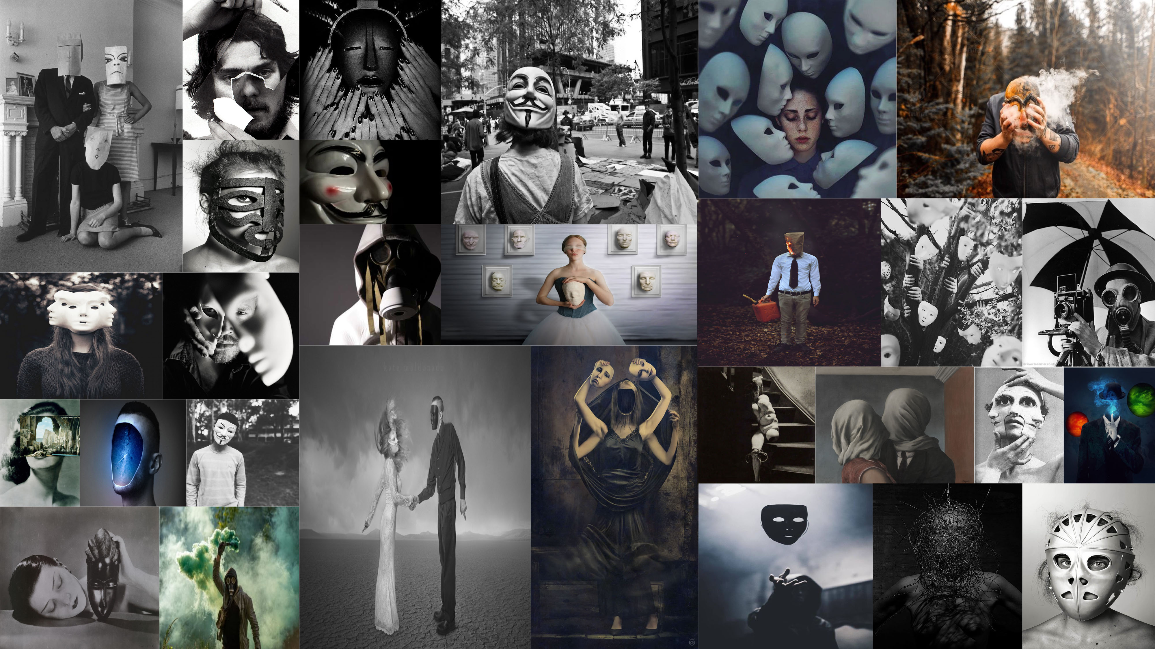
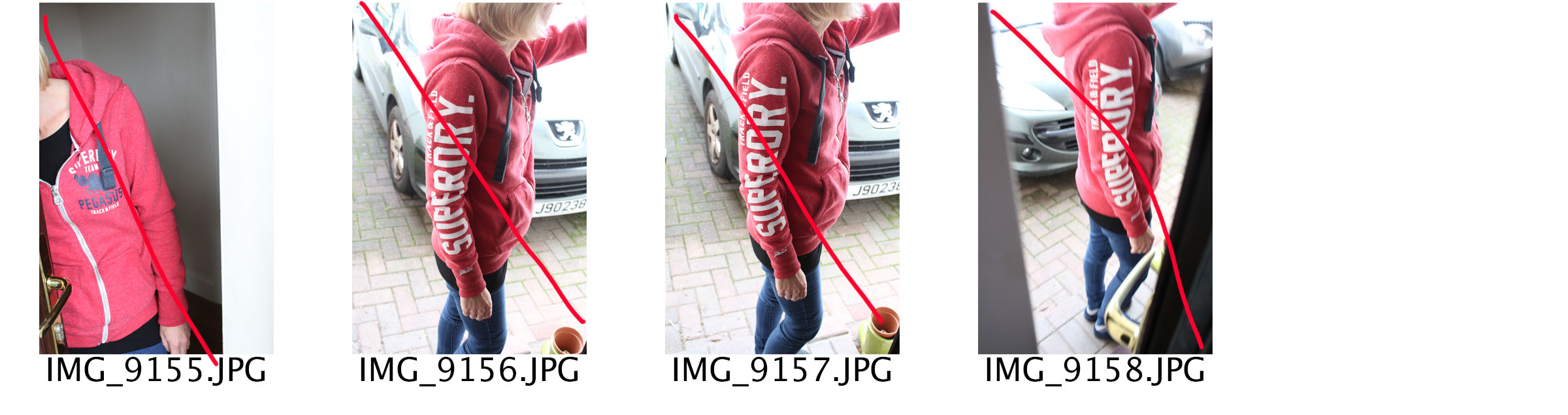
I have gone through all of my photo shoots which have been conducted throughout the portrait project, and have selected the top outcomes from each shoot. The aim of this is to begin to make final selections of images which could lead to final pieces. Moreover, it is a chance for me to reflect and see what I have achieved throughout this project, and display my best outcomes as a collective. These images are initial thoughts of what could lead into final pieces, and is beginning to make me think about ways of displaying these images, and what message I am wanting to get across.

Response To Identity:

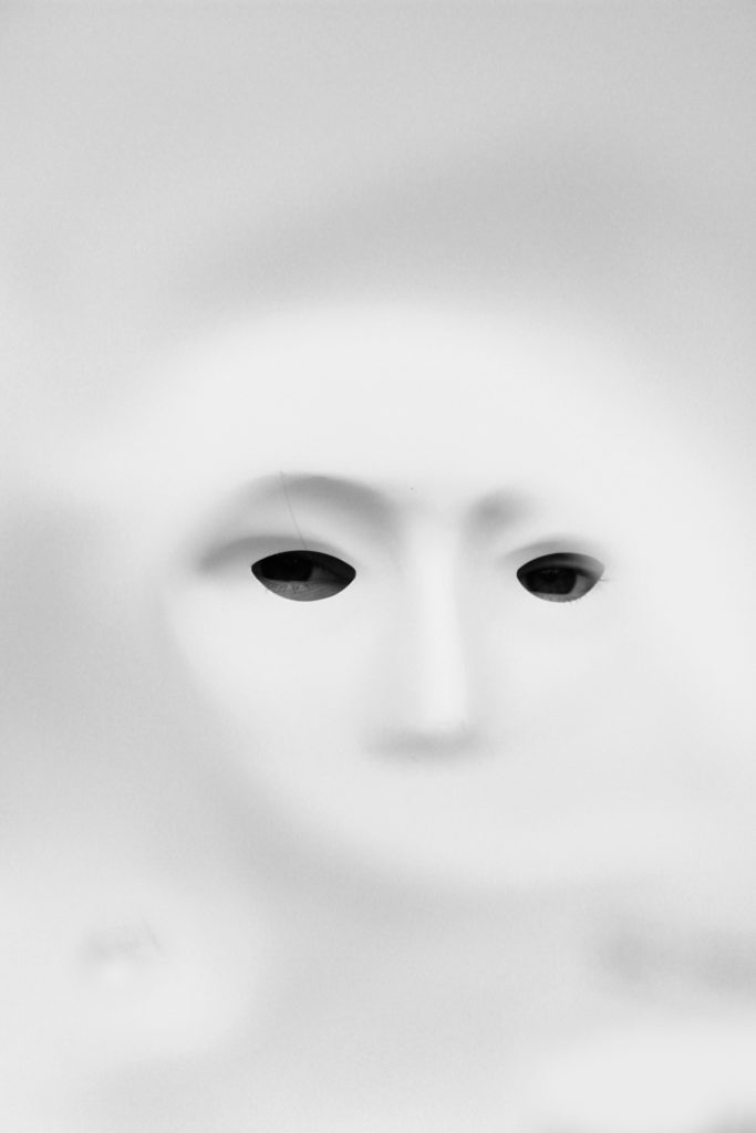
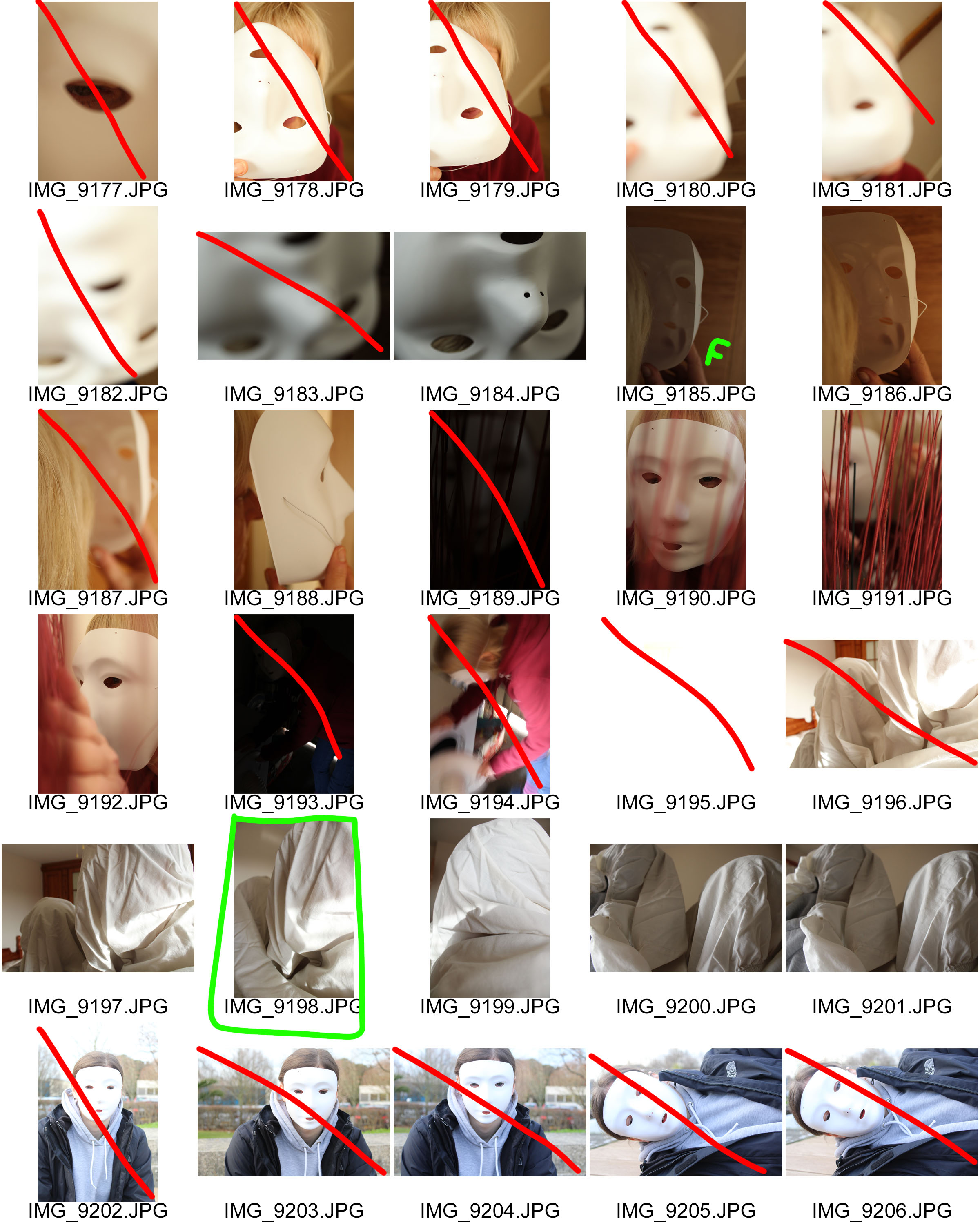
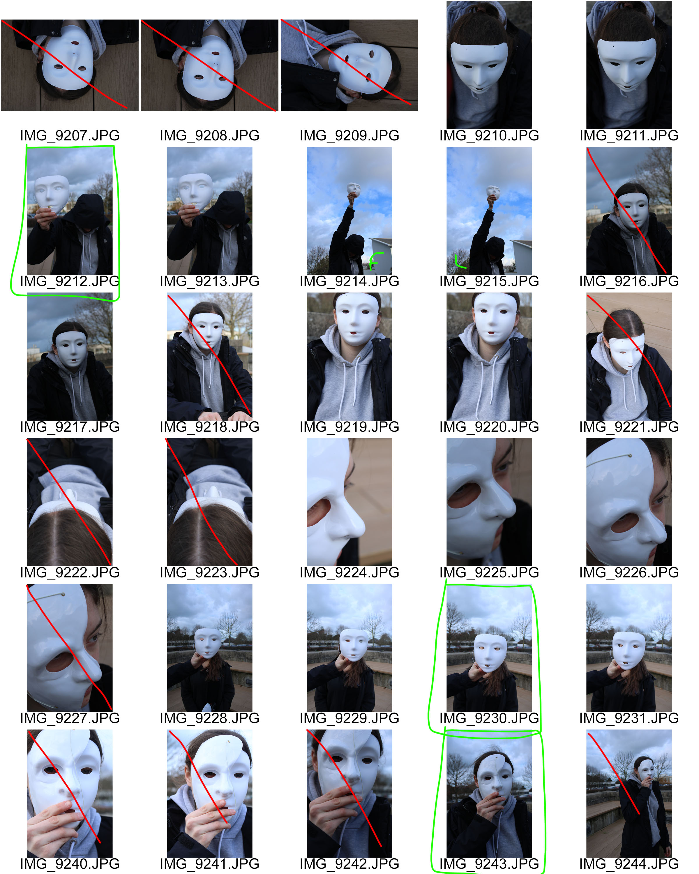
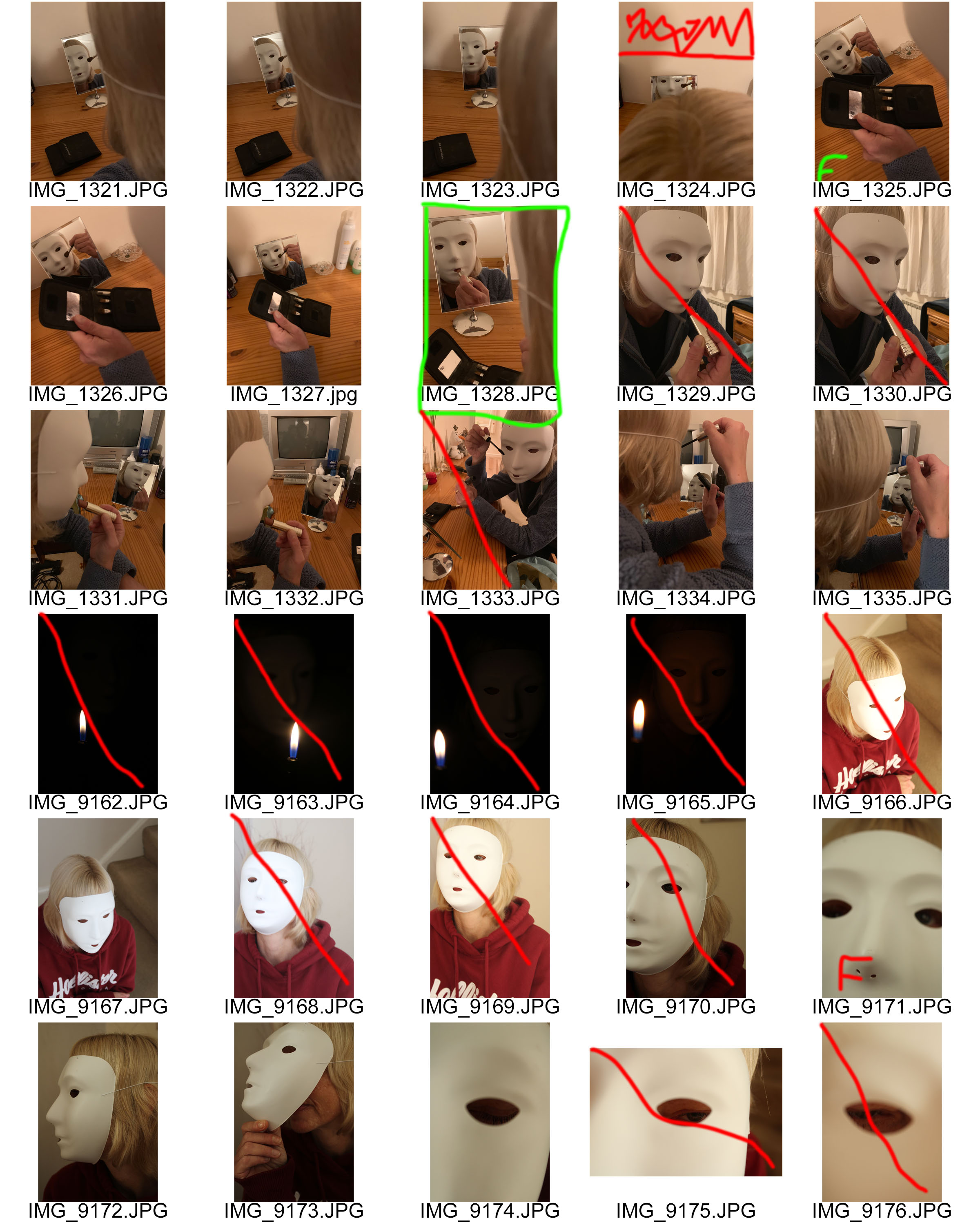
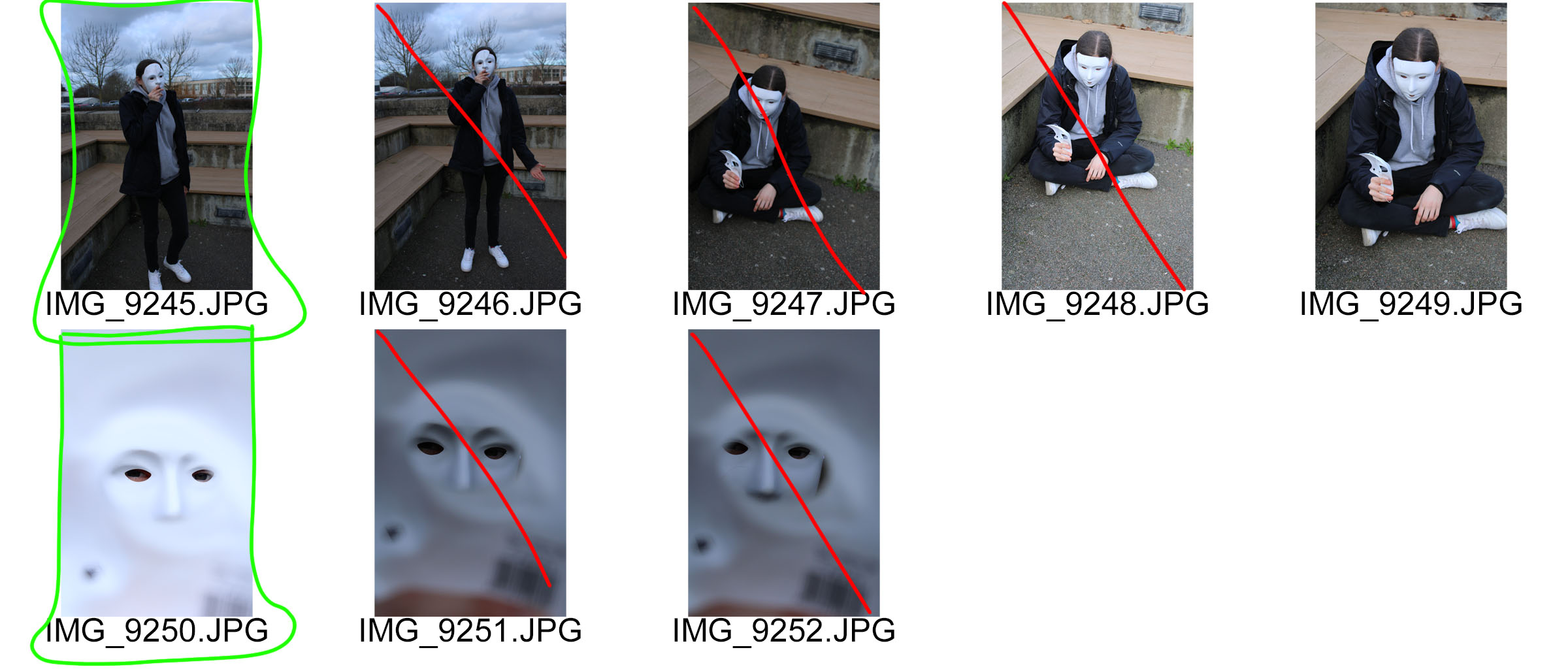
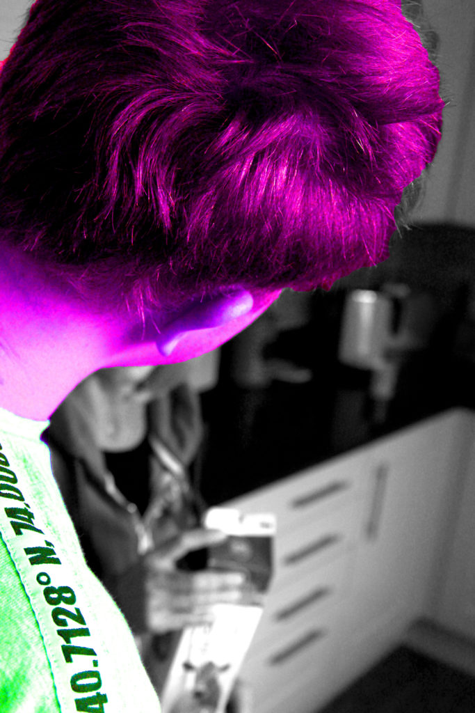
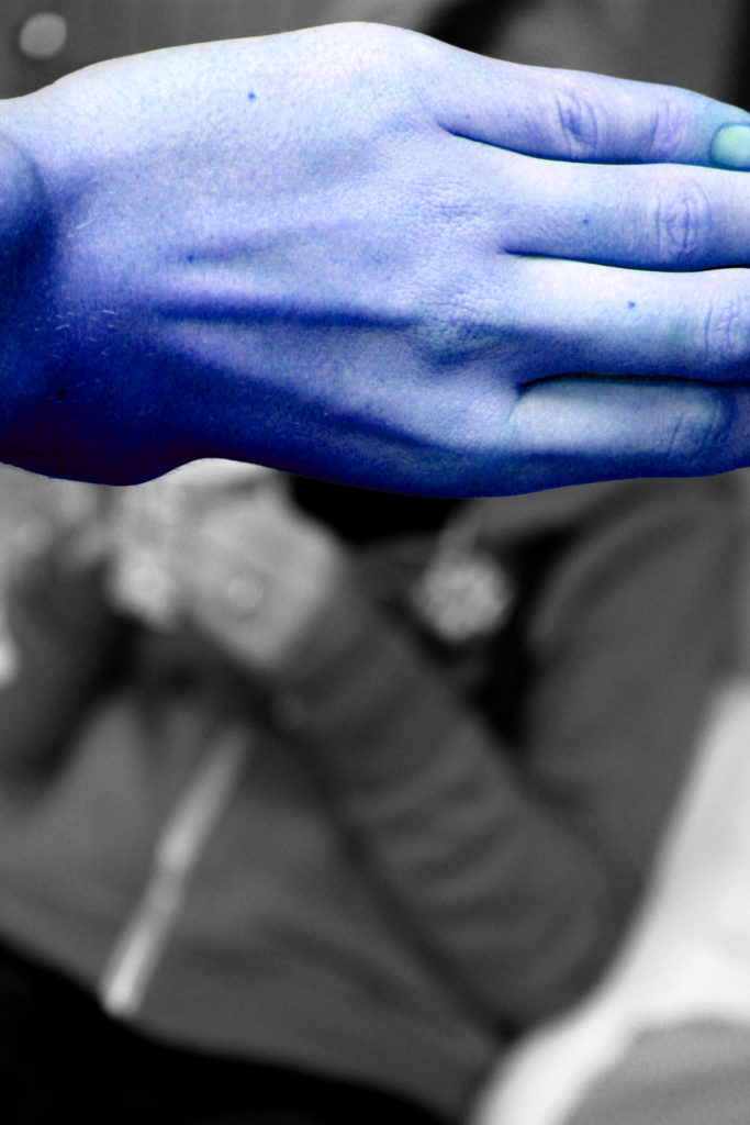
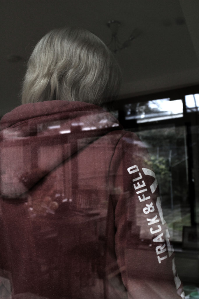
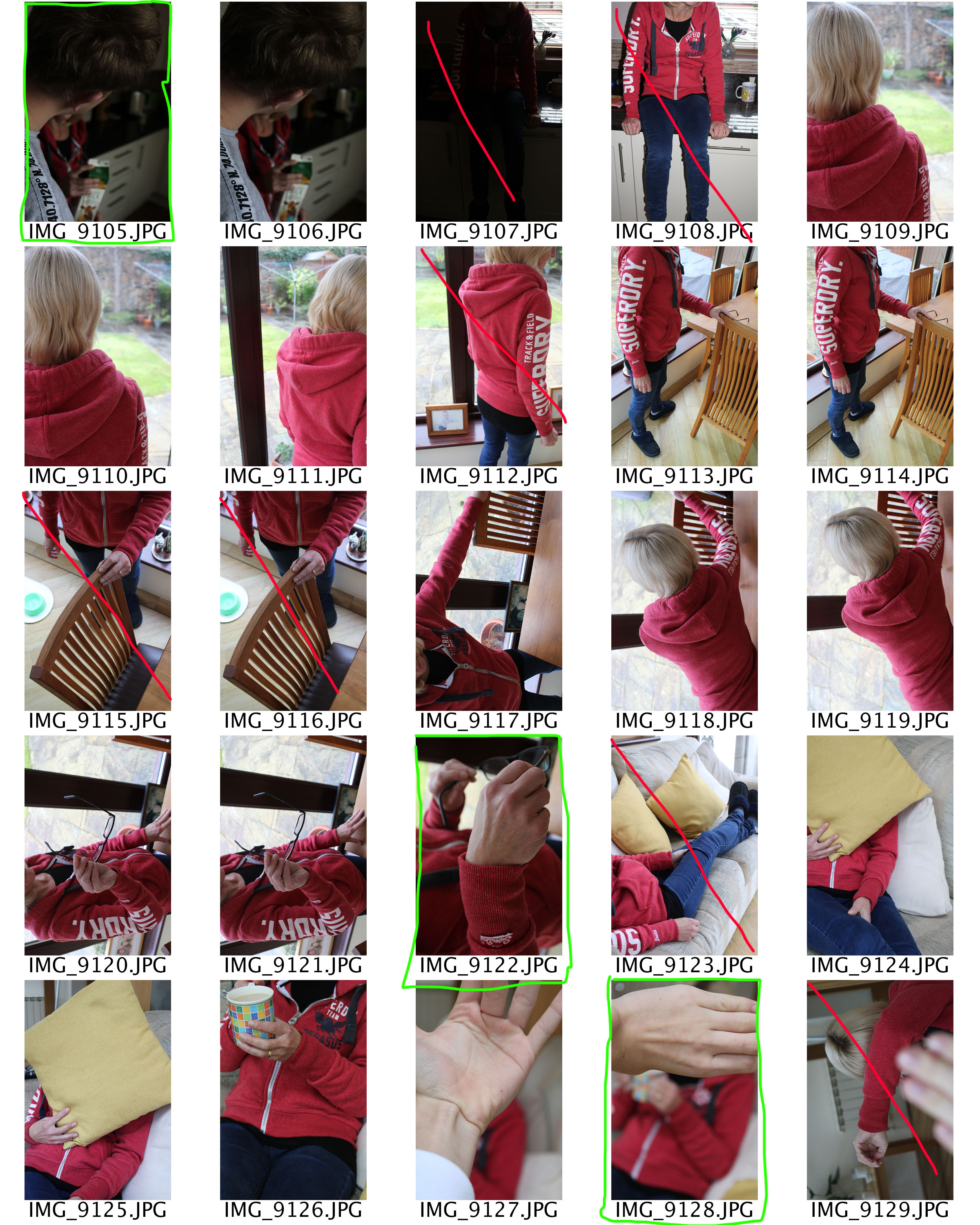
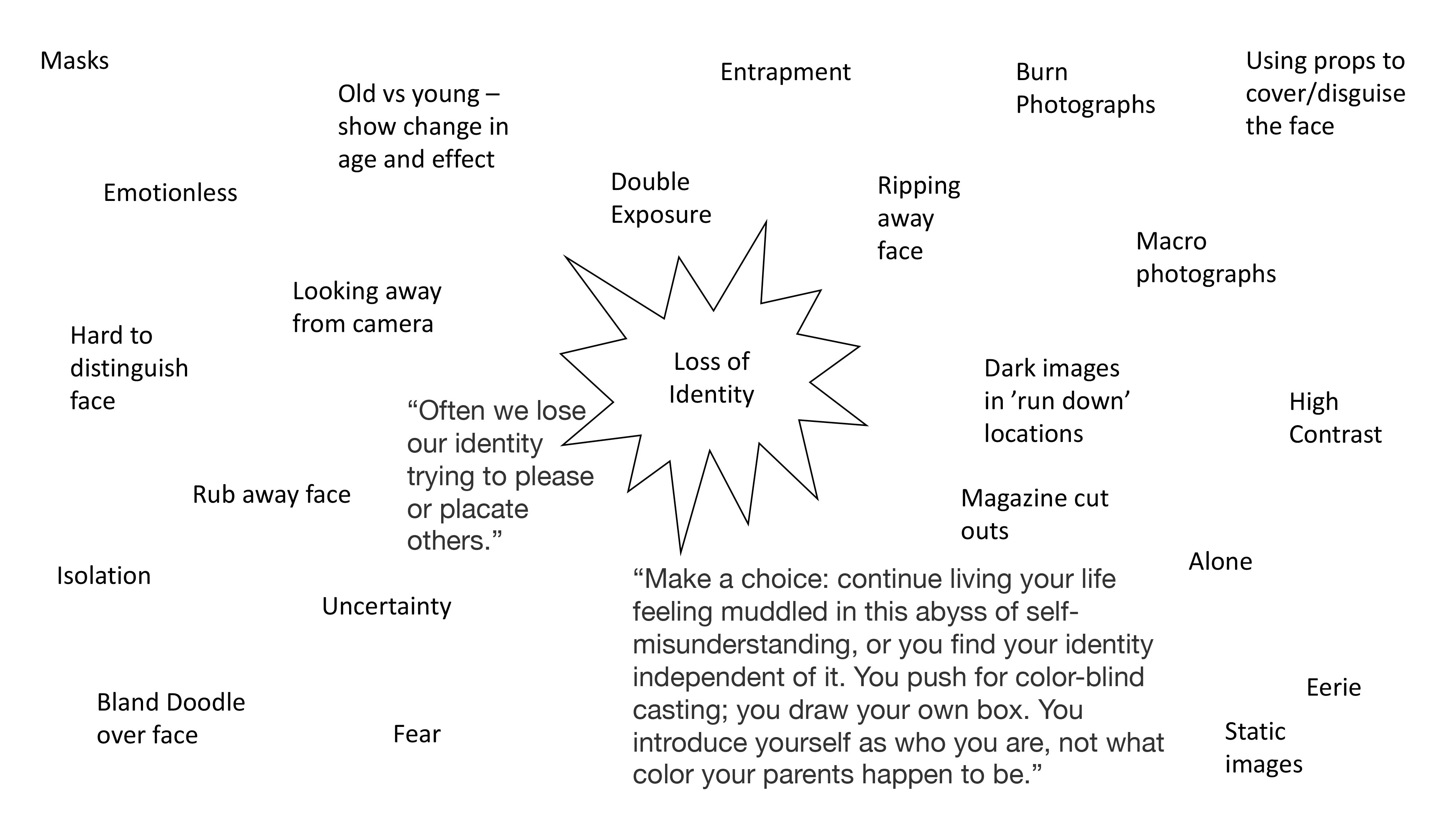
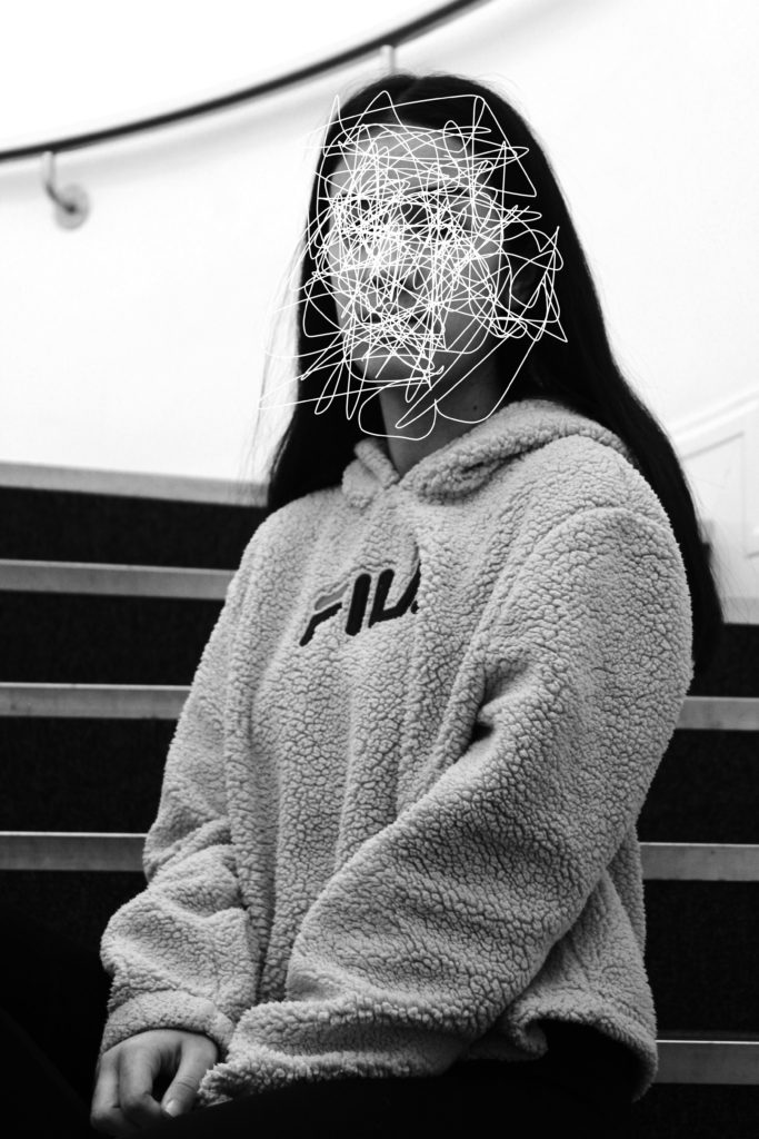
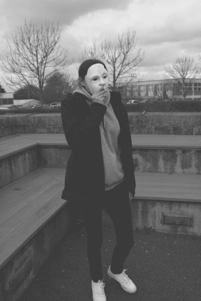
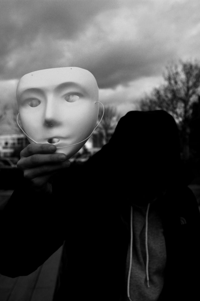
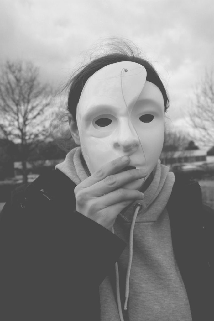
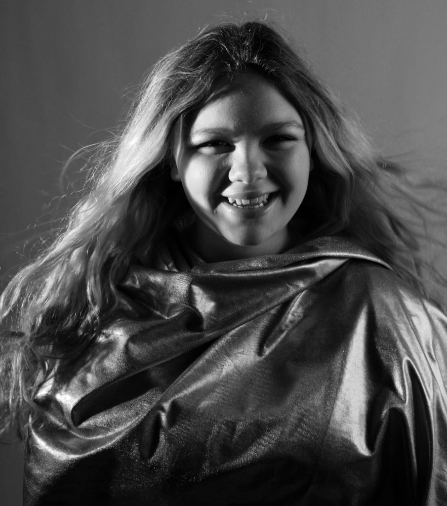
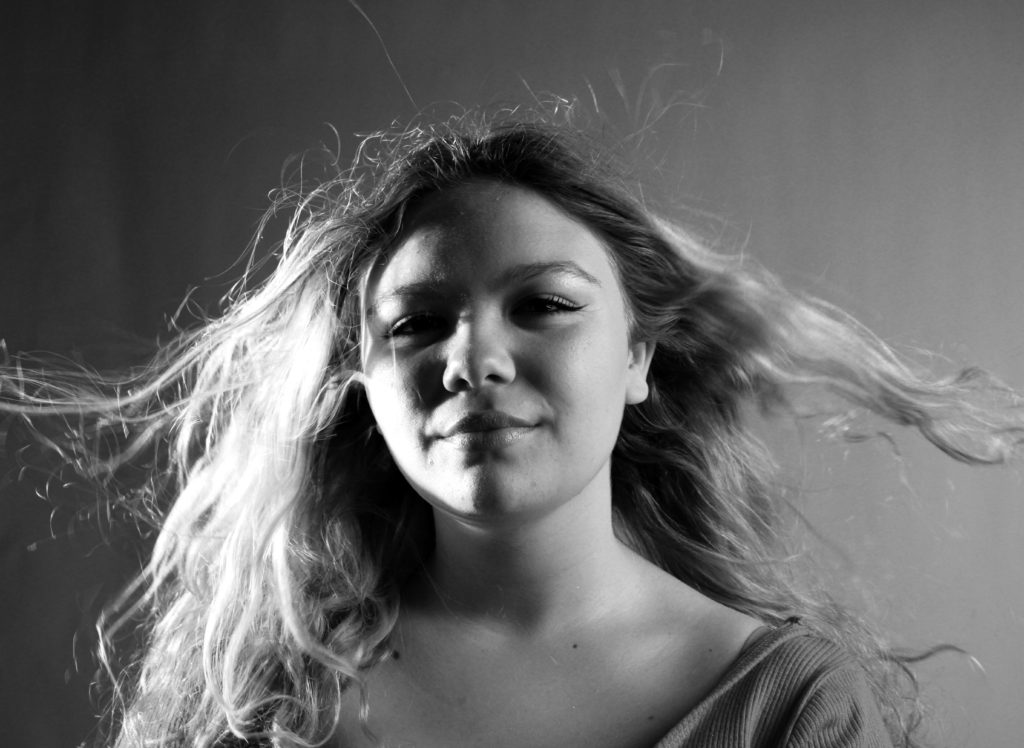
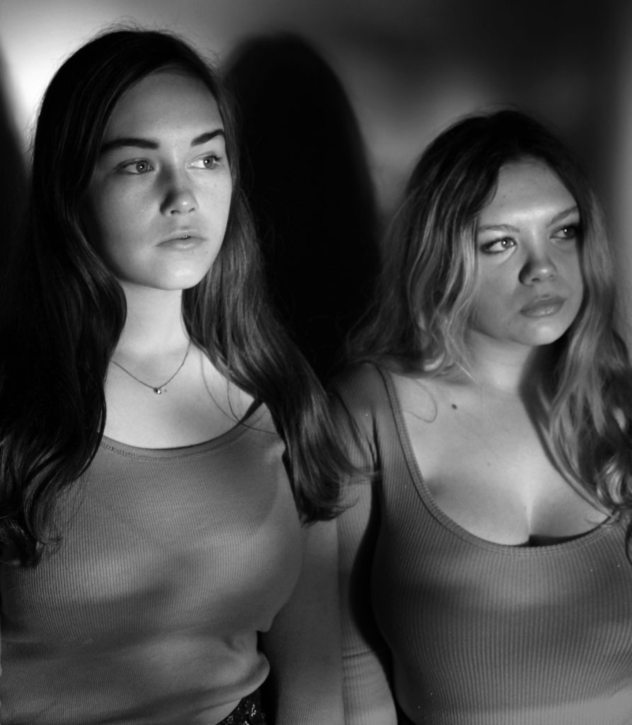
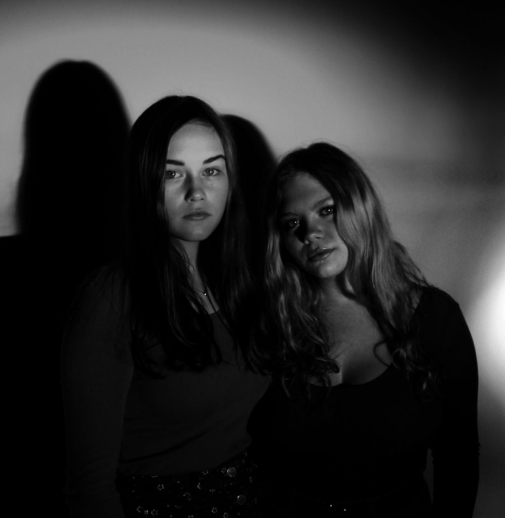
The images below are my top edits, which I believe have the strongest link to loss of identity. Moreover, all of the photographs clearly show good camera techniques and my ability to experiment, and use Photoshop in order to manipulate my images. These photographs have been taken from the two photo shoots and the old picture edit files, which I have produced in the past couple of weeks for the lead up of the mock exam.

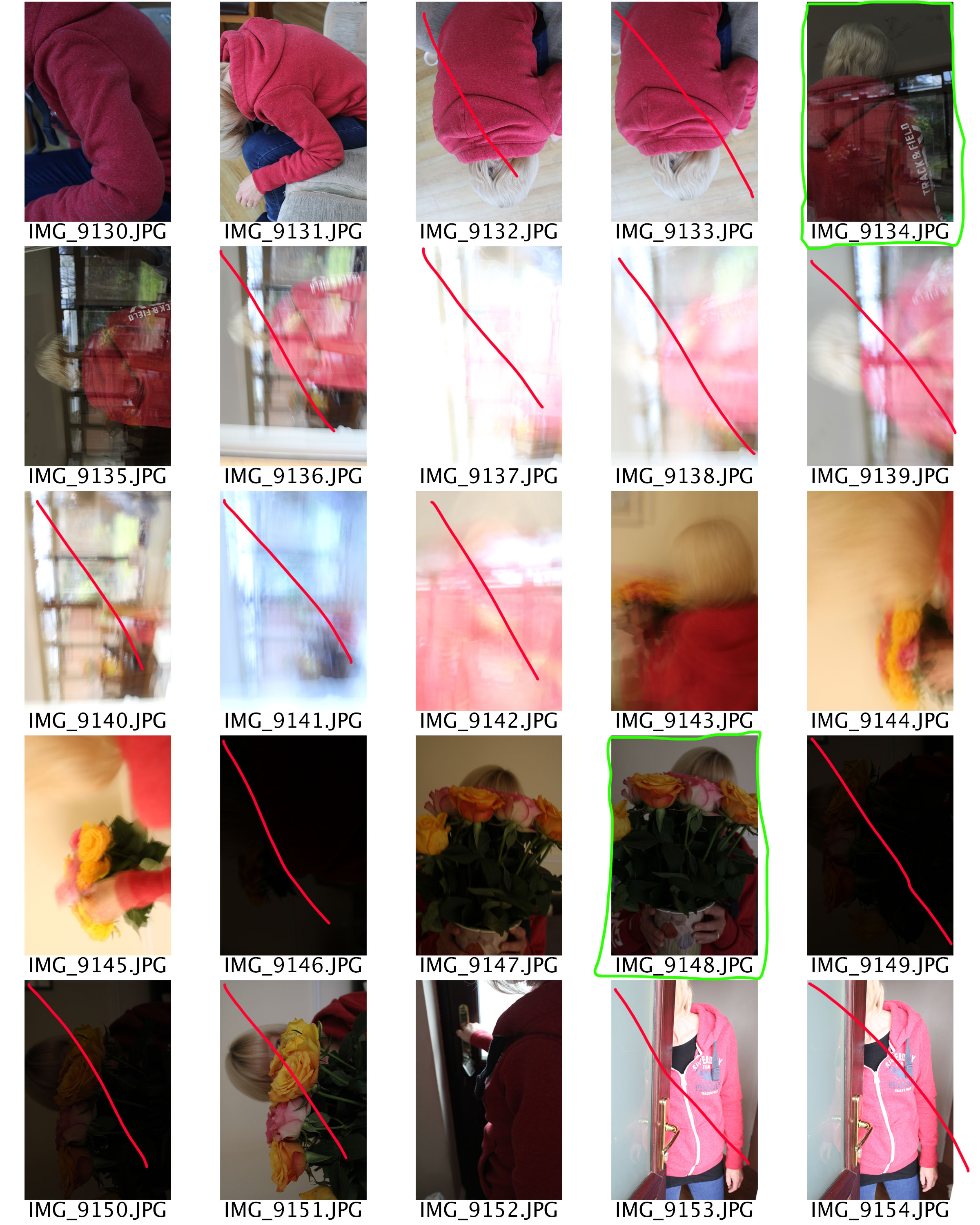
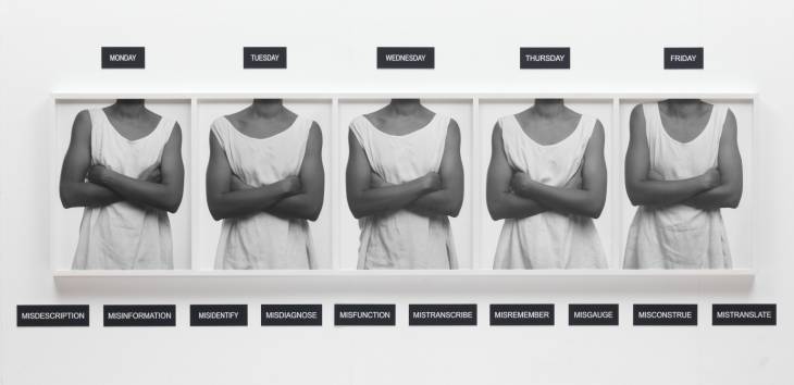
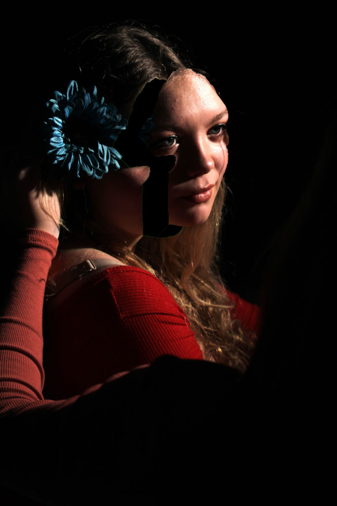
Response To Photo-Montage:

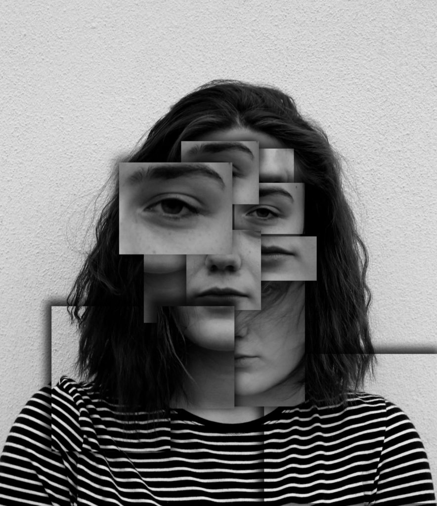
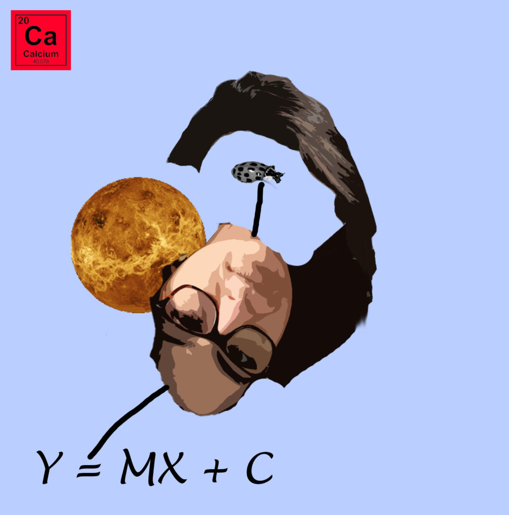
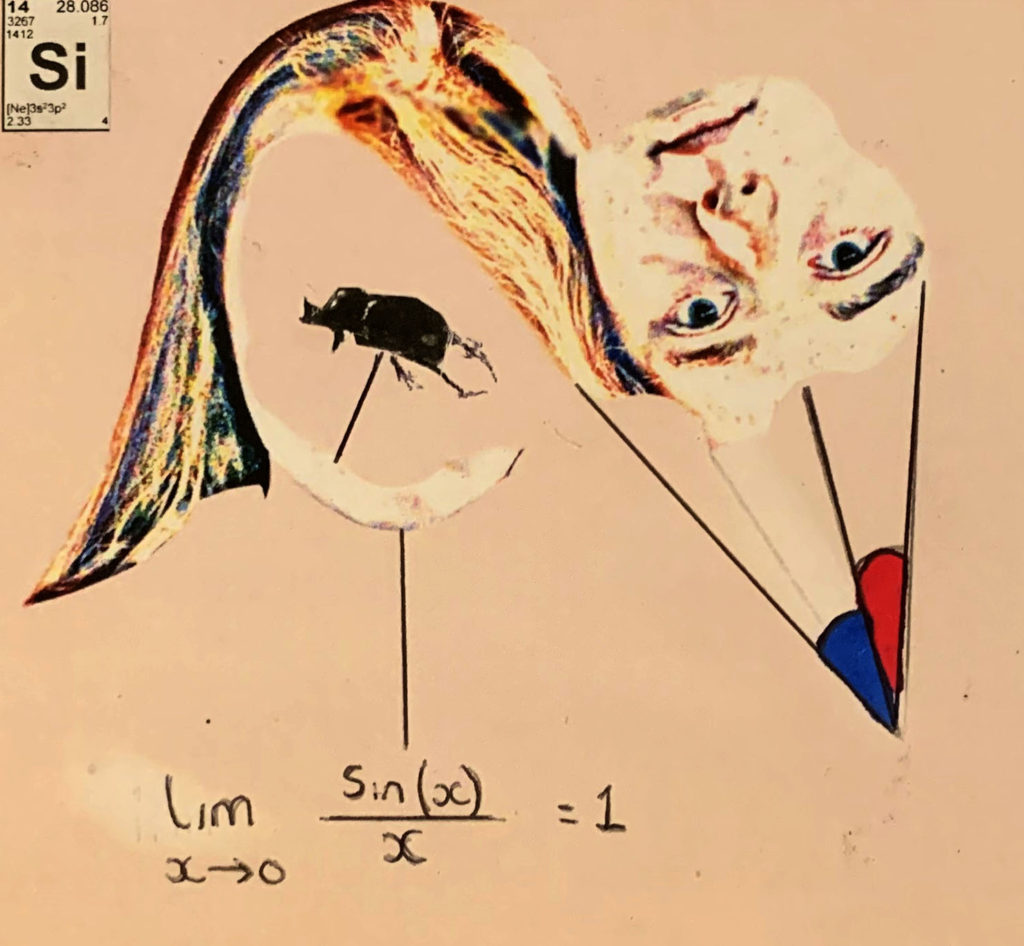
These are my top two photo-montages, which clearly show images being layered on top of each other to create an overall photograph. These two images showcase the inside of a person, by moving the head and placing objects in that and around that area, showcase the type of person they are. Both of the edits are showing the model to be smart, through the use of equations and elements off the periodic table.

Response To Tableaux:

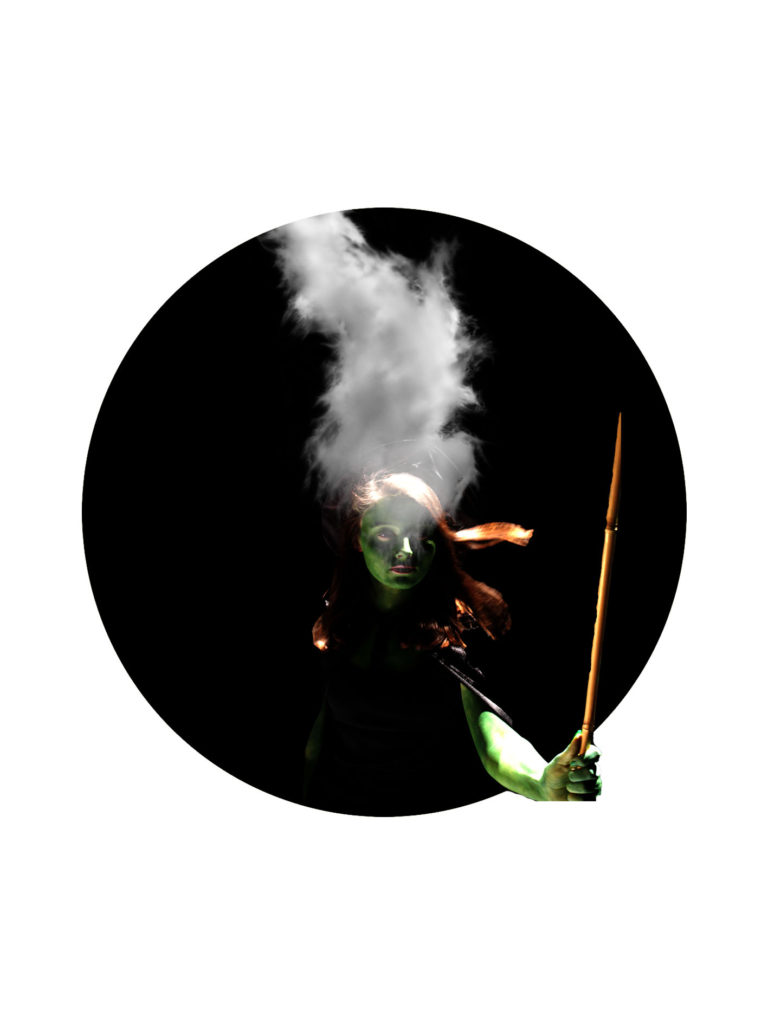
I believe my tableaux photographs are the weakest images that I have produced from this project, as a result of this I have only one image which clearly showcases my approach to this style of photography. The image shows lighting and camera techniques, which help to build a story of what is happening within the photograph.

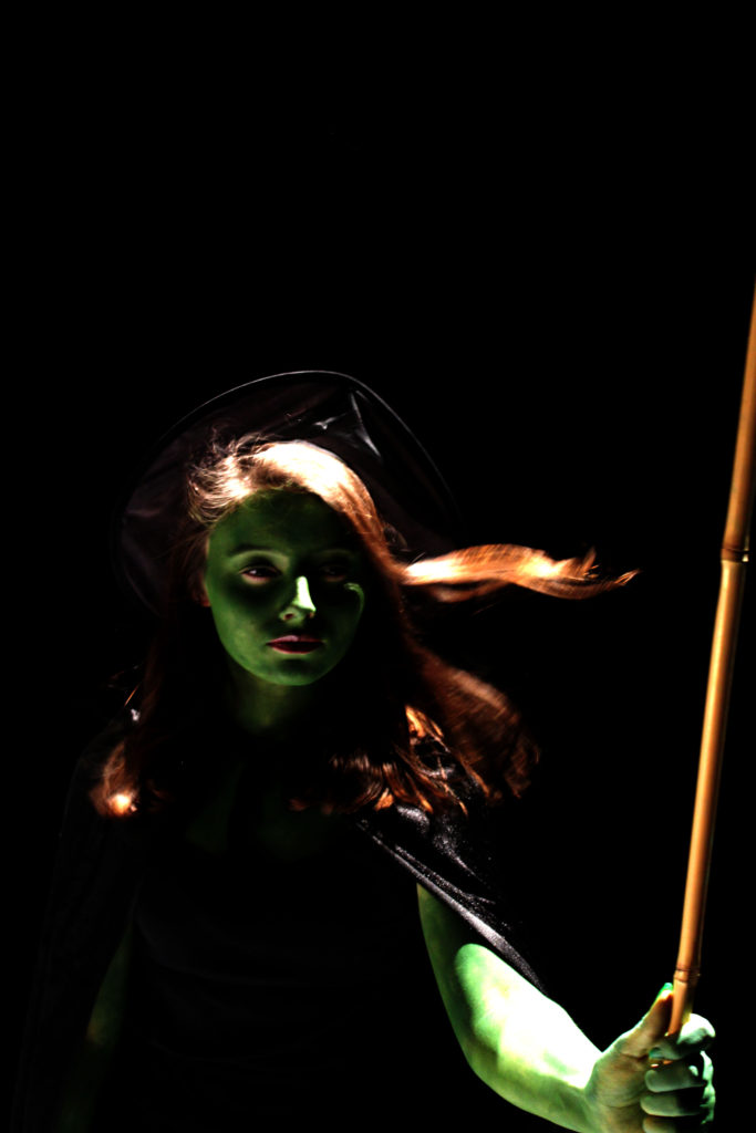
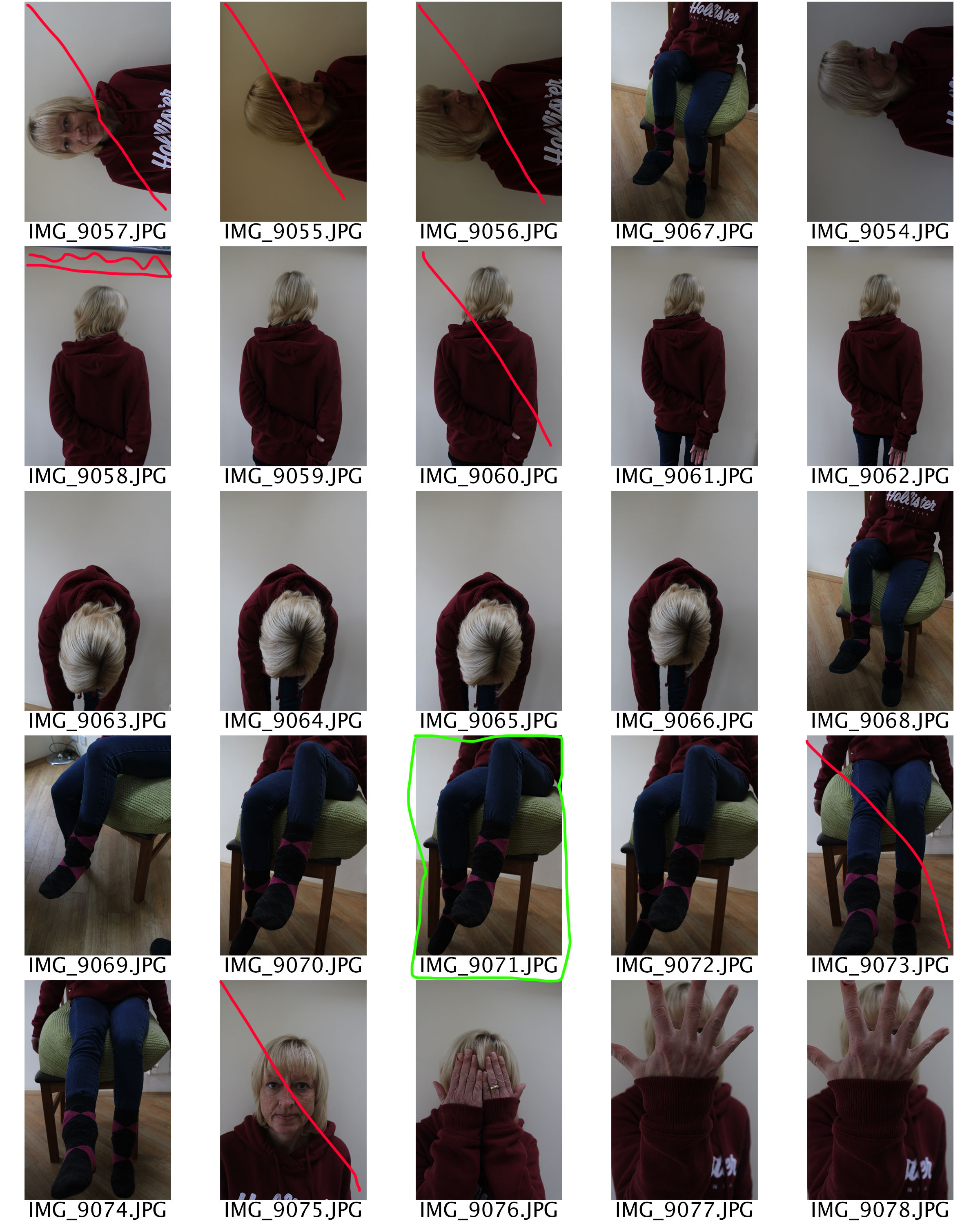
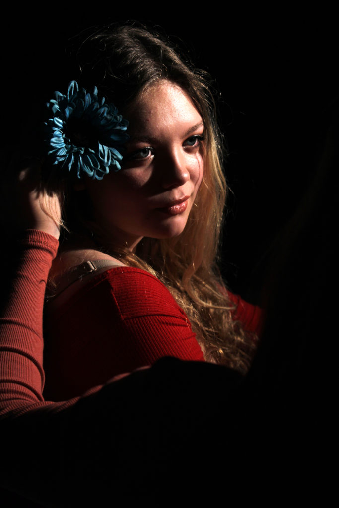
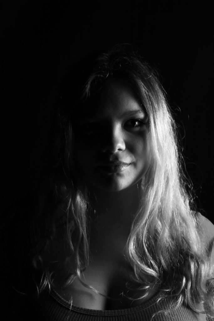
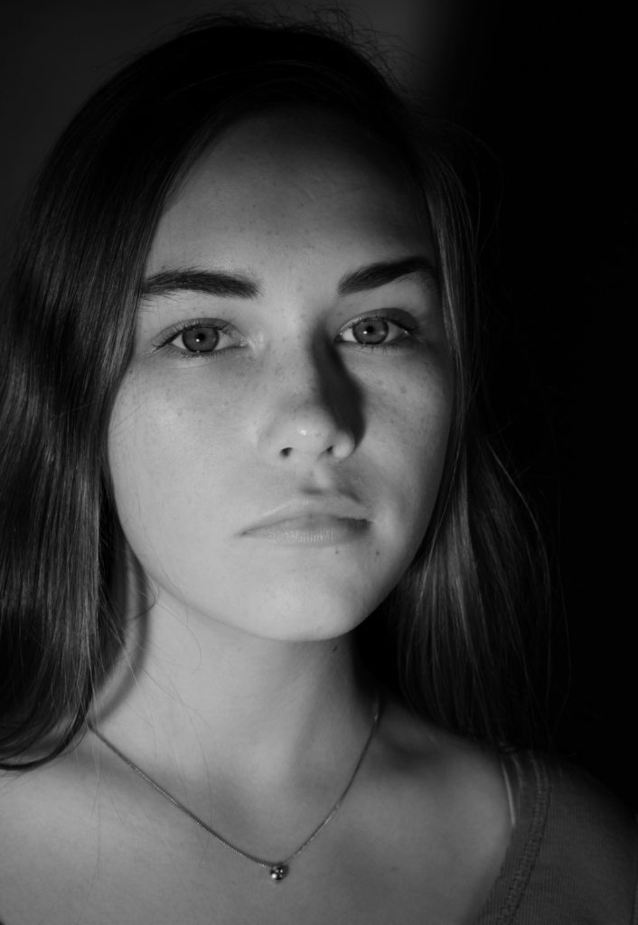
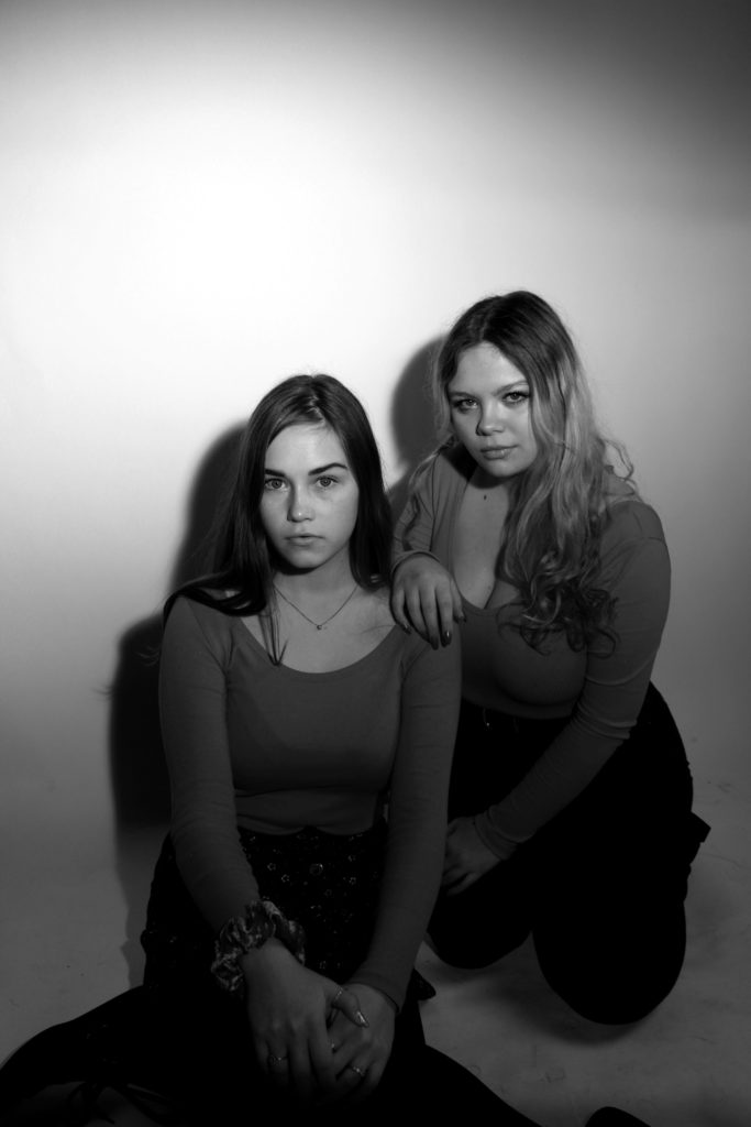
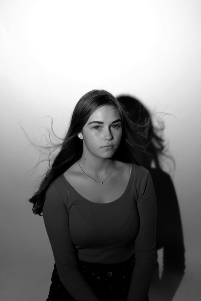
Response To Studio Lighting:

I had a large number of studio photography portraits, which I thought are successful. Due to having so many successful outcomes I am thinking of displaying 9 of the best outcomes, in rows with the middle image being in color. These are the nine best images which I would want to use, and think are the most successful.

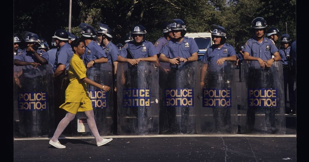
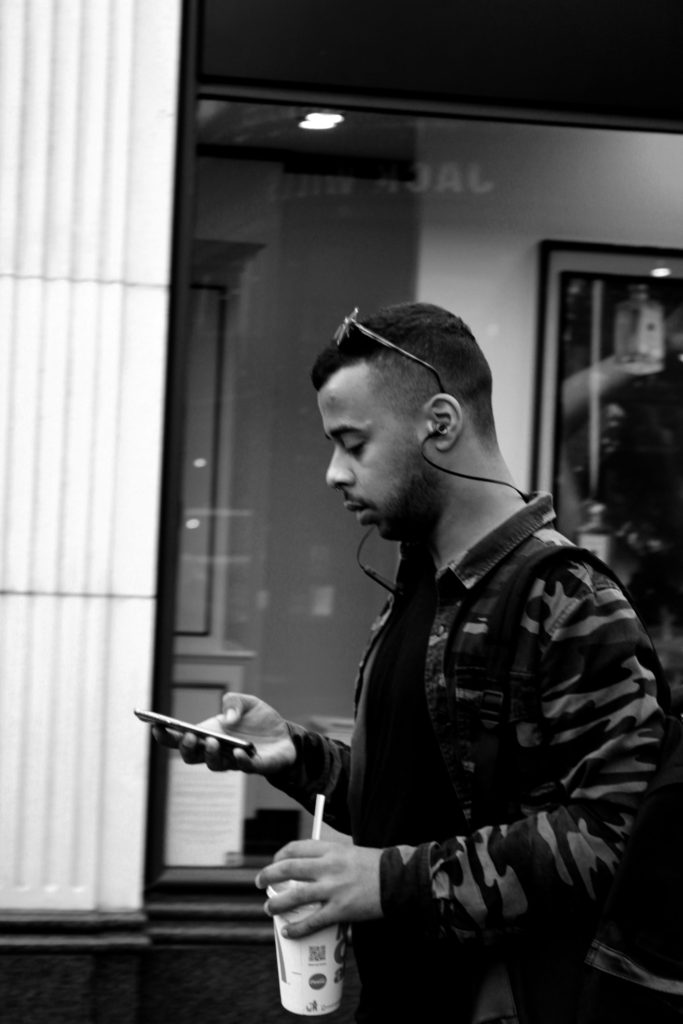
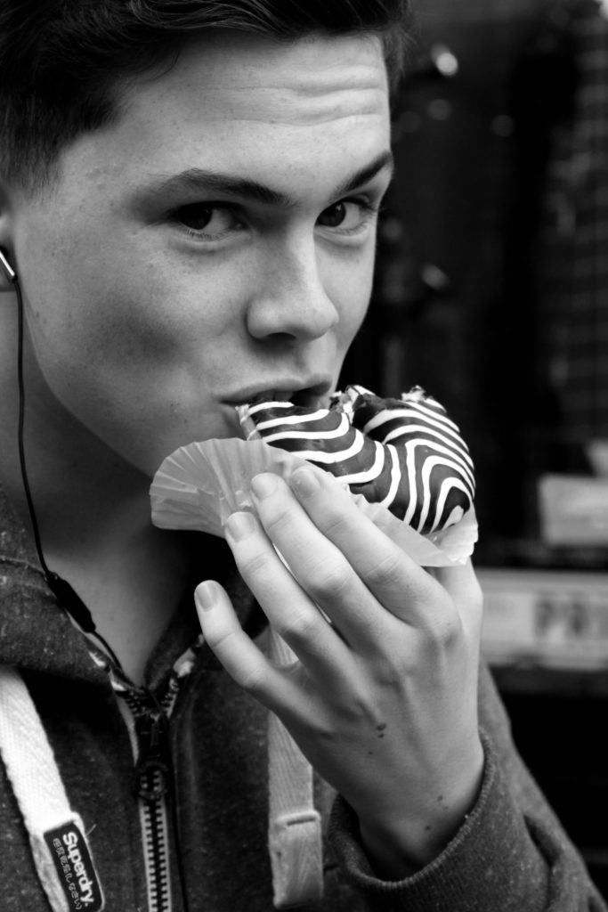
Response To Street Portraits:

Very much like the tableaux images, I felt that I was limited of successful images produced which therefore left me with three photographs which I believe could lead to potential final outcomes. These images clearly present the concept of street photography, through the nature of the model not being aware that I am capturing them in a photograph.

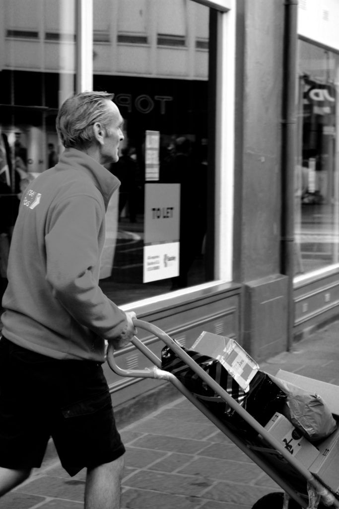
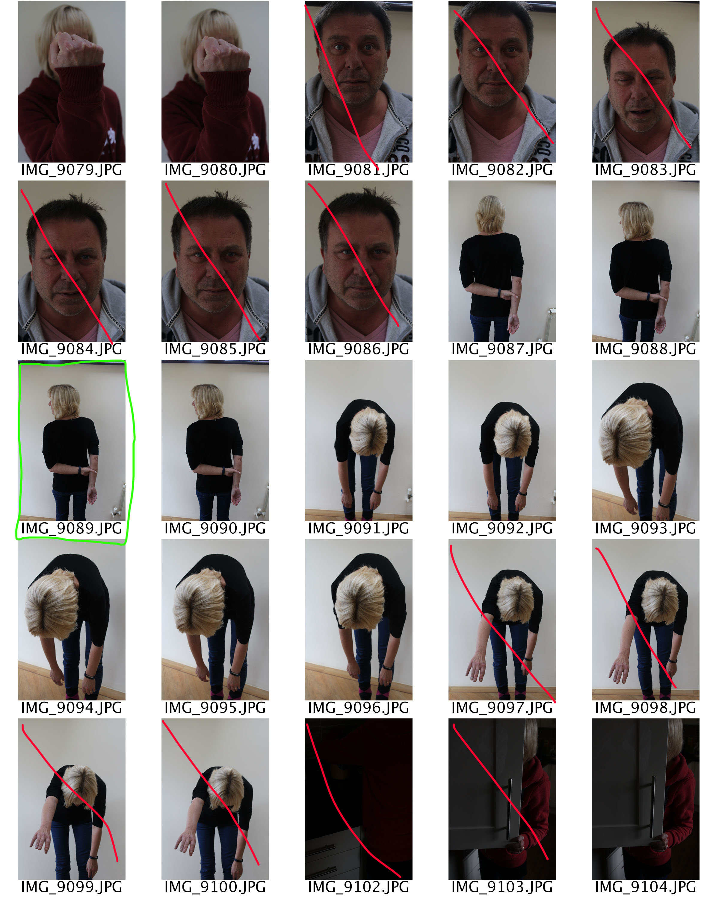
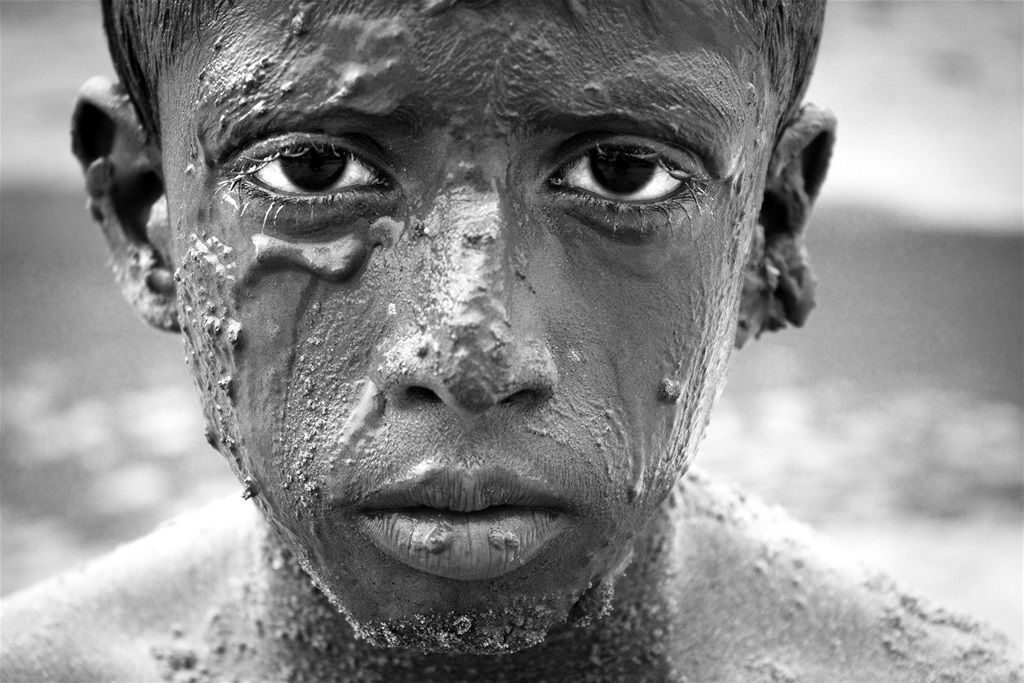
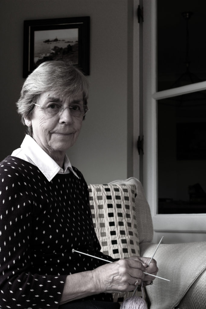
Response To Environmental Portraits:

I had a large selection of images which I could have used to showcase my response to environmental portraits. Due to the photo shoot I conducted showing the contrast of male and female stereotypes at retirement, I felt that it was appropriate to showcase two images, one of my male model and one of my female model. These two images, really outlined the contrast of gender roles I was trying to establish and therefore, I believe that they are my strongest outcomes in response to environmental portraits.


Further Loss of Identity Edits

When sifting through my photographs, which have been taken throughout the portrait project, I have found some images which could be manipulated in order to show loss of identity. These images are essentially the ‘forgotten’ images which I believe have potential to be something more. For all the edits I levelled and adjusted the curves to make the image darker and lighter, depending on how much of a tonal contrast I wanted to create.

In my first edit I wanted to physically represent my model loosing her identity. this image was taken from the studio lighting shoot, in particular when I looked at the chiaroscuro effect. I started of by cropping the image to be solely focused on the face of my model. The using the spot healing tool I went over the eyes, nose and mouth which erased them from the image. I then went over any areas of facial structure, which shows how the model has physically lost her identity. The black and white also presents no identity as colour has been taken out of the image. I really like how the image has high contrast which allows the facial features, which have been taken away, easily seen. Therefore, this edit successfully present a loss of an identity.

For my next edit I wanted to show the process of losing an identity, physically. I took inspiration from Marccelo  Monreal, who did a similar style of photo manipulation. In Monreal’s image he added flowers behind the cut out of the face, due to this being loss of identity I decided not to include the flowers as I felt that it presented to much of an identity. To do this edit I used the quick selection tool and went over the face, I then pressed layer via cut in order to make the face a new layer. I then used the move tool and  moved this cut out face slightly up and to the right in order to make it look like the models face is being taken away. Due to this edit showing the process of losing an identity I felt that this image should be in colour as it shows the before stage. Although I like the way this edit looks I do not feel that it has strong links to the theme of loss of identity, and therefore am not considering making this into a final piece.

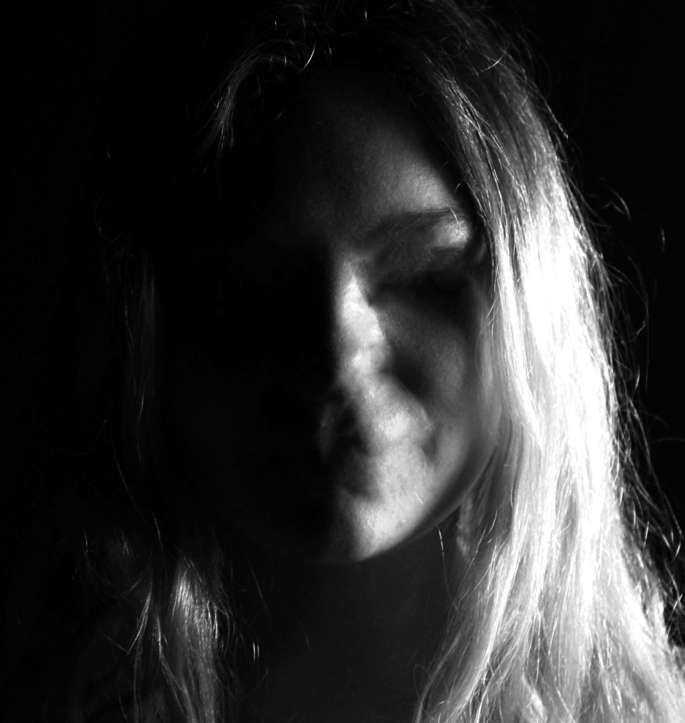
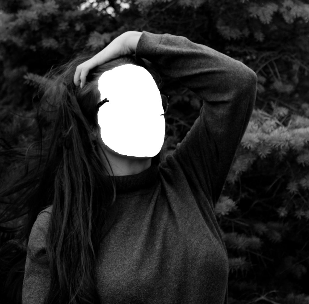
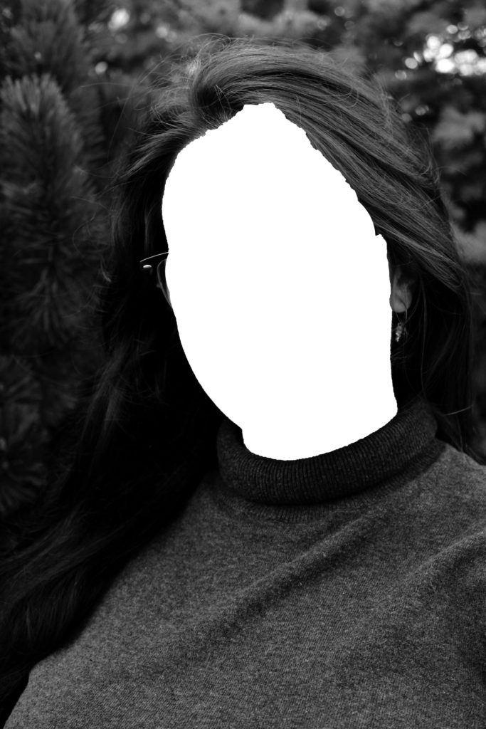
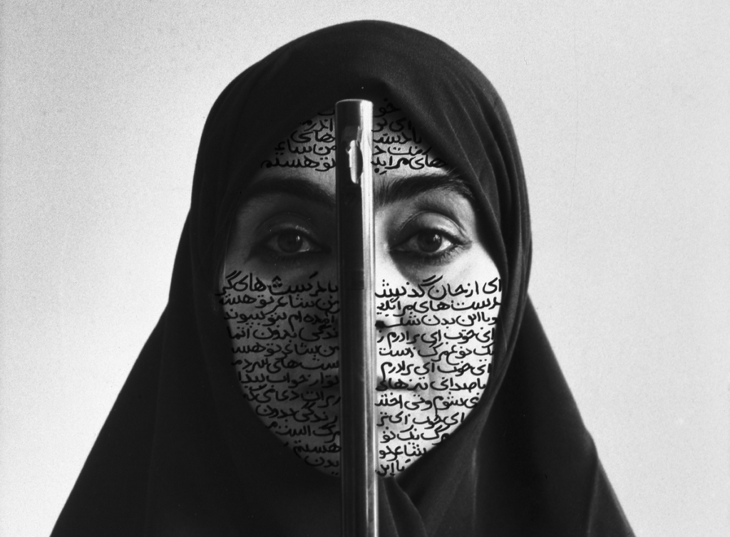
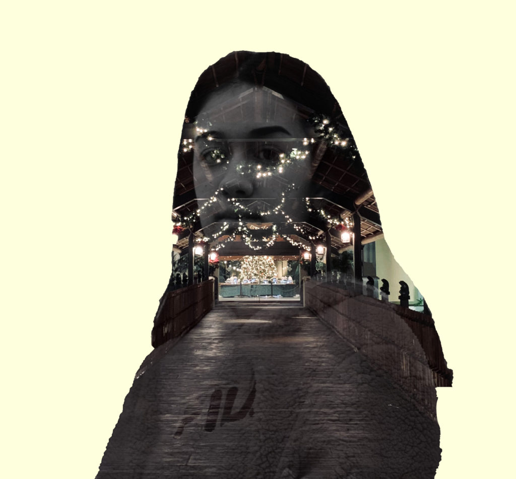
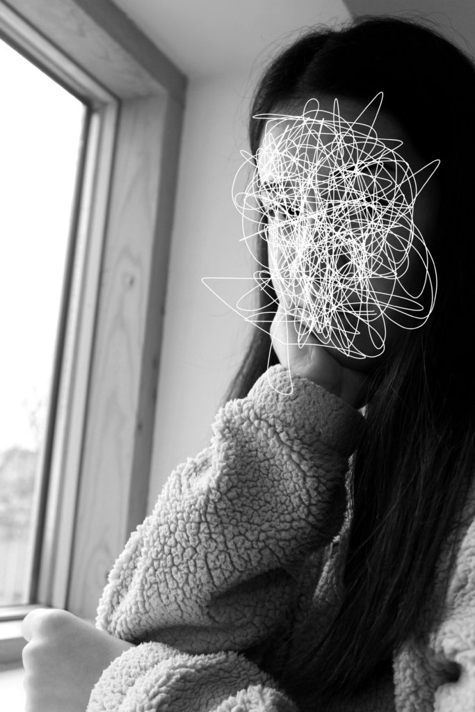
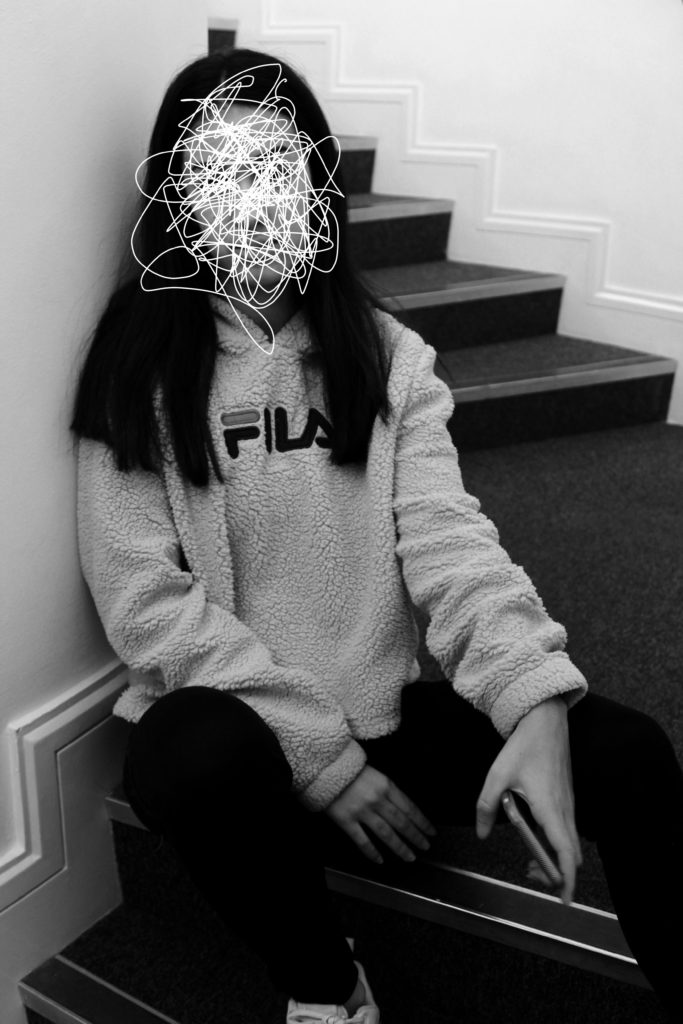
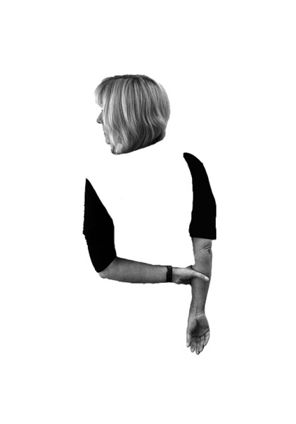
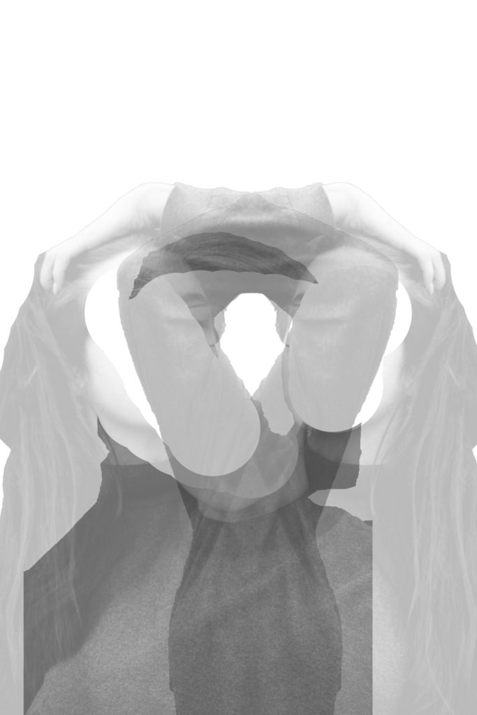
In this edit I wanted to look at the double exposure technique, where I would use two different images to formulate a whole image. I opened up the two images and cut the out using the quick selection tool and made them into separate layers by pressing layer via cut. I then moved these cut outs onto a new A4 white document. Using the rubber tool I decided to rub out the face, only leaving the body. I then placed the two images in the centre of the page and decreased the opacity of both, in order to see both images. I then decided to duplicate the layer with the model playing with her hair, and placed it the other side. Pressing ctrl + t allowed me to make the image face the other way. This final piece shows loss of identity as the models poses shows that she is confused, moreover the missing face suggested that she is lost. Finally the image is presented in black and white, making all aspects of colour identity being taken away.

Series of Three

For the next three ideas I followed a similar approach as the first idea, I wanted to physically shows a person who has lost their identity. To do this I simply made the image black and white, to remove colors, and used the paint brush tool (white paint) to scribble of the face. This creates the concept that the image has been scratched to remove the identity of the model. These three edits are the most successful, due to the strong link it has with the theme of loss of identity. Moreover, I believe that these could be a potential final outcome for the loss of identity project.

Series of Two

For my final two edits I wanted to physically show a persons loss of identity, as it tends to have the strongest connection with the theme. I followed a similar approach as the edits above, but decided to completely remove the face of my model. To do this I used the quick selection tool, and pressed layer via cut, in order to make the face a new layer. I then deleted the face layer, leaving the body and a white area where the face is meant to be. These edits are strong edits due to the not neat edges, from where I cut out the face, this metaphorically represents the idea that losing an identity can leave marks and scares and is not a tidy process to undergo. I really like the way these edits turned out, but believe they would have been more successful with darker and more sinister images, as the overall tone of the images could then match the concept trying to be presented.

To evaluate these edits, I believe I have produced some strong connections between my images and loss of identity. Moreover, I have managed to incorporate the ‘forgotten’ images and include them into the project successfully. I believe that some of these edits can be furthered into final pieces, due to meanings and representations the images hold. I have been able to clearly show a variety of Photoshop skills in order to manipulate my images in many ways, presenting different approaches to the theme of loss of identity. Thus, these edits have clearly benefited me and my exploration towards the theme of loss of identity.

Photo Shoot 2 – Edits

In this image, I took a tableaux approach, where I attempted to create a story within the image. The story being told is that a woman who has lost her identity, is placing makeup on her face in order to rectify the issue. The makeup represents a cover up for the loss of identity, which shows how society wants us to act when we lose our identity. In order for this story to clearly be presented I felt that the image needed to be naturally darker, and so I adjusted the levels and curves to do so. I also decided to turn the image into black and white which has allowed the idea that the woman has no identity to be clearly presented. Although I like the way this image has turned out, I do not feel that it has strong links towards loss of identity, and therefore I believe that this is more least successful outcome.

In my second edit, I wanted to showcase my surrealist approach to mask photography. Instead of using a mask I used a bed sheet and rapped it around both of my models heads. I placed the taller model in the foreground and the shortest in the background. From looking at other surrealist photographers work, most of the images are presented in black and white, I believe that the black and white look allows the image to be high in tonal contrast which emphasize the entrapment of my models, and how losing your identity can trap people in their own minds. The bed cover acts metaphorically to represent the mind trapping people. To edit this image I simply adjusted the levels and curves to ensure that the image would produce high tonal contrast.

In my next edit I wanted to show my model presenting her mask, before she puts it on, taking away her identity. As seen the models face is not seen and completely black which represents her identity being lost. In order to allow the face to be completely black I made the image seem naturally darker by adjusting the levels and curves, I then decided to turn it into black and white in order to allow the whole face to be completely black. I chose the main focus point to be on the mask as I felt that it represented the importance of ‘putting on a mask’, putting on an act, when you lose your identity. I feel that this image is one of my more successful images due to the different photography techniques  that are shown and the editing techniques I used.

In my next edit we are presented with the mask, looking out of a mask. The idea of this image was to showcase, what viewing the world and others through a mask, when you lose your identity. To edit this photograph, I wanted to ensure the mask on the face could still show facial features, like the nose and eyes, but had the rest of the frame white. To do this I made the image lighter by adjusting the levels and curves, and turned the image into black and white. I areas I went over with the paint brush tool (white) in order to conceal any darker areas. This image strongly portrays the theme of loosing an identity but shows it from the viewpoint of someone who has lost their identity.

In my next edit, I selected the image where a half mask is placed onto of the full mask. This represents the model falling deeper into the obis of losing their identity. This denotes that losing an identity can layer up and become hard to find themselves again, which shows the importance of speaking to someone when you begin to lose an identity. To edit this image I adjusted the levels and curves and turned the image black and white, in order to make it high in tonal contrast. I then decided to lighten the image by adjusting the lightness to be brighter. This made the image seem more grey, and old which adds to the overall sinister tone of this image.

In my final image I took the same approach as the edit above. I decided to follow the same technique, in order to make a mini series of the layering of the mask. These two images work well together as they are taken at different viewpoints and show two different styles of portrait photography. In this image we see the model in a desolate area looking as if she is walking somewhere, in hope to find someone for help. In the background we see corner stairs, which are used to represent the entrapment and how losing her identity has trapped her and how she is searching for help.

Comparison 

Small Family Group, Chelsea Hotel (from the Mask Series with Saul Steinberg), 1962. Photograph by Inge Morath, © The Inge Morath Foundation

To compare my work to Saul Seinberg, I believe that my approach has a stronger link to the loss of identity. To technically compare my image to Seinberg’s, I took the same idea of using a basic background in order to present context to the image. my background is more isolated and worn down, where as Seinberg’s image uses a posh home environment which creates an identity for those people. Both images seem to use natural cold lighting which adds to the eerie tone which was trying to be created. Both images are presented in black and white, which allows colour to be taken away, which can help present an identity. Moreover, it allows the formal element of tone and shape to be clearly presented within both of the images. One difference is that Seinberg uses paper bags with faces where as I use masks, although I like the paper bag concept I felt that it began to create an identity, which was not the aim of this photo shoot. Therefore, using a mask I felt was more appropriate. Finally, my image uses a short depth of field compared to Seinberg’s image. I felt that the main focus point being on the model helped to isolate the background, allowing the focus to be on the model allowing the clear message to come across.

To evaluate these edits I believe that I have managed to produce a strong response to mask photography, which could then develop into final pieces for the theme of loss of identity. The edits have used simple photoshop techniques which has allowed the theme to clearly be portrayed in every photograph, making these edits successful.

Photo shoot 2 – Masks

Planning

The aim of this photo shoot is to clearly show my response to Saul Seinberg and mask photography. As mentioned before I felt that Seinberg’s work presented too much of an identity and therefore conducted research into mask photography.  In this photo shoot I will be using two types of masks, a whole face mask and a half face mask, in order to present the theme of loss of identity. The location of this photo shoot will be both indoors and outdoors, to gain a mixture of environments. I want to be able to use natural lighting throughout this shoot, in order to make the images seem more natural. Doing this will present the theme of loss of identity as a more natural and realistic occurrence, making viewers more aware of the idea that someone can loose their identity. I will be keep the camera settings pretty standard, with the shutter speed being quick, the ISO on 400-800 and the white balance being on daylight. On Occasion I will alter the shutter speed and ISO in order to make the images seem lighter and darker depending of the location of the image and how I envision the final image to look like. I will direct my model to sit in different positions, do different actions and to look in certain places which will ensure that the images taken are how I want them to look.

Contact Sheets

To evaluate this photo shoot I felt that I have been able to produce some strong outcomes towards mask photography. I looked at surrealism within mask photography, bed cover over head, and a more naturalistic look with a plain white mask. I felt that I was able to successfully meet the aim of this photo shoot. In the editing process I want to ensure that all personality and identity is extracted from these images, so I will look at adjusting the levels, curves, hue and saturation. I want to be able to create a eerie and sinister tone to the final outcomes, to represent the eerie and sinister feelings people gain when they loose their identity.

Saul Steinberg

Small Family Group, Chelsea Hotel (from the Mask Series with Saul Steinberg), 1962. ;Photograph by Inge Morath, © The Inge Morath Foundation

Steinberg captured people with paper bags over there face, hiding and disguising their identity. On the paper bags there are shapes creating a cartoon style face. When someone looses their identity they tend to hide their emotions with fake ones, the paper bag acts metaphorically to show the fake emotions that a person is likely to present when they loose their identity, which presents the conceptual elements within this photographic series. Technically speaking the models are located in the centre of the frame, allowing them to be the main focus point. The background is used to present the background of the person, the type of people they are. In this case they seem rich due to the posh fireplace and large amount of space surrounding them. The photograph is presented in black and white which allows the image to be high in tonal contrast allowing details to be shown clearer.  Space, tone and texture are the main formal elements which are being presented within this image. They are all presented through the background and the model, which all add the effect of loosing an identity. The camera settings when taking these images where precise, the ISO seems to be slightly high as there seems to be an intended noise, this also contextually shows the time period (1962) that these images were captured in. The shutter speed seems to be quick as there is no intended blur, moreover there is a large depth of field due to the whole frame being in focus. This photograph presents cold artificial lighting, which adds to the depressing and sinister tone which Steinberg is creating around the idea of someone loosing their identity and trying to be someone whom they aren’t. Contextually, Steinberg wanted to show that everyone is society ‘wears a mask’ to hide the true identity, whether it is metaphorically or physically, through makeup. He said that this was because it acted as “a protection against revelation.”. Applying this to loss of identity, it shows how when people loose their identity they try and pretend to be someone they are not, so people do not find out what they are going through. To apply this contextual idea to this image the paper bags are suggesting that because these people are rich they have to act rude and snobby towards others due to the class system.

Based on this artist research I want to conduct a study where I look at capturing my model disguising their identity. In order to present a stronger relationship between the artist and loss of identity, I intended to use plain white masks and plain simplistic background, so no identity is built around the background of the model. Moreover, I intended to use a similar soft cold lighting in order to create a depressing tone to my work. In order for more inspiration with the use of masks and paper bags, to disguise and present the idea that my model has lost their identity and pretending that they are okay, I intended to conduct visual inspiration through a mood board, were further interests surrounding this topic can be presented.

Mood Board Of Other Artists Work With Masks
  • While exploring further into mask photography, I got a glimpse of the idea of surrealism with masks. Within this I saw a thin white material like a bed sheet around the head of the model, which takes the viewer away from naturalistic photographs. This presents loss of identity as it shows that there is nothing left when you lose your identity, the white sheet presents metaphorically that the person who loses their identity is left with emptiness. This is an aspect which I think could inspire my photoshoot of masks
  • Another aspect which present clear ideas is the use of a blank white mask. These masks can be considered eerie and scary, which can present the emotions that a person feels when they loose their identity. Moreover, the mask physically covers the face of the model which shows the loss of their identity.

By conducting this further research of mask photography I have clear ideas and visions that I want to bring forward to my photoshoot which will be inspired by Steinberg’s use of paper bags/masks.

Photo shoot 1 – Edits

In my first photo shop idea I wanted to show the body of my model disappearing. I decided I wanted to get rid of the body but keep the arms and the head. My model has her head slightly turned showing her nose, this makes it look like she is looking out to the horizon, potentially looking for her identity. Her arms are joined which shows she is trying to keep herself together, due to the disappeared body implies that she is finding it hard to do this. The image is in black and white like Simpson’s work and clearly demonstrates my model loosing her identity. In order to achieve this I cut out my model using the quick selection tool, and placed this layer onto a new A4 white page. I then used the rubber tool in order to rub away the body. I then leveled and desaturated the model layer in order to allow a high contrast in tonal regions. I believe that this edit is successful as it shows the process of the model loosing her identity.

In my second edit I wanted to make it more symbolic, through the use of shapes. In the centre of the image is a black circle, this circle is used to represent the model being swallowed up (her identity being taken away). The color black and white represent a empty void where nothing is, conceptually showing what it is like when you lose your identity. The models legs are sticking out as if she is sitting in this void. This shows that she is so far in (highly depressed) she does not want to come out and talk about, which is usually the best option. Like the other idea no colors have been used in order to prevent a small identity being shown. In order to achieve this idea I created a new A4 page and place a black circle in the center of the page using the ellipsis marquee tool. I the opened up the image I wanted to use and used the quick selection tool to cut out my models legs. I then placed the leg layer on to the A4 document and used the burn and blur tool to blend the legs into the black circle. Using the transformation tool I made the legs smaller, to shows how small loosing your identity can make you feel. I am extremely happy with the outcome of this edit and believe it matches the theme of loss of identity.

Due to the success of my second edit I wanted to use use the black circle again due to meaning and representations it bought to image. I started off by using the quick selection tool to cut out my model, in the bent over position. I then placed the leg layer on to the A4 document and used the burn and blur tool to blend the legs into the black circle. Using the transformation tool I made the legs smaller, to shows how small loosing your identity can make you feel.

In my next idea, I selected the image were someone else was covering the face of the model who has lost their identity. In order to show this person having an Identity, I decided to use the quick selection tool to cut them out. I then turned the background layer black and white by pressing ctrl + U. This created a colour splash, I felt that I could expand this idea. I decided to change the colour of my model to a ‘wild’ colour in order to create a dramatic contrast. I did this by pressing ctrl + u and altered the hue slider. This contrast I feel clearly portrays someone with identity to someone who has lost their identity. The model who has lost their identity can be seen in the background as a blur, which shows that she is a minor and does not want to be seen by others, thus it helps to create a powerful image.

Due to the success of the idea above I decided to follow the same steps but with the image above. Having the hand of someone else covering the models face shows how she is not important and should not be looked at, also presenting what it is like to have lost an identity.

In my final idea I wanted to showcase this natural double exposure. The image was taken through a window, so you are able to see the model and the background being reflected by the mirror. In order to show this I adjusted the levels and curves in order to allow both the model and the scenery to clearly be visible. I turned down the saturation of the image as well to create a dark and depressing mood to the image. I created this to show a before and present image. The scenery is what life was like before the model lost their identity and the model herself is seen looking the other way showing that her life is nothing like this anymore.

I am very happy with all my outcomes from this photoshoot as I believe they all showcase what life is like when you loose your own identity. I believe that these outcomes could lead to successful final pieces.

Identity – Photo shoot 1

This photo shoot is inspired by the artist Lorna Simpson, who captured the model without including their face. I believe that this is a good idea when trying to capture someone loss of their identity.

Planning

I will conduct this photo shoot in a variety of settings, from outdoors to indoors in enclosed areas. In these multiple locations I tend to have a plain background which means setting will not ruin the idea of having no identity. My camera settings will be kept normal, however I may experiment with changing the ISO to make the images darker, which also helps to show the dark and depressing side loosing identity has. Moreover, I am going to look at experimenting with the shutter speed in order to create and intended blur, to convey that maybe loosing an Identity leaves your life in a blur, making those images metaphorical. I will be using different props such as people, pillows, windows etc in order to block the face of my model allowing the sense of loss of identity to be shown.

Contact Sheet

I am very happy with the images I managed to take out of this photoshoot as it has provided me with inspiration in the editing stage. However, I found it hard to capture images without repeating the image before, resulting in less images. Knowing this fact it will help inspire my next photoshoot.

Lorna Simpson – Case Study

Five Day Forecast 1991

Lorna Sampson has created this image of a person of everyday of the week. Conceptually, she created it to show what her life was like when she had to work multiple jobs in order to fund her hobby of art/photography. There are words which hold negative connotations towards them at the bottom of the image, this implies that Sampson did not enjoy the multiple jobs due to the chaotic and horrible life style it bought. Technically, the images are presented in black and white which allows the images to be high in tonal regions. The main formal elements within this image is repetition, due to the same image being used, and texture due to the creases found in the tank top. The creases inform us that this person does not have much time, due to the multiple jobs, therefore the creases are found upon the shirt. The main focus point is the models waist, these are used to help guide the viewers eyes around the frame. It seems that the ISO used was low due to no noise being presented within the images. The shutter speed is likely to be kept low as there is no intended blur within the repetitive images. The aperture is likely to be on a ‘normal’ setting as the images are not significantly light or dark. The depth of field is large as within the images everything is in focus. The background found is plain white, which also adds to how plain and boring life was like working these multiple jobs. With the models arms being crossed conveys a negative connotation to how this model is feeling. Psychologically speaking having the arms crossed means that people are not likely to take on information that people are saying and are very close about their life. This implies that maybe the model is very closed about their life and entraps the feelings. Towards the bottom of the images there are a bunch of  adjectives which all hold negative connotations, this positions the viewer to understand this time in Simpson’s life. This piece of works links into loss of identity as it shows that by having multiple jobs made Sampson unhappy, less sociable and she lost her identity. Colors are not used as that presents an identity, which was not the aim of the piece. Moreover, one of the words used is ‘Misidentify’ which implies that she is mistaking her identity and slowly loosing it due to her lifestyle.

Taking from Sampson’s piece I like the idea of only presenting the body of my model. This means that an emotional attachment can not be created as there is no face. Moreover, I like how black and white has been used to take away color, as colors can help build a persons identity. The use of negative words about losing identity could easily be implemented within my work allowing words and photography to combine to create a powerful piece. As an action plan I will carry out a photo shoot where I will capture my model without capturing the face. I will do this by placing the model in random locations and positions in order to create different meanings.


Identity

Identity – In psychology, identity is the qualities, beliefs, personality, looks and/or expressions that make a person (self-identity) or group (particular social category or social group). Categorizing identity can be positive or destructive. A psychological identity relates to self-image (one’s mental model of oneself), self-esteem, and individuality -Wikipedia

  • Gender Identity – Gender identity is the personal sense of one’s own gender. Gender identity can correlate with assigned sex at birth, or can differ from it. All societies have a set of gender categories that can serve as the basis of the formation of a person’s social identity in relation to other members of society.     – Wikipedia

  • Cultural Identity – Cultural identity is the identity or feeling of belonging to a group. It is part of a person’s self-conception and self-perception and is related to nationality, ethnicity, religion, social class, generation, locality or any kind of social group that has its own distinct culture.                                                                                    -Wikipedia

  • Social Identity – Social identity is the portion of an individual’s self-concept derived from perceived membership in a relevant social group.                                                                                                                                   -Wikipedia

  • Geographical Identity – An individual or group’s sense of attachment to the country, region, city, or village in which they live. The key characteristics with which a particular country, region, city, or village is associated.                                                                     -Oxford Reference

  • Political Identity –  Political positions based on the interests and perspectives of social groups with which people identify.                     -Wikipedia

  • Lack of / Loss of Identity – Loss of identity may follow all sorts of change; changes in the workplace, loss of a job or profession, loss of a role that once defined us, as a child, as a parent, as a spouse. This leaves a gap, an abyss, an empty space. Such loss of identity can result in increased levels of generalised anxiety, low self-esteem, depression, a loss of self-confidence, social anxiety, isolation, chronic loneliness, all of which threaten our ability to connect with other people.                                                                                            -https://www.counselling-directory.org.uk/counsellor-articles/i-dont-know-who-i-am-anymore-losing-my-identity

My initial instinct thoughts about identity and place are very varied. Personally, I am being drawn to lack of/loss of identity, due to the nature of being able to heavily experiment with props and photoshop. I feel that I would be able to express clear view points about loosing an identity through my photography. Moreover, I am also liking the idea of social identity as I would be able to explore more serious topics which are relevant to todays society. Although this would provide many opportunity’s, I feel I would be able to produce a stronger outcome and more in-depth if I went down the loss of identity root.

Loss of Identity:

Mood Board
Initial Thoughts and Ideas

Photo-Montage Experiments

In my first experiment I wanted to create a piece which was similar to Brno Del Zou. I liked the overall message that he was trying to create and surrealist approach. In order to create this I re levelled this photograph in order to give off a dramatic effect, then I turned my photograph into black and white in order for it to look like Brno’s work. I then cropped the photograph to only have the shoulders and the face of my model in the frame of the image. Next I used the rectangular marquee tool and selected different features of the face. I then pressed ctrl + J to copy that section and ctrl + T to enlarge or make smaller that feature. I then repeated this until I was happy with the effect. Once I had all the section cut out I moved around the layers to ensure I liked the way that they all overlapped each other. Finally, I added drop shadows to them to make them stand out from the original image, it is also used to help create a 3D effect. I am very happy with the way that this photo-montage has turned out as it is ascetically pleasing to look.

In response to Hausann I decided to create my own Dadaism photo-montage in a similar style. First off the background is made out of a sexist quote that president Trump said in one of his speeches. This being repeated allows the viewers to understand the point being made and emphasises how foolish the president is. Trump himself is located in the centre of the frame with his finger pointing towards the viewer. Pointing directly at someone can be considered rude, so by using this image I wanted to portray the rude side of Trump. Coming out of his arm is a long fenced gate wall, which is presenting his idea on building a wall which he wants to place on the boarder of Mexico and USA. His left eye has been replaced by the USA’s Immigration services logo, to show the idea that he wants to stop immigration into the country, making it hard to live their if you where not born their. I put this on to show how hypercritical Trump is, he is saying all this about immigration but then his wife is not from America but he bought her into the country to live, but he sees that as okay. Similarly to Hausann’s work I used a cartoon mouth to show that Trump is very much all say and does not think before he speaks. By trumps head is a bit of corn, which went viral on social media when people started comparing Trump’s hair to different objects. Implementing this into my work allows me to express my views that Trump is just a joke. This photo-montage is used to express my negative viewpoints towards the current US President, as I do not believe he is doing America justice. As shown their are many similarities between mine and Hausann’s work as I was inspired by him to create this piece.

*All of the images used in this piece have been taken from google.*

My next montage is using the double exposure technique, where I combined two images together. First of all I opened the picture which I wanted to expose the background image. Once it was opened I levelled the image by pressing ctrl + alt + L. I then outlined the model by using the quick selection tool,I then pressed ctrl + Jwhich copied the outline onto a new layer. Next I created a new layer and put it underneath the layer with the outline. I also made the background layer invisible by pressing the eye. With the new layer made I turned the background white using the paint buckettool. After I choose the background image and placed it onto the page with the model. I then moved the background image around to go over my model. After I pressed ctrl + left clickedthe layer with my model which showed the outline. I then pressed the background layer and made a new vector mask. Which now shows the outline and the background inside the outline. I then turned the opacityof the top layer down to 58% in order to see the background and the models face. Finally I made a new layer and rubbed out the sharp edges. I am very happy with the way this photo-montage turned out as I like how it takes upon the surrealist approach. I also like how this idea begins to present the theme of identity and place.

For my next surrealism photo-montage I wanted to be able to show identity and place again. For this idea I opened up a new photoshop document and created a white background. Then using the circular marquee tool I created a large black circle in the centre of the page. I then opened up the picture of my model. Using the quick selection tool I cut out my model and dragged her onto the white with black circle photoshop page. Using the transformation tool I made her smaller to fit into the circle and positioned her to have her arm slightly coming out of the circle. I then added a piece of smoke, image taken from google, and have it coming from my models head. The simple background is used to create emptiness and create a location of isolation. The smoke is used to show how if we overthink are minds can not cope. I really like the way this photo-montage has turned out.

For my final photo-montage I decided to create a hand crafted piece, the image above is a picture of what I created. The piece was inspired by Carl Breezy. In photoshop I cut out a section of the models face a turned it to create the gap in the centre of the face. I then used the burn  and smudge tool to blend in the hair. I wanted to present my model as someone who is intelligent, to do this I added a long equation with an arrow connecting it to the face. This informs us that the model knows how and when to use that equation. I then added an element of the periodic table to the top left corner as I wanted to portray the model as someone who is important, important enough to have her own period on the periodic table. It also presents the idea that this girl is a period and reminds us that humans are made out of chemicals. I then added angles to the face which also shows my models intelligence. Adding the bug into the centre of the face was inspired by Breezy’s work as he tend to put a bug into the centre. I chose a beetle as I felt it would suit best in this photo-montage. I created this to make it seem like a sketchbook and that it looks like quick working outs in order to shows the mental process of someone. I am very happy with the way this photo-montage turned out as I like the simplicity of the idea.

To evaluate my photo-montages I believe that I have been successful in showing the difference of Dadaism and surrealism. I have been able to use artist inspiration and create pieces of work in a similar style, but making them relevant to today’s issues. I have been able to experiment with different photoshop tools and techniques in order to create my final outcomes. If I was to create another piece, I would look at implementing the theme of identity and place into all of them. I would also look at creating more Dadaism pieces in order to get across my political viewpoints