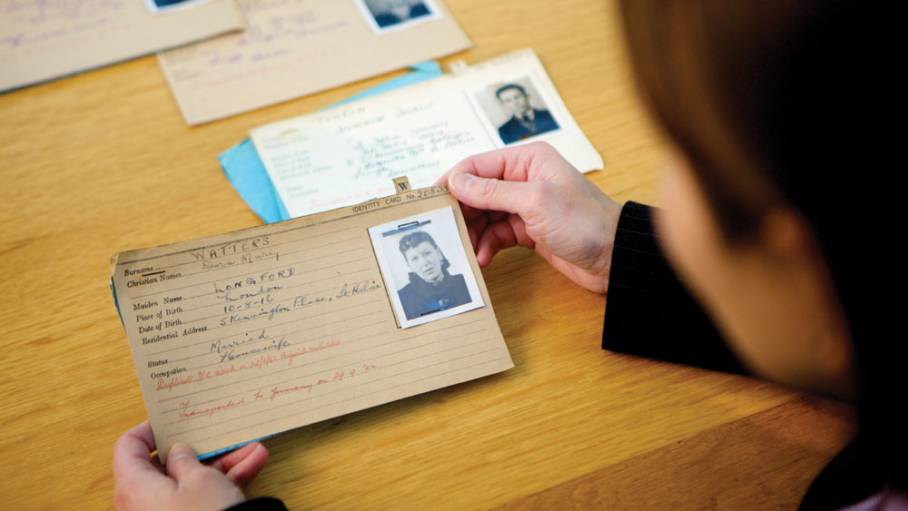
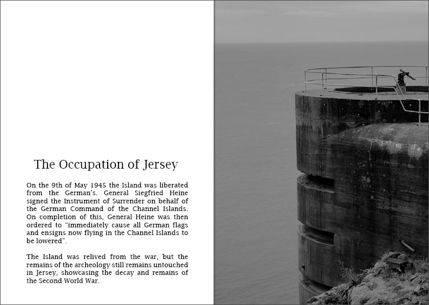
The German Register Cards are a set of unique cards which explore the background of people who lived through the occupation. German authorities made it compulsory for everyone on the Island to have one of these cards when they first occupied the island. The register process involved the collection of personal details (Name, Address, Date of Birth, Occupation) and a picture of each islander. The German authorities kept an official set of all the registration which can now all be viewed at Jersey’s Archive. The card’s were only given to those over the age of 14, anyone under this age would have their details placed on the back of their fathers Identity card. The cards were constantly updated, whenever a family moved address, had another child etc. Each card was accompanied by a blue form which had additional information, such as physical peculiarities. Islander’s were forced to carry their cards with them everywhere, so they could easily be identified by German soldiers. Many of the Jersey occupation registration cards have been listed by UNESCO, which means they are registered as they have important cultural or historical significance.These registration cards can now be found within Jersey’ Archive and the War Tunnels, which allows us to explore the past and personal lives of these people. The information will tell us how these people were treated as well as a reflection of their life during the occupation.
Exploring a Story:
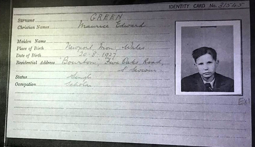
Maurice Edwarde Green – Identity Card. – Property Of Jersey Archives
Maurice Edwarde Green was only 12 years of age when the first German planes flew over the island, dropping the two cylinders, with messages declaring the start of the occupation. One of his memories was being commanded to place white flags on all buildings around the Island, in order to ensure that the German’s knew the Island was surrendering, so they would not be bombed. His mother placed many white towels onto bamboo sticks and hung them out of their window. On his German Registration Card it informed me that he was diabetic and has been on insulin from a very young age, during the occupation people where put on rations making it hard for Maurice to get his insulin. He had the Jersey States Department of Health importing and handing him over the hormones to keep his body working. Very soon the insulin supply ran short, making dieting a massive issue for diabetics living in the war. During the insulin shortage he was forced to live in a hospital, because he was diabetic, were Maurice kept leaving as he did not enjoy sitting/lying down all day, the nurses all thought he was mad. Eventually, the Red Cross parcels began to ship in he went and collected more insulin off the ‘Vega’, however he was told he was not allowed on the ship to take the medication. Due to him learning German from a young age he spoke to the solider who refused entry saying his friend who hasn’t seen for ages was onboard, thus allowing him to be granted access onto the rear of the ship. Maurice lived through the pain and horror’s of the war, but some people may consider his story even more horrific due to him not being able to get access to insulin, which is keeping his body a live. The short story gives us insight into what the war was like for medically ill citizens and informs us about the dangers and risks they took in order to survive.
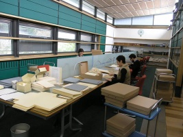
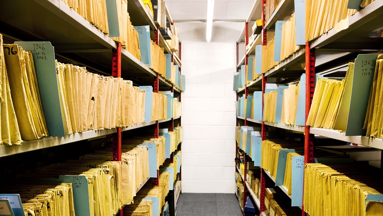
The Jersey Archive is the Island’s national repository holding archival material from public institutions as well as private businesses and individuals. The purpose of the archive, is to is to retain images, objects, documents and memories from time periods of history, allowing us to reflect on Jersey’s past through these form of documentations. The material within Jersey’s archive allows us to trace our family history, making the documents personal to the individuals, In addition, it also outlines the importance of islanders’ records in today’s society. The archive holds over 300,000 documents and images, which date back to the early 19th century, the archive was founded in 1981, and still runs today, storing new documents and allowing us to explore the past lives within our family and island.
Within the family history collection, the archive holds books, family trees, indexes of baptisms, marriages, burials and censuses. This outlines the extensive amount of files that the archive has on different family history. Having archival material available to the public, allows us to gain a better understanding of that set period of time and explore the past and our family history.In addition, another major aspect of Jersey’s archive is the extensive archival material they hold on the German Occupation, WW2. Within this aspect of the archive, they hold, letters from the Bailiff, German Register Cards, German ID cards and items from the Law Officer’s department.
The archive is different to other archives on the island, this is because it does not just hold photographs but other documents which present a person’s history and insight into the life they had.
Both of the artists explore portrait photography and capturing citizens within different cultures. Within Sunk’s work she looks at randomly capturing different teenagers within different parts of the UK, to represent diversity and individualist, where as Foot was a family photographer who only captured upper class citizens of Jersey, who could afford for Foot to capture images of their family. This outlines how the methodology and type of portrait photography differs from one another, as well as the types of models that both photographers used to be apart of their photographic series. Conceptually, the two images have been taken for different reasons, and the reasons where considered important at the time the photographs where taken. In Foot’s work he showed the concept of family honour and purity, where as Sunk showcased the ideology of diversity and celebrating individualism, which creates a contrast but helps to showcase the time frame, presenting the contextual factors of things important at specific times in history, and change between the work of Foot and Sunk.
Visually, the two artists share similar compositions in order to showcase the subjects, the people within the photograph (main focus point of the image). In the classical piece, the photograph is taken at a straight on angle, putting the focus on the three children. The layout and positing of the children is kept simplistic and naturalistic, which helps to emphasise the purity of the children. The foreground is kept simplistic, only having the children, and the background also follows the simplistic rule, by just having a field creating a sense of space. The quality of the camera helps to present a textural quality towards the piece. Similarly, in Sunk’s work the captured the main focus point at a straight on angle, as well as keeping the foreground and background simplistic and personal to the model, in order to clearly present their personality. The only difference made in the visual aspects of the two images is that, the positioning of the model in the contemporary piece is less naturalistic, which looses the sense of them presenting their real identity, as it seems that the girl could be putting on an act for the camera.
Technically speaking the two images are somewhat similar, one thing to consider when making this comparison is the quality of the camera during the classical piece and during the contemporary, again showcasing the sense of time. In the classical piece the shutter speed used is quick due to no intended blur. The ISO seems to be higher due to the noise presented in the photograph, however this could have been created by the poor camera quality. The exposure seems to be high, due to faces of the boys seem brighter as well as the background, creating a slight blur. This then showcases how a narrow depth of field is used as well as the aperture being low, making the three children the main focus point within Foot’s photography. The lighting is natural, from the sun making a more naturalistic image. Similarly, in Sunk’s work the shutter speed seems to be quick, due to no intended movement blur, as well as the ISO being low due to no noise produced by the natural/artificial lighting, sunlight alongside lamps located in the rooms, helping to light up the model. The whole frame seems to be in focus suggesting a wide depth of field as well as the aperture being high as the photograph is sharp. The white balance seems to be appropriate for the lighting used, a daylight setting, which allows a sense of warmth to be presented to the photograph. The similarity in the technical elements in the photographs, showcase the settings which make a high quality portrait photograph, no matter what the reasoning behind the imagery is.
To conclude, both images share the same simplistic and naturalistic methodology in order to showcase the subjects of the photographs, even though the conceptual and contextual factors significantly differ. Alongside the technical elements being similar which outlines what makes a successful portrait photograph and how even after a set period of time the same settings and methodology is still used, due to the success it brings to the final outcome. On the other hand, the two images differ significantly in conceptual and contextual factors, due to the time period , which was expected as both artists had different aims and ways around the broad topic of portrait photography.
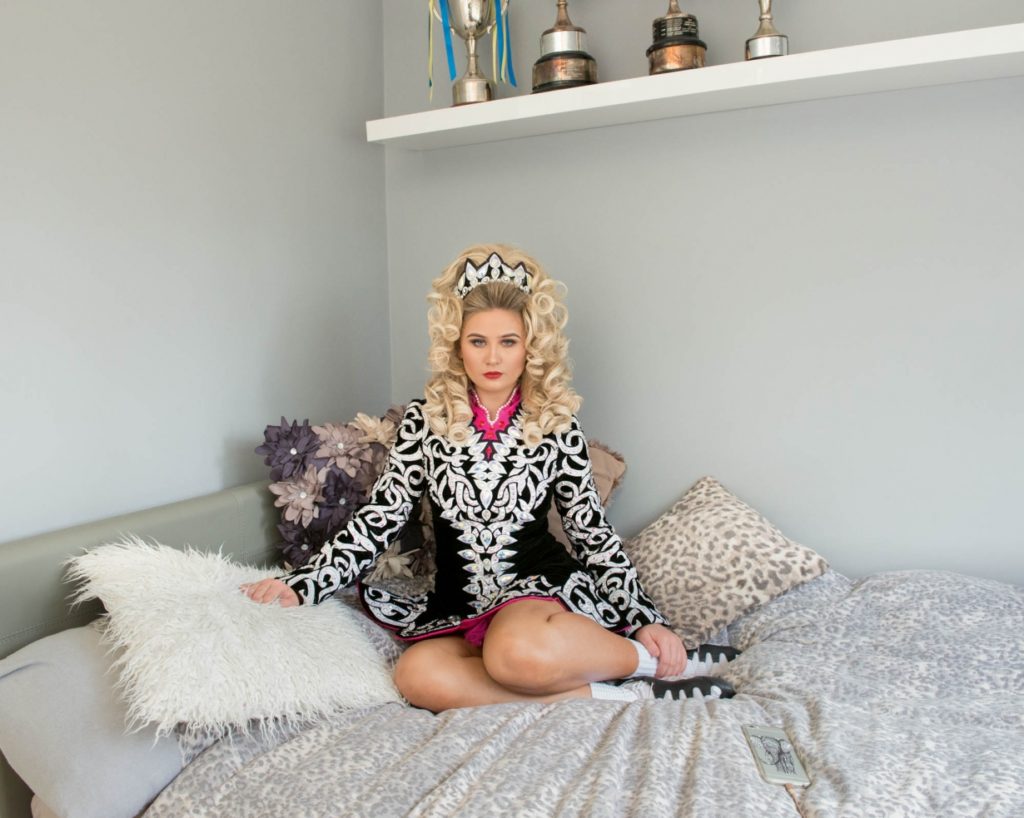
Michelle Sank originates from South Africa, but left in 1978 and permanently moved to the United Kingdom ins 1987. Her passion within photography lies within portraits, as she “documents the diversity of young people” (Michelle Sank: http://www.michellesank.com/portfolios/my-self). This illuminates her passion of exploring social groups and the idea that everyone is unique and different. Sank’s recent photographic series ‘My.Self’ captures teenager’s in their “bedroom so that the objects and decoration within became metaphors for their individuality and their cultural contexts.” (Michelle Sank: http://www.michellesank.com/portfolios/my-self) which allows us to compare the way in which other’s live their lives and understand social norms in different cultures. It also suggests that a person’s living space symbolises who they are, from posters to bed covers all help to define the type of person we are and the personality/stereotypes we may hold as an individual.
Mood Board Showcasing Sank’s Photographic Series ‘My.Self’
Above are a selection of Sank’s photographs from the ‘My.Self’ series. No two images are the same, which follows the ideology that no two people are the same, allowing the point of her photographic series, of youth identity and diversity, to clearly be presented. The methodology behind Sank’s work is simplistic, she wanted to cover different cultures and social groups, so she went up to people on the street and asked to photograph them in their bedroom (natural environment) as well as explaining the reasoning behind her photographic series. This series lead her to travelling around the UK in order to capture all cultures, as well as capturing youths from Jersey Channel Islands, allowing links with my classical artist to be made. Her series was then transformed into a photo-book where she then added direct quotes from the subjects of the image, as they explain their views on where they live.
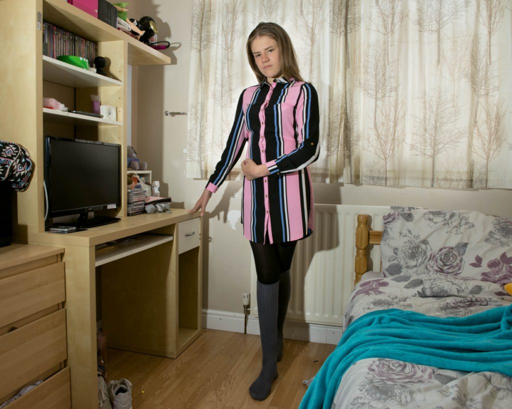
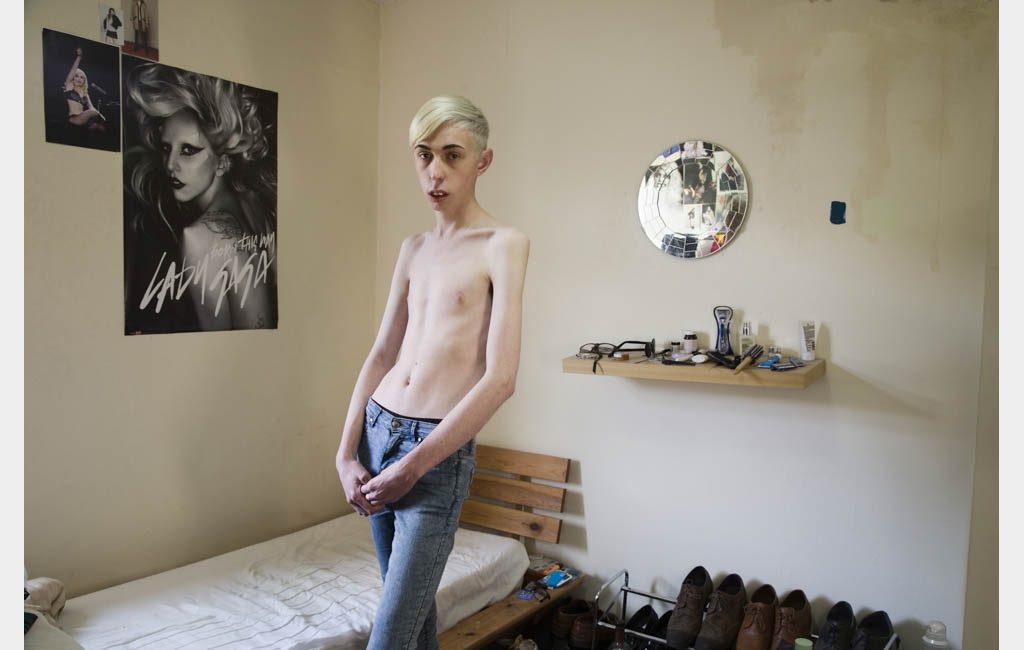
The above image showcases one of personal favourites from Sank’s photographic series ‘My.Self’. I was initially drawn to this image due to the different items within the young girls room, allowing me to gain an understanding of her life. Visually, we are presented with a girl who seems to be posing on her bed. Her make up and hair style makes her seem glamorous and seem well made up. Her outfit also matches her face and hair and can be considered elaborate, which represents her socio-economic status as being high. The positioning of the subject seems to be well thought out as she is propped up with straight posture, almost as if she was a professional model. Her bedcovers are subtle, which contradicts the extravagant pillows which surround the girl. The background is simplistic, with grey walls (which is modern day can be considered fashionable and popular amongst teenage girls). The image itself is taken at a straight on angle, allowing the teenage girl to be the main focus point. Braking down the composition has allowed me to understand the girl’s environment, which Sank considered to be a metaphor for the girls individuality and personality. This leads onto the conceptual and contextual factors of Sank’s work, as mentioned before she wanted to capture cross-cultural differences in teenagers and their natural environment and how it represents them as an individual. As a whole it allows us to celebrate the ameliorative ideology that everyone is unique and different. Technically, the camera settings used to capture the image above, and other images within the series, seems to be kept simplistic and minimalistic. The shutter speed seems to be quick, due to no intended movement blur, as well as the ISO being low due to no noise produced by the natural/artificial lighting, sunlight alongside lamps located in the rooms, helping to light up the model. The whole frame seems to be in focus suggesting a wide depth of field as well as the aperture being high as the photograph is sharp. The white balance seems to be appropriate for the lighting used, a daylight setting, which allows a sense of warmth to be presented to the photograph. A lot of formal elements are being presented such as form, shape and space, which are mainly presented through the girl and the background of the frame.
Francis Foot was born in 1885, Jersey, were his father’s occupation was being a glass and china dealer, at a time were St. Helier was affluent. Francis Foot’s passion for photography started when phonograms and gramophone records were realised and he realised he could make a career out of it, thus leading his family open up another store, where he worked as a photographer and they sold phonograms and gramophone records.
Mood Board capturing the work of Francis Foot
The time at which Francis worked, helps to showcase the cultural and aspects of society, which illuminates the classical work during the early 20th century. His interest in photography lies with portraiture work, were he captured citizens of Jersey. He looked at producing family portraiture, in the subjects natural environment, usually somethings which has personal value to the subjects. Occasionally Foot would capture his own family, and sometimes appear in the images. The background often had different objects located, which signified the wealth and personal lives of the subjects. Foot produced imagery which showcased the formality of the families, outlining their importance and wealth, and combined it with the natural environment of the Island, creating an interesting series of images.
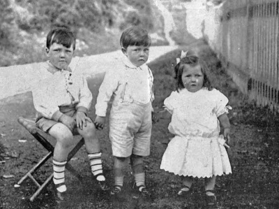
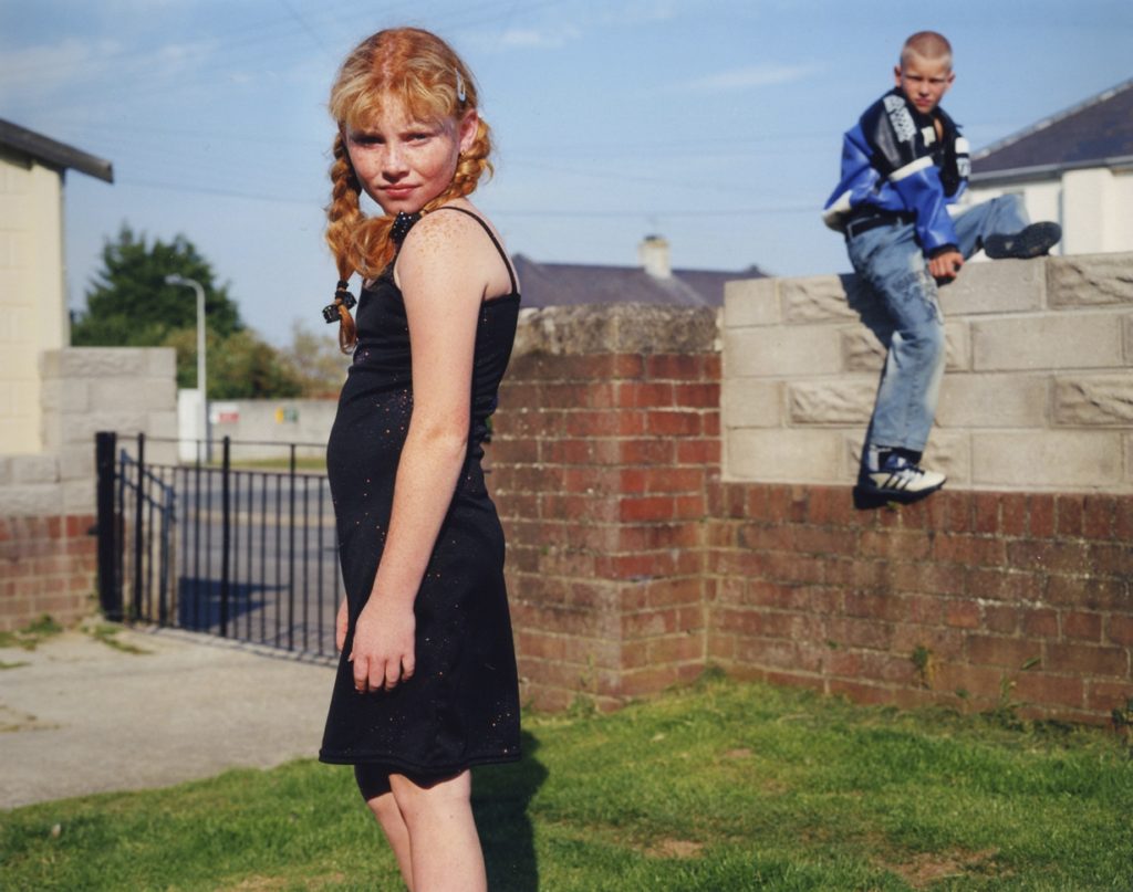
Francis Foot – George, Stanley and Dora in 1919
I have decided to analyse the image above, which is a portrait of the three children of Foot. Conceptually, he wanted to showcase the wealth of his children, and the good life that they have due to the financial situation of his parents, showcasing the contextual factor of how the class system affected Jersey Channel Island. The portrait almost brags about the ideology that Foot is proud to have legacy to his family, and document’s the beginning of these children’s lives. Visually, we are presented with his three children in the foreground, centre of the photograph, who are all dressed in white clothes. The colouring of the clothes could represent the purity of the family, again presenting the conceptual factor of wealth and upper class. The positioning of the children do not seem to be pre planned as they are not all facing the camera and are at different angles, this could be because children are difficult subjects to position and then capture, or it can represent the naturalistic stylisation Foot consistently showcased in his work. The background of the photograph seems to be dirty and displeasing, which creates a contrast between the children and the environment, illuminating the importance of the children in their life. Technically, the camera quality would not be as good as a modern camera, due to the development of technology, making it harder to analyse technical elements, but the quality of the imagery help to showcase the contextual factor within the image. The shutter speed used is likely to be quick due to no intended blur. On the other hand the ISO seems to be higher due to the noise presented in the photograph, however this could have been created by the poor camera quality. The exposure seems to be high, due to faces of the boys seem brighter as well as the background, creating a slight blur. This then showcases how a narrow depth of field is used, making the three children the main focus point within Foot’s photography. The main formal elements presented in Foot’s work is space and texture, which is presented through the environment and the subject’s. As mentioned previously the photographs are taken in the model’s natural environment, thus this is taken outdoors, which informs us that natural sunlight was used in order to capture the above image. Due to Foot’s work being captured in the early 20th century, means that all images would be in black and white. Needless to say, the black and white and the sun create a warm atmosphere which juxtaposes the facial expressions of the children.
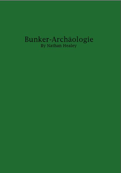
To evaluate my zine design, I believe I have produced a strong outcome which showcases my work following my intended narrative. To begin with my front cover takes inspiration from the bunker green books made by the German’s during the second world war, which showcases my ability to take inspiration and implement said inspiration into my work for an intended affect. The sequencing of my imagery within my photographic zine works well, as it clearly showcases my narrative, the decay of Jersey’s bunker’s and how nature is taking back its land, and each image compliments one another with not having any miss fits within the design. My layouts are well thought out, as I have considered contrast, shape and how the images compliment each other, and work at different sizes. This process was not easy and my experimentation can be seen on previous blog posts, were I explored the layouts of different images. In my final design I decided to include text, which I believed to help convey my narrative, supporting the images in the story. I experimented with different fonts till I was happy with one which fit well with my images and presents an older time frame within my images. To conclude, I am very happy with my final design, as it showcases my strongest outcomes from my work so far, and shows my understanding of what makes a successful zine, which shows how I have acted upon my research.
For my first design I followed the sequence which I outlined on my previous blog post. Having the start and finish have imagery of landscapes of and around the bunkers, and the middle pages containing images of the bunkers, showcasing their decay. To create this layout I used InDesign, I set up my page to be portrait and the size of A5 paper and in the style of a photo book. In this attempt I looked at different page spreads, what works and what does not look as effective. Within this initial design and experimentation I managed to produce spreads which work well in showcasing my narrative. However, some pages need to be reconsidered and the sequencing of my images could also be reconsidered in order to produce a stronger outcome.
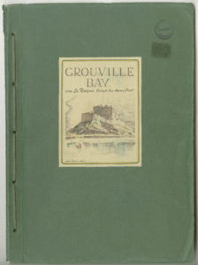
For my front cover, I took inspiration from the archival green books found at Society Jersiase. Below is an example of the green book cover.
Societe Jersiaise – Photo Archive & Lord Coutanche Library.
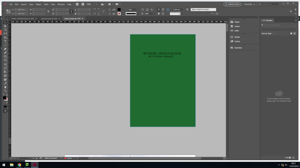
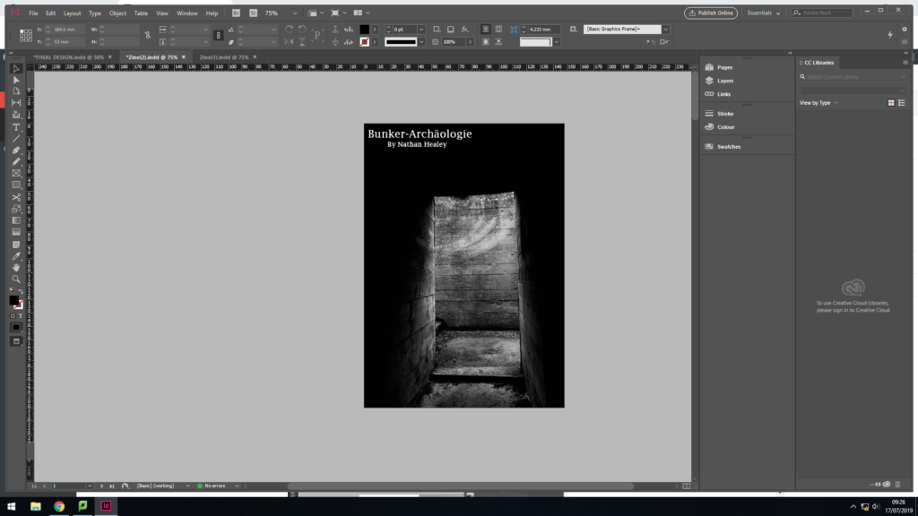
The ideology behind replicating this, was that the green books were created by the German’s during the war, showcasing the defence systems in the area on the front cover. Due to them being archival material it begins to suggest that the defence systems have changed due to the abandonment, thus it begins to present my narrative of the decay of Jersey Bunkers. For my cover I used a dark green to cover the back and black text. Although the two covers are very different, I wanted it to be a ‘modern’ version of the green book, thus this simplistic design clearly showcases this. The title of the Zine is ‘Bunker-Archäologie’, it translate to Bunker archeology in English. Deciding to have my title in German, reminds us of how the bunker’s were built for German soldiers to prevent people getting into the Island, thus it showcases how the Germans have left their mark on the island and allowing it to decay. The font used for the title is bold and has a rigid structure, which represents what the bunkers once were.
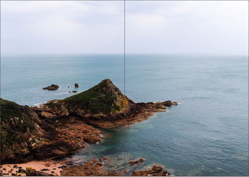
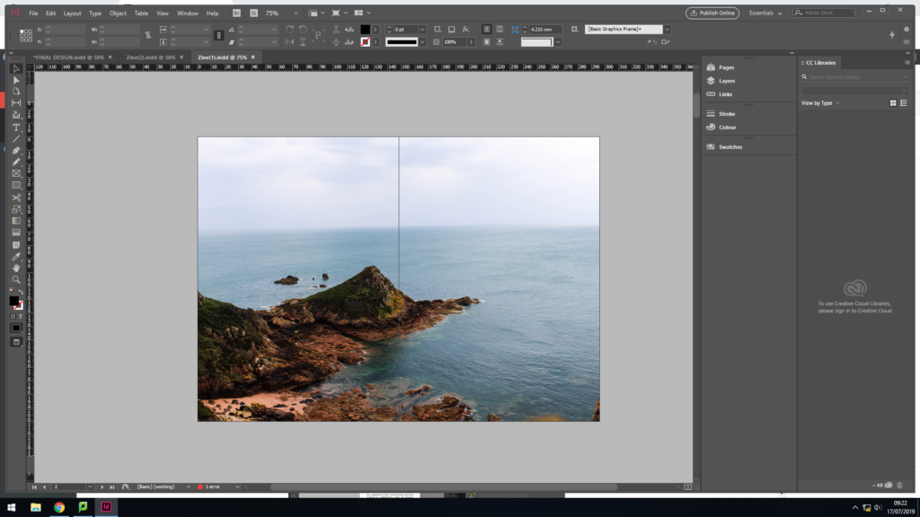
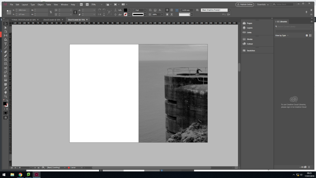
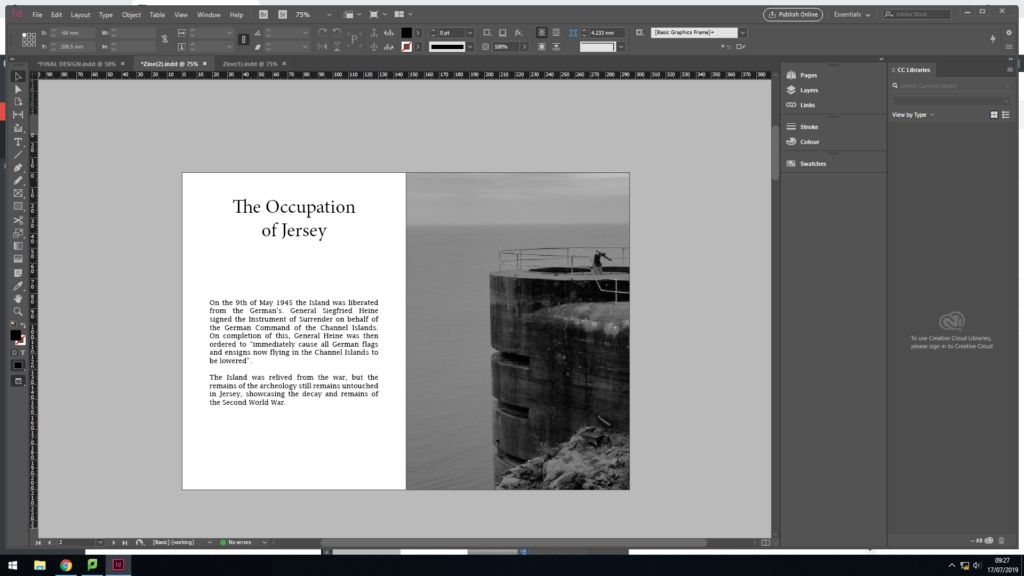
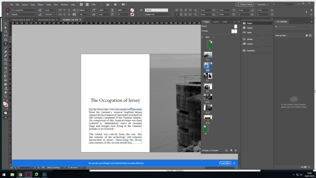
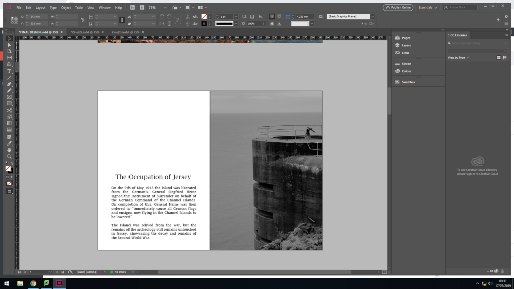
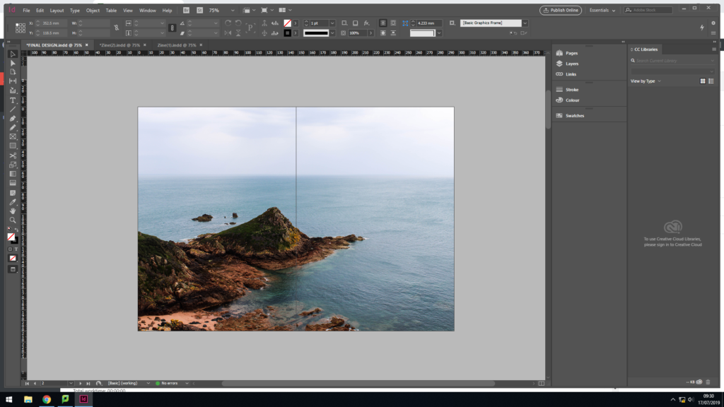
For my second page of the Zine, I used a full page spread of the landscape photograph, looking out from the Noirmont point, a location of one of Jersey’s bunkers. I kept this image in colour to showcase that the image is recent and reinforces the idea of a modern green book. In addition, it showcases the beauty of Jersey, and although the bunker’s are decaying on the top, it is not forcing the rest of the island to decay with them. The full page spread clearly showcases the sea line, and beauty of the nature, which creates a sense of space and a peaceful mood, which holds a ameliorative tone towards the photograph.
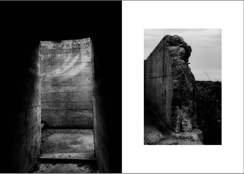
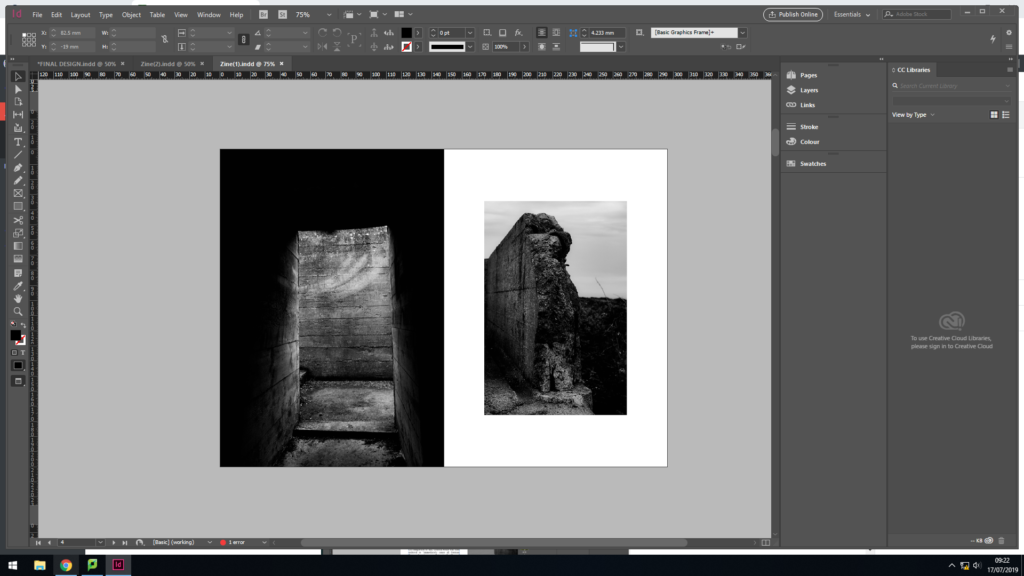
For my next page, I wanted to start showcasing the decay of the bunker’s, this layout clearly emphasises this. The juxtaposing colours, showcases the abandonment of the bunkers, which is reinforced by the formal elements of space and texture. The image on the left is a half page spread, filling the screen creating the sense of space. The image on the right is much smaller and located in the centre of the page, producing juxtaposing colours which helps the photographs to compliment one another. I believe that this layout is my strongest page spread, and is unlikely to be changed.
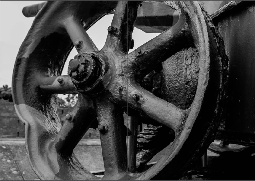
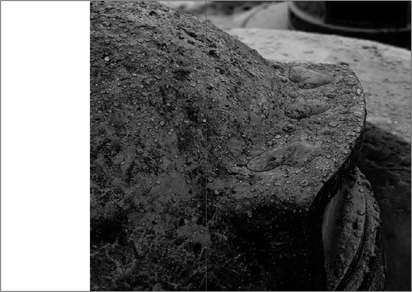
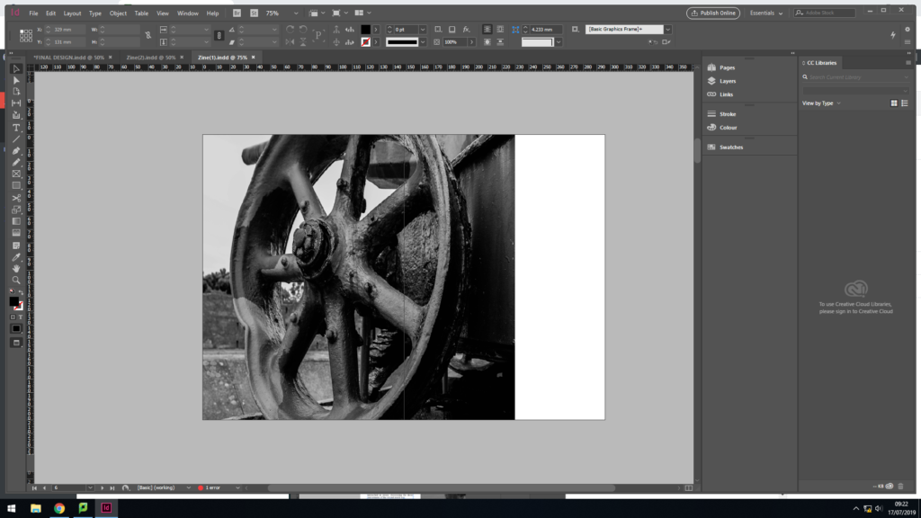
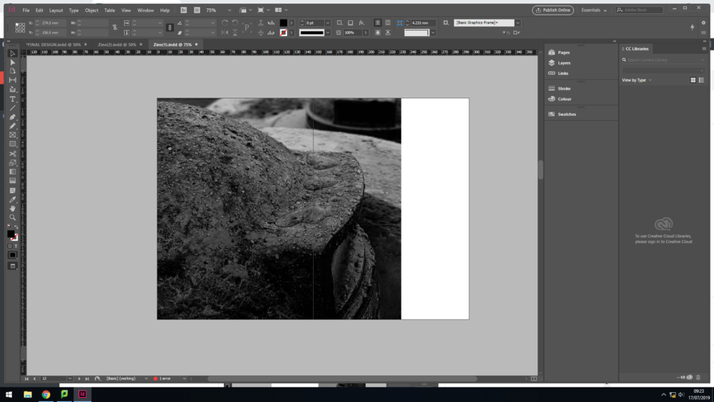
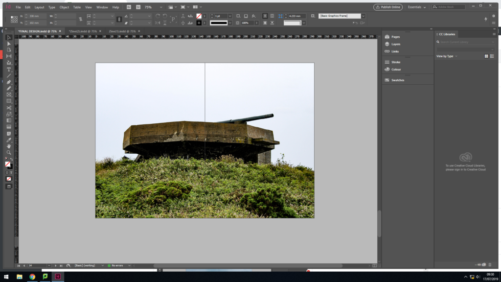
In my next page spread, I used a 3/4 page spread to showcase this macro image of the bottom of the gun. This layout allows the formal elements of texture and shape to clearly be showcased, reinforcing the narrative of the decay of the bunker. This photograph is strong enough to be alone and is busy, allowing viewers to be drawn into the image. In my opinion this page works well within my design.
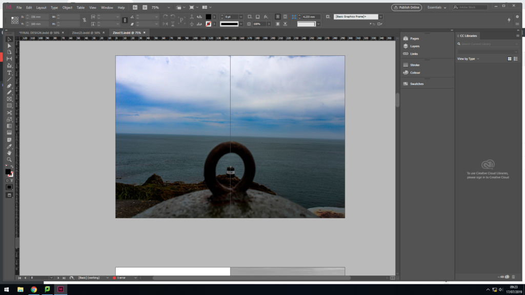
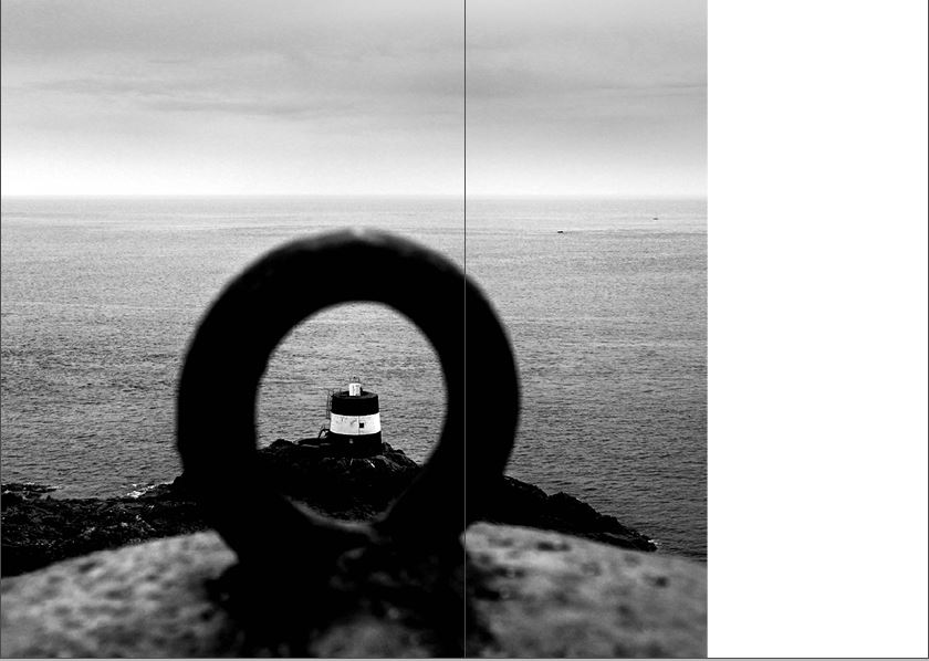
For my middle page spread I decided to repeat the idea of have a landscape image looking out in colour. I used a full page spread, for the same reasoning as the first page. This artistic design worked well, as it reinforces the idea that the bunker’s are decaying but the island will not decay with the bunker. The image works well as it uses the technique of framing to enclose a bunker type building out at sea, leaving the rest of landscape to be free. Although I like the way in which this page turned out, I do not believe that having a colour image in the centre of the zine is the best idea, as it almost distracts viewers from the actual narrative, decay of the bunkers.
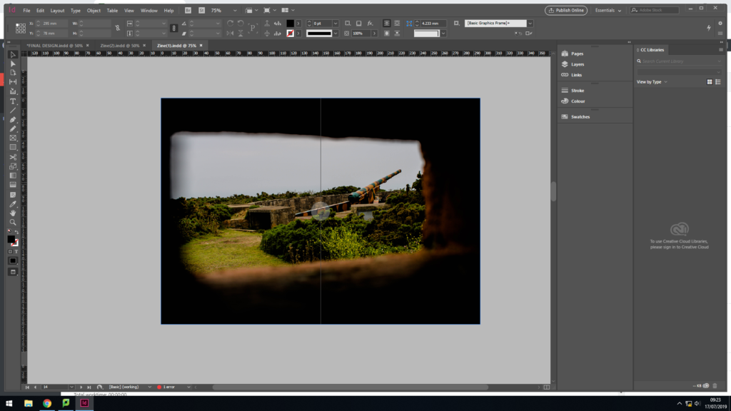
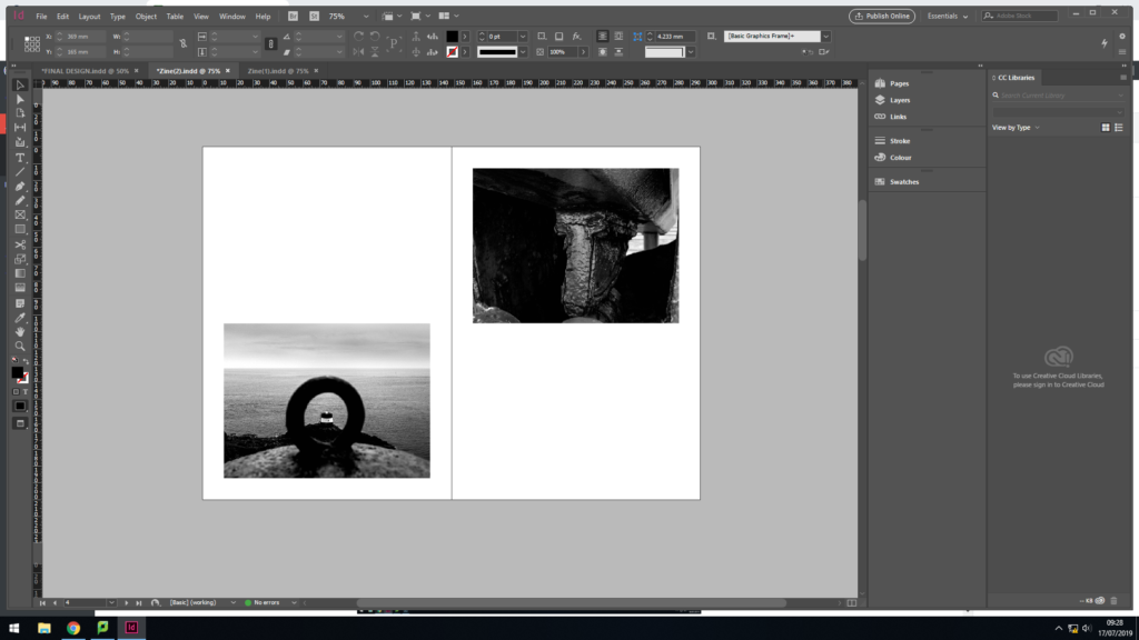
For my next page spread I decided to go with a half page spread for the image, and leave the other half blank. Creating this blank page takes a break from the action, allowing the information and concept of the zine to settle into viewers heads, it can also be used represent the idea that one day the bunkers will be gone, due to them decaying so rapidly. The image is placed on the right side of the page, as the structure is cut off on the right, so the edge of the zine acts as the end of the bunker.
In my next page, I decided to use the 3/4 page spread again, due to me liking the way in which the other 3/4 page spread look. The image used suits being a larger image, due to the texture being presented through the raindrops and decaying of the bunker.
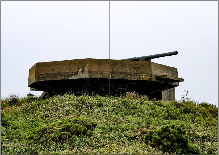
For my final page spread I wanted to use another landscape image, to create a circular plot and allowing it to follow my intended sequence stated in a previous blog post. I used a full page spread, and a colour image. This time the landscape photograph is looking back at the bunker, which nicely brings the zine to an end, as we can see how the bunkers are decaying the but what surrounds is not decaying. Although this image works well on a full page spread, I do not believe that it is the strongest finish to my zine, thus I will look at changing this.
The back page of my zine is simply the same colour green as the front cover, which refers to the archival green books which showcase the layout of the bunkers, made by the German’s.
Design 2:
In my second design I looked at alternative ways in displaying my images, by changing the spreads and adding in text in my zine. I explored a different front cover option as well as different layout options. I intend to use my best page spreads, from this design and my previous design, to create my final sequence and make my final zine design. Doing this further exploration of page layouts has allowed me to develop my skills within InDesign and has allowed me to show development within my work.
In this front cover design, I decided to use my strongest image produced in my photoshoot, It clearly showcases the decay of the bunkers, thus bringing my narrative from the get go. In addition, I used the same title and font as I did in my first design, but set the colouring to white. The placement of the text is in the top left corner, which is a little hidden, but is placed with in a completely black are making it work successfully. Although I like the way in which this front cover looks, I think this image would work better in the spread created in the previous design. Needless to say, it was well worth doing this experimentation as it confirms that I like the way in which my original front cover looks, and the conceptual and contextual factors it holds.
In my next layout I wanted to experiment with adding text into my work, in order to clearly outline the historical factors of the Second World War in Jersey. With this I simply added a title and text which outlines the liberation of the island and how the bunkers have been left to decay. The short text allows my narrative to be presented, and works well with the one page image spread next to it. I really like the way in which this spread looks, thus I am planning on implementing it in my final design. However, I will develop the font and layout of the text, as I do not believe it is having maximum impact within the zine.
My next layout, I looked at placing two landscape images on a page. I selected two images which juxtapose the sense of space. One image is placed at the top and the other at the bottom. For the narrative I am going for I do not believe that this spread is effective, or fits in with the other layouts within my zine. Therefore, I will not be further developing this layout.
I then decided to look at another alternative for a middle page spread as I was not happy with the one created in my initial design. I decided to use this photograph, which was originally a 3/4 page spread, and made the black and white photograph a full page spread in the middle. I much prefer this layout, as it does not disturb viewers from the narrative with a colour photograph in the middle, thus fitting my sequence more appropriately.
Changes:
After developing my two design idea, I still had pages which I liked but still needed developing in order to have maximum impact. Below are the three main changes I made. This shows my further development and me critiquing my work from an artistic perspective.
Font:
As mentioned earlier I was not happy with the font I used to create the page spread which included information about the decay of Jersey’s bunker’s. I decided to change the font to one which is similar to my title, keeping my work consistent. I also decreased the size so my title fitted on one line as well as getting rid of the hyphens within the paragraph. In addition, I moved all my text down to the bottom of the page, which is a typical design layout for a zine when the text does not fill the whole page. I am much happier with this change in design, as it allows the zine to flow more fluidly now and presents my narrative well.
First and Last Page Design:
My next major change was the two images I would use as my first and last page. I still stuck with the idea of looking out on the first page, thus keeping the same image as it had the intended meaning. For the last page I used a different image which looked up at a bunker with nature surrounding it, I believe that this image presents the concept of the bunker decay but nature is not much better than the original image used. Moreover, it fits my intended sequence much better.
Colour Changing:
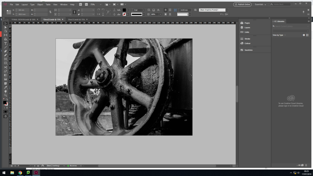
My last major change was the colouring and positing of the image above. Originally this image was in colour and a full page spread in the centre of my zine. As mentioned, I did not think this was an affective look as disturbed the rhythm within my zine so I created a new centre page. I still wanted to include this image somewhere in my final produce. I decided to turn it black and white and have it as a 3/4 spread, taking the position of where the wheel image was. I believe that this image is better suited in black and white and in this layout, as it showcases the decay more appropriately.
Action Plan:
As an action plan I will now combine my favourite spreads onto one document, creating my final design for my zine. I will then place them in the appropriate sequence and evaluate my final outcome on another blog post, which shows my final design page by page.
Narrative: A narrative is a story which is being told through writing, speech or photographs. Many times a narrative can be presented through all three forms. Usually the narrative is clear and easy to follow through out. Putting this in terms with a zine, the narrative of my zine should clearly showcase the storyline I am telling from the first page, and should consistently tell this story till the last page.
Describing my Zine’s Narrative:
3 words:
Jersey’s Bunker Decay
A sentence:
My rational for my zine is to tell the story of how the Jersey’s bunkers have been untouched since the war and has decayed over time, allowing us to constantly be reminded about this key period in Jersey’s history.
A paragraph:
My zine aims to showcase the decay of the war and the imprint it has left on the island. I intend to use images which focus on the formal elements of texture, shape and line in order to clearly present the decay and the abandonment of the bunkers, which will present different viewpoints towards the decay. The story being told will not just be focused on bunker’s, but also the scenery and landscapes around the bunkers in order to showcase how that area of land has been affected, as well as bringing in contextual factors of the war and Jersey. In addition, the story will follow a linear narrative (chronological order) and will have a clear start, middle and end. Following this narrative structure should clearly show the decay of Jersey’s bunkers and how the island was heavily impacted during the 5 years of the German Occupation.
Sequencing: Sequencing is the order in which images are placed in a zine or photobook in order to present the intended narrative.
At the beginning the zine will showcase the effect of the war on the landscape with an introduction paragraph which will contain information of the war. The middle will have different styles of images (macro, different angles and focus points) showcasing the decay of the bunkers, and it will end with the way it begins, almost like a circular plot, having a landscape image looking out at the scenery. This is a brief overview of the order in which I would like my images in order to present the narrative of the decay of the bunkers.
Action Plan:
I will now produce a new blog post which will show my first attempt at placing my chosen images into a sequence which should clearly portray my narrative. I will discuss my thought process as to why I selected the chosen order and creative thoughts towards laying out the image. Furthermore, I will use this first layout as an experimentation, allowing me to evaluate my work as to what went well and what should be changed, which should then lead me on to creating a second draft.
A zine is a independently or self-published booklet, often created by physically cutting and gluing text and images together onto a master flat for photocopying, but it is also common to produce the master by typing and formatting pages on a computer. The publication is usually folded and stapled.
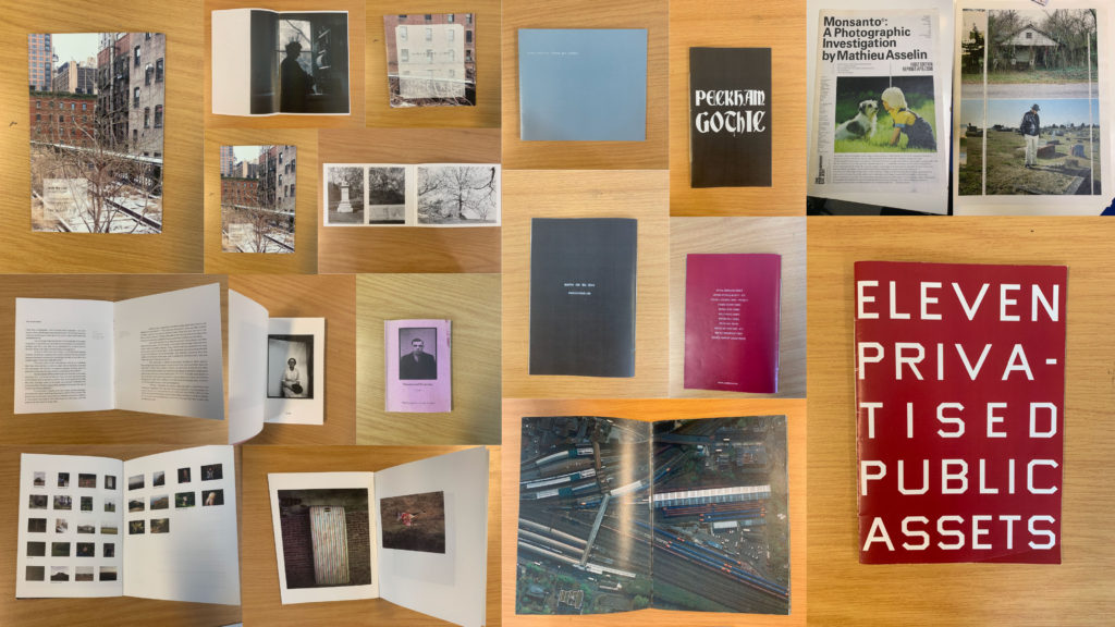
Mood Board showcasing different styles of Zines
Analysis of a Zine:
I will be analysing ‘Lingering Ghosts – The waiting for refuge’ by Sam Ivin in order to gain a better understanding of narrative and sequencing, and what makes a successful zine. I watched a video interview with Ivin where he explained his rational behind the zine and why the topic was important to him. His passion towards the subject matter is clearly shown through his work which showcases the importance of really understand and enjoying the subject matter to clearly portray a strong narrative within my own zine.
Link to Ivin’s website which provided me with further research and understanding of his project: http://www.samivin.com/lingeringghosts
Interview with Sam Ivin
Format, size and orientation
This zine is the size of A5 paper, which is used to create a literal representation of the actual size of someone’s passport, linking to the key theme of the zine. In addition to this, the zine is in a portrait orientation which further expands our understanding of the zine prier to reading it. It is formatted in a rectangular shape which is the same as a passport, which presents Ivin’s artistic creativity to present the theme of asylum seekers and immigration.
Design and layout
As previously mentioned the design of the zine is in the style of the passport which begins to build a relationship with the imagery and the theme of immigration and asylum seekers.
Rhythm and sequencing
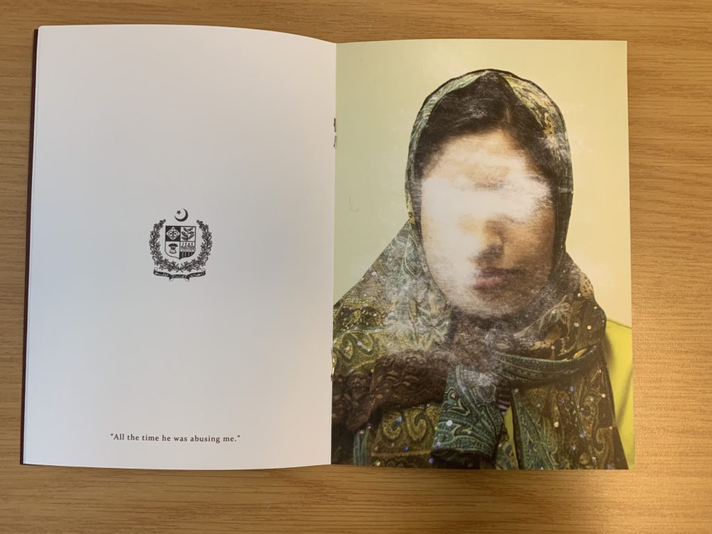
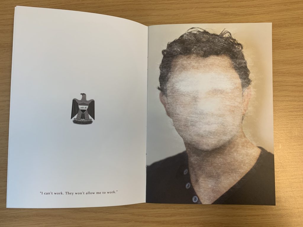
The sequence of the images is very simplistic but effective. On the left hand page the nationality of the person is presented through the country’s emblem, below this is a quote taken from what that person has said about being denied from seeking asylum. For example it says “All this time he was abusing me”. On the next page is a picture of that person with their face scratched out to show how they have been ghosted from England, and how the artist is expressing how others find asylum seekers irrelevant.
Narrative and visual concept
The story being told within the zine is people who are trying to seek asylum but are being declined. It’s trying to capture the uncertainty of their future and how their life has come to a stop and how they are being forgotten by others. This is shown through the portrait of the asylum seekers (in color), and the face has been scratched out, which symbolically represents this narrative. I would say the narrative is clear within the zine due to the introduction at the start of the zine. Needless to say, the imagery really encapsulates this idea.
Title and cover
The cover is very simplistic but has symbolic representations to present the theme of the zine. The background is a dark royal red/burgundy color which is the same color as a British passport which showcases the theme of travel. The simplicity of the design allows a bigger impact for the content within. The title ‘Lingering Ghosts’ is metaphorical to showcase how asylum seekers are neglected, frowned upon and find it hard to fit into society and are “unsure of what their future will hold”. Below the title is Britain’s emblem which is also shown on a passport, which presents the views of the artist that we should allow these asylum seekers into the country as they want safety.
Images and text
Image and text plays a massive role within this zine, due to the topic it is presenting. When we look at a two page spread, on the left we are presented with a country’s emblem with a quote taken direct from the asylum seekers words. On the right hand side is the picture of the asylum seekers them self which has been scratched out and distorted, which allows the image and text to work in cohesion.
Use of other design elements or inserts: archives, montages, graphics, typography
The images have been distorted by being scratched which showcases physical interactions with the photograph, showcasing a surrealist approach to photomontage. The text used is a simplistic bold lettering which is easy to read and understand from a viewers perspective.
Further Analysis:
To analyse this double page spread of Sam Ivin zine, I will be looking at different elements which make it successful. Conceptually, Ivin is trying to showcase the fact that the man has been declined asylum and is almost being forgotten by Britain, leaving him unsafe and uncertain about his future. This is clearly portrayed through the symbolism of the face of the man being scratched out, which showcases Britain trying to take away their identity. Contextually, these asylum seekers are leaving their country due to them being in danger as well as their family, and Britain are declining their entry due to the customs and immigration officers not believing what they are saying is true. This issue is very current today and this zine is aimed to inform those about this issue that innocent people are facing. Visually, the zine presents the formal elements of texture, shape and line through the scratching out of the portrait. The composition of the portrait is very simplistic, the portrait is located in the centre of the page and fills up most of the page, leaving the background plain allowing our focus to stay on the portrait. On the other side, the composition is also simplistic them emblem from where the man comes from is located in the centre of the page at a medium size with a quote taken directly from the man’s words located at the bottom of this page. Technically, the image uses a lot of negative space which represents the idea that they are left with nothing and being declined asylum leaves them feeling empty and not apart of society, due to where they come from. The portrait of the person is presented in colour which showcases the idea that they do still have an identity. In addition, the lighting used to capture the portrait is artificial warm lighting due to the image having a studio feel to it. To capture the images the aperture was low, and a large depth of field was used. The shutter speed was quick and the ISO is also low as there is no intended blur or noise presented within the image. The white balance used creates a warm atmosphere which creates a sense of coziness and safety which juxtaposes the theme of uncertainty which allows viewers to really understand and think about the issue before them. The zine uses a combination of image and text which makes it successful and shows variety also helping it to appeal to the viewers. In addition to this, the face (eyes in particular) have been scratched off showing photo manipulation in order to present the narrative of these people’s identity being stripped and taken away leaving them in uncertainty.
Working with archival work, I decided to creatively explore and experiment with the imagery to create photomontages. Due to previously looking at photomontages, I knew that I could successfully produce imagery which holds many conceptual factors as we as historical. My previous work can be found here :
With my exploration with war archive I decided to take more of a surrelasism approach, presenting a new way to look at the material. I experimented with handcrafts (cutting, sticking etc) images and within photoshop in order to create outcomes which I believe present a new way with looking at the war.
Photoshop Outcomes:
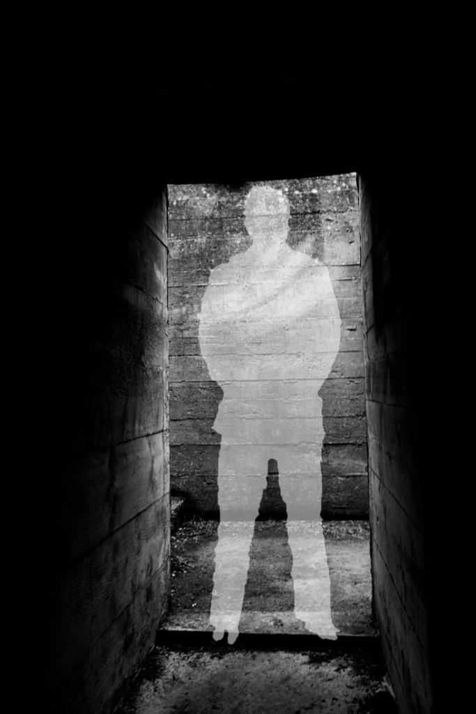
For my first experimentation I looked at the idea of silhouettes and the meaning behind them. This was inspired from the black metal cut out (outline) of soldiers which were spread across the UK, in order to remember those we lost during the war. This lead to the conceptual reasoning of the image above, I created a silhouette in the centre of the picture of the abandoned bunker to get viewers to not only remember the soldiers we lost, but also remind them that the bunkers had a massive impact on these people’s lives. In order to create this I found a cut out of a solider on google, and placed it onto of my image of the bunker. Then using the quick selection tool I outlines the solider, then on the layer with my image on I right clicked the selection and pressed layer via cut. I then deleted the layer with the solider on, and turned down the opacity of the outline I just cut out, creating a silhouette. This simplistic design works well as it clearly showcases the conceptual meaning, with still presenting history of the bunkers. It clearly takes the format of a surrealism photomontage and is an interesting piece for viewers to look at. I think that this outcome has turned out well, but is not the strongest one I produced.
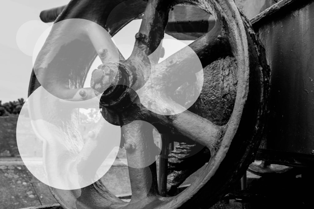
For my second experimentation I wanted to look at exploring with the formal element shape, considering my photograph was a wheel of a gun, found on a bunker site, I decided to use circles in order to manipulate this image. This contemporary final design conceptually presents the idea that although the bunkers are abandoned, and been left alone to rot, they will continue to stand there, reminding us of the horrors of the war. I believe this is mainly shown through the faded circles. Again this image presents the historical factors of the uses of the bunkers in Jersey during this time in history. To achieve this effect I used the circular marquee tool and created circles, adjusting the size by using the transformation tool (ctrl + t), and cut them out of the original layer. Then I turned down the opacity, randomly on each new layer creating the decay effect, reinforcing the conceptual factors of the image. I really like the way in which the outcome turned out, as it really emphasise the formal element of shape, creating and unique and interesting design for viewers to look at. The contemporary design, makes the concept more disguised, but needless to say it is still effective. To critique the design I would make the circles more central, to make them more ascetically pleasing.
Artist Research:
Sky-Alling Phillips Photography
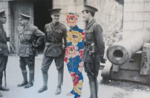
Sky-Alling Phillips created a series of photographs called ‘Paper’, in this she cut out parts of a war archival image and placed floral prints behind it, creating a unique and juxtaposing design. Although this series can not be found online, I captured a photograph of her work, when looking through different Zines. Contextually, this photograph is showcasing solider at a bunker, who seem to be off duty and socialising, making it seem like war was not all that bad as it was said to be. This further reinforced by the background, the structure of the bunker looks strong standing which creates a sense of comfort. Conceptually, Phillips is trying to showcase that those who died at war are still with us. The person in the centre of the frame, made out of the floral design, represents a solider who has been killed but is still with his ‘friends’, creating the sense that we never forget those we loved. To technically analyse this work I will explore the camera settings of the archival image. The camera settings would have been very basic, due to camera’s not being as advanced during the war as they are know. The image would have been taken outside, using natural lighting of the sun to illuminate the subjects, this creates a sense of warmth which is then juxtaposed by turning the image into black and white. The quality of the photograph is poor, which could suggest it has been enlarged to big, or that the shutter speed was slightly slow, creating movement, alongside the ISO being high due to a sense of noise being shown within the image. In addition, the soldiers seem to be in focus with the background being slightly out of focus, suggesting a narrow depth of field being used to capture the image. Visually, the photograph has many elements which makes it pleasing to look at. It uses the formal elements of space, show through the floral patter in the space of a solider as well as a sense of space between the for and background; form, shown through the structure of the bunker and the pattern of the flowers. Having the colourful flowers in the middle of a black and white photo, makes the viewers eye initially draw the there, main focus point, and juxtaposes the black and white creating intrigue and allows the conceptual factors to be presented. In conclusion, I like the simplistic design of Phillips work, as it holds a lot of meanings and is shown in a creative and successful way. The floral pattern in the shape of a solider is a cleaver design creates a sense of separation, even though the cut out is close in proxemics to the other soldiers, making it interesting to view.
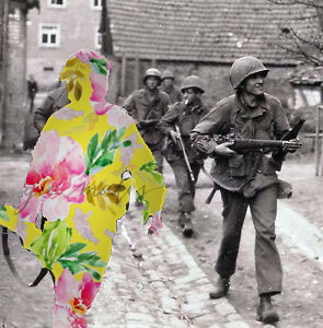
My final experimentation on photoshop was inspired by Sky-Alling Phillips. I found an online image of solider’s walking with weapons, as if they are ready to go into battle. I then decided to use the solider who was closest to the front of the frame, as the effect will stand out more, to cut out using the quick selection tool. I then found a floral pattern online and created a new layer on photoshop, placing it behind the original image, creating this effect. To make it stand out more I decided to add a drop shadow, which outlines the solider and makes the floral patter darker, creating a more subtle blend between the archival image and floral design. I am very happy with the way it turned out as it is very similar to Phillip’s photography, and represents the same conceptual factors. I believe this is my most successful outcome, as it has the strongest conceptual factor, and the design works and is ascetically pleasing to look at.
Craft Experimentations:
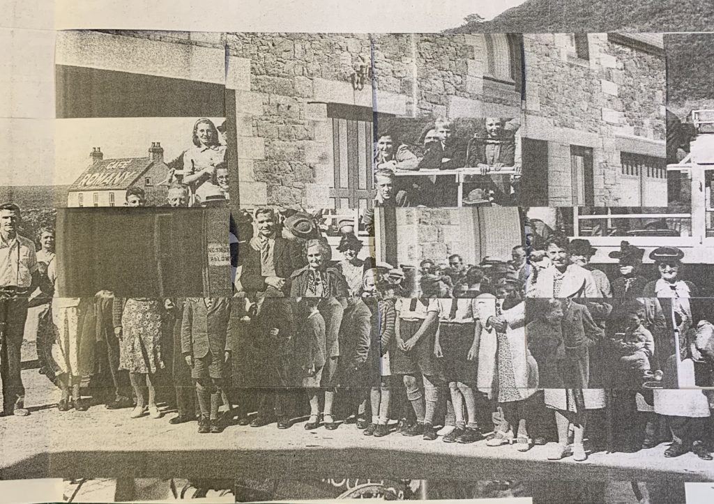
For my first experimentation I weaved two war archival images, one image of a landscape and an image of people, together in order to create a unique and abstract design. Due to the nature of the craft, viewers eyes are constantly looking round the image to try and make sense of what is happening, presenting the conceptual factor of the war was not as simple as it is told to be and there are many layers to what actual happened. Intertwining the two images clearly represents this as it is creating those layers. This outcome experiments with the formal elements of shape and space, which work together to create a eye catching image. Overall, I am pleased with the way in which this outcome has turned out, as the confusing design allows viewers to explore the concept of the overall image.
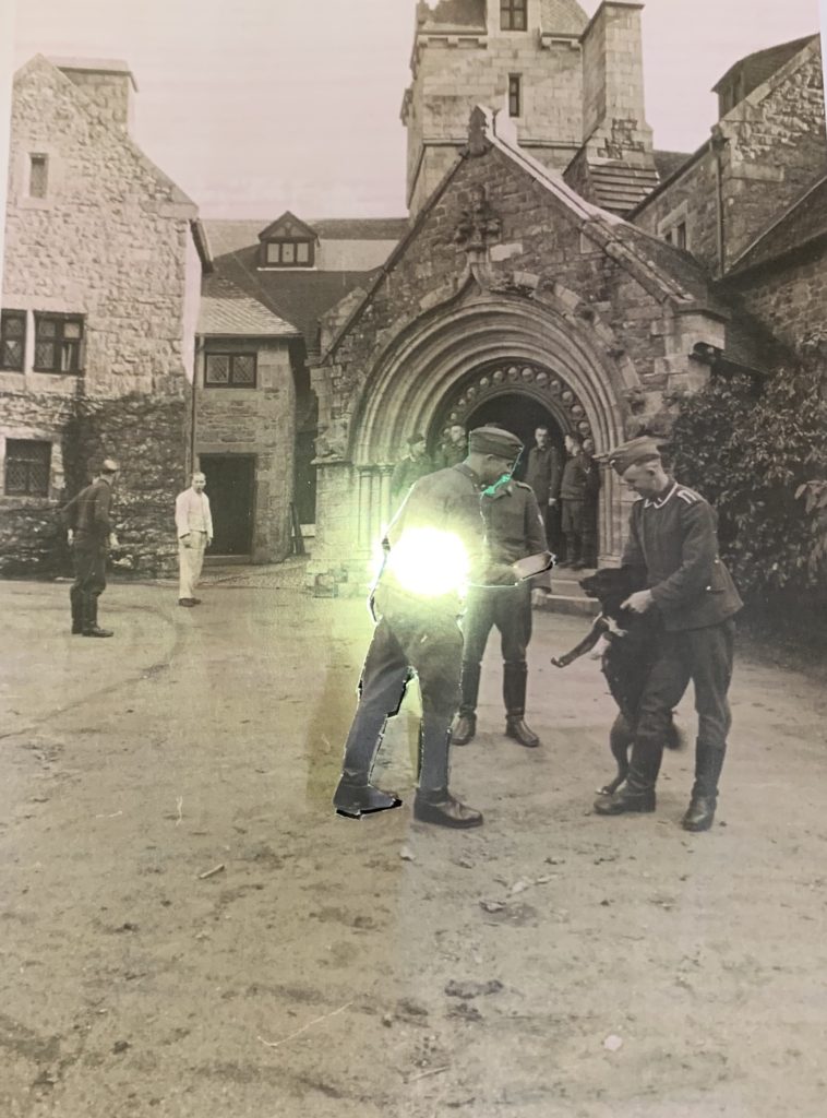
For my final hand craft experimentation, I kept it very simple, due to the simplicity of the image itself. The archival image used had a large sense of space, thus I wanted to utilise this. I decided to cut out man in the centre of the frame, but left bits of him still connected onto the image. I then placed a light behind him lighting his up and making him stand out from the rest, main focus point of the image. Conceptually, I am trying to showcase the light that each solider had but was eventually turned off as they were murdered fighting for their country. This is a more subtle concept, but can still successfully be told by the simplicity of my design. I prefer the outcome above compared to this, only because the design above is more interesting for viewers to look at due to the busyness of the frame, however this outcome is still successful.
Evaluation:
To evaluate my outcomes of my photomontages, I believe that I have managed to produce a strong set of designs. I have been able to showcases my competence in manipulating images on photoshop and give reasoning as to why I did what I did. I have also been able to utilise the main formal elements within an image, making more ascetically pleasing final outcomes. In addition, I have not only manipulated images on photoshop but also by hand to, showcasing the importance of experimenting by hand and computer. If I was to create more photomontages I would look at creating outcomes which take the form of dadaism making it easier to work out what concept is being presented within each design.