Design 1:
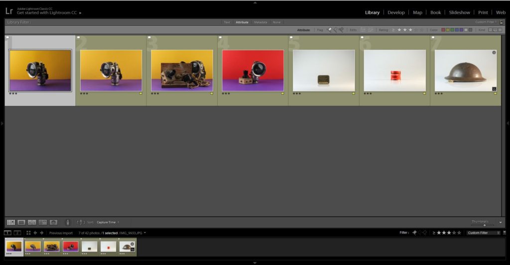
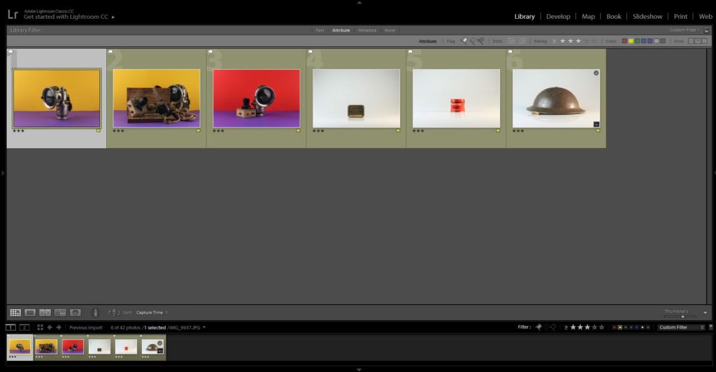
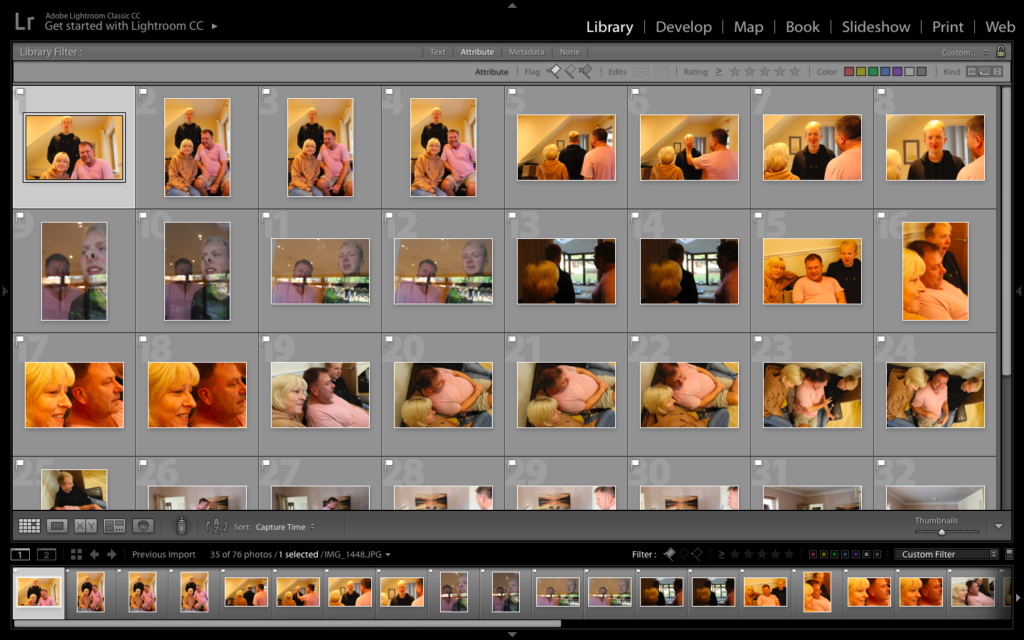
For my first design I stuck to a normal zine layout, 16 page spread in A5 size and portrait orientation. In this design I looked at having half of the zine dedicated to the war and half dedicated to the home project. Overall, I felt that the transition between the two contexts was not clear or effective and almost spoilt the narrative trying to be presented. Below are the screenshots to this design, three pages at a time, with the page layouts being explained below with reasoning as to why these choices where made. In addition, I decided to stop this design shortly after the half way point, transition into the home, as it was not affective, with reasoning as to why, and still showed clear experimentation with new zine layout designs in mind.
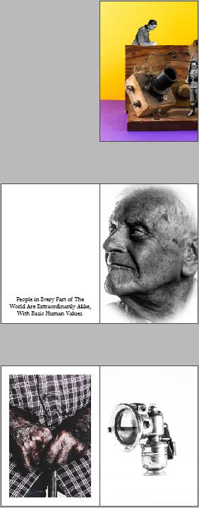
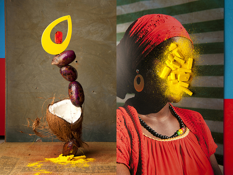
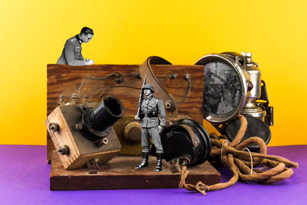
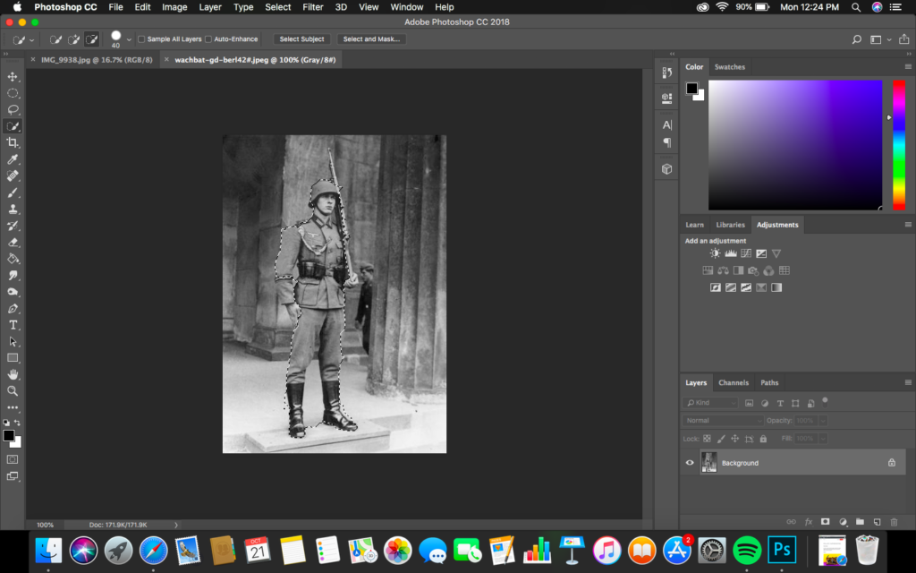
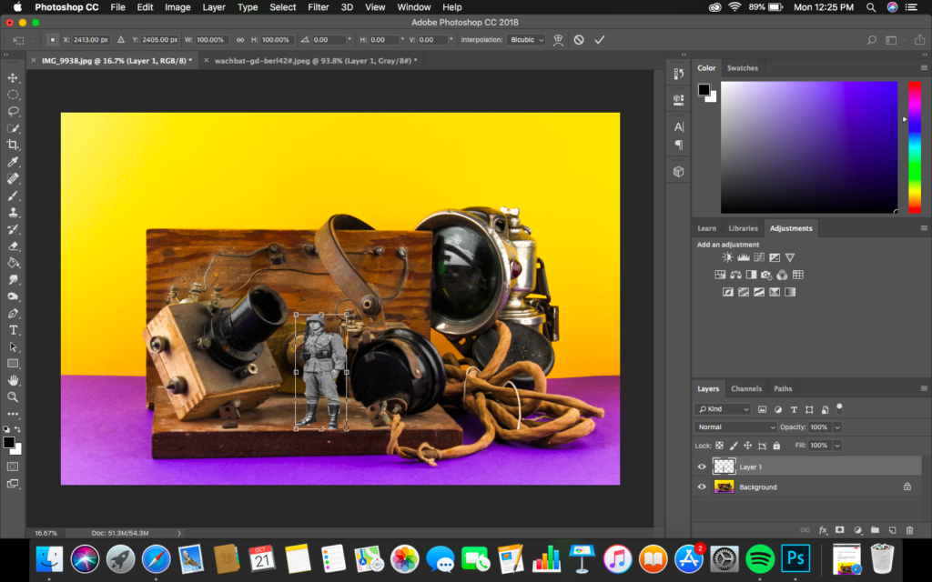
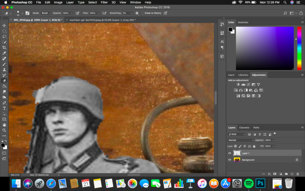
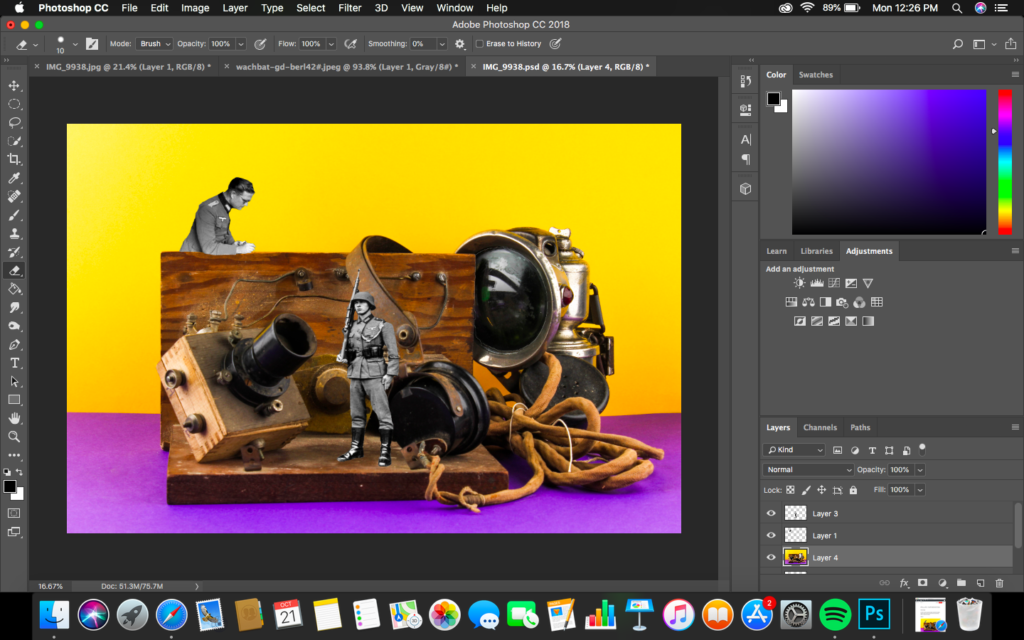
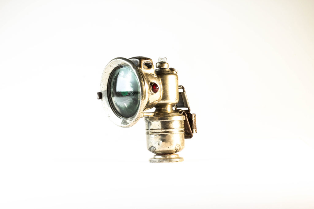
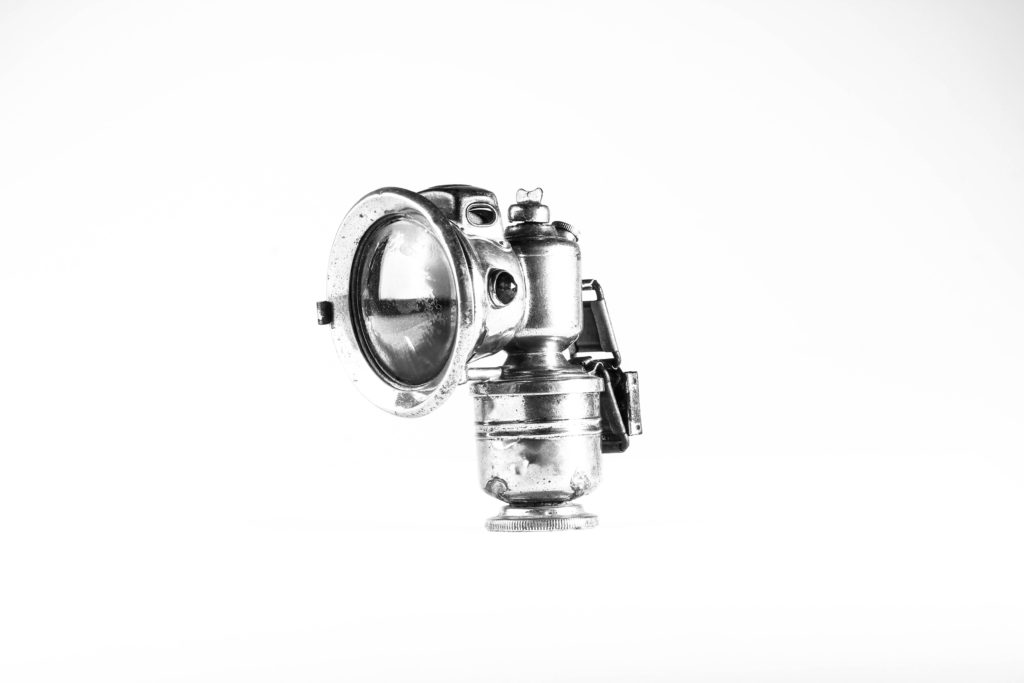
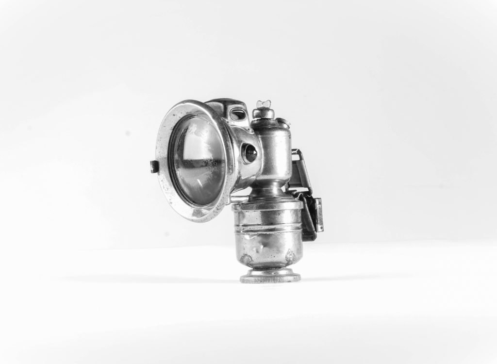
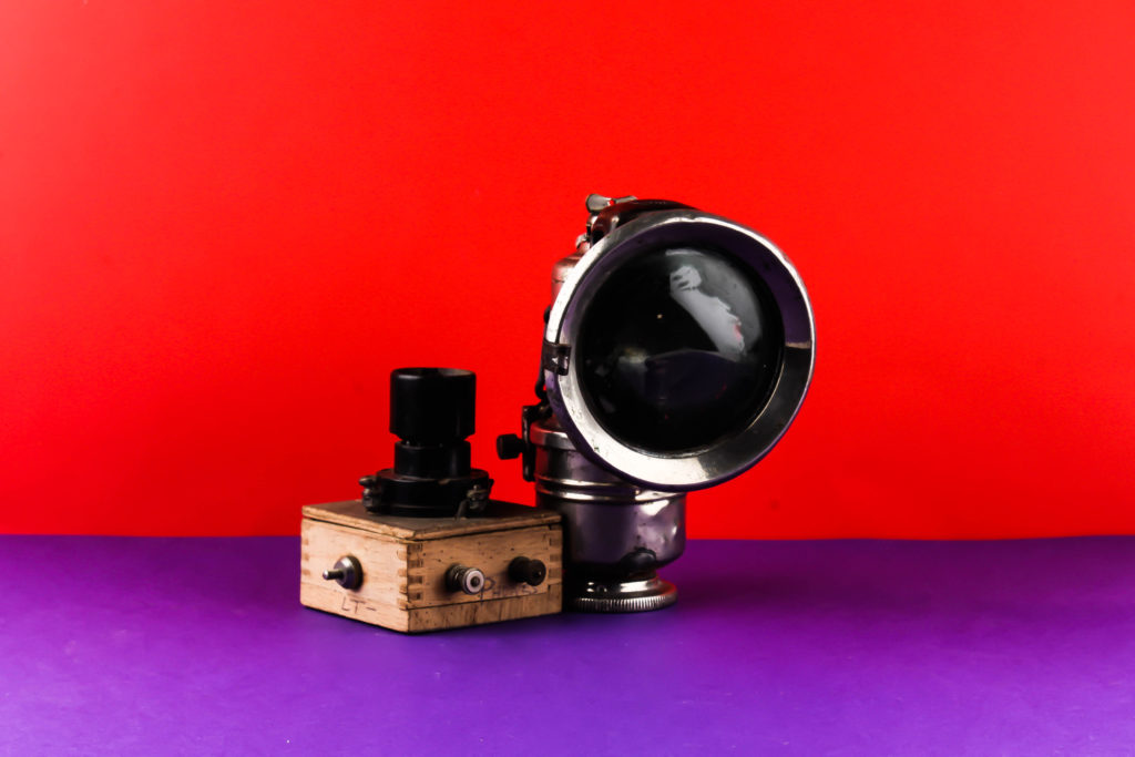
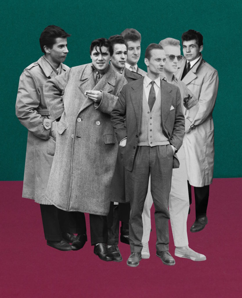
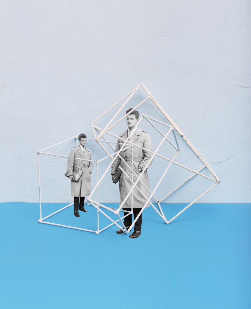
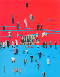
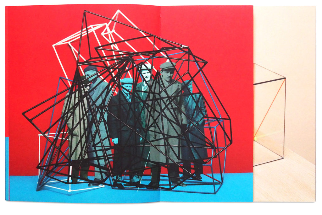
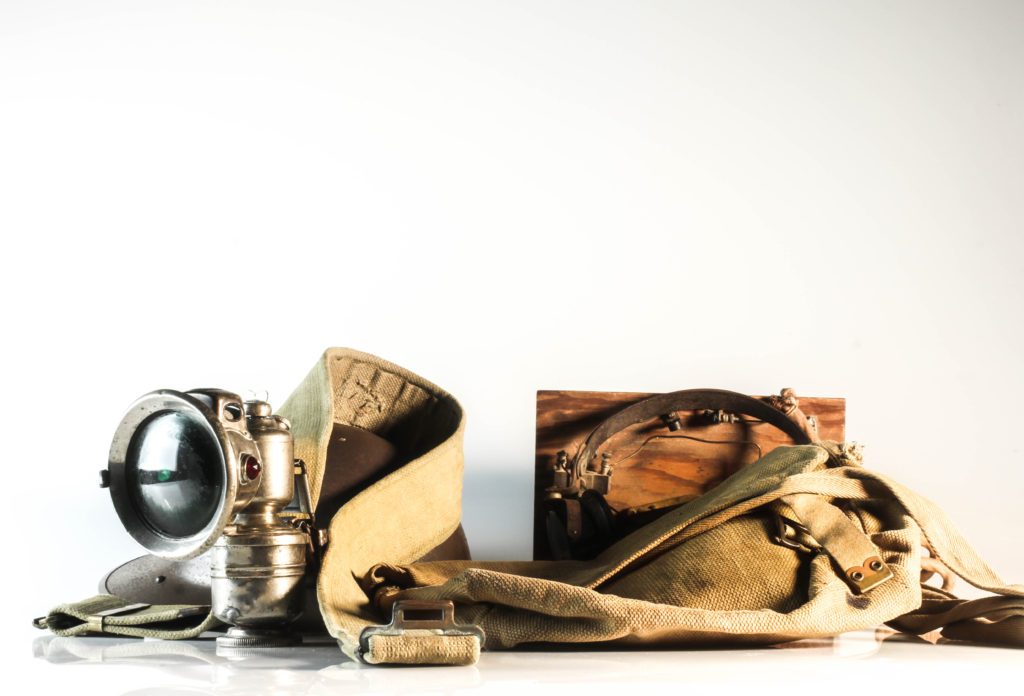
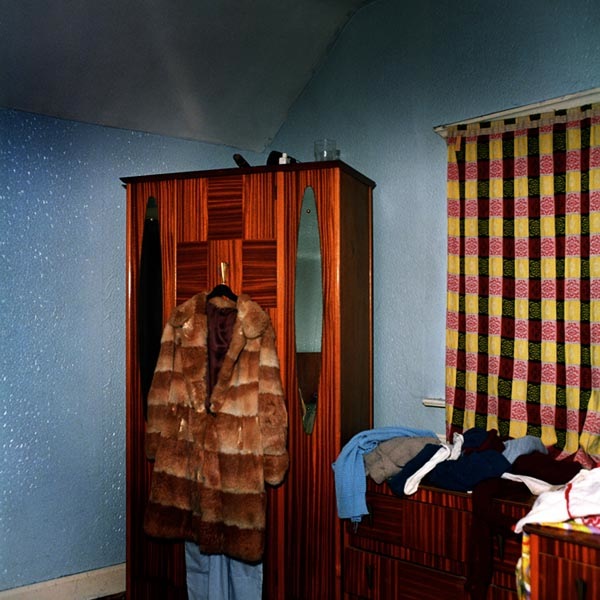
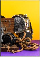
On the front and back cover I decided to use the photomontage of the war objects and archival images of the soldiers. I felt as this was my strongest conceptual imagery, I believe it fit perfectly as my covers as it already held strong representation of my intended narrative, moreover the image itself is captivating through the warm vibrant colours, thus drawing viewers into the zine. For my first layout I wanted to use my strongest portrait from the Bob Le Sueur experimentation. I placed the image on the right hand side, as it showcases the subject looking over to the left, making it look more naturally placed. I then decided to add a direct quote from the interview with Bob. I felt the quote used clearly showcased the subjects opinion on the war and German’s and helped to present the beginning of the narrative, allowing a sense of flow within my outcomes. The next spread was an image which focused on detail and texture of Bob’s hands, which is emphasised through the structure and vibrance of the image, Placing this with the metallic headlight used in the war, both being whole page spreads presents the importance of the light during the occupation and the usefulness of the object. It also works alongside Bob’s quote as it shows everyone is alike, as we use the same objects for the same reason, which continues on the flow.
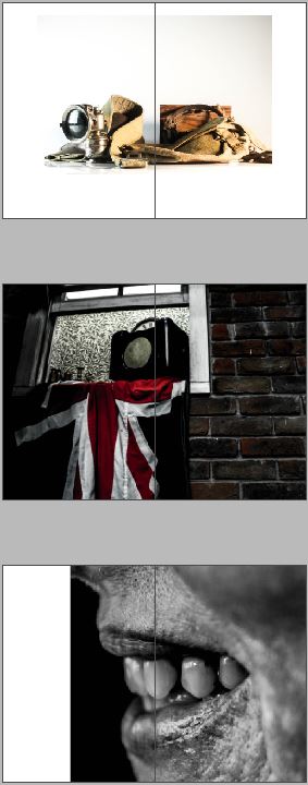
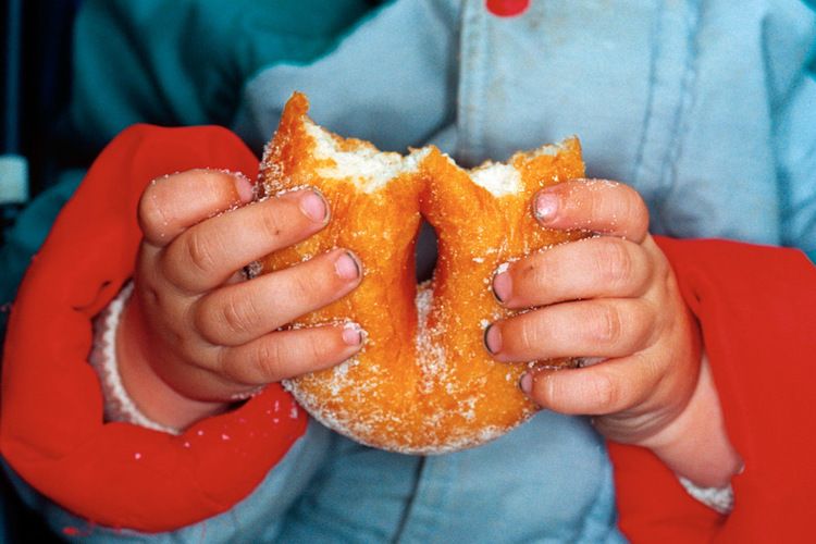
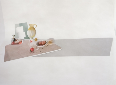
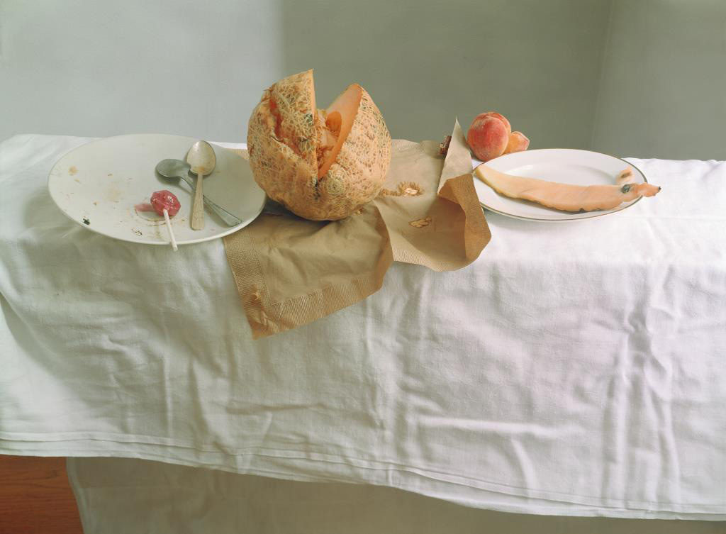
For the next three pages I looked at the transition between war into the home sweet home project. On my next spread I placed an image of a collection of war objects in the centre of the page, doing this supports the ideology that everyone used the same objects whether they were British or German, thus showcasing my narrative of the relationship between objects and portraits. For my middle page I wanted to use a double page spread which showcased liberation of the war, which leads onto the new occupation of the home. This then lead onto the 3/4 page spread of my strongest image from the home sweet home project, which is a macro photograph of a mouth. I felt that the image almost seemed out of place and broke the narrative trying to be presented, which lead me to question the effectiveness of the design.
After consideration I decided to stop with this design as I could not find a solution to transition the war into the home within one zine, therefore my initial design will showcase my experimentation and thought process when creating my final zine design.
Design 2:
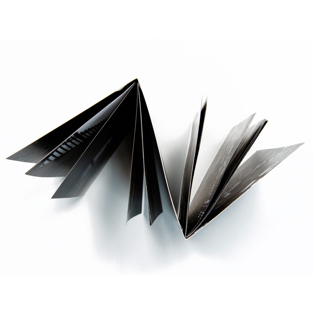
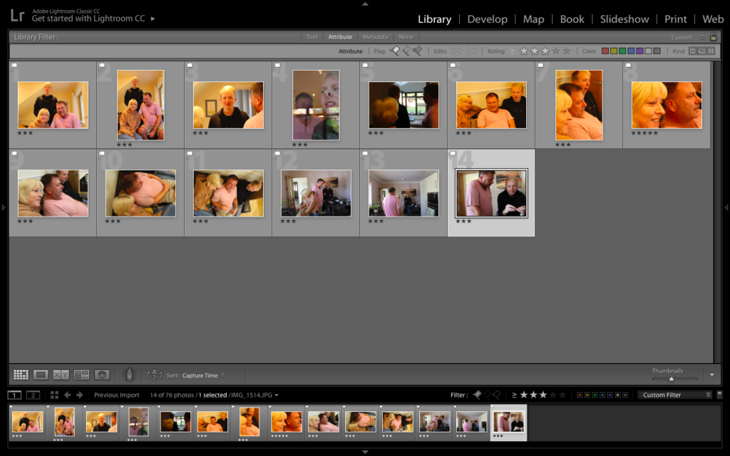
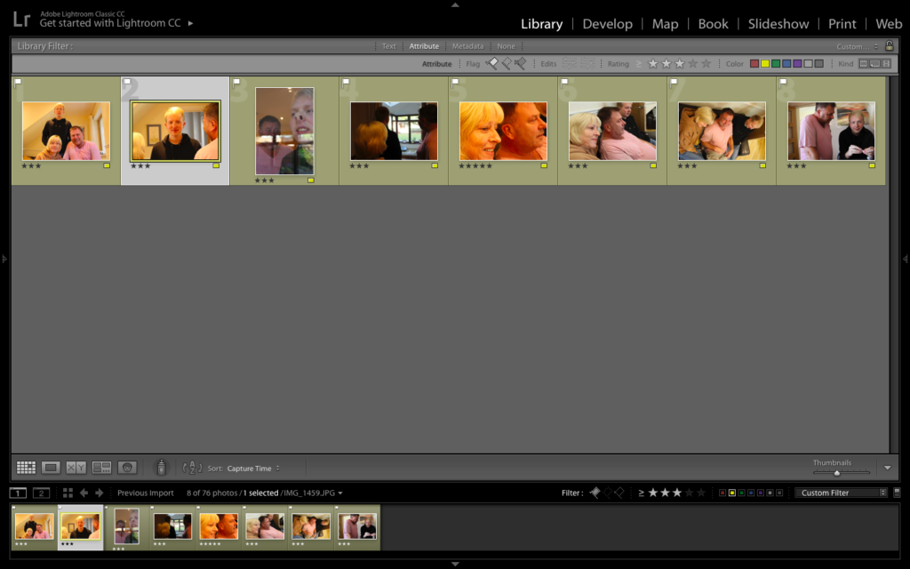
For my second design I decided to experiment with different layouts of zines, showcased on my mood board on the narrative and sequencing blog post. After consideration I decided to explore the Dos a Dos design. The dos a dos zine contains two single section zines within one cover, facing them in opposite directions, it’s a neat structure for combining two sets of material which you really want a viewer to experience separately, rather than in a sequence where one follows another. For this one I’ve combined two very different sets of imagery about my native London, one about the city’s history, and the other about it’s possible future.
For the first half of my zine I wanted to showcase liberation from the war and the relationship between objects and portraits in the sense of liberation. I decided to keep similar layouts from the first design as I felt that some layouts were successful in presenting my narrative.
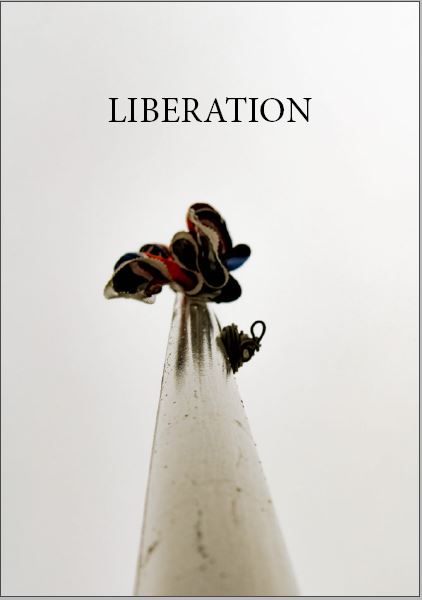
Originally my front cover was black with white text saying Liberation, which juxtaposed the Occupation front cover which was white with black text. Although this worked, having my zine as a dos a dos layout meant I lost two pages worth of display so I felt I was not utilising my pages wisely. This soon lead me to digging through my edits from previous photoshoots were I found an image I took from a worms eye view of Great Britains flag, I felt the fitted nicely with the ideology of liberation.
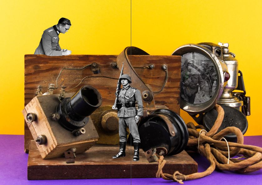
I decided to use the photomontage of the war objects and archival images of the soldiers. I felt as this was my strongest conceptual imagery, I believe it fit perfectly within my zine as it already held strong representation of my intended narrative, moreover the image itself is captivating through the warm vibrant colours, thus drawing viewers into the zine.
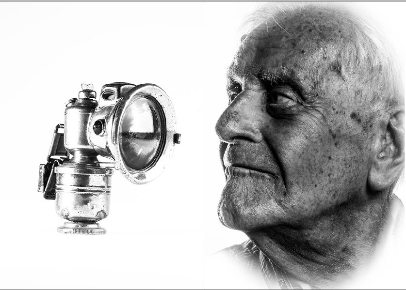
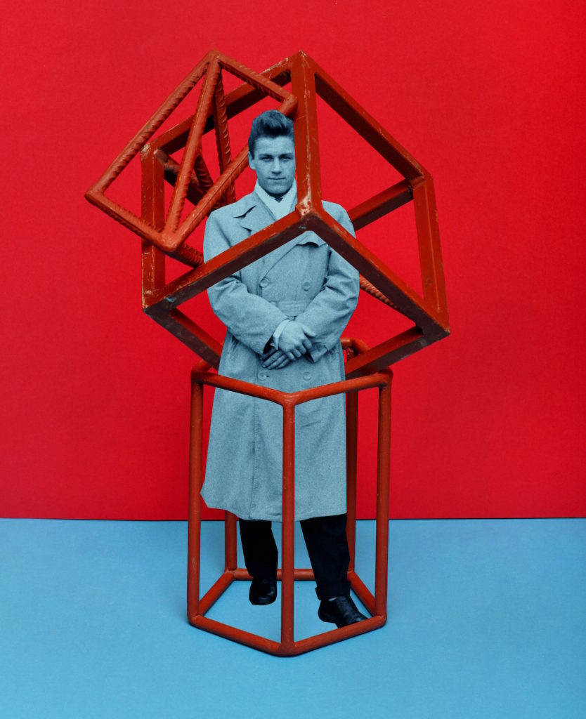
I wanted to use my strongest portrait from the Bob Le Sueur experimentation. I placed the image on the right hand side, as it showcases the subject looking over to the left, making it look more naturally placed. I then places the object of the head light on the left which faces towards the portrait. This presents a strong positive relationship between the two images, showing their importance during the war. This spread took inspiration from my first experimentation as I felt that this spread was the most successful in conveying my narrative.
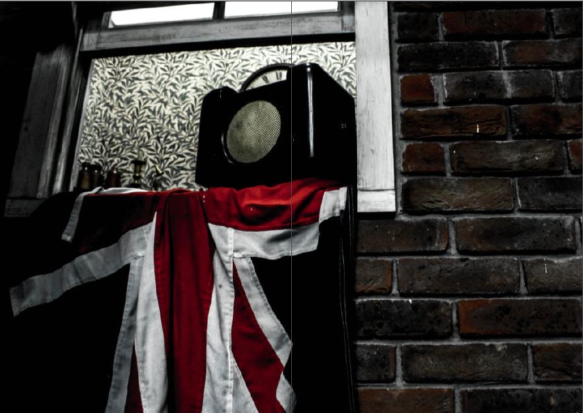
For my last page spread under liberation I decided to showcase the liberation of the Island when Germans left. This spread focuses on objects of Great Britain’s flag and a radio set, which were banned during the occupation of the German’s. This full page spread clearly showcases the relationship with the objects to portraits with the absence of the portrait, as it is commonly known the citizens illegally held radio systems which outlines the objects importance within the imagery.
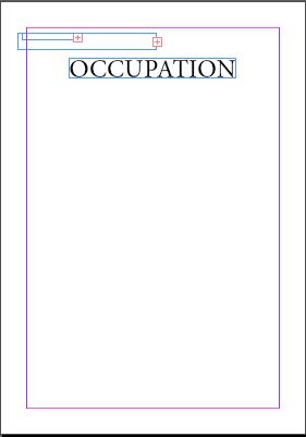
To start the occupation side of the zine, I started from the last page and made my way up to the first page, reverse order. The Occupation front cover which was white with black text, which juxtaposed my liberation front cover which was black with white text. As mentioned before although this worked, having my zine as a dos a dos layout meant I lost two pages worth of display so I felt I was not utilising my pages wisely. I will be changing this front cover, with the final layout shown below in order to show experimentation.
Within this half I wanted to showcase the occupation of marriage within a family and the relationship between portraits of objects under this ideology.
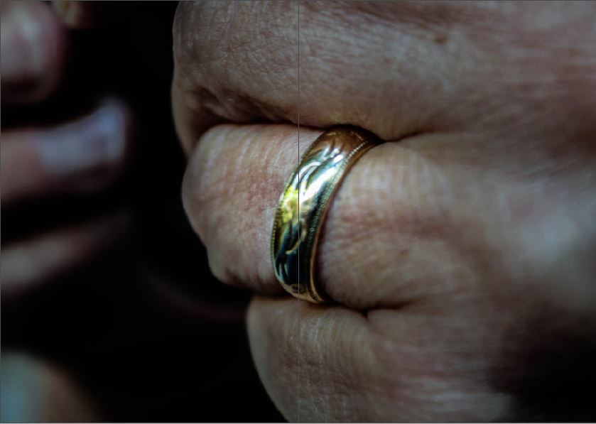
For my first page spread I wanted to showcase a portrait of my model hands, with one of the most traditional objects to do with marriage, the ring. A wedding ring symbolises the occupation of your love and life to your spouse, and is very important piece of symbolism to many married couples. Having this images as a whole page spread showcases a lack of space, showcasing the fulfilment marriage has on the impact of our lives.
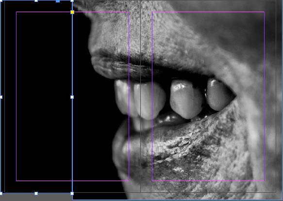
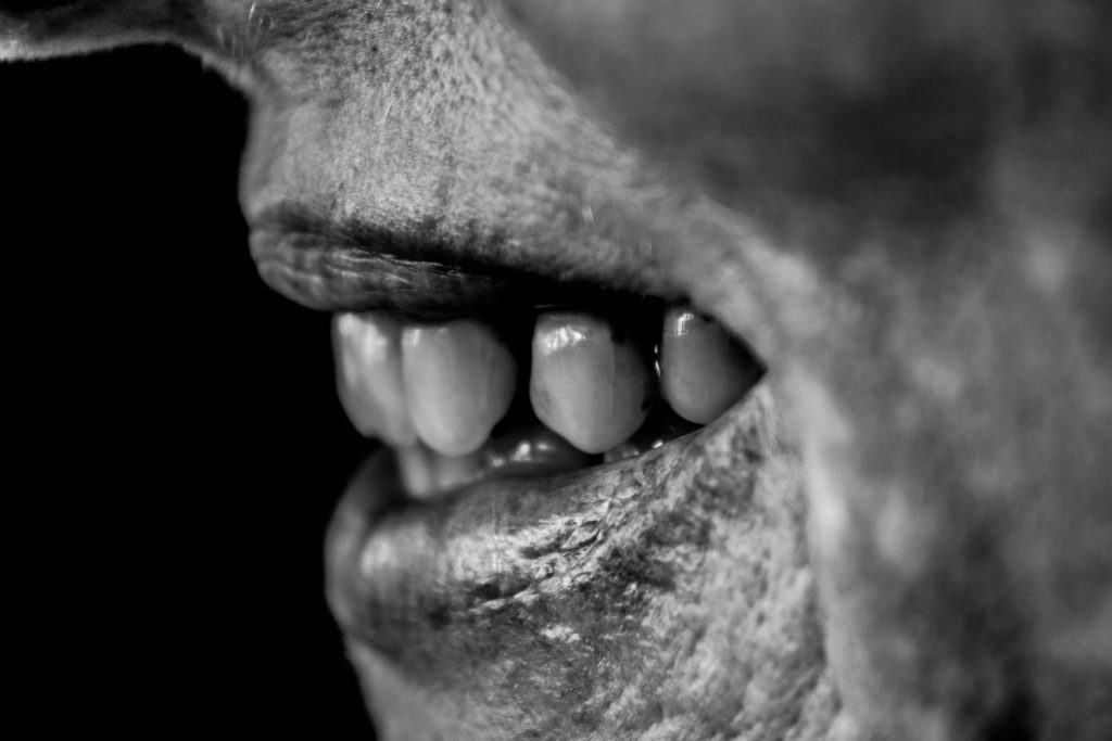
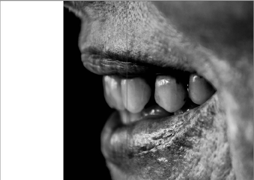
I then wanted to keep the whole double page spread design as I liked the symbolism of the lack of space and how marriage impacts a whole persons life. I then decided to use this macro image of my models mouth who seems to be smiling, showing their teeth. The sense of black space on the left shows an emptiness and false sense of happiness, many marriages lead to relationship problems. This spread almost acts as a representation go how the models life has been taken away and how they are not happy about it but can not do much about it.

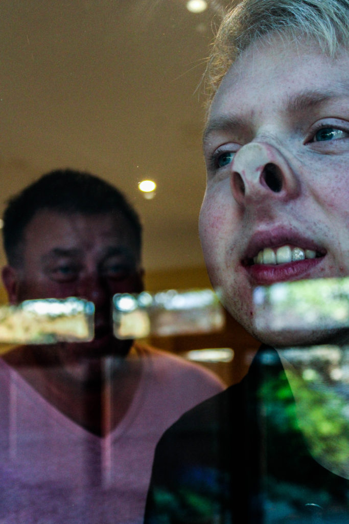
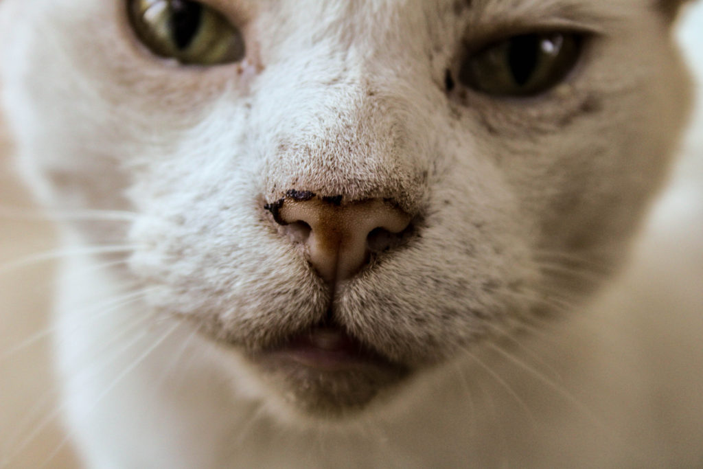
My final page spread focuses on the macro portrait of my subjects eyes. She is looking through her dirty glasses, which symbolises how she is unsure where her future is going and how marriage has lead her to not being able to freely make all decision by herself, showcasing the entrapment of marriage and the occupation it has.
Changes:
New Design 
Old Design
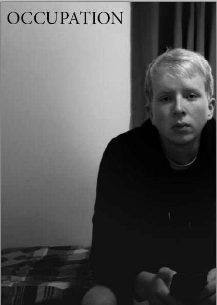
For my first change I wanted to change the front cover of my occupation front cover, to have the same amount of symbolism and my liberation front over. I decided to use the environmental portrait of my brother sat on his bed. The sense of negative space on the left and high tonal contrast shows the negative impacts of marriage which fits the theme of the occupation of marriage and begins to showcase the relationship between objects and portraits towards this overall running theme of marriage.
New Design 
Old Design
My second change was made after printing a trial run of my zine. In my initial design I turned the white space black, when printing this out the blacks came out as two different shades which distracted viewers from the conceptual representations and meaning of the spread. I decided to change this by getting rid of the artificially placed black on the left and just having it white, I felt that this change still gives off the same intended effect as the black.
Evaluation:
I believe I have made two successful experimentation of zine designs in order to showcase my narrative. I have been able to explore different layouts and the representations they held, with being able to clearly justify as to why I decided to have images in the sequence they are in. I have been able to show my artistic thought process throughout, with constant reference to my intended narrative when explaining each page layout. Overall, I believe my second design will be my final design with the changes made as I feel it’s the most successful in combining war and my home imagery.