Ralph Eugene Meatyard was born on the 15th May 1925, in Illinois. At the age of eighteen he was forced to join the Navy, at the time of the Second World War. Lucky the war had ended before he was sent on an overseas assignment. Soon after the war he dedicated his studies into becoming an optician, but still continued with his passion for photography.
His photographic series ‘No Focus’ has combined his occupation with his hobby, showcasing what he was really passionate about. In this series the photographs are completely out of focus, reveling what it is like for blind people seeing the world. This powerful photographic series changed the way people captured photographs, as it went against the stereotypical techniques we would use to capture an image. His work within this series is very inspiring to photographers as it shows that experimentation with the camera is vital part of photography, and that breaking the stereotypes can actually result in effective images.
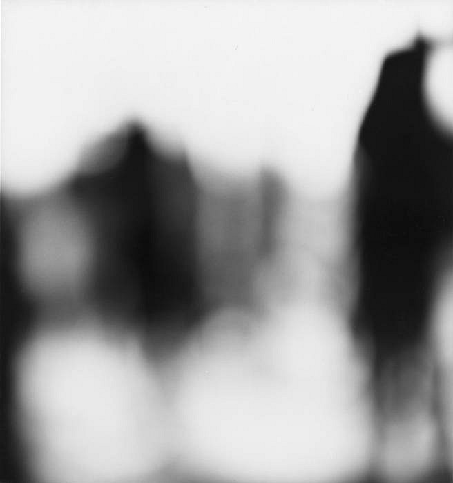
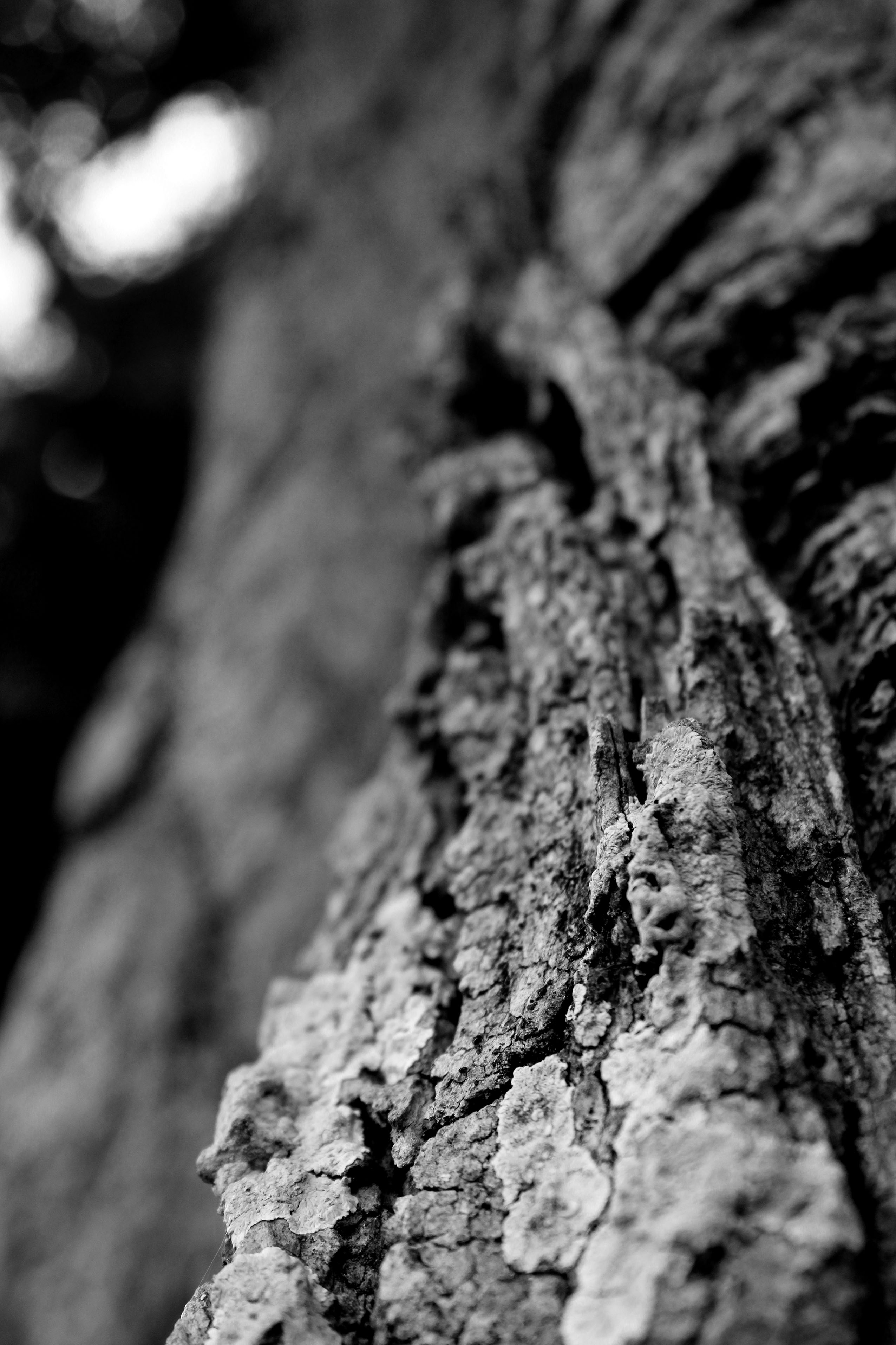
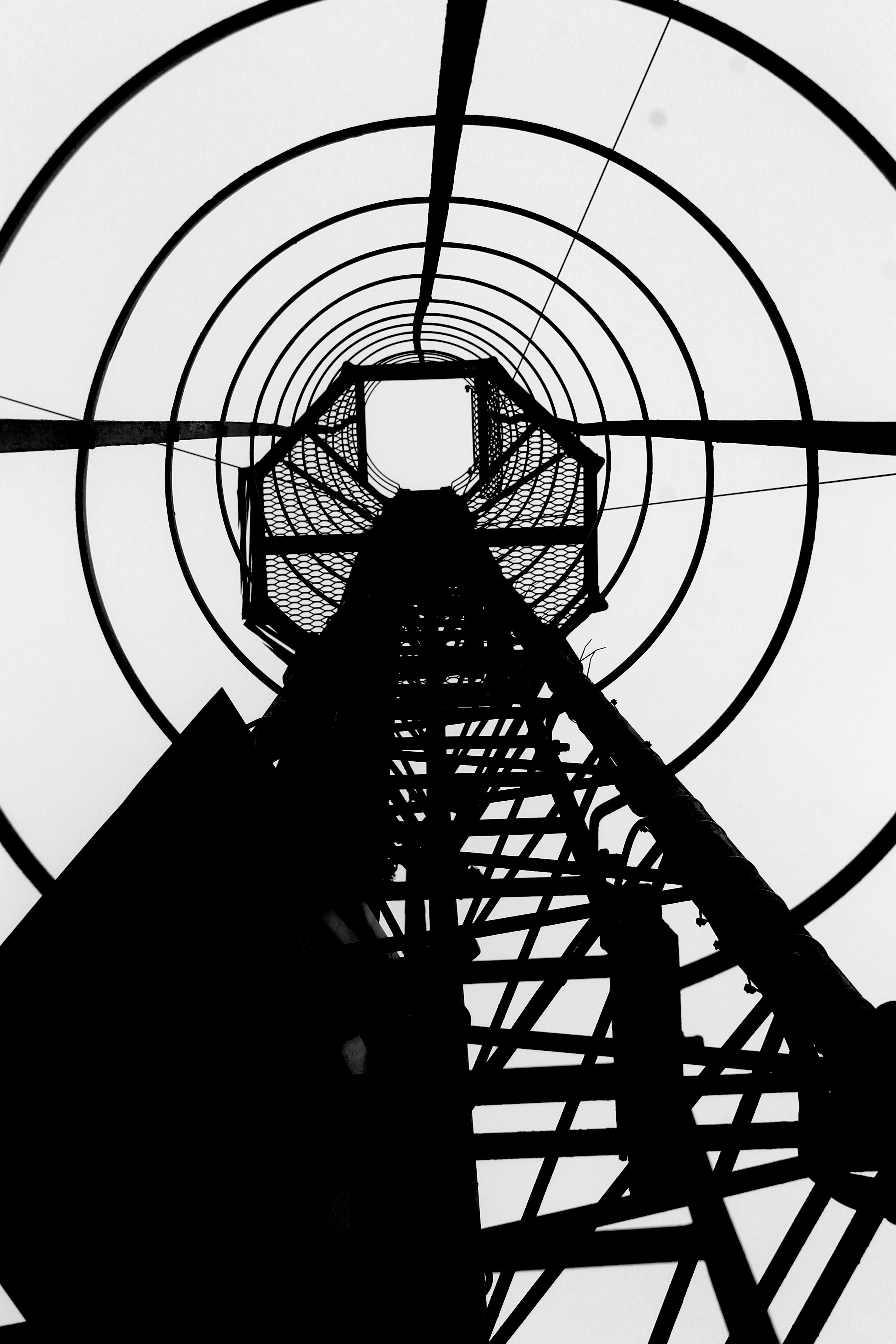
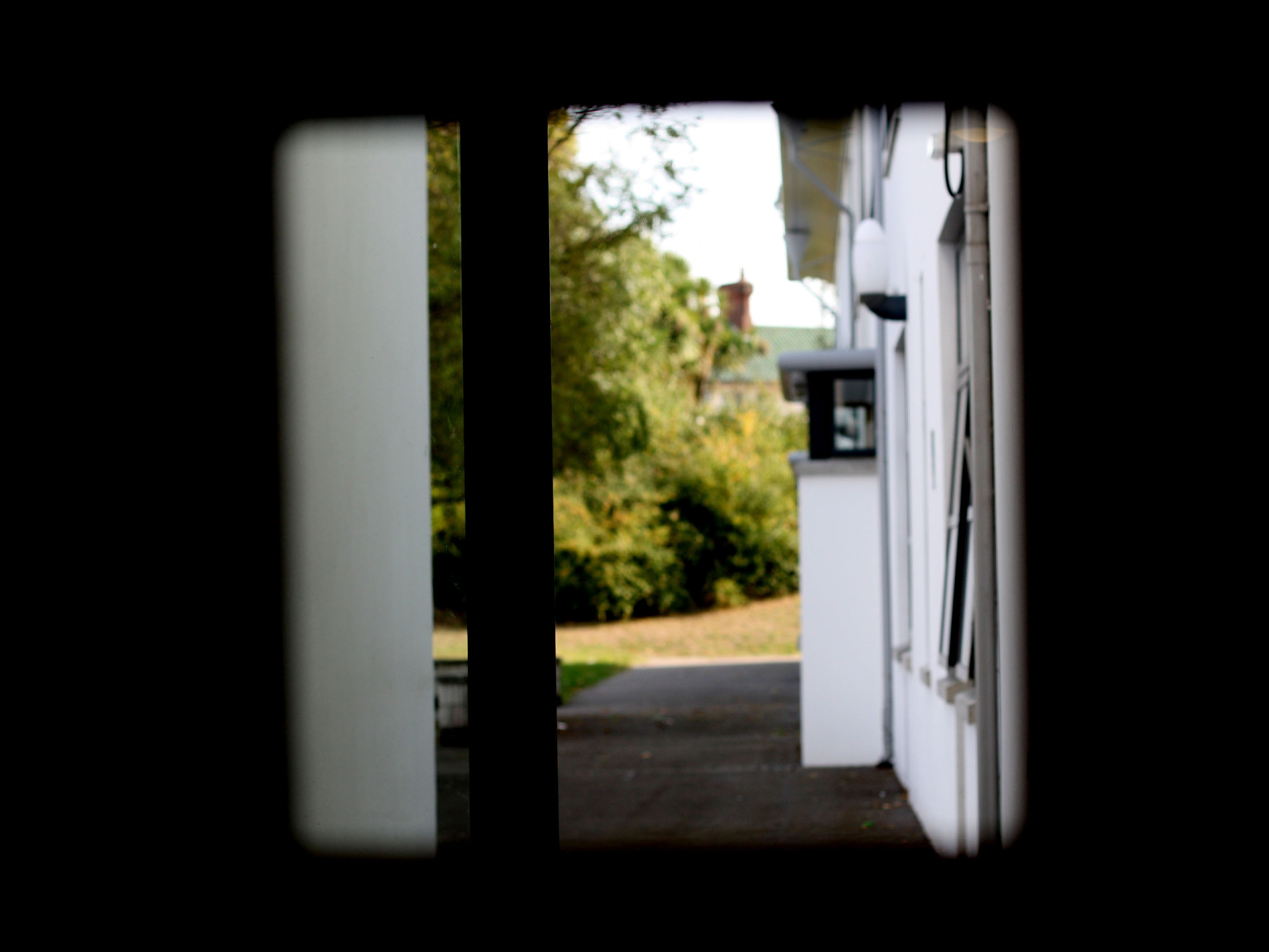
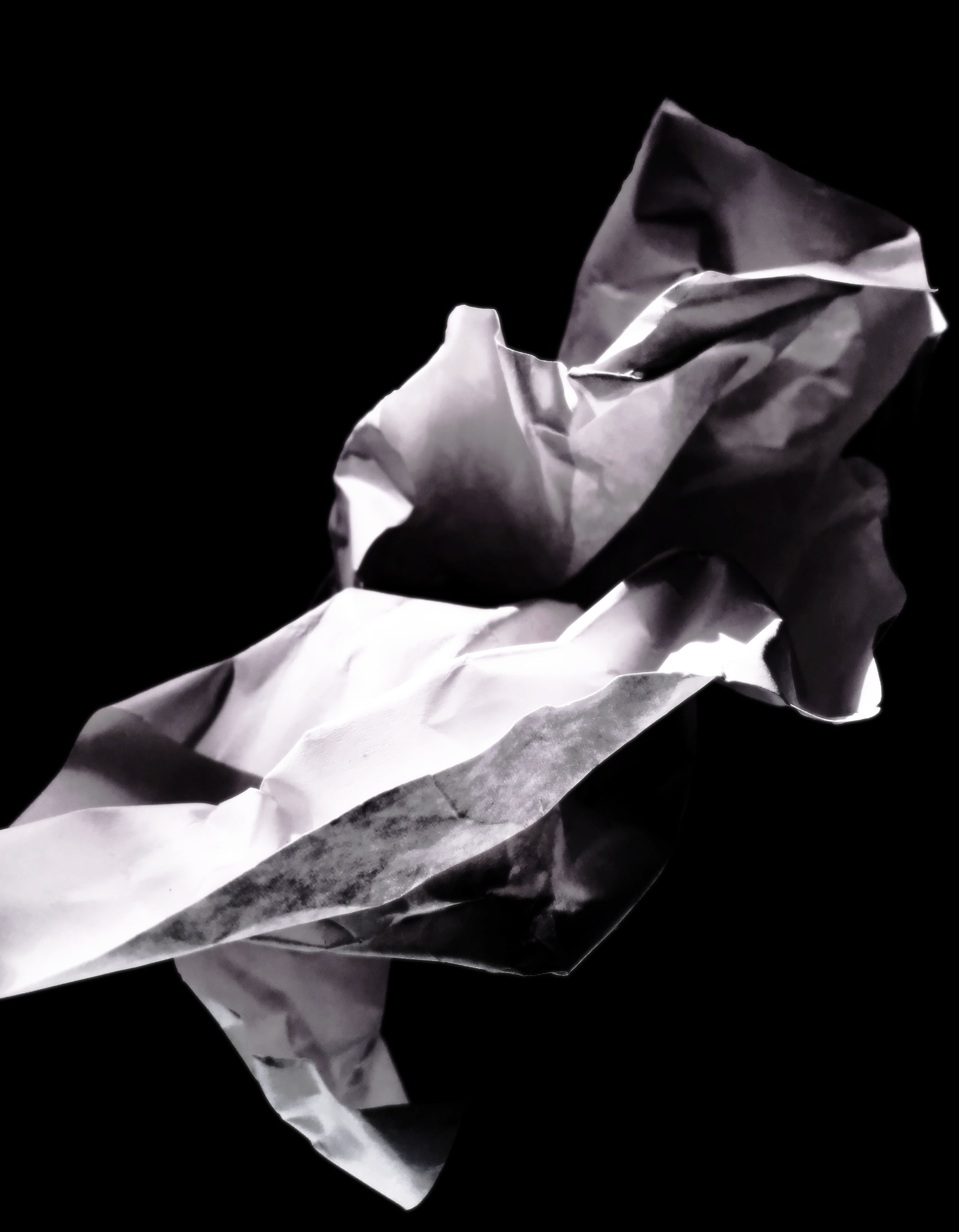
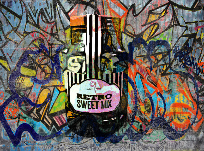
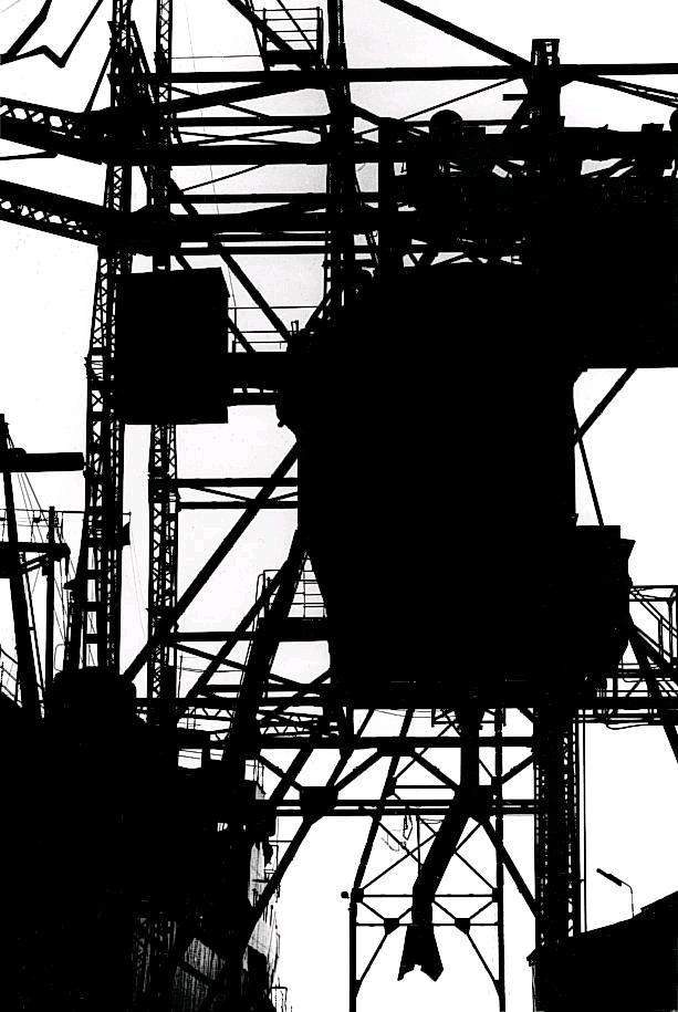
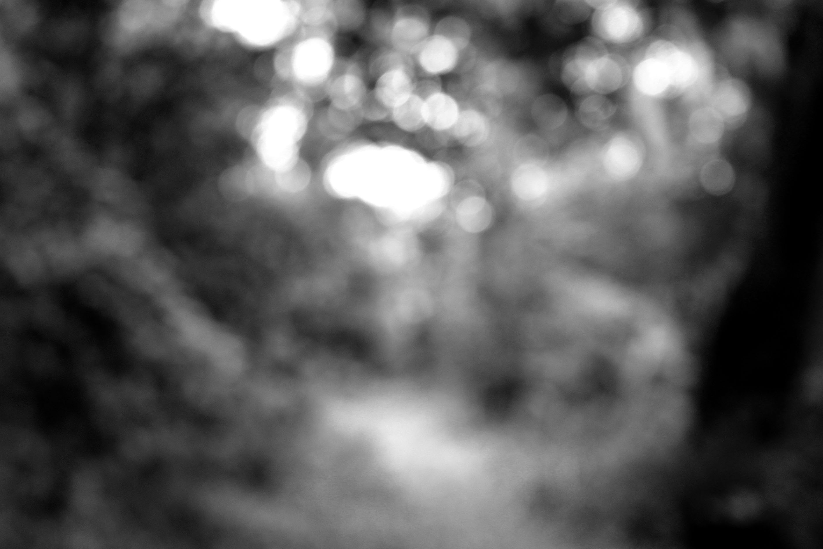
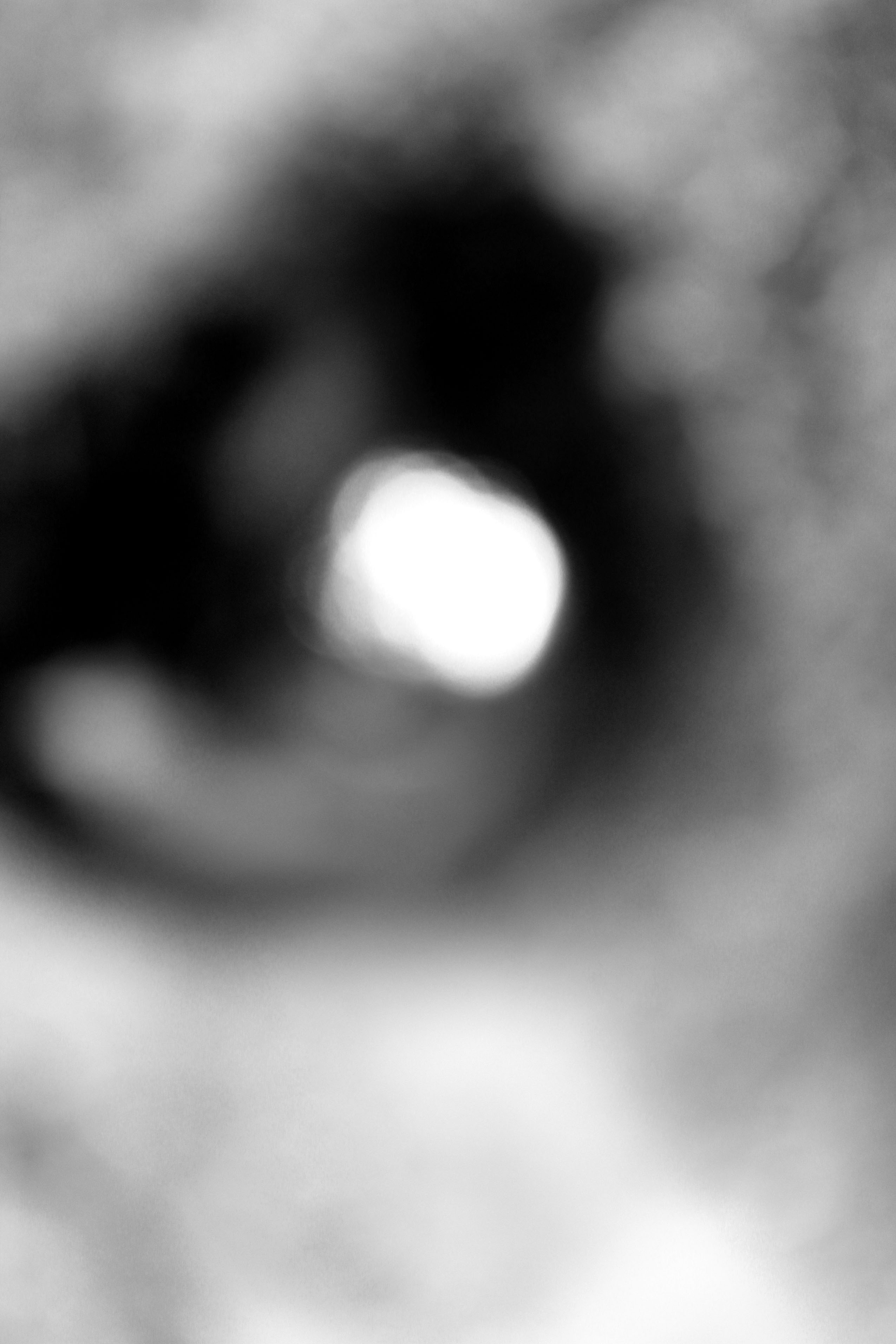
This photograph has been taken to be apart of Meatyard’s ‘No Focus’ series. As mentioned before the whole frame is out of focus, reveling what it is like to be blind. The first thing my eyes are drawn to is the silhouettes, which seem to be of people or a building. Due to us not being able to tell what the silhouettes are, makes this image more effective as we are left questioning what it is. Therefore it is a more memorable photograph. Moreover, it shows the reality of people’s lives, making an emotional attachment between the image and the viewer. My eyes are then drawn to the light source, which is located at the bottom of the photograph. The main formal elements which are being presented in this photograph is shape, tone and texture, which are all being presented through the silhouettes. All the images within this series are presented as black and white, which contextually shows the period of time when the photograph was taken. It suggests that this image was captured when coloured images could not be captured. Due to the images being in black and white it allows the different tonal regions to be much clearer, and allows the silhouettes to be seen much easier. The overall image is quite dark which suggests that the white balance of ‘cloudy’ could have been used in order to make it darker. Furthermore, the dark images creates a cold temperature to the images, due to this the overall image is seen as much more dramatic and hard hitting. The aperture used to capture this image is also likely to be quite small, in order to not allow much light into the lense resulting in the overall image to be much darker. In contrast the ISO could be high as there is a lot of noise in the image. However, the noise could be created from the focus, resulting in the ISO to be low. The shutter speed used could be a slow shutter speed, which would create a blur, adding to the overall out of focus effect. Conceptually, the photograph is trying to distort the viewers eye sight, outlining the life styles for those who struggle to see, presenting the reality of others within one image. Overall, Meatyard’s photography within this series are well thought out and portray a very powerful meaning.
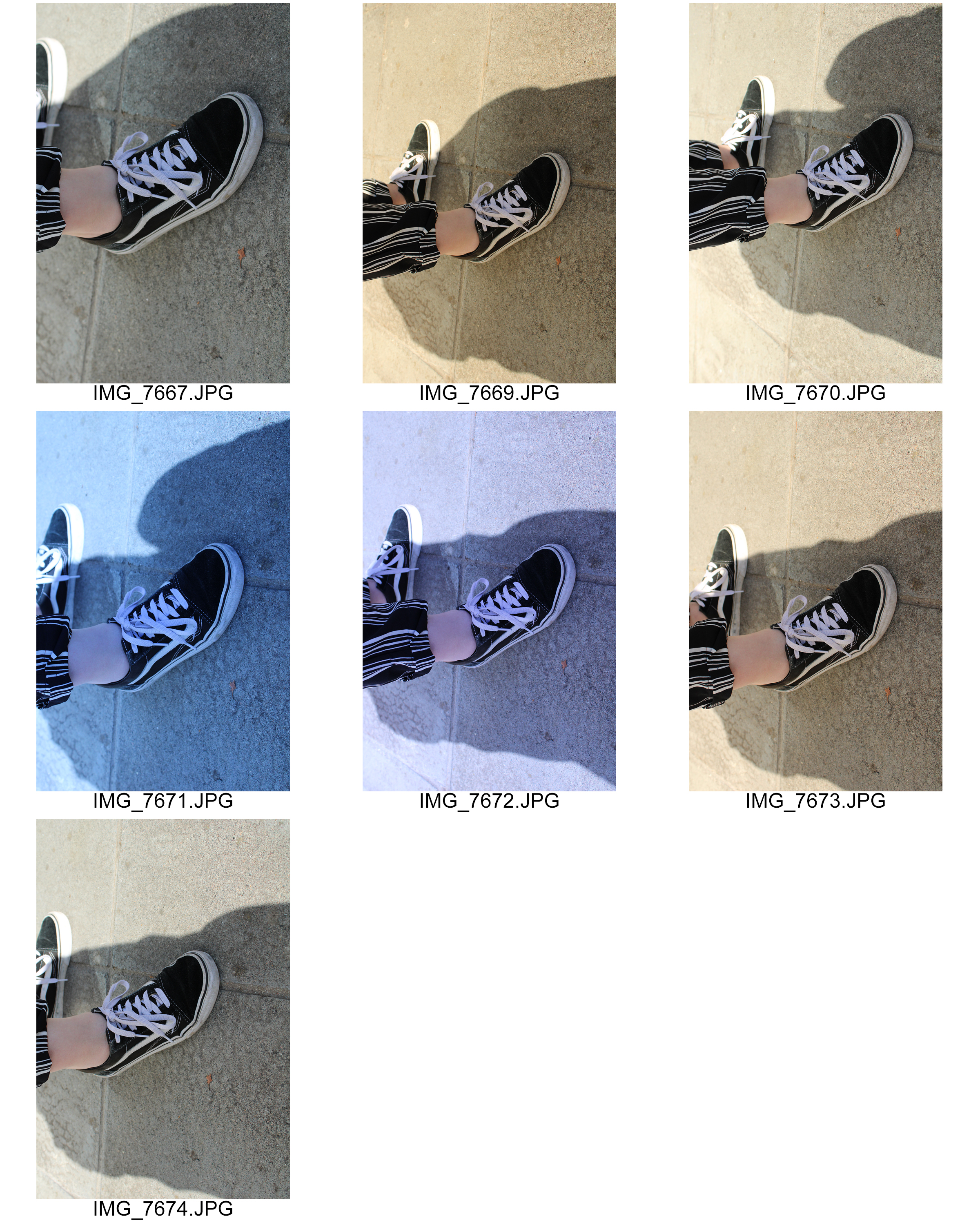
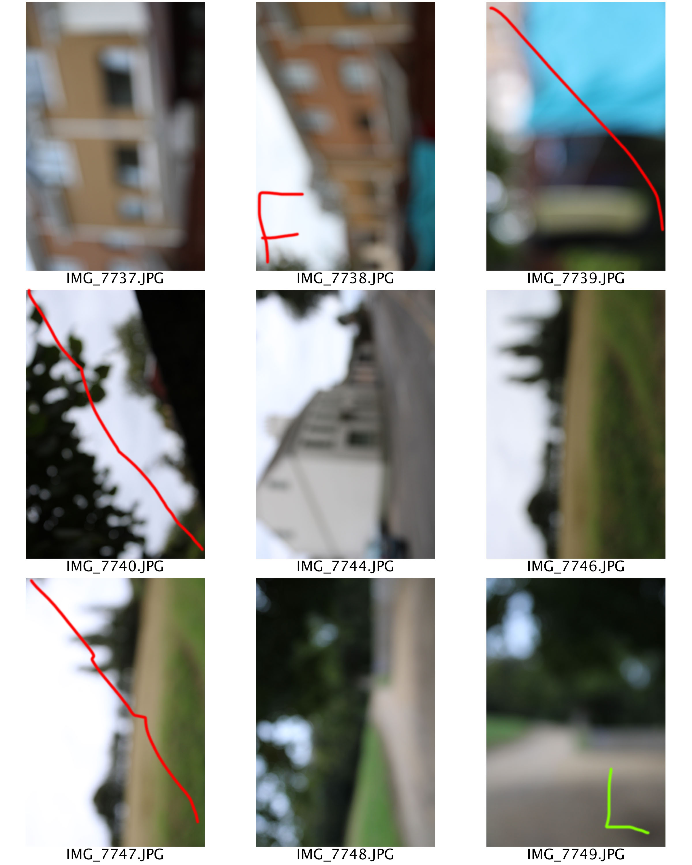
Planning
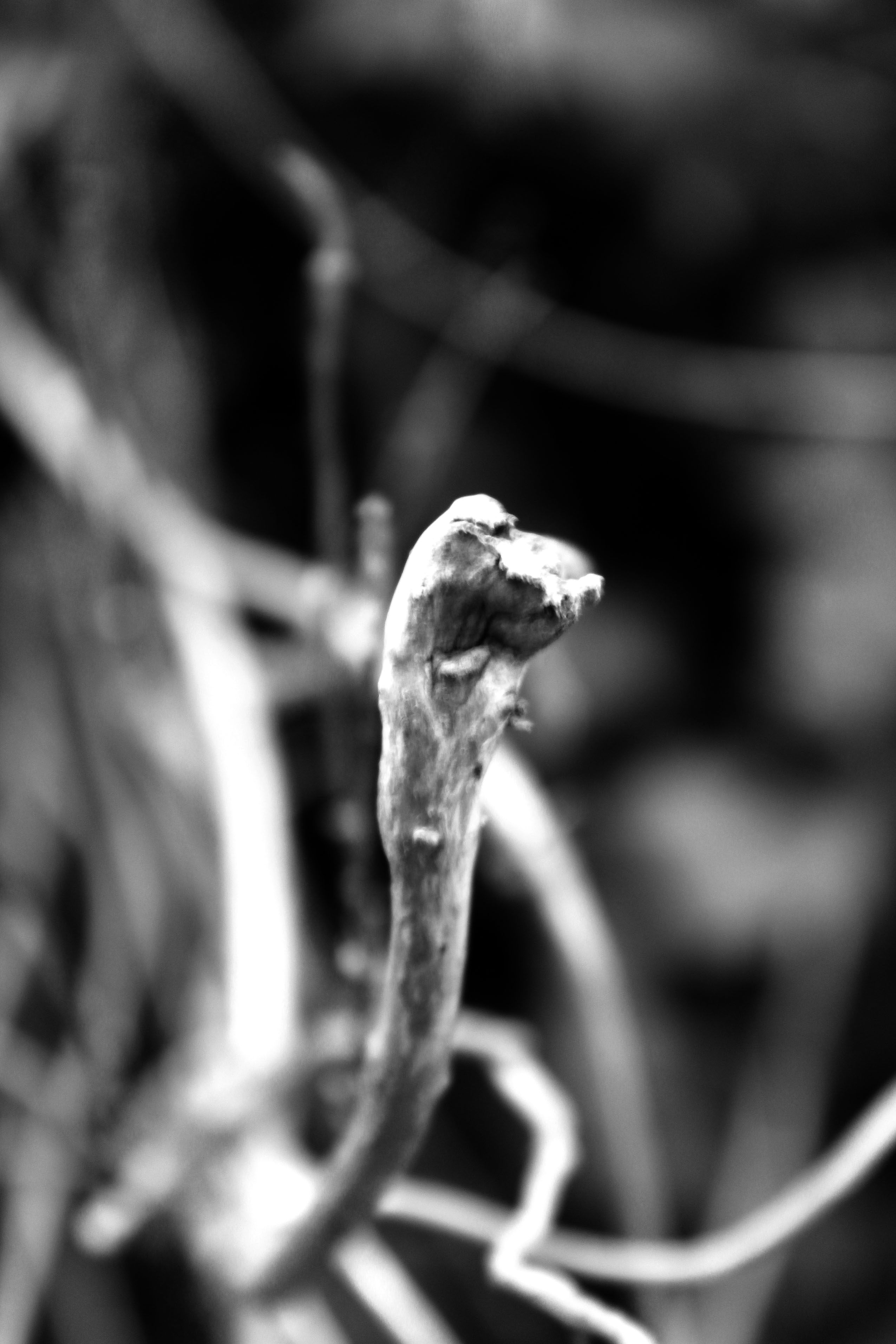
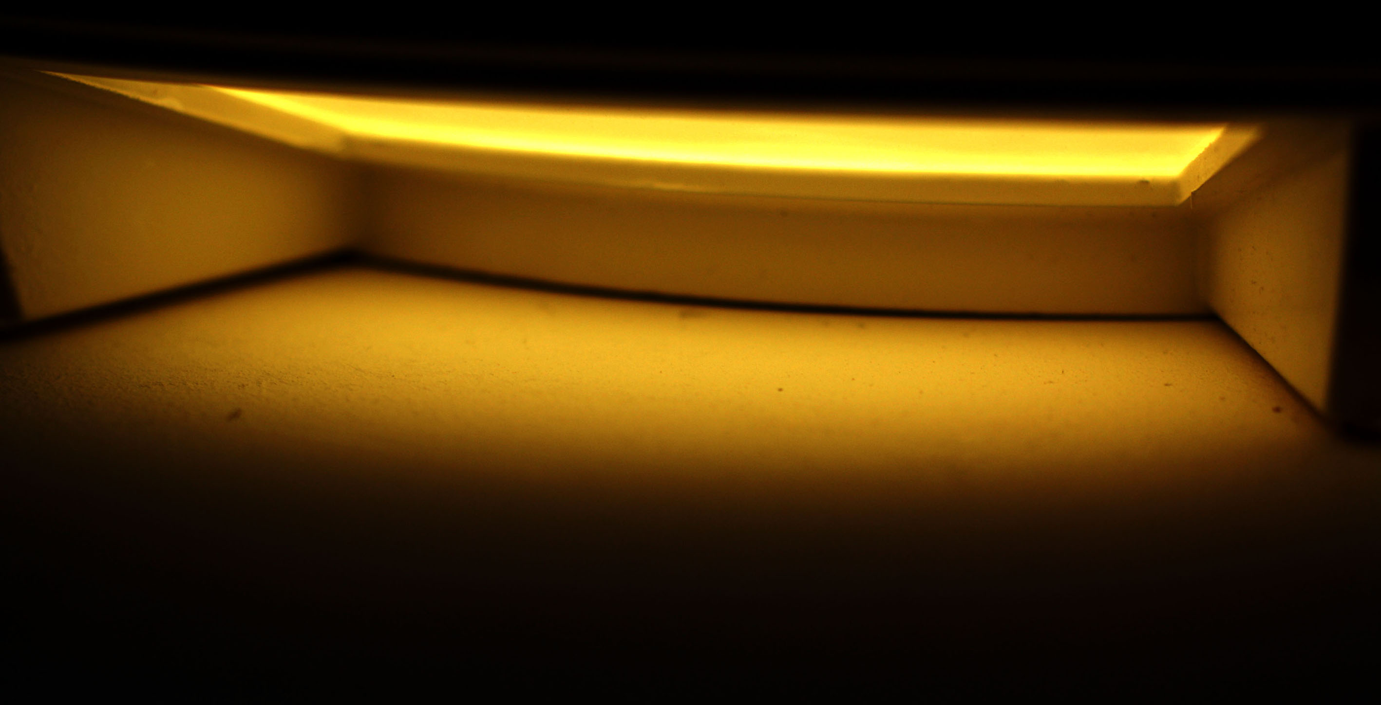
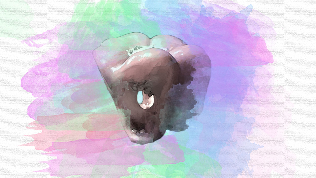
For this photoshoot I am hoping to capture my images during the day, in order to use the sun as my natural lighting. However, I would like to capture some of the images at night which will add to the dark and gloomy effect. Possible locations that could work for this photoshoot are forest, office, building and street. I am quite looking forward to capturing these sorts of images, where the frame is out of focus, as I believe I will be able to be creative with what should be turned into silhouettes and what should actually be in the frame. Looking ahead of time I would like to keep the edits simple, I am thinking about just turning the images black and white and levelling them.
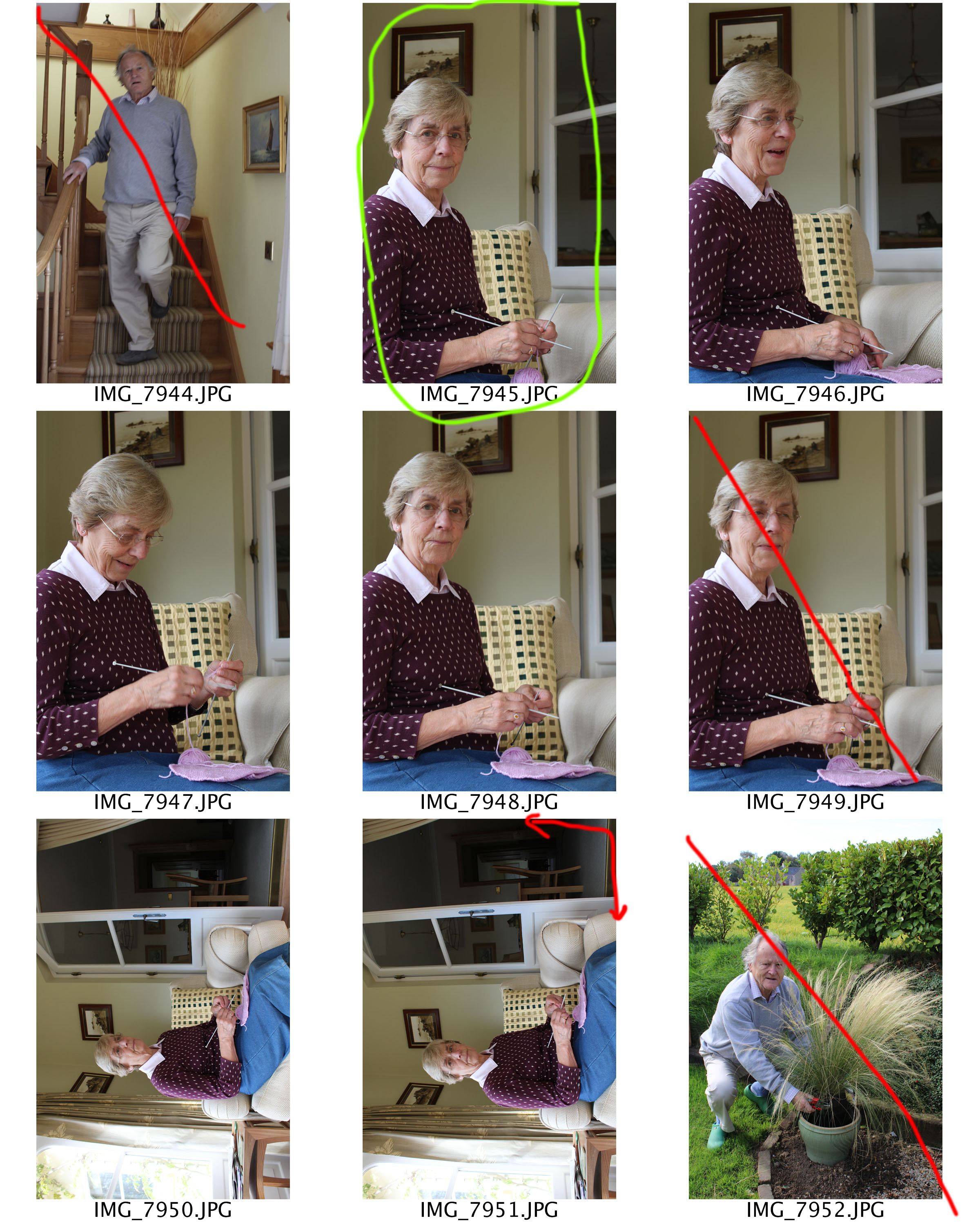
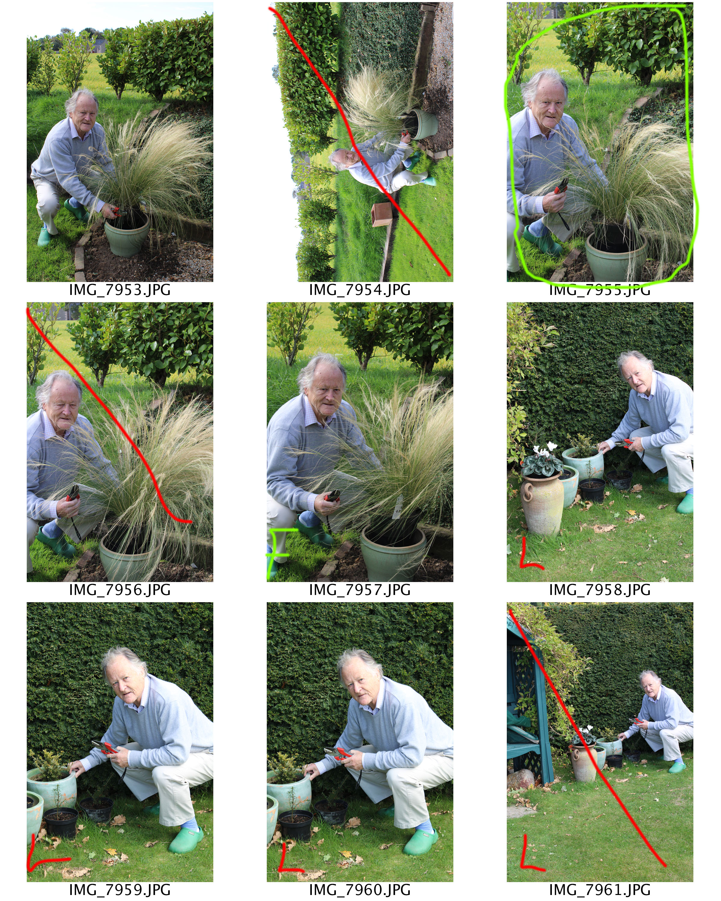
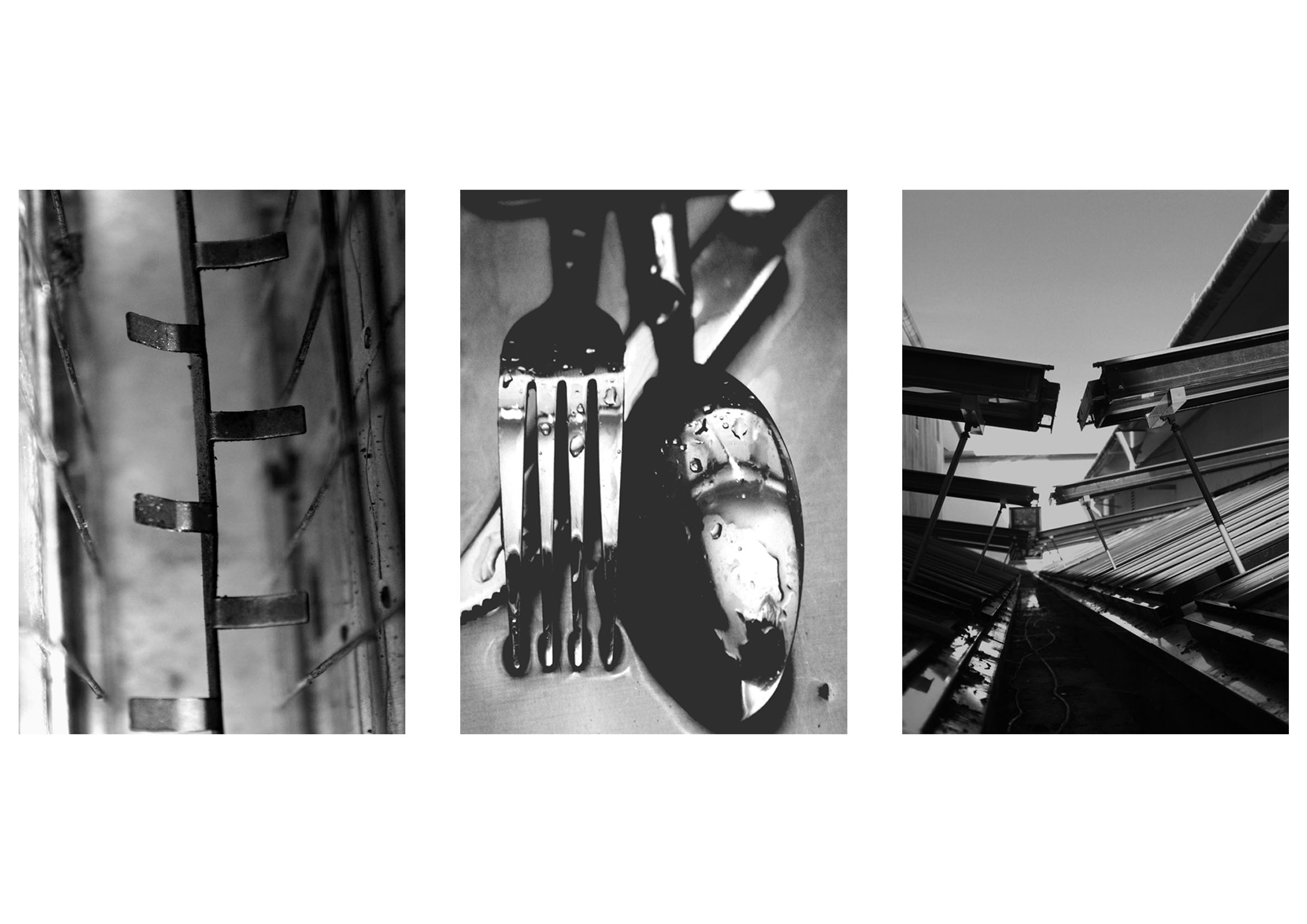
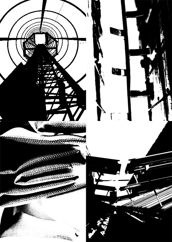
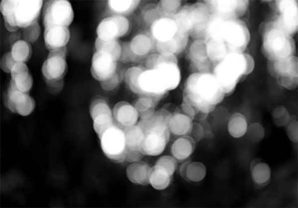
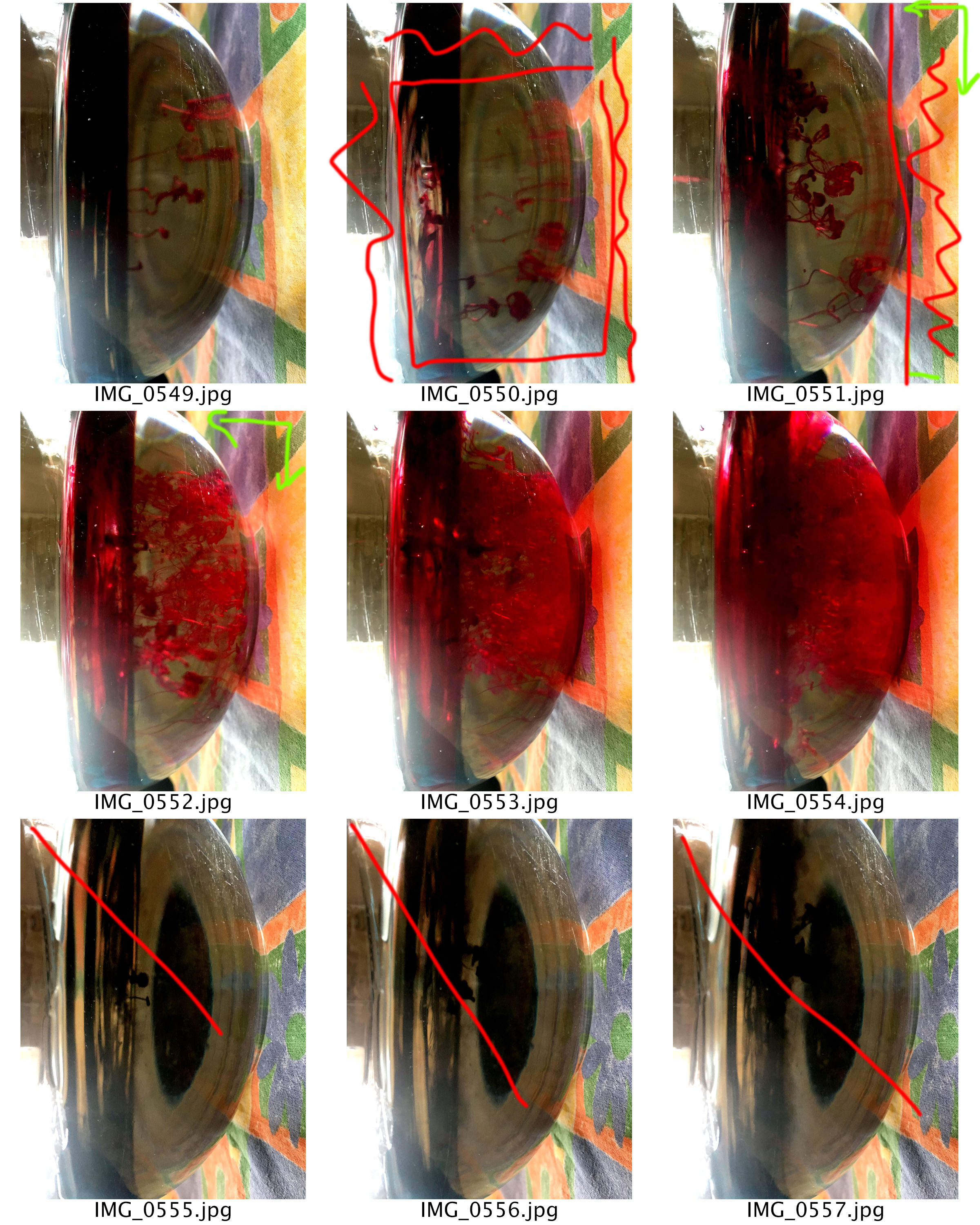
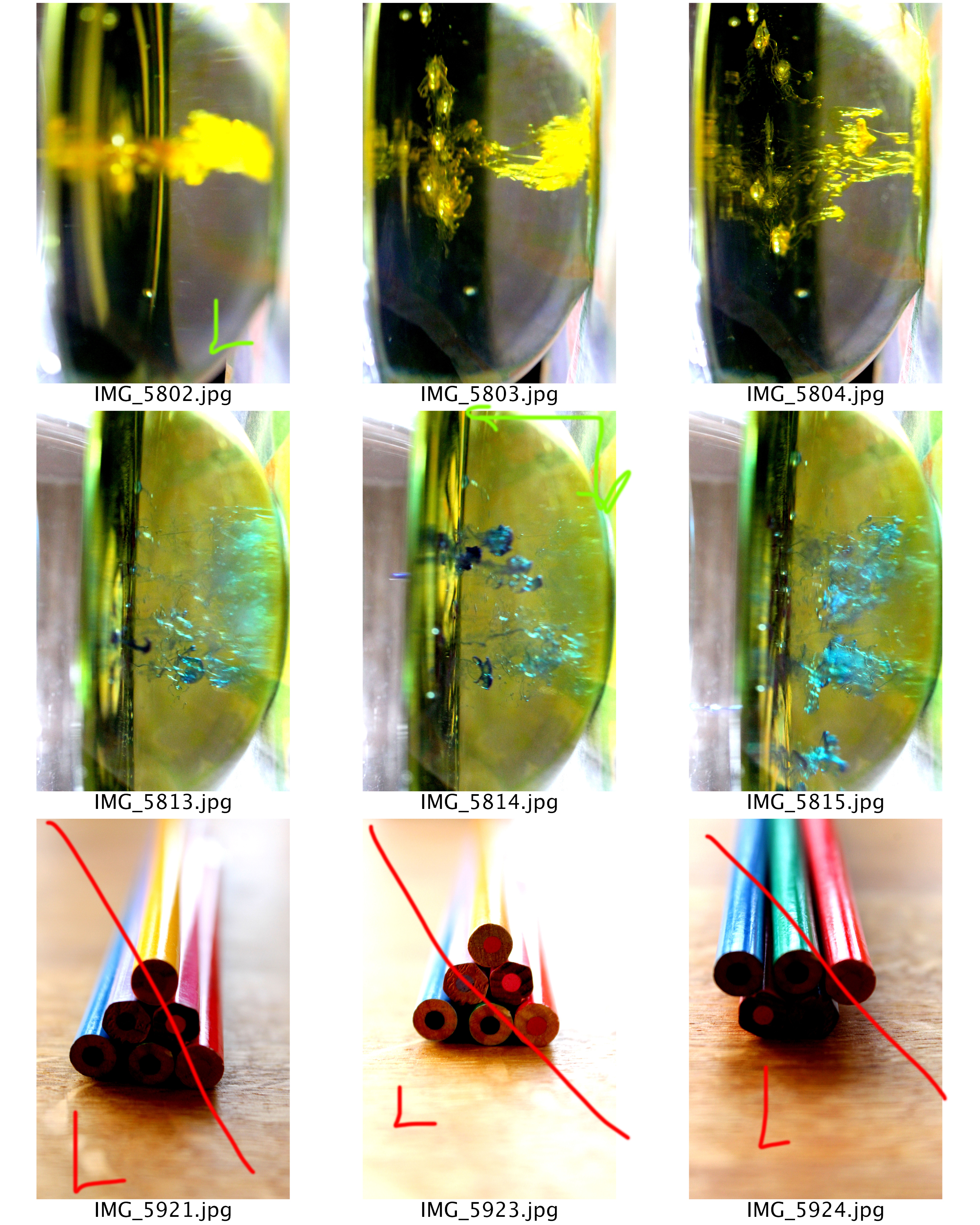
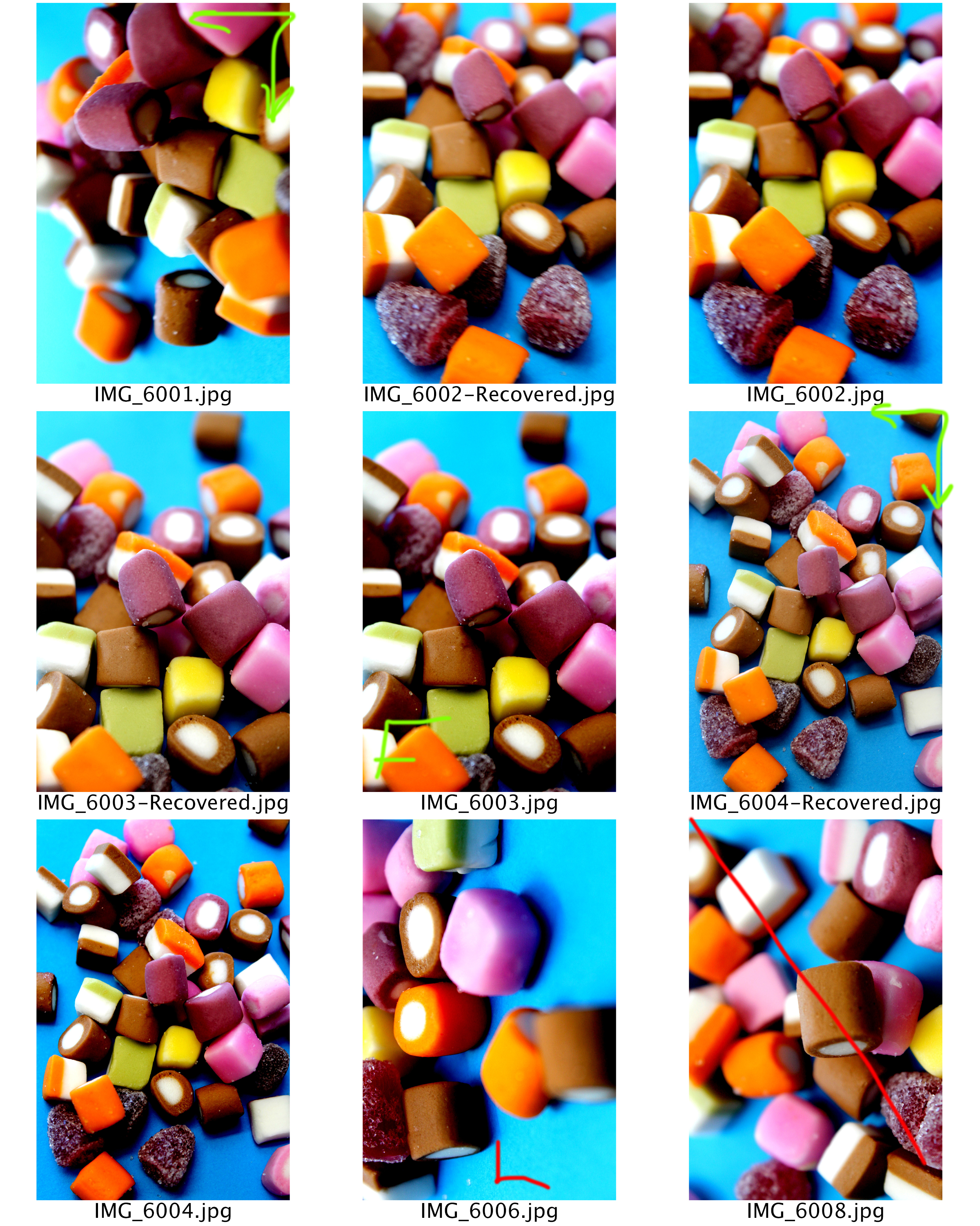
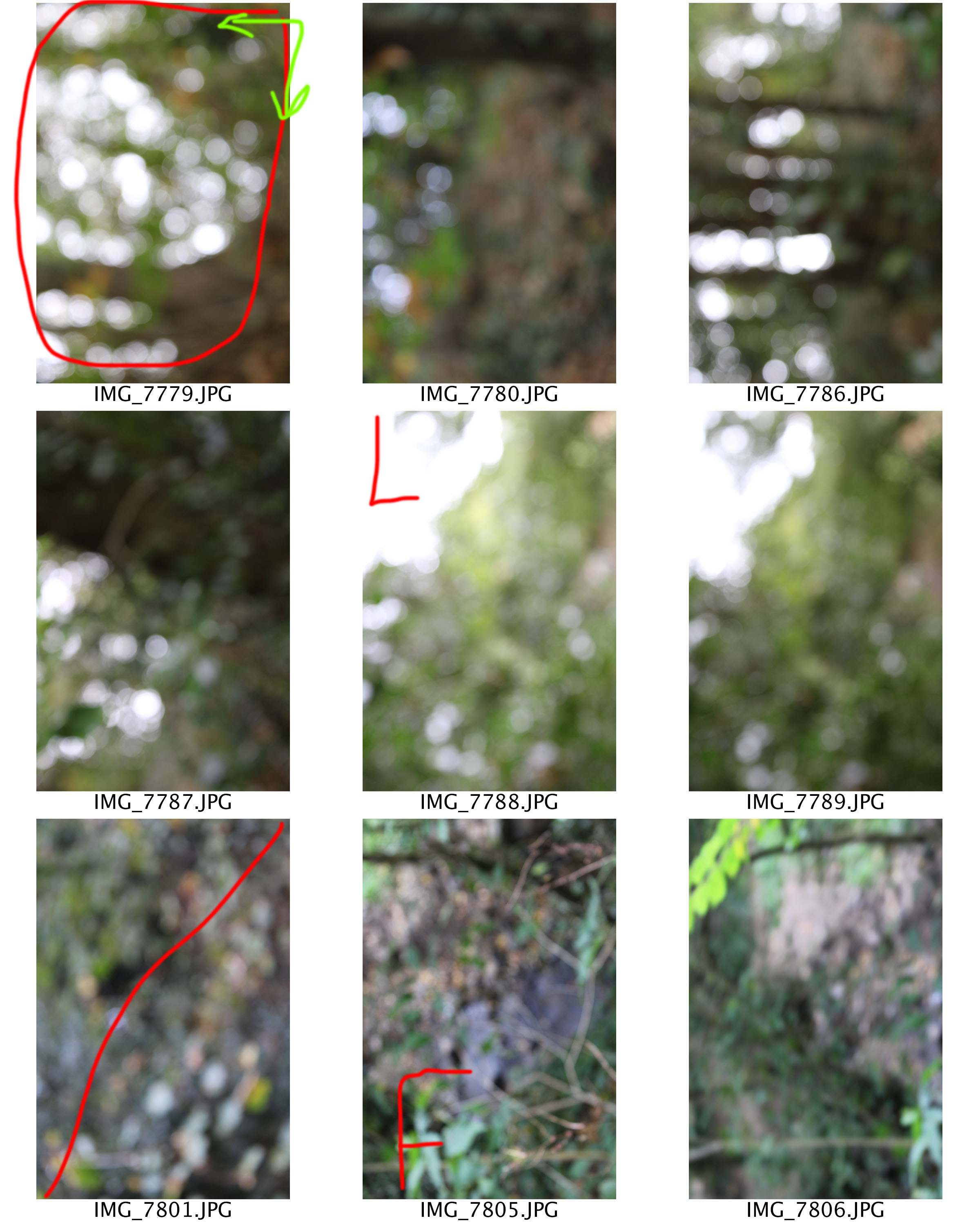
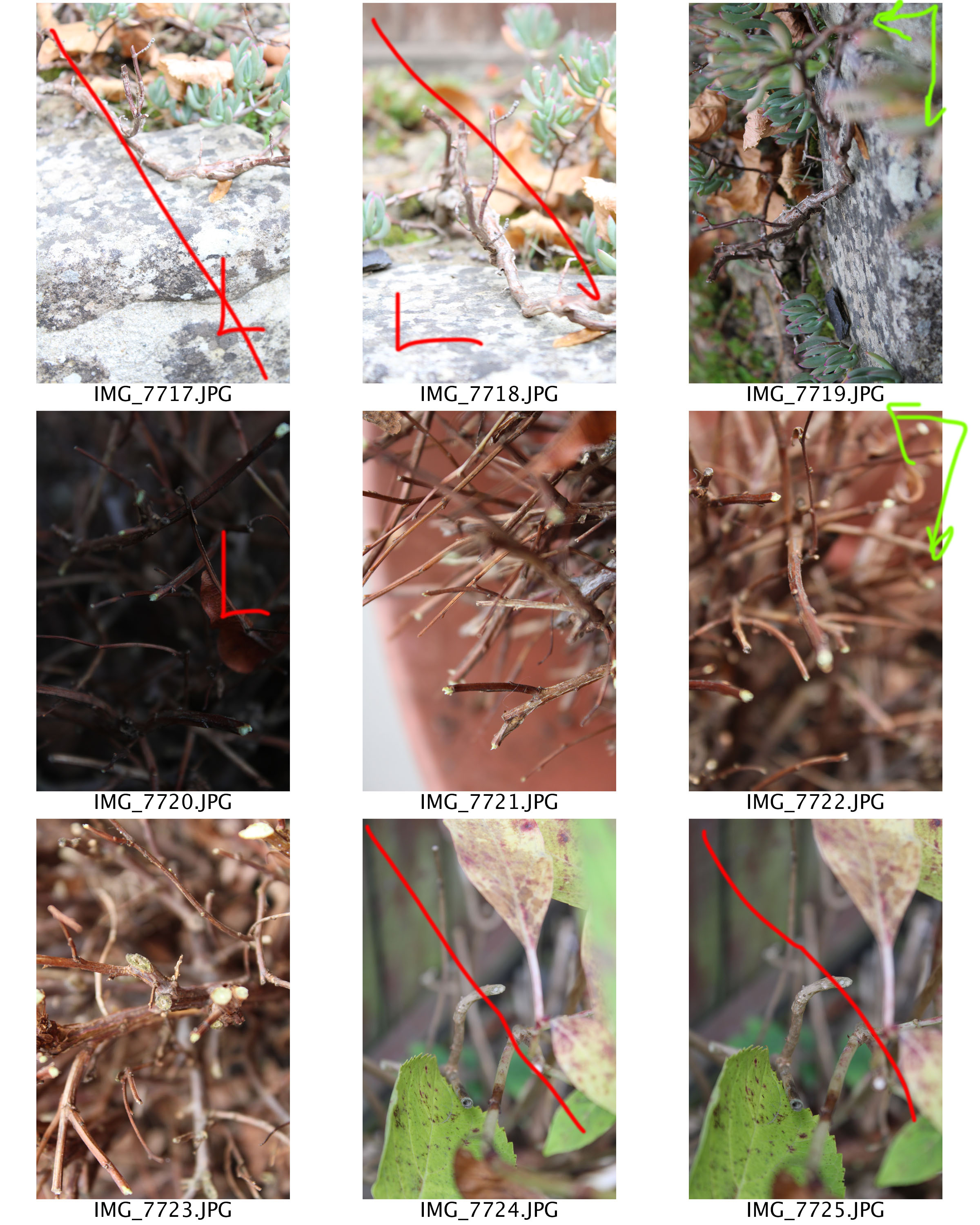
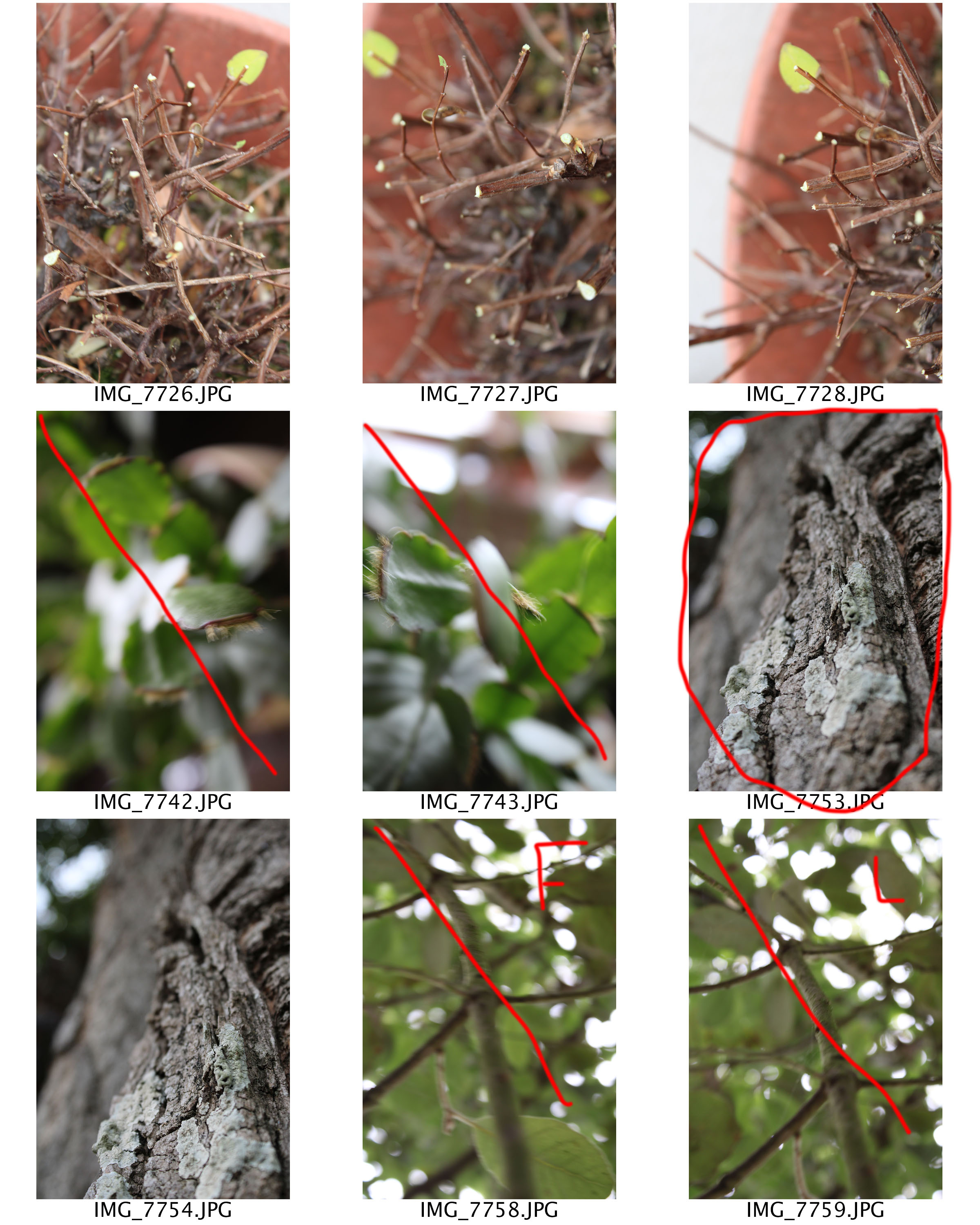
Contact Sheets
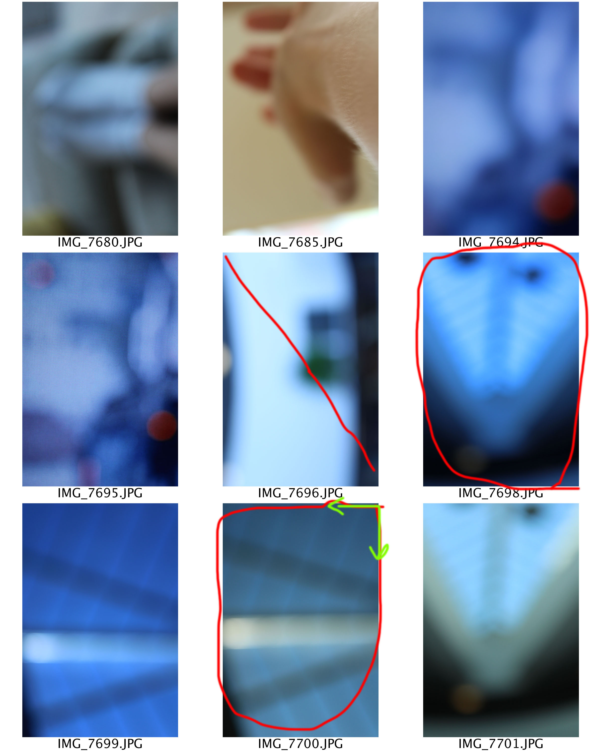


Edits
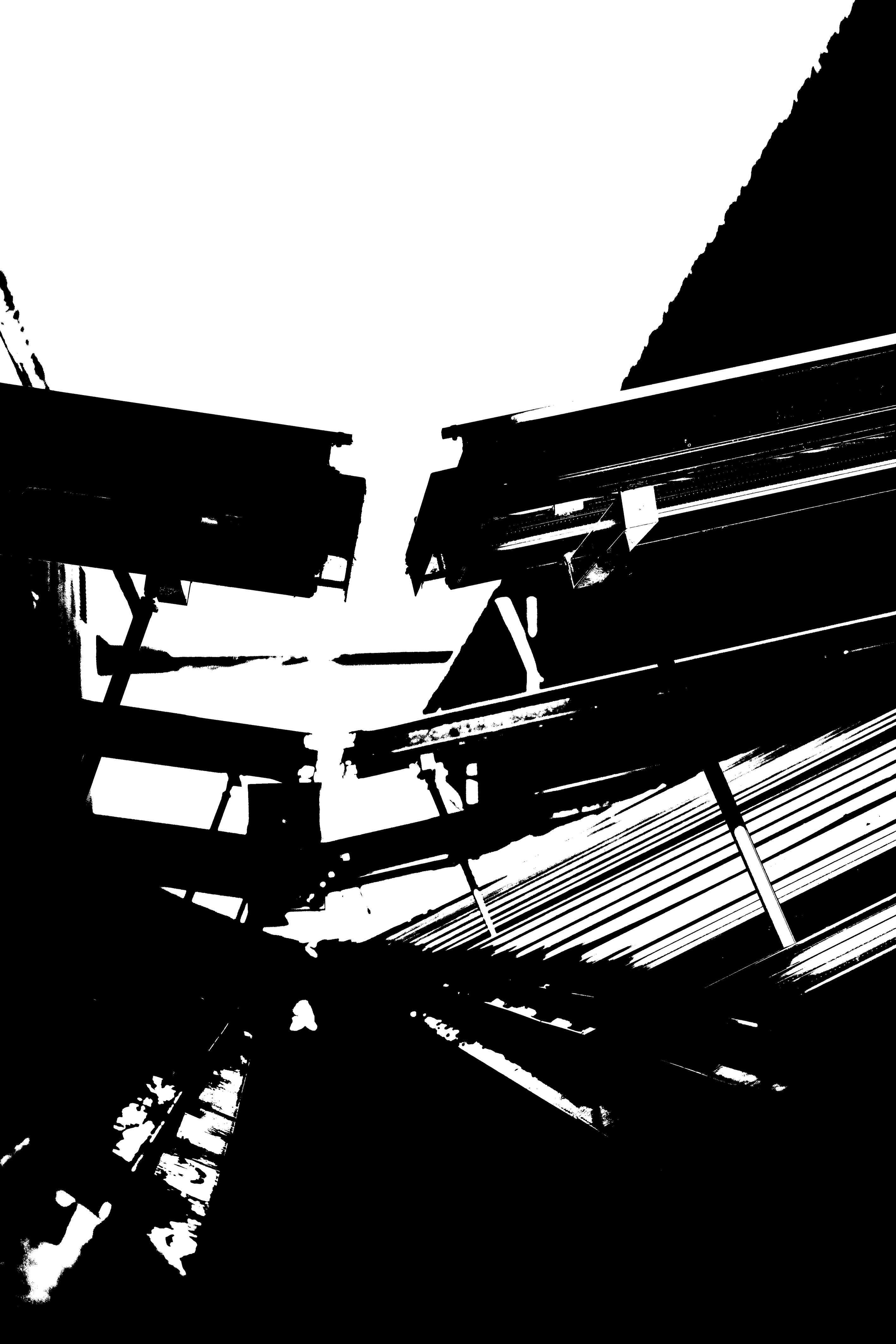
As mentioned in the planning the aim of these edits where to keep things simple. To start of with I levelled the images slightly darker than usual, to allow different tones to be shown and the light patches to be brighter. I then turned the photographs in to black and white by lowering the saturation. I am really happy with the way these three edits have come out as they create the similar blur/distorted effect that Meatyard’s photographs did. I also believe that these three images successfully meat the aim of Meatyard’s series ‘No Focus’, thus resulting in this photoshoot being successful.

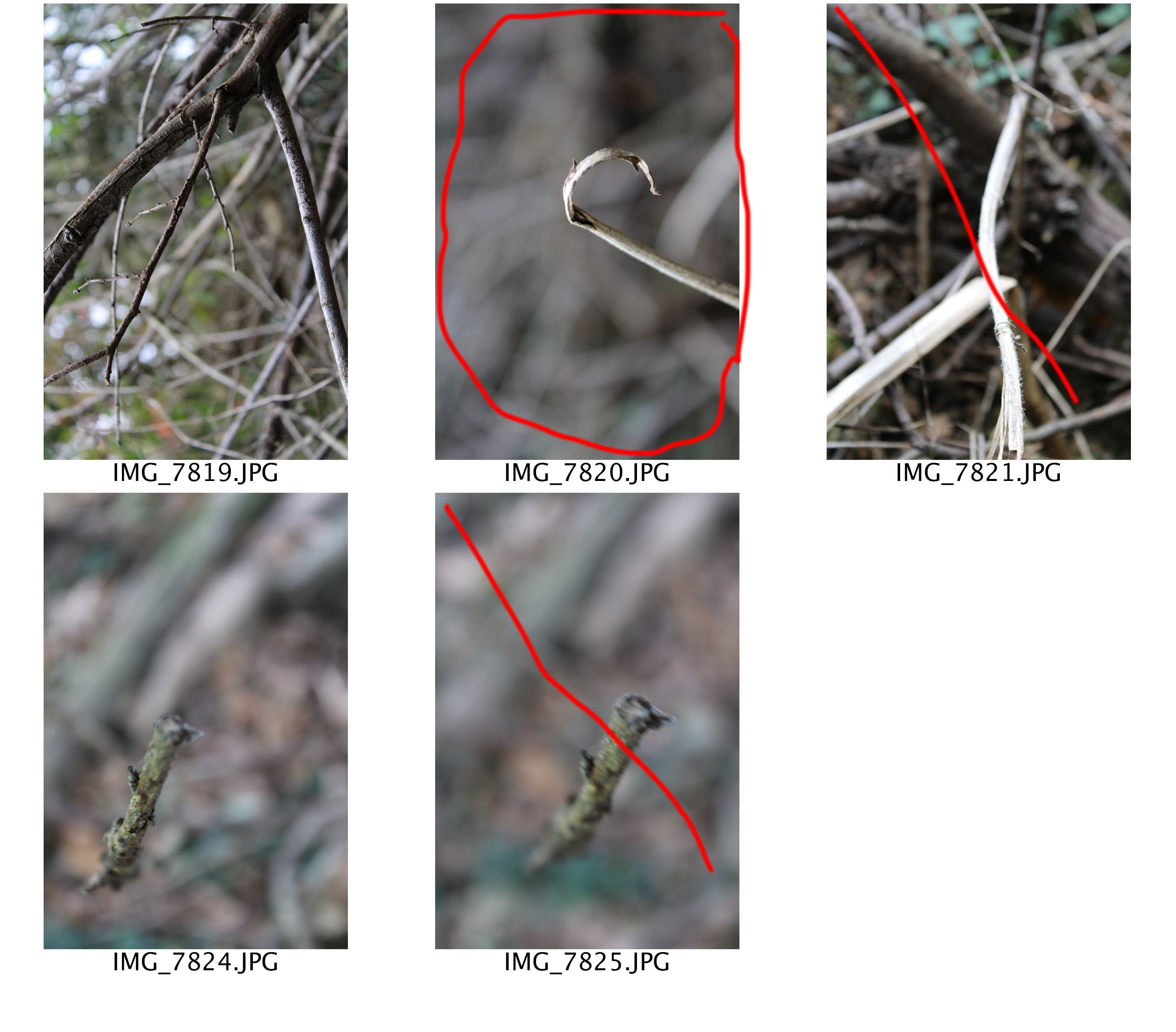
Another photographic series that Ralph Eugene Meatyard has produced is called ‘Zen Twigs’. Within this series, we are able to see Meatyard experimentation with depth of field and focus. The title of the series is ‘Zen Twigs’ which is a unique name. It suggests to us that the twigs are in a peaceful state, as Zen means a state of peace and meditation. Before looking at the images in this series viewers are able to predict that the main focus point will be of twigs, due to the name of the title.
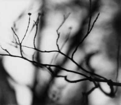
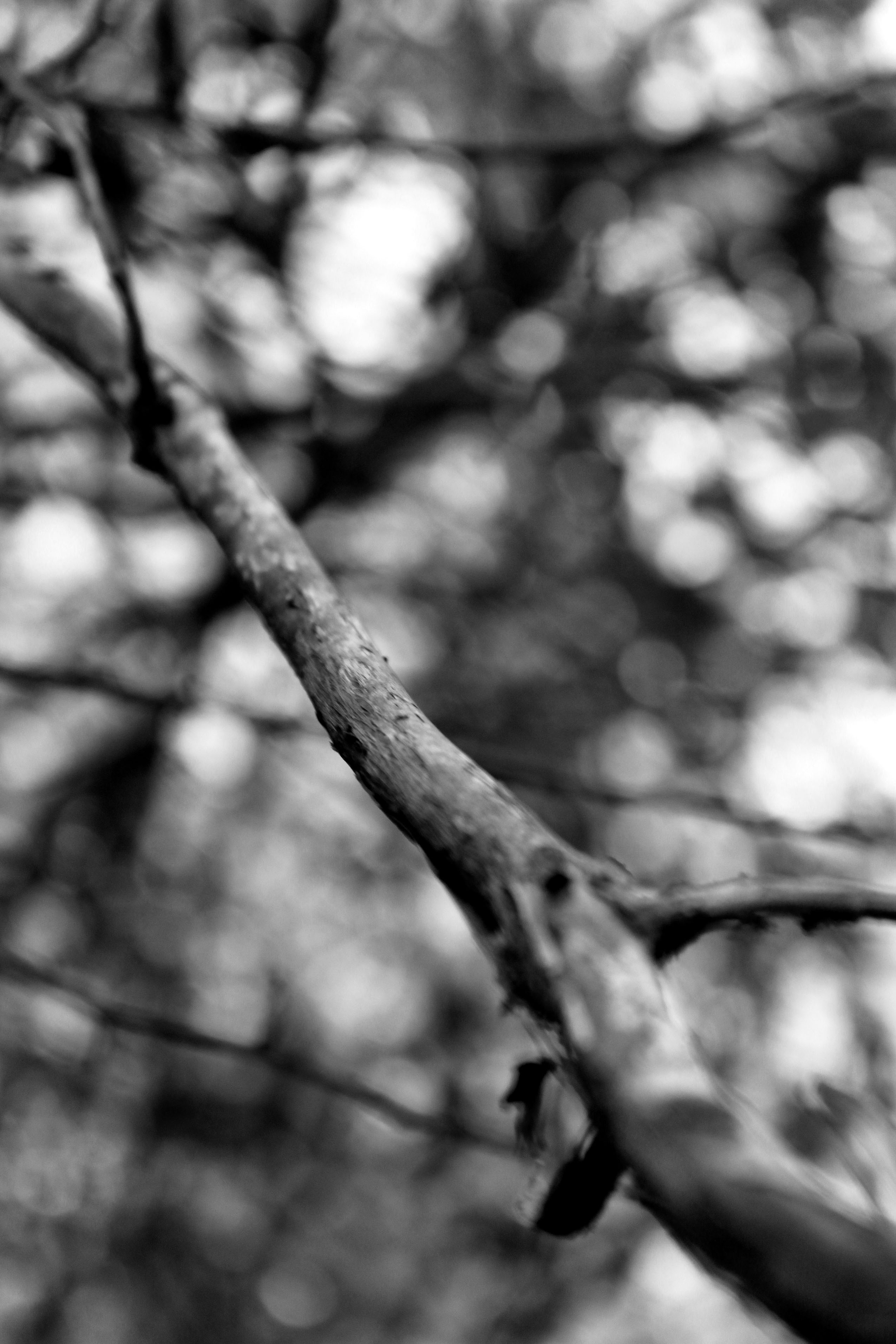
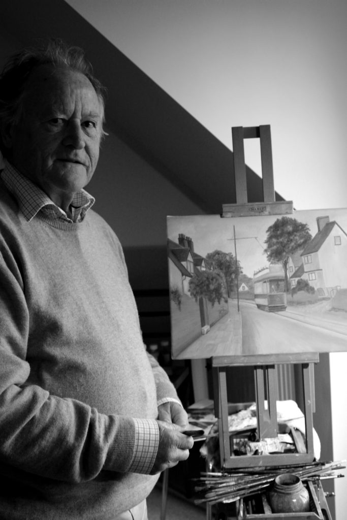
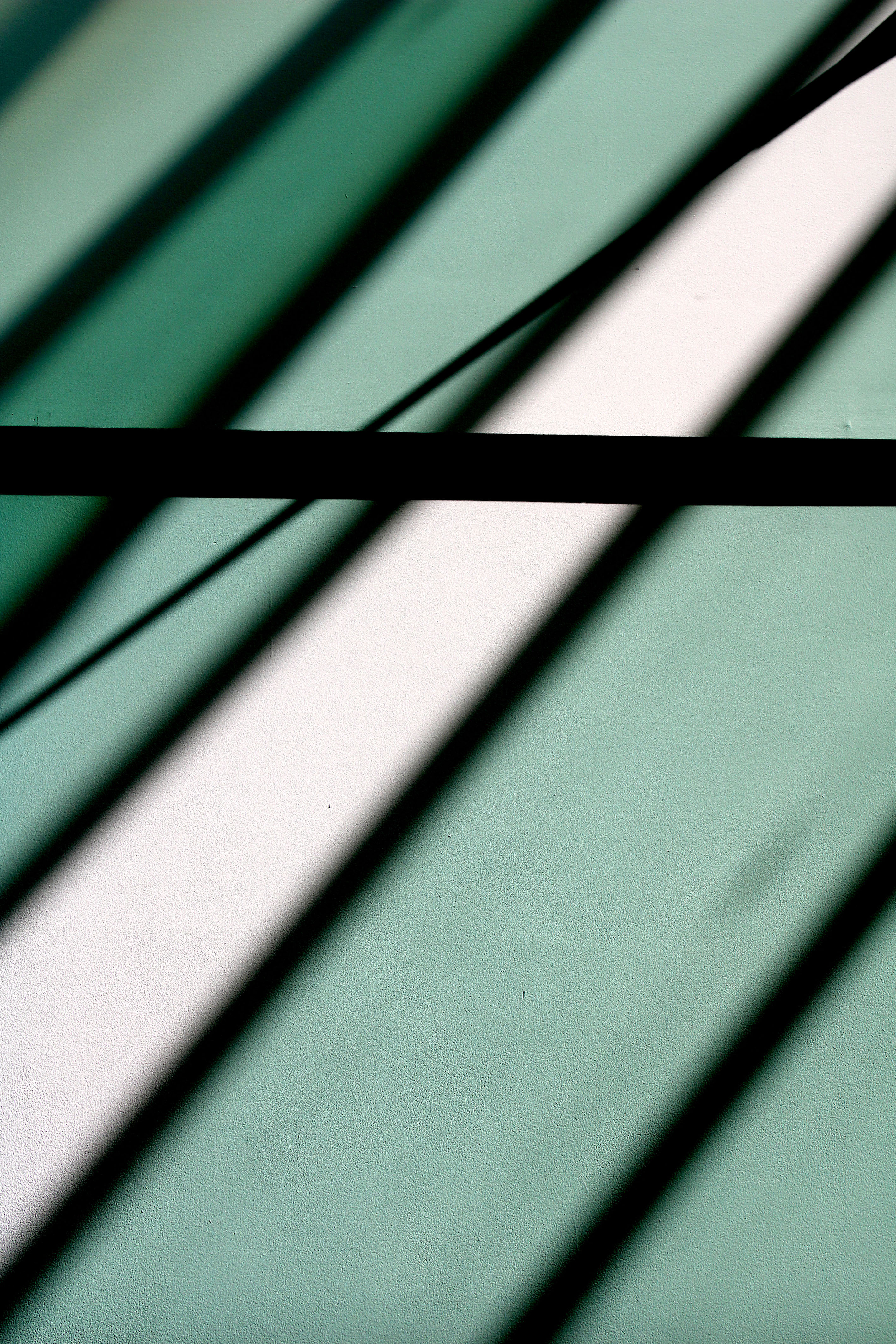
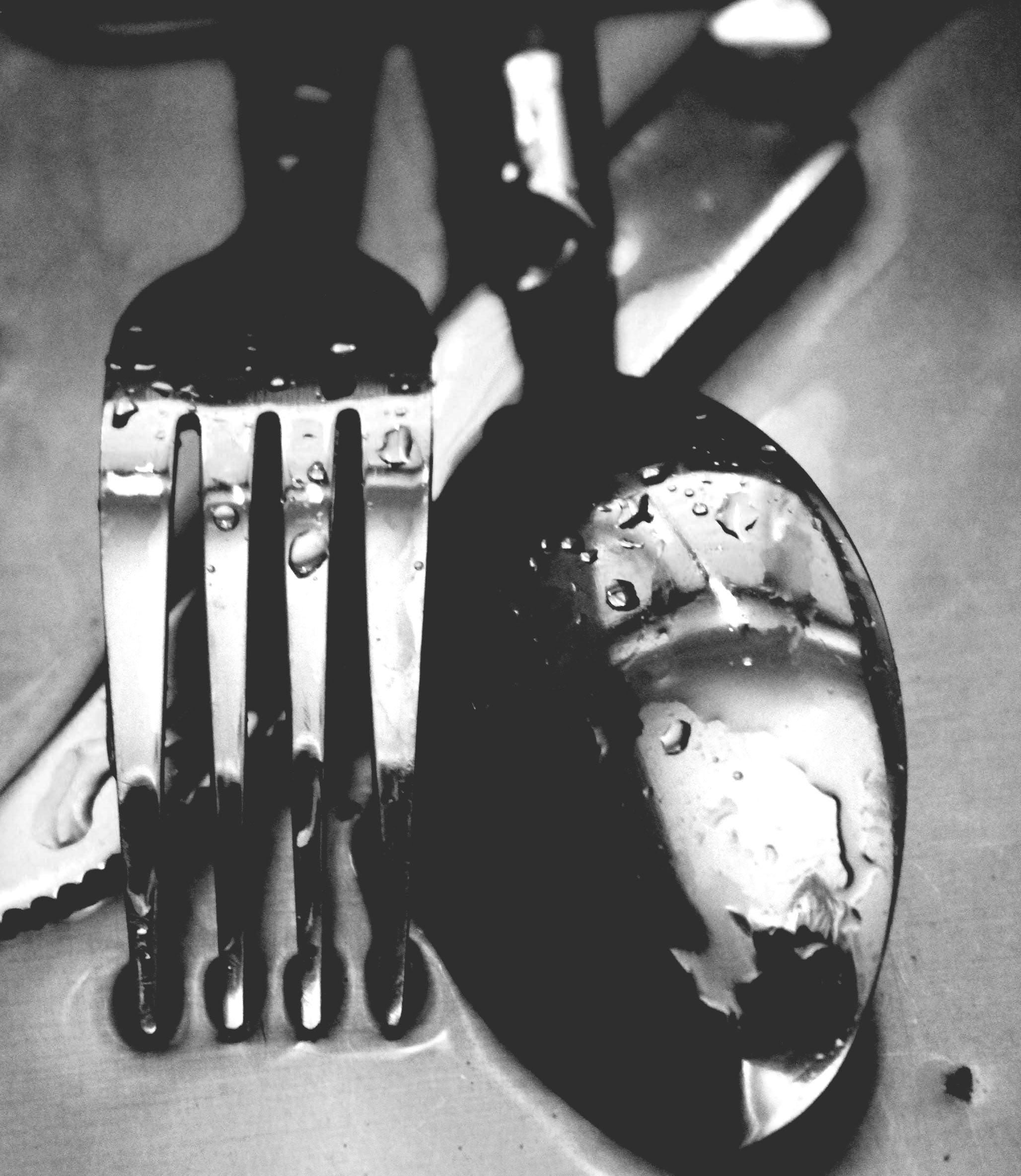
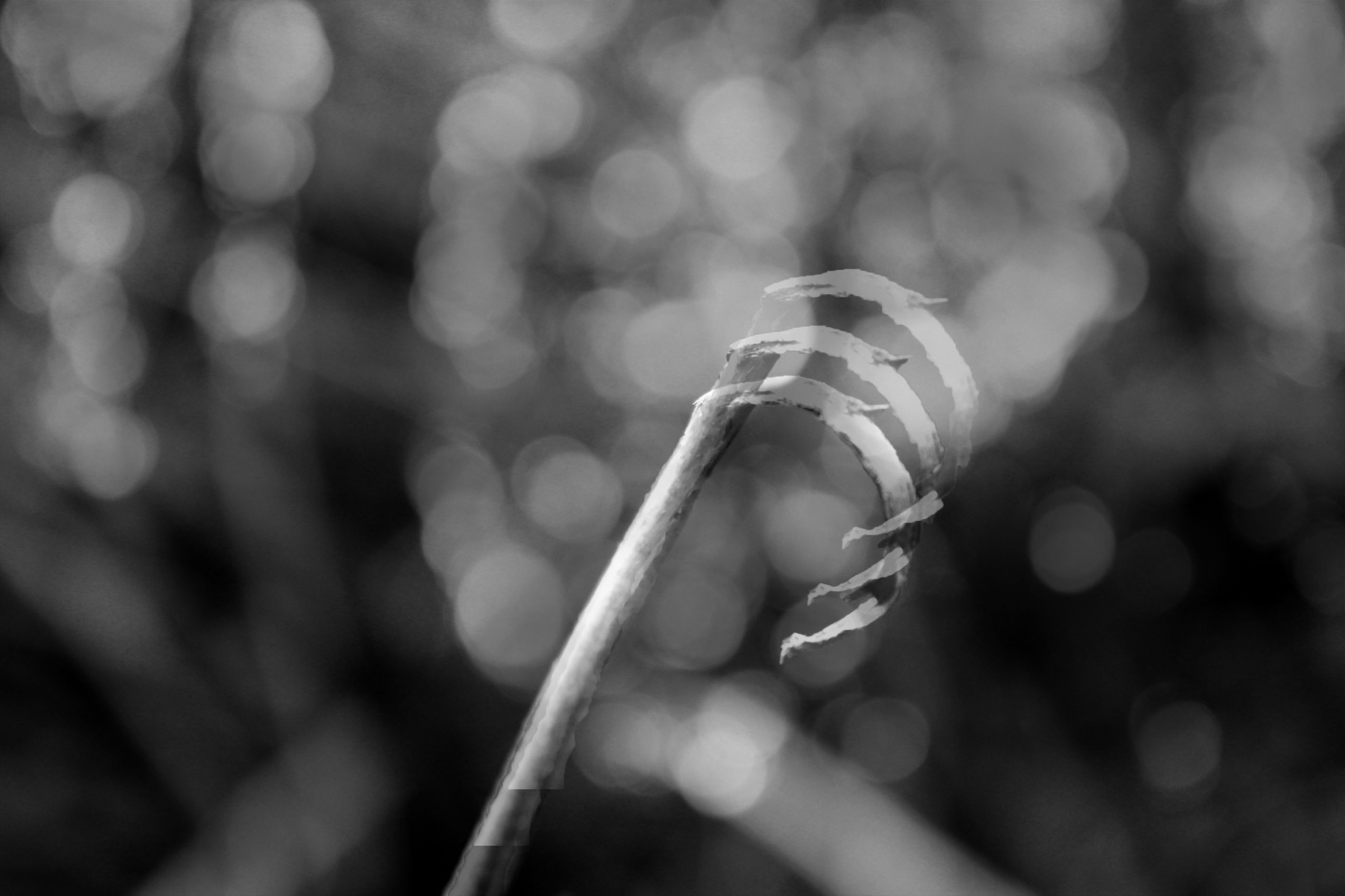
Looking at this image, we are able to confirm that the main focus point (subject) is the twigs which are located in the centre of the frame. Due to this being the main focus point it us where the viewers eyes are first drawn to. They then follow the twigs line, which moves their eyes out into the blurred background. Due to this it implies that the image has a narrow depth of field. This also means that the aperture of the lense is likely to be low in order to help capture the blurred background. This image is also presented in black and white, which outlines the different tonal regions within the image, making the depth of field more noticeable to viewers. The image being in black and white contextually shows the period of time when the photograph was taken. It suggests that this image was captured when coloured images could not be captured. Moreover, the formal elements which are being presented in this in this photograph are line, tone and texture. These are all shown through the twig which is gradually becoming out of focus. Due to the foreground of the image being in focus, it implies that a quick shutter speed has been used. We are able to see a clear link between the title of the series and the images, this is because the twig is seen very still and in focus (alone) which shows a sense of Zen. Conceptually, the twigs are used to create peace and a sense of relaxation between the viewers and the image, creating an emotional connection. I really like the images within this photographic series, due to the simplistic techniques used making the subject detailed. I also like the peaceful mood which is presented through the image, as it is easy to look at.
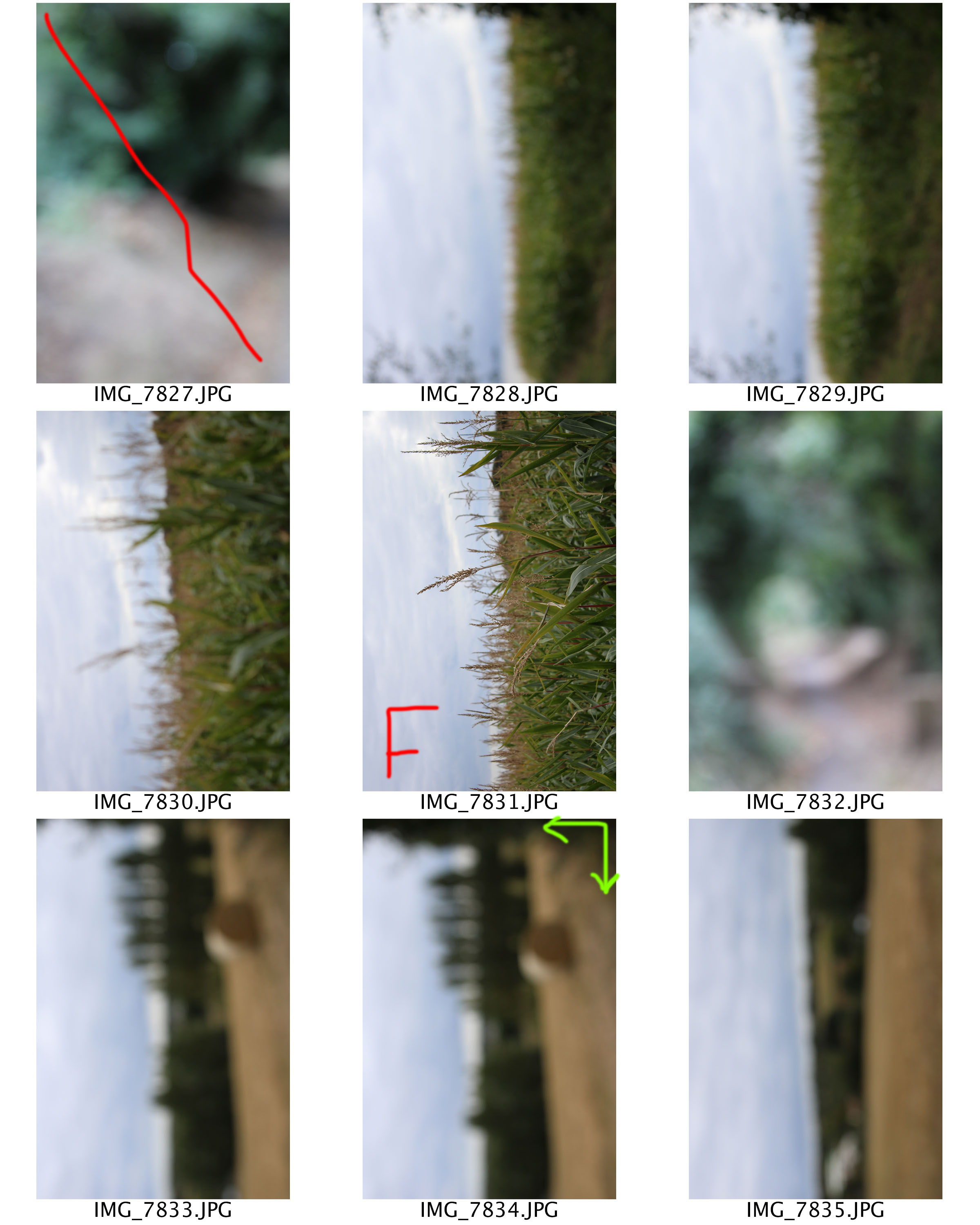
Planning
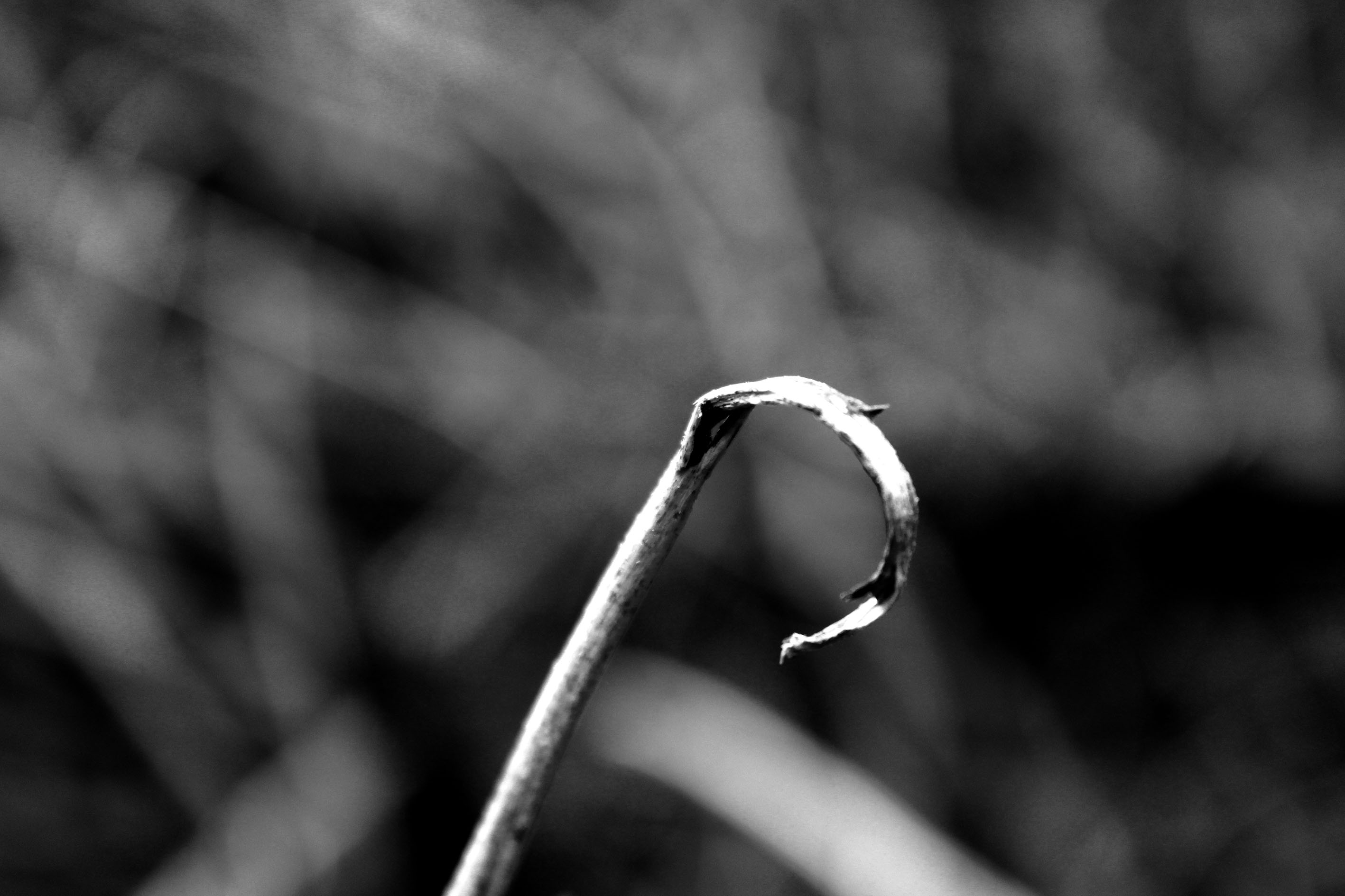
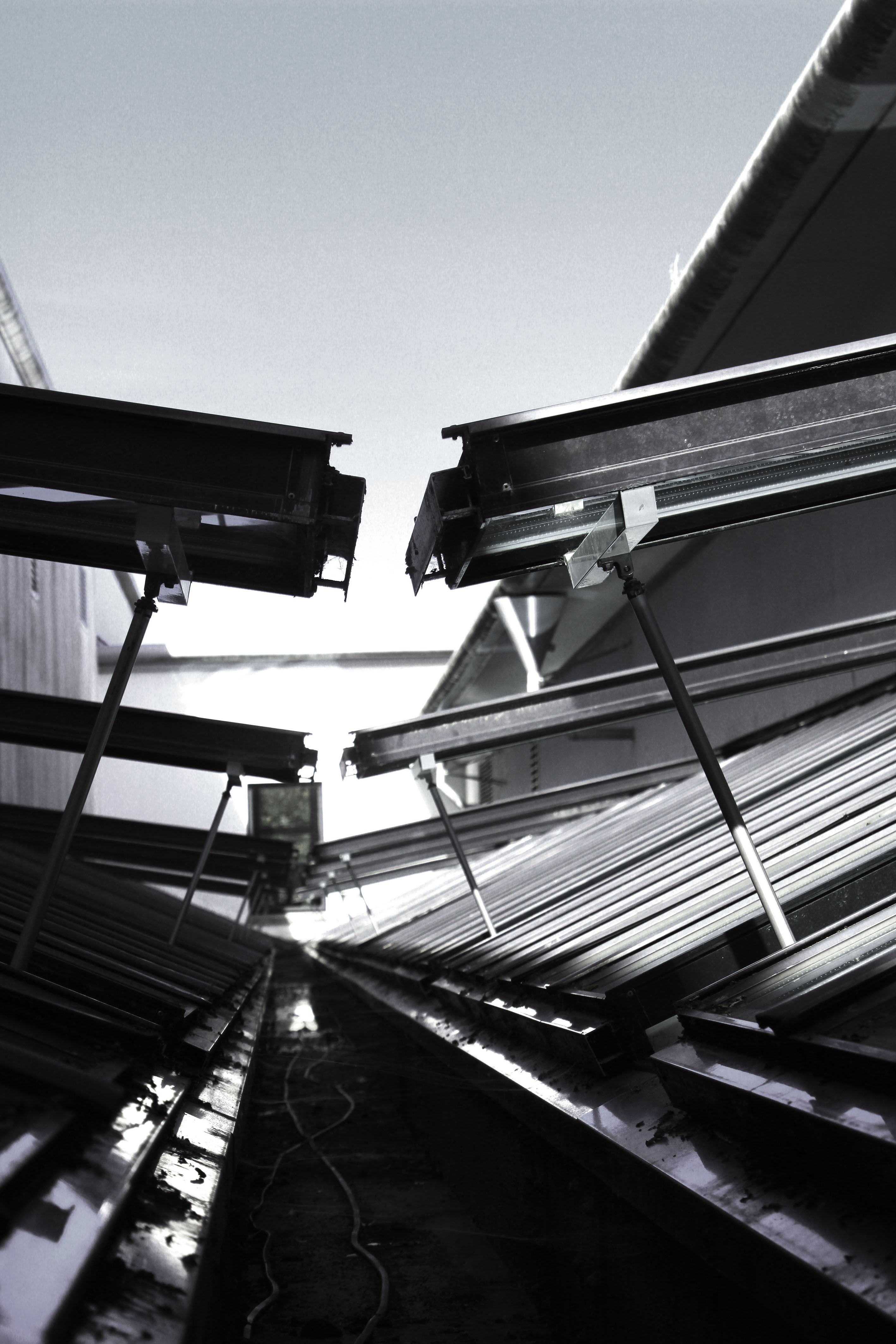
For this photoshoot I would like to use natural lighting, in order to allow the twigs to seem more natural and it will provide context to the images. To capture the photographs I am going to go into the woods and aim to capture as many interesting twigs I can see. I am going to attempt to use depth of field, focus control and leading lines within this photoshoot in order to make the images interesting and like Meatyard. Moreover, I will keep the edits simple, like the first photoshoot, in order to make my work look more like the artist.
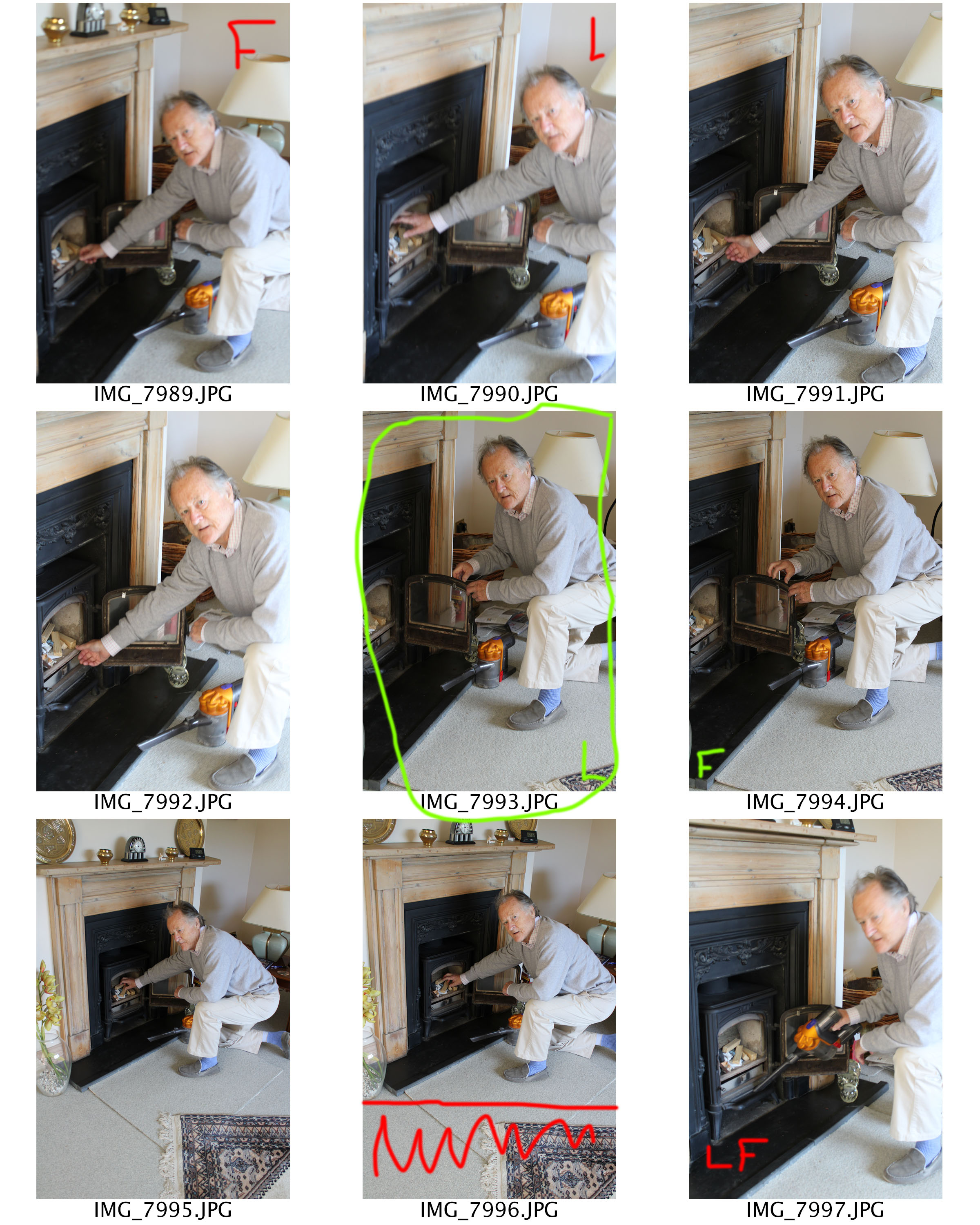
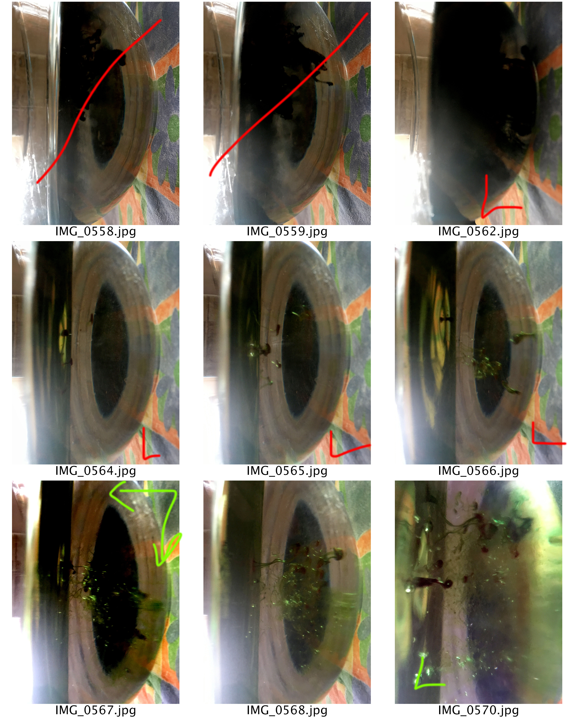
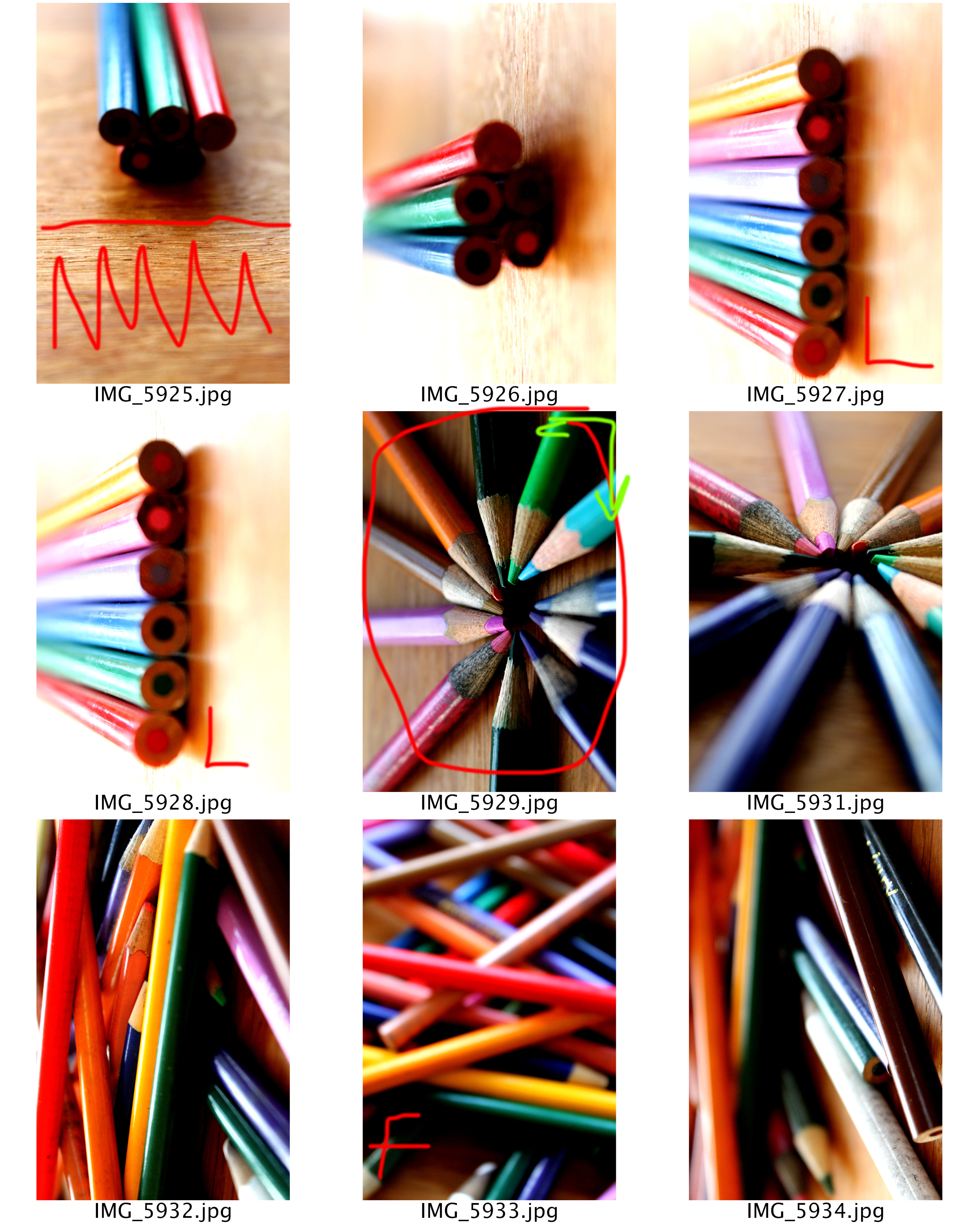
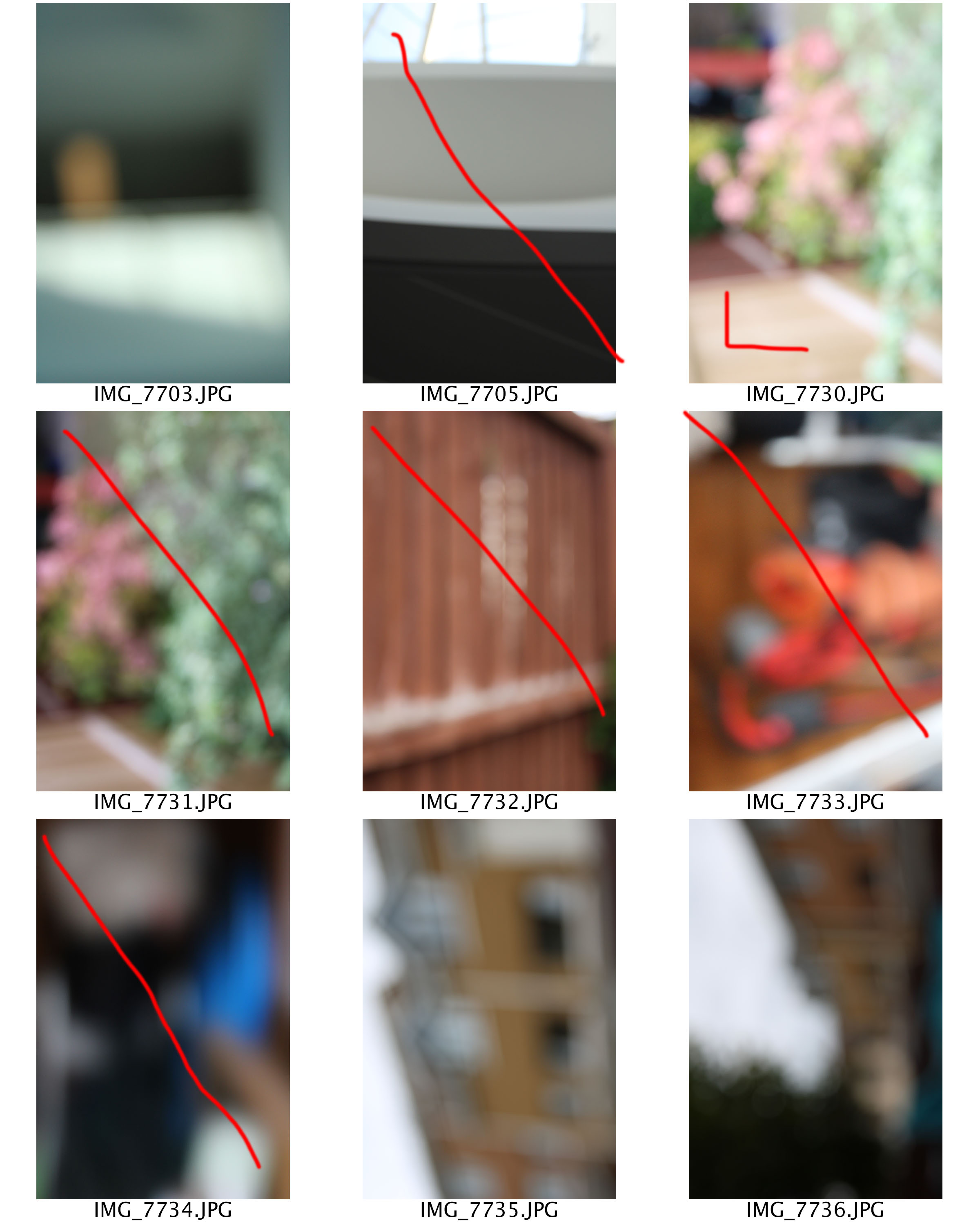
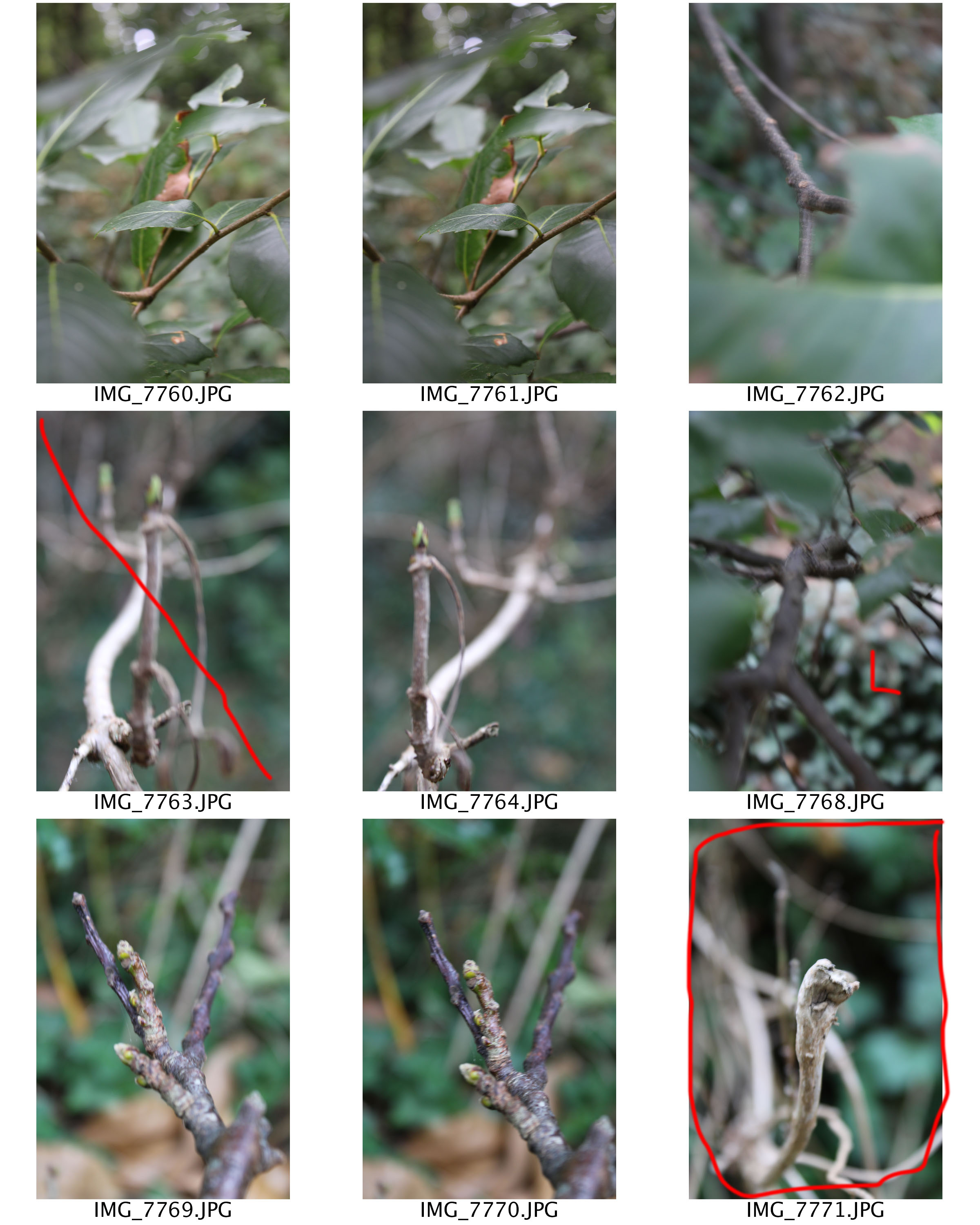
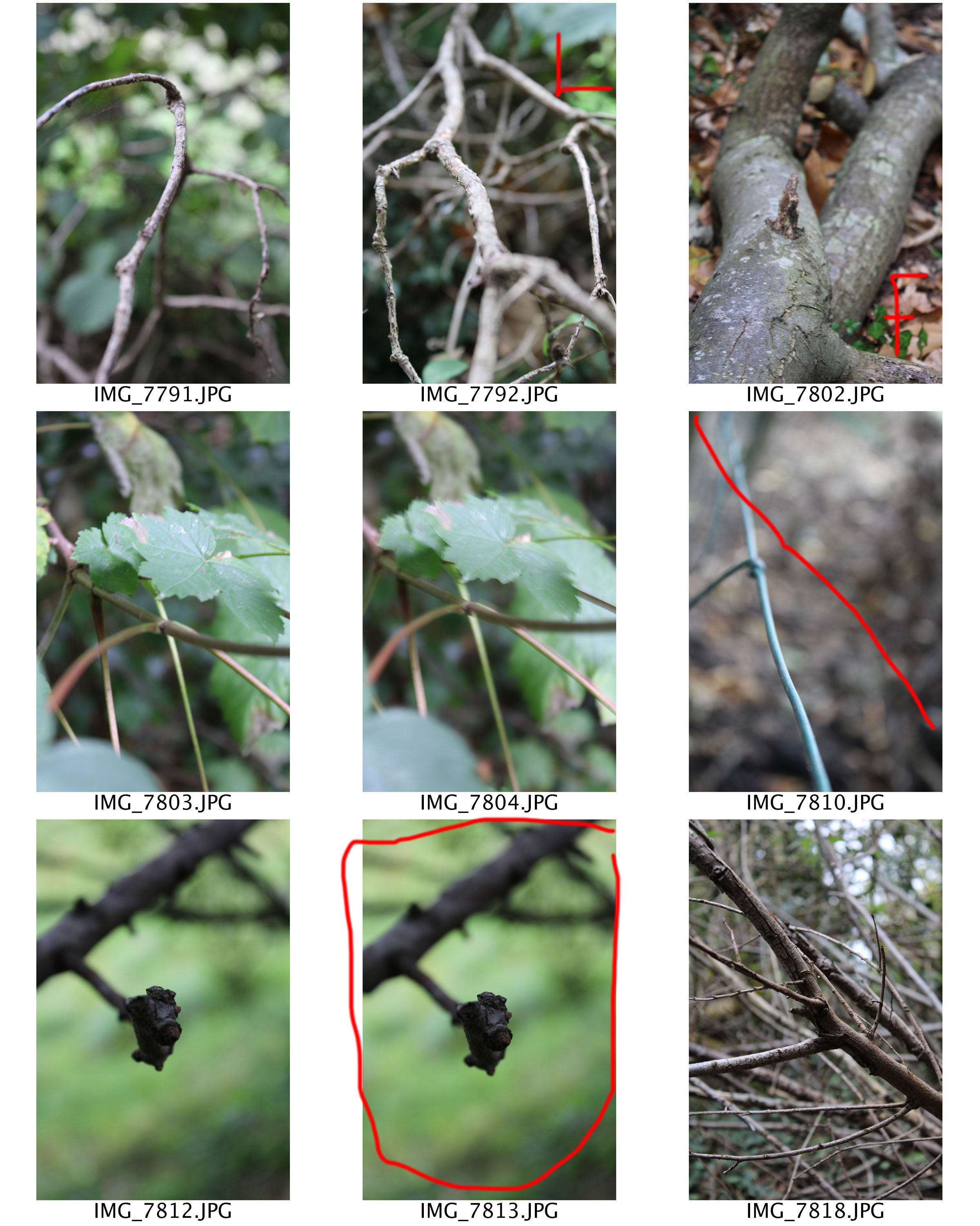
Contact Sheets

Edits
For all of these edits I decided to level the images, allowing the different tones to stand out more and make the images seem sharper. I then adjusted the curves, in order to support the effect I mentioned above. I then turned the images into black and white, like Meatyard did. I am very happy with the way the edits have come out as I believe that I have produced some strong responses to Meatyard’s work. I have been able to use the skill of manual focus, depth of field and leading lines, which has definitely improved these images.