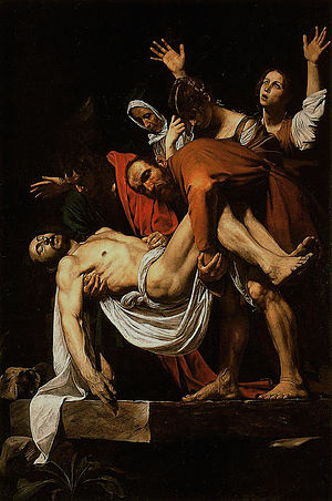
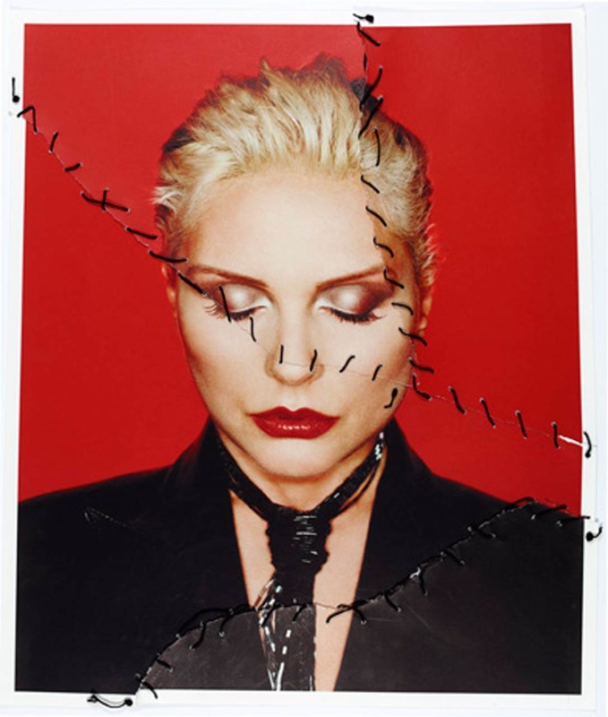
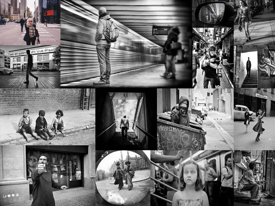
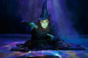
All posts by Nathan H

Filters

Author:
Category:

Photo-Montage Artist Research

Brno Del Zou

Brno Del Zou Photograph From photosculpture series

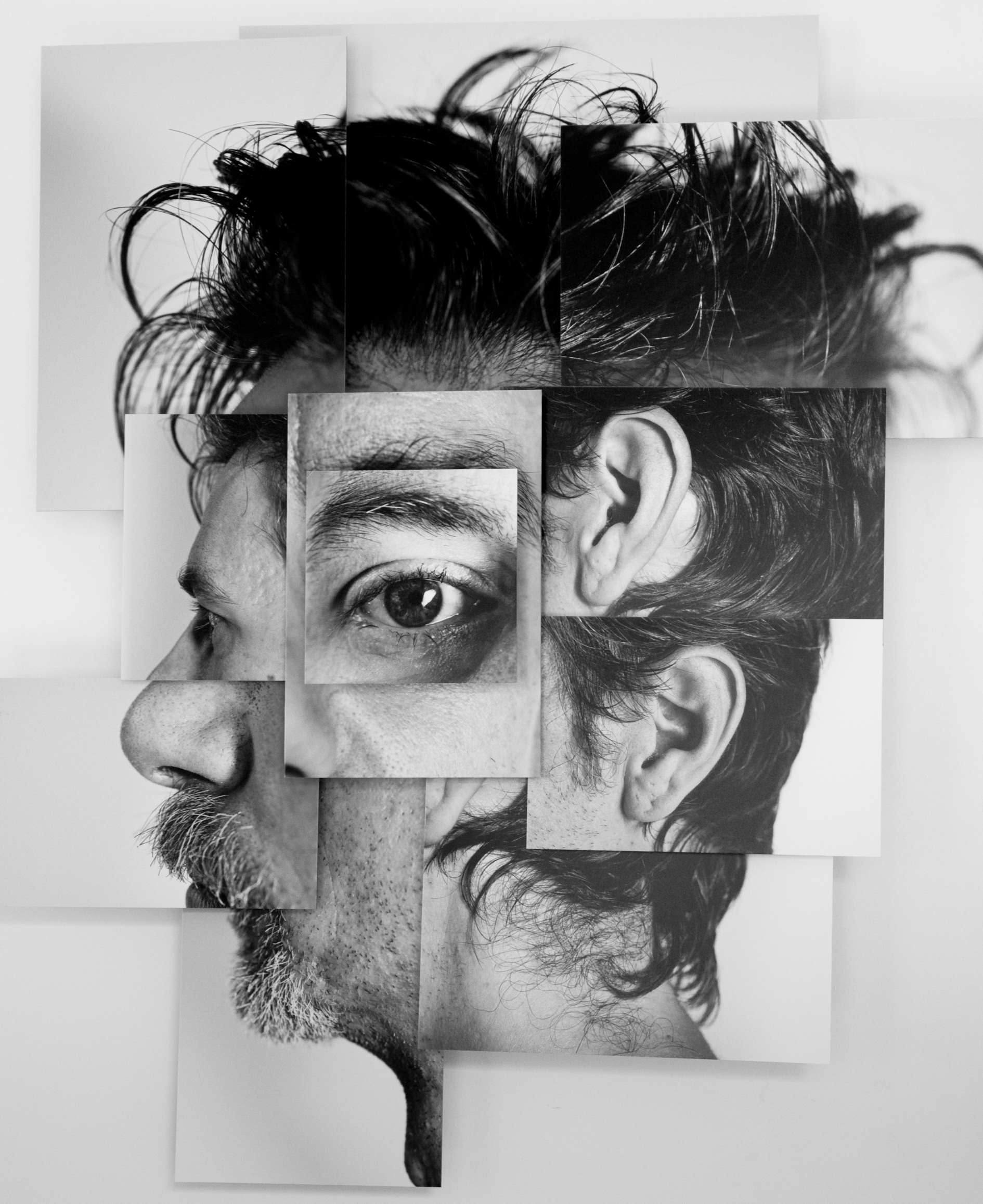
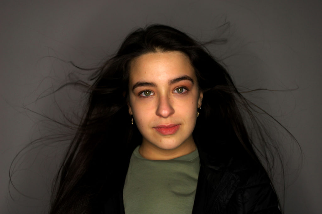
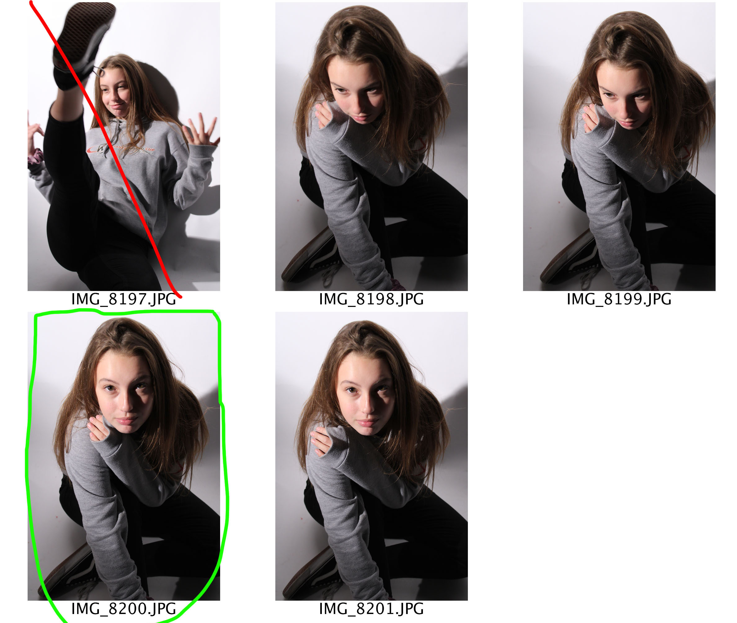
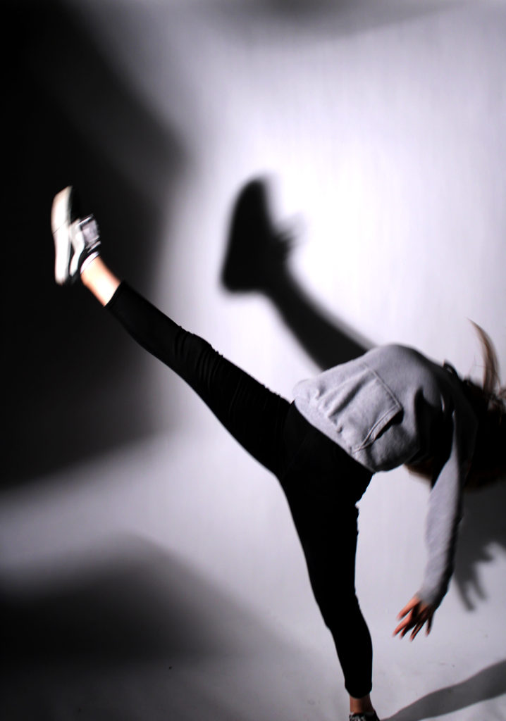
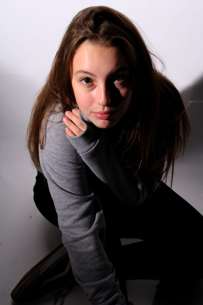
Brno Del Zou is a French photographer who was born in 1963. In his photography he takes a very imaginative look towards a human. He wants to show his viewers the chaotic side of our brains. This is seen as his artistic aim. In my opinion I believe that Del Zou has met his artistic aim. In this series of photographs ‘photosculptures’, he wants to be able to understand the human body better and so he does this by using fragments of the faceto create the bizarre looking face. This clearly links to the conceptual factor of the image, understanding the human body in all of its complexity. The facial features used helps to create a connection of scales, this is outlined by the volumes of the body features. The photographs are all in black and whitewhich helps Del Zou to bring across his desired mood and tone. I believe that the mood and tone presentedis a mysterious and artificial, which helps to intrigue the viewers to his photographs. More over the apertureis small as not much is in the frameof the photograph. Moreover the message which is being presented through this series of photographs is that the human mind can be chaotic, and it is normal if it is. The set of photographs are all take as portrait at a straight on angle, which allows the models face to be the main focus point.The tone of the photographs seems to be quite light as the tends to be no shadows give off the body parts nor the face itself. There is a low contrast in the tone, which helps to present the overall creative theme. The lighting used seems to be artificial lighting, which seems to be soft allowing the models body to easily be recognised. The shutter speed of these photographs looks to have been normal due to the fact Del Zou is not capturing anything moving. The depth of field in these photographs is short as the models face is the only object which is in focus. The background of these photographs are plain and simple, allowing the viewer to focus primarily of the distorted models face. The images within the series are mainly in black and white, however, in some of the images there is a hint of colour, which allows more important features to stand out more. Due to the images being in black and white it allows the tone of the image to be clearly presented. Del Zou’s photography from the photo sculpture series is a prime example of surrealism. The artist is not presenting a political viewpoint, but is taking the route of a non-naturalistic photograph.

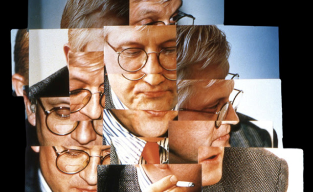
I believe that Brno Del Zou took inspiration off David Hockney who produced similar work. In Hockney’s work, he used different angles of a model and combined them together to create a fragmented surrealist piece. Whereas, in Del Zou’s work he uses the same angle just different facial features to layer up to create a fragmented surrealist piece. In Hockney’s work the images are mainly presented in colour and their is a background for the model which allows context to be added to the images and allows viewers to think about the situation the model is in. In contrast, Del Zou’s images are presented in black and white and have a plain background, which helps to alienate the models. A similarity of both artists is that I believe that the share the same artistic aim as the tones of both images are similar. Moreover, they both took the surrealist approach which allows their creativity to be expressed. Finally, I think that Del Zou’s work is an updated version of Hockney’s work due to the similarities in their work.

David Hockney’s Photograph

Raoul Haussman

Raoul Hausmann – Der Kunstkritiker

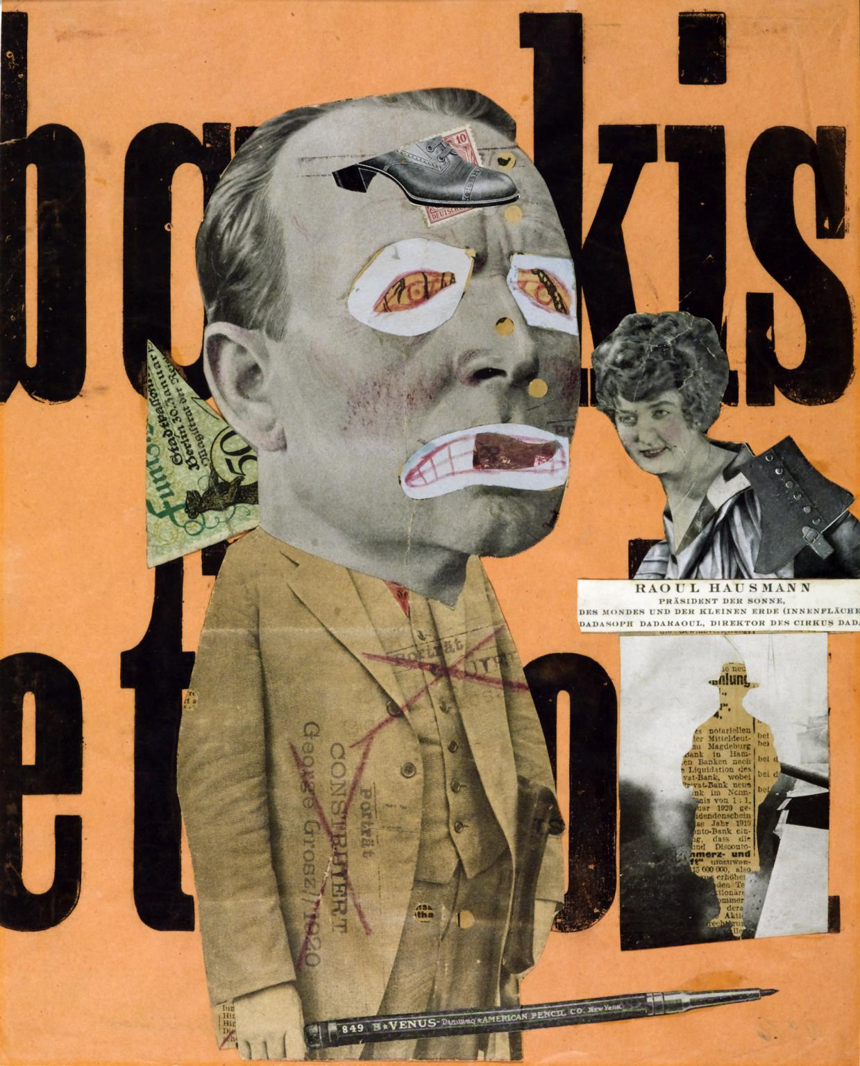
In 1919  Hausmann created ‘Der Kunstkritiker’ which is also known as ‘The Art Critic’. He created this photo-montage’ to challenge the idea of a stereotypical art critic, and the an art critics requirements in order to decided whether a piece of art is fashionable. The main motivation for Hausmann to create this image was because he was a member of Berlin’s Dada movement, and was not too happy with the traditional art styles and pieces they where creating so decided to make his own to present his disapproval to this. This photomontage has taken a disorganised style which allows the feelings of Hausmann to be clearly be presented. Due to how old this image is, it stands to reason that this photomontage was hand crafted. The main focus point is the art critic which is located in middle of the image, making him the first thing viewers look at. The head of the critic is much larger than the body, which presents the idea that art critics can consider themselves to be big headed and much superior than others. On the face the eyes and mouth has been covered by which seems to be a child’s drawing of eyes and a mouth, which presents the idea that these people are child like. It also shows that critics opinions are irrelevant as they can not see art as it should be viewed. Their is a large pencil as well in the critics hand, which shows the power that the pencil has. It is considered powerful as it is what the art critic would use to make their review about the art work. Next to the critic is a woman, who looks to be apart of the upper class, due to the way she is dressed and presented. During the time this photomontage was created the class system was being used. Hausmann used an upper class lady as it shows that the art critics where not basing their decision on whether they liked the art but on whether members of the upper class would like the pieces of art. Behind the critic is a triangular cut out of money which presents the idea that people in this job was money orientated, they worked hard in order to get money off the upper class, who had way too much power. Underneath the upper class lady is a newspaper article which outlines a man, which is taken from the business section.  He added this onto the montage in order to show that he does not like the fact that people with more money have more power. The background has large words which are incomprehensible which also adds to the negative tone being created. The background colour is also loud also presenting the idea that people in this career are loud. As shown Haumann is showing his viewpoints as negative towards the class system and the way art critics work, clearly presenting a clear example of Dadaism. He is also showing that art work does not have to be created in order to please others, but should be created for self enjoyment. This piece of work is very powerful in the way that it has been done, suggesting that it was well thought out by Hausmann. In order to create a photomontage in this style I will need to think about what overall message I am trying to get across and how each image adds to the overall message.

Photo-montage Introduction

Photo-montage is two or more images to construct a college. This style of photography originated from Dadaism but is also very similar to surrealism. This style of art/photography has developed significantly since it first originated. It’s peak point was during the 20th century where multiple artists decided to experiment with creating abstract portraits. Photo-montage is still a big style of photography, as many artists are still creating this style of images. Nowadays, artists are presenting their opinions towards current political event and issues which are relevant to today, instead of issues which are no longer relevant.

Dadaism – This was the art movement during the first world war, to show the negative reaction towards horrors of the war. The aim of these images was to destroy traditional values in art and to create a new art to replace the old..

Surrealism – Is aimed to ‘revolutionaries human experience’, by taking away all rations thoughts and visions towards visions of life. Which allowed the values of dreams to be presented. The word itself informs us that it is ‘beyond reality’, which means it take a less naturalistic path towards photography.

This style of photography allows artists viewpoints and thoughts to be expressed in a creative way. These images can be created through  the use of photoshop or can be hand created. Below are a selection of my favourite examples of photomontage. I added a variety of styles, which follow Dadaism and surrealism. Personally, my initial reaction is that I prefer surrealism due to its more creative nature, however, I do believe dadaism examples are also just as good as they provide a strong message to viewers. This style of photography manipulation is mainly done on computers, on image editing software, however they still can be produced as a hand craft.

Mood Board

TABLEAUX AND STAGED REALITY

WICKED

‘Wicked tells the incredible untold story of an unlikely but profound friendship between two young women who first meet as sorcery students at Shiz University: the blonde and very popular Glinda and a misunderstood green girl named Elphaba. Following an encounter with The Wonderful Wizard of Oz, their friendship reaches a crossroads and their lives take very different paths. Glinda’s unflinching desire for popularity sees her seduced by power while Elphaba’s determination to remain true to herself, and to those around her, will have unexpected and shocking consequences for her future. Their extraordinary adventures in Oz will ultimately see them fulfil their destinies as Glinda The Good and the Wicked Witch of the West.’

https://www.wickedthemusical.co.uk/london/about


Mood Board


Defying Gravity

Taken from Google

In the defying gravity seen we see Glinda and Elphaba caught in a room, needing to make a plan and fast. When the protagonist Elphaba casts a spell to make a broom stick fly she decides she will escape using that. She then invites her good friend Glinda to join and escape together but Glinda declines as it is not in her nature to rebel. The Guards break into the room and take Glinda Elphaba is seen traveling down the stage saying “It’s not her she has nothing to do with it I’m the one you want” The guards let go of the blonde girl and stare at Elphaba in awe as she takes to the sky.

Popular

Taken From Google

Popular is the scene where we know the two girls are attempting to get on, but of course on Glinda’s terms. This scene is Glinda giving her new friend Elphaba a make over to make her more popular and appealing to other students at the university. Of course she “Glindafies” her making her seem like a duplicate. We see Elphaba go through the different stages, from taking her hair down to tossing her hair. Eventually, a pink flower is placed in the green witches hair, creating an emotional reaction with the audience. Elphaba is then seen running of the stage in tears.

No Good Deed

Taken From Google

In no good deed we are faced with Elphaba rising onto the stage with her spell book screaming Fieryo, the name of the boy she loves. This man has been taken by the guards to be killed. The green witch is then seen casting a spell to try and keep her loved one alive, but then backtracks and reminds herself on the damage she has caused to her loved ones. She then comes to the conclusion that she is Wicked.

Contact Sheets

Edits With Story Telling

This is my photograph showing the Defying Gravity scene. The protagonist Elphaba is seen in the centre of the image with wind blowing through her hair, presenting the idea that she is in the sky. She is holding her broom high into the air, showing she is proud and is looking towards the broom. The fact that she is not looking at the lens presents the idea that she should not look back and that she is determined to succeed in what she does now. The story behind this shows how she does not need to do as people say and that others should not determine the life that she lives. It portrays her empowering character as a role model to others, it is used to present the views of feminists and how men do not rule to world. This message can be used in any context, for example it could show that A Levels do not define who we are and won’t stop us reaching our hopes and dreams if we fail them. The purpose of this photograph is to inspire others. When editing this image I decided to make the image darker allowing her different tones of green to be presented and allows Elphaba to stand out from the background. To achieve this I just levelled and and adjusted the curves.

In my no good deed Tableaux we are presented with the green witch in the centre of the frame. She has her spell book open and is casting a spell, shown by her hand movements. The neutral facial expression and direct eye contact with the lens implies the worries and concerns the character has. To story trying to be told is that magic can not fix up our lives. Obviously, we can not cast spells in real life so when transferring this message into the real world it is essentially saying think before we do something as we do not know how it is going to affect others around us. This is a sensitive image as multiple emotions can be interpreted by my models face. Unfortunately, the face of the model is not the main focus point is is sort of out of focus, this loose some of the overall effect and may lead to misinterpretations of the photography. To edit this photograph I just levelled and and adjusted the curves in order to make the image seem naturally darker.

Within this photograph we have the two witches staring at each other, which was inspired by the ‘What is this feeling’ scene. We see Glinda staring at Elphaba with neutral facial expression and sort of squinting her eyes which informs us that she despises the green witch. On the other hand, Elphaba has a smile on her face which informs viewers that she finds it funny that Glinda loathes her.  To edit this photograph I just levelled and and adjusted the curves in order to make the image seem naturally darker.

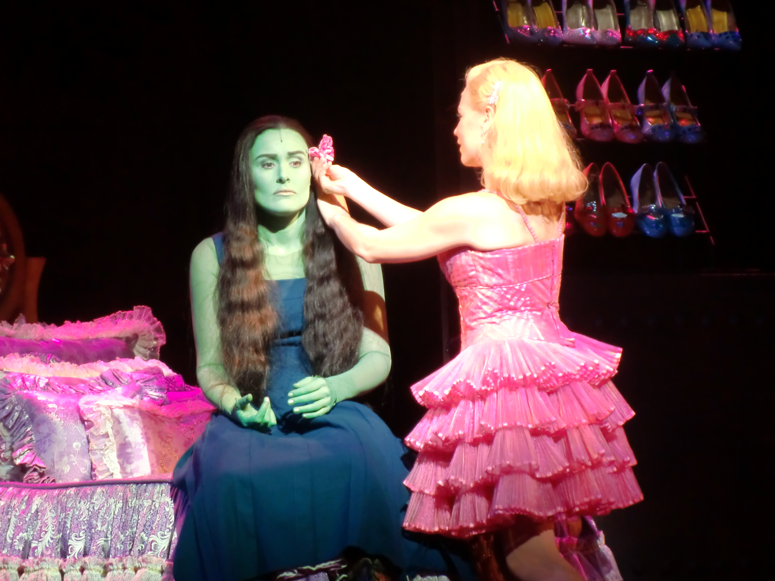
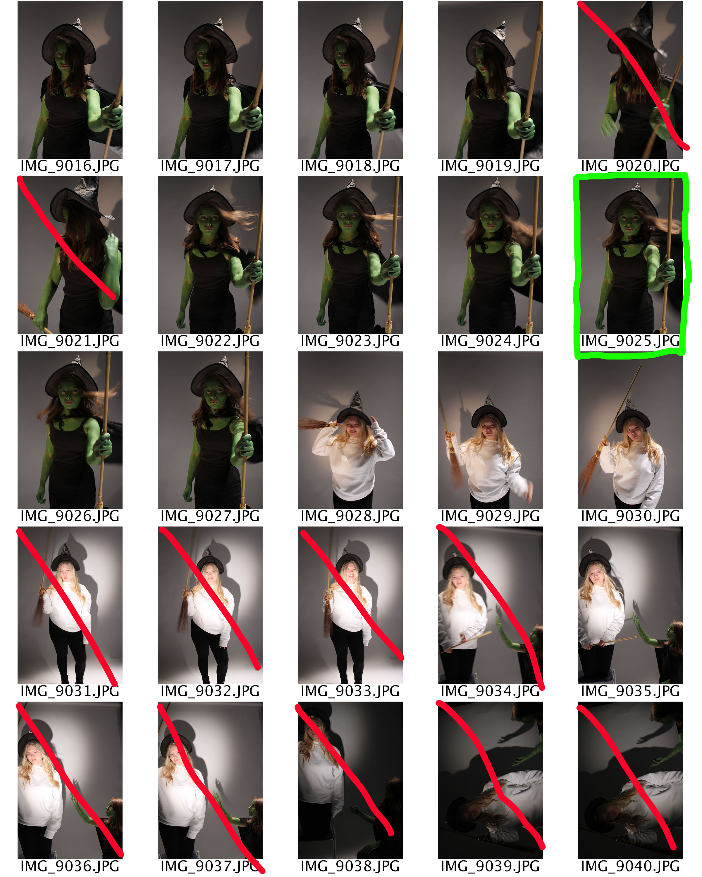
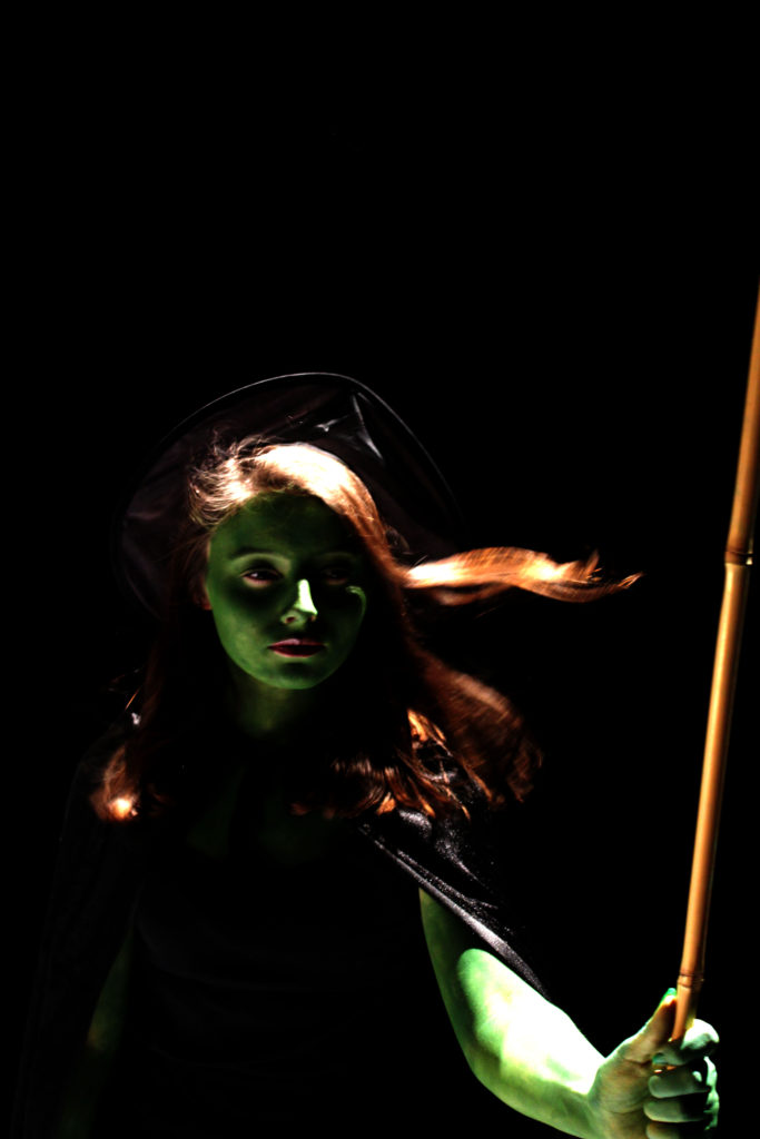
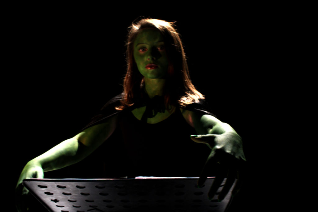
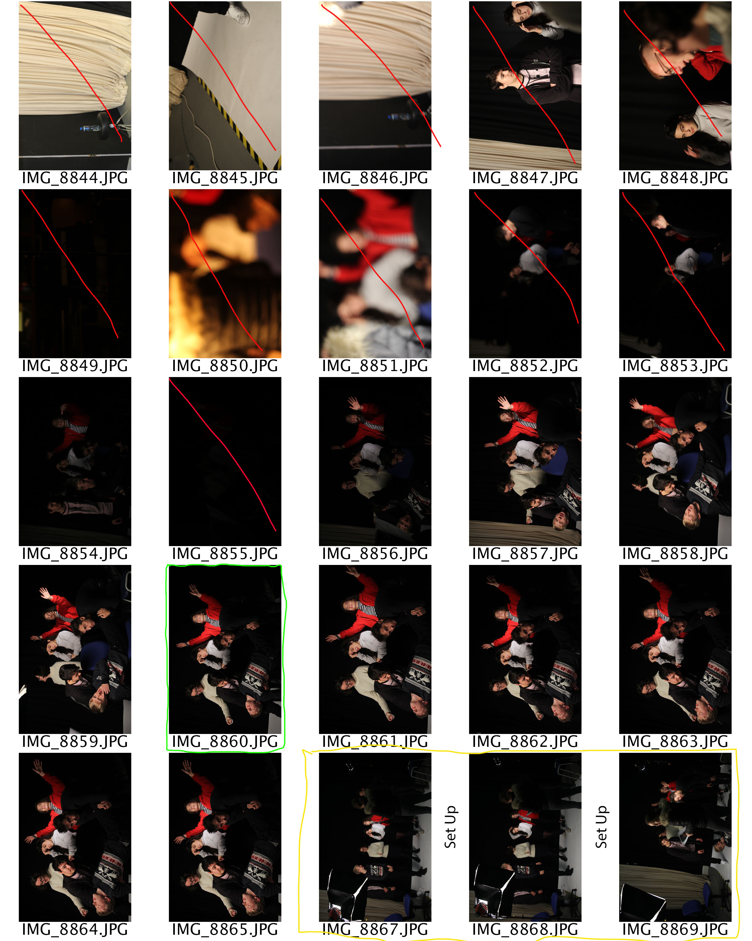
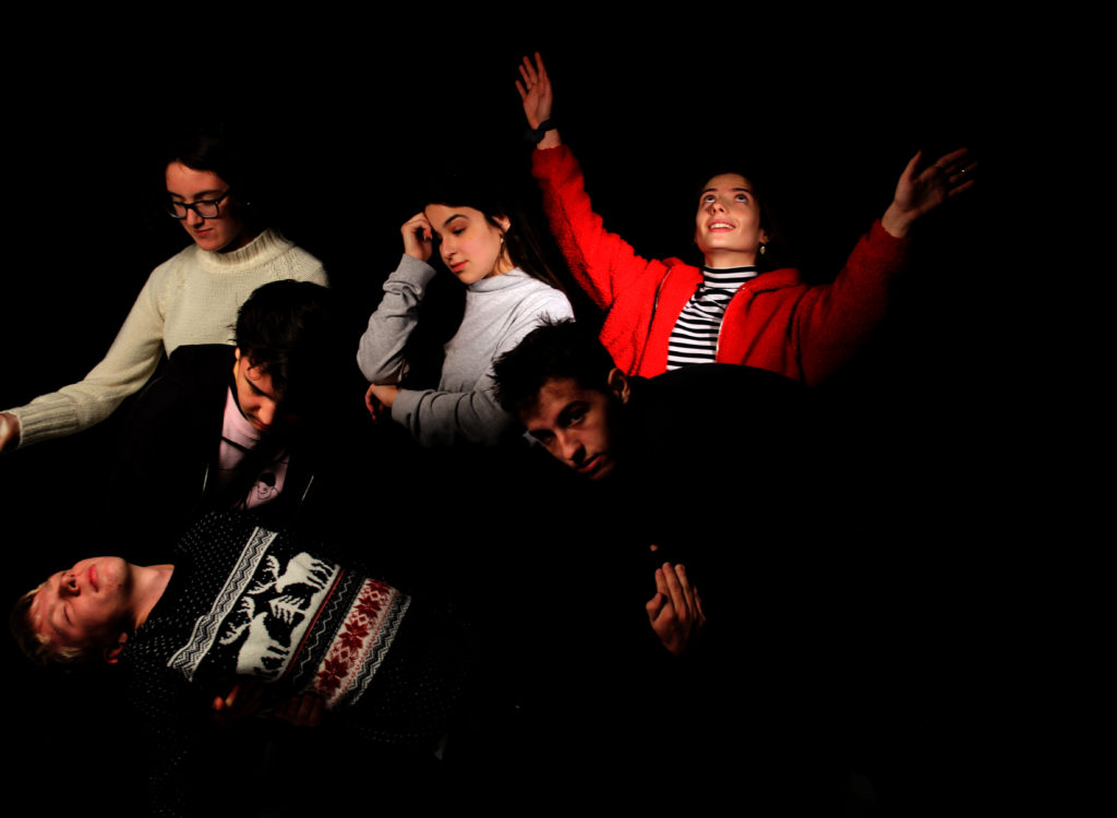
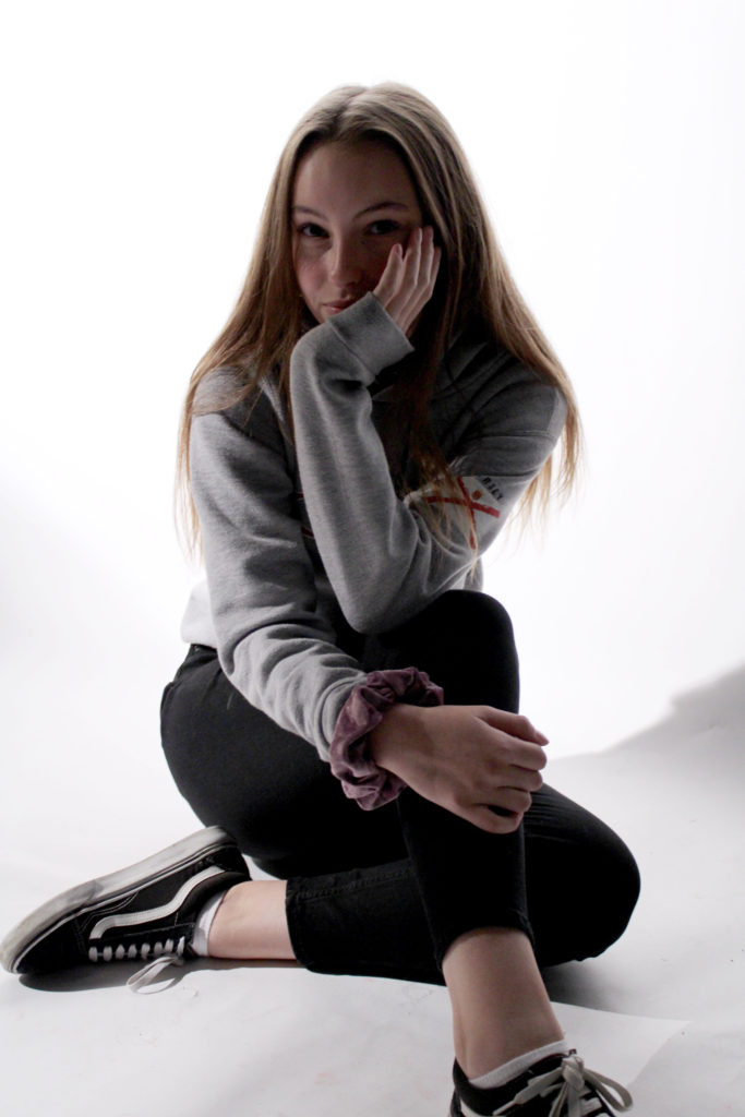
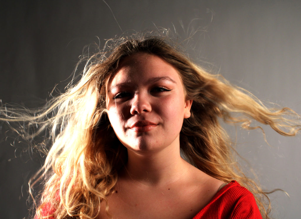
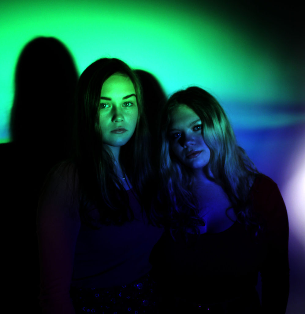
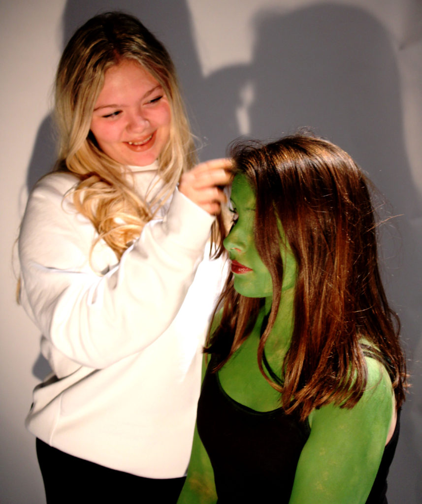
In my final image I wanted to capture the personality of Glinda and the moment when the two girls finally bond. We can see Glinda playing with the hair of Glinda with a big smile on her face, this informs viewers that Glinda is a girly girl and enjoys giving others makeovers and playing with peoples hair. In contrast Elphaba does not seem that fazed by it showing her tomboy side. The contrast shows that for the two witches to be neutral the green witch has to compromise and try and begin to like what Glinda wants. This presents the idea that girls are only concerned with hair, makeup and their phones, but clearly they are not which is demonstrated by Elphaba. Due to the harsh lighting, it allows the two witches to stand out from the background allowing the message to come across better. To edit this photograph I just levelled and  adjusted the curves in order to make the image seem naturally darker.

Comparison

When comparing my work to The Entombment of Christ (Deposizione) (1601-3) there are some similarities and differences. The main difference is that my tableaux covers issues that teenagers face today, whereas the artist research shows a major event which took place in 1601. A similarity is the of plain backgrounds which allows the story to be the main focus point allowing the storyline to be outlined clearly within the photograph. Another difference is that my tableaux is a photograph which allowed me to experiment more with lighting, shutter speed and depth of field, compared to the painting made in 1603. Moreover, a lot of thought has been put into my tableaux as I considered costumes, lighting, props, background and facial expressions of my models. Doing this allows a full story to be told, I learnt this from when I researched The Entombment of Christ (Deposizione). In my Defying Gravity image I took inspiration from the painting to use the chiaroscuro effect which has allowed parts of the models body and face to be lit up and gradually get darker, which has allowed a more dramatic effect and tone to be added to my final image.

Evaluation

To evaluate I believe that my tableaux was successful, due to the techniques and skills I have acquired from doing a class tableaux. I was successfully able to create a story within a picture, which is clear for viewers to understand. I have also been able to put in multiple elements to create a successful Tableaux. If I was to do another tableaux I would aim to look at a more religious approach, as I believe the final images would be able to produce a more meaningful representation of a story to viewers, as everyone would understand. I would also at potentially looking at a different editing strategy in order to make the images more dramatic. Although I enjoyed looking at this style of portraiture I do not think that I will continue this idea.

Tableaux Vivants

What is tableaux vivants?

The phrase itself is a French phrase which translates to ‘living picture’. A tableaux vivant is a static scene where there is a singular or multiple models telling some sort of story. These paintings and images are usually well thought out, not only in terms of lighting and camera settings but also in terms of costume, positioning, background as all these factors contribute to the message being sent across to the receiver of the image. This type of imagery combines aspects of theatre and photography to create a staged reality.

The Entombment of Christ (Deposizione) (1601-3)

In this Tableaux we can see these two men lifting up another man, who seems to be dead. You then have two woman who are in the background, almost caring for the man. The woman in the top right corner seems like she is praying or calling for god in order to make sure the dead man is safe. The other woman seems as if she is taking in the fact the man is dead and is morning over his death. The clothes worn by the models tell us that the scene is set in the olden day. The background is completely black which allows the viewers attention to be solely focused on the scene being portrayed in the foreground. It also portrays the idea that the dead man is in an empty void, as that is the general consent with death now a days. The most lit up area of the tableaux is the dead man who is located in the center of the frame, the other people then get less lit the further away they are from the man. This lighting technique implies that the man is the main focus point, and that he was someone who may have been considered important at that time. The lighting also seems to be creating a chiaroscuro effect on some of the models allowing a contrast of tonal regions to be presented in the image. The prominent formal elements found in this image is tone, shape and texture which is shown throughout the bodies found in the foreground in the image. Due to this being a painting no photography techniques have been applied. However, analysis it as if it was a photograph the ISO is low as there is no intended  noise within the image. Moreover, the shutter speed is likely to be quick and the aperture is small as not much light is being let into the image. Finally, the depth of field is large as it is all in focus. Contextually, the image was painted for a church not long after the death of Saint Peter. Saint Peter was said to be cruicified Moreover, the people surrounding him are religious people who are lowering him into his tomb.

The traditional feast days of Saint Peter are:

  • January 18, Feast of the Chair of St. Peter at Rome
  • March 19, Feast of the Chair of St. Peter at Antioch
  • June 29, Feast of Saints Peter and Paul
  • August 1, St. Peter in Chains
  • November 18, Feast of the Dedication of the Basilicas of Saints Peter and Paul

Taken from: http://www.newworldencyclopedia.org/entry/Saint_Peter

I can now see an emotional attachment and story which is being presented within this oil painting. Viewers who are more religious may find this image more meaningful and empowering than I do. However, after researching this image I understand that a successful Tableaux needs to tell a story and create an emotional attachment with the receiver of the image

As a class we decided to do a group photo shoot based on ‘Entombment of Christ (Deposizione) (1601-3) ‘. This allowed me to understand the thought process that I need to use when going on to create my Tableaux image. I learnt that all aspects play a massive role within making the image. The photographs where taken in the studio with artificial lighting.

Contact Sheets

Final Outcome

This final outcome was successful as it looks very similar to the original painting. The lighting is similar as well as the poses and postures. However, the costumes used are not the same which sort of ruins the old day effect. To edit these images I decided the level the images and adjust to make the image darker allowing the background of this image like the painting


Eugene Delecroix ‘Leading the people’

We also decided to re create Eugene Delecroix ‘Leading the people’ as another example of Tableaux photography. This is another painting taken from what seems to be the french accomplishing something, almost like the war which is suggested by the guns and dead people. The reason for doing another tableaux with the class was to ensure that I knew exactly what I was doing for my own tableaux.

Contact Sheets

Final Outcome

This was the best outcome taken from this photo shoot. There is a clear spotlight on the model in the center to ensure she is the main focus point, like she is in the original painting. I ensured the background was black, as we did not have the background of the original image. The main difference between the original and my image is that the props and clothes are different which somewhat ruins the overall effect. To edit these images I just adjusted the levels and curves to ensure the sharpness was accurate.

Top Outcomes From Studio and Natural Portrait Photography

These photographs are the best images that I have taken when experimenting with studio photography and natural lighting photography. I believe that all these images show a variety of techniques from chiaroscuro to depth of field. I am very pleased with my outcomes as I believe that they all convey meaning towards them and are interesting for the viewers to look at.

Outdoor Photography

I have been mainly experimenting with artificial lighting during the portrait unit, and have decided to further develop of using natural lighting from the first photo shoot I conducted.

For this photo shoot I decided to conducted outside when the sun had began to come out after a down pour of rain.  It was slightly windy as well. I used a silver and a gold reflector to reflect the sunlight onto darker areas of my model, getting rid of the contrast in tones. Due to different areas being lighter and darker my white balance I used varied. I mainly has it on sunny or cloudy. My ISO was low as it stayed of 400 so that no noise was presented on my final images. Moreover, the shutter speed varied again to how lit up the area was. Within this photo shoot I experimented with using different depths of field to have my model in focus and the background slightly out of focus. I also mainly captured head shots of my model, but occasionally took a full body portrait of the modal.

Case Study

Unknown Photographers Work

When I first look at this image my eyes are immediately drawn to the woman who is smiling and staring straight down at the lens of the camera. They then move around the slightly blurred out background which shows that she is exploring some woodlands. Putting the two together I can understand that she is enjoying what she is doing. This is also supported by her straight body posture. The artificial lighting, the sun, is warm which also creates a happy tone towards the image. This photograph shown above has many technical elements which I believe makes it a good photograph. As mentioned before the girl is in focus and the background is out of focus, which means that a narrow depth of field has been created. The shutter speed must have been quick as the image is perfectly focused. This also means that the aperture is likely to be around f/5.6. Moreover, no noise is found within the image meaning that the ISO used is also likely to be low.  The lighting is found behind the modal, as that is where the sun is at that time, which means no shadow of the modal is created. However, shadows of the background can be found on the grass. This helps makes the model stand out from the background. In addition, the photograph is presented in black and white which shows us all the color and allows the viewer to appreciate the scenery. From this case study, I have learnt that a good outdoor portrait should be in color, but I may experiment in black and white, it would be nice to use a narrow depth of field and the facial expressions and posture of the model is important.

Contact Sheets

Edits

Within these edits I just adjusted the levels and curves to ensure the photographs where sharp. I believe that these images have been one of the most successful photographs that I have taken so far as they clearly show good camera control, due to the different techniques I have used. In the  three edits you are able to see a narrow depth of field as the modal is in focus leaving the background slightly blurred. This ensures that the viewers attention will be focused on.  Moreover, the photographs clearly show no intended noise and clearly shows the correct white balance, shutter speed and aperture

.

Experimenting With Lighting

I conducted a photo shoot to explore all the different types of lighting within studio photography. The types of lighting I looked at was:

  • One Point Lighting
  • Two Point Lighting
  • Three Point Lighting
  • Ring Lighting
  • Warm/Cold Lighting
  • Intensity of the Light
  • Lighting Rig (On Ceiling)

All these lighting techniques have been explained in previous blog posts.

Set Up

My main light source had a diffuse on it making it a soft light, this was angles slightly to the right of my models face, making a chiaroscuro effect. I then added an additional light which was angles to the left of my model, this evenly lit up my model. Finally I used another light at the back. This was raised on a tripod and was facing directly down onto the model, making the model stand out from the background. Due to this it started to create an element of 3D in my photographs. I then played around with turning some of these lights off, but keeping them in the same place, to see what effect I could create. Moreover, I experimented with ring lighting. This is a singular light which is shaped as a circle, the light is usually quite cold and harsh. You are also able to see the ring of the light in the models eye. When using this light, I made sure it was my only light source. I positioned it to face directly at my model’s face. I then placed my camera through the gap in the middle to capture the model. With this lighting I experimented with the different background colors and the different types of white balance. Additionally, using this lighting I looked at taking macro photographs of my models eye, where you are able to see the ring. Finally, the last lighting set up I used where the ceiling lighting rig. I experimented by using the different lights and their positioning. With some of these photographs I also used the soft box light to make my model more lit up.

Another technique I looked at while trying to capture these photographs was, high key and low key. In my first set of photo shoots in the studio I mainly focused on low key where there is a lot of shadows and contrast found in the image. This time around I looked at high key photographs, where the images are much lighter and too some extent are over exposed. To capture these images I used harsh cold lighting and adjusted my white balance to make the images seem over exposed. Furthermore, I tended to stick with a white background in order to add to the effect of a high key image. When I come to edit these photographs my intention is to use the levels and curves to make these photographs seem brighter than they actually are which will also help to present these images as high key photographs.

Contact Sheets

Edits

These edits are the best outcomes from using ring lighting. Due to previous photo shoots conducted, the other techniques of lighting can be found in there outcomes. When it came to editing I simply adjusted the levels and curves to ensure that my images where sharp.

This macro photograph is of the ring light reflecting into my models eye. I decided to capture this as I believed that it was interesting and peculiar to look at. Due to the image being macro it allows the viewer to see all the detail of the facial features, from the eyebrows to the veins in the eye. This helps to present the formal element of line and texture. 

In this final outcome I tried to use the inside of the ring light to frame my model. This has helped to make the model the main focus point of the image. Moreover, I used wind to move around the models hair which has allowed movement and an element of 3D to be found in this image.

Natural Lighting Photography

In contrast to studio photography, where there is artificial lighting used, we can used a natural source of lighting to light up the subject of the photograph. In this case we used windows around the school to light up the model. Instead of using three point lighting, we used reflectors which help to light up the opposite side of the model which is darker, to eliminate a contrast in tonal regions. For this photo shoot I used a quick shutter speed, a low ISO to reduce the noise found in the photograph, a large aperture and had a large depth of field. With regard to editing I am going to focus on leveling the images and adjusting the curves, making the edits simple like the idea and aim of this photo shoot.

  • Intensity of the light – An intense lighting source is very harsh, and allows the subject of the photograph to be illuminated. If using a one point lighting rig with intense lighting, we are able to choose what parts of the subject to light up.
  • Direction of the light – Changing the direction of the light helps to illuminate different areas of the subject. Having the light at the back creates a silhouette surrounding the subject, making them stand out from the background. The light at the front will usually light up the whole of the subject. A light source from the side of the subject will only light up one side of the subject creating a chiarascuro effect. Finally we can position the light up towards the ceiling which will diffuse the light and scatter the light back down on the subject
  • Temperature of the light and white balance – The temperature of the light is used to help create an emotional response between the viewer and the subject. A cold light is usually more of a white light, the white balance to be used is likely to be cloudy which warms up the photograph but you can change this if you want to stay with the cold effect. and a warm light is a more of a yellow light. The white balance to go with this is likely to be florescent
  • Using reflectors  – A reflector is used to reflect the light source onto a part of the subject. With regards to natural lighting we use reflectors to make the subject equally lit.
  • Using diffusers – Diffuses are used to make a harsh light much softer.  To diffuse the lights we can use tracing paper, colored gels or purchasing a diffuse.
  • High Key / low key lighting – High key lighting is essentially trying to over expose things. The ISO is likely to be higher and the white balance is altered in order to make everything lighter. To achieve this the lighting is usually harsh and cold.This works well on a white background. In contrast, low key lighting consists of a lot of contrasts and shadows. and its usually dark. The lighting is usually softer and use diffuses, typically this works well using a black background.

Contact Sheets

Edits

These three photographs I would consider to be the top images from this photoshoot. I have been able to use a natural light source in order to capture these images. I have also be able to use a reflector to help light up the other side of my models face.

This photograph was taken at a window, where the most light was found within the school. The main focus point of the photograph is the model who is located on the right side of the frame. The left side of the frame is slightly out of focus meaning the depth of field is smaller and and aperture was low when taking the photograph. I wanted the viewers to still be able to see the background as I felt that it added context towards my image. In this image a reflector was not used which means the left side of her face is lit up and the right side is slightly darker, creating a contrast in tonal areas. The formal elements which are clearly presented are texture, found on the models clothes and hair, and space as negative space is found in the background of the image. The model is looking directly at the lens with a neutral facial expression, her right hand is supporting her face. This creates an emotional response, it shows that she is bored or trapped and that she is next to the outside world that she potentially can not get to. This photograph I would say is my most successful image as it allows the viewers to make their own opinion about why the model is the way she is, making them involved with the image. Moreover I believe it clearly illustrates my skills of natural lighting photography and provides a contrast between studio and natural photography.

Studio Photography

An important aspect of studio photography is the artificial lighting that is used. The lighting used helps to present an emotional responses by the viewers of the audience, it also allows the focal point of the image much clearer. Another reason why artificial lighting is important is the fact it adds temperature to the photograph, the harsher the light the warmer the atmosphere of the image, making it seem more cheerful. In studio photography there are four different types of studio lighting:

  • Flat Light – This is when the light source is facing directly at the subject of the image, meaning the subject is well lit, and all emphasis is on the whole subject. This light source creates a full shadow of the subject in the image.
  • Split Light – A light source which is provided at the side of the subject, which makes half of the subject lit up and the rest fading into darkness, this is where the photographer can clearly show their main focal point
  • Back Light – The light source is found at the back of the subject which helps to create a semi-silhouttes creating a contrast in like and dark in the frame of the image.
  • Flash – Producing a flash of artificial light (typically 1/1000 to 1/200 of a second) at a color temperature of about 5500 K to help illuminate a scene.
  • One Point Lighting – This is when the photographer will only use one light, which is considered to be the ‘key light’. This singular light is used to emphasis certain aspects of the subject. Usually this light is likely to be a soft box as it turns a powerful light source into a more diffused light.
  • Two Point Lighting – This is also known as the cross lighting technique and is mainly used in interviews. The first light is used to show highlights and shadows. The secondary light is known as the fill-light which is used to eliminate the shadows and allow the whole subject to be lit up. This light source is found directly opposite the key light source.
  • Three Point Lighting – This is the black light, which is placed behind the subject. Its purpose is to provide definition and subtle highlights around the subject’s outlines. This helps separate the subject from the background and provide a three-dimensional look.
  • Chiaroscuro Tehnique – This technique is used to create contrast between the lighting on the subject. Normally, the light source is used to illuminate one side of the face leaving the other side in darkness. To create this affect the key light is place next to the subject, on the side and a black background is used.

John Rankin

Rankin is a British photographer who is well known for capturing images of celebrities in a studio. During his careers he and his friend created a magazine where they would be able to promote their photography. Not only has his work appeared in his own magazine but also in Vogue and GQ, making his images reach out towards the younger generation.

Rankin’s Photograph

This photograph is apart of Rankin’s destroy series, where he would capture photographs of celebrities attempting to show their emotions and personality through costume, props and makeup. He would then print out the images and hand them to the celebrities to make it their own. It was then the celebrity job to destroy, colour stitch, do whatever they wanted to the image to express their personality. Conceptually, Rankin wanted to outline the importance that no one is perfect, even if we are famous we are not perfect, which outlines issues in todays society. When first viewing this photograph I am drawn to the fact that the model has her eyes closed and has her head facing downwards, which could present her emotional state at this time as negative. The use of the plain red background is also used to help support this idea. The necklace found around her neck could be considered as something trapping her, thus she attempts to try and take away her life. The lighting used to capture the photograph seems to be three point lighting as all of the model is well lit up, having no shadows or contrast in tones. I would consider texture and  line to be the formal elements within the image, these can be found through the stitching of the image and through the different materials of clothing. The ISO in this image is likely to be low as there is no noise found within the image. Moreover, the image is not completely bright meaning the shutter speed is likely to be fast. Moreover, the whole frame of the image is in focus, suggesting that the aperture is likely to be high and informs us that the image has a large depth of field. In this example of Rankin’s work we can see the celebrity has ripped up the photograph and sown it back together using black thread, making this element clearly  visible. This could show that at this time her life is being ripped apart but slowly and surely she is sowing it back together to gain a better life. This photograph is presented in colour which eliminates a high contrast in tonal regions, allowing the three point lighting to clearly be shown. The image is taken at a straight on angle with the subject located in the foreground of the image, making her the main focus point. I believe Rankin’s work clearly shows elements of studio photography but with his own twist, making his work successful. I enjoy looking at his destroy series as I found them visually stimulating and makes you grasp an understanding of what life is truly like for the celebrity.

Plan

I will be conducting this photoshoot inside of the schools photography studio. I will be using the white infinite wall and the black curtain as the backgrounds. The lights being used will mainly be a soft box and a normal harsh light. With regards to camera settings I will be having my ISO roughly around 400-800 and my shutter speed will be around 1/100. The white balance will be put onto tungsten and I will be using a manual focus. I will be looking at using the different techniques listed above to put the theory of studio photography into practice. Moreover, I will be keeping the editing simple I will be levelling the images and adjusting the curves to make the image to be sharper.

Contact Sheets 

Edits

This outcomes are very successful considering it is my first attempt at studio photography. Due to the success of this first photoshoot, in studio photography, I decided to conduct another photoshoot where I would look at different aspects of studio photography. I will be using filters and props within this new photoshoot in order to gain more meaningful outcomes. I will be redoing my Chiaroscuro technique images as the original images where not as sharp as I would have liked them to be.

Contact Sheets

Edits

I am very pleased with the way these outcomes have turned out from this new photoshoot. I have been able to successfully show the chiaroscuro technique. I have also been able to use props and light filters in order to create an emotion for the models

Street Photography


Mood Board

Definition: ‘Street photography, also sometimes called candid photography, is photography conducted for art or inquiry that features unmediated chance encounters and random incidents within a public place. Although there is a difference between street and candid photography, it is usually subtle with most street photography being candid in nature and some candid photography being classifiable as street photography. Street photography does not necessitate the presence of a street or even the urban environment. Though people usually feature directly, street photography might be absent of people and can be of an object or environment where the image projects a decidedly human character in facsimile or aesthetic.’

“Don’t wait. The time will never be just right.”
-Napoleon Hill

“Just go out and shoot! It’s great to get inspired by reading books and watching tutorials and so forth, but you need to actually go out and take pictures. Don’t be afraid to get out there.”                                     -Valerie Jardin

Henri Cartier-Bresson

Bresson was a French photographer, who was said to have pioneered the genre of street photography. He thought of photography as a way of capturing a decisive moment. Bresson’s passion of photography came at an early age where he used to capture moments of his family holidays. This small hobbit then turned into his career, where he made a massive contribution towards photography.

Henri Cartier-Bresson

Emotional Response

When first viewing the photograph, we begin to grow an emotional attachment to the child located around the image. This is because it seems like their homes have been destroyed, leaving them with the remains of the homes to play with. The morbid photograph is interesting as the facial expressions on the children are not happy making us realise that something is not right, making us more emotionally attached to the image. Moreover, the children’s faces look soiled meaning that the setting is not hygienic and potentially very unsafe for them.

Technical Response

This photograph is presented in black and white, which allows the solied faces of the children to be clearly visible, it also allows the broken walls and dirty floor, to present the formal element of texture. The fact that the image is black and white also plays on the idea that the children have nothing, like we had nothing back in the day. The wall with a hole in it has been used as a frame, which is framing the background allowing the viewers eyes to clearly be guided around the photograph. The location of the children also helps to guide the eyes, as there are more kids in the foreground and less in the background, (creating a large proximity) making our eyes look at the front of the image and make there way towards the background. The formal elements of shape and space are also presented through this image, through the use of the children and the collapsed walls, trapping them. The whole frame of the photograph is in focus, however, the background is slightly less out of focus, which means there is a large depth of field. Moreover,  the aperture is likely to be around F11 – F8. The shutter speed used to capture this image is likely to be quick, as there is no intended blur. Additionally to the ISO is also likely to be low as there is no noise created by the light. The lighting used in this photograph is likely to be natural, as it has been taken outside, in what could be the children’s natural environment. This image consists of some negative space, which is found at the background of the frame, this creates a sense of that these children live with nothing and are trapped with nothing, which also helps to create an emotional attachment.

Contextual Responce

This image was taken in 1933, which was a couple of years before the Spanish civil war. The children are said to be playing in a ruins, a destruction from a previous war. 1933, was one of the worst years during the Great Depression, which was a time when the economy collapsed, which also helps to provide contact towards the photograph.

Conceptual Response

Now knowing the context, I believe the concept of this image was to show the effect of wars and the Great Depression for those in poverty, the use of children makes the image more hard hitting towards viewers. The hole in the wall is trying to show the children trying to break away from there reality. It also shows how it has effected the children, leaving them with only ruins to play in.

Photoshoot Plan

I will be capturing my street photography images in town, during the early afternoon, a time which can sometimes be busy. I will be walking around the streets, looking for interesting characters. The aim is to remain a discrete as possible, so the citizens are unaware of me capturing the images. The lighting will be natural and my camera settings will also be kept simple, however, I do want a quick shutter speed as it will allow me to capture many images.

Contact Sheets

Final Outcomes

Comparison

In technical terms I feel that my work and Bresson’s work is similar, we both presented our images in black and white, I attempted to have the formal elements of shape, texture and space in my images as those a key elements to Bresson’s photograph. Moreover, I tried to create a depth of field, where the people are mostly in focus, but still having the background in focus, but not as clear at the foreground. Bresson’s photograph is very different in conceptual terms as he is trying to show the effect of war to children in poverty. My photographs concept was to show the different kinds of people found in town during a busy period.