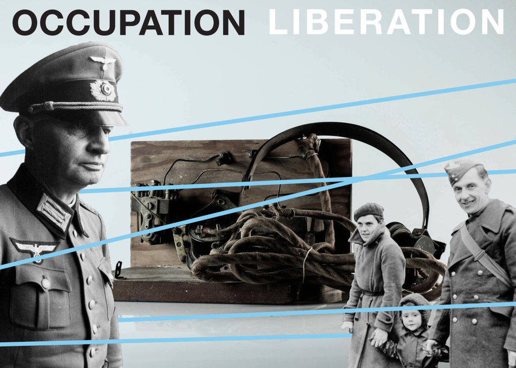
Since the summer of 2019 A-Level Photography Students at Hautlieu School have been working on an extensive programme of study in their final year exploring Jersey’s Liberation and Occupation history in collaboration with Société Jersiaise, Jersey Heritage, Channel Island Occupation Society, Jersey War Tunnels, Bureau des Îles Anglo-Normandes and post-graduate students from École Européenne Supérieure d’art de Bretagne in Rennes with funding from Liberation 75. Students were challenged with responding to personal stories told by islanders experiencing the German Occupation first-hand and finding inspiration by looking through images, documents and objects held in various collections in Jersey’s public archives, producing a series of individual creative outcomes such as montages, photo-zines and collectively construct a visual narrative presented as a newspaper supplement printed and distributed by Jersey Evening Post on Friday 24 April 2020.
The Liberation vs Occupation project began partly as a response to 75 years of celebrating freedom in Jersey from the German Occupation in 1940-45. Sadly, islanders will not be able to commemorate this landmark event as initially planned and it is hoped that this newspaper and joint exhibition between Jersey and French students will in some small way act as catalyst for remembering those years of hardship and subsequent joy when Churchill’s now famous speech was broadcast on the 8 May 1945 with the endearing words ‘our dear Channel Islands are also to be freed today’.
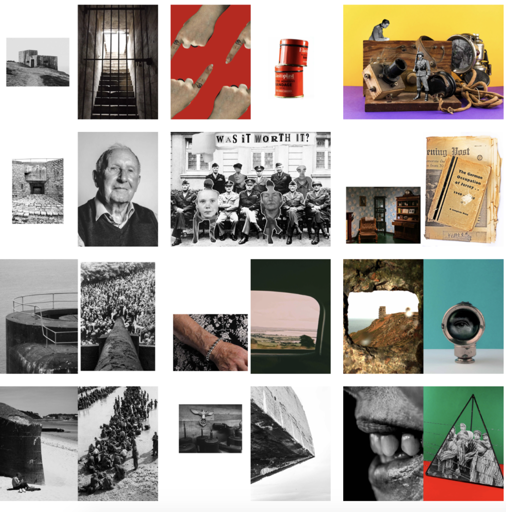
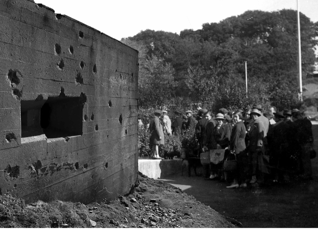
The programme of study began on the 4 June at the Société Jersiaise Photographic Archive where students took inspiration from a presentation by Patrick Cahill, Photo-Archivist and looked through some of the historical collections held in the photo-archive pertaining to the German Occupation of Jersey in 1940-45. In September students explored the landscape of German fortifications around the coastline of Jersey with specific visits to bunkers, such as Battery Moltke at Les Landes and Battery Lothringen at Noirmoint Point. Further visits followed to Jersey War Tunnels and Jersey Archive to research public records and learn more about life in the island during the Occupation.
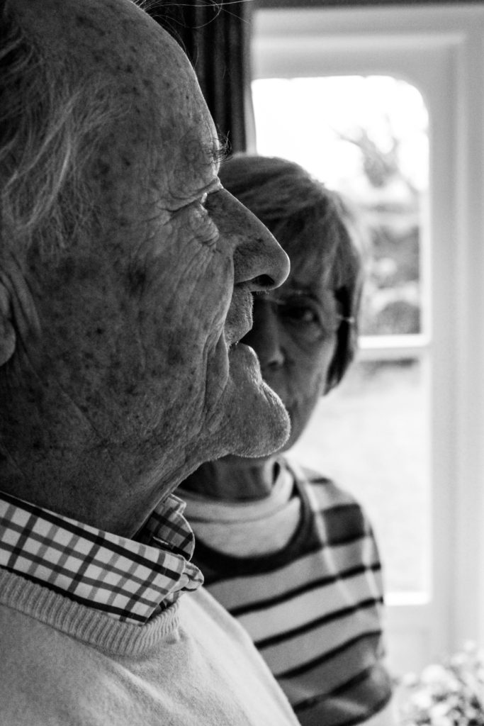
Personal stories and memories from islanders, Bob Le Seur, Hedley Hinault, Joyce De La Haye and Joan Tapley, experiencing the German Occupation first-hand were recounted to students in a series of workshops, that included portrait sessions in the photographic studio at Hautlieu School and photographing objects from 1940-45 held in the Occupation collection at Jersey Heritage. Students have interpreted how the themes of Liberation and Occupation relates to them as teenagers growing up in the 21st century and the combined outcome of their studies can be seen on the pages of this newspaper, and in a joint exhibition Bunker Archaeology 2020 with postgraduate students from École Européenne Supérieure d’art de Bretagne (EESAB) originally to be held at the Berni Gallery, Jersey Arts Centre 6 -30 May 2020, now postponed due to Covid-19.
The Bailiff Timothy Le Cocq, who has written a foreword in the newspaper expressed his delight with how this collaboration has played a wider role in cultural diplomacy by; ‘allowing Rennes-based Masters students to work with students from Hautlieu on a project that has helped to spread the message of our important history, shared heritage and bringing communities closer together.’
Photographer and teacher Martin Toft who led this project, commented: ‘Every student involved in this project engaged passionately in the subject of the German Occupation of Jersey and the images presented here in this newspaper are only a fragment of the enormous amount of work that each student has produced. It provides a fascinating insight into how young people have used the language of photography to explore and interpret events which happened many years ago.’
Here is a video browser of the Liberation Newspaper printed and distributed islandwide by Jersey Evening Post.
Zines: The editing and sequencing of this newspaper was derived from a number of photo-zines produced by A-Level photography students at Hautlieu School.
Evaluation:
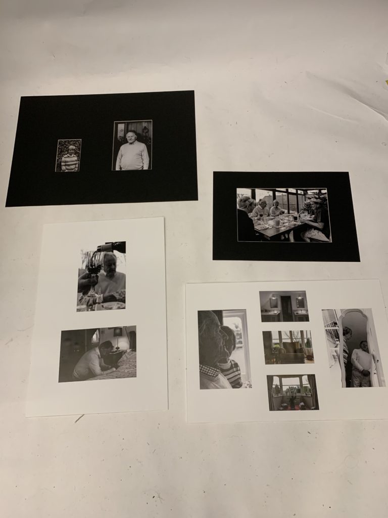
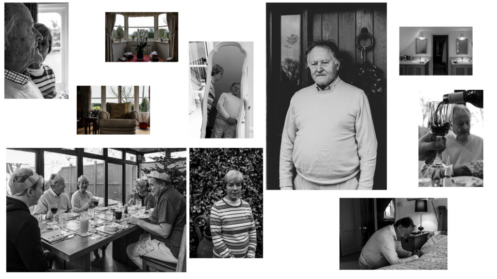
To evaluate, the overall outcome of the 48 page newspaper supplement has come together nicely and is a great way of celebrating Jersey’s 75th year of liberation. As a collective, we all selected our top outcomes and managed to sequence the photographs together in order to portray a celebrating narrative while exploring personal stories, landscapes and objects to do with the occupation of Jersey. The exhibition that was meant to go on would have also showcased our individual zine and photo books we had created which would have complimented our group newspaper. Personally, having four of my images displayed, with one being a double page spread, showcases my high quality final outcomes and adds to the overall effect of the newspaper. I am really pleased with the way in which it has turned out, as it showcases all of the classes hard work and effort and is a great outcome which will be nice to look back on in years to come.
On a basic level I believe my exploration into the terms of occupation and liberation went well. The terms were broad and allowed me to consider many different opportunities to explore, but I felt looking at the occupation my Grandparents lifestyle was a perfect fit. At first I was a little worried as I knew my portraits were not always my strong point within photography, but I knew it would allow me to refine and develop me skills within this area of photography. Using artists such as Walker Evans, LaToya Ruby Frazier, Laura Blight and many allowed me to explore different ways to present my Grandparents lifestyle through portraits and landscapes. Initially, I wanted to focus of both my Grandma and Grandad but as my project developed I made the decision to place the central focus on my Grandad due to his higher position within the family hierarchy and how he considers himself the backbone of the household. At first, I looked at just capturing portraits and understood that my narrative of my book would need a change of pace and so I decided to explore the interior and exterior of their house and the relationship between landscape and person. In terms of photographic styles my project follows a documentary style as I try and capture the reality of my Grandparents lifestyle. I often found it challenging to produce reliable imagery as I did not want to ‘intrude’ on my Grandparents, but I felt as the project went along the bond between me and my Grandparents became stronger allowing me to decode their lifestyle more.
Overall, the six photo shoots conducted I was able to produce high quality photographs which illustrate my competence of using a camera and its settings. Most of my photographs are in black and white as I felt it showcased detail, structure and space much clearer and I felt the context of the 1940’s, when my Grandparents was born, was much clearer. I tended not to deviate from a naturalistic edit as I felt that the authenticity of my photographs would be reduced, thus reducing the reliability of my outcomes. However, to show further exploration I decided to take a more contemporary route, and although I liked the way they looked I felt it did not follow my aesthetic and did not show my narrative and contextual and conceptual elements in the right way. The project itself has taught me a lot about my family and the way in which lifestyle affects the way in which my Grandparents live their life. It has allowed me to become much closer with my Grandparents and the final book is something that they will cherish, thus making it a worth while and rewarding project to do.
With regard to my final outcomes, I believe I have successfully managed to show my competence in display techniques. I have been able to artistically express my intended narrative within my imagery, whilst being able to uphold the authenticity of the photograph through the simplistic and basic looking framing techniques. I have successfully shown my creatively ability to combine photographs within a frame to illustrate a new element of their lifestyle which adds to the overall conceptual and contextual values of my work. Individually the photographs themselves, printed out, show the high quality of work, which reflects my ability to produce crisp images as well as edit the photographs for effect. Personally, I really like the way in which these outcomes have turned out as they outcast my best embodiment of work within the project, and how they reflect my narrative.
As my other final outcome, my photographic book clearly illustrates my intended narrative of representing my Grandparents lifestyle, and how the 1940’s has influenced this, with specific focus onto religion, family structure and hierarchy, relationship and interaction. The final sequencing of my photographs, clearly represent my intended effect, through the use of intimate portraits as well as landscape interior and exterior images which present a new light to my narrative. Within this period of making the book I have been able to show my ability to effectively sequence my photographs for intended effect, whilst still conveying my narrative. As well as, producing a captivating book which my Grandparents will cherish.
To conclude, I believe through the six photo shoots and different final outcomes, I have showcased my ability to experiment and explore the concept of Occupation and Liberation in a more contemporary route. In addition to this, I have shown my ability to develop an idea from artists work as well as the inspiration of my overall aesthetic which developed as the project went on. Personally, I am pleased with the way in which this project has went as I have held authenticity within my work, produced strong images, shown my ability to successfully edit images as well as sequence them to be placed in a book. In terms of my essay, I believe I have conducted a lot of research and reading to form a well structured and thought out essay, which has relevance to my project. On top of this, the essay allowed me to take this project into a deeper meaning, which is clearly shown within my work.
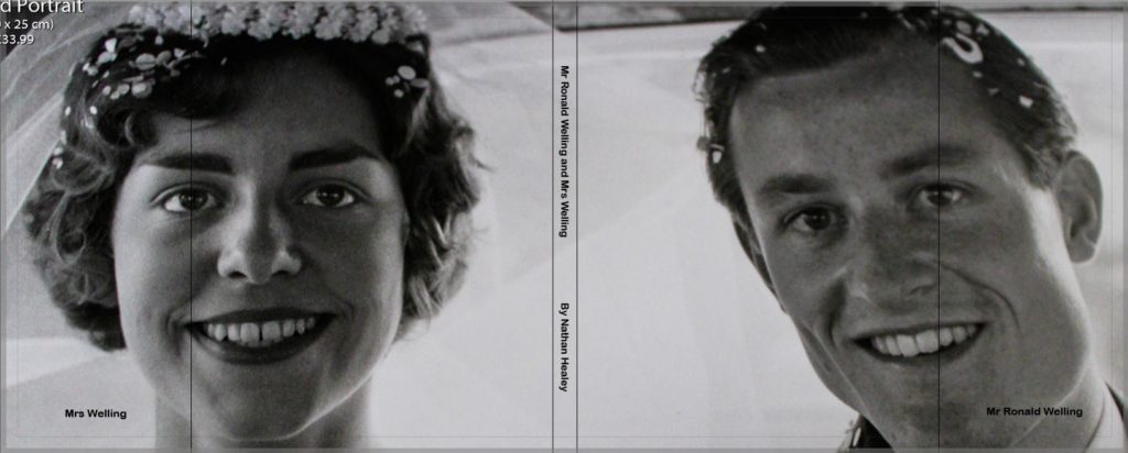
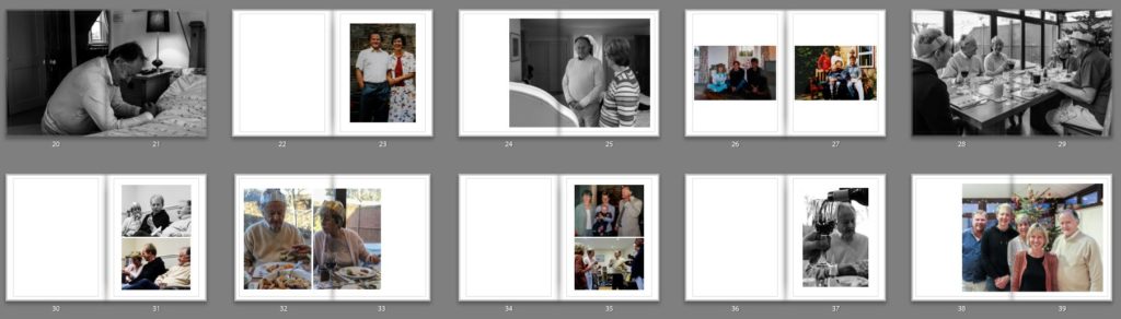
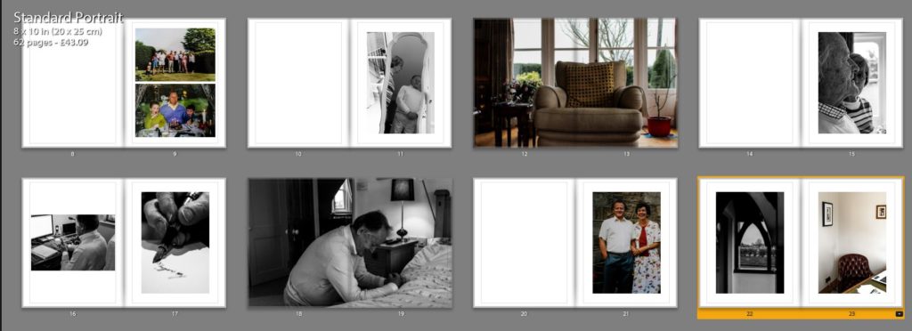
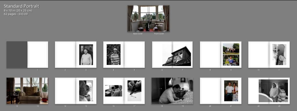
Below are screenshots of each page spread of my final book design entitled ‘Mr Ronald Welling and Mrs Welling’. As mentioned in my development blog post the title came about to show dominance and authority of my Grandad, Ron, through the formality of the title which can also suggest his business side. The photograph on the dust jacket is from their wedding day, suggesting the ideology of religion, family and happiness beginning the ameliorative mood of the overall photo book. My final book design can be viewed below:
‘Mr Ronald Welling and Mrs Welling’ is my photographic book which portrays the narrative of the occupation of lifestyle on my Grandparents, and how their upbringing in the 1940’s reflects their lifestyle in the modern day. The book includes mainly portraits of the two subject which shows intimacy, religion, family structure, authority and aspects of relationship which all cast the same underlying theme of lifestyle. In a sense the sequencing of the photographs are broken into three sections which are not explicitly sections. The first section establishes the couple, their relationship and the ideology of my Grandad being the provider for his wife and having the authority over her, this is presented through portraits inspired by Walker Evans, LaToya Ruby Frazier and some of my own artistic influence to compose the photograph. Within this section I have used archival imagery to present a compassion of their lifestyle when they were younger and present day allowing a more reliable reflection of their lifestyle. In addition, I decided to include one interior and exterior photograph which begins to reinforce the luxurious lifestyle they live through a new subject, reinforcing the ideologies of my project. The second section looks at family events and how my Grandparent’s lifestyle adapts, reflects and compares to my lifestyle. These photographs follow a family photograph style capturing the highlights of the religious event ‘Christmas’. The interaction between my Grandparents and my family, illustrate their lifestyle clearly at a major event. In the final section I mainly focus on the interior and exterior of their house through mainly landscape imagery. I also use more portraits to show my Grandad’s relationship with the specific rooms, creating semantics towards the imagery and reinforcing the idea of intimacy. For the majority of the time I have stuck to having just one image for two pages, using a single, 3/4 or double page spread. However, I have used up to two photographs over two pages if I need to emphasise a certain point. The photo book itself is a Standard Portrait, 20×25 cm. My pages will be white and printed on premium matte paper, as it makes the book seem like an official file. As stated above I will be using a dust jacket, meaning the actual hardcover of the book has not been designed. I intend to use a fabricated cover, subtle cover, as many family photographic books at the time they were raised was often this material, thus making it relevant and appropriate to use. The essay found at the end of my photo book explore the extent to which we can trust documentary photography to reflect reality, which follows the same path as the images found in my book. This presents viewers with the question of how accurately my images reflect my Grandparents lifestyle, adding a more academic response to the book. The essay includes photographs of artists work as well as my response to their work showing exploration and understanding of key theories within photography. To conclude, I believe the sequencing displayed above clearly illustrates my intended narrative which compliments my essay in response to my hypothesis. This well thought out design has gone through many experimentation and development in order to make the images powerful in the message they present as well as having a clear narrative which flows smoothly because of my sequencing of my photographs.
For my first final print I wanted to utilise the eclectic layout to illustrate my Grandparents lifestyle. After consideration I decided I did not want to use all of the photographs as I felt, that it became to chaotic and took away from my intended narrative. I decided to use the three interior images and the two photographs inspired by LaToya Ruby Frazier as I felt these images complimented each other to convey the ideology of lifestyle, authority and luxury. I decided to come away from the ‘randomly spread out’ idea and made it all lined up and straight in order to show more structure within their lifestyle. Personally, I really like the way the images compliment each other as they follow a similar simplistic composition, as well as conveying my narrative for the project.
Final Piece 2:
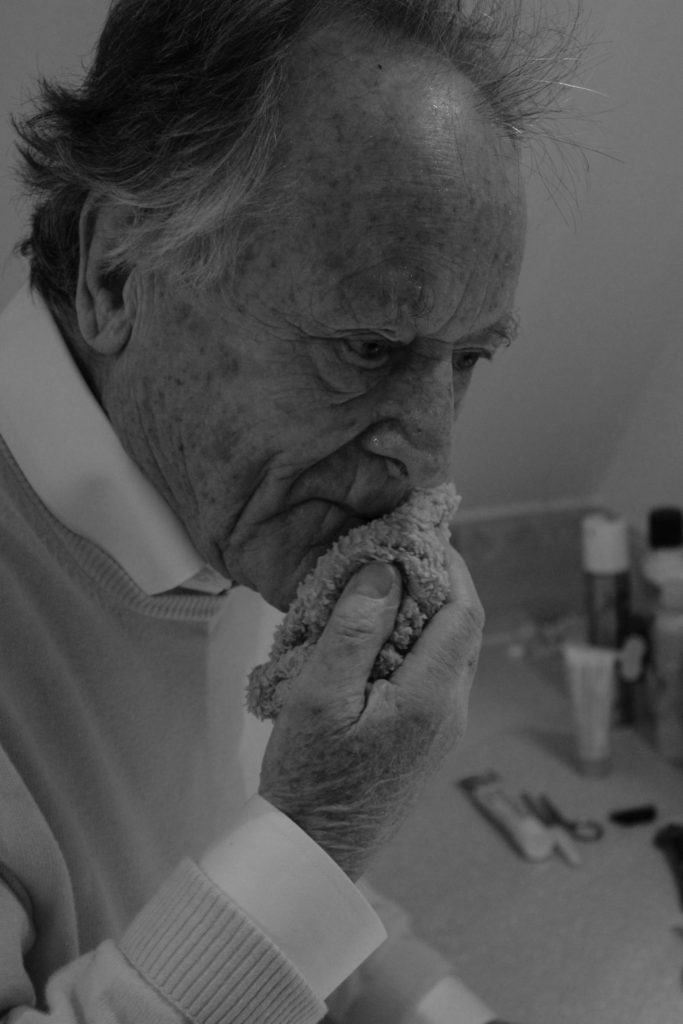
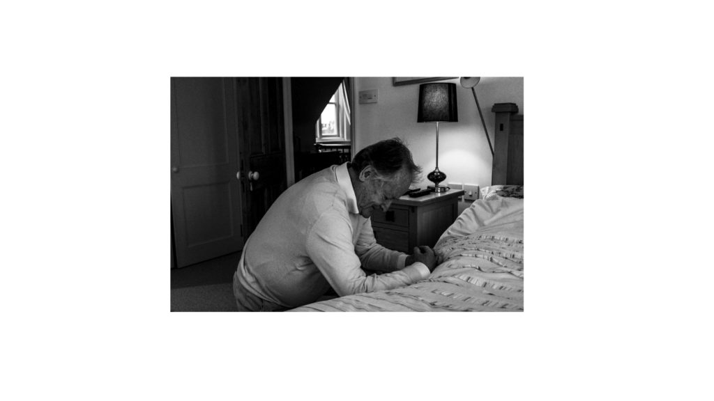
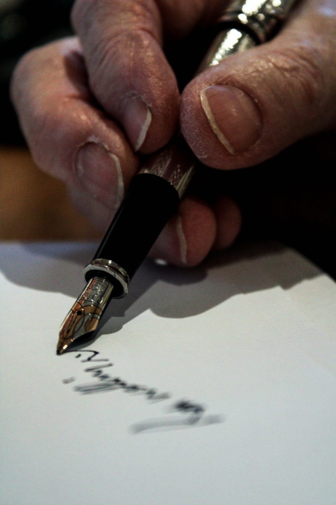
Using these two images almost juxtapose one another, however I believe it informs us a lot about my Grandad. They both hold the ideology of spirituality, the top image shows red wine which suggests the last supper and a common drink had within church services as it represents Jesus’ blood. Additionally, the photograph below is an image of intimacy showing my Grandad reaching out and praying to god. Placing these two images together clearly represents the ideology of spirituality, and therefore making it a successful outcome.
Final Piece 3:
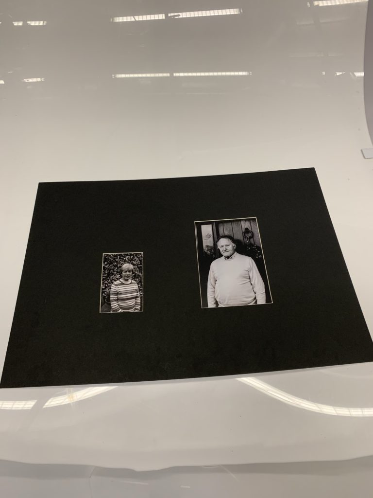
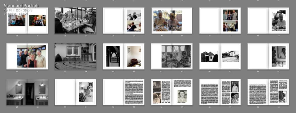
In my third final outcome I selected the two portraits, one of my Grandma and the other of my Grandad inspired by Walker Evans. I chose to use a window mount to illustrate the ideology of authority and family structure and hierarchy, as the portrait of my Grandad is larger in size, thus implying the conceptual representation. I really like the way in which they compliment each other through a similar composition as Walker Evans, as it suggests a relationship with the outdoors and their home, which showcases lifestyle. I believe this outcome is strong and clearly shows my narrative, thus making it successful.
Final Outcome 4:
For my last final outcome I chose to frame the A3 photograph of my families interaction with my Grandparents during a religious period in time, Christmas. The image is displayed in a black window mount, and holds an ameliorative atmosphere, as it explains how the two different lifestyles compliment one another. The photograph alone is structurally quite busy, thus making it effective on its own, as the monochrome composition allows detail and structure to be emphasised, reinforcing the happiness shown on the subjects faces. Personally, I really like this design as I feel it clearly illustrates the meaning of family as well as informing viewers about my intended narrative.
Evaluation:
To evaluate, I believe I have successfully selected some of my strongest imagery from the project in order to display my intended narrative within the project. I have creatively experimented with ways in which I could display my photographs, with showing a variety of methods, window mounts and stuck on foam board. The simplicity of the display allows the authenticity of my photographs to be up held. I have shown my ability to place ‘like’ photographs together in order for them to compliment and almost hold a mini narrative of their own which adds to my overall narrative. Therefore, I have successfully displayed my photographs, as well as being satisfied with my outcomes.
To what extent can we
trust documentary photography to
tell the truth about reality?
“The process of manipulation starts as
soon as we frame a person, a landscape, an object, or a scene with our cameras:
we choose a portrait or landscape format” (Susan Bright and Hedy van Erp. 2019;
18)
My personal investigation looks at my
grandparent’s lifestyle and how it has been influenced by the time period they
grew up in, the 1940’s. I have explored the influence of religion and
spirituality, gender roles within the family structure and social norms during
this time period which are still present in their lifestyle to this day.
Holding strong connections with my grandparents led me to want to base my
project on them, as I know I will be able to easily retrieve useful insight
into their lifestyle, enhancing the imagery I produce, on top of forming a
piece of work in which my family will cherish. In this essay I aim to discuss
the extent to which documentary photography accurately portrays reality, with
reference to two documentary photographers, Latoya Ruby Frazier and Walker
Evans. In this essay I will be referring to Walker Evans’ photographic series
entitled Let Us Now Praise Famous Men and LaToya Ruby Frazier’s
photographic series The Notion of Family. Analysing photographers who
captured imagery in two different periods of time, contextual and contemporary
comparison, allows me to illustrate whether the reliability has changed
overtime or stayed consistent, providing a valid argument. These two photographers
attempt to capture reality through portrait, but the validity of the imagery is
reduced as the photographer is either insider looking out, or an outsider
looking in which suggests a personal attachment to the subject or a conscious
understanding of their situation. In my project I am considering an insider
looking in, due to my subject being close to me both physically and
emotionally, creating a more subjective view towards their reality, thus
creating biased photographs.
Realism and Straight Photography looks at creating imagery which showcase life how it is lived. Artists who work within this area look at raising social and cultural issues relevant within society at that time, in order to make the audience aware of this issue in the hope that something can be done to make a change. This area looks at documentary photography and photojournalism to document events which are occurring and its practitioners adhere to the original techniques and purpose of photography; the use of photography for science, to create detailed, sharp images. Henry Fox Talbot invented the calotype, which is said to be the basis for how photography is practiced today in documenting everyday life. The calotype was done by creating a paper negative, exposing a sheet of paper coated with silver and chloride to a light source. His photographs used a short exposure time and allowed multiple prints to be produced through one negative. He believed that photographs were the cause of light, the influence of nature, on a paper negative and is illustrated through optical and chemical means. Louis-Jacques Mandé Daguerre, also shared this ideology behind image making and stated that photography “consists in the spontaneous reproduction of the images of nature received in the camera obscura, not with their colors, but with very fine gradation of tones.” (Daguerre Mandé, L-J. 1838). This illustrates how this art movement allows nature to present itself showing the reliability of imagery, which is then contradicted as it states it’s a spontaneous reproduction suggesting the accuracy of the imagery is reduced. Artist Frederick Henry Evans’ A Sea of a Step clearly presents realism through the composition and use of the formal elements of light and space. Conceptually, the imagery portrays the climbing up the stairs, as if the stairs lead towards a euphoric feeling. “He drew on the Symbolist manner of using objects to directly express esoteric ideas.” (The Art Story, n.d.). This use of symbolism creates a subjective perspective reducing the reliability of this art movement. Paul Strand took a different approach to capturing objects, using a macro technique with clear focus on light and shadow and the contrast between the two in order for the work to “be brutally direct; devoid of all flim-flam; devoid of trickery and of any ‘ism’; devoid of any attempt to mystify an ignorant public, including the photographers themselves.” (The Art Story, n.d.). This suggests how Strand’s work produces a more objective narrative which clearly depicts reality illustrating how this art movement can be truthful. Looking closely towards documentary photography, a style of photography which places into this art movement, photographers Walker Evan’s and LaToya Ruby Frazier use portraiture to showcase the lifestyle of the subjects presented in the frame in their natural environment. But to what extent does these photographers accurately portray the subject’s lifestyle? With my topic being based in my grandparent’s lifestyle, I felt that using documentary photography would be the most appropriate to capture my subject, as well as looking at social issues of family structures and gender roles.
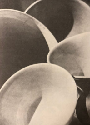
‘A Sea of Steps (1903) – Frederick Henry Evans
‘Bowls’ (1917) – Paul
Strand
The debate on the extent to which
documentary photography accurately portrays reality, has been ongoing since the
1930s. In 1936, Arthur Rothstein claimed that he “moved the skull a few
meters in order to obtain a more dramatic pictorial effect” (Wells. L, 2004:
72), suggesting in the
early forms of this style of photography, photographers were strategically
manipulating the frame and subject in order to gain a certain effect, reducing
the veracity of the imagery. During the Victorian era, cases of manipulation
for effect was still present; “In 1876 the philanthropist Dr T.J. Bernardo
appeared at a hearing, having been charged with deceiving the public” (Wells. L,
2004: 71),
– suggesting how photographers cannot accurately portray reality as an image is
only a snapshot in time, a pseudo-presence to what actually occurred. This
topic is still debated today, where Ashley La Grange regarded a photograph to
“only show the surface” (La Grange. A, 2005; 34) – which implies that the frame
may showcase reality but the interpretations of the imagery reduces the
reliability as viewers can only see a snapshot of an event leading to
misinterpretations.
Walker Evans – 1936 –
‘Allie Mae Burrough’
Walker Evans’ Let Us Now Praise Famous
Men photographic series explores the exploitation of Tenant farmers in
Alabama during the Great Depression, through the medium of documentary
portraits. With close analysis of the image Allie Mae Burroughs produced
in 1936, the portrayal of the narrative clearly illustrates the dire conditions
to which these families are subjected to and draws upon the ideology that they
do not know life any differently to the life they live now. “The essence is
done very quietly with a flash of the mind, and with a machine. I think too
that photography is editing, editing after the taking. After knowing what to
take, you have to do the editing.” (Evans, n.d.) – Evans suggest that although
his photographs are trying to capture reality, manipulation of capturing or
editing still effects the photographs and the way in which it truthfully
presents the Tenant’s pejorative lifestyles. In an article, published by the
Guardian, the author describes Evan’s imagery to accurately present reality,
“You can’t sniff the stink of the quilts in the Evans pictures, nor itch with
the lice in the pillows. The foul beds take on a Shaker dignity of form. A
gasoline pump on the porch of a post office metamorphoses into sculptural
permanence within the fixed focal length of Evans’ lens.” (Rule.V, 2001). His
positive critique of Evans’ imagery emphasis how accurately he managed to
capture the raw living environments of the tenant families, which allows
viewers to sympathies for these families, as we understand that they do not
know life any differently, which contradicts the viewpoint of Evans, but who
are we to believe more? Simplicity in the composition allows an accurate
reliable source to be illustrated. Evan’s subject is placed in the centre of the
frame and using naturalistic lighting he captures the subject gawking into the
lens as if they are asking for mercy. The presentation of the subject does not
put her in a position of respect, in the sense of her appearance and the tonal
contrast emphasising her lower class within society. However, it allows the
subject to be elevated and placed into the limelight, presenting the conceptual
elements making her more respectful in present day and towards viewers. He
captures the subject in their naturalistic environment allowing the
authenticity of his imagery to be upheld and allows reinforcement for the
sympathetic connection to be between the subject and viewers. Technically, he
uses a large depth of field, due to the whole frame being in focus, suggesting
a small aperture and slower shutter speed. It is recorded that Evans has four
different variations of his Allie Mae Burroughs which reduces the
reliability of his work, due to manipulation of his subject in each image,
which can lead us to not fully conforming to believe in this social representation,
as it not being a reliable source due to several versions of the same image,
with only one outcome being used. This is illustrated in Susan Sontag’s seminal
book entitled ‘On Photography’ where she writes “taken dozens of frontal
pictures of one of their sharecropper subjects until satisfied that they had
gotten just the right look on film.” (Sontag. S, 1977; 6).
In my response, I captured my grandparents
outside of their homes, in locations where they spent the most time when
outside, or the areas in which they felt illustrated their lifestyle.
Similarly, using a small aperture and slow shutter speed, I used a tripod in
order to produce detailed and well-structured portraits. The natural light
source from outside and naturalistic environment, allowed me to maintain the
authenticity of my imagery allowing for a reliable source presenting my grandparents
lifestyle. In terms of concept, I captured my photographs mainly outside using
simplistic backgrounds illustrating their lifestyle, but I also decided to
explore this connection of subject and location with the interior of my grandparent’s
house, as they spend more time inside than out. In addition to this, archival
material will allow for me to systematically show the connection between my
subject and the outdoors.
My Response
LaToya Rudy Frazier –
‘ The Notion of Family’ – 2014
LaToya Ruby Frazier photographic series The
Notion of Family aims to tell the narrative of her African-American family
whom are struggling to come to terms with oppression (prolonged cruel or unjust
treatment or exercise of authority) in Braddock, a suburb of Pittsburgh, and
the negative physical and psychological effects of the city’s steel industry on
their home life. Furthermore, it looks at the impact of racism in the small
suburb as well as the decline in the community and family, showing her personal
and political viewpoint towards this topic. In this she explores three
generations of her family who have lived through these issues: her grandmother,
mother and herself which reinforces the personal attitudes towards her imagery,
making a subjective and unreliable presentation of this issue. “I am obliged to
document and counter this reality, and ultimately re-imagine and rewrite it
myself.” (Campany, 2014) – Frazier refers to her imagery as a way of
documenting reality literally and re-imagines her lifestyle through the
pejorative metaphors presented throughout the series, this clearly presents
biases to this social situation, leading to misleading and inaccurate imagery
of reality. In an interview with Frazier she made the comment “We need longer
sustained stories that reflect and tell us where the prejudices and blind spots
are and continue to be in this culture and society,” (Campany, 2014) – the
connotations implied is that Frazier views her embodiment of work as a clear
way of illustrating these social issues, and suggests that the camera is a
“weapon” (Campany, 2014) of exposing reality, suggesting high reliability
within the imagery. In contrast, the photographic series is a personal response
to an issue relevant to the her as an insider looking in. This ideology of
being an insider looking in is reinforced by a critique when John Berger says “Ms.
Frazier reimagines the tradition of social documentary photography by
approaching a community not as a curious or concerned outsider but as a
vulnerable insider.” (Berger, 2014). In specific analysis of the imagery above
we are presented with two members of Frazier family at a straight on angle, one
in the foreground looking to the right of the frame with her eyes lightly
closed and a female in the background looking direct into the camera, creating
an emotional connection between the viewer and subject. The positioning
suggests the female in the background is seeking help or obeying to the female
in the foreground creating a sense of power and family structure, this implies
an artificial positioning of the subjects reducing the reliability of
showcasing reality. The presentation of the subjects allows cultural context to
be illuminated, through the wig caps, patterned and plain clothing which also
suggests low socio-economic status, which increases the emotional impact of the
conceptual message on viewers. The use of a narrow depth of field and low
aperture allows focus on the subjects and allows the background to compliment
the conceptual and contextual elements through the African pattern stylised
curtains. The naturalistic environment contradicts the artificial composition
and creates a more reliable source of reality for presenting Frazier’s family.
The low ISO being utilised and artificial lighting, allows a soft ambience to
be illustrated, which juxtaposes the chaos in their lifestyle, suggesting more
biases from Frazier due to the lighting, reducing the reliability of this image
as documentary photograph. Critiques imply that the photographic series is “a
cautionary tale and a force for educating the public and motivating reform.”
(Berger, 2014) – due to these external motives connotes a reduction in
reliability due to wanting social reform, she was aware that she had to create
imagery which provoked emotion in order to achieve a reform.
In my response to Frazier, I captured my
grandparents in their home in places suggested their luxurious lifestyle.
Through the manipulation of the composition and positioning of my subjects, I
created imagery which implied family structure and gender roles, which shows
how the 1940’s has influenced my grandparent’s lifestyle. The positioning of my
subjects creates a sense of power and authority towards my grandad as my grandma
in the background looks at him and his high family status. Similarly, the
naturalistic lighting and low ISO will allow me to create a similar soft and
welcoming ambience allowing my conceptual representation of lifestyle to
clearly be illustrated within my work, allowing my documentary stylised
photography to be considered reliable in portraying reality.
My Response
To conclude, both Walker Evans and LaToya
Ruby Frazier provide documentary portraits in order to raise particular social
issues relevant to the subject and environment they live in. Focusing on
raising the issue through portraiture, allows an emotional connection between
the image and viewers in both their work to be formed, making the social representation
more impactful and allowing the imagery to act as “indisputable evidence”
(Sontag 1977; 9). LaToya Ruby Frazier’s work is captured by an insider looking
into the social issue, which suggests subjectivity of the imagery, as she is
more likely to manipulate the frame in order to illustrate her family in a more
pejorative situation in order to play up on the emotional response of viewers
making the issue seem worse than what it actually is. Whereas Evans’ is an
outsider looking in which may project more objectivity, however the reliability
of his work is reduced due to many variations of one image, creating selective
representation. Although, both artists have a sense of authenticity within
their work, no documentary style photographs can be 100% reliable. This is
because manipulation can occur through the framing, editing and selection by
the artist in order for them to achieve their intended effect; “Even when
photographers are most concerned with mirroring reality, they are haunted by
tacit imperatives of taste and conscience” (Sontag, 1977; 6).
Bibliography:
Berger, M. (2014). LaToya Ruby Frazier’s Notion of Family. [online] Lens Photography, Video and Visual Journalism. Available at: https://lens.blogs.nytimes.com/2014/10/14/latoya-ruby-fraziers-notion-of-family/? [Accessed 24 Jan. 2020].
Bright, S. and Van Erp, H.(2019), Photography
Decoded. London: octopus Publishing House
Campany, D. (2014). So present, so invisible.
1st ed. Italy: Contrasto, pp.61-68.
Evans, W. (n.d.). Photography Quotes by Walker
Evans. [online] Photoquotes.com. Available at: https://www.photoquotes.com/ShowQuotes.aspx?id=196&name=Evans,Walker
[Accessed 24 Jan. 2020].
La Grange, A. (2005). Basic critical theory for photographers. Oxford: Focal Press,
pp.30-35.
Rule, V. (2001). Review: Let Us Now Praise Famous
Men by James Agee and Walker Evans. [online] the Guardian. Available at:
https://www.theguardian.com/books/2001/aug/18/historybooks.highereducation [Accessed 15 Jan. 2020].
The Art Story. (n.d.). Straight Photography
Movement Overview. [online] Available at:
https://www.theartstory.org/movement/straight-photography [Accessed 24 Jan.
2020].
Wells, L. (2004). Photography A Critical
Introduction. 3rd ed. London: Routledge, pp.71-72.
Sontag, S. (1977). On Photography. London: Penguin, pp.1-23.
For my first three layouts I wanted to explore typologies and how putting photographs in a triptych and diptych format in order to portray the narrative of the occupation of my Grandparents lifestyle. I decided to use the portraits which have emotional value and suggest important part of my Grandparents lifestyle as the first triptych. These photographs are being printed as A4 photographs and will be displayed with a 4cm gap between each photograph and will be either stuck onto foam board or put in a window mount on white card, as I believe white compliments the photographs the best. For my next triptych layout I printed out four landscape photographs of the interior of my Grandparents house, two in colour and one in black and white. The images are being printed as A5, and will be displayed in a similar format, 4cm gap between each photograph and displayed vertically. My final out come using typologies is a diptych which is a portrait of my Grandad and one of my Grandma. I printed one out as an A4 and one as an A5, the size difference of both will reinforce the ideology of power within family structure and how my Grandad has the most dominance. I will display the two images next to each other as a window mount or on white foam board with a 4cm gap between each photograph. These designs can be viewed below, as I created a layout of them using photoshop.
The next two display ideas are singular photographs, which would not work as a typology, and so I have deiced to display them on their own. The first photograph is of my family sat around a table at Christmas, showing the interaction of my lifestyle with my Grandparents lifestyle at a religious event. The photograph will be printed on A3 paper and displayed on white foam board. Below is a photograph of my Grandad praying, conceptually representing intimacy and the idea of religion on his lifestyle. The photograph is being printed as an A4 photograph as will displayed in the same way as the A3 photograph of my family. These full bleed photograph displays are visible below.
To show further experimentation and thought into the displaying of my photographs, I decided to create an eclectic display of all the outcomes. The chaotic design suggests that their lifestyle isn’t simple and has its ups and downs, and conceptually clearly presents my intended narrative. Personally, I really like the way in which this looks and will look at creating this on a large piece of foam board when the prints arrive, the design may change due to the size of the photographs, however I do want to see what this would look like with the real images and how impactful the narrative it displays is.
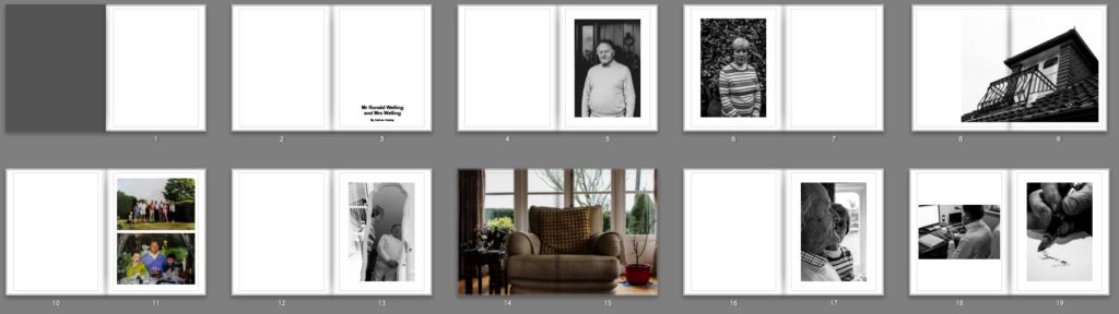
In the initial stages of my photo book design I wanted to ensure I maintained simplicity whilst making the narrative of my Grandparents lifestyle clearly presented. I started by experimenting with the sequencing of my imagery, combing interior and exterior with my portraits, trying to form a relationship between the two to create meaning to illustrate the lifestyle of my Grandparents. I decided to have two portraits or archives and then add an interior and or exterior to have a ‘break from the action’ to change the pace of the book. Although I liked the way in which it looked, I felt the sequencing of my photographs was not the clearest way of presenting my intended narrative, thus making me further explore the way in which I could sequence my photographs. In addition, in this first section of the book I wanted to include archival imagery which allowed a comparison between the past and present lifestyle to portray how their lifestyle has changed or stayed the same, thus emphasising how the time period they were brought up in has influenced their lifestyle. I felt this sequencing of archival imagery amongst present portraits was an affective way of showcasing my intended narrative and allowed a sense of flow within the book itself, therefore I am going to keep these archival images in this position of the sequence due to the reasons stated above. Due to the interior and exterior photographs not ‘fitting in’ well with this particular moment of my book I decided to move them into a new section, allowing for further experimentation.
Second Design:
Taking from the experimentation of my first design I took what went well and things needed to be changed to produce my second design. As mentioned in my book specification I wanted the book to start and end with a strong portrait of my Grandad as I felt it was a clear way of presenting my narrative at the beginning of the book, as well as using a similar portrait at the end to clarify and support the narrative, allowing the book to finish in a conclusive way. I then mainly had portrait and archival imagery in the first section, as this is what worked in my initial design. Occasionally, I did decided to implement 3/4 and double page spreads of interior and exterior to give a break from the action and present my narrative in a new light, however I did not over do this like in my first design. Moving onto the next section of my photo book I wanted to showcase the interaction of their lifestyle with mine at a family event, and so decided to utilise the photographs from Christmas. I occasionally added more archival imagery of family events in order to show the change in interaction of both lifestyles. Within this section I tended to stick with using single, 3/4 and double page spreads in order to show the interaction of lifestyles. I believe the way in which I sequenced these photographs was successful as it allows the narrative to flow, presenting a new way of looking at their lifestyle, with looking at aspects of religious events and how it impacts them. Moving onto the next section I wanted to use my interior and exterior images, as I believe these photographs are a clear way of presenting their lifestyle as well as them being some of my strongest outcomes. The sequencing of these images was kept simplistic, as I tended to show these photographs and then on the following page would be a portrait, to support the conceptual understanding of the location and my Grandparents relationship with it. In this version I decided to layout my essay within the book, I tended to have a combination of full page of text and the use of columns, to break up the chunk of text, making it seem more manageable, thus making viewers more likely to read the essay. To evaluate this design, I believe the overall sequence clearly presents my intended narrative of the occupation of lifestyle on my Grandparents, and flows smoothly with each image being an asset of presenting my intended narrative.
Fine Tuning My Design:
After the second design I am happy with the sequencing of my photographs in order to show my intended narrative. I decided to focus on fine tuning some of my spreads to make the photographs more effective in presenting my narrative, as well as improving the overall aesthetic of my photo book. A few of these artistic decision can be seen below, in order to show my experimentation in my design, as well as my decision making and thought process.
In my first fine tuning of my design I looked at the way in which I presented my double page spreads. For the most part I had a white boarder around the photograph, so it did not fill the whole page, I did this as it allowed the whole photograph to be showcased without anything being cut out, thus making my imagery more reliable in depicting reality. However, after consideration I felt that I was not achieving maximum impact of the photographs and so decided to get rid of the white boarder and have the photograph fill up the whole page. This meant that elements of the photograph was cut out, however I believe it allowed the sequence to flow a lot smoother as well as the photograph to have maximum impact on the side of story telling. The ‘cutting’ of the photograph was not highly impactful, as it did not cut out the main focus point of the chair it only cut out a slight part of the background, thus we were not loosing useful information, making this decision more affective. I decided to do this for my other double page spreads, in order to make all double pages look the same, in the sense to maintain my overall aesthetic. The old and new design are showcased below.
Old Spread
New Spread
The next fine tuning I wanted to focus on was the title page, this is because it is the first thing a viewer will see, thus I wanted it to be high effective and clear in depicting what is within the book. After consideration I decided upon the title ‘Mr Ronald Welling & Mrs M Welling’, I chose this as I felt it clearly presented what the narrative is about and conceptually begins to present my Grandad authority. Using the picture of the windowsill was a good artistic decision as the simplicity and inactive frame allows a sense of tranquil to be presented, suggesting an ameliorative and calm lifestyle. I wanted the text in white in the bottom left corner as I felt it was the most subtle place to have the text, emphasising the sense of calm. Initially I decided to use the typography of ‘Candara’ as I liked the way in which the letters were structured. However, after time and consideration I felt this effectiveness fell and so I decided to change the font to ‘Bookman Old Style’. This fonts structure reminded me of an envelope or address on an important letter. In a way it also reminds me of my Grandad’s writing, and therefore these two reasonings made this decision affective as it suggest the business side of my Grandad, due to the formal representations it holds.
Old Spread
New Spread
I then experimented with a different cover design using a photograph which more explicitly outlines the narrative of my book. I decided to use the archival imagery of my Grandparents wedding. I decided to change the front cover to a dust jacket, which has allowed this photograph to wrap around the book. The front cover holds my Grandad and the back cover holds my Grandma, suggesting the idea of my Grandad’s authority and my Grandma being the backbone of him in essence. Using the crop tool I accurately cropped the photograph so the dust jacket would fold on the same point of each of their eye, and on the fold in I placed their name ‘Mr Ronald Welling’ and ‘Mrs Welling’. Sticking to the title as stated above supports the idea of authority. In this design I decided to again experiment with text font and changed it to a more bold font which makes the title stand out a lot clearer. Personally, I much prefer this design as I feel it gets straight to the point and clearly presents my underlying theme and narrative. Therefore, I have decided to change my front cover to this design, as well as the text font.
My next piece of fine tuning was to do with the sequencing of my photographs in order to emphasises the authoritative conceptual representation of my Grandad. Initially, I had one portrait on each side so that they are next to each other, in order to emphasise relationship of the two subject, however I felt this was not sustained as much as the authority of my Grandad, and so decided to change the sequencing. The first image you see in the book is my Walker Evans inspired photograph of my Grandad on the right hand side, as the right is the page to which viewers first look at. Turning the page my Grandma is placed on the left page, as we do not immediately look on that side of the book, thus suggesting authority of my Grandad and the submissiveness of my Grandma, thus helping to portray my intended narrative.
Evaluation:
To evaluate, I believe I have been able to successfully sequence my photographs in order to present my intended narrative. Through experimentation, I have been able to see the layouts which are most successful, allowing the photographs to have maximum impact and flow nicely in order to showcase the underlying theme of lifestyle. In addition, I have been able to articulate my thought process and decision making as to why I have decided to sequence the photographs in a particular order and why I have chosen that page spread. The development of my photo book has been a long process and so I only showcased the major and most important changes, as well as details on each section and what its meant to showcase and suggest. From now to the final product, it is likely more minor changes will be made and will be discussed in my final photo book layout blog post.
Exploring my Grandparents lifestyle, based on their upbringing, occupation and relationship with each other as well as other family members.
A paragraphs
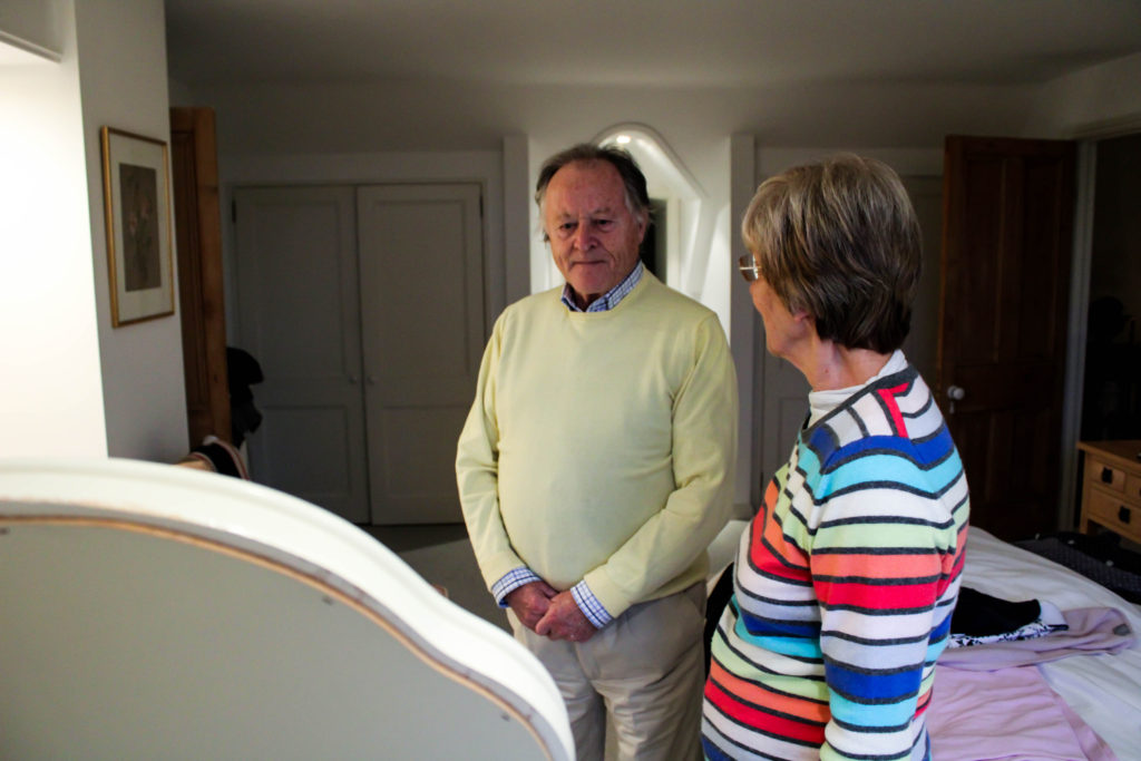
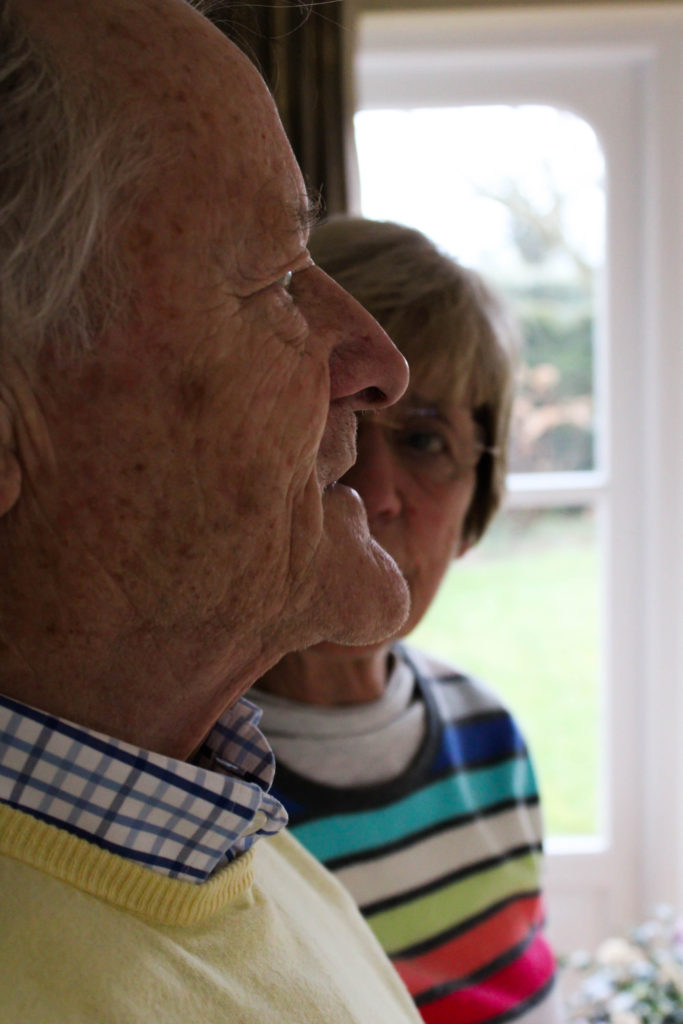
My photographic book looks at exploring the occupation of Ron Welling and Margret Welling’s lifestyle through portraits and objects. Being brought up in the 1940’s means their lifestyle is very different to mine. Traditionally, they were raised to believe that the husband has to provide for the family, as the wife stays at home as a house wife. On top of this, religion has impacted their lifestyle and the way in which they structure their days and has been apart of their life since a young age. My Granddad worked in the financial industry, after moving to Jersey in the year of 1984, and managed to make his fortune out of this industry, due to his hard work he not only managed to provide as the only financial support for his family, but also has provided a luxury retirement for himself and his wife which has clearly influenced their lifestyle.
Design: Consider the following
How you want your book to look and feel
I want my cover to be a hard back, suggesting an official book with official information like a hard back dictionary, the information in a dictionary can not be changed like my Grandparents lifestyle, suggesting a reliable source for their lifestyle, The book will feel smooth and the image wrap cover will allow this to be achieved, creating an overall nice book to hold. As it is a book about family the book will look like a coffee table book which are often found in open areas of homes, these coffee table books often are family albums. Therefore, my subtle cover will allow the coffee table ideology to be achieved.
Paper and ink
Due to my photographs sticking to a documentary style, I want the books to clearly depict reality and so I have decided to use matte paper. I also believe that having my main subject being my Grandad, who is an authoritative figure, the matte paper will conceptually present this as well as making the pages look like an important document showing his work life, it will also complement my black and white imagery.
Format, size and orientation
My book will be 20 x 25cm standard portrait, due to the majority of my imagery being portraits allowing for the full frame to clearly be presented and making clearer emphasis on my portrait photographs, allowing the conceptual representation to clearly be illustrated within my book.
Binding and cover
For my cover I am wanting to use an image warp, of one of my top interior imagery. The photograph is of a window looking out onto their garden, the curtains either side suggests the ideology of stage curtains and the window is the narrative about to be told, making this an effective image to use as it is their interior suggesting their lifestyle. With regards to binding I will have a saddle stitch which I took inspiration from Sam Harris’ book as I believe the subtle stitch will suit my narrative.
Title
Retirement
Mr Ronald Welling and Mrs M Welling
Structure and architecture
I want the structure of my photo book to maintain a simplistic theme, in order to not distract viewers from reality and the narrative trying to be portrayed. The photographs will be matched in a sense of whats happening in the frame, colour and texture in order to display the narrative of my Grandparents lifestyle. The double page spread will illustrate the key element of my Grandparents lifestyle, as well as having key portraits on a single page on the right with nothing on the left to emphasise the frame and conceptually what is happening. The photographs will be in a chronological order to display portraits, family event and then interior to clearly present a clear understanding of my narrative.
Design and layout
I will mainly use single page spreads for my portraits, with having nothing on the left to allow the main focus to be on the portrait suggesting an element of my Grandparents lifestyle. With archival imagery I will use two on a page and if I want a comparison I will use two images to a page. I will use more double page spreads rather than 3/4 page spreads to allow maximum effect on my imagery. I do not intend to having any inserts with texts, as I want the main focus to be on my imagery.
Editing and sequencing
The first photograph of my book will be a portrait of my Grandad on the right side of the double page, to illustrate the idea that he is the authoritative and main figure of the family. The next two pages will have a picture of my Grandma on the left hand side, making this artistic decision emphasise how my Grandma is more submissive as when you look at a photo book you look on the right hand side then the left, so she is less likely to be looked at. The last image will also be a portrait of my Grandad allow the sense of authority to be the closing statement of my book.
Images and text
I do not to add texts to my photographs as I believe that it will influence interpretations of my Grandparents lifestyle, which leads to an unreliable source of depicting their lifestyle.
The aim of this further experimentation is to re-edit my imagery in order to convey different conceptual representations of my work. I am going to be editing the images in a simplistic and minimalistic way, in order to explore my imagery following my projects aesthetic as well as taking a more contemporary route to manipulating my photographs, using photo shop to do so. Taking the original edit will allow a comparison to be created between the old and new, and doing this will hopefully make my imagery stronger and produce outcomes to which I will want to use in my photographic book. In addition, this will allow me to showcase my ability to creatively manipulate my work in order to create an intended effect. I am planning on taking my top imagery, which I believe could look better in a different variation, from a couple of my photo shoots that I have conducted and will produce two edits of the same image.
Experiment 1:
Original Edit:
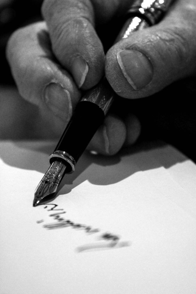
In the original photographic edit of the hand and the pen, I used Lightroom to adjust the white balance, white, blacks, shadows and contrast in order to showcase detail on his skin and the pen, allowing contextual representations about my Grandad’s job and age to be illustrated. The simplicity of the edit allows the image to follow my aesthetic which has been upheld within my project. With this edit I am wanting to create a more contemporary approach as well as a black and white version of this edit.
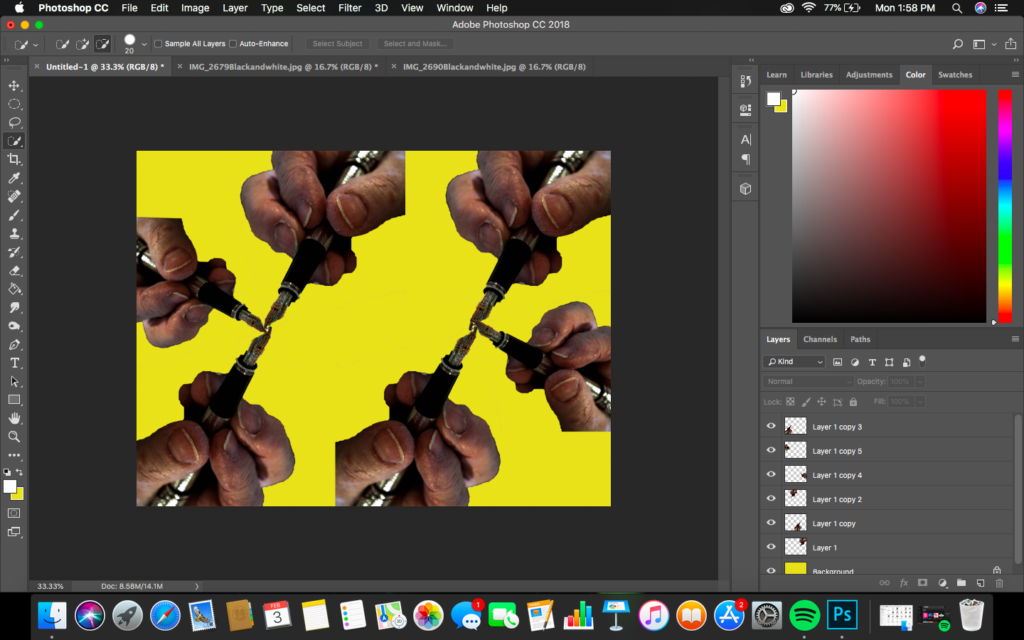
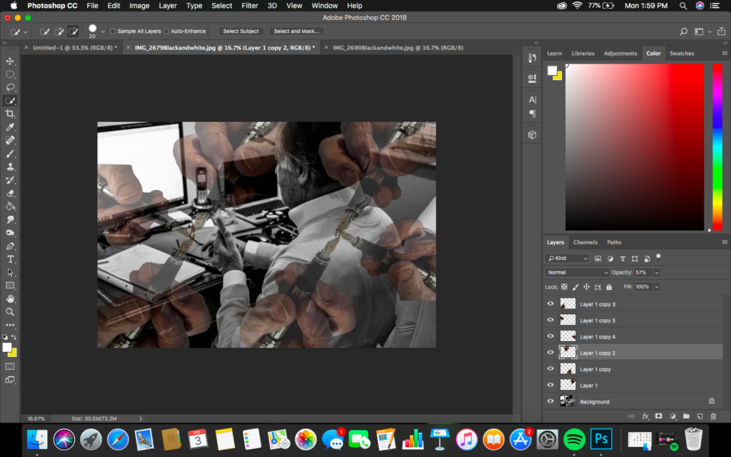
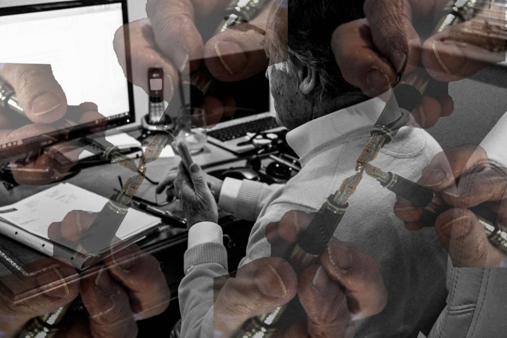
Design 1:
Below showcases the steps I took in order to achieve the final effect. To start the edit off, I opened up the hand picture into photo shop and using the quick selection tool I selected the hand and pressed layer via cut. Then opening a new photoshop page, I placed this layer onto the document, duplicating this layer allowed this hand pattern design to be created. I then merged all these layers into one layer. Opening up the photograph of my Grandad at work and then I placed this hand layer onto, adjusting the size to fit the page (ctrl + t). I then turned down the opacity of the hand layer to around 40% which allowed the affect below to be created. Personally, I really like the way in which this final outcome looks as it allows the conceptual representation of my Grandad being a hard and dedicated worker within the finance industry to be illustrated, as well as showing how this hard work has been developed into his retirement. Visually, the piece is interesting to look at due to the busyness of the frame and the contrast of monochrome and colour within the composition of the frame.
Design 2:
Taking a more simplistic route which follows my projects aesthetic, I decided to experiment with this outcome in black and white. Using Lightroom I got the original image and made the it monochrome. I then looked at adjusting the contrast, shadows, blacks and whites until I was happy with the overall effect. I wanted the photograph to show clear detail on the hand, allowing a clear tonal contrast to be created, in order to conceptually represent his hard work and dedication to his work life which is illustrated through the formal element of texture due to his skin. I believe this is my strongest outcome as it clearly represents my intended concept of the project, as well as following the stylised features of my other photographs.
Experiment 2:
Original Edit:
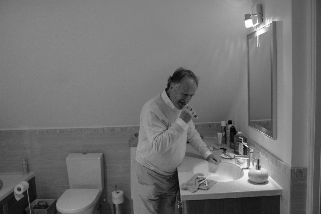
For my next experimentation I decided to explore with the photograph of my Grandad getting ready in the morning as he looks into the bathroom mirror. I wanted to take a contemporary route in order to conceptually and contextually represent his age and inner thought. In the original edit I used Lightroom to adjust the white balance, white, blacks, shadows and contrast in order to showcase detail on his skin and the pen
Design 1:
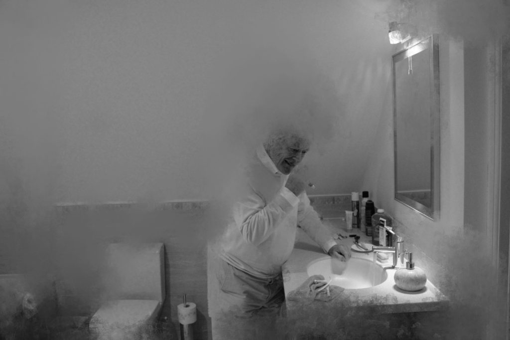
For my first contemporary edit I decided to explore using the burn, smudge tools in order to create texture within the image. To achieve the effects simply went round the outline of the back of my Grandad and smudged him which represent decay and his age, suggesting retirement and his peaceful lifestyle. Adding to this I used the burn tool in order to blend the smudge and make it look more naturalistic. I really like the way in which the photograph edit has turned out as it clearly showcases conceptual and contextual representations through distortion of my subject.
Design 2:
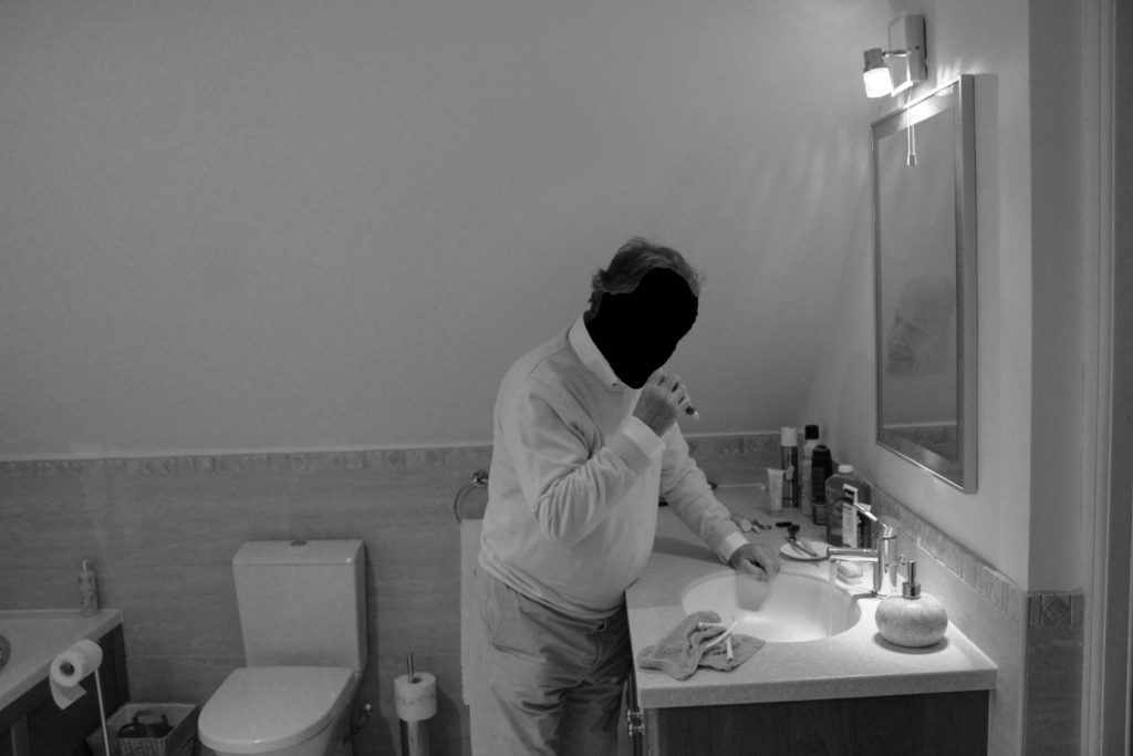
In my next edit of the same photograph I wanted to stick to the same contemporary route. I decided to use the quick selection tool to cut out the face of my grandad. Then using the transformation tool I placed the face in the mirror, looking directly at him, and turned down the opacity making it blend in. Doing this conceptually represents a more intimate approach to himself and his lifestyle, it suggests how he is always criticising himself to do better in the sense of work. It also showcases how perfection has followed him through his lifetime. Personally, I really like this outcome as it showcases my Grandad in a new limelight which is more intimate and informs us more about him, however I prefer the aesthetic of the outcome above.
Experiment 3:
Original Edit:
In this original edit of a photograph inspired by LaToya Ruby Frazier, I wanted to produce another simplistic edit as well as a more contemporary edit in order to illustrate conceptual meaning within the imagery. In the original edit I wanted to have my photograph monochrome, to match the stylistic features of LaToya Ruby Frazier. I wanted to showcase the formal elements of detail, space and form, which was clearly showcased by the composition and the way in which I adjusted the structure, whites, black and shadows. I believe that this outcome is strong but want to explore with the photograph in colour to make a comparison.
Design 1:
For the colour variation of the photograph I wanted to make the image showcase the same conceptual and contextual representation as the monochrome version of the outcome. To achieve this I simply adjusted the sliders to the same as the other variation. I then slightly adjusted the lights and darks in order to showcase detail on their skin and still illustrate the sense of space within the composition. comparing the two outcomes, I much prefer the monochrome version as I believe the contextual elements of the work is much clearer in presenting itself, due to more detail being showcased and the closer links with the artist the photograph was inspired by.
Design 2:
Utilising the black and white outcome of this photograph, due to my personal preference, I wanted to withstand the simplicity of the outcome but add a more contemporary stylistic feature towards it. Simply using the quick selection tool I cut out both of my Grandparents and moved them slightly from their original positioning, allowing a black outline of them to showcased. Conceptually, I was trying to illustrate how their past is leaving them as they become older how their lifestyle habits have changed and how their personality is changing due to situational factors presented in their lifestyle today. Personally, I really like the way in which this outcome has turned out as it creates a interesting piece to look at through the rule of thirds and the subtleness of the black outline.
Experiment 4:
Original Edit:
For my final experimentation I used another photographer from my LaToya Ruby Frazier photo shoot. In the original edit I wanted to have my photograph monochrome, to match the stylistic features of LaToya Ruby Frazier. I wanted to showcase the formal elements of detail, space and form, which was clearly showcased by the composition and the way in which I adjusted the structure, whites, black and shadows. I believe that this outcome is strong but want to explore with the photograph in colour to make a comparison. My third edit will still follow the simplicity as I feel if I take a contemporary route to it, it will ruin the strong conceptual values the imagery holds.
Design 1:
For the colour variation of the photograph I wanted to make the image showcase the same conceptual and contextual representation as the monochrome version of the outcome. To achieve this I simply adjusted the sliders to the same as the other variation. I then slightly adjusted the lights and darks in order to showcase detail on their skin and still illustrate the sense of space within the composition. comparing the two outcomes, I much prefer the monochrome version as I believe the contextual elements of the work is much clearer in presenting itself, due to more detail being showcased and the closer links with the artist the photograph was inspired by.
Design 2:
For my final variation of this outcome, I took the black and white version of the edit, due to it being stronger in presenting my conceptual and contextual representation. I experimented with adjusting the hue of the photograph in order to make it have a more orange/yellow sepia tone which helps to emphases the contextual element of the time period they were raised which influences their lifestyle of the male of the house hold being more dominant. Although I like this outcome, I feel you loose the texture and detail on my Grandad’s skin which takes away from the conceptual elements.
Evaluation:
To evaluate these further exploration, I feel I have been able to successfully use Lightroom and photoshop to create image which take a minimalistic and contemporary route to producing conceptual and contextual elements of my photographs. I have been able to demonstrate my skills of using the different tools on photoshop and justify why artistic decisions where made in order to illustrate my photographs. Moving forward, the stronger variations of the outcomes, which follow my minimalistic aesthetic I will look at using and implementing into my photographic book, in order to allow the sequence of my images to flow my easier. To conclude, this further exploration process was useful in the sense that I have been able to make my outcomes stronger in representation.