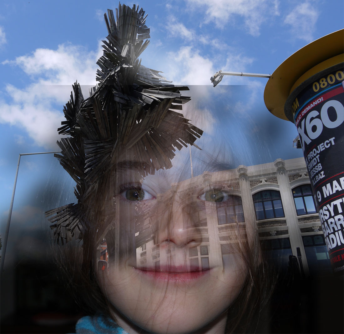
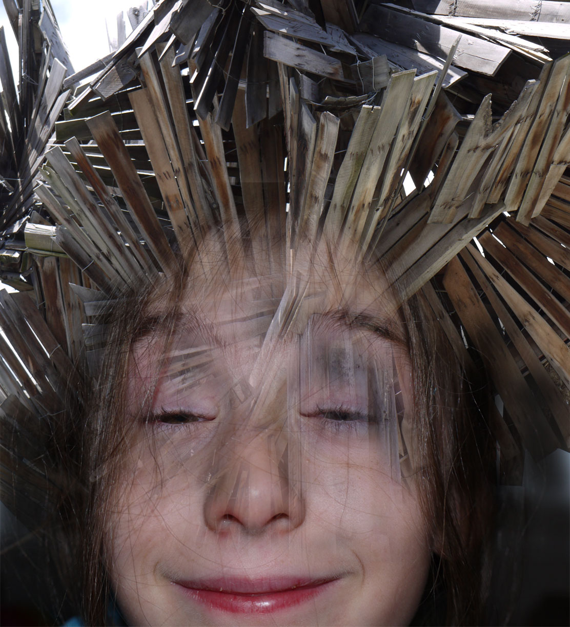
Francesco Paleari and my interpretations of his work The artist that i am going to be focusing on for my exam inspiration is going to be Francesco Paleari. Francesco Paleari’s ‘Milano’s Profile’ series tells an architectural story, a personal story, and a demographic story simultaneously. The photographs are personal in the sense that they tell a story of Paleari’s perception of Milan. He tells his story through portraits of the Milanese. Their portraits are also building profiles. The stories of people and buildings create the city’s collective profile. Paleari’s title for this series is very fitting. Each image is a profile view of a person combined with a building’s profile.Here is Francesco Paleari’s description of the series: ‘Milan in architectural profiles of a historic city and modern at the same time, Milan in the profiles of the people who live it every day.’Here is Francesco Paleari’s description of the series: ‘Milan in architectural profiles of a historic city and modern at the same time, Milan in the profiles of the people who live it every day.’There is something to be said about how Paleari decided to blend the two profiles. There is a set of decisions that dictate whether to fade out the building to highlight the person’s profile or whether to fade out the person to highlight a building’s profile. I think his decision-making was very successful. Paleari is basically stating that the building and the person tell the same story, and the collective stories of buildings and people tell the story of a city. Some images of his work that i've decided to base my inspiration off of.I have decide to create my own interpretations of his work by using Photo shop creating a blank document creating to different layers of images then using a layer mask and the brush to to fade them together.

All posts by Nelista G
Filters
John Stezaker – Artist Studdy
Back ground information on photo montage
Photomontage is often used as a means of expressing political dissent.

It was first used as a technique by the dadaists in 1915 in their protests against the First World War. It was later adopted by the surrealists who exploited the possibilities photomontage offered by using free association to bring together widely disparate images, to reflect the workings of the unconscious mind.

In 1923 the Russian constructivist Aleksander Rodchenko began experimenting with photomontage as a way of creating striking socially engaged imagery concerned with the placement and movement of objects in space.

Other key exponents of the medium are John Heartfield, the German artist who reconstructed images from the media to protest against Germany’s Fascist regime and Peter Kennard; whose photomontages explored issues such as economic inequality, police brutality and the nuclear arms race between the 1970s and the 1990s.
John Stezaker - Photo montage John Stezaker’s work re-examines the various relationships to the photographic image: as documentation of truth, purveyor of memory, and symbol of modern culture. In his collages, Stezaker appropriates images found in books, magazines, and postcards and uses them as ‘readymades’. Through his elegant juxtapositions, Stezaker adopts the content and contexts of the original images to convey his own witty and poignant meanings. In his Marriage series, Stezaker focuses on the concept of portraiture, both as art historical genre and public identity. Using publicity shots of classic film stars, Stezaker splices and overlaps famous faces, creating hybrid ‘icons’ that dissociate the familiar to create sensations of the uncanny. Coupling male and female identity into unified characters, Stezaker points to a disjointed harmony, where the irreconciliation of difference both complements and detracts from the whole. In his correlated images, personalities (and our idealisations of them) become ancillary and empty, rendered abject through their magnified flaws and struggle for visual dominance. In using stylistic images from Hollywood’s golden era, Stezaker both temporally and conceptually engages with his interest in Surrealism. Placed in contemporary context, his portraits retain their aura of glamour, whilst simultaneously operating as exotic ‘artefacts’ of an obsolete culture. Similar to the photos of ‘primitivism’ published in George Bataille’s Documents, Stezaker’s portraits celebrate the grotesque, rendering the romance with modernism equally compelling and perverse.His work fits in well with the concepts of photo montage.
-
A photo montage is a collage constructed from photographs.
-
Historically, the technique has been used to make political statements and gained popularity in the early 20th century (World War 1-World War 2)
-
Artists such as Raoul Haussman , Hannah Hoch, John Heartfield employed cut-n-paste techniques as a form of propaganda…as did Soviet artists like Aleksander Rodchenko and El Lissitsky
-
Photo-montage has its roots in Dadaism…which is closely related to Surrealism

This work really reflects this whole idea of combinations of photos. I would like to do some experiments looking at creating real photo montages made by hand not sure made using Photoshop. These montages interest me because there have multiple focal points creating a visually exiting images with lots of components made the build a whole picture.
Photo montage
Photo montage combining previous images

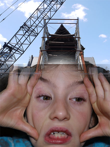
For this photo montage i created a background layer using the studio lighting photos and then drew into it using the original ideas of the broken wooden buildings the pen wraps around the face symbolizing the  encapsulation that the ever growing industrialization has on us and how we can get away from it.


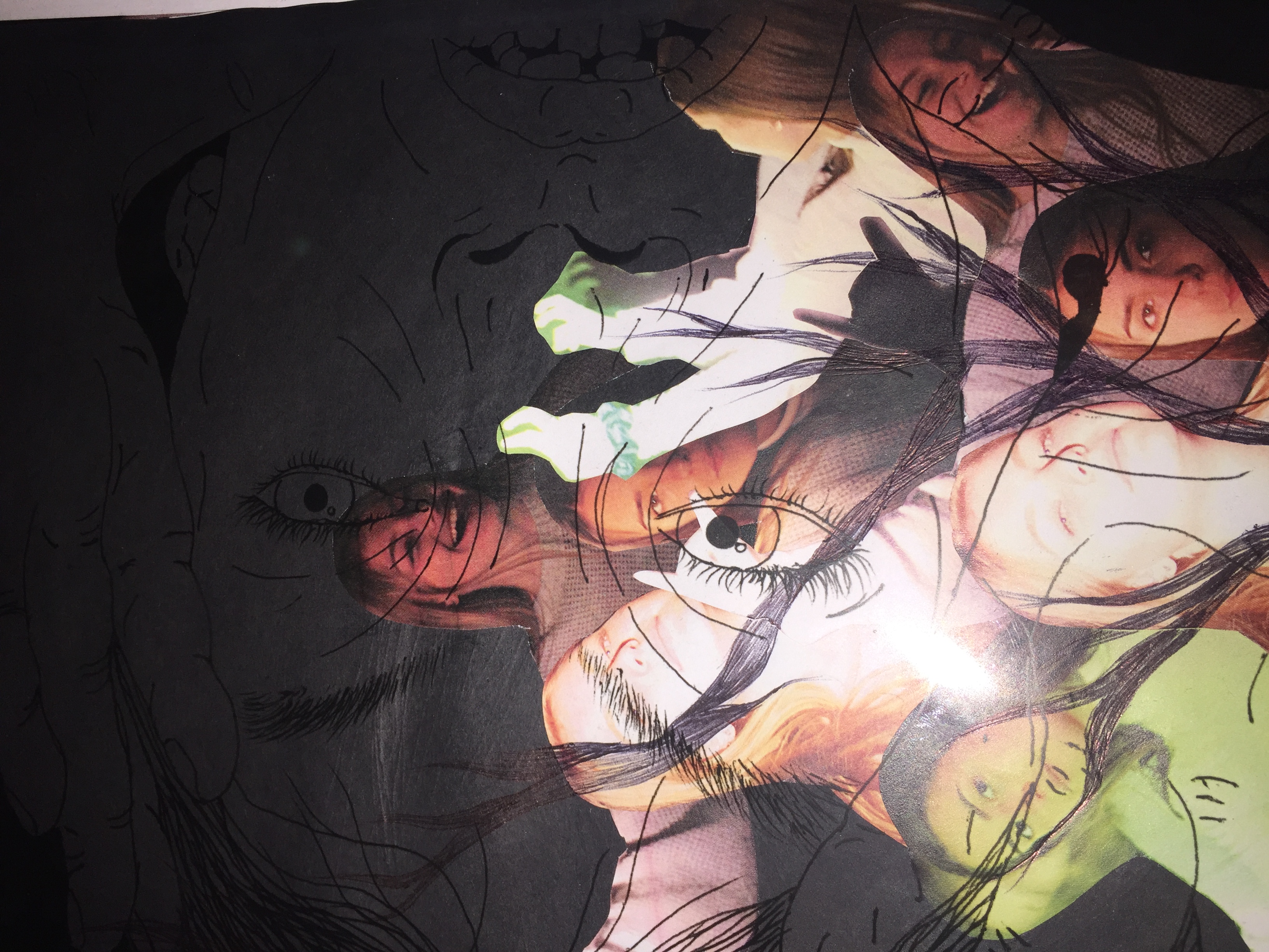


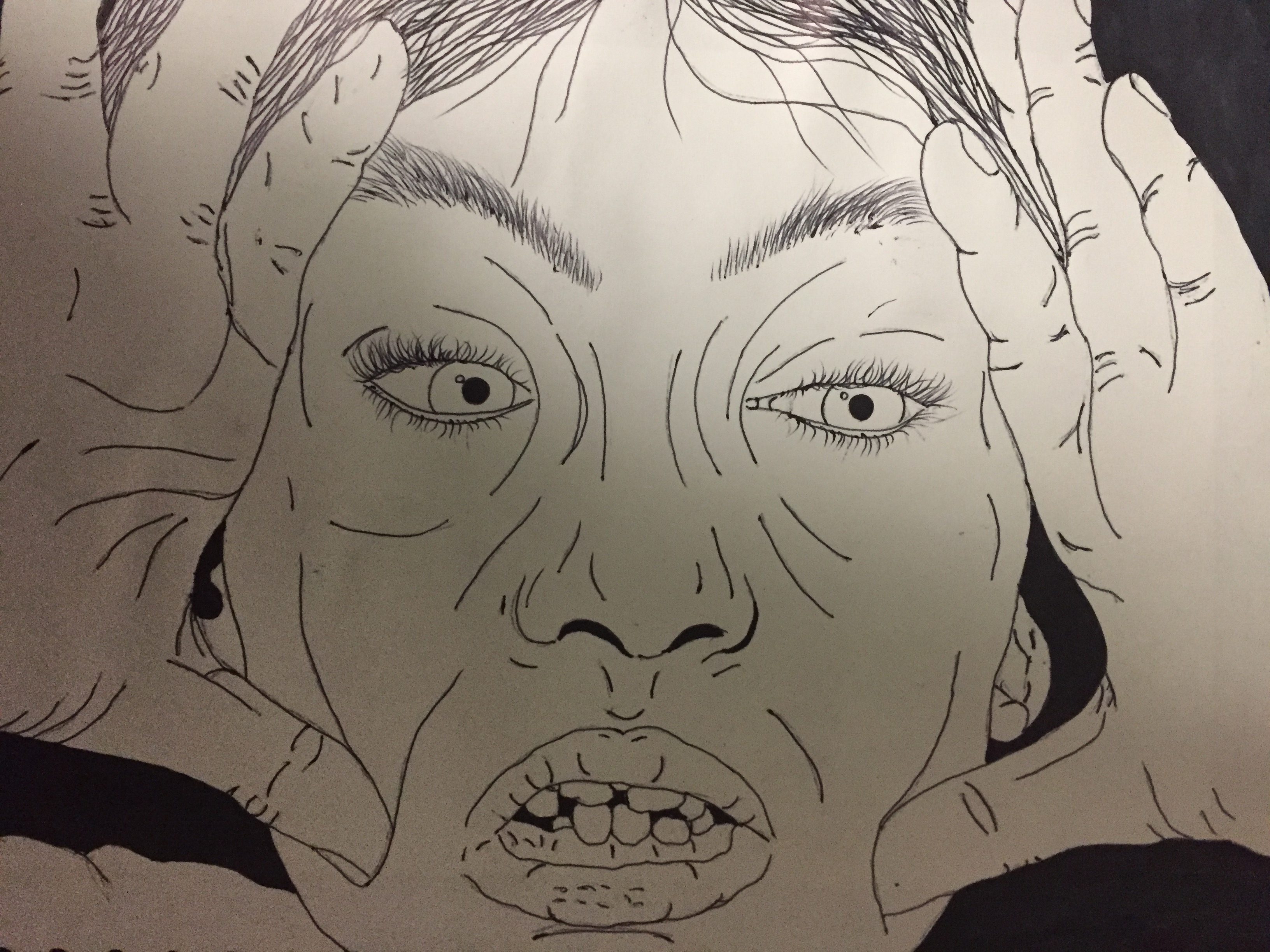
For the upper layer i used acetate. I used one of the photos from the merged faces and building images. I drew this in pen on a white background creating a light and dark contrast. Then i decided to layer it over my original images collage to create the merged feel the the picture so it fits in well with my final idea and building up work to it. This image also is meant to feel like you are looking into the head of the model and there inner thoughts reflecting on there self identity and industrial visions and how it is effecting and entwining them.

This was my original drawing for the image looking at the dark and light the way she is grabbing her face is meant to reflect how industrialization cause confusion for the persons identity and place of origin. Because this running theme of building and industrialization reflects how i have built up the image with lots of different layers creating a visually capturing and interesting image. This is because there are lots off different components to understand and appreciate.

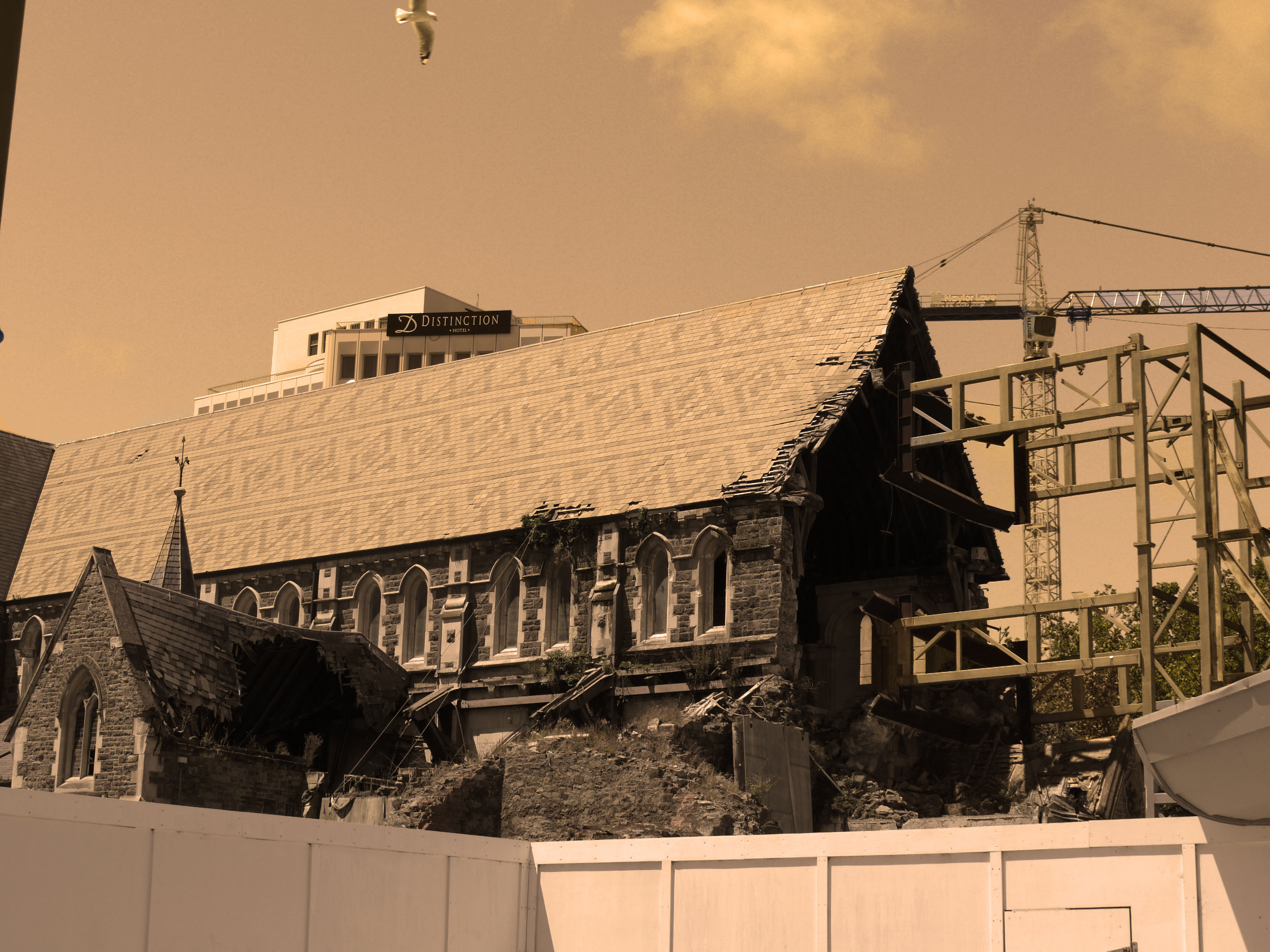
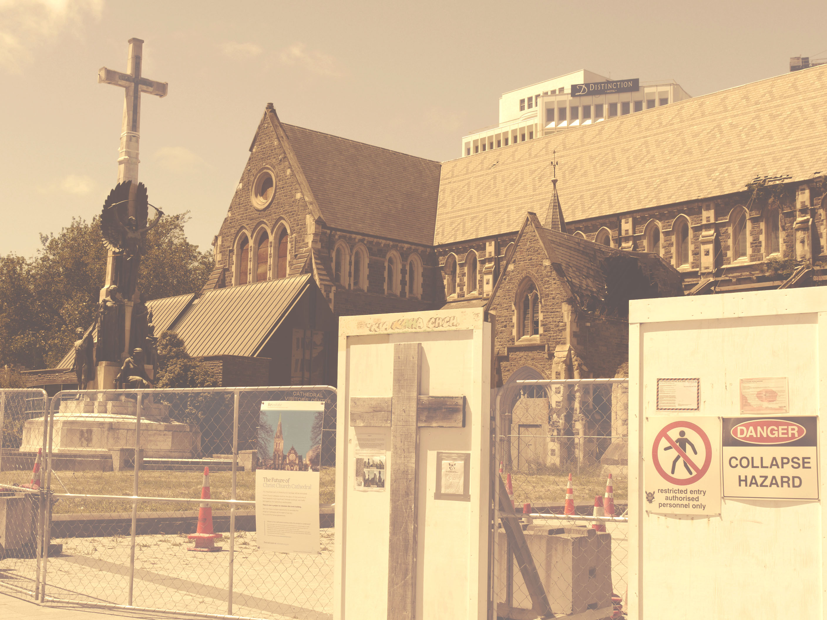
My Own response to Xavier Ribas
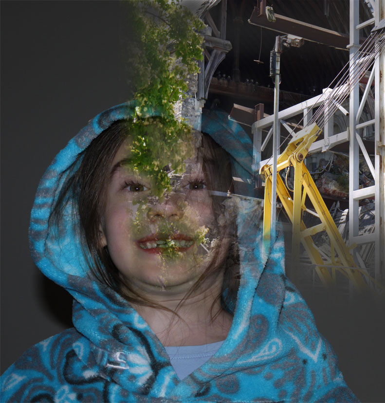
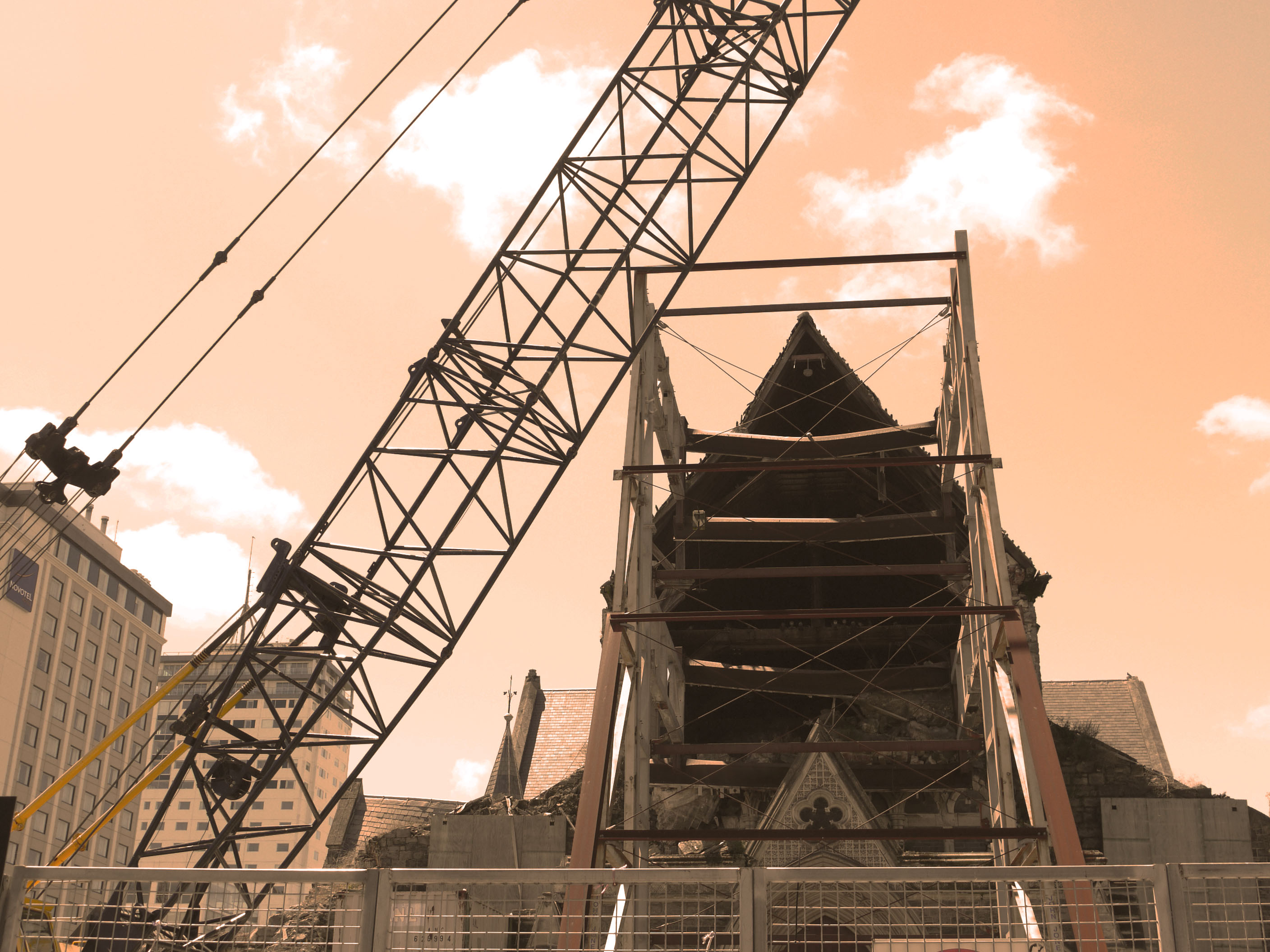
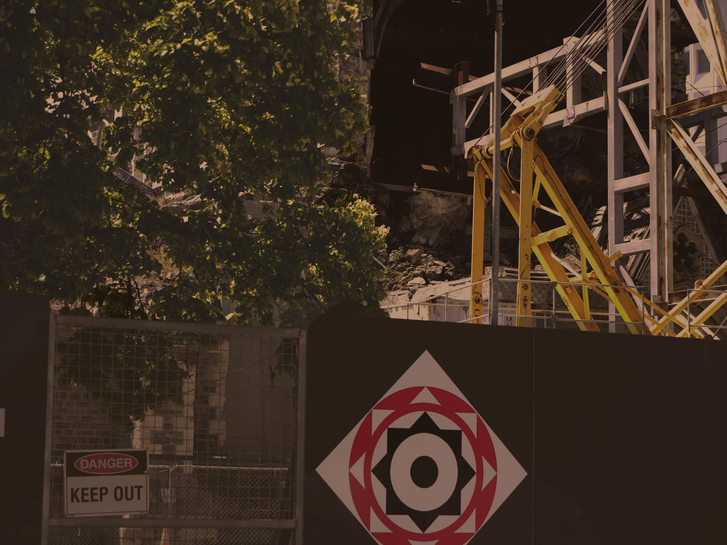
Xavier uses muted yellow tones in his photos which i have tried to replicate on photo shop. Using the image -adjustments tool and then using a different process on each photo. I looked at the main cathedral in new Zealand when i went there in Christ church and the destruction that the earthquake caused and how the city and nature moves around it with out taking much notice because it has just become normality. This links in well with Xavier's work because its all about how society just molds and grows round destruction and damage
Case Study – Xavier Ribas
Xavier Ribas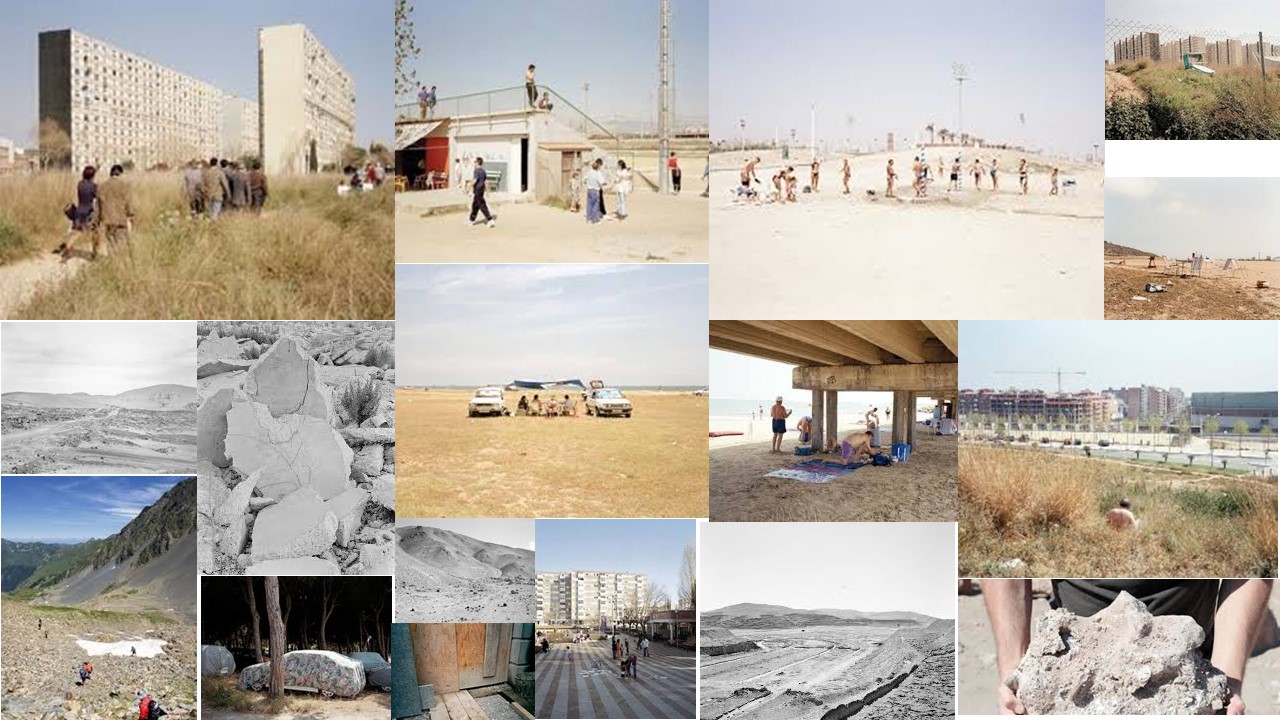
Xavier Ribas is a photographer, senior lecturer at the University of Brighton, and visiting lecturer at the Universidad Politécnica de Valencia. He studied Social Anthropology at the University of Barcelona and Documentary Photography at the Newport School of Art and Design. His photographic work investigates contested sites, histories and memories. His earlier works looked at peripheral spaces and geographies of abandonment in photographic series such as Sundays (1998), Sanctuary (1998-2002)and Habitus (2007). His recent works grouped under the title of Concrete Geographies (2003-2009) take the form of large photographic grids, looking at temporary settlements, sites of corporate urban development and exclusion, and border territories.

Ribas has been involved in many international exhibitions and his work is represented in major public and private collections. He has received awards, commissions and fellowships from the Arts and Humanities Research Council (2012-2015), the International Photography Research Network (2006), Commande Publique du Ministère de la Culture et de la Communication, Centre National des Arts Plastiques (2006), among others.

I wanted to use his work for my interspersion because i like the idea of the identity of a place can change due to abandonment. The color pallet of his images are very interesting he uses muted tones to give the effect of life being lost in abandonment. His work appeals to me because it almost paints abandonment in a more beautiful way because its not just dark and dingy, it shows how life can circulate around the unwanted and grow upon it to create beautiful images
Identity and Place
The Definition of identity and its Sub-categories
identity
noun
-
The Definition of Place
place
noun
-
a particular position, point, or area in space; a location.2. a portion of space designated or available for or being used by someone.
the fact of being who or what a person or thing is.
2.a close similarity or affinity
Gender Identity
gender identity
noun
-
a person's perception of having a particular gender, which may or may not correspond with their birth sex.
Cultural Identity
 1.Cultural identity is the identity or feeling of belonging to a group. It is part of a person's self-conception and self-perception and is related to nationality, ethnicity, religion, social class, generation, locality or any kind of social group that has its own distinct culture. In this way, cultural identity is both characteristic of the individual but also of the culturally identical group of members sharing the same cultural identity or upbringing.
Social Identity
1.Social identity is one's sense of self as a member of a social group (or groups). Sociologists use the concept of social identity to explain how people understand who they are and why they do what they do.
Geographical Identity
1. An individual or group's sense of attachment to the country, region, city, or village in which they live.

2. The key characteristics with which a particular country, region, city, or village is associated.
Political Identity
1.politics in which groups of people having a particular racial, religious, ethnic, social, or cultural identity tend to promote their own specific interests or concerns without regard to the interests or concerns of any larger political group
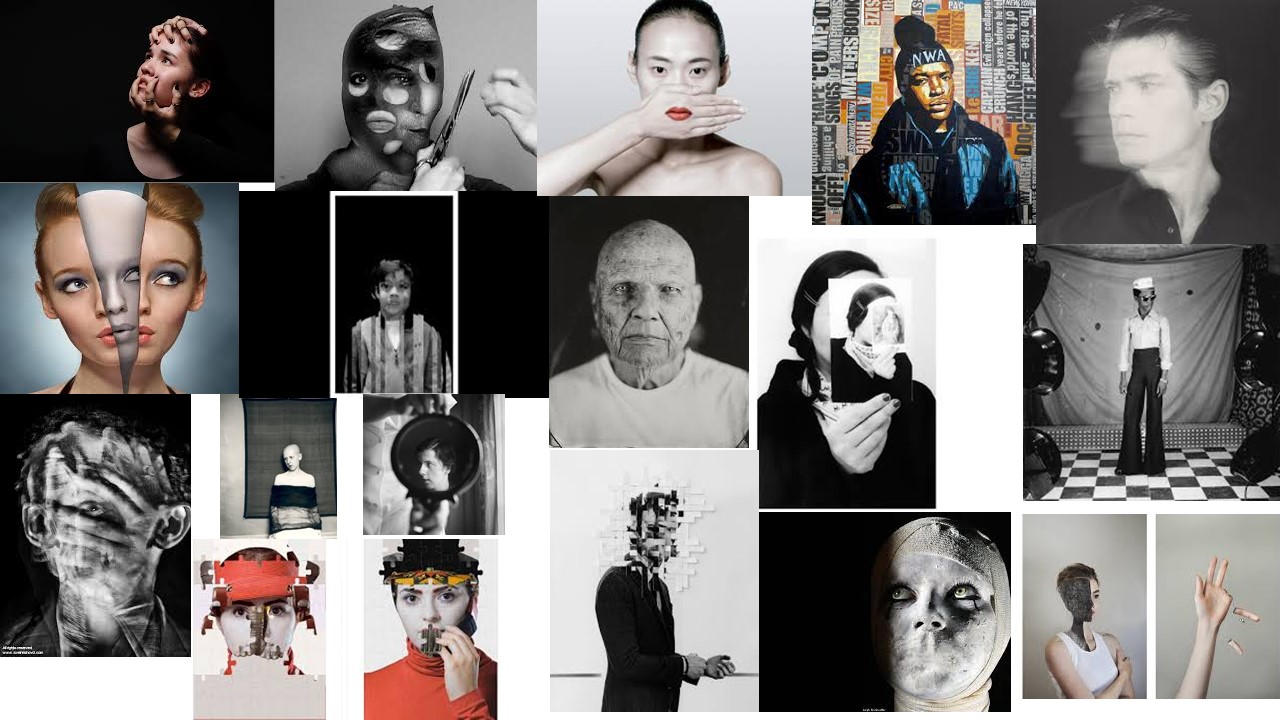
lack of / loss of identity
-
Black and white portrait images
Black and White images
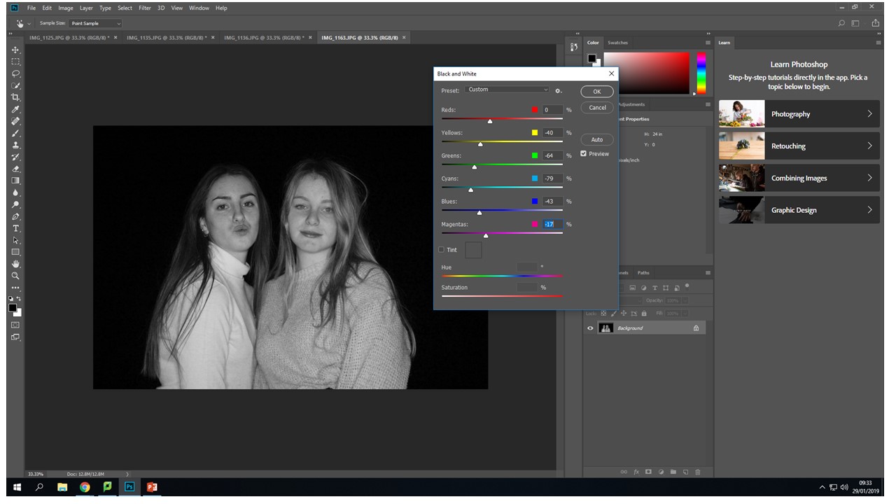
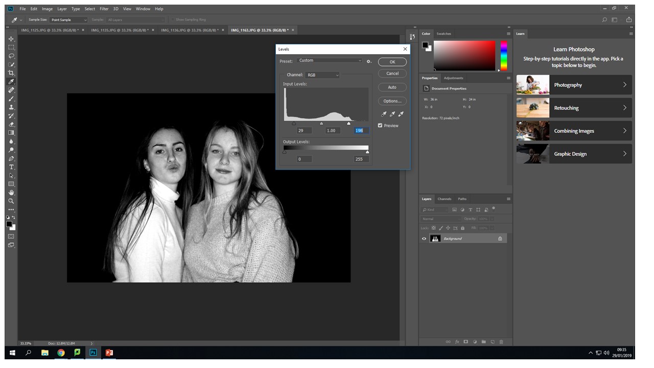
I chose to edit the photos creating even more of a contrast between light and dark. The black and white images create more of a ghostly effect. The purposeful over and under exposure look more intense and create a more interesting image with a clear focal point in relation to the back ground.

My final outcomes

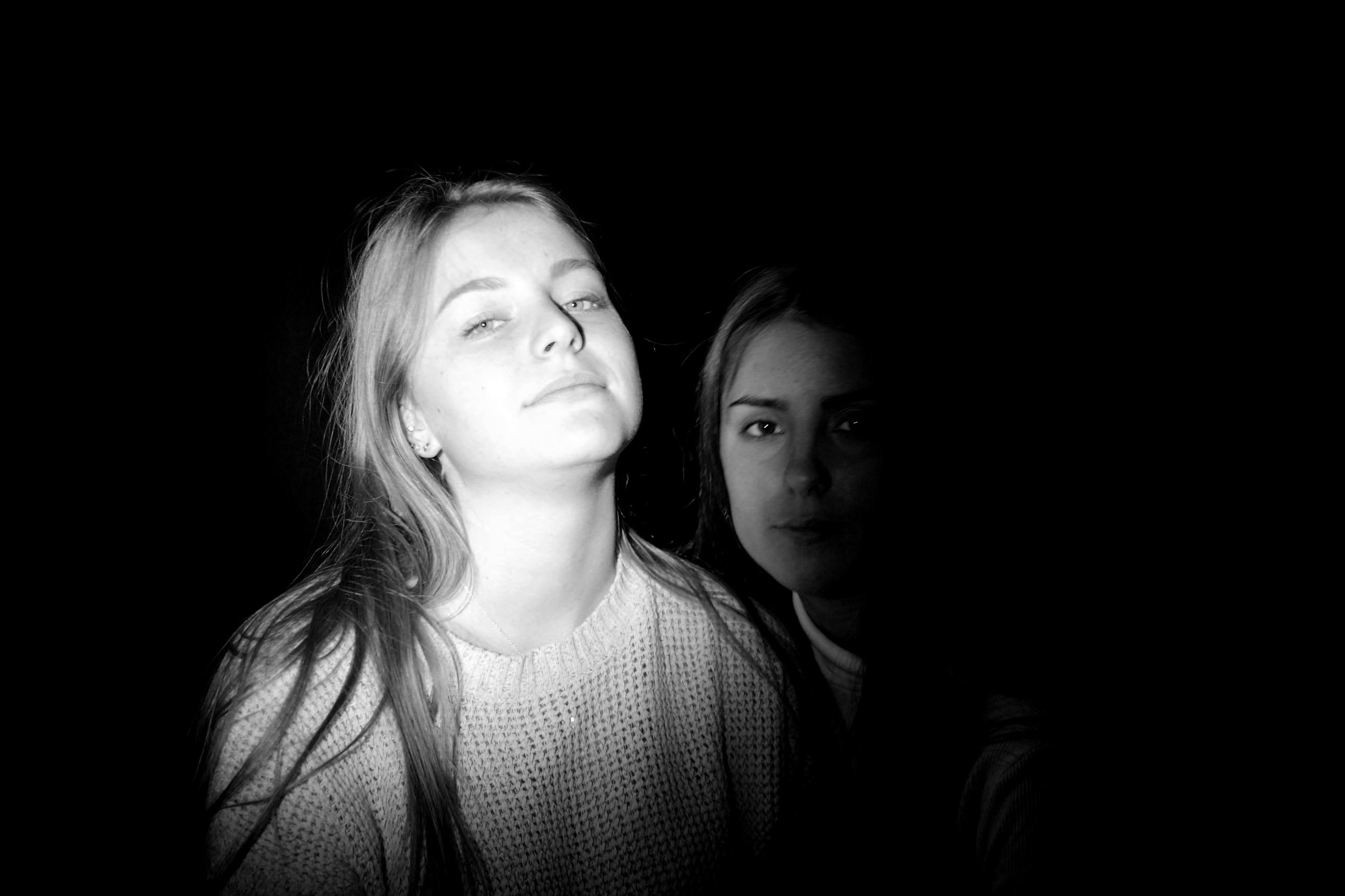
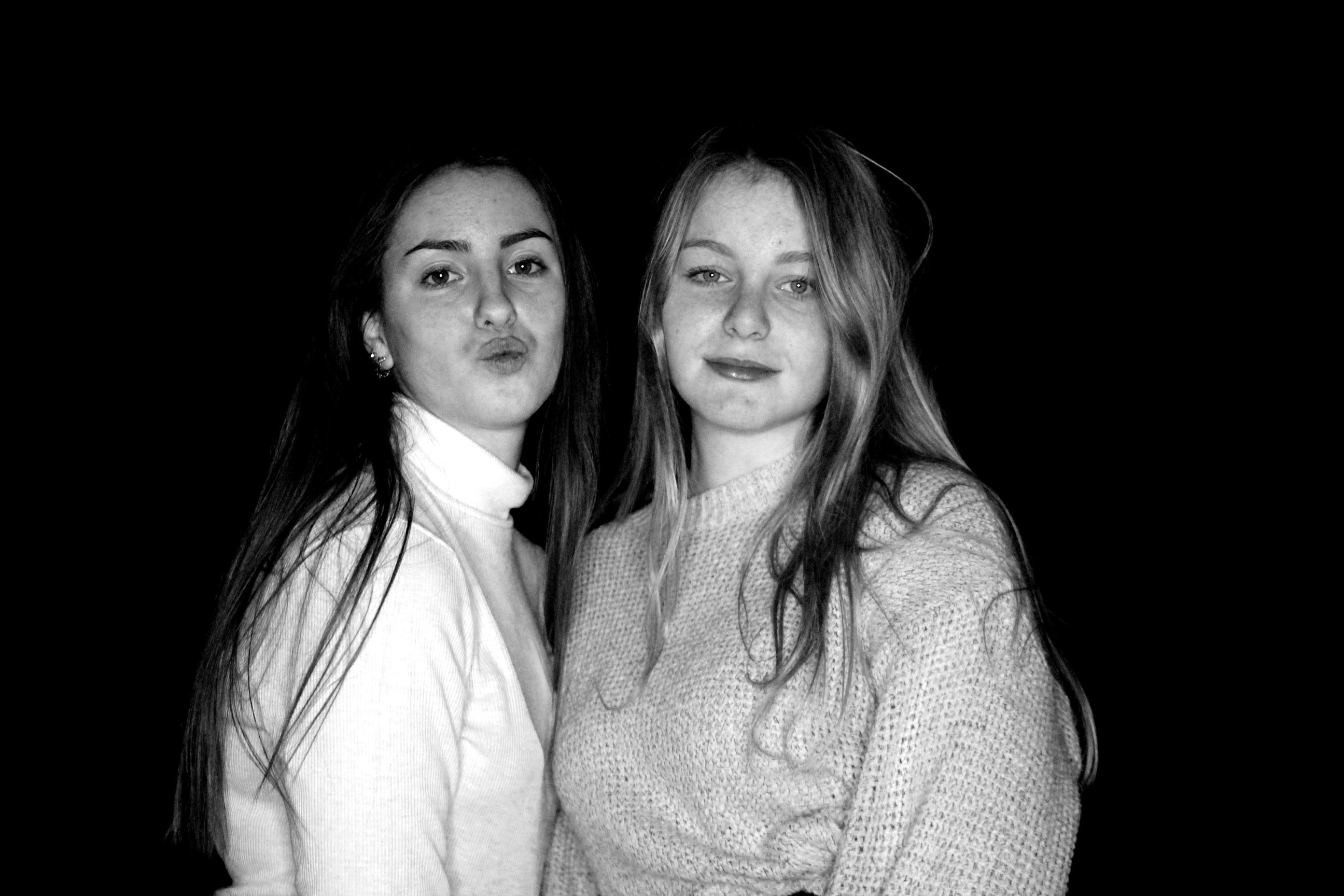
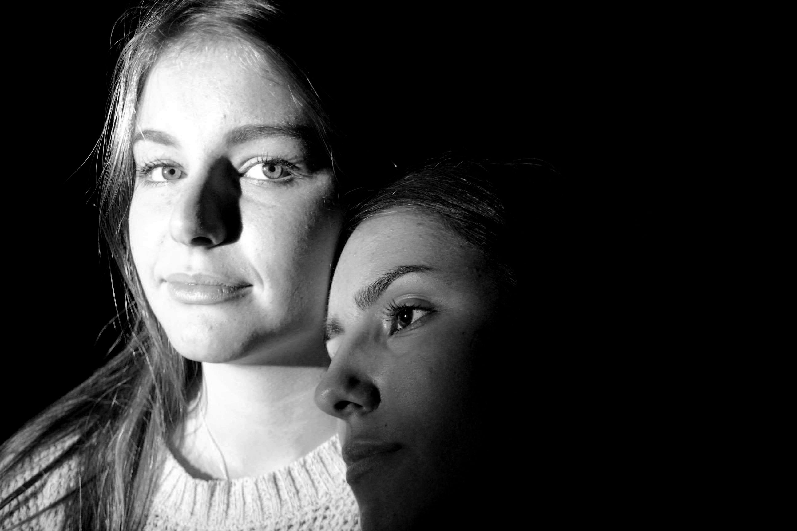
Image creation process
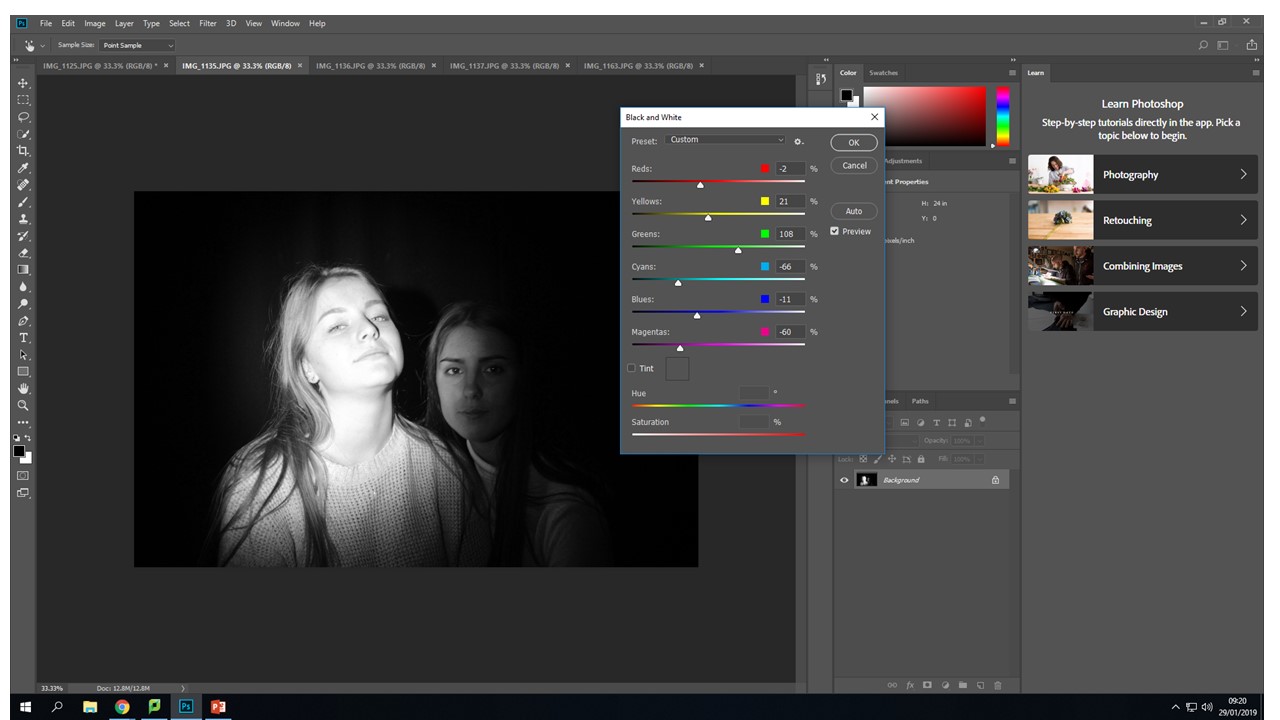
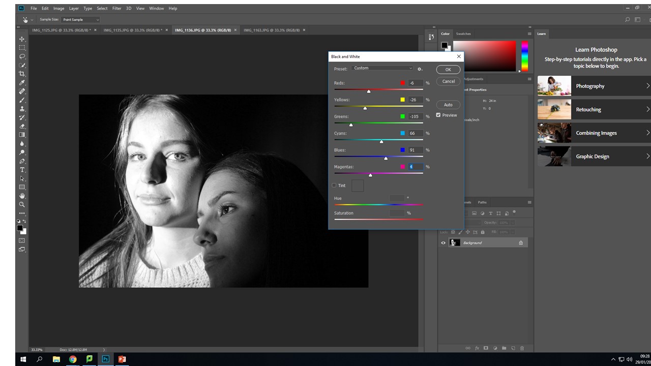
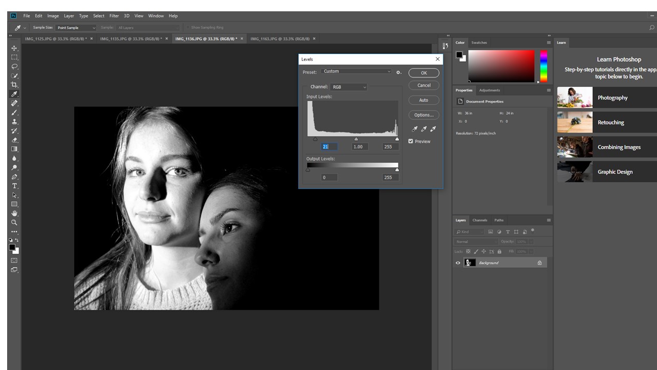
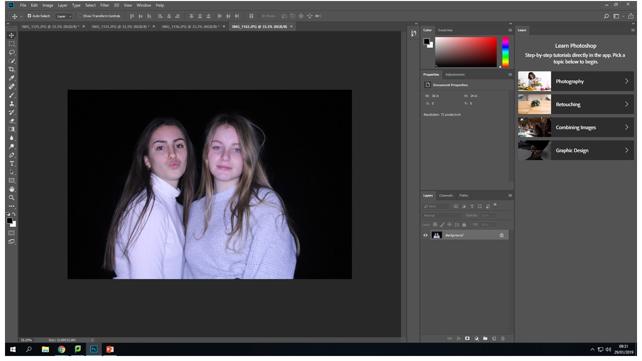
On Photoshop I went into image - adjustments - the i used the black & white controllers to create the initial  flip from color to black and white.  Also to create more contrast and over come the distracting background i used the same process but instead of clicking on black and white, i clicked levels then when from the left to right controller until my back ground got to my desired darkness.
Lighting and Portrait Experimentation
Looking at experimentation with in portraiture
I have decided to focus again on studio work because i find it is easy to control the variables that effect my final image out come.
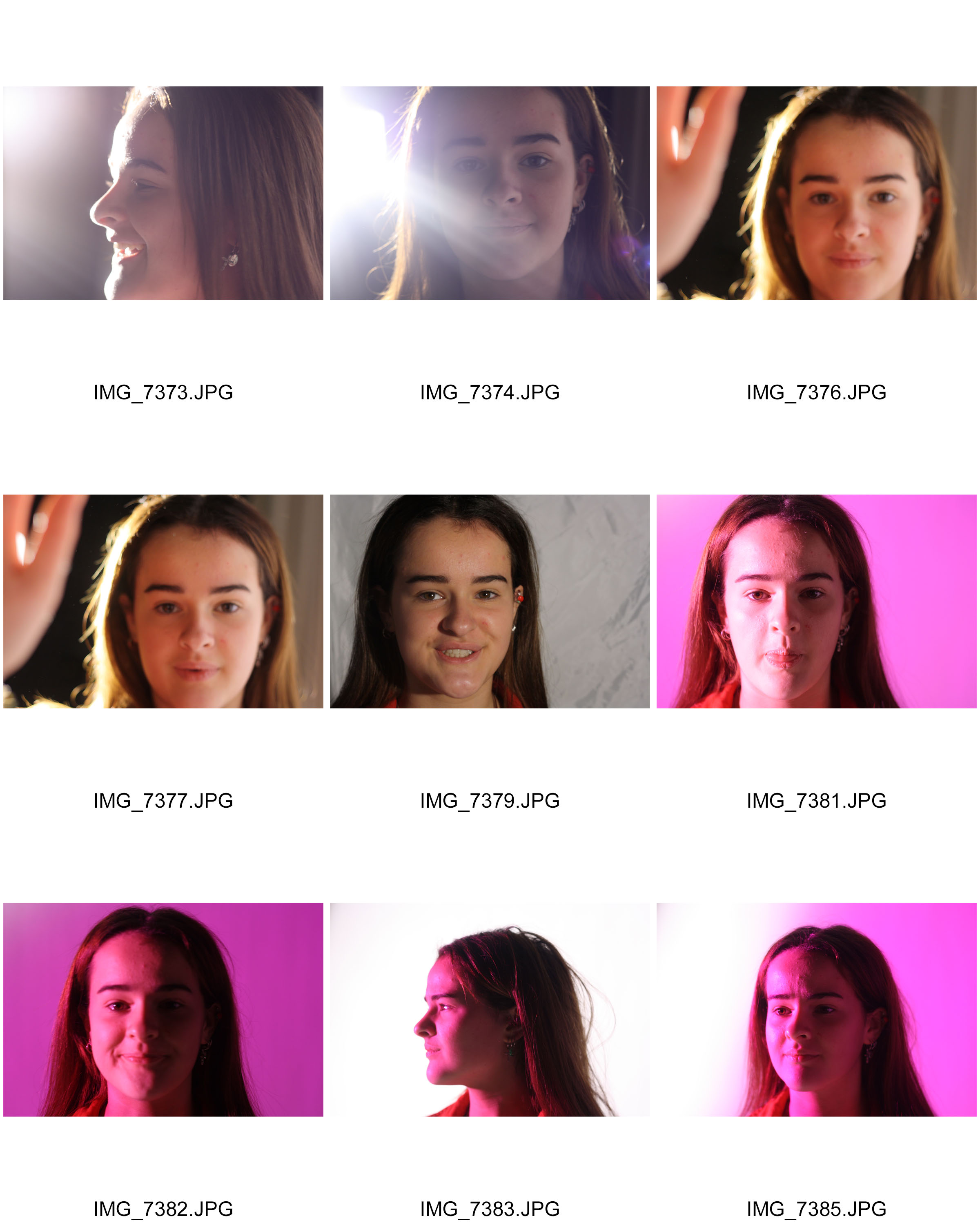
When using a full studio lighting set, I was working on looking at the contrast of light and Dark and over exposure and under exposure. Also how different lights give different effects and meanings behind photos. Also I was looking at creating shadows and trying to make alive shadow with a second figure behind.
This is working on traditional portraits and lighting with a plane white or black back ground. My aim was to draw attention to the faces and make them the focal point of the picture. Worked with different angle making the focal point more to the right or left to offset the image and give it more visual interest and intrigue.
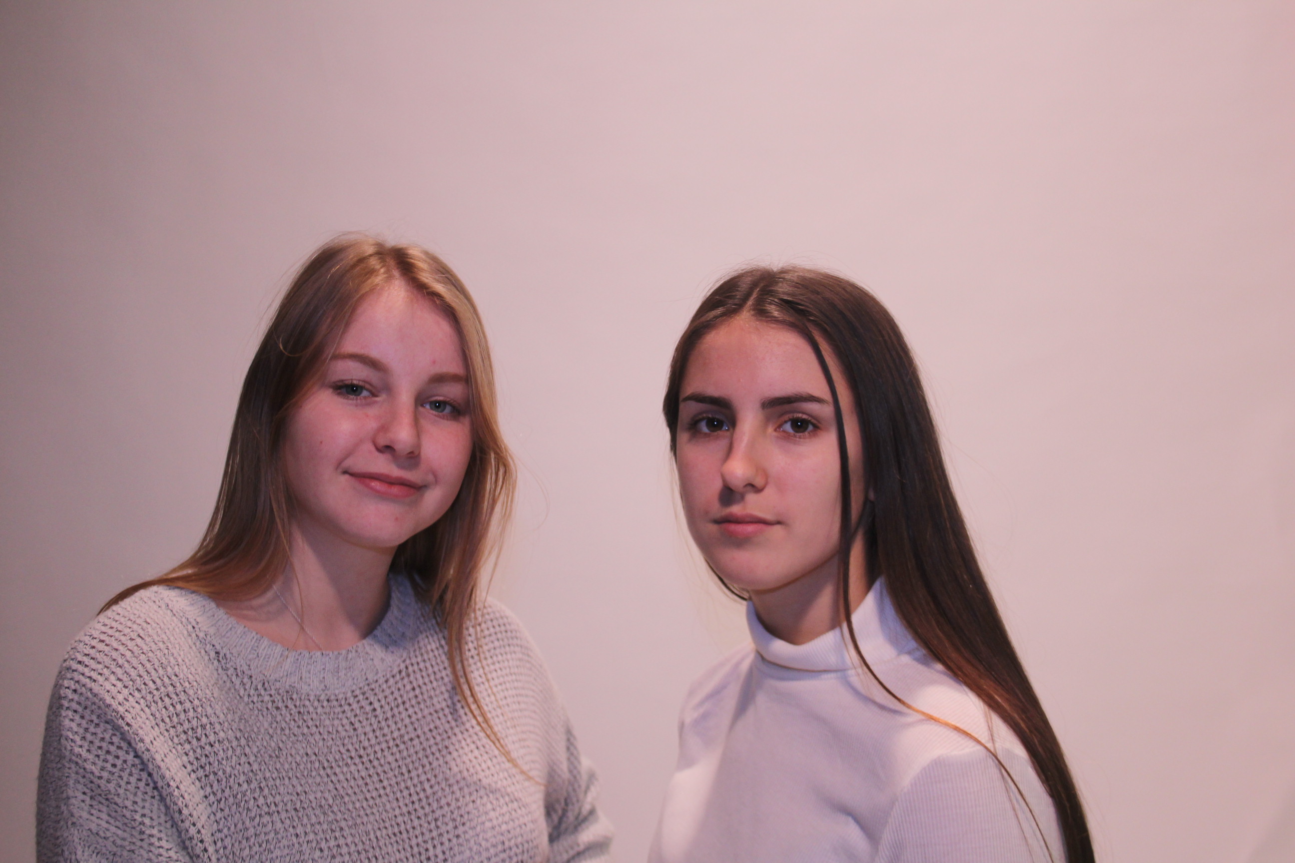
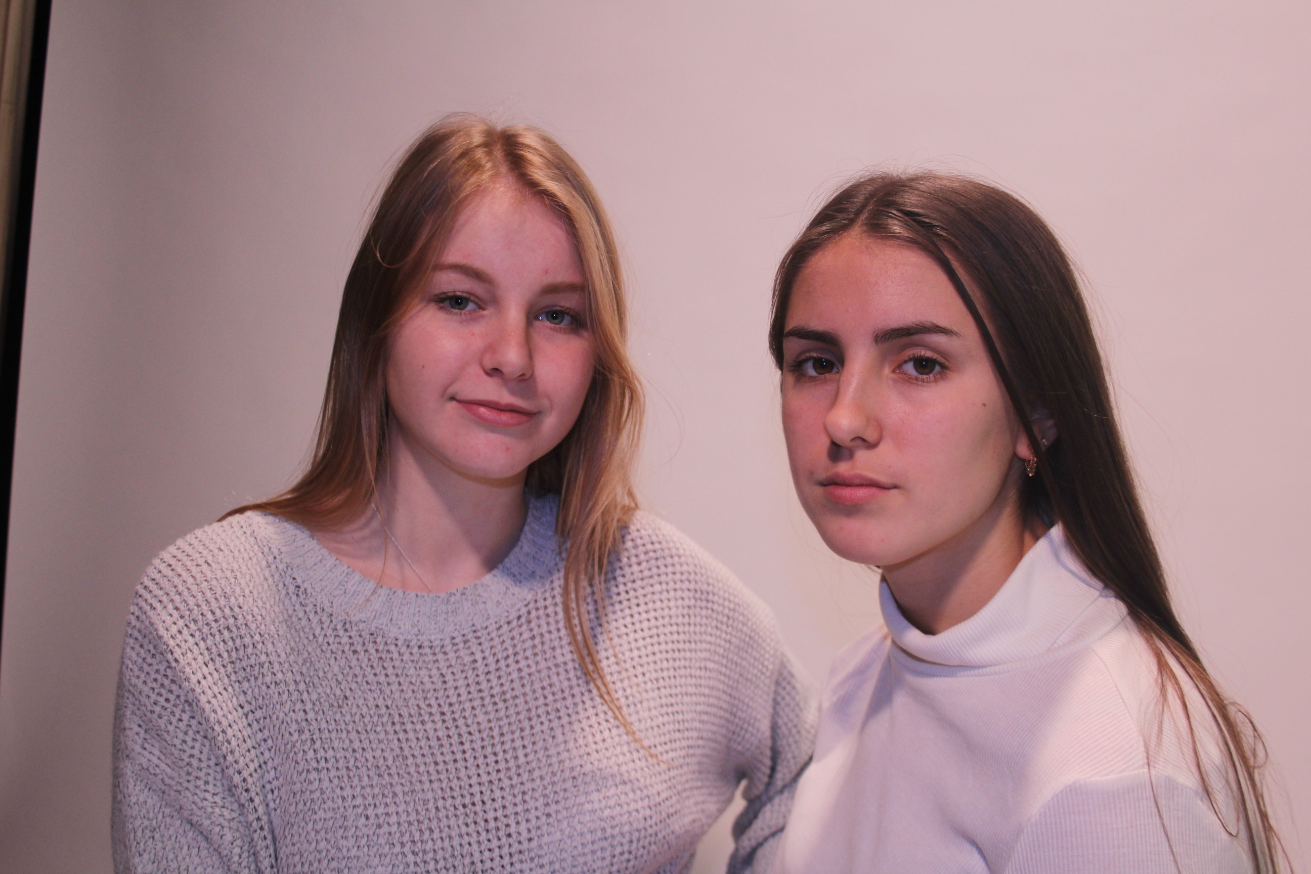
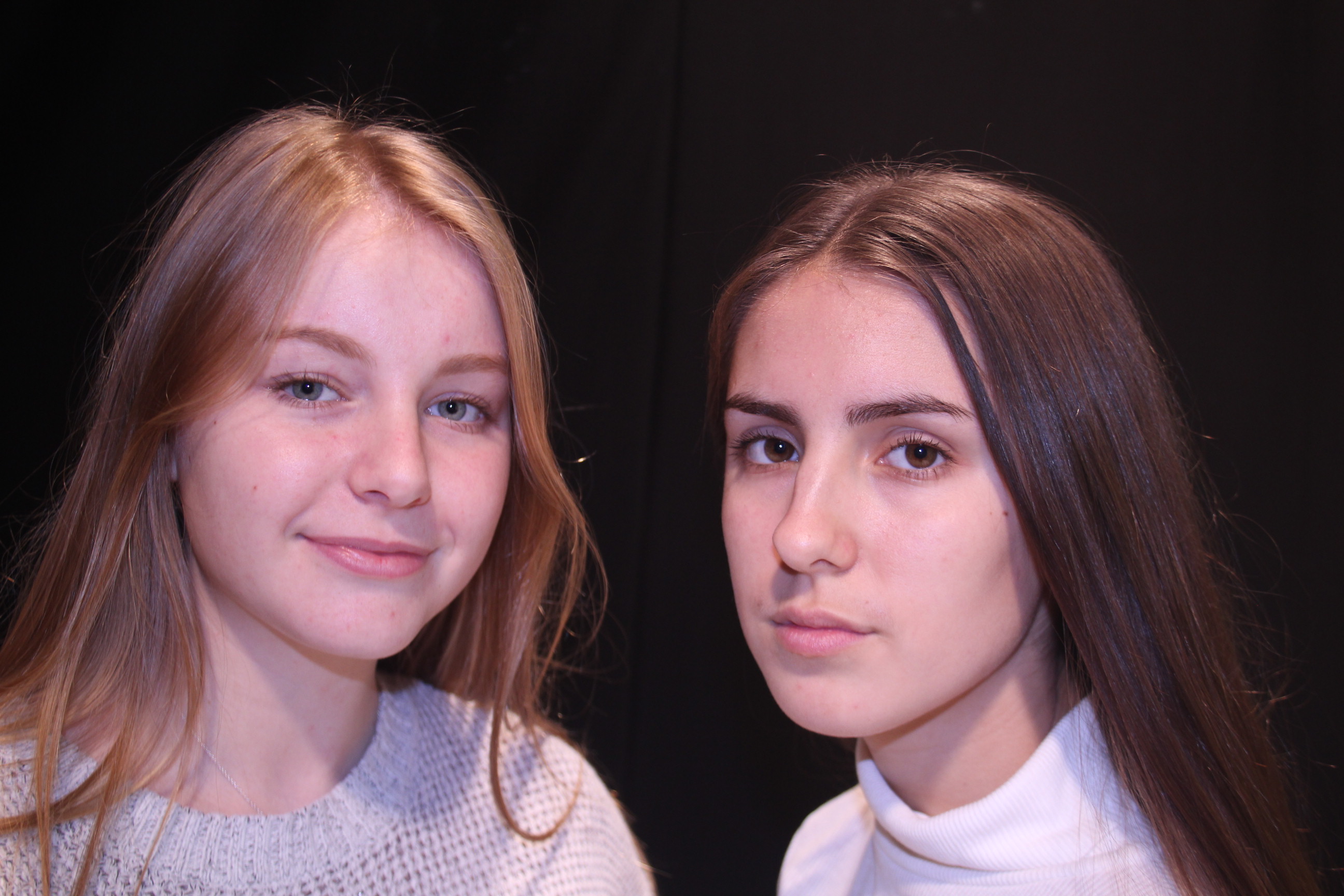
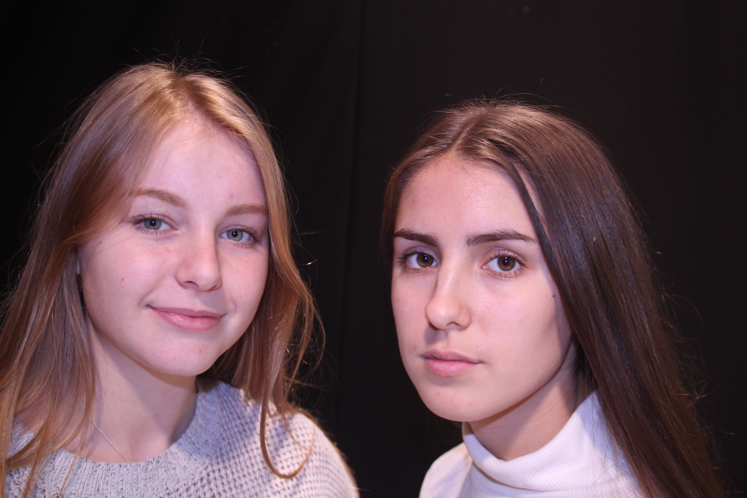
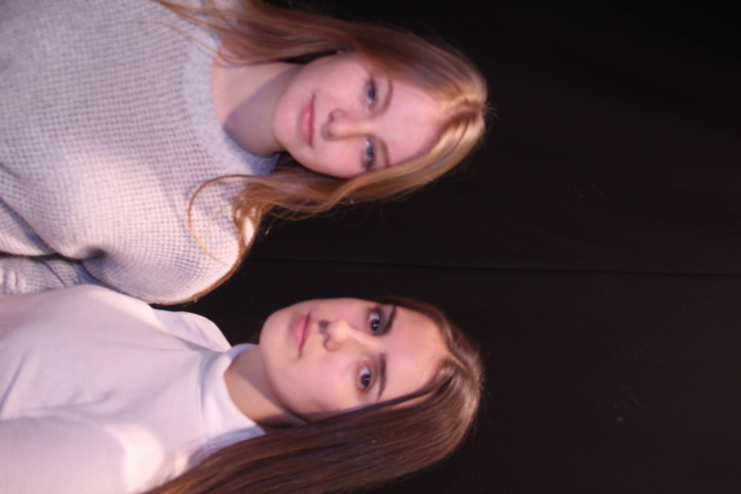
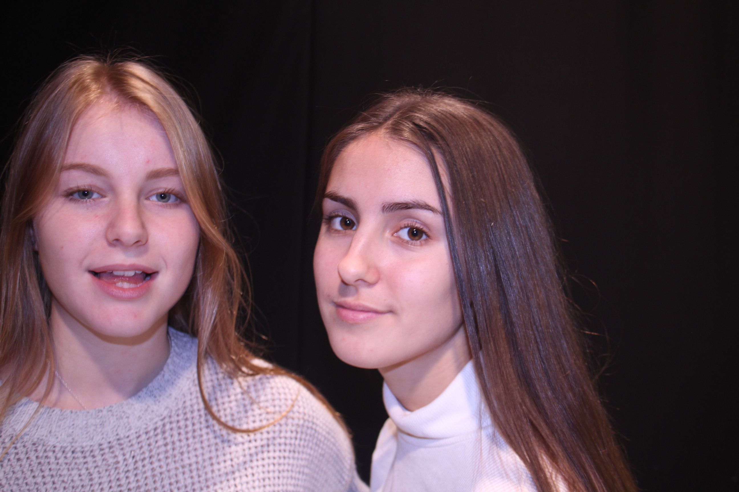
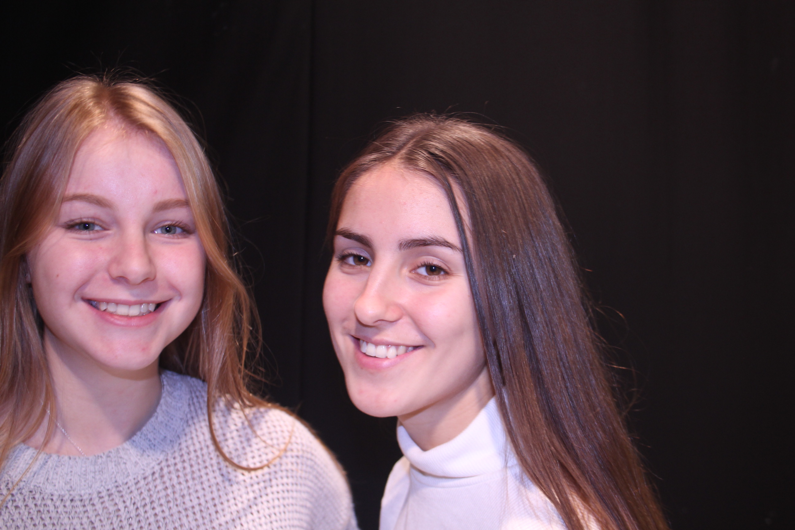
All of these images are playing upon the ideas of light and dark making the image actually contrast itself through the characters. This contrast of light and dark characters plays on the ideology of good and bad. These images are completely unedited, when I edit them I feel like the images are going to be more effective and have more of a visual impact.
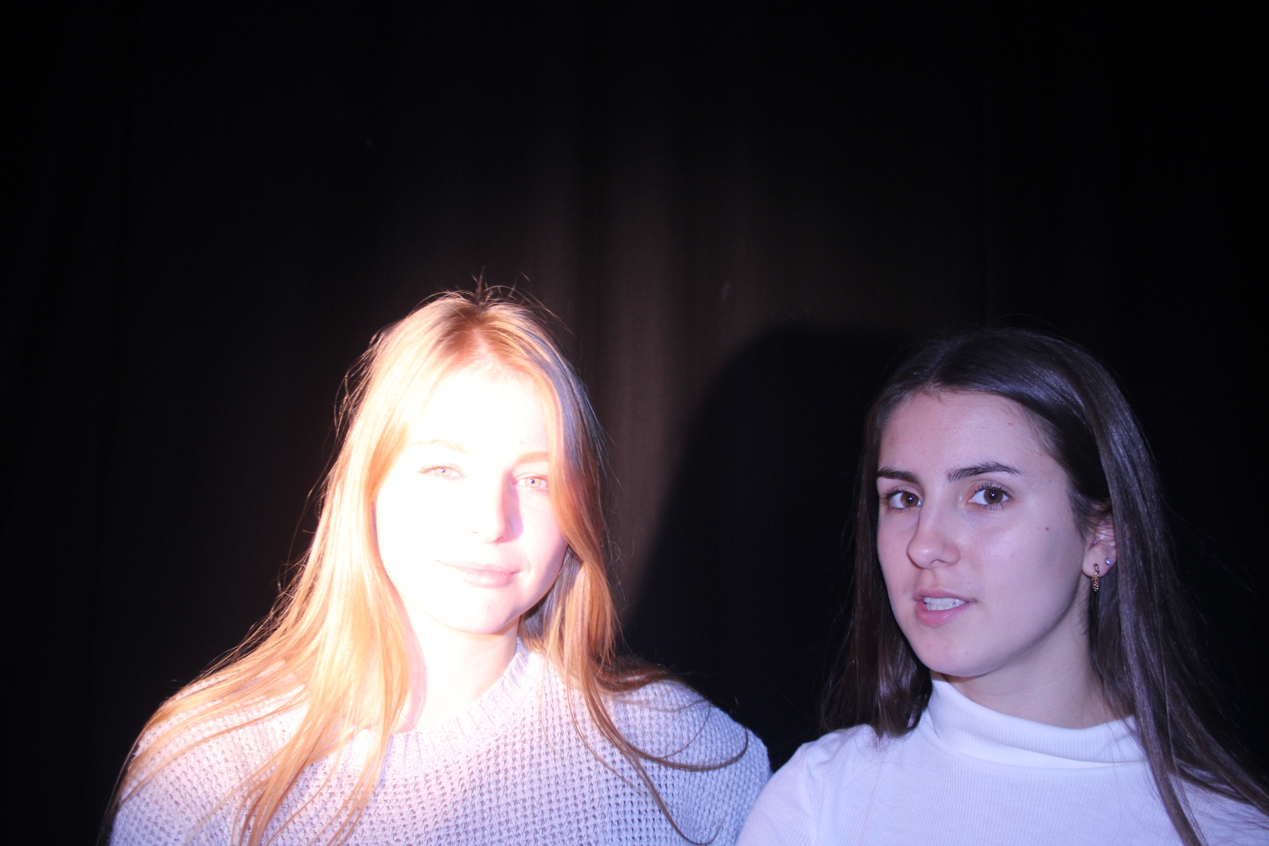
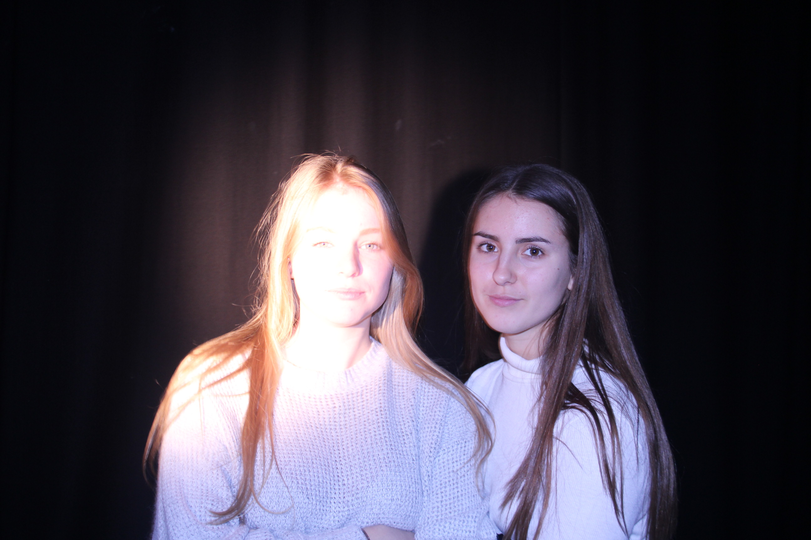
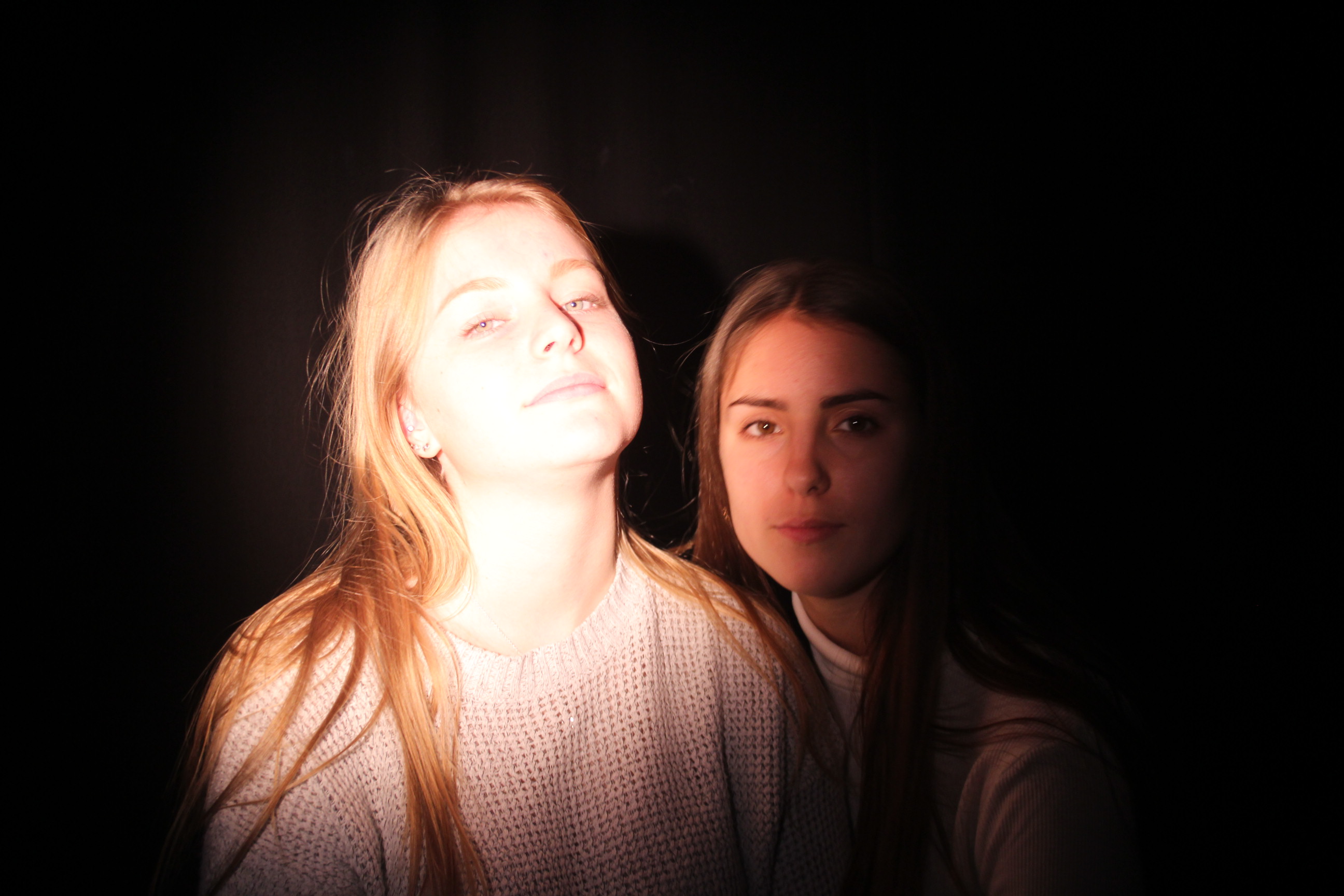
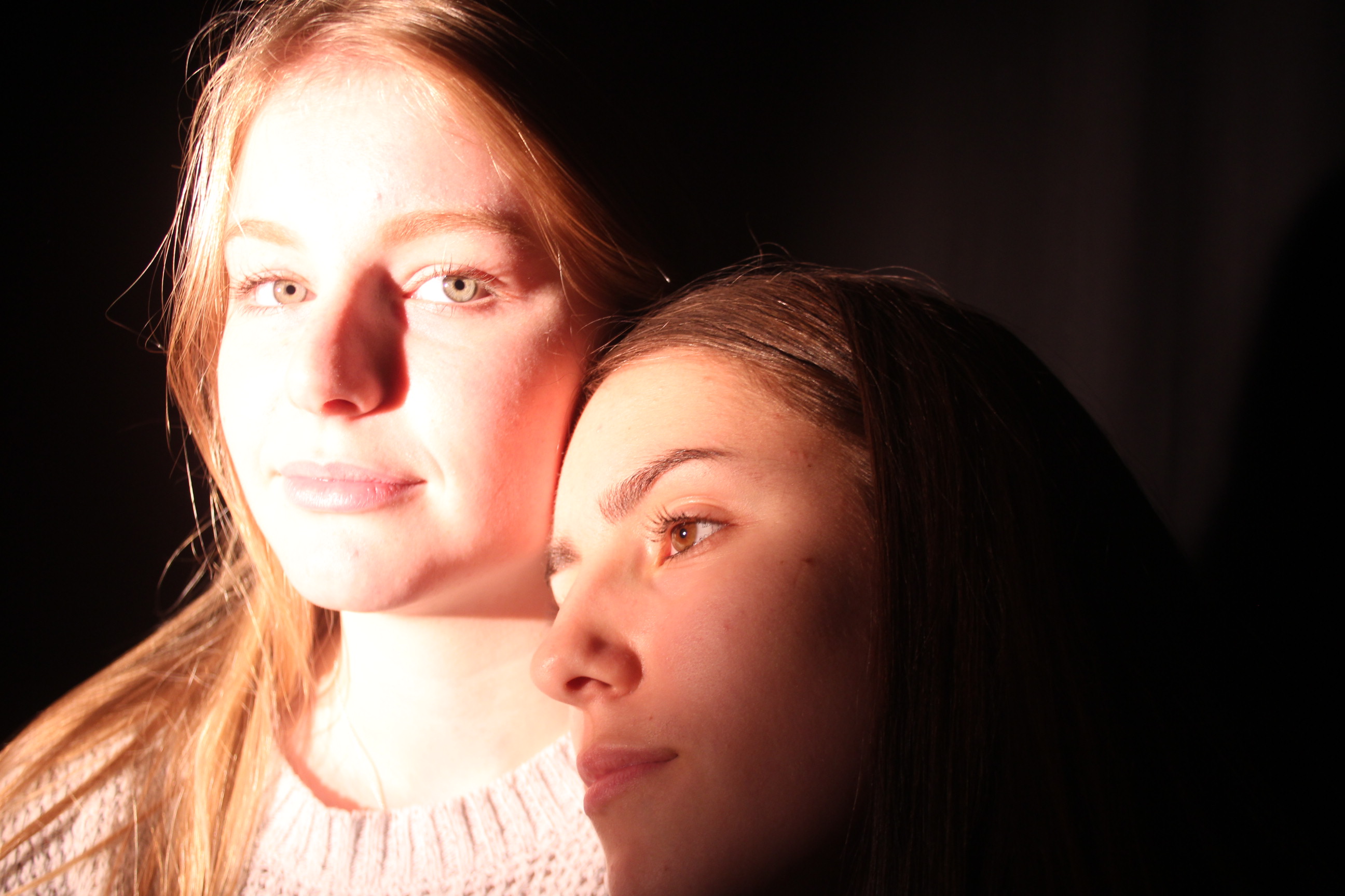
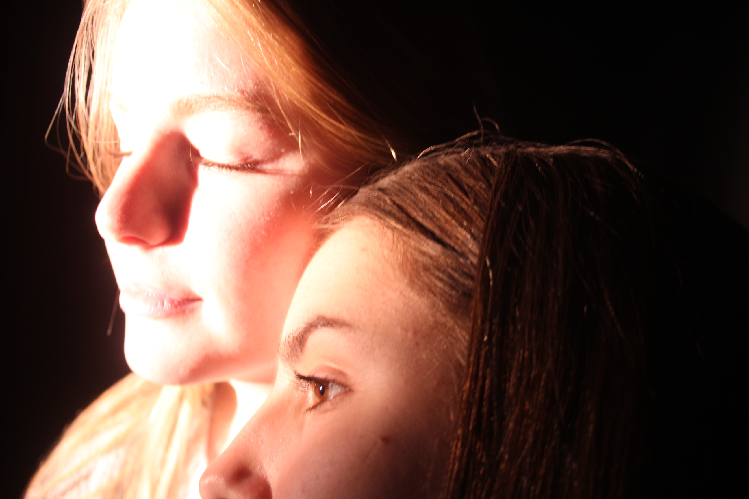
Also of these images are playing upon the concepts of doubles and shadows. Looking at using color filters over the Red head/ spot lights. This creates a creepy underwater kind of theme to the image. The last image of this set is my favorite creating a ghostly double exposure feel to the image. This image was not actually a double exposure it was just done with two models and a low sutter speed to create movement with the surrounding outsides of the images while keeping the faces in focus.
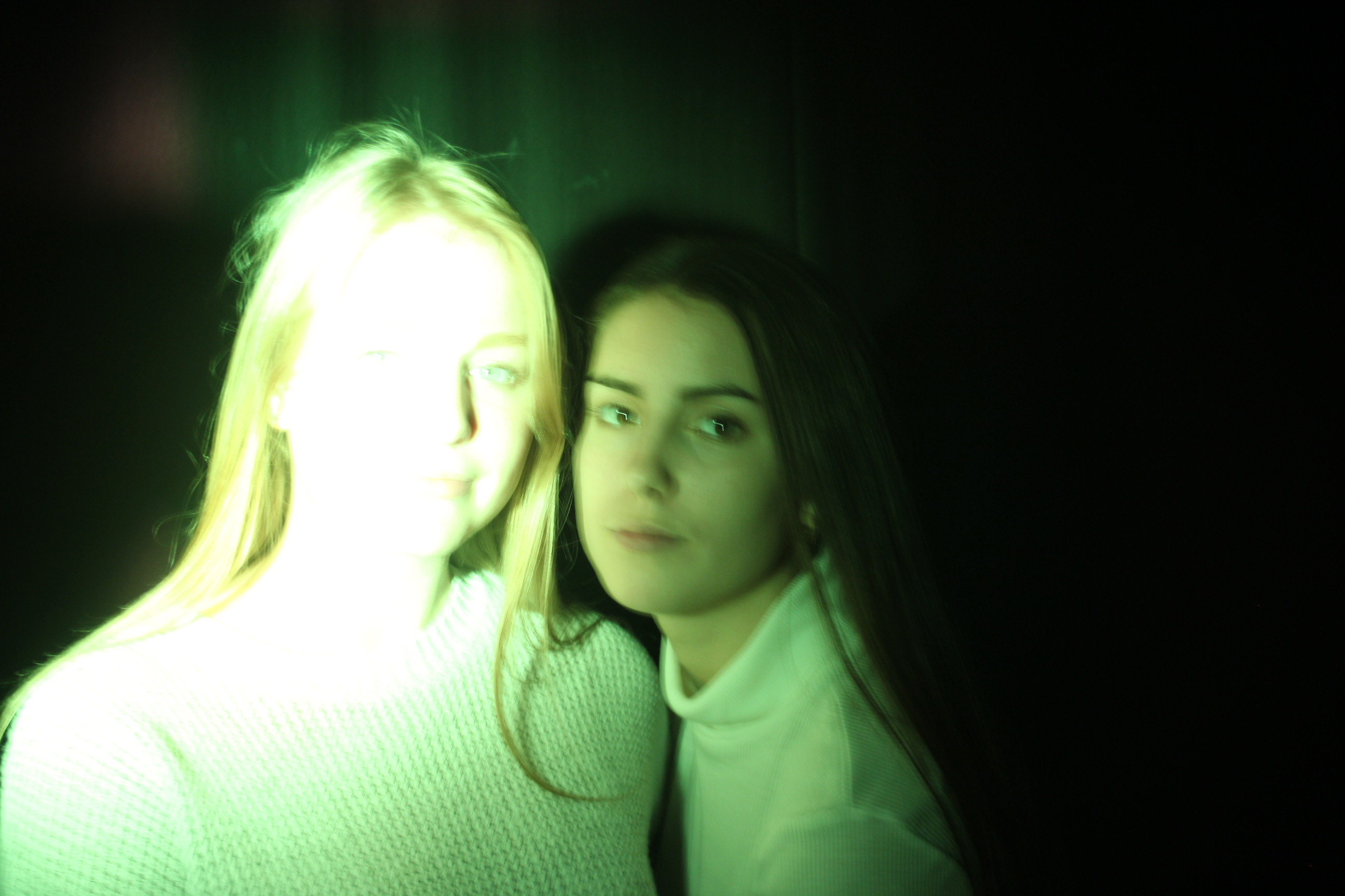
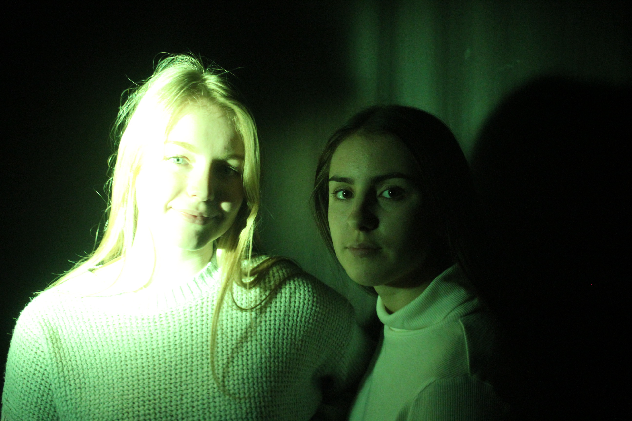
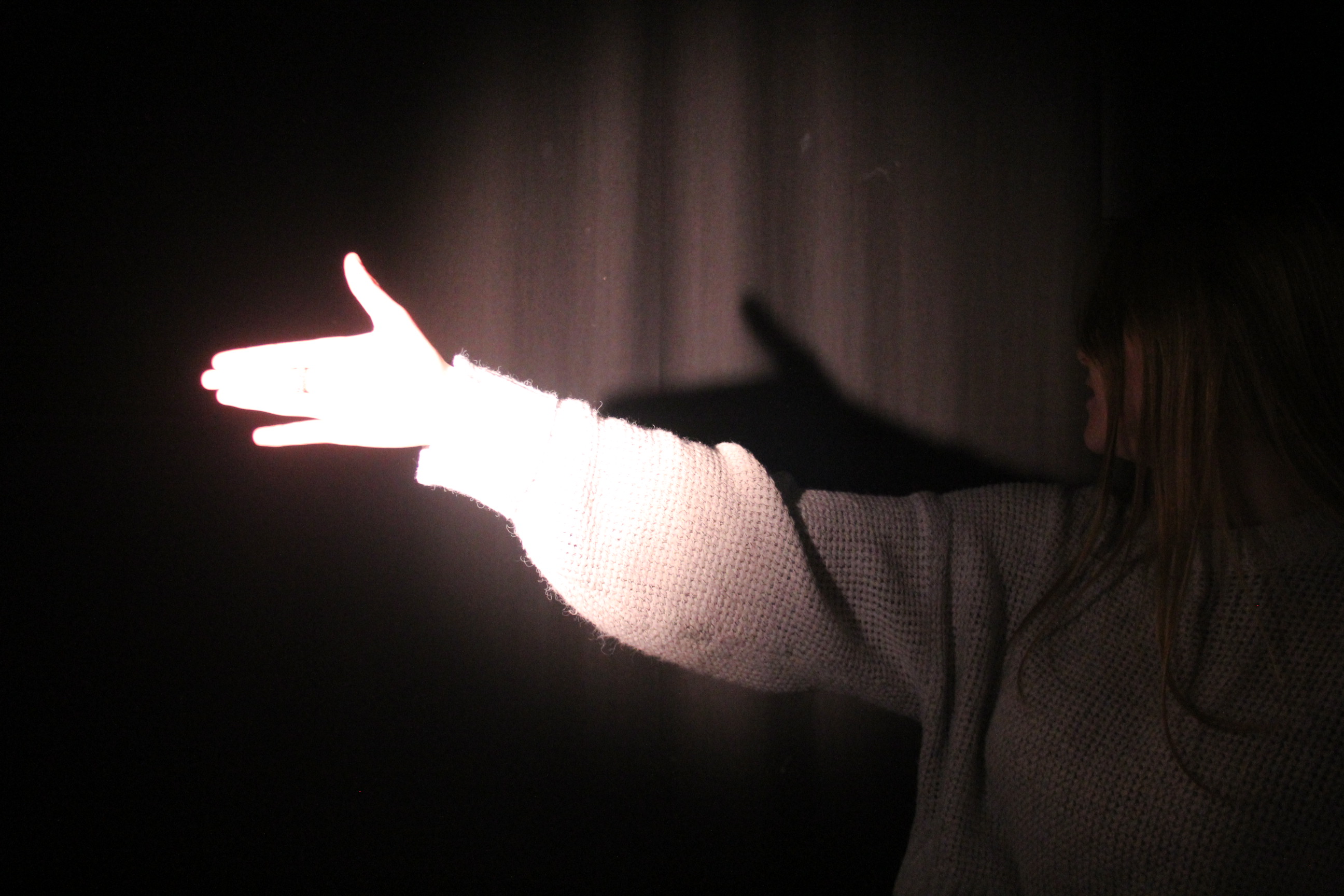
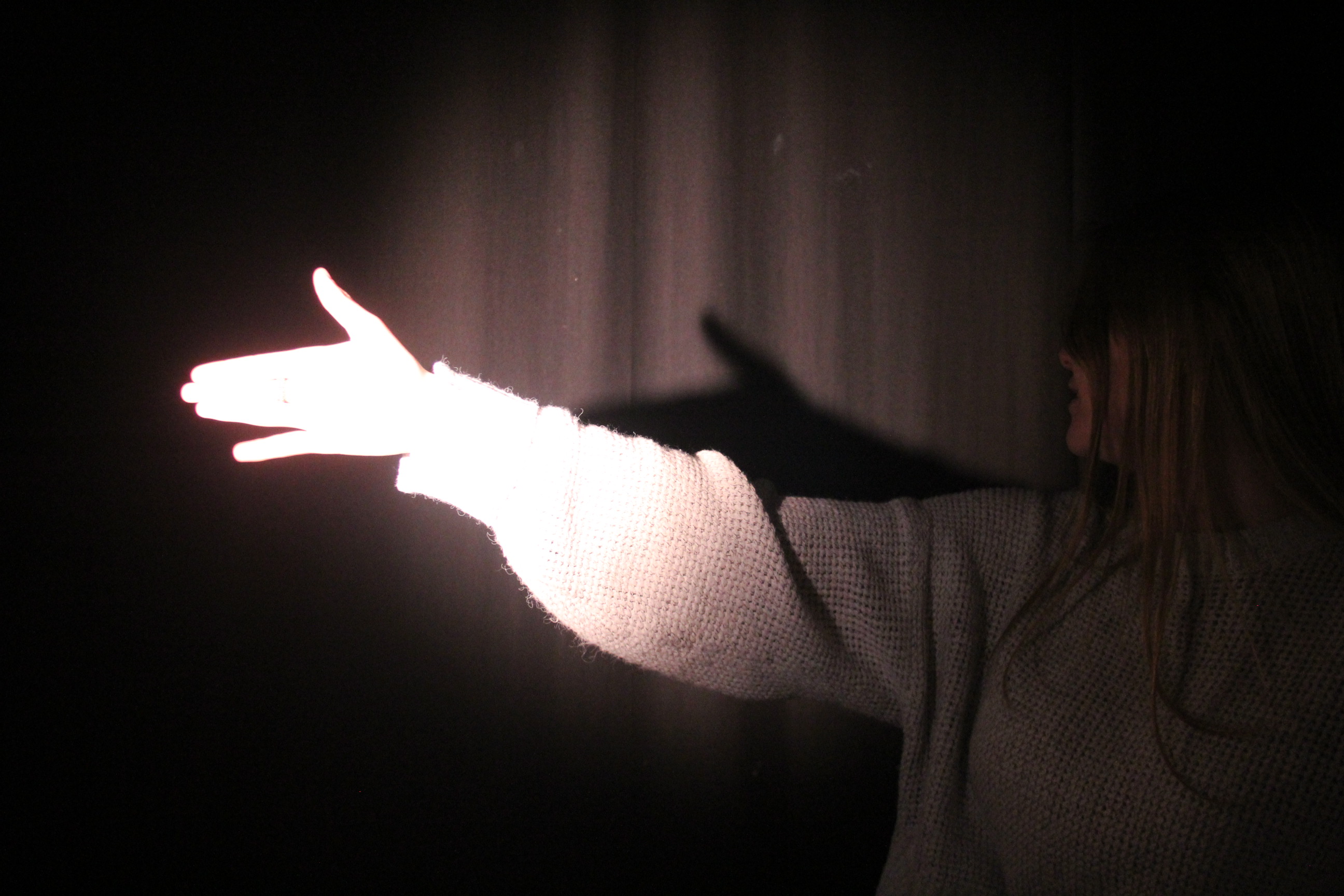
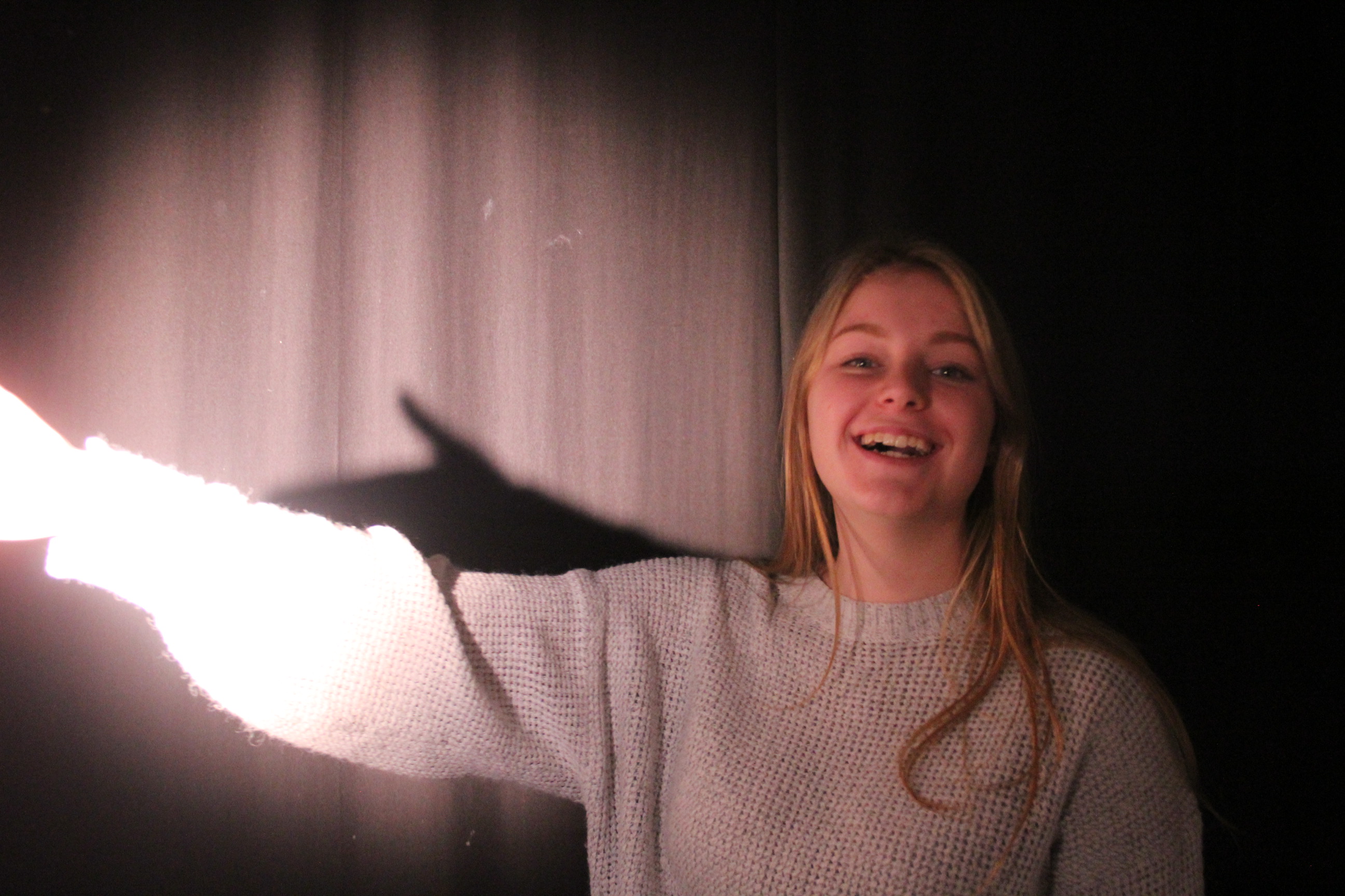
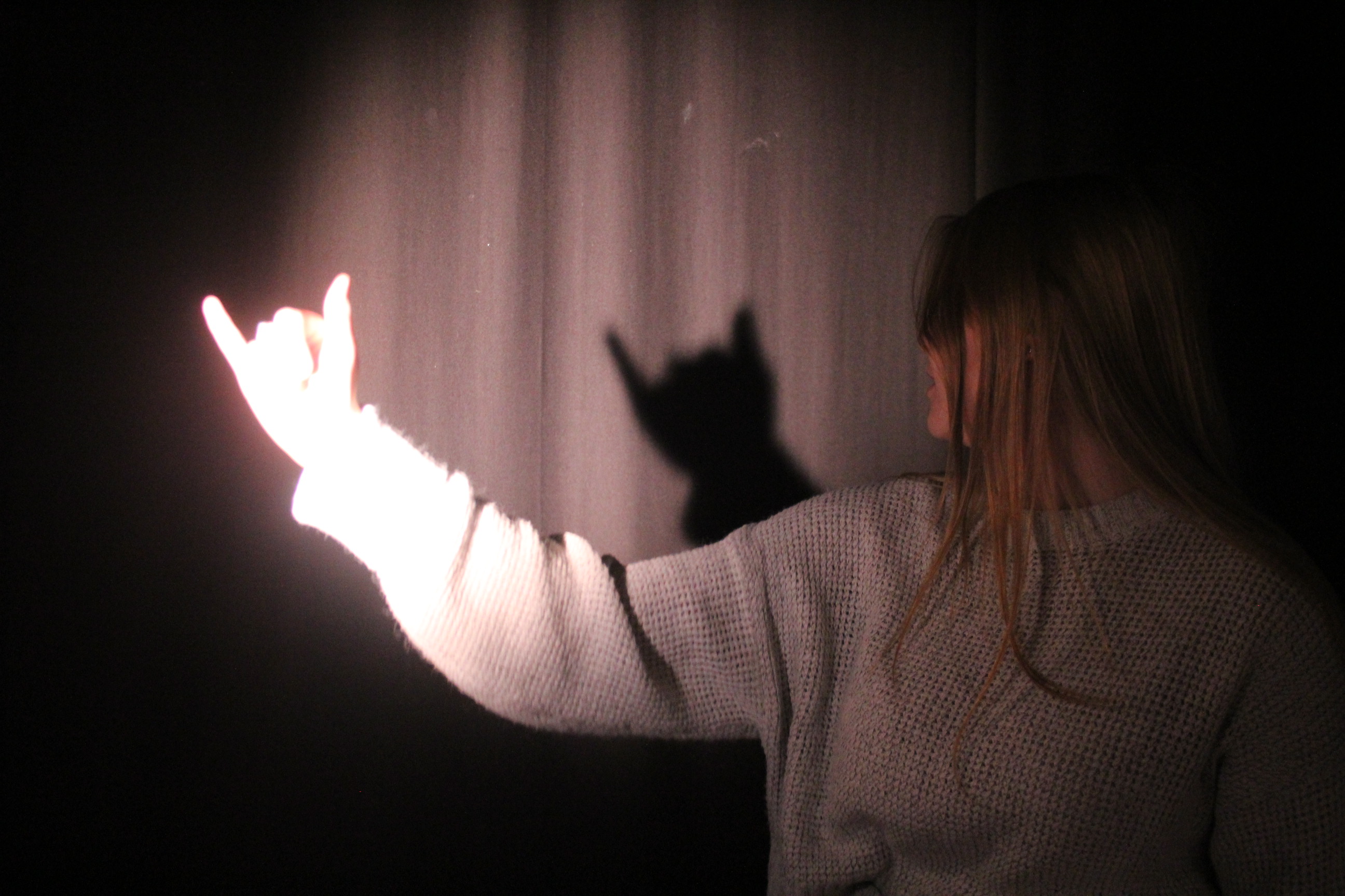
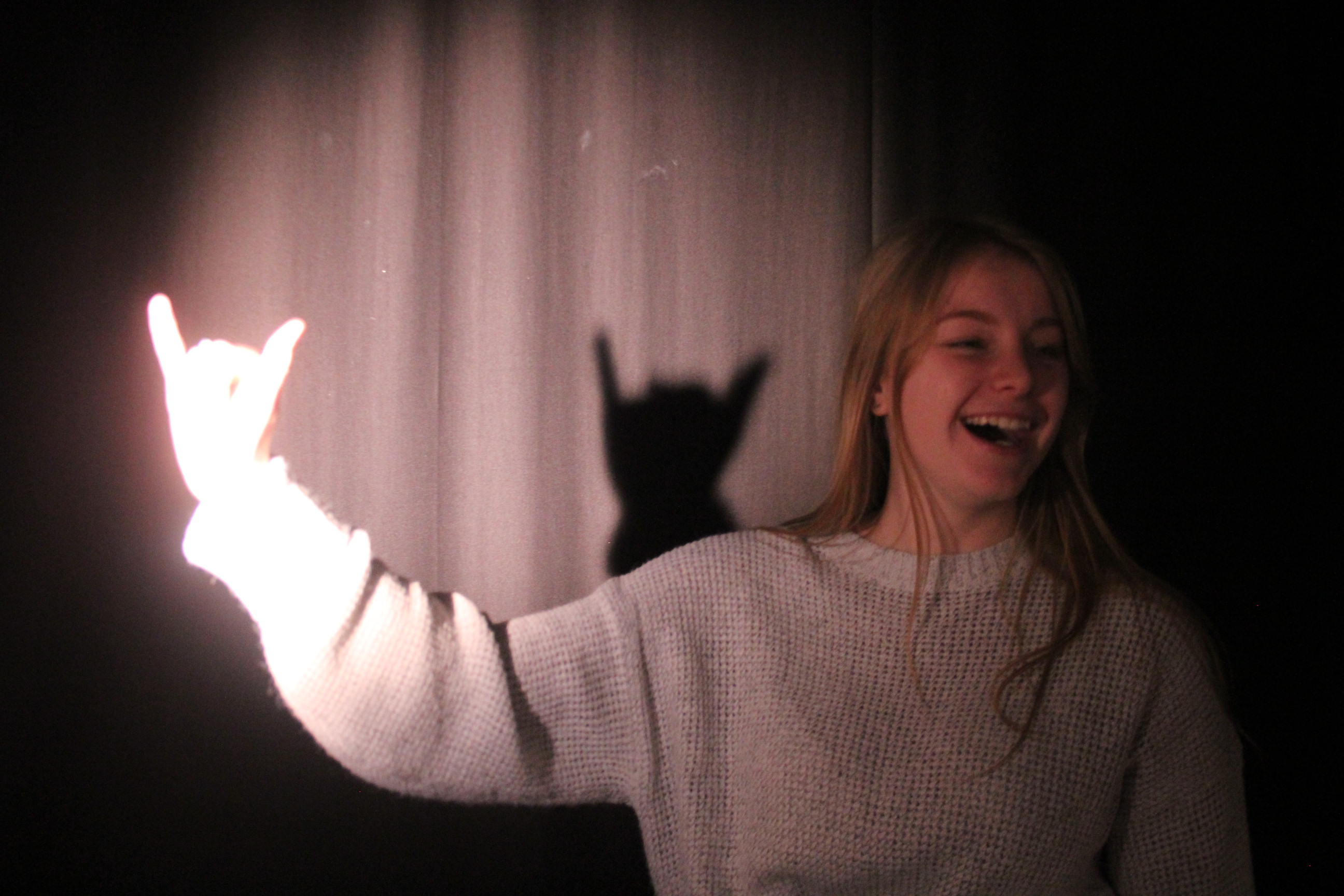

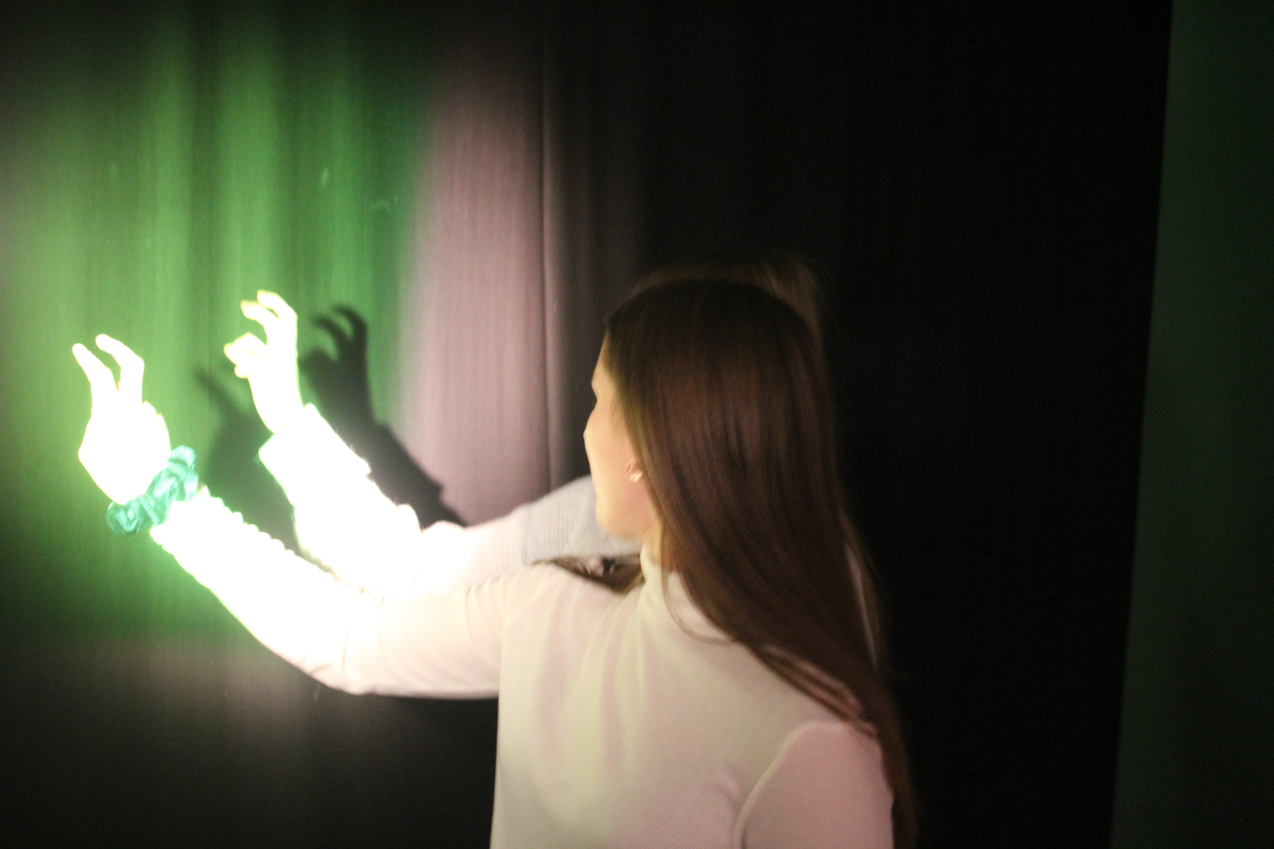
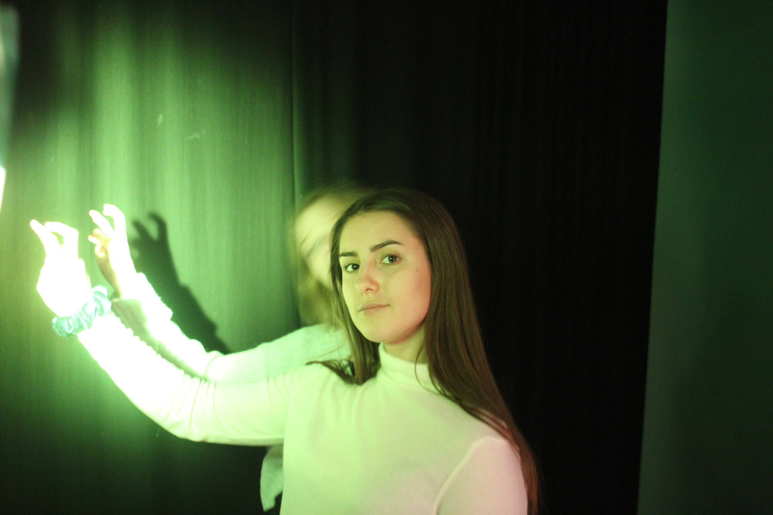
These images were taken using a ring light to create a brighter more ghostly light. Where as the soft box lights create more of a over all surrounding light which is warmer and has less of a directed focus. That why I chose to use a ring light because it works more on the light that is already preset and brightening it up . Also the ring light gives more of a crisp bright contract from the background.
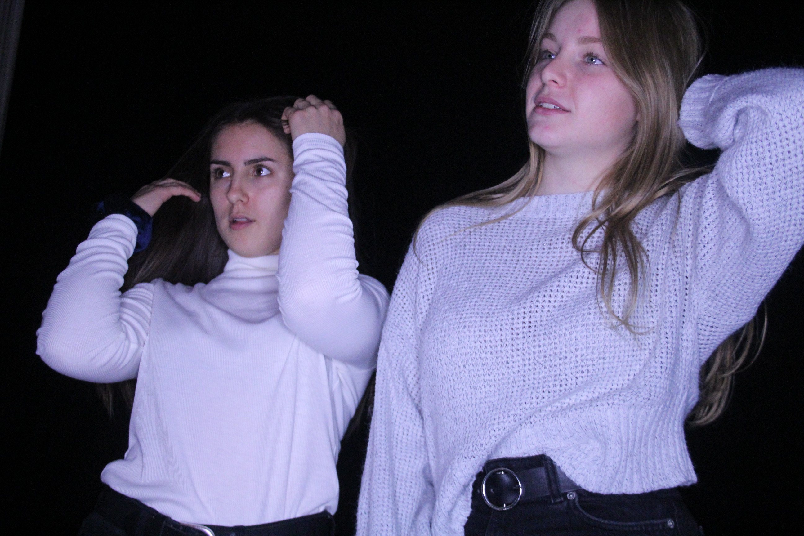
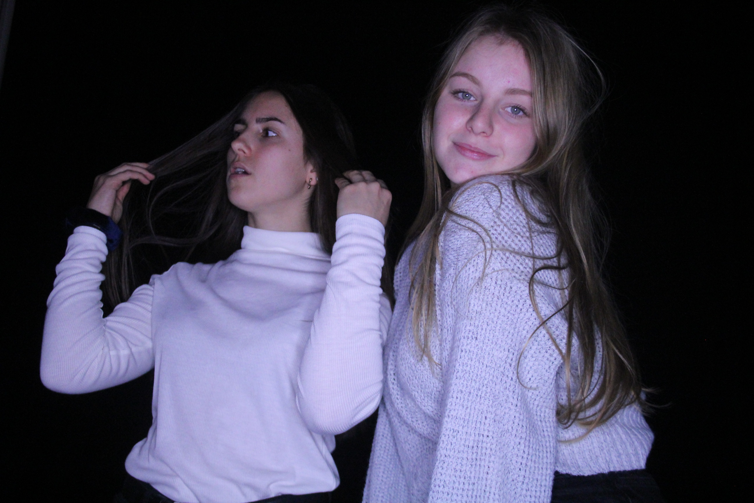
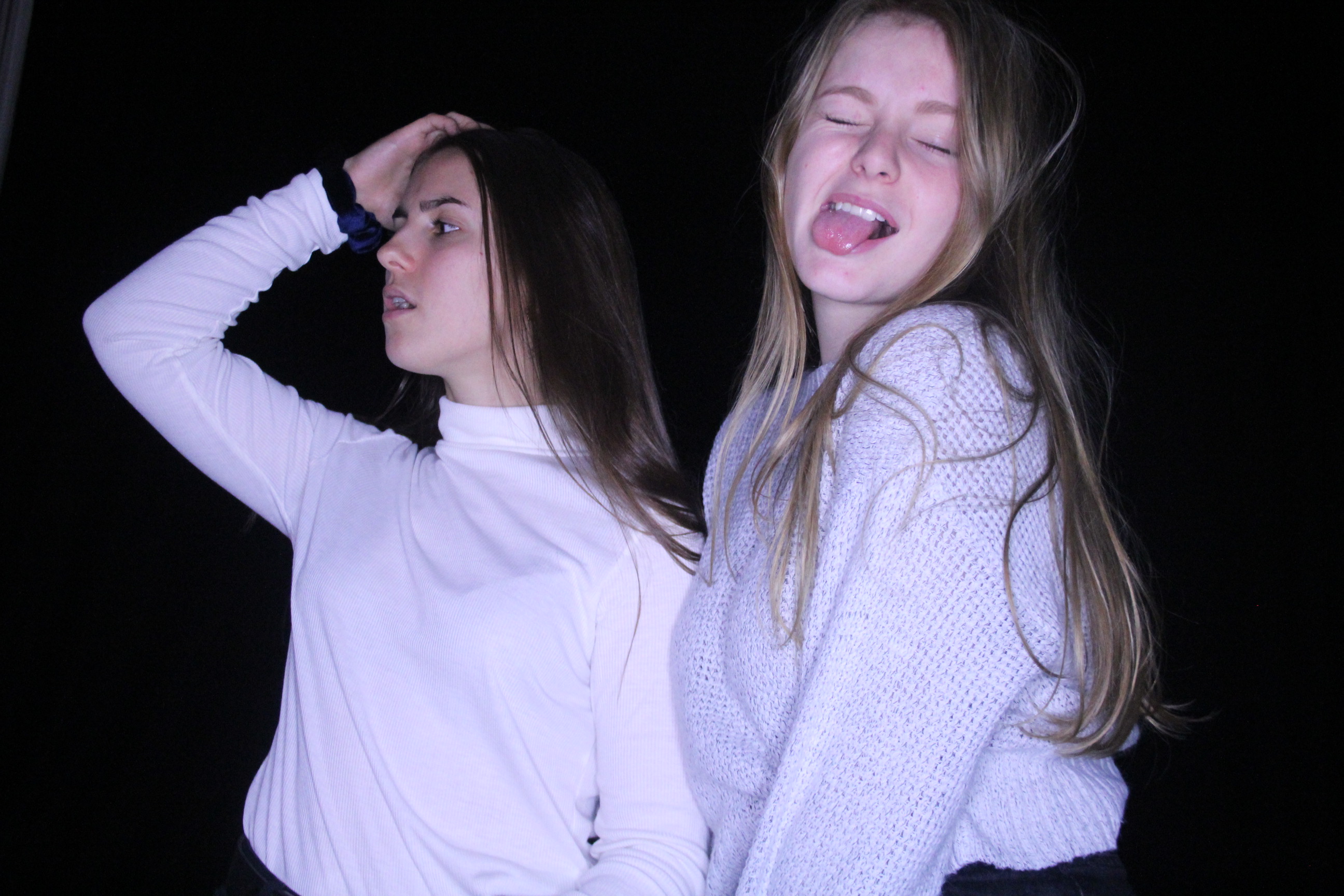
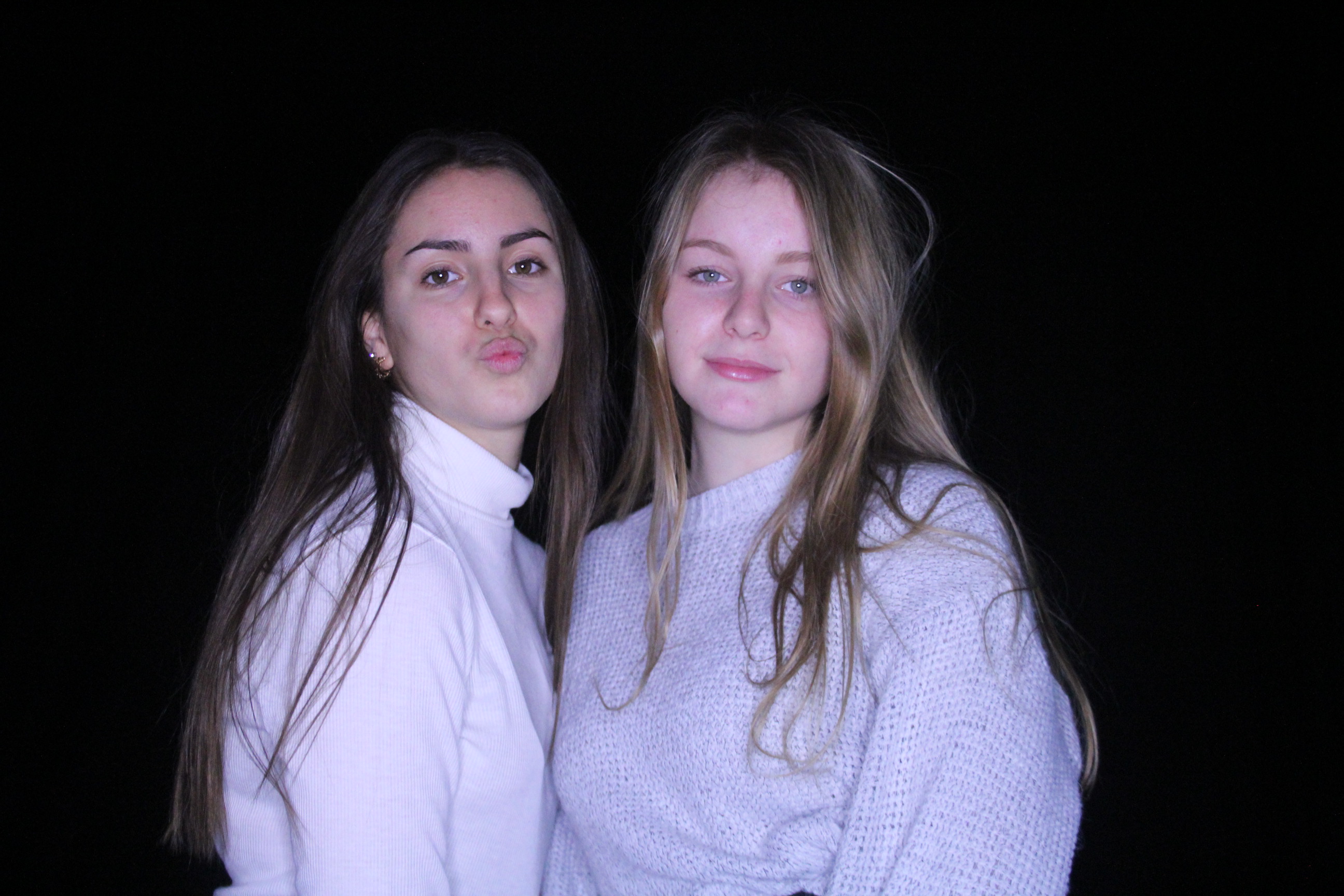
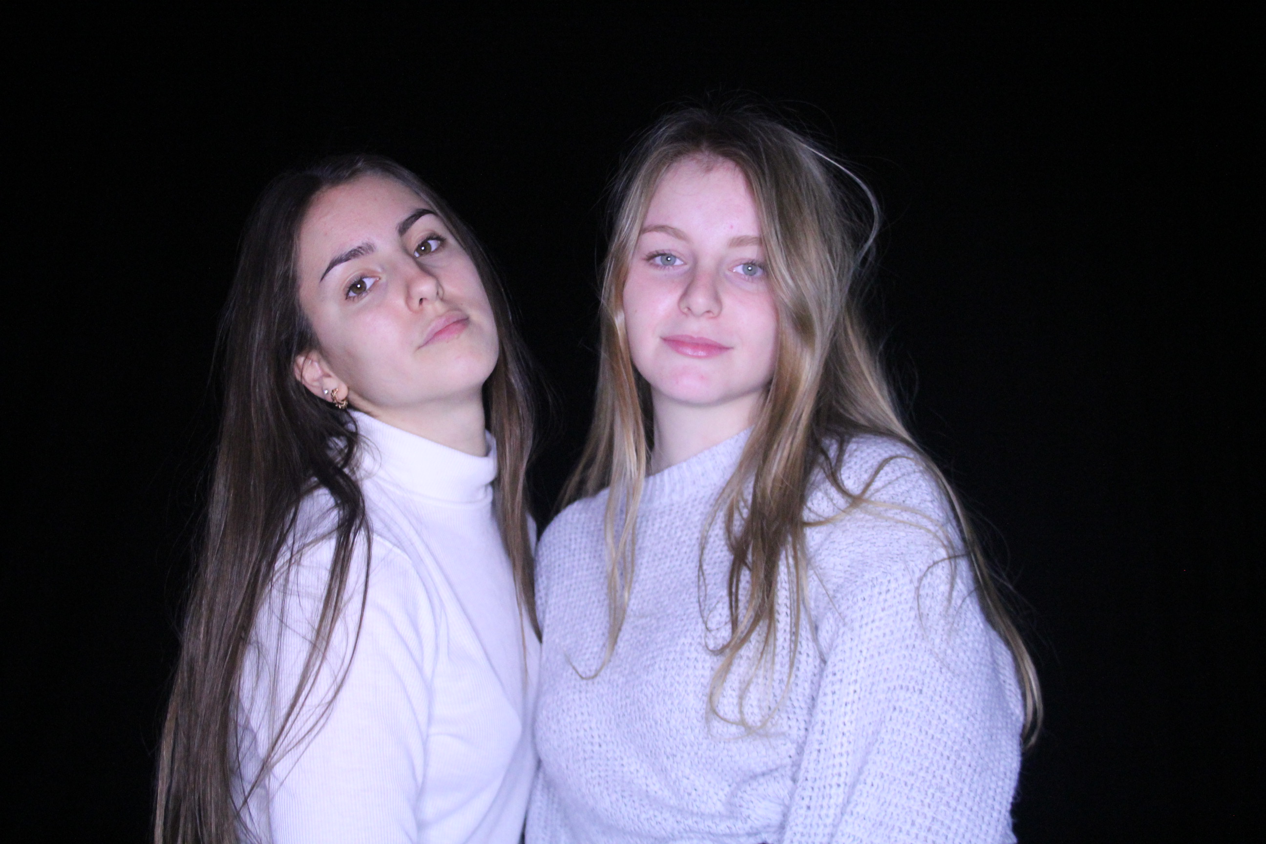
Studio lighting portraits
In class we experimented using different studio lights and color filters. The problems i faced were a lot of my images were blurry. This was because my shutter speed was to low and my focal point of the camera was not set to the middle. Next time i do this i am going to try work on this in the studio. Making my images in focus and have a specific focal point and focus.
Chiaroscuro Lighting
Chiaroscuro, (from Italian: chiaro, “light,” and scuro, “dark”) technique employed in the visual arts to represent light and shadow as they define three-dimensional objects.

Some evidence exists that ancient Greek and Roman artists used chiaroscuro effects, but in European painting the technique was first brought to its full potential by Leonardo da Vinci in the late 15th century in such paintings as his Adoration of the Magi (1481). Thereafter, chiaroscuro became a primary technique for many painters, and by the late 17th century the term was routinely used to describe any painting, drawing, or print that depended for its effect on an extensive gradation of light and darkness.

In its most dramatic form—as in the works of those Italian artists of the 17th century who came under the influence of Caravaggio—it was known as tenebrismo, or tenebrism. Caravaggio and his followers used a harsh, dramatic light to isolate their figures and heighten their emotional tension. Another outstanding master of chiaroscuro was Rembrandt, who used it with remarkable psychological effect in his paintings, drawings, and etchings. Peter Paul Rubens, Diego Velázquez, and many other, lesser painters of the Baroque period also used chiaroscuro to great effect. The delicacy and lightness of 18th-century Rococo painting represents a rejection of this dramatic use of chiaroscuro, but the technique again became popular with artists of the Romantic period, who relied upon it to create the emotive effects they considered essential to their art.

Some examples of Chiaroscuro lighting
Chiaroscuro Lighting Technique and How It Works
There are lots of ways you can add depth to your shot - you can place objects in the foreground and background, use a shallow depth of field, or employ the parallax effect. But chiaroscuro is one method you should know and use every time your shoot involves lighting.

In essence, this lighting technique seems simple enough -- use dimmer and brighter lights in opposing succession to create contrast (light/dark), however you'll soon find out, when handling such unwieldy things as lights, that it's true what they say: cinematography is basically painting with light -- and painting ain't no easy task.

I created a mood board to show some examples of chiaroscuro lighting:


