During the Second World War the Occupation of the Channel Islands lasted five years. After the German forces took St Malo on 22 June, and France surrendered, Jersey was in range of enemy guns, and when Britain decided that defending the islands was impracticable, and compulsory evacuation was ruled out, it was up to people to make their own decisions. About 10,000 decided to evacuate to the British mainland, leaving about 40,000 in Jersey when the occupying force arrived on 1 July. The island was demilitarized, with British troops withdrawn, the island’s lieutenant-governor recalled and the Island Militia stood down, although the unit volunteered as one to go to England to join the main home forces.
Life under occupation – The German Occupation of Jersey began one week after the British government had demilitarized the island fearing for the safety of civilians should there be any conflict. The code name for this was “Operation Green Arrow” and the initial German Air Force reconnaissance flights mistake civilian farming lorries for troop carriers. On the 28th of June , the German Air Force, not knowing of the demilitarization, bomb and machine gun multiple sites on the island. The attacks killed ten people and wound many more. A few days later on the 1 of July 1940 General Richthofen, The Commander of the German Air Forces in Normandy, dropped an ultimatum from the air demanding the immediate surrender of the island. White flags and crosses were placed in prominent positions, as stipulated by the Germans, and later that day Jersey was occupied by air-borne troops under the command of Hauptmann Gussek.
Food shortages – Shopping hours were reduced as goods became scarce. Food shortages on Jersey were finally relieved by the arrival of the Red Cross ship SS Vega, bringing food parcels to Jersey. Before then, substitutes had been used to replace everyday foods, with seawater replacing salt, for instance, and a mixture of parsnip and sugar beet replacing tea. During the autumn of 1944, fuel supplies were almost gone, leaving no gas, occasional electricity, and very little road fuel. Medical supplies were almost non-existent; and most people were without fuel. A Red Cross relief ship, the S S Vega, arrived in Jersey on 30 December with food parcels, and cases of salt, soap and medical supplies. The visits of the Red Cross ship S S Vega proved a lifeline to the starving islanders.
Jersey with no defenses- Hitler ordered the conversion of Jersey into an impregnable fortress. Thousands of slave workers from countries like Russia, Spain, France, Poland, and Algeria built hundreds of bunkers, anti-tank walls, railway systems, as well as many tunnel complexes. In late 1943 the Tunnel Complex Ho8 (now known as the Jersey War Tunnels) in St. Lawrence was converted from an artillery workshop and barracks to an emergency casualty clearing station able to cope with up to 500 patients.. All of the fortifications built around the island were part of Hitler’s “Atlantic Wall”. Today, traces of Jersey’s defenses and wartime occupations can be discovered across the island, especially in St. Ouen’s Bay.
Victoria on the horizon- By 7 May 1945, the German army had surrendered and the end of the war in Europe was announced. During the week leading up to 6 May islanders had been hearing reports of Hitler’s fall in Berlin by way of their hidden radios. In spite of the fact that the island was still officially under occupation, rumors began circulating of an imminent end to the war in Europe. In June 1944, the Normandy landings marked the initiation of ‘Operation Overlord’, the invasion of northwest Europe by the Allied forces. By 7 May 1945, the Germany army had surrendered and the end of the war in Europe was announced. During the week leading up to 6 May islanders had been hearing reports of Hitler’s fall in Berlin by way of their hidden radios. In spite of the fact that the island was still officially under occupation, rumors began circulating of an imminent end to the war in Europe. Culminating on the 8 May, the Allied military powers had been busy coordinating the necessary steps, behind the scenes, to recover the Channel Islands from their occupation. On 3 May a British Military operation ‘Nestegg’, with the objective of liberating the Channel Islands, was set in motion when a coordinated group of British Army units, collectively known as ‘Force 135’, were called to ‘Stand To’.
Churchill’s speech- At 3.00pm Winston Churchill crackled onto the airwaves to give, perhaps, the most famous speech of his career. The Prime Minister’s words announced the end to the war in Europe and the “unconditional surrender of all German land, sea and air forces in Europe”. When, amidst great cheers across the island, he uttered the words, “our dear Channel Islands are also to be freed today”. Island-wide flags and decorations sprang up. From a balcony overlooking the Royal Square, Bailiff Coutanche gave an impassioned address and proceed with an emotional rendition of the national anthem. Possessions, forbidden under the occupation, miraculously reappeared, adding to the celebrations. Parties continued throughout the rest of the day and long after the King’s speech at 9.00pm, with several bonfire and firework displays taking place.
liberation day – At 7.15am on 9 May, on the quarter deck of HMS Bulldog, Second-in-Command for Guernsey General Siegfried Heine signed the Instrument of Surrender on behalf of the German Command of the Channel Islands, effecting their capitulation. On completion of this, General Heine was then ordered to “immediately cause all German flags and ensigns now flying in the Channel Islands to be lowered”. At Midday an overjoyed Bailiff Coutanche accompanied a German delegation led by the island Commander, General Major Rudolf Wulf, aboard HMS Beagle anchored in St. Aubin’s bay, where the separate surrender of Jersey was to take place. Arriving at the same time in St. Helier’s harbour was a small naval inspection party sent to report on the health of the islanders, who were promptly overwhelmed by an enthusiastic crowd delighted at seeing their first liberators landing on Jersey soil.


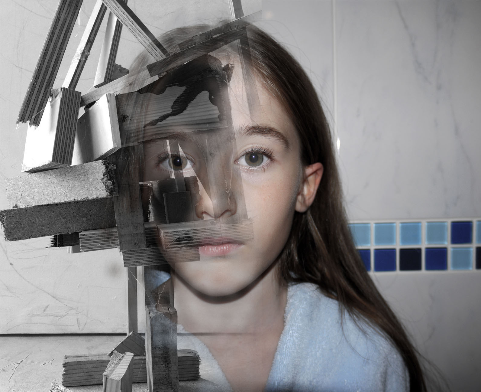
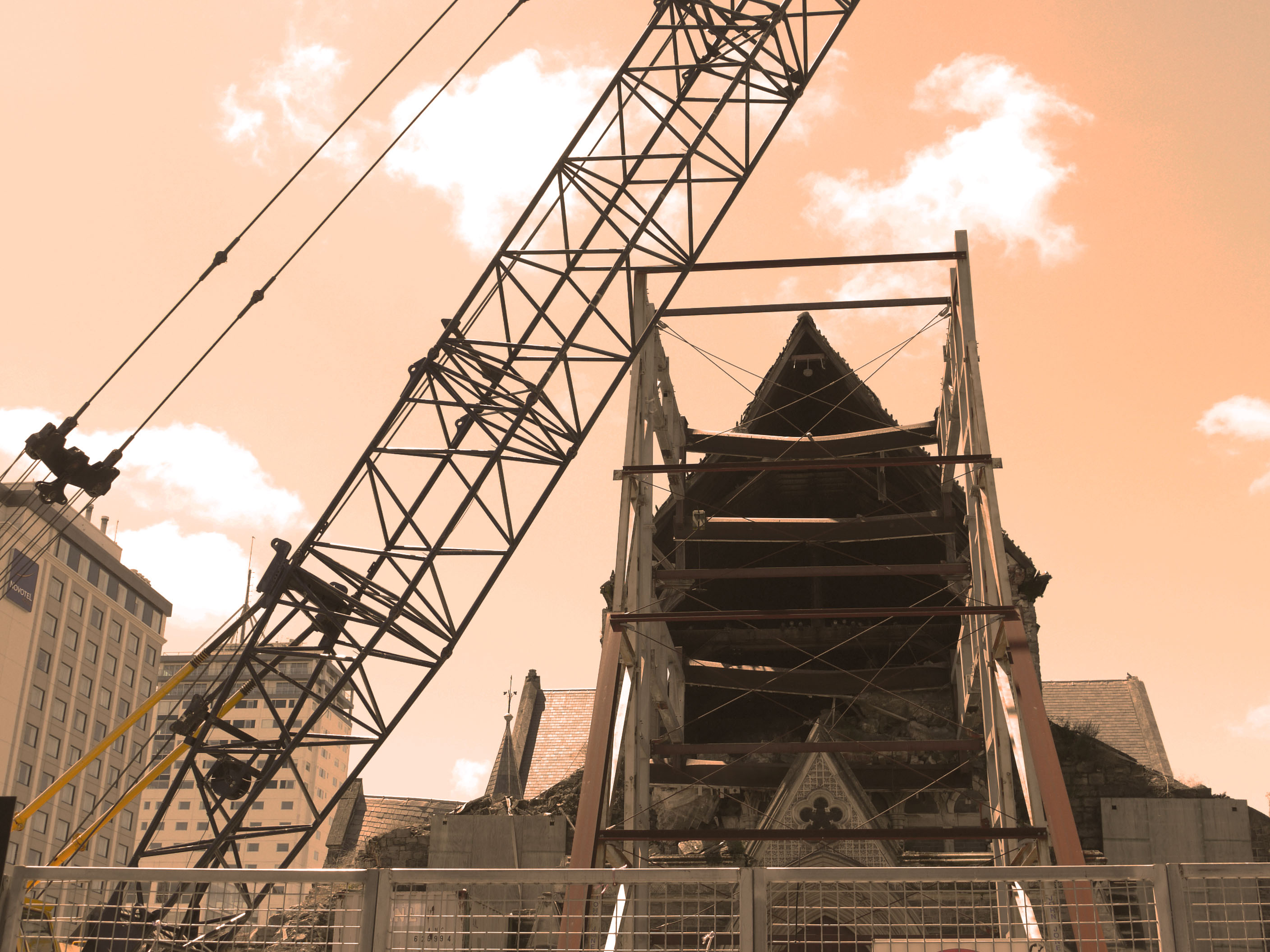
 This image was created from the soul idea that from the destruction of a place new life and ideas can be created. The wooden image was taken in New Zealand, all the wood this sculpture is made from was wreckage from the earthquake that hit Christchurch. This was then made into art, I found this sculpture when walking through the main city I feel it shows the identity of the place and what happened but also clouds people views of how hard it is to move on after that. This dilemma of if this constant reminder of identity and place should be celebrated or ignored. Thats what i hope my image conveys conflicting views on whats the right thing to do let go or hold on. I want my image to be a talking point not just something to be looked at something to be discussed relating to the identity and place. This is same with the orange cathedral image as well there is debate on weather they should leave the main cathedral as it is with the deviation of the earthquake or renovate it. I chose to over lay the colour orange over it because all the petition signs to keep it the way it was were orange, so i thought i brought the contextual identity to the image through the use of colour. Also i took inspiration from Xaviers work on derelict buildings and how the city just carries on life around it. I feel this image portrays this very well with like skyscraper to the left creating perspective and framing the image, also the crane across the middle breaks up the rigid vertical lines within the image creating a visual focal point to start off at.

 This image was my favourite out of the studio lighting portraits because it looks like it tells a story or has a real secret meaning behind it. I fell like it creates intrigue and makes the audience want to ask questions. This is my main focus for my work is to make the audience think and come to there own concussions about the images and i feel like this black&white portrait does this perfectly.
 This last image to me is from my photomontage experiments. This photo leaves you with a-lot of questions wanting to be answered. My main focus behind the image was to show pressure through facial expression and confusion through shape. This image is meant to make you feel like you are looking into someones brain while they are stressed and being able to notice each and every individual thought almost as the image is made up of individual memories each telling a different story which you can visually interoperate through imagination. This is what I wanted to convey through this image and inner look into people thought patterns and identity.

 I also tried doing it the other way around with the same image. The exact same process on a different layer. I decided that i didn't like this image as much as the other one it just didn't look right to me. The contrast of the brown wood on stark grey background looks underwhelming. They look like two purposefully different images when they are actually meant to blend and flow together. These images together in this colour pallet just creative unwanted visual noise which confuses the audience because they are just drawn to the contrast of the colours not the actual image itself.
 In this image i am moving around the colour settings so that there is more contrast between the light and dark of the wood in this image. In the first image they were just set to the factory black and white settings so i changes them to have my desired out come. I fell like it makes the image look more interesting and the left eye blends effortlessly into the wood because the pupil of the eye is the same tonal colour pallet range.
 I have decide that for this image the face is to colour full it created imbalance in my photo the face shouldn't be as vibrant and it should be a cooler colour pallet to complement the b&w wood structure.
 This image in balanced nether of the images over throw the other there is no direct focal point in ether it is just left to the viewers interpretation. The main tool i used was the vibrance slider moving the sider down to -56 gave my desired image composition. This again was through using the image - adjustments tool . There is still the cool blue tones coming through to give that image the need colour but they are muted.

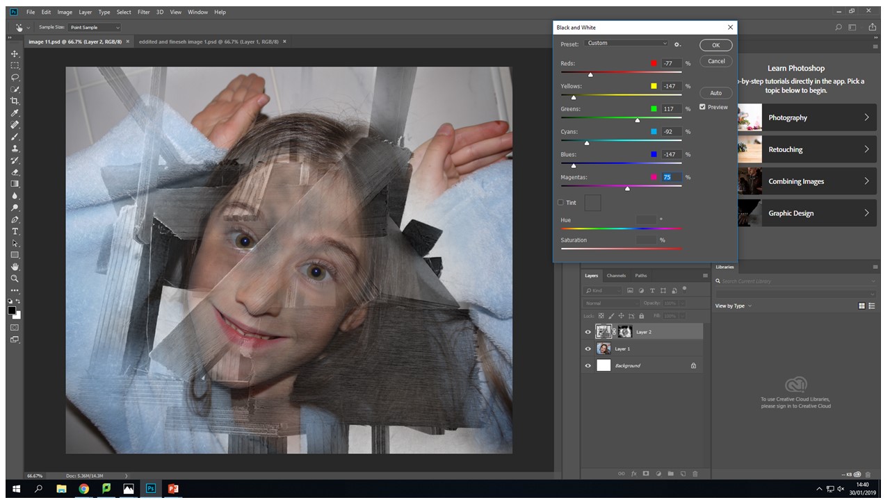 Another tool that i used quite frequently on the original face images was the levels tool to create more depth with in the eyes so that they stood out and didn't get lots within the images different layers.

 Again using the same black and white process with the wood from the images adjustments black and white tool and then sliding it to create the desired b&w tonal look.
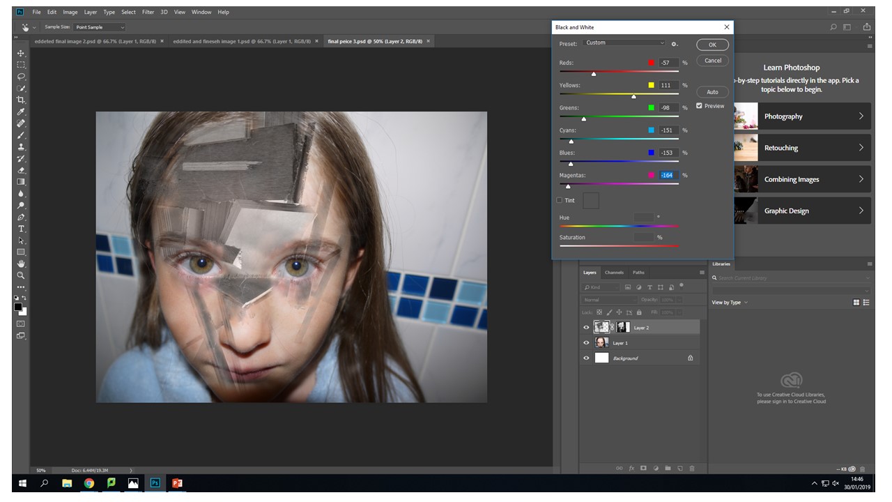 Again the vibrance tool to decrease the vibrance of the image to put a real focus on what the image is trying to portray rather that the initial combination of broken wood and a face. This vibrance decreases mean the image is seamless and creates a dimensional feel that you can look into the image in different layers but then you zoom back out it still looks like all one image.
 For me when editing my photos that I had created the vibrance slider created the most desired outcomes then it came to editing the actual face images i used this tool on all of them. It created the colour pallet that i wanted to complement the black and white wood without becoming a black and white image in its self.
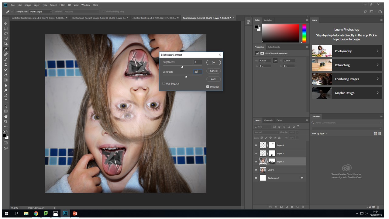


 With this image I created two layer masks over the wooden images and one original layer mask over the upside down head. Then blending the tongue and the wood images, I found that control-+ was really helpful zooming in and being able to work using a really small brush size of 17 gave the best effect.


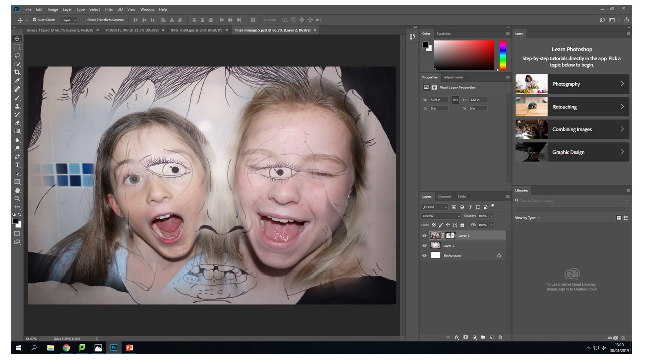
 I decided to do some experimentation and try to combine one of the images I had chosen to work from in my final peaces and one of the images i had draw to be printed on asetae for the original collage. I feel like the composition of this image works well, the drawn hands frame the two blending heads that are creating an interesting view point for the observer because they can make there own judgement on what they feel in portrayed with in the image. For me what i want to be portrayed in the encapuslement of identity and how it shrouds our initial view point. This is what is happening towards the evey changing place we live in we are engulfed by industrialisation and this can become a-lot for people and this is what this image represents to me. The inner identity thoughts and feelings that only escape us when overcrowded with thoughts.


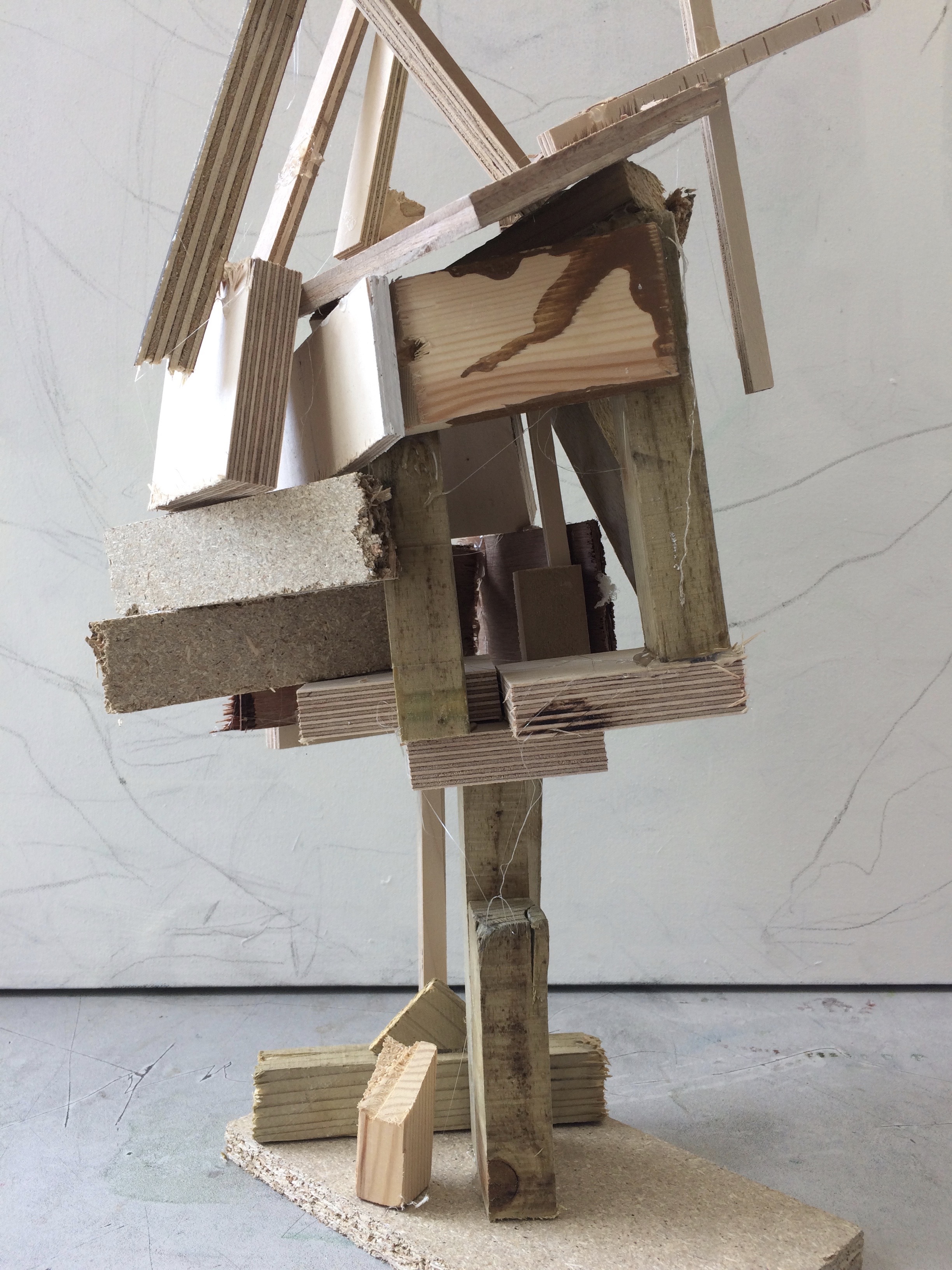
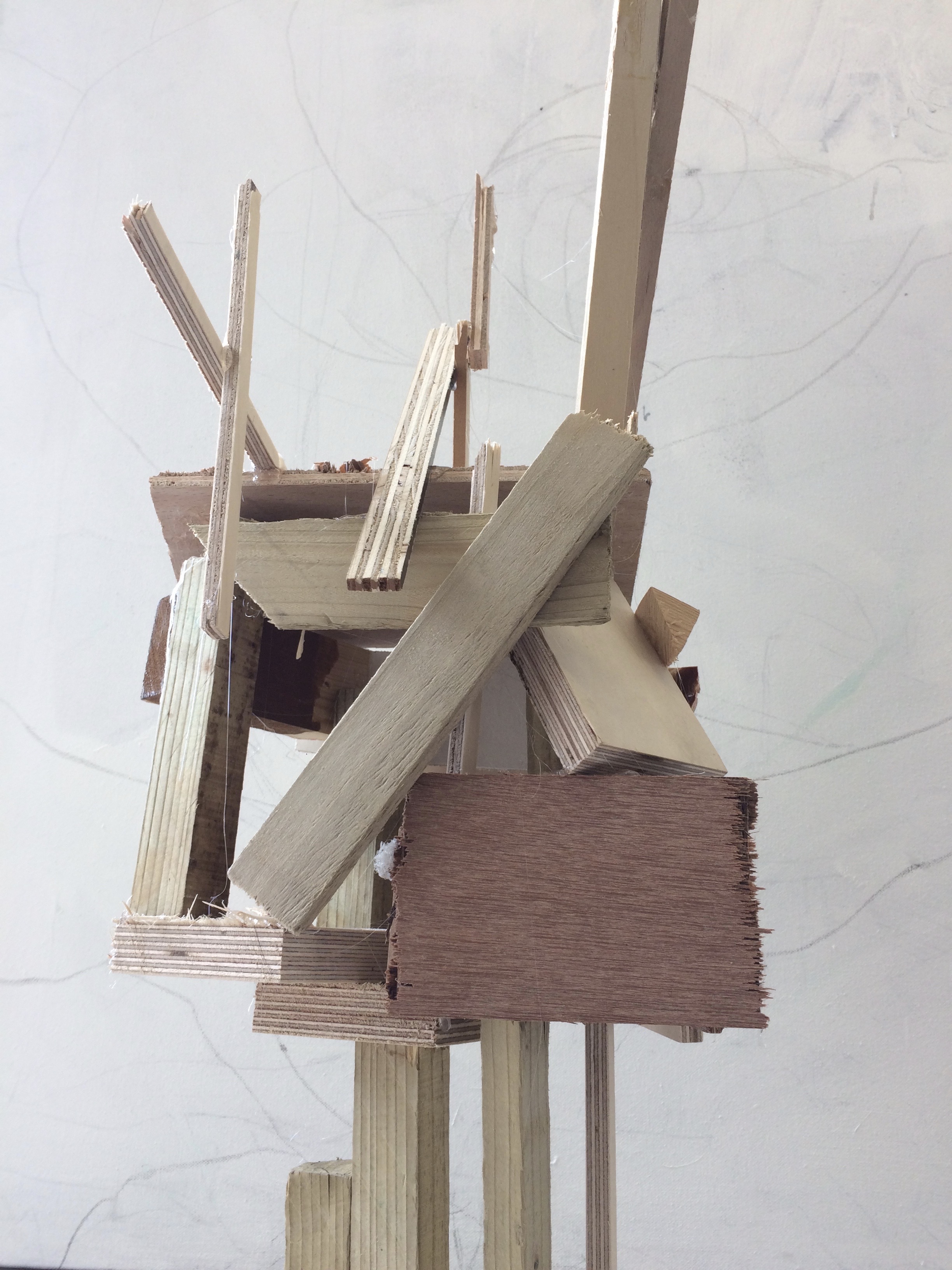 The artists work that I took inspiration for this work from was Henry Moors work is all made from wood and created human forms through his work.


 This image is what i want to be editing and creating with in the exam. My aim for the exam is to edit the existing images that i have prepared and work on combining them with my urban landscapes in the first half of the exam in the second half of the exam i would ideal like to be creating my hand made blended photos. For on of my final pieces i may make a combination of one die Photoshoped and the other made using physical techniques this to me will reinforce the concept of identity and how my own work had its own style and creativity. Also there should be a noticeable idea running through of how industrialization shrouds our minds and how we let it take over our day to day life with no care in the world, also how it just happens around us over the nature that we all so preserve so important yet we do noting about. I want my final pieces to give off this idea that our identity and the places we live are ever changing and we just have to adapt to them. Also i want it to represent how the place we live in no water how natural with always be subjective to industrialization ans we just let this happen as if it is a normal thing because it is all we have ever know. I want the images to show how imprinted industrialization is on our minds. My final outcomes i am hoping for at least one A3, A4,A5. That is the photoshoped images and then however many hand made edits depending on how much time i have left.