

Evaluation
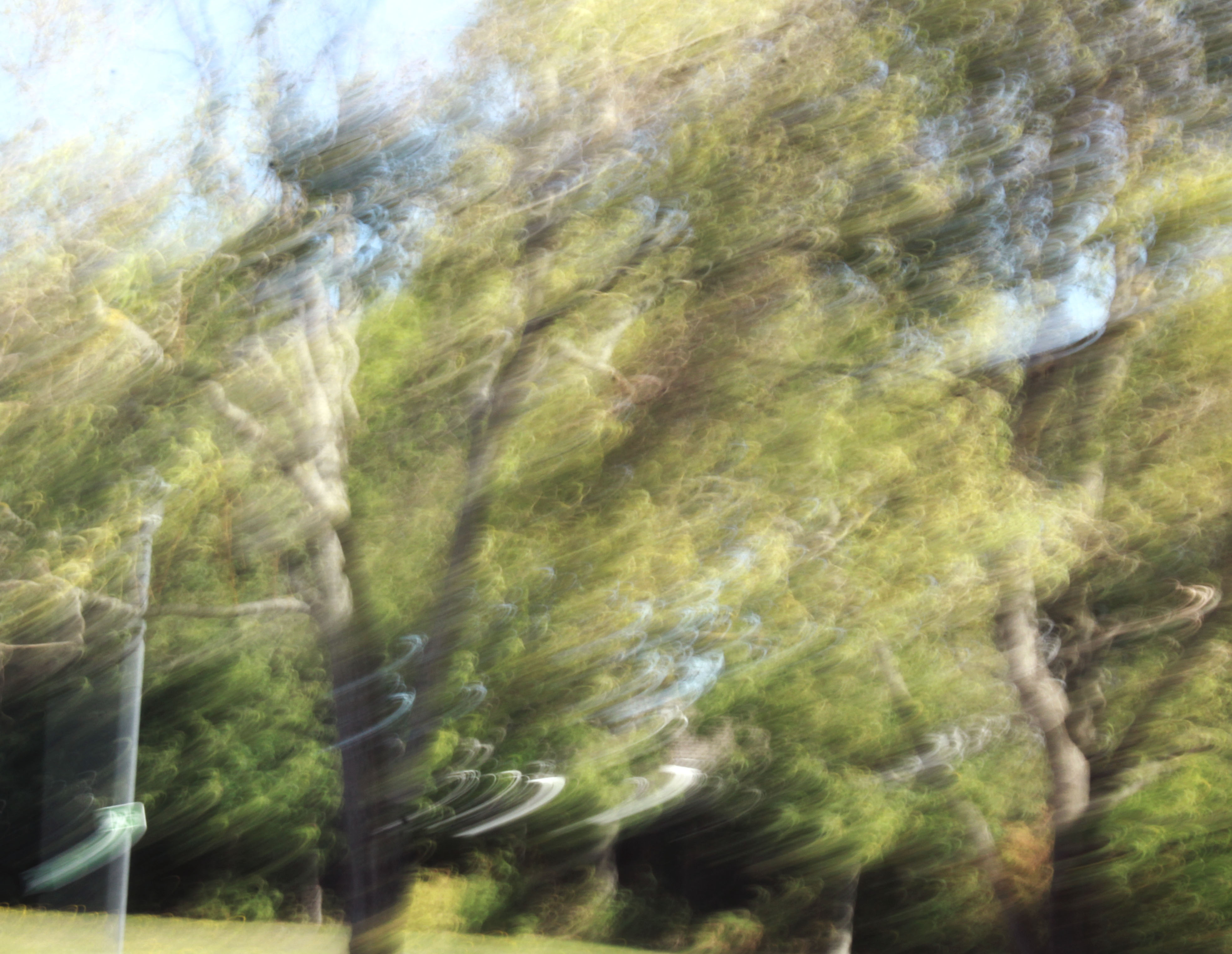
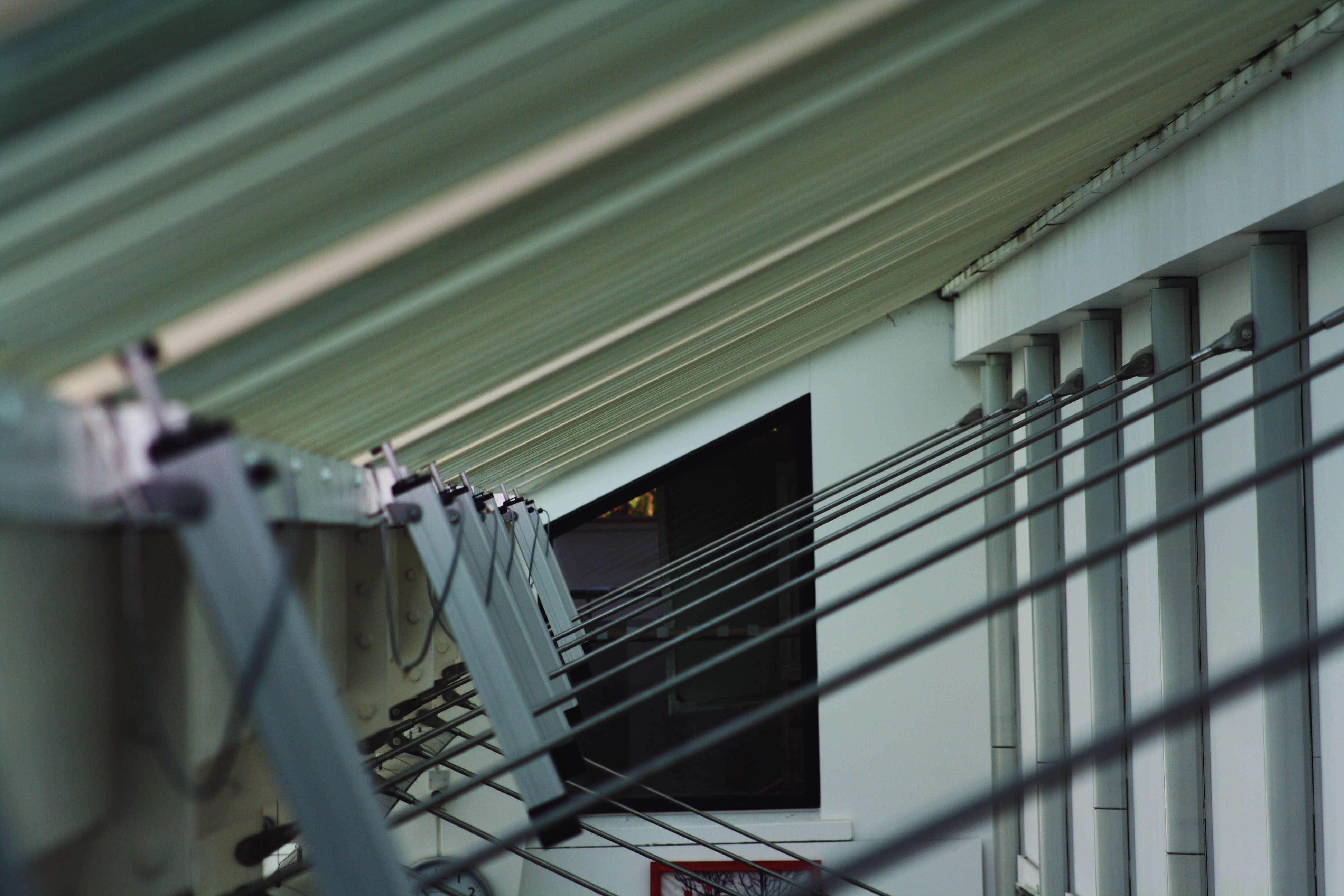
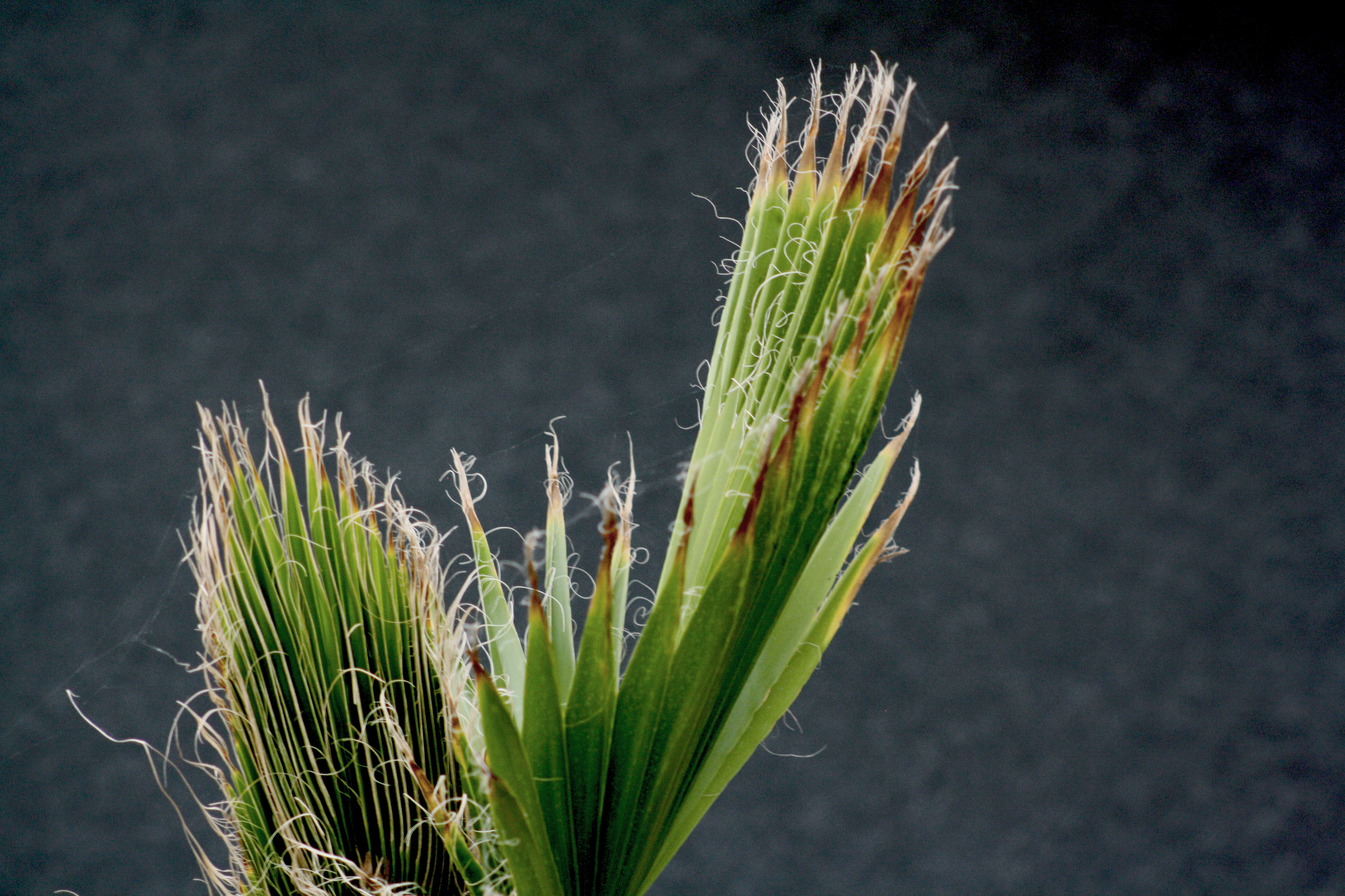
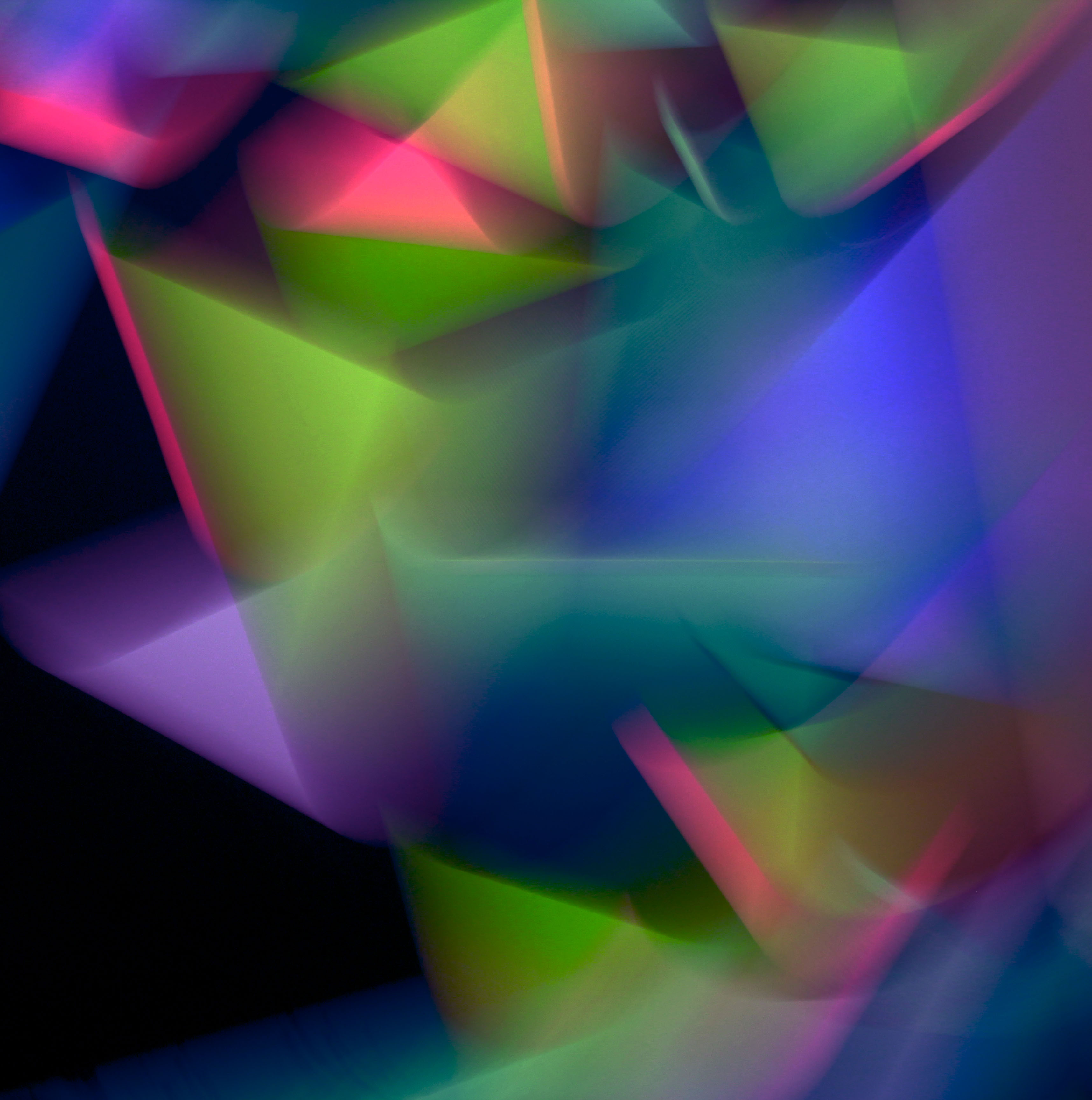
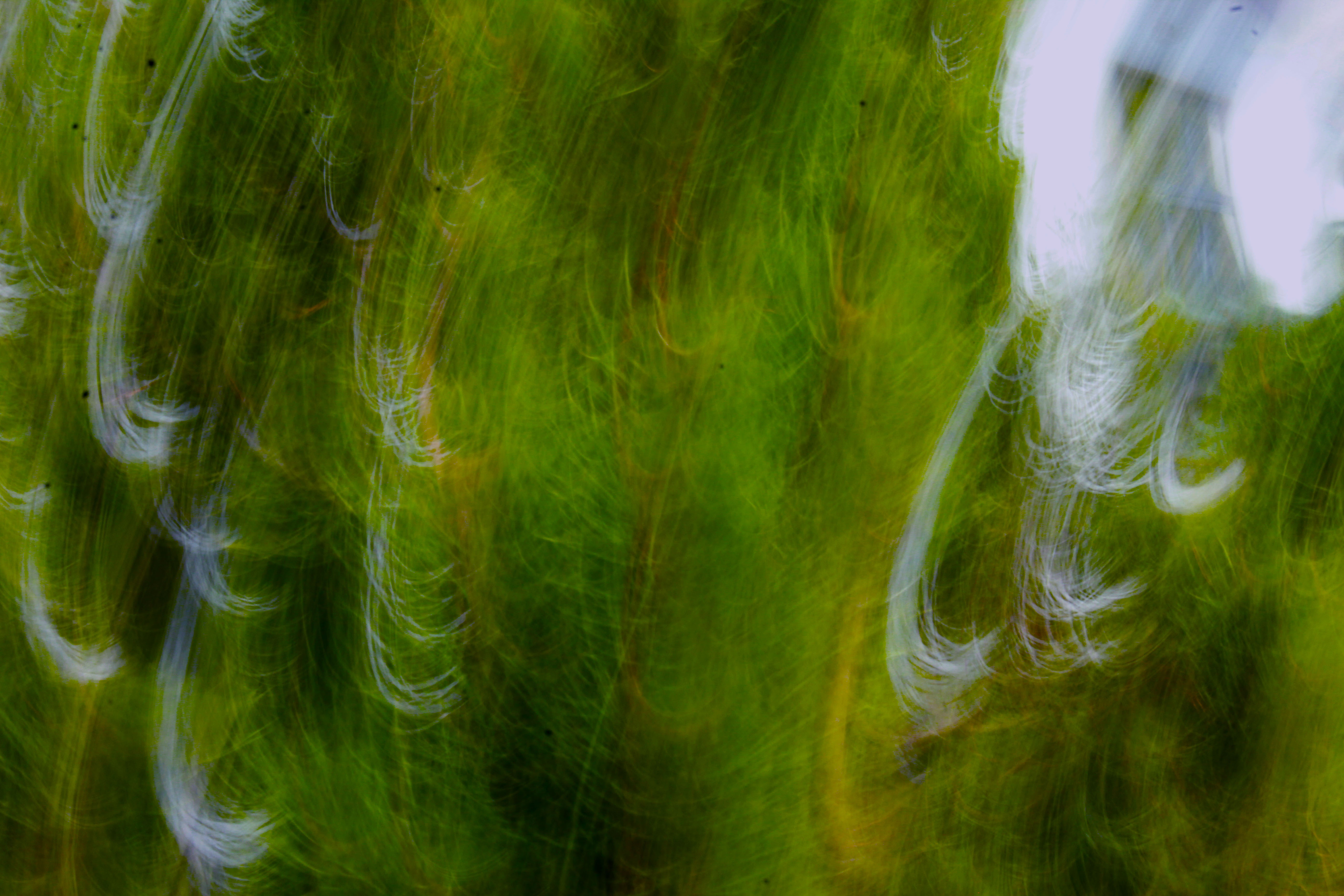
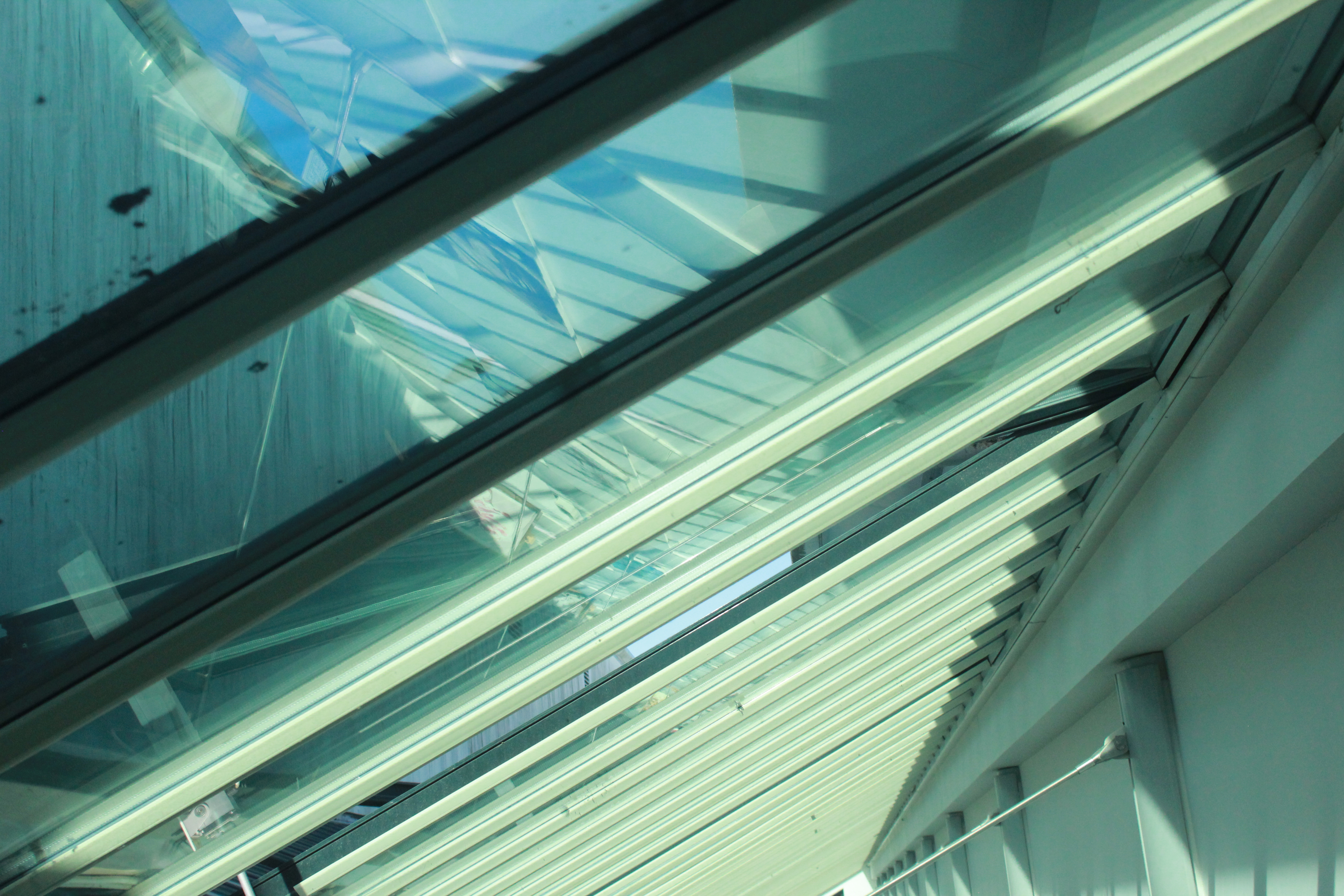
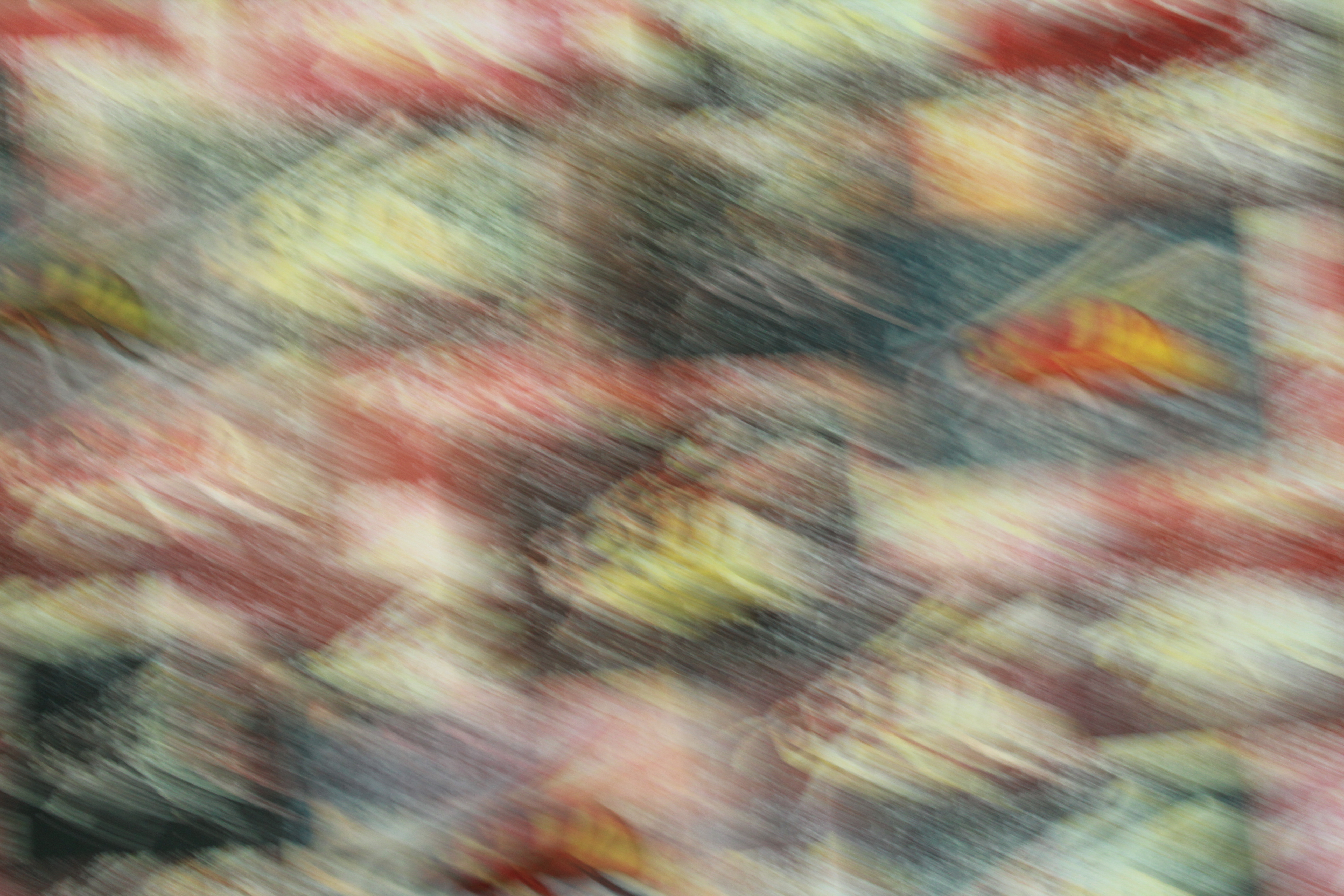
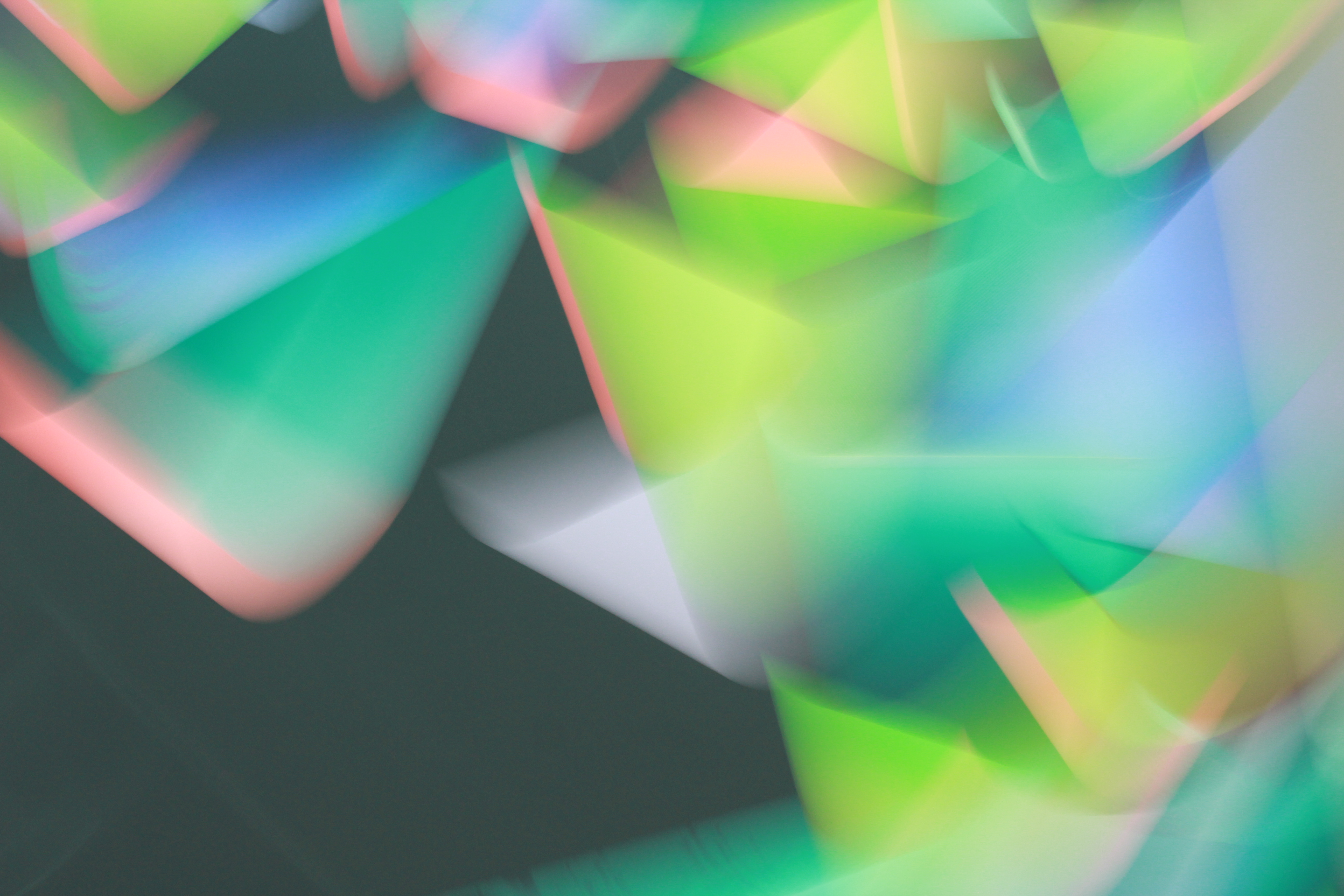
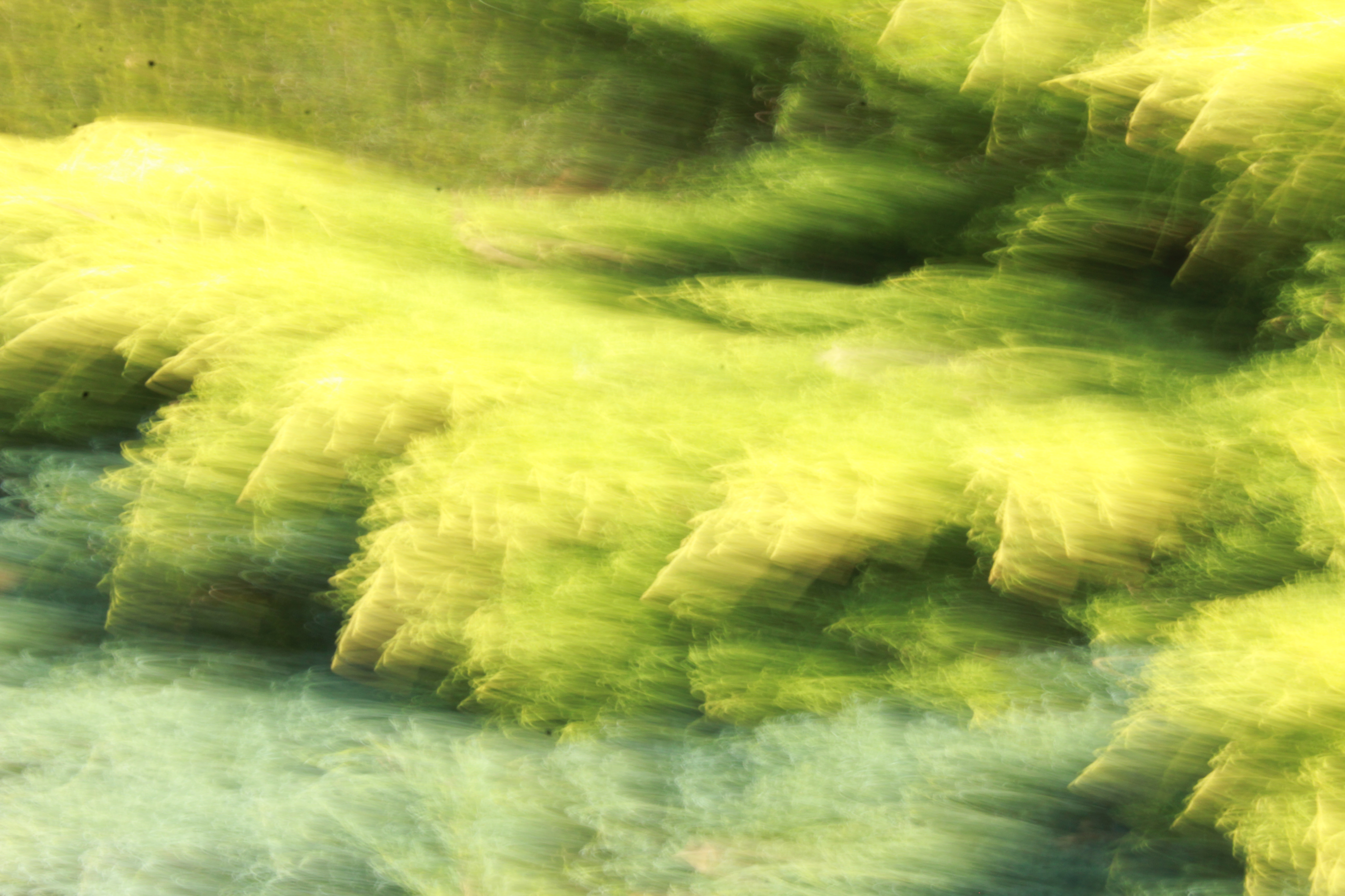
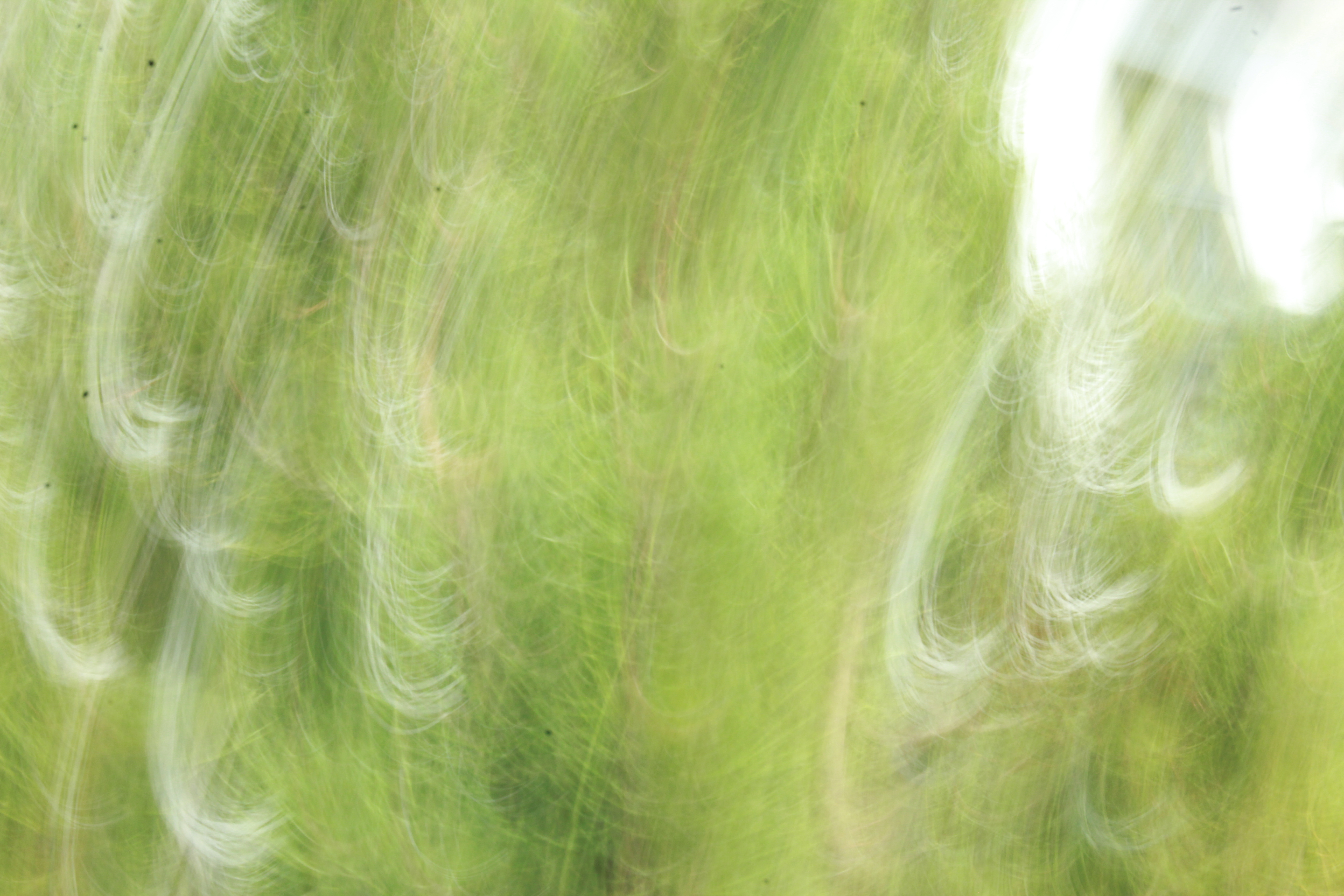
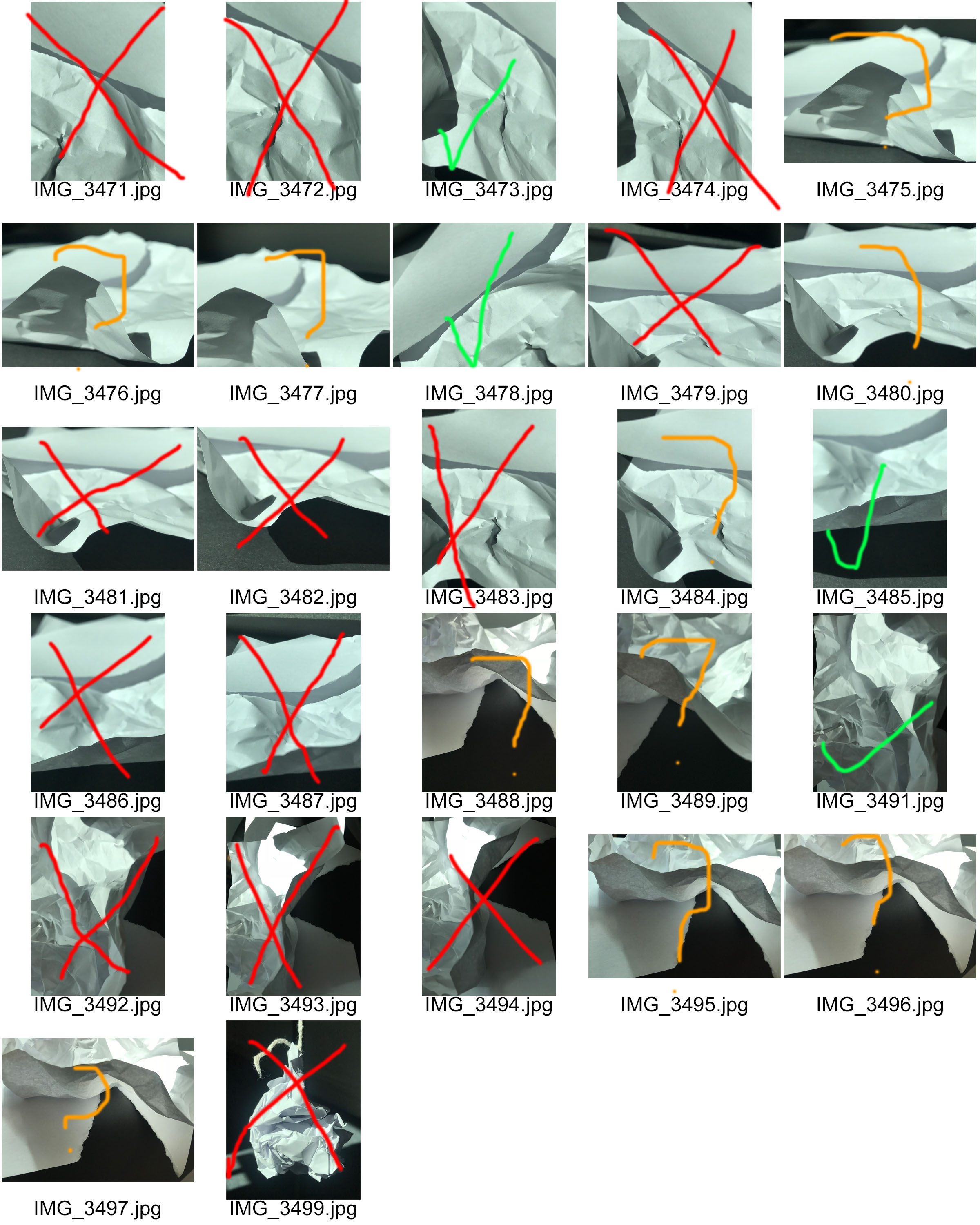
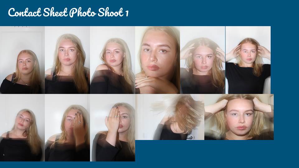
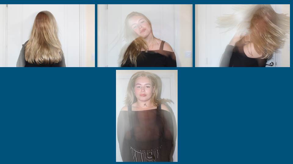
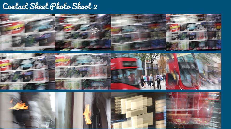
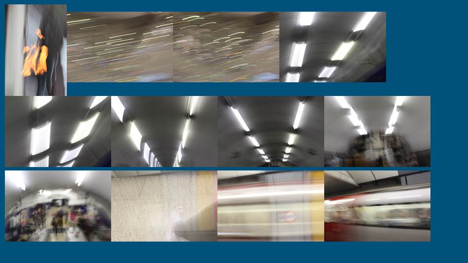
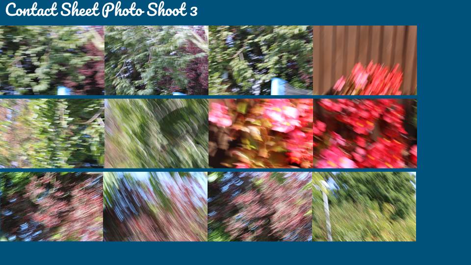
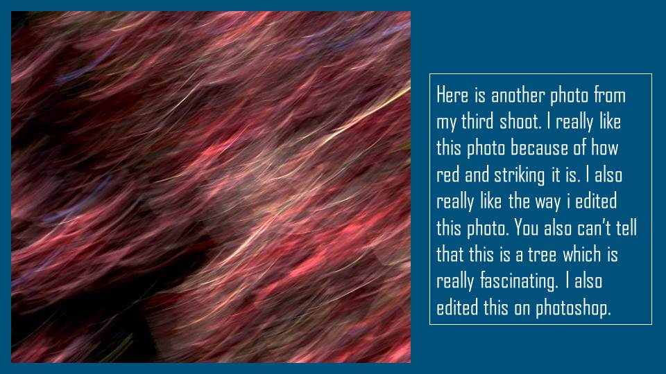
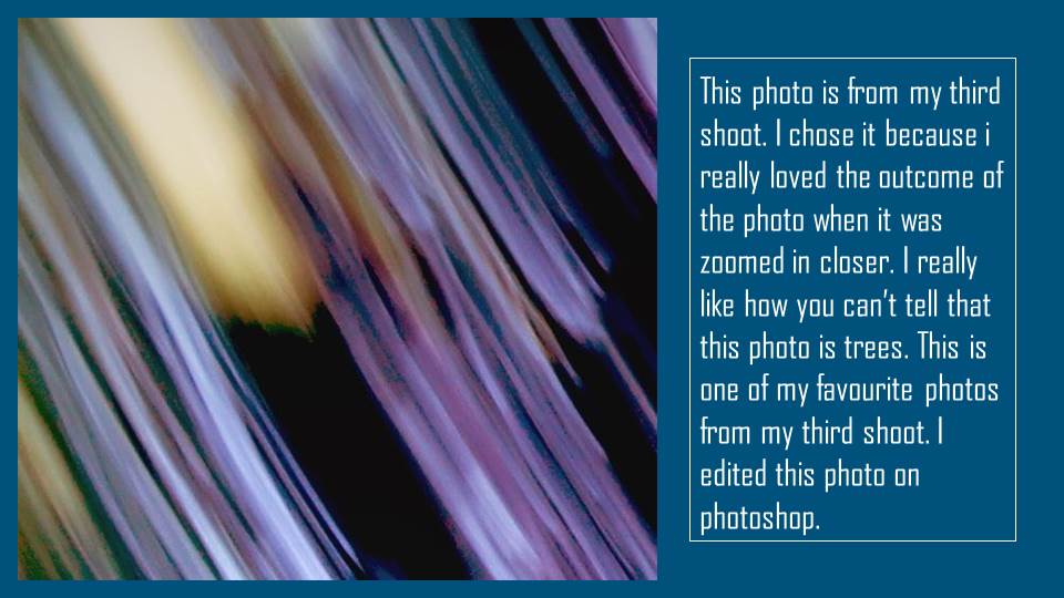
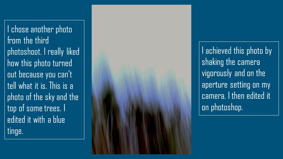
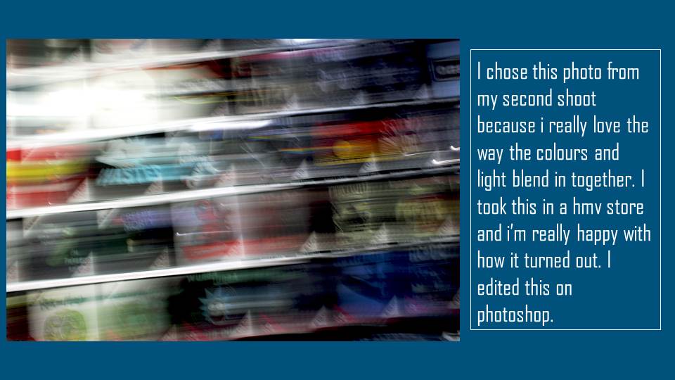
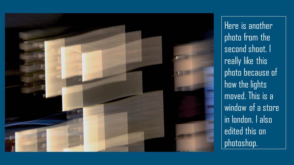
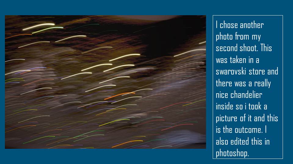
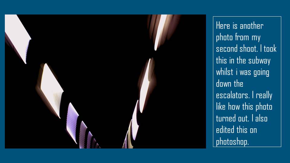
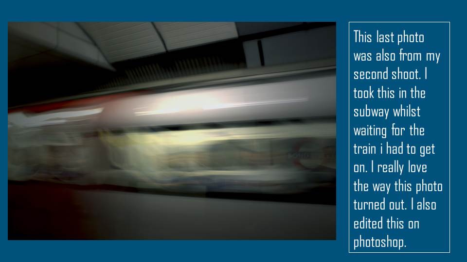
I made the photos by going onto the aperture mode on my canon camera and setting the camera to a ISO of 400 and the specific aperture value to 6. I developed my ideas from looking at Andrew S Gray’s work and experimenting with the way he takes photos. I tried my best to take photos that were similar to his because I really like his style of photography. I was trying to achieve pieces where you couldn’t tell what the photo was of and I think I did that very well because most of my family couldn’t tell what any of the photos were.
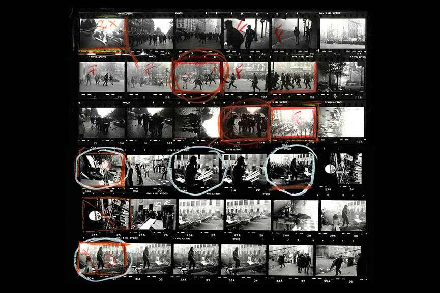
For my photos I experimented a lot with contrast, brightness, exposure, offset and gamma correction on Photoshop. I also used the filter lighting effects on some of my photos to make the vocal point more clear. I used these effects on all of my photos to enhance or change the photo and I am really happy with how they turned out. Whilst I was doing this task I learnt that I am quite good with Photoshop and editing programs. I used Photoshop to edit all of my photos.
I think the work I produced was similar to Gray’s style, but, it still had elements of my own style. The similarities of mine and his work is the way that the photos were taken, the subjects of the photos and the colours of the photos. The areas that were successful to me was when the photos were edited afterwards because I really enjoyed the look and the feel of the photos after they were edited, they looked a lot better after editing because it made the photo more unique and made it stand out.
To improve my project I think I should’ve took photos on the cliff side or at the beach because I feel that those photos would look better, but I still think the photos I produced were good. To add value maybe I could’ve taken it of something meaningful or special, I think this would make the photo better and more appealing.
To take my project to a higher level I think I could’ve used a higher quality camera and also some studio lights, the only disadvantage is that these items are very expensive. My inspiration to take my project to a higher level would have to be Andrew S Gray just because he uses fantastic equipment and takes his photos very well and also edits them amazingly, overall his work is very smooth and appealing to the eye, that’s why he inspired me.
Overall I think my project was done very well and I am really happy with the outcome and I think I took and edited the photos to how my style is. I enjoyed this project a lot and I enjoyed experimenting with the different editing programs and aperture settings on my camera. I also really enjoyed using the ICM style of taking photos because I think it looks really interesting.
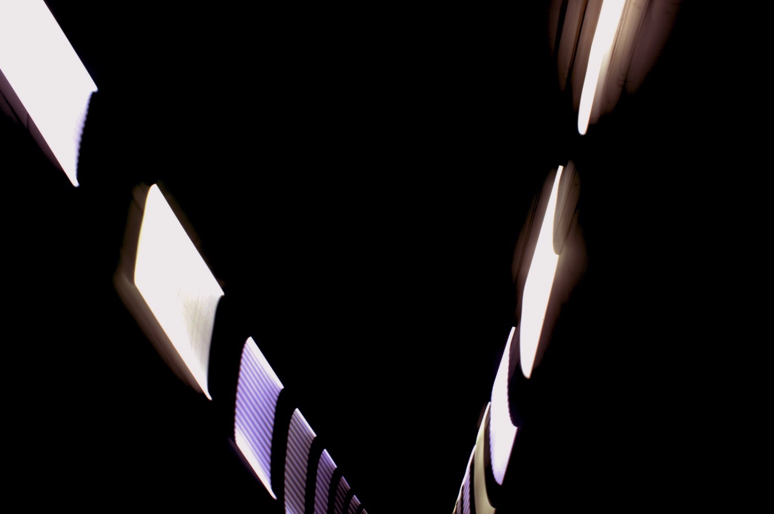
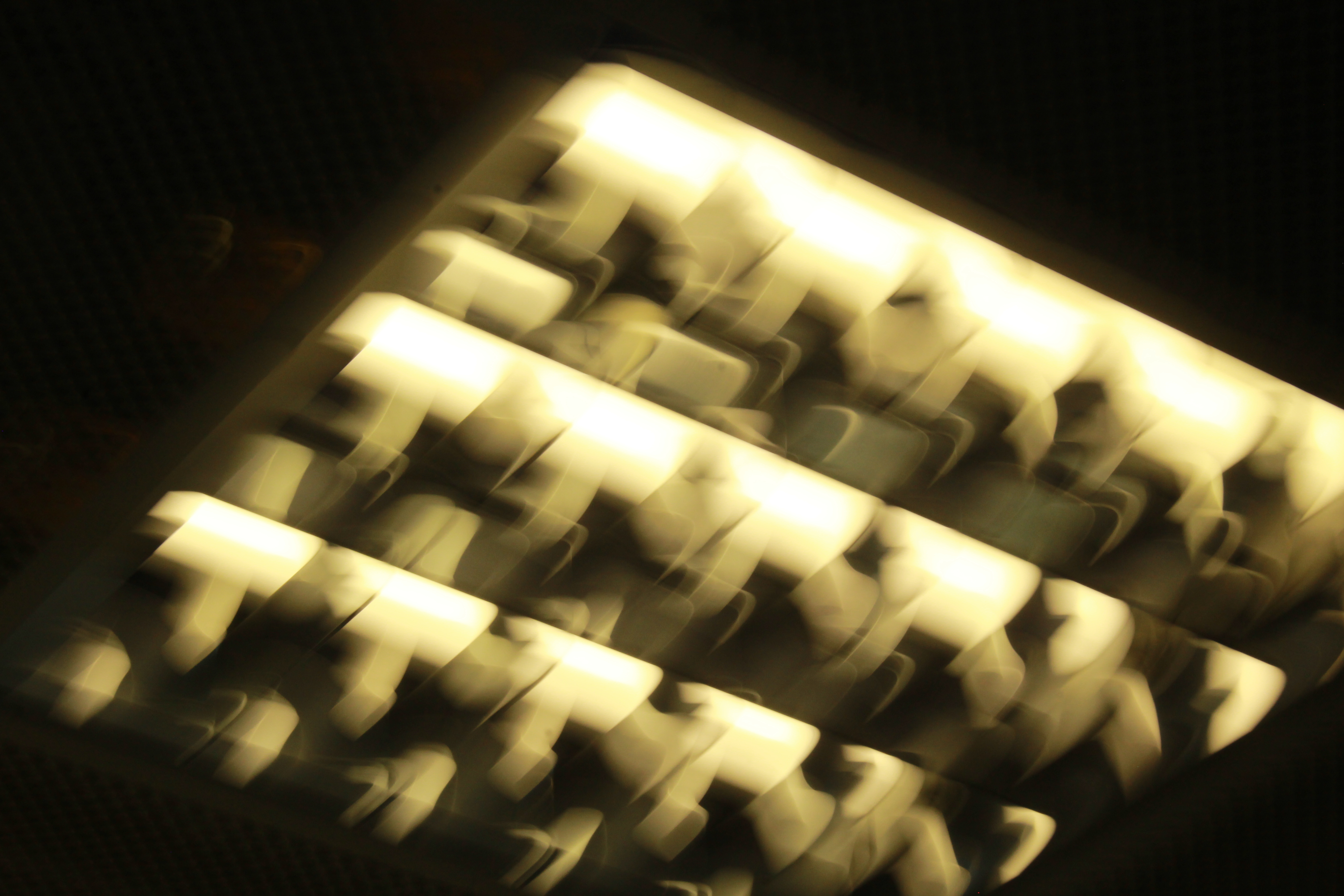
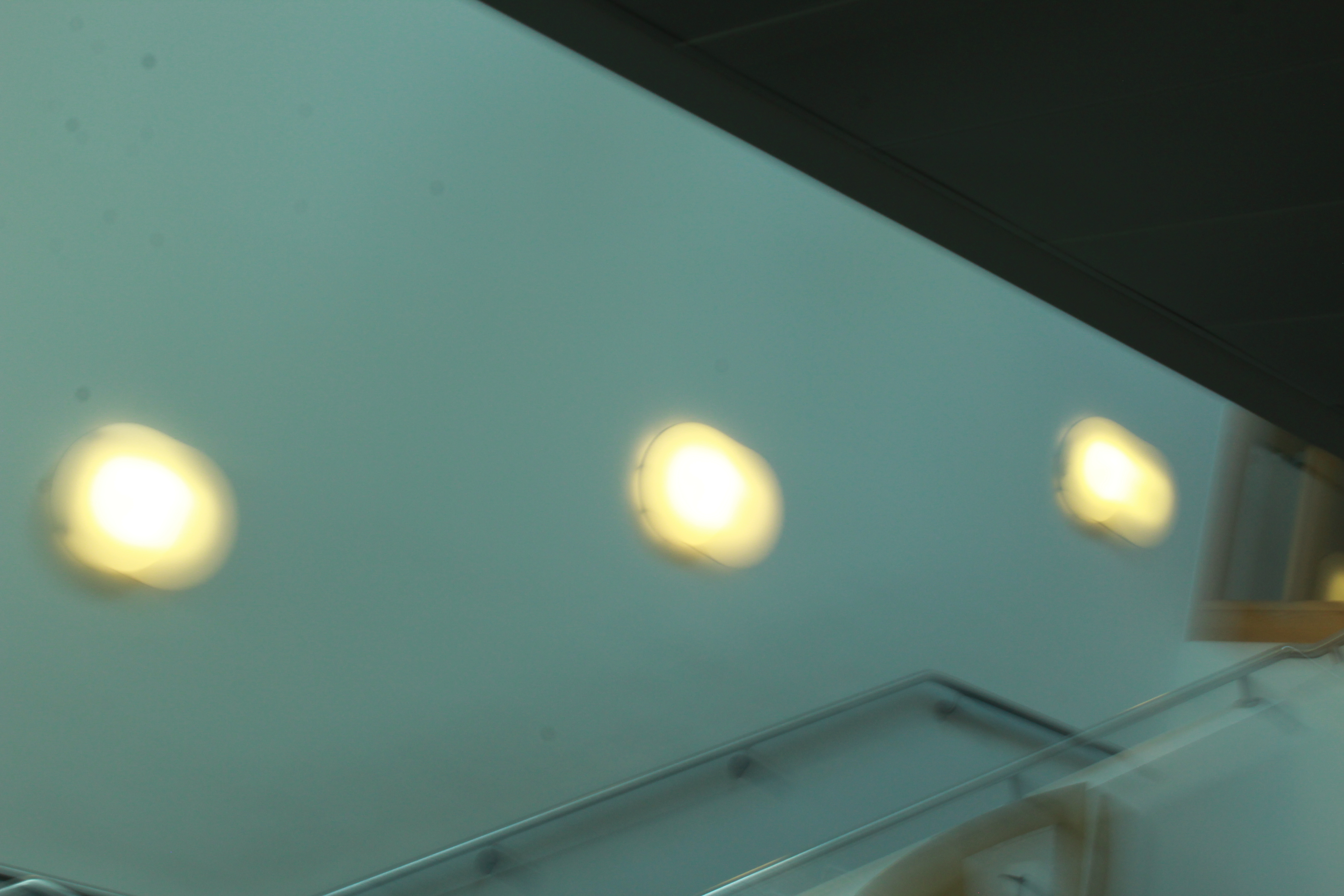
My Chosen Photo
I chose this photo because I really loved the way it contrasted between the lightness from the lights, and the darkness from the background. I think this image works well because the pop of colour is really appealing to the eyes. Also I really like how the lights somewhat fly threw the background. I’m really happy with the way this photo turned out. I also really like how the aperture changed the photo into something unique and different, I think it gave it a really nice effect. The photo has a really good focal point and the intention for it was to make it seems like it wasn’t lights, I wanted the photo to be unrecognizable and I think I achieved that. Overall I’m really happy with the outcome of my favourite photo from each shoot, it has to be one of my favourite photos I’ve ever taken.