All posts by Maksymilian K

Filters

Author:
Category:

Identity And Place – Action Plan

Who: I have decided that I’m going to focus on my brother for this section of my portrait project

What: I will be taking photos of various personal items of his which I believe represent his personality and the face he shows to the world. for this particular photo-shoot I will be photographing his car in the style of Zhao Xiaomeng’s photographs of the bikes of Beijing. For the second photo-shoot I will be photographing various smaller items relating to my brothers identity in order to fill the lower row of my typology.

Where: I will use a parking lot in town which is a placed on a demolished building, this left the outline of the walls on the other surrounding buildings which I believe creates a fitting background similar to those in Zhao’s photos. The second photo-shoot will be conducted on my gravel garden area for a grey background which still has some texture.

When: I will be taking the photos in the early evening The second photo-shoot will be taken during the afternoon.

Why: I like the idea of using possessions to show someones identity as it better conveys someones personality if they are normally a rather closed off person. Using possessions also allows me to better manipulate the subject in the images. I have chosen this time as it will give a good soft lighting for the images.


ENTRE NOUS by CLARE RAE x CLAUDE CAHUN

The majority of both Claire Rae and Claude Cahun’s work consist primarily of self portraiture, the main difference between their work is the way in which they incorporate their bodies into the environment. Whereas the composition of Claude Cahun’s work is rather standard for the most part, what makes here unique is the experimentation with gender roles and societal standards by adopting an androgynous appearance and by shaving all her hair including eyebrows and wearing clothes typically worn by men. Claire Rae on the other hand works to explore how her body interacts with her surrounding environments, her work will often have her contorted to fit her surroundings. she is very careful with her choice of clothes in order to insure that She stands out with the environment while maintaining a rather muted appearance. Both artists images are rather similar in terms of general aesthetics, with both artists adopting a rather similar style of photography. It is clear that Claire took inspiration from Claude as seen by the use of rather muted tones throughout the images, often even similarly composing her images.

My personal favorite image of Claire Rae’s work is the image inserted below. I like the composition primarily due to the triadic structure of the image as a whole, including the 3 holes in the wall and the triangular shape formed by Claire Rae. I also like the strong use of contrast in the image. This and the wide range of focus (as well as the lack of grain) suggests the image was taken using a low ISO, paired with a long shutter speed and small aperture.Bunker.jpg

My favorite image from Claude Cahun’s collection on the other hand cleverly utilizes a double exposure almost creating a feel of a split personality. This image more strongly uses contrast. The grain and time period of the image suggests that it was taken using film. I believe it was taken using high ISO film and a low shutter speed to create strong tonal contrast.Image result for Claude CahunI like How the gallery is organised and presented as the spacing between the images allows the pictures to breathe, not overcrowding any walls with images. I believe this was done also to only allow the very best of their work to be displayed to portray the photographers best work better. I do however believe that it would be better to not separate the photographers’ between 2 different rooms as this doesn’t allow viewers to compare and contrast their work under more scrutiny.

Zhao Xiaomeng/ Rita Puig Serra Costa – Case Study (Possessions)

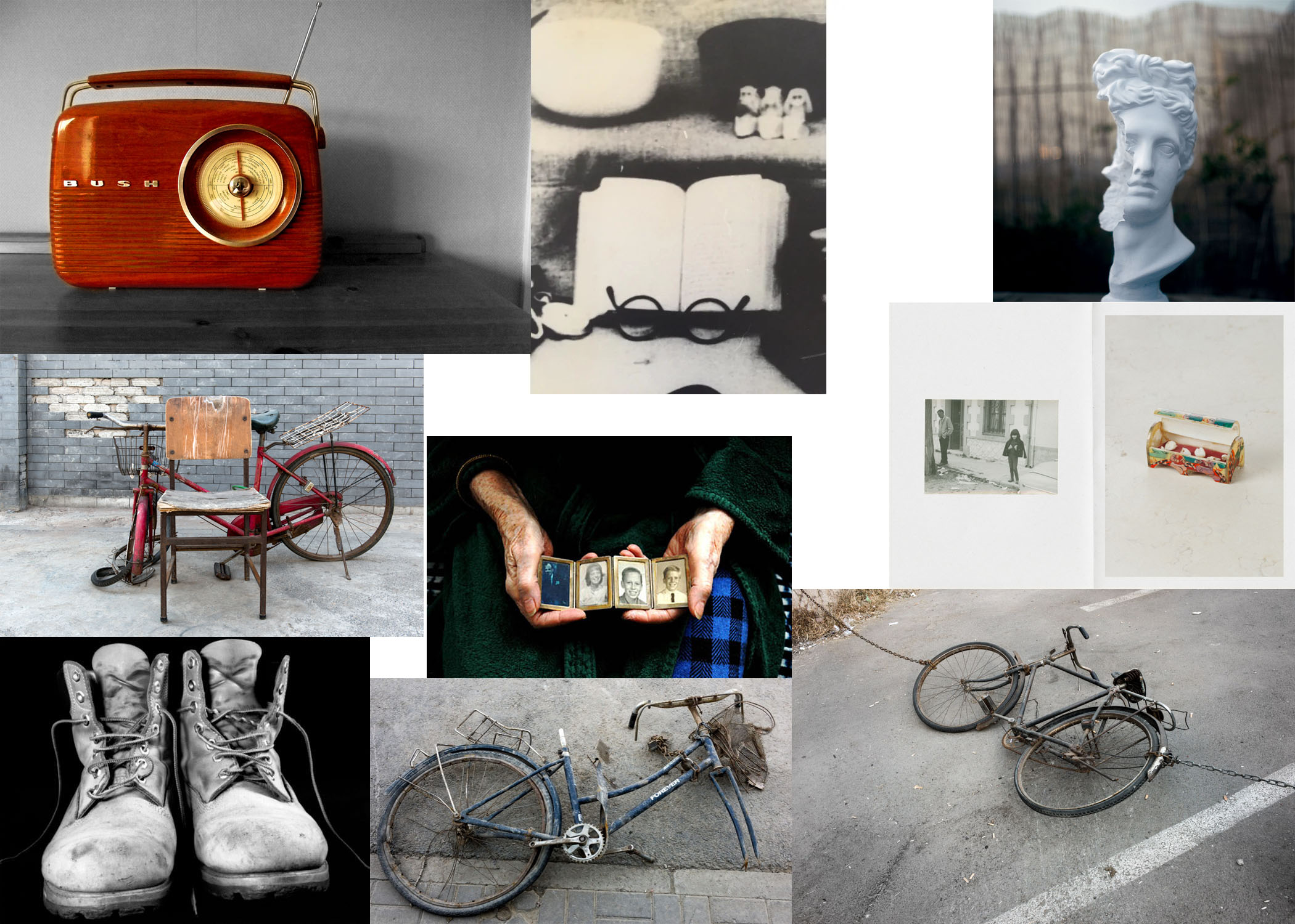
I chose to study Rita due to the sense of identity in her portraits of still life items. While there is no human subject in the photo, it is still structured like a traditional portrait allowing the photos to tell a story behind the object while leaving an air of ambiguity around the photos.

As far as technical aspects of the images go, they are structured like a typical portrait with soft lighting to avoid harsh shadows and a typically larger aperture to allow for a narrow depth of field while still allowing for a wide DoF in wider shots. She also appears to use a slower shutter speed due to the strong contrast and colors in the photos. The subjects in most of her photos are centralized in the image creating a fell of importance to the subjects. It looks as though her images could made using film due to the slight grain and Gaussian blur. The lower images seems to be exhibiting bokeh as well also suggesting that this is taken on film.

Image result for rita puig serra costaImage result for rita puig serra costa

Images Sampled from Rita’s Book ‘Where Mimosa Bloom’

I like the idea of taking a portrait of a statue as it allows for exploration of traditional portraiture techniques while still sticking with the idea of still life portraiture and I believe that the broken statue can tell a much more powerful story than a traditional portrait.

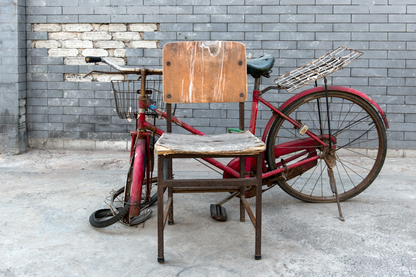
Zhao Xiaomeng took many photographs of abandoned bikes scattered across the streets of Beijing. I personally like how much about someones personality you can tell from the scattered bikes, they all have various adjustments and additions made to make the previous owners life just a little bit easier. I like the compositions of the images as I like how somewhat abstract still life photography is being framed as though it is a traditional portrait, with rather blank backgrounds to allow the subject to strongly contrast it. Most of the subjects have some strong color either from the weathered paint or the rust patina. It looks as though he has used a small aperture due to the wide depth of field, as a consequence of this I believe that the photos were taken using a long shutter speed and low ISO due to the amount of detail captured in the photos. The photos are rather de-saturated but still show color depth.

Image result for zhao xiaomengImage result for zhao xiaomengImage result for zhao xiaomeng

Identity Introduction

Identity is defined as “the characteristics determining who or what a person or thing is”. This can be influenced by various factors including geographical or cultural influences. There have been arguments relating to the importance of nature vs. nurture and which has a larger impact on ones identity.

Different Types of Identity in Photography

Gender Identity:  This is the idea of using gender to define ones identity. This is an idea often explored by various photographers/ artists such as Lorna Simpson. This work varies from more abstract pieces exploring the idea of gender identity crossing over to loss of identity to ides of empowerment in her work.

Image result for Lorna simpsonImage result for lorna simpson

Cultural Identity: This is the idea of exploring culture and how it affects a persons identity. this can range from exploring how various cultures are portrayed/ stereotyped as well as being used to give a better insight into the reality of their culture. This has been explored by artists such as Paul Sepuya.

Image result for Paul Sepuya photography

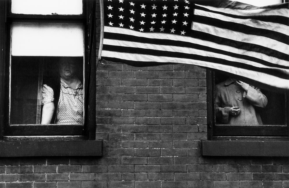
Social Identity: Social identity relates to the idea that a person can be the surrounding community, this is the same idea as the ‘nurture’ aspect of nature vs. nurture. This also relates to the idea that social pressure can change someones identity on a fundamental level through peer pressure etc. This has been explored by photographers such as Robert Frank, his work explores the influence of the ideals of their community on ones identity including ideas such as nationalism. However this piece also relates to the idea of Geographical/ political identity.

Image result for robert frank

Loss of/ Lack of identity: This is an idea that someones identity can be stripped from them either by some form of disaster or by social out casting. This is often explored in conjunction with other forms of identity such as some of Lorna Simpsons work. This is an idea also commonly explored using a surrealist approach.

Image result for francesca woodman


Photo-montage Editing

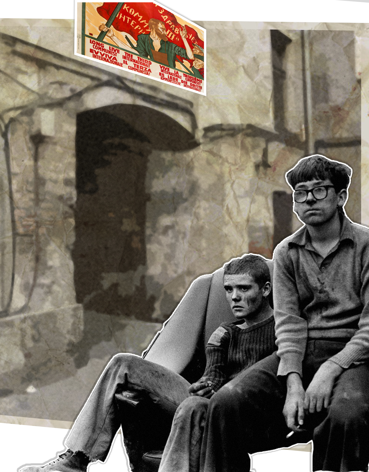
For my photo-montage I decided to link thematically to John Heartfield. While he had strong anti-Nazi messages in his works, I chose to link to my polish heritage and explore the communist era of Poland. I decided I wanted to show the negative impact that socialism had on Poland, it’s economy and it’s people. For the style of editing I used, I decided to make a piece similar to those by Martha Rosler. I used a multiply layer of a piece of crinkled paper as well as various filter in order to age the background and give it the appearance of a communist propaganda poster.

John Heartfield – Case Study (Photo-montage)

John Heartfield (born Helmut Herzfeld) was a German photographer best know for his work in photo-montage. Much of his most famous works were anti fascist/Nazi statements. He used the political nature of his photography as a form of visual art to use as a “political weapon”. John was a prominent figure in the style of photography known as dadaism.

Some of his photo-montage featured various pieces of artwork in conjunction with various photographs. the majority of his photography is borrowed however combines the photos/artwork into a powerful political statement.

Image result for john heartfield

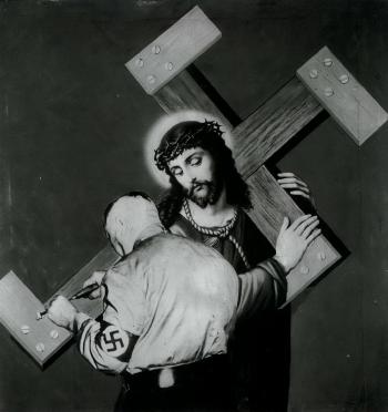
“The cross was not yet heavy enough”

This piece uses explicit religious imagery to convey the Nazi’s as an enemy of Christ.

Not much can be said for the technical aspects of John’s photography since much of the photographs used are borrowed however the photos are put together simply by cutting and pasting while occasionally painting/drawing directly onto the frames.

Image result for s Becomes Blind and Deaf: Away with These Stultifying Bandages!

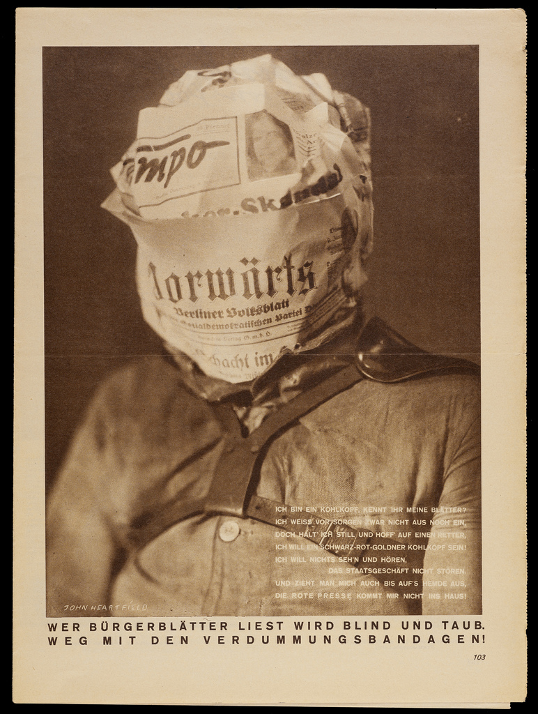
“Whoever Reads Bourgeois Newspapers Becomes Blind and Deaf: Away with These Stultifying Bandages!”

This piece is much different to the rest of John’s work as it doesn’t utilize traditional photo-montage and instead is a more traditional photo as this was a photo-shoot that was setup primarily for this shot and isn’t a combination of images. The photo is framed like many portraits taken of Nazi officials however it features a German newspaper wrapped around his head suggesting that the German people are so absorbed by the news that they are a slave to the media, this is also implied by the attire of the subject which suggests that they are being incarcerated. The photo is essentially telling the viewer that the Bourgeois news was heavily biased and will leave the reader with a closed mind.

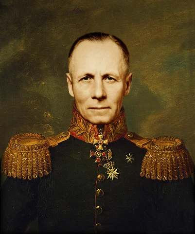
Image result for portrait rommelImage result for portrait rommel

2 portraits of Erwin Rommel of similar composition to the piece by John

Studio Photography – Image Manipulation

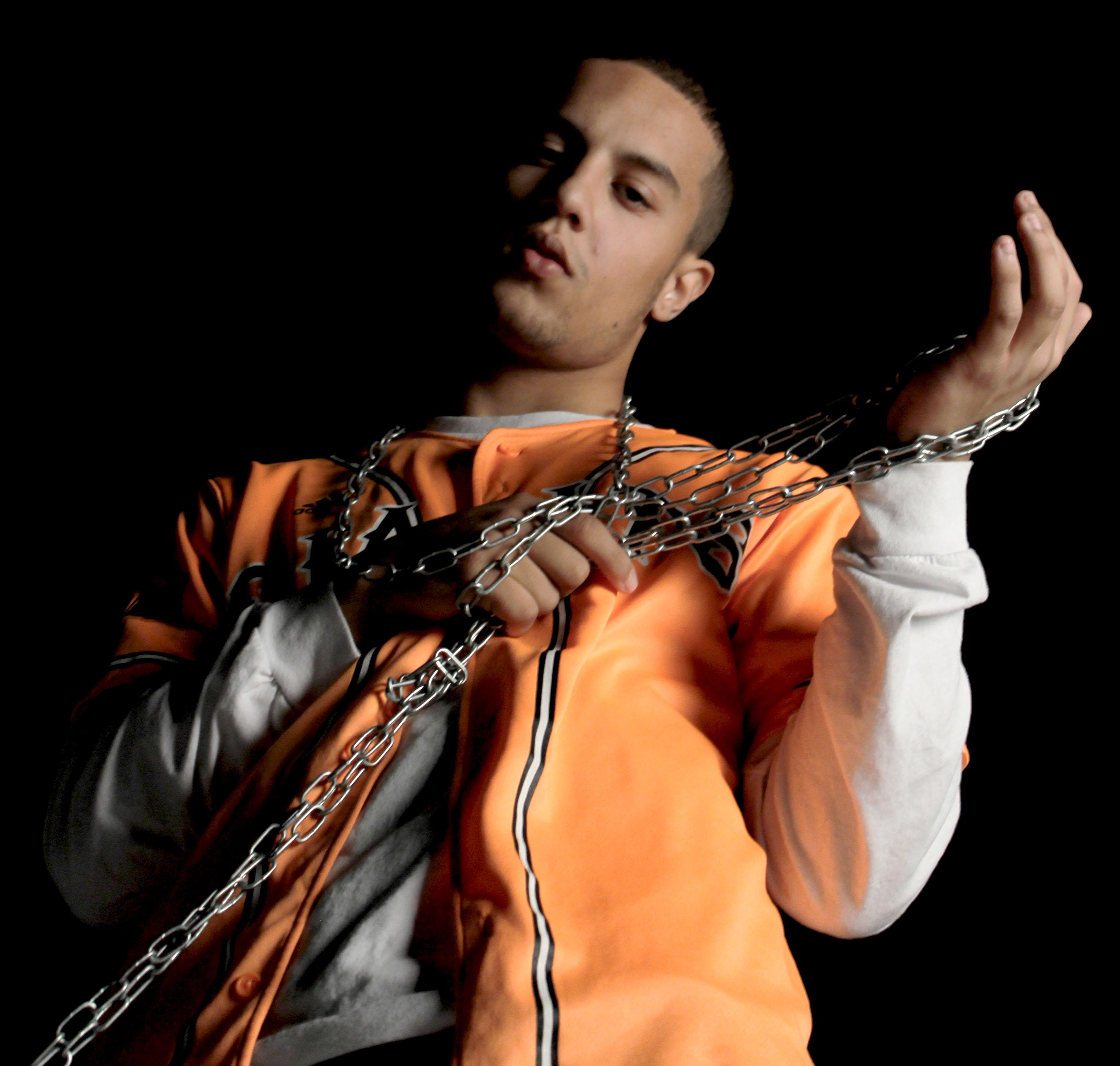
As far as editing goes I decided to be subtle with this image mainly focusing on adjusting levels and color balance. I mainly tried to emphasize the Rembrandt lighting and the slight orange reflection the the sleeve of the white tee shirt. I did this in order to avoid a tacky looking image while still incorporating a sense of drama into the image. Due to the composition of the image i decided to slightly de-saturate the image as I believe the less vibrant tones better compliment the metallic chains.

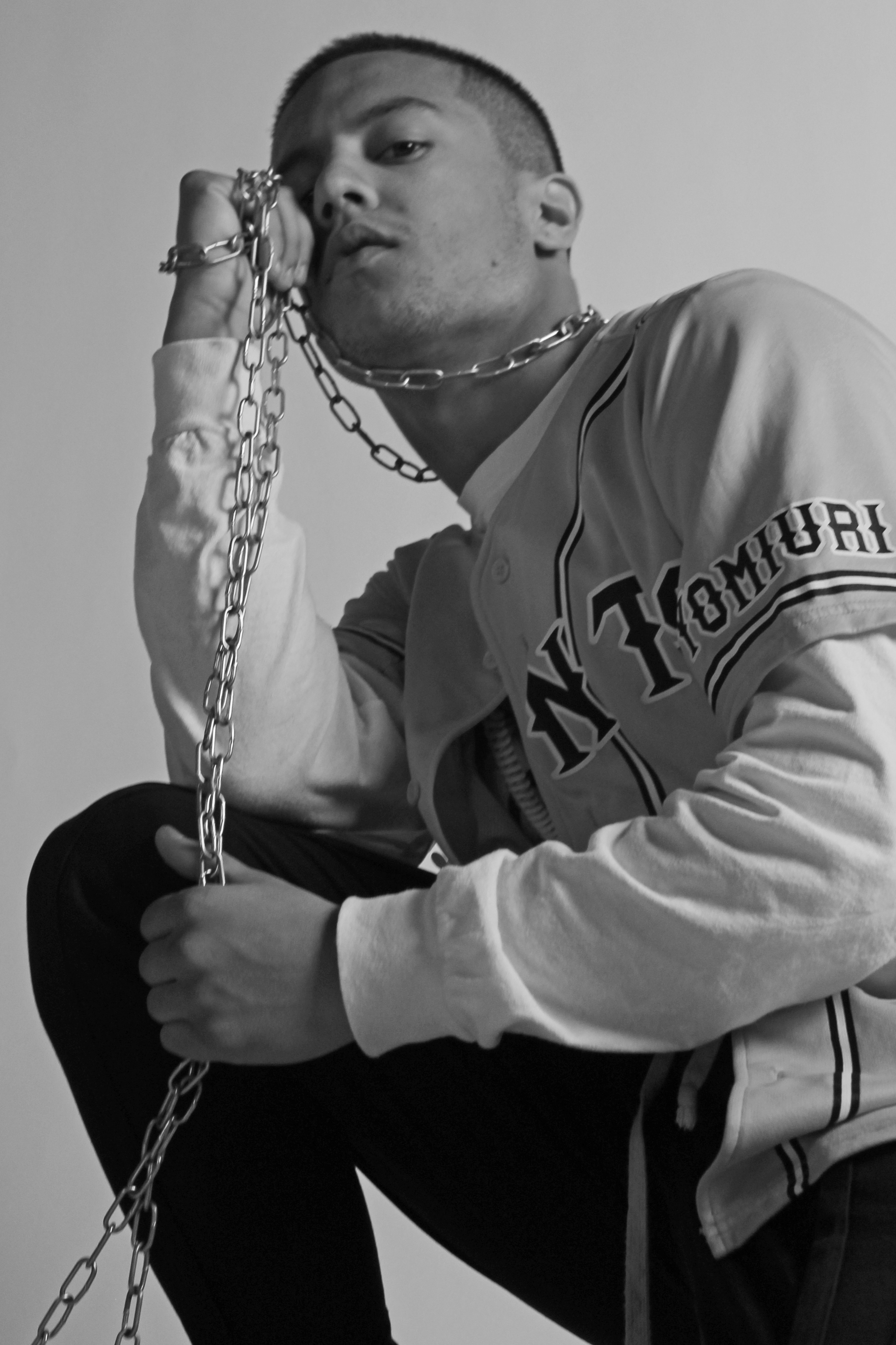
Here I decided to experiment with the dodge/burn tool and as a result of this I decided to make the image black and white in order to hide any undesirable changes to color caused by this. I also used the channel mixer in conjunction with the saturation tool to create a softer looking image while still maintaining a reasonable amount of contrast. I also cropped the Image to better fit the Fibonacci curve in order to lead the viewers eye through the image.

Studio Lighting Experimentation – 1 Point Lighting

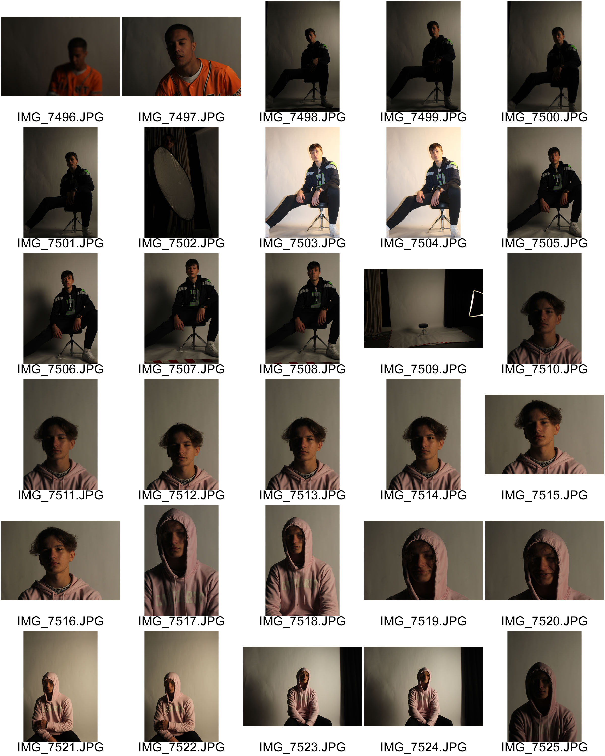
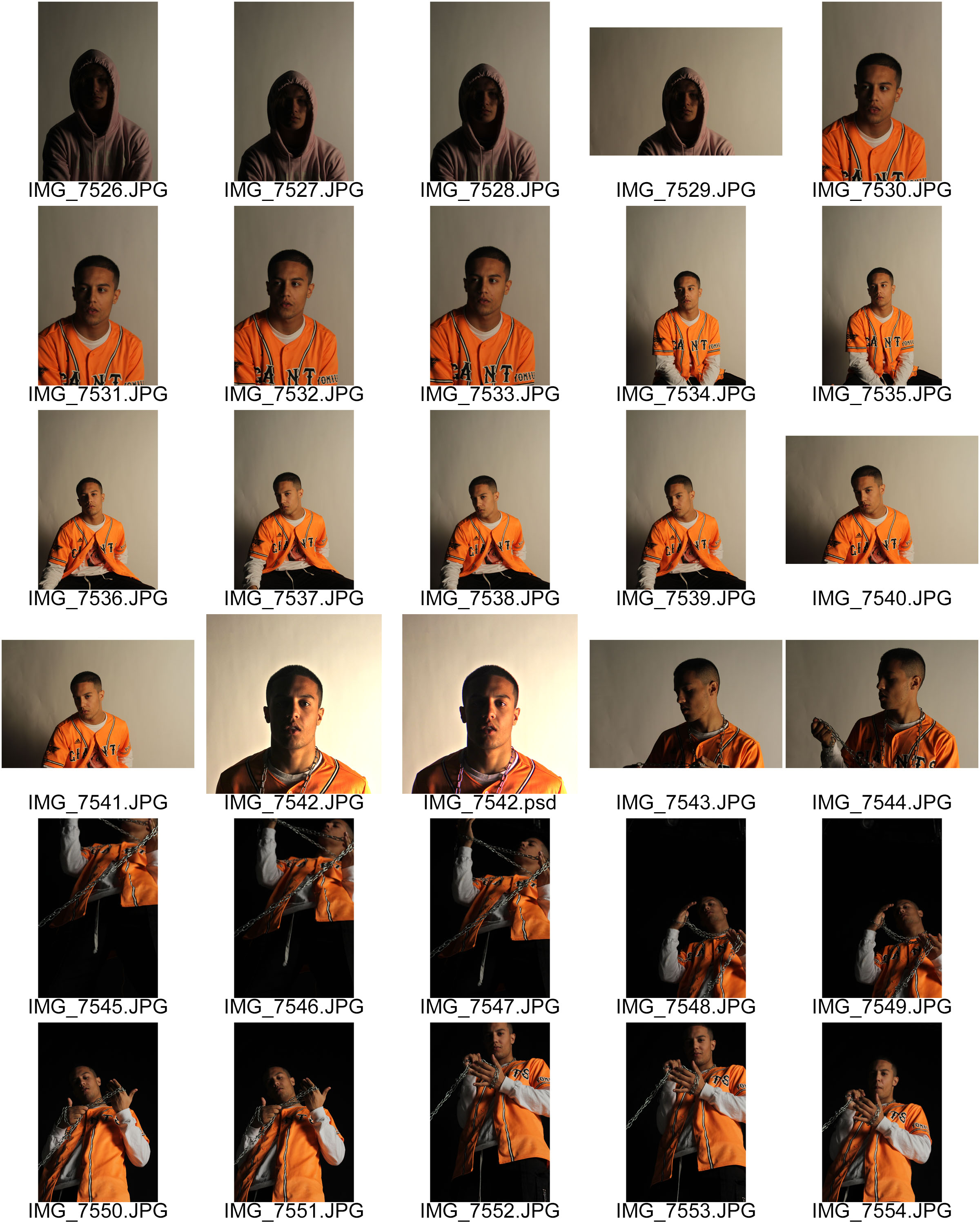
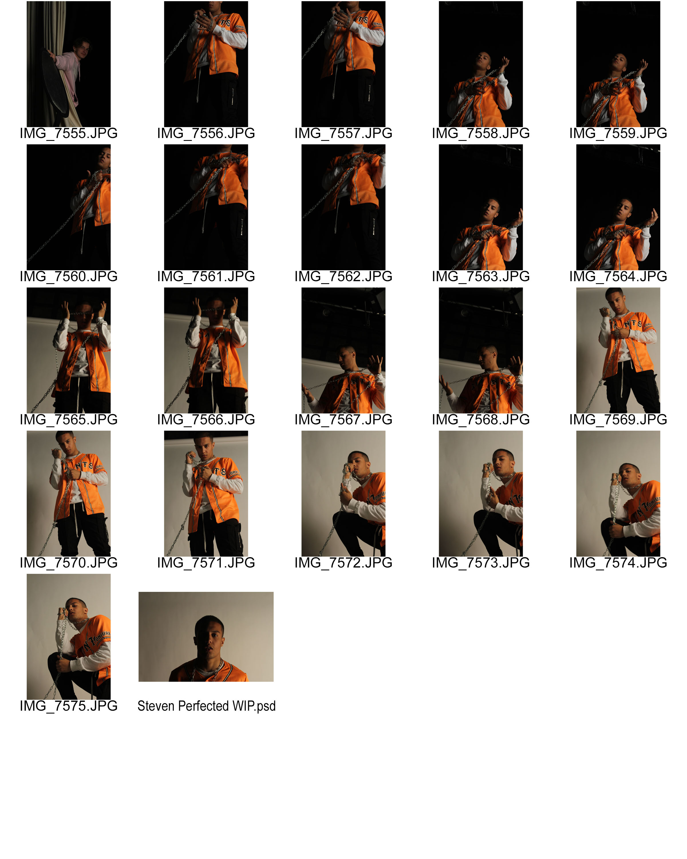
For this photo-shoot I primarily experimented using one point lighting in order to create a subtle chiaroscuro effect, I decided to be subtle about this effect as I wanted to have as many options available for editing as possible. With some of the later photos in the shoot i decided to make the effect more evident as i had a set idea for the look of the photos and thus wanted to minimize the amount of unnecessary editing I would have to do afterwards.

My personal favorites of the shoot are:

7564

7571

7544

These are mainly because i like the composition of the images and i like how the lighting complimented the colors in frame. The lighting created a good amount of vibrancy while not leaving the image over saturated. I also like the photo 7542 however i found that the lighting in that image required too much retouching and the edits became very evident.