All posts by Lillie M

Filters

Author:
Category:

Street Photography – Henri Cartier-Bresson and other Photographers

Street Photography and Candid Photography

Street photography, also sometimes called Candid photography is photography conducted for art or enquiry that features unmediated chance encounters and random incidents within public places.  Although there is a difference between street and candid photography, it is usually subtle with most street photography being candid in nature and some candid photography being classifiable as street photography.  Street photography does not necessitate the presence of a street or even the urban environment.

A candid photograph is a photograph captured without creating a posed appearance. This is achieved in many ways, for example:
  • when the subject is in motion,
  • by avoiding prior preparation of the subject,
  • by surprising the subject,
  • by not distracting the subject during the process of taking photos.
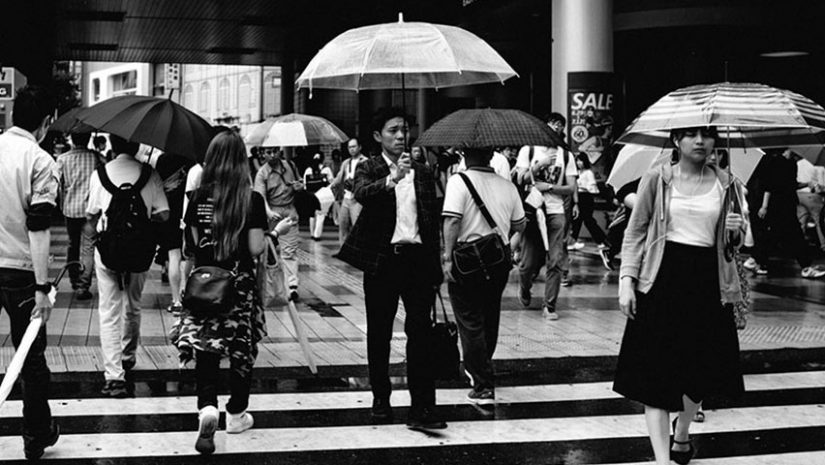
Eren Sarigul | Street Photography

Henri Cartier–Bresson

“To take a photograph is to align the head, the eye and the heart. It’s a way of life.”
Henri Cartier-Bresson


Henri Cartier-Bresson (1908–2004) was a French humanist photographer considered a master of candid photography, and an early user of 35mm film.  He pioneered the genre of street photography, and viewed photography as capturing a decisive moment.  Cartier-Bresson was one of the founding members of Magnum Photos in 1947.

Magnum Photos

In early 1947, Cartier-Bresson, with Robert Capa, David Seymour, William Vandivert and George Rodger founded Magnum Photos.  Capa’s brainchild, Magnum was a cooperative picture agency owned by its members.  The team split photo assignments among the members.  Rodger, who had quit Life in London after covering World War II, would cover Africa and the Middle East.  Chim, who spoke a variety of European languages, would work in Europe. Cartier-Bresson would be assigned to India and China.

Cartier-Bresson achieved international recognition for his coverage of Gandhi’s funeral in India in 1948 and the last stage of the Chinese Civil War in 1949.  He covered the last six months of the Kuomintang administration and the first six months of the Maoist People’s Republics.  He also photographed the last surviving Imperial eunuchs in Beijing, as the city was falling to the communists.  In Shanghai, he often worked in the company of photojournalist Sam Tata, whom Cartier-Bresson had previously befriended in Bombay.  From China, he went on to Dutch East Indies (Indonesia), where he documented the gaining of independence from the Dutch.  In 1950, Cartier-Bresson had traveled to the South India.  He had visited Tiruvannamalai, a town in the Indian State of Tamil Nadu and photographed the last moments of Ramana Maharshi, Sri Ramana Ashram and it’s surroundings.   A few days later he also visited and photographed Sri Aurobindo, Mother and Sri Aurobindo Ashram.

Magnum’s mission was to “feel the pulse” of the times and some of its first projects were People Live EverywhereYouth of the WorldWomen of the World and The Child Generation.  Magnum aimed to use photography in the service of humanity, and provided arresting, widely viewed images.
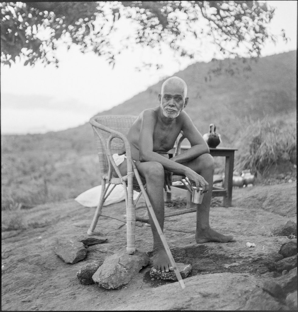
Henri Cartier-Bresson | Magnum Photos | Ramana Maharshi

The Decisive Moment

In 1952, Cartier-Bresson published his book Images à la sauvette, whose English-language edition was titled The Decisive Moment, although the French language title actually translates as “images on the sly” or “hastily taken images”.  Images à la sauvette included a portfolio of 126 of his photos from the East and the West.

Cartier-Bresson took his keynote text from the 17th century Cardinal de Retz, “Il n’y a rien dans ce monde qui n’ait un moment decisif” (“There is nothing in this world that does not have a decisive moment”).  Cartier-Bresson applied this to his photographic style. He said: “To me, photography is the simultaneous recognition, in a fraction of a second, of the significance of an event as well as of a precise organization of forms which give that event its proper expression.”
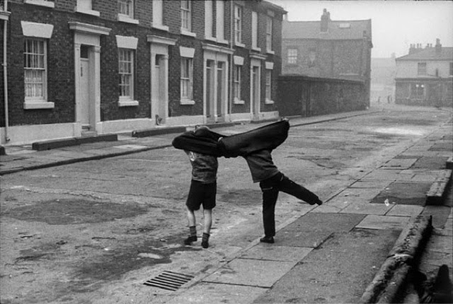
Henri Cartier-Bresson | The Decisive Moment

Analysis

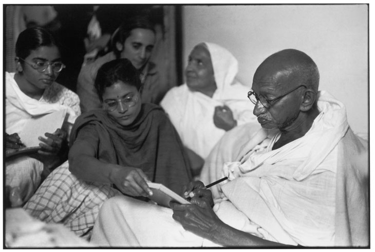
Henri Cartier-Bresson | Gandhi | 1948

Technical:  There seems to be the use of natural lighting in this photograph there is no harsh lights which gives off the impression that it is the natural lighting in the room which is giving the photograph the light.  There is a strong focus in the foreground of the photograph where Gandhi himself is seated and then towards the background of the photograph it becomes a little less focused but there is also a strong sense of depth and you can see the layers in the image as there is a clear foreground, mid ground and background creating perspective and a sense of depth.

Visual Elements:  Visually there is a lot of tone throughout the image it is lighter and brighter towards the front of the image and in the background there is a lot more dark tones created by the shadows and gives a contrast in the photograph, as it is lighter in the front of the photograph compared to the back it also helps us understand that the light source would be coming front behind the camera and looking on at the scene.  Our eyes are easily lead through this photograph as they move from one person easily to the next and this creates a leading line as it leads us towards the back end point of the photograph.

Context/ Concept:   The photograph shows Gandhi dictating a message at Birla House, the residence where he spent his last days and in which he was assassinated, just before breaking his fast. Delhi, India. 1948.  Cartier-Bresson initially set out to create a photographic essay that would capture the essence of the country, its past and present at a time of rapid social change.  India’s recent independence from Britain had quickly deteriorated into unrest with the dividing of the country into Hindu India and Muslim East and West Pakistan.  At the centre of these upheavals was Mahatma Gandhi, who, after campaigning for India’s independence, was now protesting for the end of the violence between Hindus and Muslims.  Cartier-Bresson had exclusive access to Gandhi, recording the activist’s hunger strike in protest of riots in which millions died.  However, with the assassination of Gandhi on January 30, 1948, the day after he had taken his portrait, he unexpectedly found himself witness to a major historical event.

Emotional Response:  My initial emotional response to this photograph is that it is quite a light photograph creating it to seem almost uplifting in a way.


Comparison to other Photographers

Bruce Gilden

“I love the people I photograph. I mean, they’re my friends. I’ve never met most of them or I don’t know them at all, yet through my images I live with them.”

-Bruce Gilden

Bruce Gilden (born 1946) is an American street photographer. He is best known for his candid close-up photographs of people on the streets of New York City, using a flashgun.  He has had numerous books of his work published, has received the European Publishers Award for Photography and is a Guggenheim Fellow.  Gilden has been a member of Magnum Photos since 1998.

Bruce Gilden was fascinated with people on the street and the idea of visual-spontaneity.  His work is characterized by his use of flash photography and he has mostly worked in black and white, but began shooting in digital and colour when he was introduced to  the Leica S camera as part of Magnums’s Postcard’s from America Project.
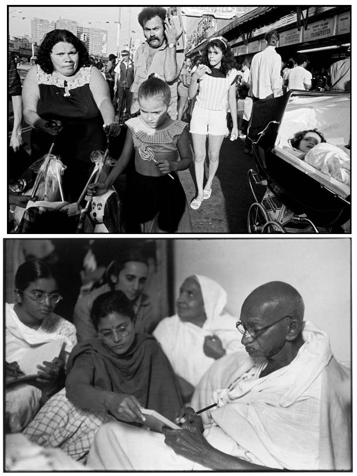
Henri Cartier Bresson (below) | Bruce Gilden (above) | Comparison

Both Henri Cartier-Bresson and Bruce Gilden produce documentary photography, however in two different styles and ways.  Bruce Gilden is very extreme in the way he takes his photographs by using a flashgun and creates very up-close portraits of the general public and people on the streets in busy urban areas such as Brooklyn, New York.  Neither of the photographers went into a lot of effort to alter the moment that they were capturing they wanted to document it raw and as it was however Bruce Gilden was a lot more intense and extreme with the way he took his photographs getting up close to the people very quickly and for a short span of time.  Henri Cartier-Bresson, however, played a more subtle approach and captured the moments either from the side of the scene or mixed in the crowds that were on-looking.  Technically, Gilden’s work seem to contain more contrast due to him using the flashgun as he works, Gilden’s photographs seem to be more busy and have more noise compared to some of Cartier-Bresson’s work. 

Robert Frank

“When people look at my pictures I want them to feel the way they do when they want to read a line of a poem twice.” 
― Robert Frank

Robert Frank (born 1924) is a Swiss-American photographer and documentary film maker.  His most notable work, the 1958 book titled The Americans, earned Frank comparisons to a modern-day de Tocqueville for his fresh and nuanced outsider’s view of American society.   The Americans reveal Frank’s mature style, which is characterized by bold composition and ironic, sometimes bitter, social commentary.

Frank became associated with the so-called ‘Beat Circle’, a group of poets, writers and artists – beatniks – who exemplified the apolitical, free-form spirit of post-war American existentialism. Having made his living as a commissioned commercial photographer, but left feeling frustrated artistically in that role, Frank took his 35mm camera onto the streets and highways of America where he honed his highly influential style of wandering, observational photography. Frank shunned the principle of balanced compositions in favor of crooked, grainy high contrasts in black and white and his revolutionary approach to his subjects was to prove decisive in the development of a more authentic reportage photography.
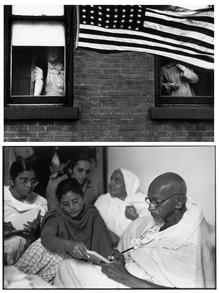
Henri Cartier-Bresson (below) | Robert Frank – Parade Hoboken New Jersey 1955 (above) | Comparison

Both Frank and Cartier-Bresson use their photography to document moments and people lives.  Frank wanted to be both intuitive and ‘somehow engaged’ and his goal was to capture through his lens the way in which the environment had effected him on a personal level.  Rather than capturing the environment effecting him on a personal level Cartier-Bresson felt his camera was and extension of his eye and wanted to capture visually stimulating material and he could linger for hours observing waiting for the perfect moment.  In this aspect both Frank and Cartier-Bresson are similar in what they might look for but their work is also similar in the way it presents itself, both of their works hold a lot of tone, some of Franks tend to be on the darker toned side compared to Cartier-Bresson.

Arnold Newman

“There are many things that are very false about photography when it is accepted without question. You must recognize and interpret it as you would any other art form, and then maybe it is a little more than real.” – Arnold Newman

A Brief Biography:

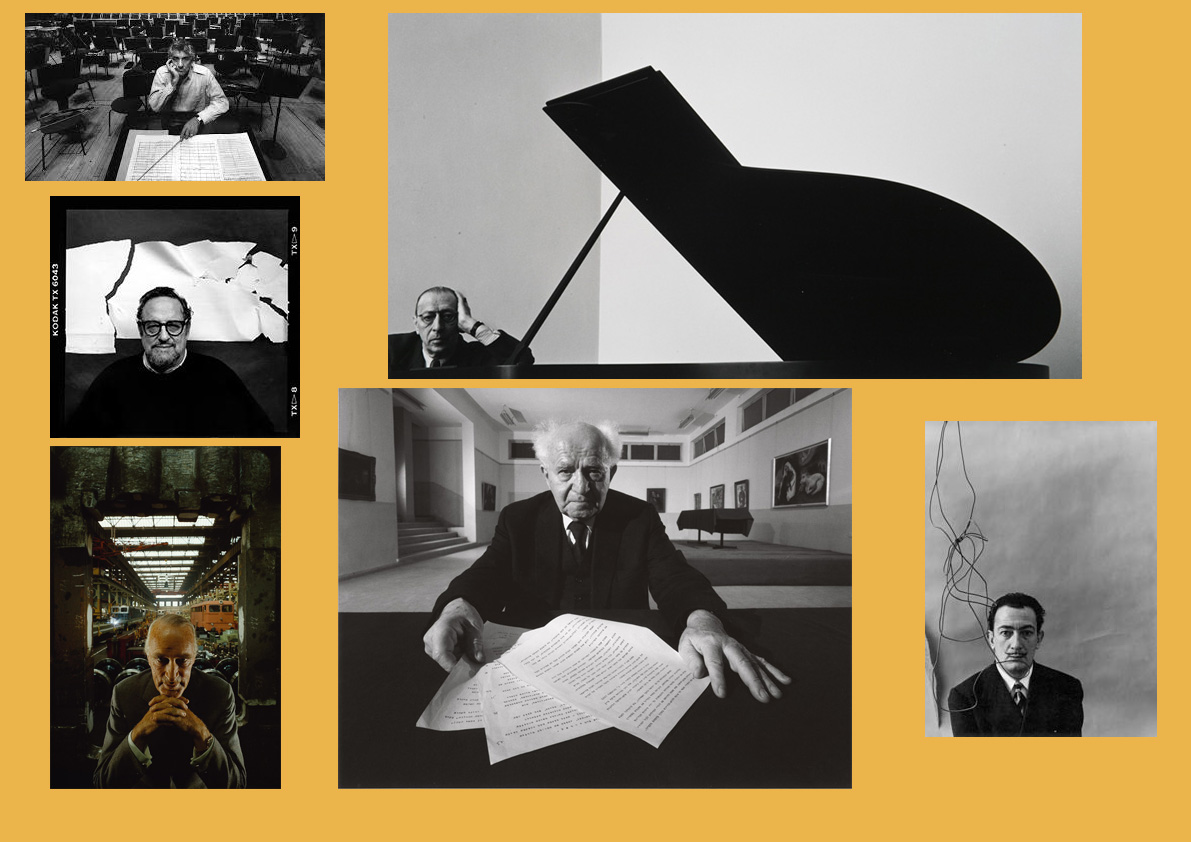
Arnold Abner Newman (3 March 1918 – June 6, 2006) was an American Photographer, noted for his “environmental portraits” of artists and politicians.  He was also known for his carefully composed abstract still life images.  In 1936, he studied painting and drawing at the University of Miami.  Unable to afford continuing after two years, he moved to Philadelphia to work for a studio, making 49-cent portraits in 1938.  Newman is often credited with being the first photographer to use so-called Environmental Portraiture in which the photographer places the subject in a carefully controlled setting to capture the essence of the individual’s life and work.  Newman normally captured his subjects in their most familiar surroundings with representative visual elements showing their professions and personalities.  Newman’s best-known images were in black and white, although he often photographed in color. His 1946 black and white portrait of Igor Stravinsky seated at a grand piano became his signature image.  Among Newman’s best-known color images is an eerie portrait from 1963 that shows former Nazi industrialist and minister of armament Alfred Krupp in one of Krupp’s factories. Newman admits his personal feelings influenced his portrayal of Krupp.

Key Photographs:

Arnold Newman | Key Photographs

These are some of the key photographs taken by Arnold Newman, these include his most famous photographs such as the photo of Igor Stravinsky at the grand piano.  As well as his most well known colour photograph of Alfred Krupp.  Some of the other photographs include those of other well known faces that he worked with such as Salvador Dali.

In Depth Analysis of a Photograph:

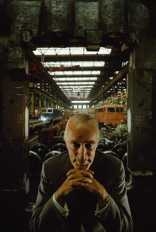
Arnold Newman | Alfred Krupp | 1963
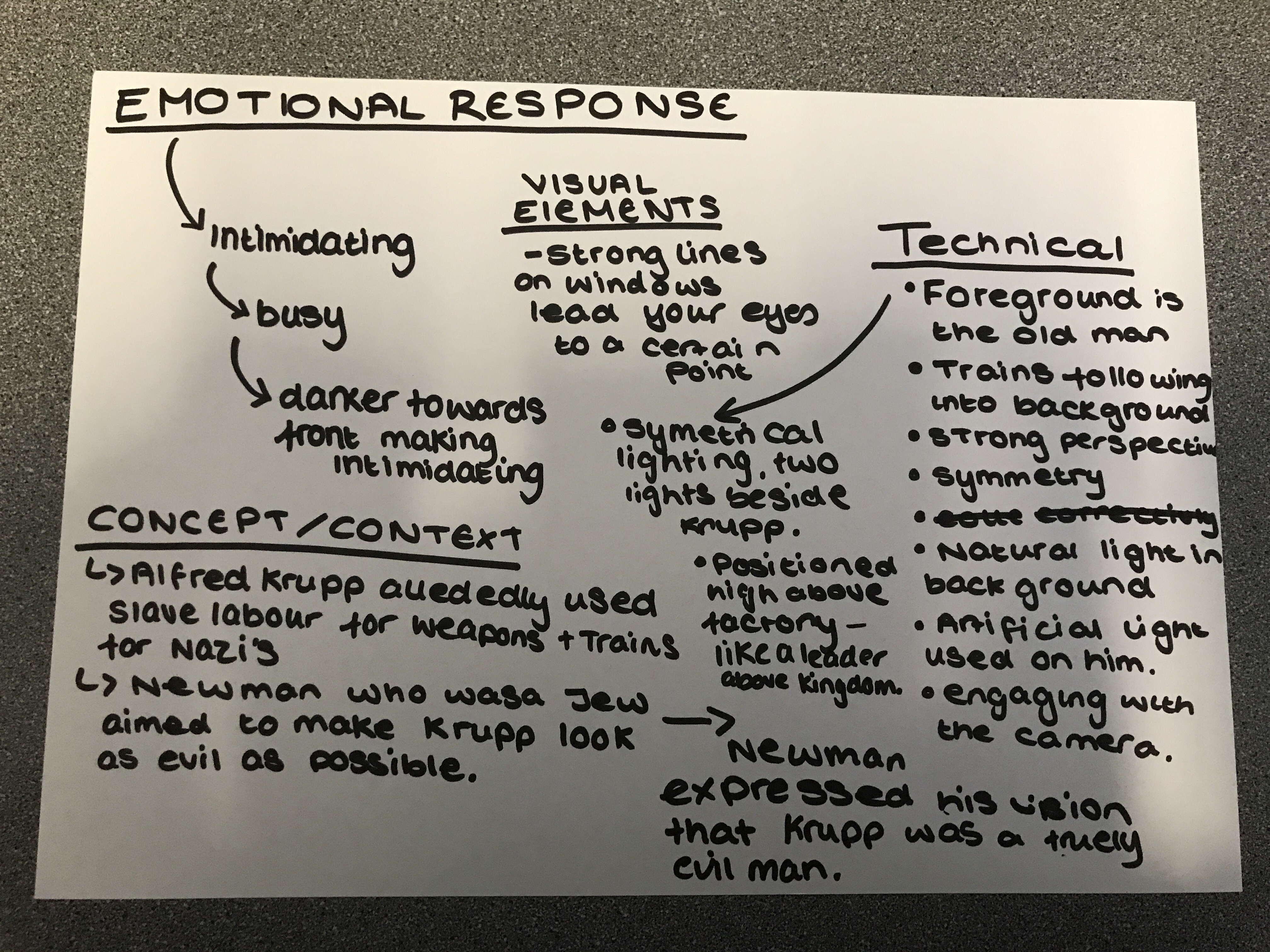
Discussed Analysis

Emotional Response:   As a first impression and response to this photograph I feel it very intimidating due to the darkness and the stance of the man.  It feels like a very busy photograph which I don’t particularly like about the photograph it’s very dark and can almost make me feel uncomfortable.

Technical:  There is a sense of artificial lighting in the foreground of the photograph which is positioned on the man, it’s a sense of symmetrical lighting as Newman placed two lights either side of Krupp facing each other.  In the background of the photograph there is a use of the natural light coming in through the windows.  There is a strong perspective and large depth of field as well the image shows areas of symmetry such as with the windows and the trains either side of Krupp who is positioned as the center focus point.  Krupp also has a strong gaze engaging with the camera.

Visual Elements:  There are strong lines on the windows of the ceiling and the back wall which lead your eye across and through the photograph to a certain point.  Also seeing that strong sense of symmetry throughout the photograph with the lines on the lights and the trains and structures either side of the photograph.  Visually it is a very dark photograph there is a lot of dark tones created by the very deep black shadows in the corners of the photograph as well as up into the sides.

Context:  Alfred Krupp allegedly used slave labour to produce weapons and trains for the Nazi’s.  Despite later being convicted of crimes against humanity and being sentenced to twelve years imprisonment, he had been pardoned after a mere three years.  Newman himself was a Jew promised to make Krupp look evil and like the devil.

Conceptual:  Newman being a Jew himself aimed to make Krupp look as evil as possible to shine him in the bad light and visualize him as the evil man he is for what he did.  Newman expressed his vision that Krupp was a truly evil man.  Newman saw it as his own way of gaining poetic justice.  One way that he did this was with the shadows that come down on his face as Newman made Krupp lean forward to create this.

A Video Describing and Analyzing the works of Arnold Newman

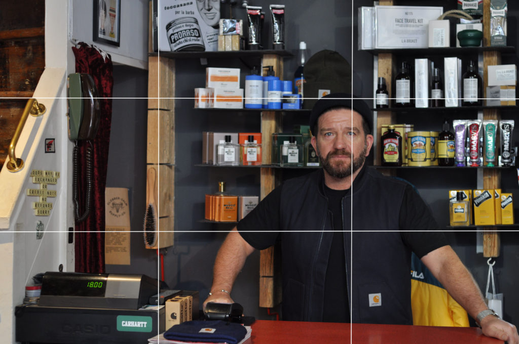
Rule Of Thirds

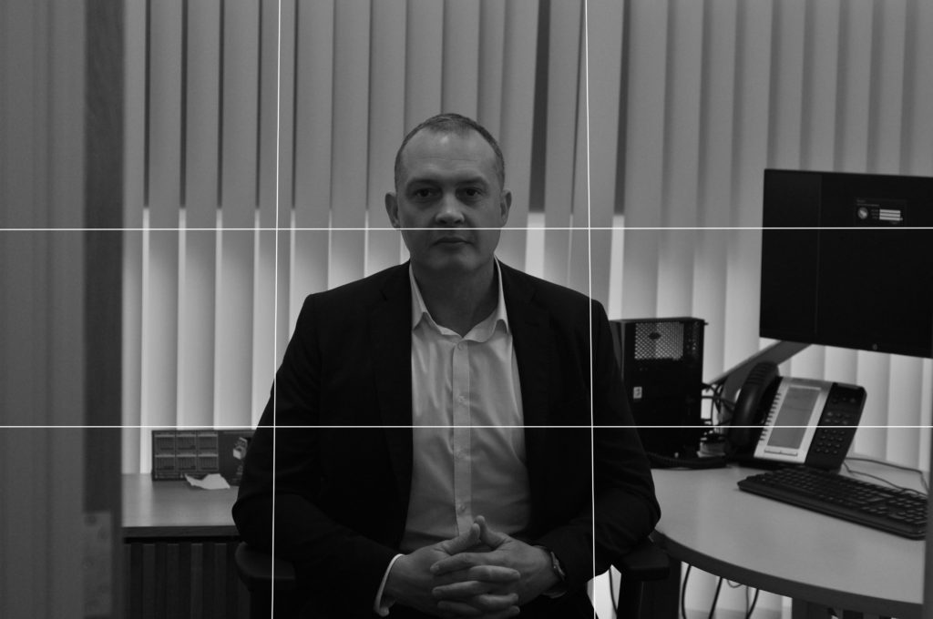
For some of my environmental portraits some were more successful than others and I can show this with the way that they fit into the rule of thirds.

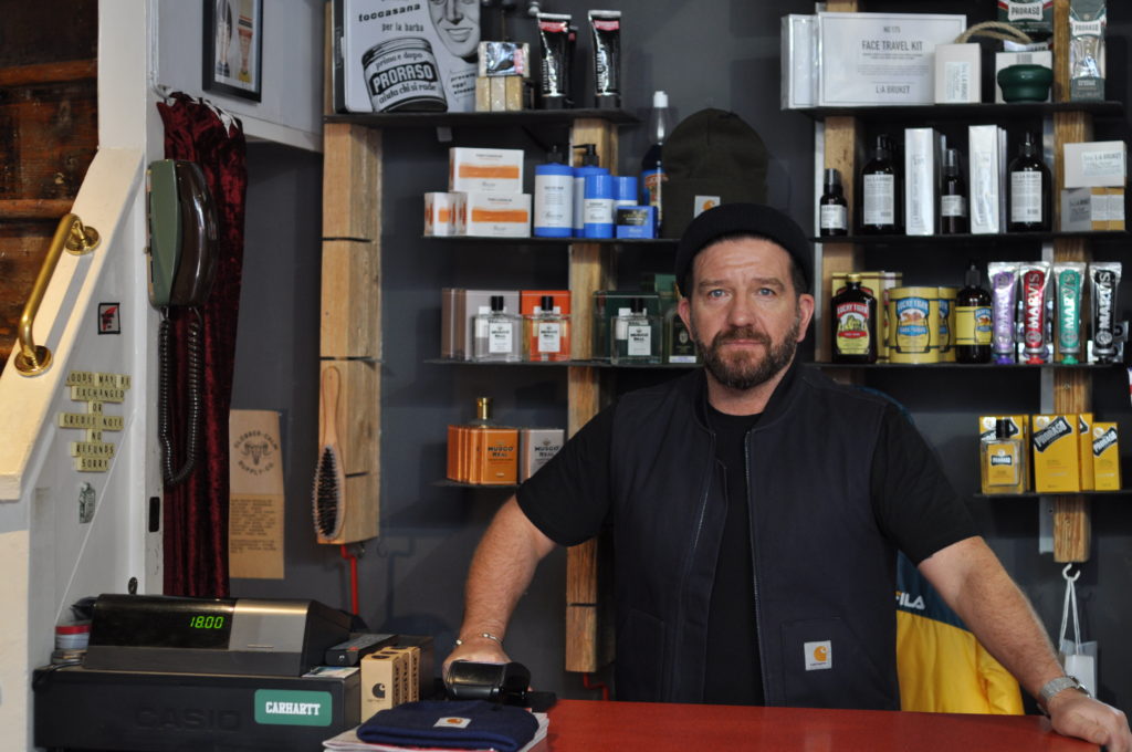
Below shows one of my more successful images for environmental portraits you can see that the figure is towards the left-centre segments this fits well with the rule of thirds.

My Own Response

Below again shows one of my less successful images, the subject is directly in the centre of the photograph which isn’t as successful in the terms of the rule of thirds.  The below image can be still seen as successful as an environmental portrait however it is let down in its strength with the rule of thirds.

My Own Response

Environmental Portraits

Environmental Portraits

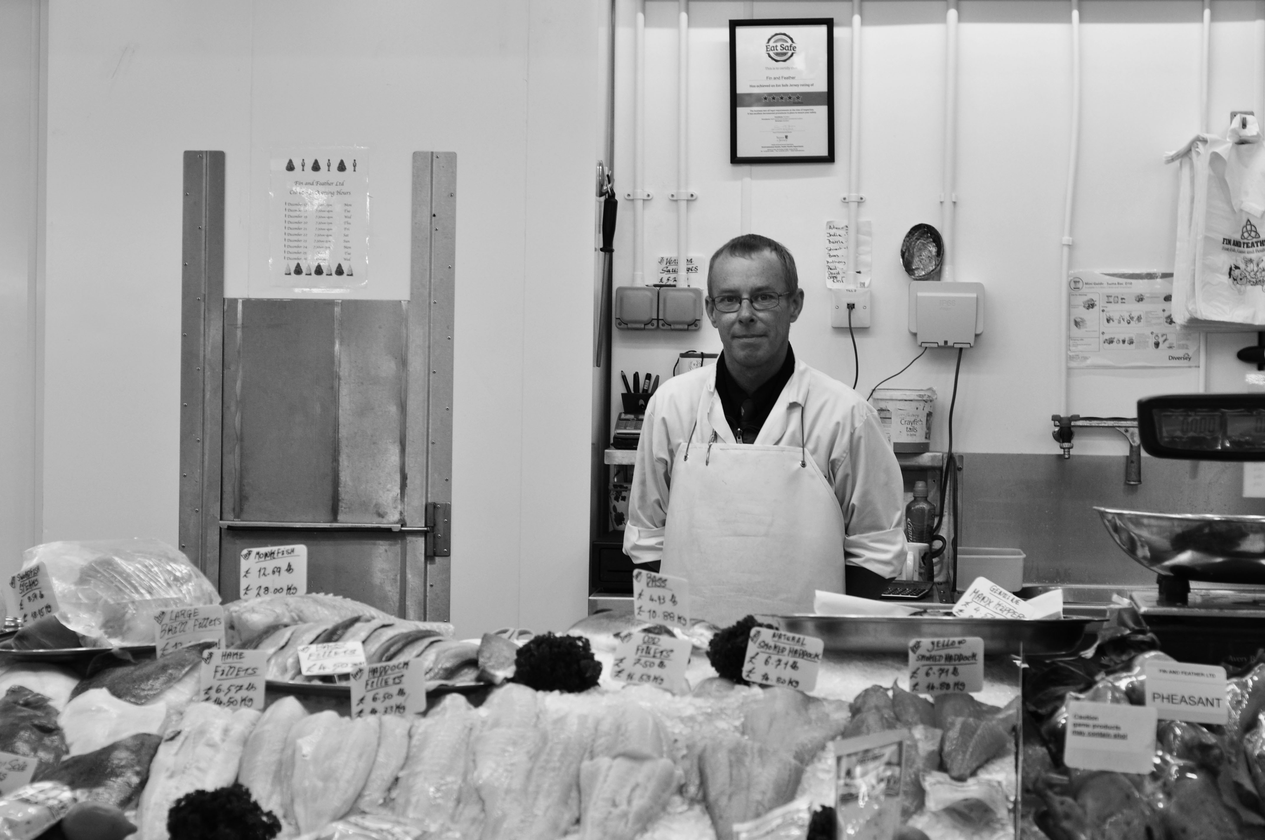
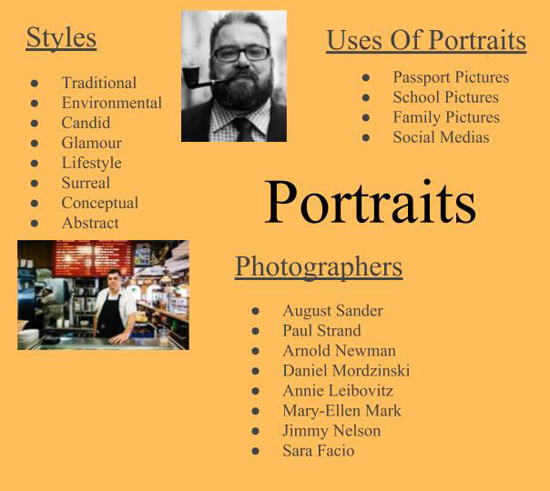
An environmental portrait is a portrait executed in the subject’s usual environment, such as in their home or workplace, and typically illuminates the subject’s life and surroundings. The term is most frequently used of a genre of photography.

The surroundings or background is a key element in environmental portraiture, and is used to convey further information about the person being photographed.   The details that convey the message from the surroundings can often be quite small and still be significant.  The key seems to be in the symbolism expressed by various elements in the background; for instance, a baseball cap may not tell you much about your subject (unless he or she is a baseball player), but a chef’s hat gives you a lot more detail about who he is and what he does.

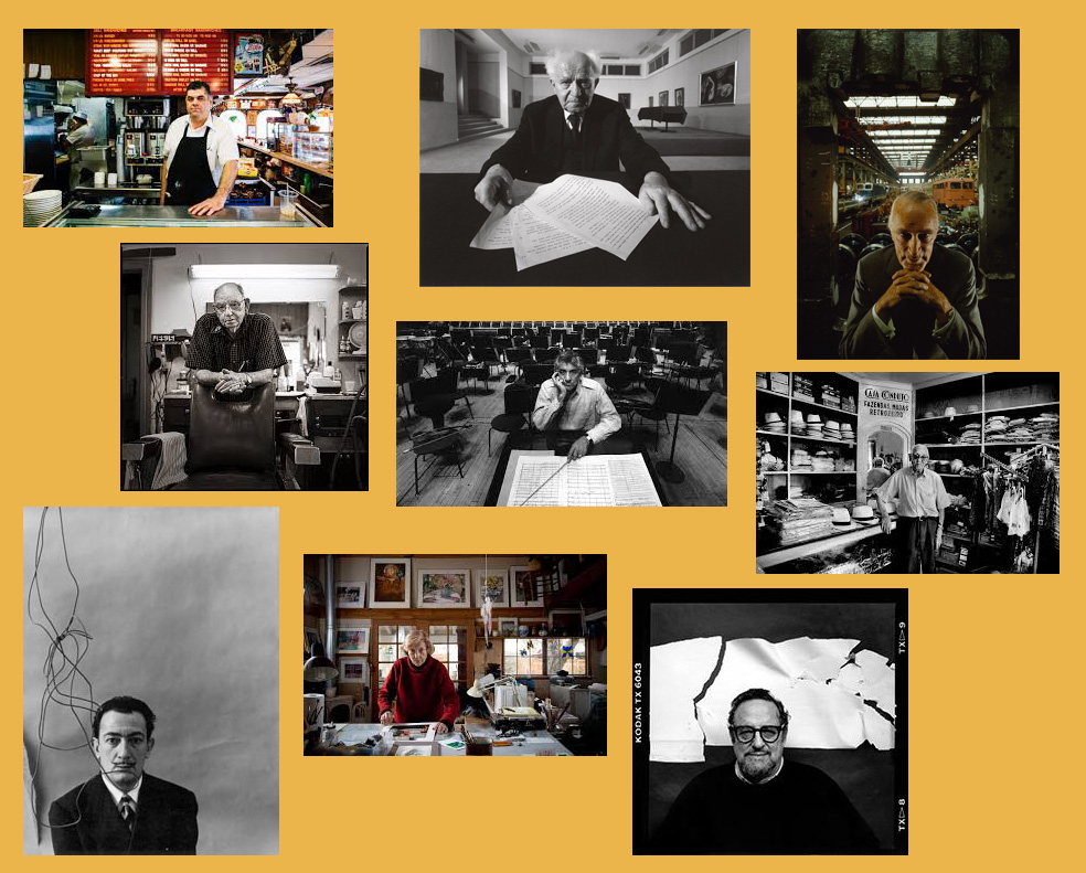
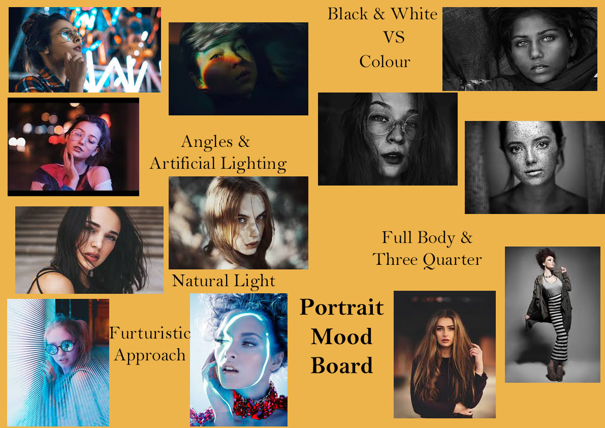
Mood Board of Environmental Portraits

Jim Cornfield – ‘Telling a Story with Environmental Portraits’  https://www.digitalphotopro.com/technique/camera-technique/telling-a-story-with-environmental-portraiture/


Arnold Newman

“There are many things that are very false about photography when it is accepted without question. You must recognize and interpret it as you would any other art form, and then maybe it is a little more than real.” – Arnold Newman

Arnold Newman (1918-2006) was an American photographer known for his environmental portraits or artists and politicians.  He was also known for his carefully composed abstract still life photographs.

Newman is often credited with being the first photographer to use so-called environmental portraiture, in which the photographer places the subject in a carefully controlled setting to capture the essence of the individual’s life and work. Newman normally captured his subjects in their most familiar surroundings with representative visual elements showing their professions and personalities. A musician for instance might be photographed in their recording studio or on stage, a Senator or other politician in their office or a representative building. Using a large-format camera and tripod, he worked to record every detail of a scene.

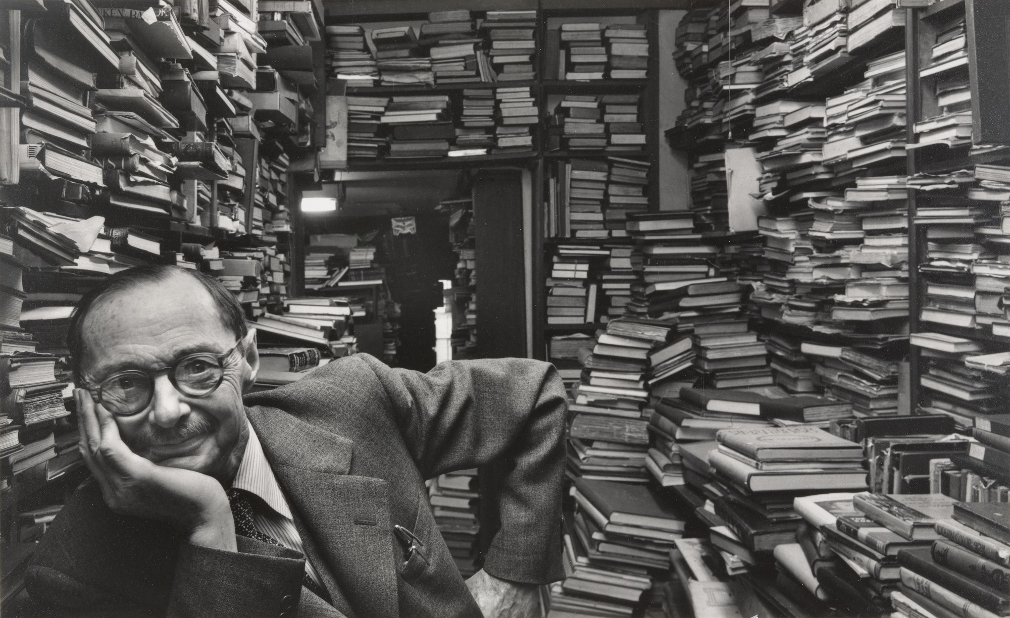
The photograph below shows one of Arnold Newman’s works, we can see he has his subject clearly engaging with the camera and how they are surrounded by something that represents them and it has been clearly composed of how they are sitting and where they have been placed in the frame which is something I will aim to do in my own photoshoot with inspiration from Arnold Newman.

Arnold Newman

My Own Responses

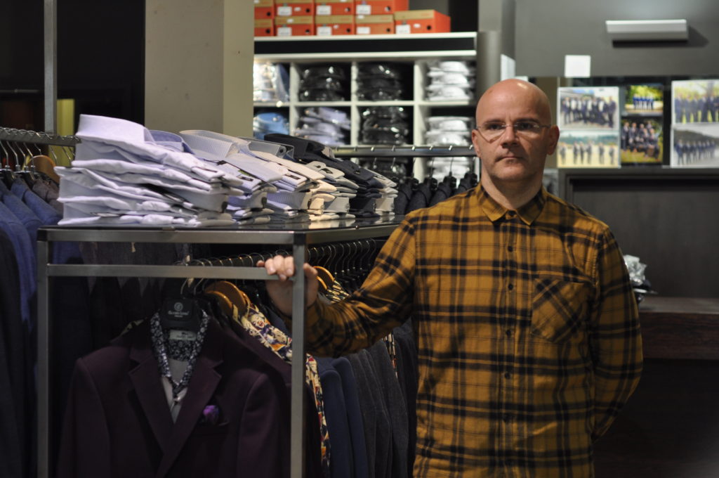
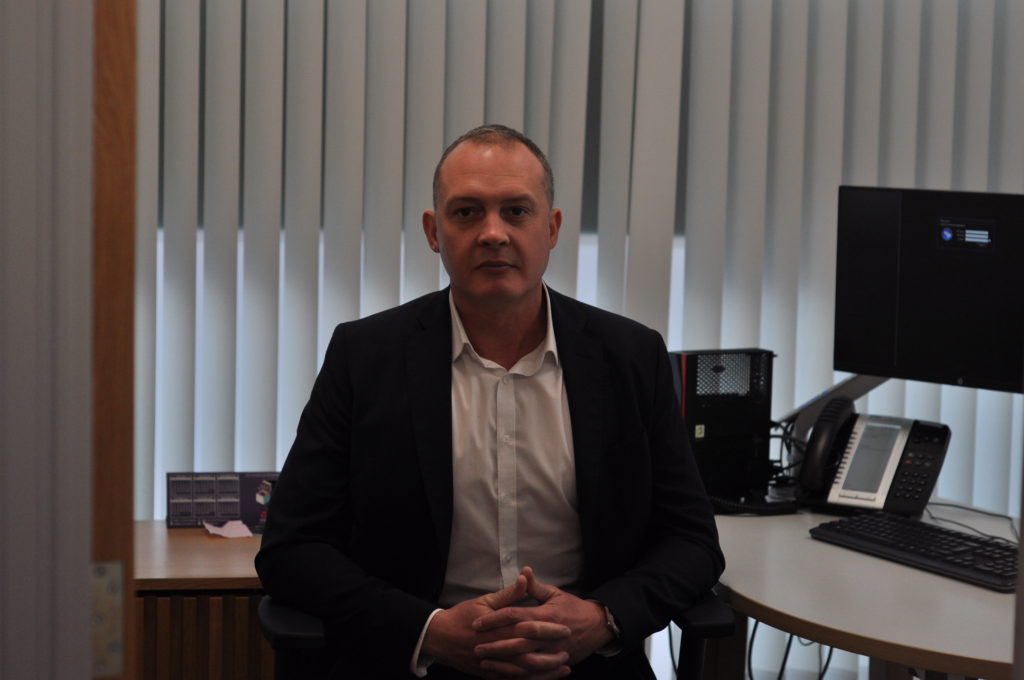
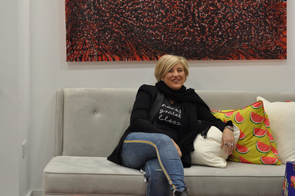
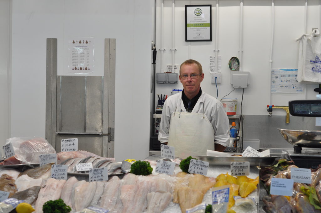
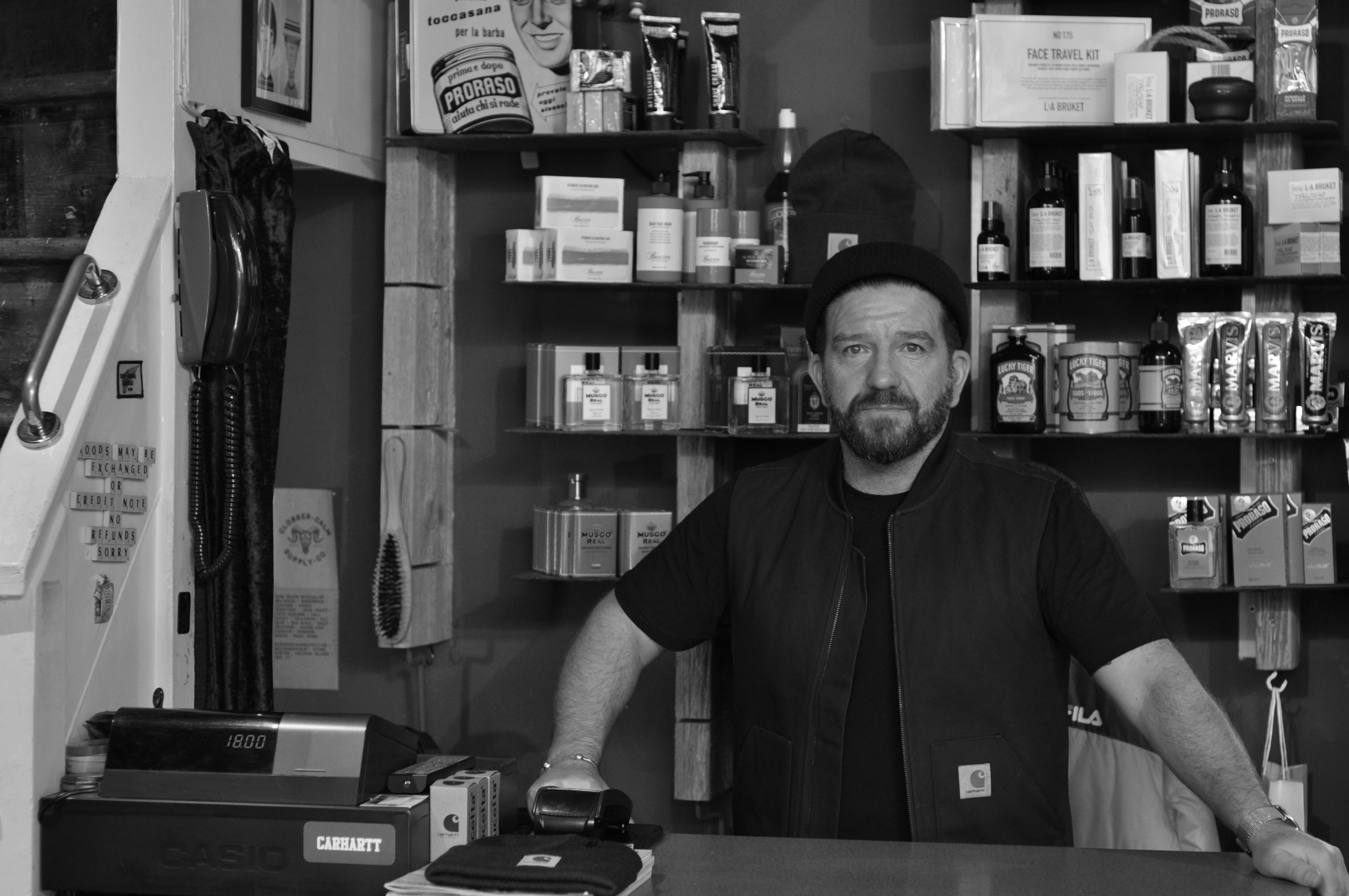
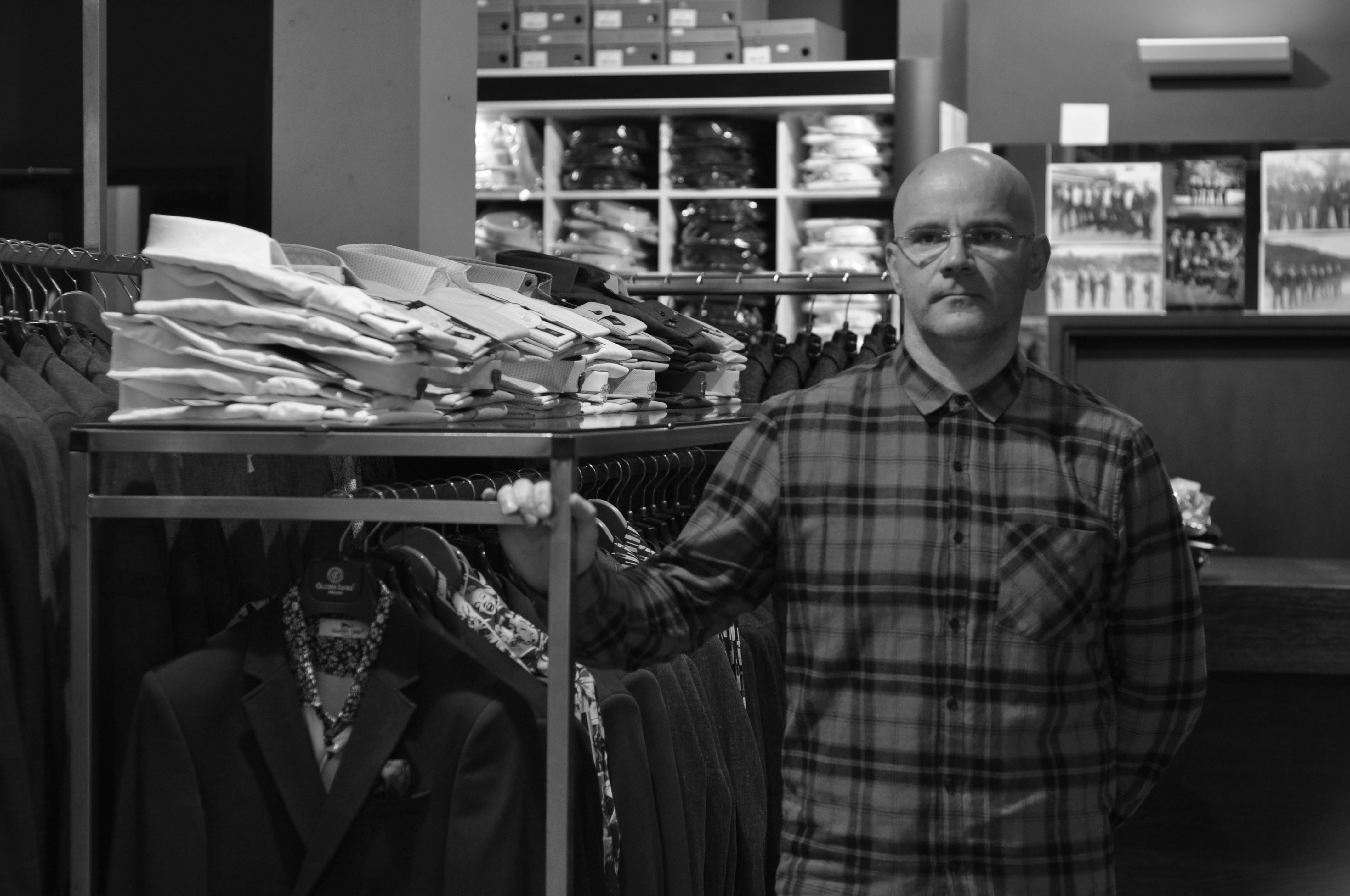
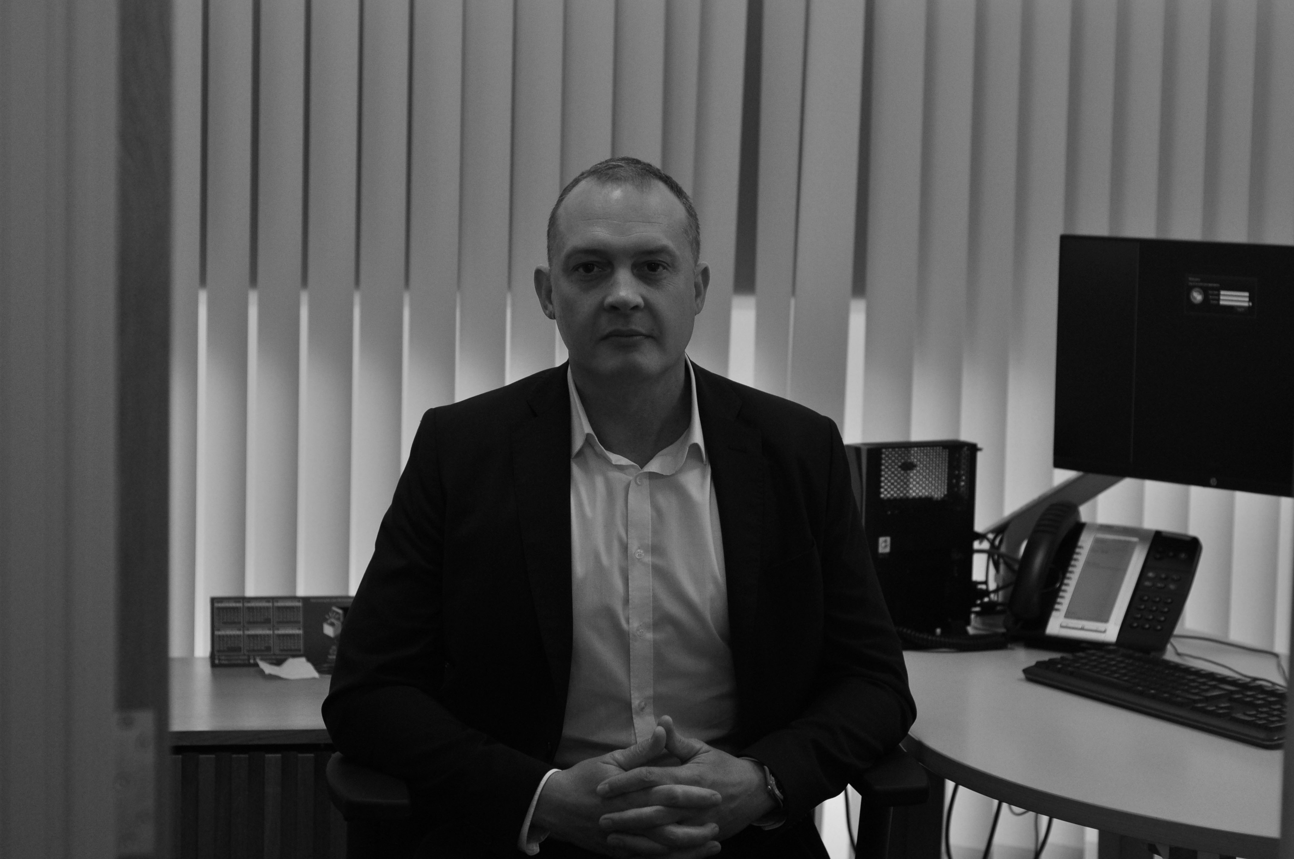
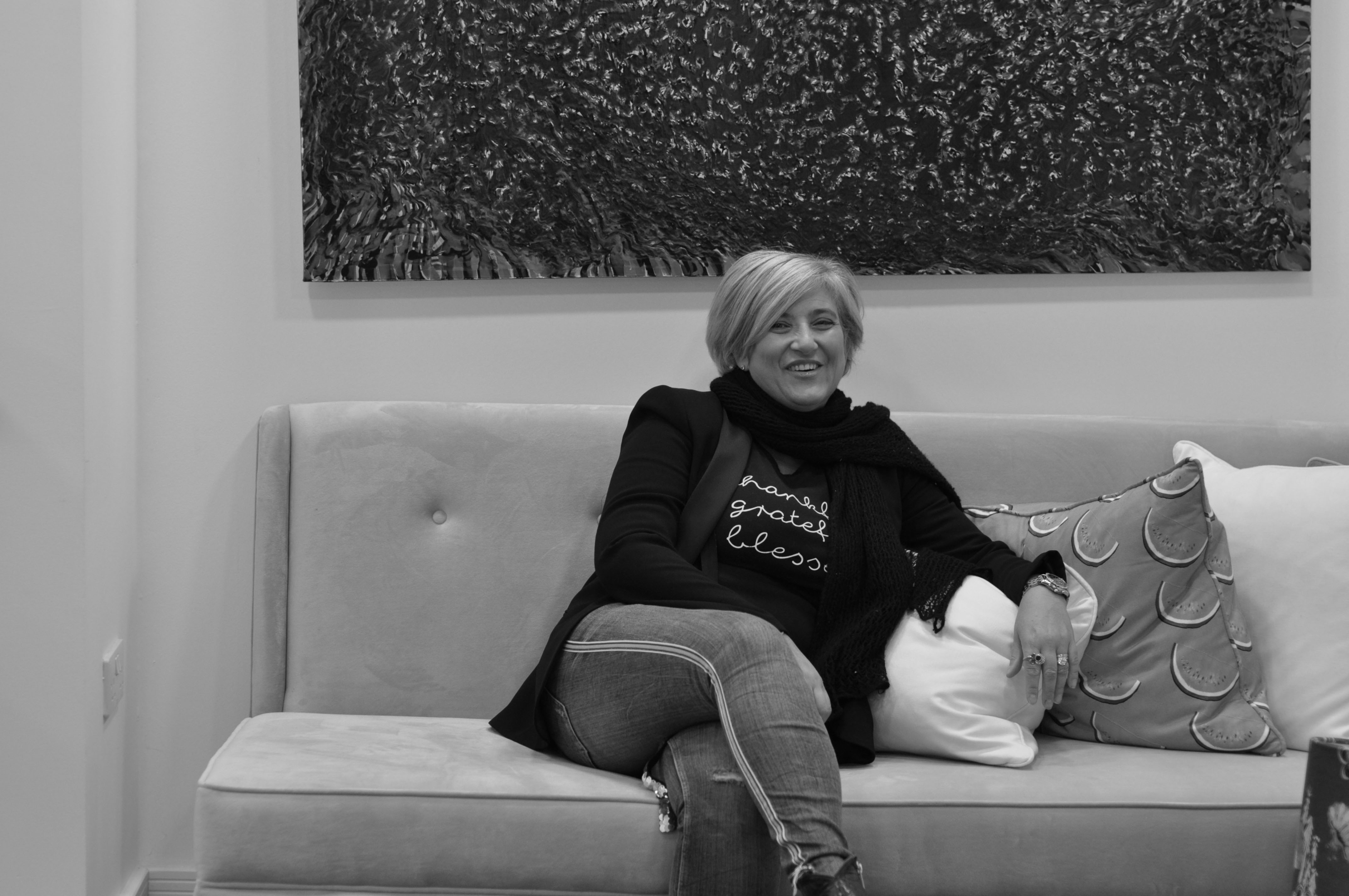
For these photoshoots I went out and captured people in their working environments, this enabled me to have them surrounded by things that may represent their life and their work such as Arnold Newman did.

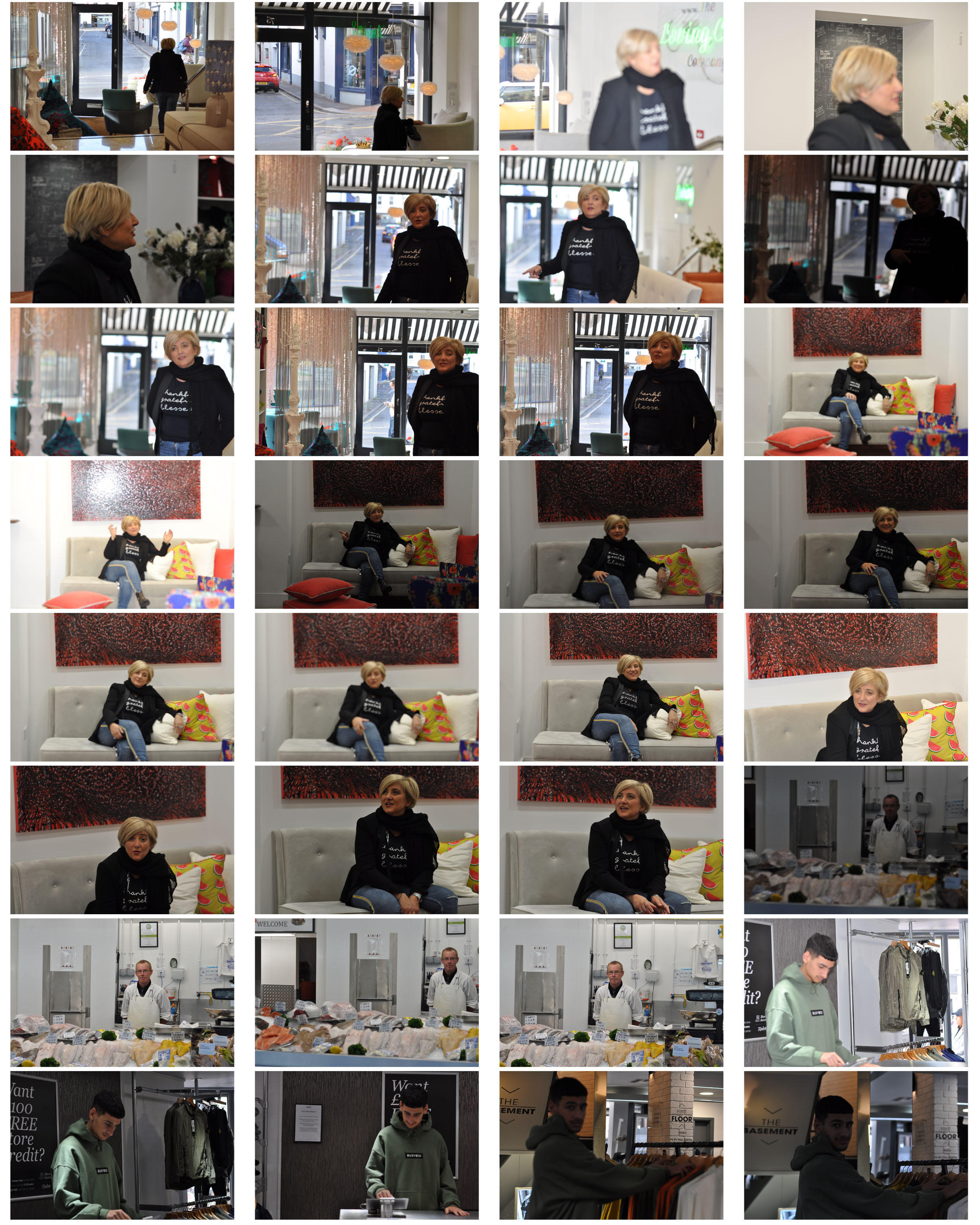
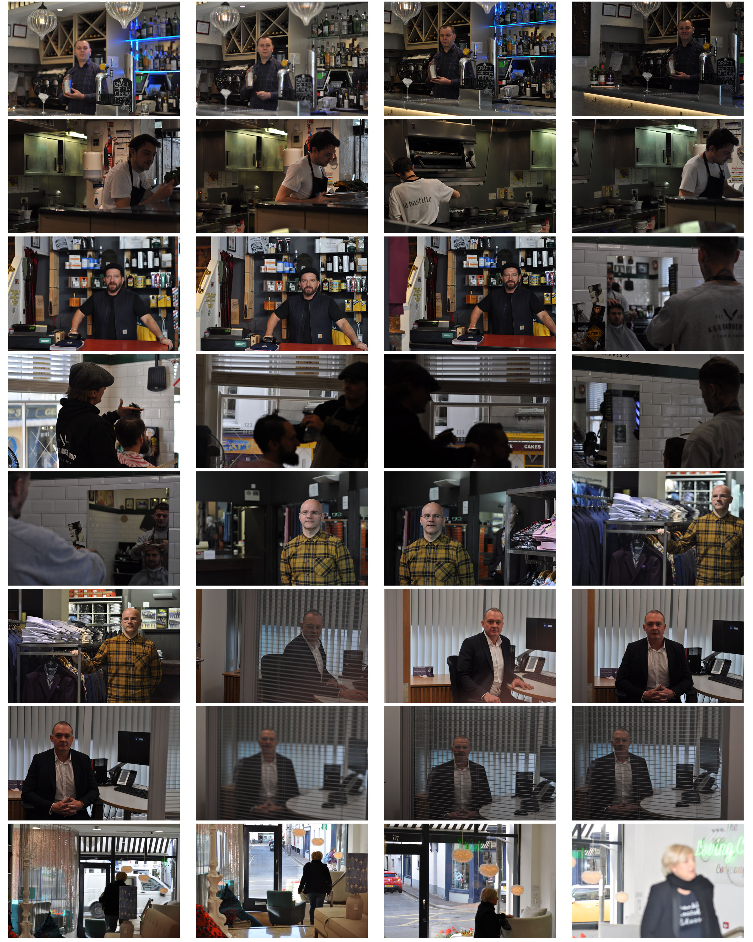
Contact Sheet of shoot

These are two contact sheet of my own experiments and photographs I have taken under the name of environmental portraits.  I went out and photographed people in their work place or their environments, I had some people posed more naturally by having them carry on with what they were doing but also having them try look towards the camera slightly to engage with it there and some more unnatural by having them fully engage with the camera by getting them to look directly at the lens.  Some photographs came out better than others as some are too over-exposed or under-exposed and others are not completely in focus however there were some photographs which I feel turned out successful and some which I feel would be good to experiment with with turning them black and white from being influenced by people such as Mary-Ellen Mark and Arnold Newman.

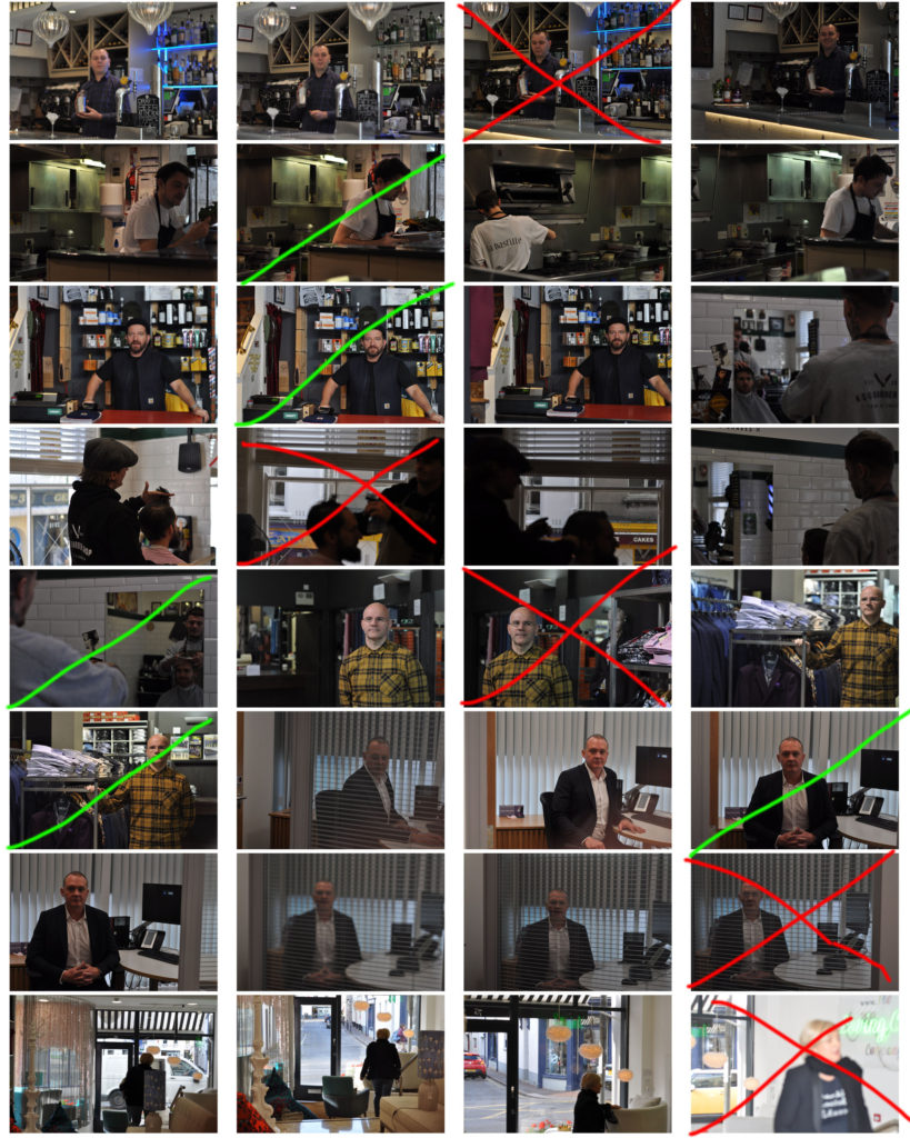
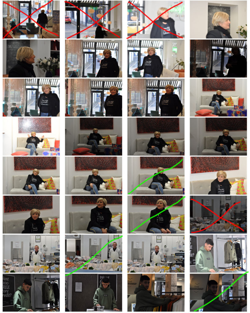
Edited Contact Sheet

This shows how I began to sort through and pick out which photographs would work for experiments with things such as placing into black and white and as good photographs and which would not be so successful or useful.

Edits and Outcomes

For the editing of the photographs I kept it simple by only adjusting the photos into black and white or maybe adjusting the brightness to help with the transition into black and white such as Arnold Newman’s photographs were.  I have chosen what I feel to be my 5 best outcomes of this photoshoot as it shows my subjects engaging with the camera and the photographs are clear and work well.  Below is the edited and unedited versions of my photographs.

Own Response 1
Own Response 2
Own Response 3
Own Response 4
Own Response 5
Own Response 1 B&W
Own Response 2 B&W
Own Response 3 B&W
Own Response 4 B&W
Own Response 5 B&W


A brief History of Portraits

Historical Purpose of Portraits

A portrait is a representation and the showing of a particular person.  A self portrait is a portrait done by the artist of them self.

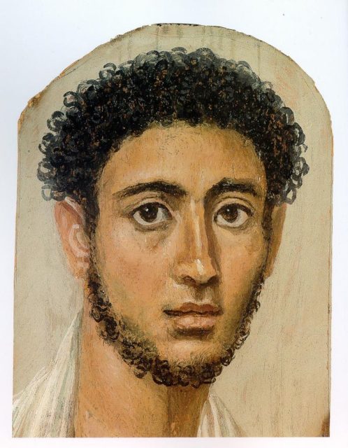
Portraits can be dated back to the Ancient Egyptians from about 5,000 years ago where they began to be used and created.

Before photography was introduced, portraits were painted, sculpted or drawn as this was the only way to record the way that someone looked.  Portraits were used to record people in history as well as represent someone’s wealth, status or beauty.

Historically, portrait paintings have primarily memorialized the rich and powerful.  Over time, however, it became more common for middle-class patrons to commission portraits of their families and colleagues.  Today, portraits are still commissioned by governments, corporations, groups, clubs, and individuals.

faiyum mummy portrait of a young man Munich

Renaissance Turn of Portraits

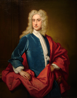
The Renaissance marked a turning point in the history of portraiture.   Portraits—both painted and sculpted—were given an important role in Renaissance society and valued as objects, and as depictions of earthly success and status.

Godfrey Kneller | Samuel Sandy | 1720 Renaissance Era

1800’s Photography

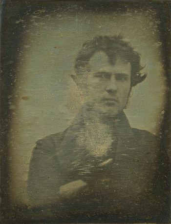
The invention of photography can be credited to Louis Daguerre, who first introduced the concept to the French Academy of Sciences in 1839.  That same year, Robert Cornelius produced what is considered the first photographic self-portrait.

Robert Cornelius | Self Portrait | 1839

In addition to portraits of famous people and family members, portrait photography became a way to preserve history.  90 Native American delegates visited Washington D.C. in 1857 to conduct treaty and trade negotiations.  While they were there, they were photographed by Samuel Cohner and Julian Vannerson.

Camera’s For Everyone (1900 – 1984)

Photography became more common when the Eastman Kodak Company introduced the Kodak No. 1 camera in 1888. Kodak made photography easier for everyone by doing the developing and sending the reloaded camera and developed prints back to the customer.  These cameras made photography more accessible to the general public.  Their 1900 Brownie Box camera was the first mass market camera.  The turn of the century also embraced photography as an art form.

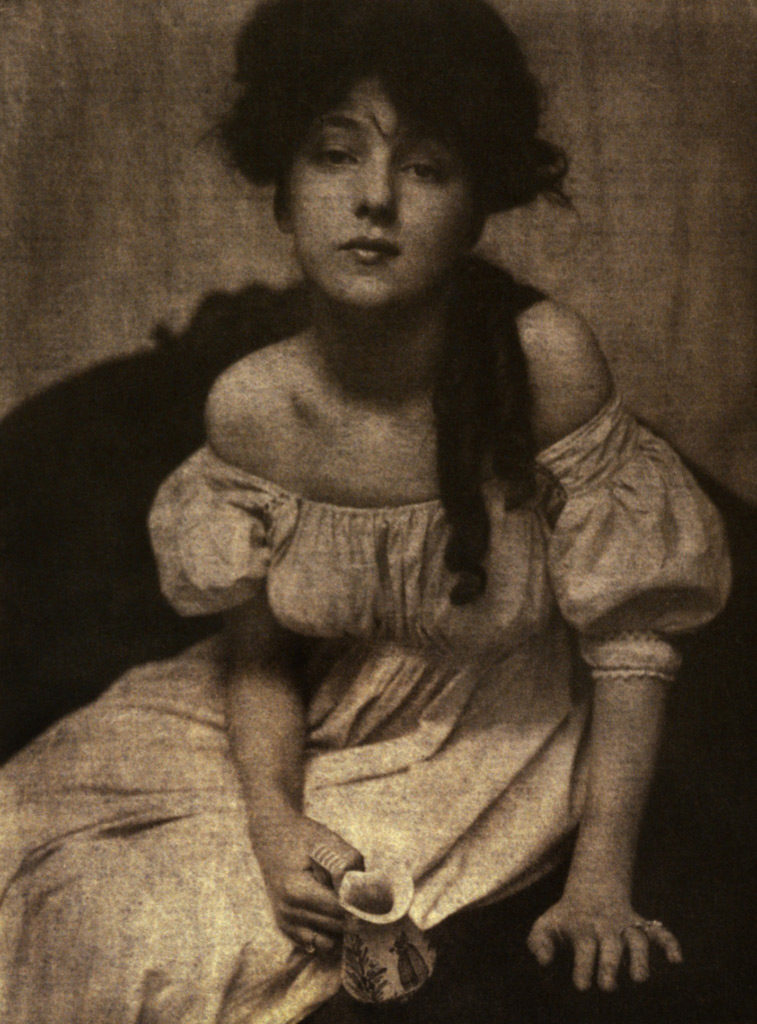
Stieglitz and the Photo-Secession

This time period also introduced Alfred Stieglitz, one of the first people to become famous for making photography an art form. In 1902, he and a group of friends founded the Photo-Secession movement. This movement sought to make photography less commercial and more of an art form.

Alfred Stieglitz | Portrait of Miss N | 1903

Photojournalism and the picture story vs Documentary (long-form) photography

Photojournalism really started to take shape when photographers could easily transport cameras into war zones. The “Golden Age of Photojournalism” is often considered to be roughly the 1930s through the 1950s. It was made possible by the development of the compact commercial 35mm Lecia camera in 1925, and the first flash bulbs between 1927 and 1930, which allowed the journalist true flexibility in taking pictures.

Yet photojournalism is not just about war or photographers working the beat for a local newspaper. It’s much more than that. Photojournalism tells a story and it often does so in a single photograph. They evoke a feeling, whether its astonishment, empathy, sadness, or joy.

That is the mark of photojournalism; to capture that single moment in time and give viewers the sense that they’re part of it.

Documentary Photography

The turn of the century continued to use portrait photography for documentary uses. In 1906 Lewis Hine was hired to document the conditions that child labor workers had to deal with in different factories throughout the U.S. His photographs were used to help pass child labor reforms, like the Fair Labor Standards Act of 1938, which banned oppressive child labor.

In 1914, the U.S. State Department began requiring photographs on all passports.

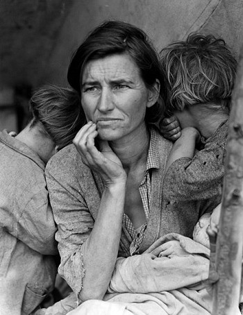
The stock market crash in 1929 led to the next round of documentary portraiture. In 1935, photographers were hired to document what was going on in the farmlands of America. The Resettlement Administration, which later became the Farm Security Administration, wanted to see through photographs how the farmers were living. The New Deal offered several programs for artists and photographers, such as the Works Progress Administration. People hired for the WPA documented life throughout America. One famous WPA photographer was Dorothea Lange, who profiled the plight of farmers in America.
‘Migrant Mother’ by Dorothea Lange, 1936

Final Evaluation

Overall in this project I have been able to experiment and explore the different ways that I can create abstract photography as well as learning the different types of camera skills I can use to generate those photographs.  I feel I have been able to develop my photographs across the whole project well and have kept the fluidity of the project as I produced more photo shoots and experiments over the course.  Into the next project I will try to get more photographs during my photo shoots as I feel this was something I had struggled with in this project and something that I can develop and would be helpful into the next coming, this will mean I have more options and more to experiment with, which will help me as I move through the next projects.  I feel that I have tried to show my development of my skills and the development of my photographs and the project as they have develop.  Something I feel I could do better would be to have more fluidity in the photographs I am taking and how I develop them.  I feel at some points in the project I could’ve taken some more risks with the photographs I was taking and being a bit more experimental would’ve helped and this is something I will try to do into the next project.

Final Displays

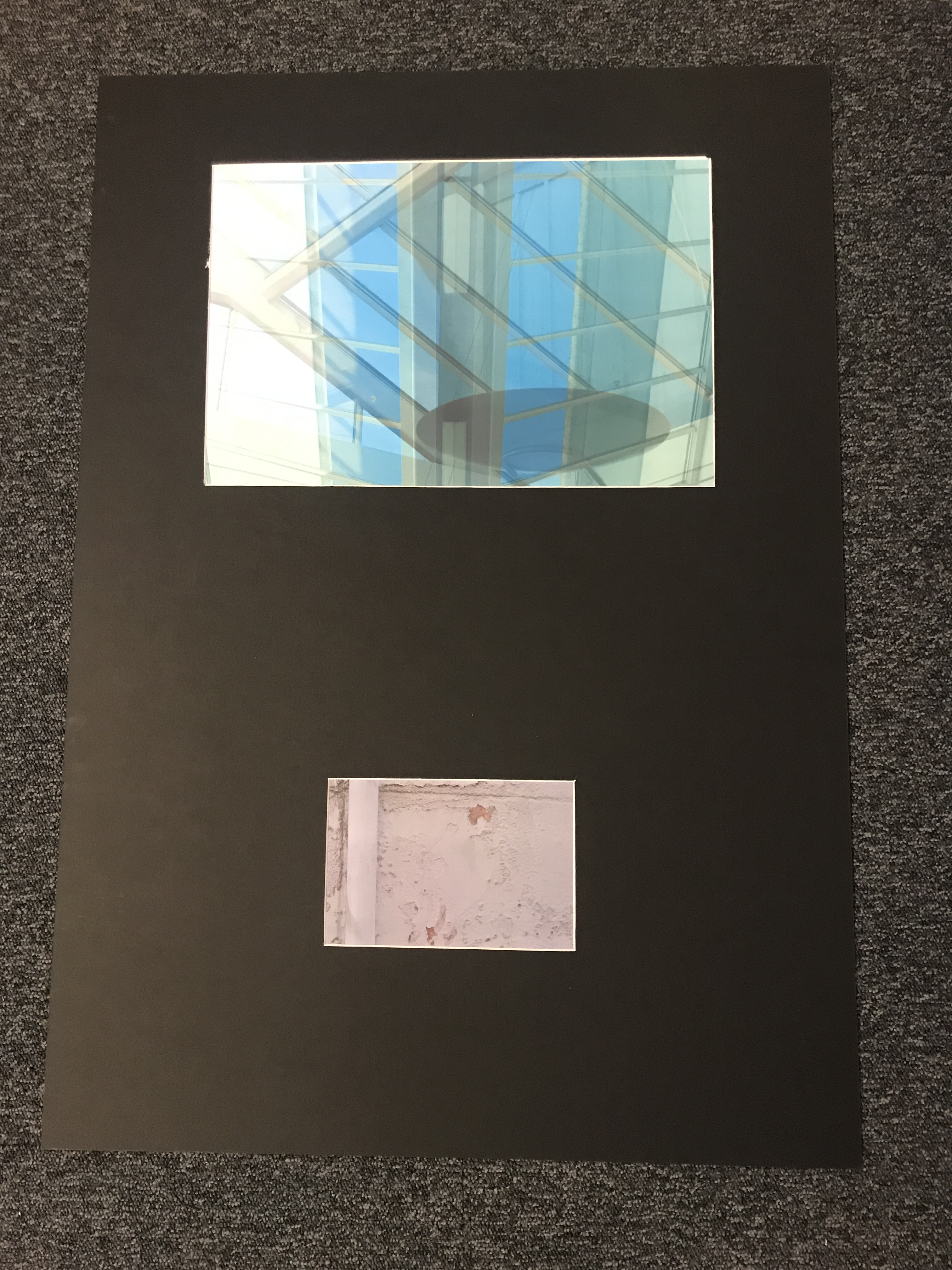
Overall I am happy with the way my final photographs turned out and how I was able to display them.  For my A3 and A5 image I feel they worked well as I contrasted them together as the different sizes but also the different takes on abstract.  In the future I may try to explore more creative ways to display my photographs, I started to try and experiment with this with the tracing paper over my A4 display however I feel I could have found more ways to try and display my photographs in more creative ways and one way I will be able to improve this is to have more photographs taken during my shoots so that I can give myself a wider variety.  I am happy with the way the editing of my A3 photograph turned out and this is something I will take forward and try to experiment with more.

Final Display A4
A4 Display
Final Display A3 and A5
A5 and A3 Display

Experiments with out of focus displays

After the final prints came through I began to experiment with ways to explore the out of focus photographs I had produced.  To do this I am layering tracing paper in different ways to create different effects with the final photographs when they are displayed.

Layering Tracing Paper

For a first experiment I tried layering up the tracing paper over my final photographs to produce and even more out of focus photograph for effect.  I experimented with layering one layer and then two layers of the tracing paper to see what different effects it can create while still being able to understand and see the photograph.

Technique 1
One Layer
Technique 2
Two Layers
Technique 2
Two Layers

Using Shapes

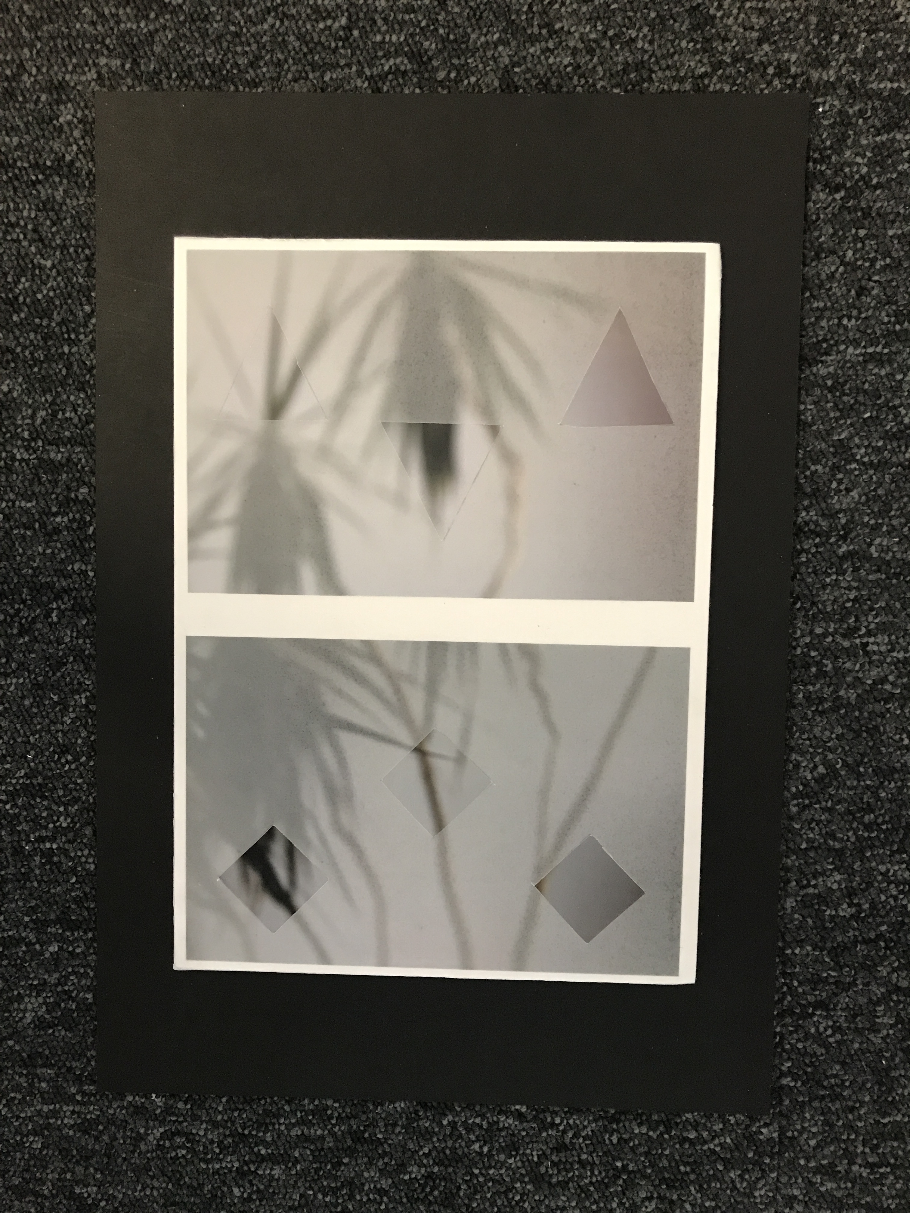
For this I began to experiment with ways in which I could place the tracing paper over my final photographs in different shapes to create different effects.  Similar to the ‘Conceal and Reveal’ experiments on Photoshop it is experimenting with hiding and editing certain parts of the photographs to give them certain effects.

Technique 1
Using Triangles
Technique 2
Using Squares

Cutting Away Shapes

This is the same as the ‘Conceal and Reveal’ experiments as it uses the idea of putting a layer over the photograph and then removing certain parts of the layer to reveal the photograph underneath.  I am doing the same hear using tracing paper and cutting shapes out as to reveal parts of the photograph.  Some parts are more out of focus than others due to the tracing paper creating another layer of opacity making the image more difficult to see underneath.

Technique 1
Cutting Away Shapes

Final Prints: Display Techniques

Here I am going to be trialing and experimenting with ways to display my final images on the A3, A4 and A5 paper prints.  This will include arrangements of multiple images on one page and also just some single images to see what will work well together and if I can create a series of images that work well along one print.

Display 1:

Display 1

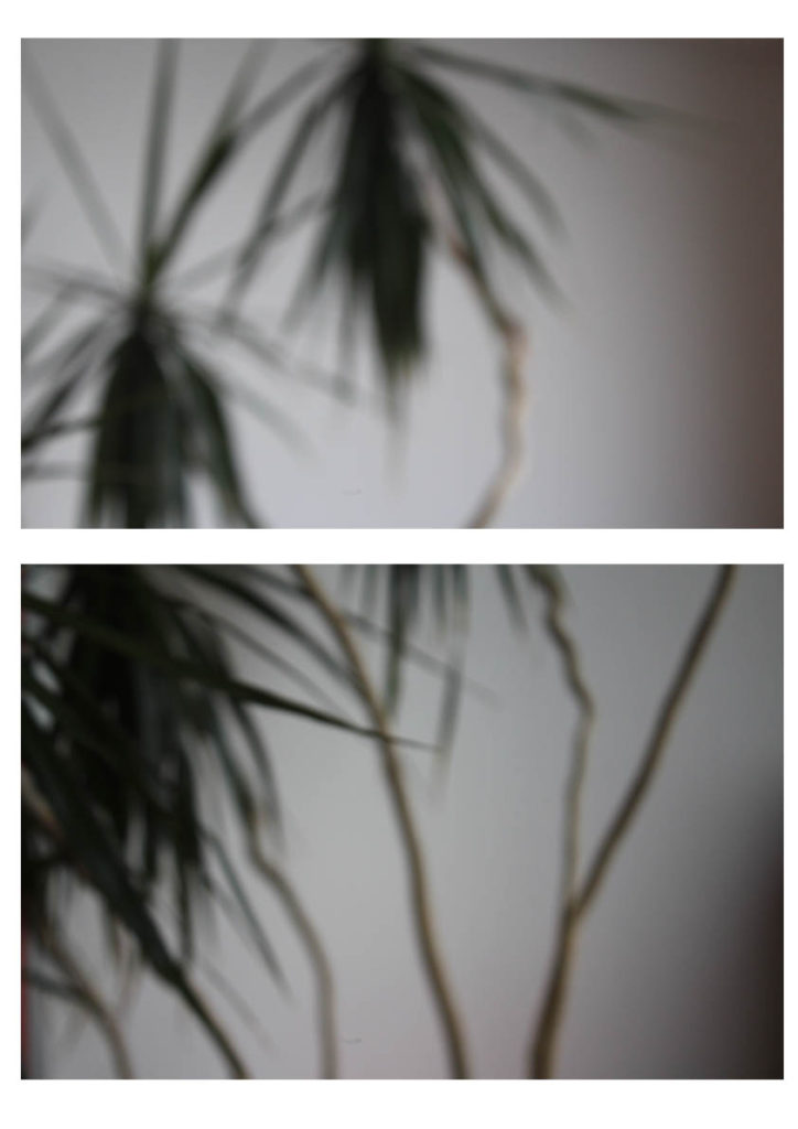
This is my first experiment with a way to display my final images.  This display has two photographs from the same shoot one on top of the other.  I would either place this image as A3 or A4, this would be so that you could clearly see the images and I feel would have a bigger impact on a larger scale.  I feel the two images together have a large impact as they compliment each other and work well together creating a better effect together rather than if I had one of the singular photographs on its own.  I feel this would work well displayed as a final piece as it shows off some of my camera skills and having them both on here emphasizes this.

Display 2:

Display 2

This display I would use for A5 this would enable for the photograph to fill the whole page and I think this would have a larger impact having this particular photograph on its own and isolated.  I would use a small boarder of white around the edge as to frame the photograph as I feel this would have a good effect.

Display 3:

Display 3

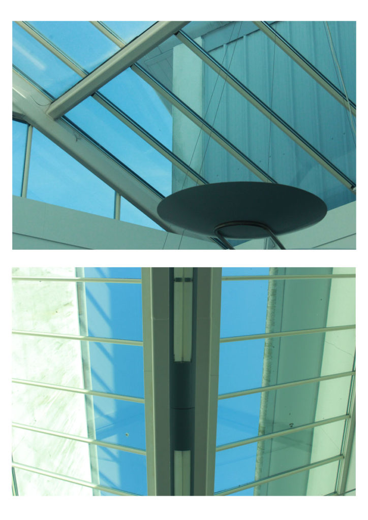
This display combines another of my two chosen images side by side as they work well together in the same style with the geometric abstract lines.  I would have it either A4 or A3 as to show off the photographs and to be able to see the detail as I don’t feel this display would work well on a scale of A5.  I feel the two images have a larger impact side by side rather than if I displayed the two photographs by themselves.

Display 4:

Display 4

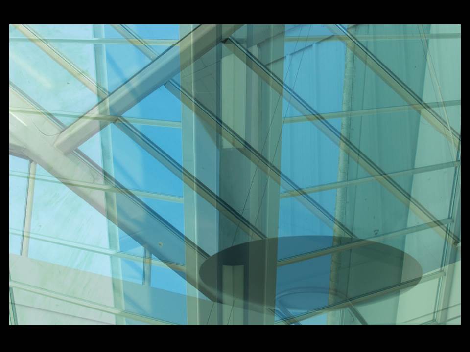
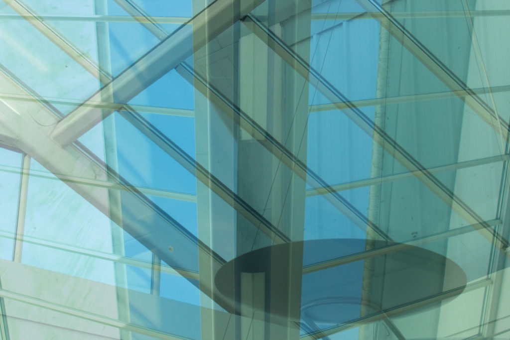
This is a display option for how I would display this edited image.  I would make it my large A3 photograph as to show the full effect of the image and I feel it would work well on a larger scale to be able to see all the detail and the contrasting double exposure of the two photographs.

Display 5:

Display 5

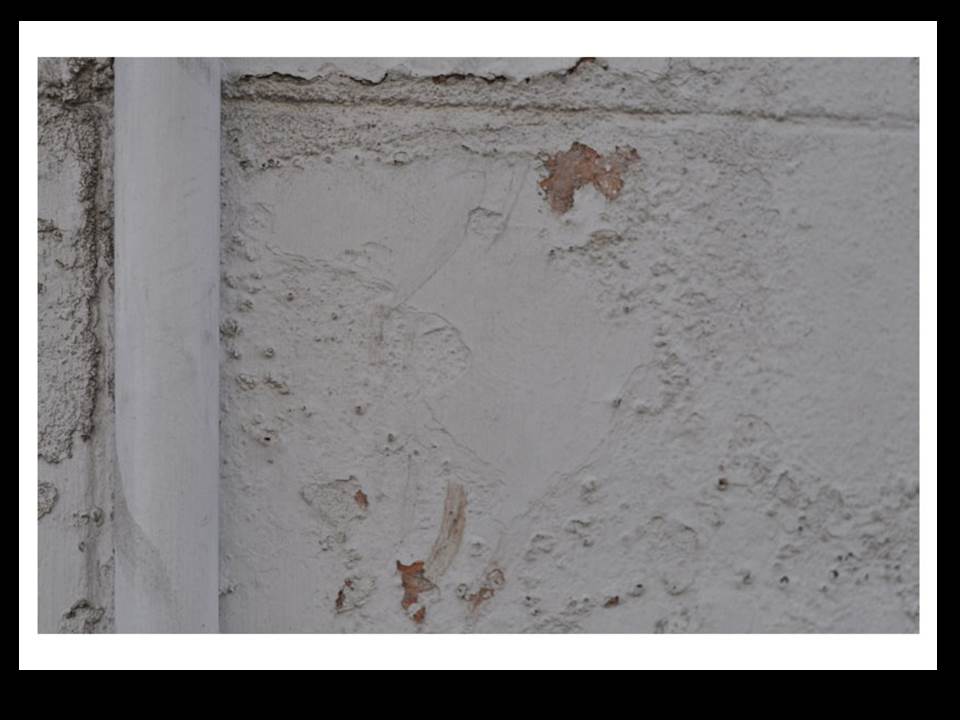
This is another way I may display my out of focus image however this has one just on it’s own like my textured wall photograph I would have this so that you could see the full effect of the photograph on A4 to be able to see my camera skills clearly with the out of focus shot.