All posts by Lillie M

Filters

Author:
Category:

Review and Reflect

While studying the topic of Occupation vs Liberation I looked into the three areas of Landscapes (Bunker Archeology), People (Occupation Babes) and Objects (Archival objects and photomontage). The overall process of the project taught me how to link and develop archival materials, both photographs, objects and writings, into my own work and photographic outcomes. Using the archival material also helped me to develop an understanding of how to go about finding and searching for the right archival material from the help of the Societe Jersiaise archive as well as the Jersey Archives. The use of archival material is something I feel would be useful to develop into my personal study as I feel it can add something to the already developed photographs, as well as the historical ones I feel creating a sense of context as well into the photographs which is something that I feel would be useful and enjoyable into the personal study.
The act of producing portraits in the studio inspired me the most as I enjoyed the simplicity of creating the photographs and the stillness and simplicity of the outcomes. The portraits portion of the project helped me to develop my skills with photographing people who I have just met and understanding the importance of getting to know them and having time taken out to speak to them and listen to them talk as to gain a better understanding of them as a person and who they are, which will eventually lead to a better portrait being taken and better final outcomes. This I feel really helped me as previously I had taken portraits of people in a character however this was speaking and photographing a real person and getting to know them I feel really helped the photographs not be so static of them just of a person. Making them, however, a lot more personal.

I feel the objects section taught me the most skills that I would want to try and incorporate further in my personal study. The objects portion of the project was able to teach me about new techniques that I previously did not know about. The use of specific object photographing tables and how to produce the right lighting around this, as well as how to photograph flat objects with my camera raised and flat above the objects.

The landscapes portion of the project was something I struggled with inspirationally however I feel the end outcome of the zine was most successful. Learning to work in different weather conditions which produced continually changing lighting was something I found difficult and the idea of framing images and what was going into frame I found harder with landscapes rather than portraits and objects. Landscapes is something I would be hesitant to reach into again in the personal study unfortunately.

The overall end outcomes from these mini projects, my zine’s I feel did turn out successful and has given me good insight into how I can go forward to develop my photo-book at the end of the personal study.
ZINE : DESIGN AND EXPERIMENTING

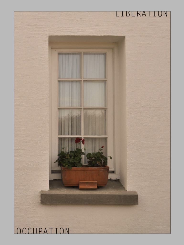
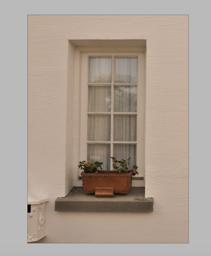
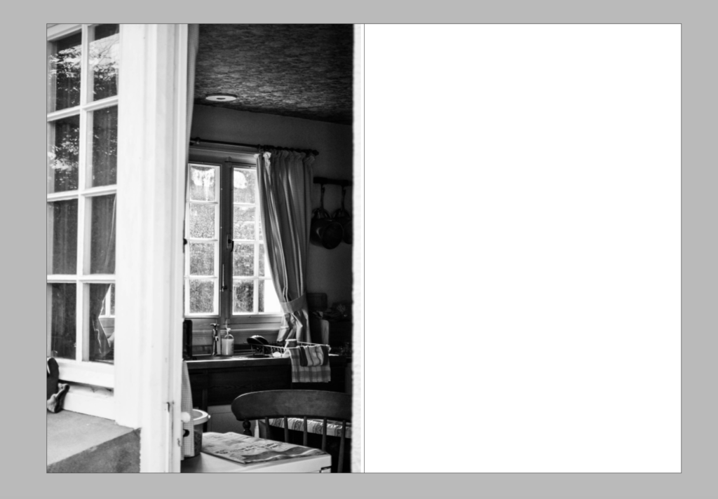
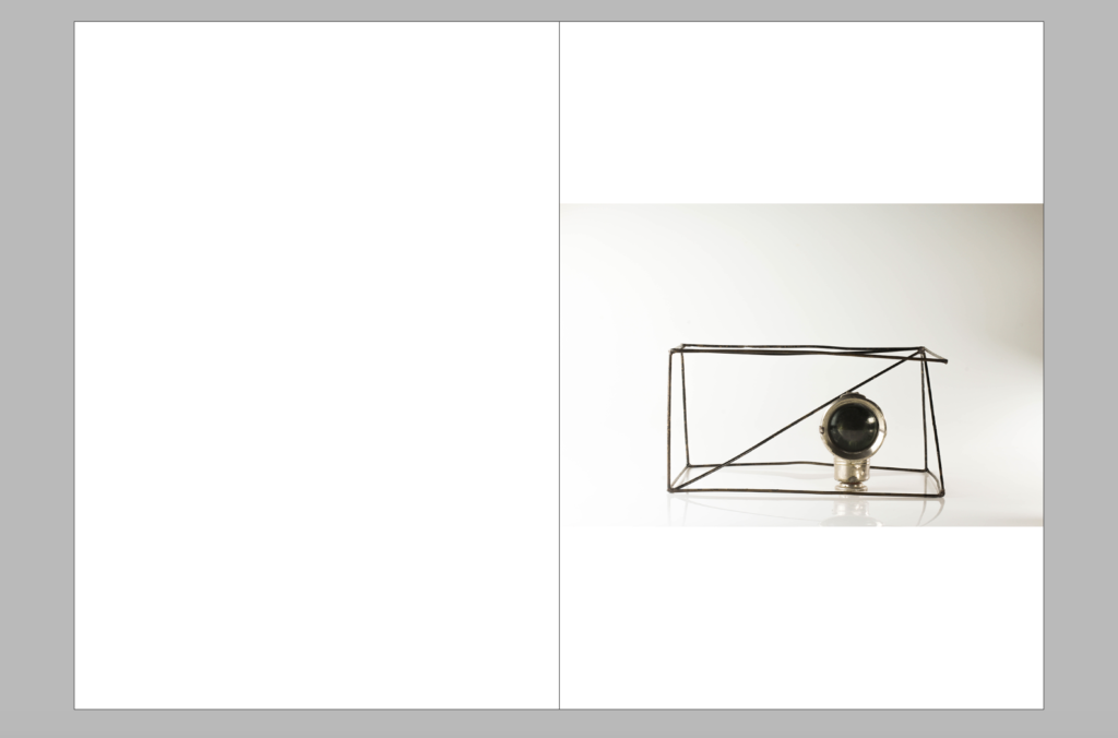
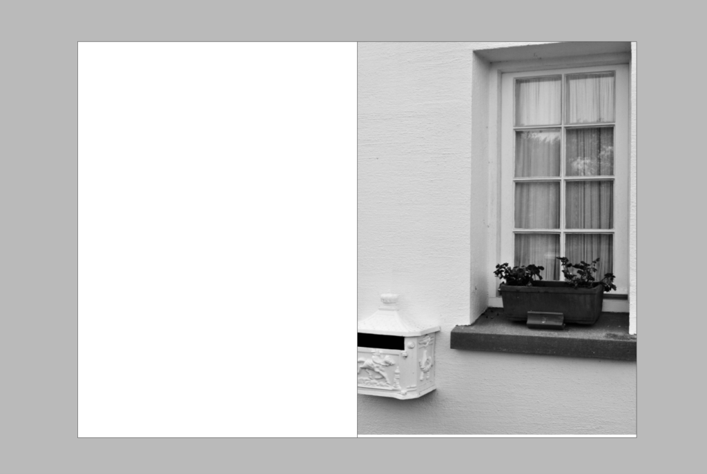
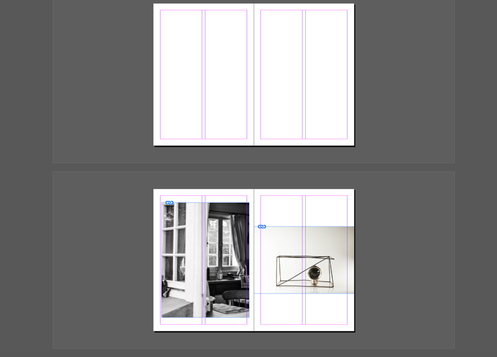
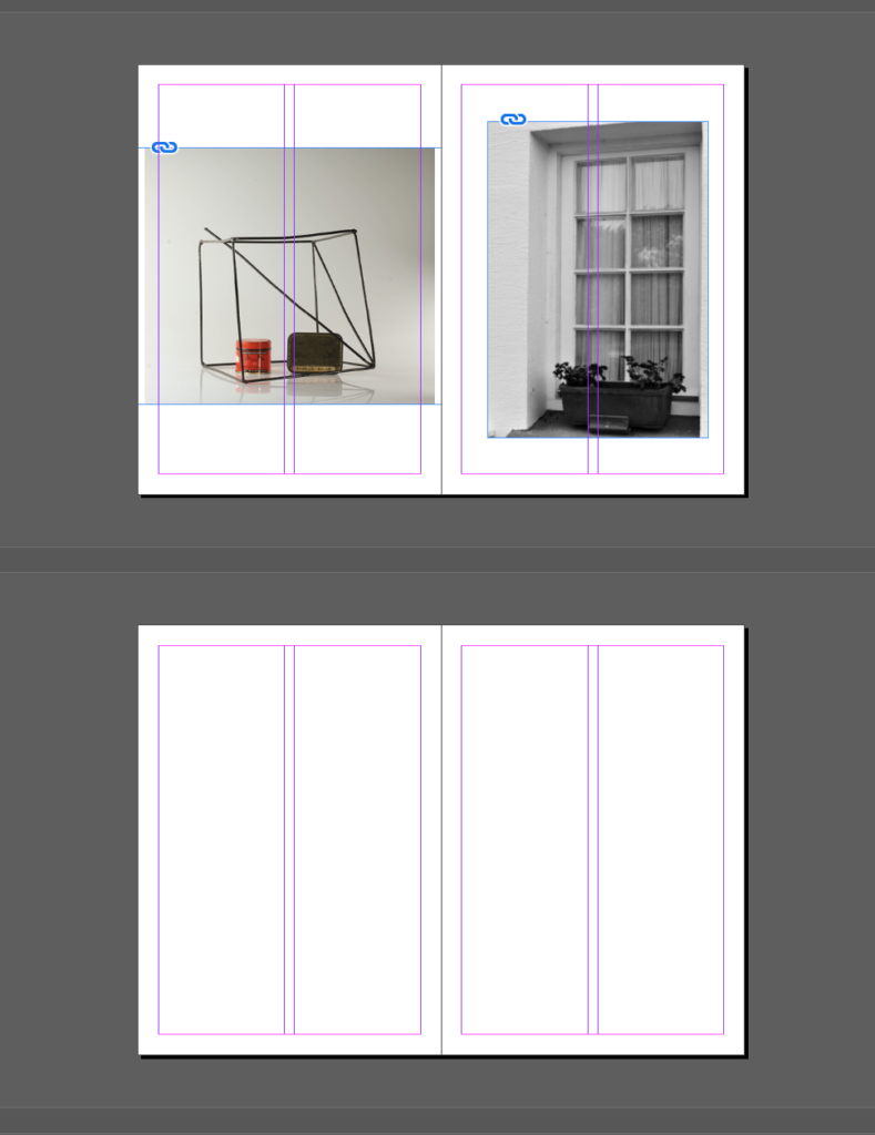
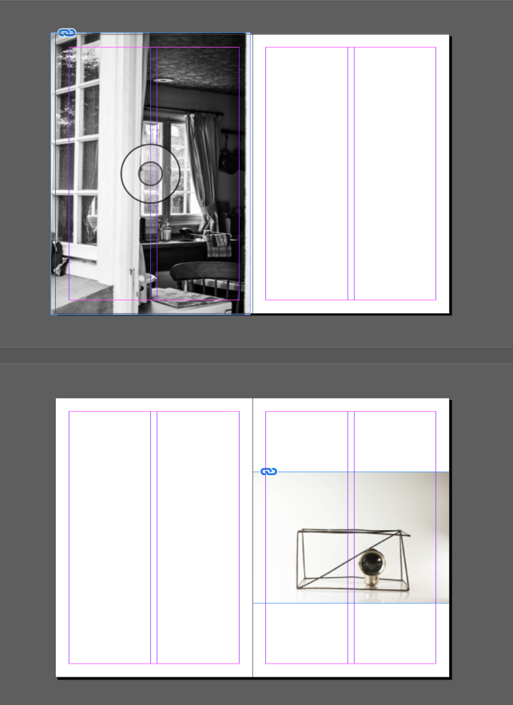
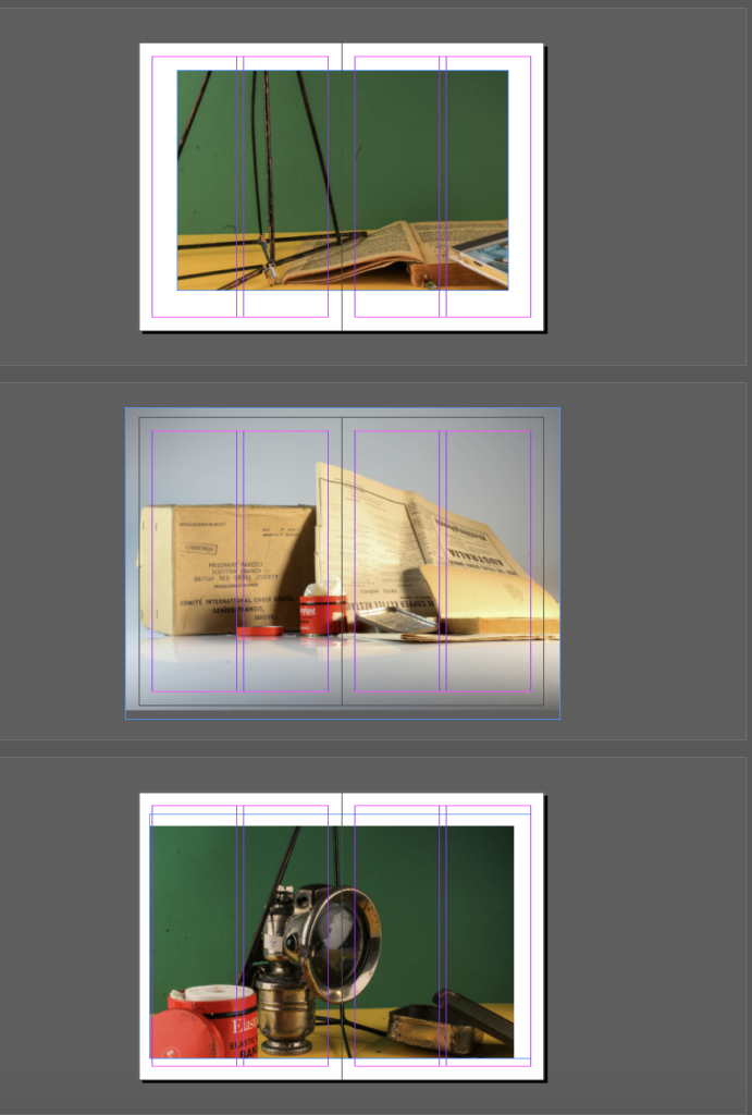
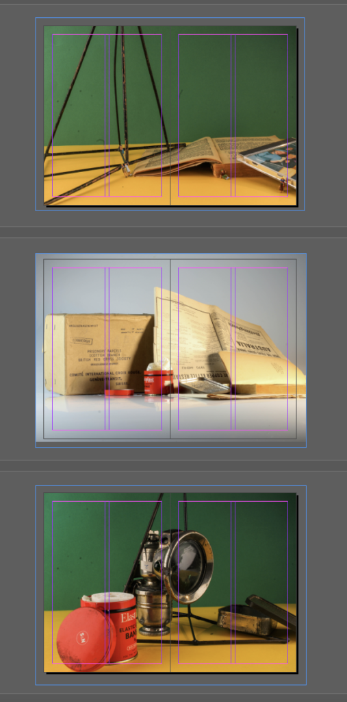
For my zine I experimented with different layouts of the photographs looking at how they are working together and what the narrative will look like and seem to be. I experimented with the use of some of my ‘home sweet home’ images to create and idea about looking inside a house, the house I used to create my home sweet home images was one built just after the war and contains a lot of old and collectable archival stuff. For this reason I began to experiment with the idea of having the first couple and last couple of photographs be of the house to create the idea of looking into the house and showing the object photographs of being stuff inside the house to create a sense of narrative and story to the zine. I also liked experimenting with the start and end of the book being in duller colours, black and white photographs as well as the use of grey and minimal splattering colour I feel this works well in the beginning of end being calming and minimal.
For the middle of my zine I began to experiment with my other object photographs that had been produced in more colour as well as my photomontage ones in response to Rafal Milach. I started to experiment with them being full bleed and leaving boarders as well as looking at the different orders I could place them in to create and narrative sequence to work with the idea of looking into the house and back out with my starting and ending photographs. I found that the photographs I feel worked better as full bleed as I think it gave more effect to the photographs and created a bigger impact.
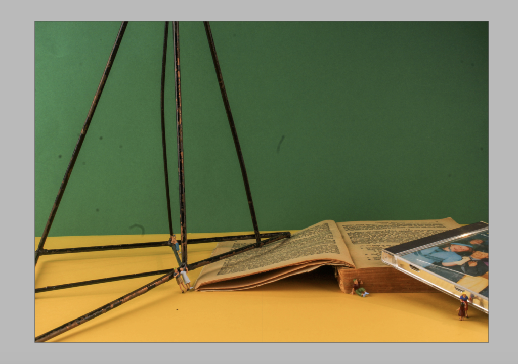
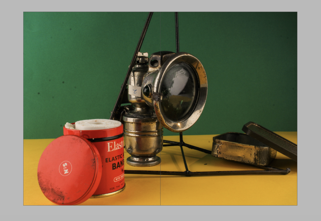
Photomontage: After Editing

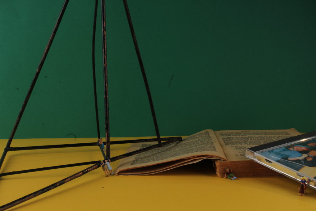
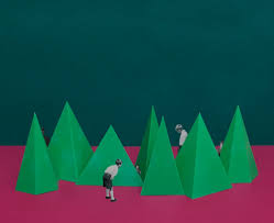
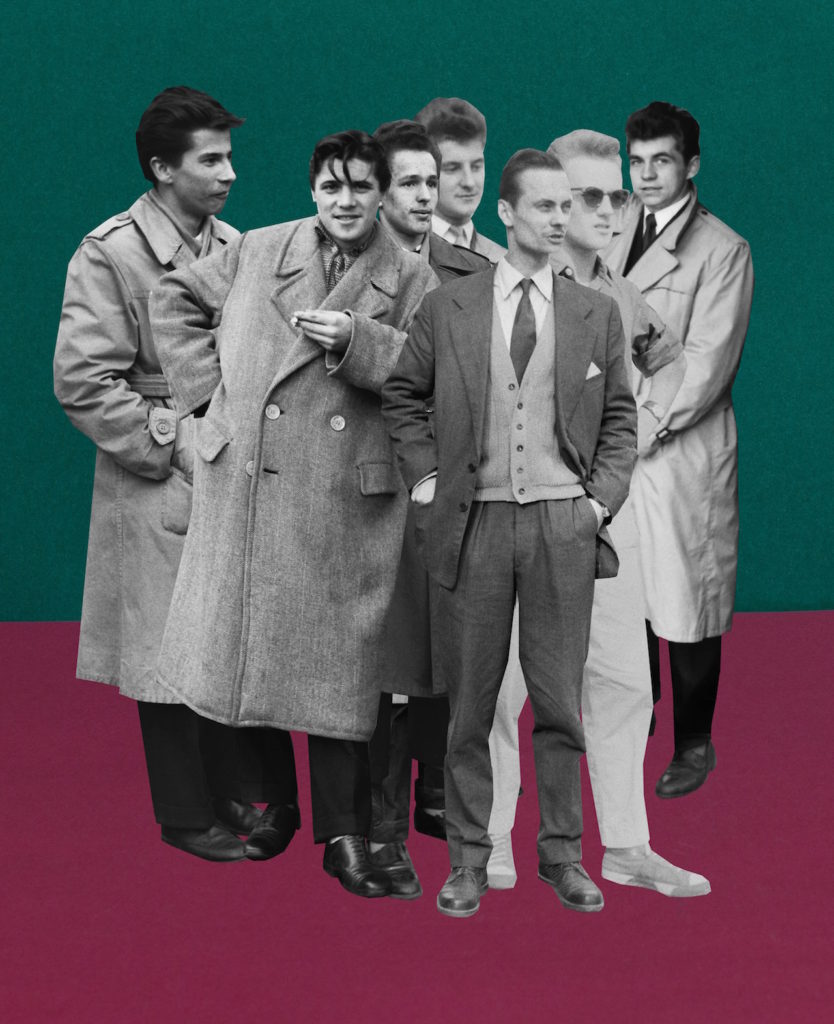
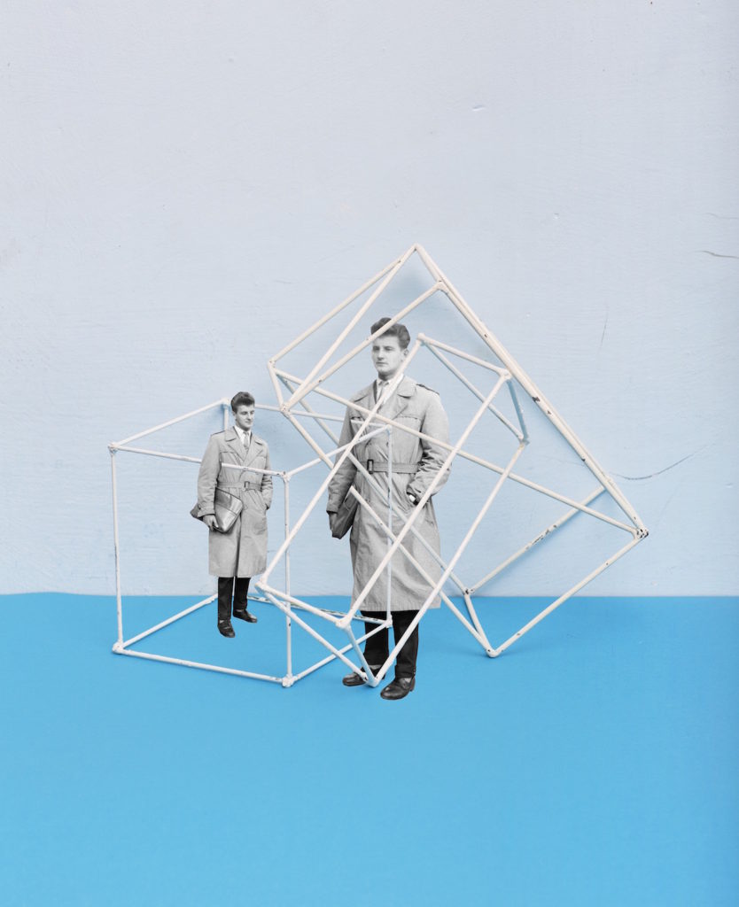
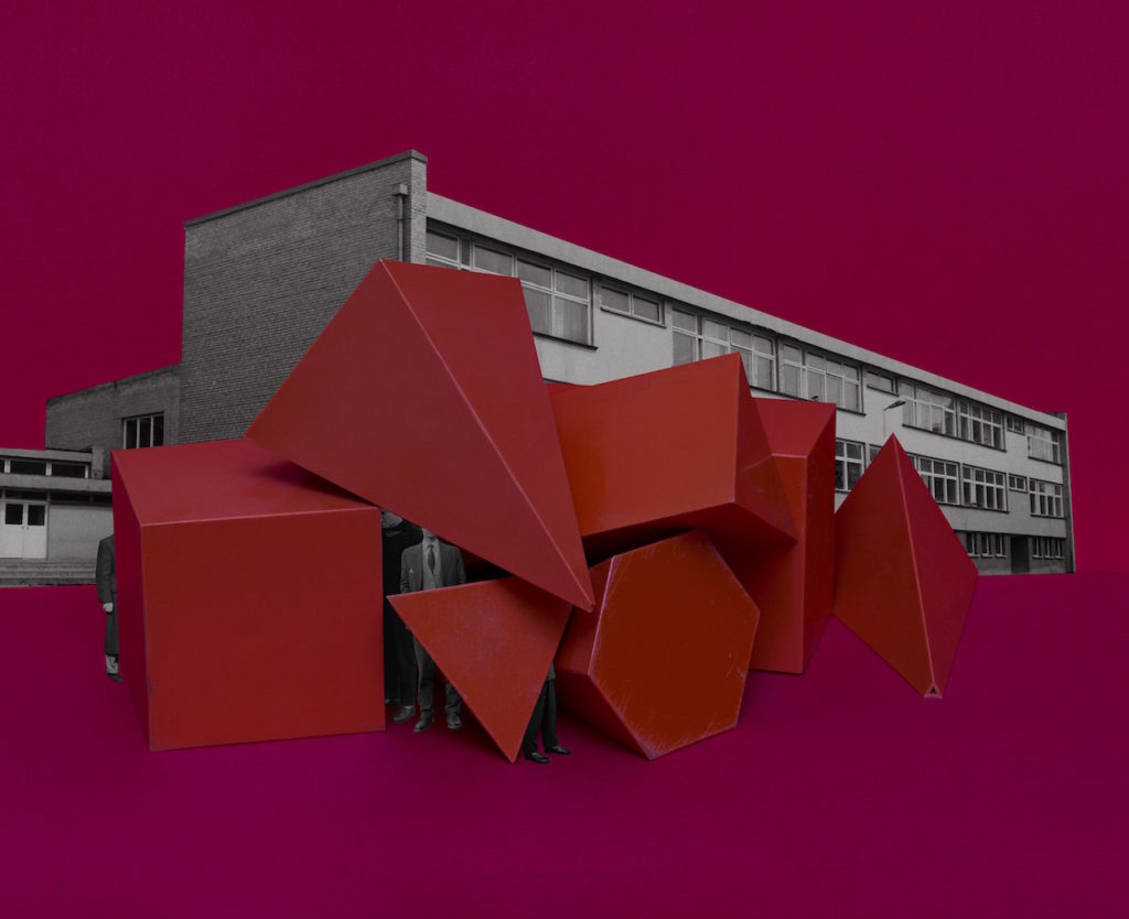
These are my outcomes from the editing in camera as well as on Lightroom in the photomontage. I feel these outcomes have worked well and I am happy with the way they have turned out that I feel some could be used in my newspaper and final zine. The outcomes have come in response to Rafal Milach I feel I have been able to create successful outcomes in response to his work with experimenting with the coloured backgrounds, seeing what colours worked together and seeing what colours worked well with each other to create good effects in camera. I have enjoyed trying to work with creating and composing arrangements against the coloured backgrounds as I feel it adds something to the photographs and makes them more interesting to look at. I will be happy to experiment and use these in my final zine as I feel that the are successful outcomes. Something that I feel could have gone better were maybe being getting the lighting slightly better or the horizontal line straighter as I found slight difficulty in getting them connected correctly to create a perfectly straight line. Using the small figured people in the photographs helped to add to the effect I believe in the meaning of the photographs as well as in response to Rafal Milach, I think this helped to tell more of a story and created for a better, more interesting photograph rather than just composing with the objects it added a bit more meaning to the photographs portraying where the objects where from.
Photomontage: Shoot | In Camera working | Lightroom Editing

In-Camera Working

Below shows two examples of my in camera working with the photomontage. On the right I have worked and started to experiment with the use of the geometric shape blocks and the archival material. I have developed a few lot of photographs that incorporate the use of the shapes on the coloured backgrounds as well as the white backgrounds. Being influenced by Rafal Milach I tried to enclose some of the objects almost in the shapes and the cages however I did this in-camera rather than in later editing, but I will want to experiment with using archival images and incorporating them into my photographs. On the left shows my other experiments when I was working with the figures as well as the geometric shapes this is another version of incorporating the people and other aspects into the photographs in response to Milach.

Lightroom Editing

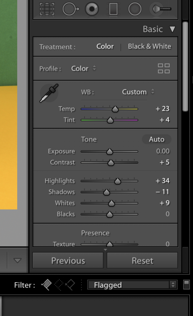
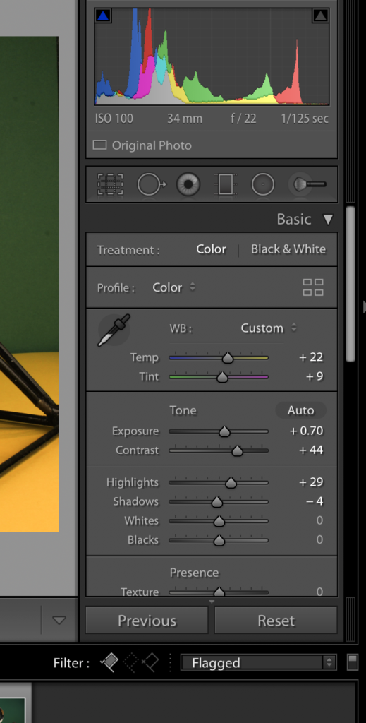
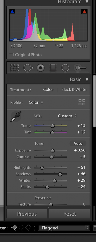
In lightroom I have been working in just updating contrasts and exposures as well as tints to work an enhance the photographs. I have not worked in photoshop as I have wanted to work mainly in camera working for this experiment with the small figures and the coloured backgrounds as well as the geometric shapes. I have worked with the brightness and contrasts of the photographs to enhance the coloured backgrounds I have used to work with the objects in front and help where there may have been some shadowing or dark patches from lighting angles which is the majority of the working I have produced in Lightroom rather than working in photoshop or the camera to particularly edit the photographs.

Rafal Milach: Photomontage

Ralf Milach | Photography

Rafał Milach (born 1978) is a Polish visual artist and photographer. His work is about the transformation taking place in the former Eastern Bloc, for which he undertakes long-term project. He is a nominee member of Magnum Photos. Rafal Milach is a visual artist, photographer, and author of photo books. His work focuses on topics related to the transformation in the former Eastern Block. His works have been widely exhibited in Poland and worldwide, and can be found in the collections of the Centre for Contemporary Art Ujazdowski Castle in Warsaw, the ING Polish Art Foundation, Kiyosato, the Museum of Photographic Arts (Japan), and Brandts in Odense (Denmark).

I will be personally looking directly at Milach’s work ‘The First March of Gentlemen’ which was developed in 2017. The book is contextually produced surrounding the historical events around the town of Września and this came to be the starting point for reflection on the protest and disciplinary mechanisms.  In the series of collages, the reality of the 1950s Poland ruled by the communists blends with the memory of the  Września children strike from the beginning of the 20th century,  which was a protest of Polish children and parents against the Germanization. This shift in time is not just a coincidence, as the problems which the project touches upon are universal, and may be seen as a metaphor for the contemporary social tensions.

“The initial idea of working with the archive was sustained, but the topic changed as I began looking for material that could occupy two spheres – discipline and pacification, and the sphere of freedom – and to bring these elements together in a series of collages.”
The above quote has been taken from an interview that Rafal Milach took part in with the British Journal of Photography, over the subject of ‘The First March of Gentlemen’, I found this quote useful to me while researching having used my own island’s archives as something to be used in my photographs and in montages. It intrigued me the way that he speaks about the subjects changing to go into a ‘sphere of freedom’ as the initial subject on looking is relating to a time of no freedom and occupation and I have just found it intriguing to see the way in which the photographer views and uses the archives as context before going in and looking at the book and photographs as a whole.

https://www.bjp-online.com/2018/06/milach-gentlemen/

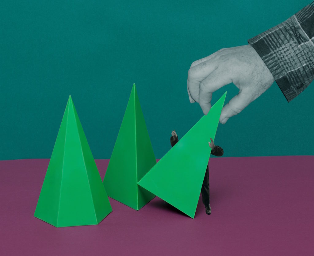
Below shows my chosen photograph of Rafal Milach’s series. When first looking at the photographs we can see the same man, produced twice with photomontage, encaged in two geometric tools. Contextually these shapes and objects were brought into and across schools to be used as teaching tools for subjects such as mathematics, in the case of the book, as you slowly move through the photo-book the figures used from the archives slowly become more entrapped and claustaphobed into these instruments. The figure in the photograph seems looking quite dapper, he stands with not much authority but not as a suppressed minority, however this stand of posture is all juxtaposed with the fact he is encaged in this structure metaphorically speaking it could be taken and seen as a sign of the freedom they had or the lack of. This photograph was not produced all in camera, it is montaged together meaning he subject is unaware of the cage around him.

Milach found the archived photographs in the work of local amateur photographer Ryszard Szczepaniak, and his archive of images shot in Września during the 1950s and 1960s. He photographed people in formal street poses, many of them while on leave from the military, some of whom came from the Armia Ludowa, a communist partisan force set up by the Polish Workers’ Party while under German occupation during World War II. We can see from the photograph below and those alike in the mood board they pose well-dressed, whether in uniform or not, they are as Milach described them ‘dandy-esque’ figures.

Quite literally Milach has detached these figures from their photographs and their surroundings. He is placing them on brightly coloured backgrounds, a hint to child-like features, and he is displacing them on the page and contrasting them. This decision can be contextually backed by looking at what Milach speaks about when describing the figures. – “They were a poorer version of the glamour they probably knew from American films,” “This intrigued me… The photo shoots were somehow detaching the guys from the context of contempt in those days. The 1950s in Poland was a pretty oppressive time in terms of the communist regime, and these guys were just having fun in some remote areas within Września county… posing, staging shooting scenes… It was like being part of the system, but making a joke out of it.”

Studio Still Life Shoot

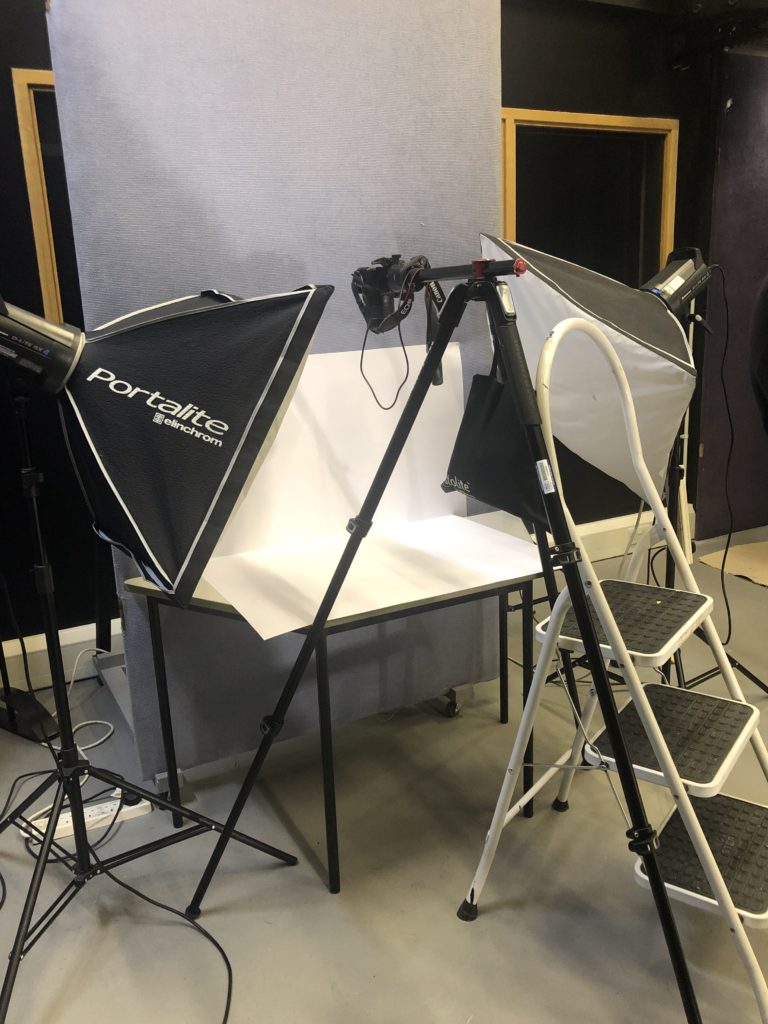
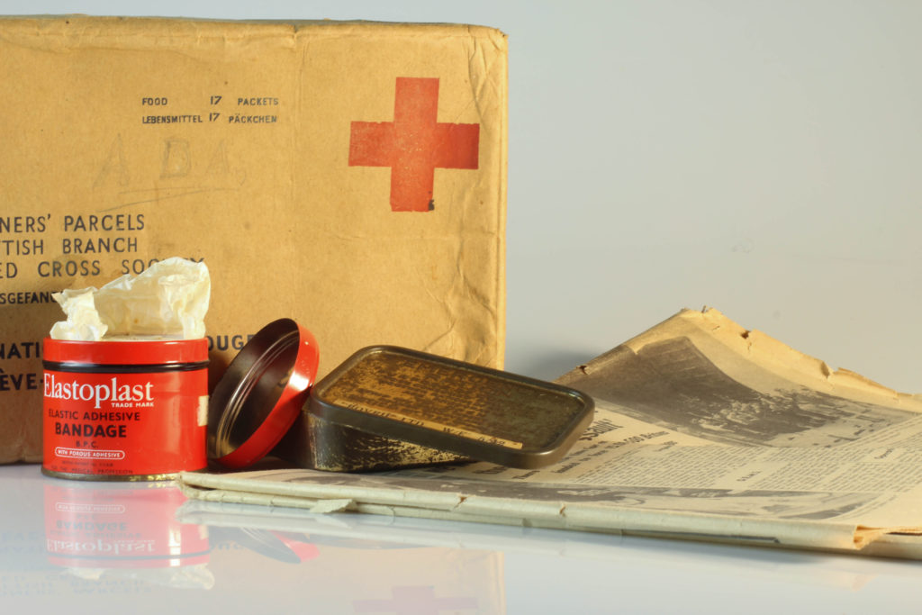
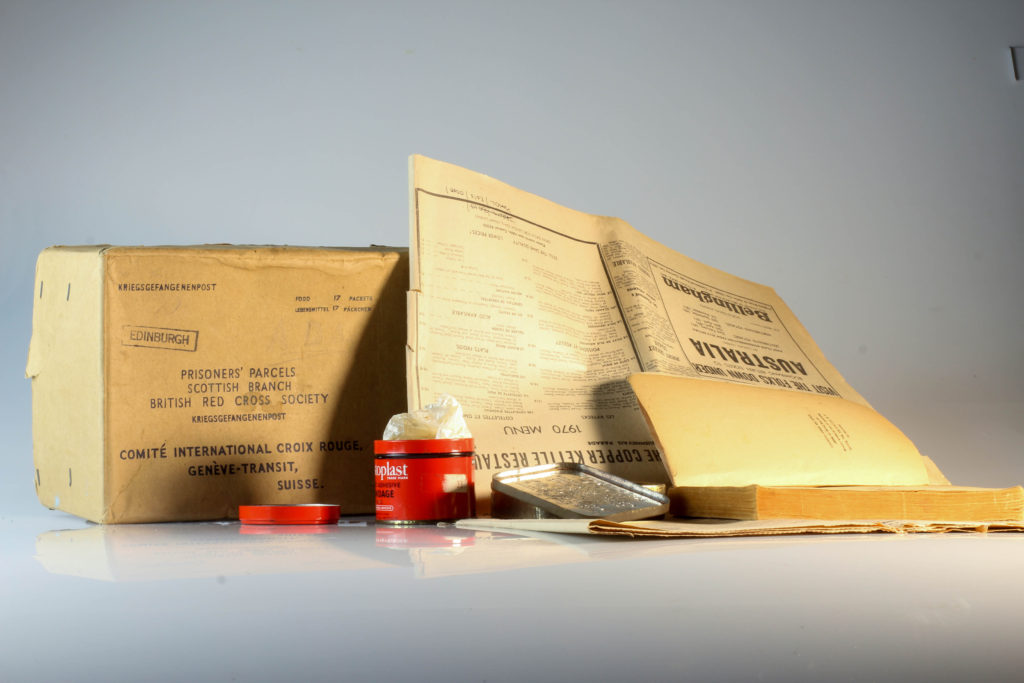
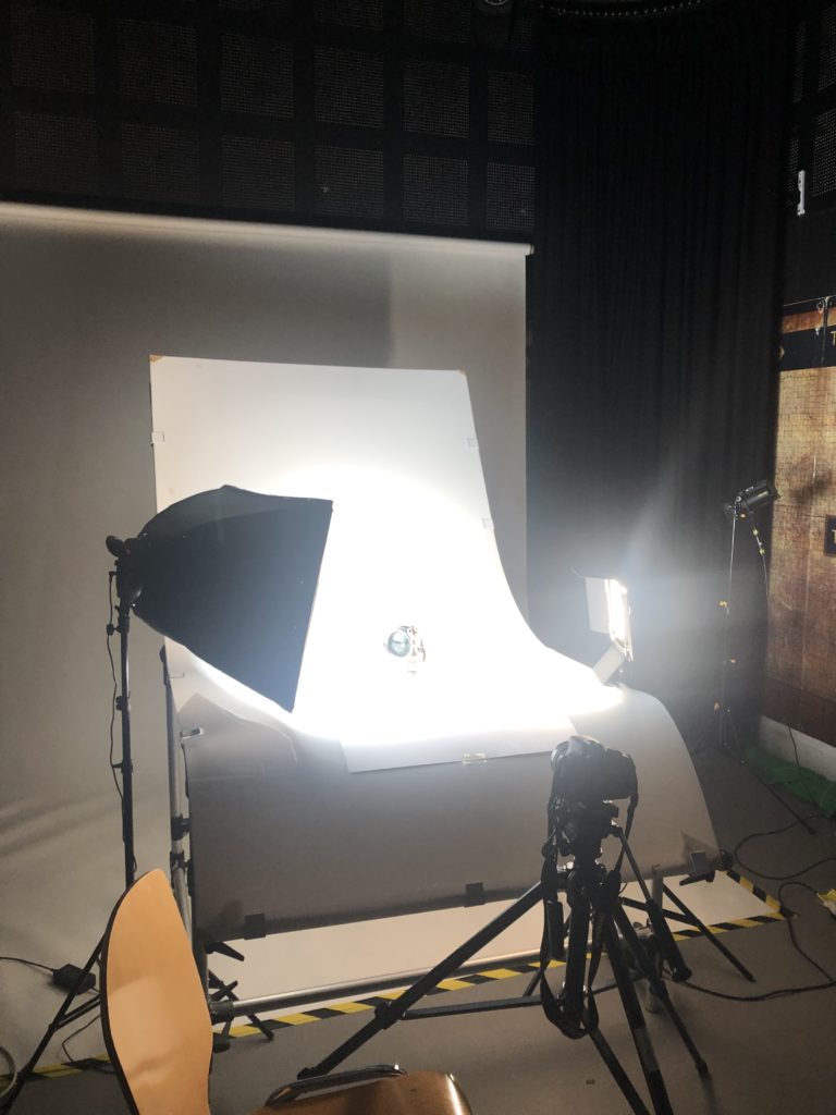
For looking at objects we went into the studio and used two different stations to produce a number of photographs. We used one with the camera directly on and the other shooting from above, using various lightings and attachments for us to be able to create our still life photographs.

The small set up uses one continuous light and two connected flash heads, this allows for a small shutter speed, aperture and ISO as we had the transmitter on the top of the camera connected to the flash heads. On the larger table set up, specifically for being able to take photographs of objects, 3D ones, we had a continuous light on, a back light and secondary (tungsten light) light source to eliminate shadows and create clearer images without grey shadows. (Set Up Pictured below)

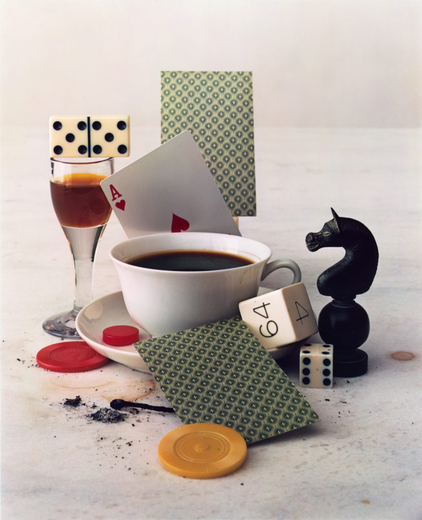
For the shoot I planned to take photographs of the occupation archive objects that we had placed in the studio, I wanted to capture some regular ones and some with an abstract feel. After looking at Irving Penn with some of the photographs I will aim to create a sort of ‘lived in’ feel like the aspects I felt from looking at Penn’s work such as After Dinner Games – New York 1947.

Birds eye view – table set up
Continuous lights, 3D on front objects set up
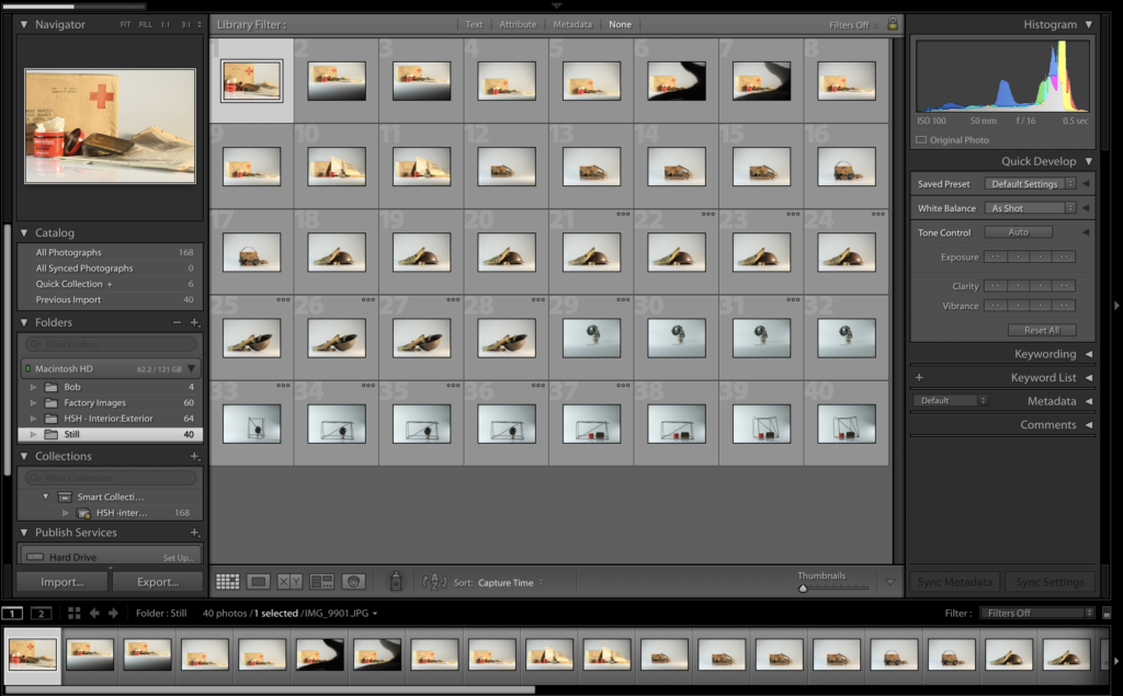
Contact sheet of Photographs:

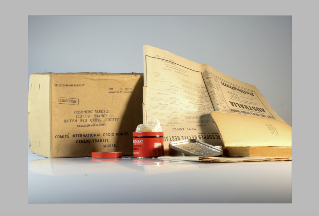
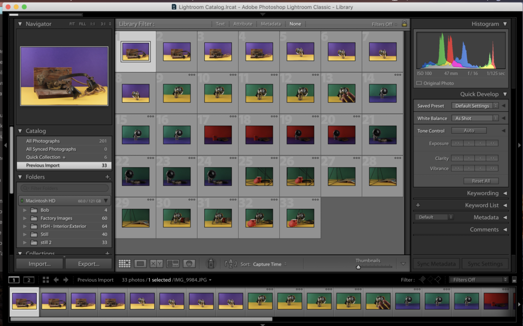
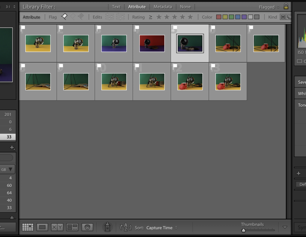
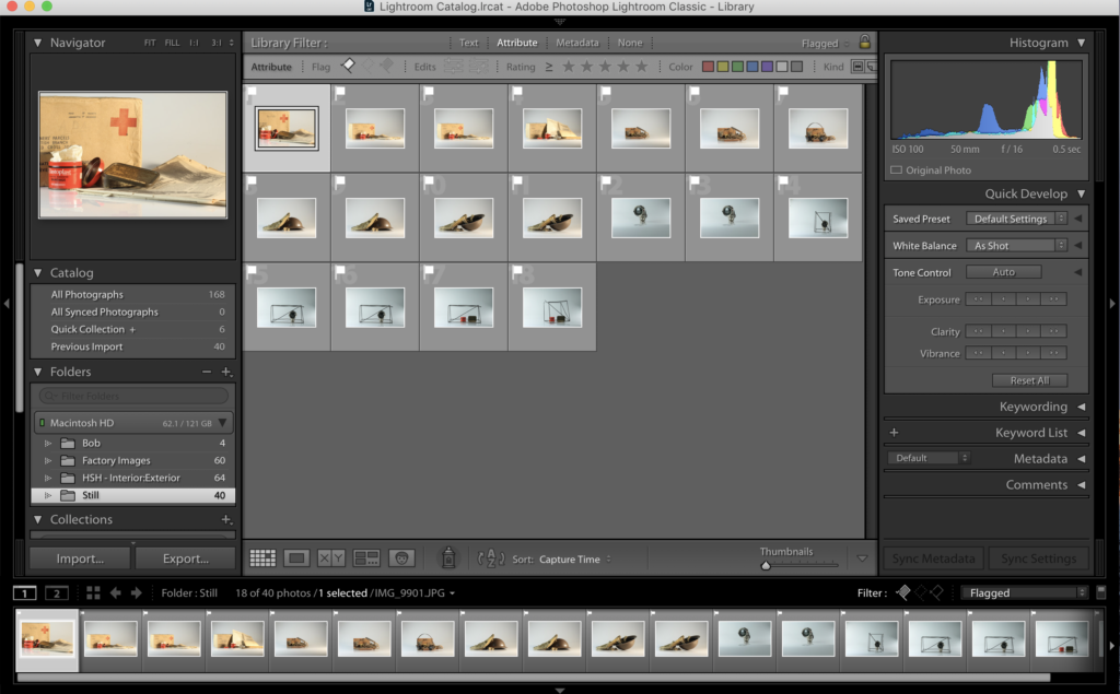
Below shows my contact sheets of the photoshoots produced in the studio, my original lot of photographs and as well my flagged, chopped set of photographs ones that I will look to go through and edit in the future and develop further in Lightroom and maybe Photoshop.

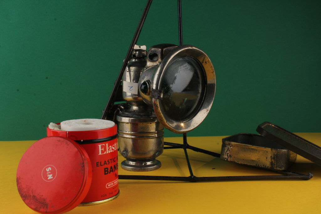
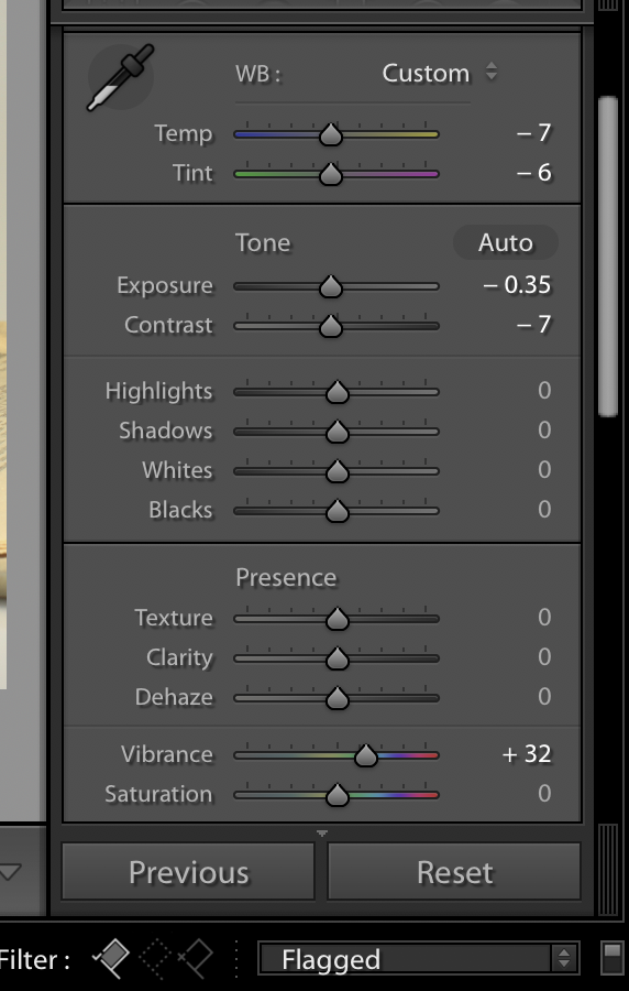
For my editing for these set of photographs I decided to look into keeping it simple. I looked at editing contrasts and temperatures as well as looking at what Lightroom suggested for white-balances to then see what I could do further to enhance the photographs rather than change them completely, I worked into around 4 of my photographs to create as final outcomes from this photoshoot. I worked mainly in Lightroom instead of photoshop as I feel this would be better for enhancing rather than manipulating the photographs. For some of my photographs I cropped the image into a square to position the objects in the centre of the photograph as some of them were slightly to the right of the photograph or there was a slight shadow in the side and a way I found effective to remove this problem if both were involved to crop the photograph down to a square to have the clear lighting and the centred photograph.

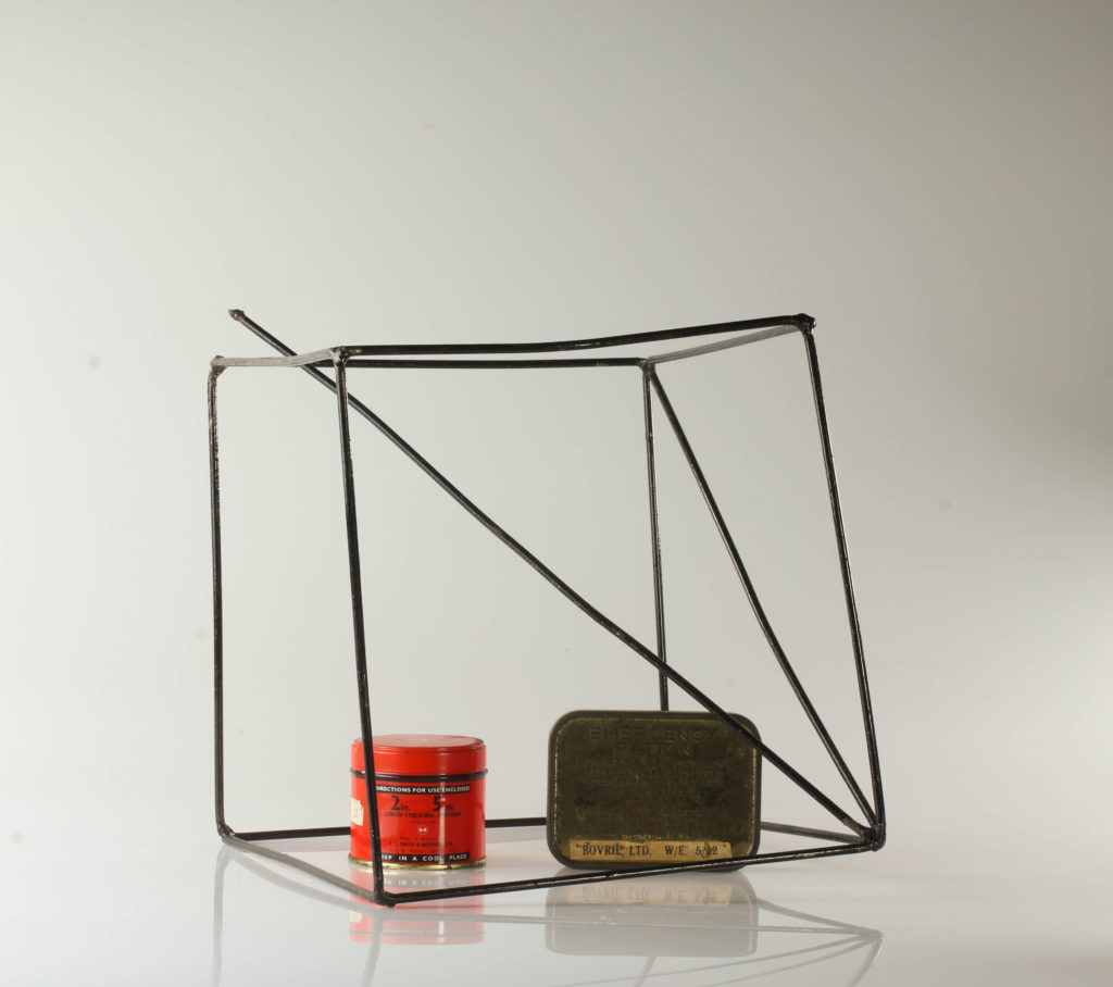
I chose to edit four of my cut down photographs as these were the ones I felt had the best composition to look at in the photographs. I chose two of my original trials of the objects just on the table and laid out, trying the Irving Penn “lived in” style that I had taken from the research and looked into. My second two came from my experimenting with shape and placing, looking at how I can incorporate archival objects into archival teaching methods, cubes and shapes used in maths etc. Below shows some of my editing process with the cropping and enhancing of the photographs in Lightroom.

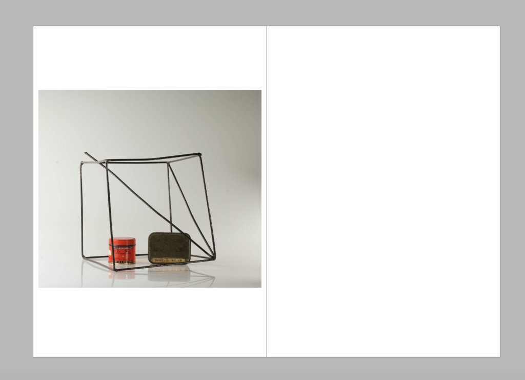
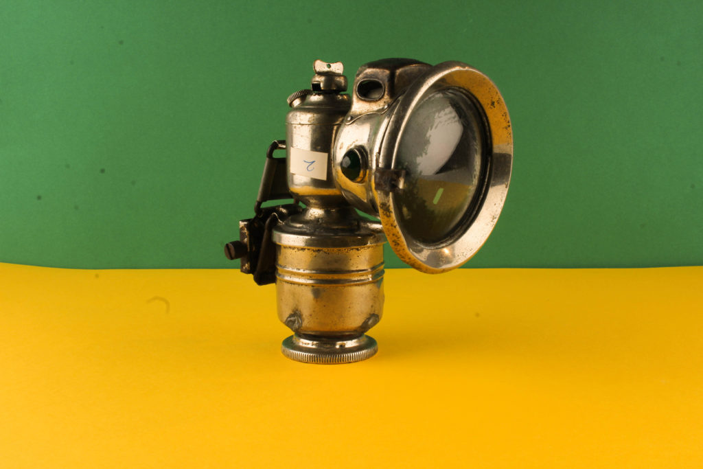
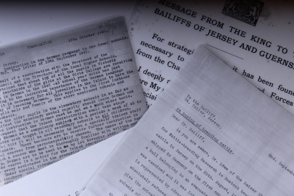
Below I have some of my outcomes from my studio photoshoots that I have produced through editing and working in Lightroom as well as working in camera. One of my favourite outcomes from this photoshoot is the one taken from above of the letters, not much editing I felt was needed for this photograph as it already is quite dark and in black and white which I feel creates a good effect for the photographs, the letters that I were taking photographs of were some personal ones as well as formal ones, sent from Bailiffs to England and vice versa at the start of the war, overall I felt taking these from above in collection with each other help to create a better more powerful image. For my other photographs I experimented with the use of other objects upright on the objects table. I experimented with incorporating unknown objects made out of wire to create some abstract photographs with some form and shape, I feel these made for interesting photographs, I tried to place the archival objects in the gaps between the wires to create lines and shapes which were interesting the eye, while in Lightroom I just experimented with editing the contrasts and brightnesses as well as exposures to enhance the photographs rather than edit them completely like I would in photoshop. For the last of my outcomes in this photoshoot I had collections of the archival objects all placed together to create what could seem like a scene or to create an idea of what was used and what life looked like during the occupied period, I found experimenting with these a little difficult due to the shadows created and getting the right lighting however I do feel that they are still good outcomes as to experiment with object photography which I had been yet to try yet.

Contemporary Practice: Irving Penn

“I myself have always stood in the awe of the camera. I recognize it for the instrument it is, part Stradivarius, part scalpel.” 

https://irvingpenn.org

Irving Penn was an American photographer known for his portraits and fashion photography alongside still life’s. He has a book titled ‘Still Life: Irving Penn Photographs 1938-2000’ – This book gathers Penn’s work in the still life genre, so central to his art, from 1938 until 2001. It opens with an introduction by John Szarkowski, who places Penn within the larger context of artists working in still life. Penn oversaw the design and production. – Published by Bulfinch Press, Boston, 200

At a time when photography was primarily understood as a means of communication, he approached it with an artist’s eye and expanded the creative potential of the medium, both in his professional and personal work. Penn’s preference for photographing in the controlled environment of a studio, where he could trim away anything that was not essential to his compositions and hone in on his subjects.

I have previously taken some time to look into Irving Penn studio portrait photograph and look into his style of working and found it very interesting and informative and eventually worked very well with outcomes for studio portraits, which is why I have chosen to look at Penn for still life photography of objects as well.

Previous Look into Irving Penn and Studio Portraits
Collection of Irving Penn’s still life work:

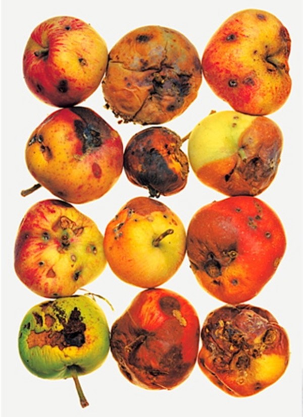
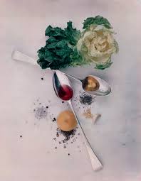
I enjoy Irving Penn’s work as I find it pleasing to the eye and I like the way that some of the photographs look less staged, like somebody has been using the cutlery or using the ruler and then Penn has taken a photograph how it has been left and this is something that I like about the images and how they are presented. I also like how some show repetition with the apples they are all laid out 3 by 4 and is something I would like to try and experiment with when I look at making my own still life photographs.

Image Analysis:

Below shows the photograph I have chosen to edit and look into in more depth. This photograph is called ‘After Dinner Games’ and was taken in New York in 1947. The photograph shows a variety of objects placed on a table. Unlike some other still life photographs I have seen where there is no horizon line, in this image we can clearly see the line where the table cloth ends and the wall begins, I feel this generates a more ‘lived-in’ feel as it is less artificially placed. The objects have been arranged to seem as though people have been using them and this is how they have been left, we can see drink and ash stains on the cloth as well which adds to less synthetic feel to the photograph. The image has fairly white light suggesting that is probably artificial rather than natural light which I feel tends to be more warm and yellow, there is a slight shadow falling to the right of the photograph from the underneath of the card, the dice and the chess piece suggesting the light is mainly coming from the left side of the photograph. I enjoy the composition of this photograph with how all of the objects are linking together and aren’t just laid out separately, I feel it creates a really interesting photograph that is pleasing to look at and creates and idea or story of what could have been happening if this photograph was taken in a real life situation.

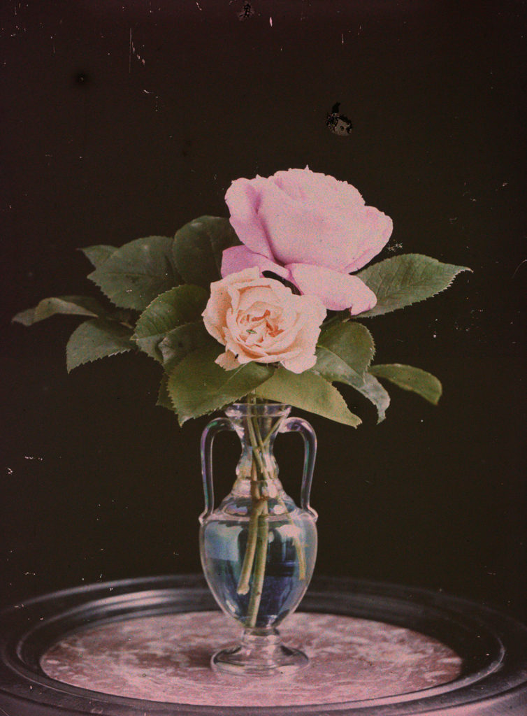
Emile F. Guiton: Autochromes:

https://blog.scienceandmediamuseum.org.uk/autochromes-the-dawn-of-colour-photography/

The first practicable method of colour photography was the autochrome process, invented in France by Auguste and Louis Lumière. Best known for their invention of the Cinématographe in 1895, the Lumières began commercial manufacture of autochrome plates in the early 20th century.

HOW DO AUTOCHROMES WORK?

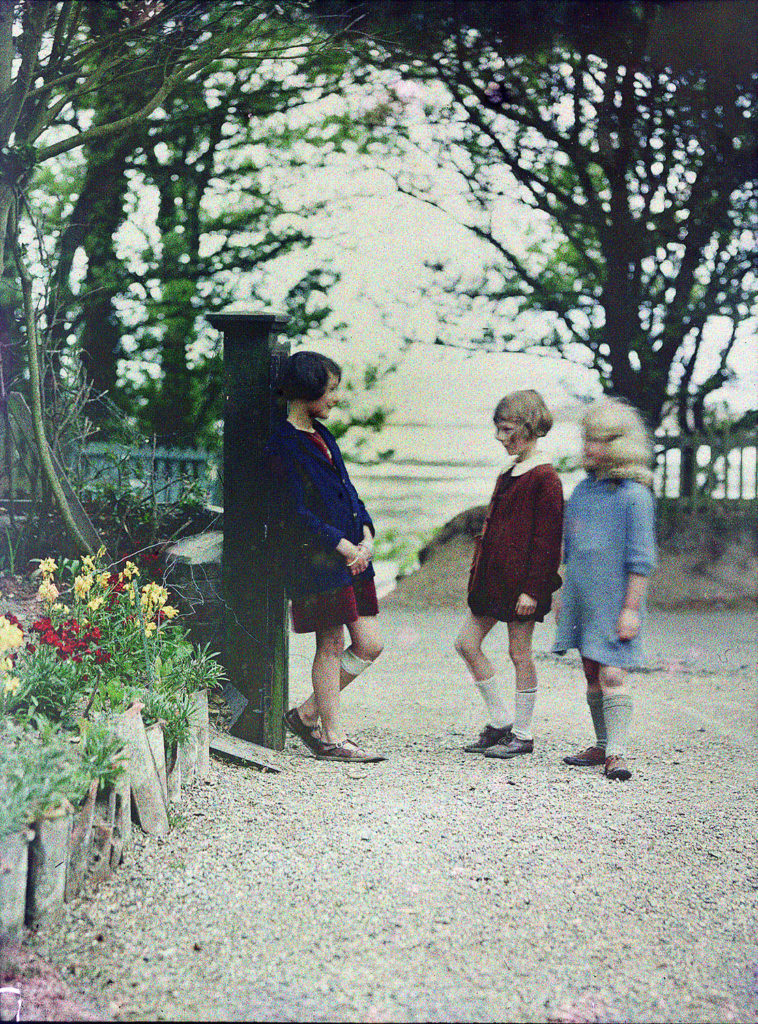
Autochrome plates are covered in microscopic red, green and blue coloured potato starch grains (about four million per square inch). When the photograph is taken, light passes through these colour filters to the photographic emulsion. The plate is processed to produce a positive transparency. Light, passing through the coloured starch grains, combines to recreate a full colour image of the original subject.

Emile Guiton

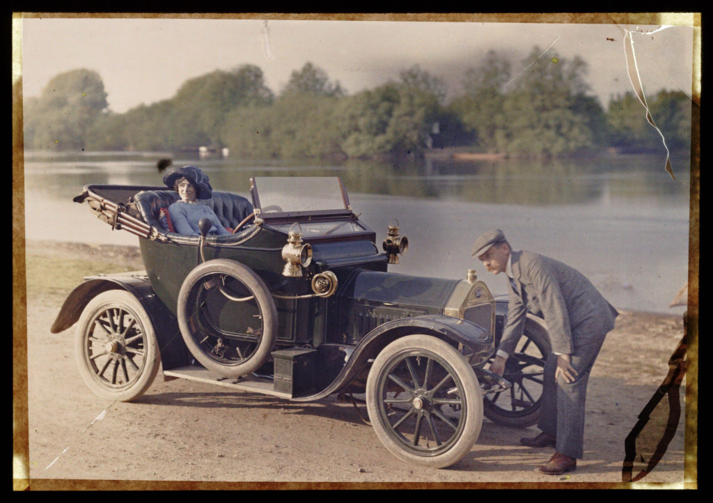
Emile Guiton was probably the most prolific of the Jersey photographers who chronicled island life during the first half of the 20th century. A substantial collection of his pictures is contained in the photographic archive of La Société Jersiaise.

Born in Jersey in 1879 he had a keen interest in history and was a member of La Société Jersiaise, served on its executive committee as joint honorary secretary, and was curator of the Museum and editor of the Annual Bulletin.

He also realised that history was being made during his own lifetime and he recorded the development of his native island from the turn of the century until his death in 1972. He experimented with Autochrome colour very early in the century.

Not only did he record events and activities during his own lifetime, particularly agriculture, but he had a fascination with the past and chronicled with his images many archaeological excavations (his pictures of the interior of La Hougue Bie remain some of the best in existence) as well as photographing Mont Orgueil Castle and other coastal fortifications, sites of geological interest, and architecture. Guiton had a particular interest in the design of Jersey houses over the centuries, and particularly in different styles of arches to be found in the island.

He was present at many major events, including the Liberation in 1945 (he had also taken photographs during the German Occupation, and the proclamations of successive monarchs in the Royal Square.

Historical Contexts: Objects

Edouard Manet once called still life “the touchstone of painting.” Characterised by an interest in the insentient, this genre of art has been popular across movements, cultures, and periods, with major figures like Paul Cézanne and Pablo Picasso sharing the Impressionist artist‘s view.

STILL LIFE: nature morte; A still life pictorial is a painting/drawing/photograph is a piece that features an arrangement of inanimate objects as it’s subject. Traditionally these items would be set on a table and would often include organic items such as fruit and flowers, as well as household items such as glassware.

The term “still life” is derived from the Dutch word stilleven, which gained prominence during the 16th century. While it was during this time that the still life gained recognition as a genre, its roots date back to ancient times.

Ancient History

Still-life as an art form first originated from Ancient Egyptian highly codified mortuary rituals. Egyptians at the time believed that objects represented on the walls of a tumb or inside a sarcophagus would accompany the dead in the afterlife. Greek and Romans later realised similar types of paintings though they did not associate any religious symbolism to it anymore. However, unlike Egyptian frescoes which were not using any perspective or shading, Greek and Roman started to develop a somewhat sophisticated form of still-life ar, more realistic and detailed.

Socio Economic Background:

The creation of the Dutch Republic caused a rise in having great pride in national identity and it came with a delight in the new art that was uniquely Dutch. As the economy flourished, and the trade with the Indies and South America grew so did the fashion for collecting, the popularity of painting in general, and Still Life (Stilleven) in particular.

As a result of this trade with far-flung places and the introduction of exotica, Dutch artists of the 17th century became renowned for being greatly concerned with what Kahr refers to as a: ‘close scrutiny of the natural world.’ This, combined with their preoccupation with perspective and the study of light, provided the basic elements of Still Life painting. The term had come into general usage in mid-century, Still Life being the carefully composed portrayal of inanimate objects.

RENAISSANCE

Northern Renaissance artists popularized still life iconography with their flower paintings. These pieces typically showcase colorful flora “from different countries and even different continents in one vase and at one moment of blooming” (Metropolitan Museum of Art) and often do not feature other subject matter. These paintings rose to prominence in the early 17th century, when Northern Renaissance artists grew increasingly interested in creating realistic studies of everyday items.

DUTCH GOLDEN AGE

Dutch Golden Age artists took this interest in detailed floral art a step further with their vanitas paintings. Vanitas paintings are inspired by memento mori, a genre of painting whose Latin name translates to “remember that you have to die.” Like memento mori depictionsthese pieces often pair cut flowers with objects like human skulls, waning candles, and overturned hourglasses to comment on the fleeting nature of life. Unlike memento mori art, however, vanitas paintings “also include other symbols such as musical instruments, wine and books to remind us explicitly of the vanity of worldly pleasures and goods” 

https://www.tate.org.uk/art/art-terms/s/still-life

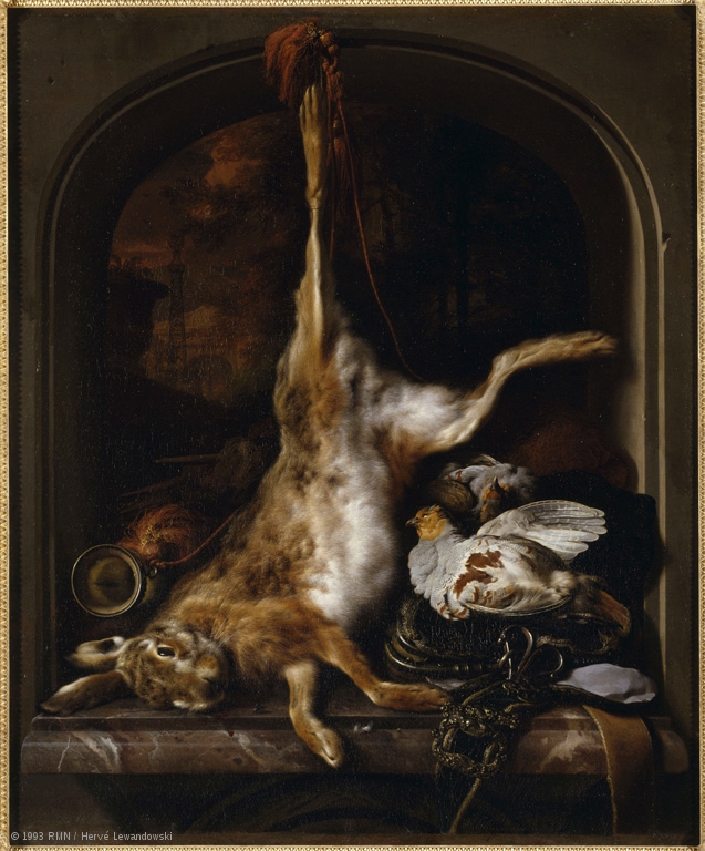
Image Analysis:

Jan Baptist Weenix painted a wide range of subjects: landscapes, still life, genre scenes, history paintings. During the early part of his career he painted Italianizing scenes in the style of his father, before achieving a reputation as a talented painter of game, both living and dead. Weenix went on to become one of Holland’s most celebrated painters of hunting still-life.

Hunting still-lives, clearly, differ from everyday kitchen and table scenes, contextually they highlight an important aspect of the lives of a highly privileged social class. Hunting trophies such as this were often painted for the townhouse or castles of wealthy parsons. In this way aristocratic parsons were able to advertise their passion for hunting. Designed to impress, depictions of the game, together with game bags and other accessories, in sophisticated, luxurious settings, were seen as potent symbolic expressions of aristocratic wealth, pride and landownership.

As with Weenix’s paintings of game, and other hunting still lifes of the time, an animal (in this painting a hare) is shown hanging by one of its back legs with its head down, as a trophy. The motif is directly related to the practice and customs of hunting with dogs. Here the hare is hung from the top of an arched window frame seeing out to a landscape. The animals head and legs are resting on a marble ledge and to the right lie two partridges on top of what could be a game bag. To the left of the hare what seems to be a type of hunting horn is seen to be sticking out. The colour scheme of dark warm tones, browns and reds, could be taken as a hint towards the idea of raw meat, associated with an essence of hunting, the window ledge itself is made from a slab of red and white-veined marble.