A2 photography
A2 photography
PERSONAL INVESTIGATION
BUNKER ARCHAEOLOGY
PERSONAL INVESTIGATION
BUNKER ARCHAEOLOGY
The last photographer I will be looking at is Mahaela Ivanova.
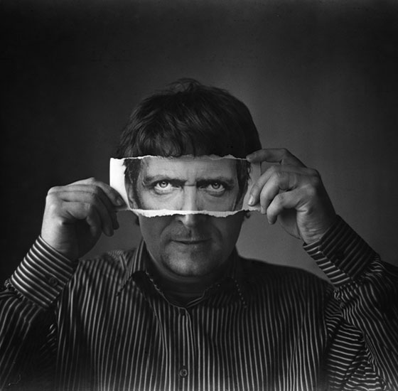
Mihaela Ivanova is a Bulgarian photographer who experiments with simple conceptual shots and black and white series. The works below focus on the concept of identity, with the subject holding a part of a portrait of a different person, whether it be the eyes or the mouth, in front of their own face, hiding their identity.

Contact sheet:
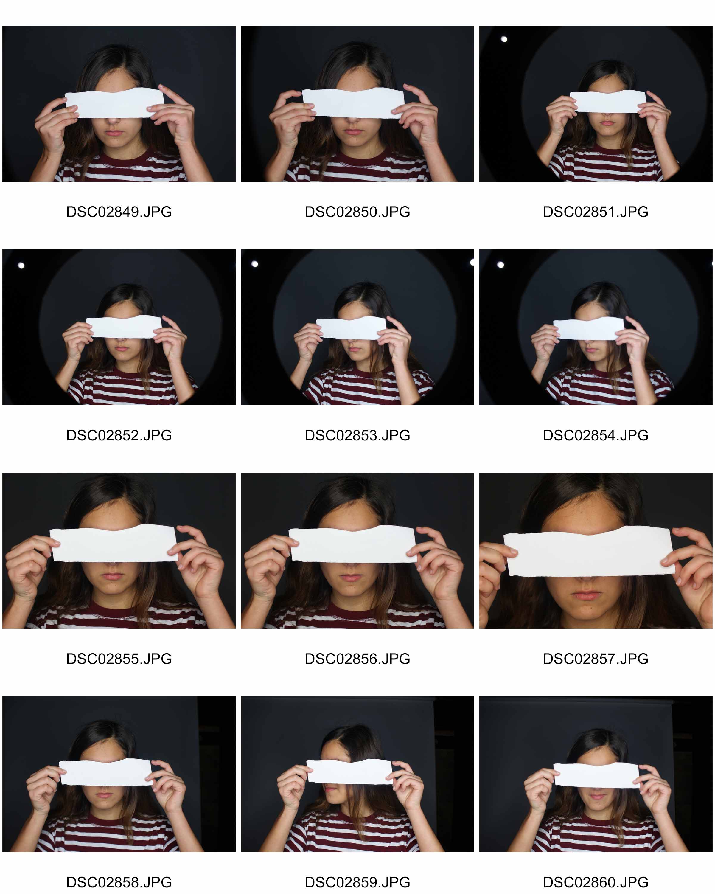
In the pictures I took, since I wasn’t able to get a picture of another person’s face in time for the photo shoot, I instead used a blank piece of paper for the subject to hold over her eyes, and will be photo shopping another person’s face into that piece of paper to create the look of Mihaela Ivanova’s work. I told the subject to look directly into the camera with the ripped piece of paper over her eyes to get the right pose, which resulted in these photos.
Chosen edited picture:

How I did it:

I started off by choosing an image which I could use, it being this one.

I then went and chose a picture of myself and copied half of my face, and then pasted it onto the picture where the stirp of paper would be. I then reduced the opacity and erased the excess image around the strip of paper. I got rid of some of the image on the strip of paper around the edges to try and create a ripped effect, as in Ivanova’s work. I also brightened my eyes using the dodge tool to make them stand out more.

Since i had pasted a picture over the original image, I covered all the shadows, so I had to implement them in myself to give it more of a 3D look, as if the piece of paper with the image on is actually there in her hands. I did this by using the eyedropper tool to take the colour of the image underneath her fingers, darkening the colour a few shades to almost a black, and then taking a soft brush tool and drawing it on where the shadows should be.

To make it look more natrual, I reduced the opacity down to 30%.

To clean it up and to make the shadows actually underneath the fingers and not on top of them, I carefully erased the excess shadows which were on top of the fingers.

To comply with Ivanova’s style, I changed the image to black and white, playing with the settings until I got my desired look.

I then went and adjusted the brightness and contrast, making the image darker and creating a dramatic contrast between the darks and lights.

Finally, I adjusted the levels, making the background darker so it brings out the subject.

This is my final outcome in response to Mihaela Ivanova. I believe it was successful, it’s clearly inspired by her work, with the ripped out person in front of someone else’s eyes, hiding their true identity,and the black and white filter on the image which gives it a dramatic effect. I like how well the photo is put together, and how I managed to put the image of my eyes onto the ripped piece of paper without making it too obvious that it’s photoshopped, however I don’t like how my face doesn’t align up with the subject’s, like in Ivanova’s works. It doesn’t look like it’s actually part of her face, the nose is out of line and the face is too wide compared to the subjects. I should have made the image of my eyes less wide and positioned it better or chose a different image which fit better.
It fits the concept of lack/loss of identity because you can’t make out who the person behind the piece of appear it, you can only see the lower half of their face.It may also be perceived that the subject hasn’t got an identity and is longing to be someone else, hence the image of someone else in front of their own face.
The theme I will be exploring is the lack/loss of identity, and i’ll be looking at multiple different photographers to gain ideas to add to my final piece.
Michalina Woźniak is a self-taught Polish photographer and has been taking pictures since 2009. In her Identity Series, she focuses on the loss/lack of identity and portrays it through dark and gloomy images.
I’m a self taught 21 y.o. photographer based in Lublin (Poland). I’m in love with deep and dark emotions, the more disturbing they are, the more powerful they’re for me. I need those strong connections between me and another worlds (creations) to FEEL it and to be able to touch it somehow.
This story is about Identity and alter ego, but everyone can find whatever he/she wants here. I don’t want to tell you what’s it all about, I want you to look for it and to feel it.
Photography is like a poem – it’s all about the impression and impulse. You need to feel it, to find the moment.
– Michanlina Wosniak
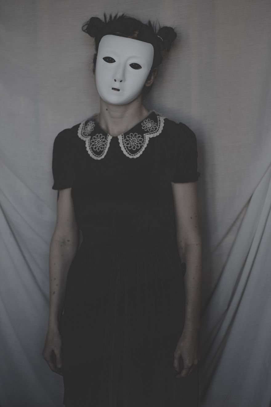
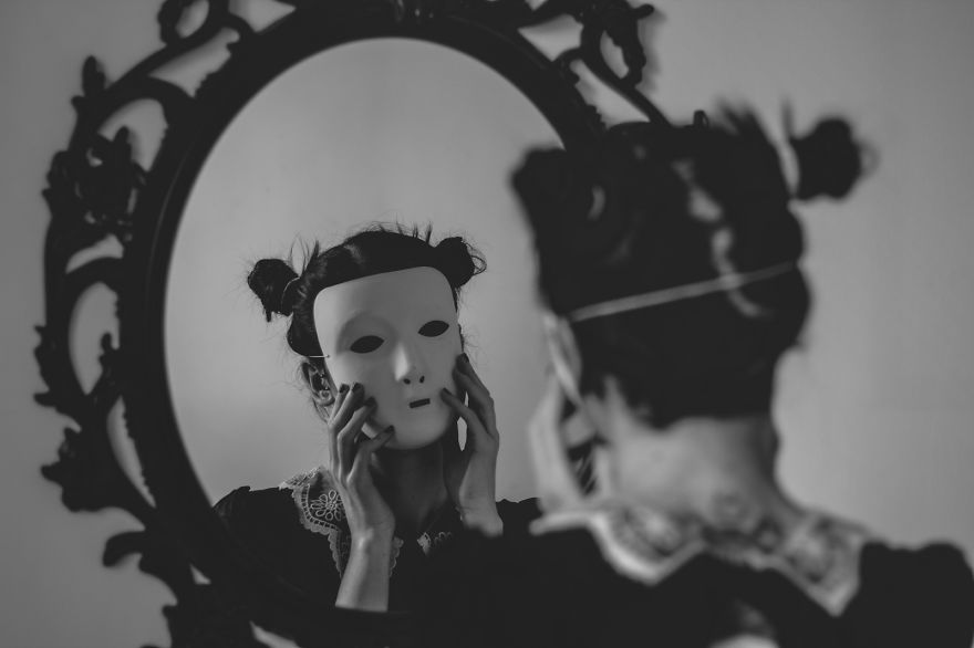
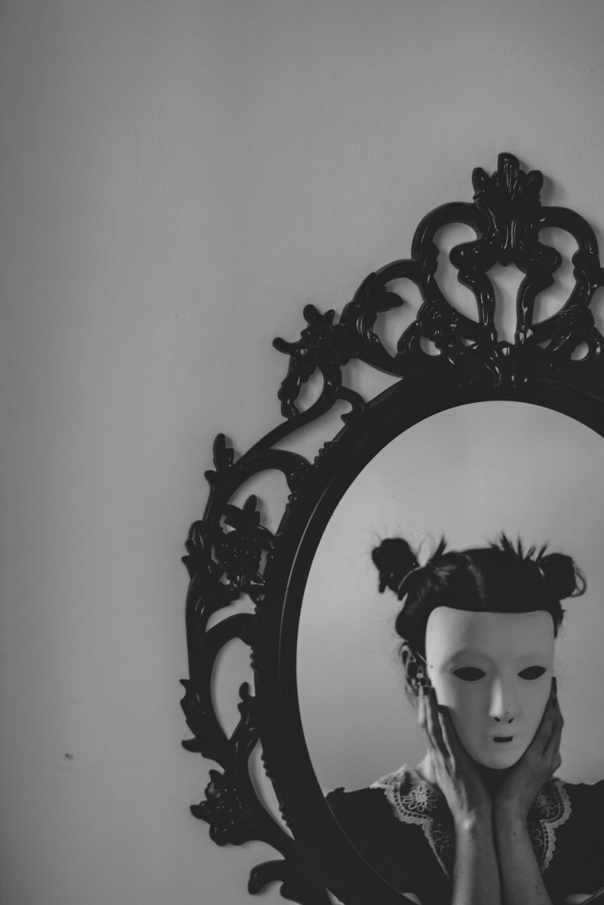
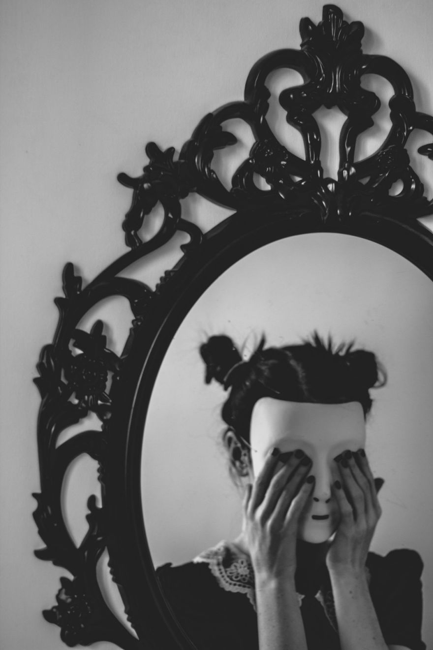
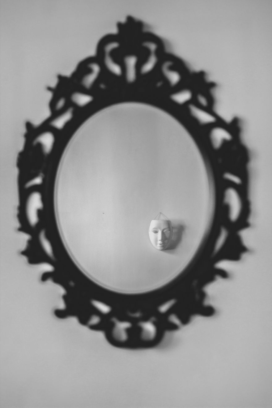
Contact sheets:
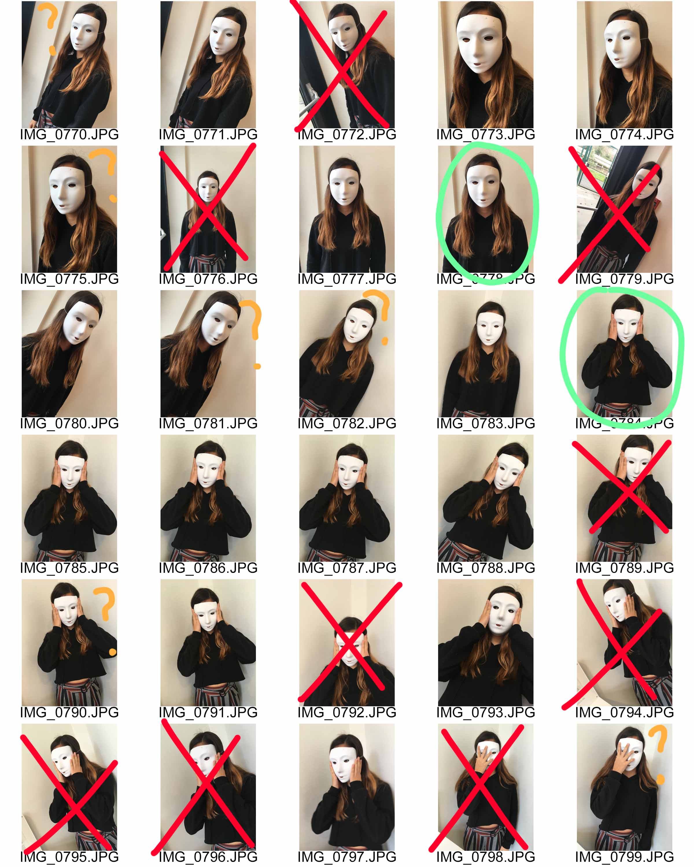

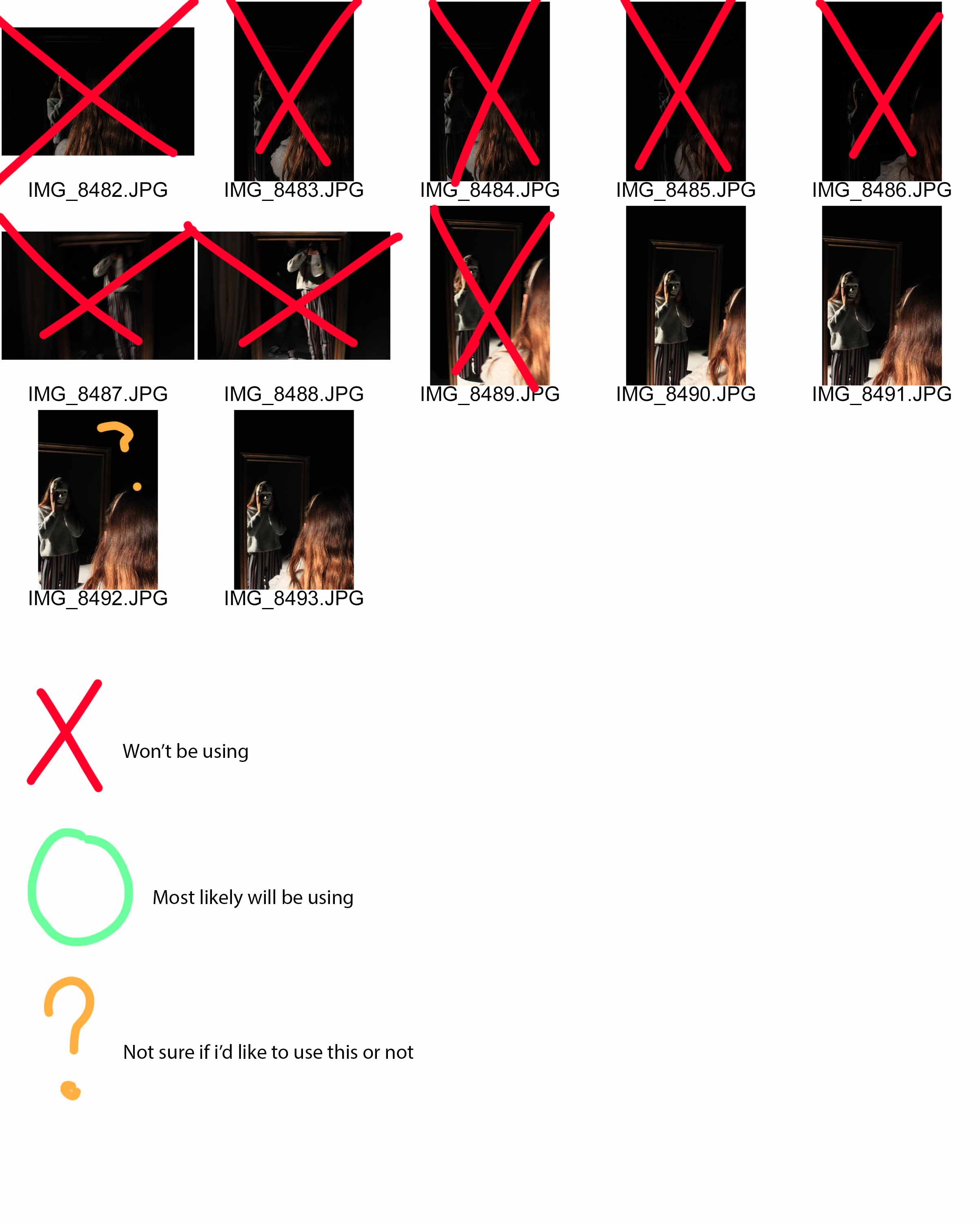
For my theme, I focused on the aspect of a masked face, and not being able to see the identity of the model in the picture. I also tried replicating pictures done by Wozniak, of a masked person looking into the mirror, surface which gives off a reflection, or looking directly into the camera. These link to my theme of the lack/loss of identity as the face of the person is hidden, and them looking into the mirror with the mask on, touching their face as if in confusion or distress, suggests that they themselves don’t know who they are. I got my subject to do multiple poses for this project, looking right at the camera with the mask, touching their face with their hands, and looking to a mirror or reflection.
Chosen edits:
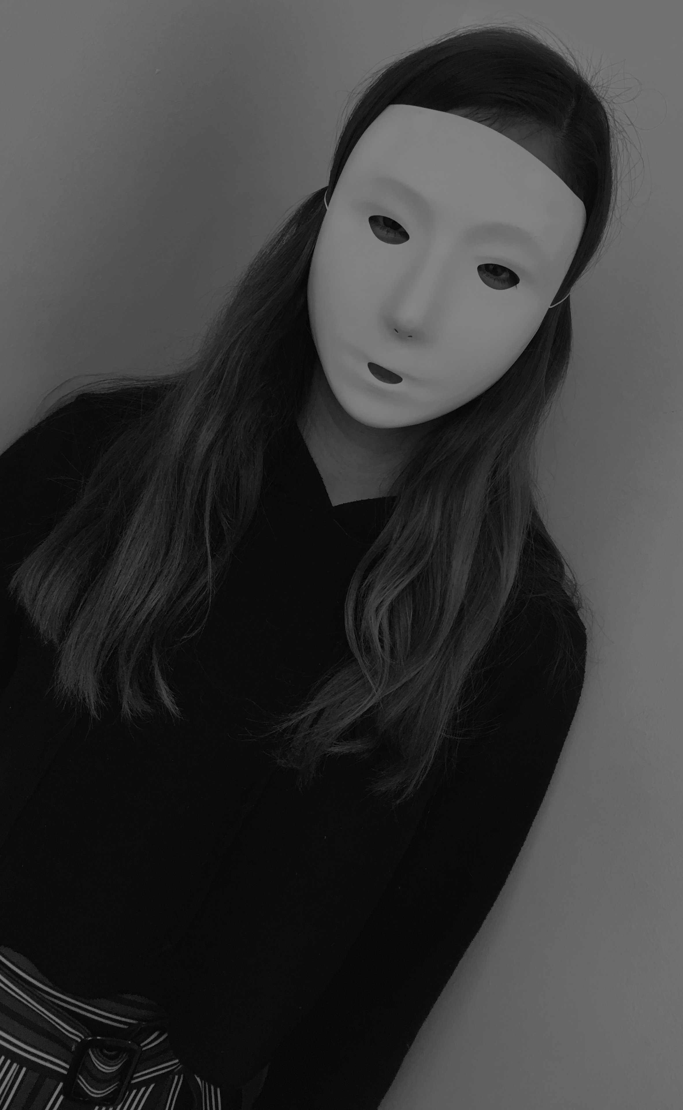
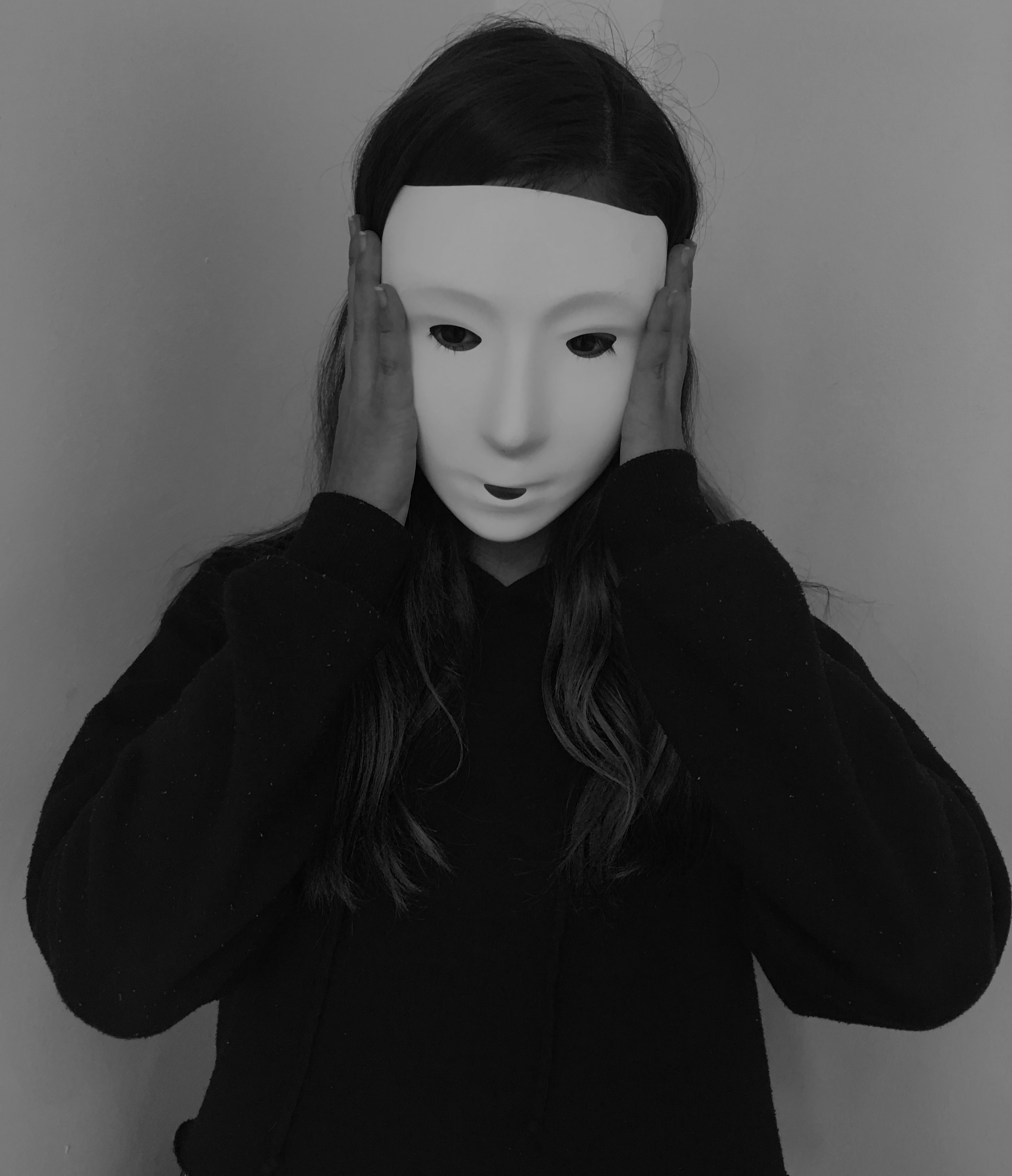
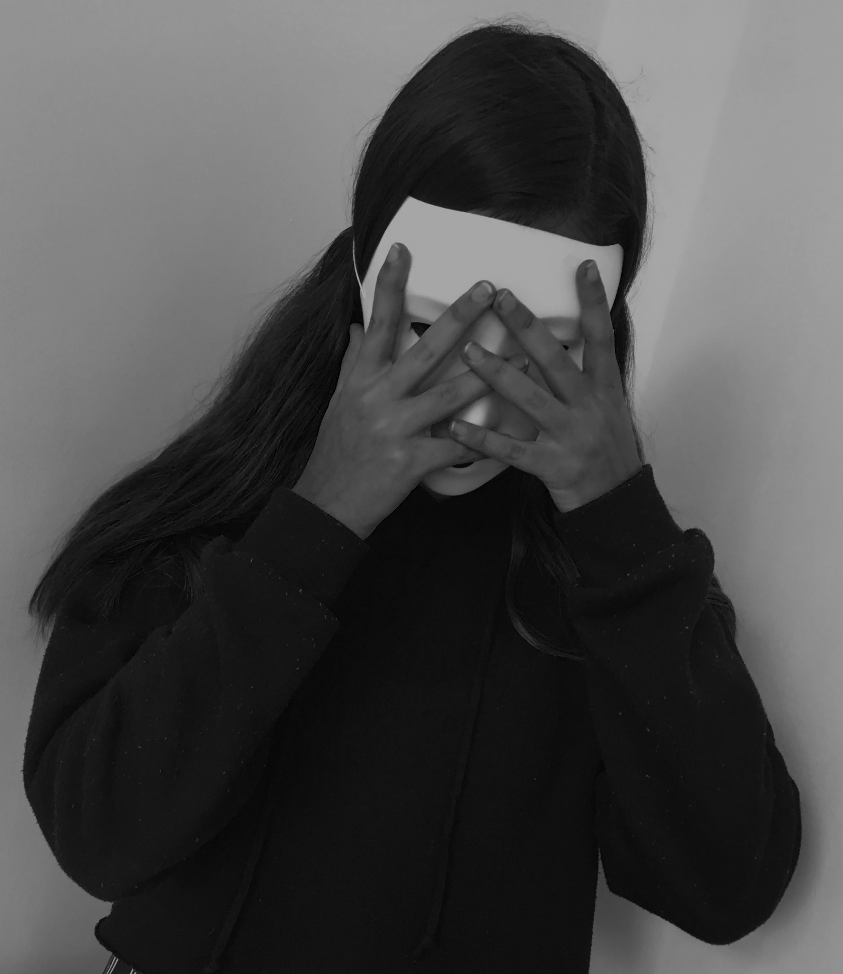
I chose these images because I believe that they relate to the theme of lack/loss of identity and portray Michalina Woźniak’s work successfully, with the masked subject and the eerie black and white setting. I think they also show a story, the first picture she seems normal, staring into the camera as if nothing’s wrong. Then in the second image, she’s touching her face as if she had just realised something, maybe the fact that she lacks identity. And in the last image it’s as if she’s in distress, her hands covering her mask as if she’s hiding away.
I like my final outcomes, they tell a story of someone who’s lost their identity and don’t know who they are, but I believe I could have taken more of a variety of images, with more mirrors, more poses and different people, including me. That would have defiantly increased the quality of this project.
Annegret Soltau is a German visual artist. Her work marks a fundamental reference point in the art of the 1970s and 1980s. Photomontages of her own body and face sewn over or collaged with black thread are the most well-known works done by her.
Contact sheets:


For the images I took, I was looking for a more portrait like pictures. I had the subjects look directly into the camera at some points, look away at others, do different facial expressions to give me some sort of variety when it came to choosing the images I was going to use for the photo-montage. I didn’t get too many images but I defiantly got enough to be able to use for my final piece for the response to Annegret Soltau, however many of them were either too over-exposed or blurry.
Chosen images to create photo-montage:
I chose this for the base image because it has a calm tone to it compared to the other pictures – here the subject is just staring into the camera, a picture which is perfect for my response to the photographer as she uses a normal base image too.

I chose this image because I wanted to use the subject’s mouth, as in one of Soltau’s work, she has an image of someone’s open mouth covering someone’s face, so I wanted to replicate that aspect.

And for the final image, I chose this one because I was interested in using the mouth and the eyes. Unlike Soltau’s work that i’m getting inspiration from, I’m using two mouths to add a bit of a quirk to it.
How I did it:
To change my work into a response to Annergret Soltau, I first went and printed out my chosen final images which I would be using for the photo-montage piece. I then went and ripped each image of the subjects up into calculated pieces, and then arranged them into weird and quirky ways which still resembles a person, and then took black thread and sewed them together to create the unique look of Soltau’s work.

This is a picture of the final piece of the photo-montage in repsonse to Annegret Soltau . I got to this point and was thinking about stopping here as I liked the arrangement of the eye and mouths, and was deciding whether or not adding hands would be too much or would complete the final piece. Originally, I wanted to add both of the eyes instead of just one but it would have looked like too much and too messy if I had done that, and in the end I decided not to add the hands for that exact same reason.
I like my final outcome as I believe it portrays Soltau’s work perfectly. I used the same black thread to sew the pieces together, I took images of different body parts of a person and stuck them in ways which makes them unrecognizable but still obvious that it’s a human. I also believe that the images I chose for this project were appropriate for my aim and I put together the pieces well. I like the placement of the eye and mouths as I believe it gives it a bit of a unique and interesting look. However, I’m not too keen on the messiness of the threads, I believe I could have made it look more neater and made each thread look more even. I also dislike the fact that I didn’t edit the images before hand. I believe that I should have made one or two of the images into a black and white version to give a bit of an edge to the final piece, or I should have at least adjusted the brightness and exposure on all the of the images before hand.
I quite enjoyed making this piece, it was practical but it didn’t demand too much hard work, time and materials. However, choosing the right images and pieces from those images was a bit tricky, as I had to choose which ones would suit the original image without making that part the center of attention.
I found the work in the exhibition we went to amazing. The work by Clare Rae, being inspired by Claude Cahun, looks almost as if they were taken by the same person. The fact that they both focus on female empowerment and take their photos in the same sort of white, grey and black tones makes it obvious that Clare Rae was aiming to make her work similar to those by Claude Cahun. However, Rae didn’t copy her completely, she added her own twist to it by taking portraits of herself, whereas Cahun used multiple different women within her pieces.
The way the exhibition was presented helped us compare the two artists in a way which we could easily see the differences and similarities. By being placed in two rooms right next to each other, we could easily switch between the two, and the neatness of it allowed us to see the work clearly and without confusion as to which was who’s.

This is one of my favourite pictures by Clare Rae. It shows Rae hiding behind a part of a cliff that’s sticking out with her legs and one of her hands in clear view. What I especially like is the tone, it’s mysterious. You only see half of her, you can’t see her face at all. You can’t see her emotions and you can’t tell what she’s thinking while taking this picture. Some also might say that it’s her way of saying that she feels like she needs to hide, possibly due to her gender as Cahun got across in her work multiple times.

This is one of my favourite pictures by Claude Cahun. It shows a woman posing with a top which on it says “I am in training. Don’t kiss me”. This could suggest that, as with Clare Rae, that due to her gender she feels restricted with what she can and cannot do. It could also come across as she has certain expectations to live up to as a woman, and the writing on her top may refer to a woman’s role within marriage at the time this was taken, as to be considered the ‘perfect’ wife you’d have to pretty much be trained in what was considered as ‘feminine’ jobs, such as cooking, cleaning and looking after the household.
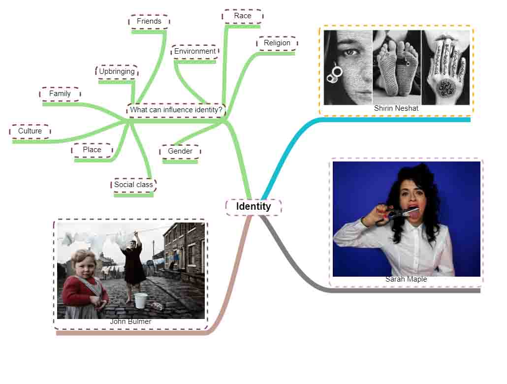
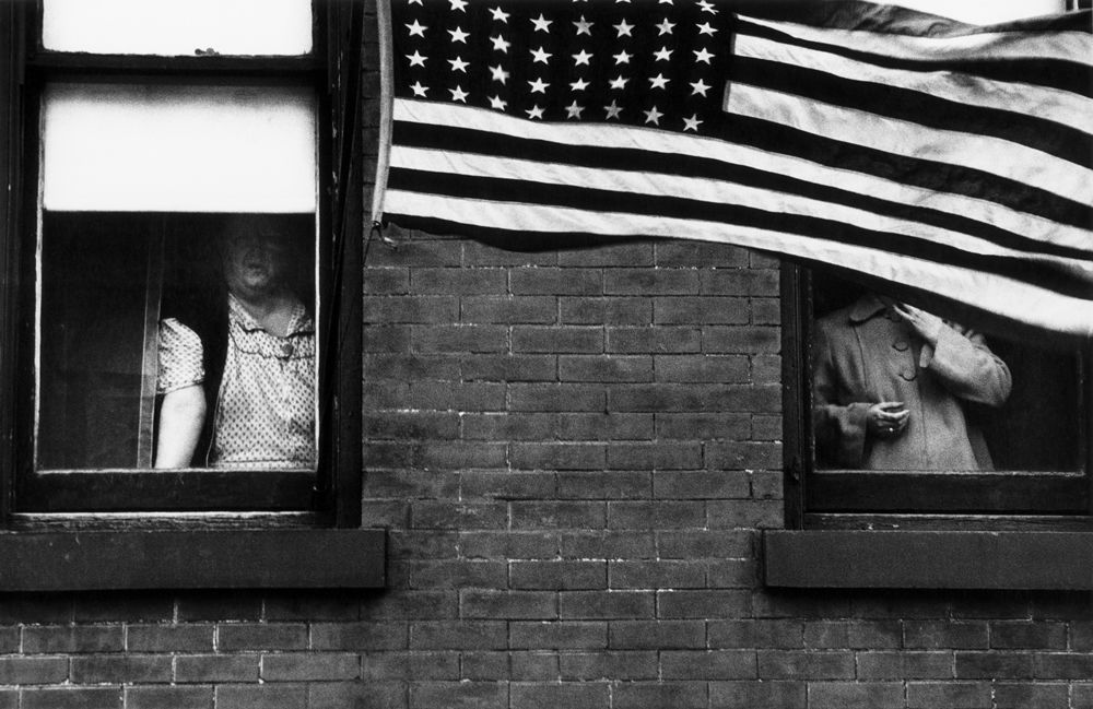
Identity is the fact of being who or what a person or thing is, and can be influenced through place, upbringing, environment and belonging. The way someone is brought up, where they want to fit into and where they are can all effect the way someone identifies themselves. Identity can be explored through multiple forms, especially through photography, and many photographers have taken it upon themselves to express their identity through their work.
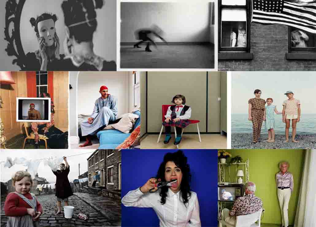
Photographers:



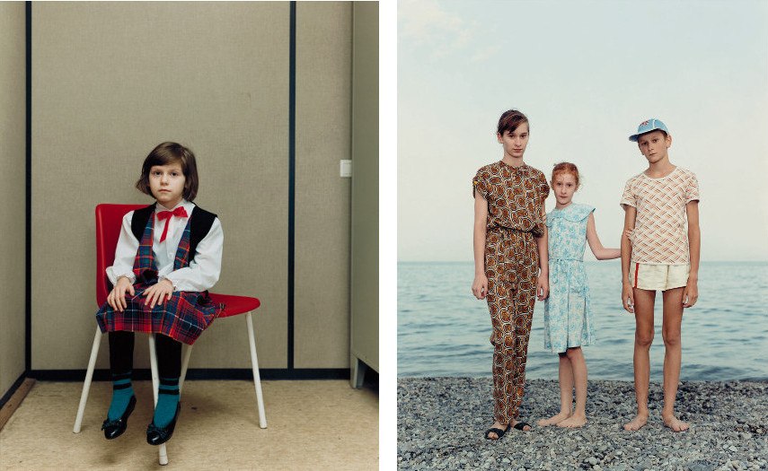


Annegret Soltau is a German visual artist. Her work marks a fundamental reference point in the art of the 1970s and 1980s. Photomontages of her own body and face sewn over or collaged with black thread are the most well-known works done by her.
As if a spider web, I sewn my own self-portrait. The grey silk thread is a kind of mask, the face overlaid with a delicate tension. I take contours and lines on my face and I support them, some put the new strings caesura. – Annegret Soltau
Some of her work consists of lines in which she has sewn into the picture herself to create interesting abstract lines, and others she has taken multiple pictures, cutting or ripping out certain parts and then sewing them together.

In this image, it is obvious that Soltau has used multiple people to create this unique piece. She has taken two pictures of people, cut the pictures up into sections and sewn them together so the image was mismatched. The thread keeping the image together creates a unique effect , something which simply gluing or taping it on could never achieve. I like the way she also ripped the original picture, and then went and sewed it back together, and the way she used two different people, one significantly older than the other, creating a comparison between the two. She also keeps the background plain, so we concentrate on the sewn together model.
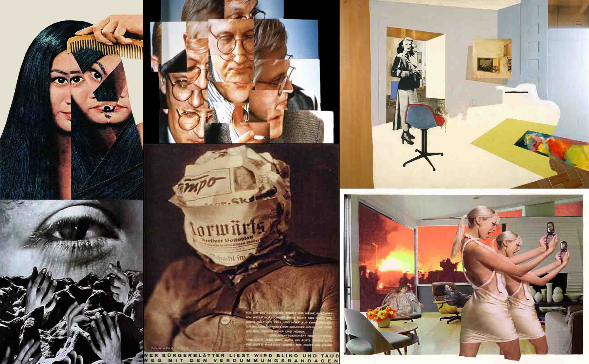
Photo montage, composite photographic image made either by pasting together individual prints or parts of prints, by successively exposing individual images onto a single sheet of paper, or by exposing the component images simultaneously through superimposed negatives. In the 1880s the juxtaposition of separate images through successive exposures became fashionable in the “combination print,” especially in the form of the contrived group portrait. The subjective, fragmented, potentially absurd qualities of this juxtaposition were exploited by Dadaist and Futurist artists of the early 20th century.
The photo montages of George Grosz, Hannah Höch, and John Heartfield from this period are among the major examples of the form. Photo montage was also used extensively in the Pop art movement of the 1960s and 1970s. A technically sophisticated form of photo montage was developed by the U.S. photographer Jerry Uelsmann, and artist David Hockney is also noted for his photo montages.
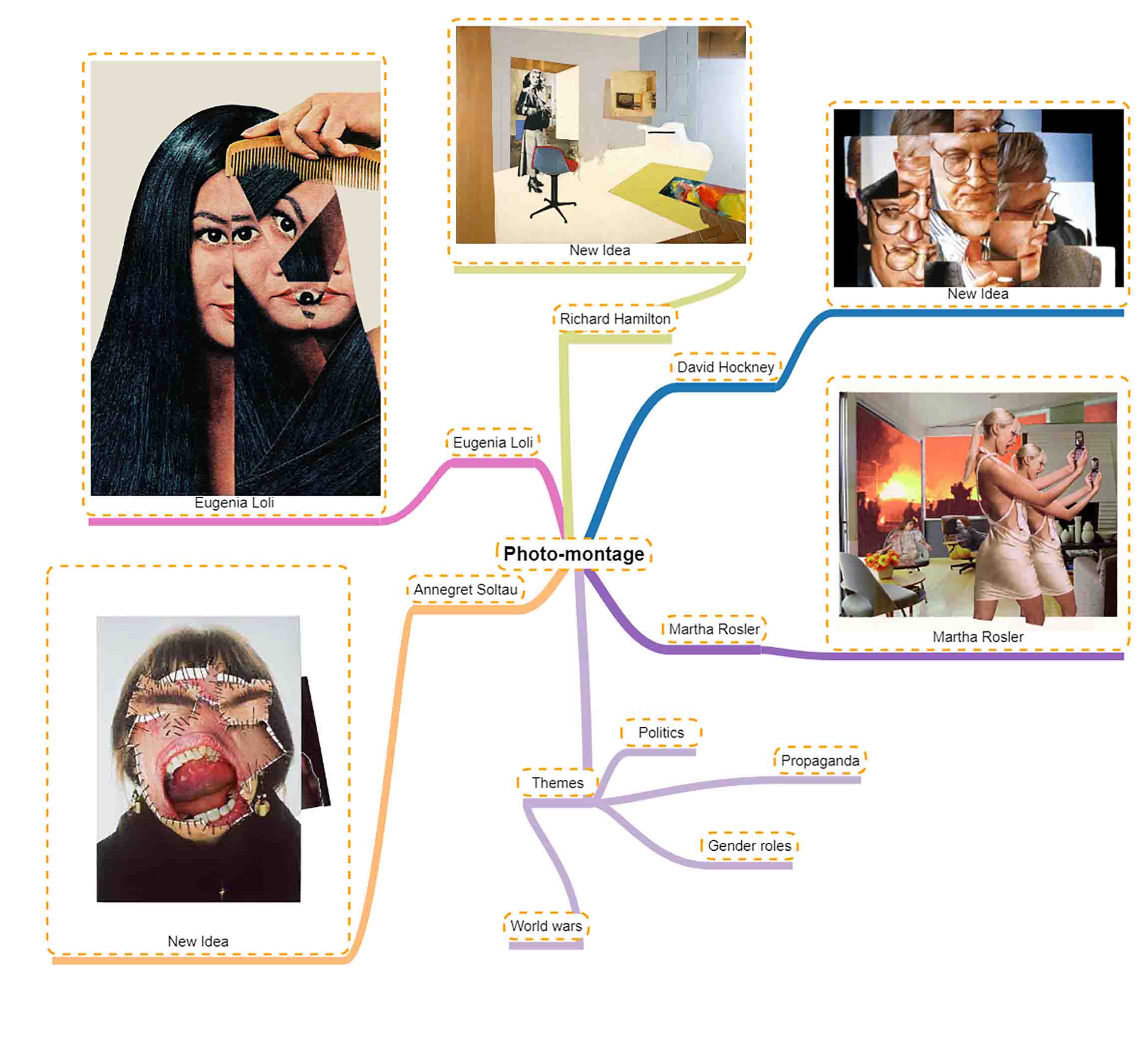
As a task in one of our lessons we had to go out, find a window with a good source of light and take pictures with the natural light.
Contact sheet:

Chosen images:
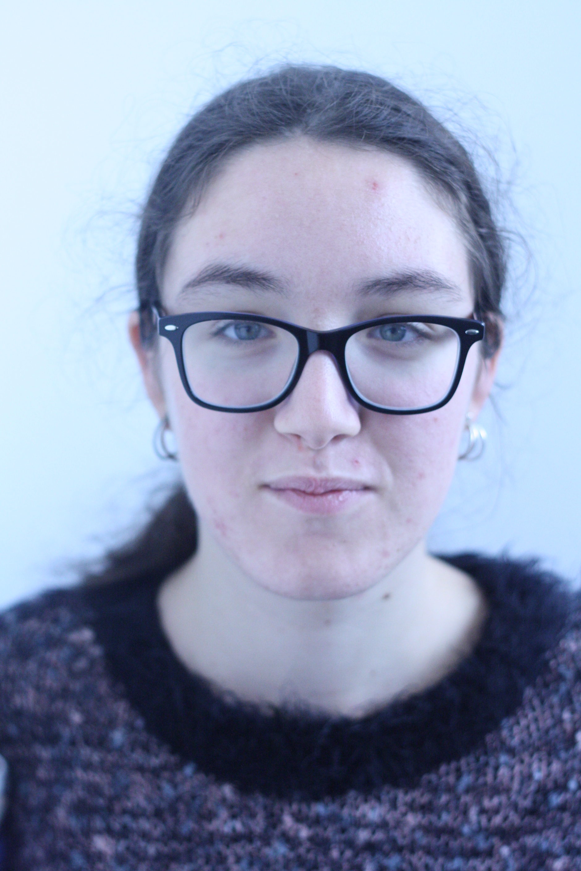
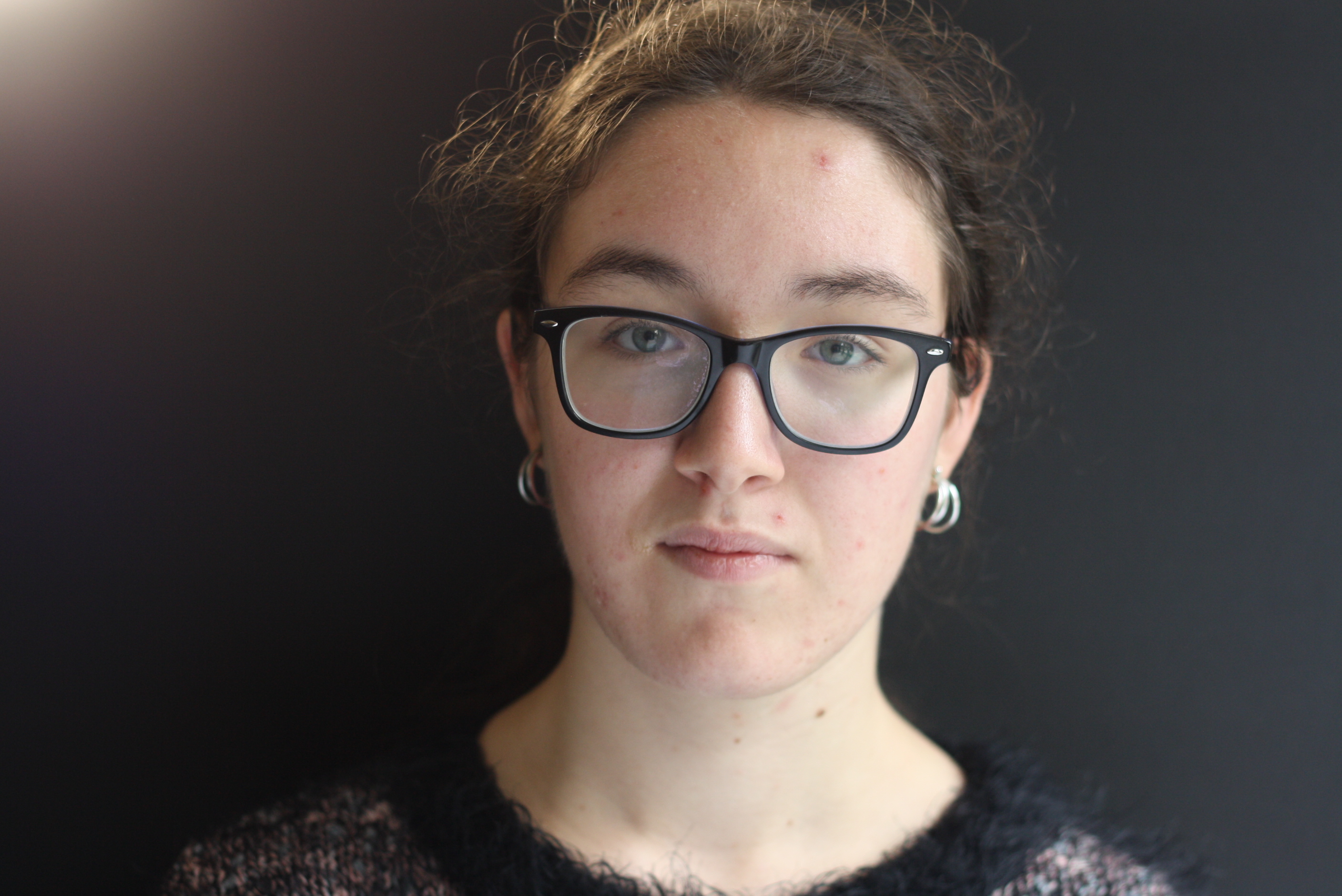
These pictures reflect the use of natural light perfectly I believe. It shows the subtle yet effective use of the natural outside light on the subject’s face, lighting up her features but not in a way which over does it and makes it become too dramatic.
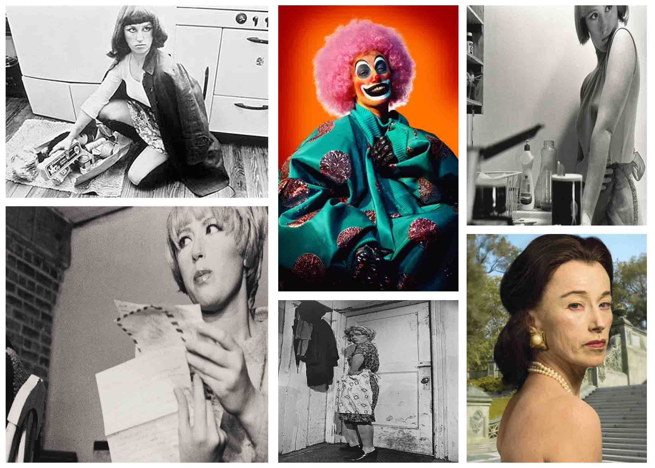
Tableau photography is a static scene containing one or more models or actors. They are usually in costume and are planned out carefully to create a certain scene.
Cindy Sherman is a postmodern photographer who started work in the 1970s and is still working today. She’s been important in the areas of “studies of the de-centered self, the mass media’s reconstruction of reality, the inescapably of the male gaze, the seductions of abjection, and any number of related philosophical issues.” She uses herself as the subject in almost all of her photographs except only a few. These are staged photographs that she takes in her studio. It’s important that they’re staged because we know that this is some sort of message embedded in them that she is trying to get across to us.
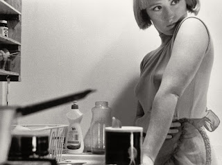
In this image, Sherman is shown to pose in the kitchen, in front of the sink with an apron on. This is clearly making a statement on the gender stereotype of women’s place in the house, which was typically in the kitchen. This looks more of like a 1950-60’s setting, where the role of women were pretty fixed within society, and they were berated for being anything else otherwise. Sherman may have been fighting against these stereotypes and making the voices of women louder when it came to their rights and how society saw them, and going against the tainted norms to make a change.
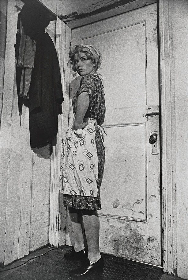
In this image, a woman is shown standing by a dirty door, in typical house wife clothes of the 1970’s. Like many of her works, and the one I mentioned above, this portrays the stereotypical view of women and their duty to the house hold.