All posts by Lucy L

Filters

Author:
Category:

Group attempts at tableaux viviant

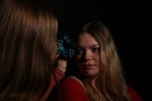
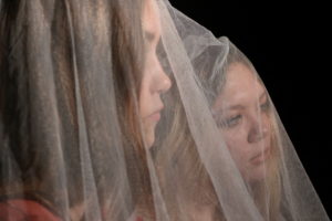
As my first attempt at Tableaux viviant, we decided to recreate the following image as a group.
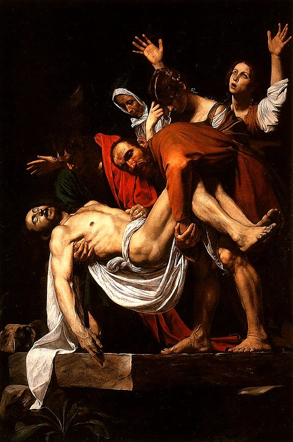
Image result for the entombment of christ (caravaggio)
The Entombment of Christ Painting by Caravaggio

Context

This piece depicting Christ being entombed was created between 1603-1604, for a chapel in Vallicella, Rome.

Technical

This painting was painted with an oil on a canvas. It contains dark toned colours and hardly any brightly tones colours.

Visual

This painting shows Christ being entombed. In the painting you can see him surrounded by 5 other people, 2 men holding him and 3 women crowding around him with sad and distressed looks on their faces. This painting is also quite darkly pained, and there’s not much light incorporated into the photo, making the painting convey negative feelings to the audience.

Conceptual

As the painting is quite dark, as I mentioned before, I think that it it is trying to convey how upsetting it was for people to witness Christ being entombed as the colour black is usually associated with death and negativeness. The way Carvaggio painted this darkly, also clearly shows that he himself pictures this moment quite darkly, which shows that the painter was a religious man who is saddened by this event. The way Caravaggo painted Christ as the only person in the painting wearing bright white, clearly shows he wanted Christ to stand out as the most important person in this image, which shows he probably hold Christ in high regards, and thinks highly of him also.

Process
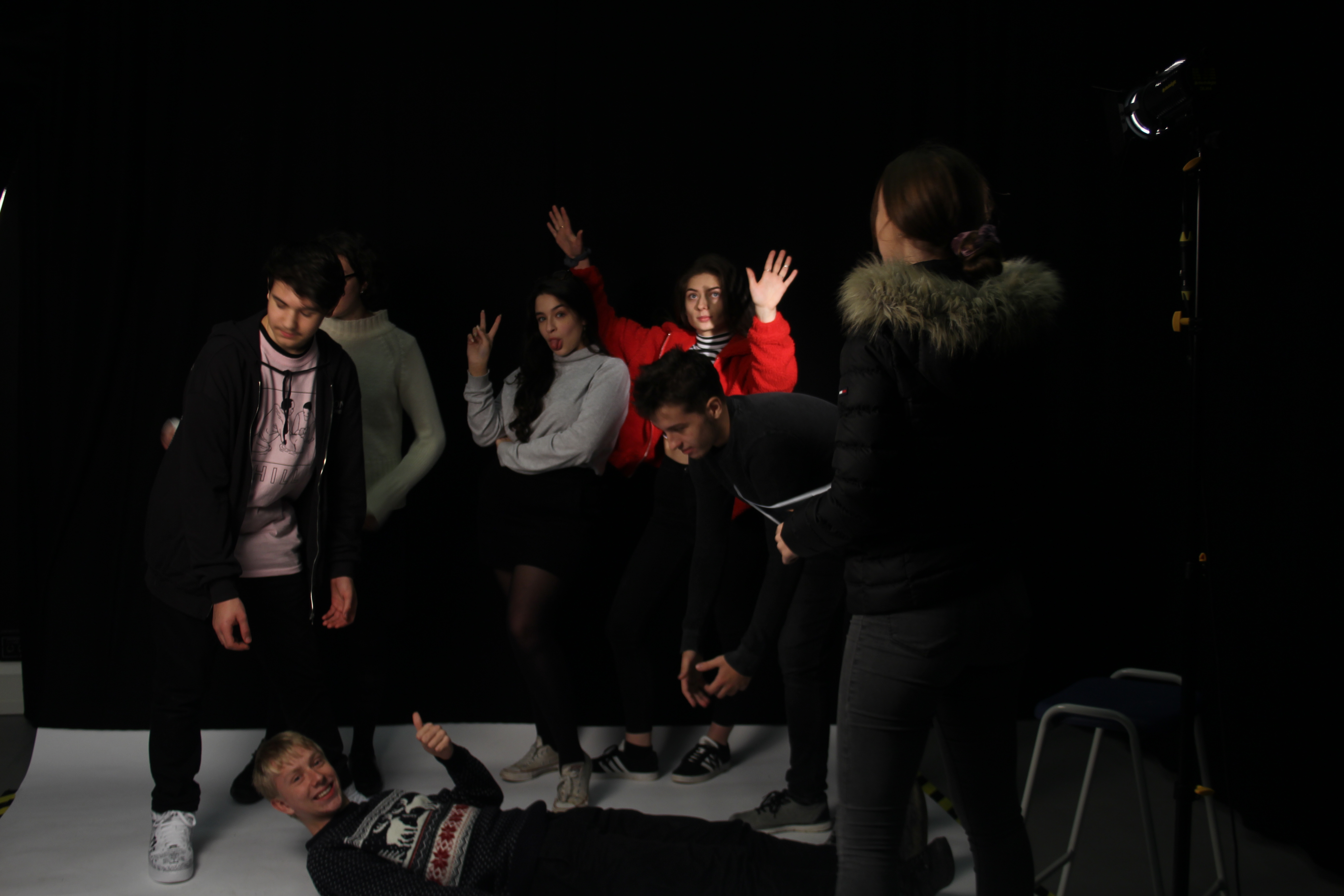
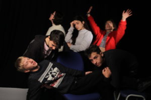
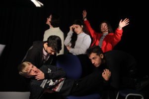
Our group being directed into out positions, before we moved onto positioning the lighting correctly.

Here you can see a member of our group directing the rest of the group in order to get us into a similar position to the people shown in Caravaggio’s painting. During this process it was important that the background was dark, which was the we decided to use the black backdrop. It took some times in order for the member of the group to be positioned properly, and for the lighting to also be set out accurately. After we all knew where we were standing and how we had to pose out bodies in order to achieve an accurate representation of the original painting,  the directer along with the photographer moved onto the lighting. A light was placed focused on our group that we all stood out and also so that the background was a dark colour in comparison to the people posed.

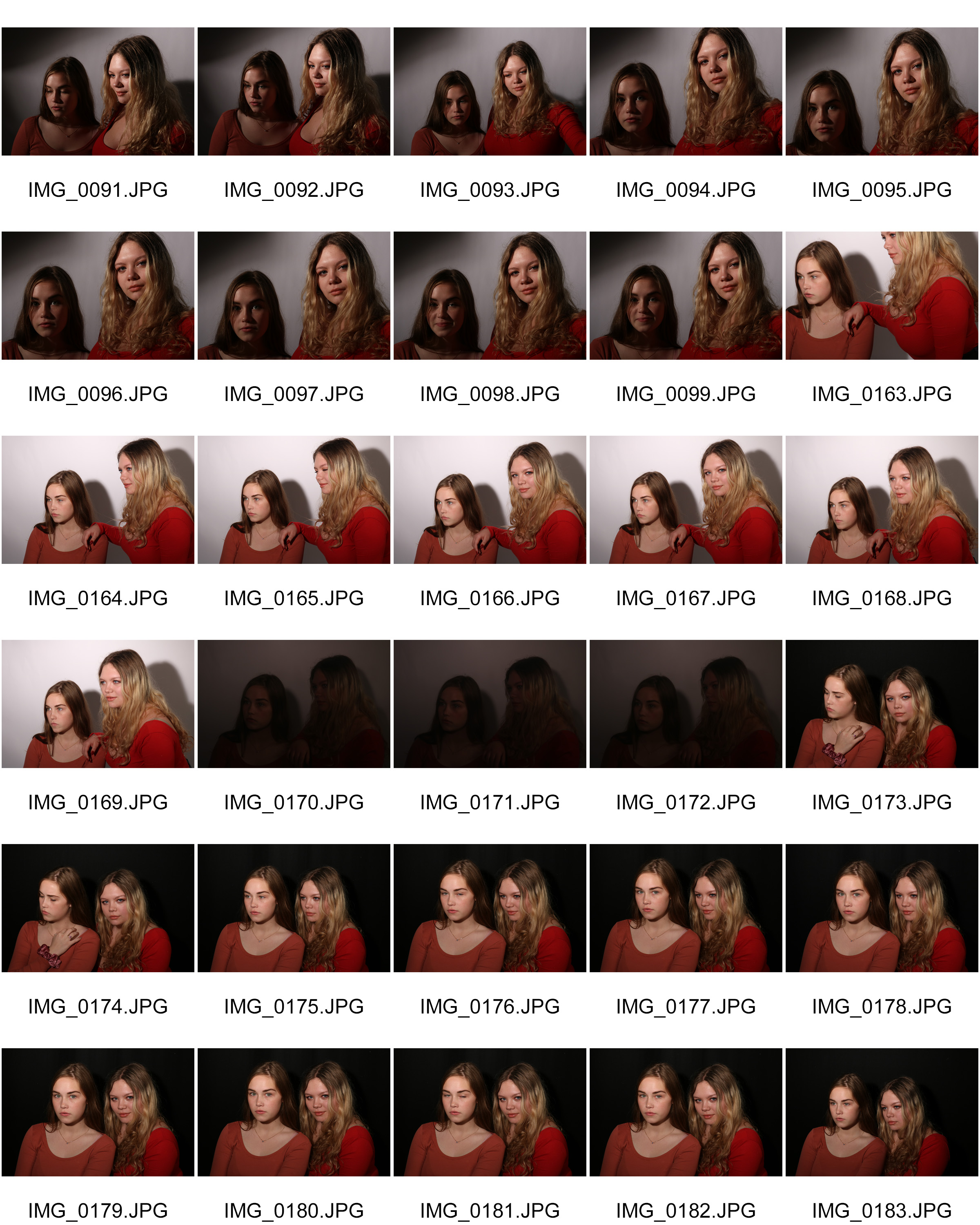
Contact sheet

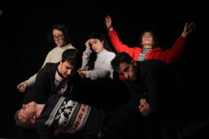
Final outcome

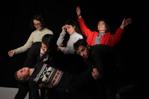
This was the best image outcome captured by the photographer. In this image we have successfully been able to position ourselves similar to those that were pained in the painting. We have also successful been able to convey our assigned characters’ emotions on our faces, which is an important element in tableaux. The background is also very ark which helps us to convey the elements of darkness and death from Caravaggio’s painting into our image. This was achieved through a black background, and also by the strategic placing of lighting which made the actors stand out even more compared to the background.

Analysing the process

While experiencing this process I learnt many important things that I will use, and take into consideration when I do my own tableaux photo shoot.

Firstly, I learnt that the most important part of tableaux is the positioning of the actors along with their expressions, rather than how you actually take the image itself. The majority of the time in this photo shoot, went into making sure we looked accurate and also into making sure the light and the background complemented each other so that our image would convey the same concept that the painting did.

Secondly, I noticed that the director has to be very clear with their instructions, and that they also need to have a very clear vision in their head of how they want the scenery to look. Since a huge part of obtaining a successful tableaux image is planning, I know that when I come to do  my own it has to be well planned so that it turns out accurately. I also now know how important scenery/location and lighting is in order to make a successful tableaux image.

Best over all portraits using different lighting

Now that I have experimented with using lots of different types of lighting and lighting effects, I will present my best outcomes from my photo shoots.  During these photo shoots I learnt how all the technical camera settings should be set in order to  make the images look good.

Spot light

Chiaroscuro 

soft lighting

Natural lighting

Flash

portraits- Using flash

Flash

You can use flash in portraiture in a range of dark and light places. It is stereo typically used in places where it is dark, but you can also create interesting effects in light ares using it. There are many types of flashes and techniques that can be used:

  • Bounce flash

This is when you point the flash in a different direction, rather than directly at your subject, in order for the light to soften before it hits your subject.  It’s typically bounced at an angle, at something like a wall or a ceiling.

Below is a diagram that explains how the ‘bounce flash’ technique is used compared to direct flash:

  • fill-in flash

This is a technique that’s used to brighten up shadowed areas. This is usually used when the background is a lot brighter that the actual subject, and using this will make your subject appear well lit and not underexposed compared to the background.

To use fill flash, the aperture and the shutter speed should be correctly adjusted to expose the background, and the flash is then fired to lighten the foreground (usually the subject)

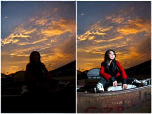
Below is an example of how using fill flash can make your images look good. The image on the left has the background perfectly exposed, and the image on the right is how the image looked when you took it with flash. As you can see, the image on the right is very successful as you can see the sky in the background, and the subject is also perfectly exposed due to the use of the flash.

Not my images.

Below is also a video that shows a range of techniques and tips on how to use fill flash:

  • Speedlight flash 

This is also known as a hot shoe flash. This is a flash that is inserted onto the top part of the camera and is triggered then the cameras shutter takes an image

Contact sheets

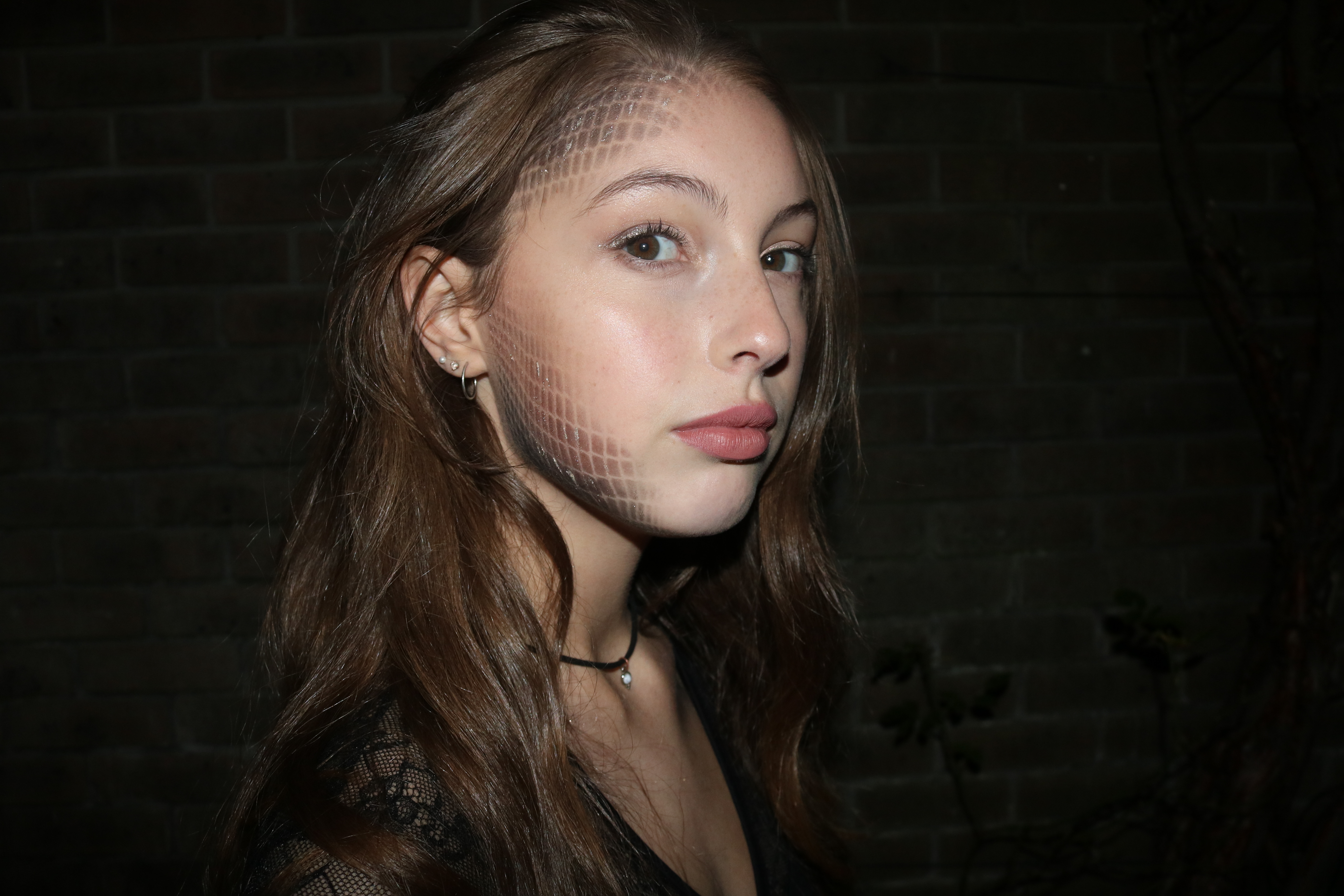
For this photo shoot I pictured my model while she was wearing makeup on her face. This demonstrated how, by using a flash, many details can be noticed in the dark.

Best outcome

Portraits- Natrual lighting

Natural lighting

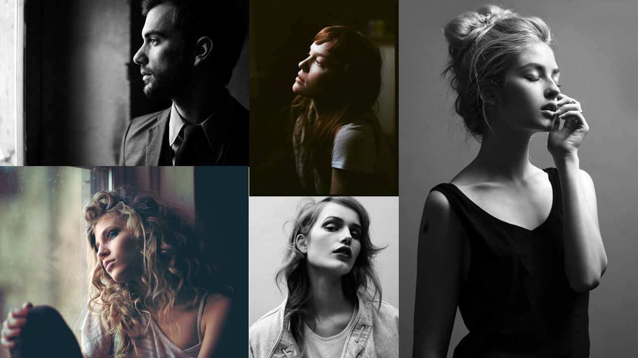
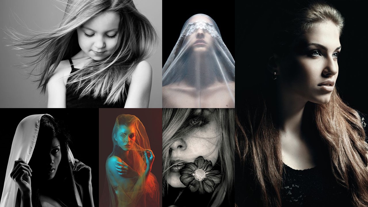
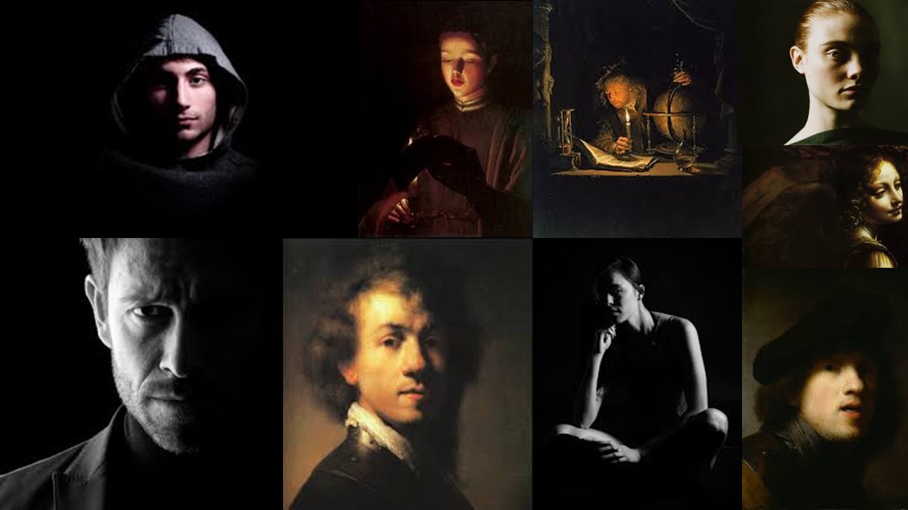
Natural lighting is the form of lighting that is mostly used in portraiture. Natural lighting can come at different intensities, temperatures and directions. These are all important to consider as all these factors can cause things like shadows, so you must use the lighting to your advantage in order to achieve the outcome that you want. I also used reflectors in this photoshoot so I could choose how the lighting illuminated certain parts of my models’ faces.  Below is a mood board that I used as inspiration on how to use natural lighting in portraiture:

Mood board

not my images.

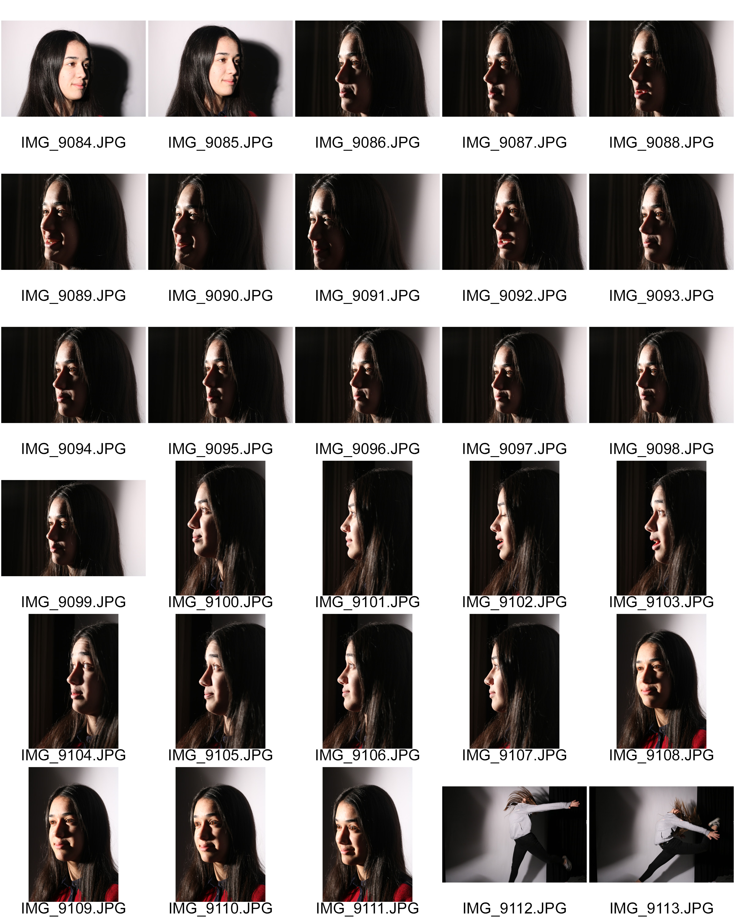
Contact sheets

Best outcomes

   

Using reflectors

Below are 2 examples, using my own images, showing how using reflectors can change how a portrait look:


The images on the left were taken without a reflector. You can tell as the parts of the faces that aren’t in direct contact with the light, ended up shadowed. The images on the right are taken using white card as a reflector. You can tell as it made the other side of the face ended up lit up.

Analysing

Technical

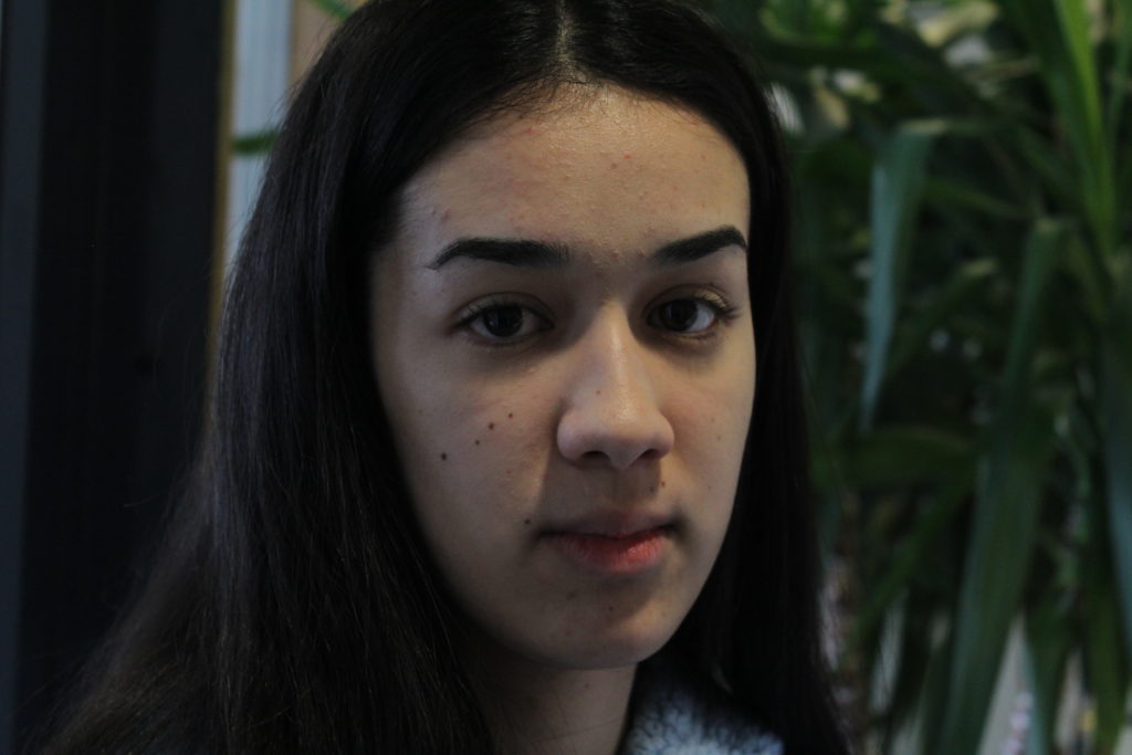
when taking this image my ISO was set to 800, and my shutter speed was set at 1/60.  These settings meant that this image had a long exposure time, so that it wasn’t dark and under exposed.

Visual

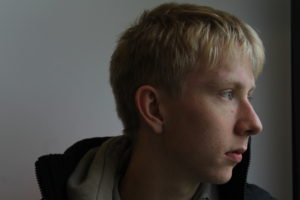
I think this is one of my best outcomes due to how the lighting looks on the model’s face. I like how part of it is lit and the other half isn’t, giving the image a chiaroscuro effect. I think the image would’ve also looked good if I had also reflected the light onto the other said of the face too. However, I think the chiaroscuro lighting and the slight low-key lighting in the image pair together nicely to create a really dramatic and mysterious image. I also like how the model is positioned nicely in the middle of the image, as it adds symmetry to the photo. However, I think the image would’ve looked a lot better if it had been taken with a better background as the plant in the background would’ve been less distracting.


studio portraits- studio light

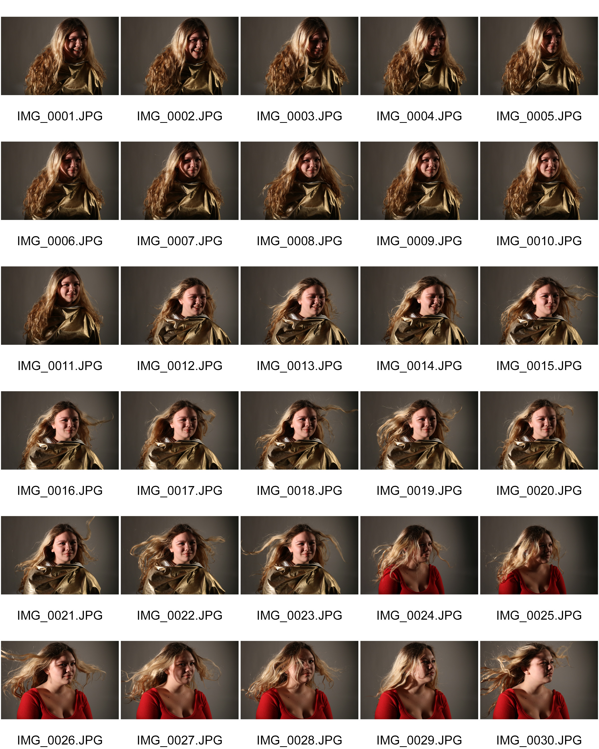
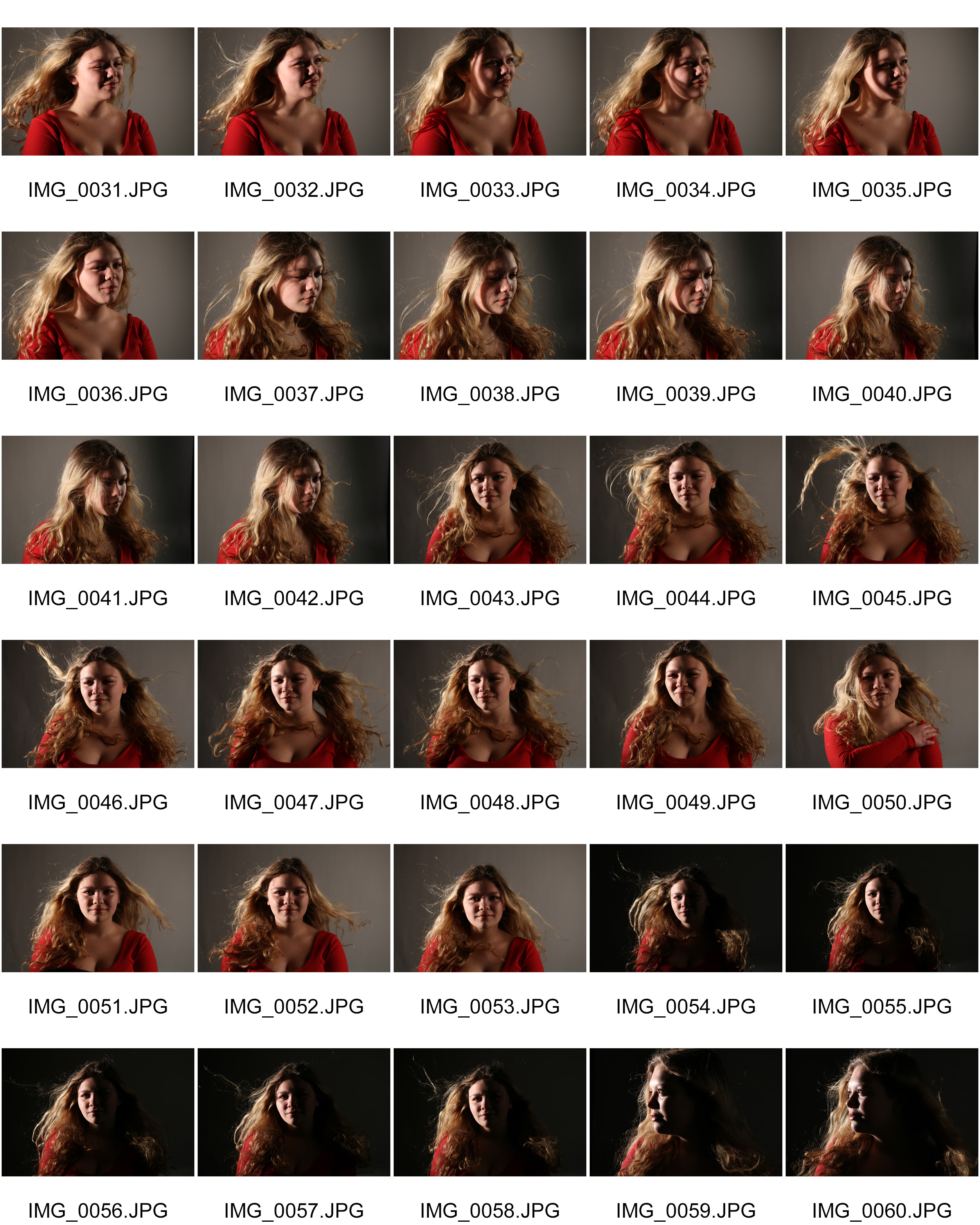
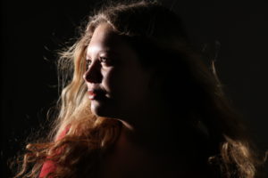
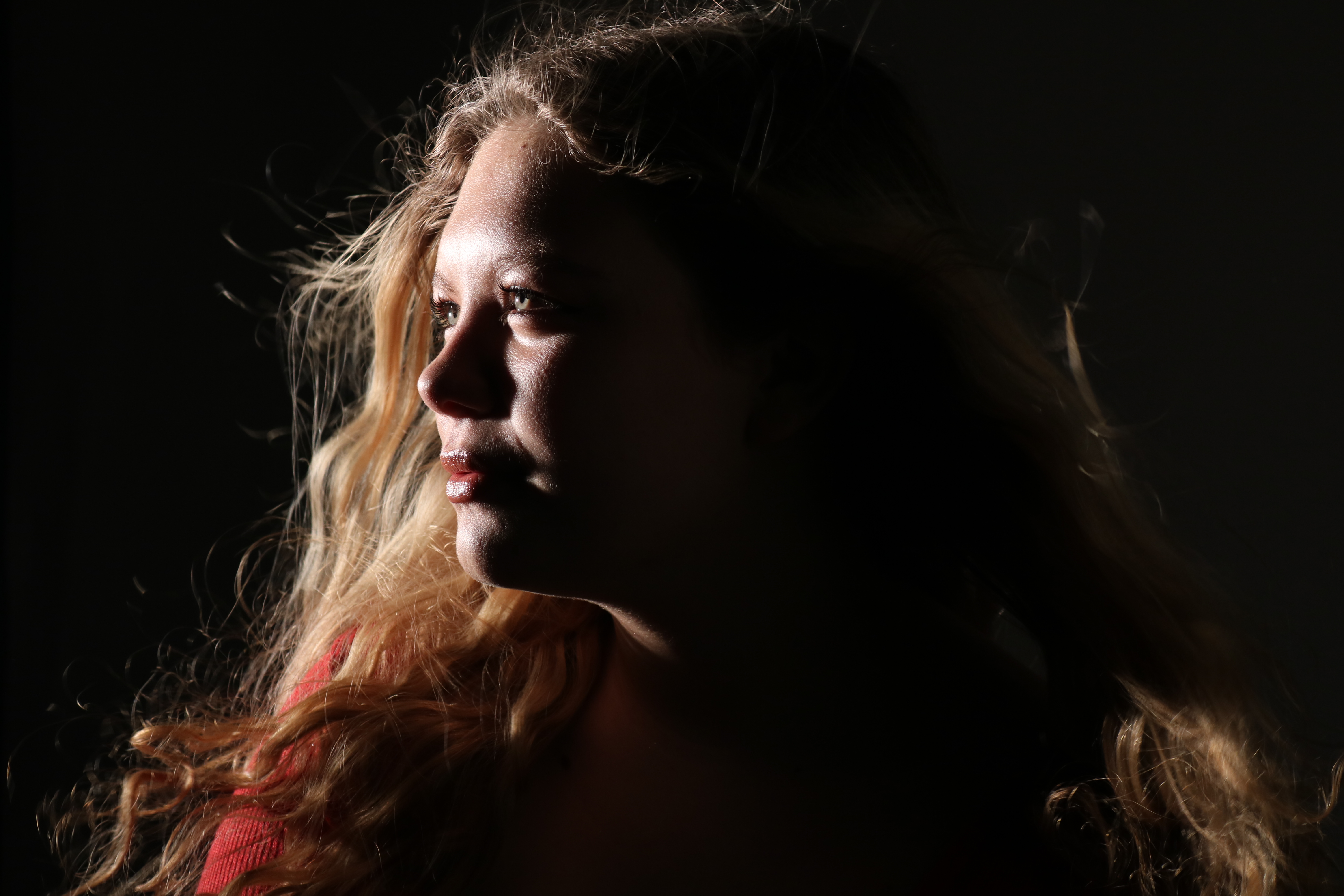
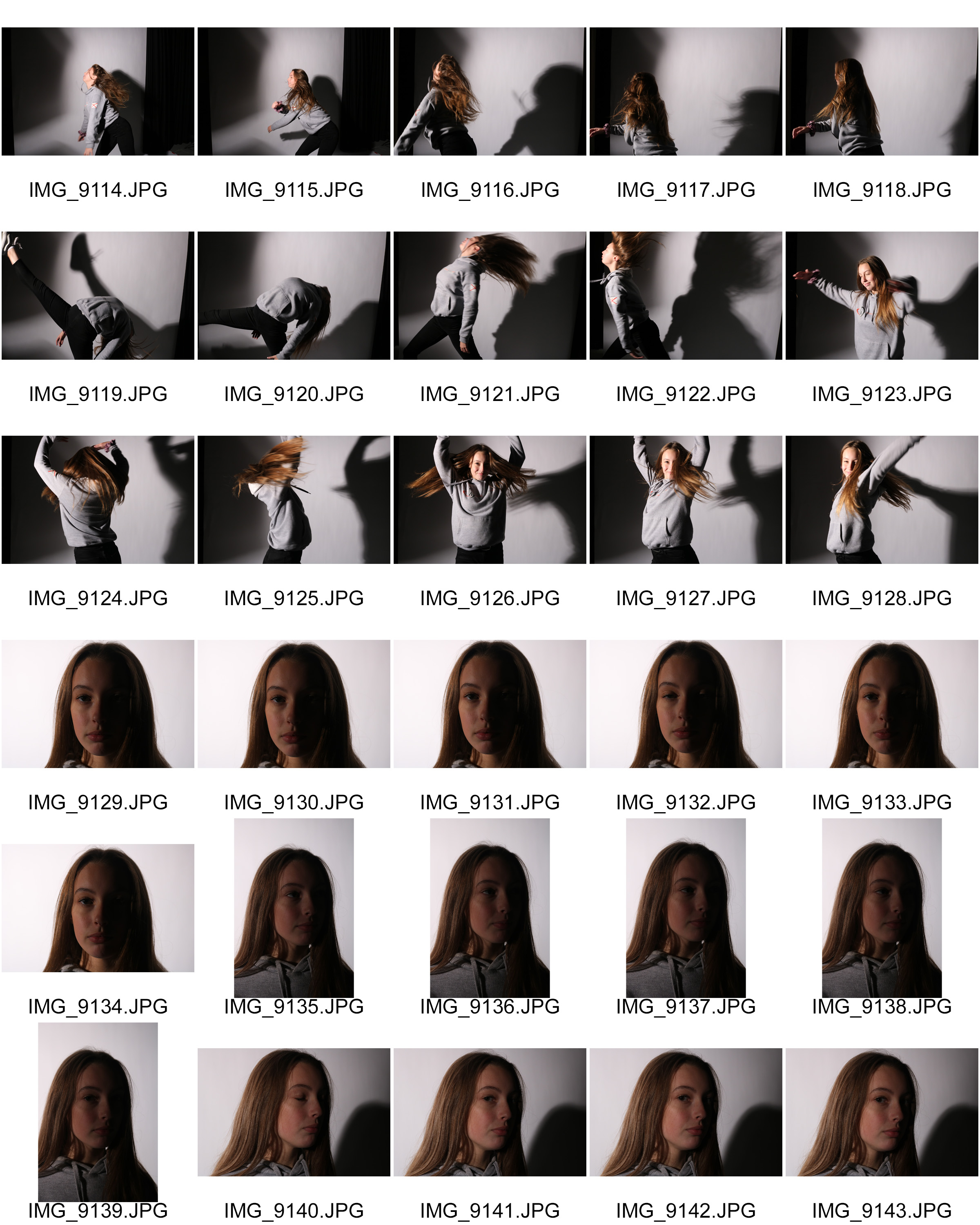
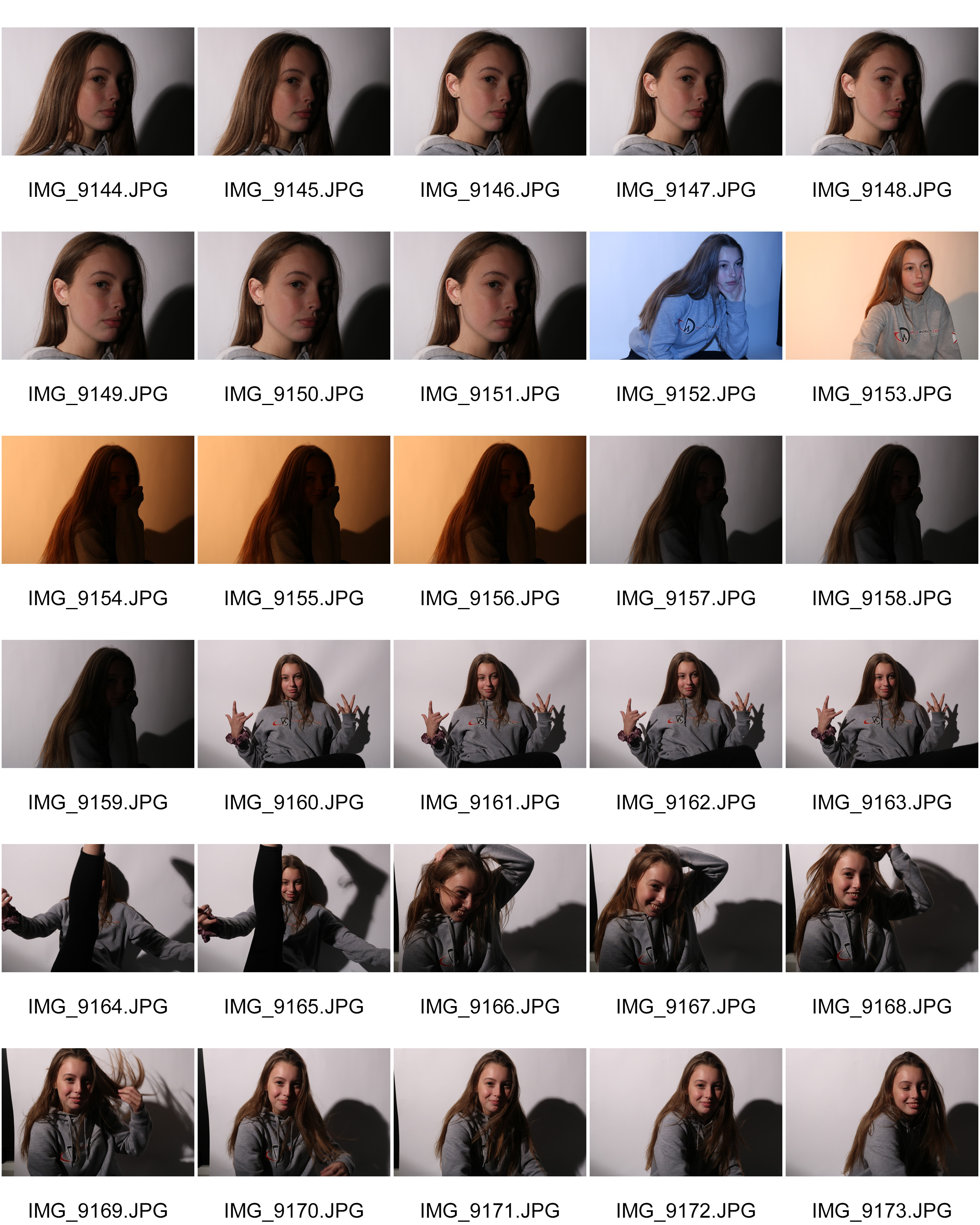
For this blog post, I photographed some models in the studio again. This time instead of focusing on the chiaroscuro technique I wanted to experiment more creatively with the lighting.  I used different backdrops, reflectors and experimented with different techniques like fanning the model in order to get their hair to below back.

My aim for this photoshoot was to get some more creative and artistic pictures.

Below is a mood board of some creative portraits that inspired my photo shoot:

Mood board

not my images.

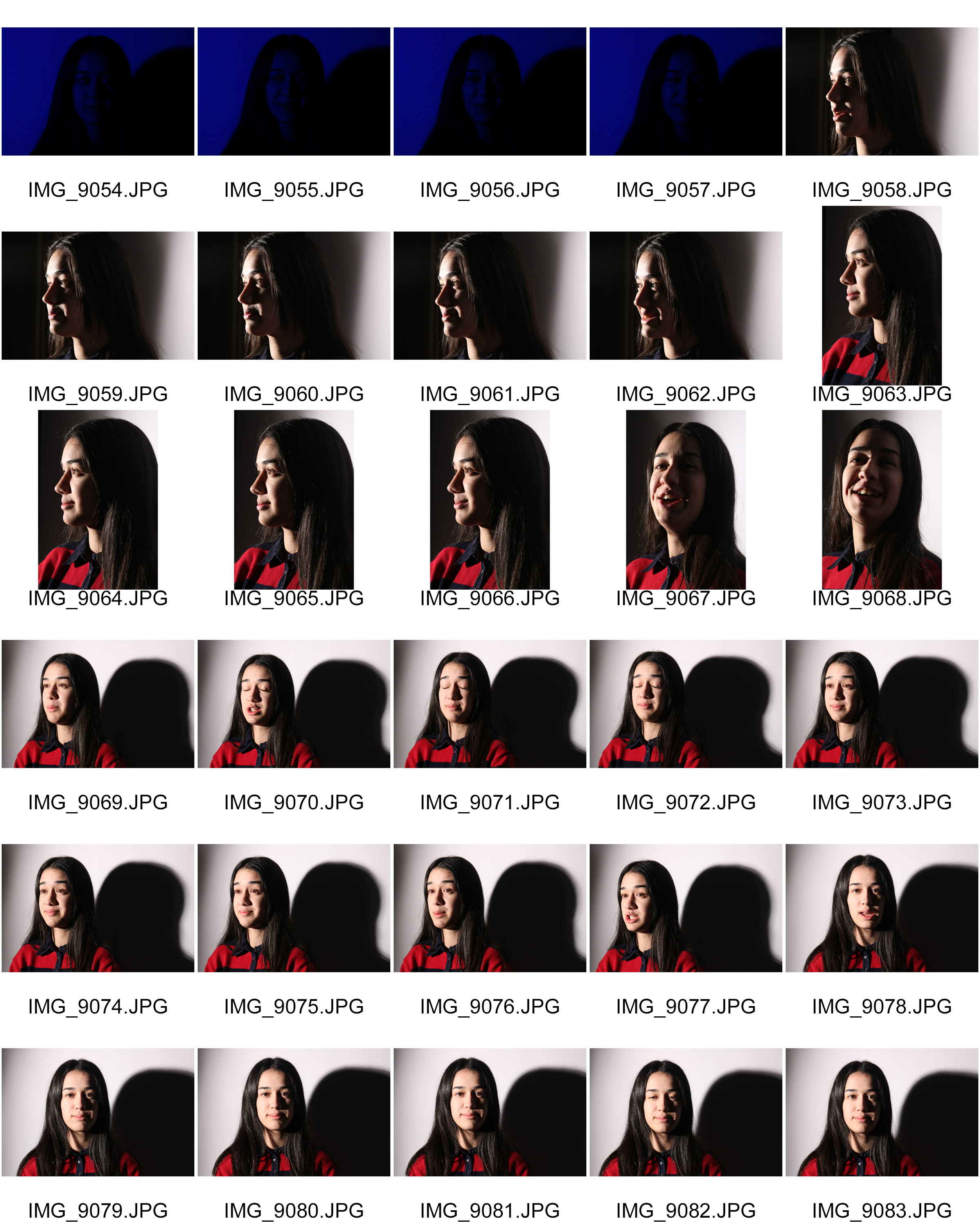
Contact sheets

Best outcomes

Analysing

Technical

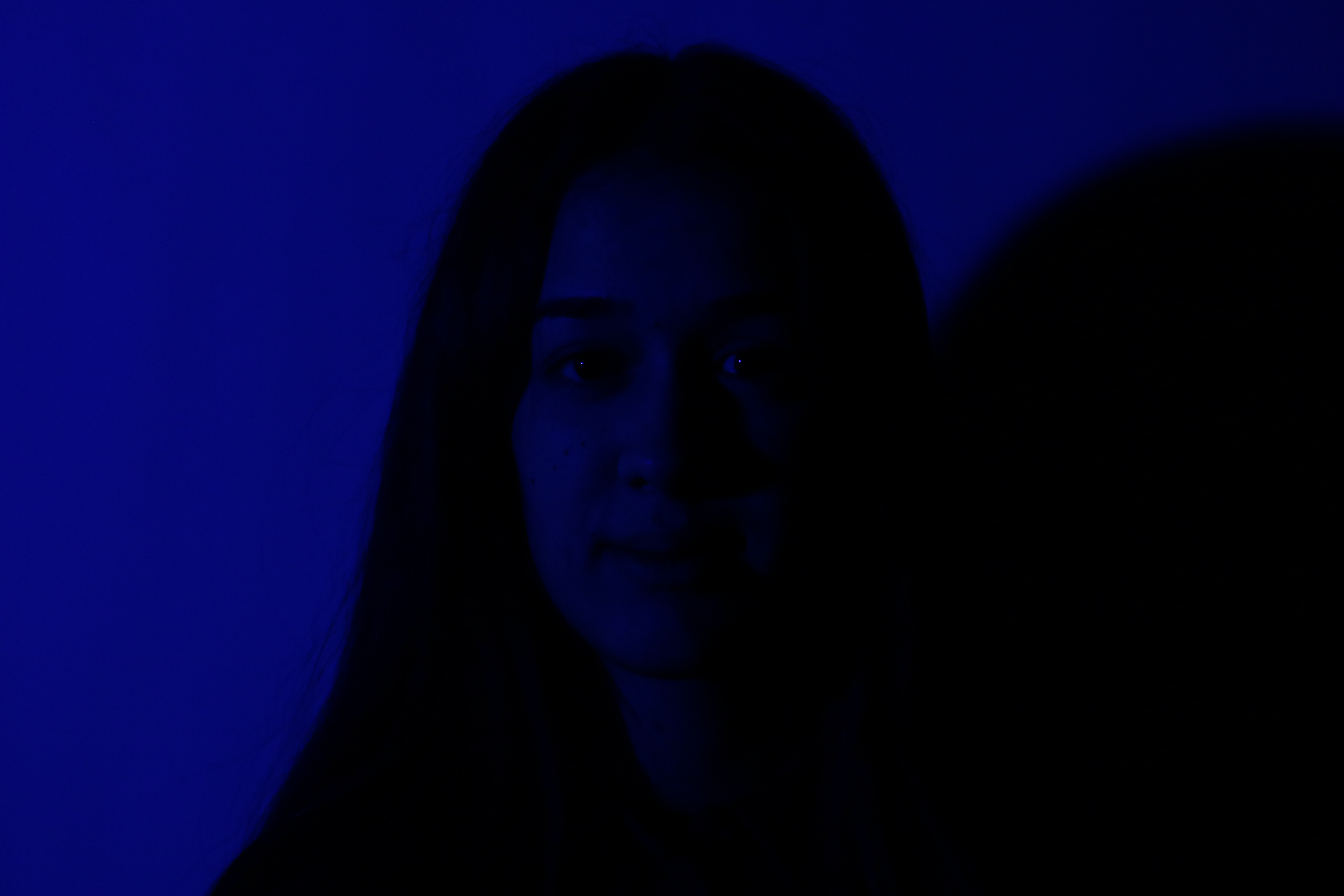
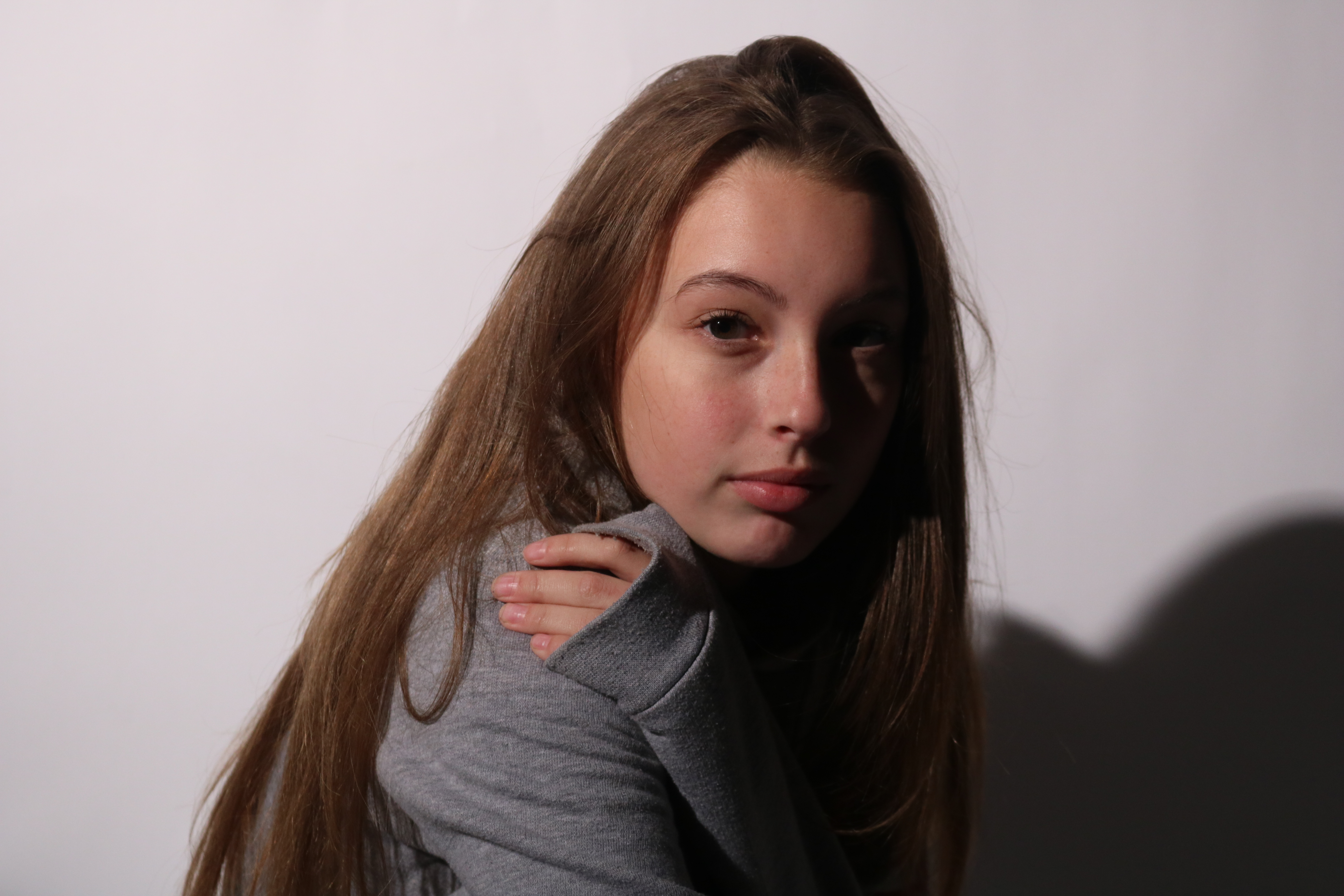
For this image my camera shutter speed was 1/160 seconds, and the ISO was set on 400. These two camera settings helped me to get the image perfectly exposed. In this image, I used one spot light which was placed on the right side of the model. I then asked her to slightly turn her face towards the light in order to get the shadowed side of her face in the picture.

Visual

I think this image is very successful. The model is centred in the frame so that there is no unnecessary background showing in the image. Because I wanted to capture the shadowing in her face, I used a black backdrop so that the shadowing would blend into the background. I also really like hoe the front of her face is lit up, and how her eyes are shining due to the spotlight.


Studio portraits – Studio light (Chiaroscuro lighting)

Studio light

Studio lighting is artificial meaning that you can be very creative with portraiture. You can do things like changing the distance of the lights to create hard/soft lighting, Change the angle/direction of the lighting to create different effects, use directors/diffusers to manipulate the lighting and also make use of backdrops.

Chiaroscuro technique

This is a technique tat has been used in a lot of painting, most famously renaissance paintings. This technique is when there is a contrast between lighting on a subject. Usually, the  light will illuminate one side of the face leaving the other side darker.

Chiaroscuro mood board

Below are some examples of this technique used in paintings and in portraiture photography.

Images are not my own.


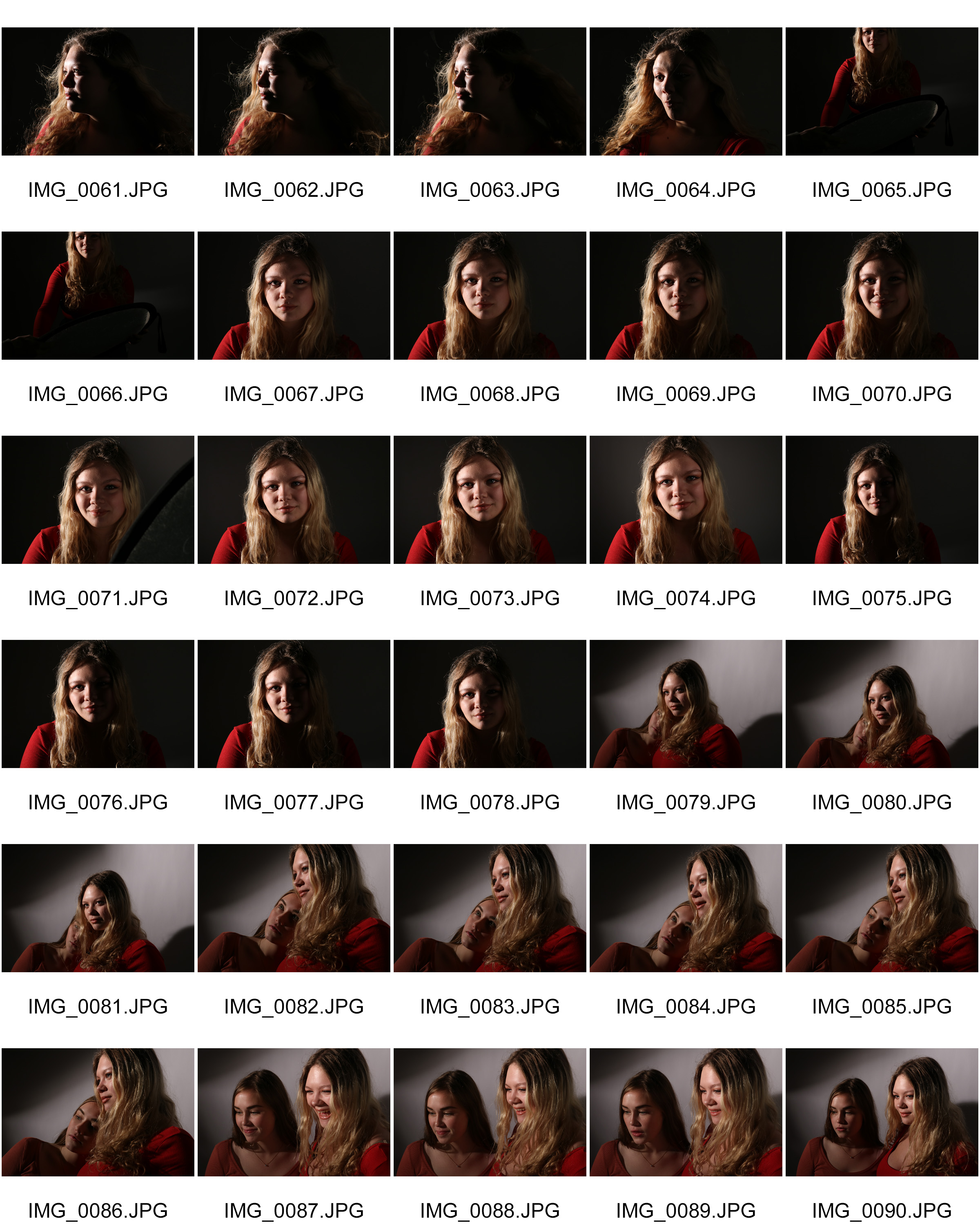
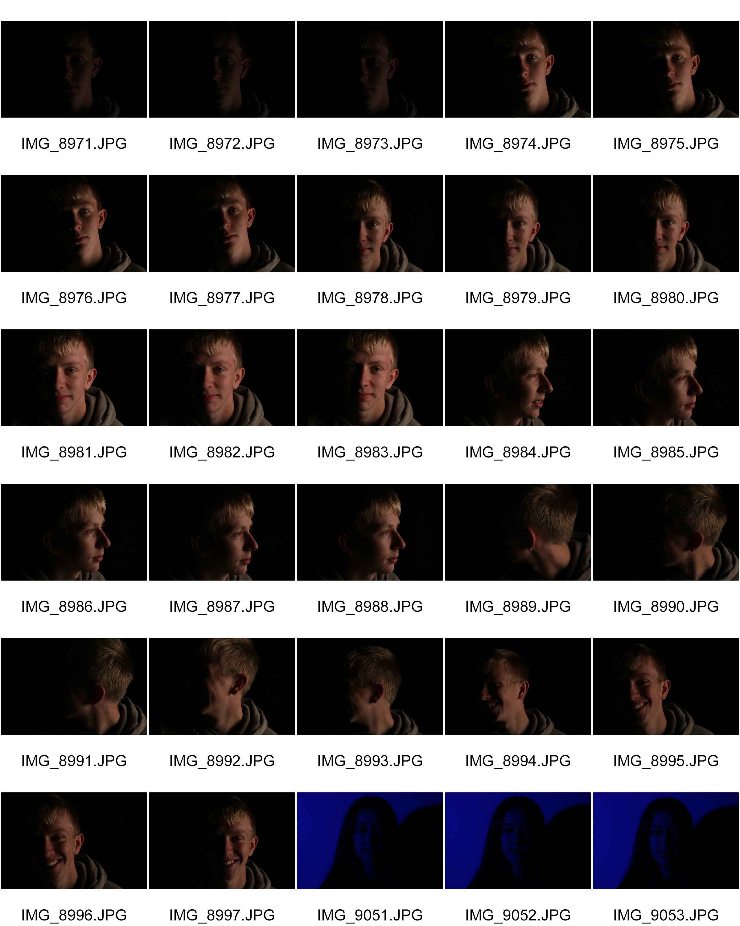
Contact sheets

Best outcomes


Analysing


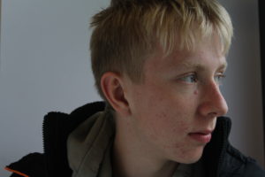
Technical

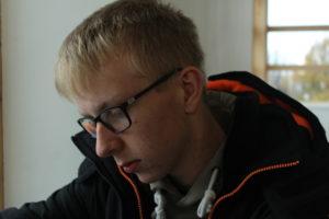
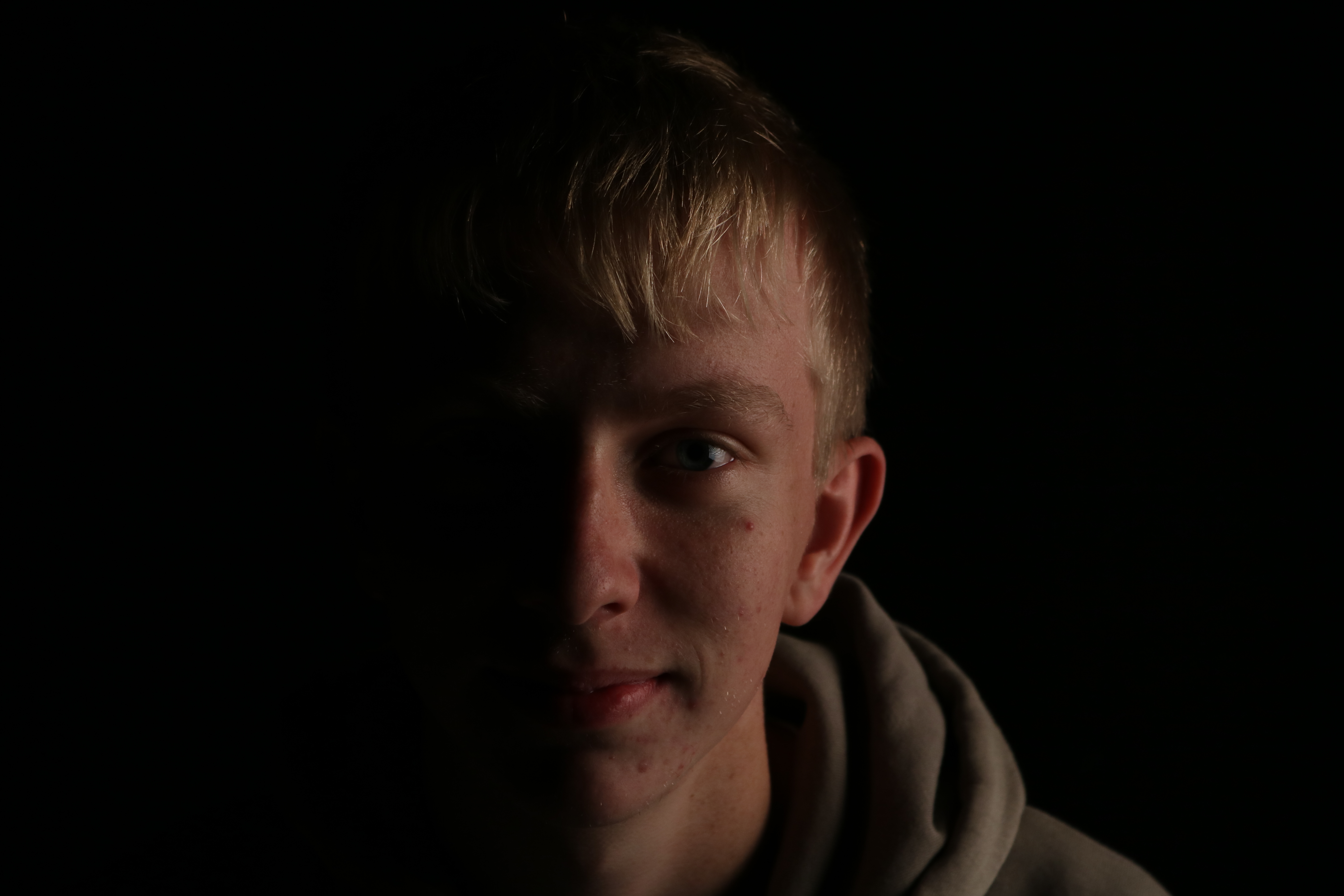
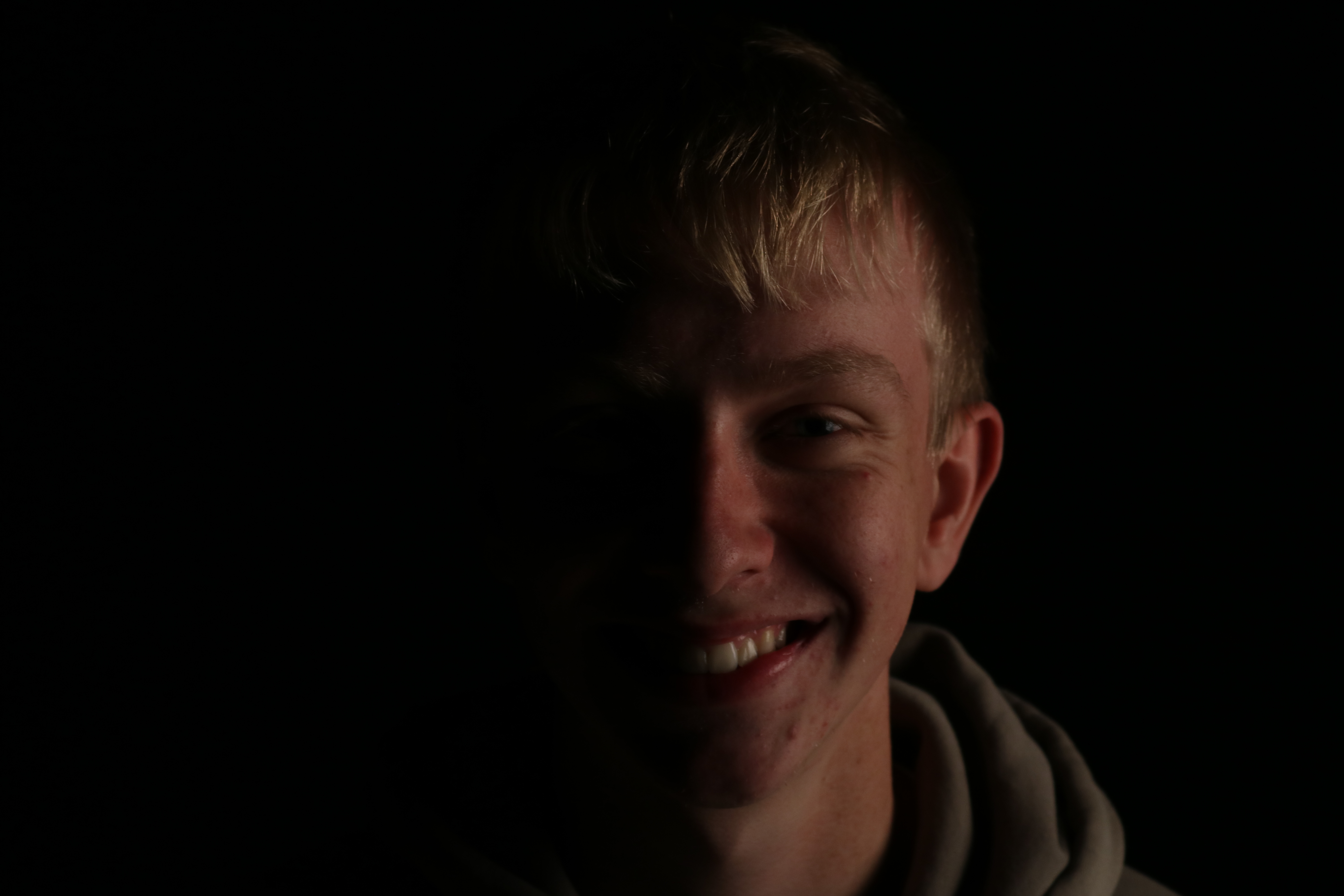
The technical skills are what makes this image successful. To take this image I used Chiaroscuro lighting, so that half of the subject’s face was lit, and the other half was shadowed. In order to do this I placed a spot light with a cover over it in order to make the lighting softer, on the subject’s left side. I made sure that it was placed directly to the side of him so that when I stood in from on him with my camera, only half of his face would be shadowed in order to successfully use Chiaroscuro lighting.

My ISO was set to 400, as I noticed that anything under that made my image far too low key and underexposed. My shutter speed was set to 1/200, which through trial and error I realised was the best shutter speed because it wasn’t too slow that my images were blurry and over exposed, and it wasn’t too quick that my images turned out under exposed.

Visual

Visually I think this photo is very aesthetically pleasing. The subject is perfect framed in the centre, so that your eye is directly drawn to him. The powerful contrast between the lighting and the shadow also helps make the image successful as they are perfectly proportioned, as both the shadow and lighting each cover half of the face. The use of the black backdrop also makes the photo very pleasing to the eye as it doesn’t cause any distraction that would take the audience’s eye off the foreground. It makes the image successful as it blends in with the shadow on the half of the model’s face, creating an almost sort of illusion.

Night street photography

Christmas light switch on street photography

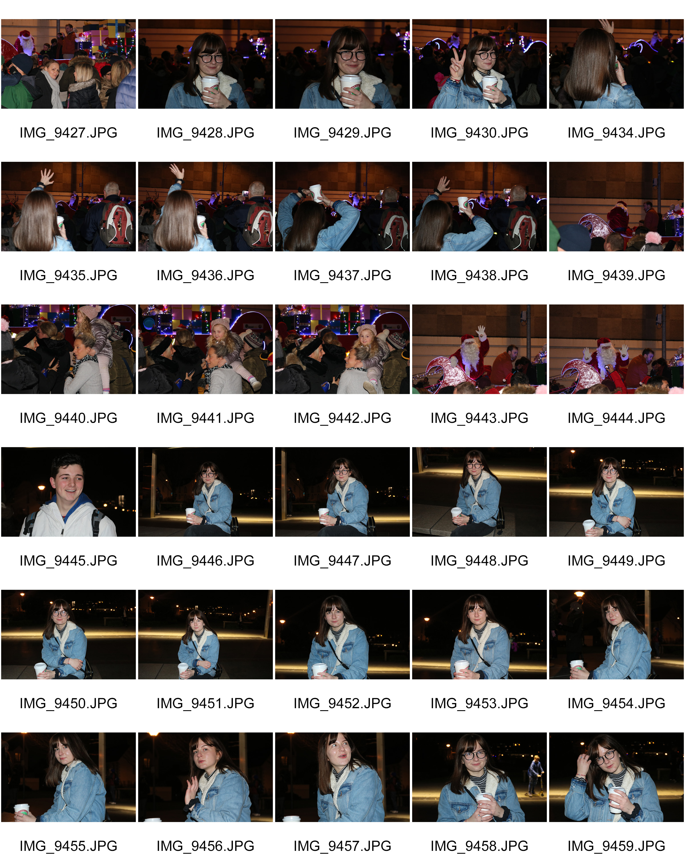
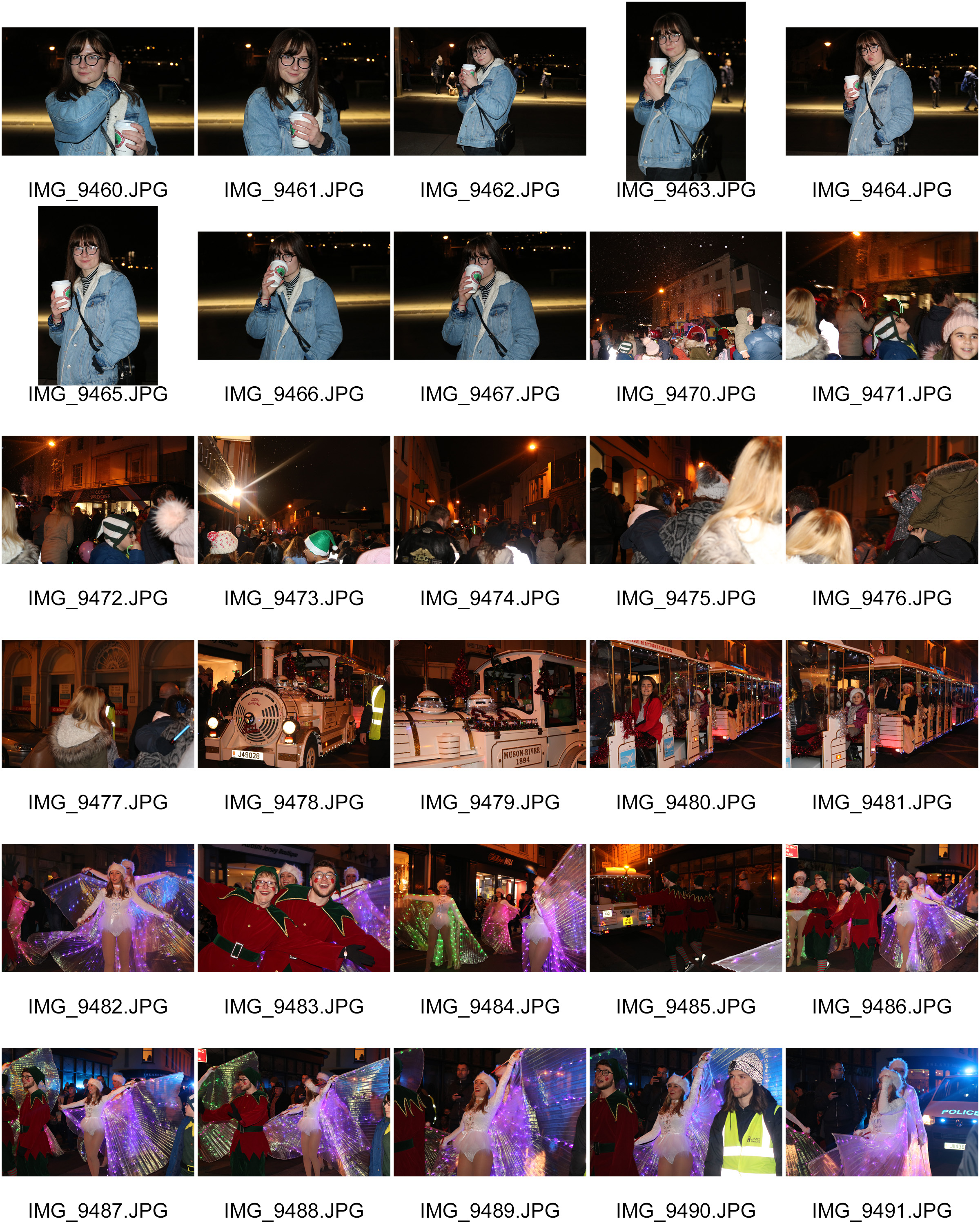
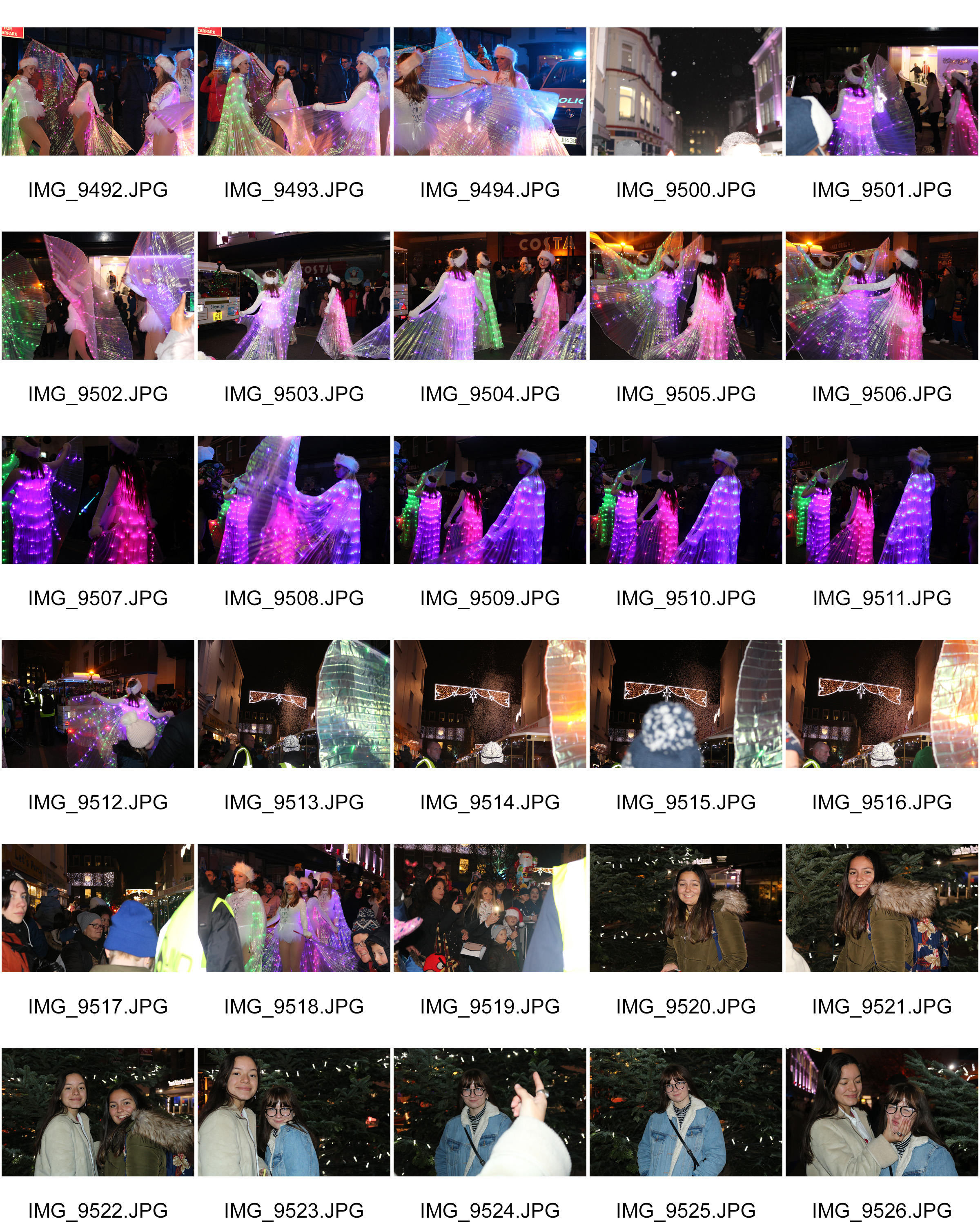
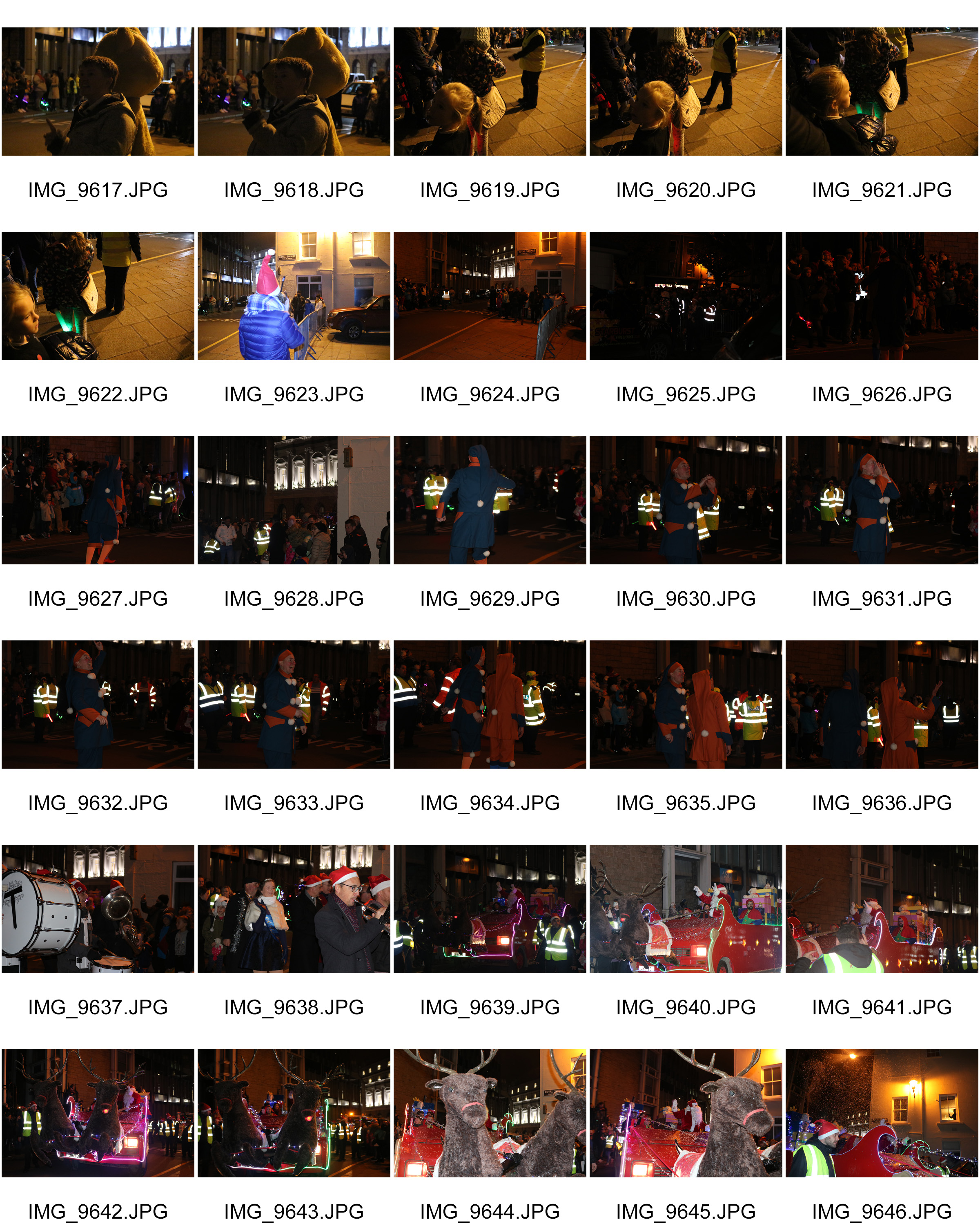
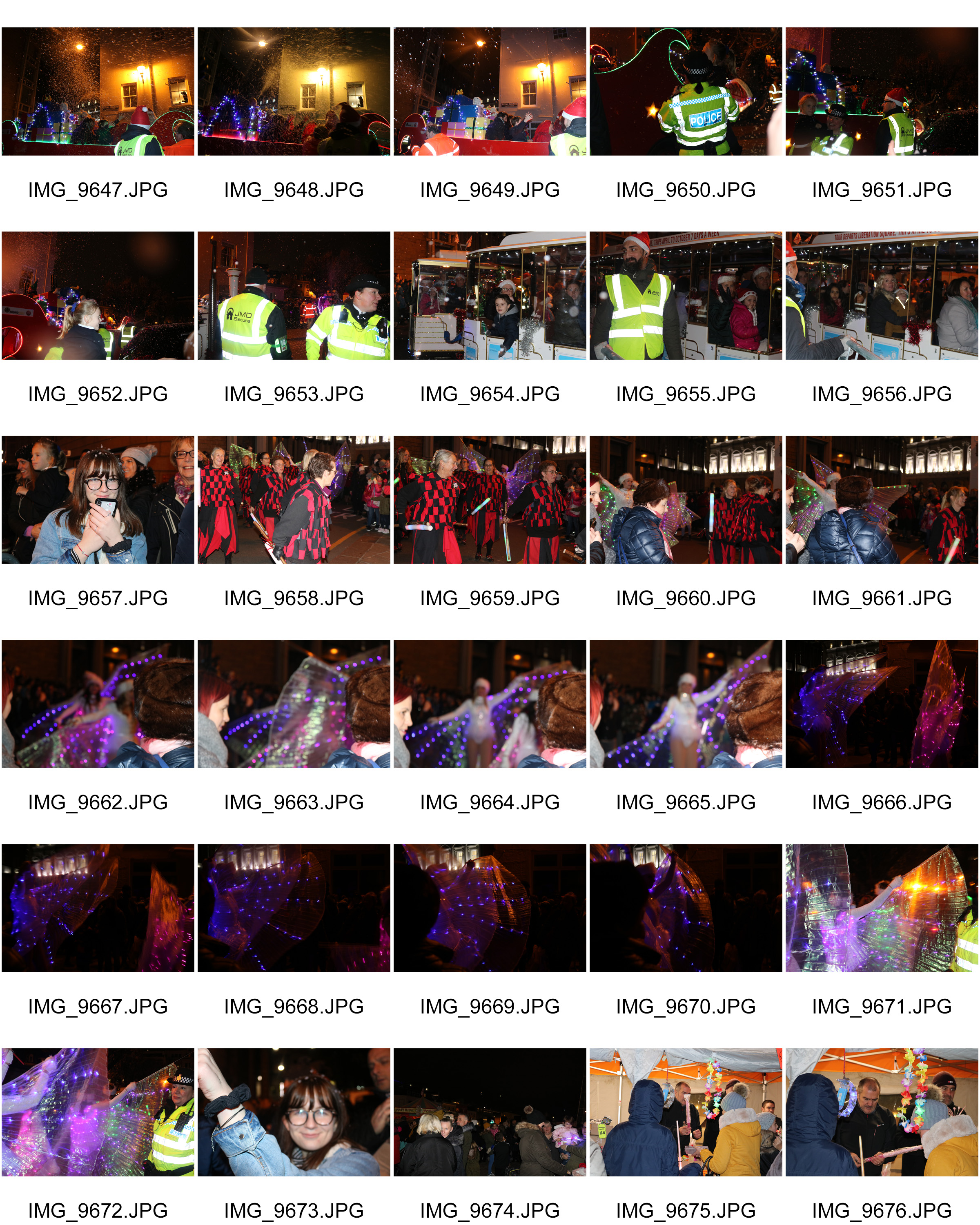
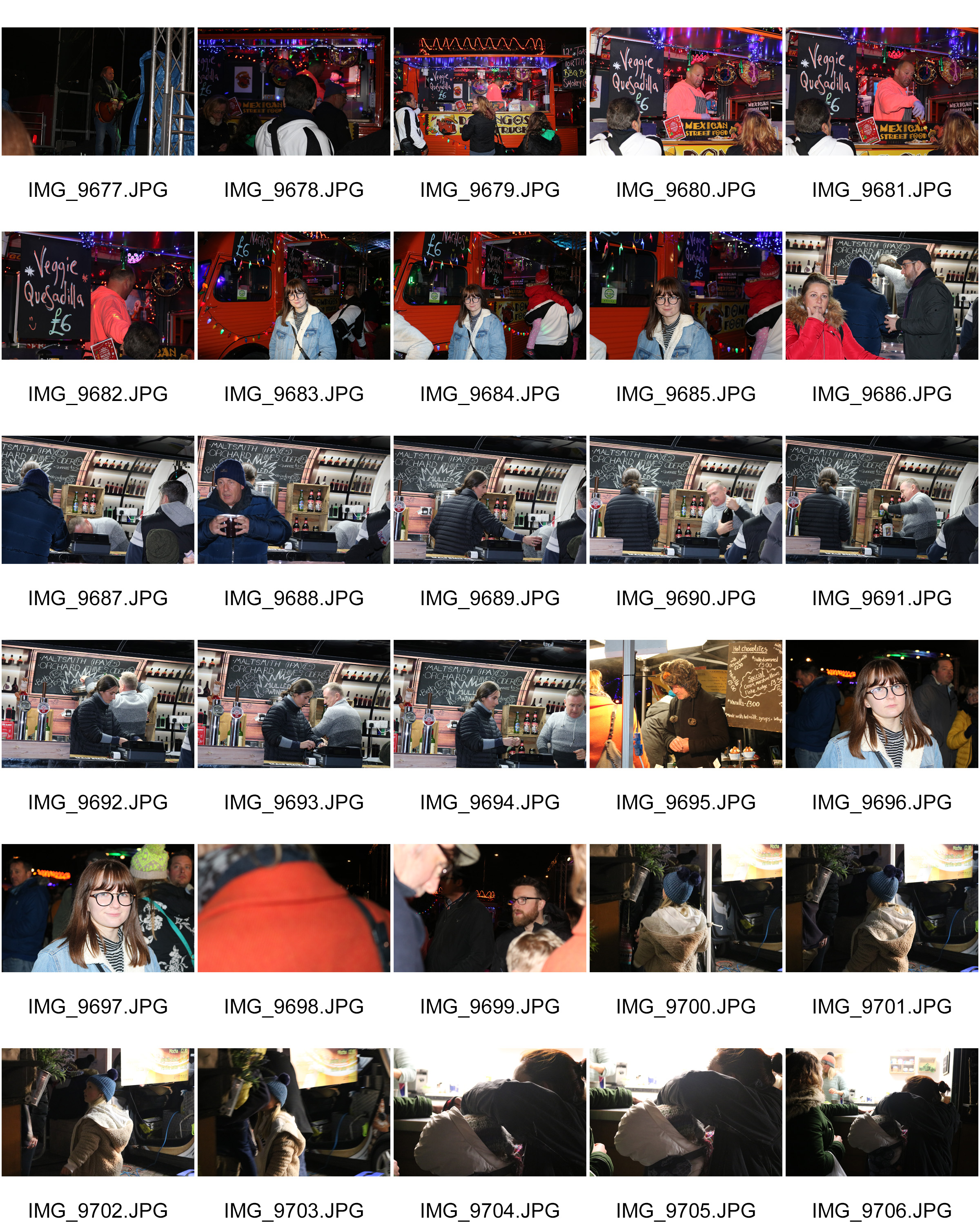
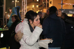
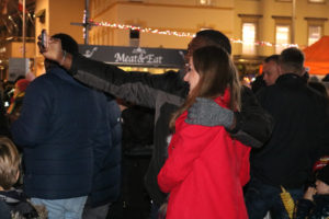
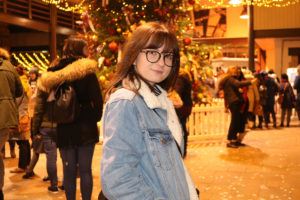
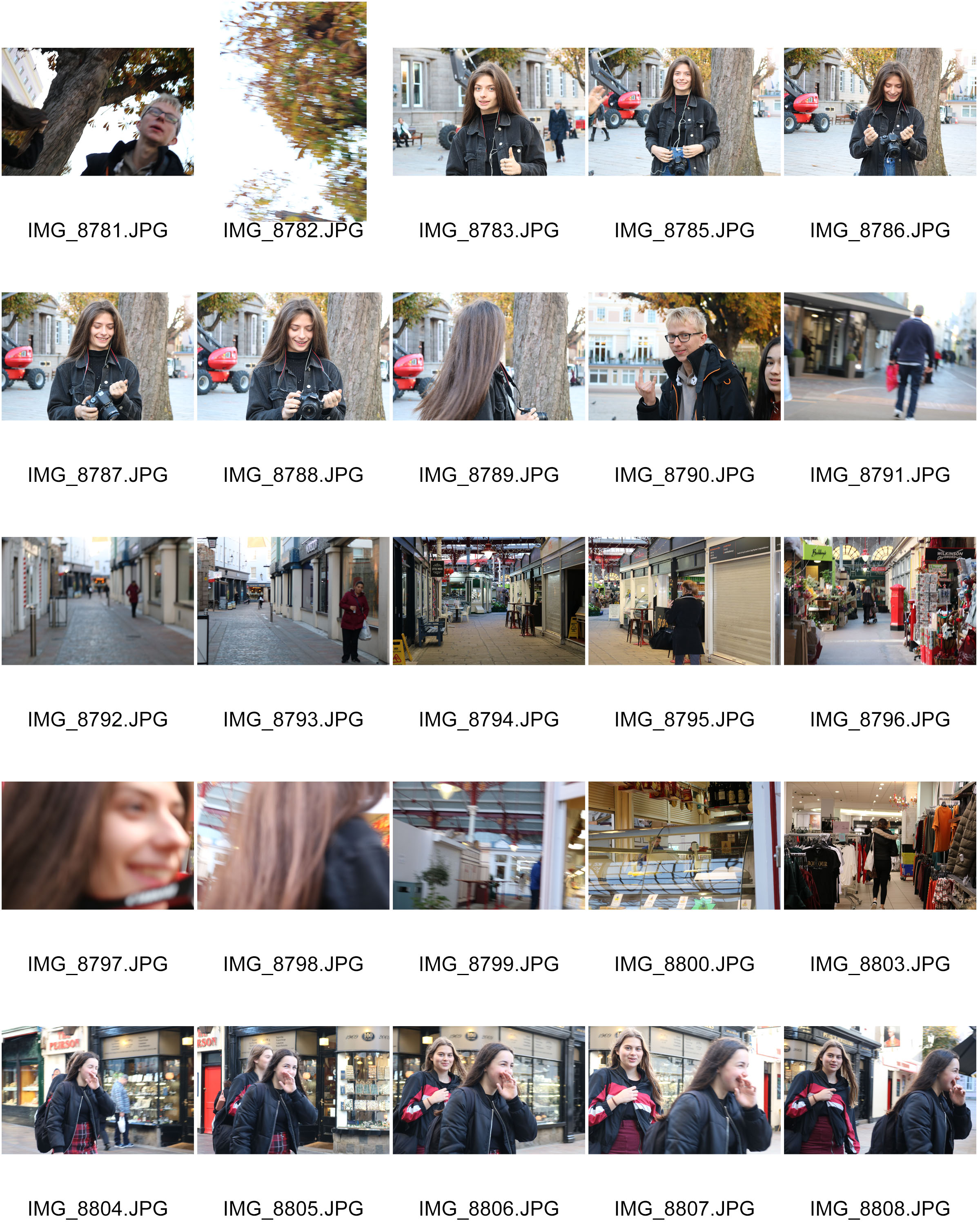
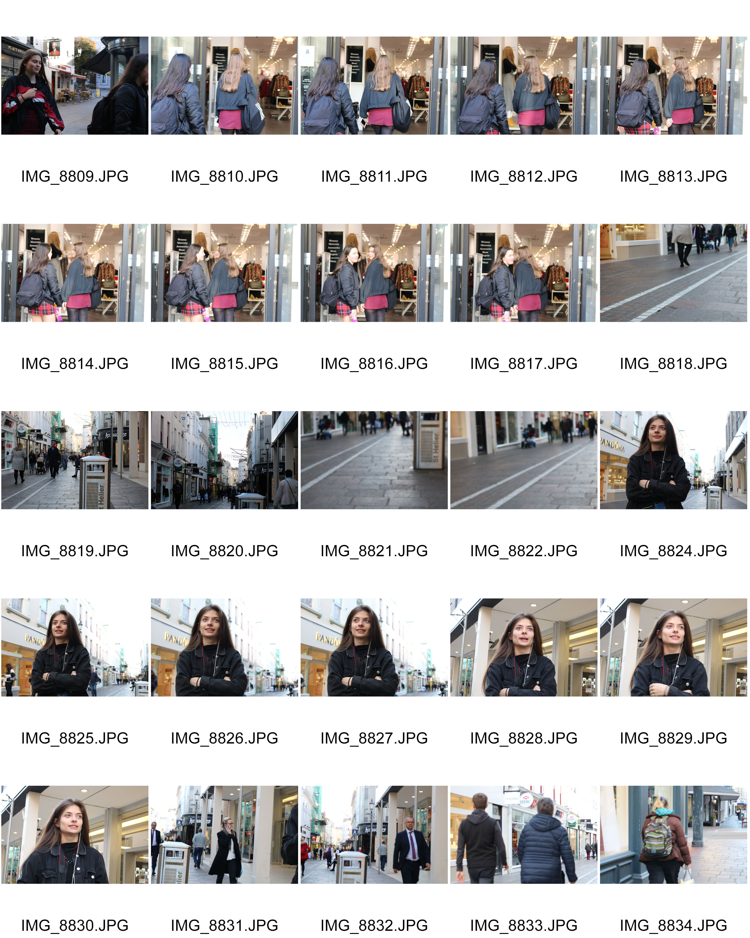
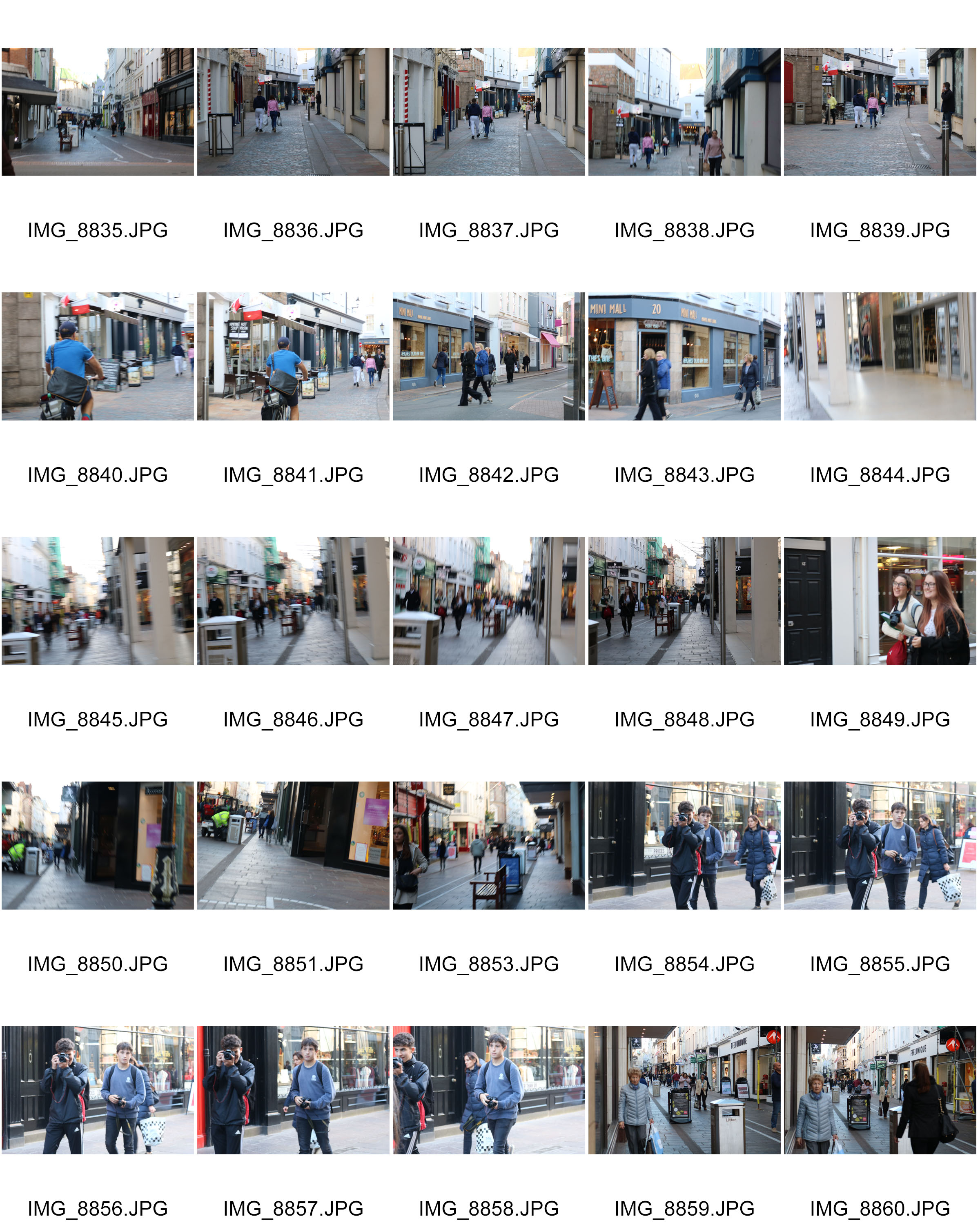
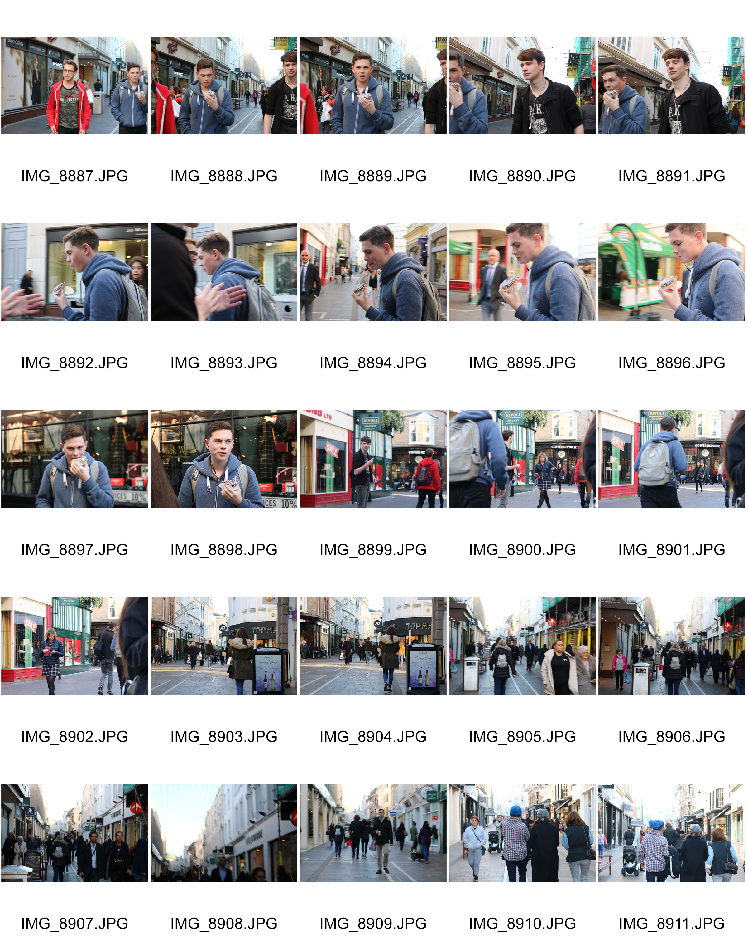
For my next attempt at street photography, I decided to take photos in town at a Christmas celebration. I thought this would produced some good outcomes as there would be a lot of people compared to my last attempt, and I therefore thought that I could find a wider variety of more interesting people to photograph. Since there would be more people, I thought that I could blend in a little more and maybe be able to capture some more candid images of people. However, I also took portrait style images of people where they were looking straight into the camera. I also tried to find interesting backgrounds that would makes my images look more attractive.

Contact sheets

Best images
Analysing

Context

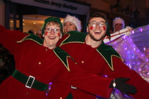
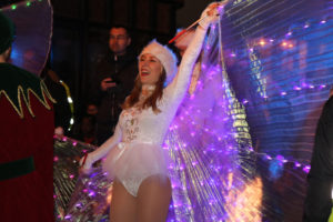
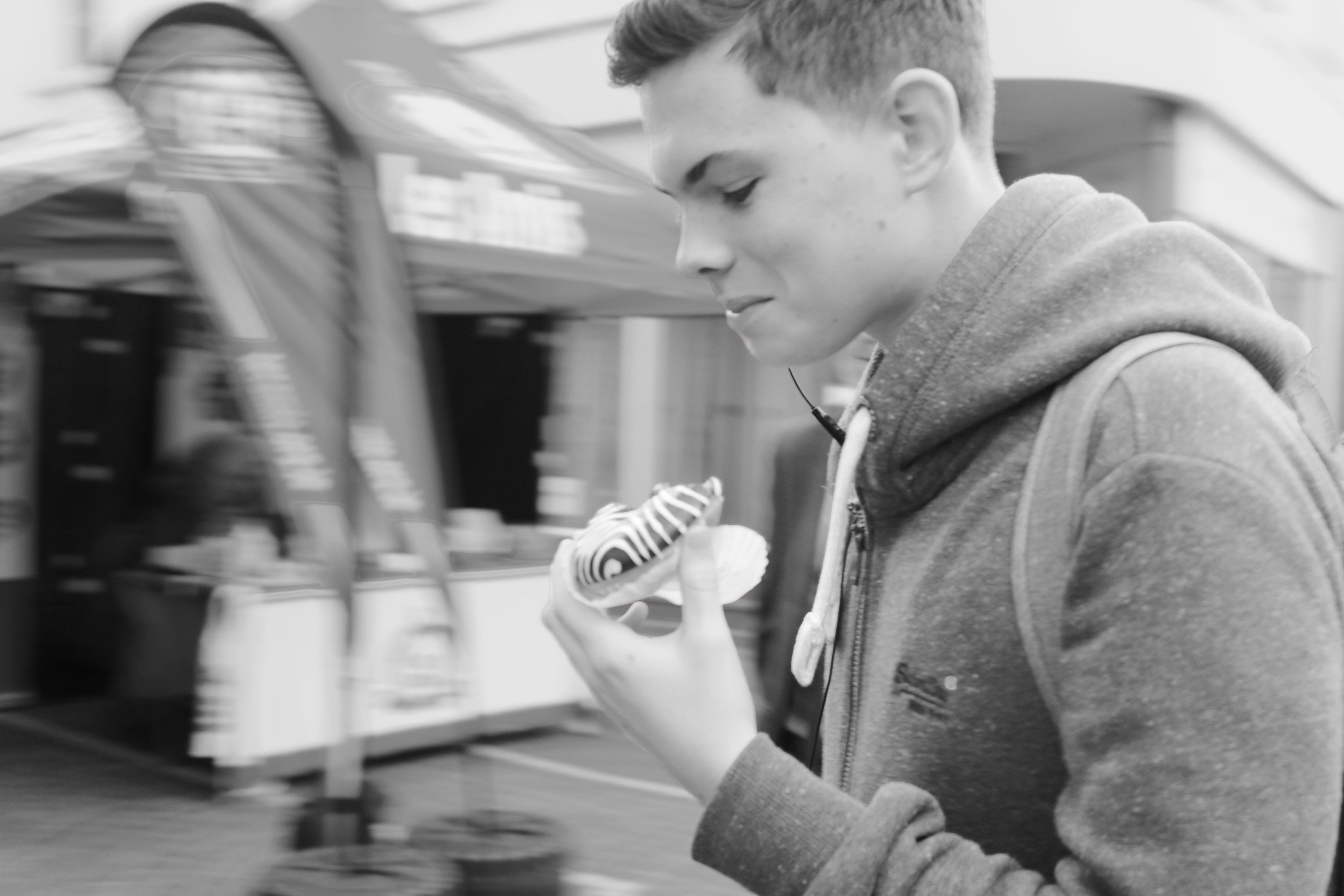
This is an image that I took of a Christmas parade dancer while she was in conversation with one of her friends.

Visual

Visually I think that this image is very successful. I like how the subject was captured in the centre of the frame, and how I manged to capture her laughing as it gives the image a positive atmosphere. I also like how there is a lot of lighting due to her costume, as it makes the image look more interesting and colourful which would captivate an audience.

Technical

As this image was taken at night in the dark, my ISO was set to 1600 and my shutter speed was set at 1/60. These settings helps me to get this image perfectly exposed. I also used flash to capture this photograph to fill in any shadowing that would’ve happened due to the uneven street lighting.

Concept

I think that the happy expression and positive atmosphere along with the Christmas nature of the photo shoot, represents how this time of year is truly abut happiness and not about being materialistic.


Context

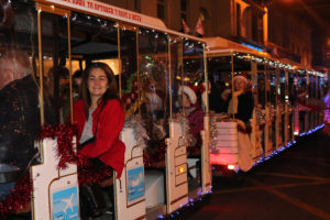
This is an image that I took of a child on the Christmas parade train, as he he leaned out of it to try and catch the foam “snowflakes” coming out of the top of the train.

Visual

One element I like in this image is the foam snowflakes. As some bits were falling very close to my lens, they ended up not being in focus as my priority was to capture the child’s expression. I like how this looks as I think that it adds more detail to the image without taking attention away from it.

Concept

I think this image shows how people should appreciate small details in life. While I took this image there was a lot going on, 100s of people crowding around us, confetti being set of, a choir singing yet the child chose to focus on the snow.

Technical


Context

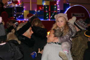
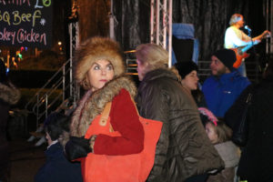
This is an photograph I  took of a lady just after the Christmas lights had turned on. She caught my attention as she was dressed in a bright red jacket, and was wearing a lot of fur. I caught this image the moment she turned back to look at the lights on the tree

Visual

Visually, I think this image is very successful. It it well exposed and it is sharp making it good quality.  The use of my flash meant that she wasn’t wash out by all the background light. The angle I captured this image from was also very successful as I got the whole of her face in the photograph.

Concept

I think that the way she is so intensely staring at the tree and the lighting is really interesting as it may make people wonder what the woman was thinking while she was looking.

Technical

For this image my shutter speed was set 1/60 and my ISO was set on 6400, as it was very dark outside and I needed as much exposure without machining the image look noisy. For this image I also used flash so that the woman in the image was evenly lit, as there were many lighting decorations everywhere that caused uneven lighting.

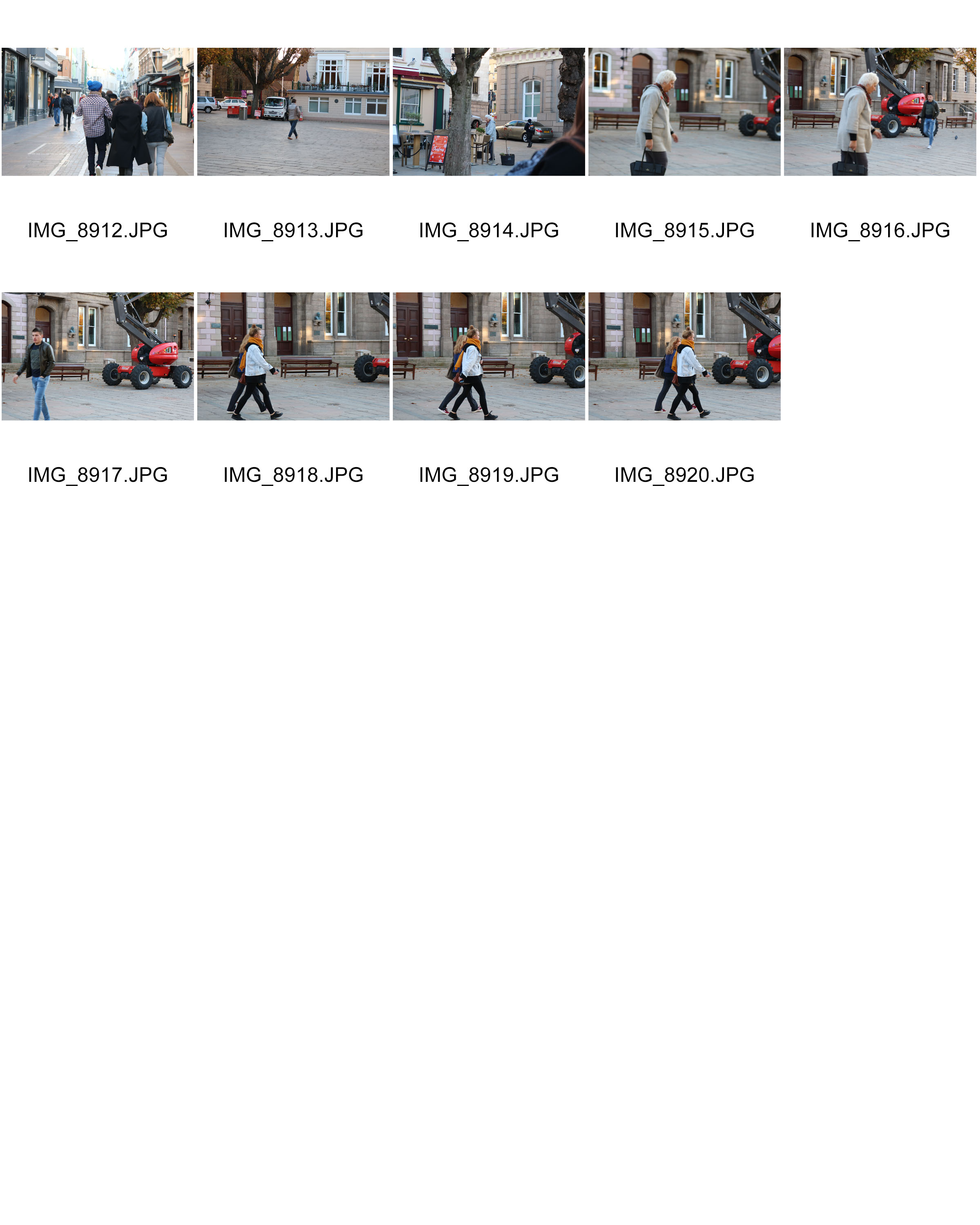
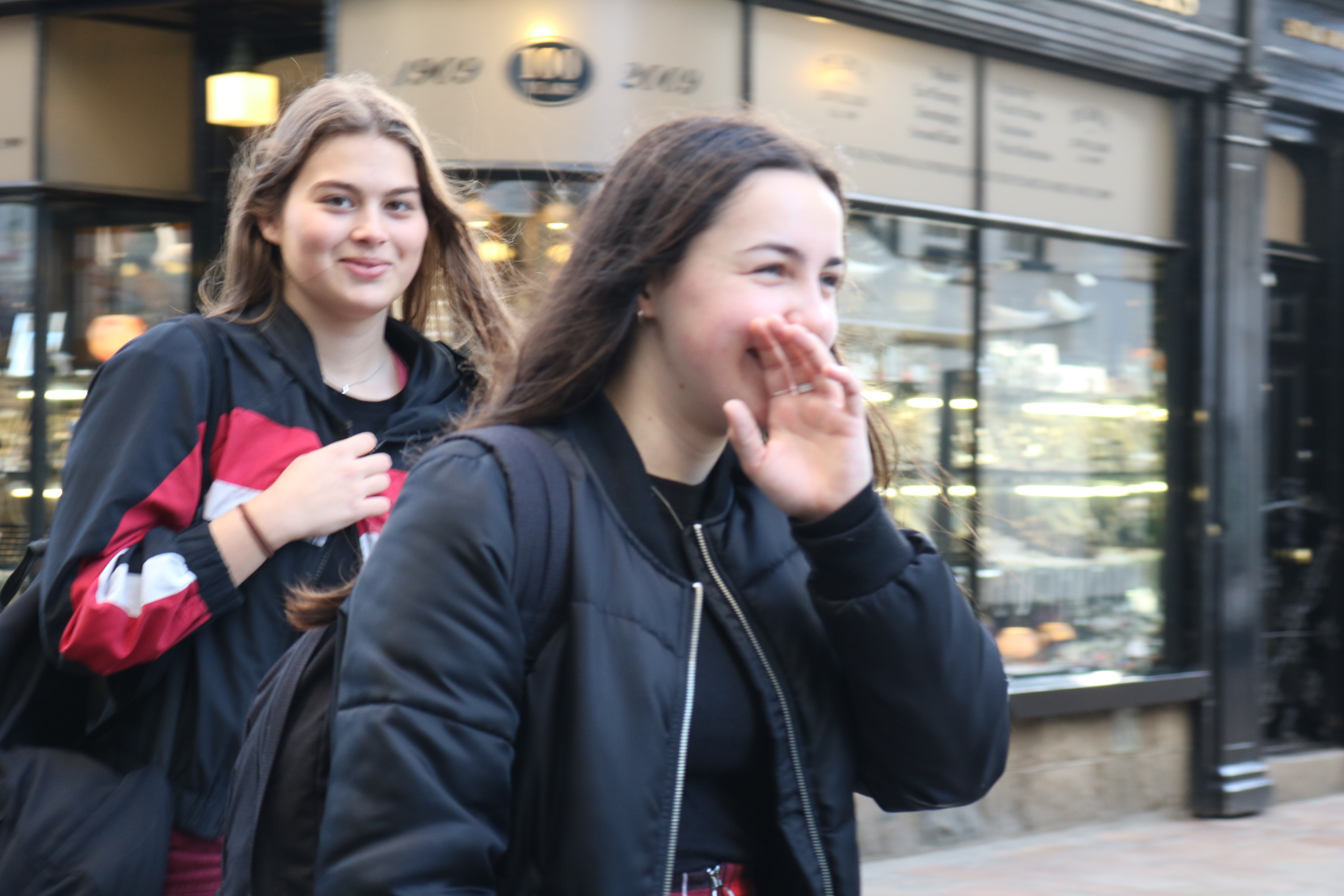
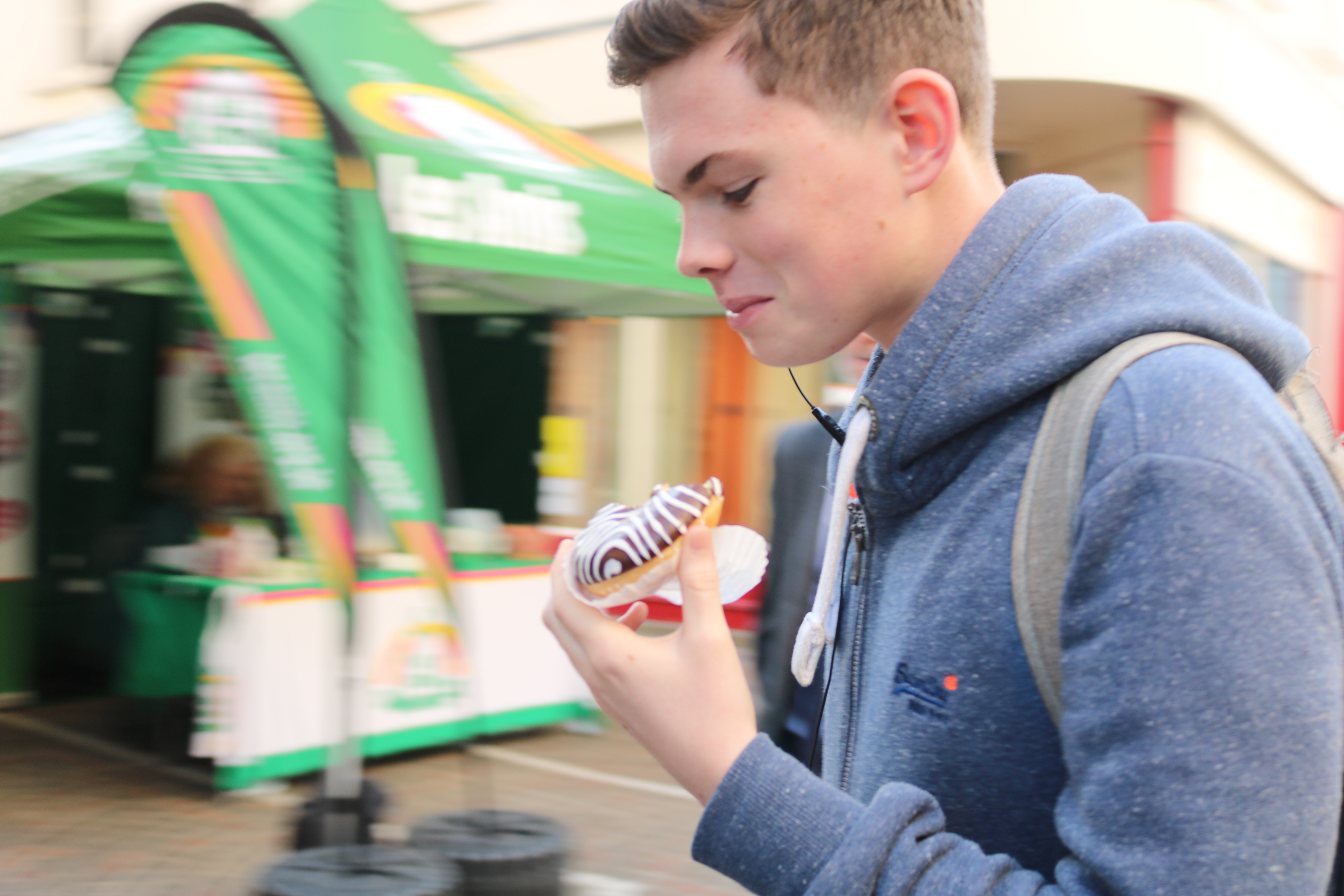
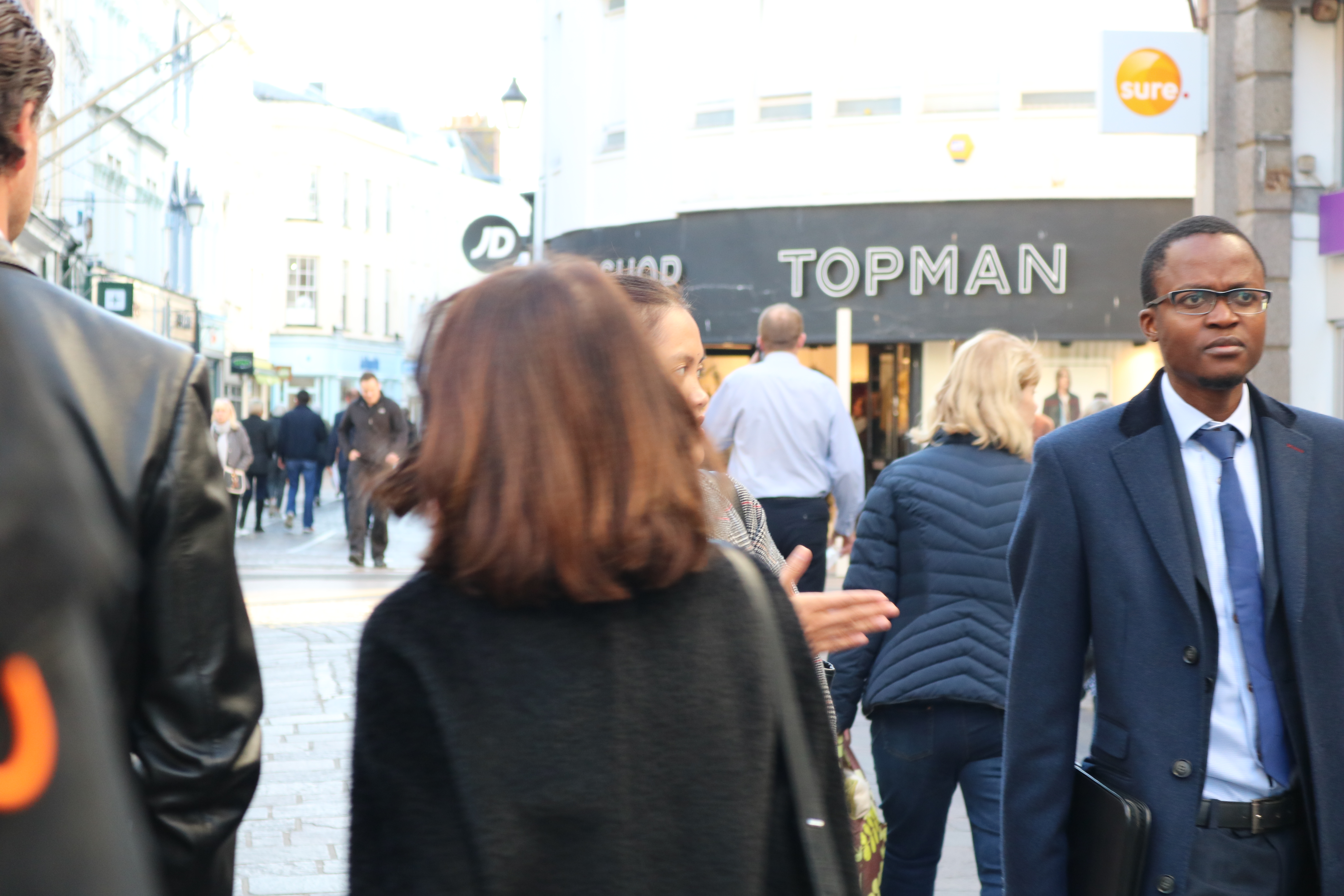
Street photography Practice

Contact sheet


Best outcomes

Editing

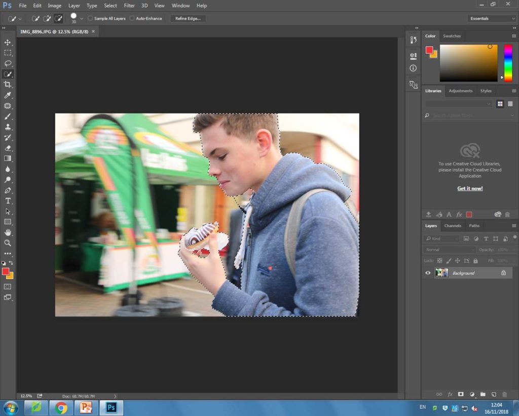
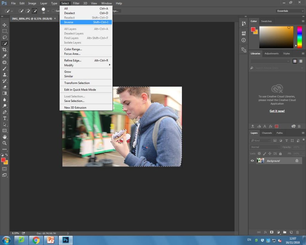
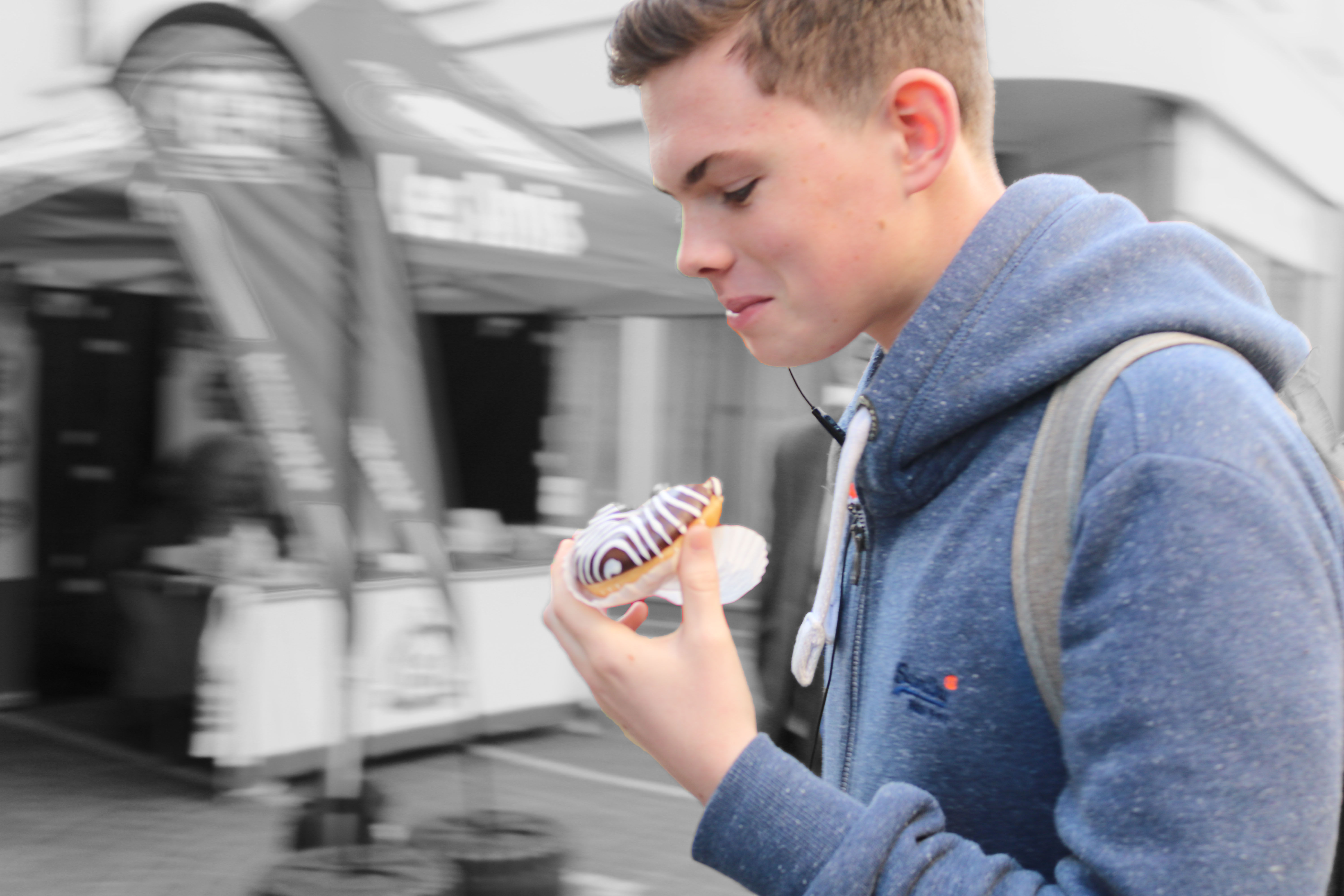
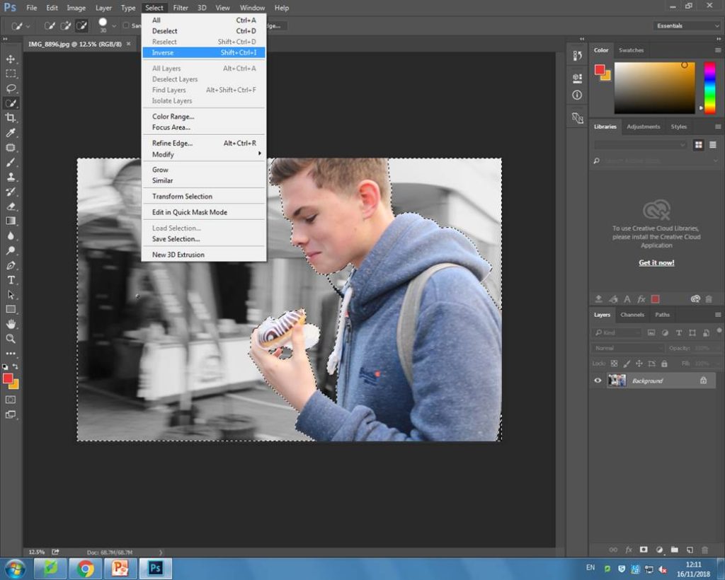
Firstly, I used the quick selection tool to select the person in the image. I then inversed it so that the entire area around his was selected instead. After, I turned the hue and saturation right down while also decreasing the brightness a tiny bit. Below is my final outcome:

My initial final outcome.

The reason that I thought I would do this is because it would make the person stand out more against the plain background. I thought this would be a good idea because it would help to bring out people’s personalities and individuality out a lot more as that is what I personally thinks makes street photography interesting.

I also wanted to experiment with making the entire photo black and white also as I thought this could make my image look more like the ones Sander took. To do this i inversed the selection again, so that it was around the person and turned the hue and saturation right down. I kept the brightness at 0 so that the person would still slightly stand out, but not as much as before.

My second outcome, experimenting with black and white.


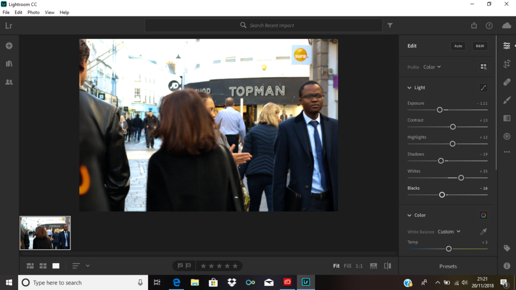
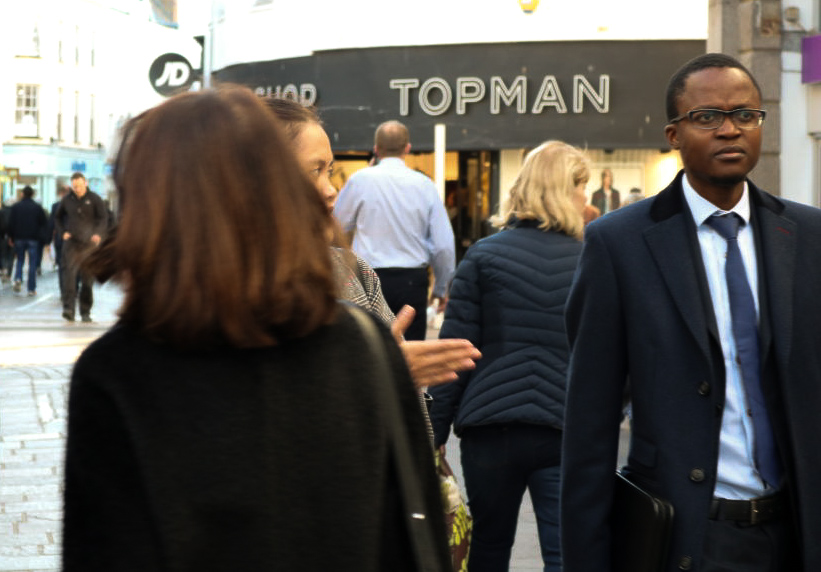
EditingI edited this image using Lightroom. As the image was overexposed along the top, I lowered the exposure, shadows and black shades and increased increased the contrast, highlights and whites. This helped not make the people in the image too overexposed.
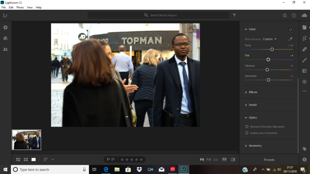
Lastly, I cropped the image to get rid of the left part as I thought it was quite unnecessary since it was quite distracting. This way you’re able to notice the main subject of the image more.
 

original image
edited image


Henri Cartier-Bresson

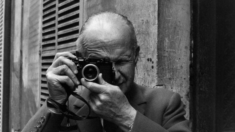
Photograph of Henri Cartier-Bresson

Henri Cartier-Bresson (1908-2004) was a french photographer who was considered a master of candid photography. He was also a huge influencer of street photography, helping to make it a recognized form of photography. He photographically reported  places through sensitive times, such as the soviet union after Stalin had died.

After World War 2, in which Cartier-Bresson spent most of his time as a prisoner of war- he founded the Magnum photo agency along with other people such as Robert Capa. The Magnum photo agency is a community that allowed photo journalists, who were interested in events happening around the world, to reach big audiences through magazines.


“Magnum is a community of thought, a shared human quality, a curiosity about what is going on in the world, a respect for what is going on and a desire to transcribe it visually”

– Henri Cartier-Bresson


The Magnum agency is committed to being authentic in its truthful,storytelling images. Magnum is responsible for documenting most of the world’s most important events like political affairs and disasters and conflict since the 1930s. All the photographers Magnum represent have a shared interest in photographing people,places,cultures and possible powerful and historical events.

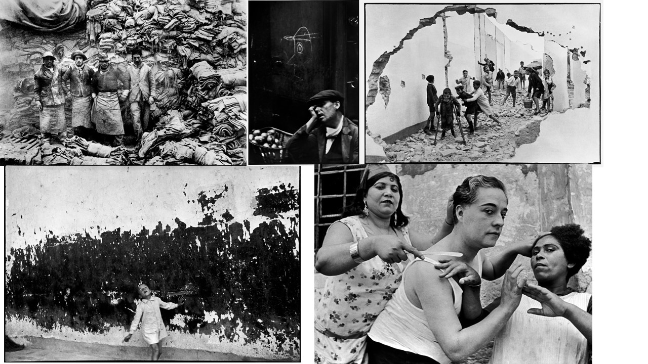
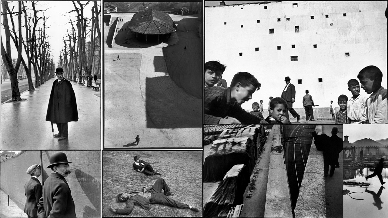
Henri Cartier-Bresson mood board

Analysing 

Context

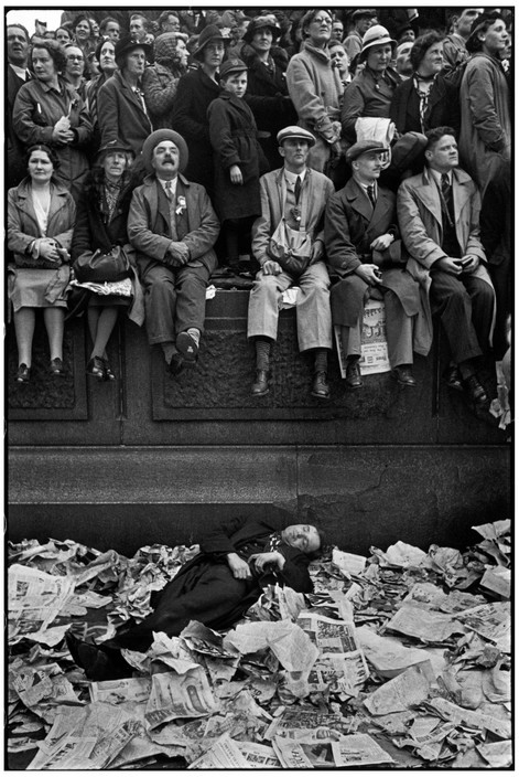
This image was taken in London on Trafalgar square on May 12th 1937. Cartier-Bresson said that some people had waited all night, and some people even slept on benches in order not to miss the coronation of George VI.

Visual 

Visually, I think the way Cartier-Bresson has chosen to frame this image is very interesting. I like the way the photo has almost been sectioned into layers with people standing on the top third, a line of people sitting on the second third, and finally someone lying down on the bottom third. I think this was a very interesting way to frame the image as it makes it really pleasing to look at, as it looks very organised. I also think there is a very interesting contrast with the person lying down on the newspaper, as the person is dressed darkly, and the newspaper appears really white on the photo. This is interesting because it means that the person stands out really vividly on the photograph.

Technical

On the technical side, the image is very successful also. The image seems to be taken during day as the sky appears white. The image is also not over or underexposed, meaning that the quality of the image is good  and it is very sharp so that everyone in the image can be seen clearly.

Conceptual analysis

I think that there could be an underlying  meaning of community and also the importance of politics and history. I think this because the image shows a lot of people all gathered closely together, which gives the sense of community. Cartier-Bresson also mentions how people had slept there all night so they wouldn’t miss the ceremony, I think this image shows that politics is important as people were very dedicated to seeing George VI being coronated as it was a once in a lifetime opportunity and would be an important part of their counties history. Because of this, the image also gives a strong sense of patriotism.

Comparison to Bruce Gilden

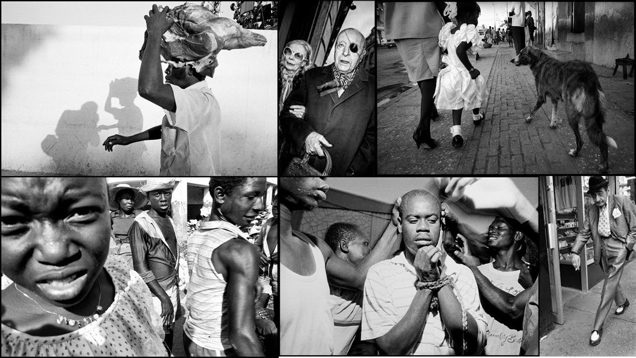
Bruce Gilden who was born in 1946, is an American street photographer who is known for his very close up portraits of people using a flash gun. He purchased his first camera after seeing Michelangelo’s film “Blowup” in 1968, and he later began taking photography night classes.

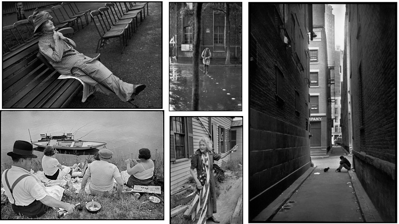
Gilden mood board


Similarities to Cartier-Bresson

Like Cartier-Bresson, Gilden is also represented by Magnum Photos, and has been since 1998. He also photographed interesting things  and people around the world like homeless people, Yakuza mobsters in Japan, prostitutes and voodoo rituals in Haiti. They both also had black and white photo outcomes.

Differences to Cartier-Bresson

Unlike Cartier-Bresson, Gildren takes a more notifiable approach to his street photography. Instead of taking candid images of people passing by, Gilden is known for getting very up close into people’s personal space and using a flash gun in their faces. Their intentions were also quite different. Although they both had a very keen interest in different people and capturing interesting things on the street, they each took an individual approach.

Outcomes

As they both took their own approaches, their outcomes are very mostly very different.

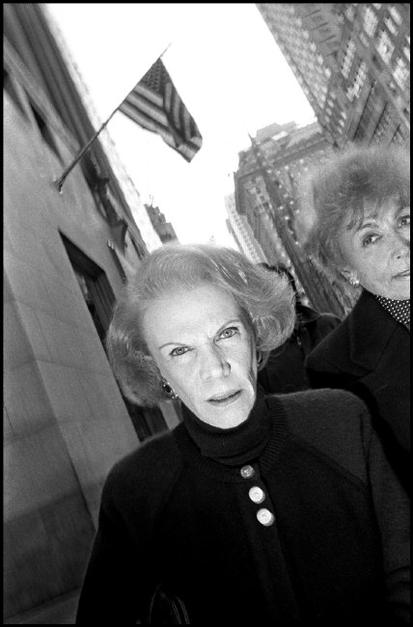
USA. New York City. 1992. Women walking on Fifth Avenue by Gilden.

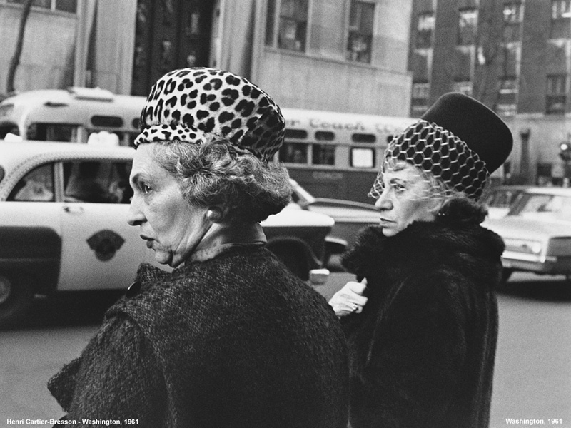
As you can see Gilden’s approach leads to portraits with different expressions, mostly of people looking quite shocked and surprised. Whereas Cartier-Bresson’s approach leads to more natural, candid images, where people aren’t looking at the camera therefore not realizing that images of them are being taken like the one pictured below:

image by Henri Cartier-Bresson


Street photography introduction

Street photography is when you capture interesting photographs of regular, everyday people outside in public. Street photography is very interesting because you are ale to capture so many different types of people, that all look unique in their own way.

To be a successful street photographer I think that you have to have an eye for detail but also an interest in different types of people, in order to notice them and be able to photograph them. I also think that it takes a lot of confidence. After experimenting with street photography myself, I realized that it is not as easy as it seems, and that’s its actually a lot harder than I though to be able to take successful images, as standing in the street taking images of people passing by requires you to be a lot bolder than you think.

There are many different approaches that you can take to street photography. Some photographers prefer to take more candid images where the people they’re photographing don’t really notice they’re there, while other photographers like Dougie Wallace and Bruce Gilden prefer to surprisingly picture people very up close with bright flashes. Each of these 2 approaches give you different outcomes:


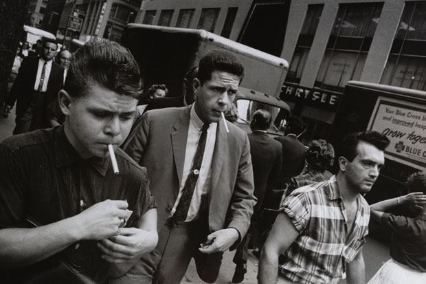
Garry Winogrand, New York, ca. 1960.

As you can see, this outcome shows that if you take a more subtle approach to capturing people. you get a more candid outcome which makes the image look a lot more natural and realistic.

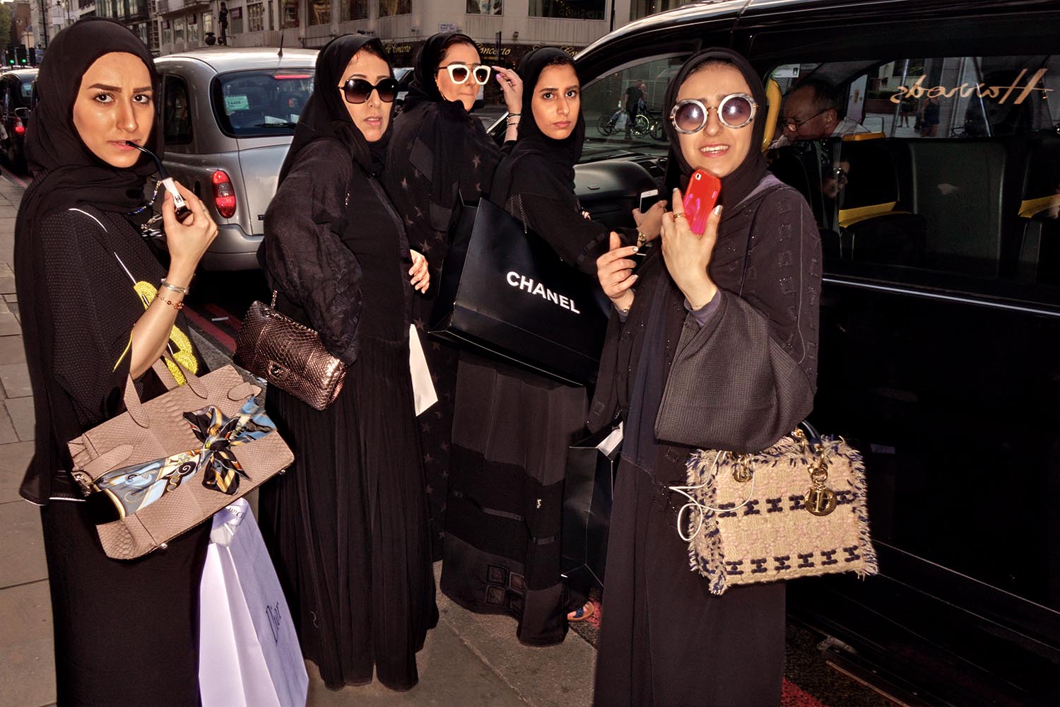
Image by Dougie Wallace, “Harrodsburg”

On the other hand, Wallace’s more loud, and surprising approach to photographing people means that in his images all the subjects react with the camera, as you can see in his image above where all the women he pictured are looking at the camera.

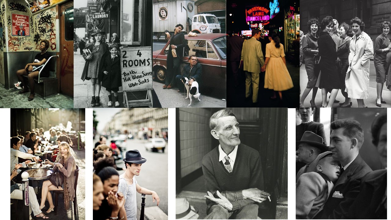
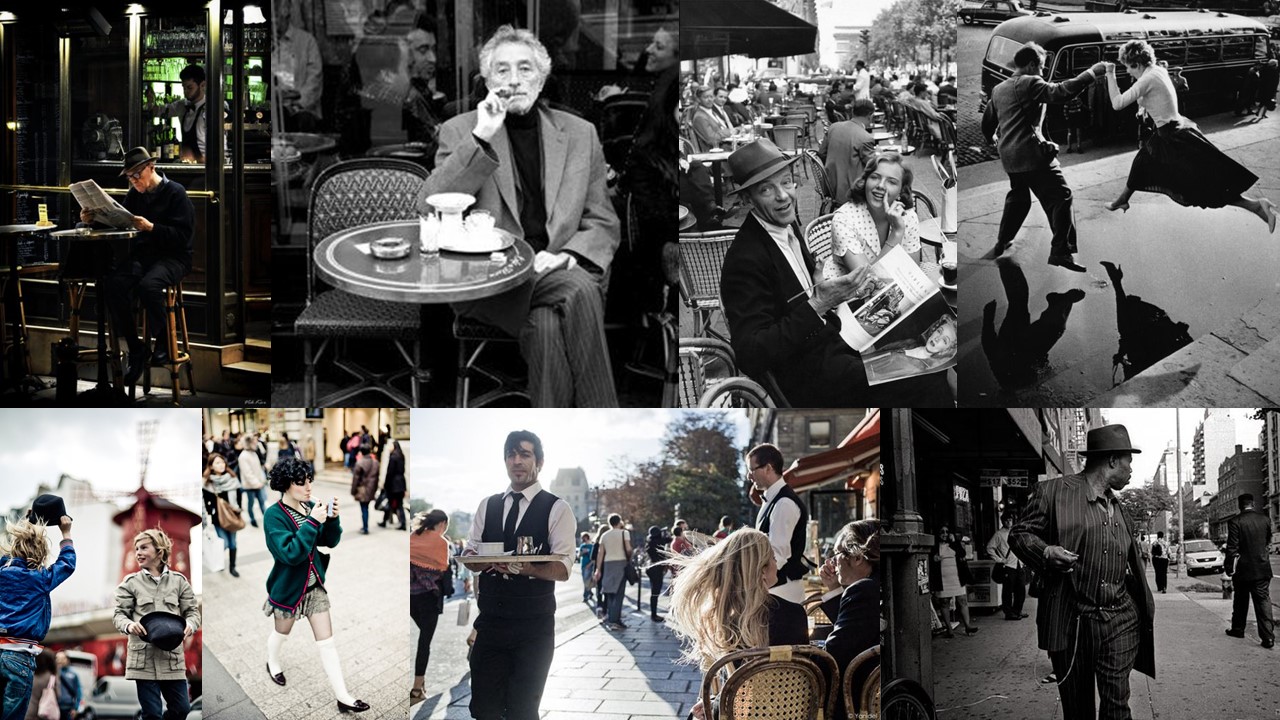
Street photography mood board

Video

https://www.youtube.com/watch?v=gGX_hb8NfVY