All posts by Krystian S

Filters

Author:
Category:

Final Images

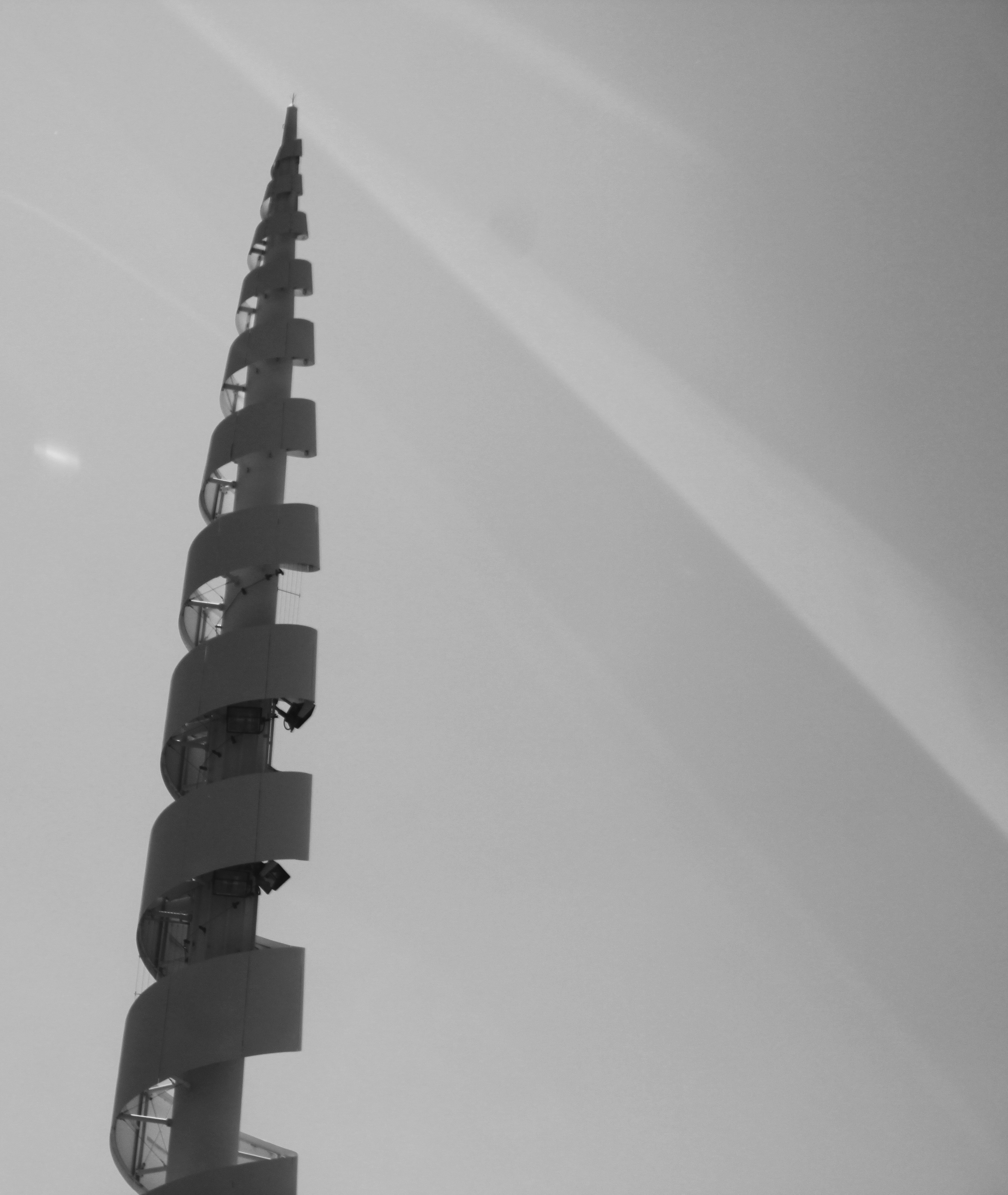
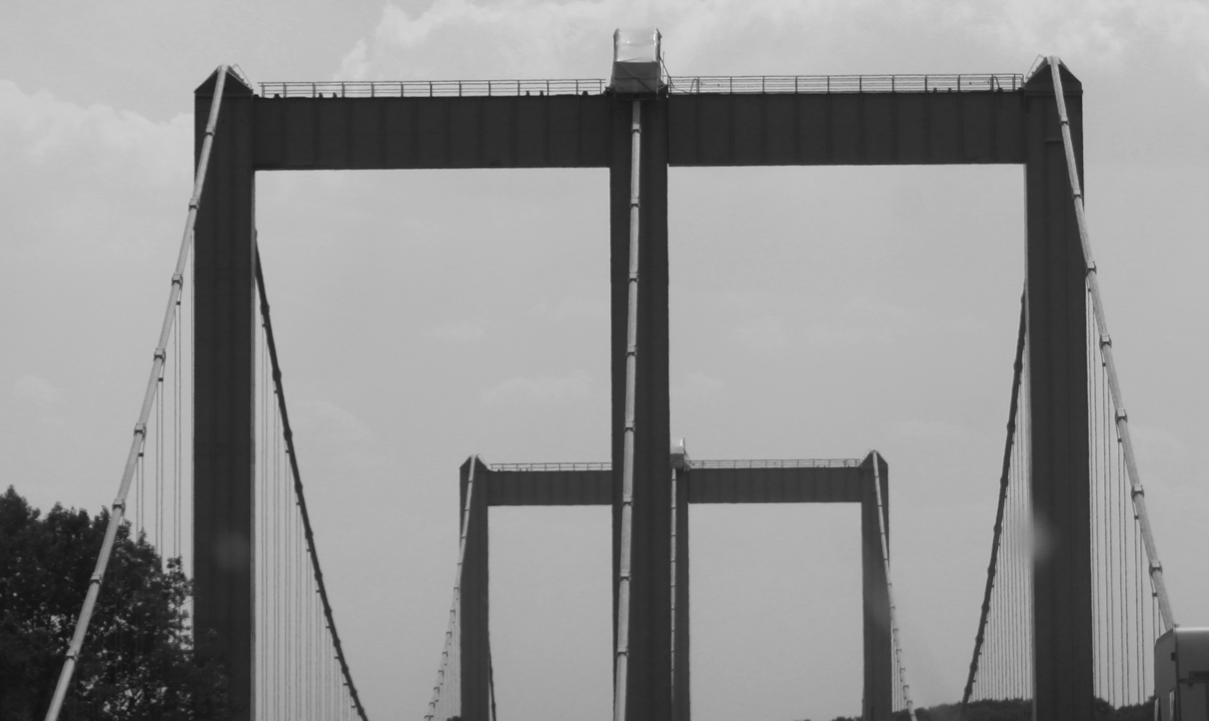
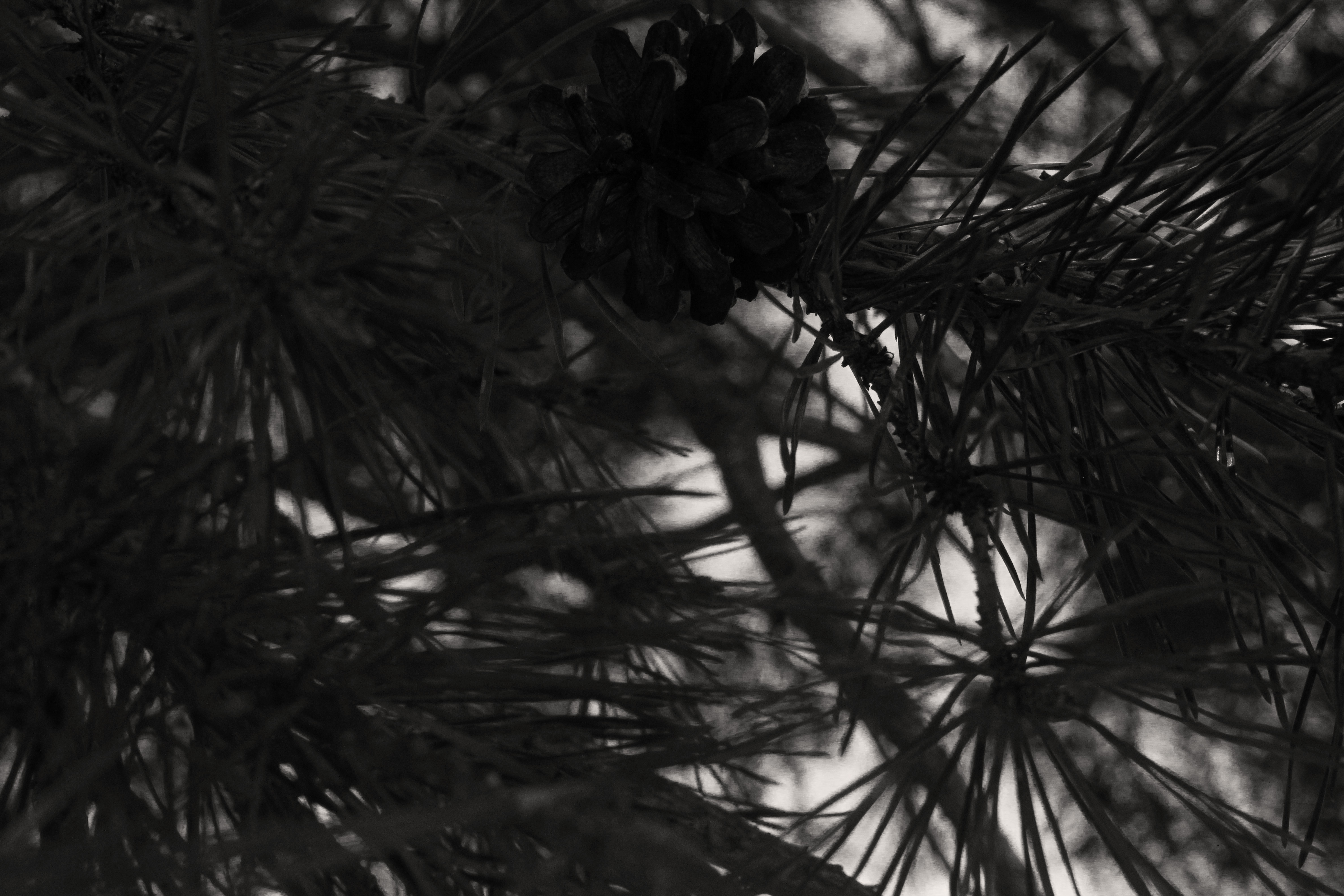
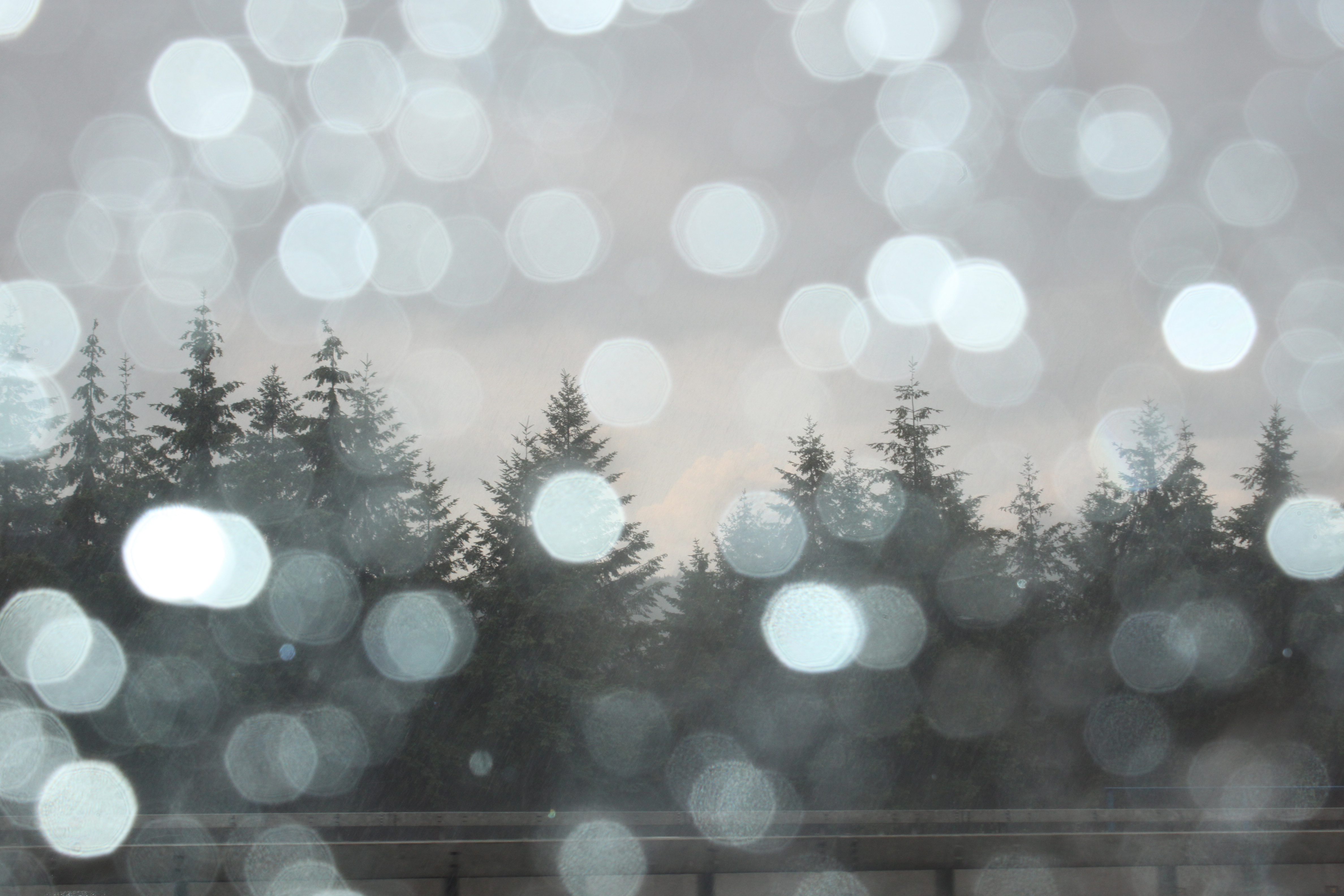
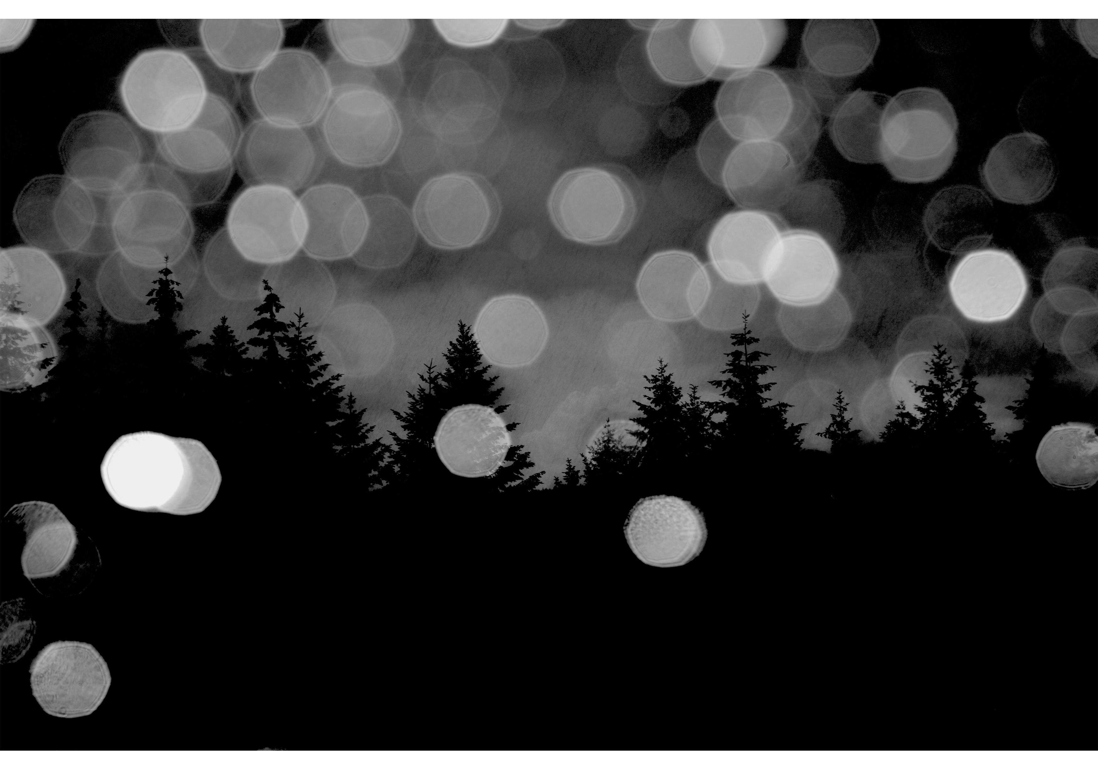
These are the 4 final images which I have chosen to print out as my final images.
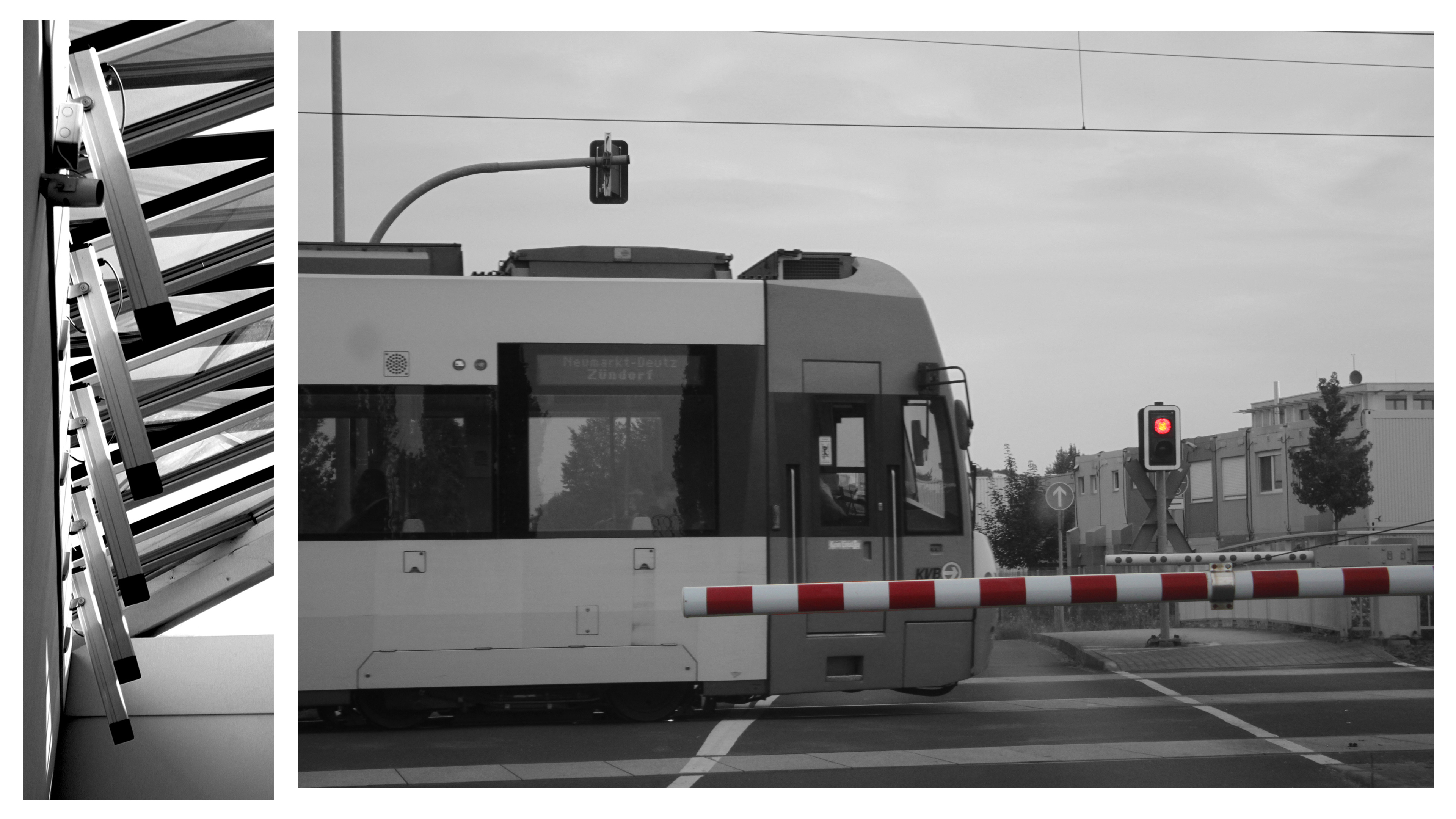
This will be my largest print out (sized at A3). I will seperate the print into the two images it consists of; then stick them onto one layer of white styrofoam board, then display them on a black A2 piece of card. This will make them literally pop out of the page more as they will be lifted approximately 1cm above the card. The whole display will also keep the black & white theme as the display elements are also black & white.This image will be printed out in A4 size. I will frame it in black A3 card to keep the dark theme of the photo. Howevr, I will bevel the edges around the photo so that the white underside of the card shows through, this will help distinguish the image from the frame without adding too much bright elements.
This photo will be printed out in A5 size. I will cut it into three elements (left, middle, right) to help show how the image consists of three clear parts. I will then layer them on different thicknesses of styrofoam board; left part will be 2 layers thick, middle right part will be 3 layers thick, and middle part will be 5 layers thick. These will then be stuck onto an A4 piece of black card with small gaps between each third of the photo.
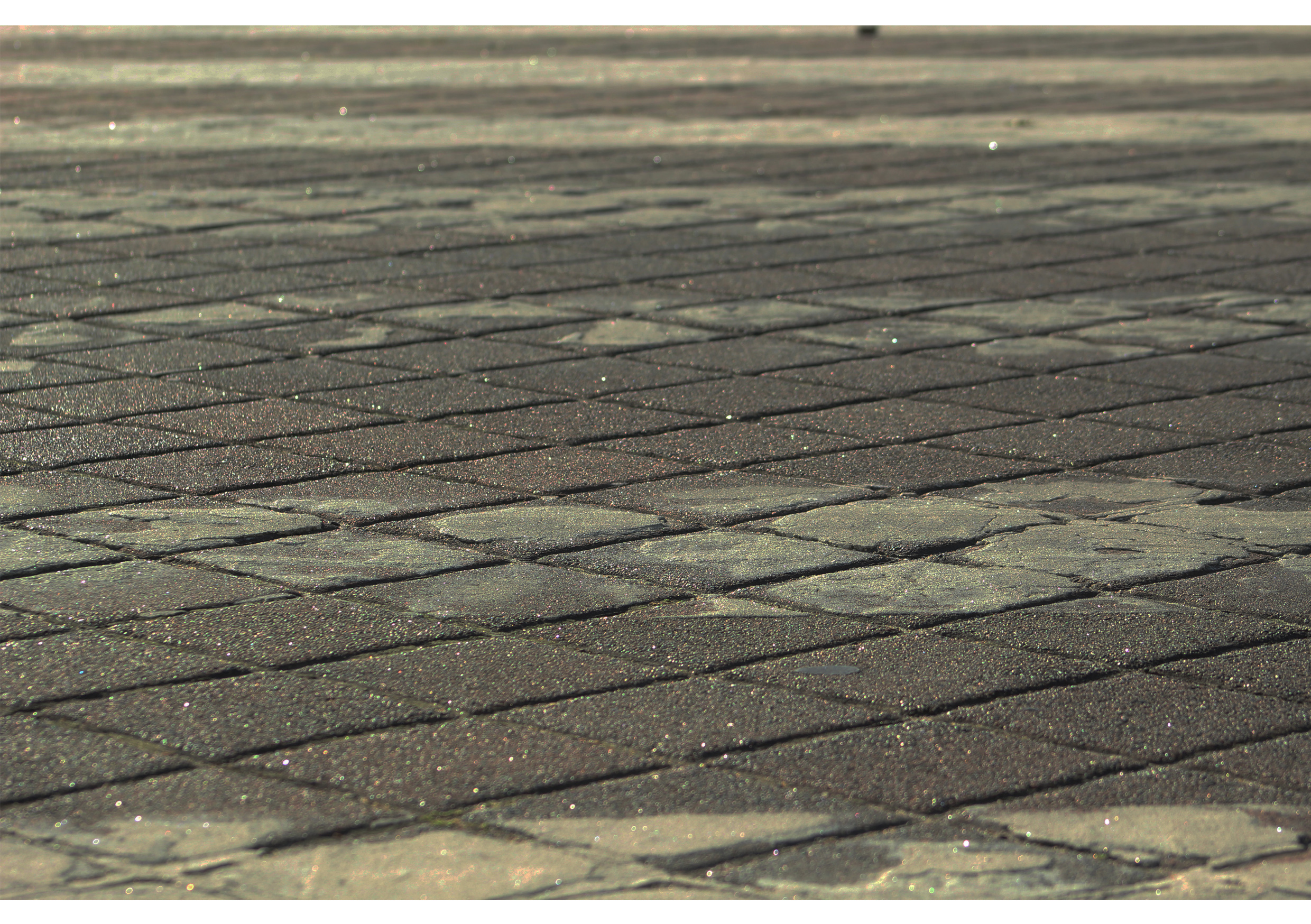
This photo will also be printed at A5 size. For this photo I have decided to keep things simple by only sticking it onto one layer of styrofoam board.

Double Exposures

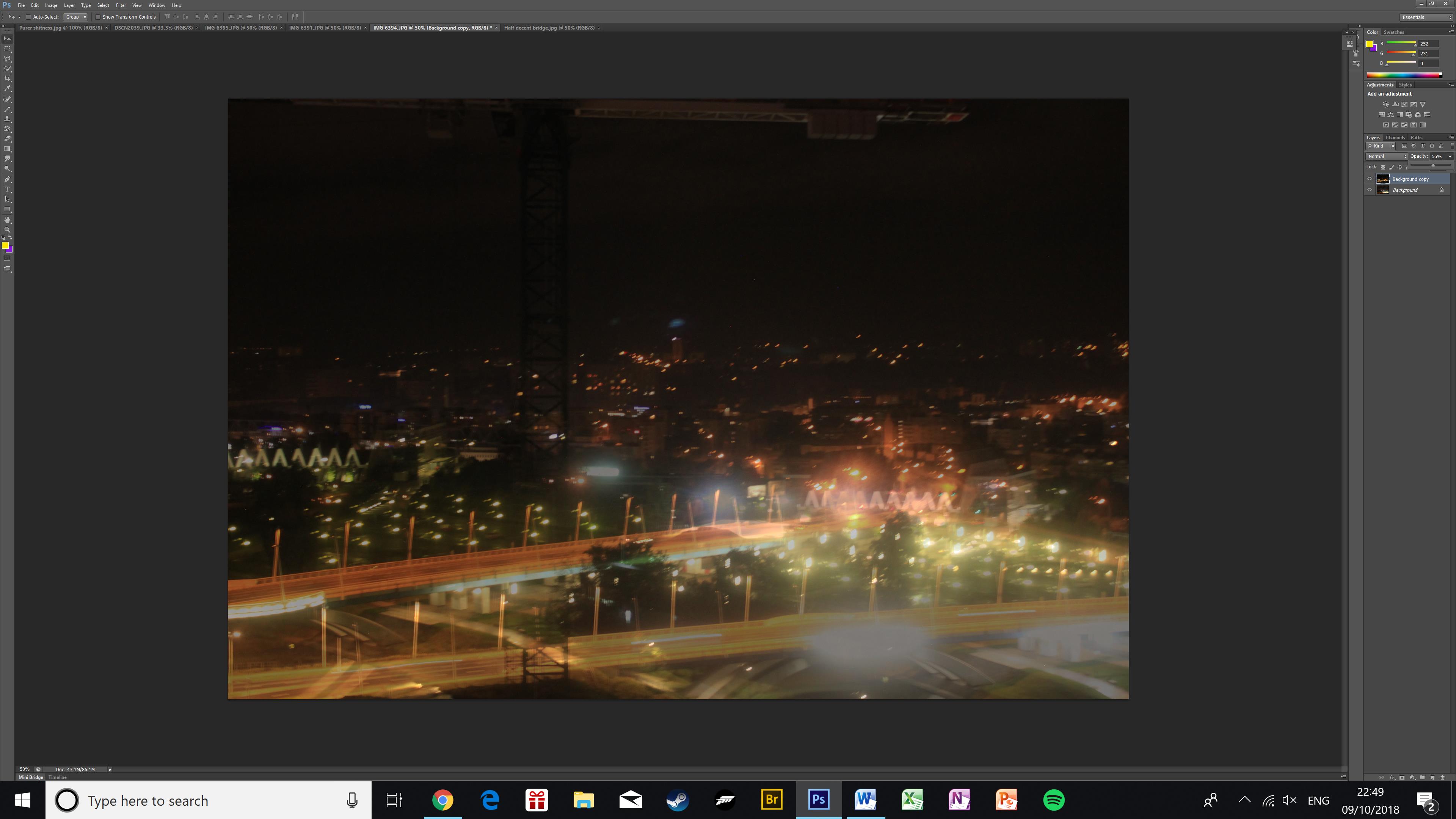
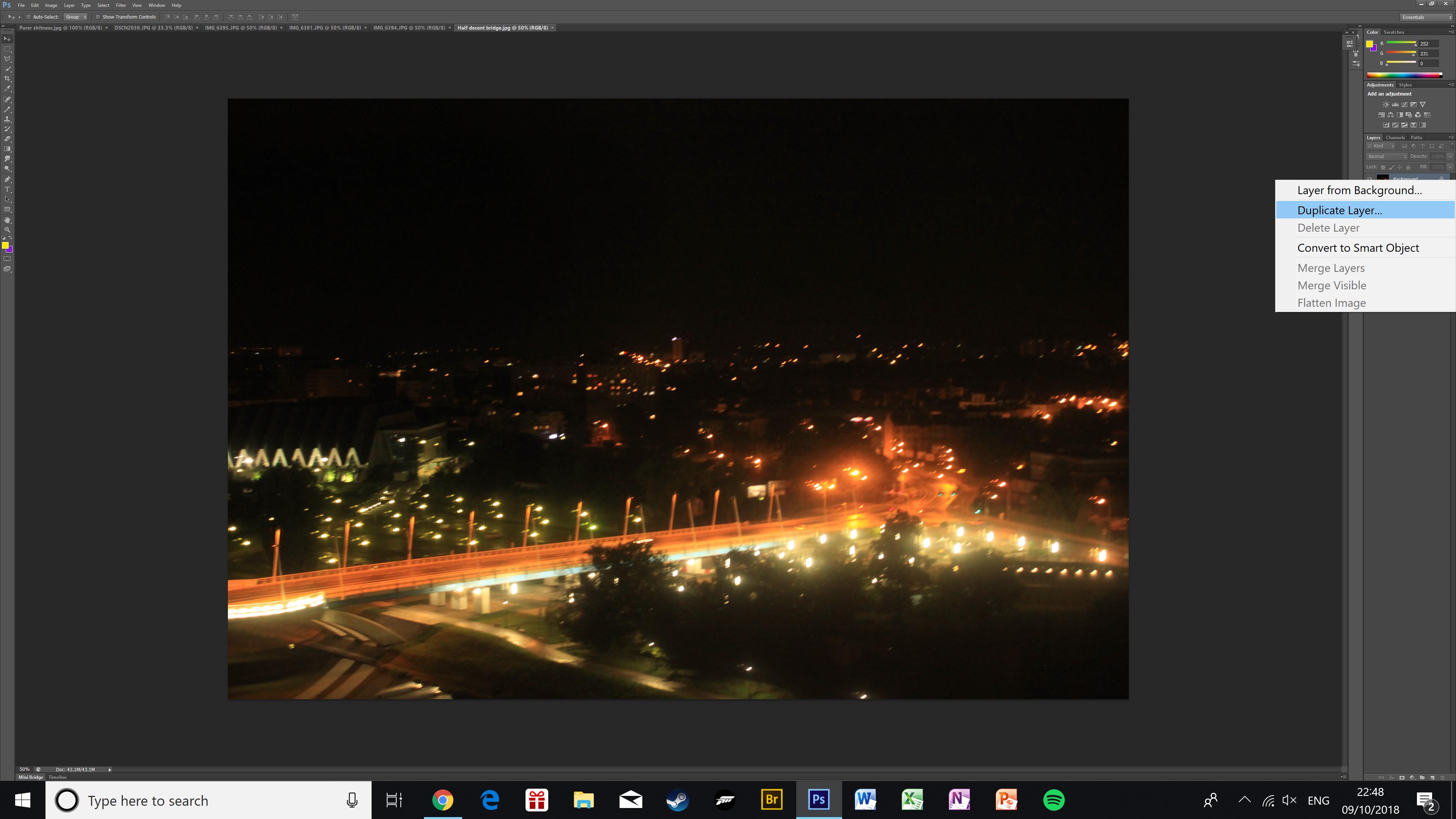
To create a double exposure I used two similar photos of the same bridge. First, I duplicated the layer I wanted to go on top and placed it on top of my base image.
Then I made the top image more transparent using the opacity slider. In this image, it creates an effect of there being two layers of bridges across the bridge, as well as raising the skyline in the background.
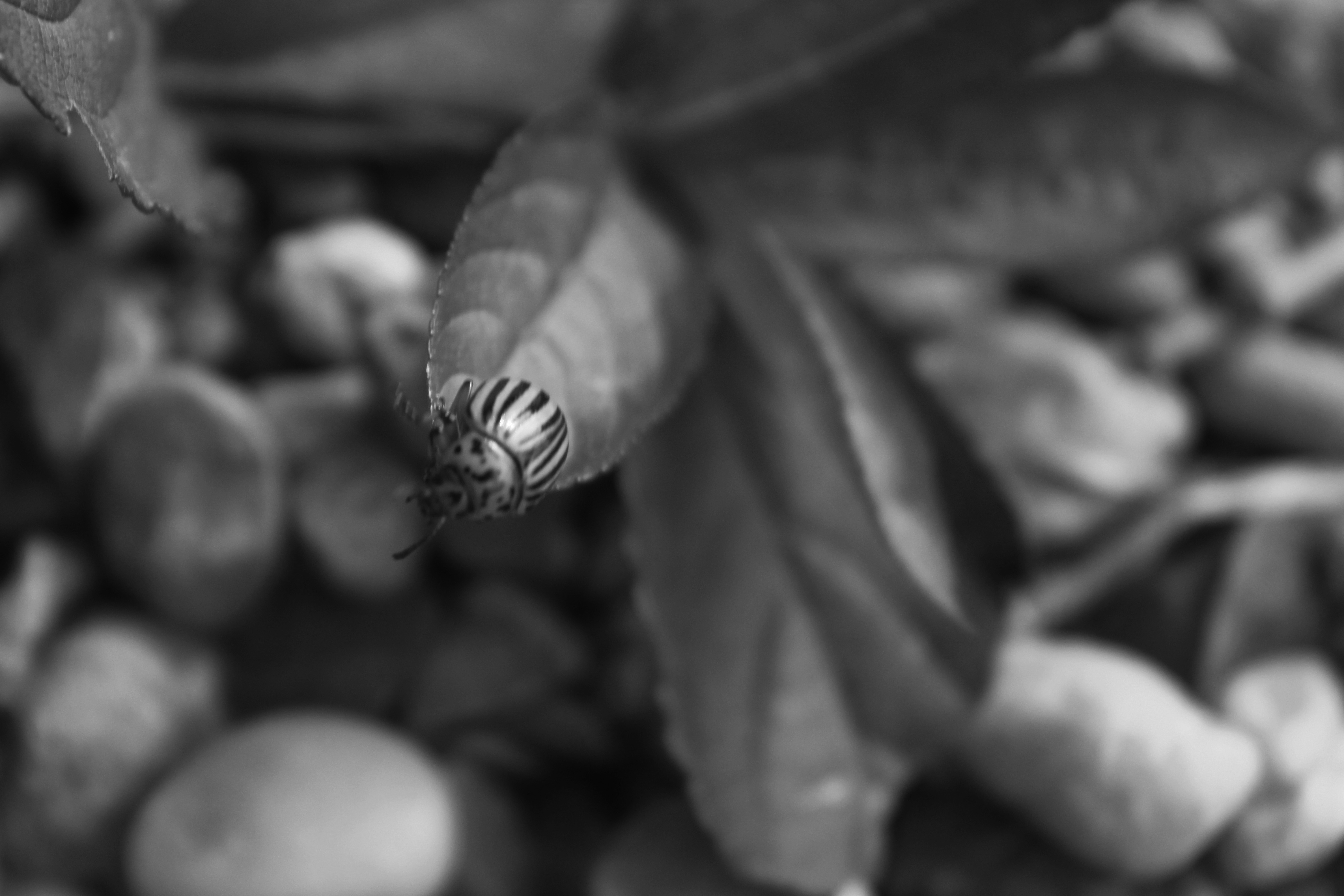
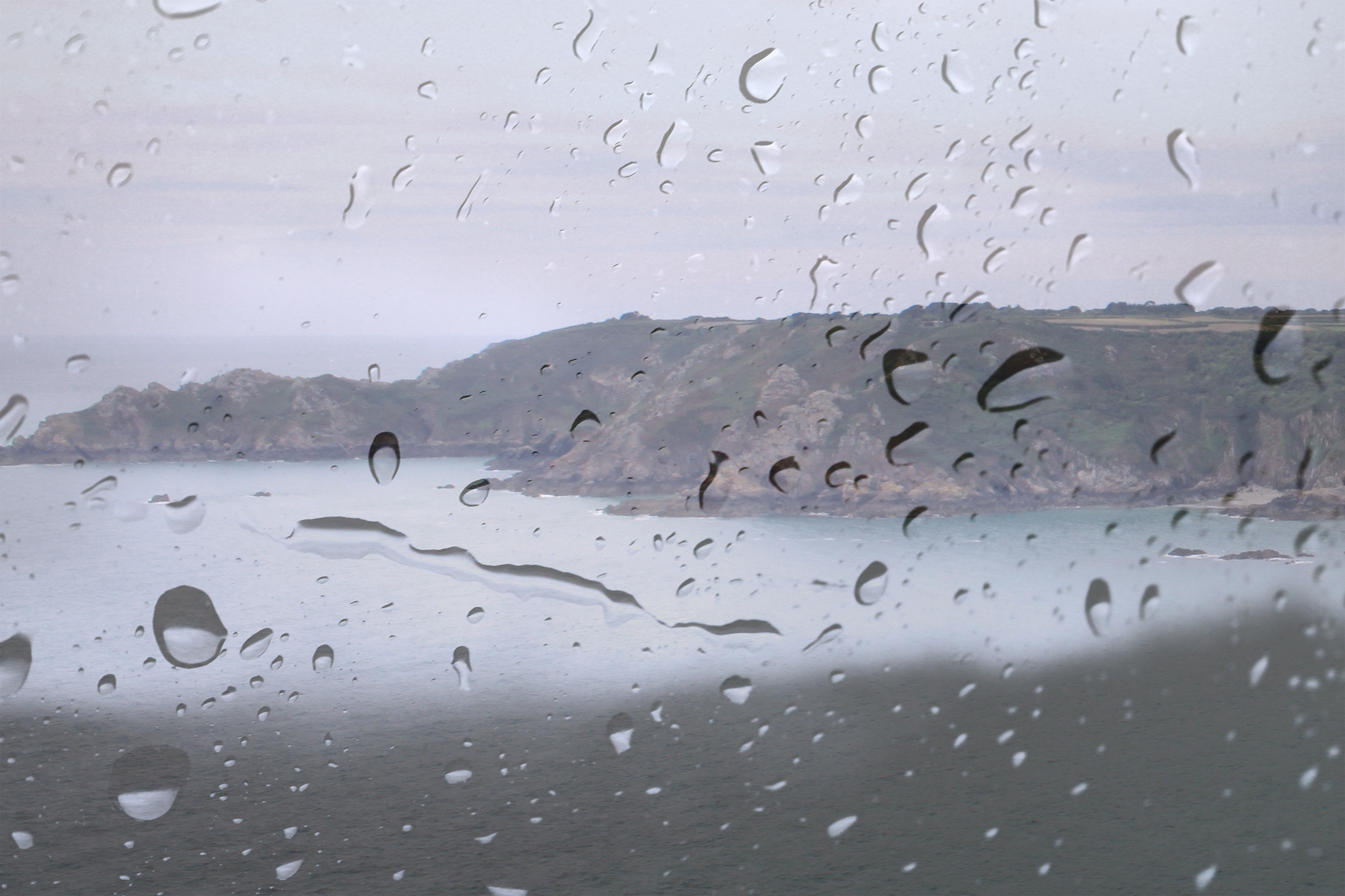
The next two pictures are finished double exposures.
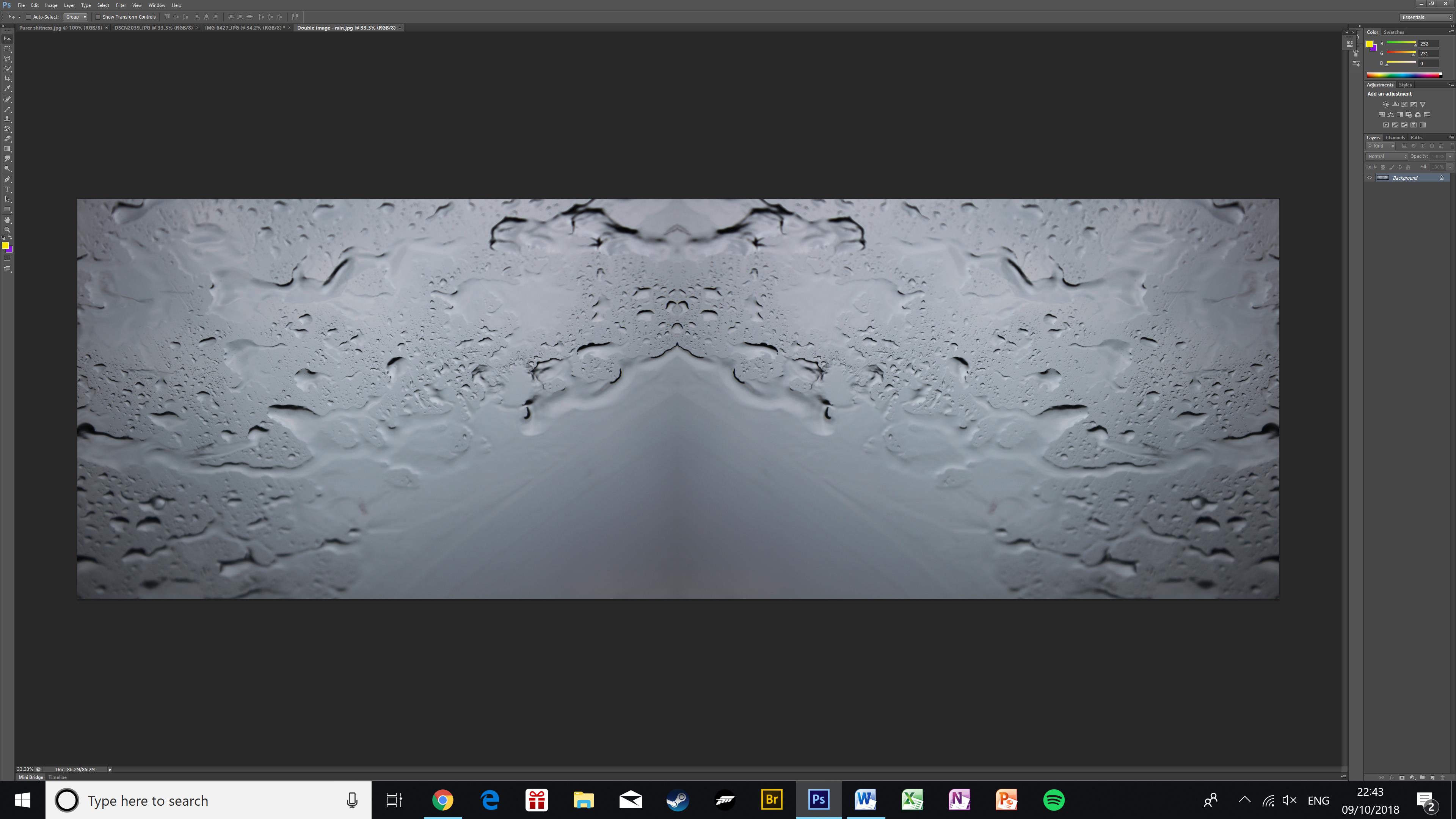
Kaleidoscope Effect

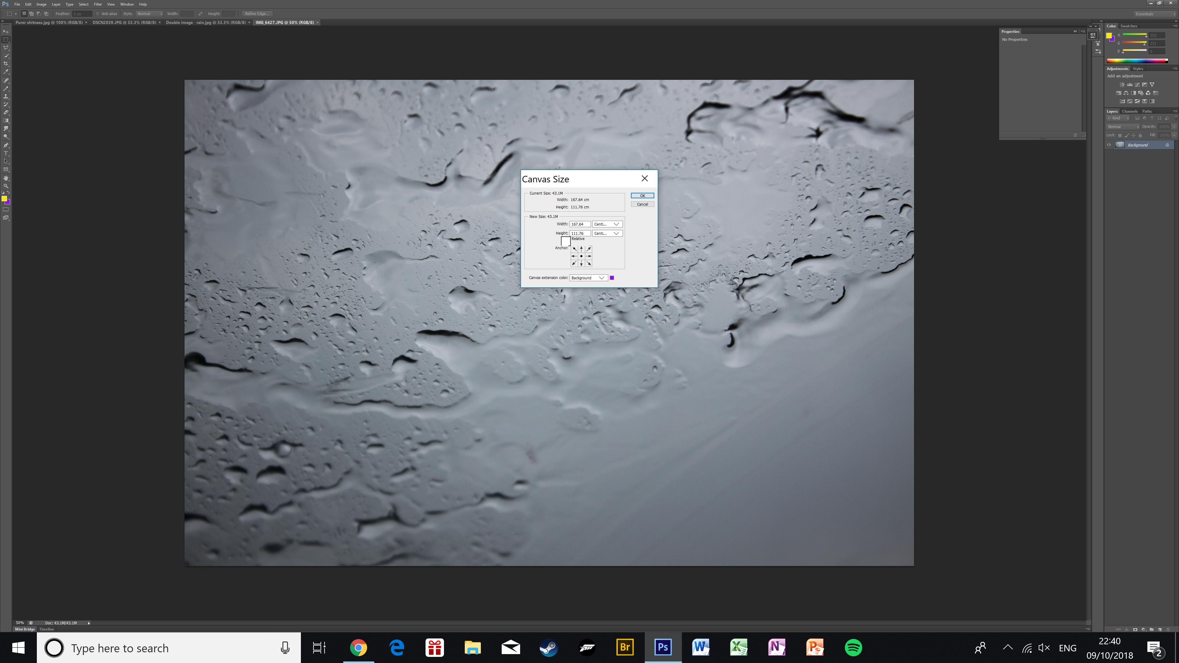
First I anchored the image to the middle-left of the canvas, then I doubled the width of it. This makes space for a duplicate image.
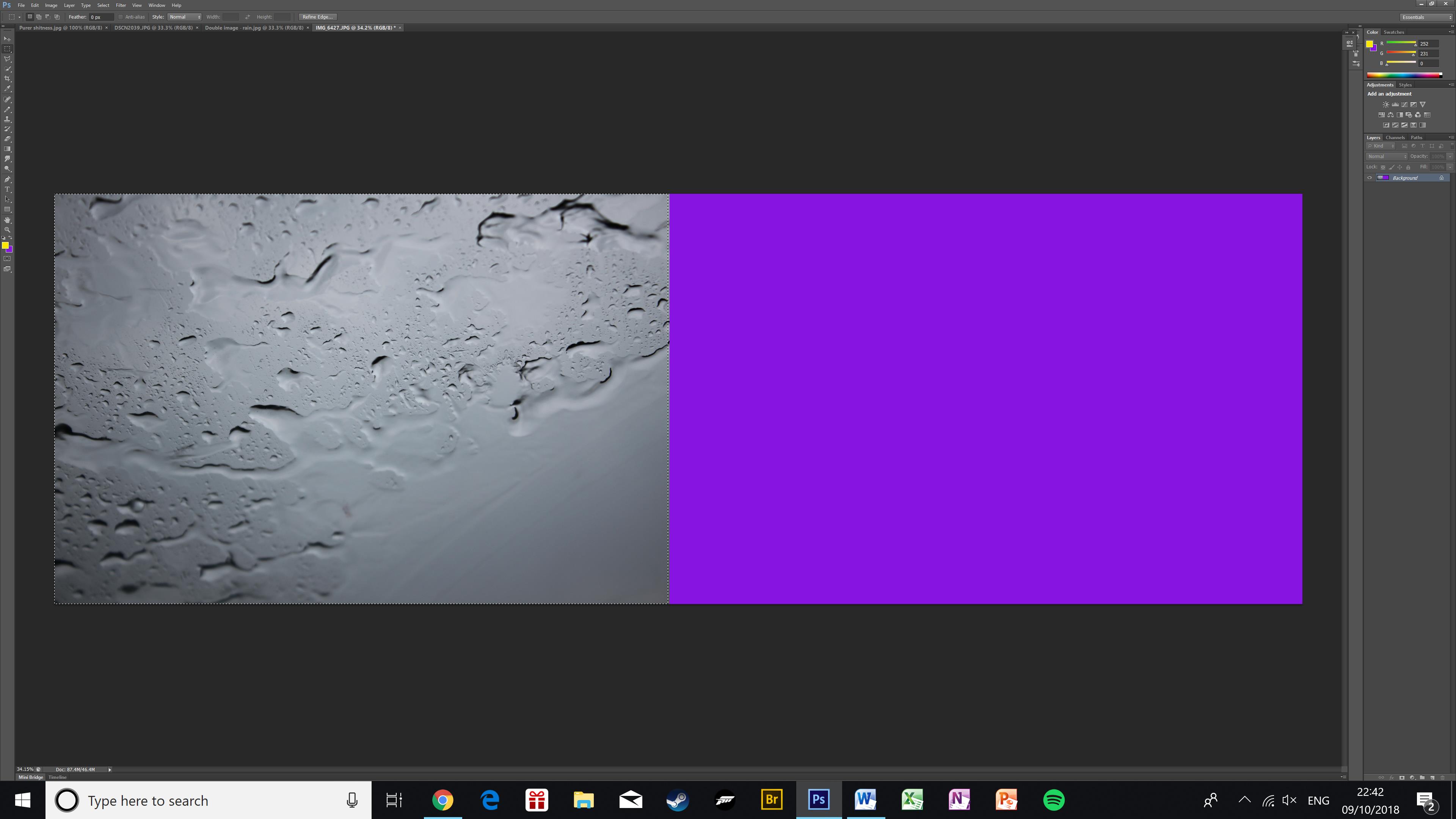
Here is the image after the canvas size has been doubled. The purple area is the empty canvas
Here is the image once it has been duplicated. Using Ctrl+J and Ctrl+T I have duplicated the photo and flipped it onto the empty canvas creating a kaleidoscope effect.

Shutter speed and exposure

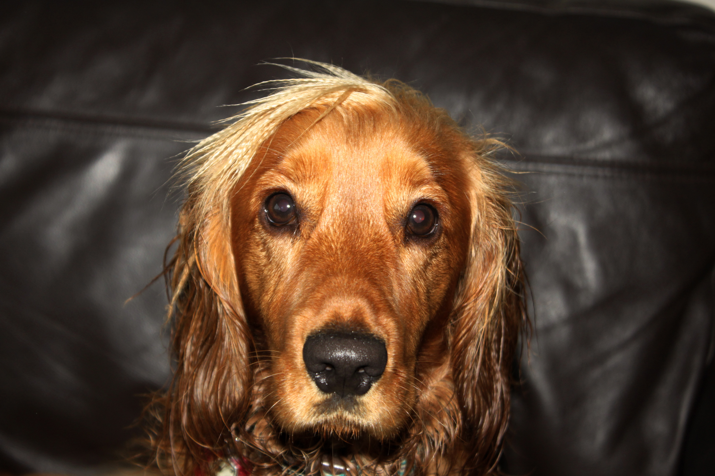
In this photo I had to use a very quick shutter speed so that I could take a sharp photo despite my dog moving around. To keep the image bright (and to show details in the hair) I also used flash.
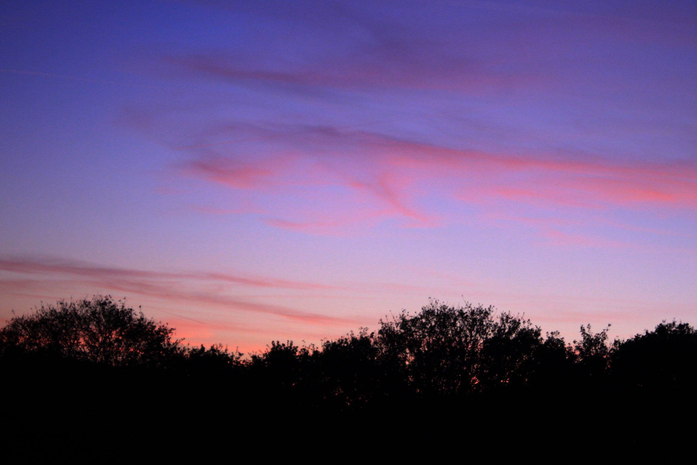
In this photo I used a short exposure and a longer shutter speed to capture a little movement of the clouds and to keep the photo dark in order to capture the colours in the sky properly.
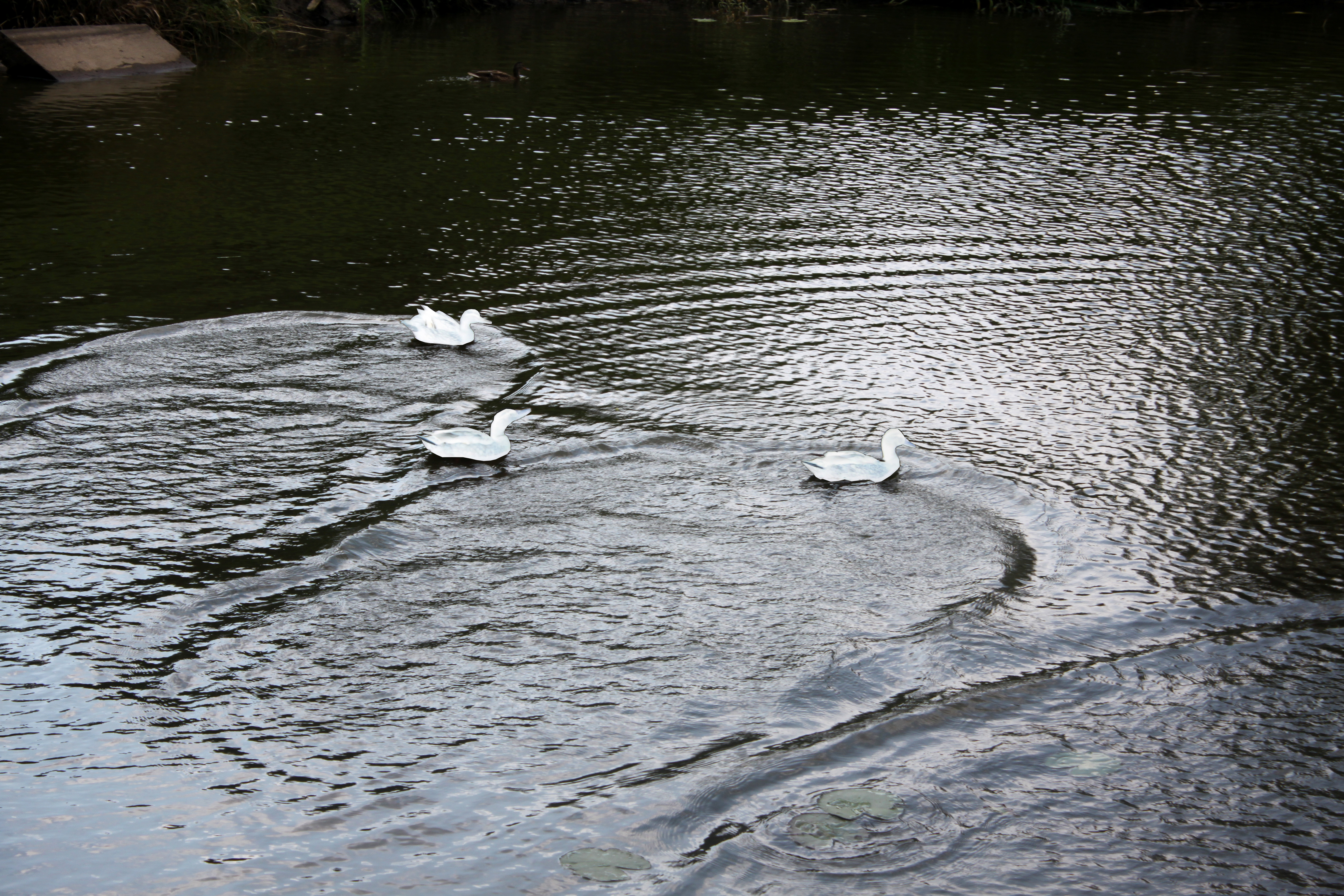
In this photo I used a very fast shutter speed to capture the waves created by the ducks swimming around. In this photo I also selected the ducks and inverted their colours to make them blend in with the water more. This stops the focus of attention being the ducks and brings more attention to the waves.


Aperture photo shoot

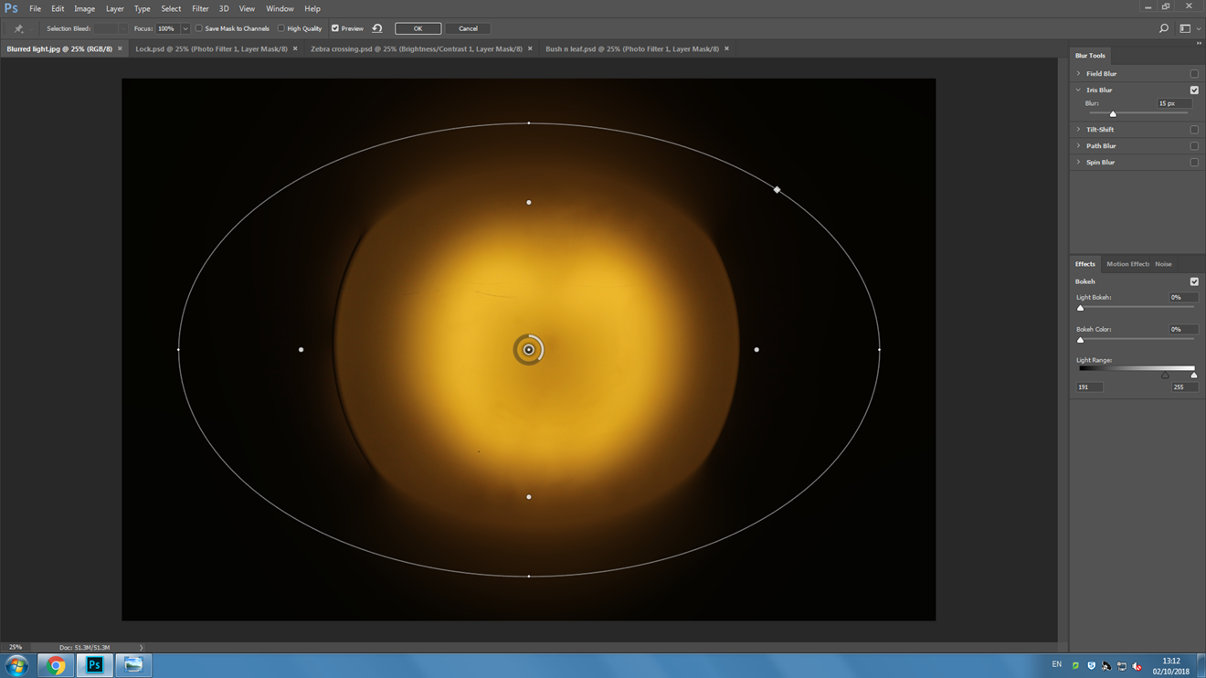
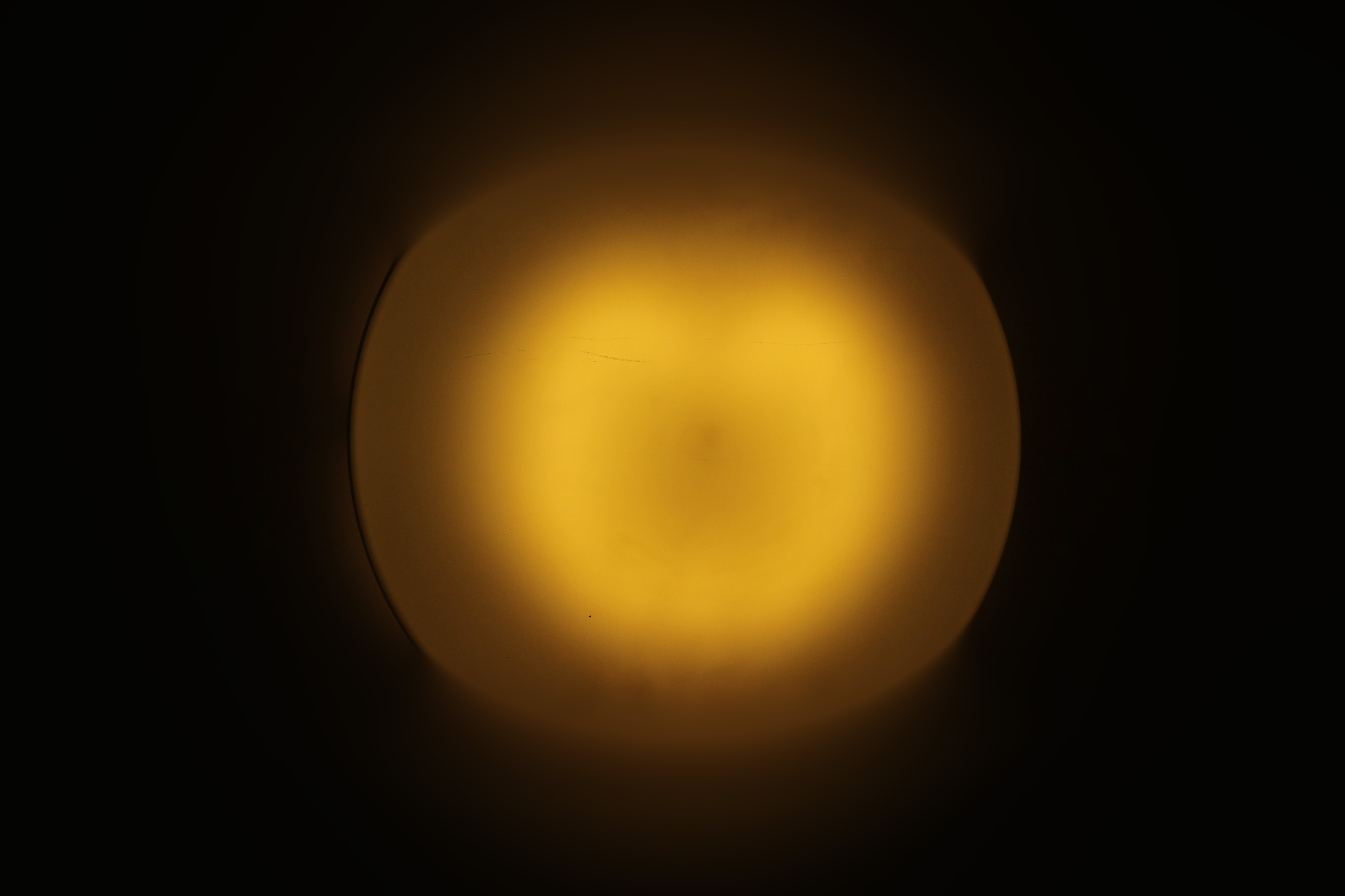
I took a photo of a lamp in the street which was all in-focus, then I artificially blurred it using the ‘iris blur’ tool. This helps achieve the proportions you want to have in and out of focus without moving your camera around for 10 minutes.
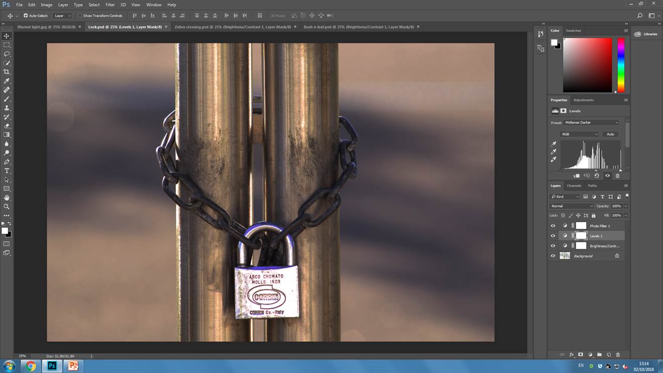
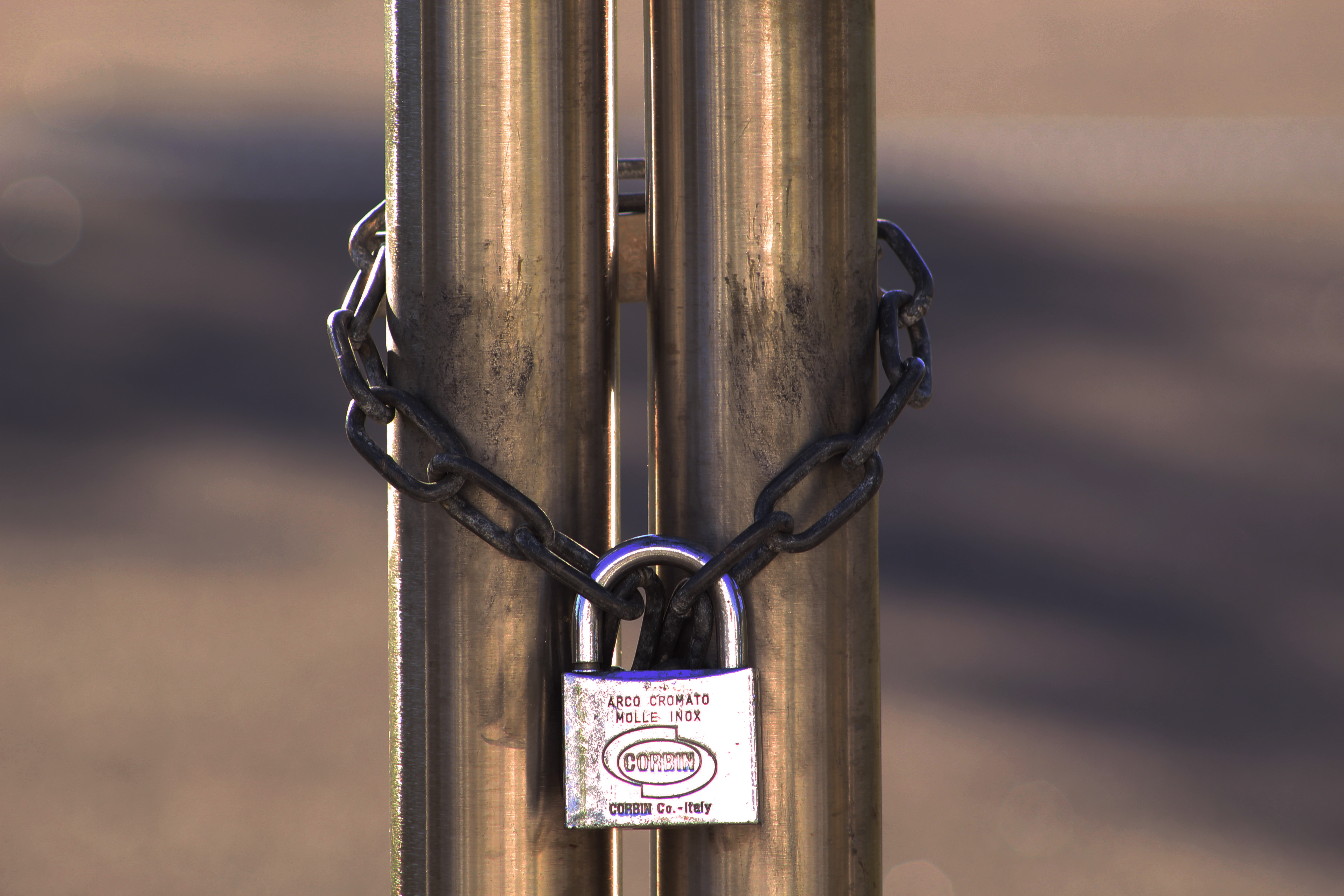
I made this photo a lot darker as the original was over-exposed, this helps bring out shadows, and the roundness of the poles. I also applied a warm photo filter and adjusted the light levels. All of this helps bring out the detail of the chain and the dirt on the poles.

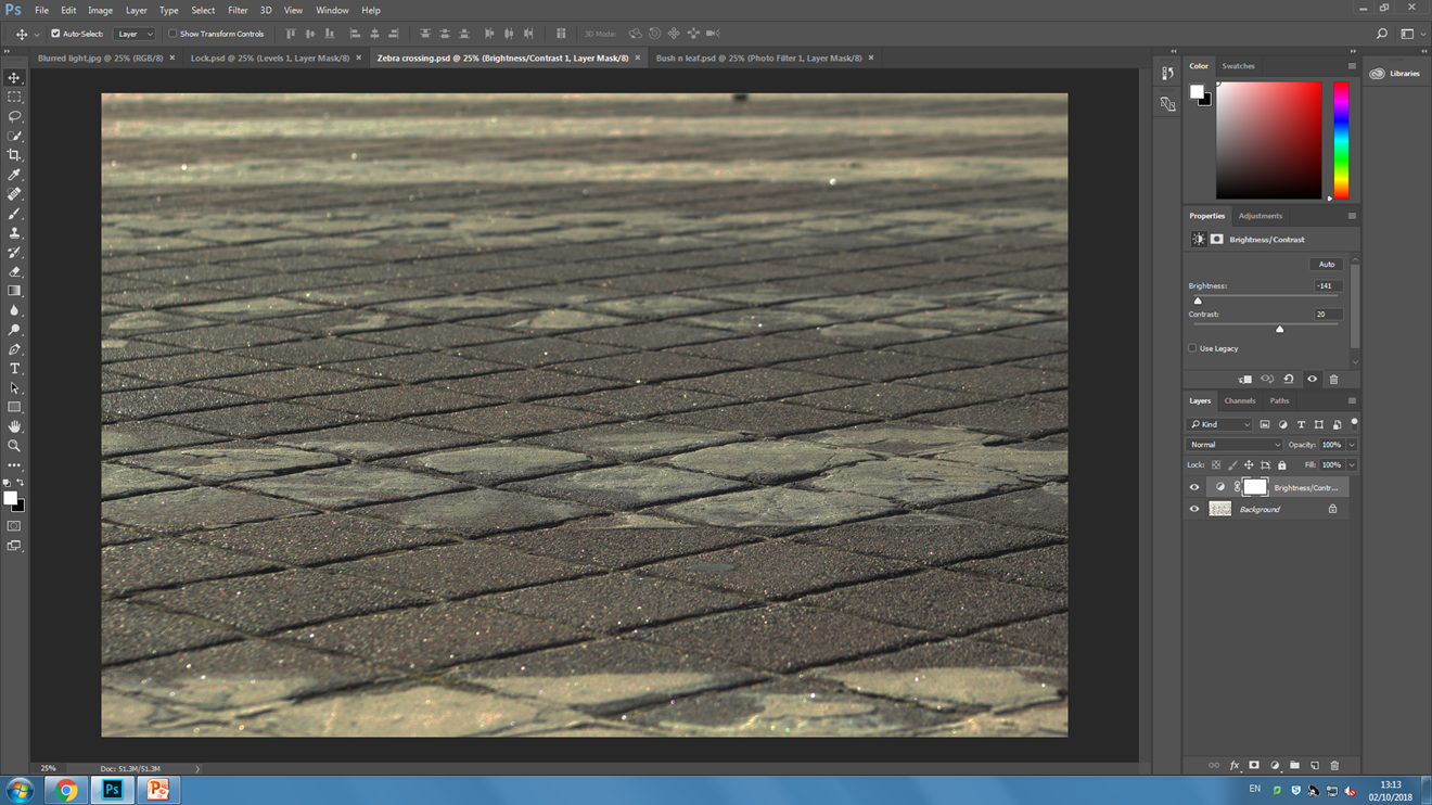
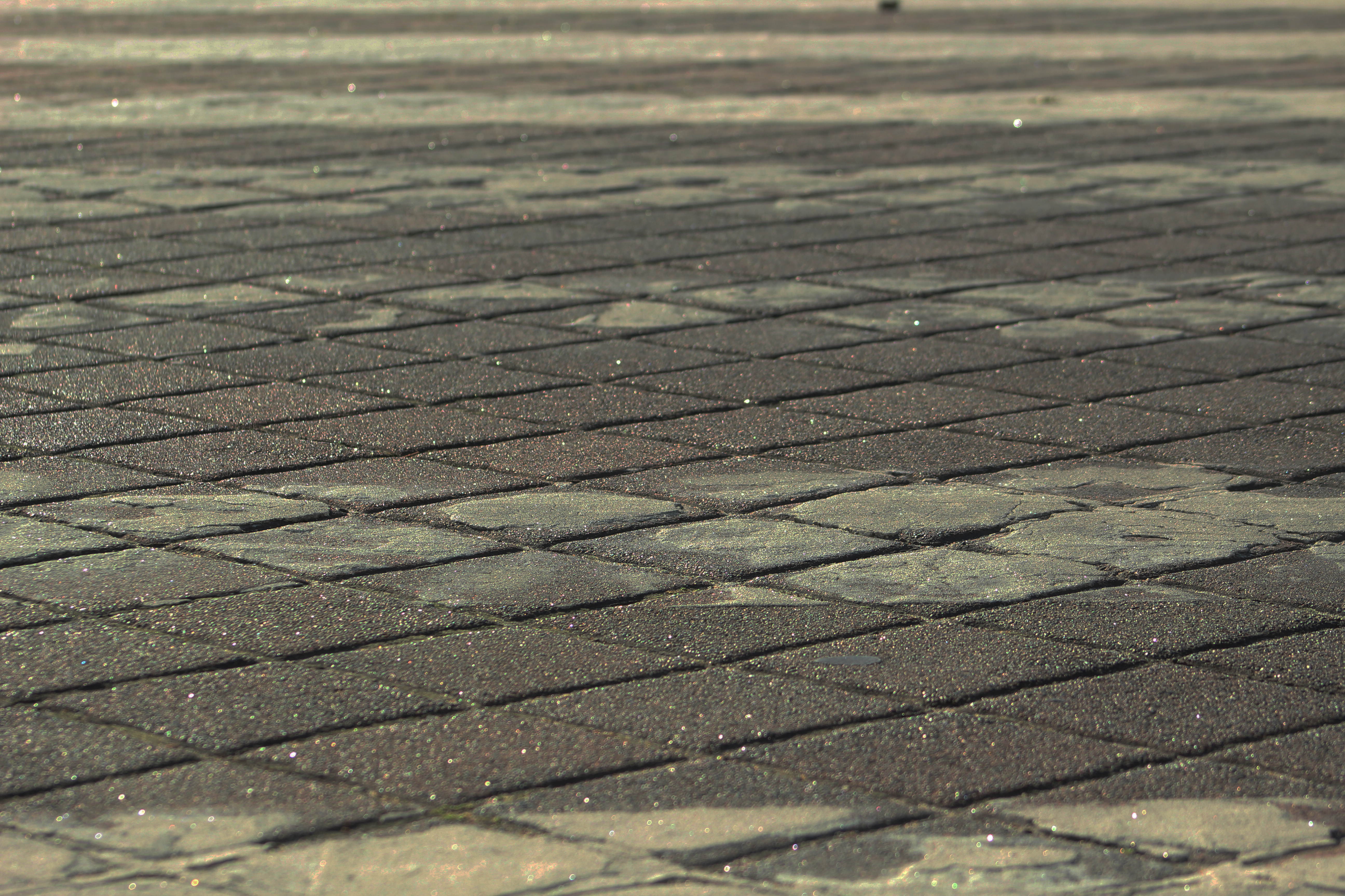
In this photo I have only decreased the brightness to make the photo easier to see, and increased the contrast to make the details in the asphalt more visible.
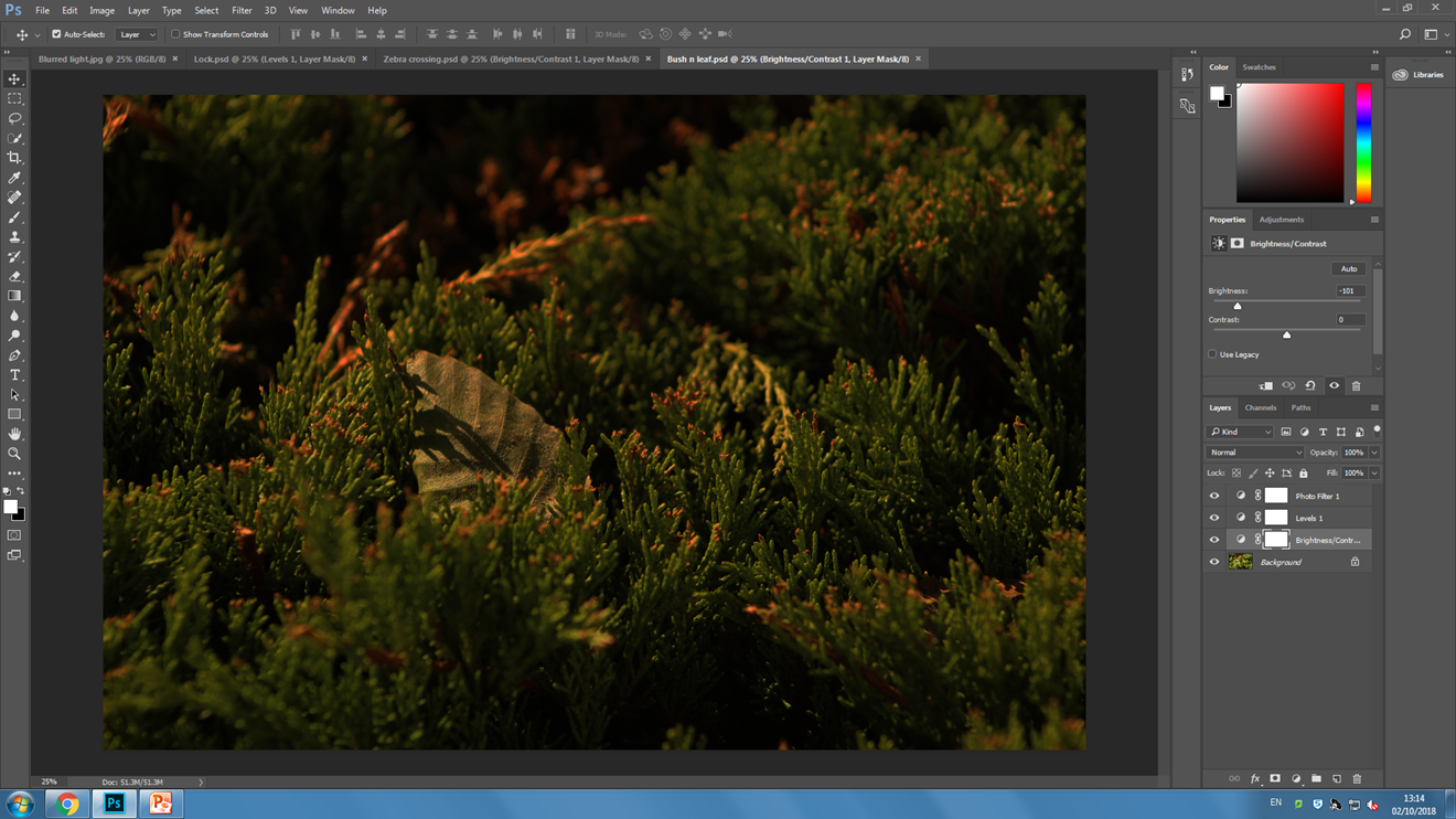
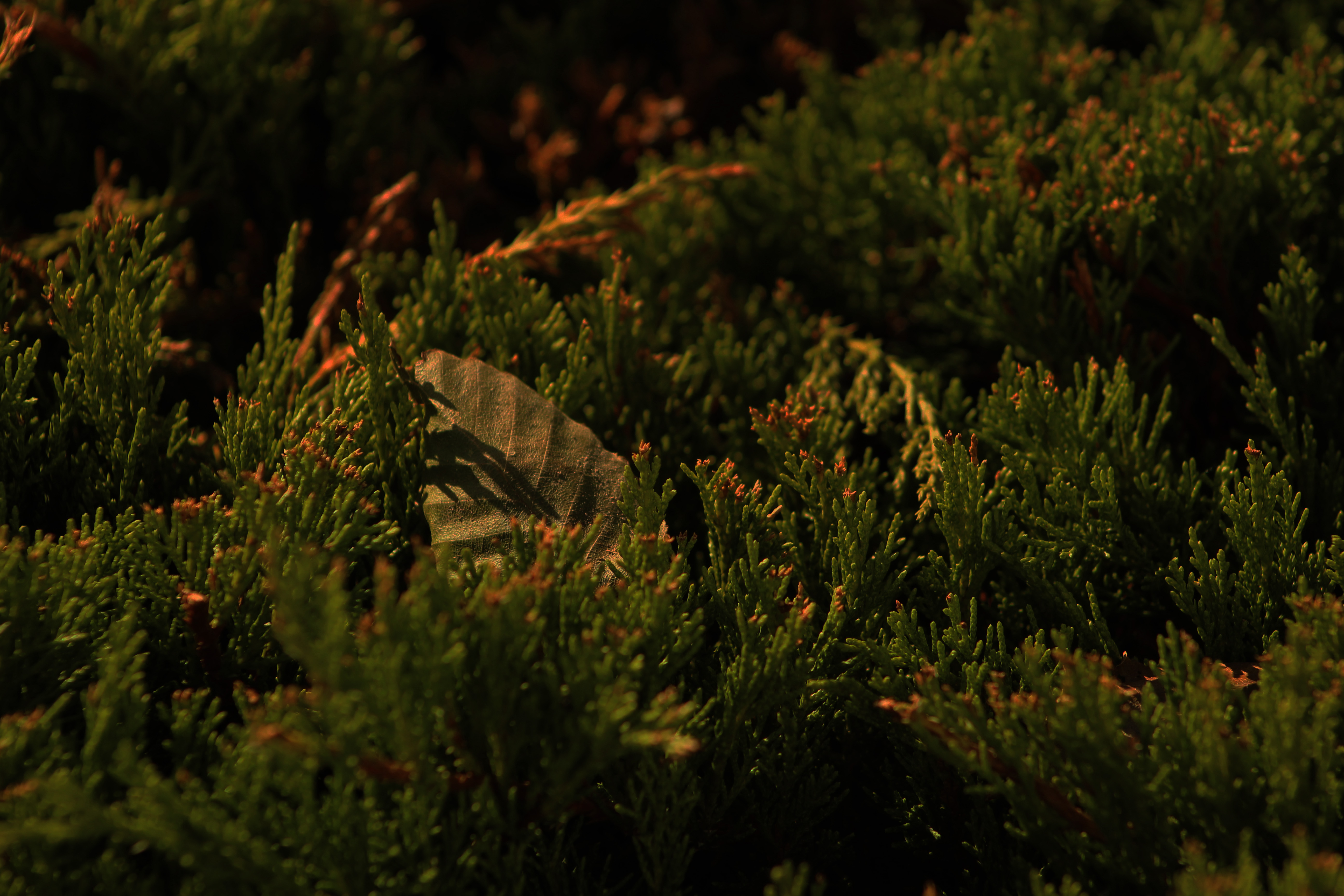
This photo was taken at midday but I have applied an orange photo filter, decreased the brightness by a lot. I have also made the midtones darker by adjusting the light levels of the photo. These effects make the photo look as if it was taken at sunset or ‘the golden hour’. The background and foreground of the photo are out of focus which puts more emphasis on the branch tips and the leaf.

Keld Helmer-Petersen

Keld Helmer-Petersen was a Danish Photographer who passed away on March 6, 2013.

He was born on August 23, 1920 in Copenhagen (the capital of Denmark) which is also where he grew up. He started taking photographs in 1938 when he received a Leica camera as a graduation present. The international prospect and an interest in contemporary art and architecture contributed to the fact that at the age of 23 Helmer-Petersen began to work with an abstract formal language. Inspired by the Bauhaus and Albert Renger-Patzsch, he published in 1948, the bilingual book ‘122 Farvefotografier/122 Colour Photographs’. Today, the book is considered to be a pioneering work in the area of colour photography.

Helmer-Petersen’s ‘122 Colour Photographs’ gave him a grant from the Denmark–America Foundation to study at the Institute of design in Chicago. During his stay at the school, he both taught and studied under the American photographer Harry Callahan. Helmer-Petersen began to experiment with the contrast in graphic black and white expression influenced by constructivist artists and their fascination with industry’s machines and architecture’s constructions.

Helmer-Petersen’s approach to photography was by and large experimental and explorative. He worked on the borders of what we normally consider to be photography. Among other things, throughout his career he worked with “cameraless” photography, the photogram (which is a darkroom technique in which objects are put directly on light-sensitive photograph paper). His curiosity about pushing the limits of the media was expressed in several experimental short films, including Copenhagen Boogie from 1949.

In his last works, Helmer-Petersen experimented with digital technology. In so doing, he returned to the black and white graphic expression. From 2008 up until his death, he placed a variety of old negatives and found objects such as insects, wires, etc. on a flatbed scanner in order to treat them digitally. This process resulted in the experimental trilogy: Black Noise (2010), Back to Black (2011) and Black Light (2014) which was published after his death.

My response:

This is the original photo, a photo of the crane operator leaving after finishing work.
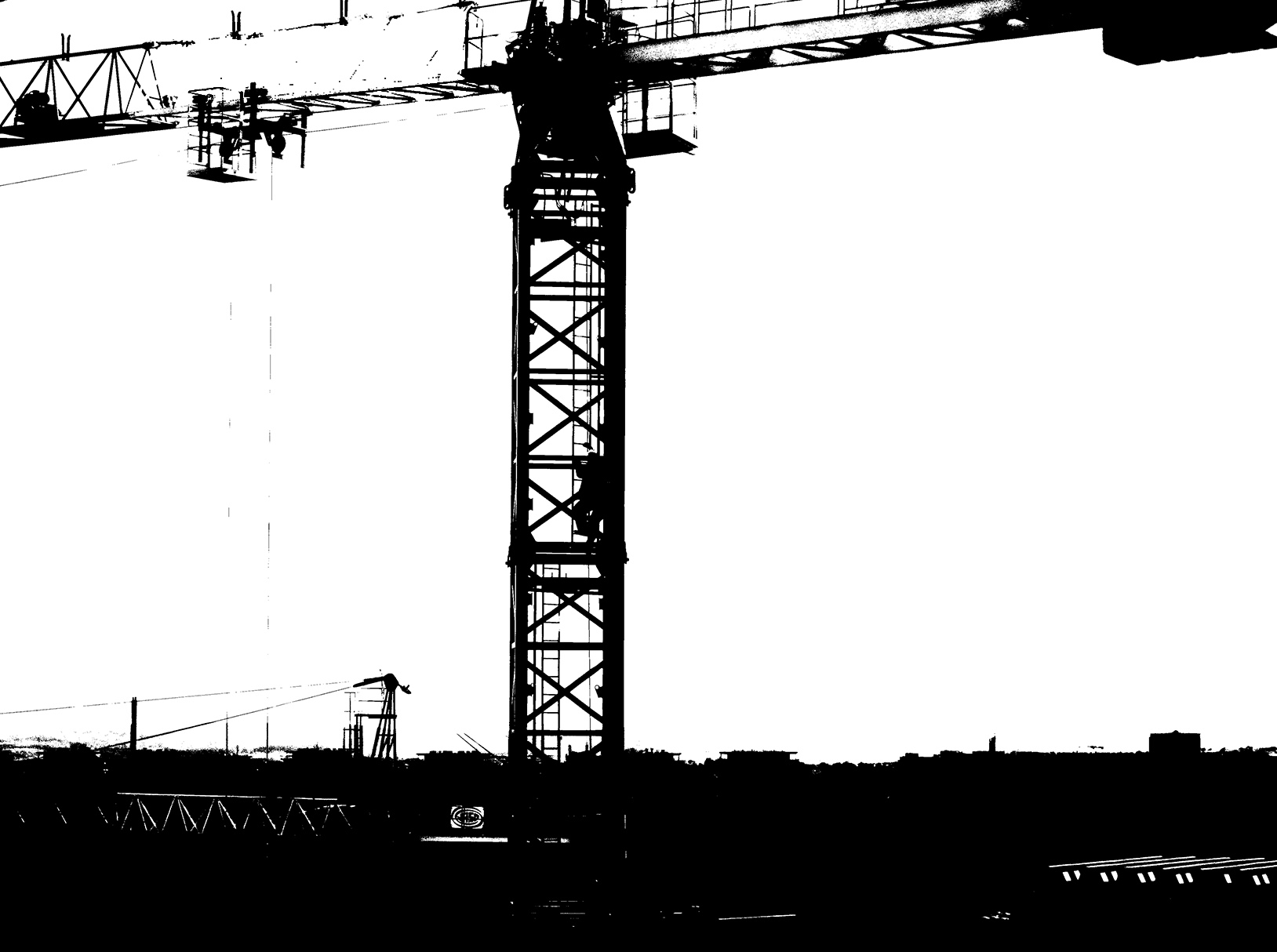
I edited the image so that it was in a similar style to Petersen’s work. I did this by adjusting the threshold of the image and adjusting the brightness and contrast slightly to make the shapes stand out more.
This is the final image. I have applied the previously mentioned filters/adjustments and cropped the image slightly so that the crane is more central.

I have repeated this process for the following images to achieve the same style.


White balance

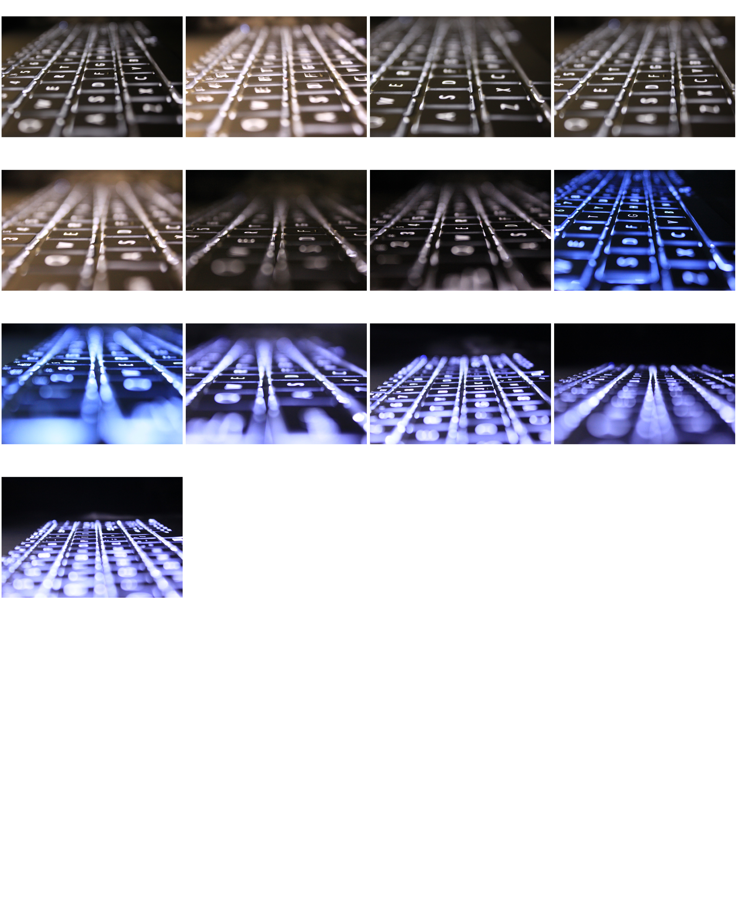
White balance is a camera setting that automatically adjusts the color balance of light the you’re shooting in so that it appears a neutral white. This setting can also be set to manual which lets you create your desired colour balance for a photo. For example, if you are taking a photo of a white neon sign you might want to set the white balance to tungsten which will give the white a blue/purple shade.

This is just a quick photo shoot experimenting with white balance, so there aren’t many photos. There next 3 photos are my favourite out of the shoot as they have very different colour balances, also because of the in and out of focus areas and the straight line ‘pattern’ running through all of the pictures.

Homework 3 – Albert Renger Patzsch research and response

Renger-Patzsch was born in Wurzburg on June 22, 1897 and passed away on September 27, 1966. He began making photographs by the age of twelve.  After military service in WW1 he studied chemistry at Dresden Technical College. In the 1920’s he started working for the Chicago Tribune as a press photographer. He  then left, and in 1925 he published his first book ‘The choir stalls of Cappenberg’. He had his first museum exhibition in 1927.

He released a second book in 1928 called ‘Die Welt ist Schon’. This is his best-known book, its a collection of one hundred of his photographs in which natural forms, industrial subjects and mass-produced objects are presented with the clarity of scientific illustrations (a visual approach to a scientific concept in a precise, clear and objective way).  He believed that the value of photography was in its ability to reproduce the texture of reality. His archives were destroyed during WW2, and in 1944 he moved to Wamel, Mohnesee, where he lived the rest of his life.

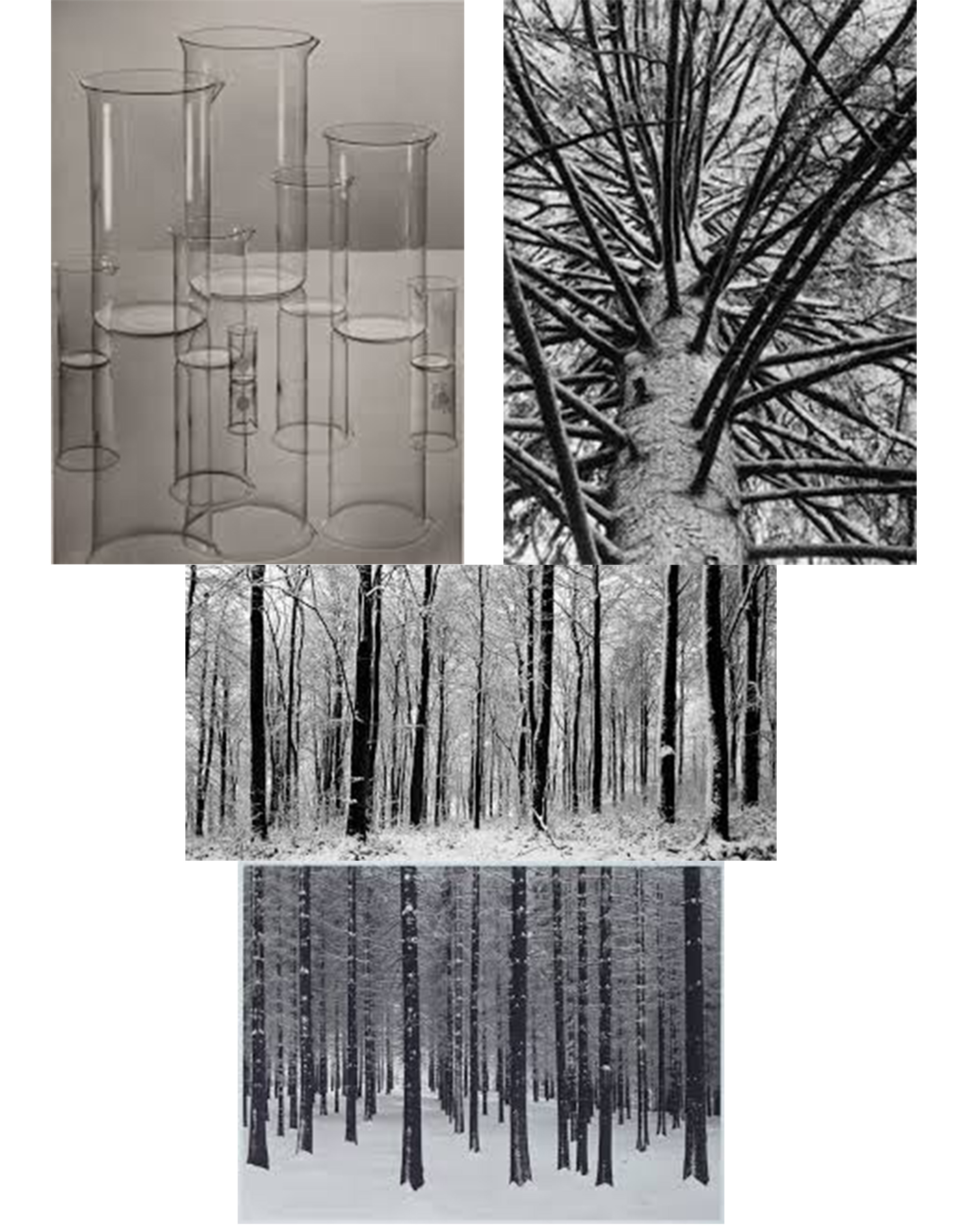
These are my favourite photos by Albert Renger-Patzsch. I like the photos in particular because they all have strong shapes within them. They’re also not overpowered by objects other than the subject of the photo (e.g. the flasks in the photo don’t have anything inside of them, there also aren’t any other items on the table).

My response:

In these photos I tried to to capture bold shapes like Albert Renger-Patzsch. I made all of them black them black and white to match the style, I also increased the contrast and decreased the brightness on some of the photos to bring out the shadows more which makes the shapes bolder. I also cropped the 1st and 3rd photos a lot as I wasn’t interested in the majority of the frame (e.g. I removed all of the empty sky from the drill photo).


Photoshop experiments

This is the original photo which I took a few weeks ago in Germany. The photo consists of blurred rain drops on the car window in the foreground, and trees in the background which are in-focus.
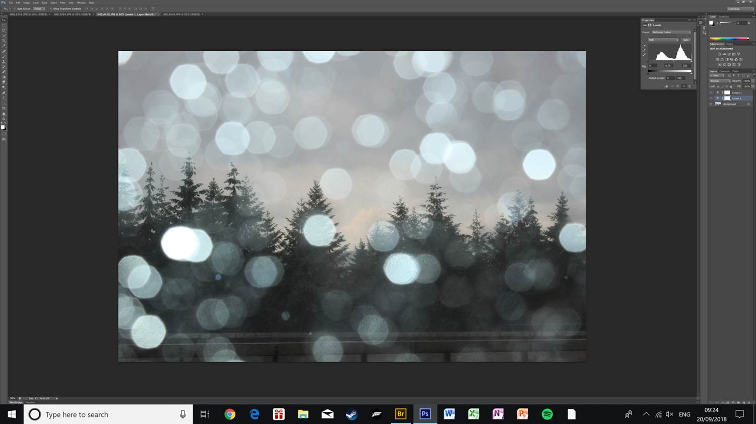
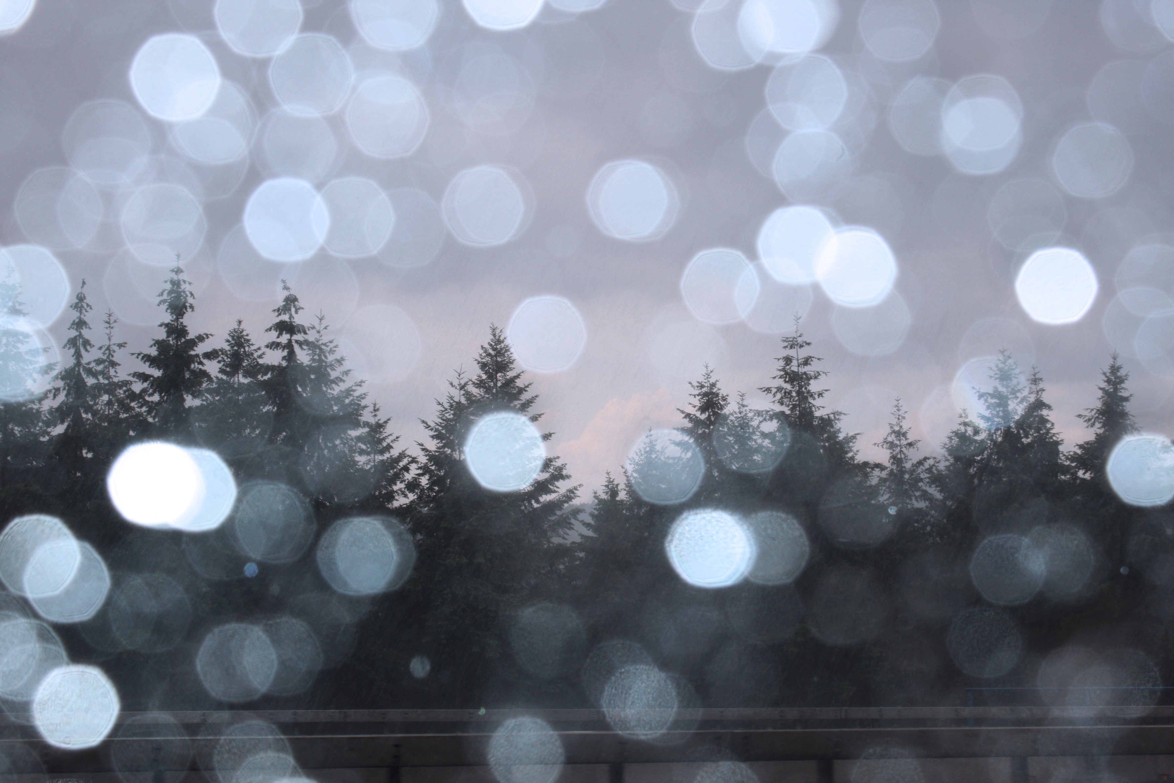
I edited the light levels, slightly increased the contrast, and applied a blue colour filter to the photo. This helps bring out the detail in the trees, as well as making the clouds in the background visible due to more contrast.
This is the first final image. I have kept it looking as natural as possible to keep the cool tone of the photo.
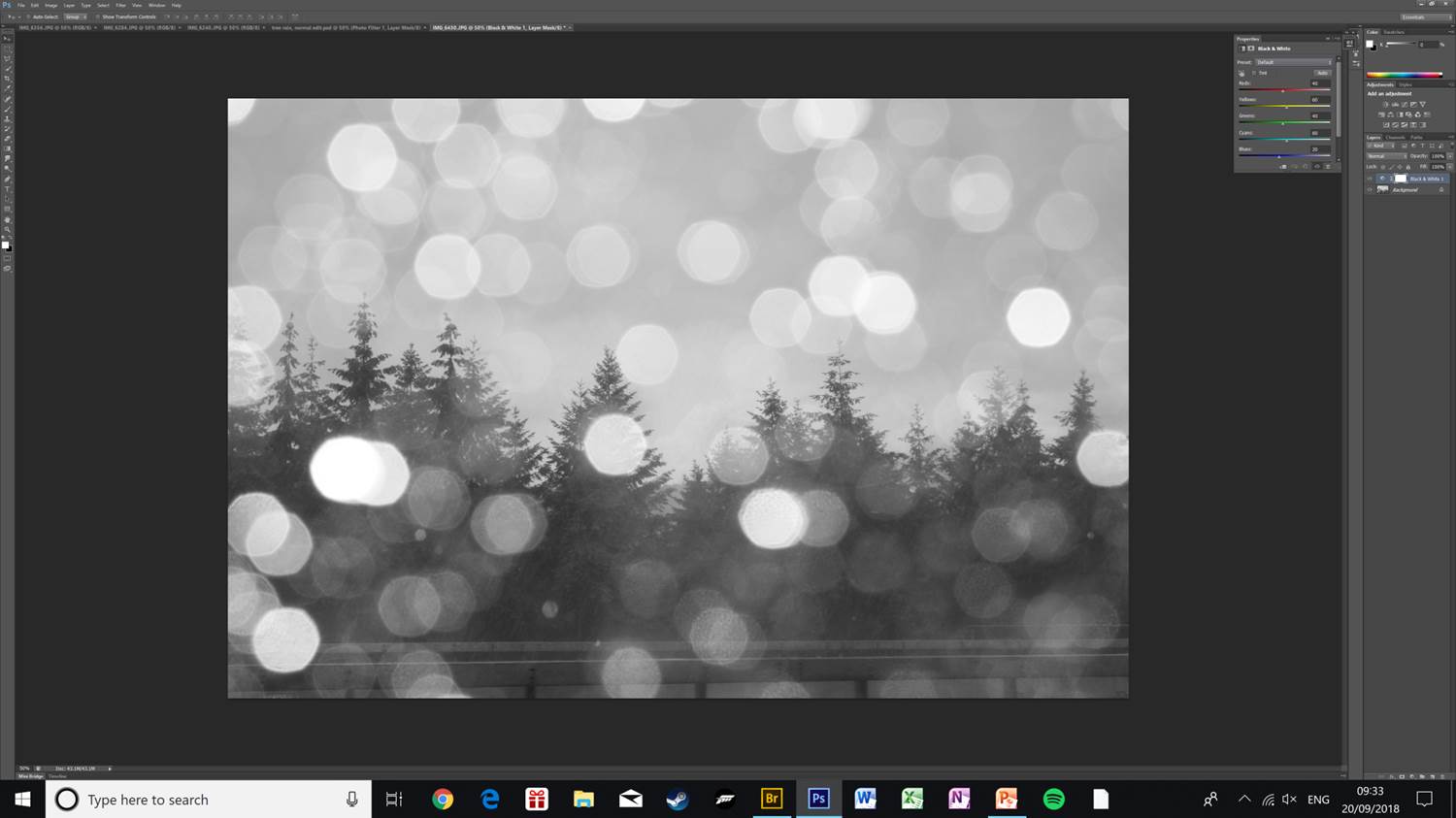
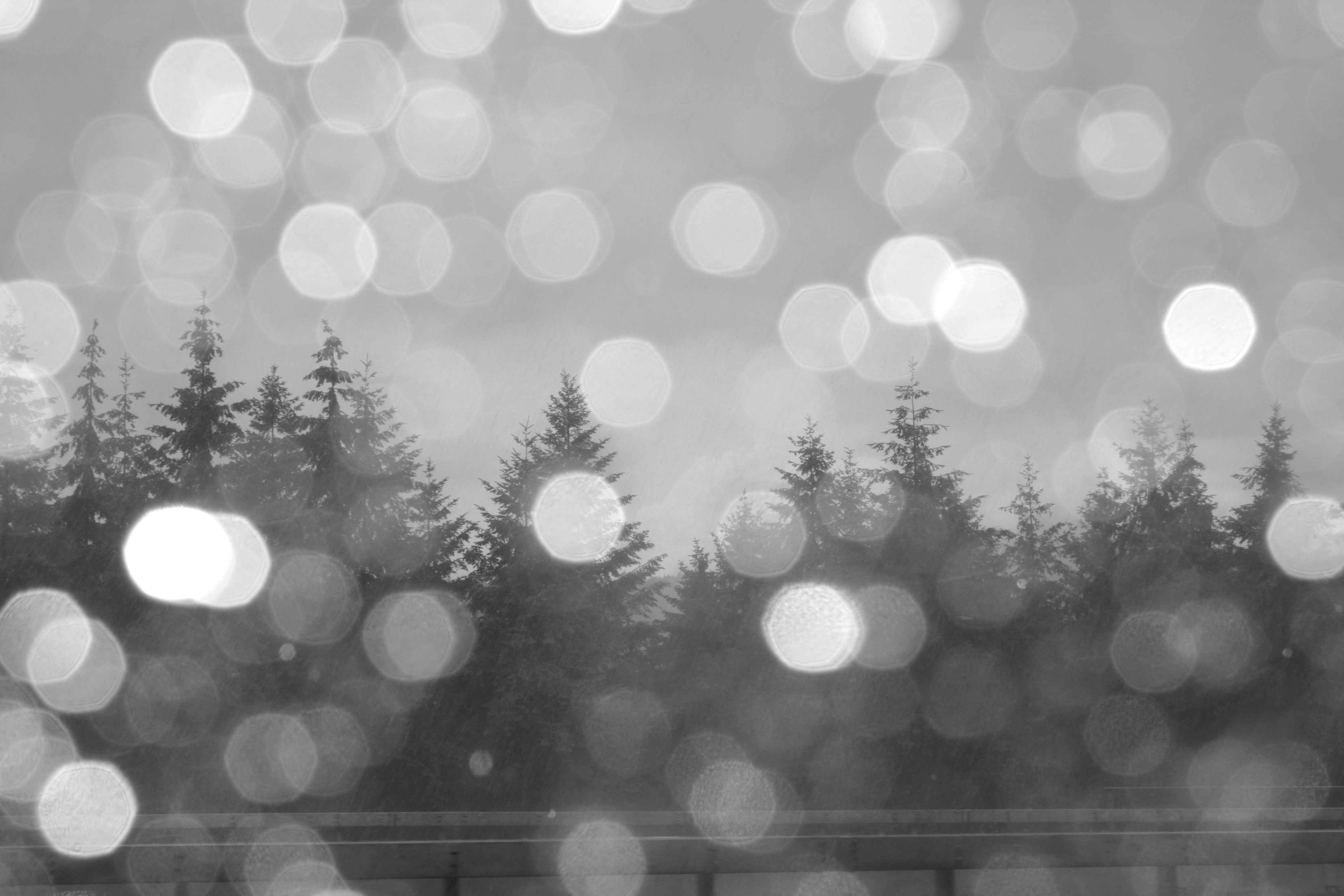
This is an alternative version of the photo, I have applied a black & white filter, and increased the brightness and contrast slightly as applying the filter made the photo dark and hard to see.
To get the final photo I have further increased the brightness and exposure, this helps make all the details in the photo visible, as well as making the rain drops in the foreground less prominent, which makes the angled rain in the middle-ground visible and diverts attention to the pine trees.
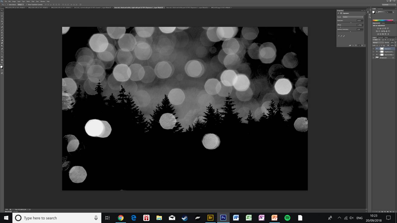
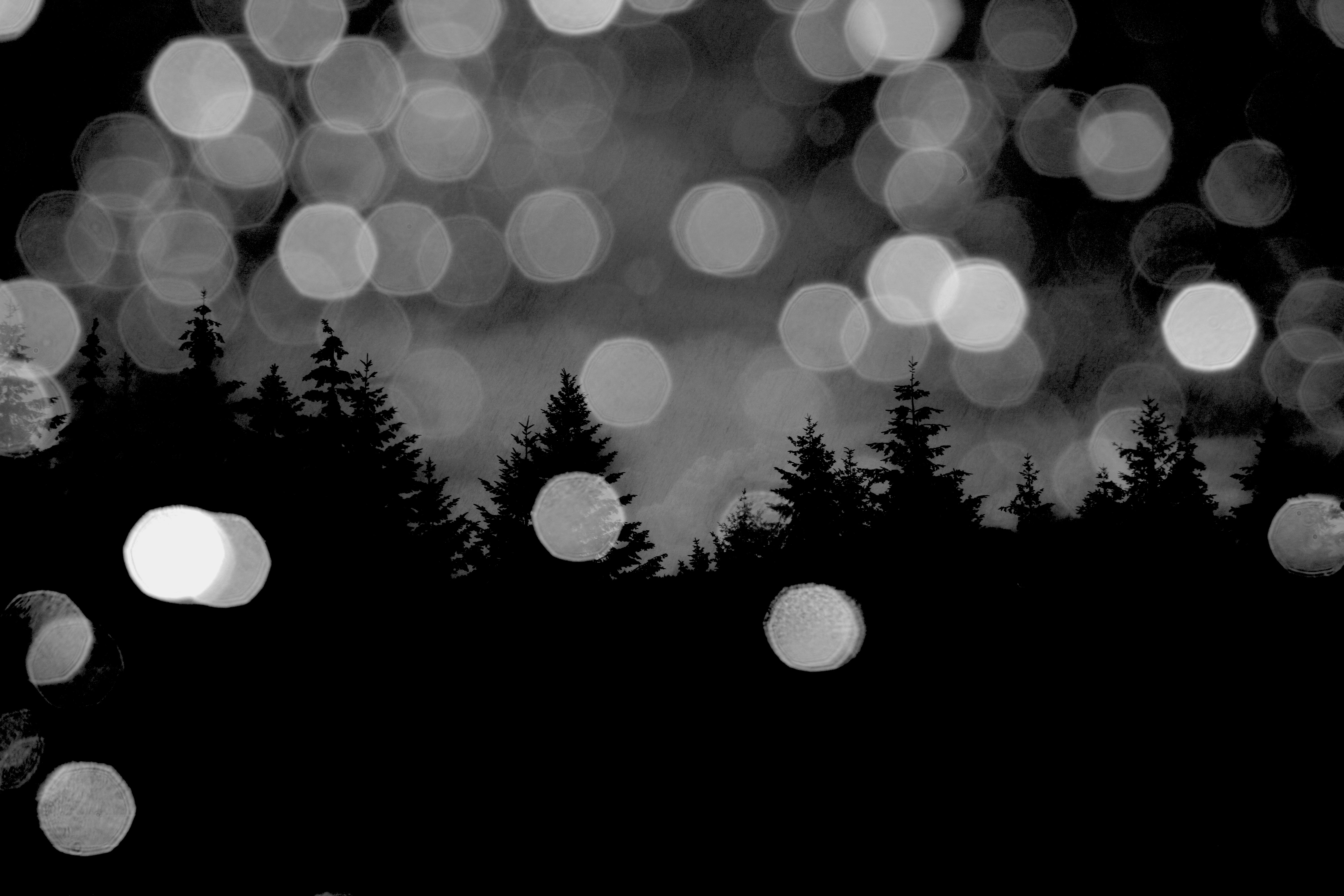
This is a variation of the black & white edit of the same pine tree photo. Here I have lowered the offset which makes the photo really dark and creates the effect of the photo being taken at night. I have also increased the exposure slightly and raised the gamma correction.
This is my favourite edit of the lot that I have done of this photo. The clouds in the background are really clear and only the outline of the trees is visible. The rest of the trees being solid black makes the whole photo stand out more as there are less distractions around the edges. The rain drops still being visible and bright help give the photo depth as the light brings contrast to the mostly dark photo.

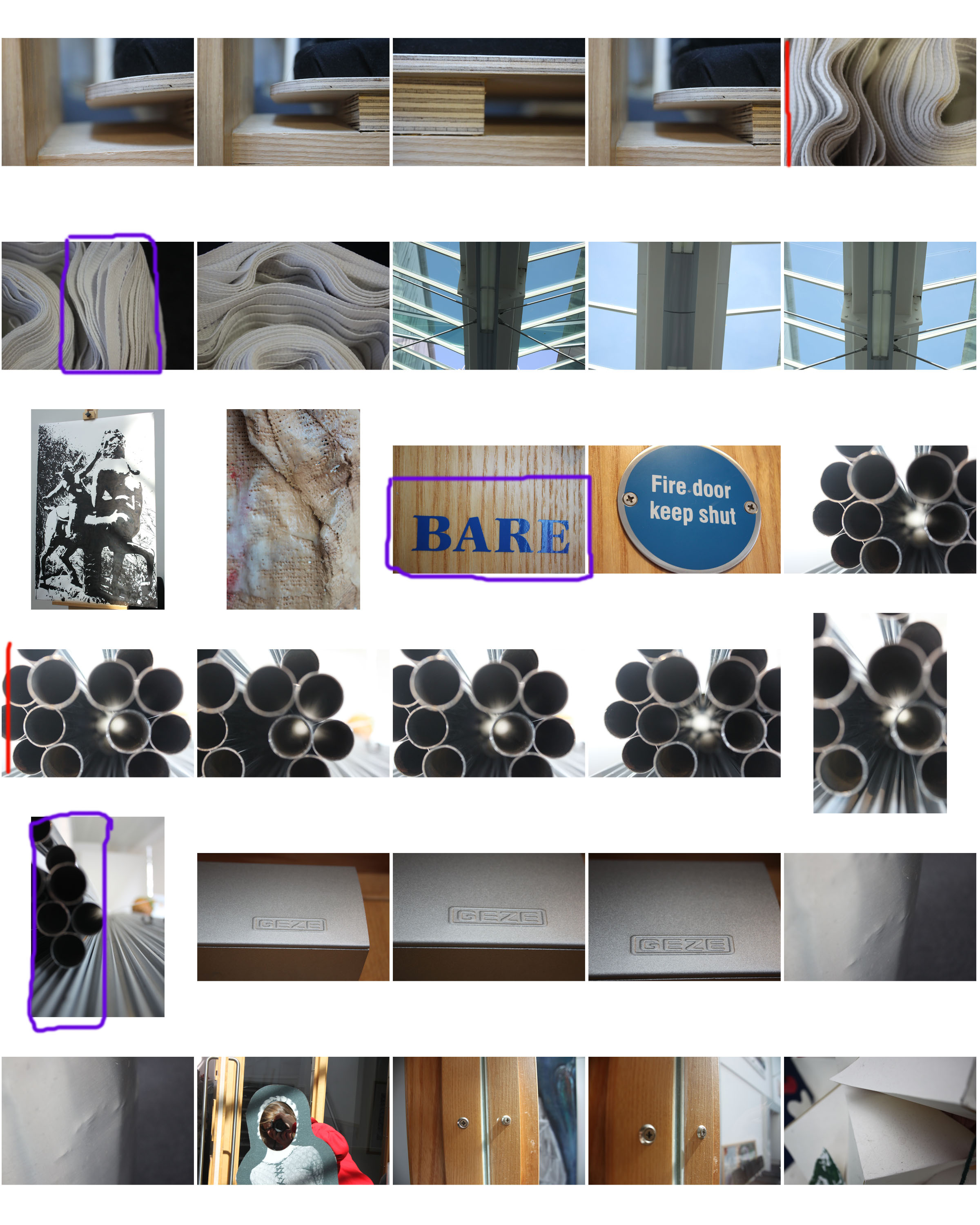
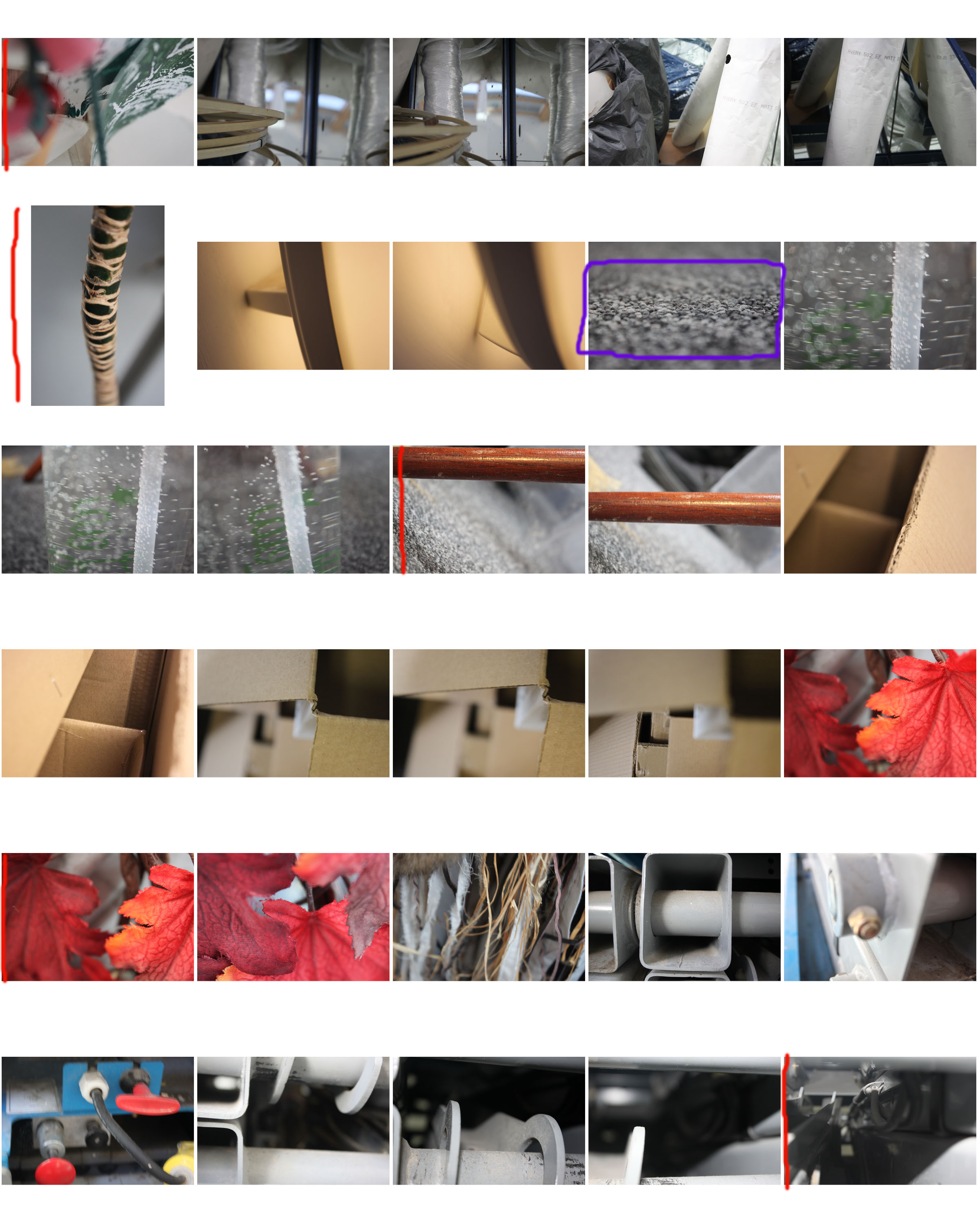
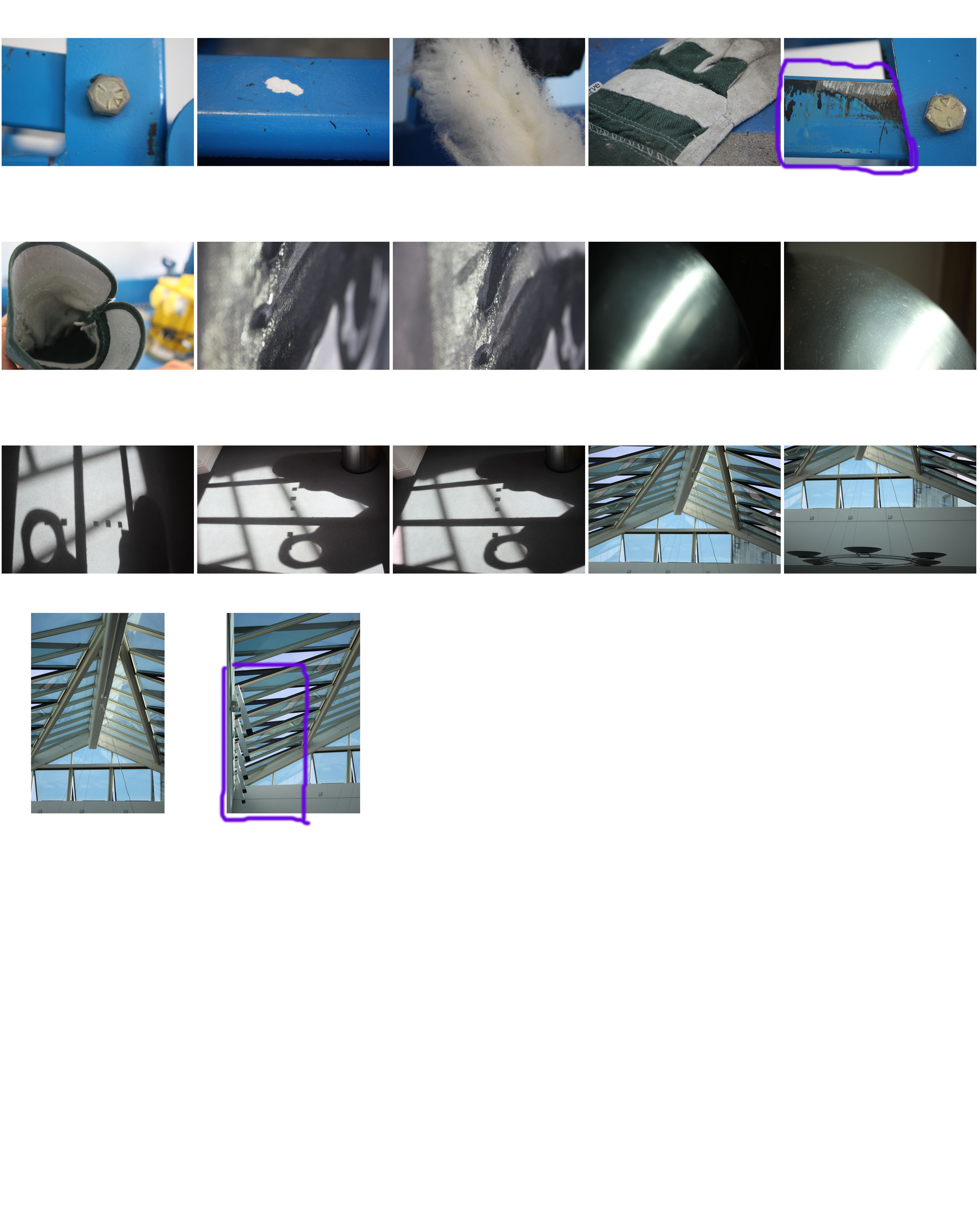
1st shoot contact sheet

For this photo shoot I focused on close up photography, using a contrast between a focused foreground and a blurred background and vice versa. Although there are exceptions, the majority of photos in this shoot are of man-made objects which are either very textured or stretch from the foreground to the background (e.g. pipes, mdf planks).

I will edit some of the photos by cropping, enhancing, gray scaling, etc. The contact sheet is just a guide for which photos I’m going to use and edit, and which ones I’m going to leave out.

I have annotated this contact sheet less than my previous one as this has a lot more photos, so going through every one would be tedious. So instead I have marked my favourite photos with a red line next to them, and marked photos which I need to crop with a purple box (indicating what area i need to crop).