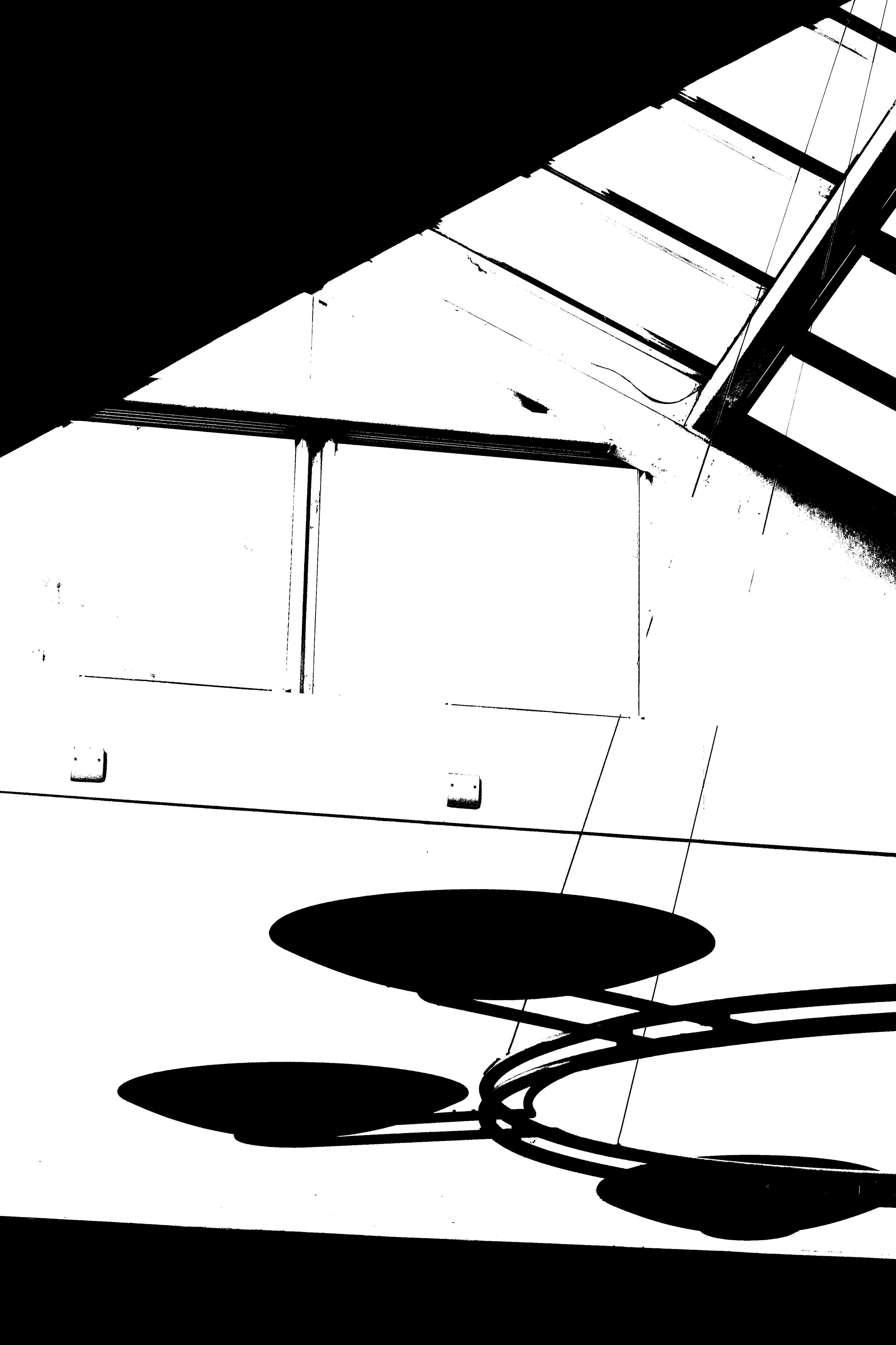
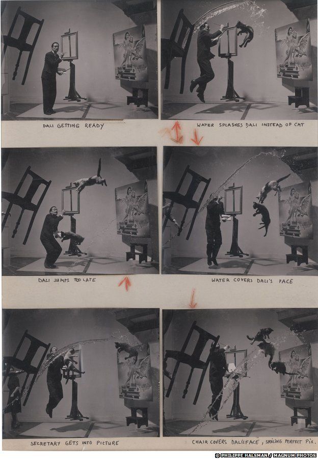
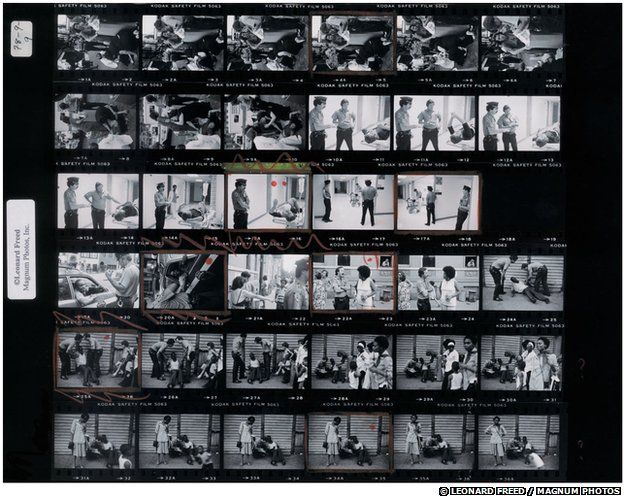
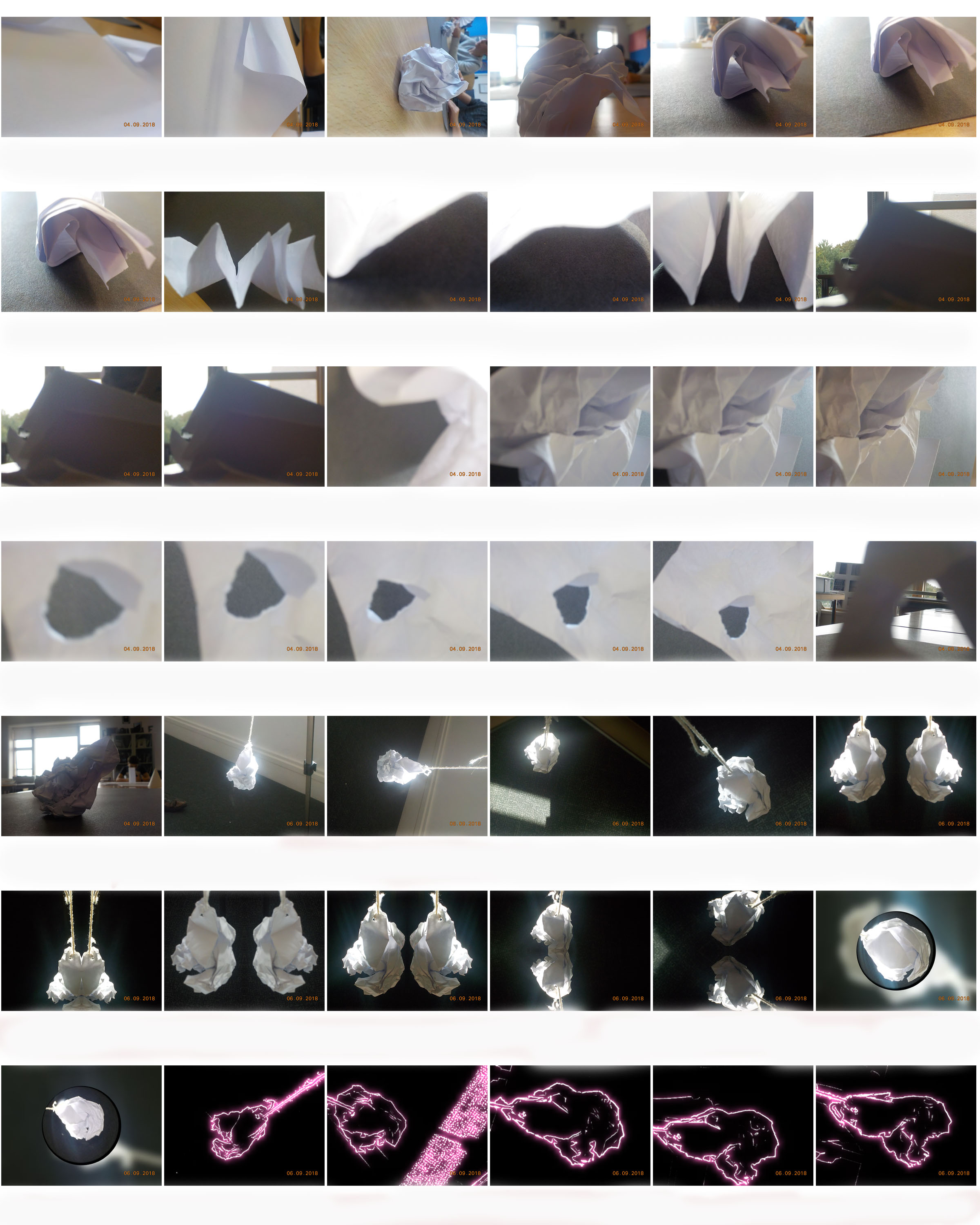
Helmer-Petersen was a Danish photographer who was inspired by Albert Renger-Patzsch, the experiments at The Bauhaus in Germany and by Harry Callahan and Aaron Siskind at the Art Institute of Chicago. He achieved fame for his colour photographs but he also published several books of black and white images that explore dramatic contrasts of tone. In some, we are only presented with images that are black and white. All mid tones have been removed. He created and found these images, using both cameras and flat bed scanners to achieve the effects he was looking for. These books are beautifully designed and encourage us to consider the space around the image and the accompanying text as integral to the meaning of the work.
https://tallisalevelphoto.weebly.com/black-light.html
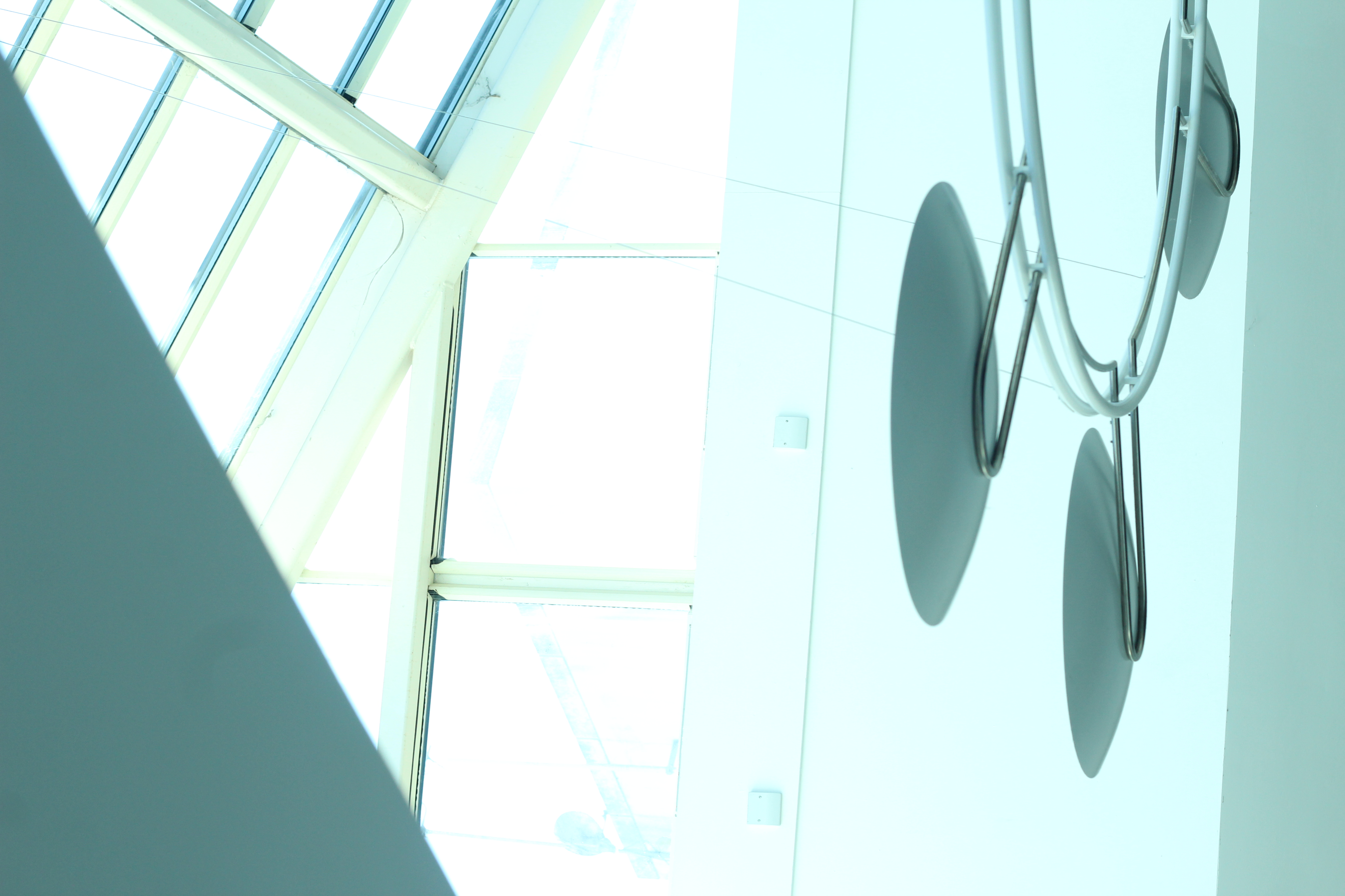
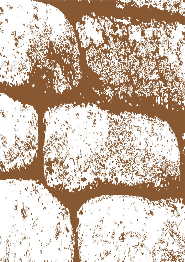
These are my experimented ideas, I have chosen to use different pictures and seeing the result of the threshold adjustment.
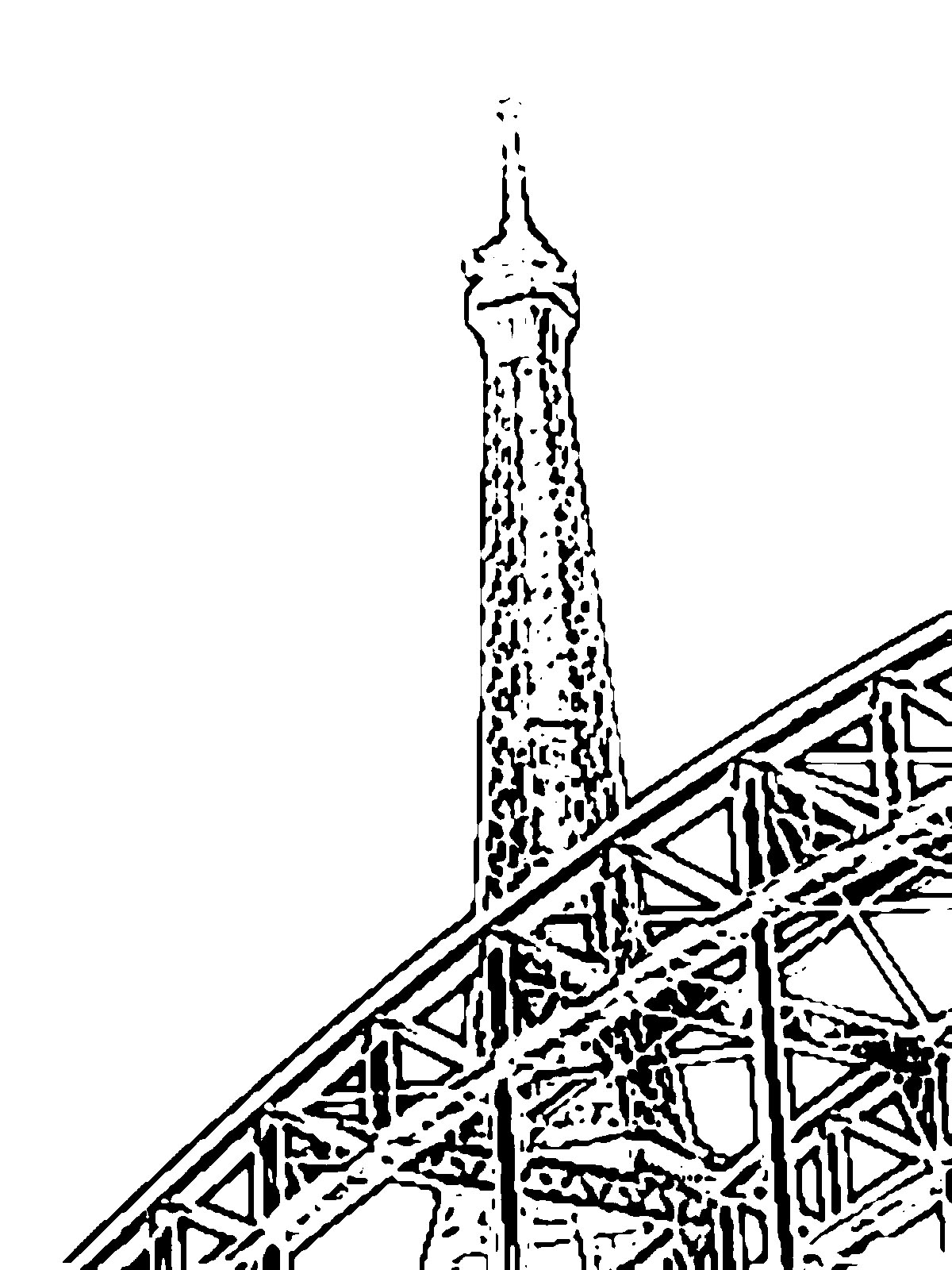
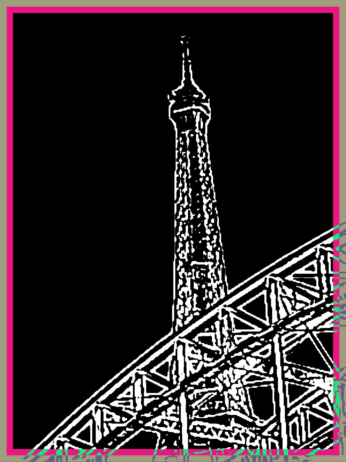
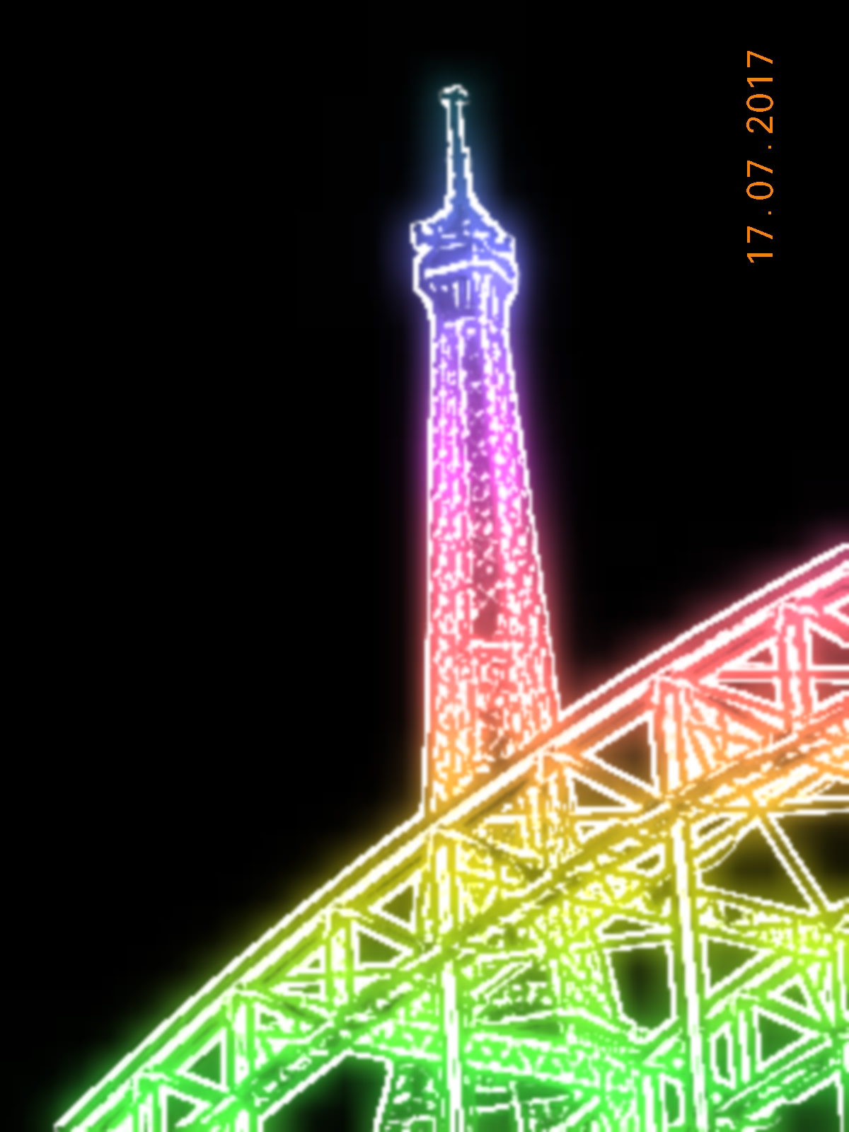
Here i have chosen my favorite 4 photos out of my edited photos using threshold. I have chosen the photos as they still contain a lot of detail which is what I wanted especially the close up of the plant, this is my favorite image out of my for images as it has more character than the others. the second best image is the one of the close up of the Eiffel tower as threshold effect has made the solid lines more solid and the image I found is the most abstract out of this project as there is only focusing on the detail of the lines it also looks better in black and white instead of using colour.
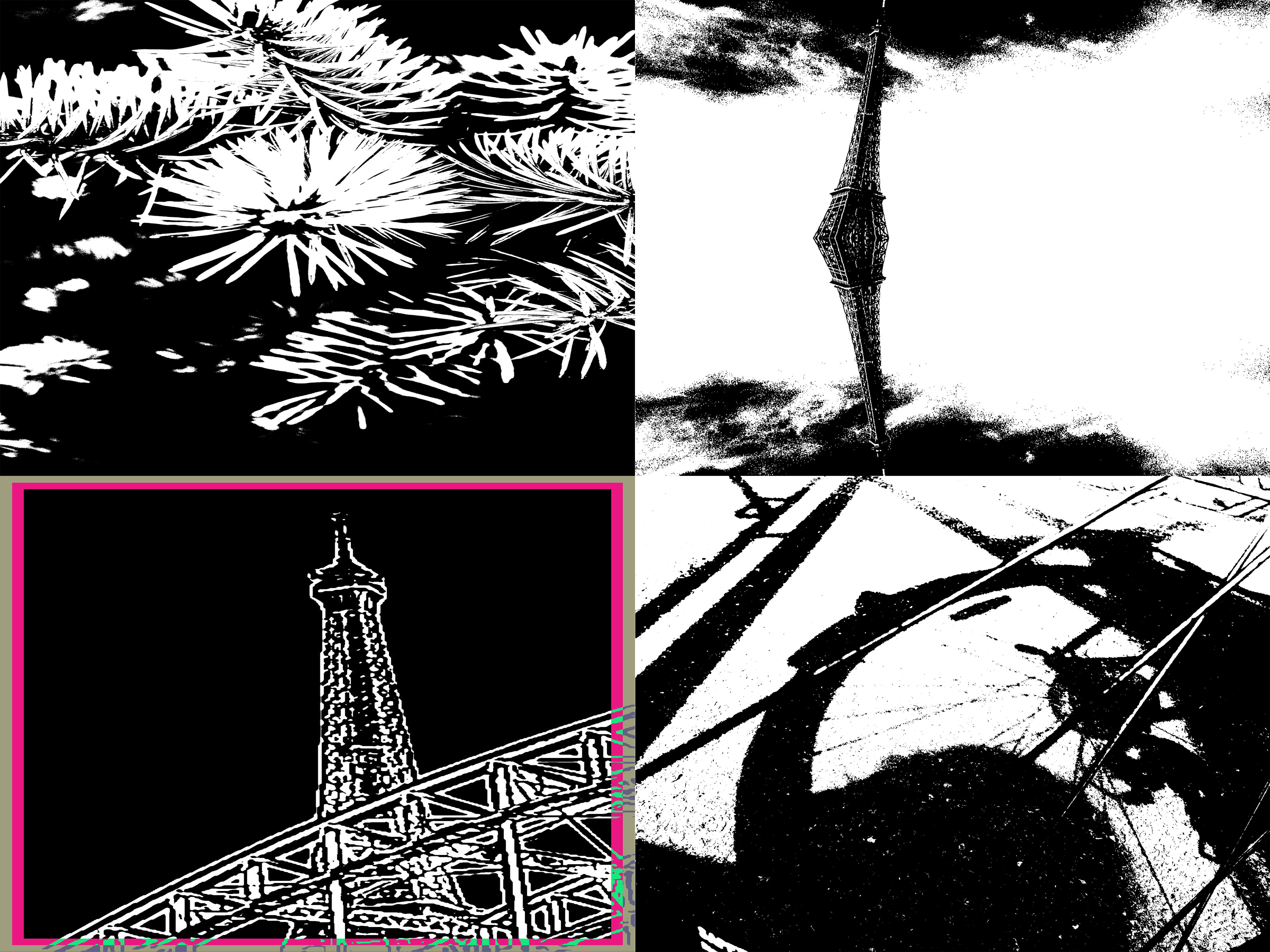
This picture below is of a close up of the plant I like this picture as in black and white there seems to be more detail within the image which is presented. I used the threshold adjustment which made it go into black and white and it adds more detail and a sense of it coming out of the page. I have included the original photo before I started editing the photo so I can compare the differences of before and after. In my opinion I prefer the edited version as it makes me feel that the picture is actually coming out of the page which is different to the other picture. In the second edited photo I used the edited photo but afterwards I changed the contrast and brightness so that it was darker. I have included it but i didn’t like it but included it as a comparison.
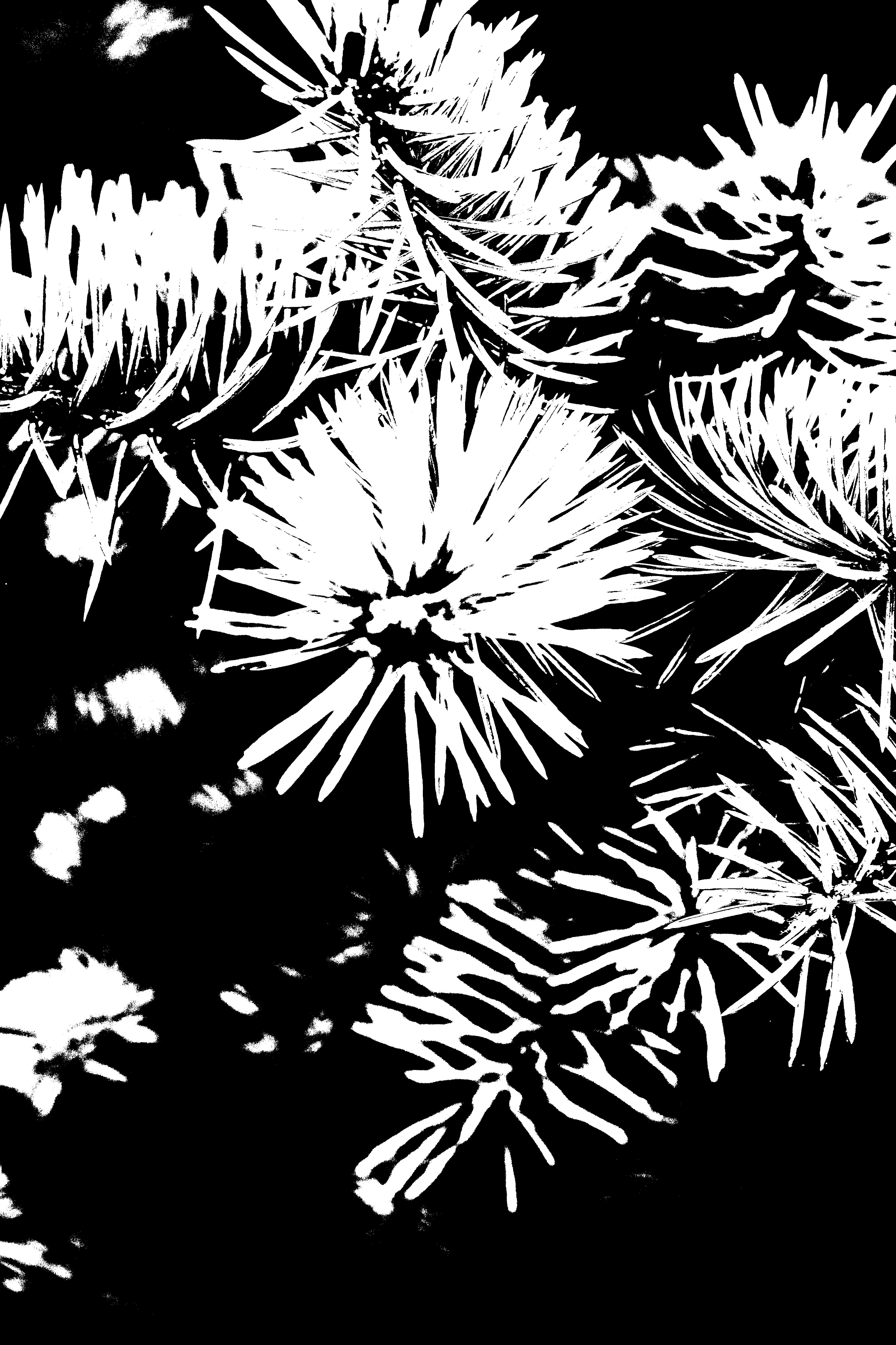

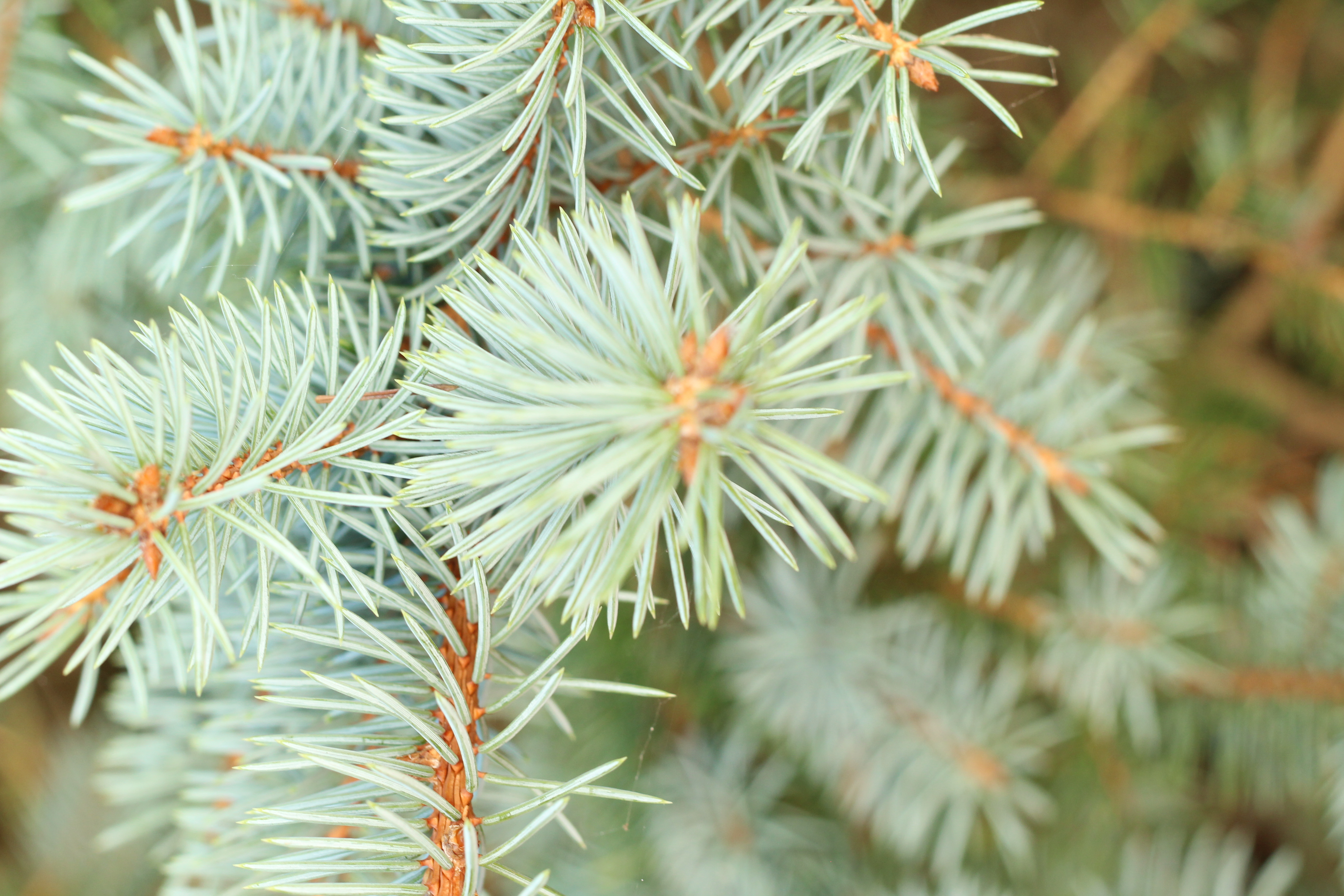
For this photo I decided to again use the threshold adjustment, but I didn’t like this outcome due to the fact the detail within the photo was taken this was because it wasn’t very abstract and the lines were very close together so the shadows collided making it darker.
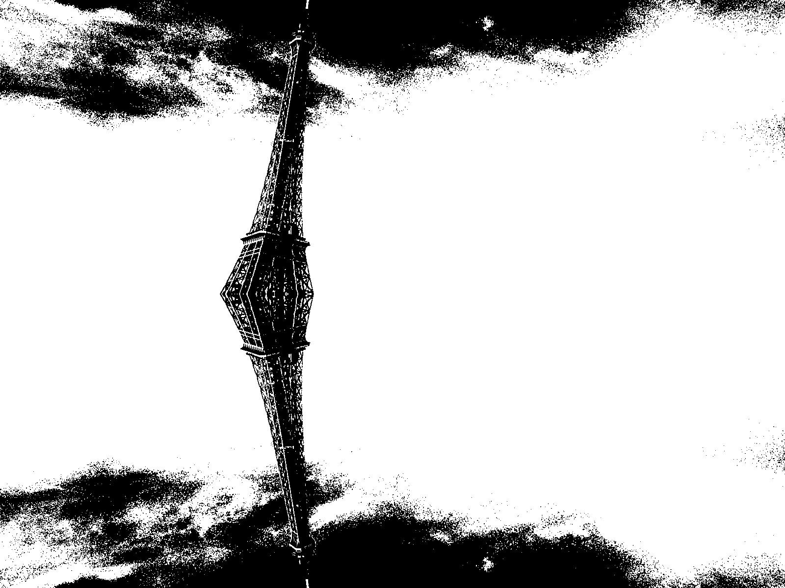
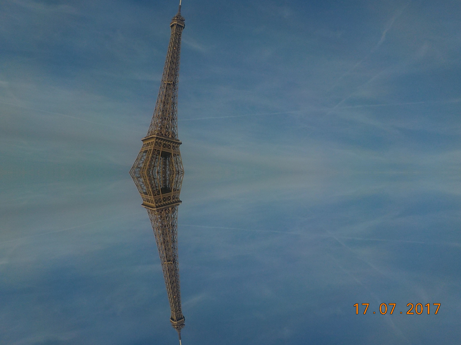
For this photo I used the threshold adjustment making it into black and white. I like it as the detail within the picture is still present however I don’t think it would be classed as abstract as there is a definite lines and it isn’t close up. I also after using the threshold adjustment i decided to add a and invert which converted the picture into white and then the lines were black I found this very basic and I didn’t like it however i decided to include it as a comparison between the original and both of the edited photos. On the threshold edited photo I included a Stroke to identify my favorite out the of the edited photos.
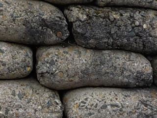
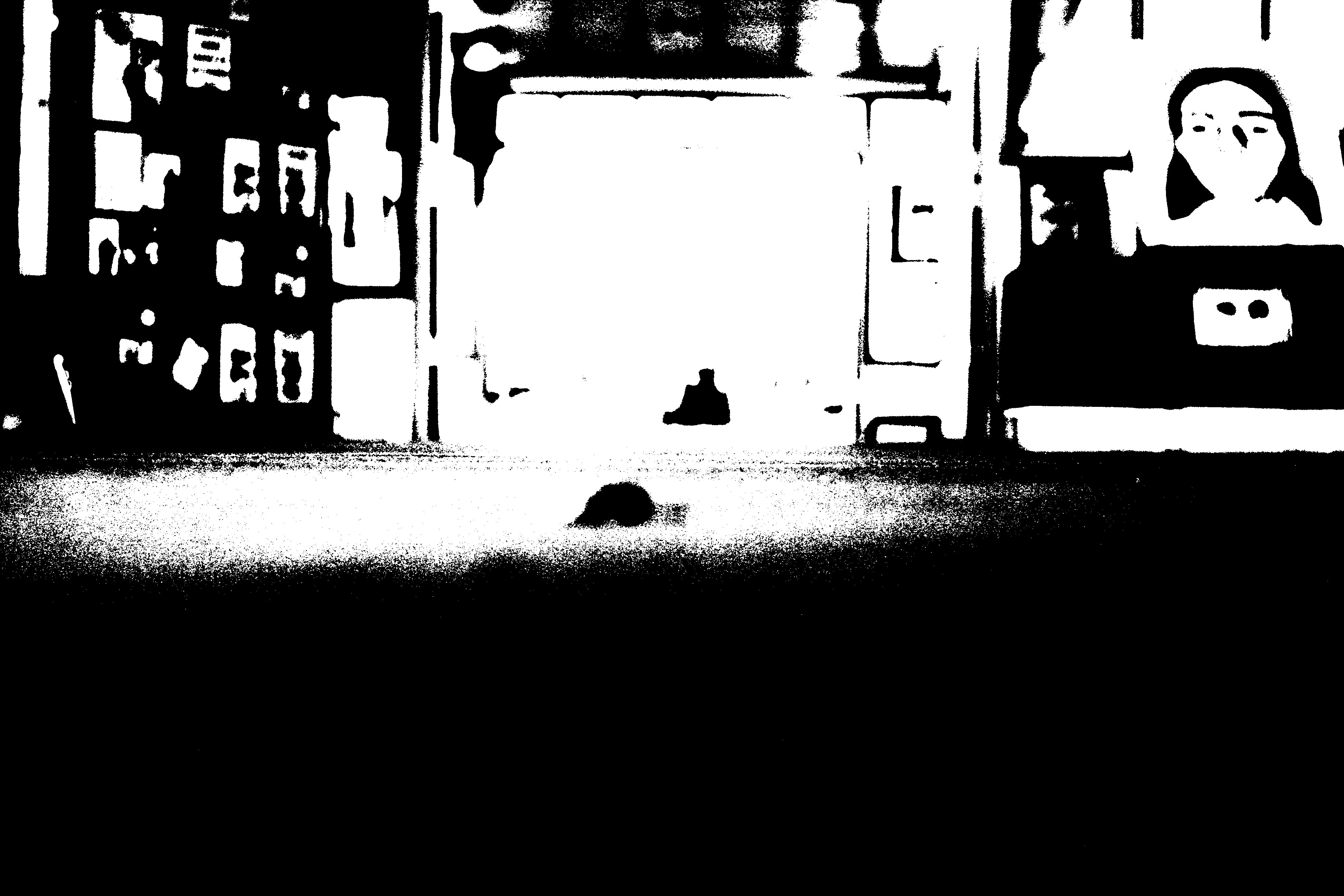
I decided to use this photo below to see what happened when I choose the very basic picture and used the threshold adjustment to convert into black and white however I found that the edited consisted of little detail and I preferred the original photo as it contains more things to focus which maybe not abstract however the edited would be classed as abstract.
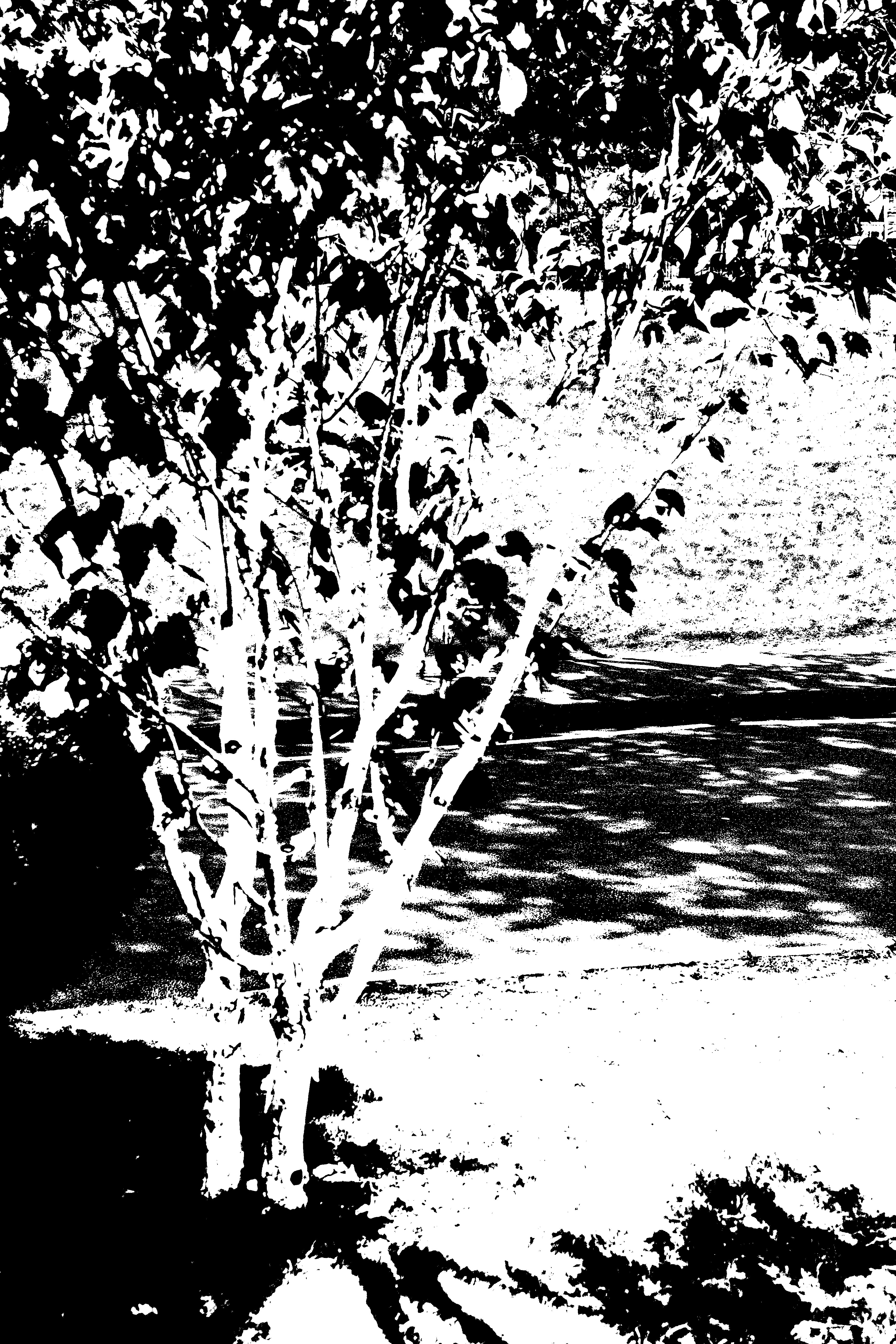
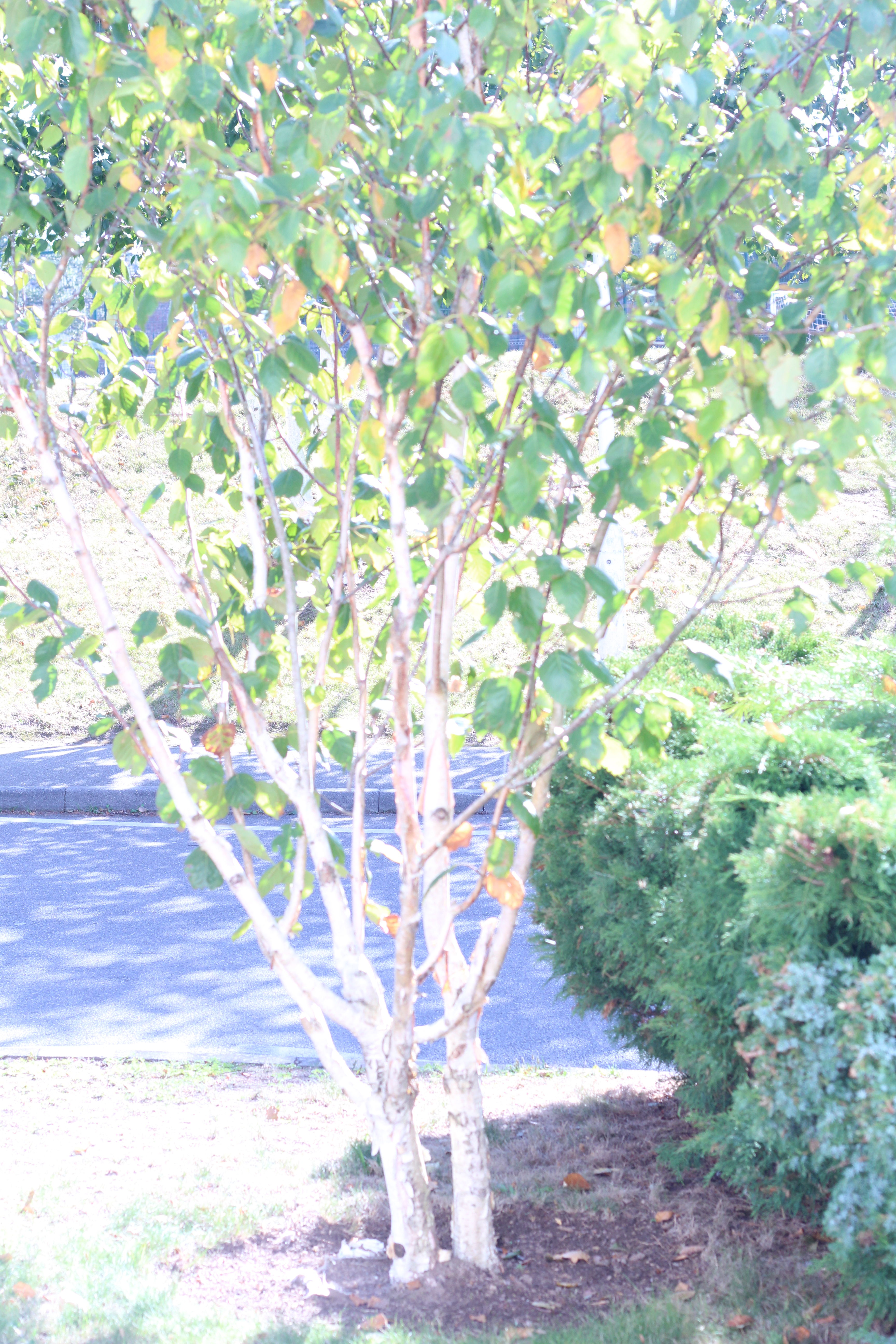
I chose this picture as it was very simple and I thought about the idea What would it look like if i used the threshold tool. I thought that it was a good outcome as all the shadows reflect the tree. Comparing it to the original photo I prefer the edited photo as you can see the shadows more clearly than the original.
This picture is of a bicycle wheel I chose to edit it as i found that it was abstract as it only focused on the wheel and its shadow, I thought that if I edited it with the threshold adjustment that it would bring out the detail and it would make the lines bold. For comparing I Prefer the edited version of the photo as it is more unique to the original which I think is very dull and has no personality.
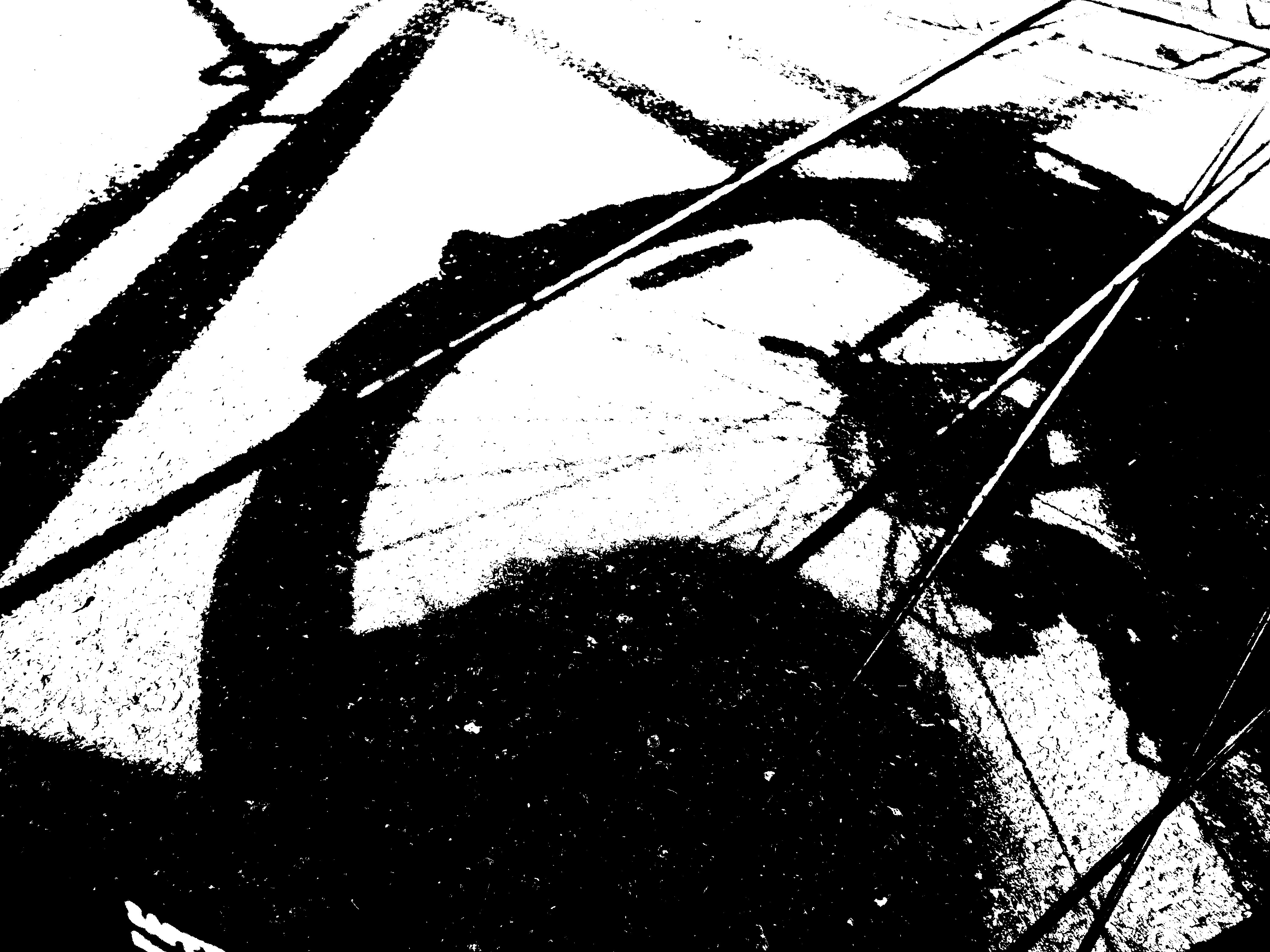
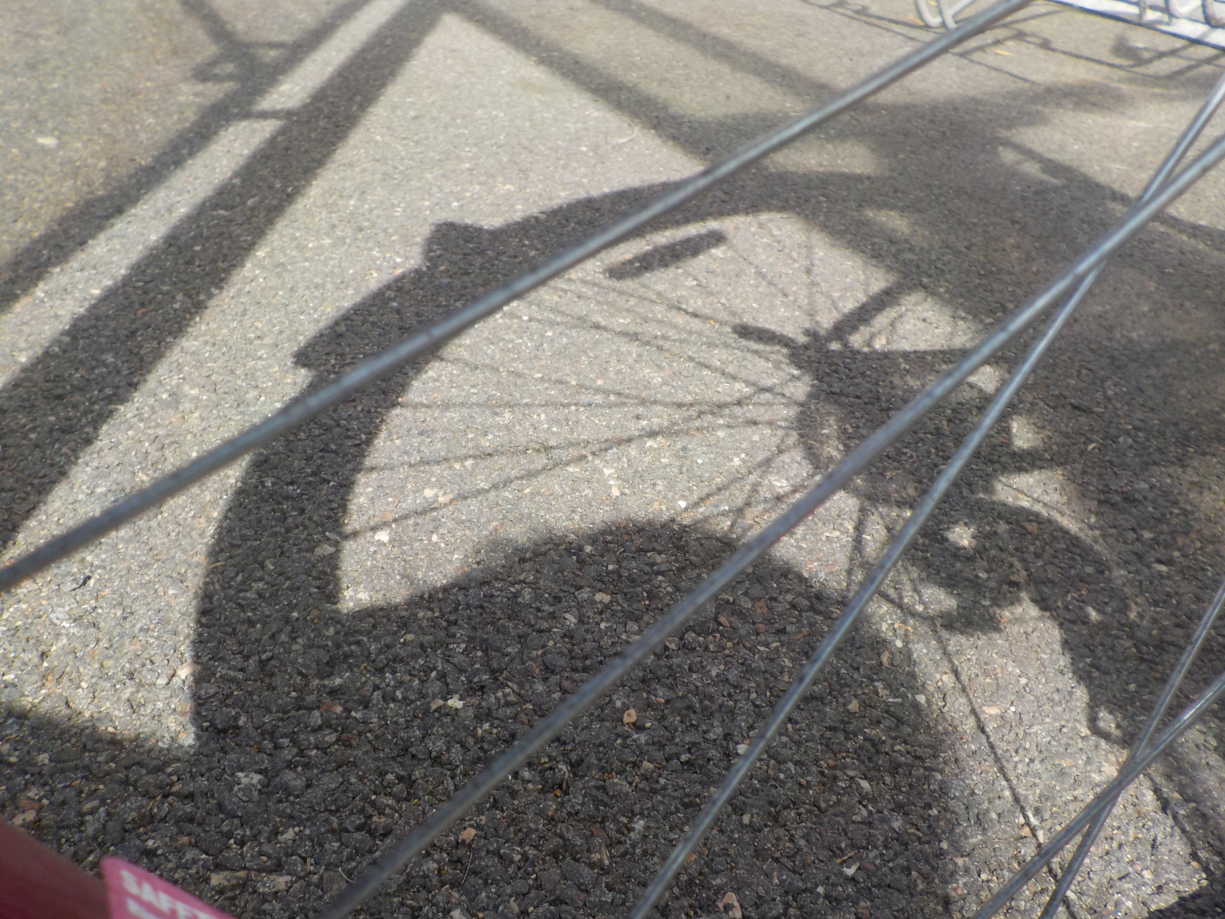
I think for this photo it would be classed as abstract as it only focuses on a little section unlike the other photos. I used the threshold adjustments which converted the photo into black and white and the lines are solid and bold which is what Keld Helmer-Peterson. I included the original so I can compare how different the adjustment did to the photo. Personally I prefer the edited photo as it seems so much more alive and it brings out the uniqueness of the photo.
