https://www.blurb.co.uk/bookstore/invited/8584163/73e15509edb5e0d8085cb07b39d9f8a8397357e2
All posts by Kimberley N
Filters
Photobook Layout
This is my Photo book layout, the title is “Special Care”
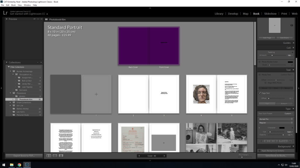
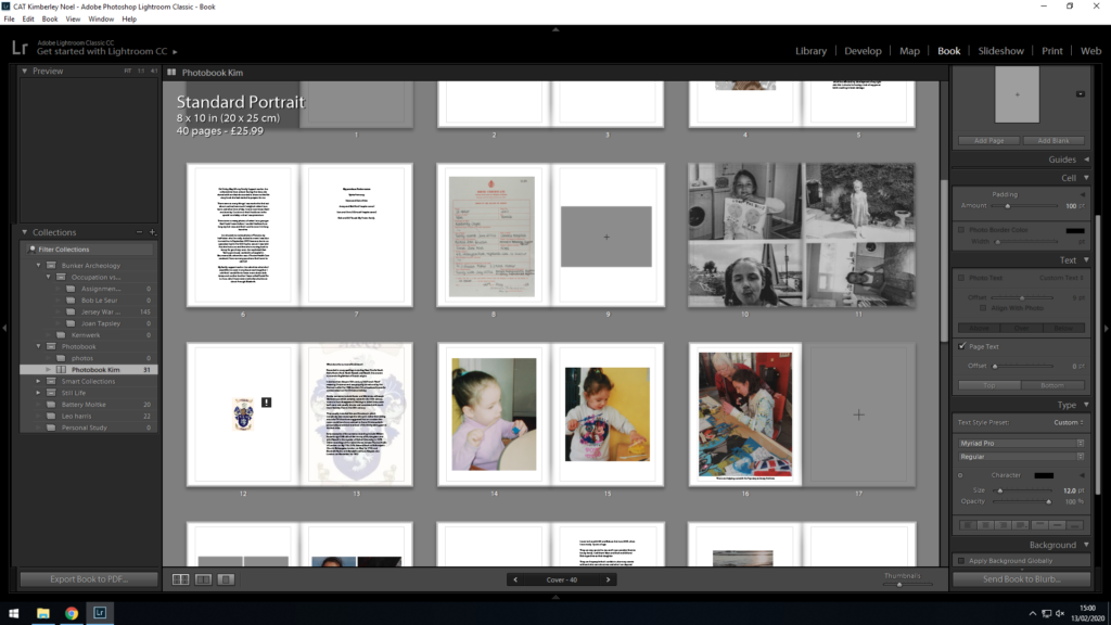
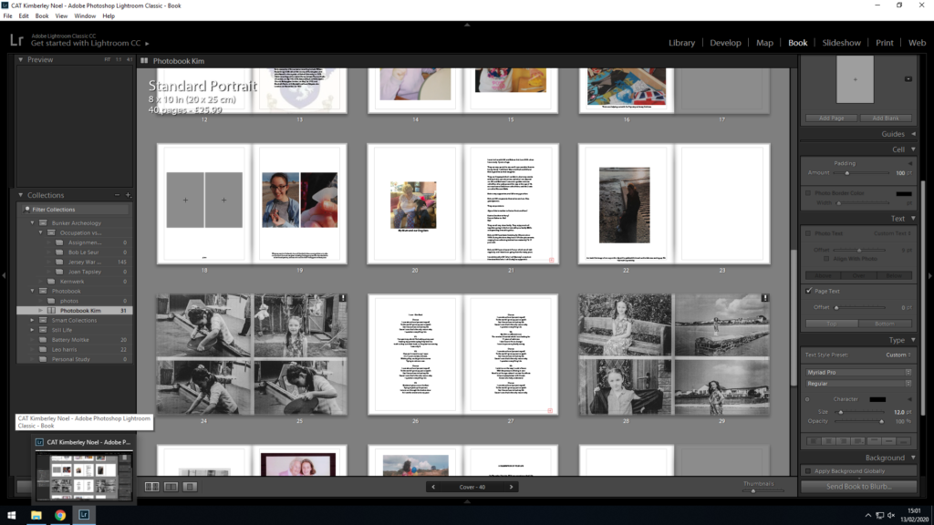
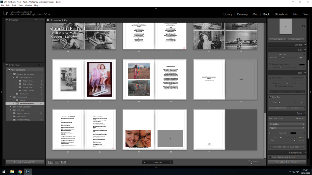
The Photo book “Special Care”, firstly explores me as a child with images and using text to explain my own experiences
Final ESSAY for PHOTO BOOK
Question:
In what way are portraits by Paul Strand and Edward Steichen seen as examples of high modernism.
Introduction:
“The process of manipulation starts as soon as we frame a person, a landscape, an object, or a scene with our cameras: we chose a portrait or landscape format”(Bright and van Erp.2019:18).
I am going to explore how having a change of event in your childhood can affect the way you have been brought up, and how you view your past. This interests me because it’s something which I can relate to and have experienced firsthand. I will be investigating how portraiture was an integral part of Paul Strand’s and Edward Steichen’s work and consider their position as exponent of modernist photography. I will also be analyzing and discussing the way and how a particular modernist aesthetics can be attached to their works. As a response I will be re-editing and re-contextualising images of my childhood and upbringing from a photo album put together by my Social Care Worker. This new selection of images will be constructed as a new story about my life.
Historical Context:
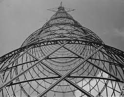
Modernism as a set of ideas emerged alongside the Industrial Revolution from 1760s onwards. Even though photography was discovered later in 1839 as a scientific tool predominantly used in botany and archaeology. Modernism itself explored questions around the nature of art and human experience. Photography helped shape modernism and was itself an invention of modernism. New York became a hub for photographers in early 20th century, due to its radical architecture, and mass population. Most modernist photographers tried to challenge the fact that photography didn’t rival painting, herefore by doing this they could see the potential for originality. Modernism also saw photographers experimenting in creating something new. They did this by cutting up, marking, or combining images together leading to early examples of photo montages and collages, as seen in Dadaist’s works such as Russian Avant Garde artists Alexander Rodchenko. This era also let photographers to explore viewpoints as the number of handheld cameras increased. They were able to explore different angles of making interesting compositions. Rodchenko, who used different viewpoints said, that he wanted to “challenge the viewers perception and delay recognition” (Rodchenko in Johnston 2004:112). This is evident in his image of Shukhov Tower, where he has photographed the tower looking up at it instead of straight on deadpan approach. By doing this he has managed to capture the sharp lines of the tower. Rodchenko pointed out, that “everybody has been photographing from Centre to Centre, for years: not just 1 but the majority of photographers ought to be taking pictures looking up from below or down from above” (Rodchenko in Johnston 2004:112). Modernism allowed artist to explore this as photographers started to reject the older styles of photography, meaning they were becoming more creative.
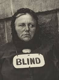
Blind Woman – Paul strand
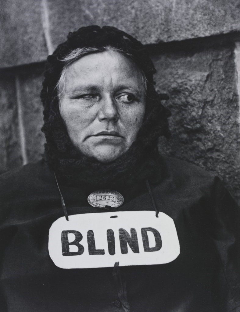
“It is in the organization of this objectivity that the photographer’s point of view towards life enters in”(Strand in Johnson 2004:128). With this statement Paul Strand is referring to the way he took images in their natural surroundings compared to other modernist photographers. Strand was instrumental in developing Straight Photography. He did this by experimenting with several techniques at the time, such as using candid camera techniques. A commentator has explained Strand being; “driven to document his city with complete photographic objectivity, he created a means of shooting his subjects candidly. He worked out that by screwing in a false lens to one side of his camera pointing ahead while concealing the real lens under his arm facing his subjects” (AnOther, n.d.). This meant that he could take images without people realizing they were captured on camera. One of his successful photos was of a Blind Street Beggar in 1916. At this time, he developed a more interest in this type of photography and began to make pictures in a lot more detail capturing every curve in the image. In the image above you can see a woman where she has a sign saying Blind. You can also see that she is wearing a tag around her neck this shows us that she is a licensed beggar in New York. This image was taken in monochrome. It also captures the details on her face, the light is hitting off her forehead and she is look away from the camera, this shows that she is not aware that she is being photographed.

Edward Steichen – Gloria Swanson
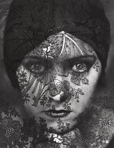
Edward Steichen is an American photographer; whose works were published in Alfred Stieglitz magazines Camera Work he was also known for his fashion photography. In the image above you can see a picture of a woman who is known as Gloria Swanson, who was a famous silent movie star. In the image she is looking straight at the camera, you can also see that she is wearing a headband. The picture is taken in monochrome, over the image you can see a piece of fabric covering her face identified as being lace. This was significant as Steichen merged the words of portraiture and fashion together. On the cloth you can see outlines of flowers and leafs. Gloria Swanson was a leading actress and this image was later used to publicize the film Vanity Fair. You can see in this portrait that the light is directed slightly to the right of the face.
I feel that portraits by Edward Steichen and Paul Strand are examples of high modernism, as they both look at different viewpoints. For example, Edward Steichen said “The mission of photography is to explain man to man and each to himself”(Steichen in Johnson 2004: 92). This signifies that you have to explore your own history to understand yourself. This is what I was focusing on to try and portray in my project about my childhood. In the image below, I have tried to recreate the famous image of Gloria Swanson where he has put lace on top of her face. For my recreation I used an overlay of another textured image in Photoshop on top of my self-portrait. By doing this I have been able to catch the emotion of the image. Edward Steichen is also a good example of high modernism as he made sure that when he took images, they were precise capturing a lot of fine detail. This is evident in his image of George Washington Bridge where he has got the everything parallel to each other, emphasizing perspective. It was taken in high clarity and you can also see that the light is hitting one side of the bridge whereas the other side is dark. In Steichen’s image of the bridge the lines are parallel, this was an integral part of modernism. “A Portrait must go beyond the almost universal self-consciousness that people have before the camera”(Steichen in Johnson 2004:92).
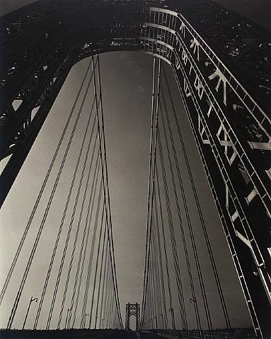

Edward Steichen – George Washington bridge.
My response Edward Steichen
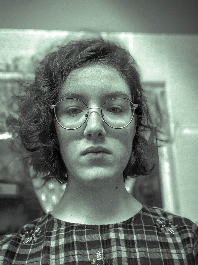
When Paul Strand said “Your photography is a record of living, for anyone who really sees”(Strand in Johnston 2004:96) and I believe that this true, as everything you take images of goes in the history books for years to come people look back and will see what it was like in this time. In the image below I have attempted to recreate what Paul Strand did when taking portraits. I have taken the image in a naturalistic background and have also turned the image into monochrome as Paul Strand’s images were mostly in black and white. Some of Strand’s images are an example of high modernism because he also explored abstraction. For example, in the image Wall Street (New York) the photograph has elements of both realism and abstraction. For example, in the image he has used symmetry, as in the black openings in the architecture in the background. Strand also captured men in suits the financial heartland of America (Wall Street), therefore symbolically showing us America’s wealth and prosperity before the Wall Street crash in 1929. The suited men also represent symmetry and repetition of figures in the front of the image. You can also see the same shapes between the shadows and sharp light. “For it is precisely here that honesty, no less than intensity of vision, is the prerequisite of a living expression” (Strand in Johnson 2004:96) This quote supports Strands ideas of capturing people in their natural environment.
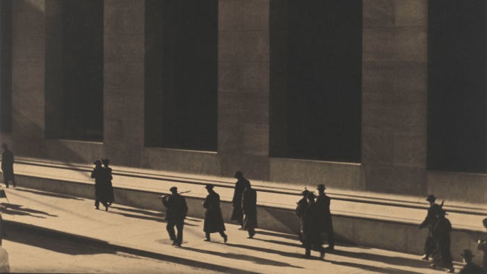
Wall Street New York – 1915 by Paul Strand
My response to Paul Strand
Conclusion:
There are similarities in the way Edward Steichen and Paul Strand make portraits, however, they explore different aesthetic styles and approaches. They both use the street as setting to make images. They both include a lot of emotion in the photographs, meaning that the audience can connect to what they are trying to communicate. Modernism allowed photographers to achieve the different emotions they wanted. Both Photographers have strong connections between the subjects in the images, As a story narrative I have tried to reconstruct my life as a child therefore have done this by getting a couple of pictures of me when I was younger and making them into a double page. Therefore, it would make effective for the reader to see what I was like as a child, but I also added some text to my book to explain my childhood for example, I have added some song lyrics I wrote, which explains my point of view of being fostered for 11 years. I hope to make this narrative easy for the reader to understand, when I have explored different aspects from my childhood to me growing up and comparing the photographs from the younger to the older me.
Bibliography:
- Bright, S. and van Erp, H.(2019).Photography Decoded.London:Octupuss Publishing House.
- Seiferle, R. and Stephenson, K. (2020). Modern Photography Overview. [online] The Art Story. Available at: https://www.theartstory.org/movement/modern-photography/ [Accessed 9 Jan. 2020].
- AnOther. (n.d.). How Paul Strand Paved the Way For Photographic Modernism. [online] Available at: https://www.anothermag.com/art-photography/8482/how-paul-strand-paved-the-way-for-photographic-modernism [Accessed 13 Jan. 2020].
- da Cunha Lewin, K. (2020). Edward Steichen Artworks & Famous Photography+. [online] The Art Story. Available at: https://www.theartstory.org/artist/steichen-edward/artworks/#pnt_6 [Accessed 3 Feb. 2020].
- https://www.tate.org.uk/art/art-terms/p/photography/a-z
- Johnson, B (2004) Photography Speaks, New York: Aperture
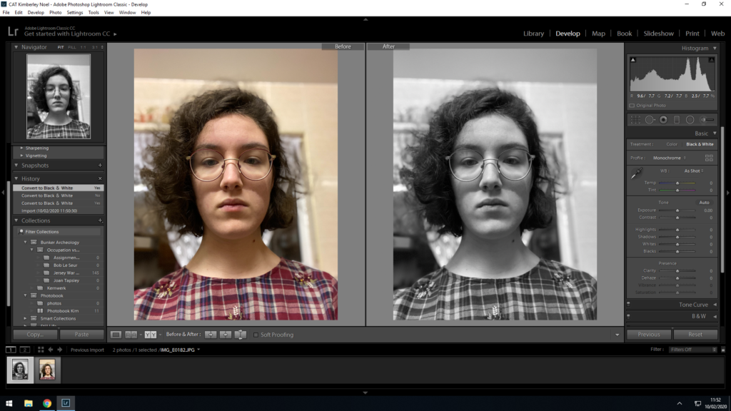
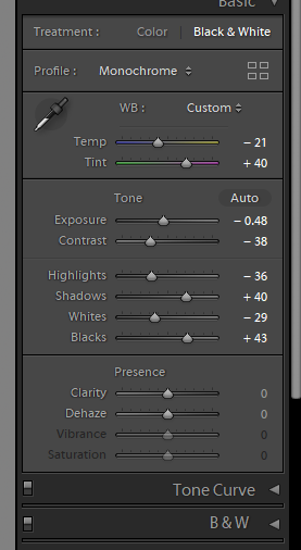
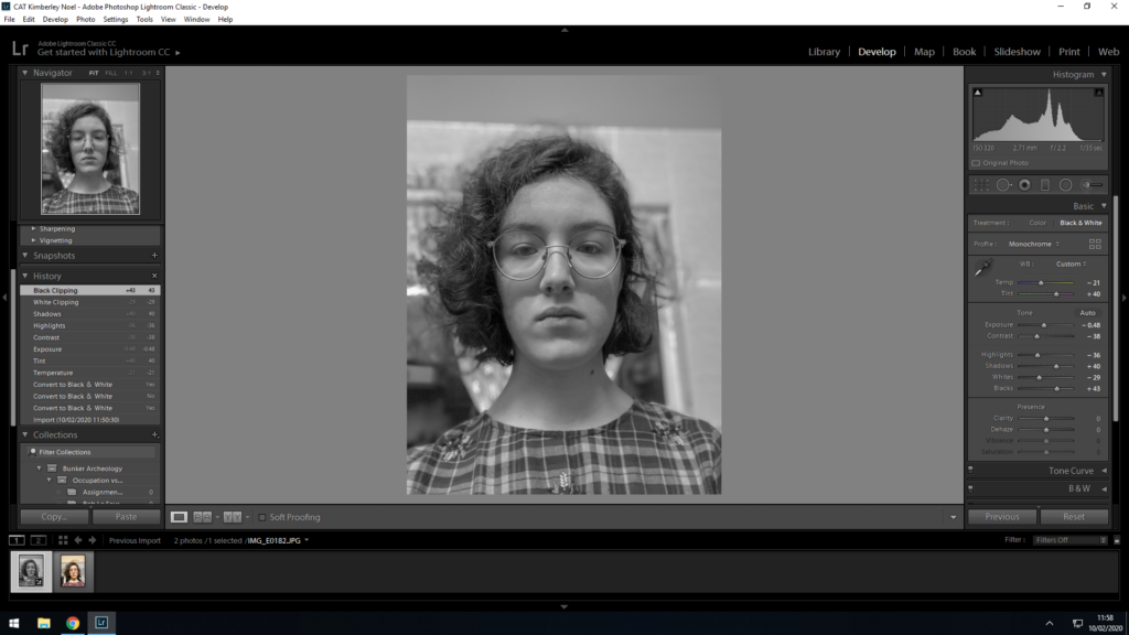
My Response to Paul Strand
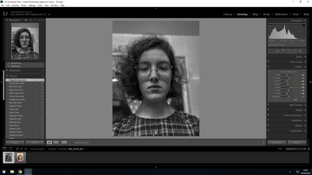
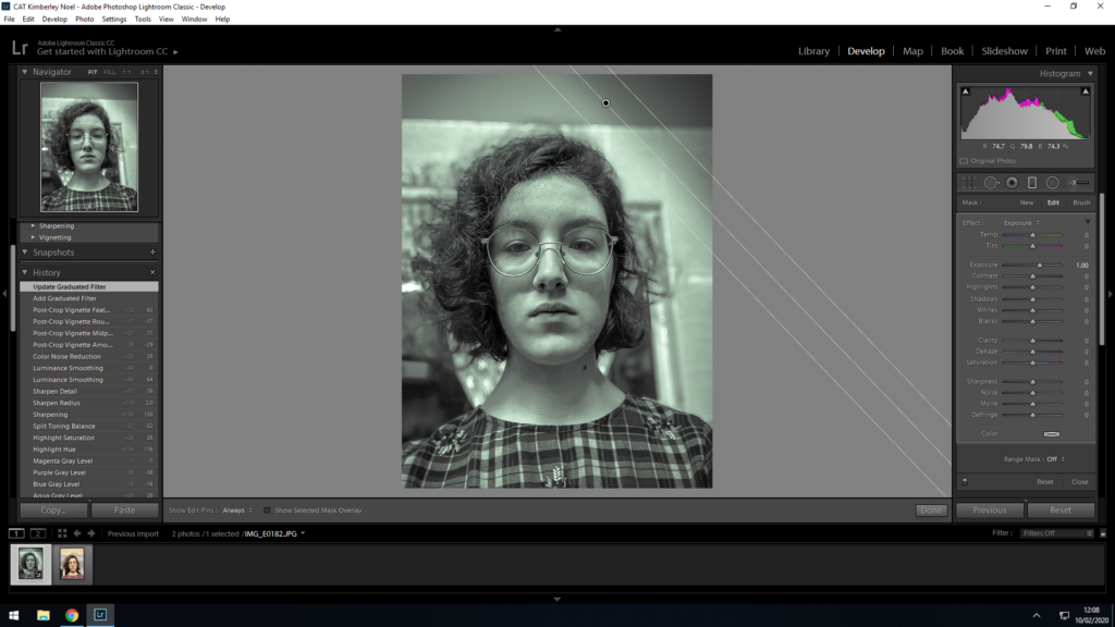
Final Image:
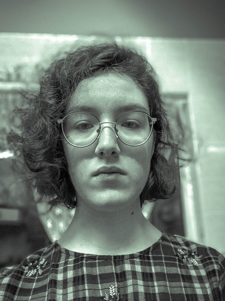
This image depicts what Paul Strand photographs, I have started of by photographing somewhere that I knew, and that I was familiar of
Response to Edward Stiechen
Edward Stiechen is an american photographer, from modernism era, he took images of fashion and incorporated them in his photography, one of his most famous was of Gloria Swanson, a silent movie actress.
My response:
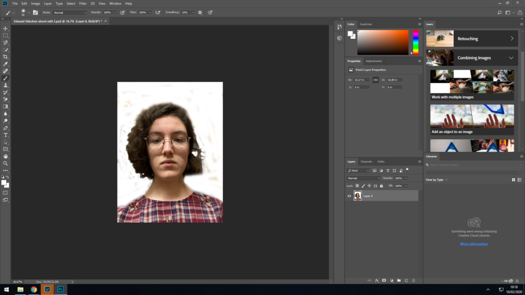
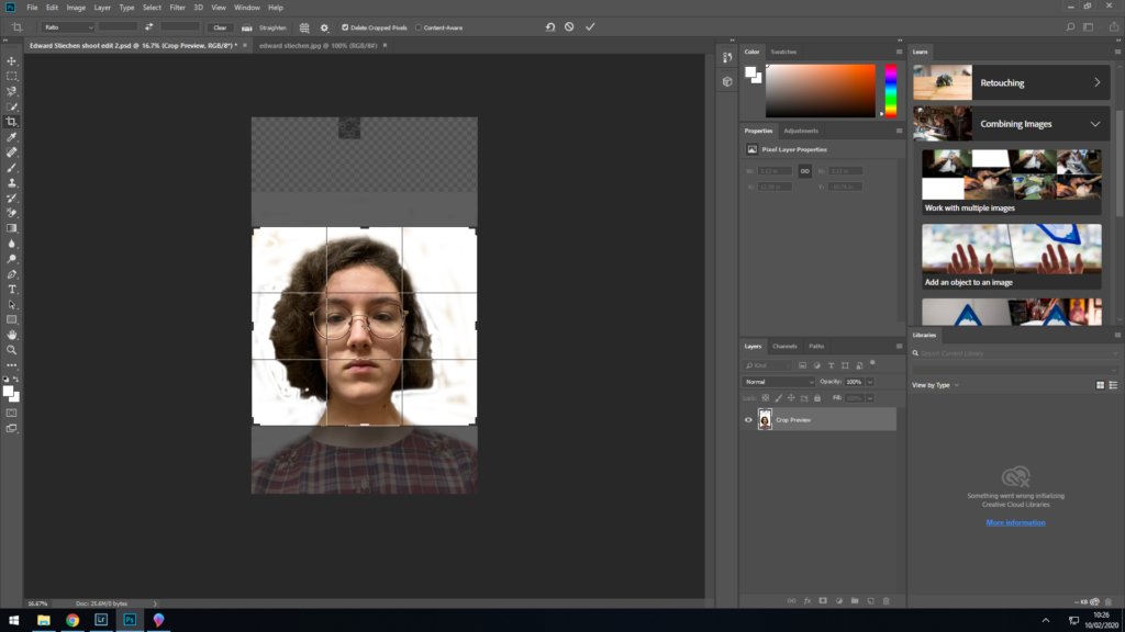
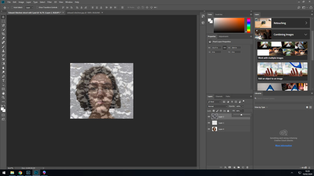
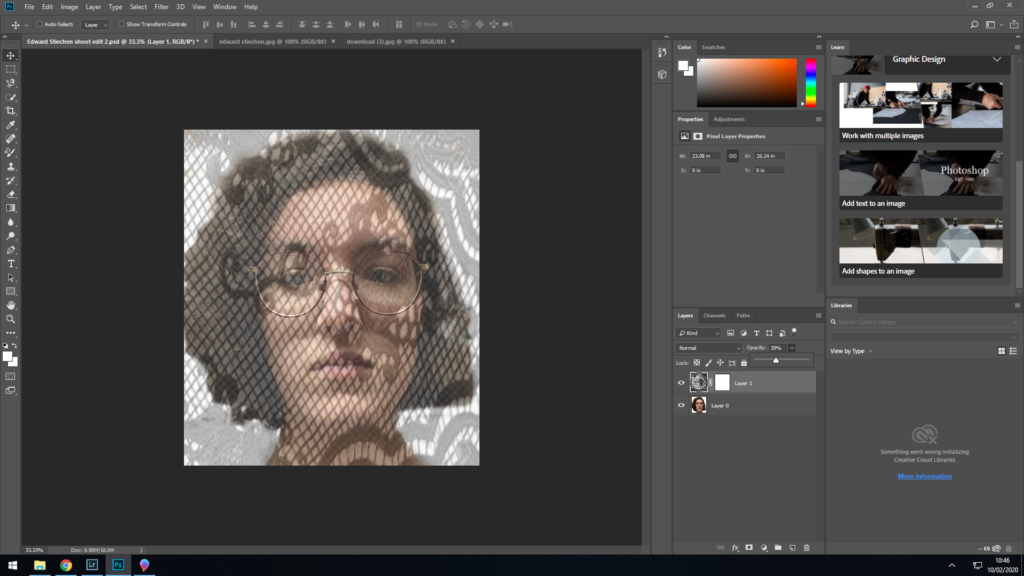
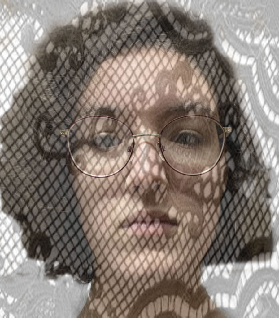
For this I have tried to capture what Edward Stiechen did with Gloria Swanson, I have done this by getting a self portrait of and cropping it, and then I added a overlay on the image to make it look like there was lace on,
UNDERSTANDING PHOTO-BOOK design
Photo-book Chosen – The Epilogue by Laia Abril
What the story is about?
For me I think that the story portrays a family struggles and how they deal with losing a love one to a disease.
What the photographer made it for?
The photographer made this book to focus on the indirect realities that are based around feminism, therefore tells the story of how a family loses their daughter to bulimia.
Audience?
Girls – Woman- families
- Book in hand: how does it feel? Smell, sniff the paper.
When I looked at the book
- Paper and ink: use of different paper/ textures/ colour or B&W or both.
The photo book uses a Matt paper however uses inserts with normal printing paper with either letters, and official documents.
- Format, size and orientation: portraiture/ landscape/ square/ A5, A4, A3 / number of pages.
Portrait
- Binding, soft/hard cover. image wrap/dust jacket. saddle stitch/swiss binding/ Japanese stab-binding/ leperello
Hard cover with a image wrap, glued stitching for binding.
- Cover: linen/ card. graphic/ printed image. embossed/ debossed. letterpress/ silkscreen/hot-stamping.
Has got a printed image on the cover, with a blue card covering the girls face
- Title: literal or poetic / relevant or intriguing.

The title can be found to be intriguing to the audience as it doesn’t give us an explanation into whats in the book
- Narrative: what is the story/ subject-matter. How is it told?
The story is about a family who lost their daughter to bulimia, the book includes flashback before the event – testimonies – objects – letters
- Structure and architecture: how design/ repeating motifs/ or specific features develops a concept or construct a narrative.
The structure of this book allows the reader to understand what is going on, the book is split in mini chapter specified by the date on a single page.
- Design and layout: image size on pages/ single page, double-spread/ images/ grid, fold- outs/ inserts.
This photo book uses a lot of double page spreads, however in some pages uses tipin to add more information that the reader can read or look at
- Editing and sequencing: selection of images/ juxtaposition of photographs/ editing process.
- Images and text: are they linked? Introduction/ essay/ statement by artists or others. Use of captions (if any.)

The are a mixture of this used in the photo book, all the text in this book relates to the image beside, this could be done by the photographer explaining what is happening in image, which gives more context to the reader.
Edward WESTON
- Edward weston is an american Photographer which was popular for his take on modernism and straight photography.
- In 1908 he briefly worked at the photography studio of George Steckel in Los Angeles, as a negative retoucher.
- In 1910 Weston opened his own business, called “The Little Studio”
Quotes:
” Similar to images used by the Surrealists, Weston’s high resolution, realist photographs of organic forms and modern marvels encouraged viewers to reconsider seemingly mundane objects and form new associations with them. ” (Henderson and McCain, 2019)
“Weston helped bring the medium out of the Victorian age that favored pictorialist imitations of painting and into the modern era wherein photography became a celebrated medium in its own right.”(Henderson and McCain, 2019)
Image Analysis:
Bibliography:
Henderson, K. and McCain, S. (2019). Edward Weston Photography, Bio, Ideas. [online] The Art Story. Available at: https://www.theartstory.org/artist/weston-edward/ [Accessed 16 Dec. 2019].
Planning: 4 Photoshoots
Shoot 1: I am going to do a photoshoot on my response to paul strand, this is going to be a self portrait.
Shoot 2: For this photoshoot I’m going again to do a self portrait, but this time its going to be a response from Edward Western.
Shoot 3: For this shoot, I am going to take images of my surrounds so for example Where I live now, where I use to live, Inside my house.
Shoot 4:
Exhibition: Invisible Hands
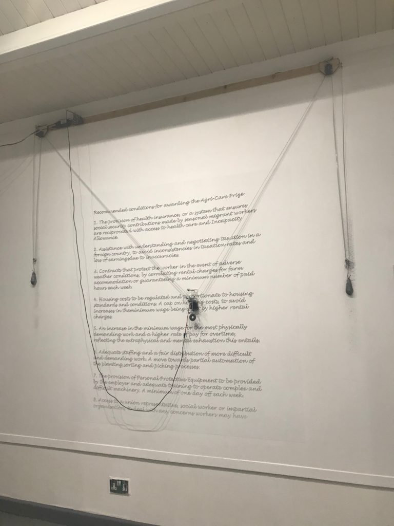
The exhibition The Invisible Hands looks at the migrant workforce which were farmers in Jersey. The exhibition covers their story, lives living and working conditions. These types of workers were hugely important to the farming industry in jersey. However the migrants works weren’t hugely remembered or documented.
The exhibition was done by artist Alicia Rogalska and The Morning Boat.
The exhibition featured 3 different sections from:
- A video explaining about the project and some of the stories behind the people.
- A transcript which was being printed in the wall with the 8 points ( requests on how to improve living conditions for the polish workers
- A set of images taken by the migrant workers e.g. their bedrooms, selfies – these images look at the different conditions and how the workers felt.
Images


artist reference
Paul stand is an american photographer and filmmaker, He focused on modernism and straight photography.
Qoutes:
” He recognized that the camera held a patent advantage over other plastic arts in that it could freeze a moment in time and space in a way that was impossible to replicate by hand or in real time.”(Duncan,2019)
art should be able to engage the spectator spiritually and socially. He is thus associated with the idea that high art can (should indeed) accommodate abstraction and realism simultaneously(Duncan, 2019)
Image Analysis:
Visual:
In this image you can see a desolate woman in the centre, with a placard which says Blind. There is also a badge above the sign, that shows you that she is a licensed newspaper Vendor.
Conceptual/Contextual:
- The image was first produced and published in Camera Work.
- Was taken in 5 Five Points.
- Strand wanted to focus on Social problems. this was evident because the image was taken “the heart of the immigrant slums on the Lower East Side of Manhattan”(Duncan, 2019)
Technical:
This image has been taken in black and white, Medium close shot.
“achieve portraits of such arresting quality Strand devised a strategy whereby he rigged his camera with a false lens that pointed forward, while the working lens was actually placed at a ninety-degree angle and hidden from the subject’s view under his arm.”(Duncan, 2019)
Bibliography:
Duncan, A. (2019). Paul Strand Photography, Bio, Ideas. [online] The Art Story. Available at: https://www.theartstory.org/artist/strand-paul/ [Accessed 16 Dec. 2019].
