All posts by Kristin F

Filters

Author:
Category:

CCA Galleries – Clare Rae and Claude Cahun Comparison

Clare Rae is a photographer based in Melbourne, Australia. Her work has recently been placed in the CCA Gallery in Jersey, the work that has been put up is the work she has done that has taken inspiration from Claude Cahun. Some of Claude Cahuns work has also been put up to show the viewers of the gallery how Clare has taken inspiration and what she has changed from how Claude Cahun worked. Claude Cahun normally used her body in her images. In response to this Clare Rae has used her body in her images. She describes this as a private performance for herself. Her work shows her body as a piece of art. She is trying to present an alternate view of the female body.
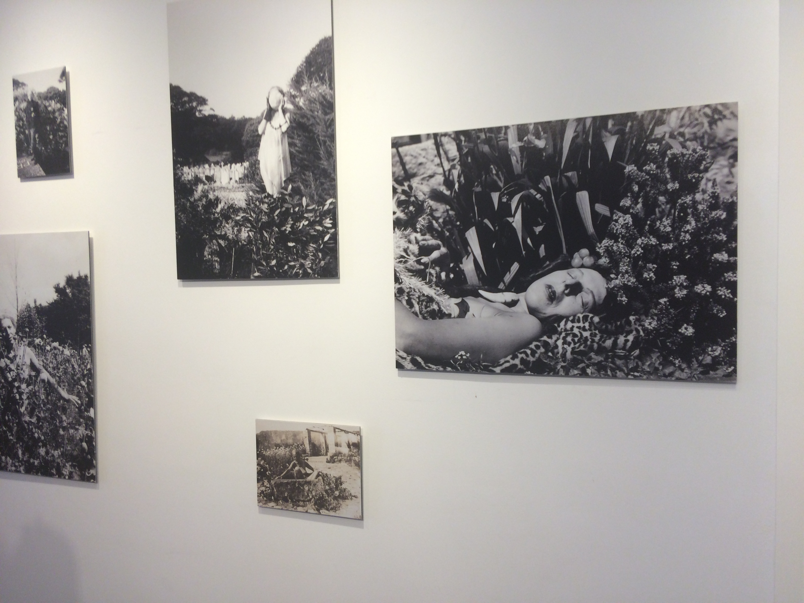


Clare Rae like Claude Cahun worked mostly in black and white while taking images for this project. Though she used the same colour scheme to get contrast between lights and dark’s, Clare Rae normally used lighter background colours, so that in black and white it would become a lot brighter with the darker colours over the top. This is different from how Claude Cahun worked as she normally used backgrounds that were a lot darker and overlapped lighter colours on top.
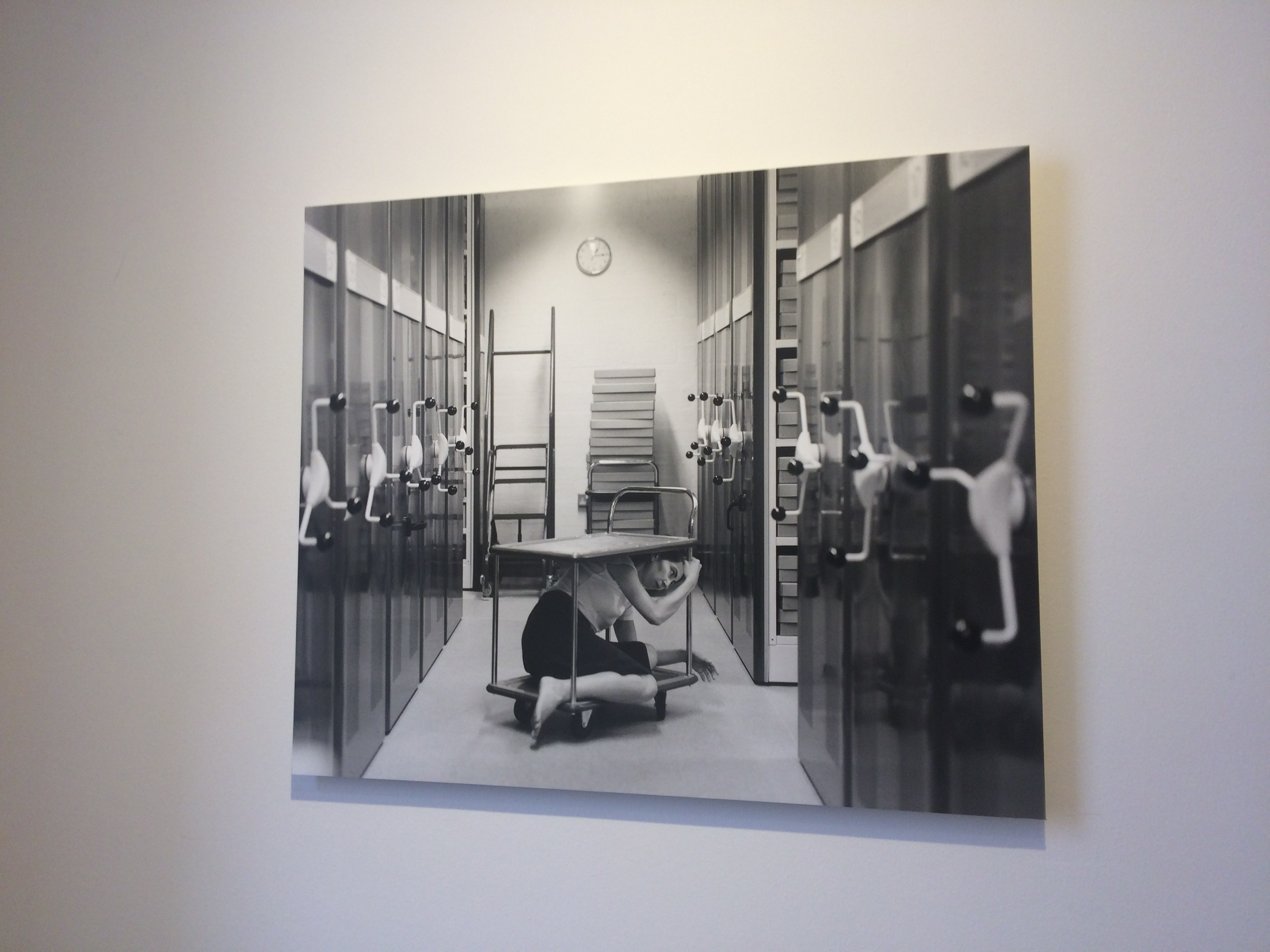
This is my favourite image in the CCA Gallery. It shows Clare Rae interacting in the environment in a way that makes her seem trapped.

Due to using their bodies as an art piece, both would have had to think about what they were wearing a lot in their images, to get what the wanted displayed in each image they took. They had to interact with the environment around them, this means that a lot of thought would have had to go into how they were going to pose themselves in their images.

In conclusion, the images produced by both people could be taken in multiple ways and have a different meaning for every person.

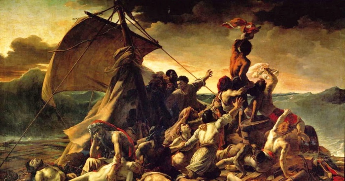
 

Raft of Medusa – Tableaux Vivant


Raft of Medusa

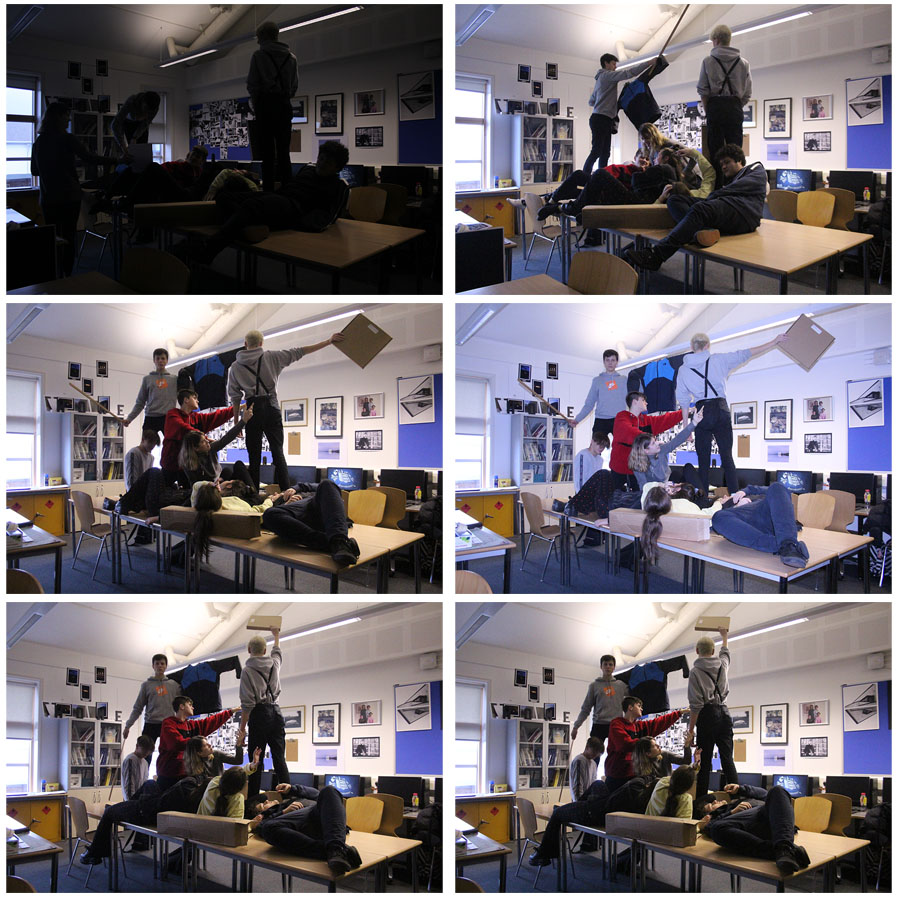
We have tried to recreate the Raft of Medusa painting, shown above. Below are the best outcomes that we got from the small photoshoot.

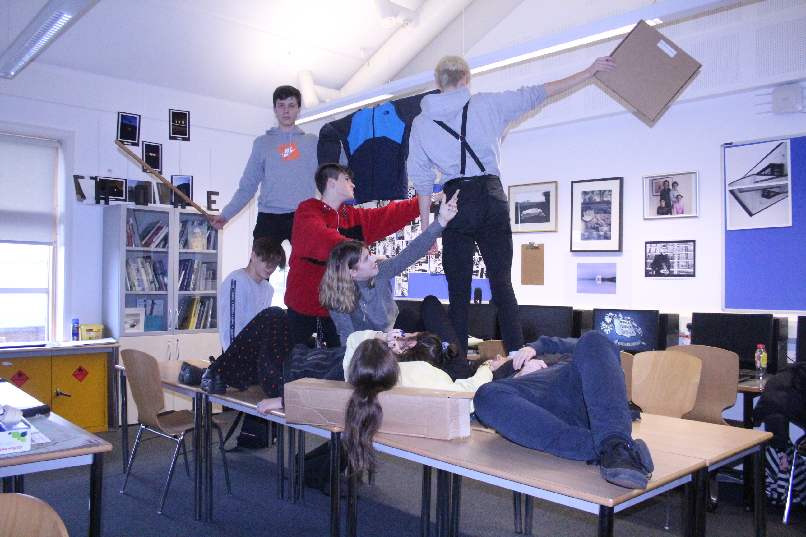
Below is the best overall outcome for this small photoshoot. This is the best image as it shows everyone in very similar positions to the real image, though we did not have enough people to get the fill every spot for every person in the painting. The blue tint on the image also creates a strange atmosphere like in the original image.


Snow White – Tableaux Vivant

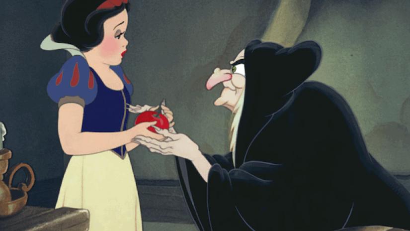
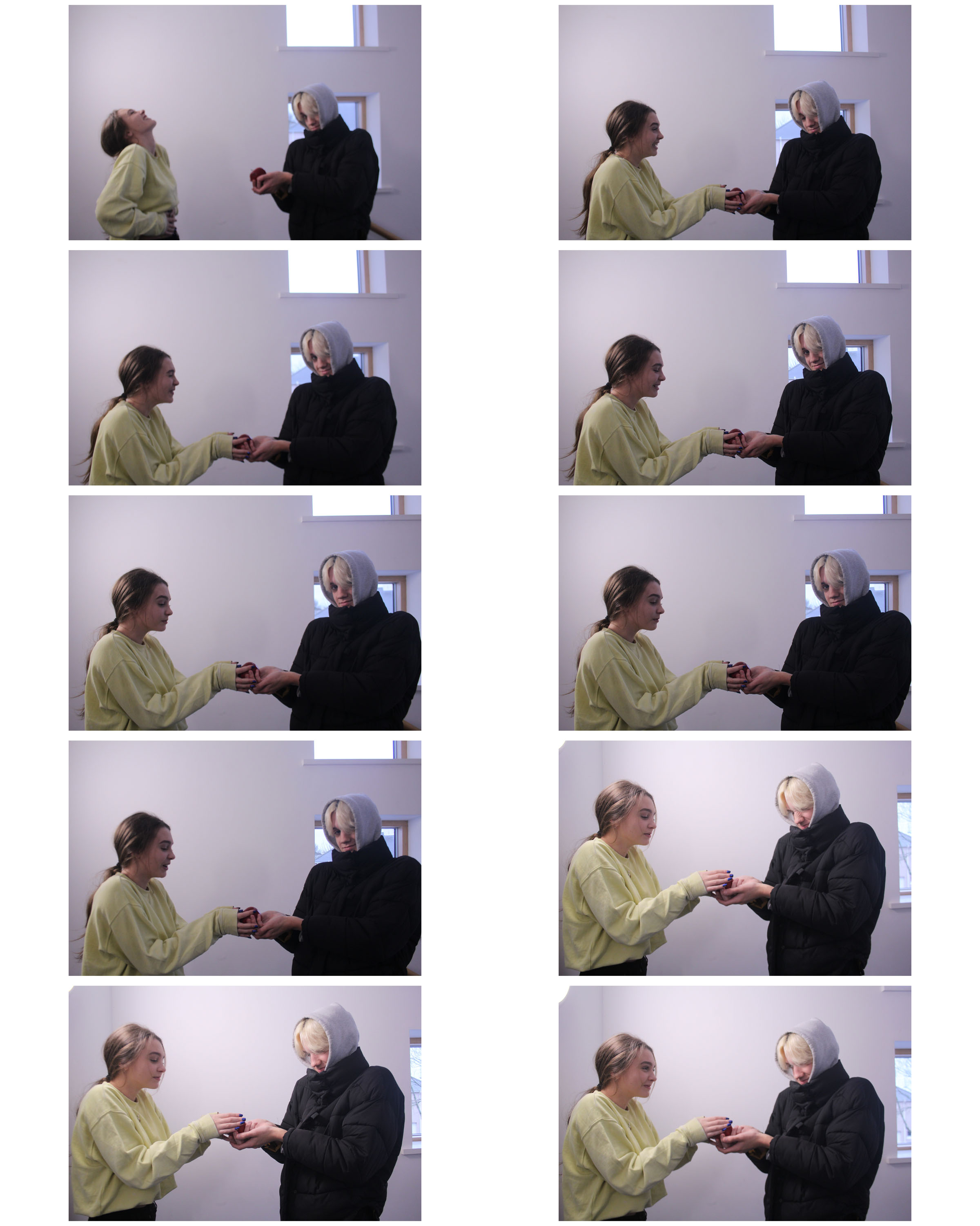
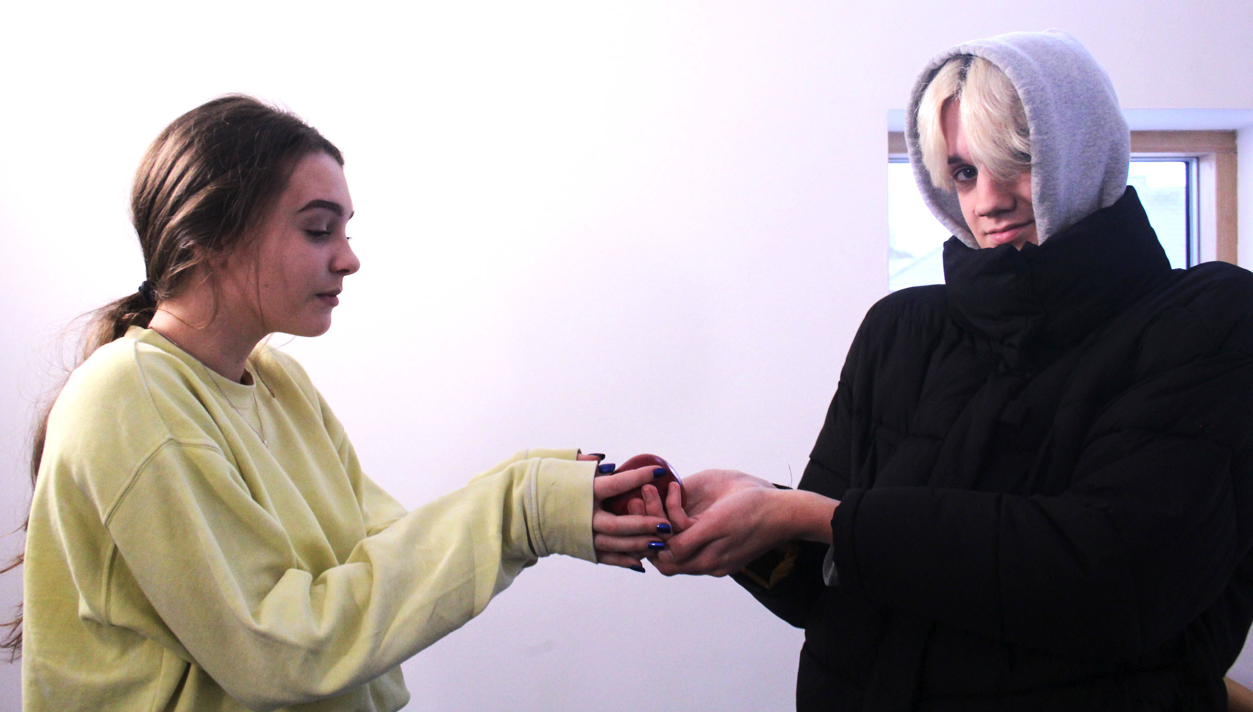
These are some of the images from a photo shoot I took. In these images we took inspiration from Disney’s Snow White in the scene where the Witch offers Snow White the apple. The original image we were trying to recreate can be seen below. 

These images below are the original images I have taken before editing a couple of them. For the most part they all turned out decently, though a couple of them came out sharper than others which are the images I have selected to edit.

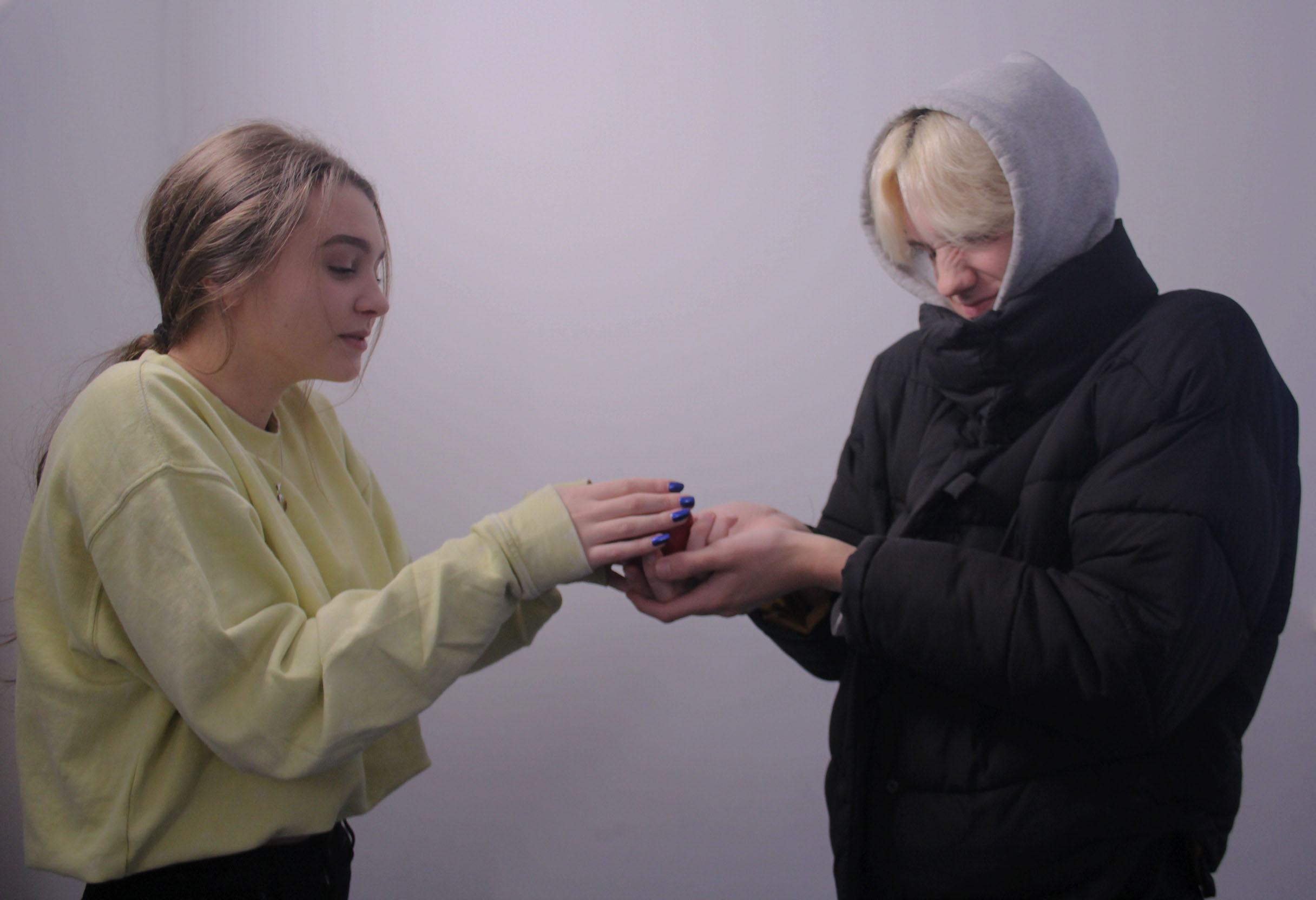
These images below are the ones I have edited. With the first one I have added, I upped the contrast and the brightness to make the people stand out in the foreground.

With this second one I have changed the brightness to make it seem a bit darker to fit with the personality of the witch. I have also cropped it to remove the window which can be seen at the right side of the first image.

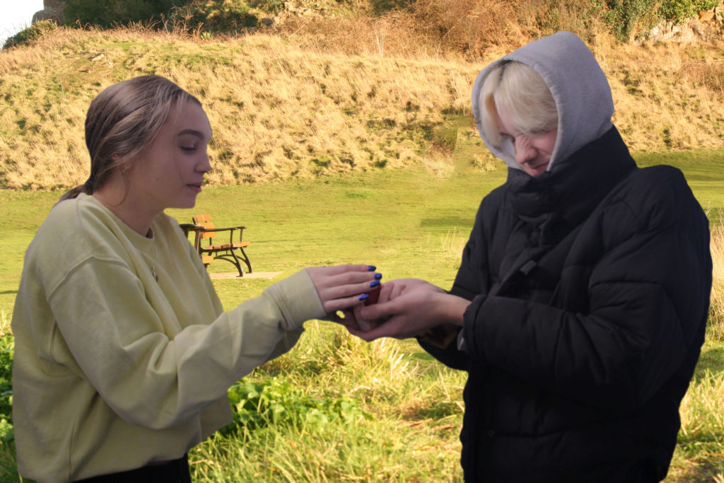
This is one of the images above which I have removed the background in place of another image I have taken recently. This allowed me to get a more authentic looking image.

Tom Hunter, Tableaux Vivant Research

Tableaux Vivant and staged reality is photography that the photographer stages in such a way that it is almost like theater that emphasizes what the photographer wants the story to tell.

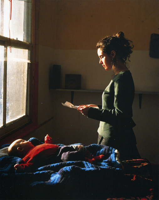
Tom hunter is an English photographer born in Bournemouth in 1965. His work was specialized in documenting life in Hackney. A lot of his images showed the local issues in the area at the time. His images also often referenced other artists work. Quite often he tried to recreate Johannes Vermeer’s work. An example of him doing this would be in his image “Woman Reading a Possession Order” which is shown below:

Woman Reading a Possession Order | Tom Hunter

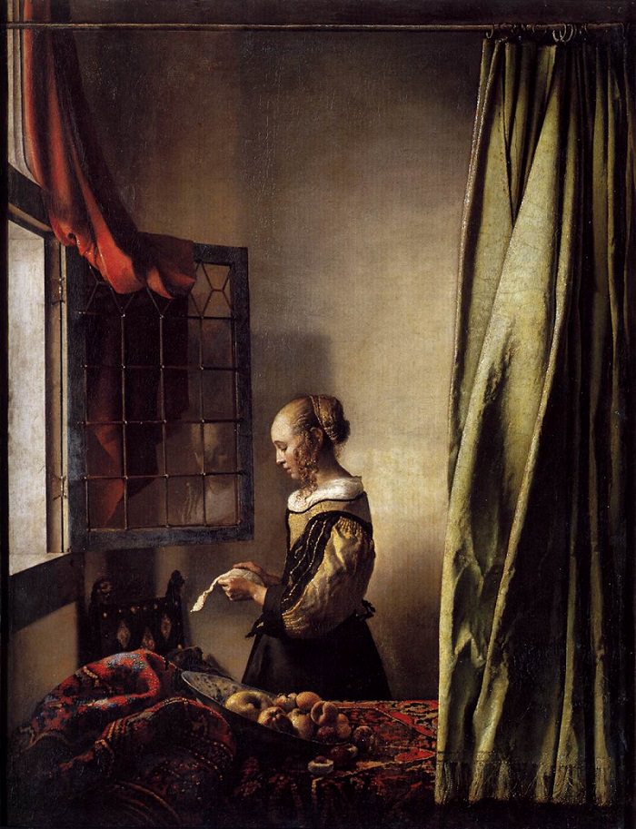
This image is a recreation of a Johannes Vermeer image as shown below:

Girl Reading a Letter at an Open Window | Johannes Vermeer

Contextual/Conceptual: Though, Tom Hunter took inspiration from Johannes Vermeer, he has added his own twist on it by showing a mother with her child reading a letter that says they are going to be evicted from their home. Rather than just a woman reading a letter with little meaning. The use of the child rather than just having a bowl of fruit makes the image look a lot sadder. The baby’s body is contorted in such a way that makes it seem like it knows what is going to happen to its home.

Visual: In the image, Tom Hunter has edited the tone in the image so that the image appears very dark throughout the image with the face appearing very brightly from the light of the window. He may have decided to edit the tone to be dark throughout to display the emotion that the woman would be feeling when reading the letter.

Technical: Tom Hunter seems to have only used natural lighting to create this image. This lighting is coming from the window and illuminates the woman’s face for the most part. Secondly, the image is quite over-exposed. This could have been created by having a long shutter speed. This makes the image seem a lot brighter in the light areas than the dark areas.


“Filipa had just had her first baby. We spent the whole day trying things out: we had a bowl of fruit, then we tried some curtains, then incorporated the baby. The light was perfect, a late winter sun coming through the window, really low, like the northern European light.” – A quote from Tom Hunter about how he came up with the image. From a guardian article:

https://www.theguardian.com/artanddesign/2009/nov/04/photography-tom-hunter-best-shot

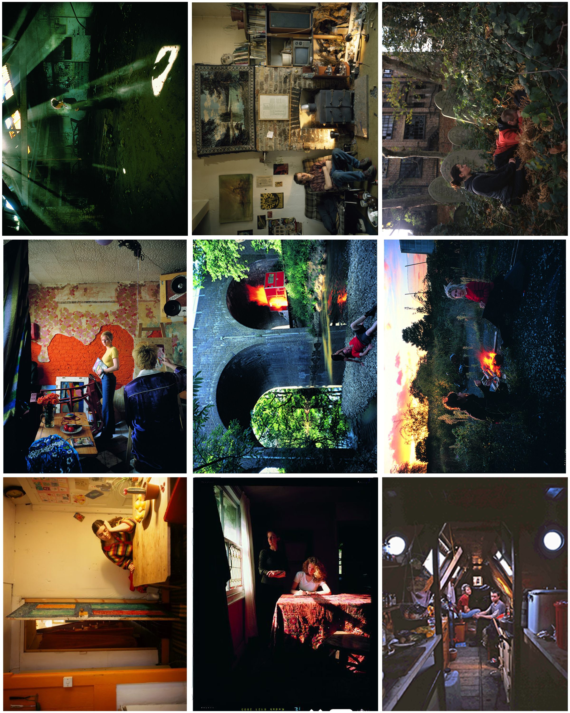
Here is a selection of other Tom Hunter images that I really like and may try to recreate:

I have picked a lot of these as my favorites due to the way Tom Hunter uses lighting and because some of them simply display parts of peoples lives, such as grieving for others.

They are inspired by Vermeer and his use of light. The light can signify various things…such as hope.

Studio Photography

Lots of photographers use studio lighting. Studio lighting is used to manipulate and add extra lighting that wouldn’t be there naturally to a shot. Having more light in a shot could be very useful as the photo without it could appear very dark and not how you want it to appear.

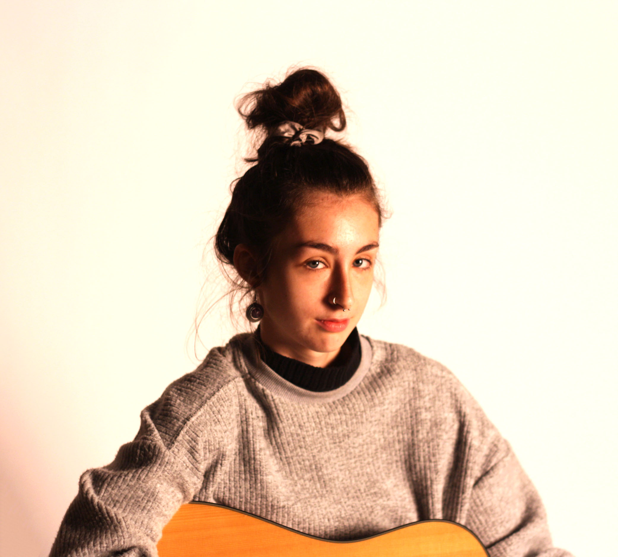
In my images you may see some use of chiaroscuro and Rembrandt lighting. This type of lighting occurs when one side of the face is lit up and the shadow from the nose and the cheek on the other side connect leaving a small triangle of light in between the cheek and the nose.

There are different types of studio lighting you can add to create different images. For example you can use one, two or three point lighting. One point lighting requires using one light, usually placed at an angle which will illuminate half of a persons face, creating contrast between the shadow and the infinity curve behind. Two point lighting uses two different lights. In portraiture this is normally used to remove shadows from the face completely. Though I have only really used one and two point lighting in my photo shoot there is also three point lighting which uses a third light. Often placed somewhere behind the person facing the back of their head to create a glow around their head to make it stand out more. Overall, the more points you have light coming from the less shadows will be cast on the person, allowing you to almost remove them completely or create different amounts of shadows in different parts of their face.

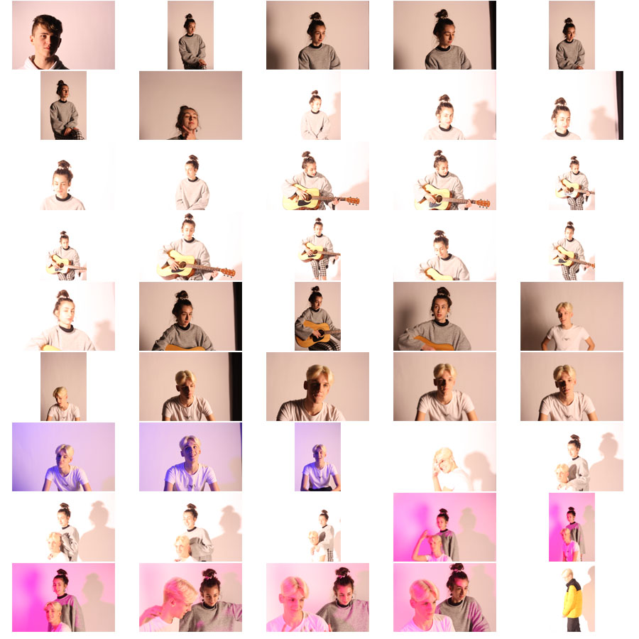
These are a selection of the images I have taken using one and two point studio lighting. A lot of the images turned out slightly out of focus due to me not focusing completely or they were over-exposed due to excessive light being used for the images.

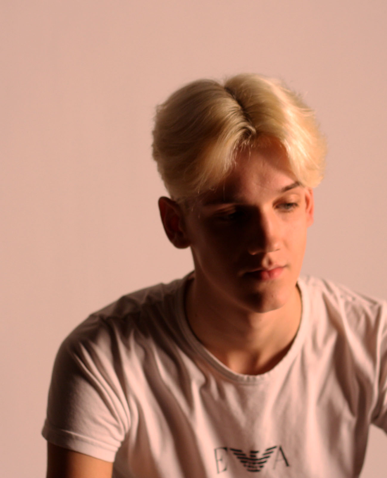
The images below are the best images I took using one and two point lighting. I have edited each image to crop, add exposure or add some more contrast between the bright and the dark parts in the images.

The images above and below used one point lighting. I have selected these images as some of the best taken due to the dark shadows that have been created due to using the artificial light on one side of their bodies.


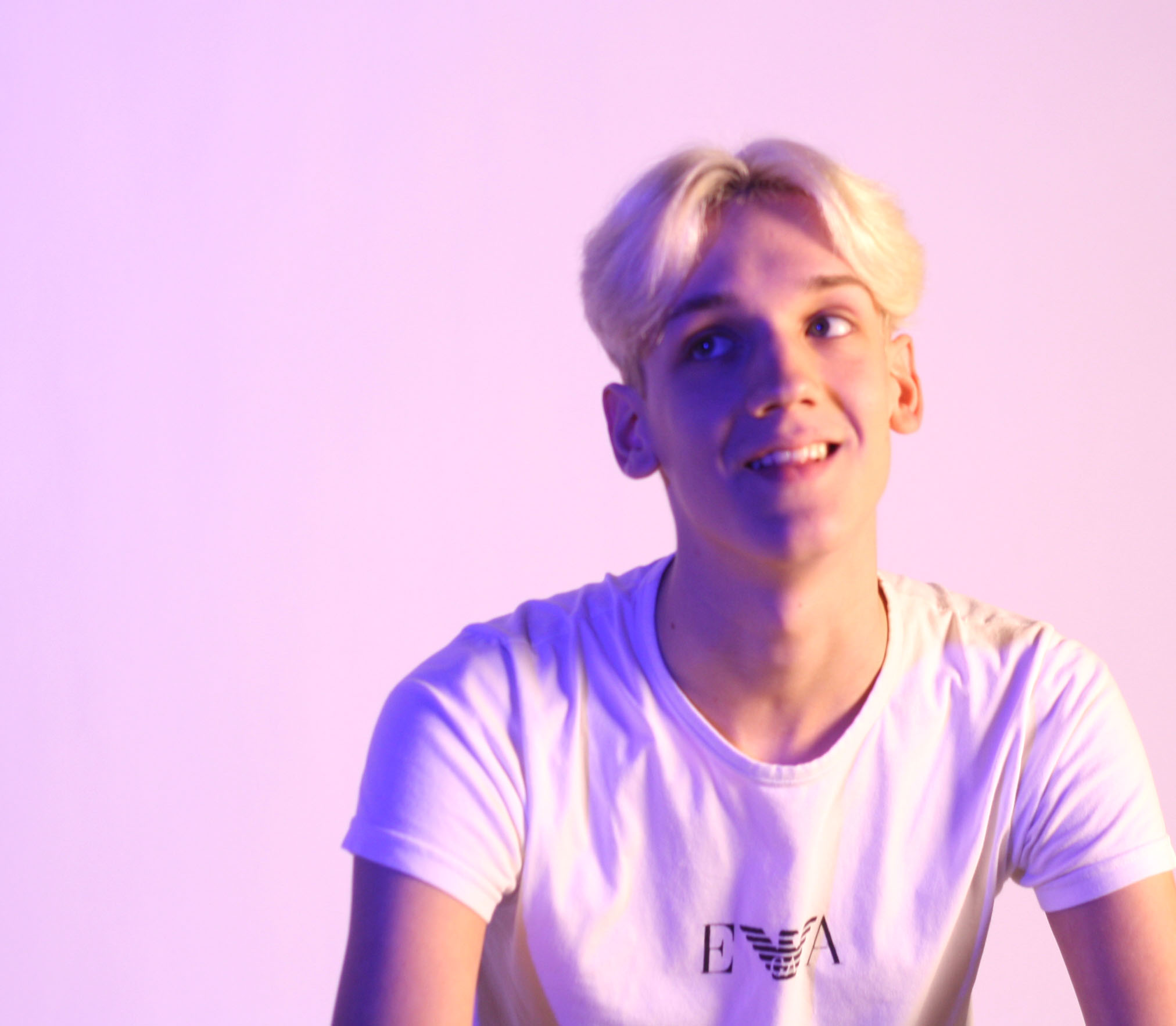
The image above uses two point lighting. In this image I have used gels and placed them in front of a spot light while keeping the soft box light appearing from the right. The use of a blue gel creates a dark blue shadow that illuminates his face and body. Without using the gel to make the the light darker on one side, his body would not appear to have many shadows.


Street Photography

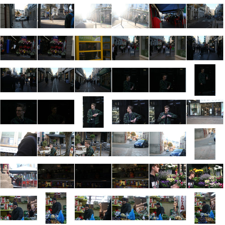
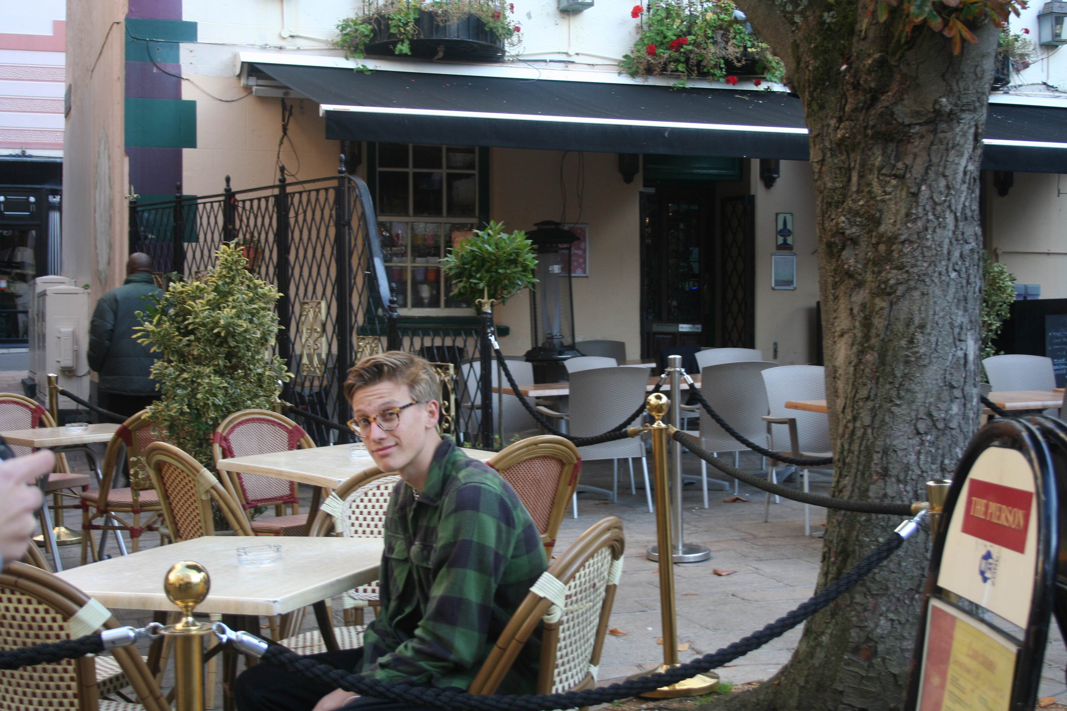
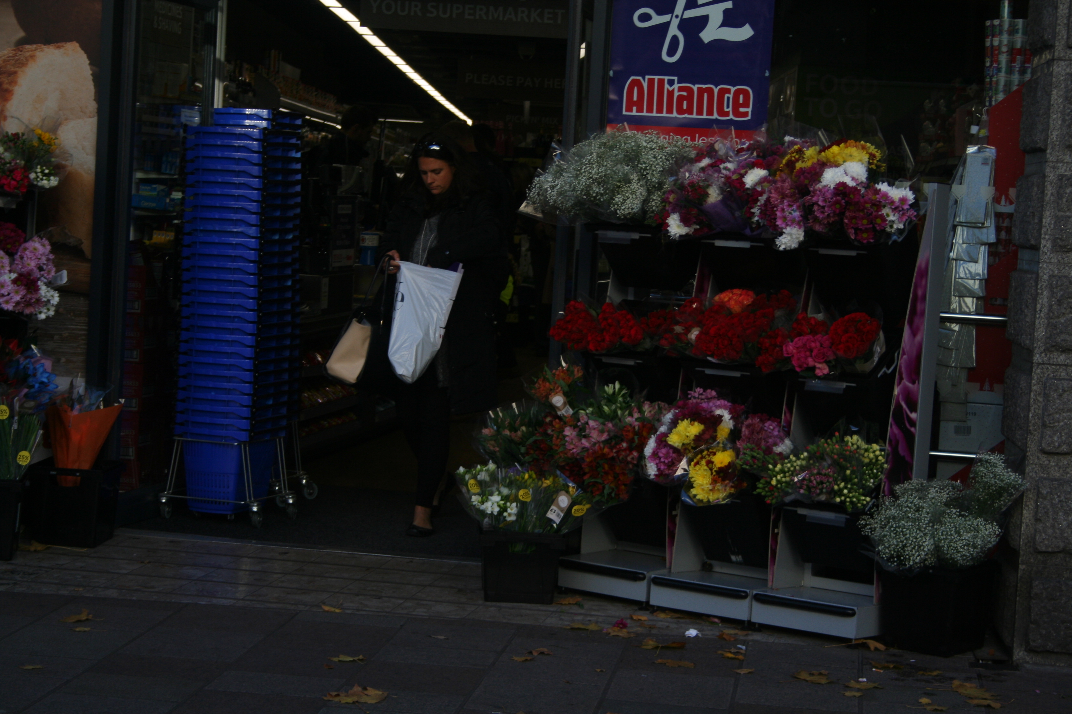
The images below show a selection of images I have taken while we were out doing street photography. I have tried to take a lot of these images in the style of Henri Cartier-Bresson by capturing and showing the life of one or two people at a time in a lot of the images. I have only used natural lighting in these images. So I have tried to take a lot of the images in different levels of lighting and in angles facing to and away from the sun to see how it would effect the outcome.

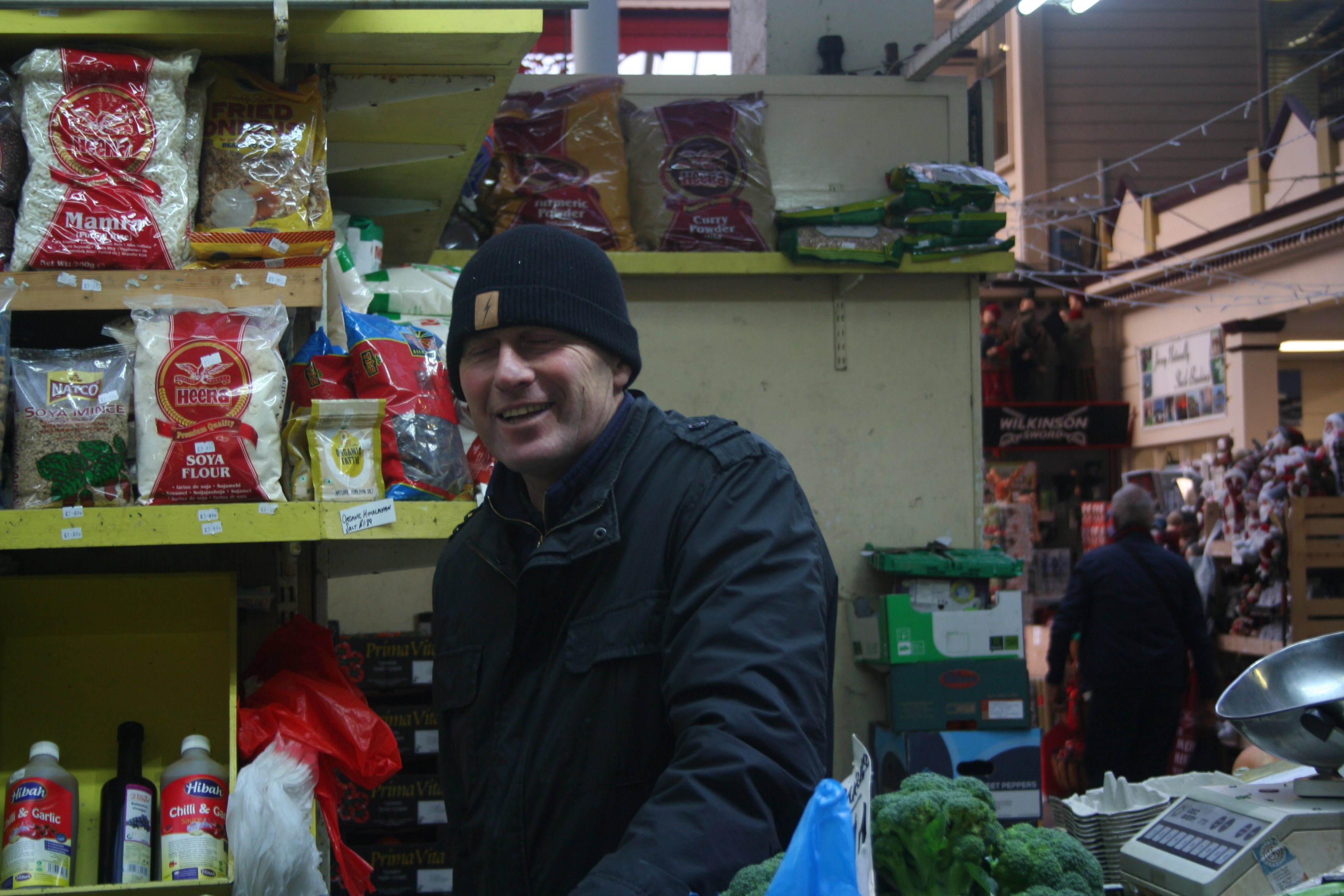
Below are the best images I took while we were out doing street photography.

This image shows a man working in a shopping area. I have picked this image as one of my favourites as it is a clean image and shows emotion through the man smiling displaying his love for his job.

This image shows someone sitting at a table at a restaurant. I have picked it due to how clean the image.

This last image I have picked. I have picked it shows a person coming out of a shop, showing their life through the actions they have done in town.

Henri Cartier-Bresson

Henri Cartier-Bresson was a french, human photographer, who was born on the 22nd of August 1908. He died on the 3rd of August 2004. He started working on photography in 1930. He was credited with pioneering the genre of street photography. He viewed street photography as capturing a decisive moment. The phrase “decisive moment” is now used often in street photography and refers to when the image represents the essence of the event happening within the image. During Henri-Cartier Bresson’s life he created a few different books, mostly full of images he had taken from different areas in photography, one of these was called “The Decisive Moment”.

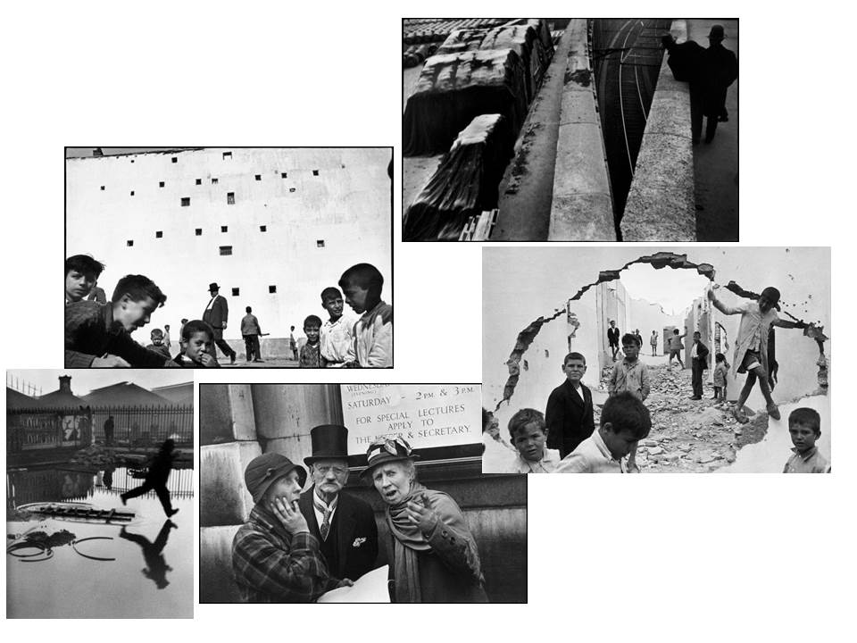
Images by Henri Cartier – Bresson

This is a moodboard of some of my favourite images that Bressen took to do with street photography.

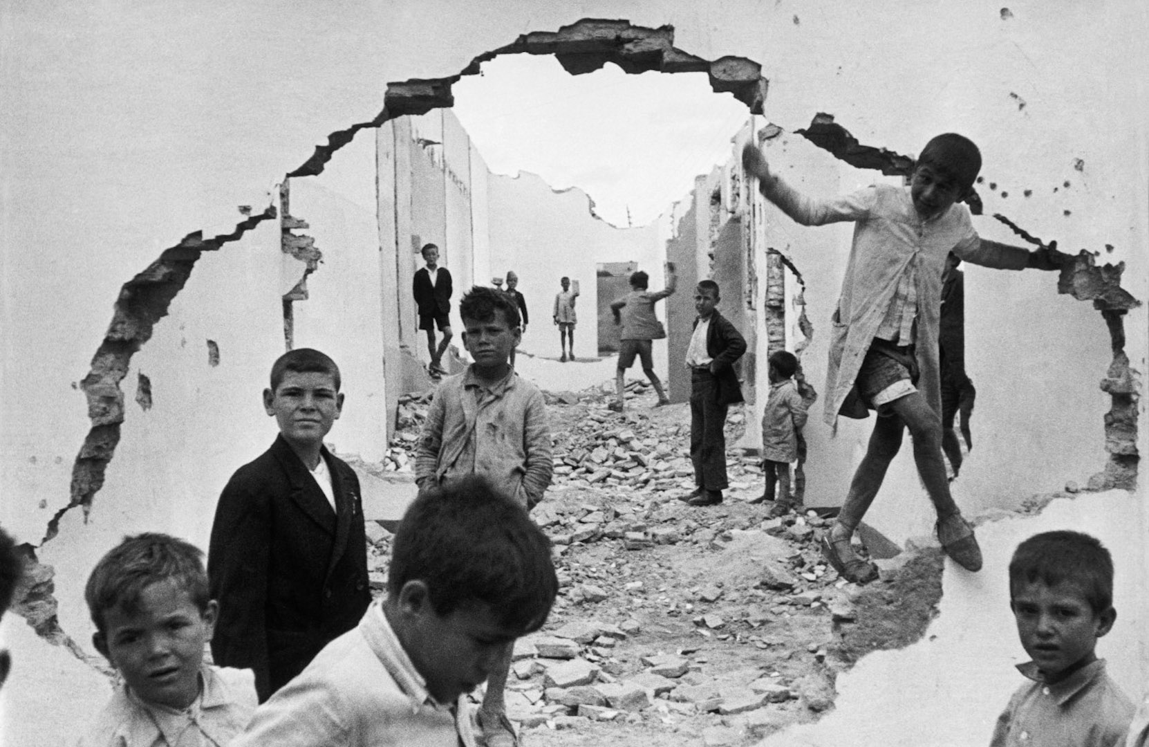
Henri Cartier-Bresson

Technical: This image uses light very consistently throughout. This can be seen due to the background sky and wall being almost the same colour with the foreground also being a very similar shade of white. This could have been created using natural lighting and a high ISO.

Visual: This image varies the tone throughout, with the majority being very brightly coloured and some coloured areas being grey or black. This image displays form and depth really well. This could be due to the darker colours creating a path of rubble down between the buildings.

Contextual: This image seems to have been taken after some kind of bombing or war. We know this due to the rubble covering the street between the buildings and the big hole that the image is being taken through that is in a weird shape. This image also gives a war-torn impression due to the children all having confused and sad faces throughout the image.

Conceptual: The image clearly displays a place that was destroyed during some kind of war. The photographer may have decided to take this image due to show some of the impacts that war can have on towns. The use of children looking sad makes it seem like these were places they lived, along with the rubble along the ground.

Arnold Newman

Arnold Newman was an american photographer that was born in 1918 and that died in 2006. Newman is often credited with being one of the first to experiment with environmental portraiture, in which the subject is put into a controlled setting to carefully show their life and their work. Newman was also a photography teacher.

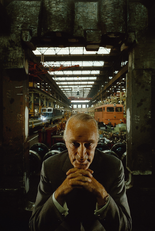
Arnold Newman | Portrait of Alfred Krupp | 1963

Newman took this image in 1963. It is an image of Alfred Krupp. The image makes Alfred look menacing and intimidating. This is done due a few different things. Firstly, it is done through the pose and how Alfred is sitting. By having Alfred leaning forward slightly with his fingers interlocked and below his chin makes him seem very evil and as though he has power over you. Furthermore, contrast is used between the background and the foreground with a lot brighter colours in the background than the foreground. The fact that the darker part is in the foreground with Alfred makes the person viewing the image notice that he isn’t a very normal person, along with being quite ominous.

This portrait seems to have heavily used natural lighting. It seems to have used this kind of lighting to light up the background of the image. This is used to help create the contrast between the foreground and the background. From the light in the background you can tell that Newman wouldn’t have really been able to use a very low shutter speed as the background, especially at the top of the image would appear a lot brighter than it does. Other than using natural light, Newman likely would have used some sort of lamps to shine onto the sides of Alfred’s body. The use of these lamp would distinguish the outline of his suit instead of his body appearing a lot darker in colour. In this image, the colours in the foreground appear as though they have been altered to add even more contrast between the foreground and background, while the colours behind Alfred, in the background seem to be a lot less vibrant and instead are more bland and lighter. This may have been done to highlight the evil personality that Newman sees in Alfred.

This image shows a few different visual techniques. Firstly, Newman shows use of different tones throughout the image. This can be seen especially well in the foreground as the tone of the colours are a lot darker at the bottom rather than at the top. By using tone Newman has been able to show highlight a lot of detail in the texture of the metals in the foreground. Secondly, Newman has placed Alfred in an angle where repeating patterns are shown behind him, this can be seen with the natural light coming from the windows in the roof in the background and the natural light coming from the windows in the back wall. Thirdly, Newman has placed Alfred in front of a window. This window turns what could just be a flat surface, creates form in the image with a large 3D open space in the background.

Contextually, this image taken in 1963, created by Arnold Newman shows Alfred Krupp in front of a factory that he owned. When Alfred found out that Newman was Jewish he did not want him to take his portrait as he was a Nazi during the war. Though he did no longer want Arnold to take his picture, he eventually changed his mind and let him do it. The factory Alfred owned shown in the image behind him used slave labour from concentration camps to manufacture… . Due to these things that Newman found out about Alfred, he decided to try and take a portrait image of him acting evil, which is why he had him leaning forward with is fingers interlocked below his chin with a dark area around him in the foreground. Alfred was not happy with how Newman displayed him, though Newman was very happy and thought of it as him getting a small amount of revenge for the Jews.


Environmental Photography

Environmental photography is a type of portraiture that requires people to be in an environment that they’re used to or work in. Its used to illuminate the life of the person.

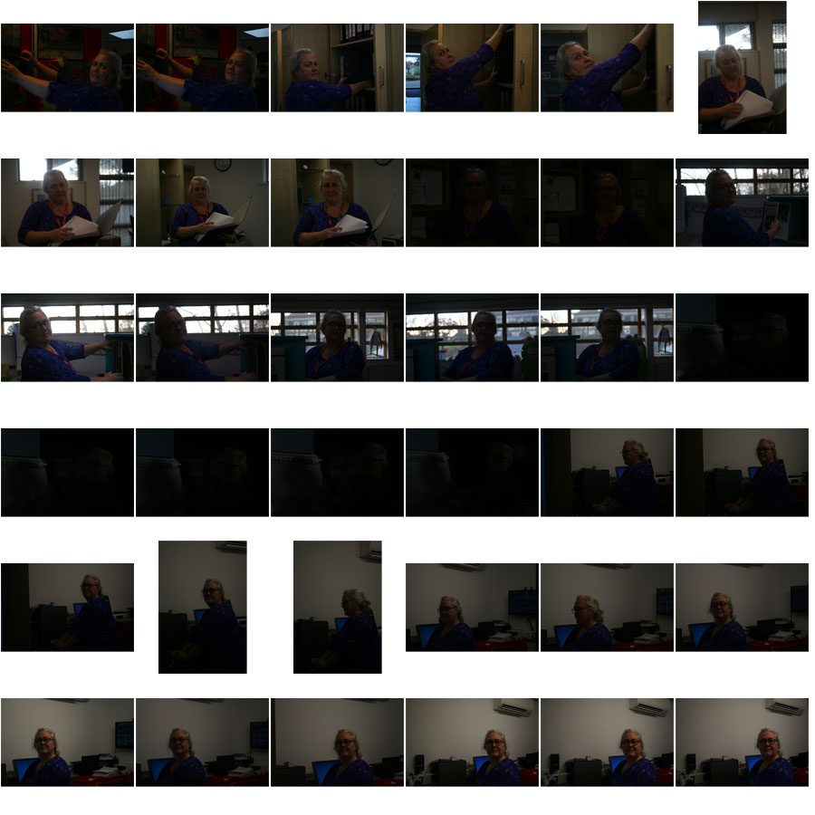
This is a selection of some of my favorite images that I have taken for environmental photography. A lot of the images turned out very dark so if I were to edit them I would make them a brighter tone.


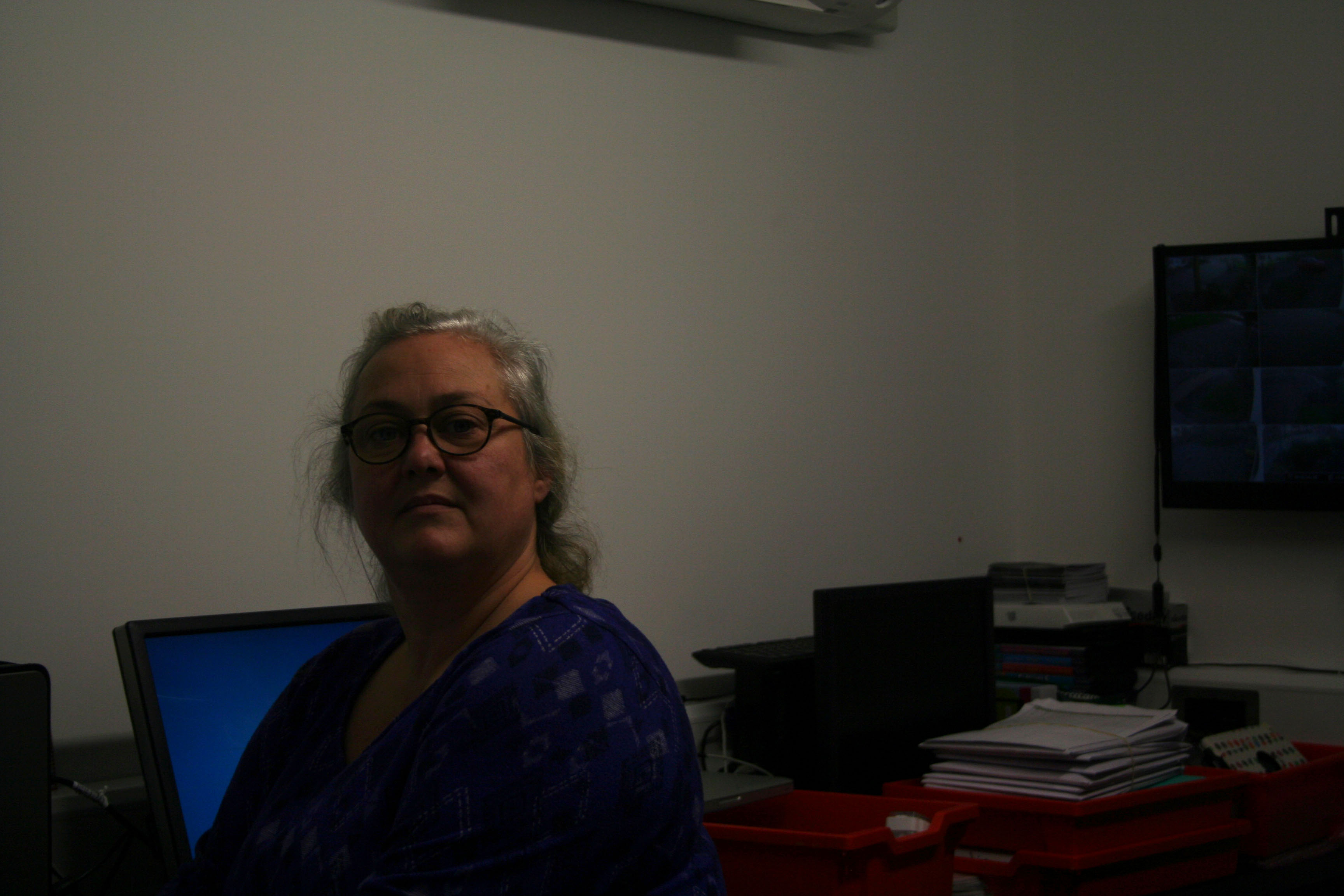
This is one of my favorite images I have taken. This image displays the person in one of their usual work environments in an ICT department in a school. It captures her in a neutral way and shows some parts of what she does such as the security camera footage seen at the right hand side of the image. I have increased the brightness in this image because it came out too dark due to the lighting in the room being very dim.

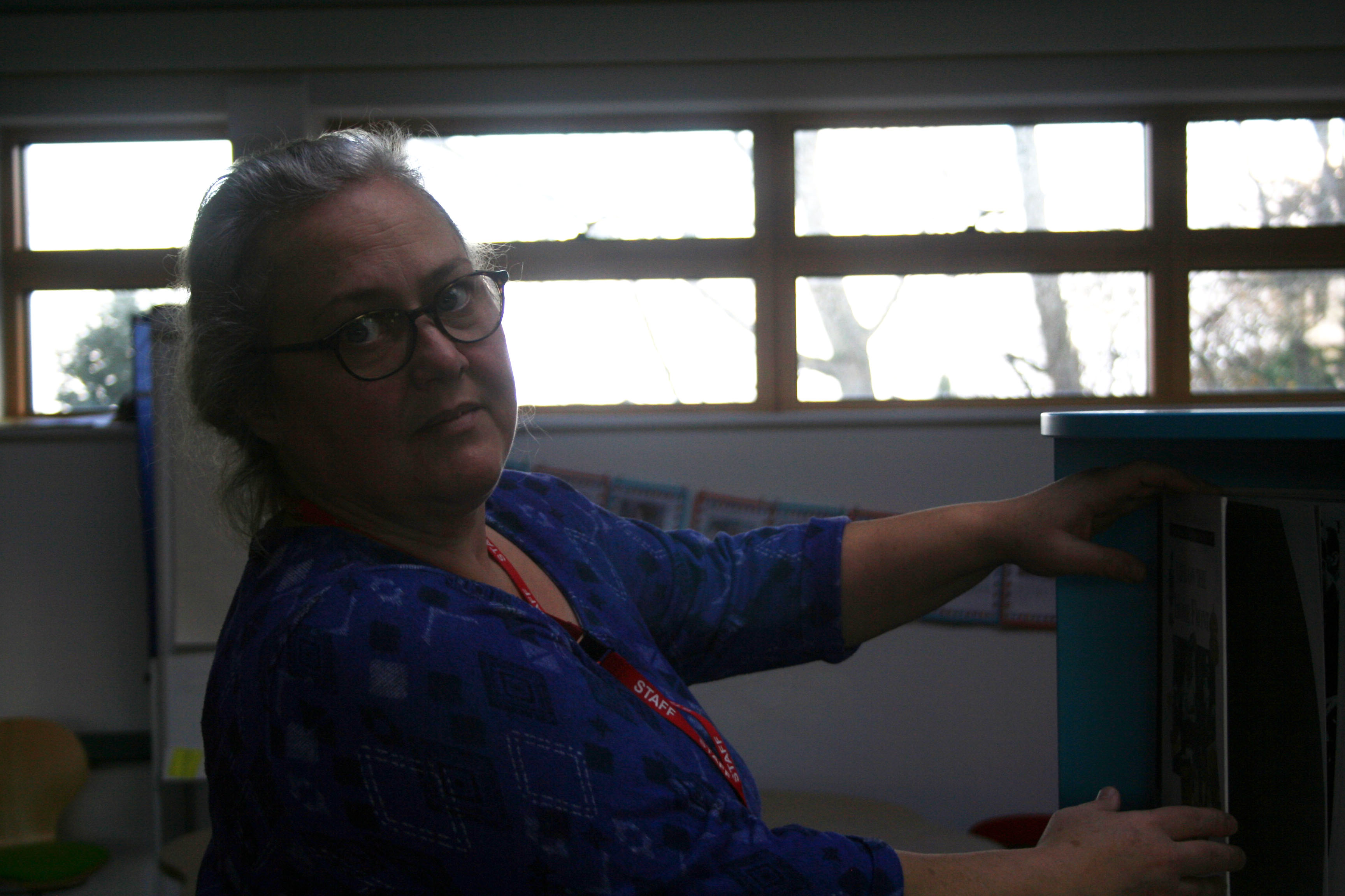
This image shows the person organizing books in a library in a school. It captures some of the things she does while working at the school which can be seen from the hand placement. I have also edited this image to increase the exposure and the brightness so that the person in the foreground stands out more and isn’t completely in the shade.

Portraiture Introduction

The next set of blog posts will be about portraiture. Portraiture is  creating images that involve other people  in some way, maybe by showing their faces or by other means by showing things that present them. There are many different ways to do this that many different artists and photographers have come up with to display different emotions or show the lives of people.

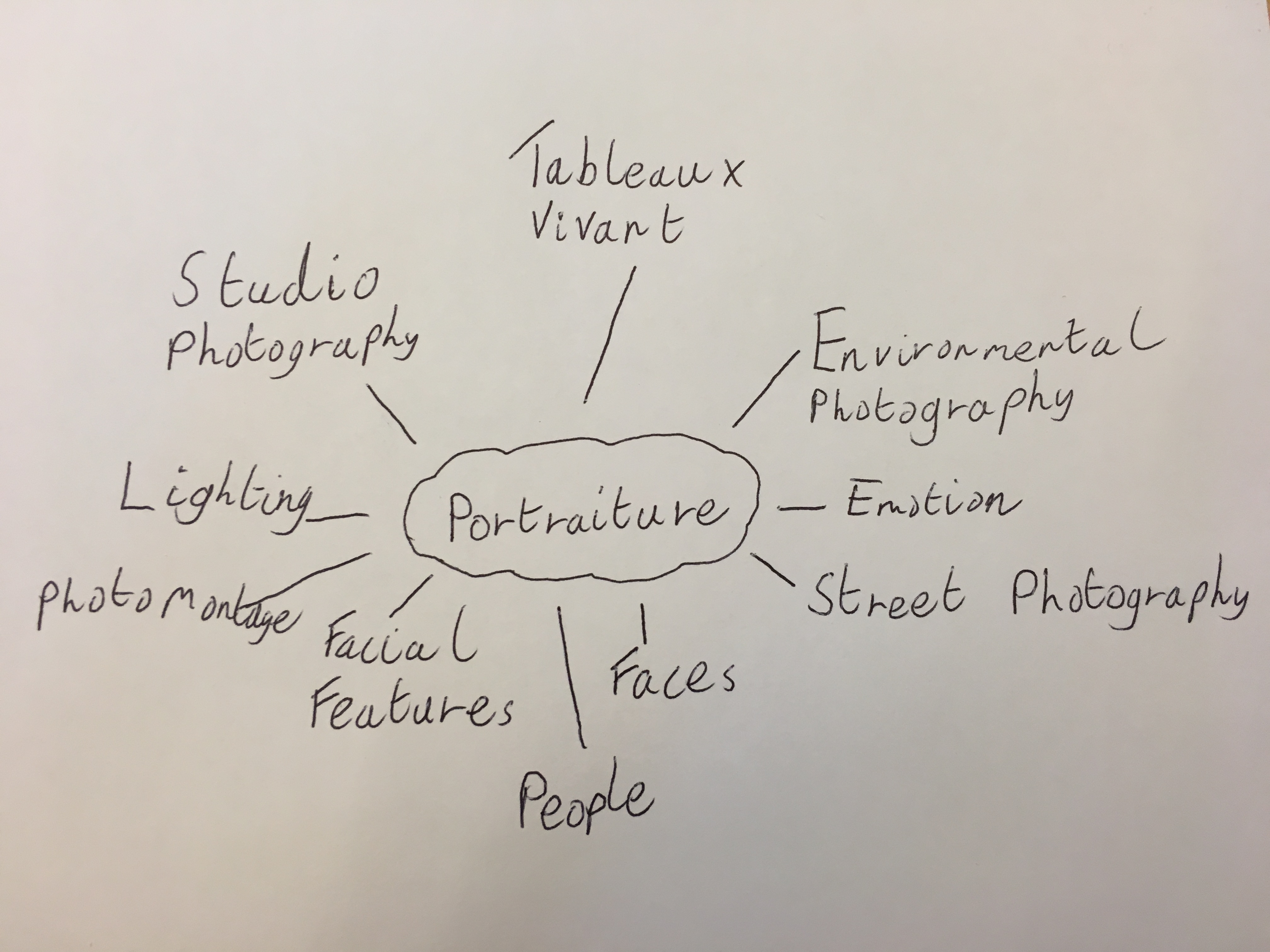
Below is a mind map all different things that we may cover ahead and things that may come up within those topics, such as lighting and the emotions of people.

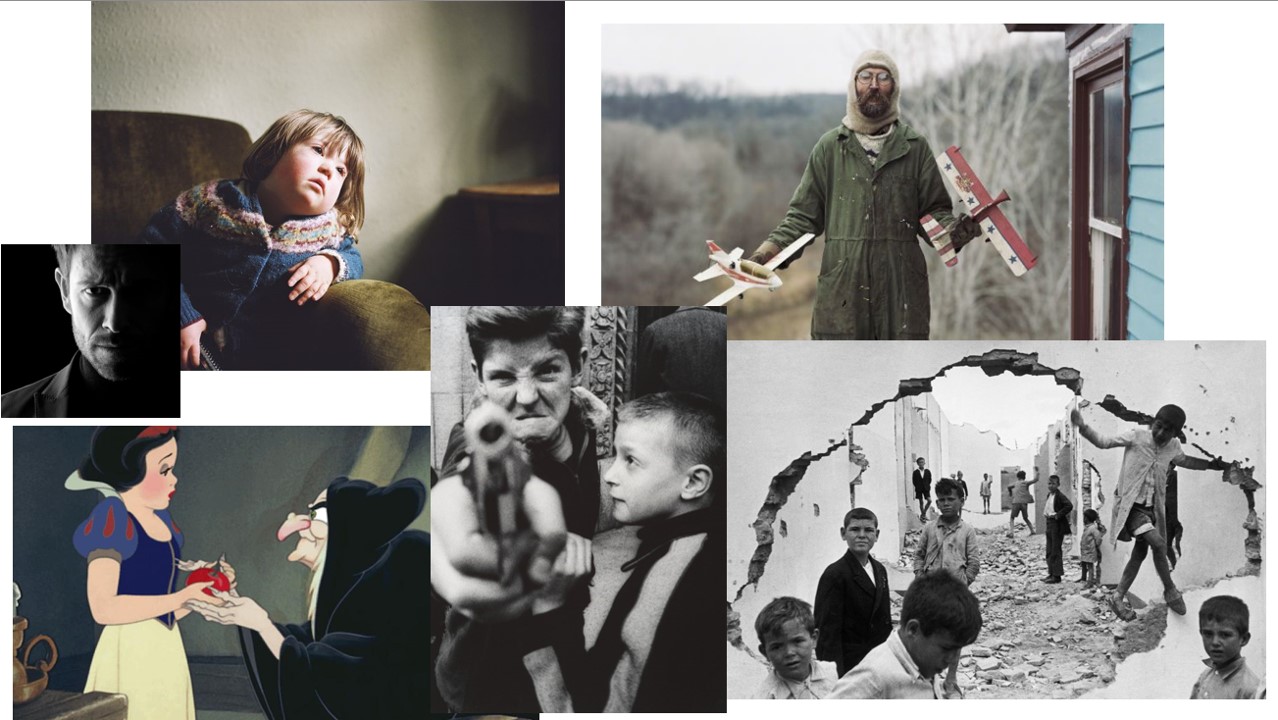
I may use inspiration from images like these below. These have been created by all sorts of different artists and photographers like, Henri-Cartier Bresson, Sian Davey and Alec Soth. I may also look at scenes from films or drawings, like the image of Snow White in the image.