All posts by Kristin F

Filters

Author:
Category:

Zine Analysis – Sam Ivin

I have looked at a lot of different zines. Different artists create them in new unique ways. This means that lots of them have different sizes such as being A5 or A4 pages, they come in different formats such as being in a newspaper or in a hard-back book, and they may be made portrait or landscape, depending on the artists preference. The zine I have spent a longer time looking at is “Lingering Ghosts” by Sam Ivin. This zine has A5 pages. It is formatted as a passport-looking booklet.

Each were designed and laid out differently. The design was quite often based upon what the photos inside were about. The layout of the images inside is also down to the preference of the artist. Some artists decide to have a coloured border around each image, some span a whole page and some span both pages inside. The zine “Lingering Ghosts” was laid out with the images on the right hand page with a small amount of text written on the bottom of the left hand page.

Sam Ivins zine shows rhythm and sequencing in his zine. He creates rhythm through the use of a pattern in how his zine is made, keeping the photos on one side of each double page spread and the quote on the bottom of the left page. His zine also tells the story of Asylum Seekers looking for work and an identity in the new place they are in to feel welcomed. Though, it tells this well, his images are not really in any particular order to tell this which means it isn’t really sequenced to show the story.

The cover of different books varies heavily. Lots of zines have covers that are landscape images that go across the back and front of the zine. Some take the theme of the photos inside further by relating the cover and the other space to something to do with the photos. This is done in Sam Ivins also. In this zine the outside covers and text are in the same font and colours as that of a passport. This is done to relate the asylum seekers who are unable to get passports, and therefore an identity, which is why the faces are removed on the images inside.

Lots of zines tend to have different visual and narrative concepts. The zine I looked at by Sam Ivins, showed people without a face. The face is the most recognizable part of a person, and through the removal of it he has shown the people which are asylum seekers to not really have an identity outside of their own country.

The title and colour scheme are very important as it is pretty much what decides whether people will decide to browse the work of the artist. In Sam Ivins zine he uses a dark-red colour scheme with a more light brown text colour for the title, this made the zine come out with a passport look. It has an interesting title that can catch peoples interests, and can make people think of different things as the title is quite vague.

The images and text in Sam Ivins zine are all related to the theme of Asylum Seekers. The images are all really similar and show peoples self-portraits, with parts of their faces removed to symbolise them having no identity. These images are used with quotes such as “I can’t work. They won’t allow me to work.” and “He will feel like a stranger until he gets the papers.” These quotes are supposed to make the reader feel bad for these people who have been almost forced to leave their previous homes to a new country, where everything is against them.

Whose Archive is it anyway?

An archive is a collection of documents usually consisting of very different types of documents such as photographs, paintings and other written documents. There are different types of archives that people keep publicly and privately. Private archives are usually used to show family history and keep a record of a specific family. Whereas public archives tend to show a broader history of where the archive was made. These are used to allow newer generations of people get a greater understanding of the events that may have happened to their families or to the place they live. They function through collections of items such as legal documents and photographs from a period in history to give a broad insight of what it was like to live back then as well as more personal things such as diaries to show what a specific persons life was like. New items can be handed in to a lot of archives if they are specifically items from history, and historical areas that are covered in that archive.

Archives act as repositories of memory as they provide reliable evidence of past events and allow us to deeply examine peoples personal and collective view of how an area was like in a past time. Archives also split off different parts of history into different sections and sub-sections so that if you want to see a specific part of history, you can narrow down your search to only photography from then or different types of documents from them. They normally have cultural connections to the place the archive is from and can show how our culture has been shaped and changed since then.

Photography can perform a double role within archives. Not only can they display someone’s life or how the world was, through the informative use of documentary photography, this being the main reason for a lot of the photography in war archives. This type of photography will usually be very clear and understandable as this is the reason it was created. The other way photography can be used is through the artistic side of it, with people creating photography specifically tailored towards showing something they want to show which may not have a link to what was happening at the time and could just be separate. Though, a lot of the time photography links to things happening at the time such as war, creating a double role by showing it in either in an explicit or implicit way by creating an obvious or distant link to an event happening, and producing it in their own artistic way.

David Bate’s text allows us to see how he thinks about archives will be used with museums as they have a collection of documents and old artifacts which will allow museums to create displays of particular historical events and how culture has changed, with very accurate information on them. In his text he refers to museums use of archives as a “vast repository aiming to construct a particular story.”  This is him saying that he believes museums should be creating either a never-ending story of an area or showing the story of a particular area through a certain event. In Bate’s text he also talks about Fenton, hired in 1854 to document the artifacts within the British Museum through photography and to show what it would have been like to see the items within the Museum in the Victorian era. The images are said to “evoke a ‘pastness’”. This shows that they have been taken in a way to make the people look at them and see the past through a barrier rather than just see a place within the photos.

For my own personal study. I am going to look at the Occupation of Jersey and how it has really changed and developed the island into something completely different than what it could be. Through the landscape of the island changing due to the bunkers and historical monuments left behind from the war and the people who lived on the island through the war and how they lived during the war. The most obvious and easy part of this to see is the bunkers and war tunnels left behind from the war, and how parts of them have been rebuilt such as the guns and the bunkers have been uncovered since they were filled in after the war. The archived material from the time will also help me out to see how people lived and what people had to sacrifice throughout the war, through the use of different peoples personal diary entries or documentation such as photographs from the time, I should be able to get a bigger feel of what it would be like to live back then and may help me stage some photographs a lot more easily. The use of the archive will also give me an in-depth insight to the other things that happened in the war such as the use of slaves to build bunkers and other fortifications, and how bunkers have been eroding and falling apart over time due to the length of time they’ve been around.

Looking at the photographs and some other documents from the archive has given me a much wider view of what everything looked like in the days of the occupation of Jersey. Not only how the bunkers used to look, before being uncovered and rebuilt, but how different parts of St. Helier looked before the war, which I can use to compare to how it is now. This will allow me to get a bigger understanding of how some things have changed within the island over the past seventy-five years.  

In conclusion, archives serve a purpose to allow people to see how things have changed over time in an area, and to display history accurately to newer generations of people. They can preserve peoples artistic work, different types of photography and documents through the use of newer methods such as digitalisation and placing plastic covers over the documents. I have learnt about the importance of archives and from seeing images from the archive I have seen that these images show a glimpse into people’s lives and how things were in the occupation.

The Occupation of Jersey

The German occupation on Jersey started early in the war. This was just after the British government demilitarized the island. The Germans began taking Jersey at the end of June not knowing that it was demilitarized they bombed and shot lots of different sites on the island injuring lots and killing a few. Later, on the 1st of July, a German officer spoke to the people of the island and ordered immediate surrender.

After this, the Germans took Jersey and stopped news being streamed from the mainland by outlawing crystal radio sets, many risked their lives and created their own radio sets to get the news about how the war was going. Fuel was becoming more scarce and other vehicles such as bicycles were only available for use by people connected to essential services.

The occupation of Jersey lasted for five years from 1940 to 1945 and the Nazi rule was stopped by the 9th of May 1945, with the Second-in-Command for Guernsey, General Siegfried Heine signing the instrument of surrender on behalf of the German command on the Channel Islands. After this, he was ordered to immediately remove all German flags and ensigns from each of the channel islands.

Final Outcome Choices

These are some of the final outcome ideas that I have come up with using my favourite and best images.

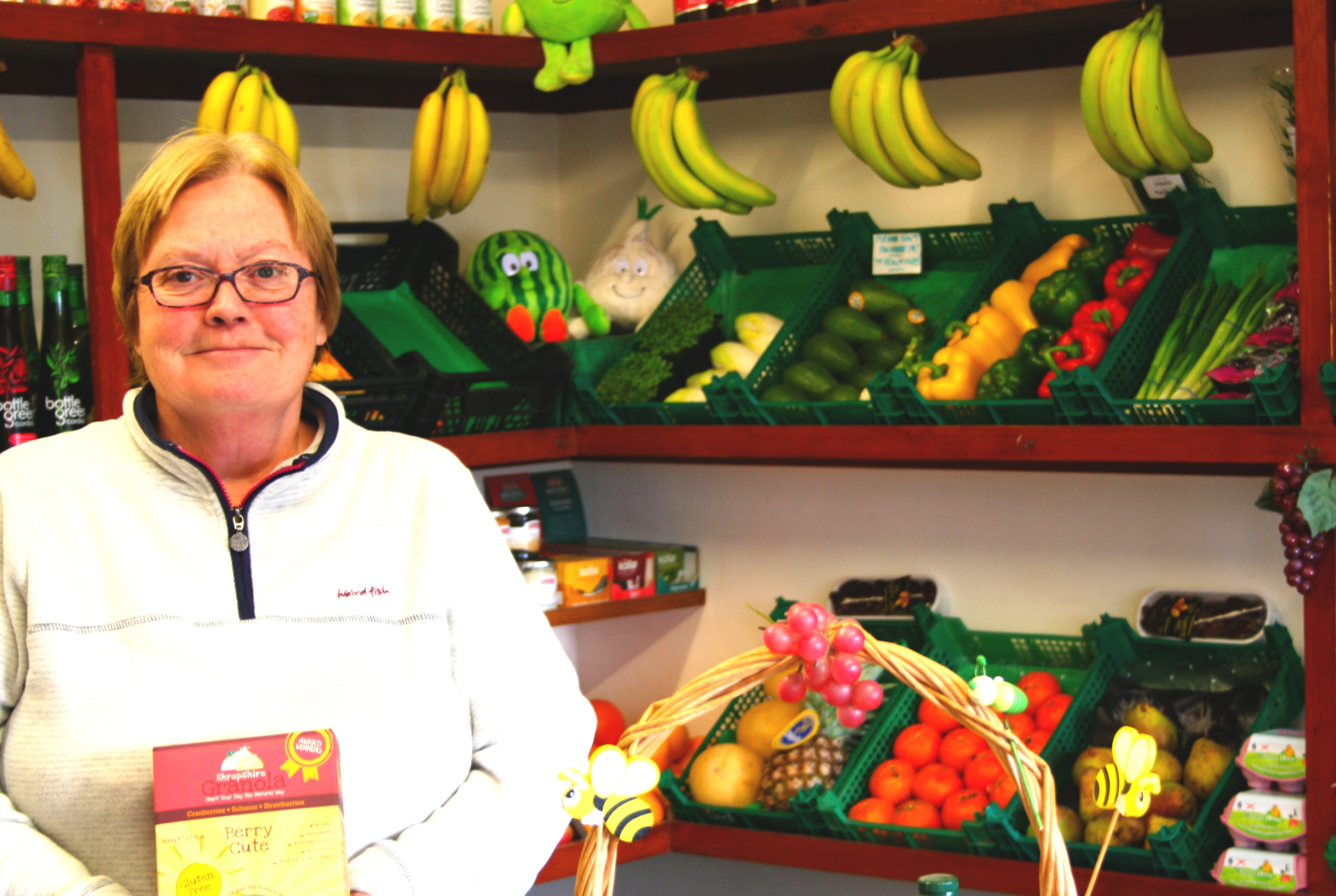
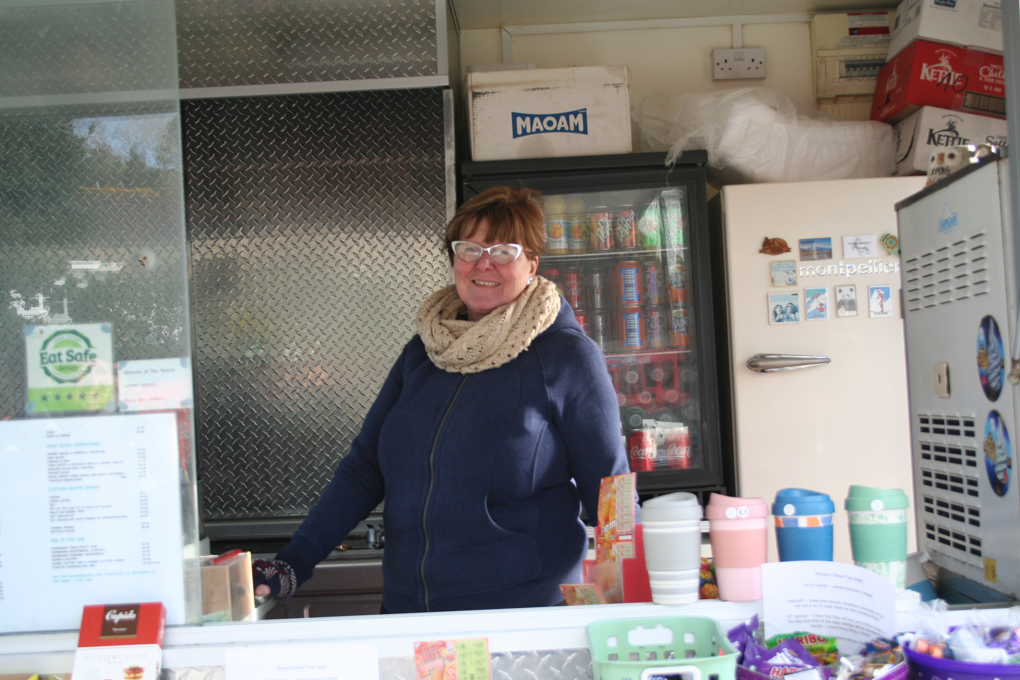
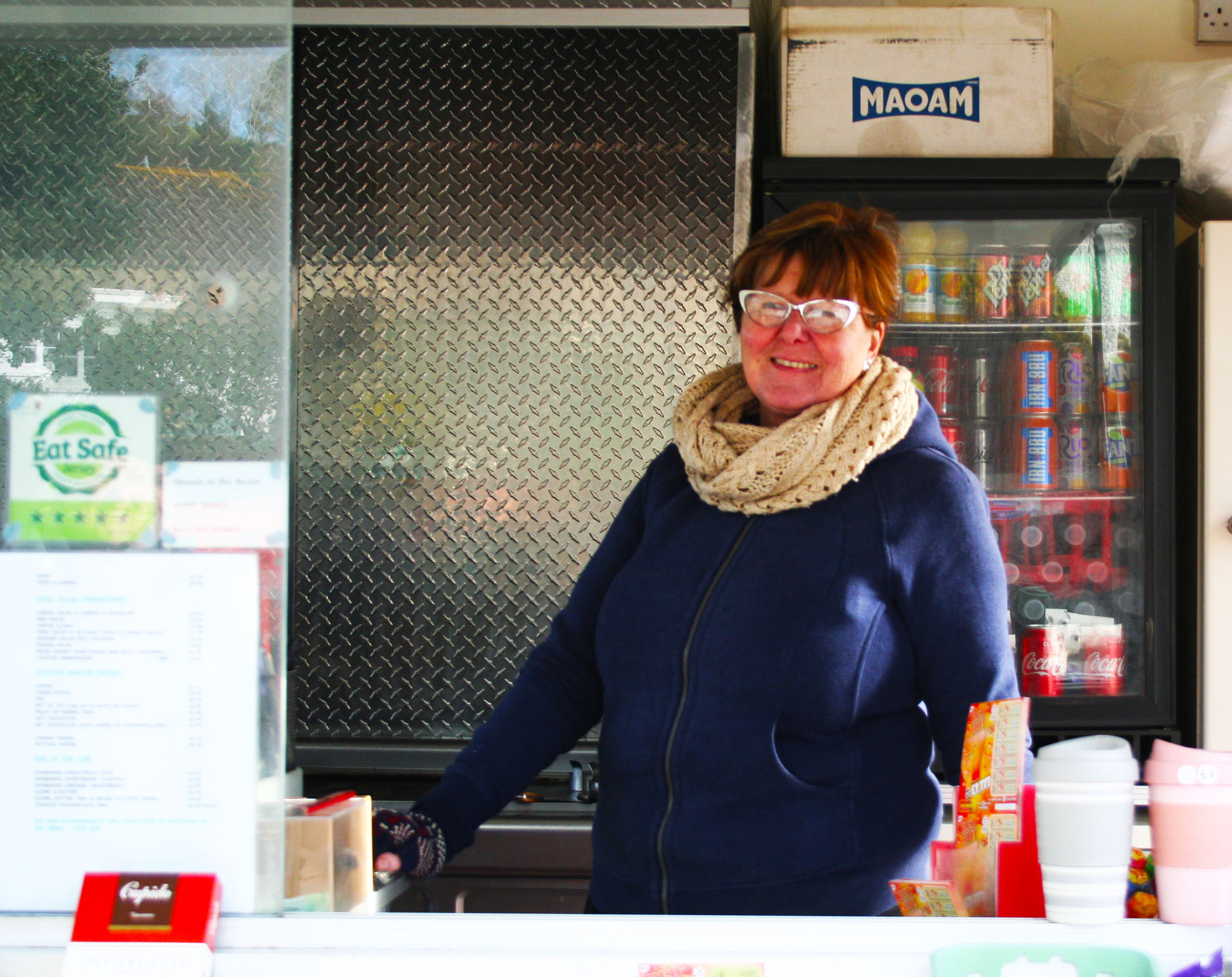
The first two images shown below I have not really edited a lot. This is because I was trying to do them like John Bulmers work and didn’t want to overdo the editing, as John Bulmer did not normally edit his work. Although these two haven’t really been edited a lot I like how they came out, especially the first one due to the saturation used to make her face stand out along with the other darker colours in the glass and the drinks in the fridge.


With this third image I changed the contrast and the exposure so that her face in the image isn’t as dark as in the original image because it was quite hard to see her face in the original image. I have also transformed this image to turn it as I took it on an angle.

The images below are different than the ones above as they aren’t taken as street photography and are instead studio photography.

This fourth image I have taken on a white background with artificial one point lighting. I like how this one came out because of how sharp it was, this along with the high contrast I have added, makes her hair and face stand out over the rest of her body

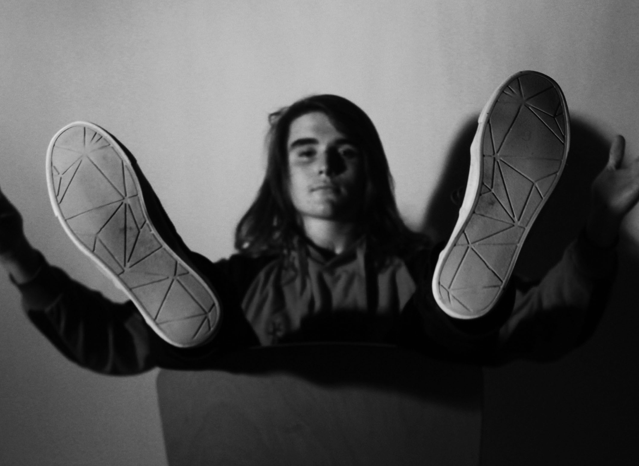
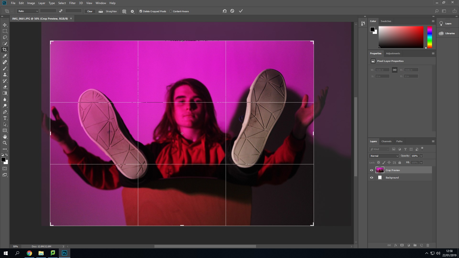
I have picked this last image because of his pose in the image. This image isn’t the sharpest image, but this is because the camera was focused onto his feet so that his face and body was put into the background. The pose he is in may show people what the persons personality is like.

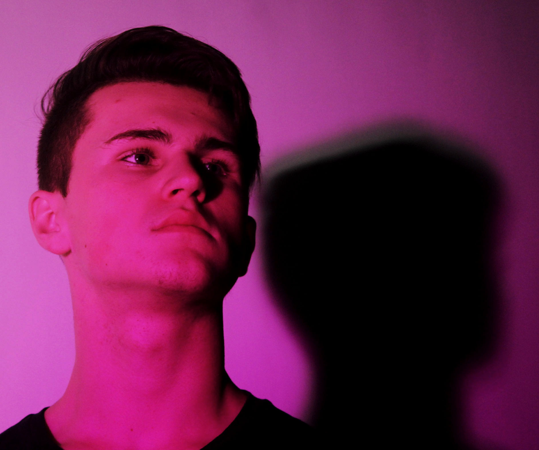
This image like the one above, shows the person in a pose. This pose is a lot simpler as it is just him looking away. I have taken the image from underneath to make them look as if they’re higher up than others.


Editing Photos from my Final Photoshoot

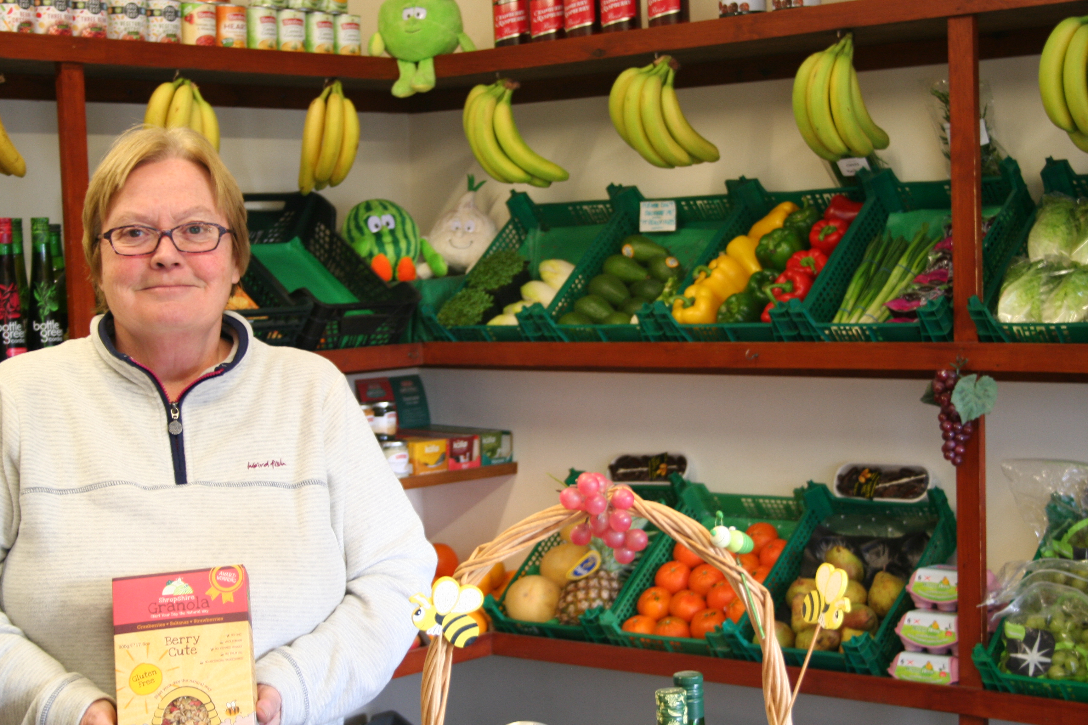
This is the original image. It is bright and uses natural lighting and artificial lighting from above.

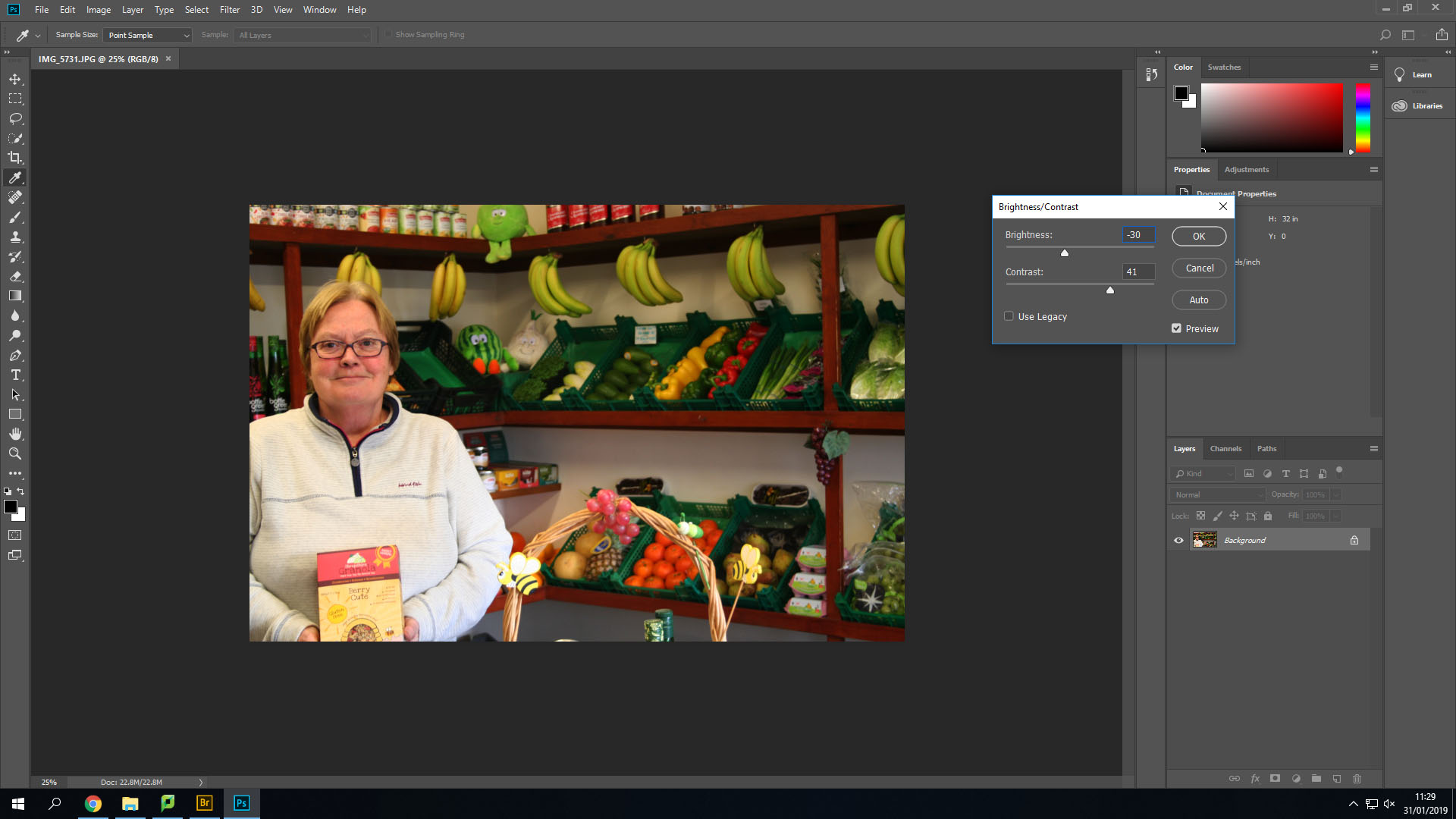
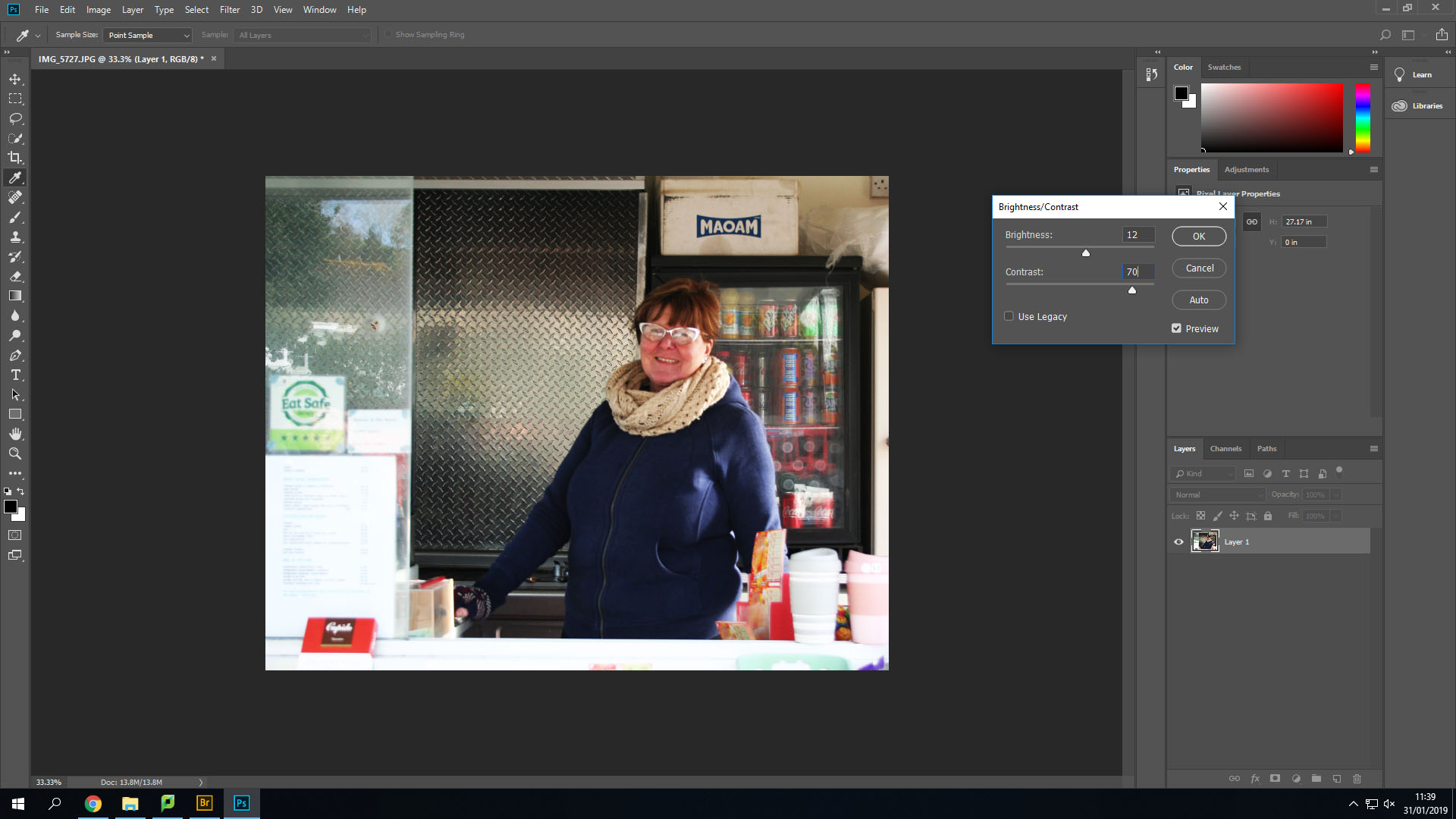
Firstly, I changed the contrast and the brightness to make the image slightly brighter, but also so that I could add more shadows in the background such as under each shelf.

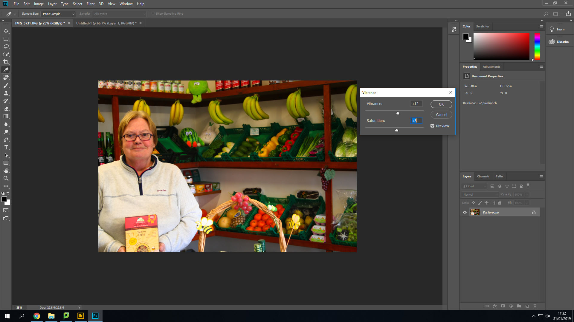
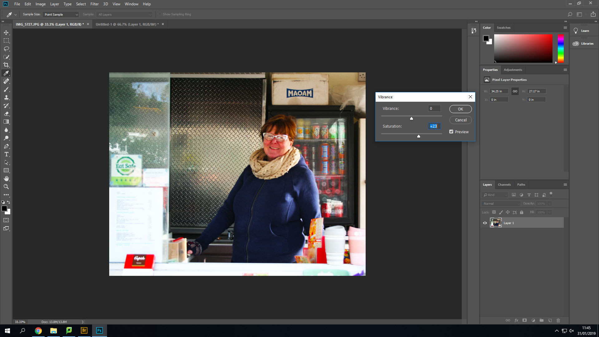
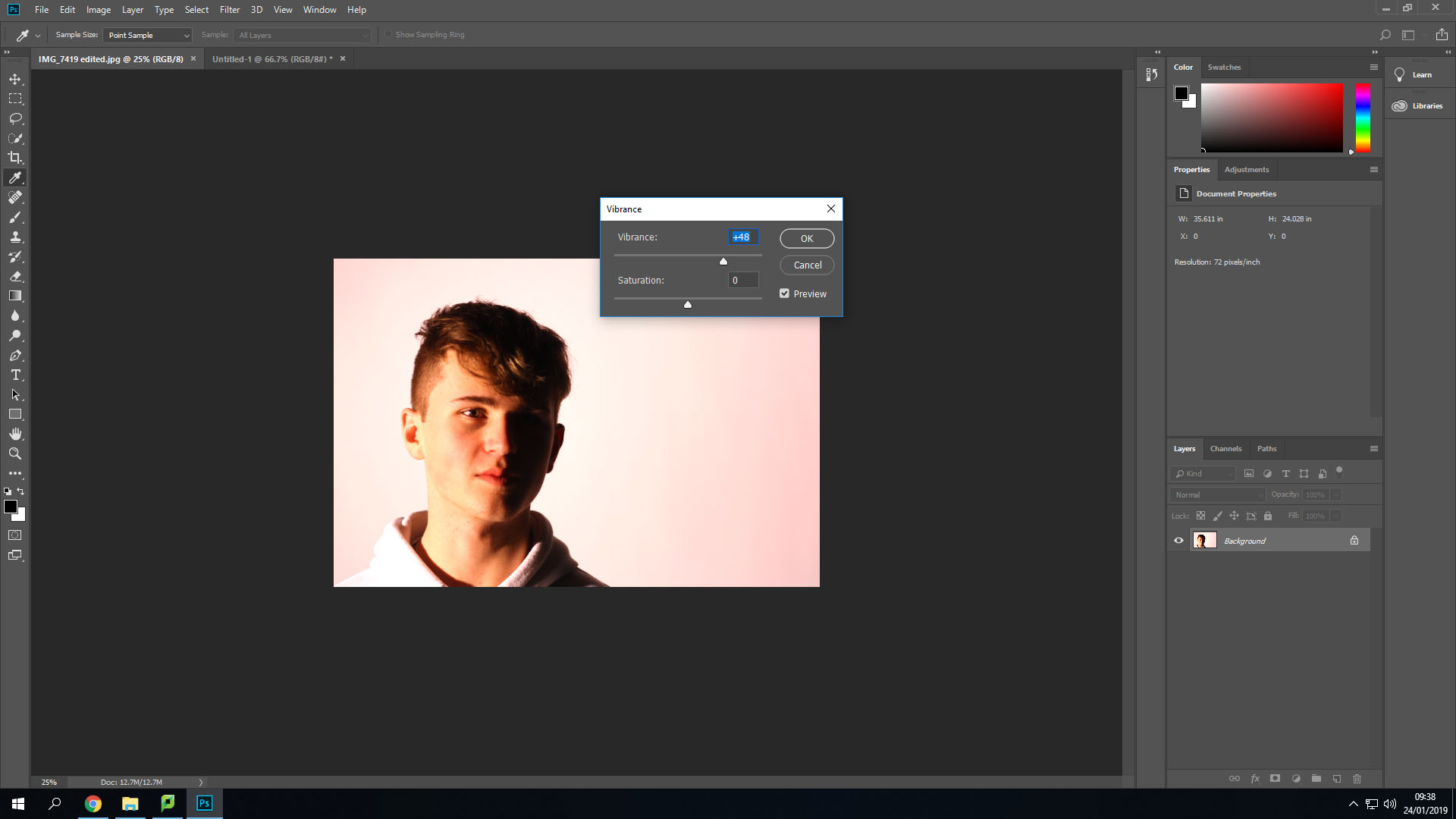
Secondly, I changed the Vibrance and saturation options to make the lighter colours stand out more and become brighter.

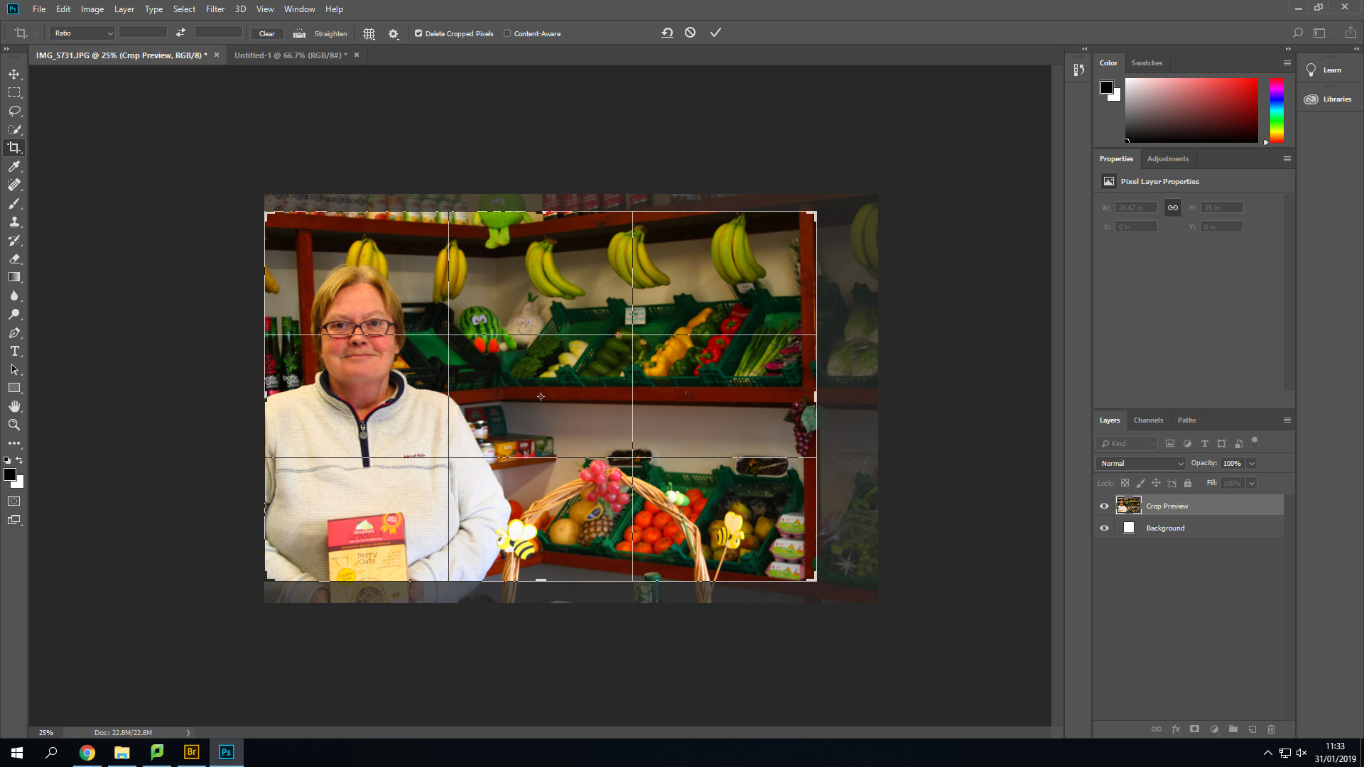
After this I cropped the image down a little bit to remove her hands from the image and line up her face into the middle of two different thirds.

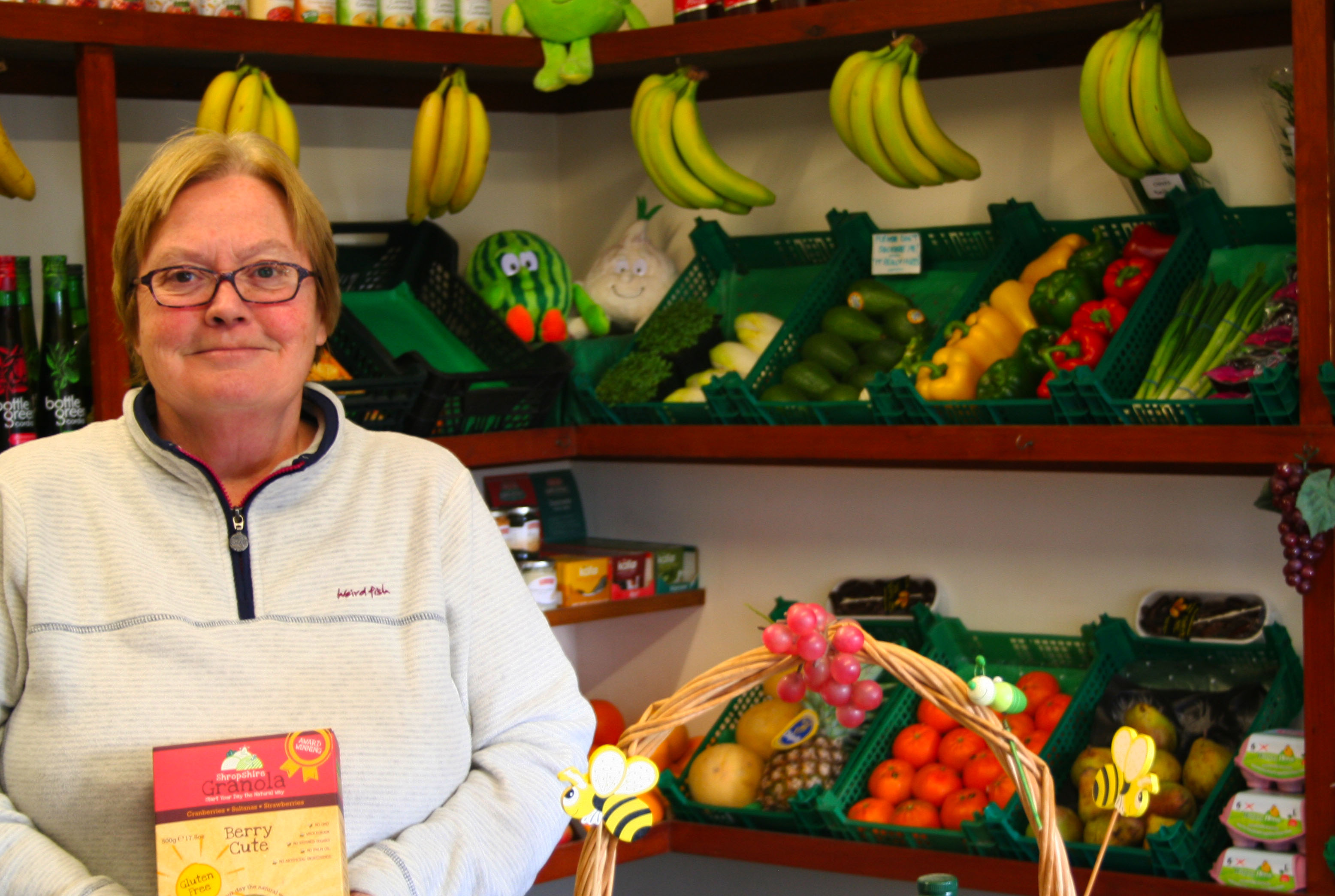
This is the final outcome of this image. I like how it has turned out. I could edit it more, but I do not want to overdo the editing as it could become far from the original image and be very different from the images like Tish Murthas and John Bulmers.

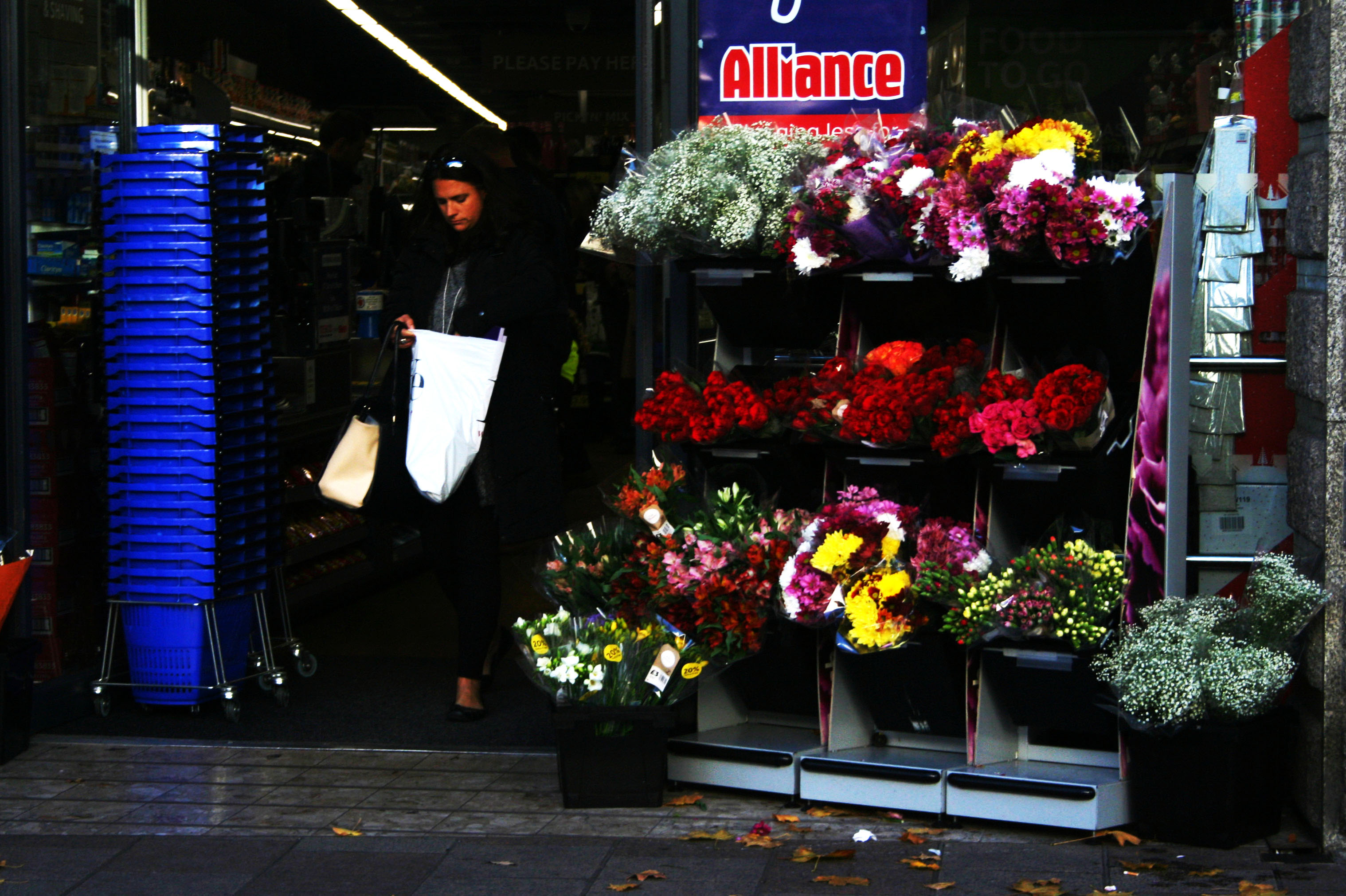
The image below is also one of the original images I took.

Firstly, with this image I transformed the image and turned it slightly to remove the angle that I took the image on. After that I cropped it down to remove the background showing behind the image that was created after I turned it. Then like the first image I changed the brightness and contrast to make the shadows larger and appear darker.

Secondly, I changed the vibrance and saturation again. This allowed me to make her face which was red at the time stand out more and let other colours such as the drinks in the background and the reflection off the glass to appear more easily.

This is the final outcome of that image. I especially like how this one turned out by using the high saturation.


Final Portrait Project Photoshoot – More Street photography

This is the final photoshoot I have done. I have done some more street photography for it. I have decided to do more street photography for it as it allowed me to get some more images like the ones Tish Murtha and John Bulmer have taken.

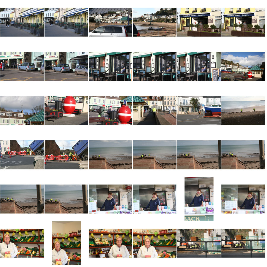
Below are a selection of the images I have taken on this photoshoot. A few of them turned out to be quite good images, that I may be able to use. Quite a lot of them didn’t turn out how I would have liked though, without many faces showing or being very dark or coming out blurry due to me using a higher shutter speed for some of the images.

The images below are the best two I have taken.

I have picked the image above because it came out to be a sharp image. If I were to edit it I would crop the image at the bottom to remove her hands and the bottom of the box and change the contrast in the image.

I have picked this image as it turned out sharp. When taking this image I purposefully angled it slightly. Though when editing I may take the image off of an angle as I don’t think the angle works. I may also add some saturation to make some of the lighter colours and the colours in her face to stand out.

Editing Potential Final Outcomes

I have had a go at editing some of the images I have taken in the past that I may use as final pieces or to help inspire me and show me some of the styles I could use for my final pieces.

On this image I started by using the cropping tool so that I could easily focus on the main point of the image which was the person.

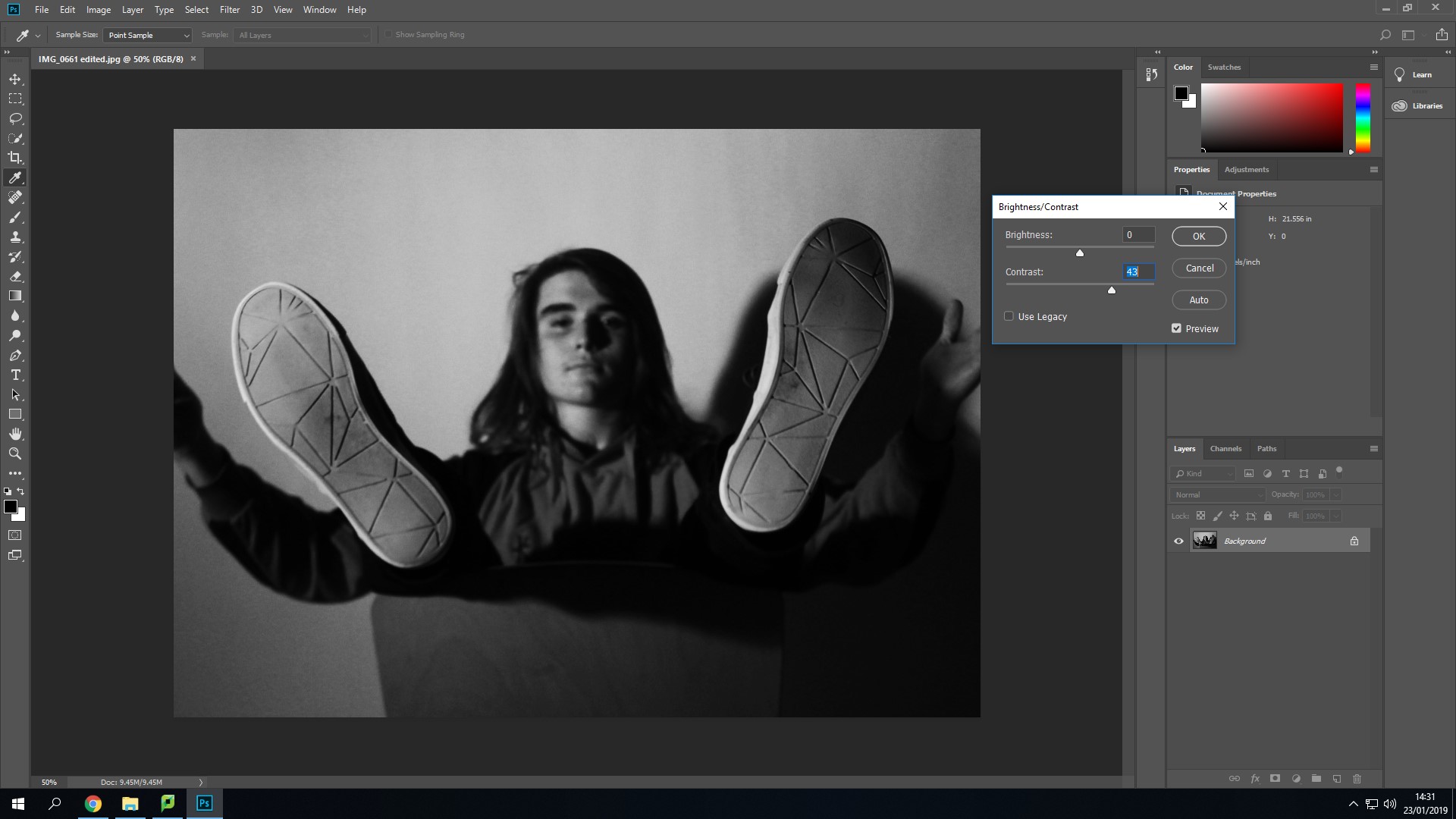
After this I used the black and white option that can be found under – Image > Adjustments > Black and White in Photoshop. I have tried using this with a few of my images because the photographers I have looked at in my case studies all started in black and white.

I have then used the Brightness and Contrast option. I have tried not to use this excessively. I used it to make the darker areas in the image darker to make the person stand out more especially since his hair has come out dark.

This is the final outcome from the small amount of editing I have done on the image. I like how the image has come out using the black and white filter over the top. I like how this image has come out, it doesn’t really create a detailed view of the persons life though.

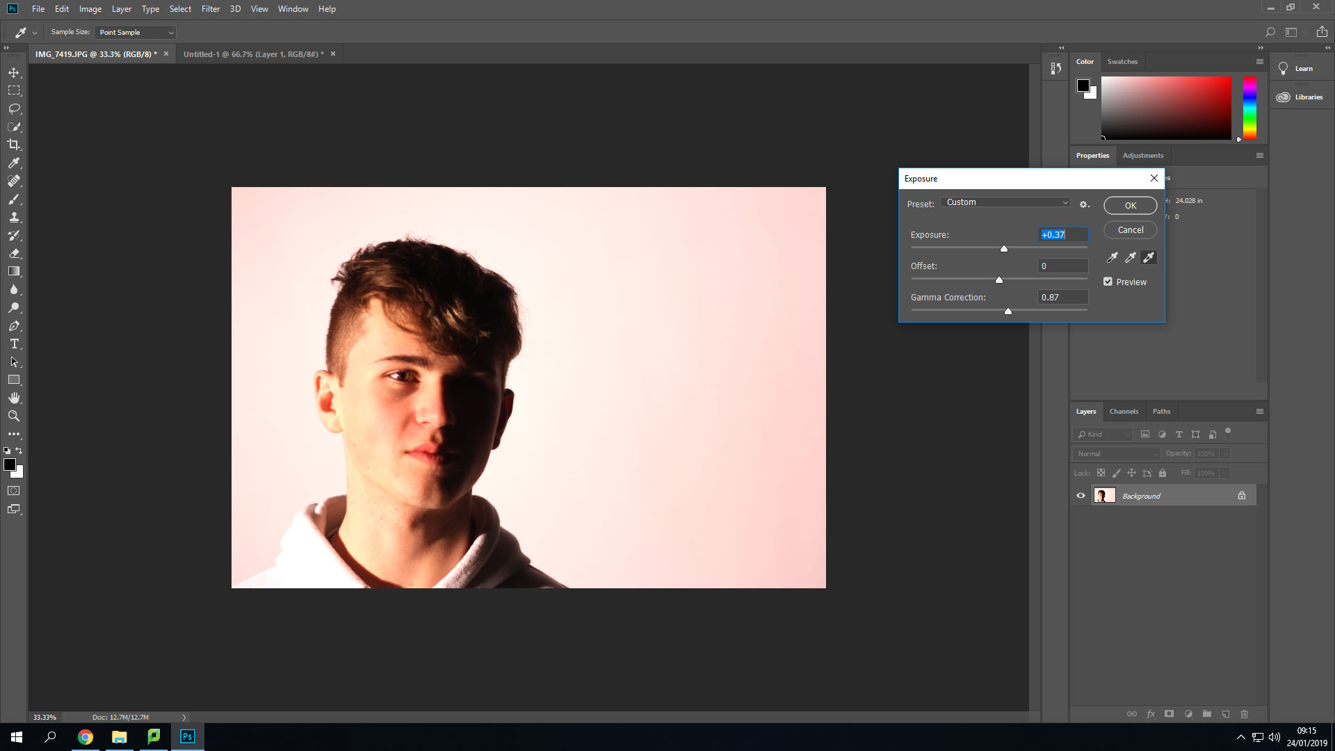
This is another one of the images I have taken that I thought I could edit a bit, to experiment using different tools. I have started by using the cropping tool to avoid having too much white space around the person. This also allowed me to use the rule of thirds.

After this I changed the exposure settings to make the background a lot brighter and consistent in colour. This also allowed me to have the light on the person sort of blend in with the background, on the left side.

I have also experimented using the vibrance settings on this image. This allowed me to make the colours seem like they are darker, but look as if they glow a little bit to help them stand out more. 

This is the final outcome of this image that I have come with while experimenting with these features. I like how the image has come out using the rule of thirds, but it could use something in the background other than white, as it makes the image look barren and doesn’t really create an identity for the person.


Tish Murtha

Tish Murtha was born on the 14th of March 1956 and died on the 13th of March 2013. She was a social documentary photographer. She was brought up in Newcastle and went to the University of Wales. In 1978 she came back to Newcastle wanting to document “marginalized communities from the inside”. In this she was documenting what her life and her family and friends lives were like living in the working class. She created black and white images. She often worked with teenagers and younger children to show how their lives were.

Murtha, like Bulmer is best known for documenting social realism and the working class. Though she is also known for documenting marginalized communities. She did most of her work in the North East of England and in Newcastle upon Tyne, also like Bulmer.


Images by Tish Murtha

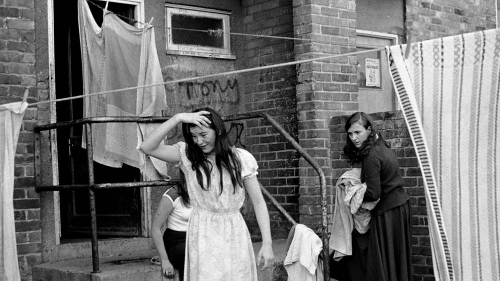
Youth Unemployment – Tish Murtha

Technical: This image seems to use natural lighting. This is used to make the image look natural and show their true daily lives without making their lives seem more glamorous than they are.

Visual: The image has been taken in black and white. Though this was likely because of the limitations Murtha had when she took the image, this use of black and white shows us now that life was a lot simpler in the past. Though the faces of the people show that they may be having some hard time.

Contextual: This image is called “Youth Unemployment” the title tells us that these people were likely poor and could not afford luxuries and lived off of bare essentials and would have had to be looking for jobs constantly to make a living to provide for their families.

Conceptual: Murtha may have taken this image to show the lives of people living without any means of income. This can especially be seen from the face of the person in the foreground of the image, as her face shows that she is upset about something.


John Bulmer Case Study

John Bulmer was born on the 28th of February 1938 in Herefordshire. When Bulmer was young he was interested in photography but mostly as a technology. Despite that, when he was a teenager he became a great admirer of Henri Cartier-Bresson. Bulmer went on to study engineering at Cambridge where his interest in photography began properly. After beginning this he went on to get his work published in lots of different magazines and newspapers such as Varsity magazine and the Daily Express. His ambition was photography journalism.

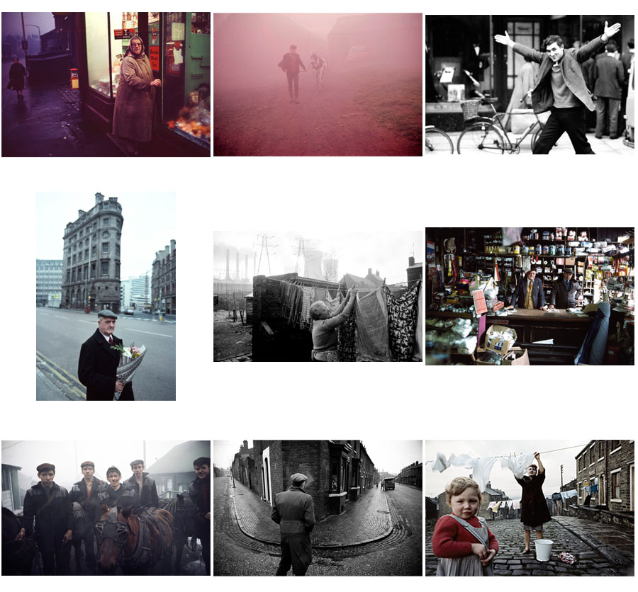
These are a selection of my favourite images by John Bulmer. These images show Bulmer both using colour and black and white. He began using colour after it was required for one of the magazines he took pictures for asked for it.  His images often displayed people from the working class such as miners or factory workers.

Images by John Bulmer

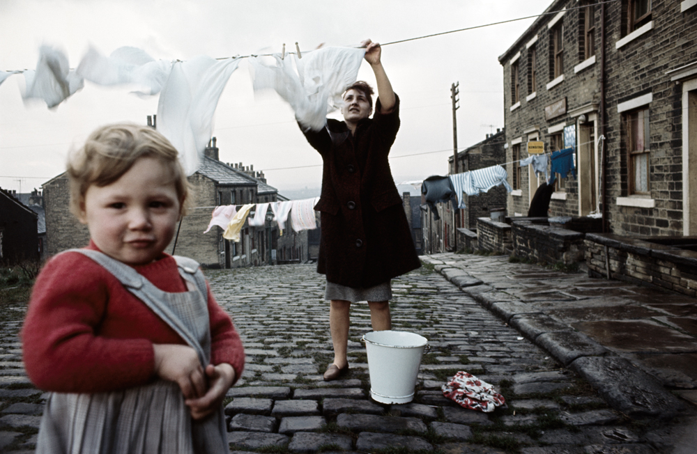
The image below is one of John Bulmers best images. It displays people in the North of England in their village hanging up clothes to dry.

Technical: This image makes use of natural lighting. This type of lighting is used because of the setting and to display the bright but dull looking weather of the area the image is taken. This image may have also taken the image at a time like this to make the area seem constantly cold and damp.

Visual: Bulmer has taken this photo at a time where the sky was bright and cloudy. This has created a contrast between the white background and the darker foreground. This makes the figures and the details in the image easily visible. This image also has form in it creating a 3D effect showing a long cobblestone road in the image. This creates an idea of community as all the buildings shown are close together and similar to each other.

Contextual: This image taken by Bulmer uses colour film. This was thought of as a difficult move for photographers at the time this image was taken. This is because colour may be harder to use than black and white for a lot of people. Bulmer is thought of as a pioneer of coloured photography because of his images, like this one.

Also, this image like a lot of Bulmer’s other work is used to show the true life of the people in the North of England. The image has been taken in a dull village and shows a mundane task to display the uninteresting lives of people in the working class in the North of England.

Conceptual: The idea of this image is that Bulmer wanted to capture the life and identity of people in the North of England. He has done this by capturing some people from the area with the old grey buildings and horrible weather to display the geographical identity of the area. This image also shows the identity of the community. This is also done through the long road with all the buildings close by each other, this along with the fact that there are two people of different age groups shows that people are close together with each other in the village.