MOOD BOARD:
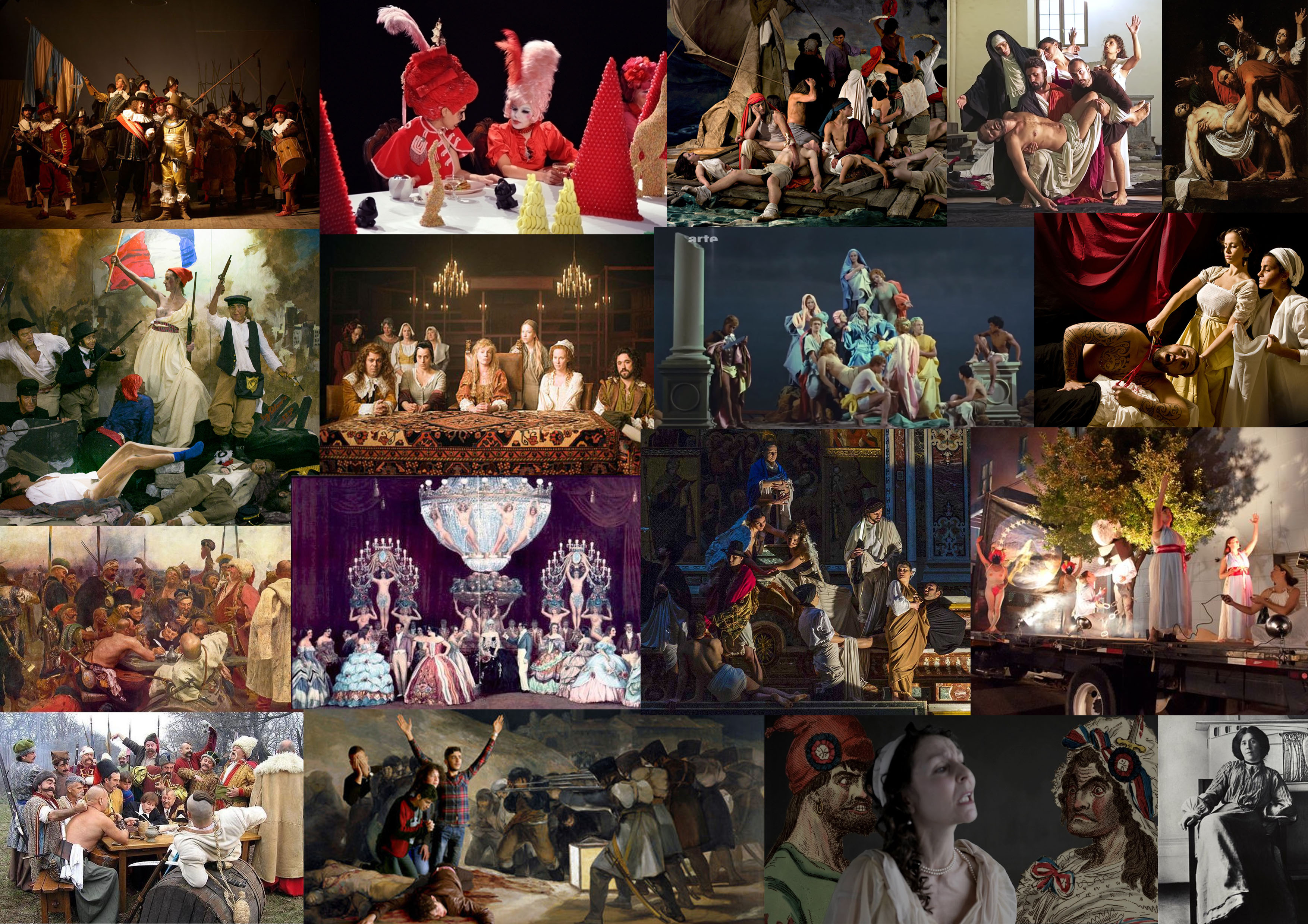
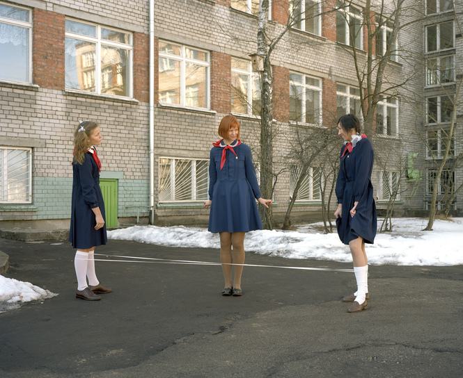
A selection of work which relates back well to tableux vivant or staged reality. They are all attempting to stage various pieces of art, literature of performances which have large cultural or representational meaning.
MOOD BOARD:
A selection of work which relates back well to tableux vivant or staged reality. They are all attempting to stage various pieces of art, literature of performances which have large cultural or representational meaning.

WHAT IS A PHOTO MONTAGE:
Photomontage is a combination of several shots joined together for artistic effect or to show more of the subject than can be shown in a single artwork. Images were composed by cutting, gluing, arranging and overlapping two or more photos or reproductions of photos together, sometimes in combination with other non-photographic material such as text or other abstract shapes.
source: https://www.widewalls.ch/photomontage-art/
MOODBOARD:
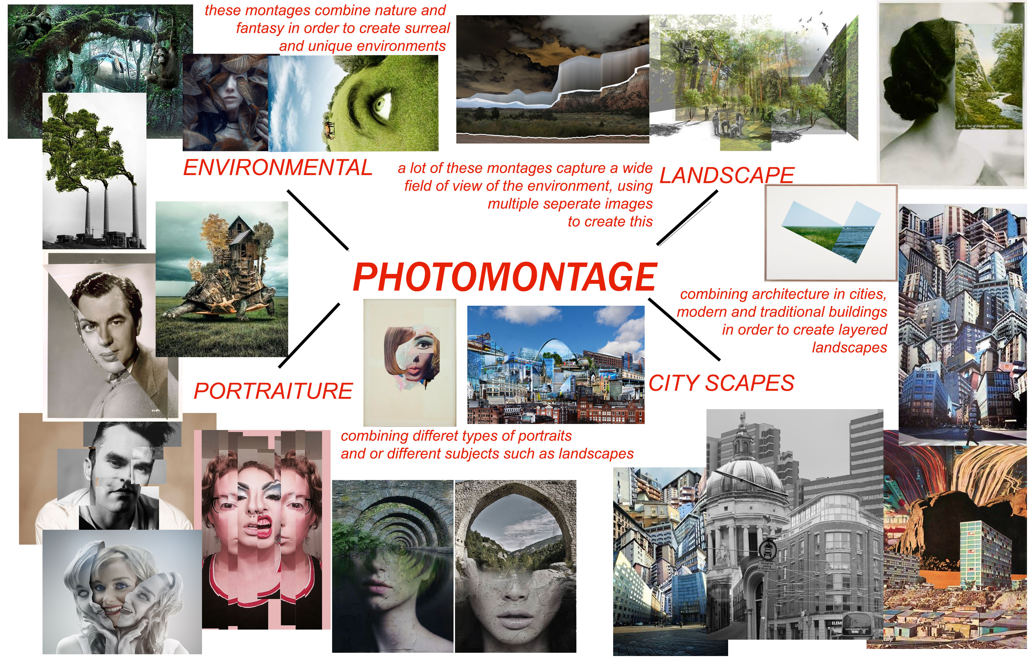
Photomontages vary a lot in style and design. Artists choose to use a multitude of subjects such as portraits, natural environments, natural landscapes, city landscapes and different objects which are combined together for artistic effect.

MIND MAP:
When looking at the search results which come from searching “photomontage”, there are 4 main themes which typically come up. Therefore I separated my mind map into 4 sections, environmental, landscape, city-scapes, and portraiture.
JESSE DAXLER:
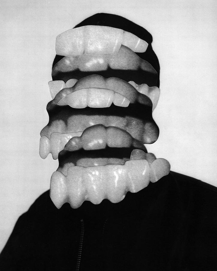
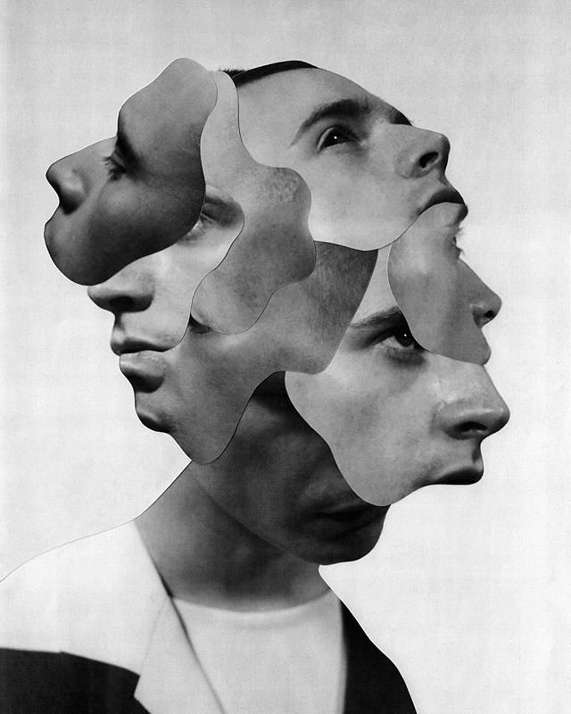
The artists work which intrigued me most when researching the topic of photo montages was Jesse Daxler, a photographer which uses portraiture in order to create her art work.
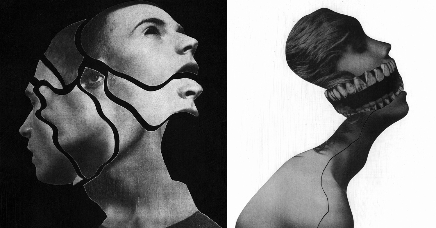
Jesse Draxler is an American artist, born in 1981 in Wisconsin. He lives and works in Los Angeles. He obtained his Bachelor of Fine Arts from the College of Visual Arts in St. Paul, Minnesota. The artist has a mixed approach: he does collages, but also texts or animated portraits in GIF. The central theme of his work is to transform and twist the original image, and turn it into something else. Mainly known for his collages, they often have sexual connotations, a visual impact and an attractive aesthetic, willing to shake up, or even disturb the spectator. Jesse Draxler likes deconstructing the classic idea of beauty and therefore paint Greek statues with spray paint, spilling ink on a fashion photo or cutting parts of human bodies. The artist makes hand-made collages, with the desire to make the spectator wonder if something is hidden under the surface. Jesse Draxler’s work was recently exhibited during solo exhibitions at Booth Gallery in New York (2016) and during collective exhibitions at The Unit in London(2015). Jesse Draxler also works with magazines, brands and designers. Among his clients are New York Times, Alexander McQueen, The Black Queen, or even Prince.
JESSE DRAXLER: “It’s a scientific exploration of what our knowledge of mortality does to our psyche. Basically, it says that everything we do in life, on every level, is at the core influenced by the idea that we’re going to die someday. It’s something that I’ve researched a lot, but I had never found a scientific exploration of it. It’s always an emotive or philosophical way of writing, so a scientific exploration was really refreshing—straight facts and research. I first came across it midsummer last year. My friend Greg Puciato, from Dillinger Escape Plan, we have a lot in common, so we were exchanging books and he told me to check it out.”

CRITICAL ANALYSIS OF WORK:
TECHNICAL –
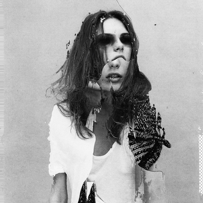
In terms of the technical aspects of this photo, extremely heavy editing has been used in order to create a very surreal, almost abstract image. Various editing techniques have been used from simple color adjustments, geometric cutting, using the brush tool and smudge tool. The overall image has also been made back and white which remain consistent throughout Draxlers work. It is also very bright and slightly overexposed. He has also chosen to remove a little slice of the background in order to reveal the checkered blank Photoshop document. I believe this image was likely taken in a studio environment judging from the even lighting which hits the face of the model.
VISUAL –
The initial feeling which hits the viewer upon seeing this image is unease. The dark, colored in, black eyes make this image quite unsettling, making us question why this has been done. The tone of black which has been used for the eyes is very dark, making them the focal point of the image, drawing in the viewer. There is a certain sense of juxtaposition in this image with the use of the youthful model, editing the images to become jagged old and unsettling. The correlating themes of this image which come to mind are delusion, possession and evil. I come to this conclusion through the collective visual effect of all the different elements in this image, the edges, juxtaposition, use of grey scale and strong editing. The black and white filter which has been applied to the image dulls out any life in the image, and makes it monochromatic.
The edges of the different layers of the image are quite jagged and uneven, which gives the image a weathered and old feel. The messy hair and black eyes of the model could potentially signify mental illness or other forms of hallucination. The backdrop is white and clean, making the main subject of the image stand out in the foreground. There is no real sense of pattern or symmetry in this image, everything is chaotic and uneven. Draxler has also used negative space in this image to give another layer of depth to the image. The jagged nature of the edges, gives the image a lot of texture. Although being monochromatic, the image is fairly light and bright as Draxler has used white negative space and the clothing of the model is also light in color.
CONCEPTUAL –
All of Draxlers work is composed of a black and white color pallete, commenting, “When I began working exclusively in grey scale is when everything seemed to start to make sense,” says artist and illustrator Jesse Draxler of his dark, brooding style that combines collaged photography and painting, manifesting in large-scale paintings or commissioned illustrations. “It’s as if by freeing my mind from having to think about color I had gained a greater clarity for everything else, like when someone loses a sense their other senses heighten to compensate.” Jesse suspects that his preference for a black and white palette is informed by the fact he’s color blind, or “color deficient” as he calls it. “Though I don’t put too much weight behind just that.”
source: https://www.itsnicethat.com/articles/jesse-draxler-alexander-mcqueen-art-190318
CONTEXTUAL –
Jesse Draxler’s pieces are enigmatic explorations of existentialism. The artist tackles ideas of beauty, nihilism, sexuality, and absurdity through deconstructed images that incorporate found photos, abstract painting, and design, and the resulting pieces are dark, monochromatic, and visually challenging.
ACTION PLAN:
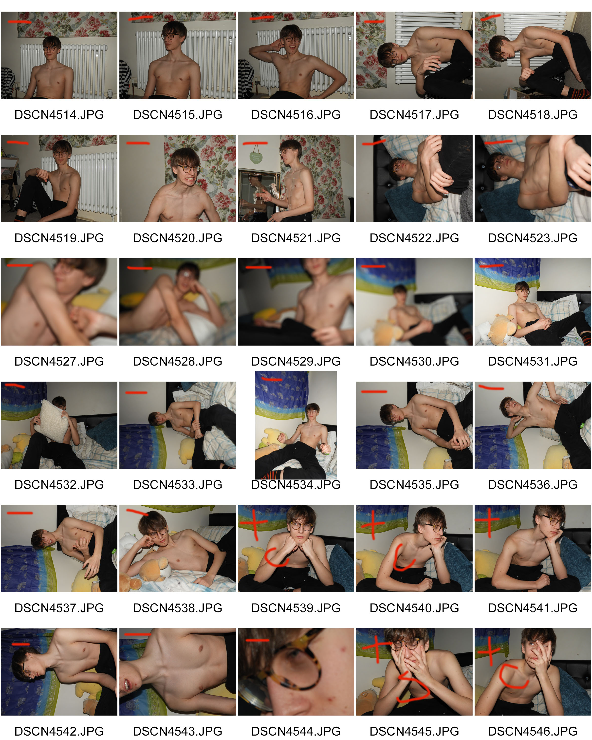
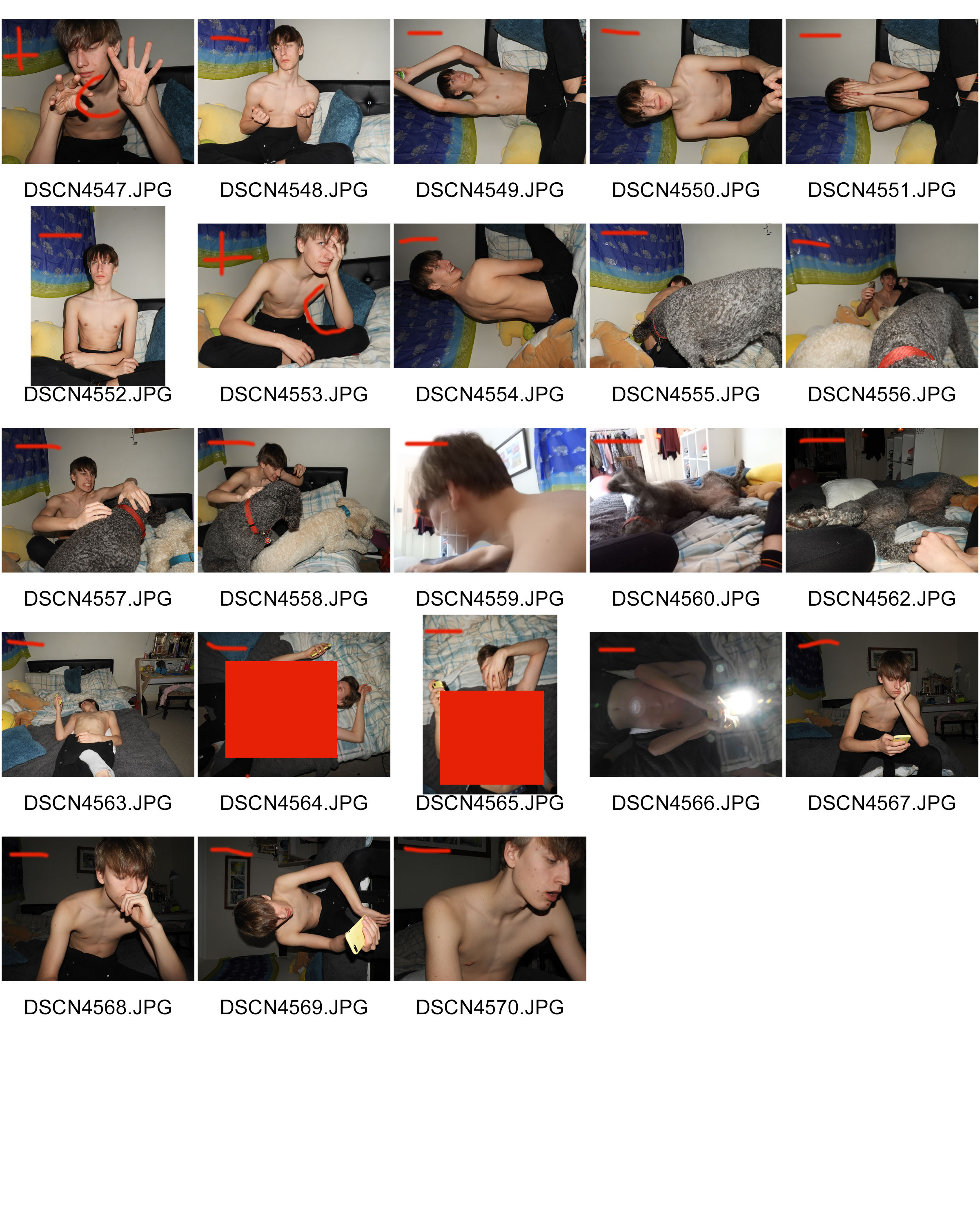
WHO – I took very causal images of just one model.In order to retain consistency and have a clearer canvas to work with when editing, the model is not wearing a shirt.
WHAT – I wanted to take as many images as possible in different positions in order to have different layers which I can later add to my photo montage.
WHEN – This was taken during the evening as I used lash photography and wanted there to be a striking contrast between the backdrop and the model.
WHERE – The images were taken indoors.
WHY – The images were taken as the starting material to use for my photo montage later, using different editing techniques in Photoshop in order to create a final product which incorporates artistic intentions and photography.
HOW – I used a dark room and flash photography in order to create the images.
CONTACT SHEETS:
EDITING TECHNIQUES:


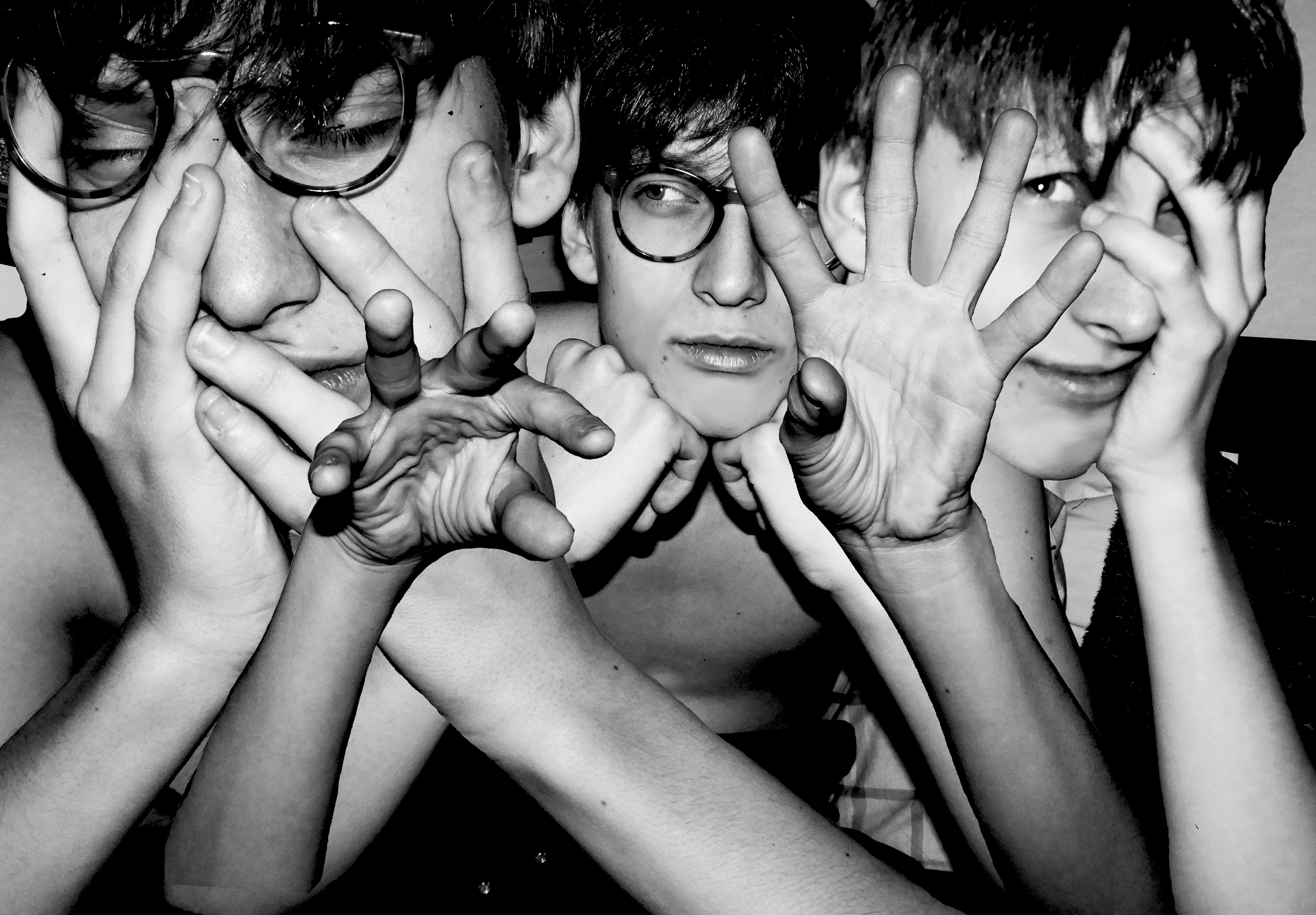
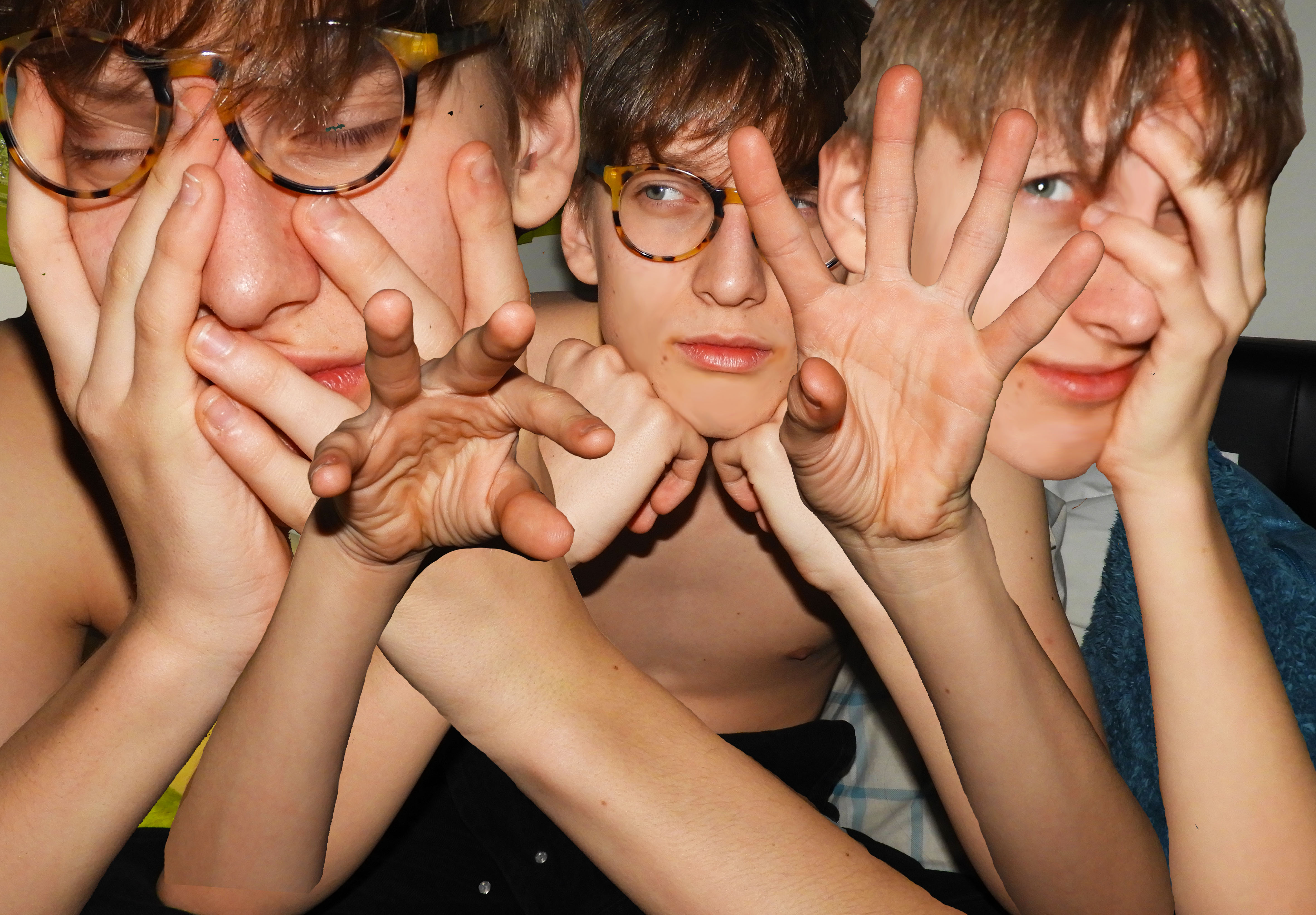
When editing this photo montage, I used multiple editing techniques in order to achieve the final product. I started with my base image, cropping it and perfecting the skin of the model in order to have a clean canvas to work with. I used the blur and smudge tool in order to smooth out the skin of the model. I imported another 3 additional images for the layering of the montage. The main tools which I used to cut out the hands and torso of the model was the magic wand, quick selection tool and magnetic lasso. I found the magic wand tool to be very useful as it allowed me to get rid of large areas of background quickly and efficiently. I only used the magnetic lasso tool when the area I was selecting had a clear backdrop, as the tool is very sensitive and catches onto other unnecessary parts easily.
I later on also used the eraser tool to smooth out any rough edges around the arms which were left behind. When arranging the arms, I used a transparent gradient so that they blend well into the skin around it, preventing harsh edges. I adjusted the size and positioning of the different layers so that they fill the surrounding space effectively and blend together seamlessly. I moved different layers around so that the central hands were in the very foreground of the image.
Once this was done, I again used the blur tool to soften the edges of the hair and make them a little less harsh. In the final stages of editing, I added a black and white filter onto the image and increased the contrast. I decreased the ofset in order to deepen the black and create a stronger gradient of black and white.
MY RESPONSE:
EVALUATION:
The overall process of creating this photo montage was fairly easy yet time consuming. The most difficult aspect was finding appropriate images which conveyed some feeling and variation in the facial expression of the model. I also wanted variation in the hand position of the model, as this is what makes the image unique and different. A key aspect of Draxler’s work is the consistent use of grey scale therefore I experimented with the different depths of black and white in the image.
COMPARISON TO KEY PHOTOGRAPHER:
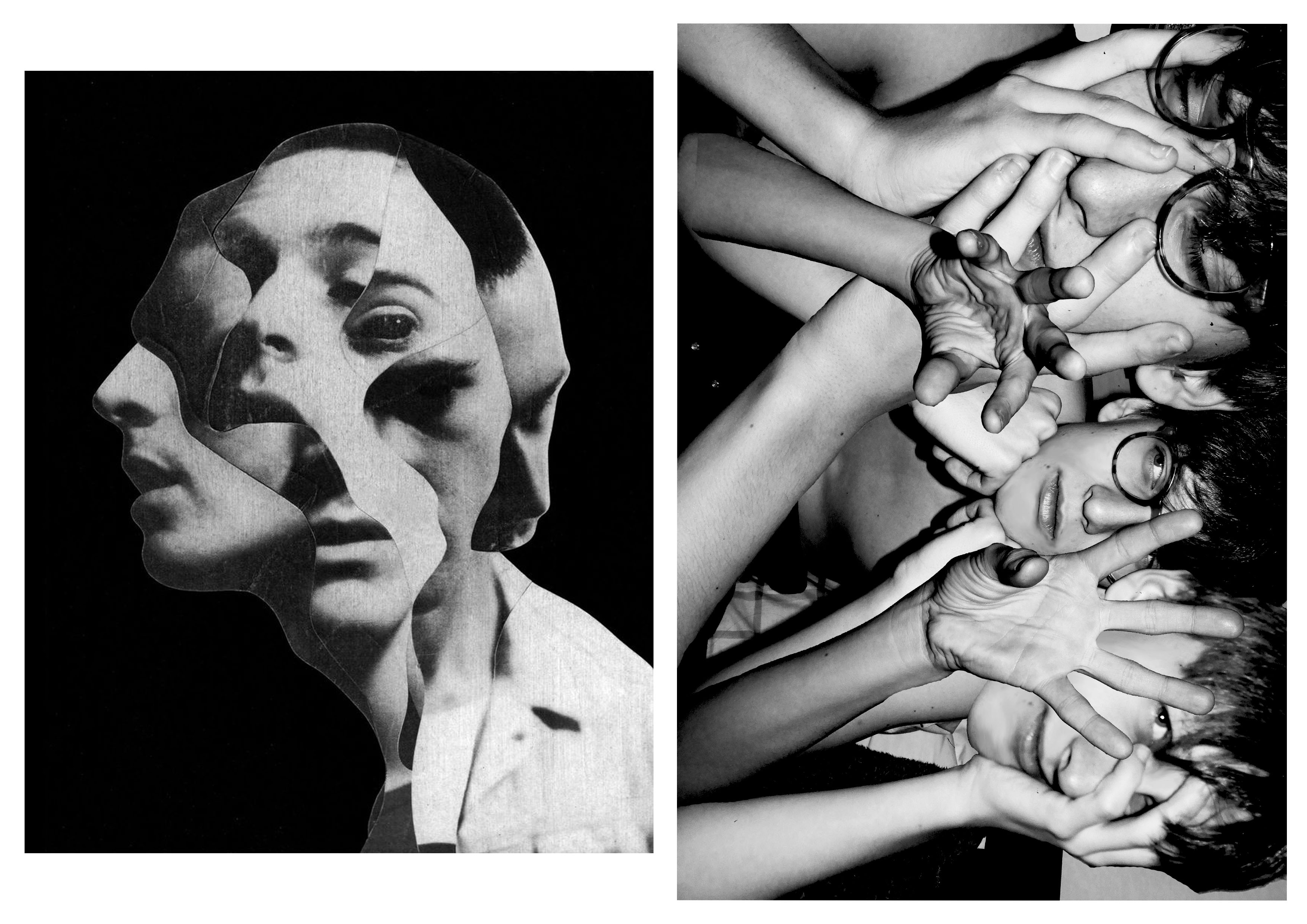
When making my photo collage, this specific photo from Draxler (misophonia) was my main inspiration. The main concept which I was trying to replicate was the duplication of the face of the model in the image. In order to add my own artistic elements and to differentiate my work, I decided not to use the irregular cut out pattern of Draxler. Another element which I used was the strong grey scale filter. I previewed my work without the filter and came to the conclusion that in order to create impact, the filter was needed.
CRITICAL ANALYSIS:
TECHNICAL –
During this photo shoot, the main objective was to create strong contrast between the backdrop and model using flash photography. It proved to be very effective as during the editing process, I could easily use the magic wand tool, lasso, and quick select tool to get rid of the backdrop. Whilst adjusting the light, I increased the exposure and contrast of the image to create dramatic lighting. I did not use any additional equipment such as tripod as I wanted the images to be less staged and more relaxed and casual, making the facial expressions of the model more genuine.
VISUAL –
I think when you first look at the image it is very striking and bold with the highly contrasting black and white, creating a monotone state. The themes which come to mind when looking at this image is worry and stress as expressed by the models face and hand positioning, touching the face and hair. There are many elements and layers involved in the image which create confusion. The hands central in the image have a gesture which pulls the viewer in, a sort of hypnotizing movement that makes them focus in. The straight lines of the edges of the arms, guides the eyes from the bottom of the image to the top where the hands and face are located. The central and right hand face are both looking into different directions which make the viewer question the circumstances of when the image was taken and what exactly the model is looking at. There is a sense of repetition and pattern with the use of the same face with different facial expressions and hand position. The hands of the model take position in the foreground of the image and the face in the mid-ground as they are covered by the hands and are shifted further back.
CONCEPTUAL –
The concept of this whole photo shoot was to be as authentic and relaxed as possible. Prior to the photo shoot, I asked the model what emotion they felt most significantly, tho which the answer was “worry”, therefore this was the theme which I tried to sustain throughout and make it clear in the final product. I chose images which clearly reflect this emotion and could be recognized by the viewer.
CONTEXTUAL –
The purpose of creating photo montages is to create hyper reality. Something which is pasted together to create an art piece which is surreal and fantasy like.
The process of creating a collage photo can be traced back to the first darkroom printing attempts, when photographers experimented with direct contact printing of objects placed on photographic plates, or techniques such as double exposure and masking. Of course, the art of “mounting the photos together” doesn’t have to involve the creation of new pictures at all – it can employ found and existing prints only as well, depending on the artist’s intentions and goals. Finally, with the advent of computers, the need of having physical imagery disappeared altogether, as today’s examples of photomontage art are being assembled within editing softwares and often never end up in a printed form.
Perhaps the most famous photomontage came during the mid-Victorian era. Then called “combination printing”, it was created by Oscar Rejlander, a pioneering photographer who was one of the experts in the field. His 1857 collage photo The Two Ways of Life was followed by the 1858 Fading Away by another artist, Henry Peach Robinson. By the end of the century, many other artworks came to life, specifically in forms of funny-looking postcards which often featured the wrong head stuck on a different body, or the creation of strange, impossible creatures. By the beginning of World War I, the method gained its first momentum, with photographers all over Europe producing postcards showing soldiers departing for battle with their loved ones seeing them off. More specifically, it was the Berlin Dada group that developed it as a tool of protest against the war and other political issues of the period, turning it into a proper modern art form.
source: https://www.widewalls.ch/photomontage-art/
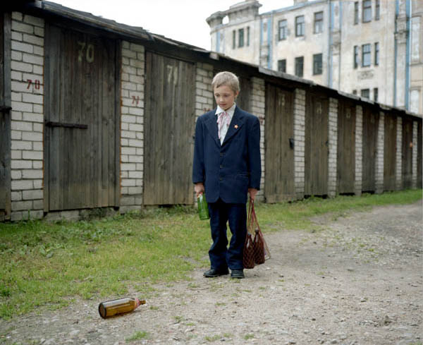
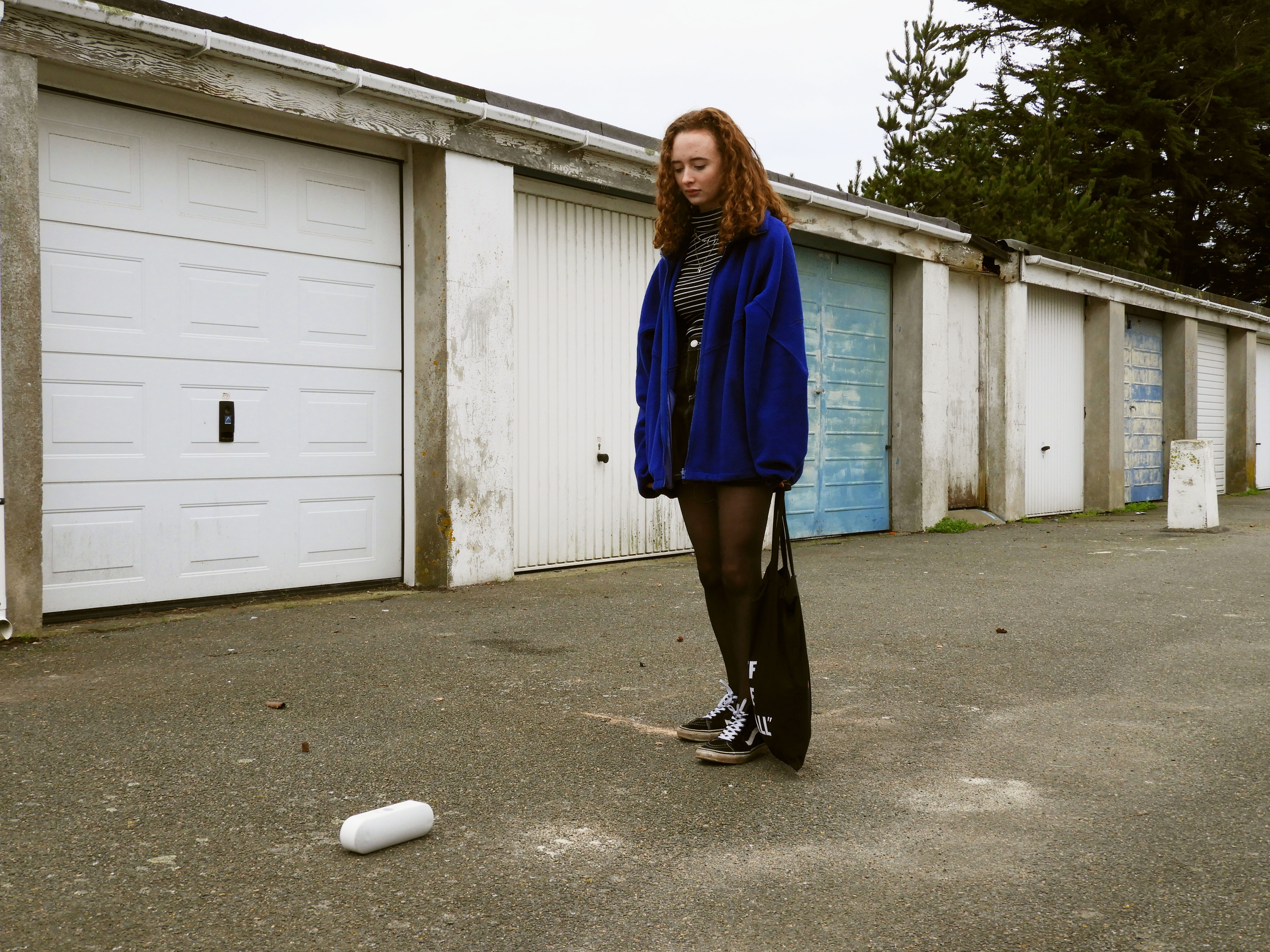
WHO – this is a recreation of Arnis Balčus’ work, using my own model in order to take form of the little boy
WHAT – the main objective of this photo shoot is to recreate and understand how Balčus creates his work and the symbolism which he chooses to include and adapting the environment and resources I have in order to recreate the photo in a similar way.
WHEN – the image was taken during mid day as I figured this would be a similar time of day judging by the original image and the direct sunlight in it
WHERE -the image was taken in an old communal garage space which resembles the location a lot in the image I am trying to recreate.
WHY – to understand the most suitable ways in which to photograph people, organize photo-shoots and comprehend the symbolism which has been used by the original artist
HOW – I used my regular DSLR camera for this photo shoot, all natural lighting.
FINAL IMAGE –
VISUAL ANALYSIS OF IMAGES –
VISUAL –
The image overall has a very gloomy and depressing mood around it. The depiction of a small child (recreated by a model which is also quite child like), looking at the empty beer bottle is synonymous with the prevailing alcohol abuse problem in Eastern Europe. The environment, which is worn and old, also suggests poverty and shortage of necessities for the child, almost using the beer bottles as toys. The child portrays sadness and loneliness. To put a modern twist on my own imagery, the glass bottle has been replaced with a speaker, as this is representative of the technology reliant youth of today. The weathered and old garages in the back of the image nicely contrast the main subject in the foreground by disturbing the repeating pattern. In order to have some similarities with the original image, the model is wearing a bright blue jacket, which immediately draws in the viewers eye to the center of the image. Both images can be split up with the rule of thirds, where the subject is situated in the middle of the image. The upwards facing power play between the camera and the model makes her seem a lot taller than reality, giving some power to the subject. The neutral expression of the model also creates a theme of confusion and mystery in the image as the viewer is not clear on what the subject is feeling. The direction in which the subject is looking at, leads also the viewers eyes down to the ground where the speaker is (situated in the bottom left third of the image). The overall color scheme of the image is dull and neutral, being mostly made up of subtle blues and grays.
TECHNICAL –
This photo was taken during late morning, on a cloudy overcast day. I especially chose this day due to the fact that this is what resembled most in the photo I was trying to recreate. I set the white balance of my camera to the “cloudy” setting in order to achieve well balanced images. As it was a cloudy, yet still bright day, I turned down the ISO of my camera down to 200 to avoid the image being overexposed. As this was a very staged image, and the subject was standing still, I chose to use a tripod to make sure the image is crisp without any motion blur, due to this I kept my aperture mid way at 1/125 as I wasn’t concerned with the camera moving. I had a very clear idea of the positioning of the model and the prop therefore I first angled my camera and refereed to the original image for guidance. After a couple of shots, I was confident in the final image therefore contact sheets for this photo shoot weren’t necessary.
CONCEPTUAL –
The main objective of this photo shoot was to make sure that what I was recreating conveyed similar visual elements as the original image, using a model of a small stature and an environment which is very similar as the original. Of course as I am not the original photographer, not in the same environment, I have had to adapt and make do with the resources I have resulting in the differences seen in the image. I wanted to convey a different social issue which affects us here in Jersey, relating to our environment and society, with the presence of the speaker on the ground. Representing how technology dependent the youth is, looking to it for guidance, happiness and companionship. This effecting social skills and the way in which children grow up and interact with one another.
CONTEXTUAL –
At the end of the 1980s all the countries of eastern Europe and the former Soviet Union enjoyed relatively high levels of human development and social welfare. Extensive social investments during the period of communist rule meant that literacy was almost universal, and well above other countries with comparable levels of per capita income, and life expectancy averaged 68 years. Unemployment was unheard of and – at least officially –poverty did not exist. Few commentators could have foreseen that the process of transition towards market economies and democratic governments would have been so tumultuous and accompanied by such high costs in terms of individual well-being, particularly among the countries of the new Commonwealth of Independent States (CIS). The collapse of economic output in many of these countries following independence, along with hyperinflation that wiped out individual savings, resulted in a dramatic drop in living standards for the majority of people and the emergence of poverty as a major issue within the region. Increasing poverty leading people to alcoholism and the use of it in daily life.
Nearly all the top 15 biggest drinking nations are in Central or Eastern Europe. Poverty and the harsh climate, particularly in Russia, play a part, as does the tradition of drinking. “Where it’s extremely cold it’s not uncommon for people to drink all day long,” said Val Smith, president of International Wine and Spirits, which provided the data on per-capita alcohol consumption.
And particularly in agrarian regions; farmers often produce their own home brews from anything ranging from potatoes to sugar beets, making alcohol very accessible and very cheap, said Smith. This also makes per capita consumption hard to measure, with official figures sometimes well below actual consumption rates.
source: https://www.unece.org/fileadmin/DAM/ead/pub/041/041c7.pdf
LIFE AND WORK:
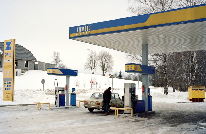
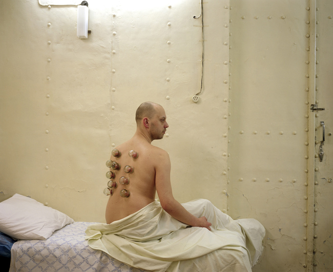
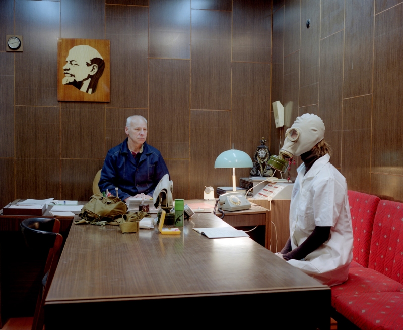
Arnis Balčus (born 1978) is a Latvian photography and video artist. Born in Riga, Latvia, Balcus lived and worked in his home town before moving to London, United Kingdom, in 2004. He took an MA course on photography at University of Westminster from 2004 to 2005. He is exhibiting his work since 1994, but emerged internationally in 2003 with the photographic series Myself, Friends, Lovers and Others. Using snapshot aesthetic the series were showing the everyday life of contemporary Latvian youth. The series had numerous solo shows, for instance, at Giedre Bartelt gallery, Berlin, Overgaden, Copenhagen, Fotogalerie Wien, Vienna, State Museum of Art, Riga and Matthew Bown Gallery, London.
WORK FOCUS AND IDENTITY:
Since 2008 most of his photographic work has been related to Latvian identity, historical taboos and social-political agendas. In 2009 Arnis Balcus showed his series Amnesia at Riga Art Space. In the photographs he was staging various social rituals that have disappeared from the everyday life in Latvia due to political and economical changes in the past thirty years.The exhibition traveled to Ventspils, Latvia. In the series Latvian Notes he has been exploring the everyday life in Latvia. This research is focused on Latvian society through the perspective of collective rituals and public space. The series Victory Parkgrappled with questions on Otherness – and more specifically, in the context of Latvia’s complex relationship with Russia, and Russian culture.In 2014 the series were shown at Street Level Photoworks in Glasgow and Mūkusala Art Centre in Riga. The latest series Beyond The Blue River are related to the Zilupe region in Eastern Latvia, which on an everyday basis is characterized as economically unstable and politically disloyal to Latvia.
In his video works he addresses issues of identity and gender. His video Xionel features a confession by a beautiful Asian transsexual, while Balcus’ Latvia 1989-91 is a photo story created of artist’s family snapshots from the time Latvia regained its independence from USSR.
WHY I AM INTERESTED IN HIS WORK:
Since moving to Jersey I have had a real identity crisis when it comes to my roots. From one point I have become more English, fully adopting the language, culture and practices of Jersey yet i truly value the home country from where I come which is Latvia. It has suffered a lot of political and economical blows since its liberation in the early 1990s from the USSR, forcing families like my own to move away. I am keen to reminisce on the traditions which I once was so closely linked to, doing this through tableaux vivant and staged reality. A lot of the subjects which Balčuks focuses on are very personal to myself and something which I feel I will be able to recreate well.
From an artistic standpoint, his work has a lot of subtle yet powerful imagery and symbolism. Creating very powerful imagery in the eyes of not only native Latvians but also people from all around the world. The topics which he tackles are relevant and hold a lot of deep meaning.
WORK STRATEGY/PLAN FOR PHOTO-SHOOT:
WHO – for this photo shoot I will be selecting two images from Arnis Balčus’ work in order to recreate for my staged reality photo-shoot.
WHAT – the main objective of this photo shoot is to recreate and understand how Balčus creates his work and the symbolism which he chooses to include.
WHEN – the images will be taken in specific environments according to the images i am recreating.
WHERE -the photos will be take in Latvia in order to have authentic images which are as close as possible to the original.
WHY – to understand the most suitable ways in which to photograph people, organize photo-shoots and comprehend the symbolism which has been used by the original artist
HOW – I used my regular DSLR camera for this photo shoot, using a combination of artificial and natural lighting.



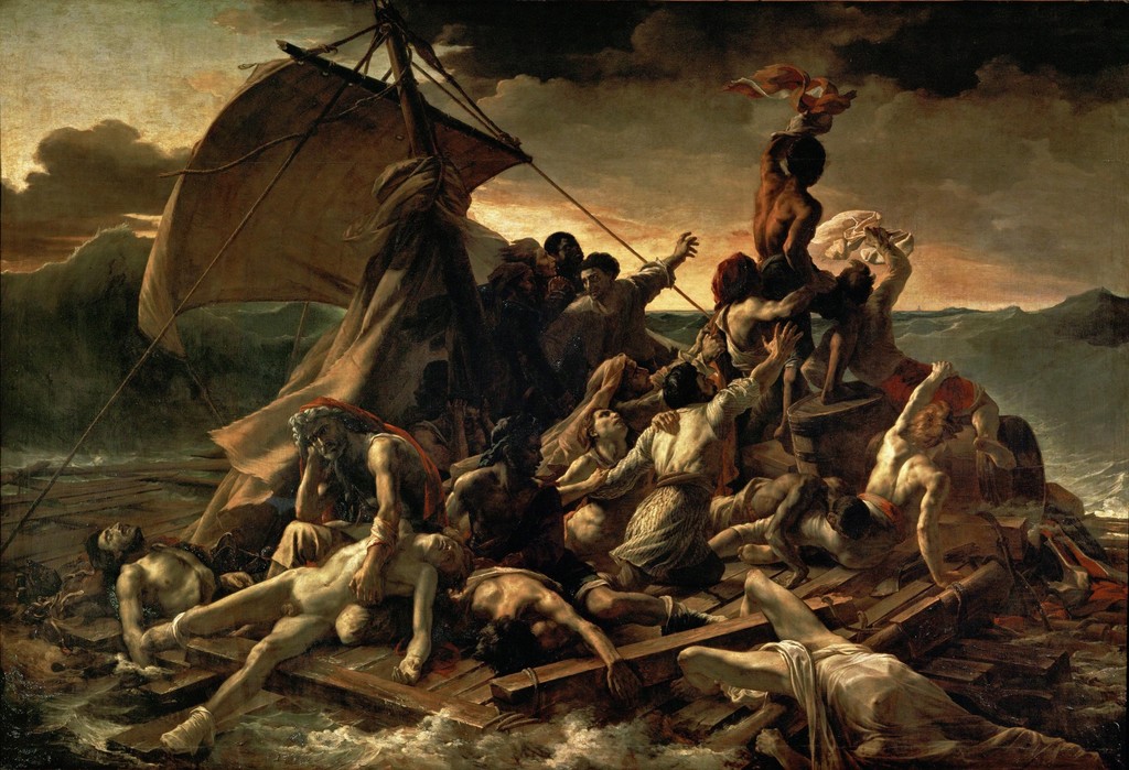
THE RAFT OF MEDUSA:
WORK STRATEGY:
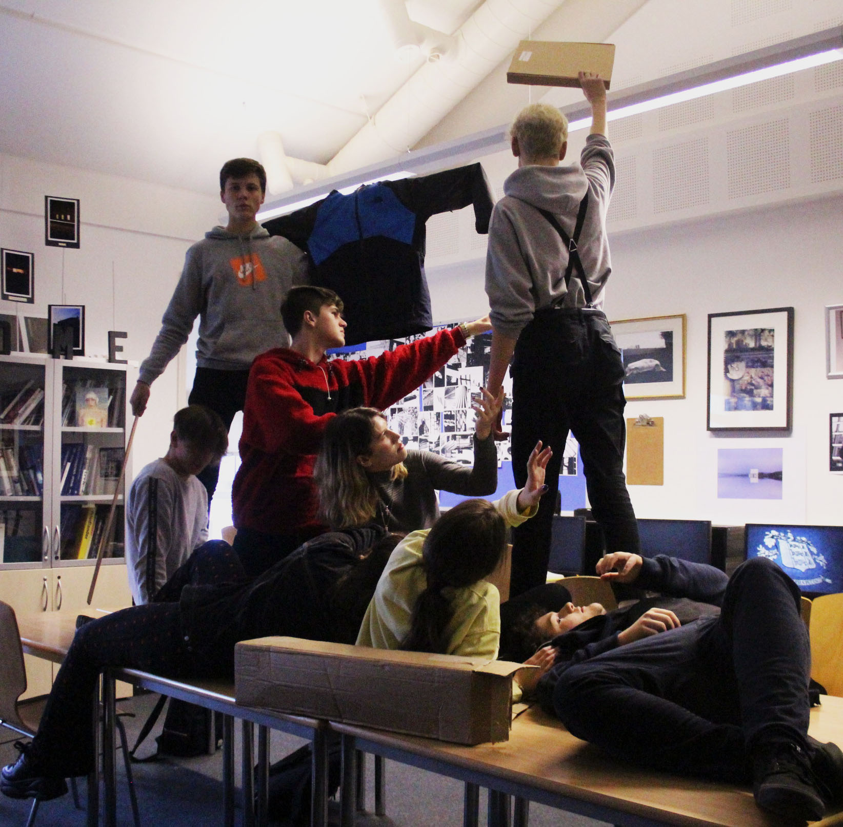
WHO – for this photo shoot, there were multiple models in order to recreate the raft of medusa.
WHAT – the main objective of this photo shoot was to try and stage the raft of medusa, adopting similar mannerisms as the people depicted in the painting.
WHEN – the images were taken during school time, indoors where artificial lighting as used ti light the room.
WHERE -the images were captured inside a classroom.
WHY – to understand the ways in which to direct people and think about aspects such as mannerisms, lighting, facial expressions and positioning.
HOW – I used my regular DSLR camera for this photo shoot, using the artificial lighting provided.
IMAGE ANALYSIS:
VISUAL:
The recreation of our image includes a lot of similar aspects as the original, trying to recreate similar facial expressions and positions as the subjects in the painting. Central in the image is main subject, holding up and waving a cloth to try and get attention, it is the first thing that the eye is drawn to due to the height at which the subject is at, towering above almost everyone else in the image. There is a sort of power play going on in the image, with two of the subjects being above everyone. This positioning is trying to convey the different states of the people on the raft, some healthier than others, whilst some are on the brink of death. We used a few extra props and stood on the table to symbolize the raft, and used a coat to symbolize the sail.
TECHNICAL:
The classroom environment we were in made it difficult to capture a similar lighting as in the image. There were direct lights which were pointing from up above, to try and correct this and create chiaroscuro lighting, we only kept one light in the room on .In order to have a very crisp and sharp image, a tripod was used to stabilize the camera whilst the image was being taken. The limited lighting in the room meant that the ISO had to be fairly high, being set to 6400 to avoid being under exposed, furthermore the f/stop used for this shoot was also quite large at f/3.4.
CONCEPTUAL: The Raft of the Medusa (French: Le Radeau de la Méduse) is an oil painting of 1818–19 by the French Romantic painter and lithographer Théodore Géricault (1791–1824). Completed when the artist was 27, the work has become an icon of French Romanticism. At 491 cm × 716 cm it is an over-life-size painting that depicts a moment from the aftermath of the wreck of the French naval frigate Méduse, which ran aground off the coast of today’s Mauritania on 2 July 1816. On 5 July 1816, at least 147 people were set adrift on a hurriedly constructed raft; all but 15 died in the 13 days before their rescue, and those who survived endured starvation and dehydration and practised cannibalism. The event became an international scandal, in part because its cause was widely attributed to the incompetence of the French captain.
CONTEXTUAL:
Géricault chose to depict this event in order to launch his career with a large-scale uncommissioned work on a subject that had already generated great public interest. The event fascinated him, and before he began work on the final painting, he undertook extensive research and produced many preparatory sketches. He interviewed two of the survivors and constructed a detailed scale model of the raft. He visited hospitals and morgues where he could view, first-hand, the colour and texture of the flesh of the dying and dead. As he had anticipated, the painting proved highly controversial at its first appearance in the 1819 Paris Salon, attracting passionate praise and condemnation in equal measure. However, it established his international reputation, and today is widely seen as seminal in the early history of the Romantic movement in French painting.
TOM HUNTER:
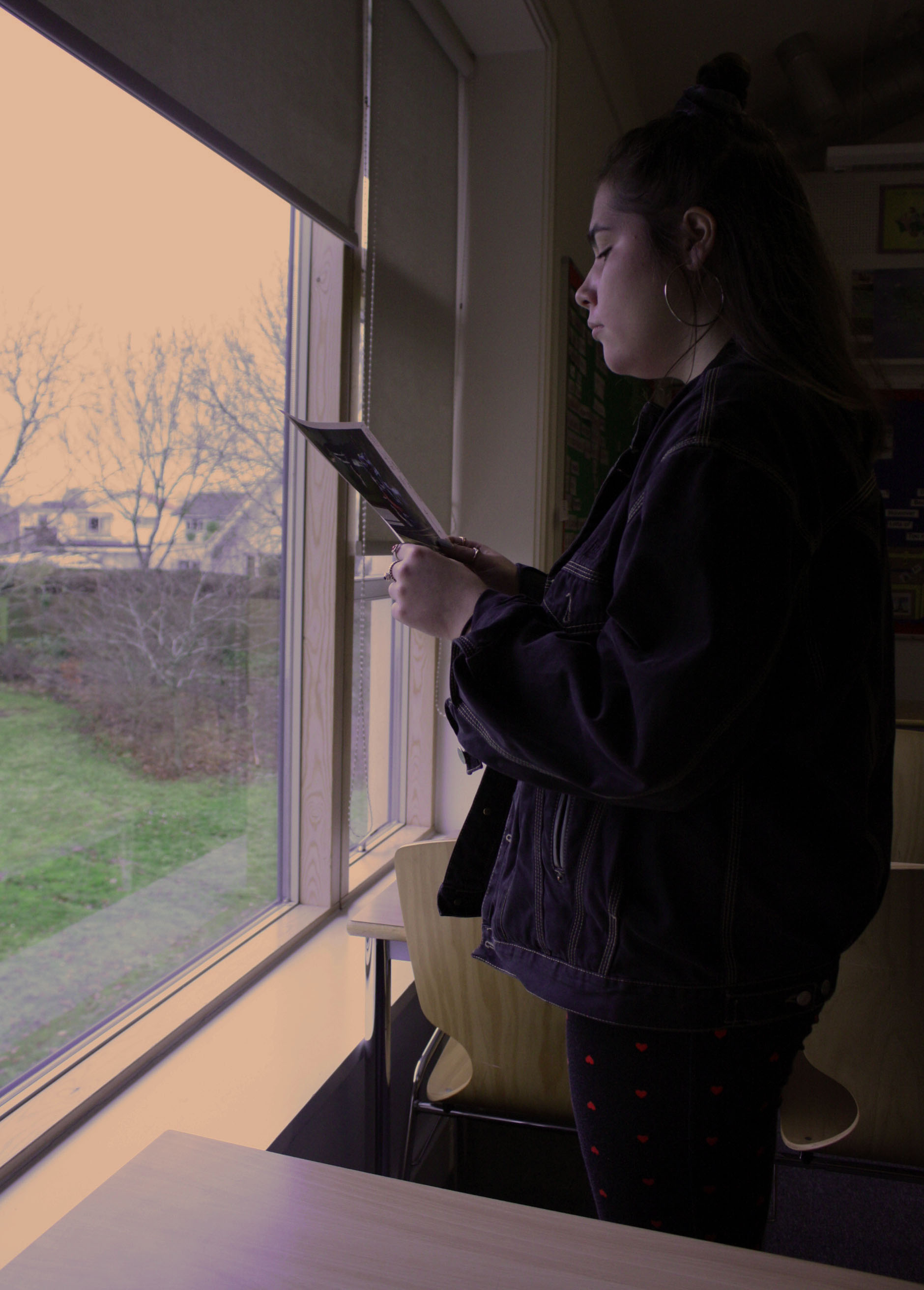
IMAGE ANALYSIS:
VISUAL:
The image below holds a lot of emotional attachment. The baby on the bottom left corner is only noticed after really looking at the image for an extended period of time as the mother is the focal point of the image. The eye is first drawn to her rather than the surroundings. The color in this image is also very bright and saturated. The overall feeling of the image is bright and colorful with the light coming in from the window and the bright lemon colored wall in the background of the image. There is a lot of natural light hitting the front of the model’s face, giving the image a very natural and organic look, as if somebody was simply documenting the woman’s day. The baby in the bottom left corner of the image adds a lot of emotion, yet at the same time blends in with the environment, almost as if it has been forgotten. The subject in the image is not making eye contact with the camera and does not have any clear facial expression suggesting that possibly a sense of shock has hit her, and she is frozen in time. The image almost feels like an invasion of privacy from the angle from which it is taken and the lack of contact made with the camera.
TECHNICAL:
The exposure of this image is very balanced, with the highlights and shadows working together to create a very harmonious image. The way in which the natural lighting hits the subject from the left hand side of the image suggests that no additional lighting equipment has been used in this photo shoot. Again making this type of photography seem more documentary style. The colors in this image are also well balanced, possibly being more on the over saturated side as the orange clothing on the baby is very visible and bright. There is a clear foreground, mid-ground and background, with the baby being in the foreground, the woman reading the letter in the mid-ground and the shelf and wall in the background.
CONCEPTUAL:
Filipa had just had her first baby. We spent the whole day trying things out: we had a bowl of fruit, then we tried some curtains, then incorporated the baby. The light was perfect, a late winter sun coming through the window, really low, like the northern European light.
I used a large-format camera, which really captures that light. And I used the Supachrome process to print it – old-fashioned even then. The exposure was about a second, so it was like sitting for a painting: she had to stand still. I was waiting for the light to pour into the lens, rather than snapping at something.
I phoned her up last week and she’s still happy with the picture. It’s a record of her, her child and her home at the time. The great thing is, the picture got a dialogue going with the council – and we managed to save the houses.
CONTEXTUAL:
I was living in Hackney in London, in a whole street of squats, having spent two years travelling around Europe in a doubledecker bus. Everyone got a letter addressed to “persons unknown”. The council wanted to knock down the street and build warehouses. The Tories had brought in the Criminal Justice Act, which was designed to stop parties. Every time you saw a picture of a squatter or a traveler, it was to go with a story about how antisocial they were. I just wanted to take a picture showing the dignity of squatter life – a piece of propaganda to save my neighborhood.
I took this in 1997, for my master’s degree show at the Royal College of Art. The 17th-century golden age of Dutch painting had had a massive impact on me: the way they dealt with ordinary people, not kings, queens and generals. I thought if I could borrow their style for squatters and travellers, it would elevate their status. In this shot, inspired by Vermeer’s Girl Reading a Letter at an Open Window, my next-door neighbour is reading the possession order.
RULE OF 3RD’S:
This image follows the rule of 3rd s, as can be seen when we divide the image into blocks. The woman is sectioned mostly in the last third of the image, yet the letter she is holding positions itself in the very center of the image, becoming a very clear focal point of the image.
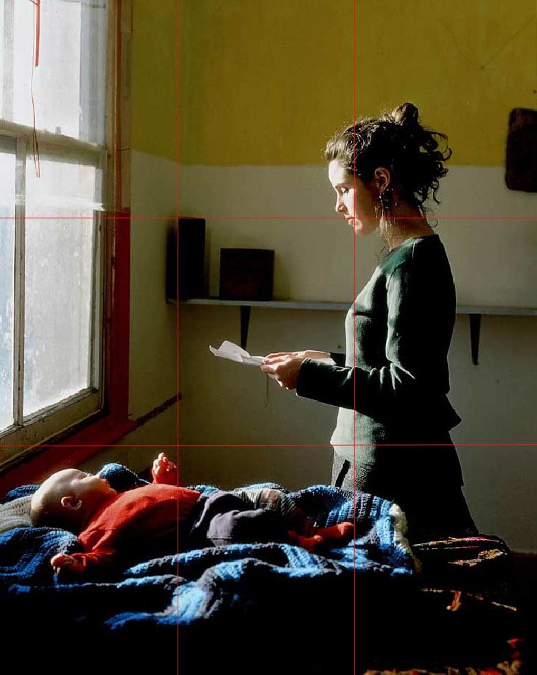
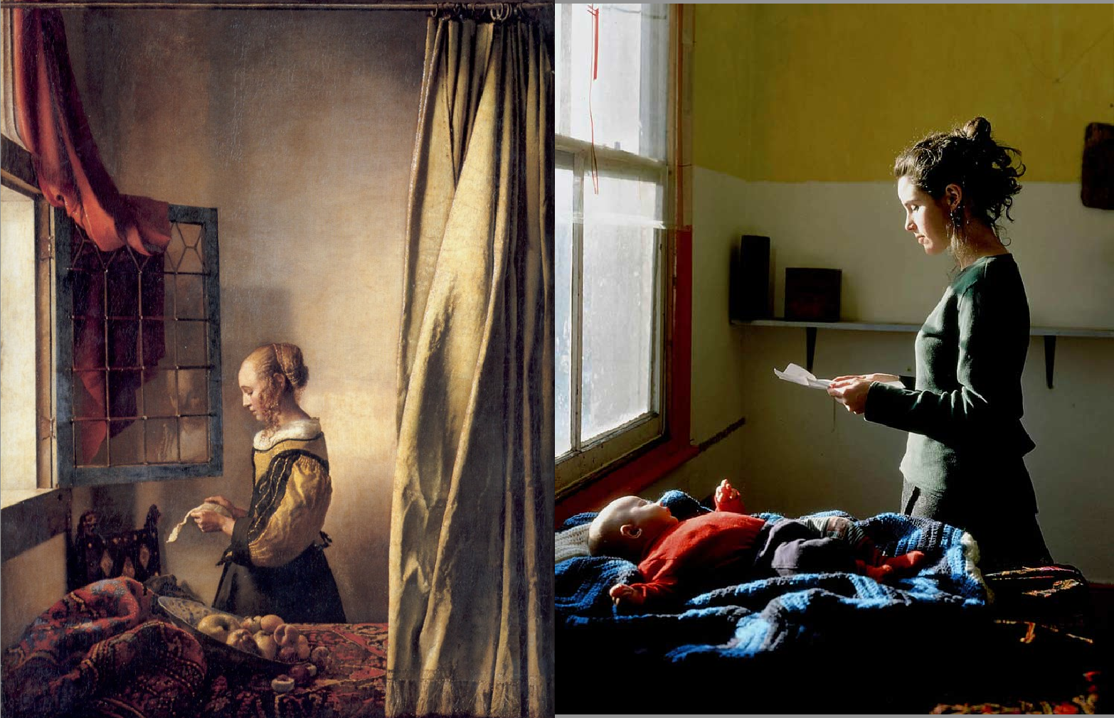
PHOTO SHOOT METHOD:
WHO – for this photo shoot, I selected two models for my shoot which I thought would be suitable to photograph, people who are quite photogenic in nature.
WHAT – the main objective of this photo shoot was to try out different lighting techniques. Fill lighting, 2 point lighting, 3 point lighting and even four point lighting.
WHEN – the images were taken during school time, regardless of the time of day, artificial lighting lit the photo shoot.
WHERE -the images were captured in the school studio, specially designed for taking photographs.
WHY – to understand the different effects that studio lighting provides and the subtle differences between them.
HOW – I used my regular DSLR camera for this photo shoot, using the artificial lighting provided.
DIFFERENT TYPES OF LIGHTING:
TWO – POINT – LIGHTING:
A two point lighting set up can produce highlights in the eyes and some shadow. The secondary source of light is used to eliminate shadows that are created by the key light, it will soften contrasts and make more of the subject visible by enhancing the illumination of the face from the key light.
THREE – POINT – LIGHTING:
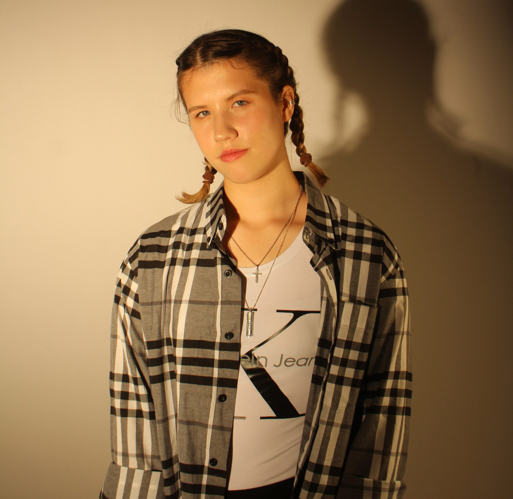
Three-point lighting is a standard method used in visual media such as theater, video, film, still photography and computer-generated imagery. By using three separate positions, the photographer can illuminate the shot’s subject (such as a person) however desired, while also controlling (or eliminating entirely) the shading and shadows produced by direct lighting.
FILL – LIGHTING:
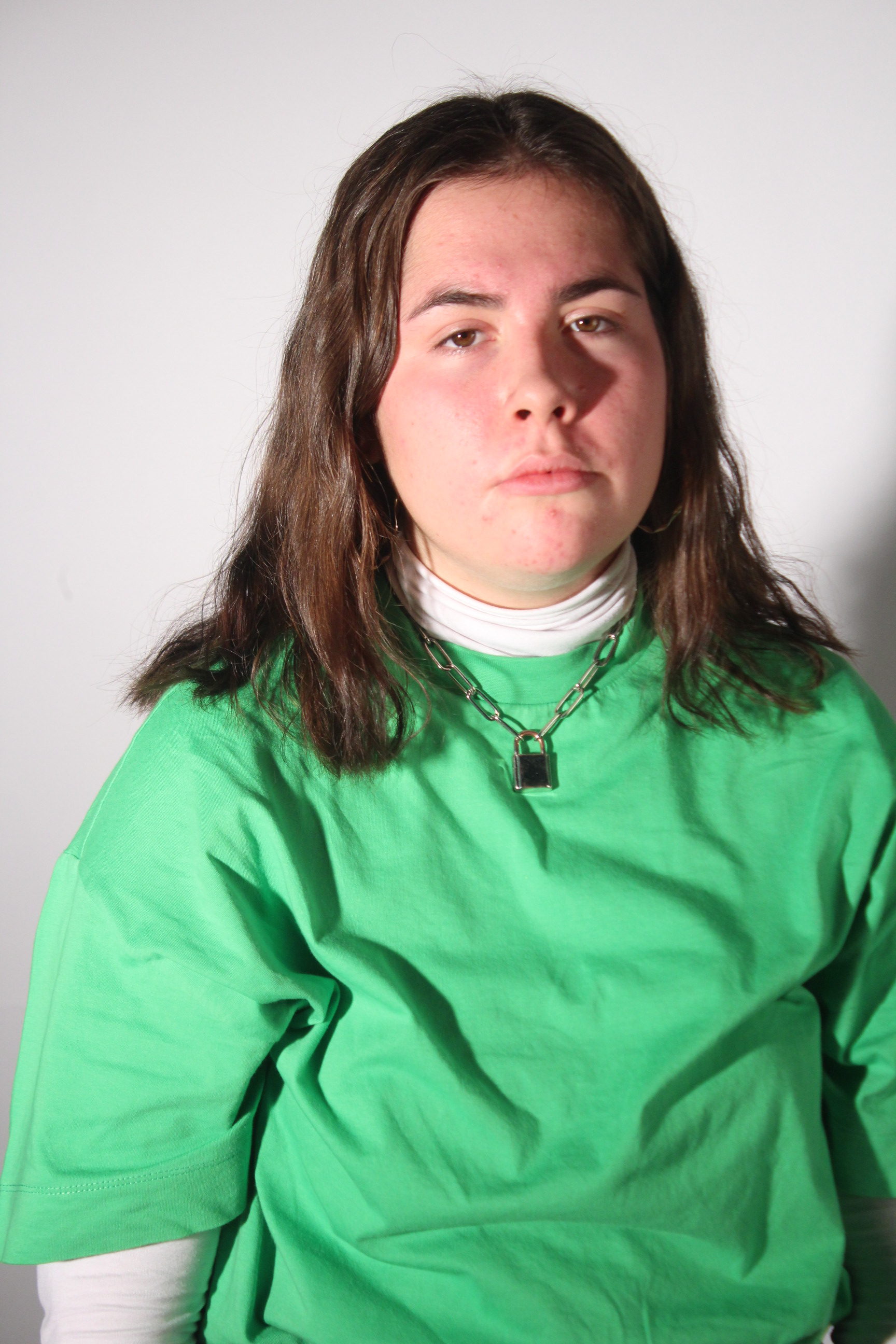
In television, film, stage, or photographic lighting, a fill light may be used to reduce the contrast of a scene to match the dynamic range of the recording media and record the same amount of detail typically seen by eye in average lighting and considered normal.
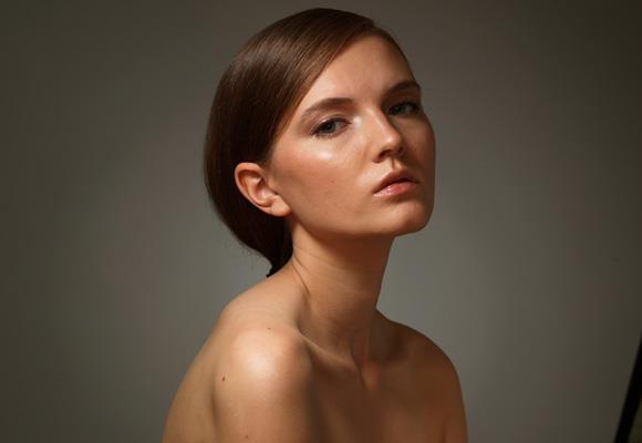
CHIAROSCURO LIGHTING:
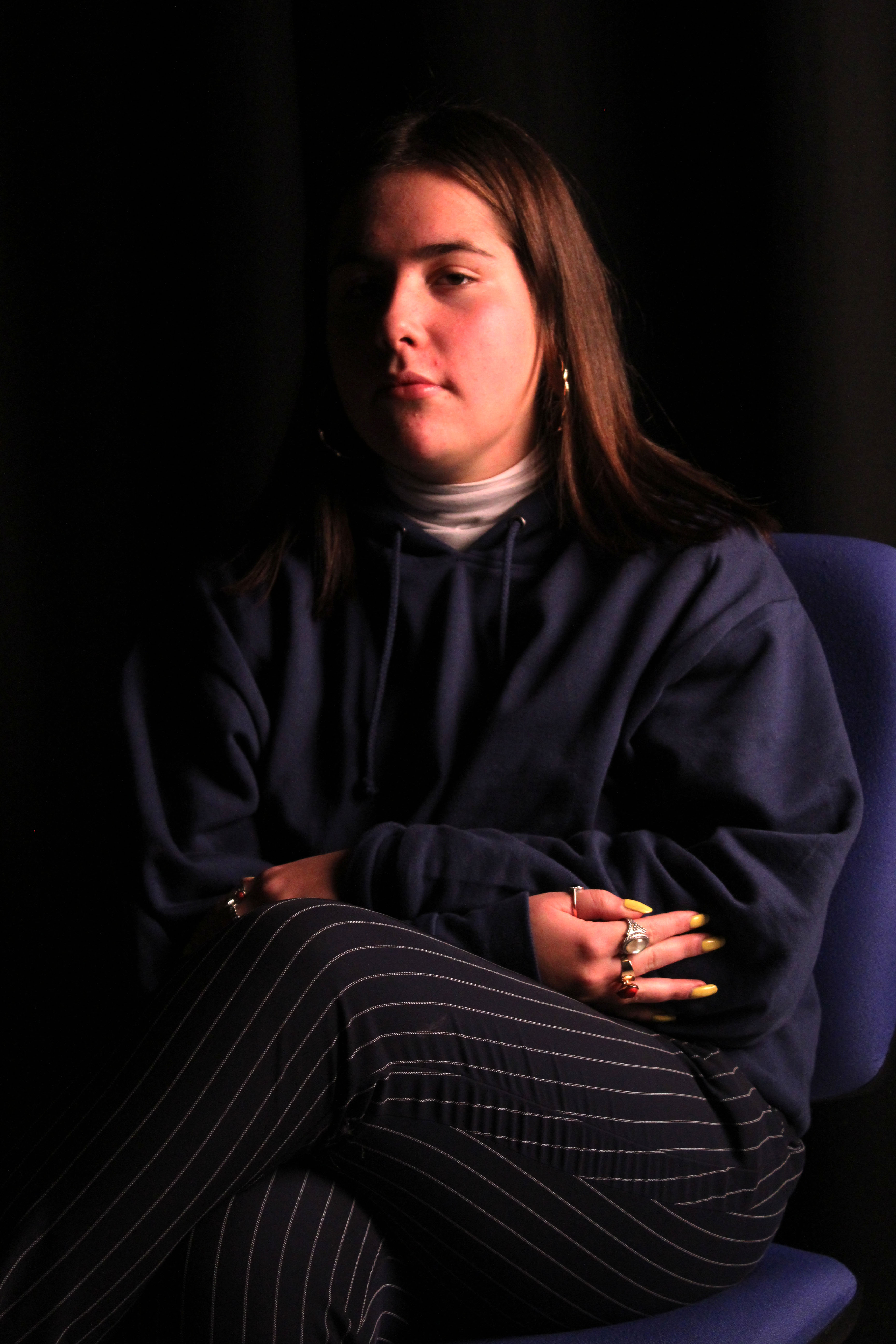
REMBRANDT LIGHTING:
Rembrandt lighting is a lighting technique that is used in studio portrait photography. It can be achieved using one light and a reflector, or two lights, and is popular because it is capable of producing images which appear both natural and compelling with a minimum of equipment.
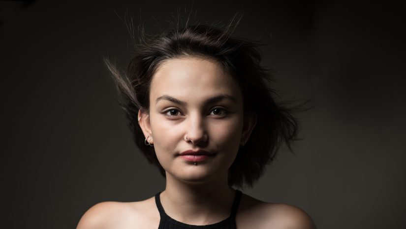
RING LIGHTING:
A ring light is a handy multi-use tool for all types of shoots, from a sharp music video to a portrait of a ladybug. They provide uniform light coming straight from the camera’s point of view, which is great for even light, and helps eliminate shadows.
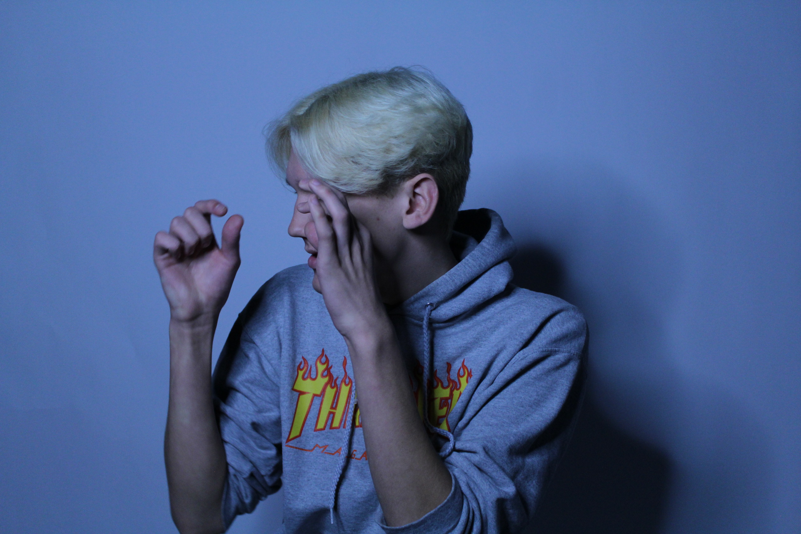
REFLECTORS:
In flat lighting, a reflector can add interest or drama to the shot. Some photographers use reflectors as hair lights outdoors. Many reflectors have a black side that can be used to block out light instead of to reflect it. Reflectors are also great for bouncing a flash when there’s nothing around to bounce off of.
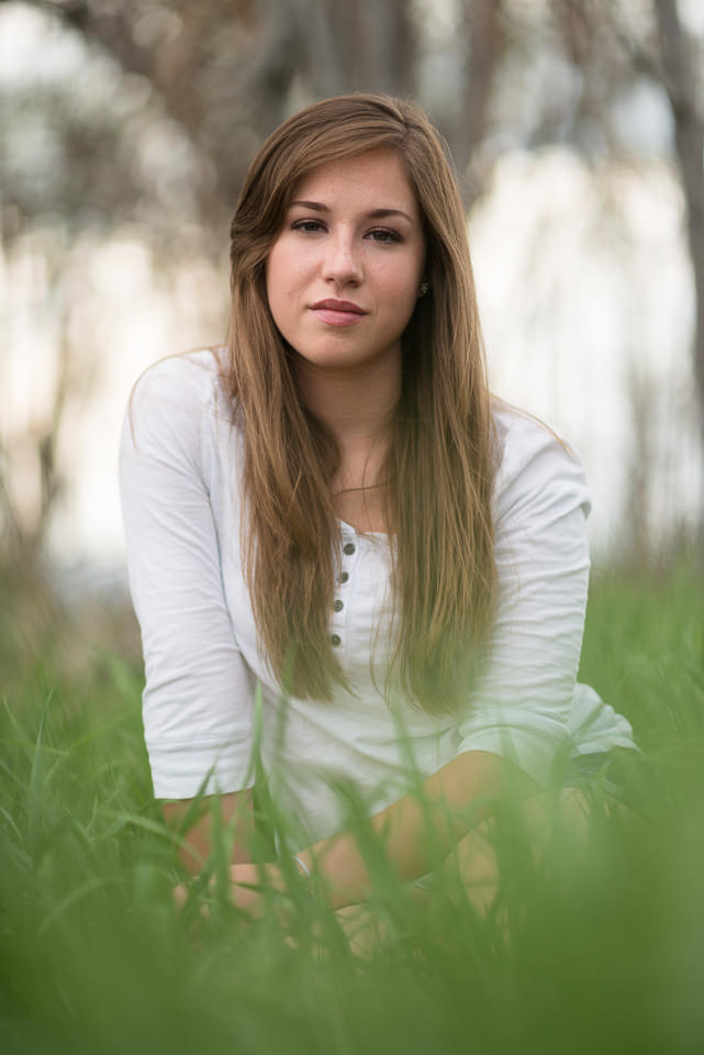
CONTACT SHEETS:
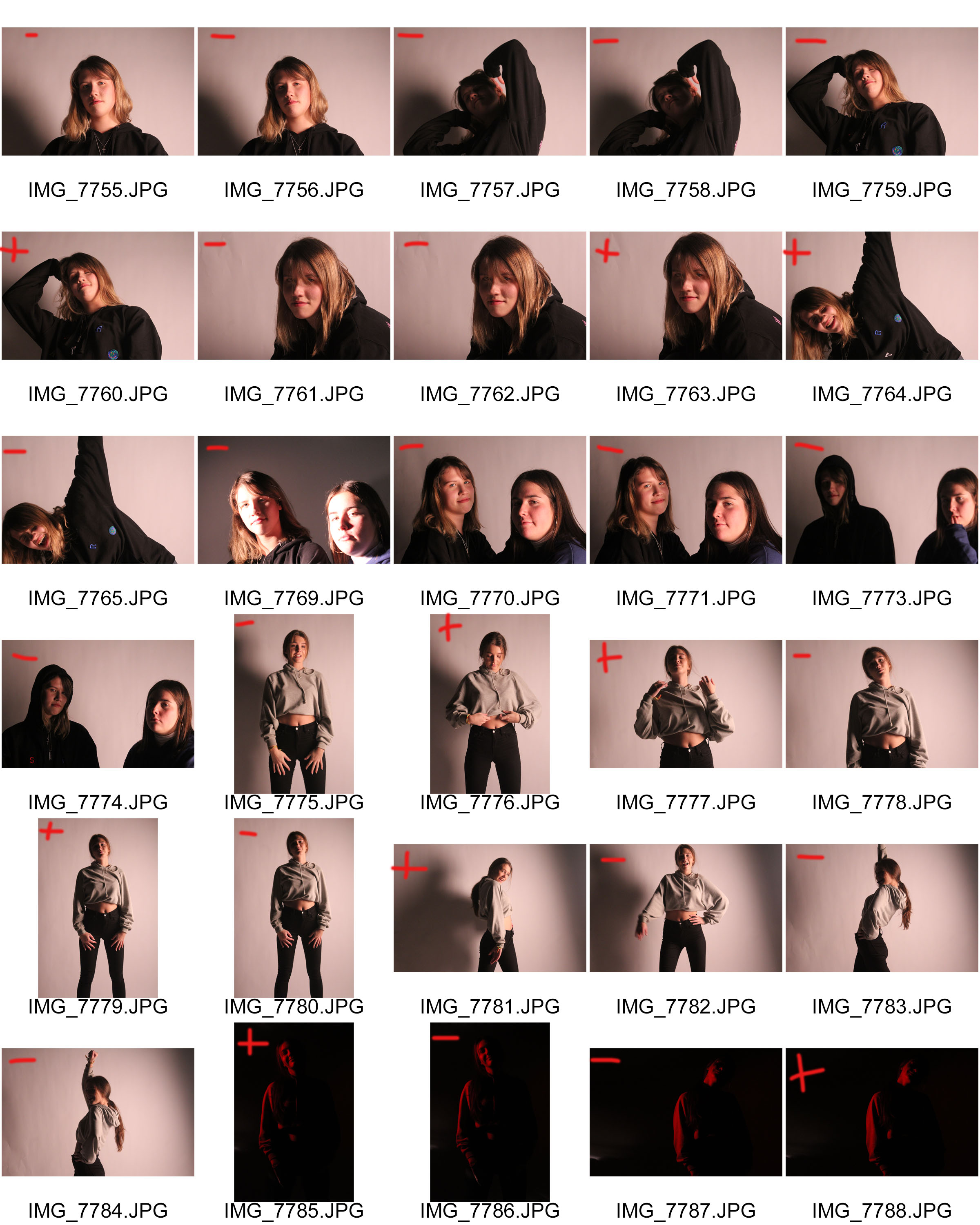
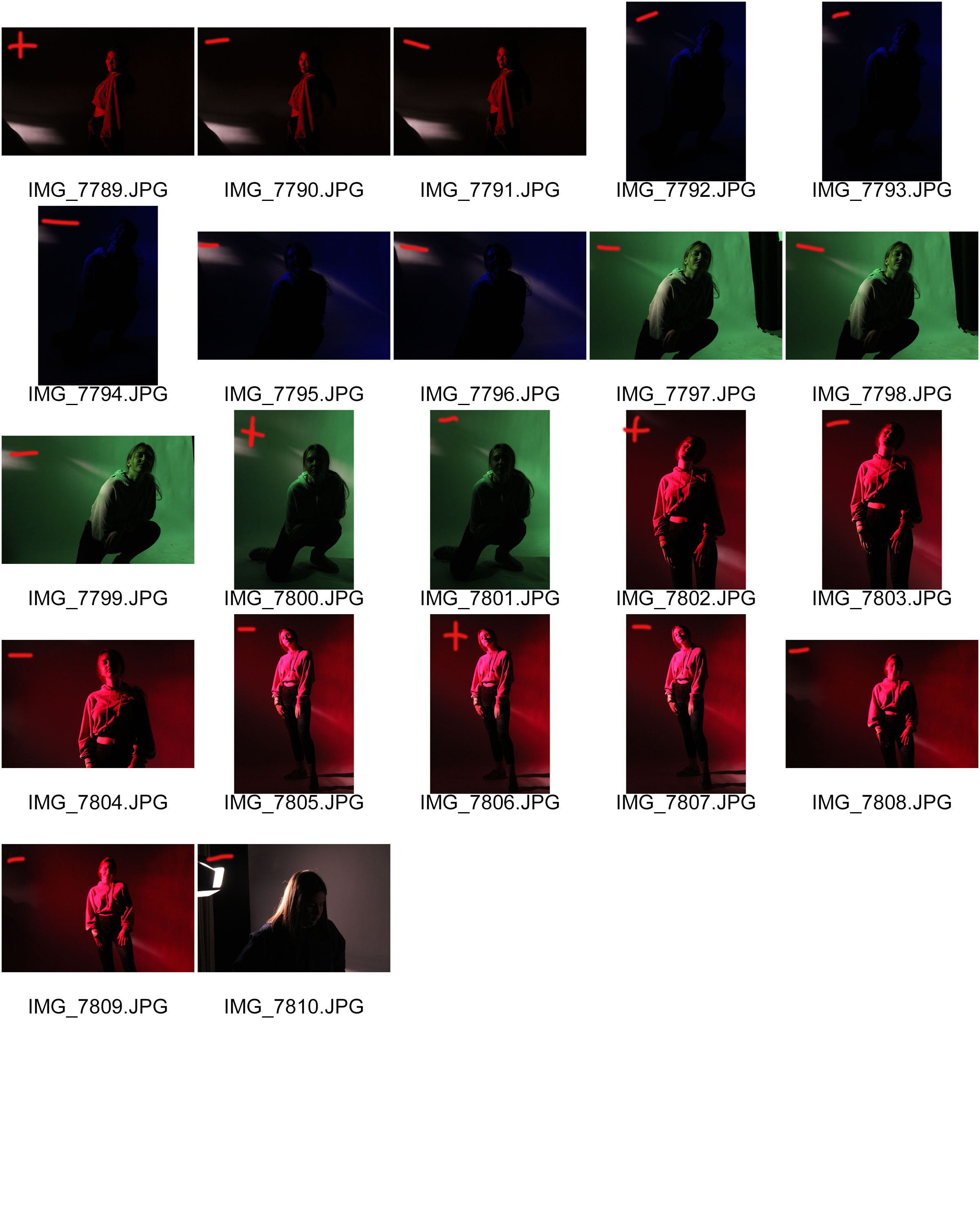
One of the main issues that came up during this photo shoot was overexpose. When using 3 point lighting, the ISO of the camera has to be set very low in order to avoid overexposure. The red heads and soft box provides light which is very powerful.
WORK STRATEGY:
WHO – for this photo shoot, I selected two models for my shoot which I thought would be suitable to photograph, people who are quite photogenic in nature.
WHAT – the main objective of this photo shoot was to experience the studio and the way in which it is most suitable to work in, using different types of lighting, backdrops and gel filters.
WHEN – the images were taken during school time, regardless of the time of day, artificial lighting lit the photo shoot.
WHERE -the images were captured in the school studio, specially designed for taking photographs.
WHY – to understand the most suitable ways in which to photograph people, and how to set up equipment specially designed for a studio environment. To also work with models and instruct them on their positioning.
HOW – I used my regular DSLR camera for this photo shoot, using the artificial lighting provided.
SUCCESSFUL IMAGES: 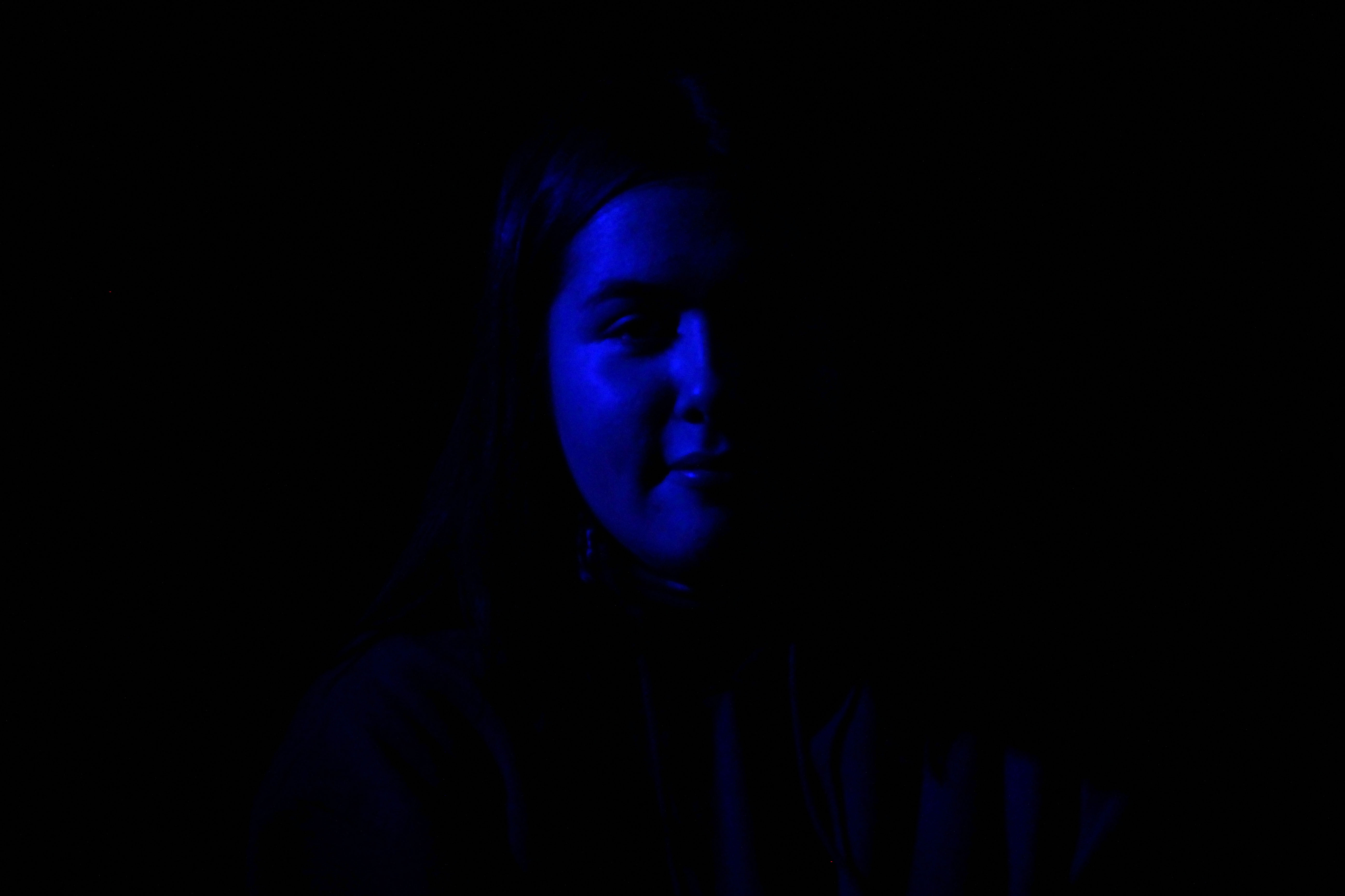

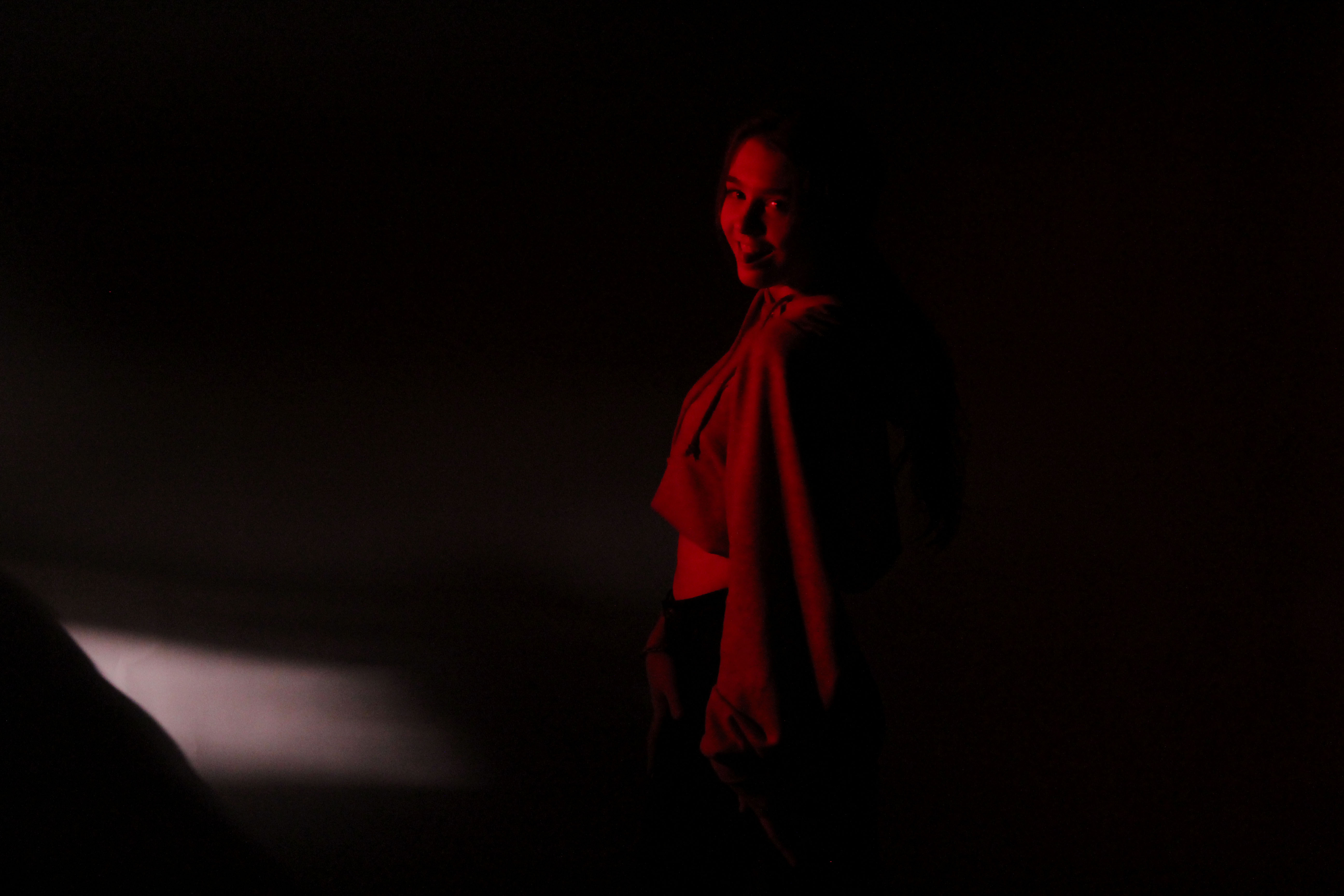
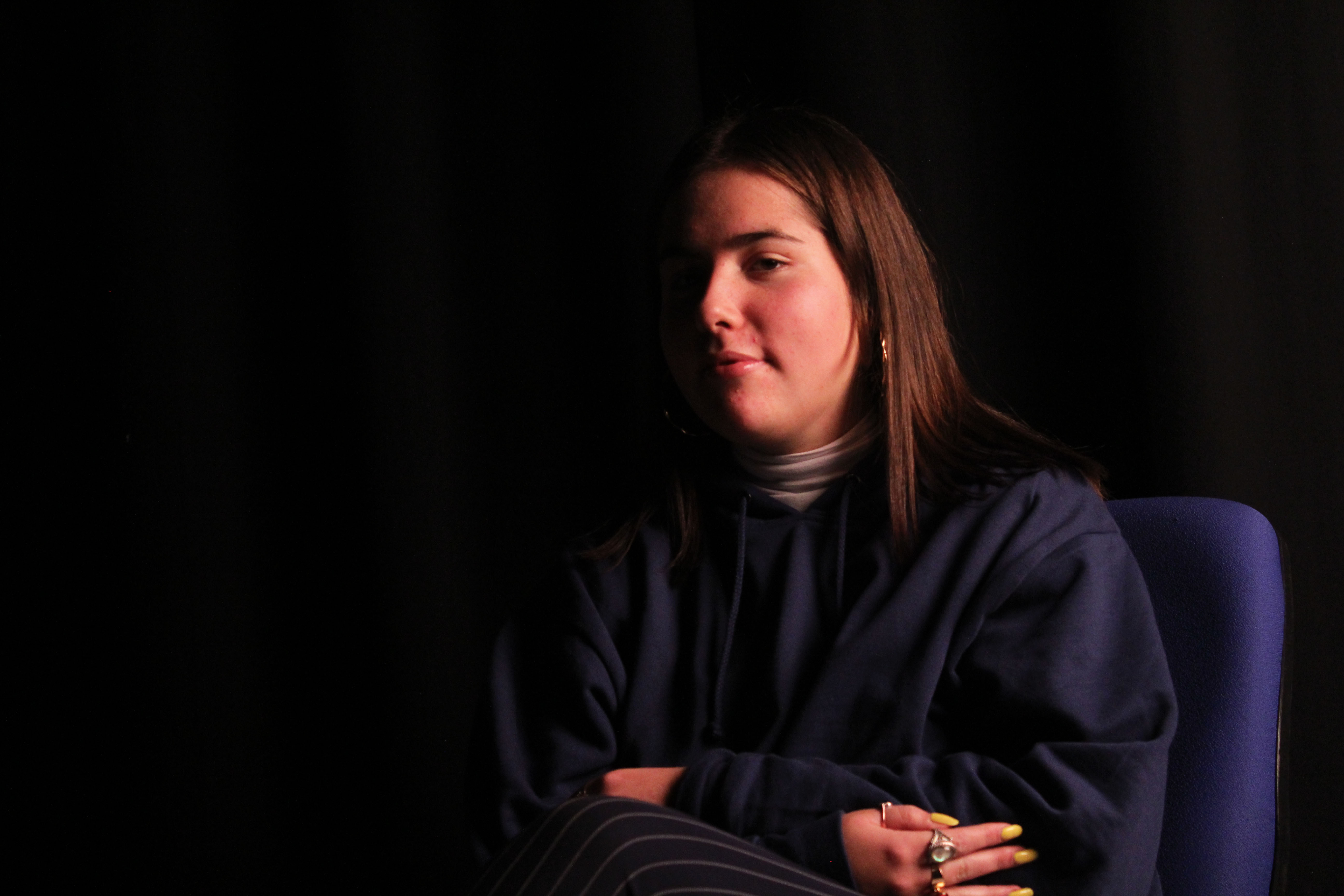
MOST SUCCESSFUL IMAGE ANALYSIS:
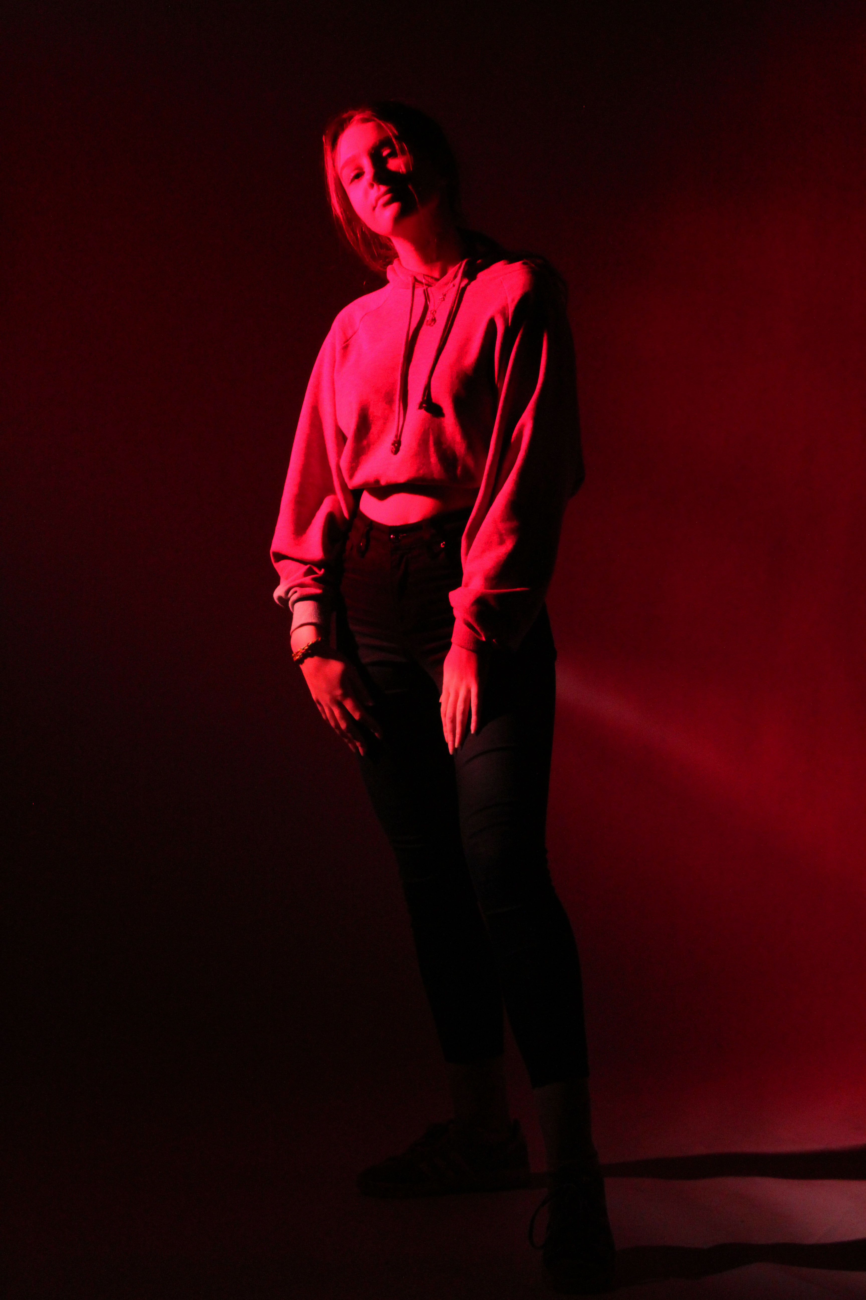
TECHNICAL:
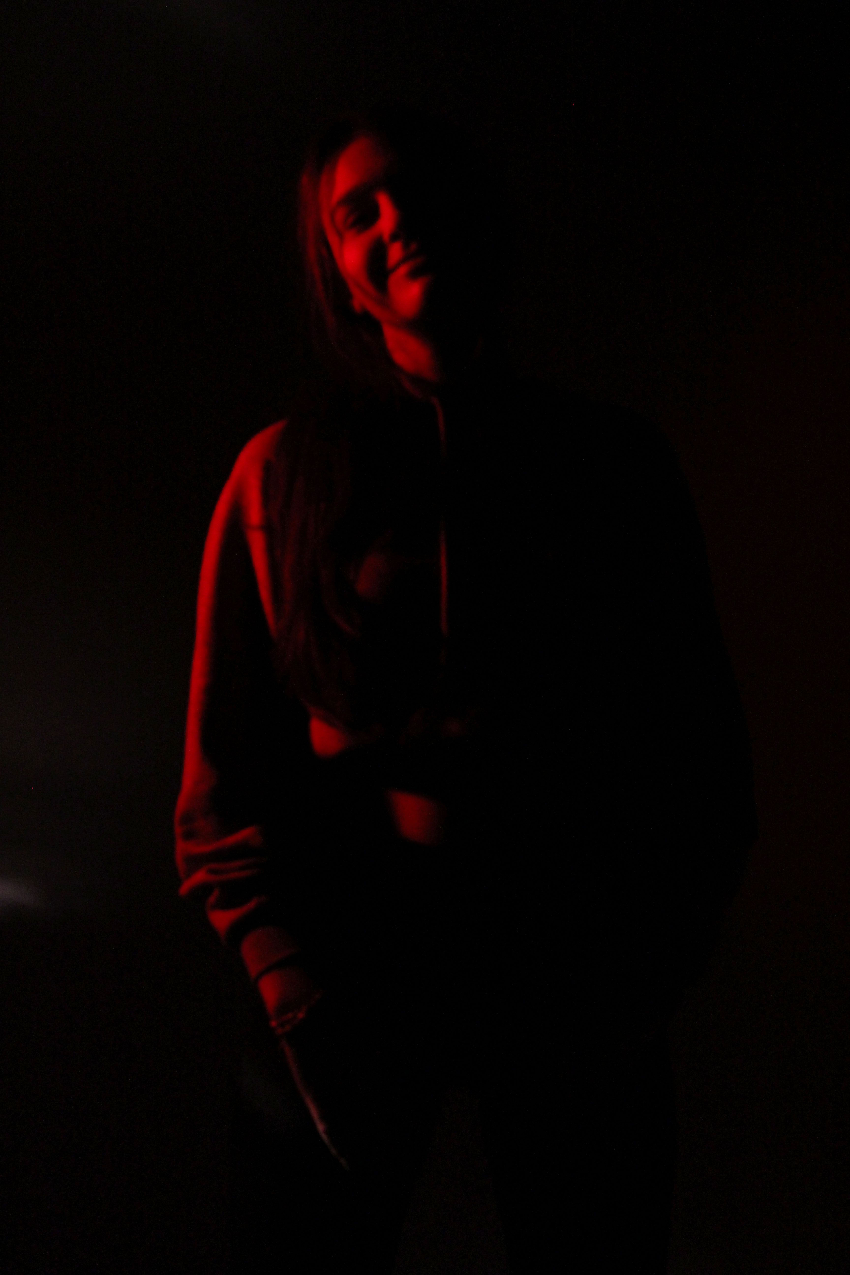
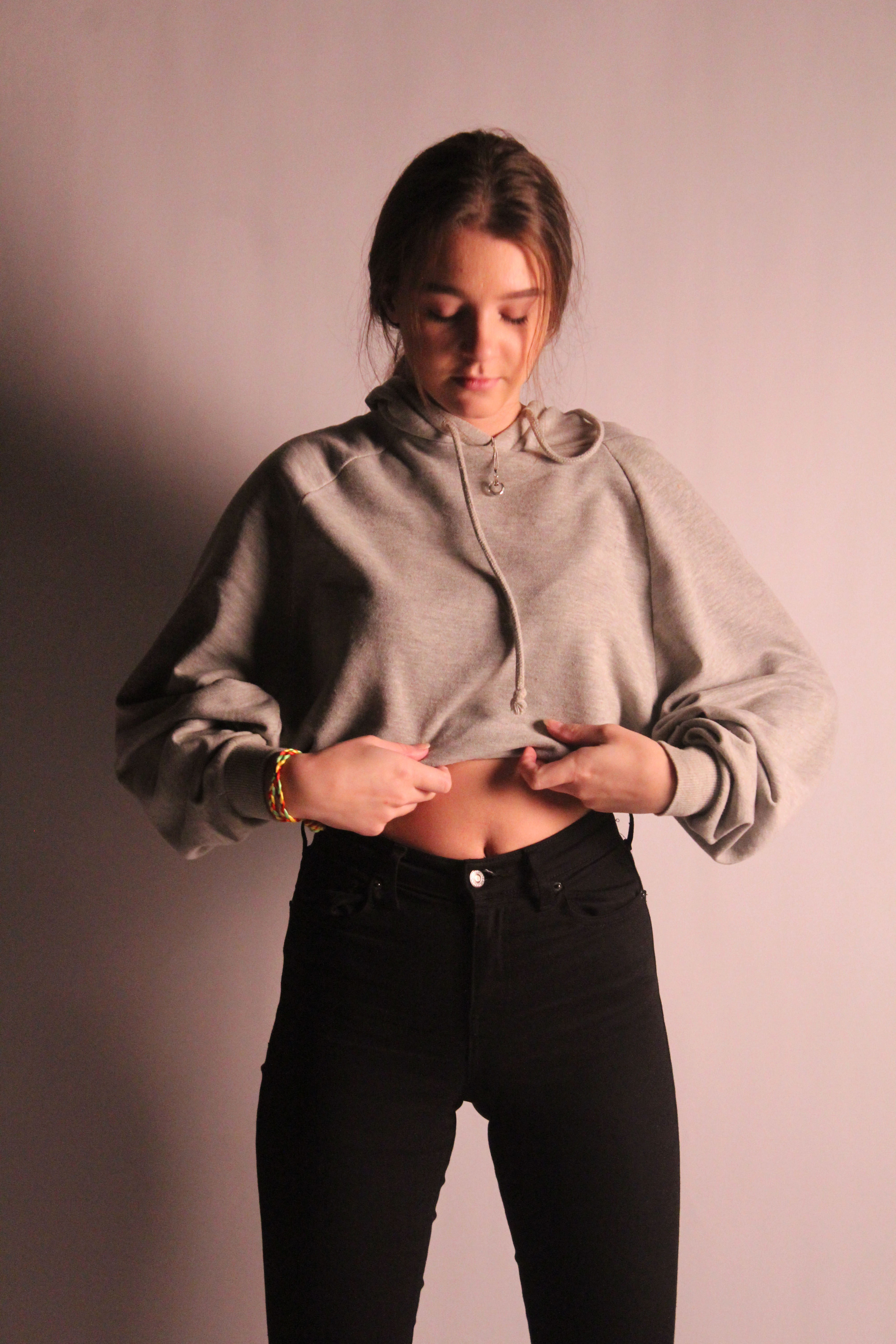
In terms of exposure, in order to capture this image the exposure of my camera had to be set very high, to ISO 3200, the highest setting on the camera. The red gel filter which we placed on the light source highly darkened the surrounding studio, contributing to the high ISO used. The f stop was also set quite high at f/5.6 in order to let as much light as possible into the camera. In order to achieve clean and crisp images, the shutter speed was set to 1/200. I also urged the models to have as little movement as possible to avoid motion blur. To add to the crisp nature of the image, we used the white infinity screen to provide a blank canvas for the models to pose on. This accentuated the model and lightened up the image, making the red more prominent.
VISUAL:
Chiaroscuro lighting is an artistic term dating back to the Renaissance that is noted by the contrast between dark and light. It is often times used in a bold manner so that it has a noticeable and dramatic effect on the entire composition of a work. It was one of the main aspects we wanted to capture in the photographs. The red gel filter applied over the top of the light source means that there is a chiaroscuro effect that includes color adding to the dramatic effect of the image. The dark surroundings and overall red tone in the images gives a creepy aura and a feeling of mystery and tension. The one faulty aspect of this image is the exposure. It was challenging to to not underexpose the image, making it dark and hard to distinguish the model, or overexpose it, making the highlights too strong and prominent. In order to retain the outline of the model, i chose to slightly overexpose the image. Rather than only capturing the face of the model, I attempted doing a full body shot. I angled the camera from a low angle to create power play between the camera and the model. This gives her a sense of importance and a grand stance. Irregularities in the gel filter placed on the light means that parts of the image are darker than others. Although undesired, it gave a nice effect, differentiating the tones in the background, The model is making clear eye contact with the camera which connects the viewer and the photo.
CONCEPTUAL:
The main concept of these images was to experiment with various items in the studio and to get used to the environment. It allowed us to use various backgrounds such as the black curtain and infinity screen, both creating different effects when used in images. When the black curtain is used, it adds darkness and mystery to the images, as it means that only the models are illuminated. When the white infinity screen is used, all the attention is drawn to the models, such as the face or clothing.
CONTEXTUAL:
Since the early years of the 20th century the business functions of a photographic studio have increasingly been called a “photographic agency,” leaving the term “photographic studio” to refer almost exclusively to the workspace.
The history of photographic studios and photography dates back to 19th century with the first camera. The earliest photographic studios made use of painters’ lighting techniques to create photographic portraits. During that era the nothing was better than the sunlight with open window as the primary source of light of painters. Photographic studios started using flashes in 1840. However, not everyone could afford it as they were quite expensive and dangerous. These flashes were also known as ‘hot lights’ and could have exploded. By 1860s they were in common use in professional studios. ‘Tungsten Lights’ or ‘Hot Lights’ were still in use. In around 70s even smaller studios got access to flash lights or strobes.
CONTACT SHEETS:
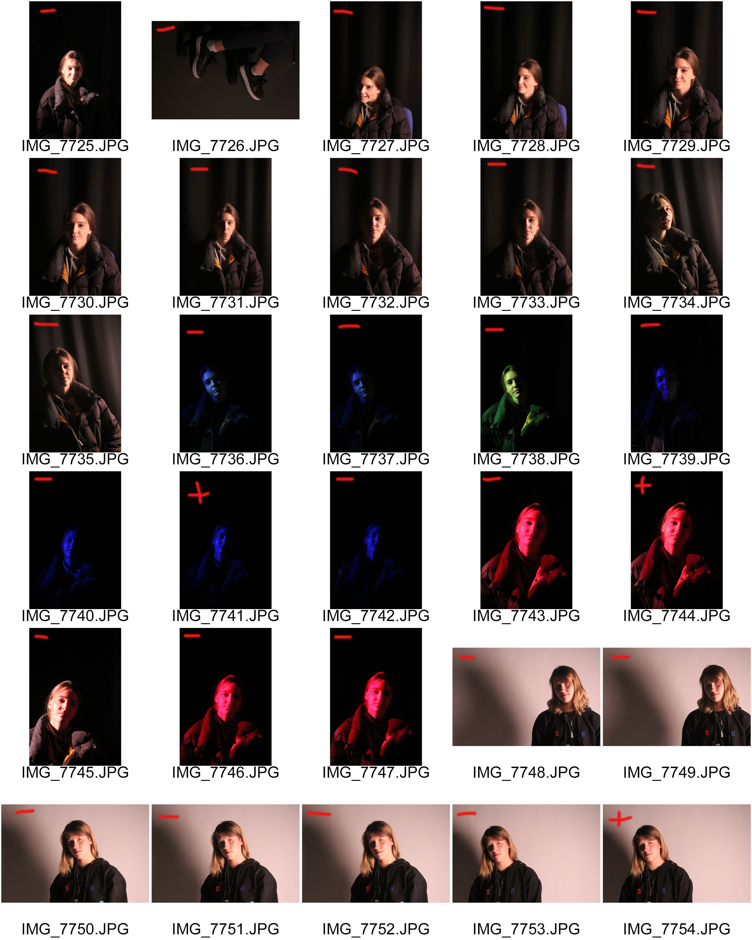
When doing this photo shoot, we experimented with various features in the studio, using both the black curtain and infinity screen. We also captured various angles of the models, from close-ups to full body shots. At points we also used two point lighting, using the soft box and red heads in conjunction to light the images. Halfway through i switched out the models in order to capture the varying characters of the people.

RANKIN CASE STUDY:
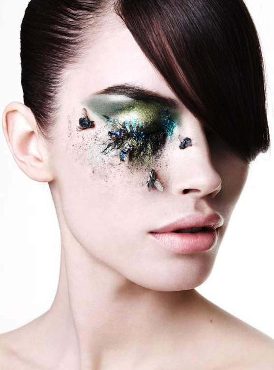
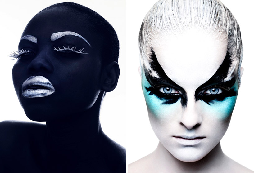
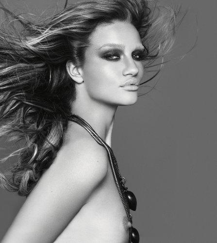
CASE STUDY OF WORK:
LIFE AND WORK:
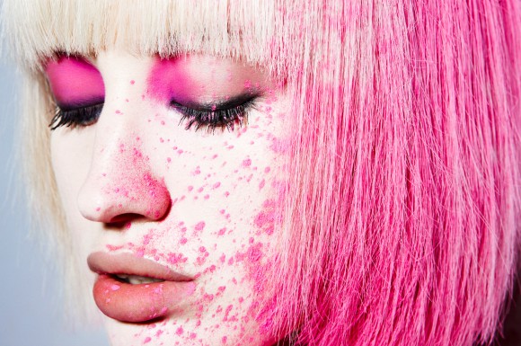
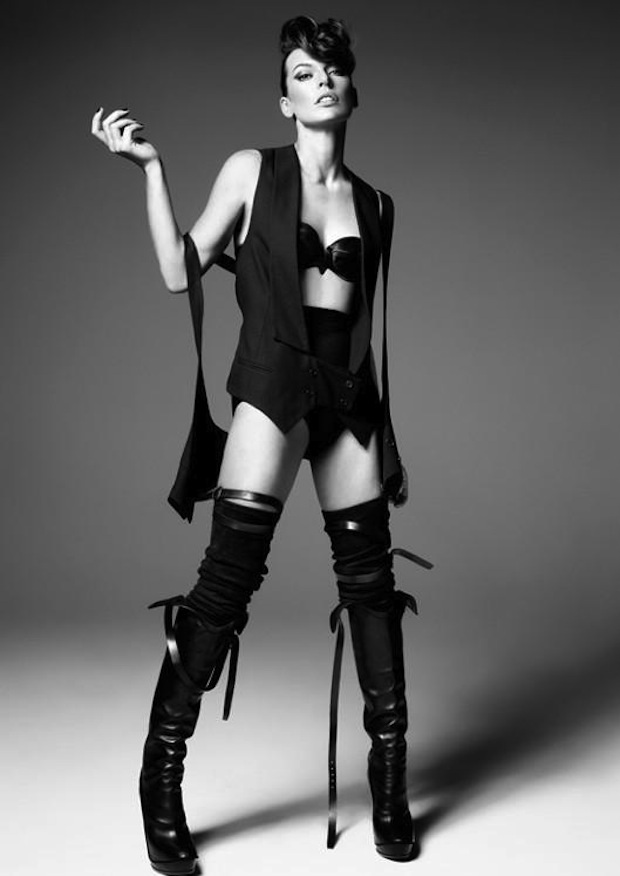
Rankin is the working name of John Rankin Waddell. Born in Glasgowin 1966, Rankin is an English fashion and portrait photographer. He grew up in Hertfordshire and while studying at Brighton Polytechnic, he quickly realized that his main interest is photography rather than accounting . So, he joined the Barnfield College, Luton, United Kingdom and later went to London College of Printing. Meanwhile, Rankin met Jefferson Hack and once they graduated, together they started a magazine titled Dazed & Confuse.
In 1999, the two became the founder of a production company known as, Dazed Film & TV. It was the first to broadcast a mast-head television special, Renegade TV Gets Dazed. Rankin then in 2000 launched RANK, a quarterly fashion magazine. The Dazed Group also publishes Another Man, HUNGER and Another Magazine.
By the Royal Photographic Society, Rankin was awarded an Honorary Fellowship. He has photographed many celebrities such as Kate Moss, Spice Girls, Lily Allen, Britney Spears, Kevin Spacey, Cate Blanchett, Queen Elizabeth II, The Rolling Stones, Madonna,
WORK ANALYSIS:
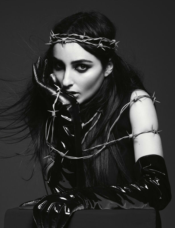
VISUAL:
The image above contains a variety of different textures and forms, from the shiny latex gloves which reflect strong highlights, to the smooth and flawless skin of the model. The barbed wire which coils around the body and the head of the model gives the image a flow and leads the viewers eyes to the top of the image, being central around the model’s head.
There is very strong eye contact being made with the camera which draws in the reader and gives the image an aura of mystery and the unknown. This feeling is further emphasized through the strong connotations that the latex gloves and barbed wire have to violence. Being in black and white, the image is dark and dramatic. The models facial features are very prominent due to the strong lighting used. The focal point of the image is the models face, which is highly contrasted with the black clothing and grey backdrop.
TECHNICAL:
The exposure in this image is very well exposed, with the highlights and shadows complementing and harmonizing with each other. The image is also very crisp and sharp suggesting that a fast shutter speed has been used, in addition to that, a tripod is likely to have been set up as well in order to keep the camera still and get a very horizontal shot of the model. There is soft and diffused light hitting the model directly in front which suggests that a reflector has been used in order to achieve this effect.
The positioning and the eye contact the model makes also suggests that this is a setup, where she has been told what to do and how to pose. The flawless and airbrushed skin of the model suggests that some Photoshop manipulation was used in order to make the image grey scale and to erase any minor imperfections to give a uniform and clean look to the image.
CONCEPTUAL/CONTEXTUAL:
He tries not to prejudge anyone. “I try to think about people in human terms. That’s something my parents taught me – never put anyone on a pedestal, but never talk down to them either, which has been very instructive in my job. I see the person, not the celebrity. I’m a portrait photographer – I shouldn’t bring in my opinion. My job is to capture them in a moment.”
Fashion and celebrity photography can be criticized for being shallow and throwaway. Rankin is often the subject of such criticism and this project was one way for him to respond to his critics with characteristic wit, allowing his images to be destroyed and the sale of the art works benefiting a music charity for young people. There is a great deal of skill and craft in creating seductive images that stand out from the crowd.
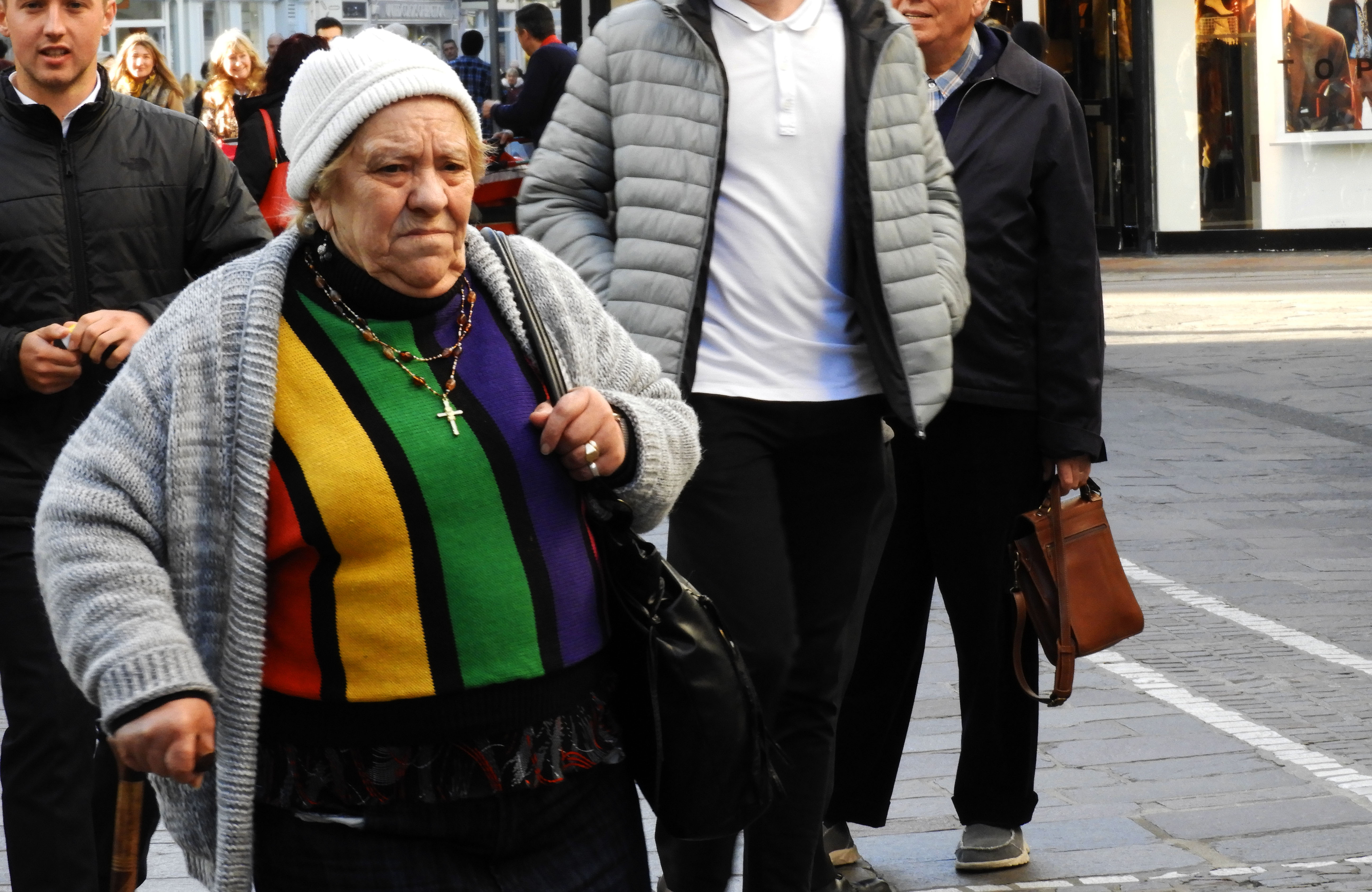
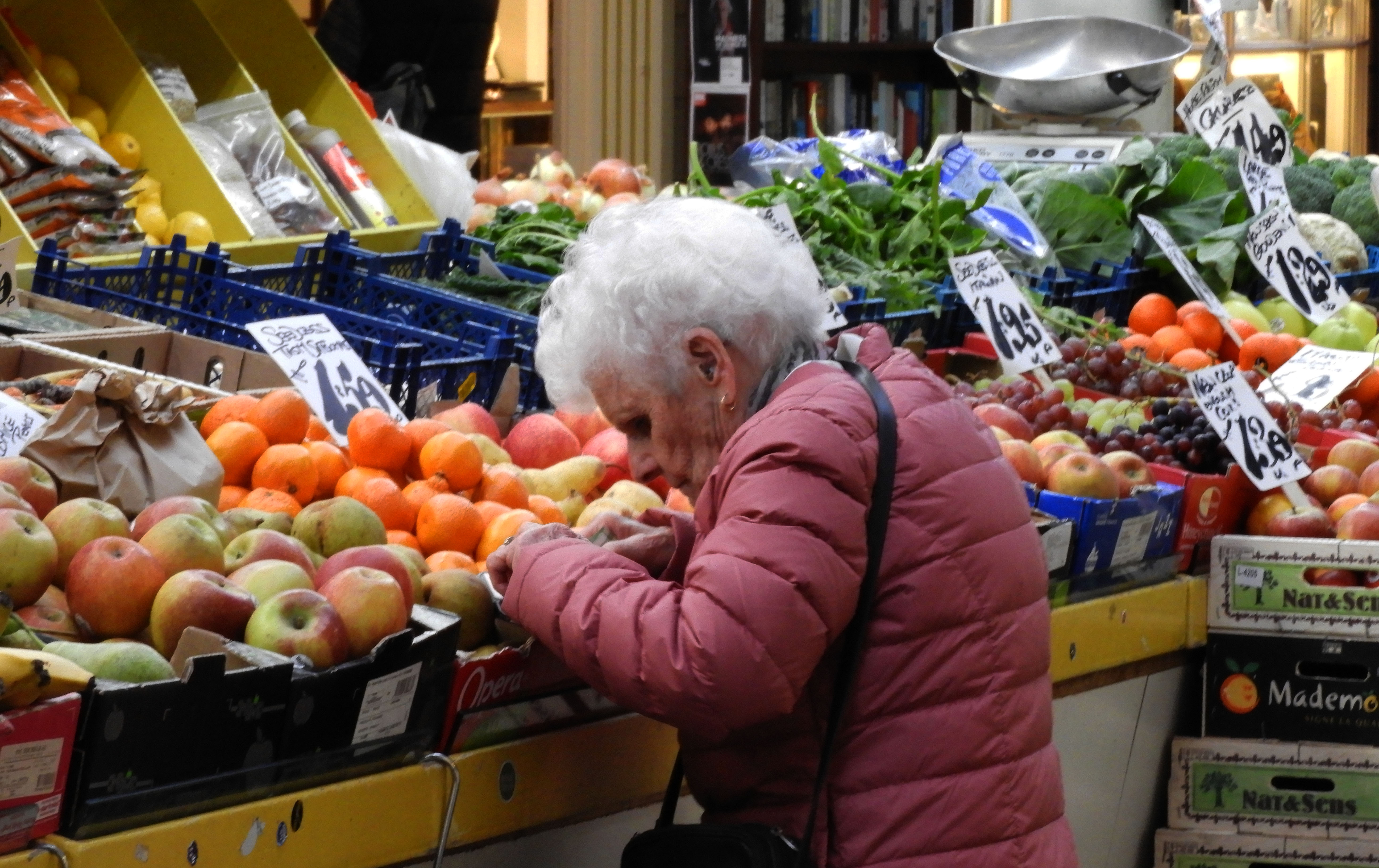
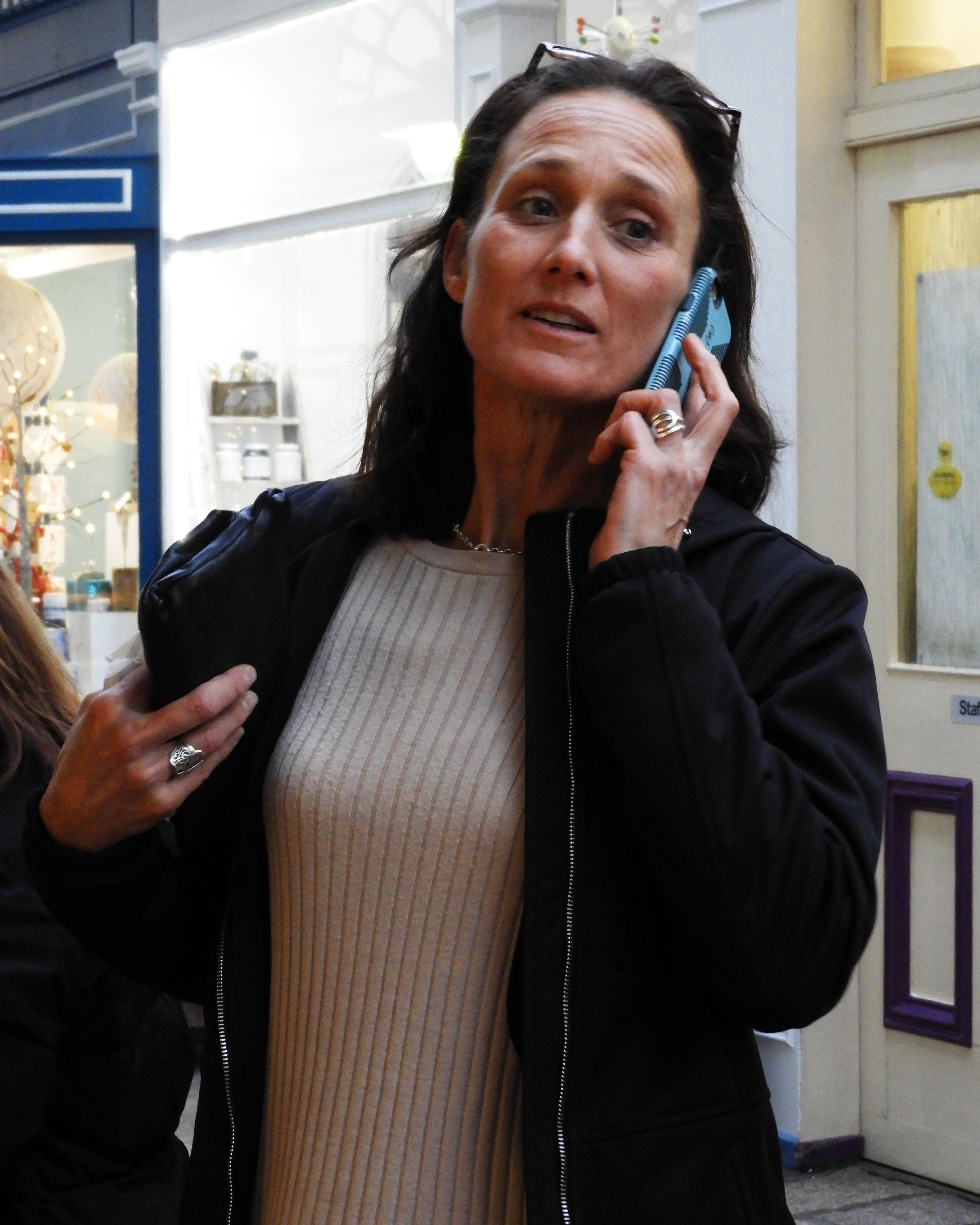
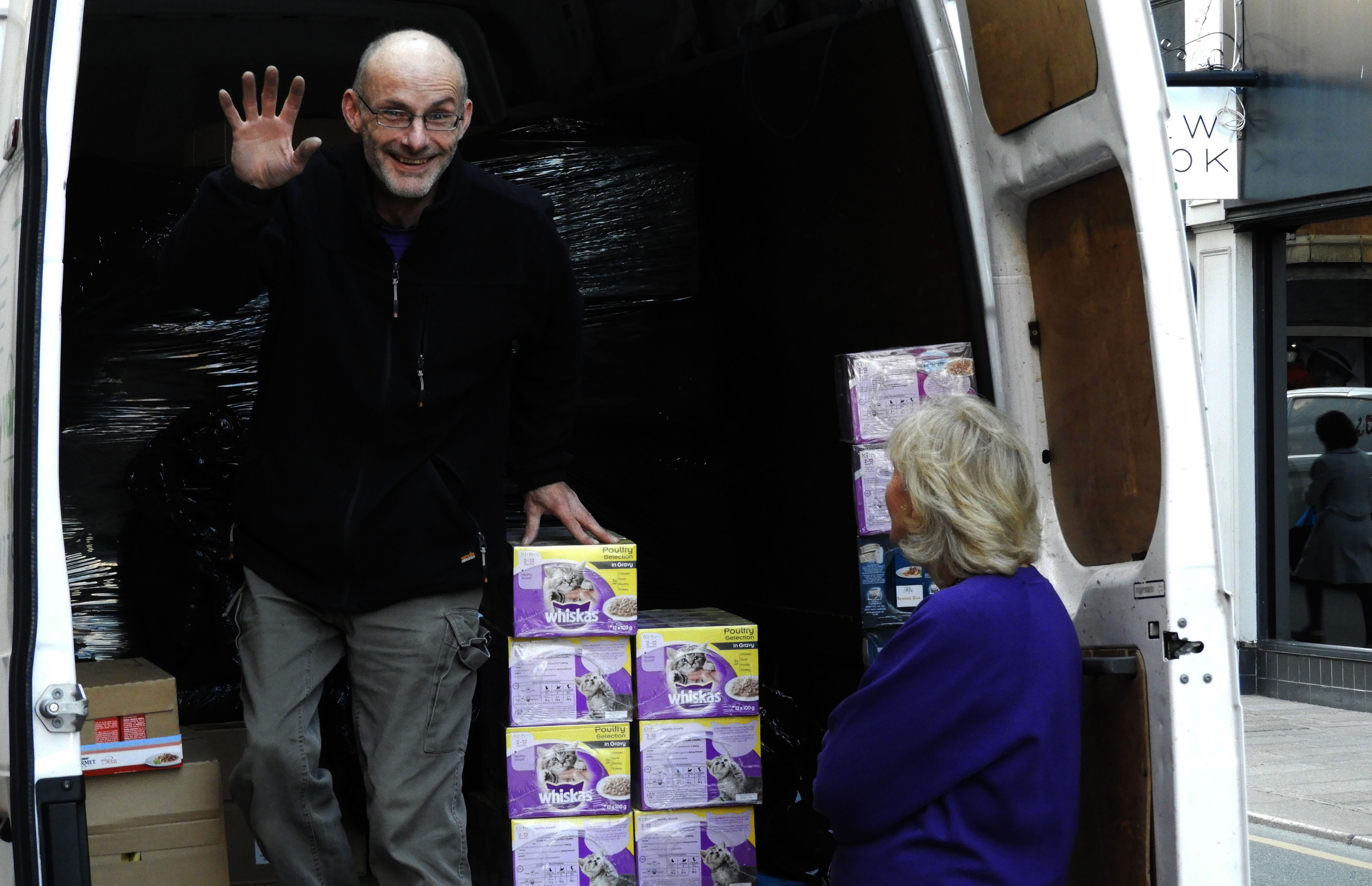
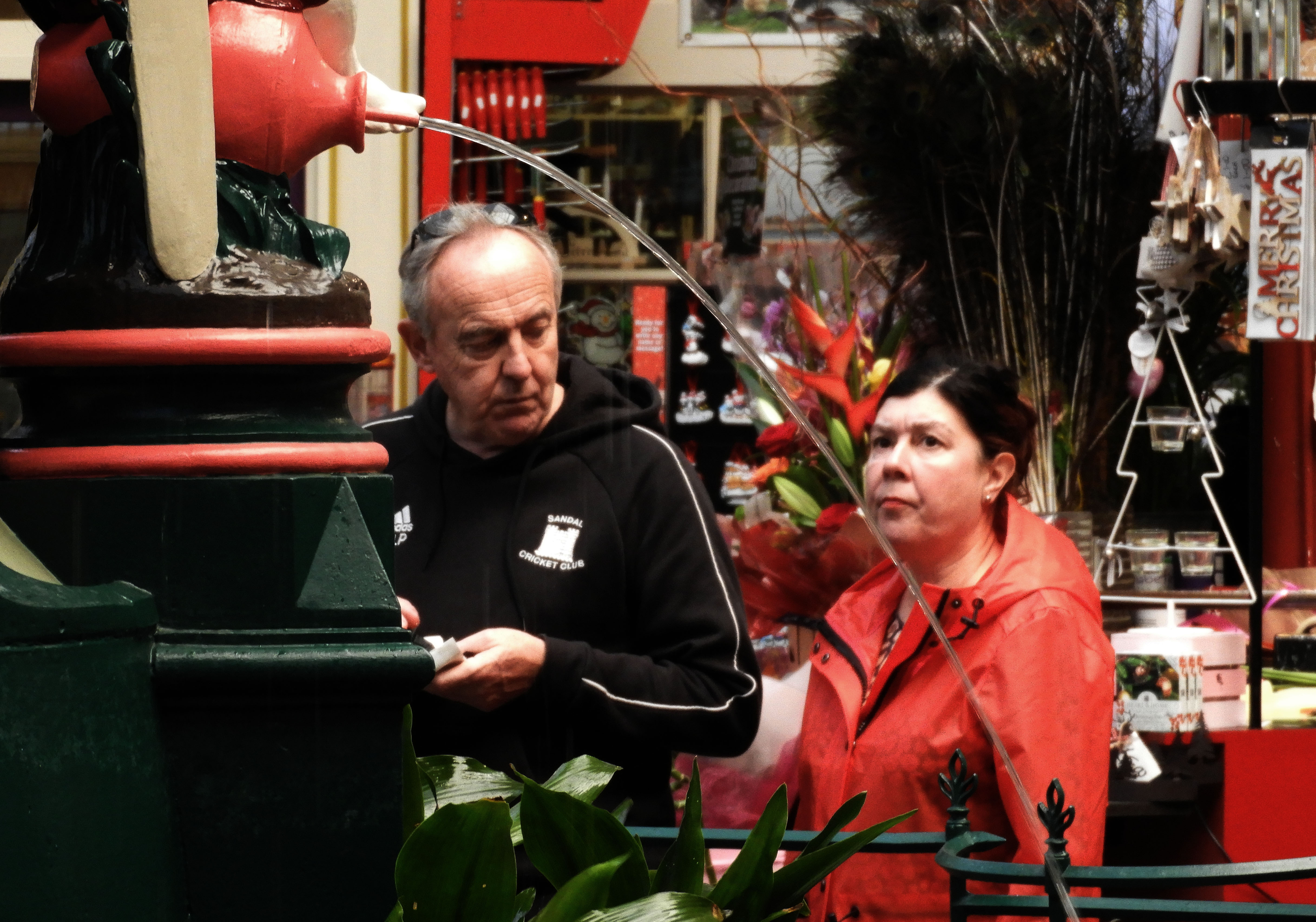
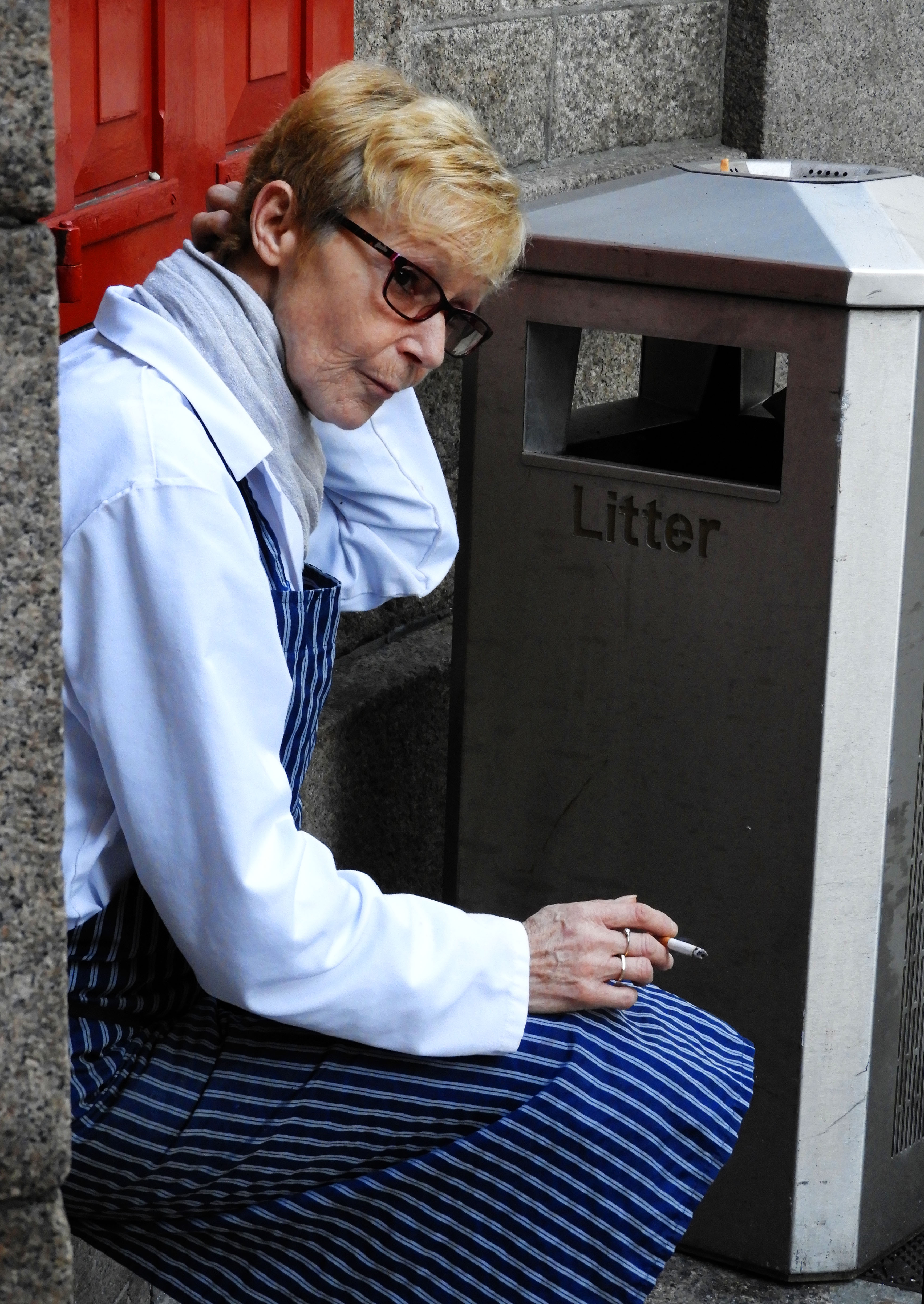
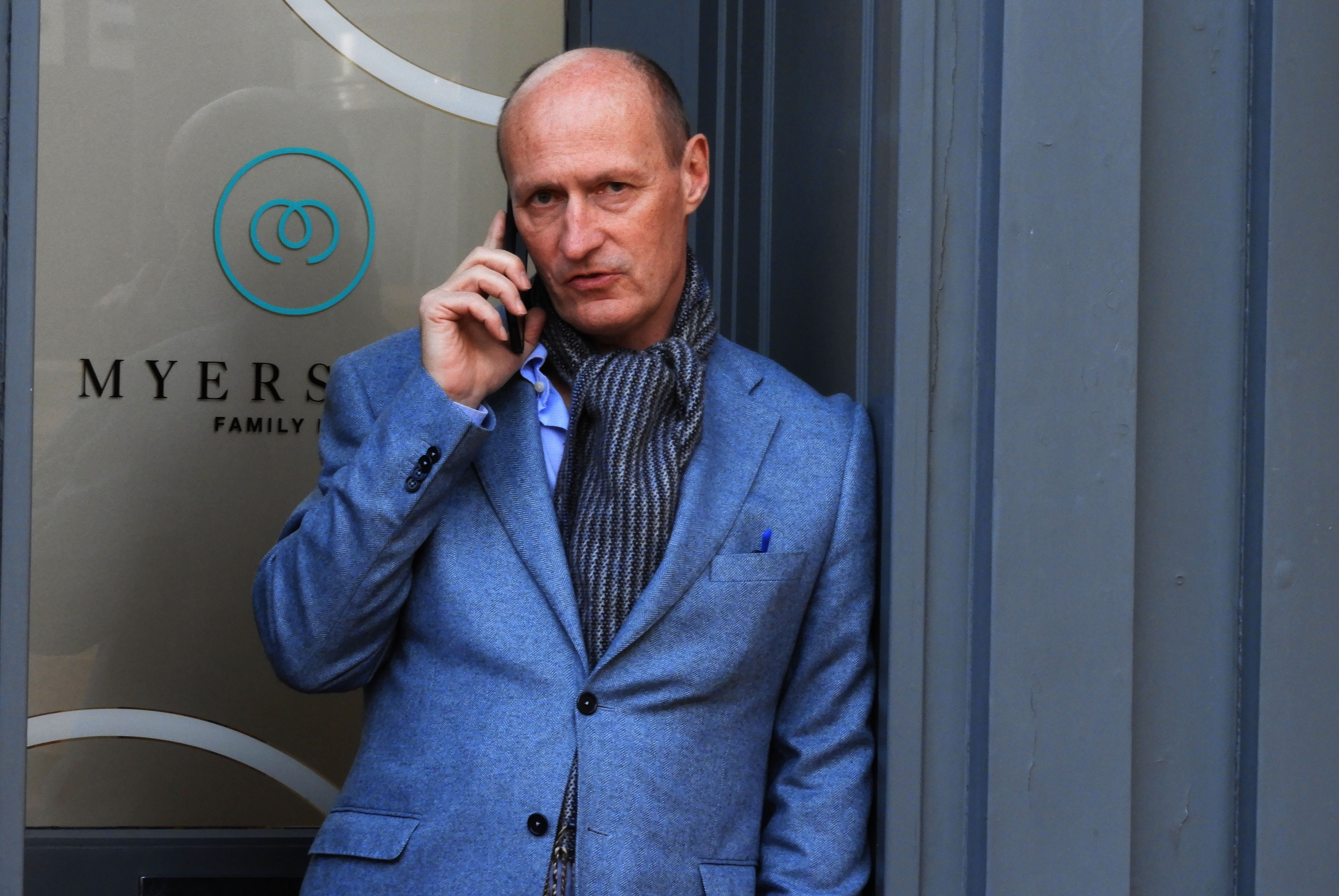
WHO – when going out to do street photography, the subjects of the images are always random by passers on the street, people going about their daily business .
WHAT – the main objective of the photoshoot was to capture snap shots of people’s regular daily lives.
WHEN – the images would be taken during late afternoon, and as it is late autumn, this is the time of day when the sun hits from quite a low angle.
WHERE -the images would be taken all around st.helier.
WHY – to document the different types of people that we encounter in our everyday lives, from young to old, rich and poor, we would capture everyone.
HOW – I used my regular DSLR camera for this photoshoot, taking advantage of the natural, bright lighting during that day.
MOST SUCCESFUL IMAGE:
TECHNICAL –
As street photography means capturing images of people on the street going about their daily activities, I was forced to use quite a fast shutter speed. Many of the people I captured were moving quickly so the images were prone to motion blur. The lighting during that time of day was also quite direct p, often glaring into the lense and creating overexposed images, therefore to combat this I used a sun hood. In terms of aperature, I switched the f stop depending on the environment I was in. I used a higher f stop for when I was inside the market to increase the amount of light entering the camera and used a smaller f stop when in natural lighting was present.
VISUAL –
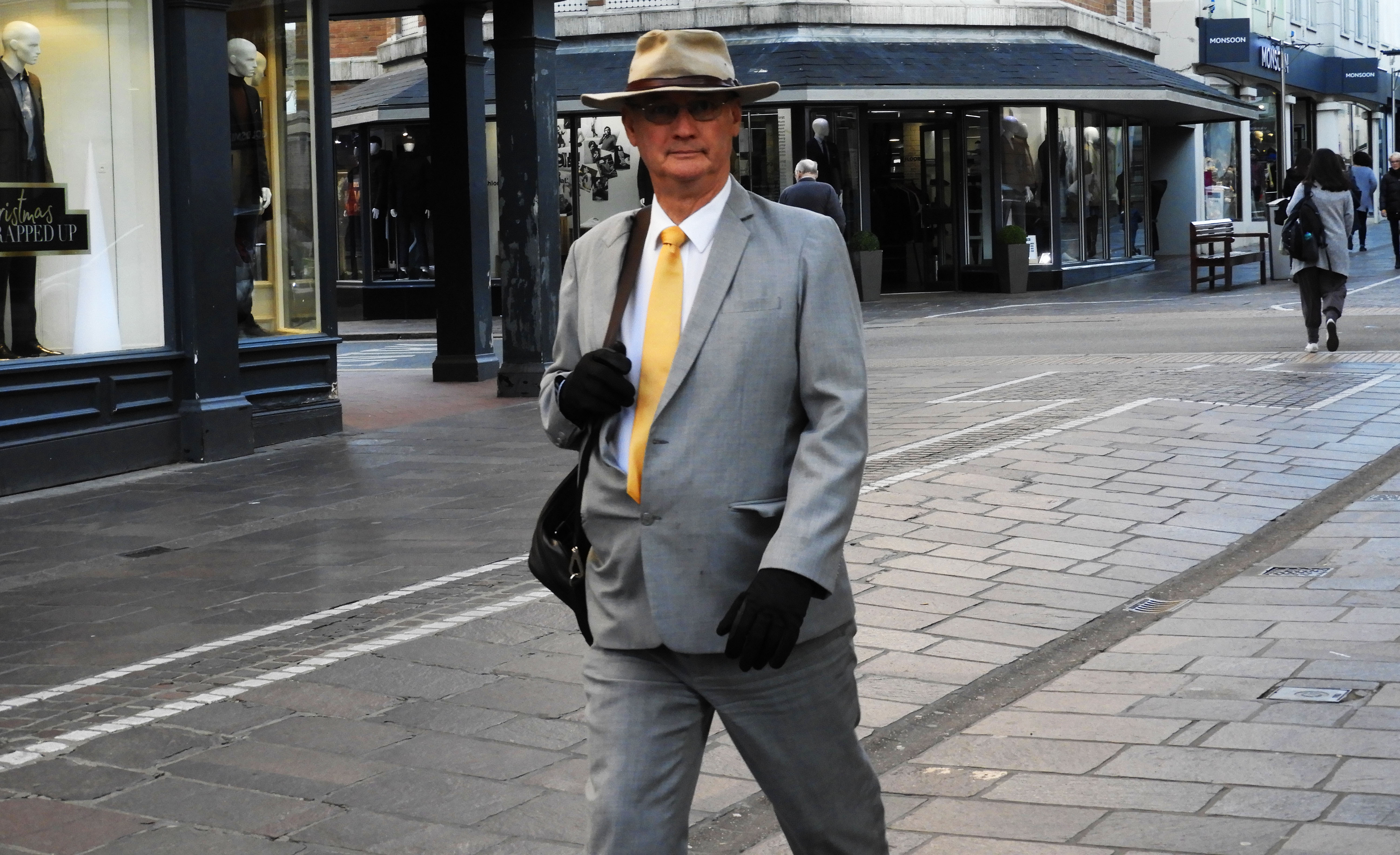
Firstly the colors in this image are very monotone, with the suit of the man and the surrounding environment being a cool grey. The bright yellow tie the man is wearing provides a very distinct focal point to which the eye is immediately drawn to. Furthermore, the central positioning of the man in the foreground means that he is the subject to stand out the most. Although I was attempting to capture people going about their everyday business, the subject in the image made direct eye contact with the camera. This instead of being a bystanders perspective, has become more personal, as the man is now making a direct connection with the viewer. The simple suit that the man is wearing works well to draw most, if not all the attention to the tie and the face of the man ,accentuating the eye contact he is making with the camera and the viewer. The repeating pattern on the ground is disturbed by the presence of the man. The horizontal lines going across the ground are opposed by the straight stature of the man. The light in this image is very well balanced, with the highlights and shadows working together to create a well lit image.
CONCEPTUAL/CONTEXTUAL-
Street photography is a way of walking through a space while being constantly aware of momentary changes in light. It is a discipline and constant awareness of how one can arrange and frame compositional elements in advance of a yet-to-be-seen sequence of events that may or may not happen: for example, when out seeking images, some photographers prefer the shady side of the street and will walk along a curb to utilize the vanishing perspective lines of the sidewalk merging with the adjacent buildings.
Street photography is about being open to the endless possibility of what might make an interesting photograph; arguing couples, balletic pedestrian movement, uncanny and witty juxtapositions of seemingly unrelated subject matter. Street photography is about spontaneity: the choreography of synchronizing an impulsive emotional or cerebral response that may transpire over the course of milliseconds with making a photographic exposure. And street photography is so often about not knowing what a good photograph will look like, yet trusting the desire and impulse to pick up the camera, frame the scene, and rely upon intuition to recognize the moment where form and content are at an apex.
RULE OF THIRDS:
This image also follows the rule of thirds. When the image is split into 3 separate segments, the man ends up being in the center segment. This is significant as this means that he becomes the focal point of the image is the man, even more notably, when the same segment is cut again into 3 parts, the bright and notable yellow tie of the man is central in the image.



WHAT IS STREET PHOTOGRAPHY?:
Street photography, sometimes called candid photography is the conduction of photography, where photographers capture natural images, unmediated encounters with strangers on the street.
MOOD-BOARD:
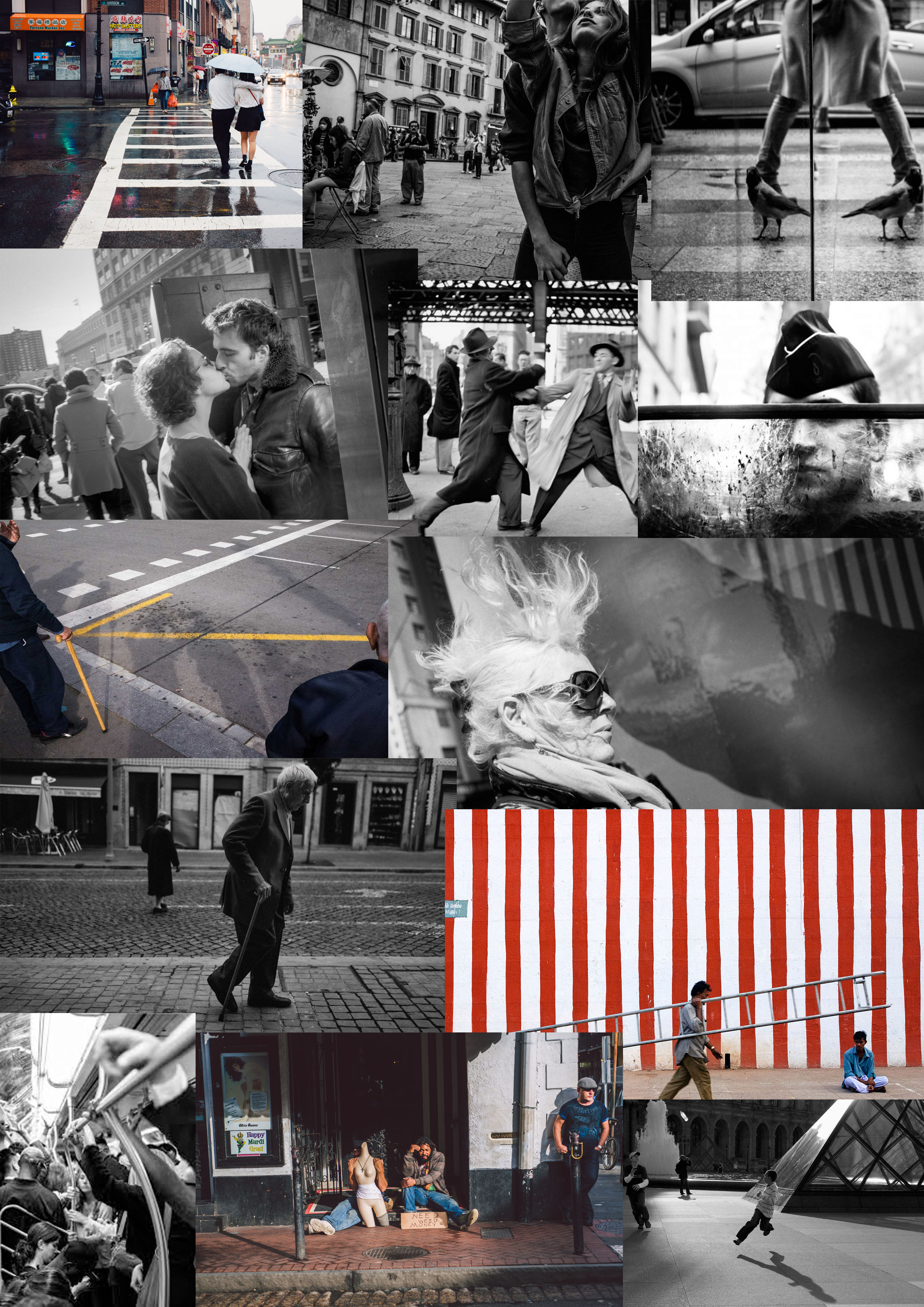
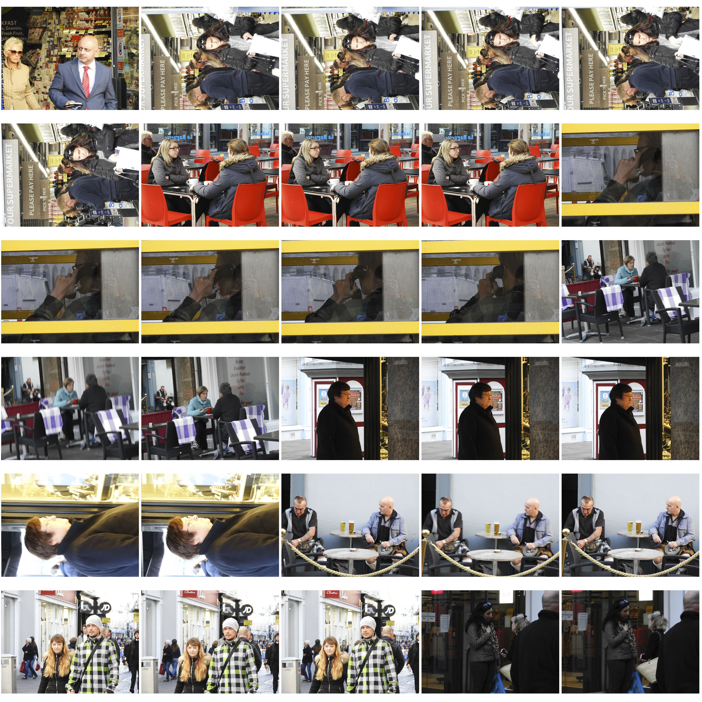
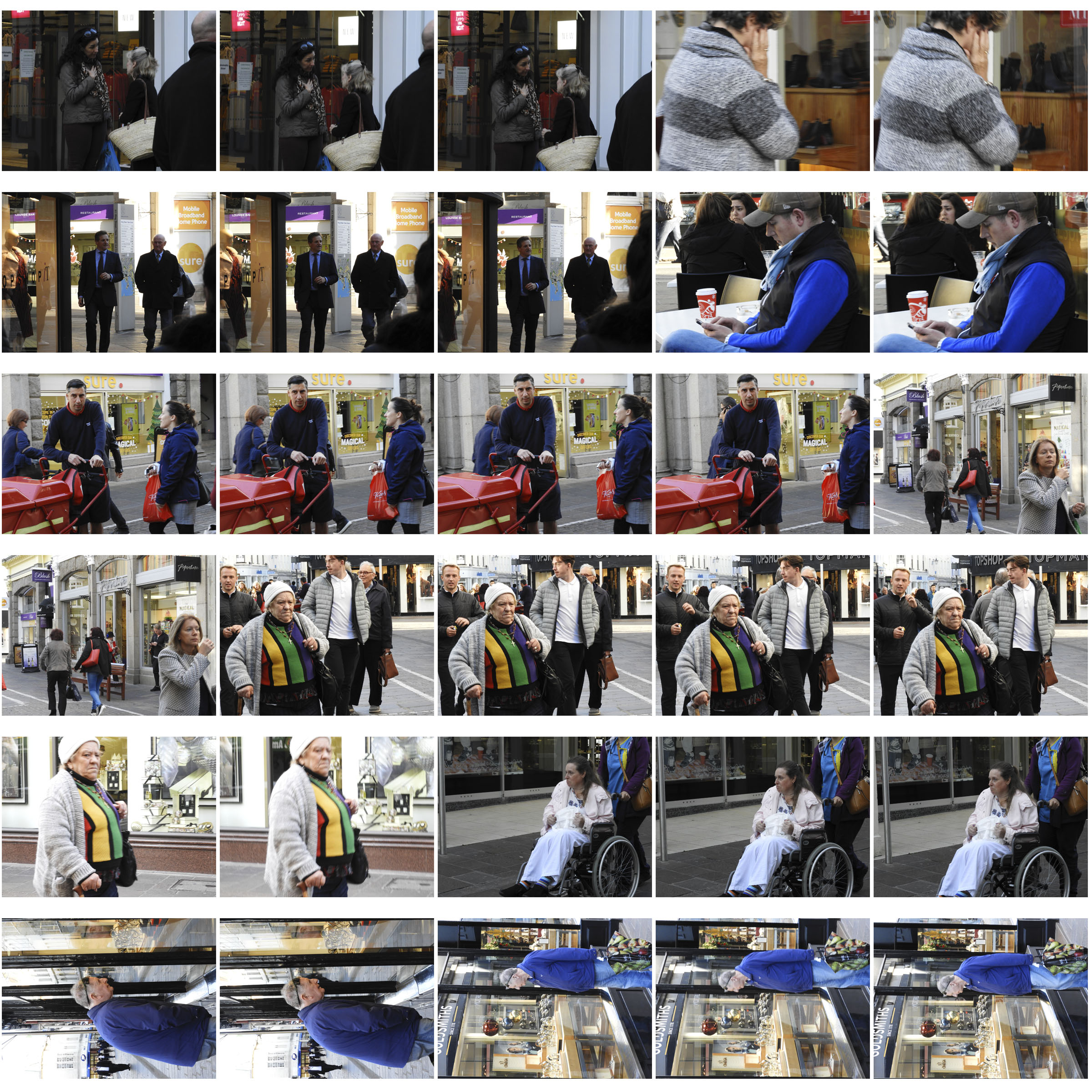
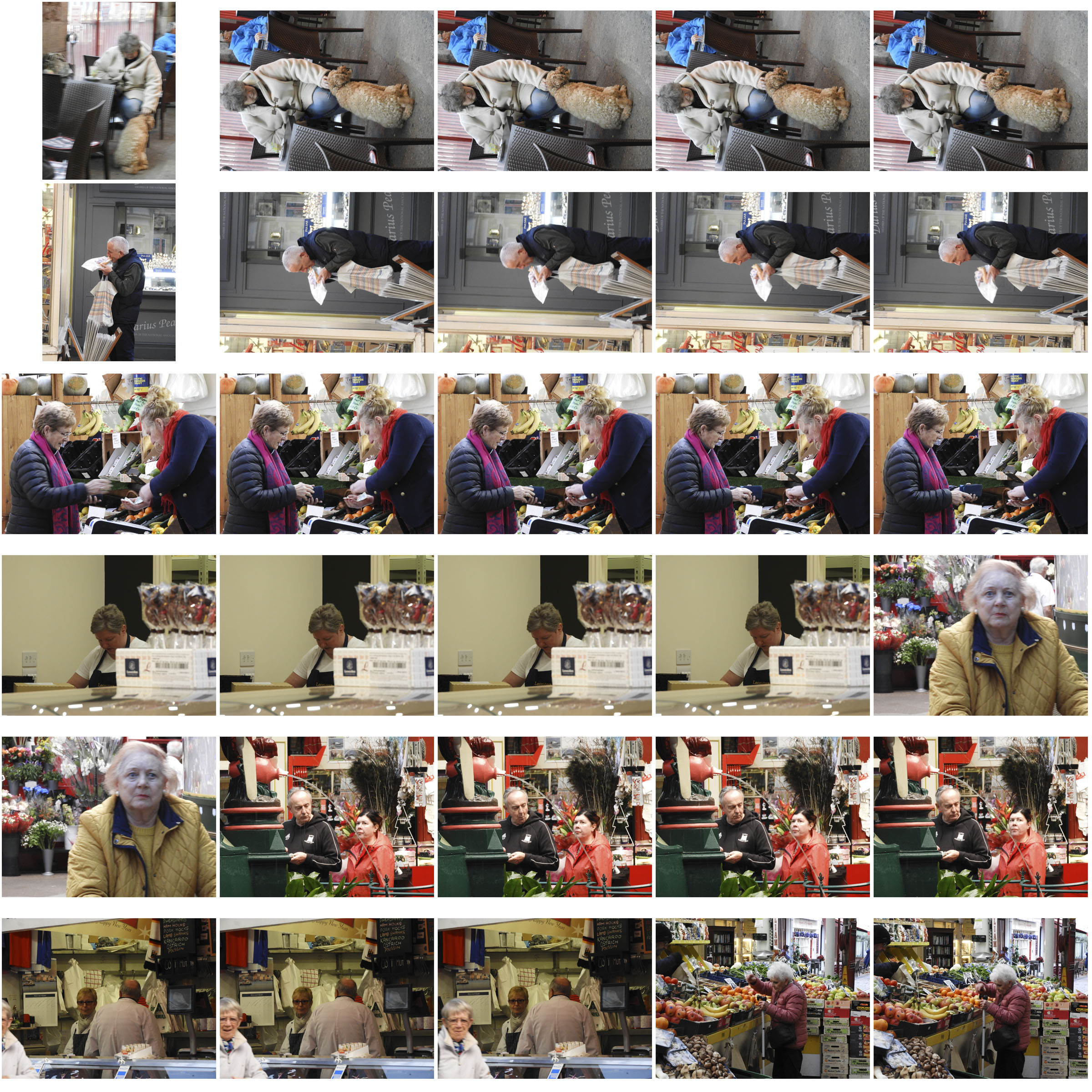
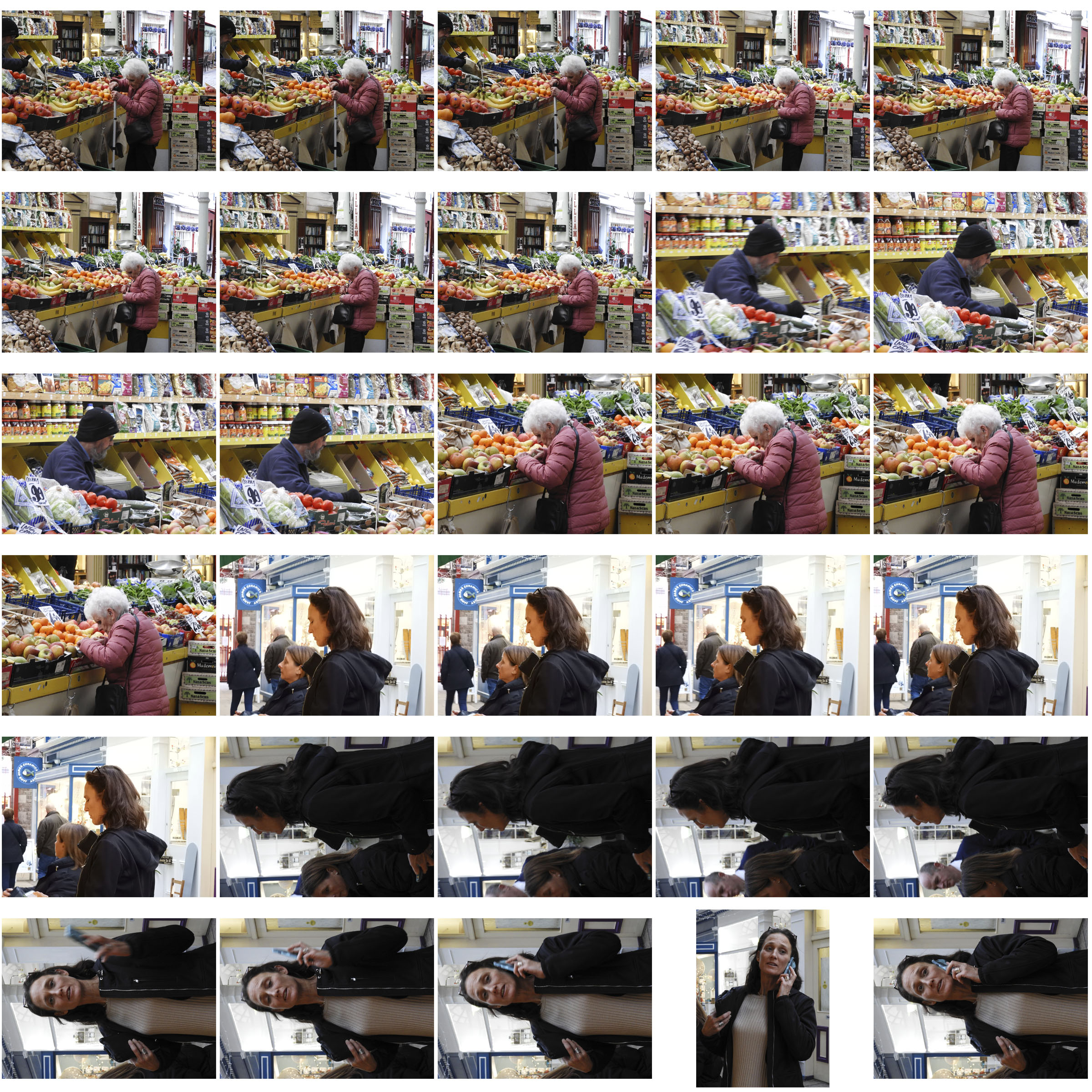
This is a collage of photos which all involve the use of street photography. TheyAround twenty years ago, street photography started to really sit up and get noticed. It was, of course, in the late 90’s that the first wave of consumer-focused digital cameras arrived – surely not a coincidence. Like the invention of the “Leica format” film (35mm), the digital camera, complete with its increased mobility, inspired a whole new generation of street shooters.
it is usually accepted that Eugene Atget is the rightful father of the street photography genre. Atget worked the streets of Paris beginning in the 1890s and continued into the 1920s. He was really the one to establish the street as a meaningful location for photography. Interestingly, his photography mainly consisted of non-human subjects. So there you go, the father of street photography made street photographs without people. So why is it so hard (and even discouraged) to do so today? A quote from Susan Sontag’s wonderful book, On Photography, will help us better understand. “Photographic seeing has to be constantly renewed with new shocks, whether subject matter or technique, so as to produce the impression of violating ordinary vision.” In other words, pictures of parks, store windows, and other non-human street subjects became too familiar to us, too common to disrupt our way of seeing in an artistic way. Of course, we are now in danger of having the street photograph of a person fall to the same fate.