All posts by Kristiana A

Filters

Author:
Category:

Occupation Photos

WHAT WAS THE TASK?

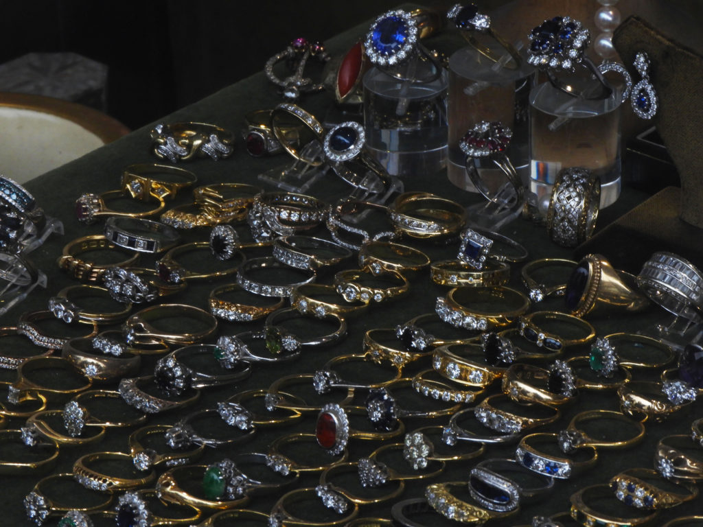
To start gaining inspiration for the new project, we started of by taking photos of various things, people, objects and places which relate to the occupation of Jersey. We first thought of the idea of taking images of items from either a charity shop or an antiques shop which may have items which date back to the 1930’s and 40’s. In the shop window there were various items of jewelry and valuables which may have significant connections to the war.

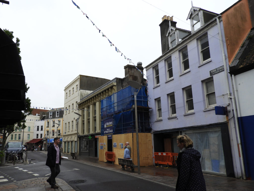
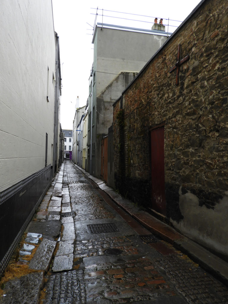
We also found a street which was blank and untouched, almost as if nothing had been done to it since the occupation. The image of the street is also a recreation of an image from the archives which shows the exact same street from the 1940’s. Although the uses of the buildings had changed, the exteriors remained almost the same.

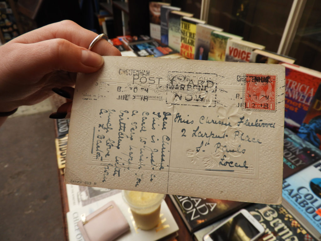
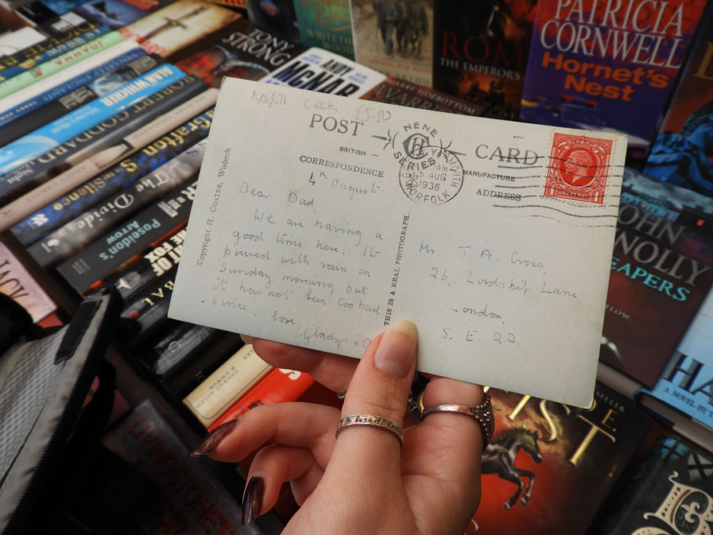
The last place we went to was the market, which again has significant historical importance in Jersey. There we found sets of vintage postcards, which some of them dated all the way back to the 1920’s, and some even had writing on them which shows the personal connection these items had to people.

Final Printout Pieces

A3 PIECES:

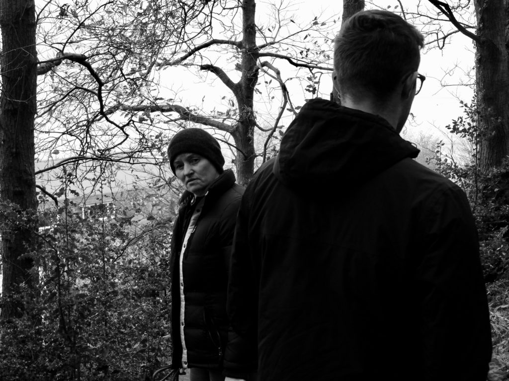
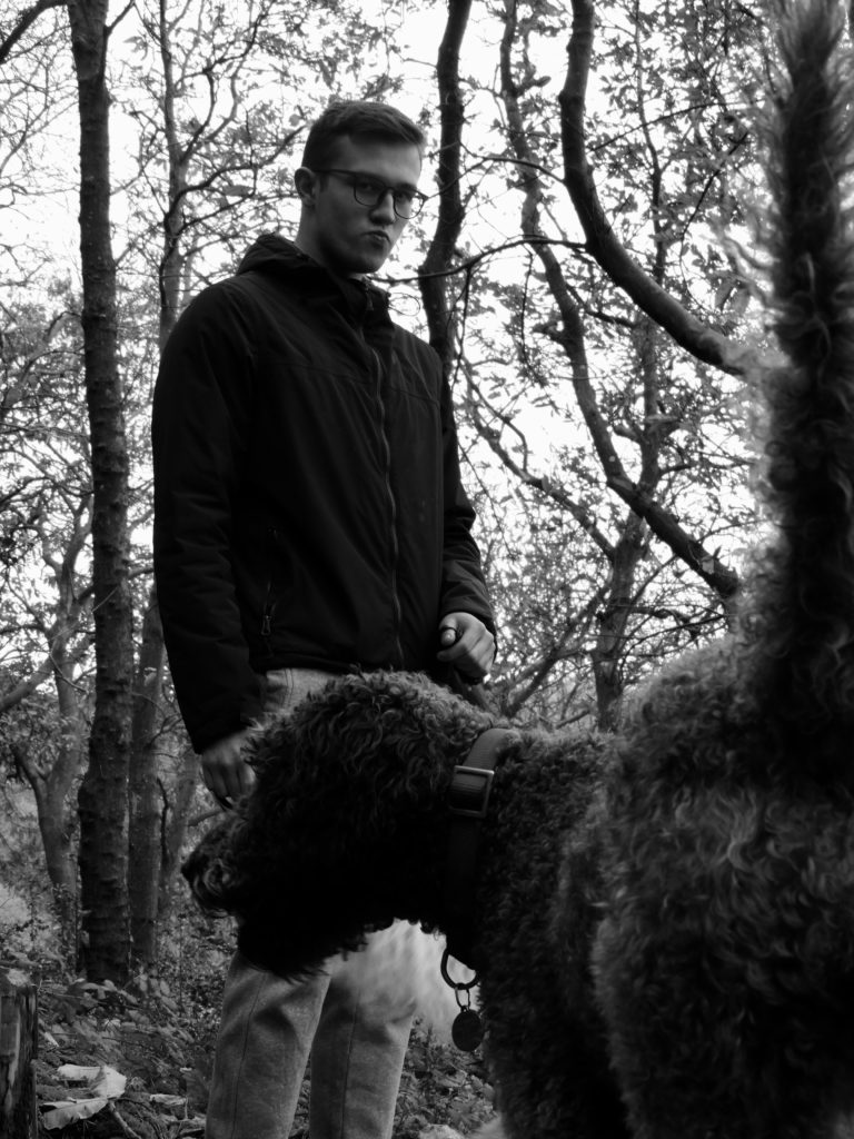
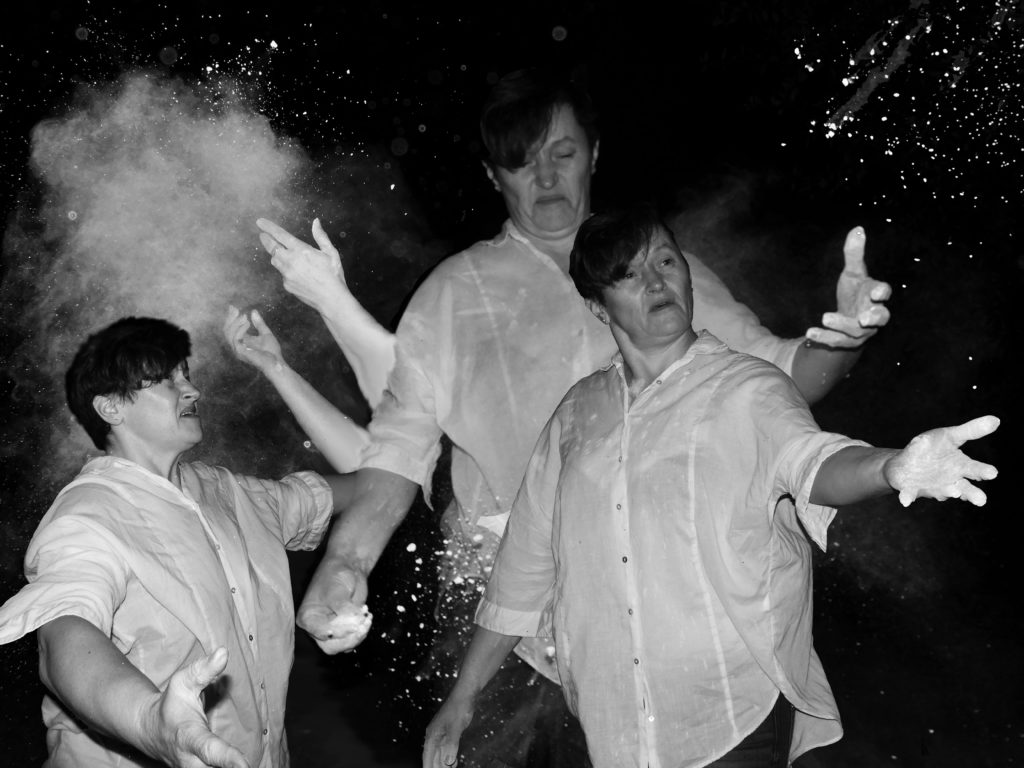
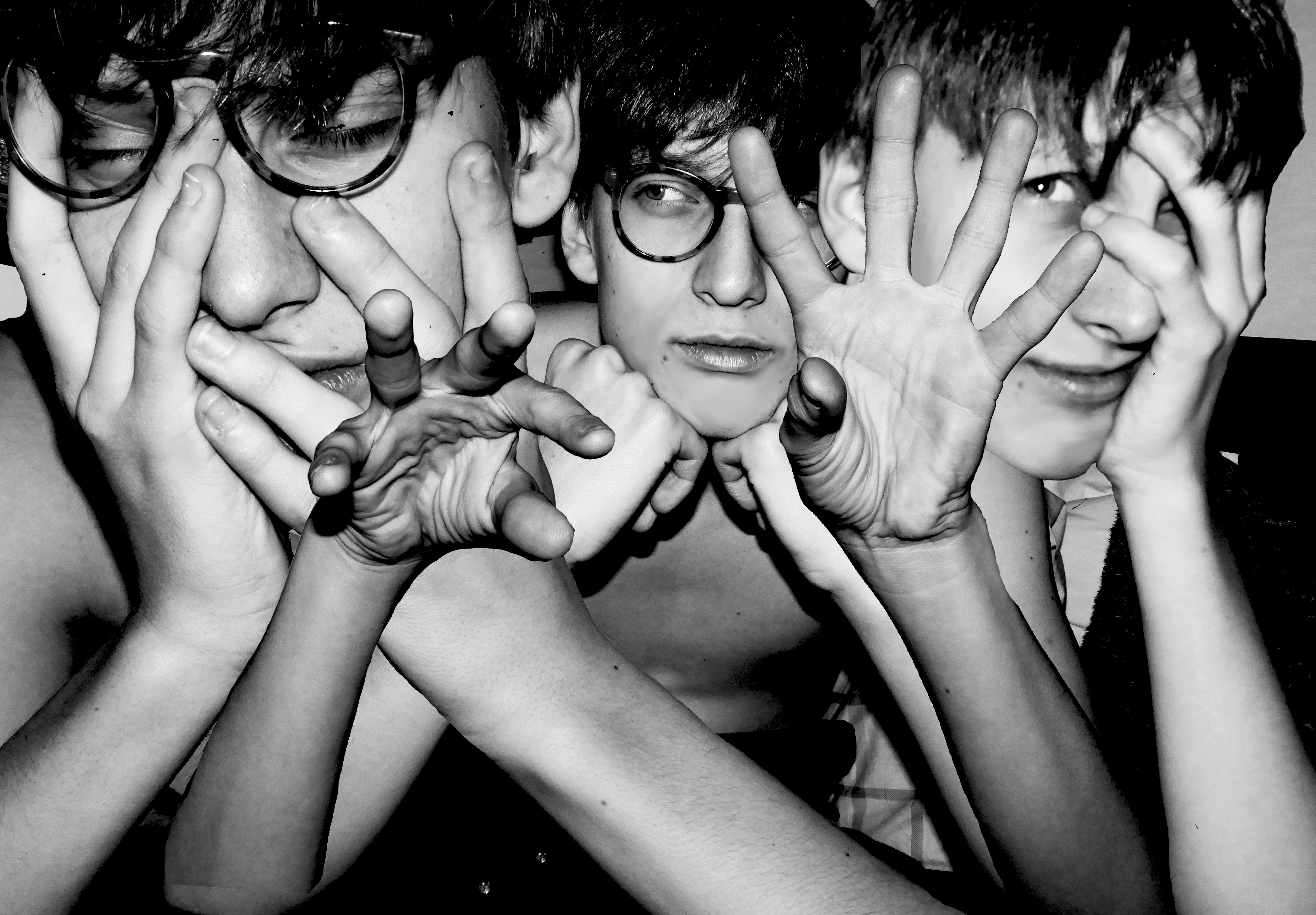
I chose this set of images for my A3 and A4 pieces as I wanted them to remain fairly consistent with one another, as during the mounting process I would be combining the two sets of images. The monochrome nature of the images means that they fit well with one another and seamlessly harmonize with each other to create a very pleasant overall mounted product. Furthermore, they fit well with each other as they feature the same set of models within them. The mood of both images are also very similar, being mostly dark with neutral facial expressions on both of the faces of the models.

A4 PIECES:

A5 PIECES:

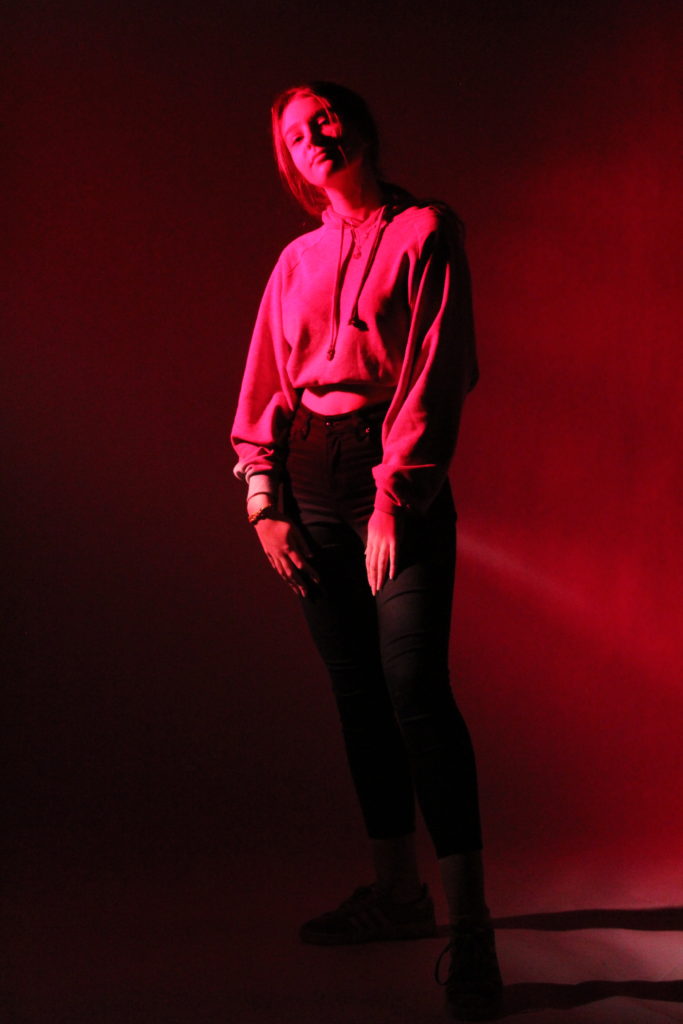
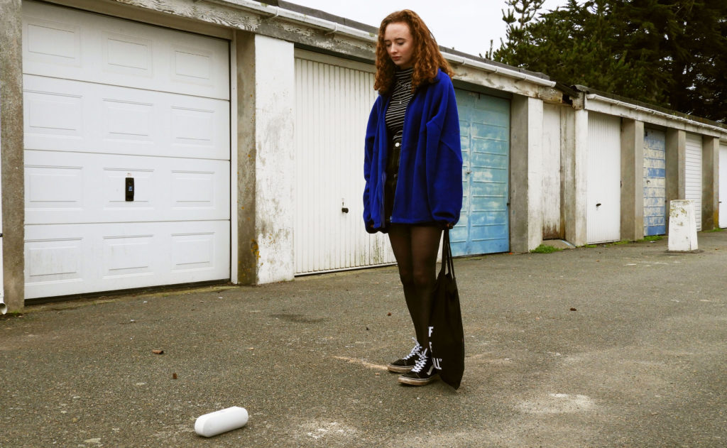
I chose this set of 3 images for my A5 pieces as they all had their own unique and effective qualities. The first image was taken from the first formal studio photography session we did. The red filter which was applied over the top of the image means that the color palette of the image is very different, creating ominous themes and connotations with the image. The second piece was taken from the Tableaux Vivant project which I did earlier in the portrait project. It was the final product which I produced in response to my chosen artist, Arnis Balcuks. I put modern twists on the themes which the artist himself tackled in his own work. The final image was the final product for the portrait project, and an extension of the photo montage project which I did previously. I used the same editing techniques as in my previous photo montage which produced a very similar outcome.

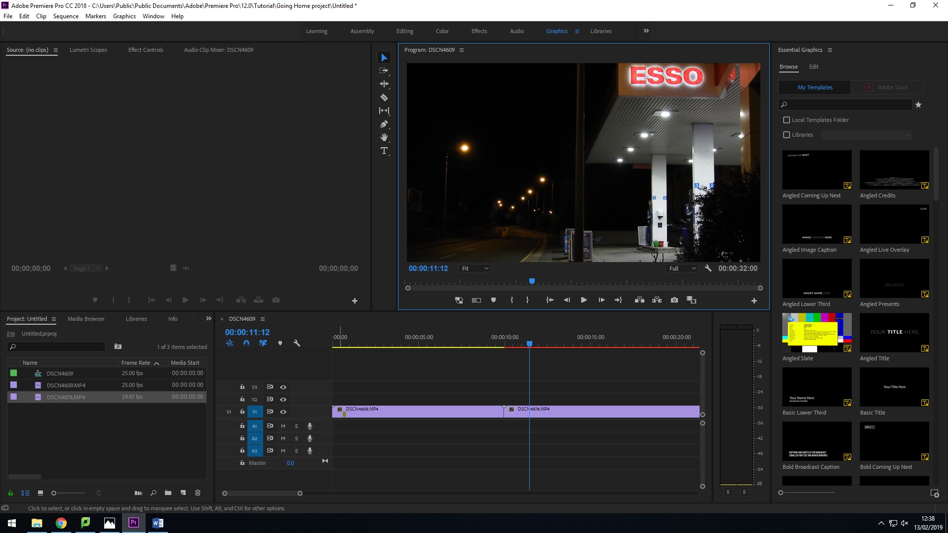
Mock Exam Final Piece: Video Montage

ACTION PLAN:

WHY: I am using the final outcomes of this photo shoot for my final piece of my mock exam. I am wanting to show the financial identity of jersey and its people, the streets of Jersey being dictated by the foot traffic these office workers create. Being completely quiet and empty in the morning, busy in the afternoon and quiet again in the evening when work is finished.

WHERE: The main photo shoot will take place in town, specifically on queens street as I feel it has the biggest contrast in foot traffic overall. It illustrates well the routine of the finance workers and the timings of their day.

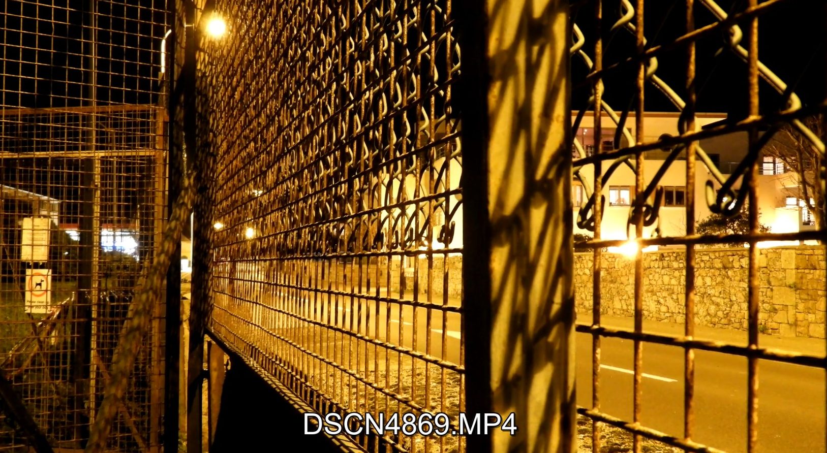
WHEN: I am shooting my videos at 3 different times of day:

  • starting at sunset, i am hoping to capture the empty streets of town before all the finance workers start their daily rush to work.
  • the second video will be at midday, this will illustrate the busiest time of day.
  • the last video will be captured during the evening, at sunset when town is again completely empty and quiet.

WHO: I will be photographing and taking videos of people within town that are involved in the financial sector, and anyone who happens to be present in town at that very moment.

HOW: I will be using my DSLR camera and the time lapse setting in order to capture my video. I will also be utilizing my tripod in order to keep the camera totally still whilst capturing the videos. Along side the montage, I will also be doing additional street photography to also have physical print copies for my final outcomes.

HOW IT RELATES TO IDENTITY: 

The main message which I will be trying to get across with my montage and final images is the dictation of life by work and the way in which the finance industry impacts the regular workers life. I have always noticed the stark contrast in traffic (both with vehicles and people) during different times of day. Peaking at different times during the day. It is a critical decider for the way in which people lead their lives. The city is totally silent and still in the early hours of the morning and evening, demonstrating the lack of identity within the regular workers life. Therefore my project will mainly be focusing on the lack of identity within society.

LEWIS BUSH: 

Even though my main inspiration (Lewis Bush) does not create film as his final piece of work, his overall message and themes which he explores is what I was most interested when looking at his work.

Lewis Bush is a photographer, writer, curator, and is a Lecturer on both MA Photojournalism and Documentary Photography and BA (Hons) Photojournalism and Documentary Photography courses at London College of Communication.

Lewis studied history at the University of Warwick, and then worked in public health as a consultant researcher with the United Nations Taskforce on HIV/AIDS. Returning to the UK he began to work as a photographer and studied documentary photography at LCC in 2012.

More recent works include Metropole (2015) which critiques the architectural transformation of London and the city’s growing inequality by subverting the imagery of London’s luxury and corporate developments, receiving international. Bush has recently completed Shadows of the State, which has involved tracking and mapping the covert radio stations used by intelligence agencies to transmit coded instructions to their agents overseas.

This is the theme which I was most relating to Jersey and the identity of people within it. The changes which we have experienced as the island has become ever more increasingly involved in the financial and corporate world. It creates a sort of blanket of expectation over the lives of many young people in Jersey, having the expectation of wanting to join one of these massive, multi million firms which operate here.  It is also very apparent that the corporate life style has taken over Jersey due to the changing foot traffic that ca be seen in St.Helier. It is ruled by the working hours of these companies and their staff.

CRITICAL ANALYSIS OF HIS WORK: 

VISUAL:

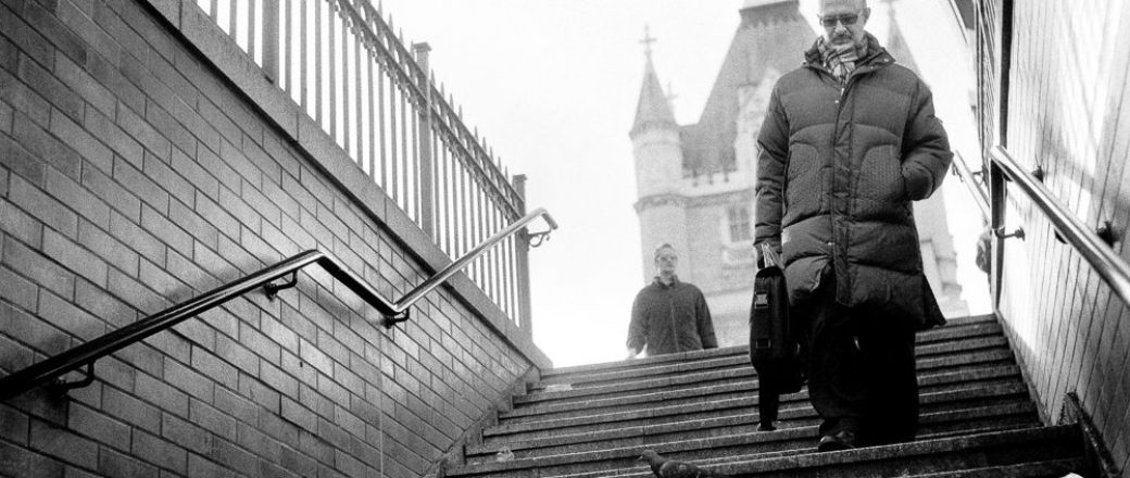
The first point of attraction in the image above is the light which floods down the image and into the staircase. There is a very distinct difference in the background, mid ground and foreground in the image. The background of the image is very clearly overexposed, yet it works well with the darkness that can be seen going down the steps in the foreground of the image. The image also follows the golden rule. If a spiral were to be drawn on the image, the man of on the right hand side of the image would fall in the correct spot in the image in order for it to be harmonious and work well. The angle from which the image was also taken from means that a sort of power play is created with the camera as it is pointed up towards the subjects. The monotone color pallet of the image also links back well to the overall theme of his work which is all about the architectural transformation of London and the city’s growing inequality by subverting the imagery of London’s luxury and corporate developments. The man who is walking down the steps is also representative of this, wearing very basic clothing, very typical of the regular office worker. His facial expression is also very dull and blank which could be representing the emptiness many corporate workers feel with their work.

TECHNICAL:

In terms of editing, the artist has very clearly cropped the image down in order to cut out the top and bottom of the image and focus in on on the subject in the mid ground of the image. During the editing process, a black and white filter has been placed over the top of the image to fit with the scheme of work that the artist is doing. I also think that the exposure might have been increased in the background of the image in order to allow for a lighter and brighter image. I think because the image is in many ways an environmental photo/street photography, the shutter speed used when taking the image was quite high to create a sharp and crisp image.

CONCEPTUAL/CONTEXTUAL:

Lewis’s photographic practice primarily explores ideas about the way power is created and exercised in the modern world and increasingly also engages with questions about how to represent issues which are nebulous and complex. In The Memory of History (2012) he traveled through 10 European countries documenting the way the past was being manipulated in the context of the economic crisis and recession. This project was subsequently widely published and was exhibited at the European Union’s permanent representation in London in 2014

source: https://www.arts.ac.uk/colleges/london-college-of-communication/people/lewis-bush

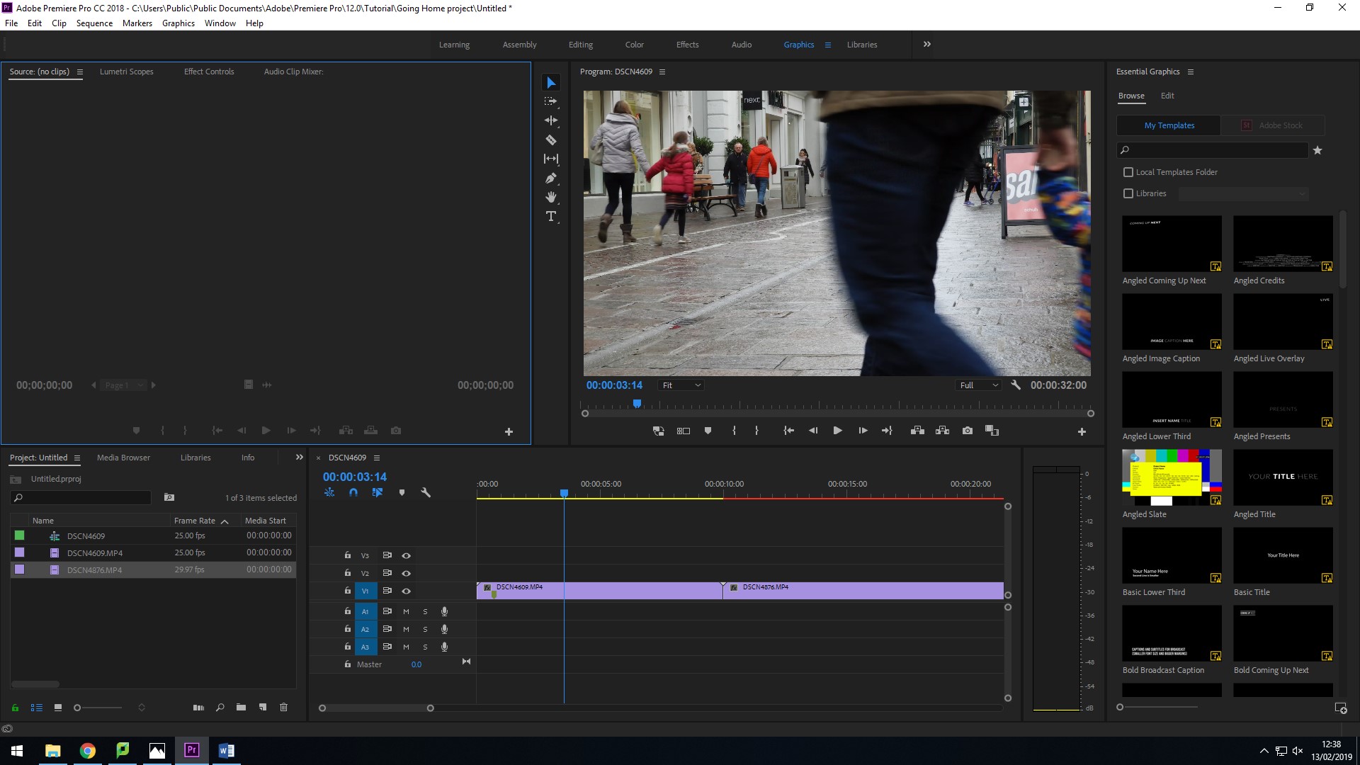
SCREENSHOTS: 

YouTube link –

Video Editing Techniques

USE OF SUPER TIME LAPSE: 

Time-lapse photography is a technique whereby the frequency at which film frames are captured (the frame rate) is much more spread out than the frequency used to view the sequence. When played at normal speed, time appears to be moving faster and thus lapsing. For example, an image of a scene may be captured at 1 frame per second, but then played back at 30 frames per second; the result is an apparent 30 times speed increase. In a similar manner, film can also be played at a much lower rate than it was captured at, slowing down an otherwise fast action, as in slow motion or high-speed photography.

In order for me to create my video montage, I felt it was necessary to use time lapse videos of the environment I was in. I felt that is was essential that I captured the sheer scale of the amount of people who aimlessly wonder through the streets of town. Speeding up the video I felt was able to illustrate this well withing a short time frame. I set up my camera in the middle of town where it was busiest at mid-day. I used the super time lapse setting on my camera which captured one frame every second. During this process I used a tripod as I wanted the film to be as steady and stationary as possible. I felt that motion disturbance would have ruined the overall effect of the video.

The time lapse video portion of my film

USE OF FAST MOTION FILM: 

Fast motion is the opposite of slow motion, in which the action shown on screen appears to be moving faster than the normal speed. This is done by filming the action at less that normal speed on the camera and then playing it at a normal speed.

This technique allows the audience to see actions or events that would usually take a long time to happen, or it allows the viewers to see actions or events in a manner that would typically bore the viewer if played at a standard speed. It can be used for a tense scene as it can help raise the suspense of the scene, however it can also be used as a comedic effect and placed alongside music.

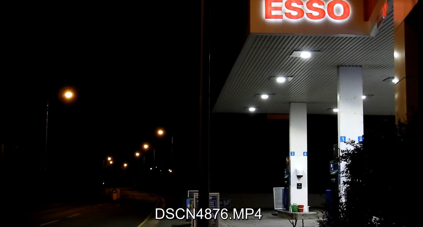
As with the time lapse video, I again used a tripod in order to capture my video. It was a particularly difficult video to shoot as the weather conditions were very windy that night. In order to combat this, I placed a weight on the bottom of my tripod to give it as much stability as possible.

The fast motion portion of my film.

TYPES OF VIDEO CUTS: 

1. The Standard

The hard cut is the basic type of cut in editing. This type of cut is utilized when you want to cut from clip to clip without any type of transition, or where you cut from the end of one clip to the beginning of another.

2. Jump Cut

The jump cut is a technique which allows the editor to jump forward in time. We see an early version of this technique in Eisenstein‘s Battleship Potemkin, where the battleship fires a mortar round and we watch the destruction as various angles jump cut from one to another. In this very early version of the jump cut, contemporary audiences were introduced to a new way of time passage in film.

3. L Cut & J Cut

What L Cut means is that you are hearing the audio from the previous shot, even though we’ve moved on to another shot. So, the audience is is looking at clip B but still hearing audio from clip A.

J Cut is essentially the opposite of the L Cut. Here we hear the audio before we see the video. So, the audience is is looking at clip A but still hearing audio from clip B.


Mock Exam: Other Successful Images

ORIGINAL IMAGES: 

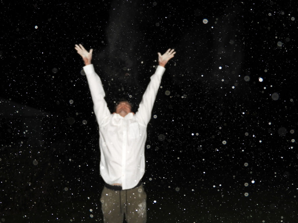
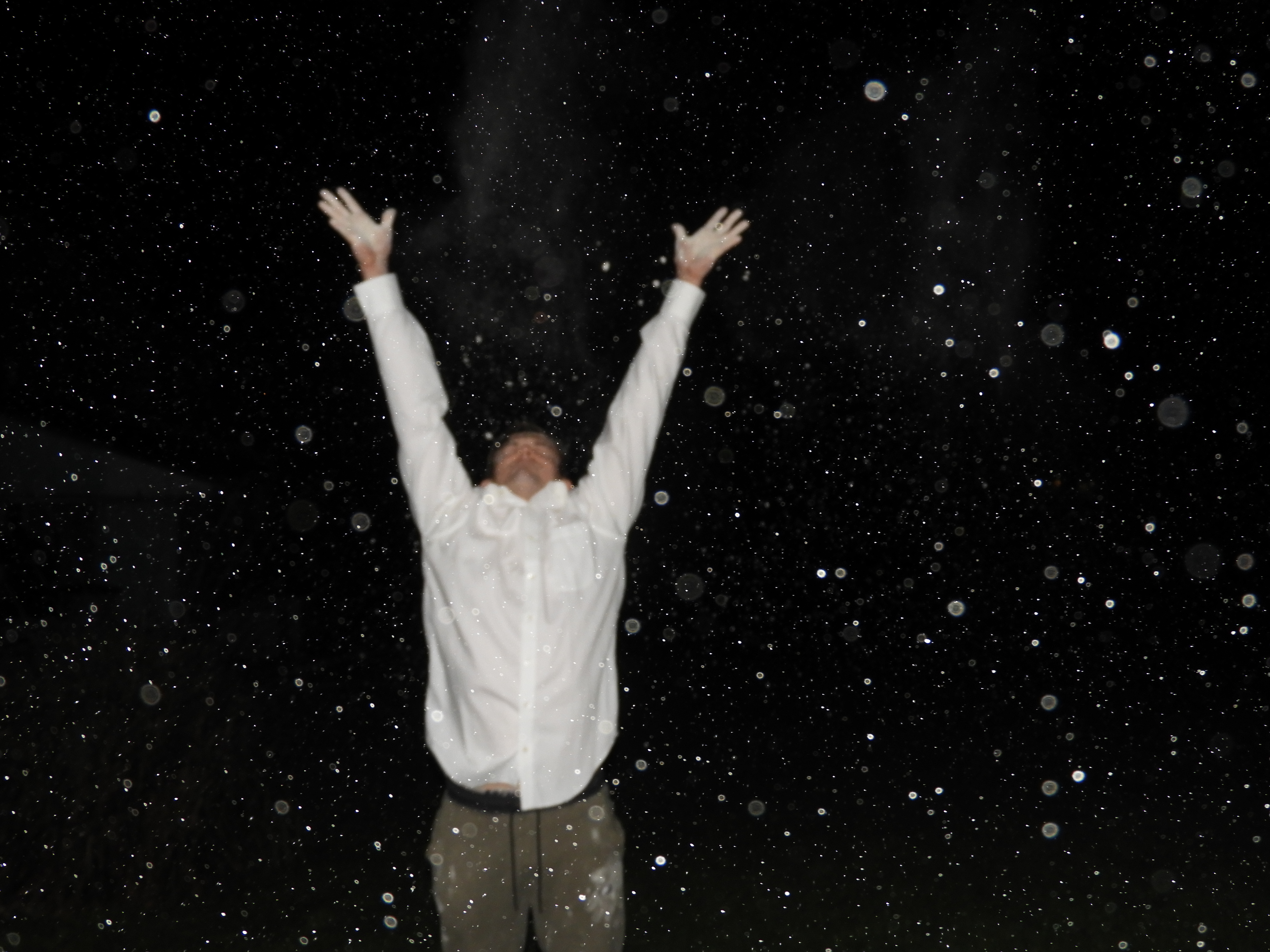
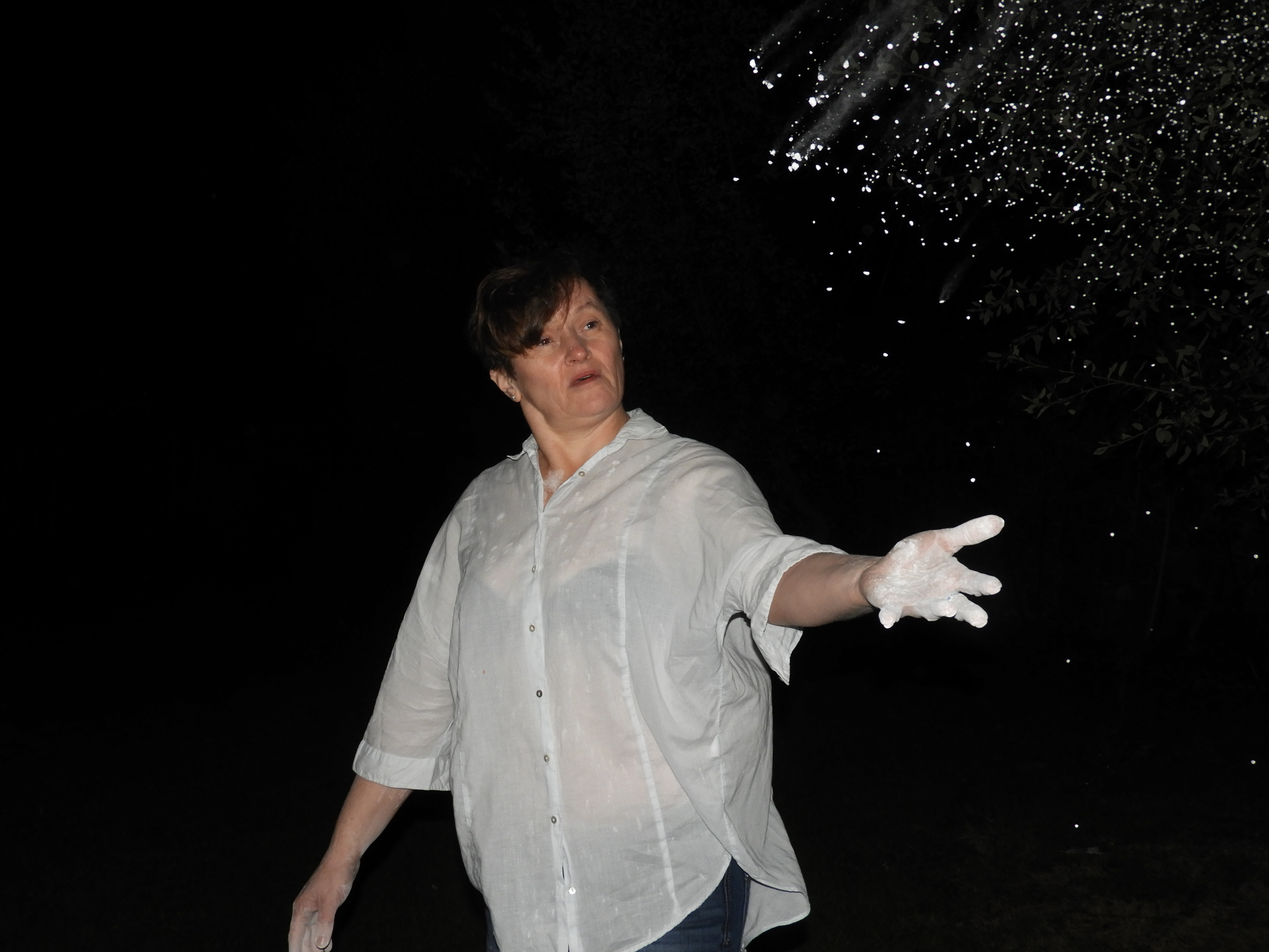
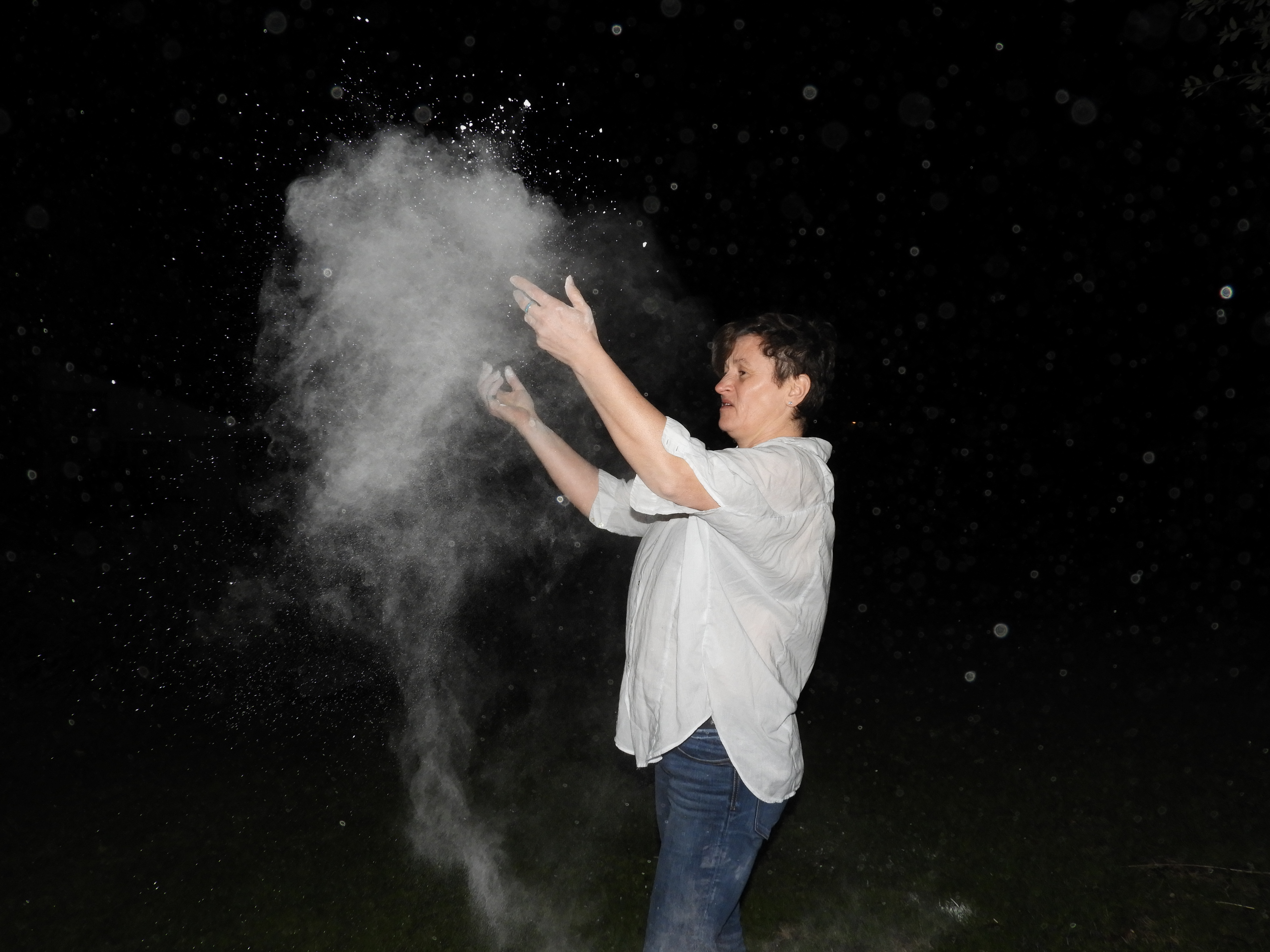
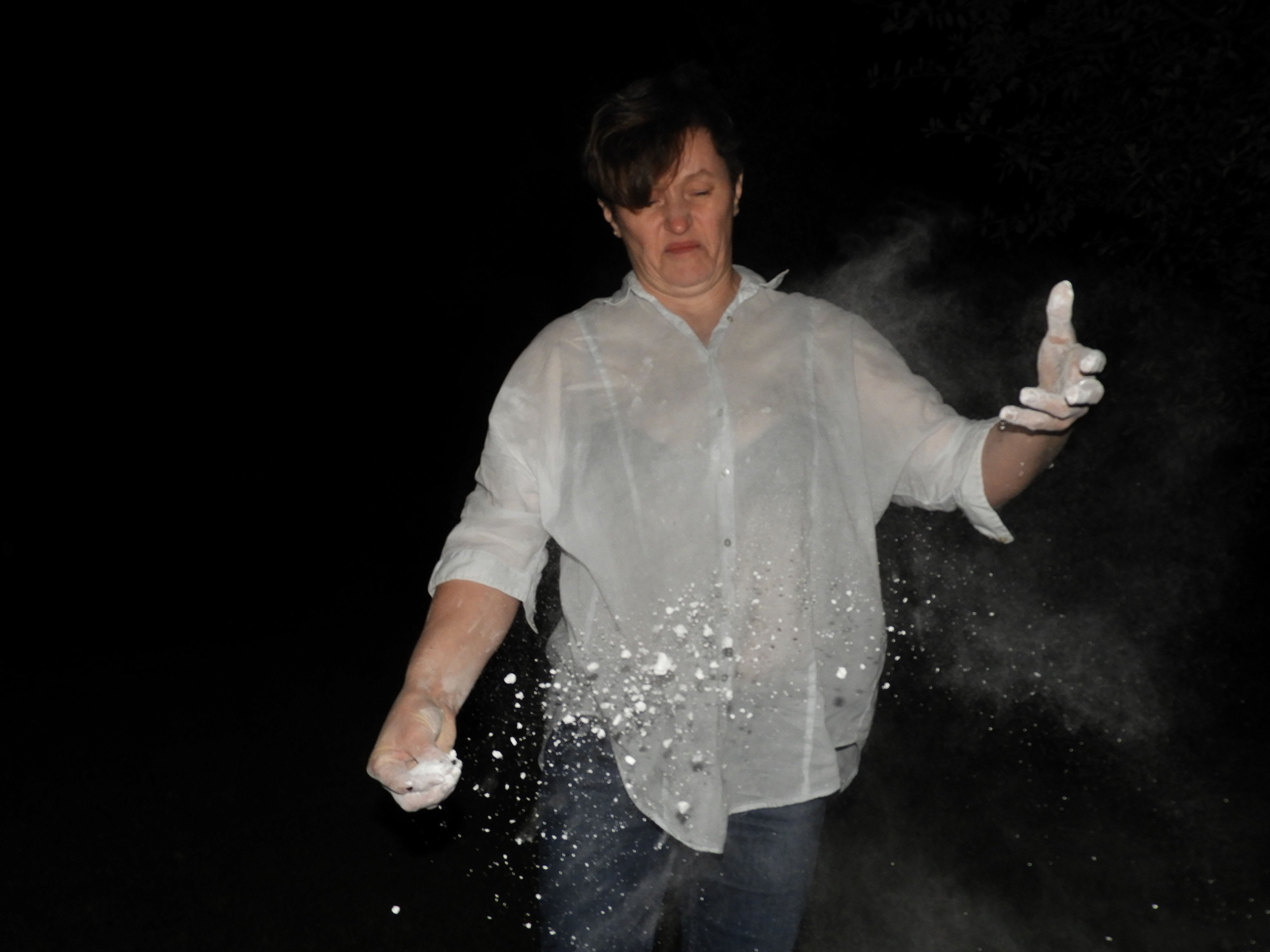
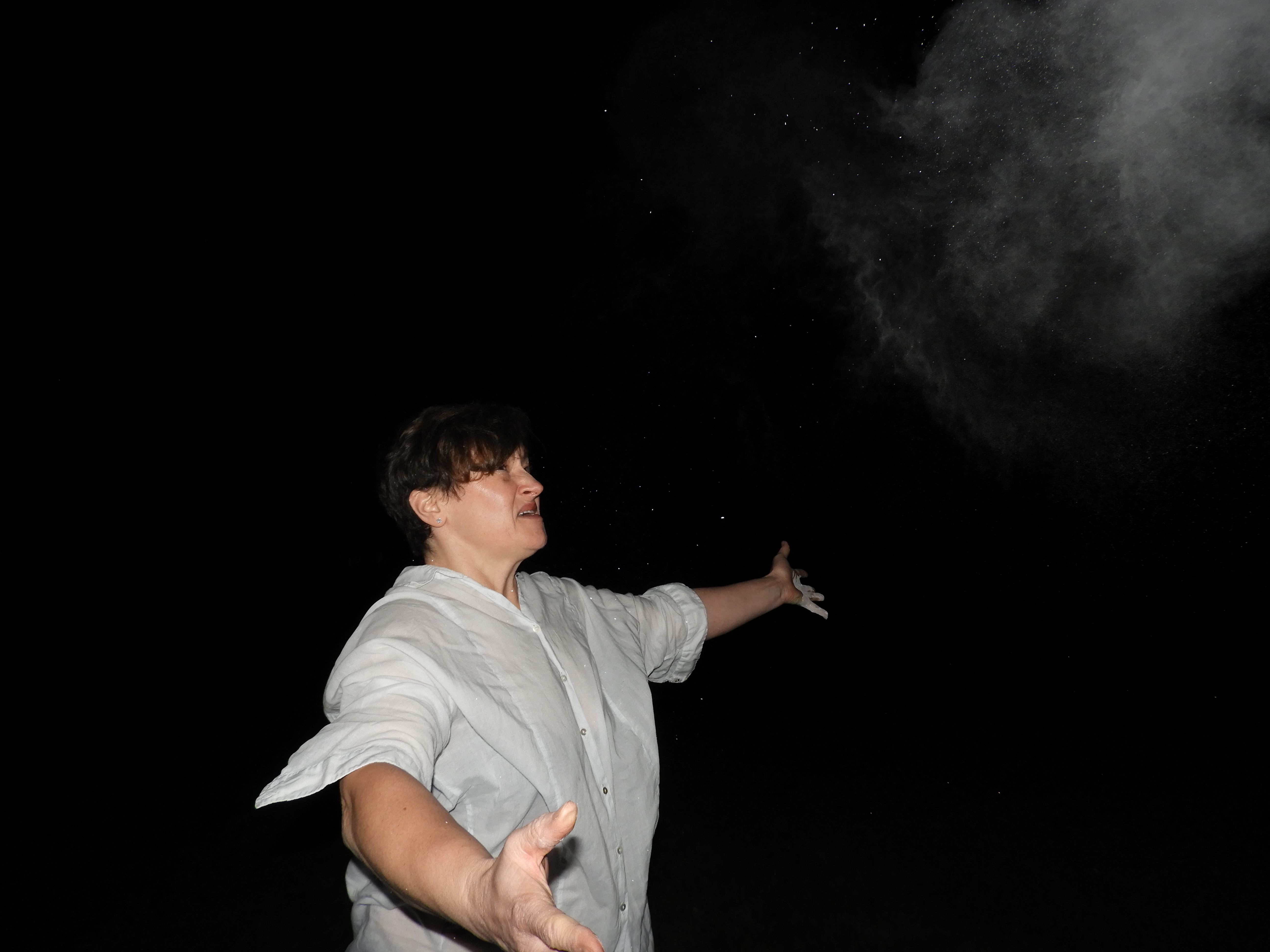
These images were captured as part of my initial photo shoot which I did in order to use to create my final photo montage. I captured images of various models, in different positions and stances in order to have variations to choose from when editing the final images. The second photo shoot which I conducted included my brother therefore I was unable to use them in my final montage as not enough images were of a satisfactory quality.

IMAGE ANALYSIS: 

VISUAL:

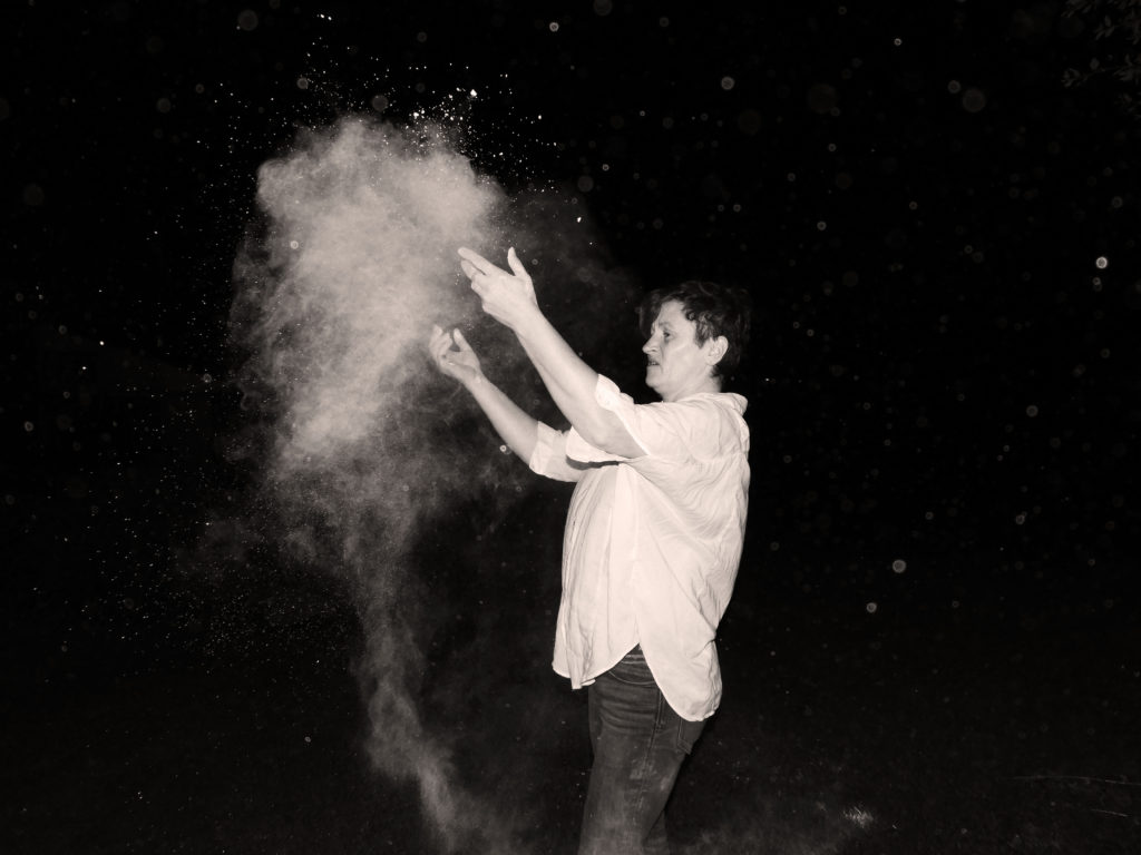
The main and most important aspect of this image is the different layers of the image which can be clearly and distinctly separated. In the foreground of the image we see the white powder particles being dispersed in a an even manner. The same is happening in the mid ground of the image. In the background we finally see the blurry figure of the subject. The position in which he is in indicates themes of happiness, joy and relief, almost as if he is letting go of something. The white particles floating in the air are highly contrasted with the black backdrop, they are very clear spherical shapes which attract the attention of the eye.

TECHNICAL:

(the technical analysis for this photo is the same as for my photo montage)

For this photo shoot, the main and single most important technical aspect was the use of flash photography whilst capturing my images. I really wanted to create a clear and crisp outline so that I could use very simple editing techniques later on to edit and blend the images together. During the photo shoot I also used a tripod to keep my camera as stable as possible, maneuvering it into angles which allowed me to capture various angles of the subject. At points the images which I took were quite overexposed to due to the flash and bright clothing of the model, but I was unable to change this as the flash of the camera cannot be made less bright. I relied on Photoshop and editing in order to fix the exposure of the images. Working outside with the white powdered sugar posed many challenges. Many of the photos were fairly blurry due to the powder getting on the lens. The powerful wind also meant that both the camera and tripod were blown over on many occasions.

CONCEPTUAL: 

(the conceptual analysis for this photo is the same as for my photo montage)

For this photo shoot I was again keen to get my family involved in the process as I felt I wanted to portray the theme of moving on and letting go. The representation of each of the elements in the images go as follows:

  • The two models which I used in the photo shoot are my own mother and brother. I wanted to portray the change in our own lives and how we have moved on from a previous life which was less than ideal. It is a conflicting feeling relating it back to the love and passion I feel towards my heritage and tradition with the Latvian folk dance.
  • The white shirt: used to represent a fresh start, a sort of blank canvas from which to start from. I wanted the subject to be dressed in a way which was very simplistic and basic as I wanted all the focus to be on the facial expression.
  • The white powder: this is used to represent the past life. the action of throwing it into the air and allowing the wind to blow it away is representative of letting go and accepting a new beginning. I wanted to use something which would highly contrast with the dark backdrop of the night sky, making the smoke stand out even more.

VARIATIONS IN CONCEPT: 

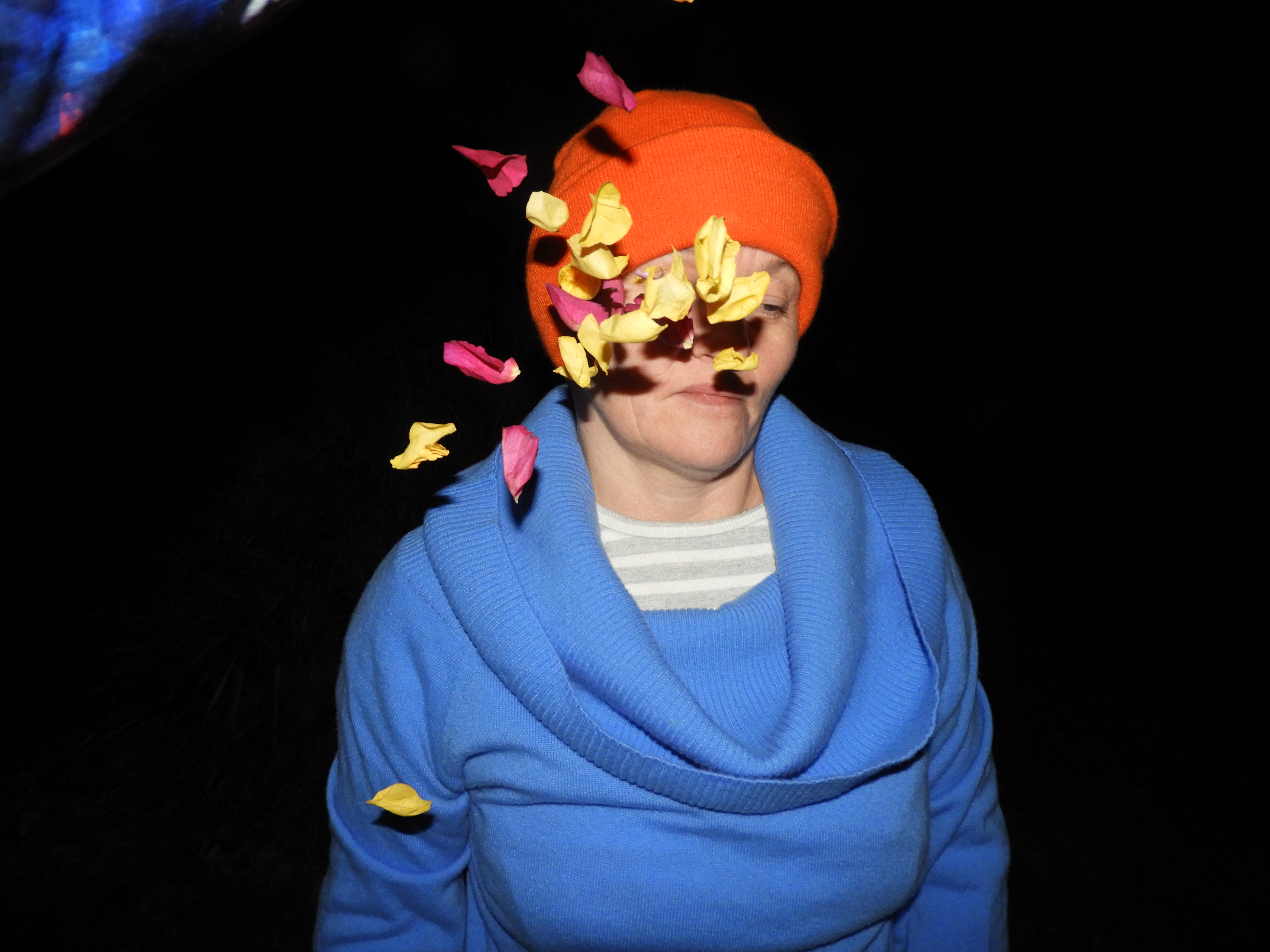
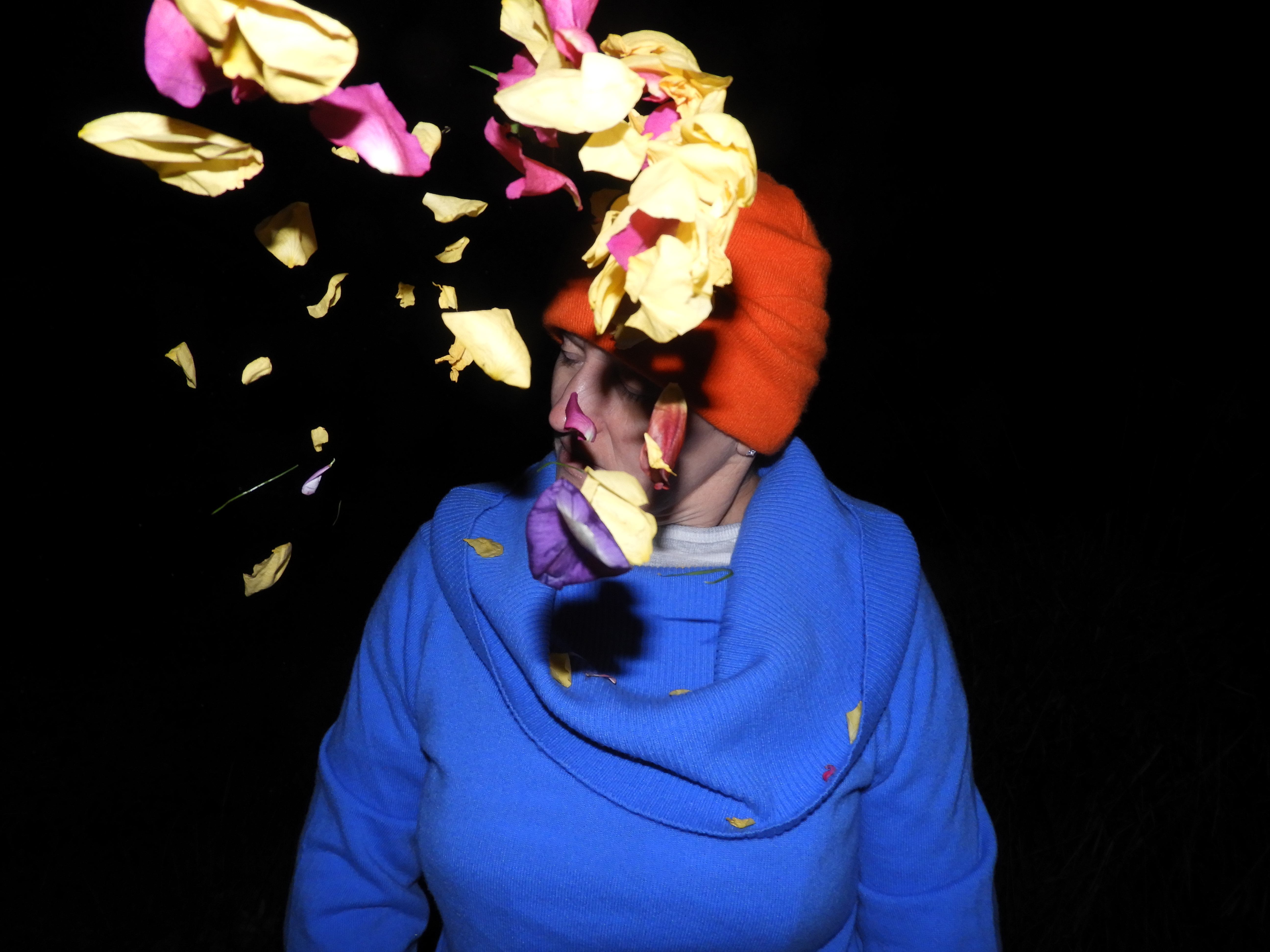
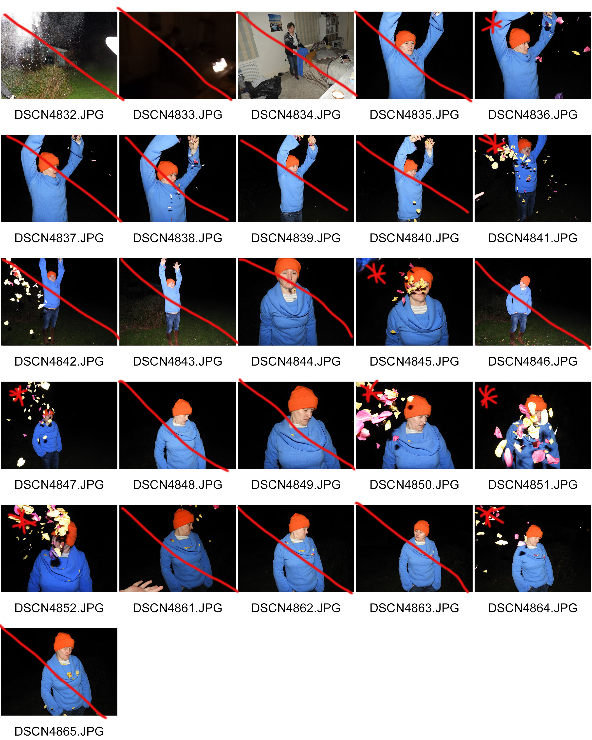
Whilst doing the photo shoot, I was keen to show variations in concept in order to have a more varied choice whilst editing the images. I chose to use flower petals in this photo shoot as it changed the entire visual representation of the images. Instead of the white powder and clothes which represent purity, it changed to bright clothing and colorful flower petals which made the images carry other themes with them.

Mock Exam: Print Products

PHOTO SHOOT PLAN: 

WHY: I was conducting this photo shoot in order to capture my interpretation of place and identity, using models and the appropriate props in order to capture the images.

HOW: The images were taken using my regular DSLR camera with the aid of a tripod as it was a very windy night and I wanted the images to crisp and sharp.

WHERE: I took the images outside for 3 particular reasons:

  • I was using powdered sugar which was messy and hard to clean up if done in a professional studio setting.
  • The wind outside was beneficial as it dispersed the sugar in a way which I thought looked more natural and well fitted.
  • Conducting the photo shoot outside meant I had a o of dark space which I could use in order to take the images.

WHEN: I took the images late at night (8-9pm) as this was the time of day when it was most windy and dark. I wanted a black backdrop for all my images to make the editing process easier later on.

WHO: I initially used two models, both my family members (as I was trying to link my whole family identity to this photo shoot).

INDIVIDUAL ELEMENTS OF MONTAGE:

One of my favorite parts of the “identity and place” unit was the photo montages which I created previously. It includes themes of surrealism and alternate reality which I find fascinating. Creating images which defy normality was something which I wanted to pursue for my final piece. My photo shop skills and the imagery which I captured, I thought would be adequate in order to achieve the outcomes which I wanted.

The Surrealists sought to channel the unconscious as a means to unlock the power of the imagination. Disdaining rationalism and literary realism, and powerfully influenced by psychoanalysis, the Surrealists believed the rational mind repressed the power of the imagination, weighing it down with taboos. Influenced also by Karl Marx, they hoped that the psyche had the power to reveal the contradictions in the everyday world and spur on revolution. Their emphasis on the power of personal imagination puts them in the tradition of Romanticism, but unlike their forebears, they believed that revelations could be found on the street and in everyday life. The Surrealist impulse to tap the unconscious mind, and their interests in myth and primitivism, went on to shape many later movements, and the style remains influential to this today.

source: https://www.theartstory.org/movement-surrealism.htm

In order to create a similar photo collage as the previous one I had to choose a variety of images which included different angles of the same model being in positions which all varied in different ways. I thought it was essential that I capture images which had a very crisp black outline around them as I wanted to make the editing process as easy as possible for myself, something which would have been very difficult of the backdrop had variations in texture of color.

BASE IMAGE: I used this image as the backdrop for the other images to be layered onto

LAYER IMAGE 1

LAYER IMAGE 2

LAYER IMAGE 3

FINAL OUTCOME:

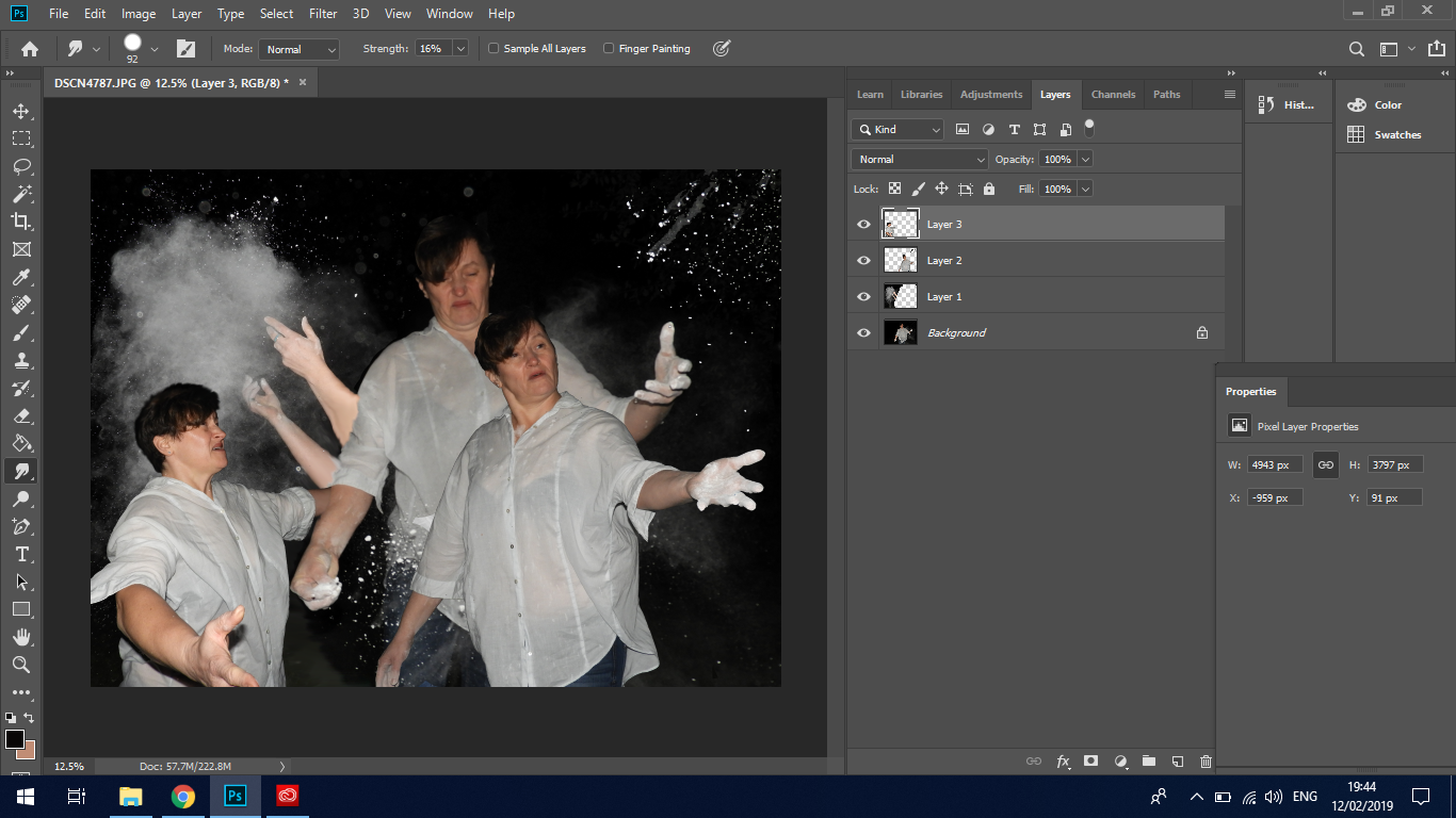
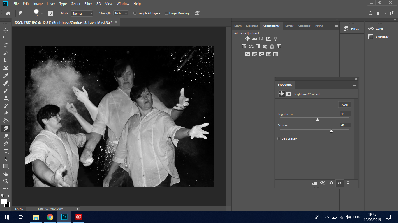
After making a final selection from my images which I took I settled on 4 images which were most successful and fitted the criteria which I set in order for them to be used. They all incorporate a crisp, and even black backdrop which made it easy to edit out. The positioning of the arms and the plooms of smoke in the air were all varied which was ideal for filling in the black background of the base image which I used. After taking out the background from the other images and blending them together, I thought it was best suited that I also make the image back and white in order to link it better to my previous work .

EDITING TECHNIQUES:

The main editing tools which I used in order to create my final piece were:

  • lasso tool – With the Lasso Tool, you can draw a free form selection outline around an object.
  • the magic wand tool – Photoshop’s Magic Wand Tool selects areas of similar color with a single click. The “Tolerance” value in the Options Bar sets the range of colors that will be selected.
  • eraser tool – The Eraser Tool in Photoshop permanently erases pixels on a layer. It can also be used to paint in a previous history state.
  • warp tool –  the Perspective Crop Tool to both crop an image and fix common distortion or perspective problems.
  • crop tool – the Crop Tool in Photoshop to crop an image and remove unwanted areas.
  • smudge tool – The Smudge Tool in Photoshop smudges and smears the areas you paint over. It can also be used to create a finger painting effect.
  • blur tool – The Blur Tool blurs and softens areas you paint over with the tool.
  • adjustments setting (exposure, brightness, black&white)

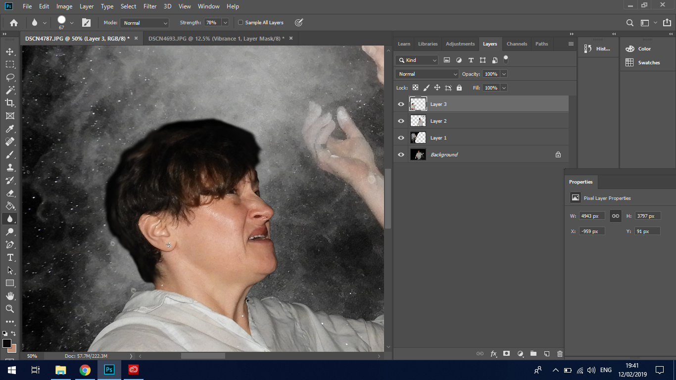
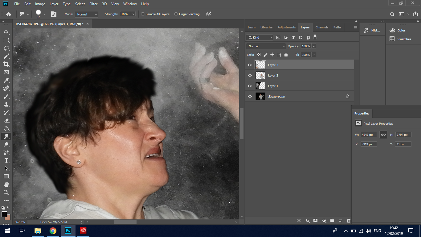
In order to create my final piece I started by removing the backdrop from all the images apart from the base image. I did this by using a combination of the lasso tool and magic eraser tool.  I prefer the magic eraser tool as opposed to the lasso as it gives me a larger margin of error when working. It sometimes becomes very tricky using the lasso tool as it is very sensitive at points and clings onto unwanted areas. After removing a majority of the black backdrop, I moved onto to using the eraser tool in order to get the edges very crisp and free from all the black backdrop. I then used the smudge tool in order to make the edges less sharp and blend in better with the backdrop as I wanted all the images to appear as one large element as opposed to something which was stuck together.

Using a combination of the eraser tool and blend tool to get rid of the black. The smudge tool allowed me to get a more seamless transition between the base picture and the additional layer.

Here I am using the smudge tool in order to create a more blurry edge which blends in better with the backdrop.

Here I finessed the the brightness, contrast and exposure of the image in order to create a dramatic image with dark shadows and bright highlights.

Here I added a black and white filter over the top of the original image in order to create a similar image as my previous photo montage.

CRITICAL ANALYSIS:

VISUAL:

One of the first and most striking aspects of this photo montage is the various facial expressions on the subject. The various positions in which the extremities are placed means a lot of drama and movement is created in the image. The action of throwing something is very apparent in the image. The clouds of white dust in the air are highly contrasted with the pitch black backdrop, creating variations of both tone and texture within the image. The distinctive contrast between the white shirt of the subject and white powder create very sharp outlines within the image which. The use of repetition within the image by using the same model over again creates themes of hallucination, surrealism and hyper reality as the imagery is far from realistic or plausible in the real world. The themes which come to mind when looking at this image is worry and stress as expressed by the models face and hand positioning, touching the face and hair. There are many elements and layers involved in the image which create confusion. The hands central in the image have a gesture which pulls the viewer in, a sort of hypnotizing movement that makes them focus in. The straight lines of the edges of the arms, guides the eyes from the bottom of the image to the top where the hands and face are located.

TECHNICAL: 

For this photo shoot, the main and single most important technical aspect was the use of flash photography whilst capturing my images. I really wanted to create a clear and crisp outline so that I could use very simple editing techniques later on to edit and blend the images together. During the photo shoot I also used a tripod to keep my camera as stable as possible, maneuvering it into angles which allowed me to capture various angles of the subject. At points the images which I took were quite overexposed to due to the flash and bright clothing of the model, but I was unable to change this as the flash of the camera cannot be made less bright. I relied on Photoshop and editing in order to fix the exposure of the images. Working outside with the white powdered sugar posed many challenges. Many of the photos were fairly blurry due to the powder getting on the lens. The powerful wind also meant that both the camera and tripod were blown over on many occasions.

CONCEPTUAL:

For this photo shoot I was again keen to get my family involved in the process as I felt I wanted to portray the theme of moving on and letting go. The representation of each of the elements in the images go as follows:

  • The two models which I used in the photo shoot are my own mother and brother. I wanted to portray the change in our own lives and how we have moved on from a previous life which was less than ideal. It is a conflicting feeling relating it back to the love and passion I feel towards my heritage and tradition with the Latvian folk dance.
  • The white shirt: used to represent a fresh start, a sort of blank canvas from which to start from. I wanted the subject to be dressed in a way which was very simplistic and basic as I wanted all the focus to be on the facial expression.
  • The white powder: this is used to represent the past life. the action of throwing it into the air and allowing the wind to blow it away is representative of letting go and accepting a new beginning. I wanted to use something which would highly contrast with the dark backdrop of the night sky, making the smoke stand out even more.

CONTEXTUAL:

Both subjects in this photo shoot are my own personal family members. The woman (my mother) has a big love for animals, especially dogs. She holds a job as a nursery school teacher during the weekdays. She was born in Latvia, in a small town near the border of Russia in the 1970s. Her farther being a forest ranger, she grew up inside a forest, contributing to her love of nature and all things outdoors. She grew up in communist soviet state of Russia, therefore being very limited to any outside knowledge before the 1990s when the state finally collapsed and she was able to travel for the very first time to other European countries. Latvia, after being in financial collapse throughout the 2000s, made it very tough for my family to remain living it Latvia, legally moving to jersey in 2012. The other subject in the photo is my brother. Being a few years older than me, he has started his own professional career in mechanics.

RELATIONS TO PREVIOUS PHOTO MONTAGE:

The creation of my previous photo montage inspired me to create a similar piece again using different facial expressions and subjects in my new photo shoot. I used the same photo shoot and editing techniques as in the previous photo shoot, using flash photography in order to capture the images with a crisp and clear backdrop.  These two photo montages again create themes of surrealism and hyper reality as they are combined in ways which are impossible to recreate in real life. Both the photo montages which I created are very confusing and difficult to understand

CONTACT SHEETS:

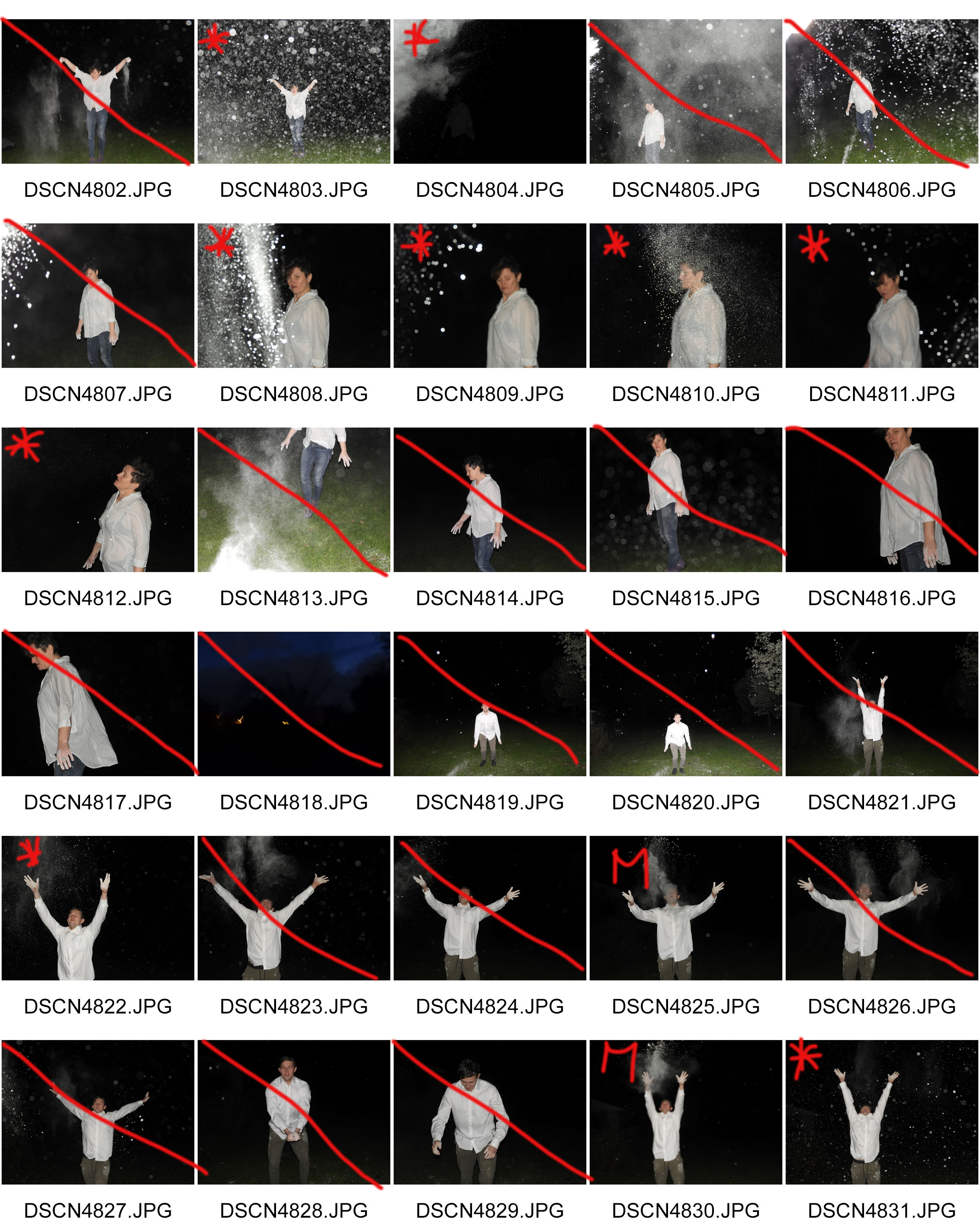
I conducted 3 photo shoots in one night in order to have variations of different props and models. I felt that there was a need to capture many different photos to have a wider choice of selection when editing the images. It was essential that I captured different angles in order to fill up most of the empty black space in the base image. I wanted it to be as busy and confusing to the eye as my  previous photo montage.

Additional Photo shoots: Latvian Tradition

CONTEXTUAL INFORMATION: 

As in many European countries, research and documentation of dances started late. The oldest Latvian dance examples are fragmentary and difficult to interpret. They are the 17th-18th century travel stories and church visitation protocols, where dancing is described as “shameless agility”.

Folk dance research and gathering started in the beginning of the 20th century. The first Latvian folk music composer and teacher Andrew Jurjans issued 2 singing and dancing books. These books are still a very important source. However, many dance descriptions are shown only schematically and thus are practically impossible to recreate.

In 1924 the Archive of Latvian Folklore is created. There is a significant amount of dance material, but mainly songs and texts. A specialist dance archive has never been created.

In 1920s, few years after the formation of Latvian Republic the first folk ensembles are formed and there is a growing public interest in folk dancing. Educated dance teachers get involved in the research of dance; in the 1930s books for practical use are issued. Important figures are Johanna Rinka and Janis Ošs, Jekabs Stuburs and Elza Silina. E.Silina is also the first theoretical dance essay author. However, the collection of dance material at the time is still selective and only those dances are published which the researchers find to be suitable. In addition, part of the material is published with the improvements from the researchers and without source references.

In the 70s the dance teacher Harry Suna seriously addressed the Latvian traditional dances. From the archive materials he collected and published a major Latvian couple-dance and song books, as well as wrote several theoretical works. He created interest in traditional dance and a number of his students continued his work.

THE IMPORTANCE OF FOLK DANCING: 

Dance is one of the components of national culture, which itself reflects the history, traditions and national / regional mentality. At the same time it gives people a wide range of self-expression – receive and pass on skills, gain emotional satisfaction, meaningful leisure and relax time, become aware of ones national / regional identity, as well as present it in an attractive form. Recently the public interest in traditional music and dance has increased. In addition there is a growing desire and need to build and maintain self-identity in the increasingly homogeneous global mass culture.

PHOTO SHOOT PLAN: 

WHY: Whilst visiting my home country of Latvia, I was able to capture images of various traditional dances which are an important part of my own identity and which link well with the theme of “place and identity”

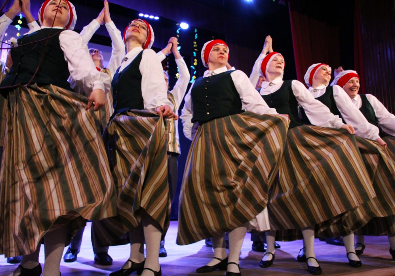
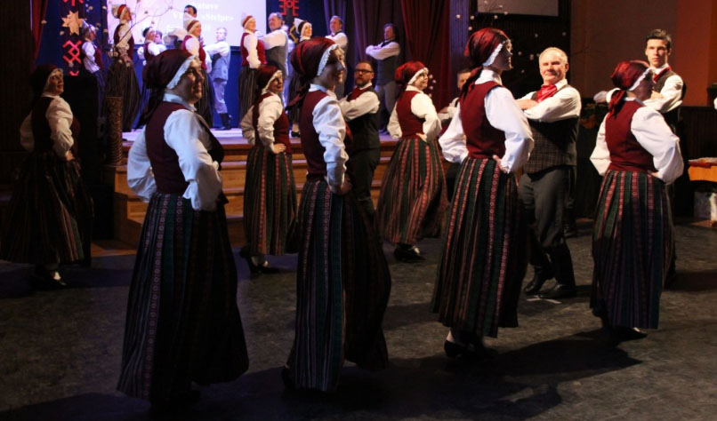
WHERE: The images were captured during a Christmas concert in my old school, where various traditional Latvian folk dances were performed.

WHEN: The performance was done during a Christmas concert, an important and widely celebrated holiday in Latvia which holds many significant cultural aspects with it.

WHO: The images were captured of professional folk dancers of various ages and abilities that were based in my hometown.

HOW: I used my regular DSLR camera in order to capture the images.

SUCCESSFUL OUTCOMES:
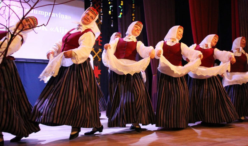
MOST SUCCESSFUL IMAGE;
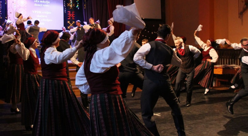
CRITICAL ANALYSIS: 

VISUAL:

This image I feel was the most powerful after viewing my selection of work by the amount of action, drama, and fun which is conveyed through it. The dancers in the image are swinging a white cloth which creates some motion blur, yet I think this is a key aspect of the image as it portrays the movement of the dancers. The overall tonal range of the image is quite dark and subdued. The dancers are wearing dark and rich colors which signify the regional colors of the county. The image has an overall warm hue to it with the orange lighting which hits from the right side of the image. This light again hits the back of the dancers and casts a faint shadow on the ground in front of them. The image gets darker as we move into the left hand corner of the image, bringing variation of lighting into the image.  The arrangement of dancers creates a repeating pattern through the image. This is further supported by the costumes of the dancers which are all identical according to their gender. the line of dancers which starts from the left hand side of the image, which then moves to the right hand side of the image, allows the eye to focus in on the dancers which are most illuminated on the right hand side of the image. each side of the line of dancers are in a way mirrored in the image, which again further creates a sense of repeating patterns. During the editing process, I decided to elongate the image by cropping out most of the top and bottom of the image. This really focuses in on the dancers and removes any distractions from the image.

TECHNICAL:

The high energy movement of the dancers during this photo shoot meant that the shutter speed of my camera had to be quite high, being at 1/250 during the entirety of the shoot. The lighting inside the hall in which I was in also created its own complication as there were places with more blue based lighting and others with warmer lighting. There was also a change in the direction of the lighting. By the stage there was direct spotlights which hit the fronts of the dancers, yet in the middle of the hall, the lighting came directly above and hit the tops of the dancers heads. I had to change my white balance settings in order to suit the mood of the entire concert which was very upbeat and joyful, setting my white balance to 2500k-3000k as this the warmer side of the spectrum. I set the aperture of my camera to f1.4 as I did not use the zoom on my camera and wanted to capture the entirety of the dance team, as opposed to focusing in on one single dancer. I did not use a tripod during this photo shoot as I was constantly moving around in order to capture the images. I think some of the motion blur in the images is a welcome addition as it further illustrates the fast dance moves and actions which were happening in the room during the event.I kept the ISO of all the images at 400, which proved to be effective for most of the photos, being nor under or overexposed.

CONCEPTUAL:

The main objective during this photo shoot was to capture the different elements of Latvian folk dance. It was something which is close to my heart as this was an activity I participated in as a child, therefore being part of my identity. It is a tradition which runs deeply in my and my family’s culture and something which is important to distinguish myself from others.  Whilst watching the show, it brought back many memories of my childhood and my life whilst I lived in Latvia. I wanted to capture the excitement and vibrant nature of Latvian folk dance which is a major part of many Latvians lives. It is an activity which brings together the whole country and distinguishes us from any other country or nation.

CONTEXTUAL: 

The singing and dancing traditions and newly forged elements of these ancient arts are not only a tribute to the magnitude of the cultural heritage of Latvia, but also serve as foundation for the identity of the modern Latvian. Traditional crafts and heritage is part of modern creation, interior design, cuisine, life-style as a whole.

The core of the culture heritage is the daina, a versified four-line piece of wisdom, which has been preserved and handed down from generation to generation until recorded at the turn of the 19-20th centuries, now inscribed in the UNESCO Intangible heritage list.

It bears the Latvian code of ethics. One can find everything there – from attitude models to descriptions of cosmic systems and deities. Some of longer folk poetry pieces have melodies, thus making them singable.  And old and young know and practice singing them, sometimes all night long.

During the time of lost statehood, the dainas or singing, private or public, often helped to express a hidden, but shared message of freedom, pride, longing for independence or protest.
IDENTITY AND PLACE

WHAT IS…

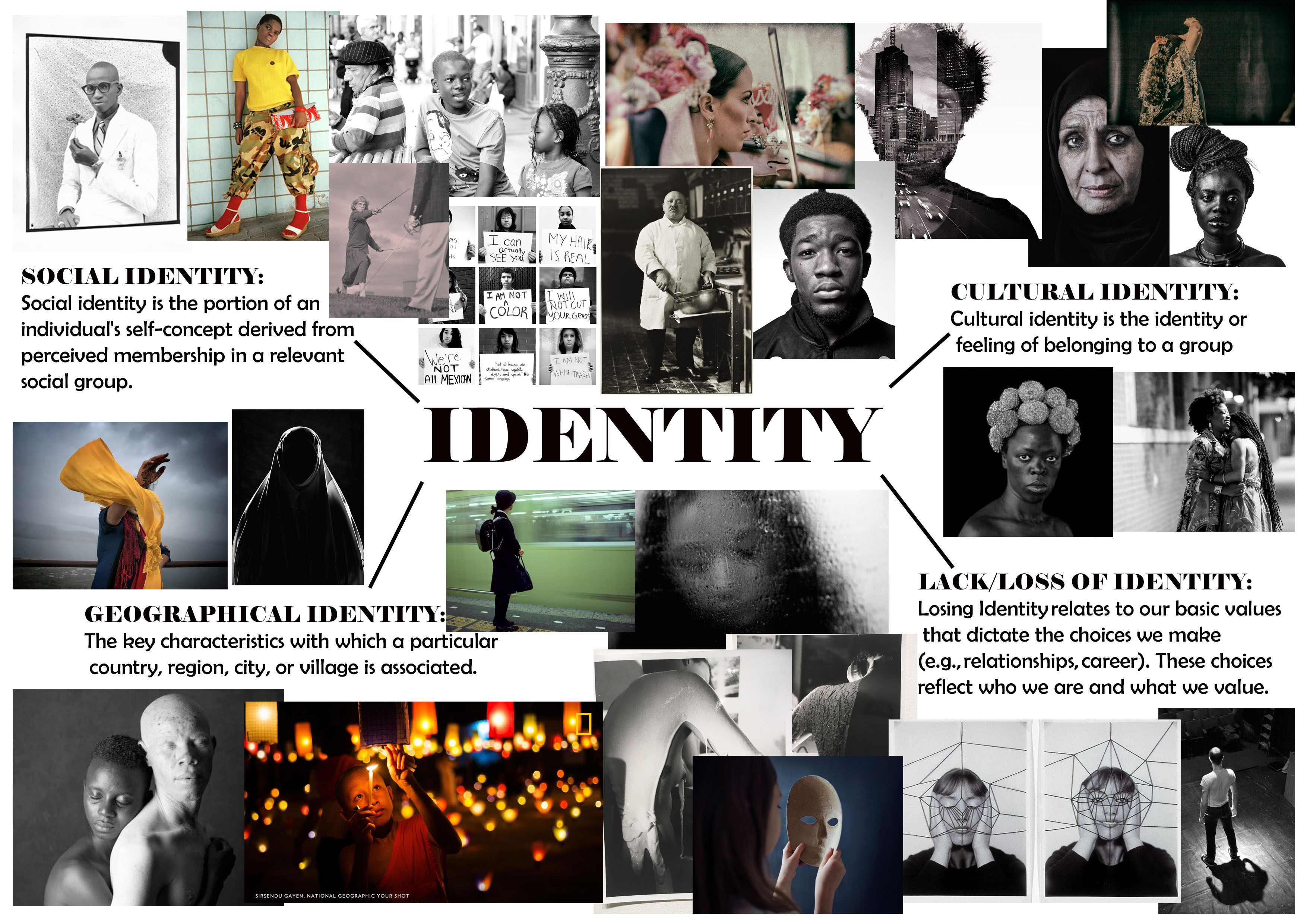
IDENTITY – Identity relates to our basic values that dictate the choices we make (e.g., relationships, career). These choices reflect who we are and what we value.
CULTURAL IDENTITY – Cultural identity is the identity or feeling of belonging to a group. It is part of a person’s self-conception and self-perception and is related to nationality, ethnicity, religion, social class, generation, locality or any kind of social group that has its own distinct culture

SOCIAL IDENTITY – Social identity is the portion of an individual’s self-concept derived from perceived membership in a relevant social group.

GEOGRAPHICAL IDENTITY – 1. An individual or group’s sense of attachment to the country, region, city, or village in which they live. 2. The key characteristics with which a particular country, region, city, or village is associated.

LACK/LOSS OF IDENTITY – Loss of identity may follow all sorts of change; changes in the workplace, loss of a job or profession, loss of a role that once defined us, as a child, as a parent, as a spouse. … When we lose our identity and sense of self, we are likely to seek our sense of self-worth from others.

IDENTITY MIND MAP: 

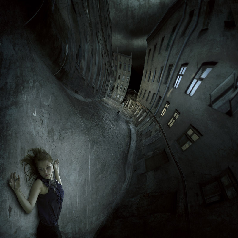
MARCIN SACHA 

CRITICAL ANALYSIS OF WORK:

VISUAL:  The image has very obviously been heavily edited, creating a spiral like warp on the image which twists and contorts the image and buildings in the backdrop. It shifts the model from a horizontal position to a vertical position. The overall image is composed of extremely dark, blue based tones. The focus of the image is mostly on the model, who is in the very foreground of the image. The clarity of the image is lost and it becomes more blurry as you move up the image and into the backdrop of the image. the buildings on either side of the street create a sort of guide for the eye, leading it down the street and making you focus on the darkness of the sky in the backdrop. The spotlight which has been incorporated onto the model, highlights her and makes her the focal point of the image. It illuminates the body and the ground which she lays upon. There is also observable light reflection in the windows of the building which draws more attention to them. The darkness of the walls accentuating this illumination. The position of the model, the dark and eerie mood of the image suggests themes of death, evil and depression. Upon a closer look, another human figure can be seen on the street in the distance, possibly suggesting that the woman in the foreground was in some way hurt by the figure.

TECHNICAL: I believe that in order to create this image, multiple images and heavy editing was used in order to achieve the final outcome. This is also extremely staged therefore models and extra equipment such as lighting was used in order to create the image. Photoshop was later used in order to warp the image and create the dream like fluidity of the image which guides the eye to the center. The model has also been staged in order to face the camera with the dead-like facial expression. The colors have also been highly saturated in order to give the dark and grungy look. The sky is extremely dark, grim and highly contrasted to the pavement, this I also believe has been edited in to give extra darkness.

CONCEPTUAL/CONTEXTUAL: “I live in Tarnow, in the south of Poland. Photography became my passion in 2005. I began with nature photography and later, landscapes. I recently became also interested in pictures on the boundary of photography and graphics. My achievements to date include nine solo exhibitions and over forty collective exhibitions in Poland and abroad, I have a title Artiste FIAP La Fédération Internationale de l’Art Photographique In my photo montage I often use paper, clay, bricks and ceramic forms prepared by myself. I create from them the scenery and by playing with the light I try to get an interesting abstracts, which imbue a specific mood of composition of light and shadow in the plane of the frame. My worlds even if habited by people are dominated by shapes, shadows and lights. These worlds are alien to them.”

source: https://www.behance.net/salimaf754

Claude Cahun and Clare Rae comparative essay

EXAMINING THE ARTISTS’ WORK 

For this comparative essay I have chosen to examine these two pieces of photography due to the contrasting nature of the composition and the surroundings.

Firstly, I thoroughly enjoy the work of both Cahun and Rae, Rae following a similar style to Cahun in which she is part of, or the main subject of the photo. Rae tends to incorporate herself into the landscape more as opposed to being the focal point of the image. The strange contortions that she sometimes does during photoshoot is an attempt to flow into and become one with her surrounding. The soft and subtle clothing that she chooses to wear during these photo shoots, illustrates a delicate and fragile side of her that allows her to blend in. I have also noticed that in the majority of her photos she is facing away from the camera , or she is at a disctance where it cannot be seen clearly. This once again suggests that she doesn’t want her identity to shine through as  our face is one of our most distinctive features, rather allowing her environment to be the biggest contributor of the image. In this photo, her attempt at fitting into the cart makes her seem small and insignificant in the maze of archives surrounding her. Rea, like Cahun, works in black and white imagery which again allows her to blend well into her surrounding with the monotone shades that her photography produces.

The work of Rae, although similar to Cahun’s, has some distinctive differences. Cahun also tends to set a lot of her photos outdoors, yet the main target that Cahun has is to explore and capture her out of the ordinary identity. Her strong facial features are clearly captured in the image. The smooth curves of her arms and face are the main center of the photo, contrasting the busy flowers that are in the foreground. Due to the technology of the time, Cahun worked only in black and white imagery but I feel this is was also an advantage as she allows all the character to come from the interesting compositions and themes as opposed to color and tone. Cahun is often discussed in relation to Butler’s idea of the performativity of
gender because of the role that gender performance plays in Cahun’s photographic self- transformations. While Cahun and Moore’s photographs of Cahun are certainly relevant to Butler’s theories of gender it was the ideas such as androgyny and the “third sex,” raised in the 1920s and ‘30s, which truly influenced their work. This image was prior to Cahun shaving her head and completing her androgynous look, portraying more as female. Preharps even the flowers in which she has chosen to stand in is a sort of irony of the traditional views of society and how women are viewed as “innocent flowers”.


Claire Rea, Les Blanche Banques 2017


Claude Cahoon JHT/1995/00032/p