All posts by Jasmine L

Filters

Author:
Category:

WEEK 3- NATURAL LIGHTING

Natural lighting

What is natural lighting? 

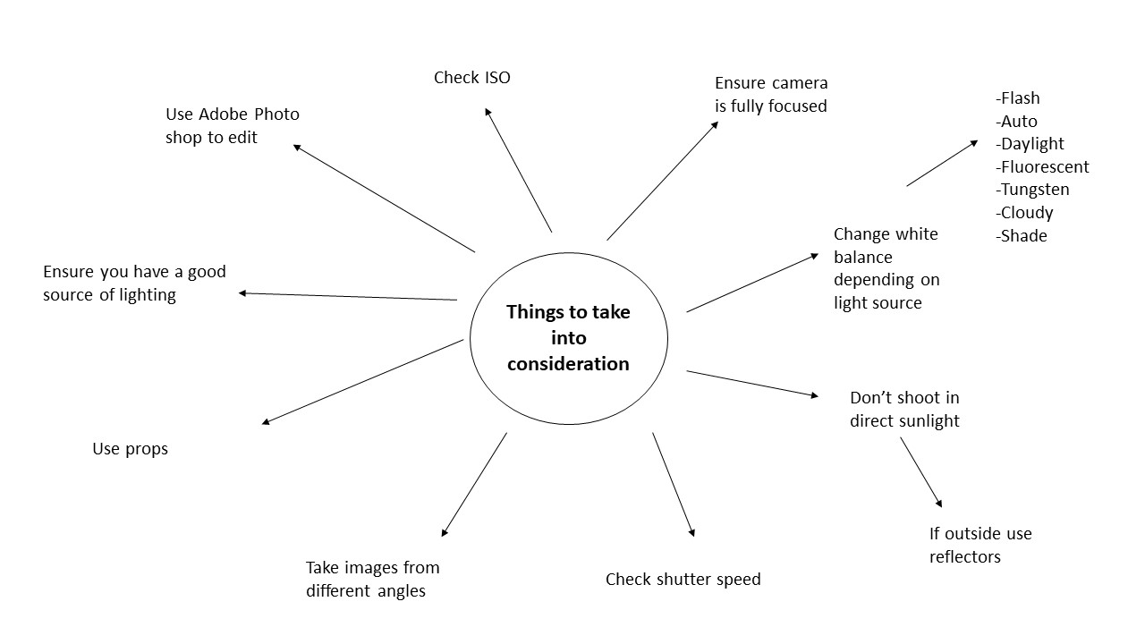
Natural light is like which comes from the sun. In most cases natural light is used to take a range of photos. However, there are different types of natural light and in order to capture a good image you have to take into consideration..

  •  The intensity of the light
  • The direction of the light
  • The temperature of the light and white balance
  • If u]you should use reflectors
  • High key/ low key lighting
  • Front/ side/ back lighting
  • Shadows/ silhouettes

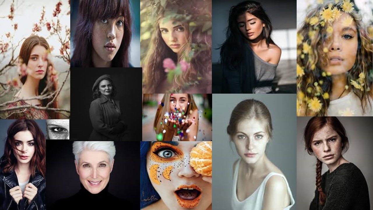
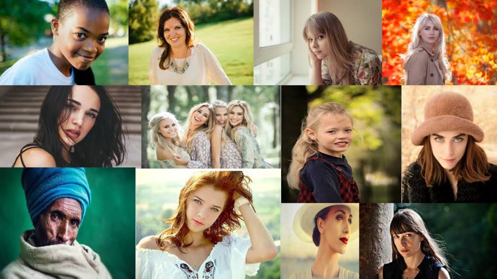
Example of Natural lighting.. (NOT MY IMAGES)


Case study (not my image)

When first looking at this image, i was immediately drawn into the  smiling girl who is directly looking into the camera lense. The blurred greenery around the model is implying that this little girl is in a park and could of just been playing. By putting both together, the reason that the girl is smiling could be that she is enjoying where she is. The photographer has used a narrow depth of field so that all the focus is on the girl which leaves the girls background story of her smiling open for debate. The image is perfectly focused which means a fast shutter speed has been used in order to take the image. The natural light source is found to be on the left hand side of the image which we can tell from the shadowing on the girls right hand side of the face which could have been fixed with a reflector to get an even amount of sunlight on the face. From this case study i have learnt that in using a reflector will be very helpful in order to decrease the chance of shadowing on the models face. I have also noticed that a good outdoor portrait should be in colour.

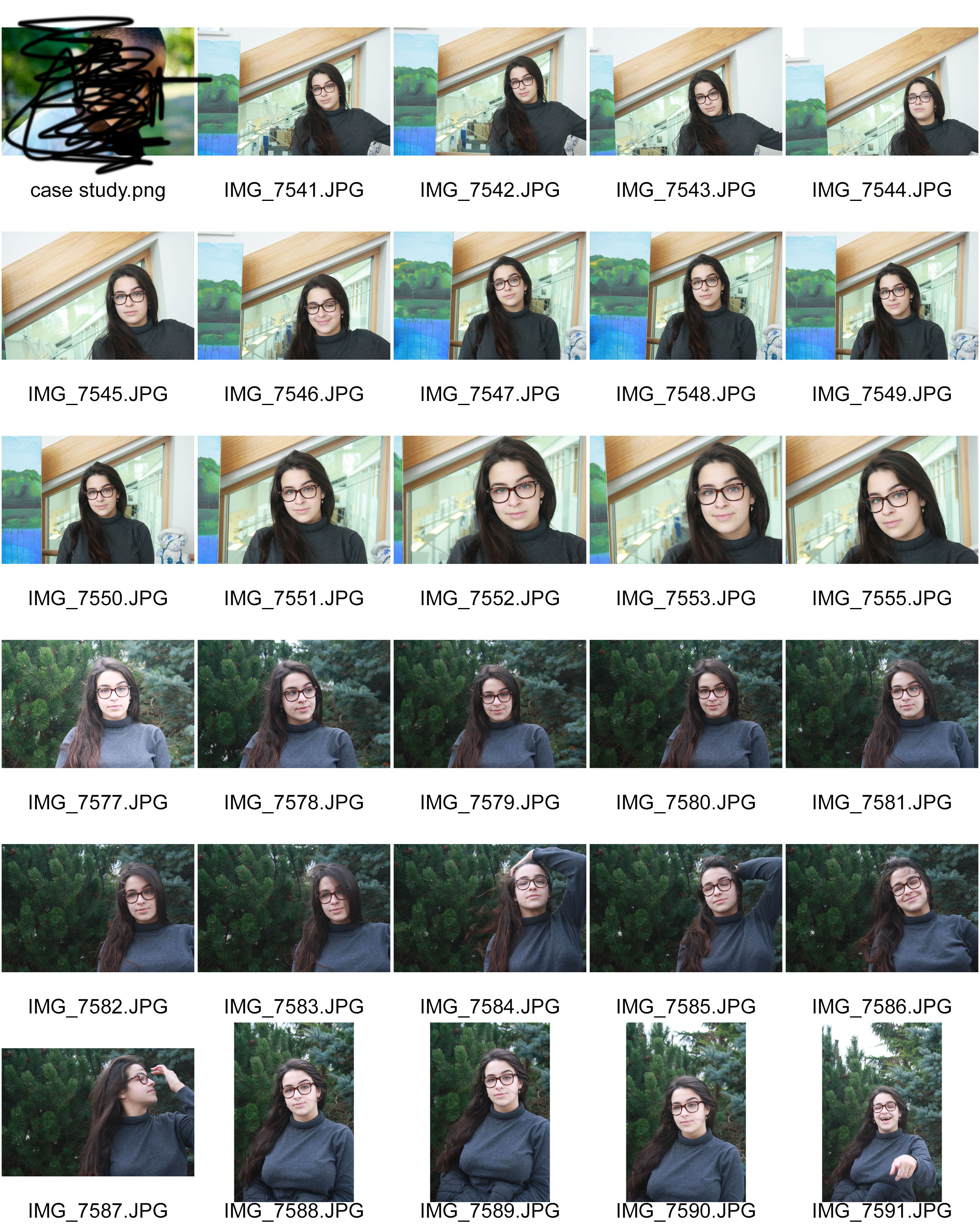
Natural Lighting photo shoot (contact sheets)

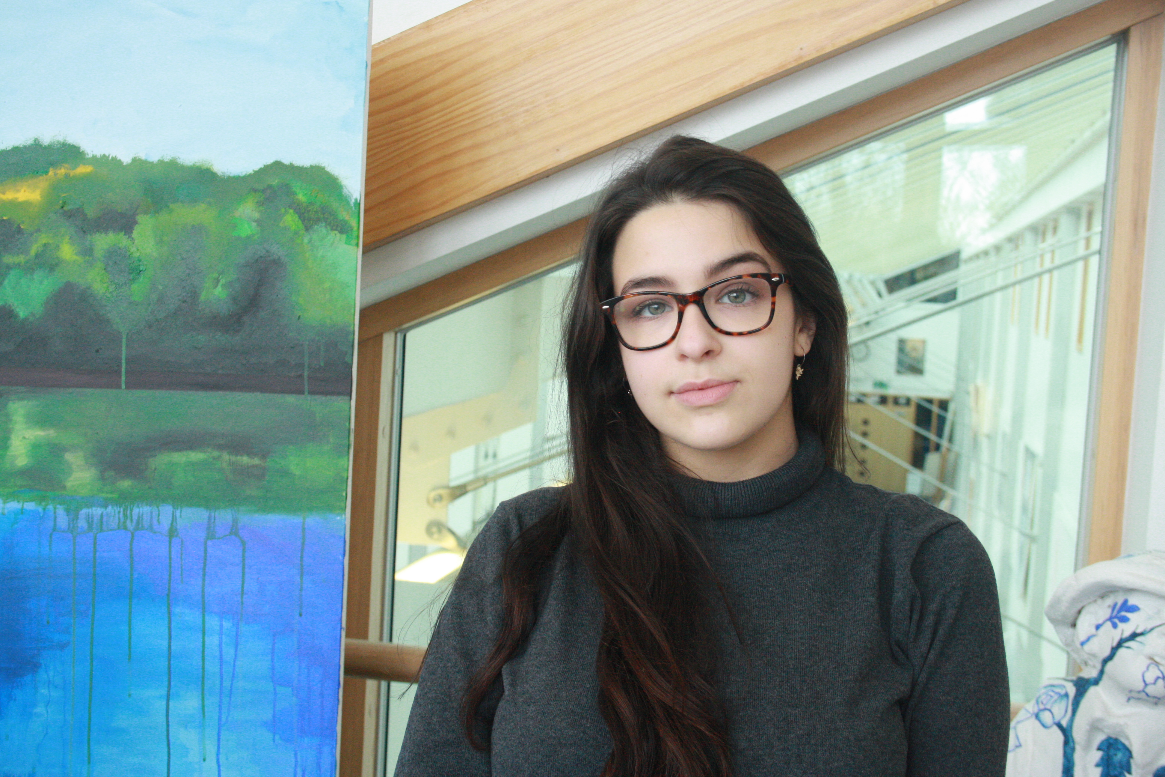
Best outcomes

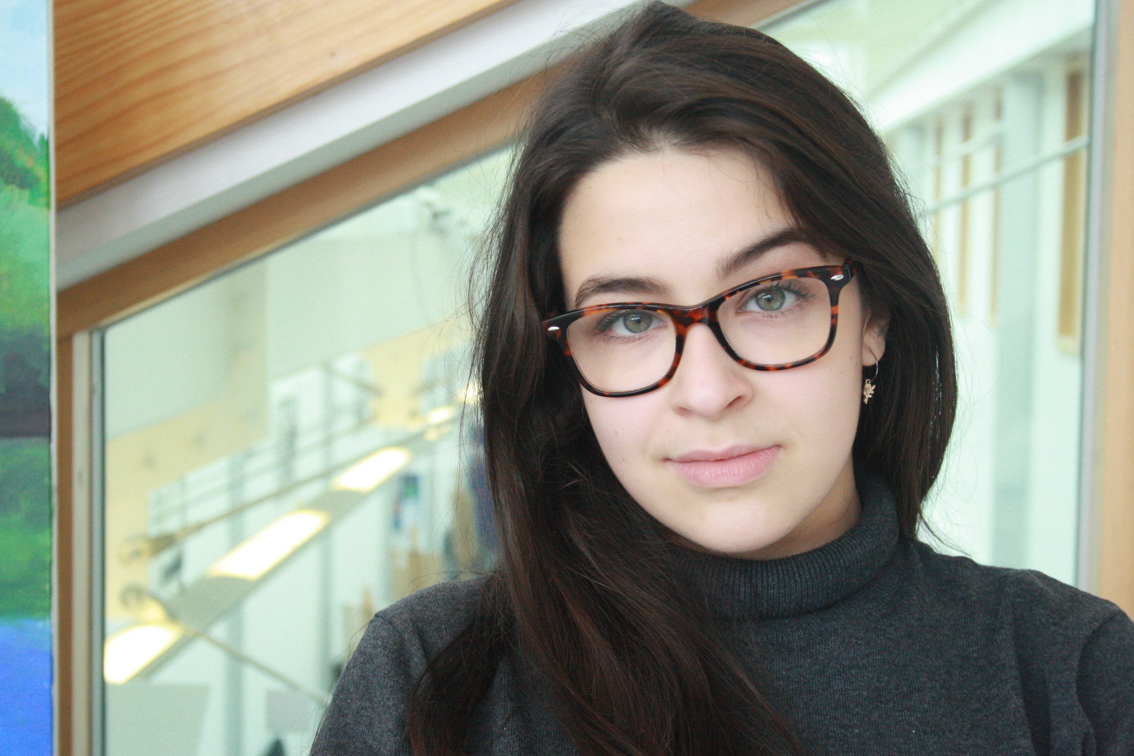
These portrait photos were taken in ‘natural’ sunlight, either that being outside or directly in front of a window.  I used a reflector when needed which decreased the shadowing on the models face.

Technical response

When taking this natural lighting portrait I used the manual focus setting so I was able to adjust the ISO setting to 300 and the shutter speed to 1/250 so my image didn’t turn out under or over exposed. I used the ‘daylight’ white balance due to being in an outdoor location, this setting also ensured the picture had the right colouring.


Technical response 

When taking both of these portrait images I used the manual focus setting on my camera so that I could adjust the ISO setting to 400 and the shutter speed to 1/250 to ensure that the images weren’t too under or over exposed. I also used the ‘daylight’ white balance setting so that the colour balance was correct. This image was also taken inside however directly in front of a very large window which let in a lot of daylight.


WEEK 3- FLASH PHOTOGRAPHY

Flash Photography

Flash is a very good technique to use when taking portraits as it helps to add more light to the picture and it can be used in both light and dark locations.

Types of flash

Bounce flash– This is when you point the flash in a different direction, rather than directly at your subject, in order for the light to soften before it hits your subject.  It’s typically bounced at an angle, at something like a wall or a ceiling.

Fill-in flash– This is a technique that’s used to brighten up shadowed areas. This is usually used when the background is a lot brighter that the actual subject, and using this will make your subject appear well lit and not underexposed compared to the background.

Speed light flash -This is also known as a hot shoe flash. This is a flash that is inserted onto the top part of the camera and is triggered then the cameras shutter takes an image.

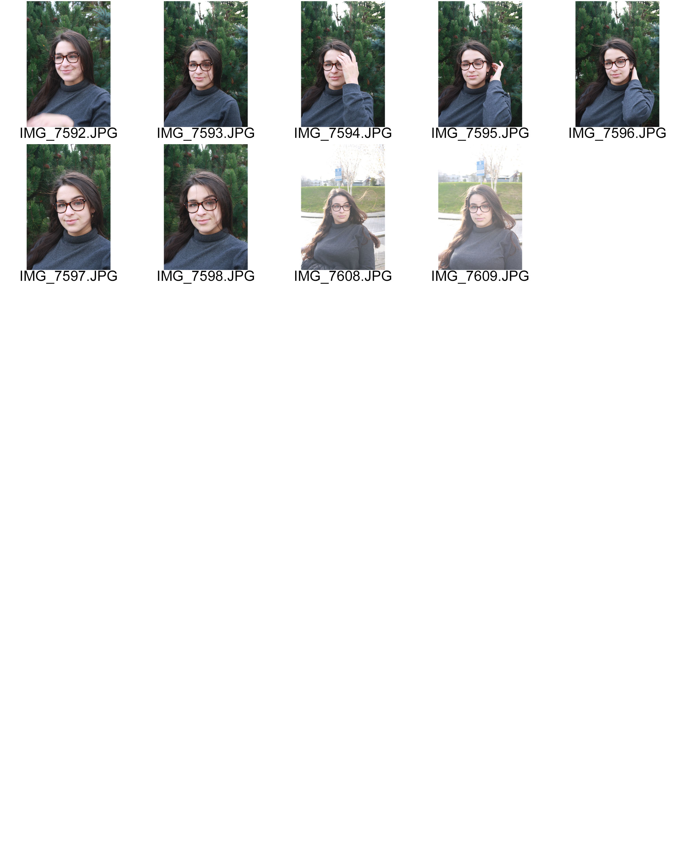
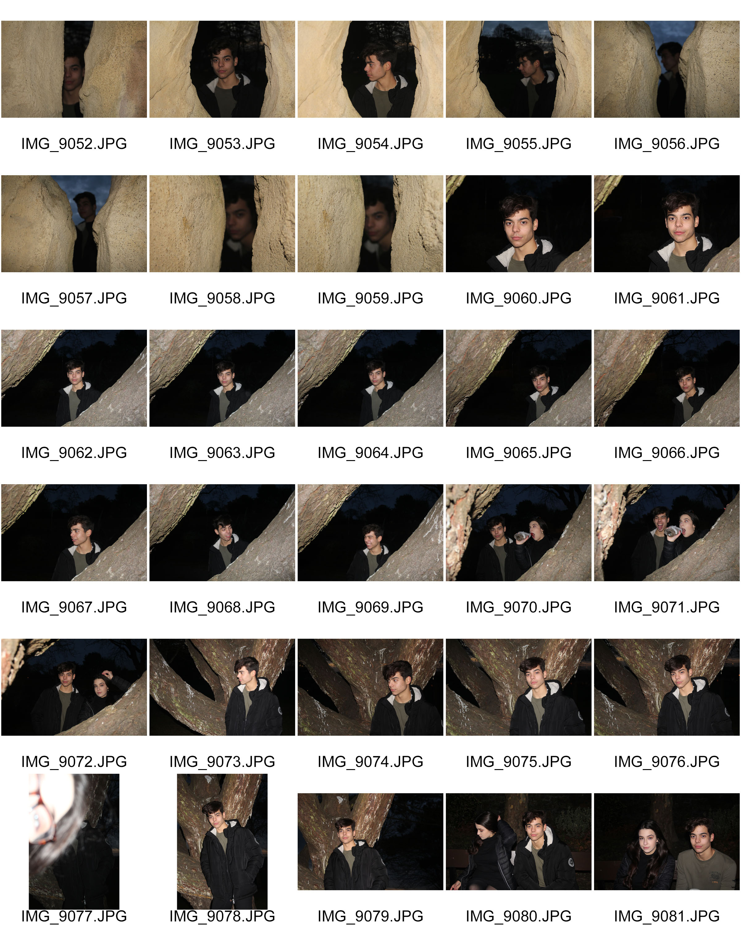
Contact sheets

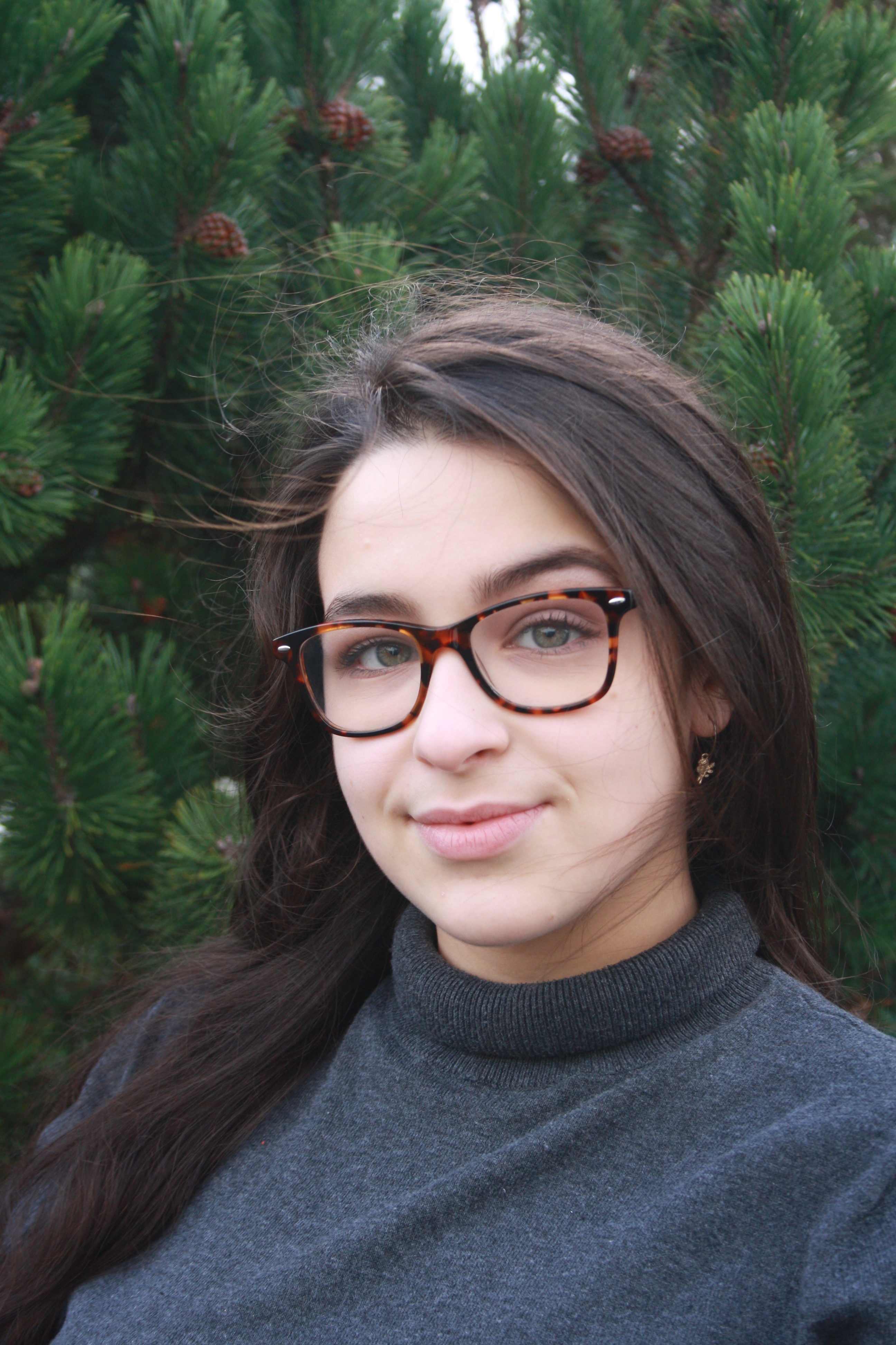
Best Outcomes

Technical analysis 

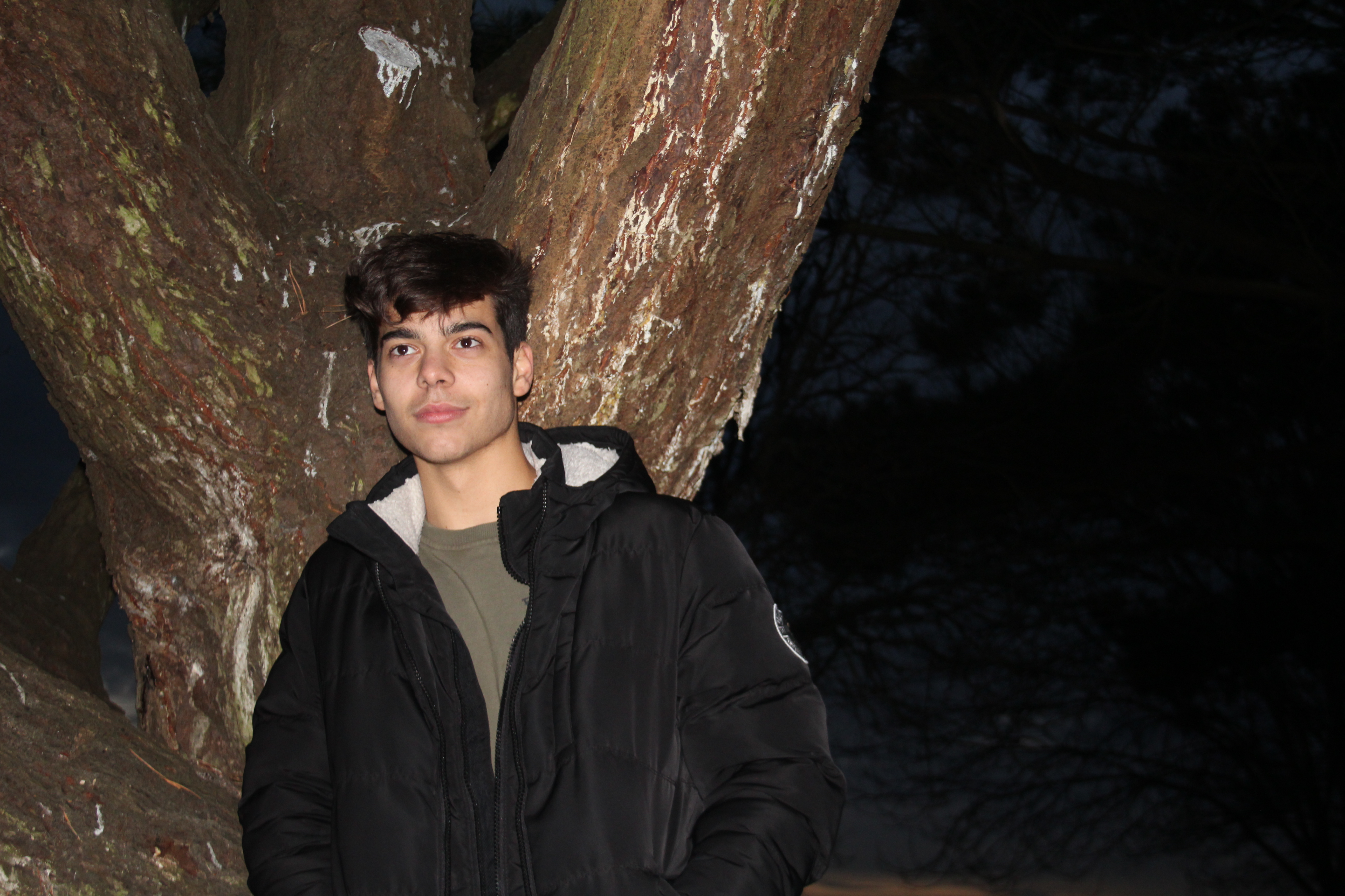
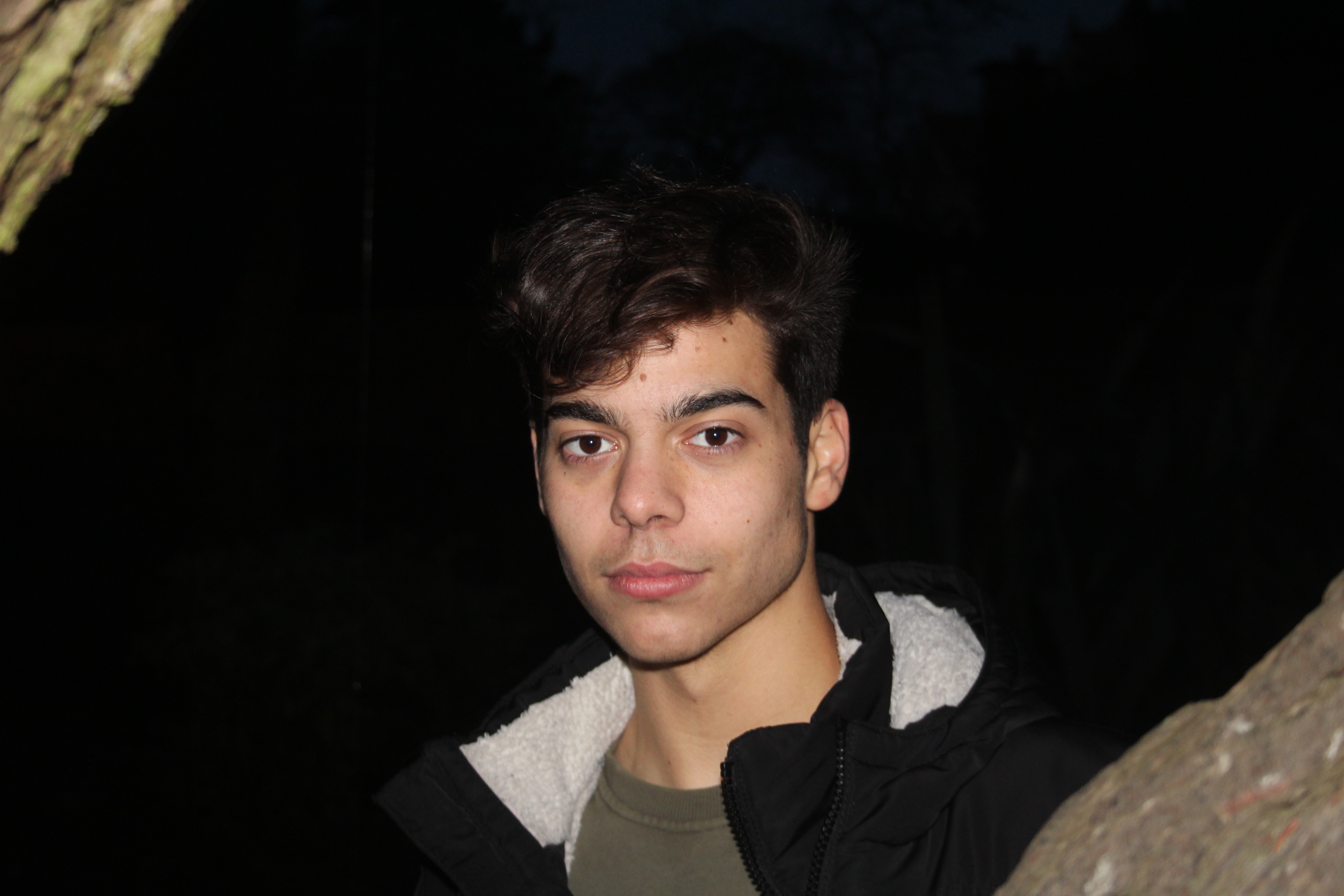
This image was taken on a Canon EOS 1300 D with a standard lens. The camera setting was on portrait mode with a white balance of ‘flash’. The shutter speed for this image was on 1/250.

Visual analysis 

We can see that this image has been taken at night due to the dark backgrounds. The flash has allowed for the models face to be lit up as well as the surrounding of the trees.


WEEK 3- HENRI CARTIER- BRESSON

Henri Cartier- Bresson
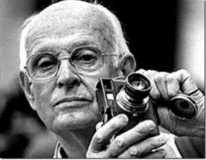
HIS EARLY LIFE: Henri was a French humanist photographer, he created street photography and was known as the master of candid photography (taking pictures of people who are not in a posed position). In his early life he did a lot of painting and had a large photography influence and ended up recieving his first camera in 1929 by a man named Harry Crosby and they spend a lot of time taking images together until Henri fell into a sexual relationship with Crosby’s wife. Henri ended up running away from France to Africa in 1931, 2 years after Crosby committed  suicide and his affair with Crosby’s wide ended which left him broken hearted. While in Africa, he survived by shooting game and selling it to local villagers. During doing this he contracted black water fever in the Cote d’lovire which nearly killed him.

Returning to France in 1931  he started up his love for photography again after being inspired by the photojournalist Martin Munkacsi in 1930. After being inspired, Henri took part in his first photojournalist shoot in 1937 where he covered the ‘ Coronation of King George VI and Queen Elizabeth for the French weekly regards where he focused on the London streets and not taking pictures of the king himself. He married his wife Ratna Mohini in the same year and they lived in a large studio with a small bedroom, kitchen and bathroom in Paris. This studio is where Cariter- Bresson developed his first film. During 193701939, Cartier- Bresson worked as a photographer for the French Communists evening paper ‘ Ce Soir’.

After Cartier- Bresson started film making in  1936, World War II broke out 3 years later in 39 and he joined the French Army in the Film and Photo unit. In the early year of 1940 he was captured in the French mountains by German soldiers and spend 35 months in prison-of-war camps doing forced labour by the Nazis. On his third attempts of trying to escape he finally did and hid on a farm before getting false papers to get him back to France. Coming towards the end of the War, there were rumors that Cartier- Bresson has been killed due to no one knowing he was working under-ground aiding other escapees. While working under ground, his dug up his hidden Leica camera which had been buried in farmland near Vosges.

LATER LIFE: Cartier- Bresson’s photography took him to places all around the work and he became the first Western photographer to photograph ‘ freely’. After working for Vogue in 1962, he withdrew as a principle of Magnum in 1966 to concentrate on portraiture and landscapes. Cariter- Bresson ended up retiring from photography in the early 70s and by 1975 did not take any more images. He returned to mainly drawing while still keeping his camera safe at home. He helf his first exhibition of drawings in 1975- Carlton Gallery, New York.

He died on August 3rd, 2005 at age 95. There was no cause of death announced, he was buried by his wife and daughter in the local cemetery.

MOOD BOARD..( NOT MY IMAGES) 
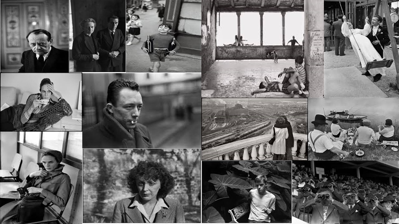
Analysation 
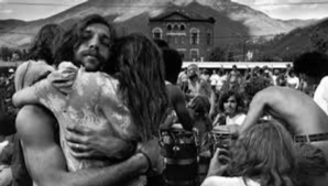
Technical analysis 

While looking at this image technically, i quickly notices that this image was taken with a wide lens due to us being able to see a large surface of the image, i can also tell that this image is in full focus and therefore doesn’t include a depth of field, this allows us to make more of a contextual and conceptual decision on the picture. Even though this image has been edited, i can also tell that the image has been taken under natural daylight due to the background ( mountains and sky) which means the White balance was set to ‘Daylight’ mode. I think that there was a high ISO used to take this image due to the detail in the subject of the image, as well as being able to see contrast in the image.

Visual analysis 

The visual aspect of this image is very obvious and we can see that the image has been edited to a black and white effect. Using this black and white effect has also allowed for there to be more of a contrast in the image due to the dark colouring of certain object and the lightness of the sky and snow on mountains. The shape of this image is a 2D flat which is allowing us to see the background of the image.

Contextual analysis

While looking at this image, i cannot get a feel for around the year this image was taken. However, due to the subject of the picture not having his shirt on but there being snow on mountains in the background, i am guessing that that this image was taken in France at a reunion camp due to the father and daughter hugging and seeing the people in the background looking a little frantic, like they’re looking for the ones they love.

Conceptual analysis 

I think the reasoning for this photo being taken is because of the very touching situation that is happening. The way i interpret the image is that there is a father and daughter reuniting which is shown through the tight hugging where you can see the mans arms tensing. All though the man is making eye contact with the camera, i think that his eyes are showing relief.

Comparison to Saul Leiter 

Saul Leiter was born December 3rd 1923 and was known as a color and black and white photographer from Pittsburgh Pennsylvania. Leiter was given his first camera at the age of twelve by his mother. However, Leither then went into art and was lucky enough to meet Eugene Smith who then encouraged Leither to become a photographer. He started taking color photographs in 1948 and began associating with other contemporary photographers

Leiter was then a fashion photographer from 1950- 1970 and photographed for Vogue, Elle and Nova.

Leiter’s photographers ranged in focus. He tended to experiment a lot with depth of fields which made his images very interesting as every image is different. I think that Leiters use of colour with the different depth of fields helps us to identify the surroundings more as some of the depth of fields used completely blur the picture which can sometimes make it hard to identify what the picture actually it. After analysing his images i have also noticed that he liked to take his images through windows which is shown by the mist on the windows, the rain or the reflection.

MOOD BOARD.. (NOT MY IMAGES)
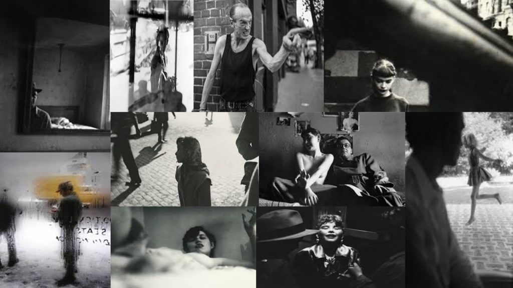
Similarities to Cariter- Bresson

The technical similarities in their way of taking photos include using natural/daylight when taking their images as most pictures have been shown to be taken outside. Both photographers also have all of the image in focus majority of the time therefore the audience can see what the model is doing which can add a story to the image. While analyzing their images, I think that both photographers used a high shutter speed in order to capture the images the way they did on the mood boards due to them all being very clear with no blurring.

After visually looking at the image i can tell that the photographers both tended to take pictures of the public who are not engaged with the camera, as well as their images being edited into black and white. Using the black and white edit has also added tone and contrast to the image due to the darker parts in the original picture standing out more. Most of their images are in 2D which allows us to see the surroundings that the models are in.

Both photographers also have a large history of being very well known and have both worked for the large fashion company Vogue.

Differences to Cariter- Bresson

After analyzing both of their works, i found it very difficult to detect any differences between the two and i have come to a conclusion that they are very similar and work in the same way.



WEEK 2-PORTRAIT ANALYSIS

ARNOLD NEWMAN 

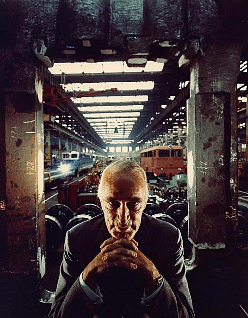
The image below was taken by Arnold Newman in 1963 and is a very well known image because of the message the image conveys.

Context 

The image was taken in 1963  due to industrialist Alfred Krupp contacted Newman for a portrait image on him. Newman planned to take the images of Krupp and while doing so discovered that Krupp transported materials to assist the Nazi’s during the second world war, and after finding out Newman was Jewish, Krupp refused to see Newman again. However, Krupp was persuaded through Newman’s very impressive portfolio to allow Newman to take the images. Because of the situation where Krupp didn’t want to see Newman anymore because of his religion, Newman used this to his advantage and made Krupp look sinister in the most weird way as revenge for Krupp’s influence in the prosecution of Jews.


Emotional response 

When first looking at this image i quickly saw the ‘ old white man’ placed in the center of the photograph which  drew me in due to the shadowing on the mans face due to the light above him. I feel as if the eye contact he gives the camera shows a dark personality and add a sinister feel to the image. I also noticed the lack of bright lights in the image which helped to contrast with the little colour in the image adding a cold and again sinister feel to the time.

I also found that the way the man presented himself with his hands together and sat in a suit suggests that he is a business man and he is of high class.

Visual 

The image is very interesting to the eye due to the very busy background of the image in  contrast to the dark lighting and the subject of the image which is the man. At first i though that the background of the image was just a random set scene. However, after researching about the image and finding out that Krupp helped transport materials for the Nazi’s in WW2 i realized the the place he is in is his underground transportation station. This instantly made me feel unconformable as i questioned why he would want to be photographed in this place and why he was proud of it. This again dded to the sinister feel of the image.

Technical

The first technical aspect of this image i noticed was the use of the texture shown through different objects found within the location of the train station. The texture is shown due to the rust on the objects which also signal that the objects are old and have been used for a long time. The background is also very busy which and there is a lot of movement shown which shows that it is a fully operating station. The depth of field of the image is large and the man being close to the camera instead of within the scenery adds a long depth of field due to us being able to see the whole background. The man also being in sharp focus suggests that he is the subject of the image.

Conceptual Response 

The facial expressions that the man is making suggests that he is up to not good and has something evil planned, the location he is in also suggests that the image is very old however him being in a suit suggests he could be an owner of the location. This image is very up to debate..


WEEK 1- ENVIRONMENTAL PORTRAITS

Environmental portraits 

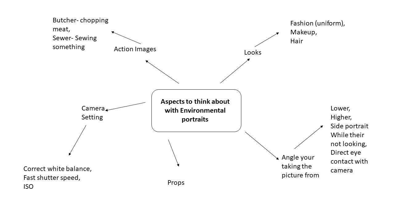
“An environmental portrait is a portrait executed in the subject’s usual environment, such as in their home or workplace, and typically illuminates the subject’s life and surroundings. The term is most frequently used of a genre of photography.” (Wikipedia)

Mood Board

Arnold Newman

Arnold Newman was an American photographer, noted for his environmental portraits.  He was born 3 March 1918, and started to make 48 cent portraits in 1938 which led onto him purchasing and creating his own business in Miami Beach during 1945. Due to his careers taking a massive turn in this year he then decided to re locate to New York in 1946 due to there being more opportunities. He was very successful in New York and ended up being well known for his work of portraits and abstract still life pictures.

Newman’s environmental images were black and white based and all have different stories which are portrayed through the models facial expressions during the time the image was taken.

His images tended to be taken from lots of different angles and focused a lot of the coloring of the background in contrast to the subject matter of the model. In all his images the models are always facing forward to the camera which gives the audience a clear understanding of whats happening in the image.

Example- 

Analyzing 

In this image there is a clear showing of how the man is feeling due to him facing directly forward with his face fully shown. The background of the image helps us to understand that this man in the photograph is a conductor due to the instruments and the prop he has in his left hand which is known as a baton and makes his role more convincing.  The conductors facial expressions and the environment he is in  suggests to the audience that the conductor is tired/ stressed/ drained and bored which helps the audience to relate to the situation .

This image has been taken at  a higher level rather than a even face level which helps to capture the full background while the black and white effect helps to add more tone to the background in contrast to the subject matter.


Planning my Photo shoot 

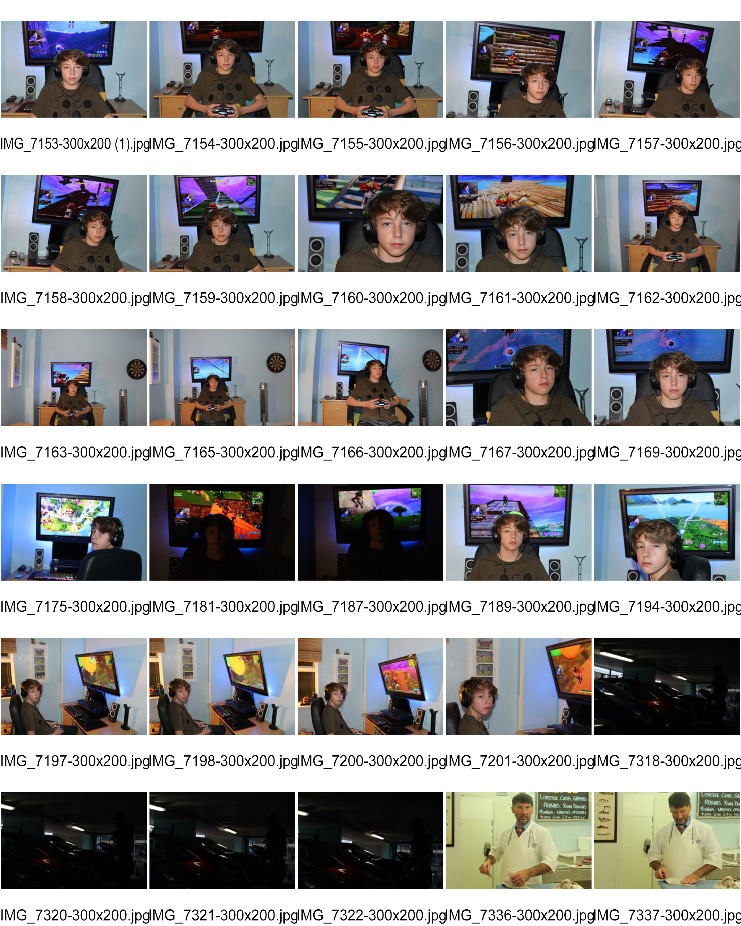
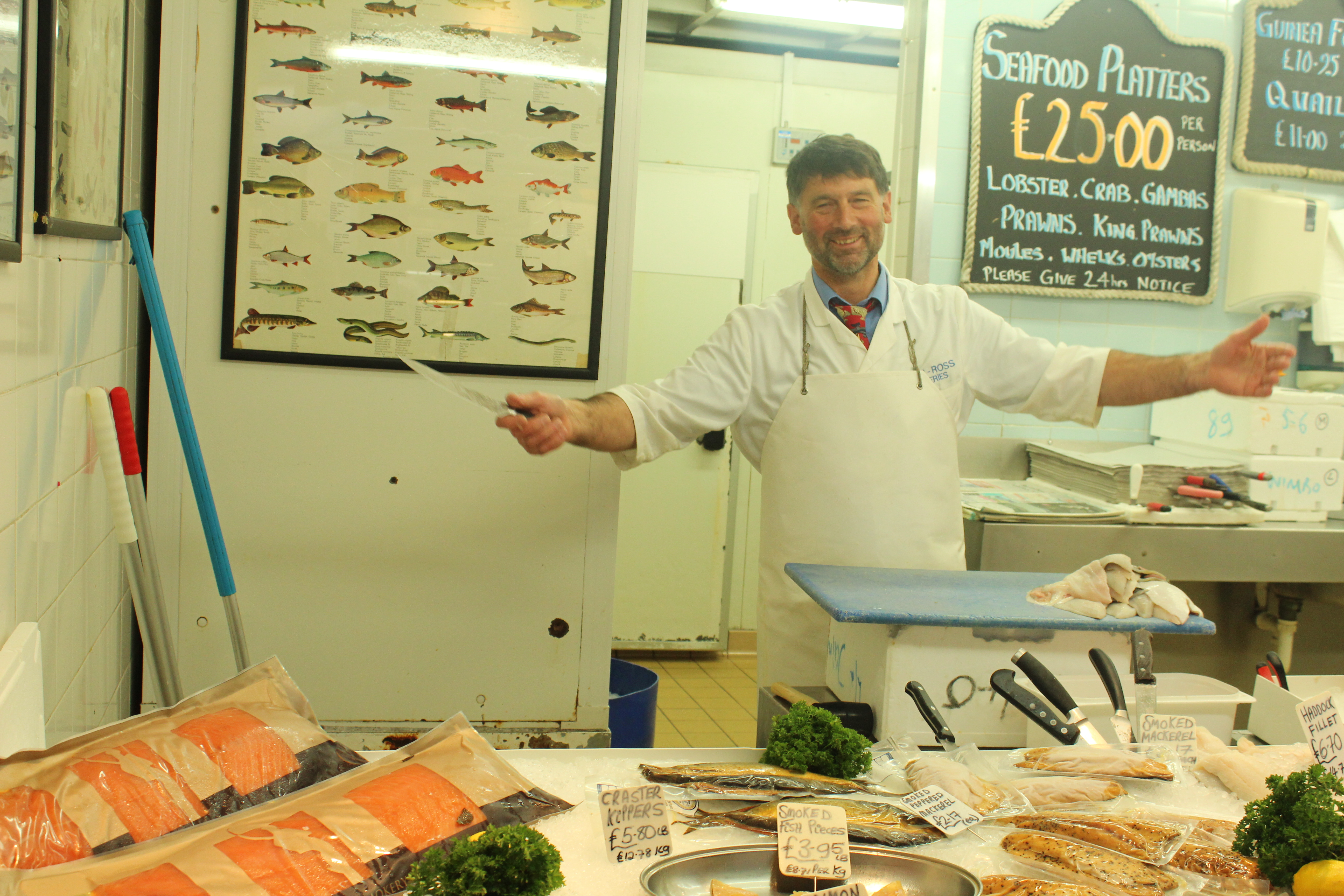
In these photographs  will be using multiple models in their natural environment. I will be capturing them doing normal tasks they would carry out. Most of the images will be taken midday under artificial lighting. I will be using manual focus in all my images to ensure i can change the ISO, shutter speed, the focus and the white balance.

Contact sheets 


Best outcomes


DISPLAYING FINAL IMAGES

Displaying final images

Final piece 1:

This image will be displayed in a black peep hole where there is a black frame outlining the image.


Final piece 2:

This image will be displayed in a black peep hole where there is a black frame outlining the image.


Final piece 3:

This image will be displayed in a black peep hole where there is a black frame outlining the image.


Final image 4:

This image will be displayed in a black peep hole where there is a black frame outlining the image.


Final image 5:

The groups of images will be placed on a plain white background however also be on a foam board so that the images stick out.


WEEK 6- FINALIZING IMAGES

Now that I have narrowed down my favorite images for printing, I will do the lasts bits of editing and present how I want them to be displayed.

A4 Image

The image i had chosen from my Bokha project had been previously edited and i ended up chosing the edited verison of the image.

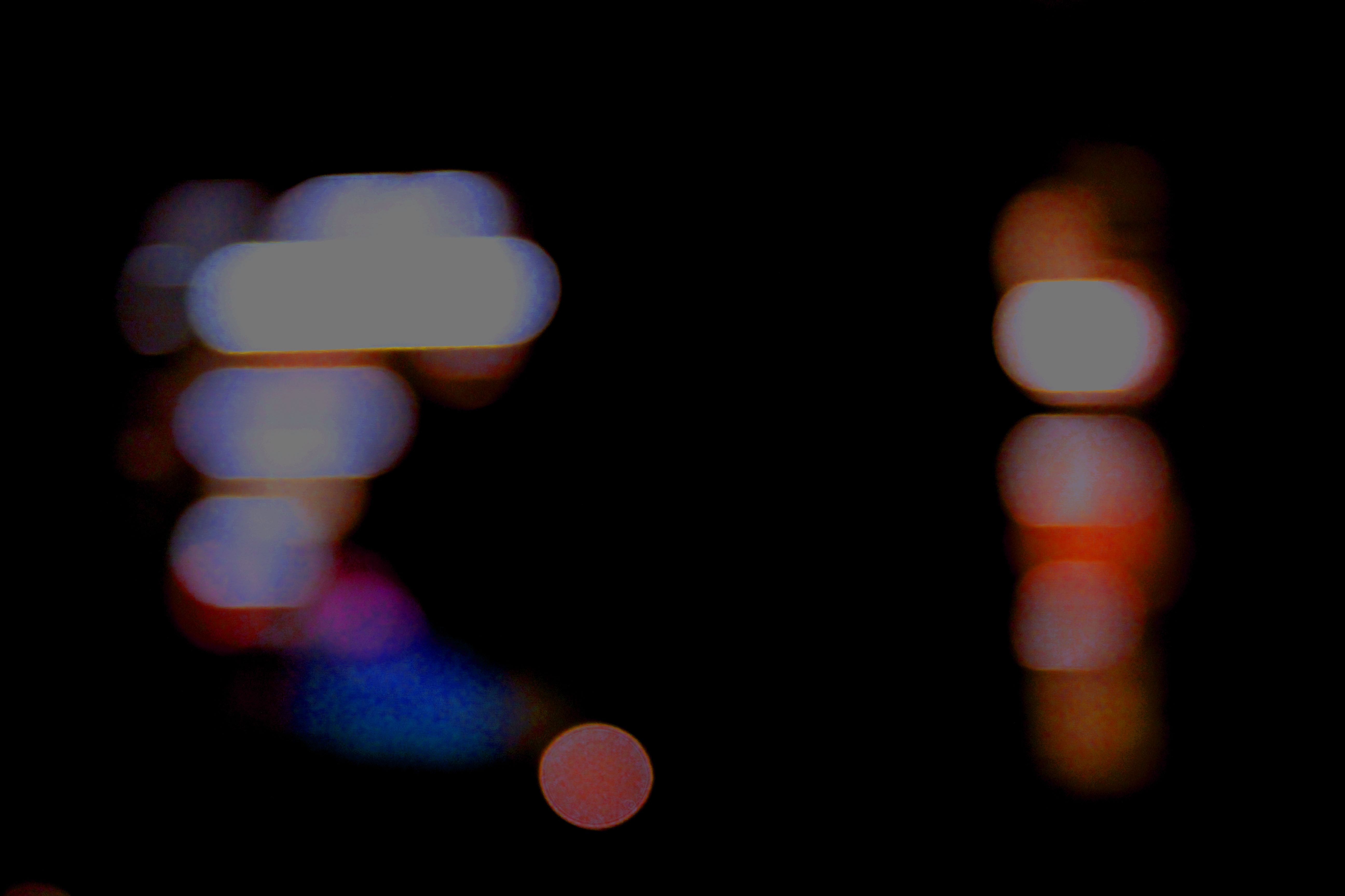
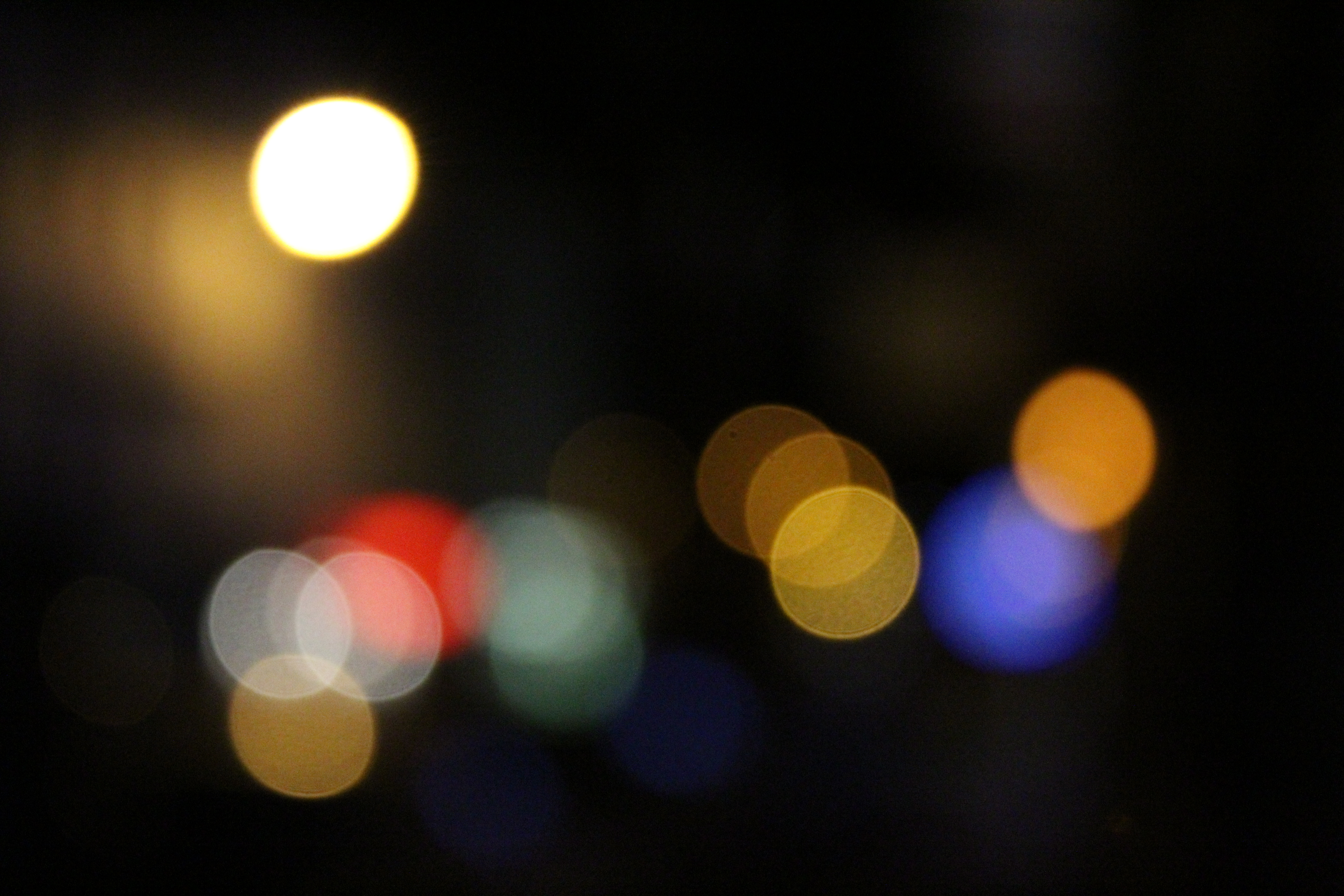
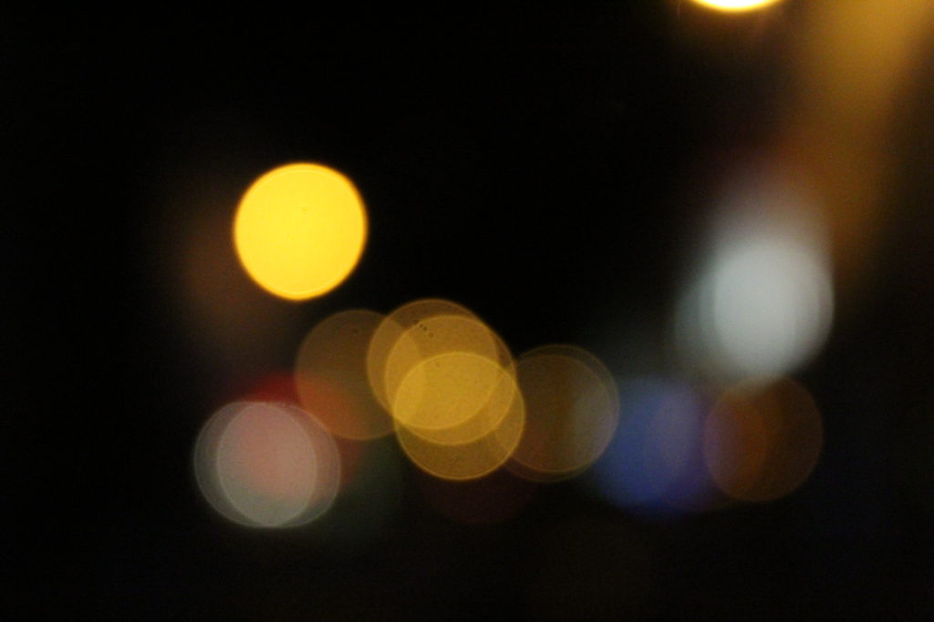
The image was taken on a Canon EOS 1300 D and was taken in Manual Focus which helped to purposly make the scenery blurred and achieve the ‘ Bokha’ effect. A quick shutter speed was also taken to help under expose the image and emphasis the darker elements in the photo. The image was also taken with no flash which helped to make the colours in the picture stand out in contrast to the darkness of the sky.
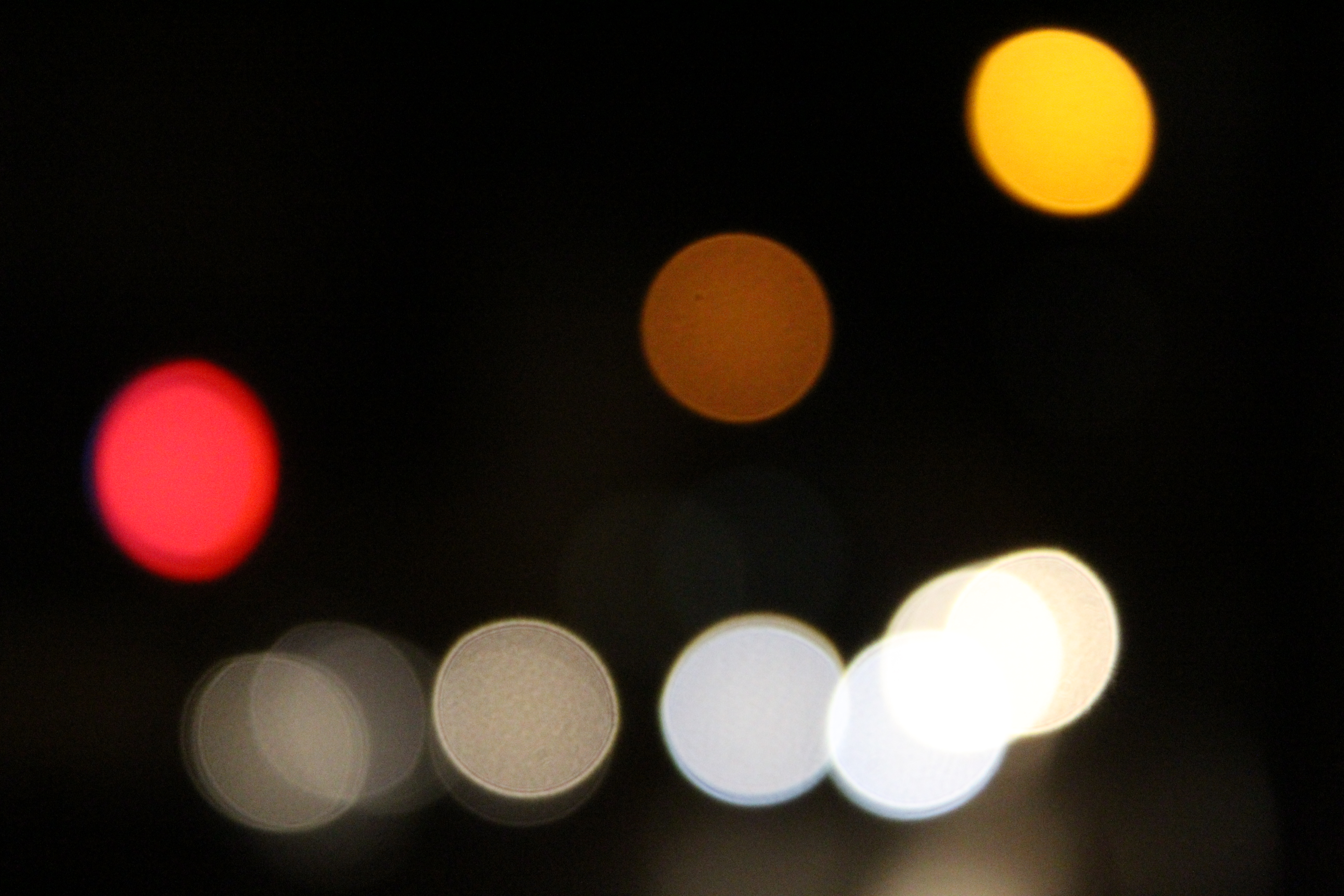
When editing the image i firstly changed the brightness down to emphasise the darkness in the background, as well as changing the contrast so that the original golden white with coloured undertones contrasted with the night sky. The exposure of the image was then turned down in order to make the image more underexposed.  The colour balance of the image was then changed. This was the step which had the most effect on the image and made it into its final image. This was because when changing the colour balance to a green colour meant that the undertones of the street lights were then enhanced.
When deciding how this picture was going to be displayed i had experimented with mirroring the image, as well as layering it. Even though this would show more technique, i decided to come back to the original and slightly edited picture as i think that it looks good as a singular A4 image as it is and doesn’t need to be overly edited.

A4 Image

This was originally an experimental image which i was very fond of and decided to bring into my final prints as it had lots of potential.

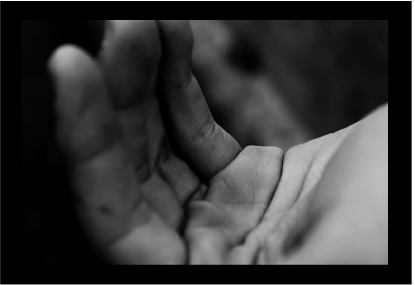
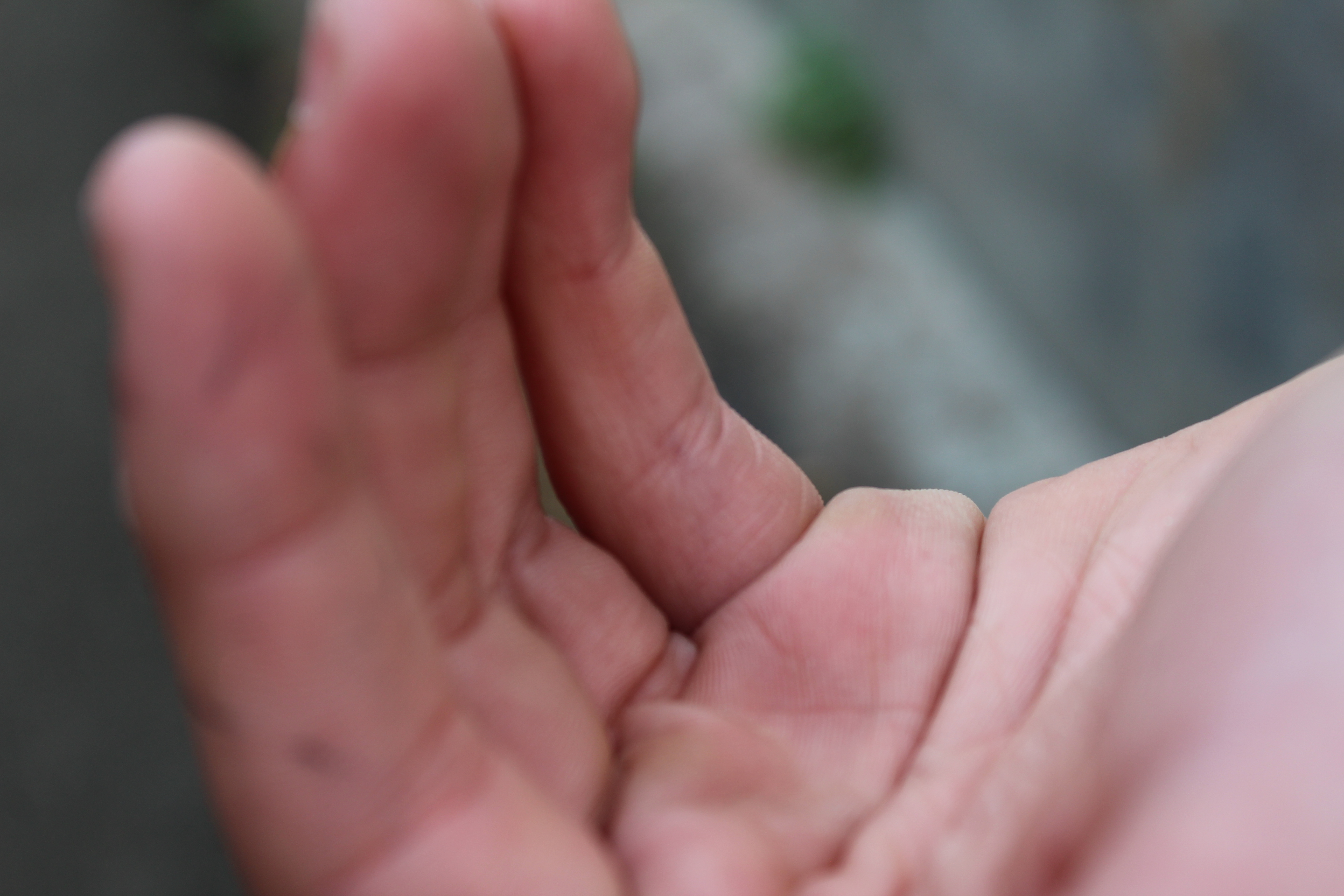
The image was taken on a Canon EOS 1300 D and was taken in Manual Focus which made sure my ‘ F stop’ was low which created the narrow depth of field effect that i was aiming for in the image. No flash was used to take this picture as the image was taken under natural lighting which emphasized every detail on the hand, as well as my shutter speed of 1/200 which allowed light into the lens.

I did not do any editing to this image.

A4 Image

The image i had chosen from my Bokha project.

The image was taken on a Canon EOS 1300 D and was taken in Manual Focus which helped to purposly make the scenery blurred and achieve the ‘ Bokha’ effect. A quick shutter speed was also taken to help under expose the image and emphasis the darker elements in the photo. The image was also taken with no flash which helped to make the colours in the picture stand out in contrast to the darkness of the sky.

There was no editing done to these images.

A5 Image

This was originally an experimental image which i was very fond of and decided to bring into my final prints as it had lots of potential after being slightly edited.

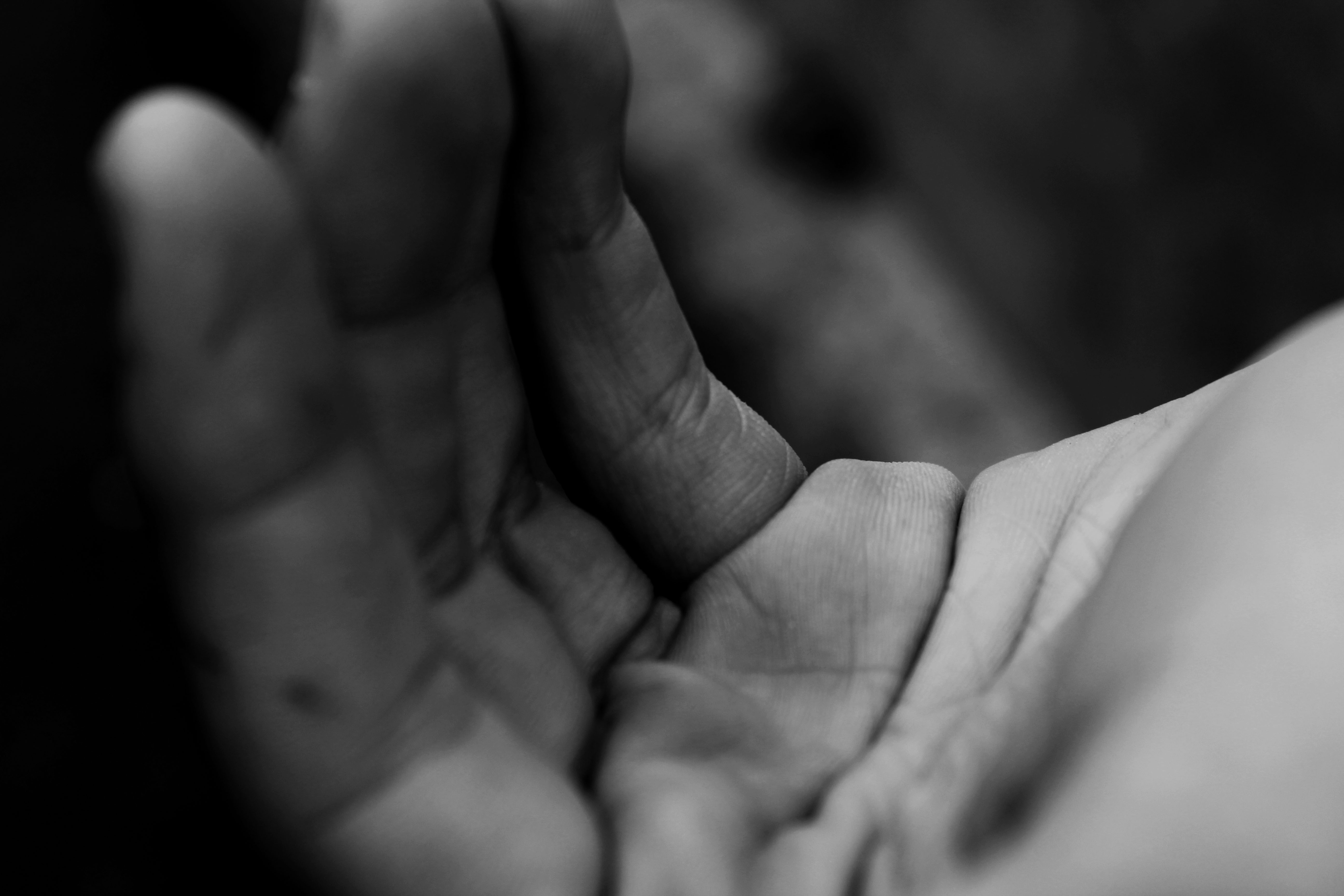
The image was taken on a Canon EOS 1300 D and was taken in Manual Focus which made sure my ‘ F stop’ was low which created the narrow depth of field effect that i was aiming for in the image. No flash was used to take this picture as the image was taken under natural lighting which emphasized every detail on the hand, as well as my quick shutter speed that i used to under expose the image for a darker background.

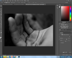
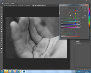
When editing this image i firstly edited the image to black and white as i thought using a black and white filter would help to emphasise the details of the hand. I then created ‘levels’ and lowered the level scale until i found that the background was dark enough to my liking in contrast to the main subject ( hand) being lighter. For my final editing stage i edited the brightness of the overall picture up in order to brighten up the hand.

I never had any intentions of changing the the display of the overall image and think the image is too simplistic to be mirrored etc.. I have decided to leave the image as it is and have the whole image on the A5 print.


A3 Image

This was an image which deliberately taken for one of my final images as i was disappointed that i didn’t get a chance in the overall Abstract project to take an image like this.

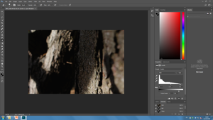
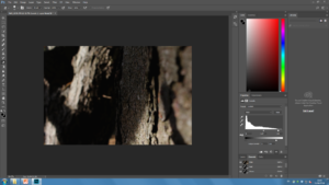
The image was taken on a Canon EOS 1300 D and was taken in Manual Focus which made sure my ‘ F stop’ was low which created the narrow depth of field effect that i was aiming for in the image. My aim with the image was to have a lot of shadowing being shown and i therefore took the image on a cloudy day which helped emphasise the shadowing. The image was also taken on a quick shutter speed which like i have mentioned in my other images, helps to under expose the image and add emphasise on the textural parts ie the bark on the image and make the shadows darker than they actually are.

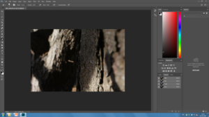
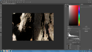
I only took two steps in editing this picture as i really liked it before hand. The first step was decreasing the ‘ Levels’ on my image which added more depth to the shadowing. I then took it a step further and decreased the brightness of the output levels which then added more darkness. I was then left with my ideal final image.

Having this image displayed on A3 was ideal for me as i really wanted the texture of the image to be very noticeable and by putting this image on the larger card is the better idea.  I think that because the image is so simple it didn’t need lots of editing done to it and i therefore plan to leave the image how it is.


WEEK 6- INITIAL IMAGES

Initial Choices for final images

After looking through my whole ‘ Abstract’ project, i have used Adobe Photoshop to play around with 5 possible images which i can choose from to be a final image of mine. 

Reasoning for my choices 

I think using my ‘ Bokha’ inspired image for A4 print out is a good choice. This is because this was my most successful image from a previous Bokha project when studying the photographer Saul Leiter. I think this was one of my most successful pictures from that project as it includes a lot of contrast in the picture due to the high saturated colours, the bright white and the overall darkness.

This image also shows a range of techniques that was used to get this end picture. I took this picture in Manual Focus as which helped to purposely make the scenery blurred while as using a quick shutter speed to take pictures of the lights not in focus as well as it helping to under expose the image and contrast the colours with the overall darkness a lot more which was one of my main goals.

I think using this very toned picture of a hand for my A5 print out is a good decision as this image includes a range of technical elements and taking this picture on this photo shoot taught me a range of things.

This image was taken in Manual Focus so that my ‘ F stop’ was low which made a narrow depth of field which was an affect that i was aiming for. This image was also taken under natural lighting and therefore when using the quick shutter speed on my camera, this allowed for every detail of the hand to be emphasized which added a lot of tone for when edit the into black and white. Using the quick shutter speed taught me that i can use it to help under expose the image to create a darker effect for the non- subject parts of the image which helps to contrast between the light and dark in the picture.

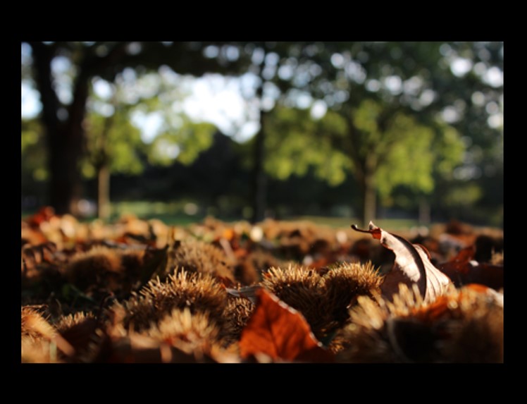
Using this very natural abstract image as my A3 print out is a good choice as the image contains a lot of interesting textures which are very pleasing to the eye. As well as my editing being used to contrast more between the light and dark in the picture and i overall really like the picture and this it will be a great choice for an A3 print out.

This image was taken in Manual Focus which helped me learn what an ‘ F Stop’ is as i had used a low F stop in order to create a shallow depth of field. This image was also taken on a very cloudy day which created a lot of shadowing on the tree bark adding a lot of texture to the image.


Using these three images for a final piece is a good idea as the images will look nice displayed as a three piece of art. I like the range of different colors in the images and think that i can creatively display these images.

These images also shows a range of techniques that was used to get this end picture. I took these images in Manual Focus as which helped to purposely make the scenery blurred while as using a quick shutter speed to take pictures of the lights not in focus as well as it helping to under expose the images and contrast the colors with the overall darkness a lot more which was one of my main goals.

This is a great image as it is showing a clear use of depth of field. This image has not been edited at all and therefore shows the quality of the camera skills used.

The image was taken in Manual Focus with a shutter speed of 1/250 which helped to let in light to the lens of the camera. I also had a  ‘daylight’ white balance.

WEEK 5- GARY GAY ( COLOUR + TEXTURE)

 Garry Gay

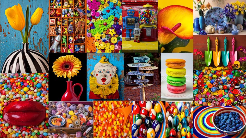
Garry Gay was born in 1951 and was a color photographer from Glendale, California. He tad taken digital photos since 1993 and had a successful career due to being the president of multiple photography clubs. Garry Gay tended to take images which were very colorful as seen below where he had been taking colorful household object pictures.  

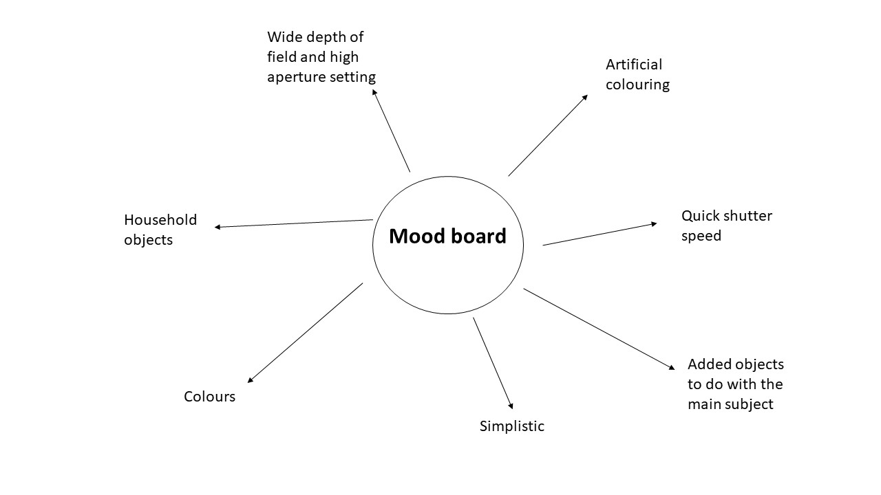
The main focus of Garry Gay’s work is the use of colourful objects he takes photos of. Garry uses the formal elements of shape and texture in his work, shape is shown in his work through the different sized objects while the texture is shown through the bright colours in his work and the materialistic objects which helps the bright colours to stand out. Most of Garry’s images are taken from a straight angle which allows different parts of the objects to be the focus piece. After analysing Garry’s images i think he uses artificial lighting in his photography which helps the colours to really pop out, as well as him using a quick shutter speed as there is no blur in any of his images. Most of his images do not include any type of background and only other objects which are to do with the main focus of the image which means that his images are very layered and his main focus doesn’t tend to stand out as much as it would with a plain background. However, this is a very effective technique and by using a wide depth of field this allows for the whole image to be in focus as well as the use of a high aperture.

I like Garry’s work as it is very simplistic however very effective and is very different from any other photographers i have previously researched about.

Plan

After researching and analysing Garry Gay’s images i have decided i want to use a quick shutter speed when capturing brightly colored pencils. For my background i will use pencil sharpening which i have chose to do after being inspired by the idea that Garry always included other objects to do with the main subject. I think bot the pencil shavings and the colored pencils will look very effective when together and this is an idea which i can up with myself.

When taking my image i am going to have my camera on a Manual setting so i can change the shutter speed and aperture to whatever i desire and will therefore be able to achieve my goals for this task. These images will be taken inside under artificial lighting.


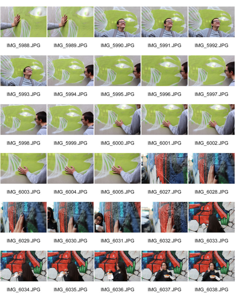
Contact Sheets 


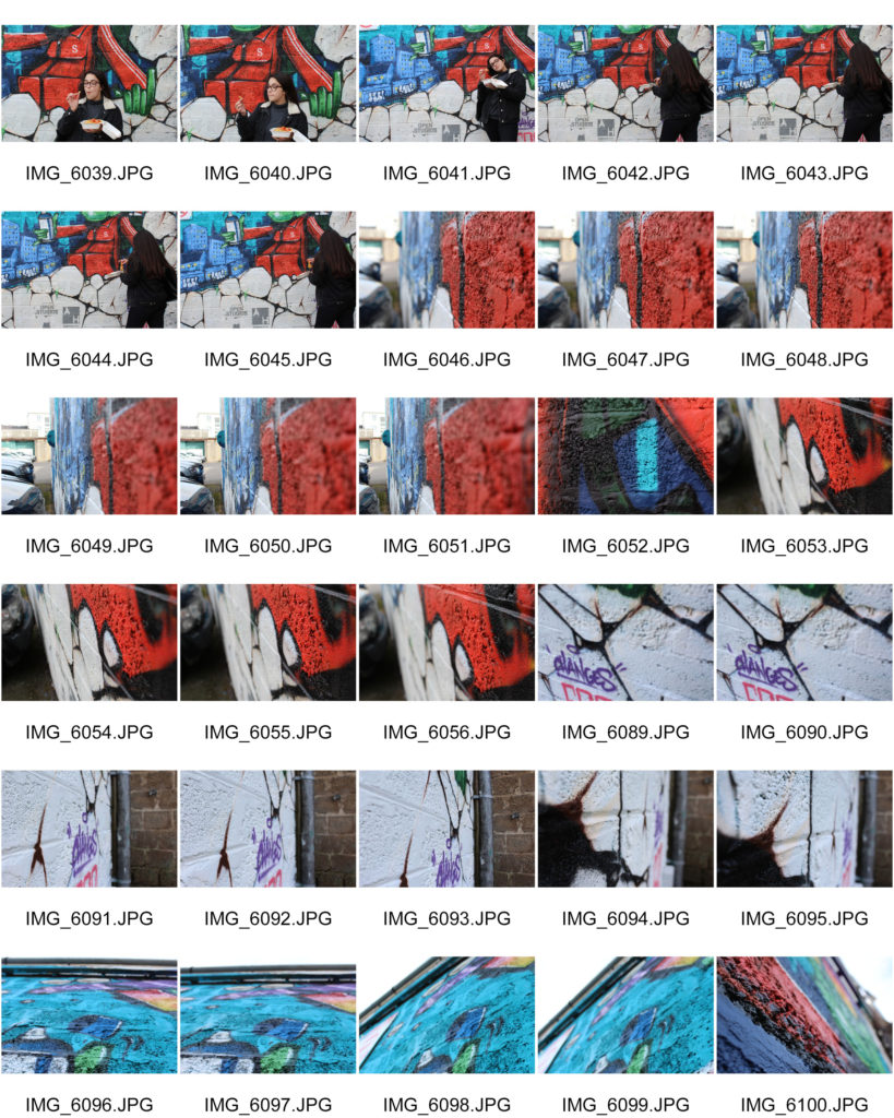
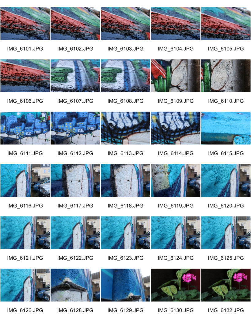
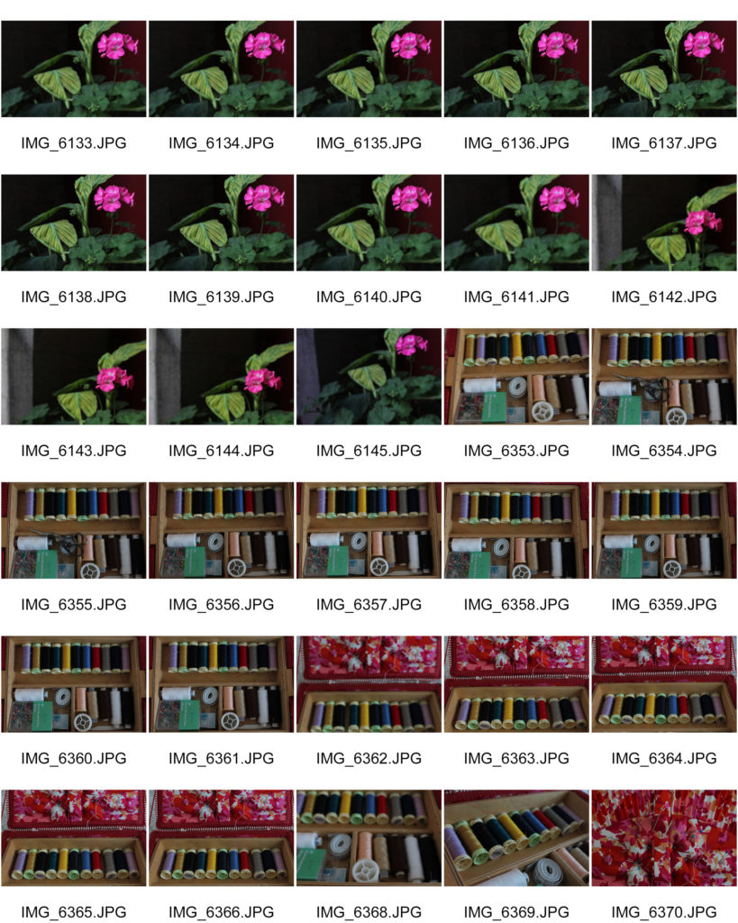
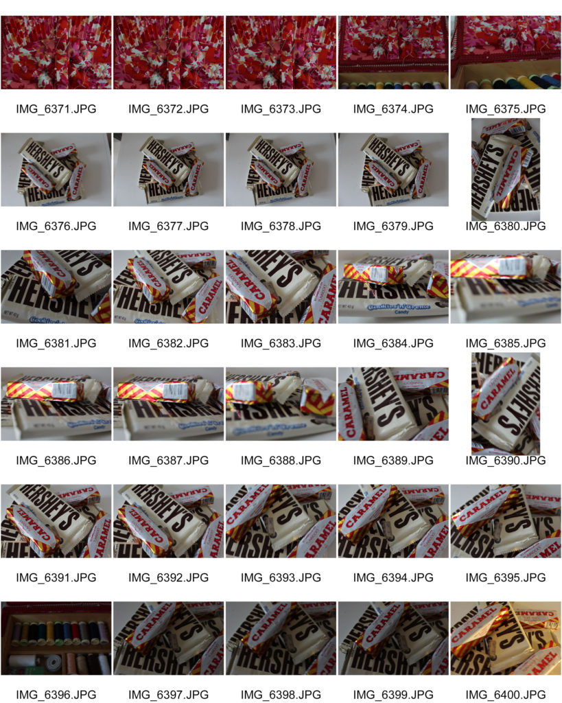
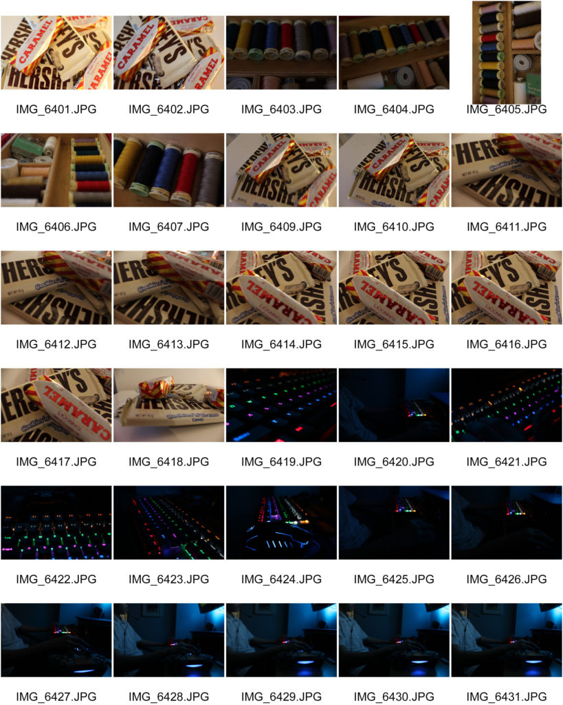
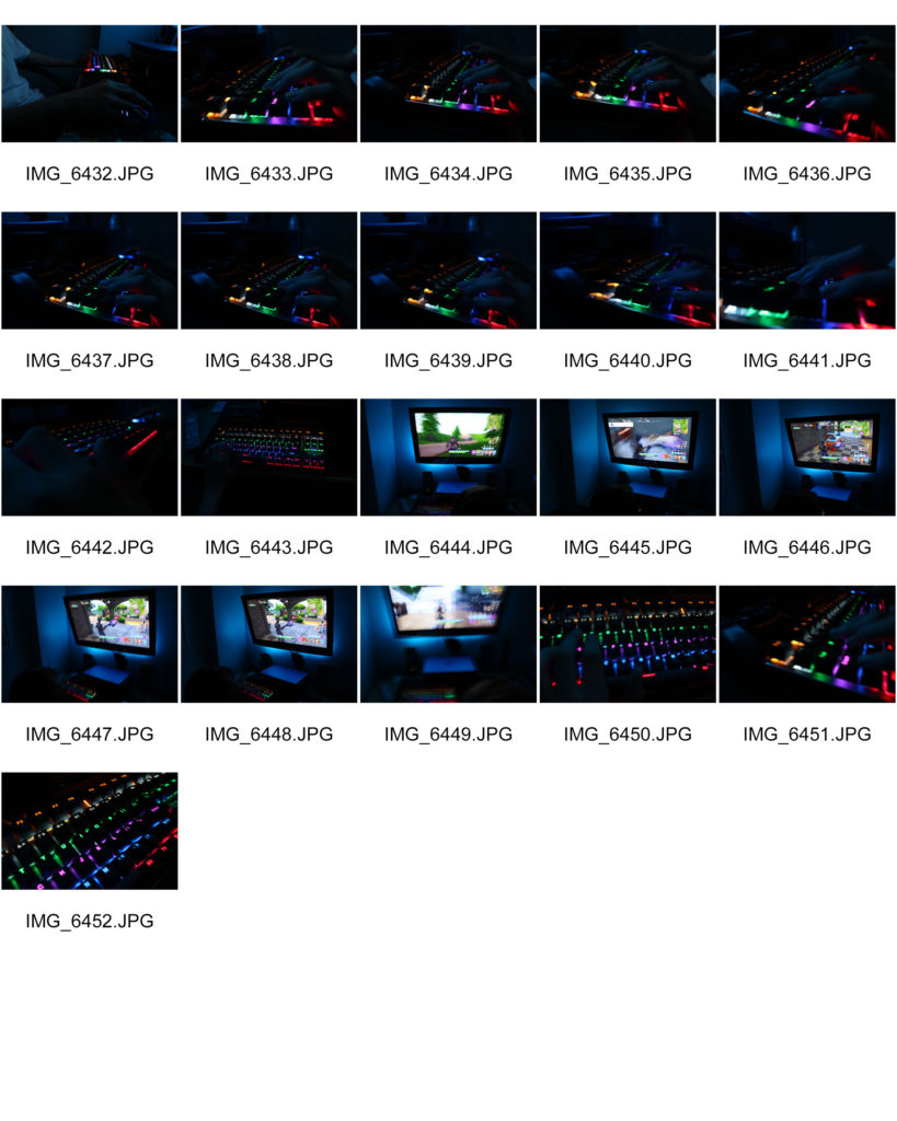
I found that during taking my images for this photo shoot, it was very hard due to having to use a slow shutter speed as i was under artificial lighting which make the images very hard to focus and therefore they have turned out quite bad.

Best outcomes

Editing the image..

The end picture..

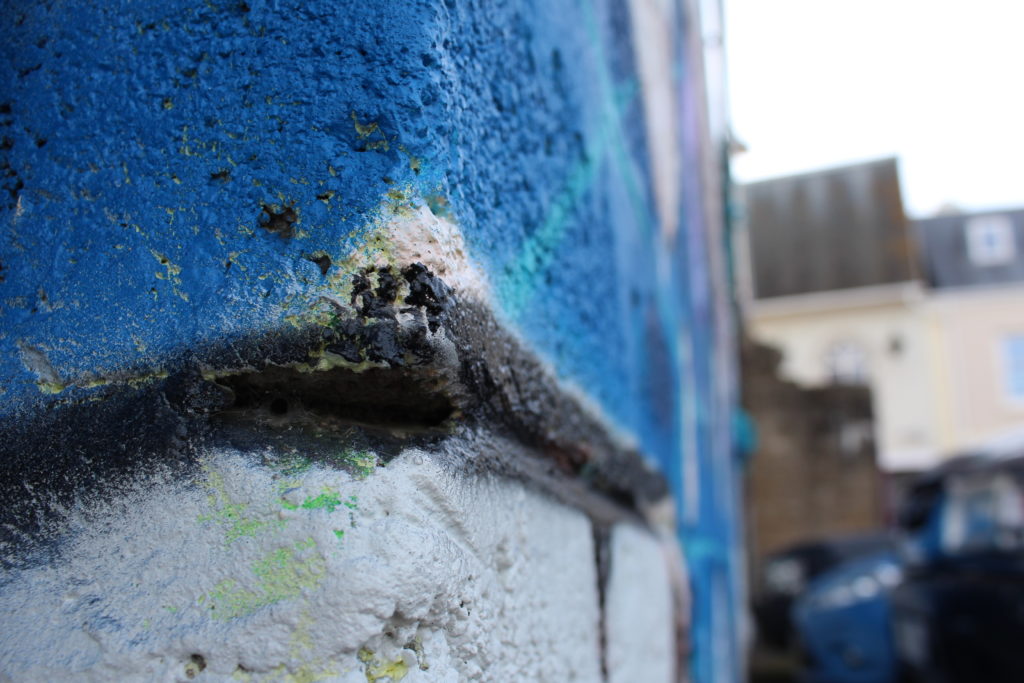
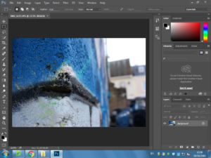
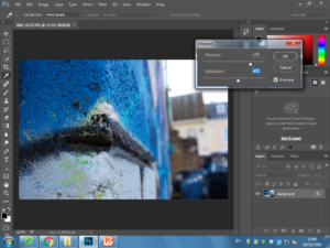
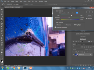
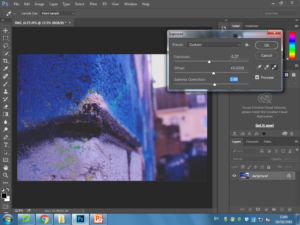
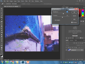
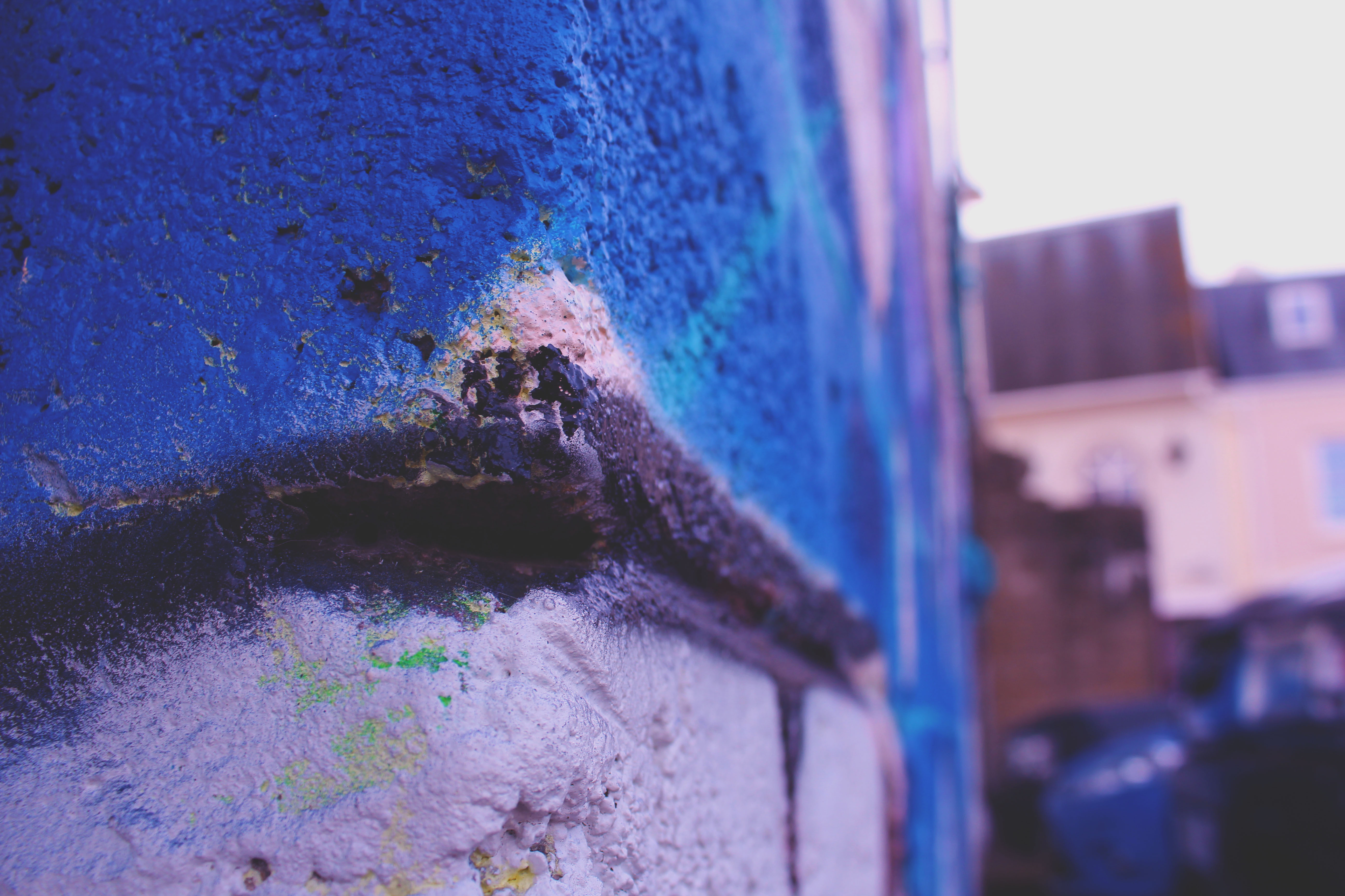
When originally taking this image, it was taken with no flash on Manual Focus as i wanted to capture the range of overall very blue colour in the image, as well as being able to edit the depth of field when taking the picture. When planning my editing stage i planned to use Adobe Photoshop to edit the brightness, contrast, saturation, the colour balance and the exposure of this image in order to get my ideal end photograph.

When taking my images i used Canon EOS 1300 D and took all my images in Manual focus which helped me to create a picture with lots of depth.  When taking the image i also used a high shutter speed ( 1/250).

The visual aspects are shown through the colour of the image which are emphasized by the brightness of the image as the light brightness helps to brighten up the blue paint on the wall. There is a lot of texture in this image due to the  main subject of this 3D image being the wall which has a lot of dents in as well as different colours which act differently to the brightness used in the picture. There is an obvious use of a strong depth of field in this image which has been tone to add more texture and depth into the image.

Editing the second image.. 

The end picture..

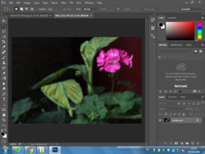
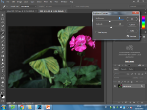
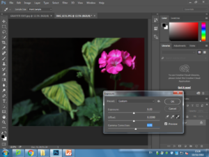
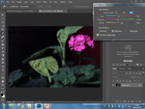
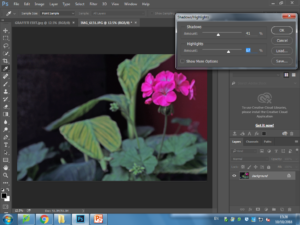
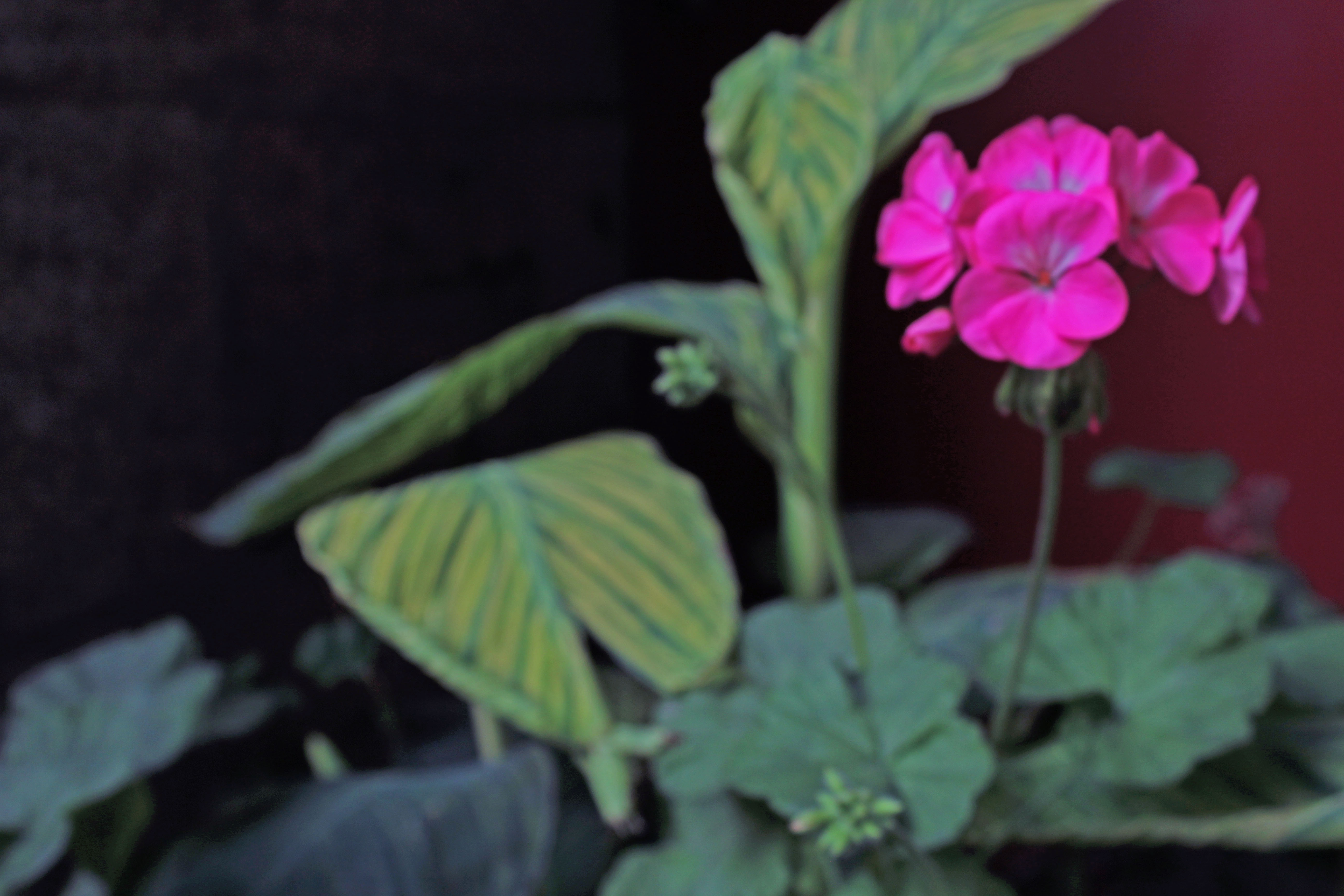
When originally taking this image, it was taken with no flash on Manual Focus as i wanted to be able to change the camera settings for the focus of the image. While planning my editing stage i planned to use Adobe Photoshop in order to change the brightness, contrast, exposure, offset, viberance, saturation, the color balance, the shadows and the highlights of the image in order to create my ideal final image.

When taking my images i used Canon EOS 1300 D and took all my images in Manual focus which helped me to create a picture with lots of depth.  When taking the image i also used a high shutter speed ( 1/250). Using the fast shutter speed helped to under expose the image due to the darkness in the background in the image. Using the fast shutter speed helped me to achieve my end goal of having colour and the darkness in the image contrast with each other as there was not much light let into the image. I also used an ISO of 6400 which again helped the contrast between light and dark.

The visual aspects of the image are shown through the colours in the image which is emphasised  by the tone of the overall light. There is not much texture in this 3D image however there is viable texture on the leaves of the plant which makes the image very unique, as well as using an ISO of 6400 which is helping to add more contrast between light and dark. There is no pattern arrangement in this image. However, the Rule of Three method is clearly shown on the right hand side of the image.