All posts by Jasmine L

Filters

Author:
Category:

Modernism VS Postmodernism

Modernism

The time period which modernism became a period of experimentation was during the late 19th to the mid 20th century and was mostly popular in the years after World War One.

Key Characteristics- Modernism is the art movement which associates with cultural trends and changes which came from the transformations in Western society during the late 19th century. There are different modern-isms which are often incompatible and they reject the dominance of older movements such as Naturalism, Classicism as well as Academicism which is done in the favor of producing art. It inspires all aspects of society in its cultural form through Architecture, Painting, Photography and Fiction, this is because it is characterized intellectually. Photography was invented as part of the process of modernization which took place in the industrial revolution. It is known as a modern form of image making which helps the development of modernism.

Key Conventions- Modernism can be done through other smaller projects such as straight photography and realism. Straight photography was used by photographers who believed in intrinsic qualities and provided accurate/ descriptive records of the visual world. They aimed the make images which were photographic rather than painterly as they didn’t want to treat photography as a type of paining such as monochrome. Because of this they used handwork and soft focus in a wide depth-of-field. In addition to this, Realism is associated very closely to straight photography as it is taking images while trying to recreate the image you see in front of you, therefore showing it has a relationship towards reality and shows a cameras ability to capture the world as it appears.

Artists Associated

  • Alfred Stieglitz (1864-1946)- He was influenced by European avant-garde art movements as images in this range included underlying abstract geometric forms. Stiegliz took an image called ‘The Steerage’ which wasn’t up to Pictorialism’s aesthetic which was then therefore qualified to go into the ‘Straight Photography Means’.
  • Alexander Rodchenko, Russian, 1891-1956- Rodchenko worked on a new aesthetic vision using extreme viewpoints through their photography and graphic design. They rejected illusions so that photographic representation could be um problematic aspects of reality.

Key Works

Methods/ Techniques/ Processes- Black and white edits are used for emphasis, sharp focus images in order for them to be seen clearly, as well as a large frame size.

PostModernism

Post Modernism was first discovered through ‘Pop Art’ in the 1960s which was then developed into the aspect we know now which was made in the 1970s.

Key Characteristics/ Conventions- Postmodernism is known to be a reaction against ideas as well as values of modernism. The term of modernism’s dominance in cultural theory is associated with irony and philosophical concepts of universal truths. There is a known distinction between high and low art which incorporate popular elements making the overall postmodernism. Key conventions of postmodernism makes references towards outside art work which adds to the contextual work.

Artists Associated

  • Cindy Sherman (1977-1980)- Photographs are taken from videos and she untitled films in order to showcase female stereotypes and feminism.
  • Barbera Kruger (1945)- She is seen challenging cultural stereotypes and her work is displayed through the use of posters.

Key Works

Methods/ Techniques/ Processes- Photographs are usually blown hip, edited, cropped etc to be used used in newspapers and billboards. Others use repetition to create emphasis on the image.

Pictorialism VS Realism

Pictorialism

Pictorialism was created first in 1880 but flourished during the period of 1885- 1915 and it overall refers to style and aesthetic movements. It is the approach to photography which shows the beauty of the subject as well as the composition which creates the feel that it isn’t reality. It also refers to the style in which the photographer has manipulated an image, meaning its a created image.

Key Characteristics/Conventions- The people who first came up with the overall idea of this subject matter wanted their photographic work to be related closely to art and drawing, therefore they created techniques which made images look like paintings when they were taking the photograph eg, taking images in darkrooms, blurry/fuzzed images, soft focus, markings on canvas which all are based on religious scenes. Pictorialism also dismays the industrial exploitation of photography which connects to professional establishment. Following this, the photographs give individual expressions.

Artists Associated

  • Julia Margaret Cameron- She was a photographer in the Victoria era and she is known for her closely framed portraits and illustrative/ religious works. Her photographs are unconventional and have a particular created blur through long exposures.
  • Sally Mann (1951)- She creates haunting images which represents the loss of life. She includes a lot of darkness in her mixed landscape and portrait images which explores the divide between body and souk, and life and death. This is clearly shown in her images of decomposing bodies and portraits of her children.
  • Peter Henry Emerson (1856-1936)- He has a theory of Naturalistic Photography which the subject of Pictorialism used to promote photography as an overall art. He handcrafted the prints in a visual form.

Key works

Methods/ techniques/ processes- The first technique being putting Vaseline on the camera lens which created a smudge allowing a symbolic meaning to do with religion. This is also an example of pictorial photographs lacking sharp focus, creating its overall style. Some work as groups to create more ideas, not very good quality cameras are used as they intend a blur anyway.

Realism/Straight Photography

Photo-Realism photography first began in the 1920s and became extremely popular in the 1960s as it became more well known and took overall photography as an inspiration. Photographers who photograph realist images are called ‘Photo- Realists’ and they are people who created high quality images which are illusionistic and reproduce the original image.

Key Characteristics/Conventions- Realism is known as a style of photography which creates an image for what it is, a pure documentary style. It is a very accurate and doesn’t have any metaphorical manners as it focuses on real people in their natural situations. The photographers who capture these moments use sharp focus techniques and use a wide depth of field in order to capture the whole scene, representing the realistic side. In relation, Straight Photography is closely associated with Realism and these photographers believe in intrinsic qualities and it has an ability to provide records of the visual world through descriptive aspects.

A smaller group in the subject of Realism, ‘Social Reform Photography’ which is when people photograph the conditions in which people live in and represents how different it is to a ‘average’ persons living way.

Artists Associated

  • Walker Evens (1903-1975)- Evens was a documentary photographer in the 20th century who previously rejected Pictorialism as he wanted to create new photographic art which has an obscure look. He photographed several families who work on different farms to represent their uniforms, backgrounds/ living environments. He also made a book which shows all the different families in comparison.
  • Alfrid Stieglitz- He tells images through a story through capturing images of immigrants in abstract pictures.

Key Works

Methods/ techniques/ processes- There is a constant use of a sharp focus which allows for the image being taken to be seen in detail, this also represents the ‘Realism’ aspect in detail. A wide depth of field is also seen the be used which again, shows the realism. The use of environmental photography is supporting the overall role.

Contextual Studies- Conversations on Photography

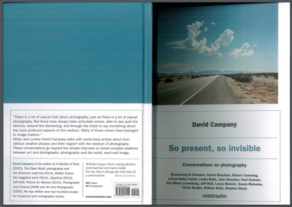
David Campany’s New Book (Introduction)

Reading through the introduction of Camapany’s new book it is clear that the individual is knowledgeable and starts off his intro with his personal opinion on photography. He includes the quote“Photography is the easiest thing to talk about, which also makes it the hardest”. I found that this allowed for the book to be introduced in a personal way which can also be taken as facts. He also includes four names within this which are said to be photographers who have inspired him to talk to them about photography, making this introduction also conversational. He said that the conversations were challenging and there were photographers who seemed to be “more approachable than others“.

Going onto the end of the first page and onto the second, Campany again gives a personal experience where he says he is usually invited by artists and photographers to interview them which he says he likes to take casually in order to not but the person on the spot (after personal experience). He usually doesn’t prepare to interrogate the individuals and makes up the questions on the spot as “the best moments come when both parties are really pushing and clarifying each others thinking” . The carry on from this is about conversations within his workplace and explains the value of a conversations along with the waste of a questionnaire.

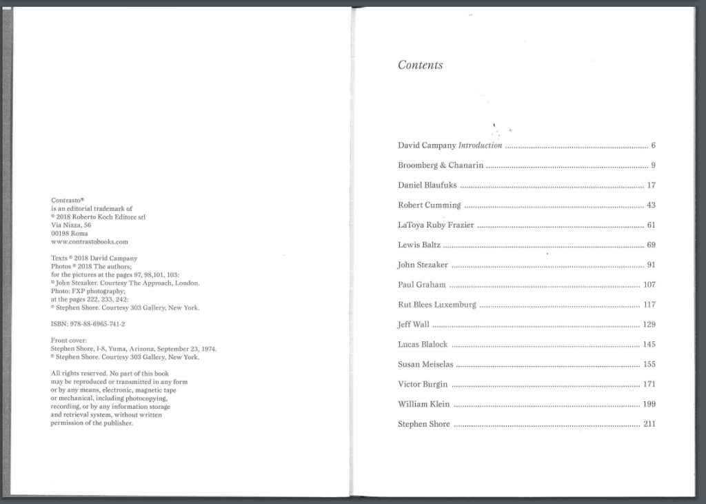
After this introduction there is then a sections for each photographer included in the book which totals to fourteen of them.

Front and Back of the Book

Contents Page (Photographers listed)

David Campany’s Introduction Page

Looking into an Artist

After looking at David’s introduction page, i then went through and chose an individual from the contents page to explore in more detail.

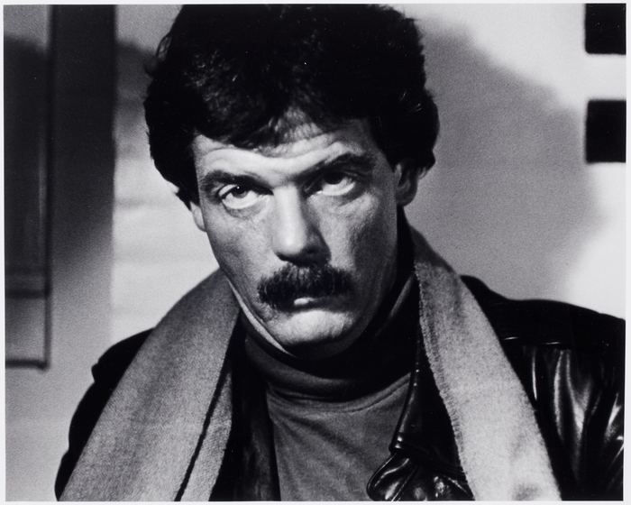
Lewis Baltz Artist Research

Baltz was born in Newport Beach, California in 1945 and was known for his work focused around the subject of beauty in desolation and destruction. He graduated with a BFA in Fine Arts in 1969 as well as held a Masters Degree from Claremont Graduate School. Due to this he received several scholarships and awards as his specialty was recognized by lots of industries best. In the year 2002, he became a professor in Photography for a graduate school.

Coming back to the subject around his independent work ‘ Beauty in Desolation and Destruction’ his images were seen to describe the architecture of the human landscape ie offices and parking lots. His images are a clear representation of representing power and control through his minimalistic photographs. He has said that what inspired him most to create these subjects is the difference between knowledge and visual aspect as his photographs, videos and site-specific installations dramatize these aspects in different ways. In 1989 he left back for Paris and Venice where he lived the remaining years of his life.

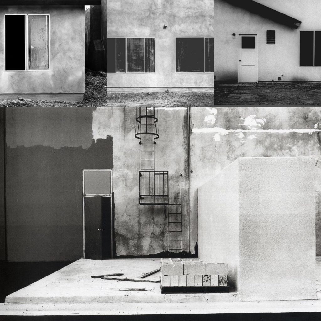
Mood Board of his Images

His Style..

  • Black and white edits
  • Contrast between light and shade
  • Fully focused images
  • Images of industrial sites
  • Shapes of buildings are usually seen
  • High shutter speed/ Low ISO used
  • Images aren’t cropped

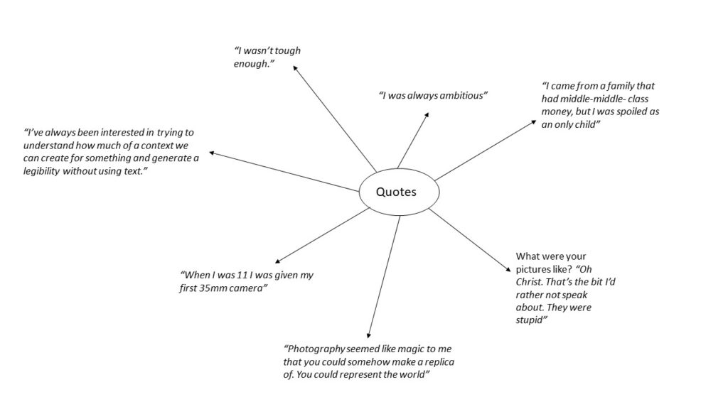
Quotes

Image Analysis

Image result for lewis baltz

Technical Analysis- Technically we can see that this image has been taken with a well quality camera and simple setting have been used in order to make the image successful. I am thinking that a quick shutter speed along with no depth of field would have been used for this image as it is a fully focused image, it is also suggested that there was no flash used for this image. There would have been a low ISO used as the shutter speed was high for no intended blur. The apature is likely to b on F16 to allow the full frame to be in focus and allow enough light in the image.
Visual Analysis- Visually we can see this image has been edited into a black and white edit which allows for contrast to be shown clearly through light and shade, as well as the image being seen as being part of a building which looks run down. There are also a lot of walls in the image as well.

Conceptual Analysis- Conceptually, this image as seen as quite a light and shade image creating a sense that it has a dark meaning behind it. Due to the odd locations of a shoot this also adds the element that Baltz may have been in a dark place in his mind.

Contextual Analysis- Contextually this image was taken at Western Carpet Mills in Tustin and is from ‘The New Industrial Parks Near Irvine, California’ in 1974.

Artist Reference (Fashion Images) -Hasson Hajjaj

Hasson Hajjaj was born in Morocco, Larache in 1961 and is known as a contemporary artist based in all London, Morocco, UK and Marrakech where he takes fashion inspired images in different cultures. He is also known as the ‘Andy Warhol of Marrakech’. His most well known photographic works is his collection which is being displayed in New Yorks Brooklyn Museum as well as others in the United Kingdom and in France.

He was known as a photographer, filmmaker and a designer and is self-taught with having a lot of influence from hip-hop in London which allowed him to have a diverse practice in portraiture, installation, performance and fashion. This then developed into drawing more influenced from pop art, fashion as well as his overall photography to create more studio works with Malick Sidibe.

Carrying on with the theme of film, Hajjaj’s first feature-length film was premiered in Los Angeles Country Museum of Art and it takes viewers into the world of one of his most iconic series ‘Kesh Angels’. He was also the winner of the 2011 Sovereign Middle East and African Art Prize.

His Style

  • Color Images
  • Portrait way up
  • Full Focused- High Shutter Speed
  • Are posed images
  • Front facing angle used
  • Low ISO
  • Solo images

Mood Board

Analysation Image

Image result for hassan hajjaj

Technical Analysis- Technically we can see this is a well focused image with good camera quality helping to show that a high shutter speed would have been used in addition to a low ISO allowing for there to be no graininess to the image. Along with this a high contrast is used allowing colours to be bright and for the image to be focused and stand out. We can also see an appropriate white balance to go with the artificial lighting which is allowing for the saturation of the bright colours to be well seen.
Visual Analysis- Visually we can see that the saturation on this image has been enhanced to allow the bright colours and patterns to be seen with Hajjaj’s desired effect. The male model is wearing a red and white matching suit with orange timberland boots creating a mix match effect due to the colours not usually going together. There has also been a blue and black roll of paper laid out as a background which shows this had b been a set up photoshoot. However, looking at what the models wearing and what the background is we can clearly see that these colours don’t go together. There is also a border to this image which are individual tomato canisters which can be seen as random.

Conceptual Analysis- Conceptually, due to the blue and back spread we can guess this is a set up photo shoot meaning that the photographer wanted for every aspect in the image to be as it is, otherwise it would have been edited out. Therefore I personally think that her meaning through this photograph is that she wanted to show fashion in the way that you can wear what you want even if it doesn’t’t live up to societies image of colours going together etc.

Contextual Analysis- Looking into Hajjaj’s work, as well as his images it has become clear that he has a very certain type of style where he likes to experiment with colour, patterns and the way they are worn showing his passion for fashion and art. This image specifically represents experimentation with society and how people respond to the crazy patterns and lifestyles some people wear and choose to live.

Meaning behind this choice

After looking into fashion photography, I have found that it doesn’t have to be all about fashion and I can link the images in alternative ways. I think this is a good idea as I want to base my third shoot on costuming which also links to fashion at the time the costume was bought, therefore allowing me to show fashion between dance during that year period. This is also a subject of occupation I would like to cover within my project, leading me to believe this is a good base for my third shoot.

Reference (Still-Life Images) Exploring Still Life

History to Still-Life

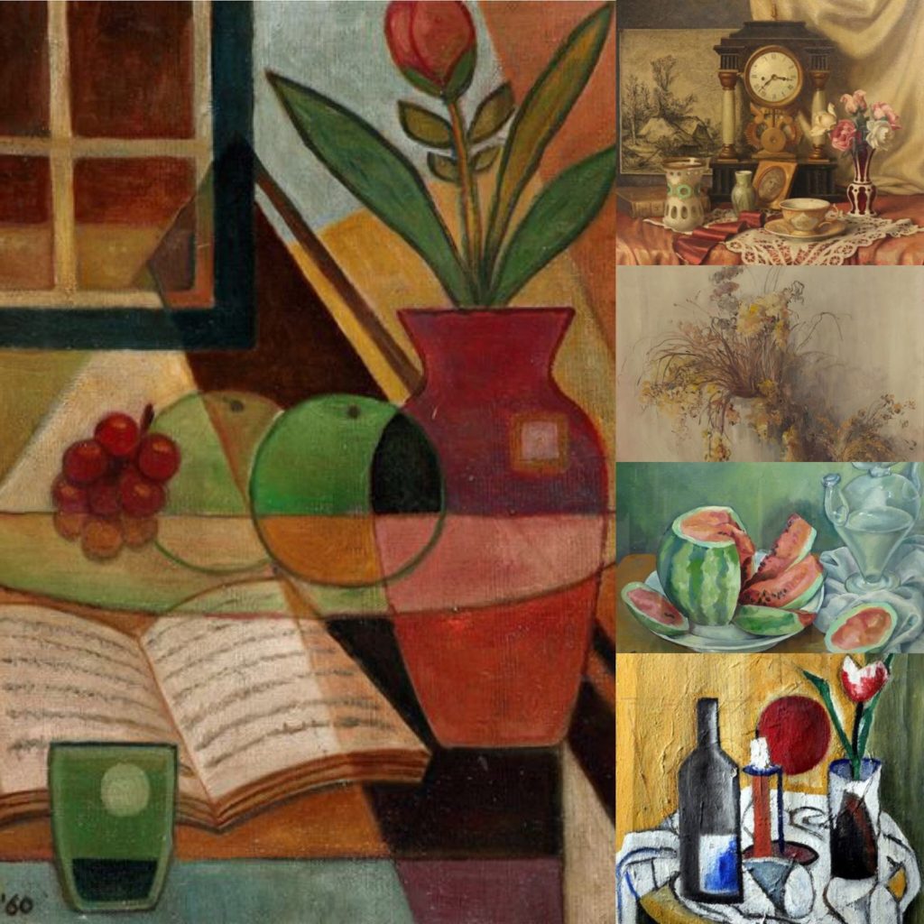
In the early 1960s, the genre of Still-Life became popular in Northern Europe and it Dutch and is known to be an independent photography style. The style is originally formed in Dutch and started to become renowned for being concerned with Khar (observation with the natural world). The objects photographed are usually positioned within a frame and create the objects showcased are usually considered to symbolise religion and mortality, reflecting the artists culture. The symbolism is shown through different objects (mirrors, candles, glasses, vases, watches, crowns etc..) all of which can represent aspects such as death, power, human life, as well as wealth and beauty and were all discovered in the ancient burial sights. Therefore, still-life being the composed portray of objects was considered broad and later on they were condensed into sub categories because of the different objects being photographed being different and having a different symbolic representation.

The Romans and Greeks also made a similar form of art which was known as Frescoes which is where they painted on plaster. This art type was modified to include more religious elements, meaning that floral designs become more popular because of them representing areas around the world which are all blooming in the same vase. Moving onto becoming closer to the modern day, this overall technique was adopted by well known artist Van Gough who painted images which included sunflowers, water jugs, as well as wine bottles.

Contemporary Still Life

What is Contemporary Still Life?- “Contemporary Still Life brings together approximately fifty paintings, sculptures, drawings, tapestries, and photographs executed since 1960. The exhibition has been assembled with the intention of encouraging a rethinking of the traditionally narrow definition of still life”.

Laura Letinsky Case Study

Letinsky was born on Winnipeg and is a Canadian comtempoary photographer who is known for her still life photographs and graduated from the Yale School of Art in 1991. When starting photography, she started as a portrait photographer but matured through her photography to working with still life imagery. At present she is working at the Visual Art University of Chicago.

Her images reflect the famous Dutch still life but with a new feel which were described as “ripeness, freshness and decay”. This makes her still life different from Dutch still life, due to hers being more modern because of the elements included. She has said that she uses photography to convey our understanding of relationships and love which could link back to her “ripeness” in her photographs. It has been said that her association with still life associates with femininity, minor art and imbrication within the home.

Her Style..

  • Aesthetically pleasing
  • Landscape Images
  • Simple camera settings
  • Low ISO’s throughout
  • Fully focused images (high shutter speeds)
  • Monotone colours used

Mood Board

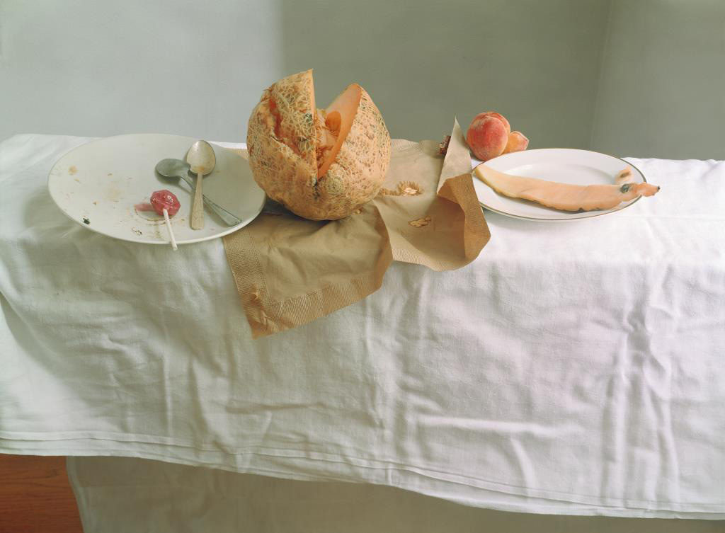
Analysation Image

Technical Analysis- Technically, we can see that the photograph has been taken with a simple camera setting, allowing conceptual factors to be an important part in the photograph. The shutter speed used must of been quick due to their being no intended blur on the image within the frame. There must have been a low ISO used on the photograph because of the soft lighting seen on the image which has obviously been done with artificial lighting which was created from studio lights. Their is an accurate white balance being used for the environment in. The aperture used in the photograph is seeming to be low because of the large depth of field in the picture.

Visual Analysis- We can see that this is a landscape image with the main focus being on the centre of the image which is a half eaten melon. Their are very monotone colours used in the image which helps to contrast with the yellow/orange melon which is placed in the centre of the image. The background is also seen as simplistic.
Conceptual Analysis- The creased table cloth is suggesting a sense of mess and uncleanliness. Due to Letkinskys work being about femininity, I personally am taking this unclean rug as a symbolism of an unpure women, and due to this being an object I feel as if the image is also representing women as not being objects.

Meaning behind this choice

After looking into both the overall history of still life as well as more in depth contemporary still life artist Laura Letinsky and her work, I decided that using still-life as a photoshoot is a good idea for my project as there is a lot of freedom within this subject and although the images are staged, they can still portray emotions and meanings.

Artist Reference (Archival Images) – Diana Markosian

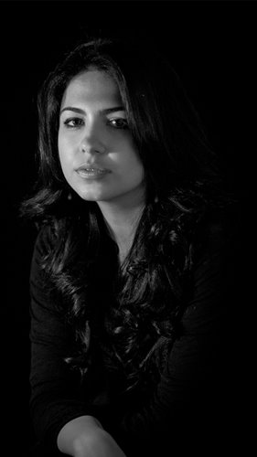
Diana Markosian is was born in Moscow in 1996, making her a Russian American who left Moscow to live in California with both her mother and brother. She was family orientated due to not having contact with her father until age 23 before travelling to Armenia to see him 15 years later. Markosian is known as a Russian American artist of Armenian Descent.

Markosians most recognised work is “Inventing my Father” where she explores her fathers absence throughout her life through using archival imagery and landscapes to support her lost memories. She also used physical elements such as newspaper articles, letters and objects which is photographed in a still-life way to represent a personal element to the project, showcasing raw emotion to her audience through using black and white edit and through portrait images of her father.

Relevant Quote- ” I often wondered what it would have been like to have a father. I still do.”

Her Style..

  • Black and White Edits
  • Burns images
  • Fully focused Images
  • Birds eye view
  • Photo Manipulation

Mood Board

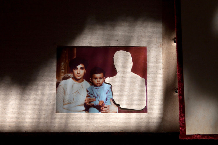
Analysation Image

Technical Analysis- Technically this image is seen to be taken in a poorly lit room which adds to the emotion of the raw image, there is shadowing going on to show that there is a light source coming from somewhere in the room. The image is fully focused and good quality showing that a goof camera has been used to take the depressing photograph.

Visual Analysis- Visually, we can see a printed photograph of Diana and her mother with a cut out image which we can assume would have been her father, representing a broken family photograph. The image has been cut out physically through scissors. Due to the background we can also see that this image has been taken in a photo album due to the type/ texture of the paper.

Conceptual Analysis- Conceptually, this image can be seen that there is a clear disappearance of a family member in the image which represents lack of responsibility and absence in the family home. This can further be looked into by the cut out showing the audience how important Diana’s mother was to her due to being the only adult influence she had.

Contextual Analysis- After research, this image contextually portrays an image which Diana’s mother had cut out after being stuck into the family photo album. The cut out represents the loss of a family member.

Meaning behind this choice

After researching the artist Diana Markosian in detail, I have decided that I would like to use her as an inspiration towards my first photo shoot as I feel as if our imagery is in relation to each other. Although her images have depressing backgrounds to it and mine will be showing good times in my life, I still feel as if she is a good basis on what archive images can been to a certain personal emotionally which is an element I was aiming to use in my project.

Personal Study- Intentions/ Action Plan

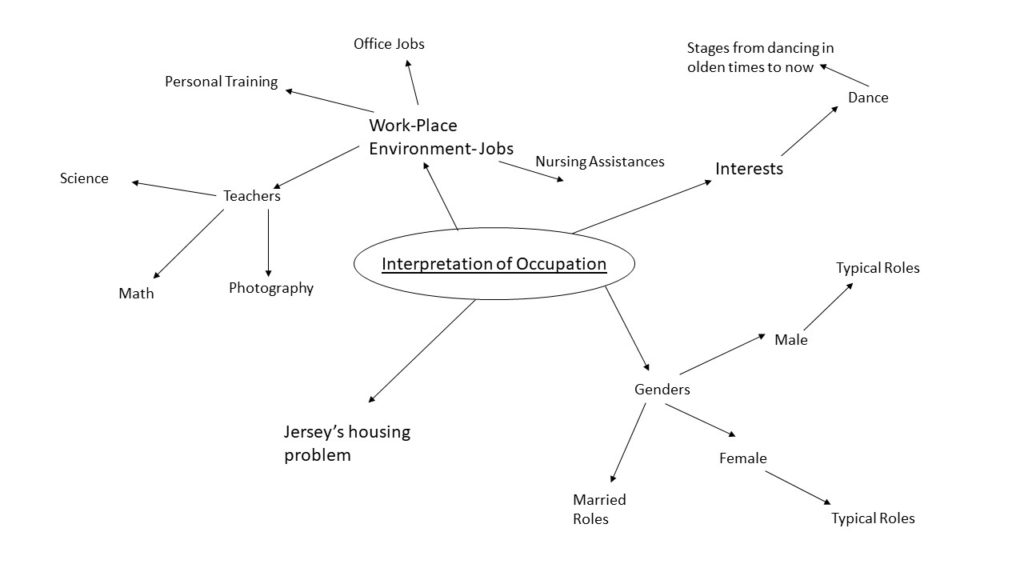
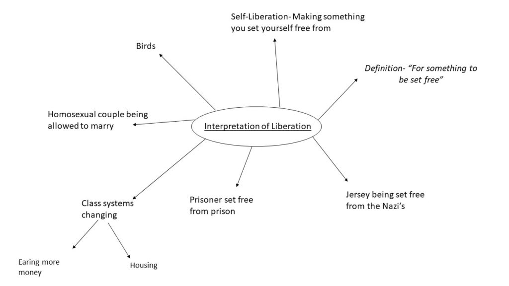
In order to get a first interpretation of what Occupation and Liberation are, I researched about them and made mind maps on aspects which would be included in the subjects. Following this took place in an independent study where I looked at previous students work in order to grasp knowledge of the different types of photo books as well as give me inspirations to my own.

Looking at the aspects above have allowed me to focus on the ‘Occupation’ aspect of the course. This will be done through expressing fashion and dance in the same photo shoot. I feel as if doing this subject is a good idea for me as dance is personal to me and adding an element of fashion into it would allow me to explore both dance, portrait, fashion and still life photographers. When looking at these subjects I feel as if i would like to separate each shoot I create in order to show a narrative throughout the book. However, to do this I will combine all the different shoots together (ie, not separate each shoot to a certain section of the book) which will allow for each shoot to be linked and create smaller stories within my whole photo book. I will do this throughout three different shoots which will all be taken in a different style to another to create the intended narrative of me sharing my dance journey growing up and photographing the different elements such as accessories/ medals/ etc to include sentimental elements which have been important in my process. The first shoot I plan to take images in the photographing studio of ‘Archival Images’ both from when I was younger and at my age now as I feel as if this will allow me to show important aspects which would have been photographed such as my first ballet exam, my first dance competition, my best award etc. these imaged will be taken from a bird eye view and I feel as if this shoot will create a strong basis to work from in my project as I would like to combine this with my second photoshoot which will be a still-life object set up. Carrying on with this, during my second shoot I plan to take images from a straight on angle in the photography studio where I will showcase the important objects that have encouraged me to carrying on dancing all these years. These objects will include elements such as certificates, medals, trophies, magazines, newspaper articles, exam notes, CDs, ballet shoes etc. Following this, I intend to use my camera ability to photograph images of old costumes when I was younger as well as ones which are being used at the moment in order to include an element of fashion into this narrative as the audience will be able to see that costuming has grown over the last ten years, while still relating to the overall narrative. As previously mentioned, I will combine all these shoots during my photo book as I would like for there to be a relation between archival images, objects and costuming to show a time period of my life throughout different occupations.

I overall feel as if this will be a strong idea for my project as it is very personal to me, therefore meaning that I will be able to create relevant analysis and images.

Small Plan of Each Shoot

First Shoot- For my first shoot towards my photo book, I intended to have an introductory page which will be the first written page of the book. This will explain a little about the images on following pages in order to have both a text explanation as well as a photo evidence of the time period. The actual shoot its self will be taken on a birds eye view to allow for the printed images to be seen clearly with a white background to add simplicity to the images as I don’t want there to be distractions to the relevant images. I will use this shoot to allow me to show dance performances when I was younger, as well as to show the audience the style of costumes I wore in those days etc.

To go along with this idea, I found a female photographer named Diana Markosian who I will use as an artist reference towards my project so that I know more about archival imagery.

Second Shoot- For my second shoot, I plan to use the same location of the photography studio however will be using a straight on angle in order to allow for the objects I will be taking to be seen. During this shoot I will take fully focused images of different objects which are important to me growing up as a dancer. These objects will be items such as certificates, medals, trophies, magazines, newspaper articles, exam notes, CDs, ballet shoes etc and will be in important part in the photo book. I feel as if this is a good idea as I can match my archival images to items in this shoot (example, if I have a archival image of me wearing a blue costume with a blue hair piece, I can photograph the hair piece In this shoot as a representation of that initial time, as well as the certificate which I received for that dance.) I feel as this will allow me to make an aesthetically pleasing selection of images.

To go along with this idea, I will be researching on still life photography as a whole in order to gain an idea of what still life is, how it was originally photographed and now it is these days, as well as the best type of angles to use for these type of images.

Third Shoot- To carry on sentimental values in photography, I intend to use self portraiture as a way of showing myself in my recent costumes which would have been previously seen in archival images to be able to section these shoots together more and create a set of images. I think that showing costuming is a good way to showcasing development of fashion which will be my main subject in this particular shoot as the different costumes can be seen as a documentation as to how style has changed. As for the smaller costumes I won’t be able to fit into anymore, I will photographer them in front of a white canvas in the photography studio to allow for them to be seen, as well as creating detailed images from these.

In order to support the idea of Fashion, artist Hasson Hajjaj who explores fashion in her photography will be my inspiration for this last shoot.

Personal Study- Initial Research/ Ideas

Interpretation of Occupation

Interpretation of Liberation

Exploring for Personal Study

In order to begin researching for my personal study I looked at last years photo books for inspiration as it was the easiest source of examples. I gathered three photo-books from the previous A-Level students and went through the book in detail while picking out elements i liked from the photo book/ parts which inspired me. I also looked at the composition of the books, all of white included a mixture of full bleed images, double page spreads as well as a range of sized images.

“Jersey Was The Land Of Fairies”- Jade Dingle

The first book i looked at was ‘Jersey Was The Land Of Fairies’ by Jade Dingle. I found that this book had an unusual concept to it as it is seen to be about four different fairies, all of which she has dressed up the same girl in different costumes and created a story for the ‘fairy’. The book purely contains her own images with a page of her own writing which is about the subject of the following images. I liked how she included text in the book as it isn’t overpowering however it does also allow the audience to gain a sense as to what the photographer was trying to portray. For example, as seen below there is a page for a specific fairy called ‘William And The Water Sprite’ this title followed by the text allows us to understand why the model is in water, why she has blue face paint on etc..

“All My Love”- Jude Luce

This second photo- book i looked into had a theme of family ad relationships with parents and friends. When looking through this book I found that there were a few images which didn’t necessarily link to the theme of the book which I felt as if didn’t need to be there. However there were also aspects I liked such as the physical photos which have been stuck in, comparison in old and new images, including sentimental elements ie tattoos and archival images from there parents.

“Inside Out”- Anna

When looking through this photo book, i quickly gained a personal concept in my head. The book includes a lot of images with the model wearing barely any clothing and also being placed in different locations such as the beach, studio, in the bath etc. I feel as if this adds a purity to the book and the lack of clothing showing her femininity, these elements work well together as they both help to empower a women which i feel as if this book is trying to do. When being able to see the models face we can see a straight face suggesting shes effected by this subject and is showing her own body to people who don’t feel conformable in their own, to empower them. This can be seen in the image below.

“Those Who Dream Only By Night”- Cole Courval

In this photo book I can see that there is a mixture of images included, most of which don’t add up to create a narrative. However, there are sectioned images which all represent a typical subject which I feel is a good aspect to this book. There is also a theme of black in the book which creates an aesthetic. Different locations are shown in the book, ie. town, beach, skate park etc. all suggesting that the overall theme could be teens.

Evaluation:

I found that looking at previous students work has been very inspirational and given me an insight as to the standards some photo books are as well as help to allow me to understand different compositions which people used for certain effects. This has allowed for me to create a few subjects which I would like to explore in my own photo-book.

I will also research well known photographers and look into their work in order to look at more technical elements to a photo book and photographic techniques used to create effect.

Designing Newspaper Spreads

As part of our photography course work we were asked to produce a Newspaper spread to go into the Jersey Evening Post to showcase the Year 13s Photography work at Hautlieu School. The images i can see been to use have been from previous photo shoots in the project which have been landscape, portrait and objects. I have tried to use as different images as possible in order to showcase all my photographic skills.

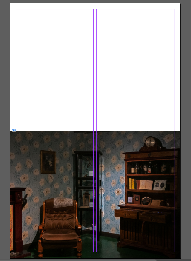
To make my Newspaper spread i used Adobe InDesign which allows me to make my spread digitally, I also used Adobe Photoshop to create further edits to my images. I used the dimensions 420mm(h) x 280.5mm(w) to create the overall layout of the book and then used Photoshop to save my images as high resolution ‘Tiff Files’ (4000 pixels) which allowed my images to print out as high quality as possible. There was a requirment to have one image a ‘ full bleed image’ which can be seen as included in the book and I also chose my own layout of the spread myself.

My Newspaper Spread

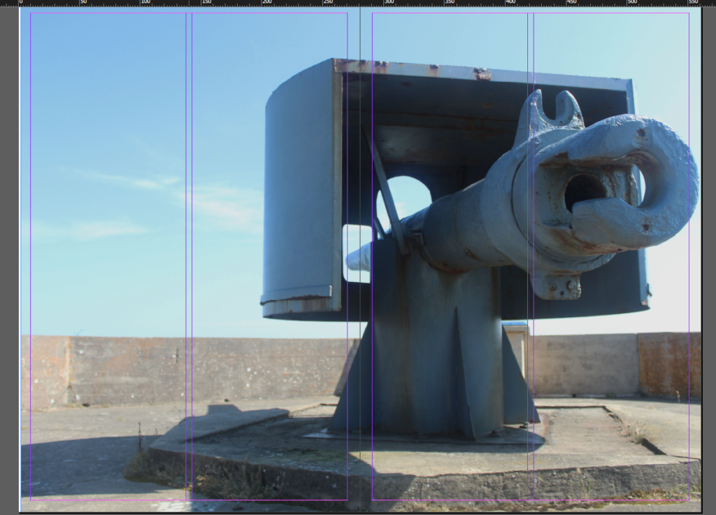
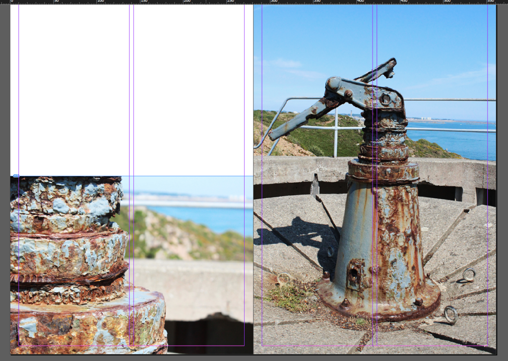
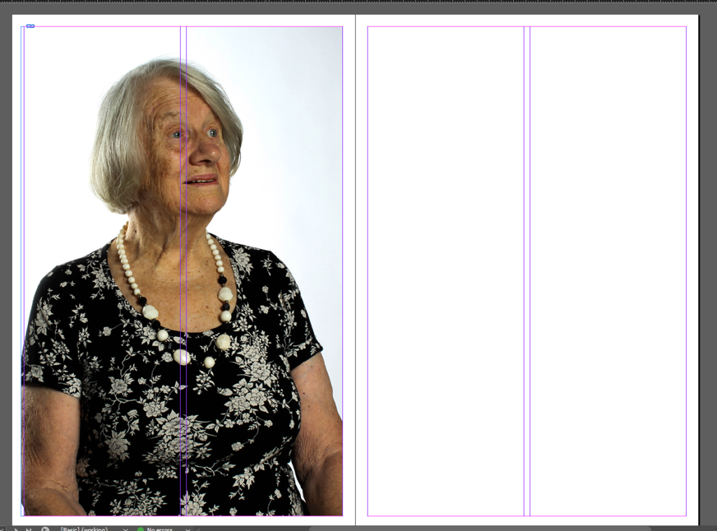
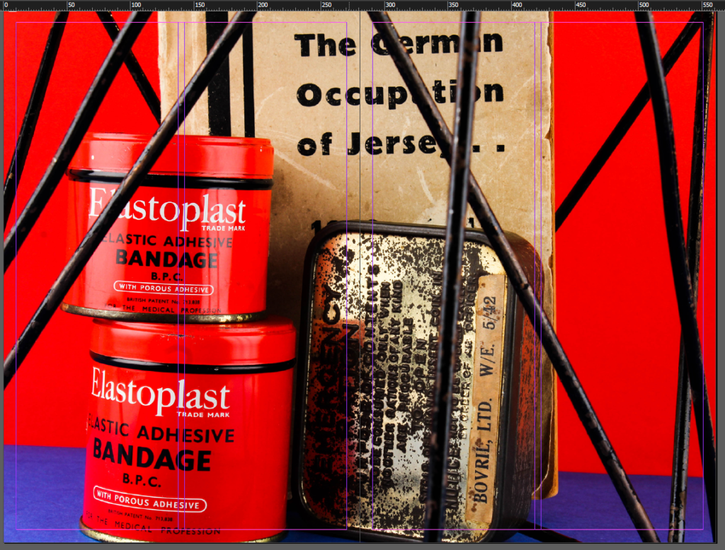
As seen below I have created my spread which includes a mixture of Landscape, Portrait and Object images which have all been taken with a Canon camera and edited on Photoshop. I enjoyed making this spread as there wern’t much instructions to making your piece which meant you were allowed to be as creative as wanted. I made my spread very simplistic and didn’t include any text or quotes as i didn’t want to distract from my pieces.

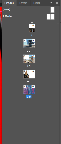
How the pages look

Reviewing and Reflecting

Personal Investigation (Occupation vs Liberation)

Occupation of Jersey

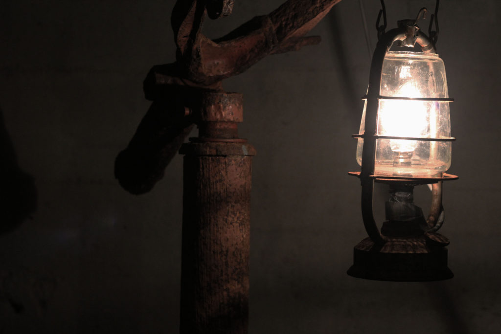
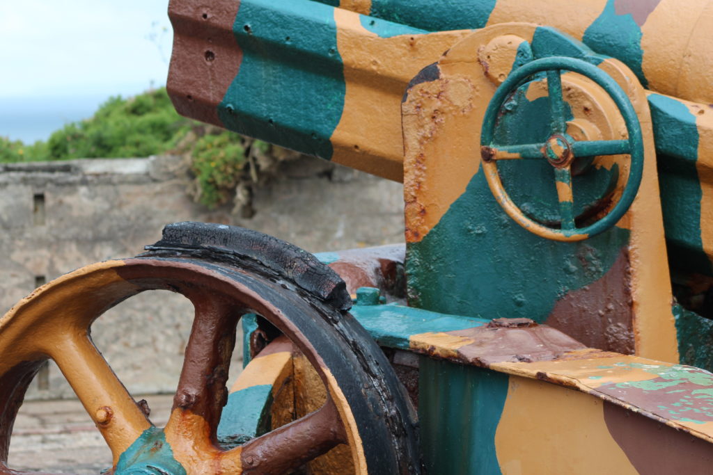
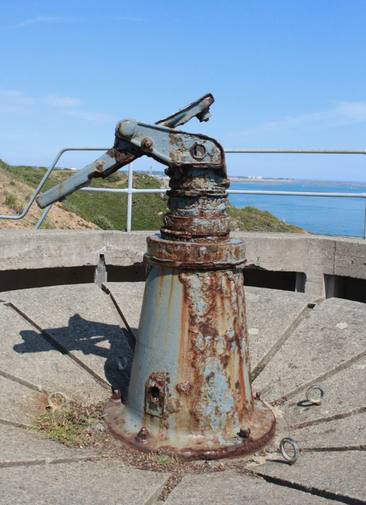
From studying the theme ‘Occupation VS Liberation’, it has allowed me to explore many different themes within the second world war (WWII). My first way into my project was starting with archival imagery which I collected information and images from the ‘Societe Jeriase’ trip me and my class mates took. This trip included searching through archival images from world war two, such as images of fields, homes, german soliders as well as occupation ID cards. Looking into these aspects allowed for me to gain a standard historical understanding into the subject and also changed my insight to how important archives are. To represent my understanding on the subject, I produced an essay where I explained the importance of archives while including artist references. I was then set the case of looking into bunkers in Jersey which allowed me to gain experience in landscape photography. Overall I made two different bunker shoots which lead me to gain experience in landscape photography and allowed me to show Jerseys history through photographic evidence. This also led me to exploring aspects in the Jersey War Tunnels which helped to me to gain understanding of war. This photo shoot linked with our title of looking into ‘Occupation Objects’ and by photographing objects in the dark tunnel and exploring with different lighting sources allowed me to develop my overall project.

This image has an empty alt attribute; its file name is IMG_1591-1024x683.jpg
This image has an empty alt attribute; its file name is IMG_1492-1024x683.jpg
This image has an empty alt attribute; its file name is IMG_0180-741x1024.jpg
This image has an empty alt attribute; its file name is IMG_0303-1024x683.jpg

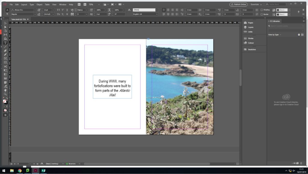
After these investigations and photo shoots, I then went into making a zine (photo book) where I explored different aspects such a sequencing and narratives. This was my first time at using Adobe InDesign and allowed me make a photo book, digitally. This photo book included my own images from shoots such as the batterie Moltke, batterie lothringen, jersey war tunnels etc. These all helped me to gain experience in zine making, as well as to help convey a narrative through imagery.

Zine Design Page

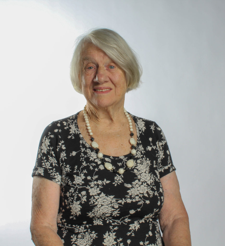
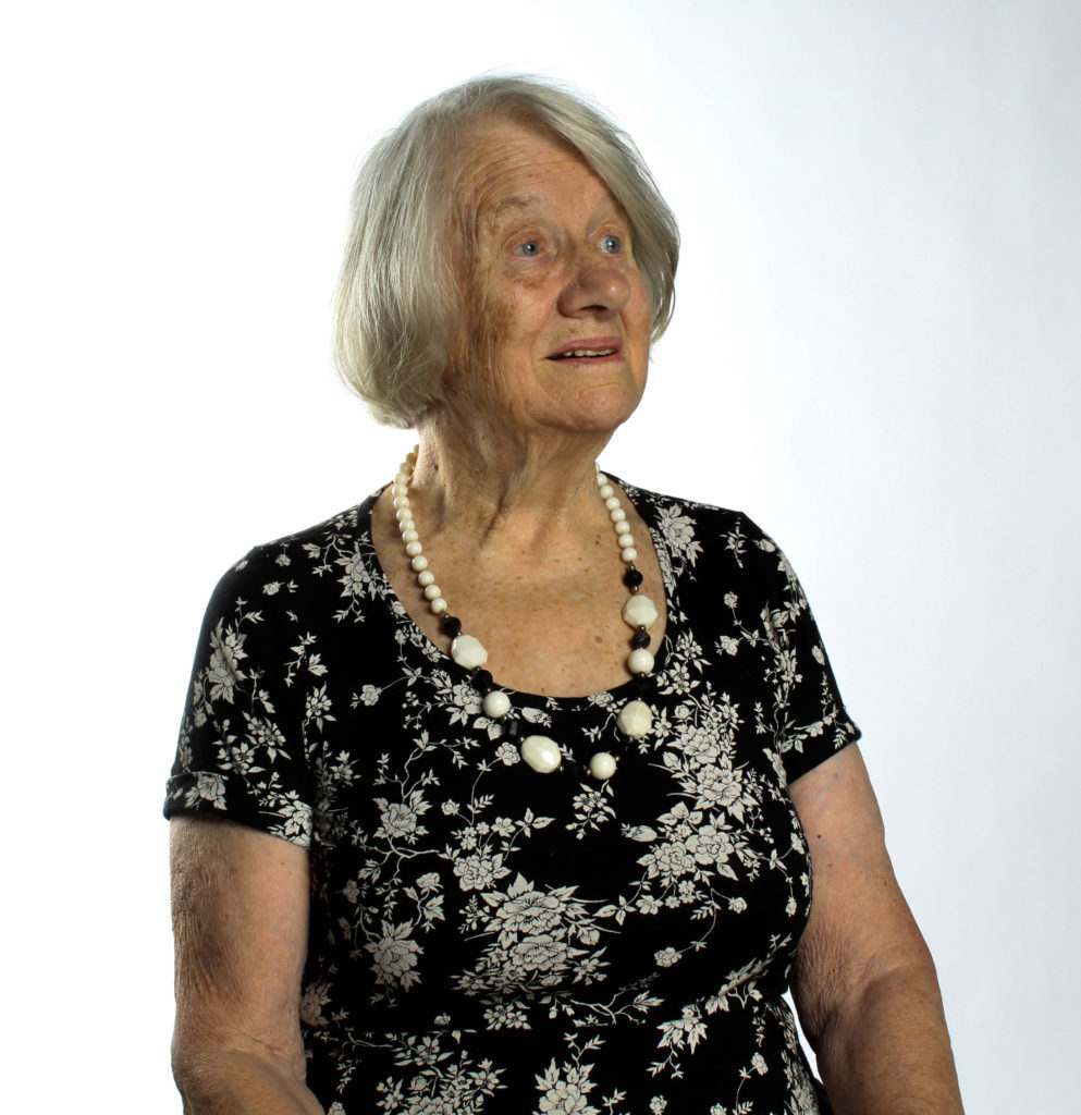
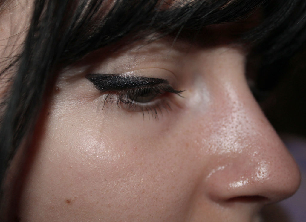
After making my first zine, I then decided to spend most of my focus on portraiture within my ‘Home Sweet Home’ tasks. I began my looking into portraiture photographers such as Francis Foot which helped me to explore different types of portraiture photography as well as give me an understanding of successful ones. This led me onto looking into the photographer Richard Billingham who focused on ‘Candid Photography’. Looking into and trying different styles helped for me to gain experience and in this particular style influenced the way I took my images. This led me to exploring more portrait styles such as detail photography, enviromantal photography, establishing shot, as well as looking into interior and exterior photography. We were also lucky enough to take portrait images of occupation survivor Joan Tetley who also shared her experiences with us.

This image has an empty alt attribute; its file name is IMG_0574-936x1024.jpg
This image has an empty alt attribute; its file name is IMG_0582-993x1024-1-993x1024.jpg
This image has an empty alt attribute; its file name is side-pic-1024x743.jpg

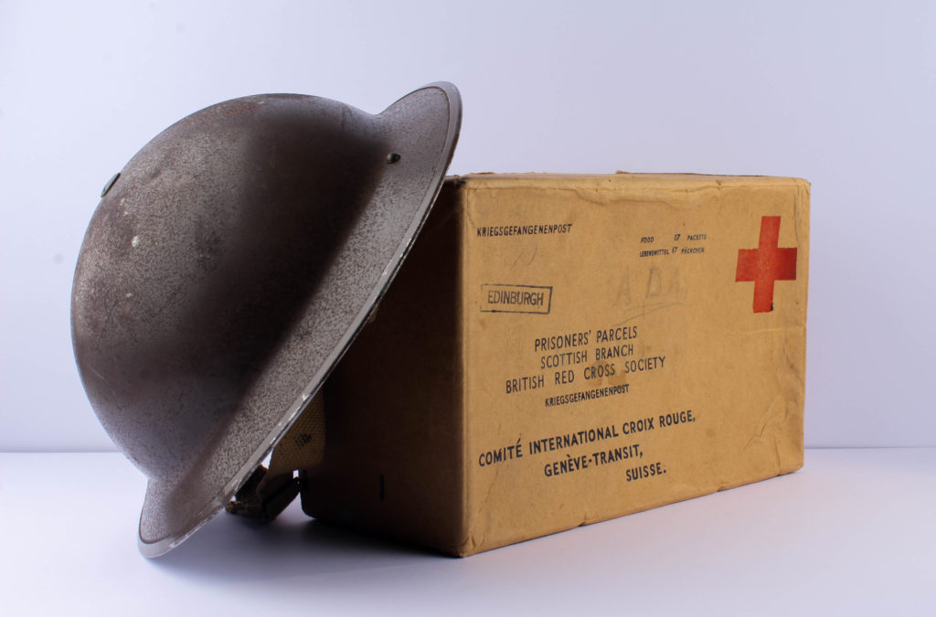
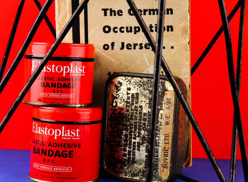
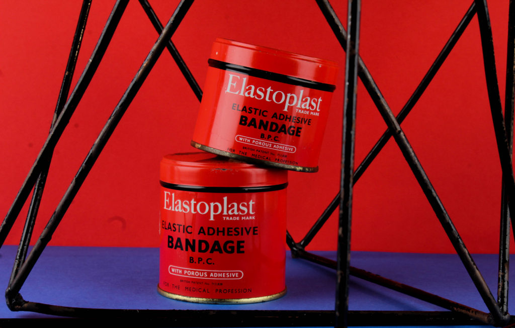
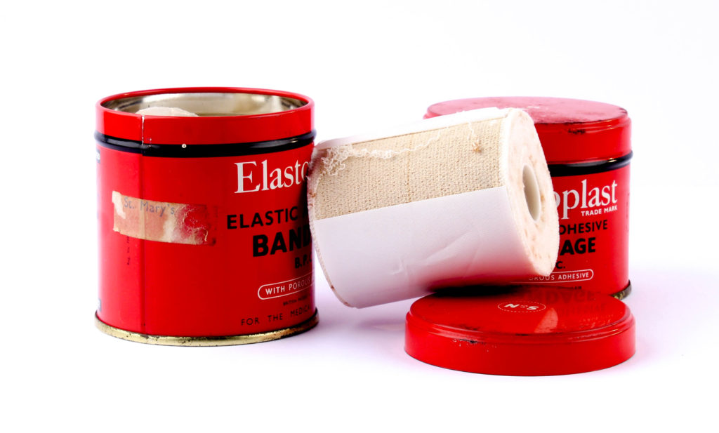
After looking at portraits it was time to look at ‘Objects’ which included a Still-Life project. My first time looking into photographing objects was with objects from the occupation which I photographed in a studio under artificial lighting. Taking part in this allowed me to gain more experience with using studio/ artificial lighting as well as take my images with a tripod. This project also inspired me for my photo montage project where I used the images in mix with archival ones.

This image has an empty alt attribute; its file name is pic-1-6-1024x617.jpg
This image has an empty alt attribute; its file name is IMG_9765-1024x675.jpg
This image has an empty alt attribute; its file name is IMG_0005-1-1024x753.jpg
This image has an empty alt attribute; its file name is IMG_9997-1-1024x652.jpg

In conclusion, I have found that this overall project has allowed for my photographic skills to be enhanced by both researching, experimenting and editing and has allowed me to gain more insight on different types of elements in taking a good image in landscapes, portraiture and in a studio setting.