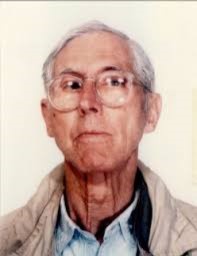
Saul Leiter
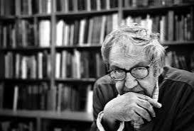
Saul Leiter was born December 3rd 1923 and was known as a color and black and white photographer from Pittsburgh Pennsylvania. Leiter was given his first camera at the age of twelve by his mother. However, Leither then went into art and was lucky enough to meet Eugene Smith who then encouraged Leither to become a photographer. He started taking color photographs in 1948 and began associating with other contemporary photographers
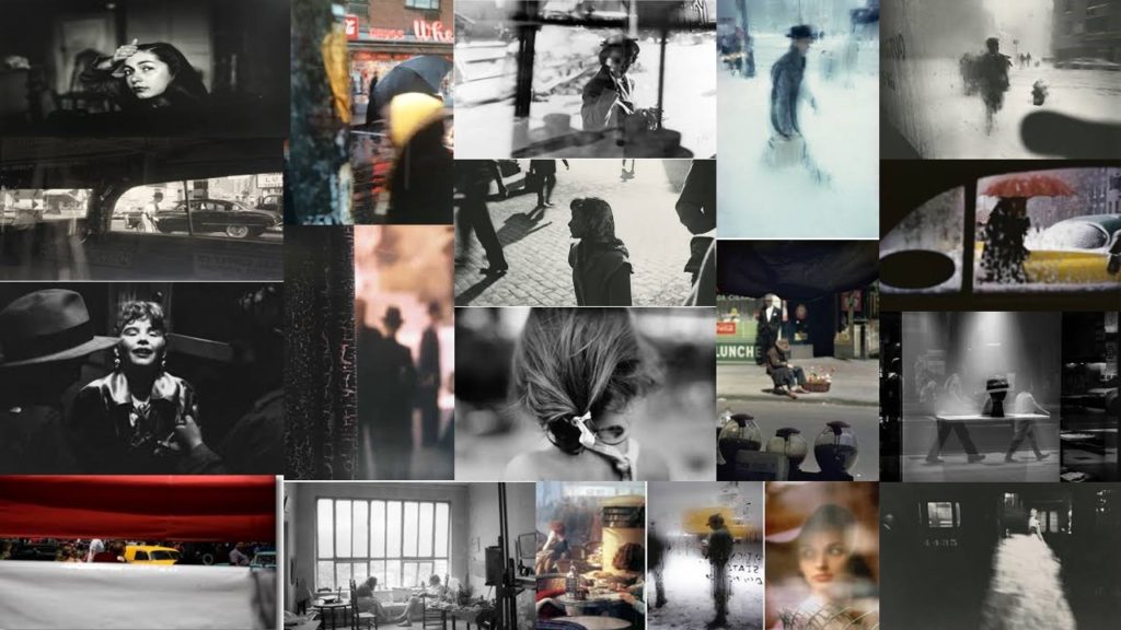
Leiter was then a fashion photographer from 1950- 1970 and photographed for Vogue, Elle and Nova.
His images explore color harmonies and exploit unusual framing devices which helps to create an abstract feel of everyday streets.
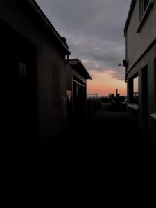
Leiter’s photographers ranged in focus. He tended to experiment a lot with depth of fields which made his images very interesting as every image is different. I think that Leiters use of colour with the different depth of fields helps us to identify the surroundings more as some of the depth of fields used completely blur the picture which can sometimes make it hard to identify what the picture actually it. After analysing his images i have also noticed that he liked to take his images through windows which is shown by the mist on the windows, the rain or the reflection.
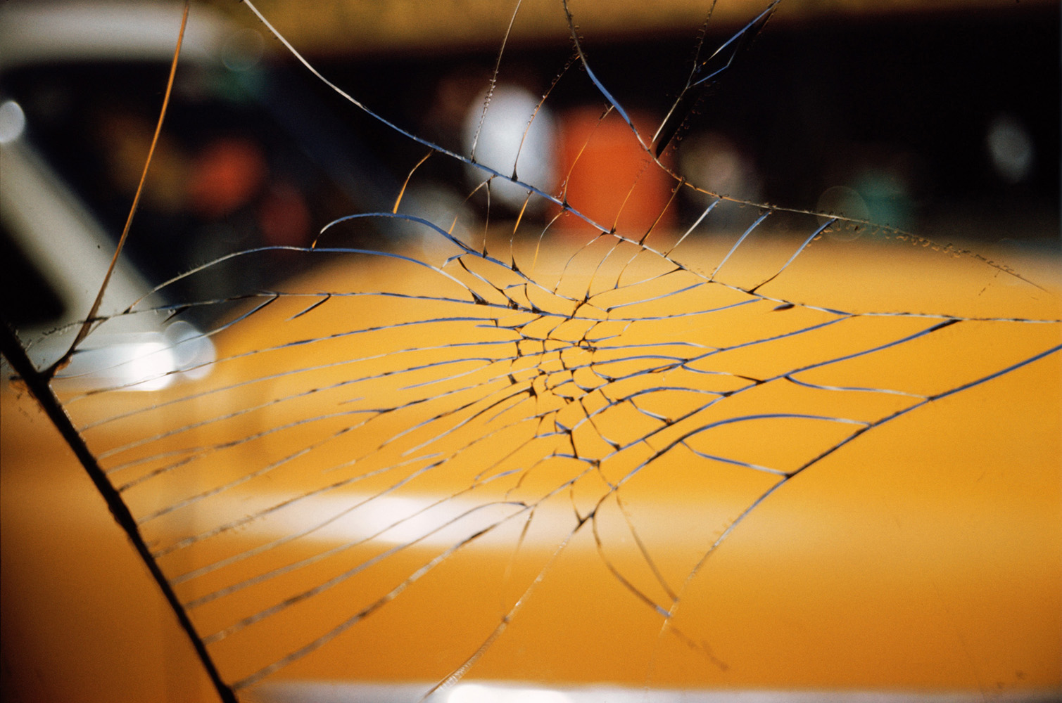
Analysis
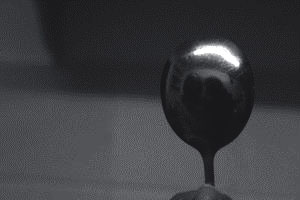
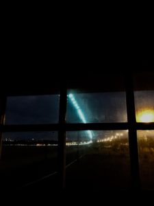
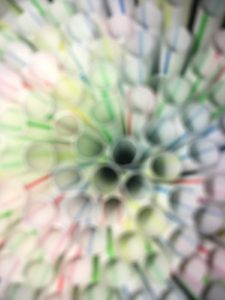
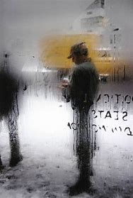
This is my personal favourite image from a selection of Lieter’s pictures as the use of taking the image through a window implies the weather of the picture without the picture explicitly showing you what the weather was like at that time, ie the dripping condensation and the writing showing that were Lieter is it is warm and where the primary subject ( the man) is it is cold, as well as the writing shows it is a window. The yellow colouring helps us to capture everyday life as the colouring is shown in the distance which could imply that it is a vehicle. The depth of field is focused on the mans top half in this picture and everything around that top half is blurred which makes the image very abstract as everything else in the picture is implied
Planning my photo shoot
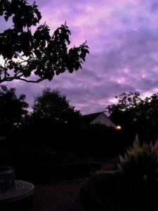
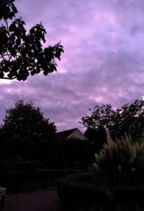
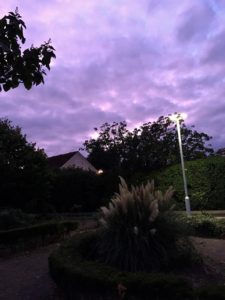
For this photo shoot i have decided to take images of different colored lights in the town central. I think this will be a cool idea as using the Bokha effect will make the different coloured lights look really effective. This shoot will also take place at night to enhance the contrast between the bright lights and dark night.
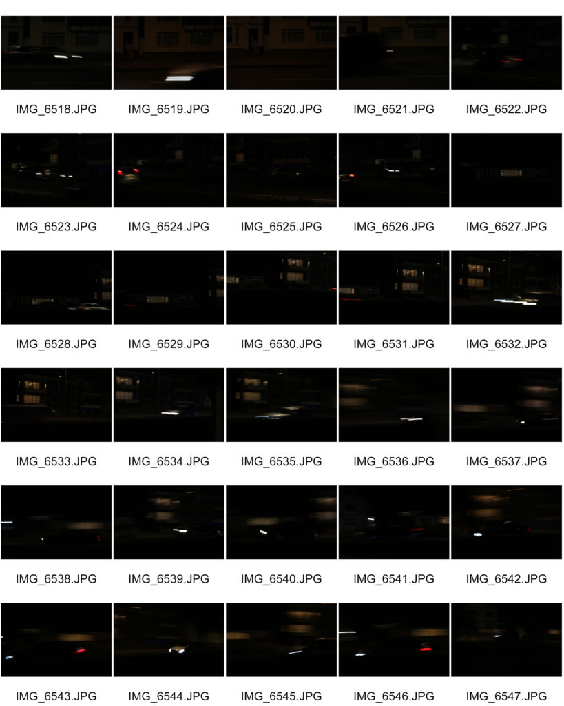
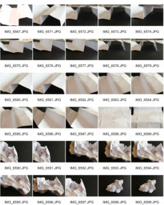
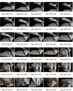
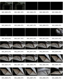
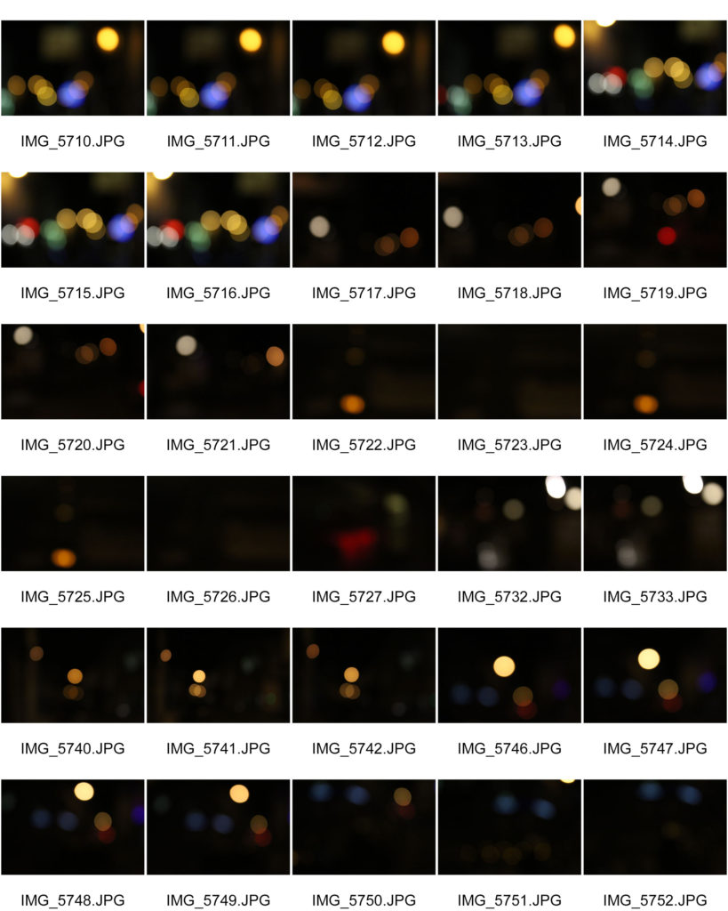
Contact sheets
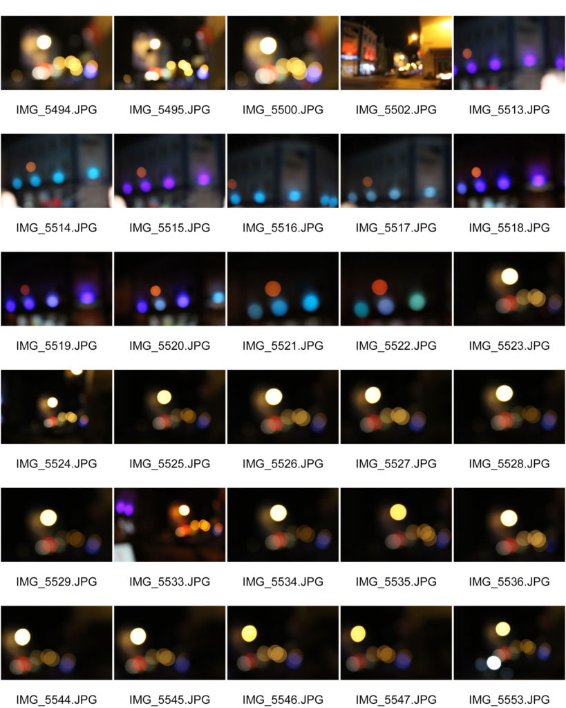

Best outcomes
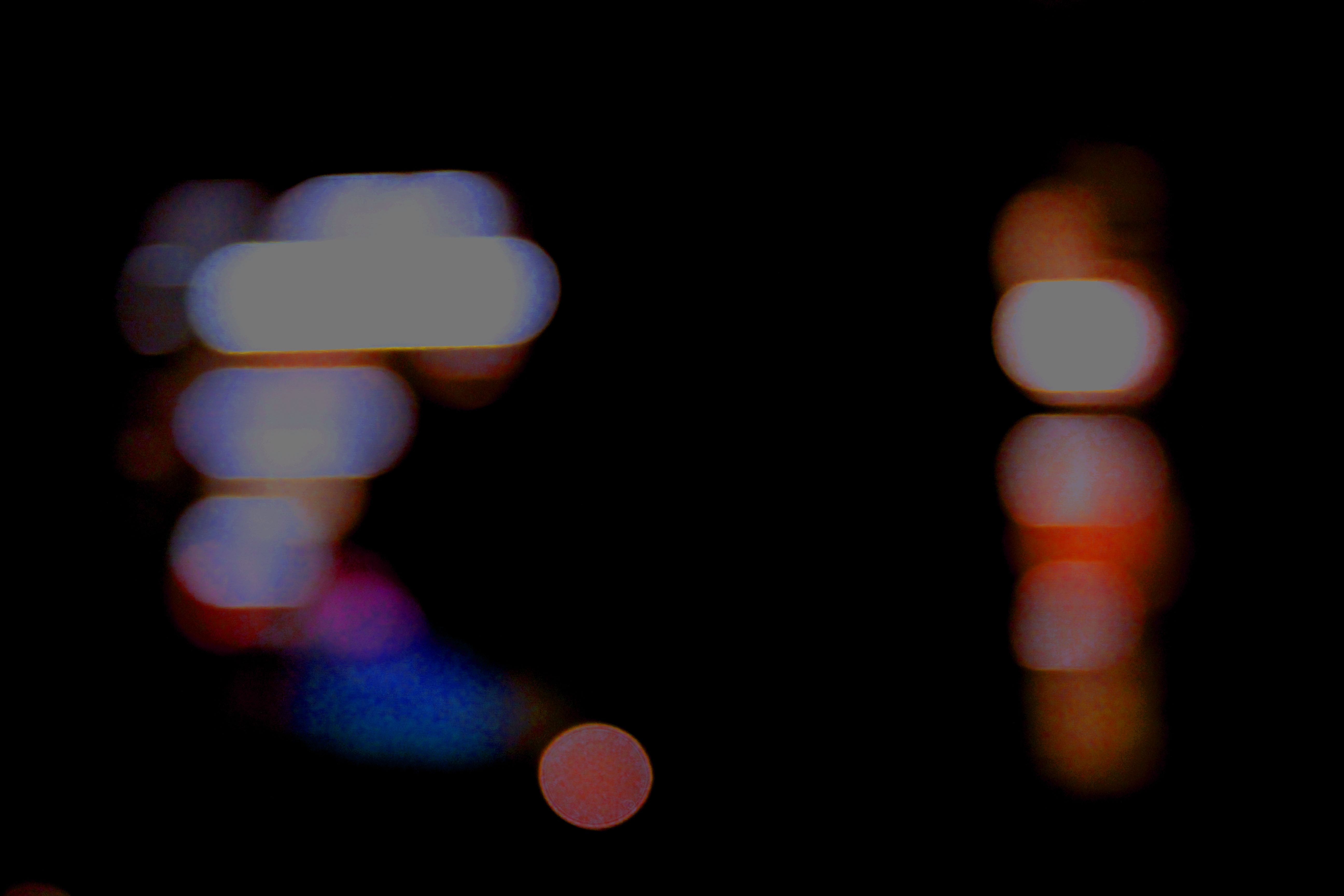
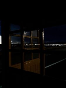
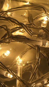
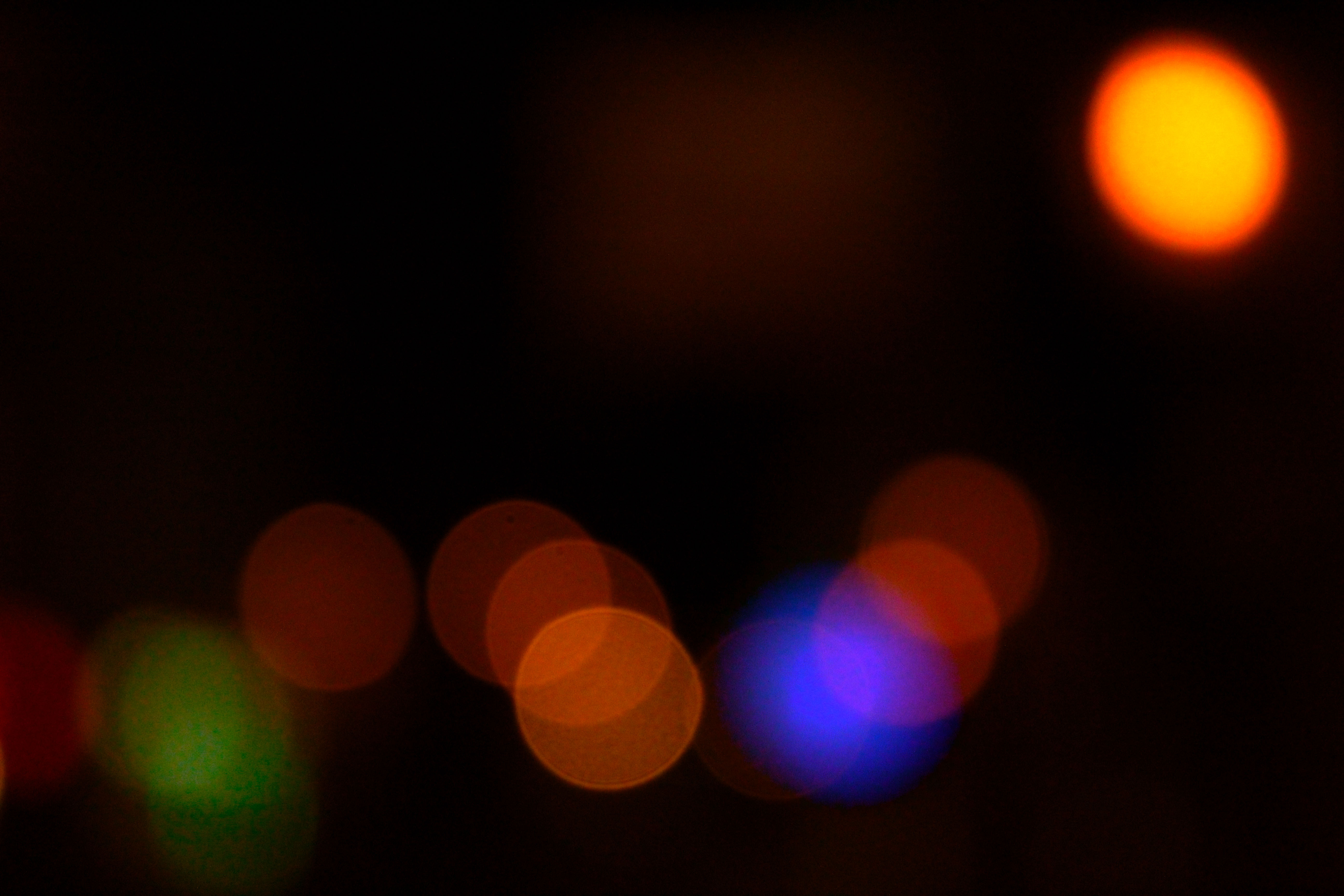
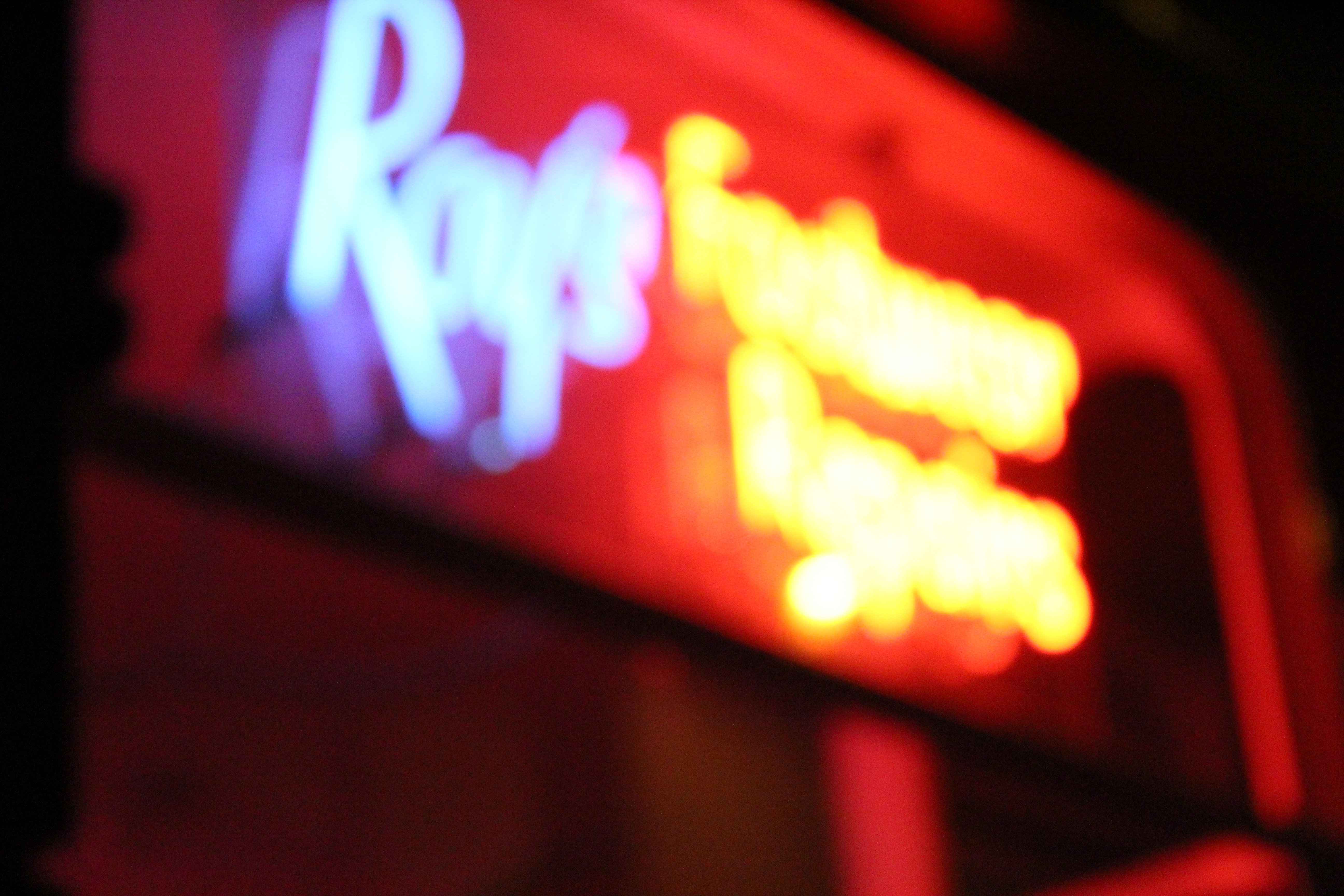
The image i thought was my best out of this first shoot was this picture as i thought the range of colours in the picture is really interesting and it would turn out very well when edited.
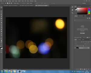
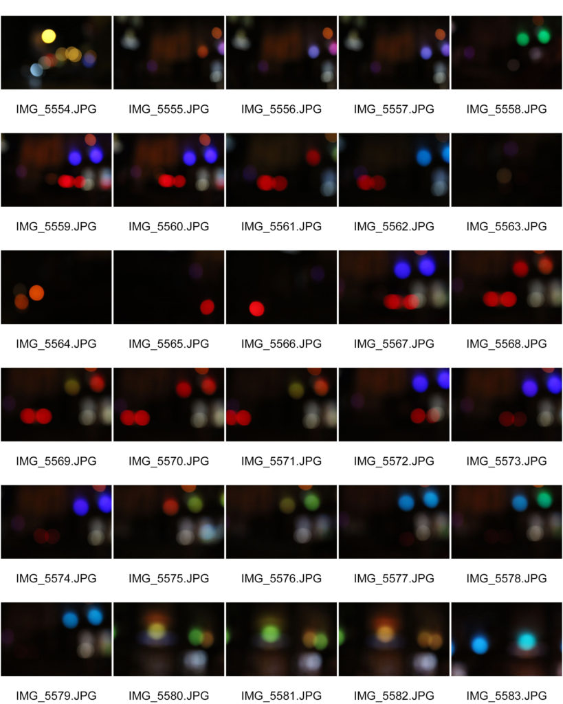
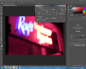
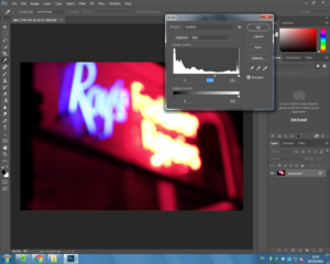
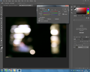
Editing my pictures from this shoot..
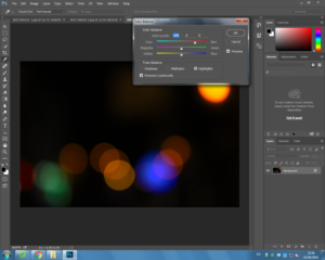


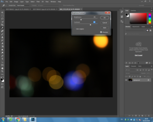
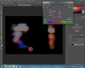
When originally taking this image it was taken at night with no flash as i wanted to capture the range of colours. This helps the image successful as it made the colours even brighter in contrast to the dark sky. While planning my editing stage i planned to use Photoshop to change the brightness, colour balance, contrast, viberance and the saturation which would help me achieve my end goal.
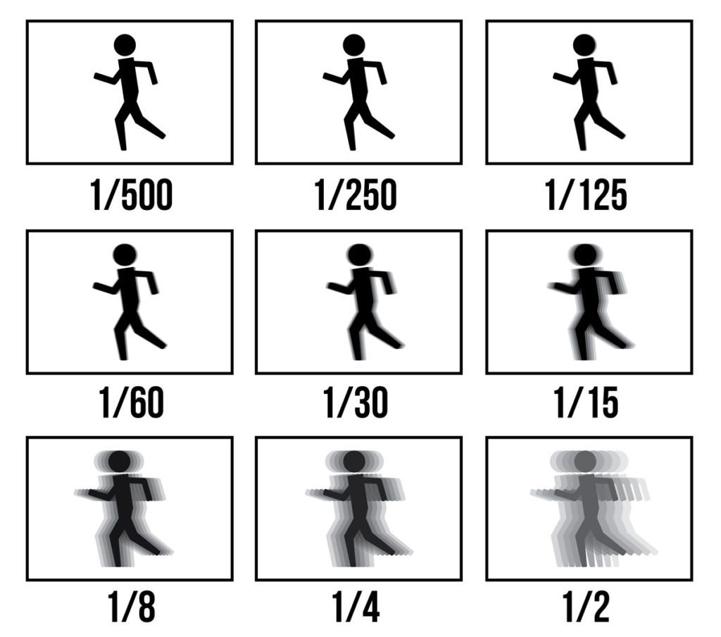
When taking my images i used Canon EOS 1300 D and took all my images in Manual focus which helped me to create the Bokha effect. When taking the image i also used a high shutter speed ( 1/250), using the fast shutter speed under exposed the image due to the black in the image. However, this helped me to achieve my goal of having the color and the darkness of the picture contrast as there was not much light let into the image. I also used an ISO of 6400 which again helped the contrast between light and dark.
The visual aspects of the image are shown through the colors in the image which is emphasised by the tone of the overall light. There is not much texture in this image due to it being a 2D photograph. However there is a small pattern through the image with the way in which the blurred colors are shown. This pattern arrangement makes the image pleasing to the eye due to the selection of different colors which are very compact and help to contrast each other. There is no obvious rule of three in this image, however the right hand side is a little more focused than the rest of the image which could be identified as the rule of three.
End image..
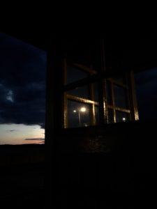
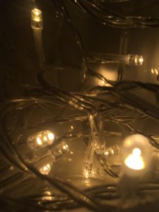
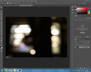
I think this is my most successful picture out of my second shoot due to the image being blurred but the image still being viable, as well as me liking the range of colours.
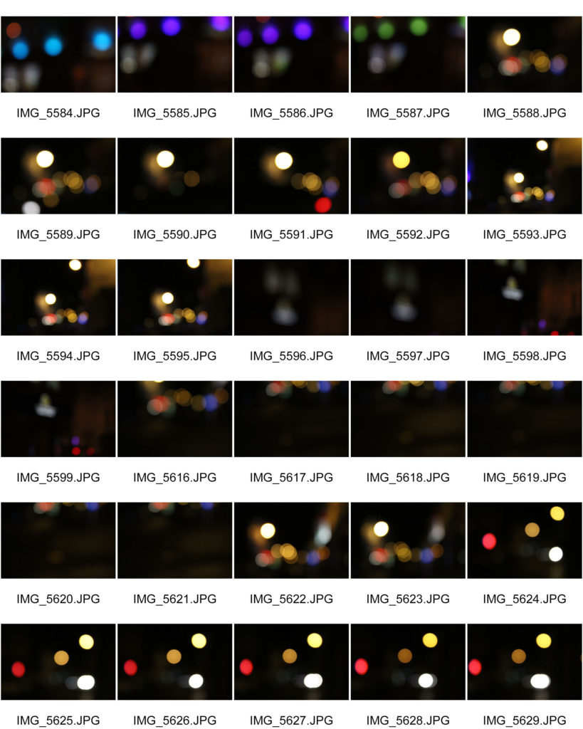
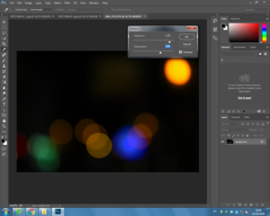
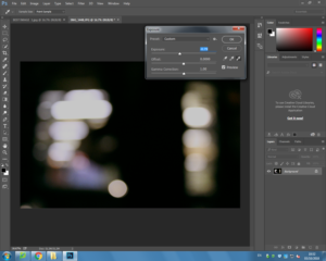
Editing my picture from this shoot..


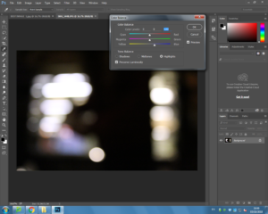
When originally taking this image it was taken at night with no flash as i wanted to capture the range of colours. This helps the image successful as it made the colours brighter in contrast to the dark sky.
When taking my images i used Canon EOS 1300 D and took all my images in Manual focus which helped me to create the Bokeh affect. When taking the image i also used a high shutter speed ( 1/250), using the fast shutter speed under exposed the image and emphasized the darker elements in the photo. However, this helped me to achieve my goal of having the colour and the darkness of the picture contrast which was going to be hard due to the amount of colour and lighting the subject of the image has but the shutter speed ensures that there was not much light let into the image and allowed the darkness of the night to still be shown. I also used an ISO of 6400 because the higher the ISO the more light is noticeable in the image.
The visual aspects of the image are shown through the colours in the image which is emphasized by the tone of the overall light. There is not much texture in this image due to it being a 2D photograph, as well as there not being much tone to the image due to the range of colours and the blur effect. I decided not to crop the image as i liked how the image overall looked and only wanted to focus on making the colours of the image more saturated as this was my main focus.
End image..
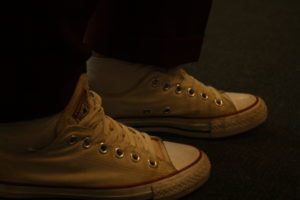
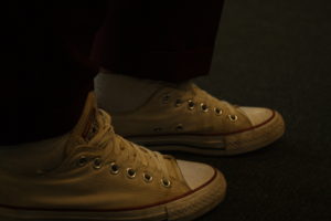
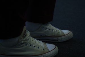
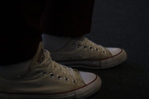
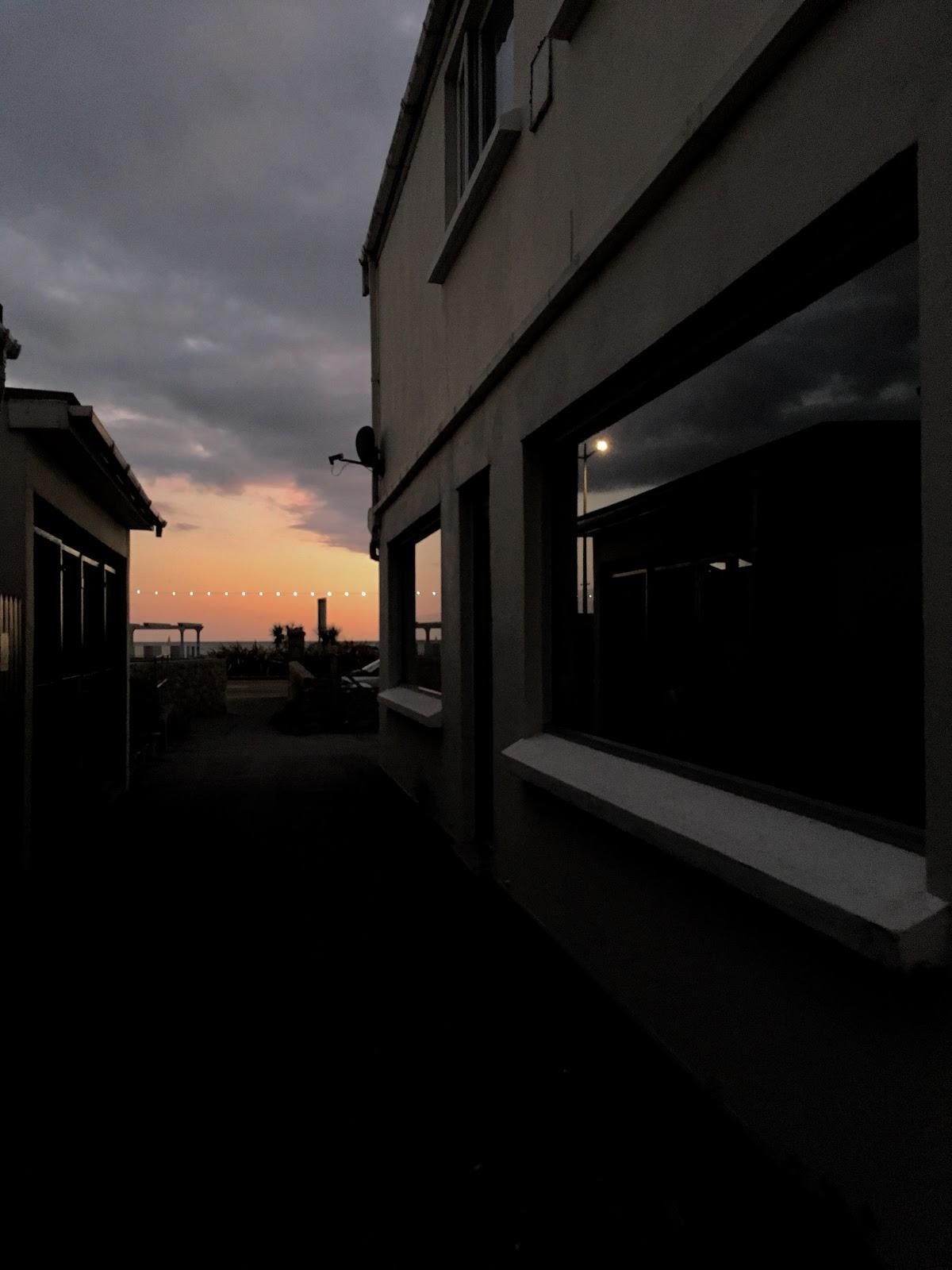
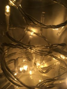
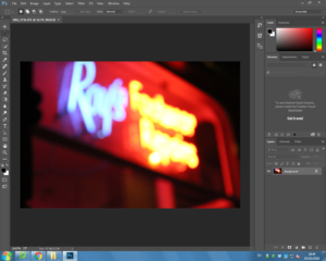
I think my most successful picture from this shoot is this image as it includes a lot of technical aspects and is very eye catching.
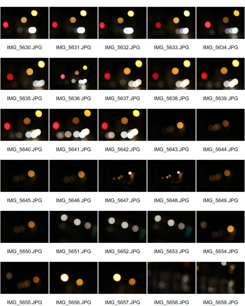
Editing the picture..
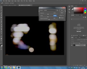
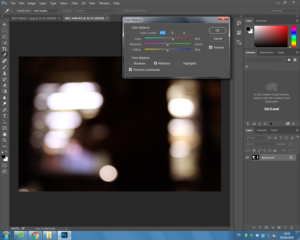
When originally taking this image it was taken at night with no flash as i wanted to capture the golden colour from the street. This helps the image successful as it made the colour brighter in contrast to the dark sky.
When taking my images i used Canon EOS 1300 D and took all my images in Manual focus which helped me to create the Bokeh affect. When taking the image i also used a high shutter speed ( 1/250), using the fast shutter speed under exposed the image and emphasized the darker elements in the photo. However, this helped me to achieve my goal of having the colour and the darkness of the picture contrast . I also used an ISO of 6400 because the higher the ISO the more light is noticeable in the image.
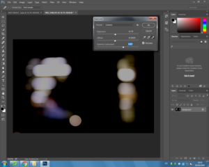
This image is very visually simplistic compared to my others and unlike the others doesn’t include high saturated colours. I think the simplistic of the edited white light adds small amounts of detailing to colours around the light as they help to contrast each other and makes the image stand out due to all the darkness around it. I think the rule of three in this image also helps to make the image more attractive and it engages the audience.
Best outcome