All posts by Jazmin G

Filters

Author:
Category:

Studio Lighting

Why do we use studio lighting?

Studio lighting offers the photographer control over the final image. Studios are simple rooms with no windows so there’s no sunlight involved. The walls are black or white so there’s no colour introduced. There’s a simple backdrop using a roll of white or black material.  There’s also lots of space for the model and equipment to move around.
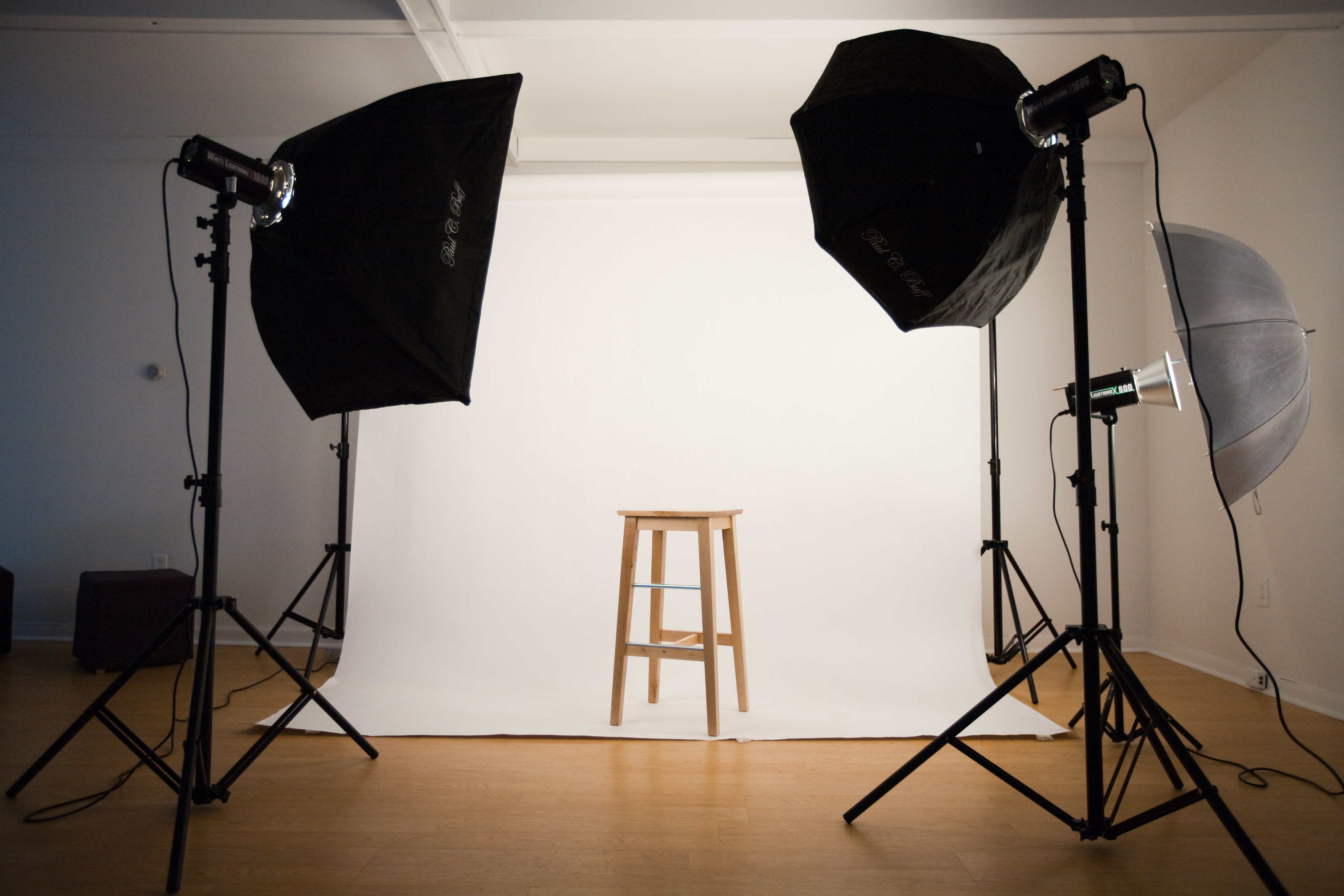
What is the difference between 1-2-3 point lighting and what does each technique provide?

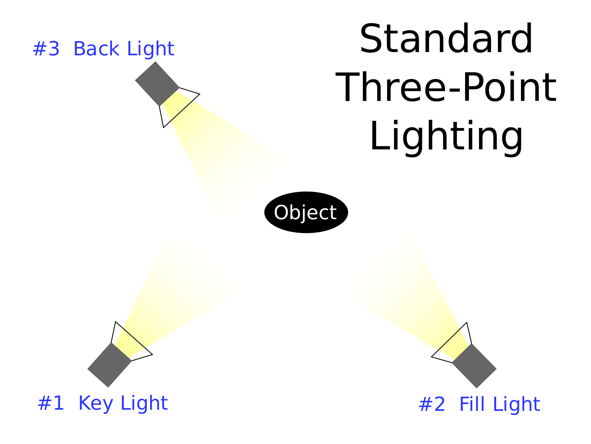
One of the oldest lighting technique is called three point lighting. It is vastly used in studio photography. It is also a good basis for any portrait photograph. In this technique you use three lights:

  • The first light is key light. This is usually the strongest light and this light sets the lighting of the scene.
  • The second light is called a fill light, this light helps fill the shadows that the main light casts.
  • The last light is called a backlight and it provides definition and subtle highlights around the subject’s outlines. This helps separate the subject from the background and provides a three dimensional look.
What is fill lighting?

Fill light is a form of additional light mainly used to lighten up shadows in an image. It is often used in portrait photography to create contrast between the subject and the background giving the scene a sense of depth. In this situation the use of fill lighting reduces the overall dynamic range of the scene allowing for easier selection of exposure settings required to capture an image. When fill light is correctly applied it does not impact the main light source of an image.

What is spill lighting?

Spill light is the light that illuminates the surfaces beyond the area intended to be illuminated. 

What is Chiarascuro ? 

It is a photography technique and can be referred to as extreme low key. It means strong and bold contrast between light and dark areas in photography. It is well suited for portraits and giving the illusion of being three dimensional. It adds depth and a more mysterious atmosphere as it creates contrast between highlights and shadows in a photo.
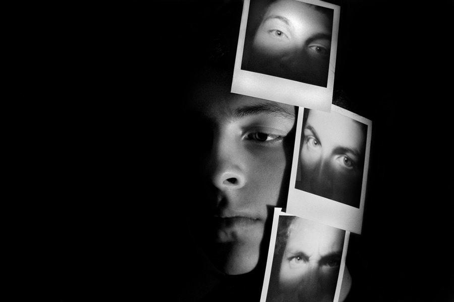
example of chiaroscuro by Ryan Berry

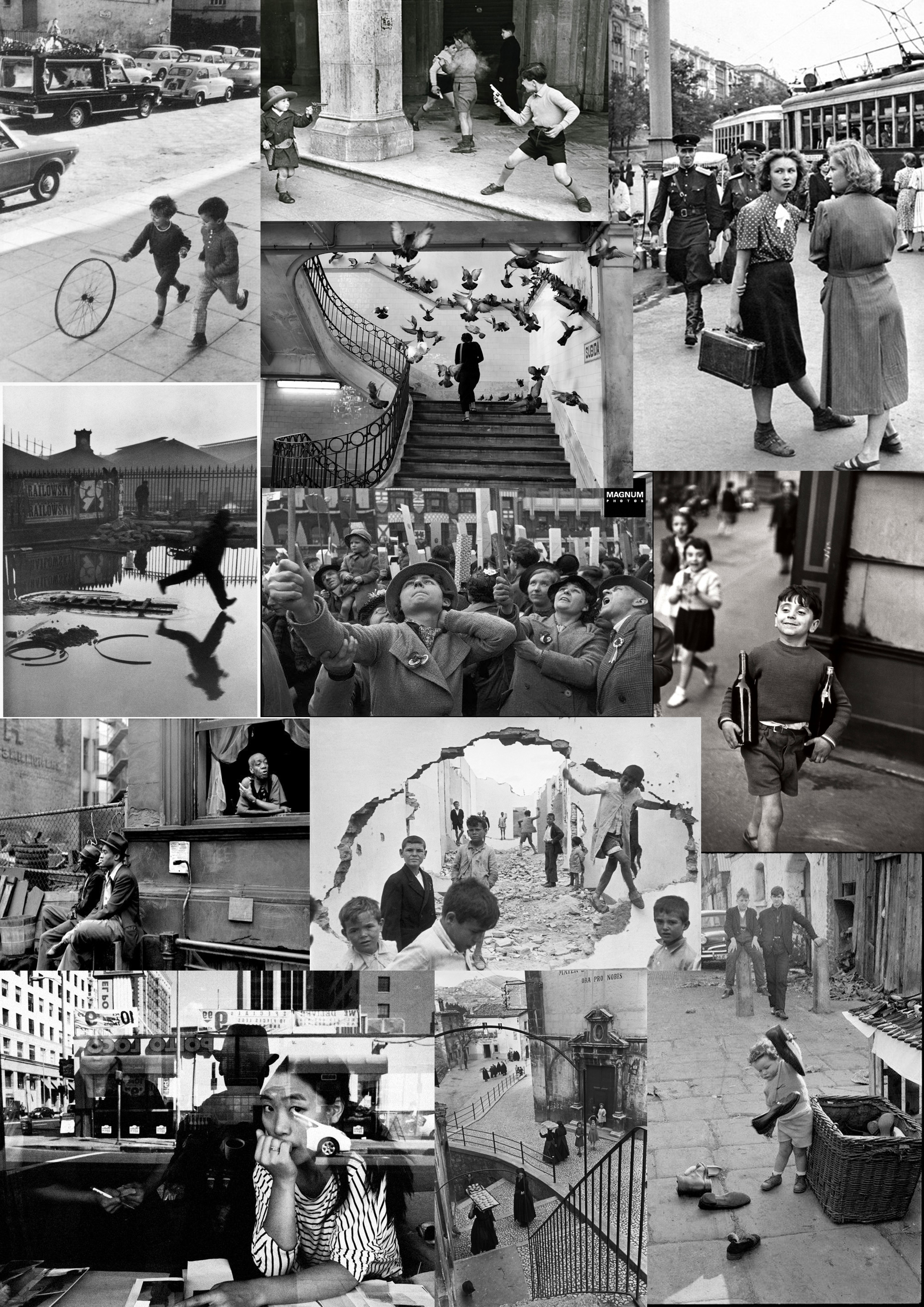
Henri cartier-bresson

Henri Cartier-Bresson was a French humanist photographer considered a master of candid photography. He pioneered the genre of street photography and viewed photography as capturing a decisive moment. He was also one of the founding members of Magnum photos in 1947. Working in black and white, his photographs seem to distill the chaos life into something pure. His refusal to either crop or manipulate his image feel provocative and refreshing and allows the modern viewer to see things exactly as they were.

In early 1947, Cartier Bresson, with Robert Capa, David Seymour, William Vandivert and George Rodger founded Magnum photos. Magnum was a cooperative picture agency owned by its members. The team split photo assignments among the members. Cartier-Bresson would be assigned to cover India and China. He achieved international recognition for his coverage of Gandhi’s  funeral in India in 1948 and the last stage of the Chinese Civil War in 1949.

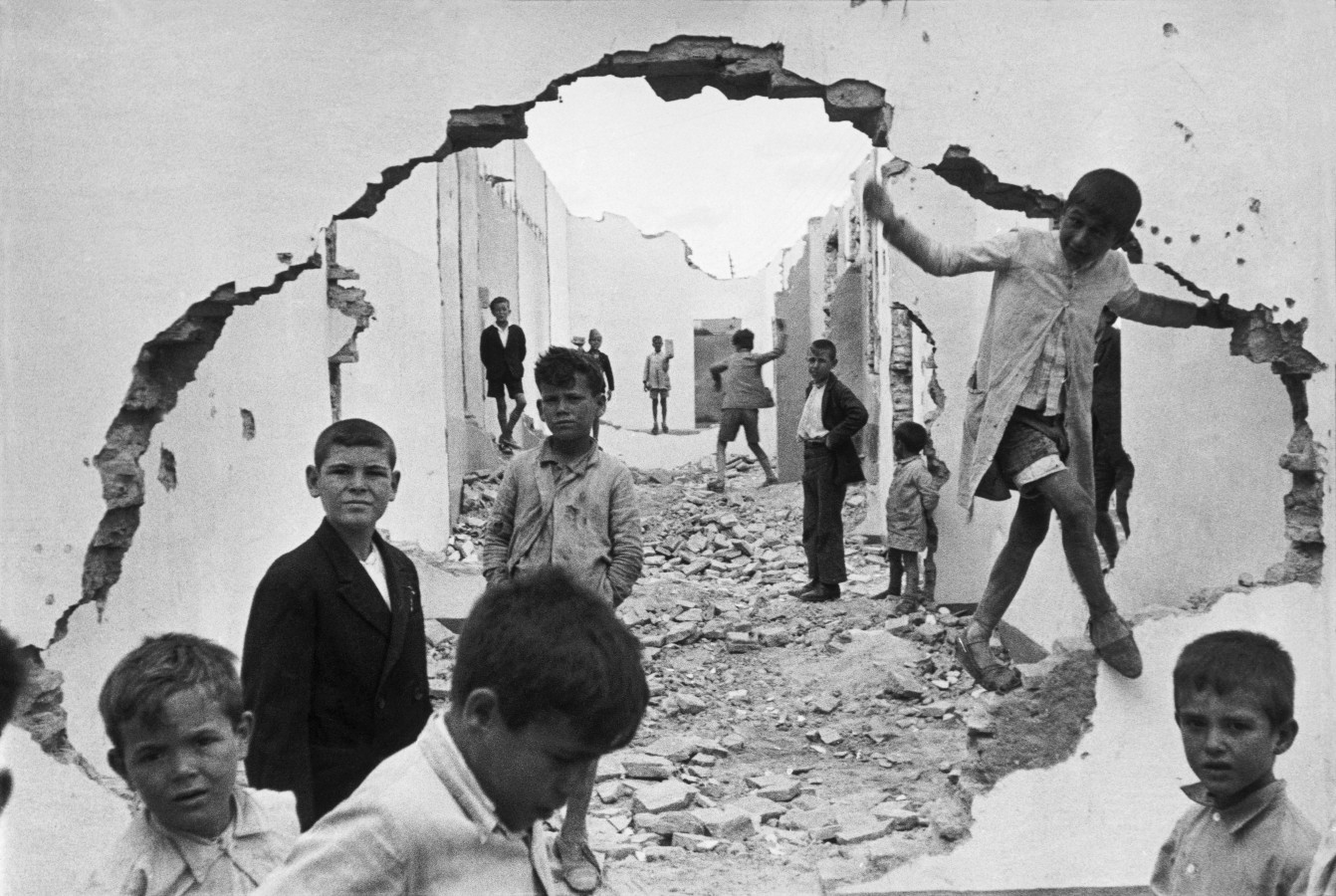
Children playing in ruins, Henri Cartier-Bresson, 1933

This photograph was taken in Sevilla a couple of years before the Spanish civil war. The image depicts young children socialising in ruins. The children are clearly in poverty judging by their clothing, dirt on their bodies and footwear. The fact that children are playing  in times of war (1930), it could be the photographer trying to convey war as just children playing games, which as a former soldier he is entitled to believe. Almost all of the children seem to be looking at the camera in a rather suspicious and disturbed manner which may be because of the unsafe environment they live in. Tension can be seen through the children’s faces which could also be what he is trying to convey to the rest of the world. He is showing what effect violence is having on innocent children through this photograph.

Street photography

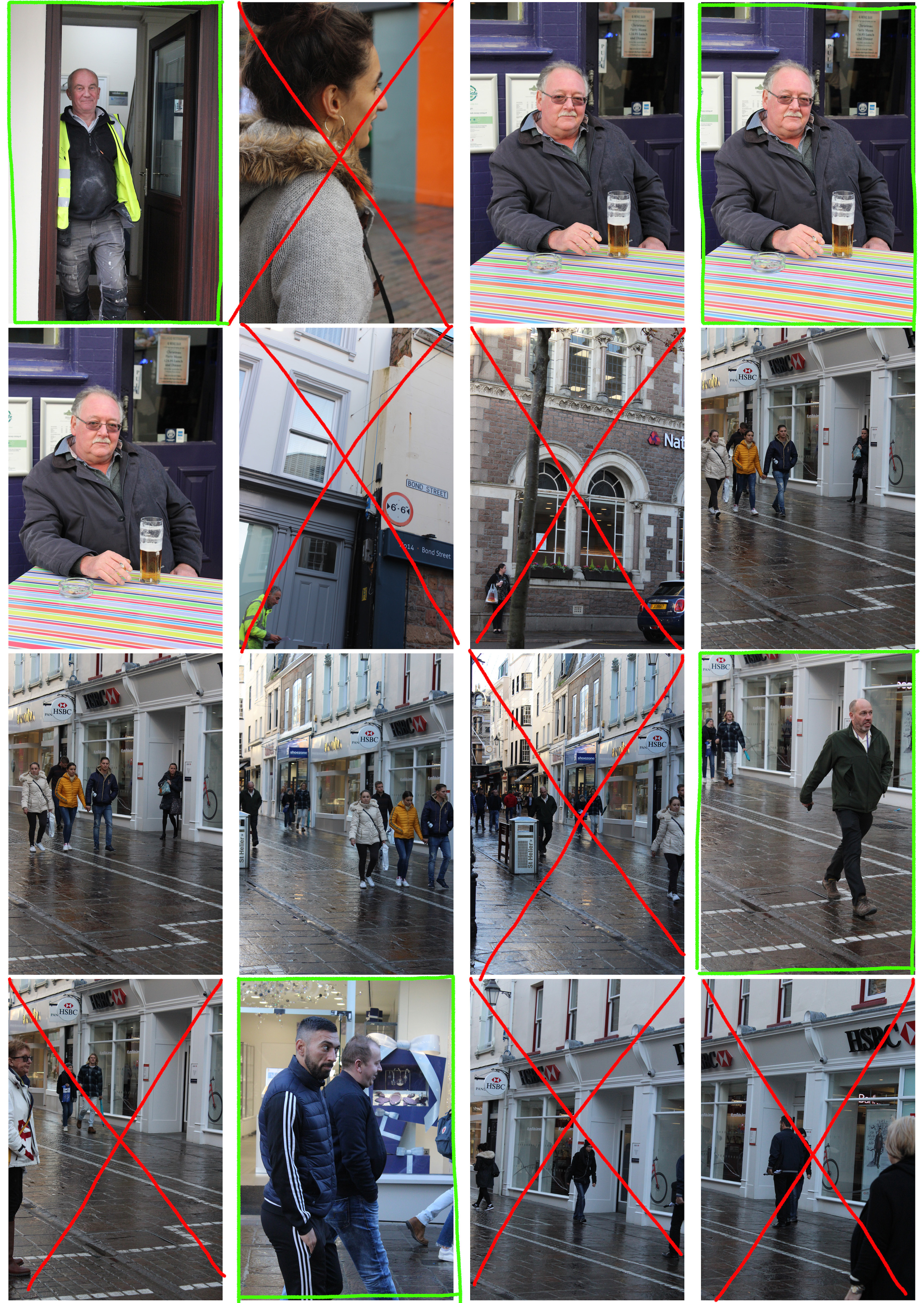
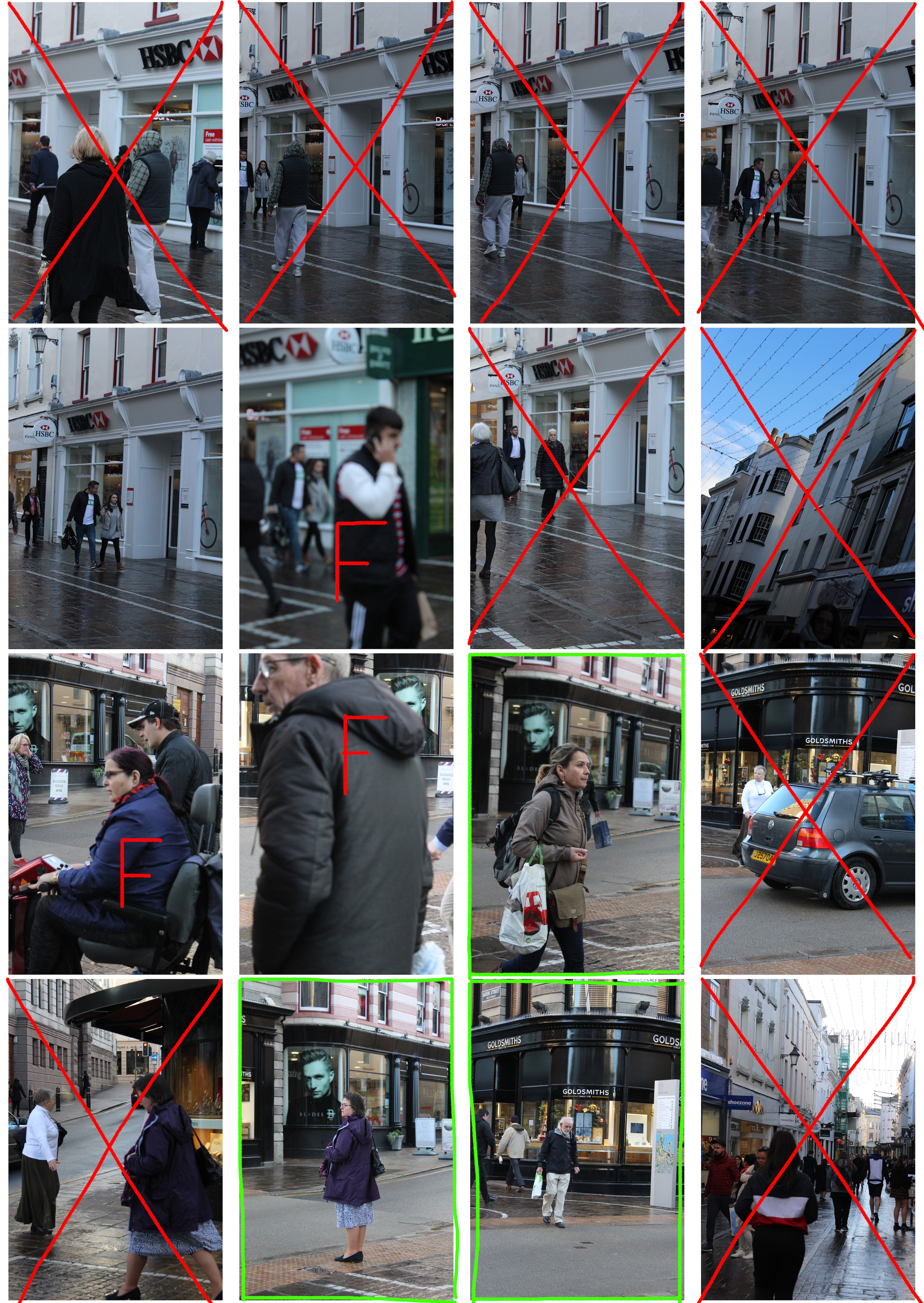
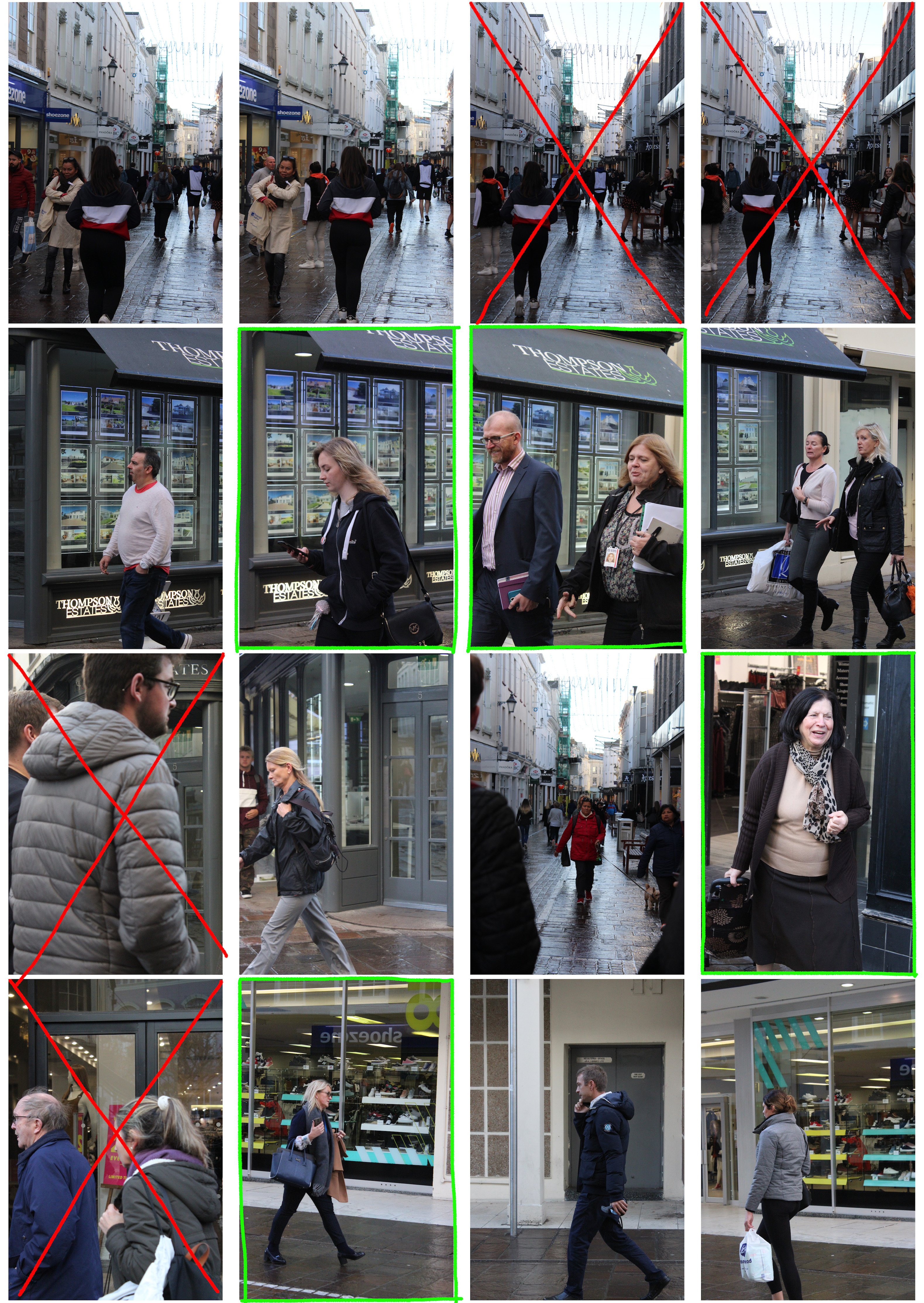
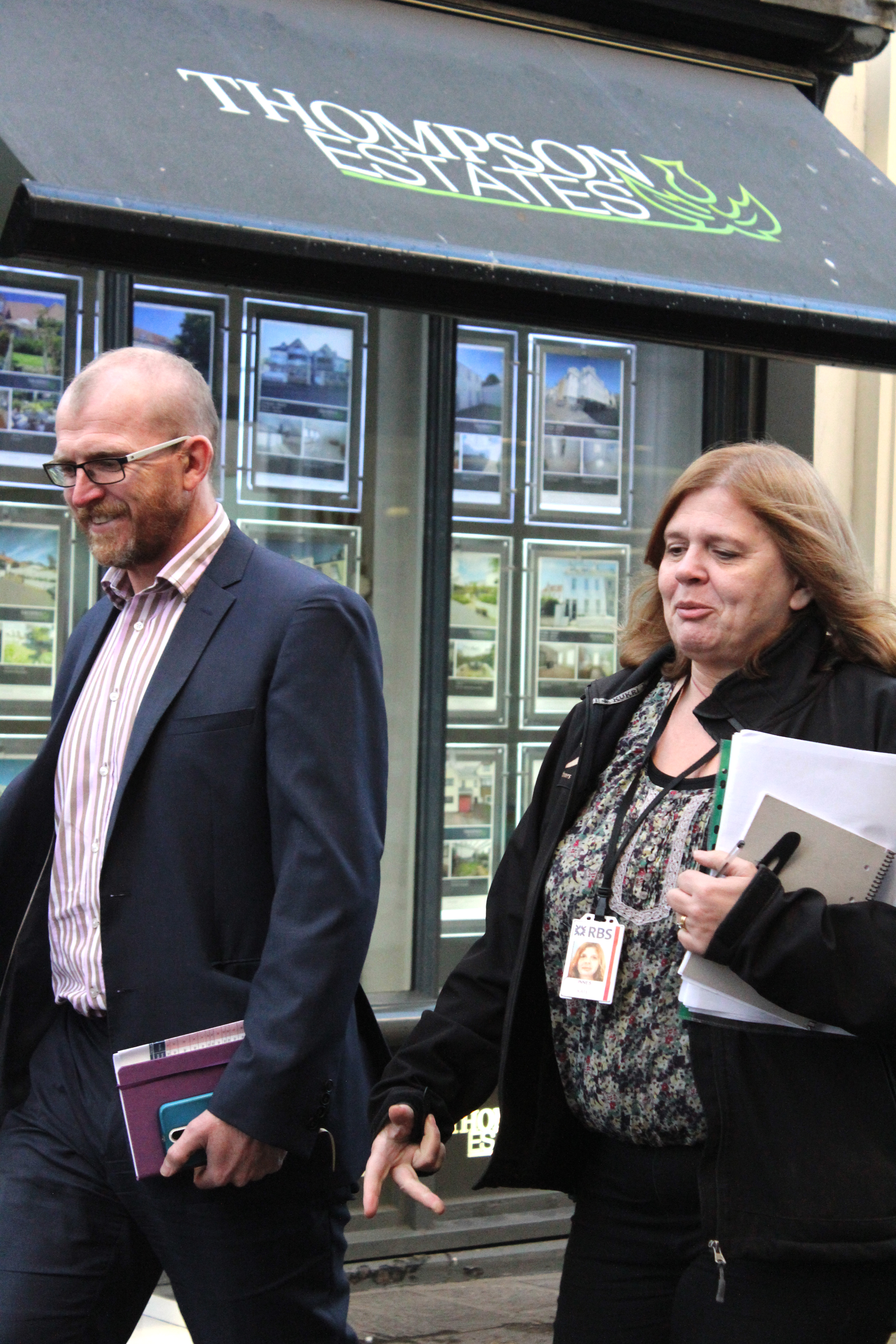
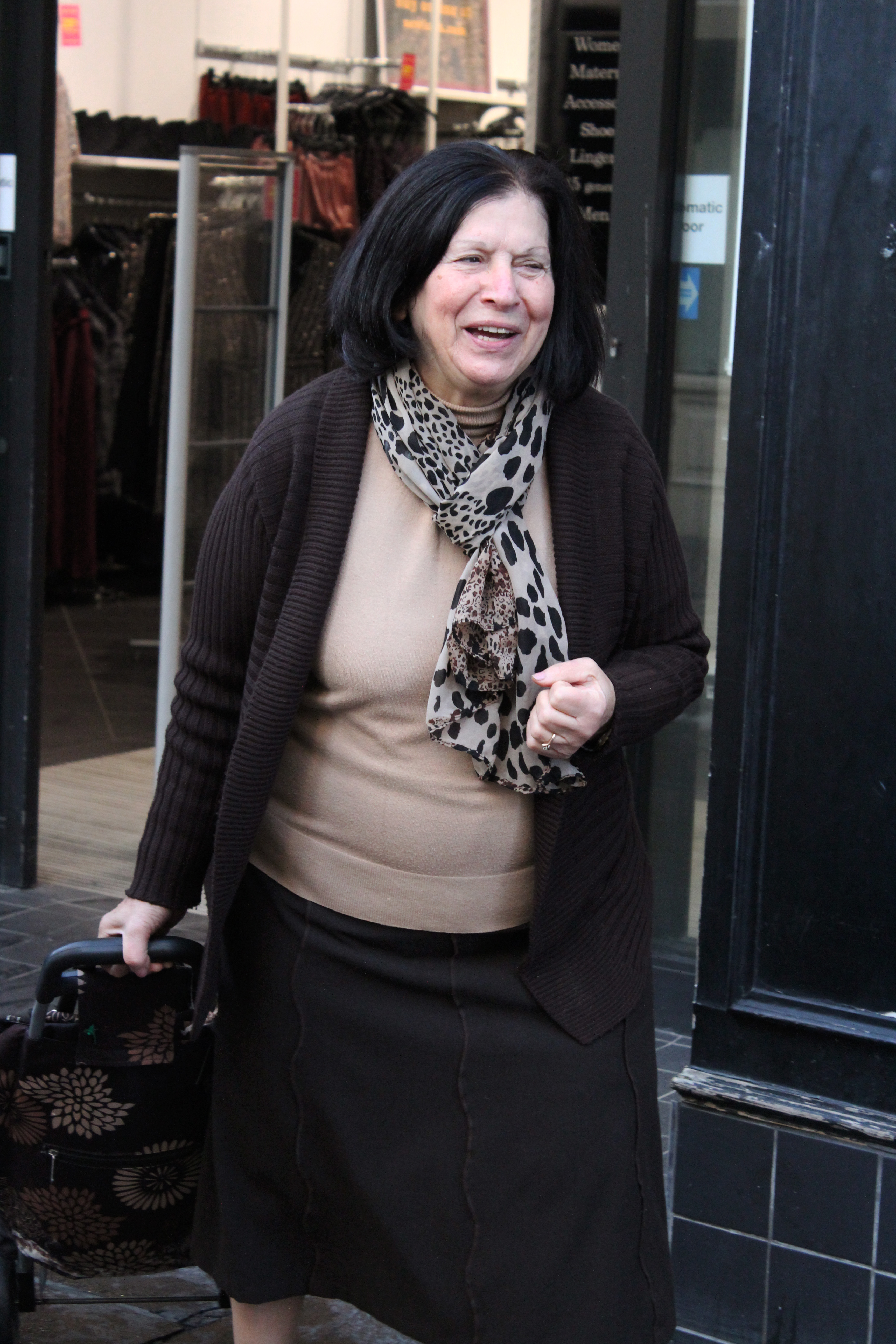
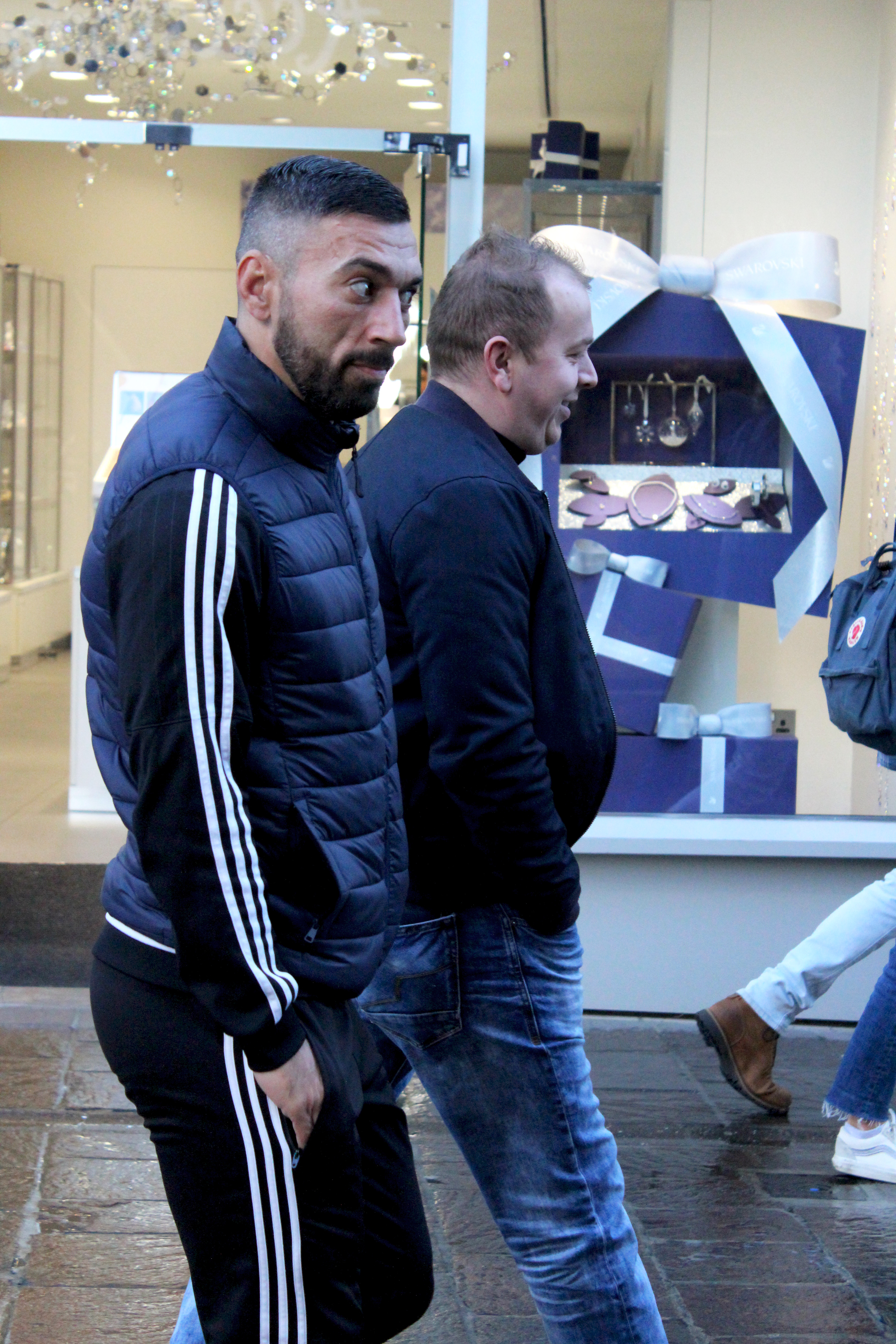
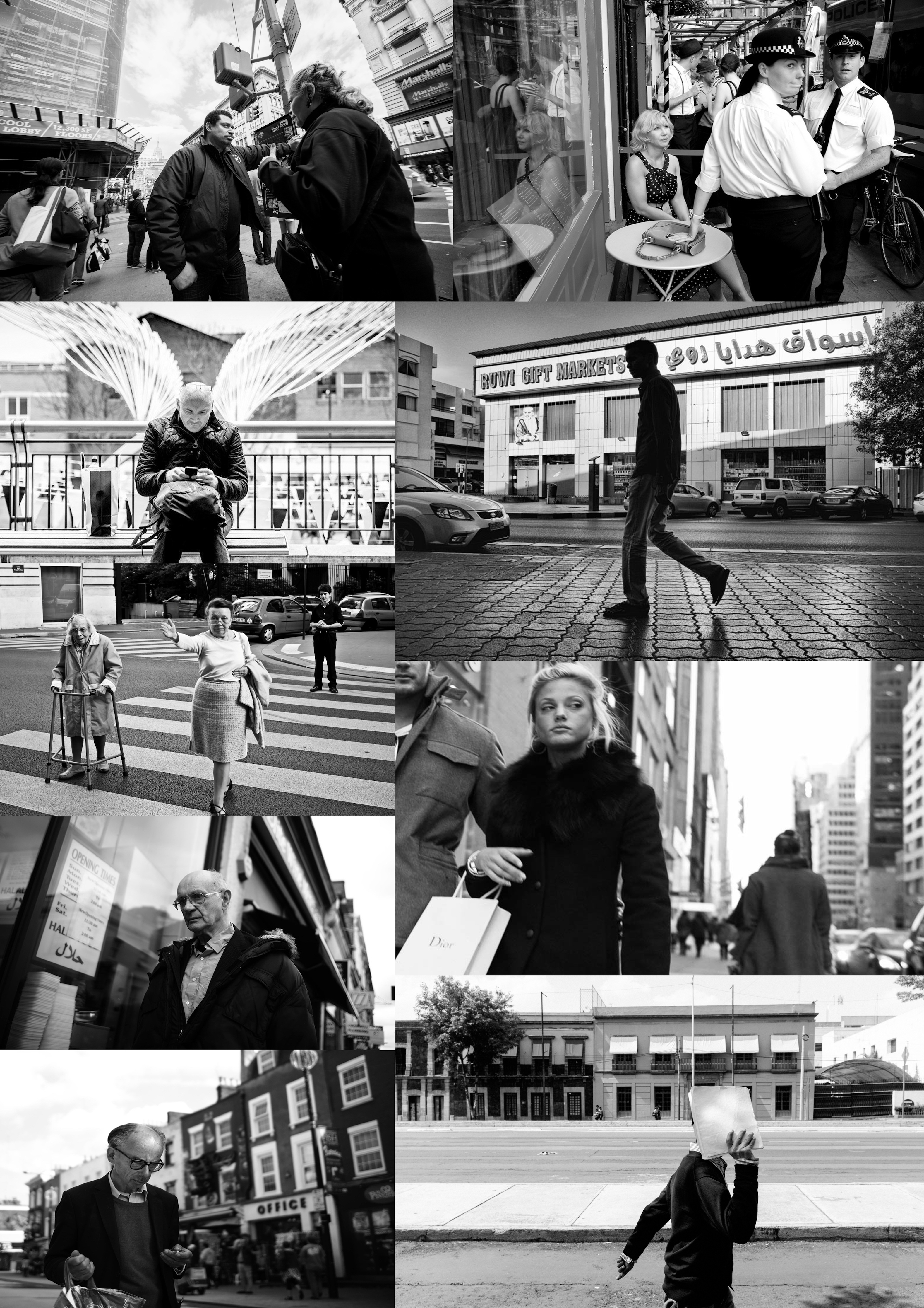
The images below show my experience of trying to do street photography. My photography class went to town to capture a variety of images of people in their natural environment. The publics reaction were all very different as some appeared to be annoyed that their pictures were taken without consent, others were smiling, but the majority didn’t seem to mind as they carried on walking. At the start I asked for consent to take people’s pictures. However, I then realised that if I did that for every person I walked by all my images would be staged and not candid as most street photographs are. It would also take a long time to ask for consent from each person and I only had 30 minutes to take as many street photographs as I can. So I began taking loads of images of people in different parts of town, hoping that some of the results were good. Although I had my camera on sports mode to capture subjects in motion, some of the images turned out blurry.  Even though it was a struggle to take street photographs, I did manage to capture some focused moments of people walking. The zoom on the camera lens also helped as I could take close up images of people without having to get myself close to the subject. The contact sheet reflects my own experience of doing street photography for the first time.

Street photography

Definitions 

Street photography, also sometimes called candid photography, is photography conducted for art or enquiry that features unmediated chance encounters and random events within public places. Street photography can focus on people and their behavior in public.

A candid photograph is a photograph captured without creating a posed appearance. This can be achieved in many ways, for example when the subject is in motion, by surprising the subject, by not distracting the subject during the process of taking photos etc.

Articles about street photography

http://erickimphotography.com/blog/the-ultimate-beginners-guide-for-street-photography/

https://digital-photography-school.com/ultimate-guide-street-photography/
Quotes

"if your photos aren't good enough, then you're not close enough" - Robert Capa

"It is more important to click with people than to click the shutter" - Alfred Eisenstaedt
Threshold concept #7

The meanings of photographs are never fixed, are not contained solely within the photographs themselves and rely on a combination of the viewer's sensitivity, knowledge and understanding, and the specific context in which the image is seen.

August Sander

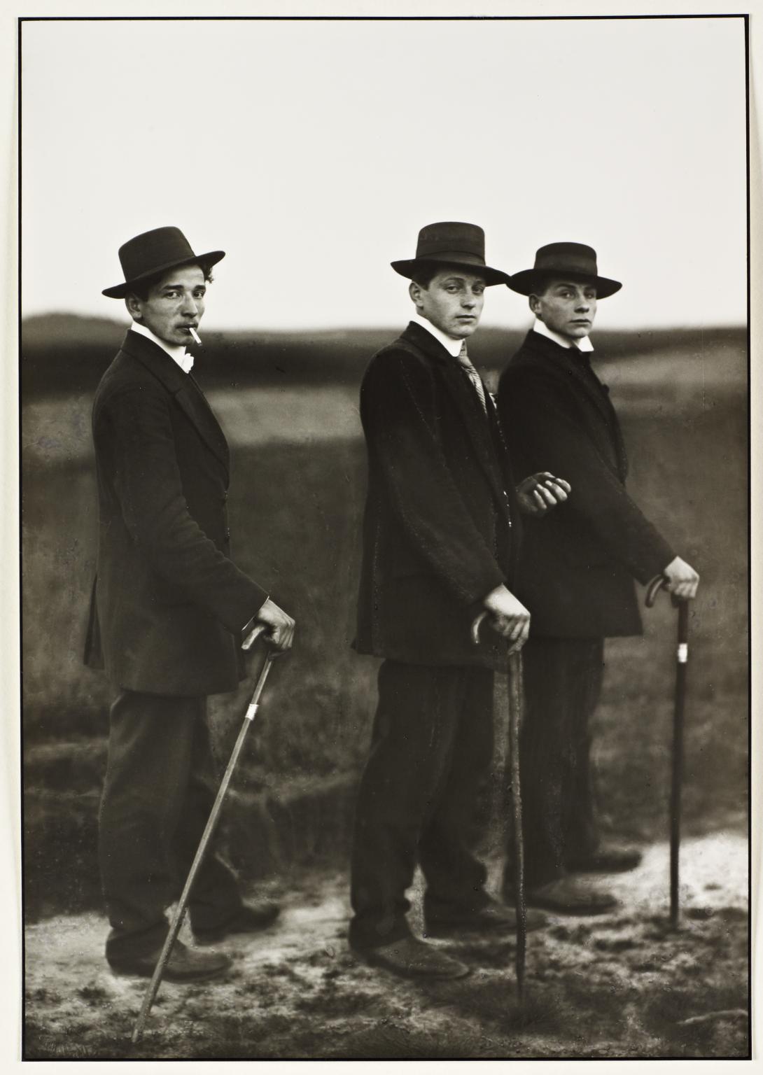
August Sander was a German photographer who attempted to produce an extensive photographic document of German people. He was the son of a mine worker, and Sander did the same work initially as his father. He got his first camera in 1892 and took up photography as a hobby. After the military he pursued it professionally, working in a series of photographic studios in Germany. By 1904 he had his own studio in Linz and after his army service in World War I he settled permanently in Cologne and became friends with photographers and painters dedicated to the New Objectivity. After photographing local farmers near Cologne, Sander was inspired to produce a series of portraits of German people from all levels of society. His portraits were usually sharp, photographed straight on in natural light, while the subjects class and profession was shown through clothing, gesture, and backdrop.

Young Farmers, August Sander, 1914

Contextual: Sander was a German portrait and documentary photographer. During the nazi period he struggled to maintain his job. This image was in Sander’s portrait photo book ‘Face of our Times’ which was published in 1929, and also appears in the first volume of Sander’s incomplete project ‘People of the twentieth century’ which was planned as an extensive series of portraits of the German population, classified into seven groups by social class. These farmers, influenced by popular culture and advertising, may represent a trend that saw workers move away from the land towards the city.

Visual: There are three figures standing in the foreground against an out of focus landscape. The repetition of each figure’s posture, their walking sticks, dark suits, and hats creates a lateral rhythm across the picture plane. Each figure is looking directly at the camera. The shapes of their heads and hats are depicted against the blank sky. Their expressions are serious. Their shared pose is a mixture of formal (stiff posture) and informal (cigarette. They appear to be on their way to an event and have dressed up formal. They are not in their usual work clothes. The rule of thirds is used to locate each figure from left to right and top to bottom. There is also an implied movement from left to right since their feet are pointing towards their destination.

Technical: Apparently this image was taken with a large format glass plate camera on a tripod with a long shutter speed ( common in portrait photographs). The photographer uses available early evening light. Shallow depth of field can also be seen through the image which has been caused by a relatively wide aperture and focal length of the lens.

Environmental portraits

An environmental portrait is a portrait captured  in the subjects usual environment, such as in their home or workplace. The setting typically illuminates the subject’s life and surroundings. By photographing a person in their natural surroundings, it is thought that you will be able to better illuminate their character, and therefore portray the essence of their personality, rather than their physical features. Photographing a person in their natural surroundings will make the subject feel more comfortable so they will express themselves more, as opposed to in a studio, which can be a rather intimidating and an artificial experience. The background is an important aspect in environmental portraiture and is used to show further information about the person being photographed. Small apertures and a large depth of field are mostly used in this type of photography. The symbolism expressed through the various elements in the background are effective when taking an environmental portrait.

Portrait analysis of Alfred Krupp

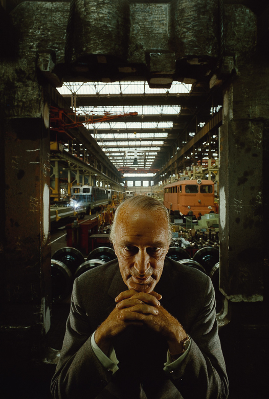
Arnold Newman, Portrait of Alfred Krupp, 1963

Alfred Krupp was an armanents manufacturer who used slave labour to make weapons for the Nazis. When finding out that Newman was a jew, Krupp refused to let him take the photograph. Newman insisted to have Krupp look at his portfolio before making a final decision and after seeing Newman’s portfolio he accepted. On July 6th, 1963 they both went into a delict factory in Essen which belonged to Krupp, where Newman decided to make Krupp look as evil as he can under the eerie, demonic lighting of the factory. When Krupp initially saw his portrait he was furious. Newman said “as a jew, it’s my own little moment of revenge”. Krupp in this image is in an elevated position which is important because it shows his declaration that he is the highest authority within these premises, he is the man responsible for all that happens. Krupp is situated in the centre of the image and the lens mostly focuses on his face rather than the background;This emphasises his facial features and gesture. Krupp is slightly leaning forward and clasping his fingers together under his chin. He is staring directly at the camera in an eerie, sinister way with a sort of grin on his face. He’s also wearing a suit and appears to be in a formal position. In the background you can see his factory which gives the impression that Krupp is in charge. The fact that the background is lighter than the foreground makes Krupp appear evil since he seems to be surrounded by darkness. This image makes me feel on edge since he looks like he’s done something  evil. It seems like he’s staring right into the depth of your eyes which makes the viewer feel uncomfortable and uneasy. The whole image seems wicked which is mostly created through the eerie lighting and his facial features.

Environmental portraits

Arnold Newman

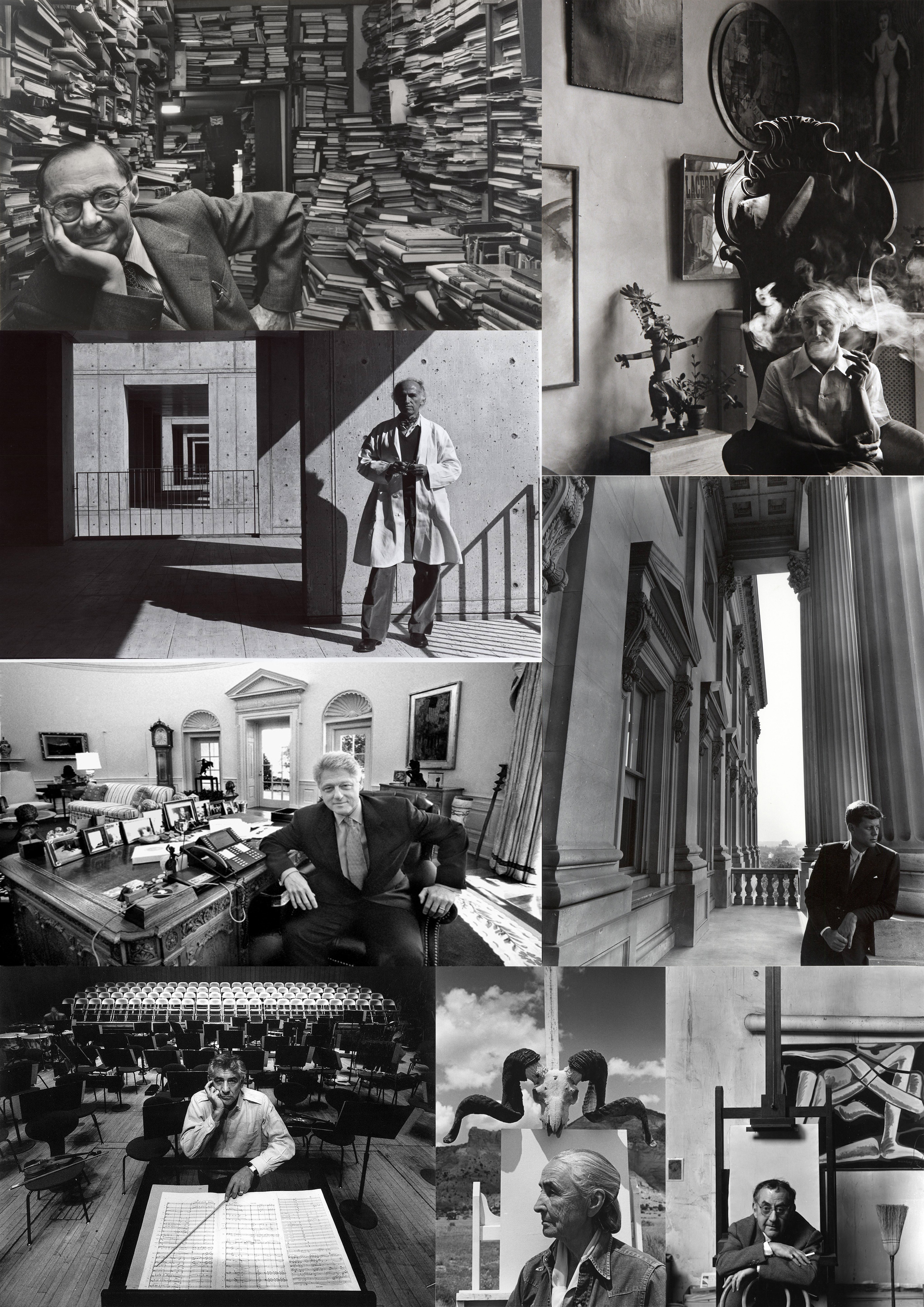
Arnold Newman was an American photographer, mostly known to be the one who flourished ‘environmental portraiture’, in which the photographer places the subject in a carefully controlled setting to capture the essence of the individual’s life and work. Newman normally captured his subjects in their most familiar surroundings with representative visual elements showing their professions and personalities. Even without knowing who the subject is, a viewer can identify the artist in his studio, or a musician at the keyboard, or a president at his desk. Newman’s best-known images were in black and white, although he often photographed in colour. His portraits ranged from celebrities, artists to politicians. Newman insisted that a picture of a celebrity or politician by himself wouldn’t be as meaningful as one taken in the subject’s workplace. The viewers can tell that his portraits are planned because of the carefully composed environment and the posed subject.

His style

Although his style evolved, backgrounds always played a leading role in his photographs. Through his environmental painters’ portraits you can see how he carefully chooses backgrounds to fit with the style of painting these painters created. Most of Newman’s personal works were the result of long social interaction with the subject. After getting to know the subject in a broad way, the photographs began to happen. Newman captured images that he had in mind from the beginning, which was the essence of his photographic style. In all his environmental portraits, Newman included representative elements of the subject’s profession. Sometimes Newman’s photographs have different compositional approach in which the subjects is close to the corners of the frame. This was probably a reflection of the great care he took to show as much as possible of the subject’s surroundings.

My response

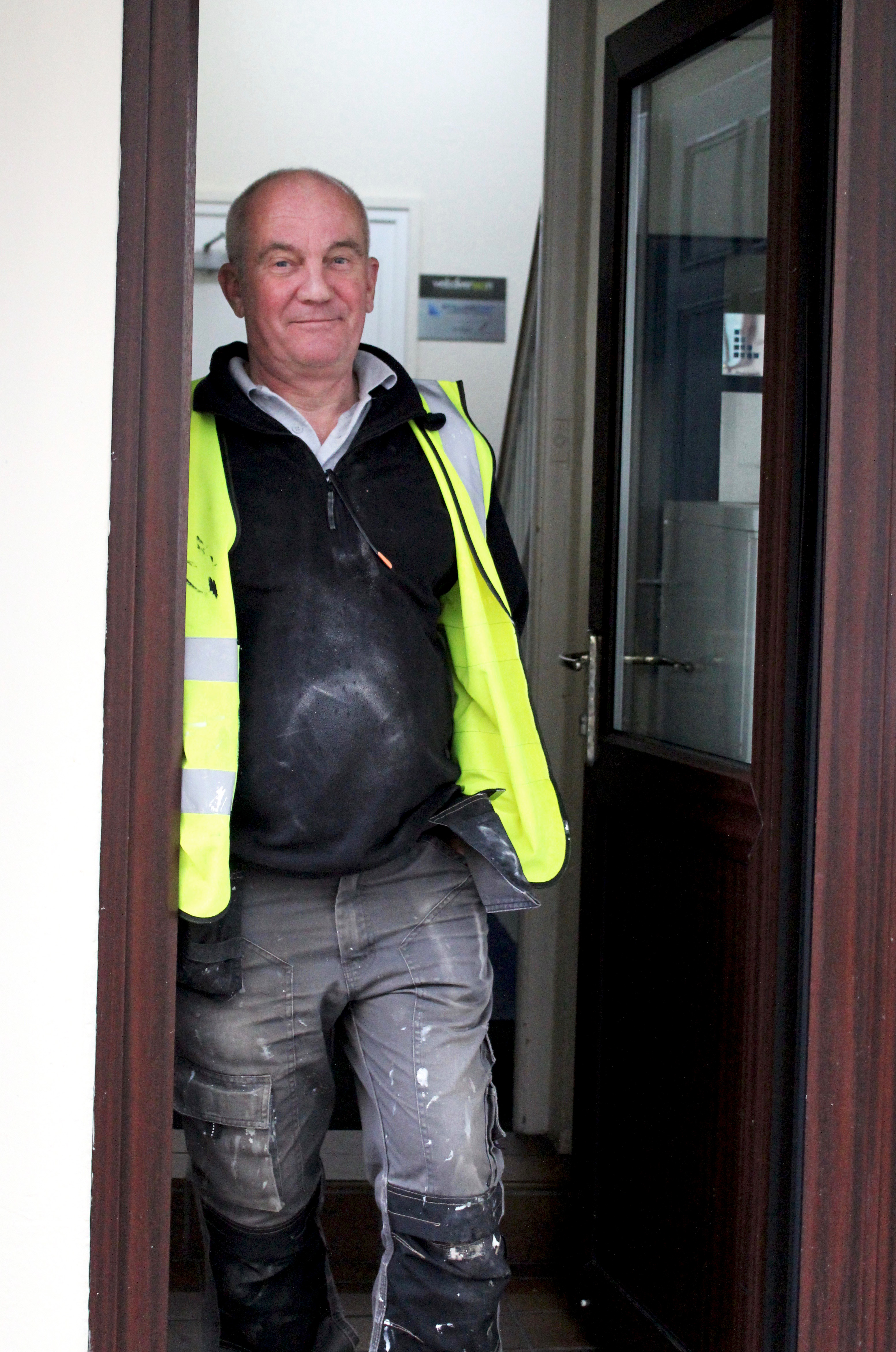
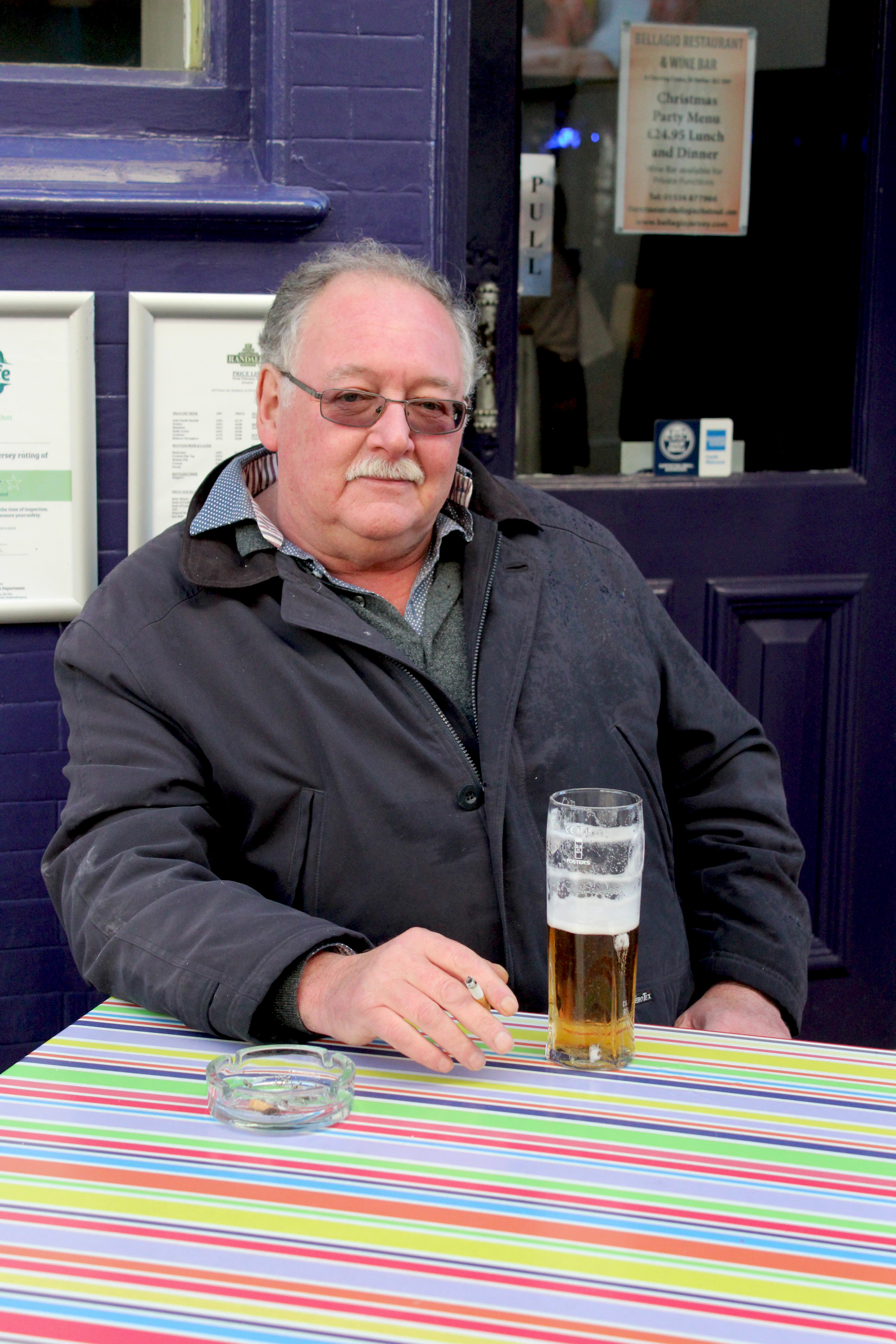
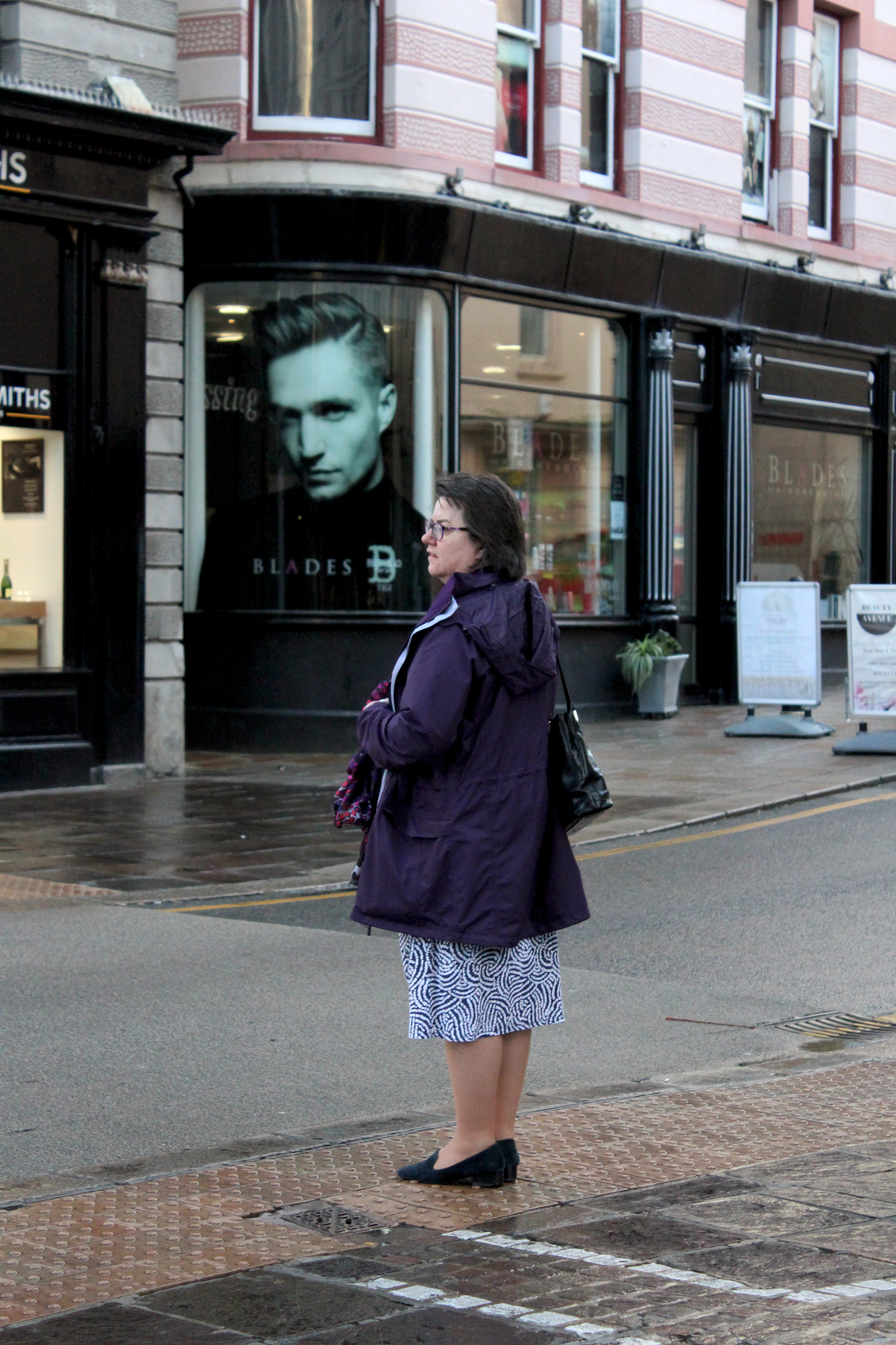
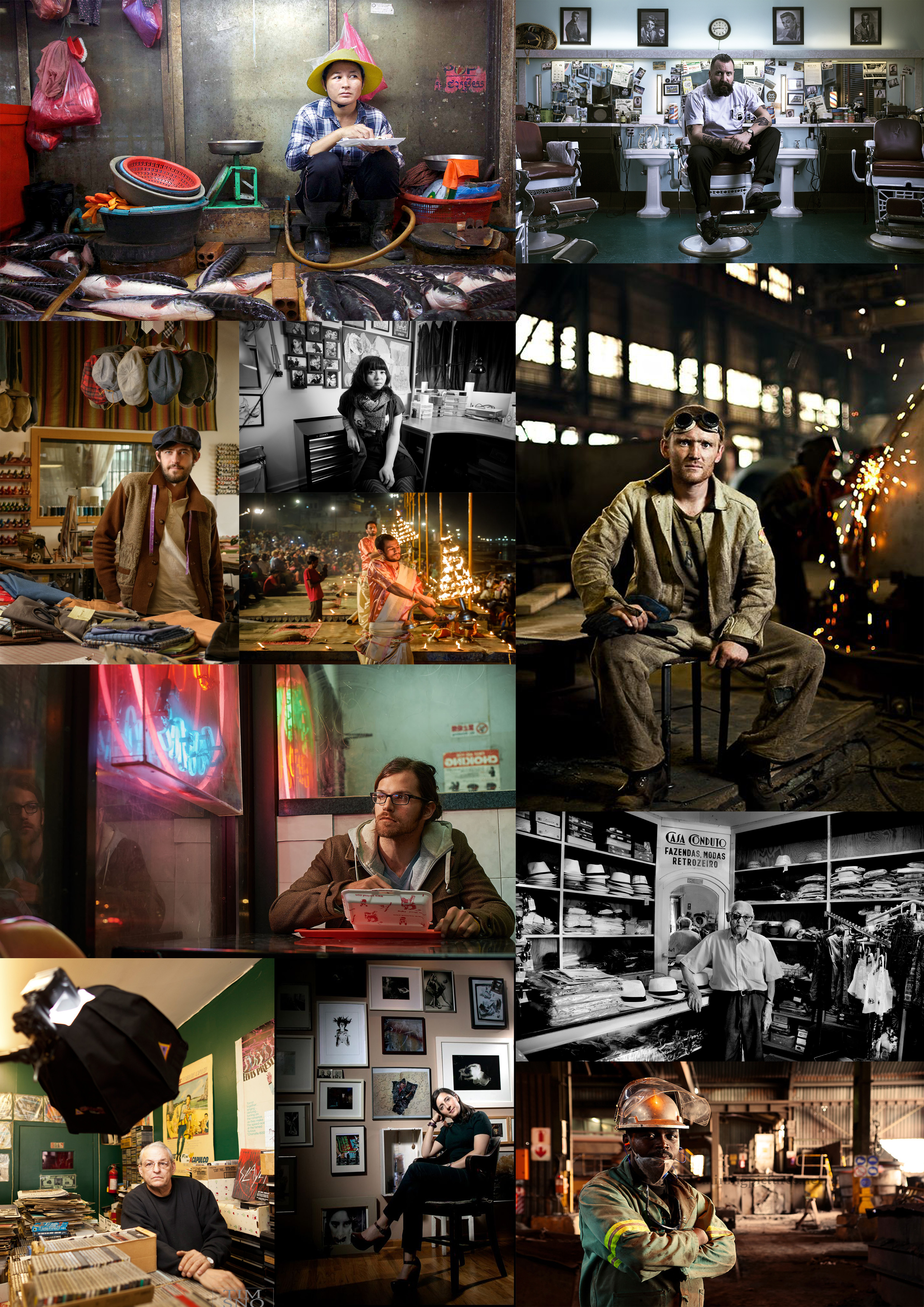
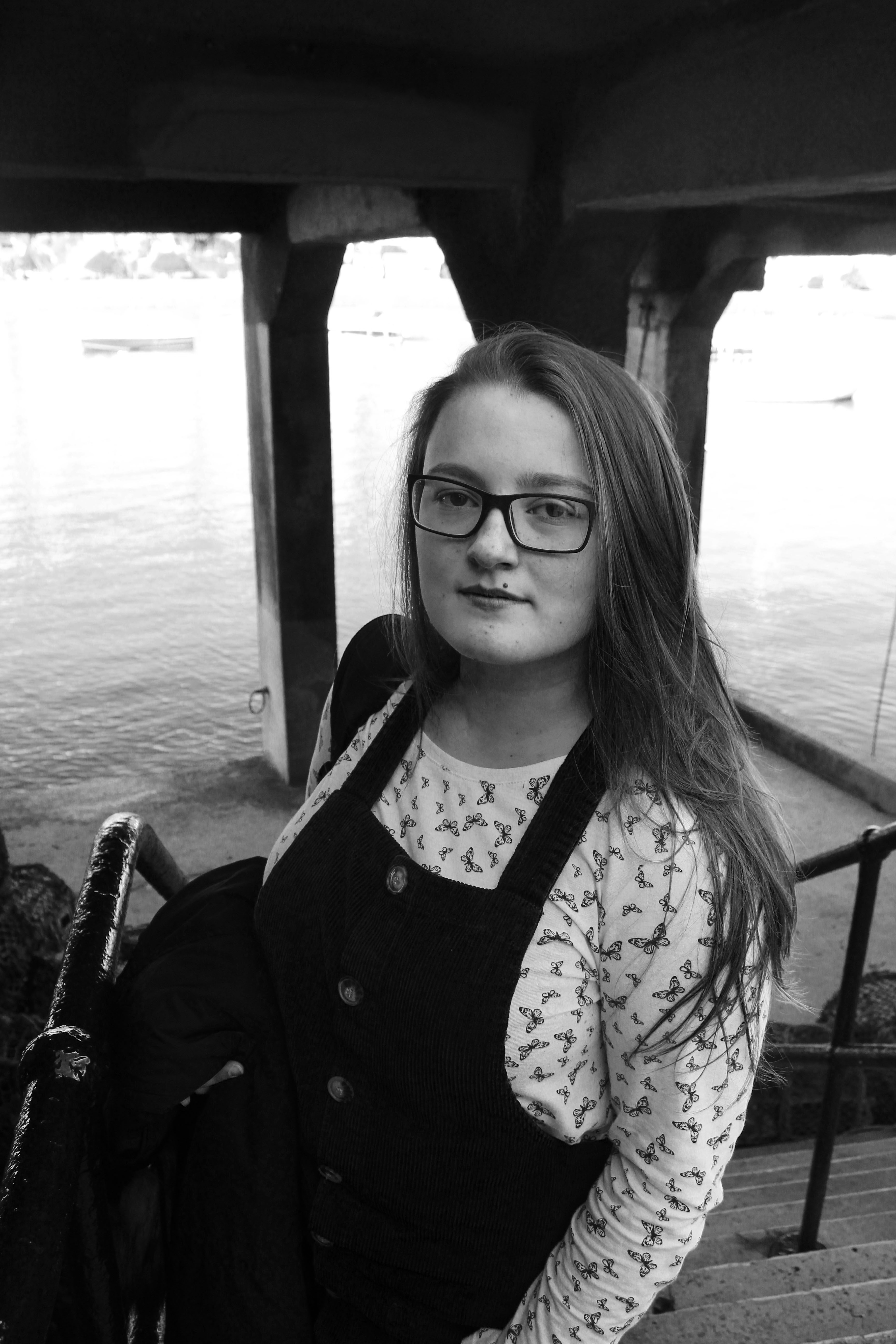
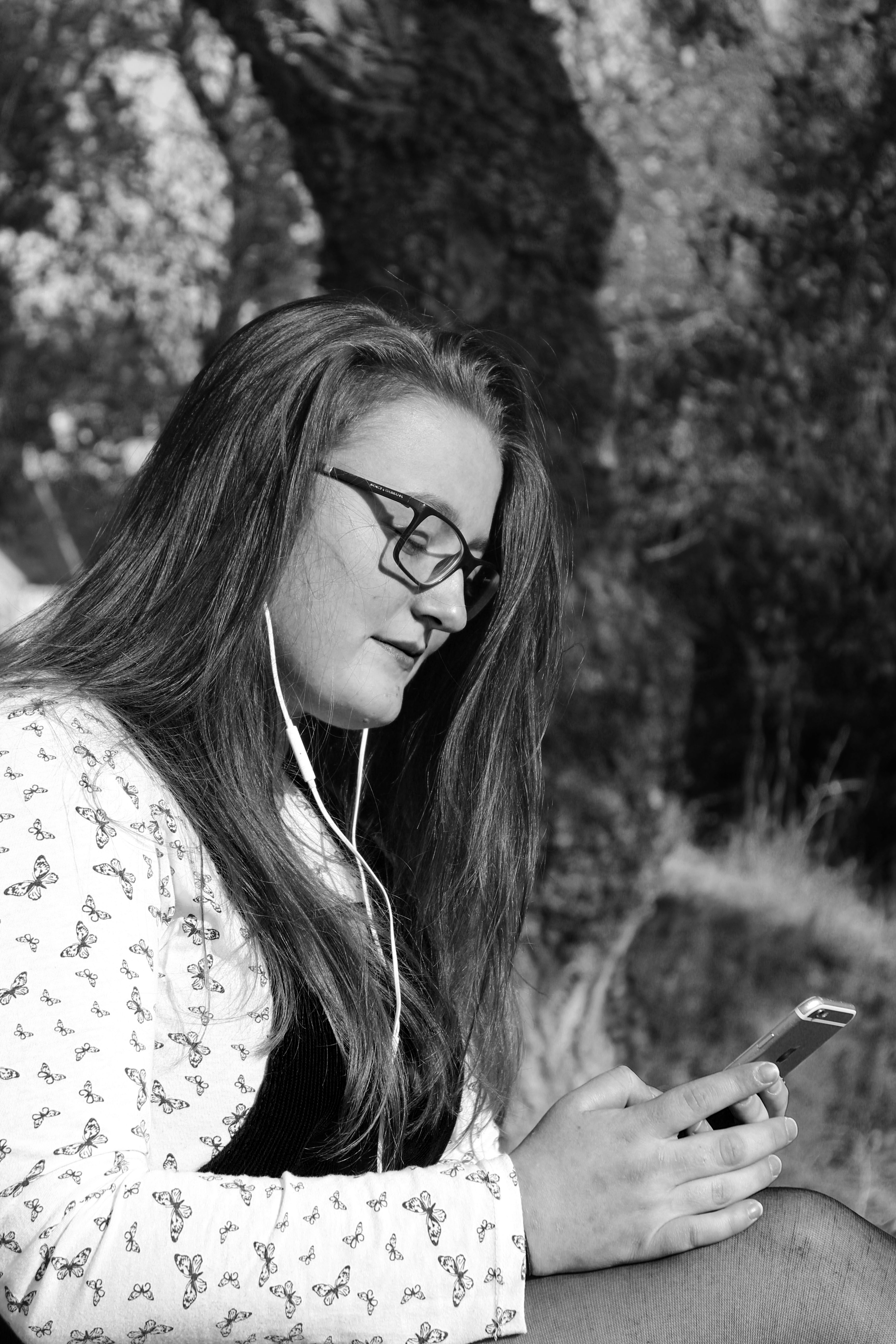
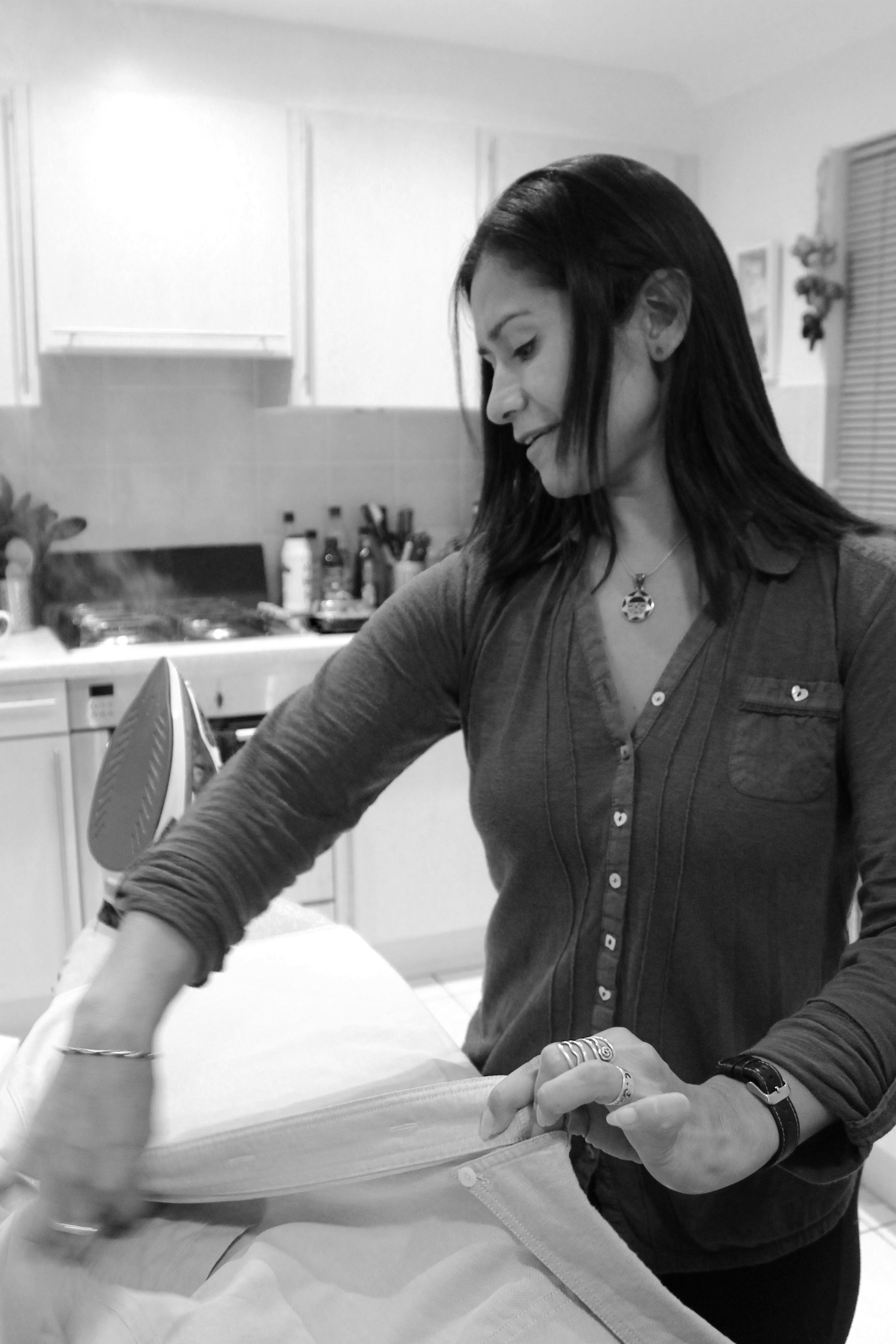
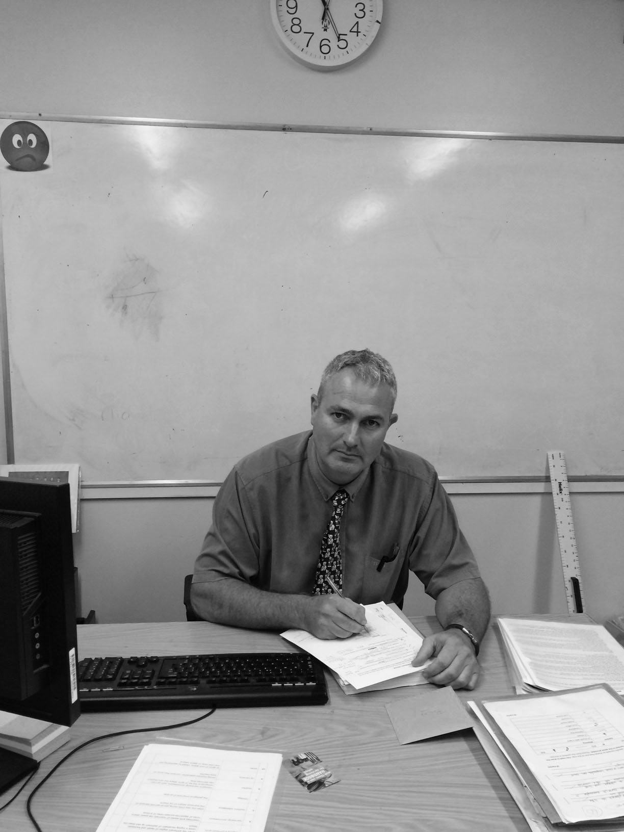
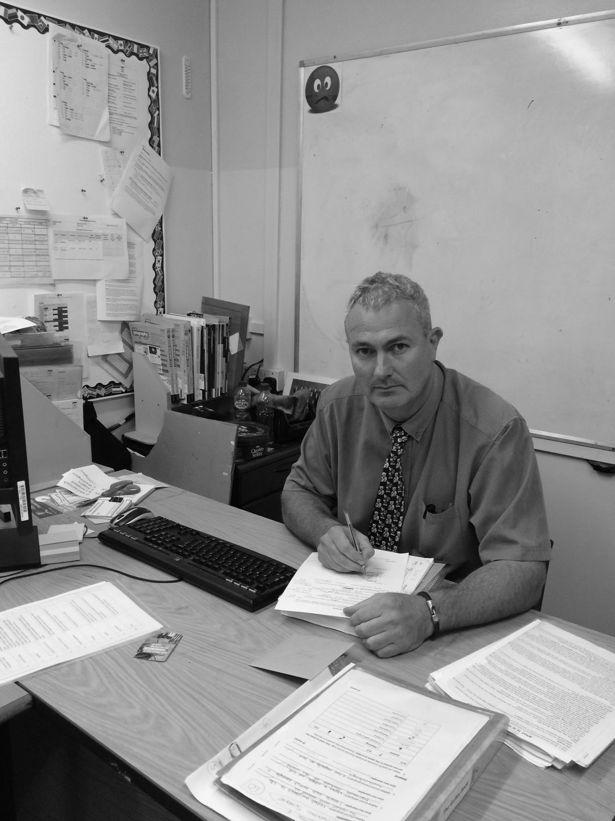
To respond to Arnold Newman’s photography work, I captured images of people in their familiar surroundings or their workplace. Since Newman is best known for his black and white images I decided to edit the final outcomes on photoshop by applying the black and white filter and slightly adjusting the contrast and brightness. A large amount of background can be seen through my images as this was an important aspect in his photographs to show the viewers the subjects representative elements. I think these images replicate Arnold Newman’s photographic style since they are black and white environmental portraits which have been captured using his techniques. However, to improve I could have photographed more people in their working environments and taken pictures of subjects that I’m not familiar with.

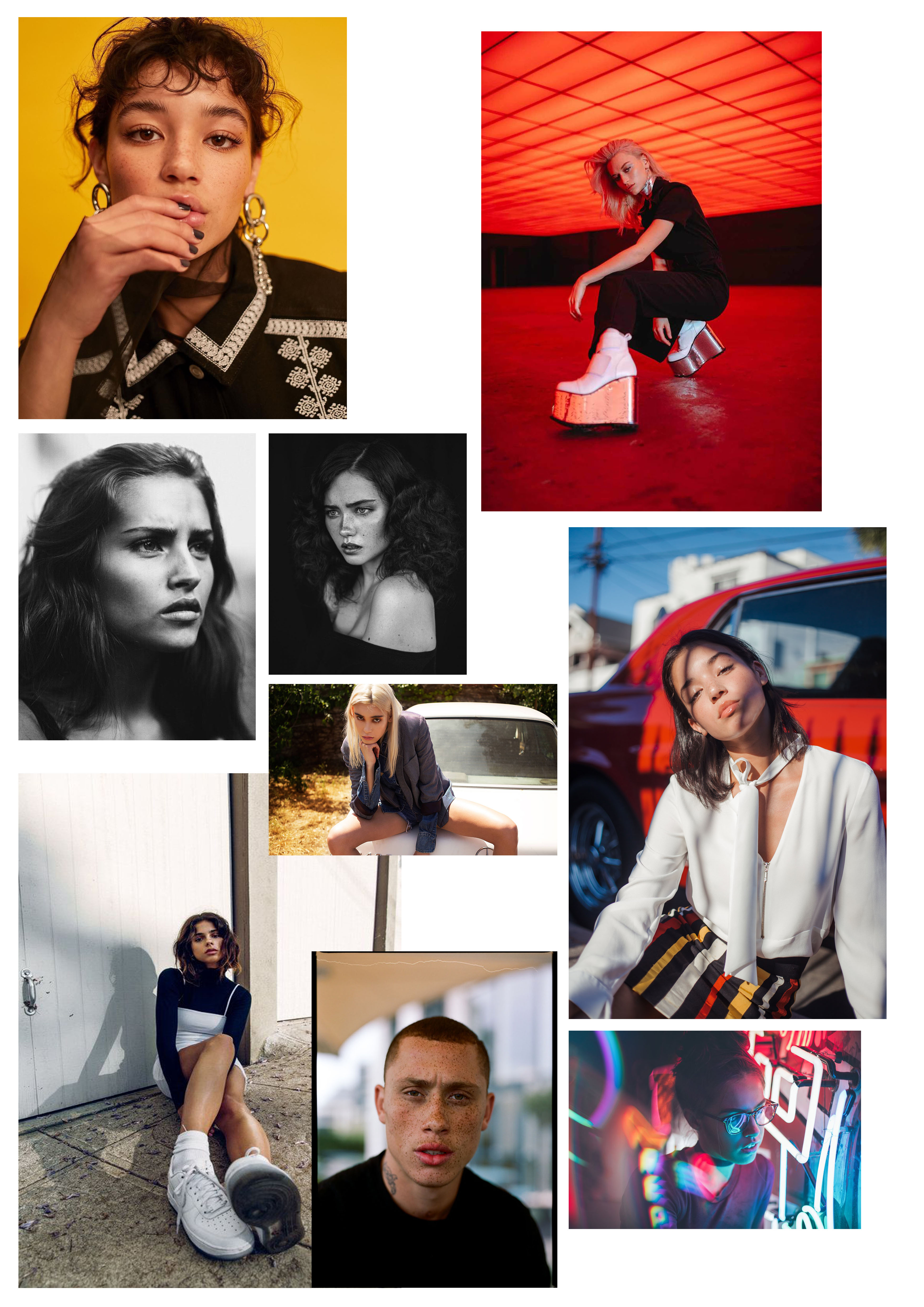
portrait mood board

Portrait photography is a photograph of a person or group of people that captures the personality of the subject by using effective lighting, backdrops, and poses. A photographer’s goal is to take a carefully decided photograph of a person’s distinguishing facial features, while capturing the person’s attitude, identity and personality. Frequently, portraits are taken for special occasions, such as weddings or school events.

ABSTRACT – FINAL IMAGES

I will select my best photo outcomes to print onto A3, A4, A5. I will search through the entire abstract project and select the ones that look visually interesting and show my  photographic skills. Researching many photographers has helped me to capture abstract images in a variety of different ways in order to replicate their style.

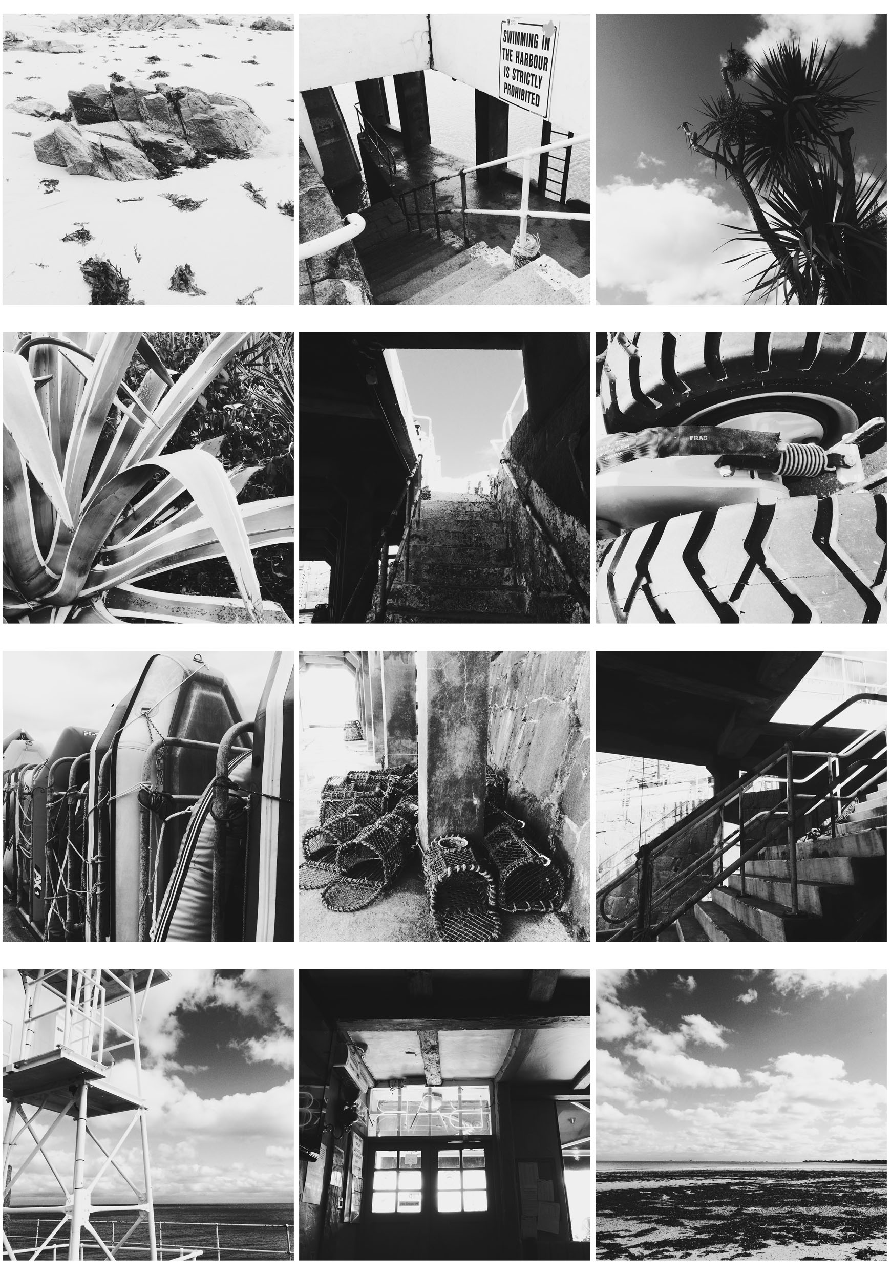
A5

These images are responding to  Albert Renger Patzsch photography work. I captured 100 or more images in black and white to replicate his style. I took the pictures using the Hipstamatic app on my iphone with the lens Florence and the film BlackKeys XF. The lens captured images clearly and the film made them black and white instantly. After taking 100 images I made a selection of 12  to make a 4X3 grid. I selected images with either lots of shadow or highlight so when they are placed next to each other, all the images on the grid contrast and stand out.

A4

These 2 images are responding to Jon Setter’s photography work which mostly focuses on urban space. To replicate his style I payed attention to colour and texture to create man made spaces into geometrically satisfying compositions. Photographing a different perspective helped me get the results I wanted to create abstract images. I took around 100 images and selected 2 from the contact sheet. Then on photoshop I edited the two images by increasing the saturation and contrast to correspond to his vibrant style. This created bold and sharp images to emphasise the formal elements. When capturing the images on my camera I made sure to increase the aperture so my depth of field would be greater and my images would have a sharper background. I selected these two images as they both greatly contrast each other through their different colours and textures.

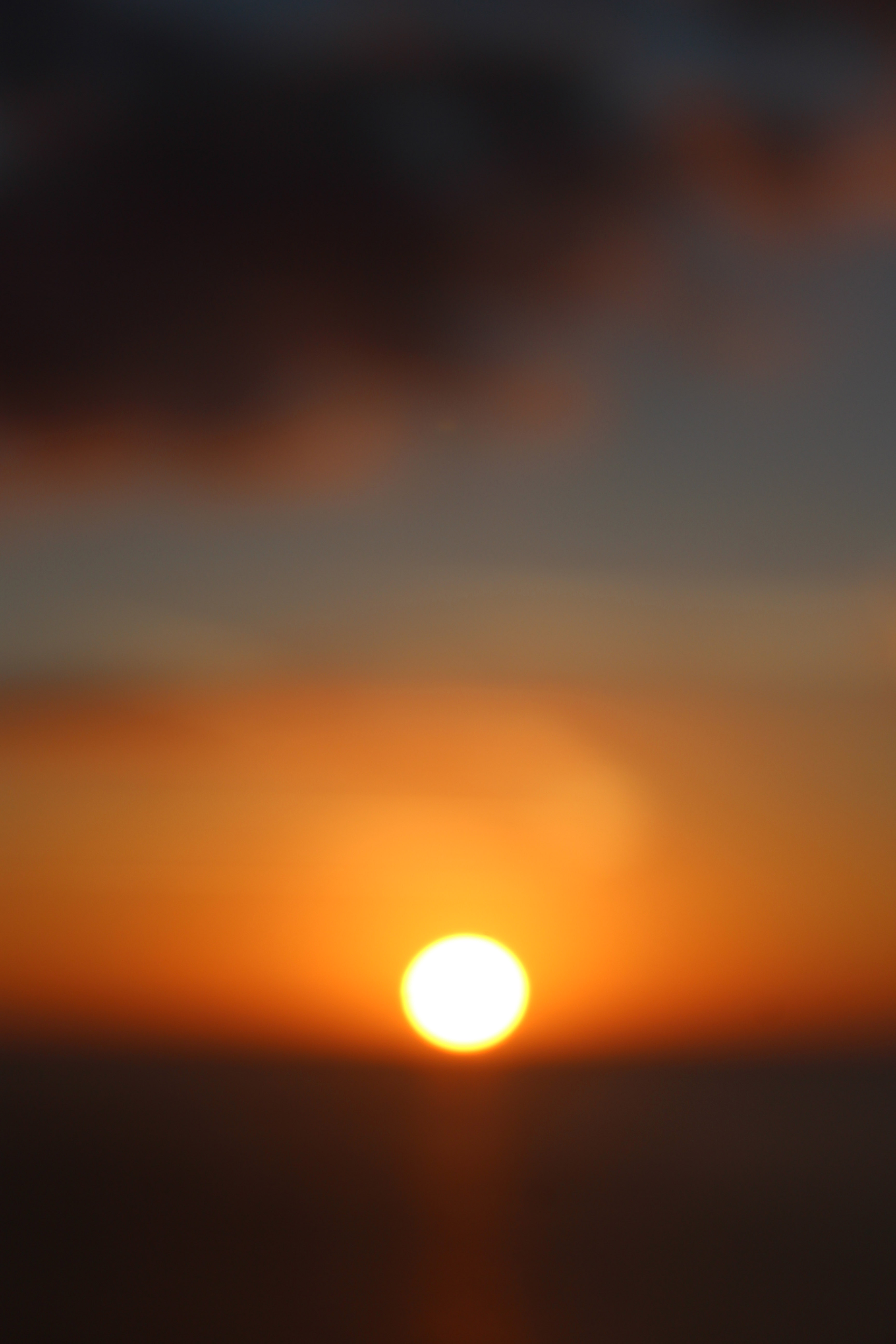
A3

This image was inspired by Uta Barth. She is interested in light, drawing attention to the viewer’s perception and separating the image from the thing depicted. Although her images are blurred, they appear abstract. Uta Barth has made visual perception the subject of her work. She carefully renders blurred backgrounds, cropped frames and the natural qualities of light to capture incidental moments. I decided to use the blurred sunset image inspired by Uta Barth because of the soft blend of unfocused colours surrounded by the sharp, vibrant sun. I chose this image to be printed A3 since most of Uta Barth’s photography work was printed out on a large scale to create a huge impact on the viewer.