All posts by Jazmin G

Filters

Author:
Category:

Contextual Study

The introduction of David Campany’s book So present, so invisible claims that “Photography is the easiest thing to talk about, and for that reason it can be the most difficult.” He comments that people with articulate voices are able to “see past the obvious” and “say something about the profound aspects of the medium”.

An intriguing piece of information that Campany mentions is that photographers seem much more approachable when they were talking freely to others and not addressing him. Something about this format of conversation is freeing since he feels like he was eavesdropping.

Campany is often invited by artists and photographers to write about their practice. He states that a conversation is better than preparing question in advance since he doesn’t want to “interrogate”. This is why he never fully researches in advance since he wants to converse with the photographer and discover more. Campany says that the best moments come when both individuals are clarifying each others thinking. No matter the length of the conversation, nearly all were open ended. No one knew where the conversation might go or where things would end up.

JOHN STEZAKER
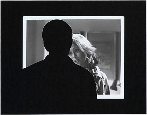
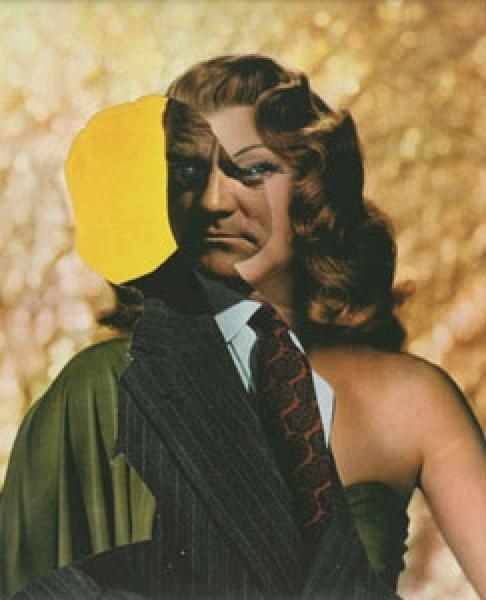
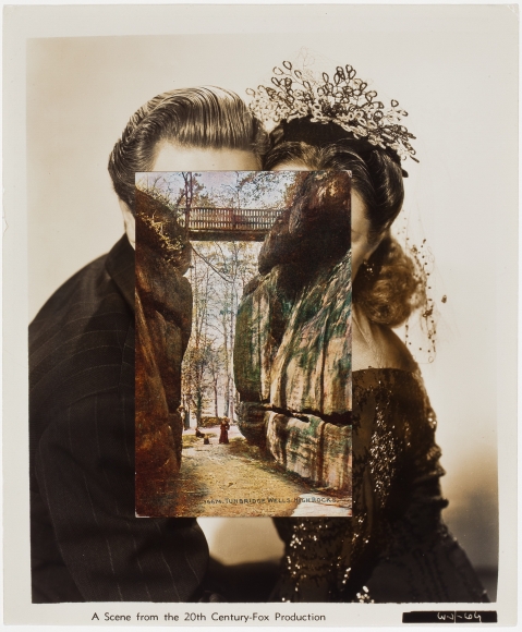
John Stezaker has been making collages for over forty years, by combining 2 photographs or by removing an element from one photograph. His art is associated with surrealism, situationism and pop. Stezaker uses familiar materials such as postcard pictures and generic film publicity photos. From these ordinary images he has been able to express his creativity through collages.

Initially his painting were “not as interesting as his collages” and the collages were “not as interesting as the original image”. This led to a crisis in his first year at London’s Slade School of Fine Art, which resulted in him giving up art. Stezaker didn’t know how to improve on his photos because in order for him to be fascinated with an image it had to “already be there, it had to be found”. This is when he began to use a process of collecting, fragmenting and reassembling images as a primary activity. Around this time he also discovered situationism which created justification for what he was doing.

Digression is important to Stezaker because “it is a way of escaping conscious control”. creating collages involves digression and allows a “conscious contemplation of the image in its dream state”.

From the start, he thought of his collages as “cutting into, opening up”. That is why so many of his early titles relate to surgery. He wanted to open up a space that he thought was closed. Somehow the cut also helped to create a feeling of depth.
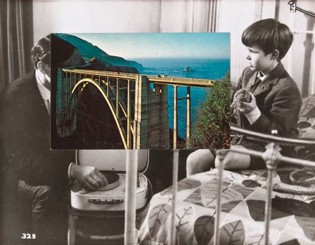
The photograph is called ‘Bridge’ and is part of Stezaker’s masks series. The image seems to depict the relationship between the child and the man, which I assume is the boy’s father. The boys seems to be showing something and he attentively watches. I instantly made the assumption that the boy and the man are related due to their positioning; Their gaze is towards one another, they are close to each other and they seem to be in the boys room.

The black and white image and the photo of the bridge combine together well since they appear like they are meant to be together. The smaller image is vibrant and there may be a deeper meaning behind the choice of this photograph. The placement of the bridge reinforces this assumption.

The section of the bridge closest to the father is more complex in structure. This could be a reflection of the man since fathers are complex and have greater life experiences. Whereas the bridge in the sons direction is simpler in structure as he has yet to face these hardships since he is only a child. He doesn’t have any responsibilities yet and therefore does not need extra support.

The photograph could also represent a shared memory between father and son; A memory of a holiday perhaps since the image depicts a landscape.

A bond between a father and his son is strong and usually starts from an early age. The bond one would have with their father would be completely different to one had with a mother. I feel like the photograph touches on the subject of bonding and appreciating time together.

When I first explored his work I thought he simply placed one image on top of the other. However upon further inspection, I found that was not the case at all. I like how he has chosen to combine old images with different aspects of nature or architecture. Though at first glance it seems like they are just two separate images, you come to realise that the images fit together perfectly.

Review and reflecting

My personal Investigation based on Occupation vs Liberation, has allowed me to develop my photographic skills and has furthered my historical knowledge on the German Occupation of Jersey.
As an introduction into our project on the German Occupation of Jersey, we visited the Société Jersiaise. Looking through the photo archives in groups allowed me to gain insight into what World War 2 was like through imagery. I finally got a better understanding on the historical context of the Occupation in Jersey, whereas previously I didn’t appreciate the significance of this event.
I began the project by writing an essay with the title “Whose Archive is it anyways?”, which allowed me to explore the importance of archives, it’s purpose and why they are still relevant in the present day. I now know how new technology has changed the role of archives as well as what we think an archive is. My understanding of archival photographs is that they open a window into the past and give a glimpse of what people’s lives were like during the Occupation.

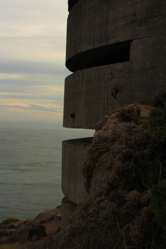
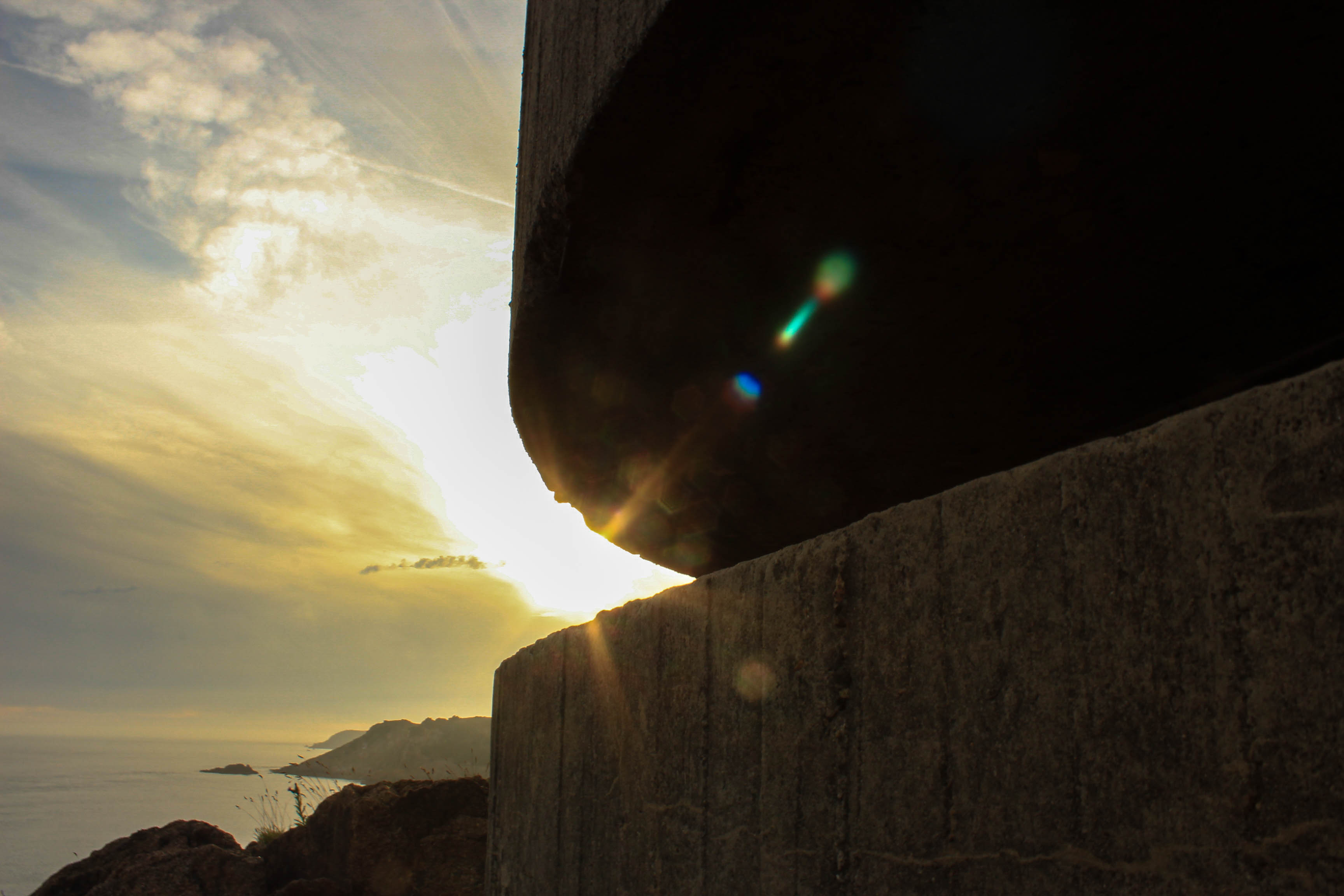
We then went on a photography trip to see the bunkers located at Battery Moltke. A CIOS member began the tour by giving us insight into what the German Occupation was like in Jersey. We explored and photographed the principle bunker which has been turned into a museum. I also visited Batterie Lothringen during my spare time which was a World War 2 coastal artillery battery. During this photo-shoot I learnt the importance of lighting. I captured landscape images during Golden hour where the warm colour of the low sun enhanced the colours of the scenes.

Our photography class also learnt how to use Lightroom, a photo management and editing software combined into a single tool. I now know that it helps to import, organise, manage and find your images. I first started experimenting with Lightroom when using my images from the Battery Moltke photo-shoot.

After learning about zines and how it’s a tool that photographers can use to tell a visual story, we were then expected to create one based on the Occupation vs Liberation theme. Before getting started, I analysed the zine “Concrete Jungle” which helped me to gain inspiration and made me realise the importance of narrative and sequencing within a zine. I created a zine called “Glimpse of the past” using InDesign. My first zine only includes imagery from the Battery Lothringen photo-shoot since these images where my strongest outcomes.

We then visited the Jersey Archive which contains archival material from public institutions as well as private businesses and individuals. I now know that their purpose is to preserve the written cultural heritage of the Island so that future generations can access the material in order to learn more about Jersey’s past.

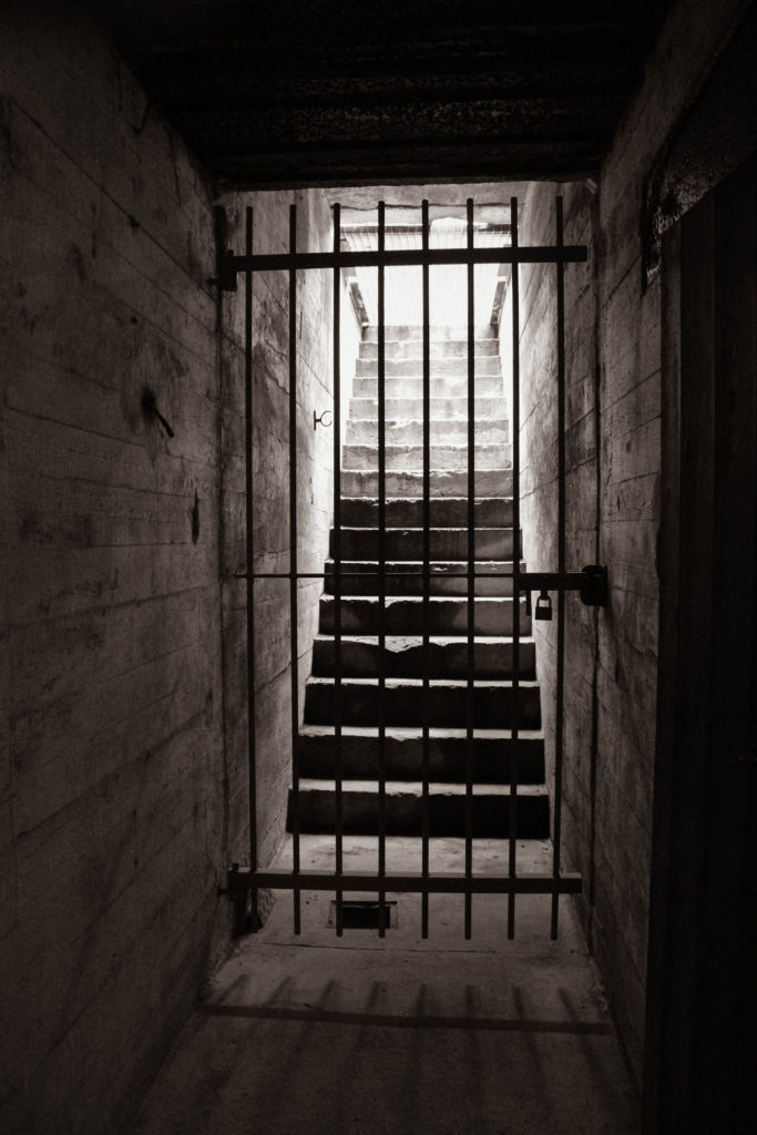
Another site where we developed our landscape photography further was the Jersey War Tunnels. Visiting this location helped to improve our camera skills in dark lighting since we learnt about the IOS setting and what shutter speed to use in low lighting conditions. This ensured that the photographs wouldn’t be under or over exposed.

We then focused on portraiture. This is when I researched two portrait photographers: Martin Toft and Ernest Baudoux. I compared their photographic styles and incorporated both their techniques into my own portrait photography. This lead me into conducting my own photoshoot on Joan Tapley in the studio. Before we photographed Joan, we got to listen to her war stories which allowed our class to gain knowledge of what it must have been like to experience the war through childhood. This photo-shoot helped me learn the different types of lighting used when capturing portraits in the studio as well as how to interact with your subject to gain the best photographic outcomes

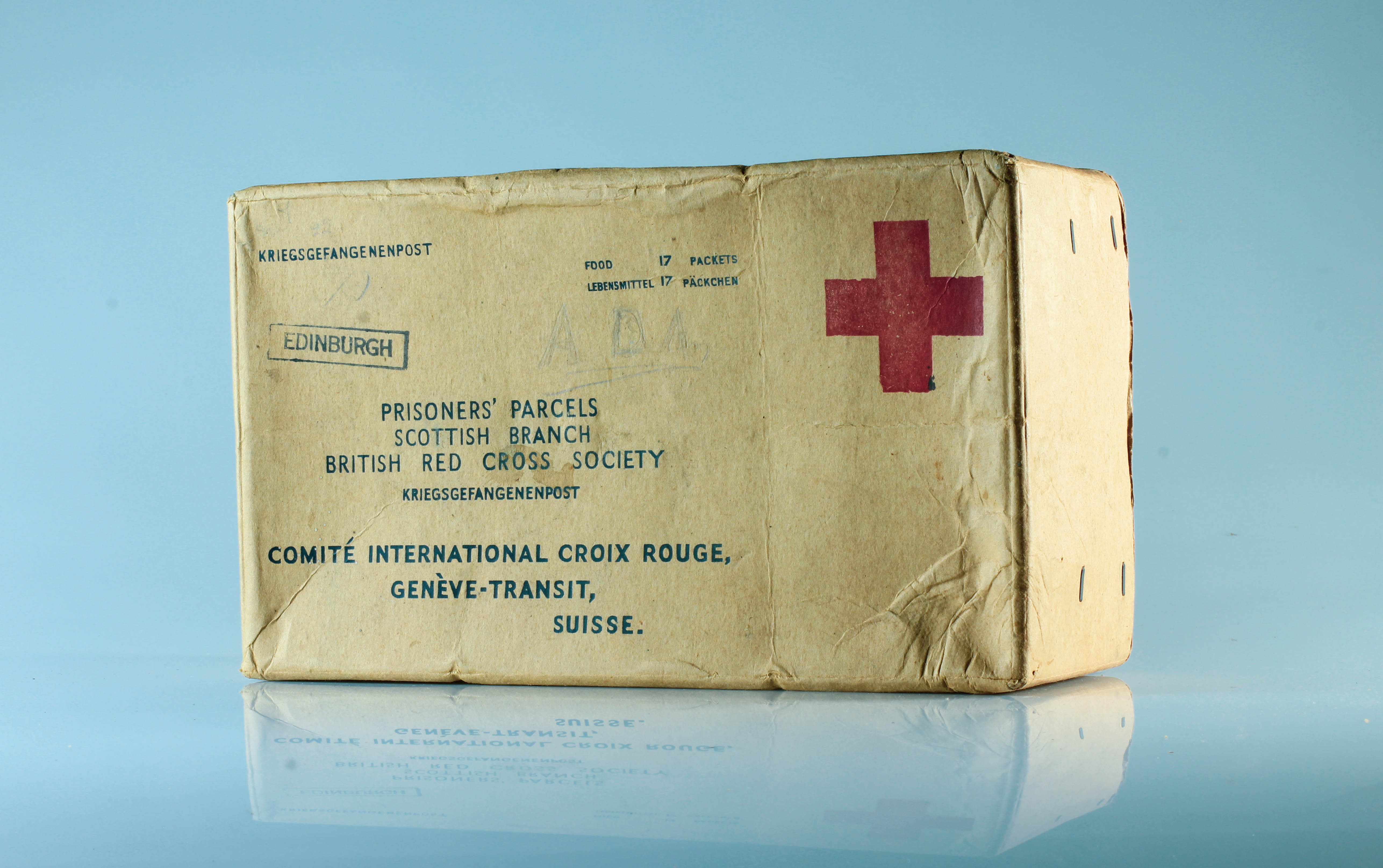
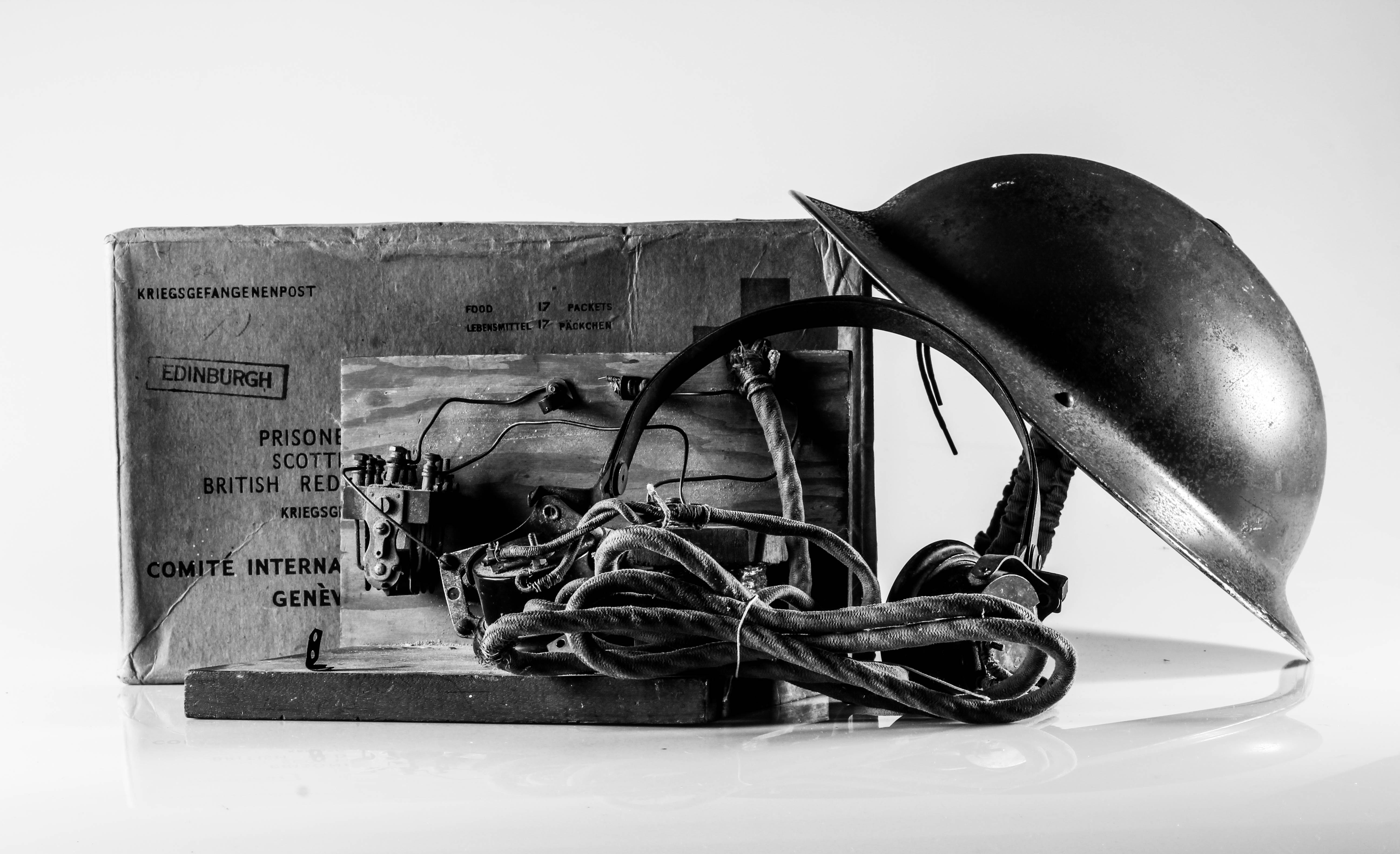
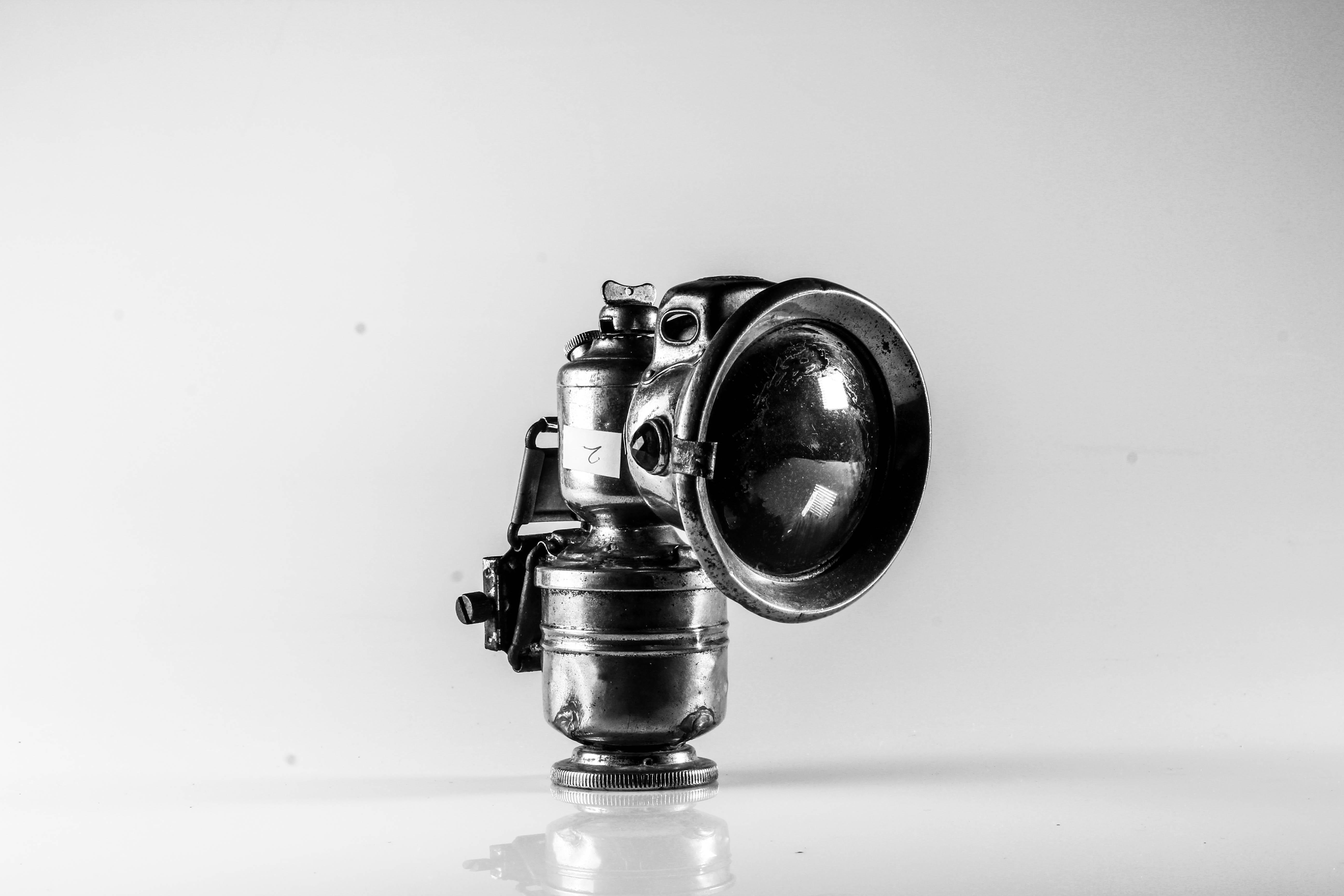
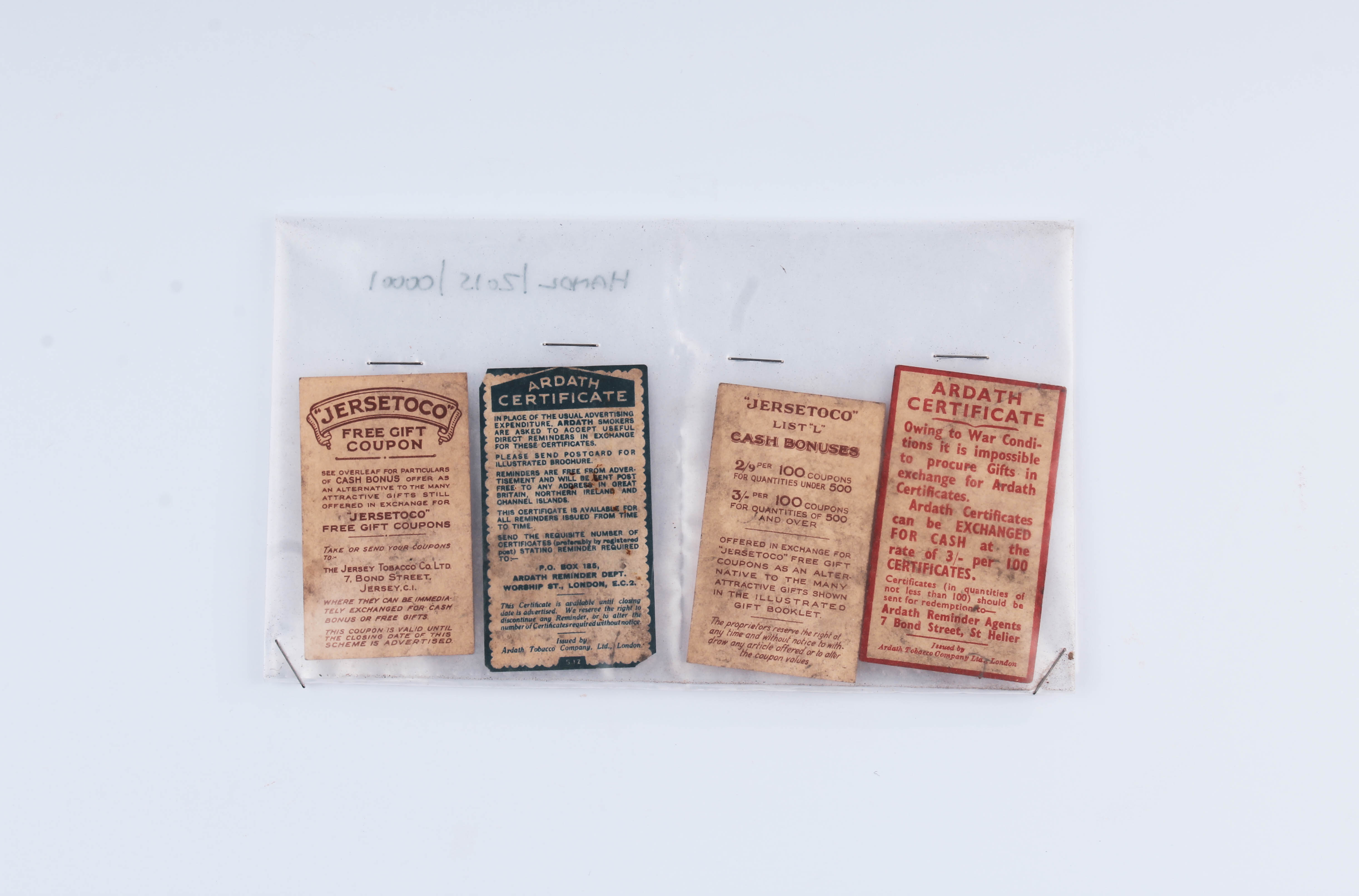
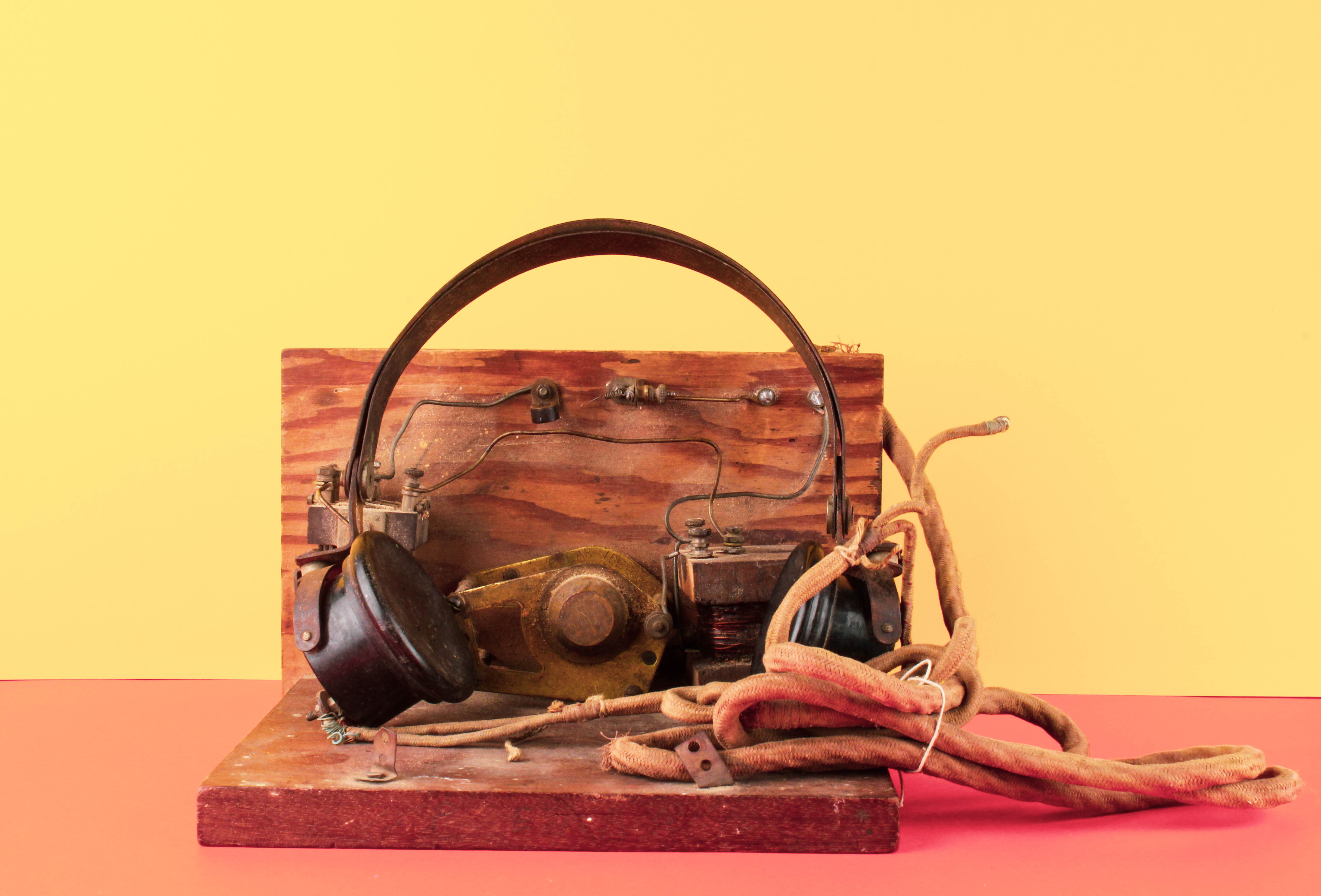
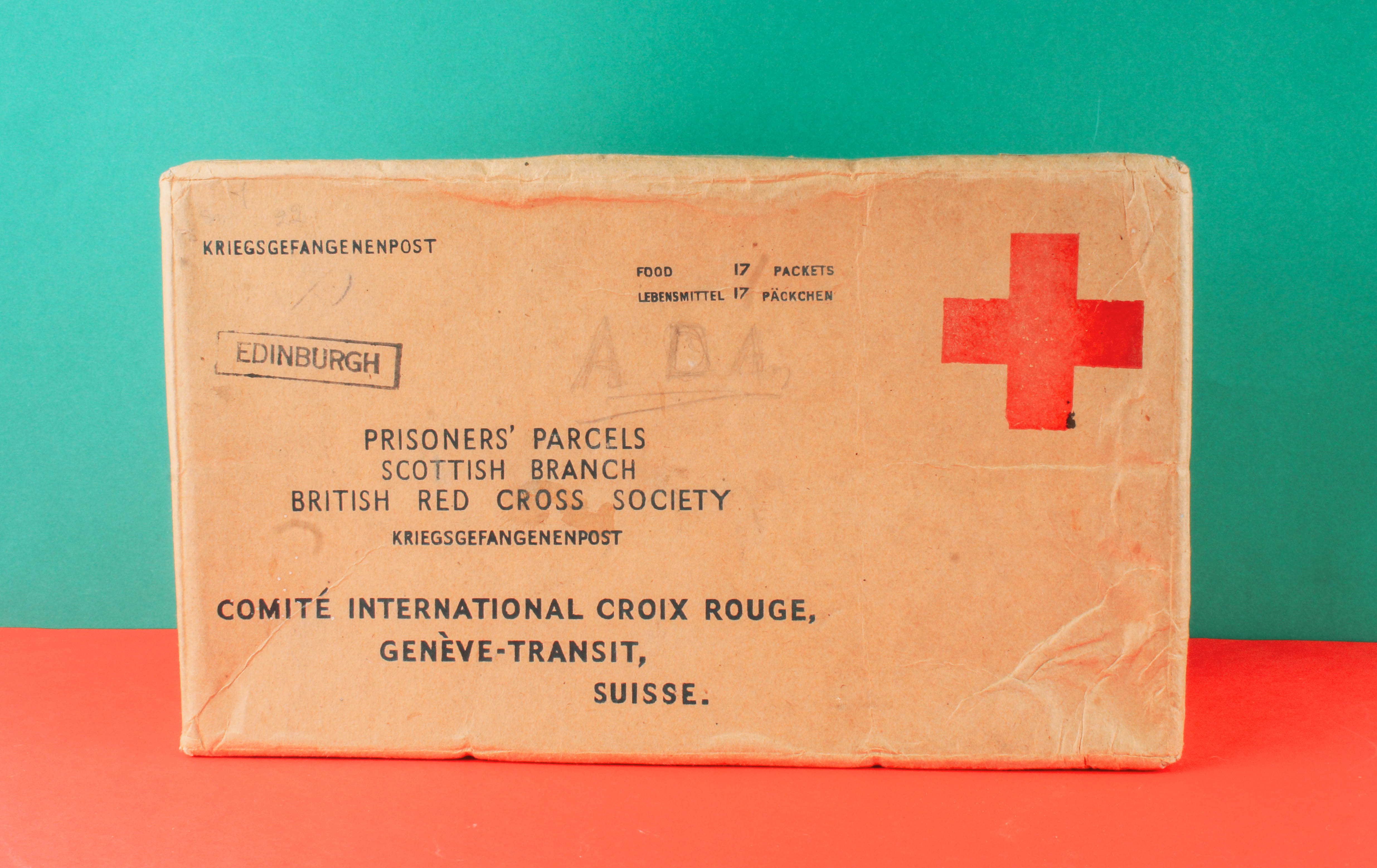
We began the next theme Still Life by researching the historical context and the symbolism presented through objects. We got to photograph Occupation Objects from the Jersey Archive in a creative way using the still life table. Our photography class learnt about the lighting used to photograph objects and the importance of using a tripod to capture a steady image. After doing two still life photoshoots, we moved onto photomontage. This is when I began creating edits in response to The First March Of Gentlemen by Rafal Milach. I was inspired by the collaged archive photographs as well as the geometric shapes which restrained the figures. This influenced my second zine where the bold, vivid colour scheme juxtaposes with the historical black and white images of soldiers. I like the idea that the colourful aspect of my zine camouflages the serious subject matter of World War 2.

Zine Design

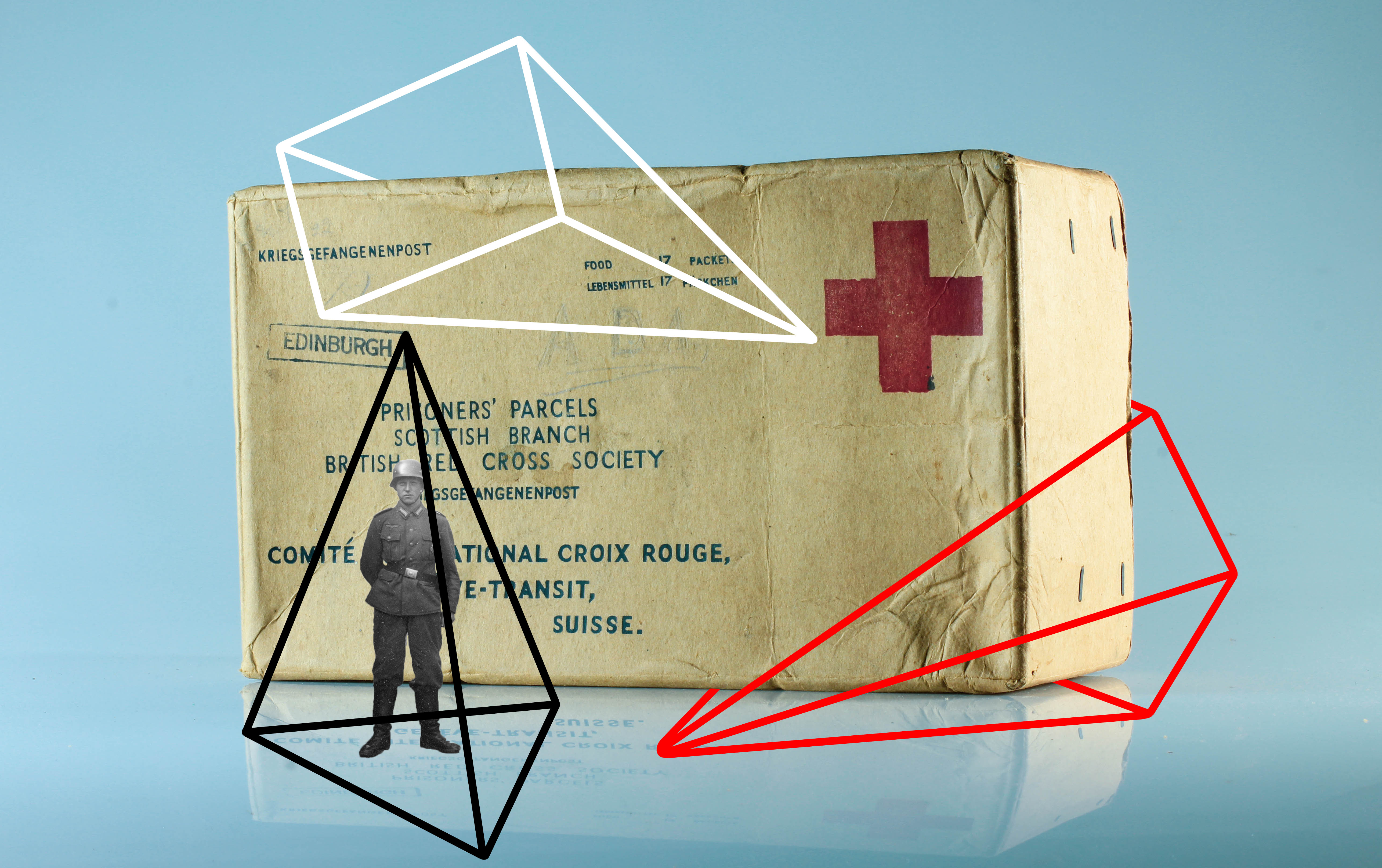
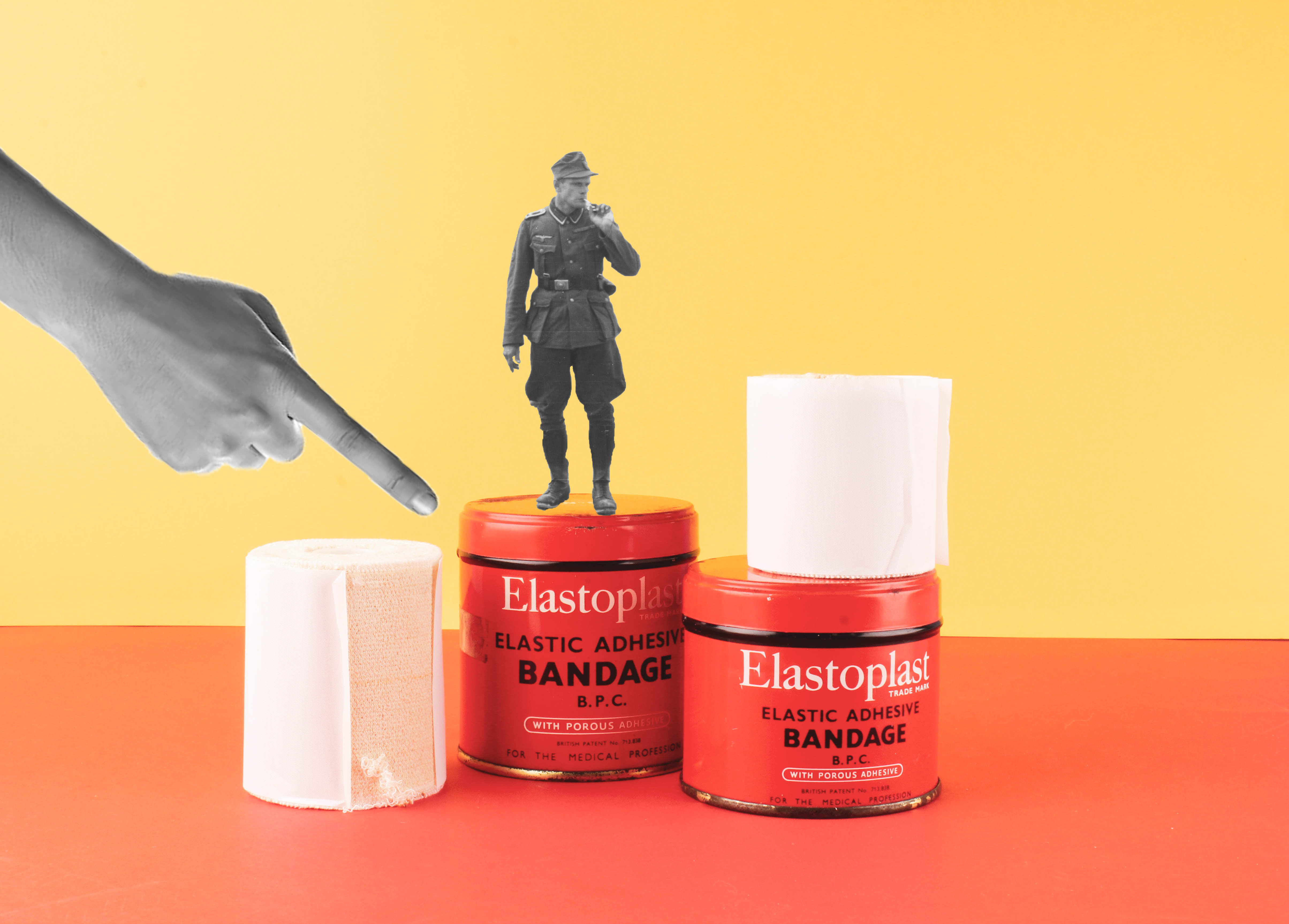
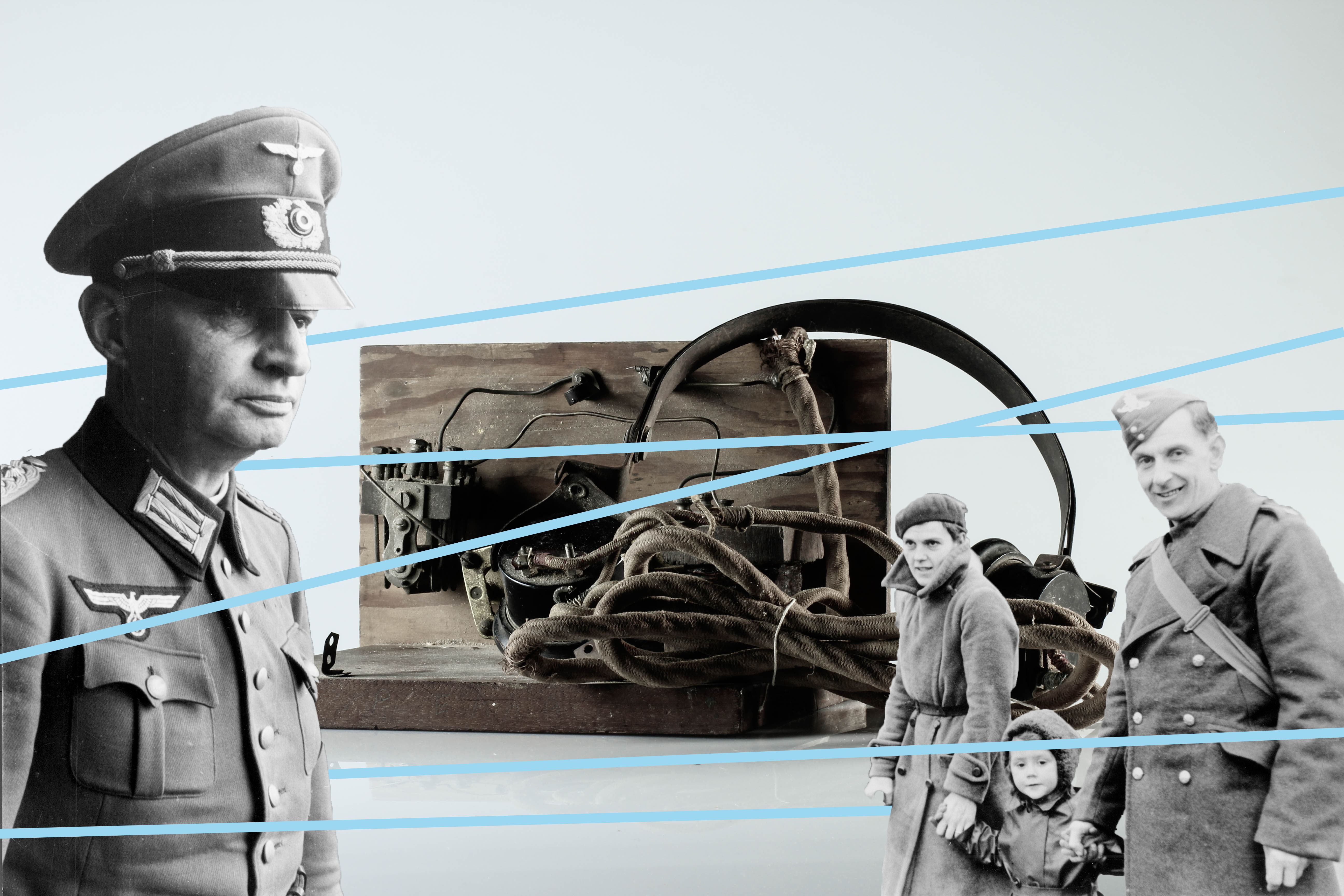
My zine has been influenced by The First March of Gentlemen by Rafal Milach. I have detached figures from the Société Jersiaise archival imagery and placed them onto my still life photographs of Occupation objects. Several figures in the zine are caged in geometric shapes as a metaphor of the restrictions the German’s introduced into Jersey when it was Occupied

I love the bold, vivid colour scheme of my zine since it juxtaposes with the historical, black and white images of the soldiers. The colourful aspect of the zine camouflages the serious subject matter of World War 2. I have also included typography inside to add a pop of colour, so there would be a constant colour scheme running throughout my zine.

The theme of the zine is looking at the different topics that we have explored during the Occupation vs Liberation project. These include portraiture, still life and photomontage. The majority of the images in my zine are montages since I wanted to present my photos in a creative way, however there is a double page that includes a portrait of Joan Tapley and two still life’s from the Jersey War Tunnels.

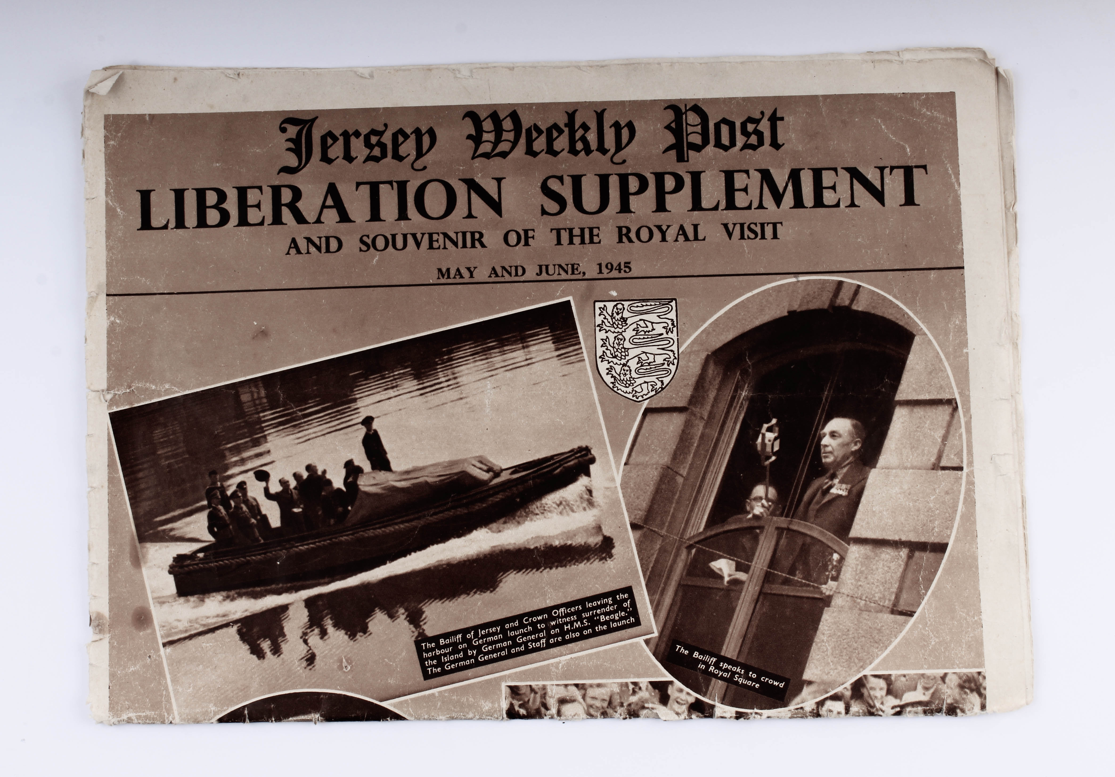
The front cover includes all the archival figures that can be seen inside the zine. I used the font TitlingGothicFB Skyline as the title since it’s bold and will most likely capture the viewers attention. Previously, I had the title in the colour black but decided to change it to white since there is greater contrast between the lettering and the “candy” coloured background. The background from the front continues to the back cover, where a newspaper from the Jersey Weekly Post is depicted stating “Liberation Supplement”. This was published in 1945 and shows Jersey’s Liberation from the German Occupation, creating a pleasant ending to this zine.

Montage experiment

In The First March of Gentlemen, Rafal Milach creates a narrative composed of real stories. He retells the historical childrens strike in Wrzenia in Poland from the early 20th Century, through collaged archive photographs from the 1950s and 1960. He has created a narrative to be read as a playful metaphor for the social and political tensions of the present.

When western Poland was under German occupation, over 100 students of the Catholic People’s School took part in a strike against the German influence on their education. The Germans aim was to remove the Polish language from their teachings.

Milach detached the figures from Szczepaniak’s photographs, both literally and figuratively, from their original context and placed them onto bright, candy coloured backgrounds. The design is “like a toy, like a candy – something nice to look at and to touch.” The figures are caged in geometric shapes, which as the book progresses, increasingly constrict and restrain them. The figures remain oblivious to their imprisonment. Ania Nałęcka-Milach, the designer of the book, created the physical object to reference the size and colour scheme of children’s school exercise books, as a camouflage for the serious subject matter.

https://en.artbooksonline.eu/art-20507

https://www.bjp-online.com/2018/06/milach-gentlemen/

MY RESPONSE:

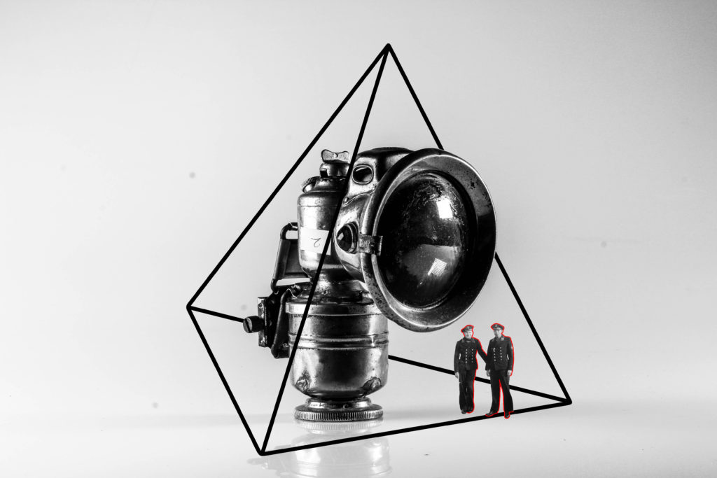
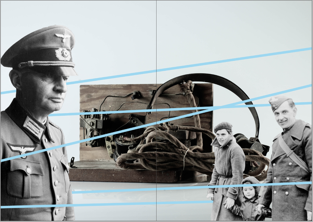
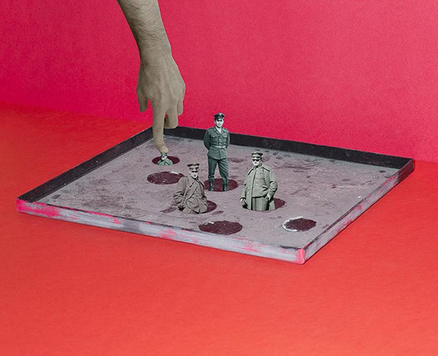
In order to create these photomontages, I edited my still life Occupation objects on photoshop. These 4 outcomes are inspired by Rafal Milach, a photographer who created montages with figures caged in geometric shapes to retell the historical children strike in Wrzenia in Poland. His vivid colour scheme and “toy and candy” design has inspired me to further explore my editing skills on photoshop.

To create these several designs, I used archival images of German soldier from société jersiaise. The quick selection tool on photoshop allowed me to cut out the soldiers from their original photo and place it onto the still life photographs. Before using the line tool, I adjusted the figures using the transformation tool to change the size and placement. What I enjoyed the most about editing these photomontages was adding geometrical shapes onto the images to have the same contextual meaning as Milach’s book. The figures are restrained and caged by these lines to convey the restrictions the German’s introduced into Jersey when it was Occupied.

Occupation objects: studio shoots

RECORDING:

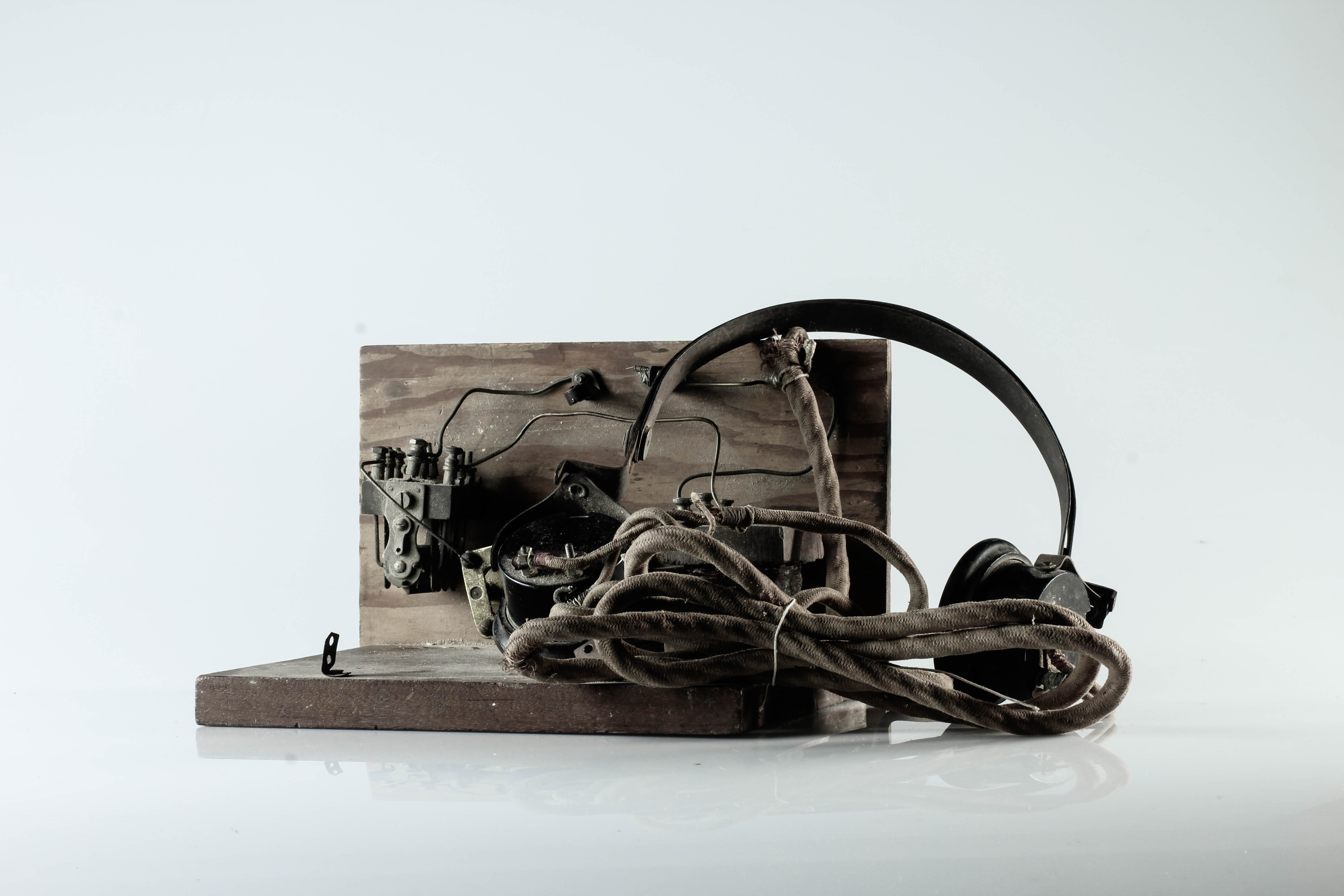
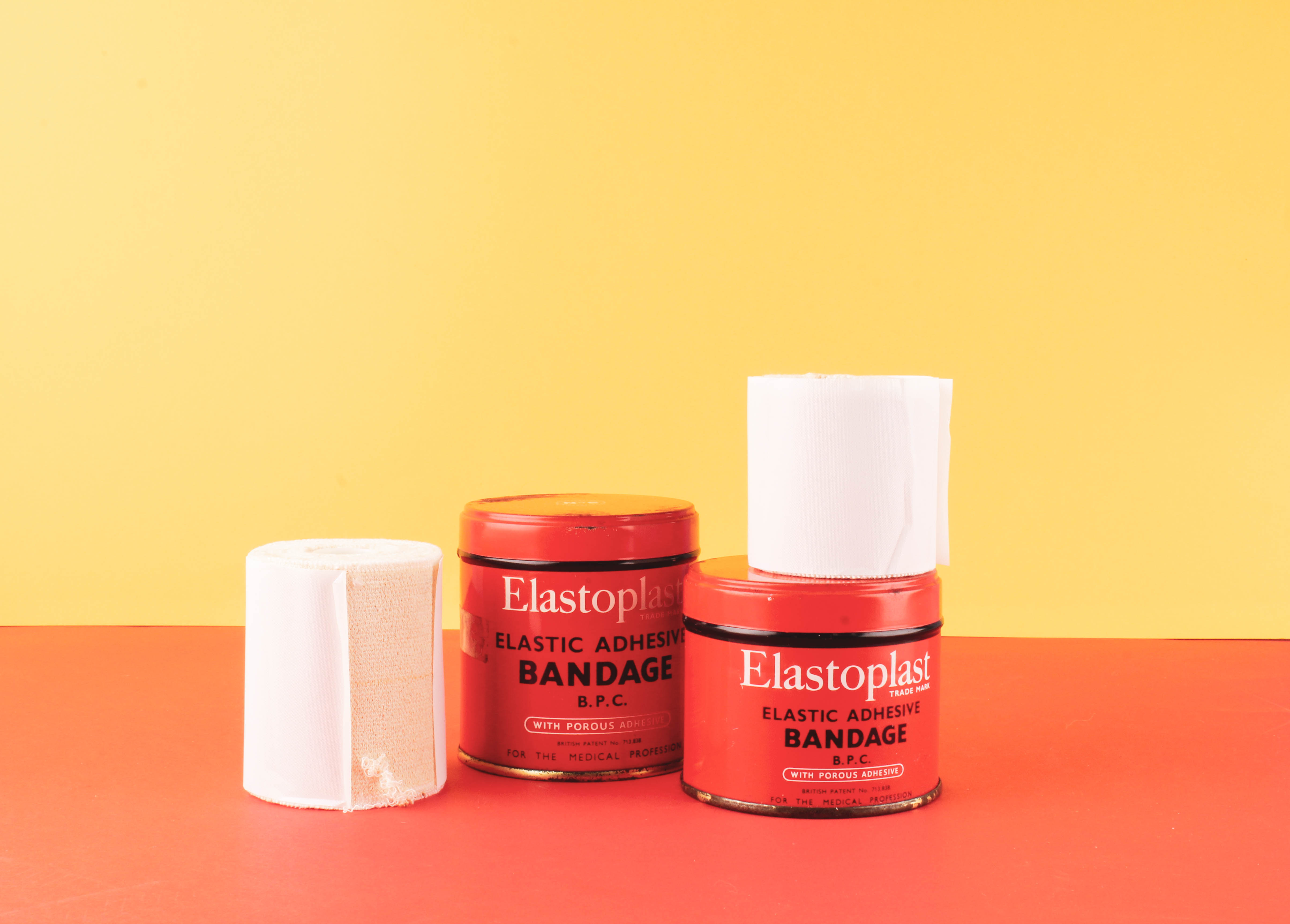
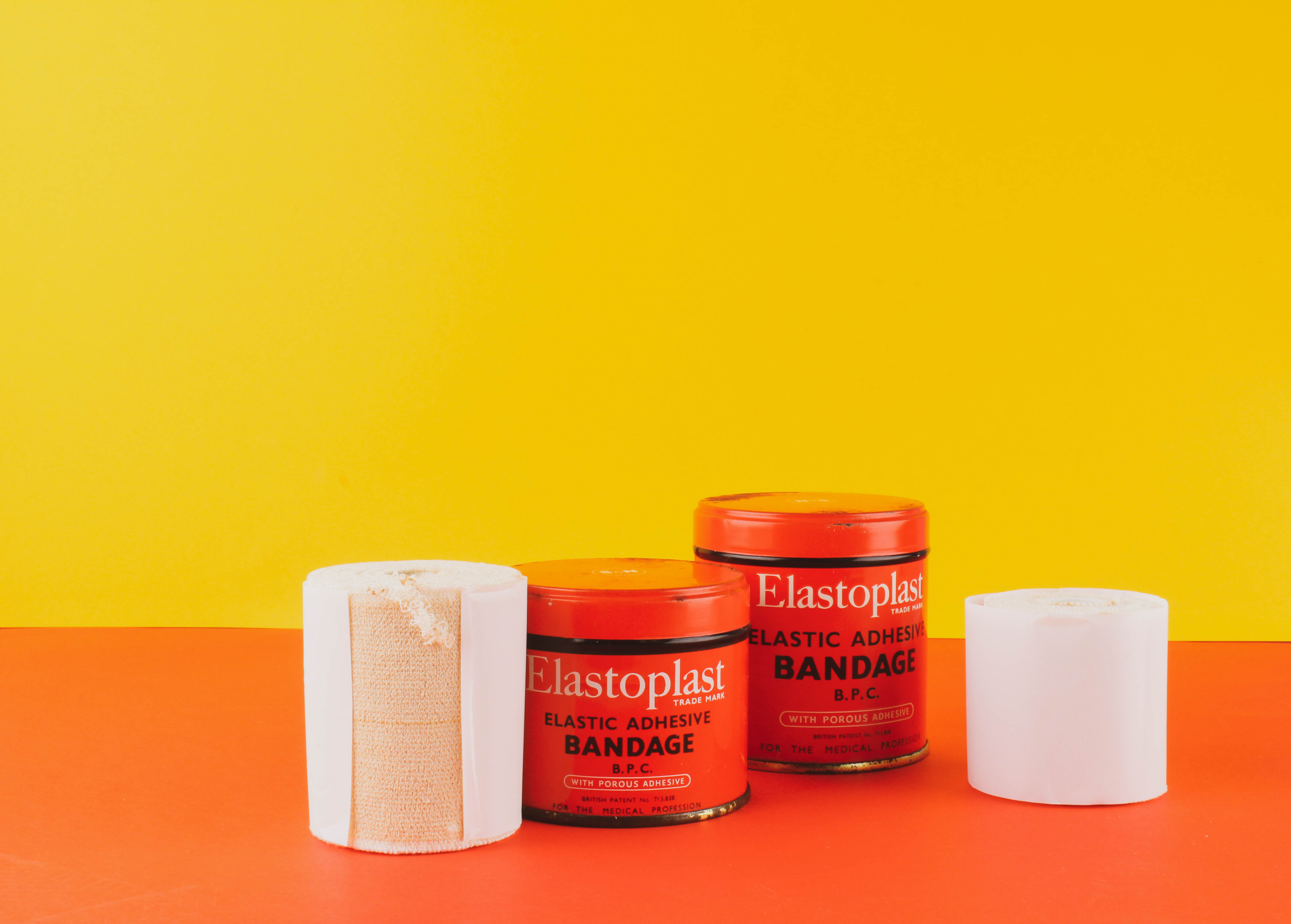
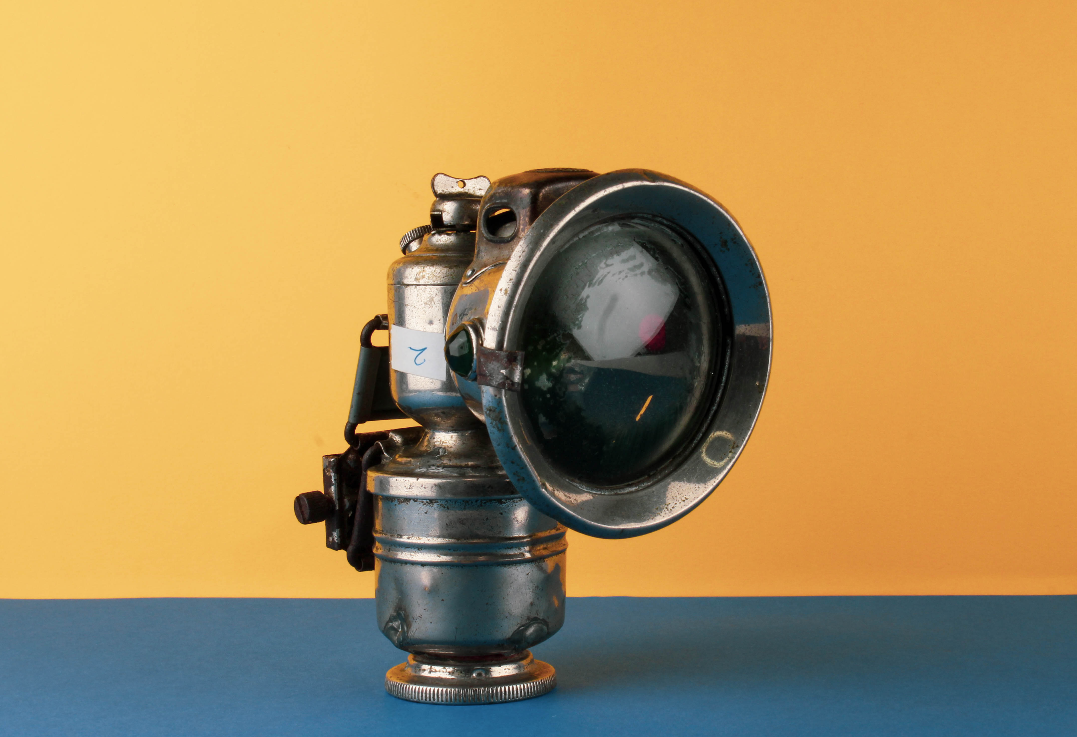
We had to present the Occupation objects from the Jersey Archives in a creative way and use a special still-life table and its translucent backdrop. I photographed the objects using different angles, both from above, side and front. I chose to either photograph each object individually or group together several objects for a more complex still life arrangement.

LIGHTING:

To photograph the Occupation objects in the studio, we experimented with different lighting set-ups, both continuous lights and flash lights. Continuous lighting has studio lights that stay on. You can power them up or down, based on what lighting you need. Flash lighting, lights up when you trigger it. You cannot see how the scene will be captured until the flash is triggered. When it is, a high intensity light will pulse for just a fraction of a section, lighting the scene.

TECHNICAL:

Continuous lights – To photograph objects three dimensionally

  • Camera setting: Manual Mode
  • ISO: 100
  • White Balance: Daylight
  • Aperture: F/16
  • Shutter: 0.5 sec to 0.8 sec
  • Lights in the room had to be switched off to avoid reflections

Flash lights – To photograph images, documents, books, newspapers, etc.

  • Camera setting: Manual Mode
  • ISO: 100
  • White Balance: Daylight
  • Aperture: F/16
  • Shutter: 1/125 – 1/200
  • Flash heads set to power output: 2.0
  • Pilot light was used for focusing
EDITING:

After photographing in the studio, I uploaded my images from the photo shoot on to Lightroom and made a rough edit of 6 images. I used the presets Desaturated Contrast, B&W Punch, Warm Contrast and Red Lift Matte. After selecting the filter, I adjusted the contrast, shadows and highlights. I also cropped unwanted areas to centre the Occupation objects in the middle of the frame.

MY RESPONSE:
FIRST PHOTO-SHOOT

To evaluate my first still life photo-shoot, I believe that I have been able to produce photographs that explore my own style of capturing Occupation objects. I have shot these images using different angles and lighting to contextually showcase the significance of these objects during World War 2. I believe that my outcomes turned out well since they capture the detail and textures of the objects. The minimal editing and central framing helps to draw the viewer’s attention, further emphasising the point that these items are of importance.

SECOND PHOTO-SHOOT

For my second photo-shoot, I decided to capture photos with a contemporary approach by using coloured backdrops which has been inspired by Rafal Milach’s work. Using his photographic style has allowed me to further develop my response to still life Occupation objects. Below are my 5 final outcomes for the colour photo-shoot that have been edited on Lightroom to enhance the saturation of backgrounds. I love how the coloured edits turned out because it makes the objects appear childish, as if it was a toy. This juxtaposes and camouflages the serious subject matter of World War 2.

To evaluate I believe that I have produced imagery which clearly conveys my own understanding of Rafal Milach’s work and my ability to apply his photomontage style into my own photographs. This new way of capturing still life Occupation objects has furthered my exploration since I am now presenting coloured outcomes which creates a strong link to Milach’s work.

Laura Letinsky

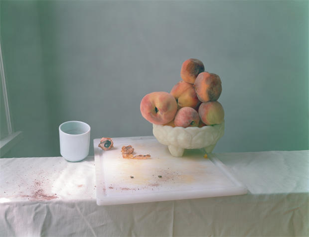
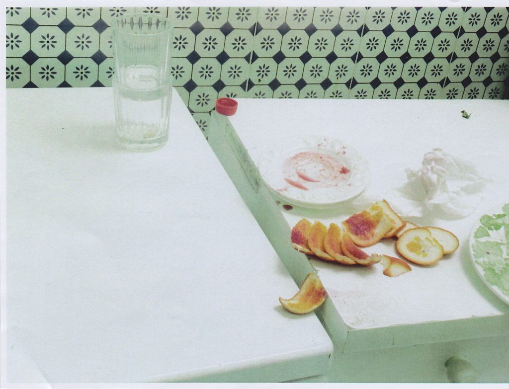
Laura Letinsky is best known for her elegant composed still life photographs. Inspired by the 17th century European still life paintings, Letinksy offers her 21st century perspective of the genre. She is aware of the rich narrative possibilities that still life presents. Although her photographs are similar to Dutch still life, they are more modernised.

The scenery usually has a dirty table cloth, as if someone just got up and left their meal after a huge argument with someone. Although as thoughtfully composed as the arrangements of those historic painters, her images embrace the messiness of real life where peaches rot, and table cloths are stained with spilled red wine and covered with crumbs from meals consumed.

Early in her career, she photographed couples in their own homes creating visual narratives about love and relationships. By the late 1990s she stopped photographing people and replaced them with objects. She began using objects that hinted at human presence.

Autochromes

The autochrome process was invented in France by brothers Auguste and Louis Lumière. The Lumières began a commercial manufacture of autochrome plates in the early 20th century.

Autochrome plates are covered in microscopic red, green an blue coloured potato starch grains. When the photograph is taken, light passes through these colour filters to the photographic emulsion. The plate is processed to produce a positive transparency. Light, passing through the coloured starch grains, combines to recreate a full colour image of the original subject.

Autochrome plates were manufactured at the Lumière factory in Lyon and was a complex industrial process. The transparent starch grains were passed through many sieves to isolate grains. These gains were separated into batches, dyed red, green and violet, mixed together and spread over a glass plate. Next charcoal powder was spread over the plate to fill any gaps between the coloured starch grains. A roller spread the grains and flattened them out. Finally, the plate was coated with a panchromatic photographic emulsion.

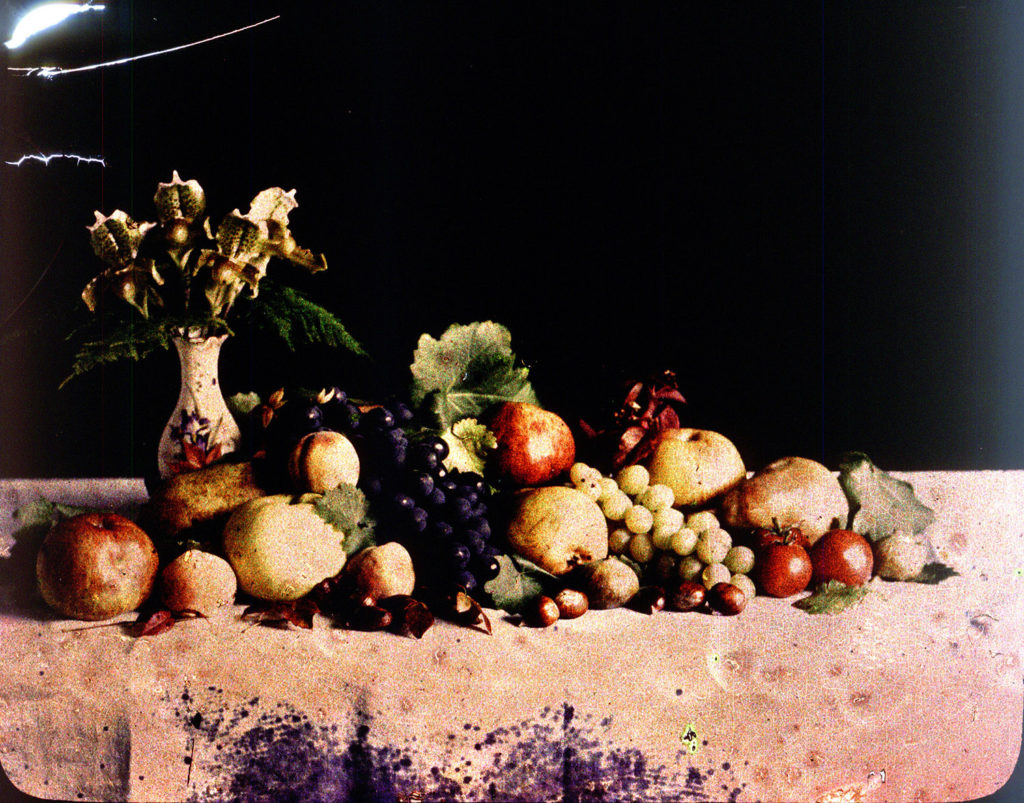
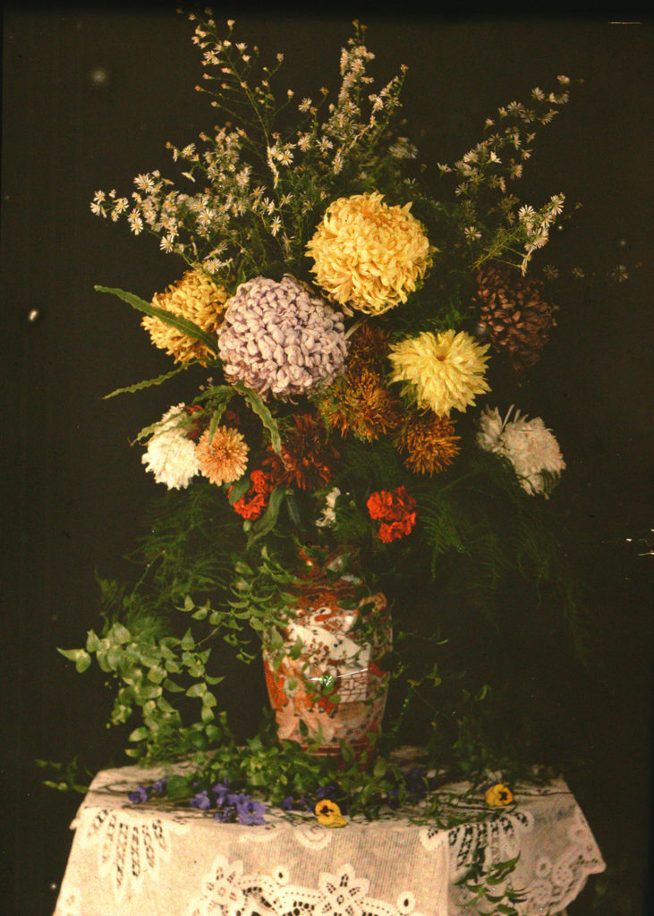
Lumière Autochrome is the first colour photograph taken in Jersey in 1904 G. Guiton & E. Guiton. This photograph of a vase containing roughly assembled garden flowers was the starting point for photographers to explore the possibilities of colour.

Emile’s autochromes fall into two categories. The first category are still life photographs such as flowers, stained glass windows, fruit. The second category can be described as domestic photographs such as children playing, a garden, local country scenes.

The still life photographs are an attempt to experiment with the autochrome process, to improve his technical understanding and the quality of his images. Guiton was also making attempts at classical arrangements and compositions.

https://blog.scienceandmediamuseum.org.uk/autochromes-the-dawn-of-colour-photography/

https://hautlieucreative.co.uk/photo20al/wp-content/uploads/sites/33/2019/09/The-Autochromes-of-Emile-Guiton.pdf

Analysis

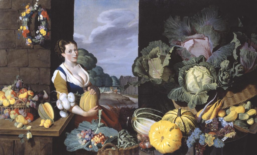
Cookmaid with Still Life of Vegetables and Fruit c.1620-5 Sir Nathaniel Bacon

Sir Nathaniel Bacon did not paint professionally but he was a skilled amateur artist. The cook maid surrounded with lavish produce, usually associated with Dutch and Flemish art, is unusual in England for the period. The painting is quite unusual for British art of this period since it shows a lavish still life. Still life paintings became established in Britain in the late seventeenth century.

Every item depicted in the image is known to have been growing in England. Although every item represented in the painting was grown in England, not all would have been in season. According to a letter, Bacon was growing melons at his estate in East Anglia, and was known to have a keen interest in horticulture. The painting reveals the artist’s interest in gardening which was becoming increasingly fashionable during this time period.

His wealth let him paint for his own pleasure. We know that Nathaniel Bacon travelled in the Southern Netherlands during this period and that paintings of cook maids were prevalent in the southern Netherlands in the late 16 Century and early 17th Century. He may have travelled there, trained there and become accustomed to this compositional style while he was there.

The subject most likely would have had erotic connotations. The large amount of ripe melons surrounding the cookmaid echo her cleavage.

https://www.tate.org.uk/context-comment/audio/curator-tim-batchelor-discusses-cookmaid-still-life-vegetables-and-fruit

Still Life

A Still Life painting is a piece that features an arrangement of inanimate objects as its subject. Usually, these items are on a table and often include organic objects such as fruit and flowers and household items.

Northern Renaissance artists popularised still life imagery with their flower paintings. These pieces typically showcase colourful flora when they are blooming. These paintings became important in the early 17th century, when Northern Renaissance artists became interested in creating realistic studies of everyday items.

The Dutch Golden Age artists created vanities paintings. These paintings are inspired by the genre memento mori which translates to “remember that you have to die” in Latin. These pieces often pair cut flowers with objects like human skulls, candles and hourglasses to comment on the short nature of life.

Still life were a great opportunity to display skill in painting textures and surfaces in great detail and with realistic light effects. Food of all kinds laid out on a table, silver cutlery, intricate patterns and subtle folds in table cloths and flowers all challenged painters. Mostly all still life had a moralistic message, usually concerned with the shortness of life; This is known as the vanitas theme.

Vanitas Paintings – A Metaphor for Transience

Symbolism was present in every form of Still Life but never more significant than in Vanitas work where everything spoke of the inevitability of death: Skull – reminder of the certainty of death; The watch or hourglass – the brevity of life. Flowers and butterflies can be interpreted in the same way, and a peeled lemon was, like life, attractive to look at but bitter to taste. Art Historians debate how much, and how seriously, the vanitas theme is implied in still life paintings without explicit imagery such as a skull.

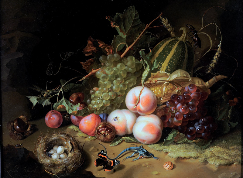
Rachel Ruysch, Fruit and Insects

PHOTO-ASSIGNMENT 2: Home Sweet Home

ESTABLISHING SHOT:

A group portrait of two or more members of the family where you are constructing an image that tells a story. This image can be naturally observed or staged. The main focus is conveying a sense of narrative.

DETAIL SHOT:

Focus on detail of a person or a close up that conveys something about the individual character or identity e.g. age, race, gender, sexuality, fashion, hobby, lifestyle etc.

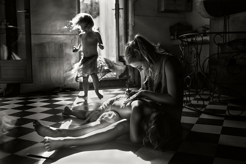
ALAIN LABOILE

La Familie

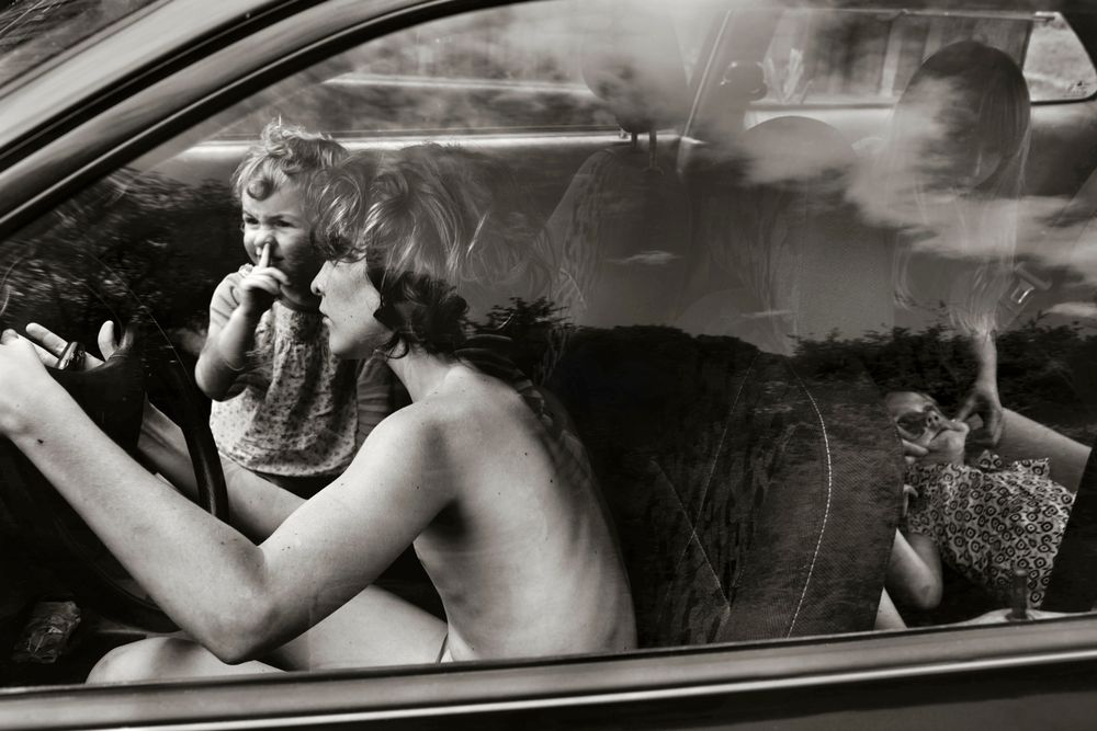
Alain Laboile is a father of six. Through his photographic work he celebrates and documents his family life. His work reflects their way of life, revolving around their childhood. Although his work is deeply personal, it is also accessible, addressing human nature and allowing the viewer to enter his life and reflect on their own childhood. His eye for beautiful compositions, along with his choice to shoot in black and white, gives his photographs a timeless feel and make them seem as though they could have been a part of anyone’s childhood. Laboile describes his family’s life as “atypical”. Lots of Western families these days find themselves living in urban settings, unlike the rural area his children explore in his photos.

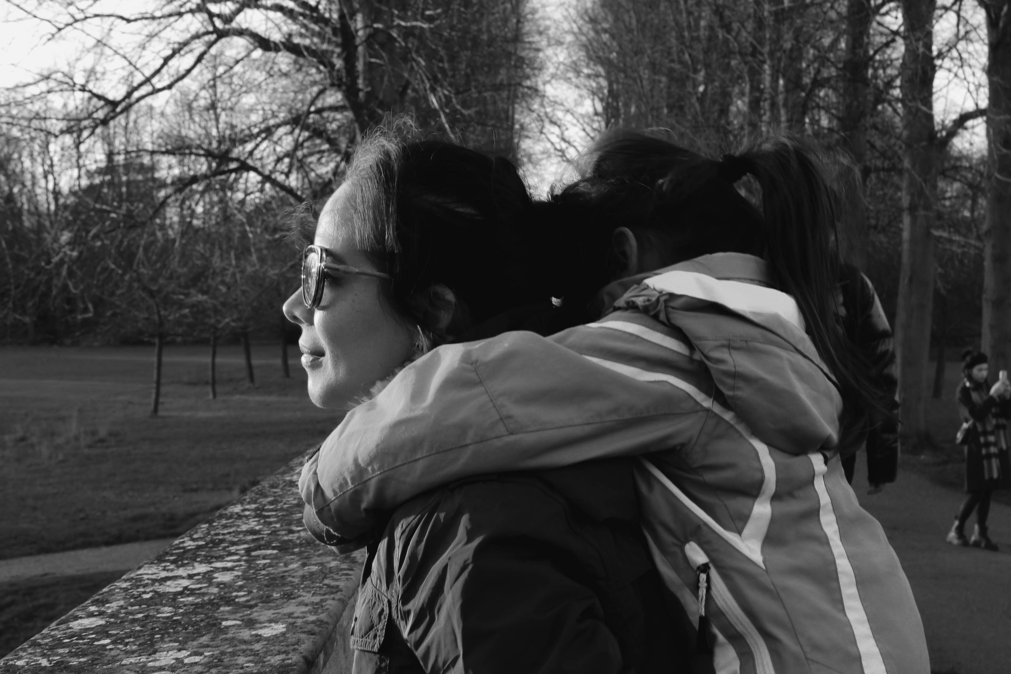
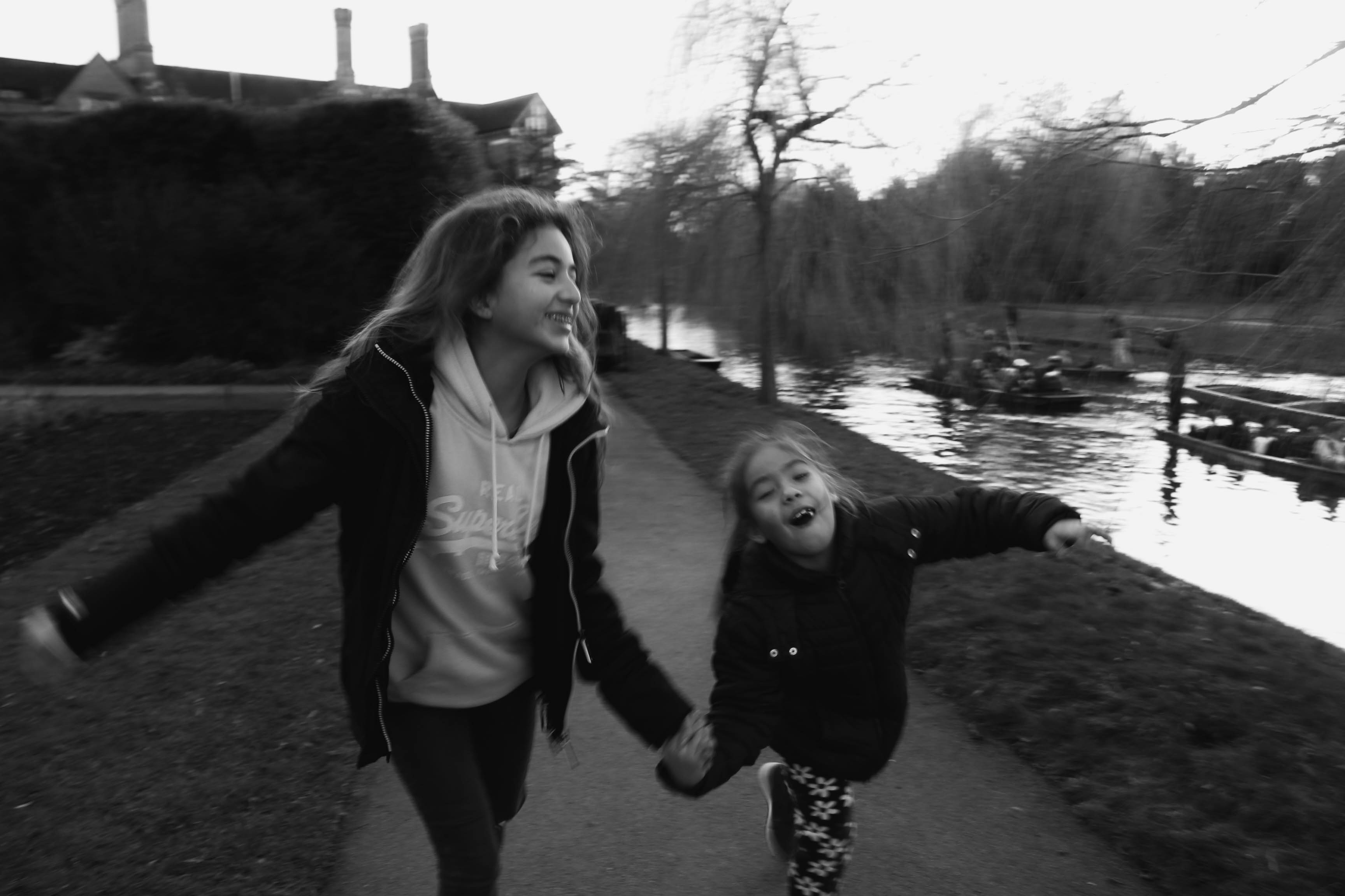
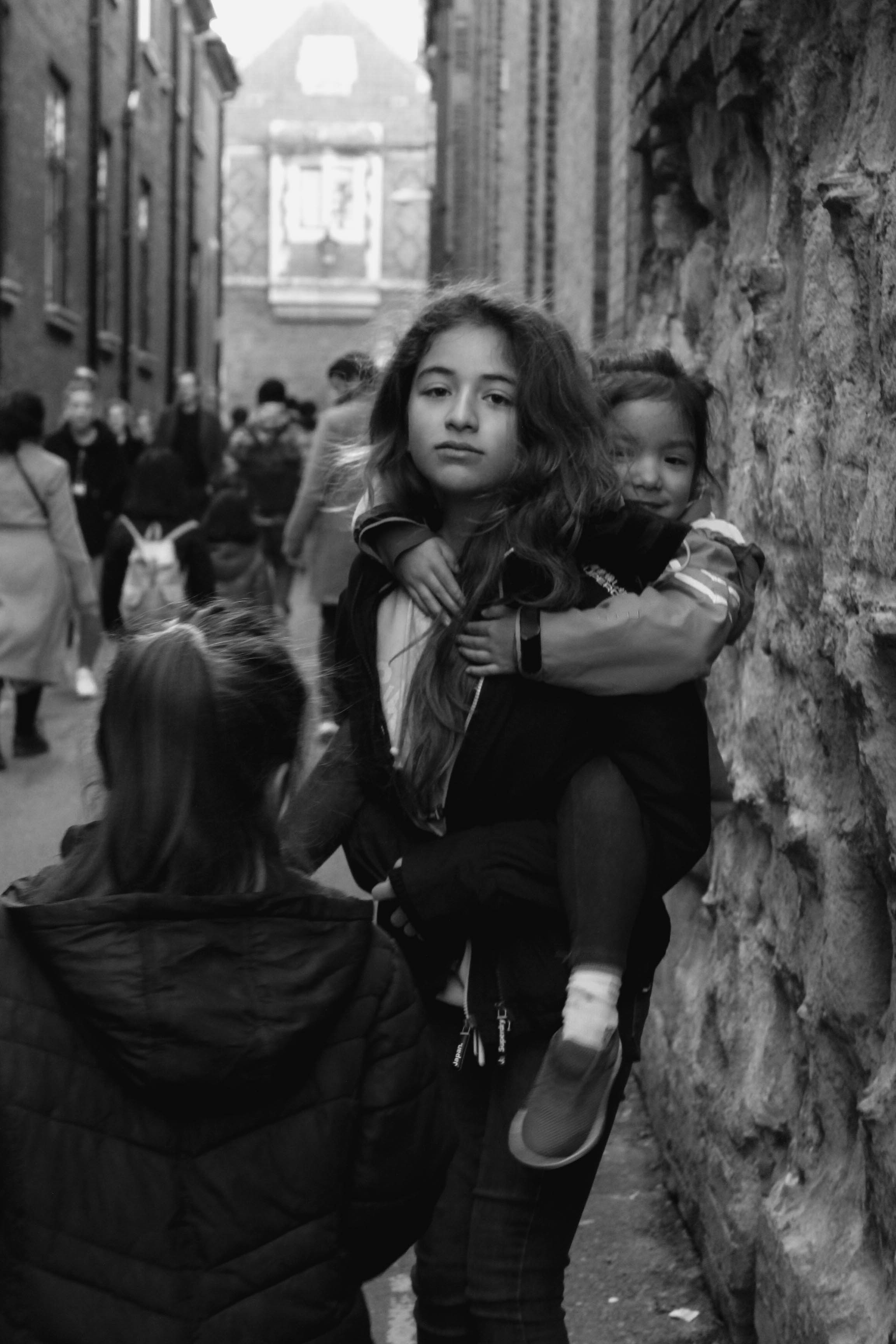
MY RESPONSE