All posts by Jade B

Filters

Author:
Category:

Still-Life:Contextual Studies

The definition of still life is a painting or drawing of an arrangement of inanimate objects, typically including fruit and flowers and objects contrasting with these in texture, such as bowls and glassware. Still-life art began to emerge in popularity during the 16th century but its roots date back to ancient times, it’s earliest form was of skulls, candles, and hourglasses as allegories of mortality ( vanitas were very popular at this time in the Netherlands, this is a collection of objects that symbolise the inevitability of death and the vanity of materialistic achievements and pleasures, it exerts the idea of repentance) as well as fruit and flowers which represented natures cycle and the seasons. The genre became of high demand for wealthy middle class to decorate their homes with as it was a modern form of art in comparison to the trends of portraits and religious art work. Today still life is a part of modern art but focusing on more contemporary objects to show how times have changed.

Analysis:Pieter Claesz
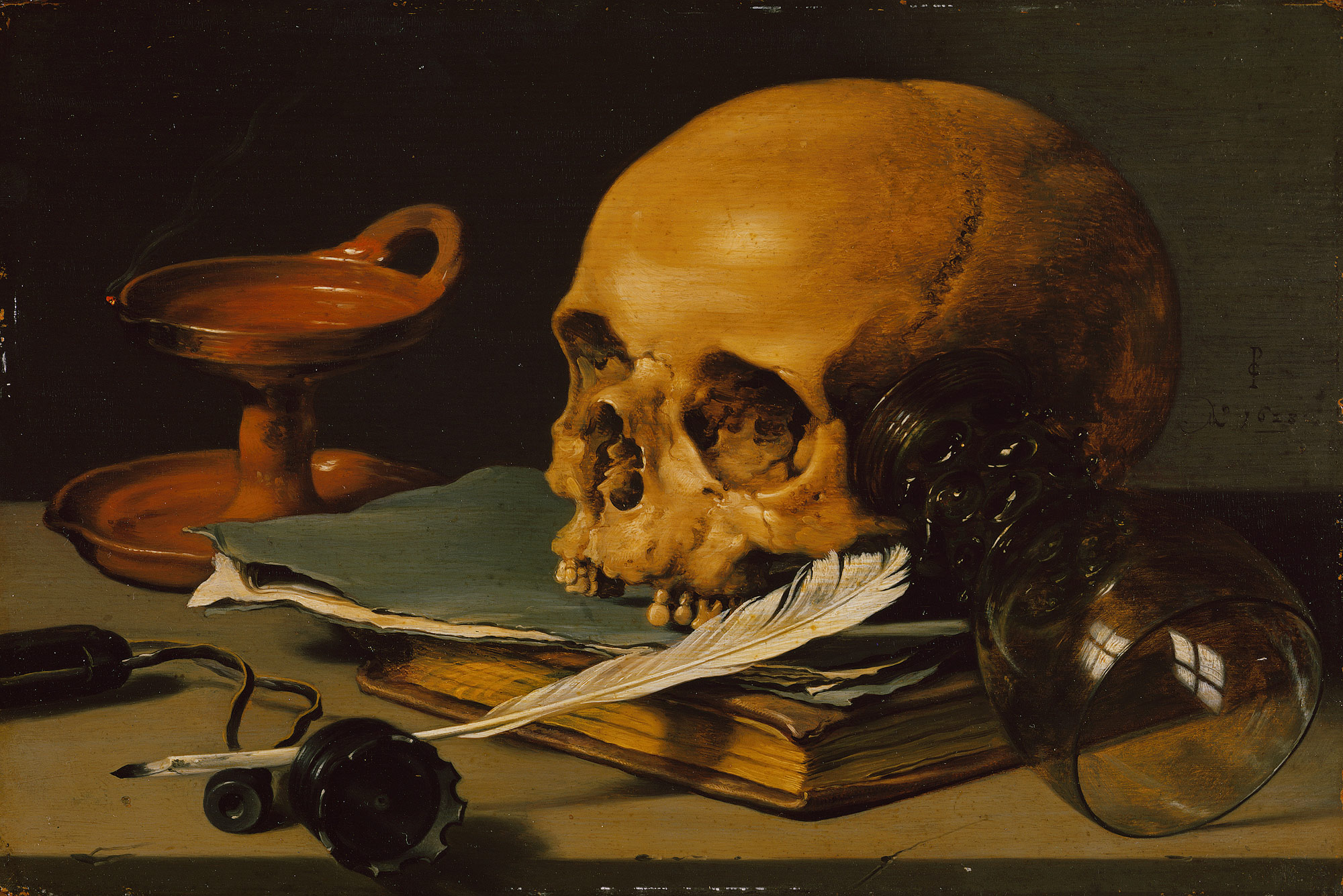
Still Life with a Skull and a Writing Quill, 
				ArtistPieter Claesz,Paintings

This art work is called A Skull and a Writing Quill and was painted 1628 by Dutch artist Pieter Claesz. It’s main focus is the skull as a vanita which was popular amoungst dutch artists, they symbolise mortality and how death it always inevitable. Vanitas were very popular at this time in the Netherlands, this is a collection of objects that symbolise the inevitability of death and the vanity of materialistic achievements and pleasures, it exerts the idea of repentance. The colours used are of a subdued palette with a monotone range this emphasises the depressive idea looming death and how life running up to it can we equally as depressing. Claesz is well known for including reflections in this art work this could symbolise the unknown paths of life and how their are parts that are light and happy, not all of it is gloomy, the white window relection goes in comtrast with the dark glass, like heaven and hell in a way. The quill adds a sense of reality maybe the skull is of a writers, this creates a more authentic feel that all types of people died, not just the poor as back in those times it was more likely for a person of the lower class to have a small life span due to lack of access to clean water, health care, shelter etc. The skull is a reminder of the transcience of existence. The depiction of the glass and quill whch were seen as luxury goods were often tempered by the presence of a skull or hourglass to remind the viewer that such luxuries would be of little use in the afterlife.

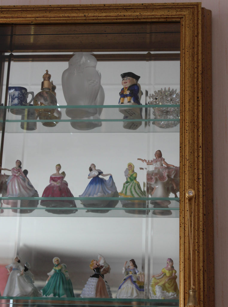
Home Sweet Home:Gran

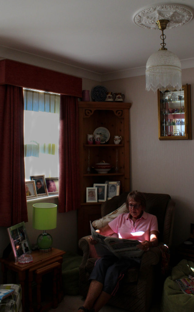
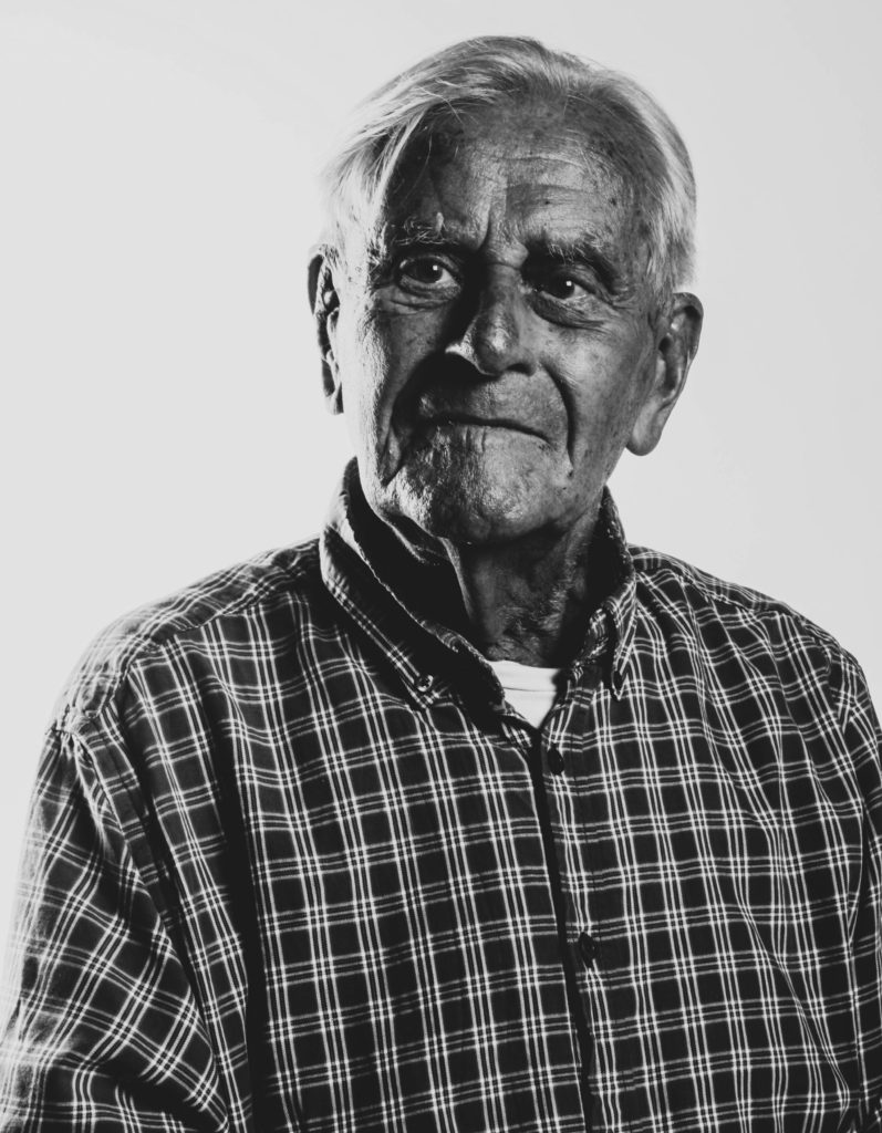
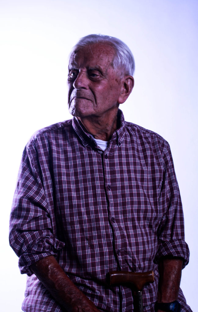
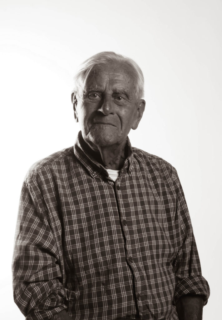
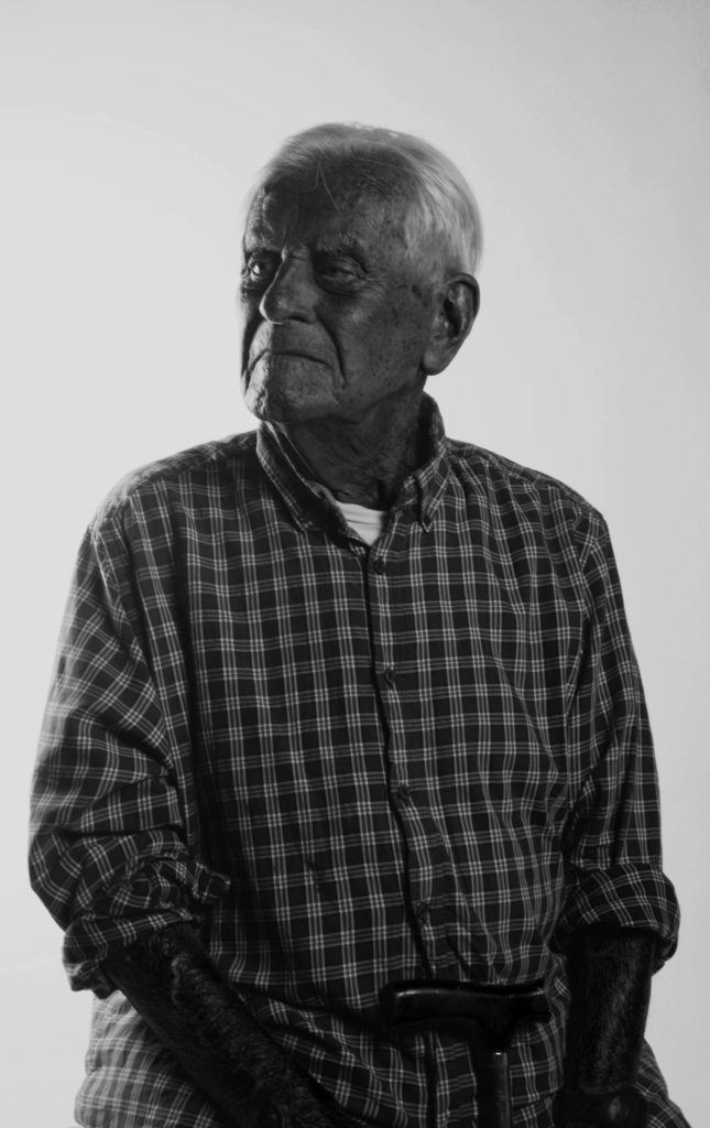
I think its important to establish who you are photographing before you start shooting. My Gran is 74 years old, born in 1944 in Nottingham, she experience WW2. She was meant to be born in Alderney but everyone on the island was evacuated, her and her family sheltered in a house on the mainland but not for too long as the war was nearly over. Since living in Jersey she met my late grandad and had two babies , they divorced when their youngest child went to uni. My gran moved to the current house she is living in now on her own, shes had love interests since but they either didn’t work out of died. I met her mother when I was little but around when I was 3 years old she died in Alderney. I never met her father, she hardly ever mentioned him. She currently has four grandchildren but two are at boarding school and this is my last year on island and I can tell that she is being to lose purpose.

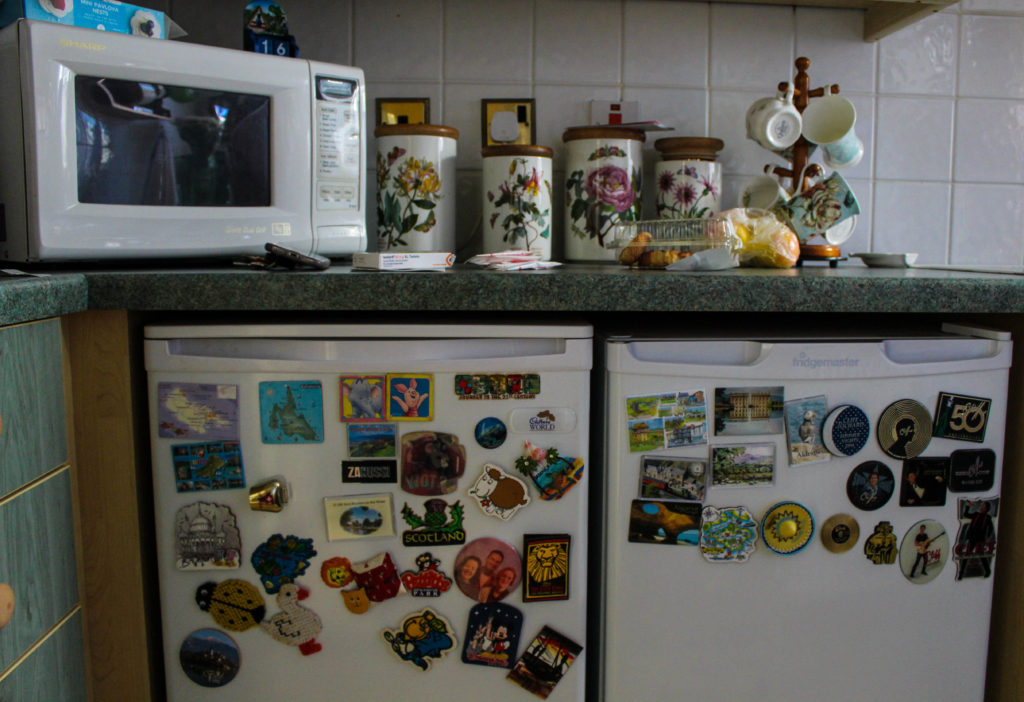
The house she lives in now has great significance to me, it was the first place I slept without either of my parents, it was the place I would go when mum was at work or going out, it became my third home after my dads. I remember so vividly counting sheep in the attic room to get myself to sleep as I thought the house was haunted and I still do today. The kitchen has significance because its where I made my first cake and she would always make cheese on toast for me and no one could make it better than her.

I used to as a child think it was weird she lived alone when she had a committed boyfriend but I understand it, she likes her own small space and I think after years and years of looking after my grandad she just wants to look after herself and not relive it with another man. She likes her small house because its easy to keep tidy and it doesn’t feel empty to her. She frequently is out playing squash, cards, country dancing, holidays, meals, visiting friends and family, but when I see her she’s always at home, when I think of her the house is a part of my image.

My Images

Analysis

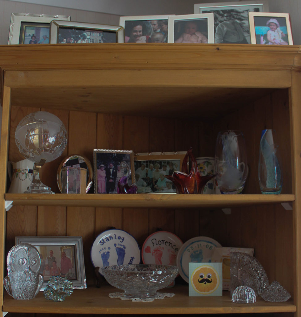
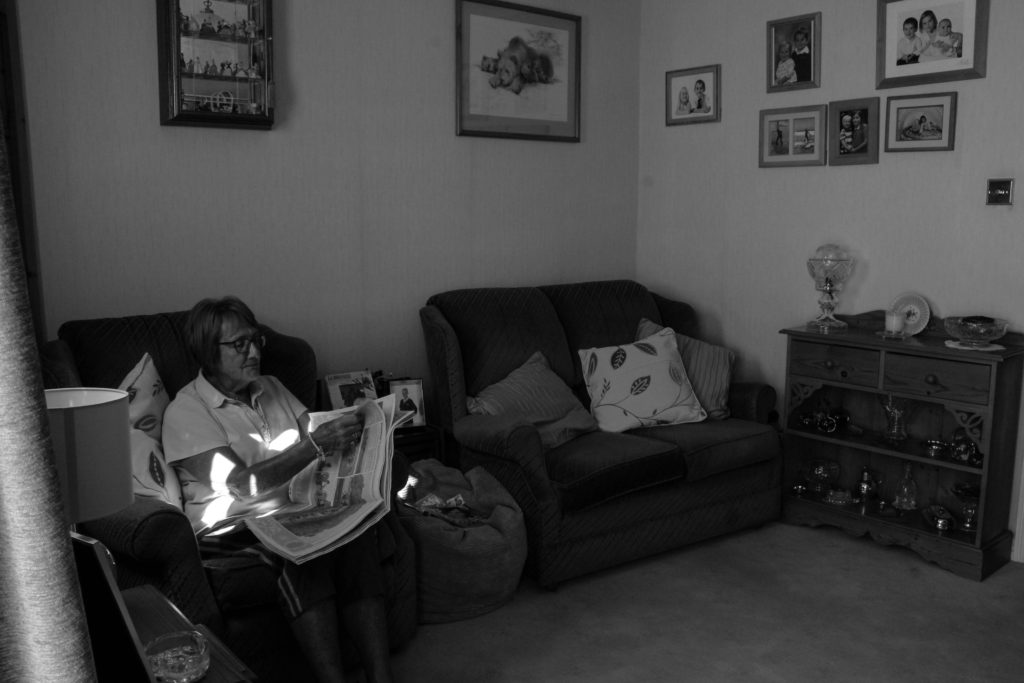
Overall I am pleased with my shoot as I feel I have several successful images. All images of my gran are candid as required of the task but I wanted to also include close up images of item and furniture in her house in order to get a further sense of who my gran is. I’ve always wanted to capture images of my grans house as I feel it has so much character to it, all the trinkets and photos hold meaning and have a story behind them. I feel her house mirrors her age well because modern houses are usual minimal, mostly white and lack individuality. When I arrived she was just sat on her sofa listening to the radio with a paper in her hand so I captured that, rather then placed her in an unnatural position, I wanted it to feel as authentic as possible, therefore I had low levels of control. She then later went in the kitchen to make a cup of tea so I followed her and just took shots of her getting on with it and then some close ups of features in that room. I used natural lighting in all my images and a mixture of close ups and wide angle images. I have cropped every photo in lightroom to get rid of any unnecessary space to make sure the focus of the image is clear. I chose to have both colour and black and white images as I wanted to replicate her my memories in her house differ, some are hazy(black and white) and others are very vivid(colour). The contrasting tones of light and dark also represent how life in that house has been for my gran, some sad things have happened since living in their as well as amazing things.

Bob Le Sueur

MBE, Bob Le Sueur was 19 when World War II started, he came into school to talk about his stories of the occupation and how he helped escaped Russian slaves.

The first story he told us was was of the German’s arrival which took place in 1940 on July 1st. He lived on Victoria’s Avenue seafront and saw these two parachutes in the sky but there weren’t people attached to them but cylinders. Inside the cylinders were messages addressed to the bailiff, saying that Jersey had 24 hours to surrender or the Nazi’s would carpet-bomb the whole island. The British had demilitarized the channel islands leaving them weaponless, all they said was for the Islands to ‘do the best they can’.

The second story was how escaped Russians slaves were sheltered by locals. Bob once helped a Russian but this particular story was about his two mates who kept a Russian, who was labelled as a Polish to protect his identity. If you were known to the Nazi’s as a ‘Slav’ you were taken as a slave and were called sub-human. Rations were already very low so the two men bought an illegal identification card in order to gain another ration book, so all was working well. September 1944, it was announced that this was the last day the island would have a gas supply, so not more gas cooking, only open fire. These two men decided to hold a party for this occasion, so they invited people over for drinks and to have one final celebration, but it all went pair shaped when the Russian drank too much and started doing Russian dances, word got around by nothing came from it as most locals hid Russians and wouldn’t snitch.

The third story was of Liberation day and how it had been announced that Hitler had died defending his country (which we now know is fake news) and that an armistice is being written. 7:14 am the liberation of the channel Islands was signed on a British Destroyer at St.Peter’s Port Harbour. Bob went with his friends on their bicycles made from garden hoses to the pier by the bottom of Mount Bingham to see the boat come in. As they were arriving they went past two Germans holding rifles, Bob’s bike in that instant broke and let of a large gun shot sound which alerted the Germans and when he looked up thy were pointing there rifles at him. This moment was intense but the Germans retreated when they realised what had happened. Overall this story gave a message that we are all humans are the same at the end of the day and Bob was saying how the Germans could have shot him there and then but they didn’t. Bob also was reminiscing on how he regretted not shaking the Germans hands.

Societe Jersaise vs Archisle

Francis Foot was born in 1885 as a only child to this parents,Francois Foot (1847-1918) and Louisa Hunt (1843-1934). His father was a china and Glass dealer in Dumaresq Street, at a time when the area was one of the more affluent in St Helier. Francis’ first job was as a gas fitter, but he soon became fascinated by photography and the early phonographs and gramophone records and realised that he could earn a living from them.

The family took on a second shop in Pitt Street, where Francis worked as a photographer, while his father and mother sold gramophones, records and other wares in Dumaresq Street. After his father’s death, Francis took over the business in Pitt Street. He married Margaret Vernon shortly before the First World War and the couple had four children, George (1914- ), Stanley (1915- ), Dora (1917- ) and Reg (1920- ).


George, Stanley and Dora in 1919
File:FrancisFootFather.jpg

Francis Foot’s father Francis
File:FootFamilyOuting.jpg

The Foot family in their car ….

Michelle Sank was born in Cape Town, South Africa. She left there in 1978 and has been living and working in England since 1987. Her work encompasses issues about social and cultural diversity and the challenges within.

The particular project of hers which features Jersey is called ‘Insula’, she srrived April 2013 to start her six month residency with Archisle. In the archive it lacked late twentieth century imagery so she set out to fill that space by capturing photos. She said she found it challenging as Jersey had a peculair British- Norman cultural identity and she needed to include that as well as Jersey’s uniqueness. ‘Insula’ is Latin, it simply means island in English, the projects main aim was to create a narrative for our island but a more modern story to provide evidende of what Jersey was like in the twentieth century.

Image result for michelle sank insula
Harve de Pas
Image result for michelle sank insula

Analysis

File:FootWifeChildren.jpg

Margaret with Dora and George in 1920

This image taken by Francis Foot features his wife and two children in a Jersey wood, possibly St Catherine’s. Both Margaret and George are taking direct eye contact with the camera, both expressing minimal emotion which creates an eerie look. Whereas young Dora is in candid and is blurred, this could be because she is young and doesn’t understand the concept of taking a photo or Foot may have purposely wanted this effect as again it creates a sinister feel as her head is dis-morphed and she almost looks like a ghost. All photos of Francis are in black and white because he had no assess to colour in his lifespan. This creates a sense of delicacy to the images as they appear to look fragile due to the lack of camera quality and colour. The photo is well exposed with the dark trees at the front alongside the light background, they work in harmony adding different textures. The black clothing the mother is wearing contrasts nicely with the young children, its almost symbolic of the innocence of the children and how the colour white has connotations of purity. A neutral tone is created through the use of back and white which works together with the neutral expressions on their faces. Foot used natural lighting in this image solely daylight from the sun. It looks as though they have been placed in this positioning by Foot because the young boy looks unnaturally smart in the way his hands are put behind his back and how he had perfect posture. Also the way the mother is placed in the middle creates a pyramid shape which suggest her role in the family how she is an authority figure to her children. There is a prominent rule of thirds which is displayed via the three people, the background is the vegetation and the foreground is the main focal point of the photo which is the family.

Image result for michelle sank insula

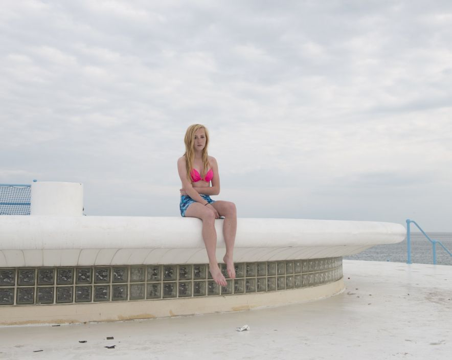
This image by Michelle Sank in some ways is similar to foots as it features relatives which are both making direct eye with the camera. However in this image the background is equally as important as the two girls as it shows a wide shot of Harve de Pas. The project Sank created of Archisle was all about capturing the people of Jersey in Jersey, whereas Foot was just taking portraits. Both girls have neutral facial expressions, also they both wear very similar outfits and take up the same stance. This image clearly displays culture of it’s time for instance it is in colour, the girls are wearing clothes of a modern trend, the hotel and houses behind look well kept. There is a light tone to the photo and it appears to have been taken with just natural daylight, this could have been challenging to get a good exposure as it was clearly a very bright day judging the squints on their faces and the lack of clouds in the background. The twins stand in the foreground and the hotels and houses are placed in the background but both share focal point.

Bunker zine-War With Nature

I named my zine ‘war with nature’ because I wanted to capture the relationship between the islands scenery and the man-made bunker. the key concept was to photograph how nature as grown around the fortifications similarly to how after the occupation everyone had to rebuild themselves with what had been left behind my the German’s. The harmony in which bunkers and natures now live in symbolizes the end of the war and how Jersey is now peaceful place, war free. The fact that the bunkers are permanent to the island, mirrors how the soldiers after WWII had to live with permanent PTSD and trauma from the war fields. The majority of German fortification are on Jersey’s coastline which have some of the islands most scenic views, the fort and bunkers add a sense of historical background to these landscapes.

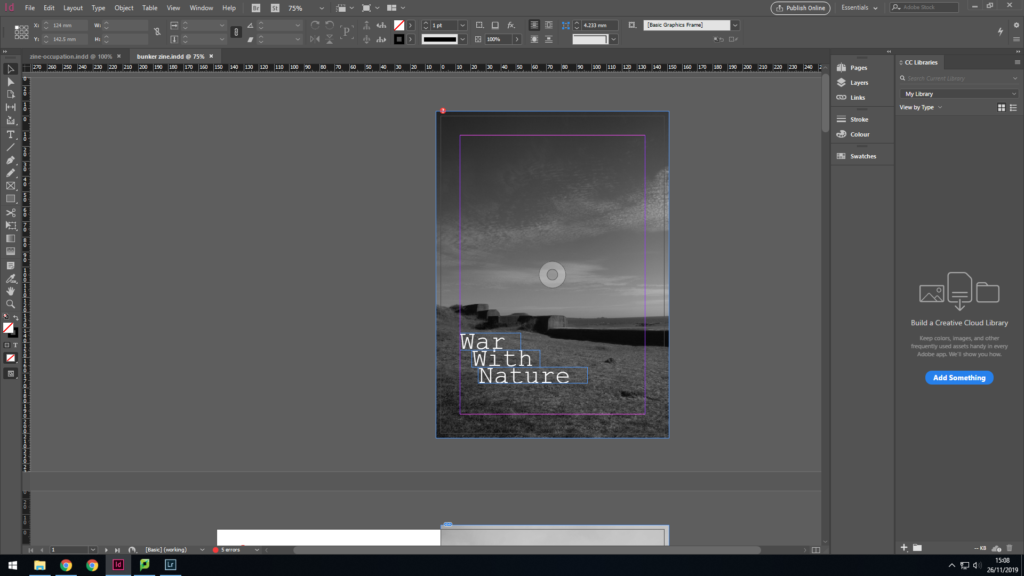
I went for a minimalist font, which looks like a typewriting, providing war connotations. This image is of the sea wall on the north of St Ouen’s coastline. The wall is structured like stairs it moves in height with the uneven land, my title is mimicking this shape.

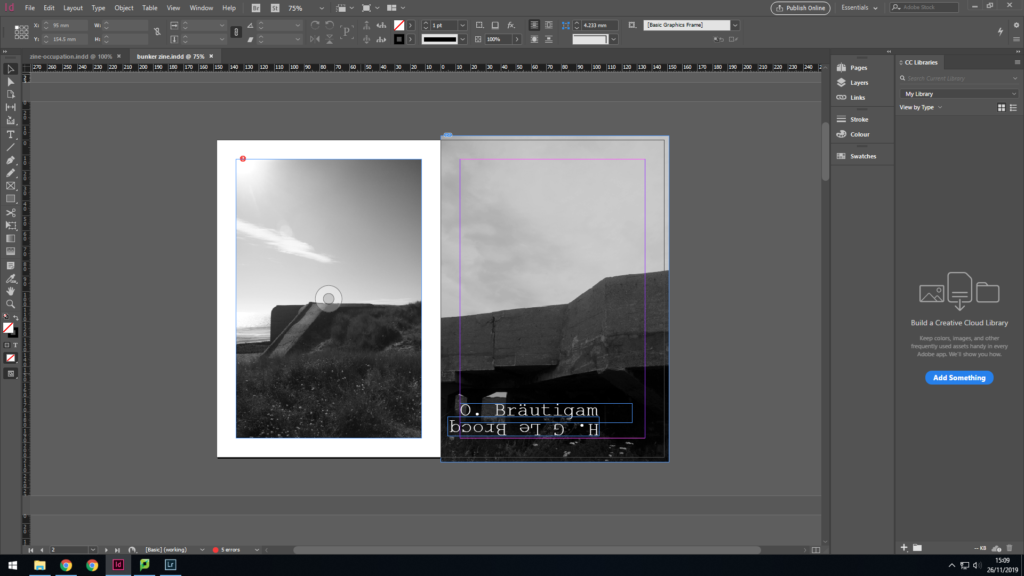
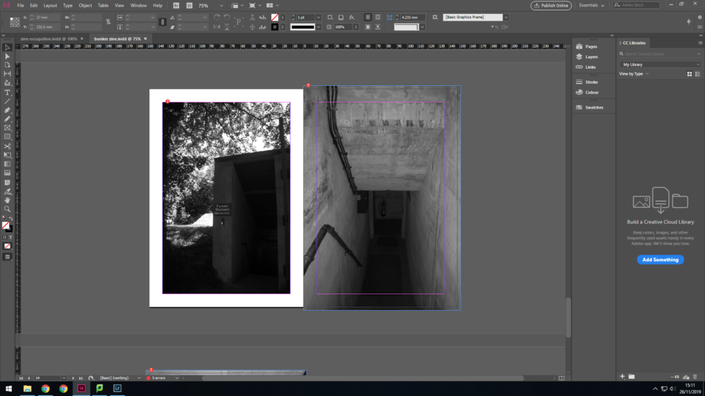
Next I used another image from the sea wall fortification at St Ouens bay like the font cover image. I put a border around it to seperate the two images, to signify the spread of bunkers across the island. The second image of a bunker at Noirmont Point part of Battery Lothringen. I wanted to start the book simple and set the scene and theme with images of bunkers in and amoung nature. The typography is of a German soldier and Jersey soldier, I chose this font as it creates a typewriter effect. I placed them parallel to each other to express that even though they were enemies they were still both human.

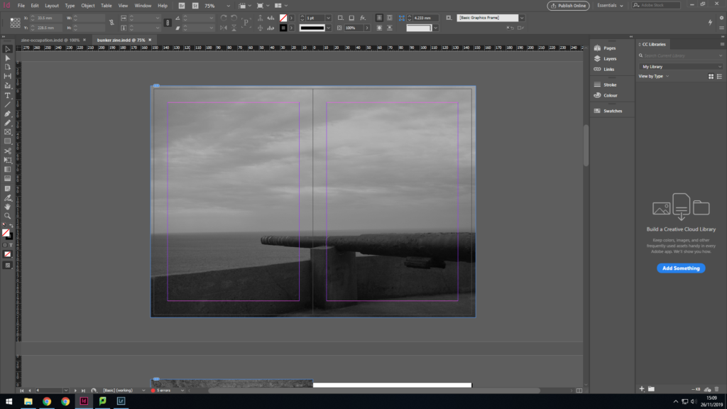
I then moved onto a double page spread which was of the weaponary on Battery Lothringen. This time nature is represented by the sea, which is a large part of Jersey because of it’s size. We also forget how significant the sea was during the war for transporting things like Red Cross parcels.

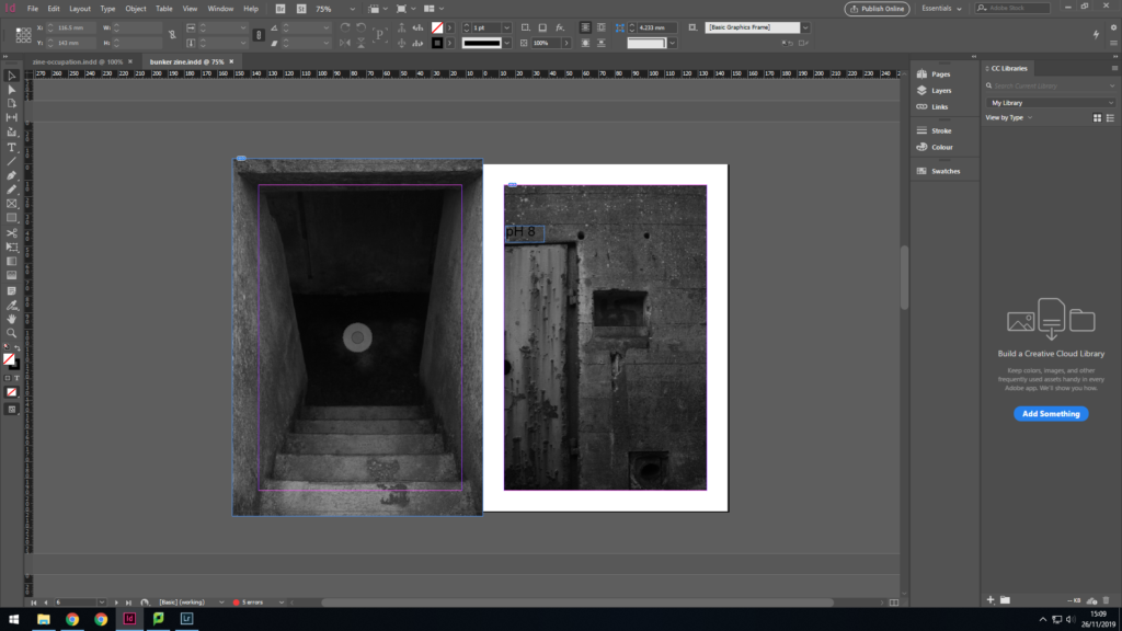
The next two images are close ups of features of bunkers, so the narrative is becoming more detailed by focusing on their characteristics. The first image is very dark and gives connotations of the unknown which is how the locals felt during the occupation, in a state of not knowing whats next.

Again I have gone even further into the bunker with his image of the lighting. Light was such an important part of life in the bunkers because they didn’t have the sun as there source. When it came to lighting that was where nature couldn’t adapt, which is like how some people during the war couldnt adapt back to normal life and had severe PTSD.

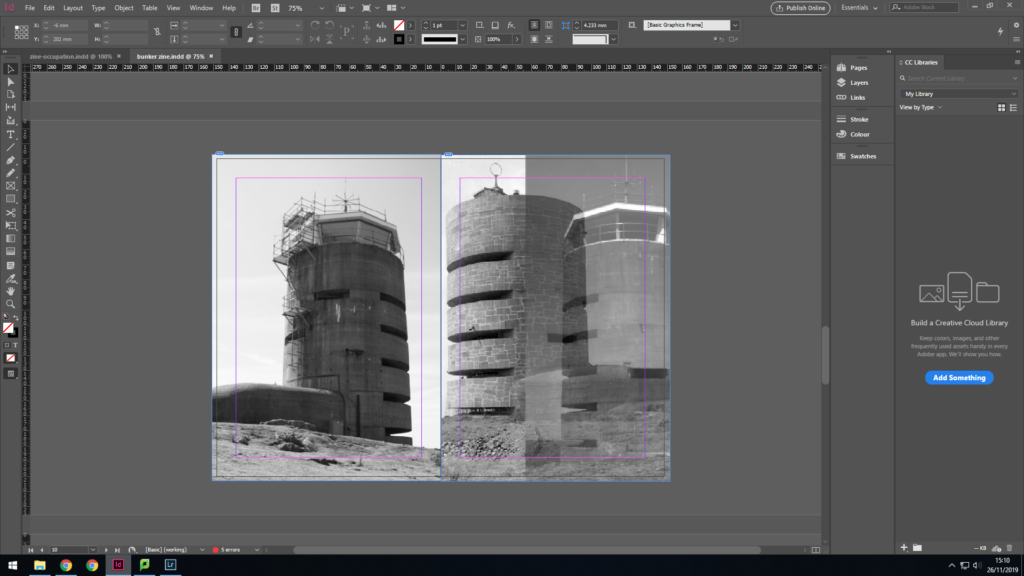
The next two images are of the radio tower at Corbiere so the book is chrongically making it’s way along the Jersey coast line. The first image is of my own photography and the seccond is a merger of my own and an archive image during the occupation. I wanted to capture the change in the nature around the tower and how its adapted to live around a man-made histroical eye-sore.

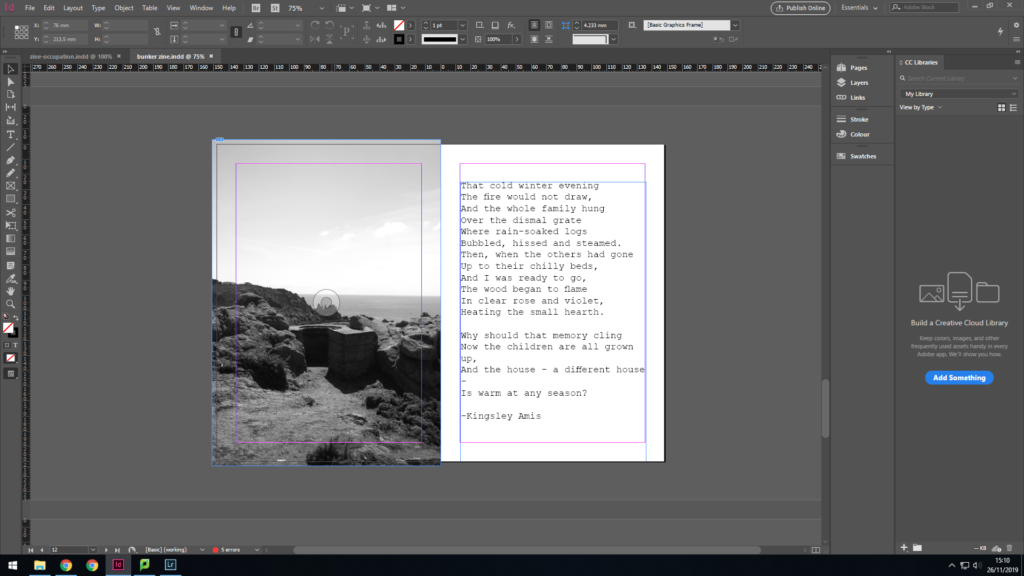
This image is also at Corbiere but is of a German look out town, which would have been stragetically placed within the greenary for camoflague. The shrubs have continued to grow around it and inside of it, which helps it to look like part of the landscape. On the other page is a poem from Kingsley Amis called Wasted which he wrote during the occupation. I included this poem to also move focus to the people rather than the environment.

I am focusing back on nature with this image with a bunker from Le Houge Bie. This bunker is different from all the others as it’s fully submergeed by greenary. The second image is of the inside and it create a juxtaposition between the green exterior and concrete interior.

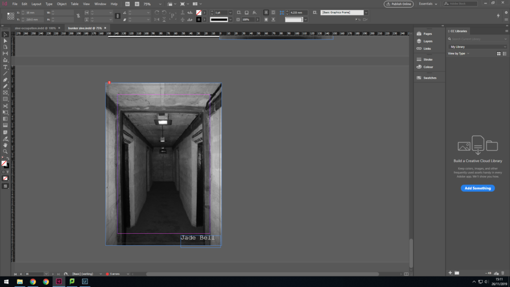
I finished with an enigmatic image of a eerie looking corridor to bring home truths of the occupation. Although people moved on and started a new life, it was still a burden of memories they had to live with for the rest of their life. The war bought many changes, some for the best, others for the worst.
Zine Narrative

3 words

Nature with War

A sentence

I want to highlight the idea in how such man-made structures manage to blend in with the delicate nature of Jersey.

A paragraph

When on the trip to Noirmont point the bunkers were what caught my eye immediately, they are big, dull and square the complete opposite to the nature of the headland, but yet they seemed to compliment each other well. This links to the idea of overtime people get used to one another and get along to me it symbolizes the end of the war and how eventually the Nazi’s were defeated and everyone at the time just got back on with their lives. They had to rebuild their homes, like nature, they had to deal with what they had left over from the war and carry on as if it was the same before the war. I want to capture in my zine, how nature had to grow around the Nazi fortification, which is similar to how the soldiers had to live on with their horrific war memories because they can never get rid of them. The majority of German fortification are on Jersey’s coastline which have some of the islands most scenic views, the fort and bunkers add a sense of historical background to these landscapes.

Zine Analysis

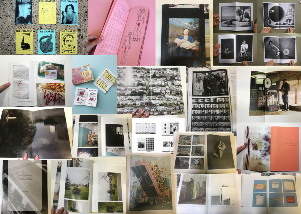
A zine is an independently published booklet, often by a single person. They used to be created by physically cutting and gluing text and images together onto a master flat for photocopying, but now it’s more common to produce the master by typing and formatting pages on a computer. Since the 90’s, zine production has dwindled but that doesn’t mean it’s died out.

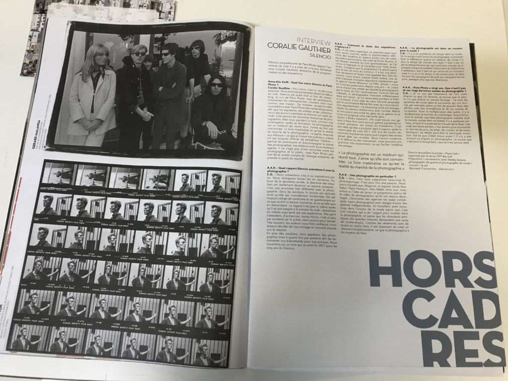
In order to create a zine lots of planning goes into it, many different elements need to be considered. Display is important to create a specific aesthetic, for instance in the zine below there are 36 images of David Bowie on a contact sheet. The creator of the zine could have chosen their favourite photo out of the 36 taken but they chose to include all of them. This could be because it creates a sense of originality and shows the journey in which the photographer took when photographing David. As well as that the contact sheets also are a form of sequencing, this is an important aspect of a zine as having structure provides an opportunity for the readers of the zine to decode the intended narrative in which the creator encodes into the sequence. This particular zine also highlights how text can be used, in this is one there is detailed writing as it’s an interview format but not all zine’s have this much, the majority have very minimal text. The font is very basic but it’s not a negative as it suits the basis of an interview, it’s simply just question and answer. Also it’s layout is very formal, it’s looks like a broadsheet in the way columns are used to display the text, this creates a sense of professionalism towards the creator of the zine. The chronological order of the contact sheets and the repetitive columns of the interview work in harmony and compliment each other nicely as well as them both being in black and white creating a simplistic feel to the two pages. On the left page there is also addition text which is placed vertically to the side of the featured photography, this is a common feature of a zine but also again links to the design and how it’s similar to a broadsheet newspaper as usually with an image comes a caption underneath it providing a description. The dates featured are 1966 and 1983, so the black and white helps the reader to identify the age of the photos and people in them without having to the read the side caption.