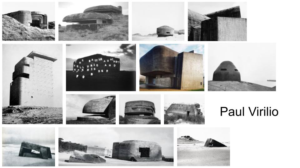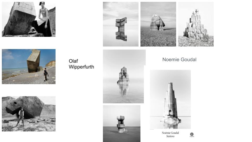
During this project I’m going to be looking at a classical reference and a modern reference whilst looking at the topic Occupation Vs Liberation. These two references will come from this mind map.

During this project I’m going to be looking at a classical reference and a modern reference whilst looking at the topic Occupation Vs Liberation. These two references will come from this mind map.

Paul Virilio was born in Paris in 1932. His father was an Italian communist and his mother was Breton. He grew up in Brittany, France. He trained at the Ecole des metiers d’art and specialized in stain-glassed artwork and even worked beside Mattisse in churches. In 1950, he converted to Christianity instead of catholicism.
During the Algerian war of independence, he was conscripted into the army. He then went on to attend lectures in phenomenology at the Sorbonne. 1958, he went on the conduct a phenomenological inquiry into military space and the organization of the territory, especially the Atlantic Wall which can be seen in his images. 1963 he began collaborating with the architect Claude Parent. He participated in the May 1968 uprising in Paris and was nominated by students to be a professor at the Ecole Speciale d’Architecture. From this, in 1973 he became director of studies and the director of a magazine called L’Espace Critique
In 19575, he helped organize a Bunker Archeologie exhibition in Paris. Because of this he became widely published and anthologized.
He said ‘war was his university,’ he lived in France during the Second World war. The war developed into an interest for him throughout his life.

Lighting: The lighting in the image appears to be natural from the sun which appears to be behind the subject of the image because the side of the subject we can see is in shadow but bordered by light.
There is no color in this image, it’s black and white. It has a dark tone because the subject and the landscape are cast in shadow due to the positioning of the sun. The image still has a lot of texture due to the tonal range. You can see the grain and uneven texture of the sandy landscape and the waves in the sea. The image is composed so the subject is in the center and is the focal center.
The image is called the Atlantic Wall (the battle against telluric and cosmic forces) and was taken 1994-1995. It’s part of Virilio’s book Bunker Archaeology. It’s an image of a German occupation structure on the Atlantic wall in France. that has been abandoned.
Virilio was an urbanist and these images were meant to emphasize how ghostly and derelict these abandoned buildings are but also to remind how destructive these buildings were. These occupation buildings were part of Virilio’s early life in France and now abandoned they appeared even more like the places of destruction and nightmare for many. Virilio was looking into Albert Speer, Hitler’s head architect when he took the series of images this image is a part of.
My narrative
-In 3 words- Occupation to memorial
In a sentence- The journey from interior to exterior, the occupation to memorial and today.
In a paragraph- My sequence is a combination of the exterior to interior because my images start underground going through a bunker corridor then go above ground to the guns and bunkers outside then the images of dead wreaths, the landscape around and memorials. My plan is to show the occupation into the present and memorials. I may have my montages in the middle which is a combination of images from the archive and modern pictures I’ve taken myself.
My sequence
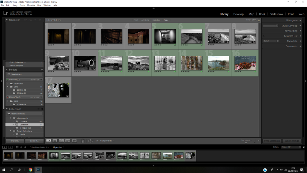
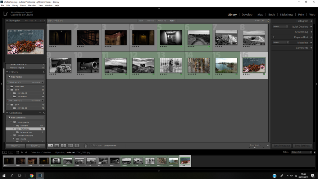
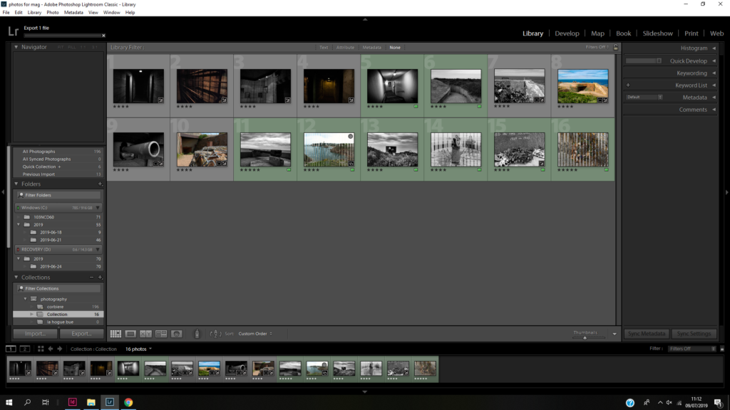
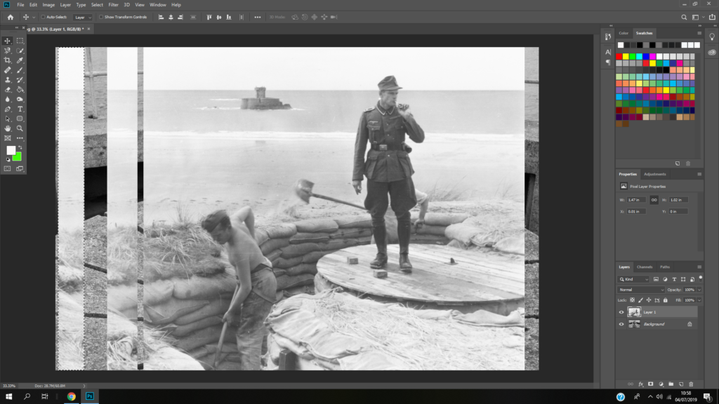
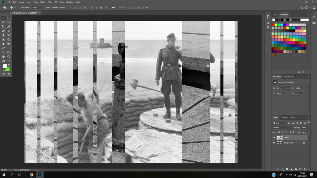
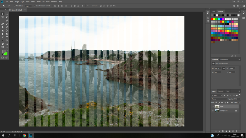
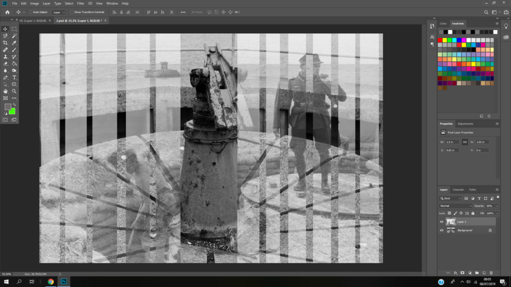


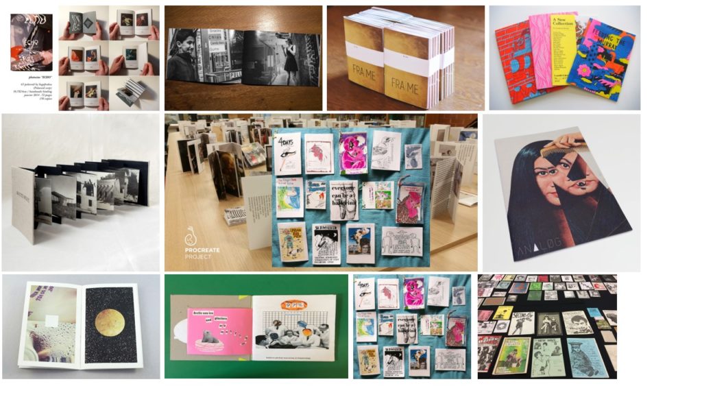
Photo zines are books that are a simple way of telling a narrative through you photography.

Format, size and orientation
Format- book. size- A2 orientation- landscape.
Design and layout
-The front has a small image with curved edges with a Polaroid look. The piece of green card covers some of the left side.
Layout- like a book
Design- colour card on the front that tells you about the zine.
-Colour- green piece of card. blacks and white cover.
Rhythm and sequencing
The images are all the same shape.
Rhythm- the images are Polaroid shaped.
Narrative and visual concept
Title and cover
The title is on the piece of green card which we can assume is a sort of cover.
Images and text
Not many of the images have text.
Use of other design elements or inserts: archives, montages, graphics, typography
There was typography on the front.
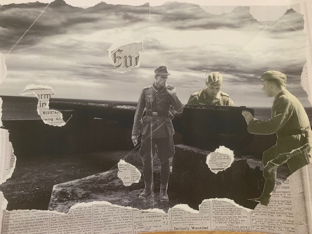
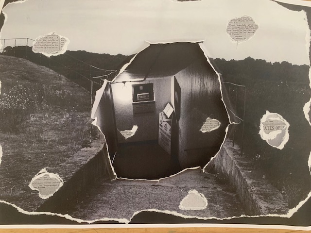
With this collage I wanted to create a journey so I use an image of outside a bunker, tore hole in it, stuck it onto an image of inside a bunker then stuck both onto a photocopy of an occupation newspaper.
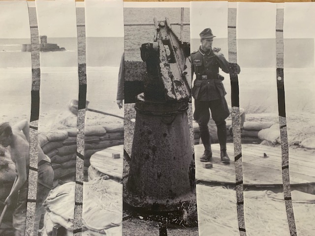
For this montage I wanted to connect my images to the past so I found an archival image of a man possible a slave digging the bunker out, cut it up and then stuck bits of it to my own image
The occupation of the channel Islands lasted for five years from the 30th of June 1940 till their liberation on 9th May 1945. The whole occupation received little resistance however, it almost ended in near starvation in the last winter. Both Guernsey and Jersey’s civil courts were allowed to operate. They did change the time zone from GMT to CET and the rule of the road was changed to driving on the right. They allowed certain types of entertainment to continue like cinema and theatre, their marching bands even performed from time to time. Lil Dagover, a famous German actress of the time, even visited German troops in Guernsey and Jersey in 1944.

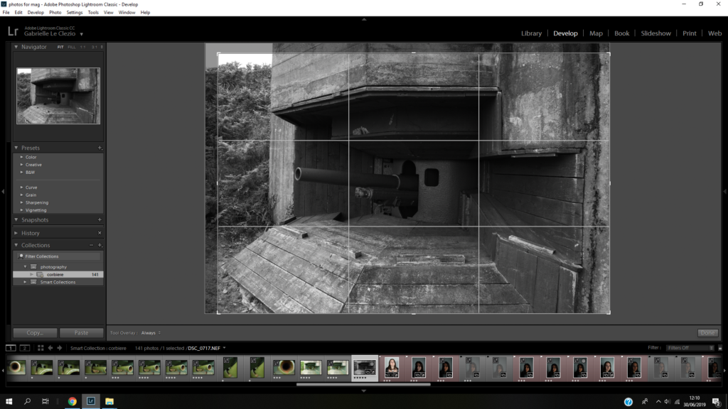

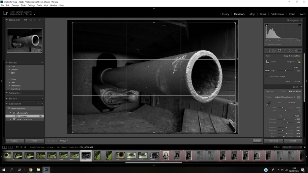
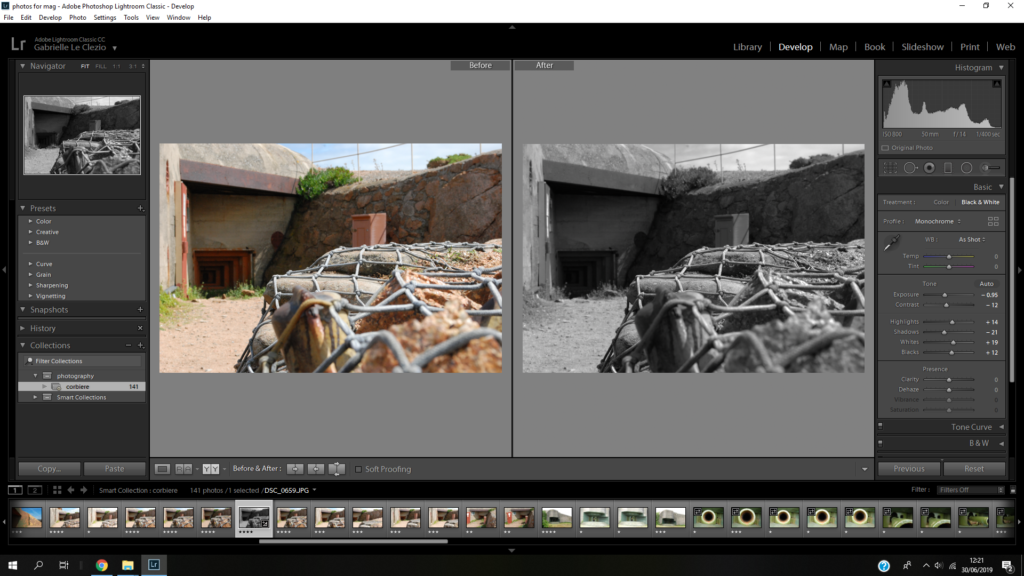
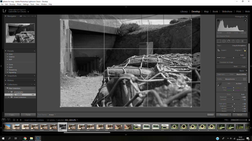

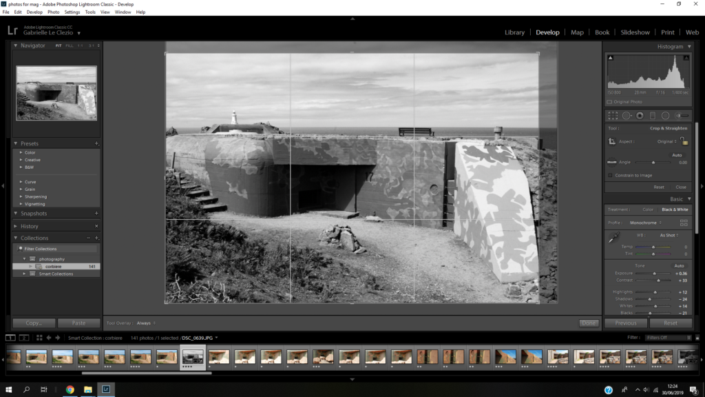
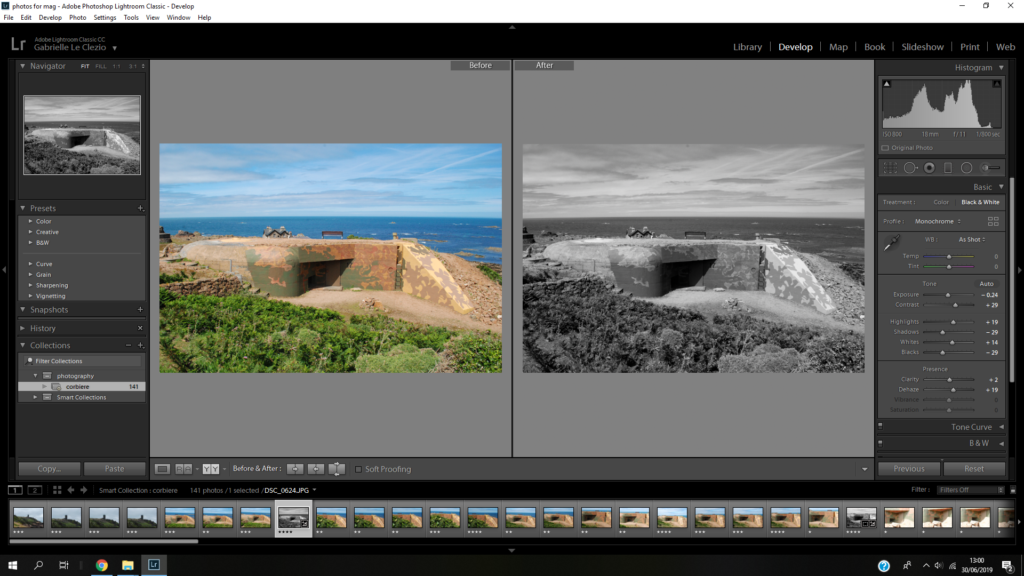

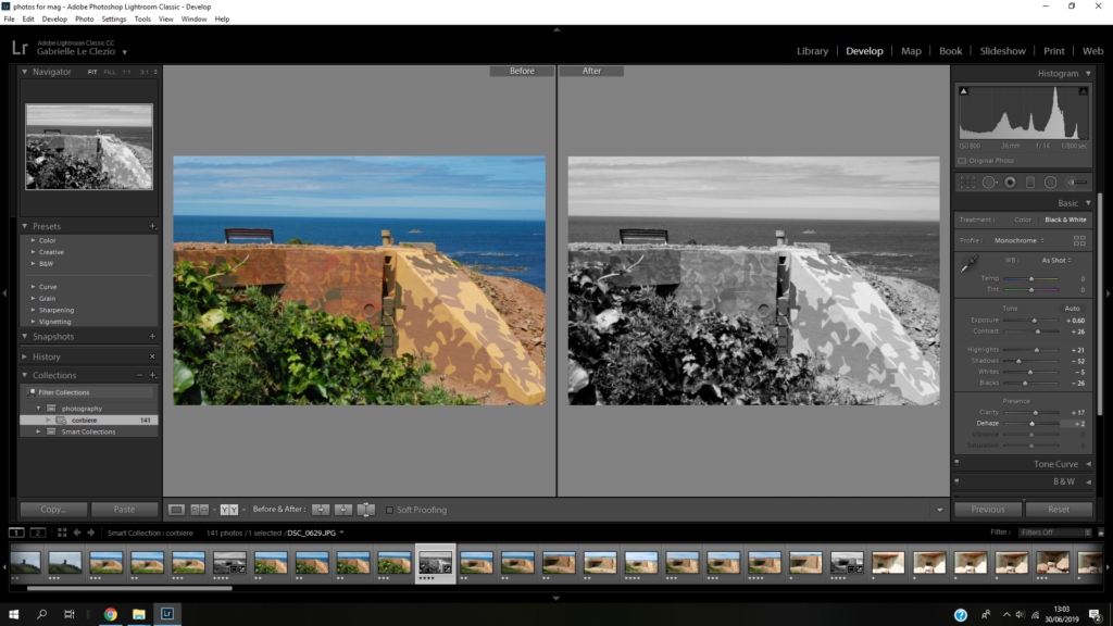
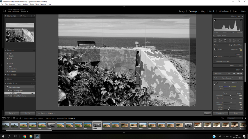
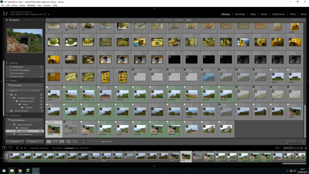
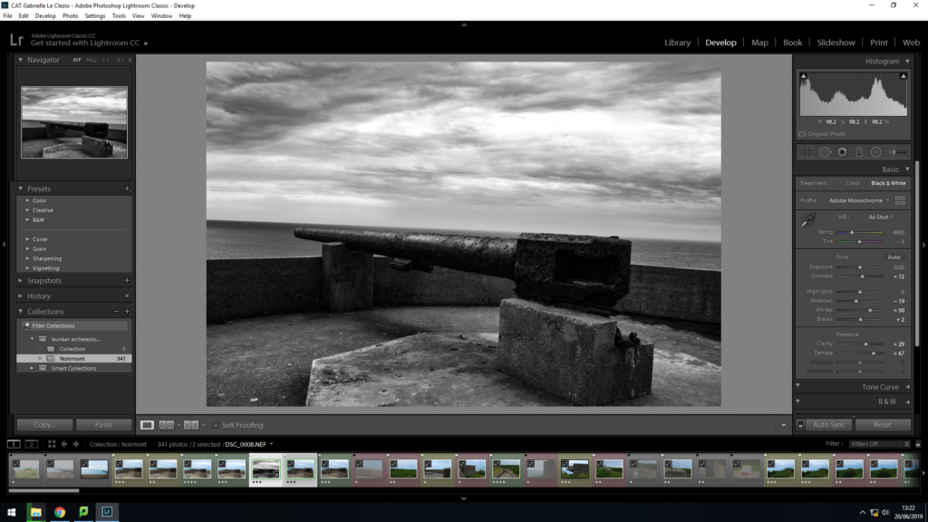
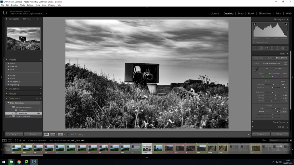
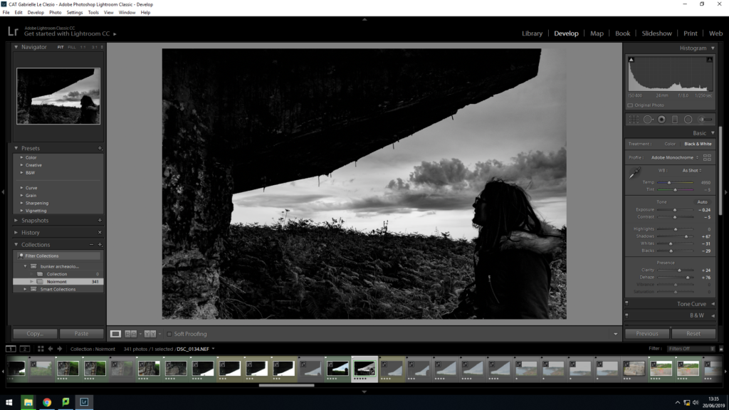
During the weekend I went to Corbiere light house to take pictures of the occupation bunkers up there. I thought since they had bunkers that were painted it’d be interesting to see what that’d look like once I’d edited the images into black and white.
After the shoot in Lightroom I edited my favourite images into black and white, adjusting some of the settings, and then cropped them.
