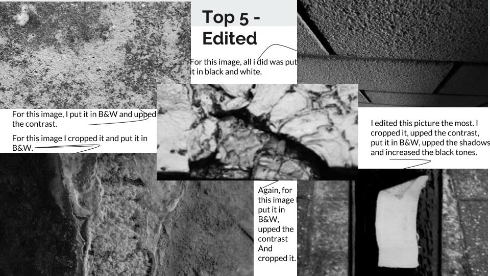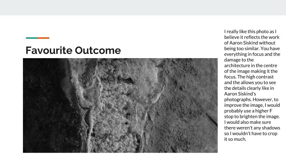


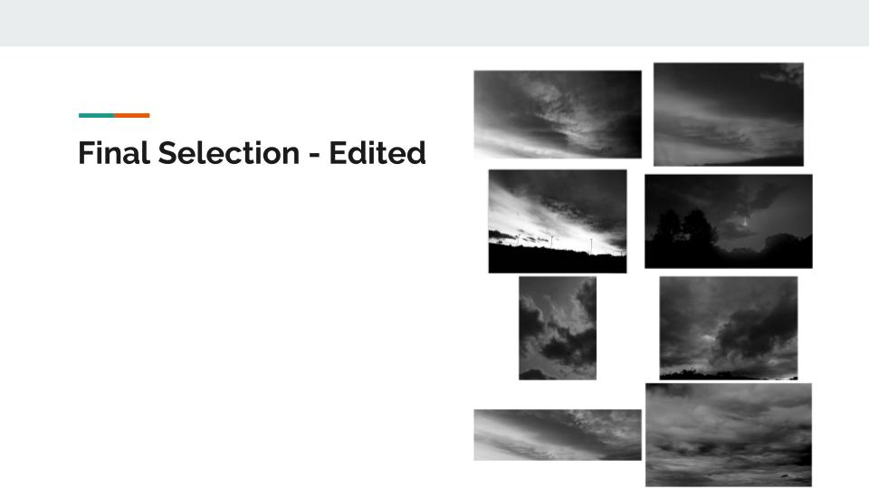
 Favourite Outcome


 Favourite Outcome

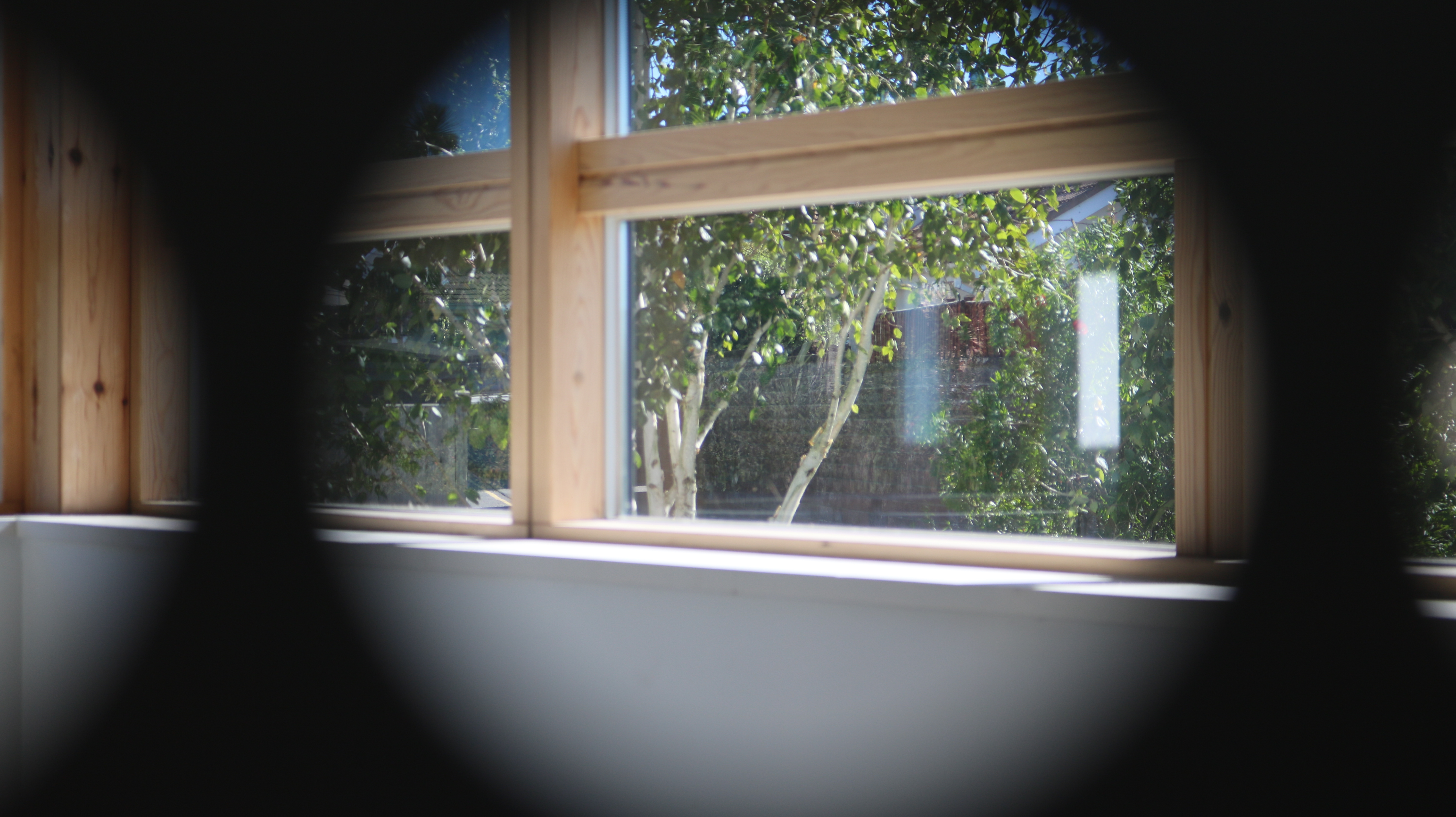


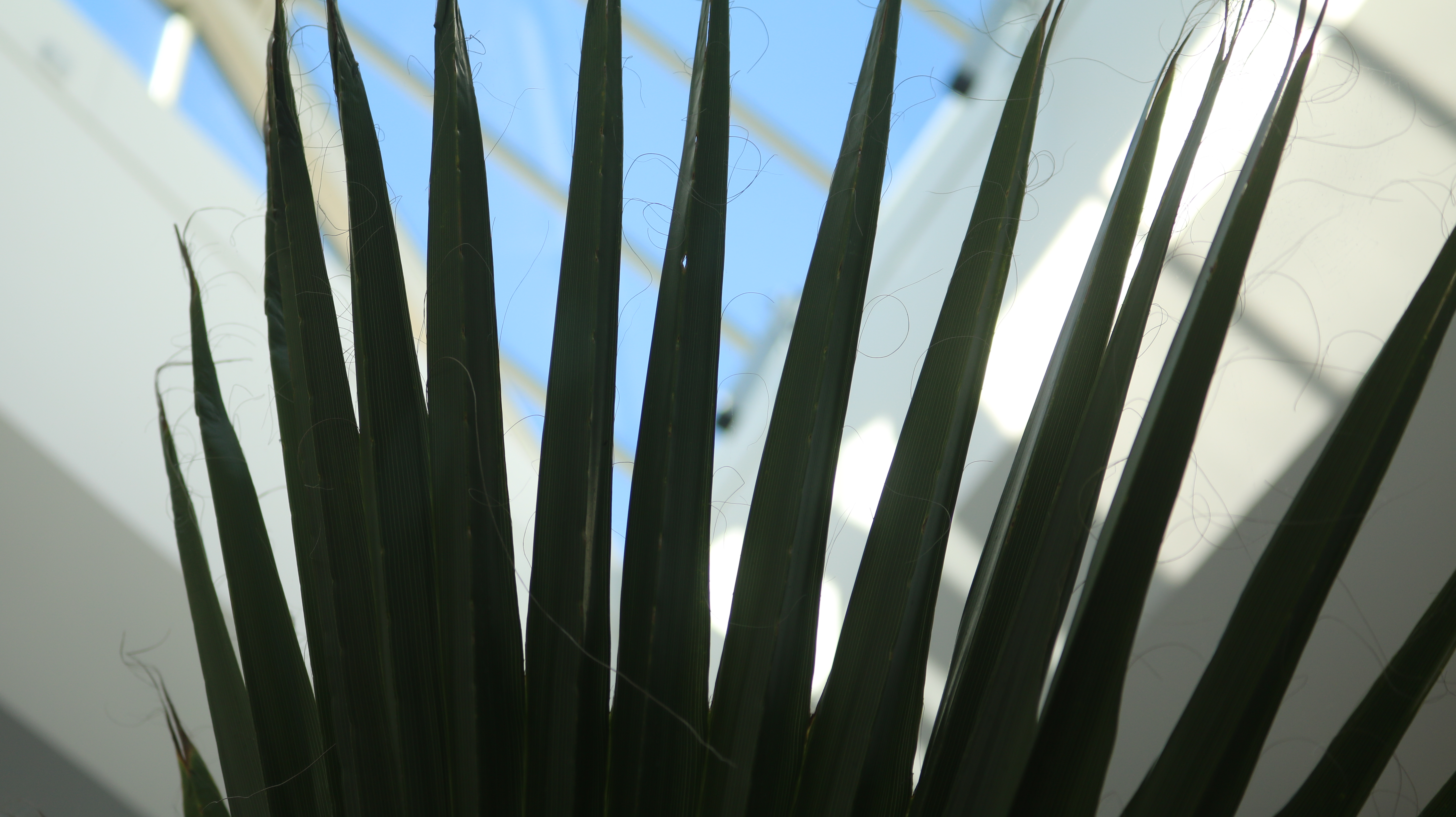


ISO controls the brightness of your photos and controls the cameras sensitivity to light. Put simply, it will lighten or darken your photos. As you increase your ISO, your cameras sensitivity will increase and therefore photos brightness will increase.
It means you could have more flexibility in your aperture and shutter speed settings. For example, if you’re indoors with poor lighting and you’re photographing a sports even where people are moving fast, then you would be able to use a fast shutter speed without the photo being under exposed.
When using high ISO you can start to get more grain/noise.
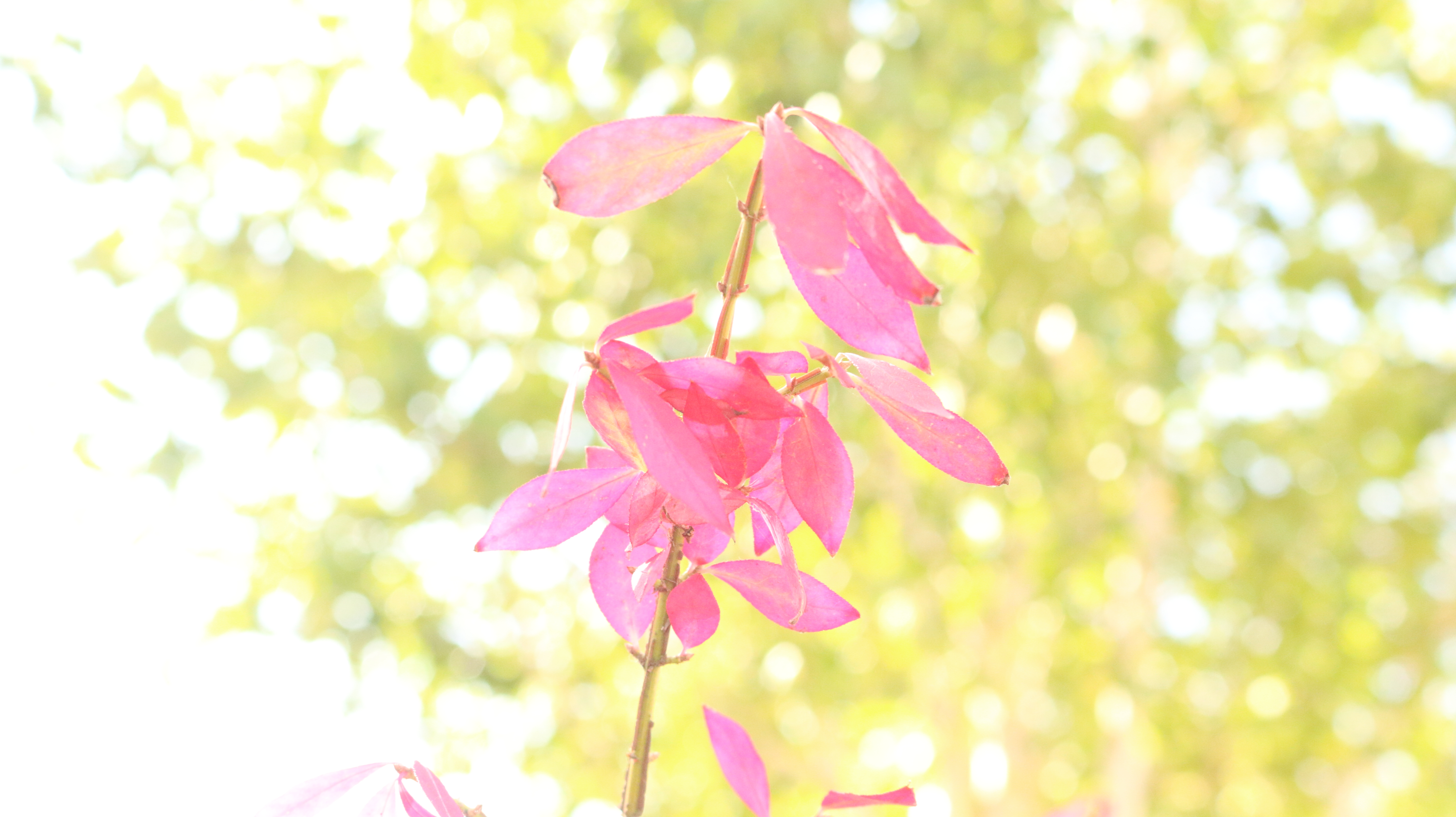
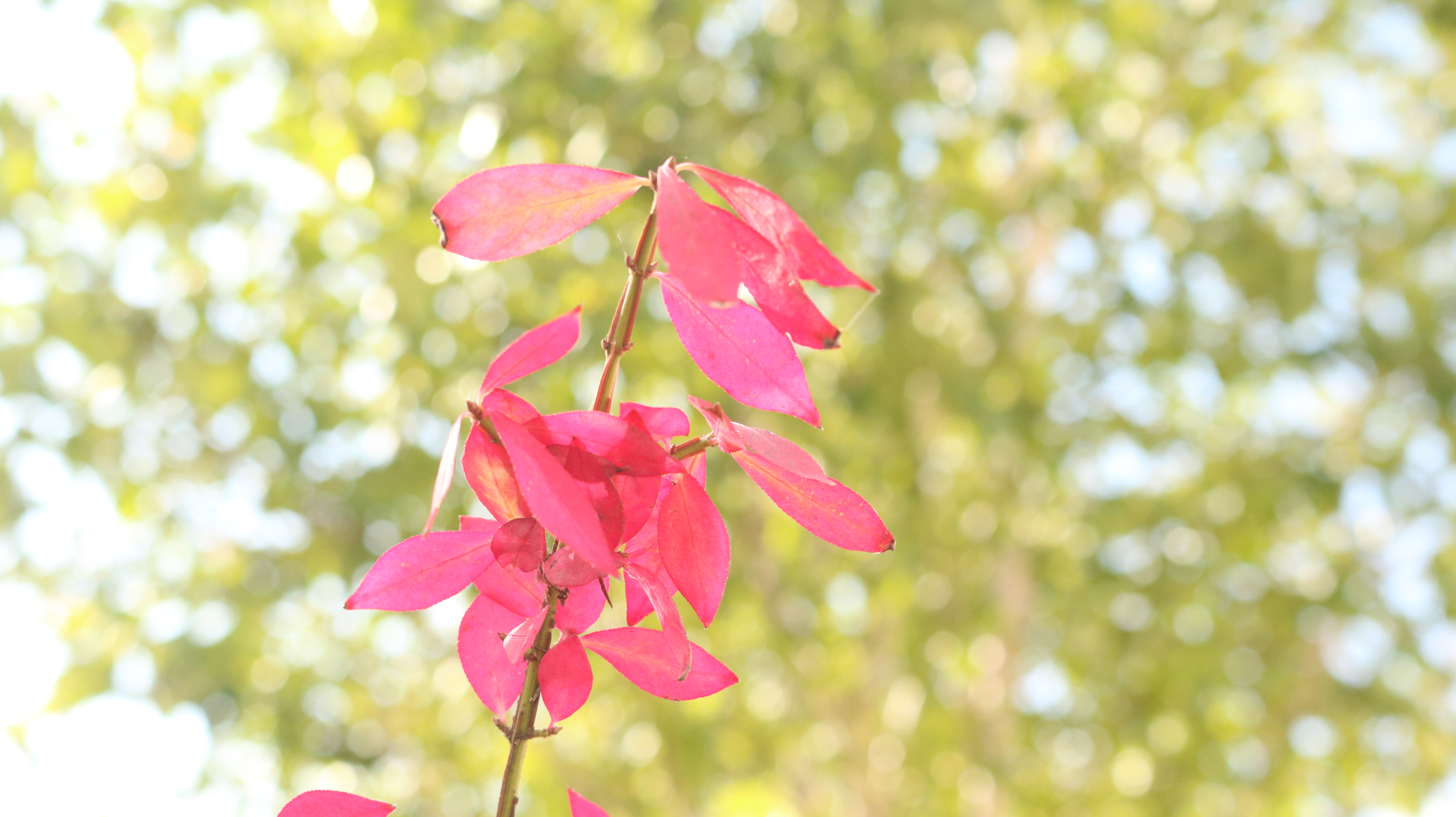
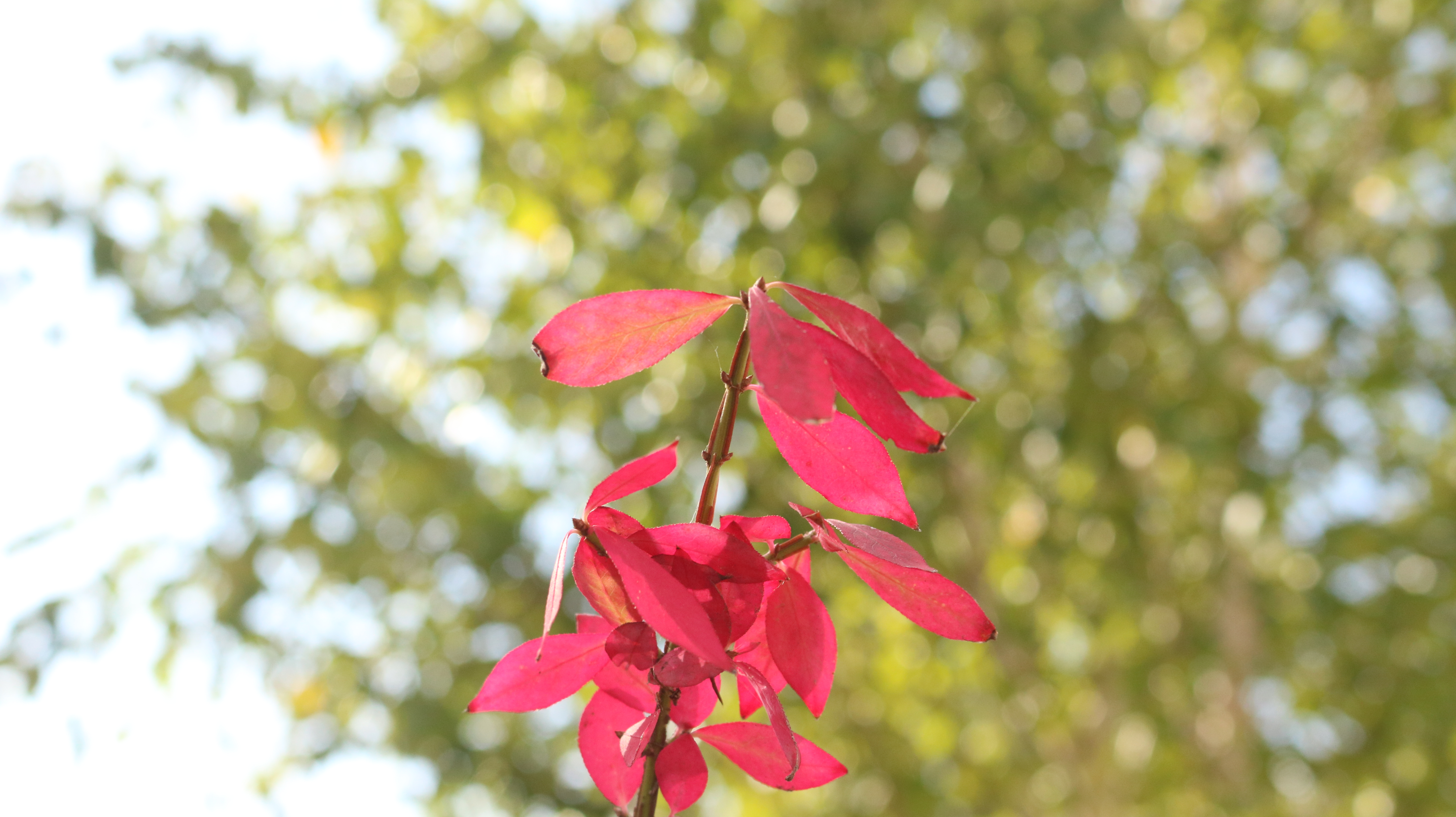
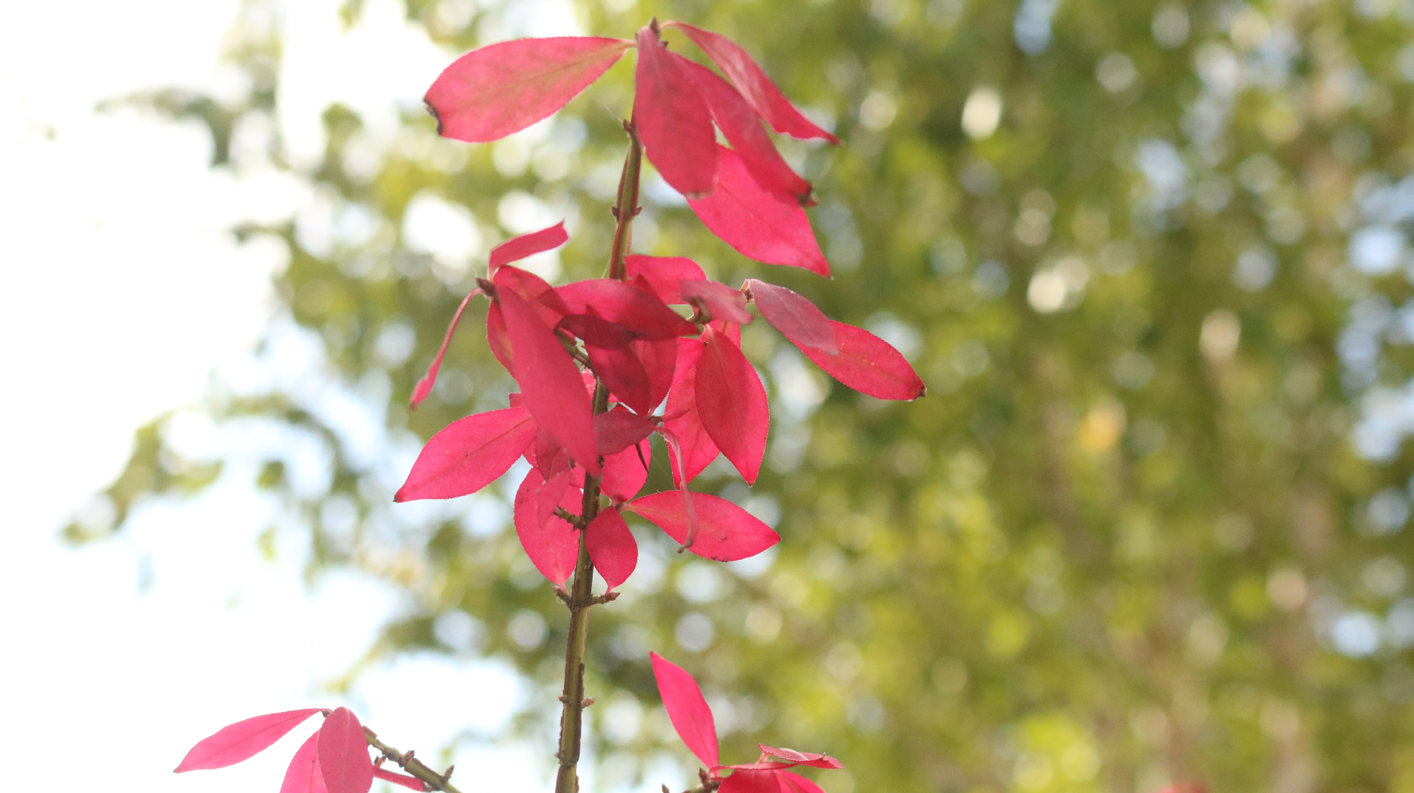


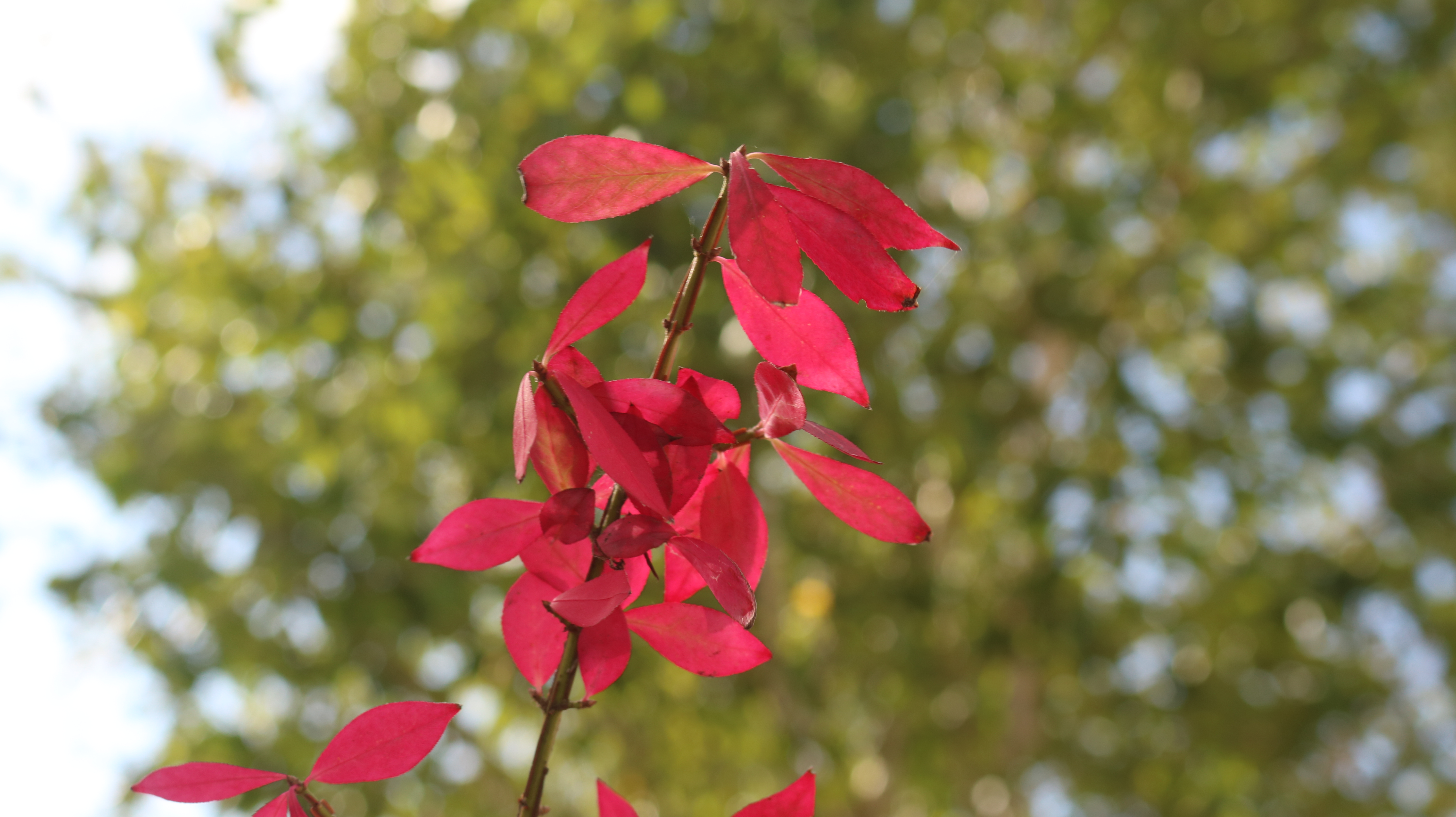


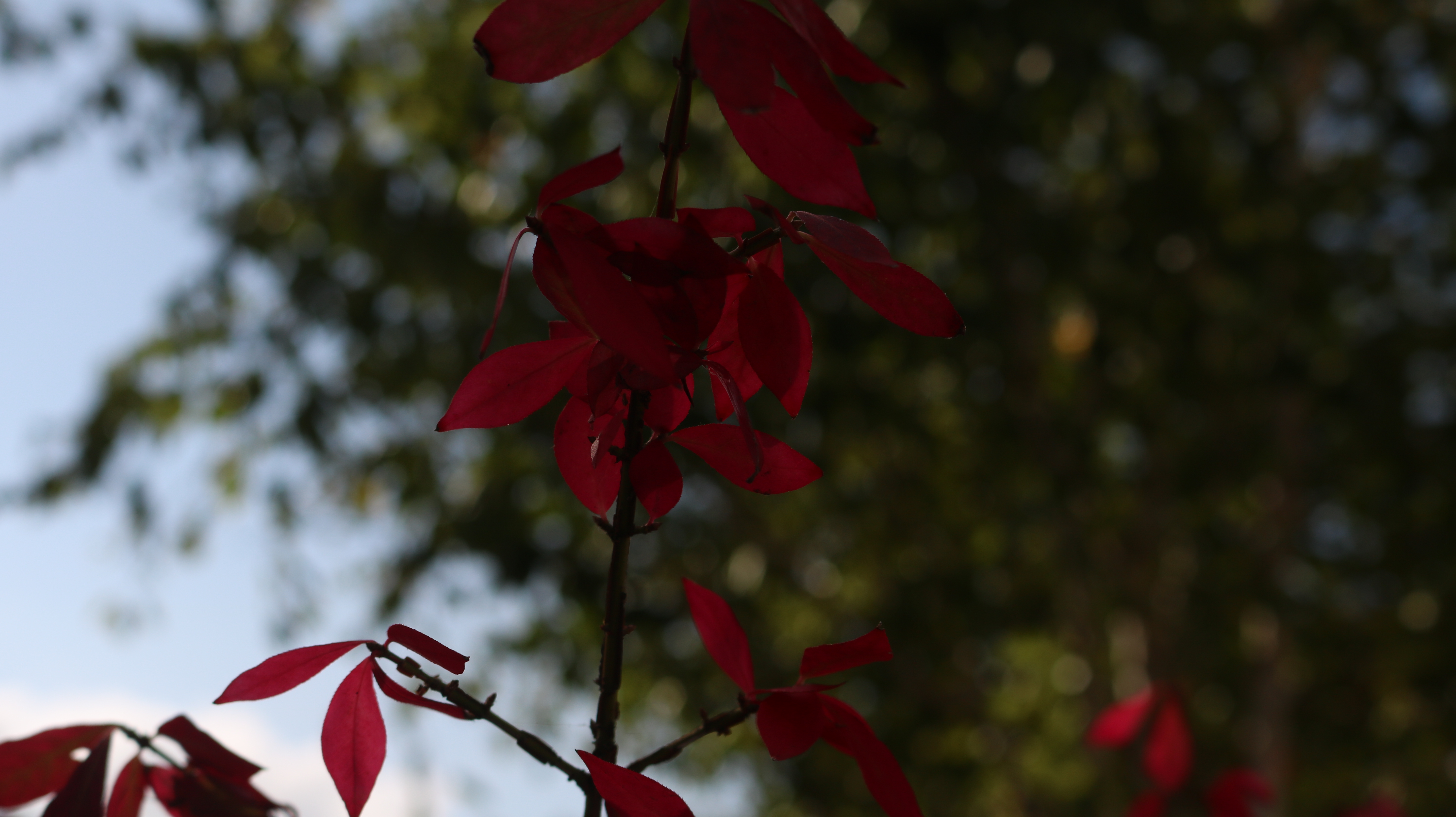


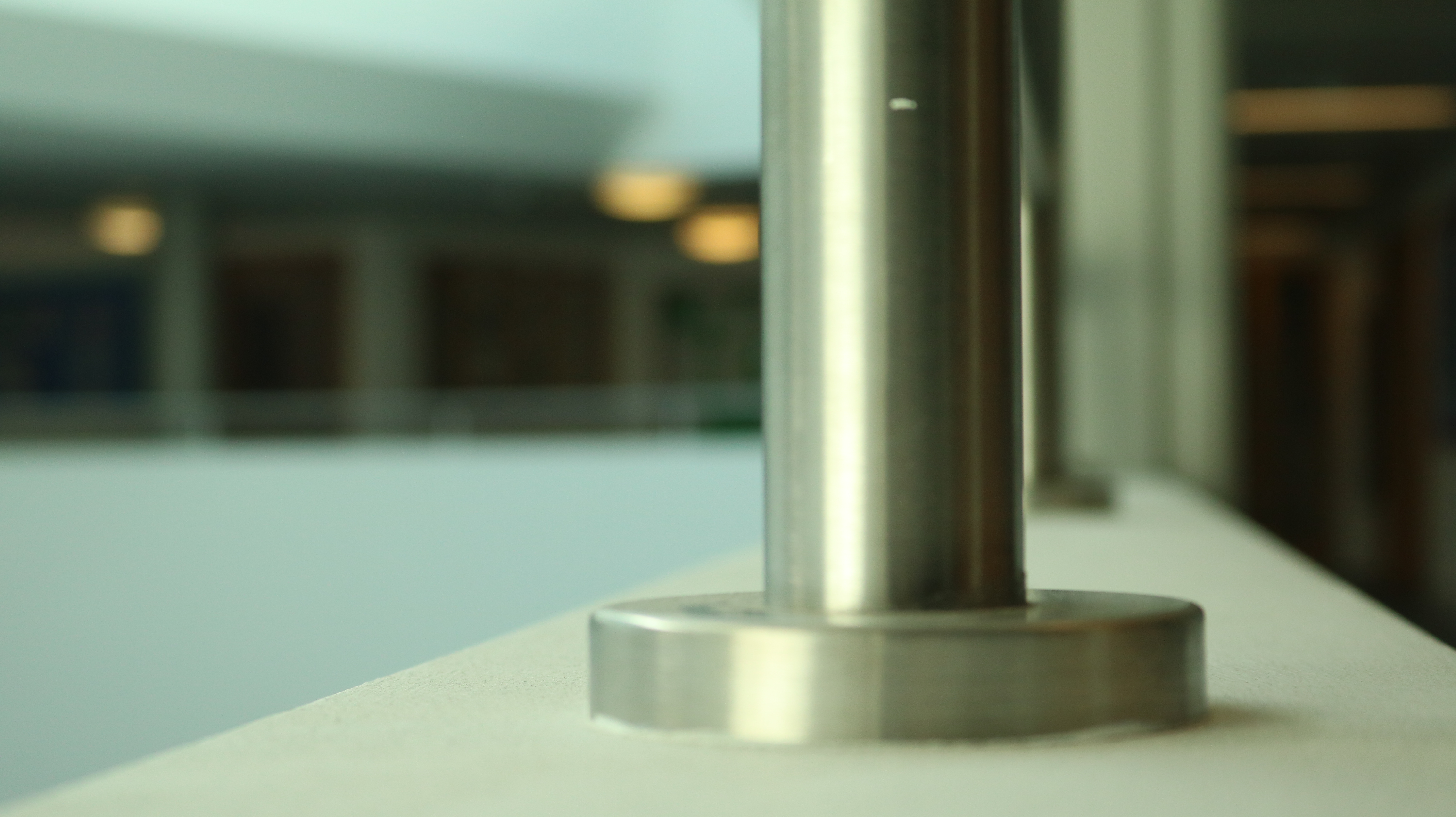
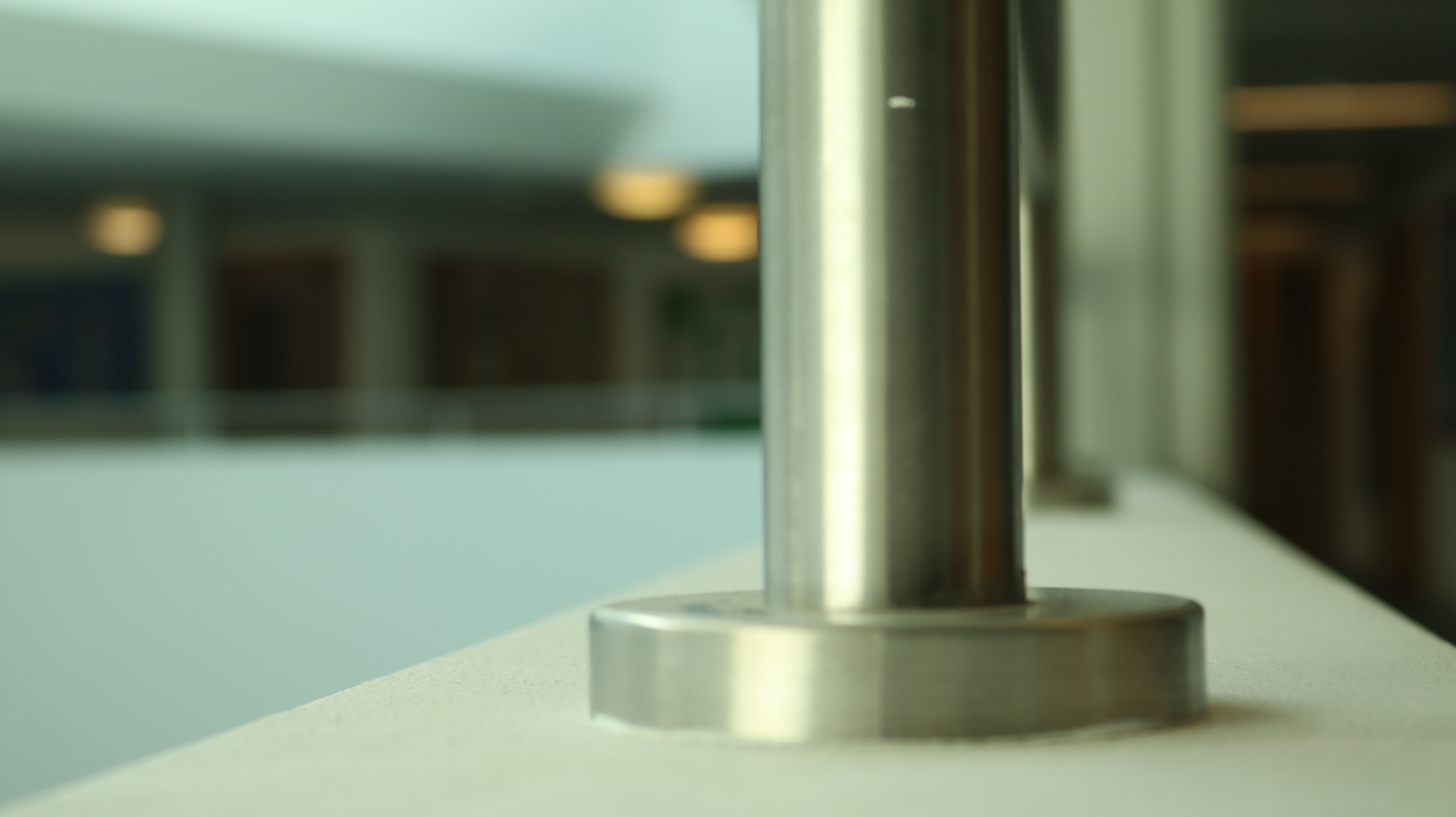


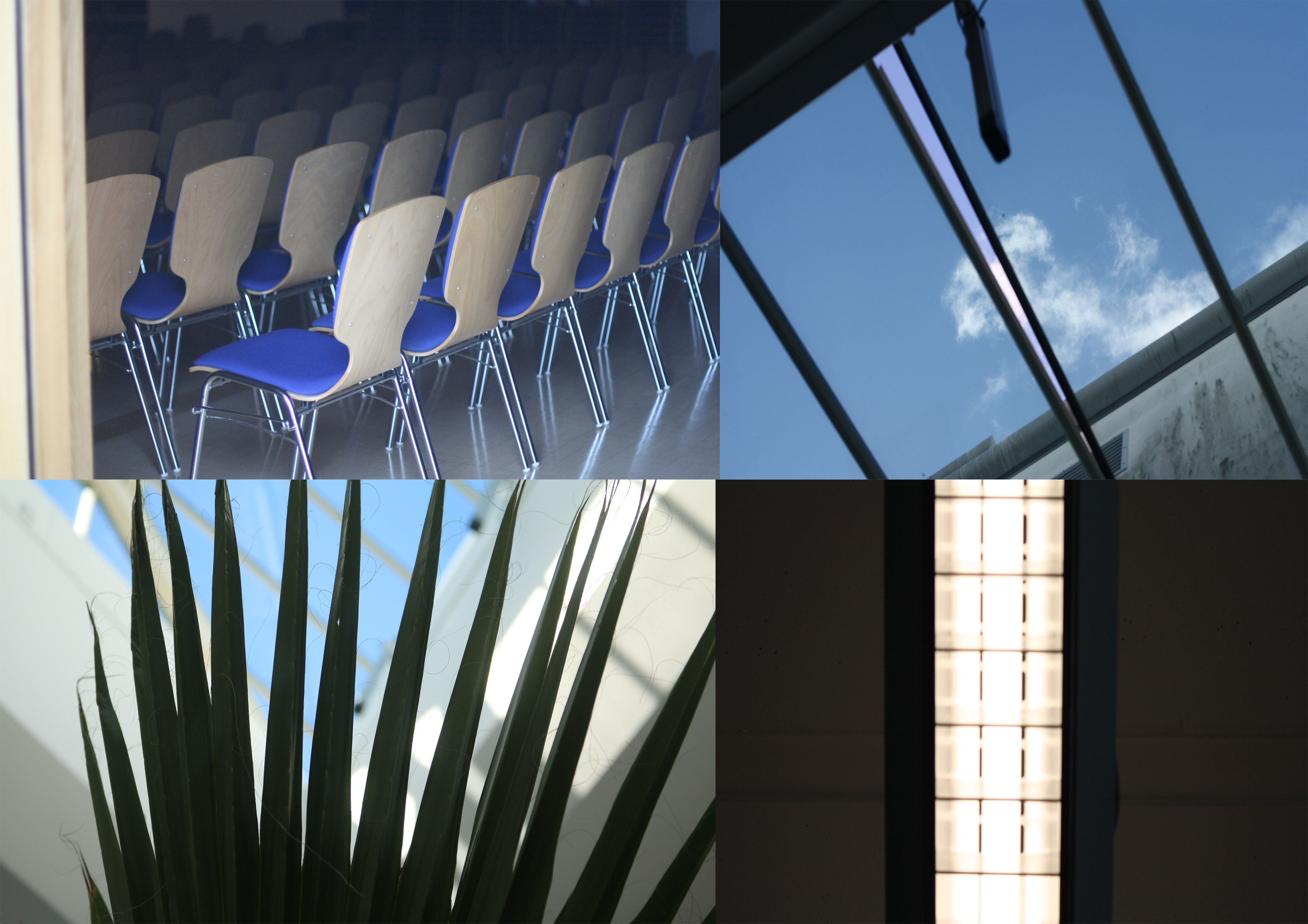







Camera settings – 1/25, f5.6, ISO 400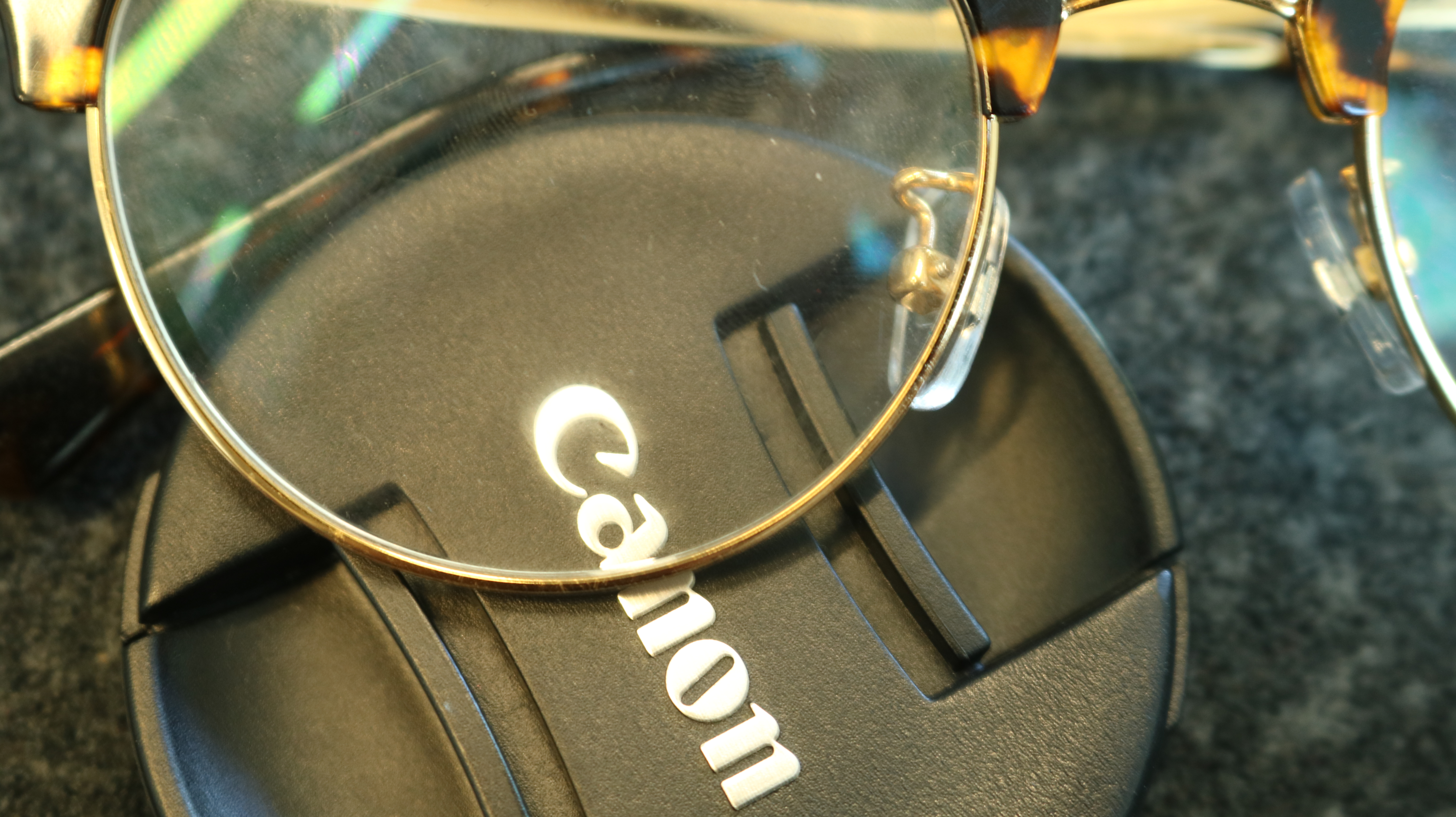
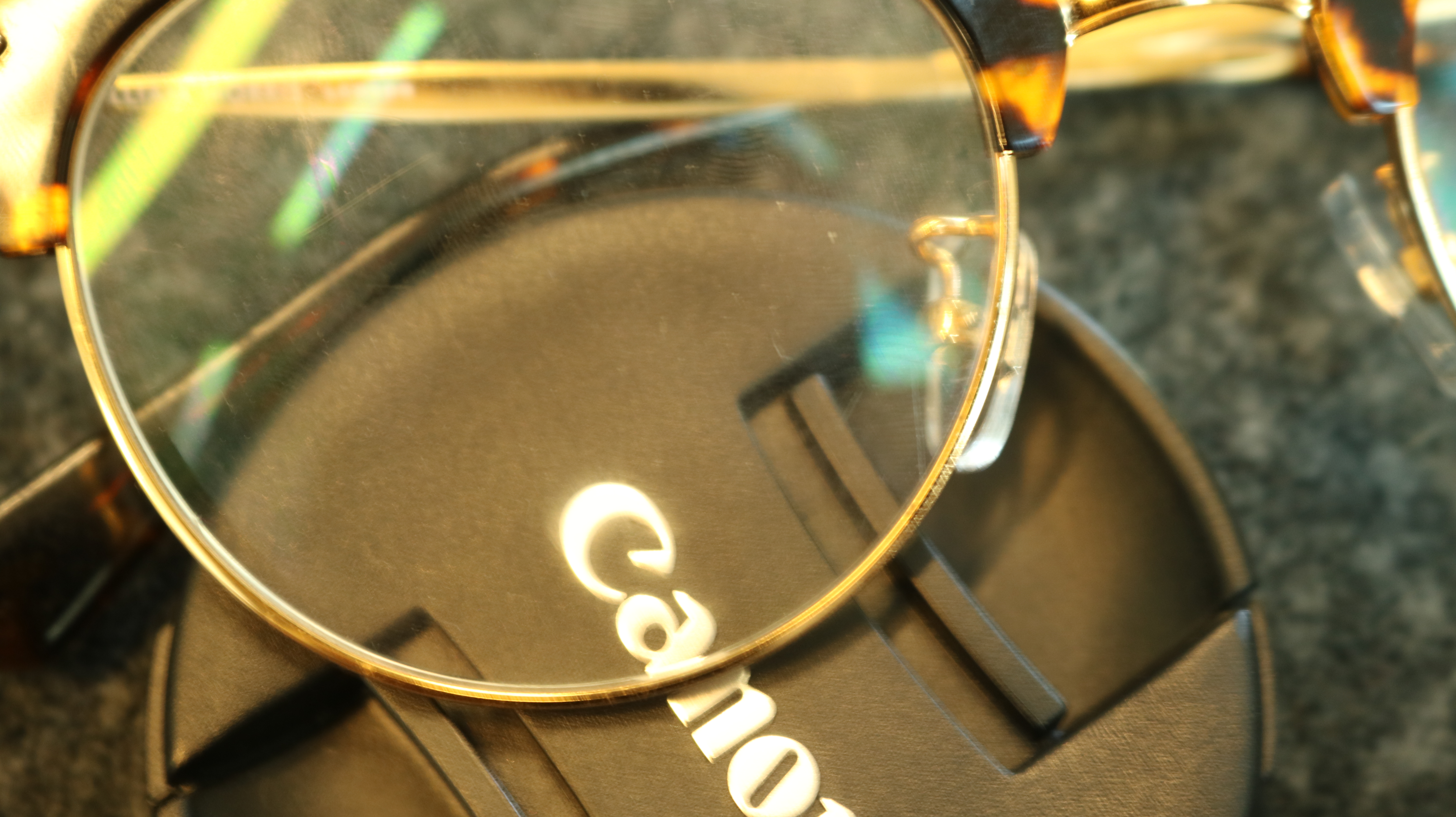
WB – Sunlight setting
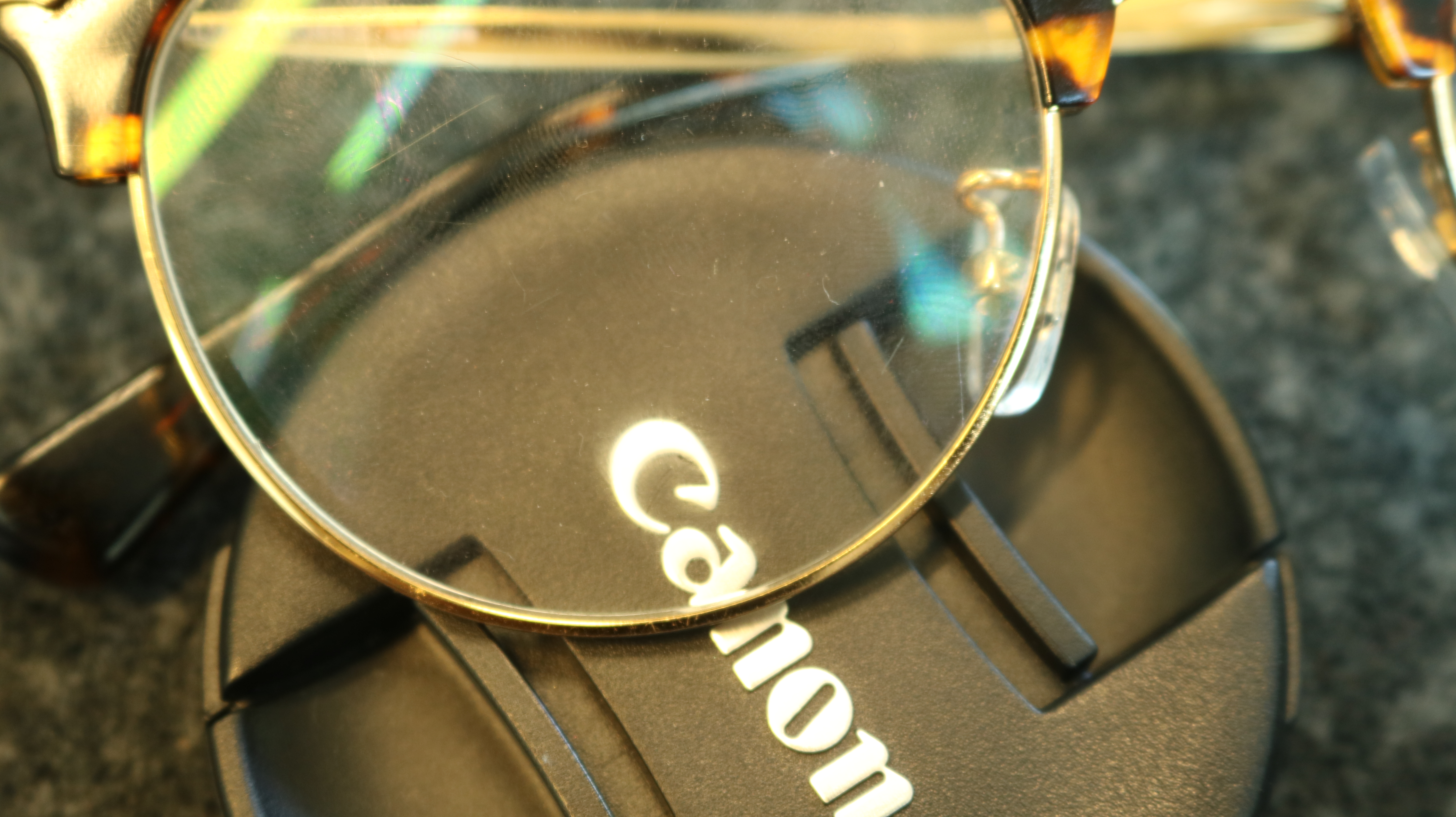
WB – Shade Setting
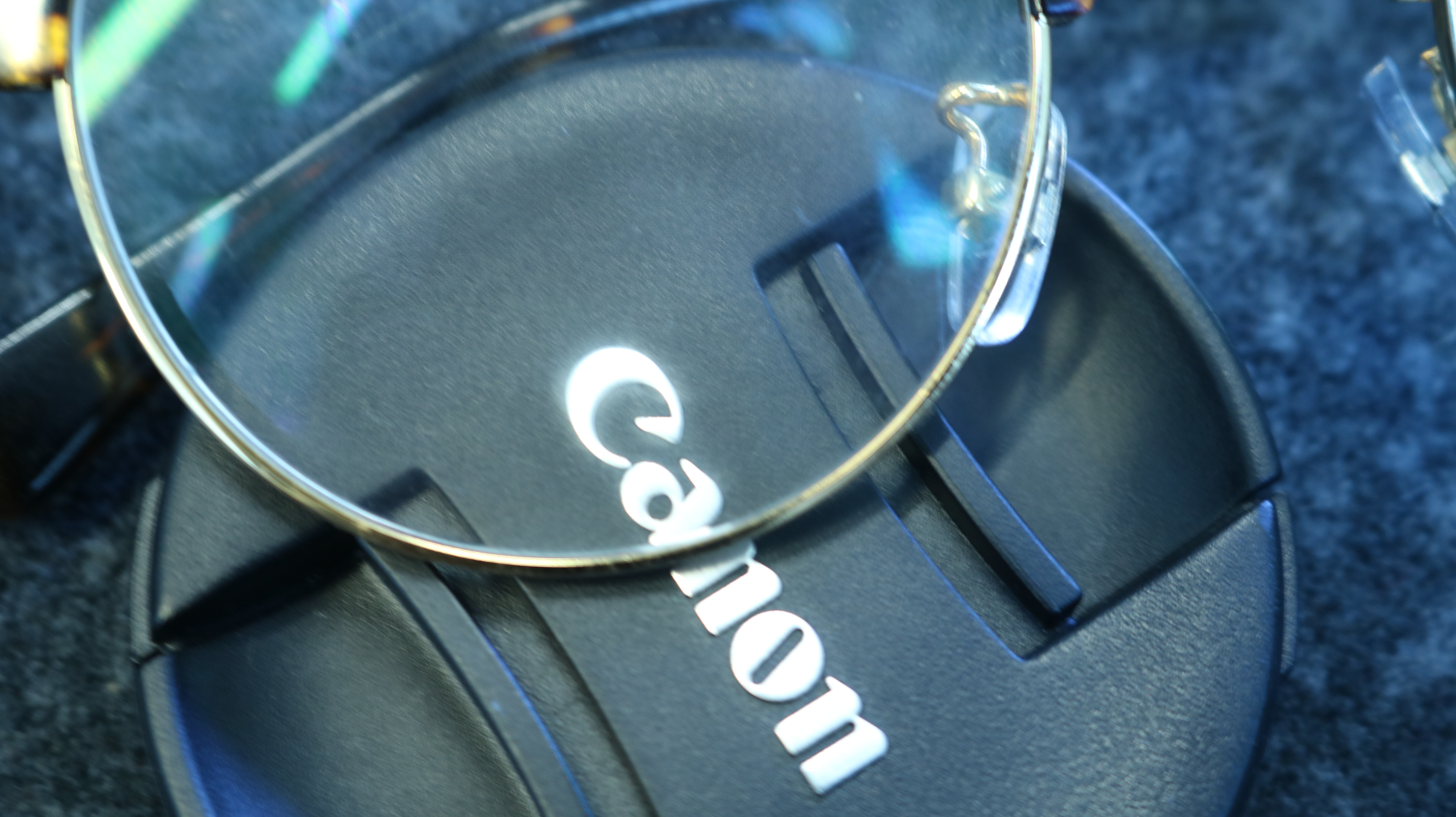
WB – Cloud Setting

WB – Tungsten light setting

WB – white fluorescent light
Camera Settings – 1/1000, f5.6, ISO 400

WB – Auto
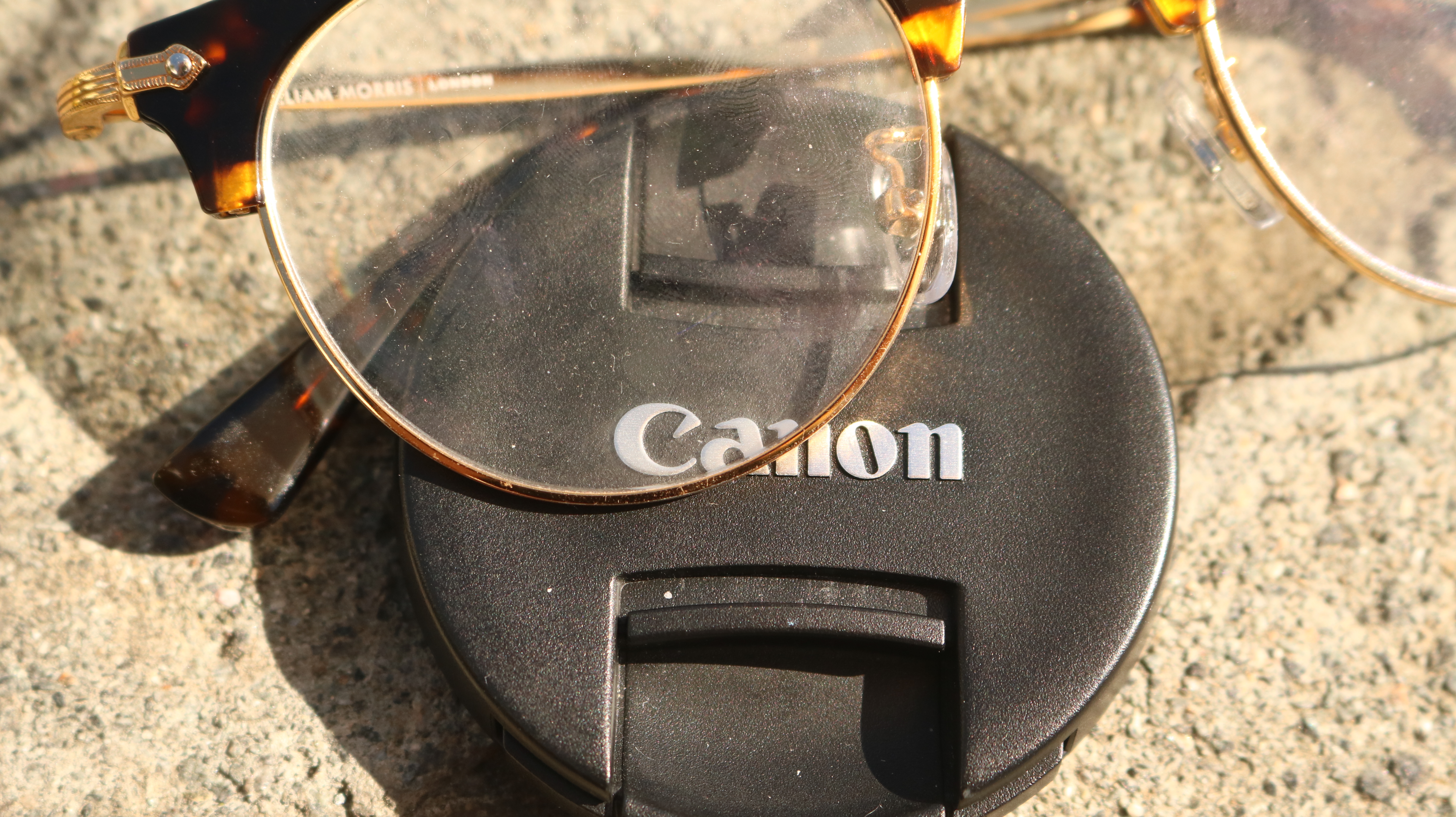
WB – Sunlight setting

WB – Shade setting

WB – Tungsten Light setting


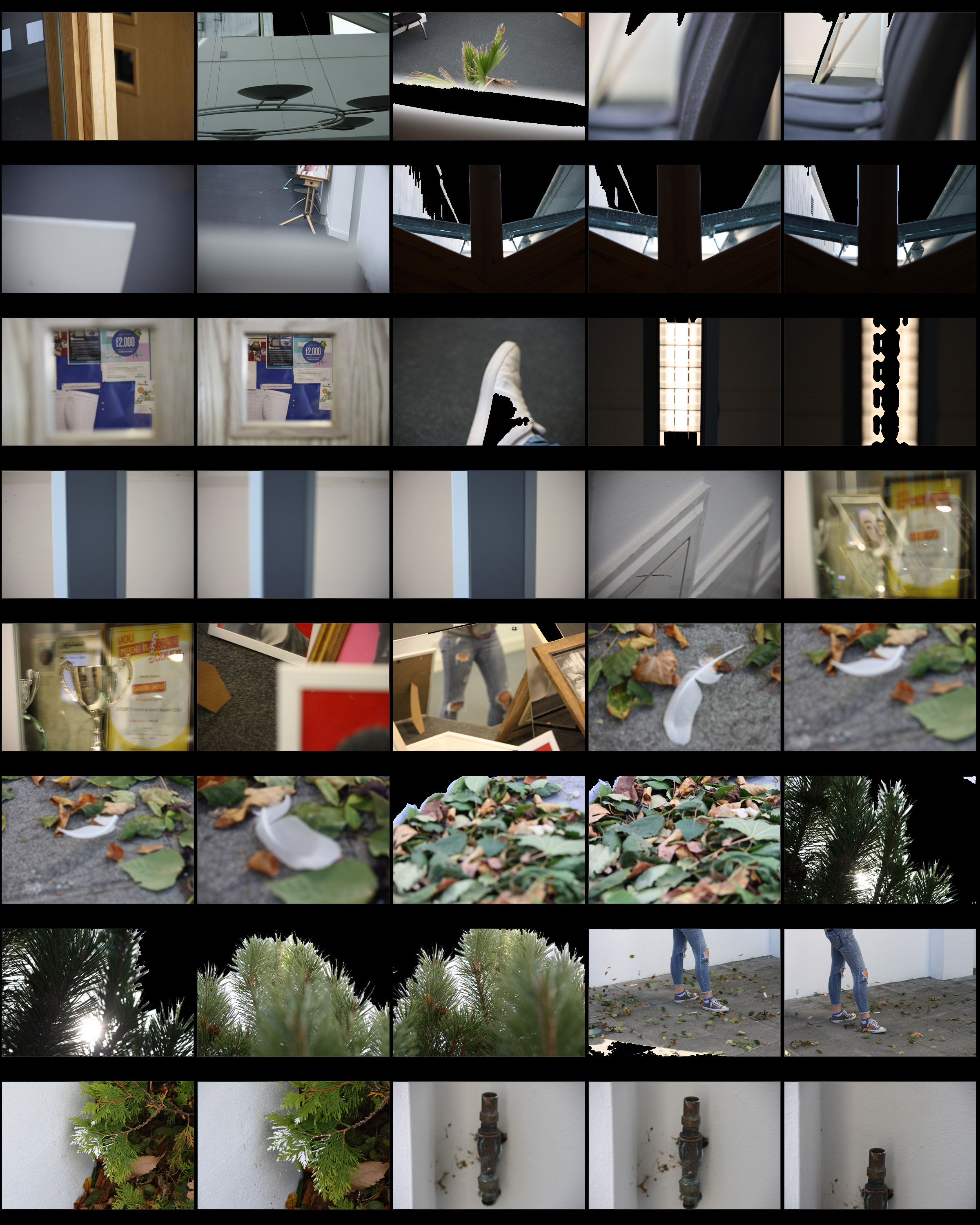



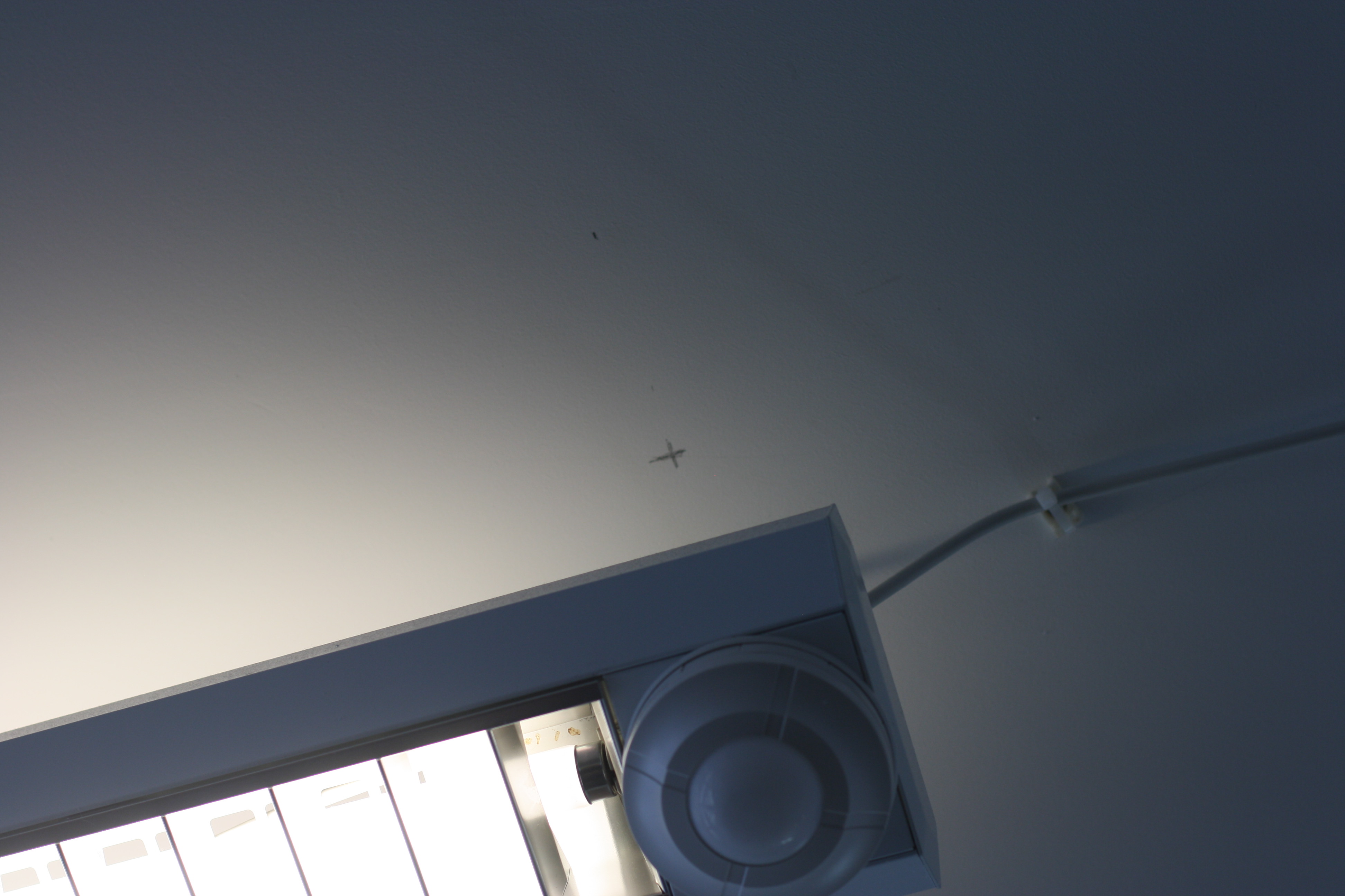

I really enjoyed using the standard lens as it was easy to focus however I believe the Telephoto lens ended up getting the best photographs.


I enjoyed the work of Clare Rae and Claude Cahun very much as I enjoyed seeing the surrealist nature of Claude Cahun’s work And how Clare Rae managed to interpret her work and gain inspiration to carry out her response. Clare Rae focused more on Claude Cahun’s earlier work about Man with nature and man with man made objects. Clare Rae and Claude Cahun both have put their pictures in black and white and are both the main subjects of the photograph, whilst maybe someone else is taking the photographs. Both their work likes to feature contrasting tones of light and dark.

Claude Cahun in this photo is far away from the camera itself and facing away from it also. She here I believe is trying not to draw too much attention away from the surroundings and the structures in the photos. The walls at the edges in the photos creates a claustrophobic feeling which could be Claude Cahun’s way of expressing her feelings towards those who were at the time maybe being shunned for their sexuality.
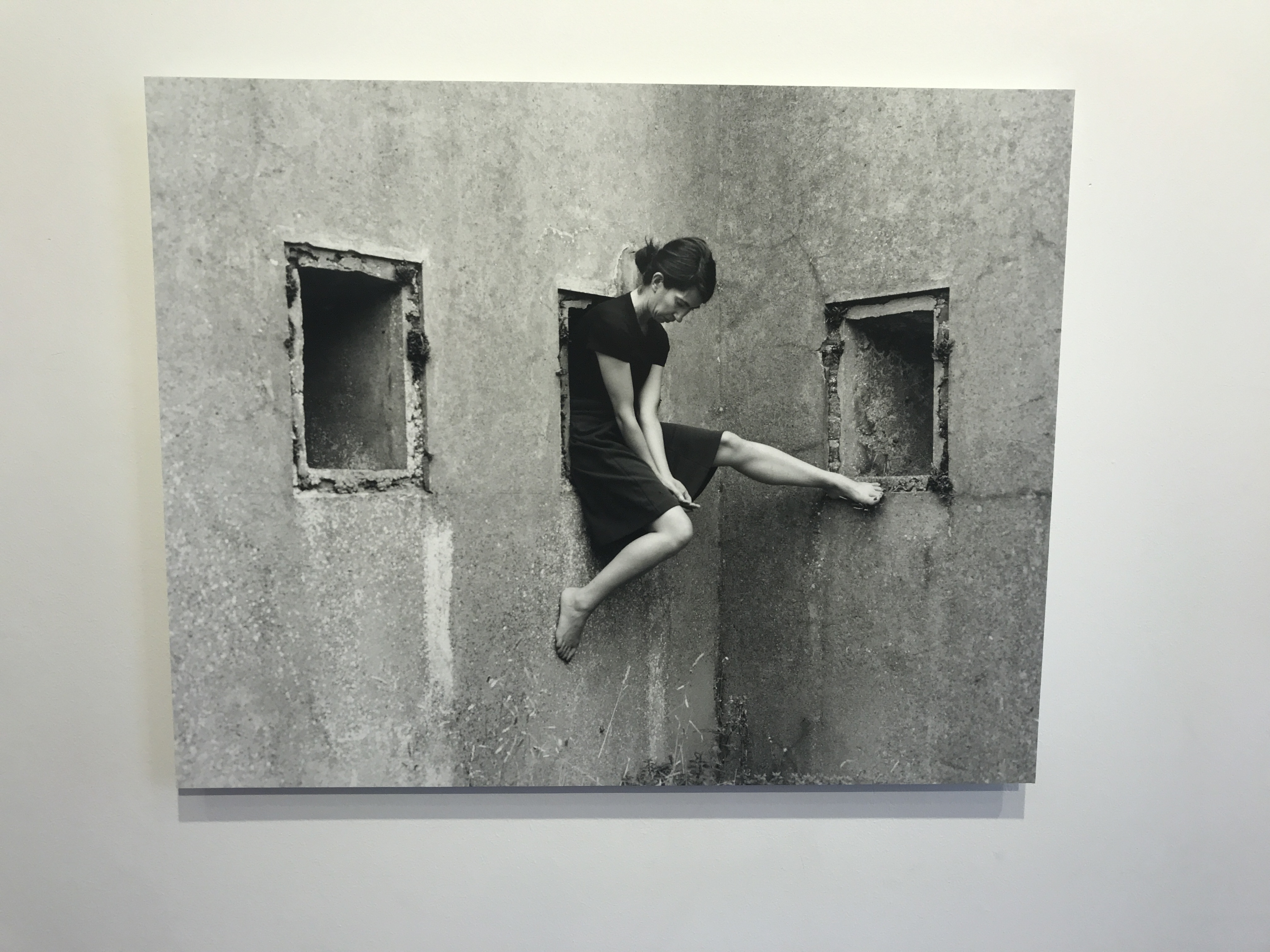 Similarly, here, Clare Rae keeps her head down and not looking at the camera. She also focuses on the architecture around her and the texture and shapes of the walls. Rather than this feeling claustrophobic, it’s feels comforting as she’s almost cocooned by the walls. However the ways she sits is awkward which could be a take on the ways Claude Cahun also used her body.
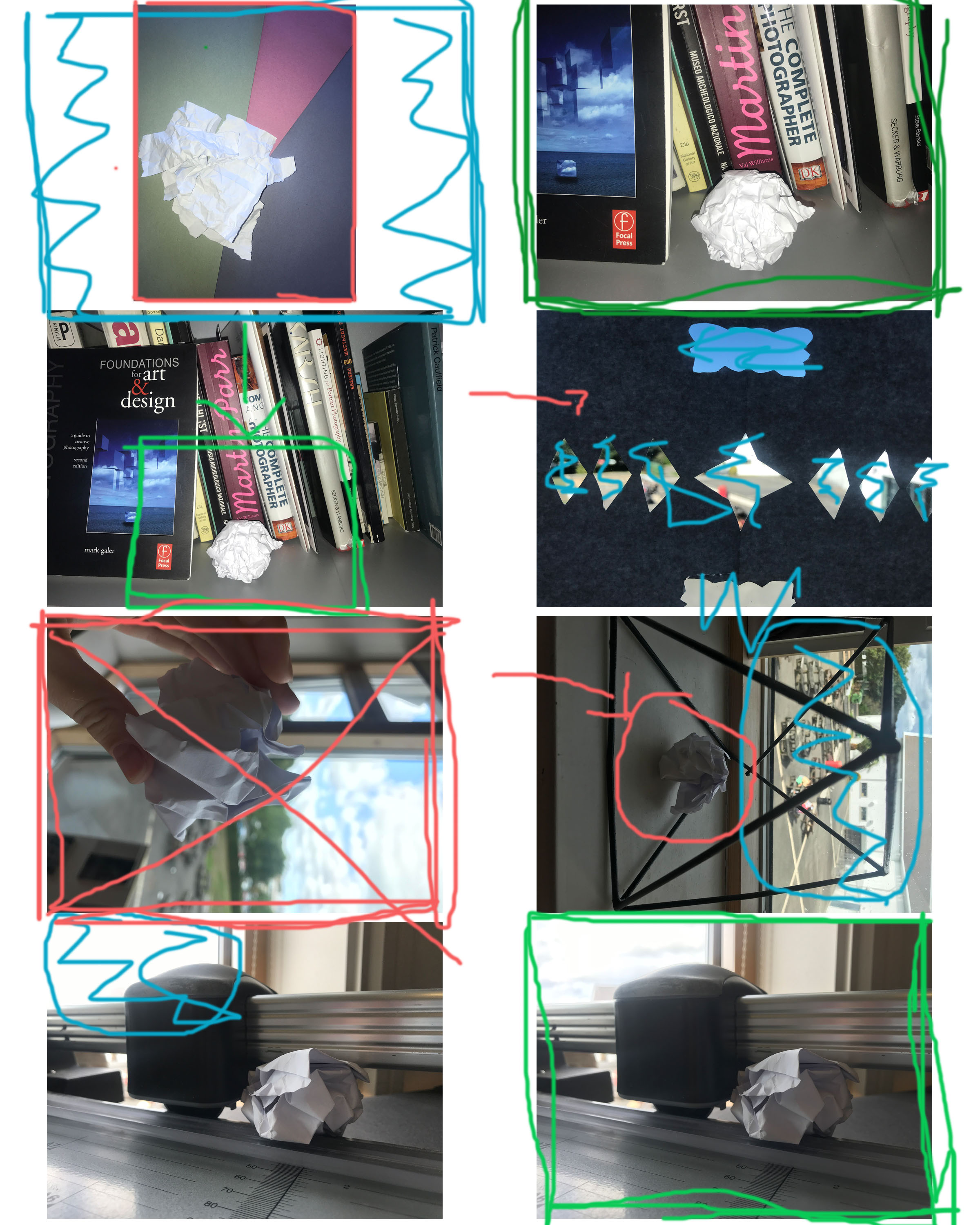
Why did I reject the ones I did?
I didn’t like the lighting in the one with me holding the paper and the one in the geometric shape. I also didn’t like how the light was coming in from the window in one of the photos. I didn’t like the background being featured in the one with the shapes cut out of the paper.
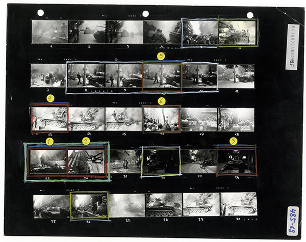
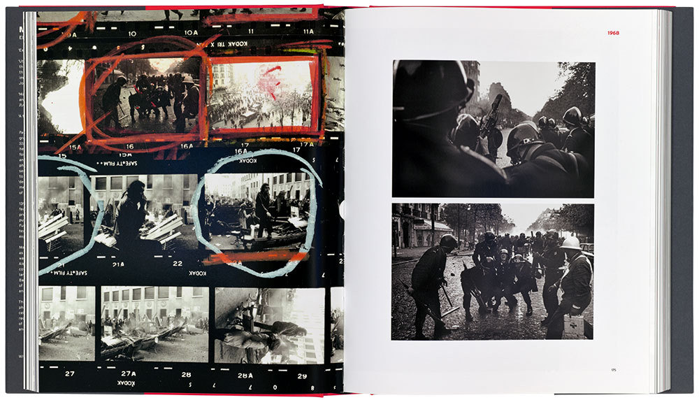
KEY:
Red X – Unwanted Photograph
Red Circle – Lighting Issue
Blue Scribbles – Unwanted things in the background (mise en scene issue)
Large Green Box – Wanted image
Small Green Box – Want everything within square

