Working on this project allowed me to really engage with the history of this island and express what I learnt through photography. I also managed to learn a lot about my families history during the occupation. My favourite part of the project was interviewing and taking pictures with the occupation survivors. I loved hearing their personal stories and thoughts on the occupation, and it ended up affecting how I went forward with the images I took for the rest of the project. Creating the newspaper allowed us to reach a wider audience to express our feelings on the 75 years since the occupation as well as learn how to put together a newspaper and tell a story with my images.
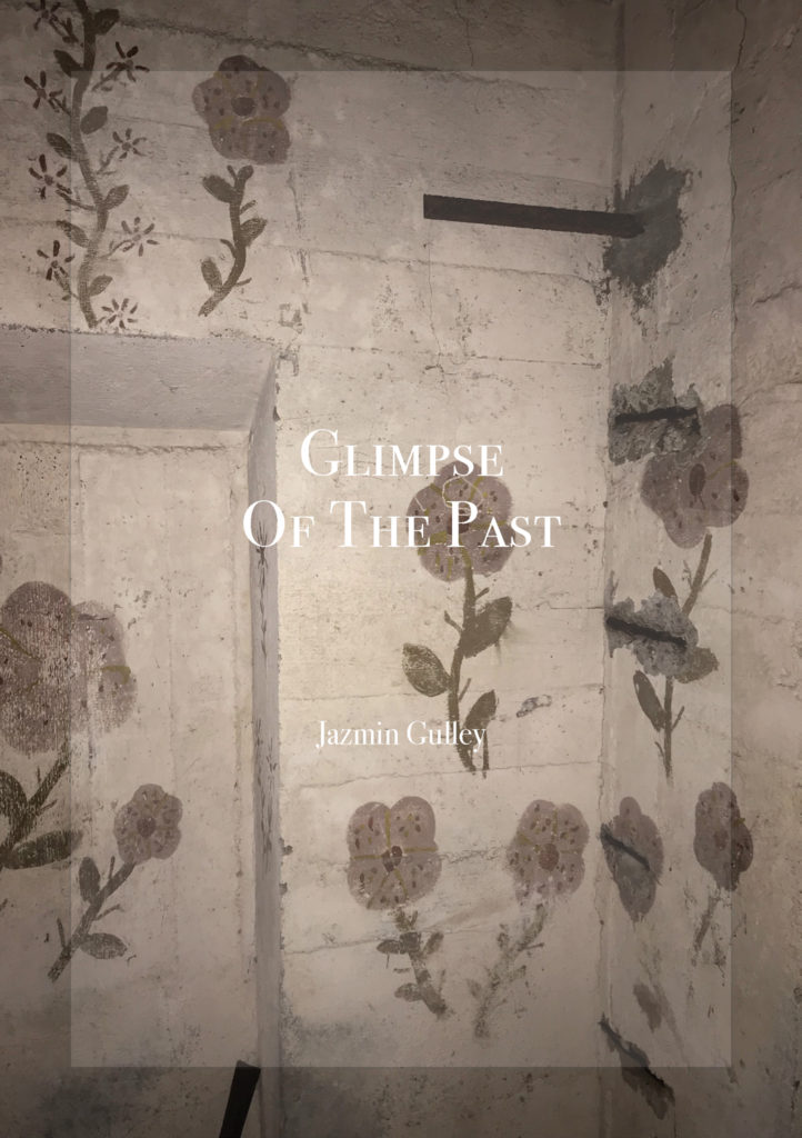
Liberation Newspaper
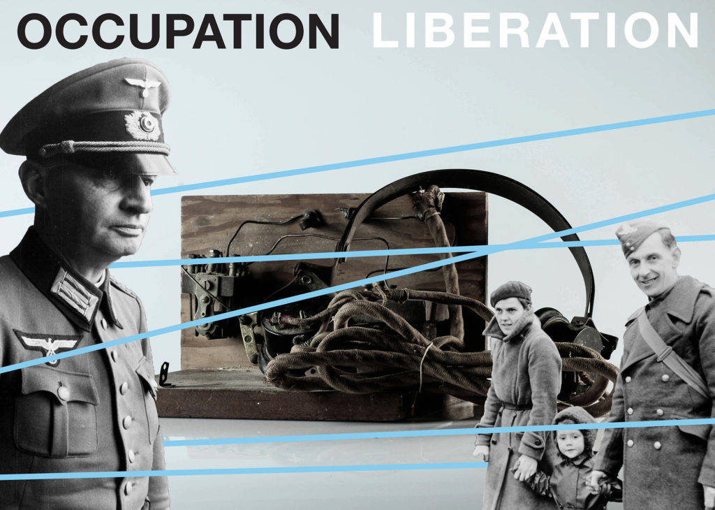
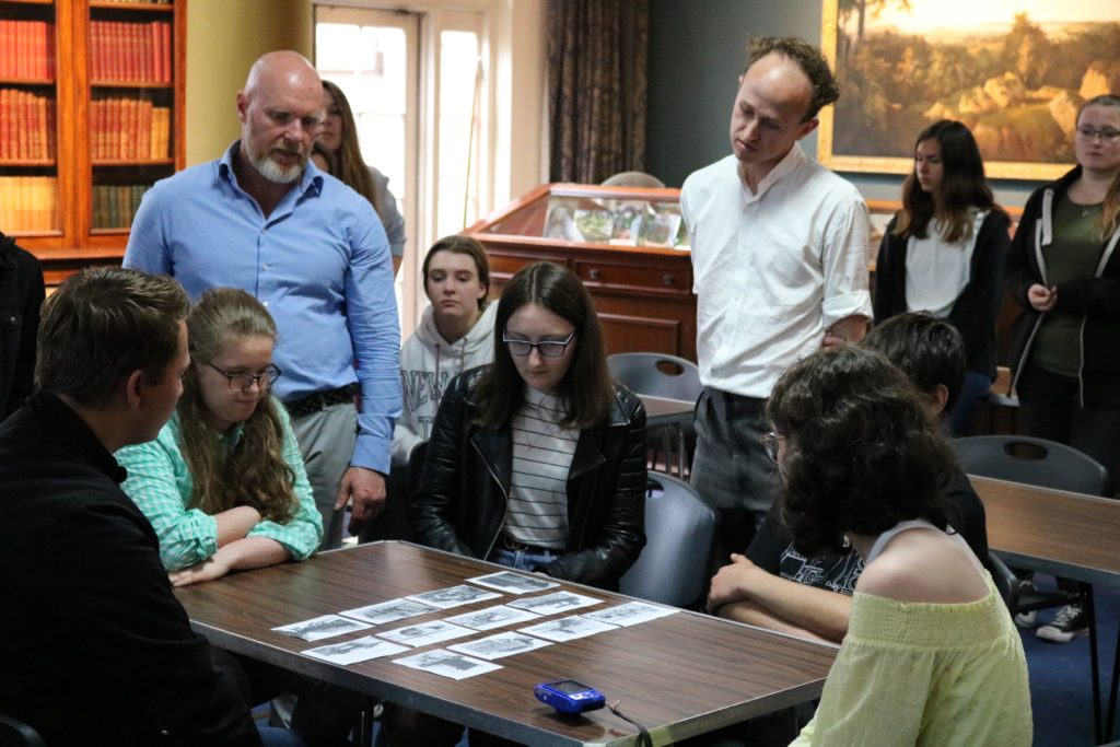
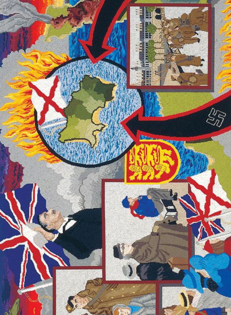
Since the summer of 2019 A-Level Photography Students at Hautlieu School have been working on an extensive programme of study in their final year exploring Jersey’s Liberation and Occupation history in collaboration with Société Jersiaise, Jersey Heritage, Channel Island Occupation Society, Jersey War Tunnels, Bureau des Îles Anglo-Normandes and post-graduate students from École Européenne Supérieure d’art de Bretagne in Rennes with funding from Liberation 75. Students were challenged with responding to personal stories told by islanders experiencing the German Occupation first-hand and finding inspiration by looking through images, documents and objects held in various collections in Jersey’s public archives, producing a series of individual creative outcomes such as montages, photo-zines and collectively construct a visual narrative presented as a newspaper supplement printed and distributed by Jersey Evening Post on Friday 24 April 2020.
The Liberation vs Occupation project began partly as a response to 75 years of celebrating freedom in Jersey from the German Occupation in 1940-45. Sadly, islanders will not be able to commemorate this landmark event as initially planned and it is hoped that this newspaper and joint exhibition between Jersey and French students will in some small way act as catalyst for remembering those years of hardship and subsequent joy when Churchill’s now famous speech was broadcast on the 8 May 1945 with the endearing words ‘our dear Channel Islands are also to be freed today’.
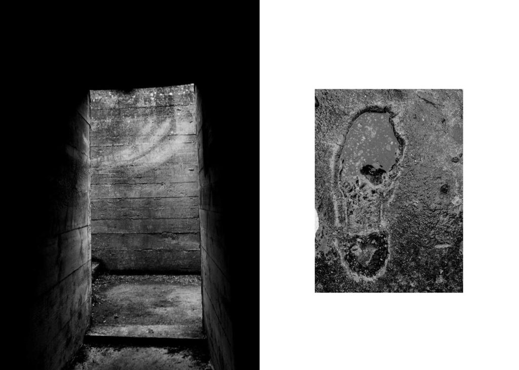
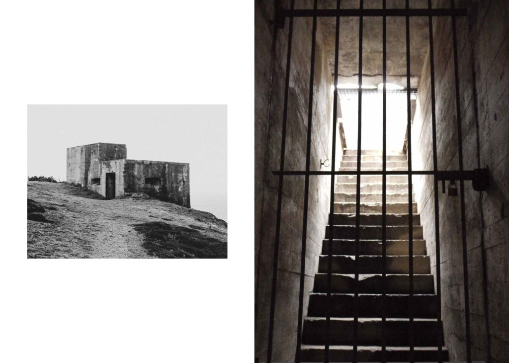
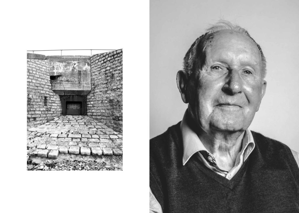
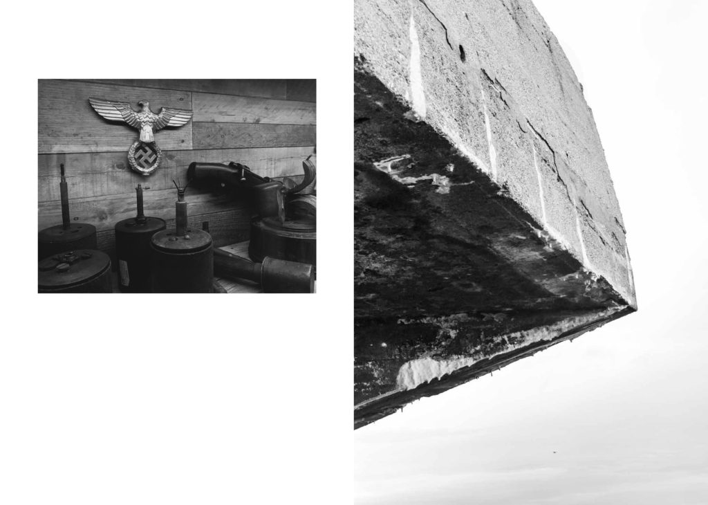
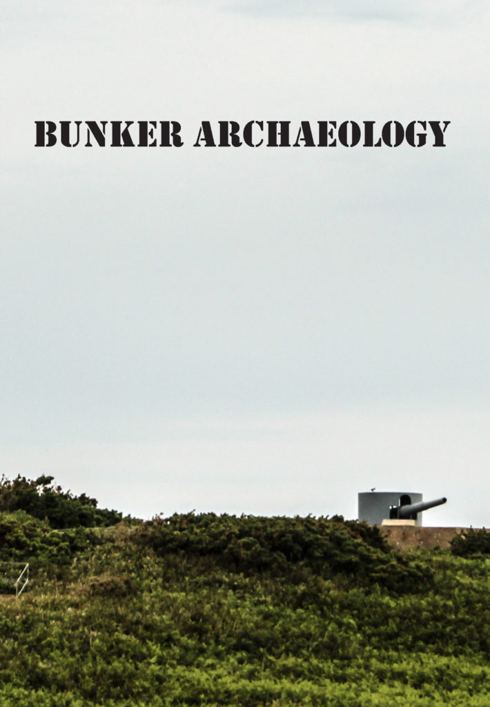
The programme of study began on the 4 June at the Société Jersiaise Photographic Archive where students took inspiration from a presentation by Patrick Cahill, Photo-Archivist and looked through some of the historical collections held in the photo-archive pertaining to the German Occupation of Jersey in 1940-45. In September students explored the landscape of German fortifications around the coastline of Jersey with specific visits to bunkers, such as Battery Moltke at Les Landes and Battery Lothringen at Noirmoint Point. Further visits followed to Jersey War Tunnels and Jersey Archive to research public records and learn more about life in the island during the Occupation.
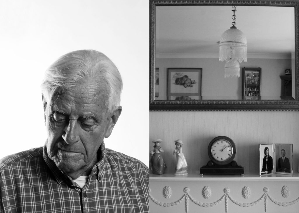
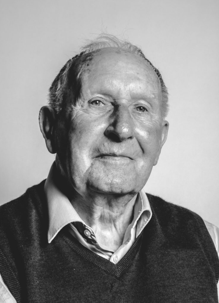
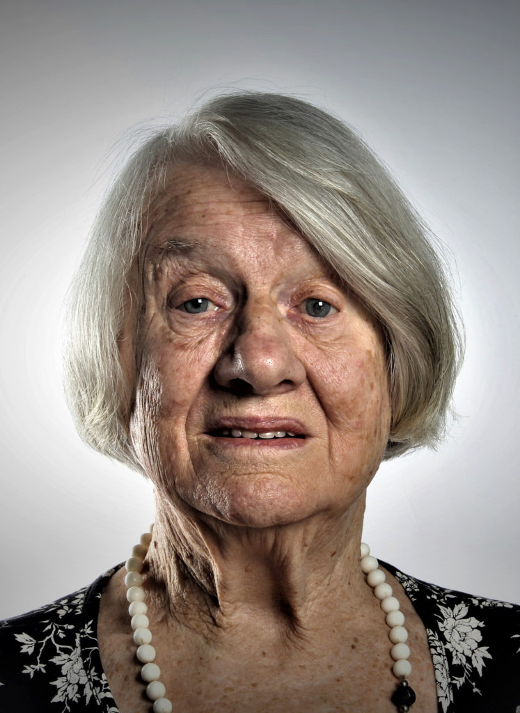
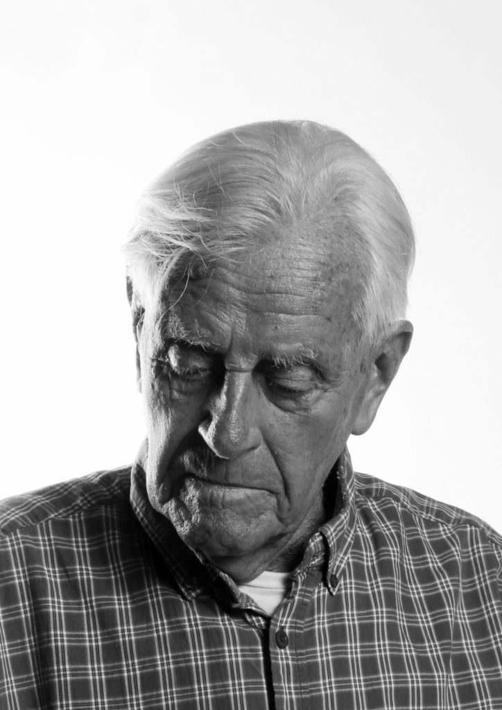
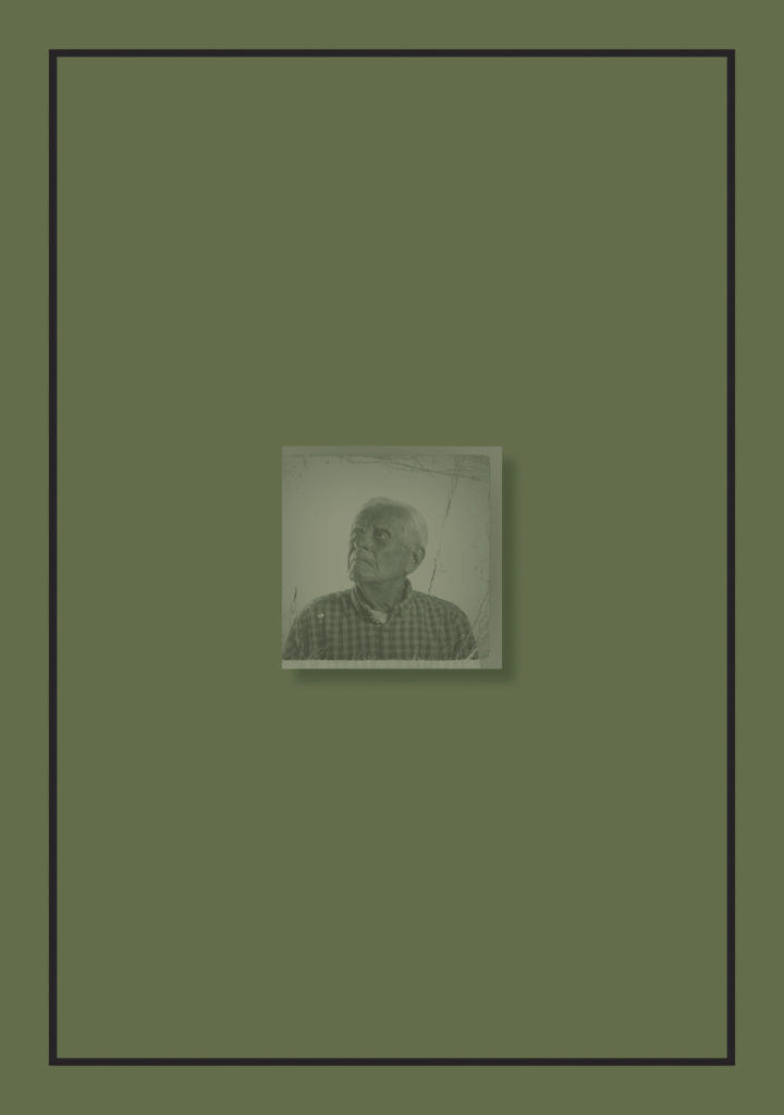
Personal stories and memories from islanders, Bob Le Seur, Hedley Hinault, Joyce De La Haye and Joan Tapley, experiencing the German Occupation first-hand were recounted to students in a series of workshops, that included portrait sessions in the photographic studio at Hautlieu School and photographing objects from 1940-45 held in the Occupation collection at Jersey Heritage. Students have interpreted how the themes of Liberation and Occupation relates to them as teenagers growing up in the 21st century and the combined outcome of their studies can be seen on the pages of this newspaper, and in a joint exhibition Bunker Archaeology 2020 with postgraduate students from École Européenne Supérieure d’art de Bretagne (EESAB) originally to be held at the Berni Gallery, Jersey Arts Centre 6 -30 May 2020, now postponed due to Covid-19.
My Image
The Bailiff Timothy Le Cocq, who has written a foreword in the newspaper expressed his delight with how this collaboration has played a wider role in cultural diplomacy by; ‘allowing Rennes-based Masters students to work with students from Hautlieu on a project that has helped to spread the message of our important history, shared heritage and bringing communities closer together.’
Photographer and teacher Martin Toft who led this project, commented: ‘Every student involved in this project engaged passionately in the subject of the German Occupation of Jersey and the images presented here in this newspaper are only a fragment of the enormous amount of work that each student has produced. It provides a fascinating insight into how young people have used the language of photography to explore and interpret events which happened many years ago.’
Here is a video browser of the Liberation Newspaper printed and distributed islandwide by Jersey Evening Post.
Zines: The editing and sequencing of this newspaper was derived from a number of photo-zines produced by A-Level photography students at Hautlieu School
The above images I will be placing in my book once it arrives. I liked the tactile feel of Yoshikatsu Fujii’s book ‘Red String’ and as I wasn’t able to do the physical split, I wanted to incorporate physical pictures. I chose these images out of my personal family albums. I chose these images as the two of my parents are of when they were younger at the beginning of their relationship and the others as they were the only photos that I could find that were taken in a similar way for both my mum and dad. I wanted to use a negative as negatives are the closest you can get to the original moment. Negatives were actually in the camera at the moment they were taken.
Evaluation
Overall I’m happy with how my book conveys my emotions about my parents divorce. The split is clearly shown throughout putting the images of my dad upside down making it only readable for one parent at a time. I enjoy having physical photographs as it gives my book a more interactive element, as well as having to turn the book upside to see some of the photos, which i think makes it more interesting rather than having just digital flat images. I also liked including my step-dad in my book as my dad is not re-married and just defines the split between and them and how truly the relationship is over. Including my step-dad was also fun as he is a big part of my life now. I am happy with the blend of portraits, objects and various more ‘aesthetic’ styled photographs. I feel each works in synergy with each other to fortify the emotion behind the book. I enjoy the minimal editing and simple subject photographs as it doesn’t force a reader to come up with meaning, it is already there presented to them. If I was to do this again however, I would experiment with editing and montaging images more. I may also explore not only my parents, but also my entire family, so include images of my sisters and their partners, or I could compare my parents relationship with my own. My critiques of my book would be that I don’t have as many portraits of my mum as i do of my dad, and I don’t have much from their relationship other than photos. It would’ve been nice to include letters, cards or gifts etc.
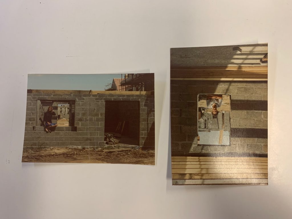
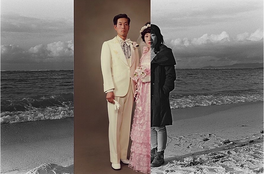
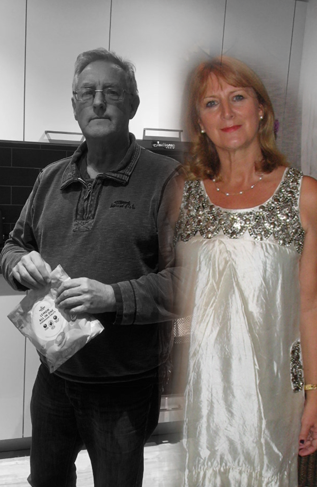
I decided to mount my images in this way to mimic pictures out of my book. one of the images I included in my book was the same as the first image. I liked it a lot so I decided to do the same concept but larger and have the images staged on foam board to add levels and make it more interesting. The second image is inspired by one of the pages of Yoshikatsu Fujii’s ‘Red String’ in which he has on image going across the two halves of the book with each of his parents either side. Overall I am happy with how these turned out and I feel like they represent the contents of my book very well.
Final coursework Images
Experimentation:
Final Layout:
Evaluation:
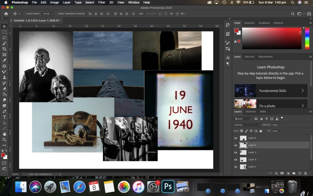
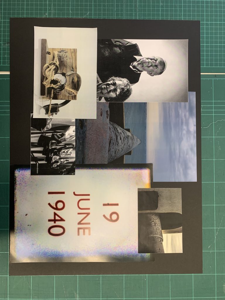
I chose these images as i thought they best represented the work we have done since September, as it includes portraits, the bunker landscapes and the occupation objects. I decided to collage them to bring all the areas of study together and to unite the story of the occupation. If I could do this project again, I’d like to interview more occupation survivors and take their pictures, or get them to re-visit places where they grew up or bunkers.
This was me experimenting with the layout of the title and spine. At first I liked the quirky font as it reminded me of my idea of the 70s which is when my parents got married, however, I ended up preferring something more simple and minimalist, almost like what you’d see on the order of service at a funeral; a memorial for my parents marriage. I also didn’t know if the white would be too bright so I tried a grey colour but ended up with going back to the white.
This was me trying to decide where I would leave pages blank to add in the images once the book arrived.
I again, at first I like the dramatic full bleed page, however, then I decided to make it more minimal, resembling a negative. I will therefore also be adding a negative over the centre of the image going diagonally.
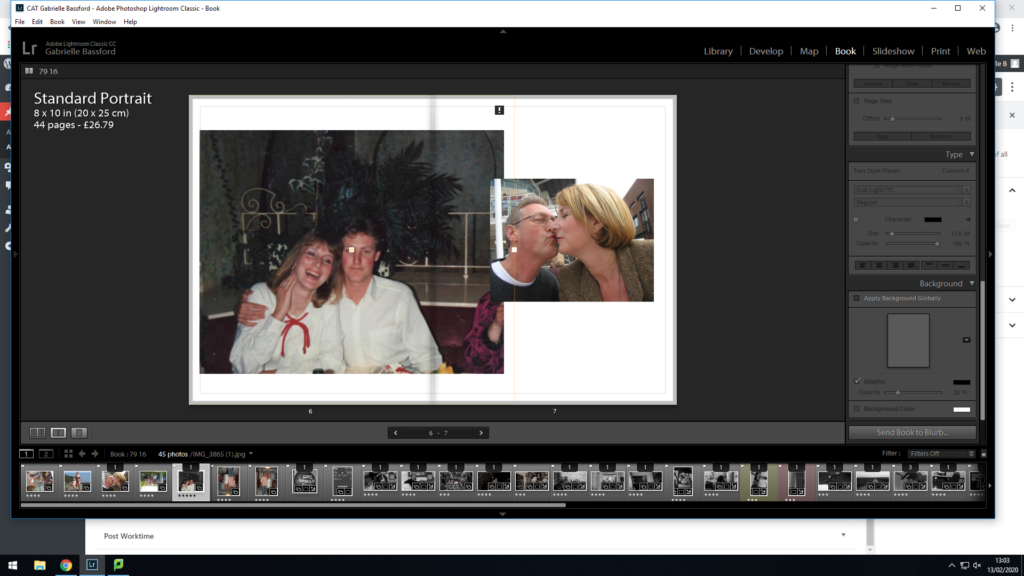
I was trying to decide which image I thought fitted better. I decided to go with the one of me as a baby with my dad as it would be on my dads side which made more sense. I also think that the colours and shadows in the image fitted with the rest of the book better than the other image.
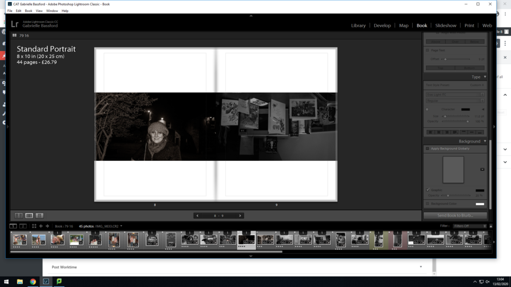
Again, here I was trying to decide which image I preferred. Although I preferred the first image, the second one made more sense and was more poignant juxtaposed against the dead flowers on the right. The second photo is also just my parents with no one else in the background.
These are the images I decided best represented my work and the images I thought were the best. I feel they are all different enough to show the range of my abilities.
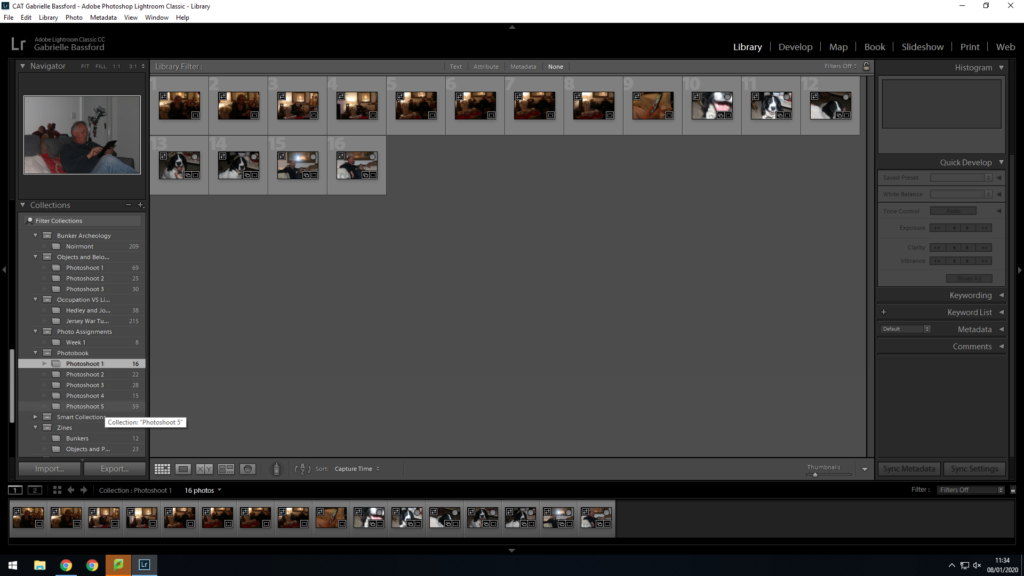
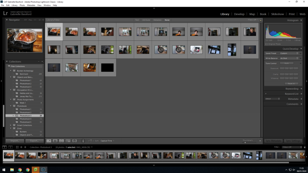
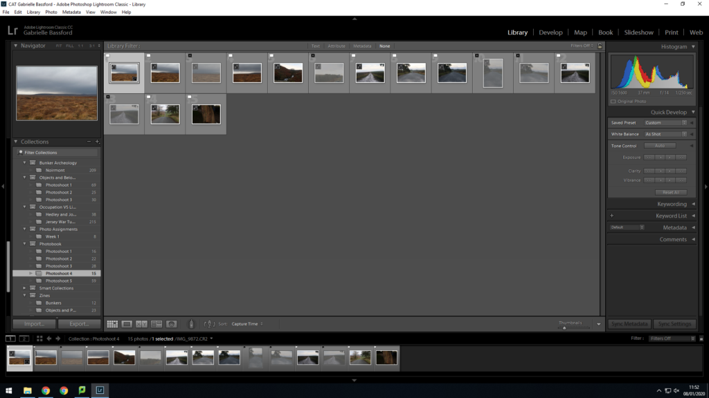
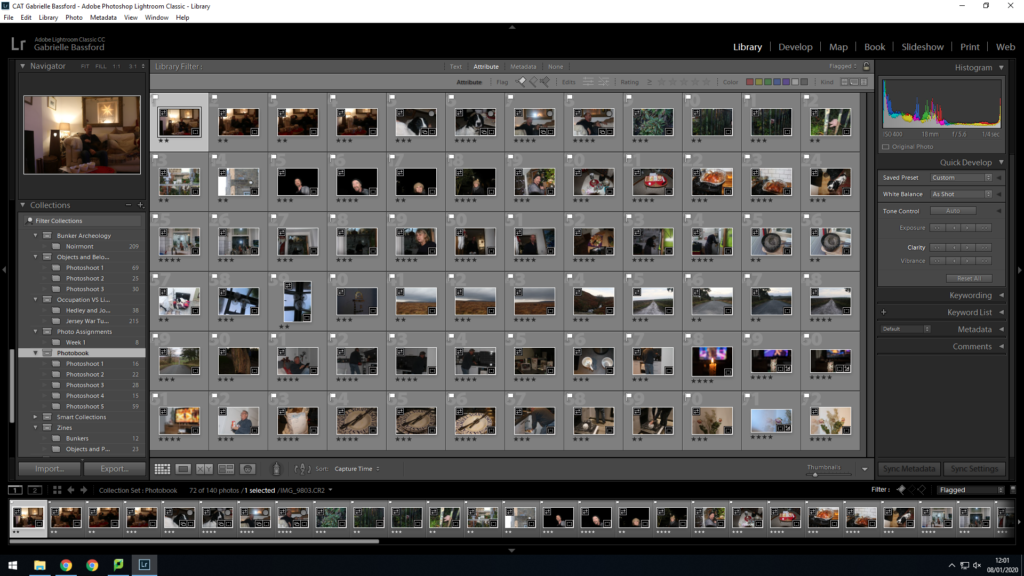
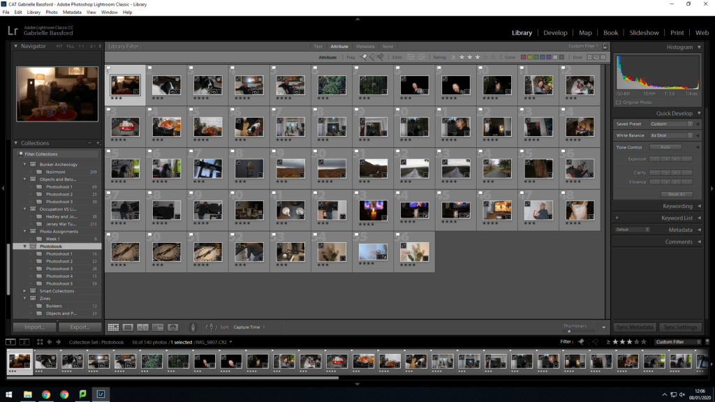
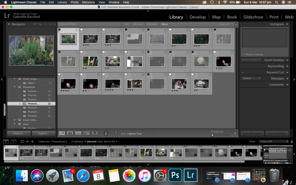
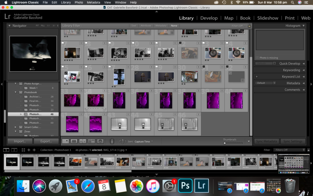
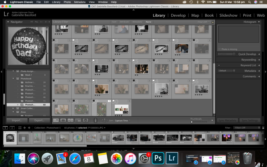
I went through each of my shoots individually and repeated the same process for each. Firstly I imported my images into Lightroom and created separate collections for each of my shoots to make working with my images easier.
Then using the pick (p) and reject (x) tool, I selected which images I thought were the best and wanted to potentially edit and use in my photobook.
I then went on to rate my photos out of 5 stars, with 2 and below being images I didn’t see working and 3 and above being ones I either really liked or ones I feel I could work with with a bit of editing, further narrowing down my selection.
The images I selected.The final selection of images to work with.
As I edit I will probably reject more images that I don’t feel like are working.
In this I was just going through a pen drive full of family photos and trying to find some good one I could use of my parents. I was trying to find one where my parents looked really in love so it would make the contrast between past a present really harsh. I plan on looking through and taking out photos from physical family albums as well, like Yoshikatsu Fujii has done.
In this shoot I was trying to capture candid moments while my mum and step-dad were watching tv. If I waited for them to be relaxed and distracted, they wouldn’t know I was photographing and therefore I’d get the purest outcome from the situation and therefore allowing my book to have more raw emotion in the future. With editing I kept it simple and made the images monochrome with some slight grain added.
This second shoot was mainly about trying to get ‘aesthetic’ styled images that would break up the portraits a little bit and add something artistic to the book. I was trying to get photos of plants in my mums garden so the photos would have some significance. I experimented using flash similar to Mateusz Sarello to get that aggressive ‘assault’ feeling. I also captured some more candid portraits. Again, keeping with the theme I intend for the book, I kept the editing minimal and again made the images monochrome and added extra grain.
This shoot I actually took on New Years Day. I thought this would be a perfect time to gain some photos of my mums lifestyle and would be a good contrast to my dads. I took photos of my mum doing the laundry and cooking the new years dinner. My mum always likes making events special so capturing one of these events would be very important in enhancing the meaning in my book as that is something that hasn’t changed because of my parents divorce. Again, I kept editing minimal and did the same as stated above.
This was a small little shoot as we were out. I thought including the landscape around where my mum lived would again break up the portraits but still have significance and a place within the book.
I got enough photos of my dad during this shoot. My dad doesn’t cook much so we often go out to eat. I thought I’d take a photo of the takeaway bag as it contrasted the images of my mums cooking very well. Capturing my dad loading the dishwasher was very similar to my mum doing the laundry so i thought that image would be very effective in showing similarities as well as differences. I thought taking images such as the photos of the dead flowers would play into the stereotype of living with a single dad, which a reader would recognise and be able to understand more. Editing was the same as above however I plan on maybe photoshopping my mum into one of these images as if she’s a ghost.
Explore How both Mateusz Sarello and Yoshikatsu Fujii use archive/old images to convey the theme of separation and loss through their work.
“This work may be a personalized narrative for myself, but “family” is something that everyone has – a universal theme.”
Yoshikatsu Fujii
Loss and separation and the effects of divorce on family. I felt inclined to study this due to my own experience on the subject, in relation to my parents own divorce and my mother moving away to the UK. Separation, especially divorce is difficult for everyone involved, and that is something I wanted to show through my project. I will be looking at Japanese photographer Yoshikatsu Fujii, specifically his project ‘Red String’ and also Polish photographer Mateusz Sarello and his project ‘Swell’. I chose Fujii because his images resonated with my experience of parents divorce and he manages to express similar feelings. I thought I would effectively be able to use his images as inspiration and effectively respond. The incorporation of old family photos really spoke to me and it was definitely something I wanted to include into my project. Sarello’s ‘Swell’ is another one of my inspirations as I find the way he laid out his book (the broken spine and the ‘happier’ images first with a gap and the ‘sadder’ images after) and the images using flash interesting and a great way of creating a disturbing feeling in a viewer. Both artist’s use of archive images create a depth to their work as it adds context to their work. Without them the desired affect wouldn’t be as poignant. They create juxtaposition between the past and present which makes Fujii and Sarello’s work so touching and effective. We can identify with them as we all have personal archives with attached memories.
Historical Context – Archives
Archive art isn’t a a new concept but is surprisingly common. Photographic archives are typically defined as collections of photographs held by libraries or museums. However, more recently, photographers and curators have been using these archives as part of their work and the definition of archives images is changing. For example artists are now creating their own archives, some are using personal archives such as family albums and some are using rejected images or projects and reusing them for another purpose. I believe that using old images for another purpose in a way could be considered as using archive images. Archival art pays homage to events and people or is used as a framing device or as art historian Hal Foster described it; it “make[s] historical information, often lost or displaced, physically present” (Breakell, S). Sue Breakell describes archival art as “post-postmodernist” (Breakell, S) in that “it comes after post-modernism: it is part of, and indeed embodies, a turn that reflects not simply the urge to deconstruct, but a more fertile and iterative urge to build in a way that not only is not monolithic but also is inclusive” (Breakell, S), suggesting that archives have evolved to create a place for reflection and are able to be used in photography and other art mediums as a form of call to break down the past to create a better future and in this makes archival art turn from just a form of history to an artistic form of expression. Breakell therefore also sees the archives are not only being used by artists to inform research into work they are doing but also as “an arena for the consideration of philosophical questions about its nature and meaning” (Breakell, S) of an artists work. Archives are often used as a theme in many artists work. More recently biennial curators have used historical archives in their shows, such as Massimiliano Gioni who incorporated an enormous amount of documentary materials into his work such as photographs of the victims of atrocities in Cambodia in his Gwangju Biennial. Another example is Zoe Leonard who created a fictional character, Fae Richards, an acclaimed black actress and singer who “lived” from 1908 to 1973. Leonard did this for what wanted to be a fictional archive of the “legendary” character. Leonard used film stills, publicity materials, photographs, and recollections to create the archive but she actually made it from using the real lives and stories of black women in the early days of Hollywood. Through her invented character, Leonard began a conversation about very real issues that risked being forgotten. Archive images have always been used either to give photography context or a medium for people to respond to and influence their creativity, in the case of Mateusz Sarello, even though his images aren’t necessarily taken from an archive as such, they are still images taken without the intention of being used in the context they have ended up in, like many other images within photographic archives. The images he took before his break up are mild and gentle polaroids which are unsaturated and subdued. This creates a perfect juxtapositions for the angry photos of the waves that then spill out of the following pages, embodying the emotions you would feel after a break up or loss. For Yoshikatsu Fujii however, the images are of his childhood and his parents early lives together add a personal and bittersweet feeling to the book. Again, the juxtapositions contrasts between the happiness of the past and uncertainty and difference of the present.
For my study on my parents divorce, the use of ‘archived images’ will be extremely important, as they will give a juxtaposing image from my childhood to now. It is this difference that I want to focus on, as it will express my feelings around my parents divorce and also the effect of divorce on family dynamics and how these dramatic these changes can be.
Yoshikatsu Fujii – Red String
Archive images have been used for ages, however, not many people have taken their own old family photos and used them within the concept of archive art, which is something Japanese photographer Yoshikatsu Fujji has decided to explore in his project ‘Red String’. His photographic works often deal with historical themes and memory lingering on in contemporary events. Red string was based on the split of Fujii’s parents with inspiration for the name and nature of the book coming from the legend of the restring, popular in Asain culture. The legend tells that soul mates have a red string tied around their little finger from the moment they are born and are destined to meet. the string apparently can never be untied or broken. Fujii reflects on this legend stating that maybe “the red string tying my parents together came undone, broke, or perhaps was never even tied to begin with” (Fujii, Y). Fujii has used old family photos along with inserted notes and original images of his family to express his feelings on his parents divorce. The images he takes of his parents and family are very candid and simple, which allows him to capture his parents true selves. This simplicity of the portraits also seem lonely, with the black and white making the parents seem isolated, with Fujjis “anxiety” (Fujii, Y) over his parents divorce clearly shown. The book wouldn’t be complete without the use of his old family photos to juxtapose this. The images of his family are full of smiles and colour, making the black a white lone images of his parents seem more bitter than they already did. The image above is a perfect a example of this contrasting mood. This contrast between his parents wedding, which is meant to be the happiest day of they lives, and his mother alone on a beach, with no one but the memory of her husband, seems sentimental but also harsh. The layering of the images allow their lives to be to close but also so separate from each other which is how someone does feel during divorce. This image could be showing Fujii’s desire for his family to be whole again but as reviewer Alexander Strecker says it is merely “fragments of that which was” (Strecker, A). This book could be Fujii’s way of coping as the book is so personal and intimate. Strecker claims the book is a “reconstructed journal of this separation” (Strecker, A), however I believe rather than being a journalisms of the separation, I believe it is more like a journal of coping with the change. The book itself is broken, with a split in the centre, forever keeping his mum and dad separated, a tragic thought for those who know hat its like for parents to separate. The archive images used so frequently are almost a form of grounding. It is continually reminding a viewer of the past happiness making the separation and loss so much greater. The handmade fragile book really encompasses the fragility of life friendship and love.
I responded to Fujii’s work by taking candid images of my parents, specifically them doing normal chores. I thought this would make this emotion behind my images more genuine than if I staged them. However, as I was using old family images as well, for this shot I had to get my dad to pose for the photo to line up properly. I stayed true to the theme however. the photo I took is in black and white while the photo i used from the family albums stayed in colour with the only editing being cutting my mum out of the image and placing her in the new photo then bleeding it together. I didn’t use flash either. I preferred the blending rather than just putting the photo in on top of the original as Fujii did because I enjoyed the outcome of the ghostly image, almost as if the memory is fading. The rest of my images are portraits and objects or settings with minimal editing, just made monochrome.
Mateusz Sarello – Swell
Where as Fujii uses his archive images to convey a sort of sadness toward the separation of his parents and the loss of his normal family life, Mateusz Sarello conveys anger and resentment. The archive images Sarello uses are not like Fujii’s, instead his images are from a discontinued project which he then uses, similarly to Fujii, to juxtapose the past and present emotions. Swell started off as a documentation of the Baltic sea, with images in typical polaroid style. The images are calm and unsaturated, with the subject being typical scenes you would see day to day. However, during his project Sarello split with his partner. He recalls the break up changed him and he was unable to complete the project as it was designed. The book then transformed into a project about heartbreak and unaccepted loneliness. He took the rest of images whilst going back to places he previously went with his girlfriend. So in his work, archive images are images which he took before his breakup, that he is using in a different context with the purpose of creating a split and separation. Reviewer on the site Culture.pl, Dariusz Bochenek, expresses his opinion of the split in the book, stating “Swell literally falls apart in the reader’s hands. The book appears to be broken, torn into two halves.” (Bochenek, D). The book then splits between Sarello’s old images and his new ones. The gap looks messy and the pages are a different size; everything mimics his break up and his vulnerability afterwards. It also represents the split up of him and his partner, almost as if its meant to signify a new chapter in his life, which is drastically different, which in Bochenek’s opinion is a perfect show of the “dualism of love and sudden acute loneliness” (Bochenek, D). The move from softer polaroids to the harsh grainy images with flash is striking. You can feel his hurt and pain as you see the waves and the sharpness of the shadows and light due to the flash. The hectic nature of the birds flying over him make his head seem clouded, whilst the brightness of the images resembles when you walk out of the shade into the dazzling sun, compared to the dark photo of the birds flying in a neat line on the opposite page. It makes the viewer feel overwhelmed. Through using the older image, or archive images, Sarello is able to contrast his emotions so graphically, we can begin to understand his emotions and reaction to separation and loss. The title itself “Swell’ could relate to the emotions you feel after a break up which is a complete mix, as well as a nod towards his original idea of a documentation of the baltic sea.
My response to Sarello followed his general invasive photographing technique along with flash. Similar to my response to Fujji, I kept the photos candid and didn’t stage any of them. I purposefully tried to catch my parents off guard when taking these photos. For editing, I again kept it minimal, only putting my images into black and white, however with these images I enhanced the grain within the image as it is something that Sarello does often with his images in this project. In this specific image I wanted to catch my mum doing something and I managed to get a photo of her halfway through a sentence. I like how it brings personality to my mum, that a staged image probably would not.
Conclusion
In conclusion, both Mateusz Sarello and Yoshikatsu Fujii document their experience with separation and loss using archived images to create a contrast and split between their lives before and after experience, however they both go about it in different ways. Fujii documents his parents gently and with care, with soft lighting and simple positioning, Sarello uses harsh flash in his images and a candid “assault” (Bochenek, D) like technique which creates a hectic and angry feeling rather than sentimental. The nature of both artists archive images differ as well. Fujii uses old family photos that create that context and sentimental feeling of what once was, whereas Sarello actually uses some of his own old work along with differing page sizes to mimic the split and juxtapositions. Both artists projects follow the similar theme of separation and loss, however, their outcomes are both different as Mateusz Sarello went through the break up himself, whereas Yoshikatsu Fujii is documenting his parent breakup and the second hand effects. Archive images within their projects are vital, without them they would have the same value or background information. My project itself follows Fujii’s project more closely as I am also using family images and documenting my parents break up, however I’m using Sarello’s aggressive style with flash rather than Fujii’s passive approach. Archive images are a way to look into and reflect on the past. By using archive images along with original images, rather than creating a statement, you’re creating a sort of question effect, a bit like the Kuleshov effect. This effect states that two sequential shots give off more meaning than a single shot in isolation in film. In photography this could translate into to two images being sew together to create an emotional response in a viewer, especially when archives are involved.
A sentence – Witnessing my parents lives after their divorce and comparing it to when I was a child.
A paragraph – This book is about my parents and their lives after their divorce. My mum has re-married and lives in the UK now, whereas my dad still lives in Jersey with me. For me, I found the divorce and my mum moving away very hard, so I decided for this project to capture my parents lives and tell and honest truth about what a separated family is like. I also want to include own images of my childhood to show the juxtaposing lives of both my parents and the past and present.
Design: Consider the following
How you want your book to look and feel – I want my book to feel like a photo album. I want it to be plain black and simple.
Paper and ink – Id like the paper to be matte so the glossy images i take out of the photo albums will contrast it.
Format, size and orientation – Just a standard portrait sized book.
Binding and cover – hard cover, plain black.
Title – 7916 – parents marriage and divorce dates
Structure and architecture – just like a normal photobook but I want to insert images out of family photo albums as I feel like this will give the book an interesting tactile feel.
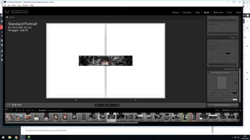
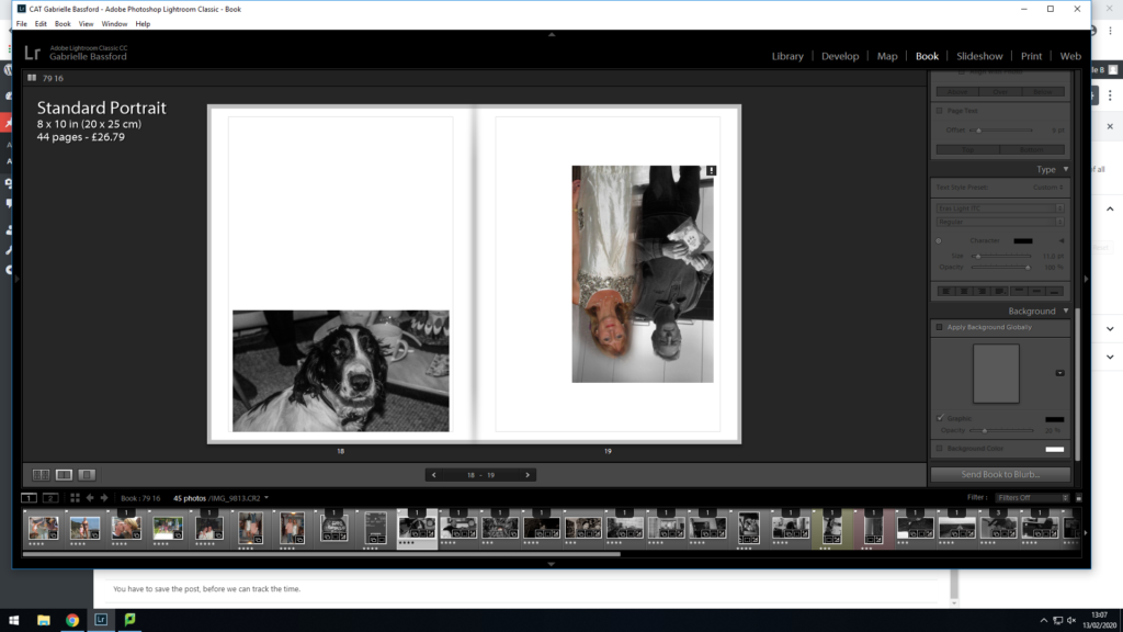
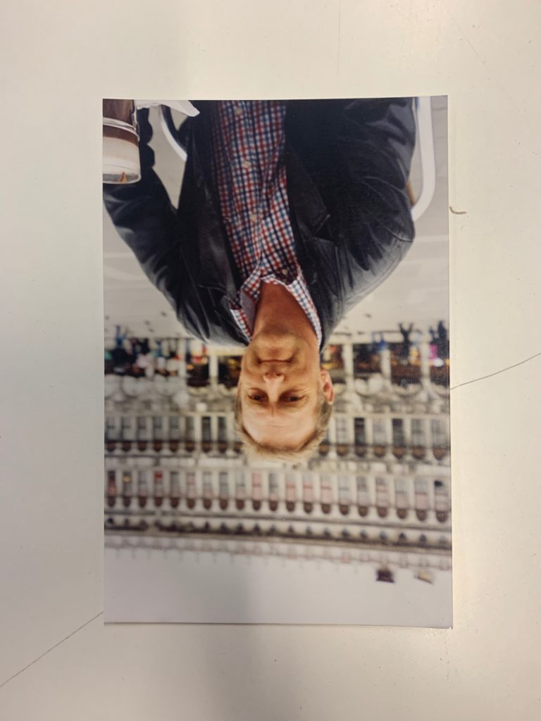
Design and layout – images of my mum will be on the left and the right way up, but then images of my dad will be upside down. This is a way to show their split and also made the reader engage with the book as to view the images of my dad they’ll have to turn the book upside down.
Editing and sequencing – I’m going to put any images I take into black and white but leave the archive images untouched.
Images and text – I want the images to be candid and of my parents daily lives, almost as a documentary. I feel that if my images are staged it would take the meaning away. no text.