All posts by Francesca S

Filters

Author:
Category:

Environmental Portrait Experimentation

ENVIRONMENTAL PORTRAITS

It is a portrait where the subject is photographed within an environment that they are usually in, it could be a profession or a hobby. This type of portrait allows the photographer to show what type of person the subject it depending on their environment and it illuminates the their character. By the subject looking directly into the camera, it allows the viewer to feel a connection between the two sources. The environment is always used as a background and it can range from large and busy to small and simple, the background isn’t the main part of the image, its the subject themselves as they draw most of the attention towards themselves as they are telling the story behind the image.

EXPERIMENTATION

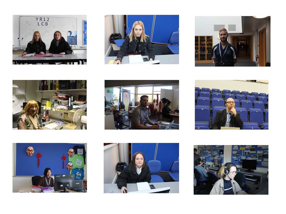
These are images I took when experimenting with environmental portraits. In some of these images I used flash to create a dramatic lighting effect. I also regularly  changed the shutter speed which was dependent on how dark or light the background was. Some of my images where too exposed this is because my shutter speed was too slow and ISO was to high, which meant the camera was sensitive to the amount of light I was letting into the image, with the image being over exposed it made the image become more white than it was. My images have a wider range of variety, as I went to different environments in a school so this helped with me adjusting the manual settings on the camera. The meaning behind these images it to show the students and teachers in their everyday environment doing their work and where they are mostly seen. With these subject being put in their everyday environment it is easier for the viewer to make a connection and an understanding as the environment it relatable especially for sutdents.


Arnold Newman Image Analysis

ANALYSIS

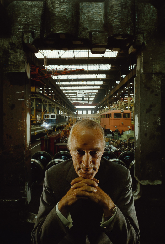
Alifred Krupp

EMOTIONAL RESPONSE;

He gives off an unsettling feeling due to his intimidating look – the way he is looking at the camera and leaning on his hands. The initial emotion from this image is negative due to the way the man has come across, due to his expressions and the dark colour in the image.

TECHNIQUAL;

The camera was set at eye level, to be able to get a strong connection with the subject. The subject is centered to create a stronger look in the image as more symmetrical. There is also a large depth of field as there is a big background that is also within the frame and more or less in focus along with the main subject in the photo.

VISUAL;

There is an old man in the center, with little hair but the hair that remain is white/grey which shows the age of the man. His hands are clasped together and he is leaning on his elbows with his chin just resting on top of his knuckles. His eyes are penetrating into the camera lens, along side this his face as little expression in it, it is very neutral, almost like he is thinking/planning something. He is a faded dark grey suit which suggest he is important or dressed for an important event. The dark colours throughout the image suggest that there is something more deep and meaningful in this image that we have to figure out.

CONCEPT;

Newman had the idea of presenting evil within this image and to expose Alifred Krupp for the toxic person he was.

CONTEXT;

Krupp, who was a man who produced transport and material for the Nazi’s wanted a portrait of himself, so he contacted Newman for one but not knowing he was Jewish. When Krupp found out he refused to let Newman take his photos but Krupp was slowly persuaded by Newman’s phenomenal portfolio and he was then allowed to photograph him. Newman being the great photographer he was took it upon himself to portray Krupp for who he really was and he successfully did this through his image.


Arnold Newman

ARNOLD NEWMAN

He was born on March 3rd, 1918 and died June 6th, 2006. He was an american photographer who was noted for his environmental portraits of artists and politicians. He studied painting and drawing at the University of Miami, but he was unable to continue after 2 years as he couldn’t afford it, so he moved to Philadelphia to work for a studio making portraits. In 1945 he opened his own business in Miami Beach but in 1946 he relocated his business in New York and also worked as a freelance photographer.  Newman photographed places in essence of an individual’s life. He captured the subjects in their most familiar places to represent them and show their profession and personality. Newman said “the surroundings had to add to the composition and the understanding of the person. No matter who the subject was, it was going to be an interesting photograph.”

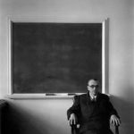
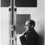
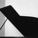
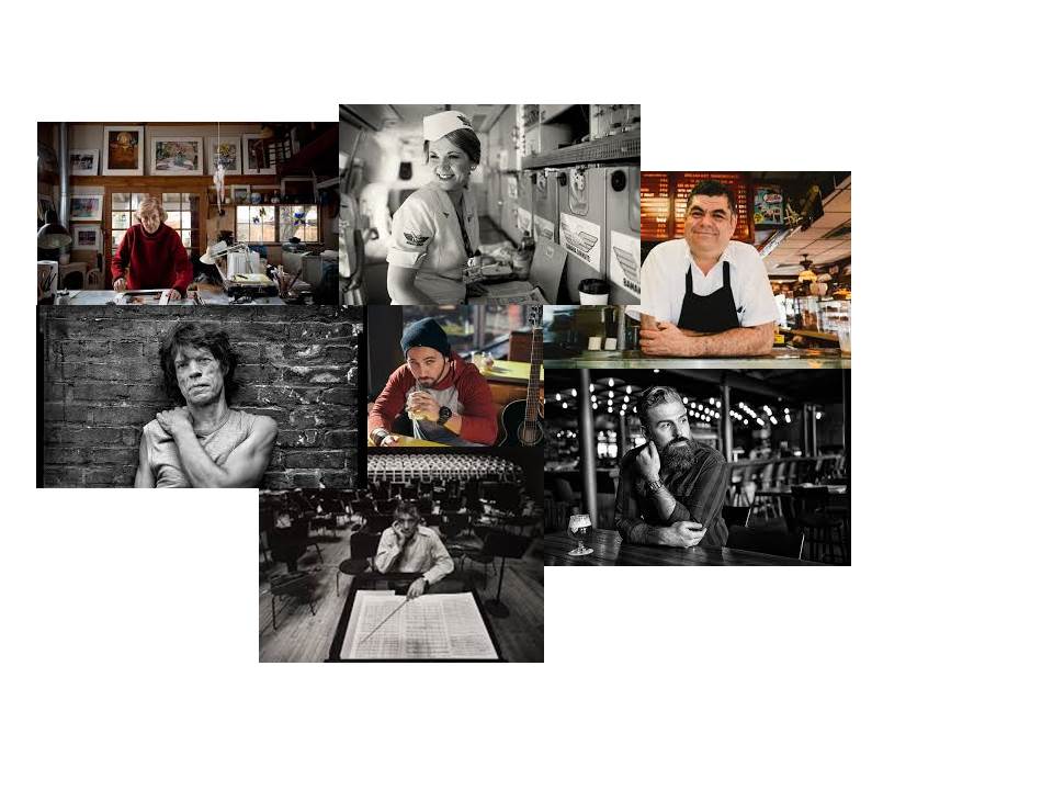
These 3 images are some of my favourites by Newman because they are simple but speak very loudly. As they are showing what the subject loves to do, you can get to know and understand what the people are like by having access to the hobbies/jobs to get an idea what sort of person they are. The images are very simple but it makes your eyes attract towards the main subject of the photo first to see their facial expressions and then you move onto the surroundings as your mind is trying to figure out why they look like that? why they are set in these surroundings? Such a simple image having many of questions and query makes it interesting for the viewer as they are constantly trying to figure out what the meaning of the image is.

EXPERIMENTING 

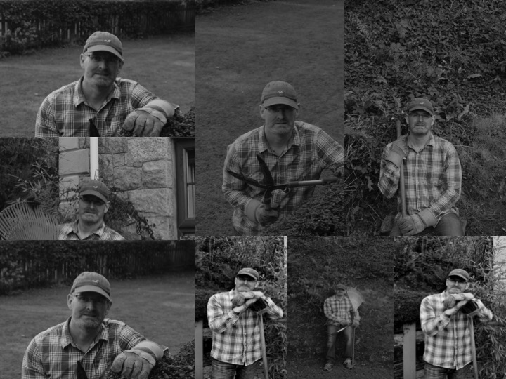
In this series of photos I have photographed the subject in his working environment. These photos are representing the type of work Newman produced, images showing different people’s personalities and passions. With the subject looking directly into the camera with a neutral face it allows the viewer to make a connection between them and the image, as the subject is looking directly at you in some sorts. As I was shooting outside I had to use a faster shutter speed so that less light would be let in and my photo wouldn’t become over exposed, I also used a manual setting so I could adjust what was in and out of focus. When editing these images I did very little as I didn’t want the editing to over power the reasoning behind these images, so I put them into black and white and this really helped show the facial expression on the subject and their passions, as the viewer had very little to engage with, which is good as they can focus in on the main subject and the meaning behind the images, but due to the simplicity of my images it doesn’t make them interesting to look at. Overall I feel this shoot was a learning experience, due to the simple images I have produced. Also the quality of my images aren’t great due to the poor focusing caused by me either moving the camera as I was taking the photo or the focus not being sharp enough.

Final Images

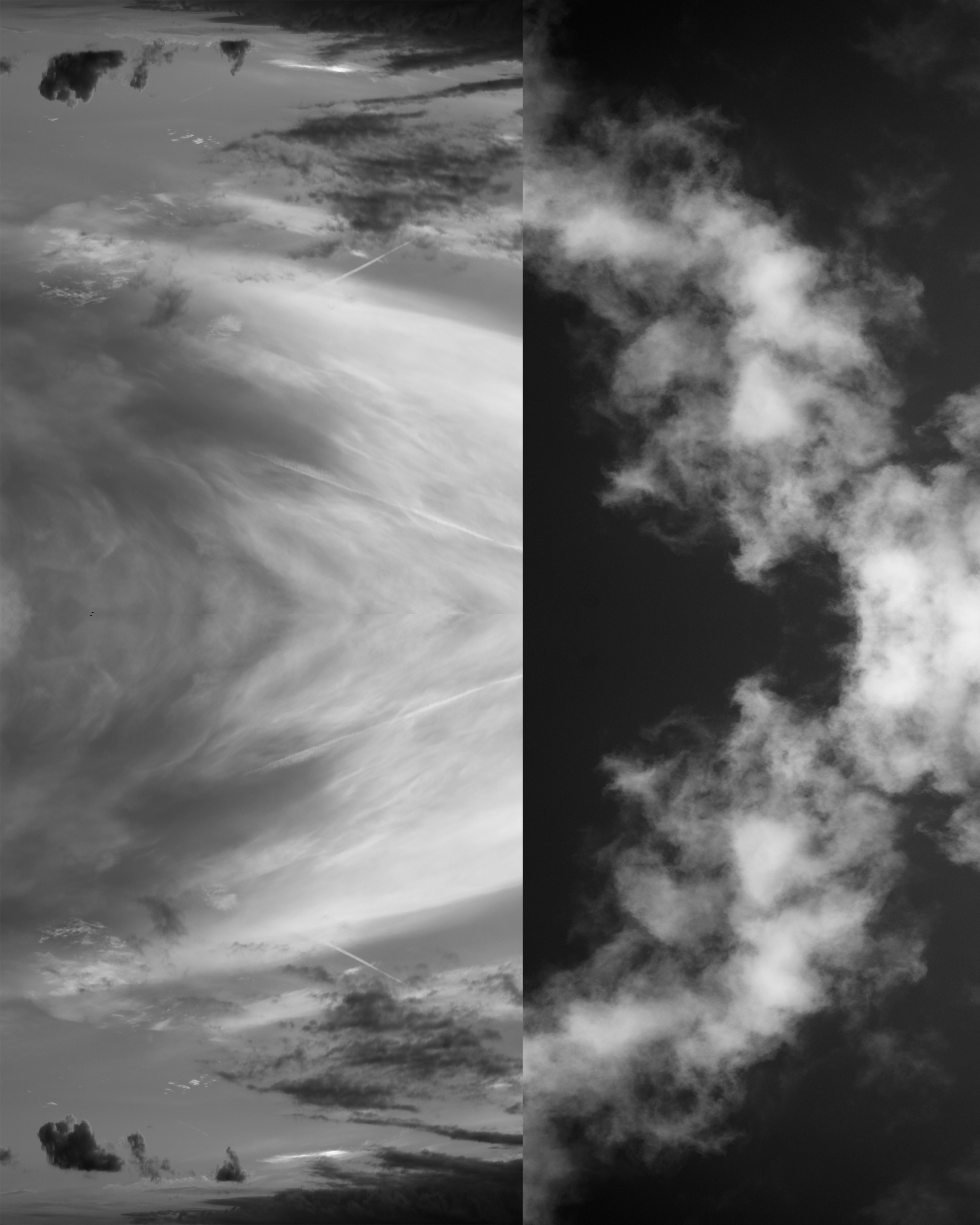
A3 image – I piked this image as my final images, as it is showing my Photoshop skills and also the contrasts between the light and dark colors along with the different shapes made by the clouds make it different and interesting to look at. By putting together two similar yet highly different images created an abstract image for me

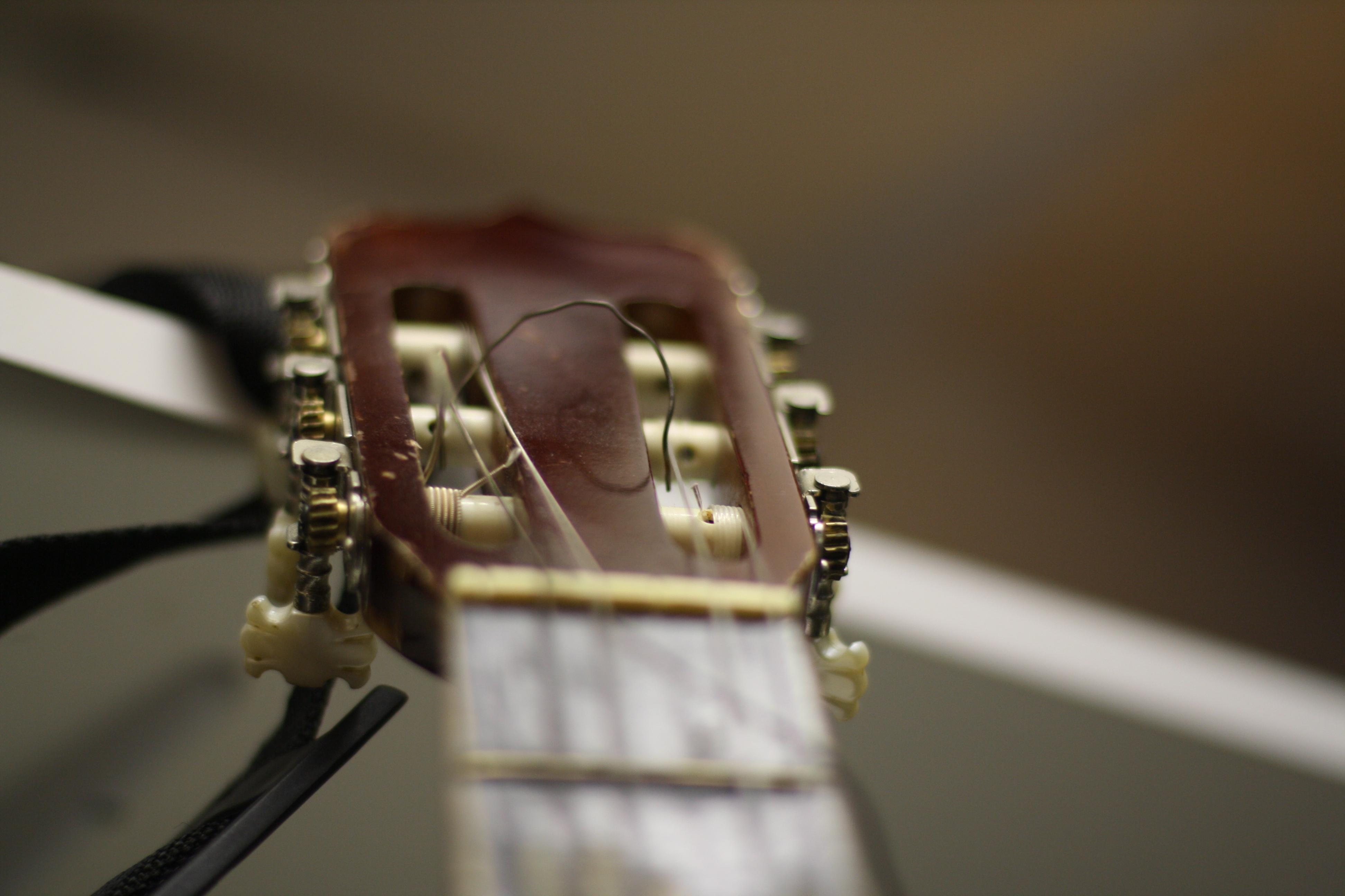
A4 image – this image shows my camera skills in the sense of being able to use manual focus, to only focus on one small tiny part of the photo. Also I like the way this photo came out.

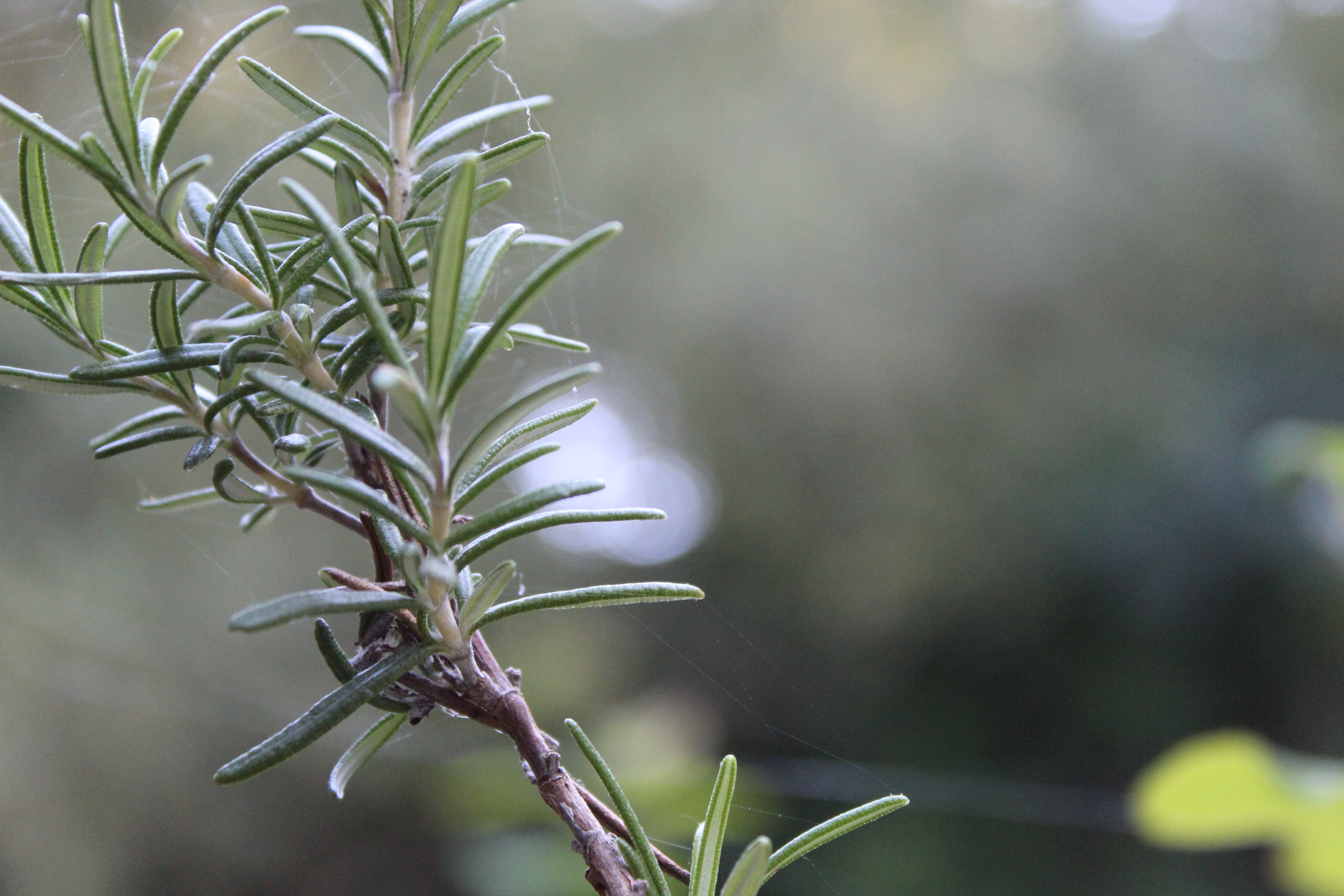
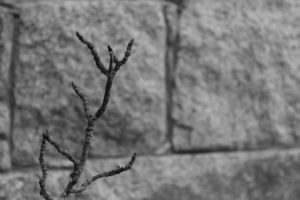
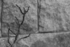
A5 image – again this images is showing my ability to focus on one primary subject in the photo. I like this photo because of the sharpness of the branch, and the highly blurred background created by using manual focus.

Uta Barth

Uta Barth is a contemporary photographer, who lived and worked in California. Her photographs weren’t about seeing  the sharpness and clear images within her photos. She made all the images and shapes within her photo merge together. As photography was mainly about pure visual and seeing what was in the photo, but Uta Barth changed this and her photographs were a sense of art and the viewers ultimately depend on the visual to understand the photo. Her work makes people view her art more than once to understand and appreciate the image.

At first glance this image seems to been taken in a bad way and very simple. But this image conspires with the human eye, to figure out what we are looking at. This photo was taken in a simplistic way, but almost amazes me that an image can look so interesting out of focus. The natural lighting in the images gives the walls a yellowy town to it, the colors in the images are very earth orientated, shades of browns and yellows. When looking at this image, it calls the attention of you to really figure out what the subject of this images would’ve been, its surrounding and the meaning of it. 
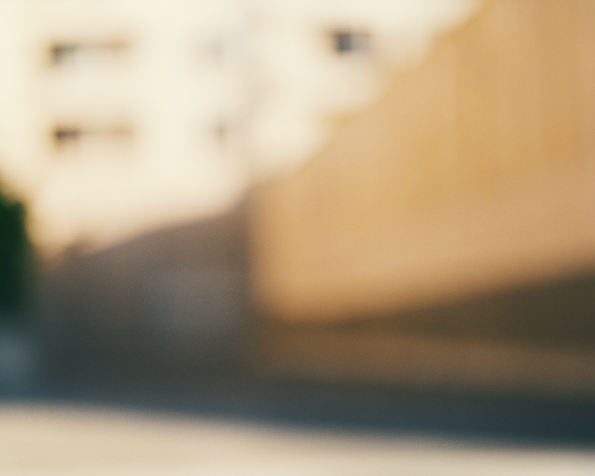
In all of Barth’s work there is little human interaction in them, this is because she says it removed the focus away from the entire photo, as people would play more attention to the clothes they are wearing and using people automatically gives them an identity due to the way they are looked and used in an image, which can overall change the whole subject of the image. The blur theory throughout her images it to make all the objects equal and universal, which meant viewers could pre-judge what they were seeing in front of them. Using a blur makes the viewer question what they are seeing. The story behind her images, it telling people that the world that surrounds us isn’t just a background and scenery, it is equal to us and is as important as us.

When planning for this shoot I had to take into consideration, lighting, camera settings, location and the concept and context of the photos I was going to take. I took into thought about showing the pureness of our surrounds, so I began to focus on focusing on natural shades and tones, such as white and green. The white would represent the pureness and righteous of the world and the green would show the nature of the world.  The two colors would work well together, as the white would make the green standout, as it would give a pop of color in the pictures.  Then also having my images out of focus it would merge together the two colors, making them equal to each other. These are a few photos I came out with from this shoot;
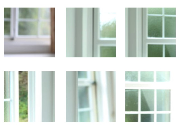
The difficulties I had in this shoot were trying to get the camera settings on the right format. I used a manual setting, with a wide lens, I has a low ISO of 100 or 200 and a slower shutter speed of 1/4 or 1/8, this is so I could let more light into the photo, which made the white become brighter in the images. I adjusted my lens to get the images to be out of focus so the color and shapes could merge together and become equal to each other, this is so that there wasn’t just one center subject of the photo, the whole photo was the main attraction as you had to figure out yourself the meaning, the point and what was actually in the photo.

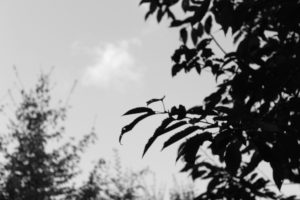
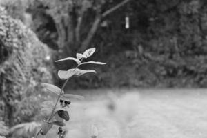
The second part of my shoot, I focused on using the outside and natural light along side with the natural settings. For this part for the shoot I kept the same ISO but changed the shutter speed to 1/32, this is so you could see what was in photo more clearly, so you could get more of an outline, because if the shutter speed was too slow the photos would of come out white. I photographed the things closer to the camera in focus with the rest of the background and surroundings out of focus. This gave the photo a primary focus, but yet it was showing the shapes and colors of our surroundings. I decided to put in focus something simple, which people don’t see as equal to us. These are my photos from the second part of the shoot;
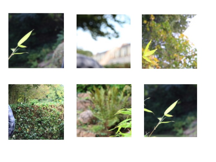
The struggles I had in this part was focusing on one main subject, and not getting everything in or out of focus. Also having to find a simple main subject for the images was a challenge, but looking at some of Barth’s worth gave me inspiration in what to use and focus on.

Overall, this shoot was a chance for me to learn about a new photographer but also learn different ways to photograph images and that all images don’t have to be in focus and that they can have any meaning you make them have.
Alfred Stieglitz – Songs Of The Sky

ALFRED STIEGLITZ

“photography fascinated me, first as a toy, then as a passion, then as an obsession”

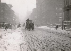
He was an American photographer and modern art promoter who was born on January 1, 1864. He was friends with German artist at the beginning of his career and he brought his first camera and traveled through the European country side photographing landscapes and peasants. He began to self teach himself about photography and he won first place for his Last Joke, Bellagio photography in 1887 from Amateur Photographer. In the main part of his career he considered himself an artist but refused to sell his photographs. His father decided to purchase a small photography business so he could earn a living in his chosen profession, Stieglitz paid his employees a high wage as he wanted high quality images. He then started getting awards for his photography exhibitions. He brought his first hand-held camera in late 1892 and he used this to take his two best known photos which are Winter, Fifth Avenue (right)  and The Terminal (left).

SONGS OF THE SKY

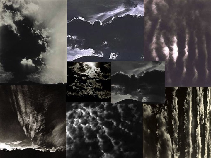
His photographs called ‘Songs of the Sky’ are focused on landscapes of the sky, which have abstract qualities. The title of these images are related to music, which shoes Stieglitz intended to do.

Moodboard;

These 8 images here are my inspiration for this shoot. I like how the dark and light in the images contrast each other and they all have different moods such as danger or a sense of heaven. He has really shown nature giving off many emotions in this project and it makes people looks at the images very differently because you can feel an emotion when looking at these images of clouds, something so simple yet with so much meaning.

This image by Stieglitz is one of my favourites because the natural light is seeping through the waves of clouds. The leading eye point in this images would be the whiter parts of the image because it captures the eye as it is contrasting up against the dark duller coloured clouds in the image and this shows how nature works together to create something so simple but beautiful and I believe that was Stieglitz’s motive behind this image, to show the earth for what it is. This image also has little editing to it, so it is showing the natural creations. 

SHOOT 1

When performing my shoot, I regularly came back to the 8 images above, so regain inspiration and to remind myself of the images he took.

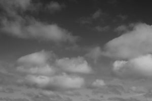
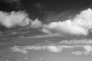
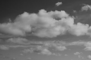
These three images here are a few I selected from my shoot, just to show the variety of images I took. All three images have been edited into black and white and also have adjusted the contract slightly, to make the white clouds pop more. To help me get these images I regularly came back to my moodboard I created earlier before starting to shoot, to remind myself of the way he took his photos and to regain inspiration, to form new ideas.

EDITING/PHOTOSHOP

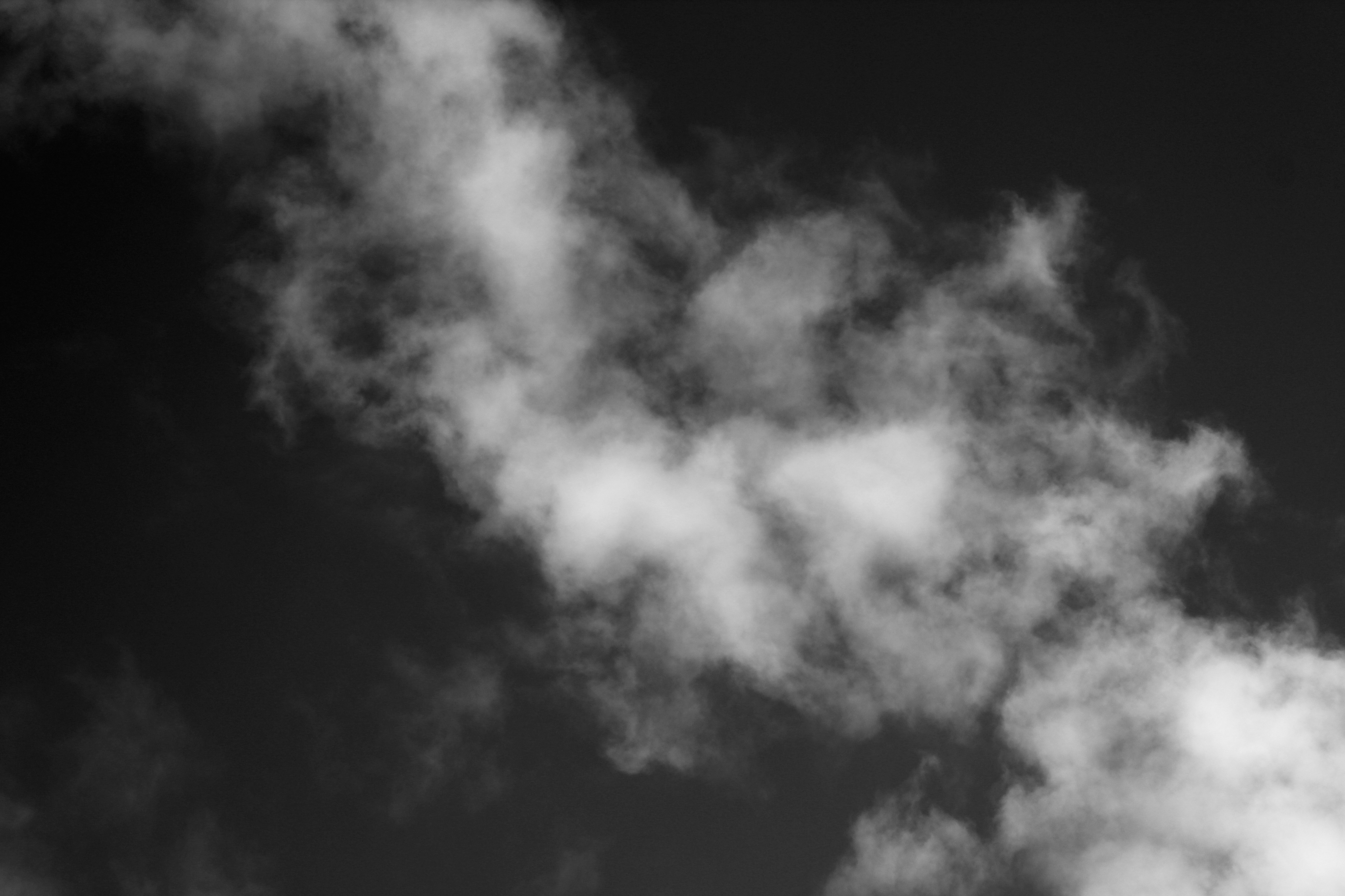
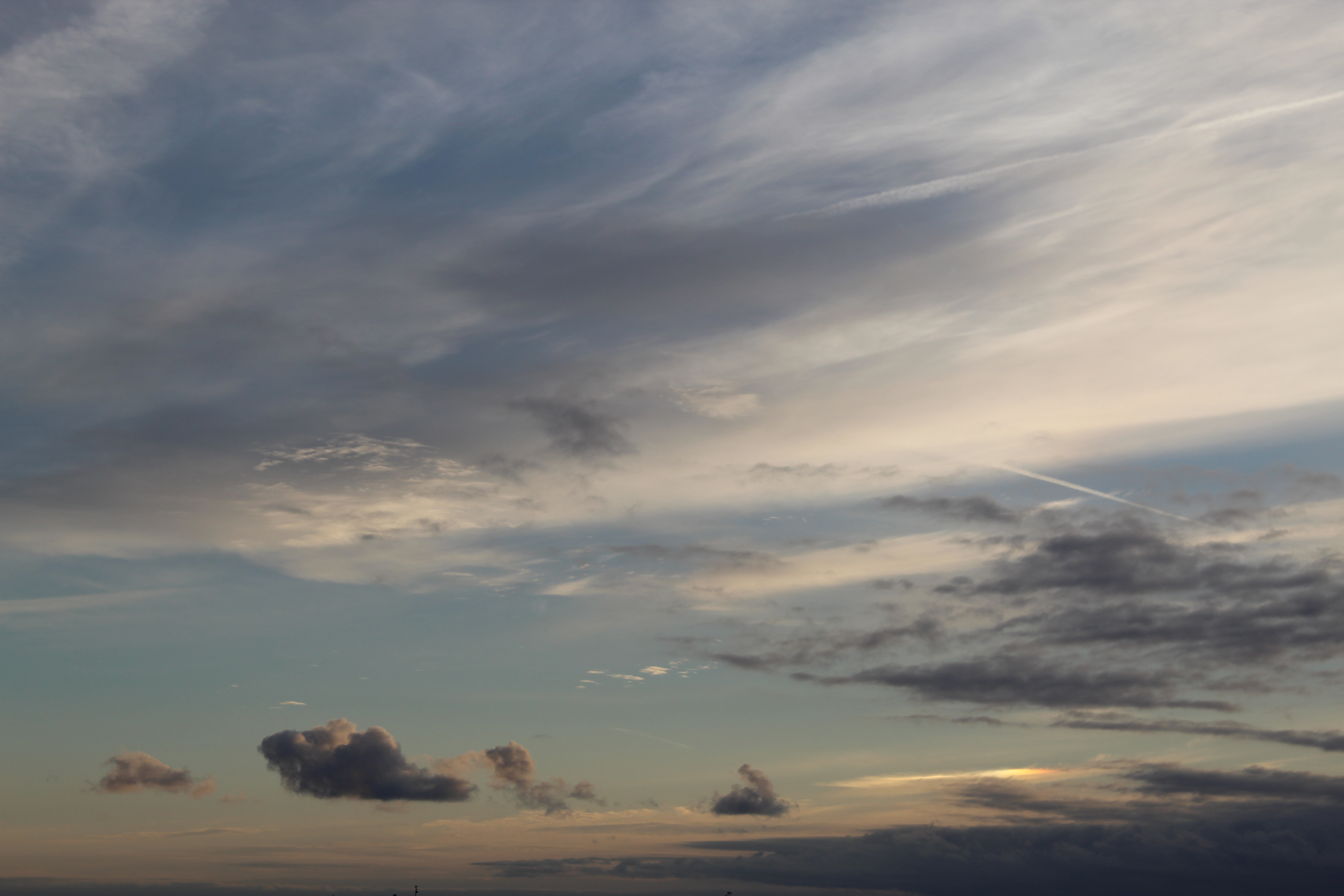
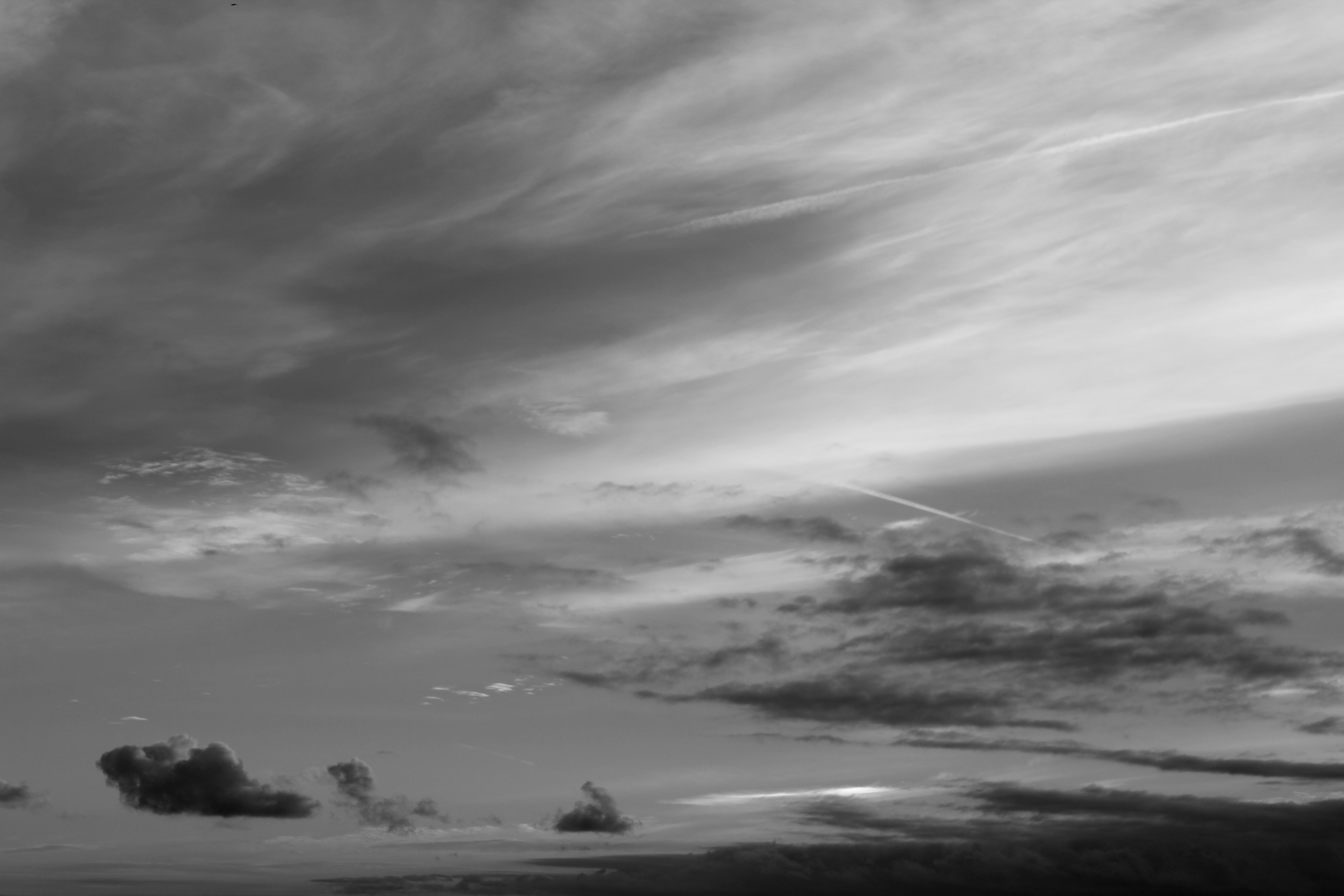
When editing this photo I  focused in editing the darkness of the images, to create a higher contrast between the tones in this images. I would use this image as one of my final images because of the way the clouds look, the texture looks soft, so it gives the image a calm mood, but with the dark background the clouds look more vibrant and bold.

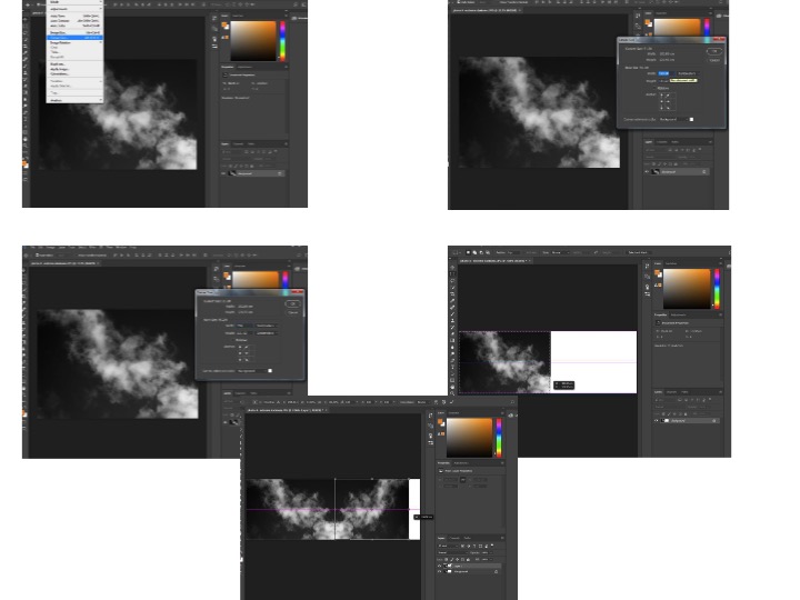
I was also experimental with my images, mirroring them using Photoshop, to make my own abstract photo. I mirrored each image then joined them together to make one photo, this makes the image more interesting and creates a contrast.

These are the steps on Photoshop I took to get the finished result of joining 2 mirrored photos together;

FINAL IMAGE

Before After

These images demonstrate  a before and after editing. The final, completed image has been edited into black and white but I have also edited the darkness on the image and the contrast. I made the contrast high to show the different tones and shade. There is a depth of field in this photo, the top of the photo feels more close up to the white sheets of cloud and then the clouds become smaller which makes them look further away, even tho everything was in line. The clouds have made many different unique shapes, which creates a more interesting photo as there are more shapes to look at and admire. The images just looks satisfying because of the different tones and shapes around.


Shutter Speed

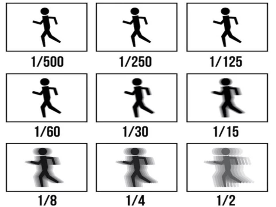
Shutter speed is the nominal time for which a shutter is open at a given setting. If the shutter speed it set to a faster fraction it means it’ll let less light into the photo, but if the shutter speed is slow, more light will be let in because the shutter is open for a longer period of time and can collect in more light and detail.

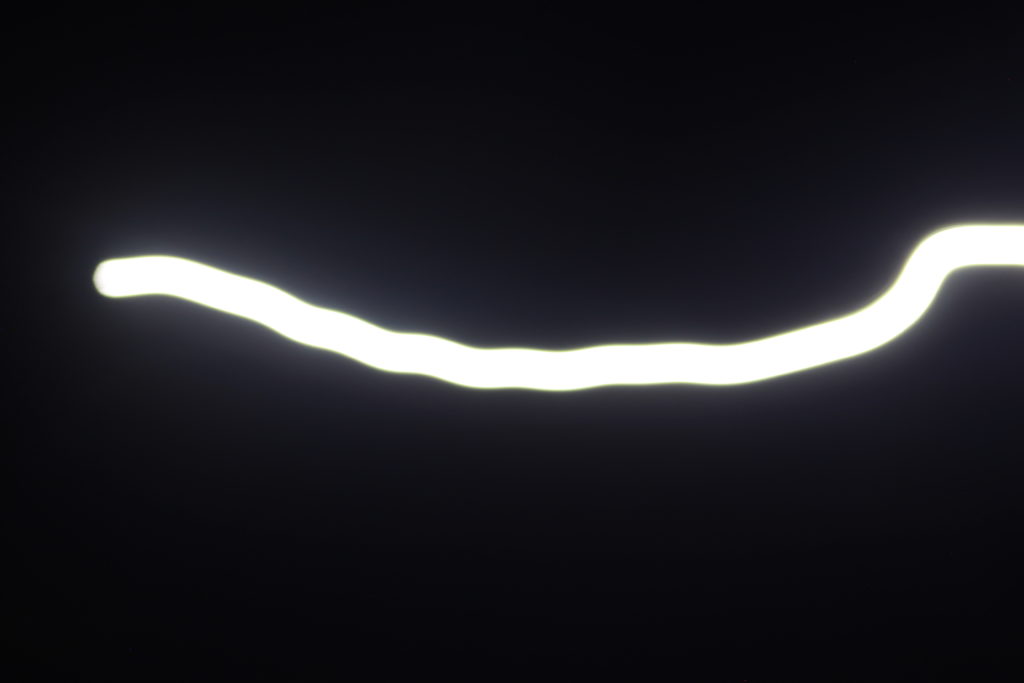
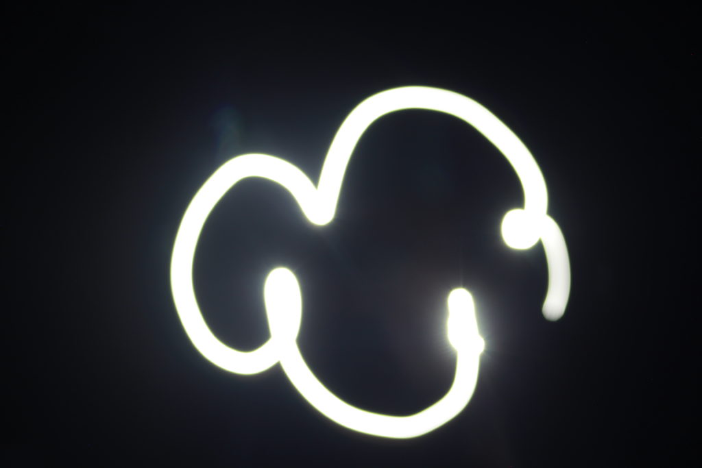
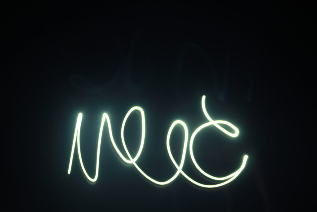
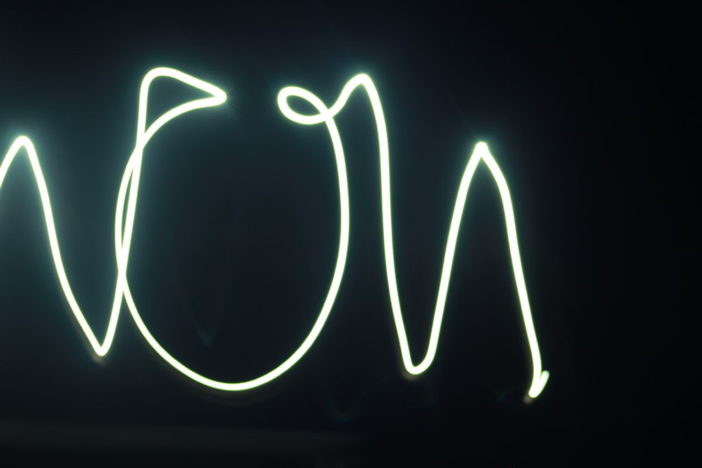
I experimented with a slow shutter speed and these are my results. In these photos I photographed a moving light which enabled the camera to photograph the whole image the light was drawing.


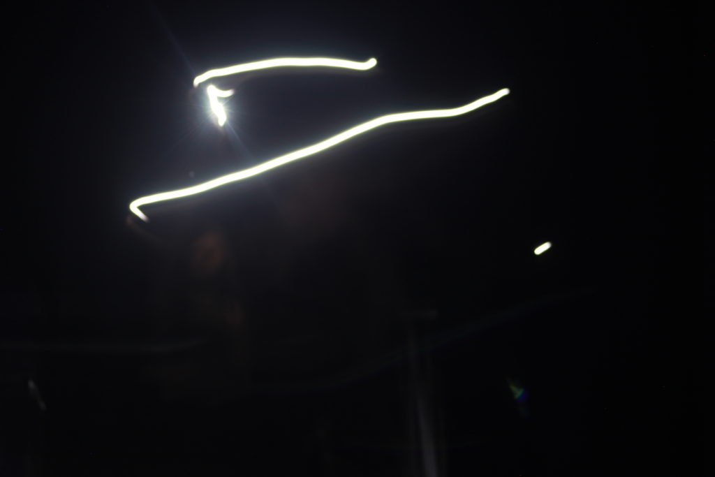
This image was also taken in a dark room along with a moving light, which created the lines in the image. I used a 4 second shutter speed this is so the image could capture more light of the light moving in the room. If i had used a fast shutter speed the image would have been blurry and it wouldn’t of captured the pattern of the light.

Keld Helmer-Petersen

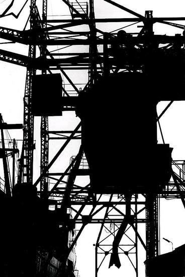
Keld Helmer-Petersen was a danish photographer who achieved a wide spread recognition in the 1940-1950’s, he was known for his color abstract photography. But in this project I focused on his black and white contrasting images. In his black and white photos there is a lot of empty space in the photos and he focuses on lines, texture and pattern. Petersen ended up opening up his own studios.

In this image Peterson has sued the natural light as the image has been take outside, but he has edited this image by changing the threshold and making the images more distinct with more empty spaces, shown by the block of either black or white in the image. The range of tone is limited in this image this is because of the way Peterson has edited his image and made it bold and simple.  He also has a range of focus and depth in this image, the things at the front of the image are more focused and bold, but as you look further back into the image things become less clearer and less bold. Visually this image looks like a cold image because of the bold black areas taking over the photo, and the lines in all directions give it a chilling feeling.

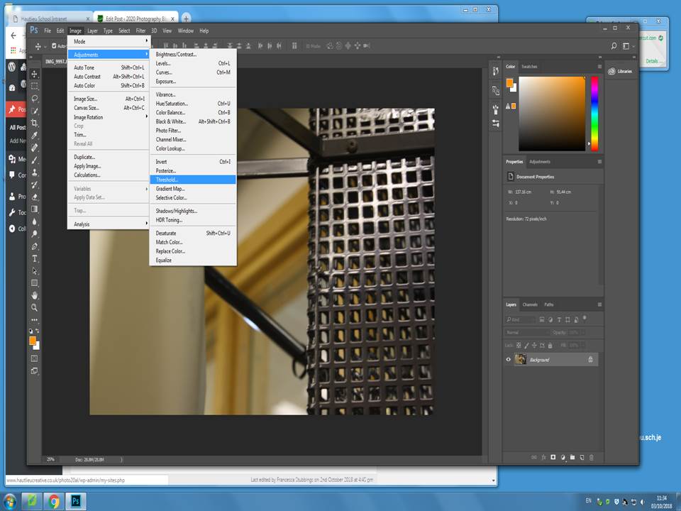
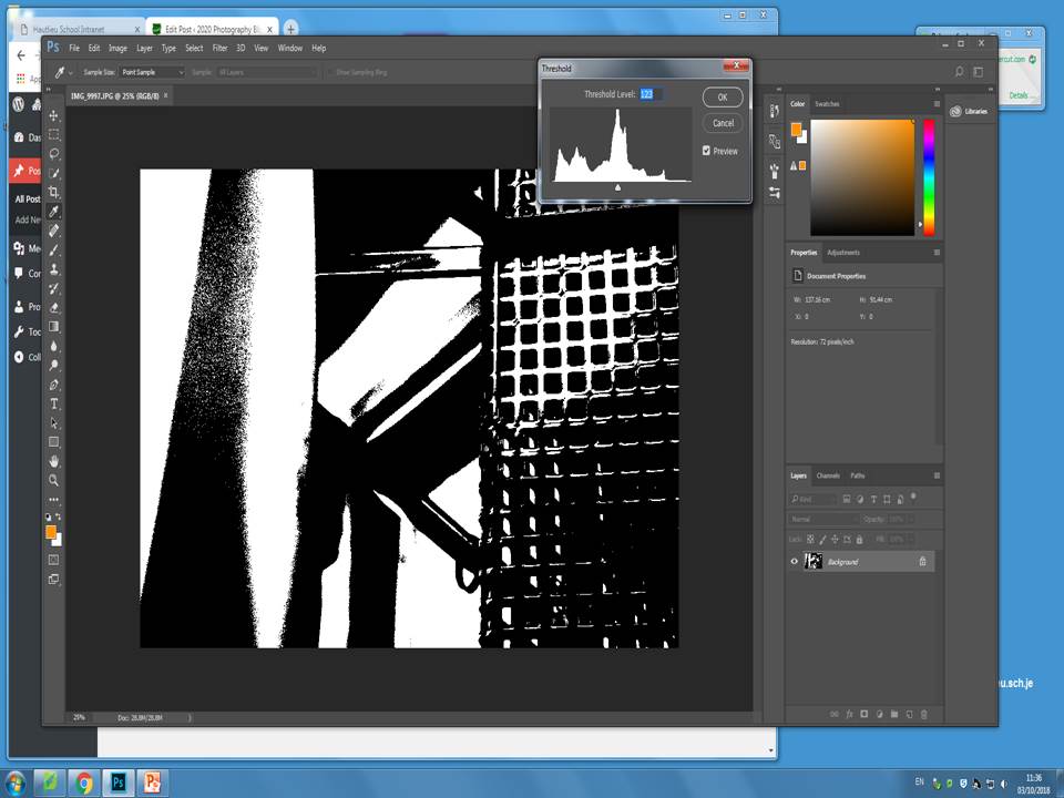
I then decided to responded to Keld Helmer-Petersen’s work, I did this by using images I had previously taken and then editing them in Photoshop. When editing the images i mainly focuses on changing the threshold of the images, to either increase the amount of white or black in the image, and making the represent the work Petersen did.

I firstly started with the original image in Photoshop and took these steps in order to change the threshold.

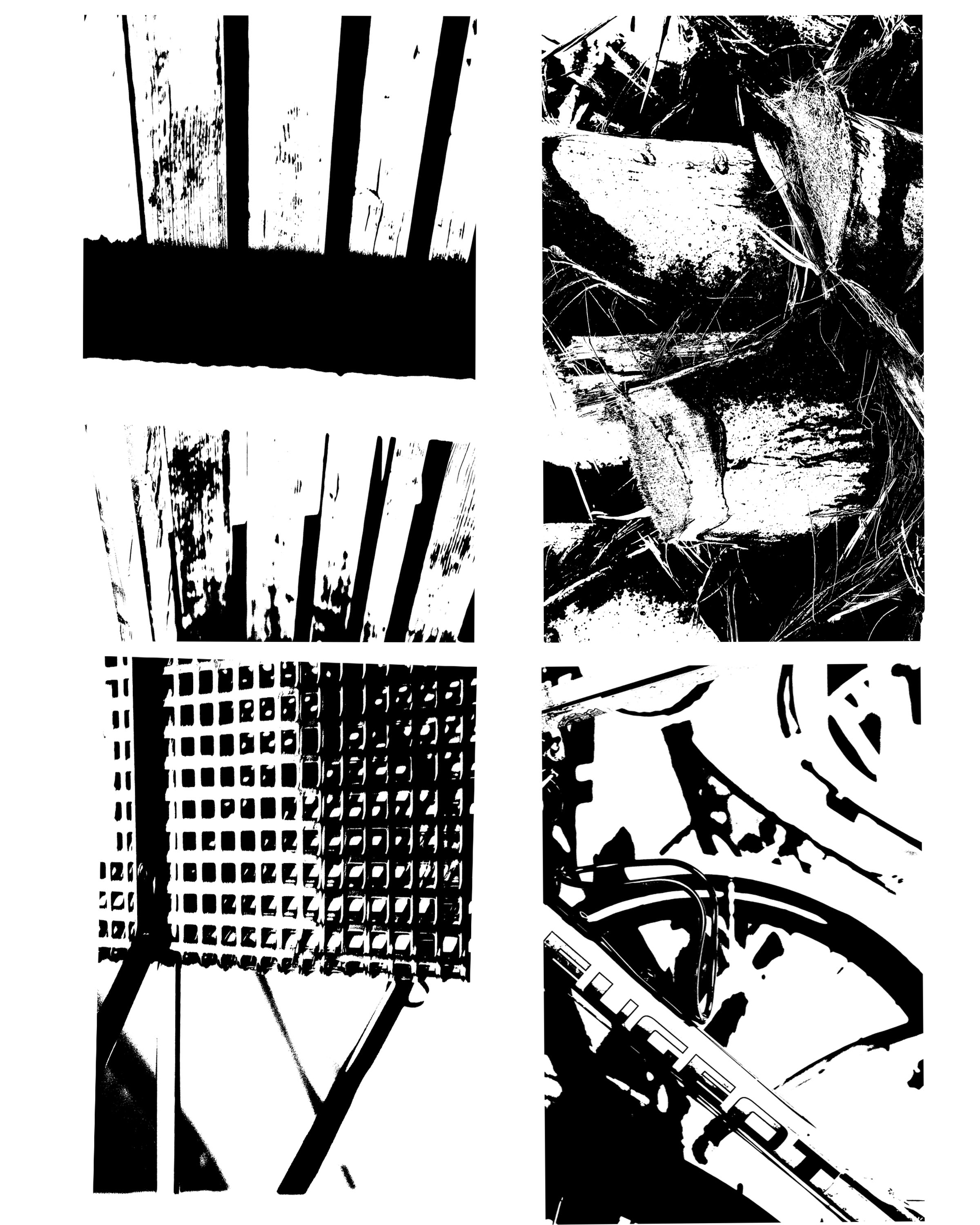
I did these step for each of my 4 images, I then copied them all over onto one page and created a gallery of these 4 final images. These are my 4 final images.

Each of these images were originally taken in natural light. All images have a range of depth and focus. The image in the top left hand corner is mainly focused on the black blocked line across the upper part of the photo and them the majority of the image is in white, where as the bottom right hand image has many more white blocks in the images and there is no real focus in the image, but there is depth, the text is at the front of the photo and then the vague lines behind the text really show off the depth of the image.


Ralph Eugene Meatyard

Ralph Eugene Meatyard  was born May 15, 1925. He was an american photographer who initially in the navy during world war 2, after the world war he began to study to become on optician. After he married he continued his trade as an optician with a company that also sold photography equipment. Meatyard purchased his first camera in 1950 and joined the ‘Lexington Camera Club’. He tended to make work in bursts and left his film for long times before developing it in his darkroom at his home. He approaches photography with a heavily influenced jazz music background, he used his children as the prime subject in his photos. He addressed the ‘masks of identity’ and the nature of the surface matter. By the time he dies his work was just being recognized.

Image result for Ralph Eugene Meatyard twigs

This photo by Ralph Eugene Meatyard has a main focus which is the twigs, this then gives the photo depth, because of the blurred background it shoes the distance in the photo and it isn’t just a shallow photo where everything is focused in the image. Meatyard has used a natural light because of the nature of his photo, this gives the photo a mysterious feel to it because of the shadows in the background created by trees behind it, even tho is is blurred out it is  still apart of the photo and gives it that mysterious feel.

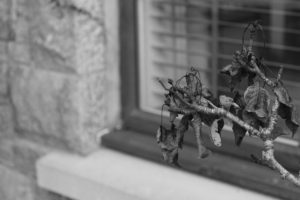
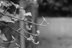
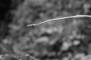
I aimed to take photos like Ralph Eugene Meatyard, with little focus in the pictures. Here are a few of my outcomes;

This small selection of photos show the way I try to copy the way Ralph took his photos. I used manual focus to get these photos and zoom, this is so I could really focus on one thing in the photo. I got inspiration for these photos by his selection of photos known as ‘Zen Twigs’.  The depth in these images vary, this is because depending on the background of the photo, how blurred out it was, some of the images had a slightly blurred out background whereas others had one main focus in the photo.