All posts by Emelia S

Filters

Author:
Category:

Week 4 Homework – Ralph Eugene Meatyard

“No Focus”

Ralph Eugene Meatyard (1925–1972) lived in Lexington, Kentucky, where he made his living as an optician while creating an impressive and enigmatic body of photographs. 

https://fraenkelgallery.com/artists/ralph-eugene-meatyard
Meatyards images are usually deliberately unfocused. Therefore for my shoot I deliberately unfocused my camera to try to get the same effect as meatyard. In my images I experimented with ISO, focus control and depth of field.

Here are examples of Meatyard's work:

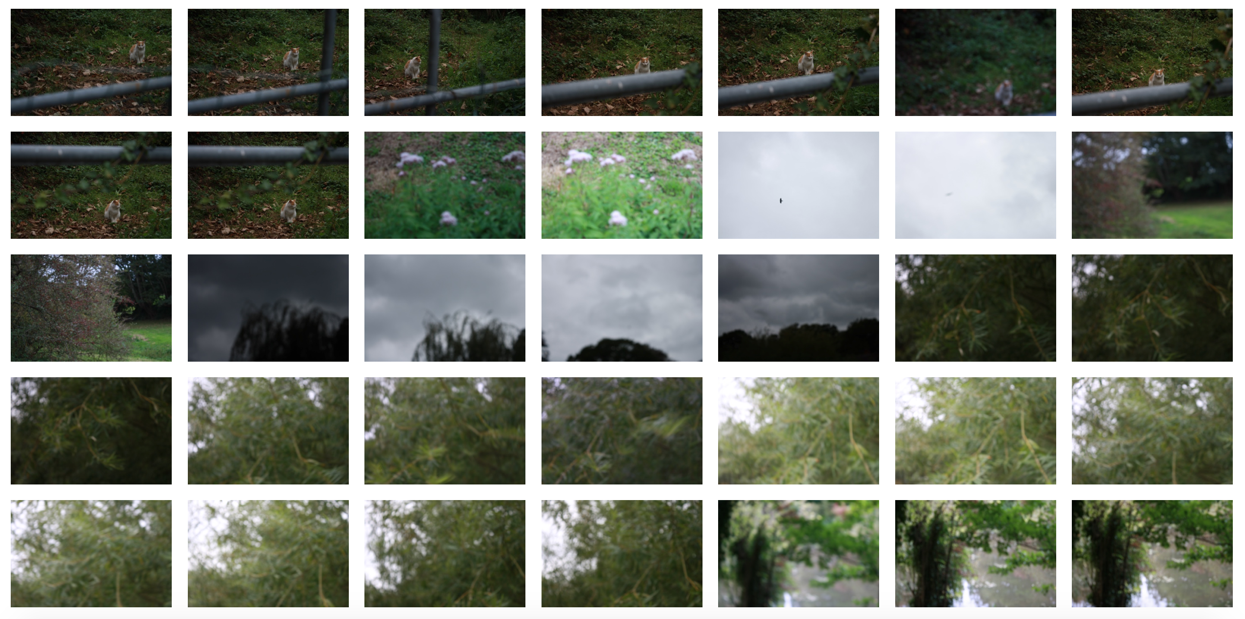
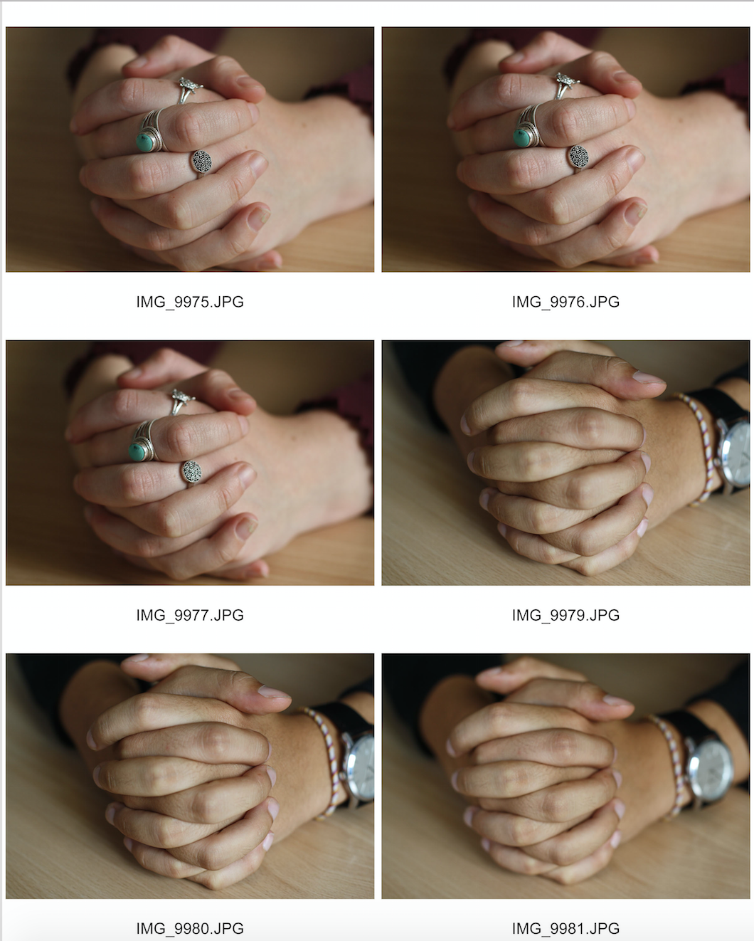
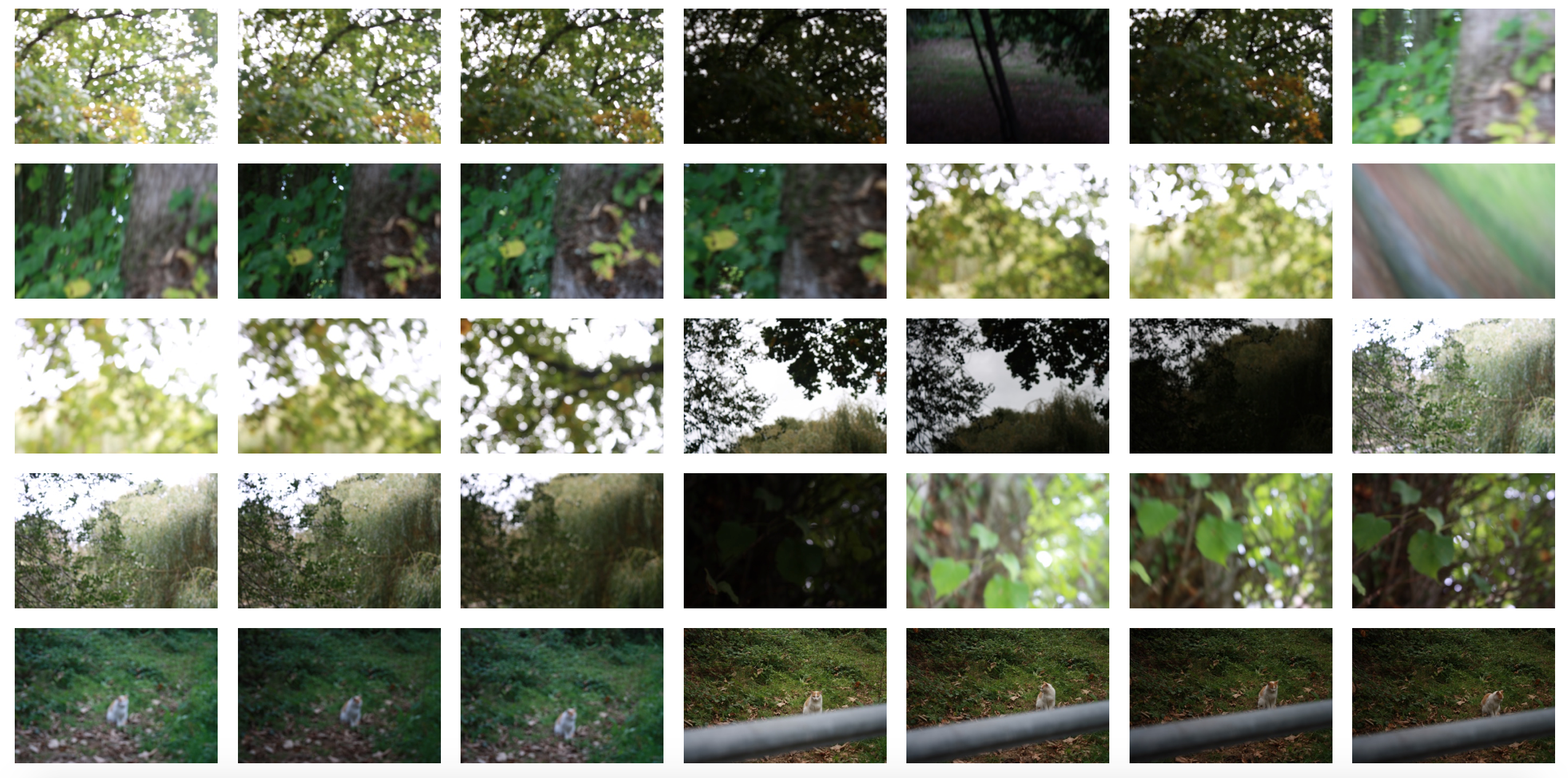
Here are unedited JPEG examples of my shoot:

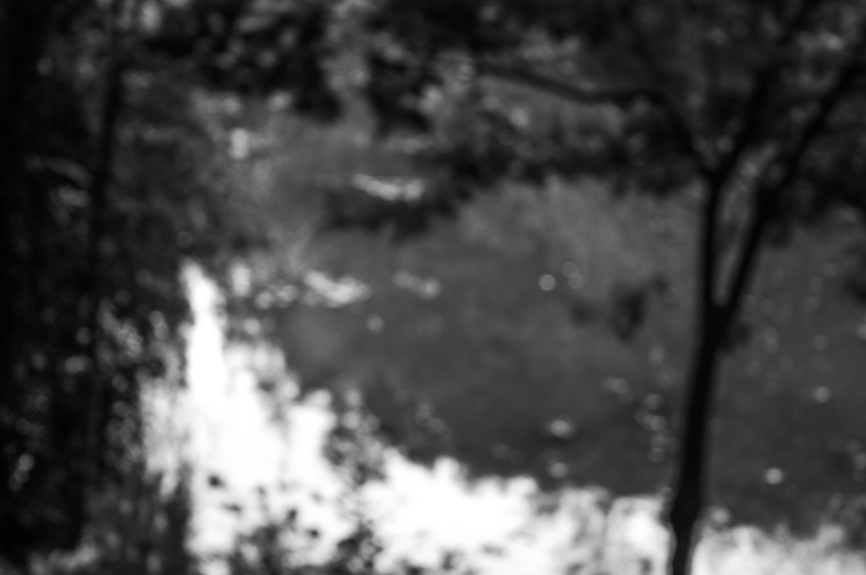
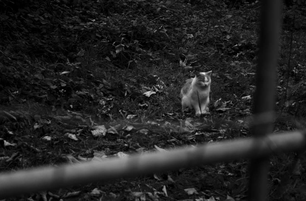
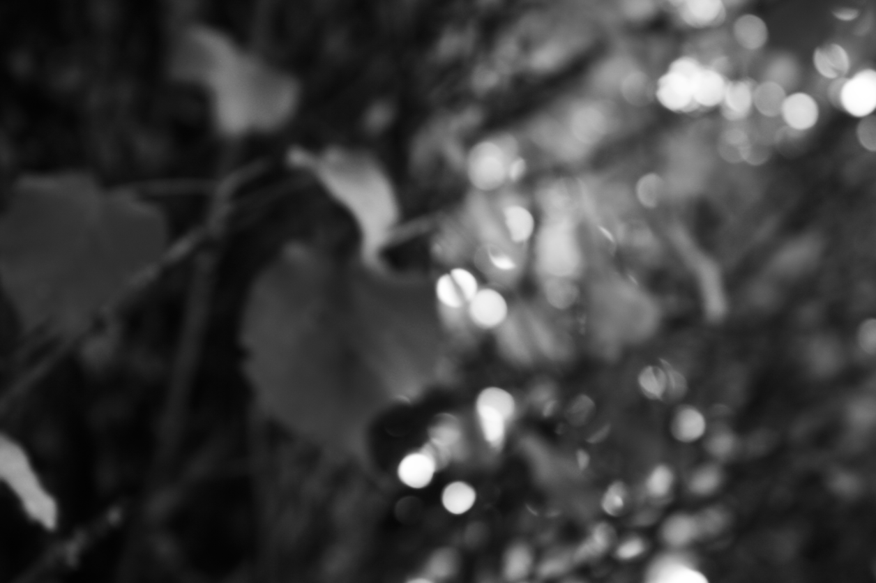
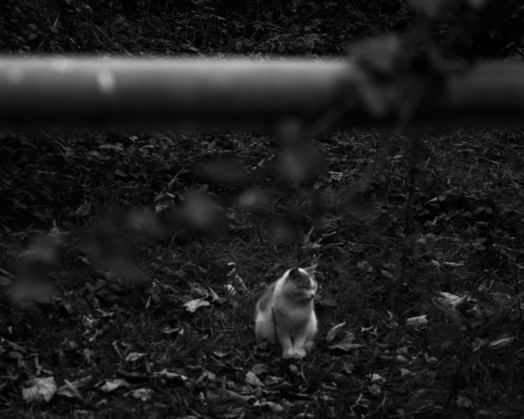
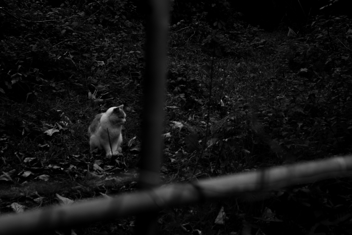
Here are some of my favourite photos from the shoot that I have edited. I used adobe lightroom to manipulate these images. I applied a black and white preset to all of my images because Meatyards images were mainly in black and white. I then manipulated the exposure, contrast and cropped some images until I was satisfied with the outcome.

Although I like the outcome of the photos of the trees and the lake, I particularly like the photographs I took of the cat behind the fence. I like the depth of field created by the unfocused fence, which therefore focuses the audiences attention on the cat. I feel the black and white preset also aids in directing the attention on the cat because the bold and vibrant colours of the green grass and ivy could redirect and confuse the audiences attention.

White Balance Experimentation

What is White Balance?

White balance in digital photography means adjusting colors so that the image looks more natural. We go through the process of adjusting colors to primarily get rid of color casts, in order to match the picture with what we saw when we took it.
https://photographylife.com/what-is-white-balance
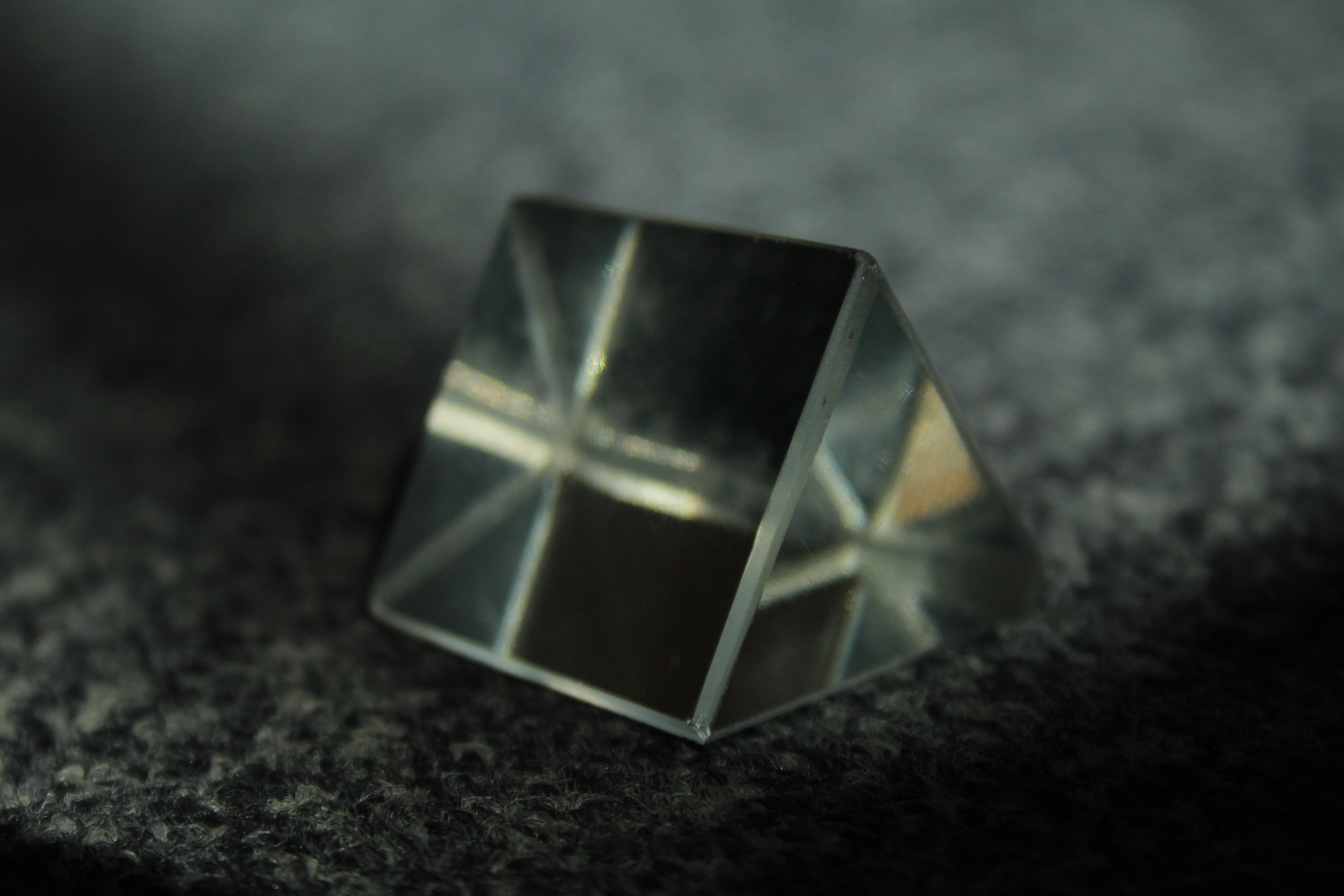
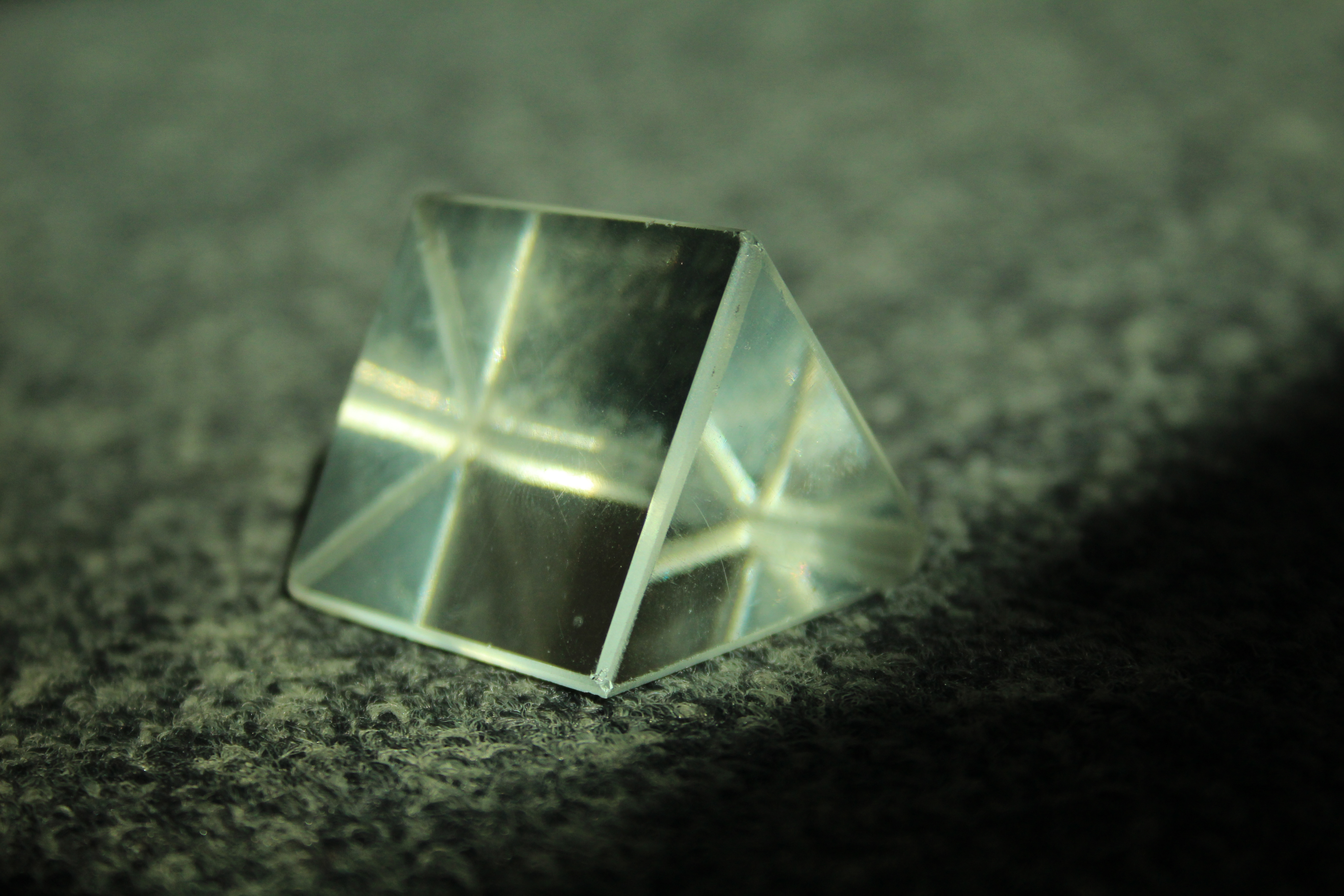
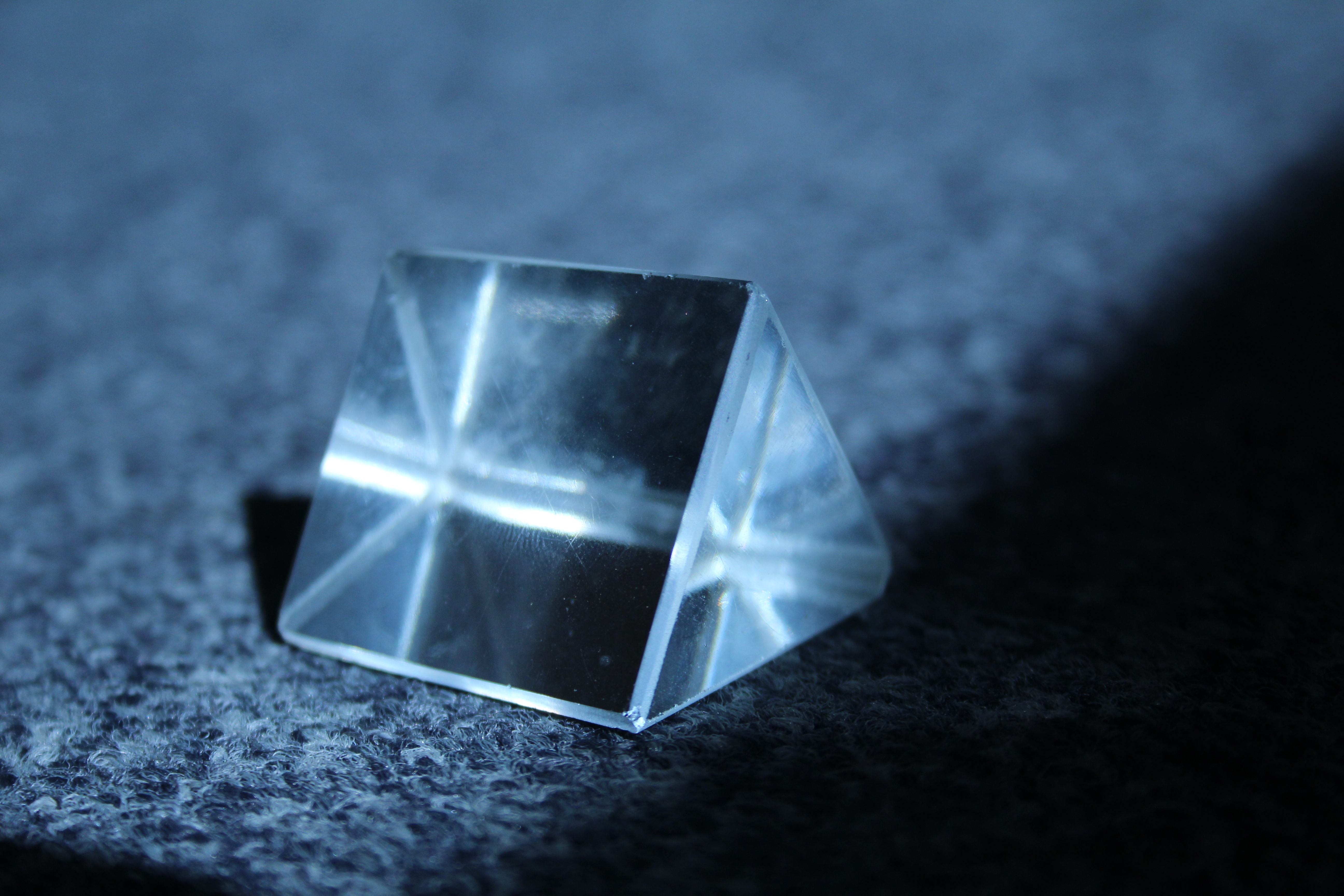
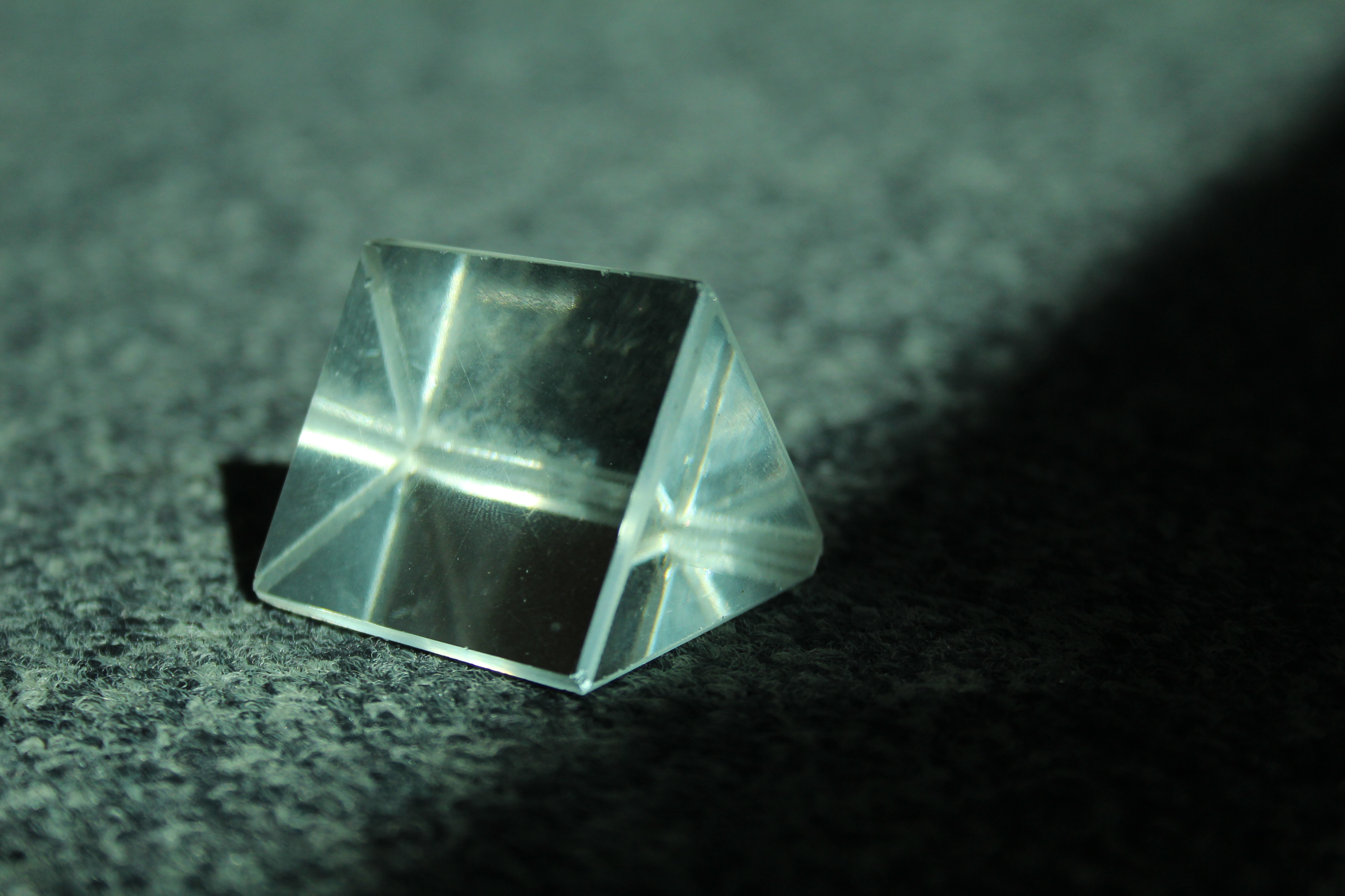
Here are examples of my experimentation indoors:
These are all images of my experimentation of white balance. I adjusted the exposure so the photo wasn't too light or dark then applied the different settings which changed the temperature of the images.

Here are examples of my outdoor work:

Depth of Field Experimentation

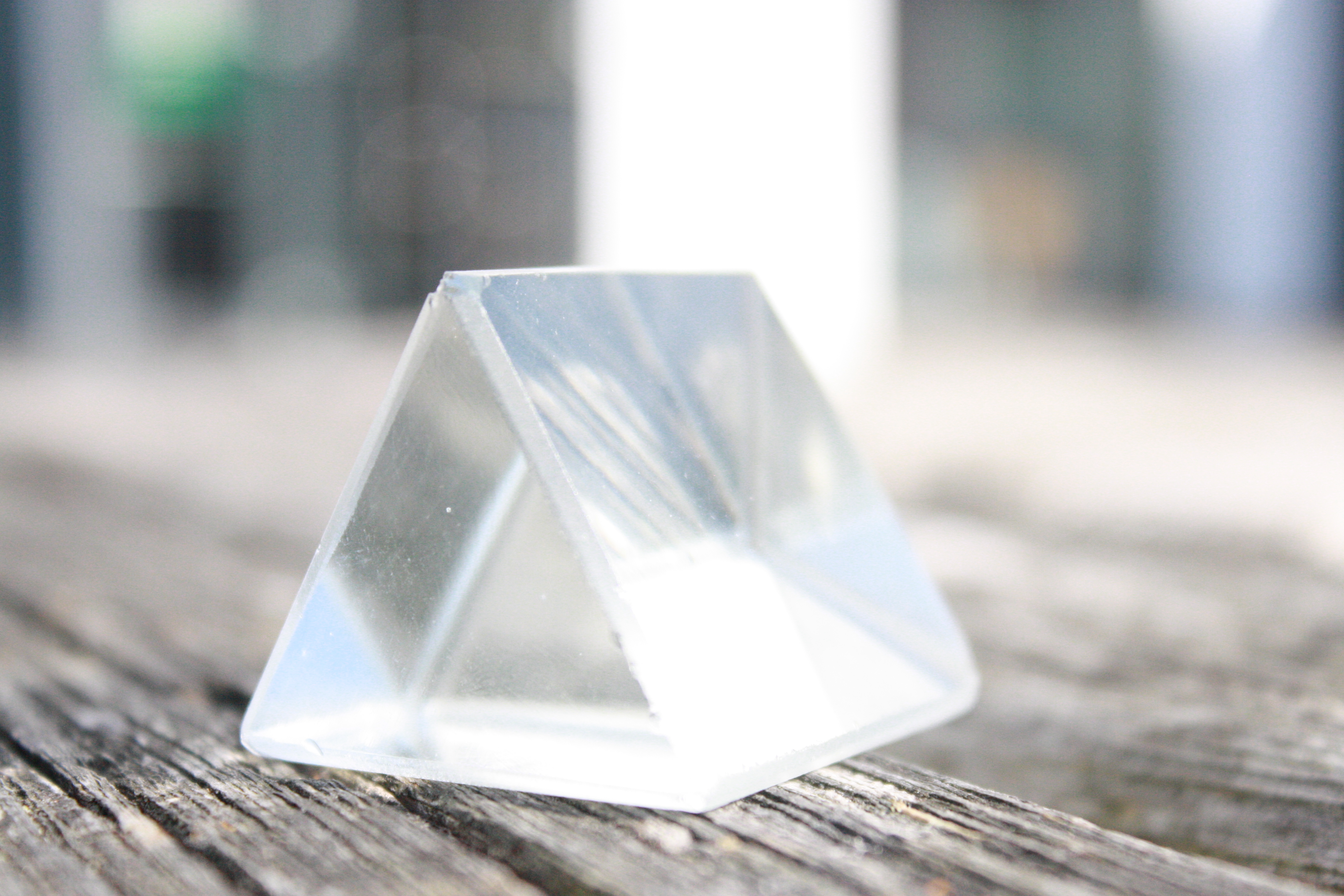
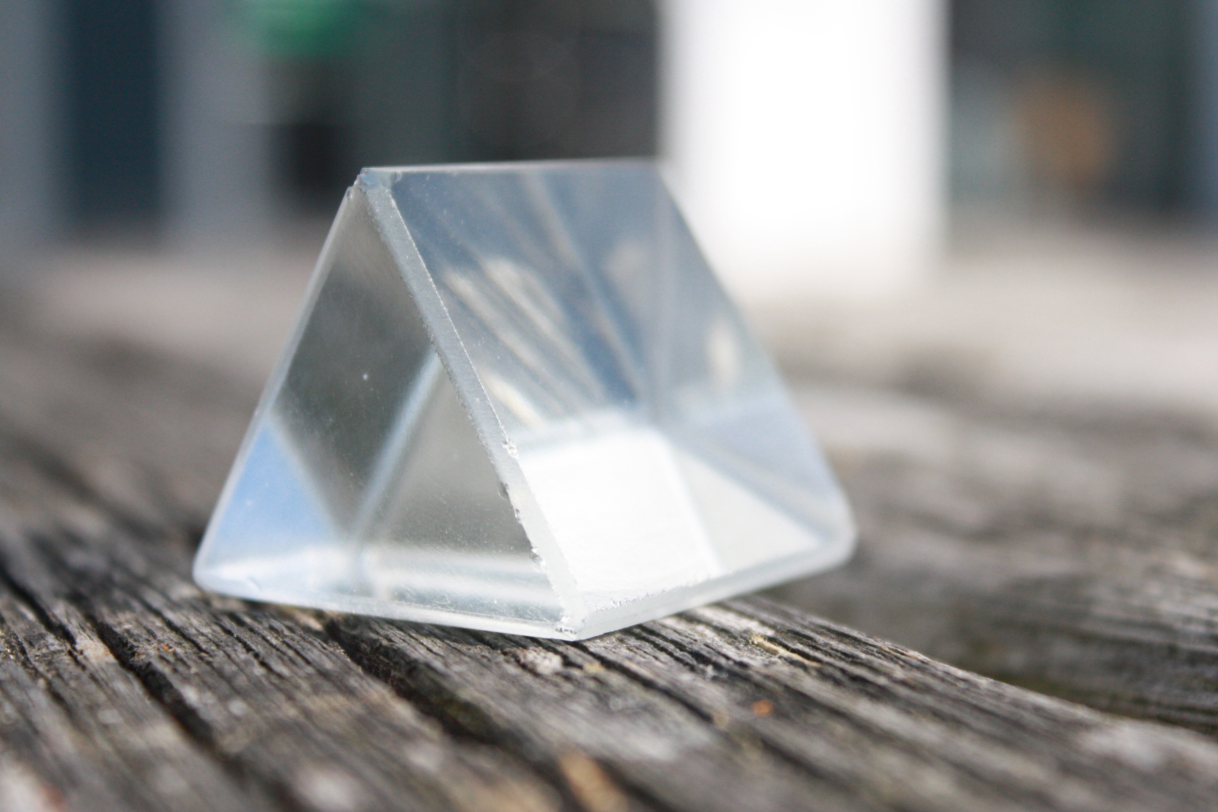
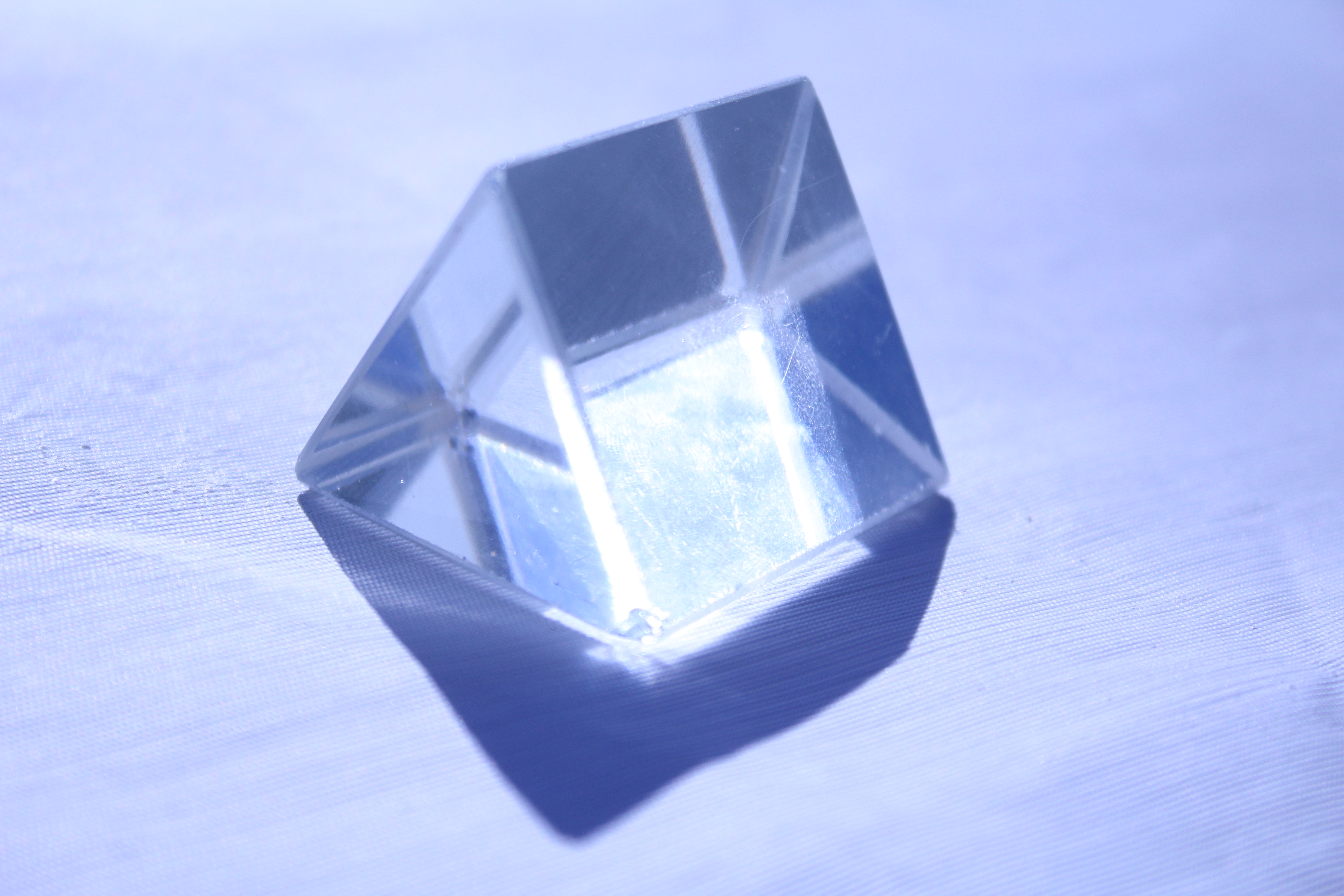
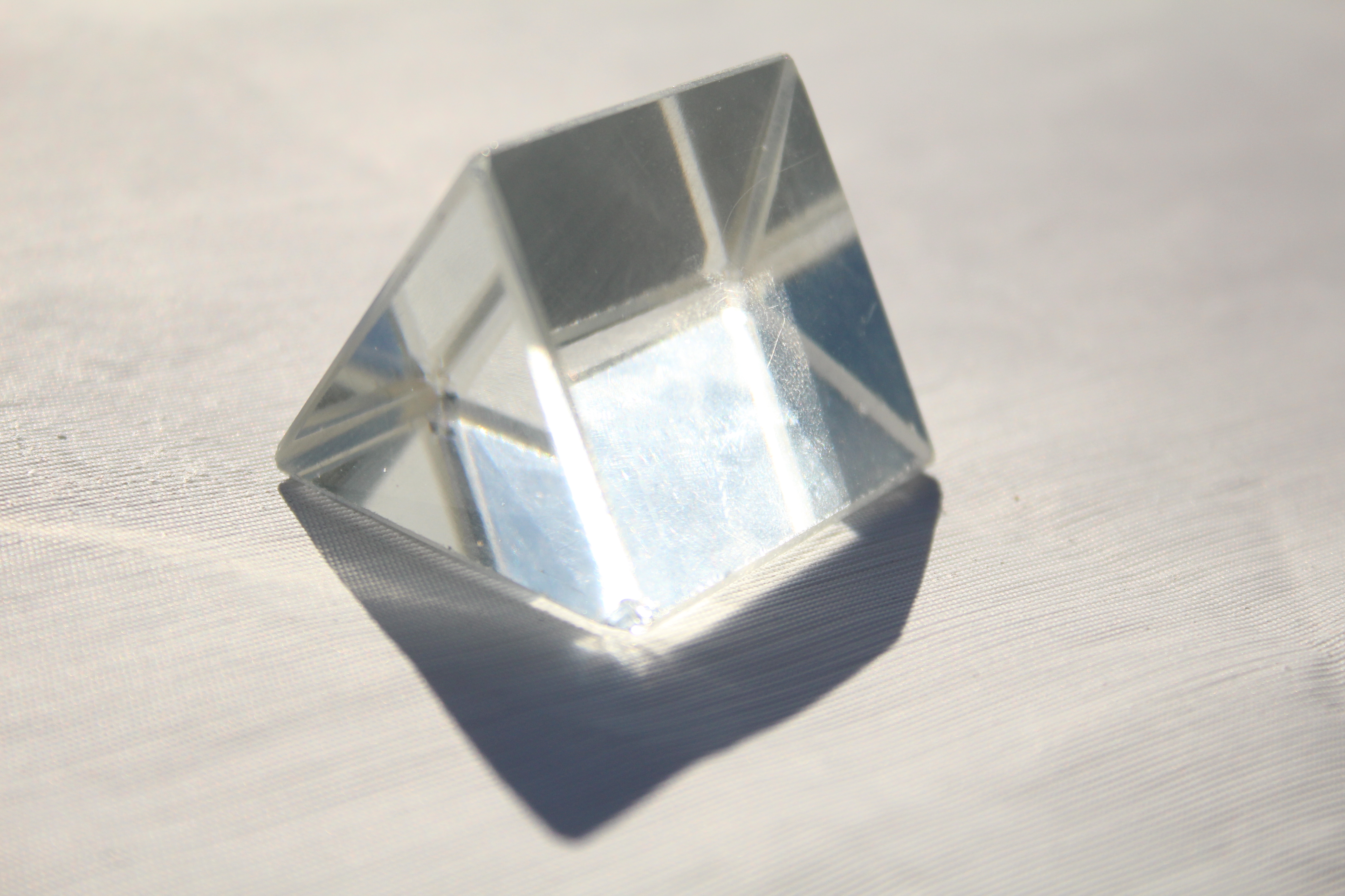
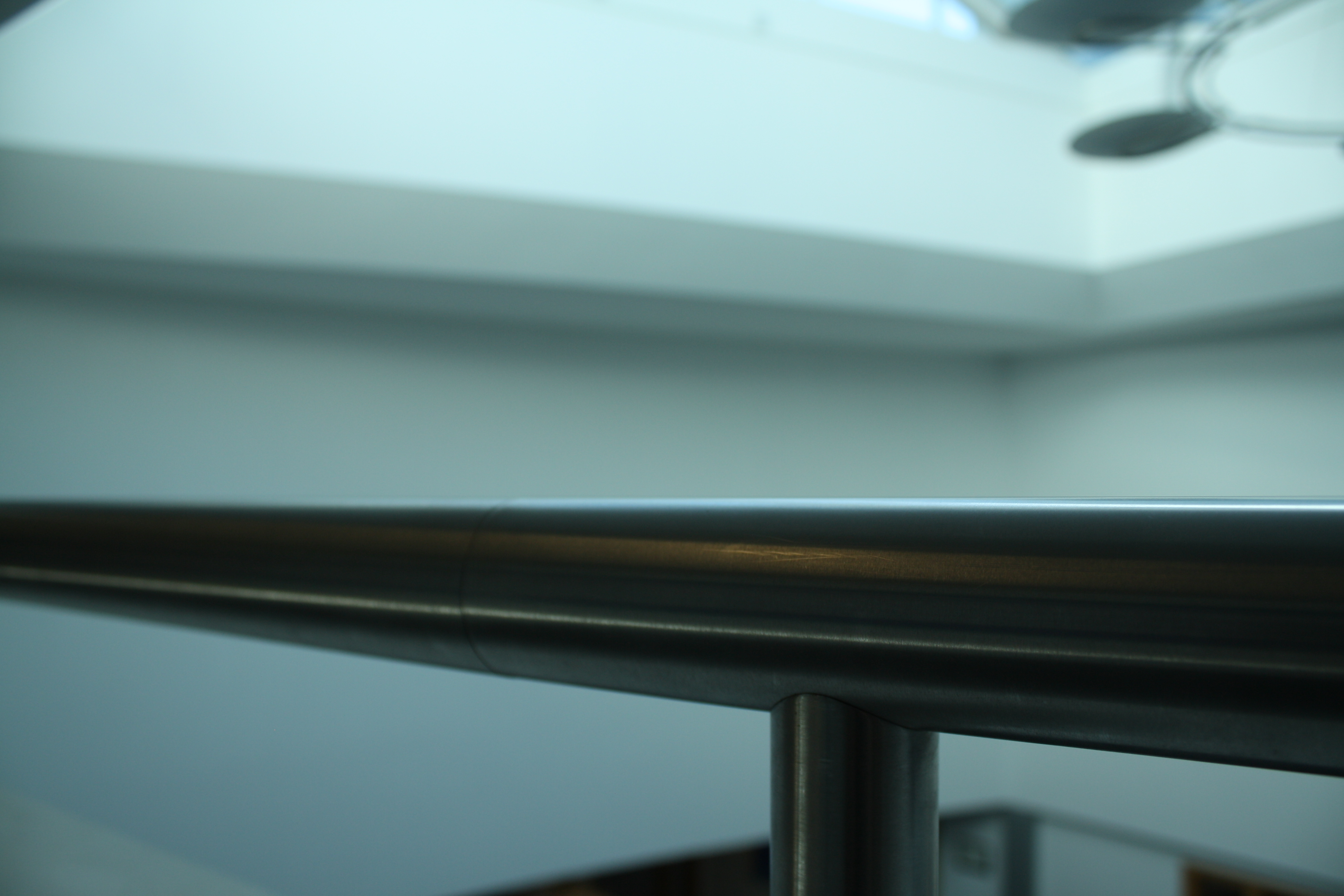
In this experimentation shoot we had to focus on the depth of field of our photographs. Depth of field is the distance between the nearest and the furthest objects giving a focused image. Here are some examples of my experimental images:

In the first image contrasts the third image because the focus is on the object closest to the camera. However, in the third image, the focus is on the window which is the object furthest away from the camera.

The second and third image both link because they both focus on the objects/background furthest away from the camera. All of these images are an unedited experimentation of focal length.

Week 3 Homework – The World is Beautiful

Albert Renger-Patzsch

Albert Renger-Patzsch was a German photographer associated with the new objectivity.

In its sharply focused and matter-of-fact style his work exemplifies the esthetic of The New Objectivity that flourished in the arts in Germany during the Weimar Republic. Renger-Patzsch believed that the value of photography was in its ability to reproduce the texture of reality, and to represent the essence of an object. He wrote: "The secret of a good photograph—which, like a work of art, can have aesthetic qualities—is its realism ... Let us therefore leave art to artists and endeavor to create, with the means peculiar to photography and without borrowing from art, photographs which will last because of their photographic qualities.

https://en.wikipedia.org/wiki/Albert_Renger-Patzsch
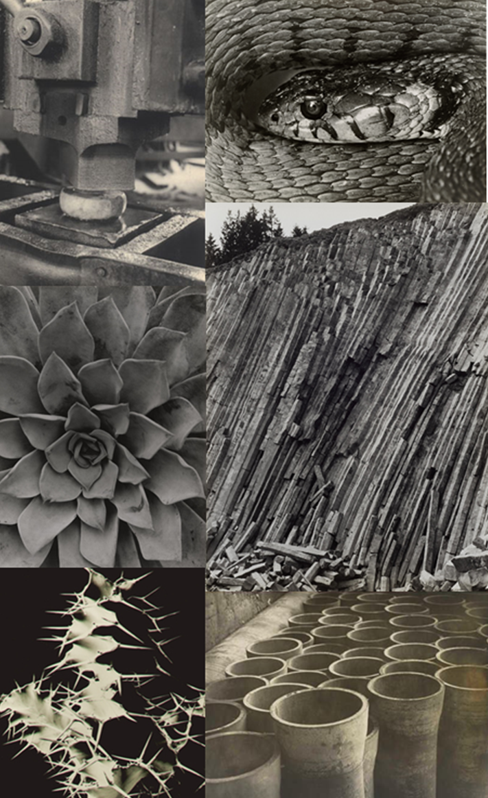
The New Objectivity:
The New Objectivity (in German: Neue Sachlichkeit) was a movement in German art that arose during the 1920s as a reaction against expressionism.  These artists rejected the self-involvement and romantic longings of the expressionists, Weimar intellectuals in general made a call to arms for public collaboration, engagement, and rejection of romantic idealism.

https://en.wikipedia.org/wiki/New_Objectivity
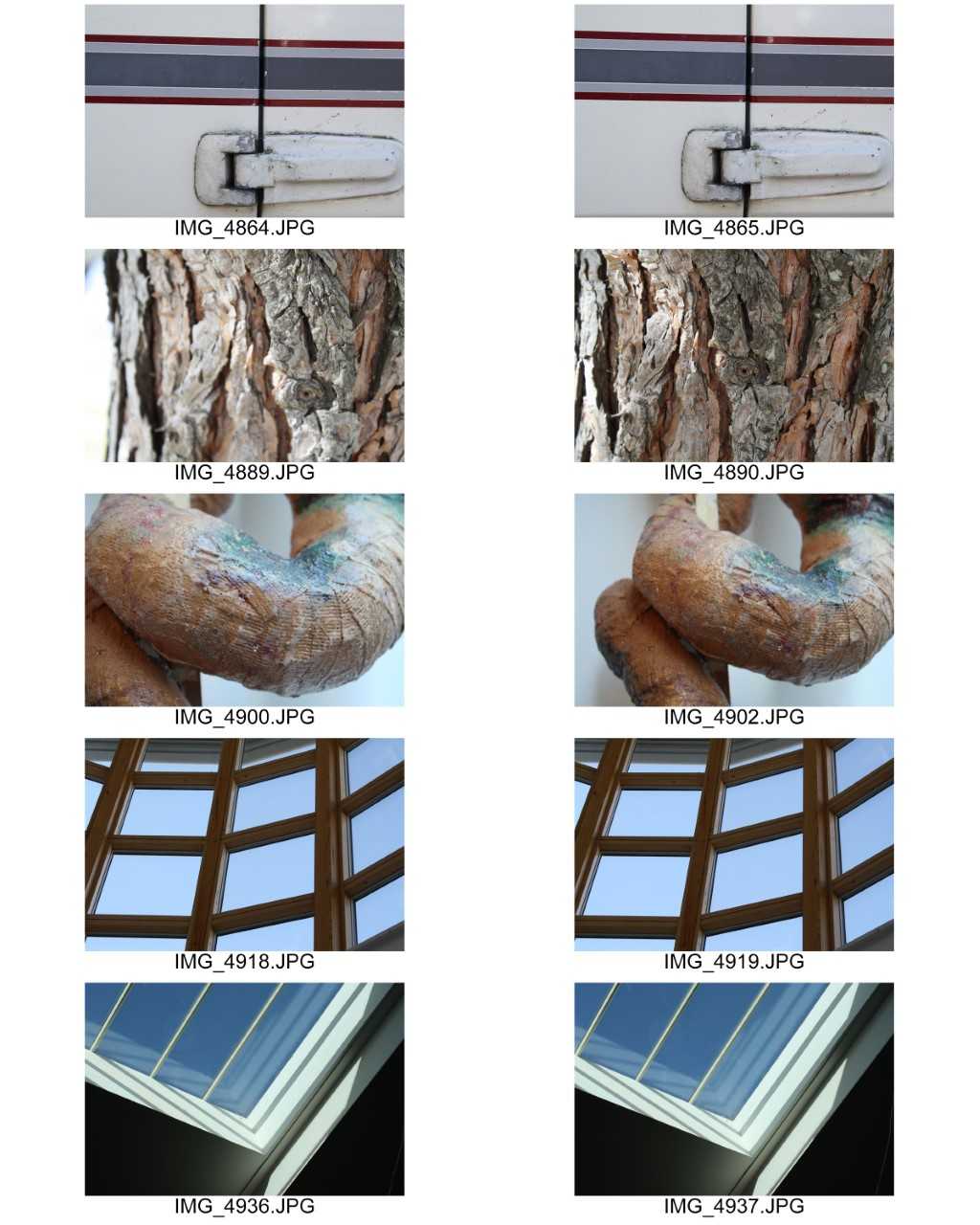
Contact Sheet:
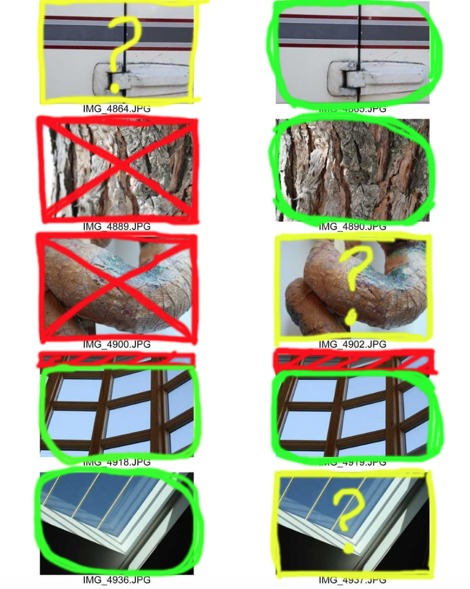
This is my contact sheet with the few images I have selected to edit.

Green circle - An image I would like to further use.

Red cross - An image I would not like to use.

Red F - The image is out of focus.

Red shading - The part of the image I would like to crop out.

Yellow question mark: An image I am unsure whether to edit or not.

Here are my final images:
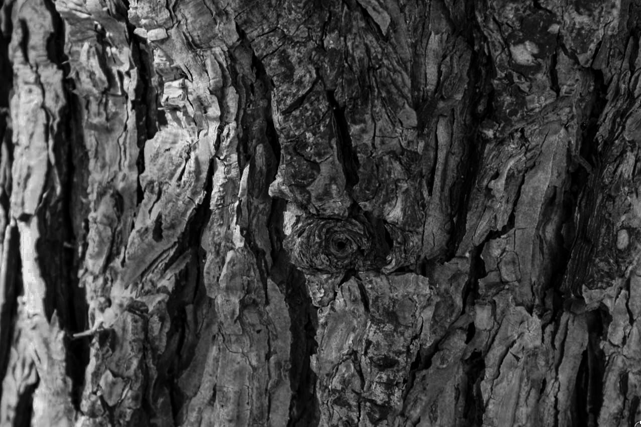
I used adobe lightroom for this image, I applied a black and white preset because Renger-Patzsch's work was mainly in black and white. I then hightened the clarity and lowered the exposure. I then played around with the shadows and highlights until the image looked aesthetically pleasing. I like the depth of field created because the image is focused on the knot in the centre, and particularly towards the right of the photo, the blurryness.
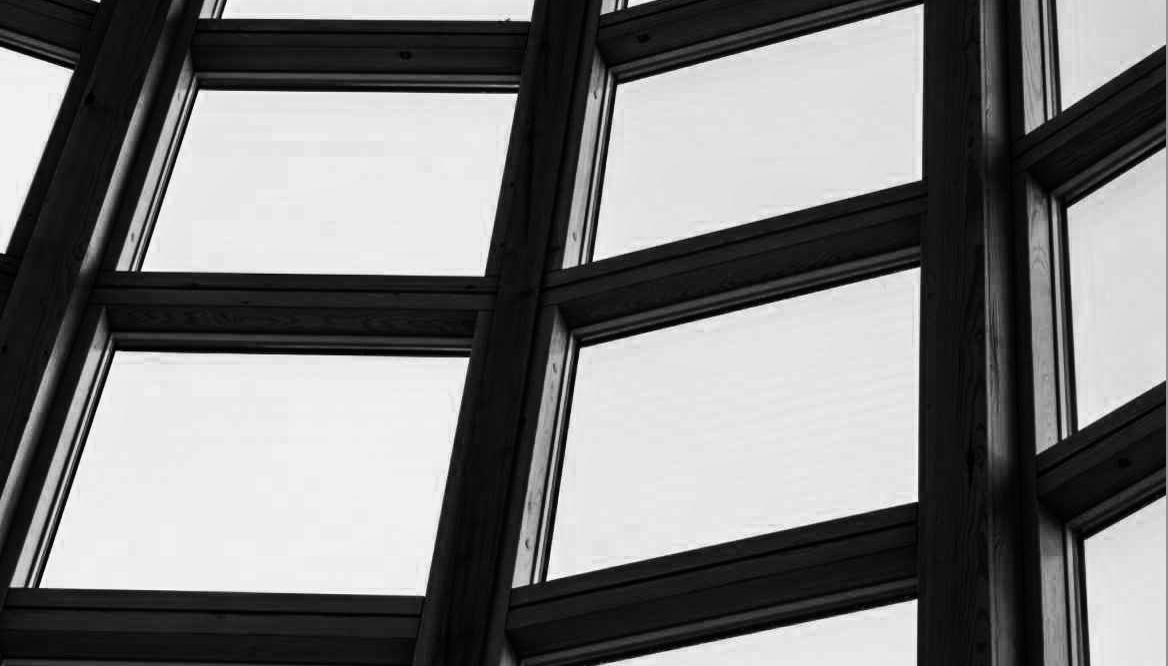
Once again I used adobe lightroom to manipulate this image. I applied a black and white preset, hightened the contrast, clarity and highights, while lowering the shadows. The image has a crisp look to it and there is no depth of field created. I also cropped the image to remove some of the unwanted wall so it focuses on the actual image.
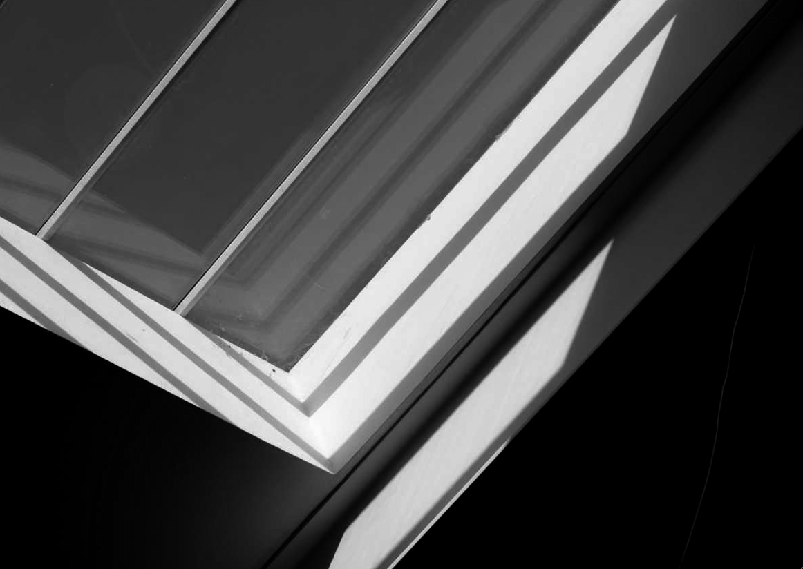
In this photo I used adobe lightroom to edit this image. I liked the contrast of light in the photo, especially the light reflected on the left which juxtaposes the dark shadow of the wall. I applied a black and white preset, then lowered the exposure and shadows. However, then I hightened the clarity, highlights and contrast. I then slightly cropped the image.
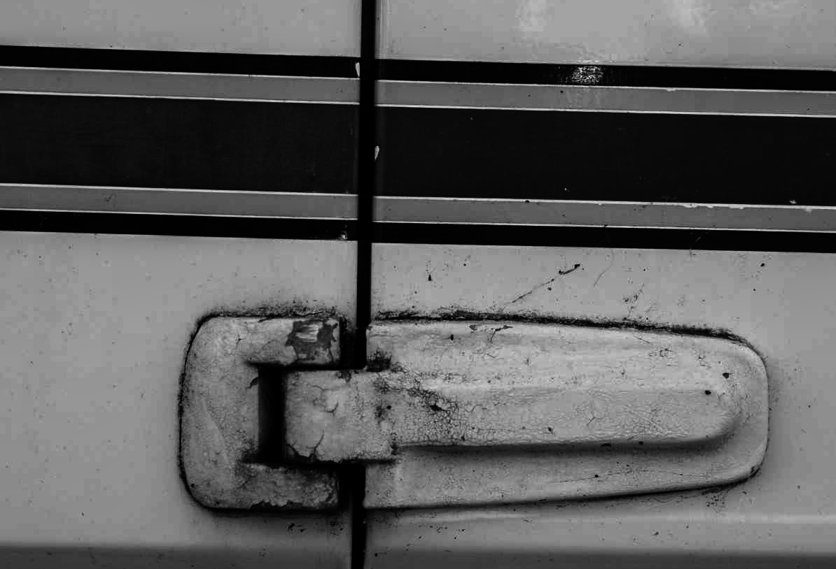
My final image is of a hinge on a caravan door. I applied a black and white preset on adobe lightroom, then hightened the contrast, clarity and shadows. I then lowered the highlights and exposure. I also slightly cropped the image to create more focus on the actual door hinge than the door.

 

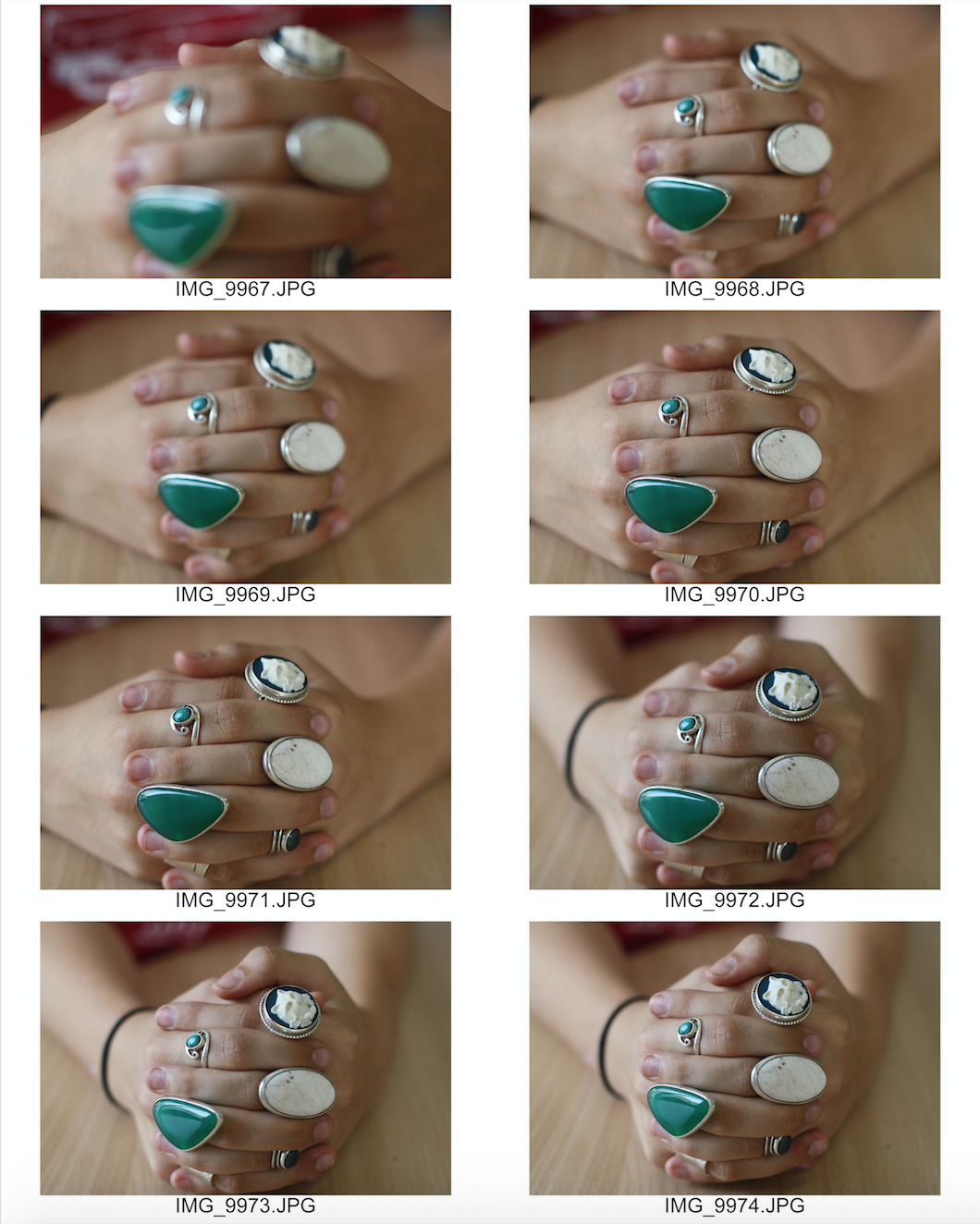
Focus on Focus – Mini Hand Shoot 3

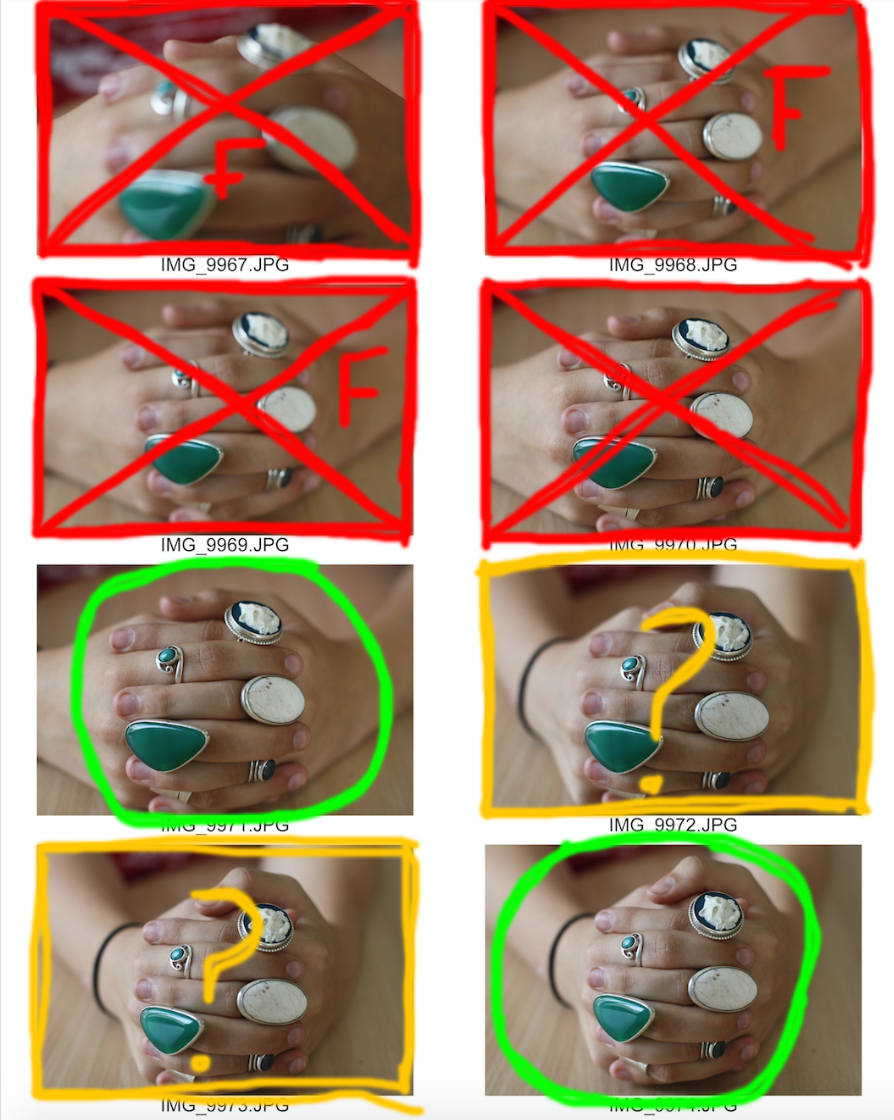
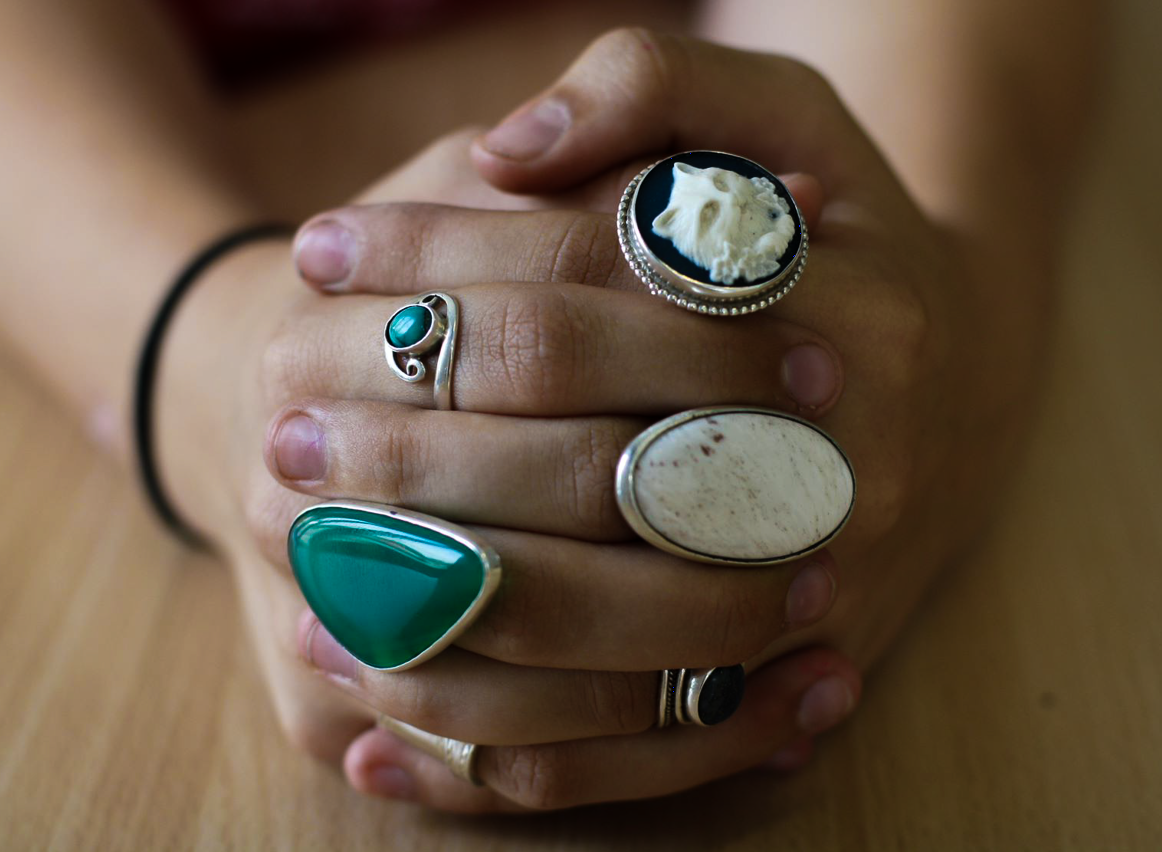
Here is another example of one of the hands that I photographed. I used a portrait lens and because I haven't used a portrait lens before I have just had to experiment with it. The autofocus was a bit strange on this camera so I had to shift between auto and manual focus throughout this shoot. I really liked the focused photos in this photo and like the depth given by the unfocused background.

Here is my contact sheet on the images:

This is my contact sheet with the few images I have selected to edit. 

Green circle - An image I would like to further use. 

Red cross - An image I would not like to use. 

Red F - The image is out of focus. 

Red shading - The part of the image I would like to crop out. 

Yellow question mark: An image I am unsure whether to edit or not. 

Here are my final images:

I manipulated these images using adobe lightroom. 

For the first image, I slightly increased the clarity and shadows of the image, then I lowered the exposure and highlights until I thought that the image was aesthetically pleasing I think the reduction in background highlights brought more attention to the focused hands and rings.

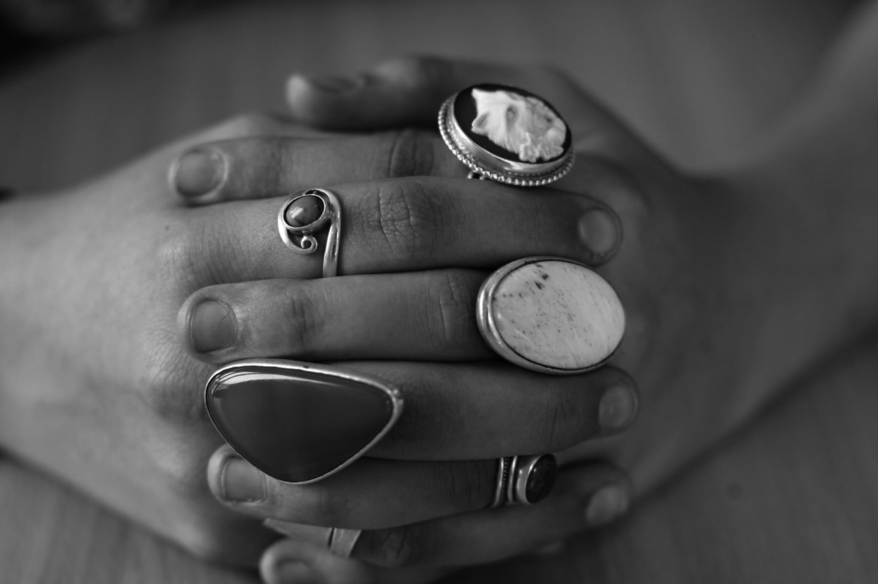
For the second image, I applied a black and white preset, reduced the exposure and highlights. I then slightly increased the clarity and shadows of the image.

Focus on Focus – Mini Hand Shoot 2

Here is another example of one of the hands that I photographed. I used a portrait lens and because I haven't used a portrait lens before I have just had to experiment with it. The autofocus was a bit strange on this camera so I had to shift between auto and manual focus throughout this shoot. I really liked the focused photos in this photo and like the depth given by the unfocused background.

This is my contact sheet with the few images I have selected to edit.

Green circle - An image I would like to further use.

Red cross - An image I would not like to use.

Red F - The image is out of focus.

Red shading - The part of the image I would like to crop out.

Yellow question mark: An image I am unsure whether to edit or not.

Here are my final images:

I manipulated these images using adobe lightroom. For the first image, I applied a black and white preset, reduced the exposure and highlights. I then slightly increased the clarity and shadows of the image.

For the second image, I slightly increased the clarity and shadows of the image, then I lowered the exposure and highlights until I thought that the image was aesthetically pleasing I think the reduction in background highlights brought more attention to the focused hands.

Focus on Focus Mini Hand Shoot 1

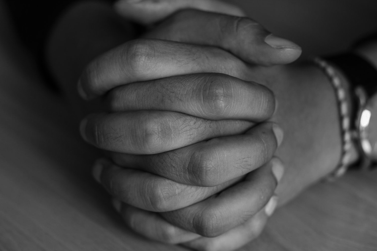
Here is one example of one of the hands that I photographed. I used a portrait lens and because I haven't used a portrait lens before I have just had to experiment with it. The autofocus was a bit strange on this camera so I had to shift between auto and manual focus throughout this shoot. I really liked the focused photos in this photo and like the depth given by the unfocused background.

This is my contact sheet with the few images I have selected to edit.

Green circle - An image I would like to further use.

Red cross - An image I would not like to use.

Red F - The image is out of focus.

Red shading - The part of the image I would like to crop out.

Here is my final edited image:

I used adobe lightroom to manipulate this image. I heightened the contrast and clarity of this photo, slightly reduced the exposure and applied a black and white preset. I chose to apply a black and white preset because I believe it draws more attention to the hands' characteristics like the wrinkles and nails.


CCA Galleries – Clare Rae & and Claude Cahun Exhibition

Clare Rae is a contemporary photographer who is based in Melbourne, Australia. Her work is based around the feminist theory, the female body and the awkward experience of subjectivity. Her current exhibition at the CCA Galleries: "Entre Nous" is her work that is inspired by Claude Cahun. 
Claude Cahun, a member of the Parisian surrealist movement, was a queer and jewish photographer who moved to Jersey with her stepsister/lover. Her photos are self portraits that pushed the boundaries of self identity, gender and sexuality. Claude is often described as ahead of her time as she pushed so many boundaries that were deemed highly unnaceptable at the time. 

Claude Cahun and Clare Rae have 70 years between them, and their exhibition brings the conversation between their two performative practices.
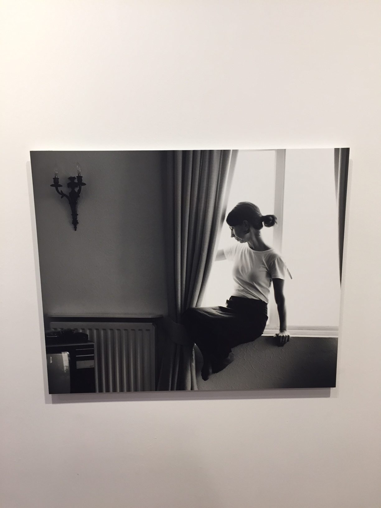
Example of Clares Work:


The lighting from behind the subject (Clare) creates a slight silloute of herself. Her simple outfit and concept in this image contrasts Claude Cahuns photo of "I am in training don't kiss me".
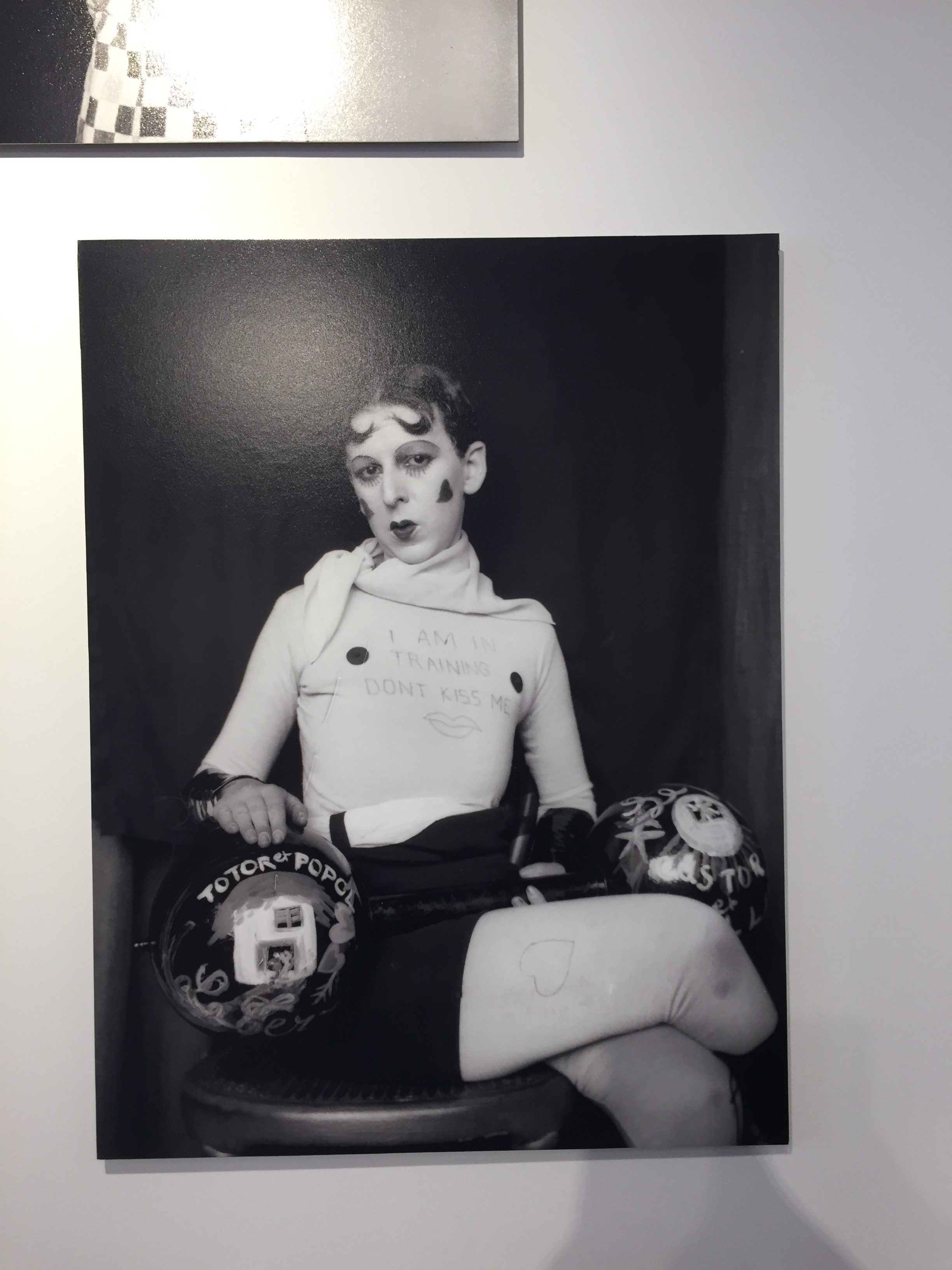
Claudes dark background contrasts Clares light background, also the fact that Claude is staring towards the camera reveals her daring and devilish attitude. On the other hand, both photographers are sitting in a similar position and they both have white tops on with black bottoms. Claudes masculine activity (weightlifting) contrasts her extreme feminine looks - the lipstick, the love hearts. These contrasting ideas display Cahuns defiant attitude towards gender roles.
Paper Shoot – The Edits: VSCO App

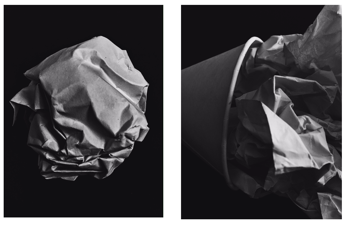
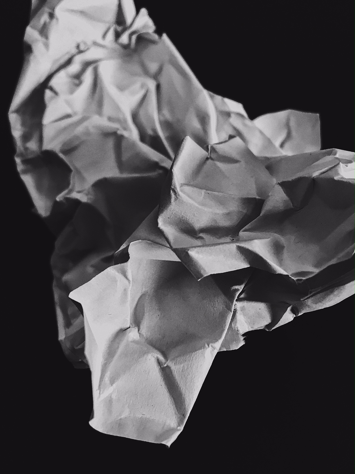
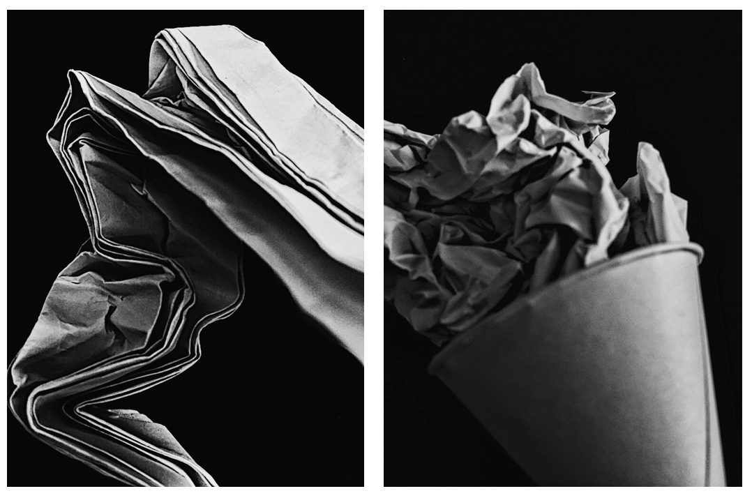
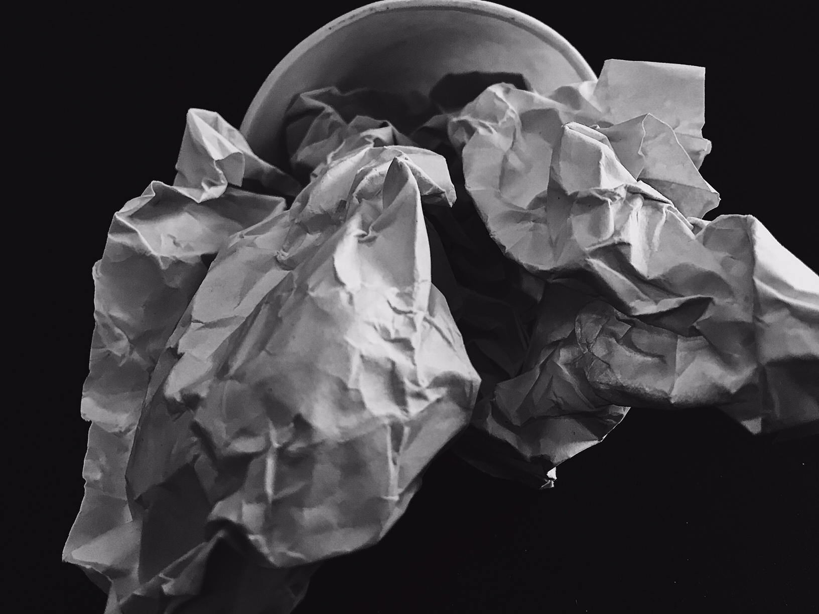
Here are some of the edits of my paper shoot. My nest photoshoot I need to concentrate on the focus a lot more. Taking into consideration that I was using an iPhone camera which isn't amazing quality, I need to continually focus on the quality of the image and ensure the focus is correct.

To manipulate these images, I used the app VSCO.  I heightened the contrast and clarity, then lowered the exposure and applied a black and white filter.