All posts by Eren G

Filters

Author:
Category:

Research- 2019 mock

Who is Francesca Stern Woodman?

Francesca Stern Woodman born on the 3rd of April 1958 was an American photographer and best known for her black and white images.

Francesca was born in Denver, Colorado. her Jewish mother names Betty Woodman and her father from a Protestant background, George Woodman who were also both artists. Woodman also had a brother who grew up to become a professor of electronic art. overall Woodman had a fairly creative and artistic family.  From the age of 13 is where Woodman really learnt her love for photography whilst attending a public school in Colorado, whilst she wasn’t in Italy with her family. Moving on to high school in 1972 where she attended Abbot Academy. This is when she concentrated on developing he skills and overall perspective on photography and graduated in 1975. After her excellent performance at her middle school she was then able to go on to attended Rhode Island School of Design in Providence, Rhode.  In 1977 she studied in Italy as part of a honors program. Graduating in 1978. In 1979 Woodman decided to more to New York to ”make a career in photography”. Woodman worked hard for a long period of time sending of portfolios to anyone that would have a look and consider them. however still in 1980, woodman had not yet been successful. This was Woodman’s lowest time as that same year she attempted suicide and after recovery moved to live with her family in Manhattan, where she could rebuild herself- well that what her parents thought. soon to be proved wrong when on January 1981 Woodman jumped out of a loft of a building and died at the age of twenty-two.

Image result for francesca woodman

Image result for francesca woodman

Visual:

Francesca Woodman’s images are always portrayed with such a strong once looking at them. In this image you see an empty room which some what looks dirty with the walls being marked. The room gives off a cold feeling and lonely feeling with the image of the woman, doing what looks like reaching down to the floor. However her whole figure is distorted and blurred so you are unable to see any feature of her body or face. Although her shoes are still in fair quality this will be down to the fact she hadn’t yet moved when the photo was being taken. By being able to see her shoes it implies a woman is being photographed due to the high heels that are worn. The woman is positioned to the left of the image and what feels fairly manipulated to be presented as far away from the camera right up near the wall.

Technical:

In this image there is a clear representation of shadows being produced this could have been effected by natural daylight shining in through the window. The main focus of the image is the woman who is located on the fair left and positioned far back at the wall from the camera. It’s clear that for this image to have the appearance it does the camera must have had an extremely low shutter speed in order to create the blurriness of the figures movement. To me this image is displaying a mixture of texture with the wall and floor almost feeling gritty and unsmooth compared to the figure who is over ‘’smooth’’ in the sense that there are no lines or clear outline to the woman creating a distorted feeling to the image.

Conceptual:

How does this image make you feel? The image present the feeling of loneliness this is represented through the feeling of the rustic empty and oversized room. With then only one distorted figure cramped in the order. Her movement almost like she’s trying to break out from that corner and start to spread out. The blurred figure gives the feeling of rushing that she was moving fast, possibly wanting to get away from something- the loneliness?

Contextual:

From research it is clear that Francesca Woodman ad a hard and what she felt dark. With loving photography so much and no one else appreciating it like she did. The idea of the loneliness in this image could be portrayed as Woodman emotions of her own work the idea that she was alone with no one else to look and view her work.

Identity and Place

Definition of Identity 

Who a person is, or the qualities of a person or group that make them different from others.

Definition of Gender Identity- Wiki

Gender identity is the personal sense of one’s own gender.  Gender identity can link to set gender at birth, or can be the complete opposite.  All societies have a set of gender categories. In most societies, there is a basic division between gender attributes assigned to males and females, a gender binary to which most people adhere and which includes expectations of masculinity and femininity in all aspects of sex and gender. biological sex, gender identity, and gender expression. Some people do not identify with some, or all, of the aspects of gender assigned to their biological sex.

Image result for Gender Identity

Definition of Social Identity- Wiki

 Social identity is the portion of an individual’s self-concept derived from perceived membership in a relevant social group.

Image result for Social Identity

Definition of Political Identity- Wiki

 Political positions based on the interests and perspectives of social groups with which people identify.

Image result for Political Identity

Definition of Cultural Identity- Wiki

Cultural identity is the identity or feeling of belonging to a group. It is part of a person’s self-conception and self-perception and is related to nationality, ethnicity, religion, social class, generation, locality or any kind of social group that has its own distinct culture.

Image result for Cultural Identity

Definition of Geographical/ National Identity- Wiki

National identity is a person’s identity or sense of belonging to one state or to one nation. It is the sense of a nation as a cohesive whole, as represented by distinctive traditions, culture, language and politics.

    Image result for map

   Definition of Lack of /Loss of Identity

1. Personal psycho social conflict especially in adolescence that involves confusion about one’s social role and often a sense of loss of continuity to one’s personality

2. A state of confusion in an institution or organization regarding its nature or direction

Image result for loss of identity

Mood bored:


Lorna Simpson

Lorna Simpson born 13th August 1960 is an African-American photographer who came most popular around the 1980s and 1990s with artwork such as Guarded Conditions and Square Deal. Her work as been displayed in multiple exhibitions all around the world and is most famous for her photo text installations, photo collages and films. Simpson first came to prominence in the 1980s for her large-scale works that combined photography and text and defied traditional conceptions of sex, identity, race, culture, history, and memory. Lorna Simpson received her BFA  in Photography from the school of visual arts in new York then followed by  getting her MFA from the university of California. Lorna Simpson always looked into the idea of challenging the norm and what she believed that society expected. Going into depth about identity and exploring how people really feel about themselves and how one might want to portray themselves.

She started off taking photographs of things she saw around her- but soon realized  that she wanted to focus more directly to explore the ideas and issues she felt strongly about. so she began to take carefully posed images in her studio. to really branch out she began looking into the idea of added words or other images alongside the photographs she could express even more powerfully feelings and was then able to leave her images up for interpretation.

Some of Lorna Simpson’s work:

Image result for lorna Simpson

Image result for lorna Simpson

Image result for lorna Simpson

Lorna Simpson
Five Day Forecast 1991

Chiaoscuro and Rembrantdt lighting

What is Chiaoscuro?

The book definition of Chiaroscuro is when an image is manipulated to the effect of contracted light and shadow. Chiaroscuro is an Italian word simply translated to ‘light-dark’. In the painting industry (paintings etc.) the particular description refers to sharp tonal contrasts which can be and often are used to suggest the volume and modelling of the subjects being used. Similar effects in cinema and photography also are called chiaroscuro. Artists often used bold contracts to help emphasis the image and the overall affect.

In photography, chiaroscuro can be produced with the use of Rembrantdt lighting.  In more highly developed photographic processes, this technique also may be know as ambient/natural lighting although when done so for the effect,. This can make the image look artificial and not generally found to be ‘natural’.

Artists who are famed for the use of chiaroscuro include Leonardo da Vinci and Caravaggio. Leonardo employed it to give a vivid impression of the three-dimensional  figures within his image, while Caravaggio used such contrasts for the sake of drama. Both artists were also aware of the emotional impact of these effect of this technique.

The term chiaroscuro originated during the Renaissance as drawing on colored paper.

Traditional realism painting:

Image result for renaissance paintings dark and li8hgt

For example one of Leonardo da Vinci most famous paintings entitled The Mona Lisa:

Image result for mona lisa

What is Rembrantdt lighting?

Rembrantdt is linked to studio with the use of either one studio like pols a reflector or two studio lights. Rembrantdt lighting gave photographers the opportunity to produce images that allow for some what natural feel whilst also have a more  complex side to that particular image while only using a minimum about of equipment. This made these types of images much easier to produce. Rembrantdt is named after the Dutch painter, Rembrantdt who was often found using this lighting. Rembrandt lighting is described as a illuminated/ bright triangle under the eye of the subject on the less illuminated/dimmer side of the face.

Most commonly, the main light is placed higher, to one side at the front behind the camera and then the reflector is positioned half- height and on the other side at the front, behind the camera. This is set to about half the power of the key light (main light) with the subject facing at an angle to the camera,  with the key light illuminating the far side of the face. What is evident, is that to fully and correctly use this particular type of lighting, it is important  to create the triangle or diamond shape of light underneath the eye. where one side of the face is illuminated from the main source of light while the other sided being covered in shadow, to create the geometric form on the subjects face.

One of Rembrantdt’s paintings:


My own Work:

After researching Chiaroscuro and Rembantdt lighting I had ago at creating my own images much inspired by these two types of lighting to do with light and dark contrasting with shadows. For my first image i kept it simple with one subject facing onward to the camera with the light shinning on to the subjects face from her left causing the the right side of her face to be covered by shadows causing a dramatic effect and feeling from the image.

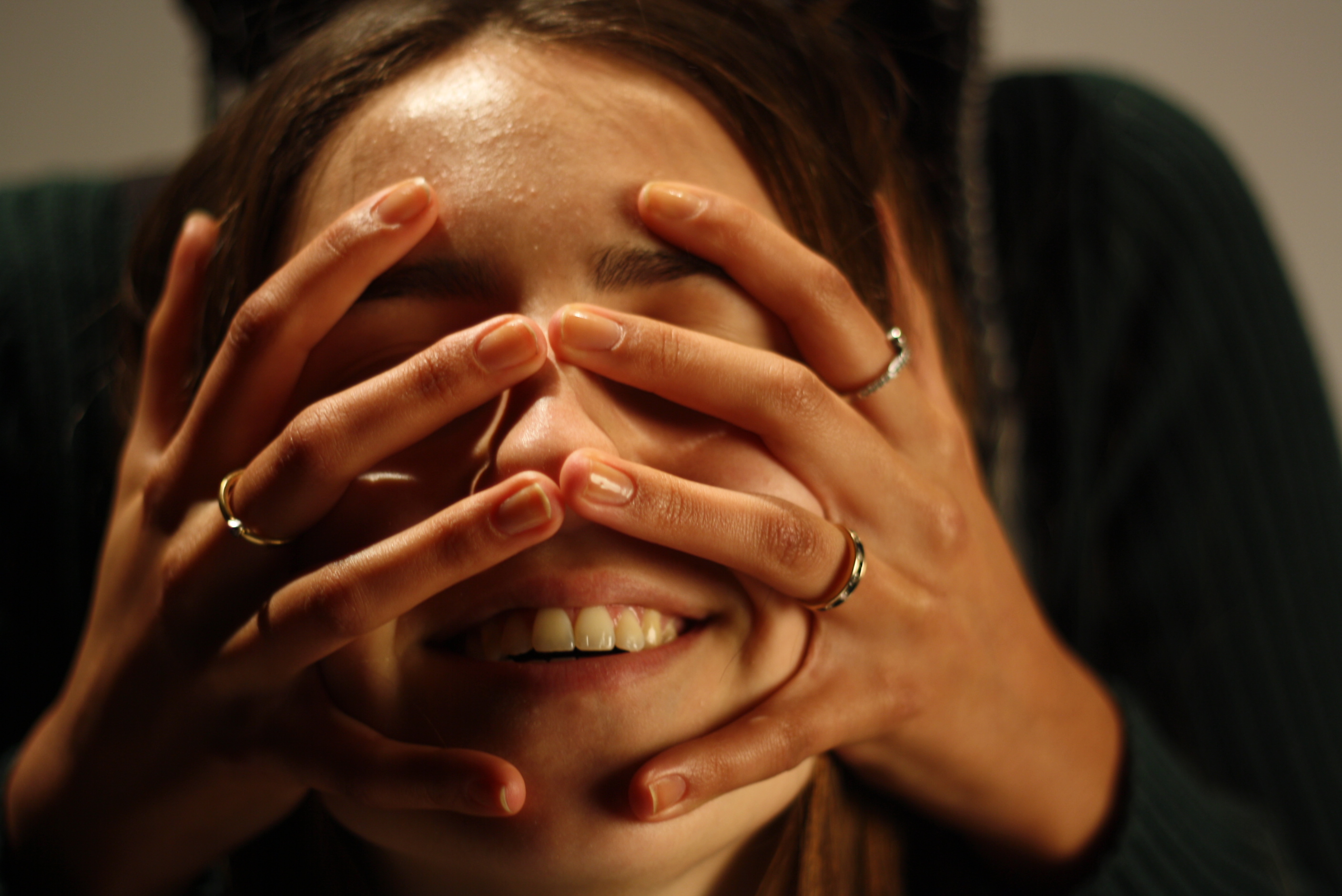
 After taking multiple picture using the traditional method i then decided to experiment with  the subject and the colors created. I wanted to see how color could effect the overall feel and effect of the image whilst still considering the Chiaroscuro and Rembantdt lighting technique. This is what i cam up with.

I created four images with all different poses with a selection of  four colors- blue, pink, green and yellow using the Chiaroscuro and Rembantdt lighting method. Each image i believe created a different view and opinion as color are fairly contrasting with different poses leading to unique emotions being created from the image.

Other images:

Studio Lighting

Types of lighting

There are many different types of lighting that create many different types of images and can cause different feelings towards an image. These include:

  • Intensity of the light
  • Direction of the light
  • Temperature of the light and white balance
  • Using reflectors (silver / gold)
  • Studio lighting
  • Natural lighting

Flat light:

Flat light is very different from soft and hard light, flat lighting causes the minimum contrasts in an image/scene.This means there is pretty much no significant contrast between the highlights and shadows of that particular image.

Split light:

Split lighting is simply the use of one light angled at 90 degrees from the subject you are photographing and placed a bit higher that their eye level. Leaving one half of the face exposed to the light and other in shadow.

Back light:

Back lighting is basically the main light shining in from behind the subject, pretty much so that the back light is some what facing onward towards the camera.

Natural lighting:

Natural lighting is the most basic type of lighting and refers to mainly light produced from the sun.  In other words ambient light (meaning the available light in an environment) can be considered as natural light as it is photographer’s lighting equipment. This usually indicates natural lighting from outside that lights up a room through a window. There are three different types of natural lighting they include:

  • Intensity of light
  • Direction of light
  • Temperature of the light

Studio lighting:

Studio light is essential for most photographers and allows photographers to create natural lighting effects in a variety of situations that the photographer controls. This helps us change and alter things:

  • Filter lighting
  • Distance from subject to create hard / soft light
  • Angles and directions
  • reflectors and diffuses

By using studio lighting it allows a large range of equipment to be used, for example, soft-boxes, umbrella lights, spot lights and floodlights.

Why use this particular lighting?

Studio lighting allows the photographer to have full control of the image being created, and can help us imitate almost all types of lighting with the right equipment.

Flash:

Flash units offer a range of possibilities in both low and high lighting scenarios:

  • fill-in flash flash “bouncing”
  • TTL / speedlight flash
  • remote / infra-red flash (studio lighting)
  • fast + slow synch flash
  • light painting c/w slow shutter speeds

What is the difference between 1-2-3 point lighting and what does each technique provide?

Point lightning 1:

Point lighting is the most common and can sometimes be accidental for example when taking a photos outside with the sun shinning- this is a prime example of one point light this can be proven to mainly natural images/light. However one point lighting could lead to a rather dramatic image being produced, with the light being focused on one section/area/or the whole subject.

Point lightning 2:

Although not as popular 2 point lighting can also be proved to be extremely beneficial as the  lighting allows the main subject to stand out much more, creating a stronger 3D image as the two point lighting creates much stronger shadows leading to more dimensional angles  throughout.

Point lightning 3:

The goal of three point lighting is to create the illusion of a three-dimensional subject in a two-dimensional image.  whilst removing background shadow produced by the subject/ clashing lights. this is proven an extremely popular technique commonly used.


Photo-montage and Hannah Hoch

What is photo-montage?

Photo-montage is the putting together of multiple pictures in order to create a new image with a completely different feel to what the separate individual images would have created. This is done by cutting, gluing, rearranging and overlapping two or more photographs/images to make it entirely new one. sometimes this can cause the image to look some what like a photogenic print. Now days there is a more popular method of creating the idea of a photo montage and that by using a new application called ‘Photoshop’ do help ‘cut’ and edit the picture together this is known as ‘composting’ and is a more modern term for photo-montage. Although photographers need to be aware that a composite of related photographs to present a scene with all related images or subject is not considered a photo-montage.

What the history behind photo-montage?

In the 1880s was where first merging different photos together became about which was then called ‘combination print” and was most popular in a  form of the contrived group portrait. The subjective and bizarre juxtaposition were further looked into by Dadaist and Futurist artists of the early 20th century. Some of the most iconic photo-montages were produced by George Grosz, Hannah Hoch and John Heart field from the being stages of photo-montages being produced. This also came extremely popular and was used extensively during the Pop art movement of the 1960s and 1970s. leading to more technical forms being produced by photographers like Jerry Uelsmann and David Hockney .

Dadaist=

Futurist=

Hannah Hoch

Hannah Hoch born in 1889 on November 1st in Gotha, Germany. Hoch began her training 1912 at the School of Applied Arts in Berlin- Charlottenburg. Here she concentrated on glass design with Harold Bengen, soon to be cut short when the break out of World War 1 began. However returned back to Berlin and began back at Applied Arts in 1915, although changed her specializing in glass design and moved her focus to painting, graphic design, woodcut and linoleum-block-painting with Emil Orlik until 1920.  In 1915 she met and became romantically involved with Australian artist Raoul Hausmann, who in 1918 introduced Hoch  to Berlin Dad circle, a group of people including George Grosz, Wieland Herzfele and Wieldlands brother John Heartfield. This then lead her to experiment with nonobjective art though painting but also looked into the idea of collage and photo montages. in 1917  is Hosh’s true interest in photo montages properly began. Hoch and Dadaists were the first to fully explore the idea of photo montages. Then in  1934 Hoch was names as a ‘cultural Bolshevist” by the Nazi.In order to continue to make art during World War l she retreated to a cottage in Heiligensee, on the outskirts of Berlin. After World War l Hoch tried extremely hard to stay relevant to the time period and continued to show of her hard work by putting them in exhibits through 1945 and 1946. As she grew and devleloped she worked with new modes of expression but continued to reference her past. Hoch was such a key part of photo montage and was clearly an important influencer during her period of six decades of hard work. Her legacy will obviously continue with her strong contribution to the Dada movement. In the late 1960 and 70s her work began to receive more attention due to the concerted effort by feminist scholars and artists to uncover and reclaim the art created by Hich and other during that particular time period of the 20th century. Hannah Hoch tragically passed away on May 31st in 1978 in West Berlin.

Some of her pieces she produced:

Response to Street Photography

The Action Plan:

Originally I wasn’t to ken on the idea of Street photography, as this wasn’t normally my cup of tea. My initial plan was to go out into town (Jersey) and just walk around and see what happens. I had planned to start at the top of town and slowly work my way down. i want to take photographs on different days including different weather conditions. I wanted to do this as I hoped there would be a contrast in the public’s behaviors and emotions expressed through their body language and facial expressions. Amusing to have capture more stressed and unpleasant facial expression and body language on a wet, windy day compared to a warm sunny day which would most likely present the opposite emotions.  Fortunately  I was lucky enough to have gone traveling around Europe with my family, and after looking closely back at my photographs that I took on the holiday it was clear that street photography can come a lot more naturally than most people would believe. So i had a new action plan, as well as my local photographs I used most from my travels as they proved to be a lot more of extravagant out come.

Contact Sheet:

My favorite images:

Original to edited

This image was particularly one of my favorite images as it if originally such a busy image with so much going. Including different types of people, a famous statue on the right in Barcelona, and the trees providing the image with a feel f symmetry. For the edited version i turned it in to an older looking image using the specific filter however emphasized brighter colors in the original image as white so the image still has the contrast of colors. From a darker gloomier feel to the image with the sharp white shades seeping through.

I took this image whilst walking through France, Marseilles, this particular shop really stood out to me whilst passing by due the vibrant colors emphasized by the products in the shop. The is some what formality to the image, this is seen through the layout of the shop with the man tidying up, giving an extremely natural feel to the image. When editing and manipulating this particular image I wanted to try come thing completely different to my previous image. So therefore to completely contrast i emphasized all the brighter colors so they poop out of the image. However to make the images brighter the natural light needed to be dimmer so I manipulated the exposure to a much lower setting. This image to me now has a completely different feel and story to its original image.

Street Photography- Bruce Gilden and Robert Frank

About Bruce Gilden: 

Bruce Gilden was born in 1946 in Brooklyn, America. In 1968  during his early stages of work life he began studying sociology at Penn State, he went and watched one of Michelangelo Antonioni’s film coming out of the film extremely inspired and bought his first camera and started to take photography classes during the evening at the School of Visual Arts of New York City. This is where Gilden turned his career in to a photography career. Gilden originally worked with flash photography and initially used only black and white colors soon to be introduced to he world of color when he had his first look at the Leica S camera as part of Magnum’s Postcards From America project. Gilden has now been a member of the Magnum Photos since 1998.

Bruce Gilden’s first major job with photography was of people at Coney Islands. This is where he found his true love for photography  and the type of photography he most enjoys. He was assigned to take photos of normal people walking down the streets of New York City for example, homeless people, gang members anyone really who was there at the time.

Robert Frank

Robert Frank born on 9th November 1924 in Switzerland. His mother called Rose Franks and Father called Hermann Franks. Robert Franks started photography in 1941, and followed this up with spending the next several years working for  commercial photography and graphic design studio in Zurich, Geneva and Basel. After returning back to Switzerland he headed straight off to America in 1947, where he was spotted by a man called  Alexey Brodovitch who offered him a job as a fashion photographer at Harper’s Bazaar. In 1949, the new editor of camera magazine, Walter Laubli , published a substantial portfolio of Jakob Tuggener pictures made at upper-class entertainments and in factories, alongside the work of much younger Frank who had just returned to  Switzerland after two years abroad, with pages including some of his first pictures from New York. He soon left to travel in South America and Europe. He created another hand-made book of photographs that he shot in Peru, and returned to the U.S. in the 1950s. In 1953, he returned to New York and continued to work as a freelance photojournalist for magazines including McCall’s, Vogue and Fortune. Associating with other photographers like Saul Leiter and Diane Arbus. During the 1940s and 1950s he helped form what Jane Livingston has termed The New York School of photographers.

Some of Robert Franks work:


Street photographer- Henri Cartier-Bresson

About Henri Cartier-Bresson

Henri Cartier-Bresson was born on the 22nd August 1908 in Chanteloup-en-Brie, France. Henri was the oldest of five children, his father being a wealthy manufacturer, while his mothers family were cotton merchants and landowners from Normandy. Henri began his creativeness by beginning to sketch from a young age which soon led to his love of photography. However Cartier’s father assumed that he would continue on the family business but Henri was fairly set on becoming a photographer and was not keen on his fathers idea for his future. Henri tried many forms of art and began to paint after he stopped learning music.

Cartier first began painter when his uncle Louis introduced  him to oil painting. to after this introduction Carriers uncle died in World Was l. In 1927 Cartier began at the private art school and Lhotel Academy. After an eventful period at the Academy Cartier-Bresson looked else where for inspiration and do find himself. That’s when he came across The Surrealist movement, founded i 1924, which was a key component to Cartier-Bresson’s photography. He would begin to meet and socialize with Surrealistic at the Cafe Cyrano, in the Place Blanche. this is where Henri began to adapt to their techniques of photography, leading to him maturing as an overall photographer.

In 1931 Cartier became extremely inspired by Hungarian photojournalist Martin Munkacsi showing three  naked young African boys, caught in near-silhouette, running into the surf of Lake Tanganyika.  He finally found his way and pioneered the genre of street photography and began to view photography as capturing a ‘decisive moment’. In 1952 Cartier-Bresson publish The Decisive Moment the title of The English edition of Cartier-Bresson’s photo book originally called Images a la Sauvette loosely translated as ”image on the run”, which included a portfolio of 126 photos from the West and East. Cartier-Bresson’s photography took him to many places, including China, Mexico, Canada, the United States, India, Japan, and the Soviet Union. In 1962 Cartier-Bresson was asked on behalf of Vouge to go to Sardinia where he visited an array of areas and photographed extraordinary things.

One of his famous pieces:

Emotional response:

When first looking at this image I was initially drawn to the centre of the piece where the man in the dark coat was positioned, as well as this the black and white shades were a dramatic factor to consider as I believed them to be extremely defined in the image. Due to the this drastic vibe and the specific lighting being produced the tone of this particular image to me became much darker and some what unsettling. as the dark tones seeping in through the tree almost represents the idea of being stuck and trying to escape. The man in middle to me has a dark  feeling. with is long what over sized drench coat matched nicely with his top hat. He looks a fair age with his well groomed facial hair and what looks like a cigar resting in his mouth. This image to me clearly comes across as 3D with the slowly decreasing size of trees running symmetrically and respectively down each side of the photo, leading to a high aesthetic value.

Technical Response:

This image is based in a park so has streams of natural light, however not necessarily clear sky, due to the shadows the weather in the photographer looks misty and cold.  Due to the specific lighting the image of the man looks some what manipulated in to the photograph and is what looks like a ‘card board cut out’ this is thanks to the daytime light shining in through behind the man whom is which strongly contrasting with the bright light due to being dressed in complete black. The image is taken as a portrait image with what i believe to be a purposeful about of over exposure, which is well balanced with the man dressed in black and the dark trees. The image has a slightly grainy texture to it telling us the light sensitiveness of the image is reasonably high.

Contextual Response:

Henri Cartier-Bresson took this image when he was part of the Magnum Photos cooperative. Working along side Robert Capa, George Rodger and David Seymour. Henri Cartier-Bresson said ”i was walking behind this man when all of a sudden he turned around” Marseille, France, 1932.

Conceptual Response:

The concept of this piece was simply Henri Cartier-Bresson going out taking photographs for Magnum’s cooperative. He clearly was focusing on street photography and managed to turn it more in to a portrait when the man in the photograph turned around and looked directly in to the camera, proving that some of the best photographs happen by accident.


What is street photography?

What is Street Photography?

Street photography also known as candid photography, is images conducted and taken ‘by accident’ . to get the best of street photography you can’t be timid, the most common tactic is to take yourself and your camera on the streets and start taking photos, get up close and persona  with the public. However street photography does not necessarily have to be in the presence of a street or even the urban environment. A lot of photographers look at the idea of street photography and focus on people and their behaviors in public. The expressions on someones face or the emotion portrays in their body language is what makes a photograph have meaning; it is what creates the relationship that makes a photo speak to you. To capture feelings in a photograph that cause the same emotional reactions in its viewer is the goal of any photographer. Street photography is said to be one of the best ways to express and capture the natural emotions people are feeling at the time, as photographers are taking pictures of people of guard, unaware and has an element of surprise.

Mood board:

Ideas:

  • What might you want to achieve with this street photography photo shoot
  • Where would be a good place
  • Specific locations or walking around
  • Will the whether effect the mood of people in you photos
  • How close are you going to photograph people- close up / faraway
  • Who will you be photographing?
  • What type of people?

Arnold Newman- Environmental portraits

About Arnold Newman and his photography 

Arnold Newman who lived from 1918 to 2006 growing up through the war where some of his most famous pieces were produced. His career really began to develop when he began to focus his photography on to a particular type of photography called environmental photography in which he primarily worked for magazines. He would walk around carrying his camera and light to his subjects, capturing his participants in their surroundings. Newman was a renowned for photographing the distinguished famous faces at the time. Newman’s images often left plenty of room for interpretation from the viewer, allowing all types of opinions to flow in.

In 1963 after the war was over, Arnold Newman was commissioned by Newsweek magazine to take some photos of a German industrialist – Alfred Krupp. Which is now one of his most famous pieces at its said to capture an array of emotions and feelings to each individual looking at the image.

Image result for Arnold Newman alfred krupp

Emotional Response 

When firstly looking at this image I was initially drawn to the strange man in the center, who was the German industrialist – Alfred Krupp. The photograph presents the man in the center of the image, with his hands clasps resting- fingers intertwined- resting his head on them. With his eye view looking straight into the camera, giving strong eye contact to the viewer, almost giving the impression of a threatening face. The way the shadows are formed demonstrations the mysteriousness radiating off Krupp face. The image helps represent the age of the man with his thin grey hair, brushed to one side and wrinkles speed across his forehead. Krupp is dressed in a smart suit grey suit and looking very presentable, giving the idea of high power and class at the time. He is sat at the front of what looks like a train station which is no longer in action. This is showed through the low maintenance and quality of the back ground functions. The contrasting in light shining through from the back emphasizes even more Krupp sat in the front of the trains, and helps darken Krupp’s even more, adding to the idea of curiosity of why Krupp is in the train station.

Technical Response  

For this image it is color based which helps show the key details, for example textures and strongly emphasizes the differences between the foreground and background. There is a clear contracts between the foreground and back ground. With the background showing high exposure and there is an excess of natural sun light flushing in through the windows on to the old run down train station. This presents a more clear view of the train station and all its details, like the copper rust. These high quality leading lights seeping in assist the textures and colors used demonstrate rusting and really presents the idea of the station being extremely run down. This could lead our thought trail to why Krupp was photographed there. Due to the over exposure in the back ground somewhat draw or attention to the fore ground where Krupp is sat in much darker conditions. Thanks to the over exposure in the background and under exposure in the foreground help present the image with a range of shadows, which I believe aids the feeling of the image. The lens was most likely to be a wide lens to the varse amount of item and things in the image, the wide lens also shows the camera was facing pretty much straight on however the position of Krupp could suggest that it was a slightly higher up view.

Contextual Response 

Knowing full well that Krupp was a strong Nazi follower and had preciously used his factory for slave labor in the Second World War in order to supply the army with Nazi war machines. Later on Krupp then got convicted of a numerous about of crimes and was due to serve twelve years in prison in which he was released after the third year. Newman initially turned down the offer from Newsweek commission however after a long debate with the editor Newman finally agreed to participate. On the side Newman had promised himself to portray Krupp for who he truly was ‘the devil’. On first appearance with a group of men associated with Krupp and his factories the portrait was canceled. Newman beloved this to of happened due to his appearance, this was an issue for Krupp as Newman was a Jewish. But after a long time convincing Newman finally persuaded the Krupp company to go on with the portrait. Newman’s ‘revenge’ was satisfied when the image was published and fully represented the evil behind the man.

Conceptual response 

The concept of this piece was simply Arnold Newman’s revenge on Krupp for what he believed to be a ‘monster’ causing immense pain and chaos throughout the period he was upcoming. Newman intended to create this portrait in order to fully represent Newman’s true colour to the editors of the magazine and the public by producing an intense piece centred around Krupp himself being shined in a dark light.

Photographer Arnold Newman,

See the source image