All posts by Eren G

Filters

Author:
Category:

PHOTO MONTAGE EXPERIMENTATION

What is a photomontage?

A photomontage is the process and ending result of producing a composite of photographs this is done by cutting, gluing, rearranging, distorting and overlapping multiple images to make a final new piece that could aid a completely different meaning or experience.

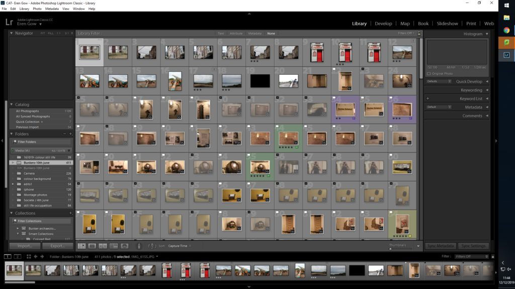
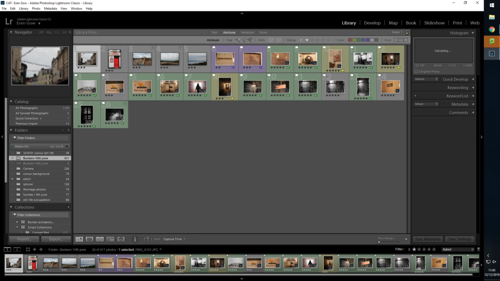
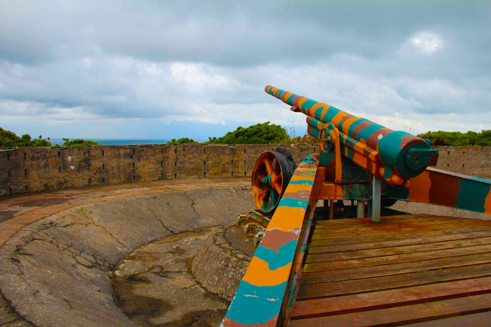
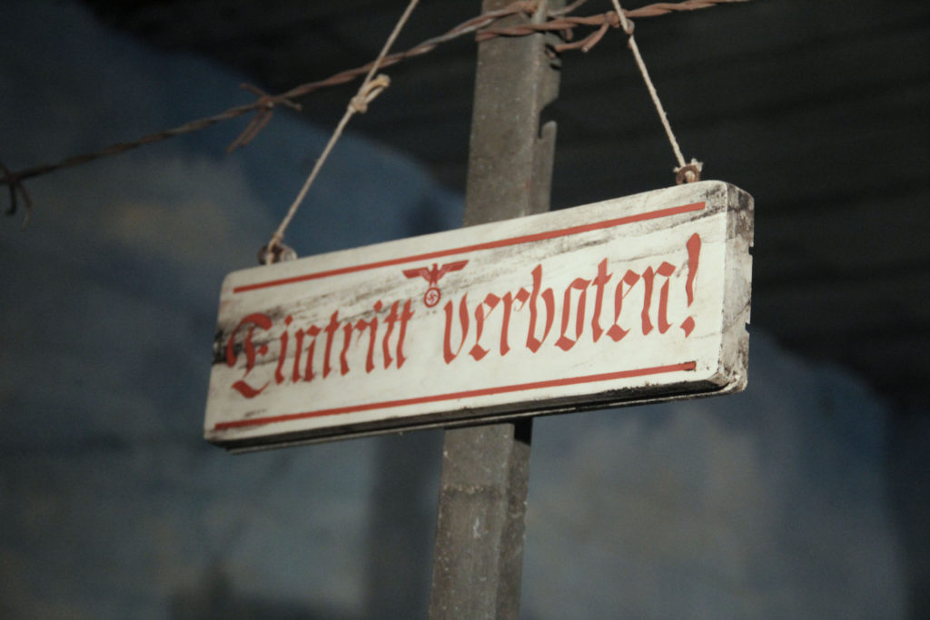
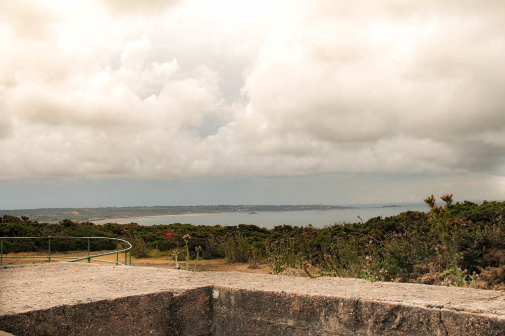
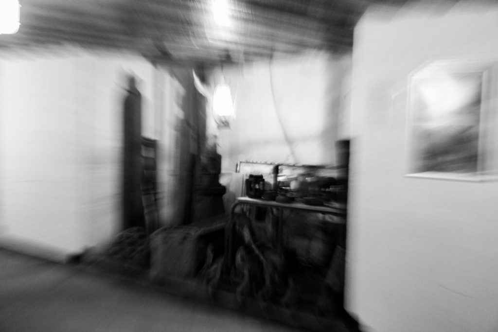
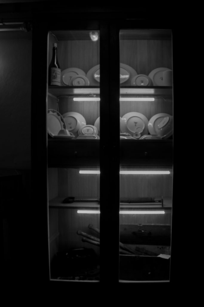
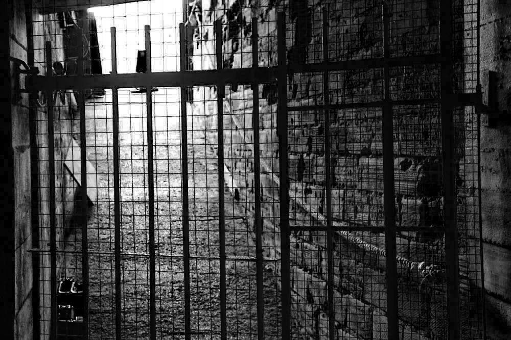
After getting a better understanding and experience with photomontages from previous work done, I decided to create new versions of my Occupational themed images to create montages that would help aid my project. Initially I selected my favourite images and those that I thought would work best in this situation in order to produce the best combined images possible; I selected these images from shoot that I produced from the war tunnels, St Quens bunkers and archival photos which showed a different point of view and highlights a clear comparison between archival and my own images. I started by printing out my main images that i wanted to incorporate within my montages , then laid them out on a plain white table and matched the images together and decided which parts of with images would be put together. After finally deciding what i wanted to create i used scissors, cutting board and a cutting knife to carve my photos together, then stuck them on to each other to create my final pieces. These were my final four images:

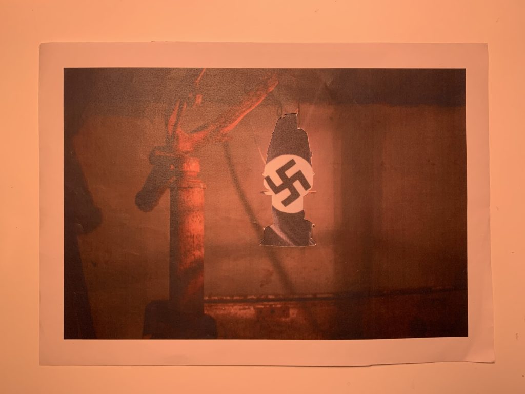
For this image i wanted to highlight the significance of the lamb and add deeper meaning of the Second world War through the lamp and the background image coming through

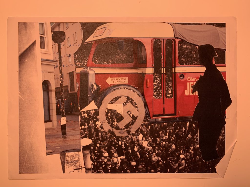
This image consists of multiple images combined together which shows a more chaotic representation which could further add deeper meaning to the time and what was happening and the significance it had on the places and people that were effected by the distraction of the Second World War.

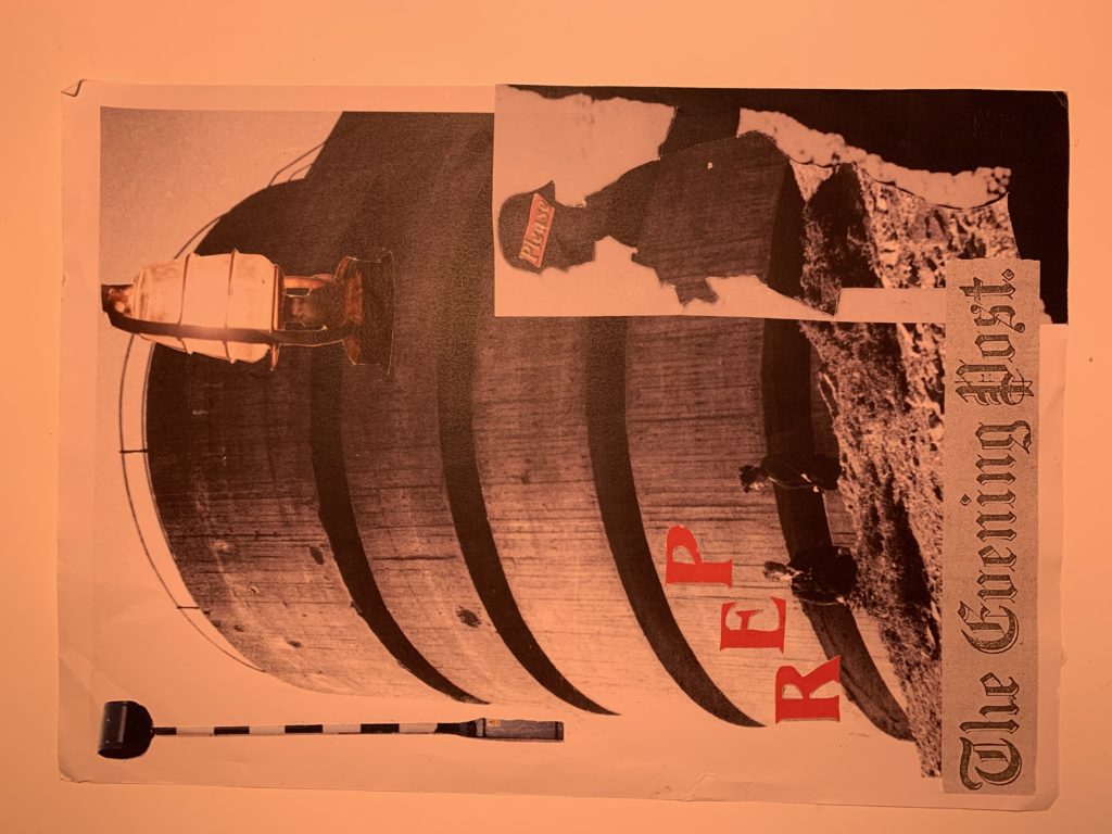
This last piece was one that i had not planed but came together due to through the left overs of my other images, and includes yet again a wide variety of sections and cut outs from different images which helps the idea of deeper meaning and opens opportunities for the view to have their own response and thoughts toward the image- this shows a more individual and unique approach and supports the deeper meaning of all the individuals during the Second World War and all the different experiences that they had during that time

BUNKER- BATTERY LOTHRIGEN

On the 18th June 2019 our photography class visited Batter Lothrigen, at Norimont, which was a battle artillery battery during the second world war and located in Saint Ouens, Jersey. Battery Moltke also known as Batterir Molke is an uncompleted coastal artillery battery that was never completed during the second world war and is located in the north west of the island. t was constructed by Organsiation Todt for the Wehrmacht for the Wehrmacht during the Occupation of the Jersey Channel Islands. The area has bunker structures with gun emplacements and a three tiered Marine Peilstand tower located on Les Landes and a costal heathland arae at the north end of St Ouen’s Bay.

On arrival we were greeted with a tour guide which would allow us to achieve a better understanding of the placement of the bunker and the strategies behind it, as well as providing us with an overall better understanding of what life was like during the Occupation of the Channel Islands in the Second World War, which I found extremely eye opening and opened opportunities for a new for the second World War. We were told some initial factors like the general purpose of the land which was for storing weapons and ammunition, giving us great detail about all the different weapons that were used. and that the and is now owned by the De Gruchey family who have kept the area as intact as possible allowing it to keep a memory of our significant history alive, and teach others all about it. Furthermore, when our guide had bought along old archival photos of what each area of the bunkers and weapons used to look like when they were in use, and helped demonstrated a clear before and after response, to me this was extremely beneficial as it provided a further understanding and historical background of the bunkers. After spending time outside the bunkers and getting an understanding of the location, we were lucky enough to be able to enter and explore the bunkers inside. This was very helpful because as well as helping us with historical factors it gave us the opportunity to practice our camera skills in dark lighting which I always deemed to be a challenge. Inside the bunkers we were guided though the tunnel paths and saw the living condition that people of that time would have experienced which added a much better contextual feeling to the experience.

The photography:

On arrival I didn’t necessarily have a plan as I wasn’t sure what to expect,to me all i wanted to do was capture as many images that i could that would help aid my project and enable me to project and portray what life really was like during the Occupation. In addition, when I arrived I started with landscape photos which a needs to make sure was in focus and that the image were actually relevant, as well as this it was important to consider my camera setting when entering the bunker as there would nit be much light, which essentially could prove difficult to capture good quality images.

Colour edits:

For my colour edits I wanted to express highlight significant colours that i thought were essential to help highlight the meaning of the images. I did this by editing and adjusted the clarity, shadows, blacks, whites, this aloud any issues with lighting from the originator image to be cleared and fixed. Overall I am happy with my end result as I believe i have produced a wide range of different images that all reflect different meanings and reprocesses to my experience visiting the bunkers. For my first image i wanted to highlight the different colour and show the idea of reflecting on history and comparing life to what it is now to what it was like back them. seconding i wanted to keep this next image fairly simple so i just darkened the surrounding and added a blue undertone which helped add a feeling of mystery being portrayed by the image. Finally i decided to completely contrast with my first image and try to reflect and imitate an old image from the archive in the same way but with the location being modernized after the war.

Black and white edits:

For my black and white image it was key to me that the image told and story and left a feeling of mystery and almost a cold feeling, representing the reality and true struggles of how people really lived during the Occupation. Here are my final images:

WHOSE ARCHIVE IS IT ANYWAYS?

Now initially the first question I should be asking is, what an archive is; well an archive is a collection of historical documents or records providing information about a place, institution or group of people. In this case The Jersey Occupation will be the main area of concentration when considering artist and time period (1940-1945). The particular archive I will be interested in is called Societe Jersiaise’ in which I visited on the 4th of June, this helped provide me with a first-hand understanding of what an archive and how to approach them. The Société Jersiaise was founded in January 1873 by a small number of prominent Islanders who were interested in the study of the history, the language and the antiquities of Jersey.  Membership grew quickly and the aims of the new society soon widened to include the publication of historical documents, the founding of a Museum, and the study of the Island’s natural history.  The first Bulletin Annuel was issued in 1875 and continues to be the main record of our activities. It was evident that the clear purpose of this archive was to hold Jersey’s most treasured historical imagery and documents dating way back to the Second World War, and originates from the beginning to the end of the war pretty much creating its own story to tell and highlighting the importance of the event, alongside the impact it had on Jersey and the impact it will always have on Jersey. The actual practice of keeping official document is an extremely old ritual dating all the way back to the third and second millennia BC in sites like Ebla, Mari and Pylos, this gives a clear understanding of the significance an archive has on the current historical phenomenon. Archives work in the way of storing photos and document on a computer but in this instance it’s all original copy’s carefully kept away and stored, some so precious they are to only be touched with white fabric clothes to avoid finger marks being left behind on a possible major historical in detail photograph and document. So in the case of the Societe Jersiaise it stores hundred and even thousands of images dating although back to when the archive first opened in 1873. However the period we are interested is much more recent, it still hold a large percentage of images and documents stored in this particular archive when in concern with the Second World War. When we look at all these images being stored, its gets us thinking that clearly there are some historical and significant photographers to thanks for the documentation that has helped us to helped understand and develop our understanding of this particular time frame in Jersey, for example, William Collie. William Collie was most likely to be one of the original photographers to use Fox Talbot’s calotype process in Jersey. Linking some of his unrelated previous work that can be found in exhibition at the Musee Dorsay in Paris, first presented in 2008. Collie was born in 1810 in Scotland and moved to jersey just before 1850 to peruse a business before diverting his work to art, but given his undoubtedly significant position in the beginning years of British photography, incredibly he was not very well known and there is little evidence of his work. Alongside many earlier photographers he started his work as a portrait painter leading onto photographic work, which lead his to produce one of his more famous pieces he made in a series of genre calotype portraits depicting ‘French and Jersey Market Woman’ which has an extremely positive response by the photography critic of the Art Union in June 1847, later being exhibited at the London Great Exhibition in 1851. When in relation to the Société Jersiaise, there is a total of 157 photographs stored by William Collie, although none in which can be viewed online, this could be due to the oldness of the images which have been all said to be the copyright of the Royal Photographic Society. One of those listed in the Société Jersiaise Photographic Archive is a photograph of Elie Jean Filleul, who died aged 102 in 1851.  Most of the recorded images in the archive are listed as portrait however there are around four which are presented as landscapes of Jersey, its said that they feature Mont Orgueil Castle, Gorey, Midvale Road and houses along Queens road all with a date around 1845-1850, clearly holding a historical value. Alongside William Collide being an extremely iconic historical photographer, we also have a man named Albert Smith. Albert Smith was from Liverpool and moved to Jersey in 1892 to start business work, and then turned to photography. It said that thousands of his images survive as glass plate negatives, with his main subjects being known to either be portraits or cattle portraits that were produced in to post cards bought by many. As well as him and his staff strongly working on commissions they also looked in to jersey’s island life capture significant scenes which they believed to portray the beauty of the island itself. It’s reported that around 3300 of Albert Smiths images are stored at the Societe Jersiaise, and that 2000 images of his can be reached online. Although Albert Smith’s photographs were made for the public to purchase and in addition to those in a negative format in the Societe Jersiaise archive there is undoubtedly many of his photographs circulating the island and around the world. These two photographs hold a key importance in the history of the Jersey archive and it is important that their work continues on. From all this research has had given a much better understanding to the importance of an archive and has lead me to be interested to explore my own history. This will help me with my project as it will give me the opportunity to really relate to the idea of family history and the changes that have happened to me and the world. I would like to think that by looking at my own image it will help provide a type of style and context that I can continue forward in my personal study, leading to a better appreciation for the overall project- this is extremely important to me as it will help develop my skill and will grow my thought to look outside the box for inspiration. By looking into more depth about archives it has lead me to have a higher appreciation and understanding for history and the preciousness it holds to many islanders and families, it has also given me the opportunity to further my knowledge and look more deeply in to my personal study’s and where I would like to move forward with my project in to the Occupation. This is essential as it will help focus my images and ideas to achieve the best outcome I can get through the history of Jersey and the support that can be reached at any point from the Societe Jersiaise.

Image result for william collie photographer

William Collie
Albert Smith

THE OCCUPATION OF JERSEY

The occupation of Jersey began in 1940 on the 1st July and five years later ended on the 9th May in 1945 and was one of the most significant moments in the Channel Islands history.

The arrival:

Before the Germans fully invaded the Channel Island, the Germans wanted to ensure the that the channel islands had little to no defence, on the 28th June the Germans sent troops across from the nearby French coast (which had been recently been occupied by the Germans just a few days before) and landed an air attack against St Helier harbour in Jersey. German aircraft also strafed La Rocque Harbour. In total nine people were killed.The Germans then dropped copies of an ultimatum, on Jersey at 5:00am on Monday the 1st July, with a total of three copies dropped- two in Bath Street and one at the airport. They were then immediately taken to the Bailiff, Alexander Coutanche. Coutanche summoned the Royal Court at 9.30am, and the States met later and passed an Act to comply with the terms of the ultimatum. Copies of the translation of the ultimatum were put up around the Island with the following footnote:-

The States have ordered this Communication to be printed and posted forthwith, and charge the inhabitants to keep calm, to comply with the requirements of the Communication, and to offer no resistance whatsoever to the occupation of the Island.”

Fortification:

Among the lasting legacies left behind by the German from the occupation include fortifications erected around the coast and some at other specific locations. Although many had been destroyed and removed just after the war to remove any remains from the Germans to what the civilians wanted to forget at the time, a lot have now been restored as a reminder of a period otherwise best forgotten. Many guns emplacements, bunkers, towers and other concrete constructions have remained to this day, some are now tourist attractions.

Life in the occupied island:

When the Germans took over the island they also bought a substation about of rules that required all citizens of the Jersey channel Island to follow. For example these included, a daily curfew, a switch to Central European Time, a ban on listening to anything other than German radio stations (subsequently relaxed, but followed later on by a ban on all radio use and confiscation of sets), a ban on private use of motor vehicles, a ban on sales of spirits and an order preventing the raising of prices of any commodity. Initially rationing followed the pattern already imposed before the Germans arrived, but as the Occupation years went by, restrictions became stricter and stricter.

The Jews:

There were many story on how the Jews were treated and their lives, these can be reached through the book written by Frederick Cohen, called The Jews in The Channel Islands during the German Occupation 1940-1945

He writes:

“The implementation of the anti-Semitic Orders in the islands had a substantial effect on the lives of the registered Jews as each measure cumulatively placed further restrictions of their freedom, singling them out from the rest of the community.”


One example given is that of Mr and Mrs Samuel Simon: “For example, Samuel and Beatrice Simon’s great-granddaughter remembered that they lived in a ‘terrible state of fear’, especially after they had received a deportation notice. Their actual deportation having been delayed due to Samuel’s poor state of health.64 They were traumatised by the special curfew imposed upon Jews, and indeed such was their state of fear that they kept their curtains closed all day. Shortly before Samuel’s death the Simons moved to their daughter Ella’s home at Langley Park, St Helier. Samuel died on 7 November 1943.

Liberation:

The Channel Islands were liberated a day after the official end of the war in Europe and this joyous event is celebrated annually on 9 May 1945. The decreasing numbers of islanders present then and alive today have, without exception, vivid memories of the final events of their occupation by German troops.

Final Piece- Evaluation

EVALUATION

In conclusion this project I have completely focused on identity and place. My main artist I wish I decided to focus on was Francesca Woodman who I have based a lot of work on due to intricacy of her work. Francesca Woodman’s work have a turn more a much more darker feel but leaves the viewer with much more deeper meaning and leaves the viewer in ore. I strongly based my ideas on how woman portray themselves and how they feel about their appearance. This is an important area to focus on and I re4ally wanted to concentrate on this idea and fully portray it in its best light.

This project 9on identity and place allowed me to crea5te new Photoshop and try things I haven’t yet tried before. As well as going back to old Photoshoot and the photographs I took when traveling around Europe. With the new photoshoot I was able to experiment with new camera skills and try new things experimentally. This project allows me to use different types of light and provided me the best knowledge to go forward when photographing my images. Now having the awareness of how important it can be to plan shoot and how it can still work to be spontaneous and experiment with new idea.

When editing my photos it really challenged me as I had not been experienced with Photoshop, so at time found this extremely challenging. Although managed to perceive, with my original image it was my main focus to distort the powder paint colours on her face with dark shades. However still adding colour that would help emphasis the darker shades contrasting perfectly with the popping colours bursting through. To me I was happy with image however to improve next time I might have added more colour or possibly take the editing further and create something like a photo montage.

For my second image I was overall extremely happy with the outcome due to my inspiration of Francesca Woodman who I really took an interest in during this project. Woodman inspired to create my images and showed me the importance of deeper meaning and how vital it is to consider how the photograph will make the viewer feel. The mage and editing I was happy with however to improve I would consider doing more research in to similar photographer and see where that might take me. Possibly creating a selection of images all linking together.


My final pieces- Editing

My Finals Pieces:

Editing

For my second final piece, I selected images from a previous photo shoot I did and selected one of images with the highest quality. For editing I used a black and white filter however targeted certain colors in the image to have certain levels and shades of black and white depending on the original colors. The theme was place and identity for our final pieces so i really wanted to go into more depth, therefore i used the titles o f one of the most famous beauty magazines ‘Vogue’ and cut and pasted the famous font title on top of the preciously edited image. Once again i felt like i needed to add some kind of color so put the title in a hot pink to really stand out from the dark shaded background.

How did I edit the picture?

After the photo shoot I created a contact sheet in order to see which images I preferred and which photos I was going too used. Finally I selected my chosen image and opened it in adobe Photoshop. Firstly I smoothed out any over exposed or sharp edges on the image. Next I need to create the black and white however needed to make sure the power paint colours on her face were darkened/ brightened to really emphasis the different shades I wanted to portray within the image. For this detail I highlighted the image IMAGE > ADJUSTMENT > BLACK AND WHITE. Once selecting this a side tab came up with the strengths of shades each colour would portray in the image. I played around with this for a while till it was perfect with dark and lighter shade distorting her face. Finally I needed to add the vogue, I simply copied and pasted it and messed around with the different colours and decided that hot pink was the most appropriate colour and helped create deeper meaning to the image and the colour really popped in front of the black and white background.


Photoshop editing screenshots:


Editing

For the final image, i had previously looked into the photographer Francesca Woodman whom very much inspired me to create this image. She looked at using slow shutter speed and the model in the image being unclear and distorted. so this is exactly what i did for this image from the photo shoot i used two images and over layered them, altering the opacity so they merged into each other. Creating a distorted  appearance.

How did I edit the images?

For this particular image I was very much inspired by previously mention photographer Francesca woodman who focused on the idea of blurring and distorting the model in the image. After completing the photo shoot I selected two images not to similar so it would be clear of two figures when I over layer they to get the distorted blurry feel to the image. I opened both images into Photoshop and edited them to black and white so they would display a much darker and uncomfortable feeling to the viewer. Next I copied and pasted one of the images on top of the other, after carefully deciding the opacity level the image was complete- not too strong from one or the other image. Providing a fair balance from both images so you could still see the difference.

Photoshop editing screenshots:

Planning for final pieces

What is included and who is included?

Image 1:

When first deciding what types of photo shoot I initially came to a halt for ideas. I soon remembered last year i did a fun run which involved powder paint and having left overs I knew I could start getting fairly creative with this. So i asked one of my friends to help me out we went somewhere where not too much mess could be made and then using three different colors of powder paint: orange, blue and pink. I began to blow it on to her face to create ‘patches’ of the paint to give a color and effective look, to me it was important that the picture portrayed different texture so i made sure i was a windy in order to get volume and movement in the hair.

Image 2:

For my second piece, I was at the art center for a rehearsal and one of our costumes was a dirty brown authentic looking dress which i deemed to be perfect for this occasion, and knowing this location fairly well mi was aware of an old set of stair case at the back of the stage so i asked a friend to help me out. I got her in costumer to run up and down the stairs a few time while i photographed as many photos i could in one lap of the starts in order to ha the same direction. This made it much easier when i went on to over laying y images and the stair cases lined up perfectly- this helped provide a much better overall affect.

Why this shoot and how is it connected to identity and place?

Theme: Place and Identity

Image 1:

For my first image I was originally looking closely into photo montages leading to me looking at magazines. That is when I came up with the idea of creating something do to with magazines. This links to identity as nowadays people are so set on being like all the models they see in the pages of magazines and how you should look. The idea that people will do nothing to look ‘perfect’ but realistically there is no perfect. People should be happy with themselves having their ow identity to everyone else. This is where my idea for my image came together. The power paint really helped me provide the image with the her face looking extremely distorted and looking different and original. Creating the opposite of what you would find on the front of Vogue.

Image 2:

For this image i was very much inspired by Francesca Woodman. Francesca Woodman had evidently a hard life with being an inspiring photographer , but with no one to show her work to. Woodman went though a dark stage where she didn’t know what she was doing and constantly went on about trying to find herself. The idea of loss identity and loneliness was clearly represented in her photographs. This is the road i wanted to go down the point of loss identity

Identity and Place- mood board and ideas

Mood boards:

Ideas:

  • What type of identity? Loss of identity, gender, social etc
  • Am I liking to places as in where some one thinks they belong from or where they actually are form
  • Colors: black and white with burst of occasional color
  • All black and white
  • All color
  • How many people will i use?
  • What type of portrait will I include?
  • Street, environmental, montage
  • What do i need consider?
  • How do i want this image to make people feel?
  • Where will i take my photos?
  • When will i take them?
  • Who will I ask to model?

Tableaux Vivants

Tableaux- Mood board

Mind map:

What is Tableaux Vivants?

Tableaux is a french word for ‘living image’ and is a representation of scene, painting, sculpture, etc, by a person posed or grouped together in silence and motionless. When creating he Tableaux vivant it is key that the subject carefully positioned in place usually in costume with props to really help to set the scene. A tableaux vivant can be presented in a multiple of way including a ‘live performance’, sculpture, painting and photography. The most common movement of tableaux vivant is in the words of the Romantic, Aesthetic, Symbolic and Art-nouveau. In the 1970s and 1980s a man named Jean-Francois Chevrier was one of the first to introduce tableaux vivant into art photography when he wrote an essay entitled “The Adventures of the Picture Form in the History of Photography” in 1989.

The below image is a prime example of a photographer using a famous painting and recreating though people in poses, using costume and props.

Image result for tableaux photography caravaggio

Below shows a different tableaux photography by  Ryan Shude, his work is not so much recreated from paintings but is still set up and staged.

Image result for Ryan Schude

Image result for Ryan Schude

Image result for Ryan Schude

Action plan: 

For tableaux Vivant after looking at such different types of photographers it inspired me myself to be a bit more adventurous and really find a deeper image that i can portray in different lights. That when I started looking at fairy tales. my initial idea was Alice in Wonderland but after looking deeper its was clear to me that ”Snow White and the Seven Dwarfs” provided more doors for me to go through. After finally deciding on what I wanted to base my Tableaux Vivant I needed to select a final scene. I did a brain storms of the key moments in the story and came to the conclusion that the scene where the wicked queen is disguised and giving snow white the apple would be the most effective in this case. i then found my models, simple costumes and props and went down to the studio. This was then followed by the hard decision of what lighting and background I needed to portray this vital scene.


My Response:

Visual:

For both images they have a set plain black background, which helps the characters stand out more. By using the black background I believe it help emphasizes the different personalities of snow-white whom is illuminating of the black background compared to the Witch who is somewhat merging into the darkness of the background. I believe this to help set the atmosphere, and how to feel about the characters. The image overall has a very dark feeling towards it with a white light mainly being focused on the representation of snow-white. To create this white image I used a ring light to help portray the correct textures as well as helping to set the mood. The view point is fairly straight on so the viewer is presented with almost a perfect side view of both characters, linking to the symmetry of the image. Although different heights the idea of symmetry is still presented in the scene of a side image of both model and both essentially reaching out the object. I think this helps divide the emotions towards the different characters with the witch model have a more mysterious, covert and dark feeling strongly contracting with the bight eyed character of snow-white who gives off a more bright and blissful feeling. overall providing us with a very balanced image due to the contrasts of the well know characters and their stereotypes.

Technical:

For this image I chose to use a white ring light that firstly gave off a whitey and blue light which I thought to deem appropriate to the scene. I placed the light at a slight light as I thought this would be important to help portray characters and help improve the over all understanding of the image. the ring light was positioned to the left of the image- closer to ”snow-white”. I did this because snow-white is the much brighter character and ore oblivious of the darkness. I think by positioning the light in the place it help illuminate snow-white character improving the overall representation of the image.  Due to the type of lighting the image has a much more colder representation to it rather than a warmer color and feel.

Conceptual:

Originally this image was from the cartoon film ‘Snow White and the Seven Dwarfs’ produced in 1937 by Walt Disney. The story is about White’s beauty, the wicked queen orders the murder of her innocent stepdaughter, but later discovers that Snow White is still alive and hiding in a cottage with seven friendly little miners. Disguising herself as a hag, the queen brings a poisoned apple to Snow White, who falls into a death-like sleep that can be broken only by a kiss from the prince. This particular image was taken from the film when the wicked queen was giving Snow White the apple. presenting the innocence from snow white and the darkness and evilness presented from the wicked queen.

Contextual:

Although originally I took these image using the set prop of an apple, I also wanted to look at something different and add my own interpretation to provide a deeper meaning to viewers. After my using the prop of an image i turned to the idea of the wicked queen handing over a phone, conveniently an Apple iPhone. Once this idea came to place, the deeper became evident. With the original concept being handing over an apple that kills Snow White linking to the idea that technology is now starting to kill us off, so therefore by giving a phone to Snow White is give the idea that with social media taking over our lives and the new addiction to looking down at our phone, we are slowly wasting away and dying on the inside. The representation that technology is melting our brain has been a worry of people all over the world with now media starts taking over completely. The poison is now our technology.