Irving Penn was born on the 16th July 1917 and died on the 7th October 2009 and was an American photographer and was best known for his fashion photography, portraits and still life. Penn was well known and worked with a wide variety of famous companies for example Vogue Magazine and went on to take a more independent approach to advertising approach for specific clients like Issey Miyake and Clinique. Penn’s work has been exhibited all around the work including international sites and continues to inform the art of photography as well as still being a dramatic influential character and photographer.
TECHNICAL: From just looking at the image it is evident the lighting being produced in artificial and most likely took place in a photography studio using a jet black background to help contrast with the white skull which helps make the definitions of the skull stand out. Overall there is a good exposure level supported by the manipulation of the editing done of the skull, the images shows no signs of reflection however due to the brightness of the skull illuminating against the jet black background it is possible that flash was used to help aid this point even more and create an even stronger contrast. The focal point of the image is clearly the front face of the skull and in great focus with no blurred aspects which further provides evidence the camera lens type and size. The image also has low sensitivity due through the lack of grain seen in the image with fine and specific textures of the skull adding more realistic view for the audience. The image only presents a black and white image so therefore is slightly harder to determine the temperature of the image however due to the contextual factors (the image being a skull) to me it presents a more colder temperature to the images also supported by the conceptual evidence.
VISUAL: From the photograph we can clearly see that there are only black and white colours used which adds a more dramatic feel, due to the jet black background which extensively contrasts with the fresh white skull, this visual aspects supports the point that the main focal point is the skull. Additionally, the overall tone presented is a light tone due the the bright white skull standing out and can be seen through the formation of the skulls- one facing forward, one facing to the side and one facing down all transformed to merge all together, this point also brings up the idea of symmetry which is some way can be seen but not crystal clear however showing a 3D representation of the skull.
CONCEPTUAL: Overall the image does not give much of a story which i believe helps make the audience really think deeper about the true meaning about the photograph and why it has been edited in that certain way. To me, after analysing the visual and technique points of the image i believe the image could be seen as a reflection on human life or even the idea of the beauty of the human body with the brain being the most essential part of the body to be able to function the rest of the body. so therefore the presentation of the image, the illuminated white skull being contrasted against the jet black background showing the main significance and main focal point of the image therefore making the view concentrate on the skull itself and look deeper into the distortions of the skull.
From my personal study based on the occupation in Jersey entitled OCCUPATION VS LIBERATION I developed a large amount of skills and furthered my knowledge and understanding of taking images, reflecting and responding to other inspirational artists.
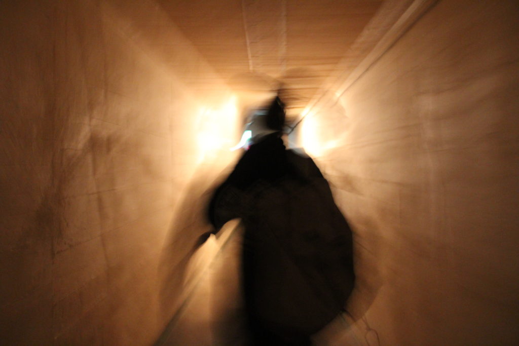
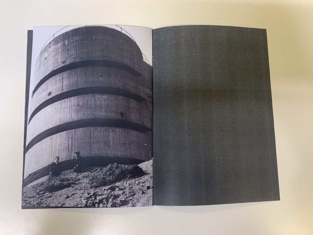
Originally we started this overall project by exploring different types of landscapes using wider lenses which allowed more details of the picture. To help increase our skills we went on a trip to visit the Jersey bunkers in St Ouen’s to look out across to see where the Germans would have viewed France, as well as the stunning views of across the island. This gave us the opportunity to fine tune and grasp the proper understanding of how to take landscapes images to our best abilities. Furthermore when we visited the bunkers we were able to explore inside them, this helped to improve our camera skills in darker areas, for example adjusting the IOS to a lower level allowing as much light that can be produced in such a dark room leading to much better quality images, and would ensure that the images wouldn’t be underexposed. This skill also was practiced when we visited the war tunnels later on in the year which closely linked with our OBJECTS title project. By photographing in the war tunnels it helped us focus on different types to lighting as throughout the tunnel there are inconsistent lighting in each room and we had to adjust our camera to enable us to produce and focus on interesting objects that would help us develop our project. As well as this factor for photographing objects we also developed our ideas in the studio, this taught us about the different types of lights and backgrounds used. For example an infinity wall which means a continuous background behind an object which I believe to create more dramatic experience. In addition we we concentrated on the lights used- continuous lights, camera settings; manual mode, aperture of F/16 and a shutter speed of 0.5 seconds to 0.8 seconds depending on the reflection on each object. To continue this led us to learn about developing initial ideas, by using white backgrounds to start with and developing on to colour ideas, to me this was a beneficial task as it taught be the ideas of exploring and developing initial thoughts into something more interesting. This meant as well as the actual photography it taught me how to develop my thoughts and ideas properly on to the blog by portraying them through mood boards and descriptions.
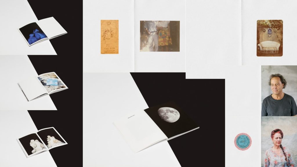
After visiting the bunkers, we were taught to use the computer software called Indesign which enabled us to produce and develop our own zines. For this particular production it meant using the following techniques which later proved beneficial. It taught me how to refine hundreds of images to just a select few, which meant I had to grasp the idea of quality not quantity, additionally I taught me an essential lesson of story telling through photographs, this was something that initially I found extremely had as at first i was just placing random images in a random order without careful consideration. eventually i learnt to refine my images ad begin to really tell a story. Although this particular zine was not my strongest in enabled be to dramatically improve my understanding, and skill when making my next zine at the end of this particular area. I found that when making my second zine I had much more fun and I had a much better understanding of how to tel a story through the photograph I had previously captured.
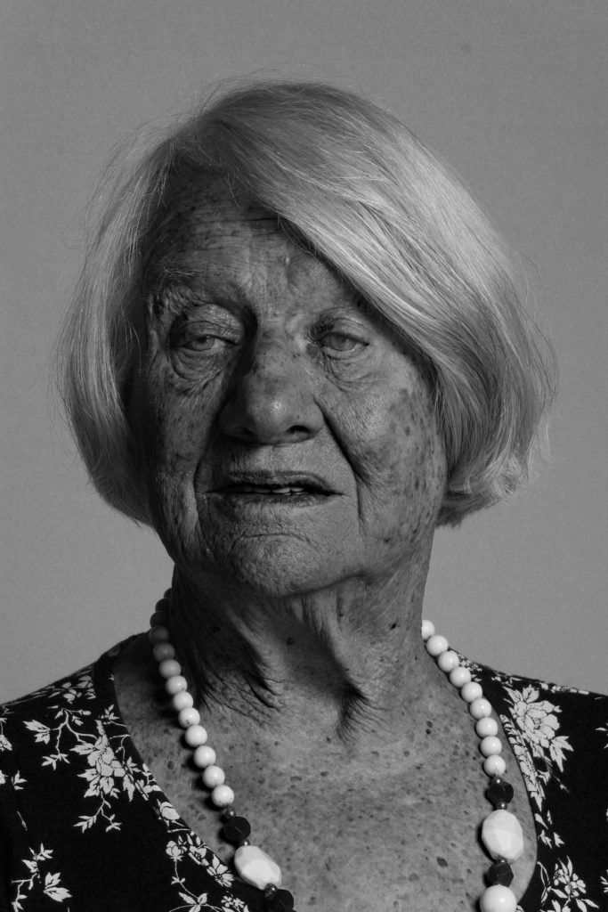
Next we look at PORTRAITS and photographing individuals, family and friends. For this part of the project we were lucky enough to have some of the people who were children in the war come and talk to us about their own experience’s, taking part in this task provided me with the skills of note taking and portraying someone’s history and experiences through their own portraits. After talking to Joan and talking about her history we went down to the studio to take some portraits of her. When I was photographing her, it was important that I was able to get the best quality images, i did this making ensuring i had an appropriate lens with the correct setting that wouldn’t lead to any defaults in the final photographs. This ability encouraged me later on when developing my own portraits of my family at home, the idea of different facial expressions, angle and lighting which would convey a certain meaning. Lastly for the portraits section we were given a task entitled ‘home sweet home’ which gave me the opportunity to help practice certain skills at home in my own environment, and gave me control over my own ideas and how I wanted to convey each image with each individual. This skill will defiantly be consistently essential through the rest of my photography project.
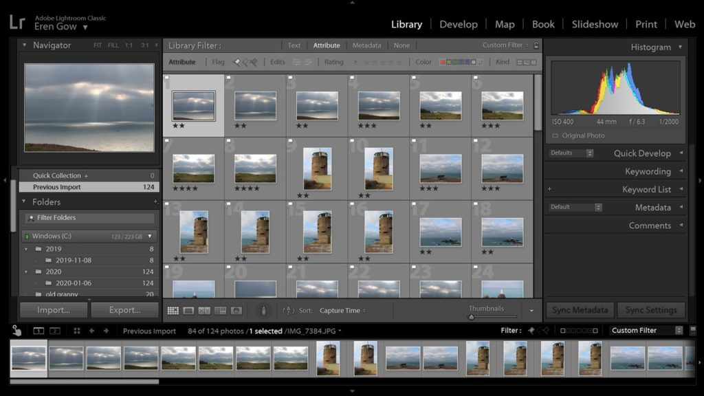
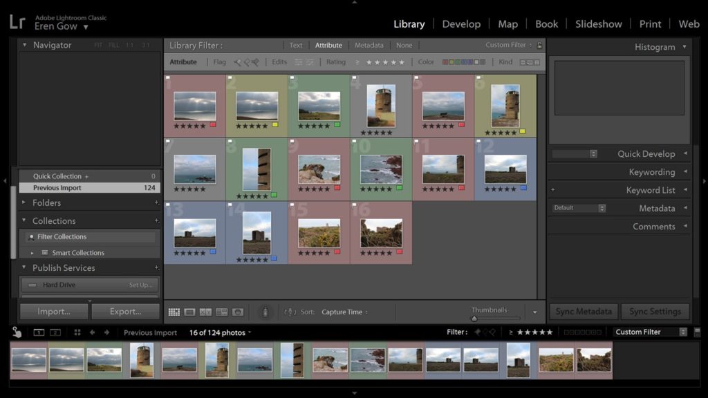
Finally, computer software, as its clear we had a lot of photo shoot throughout the project we learnt how to use LightRoom Classic which presented all our images from each shoot and enabled us to discover our best images compared to our worst images, going through different stages to allow us to select our final images from each shoot that I wanted to display and develop on to the blog. In addition, we learnt specific, quick and easy skills on LightRoom that helped us fine tune our images for example the Spot Removal tool which helped removed any marks that may have been produced on the image giving it a better final picture.
A Zine is a self- published or individually produced booklet, which can be made by physically sticking, cutting and gluing images and pages together or using InDesign to help plan your zine using a computer then printing it out. Zines have been around since approximately 1776 when Thomas Paine self-published Common Sense and used it as an instrument in promoting the ideas that contributed to the US War for Independence.
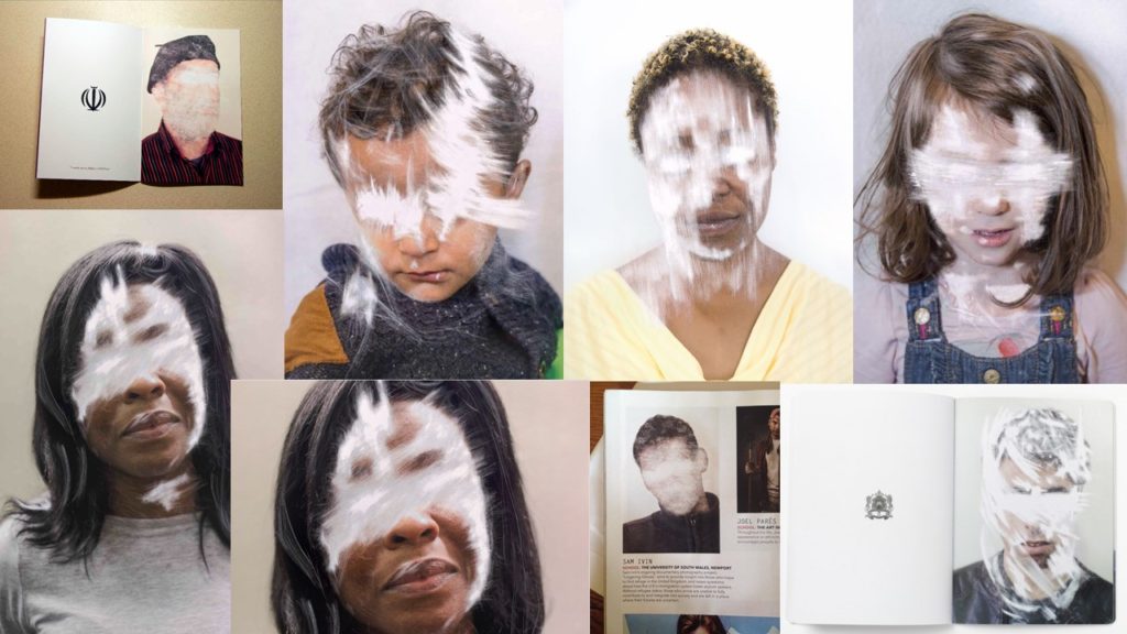
For example some popular artists who use zine to express their work are: Lorenzo Vitturi, Sam Ivin, Rita Puig-Serra Costa.
Lorenzo Vitturi
Lorenzo Vitturi are clearly presented to have consistently used more bright and vibrant colours in the zine, the zine images are fairly unusual creating different shapes and colour by combining different objects together to portray a certain effect and feel.
Sam Ivin
Sam Ivin has a more consistent style that he used within his zine, using portraits of people and editing them to have white strikes and marks across their eyes key facial features. this creates a deeper meaning and overall representation of individualism.
Rita Puig-Serra Costa
Rita Puig-Serra Costa presents a more abstract and original sense to the zines, consisting of various sizes and colours, including portraits, objects and landscapes. this provides a wide range of aspects to the zine producing a different feeling and personal response each time you turn a page.
Autochromes were the first practicable method of colour photography and was invented in France by Auguste and Louis Lumiere. The autochrome process was also known as the autochrome Lumiere- named after the creators themselves was originally a research project into colour photography to the Academie des Sciences in 1904 and the commercial manufacture of autochrome plates began in 1907, which led to the first public demonstration of the invention occurred on the 10th June 1907 in the offices of the French newspaper company ‘L’illustration. Autochromes plates are surrounded in microscopic red, blue and green coloured potato starch grains- approximately four million per square inch. When a photograph is taken, light passes through these colour filters to the photographic emulsion the plate is the process to lead and develop a positive transparency, therefore light passes through the coloured starch grains and leads to a combination to recreate a full colour image of the original subject, producing a coloured image. For autochromes to be taken there was specific apparatus which was required and photographer could also use their own existing cameras; on the other hand it was essential for the photographer to remember to place he autochrome plate in the camera with the plain glass side nearest the lens so the light passed thorough the filter screen before reaching the sensitive emulsion.
EMILE GUITON:
Emile Guiton was beyond influential and was aid to be the most prolific photographer in Jersey at the time who chronicled island life during half of the 20th century. a large percentage of he photography is kept and preserved at the photographic archive of La Societe Jersiaise, in total 781 images of Emile Guiton’s can be viewed. Guiton was born in 1879 in Jersey and from a young age had an interest in history and was a member of La Societe Jeriasise, whom served on its executive committee as joint honorary secretary and was curator of the Museum and editor of the annual Bulletin. Emile Guiton was an amateur photographer and began to develop great skills throughout his life and career. Guiton also experimented with the early stages of colour photography known as ‘autochrome’. His main subject which he used was the recording of archaeological excavations, as he was one of the few members in Jersey who were permitted to take photographs during the occupation in 1940-1945. His research and photography really helped him develop a true understanding of the significance of taking photographs and the historical and social resources they hold. Tragically Emile Guiton died in 1972 and donated many of his imaged to the Societe Jersiaise.
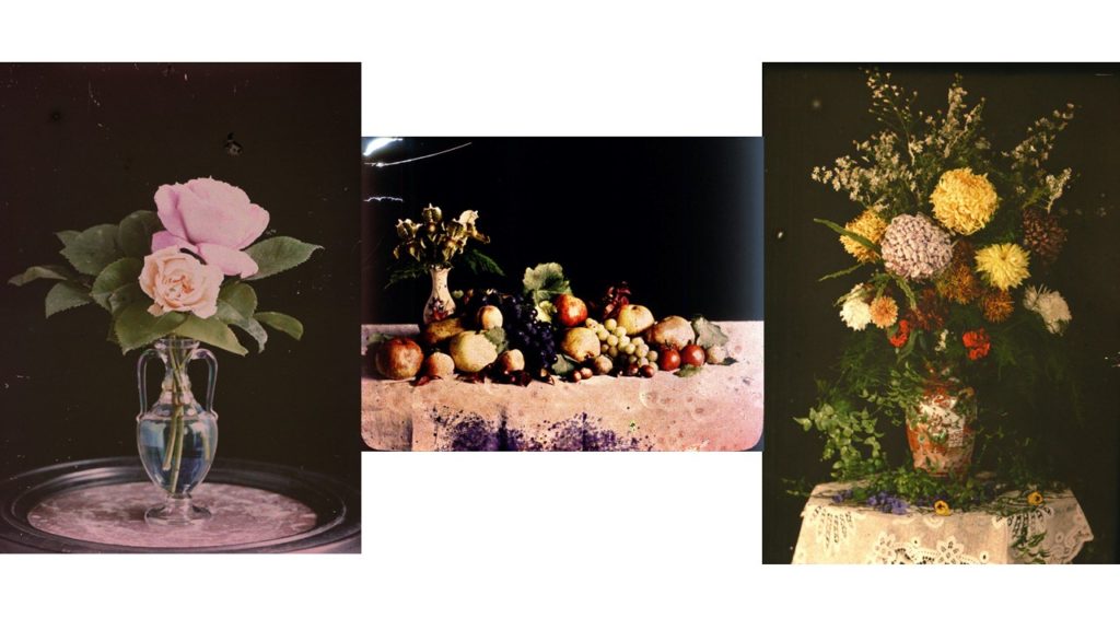
Still life photography is a specific genre of photographing objects to create a main focus of image, the subject matter is inanimate and therefore never moves, for example household objects, flowers, or fruits. This particular genre helps the photographer expand and explore the arrangement of designing element and set ups.Typically, still life’s are not close up to the subject nor far away, but at a very medium angle. For still life photography it is key for the photographer to have a true understanding of how to control the studio lighting/natural lighting in order to help illuminate their image to their own personal preference. Within the idea of still life photography there comes many different types for example crated still life or found still life, each one producing a slighting different effect and feeling, which is clearly essential to produce the most effective and creative images.
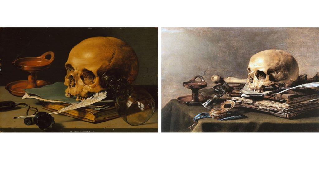
Still life developed as an independent genre which occurred way back in the early 1600s from Dutch and Northern European painting. The objects used to form these still life images often had strong connotations of symbolic adherence to religion and mortality which helped reflect the ongoing urbanization of Dutch and Flemish society, all these factors produced an emphasis on the home and the significance of personal possessions, commerce and trade. Paintings consisting burnt candles, human skulls, dying flowers, fruits, vegetables, broken chalices, jewelry, crowns, watches, mirrors, bottles, glasses and many more are all portrays in a symbolic light of the transience and brevity of human life alongside power, beauty and wealth.
Categories of still life:
Flower pieces: using flowers in still life is an extremely popular genre and is highly regarded and well paid. When considering the still life of floral images, its said to be important to reflect the bloom of flowers from the four different seasons to help represent different feelings and portrayal. Flower paintings were always accurately detailed without the overlapping that would have naturally happened in a vas giving a more controlled look and structure.
Fruits with flowers: it was often found that still life images that consisted of fruits was closely linked with flowers and would often be captured together, where symbolism was still being presented, in the exotic fruits and shells bought back by trading merchants. as well as symbolism fruits had a religious message; apple of temptation, the grape the blood of Christ.
Vanitas paintings: a metaphor of transcience, which meant society’s awareness of death did not disappear with the end of the Twelve Year Truce; two outbreaks occurred in the 1920s republic known ass the outbreaks of Bubonic Plague, this is suggested the beginning and development of Vanitas paintings, which consisted of recurring motif, the skull which provided a connotation of mortality
As well as:
Breakfast pieces
Trompe L’Oeil and its Relationship with the Game Piece
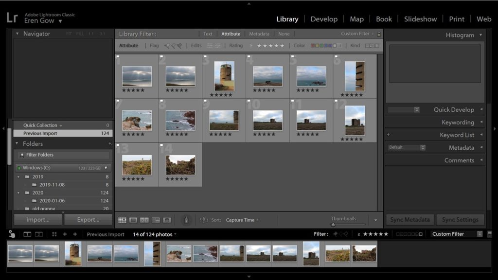
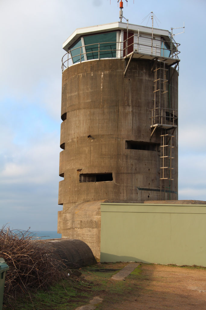
After visiting the different bunkers around the island and having different opportunities to further my photographic understandings and capabilities when capturing historical land marks, it was time to investigate by myself and explore other significant landmarks on the island. I did some research on historical bunkers around the island and decided on the features down at Corbiere Saint Ouens. For this shoot i decided to shoot during the day as i know their are lots sea views and wanted the chance to possibly get some imaged where the sun is reflecting off the ocean. So on a Sunday afternoon i drove down to the lighthouse and took my images of the bunkers, the lighthouse and the tower; when i returned home i put al my images on my computer and opened them upin Light Room Classic which enabled me select my best images and categories them in star rating which helped me slim down my choices for the final image selection.
MY FINAL EDITS:
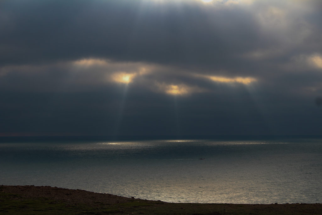
For this image I wanted to highlight the significance of the sunbeam seeping in through the clouds and reflecting off the ocean, to do this i darkened the clouds and lightened the sun rays which help contrast them against each other.
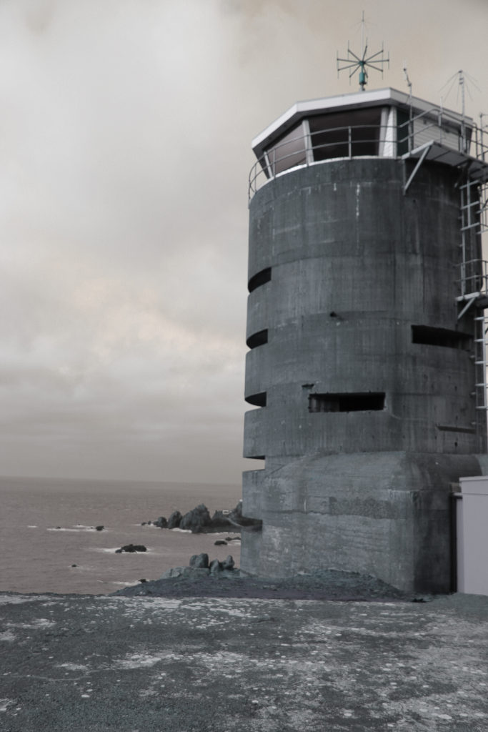
For the two above pieces i wanted into reflect the old and the new, from the beginning to the end of the Second World War and show the significant features that are laid on our ground and continue to show the history that the island went through during that time period. Furthermore, I presented this idea through having one of the images in a much darker colour using black and white shade along side a background of warmth which adds more feeling and thought to the picture; compared to the opposite image which has lots of colour and warm radiating from the natural sunlight.
I liked this image a lot and decided to include it in my final collection as the focus of the image is on the tree and the rocks are blurred which I believes gives an enticing contrast and makes it original from the rest of my images
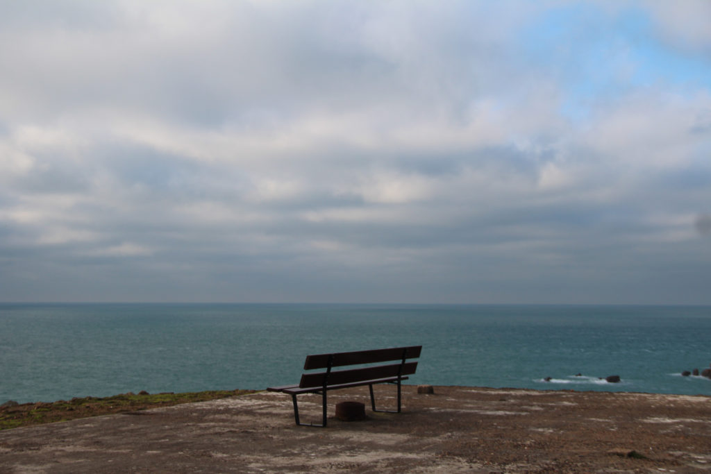
For this particular image I liked the idea of the isolation of the bench and the idea of looking out to a infinity of ocean and help point out historical meaning of what it may have felt like to be part of the Second World War
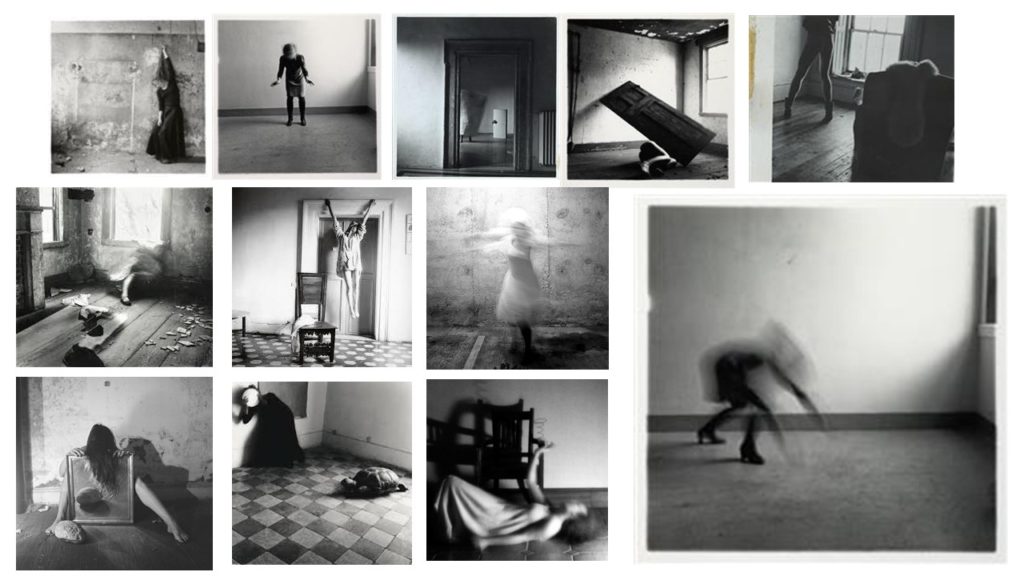
Francesca Stern Woodman was born in 3rd April 1958 and died on the 19th January in 1981, and was an American photographer and was best known for her work based around black and white images using her self in self portraits or a female model to represent herself. In her images they were often blurred this was due to the movement of the model and the long shutter speed, and the subject would often start to merge with the background and surroundings of the image or faces and appearance would often be fairly obscure. From her personal life its important to consider her struggles that she experiences, in the late 1980, Woodman began to shows signs of depressions which was due to the consistent failure of her work to attract attention which was produced from a broken relationship, this was where she survived her fist suicide attempt in the Autumn of 1980 when in Manhattan. Tragically on January 1981 Woodman jumped out of a loft window at the age of twenty-two and died. ‘An acquaintance wrote, “things had been bad, there had been therapy, things had gotten better, guard had been let down”. ‘ Davison, Peter. Girl, seeming to disappear. Atlantic Monthly, 2000 May;285(5):108–111.
MOOD BOARD:
Visual:
Francesca Woodman’s images are always portrayed with such a strong once looking at them. In this image you see an empty room which some what looks dirty with the walls being marked. The room gives off a cold feeling and lonely feeling with the image of the woman, doing what looks like reaching down to the floor. However her whole figure is distorted and blurred so you are unable to see any feature of her body or face. Although her shoes are still in fair quality this will be down to the fact she hadn’t yet moved when the photo was being taken. By being able to see her shoes it implies a woman is being photographed due to the high heels that are worn. The woman is positioned to the left of the image and what feels fairly manipulated to be presented as far away from the camera right up near the wall.
Technical:
In this image there is a clear representation of shadows being produced this could have been effected by natural daylight shining in through the window. The main focus of the image is the woman who is located on the fair left and positioned far back at the wall from the camera. It’s clear that for this image to have the appearance it does the camera must have had an extremely low shutter speed in order to create the blurriness of the figures movement. To me this image is displaying a mixture of texture with the wall and floor almost feeling gritty and unsmooth compared to the figure who is over ‘’smooth’’ in the sense that there are no lines or clear outline to the woman creating a distorted feeling to the image.
Conceptual:
How does this image make you feel? The image present the feeling of loneliness this is represented through the feeling of the rustic empty and oversized room. With then only one distorted figure cramped in the order. Her movement almost like she’s trying to break out from that corner and start to spread out. The blurred figure gives the feeling of rushing that she was moving fast, possibly wanting to get away from something- the loneliness?
Contextual:
From research it is clear that Francesca Woodman ad a hard and what she felt dark. With loving photography so much and no one else appreciating it like she did. The idea of the loneliness in this image could be portrayed as Woodman emotions of her own work the idea that she was alone with no one else to look and view her work.
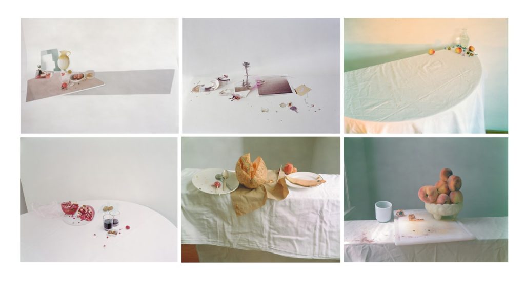
Letinksy was born in 1963, born in Winnipeg, and is a Canadian contemporary photographer, being best know for her work based around the genre of still-life. Letinsky has an BFA from the University of Manitoba and an MFA from Yale University and received a fellow ship from the John Simon Guggenheim Foundation, Anonymous Was a Woman and the Canada Council for the Arts and is currently a Professor of visual arts at the University of Chicago. She has demonstrated aspects of exploring the expressive possibility of still-life photography, after shifting my photography of people on to still-life, she sates that ‘ For a long time I’ve asked myself questions about what a photograph is. While I was taking photographs of couples in the 1990s I began thinking about love, and about how photography relates to love, how it can functions within a kind of circuitry of production and consumption.’ (Sholis.B, 2013, Interview with Laura Letinsky; aperture)
MOOD BOARD:
ANALYSIS:
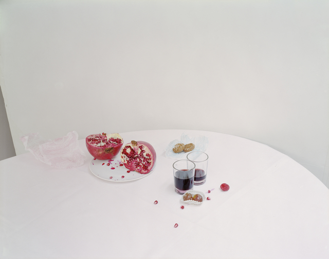
TECHNICAL: from this image its evident by the shadows and the bright white that there was a lot of light being produced/ placed on to the subject, this suggests that the exposure time is accurate if not slightly over exposed however, this could be misinterpreted due to the extensive white back ground contrasting with the darker coloured subjects on the table. The image is clearly very focused and lacks any blurring which add to the detail and focus of the food and drinks placed on the table, furthermore showing that there is low sensitivity as the image presents no grainy features to it. Finally the temperature of images presents a colder feeling due to the harsh white balance and background which the image is covered in which dramatically contrasts with the dark reds and purples on the able giving overall a better presentation.
VISUAL: From the image is evident that over the colouring of the image is white, however as previously mentioned it helps reflect and contrast the dark red and purple shades in the centre on the image on the table, the empathizes that this is the main focus of the image, this links to the idea of the image having a light tone due to the majority of the image being a bright white shade with suggestions of a bright light helping to illuminate the background.The image shows a table and from the curvature of the table it shows that it is out of place and not in the centre which demonstrate that symmetrical aspects where no required or needed for this image, with that in mind there is a lack of consistent patterns or repetition , although the white background is consistent the placement of the mood and a drink on the table is not. This projects a messy scene and add questions for the viewer.
CONTEXTUAL: From background research and y own knowledge i know that Letinsky was trying to project and capture the inner beauty of woman, she did this by breaking historical stereotypes of the disorganized placement on the table as well as the mess of the food and drinks with a wrapper still being placed on the table. This aided support of other aspect of her photography and allowed her develop her ideas and formats.
CONCEPTUAL: Through the contextual factors it helps the audience and viewers further aid and construct their own opinion on the photograph, as is gives them an understanding that it demonstrate the inner beauty of woman and the idea of trying to break away from stereotypes which gives the opportunity to lead on to many different ideas , as stereotyping a huge issue in out day society. This could lead on to the ideas of self love and being different form other, stepping away from the norm.
ACTION PLAN FOR RESPONSE:
After having researched Laura Letinsky in great depth its given be a much better understanding into the idea of being different and trying to tell a story in my own way instead of following the norm in the photography industry. This has given me the opportunity to grow an develop my own ideas for my current project and projects in the future as it is something that i believe to be such an important aspect of showing off your work. furthermore, its made be realize the significance and diversity of other peoples reflection and understanding of a photograph- when I see a photo is most likely my view o it will be completely different to someone else. As well as the deeper meaning of images, its given be idea of controlling and thinking more in depth abut the background of y images and how important they really are, and in concerns with camera skills its made be think about more carefully my IOS settings which will help be control the exposure of the image.
After spending some time with Joan Taply and hearing all about her stories during the occupation, it was essential to me to create and edit her portraits to represent a certain effect. I did this my experimenting in Photoshop with the different images I collected from the photo shoot, and carefully selecting the most appropriate photograph in order for me to achieve the highest level of quality and the most effective final image. With all this in mind I wanted to demonstrate how easily the conceptual aspect of the photograph can change by just editing each image in a certain way giving it a new feeling and depiction
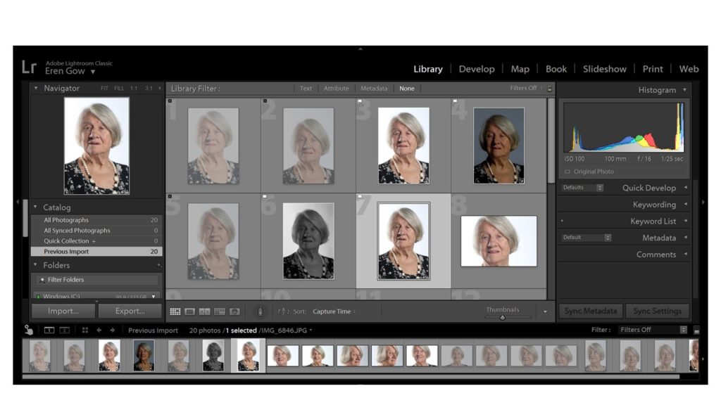
Firstly, after spending time with Joan Taply in the studio I moved all my images into Light room which enabled me to closely look at and concentrate on the best quality images.
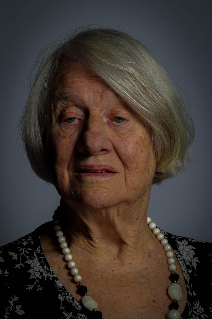
Next, selecting the main images that I wanted to attempt to edit, I started to clear up the lighting errors from the image for example, the shine on Joan’s nose from the studio lighting. this helped improve the photograph a lot already before the editing had even begun. Additionally, I went on to begin editing for my first attempt I wanted to keep it simple and affective so, I increased the contrast levels in order to give a sharper deception of the image to add even more significance to the image to help highlight Joan as the main subject, in Light room I went on DEVELOP then EFFECTS and altered the AMOUNT button that created a shadow around the corners of the image. This particular edit helped to provide a contrast of the lighter for illuminated face of Joan compared to darker shadows around the corner. This was the result:
Although, my initial idea I was pleased the end result of the image came out much darker than intended so I further experimented, keeping in mind my previous edit issue that would help me develop and improve the next image
This was my second edit after evaluating the faults and issues with my first image I made sure that I didn’t repeat the issue. I was much happier with this image especially at the darker edges of the corner which helped highlight Joan’s face even more. To me this feature really provides a significant overall improvement to the photograph and adds a more dramatic feel.
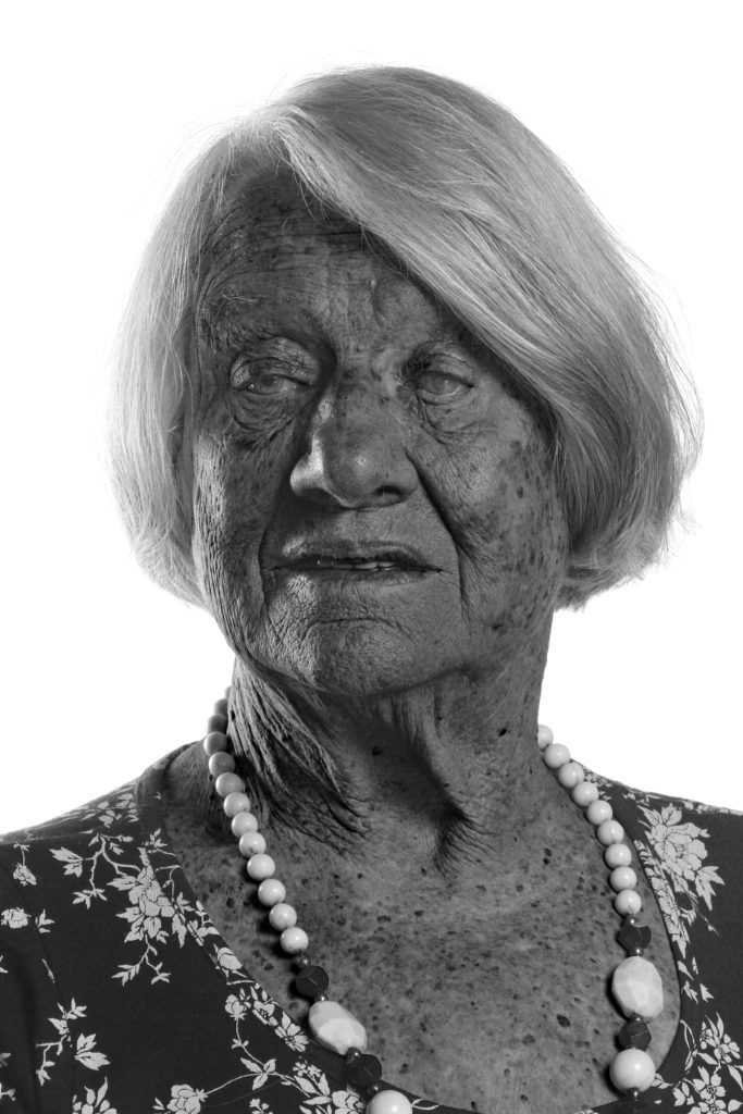
Finally for my third photograph I decided to take a more abstract approach using Photoshop which enabled me to control the intensity of each shade produced after changing the image to black and white, giving a more drastic and sizeable transformation. These photographs give a more disturbing feel due to the contrasting intensities of the different black and white shades.
For my last edited image, I used a different approach, by using a completely different angle and a side view which meant a lack of eye contact providing an original feeling compared to the more basic front faced portraits, to me it gives a more personal feeling and therefore suggest a more ‘soft’ notion. Furthermore, the idea of adding a personal feeling was a necessity to me as after spending time with Joan and hearing about all her experiences and her life during the war and as a child, the sense of providing a personal touch has connotations of personal experiences and a journey that a particular individual has taken.
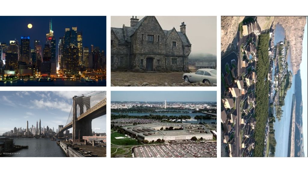
Establishing a shot is related to film-making and television production set up, and it can also been with a contextual view through a scene showing a relationship between the main subjective figures and objects creating a narrative story. In terms of the technical view its most often viewed as a long or extreme long shot at the start of the scene, most often setting the scene and placement. For example, where, what, when. Establishing shots were much more popular during the more classical era of film making, compared to now-a-days who often now skip this process of establishing a shot in order to make the overall process quicker and getting to the point at a faster pace. In addition, the expositional nature of the shot may be unsuitable to scenes in mysteries, where details are intentionally obscured or left out. The best examples of establishing shots and more famous landmarks to indicate the city where the action is taking place or has moved to, such as the following:
Brandenburg Gate or the Fernsehturm to identity Berlin
Victoria Harbour to identify Hong Kong
Las Vegas Strip to identify Las Vegas
LOndon Eye, Big Ben or Town Bridge to identity London
Parliament House, Old Parliament House, the National Caraillon or the Black Mountain Tower to identify Canberra
MOOD BOARD:
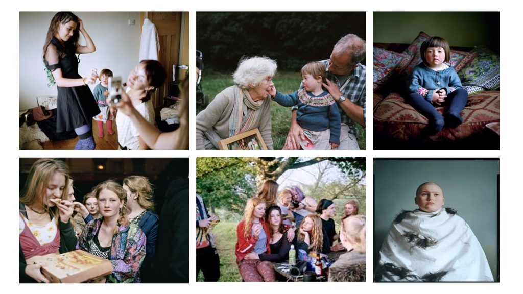
SIAN DAVEY:
ABOUT: Sian Davey was born in Brighton in 1964, and is now a popular British photographer, she studied paintings at Bath Academy of Fine art in 1985 ad the went on to social policy at the University of Brighton in 1990 and most recently MA 2014 and MFA 2016 at Plymouth University) . As well as this Davey was also a psychotherapist for 15 years before properly dedicating her time and passion of photography in 2014. Furthermore, Davey’s main focus in photography is her family, community and on herself and try to relate her background of psychology and relates it to her photography. One of her most famous series is based on her daughter called Alice who lives with Down Syndrome and looks more closely in to her life (called: Looking for Alice). This particular series was shortlisted for Photobook of the year in the Paris Photo-Aperture Foundation PhotoBook Awards. On the creations of her work she always try’s to incorporate her family, so for this particular creation of Looking for Alice her other daughter Martha helped with the production, which significant highlights and supports her view of the importance of family. With the assistance of her daughter Martha it led to her next series based on Martha and her teenage friends which Davey simply called Martha. Finally her most resent series was called We Are Family and was produced in 2017, and was exhibited at the National Portrait Gallery in London. This particular series led Davey to travel across Britain and was lucky enough to photograph a total of 31 families in an impressive 21 days.
PHOTO:
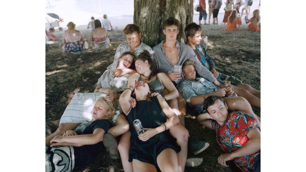
TECHNICAL: from this image its clear to see that natural lighting is an essential role in capturing this image, this is seen through the shadows of sunlight seeping in through the trees and leaves on to the group of friends perched underneath. The exposure is fairly low which enables the shadow to have more contrast against the sunlight seeping through, furthermore there is low light sensitivity as there lacks grainy textures, there are no significant textures that stand out as the image is projected in a real life situation and therefore shows a sense of reality; the colours are warm and suggest a warm summers day as well as features of the image which help provide evidence of this. to continue the colour provide a light tone which aids proof of the summers day with a pattern of the layout of the friend group positioning linking to the natural layout of the frame giving a 3D projection.
CONCEPTUAL: The conceptual feeling from the image is a group of friends hanging out on a summers day and having fun together and just trying to relax. Furthermore the different facial expressions from the image suggest it was taken fairly off guard as a lot of the people are not all looking at the image nor posing, for example;the top left people are laughing which suggests a joke being told and having fun furthermore the blonde girl in the bottom left having a disgusted face. overall suggests connotations of just a regular friend group having fun however deeper meaning maybe reflected through the various facial expressions could project the emotions that different people go through in their everyday life; disgust, laughter, sadness, happiness etc.
CONTEXTUAL: This image is from Davey collection called ‘Martha’ she got inspiration from her second daughter who said ‘why don’t you photograph me anymore’ which inspired her to look more closely at daughter Martha and her friends. ‘The work began when Martha was 16 and at the time when a child is on that cusp of being and becoming a woman. Its a particular period of time, when for a brief period you are both a young woman and a child in the same body, before the child leaves and the young woman stands on her own to meet the world’ ( Davey, 2018, Martha http://www.siandavey.com/portraiture/rqtu5vwfmmk1p0iagah6moz73evpob ) This suggested that the image has a deeper meaning and looked more closely at growing up as a woman and everything they go through.
DETAIL SHOT:
A detail shot is established by the use of a macro lens and involved capturing an image to help project a new an different conceptual meaning. The image and picture has connotations and references with identity and informs us about the subject being focused on within the picture. From the norm its suggested that the most popular element produced within the genre are texture, shape and space which all works together to create a forum.
MOOD BOARD:
MARTIN PARR:
ABOUT:
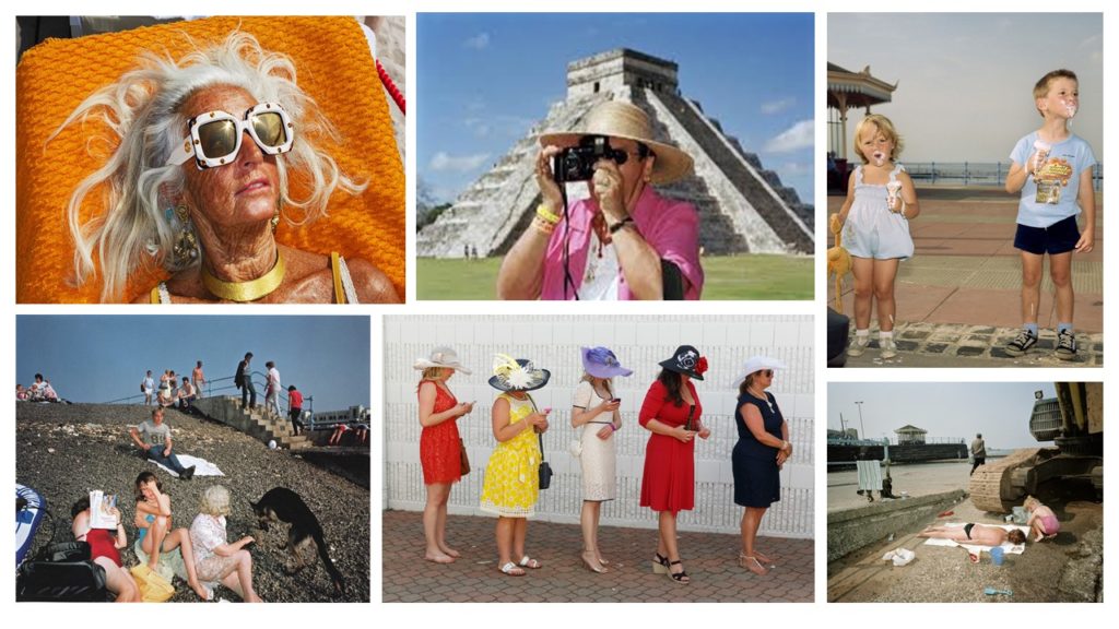
Martin Parr was born in 1952 on 23rd May 1952 and is a British documentary photographer, photojournalist and photo book collector. He is known for his photographic projects that take an intimate, satirical and anthropoloical looking at aspects of modern life, in particular documenting our social class in England, and more broadly the wealth of the Western world. Major projects include; 1975–1982), The Last Resort (1983–1985), The Cost of Living (1987–1989), Small World (1987–1994) and Common Sense (1995–1999).
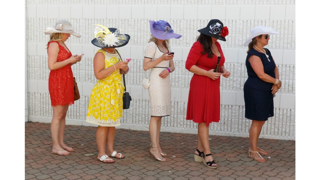
PHOTO:
TECHNICAL: from this image there is clear use of nature daylight and possibly the use of flash seen through the brightness of the colours portrayed in the image. The lens size is regular with minimal exposure level which helped highlight the different colours on the dresses, overall the image has good focus and low light sensitivity due to the lack of graininess in the picture, overall the image is a warm temperature due to the colours presented; red, yellow, black further aiding the idea of the image having a lighter tone with natural textures creating a more realistic view of the image to others, with a consistent pattern of woman being laid out in a line all facing the same way which add some symmetry although the layout and positioning of the woman would suggest otherwise due to the fact that one of the woman is cut off and the other aren’t which shows the image isn’t central.
CONCEPTUAL: The image shows five woman inline all dress to a high standard, suggesting an upper class range furthermore there a few of them staring down at their phone which could have connotations of the idea of social media taking over our lives and that we would rather look down at our phone than up at the world or talk to others around us.
CONTEXTUAL: ‘ At first glance, his photographs seem exaggerated or even grotesque. The motifs he chooses are strange, the colours are garish and the perspectives are unusual. Parr’s term for the overwhelming power of published images is “propaganda”. He counters this propaganda with his own chosen weapons: criticism, seduction and humour. As a result, his photographs are original and entertaining, accessible and understandable. But at the same time they show us in a penetrating way how we live, how we present ourselves to others, and what we value.’ (Martin Parr, intro, https://www.martinparr.com/introduction/ )
My own plan:
From this i will take everything I’ve researched and learnt to capture and respond to the ideology of established shot and details shot; for my work i will use inspiration from Martin Parr and Sian Davey and reflect their work on to my family as i will be using them as my subject