All posts by Eleanor G

Filters

Author:
Category:

Environmetal portraits

An environmental portrait has the same idea as a standard portrait, but this time the photograph is normally taken where your subject spends most of their time. Often, its somewhere relevant to that particular persons passions and interests in their life. For example if you were to photograph an artist you would capture them whilst in their working environment, i.e. their studio and take picture of them working. In addition there are hundred and hundred of different types of environmental portrait all capture different feelings and different ideas. Although for this to classify as a environmental portrait its essential that the subject is making clear eye contact with the camera whist doing the action of their work. This is a key point for the photograph to count as an environmental portrait. A good portrait should bring out the subjects personality in a stylized way, it should be an exaggeration.


Environmental Portraits – image analysis

Image result for arnold newman alfred krupp

Emotional

This portrait provides me with a sense of intimidation and lack of authority. Yet I do think it is a very impressive photo with a message behind it. I like the contrast between the dark area at the front and the light area at the back, which adds great amount of depth. although the photo is busy, I can’t get away from the fact that the man (Krupp) is the focal point, his stern looking face is hard to move away from.

Visual

There is a clear foreground and background which are emphasized by the change in light. In the foreground there is a Caucasian man aged around 65, wearing a suit, with his hands joint together and his chins resting on top, he has little to no emotion on his face, the dark areas around his eyes create a demonic silhouette. In the background it’s light which is flooding in via the windows on the ceiling, below there are trains of different colours and sizes. The warehouse behind him seems eerily quiet and dingy, there doesn’t seem to be an areas of interested in terms of beauty.

Technical

Their is a clear leading eye in this photo, from the man your eye is lead by the symmetry of the windows, this also represents pattern and order within the photo, this creates a large depth of field. The exposure is very well down and is correctly balanced between the dark and light areas. In the background Newman has used natural lighting, whereas to highlight Krupp’s face it appears he has used natural lighting this is indicated by the shadowing on some parts and glowing light on other parts of him, his light may have occurred via an office lamp. Krupp’s direct eye contact with the camera has a big impact making it much more personal and its as if hes staring you down creating more and more intimidation.

Conceptual

The photo was taken by Arnold Newman, a Jewish photographer in 1963. Alfred Krupp was hesitant at first to have his photo taken by Newman but he eventually came round to the idea and thus this photo was taken. Krupp in World War II held much power as he took over his fathers company which he then used as a place to assign Jewish prisoners at the time to work there under slave labour to create Nazi weapons. Krupp’s background story is clearly represented in the photo by Newman and the fact that he was Jewish emphasizes his intentions even further. He made Krupp to look like a demonic figure with the lighting, expression and body language to expose the injustice of the Jews and how much evil people in the time of the war exploited them and such horrific factories. As well as that the rule of thirds also create a sense of structure, which symbolises the the strict regime of the Nazi’s and how they locked up Jews in tight uniform concentration camps similar to how Krupp forced them to work in rows in his factories for hours on end.


Portraiture

1. TRADITIONAL PORTRAIT.

Traditional or Classical portraiture would refer to an image where face is the predominant element. The purpose of the photograph is to depict visual representation of that person. Subject is expected to be looking directly at the camera. With what is described as a head-shot, two thirds or full body framing can be used

2. ENVIRONMENTAL PORTRAIT.

The term Environmental Portrait refers to an image where the subject is photographed in person’s natural environment. For example, a worker photographed at the construction zone, teacher in the classroom, sculptor in a sculpture studio and so on. Surroundings are used to compliment the subject and to emphasize his character. Subject and setting are chosen by the photographer.

4. CANDID PORTRAIT.

A candid portrait is taken without a subject expecting or acknowledging the photographer. This style used in photo journalism, travel photography, street photography and event photography. As opposed to an environmental portrait this image is captured at the moment rather than set up.

5. GLAMOUR PORTRAIT.

The term Glamour Portrait refers to portraits where emphasis is given to highlight the sexy romantic appeal of the subject.

6. LIFESTYLE PORTRAIT

The term Lifestyle Portrait refers to portraits where emphasis is given to suggest the “style of living” of the individuals depicted. Technically it is a combination of environmental portrait and candid portrait. More weight is given to communicate the feeling of life experience of the subject. Style has numerous implications in commercial and fine art photography. Editorial, fashion, pharmaceutical, and food industries often use lifestyle images to evoke emotions in viewers by depiction of desired life styles. It is common to see this style used in wedding and family portrait photography as well.

7. SURREAL PORTRAIT.

Surreal Portraits are created to emphasize the other reality. A depiction of a person’s interpreted subconscious mind. Surrealism is an art movement started in the early 1920‘s and still alive and well. In photography tricks and special effects are used to achieve a surreal look. 

8. CONCEPTUAL PORTRAIT.

Conceptual Portrait refers to images where concept adds a fourth dimension. The hidden meaning of the concept will leave the viewer guessing as it is often open for interpretation. Conceptual artists generally get offended when asked what did they mean in their photograph. It is the job of the viewer to decide. Conceptual Portraits are often used in advertising photography but concepts are much easier to understand.

9. ABSTRACT PORTRAIT.

Abstract portraits are created with a purpose of creating art and not based on realistic representation of a person. Collage or digital manipulation is often used.

Final images

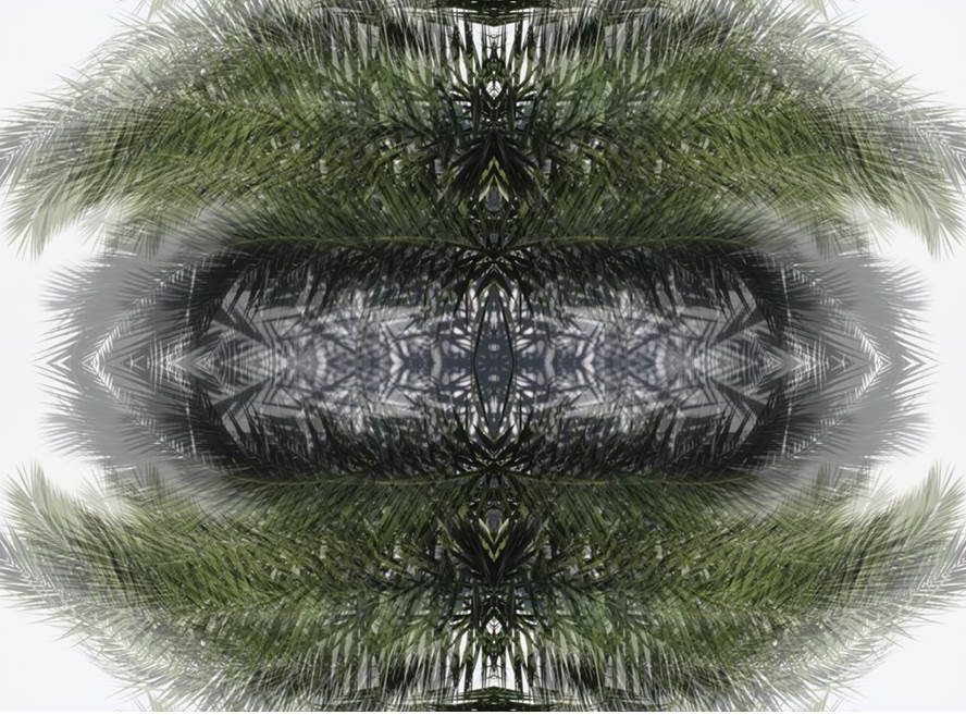
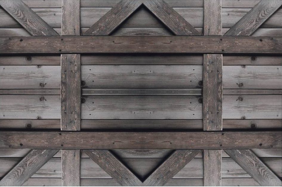
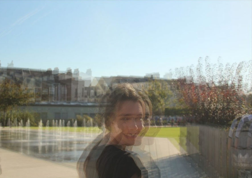
In this project I have been able to explore into the concept of abstract photography. I have looked at a variety of artists, who use multiple editing and camera skills, allowing me to gain a greater depth into the theme of abstract photography. I have captured a range of subjects, from paper to twigs, allowing to experiment with the formal elements which play an active role in abstract photography. I have acquired many camera skills, from controlling the shutter speed, ISO, White Balance and Depth of Field. I feel that I have successfully demonstrated these skills through my photo shoots, which have been inspired by artists that I previously researched.
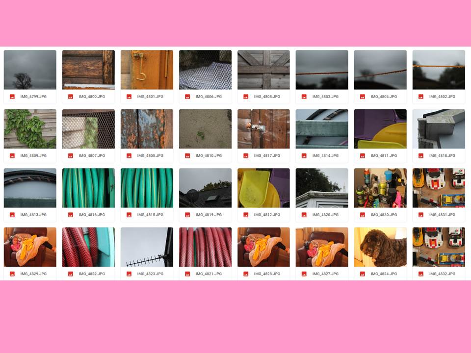
Here is a final plan for the layout of my final images:

Analysis

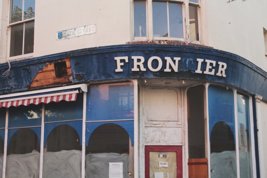
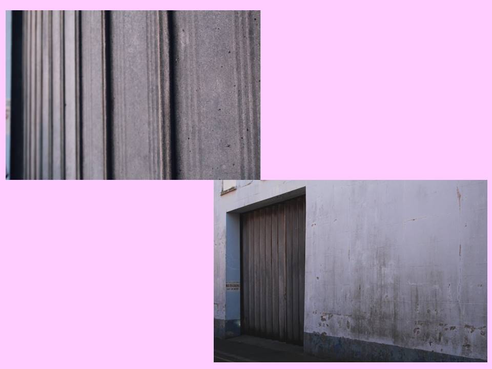
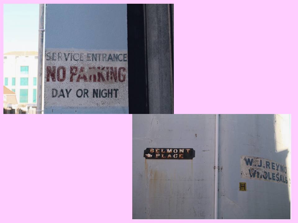
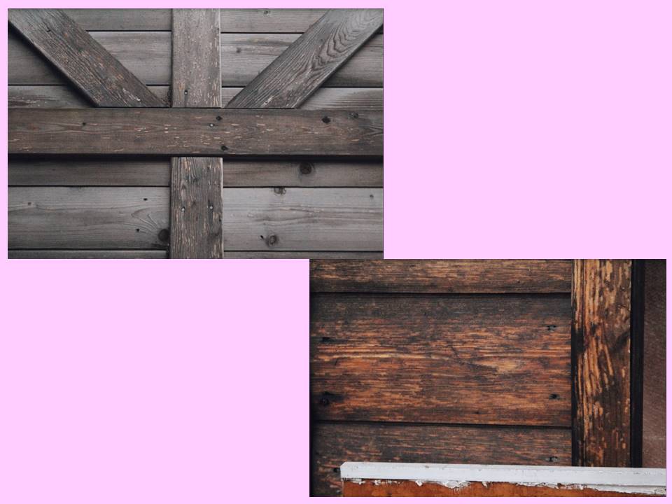
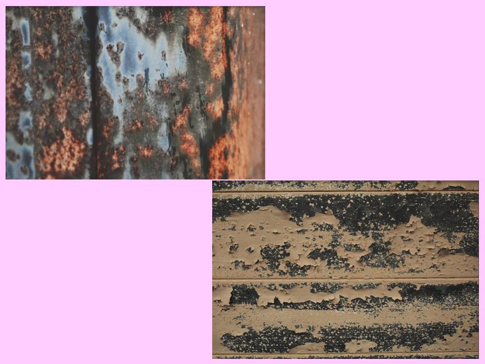
Overall, I chose the images as my final images due to them, in my opinion, reflecting my camera skills and perspective within ‘Abstract Photography’. I also chose them due to their abstract view points on colour: man made vibrant colours next to natural and neutral colours. Throughout my project I focused on photographing abandoned or decayed buildings or surfaces because I liked the idea of the fact that we’re living in a forever growing world with things being introduced to us everyday. Yet, there is so much decay and remains left for us to bare and manage. This overall project was to show how in our everyday lives, we ignore the decay us and proceed with our ‘new’ set in place futures.

Final Abstract Images

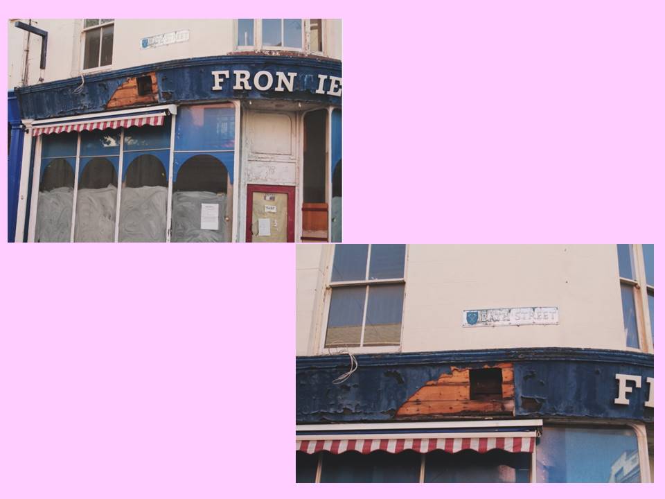
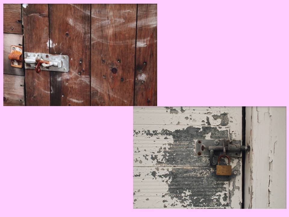
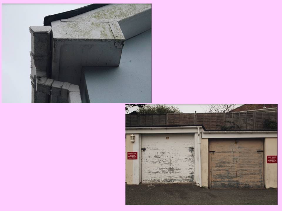
I chose this image as my final A3 print because i think it portrayed: good camera skills, aspects of abstract (the mixture of textures and shapes) and good use of utilizing enhancing tools such as sharpening and contrast.

It’s my favourite exposure because within the concept of ‘Abstract’, i ventured into the idea of abandonment and decay. This idea of utilizing surfaces of decay was to show the different textures side by side to new surfaces.

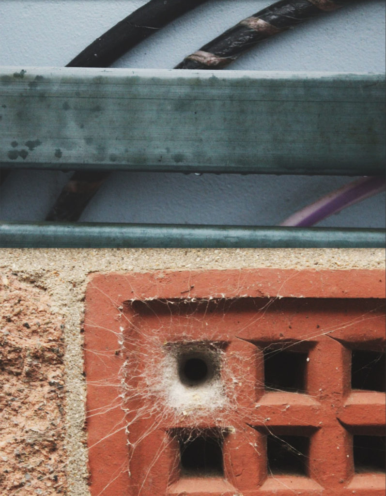
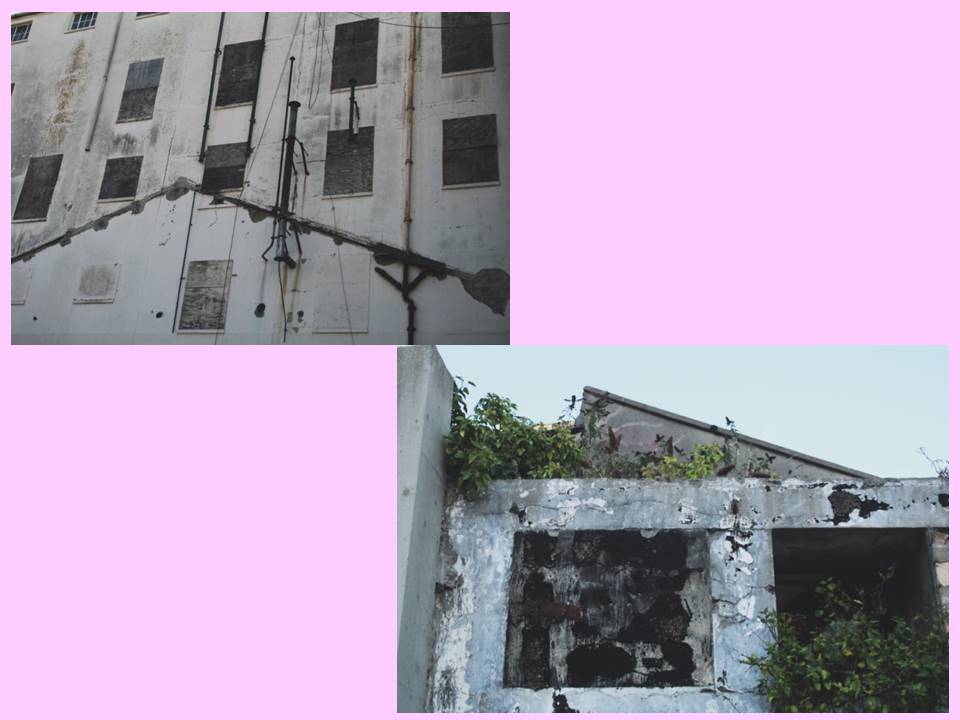
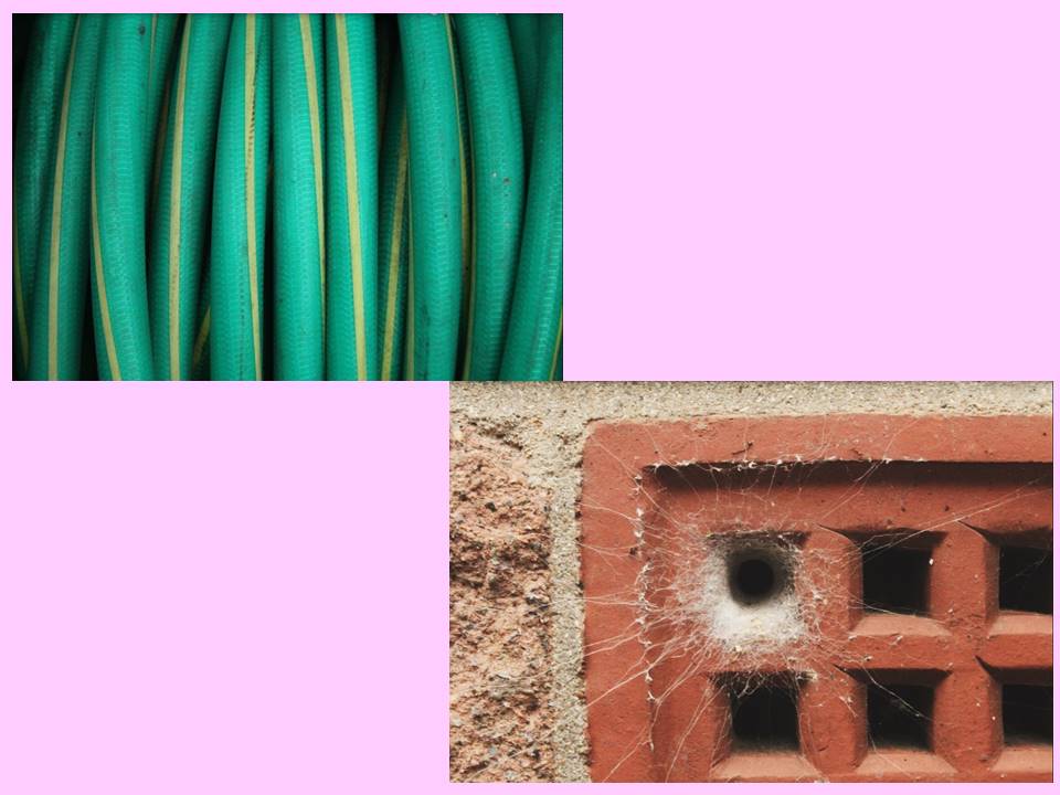
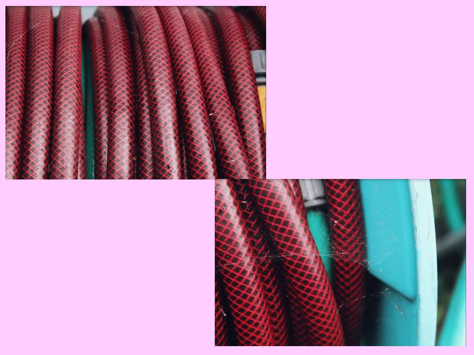
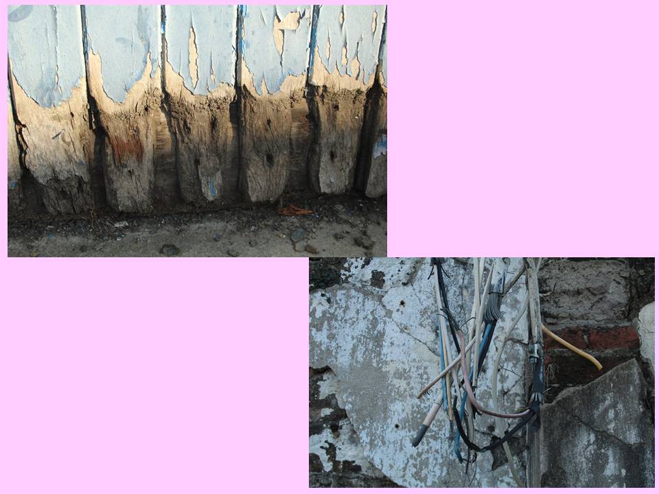
I chose this composition as my A4 print. This is due to again returning to contrasting surfaces: for example- the contrast of the man made bricks compared to the natural spider’s web. I also like these frames because they contrast yet compliment each other due to their colour palettes. The top image shows the cool colour palette with a few pops of the warm palette, compared to the bottom image’s warm colour palette with a centralized cool colour. 

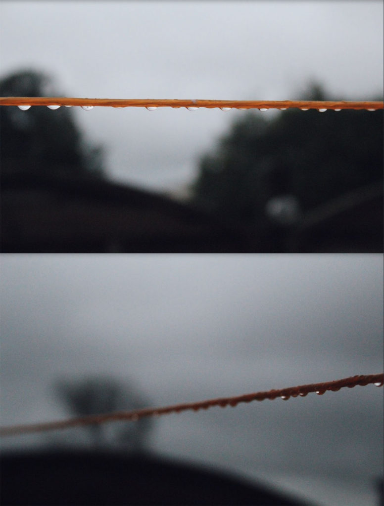
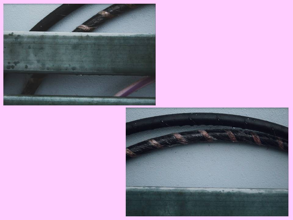
I chose these images as my final A5 frame. This is due to showing my camera skills showing examples of depth of field and area of focus. The top image is a prime example of utilizing focus because by using the camera settings, i was able to focus solely on the washing line in front, blurring the background. Similarly, the bottom image uses focus but in a different way. I was able to focus on one section the the line then create a blurred effect along the rest of it. This creates the sense of depth of field, just by focusing on one specific part.

colour and texture

For this task I took inspiration from Aaron Siskind. He focuses on aged and peeling surfaces, for example: old posters left to rot or old wall paint.

Aaron Siskind’s work

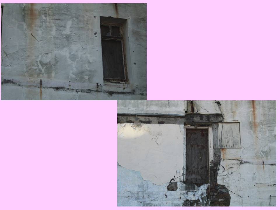
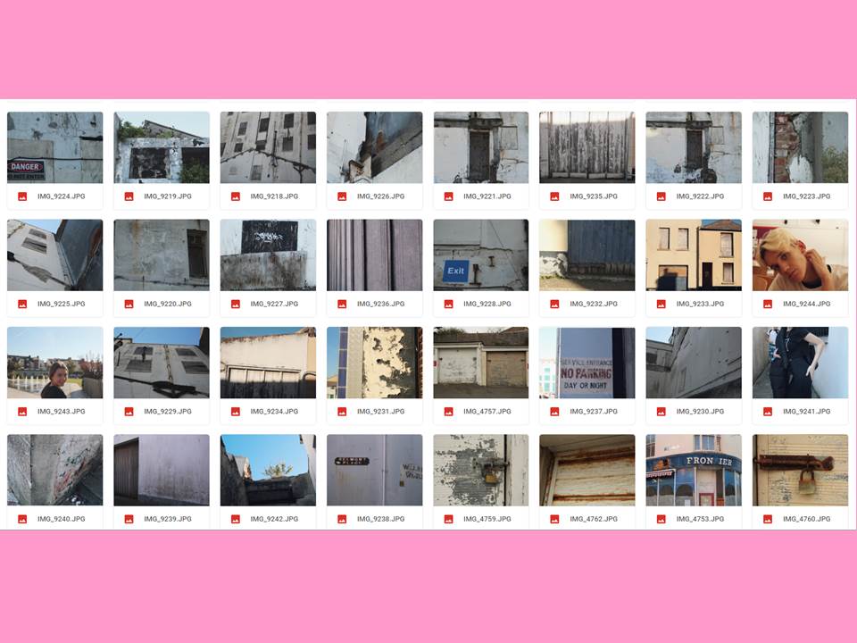
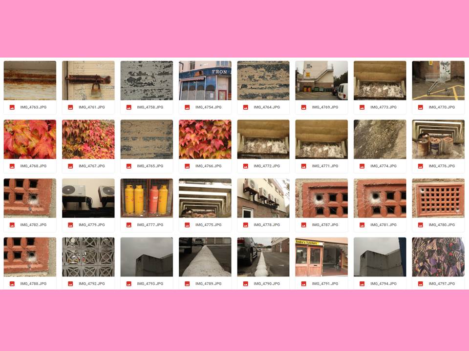
From the stimuli given from Siskind’s work, I focused on the ‘decay’ of walls and buildings which all fitted into our urban lifestyles. My first shoot was based in the old Jersey Brewery, which is now being slowly nocked down and being turned into apartments. However this means there’s more parts of the old building being revealed. I mainly focused on the decay of the building’s crumbling walls and peeling paint.

My response

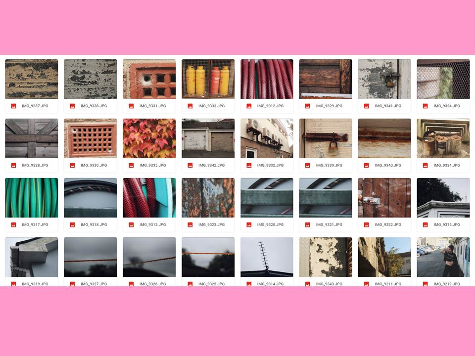
My second response involved focusing more the textures and lines that came naturally either from natural or decaying objects.

My Second Response