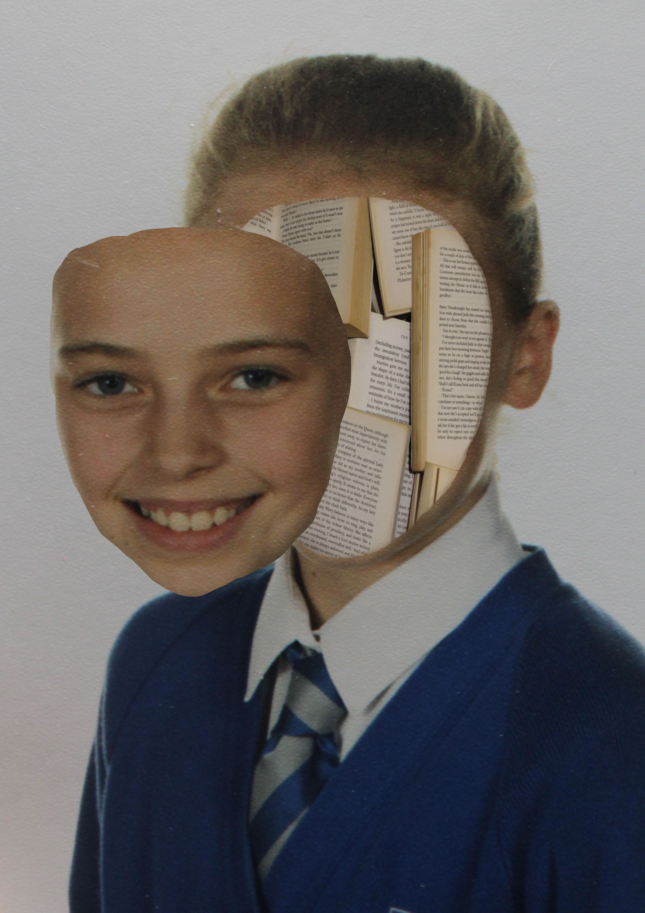
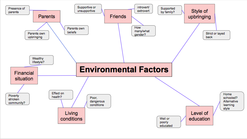
For my project into identity, I have decided to focus on the different factors that help to develop and influence the identity of young children. I feel like this is a relatively broad topic, as the factors that influence children and how they perceive themselves range from the influence of parents, to the influence of media and their peers. I will be focusing on how the different factors that play into children’s everyday lives effect and influence them, either positively or negatively, and help to shape how they identify themselves and others around them.

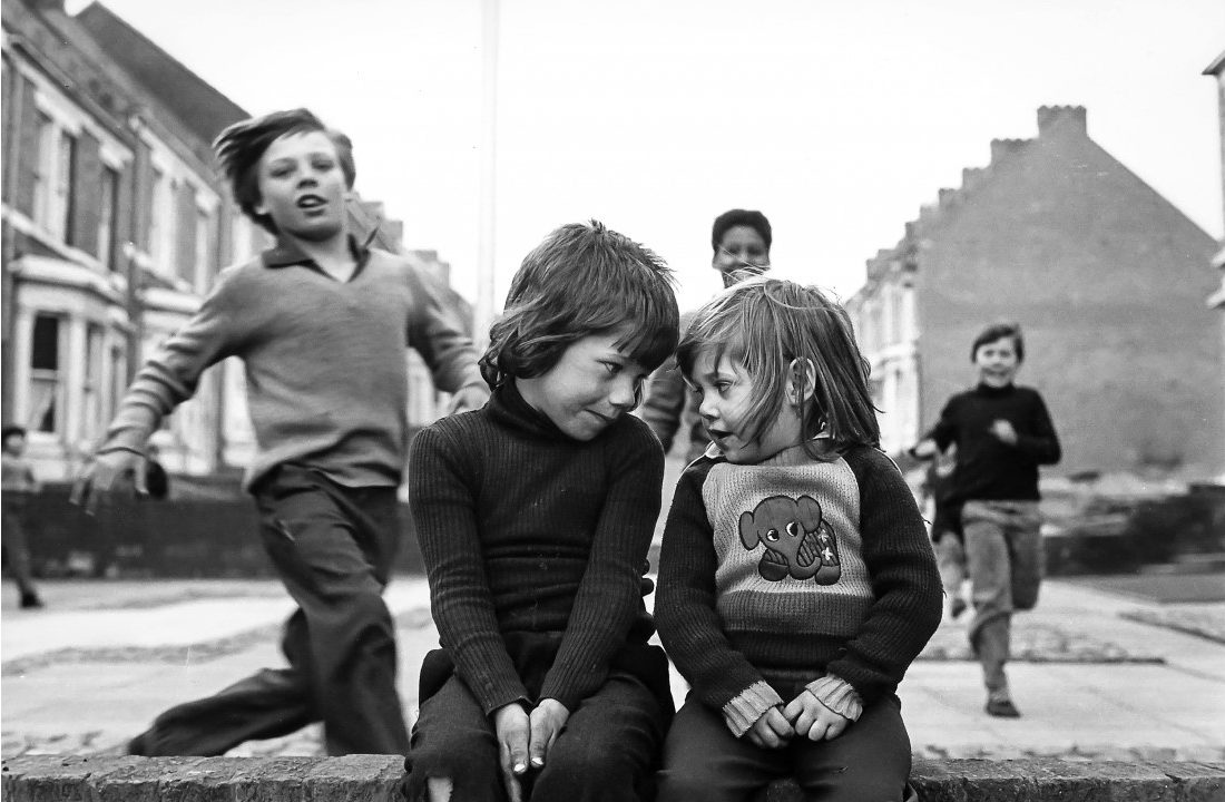
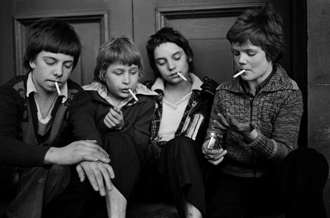
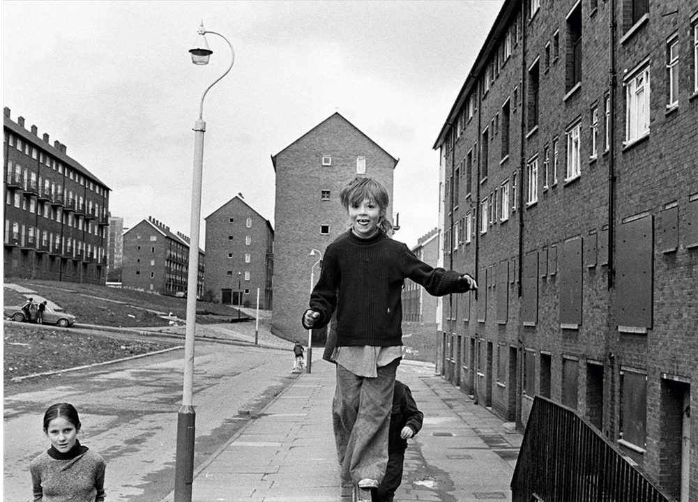
I will be taking inspiration from the artist and photographer Tish Murtha, as I feel that her documentary style photography of working class subjects in the mid to late 20th century documents how social, political and economic factors in their lives influences and shapes their social identity and behavior. I will be taking inspiration from Murtha’s documentary style photography, as well as using the concept of external factors influencing identity in order to complete my project into how children develop their identities.
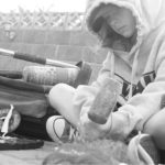
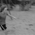
The below images are examples of where Murtha has used children of subjects in order to display the complex nature of the social dynamics of children’s relationships with one another. Murtha’s work also shows how children’s external environment effected them during the 1970’s-80’s, as the children depicted in her images are often shown to be playing freely and with little supervision:


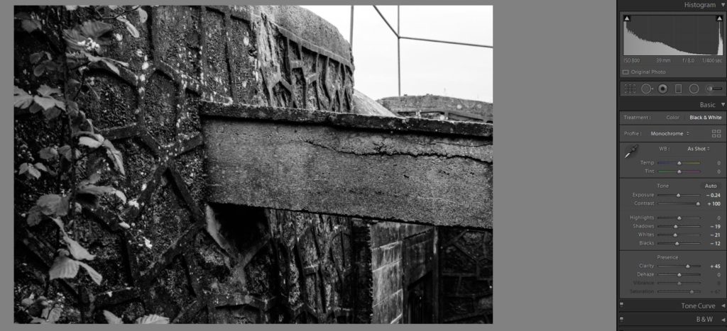
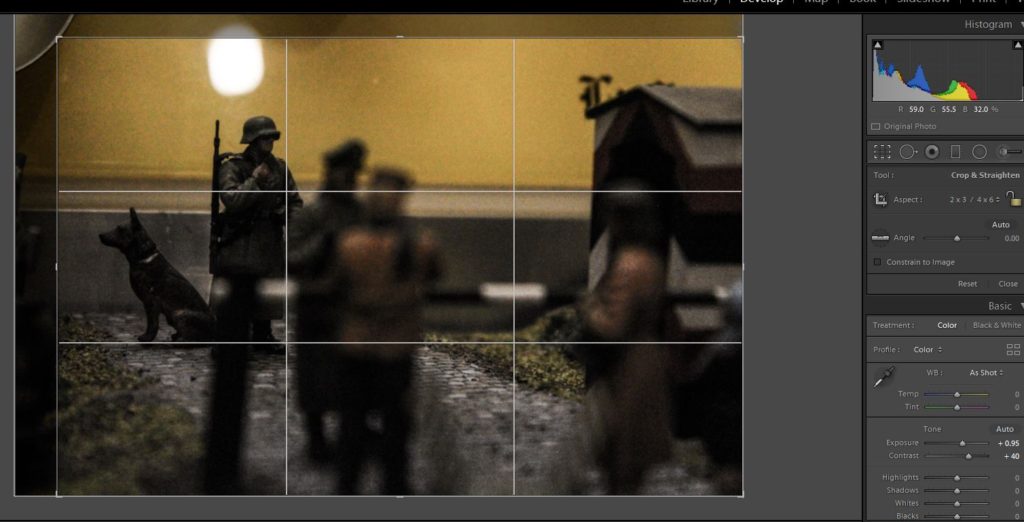
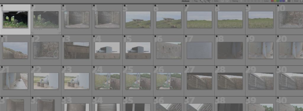
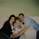
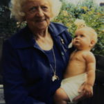
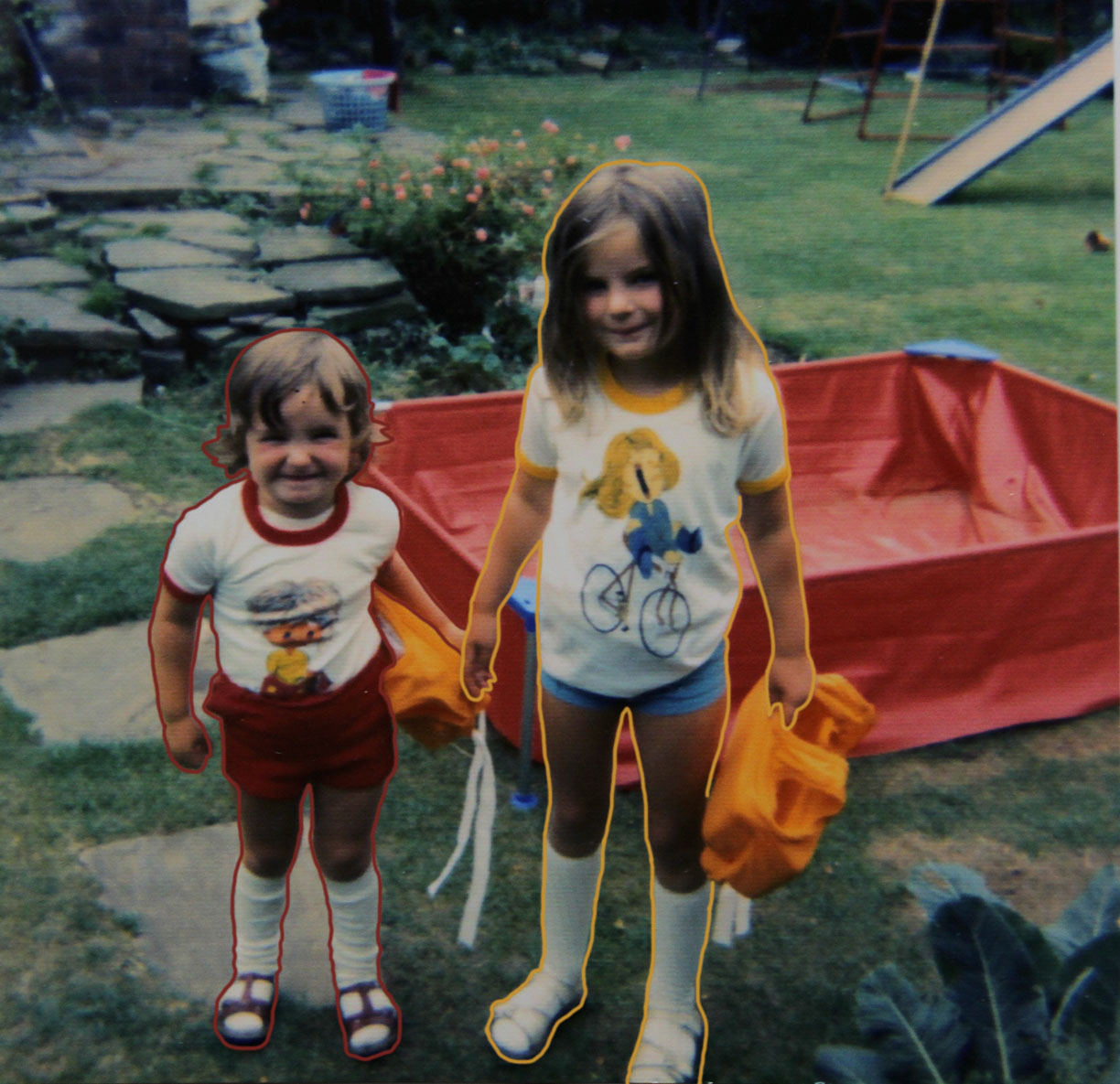
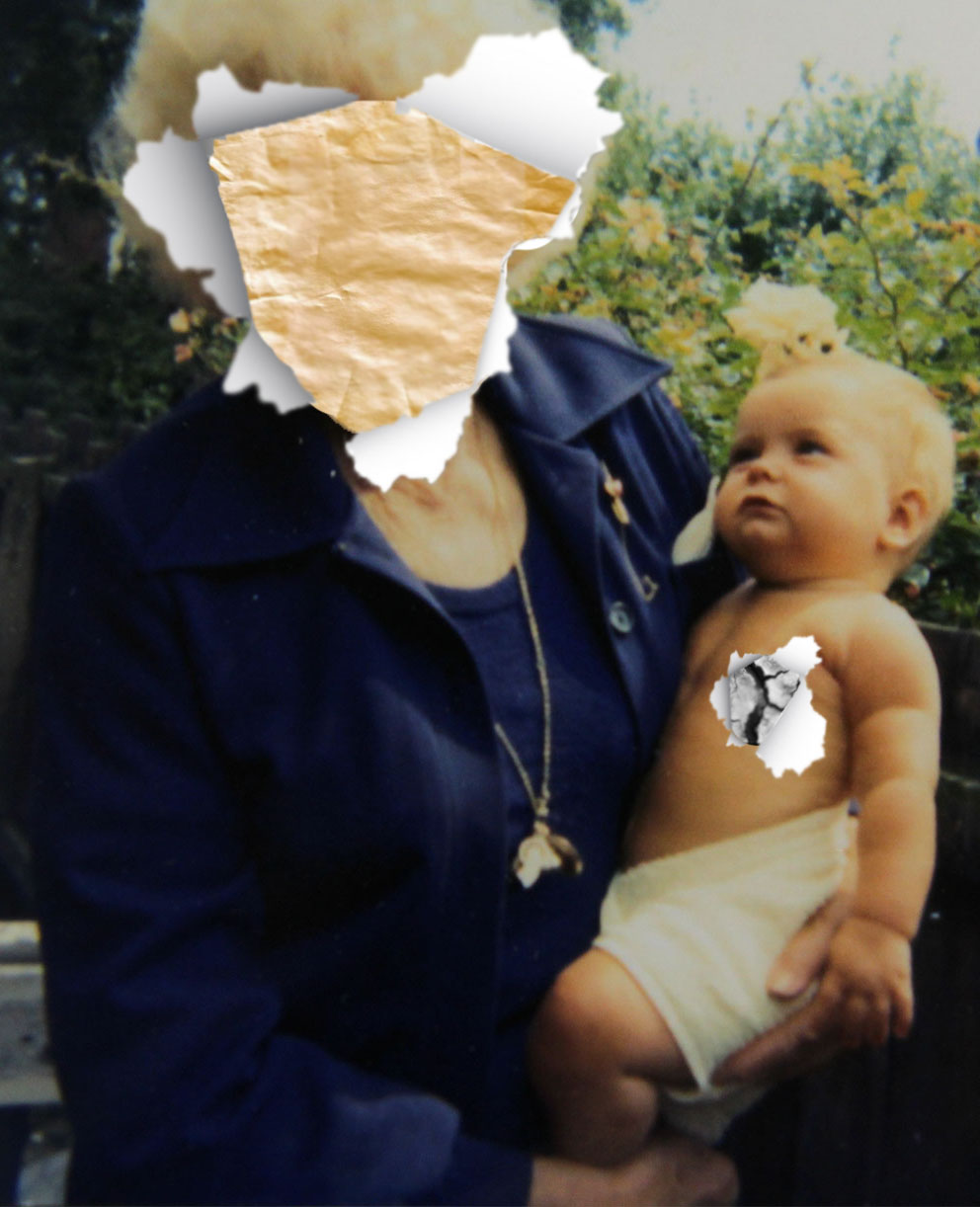
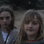
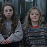
I conducted a range of photo-shoots in order to collect images that can be used to present my theme of how factors influence the developing identity of children.
A portion of the images I took use the documentary style that is also utilized by Murtha, as the subjects are captured in candid, natural poses. As well as the images that make use of documentary style photography, some of the images are posed, inspired by the close up shots that Murtha took of children in and around the area in which she worked.
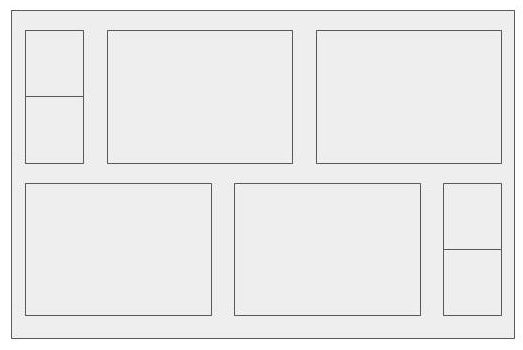
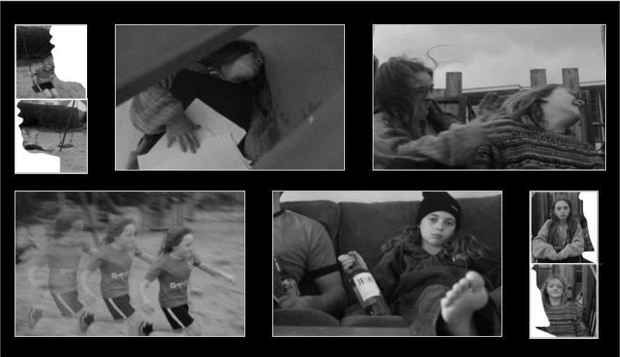
For the layout of my final images, I have decided to create the following pattern, using 8 of my final images in order to fill the boxes. I feel like this layout is eye-catching, and allows for certain photographs to be emphasized, whereas others are more subtle presented, allowing the viewer to see the different aspects of the images in different ways.

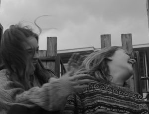
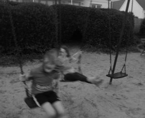
The following images will be used in this final piece layout:


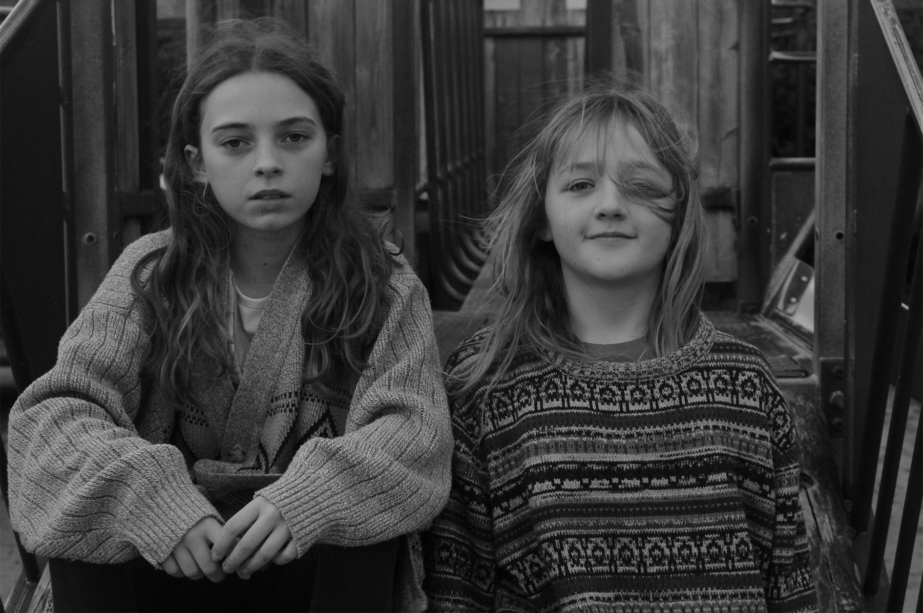
Upon printing, the bottom 2 images will be physically torn in half, to create a divide between the 2 subjects, before being used as the smaller images in the top left and bottom right of the layout.
The final layout of the piece will resemble the following:

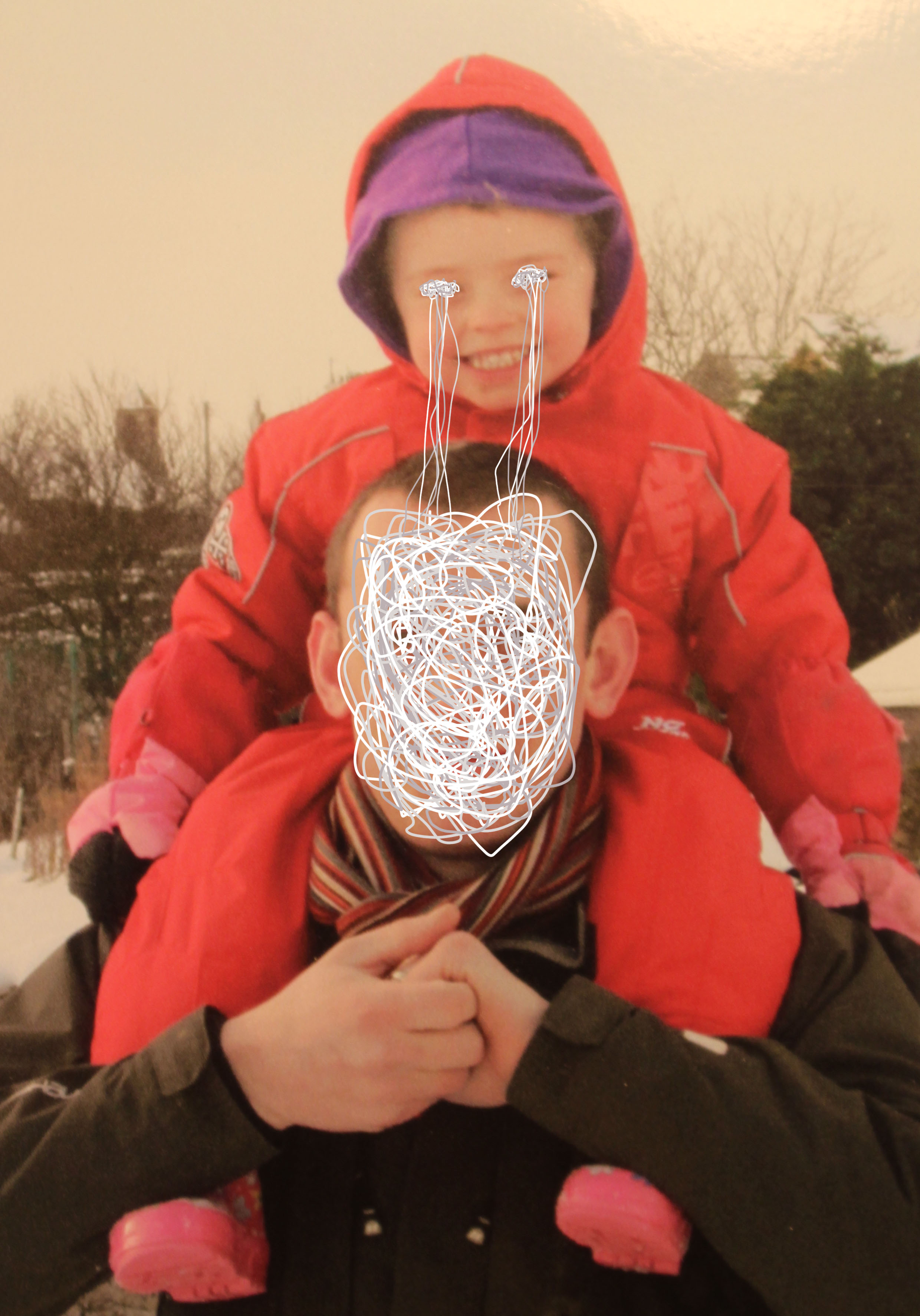
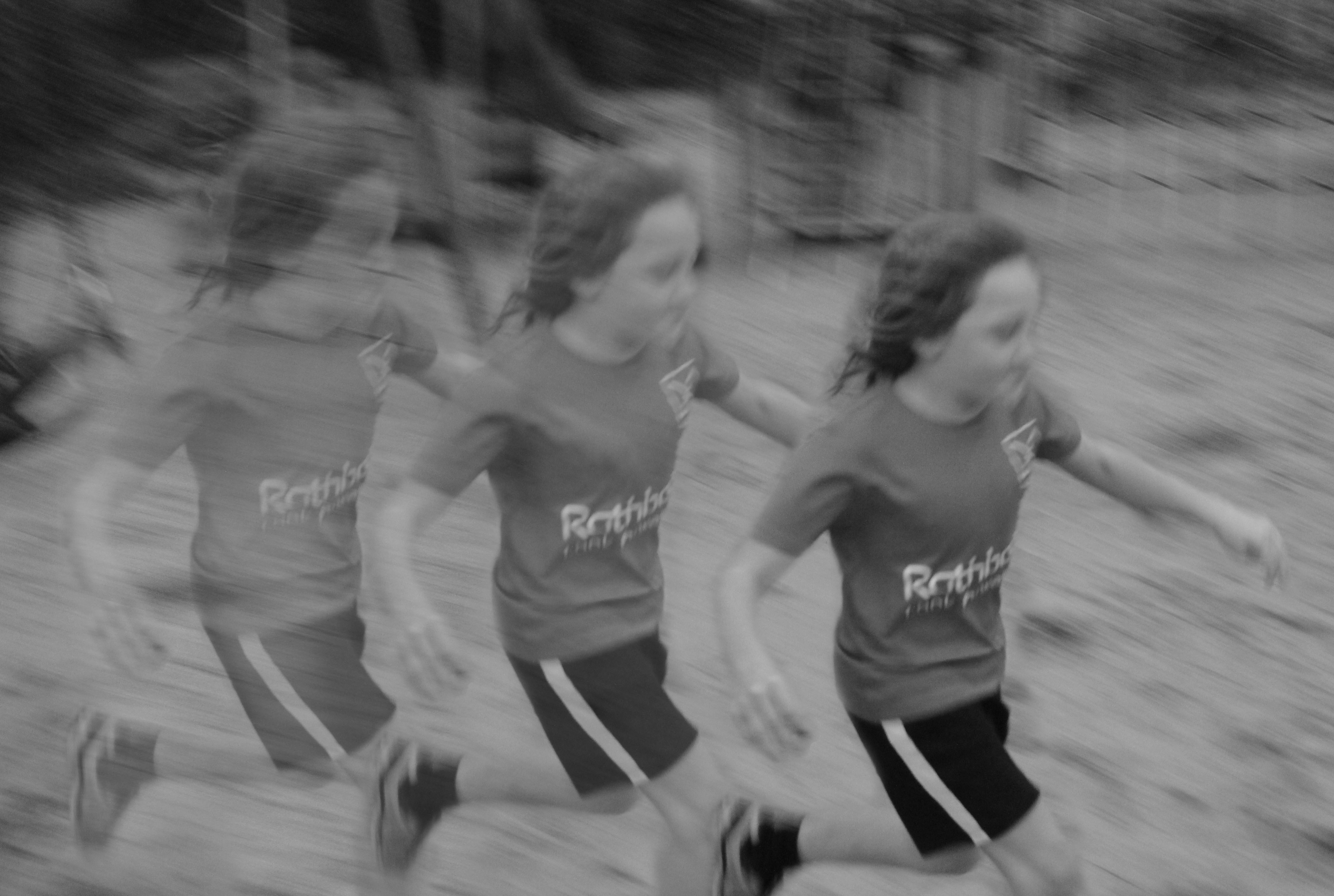
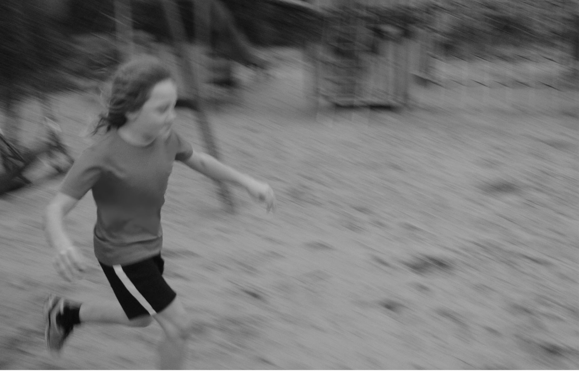
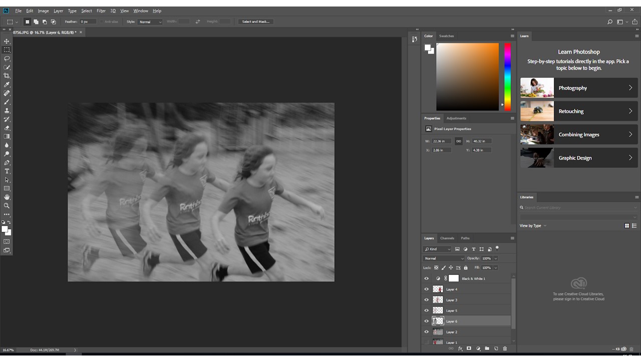
In addition to this layout, I will be using the following as a second final piece:

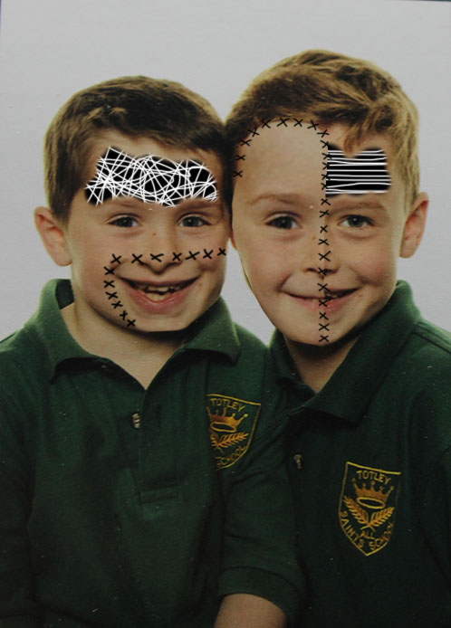
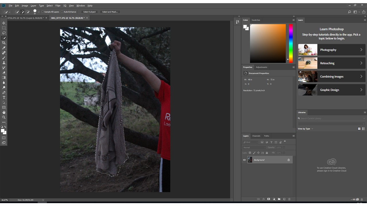
And after the following image is printed, it will be physically sewn into to add to the layer of editing on the photograph:
