All posts by Emily C

Filters

Author:
Category:

Photo Assignment 3: Home Sweet Home: Interior vs Exterior

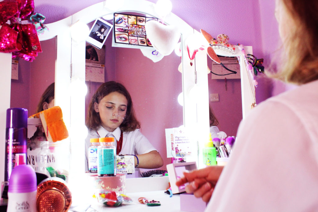
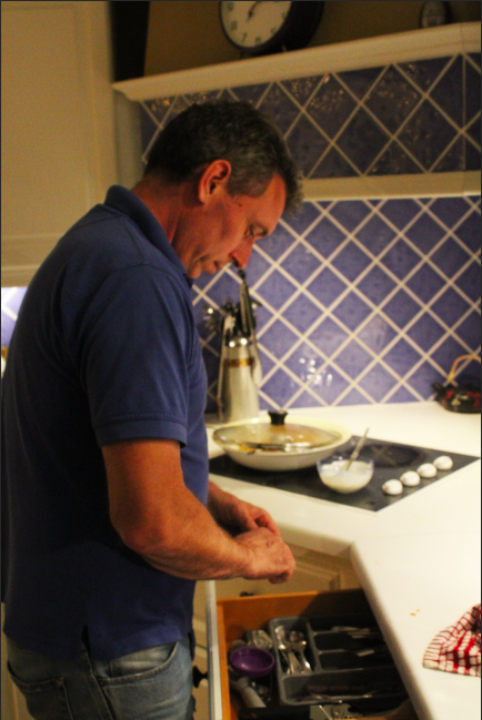
For my homework into capturing the interior and exterior of my home and the area in which I lived, I experimented with a range of different locations and places in order to best present the place in which I lived, and to best show the personalities, attitudes and lives of the people I live with/around through presenting their houses and what is included inside/outside of them. I captured a range of photographs, ranging from my street to the inside of rooms and houses, in order to encompass both the “interior” and “exterior” aspects of the project.

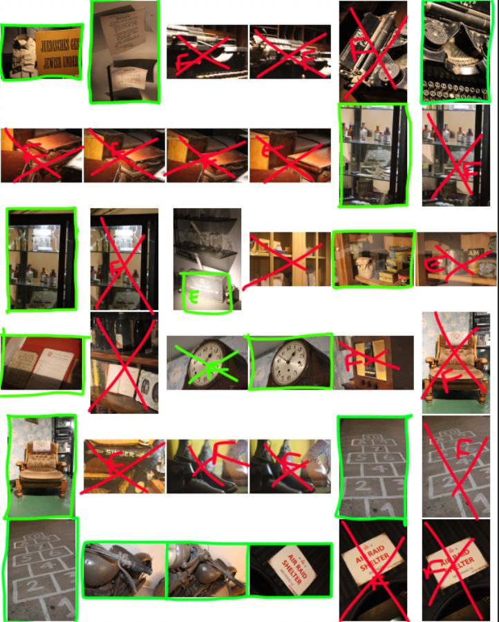
Below my contact sheets can be found where I have made a selection of images to bring forward to the editing process:
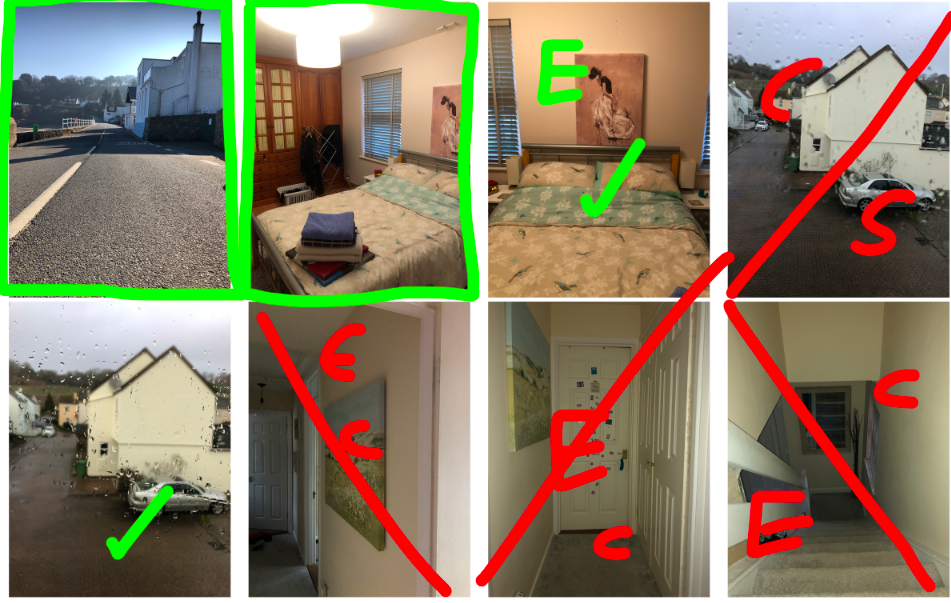
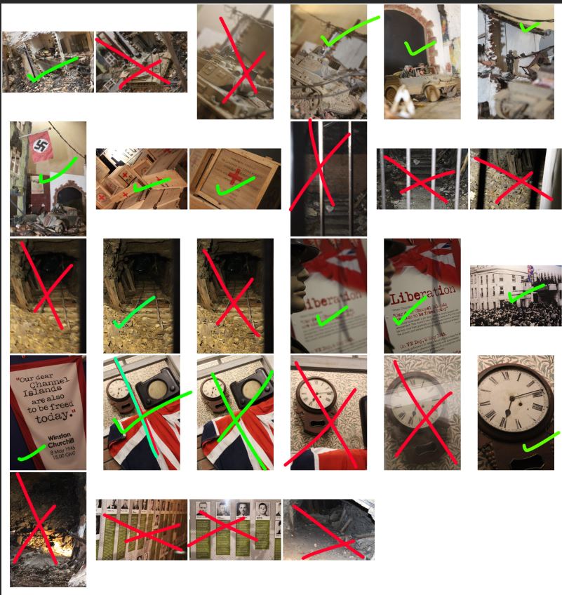
GREEN: box = final image, tick = possible final image, E = small issue with exposure
RED: line = rejected image, E = too over/under exposed, C = issue with the positioning of the camera/focus/technical issue
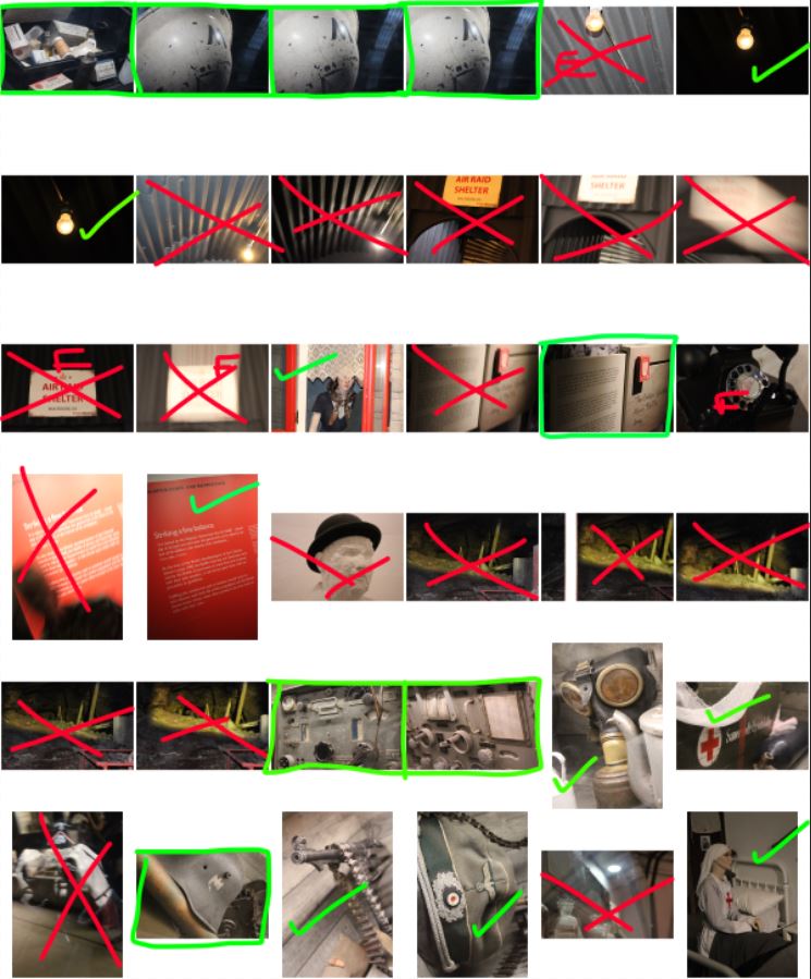
GREEN: box = final image, tick = possible final image, E = small issue with exposure, F = small focus issue, CR = requires small capping adjustment
RED: line = rejected image, E = too over/under exposed, C = issue with the positioning of the camera/focus/technical issue

After selecting the images I wanted to use, I moved onto Photoshop to experiment with the editing of the images:
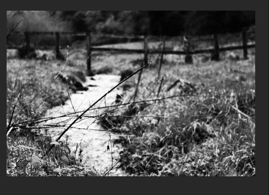
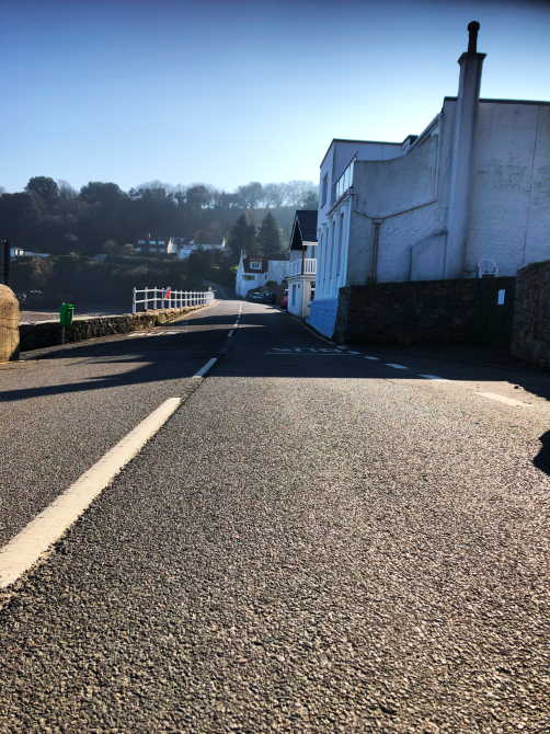
For this first image of the exterior of where I live, I decided to make the initial version of the image black and white as this gave the shapes and textures of the image more emphasis. After turning the image mono-chrome, I decided to further experiment with the image by adding a small amount of colour.
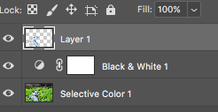
I used the lasso tool to cut around the water of the image, and copied this onto a separate layer so that I could edit the water and the background separately.
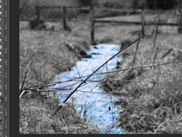
After separating the 2 components of the image, I used the “selective colour” tool to increase the cyan and blue colours of the image, giving the water a heightened colour which contrasted the monochrome background.
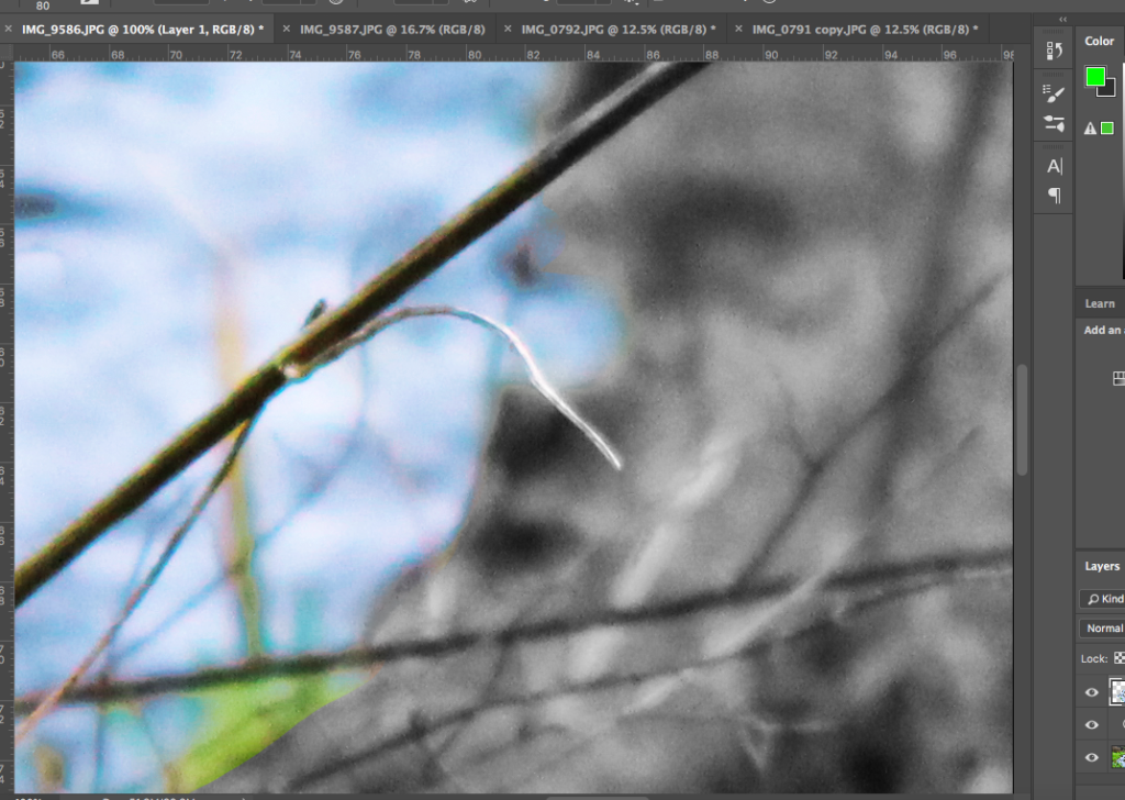
I then went around the edges of the water layer with a soft eraser tool to soften out the edges of the water, allowing them to blend more with the edges of the background. I also used the eraser tool to erase the green plants that I had accidentally included in the layer, which meant that the only thing left in colour was the water. I feel like this gave the image a cleaner look, with the blue water looking more “natural” as opposed to simply being cut and pasted over the background.
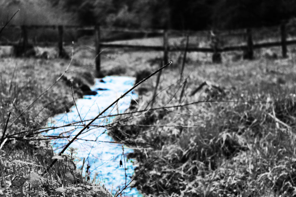
After heightening the contrast of the whole image after I had finished editing the water, the above was my final result. I feel like experimenting with the flash of colour in the water allowed for me to compare the 2 versions of the image, and in turn I was able to decide whether I felt the pop of colour was effective at drawing attention to the image or not.

Above are the 2 possible outcomes. After comparing the 2 visually, I decided that my final image would be the purely monochrome image. I found that experimenting with colour allowed me to gain a better understanding of what worked for the image, and I concluded that the simplicity of the monochrome image allowed for more attention to be drawn to the texture, shading and shapes of the surrounding without distracting the viewer with unnecessary colour.

After editing this first image, I went on to use the same sort of process (increasing contrast, using selective colour editing or using monochrome) to edit the remaining images. Below is an example of one of the interior images I used:

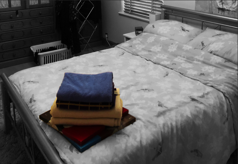
In order to create this image, I increased the contrast of the image, and used the selective colour tool to increase the brightness of the white in the background:
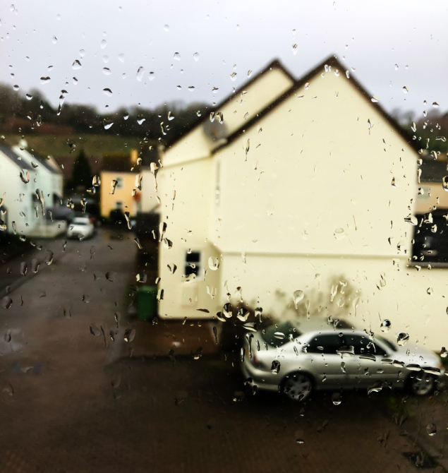
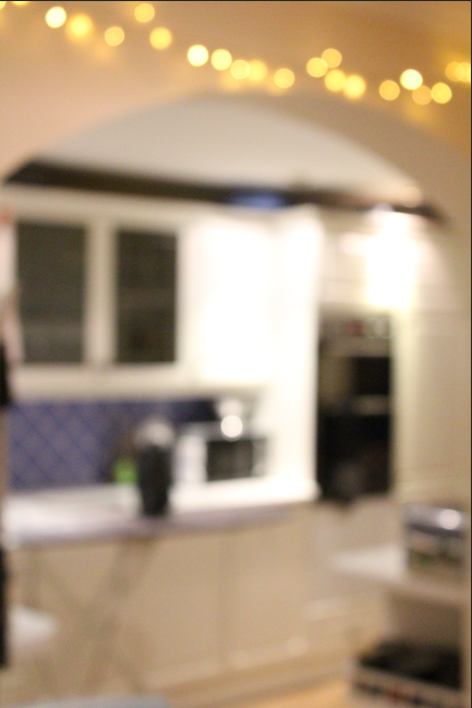
I decided to use this blurred image, as I felt it gave an intimate view into the interior of an individuals private life. The lack of focus allows for the interior to retain some privacy, and draws attention to the fact that the viewer is looking into the most private aspect of an individuals life; their home. I feel like although this image does not stick to the norms when it comes to its visual and technical layout, the concept behind the image fits the title of the project well, and therefore I decided on it as a final image or this reason.
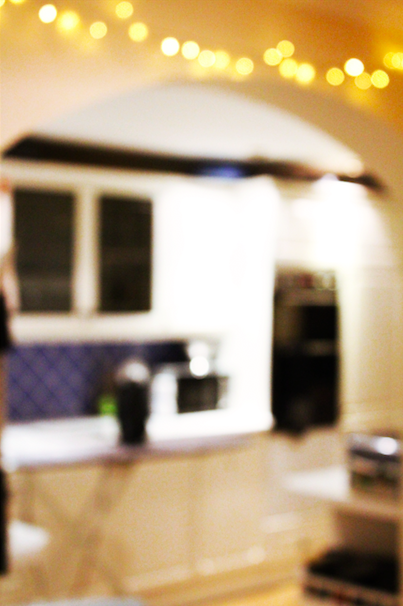
Final image

I then decided to edit the image which I originally decided had an issue with its perspective. I used the photograph of the bookcase which I had initially taken using a handheld camera, and thus the image came out with the bookshelf appearing uneven and lob-sided, as shown underneath:
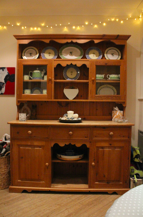
I took the image to Photoshop, where I turned the image monochrome (as I disliked the yellow tint to the image and felt the textures could be best emphasised using black and white) and then proceeded to alter the perspective of the image using CMD-T in Photoshop:
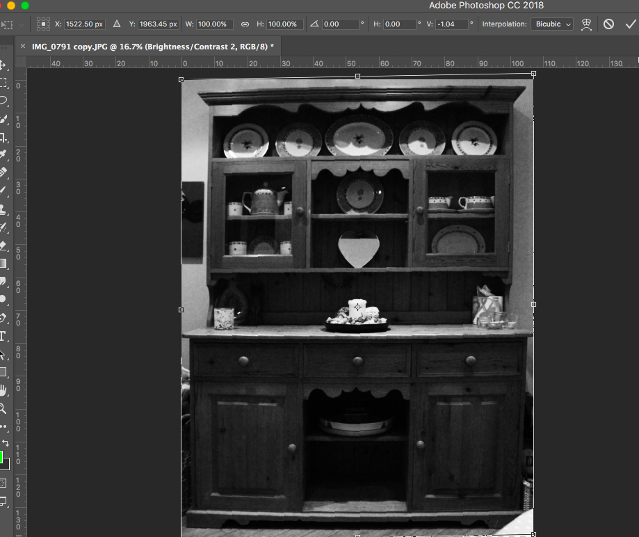
This allowed me to better straighten the cabinet, and thus I created a much more in-line, symmetrical image.

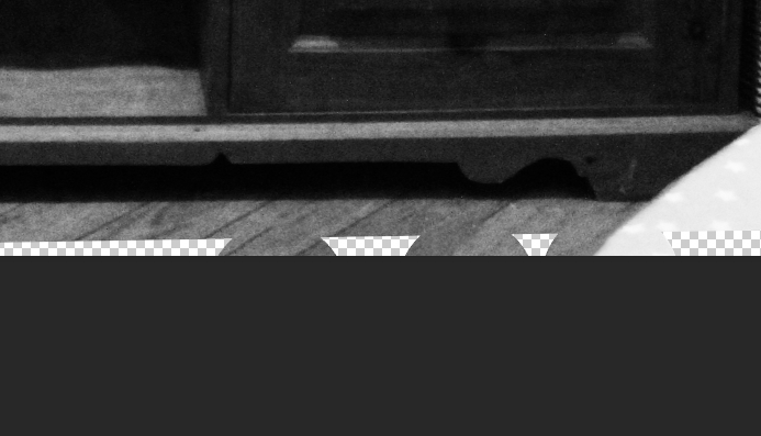
I then had to fill in the gap at the bottom of the image, left from where the image had been lifted due to the perspective change. To fill this, I used the spot healing brush tool, and allowed the software to fill the gaps in:
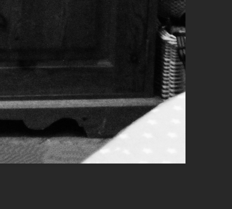
I then decided to remove the table corner in the bottom right of the image which distracted from the cabinet itself, and to do this, I also made use of the spot healing brush tool:
After this editing was complete, this was my final product:
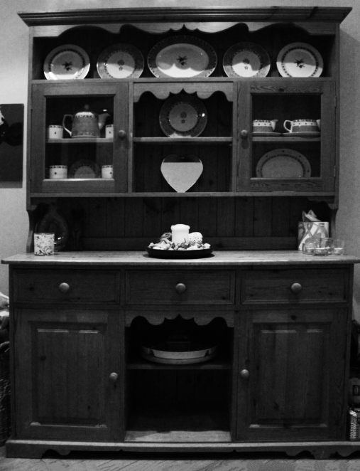
I followed the same sort of process for the rest of my images, and developed the following as my final images:
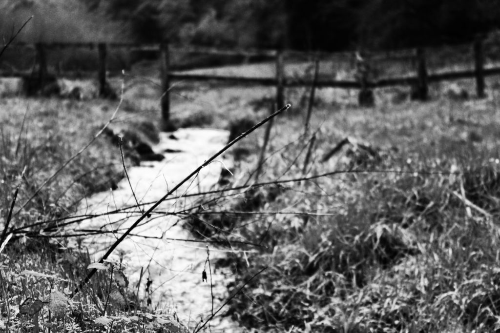
I feel like my final images for this project reflect the meanings of both “interior” and “exterior” well, with a range of images for each criteria. I feel like my final images give a feel and understanding to the viewer of the public and intimate aspects of the lives of individuals living in the houses and areas that I photographed, and the intimacy of rooms such as the bedroom and kitchen allow for the viewer o gain an understanding of the personality of the people living inside and around these rooms. I feel like the editing process allowed me to emphasise certain aspects of the images, and downplay others, which I felt was an effective method for drawing attention to certain components of the image which helped to better convey the meaning of the image.

Still Life: Contemporary Practice – Klaus Pichler

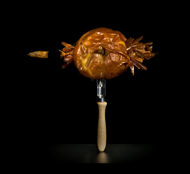
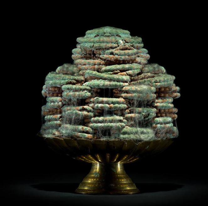
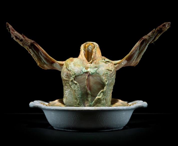
Contemporary still life photography is still a popular genre of art, and advancement in technology has allowed photography to contribute massively to the amount of still-life artwork circulating. More modern takes on still life artwork often raises awareness of current affairs, such as climate change, issues within society, waste and technology, while much of the work still often links back to the original themes of exploring mortality and social structures. With the introduction of a wider range of subjects to chose from, still life artwork has blossomed

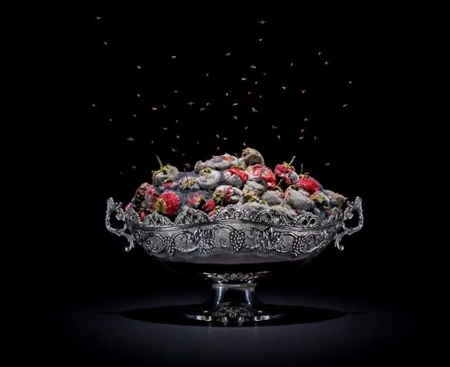
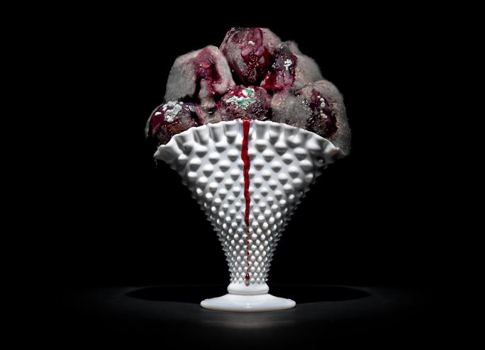
Above is a piece created by Pichler. The strawberries rotted in a week and a half, providing a layer of mold over the top of them. The contrast between the colour of the subjects and the black background, coupled with the detail found in the dish, draws maximum attention to the details within the image.

Austrian photographer Klaus Pichler wanted to raise awareness of the issue of food waste around the globe, and the effect we have on the climate, caused by the carbon footprint we leave through shipping goods around the world. His still-life photography project, titled “One Third”, involved rotting food in his bathroom over a period of 9 months, and photographing the decaying items in a way that very closely reflects classic still life artwork.

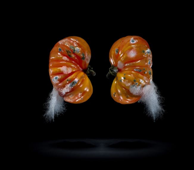
Pictured is Klaus’ photography TOMATOES. The contrast between the red of the tomato and the black background draws full attention to the subject in the foreground. The addition of the mold of the tomato, and the positioning of the tomatoes in what could be described as a human kidney shape (perhaps signifying the influence of humans on the waste crisis), gives the image a more abstract, interesting look to it, while also allowing the viewer to look more closely at the shape of the subjects.

Pichler’s project was centered around raising awareness about the global issue, that is, wasting food. Klaus became aware of the fact that 1/3 of all of the worlds food, produced for human consumption, goes to waste, while in other areas of the world over 900 million people are starving. Pichler felt personally connected to this project, as he grew up in an area that required him to raise and eat his own meat/produce. In order to reflect this personal attachment to the project, Klaus decided against renting a studio to complete his work, and instead developed the project in his own apartment. Klaus can be quoted as saying, during an interview with National Geographic:

“I was definitely not the first one who was making photographs of rotting food but to make myself credible, I decided not to rent a studio but to make it in my apartment. This was quite a conscious decision. When I am working on a project, I want to really be in the middle of it.”

This quote clearly reflects Pichler’s personal connection to his project, and shows that the meaning behind his work is something that he feels very passionately about. This passion is clearly reflected in the dedication he had to his work, allowing food to rot in his own bathroom for months on end, with the smell of decaying chicken leaving him unable to sleep for nights at a time (according to National Geographic).

Pictured above is the image EGGS, which can be found with the following description accompanying it:
Place of production: Kolontar, Hungary
Production method: Factory production  *   Time of production: All- season
Transporting distance: 196 km  *   Means of transportation: Truck
Carbon footprint (total) per kg: 5,82kg  *   Water requirement (total) per kg: 3061 l
Price: 1,39 € / kg
this caption draws attention to the requirements needed in order to package and transport these eggs, only for them to be wasted.

Klaus also put thought into the caption of his images, using a description of the transportation, place of production and carbon footprint of each of the foods he photographs. This took a large amount of research on Pichler’s part, yet his enthusiasm to raise awareness of the massive waste of resources (and effects on the climate) produced by the production of foods, and then the way these foods are wasted, allowed him to collect the records of all of the foods that he photographed, using the captions to further reflect the food waste crisis of the world.

Pichler’s project falls within the category of still life, as it makes use of arrangements of rotting foods (often including the classic still life food; fruit). Pichler also makes use of silverware and intricate dishes, cups and cutlery, which contrasts the grotesque reality of the decaying food that it holds. This is perhaps a remark towards another aspect of food waste, as first world countries enjoy wealth and the ability to choose to waste food (reflected by the detailed cultery/dishes) whereas third world countries are left to starve. The simplicity in the final image, yet detail within the process and meaning of Klaus’ work, runs parallel with the more classic works of still life, which include elaborate meanings and metaphors, and would have involved the collection and arrangement of many objects and foods.

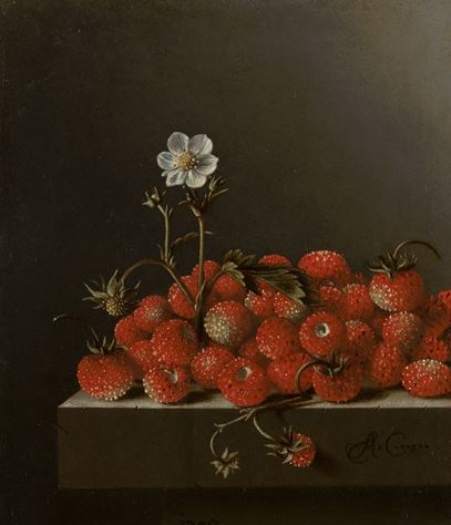
Many similarities can be found between the 2 works found above. The dark background used to contrast and draw attention to the colours in the subject, the use of food (strawberries) as a subject, and the arrangement of the strawberries themselves are all similar, yet the meanings behind the two pieces are vastly different.

Rafal Milach: The First March of Gentlemen

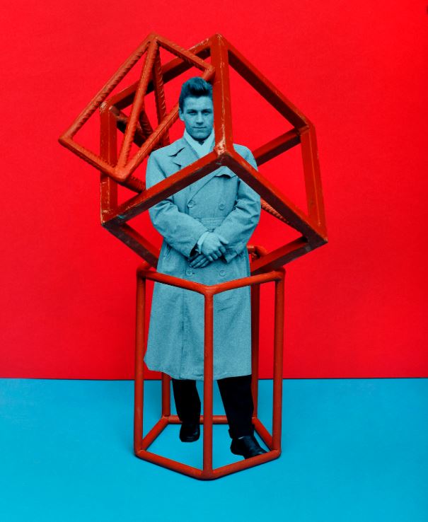
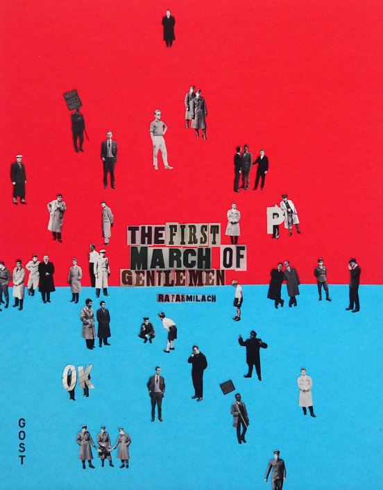
Polish photographer Rafal Milach set out to develop a project that would combine the individuals who lived through the communist era post WW2 (in which Poland was a part of Soviet rule), and the children’s strikes of 1902, in which Catholic school students objected to the Germinization of their education. Milach incorporated objects found in education (specifically maths equipment) with archival images of when Poland was invaded by the Germans, and in doing so emphasized the stark contrast between the childish innocence of simply wanting an education, with the reality that the education system and children were severely affected by the German invasion.

“The initial idea of working with the archive was sustained, but the topic changed as I began looking for material that could occupy two spheres – discipline and pacification, and the sphere of freedom – and to bring these elements together in a series of collages.”

In the above quote, Milach discusses how he was able to bring the 2 contrasting themes of peace (children) and war (occupation).

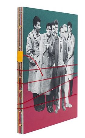
Milach published his photo-book, The First March of Gentleman, and used bold eye-catching colours (associated with children and children’s artwork) in order to show the contrast between the reality of the archival images, and the concept of the book itself. Milach added a string to the book that had to be physically unwound in order to open it; this added a sense of interactivity to the book, and the string (when wound) can be used to represent bars, caging in the subjects:

The book is bound by string, presenting a metaphor for how the inhabitants of Poland were trapped by the invading forces of the Germans
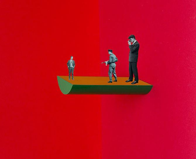
Milach makes use of space to draw maximum attention to the subjects and concepts in the foreground.
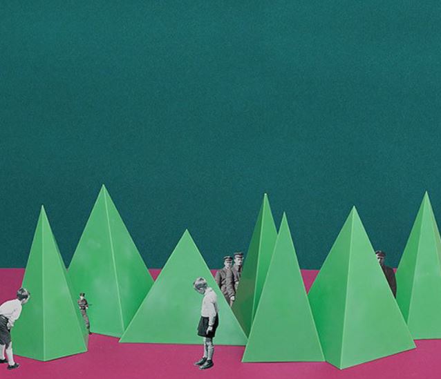
Here, Milach makes a statement by placing children in the foreground, curious towards the boldly coloured pyramids, and German soldiers stand watching over them in the background.

Milach makes use of space in his images, as the bold colours in the background still act as part of the image, drawing attention of the viewer, and the use of space draws maximum attention to the archival images laced between the objects.

I will be taking inspiration from Milach, and will be designing my own photo-montages that will reflect the feelings of confinement and hopelessness that covered Jersey during the occupation, and in general, Europe during WWII.

Still Life: Emile F. Guiton – Autochromes Study:

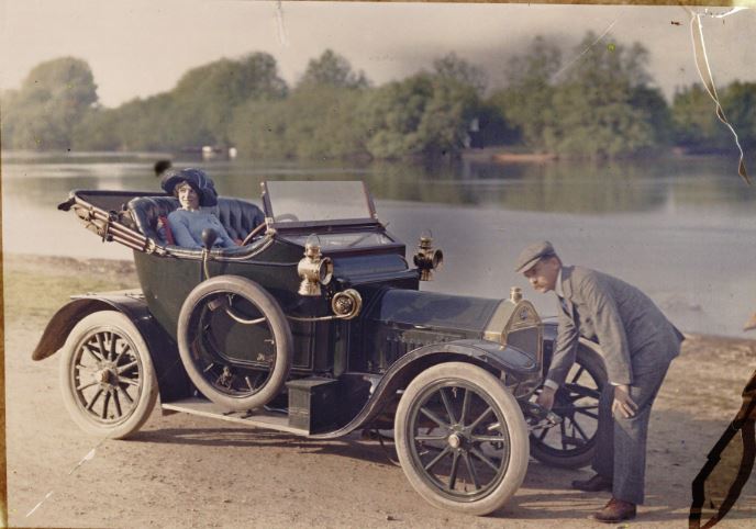
Autochrome colour photography was developed in 1903 by the Lumiere brothers in France, and involved the process of creating a filter from placing tiny starch potato grains onto a sheet of glass, and dying them red, blue and green (with black charcoal being used to fill in the gaps between the colours), before coating the entire sheet with an emulsion. The 3 primary colours, when subjected to light, would create a range of different colours which would reflect the accurate colours of a real life object. In order to counteract the blue sensitivity of the emulsion, the exposures were made using a yellow filter, giving the final image it’s distinctive slightly yellow tone.


Source: Anon, Couple with a motor car, c.1910, auto-chrome, notice the slightly yellow undertones caused by the yellow filter.

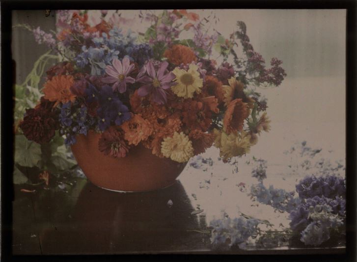
Source: Baron de Meyer, Flower study, 1908, autochrome – this image is a reflection of the type of subjects that were often used in the early days of auto-chrome photography, including fruits, flowers and vases.

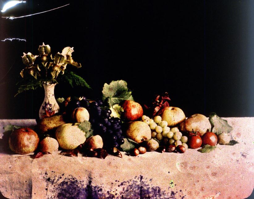
The first colour image taken in Jersey was produced by the founding father of Societe Jersiaise, Emile F. Guiton, in 1904. Guiton was an enthusiastic amateur photographer, and made use of the newly developed Autochrome technique to produce coloured images of vases, flowers and fruits.


Emile F. Guiton, early 1900’s – this auto-chrome is an experimentation by Guiton to look into the ways colour interacts within an image.

The ability for photographers to take coloured autochrome images was revolutionary, and many people commented on the depth of the images along with the vibrance of the colours. in 1908, the Photographic News was quoted as saying:

when the effect of relief is joined to a life-like presentation in colour the effect is quite startling in its reality. It is not easy to imagine what the effect of anything of this kind would have been on our ancestors and witchcraft would have been but a feeble, almost complimentary term, for anything so realistic and startling

This quote reflects the opinions of photographers towards the development of the auto-chrome, and allows for us to grasp an understanding of how revolutionary it was that photographers could now take images and photographs in colour that almost perfectly reflected real life. A huge difference from the common black and white photography.

Still-Life: Contextual Studies – Image Analysis


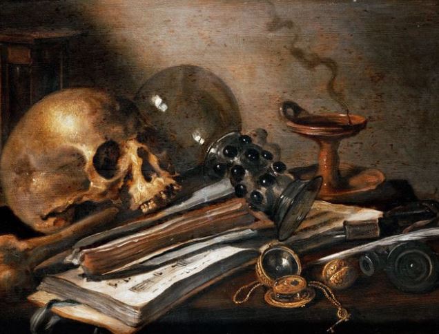
A still-life image painted by Dutch painter Harmen Steenwyck during the 17th century.

The above image is an example of the work produced by Harmen Steenwyck, a Dutch painter active during the 1600’s (the golden age for still-life artwork). Steenwyck is possibly best known for his vanitas artwork, in which he uses skulls and objects to draw attention to mortality, and the inevitability of death. In the above image, Harmen has included a skull as the main focus of the image, concluding that the above image is centered around the theme of mortality, and the fact that no-one can escape it. Harmen also includes a range of other images in this piece of work. The use of green plants (possibly derived from a fruit) is likely a reflection of life, which contrasts the skull in the foreground. The plant appears to be growing out from behind the skull, perhaps reflecting the close connection between life and death, and how one is not itself without the other. Furthermore, the inclusion of a sword is possibly a reflection of high status, as it likely belongs to a soldier or army personnel of a high status (in contrast, the sword could also be a reflection of mortality, and may represent violence and conflict). The inclusion of silverware towards the right of the image also reflects wealth, and so the positioning of all of these prized possessions (including the books and red cloth, perhaps reflecting education and a high social status) as a whole creates a sense of meaningless of these material objects, as they are placed next to the skull and therefore, in the face of death, are redundant. This meaning and imagery within Renaissance still-life artwork was common place, and the use of vanitas was extremely popular, as it opened up a conversation about controversial topics such as mortality in a much more subtle way than ever before.

Still-Life: Contextual Studies – Historical Context

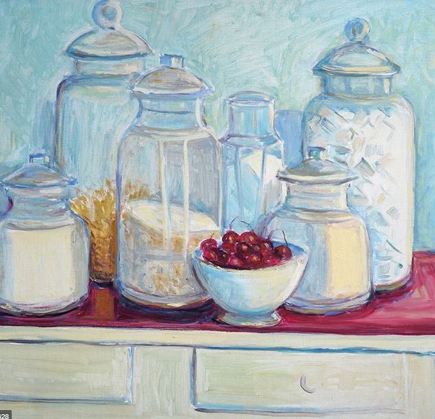
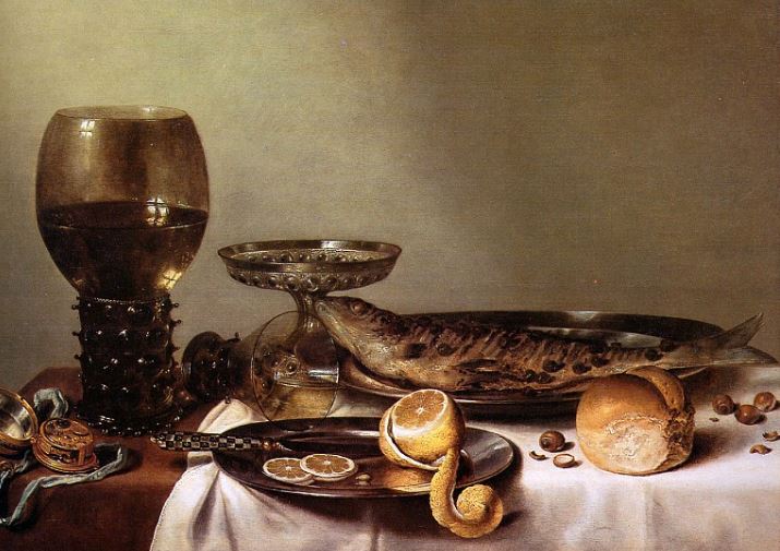
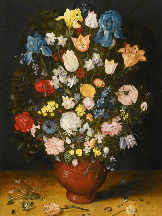
Still-life, by definition, is a work of art depicting an arrangement of objects (such as fruits or flowers), that is either painted, photographed or drawn. Still-life art-work makes use of inanimate objects, which are often easily recognizable and common (such as foods, books and plants). Still life became popular in western societies during the 16th century, and since then has remained a distinct genre of art work thanks to its malleability; as using inanimate objects makes it much easier for artists to experiment and manipulate the objects and scenery, to create the piece of art that best suits their requirements/themes. Still-life artwork often focuses on exploring the form, shape, colour, texture and composition of the objects, while often allowing the artist to include more subtle meanings and metaphors in their work. Below are some examples of still-life work, painting, drawing and photography:

The first image is an example of still-life photography
The above is an example of a still life drawing
This final image is an example of a still life painting

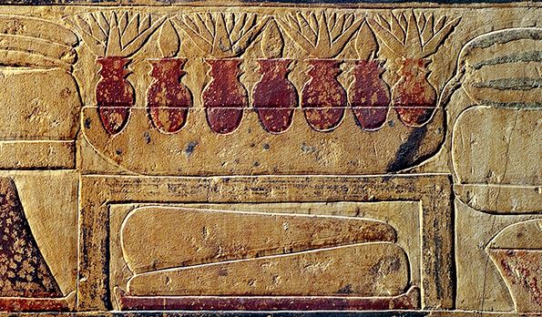
Paintings of inanimate objects have existed since ancient Egypt and Greece, with the Egyptians often placing the artwork in tombs in the hopes that the deceased would be able to use these objects in the afterlife, and Greeks depicting still-life artwork on vases. Although still-life artwork was used for many thousands of years, it was not until the Renaissance that it became its own popular genre of art.

During the Renaissance, still-life became a very popular way of depicting christian imagery and themes such as mortality, life and, more controversially, sexuality. Still-life was especially popular in 17th century art in Dutch and Northern Europe, with Dutch still-life specialists such as Willem Heda and Jan van Huysum producing work that followed the still-life genre.

Still-life artwork often challenged societies views in the sense of personal possessions and class, for example, some artwork was made with the idea that love for material objects is meaningless, and other works depicting skulls often brought to light our own mortality. An example of this can be found in Roman works, which depicted skulls and the phrase Omnia mors aequat (Death makes all equal).

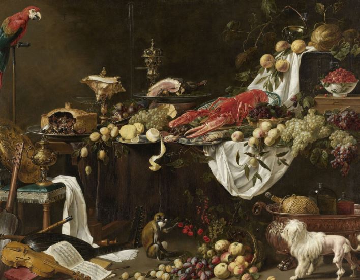
Images could be used to depict the massive wealth of a small group of individuals. The inclusion of lobster and imported foods is a reflection of trading and wealth of a nation.

Vanitas paintings (images depicting metaphors for death/illustrating it’s inevitability) also became popular during the Renaissance. At this time, it became common to include skulls, hour-glasses and dead animals in paintings in order to reflect the delicacy of life and the inevitability of death.

Photo Assignment 1: Home Sweet Home: Environmental and Candid

My first assignment was to take a range of environmental portraits that help to reflect the culture, economic and social backgrounds of the subjects in the images, and to capture a series of candid images, showing un-posed life and events occurring naturally, often without the subjects knowledge that the image is being taken in order to keep a sense of naturalism. The environmental portraits are supposed to accurately reflect the subjects in the photographs, showing aspects of their personal lives, which are normally left unseen behind closed doors. As houses and homes often reflect the beliefs, social and economic classes, and culture of the individuals who live there (through belongings, style and the people themselves), I decided to take a range of images inside the subjects own houses, as well as in places they feel comfortable, that are personal to them, I order to better reflect who they are as individual people. In contrast to this, the candid photographs are meant to reflect the raw, natural events and occurrences in the subjects lives.

The first contact sheet includes all of the images from my environmental photo-shoot:

The second contact sheet includes all of the images from my candid photo-shoot:


During the editing process, I used a selection of different editing techniques. I cropped a few of my images in order to place the subject at the centre of the image sombre attention could be drawn to them, and with most other images I altered the colour balance/saturation/contrast in order to either raise of reduce the contrast of the images.

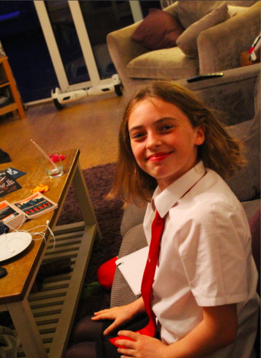
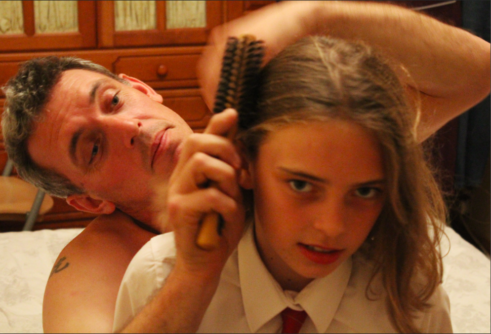
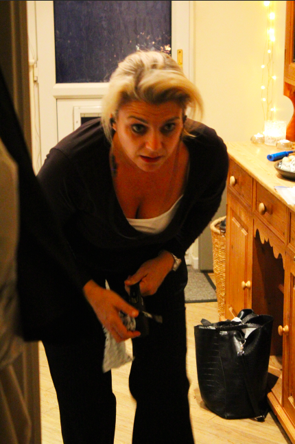
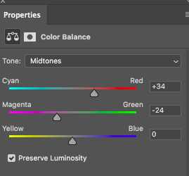
Above is a selection of some of the basic adjustments I made. I often altered the contrast of the images in order to highlight the outlines of the subject, and for a few images I altered the colour balance of the images to highest the main colour of the image (for example, emphasising the red and magenta mid-tones in the first image allowed for a highly saturated pink, which I feel produces a better example of the personality/style of the subject). Furthermore, I reduced the saturation of a number of images in order to reduce the viewers concentration on the colours, and focus more on the actions/poses of the subjects, which I feel in a number of cases is important for the reflection of the mood/meaning of the portrait.

Occupation Guests; Talk and Studio Portraiture:

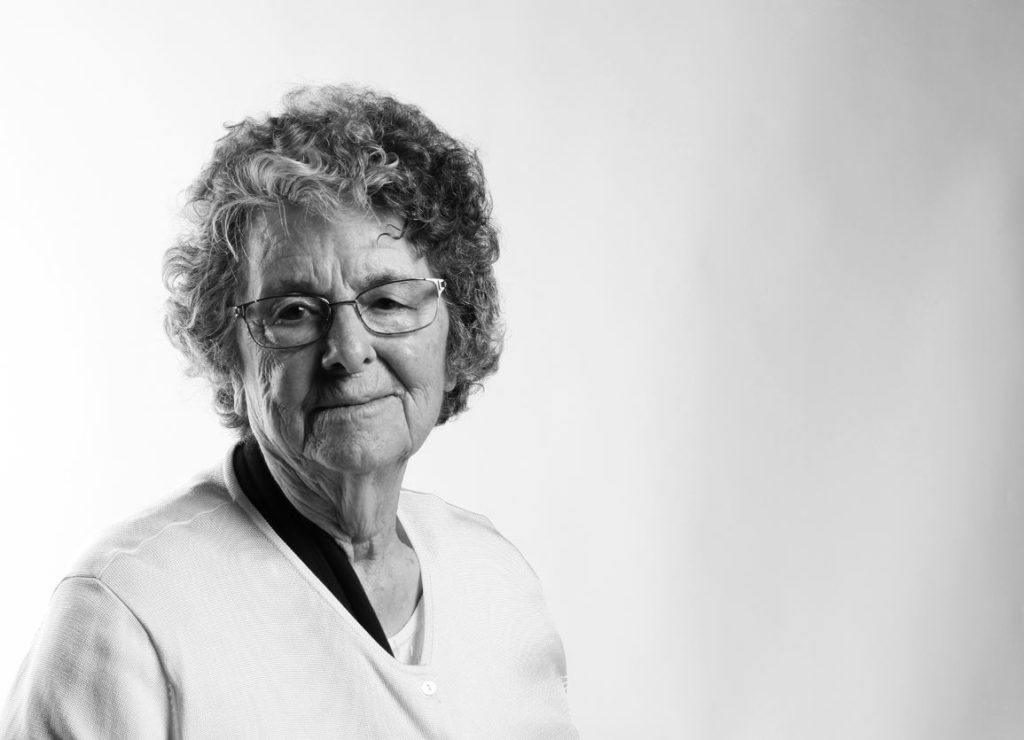
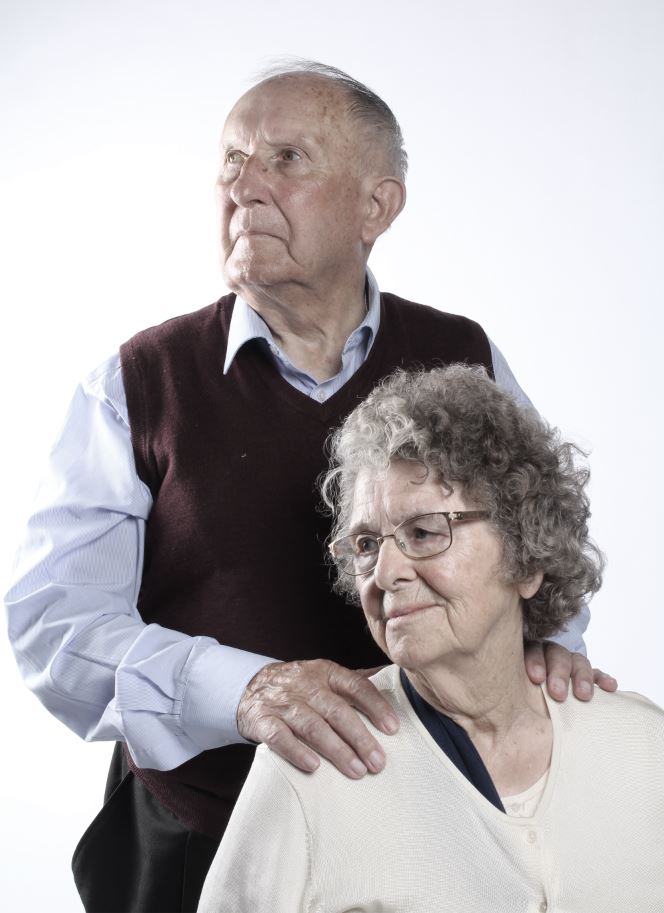
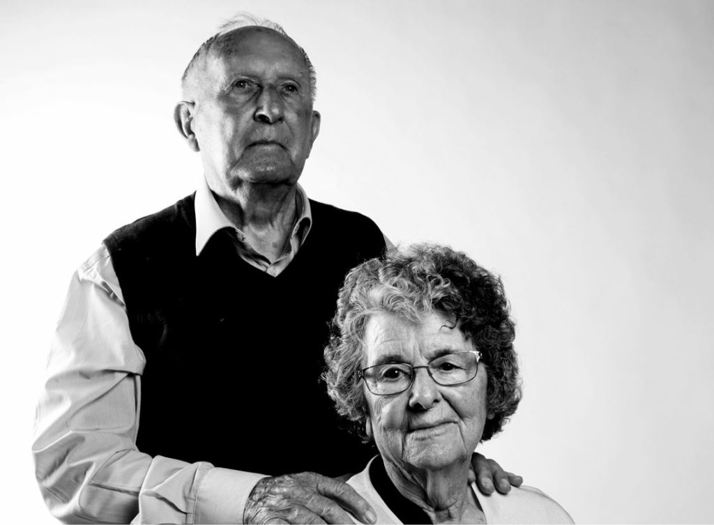
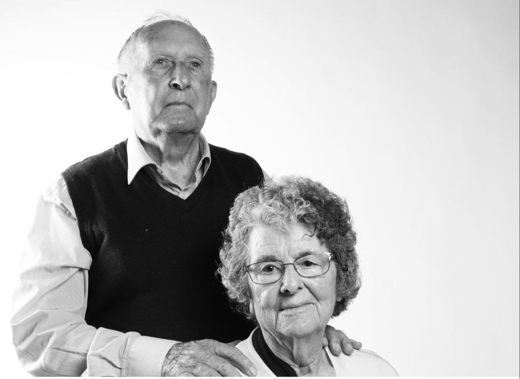
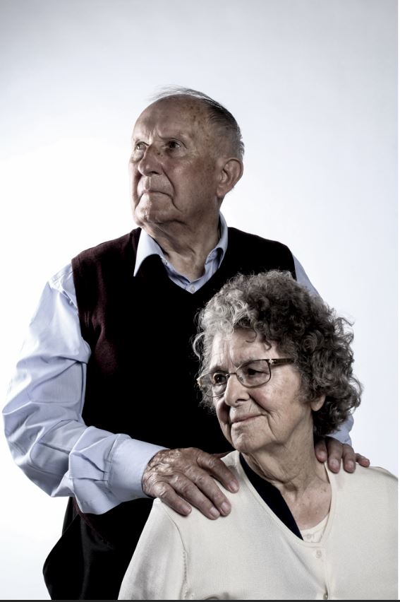
As part of out research into the Liberation and Occupation of Jersey, following the path of portraiture in order to document the lives, experiences and stories of those who experienced the liberation and occupation, we were lucky enough to be able to meet and listen to the stories of 2 individuals who experienced both the initial occupation of Jersey in 1940, and its liberation in 1945. Henley (14 at the time of the occupation) and Joan (6 at the time of the occupation) both gave detailed accounts of their experiences with life under German rule, with Henley recalling the time that, at the age of 14, he was able to render a German guard almost unconscious by continually giving him glasses of cider, and the soldier was drunk enough to not notice when the farmers had time to hide a lot of the wheat they had farmed in order to avoid having to hand it in to the Germans. In contrast, Joan was able to recall her experience with walking to school through a number of German outposts and identification points, as she passed by the fenced off and mine covered beaches. The lack of transport (confiscated by the Germans) and the censorship and limits imposed during the occupation brought the native community together, with adults crafting bicycle tyres out of hosepipe and rope, and children knitting water bottle cosys for the Red Cross. Both Joan and Henley recalled the liberation of Jersey as being a huge event, with Henley not being able to see the liberation ship for the huge crowds of people blocking his view, and Joan missing the crowds at the harbour altogether due to her inability to travel across the island from her home to town.

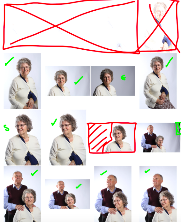
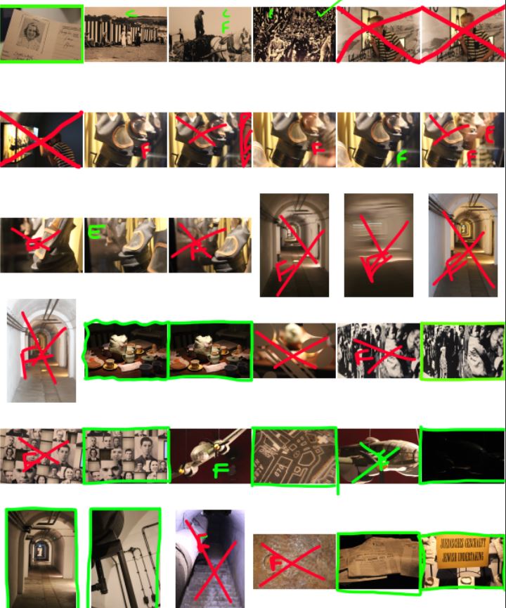
After listening to the stories of Henley and Joan, we had the chance to photograph them in the school studio. I was able to collect images of both Henley and Joan, and singular images of just Joan. In the studio I had my IOS set to 100 (as the lighting in the studio was already very bright) and my shutter speed was at F16. I also used the Daylight white balance in order to slightly correct the colour based on the studio lighting and colours. Below are the results of my photoshoot, shown in a contact sheet:

Key: GREEN “S” = Small issue with the subjects pose – GREEN TICK = candidate for final image – GREEN HASHED AREA = problem area/needs editing out of final image – RED HASHED AREA = problem area too big to edit out – RED “x” = rejected image

The first row of the contact sheet includes images that are so over-exposed that they appear as white boxes. This was my own error as I originally failed to adjust the IOS from 6400 down to 100, and so the amount of light that entered the lens was way too much to produce a clear image. I adjusted this afterwards and the rest of my images are shot at the right IOS.

After taking the images in the studio and using the contact sheet in Photoshop to nail down my selection to my final choices, I moved the final images onto the editing stage. The following are the results of the images I edited:

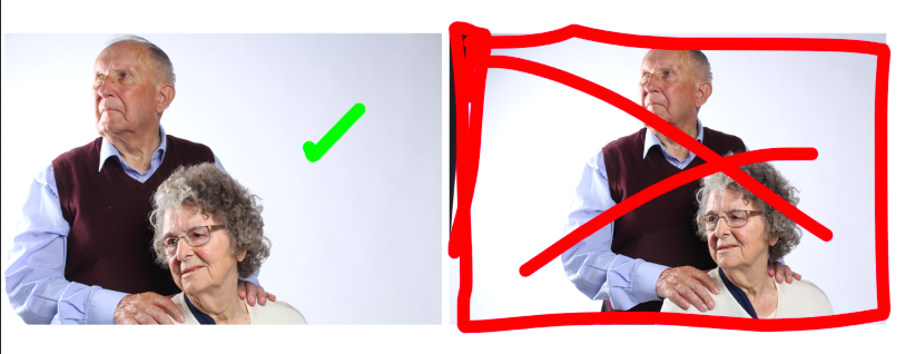
I was able to use Photoshop to adjust the contrast and colors of most of these images, in order to make the initial edits. I then moved the images to Light-room to further make use of the tools available on that software. In Light-room I especially focused on the last image, as I was able to edit the image to draw up the contrast in order to give it a more bold look. Below is the before and after Light-room edit:

The image on the right was the original from the Photoshop edit, which I found to be too over-exposed (especially around Henley’s right-hand shoulder). I used Light-room to adjust the contrast and more specific colour settings (highlights, shadows, blacks, whites and clarity). I feel like the final product (left) looks much more bold and eye drawing than the original on the right.

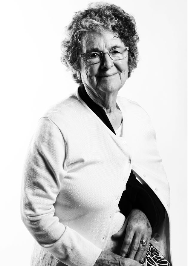
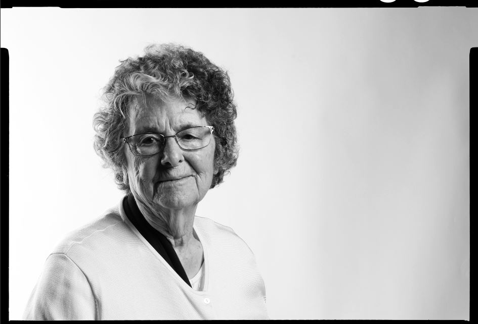
For some of the images, I adjusted the colour settings so that they were in black and white. I did this in order to make a link to the imagery of the occupation and liberation of Jersey, which was all taken in black and white as colour photography only became common for the average person in the 1960’s. I feel like black and white images also allow for the details in the textures and shapes of the images to be better emphasized, and it allows for certain aspects of the image (such as eyes and clothing) to present as more eye-catching, and can between hold the attention of the viewer. Below is an example of an image I edited into black and white for these reasons:

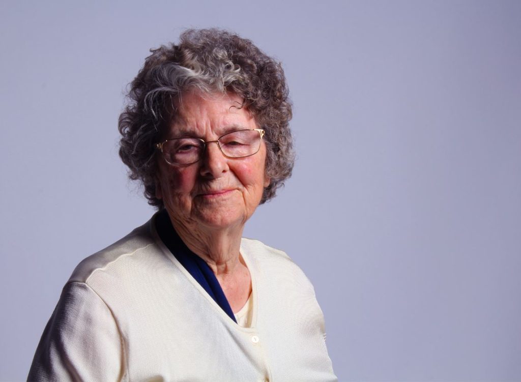
Furthermore, on some images I made the decision to simply lower the saturation of the images in order to dull down the colours of the image, giving the final image a more somber and dulled image. I made this decision as I feel that it accurately reflects the atmosphere and feelings surrounding the occupation of Jersey, as the overall atmosphere at the time (and the feeling that came with many of the stories given by Joan and Henley) was solemn and very close to being hopeless. I therefore tried to reflect this through the colour of some of my images, which are dulled and almost drained completely of colour. An example of one of these images can be seen below:

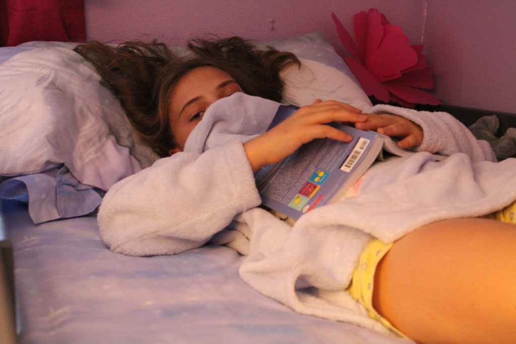
For the final image, I made the decision to raise the saturation and contrast, and made some colour adjustments in Photoshop that involved heightening the colour balance so that it fell more towards a lilac/subtly feminine colour (especially in the background). I did this in order to highlight that through the occupation, many individuals were still able to keep hope, and regardless of the solemn circumstances, many individuals were able to find pleasure in small things (such as dances and cycling). The editing of the colour in this image is a reflection of the subject being able to maintain her femininity and hope for a better future, even through the difficult times of the occupation:

After the initial editing of colour and saturation, I began to experiment with some of the images, using things such as boarders, adding in other images to the initial image in the form of collaging, and experimenting with different techniques in order to enhance the image further.

In the above image, I used the spot removal tool in Light-room to remove some of the light colored fluff that was on Henley’s jumper, which distracted from the image itself.

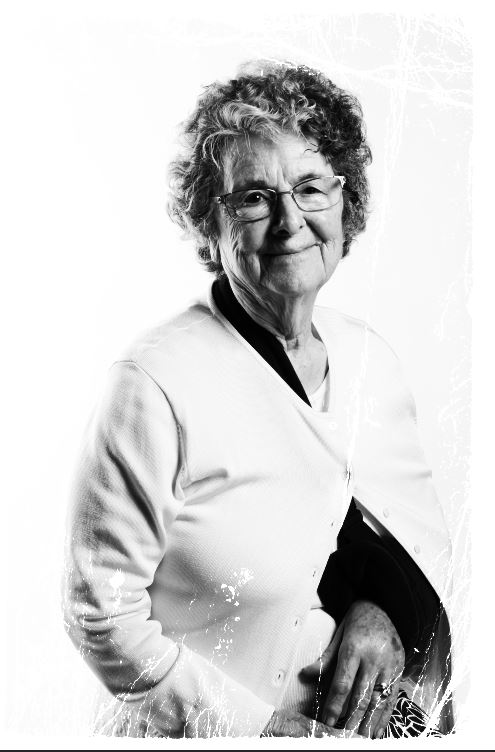
The above 2 images of Joan have been edited to produce a different framed effect on each of them. I experimented with this in order to see if the frames make the image seem more eye-catching.

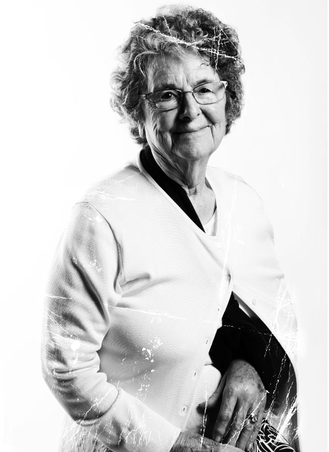
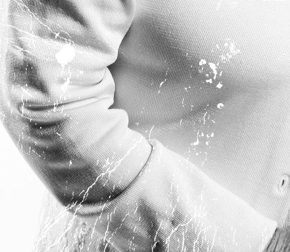
I further experimented with the above image, using the same template for the frame as I used in the original, but this time cutting and stretching the damaged effect of the frame more over the subject, allowing the contrast between her darker shape/outline and the white damaged effect to become more clear. Below is the process I used to do this:

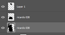
I selected the colour dodge option on the layer that the frame was on. In doing so I only kept the white damaged effect, removing the black background so the subject could be seen through it.

I then copied and pasted the frame onto multiple layers, and used the lasso tool to cut the frame so that I could fit it into the correct areas of the subject so that the damaged effect covered the darker areas.

The final effect was the damaged effect that can be found more clearly in the image above. I decided to do this because the effect that the frame gives the image reflects the same kind of damage that happens to old, archival images. Therefore here, I am referencing the past/youth of June, and contrasting it with the present, using the style of the image to reflect past trauma (through “damaging” the image) while the subject can still be seen smiling as her current self, a survivor.

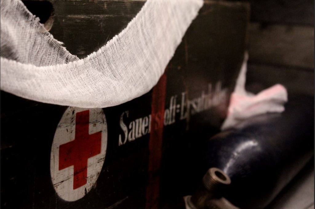
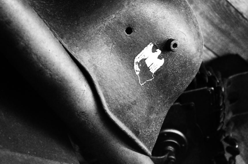
The War Tunnels:

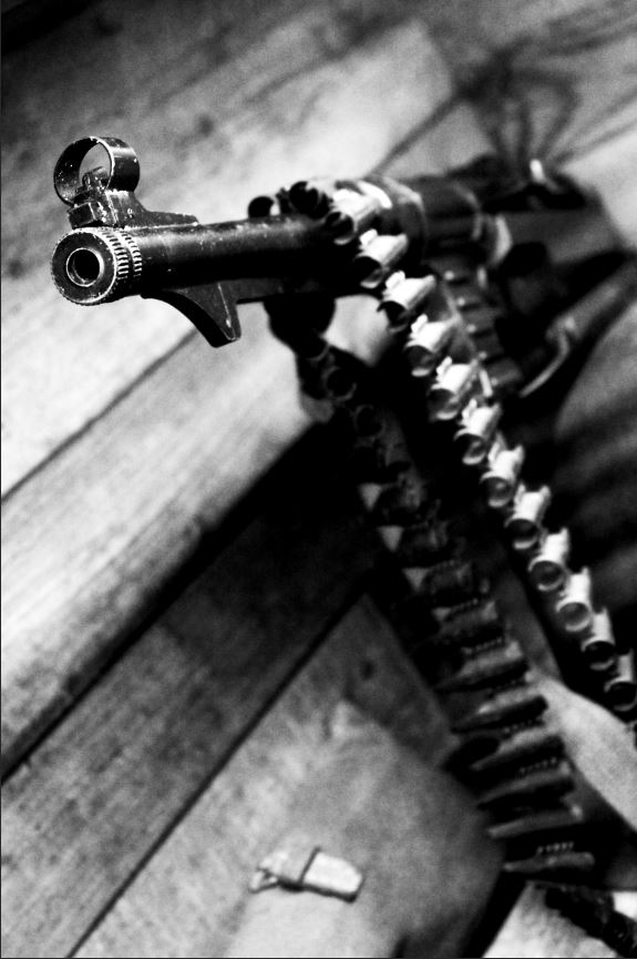
I decided on my final images, and the below images are the final images after editing in Photoshop:


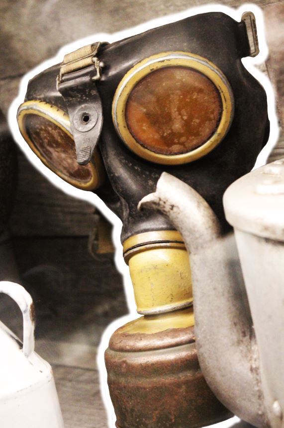
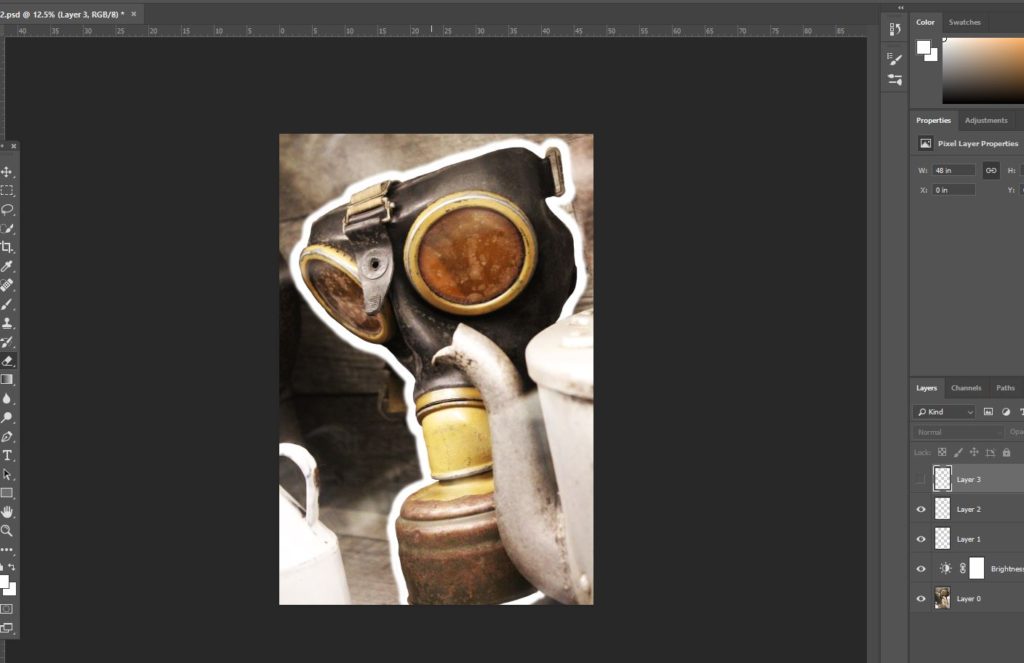
In Photo-shop, I was able to use the following techniques to produce the final images:

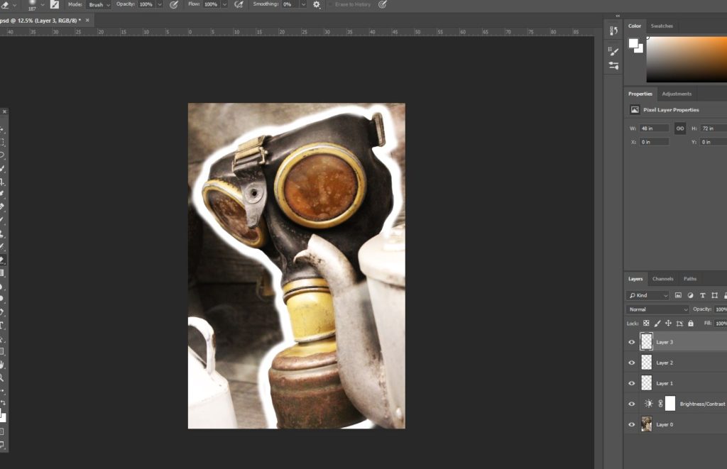
In the above 2 images, I was experimenting with the width of the boarder around the gas mask, and to do so, I used the brush tool to draw outlines of different widths. I also experimented with the softness of the outline, originally working with a hard line, and then moving towards a softer outline version. In this image, I was attempting to make a distinction between the background and the gas mask. The concept of this image was to show how, during the war, conflict and violence became a common part of life, and to do this, I made a distinction between the gas mask, and the teacups and kitchenware placed directly next to it. By arranging the gas mask and familiar kitchen ware together, it can be established that fear of an enemy gas attack lay around every corner, and nowhere (not even the safety of home) was safe from the threat of violence. This image merges the two opposites together (fear and safety), and in editing an outline around the gas mask, it draws more attention directly to the mask itself, and also disconnects the mask from the rest of the image. In doing so I am able to make some distinction between the kitchen ware and gas mask, hopefully drawing more attention to the fact that these 2 things should not be seen as normal together, and yet also presenting the fact that in reality, they were.
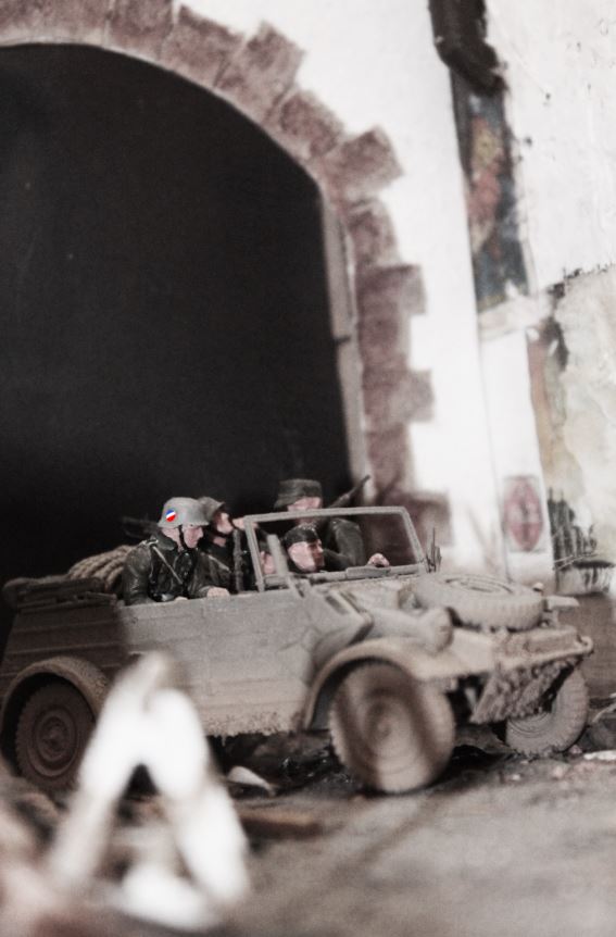
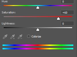
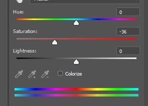
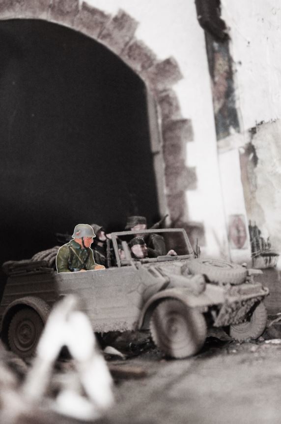
The 2 images above are examples of the colour editing I worked on in the below image. I used two different layers when it came to editing this image, the first image including the background, and the second layer including the soldier in the foreground. I reduced the saturation of the background in order to give it a more somber tone, reflective of the reality of conflict and war, and in order to contrast this, used the layer on which the soldier sat to heighten the saturation, showing contrast between the background and the individual soldier in the foreground. As a concept, I did this because I was attempting to reflect the reality that all soldiers during the occupation were individual people too, with hopes and fears, many of which did not want to leave their families in Europe to come and occupy Jersey. I chose a single soldier and made him easily distinguishable from the rest, regardless of his own insignificance in terms of the whole image, because I wanted to convey the idea that all individuals, German and Jersey, were people that were individually affected by the impact of the war/occupation, and should not all be grouped together as “enemy” or “friend”.
German Registration Cards:

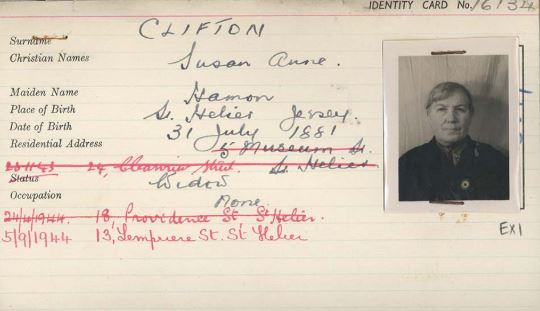
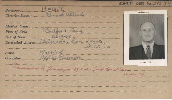
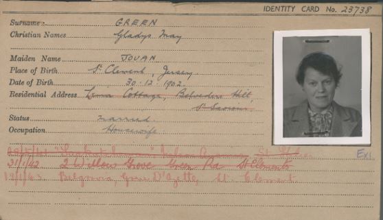
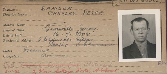
In December 1940, the Germans who occupied Jersey the summer before released a decree that ordered ever person over the age of 14 to register under the Registration and Identification of Persons (Jersey) Order, 1940. This resulted in all inhabitants of the island over the age of 14 being issued with a registration card, which included photograph of the owner, their address, name and other personal details. Children under the age of 14 were recorded on the back of their fathers card. The purpose of the cards was to provide clear identification of an individual if they were stopped by a German official, gave occupiers a rounded consensus of Jerseys population, and assisted in identifying and deporting certain individuals based on their nationality. Below is a selection of some of the registration cards given to people living on Jersey during the occupation:

The stories of the people who owned the above registration cards can be found in the Jersey War Tunnels, where some of their stories have been documented, and photocopies of the registration cards are available to look at and keep. Their stories reflect only a handful of the stories available from the German occupation, all of which tell a different tale of the struggles the people of Jersey endured under the strict rules and regulation of the Germans during the occupation.