All posts by Emily C

Filters

Author:
Category:

Exhibition: Invisible Hands

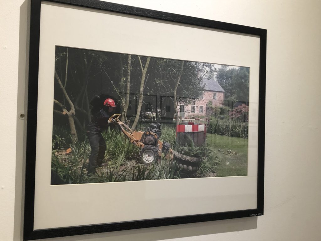
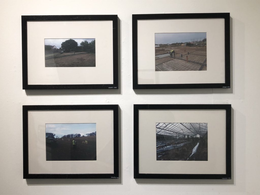
In order to gain inspiration for out Personal Study, I attended an exhibition at the local Art Centre in which the project “Invisible Hands” was presented. A collaboration project between artist Alicja Rogalska and The Morning Boat artist labarotory, “Invisible Hands” is a project meant to draw attention to the individual lives and influence that the immigrant labour workers of Jersey have on the islands food production, while at the same time showing how little these workers are given in terms of pay, housing, and representation.
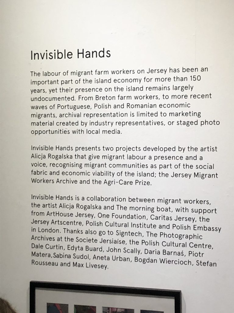
The project itself was original with it’s execution, with the artist using the personal photographs of the workers themselves, showing the lives of the workers from their own perspectives and viewpoints. This produced an interesting range of final images, showing the intimacy and relationships between workers, rather than just documenting the end results of their work (as is done by many photographers who only document fields, food produce and the workers while they work the fields). Overall, the project was meant to show the personal, intimate, human side of the lives of the labour workers in jersey; an aspect that is often ignored by those who document food (specifically potato) production in Jersey.

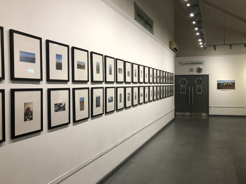
The above images are examples of the work displayed in the exhibition. All photographs were collated from labour workers mobile phones, and are examples of their own perspectives of their own lives/working days. A selection of the workers images were framed by artist Alicja Rogalska and a representative from The Morning Boat, Casper. The exhibition itself was displayed in such a way as to tell the story visually and through text, with the images displayed next to sections of text explaining the story of Jersey’s labour workers, and the way in which many have been exploited by farmers, forced to deal with low wages and long hours.

Many of the images were framed and arranged, but some of them were printed on larger paper and displayed around the room frameless.
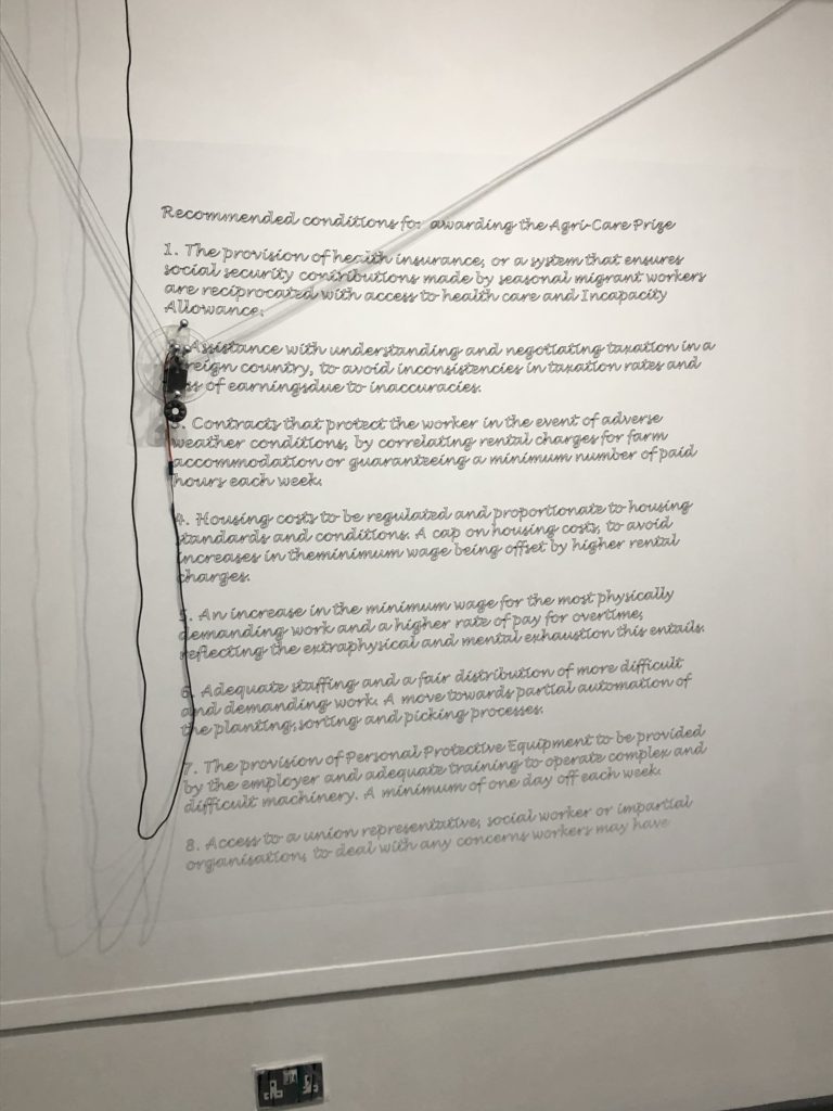
The most eye-catching aspect of the exhibition was the robot on the back wall that had been programmed and designed to write out the recommended conditions provided by the labour workers, when asked what they think should change about the conditions of their work. The robot (moved by a motor, weights and string) wrote out a list of 8 of the conditions thought up by the workers, which included a pay raise and an increase in the amount of personal protection equipment. The concept of programming a computer to write out these recommendations, is metaphorical for the increase in technology and machinery in farming, which can both help to relieve the workload of labourers, while also providing the possibility that, in the future, human labour may be replaced by machinery and technology.

Overall, the exhibition allowed me to gain an insight into the use of candid photography, and the way in which political and social issues can be reflected through visual imagery (photography). Seeing these real life examples of photography where candid photography taken by the community is collaborated to produce a response to a prevalent issue in society, has allowed me to gain inspiration for the way in which context and concepts can be incorporated into imagery, and the way in which collaboration between different mediums (video, machinery and photography) can be used to portray an in-depth, detailed source of information to teach people about important social and political problems that often go un noticed.

Contextual Studies: Conversations on Photography: Jeff Wall

Canadian photographer Jeff Wall focuses much of his work around conceptual photography, and in doing so focuses largely on the metaphorical symbolism that can be found in photographs. Wall’s work is often brightly lit, and makes use of bold colouring, and often his work can fall into the category of tableaux, with each piece of work referencing a concept or idea that Wall witnessed in his own life. His work has been described as tackling the subject of “overt social tension and unease”, therefore emphasising the strong conceptual meaning behind many of his images. Wall’s work, at a first glance, resembles street photography, with his subjects often looking to be involved in an action, with some images seemingly taken covertly and without the subjects knowledge. However, Wall actually takes great care in staging his images, and makes sure to capture what looks to be a natural scene, while making sure to incorporate the meaning and concept behind his image.

Picture For Women: Jeff Wall (1979)

The above image is a well known example of Wall’s work. It depicts a reflection of the scene itself, with the subject, the woman, towards the left side of the image, looking at the viewer, and with Wall himself, seen to the right of the image, posed with the shutter-release cable of his camera in his hand. In the way that Wall has placed himself in his own image, he is directly placing the usually unseen face of the photographer/artist/creator in the forefront of the image, forcing the viewer to take into account the contributions and work of the photographer themselves, while allowing the viewer to associate this hard work on behalf of the photographer with the beauty and professionalism of the final product (reflected through the focused professional lighting of the female subject, in contrast with the shaded appearance of Wall). In this image, Wall is directly challenging the belief that the only subject to be witnessed in an image is the subject themselves, and is instead emphasising the role of the photographer and scenery in the creation of an image. Wall therefore focuses on the background behind the image, and emphasizes that “[Wall is] looking for ways of showing, ways of creating an appearance of something, whether its a scene of tension or of something else”. Here, Wall is emphasizing the importance of the experience and meaning of the image, and therefore the inclusion of his own figure in the image helps to emphasize the background and context of the work itself.

Overpass, 2001, Jeff Wall
Approach, 2014, Jeff Wall

The concept behind “Picture For Women” is to challenge the controversial debate of the “male gaze” in artwork; a term used to describe the way in which women in art are portrayed by men as objects, and are included in images in order to please the male viewer. In this image, Wall has taken inspiration from Édouard Manets “A Bar at the Folies-Bergère“, which depicts a bar maid looking directly at the viewer, with a male bartender gazing at her in the background. This image represents an example in which the “male gaze” is portrayed in art and culture, and therefore Wall created his final image in order to draw the viewers attention to the historical context o the “male gaze” in media and artwork, and therefore allows the viewer to question the modern implications that this way of displaying women in images has in current media and artwork. In this image specifically, Wall is able to portray his theme of causing an “Overt social tension of unease” in his imagery, by making the “male gaze” the main subject of the image, and drawing attention to it’s controversial historical context.

Through using this specific camera angle and placement of subjects, Wall allows for the viewer to witness the male gaze first hand, as they are present for the male subject viewing the female subject s her back is turned, and at the same time incorporates the viewer into the image itself, by placing the camera in the forefront of the image, allowing the for viewer to feel as if they are participating in the act of watching the women, just like Wall is in the background. This concept highlights the importance of understanding the historical context and modern implications of the “male gaze” in artwork throughout history. The decision to create this image specifically as a tableaux has made use of a studio setting, which is used to control all, variables and factors of the image, while still allowing it to seem natural. Wall himself believes that a studio “…space presents a constant set of possibilities that don’t rely on some occurrence in an unpredictable world of occurrences”, therefore allowing him to control and manipulate all aspects of the image without the possibility of unpredictable occurrences.

Listener, 2015, Jeff Wall

Photographer Research: Phoebe Jane Barrett

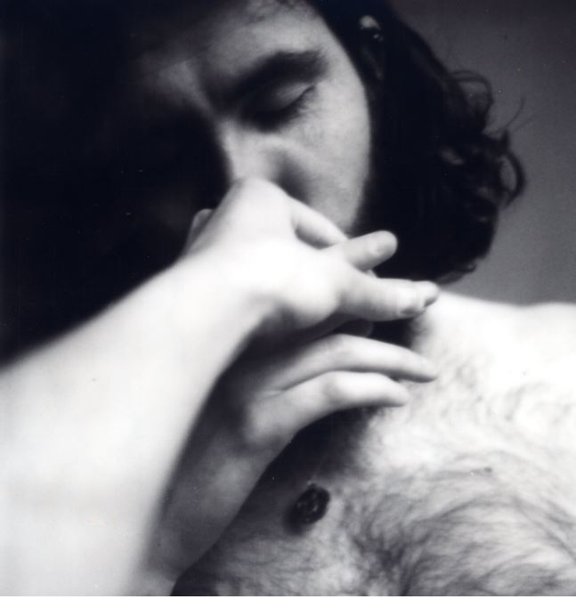
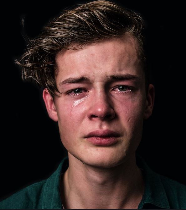
English photographer Phoebe Jane Barrett focuses on showing the power of human connection and compassion in her photography, and much of her work powerfully portrays the importance of relationships and emotion. In one of Barrett’s projects, she focused on reestablishing the definition of masculinity, and showing the fragility and vulnerability that many men feel, but are forced to hide behind societies definition of masculinity. Phoebes opinions on masculinity contrasts societies more stereotypical beliefs, believing that “The stereotypes around masculinity are damaging to men, women, and society as a whole”. This quote encapsulates Barrett’s belief on the toxicity of stereotypical masculinity towards both men and women, and the way that it negatively impacts society from multiple different angles.

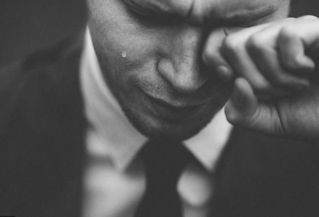
Phoebe uses a range of male subjects in her work, and places them in what may be classed as more vulnerable and stereotypically “feminine” positions and environments in order to challenge the public’s perception of what masculinity is. These subjects are all men, and yet the way they are displayed and positioned in the images brings a sense of vulnerability and delicacy to the images.

Barrett brings the concept of mental health into her work, and allows for her photography to act as a method of rebellion against firm and outdated social constructs that focus on the unemotional, strong attributes of a man, and ignore the mental health problems that can develop as a result of repressed emotion and an inability to vent frustration and emotional pain without being judged and stereotyped. Barrett makes reference to the disturbingly high suicide rates of men around the world, and focuses on the importance of developing an environment for men to voice their problems and express their vulnerability, without being labelled “weak” or “feminine”.
 Barrett also makes reference to facts and statistics in the context of her work, drawing the concepts and contexts of her imagery into reality, as they are backed up with solid, disturbing fact. Barrett draws attention to the fact that, “Men who have this rigid, fixed idea of what a man is supposed to be are more likely to be depressed and emotionally repressed, suicide rates are higher for men. I think that’s why it’s important to redefine masculinity, so that we can have a healthier notion of what being a man is. Redefine it to include more empathy and compassion, and enable men to be more open emotionally.” Here, Barrett refers to the consequences of societies strict ideals of masculinity, and acknowledges that these ideals severely damage many men and their ability to express genuine emotions.

Personal Study: Planning

After making my statement of intent, I went on to further develop the plan for my personal study, forming ideas and taking inspiration from other works that I will likely take inspiration from:

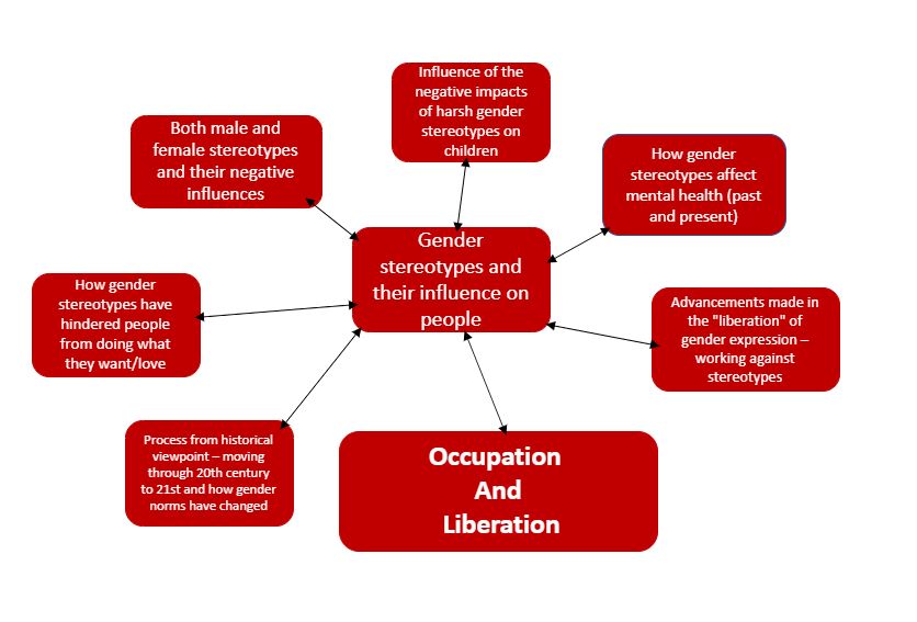
Above is a Mind map that I produced showing how I interpret the theme of Occupation and Liberation now, incorporating my own concept into the meaning.

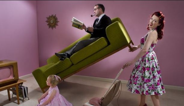
I created a mind map in order to arrange my ideas, and in doing so developed some ideas for a photo-shoot that I could use to begin the process of creating images around the concept of the historical context of gender roles, and the way they have changed and developed over time. I want to be able to show a contrast between “now” and “then”, incorporating aspects of different periods in time such as clothing styles and typical gendered-jobs into each image.

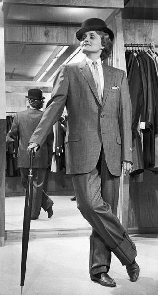
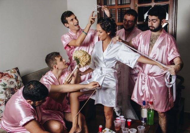
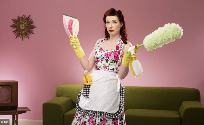
I then created a mood board, incorporating inspiration from different images and concepts to do with identifying and breaking gender stereotypes, with some of the images showing the vulnerability of men, and others showing stereotypes being both broken and adhered to.

Personal Study: Statement of Intent

I have decided that my personal study, based around the overall theme of Occupation and Liberation, will be based on the liberation and suppression (occupation) of gender expression, and the negative influences that stereotypes and suppressing ones true identity (likes and dislikes) can have on an individual. I will focus my work around the theme of breaking gender stereotypes, and the backlash that people often face from doing so, as well as the liberation they can feel when supported and understood. Here, I have interpreted the theme of Liberation and Occupation in my own personal way, as I along with a number of people that I know and live around, regardless of gender, face discrimination and retaliation from breaking the classic masculine-male, feminine-female stereotypes. I want to be able to interpret this theme in order to show the progress of how atypical expression has become more accepted as history has progressed, while at the same time showing the problems that still occur today, such as bullying and the mental health issues that can result from oppression and having to disguise and hide ones real identity.
Above is a Mind map that I produced showing how I interpret the theme of Occupation and Liberation now, incorporating my own concept into the meaning.

I created a mind map in order to arrange my ideas, and in doing so developed some ideas for a photoshoot that I could use to begin the process of creating images around the concept of the historical context of gender roles, and the way they have changed and developed over time. I want to be able to show a contrast between “now” and “then”, incorporating aspects of different periods in time such as clothing styles and typical gendered-jobs into each image.

Reviewing and Reflecting

During my personal investigation based on Occupation and Liberation, I was able to learn a range of invaluable skills that I can transfer onto further projects and my own Personal Study. During the course of this investigation, I was able to develop my understanding of how the concepts and historical background behind images can help to develop a narrative/sequence, and how the process of editing can help to build bridges between the historical context of an image, and how it is relevant and applicable to modern ideas and concepts.

As my Personal Investigation was mainly based on the Occupation and Liberation of Jersey during WWII, I have decided to extend the theme of Occupation and Liberation to a concept that I can more personally relate to (as I have no family left who can recount the war, nor do I have any historical tie to the island itself). I have decided to extend the theme of Occupation and Liberation, and develop it into an investigation into the influence that gender norms and stigma can have/have had on different generations, and the concept of how “liberating” individuals (allowing them to express themselves freely without the weight of gender norms) is, although making progress, still a taboo topic that carries its own stereotypes.

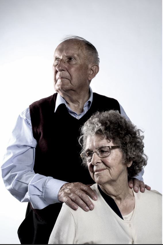
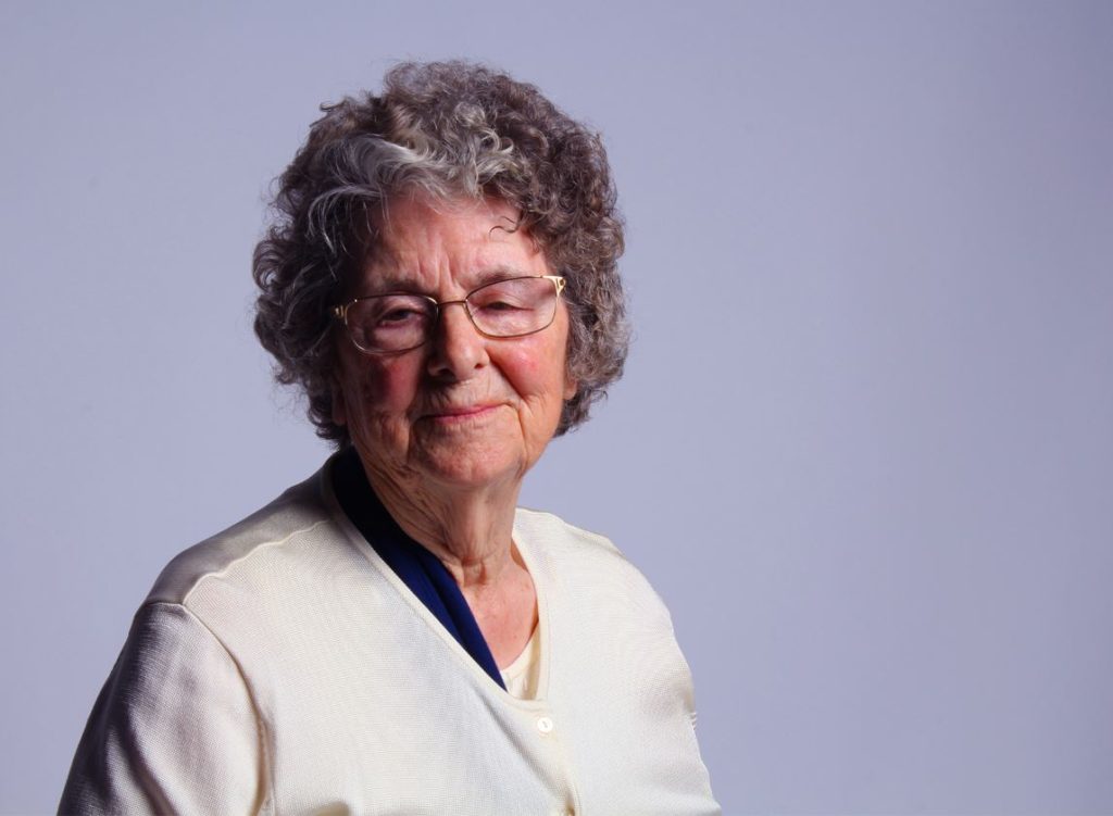
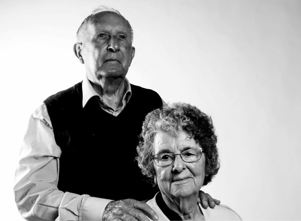
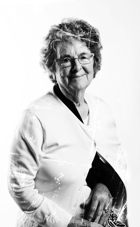
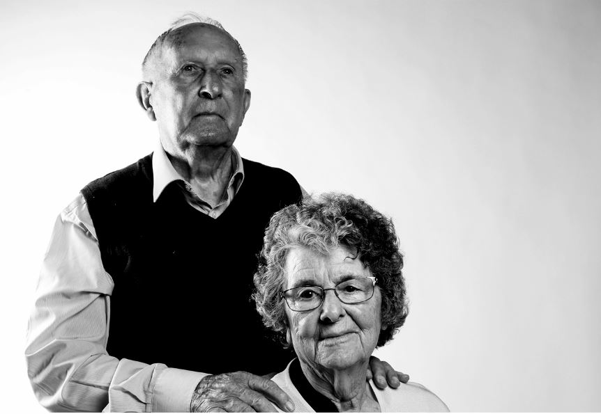
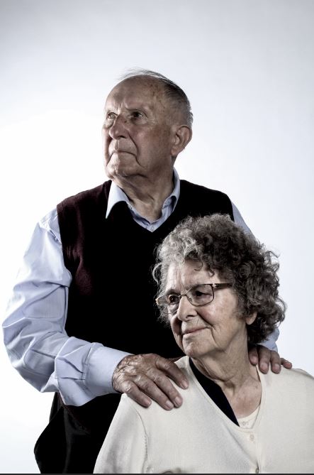
During my investigation into the Occupation and Liberation of Jersey, I was inspired by a range of themes, photographic skills and artists that helped to better shape my understanding of developing a project around a certain theme, and keeping in mind a narrative that can be applied to the final layout of images. During this project, I had the opportunity to photograph archival objects from the Occupation, individuals who lived through the occupation, and a range of settings from bunkers and Jersey’s War Museum. Studying a range of artists such as Rafal Milach and Klaus Pichler gave me a broad understanding of the different methods of developing images, and the different subjects that can be used. Milach allowed me to develop my photo-montage skills (an expression of art that I really enjoy), and Pichler allowed me to gain a deeper understanding of the ways in which concepts and the historical context of an image can be shown clearly through the use of photography. I feel that the portrait approach towards our project (in which I was able to photograph Joan and Henley (survivors of the occupation)) inspired me the most, as I feel that being able to learn and understand their stories, before having the chance to photograph them in a very personal, up close manner, allowed me to develop a deeper link between myself, the subject and the photograph.

I also enjoyed object photography, in which I had full control over the objects in the image and was able to create images using layouts of objects that I felt best reflected a certain concept/showed the best shapes, angles and contrasts. I feel like the portrait aspect of my Personal Investigation, along with the camera skills I gained (using a tripod, using different lighting and taking images effectively inside and outside of studio settings) will help me to begin a successful Personal Study, in which I wish to focus on people and objects to fully highlight the concept of gender within the theme of occupation and liberation.

Below are some examples whereby I have developed skills and used them to take and edit images:

Above are examples where I have created photo-montages, allowing me to develop my editing skills and narrative skills, as I had to find ways to lace images and concepts together to create a narrative for the image itself.

In the above images, I have developed my portrait taking skills (a skill that I will use in my Personal Study) – I have been able to develop my understanding of how a studio setting (lighting, angles etc) effects the final outcome of an image, and I was able to gain confidence in my ability to make decisions about the poses and positions of subjects within the frame of the image to better draw attention to certain features.

In a practical aspect, I developed my understanding of different software such as Photoshop, and was introduced to and developed my skills in Light-room. I also developed my ability to form narrative and sequencing after developing my second zine, in which I more carefully selected the sequence of images and narrative.

Still Life: Studio Layout

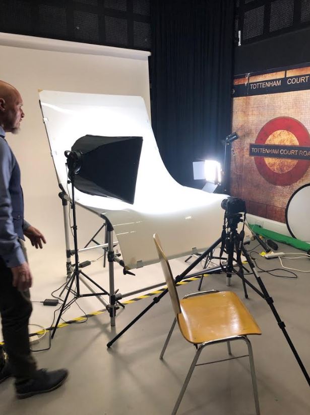
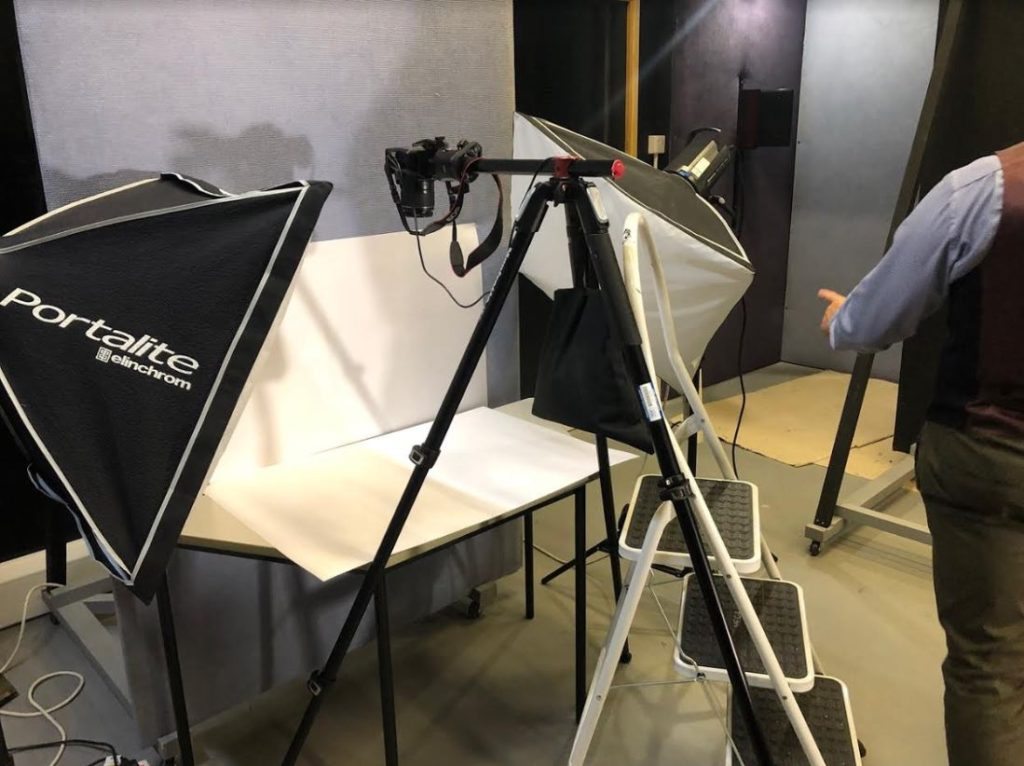
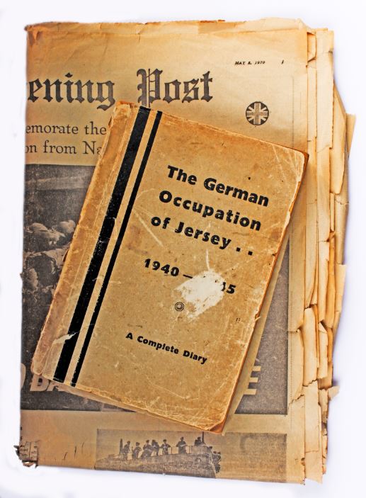
Before going into the studio to take photographs of still-life objects that originated during Jersey’s Occupation, we were first given an explanation of how the lights, set and studio itself was to be laid out, along with the camera settings we would need to use to compliment the lighting.

Firstly, we documented the layout of the set, which consisted of a curved white sheet of reflective plastic propped up by a frame. The sheet was curved in order to blur any possible corners so that the background looked like a single toned white background, therefore making sure not to divert any attention away from the subjects, and to make sure there was no cut/line in the background.

3 lights were used to light the subject in the centre; a filler light, a key light, and a back light. The key light was the most important light, as it highlighted the form and dimension of the subject, and provided a basis for all other lights to be added on afterwards. The filler light was used to reduce the sharp shadows created by the key light, and therefore reducing the harsh contrast and making the subject seem more realistically lit. Finally, a back light was used to slightly highlight the subject from behind to allow for an increase in depth in the image.

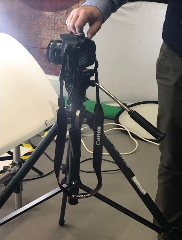
The camera was set up on a tripod to ensure that I did not create a blurred effect on the image due to camera shake, and a remote switch was plugged into the camera in order to take the photo while not having to touch the camera itself (meaning the camera remained as still as possible).

The camera settings were altered to give the best possible outcome of the image. The camera was set to manual (to allow for manual adjustments of zoom and focus) and the white-balance was set to Daylight, in order to compliment the blue-light setting of the filler light. The IOS was set to 100 due to the light intensity of the studio, and the shutter-speed was set to 1/4th of a second (although after a number of attempts, this was altered to 1/2, 1/8 and 1 in order to see the difference in the images). Finally, the aperture was set to F16, in order to slightly reduce the amount of light coming into the lens (due to the intensity of the light in the studio itself),and the shutter-speed was set to 0.5/0.8 (depending on the reflection of the objects).

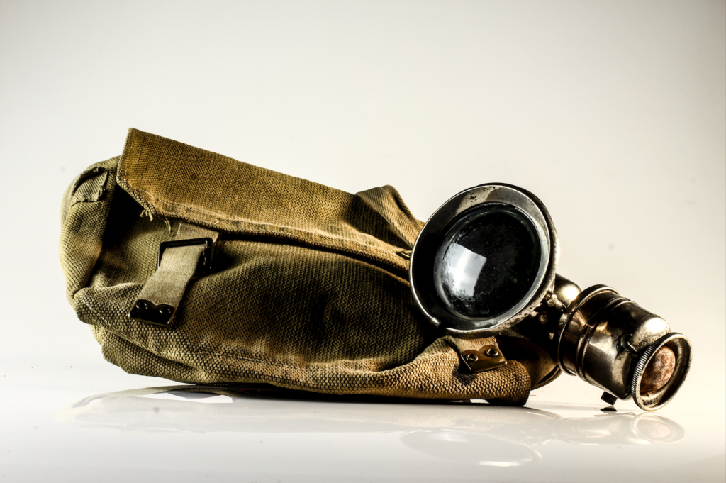
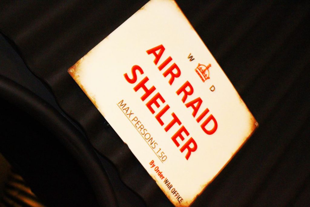
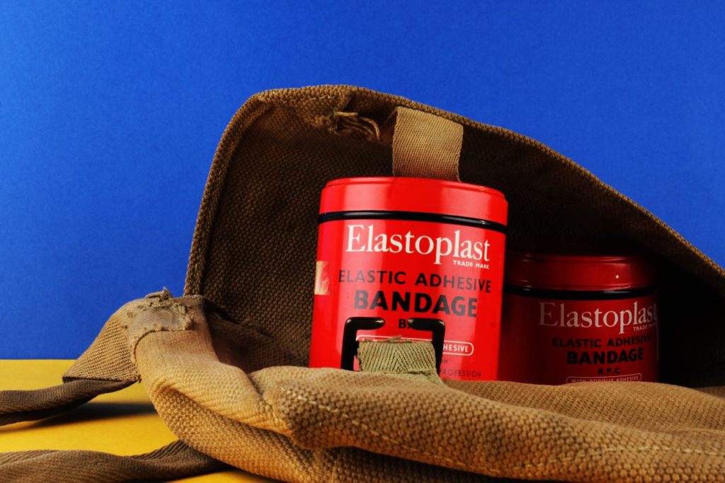
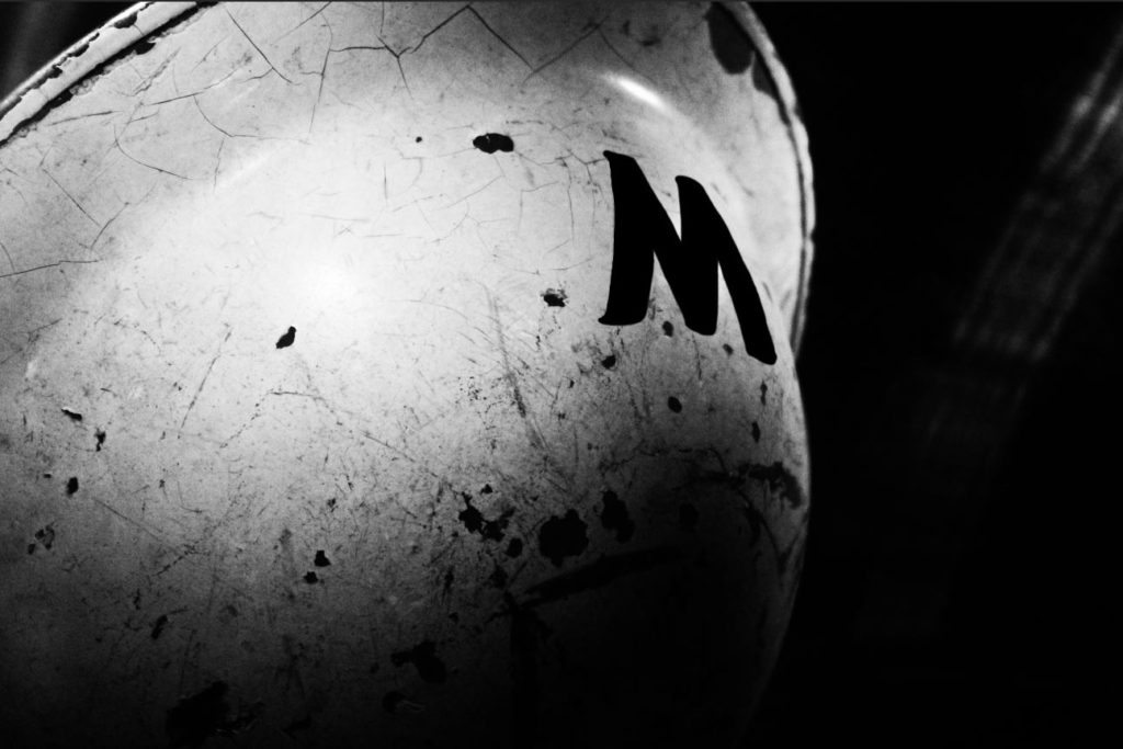
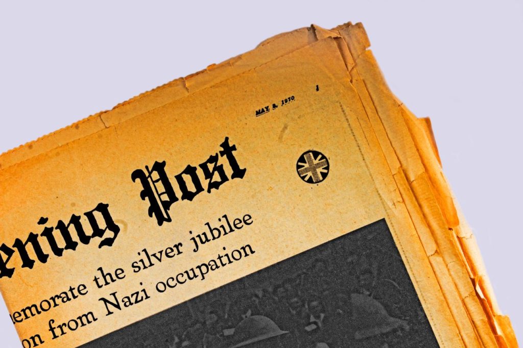
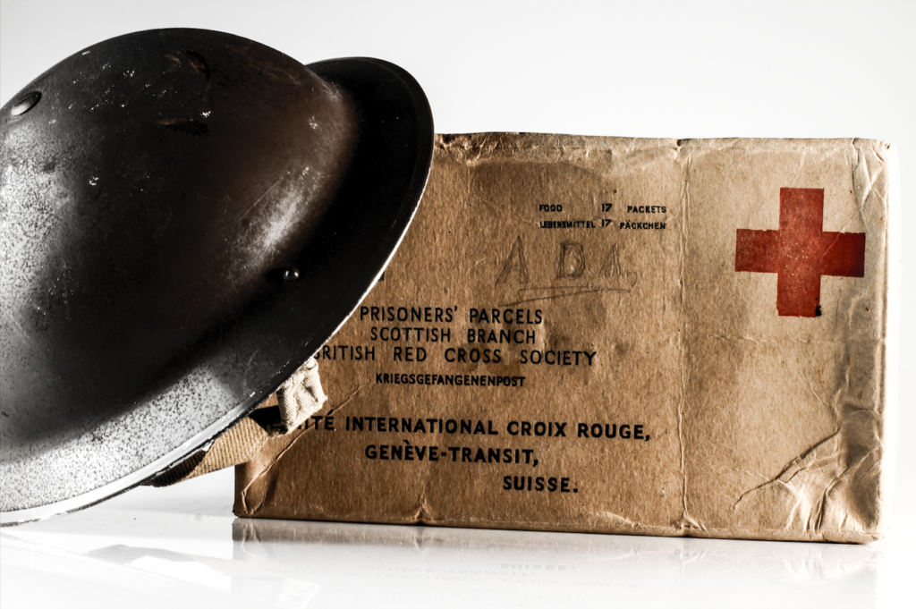
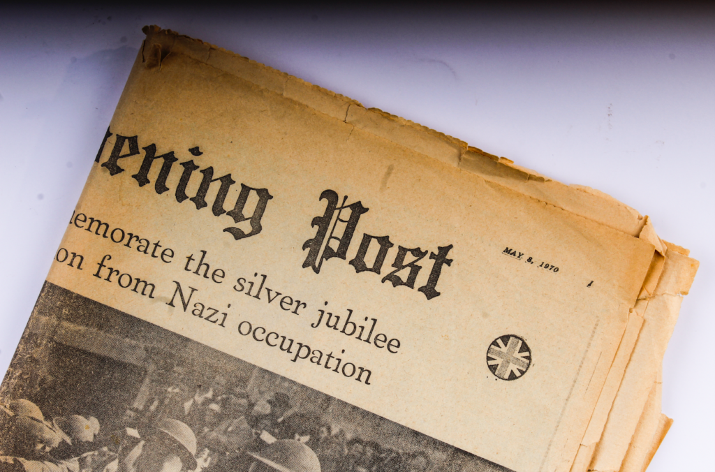
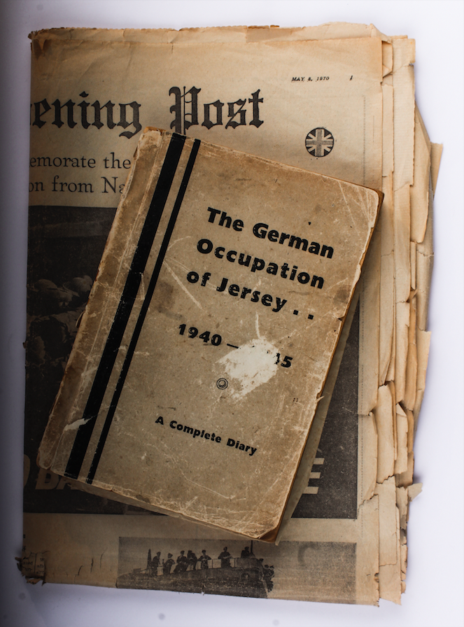
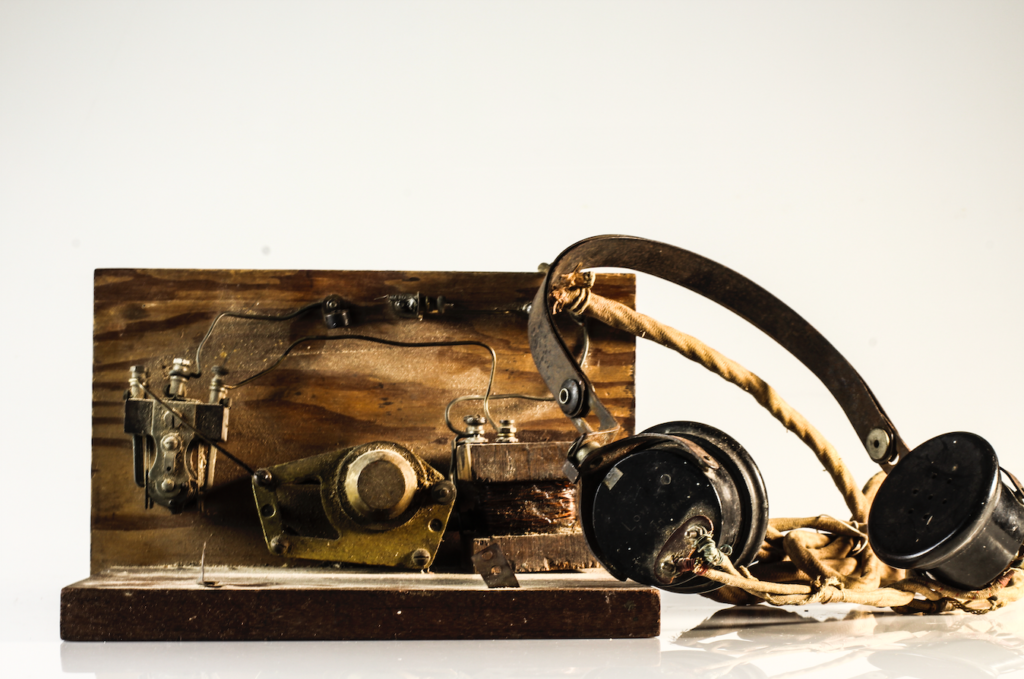
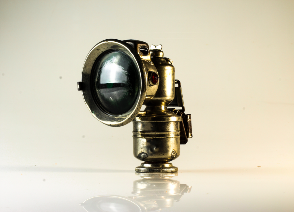
After the camera settings were adjusted, it was possible to take the photographs of a range of subjects and objects loaned from the Jersey Archives, including many items originating from 1935-45.

For the second setup, a tripod was positioned horizontally over the objects (placed on a white table) in order to give a birds-eye-view image of the objects straight on (this was a better option for images with slightly with less depth (such as books and ration coupons). A weight was used on the other end of the tripod in order to balance the structure, and the images were also taken using a remote in order to keep the camera as stationary as possible during the photo.

Zine: Sequencing and Narrative

After finalizing the editing for all of the photographs I took over the course of the project, and reducing my selection of images to the ones that I wanted to use as final images, I was left with the below images:

These would be the images I would use in my zine, and I felt like these images could all be linked together using a narrative. My first thought was that the contrast between the portraits (clearly taken in modern time) and the images of the archival, old objects would work to add to a narrative that represented the reflection between the present individuals who still deal with the trauma of the occupation, and the reality that the occupation is still a very important and present part of the history of Jersey (as clearly the objects have been looked after and archived to preserve them and their importance). I decided to develop a narrative that would help to link between the past and present, and show the differences and similarities that could still be found within past and present representations of war and occupation if they are actively sought out.

The first 2 images I decided on to place side by side were a portrait and a photo-montage. I feel that placing these 2 images together shows a contrast between the bold colours on the right, and the dulled, somber colours of the left. I specifically placed these images together due to their contrasting colours which would draw attention of the viewer, but also the fact that the subjects of both images are looking in the same direction, showing a connection between the two images, and drawing attention to the fact that the subjects of both images, although presented very differently, still hold experiences of war and trauma that they deal with in their own way. I made these the first images to immediately draw attention to the similarities between old and new.

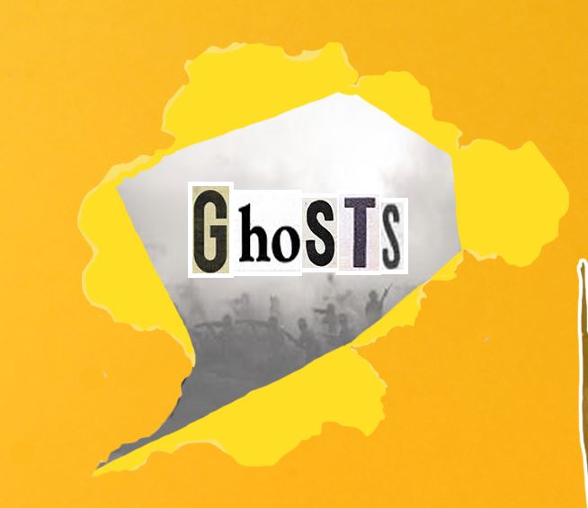
I then began sequencing the next images, to show a subtle decent into a set of images that focused more on the historical aspect of the war, drawing attention to archival images and photo-montage representations of how war influenced those involved in it. I did this by placing an image of a single subject that has been edited to look slightly ripped. I did this to show a decent, as if tearing away the present to reveal the past reality of the war and occupation. I then placed a series of objects and photo-montages, progressively becoming darker and bolder in colour as well as theme, in order to represent the growing despair and hopelessness of the occupation.

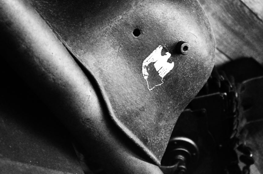
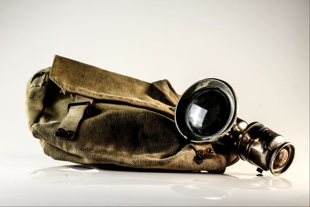
As seen in the gallery of images above, the sequence moves from lighter, studio photography of objects, towards more raw, darker tones images of objects in the environment in which they would have been found during the occupation. I did this to emphasize the reality, in which archival objects themselves struggle to tell the full story, unless the reality and truth of the occupation itself is considered, and the objects are seen in their real, frightening and more disturbing setting.

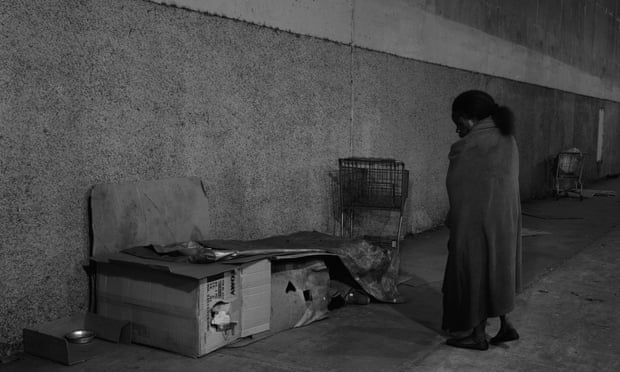
I decided to use this image as my final image. I feel like the tones of this image encapsulate the sorrow of the war, as the contrasting black and whites present a stark and harsh contrast, with the subjects presenting neutral faces (rather than happy). I used this as my final image to bring attention back to the present, where individuals present during the Occupation still deal with the negative memories of the Occupation, and I feel that this image reflects the dark struggles that the subjects still deal with every day.

Photo-Montage Experimentation

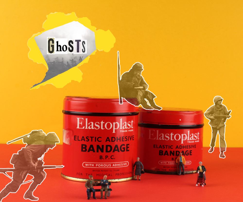
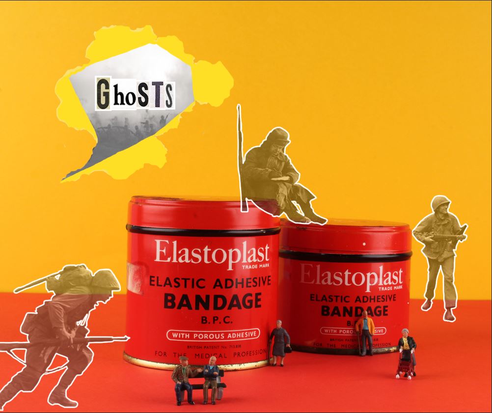
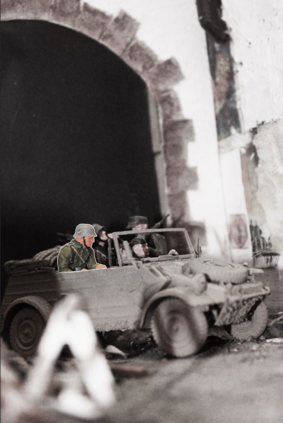
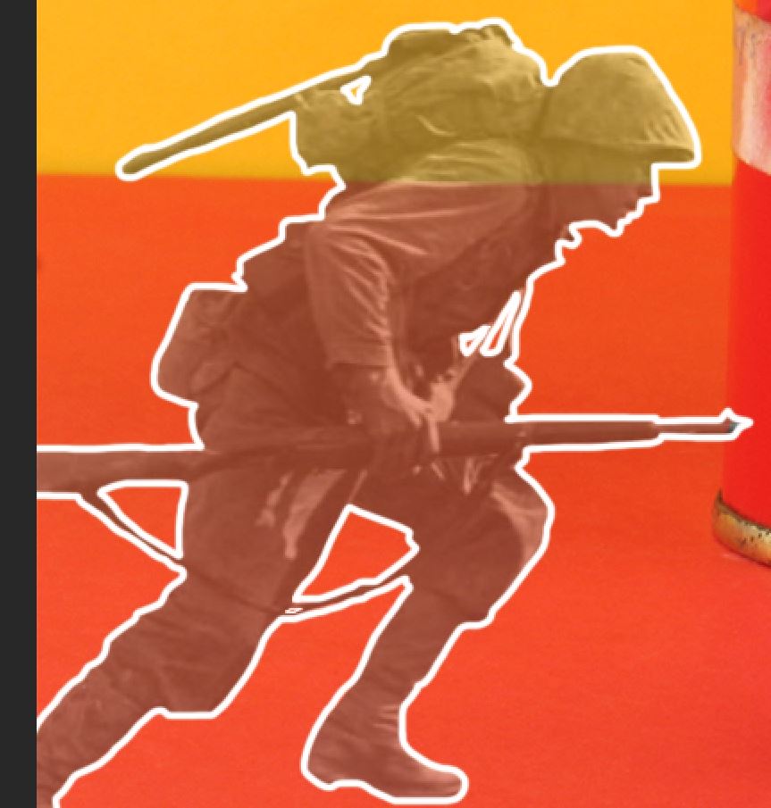
After taking a series of images using the studio layout, I began to combine multiple elements to create photo-montages. In the initial studio photograph, I took inspiration from Rafal Milach’s “The First March of Gentlemen”, and used contrasting card colours to provide the background for the objects. I used one colour as a back wall, and a it’s complimentary colour as the ground colour in order to create an obvious separation between the 2. I then took a photograph of a series of objects taken from the Jersey archives, and for one of the images I made use of a number of tiny figurines. I then used Photoshop to create a montage out of these original images, and a series of archive images, taken during WW2.

I produced this first image after taking an initial photograph of the objects and figurines, and then used Photoshop to edit in the faded outlines of the soldiers. I did this to try and create a representation of the memories of the war (represented by the faded soldiers) in contrast to the present day (represented by the figurines of the elderly people). I produced this image to represent the reality of many individuals who survived occupation and war, as they now all live with constant memories and reminders of the experiences they survived during the war.

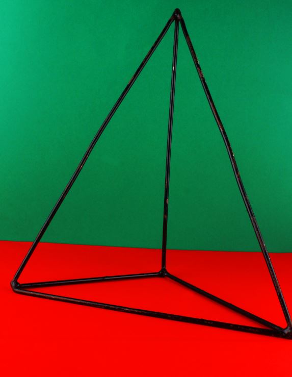
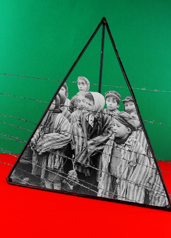
For my second photo-montage, I made use of 2 complimentary colours in the background, and photographed a pyramid maths object (taking inspiration from Rafal Milach). I then used an archived image of children in a concentration camp, and edited the image so it looked like the children were trapped inside of the object. I did this to reflect the horrors that many children faced during the war, while also contrasting this with the use of an object used in school, which is supposed to be a safe environment for children.

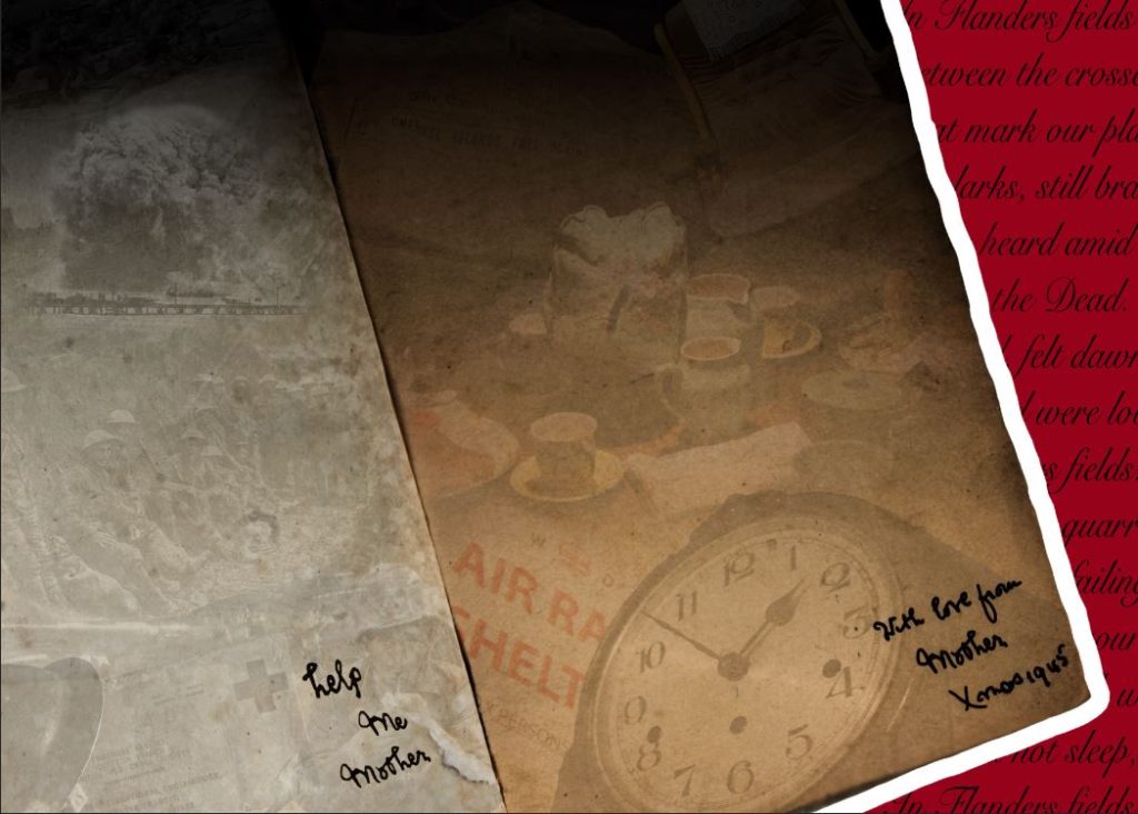
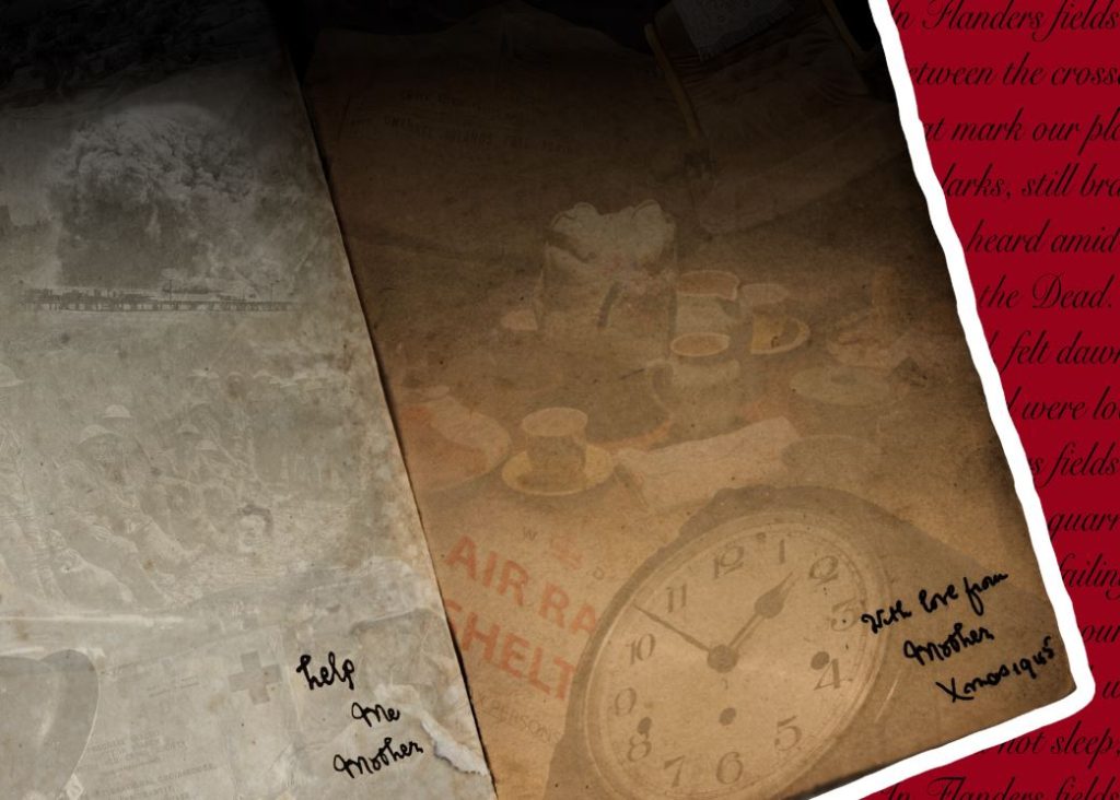
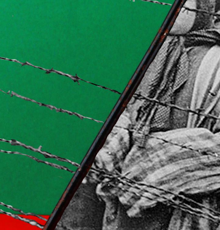
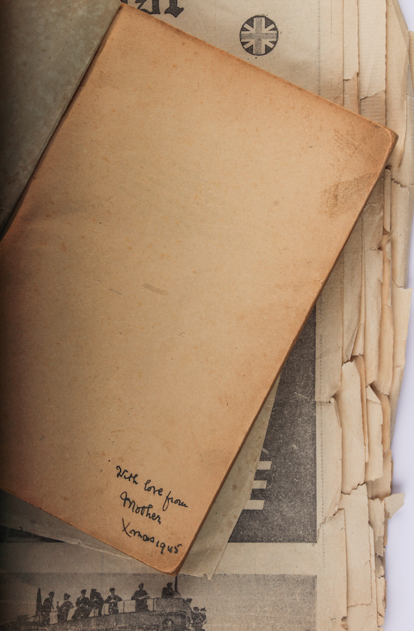
For the above image, I took a more experimental approach. I took inspiration from the note within the original book, saying “with love from mother, Xmas 1945”. I created a contrast between the 2 sides of the book, with the memories from home on the right, and the horrors of the trenches on the left. I did this to uncover the reality of war, and the differences between experiences of different people during WW2.

Still life: Studio Photography

Once I was confident with my understanding of the lights and layout of the studio, I could begin taking photographs of the archival objects that were loaned from the Jersey Archives. I made use of the cameras already attached to the tripods but used my own SD card. After taking a series of images, I came out with the below series (unedited):

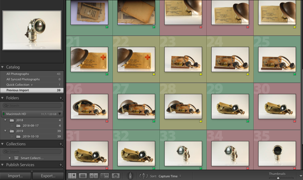
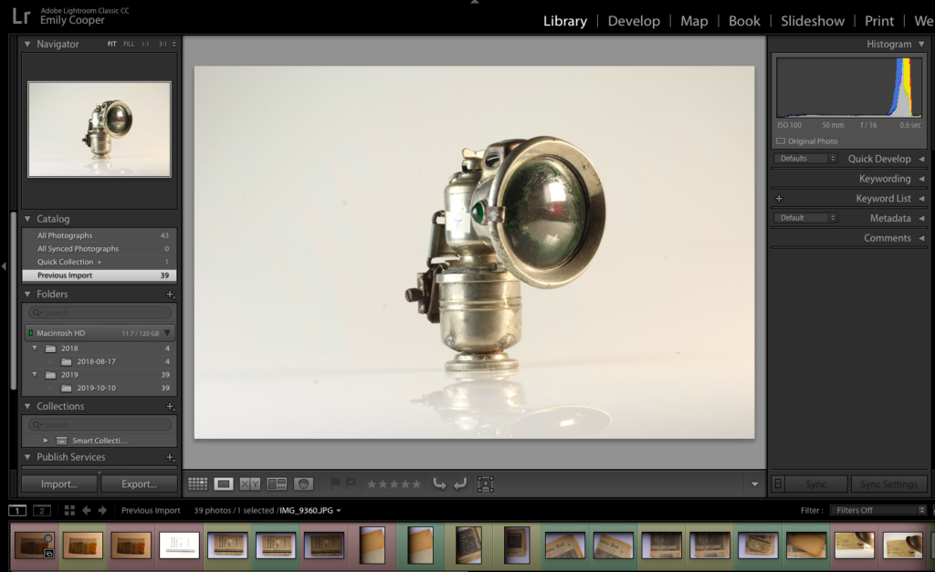
As some of the images were either overexposed, underexposed, or had the wrong composition, I uploaded the images into Light-room, and used the colour option to highlight which images I wanted to use, and which images I would reject. The following screenshot is the collection of all of my images after they had been colour coded:

Key:
Green: Final images
Yellow: Possible final images (need more editing)
Red: Rejected images

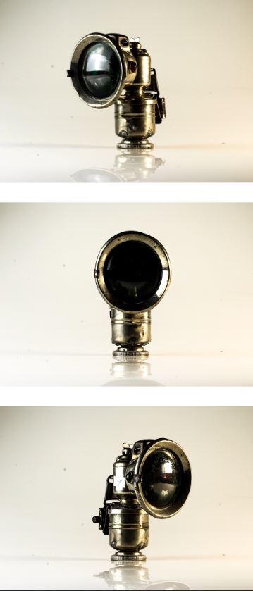
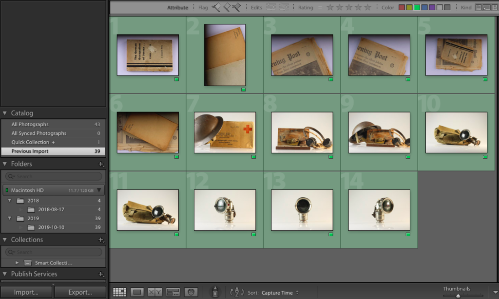
Out of the images I uploaded to Light-room, I only decided to edit 14 of my best (those highlighted green). The final 14 images can be seen below:

I took some of these images with the knowledge I would most likely use them in a series/pattern (for example, the final 3 images are the same object at different angles, which I took under the assumption that I would use them in series)

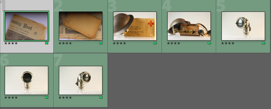
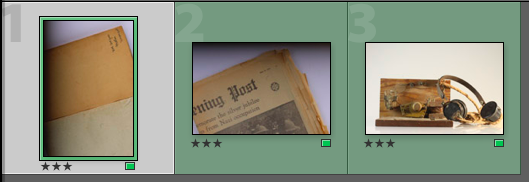
As a further method of rating each image, I decided to rate each of the green images /5 in order to record which images I felt would work best, and which ones I felt needed the most editing during the development stage:

The ratings of the above images ranges from 3/5 to 5/5, showing a variation of images at different levels.

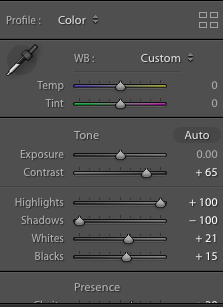
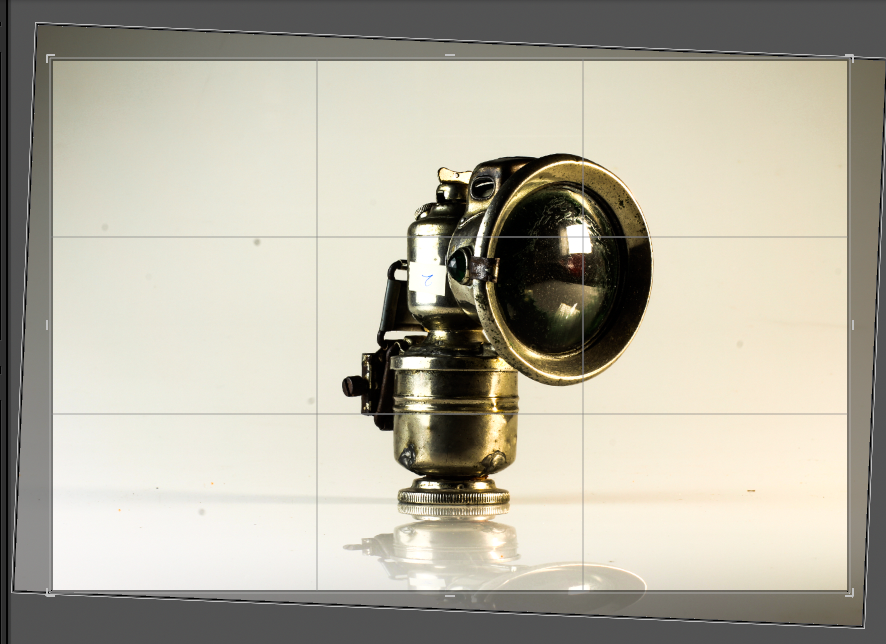
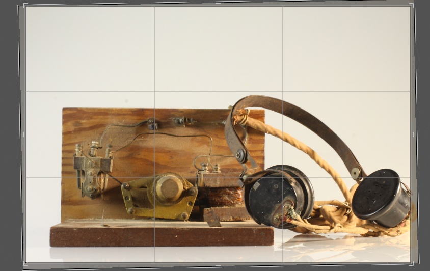
I then began the development process, in which I would edit the images that I had labelled green. I used the Light-room editing software, as I find it more detailed and specific than the Photo-shop software. I found that editing the colour gradients and contrasts of my images would be the most important part of this process, along with altering the orientation of some of the images so that the objects lay parallel to the bottom of the image frame.

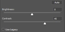
For many of the images, I increased the contrast of the colours in order to produce bolder outlines and harsher colours. I felt that this helped to make the images appear more sharp and clinical, and gave harsher outlines and contrast in the colours and shadows. I decided to do this as I feel this harsh, sharp appearance reflects the atmosphere of the occupation, as the occupation of Jersey can be seen as a harsh and cruel event that made the lives of the occupants of the island much harder.

Furthermore, I decided to increase the clarity of some of my images. I found that by raising the clarity, the clarity of every small damaged area/detail was emphasized, making the objects of each image look more worn and used. I decided to use this on a range of occasions to emphasize the time difference between now and the occupation, and to emphasize that, although these objects represent a time man years ago, the implications of this event is no less relevant.

I also adjusted the orientation of some of my images, as the way the tripod was set out meant that the camera took some of the images at a slight angle, meaning the lines of the objects were not parallel to the bottom lie of the image frame. I found this to be a small issue which could have reduced the viewers focus on the subject itself, as their attention may instead have been drawn to the conflicting angles at the bottom of the image. I altered this using the crop option found on the tool bar at the side of the screen, and simply rotated the image until the lines were parallel:

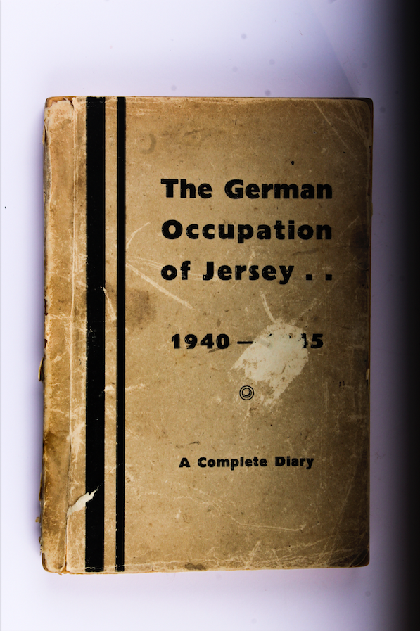
After the editing process, I was able to save the below images as my final images: