All posts by Emily C

Filters

Author:
Category:

Essay:

Compare how Cindy Sherman and Phoebe Jane Barrett challenge gender stereotypes in their work

“Our familiarity with cinema contributes to the ingrained ideas about beauty and gender in our visual language, so it is not surprising that the medium has influenced so many self-portraits…” (Bright, 2010, 11) 

Introduction: 

The representation of gender roles and stereotypes has been a popular concept within art and photography throughout the history of both art forms, but it is only recently that artists have begun to directly challenge these stereotypes in their work. The deeply ingrained gender stereotypes found in society, some more subtle than others, have been present throughout history, and alongside how our views on gender has changed. The process of societal change in views and opinions on gender has been slow, however, the turn to focus on gender studies in photography during the 1990’s (heavily influenced by philosopher Judith Butler’s 1990 book, “Gender Trouble: Feminism and the Subversion of Identity”) provided a new outlook on the way people viewed traditional gender roles and stereotypes. Photographers began to turn towards more abstract depictions of gender, with the focus on breaking, rather than adhering to gender roles. The move towards gender identity as a photography focus altered the way in which identity-based art was represented, with “a striking visible popular interest in gender presentation and sexuality in the 1990s [intersecting] with an explosion in the production of art” (Blessing, 1997, 7) .In my personal study I wish to be able to show how these changes and developments in gender stereotypes have changed in the 20th and 21st century, from more traditional gender roles and ideas to our current understanding of the development of many different gender identities. Out of the many artists who explore gender stereotypes in their work, I have chosen to focus on photographers Cindy Sherman and Phoebe Jane Barrett, who both represent gender roles in the 21st century, using different methods and approaches. I have chosen to study these artists, because I believe both Barrett and Sherman convey strong context and meaning through their images, while at the same time producing work that really engages the viewer, and allows for a dialogue to be opened about the way that society and the media portrays versions of both men and women, that are not true to real life, thus forcing people to adopt stereotypical behavior in order to fit in to a social norm. In order to compare these two artists, I will examine both similarities, such as the concept of drawing attention to gender stereotypes and their representation, and differences, such as their different visual portrayals of these stereotypes and the way in which they approach their work. Both artists approach towards challenging historically rigid and strict gender roles and stereotypes can be seen as an attempt to redefine what society sees as acceptable for each gender, and bending the rules in order to allow individuals to express themselves freely without being judged. Phoebe Jane Barrett acknowledges the consequences of these strict barriers to individual expression, and is quoted as saying, “I wish that gender created less of a divide between people” (Barrett, 2019). I intend to respond to the work of Sherman and Barrett by showing both subtle and overt examples of how gender has developed and changed through time, and to do this I will be incorporating strong and obvious examples of breaking gender roles when it comes to stereotypical masculinity, while also using multiple examples of the subtle ways in which femininity is rejected by modern women, choosing instead to follow their own version of identity rather than society’s ideas.  

Historical context: 

Julia Margaret Cameron: Image of her Neice, (1867)

Photography as it is currently known was developed in the form of the daguerreotype, by French photographer Louis Daguerre in 1839, in order to scientifically record true to life images as they were in the real world. The daguerreotype paved the way for the advancement of photography, and is revered even in the modern era by photographers such as Adam Fuss as allowing the viewer to “see what has never been in a camera. Life itself is the image” (Fuss, 2010). The daguerreotype also allowed, for the first time, for someone to manipulate the contents of an image in order to suit their ideas. In the words of authors of the book “Photography Decoded“, Susan Bright and Hedy Van Erp, “The daguerreotype had the aspirations to both the realistic and the theatrical, as well as the commercial” (Bright, S. and Van Erp, H. 2019; 17). With the development of technology and the camera becoming a more widespread devise, the development of different movements in art and photography began to occur. An early movement in photography (appearing from 1860 onwards) was Pictorialism, which rejected the use of photography as a way to scientifically record objects realistically, and instead opted to focus on emphasizing the tone, beauty and overall composition of images, presenting them more as an art form than a method of recording data. A key individual who helped to shape the movement was photographer Julia Margaret Cameron, who’s work during the late 18th century was focused around portraying the inner workings of her subjects, often using children looking wide-eyed into the camera to emphasize the focus on exploring the concepts of dream, the unconscious and imagination. Early photographers such as Cameron helped to develop the movement of Pictorialism, and although their work was often rejected by critics of the time due to its unfocused, ambiguous appearance, their work on the movement was essential for the development of the understanding of photography as an art form. The step towards focusing on the beauty and composition of images led to the development of aesthetically focused and decorative images, emphasizing the contextual meaning of the subjects and concepts within the image. The work produced by photographer Phoebe Jane Barrett follows along the ideas and methods of Pictorialism, with her work often displaying a soft focus, and allowing certain areas of the composition to be draw the attention of the viewer the most. The beauty of the subjects in her images are emphasized as the vulnerability and fragility of their masculinity, and is purposely presented as a major part of the concept of the image. Photography continued to develop as an art form through the 19th and 20th century, and during this time the ways in which photographers expressed and portrayed their own opinions on political, social and human issues changed, as it became easier to edit and manipulate images to suit the need of the photographer. A movement that became popular during the latter half of the 20th century was Postmodernism, a movement which incorporated themes from a range of previous movements (including Modernism) and focused on the ideas of surrealism, bricolage and parody to present the ideas and beliefs of the photographer. Postmodernism was originally a response to the modernist movement, popular in the late 19th to mid 20th century. Contrasting Modernism, which focused on the visual elements of an image, praising the photographer for their ability to create beautiful images with their artistic skills, the Postmodernist approach looked more at the concept and context of the image, rather than it’s physical appearance. 

“The Siren,” a 1900 painting by John William Waterhouse, went for £3.8 million with fees at Sotheby’s on Thursday.
John William Waterhouse, “The Siren” (1900) – an example of how the male-gaze was used to depict women in early artwork and media

In Postmodernism, the idea matters more than the work itself, allowing the photographer room for a lot of creative artistic freedom when it comes to the subjects. Postmodernist artwork is often produced for the novelty factor, allowing the viewer to enjoy a visually pleasing experience (incorporating bold colours, shapes, and wild concepts), while subtly hinting at a deeper meaning. Cindy Sherman’s work can be considered to follow the characteristics of Postmodernism, with her bold and colourful self-portraits parodying how society views women and how femininity is represented in the media. The exaggerated appearance of the subjects providing a visually interesting experience to the viewer, while at the same time hinting at the deeper meaning of hiding ones true appearance behind a mask that society would find more socially acceptable. Sherman’s work challenges the representation of women in the media, and forces the viewer to consider the ridiculous way in which many women have their features overplayed and portrayed in social media. Sherman’s work depicts parodies of an important feminist theory that has become popular in modern work, known as the “male-gaze”. The “male-gaze” refers to the way in which women are presented from the perspective of heterosexual, masculine perspectives, as sexual objects that are included in order to please the male viewer. This concept in the art world has remained prominent since medieval paintings, and the term “male-gaze” itself was coined by film critic Laura Mulvey in her essay “Visual Pleasure and Narrative Cinema”(Mulvey, 1989). Mulvey’s essay touches on the concept of the “male gaze” in cinema, describing that, “In their traditional exhibitionist role women are simultaneously looked at and displayed, with their appearance coded for strong visual and erotic impact so that they can be said to connote to-be-looked-at-ness.” Here, Mulvely gives a perfect definition of how the “male-gaze” influences the display of women in the media; a concept that Sherman is able to hint at in her own work, displaying the characters in her scene as over the top and caricature-like versions of women, highlighting the absurdity of the way women often appear in media. Although “through the male-gaze” has been the most prominent way in which women have been depicted in the media throughout history, in more recent years there has been effort to fight back against this one-sided representation of women, with exhibitions such as the 1995 “Rose is a Rose is a Rose: Gender Performance in Photography” providing an outlet for photographers to break the boundaries of gender norms, as it offered ways to elude the heterosexist, patriarchal male gaze and speak to more diverse desires (Blessing, 2017, 98). This move from a sexist, one-sided method of representing women in photography, to a more inclusive, diverse way of incorporating all gender identities and gender expressions, has allowed for modern feminist photographers such as Sherman to break the boundaries of social acceptability and gender norms in their work.

Cindy Sherman:

Cindy Sherman: Untitled (self-portrait with sun-tan) 2003

Cindy Sherman’s approach to photography did not begin with the boldness and daring as her more current work. Sherman originally took part in creating film stills during the 1970s and 80s, with her work involving black and white self portraits, where she depicts different ideas and concept of women of the time. Her work then became progressively more bold, with her project Centerfold(1981), in which she produced one of her most recognizable pieces of work, Untitled #96. Throughout all of her work, Sherman has focused on the theme of personal and individual identity, with the overarching idea of her work being the way that we as individuals project and present our identities to the outside world. Her work has been met with praise from many critiques, applauding her use of self-portraits to convey a number of identities which are all based in the same theme of hiding and exploring female stereotypes. Popular opinion of Sherman’s work can be summed up in the words of art critique Laura Cummings; “Sherman has by now invented more than 600 personae; every one of them is a recognizable type, to some extent, and yet also an individual” (Cumming, 2019). Her work reflects the vulnerability of the subject within the images, with her piece Untitled #92 reflecting a distressed and scared self portrait of herself in a vulnerable position. Her work reflects the vulnerability of those who express their individual identity, and by taking self portraits, Sherman is able to both remove herself from her work through hiding her identity, while also remaining very much involved in the practicalities of her photography. Sherman herself believes “I feel I’m anonymous in my work. When I look at the pictures, I never see myself; they aren’t self-portraits. Sometimes I disappear.” (Sherman, 1990). Her current work revolves around making extremely eye-catching and striking images, while at the same time providing a narrative behind the image which helps to engage the viewer, and forces them to realize the contextual and conceptual realities of the image. Sherman herself believes that “people are more apt to believe photographs, especially if it’s something fantastic. They’re willing to be more gullible. Sometimes they want fantasy” (Sherman, 1985), which allows for the explanation as to why she decides to make such expressive images. In the above image, (which remains untitled but is often refereed to by Untitled (self-portrait of sun-tan 2003)) Sherman is focusing on drawing the viewer in using bright and eye-catching colours, making use of deep oranges and an extreme layer of orange sun tan across the body of the subject in order to create an incredibly dramatic, satirical example of a tourist woman. The colours in this image are what draw the eye initially, however the concept behind the image revolves around portraying the way in which women (in this case, a tourist) in the modern era are portrayed in such an extreme way in the media. Rather than using overt examples of the unrealistic standards of women in the media, (and the struggle of maintaining and developing ones identity in general), Sherman focuses on leaving her images very open to the interpretation of the viewer, allowing the viewer to decide what the image represents in terms of female identity and the way we are perceived in general. Sherman’s goal was for there to be “hints of narrative everywhere in the image so that people can make up their own stories about them” (Sherman 2016), allowing the viewer to develop their own understanding of the concept of identity and gender with guidance from the image.

Image result for untitled 92 cindy sherman"
Cindy Sherman, Untitled #92 (1983)

Phoebe-Jane Barrett:

Phoebe Jane Barrett: (2018)

While Sherman takes a direct approach towards highlighting the distorted way in which women are portrayed in the media, in order to elicit a strong emotional response of shock or intrigue from the viewer, Barrett instead takes a much more subtle and soft approach towards her representation of male vulnerability. Barrett’s work has an overarching sense of humanity to it, with her photography often depicting the intimacy of human relationships and connection, focusing on presenting societies more hidden and controversial topics. Barrett found photography as a way to express her own opinions on social situations, as it allowed her to “challenge myself and push myself forward, collaborate more and focus on a variety of subjects and genres.” (Barrett, 2019). A more controversial topic that Barrett approaches in her work, is the concept of male vulnerability, and the reality that “the stereotypes around masculinity are damaging to men, women, and to society as a whole.” (Barrett, 2019 (2)). In order to portray this topic, Barrett took a delicate approach, using male subjects in vulnerable and stereotypically feminine poses and situations to highlight the truth that men experience vulnerability and emotion the same way as women, yet are expected to hide this in order to meet society’s definition of “masculinity”. The above image depicts a stereotypically masculine-presenting male subject, with his facial hair and low brow presented as the centre of the image, drawing the viewers full attention to the fact that the subject is male. However, this presentation is contrasted with the situation the subject finds himself in, lying on the lap of an unidentified subject, who holds the man comfortingly. The male subjects blank, glazed over expression gives away very little personal emotion, therefore forcing the viewer to gain all of their contextual information from the visuals of the scene around him. The subjects position reflects that of a small child seeking comfort from his mother, or a stereotypically feminine woman looking for protection from her partner; however, these stereotypes are tipped on their head by Barrett’s image, as the viewer instead sees a male in this vulnerable position. The technicalities of the image also serve to add to the overall gentle feel of the photograph, with the monotone colouring of the image presenting enough contrast to make out the different shapes and textures within the image, while still remaining soft enough for these shapes and edges to blend into, rather than harshly contrast, one another, therefore adding to the overall delicate and gentle atmosphere of the image. Barrett has successfully presented a response to the controversial concept of vulnerable masculinity, and her belief that “photography has always had the incredible power to challenge and redefine societal norms… (Barrett, 2019 (3)) has allowed her to present this topic in such a way as to spark conversation between viewers about the harmful consequences of toxic masculinity on society. 

Conclusion:

When it comes to the way both Sherman and Barrett present their work, they appear to take very different visual routes, while still sharing the overarching concept that gender should not be the defining aspect of an individual, and the strict rules and stereotypes held by society is damaging not only for the people they are targeted at, but for everyone. Barrett’s gentle approach to the idea of vulnerable masculinity presents the idea that men experience emotion and vulnerability just as much as women, and yet seeing men in vulnerable situations elicits a different response from the viewer, because of how out of the ordinary and contrast to normality it is. In the same way, Sherman touches on presenting an exaggerated idea of a female character, meant to reflect the outrageous standards placed on women in the media, eliciting a shocked response from the viewer. A more subtle similarity between Barrett and Sherman is their shared respect for self-portraiture as a means of self-reflection and representation of identity. Sherman’s work as a whole is heavily focused on self-portraiture, as it allows her to explore the identity of herself while creating and presenting a character, while for Barrett,”self-portraiture was a way of examining and almost verifying my own existence, I guess as a form of self-analysis and self-reflection”. (Barrett, 2019 (4)). In my own work, I have also made attempts to follow both the obvious and subtle approach to showing and braking strict gender roles. I have focused on showing stark contrast between reality and the gender stereotypes that people develop due to society’s influence, and to do this I have focused on presenting male subjects in feminine situations and environments (highlighting the contrast between the reality of gender expression, and the prejudice held by the viewer), and presenting female subjects in situations which reflect their dislike of adhering to strict feminine gender stereotypes and social norms. When it comes to my work with male subjects, I take inspiration from Cindy Sherman, and her method of presenting bold, intrusive work which draws the full attention of the viewer, and demands that they confront their own personal prejudice towards the image, while I also take inspiration from Phoebe Jane Barrett when it comes to my use of female subjects, using more subtle references to rebel against the right restraints of feminine gender stereotypes and roles. 

Here, I have taken inspiration from Cindy Sherman’s bold approach to her photography in which she redefines and breaks gender roles and stereotypes in an almost satirical way. Here, I have used a very bold and eye-catching subject in order to draw the viewers attention to the underlying meaning
I have also used more subtle hints of the issues people face when adhering to or challenging gender norms. In this case I focus on the emotion that the subject can convey to the viewer, taking inspiration for Barrett’s more subtle, soft and emotional imagery.

Bibliography: 

Bright, S. and Van Erp, H. (2019), Photography Decoded. London: Octopus Publishing House  

Cumming, L (2019) Cindy Sherman, a Lifetime of making herself up, The Guardian, viewed 16 January 2020, < https://www.theguardian.com/artanddesign/2019/jun/30/cindy-sherman-national-portrait-gallery-review-a-lifetime-of-making-herself-up>   

Marili (2019) Soft, Intimate and Emotive: Redefining Masculinity with Photographer Phoebe Jane Barrett, EyeEm, viewed 17 December 2020 < https://www.eyeem.com/blog/redefining-masculinity-with-photographer-phoebe-jane-barrett-2018>   

Hufkens, X, Adam Fuss, Xavier Hufkens, viewed 16 January 2020, < https://www.xavierhufkens.com/artists/adam-fuss>   

Collins, G (1990) A Portraitists Romp Through Art History, The New York Times, viewed 16 January 2020, < https://www.nytimes.com/1990/02/01/arts/a-portraitist-s-romp-through-art-history.html>  

Mulvey, L (1989) Visual and Other Pleasures, Palgrave Macmillan, UK   

Stoffel, A. 204 Cindy Sherman, Phillips, viewed 1 January 2020, < https://www.phillips.com/detail/CINDY-SHERMAN/NY010413/204>   

Adams, T (2016) Cindy Sherman: ‘Why am I in these photos?’, The Guardian, viewed 12 December 2019, < https://www.theguardian.com/artanddesign/2016/jul/03/cindy-sherman-interview-retrospective-motivation>  

Ginn, D (2019) Phoebe Jane Barrett Creates Tender Moments with Her Portrait PhotographyThe Phoblographer, viewed 21 January 2020, <https://www.thephoblographer.com/2019/07/12/phoebe-jane-barrett-creates-tender-moments-in-her-portrait-photography/>    

Blessing, J (Winter 2017) “Rose is a Rose revisit”, Aperture (229) (98-103) 

Bright, S (2010) AutoFocus the self-portrait in contemporary photography, London: Thames and Hudson 

Photo-shoot 3: Final Images

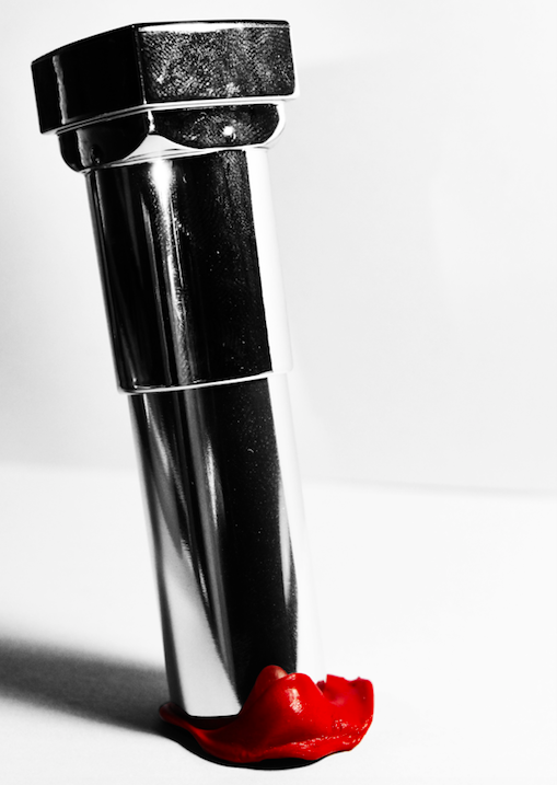
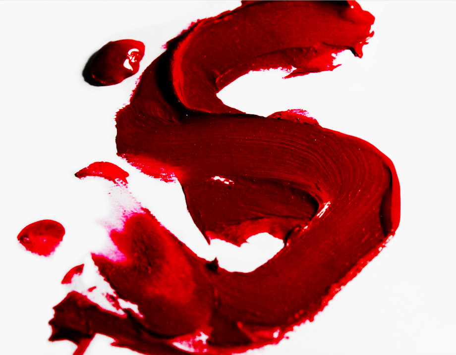
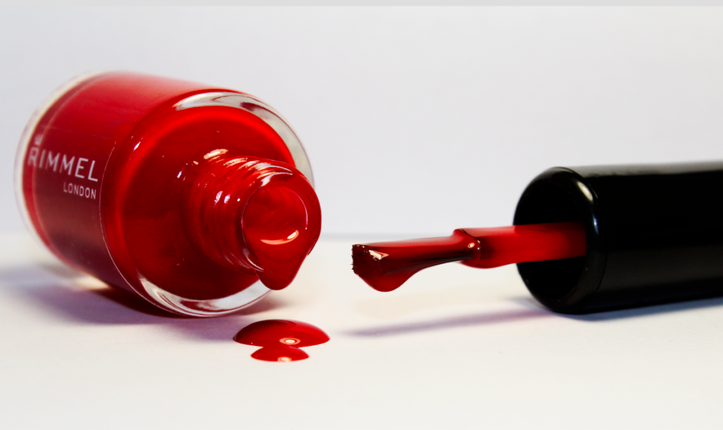
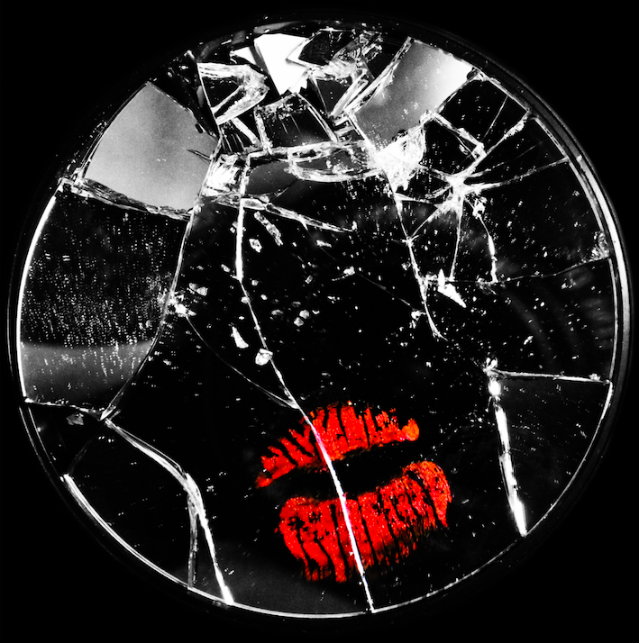
This image (along with the 2 below), is meant to represent a liberation from the tight restriction of female gender stereotypes. Here, makeup and feminine products are seen to be destroyed, broken and smashed, showing a rebellion against the norm, and presenting examples of freeing individual expression, and breaking stereotypical gender roles in order to express ones self freely.
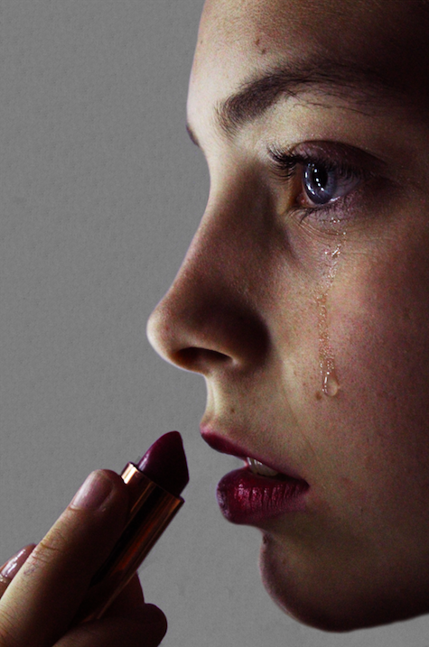
This image is a more overt example of the issues and problems caused by adhering to gender expression that doesn’t fit the needs and desires of the individual. Here, the subject is distressed by their need to adhere to the beauty standards of society, and therefore can be seen crying while applying makeup.
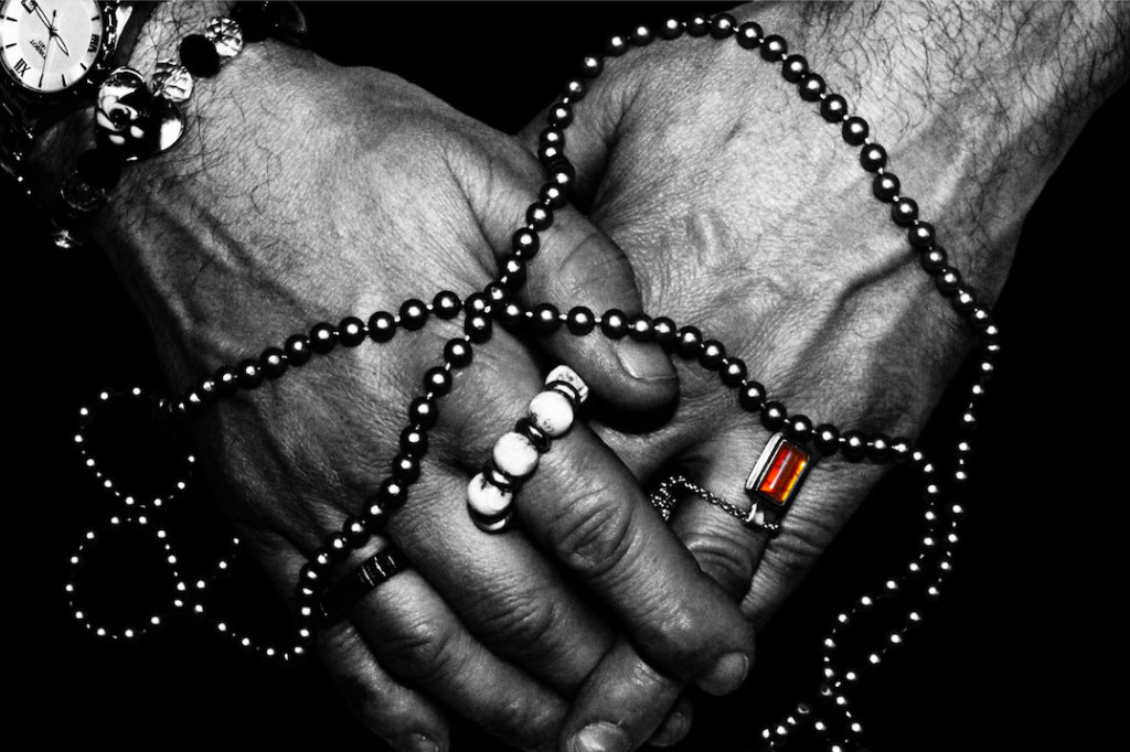
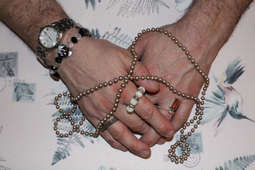
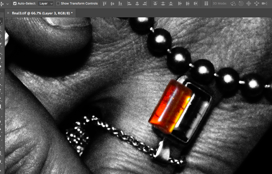
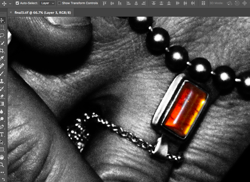
Here, I have made use of monotone in order to emphasize the contrast of te colours and shapes of the jewelry and hands. I kept a single colour in order to draw attention to the jewelry on the hand, and overall I feel like this image is the strongest from the photo-shoot, with it having a double meaning of identity liberation, and also feeling trapped and restrained by society’s standards and judgement.

The above images focus on the struggles and issues with trying to navigate gender identity in a society that doesn’t accept you. I have used both positive and negative examples, with some images reflecting the breaking, smashing and ruining of items that represent female beauty standards, therefore allowing the individual to be liberated from the pressures and strains of beauty standards. Alternatively, I have also made reference to more negative consequences of beauty standards, with one of the images depicting a female subject applying lipstick while crying, representing the affects of the pressure on women to adhere to society’s standards of beauty. The final image depicts male hands covered in jewelry, and although this can be used to represent the liberation of gender identity and expression (with the subject able to express their like of jewelry regardless of their gender), the way in which the jewelry is placed can also represent a chain/ties, used to restrict the hands.

Overall, I feel like this photo-shoot has been a success. I have developed one of my favorite images from the project (black and white hands), and will be using these images in my final book, as I feel like they successfully represent the struggles and triumphs of adhering to (and rebelling against) beauty standards and stereotypes.

Photo-Shoot 3: Planning

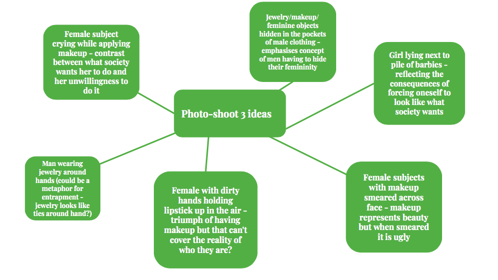
My third photo-shoot will be focusing on the hidden aspect of gender identity that are often not spoken about. I will be focusing on the issues of women who do not want to present as feminine, and yet are forced to by society, as well as men who struggle to show their more feminine aspects without being shamed by society and historical gender norms. In order to do this, I will be focusing on more metaphorical imagery, using portraits and images of objects to do so, as I will be exploring the problems and consequences people face when they try to express themselves in a way they don’t want to/feel forced to.

Below I have included a mind-map of some ideas for this third photo-shoot:

Photo-Shoot 3: Selection and Editing

For my third photo-shoot, I will be focusing more on the physical objects that can be associated with gender, and will be contrasting these with each other in the photograph. As the focus of my project is on breaking gender stereotypes (liberation of gender) and showing the truth behind peoples identities and the way they express themselves through gender, I will be focusing on creating images that encapsulate stereotypical gender roles and stereotypes, with small twists within the image that allow the viewer to realise that the image is not what it seems (specifically, that the stereotypes they link to the objects may not always be accurate. For this photoshoot I will be focusing on feminine objects, such as makeup and jewellery, and will be intertwining the idea that both women and men can suffer when it comes to expressing femininity, to create a contrast. This photo-shoot will be focused more on the hints to the viewer that some people express their identity in less stereotypical way, and that there are often social consequences for those who do this.

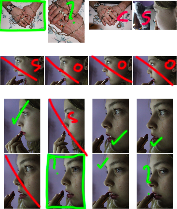
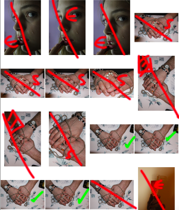
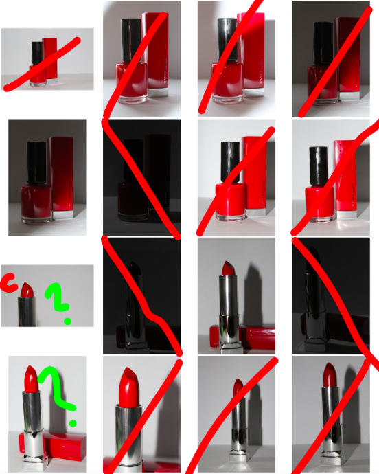
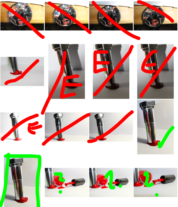
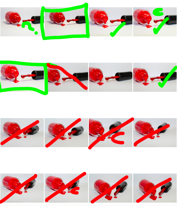
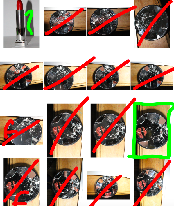
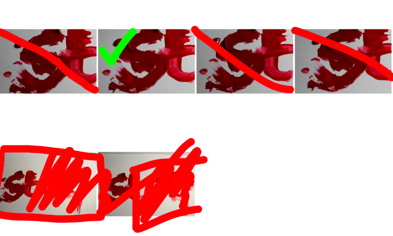
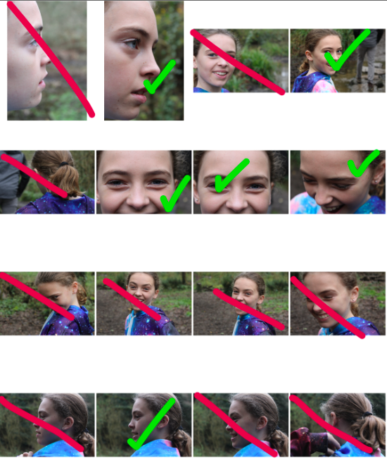
Below are the contact-sheets for my photo-shoot, I have indicated my decision making process using the brush tool:

COLOUR KEY:
GREEN: tick – possible final image, rectangle – final image, question mark – possible final image,
RED: line – rejected image, S – subject is in the wrong pose, O – wrong orientation, E – too high/low exposure, C – camera is in the wrong position, hatched red lines – shadow/unwanted aspect
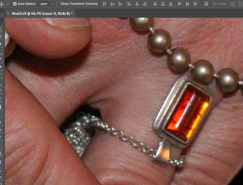
This was the original image I began with.

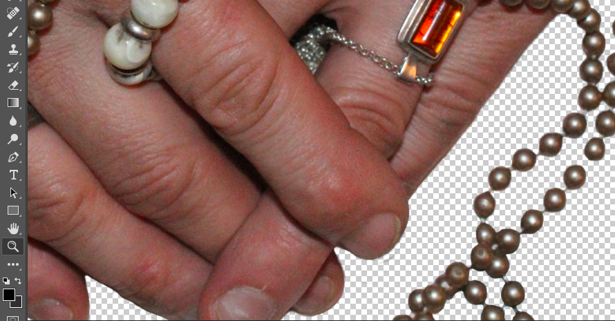
For my first image, I wanted to separate the image itself from the background in order to replace the background with a simple black background (as I felt this would draw maximum attention to the image and details in the foreground). To do this, I used the lasso tool to highlight the areas of the background, and deleted it from the layer. I then went around the edges of the image with a 0% hardness eraser tool in order to soften the boarders so that it would blend more realistically with the black background.

Here, I erased the background of the image, and softened the edges of the image with the eraser.

I then added a black background to the image to make the foreground image stand out more and draw maximum attention:

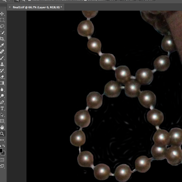
Once the black background was added, I erased the remaining areas which looked uneven, and I smoothed out all boarders of the image.

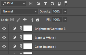
I decided to focus on the contrast of the shades, textures and shapes of the image, and therefore decided to make the image black and white, and raise the contrast substantially in order to emphasise these contrasting aspects:

Here, I altered the image to black and white in order to increase the contrast, and also increased the contrast of the colour itself to highlight this.
After increasing the contrast and turning the image black and white, the boarders of the image faded more into the background, allowing the image to fit more flush with the background.

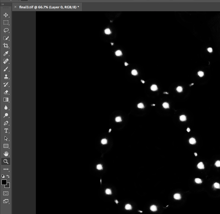
I decided that for this image, I wanted to highlight a certain area of colour in order to draw the viewers attention to the image, and to provide a small amount of contrast in the image which would draw attention to the jewellery that the subject was wearing (by highlighting the colour of the stone, the viewer can more easily focus on the jewellery itself, rather than looking at the whole image as a flat continuous image). To to this, I copied the original coloured image, and copied the stone using the lasso tool. I then pasted that over the top of the black and white image, and smoothed out the edges:

I first copied the original stone from the coloured image, and pasted it into a seperate layer.
I pulled this layer to the top, above the black and white later, and layer the coloured stone over the top of the black and white stone.
I then smoothed out the edges to sit the stone smoothly onto the black and white image.

The final image can be seen below:

I used the same sort of editing process for the other final images in my photo-shoot. I increased the contrast of many of my photos, (especially if the image was going to be turned monochrome in order to increase contrast between shapes).

Below are my final images for this photo-shoot:

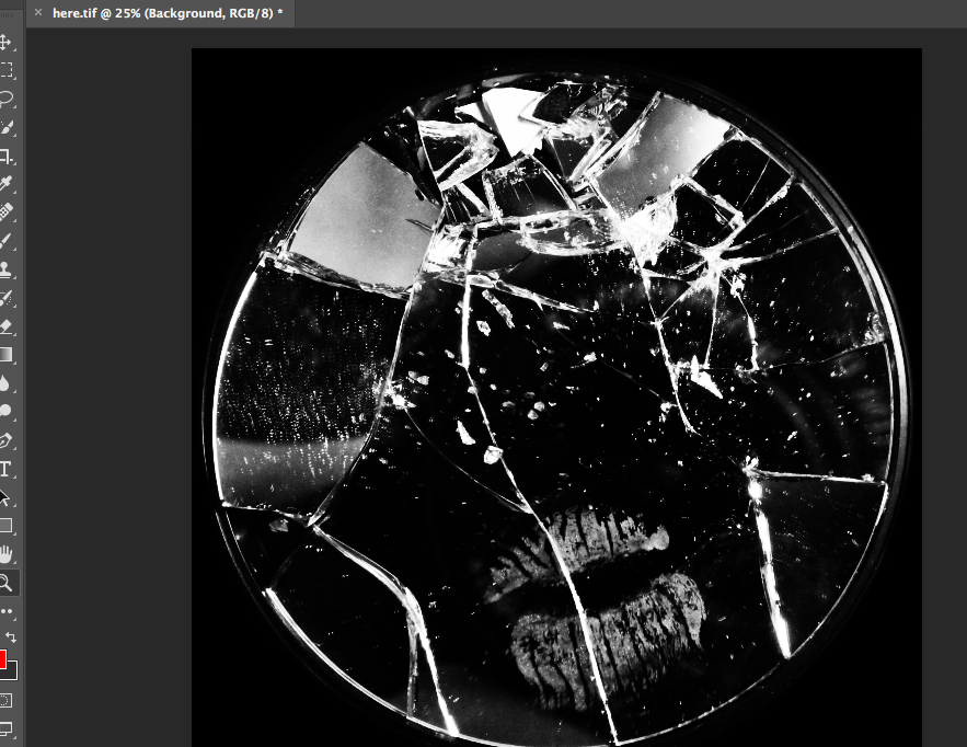
for the below image, I used the lasso tool to cut the lip mark out of the original layer and paste it onto asseverate later. I then made the first layer monochrome and increased the colour contrast of the lips to make them stand out from the background. I also cut the mirror from the background and replaced the table background with all black to force the viewer to focus on the image in the foreground:

This was the image after I turned it monochrome, before I pulled the layer with the lip mark to the front.
These were the 2 separate layers to show the contrast between the coloured lipstick and the black and white background.
After pulling the lip print to the front, I increased the contrast of the red colour, and this was the final result.

Understanding Photo-Book Design:

In order to get a better understanding of the process of designing and creating a book, I have found an already produced photo-book, and took inspiration from it in terms of the ways that books can be edited together, sequences and designed.

For this, I chose to study the photo-book titled “Redheaded Peckerwood” by photographer Christian Patterson.

Image result for christian patterson redheaded peckerwood book
Book in Hand: the book is very slightly textured, however the front cover gives the illusion that it is much more textured than it is in reality. I found this interesting, as I had to spend some time deciding whether the cover was in fact smooth or textured, as the cover photo itself acted as a slightly illusion
Paper and Ink: the book makes use of the same smooth photo-paper throughout, with the exception of a number of handouts/pullouts (such as letters, postcards and small leaflets with writing on). The images in the book are both colour and black and white, although there is a larger number of coloured images.

Format, size and orientation: the book itself is presented in portrait, however the images inside are both landscape and portrait. The overall size of the book is slightly shorter than A4, and includes around 100 pages of images (a d around 5 inserts).

Binding, soft/hardcover: the image is a hardcover book, with case binding used to bind the pages together. The book is without a dust-jacket.

Cover: the front cover is made of a card material, and includes an image of 2 subjects smiling and facing the camera. These subjects have been obscured using a grey, pixelated filter, acting as a shroud over the image, as to reduce the detail available to the viewer, and to obscure the image. The front cover does not include the photographer or the title of the book (these are only included on the spine of the book.

Title: the title “Redheaded Peckerwood” derives from the derogatory, slang name for white, lower class individuals living in the South of the USA. The title is most likely used as a derogatory term for the murderers, who are presented as important subjects in the book.

Narrative: the subject matter of the book is the murder case of 11 individuals by 19 year old Charles Starkweather, and his 14 year old girlfriend Caril Ann Fugate. During the later years Starkweathers childhood, he began to develop aggressive tenancies and anger problems. Starkweather eventually became involved in a dispute with a petrol station attendant named Robert Colvert, who Starkweather eventually shot and killed. Both Starkweather and Fugate then proceeded on a violent rampage, murdering 11 individuals including both parents and the younger sibling of Caril. The book itself follows the story of the killings, using both archival and staged images to slowly hint and give clues to the reader as to the sequence of the murders as the book progresses. The narrative of the book follows the story of the murders themselves, and uses more abstract and conceptual imagery to depict the process of the police, the murderers, and the community as the rampage unfolded.

Structure and architecture: the book follows the structure of focusing on the environment of the community in which the murders occurred. The book becomes progressively more detailed in the clues it gives, with the beginning half focusing on the context of the murders, and the images becoming more and more detailed in the second half of the book, focusing on specific objects, details, people and letters that relate to the crimes committed.

Design and layout: the inserts inside the book are the most unique feature. These inserts include letters (written and typed), postcards and documents. These inserts help to add to the narrative of the book, and moves the story along. The images in the book are rarely full-bleed, and instead sit in the centre of each page, with a white boarder around the edges. There are no double page spreads, although many of the images on opposite pages compliment each other in terms of their composition, colour and structure.

Editing and sequencing: the images seem to involve very little editing, and focus is placed on emphasis of the colour, or changing the image to black and white, rather than physically distorting the image. Overall the only place in which editing is obvious is on the cover of the book, as the rest of the images offer a more scientific and stark documentation of the objects they depict, although the meanings behind the inclusion of these images may be more conceptual. Towards the end of the book, the images begin to compliment each other more and more, with the colours and styles of images included becoming a theme that stretches across a number of pages, before changing again. The overall selection of images has been made to progressively hint more and more obviously at the acts and sequence of events of the murders, although no image is too overt in the way it documents the events. All images are conceptual rather than literal, and therefore the selection of images ranges from images depicting the scenery of the community, to archival images of the murderers themselves (towards the end of the book).

Images and text: the author of the book himself includes very little text, and instead relies on archival evidence of correspondence between the police, the murderers, and letters between the murderers and their family. These documents directly compliment the images they re found among, and help to tell the story without the need for an introduction written by the author, as the first few pages of the book includes the confession letter written by Starkweather and Fugate, setting the scene for the rest of the book. The extracts in the book (including a postcard from Starkweather to his father, and the back of the book contains a leaflet of accounts written by writers, critics, and contemporary photographers regarding the case and their opinions on the photographers work. By using a number of archival writings, critics from other members of the photography community, and the murderers own accounts of events, the author is able to sew together a detailed description of the book and case, while at the same time using very little words of his own.

Photo-shoot 2: Final Images:

After editing the selection of images from my final photo-shoot, I was able to produce the following pieces. For this photo-shoot I was looking to present a more subtle example of women and girls breaking gender stereotypes, and I did this by placing a female model into an environment that is not considered a stereotypically “feminine” environment. I placed a stereotypically feminine model (wearing makeup, female, wearing jewelry) in an environment that is dirty, with twigs, leaves, water and spiked bushes providing contrast to the gentle appearance of the model. The following images are my final selections:

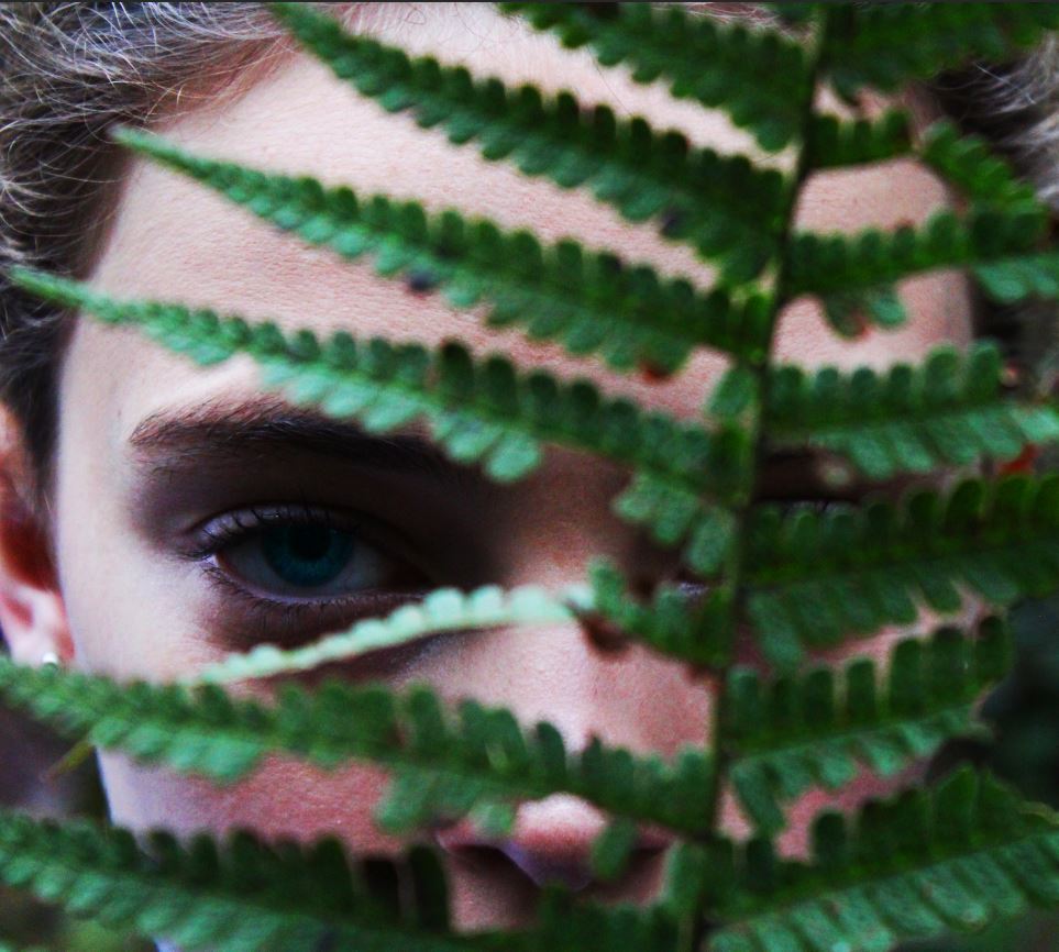
In the above image, I focused on emphasising the colours in the image, and in turn I was able to emphasize the contrast between the model and the plant in front. I feel that this image portrays the sense that the subject is hiding themselves (and in turn their femininity) behind the plant in the foreground. I feel that the eye-catching colour of the eyes draws attention to the stern look of he subject, while at the same time presenting the human side of the subject.

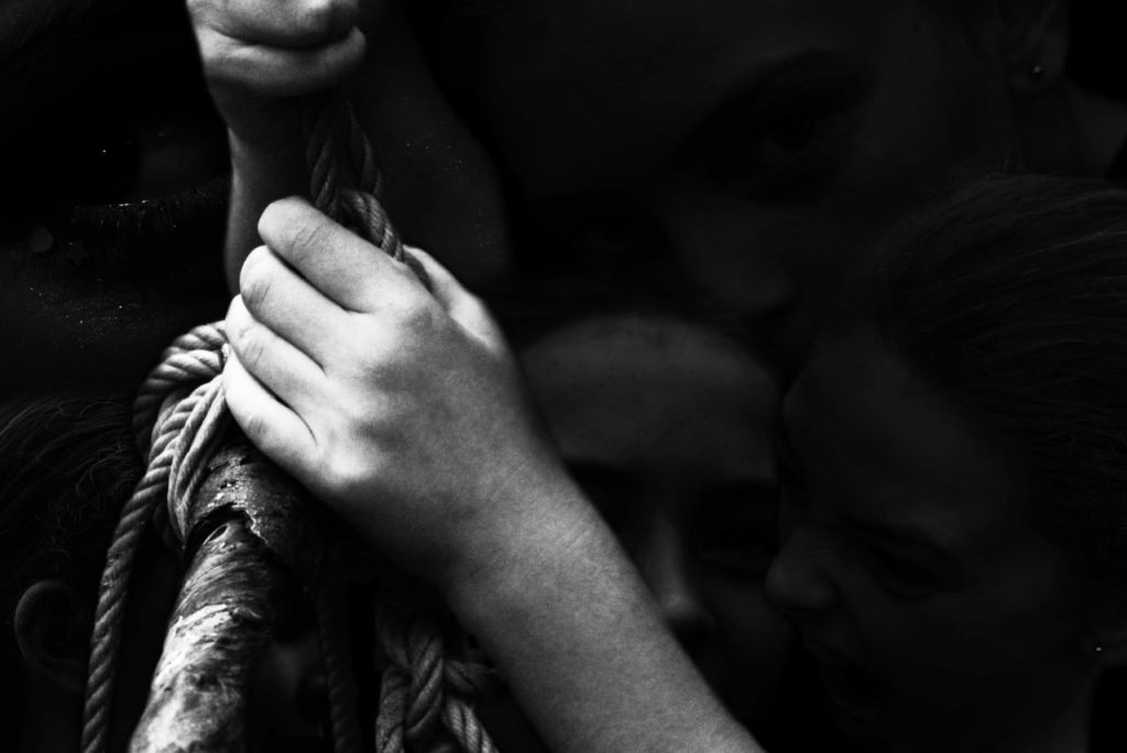
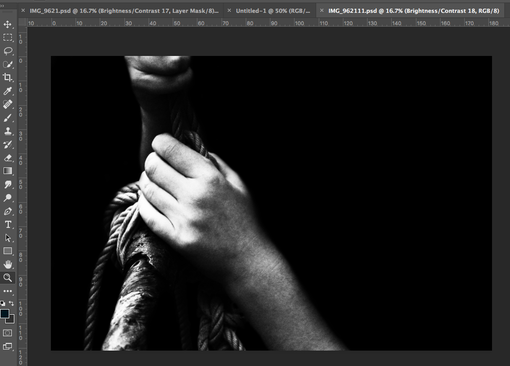
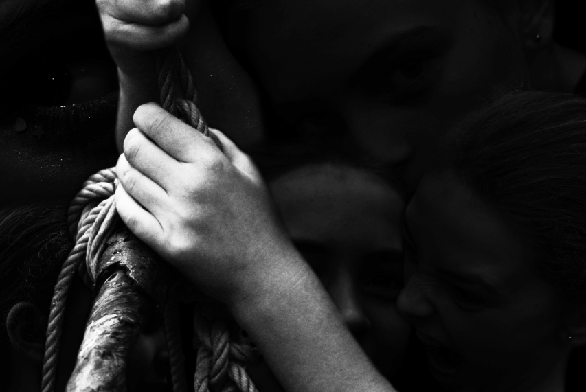
In this image, I was trying to convey the complexity of emotion, and the more extreme emotions of anger and fear which are often not associated with femininity. In this image, I feel that the background presents a selection of extreme emotions, some of which are unsettling to see a young girl portray, and therefore presenting the stark reality that although it is often expected for women to be emotional, feeling emotions of extreme anger, determination and strength are often not associated with femininity. The image in the foreground is an example of the subjects strength, with the contrast between the small feminine hands holding the mess of ropes and wood providing a more obvious example of contrast between things considered stereotypically feminine and masculine,

For the above image, I was focusing on portraying a contrast between the subject and the shapes of the plants in the image. I used a soft, feminine face, looking meekly into the camera, and contrasted this with the harsh sharp shapes of the holly leaves in the foreground. I feel that the use of this sharp plant brings a sense of menace and threat to the image. I also feel that the back of body-shape (other than a head) present in the image, and the use of the dark background, helps to bring an element of unease to the image, as it is difficult to place the subject when their body appears to be absent. I feel like these elements all together help to create a contrast between the gentle and harsher elements of the image.

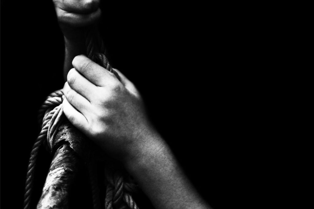
This image is another version of the image from above, but without the faces in the background. I feel like this image on its own presents an example of strength, and the black and white tones of the image create a contrast, and highlights the different textures and tones of the image.

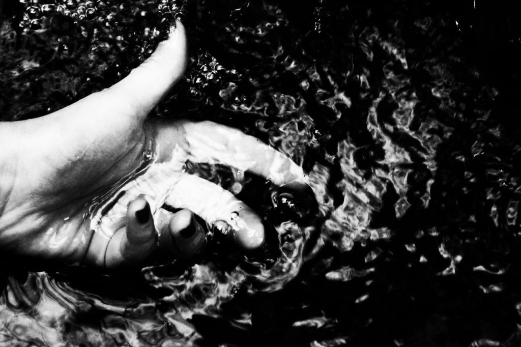
I feel that this image focuses heavily on the texture of the water, and the high contrast of the black and white tones of the image helps to emphasize this texture. I like this image as it presents a distortion of the subjects hand under the water, and the movement of the water gives the image an overall sense of adventure and action (elements not typically associated with feminine features, such as the painted nails)

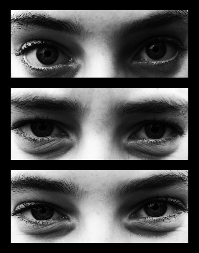
The above image is a presentation of the different emotions that can be inferred from eyes. The subject of the image is seen displaying different emotions through only the use of their eyes, thus focusing on the different and varied emotions that an individual can experience. The gender of the subject remains relatively ambiguous, and therefore the image can be used to represent human emotion, rather than the stereotypes of emotion (such as feminine emotions being fear and care, and masculine emotions being anger and ambition).

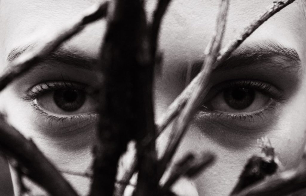
The above image makes use of the contrast between the roundness and detail of the subjects eyes, and the harsh thin shapes of the twigs in the foreground. This contrast in shape helps to emphasize the contrast between the 2 different characteristics of the image (more harsh, masculine aspects, and the femininity of the face), and yet at the same time, both characteristics compliment each other.

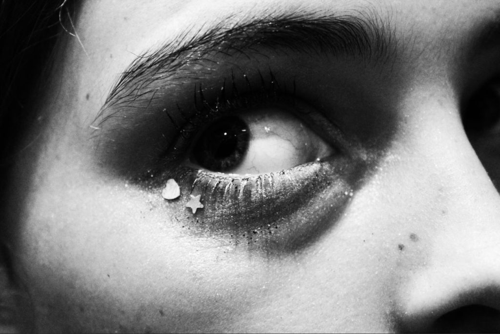
This final image was a close up of the subjects eye, detailing their makeup and the intricacies of their eye. I feel that this image accurately depicts the stereotype of femininity, with the heart and star sequins solidifying the feminine characteristics of the image. The subject is giving a somewhat fearful and alarmed glance to the left, and this contrasts the stereotypical characteristics of femininity in young girls (joy, happiness, excitement, kindness), and brings a level of depth to the image as the viewer is able to look past the physical appearance of the image, and question the reality of what is happening “behind the camera”.

Overall, I feel like this photo-shoot has allowed me to explore the intricacies of what is considered feminine and masculine, and I have been able to present these 2 different but complimentary characteristics in a subtle but impactful way. I feel like this photo-shoot has provided images that can be used in contrast to the move overt and obvious images in my study, and can be used to provide a more subtle, yet equally thought provoking example to the viewer of the ways that out expectations and predictions of gender can be broken and rearranged.

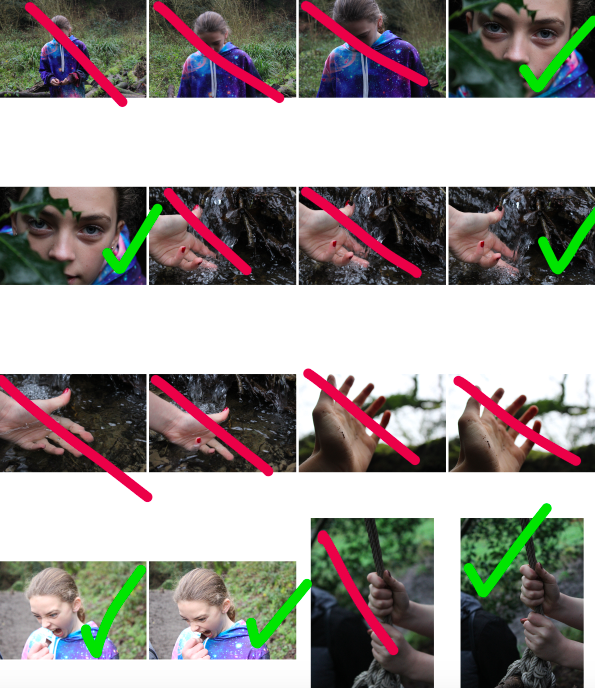
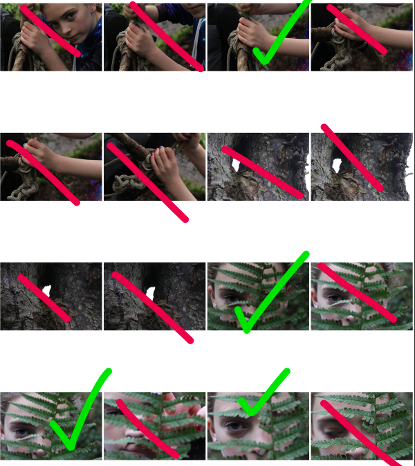
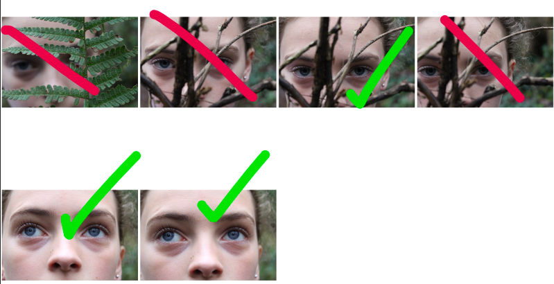
Photo-shoot 2: Selection and Editing:

For my second photo-shoot, I focused on displaying a break in feminine gender roles by focusing on showing women/girls in nature, showing them playing in forests and getting muddy. I feel like this approach allows for a subtle line to be drawn between the expectations that society has for girls, and the reality that many girls find joy in “masculine” activities, such as playing in the woods, exploring and adventuring. I find this concept to be a more subtle show of braking gender stereotypes than my first photo-shoot, and therefore have included this in order to contrast the more overt, brash examples of gender stereotypes with more subtle, hinting examples.

After selecting which images I would use to edit, I used the software Photo-shop to create and edit a range of images:

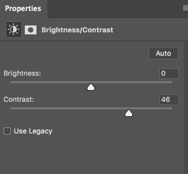
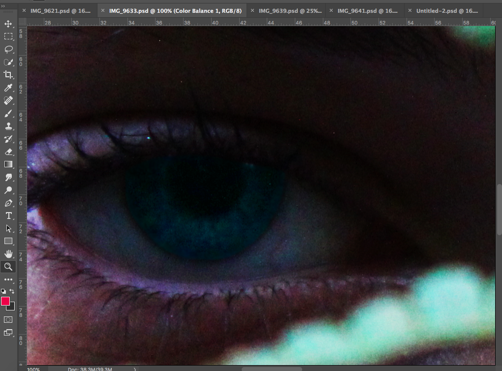
For many of my images, I increased both the saturation and contrast. I did this to make the colours and contrasting shapes and tones of the image stand out, allowing the viewers attention to be drawn to certain aspects of the image.

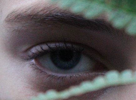
For the above image, I altered the saturation and contrast of the image, and then using the lasso tool on Photoshop, I highlighted the iris of the eye, and raised the contrast and saturation of the blue, in order to make the eye colour of the subject stand out much more. I did this to make the eye of the subject the focal point of the image, forcing the viewer to see the subject as an individual person by making eye contact with them through the image.

Simply by increasing the contrast and saturation of this image, and making small edits using the lasso tool, I was able to finish this image, using the colouring and shapes of the image as the focal point of the image.

The above image involved turning the images black and white , increasing the contrast, and placing all images onto a single page (I outlined the images with black rectangles using photoshop to better define each image).

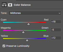
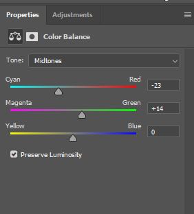
For many of my images, I also altered the colour balance of the image in order to emphasise certain shades and colours. In this instance, I increased the red and blue and magenta tones slightly (and I also increased the contrast and reduced the saturation), which gave the below final outcome:

The hardest image to create was one in which I would be merging a set of images together to create a background, while keeping a single image opaque in the foreground.

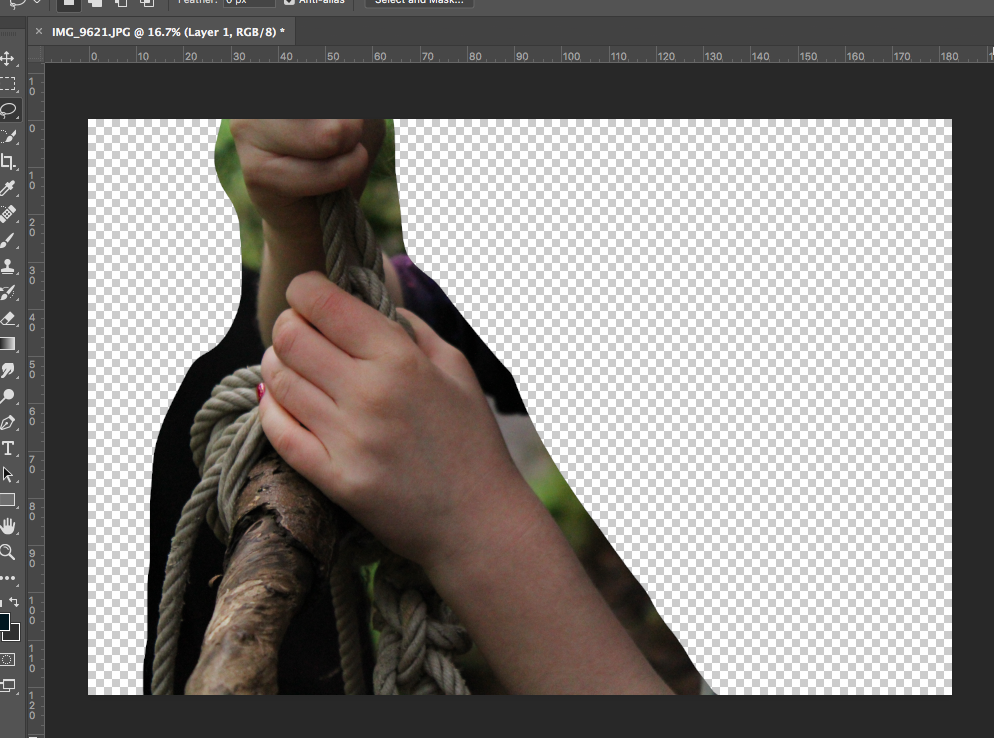
Initially, I cut out the part of the image I wanted to use from the background.

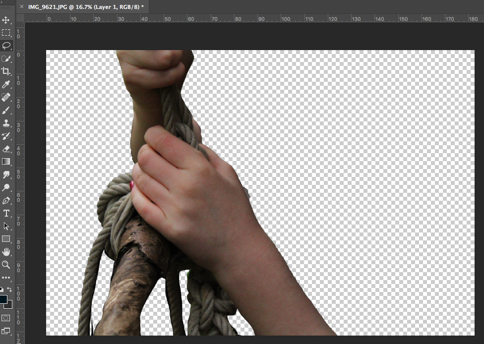
I then used the quick selection tool and lasso tool to cut the image out from the background fully. After this, I used the eraser with 0% hardness to soften out the edges of the image to make it look more natural.

I then increased the contrast of the image and turned the image black and white to match the black background that I added. I used a soft black paintbrush to go around the edges of the image to patch up parts the edges that did not match the background.

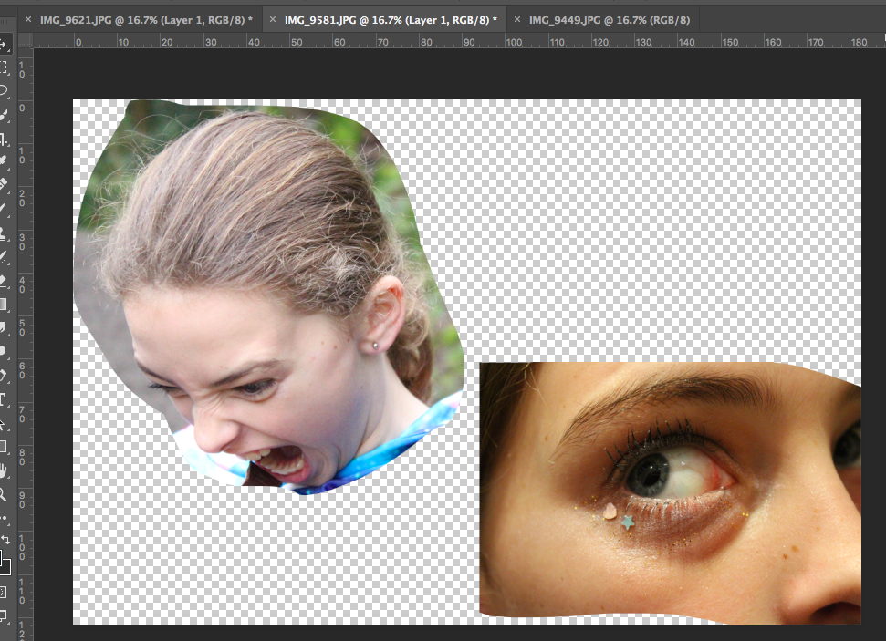
I then used the lasso tool to cut out a range of images of faces showing intense and varied emotion from a range of different images.

I then used the eraser tool at 75% opacity to make these cut out image more opaque and soft. Finally, I added these images behind the image in the foreground, allowing them to create the background for the image. I feel that although this image took a lot of work, I believe the outcome is an effective piece.

Photo-Shoot 1: Final Images

The final products of the editing process can be seen below:

In this image, I was looking to focus on editing to paint the picture of the contrast between feminine and masculine features. The broken, split appearance of the image is meant to signify the broken and split boundaries of gender norms, that are presented in the image. The choice to include pink as the boldest colour in the photograph, was decided due to the fact that pink is often seen as a delicate, feminine colour, yet in this context is being used in a bold manner, with a bold pink tone being used to split the black and white fragments of the image. This image was created with the idea of liberation in mind, with the gender and identity of the individual being expressed as bold, proud and strong.

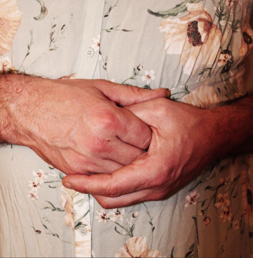
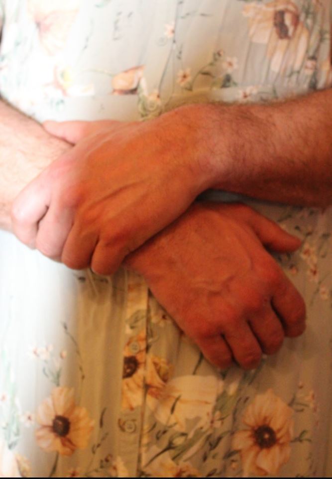
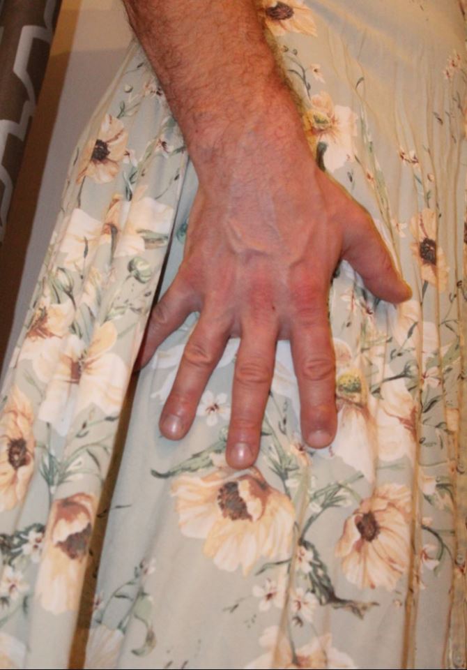
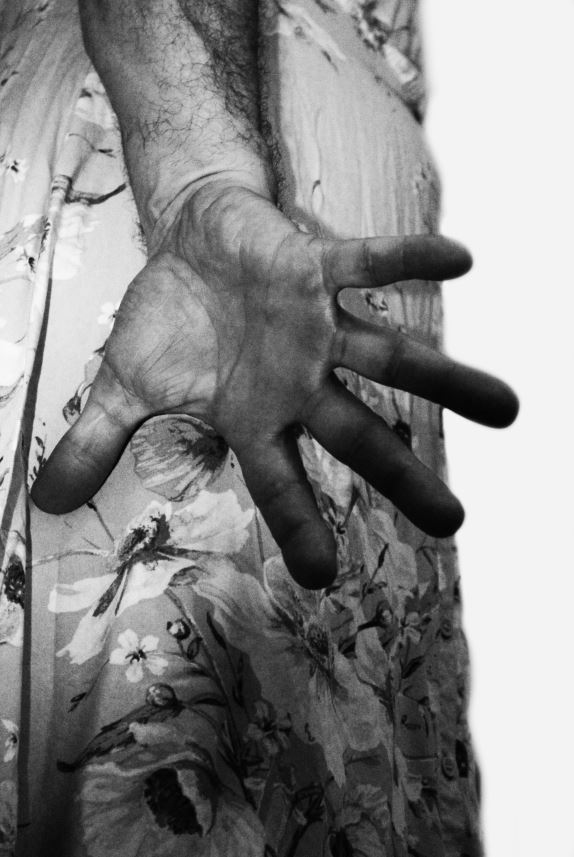
I have selected the above image as a final image due to the shapes and details within it. I feel that the shape of the forearm in the foreground is eye-catching, and draws viewers into the detail of the arm. It also makes it very clear that the arm is of a male, and therefor the viewer may assume immediately that the subject is male. However, the feminine clothing in the background, and the delicate, soft colours of the image give a contrast to this view, and provide contrast between masculinity and femininity in the image. I feel that this image presents a contrast between stereotypical male gender roles, and the defensive, masculine posture of the subject draws attention to the fact that the subject has to hide the feminine side of themselves (the floral dress) in order to present themselves as stereotypically masculine in order to avoid judgement from the outside world.

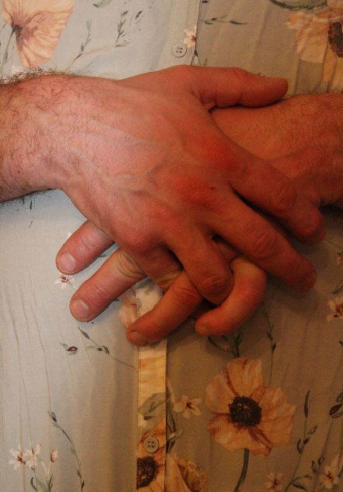
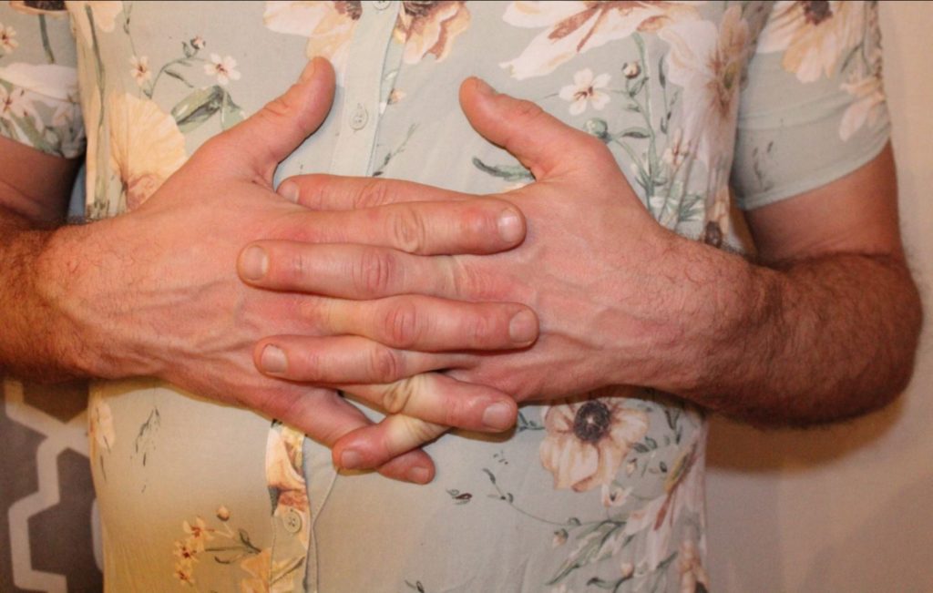
I feel that the simplicity of this image allows it to covey the meaning in a more fluid and subtle way. I used the split down the centre of the image to represent a split in an individual persona; how they present themselves on the outside may not be the way that they feel on the inside. The cut could also represent a split between what an individual knows is considered socially acceptable, versus what they wish they could be. I feel that the solemn, sturdy pose of the subject (hands held together in-front) helps to express the idea that individuals often have to keep these internal conflicts hidden from the outside world to avoid being judged or stereotyped.

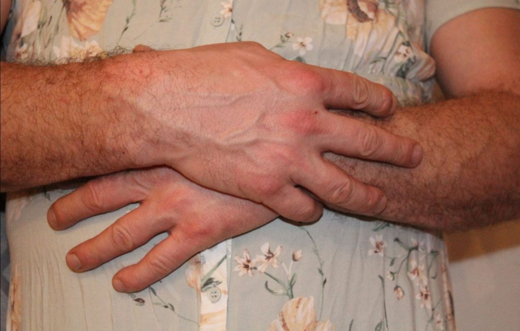
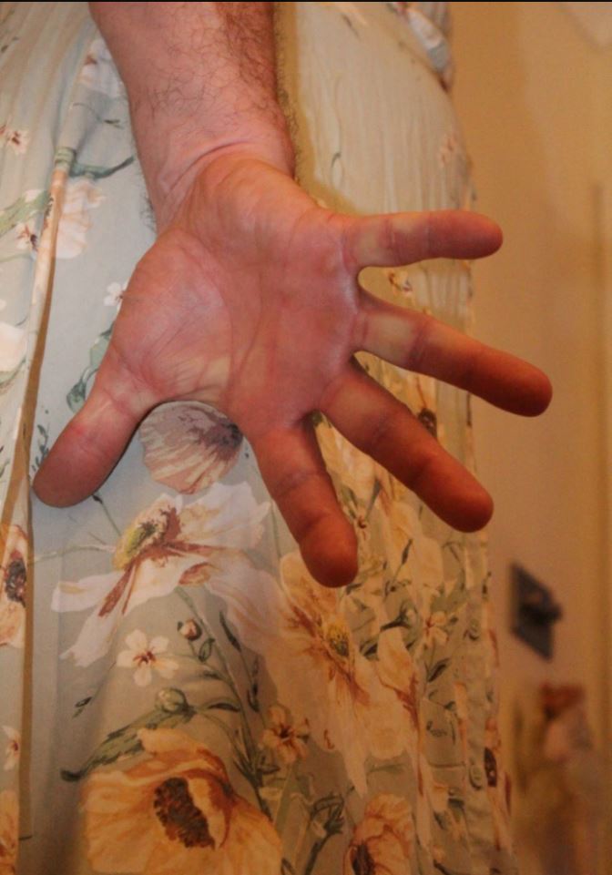
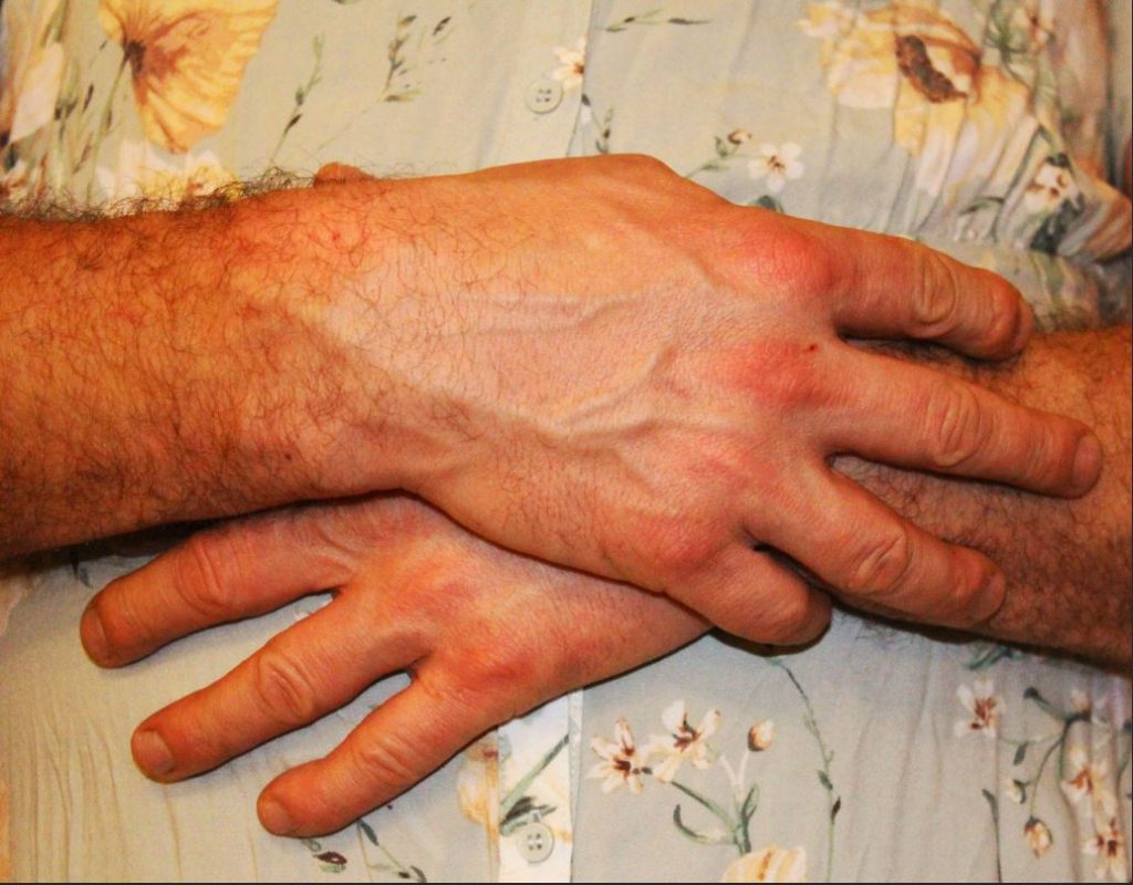
I selected this image as a final image, as I feel it represents and brings to light the more delicate, emotional side of men, and shows that, regardless of the masculine presentation of the individual, their ability to feel, love and their need to be cared for is no less. This image is made to reflect the more feminine aspects of gender stereotyped; the subjects hands are posed in a delicate feminine manner, and the slight warm hue of pink/red is meant to give the photograph an overall soft, feminine feel. However, this is all contrasted by the masculine shapes of the hands, which are placed as the main focal point of the image. I feel that by placing the subject in a feminine pose, while also drawing attention to the detail of the masculine features, helps to reflect the way in which, although an individual may present as stereoypically masculine, clues may show the reality of hidden emotion, and delicacy.

This image, I feel has a slightly vintage appearance to it, with the slight blue hue giving a vintage magazine effect. I decided to use this image as a final image due to the shape of the subject, and the hue that is edited over the top. I feel that the simplicity of the pose helps to draw attention to the clothing of the subject (which is the focal point for this particular image) and the close up allows for the detail of the masculine, contrasting features to be shown. I feel like this image is simple enough to be used as a single image that could sum up the entire study, and its simplicity makes it appealing for a stand alone image.

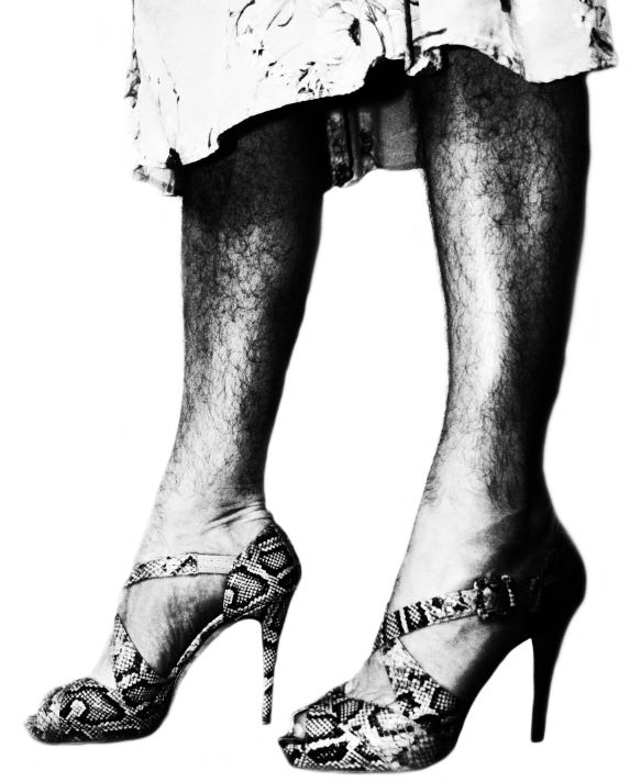
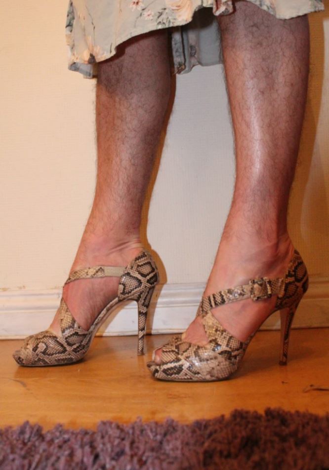
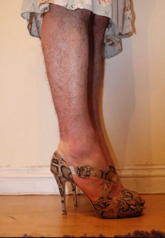
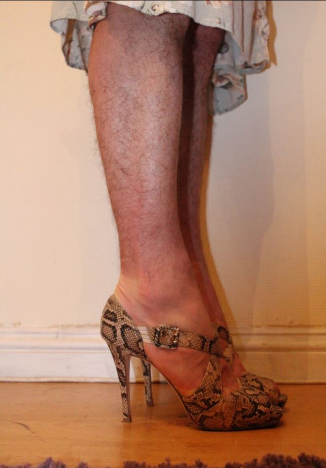
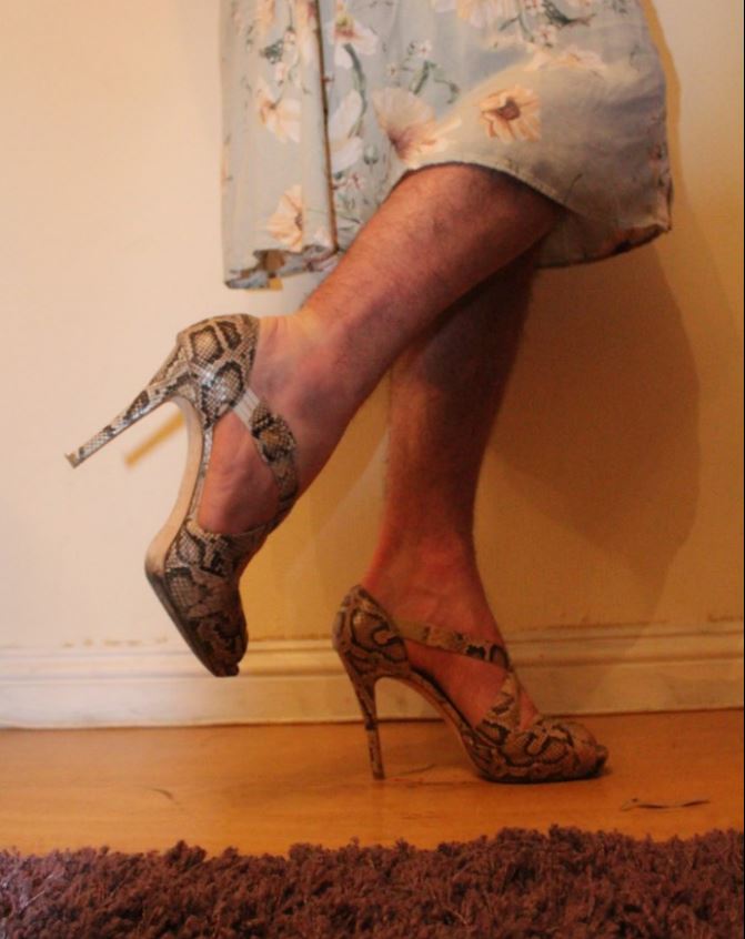
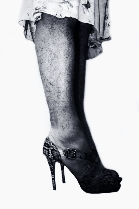
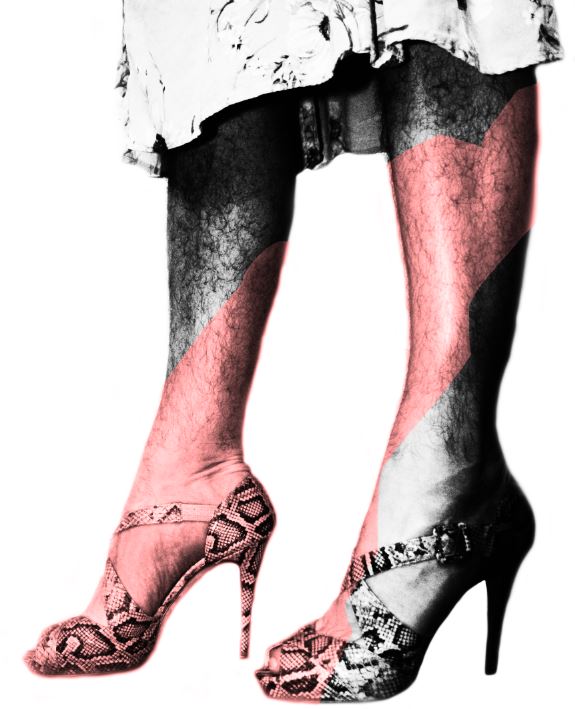
I feel that this image reflects the work of Helmut Newton, in the way it presents the subject in a posed, model like way, with the focus of the image being the legs of the subject. Using inspiration from Newton, I heightened the contrast of the image in order to draw attention to the details of the shape of the legs, and the details of the clothing of the subject (which contrast one another). I wanted to flip the idea of Newtons work, using a male subject to reflect the reality of the way that Helmut presents his models. Using a male model in a similar way helps to draw attention to the way in which we are desensitised to the sexualization/presentation of women body in media, and yet are not at all used to the same concept occurring with men

For this photo-shoot, I was looking to focus on the contrast between masculine and feminine features, and show how, in the modern era, these contrasts (which were once much more prominent and strict) are beginning to merge into one another. My focus for this photo-shoot was to create a response in the viewer, as the images are bold and striking in their contrast, and therefore I attempted to present a moral example to the viewer, asking them to decide whether the images make them uncomfortable, or whether they embrace the images and the way they differ from typical gender stereotypes. For this photo-shoot, I feel like I was able to show a striking contrast between typical feminine and masculine features, in a way that draws the attention of the viewer, but also reflects the progress that the world is making towards their views on gender and the lack of boundaries that should be placed on individuals when expressing themselves.

Photo-shoot 1: Selection and Editing

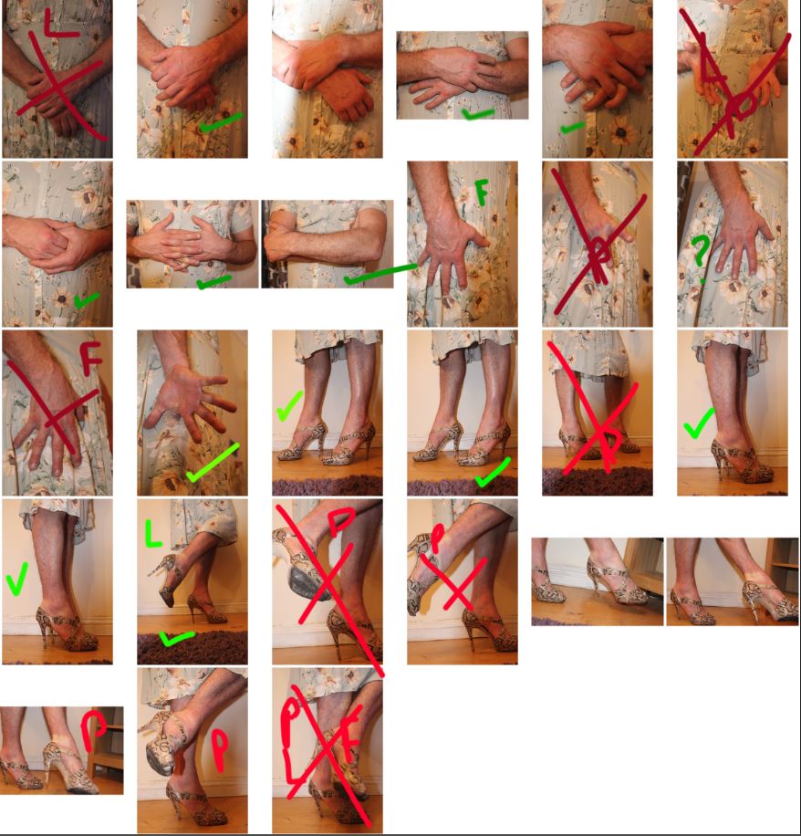
After taking inspiration from my planning mind-map, I was able to take a series of images for my first photo-shoot, revolving around the theme of breaking masculine gender roles, and merging both masculinity and femininity in order to show a liberation from gender stereotypes and roles. Here are my results:

Green tick: Will use in editing – Green L: Small lighting problem – Green ?: Possible final – Green F: Small focus problem – Red X: Rejected image – Red F: Focus problem – Red P: Subject position = wrong – Red L: Lighting problem

The final images from my selection can be found below:

After creating this contact sheet, I was able to using editing software Photoshop to edit the images I decided that I would use. I used different editing techniques on the images in order to show different final results, and made an attempt to enhance the colours and contrast of each image using the editing tools on Photoshop:

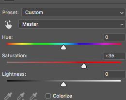
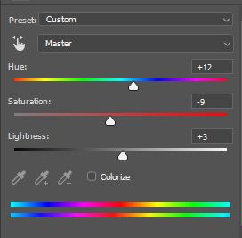
I decided to experiment with the hue of some of my images in order to give them an overall more blue/green effect. I did this because I believe that by increasing the presence of this colour, the image takes on a more delicate, soft overall feel, therefore reflecting the feminine side of the image that I am trying to convey.

Here, I adjusted the hue, saturation and lightness slightly to give the image a softer effect

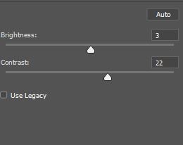
As well as editing the hue of my images, I also focused on increasing the contrast and altering the colour balance, in order to give the image an overall slightly softer and lighter effect.

After adjusting these settings, I was able to form an outcome of the image below:

I believe this image works very well, as it conveys a softness in the colours and lightness of the image, but at the same time, the masculine pose of the subject and the focus on the masculine arms helps to draw a comparison between how the subject presents themselves, versus how they may be feeling. The folded arms are protecting/hiding their femininity (the dress).

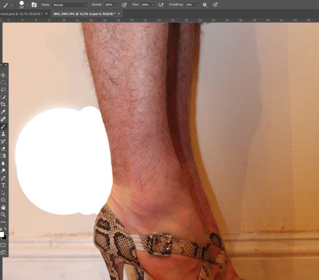
In my images, I also took steps to eliminate the background of the subject, or replace it with a colour that made sure to push all focus to the subject themselves, and to remove the background that did not match the context of the image. To do this, I used the eyedropper tool to locate a suitable colour on the background, and used the paint brush to carefully paint around the subject, and fill in the background.

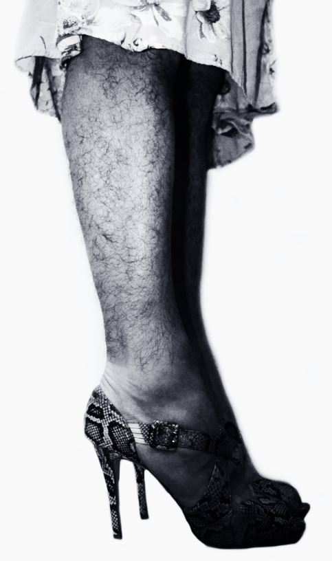
In some of my images, I made attempts to show as much contrast as possible between the light and dark areas of the photo, and in doing so enhanced the shapes and patterns of the subject and their clothing, which I feel helps to draw attention to the parts of the image where there is contrast (masculine legs vs the feminine clothing)

Here, I haven to cu around the subject to remove the background, I will then replace the background with a better image that makes more sense to the image.

After cutting out the subject from the background, I changed the image to black and white, and increased the contrast drastically. I then altered the colour balance so it sat more towards a blue hue, and therefore the final image is a black and white image with a slight blue tone, giving it a softer, but still stark bold overall look.

The following images are also a collection of my final images from my first photo-shoot, after the editing process:

This image took very little editing, I simply cropped the image to focus on the hands, and increased the saturation.
This image involved cutting out the image from the original background, and pasting it onto a white background. I then changed the image to black and white, and rose the contrast significantly.
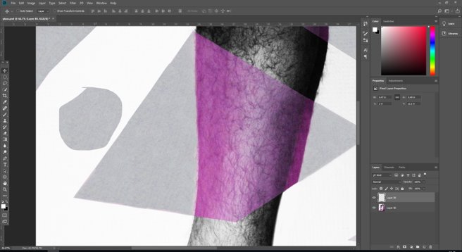
For this image, I used the lasso tool to cut a jagged line down the centre of the image, and highlighted one half of the image in order to select it. I then copied that half of the image onto a separate layer, and was able to adjust the contrast of each 1/2 of the image separately, to create this split, distorted effect on the final black and white image.
This image was cut and pasted onto a white background, and was changed to black and white, with a slight raise in contrast
This image involved using the lasso tool to cut the lines through the image, and I then merged the layers of the lasso images together, in order to create the broken effect. I then individually edited the 2 layers, changing the colour balance of some fragments of the image so they gave a much more pink hue, in contrast to the black and white fragments of the image. I then used the lasso tool to copy and paste sections of the background, in order to clean the background up.
I used the lasso tool to cut and paste certain parts of the image, in order to separate the image into different layers to work on separately.
Here is an example of where i cut part of the original background out. I would then shape this cut-out-part to fir it into any areas where there are blemishes in the background in order to cover them
This image included cropping the image to focus on the hands, and changing the colour balance so the image was more red-toned. I then increased the saturation slightly to bolden the colours.
The above image included using the lasso tool (as used in previous images) to select a portion of the image to copy and paste onto a separate layer. I then edited the 2nd layer to an overall red hue, and increased the contrast of the first layer, also changing it to black and white. Furthermore, I cut the image from the original background and pasted it onto a white background.

Photo-shoot 2: Planning

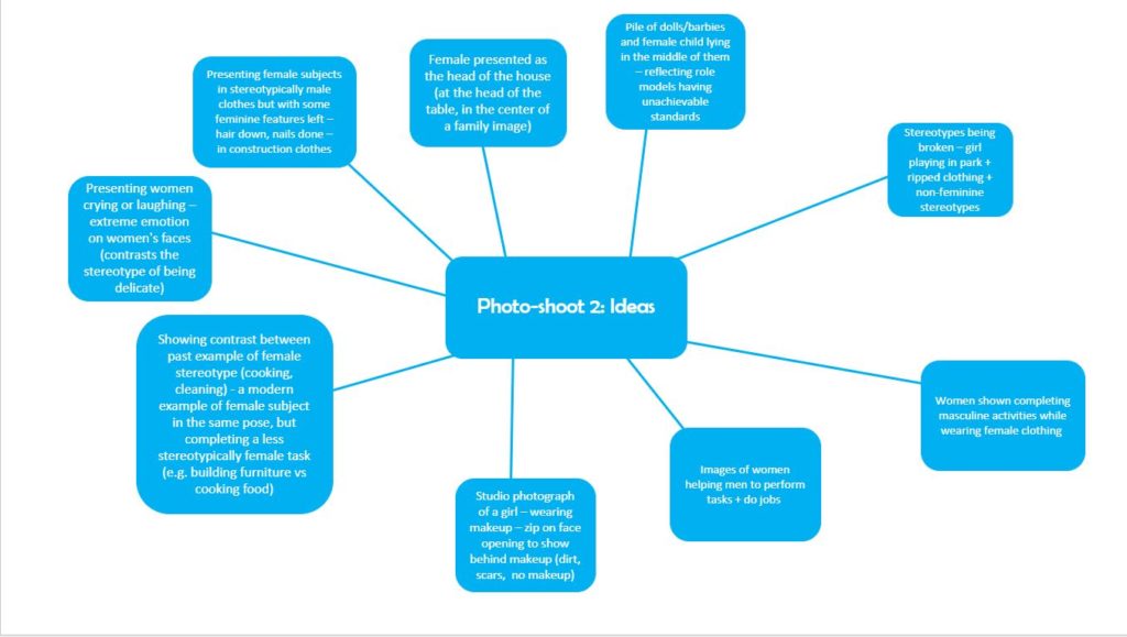
For my second photo-shoot, I have decided to focus on breaking stereotypical female gender roles. With this approach, I will take a more historical look into the stereotypes of gender, as I feel that comparing the progress in the way women are viewed as individuals provides a very obvious example of the way that gender roles have developed and changed over time. I will be focusing on the more subtle differences in the way women are treated and perceived (both positive and negative sides), and will be showing contrast between images throughout the photo-shoot.

I will be focusing on the strength of individual women in comparison the the way in which they are often perceived by society, and will be making overt comparisons between the ways that men are perceived, versus the way that women are perceived when carrying out certain activities and roles. I will attempt to convey the way in which women have been allowed to have more control over their autonomy, and have been liberated in the sense of controlling their own views on beauty, while also bringing to light how women still struggle with the weight of media/society’s expectations on them to be individual and strong, as well as feminine and beautiful. I will highlight that, when women decide not to abide to societies ideals of beauty, they make people uncomfortable, and i will be using these examples in order to show the contrast between women’s views of themselves in the mid 20th century, versus the present day.

I have created a mind-map to show ideas for photo-shoot 2: