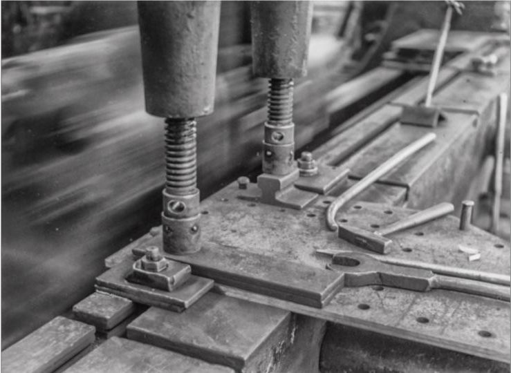
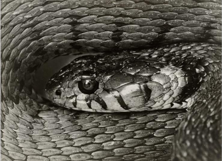
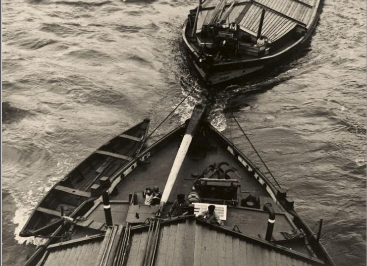
All posts by Emily C

Filters

Author:
Category:

Environmental Portraits

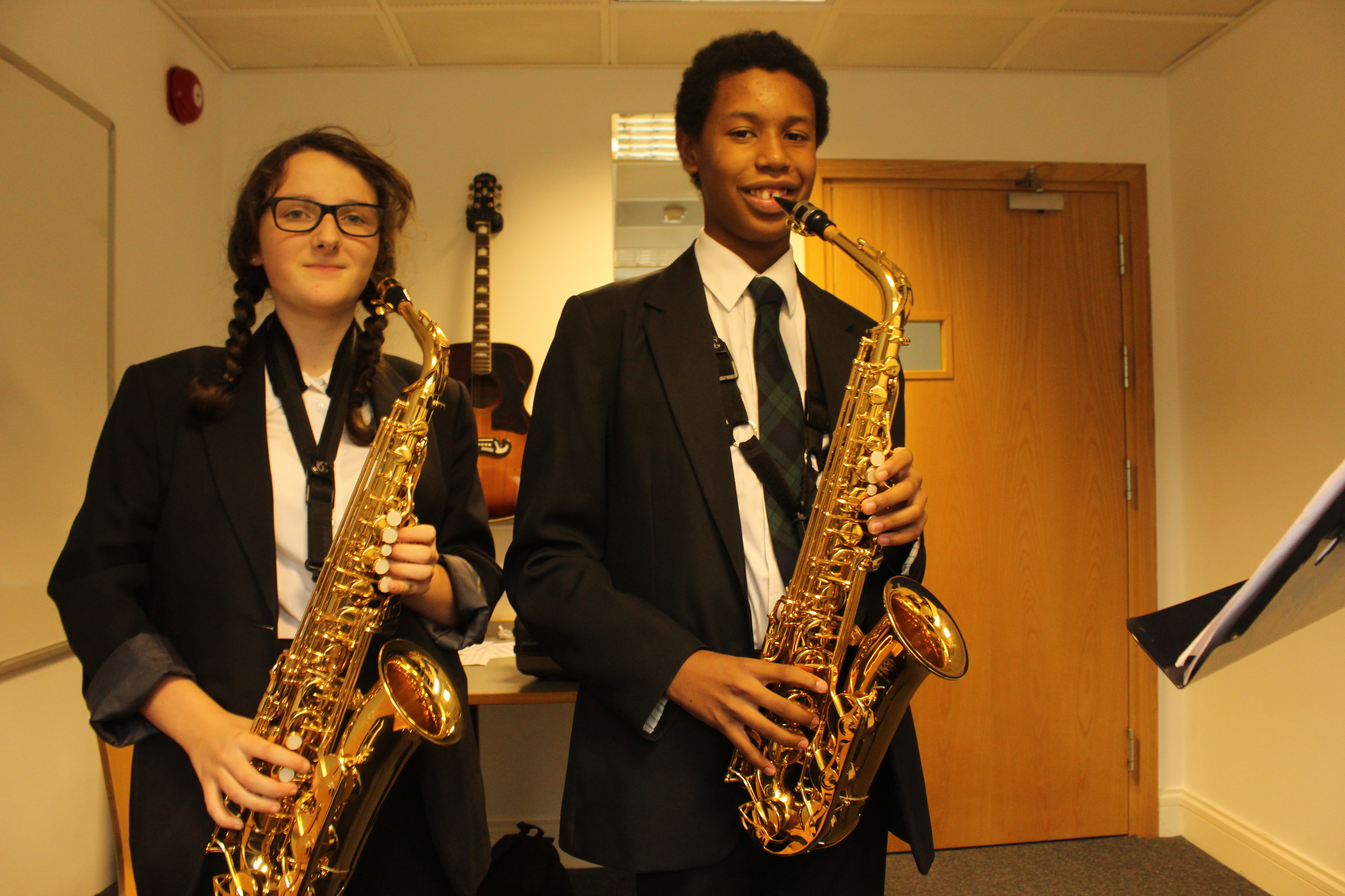
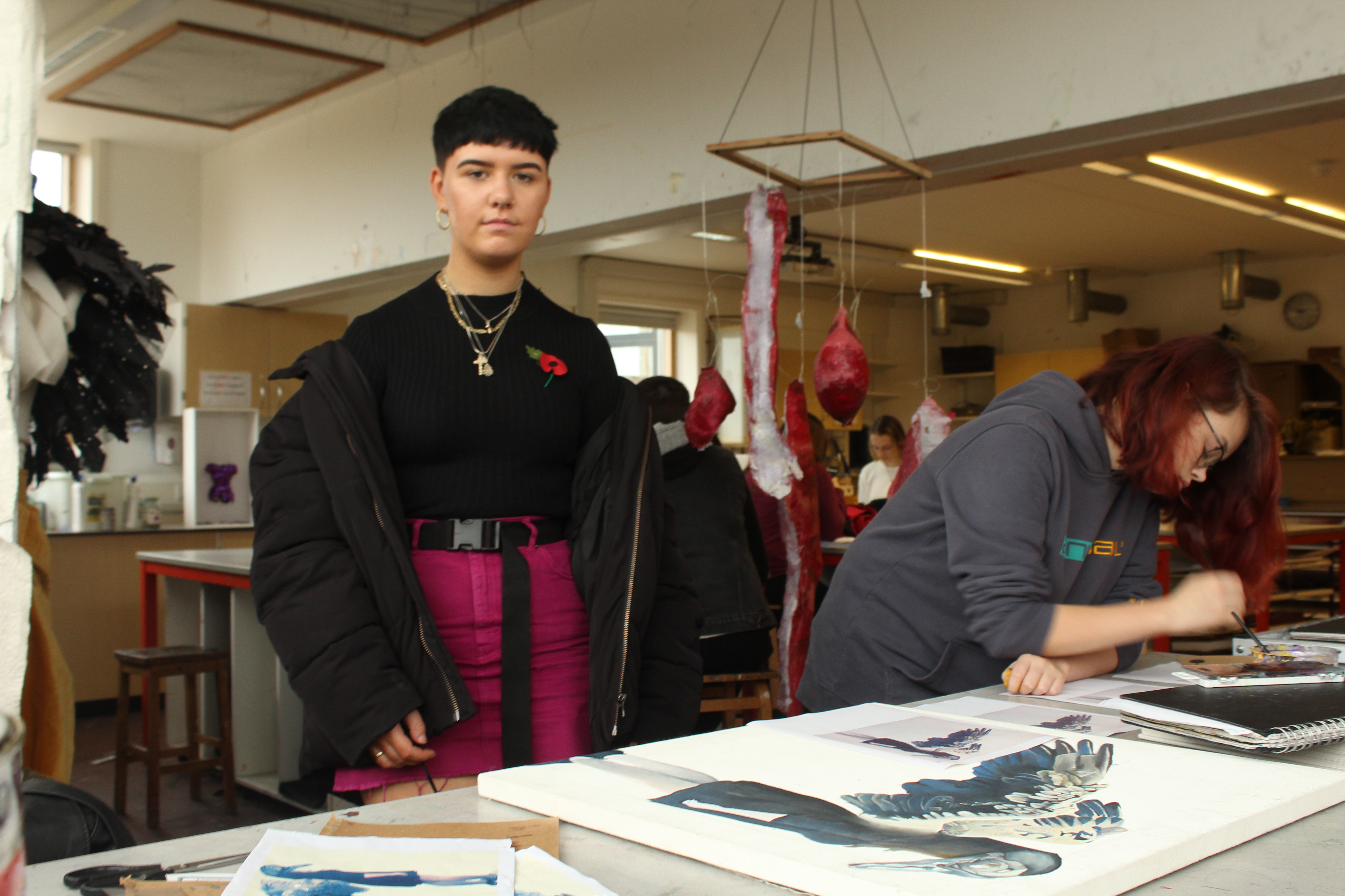
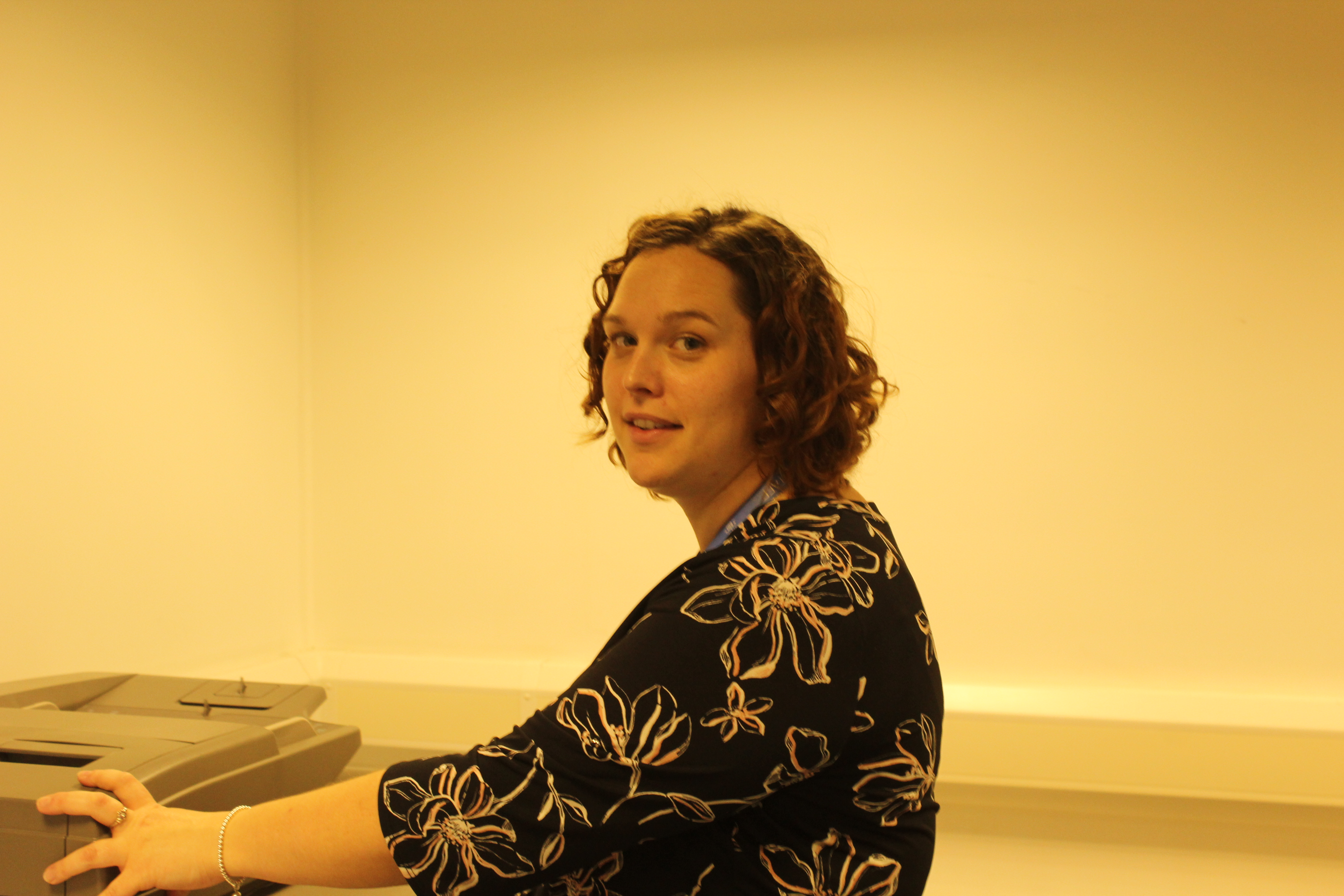
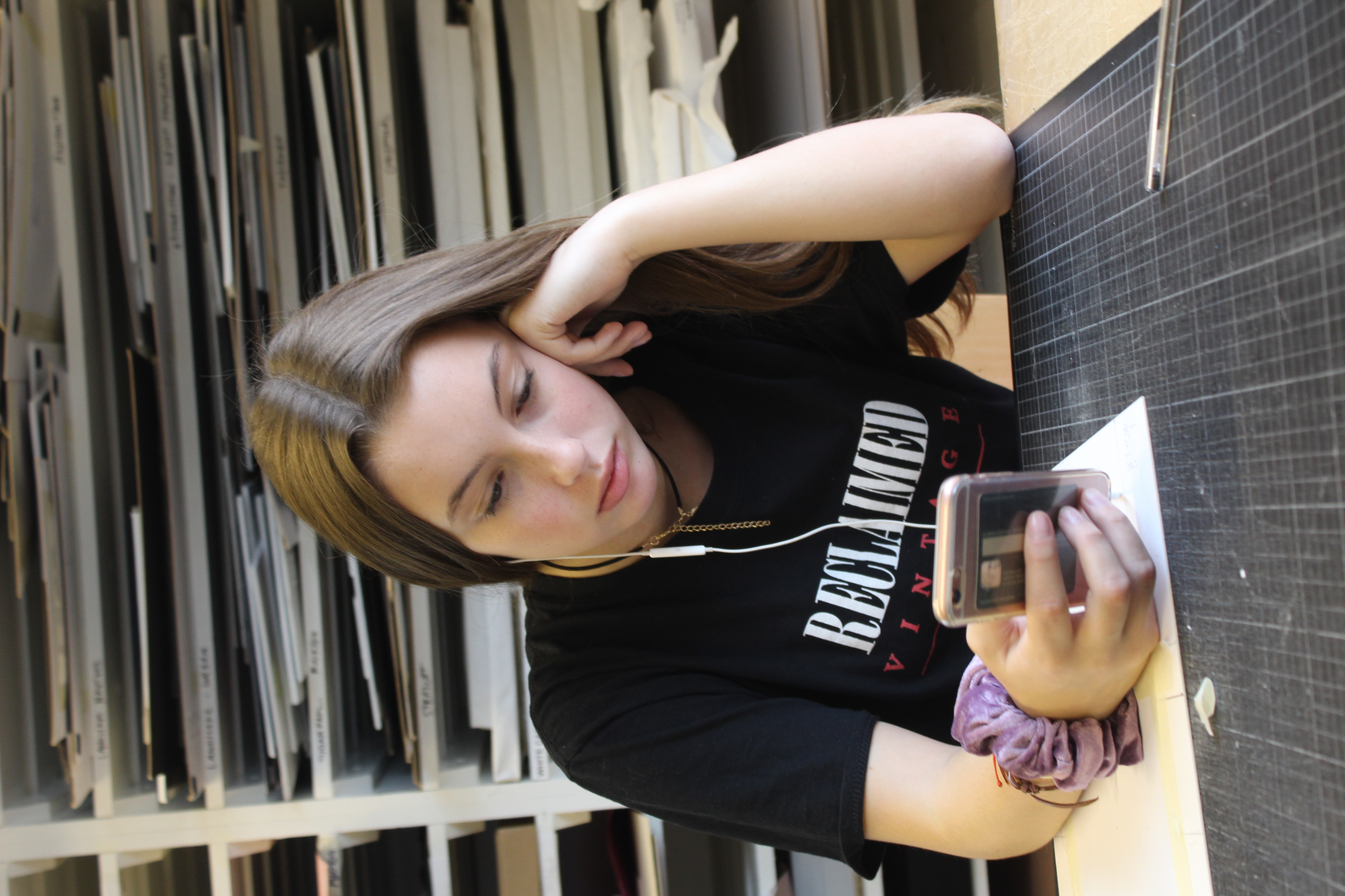
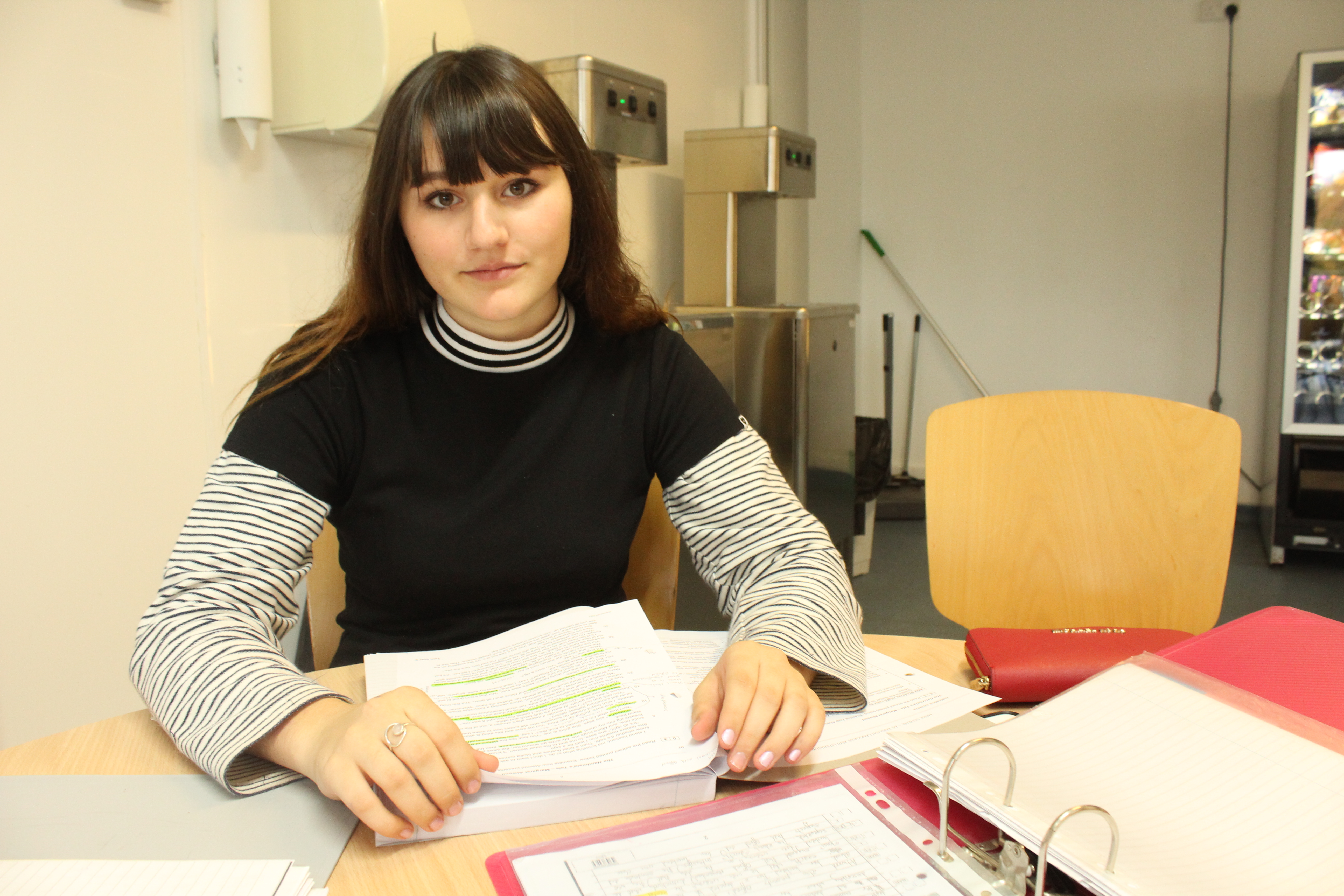
Environmental Portraits capture a subject in their natural environment, and are used to convey the personality and lifestyle of the subject through the context of the image. Environmental portraits often make use of the subject maintaining eye contact with the camera, and posing with a neutral expression on their face. This helps to convey a powerful message to the viewer, as the subject is simply representing what they would look like in their own environment, as they are not posed in an action shot. This helps to maintain the attention of the viewer on the environment, as wells the subject themselves and what they represent.

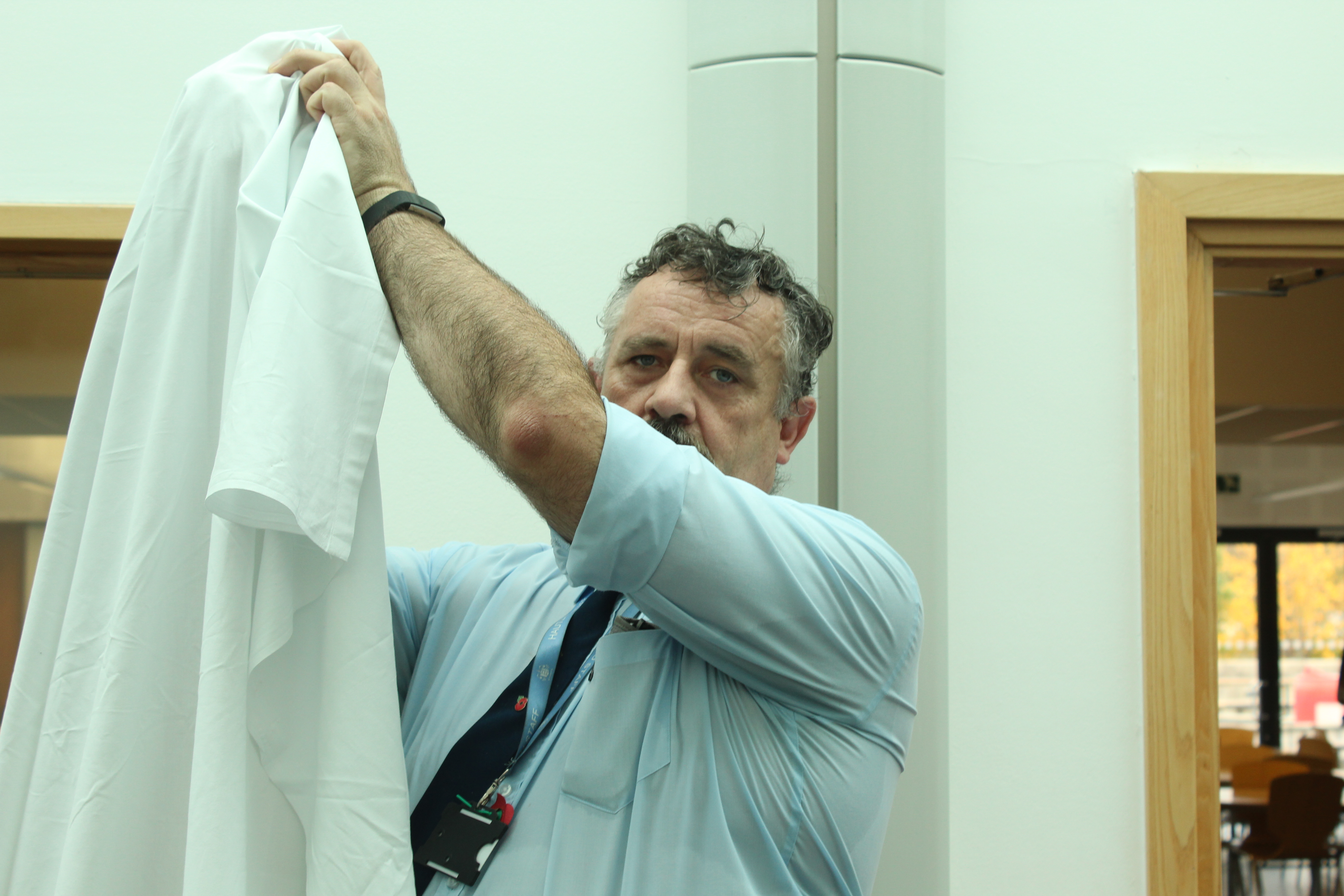
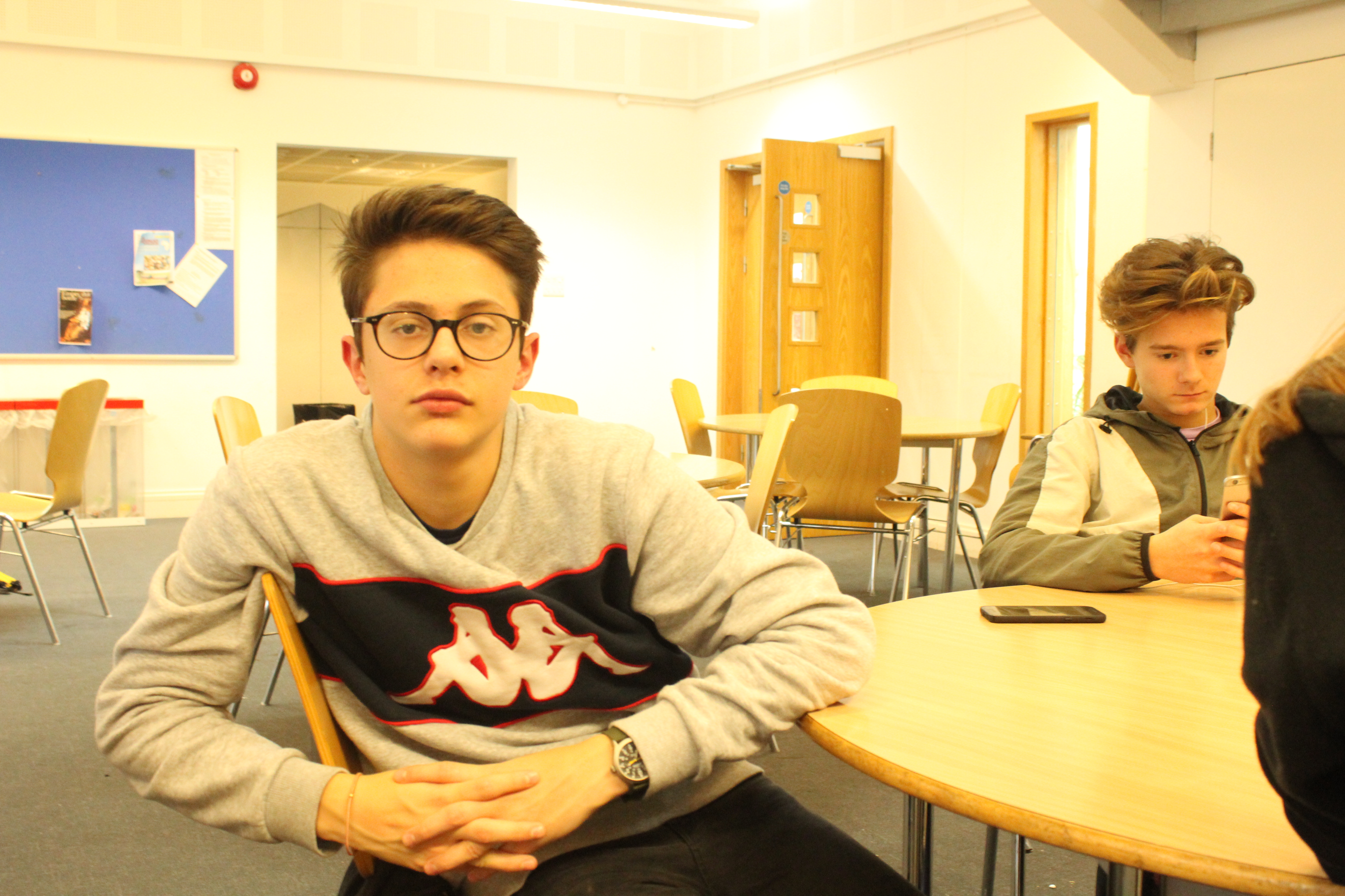
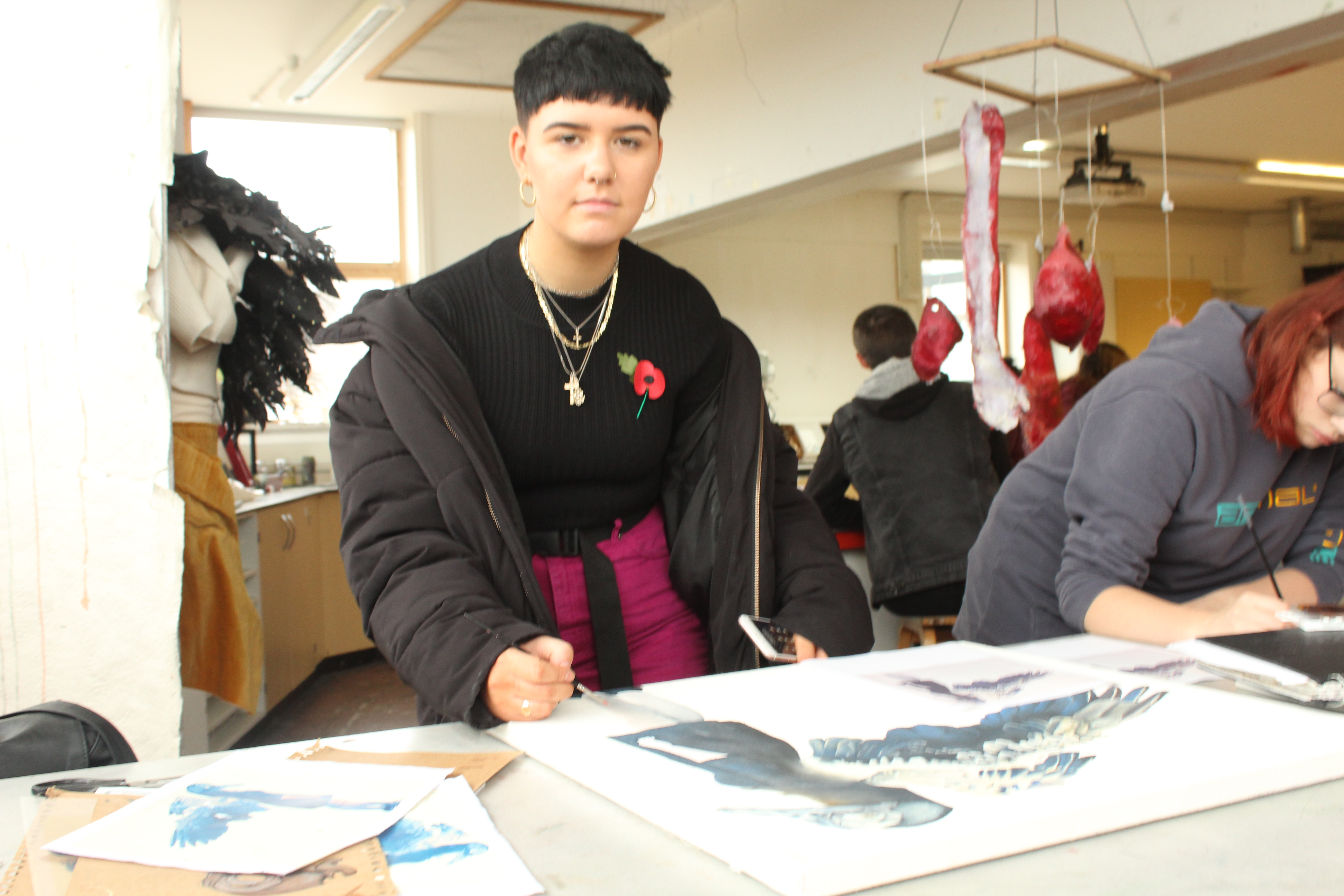
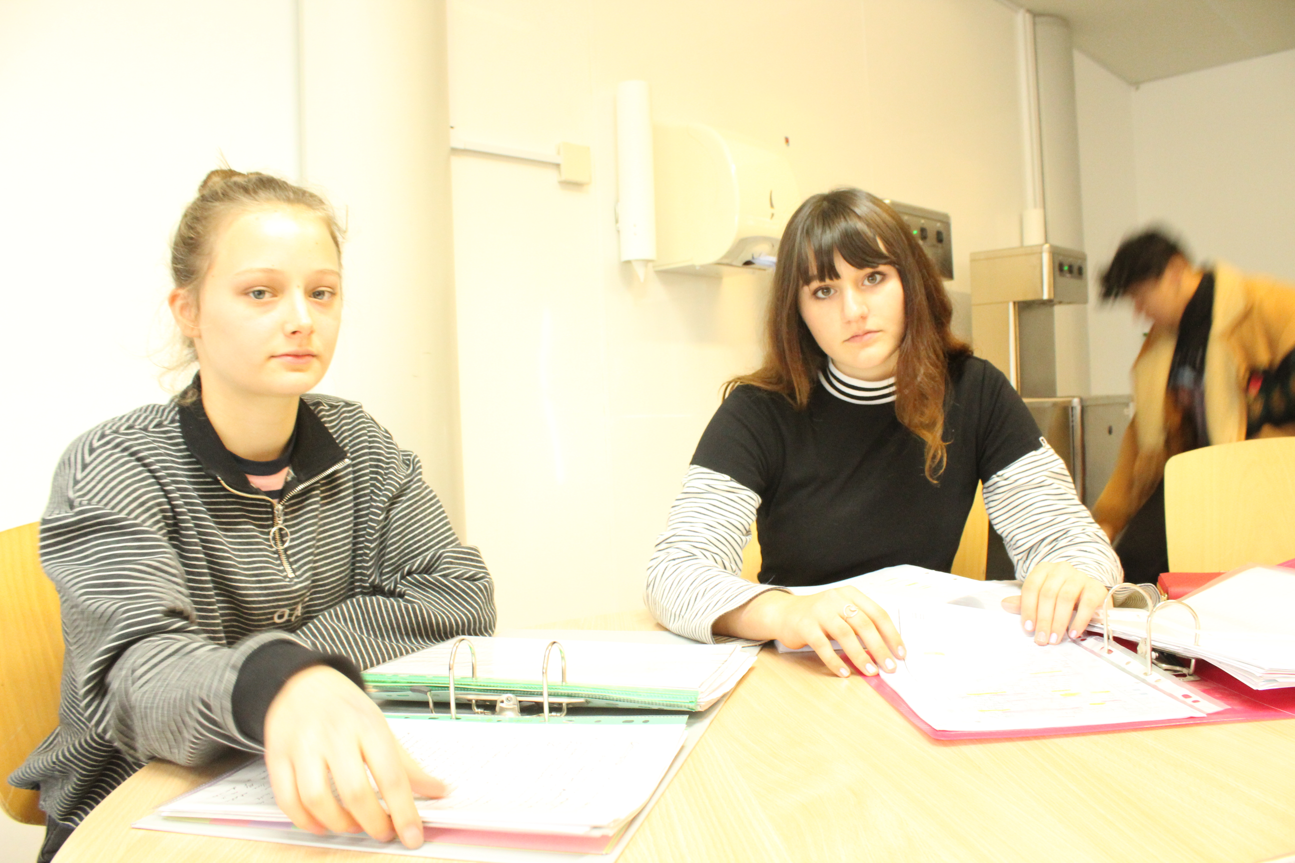
The following images are the images I have taken of the different people found in a school environment:

I feel that these images all convey the different environments that can be found within a single school, and the variety of subjects help to present these different environments effectively. The use of eye contact in environmental portraits helps to maintain the attention of the viewer on that specific subject, and allows the viewer to believe that the subject represents all individuals who are associated with the same environment.

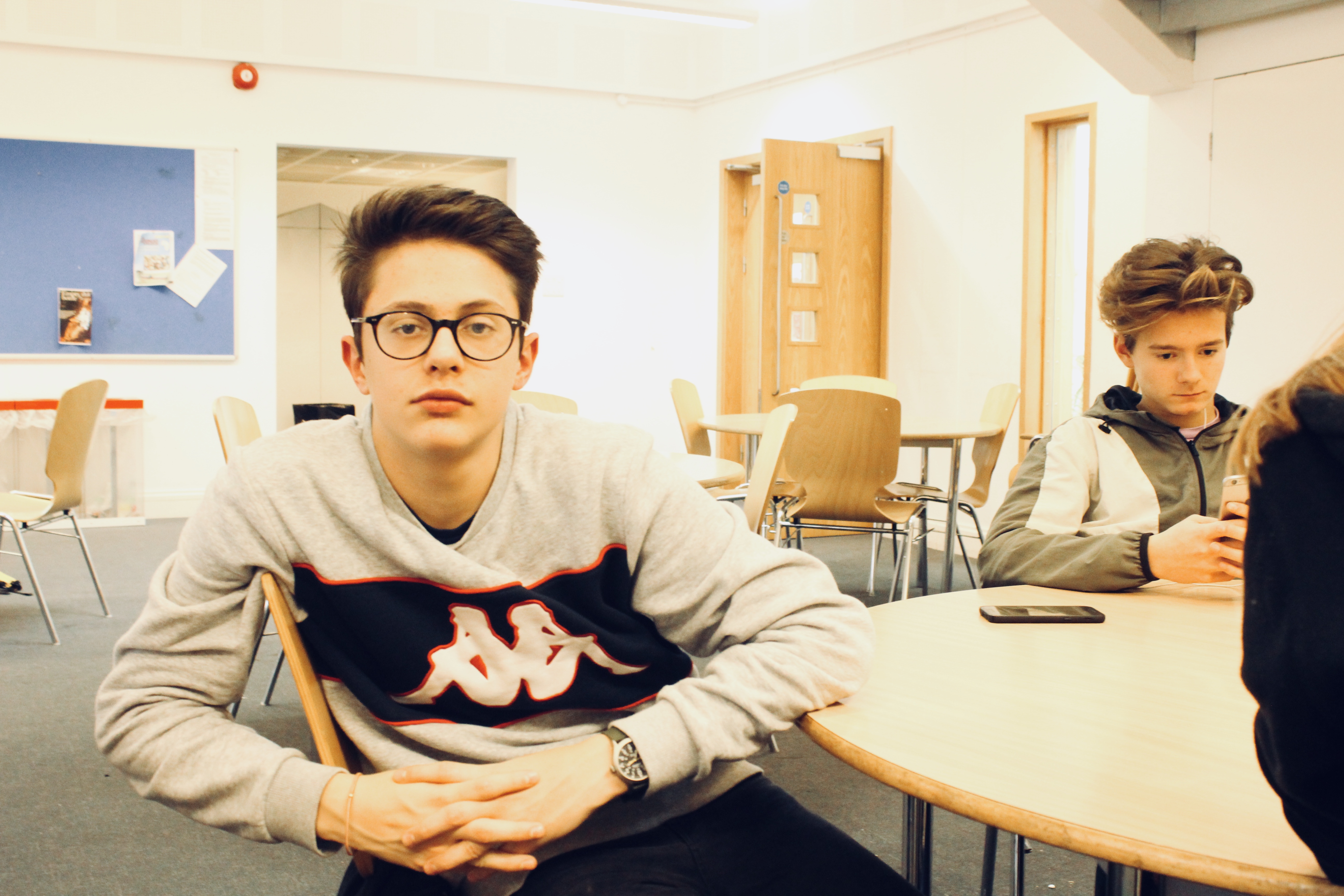
The above image was taken in the canteen, and the subjects facial expression and eye contact is in line with what would be expected of an environmental portrait. The original image was taken in lighting that was difficult to work with, even using camera settings such as white balance, and so the during the editing process the yellow tint was removed to show a more natural representation of the environment.

The props used by subjects in environmental portraits can also help to tell the story of the context of the image. In the above image, the subject is using a prop (a white sheet) to show that they are in the process of creating an in school display. The use of the prop helps to give more context to the subject, and in turn helps to convey that the subject is in their natural environment.


Portrait Analysis – Arnold Newman

Portraits can be used to convey the personalities and emotions of the subject being used. In many instances, photographers use both the context of the image, and the subjects pose, to convey a message.

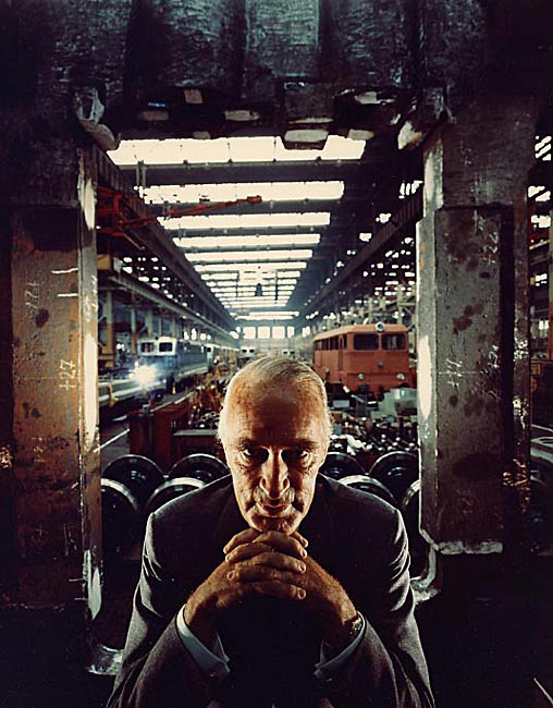
The below photograph was taken of industrialist Alfred Krupp, and became a very well known image, due to the message that it conveyed and presented.

Emotional Response:

My first reaction to the image, is that it seems to portray a sinister, dark theme. The way the subject is positioned makes it seem like he is mimicking an evil character, and his facial expression is unnerving and  lacks emotion. This image is also very full, and the attention of the viewer is moved from the subject in the foreground to the different activities occurring in the background. this makes it difficult to concentrate on a certain part of the image, and so I dislike this aspect of the photograph.

Visual:

The photograph makes use of dark, contrasting colors to present a more sinister and unnerving tone. The setting of the railway station gives the image an industrial, strict feeling, while the graffiti on the walls of the cement pillars makes the setting seem more run-down and decrepit, allowing the photograph to present a more eerie feel to it. The fact that the subject, an elderly man wearing a suit, is positioned in the very foreground of the image, startles the viewer, and makes it seem like the subject is the dominant figure in this scenario, possibly that the subject owns the station, but doesn’t participate in any manual labor due to the presentation of him wearing a suit.

Technical:

This photograph was taken with a camera, at eye-level with the subject. The image has good symmetry, as the subject is centered in the image, and the industrial setting behind him shows a relatively symmetrical layout. The image also has a strong perspective, as the setting behind the subject seems to carry on towards the center of the image, in the distance, showing the length of the railway line. These techniques used allow for the photograph to show the setting as a large industrial area, and allows for the viewer to focus on the subject and his position, as he is directly in the center at the front of the photograph.

Conceptual:

Newman idea behind this image was to present the subject as sinister as possible. The main focus of the image is to draw attention to the subjects personality, as Newman has attempted to portray how bad of a person Krupp was, through positioning him to look like a villain. Newman used both subtle and unsubtle techniques to present this effect, and overall, the concept of the image can be deduced relatively easily by analyzing the setting, the position of the subject, and the context behind the photograph.

Context:

In 1963, photographer Arnold Newman was contacted by industrialist Alfred Krupp to photograph a portrait image for him. Krupp was discovered to have produced transport and materials to assist the Nazis during the second world war, and after learning Newman was Jewish, Krupp refused to see him. After being persuaded through viewing Newman’s impressive portfolio, Krupp agreed to allow Newman to photograph him. Newman took advantage of this, and portrayed Krupp in the most sinister and eerie way possible in an act of revenge for Krupp’s influence in the prosecution of the Jews.

Portraits in Photography

Portraits in photography are often used to capture the personality of the subject, and to present a thought or feeling through the use of a human subject, making the photograph as a whole, more relatable.

Different camera techniques and editing skills can be used, depending on what the photographer is trying to portray in their image. The following are professional examples of different techniques that a photographer could use when taking a portrait image of a subject:

Posed portraits:

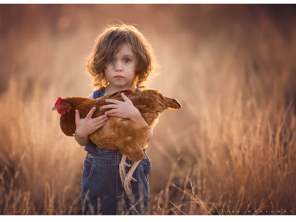
Photograph by Lisa Holloway

Photographers may decide to pose their subjects in order to convey a specific image, or to present an action or scene that would be difficult to capture in a candid photograph in everyday life.

Candid Portraits:

Photography from: https://www.glassdoor.co.uk/Photos/Studio-31-Office-Photos-IMG1973125.htm

Candid photographs are images taken while the subject is not posing, and is instead completing a natural task in their natural environment. Candid photos are often used to show the personality of the subject, and makes use of the setting how it naturally is in everyday life.

Half-body Portraits:

Photography by Yew Kwang

Half body portraits are often used in professional photographs. They allow for the personality of the subject to show through in the photograph, but in a more professional manner, as the focus is still on the face and upper body posture.

3/4 length portraits:

Photograph by Alan Fisher

3/4 length portraits typically focus on the top 3/4 of an individuals body, leaving out the bottom of the legs. this can be used to present the whole appearance of the subject (including clothes and posture) without minimizing any details that may be left out in, for example, a full body portrait.

Full body portrait:

Photography from: https://www.dpreview.com/forums/post/56358184

Full body portraits are meant to show the viewer the entire posture of the subject, as their whole body is in the image. they are commonly used in fashion magazines, where the purpose of the image is to show a full outfit of clothing on a subject.

High angle portrait:

Photography from: https://storyboardclass.wordpress.com/cinema-language/high-angle-shot/

High angle portraits are often used to emphasis the small size of the subject. they place the camera in a position of dominance, and thus the subject is presented as smaller.

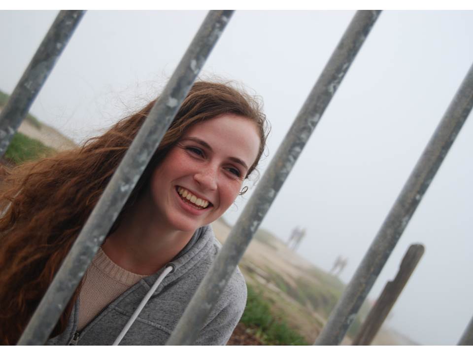
Canted angle portrait:

Photograph from: https://sckimadam.wordpress.com/2015/02/12/21/

The canted angle is produced by tilting the camera at an angle, so that the horizontal lines within the image are no longer parallel with the frame of the image, and any vertical lines lie at an angle to the side of the frame of the image. This technique emphasizes the diagonal lines of an image, and can be used to emphasis drama and interest in an image.

photograph from: https://www.thephotoargus.com/beautiful-black-and-white-portraits/

Black and white portraits:

Black and white portraits are created during the editing process of an image.  Using black and white can help to emphasis the shape, texture and contrasting tones of an image, and can make an image more effective if it uses different shapes and angles.

High-key portraits:

Photography from: https://profoto.com/in/profoto-stories/how-to-do-a-high-key-portrait

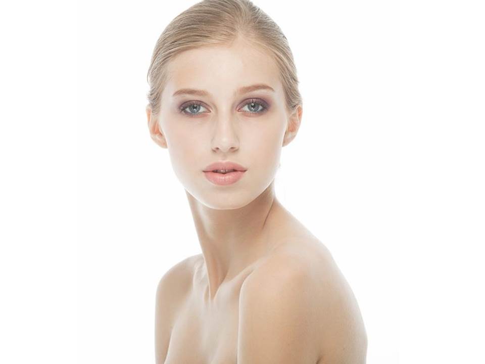
High key portraits make use of light colors, and images are often taking using lots of artificial light, using neutral colors in the image. High key images help to draw attention directly to the subject, as attention is not diverted by any bold colors or shapes.

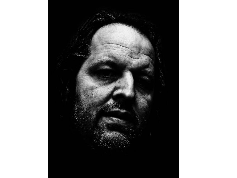
Low-Key portraits:

Photograph from: https://www.portraitprofessional.com/blog/lowkeyportraits.php

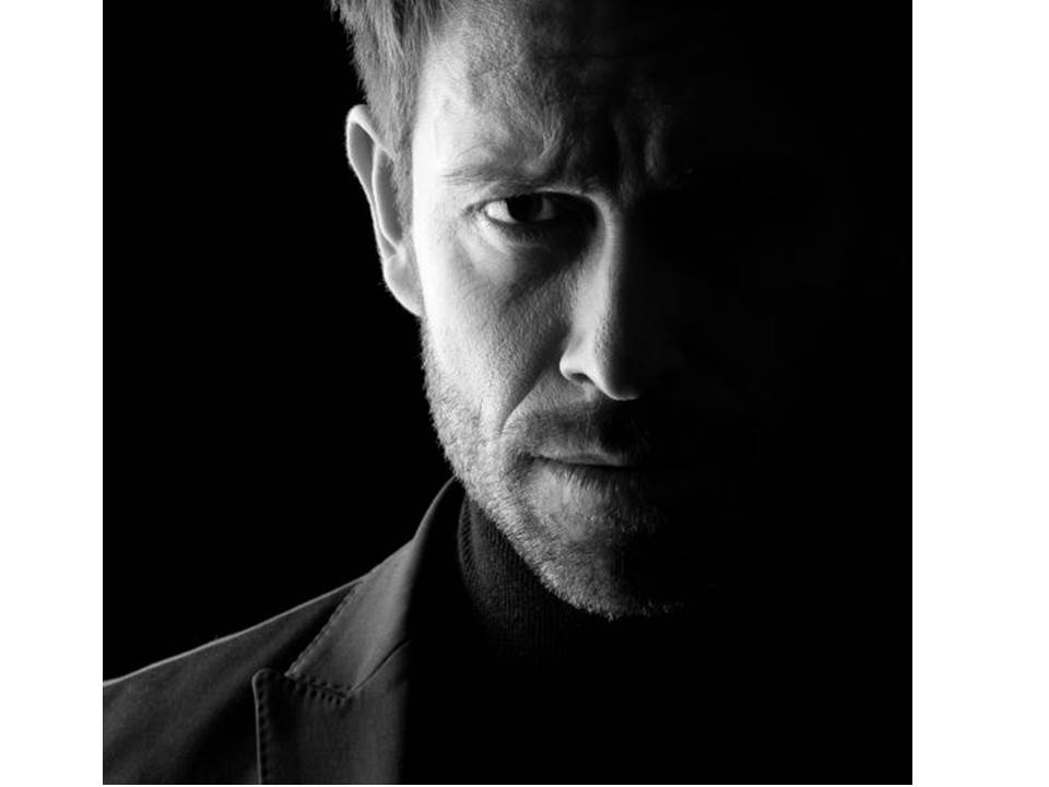
Low-key portraits are the opposite of high key, making use of dark tones and a lack of light to create a shadowed effect on subjects. The images typically portray themselves as more serious and harsh, and add  mystery to the subject due to a portion of them usually being shadowed in darkness.

Color Portrait:

Photograph from: https://unit22portraitphotographyjosh.wordpress.com/task-1-colour-photographers-part-2/

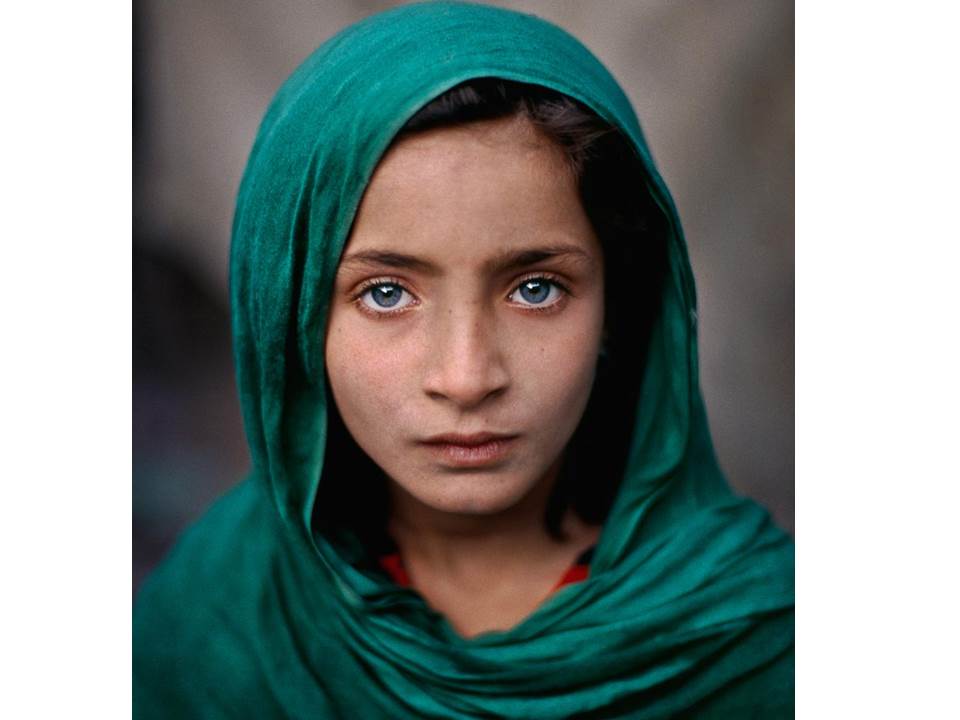
Color is often used in portraits to draw maximum attention to the subject. Bold vibrant colors are often used to allow the subject to stand out, and the viewers attention is drawn to the colors and shapes that are emphasized.

low-angle portraits:

By Pixioo Photography

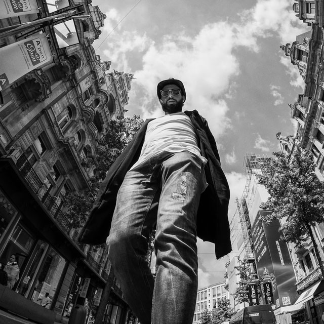
Low angles are often used to present the opposite features to high angles. A low angle image places the subject in a position of dominance, making the subject seem larger, and more threatening to the viewer.

Head-shot Portrait:

Photograph from: https://improvephotography.com/47624/headshot-photography-pricing-guide/

Head shots are often used to place maximum emphasis on the facial expression of the subject. The identities of the subject are often clear, and the image would be used to focus on the subjects reaction to something, or to help identify them easily (e.g head shots are used in passports to identify people) without the addition of any unnecessary features that may draw attention away from the face (e.g bright clothing).

Manual Camera Work: Ralph Eugene Meatyard (in progress)

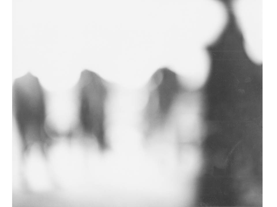
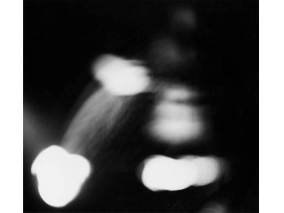
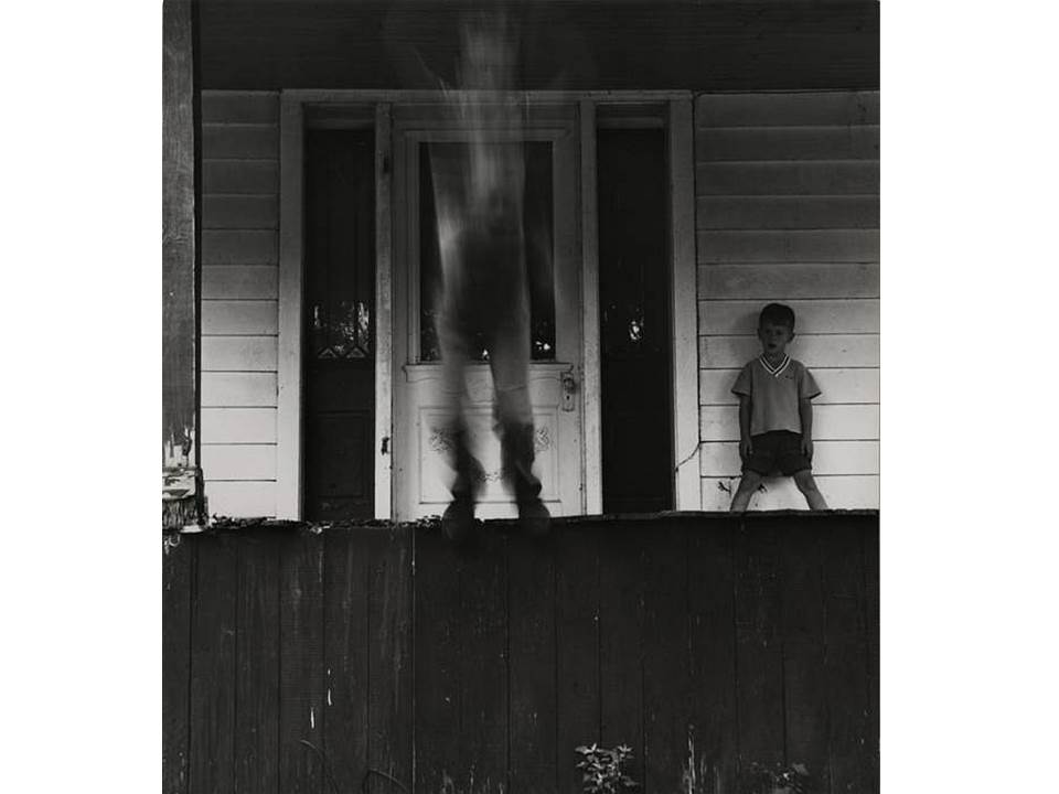
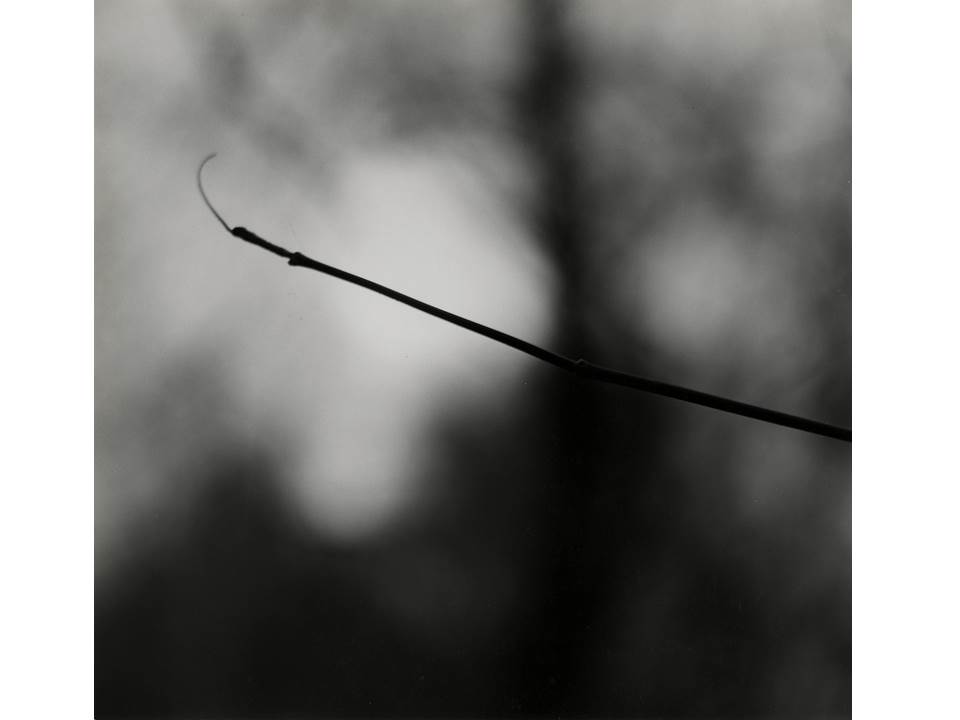
In order to further explore and improve on the manual camera skills I have learnt in the past week, I have decided to take inspiration from photographer Ralph Eugene Meatyard, and his projects “No Focus” and “Zen Twigs”, in which Meatyard explores the use of manual focus, and produces work to show both unfocused images that have a show a lack of context, as well as images that focus on nature with a shallow depth of field, that both help to draw the attention of the viewer, with effective use of contrasting, grey-scale colors.

The following images were taken by Meatyard during his “No Focus” project, and are the images that I took inspiration from:

Both of Meatyards projects hold some similarities as well as differences. “No Focus” is a project that focused on removing the context of the image, and presenting images as more flat and without depth, while still presenting enough contrast and shape to draw the attention of the viewer, allowing them to question the context, as the can’t see it.

In similarity, “Zen Twigs” focuses on the naturally twisted and unpredictable shapes of branches and twigs, while throwing the background completely out of focus. This draws the attention to the subject matter (the twigs), while separating the subject from it’s naturally surrounding, therefore creating a very abstract and out-of-context effect.

As a response to Meatyards work, I produced the following photo shoot, focusing mainly on the use of depth of field and manual focus:

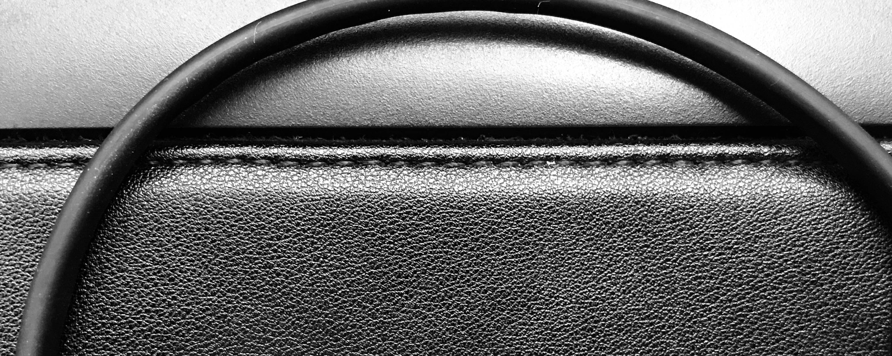
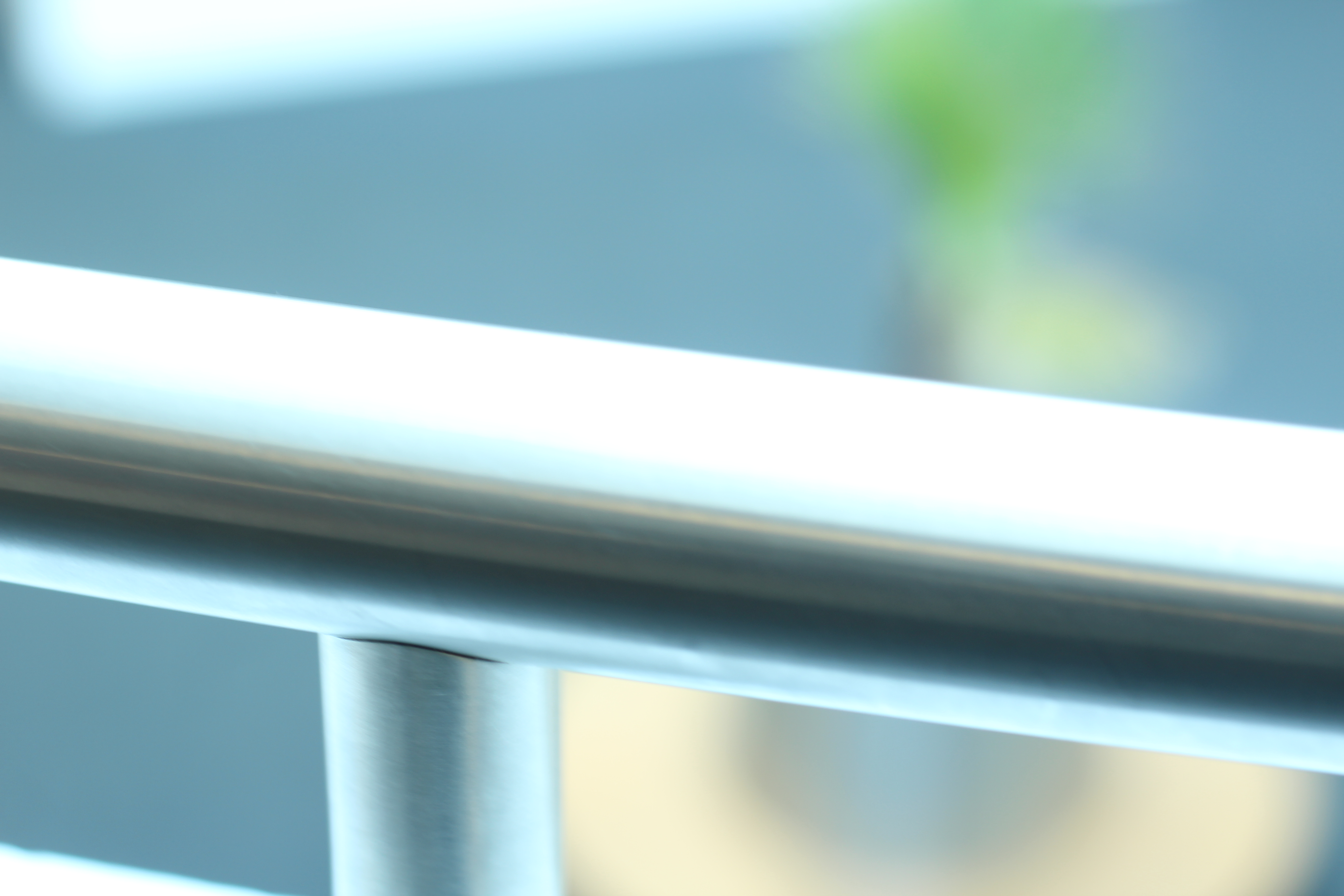
The above photoshoot I took inspiration specifically from Meatyard’s “No Focus” project. In order to present images as having high contrast, I purposefully chose images that were naturally black or white, and placed them together to create contrast. I also used a variety of wires, boxes and stationary as subjects to show different shapes, which will help with drawing the attention of the viewer to the different shapes.

After taking the photo-shoot, I edited my images to enhance the colour contrast. I edited the images so that the colours became grayscale, which is a tactic used by Meatyard in his images to emphasise the shape and contrast of his images.

I also produced another photo-shoot, taking inspiration from Meatyard’s “Zen Twigs”. The images from this photo-shoot are seen below:


Final Images – Abstract Project

After compiling all of the images I took for the abstract project together, I nailed down my selection to 5 images., the following images are these choices:

These images were the bare, unedited images that I took only using camera settings (except the second image across was edited black and white and was taken using a mobile phone), I then used Photoshop to refine the images and make them more eye catching. During the editing process, I decided on my final 3 images according to what best fit the project, and depending on what influence I took from artists in order to develop them. The following 3 images are the edited final 3:

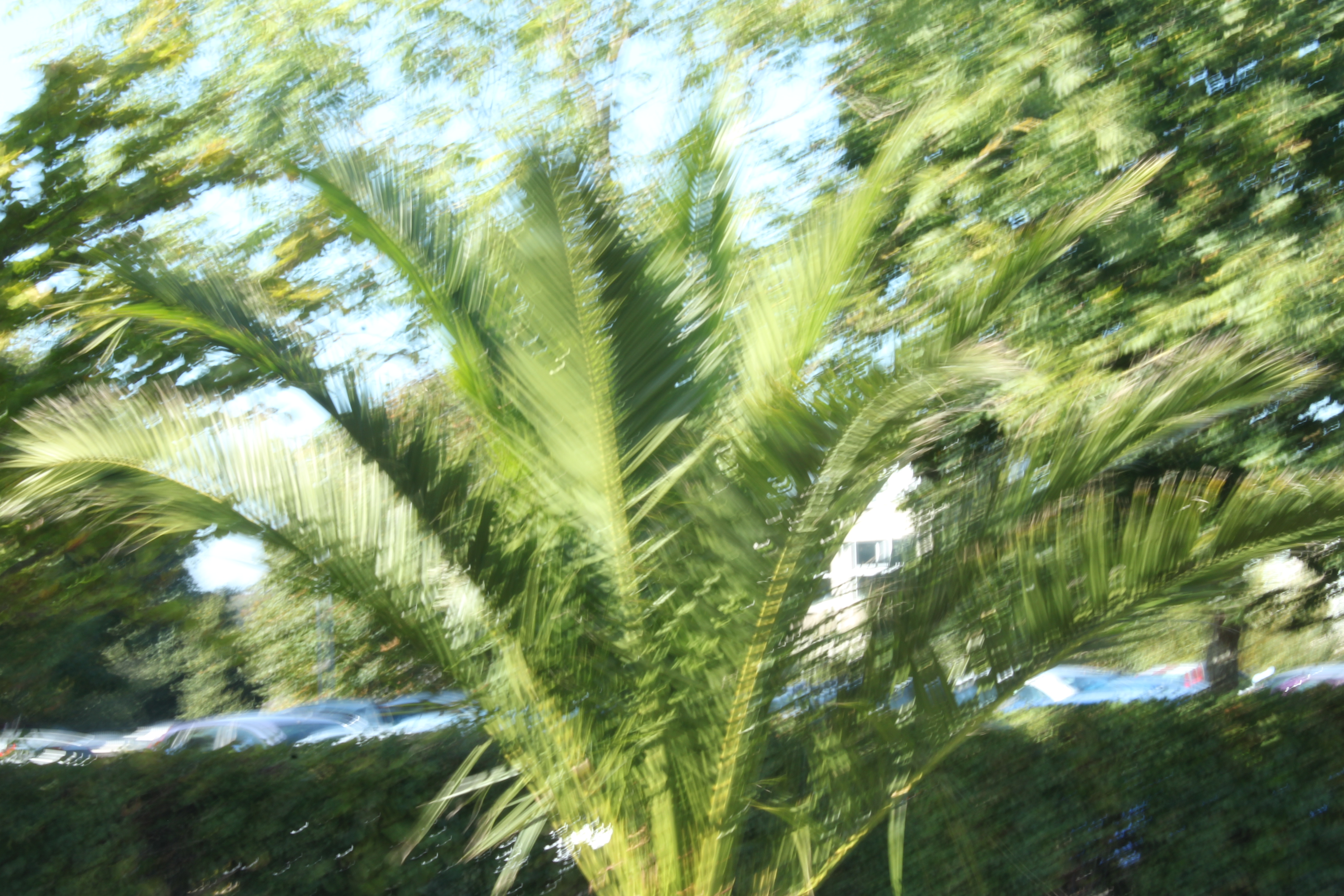
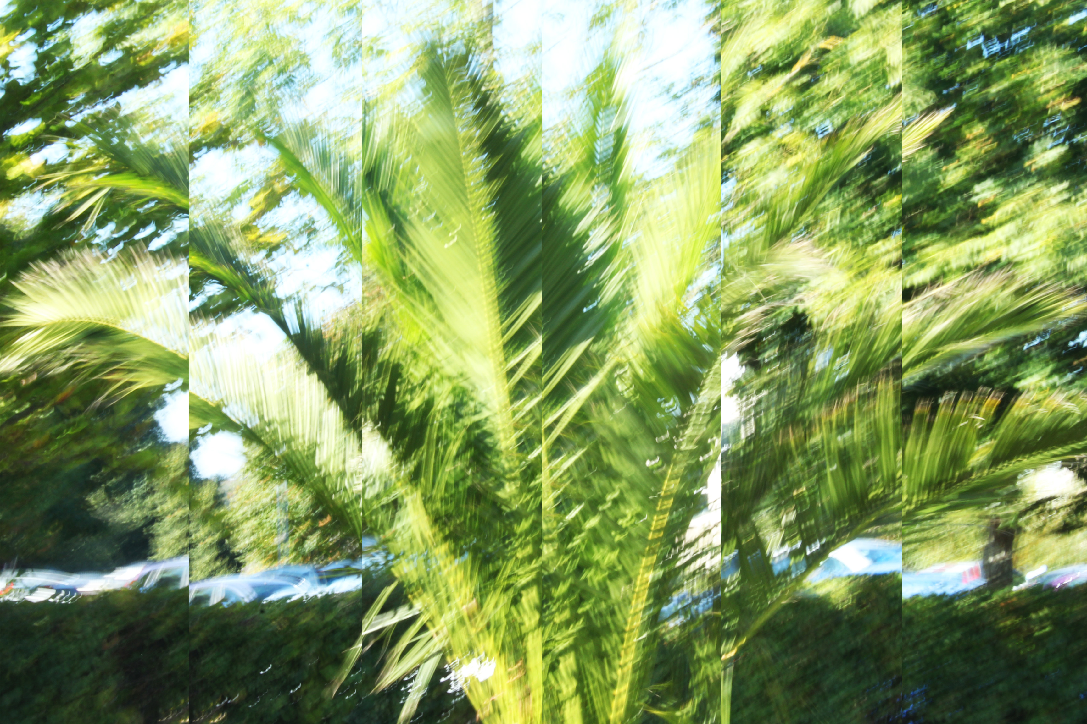
For the below image, I made use of a slow shutter-speed, and captured a tree that was moving with the wind. I found that using a slow shutter-speed distorted the subject, and made the photograph more abstract.  After taking the image, I used Photoshop to edit the image. In order to make the image even more abstract, I split the image into 6 parts and expanded and adjusted each image, so that the 6 separate parts of the image added together to make the full image.  This gave the image an even more distorted feel, and added to the abstraction of the overall image. I then slightly adjusted the saturation to make the image brighter and stand out more. In terms of inspiration, I took influence from the artists Uta Barth and Albert Renger-Patzsch. Most specifically, I took advantage of the high ISO that Barth uses to create very bright, vibrant images that reply heavily on lighter colours to bring her work to life. I raised the ISO setting of my camera to take this image, and in doing so, the image was naturally brighter than it would have been otherwise. I think that taking inspiration from Barth allowed for my image to come across as more abstract, as brightness slightly blurred the boarders of the subjects, making them more difficult to differentiate from the background. In addition, I took inspiration from Renger-Patzsch by using a natural subject, and taking my image in a slightly more scientific and objective way. Renger-Patzsch often made use of plant life in his work, and I took my photograph in the same style as Albert, looking straight on as if the camera was an eye> the abstraction came as a result of the ISO settings and the shutter-speed, but the initial image itself was taken with inspiration from Renger-Patzsch. This image will be my A3 image, as I believe that the image provides a lot for the viewer to see, and the splitting of the image into 6 sections will be more prominent if the image is printed as large as possible.

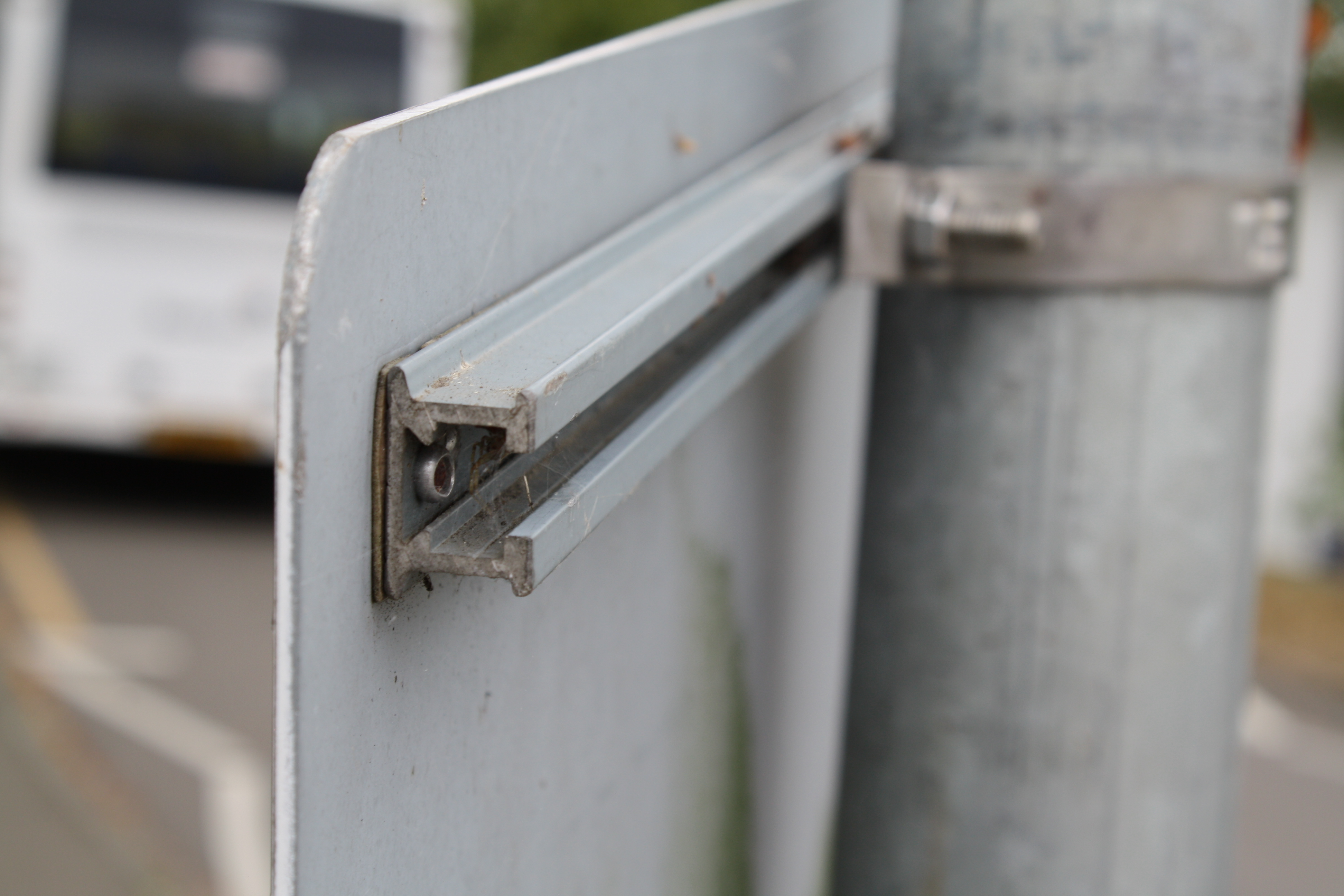
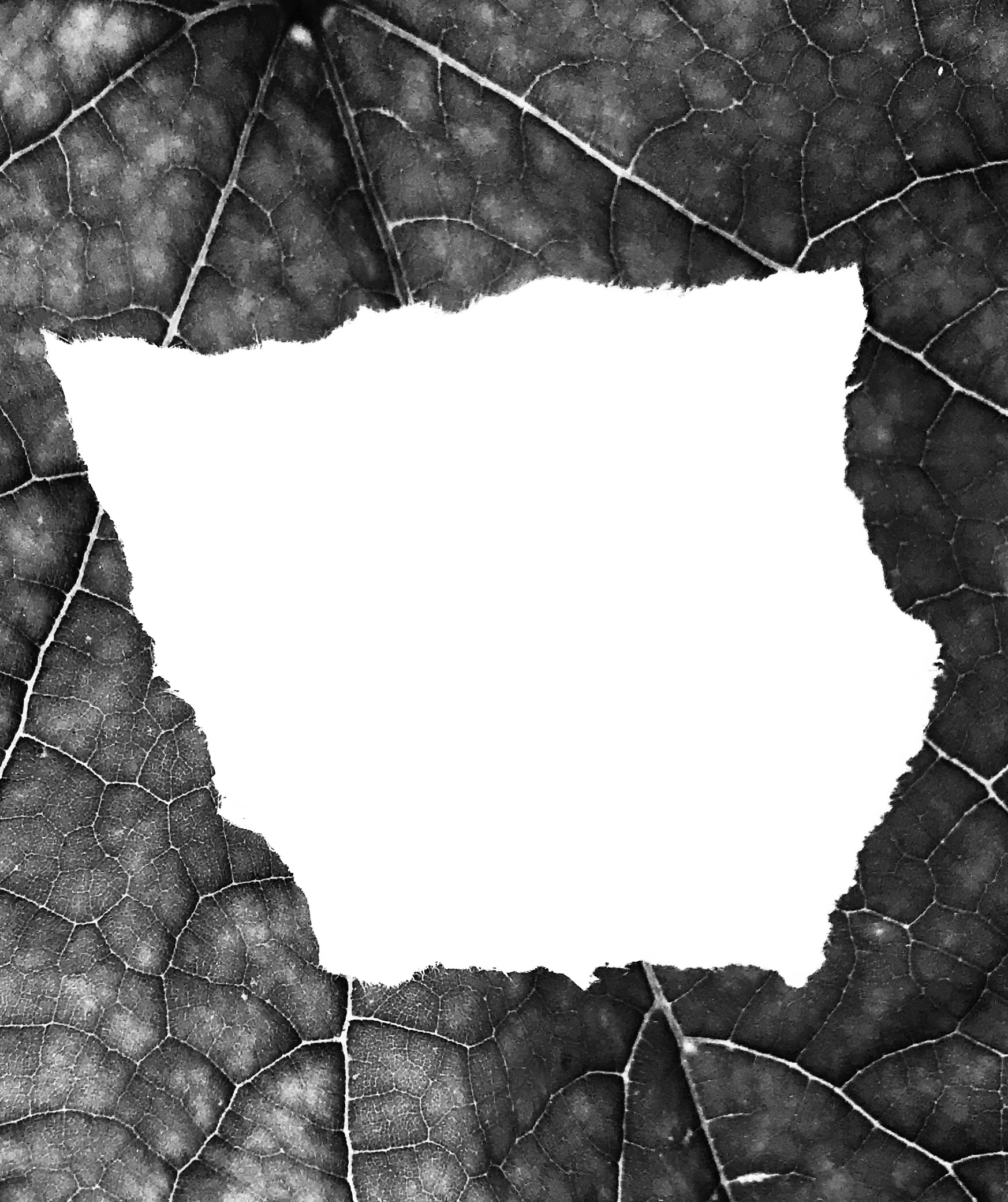
For my second image, I took made use of the manual zoom and focus of my camera, and captured a detailed image of a piece of ripped paper on a leaf. This image was originally taken for my Paper Project, and takes a small amount of inspiration from the photographer Aaron Siskind. Siskind often took close up images of subjects, and presented them in a more factual, objective and flat way. For this image, I am making use of a lack of context in order to present the image as being more abstract, and the high zoom used to take this image helps to cut out the context. I also edited the image in Photoshop to make it grey-scale, as this takes inspiration from Siskinds dark tones work, but also helps to emphasize the details within the leaf. I also believe that the contrasting colours of the leaf and the paper help to make the image more eye-catching as a whole. I will be using this image as my A5 image, as I feel that this will help to emphasize that although the image is detailed, the original subjects are naturally small, and I believe that this will create an effective  juxtaposition, between the subject and the detail in the image.

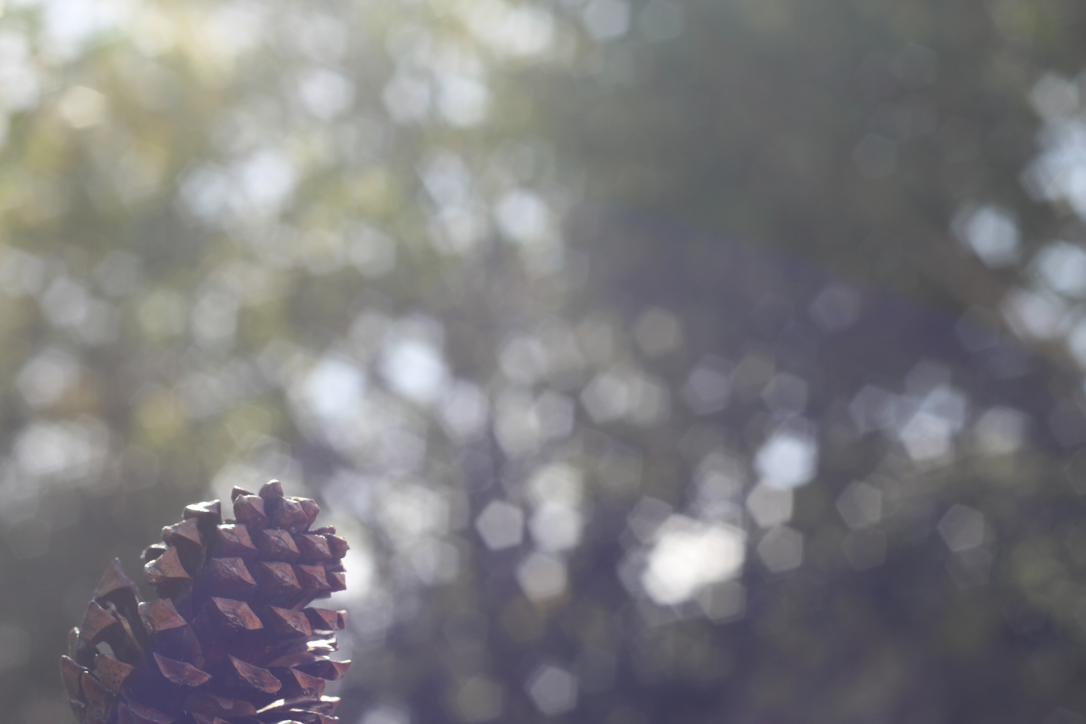
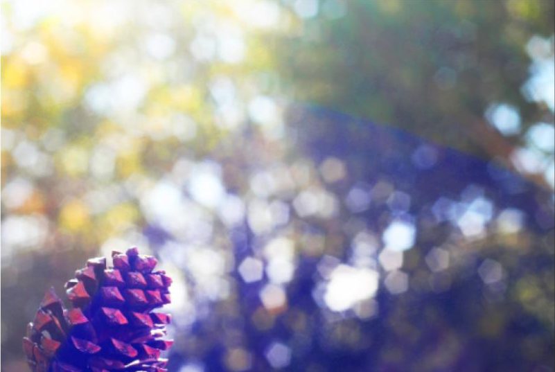
For my final image, I made use of the manual focus of the camera. for this photograph, I focused on the subject (the pine cone) while using a narrow depth of field to throw the background out of focus. I feel that this is an effective technique, as it allows for the viewer to focus on the subject completely, while questioning the context of the image due to most of the photograph being out of focus. I used Photoshop to edit the saturation of this image, and raised the contrast in order to make the colours of the image more vibrant, thus the image can draw more attention. I will be using this image as my A4 image, as I feel that the image will be more effective if it is large enough to make out the main focus point (which is small compared to the rest of the image), yet the image may become too boring and uninteresting if it is printed an larger. For this image, I took inspiration from Uta Barth again, as for some of her work she focuses on a small subject, and uses a narrow depth of field in order to throw the background almost completely out of focus. I was influenced by this technique, as I found it to be effective and eye-catching.

Colour and Texture In Photography ( in progress)

For this project, I attempted to show contrast between colours and textures through the medium of photography. Colours and textures allow for photographs to become more interactive, as a viewer can be drawn in by bright and contrasting colours, and texture allows for the photograph to feel more genuine and real. Because of this, the use of texture and colour in photography is important, and for this project I have attempted to portray these factors in a more obvious way, allowing viewers to see how colour and texture can really effect an image.

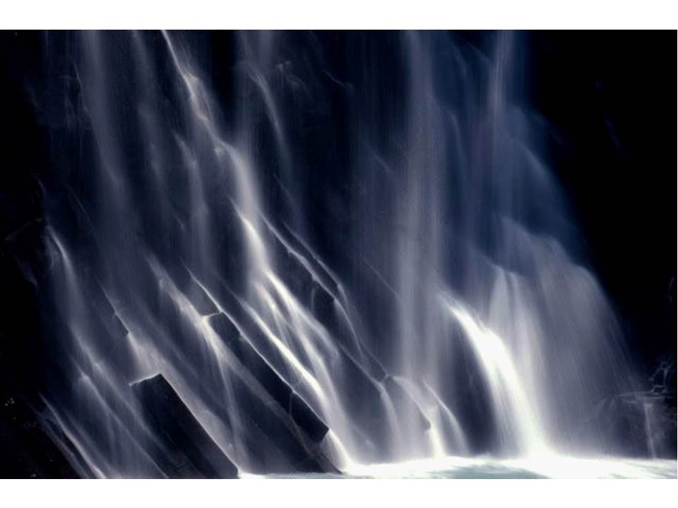
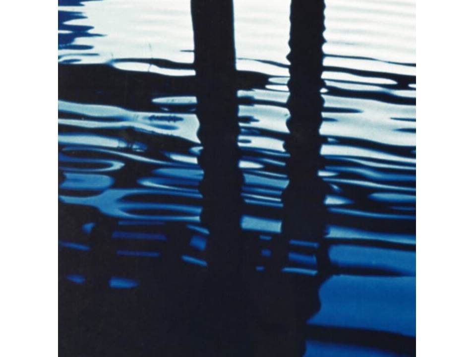
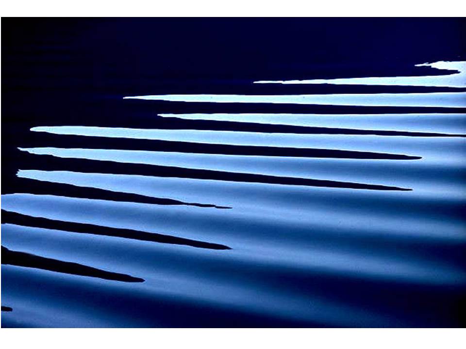
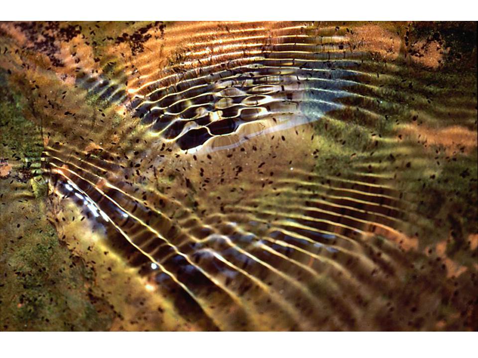
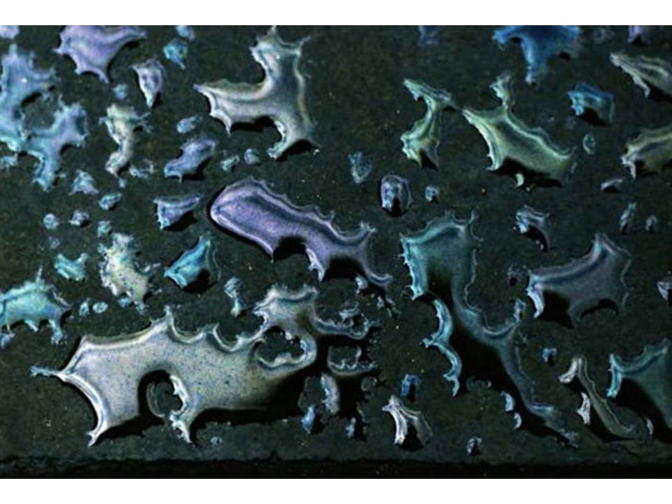
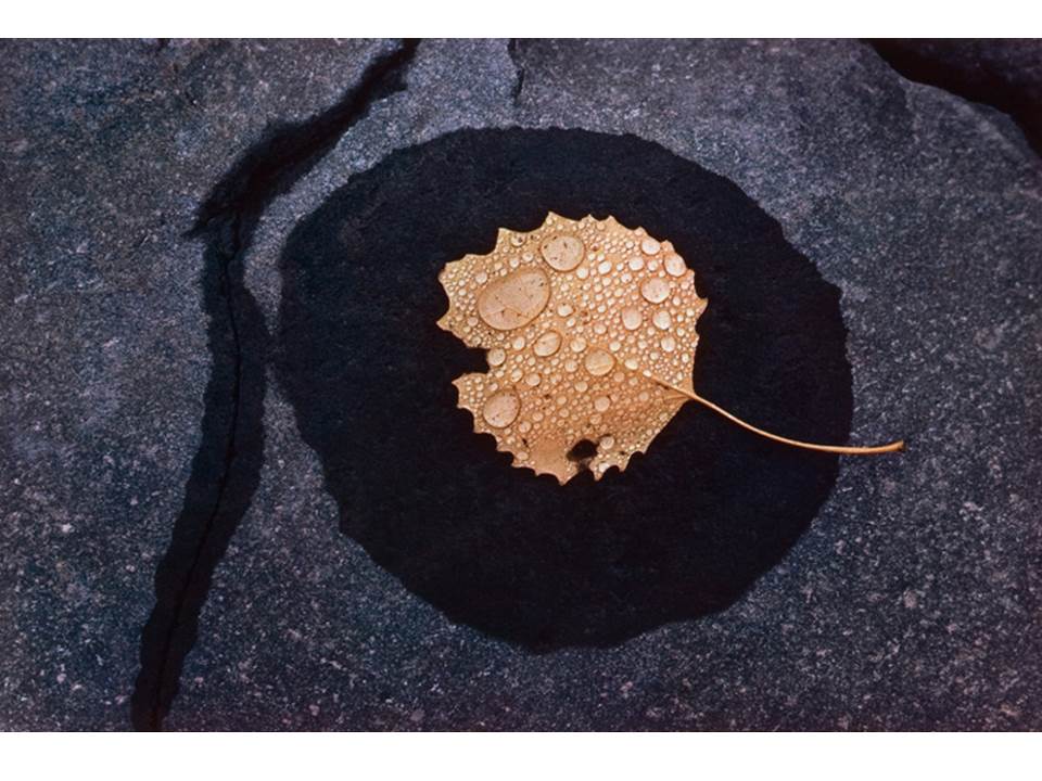
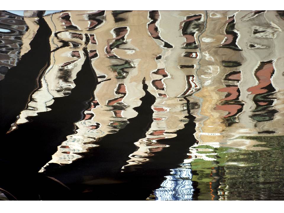
For my inspiration for researching texture in photography, I decided to take influence from the work of Ernst Haas, specifically his water photography.

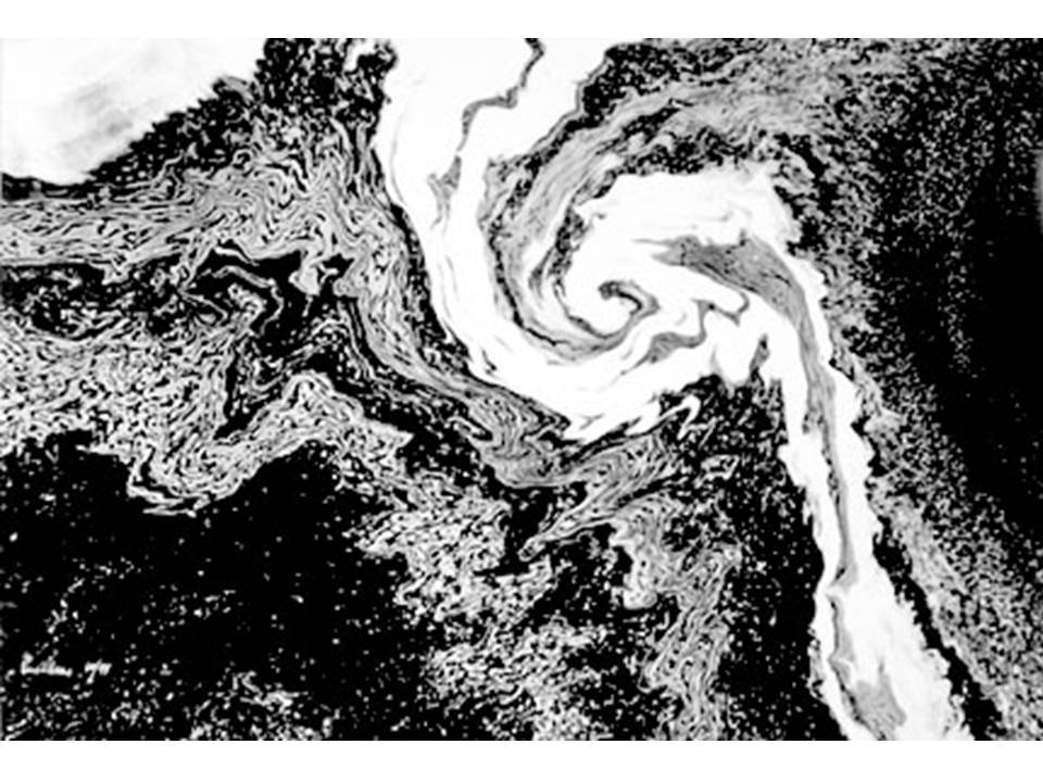
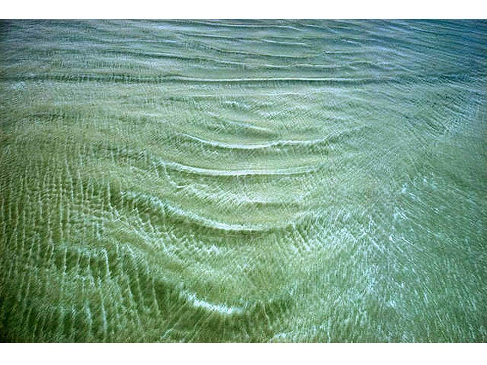
Haas was fascinated by the concept of water,  the way it reflected light and the dynamics of its movement. Haas’ water photography maintains an abstract feel, yet displays clearly the unpredictable way that water moves and interacts with its surroundings. Haas often edited and cropped his photographs in order to abstract the context of his images, and used colour and grey-scale to experiment with different ways of further abstracting his images. Below are examples of Haas’ work with photographing water:

As displayed, Haas makes use of contrasting tones and colours in order to draw more attention to his images. Bold colours draw the viewers eye, while the use of texture in the images (often due to the movement of the water) allows for the viewer to stay intrigued, as it gives the image an sense of realism, and enables the viewer to relate to the image.

After analyzing the work of Haas, I produced a photo shoot focusing on emphasizing the colours and textures naturally found together. I tried to focus on colours that contrasted one another, and textures that really draw attention to the image. Below is the contact sheet as a  result of my photo-shoot:

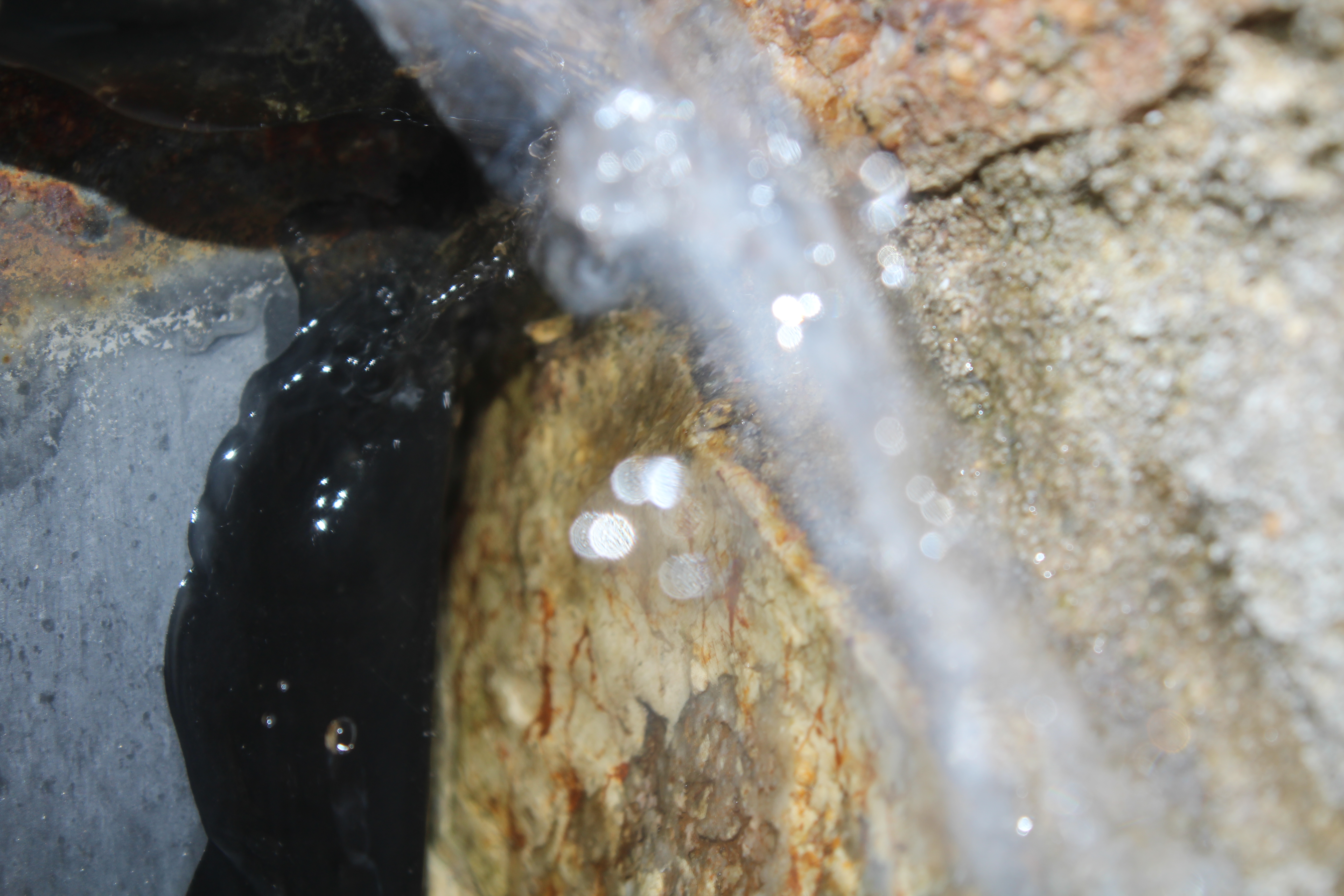
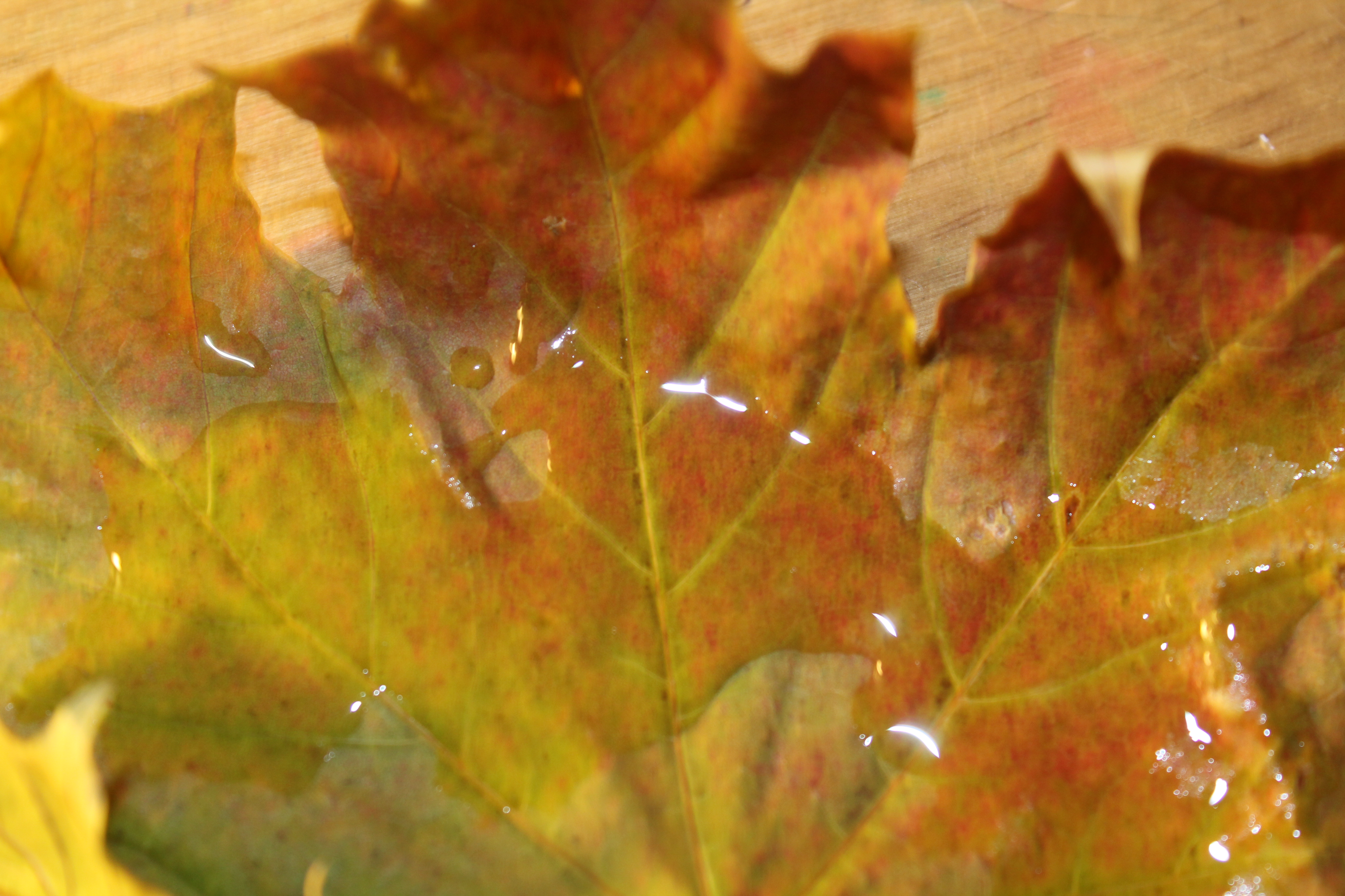
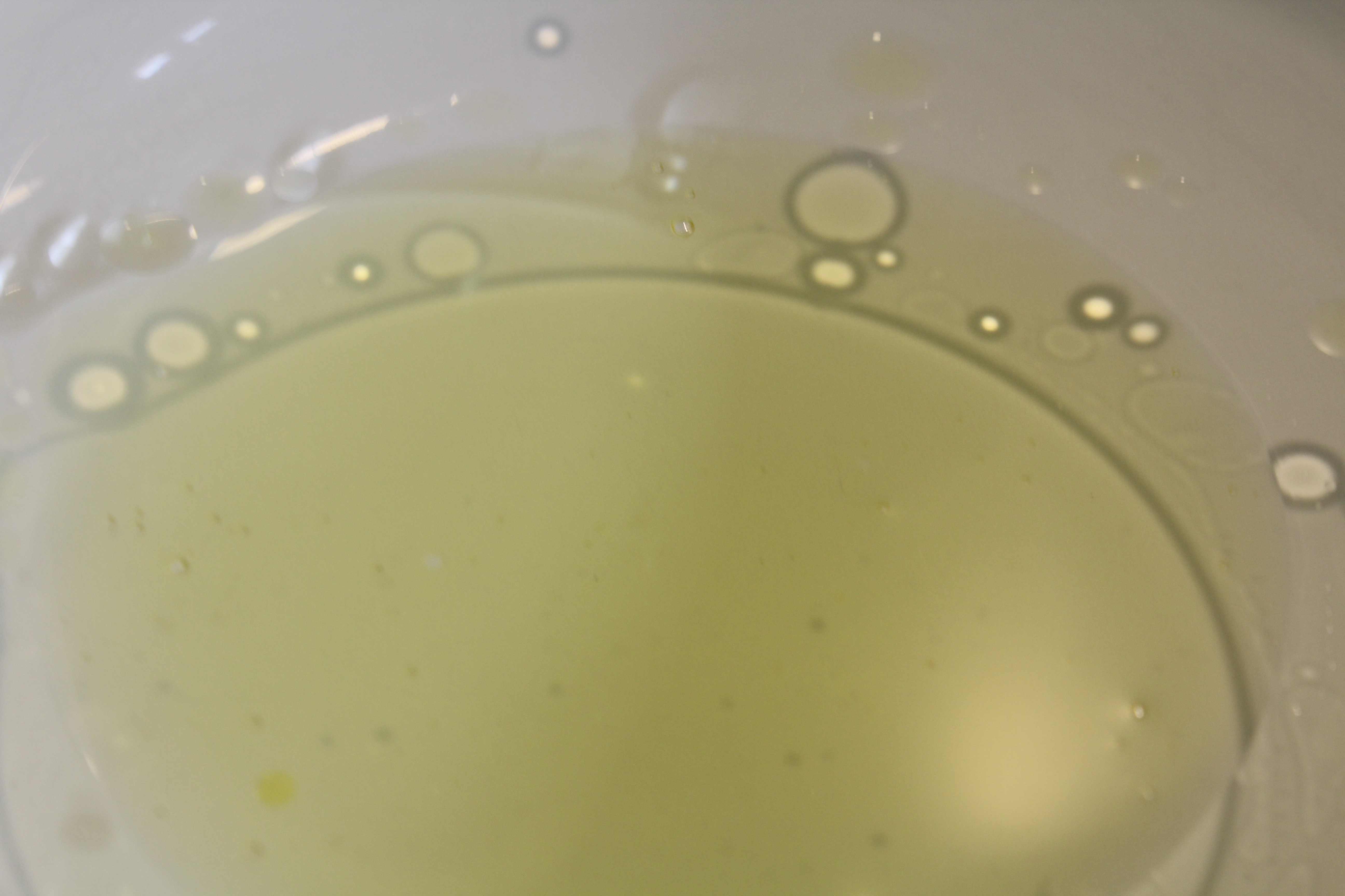
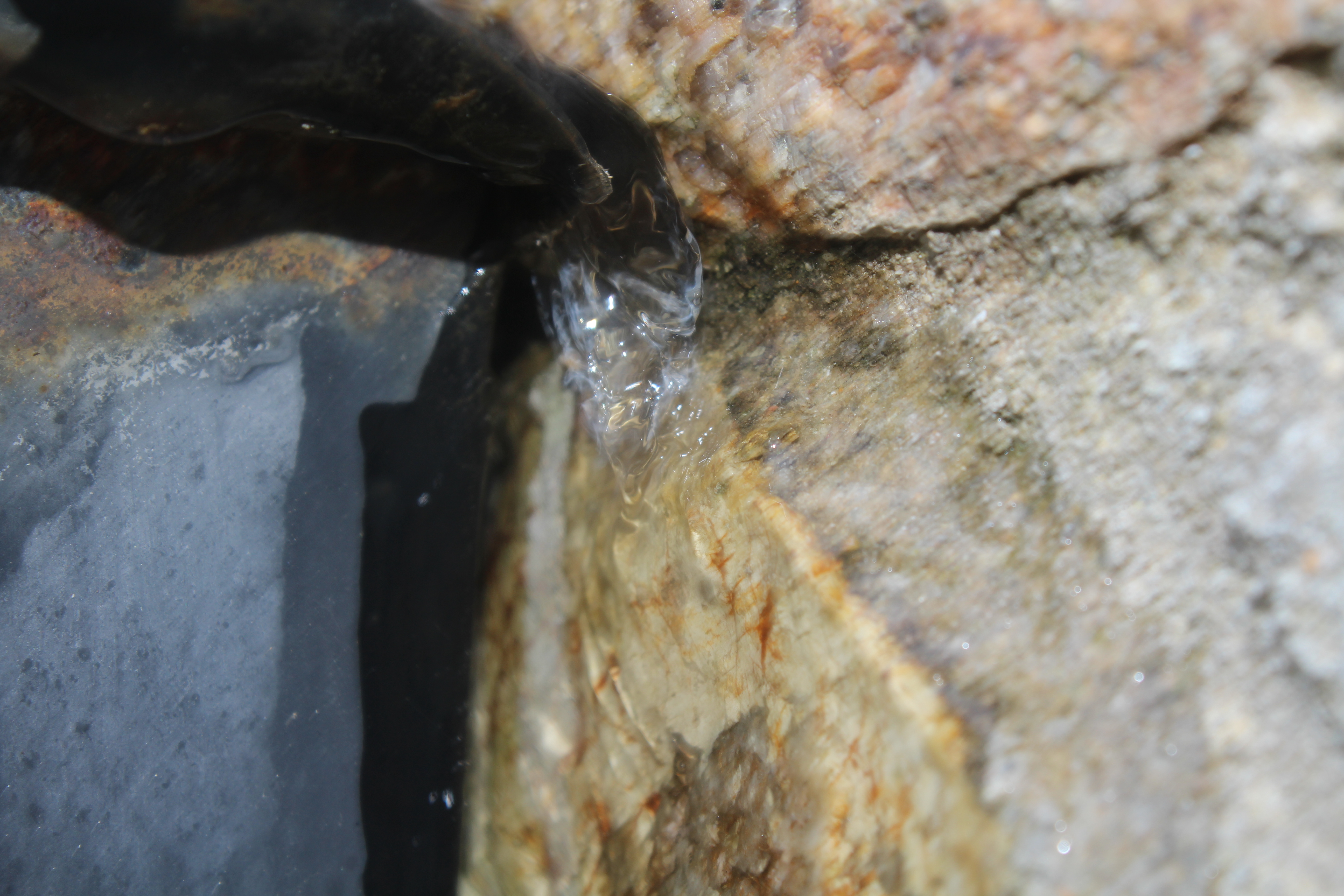
I took inspiration from Haas, and in doing so produced a photo-shoot which heavily took into account the texture of the image subjects. For my images, I focused on zooming into details, which in turn produced photographs displaying texture, such as the image pictures below:
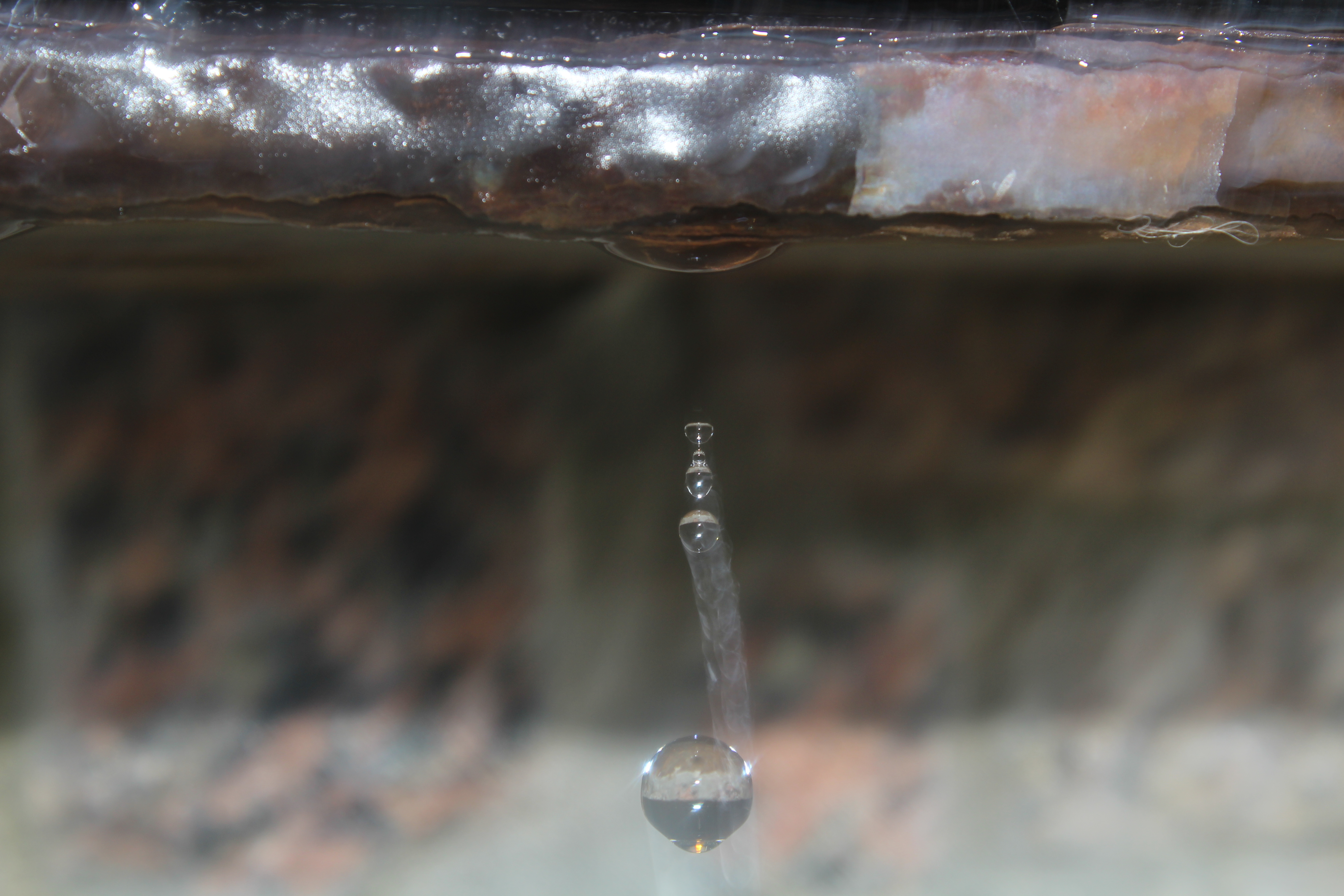
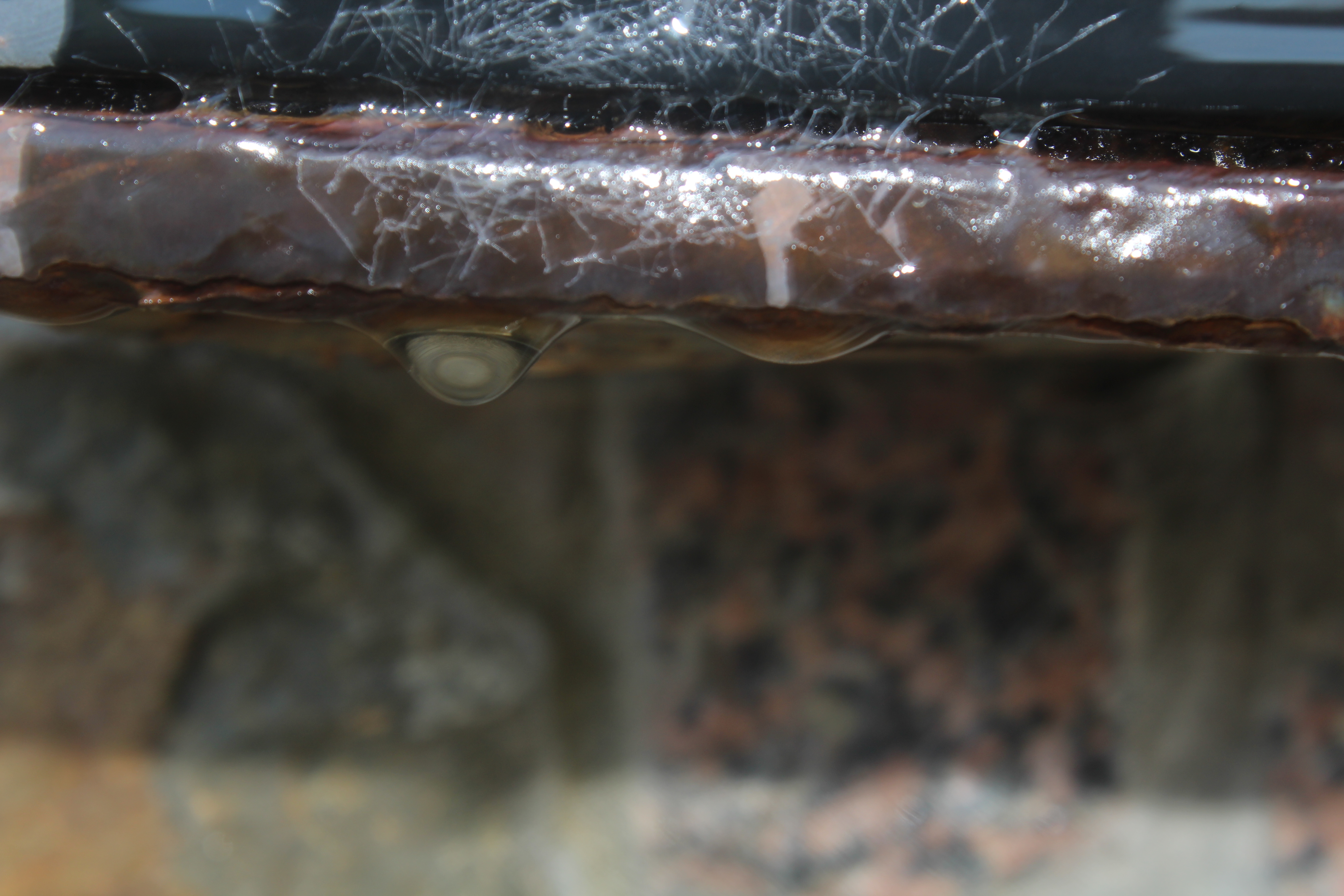
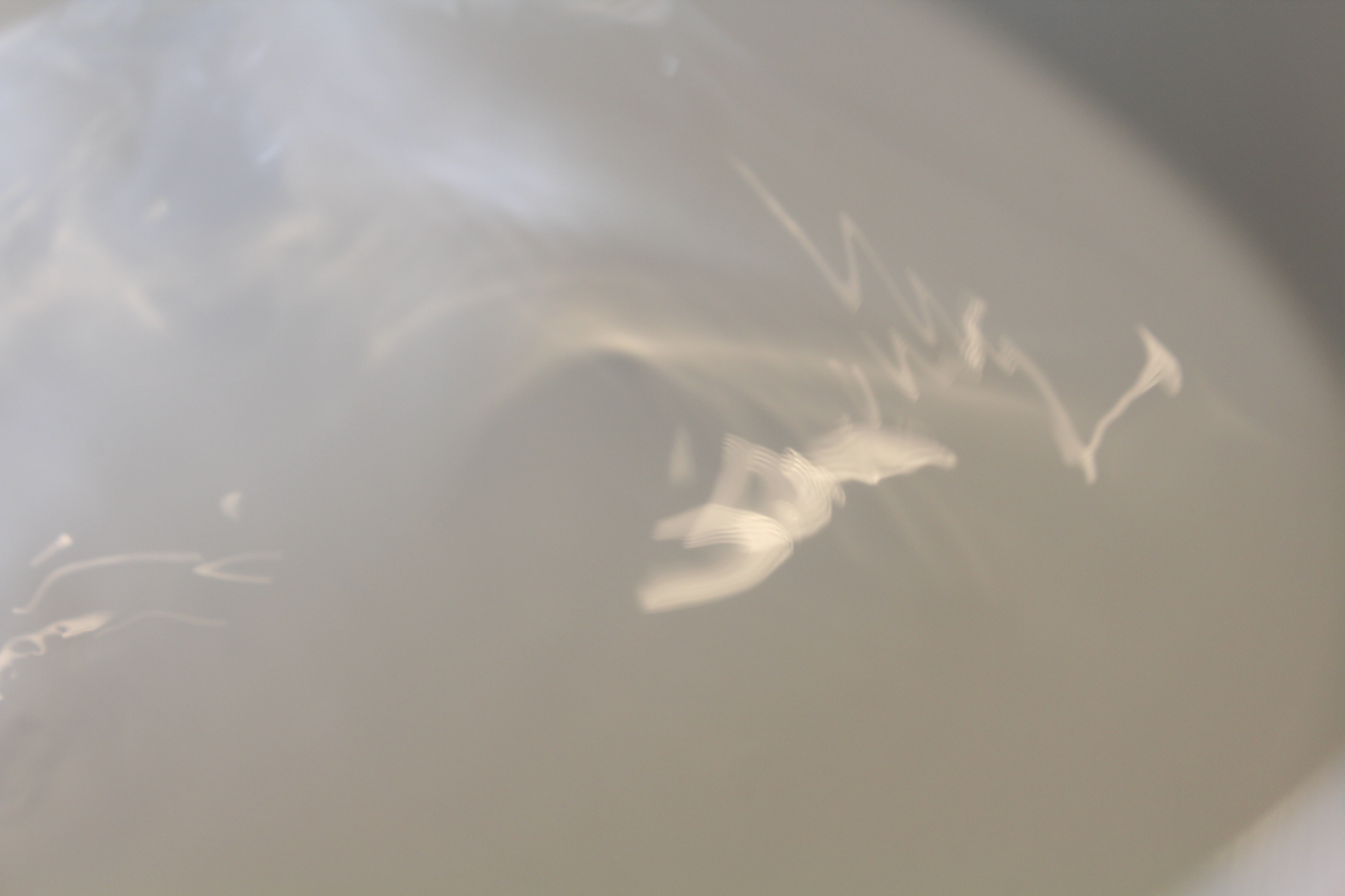
This image makes use of both colour (contrasting the darker background with the lighter toned water droplet) and the rough texture of the rust at the top of the image, and the way that this contrasts the smoother texture of the water droplet. Haas often used darker tones in his image backgrounds, to emphasize the water that would typically reflect the light, and present as a brighter, lighter tone. I have taken inspiration from this method, and I believe it is an effective way to show contrasting textures through the use of light and shade.


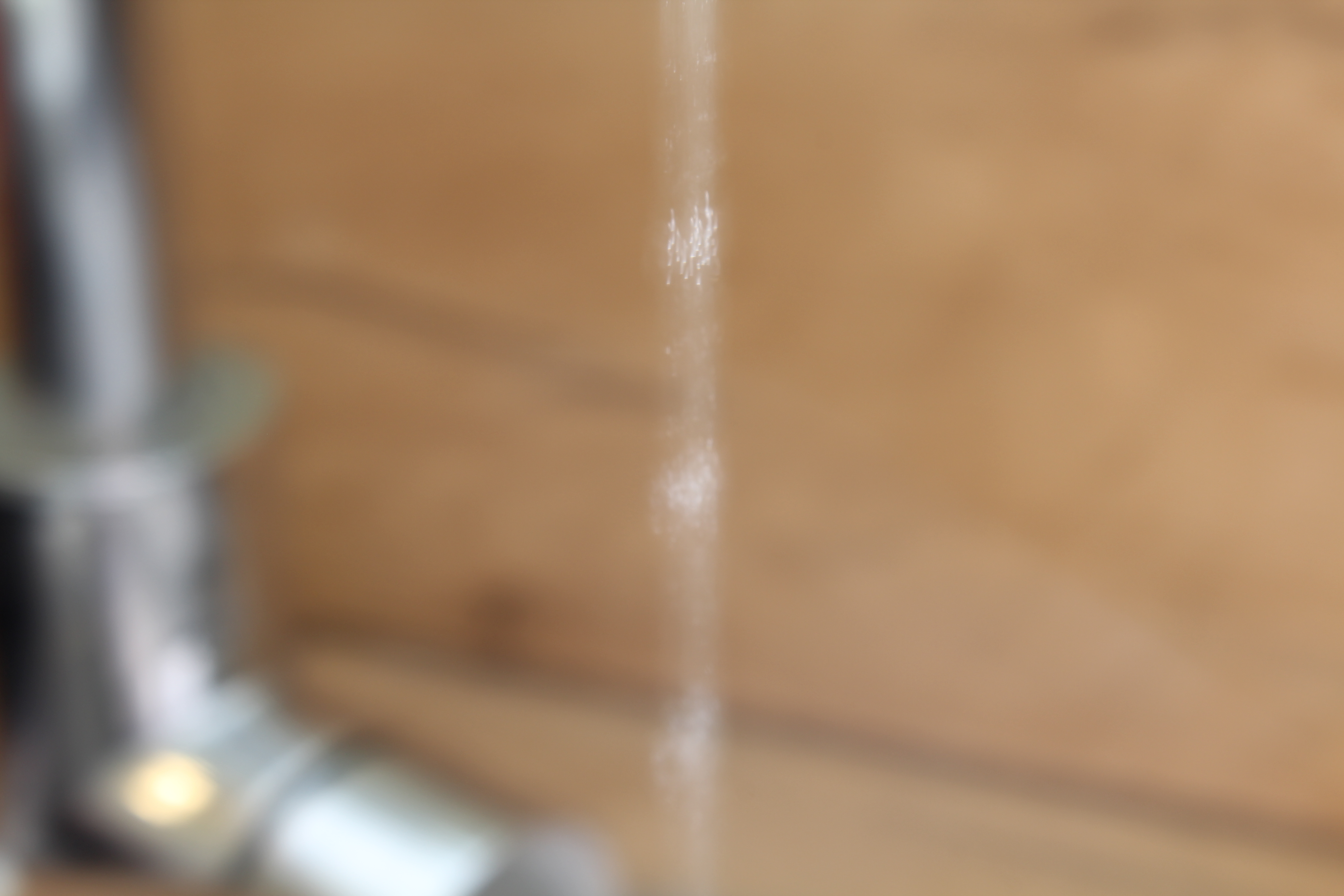
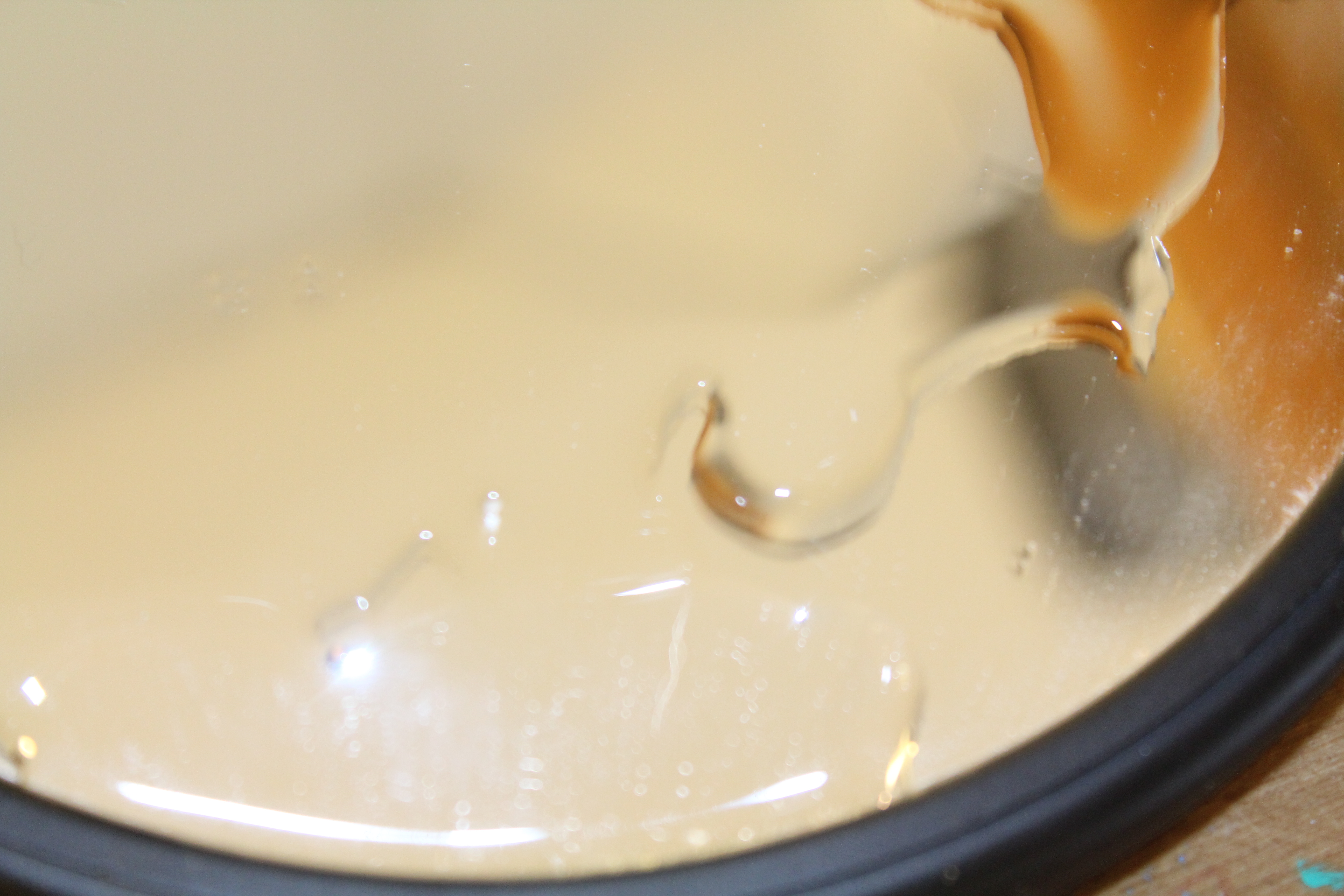
The above 2 images were taking using a slow shutter-speed, and I feel like these images focus more on showing contrasting colours. The image was taken with an ISO of 1600, and so the photograph is very bright, which I feel exaggerates the colours, and helps to show the contrast between the yellow and white portions of the image. This image is still using the subject of water, but I feel that the combination of a high ISO and slow shutter-speed has helped to distort and abstract the image, so that the main focus of the viewer becomes the colour and texture, rather than the subject itself.On top of the bright colours used, I feel that the texture also draws the attention of the viewer, as the movement of the water captured by the slow shutter-speed has caused the texture of moving water to be captures, especially towards the middle of the images. This gives the images a rippled effect, and helps to present them as more 3D, rather than a flat image, which in turn draws the attention of the viewer.

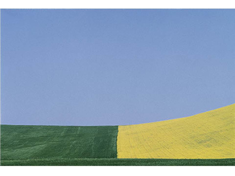
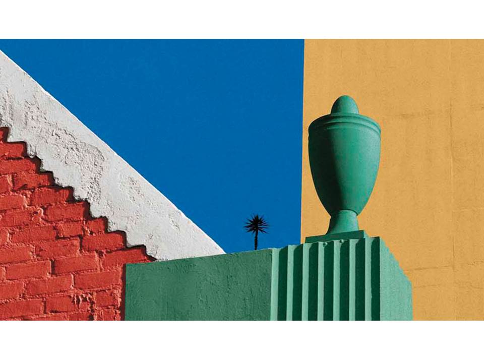
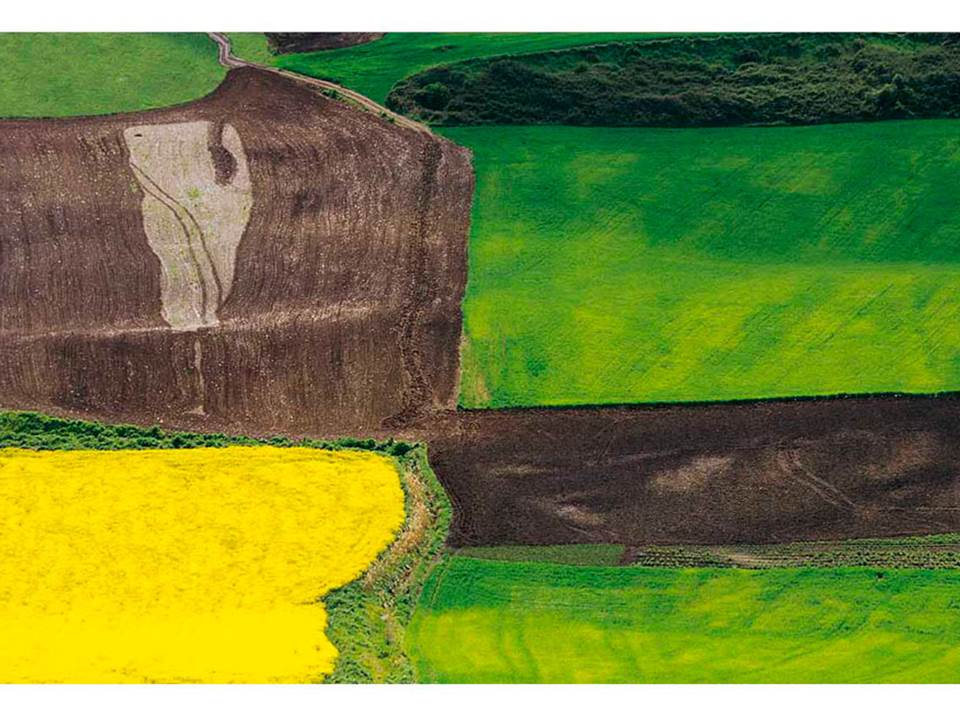
In addition to taking inspiration from Haas, I also further explored the use of, specifically, colour in photography, by taking inspiration from the photographer Franco Fontana.

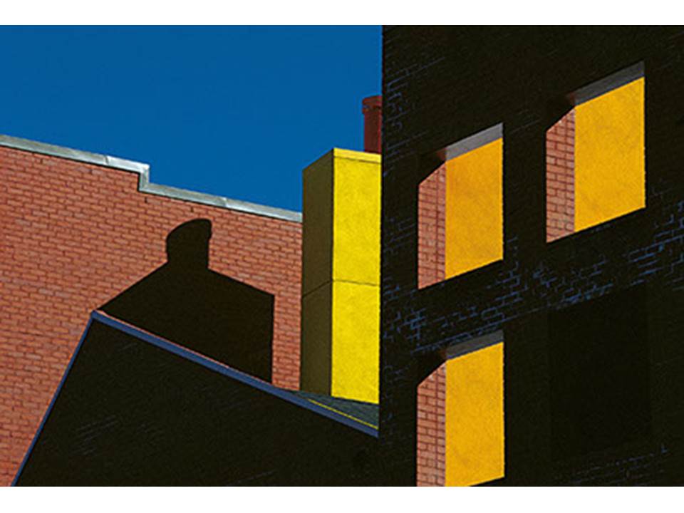
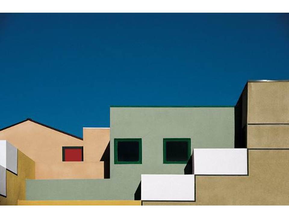
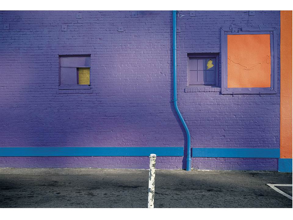
In order to explore colour using Fontana as inspiration, I first analysed his work in order to understand how he used colour to best emphasis how the different colours contrasted each other. The following image is a collection of his work that I used for inspiration:

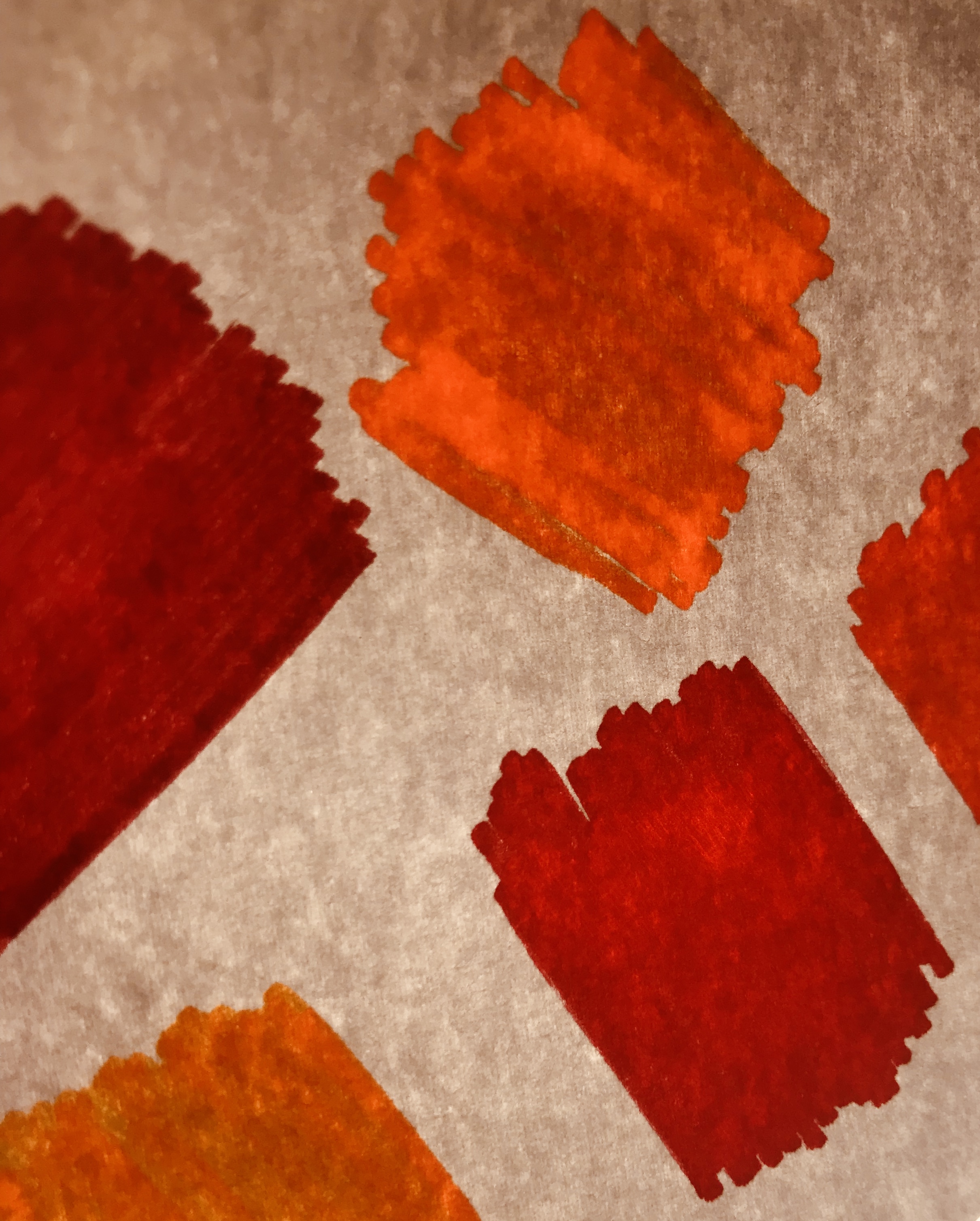
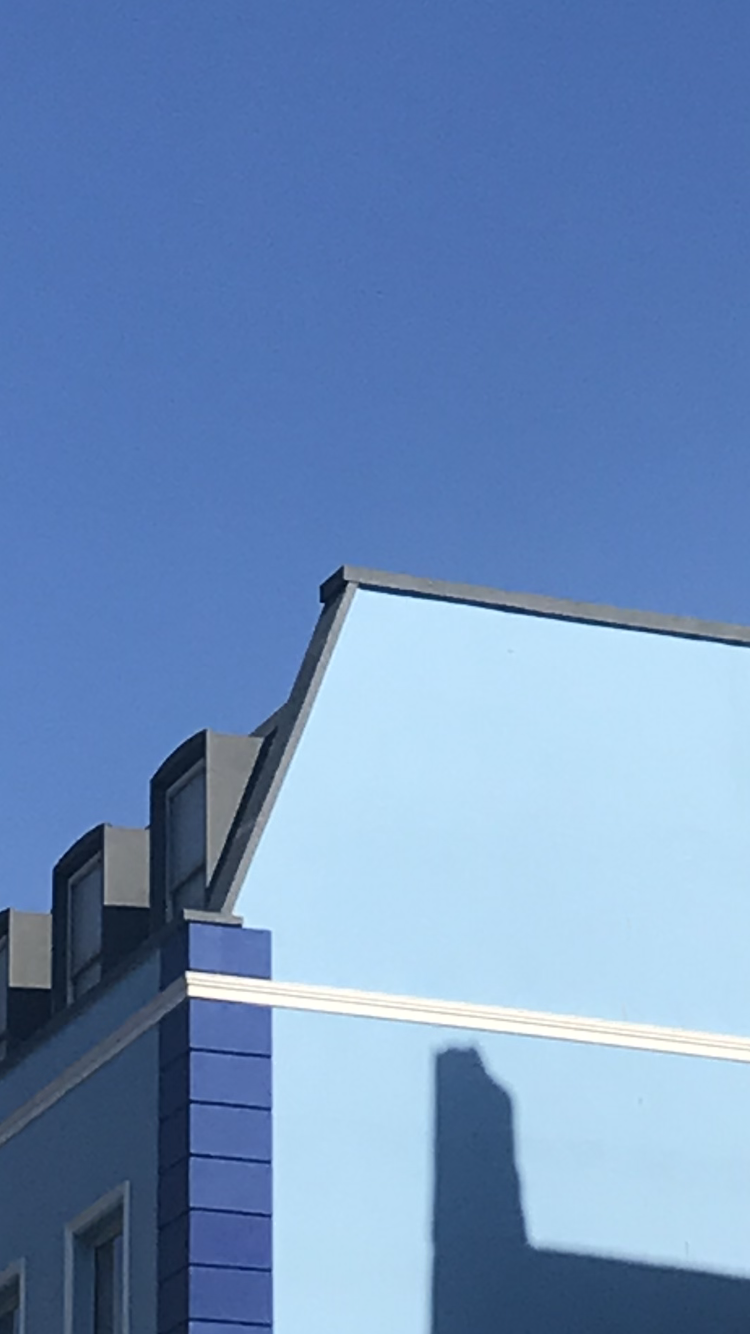
Fontana uses very vibrant and bold colours in his photography, which helps to emphasis the contrast of colour, which draws a lot of attention to his work. Fontana typically uses naturally occurring bold colours, usually focusing on buildings and field landscapes, in order to draw attention to the bold and bright colours that can be found in everyday life.

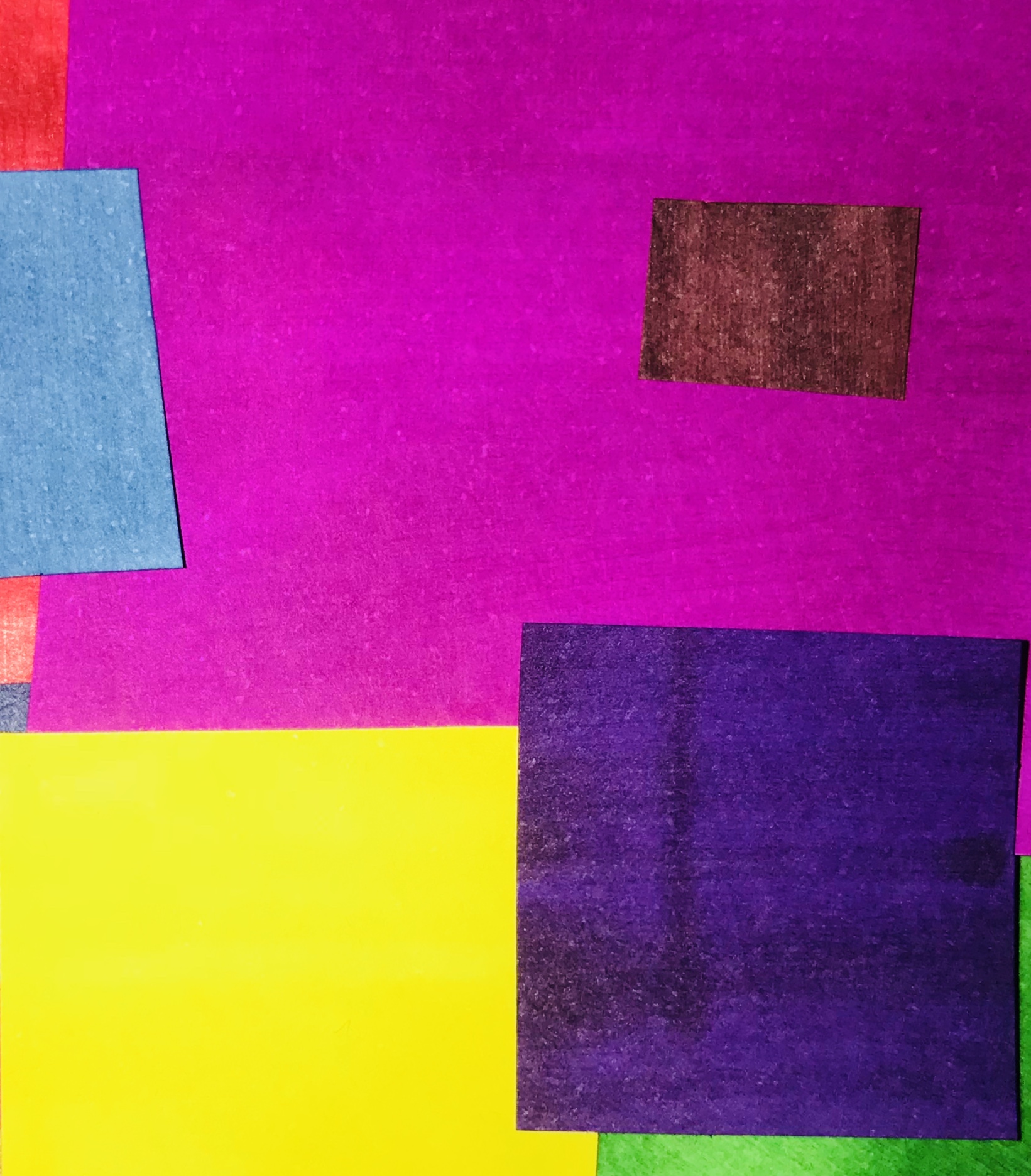
After analyzing Fontana’s work, I produced a photo-shoot of my own, using the same mindset and bold colours that occur in Fontana’s work. The below image is the result of my colour-focused photo-shoot:

This colour focused photo-shoot


Shutter-speed Experimentation

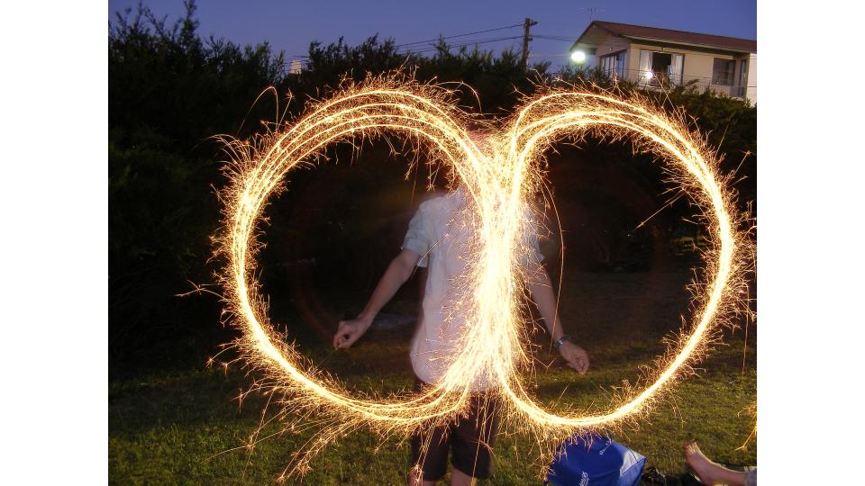
Shutter-speed allows for a camera to pick up on movement, and record the movement in a single photograph. Shutter-speed is the length of time that the sensor of the camera is exposed to light, and so the longer the shutter-speed, the more movement and light the camera can track.

Shutter-speed is useful when attempting to give the sense of movement, and can allow for an image to seem like it has captured a subject moving from one place to another. Examples of images taken with slow shutter-speeds can be seen below:

As using a slow shutter-speed tracks movement, this setting is useful for sports adverts, travel adverts, and any photograph used to show a busy area or the speed of an object.

Shutter-speed can be adjusted by turning the main control dial. Doing this makes the shutter-speed wither faster or slower, and so the shutter-speed can be adjusted easily depending on what kind of photograph is being taken.

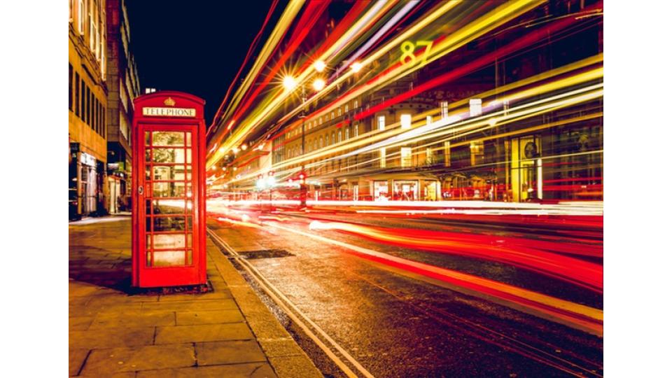
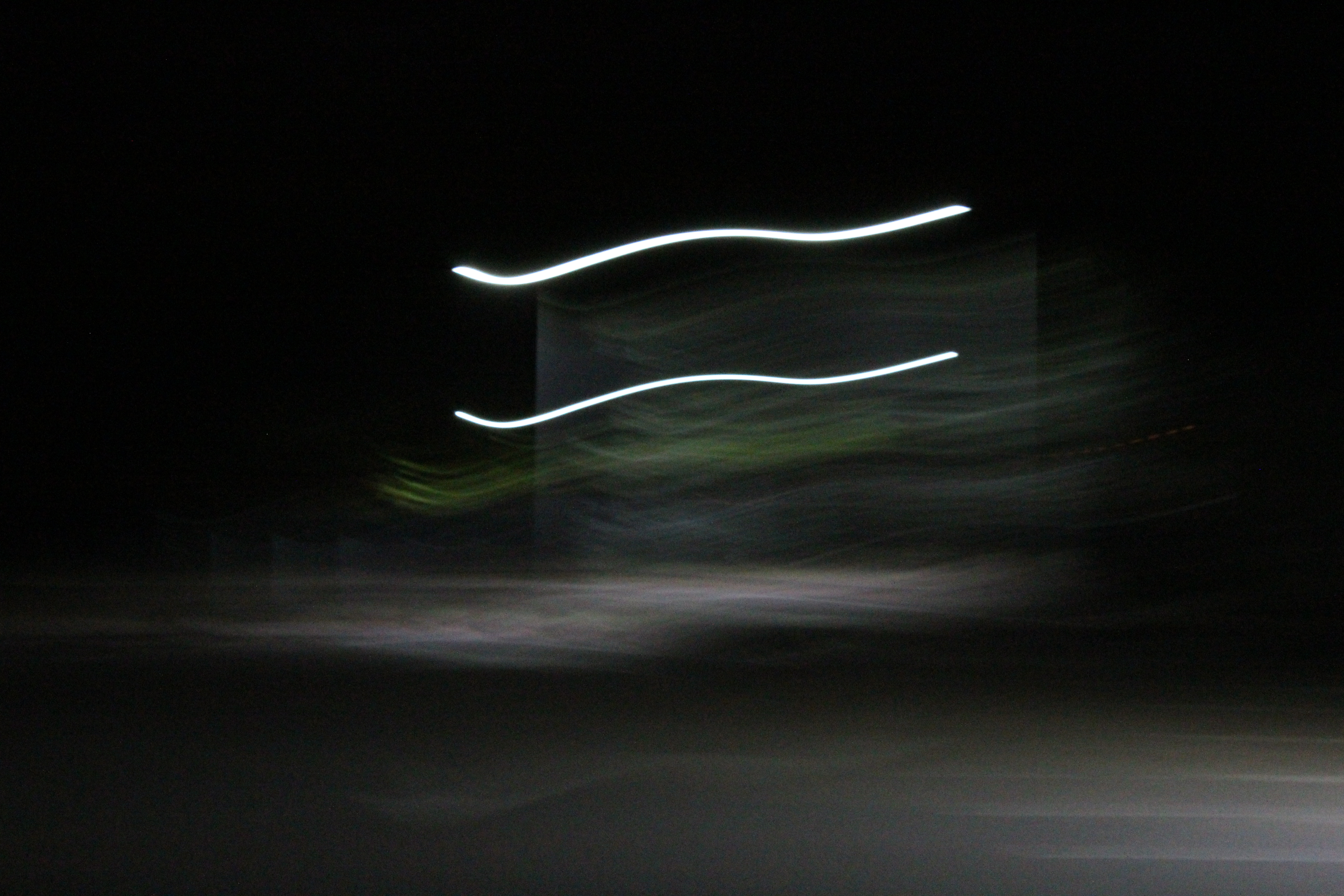
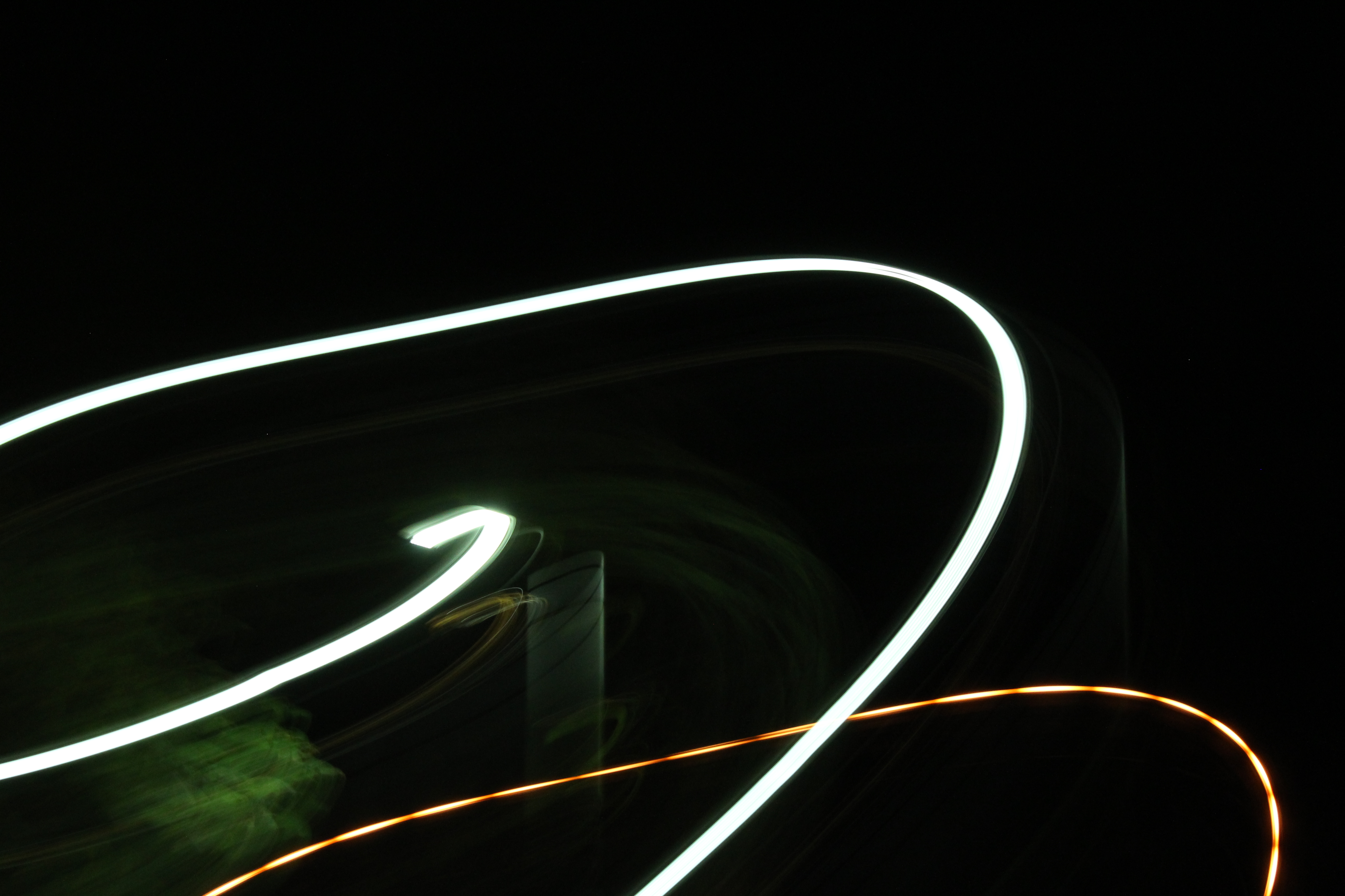
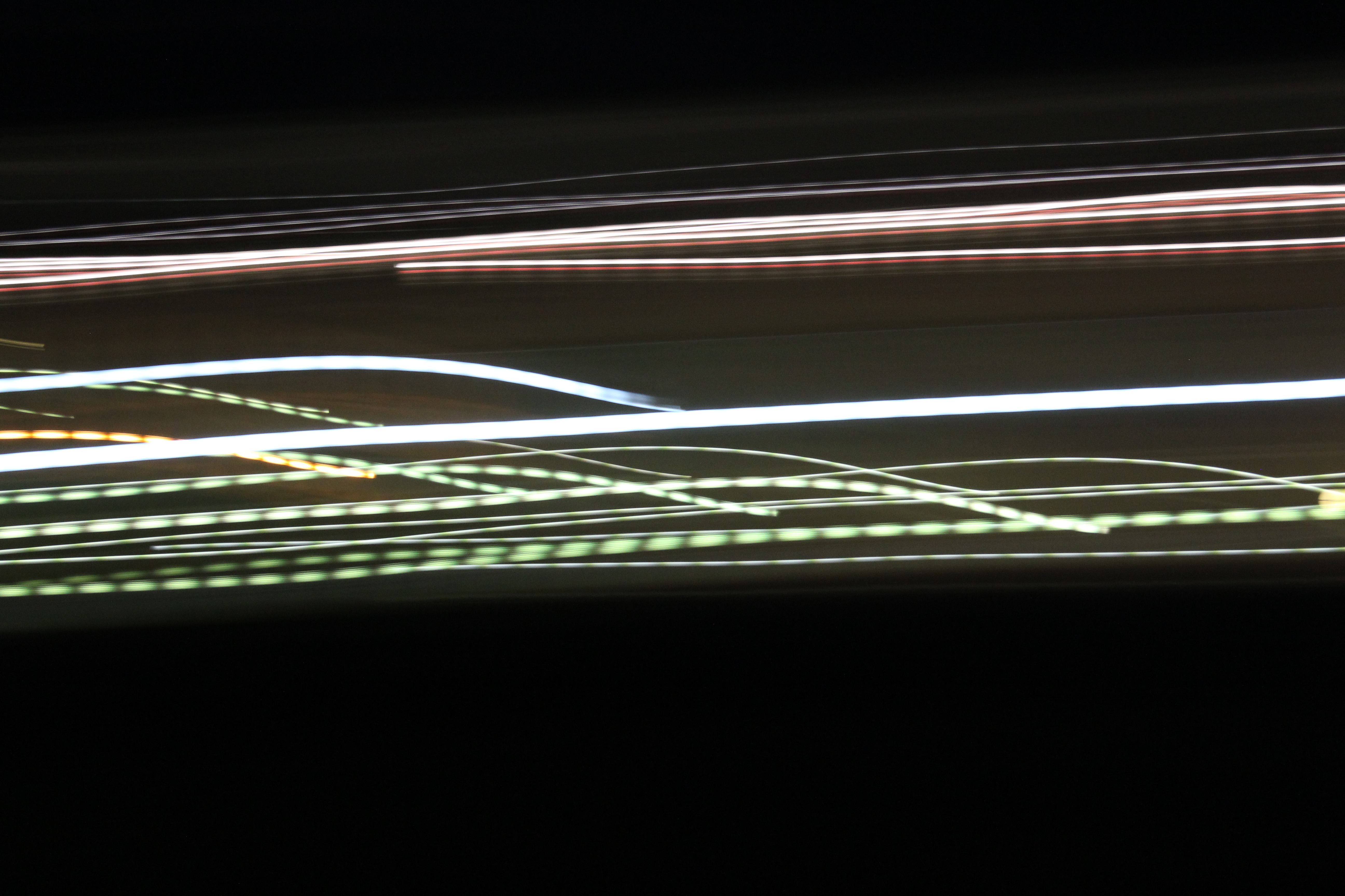
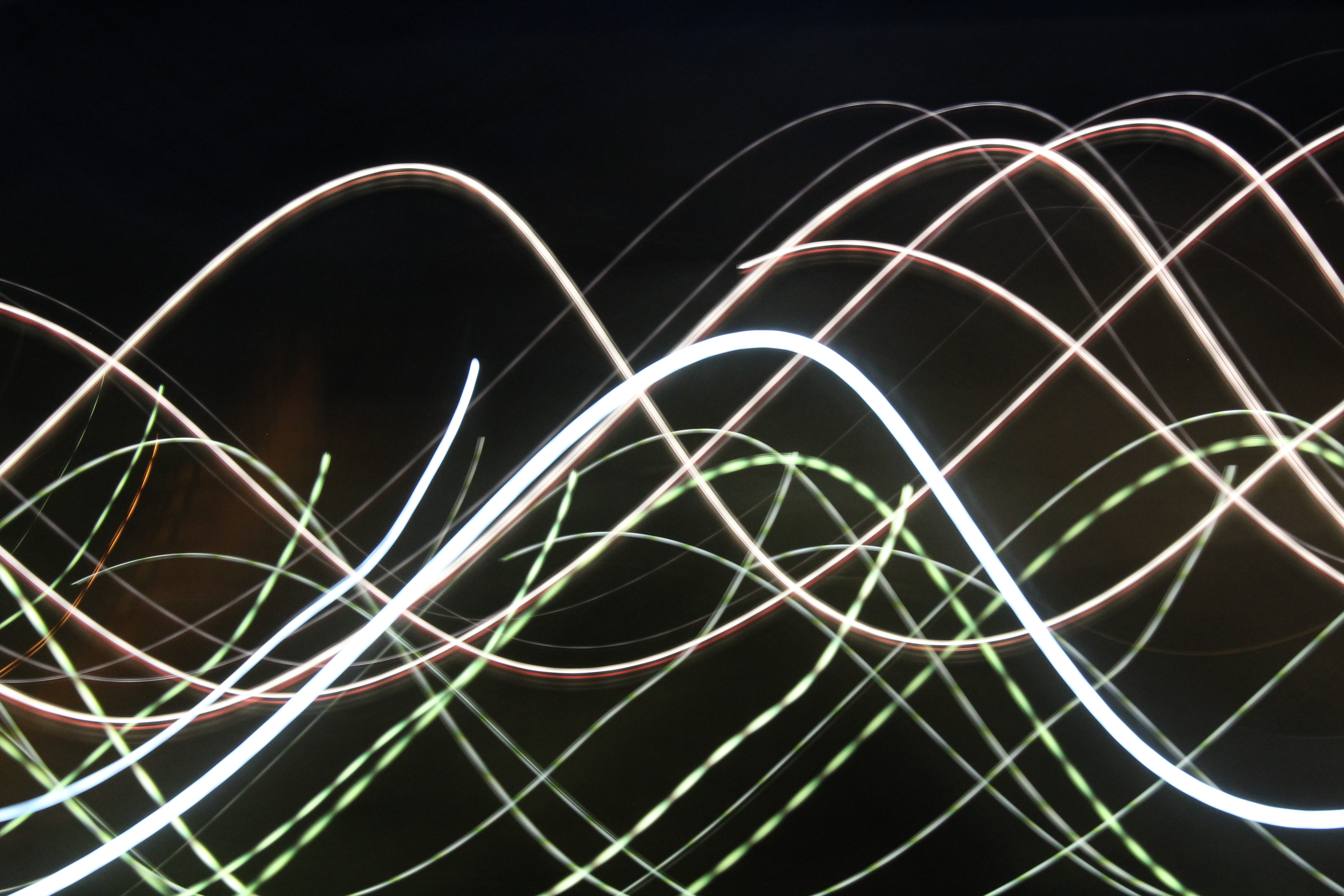
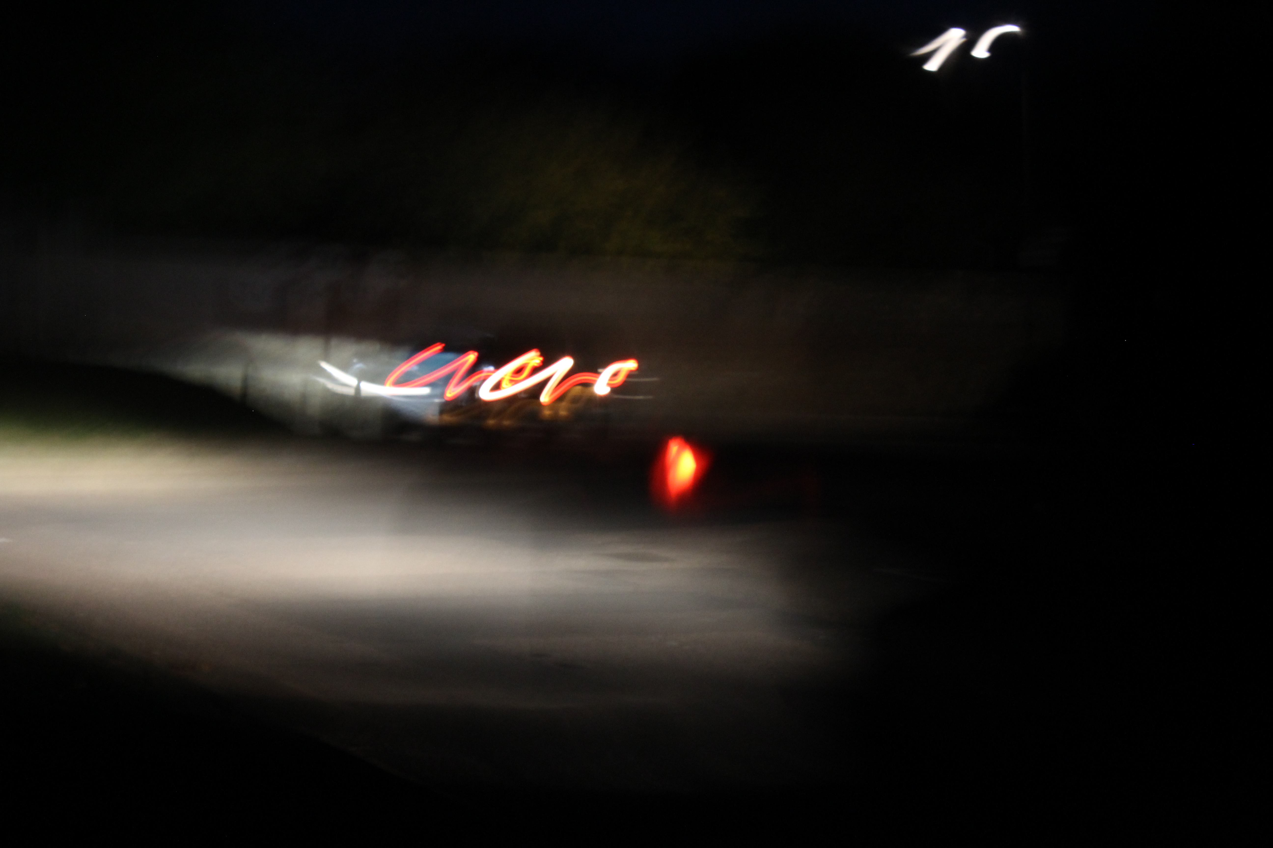
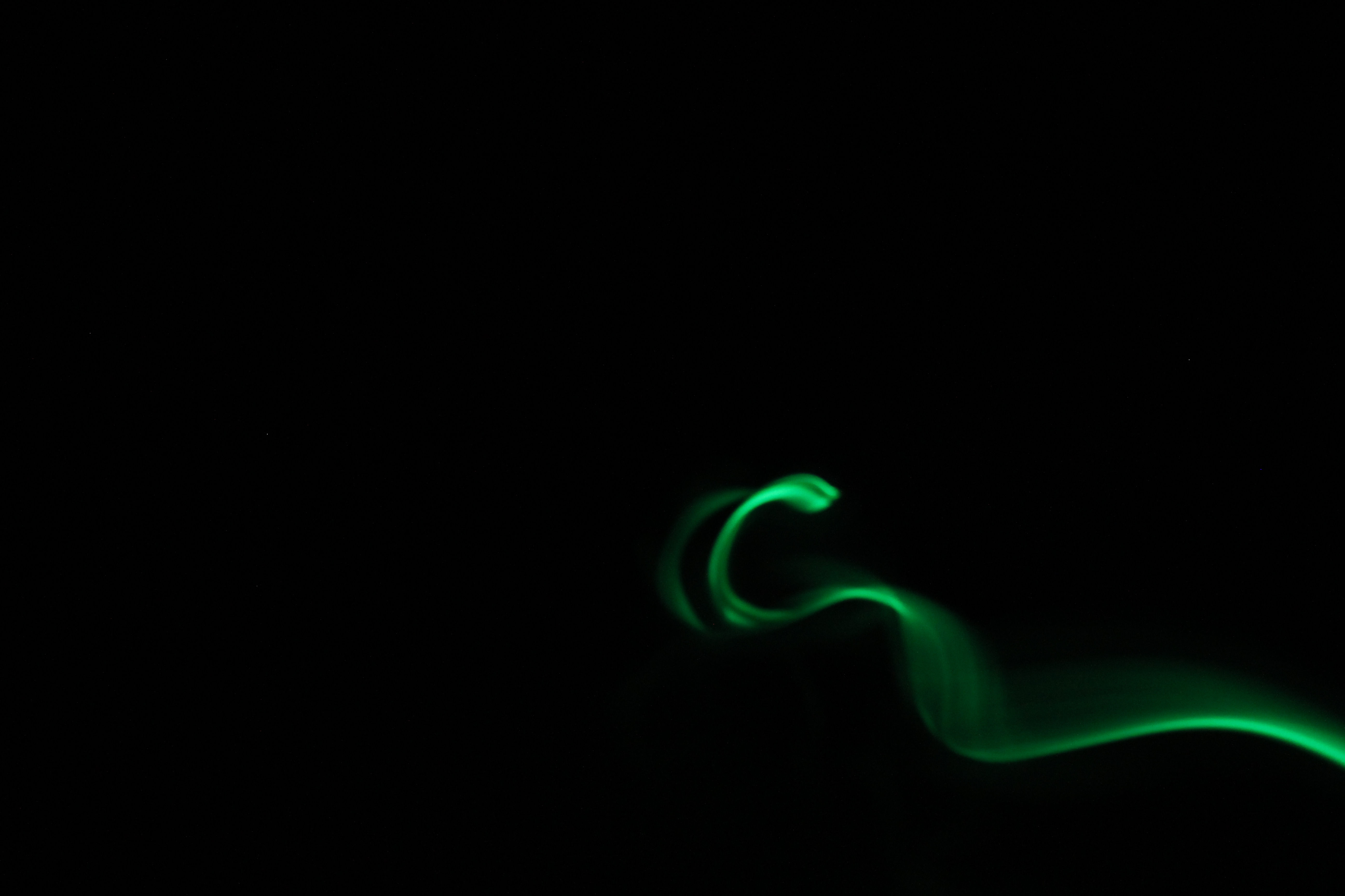
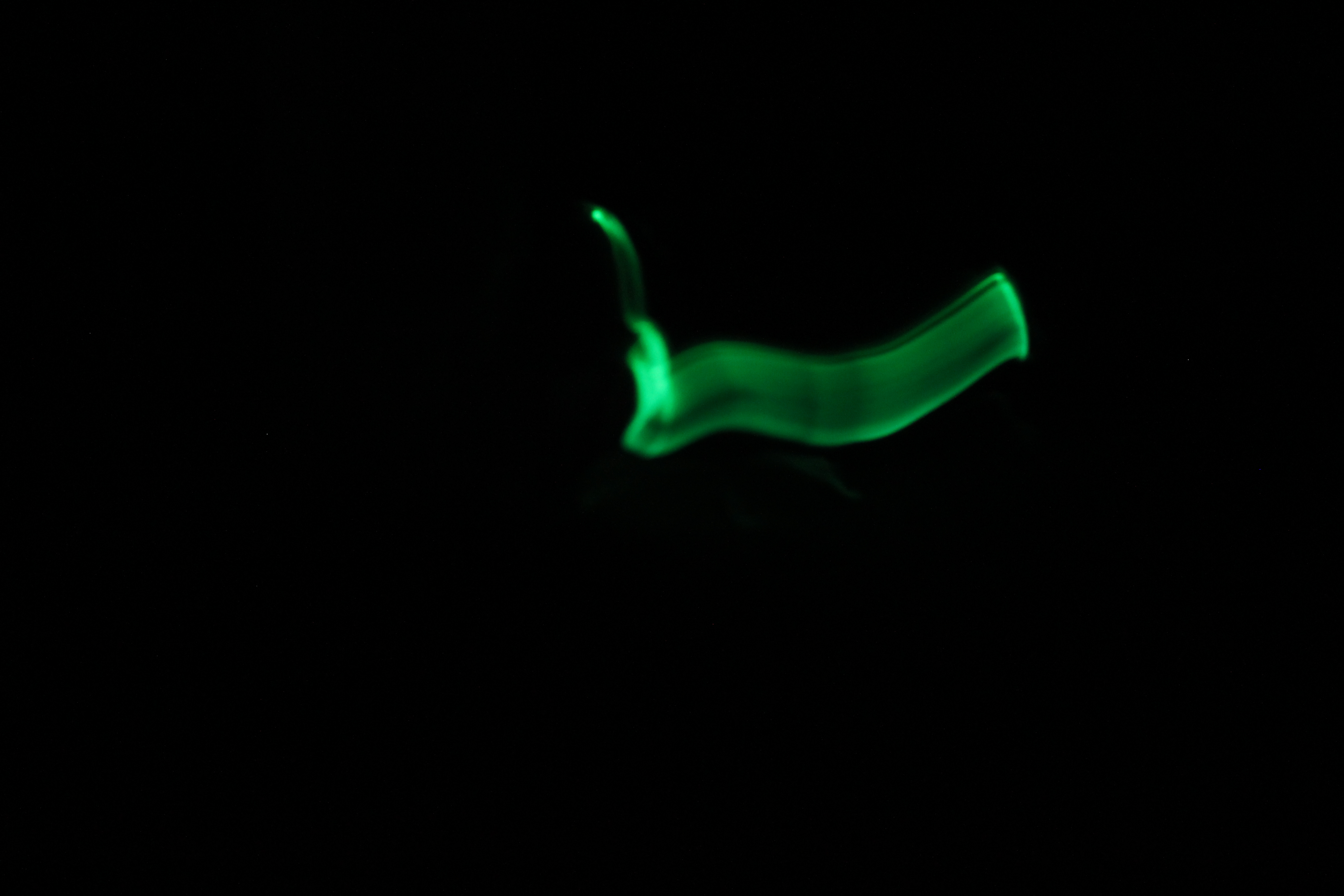
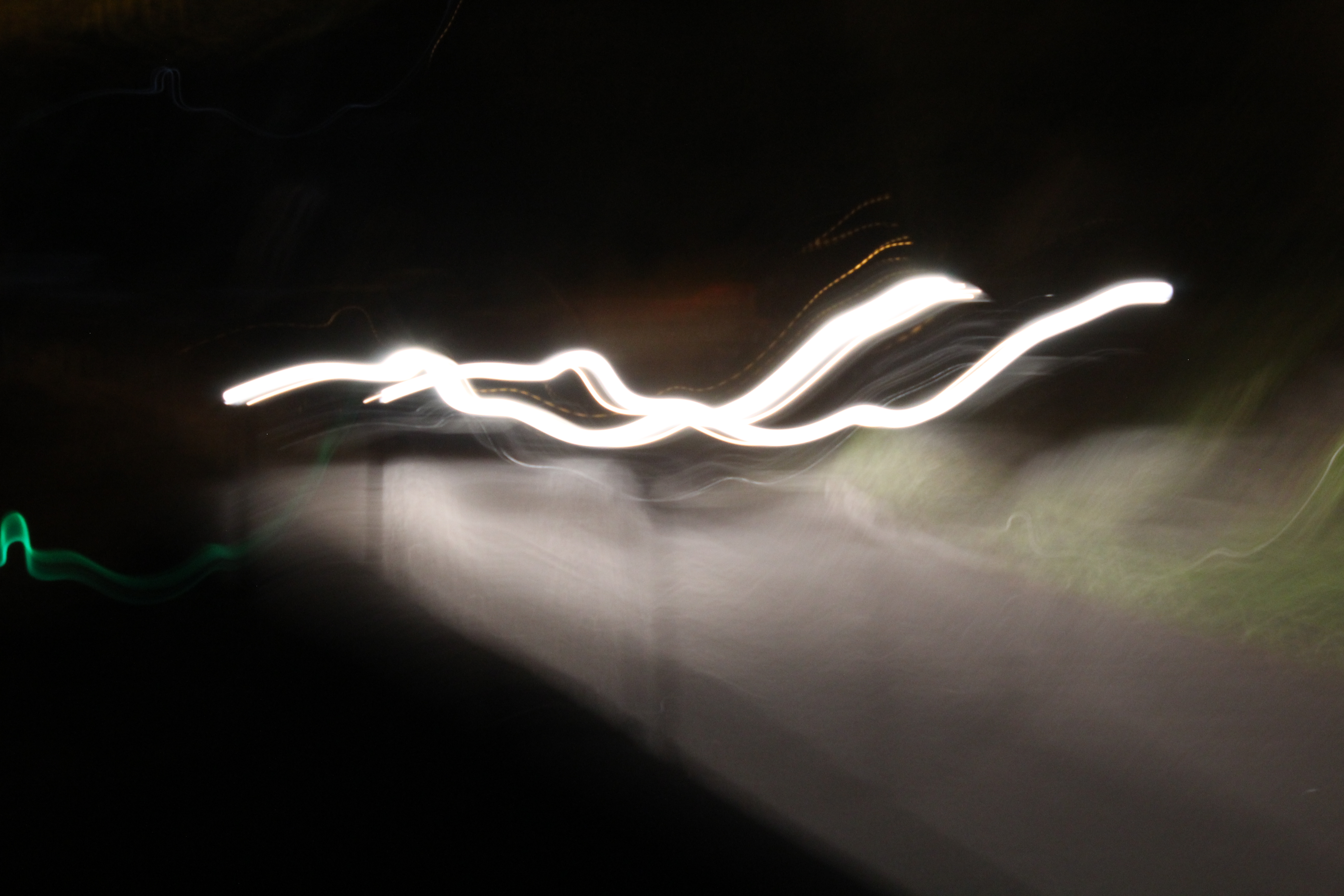
The following are examples of photographs I have taken using a slow shutter-speed (of 0 “4 or 0 “6):

These images are taken of light, late at night, as this best shows the movement in a clear and obvious way. In some of the photos the source of the light itself was moving (e.g a cars break lights), and in others I manually moved the camera. The movement of the light was tracked due to the slow shutter-speed, and an be seen in the images.

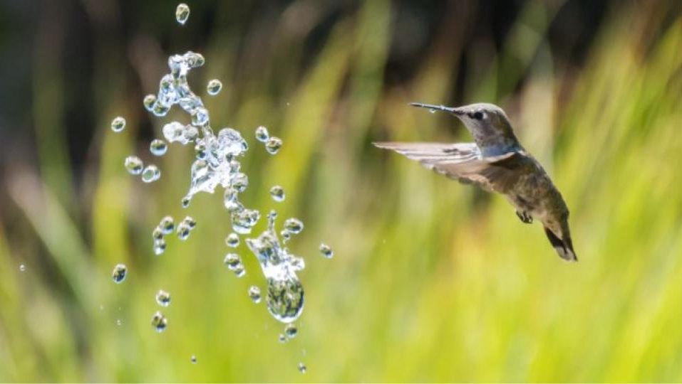
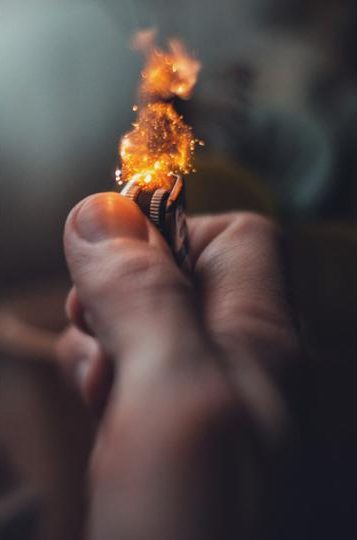
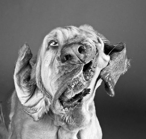
Shutter-speed can also be adjusted to become faster than normal, meaning that clear images of objects that are moving fast can be captured, showing a freeze-frame of the object without showing it’s movement. Examples of images using a fast shutter-speed can be seen below:

Images like these can be taken and used to show a different perspective of a familiar situation, freezing what is normally a fast action (like a dog shaking). This gives the viewer an interesting look at a situation, and can be used to draw the eye and increase interest.

Aperture/Depth of Field Experimentation

For my experimentation into aperture and how it effects the depth of field of my photographs, I took multiple photographs of the same subject in order to compare the differences.

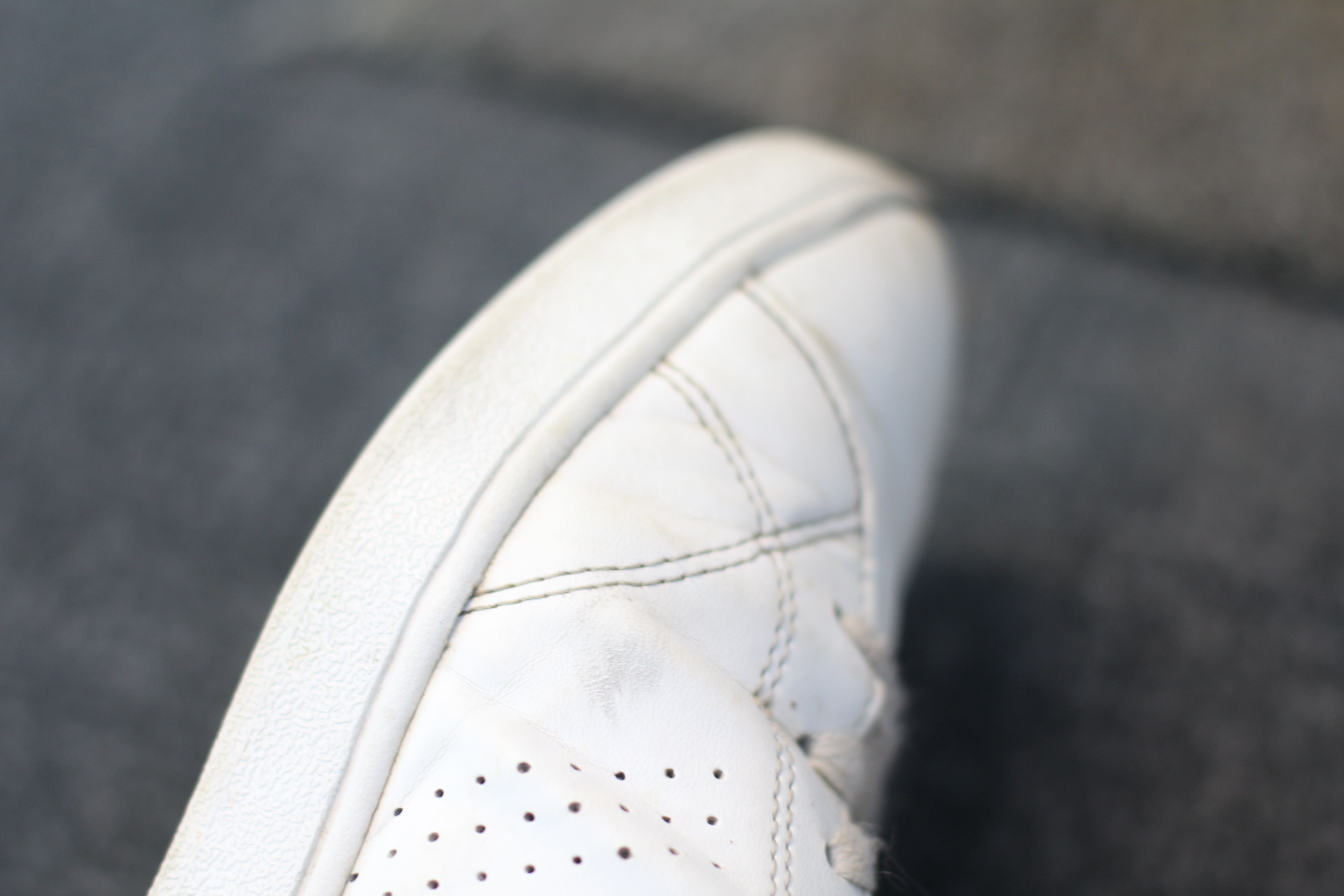
Changing the aperture allowed for the depth of field of my image to change. Lowering the aperture meant that the parts of the subject that were in focus were much smaller and more specific, and more of the image was thrown out of focus, whereas raising the aperture allowed for more of the image to stay in focus, and less of the image was thrown out of focus.

Using a lower aperture allows for more emphasis to be placed on the subject still in focus, and draws more attention to specific parts of the subject that are in focus. The following images are the result of my photo shoot, each using different apertures.

For many of the photos, I used the same subject, but either lowered or raised the aperture. Adjusting the aperture also meant that I had to adjust the ISO, depending on how much light was being let into the image. For example, a higher aperture would make the image darker, and so I raised the aperture to allow more light, which makes the image more visible.

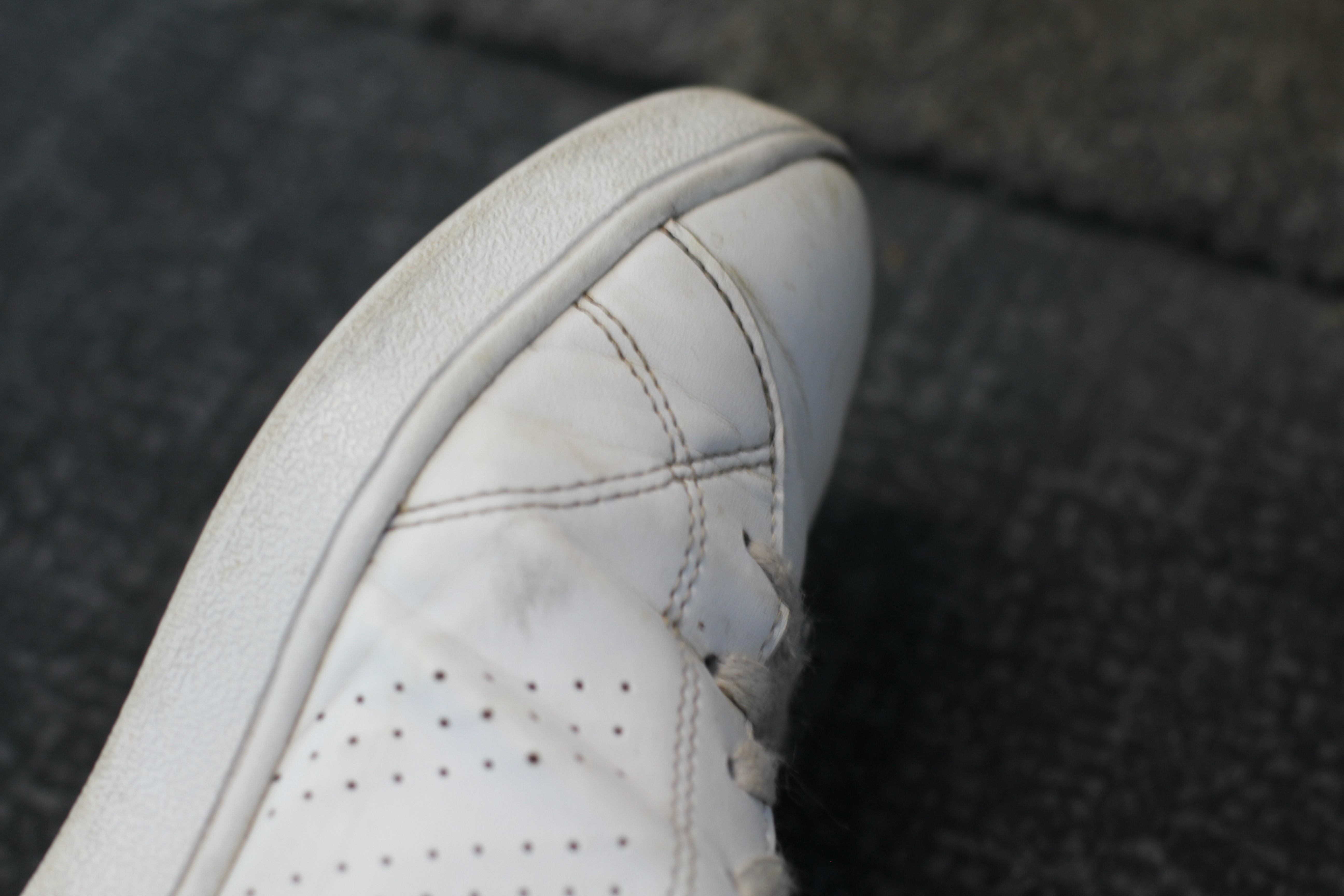
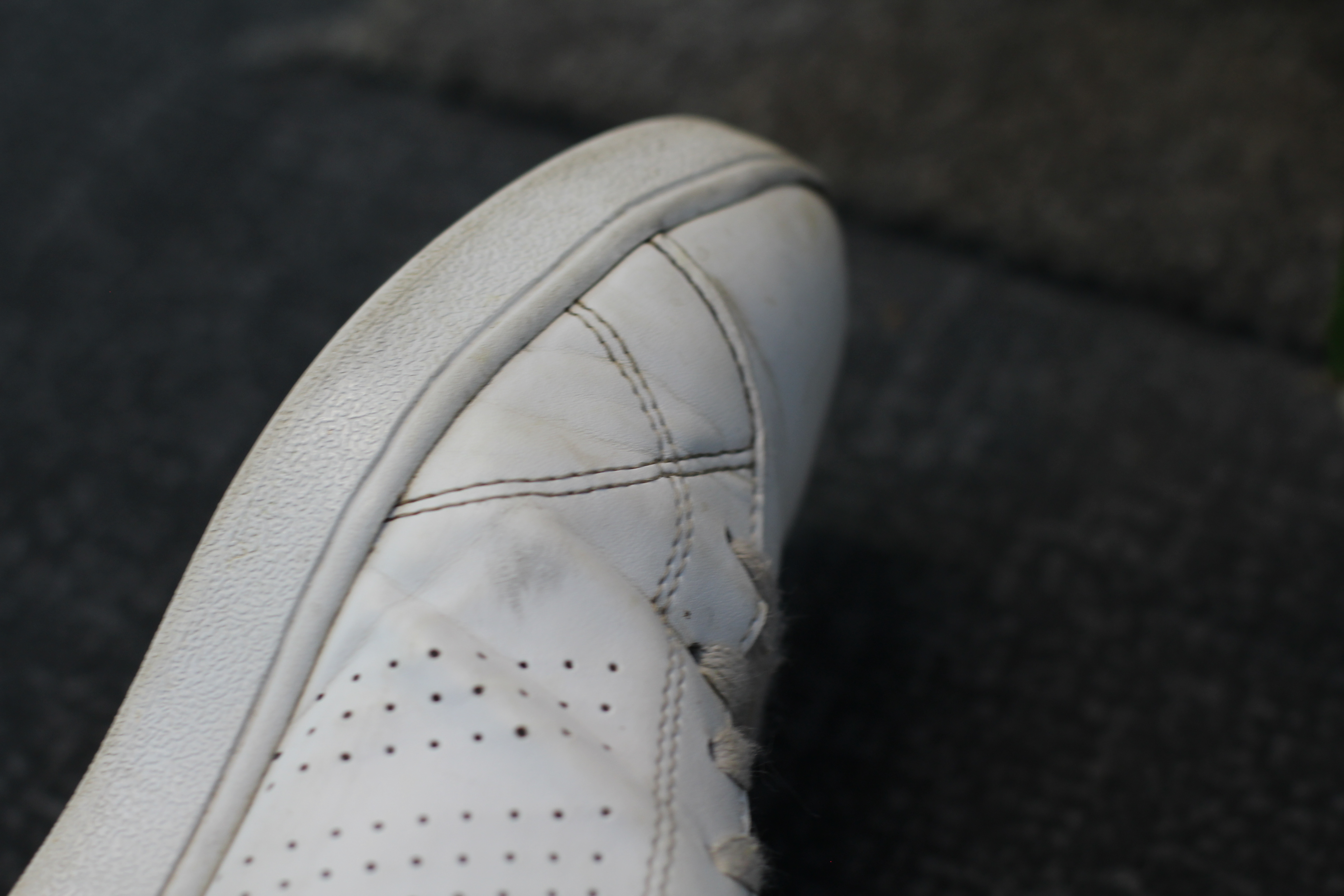
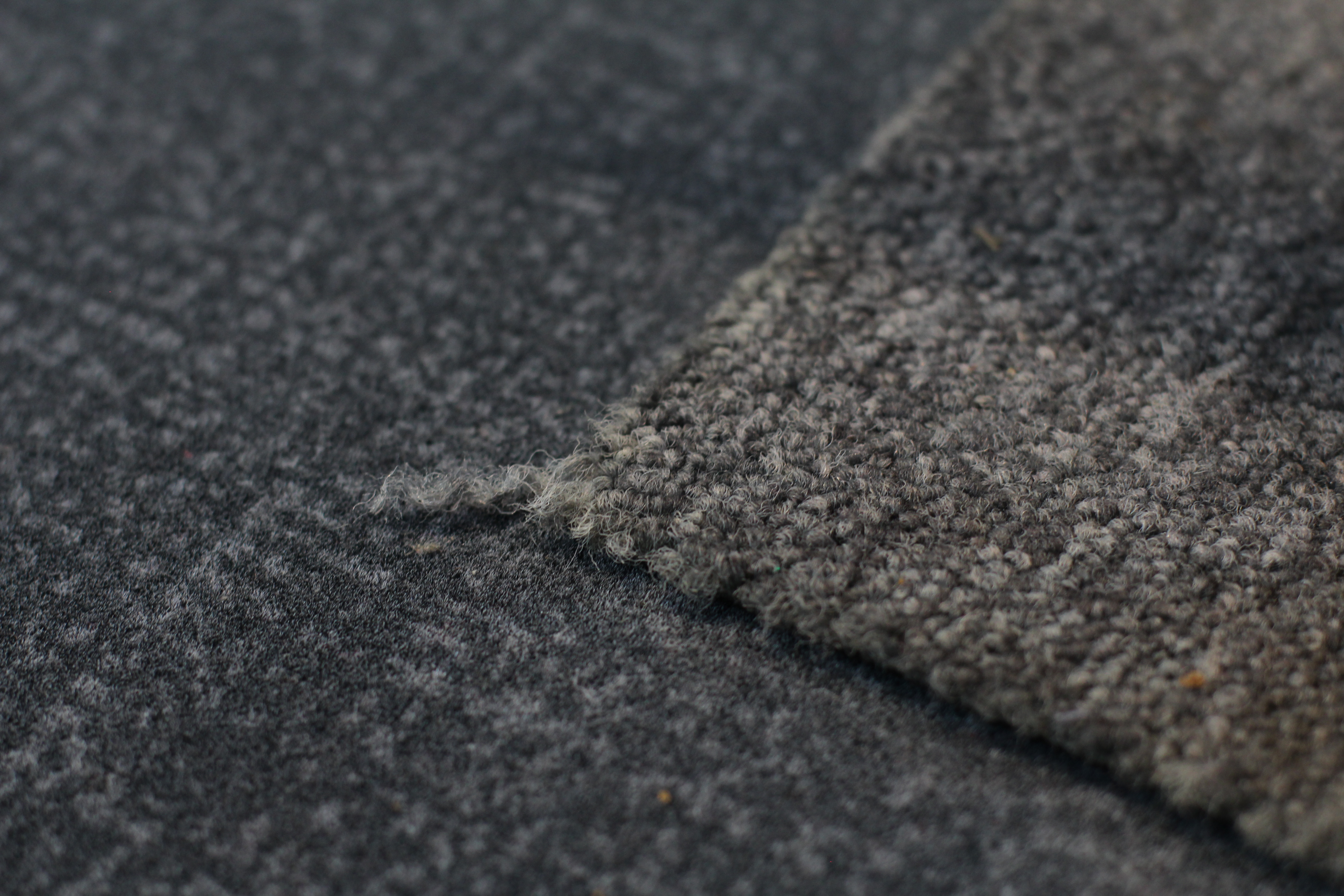
Below is an example of where I took 3 images of the same subject, but adjusted the aperture and the ISO, meaning the the depths of field and focus points vary from image to image:

The above image was taken using high aperture (f/10). This high aperture allows for the whole shoe to remain in focus, and all of the detail of the shoe is displayed clearly. Using a higher aperture allows for more of the image to remain in focus, and so the subject (the shoe) can be very clearly seen.

The above image was taken using a slightly lower aperture (f/5). Due to the lower aperture the image became lighter, as more light was allowed into the image. To counteract this, I adjusted the ISO to a lower number in order to give the image a normal amount of light. As I used an aperture of f/5, I adjusted the ISO setting to 200. As shown, the amount of the shoe that is still in focus has reduced. The main focal point is towards the top of the shoe, and just centimetres away the subject begins to fall out of focus. This allows for the focal point to become more obvious, and the attention of the viewer is drawn more to the specific focal point.

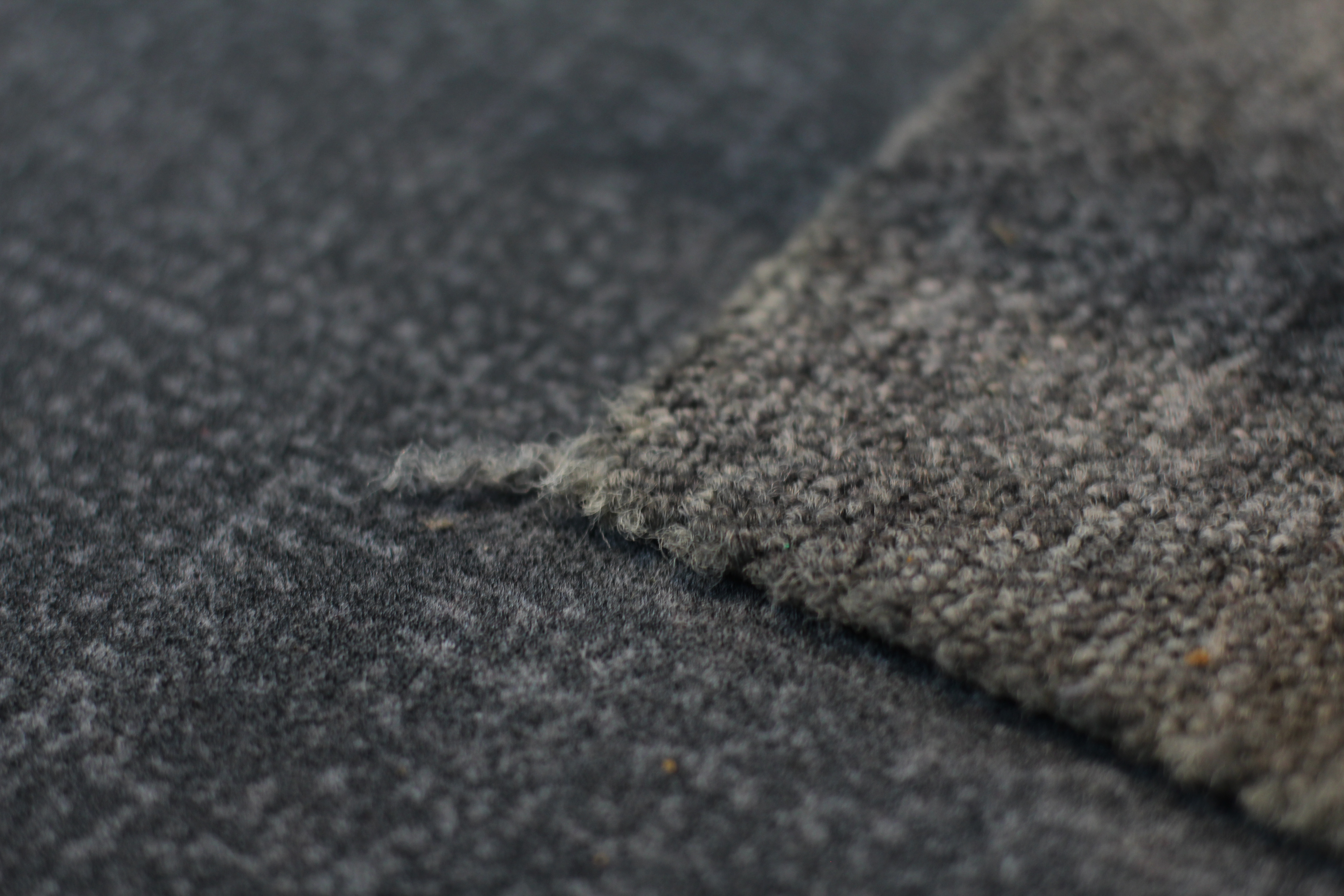
The above image was taken with the lowest aperture (f/2.8). Due to this low aperture, I again adjusted the ISO to a lower number (100). This adjustment is ISO means that all of the images allowed in a different amount of light, but still look clear and bright. For this image, the main focus point was towards the bottom of the photograph, and now it is just millimetres away that the subject begins to fall more out of focus. This image has a much more narrow depth of field than the above 2, due to the small amount of the subject that is in focus. This draws maximum attention to the focus point, and is useful when a photographer wants to draw all of the viewers attention to a very specific area, while blurring out the rest of the image. Due to the narrow depth of field, the carpet (background) of the image is completely out of focus, regardless of it only being a short distance away.

Altering aperture and ISO settings of a camera allows for the image taken to either keep the majority of the subject in focus, or just a small fraction in focus. These differences can draw more attention to specific parts of an image, or draw attention to the whole image depending on which way they are used. Adjusting aperture is a useful technique depending on what the goal of the photographer is.

Keld Helmer-Petersen: Response

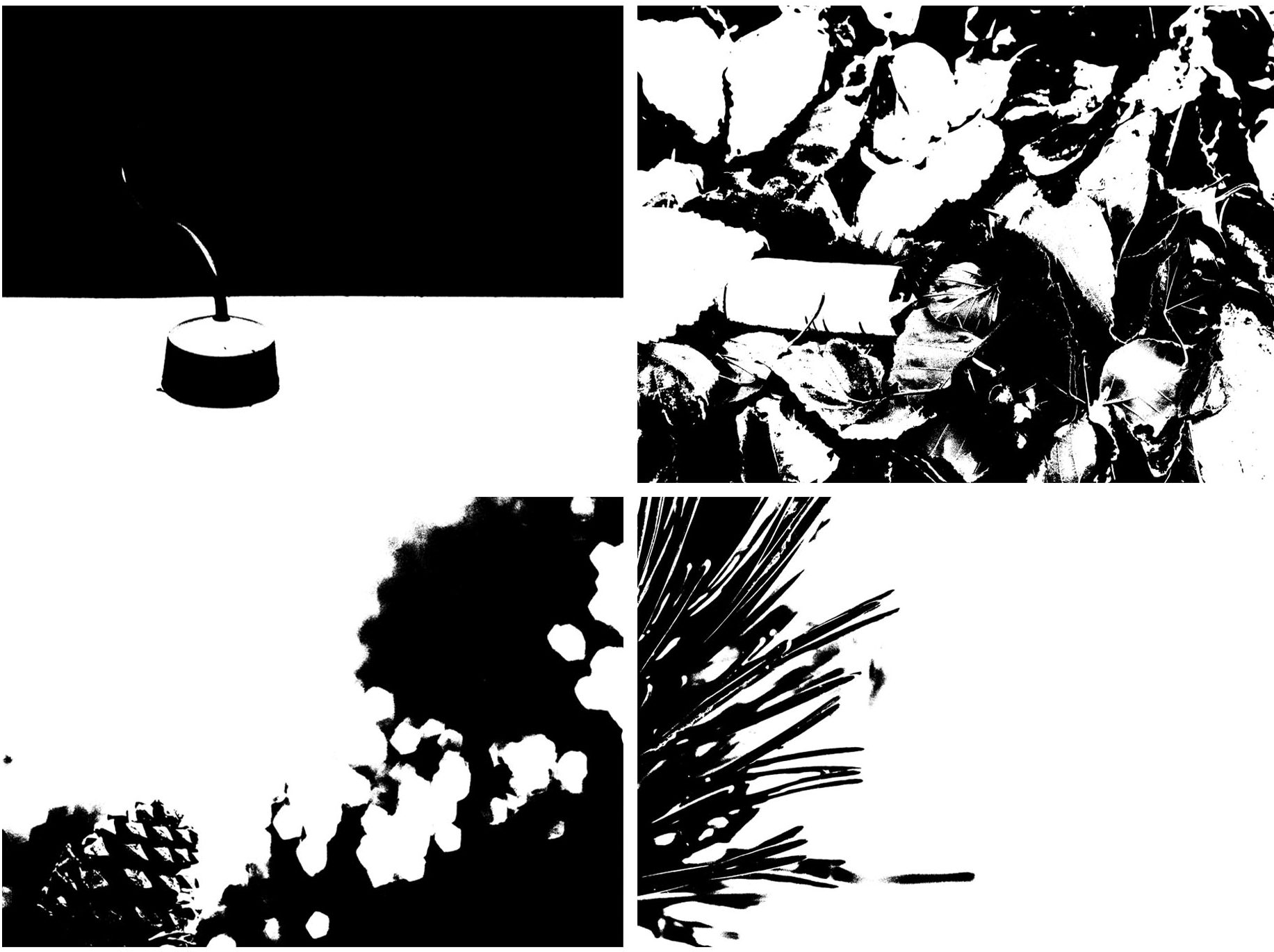
After observing and analyzing the work of Keld Helmer-Petersen, I took 4 images that I think best suit the style of his work, and used Photoshop to mimic the silhouette-effect that he produces in his work, in order to respond to his work successfully.

The following images are the images that I decided were most like the work of Helmer-Petersen:

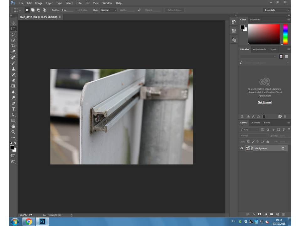
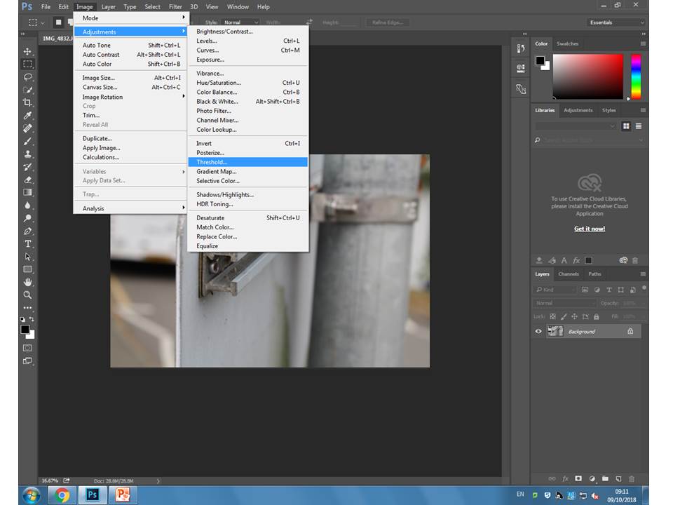
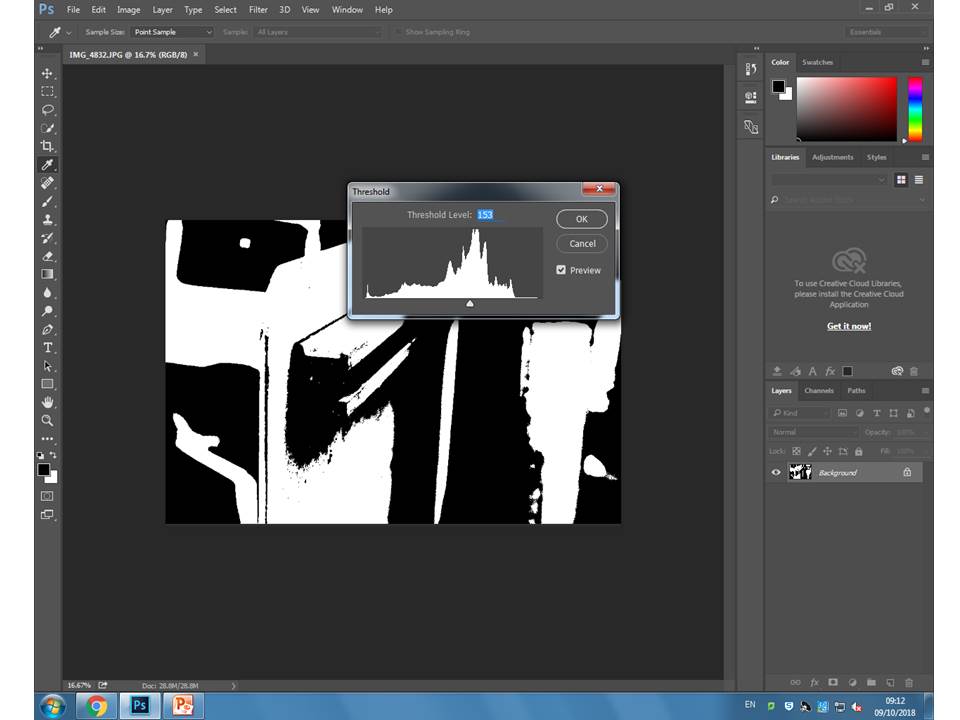
In order to give my images the silhouette effect, I used the Threshold option on Photoshop. The following images explain the process I used to achieve the image above:

Step 1) First, I opened the image that I wanted to use for the project. I decided on photographs that had clear boarders and contrasting colours, that way when i edit the image with Threshold, the boarders will remain more obvious.

Step 2) Next, in order to edit the image, I chose the image option on the top toolbar, and then selected Adjustments, and then Threshold. Clicking this option immediately opens the threshold level adjuster.

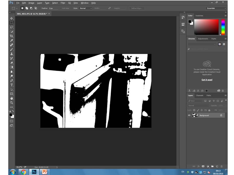
Step 3) After clicking threshold, the option to adjust the threshold is made available. By sliding the arrow left and right, the image changes from containing more black, to containing  more white. I adjusted the image so that the outlines of the subjects were clear, but there wasn’t too much black in the image.

The image above is an example of how an image looks after the threshold has been adjusted in Photoshop. This editing tool is very useful when editing images to look like the work of Keld Helmer-Petersen, as it allows for the image to show as simply black and white, and emphasizes the shape and detail of the image due to it’s simplicity.

Albert Renger-Patzsch Project: The World Is Beautiful (New Objectivity) (in progress)

Introduction to Albert Renger-Patzsch:

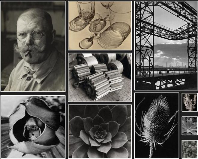
Albert Renger-Patzsch was a German photographer who took a liking to the New Objectivity ways of photographing, and helped to develop the movement with his own work. New objectivity focused a lot on taking photographs in a bold, documentary like manner, showing the subjects in a simple yet striking form. Renger took a forward approach to photography, using his camera almost like an eye, simply photographing what was seen in the way that an individual would see it. Albert’s photography matched the movement of New Objectivity well, and through the use of black and white tone contrast, his work drew attention to the new way of photographing subjects the way that they were seen in everyday life. Albert focused on subjects that could be found in everyday life, making his photographs more relatable to the viewer. He often focused on nature, taking close up photographs of plants and flowers, showing the details of nature in a simple yet eye catching manner. A lot of his photographs take advantage of natural shadows and patterns, exaggerating them by editing the colour to grey-scale.

Introduction to New Objectivity:

Renger-Patzsch focused a lot of his work around the “New Objectivity” expression of photography, which gained popularity during the 1920’s as a reaction against expressionism. New Objectivity focused on depicting subjects of photographs in a more scientific, documentary style manner. Photographs taken during the surge of New Objectivity often maintained sharp focus on an obvious and well framed subject, and depicted the subject how it was seen with the human eye, rather than distorting or abstracting it. As a whole, New Objectivity presented photographs as precise, literal, and scientific in appearance, which greatly contrasted it’s predecessor, Expressionism.

Exploration of the formal elements:

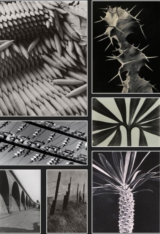
Albert Renger-Patzsch experimented a lot with lighting, shadows, form, lines and texture. His photographs often take advantage of the contrasting tones in gray scale; using the contrasting colours to emphasize the details of the images. Renger also experimented a lot with texture, using close ups to emphasize the texture of the subjects he used, while positioning his lighting to highlight the contrasting textures that can be found on a single image. The final images that Albert produced were sharp and bold, and the dark and light colours that he edited into the images helped to emphasize this bold photography. The position and settings of Albert’s camera were also important in creating his photographs. Albert made use of the zoom feature of his camera, taking close ups of plant life and everyday objects to show their details. A lot of Albert’s subjects include more harsh objects, such as thorn covered plants or telephone wires, and the way he positioned his camera helped to frame the image in a bold way, drawing the viewer’s attention directly to the center of the photograph. This technique helped to add to the harshness of the photographs he took, along with the use of harsh subject matters. The combination of gray scale, closeups and bold subjects helped Albert create an overall eye catching and striking style that matched the wave of New Objectivity.

Further Analysis:

Renger-Patzsch looks for the details in his subject, zooming into the more complex areas and drawing attention to the complexities of everyday objects. Albert focuses a lot on industrial hardware, including cranes, machines and factory spaces, and draws attention to the detail found there. This often helps to add to the objectivity of Renger-Patzsch’s work, as it allows for the viewer to see these machines as they would usually see them with their own eyes, but allows them to concentrate more on the details that they would normally miss. Examples of where Renger-Patzsch has payed extra attention to the detail present in the frame of his photographs can be seen below.

My Response:

After analyzing his work, I have taken inspiration from Albert Renger-Patzsch, and will be using his style of photography to create a photo shoot of my own, keeping in mind his use of camera settings, subjects, and his frame of mind in reference to New Objectivity. Below are the contact sheets I have produced after taking photographs inspires by Renger-Patzsch:


Response Analysis:

As can be seen in the above photo-shoot, I have focused on aligning my photography with the New Objectivity movement that influenced Renger-Patzsch with his own work. I have focused on using subjects including both nature and machinery, where I have been able to mimic the style of Renger-Patzsch. I feel that, by taking very front facing photographs of subjects, that are not altered or abstracted, I have been able to capture the style of the New Objectivity movement in my images.

———-individual (x3)———

In order to allow my photo- shoot the appear to have taken inspiration from Renger-Patzsch, I decided that editing the images would be the best way to emphasis the shape and contrast of the images. Renger-Patzsch often used grey-scale when editing his images, in order to draw attention to the subject of the image, rather than the color, and to present the subjects in an even more scientific, almost clinical way. In order to mimic this effect, I have selected the images that I feel are the most relevant, and have edited them to mimic the colour pallet of Renger-Patzsch’s work. The products can be seen below: