A2 PHOTOGRAPHY
PERSONAL INVESTIGATION
BUNKER ARCHAEOLOGY
A2 PHOTOGRAPHY
PERSONAL INVESTIGATION
BUNKER ARCHAEOLOGY
Contact Sheet:


Final images:

Edited in: Photoshop + Lightroom
For this image I wanted to show a confusion and inevitable lack of identity, I did this by using multiple exposures in Photoshop and then using a large eraser (2500 px or so) with around a 20-35% brush hardness. Along with this, I used different opacity levels for many of the different layers, to make the image seem almost dream-like or as if it was happening inside the head of the subject, with the intention of the face furthest to the left to have different personalities or emotions. I wanted the image to have a different look than most other portraits in plain white/yellow light, and the pink hue added by the neon sign only adds to the image as it helps it look slightly unnatural/artificial. There were a total of 9 different images used to add depth into the many faces, along with most of them using layer masks and using gradients to eliminate the edges, and then if an image was moved up or down, I used the eraser to eliminate any hard lines from either the top or bottom of the image.

Edited in: Photoshop
While I originally played around with the idea of digitally erasing parts of a subject like the mouth and eyes, however I found that this didn’t work in the way that I wanted it to, so I decided to use the lasso tool instead. For this image I used the Polygonal Lasso tool in Photoshop to select areas of the subjects face, then copied these areas and pasted them back into the image as a new layer, I did this several times on many different areas of the face as you can see above. I wanted to make the subject seem like a broken mirror, hence all of the layers are triangular and, for the most part, facing inwards like a smashed mirror. I did this to show the feeling of not knowing who you really are, similar to the first image, but this one is more about all of the ways we represent ourselves depending on who we are around, and how at a certain point you lose yourself when trying to put on these different faces for other people. To me, this image represents being lost and not really knowing who you, because you are trying to act differently around different people in your life, where as the first image represents a more internal struggle, and lack of identity because of focusing on too many things inside your own head.
Unsuccessful Images

Edited in: Photoshop
I also experimented with the idea of using mirrors but personally don’t really like how it turned out. I think that this idea could have worked better if I had found a larger, more open space, so you could see the depth of the image. I also think a different mirror would have enhanced the image as from this angle the mirror used doesn’t have and large edges; meaning it doesn’t look as much like a mirror compared to Laura Williams’ work, on which this image is based.
Mirror Illusions
When exploring different ideas for for this shoot (or multiple potential shoots) I came across the use of mirrors obscuring different parts of the body, and though this would be a great way to not only show the loss of identity in a person, but also have a further metaphorical meaning of how so many people ‘reflect’ onto other people when talking, not relieving how they really feel. Similar to the picture below (left), i wanted the mirror to cover the face of the subject, to show how people take ideas from around them, similar to how a mirror reflects. However, the pictures to the right show that using Photoshop to erase the inside of the mirror to show what is behind the subject (by taking one picture with a subject in frame and one without) makes the image look, in my opinion, a lot cleaner and even more professional.


Multiple Exposures and Slow Shutter
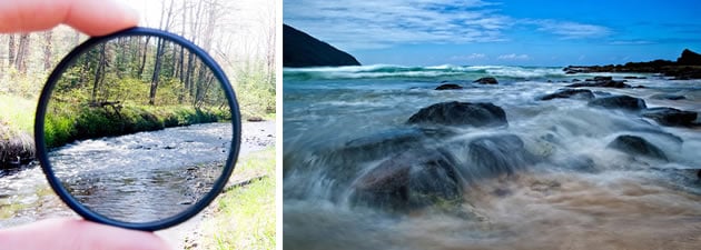
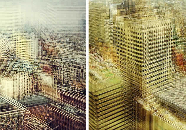
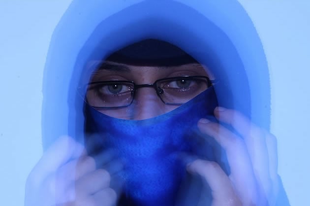
While using mirrors is at the top of my priority list, I also wanted to focus on using double or multiple exposures, as well as long exposure times to create blurred and distorted images of peoples faces and features, further showing the nature of uncertainty of the subject’s identity. Using similar techniques as the pictures below, i want to create my own interpretation of them. As i have experimented with long exposures in the past for landscape photography in my own time, i understand the basics, however I have never really used a slow shutter speed when taking portraits unless it was absolutely necessary to bring up the exposure, but still using a tripod.


Other Ideas:
While the two techniques above are what interest me most, I will also try to explore different such as: burning printed images, using objects to obscure parts of the image, damaging the image(scratching, ripping, taring, etc.), digitally erasing parts of the image, and selecting specific coloured areas.
Definition:
Identity is the fact of being who or what a person or thing is. identity is a very personal subject as every person has a different identity, and can be influenced by a person’s situation, living environment, lifestyle, etc. For example, people brought up in a religious household, will be more likely to have religious views and beliefs, and these beliefs therefor become a part of their identity. However, identities are always changing, and that means that their views on different subjects and feelings towards different things will change as well. There are several different types of identity, including:
Gender identity – The self-perception of their own and other people’s roles based on their gender
Cultural identity – Belonging to a group of people and a culture, such as a religion or community, which influence a person’s life.
Social identity – how people identify and view others around them in society.
Geographical identity /political identity – a sense of attachment to a place or political agenda that a person can relate and identify with.
Lack/Loss of identity – The psychological view that a person has no role in society and lacks a sense of community, often brought on by the confusion of not knowing the kind of person you are and what role you play in society.
Mood Board:
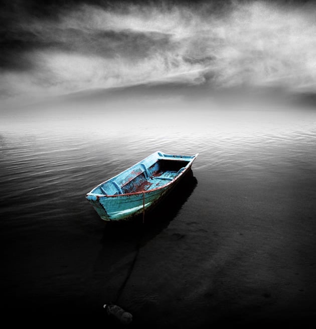
I wanted to explore the ideas of the lack/loss of identity, as i feel there is a lot of room for exploring different techniques. Below are some ideas for the type of ideas that could influence my final piece of work for this unit.





Background:
The idea behind Tableau Photography comes from the term ‘Tableaux Vivants’, which translates from French to Living Picture. These are made to show a static scene showcasing actions between 1 or more characters in a scene. They are usually in costume and carefully posed with props. The term was mainly used for artwork/Paintings in the early 20th century, where artists would paint stills of large detailed events. Tableau Photography and painting is linked to theater in terms of lighting, poses and style. The main point of Tableau Photography is to create emotion and introduce symbolism and meaning to your photographs.
Examples:


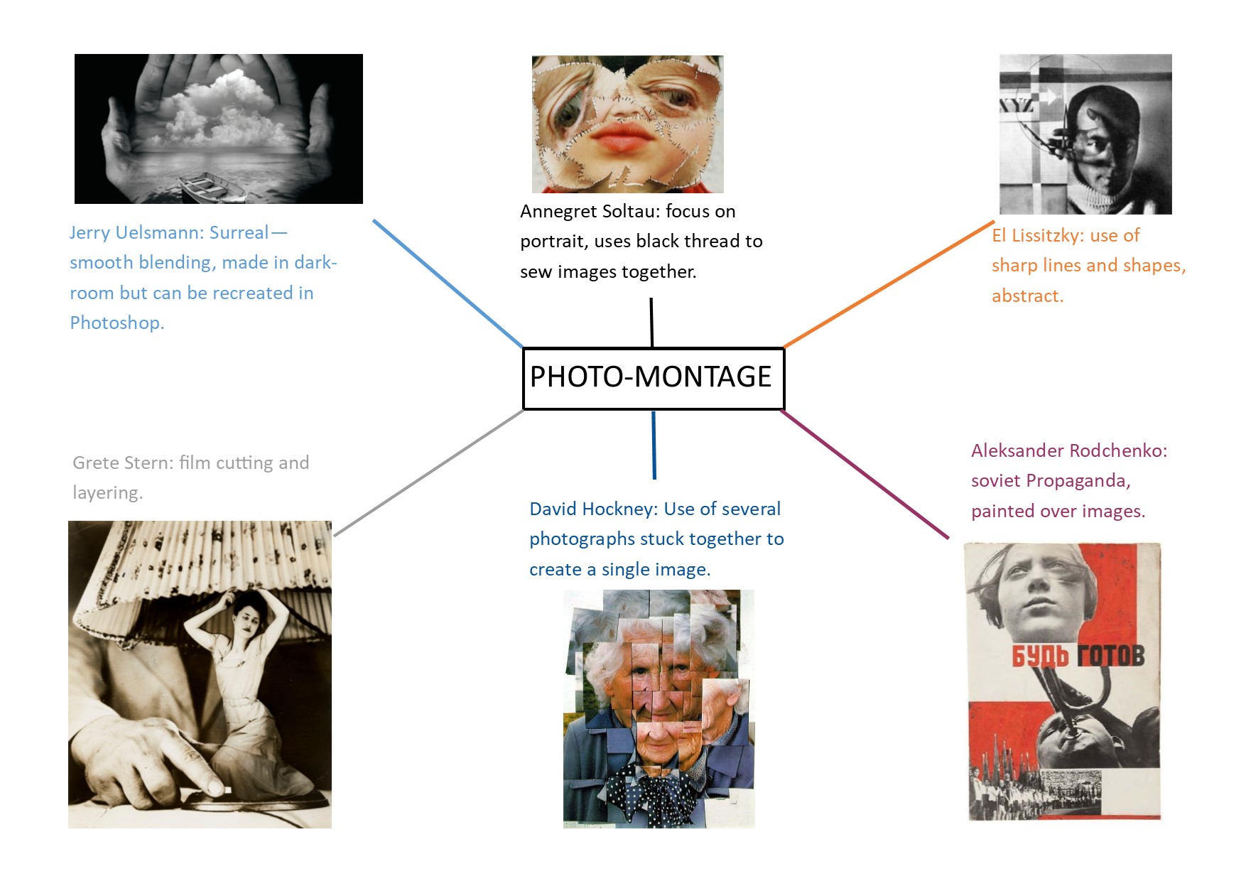
Jerry Uelsmann is an American photographer known for his work on photo-montage, and it has been said that his work inspired many elements of Adobe’s ‘Photoshop’ image editing software. Uelsmann focused on surrealist images created by layering film on top of one another in a dark room. Uelsmann was born and raised in Detroit in 1934 and became interested in photography as a hobby in high school when he was 14 and used it as a way to escape from his school life, where he was getting poor grades. He managed to land a few modeling and wedding shoots and began working as a part time photo assistant for a commercial studio and wedding photographer, then eventually went on to earn a BA from the Rochester Institute of Technology and M.S. and M.F.A. degrees from Indiana University. Uelsmann was a driving force of surrealist photography and was a pioneer of collage and multiple imaging in photography.


These photos are still fairly difficult to create in today’s times, and you have to know your way around Photoshop to even begin a process like this, yet Uelsmann was creating these pictures well before the invention of Photoshop, using a range of unconventional techniques, he managed to create flawlessly realized and executed images working with multiple enlargers, negatives and an array of highly-refined masking, diffusion, burning and dodging techniques. it was after graduating from Indiana University in 1960 and embarking upon a teaching career at the University of Florida that this experimentation really took off. Uelsmann had his first solo show at MOMA in 1967, and is currently the subject of two major retrospective shows. “The Mind’s Eye,” featuring approximately 90 images (including early documentary images dating from the mid-’50s), opens at the Peabody Essex Museum in Salem, Massachusetts in February 2012 after having debuted this summer at the Harn Museum of Art at the University of Florida in Gainesville, where Uelsmann taught photography for close to 40 years.

History:
A photo-montage is a type of montage constructed from photographic images. In the modern age, this style of photographic editing is typically created using Adobe Photoshop or other computer software. The style has been tracked back to as early as the 1860s, but was made more popular in the 1880s when people were starting to be more experimental with their exposures. Early photo montage would consist of cutting out parts of one or more images and paste them on top of an existing photograph. These elements would later be explored in more detail by futurist and dadaist photographers at the start of the 20th century.
Mood board:

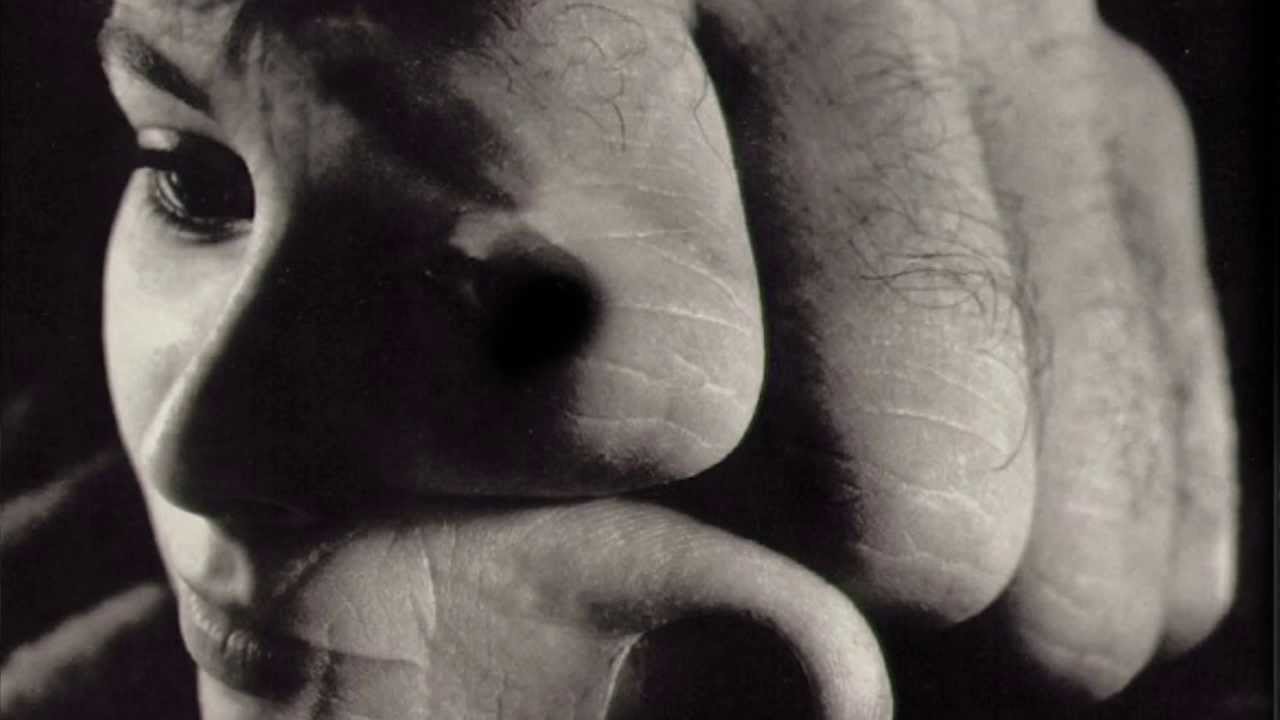



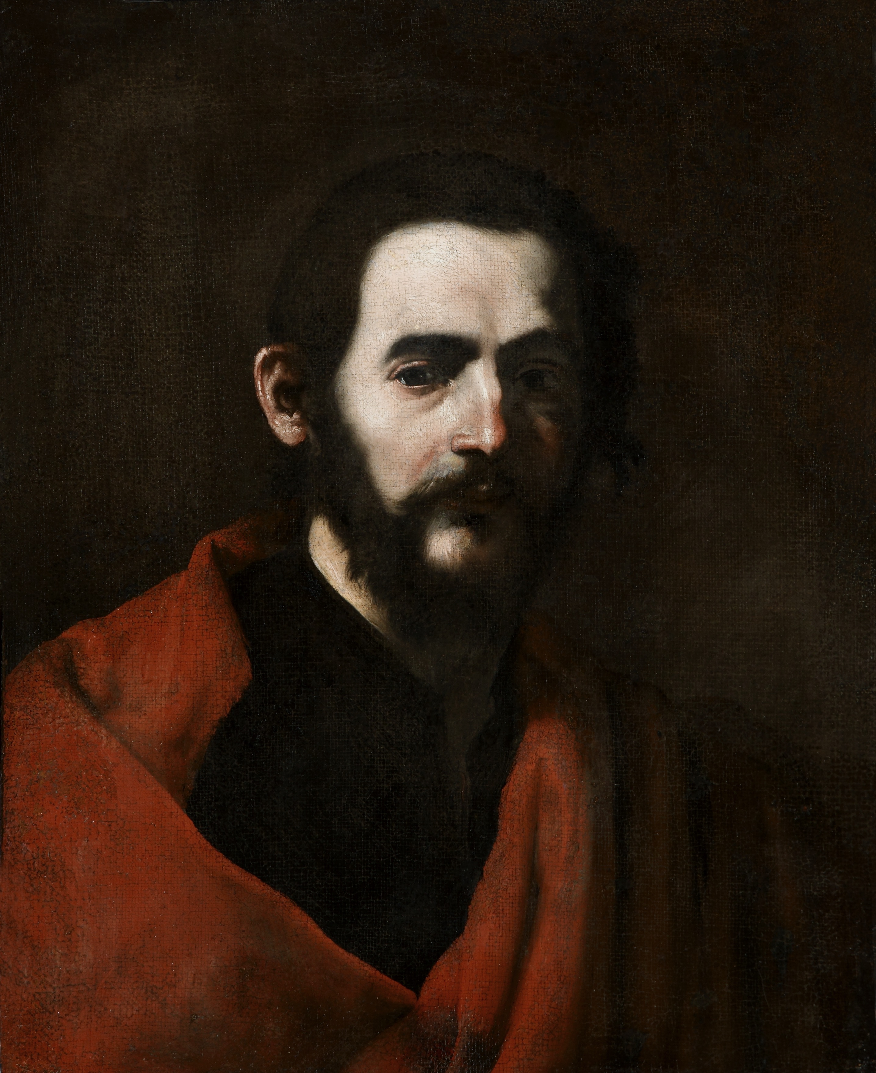
The Italian Term Chiaroscuro, meaning light and dark, is used throughout renaissance paintings and and continues in modern photography today. One of the most notable artists to come out of the renaissance was Giorgione, an Italian painter, who focused on using Chiaroscuro and Rembrandt lighting, inspired the likes of Jusepe de Ribera, who used more contrasting colours and kept more of their subject’s face covered in shadow.
The use of this technique is still being replicated today, with Photographers such as Ralph Gibson using a very high contrast between the subject and their shadows. Gibson uses lighting and shadows to create create an artificial atmosphere in which the photograph has much more depth.

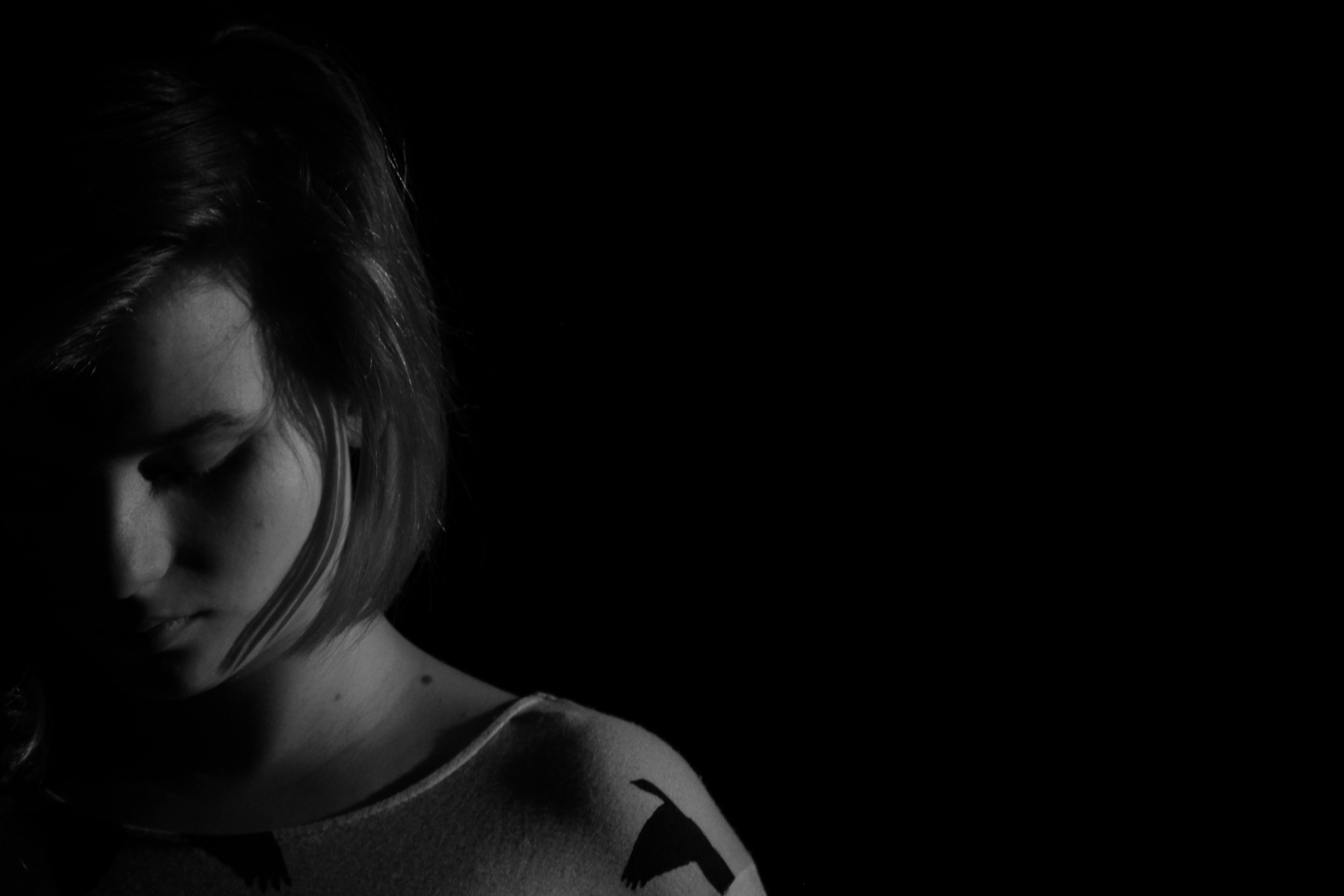
For my images i wanted to use a similar style of photography as this picture from Gibson’s ‘Infanta’ series. I wanted to create a clear line between light and dark in the photo, and try to recreate the dramatic feeling given off by the lighting used in this image.
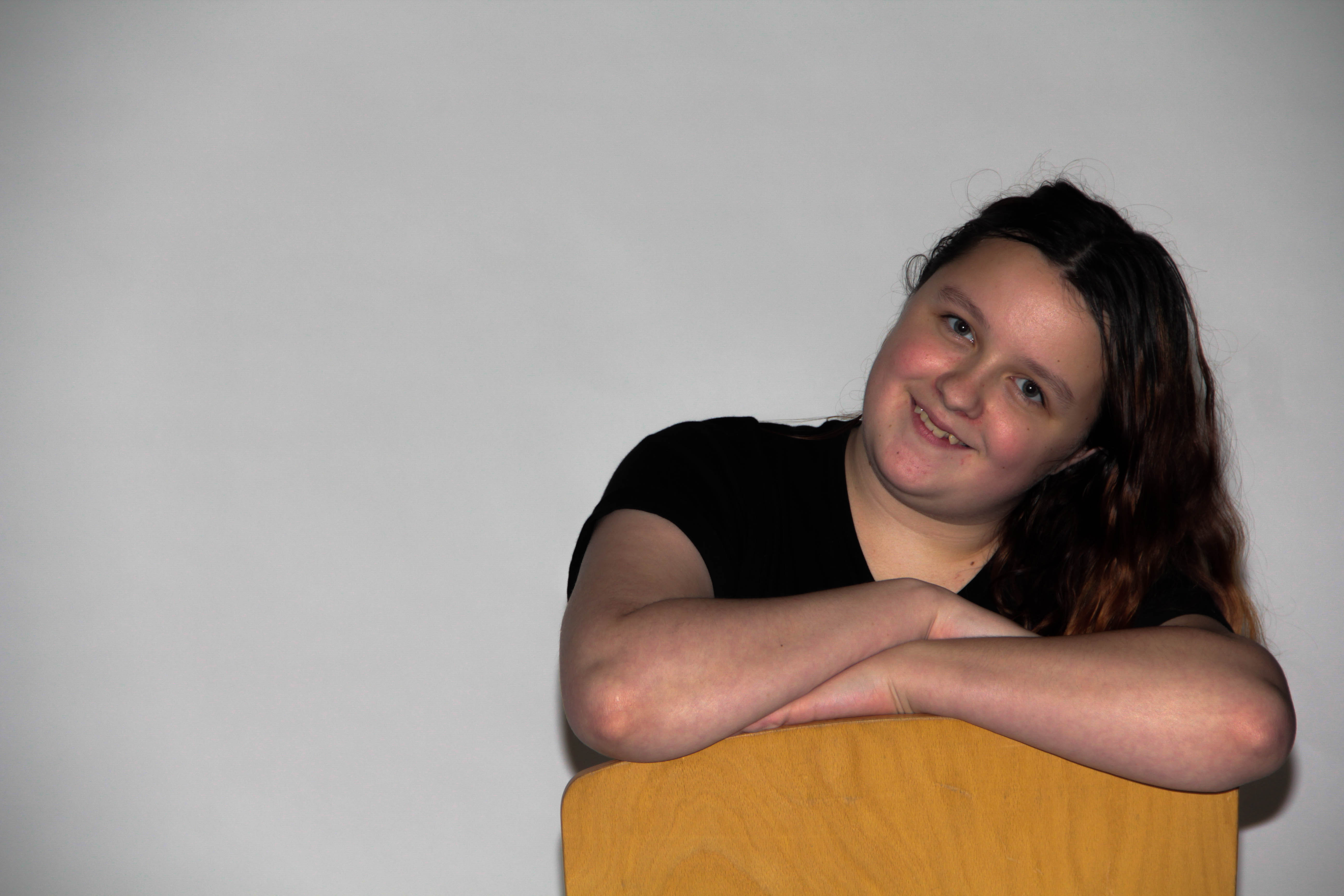
As you can see from my contact sheet below, I also wanted to play around with lighting the subjects with fill lights as well as front facing flash and light bouncing. While this technique worked to some extent, i feel as though my lower key photographs looked much nicer and more professional.
Contact Sheet:
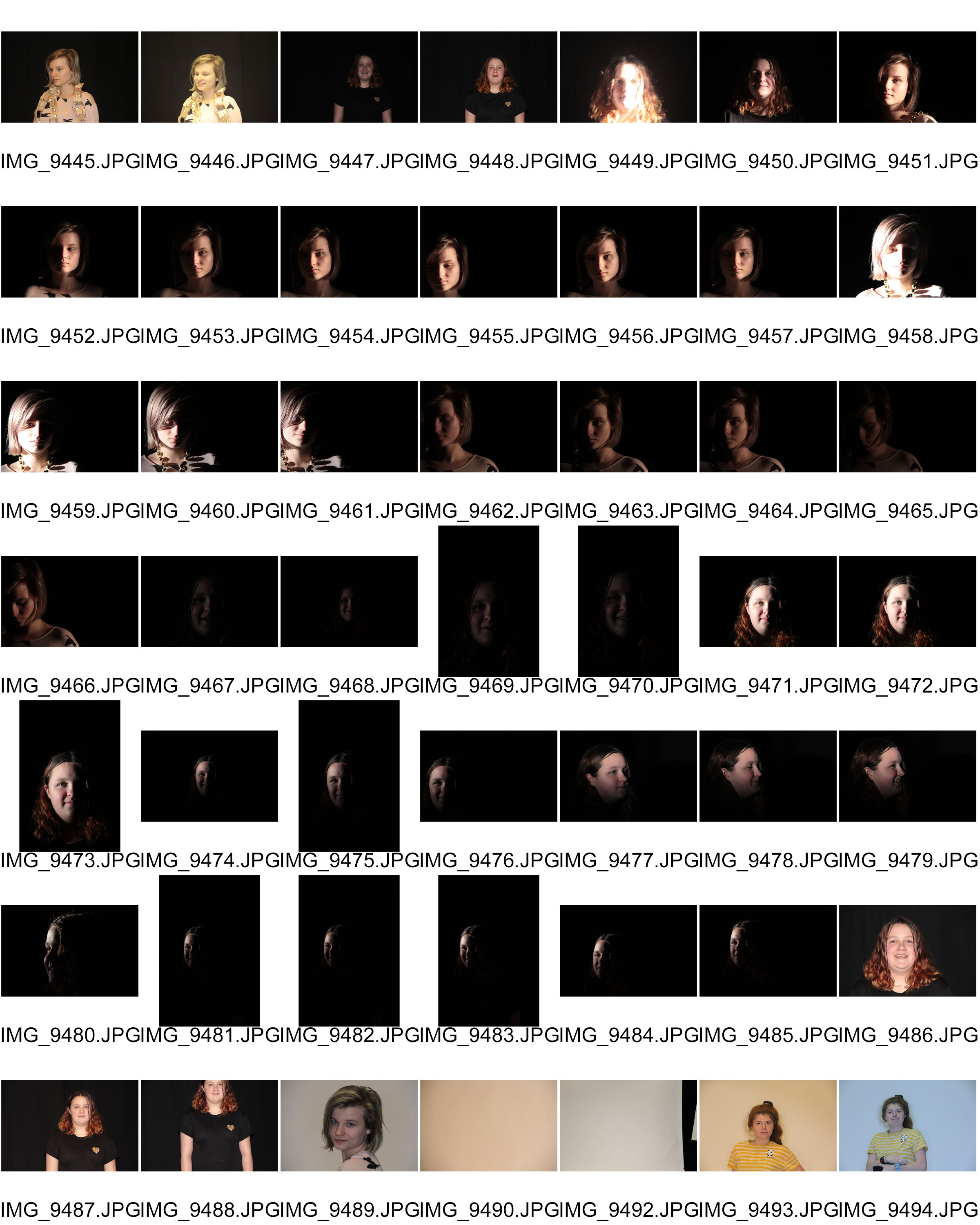

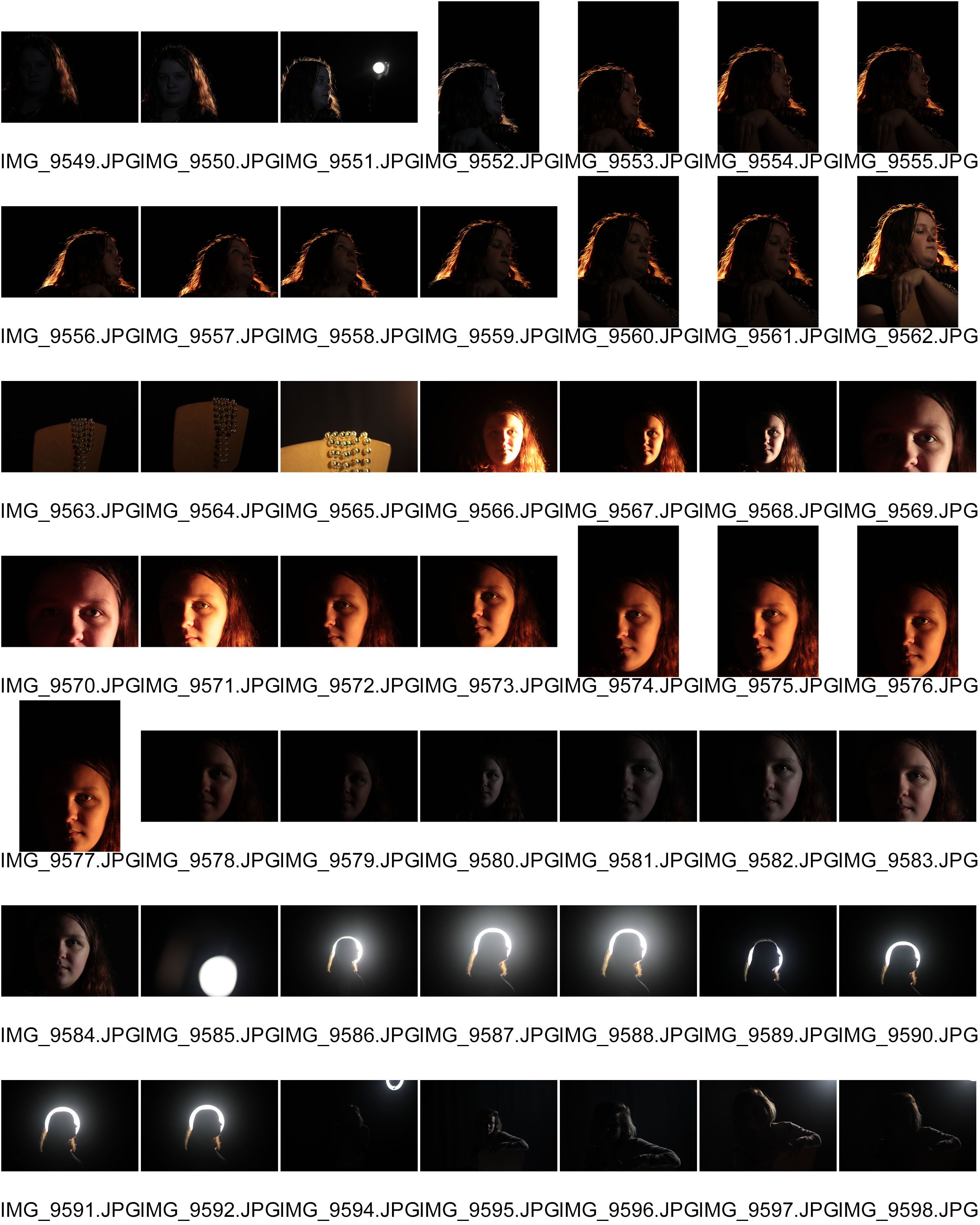
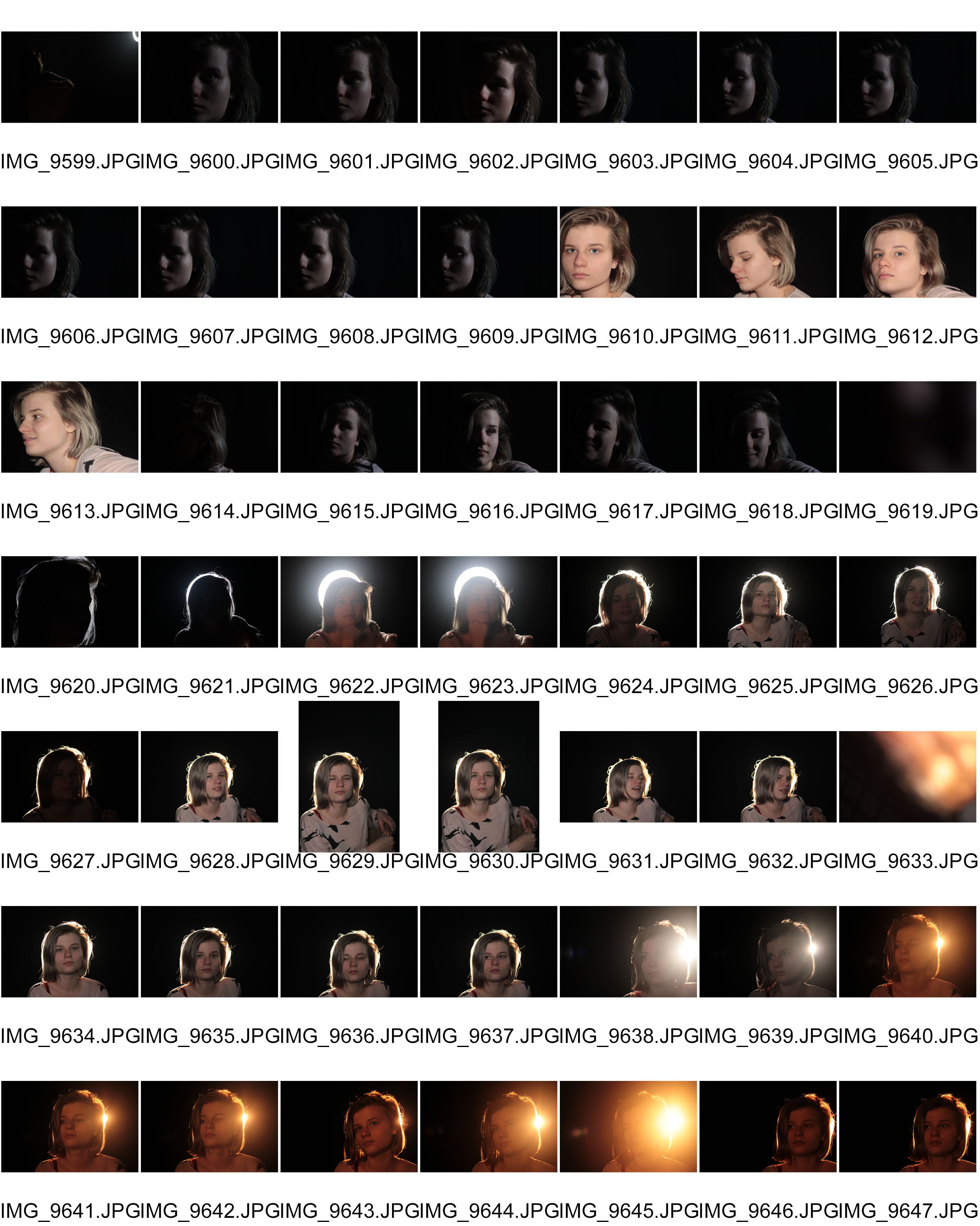

Final Images/Edits:
Fill Lighting:
Edited in: Lightroom
Chiaroscuro Lighting:
Edited in: Lightroom



Chiaroscuro Lighting:
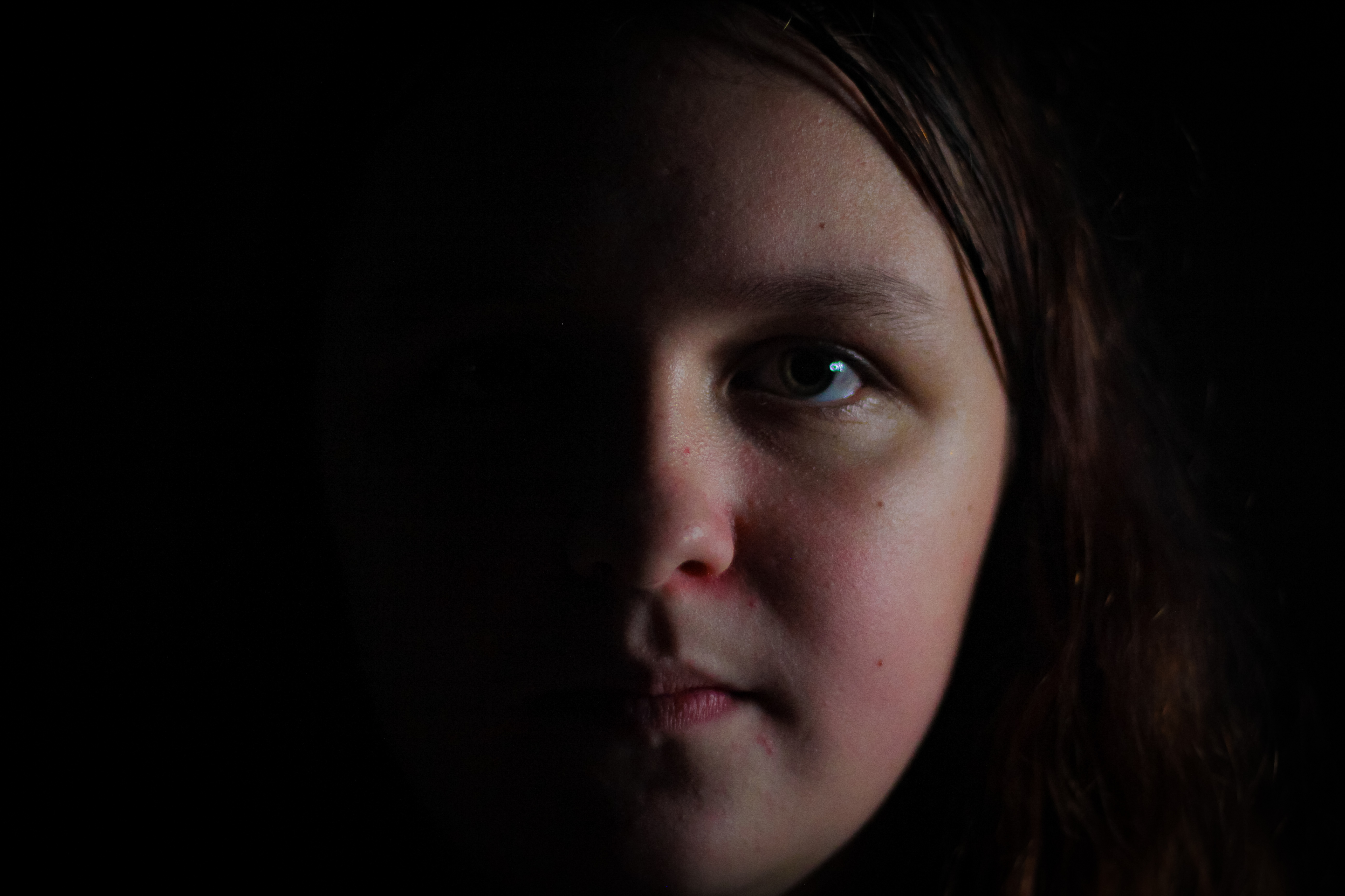
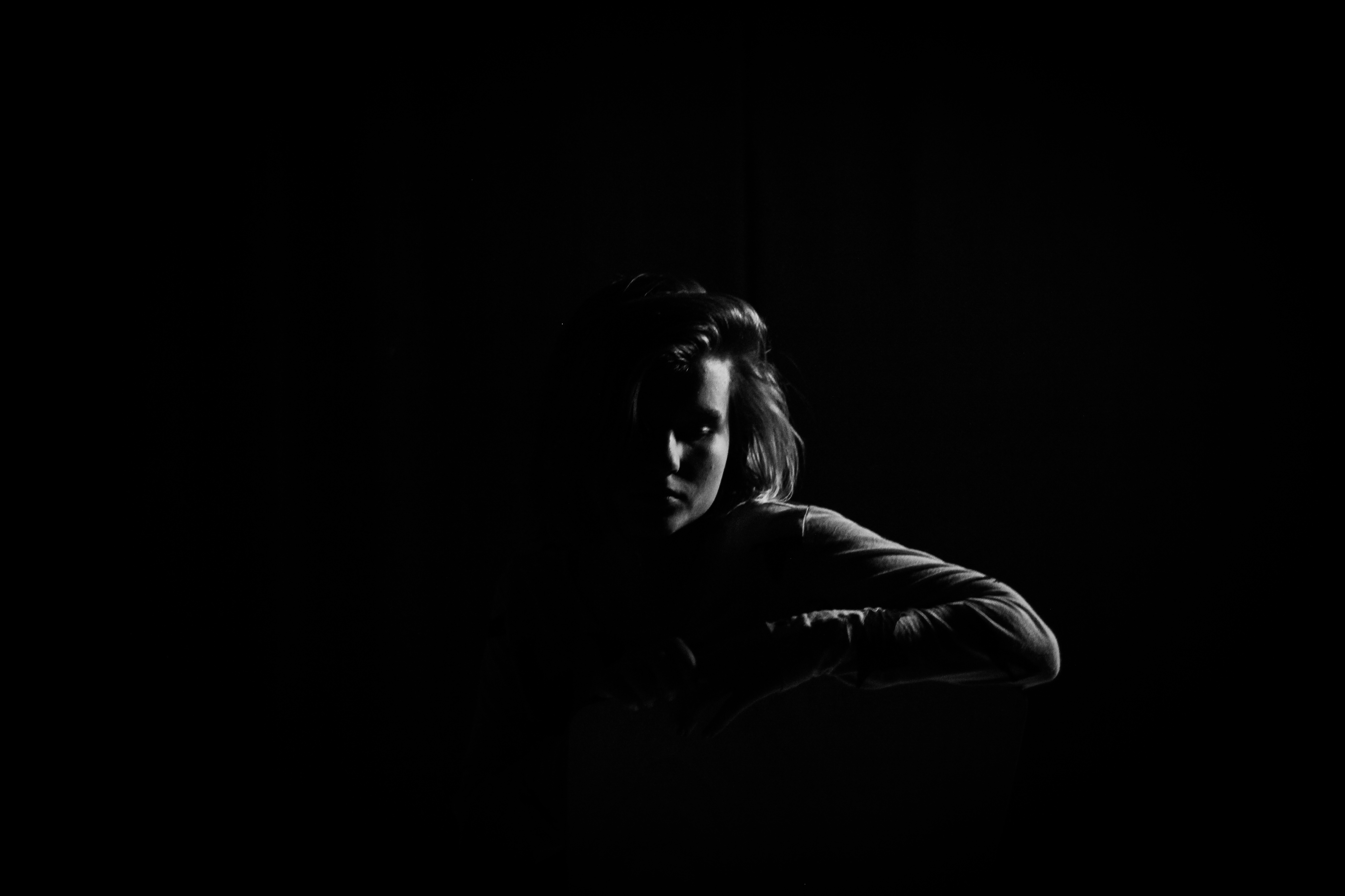
Chiaroscuro is an Italian term which means light and dark and basically refers to the high contrast light/dark style used in Renaissance painting and later in photography and cinema. In modern terms Chiaroscuro means strong or bold contrasts between light and dark areas in the photograph. It is often used in studio portraits using single-point lighting to cast a shadow across one side of the subject. This means that Chiaroscuro Lighting creates a very low key image as there are a lot of dark areas on the picture.
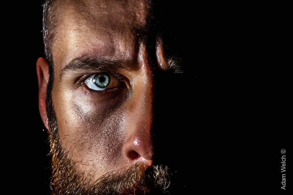
As you can see, half of the face in the image is completely enveloped in shadow, creating a very dark and mysterious atmosphere, similar to that of renaissance paintings of which the style is based.
Rembrandt Lighting:
Rembrandt lighting is a lighting technique that is used in studio portrait photography. It can be achieved using one light and a reflector, or two lights, and is popular because it is capable of producing images which appear both natural and compelling without needing too much equipment. The iconic sign for Rembrandt lighting is the triangular light/reflection next to the nose, under the eye, on the cheekbone usually on the side of the face that is darker or further away.
