Occupation Vs Liberation
All posts by Daniel B
Filters
Final Version for Zine
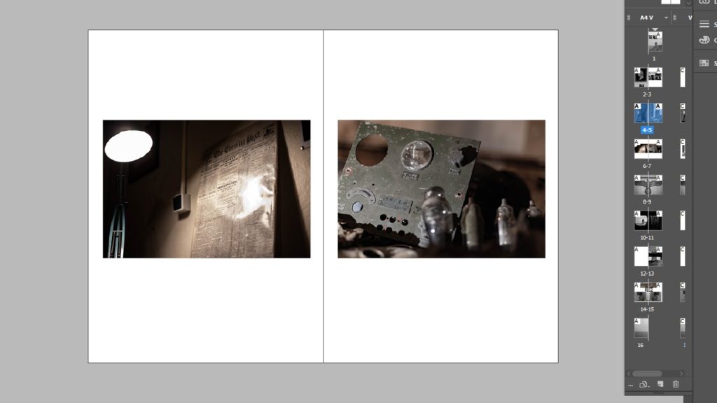
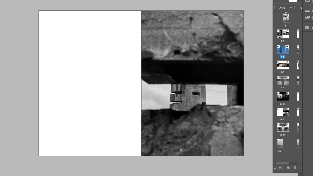
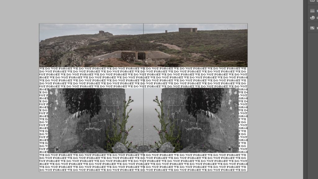
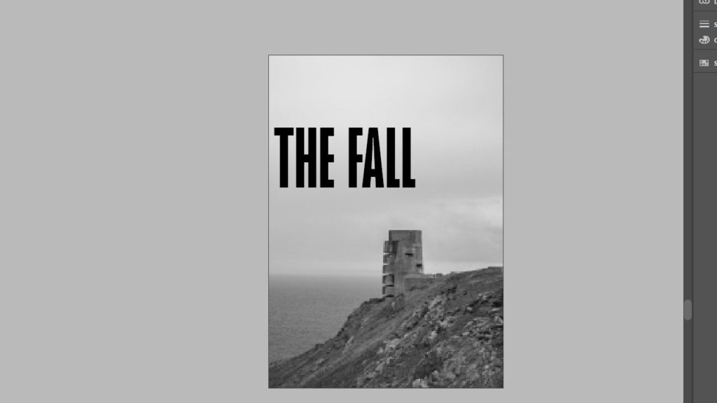
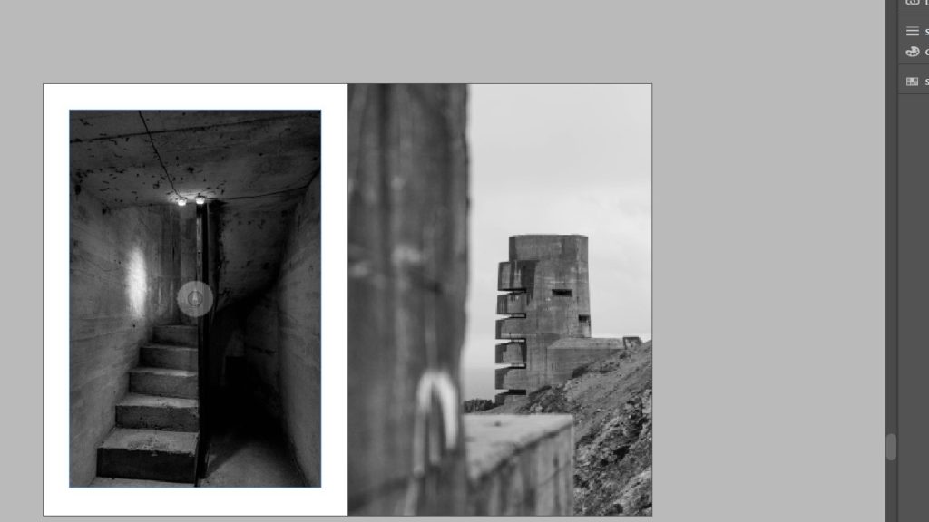
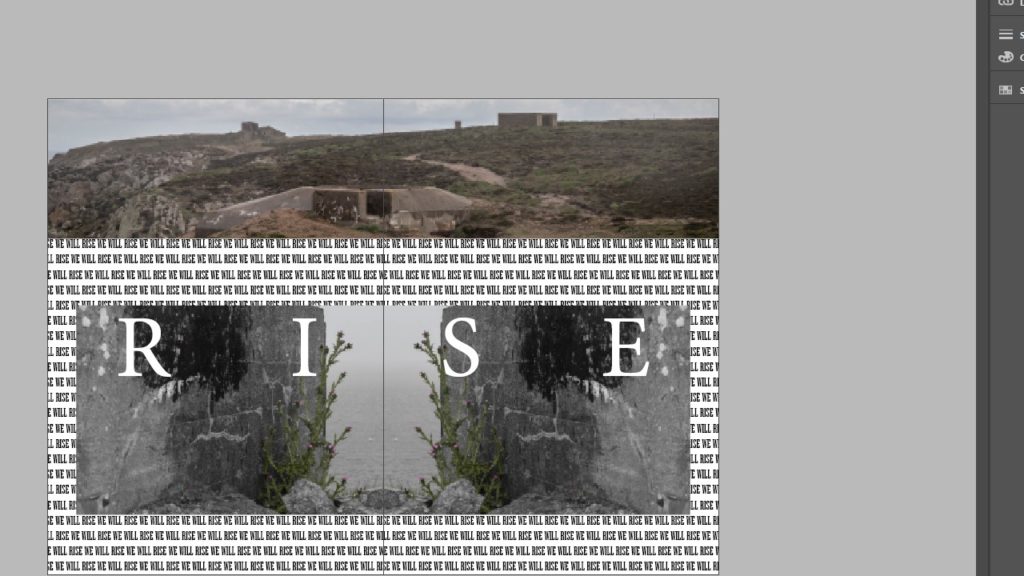
For my final configuration, I largely left it the same as version 3, however I decided to make Most of the images black and white except for pages 5 and 6, because i found that the images were much more impactful in the slightly warmer colour, acting as a sort of throwback to the days of colour film cameras. I also made the final spread in full colour as it is meant to represent the liberation of the island. I also changed pages 9 and 10 to show a larger image that bleeds onto the next page instead of having 2 smaller pictures. overall I think that this is the best variation of my zine yet, as it incorporates all of the elements that I wanted it to, in showing the harsh and unsaturated world of life in the bunkers, as well as the more positive aspect of the liberation of the island.
Zine Variations
Variation 1
Variation 2
Variation 3
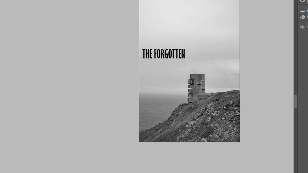
Of all the variations I have made so far, I think that variation 3 takes the best elements of the first 2 attempts and improves upon them. I liked the use of space in the 2nd variation, as it shows the isolation that some of the soldiers would have felt, however I found that the use empty space outside of the images, on the page, was not as effective as showing the images, as I wanted them to act as memories of sorts, in which the empty space acts as a hazy or uncertain memory, where as the large page spreads represent the key imagery that stood out the most both in and outside of the bunker.
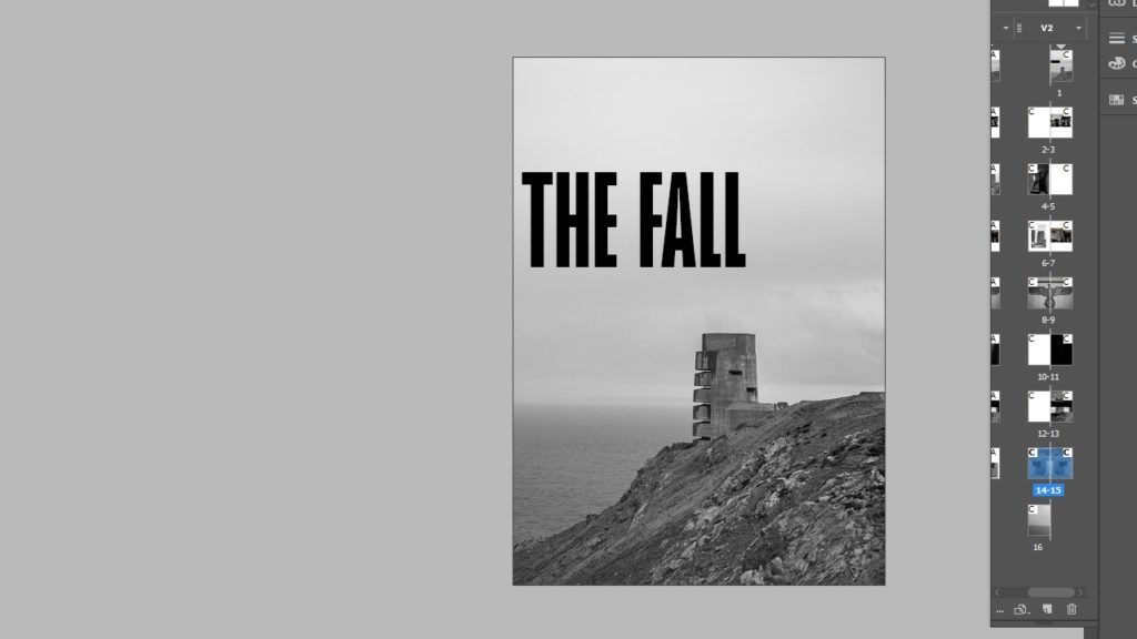
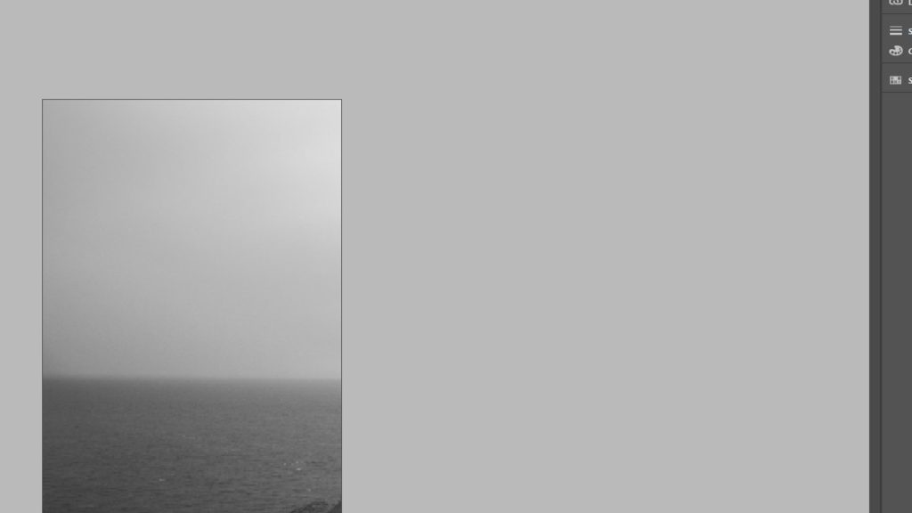
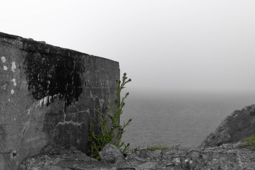
This is true throughout the zine, except for the final spread, as it represents the island taking back its own land, in which I used plants to show the overcoming of the occupation, making the German bunkers nothing more than abandoned old buildings. I will probably change the image on pg 9 as it doesn’t really keep the consistent flow of the rest of the zine. I also wanted to keep the spread of the landscape for the front and back covers as I feel it conveys the feeling of dread that I want the whole zine to have as a running theme throughout. For the final spread i also used the typography in the background to spell out “we will rise” when reading normally, but if you read each word down the page, it spells “will we rise”. I did this to encapsulate the emotions of the islanders who didn’t know if the war would be won by the British, especially towards the end of the war when there was a food shortage, and people were starving to death due to the lack of ships that could access the island due to the occupation.
Narrative and Sequencing
3 Words:
Aftermath Of War.
Sentence:
The impact of the 2nd World War and the occupation the island of Jersey.
Paragraph:
How was jersey impacted by the occupation in 1940 as well as the lasting effects of the Germans occupying the island. I Want my ‘zine to show the aftermath of the events that took place between 1940-45 using both contrasting images and as well as similar images to show the different effects of the occupation.
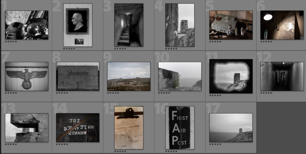
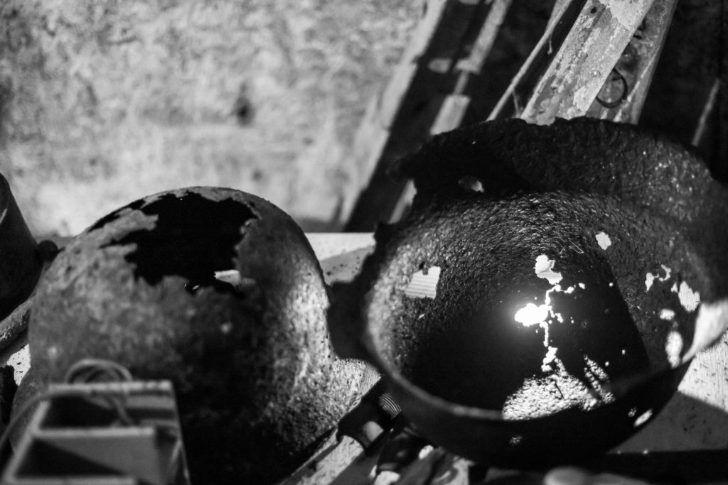
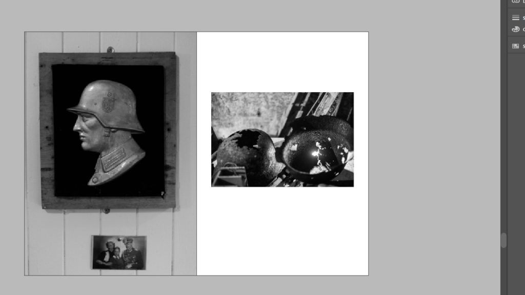
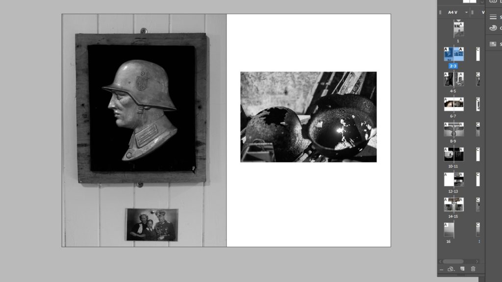
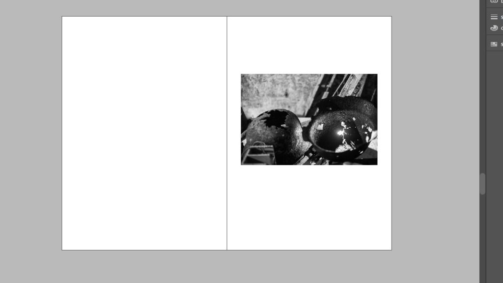
I wanted to start off by showing a more human and personal side to the occupation, hence why I started off with both the old rusted helmets and sculpture of a soldier, as it shows the decay from what once was a pristine shiny helmet, into a rusted lump of metal. I also like that the image has a photo of a family underneath the sculpture, which only adds to creation of the soldier character that my zine follows.
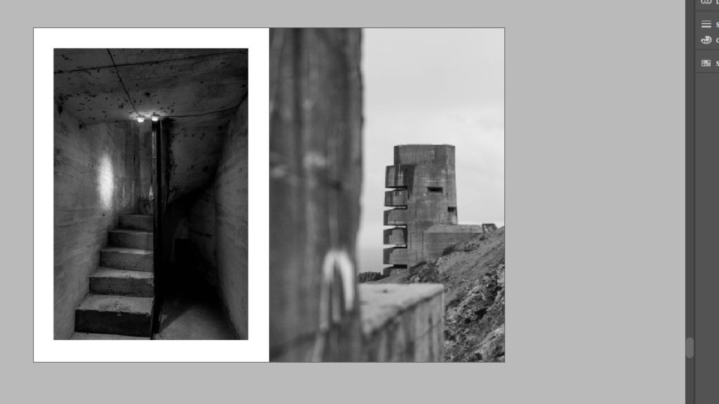
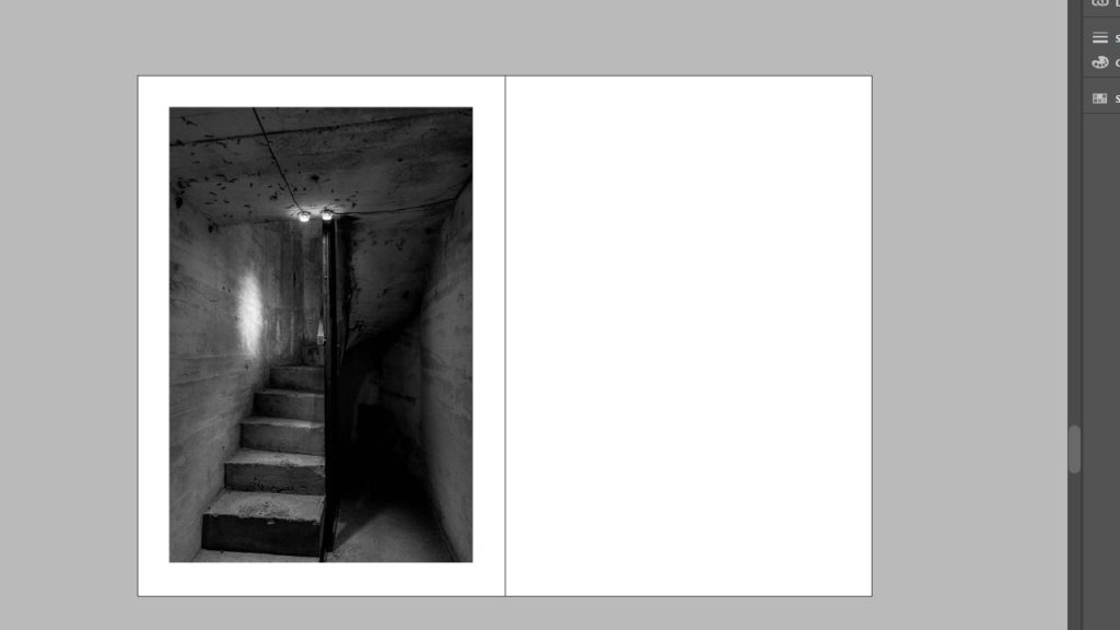
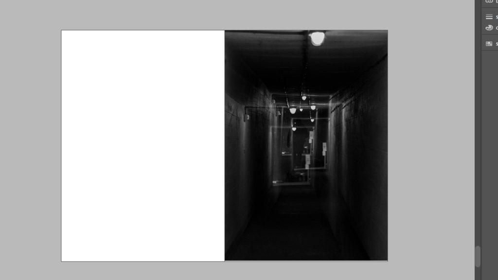
Next I wanted to show some of the sights that a soldier would see, such as the stairs in a bunker as well as using a photo with multiple layers, having a prominent background and a shallow focus in order to create a realistic view of what a person would actually see.
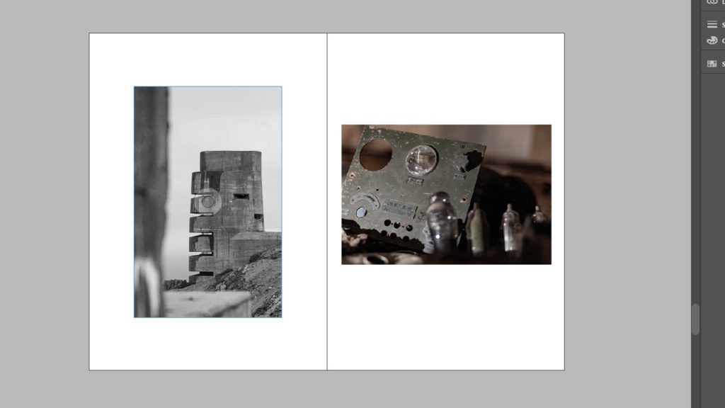
My next 2 pages use light to connect them together(Note: images 5 & 6 have to be swapped around to create desired effect) as well as being fairly close up and focusing on smaller subjects in comparison to the previous images. I found that both of these images have light coming from fairly similar angles, which can be linked together by putting image 6 on the left page, and image 5 on the right, making it seem as if they are being lit from the same source.
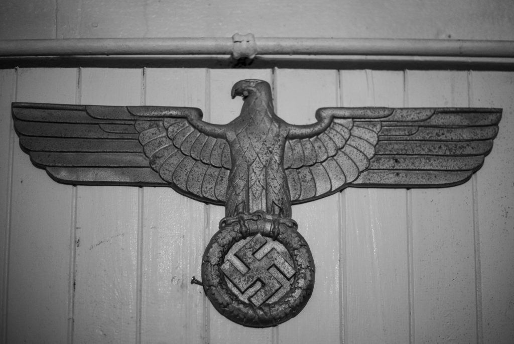
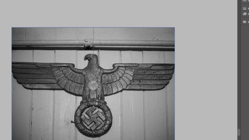
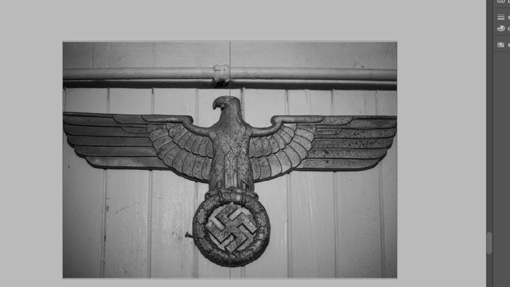
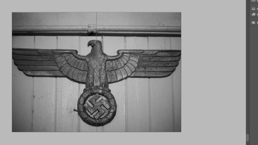
The next 2 images carry on the theme of the smaller items that a German soldier would pass by when navigating the bunkers. I also decided to put these images together as they both feature symbols of the German occupation, with one quite clearly a symbol of the Nazis, and the other a German word for scriptorium; which is a room set apart for writing and where manuscripts were copied. I like this contrast from something so extreme to something so simple and calm.
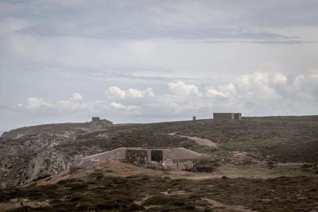
My next 2 images are linked through colour, showing the open greenery of the island, which is then contrasted by the harsh concrete of the bunkers, but still keeping a part of jerseys beauty in the form of a single plant sprouting from the base.
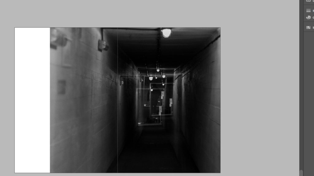
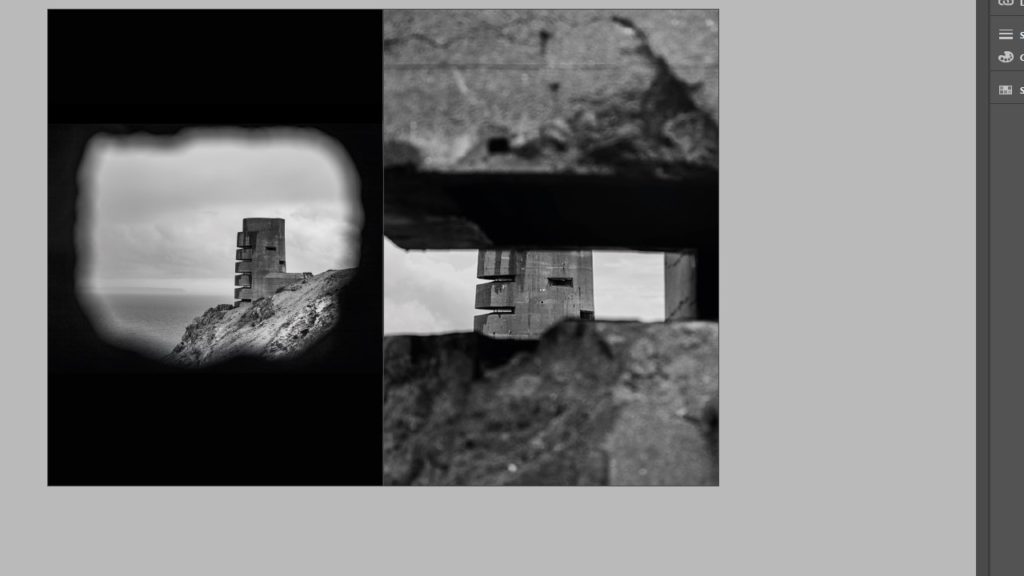
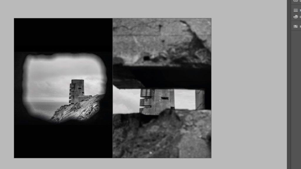
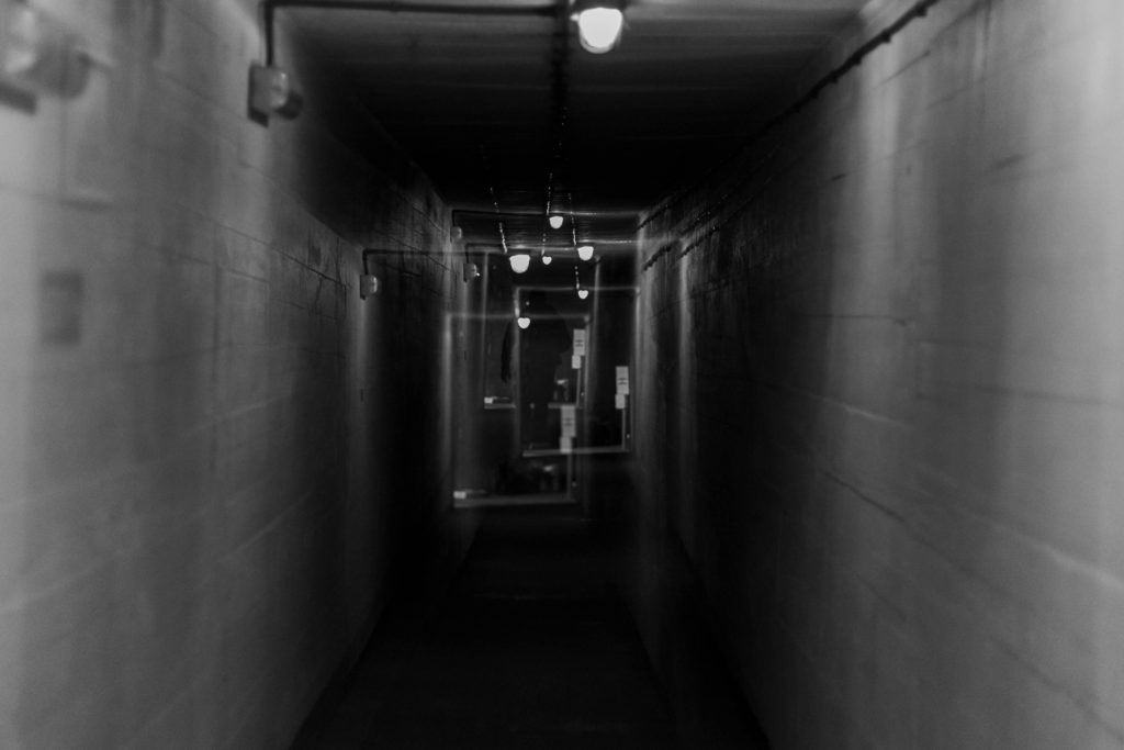
This is followed by 2 images that focus on the idea of tunnel vision with one using multiple exposures to show how disorientating it must be to be under attack, or even just the though of a possible attack happening. I intended for the other image to seem like a machine gun placement aiming at the lookout tower, to add to the theme of paranoia and disorientation.
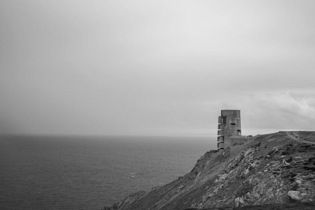
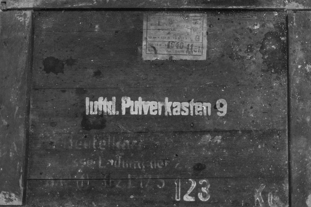
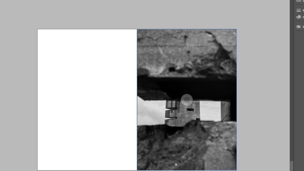
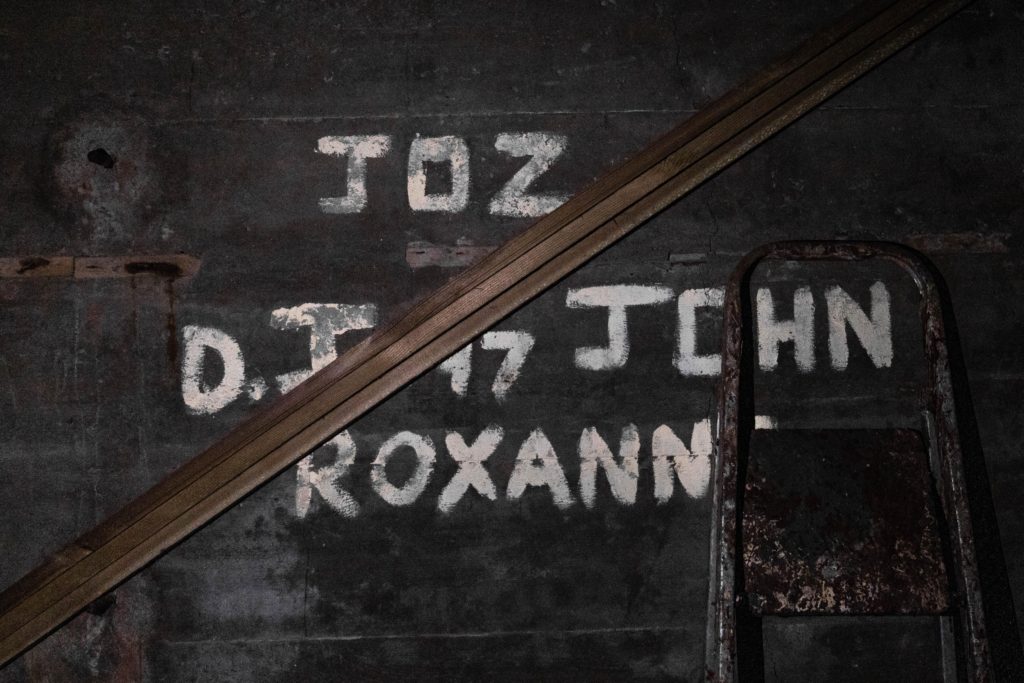
After these pictures, I wanted to show the exterior and then interior to the lookout post and i specifically took the picture of the tower through another bunker in order to highlight the floor that the writing was found on. The images are also linked as they both feature themes of building and destruction, with one being a repair of the interior, and the other having significant damage around the bunker.
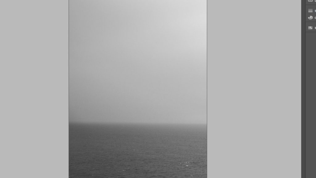
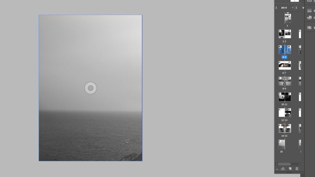
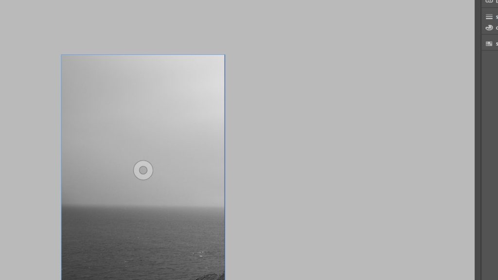
My final set of images show what could have happened to the soldier that we have been following the whole time, and how he could have been wounded and sent to a first aid post, put on a list of patients, or even a list of those who died. For the front and rear covers i will be using the last image to wrap around the front and back of the zine, with the tower on the front cover and most likely a title next to it on the left, and then have the back of the zine be taken up by the ocean of in the photo.
Zine/Newspaper Moodboard
1 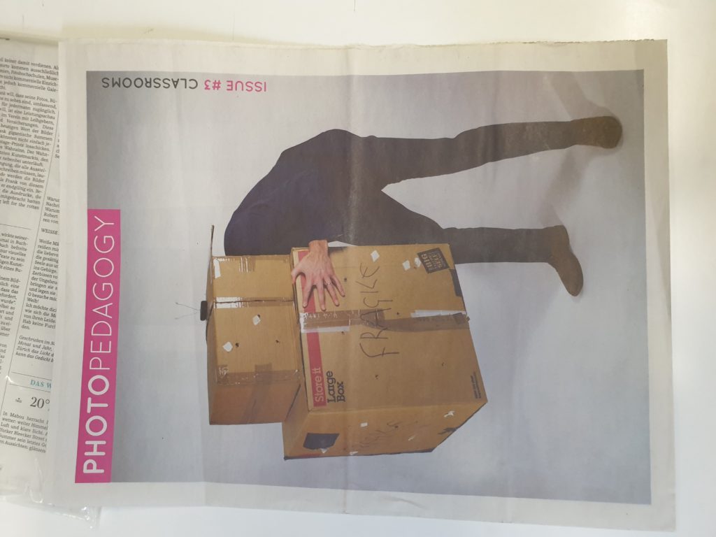
2 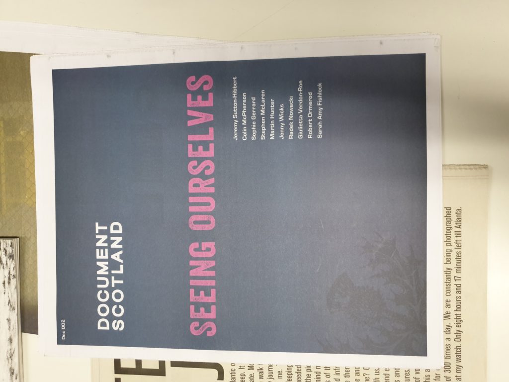
3 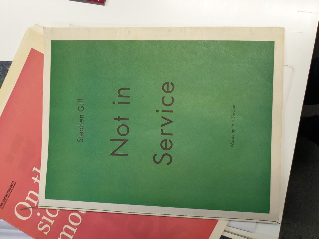
4 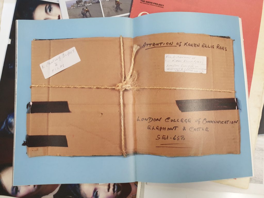
5 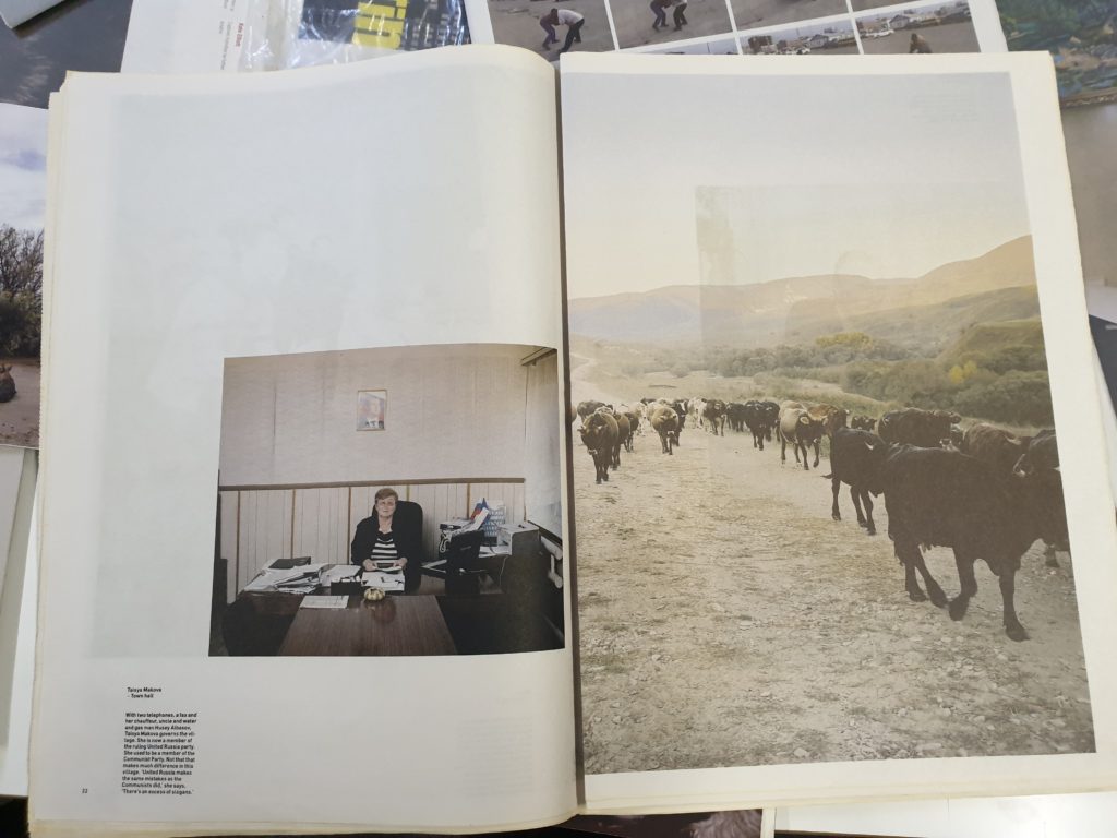
6 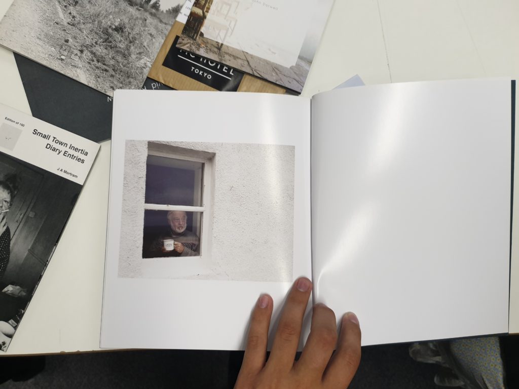
7 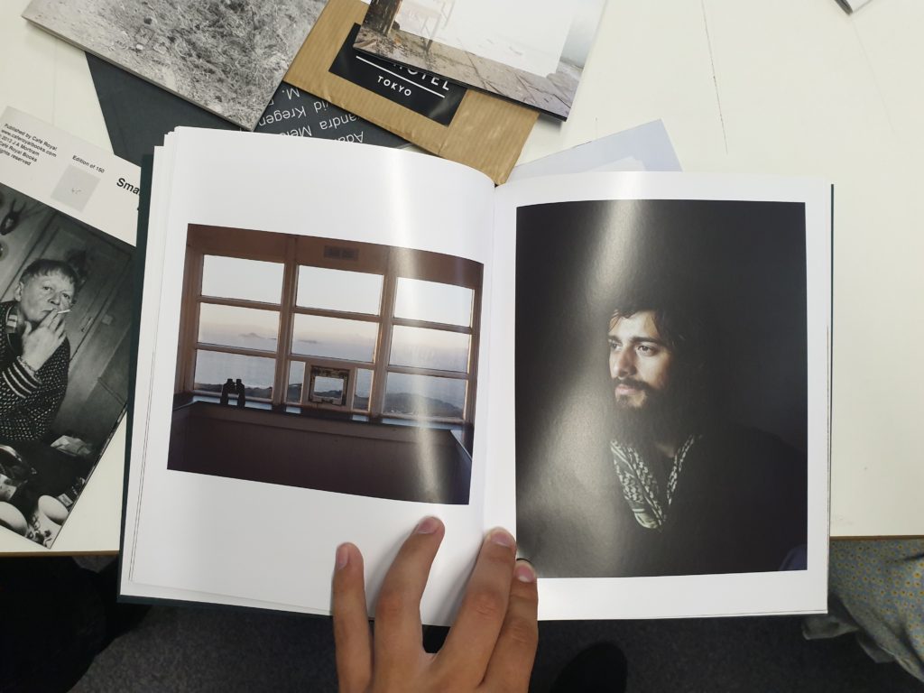
8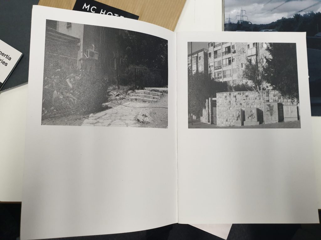
9 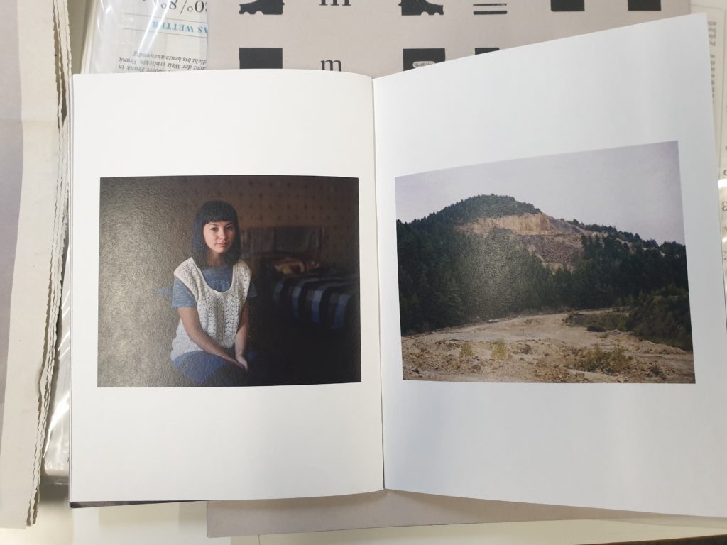
10 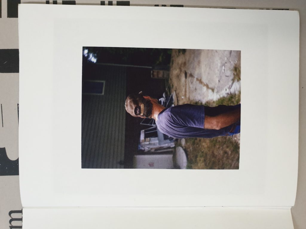
11
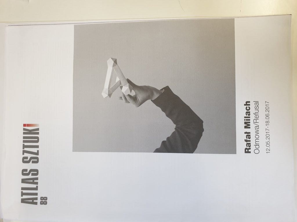
For my first selection, I wanted to highlight one of the front covers that stood out the most to me. I like the use of bold typography for the title, and the use of the red for the final letter definitely gives it a unique look, whilst still being fairly minimalist, using negative space to its advantage. To continue the style of minimalism, I also like the layout of picture number 2, as having one bold image that takes up most of the page, along side the brightly colored title. In contrast to this, I also like the idea of using a darker or colored background, as I have highlighted in pictures 3 and 4. Even though I definitely prefer the colours used in image 3, however I think the much more simple design of image 4 looks much cleaner.
Moving on to the inside of the ‘zines, I like the use of this double page spread and how the subject has a border within the image, rather than adding a border in Photoshop. The ideas presented in the 6th image also stood out to me, as there were very few ‘zines or newspapers that used the different sizes of images to contrast them, and I like the idea of using different image layouts to help create a narrative. Speaking of which, image number 7 uses only 1 picture over the course of 2 pages, and the use of the white background in the photo over the white of the paper creates a very nice effect in showing the subject as especially small. An idea that could work in tandem this would be to feather the image out at the edges, so it blends into the white page background even more. I’m not entirely sure how effective this will be, but I’m probably going to try and utilize it in my own ‘zine.
I like the way that image 8 uses light to convey a sense of space and setting, as the image on the left of the window makes it seem as though the man in the right picture is being lit by the other photo, even though they could have been taken at completely different times and places. Picture number 9 uses negative space under the image very effectively. The layout is slightly more obscure than the more common idea of putting the images in the center of each page as highlighted by picture 10. However picture 10 also uses juxtaposition to its advantage, and even though the layout is nothing particularly new or inventive, I like the use of the barren landscape of the mountainside in comparison to the portrait taken within someone’s home. Finally for picture number 11, I like the use of minimalist and simple framing, using a particularly thick frame, to display the isolation of the subject. I am hoping to incorporate as many of these different techniques and styles as possible in my final ‘zine.
SJ archive
The the photographic archive of the Société Jersiaise which consists of around 80,000 images dating back to the 1840s. This includes many different collection from different time periods, places on the island and different parts of history; including the occupation. This provides a very good understanding of what Jersey used to be like in both the nineteenth and early twentieth century. The photographic archive of the Société Jersiaise was founded in 1873, to create not only a museum, but also a library. The Société Jersiaise opened its museum in 1877 and with collection of photographs already identified as a priority, these activities were continued as significant parts of the Société museum and library. Some of the first photos to be produced arrived in Jersey on the 9th of May 1840 and after nine months the Société Jersiaise first publicized it in the urban centers of England and France.
The archive contains examples of work by important early photographers such as Henry Mullins William Collie, Thomas Sutton and Charles Hugo. The collection also contains late nineteenth century collections of negatives by Jersey based photographers such as Ernest Baudoux, Albert Smith and Clarence Ouless. There were also very important twentieth century documents and images including a major archive collection of over 1000 negatives by Percival Dunham, Jersey’s first photo-journalist, as well as an archive of 1300 German Occupation images compiled by Emile F Guiton; the honorary Curator of the Société Jersiaise Museum and founder of the Photographic Archive. Public access to the archive was granted in 1992, and now contains online catalog with over 36,000 images that can be searched via a link online, as well as visiting the archive to view the images, negatives and original prints as well.
Experiment 3: MONTAGE > COMPOSITE IMAGES
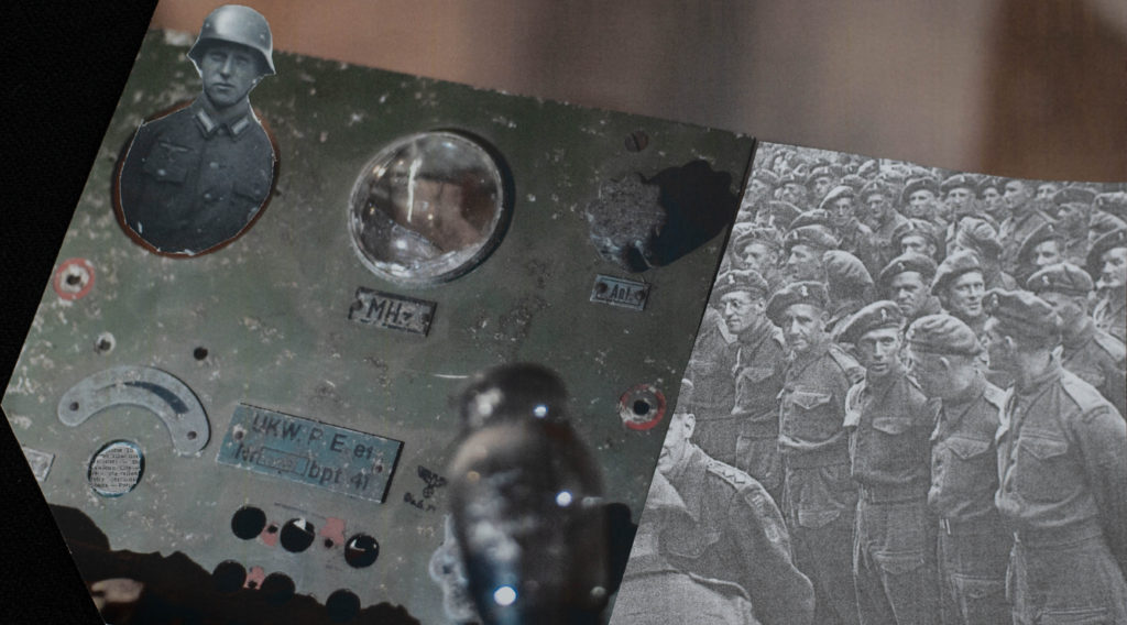
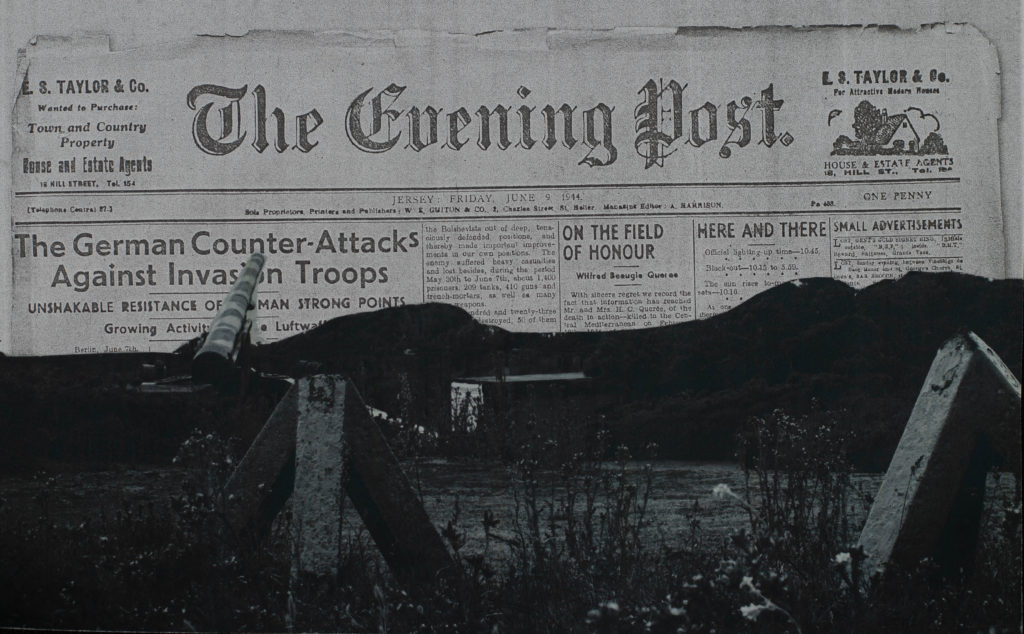
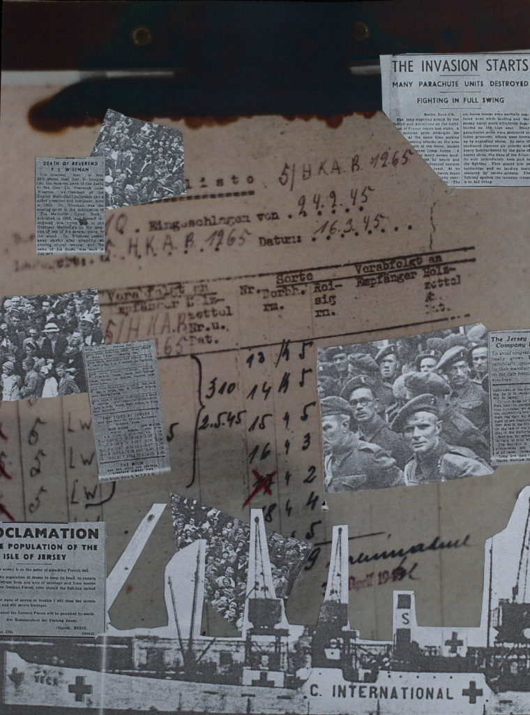
2nd Set of edited photos
Essay – Who’s Archive is it Anyway?
Archives take old text, images, books, notes, etc. and store them so that not only can future generations learn about the past, but it also helps keep an accurate record of events, people, objects and other documents from different points in history.The purpose of an archive is to keep a collection of original documents safe as well as keeping an accurate record of the past using different kinds of documents. Many archives are now making their documents digital by scanning them into a computer in order to digitally preserve them in case something happens to the original copy. This also means that more people can access these documents in order to do research.
Archives can also show how people have developed over long periods of time. Archives provide relevant and reliable evidence by acting as repositories, which means they are similar to a server which contains sets of packages, and these packages hold information on events that happened through history. This means that people can access sets of information from documents to pictures relating to a single event in the past.
Photography plays multiple roles when it comes to archives, as they can not only so accurate depictions of buildings, vehicles, and other older objects. As well as this, photography was also used to document landscapes so people can see the change from the modern day. Photos also show certain lifestyles and people that were living at the time, which is especially useful when it comes to the occupation.Looking at archival material will help enrich my personal projects and study, as it shows a vivid glimpse into the past, which i can use to get insight regarding photographers in the past. It will also help with my study knowing the style of a lot of these photographs, as many of them use quite a deep focus with fairly little bokeh.
I think that looking at these archives has been resourceful in terms of seeing the kind of events that happened in the past in such detail. I think this will help me throughout the project surrounding the occupation, as i will have some reference points using many of the photos from the archive (of which i have photos of on my phone) as well as other that i can obtain from Société Jersiaise.I have learned of the importance of archival photographs during the visit to Société Jersiaise, as they keep an accurate record of not only what the world looked like in the past, but the people in it, and also how much things have changed.
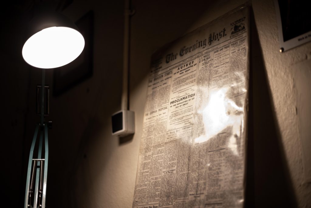
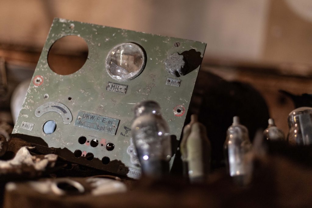
Final Images From Bunker Shoot
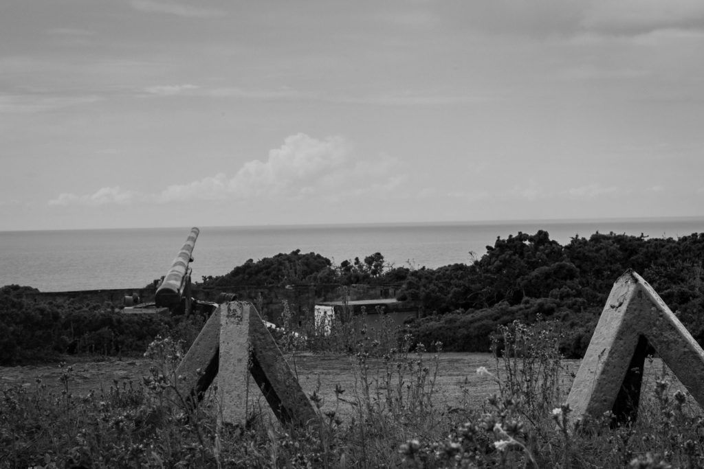
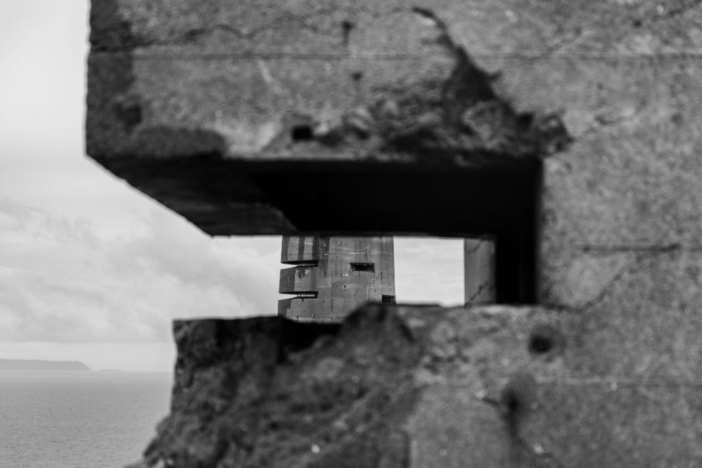
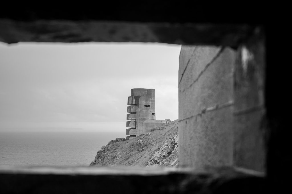
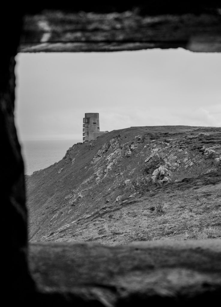
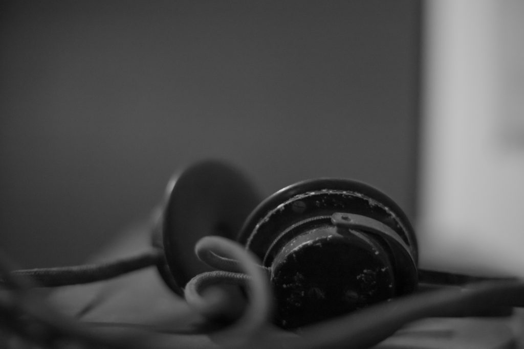
My final selection of images for the Batterie Moltke Photoshoot:
