All posts by Ceira W

Filters

Author:
Category:

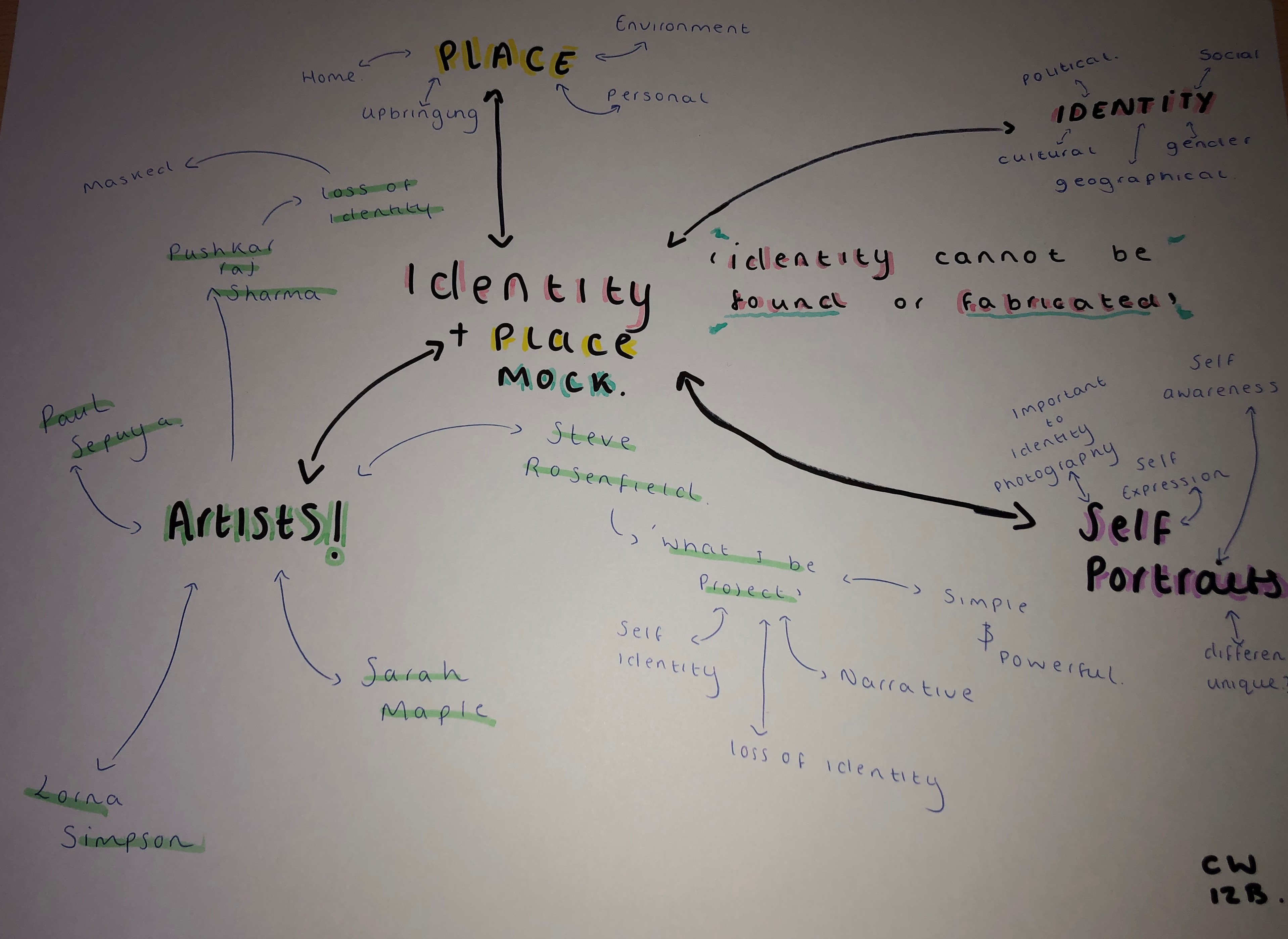
STEVE ROSENFIELD & ANALYSIS (MOCK)

Steve Rosenfield was born and raised in Boston, USA but now lives in Sacramento, California. He started to photograph live music, weddings, senior portraits and other events.


“in 2010 i wanted to do more with photography and hoped i could change the way people looked at their friends, family, significant others, and even themselves – thats where the ‘what i be project’ was created”

– steve rosenfield 
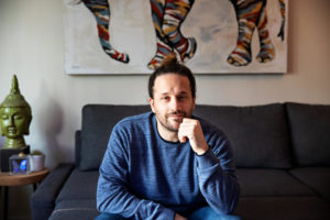
Steve Rosenfield – photographer
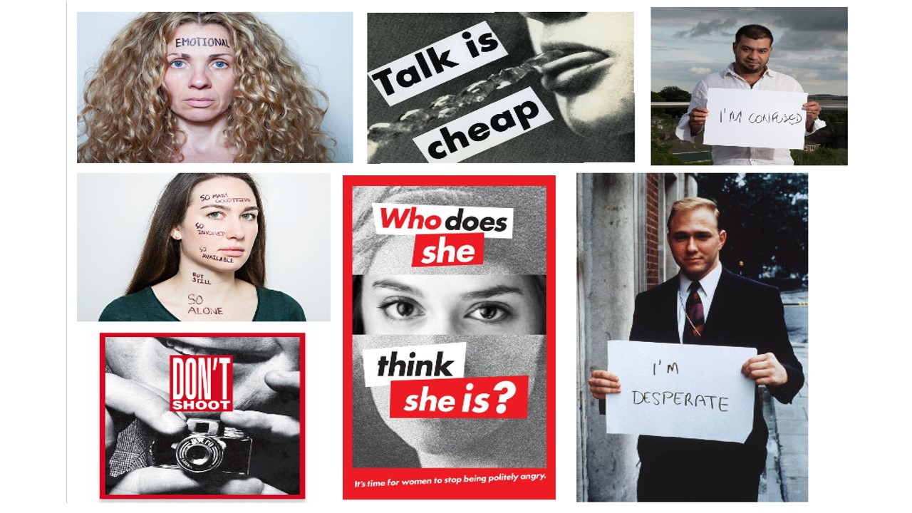
What I Be Project 

The What I Be project is Rosenfields most successful photography project.

The What I Be project was a “social experiment” that quickly changed into a movement about honesty and empowerment. In today’s society we are told to look a certain way, or act a certain way and if we do anything differently from these typical standards we’re often judged, or bullied.

 “I started this project in hopes to open up the lines of communication, and to help everyone accept diversity with an open mind & heart and empower those who feel they suffer for something they may see as a flaw.”
– steve rosenfield 

Analysis
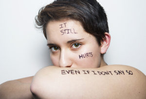
 

Steve Rosenfield – ‘I am not my abuse’


The model in the photograph is throwing  her insecurities out and into the open, and exposing a side of herself that she hadn’t previously shared with anyone. She’s done this by stating “I am not my abuse”, by this she is saying that she does in fact struggle with these issues, but it does NOT define her, her character, her personality, her identity. This project was created to spread awareness on the affects of societies closed thinking and the serious and very stigmatised issues, that unfortunately, some individuals have to fight on a day to day basis.

Technically this photograph is not very complex, it appears like this has been taken in a studio lit by artificial lighting. However, although maybe not the most technically difficult, I feel that this approach was extremely effective and appropriate, I feel this way as it keeps all the attention on the subject and the writing across her body, which does result in the awareness raising aim that Rosenfield had in mind for this project.

Identity and Place (MOCK)

identity – the fact of being who, or what, a persoor thing is. 

A persons identity is made up from a lot of different a person or thing is. things; their qualities, beliefs, looks, expressions and personality. It’s who you are, what the world thinks of you, and what you think of yourself.

factors that can influence identity


PLACE & ENVIRONMENT 

Mood can be hugely determined by the environment surrounding us; the walls, furniture, streets and buildings that surround us. Yet often, the architecture surrounding us is often seen as frivolous, unimportant. If we walked into an “ugly” room we would be left with a sense of detachment and boredom; if we walked into a warm, colourful room filled with life, we would be left with a sense of happiness and joy, it would lift our mood, influencing our identity.

 “People have strained their backs carving flowers into their roof beams and their eyesight embroidering animals onto their tablecloths. They have given up weekends to hide unsightly cables behind ledges. They have thought carefully about appropriate kitchen work surfaces. They have imagined living in unattainably expensive houses pictured in magazines and then felt sad, as one does on passing an attractive stranger in a crowded street.”


UPBRINGING & FAMILY 

Children form their sense of self in the environment in which they’re brought up. The family, both the family members, and family dynamic play a massive role in shaping the identity of a child while they grow up into the age of adolescence and start to find themselves and become adults. The way the family interacts with one another, and how functional or dysfunctional the family is will shape a child’s identity, from their self-esteem and self-image, to their cultural and religious beliefs.

belonging – feeling a sense of welcome and acceptance. 


There is a lot of different aspects of ‘identity’

gender identity – gender identity can relate to someones own personal sense of their gender.

cultural identity – the identity or feeling of belonging to a group. related to ethnicity, religion, social class, and generation – any group that has its own distinct culture.

geographical identity – a group or individuals sense of attachment to the country, region or city. Can also be the key characteristics associated with a particular country, region or  city,

source: https://www.wikipedia.org/

social identity – social identity is the portion of an individuals self concept & personality that is influenced by a particular group that they’re in/take part with.

eg.

friendship groups

activity groups/voluntary

workplaces

loss of identity – when we lose our identity we often lose a sense of self; this can follow a change of workplace or education, it may also be caused my a mental illness or form of abuse.


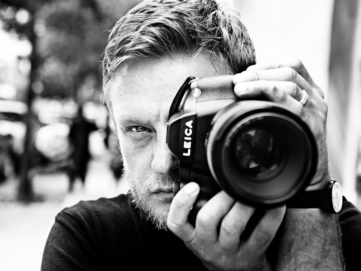
JOHN RANKIN

John Rankin, known as Rankin is a British fashion and portrait photographer and director. He’s taken portraits of Kate Moss, Heidi Klum, Madonna, David Bowie and even Elizabeth II. His work has appear in magazines like Vouge, Marie Claire and GQ.


“I see the person, not the celebrity”

– John Rankin
John Rankin


While Rankin was at school he decided that school wasn’t for him and actually he had other interests and other things he was more passionate about, and so he dropped out. Instead, he started to study Photography at Barnfield College, Luton.

During the time he was studying Photography he met Jefferson Hack and the two created a magazine together, called Dazed & Confused in 1992.

Rankin’s photography is used for advertising as well as fashion and sport magazines. His work has allowed him to gain business from some well known, popular, companies. Rankin uses different methods of photography depending on the purpose of his photographs.

Analysis

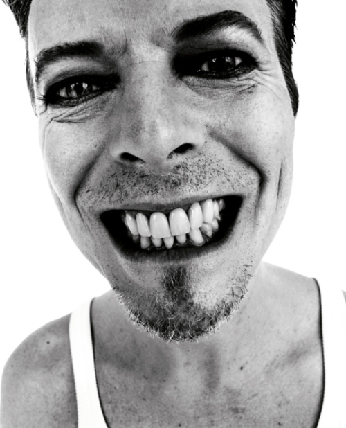
This is a portrait of David Bowie taken by Rankin.
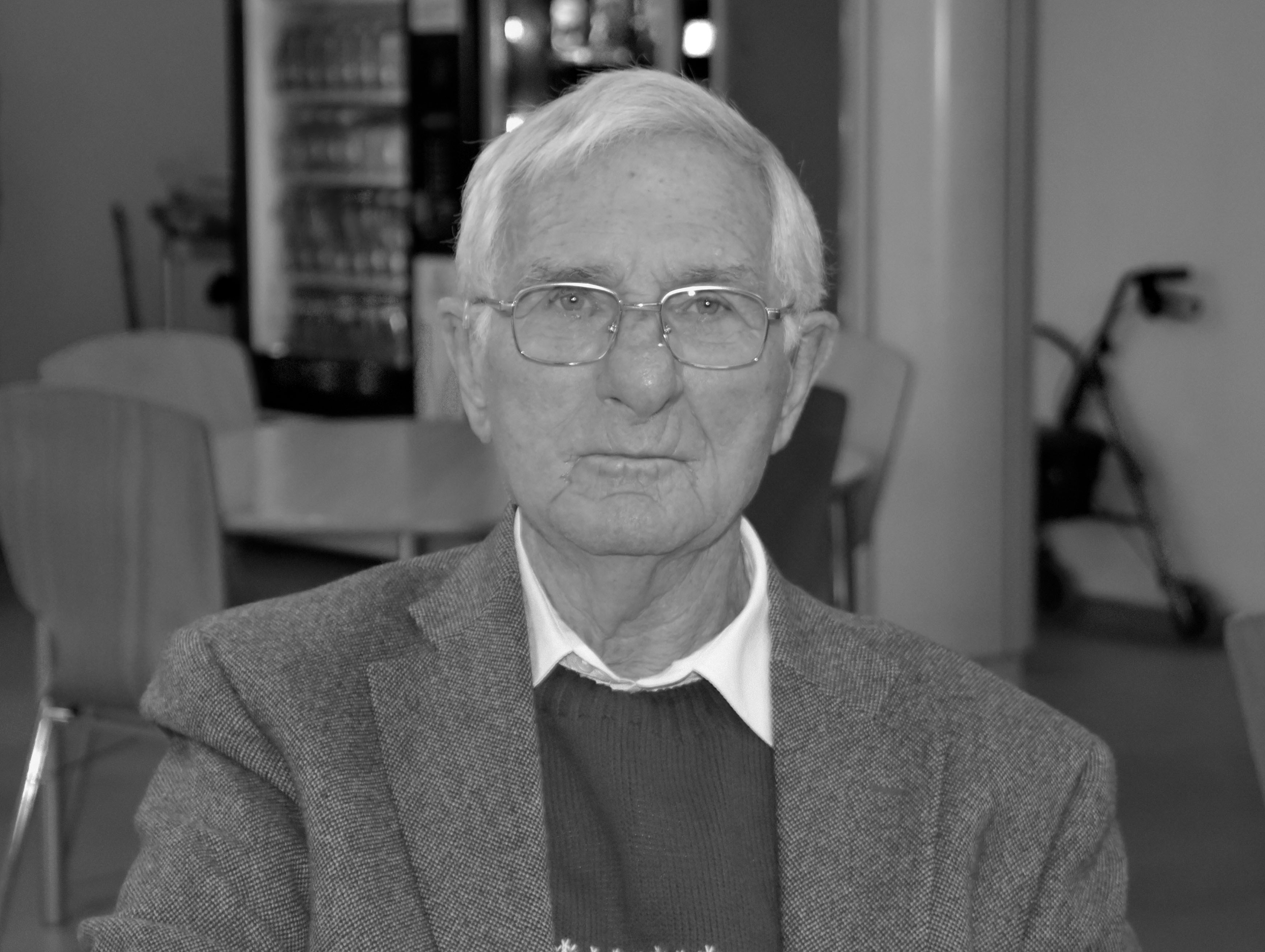
In this image it seems Rankin has aimed to get across David Bowie’s character. David Bowie was known for having a quite outgoing personality full of character. This image is very close up which could imply that Bowie had nothing to hide. His smile also takes up a lot of the image, consequently making it one of the main focal points of the photograph in a sense.

There is also some technical elements to this photograph. David Bowie was photographed here on a white background making the subject the center of all attention. The image was then edited into black and white, with a high contrast. The black and white effect compliments the reflection of personality in this photo as it is also very powerful and catches attention quickly. Although the image is in black and white, it is still very sharp, bold, and clear. It does also compliment facial features as it makes them the focal point of the whole image. The contrast and saturation of the photo has also been manipulated to give it a stronger and deeper appearance. The camera seems like it has been angled a little bit lower looking upwards at Bowie portraying him as a more powerful character but also giving a more in depth look.

I think that this is a very effective photograph as it captures loads of personality by only using one persons face and some technical skills, whilst still remaining a very professional looking photograph.

SENIOR FINALS + ANALYSIS

Analysis of final piece

Context

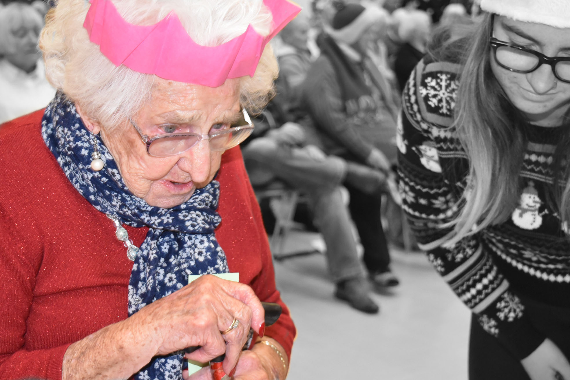
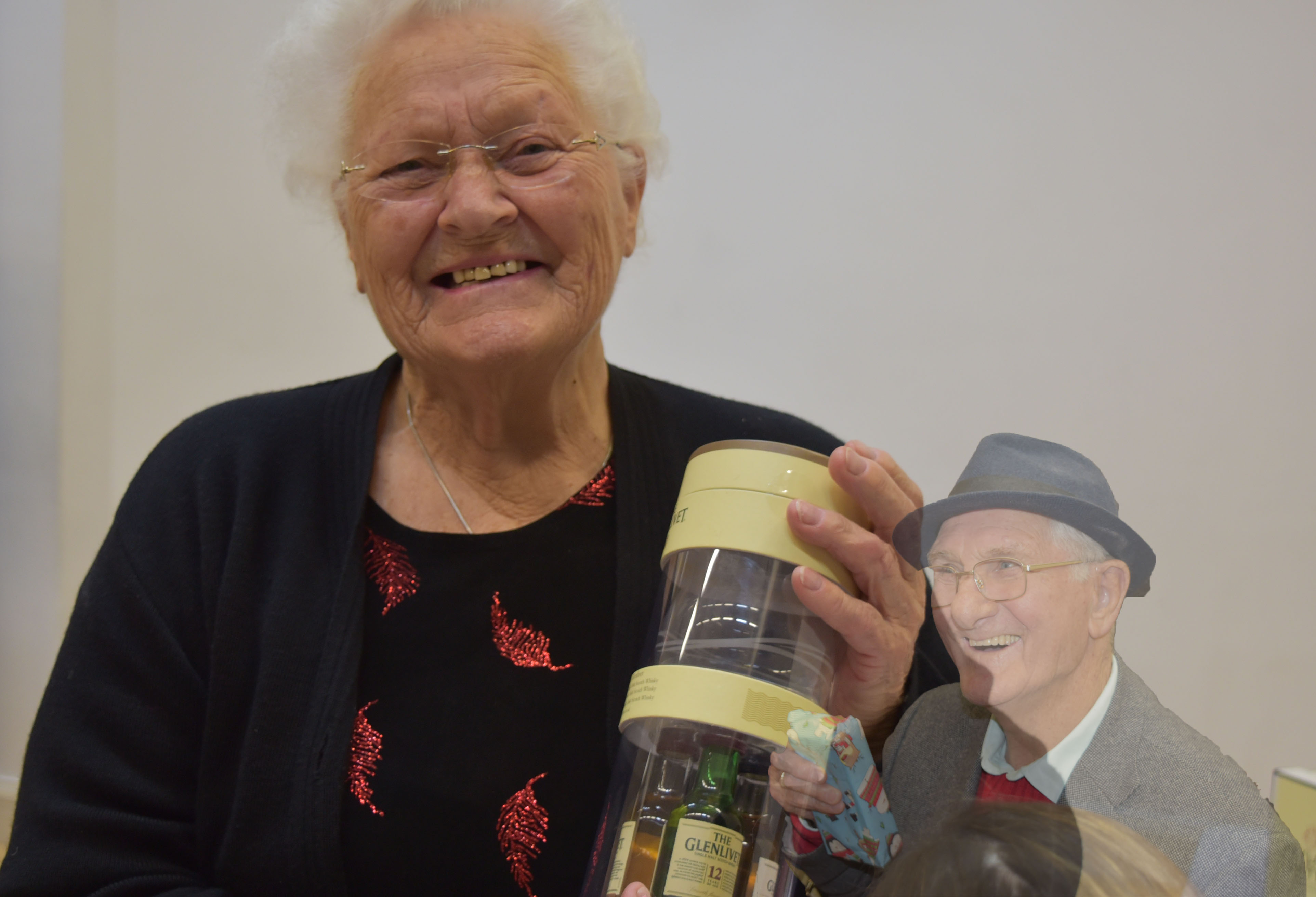
Both of these photographs were taken when the subjects had either just received their prize/gift. They were taken in the hall at Hautlieu School during the senior Christmas party. This was the end of the party and everyone had had a good time.

Conceptual

My aim with this edit, was not to be the most technical and aesthetically pleasing, but was to capture the overall mood of the event, and I think that I was successful in doing this. I feel that this edit shows that the general happiness of this afternoon was beautiful in it’s own way, and very rewarding and worthwhile.

Visual

This image does contain some little hints of colour, i.e, the red on the subjects top and also the blue gift in the masked layer, however, overall is not too colourful and eye-catching, if I were to re-edit I think that I would enhance the colour by adjusting the highlights, shadows and maybe the vibrancy of both layers to make it all stand out more. However, I like that this photo was taken against a white wall, consequently the subject gets all of the viewers attention and focus.

Technical

This photo was not taken the most technically. The lighting was all artificial, this photograph was taken in the hall with overhead bright main lighting and no flash. Ultimately this was because this was not a planned photo shoot, but capturing events as they happened. I had my camera on the ‘manual focus’ setting so that I could decide who and what I was focusing on and I think this did help as I was able to have more control, as I was not in control of the environmental factors.

EDITING SENIOR MEAL PORTRAITURE

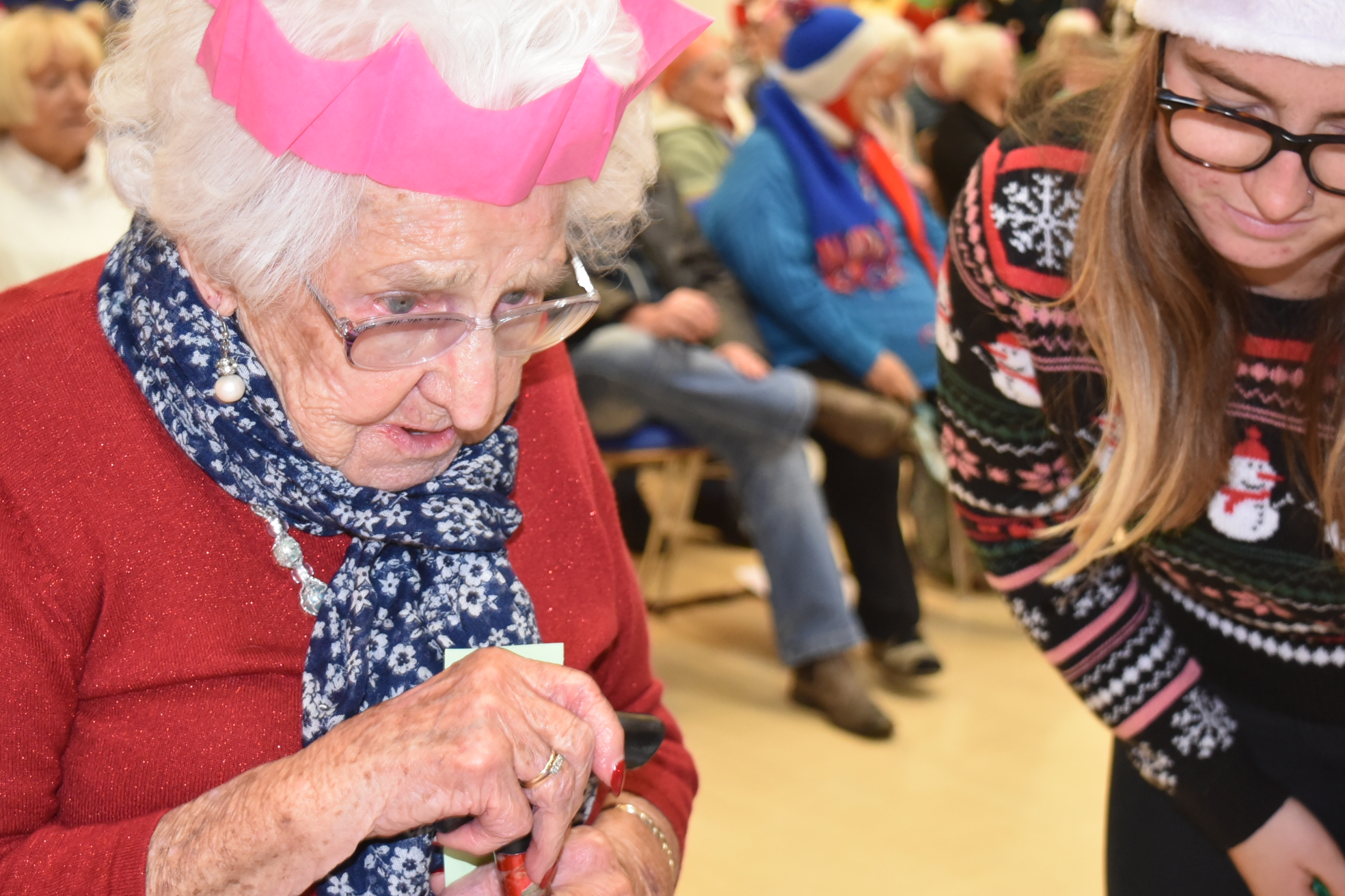
unedited image

This is the first image that I chose to edit – totally unedited. I chose to edit this photo as this was the eldest lady that attended the senior meal – at 99 years old. She had just won a prize and was full of happiness and personality.

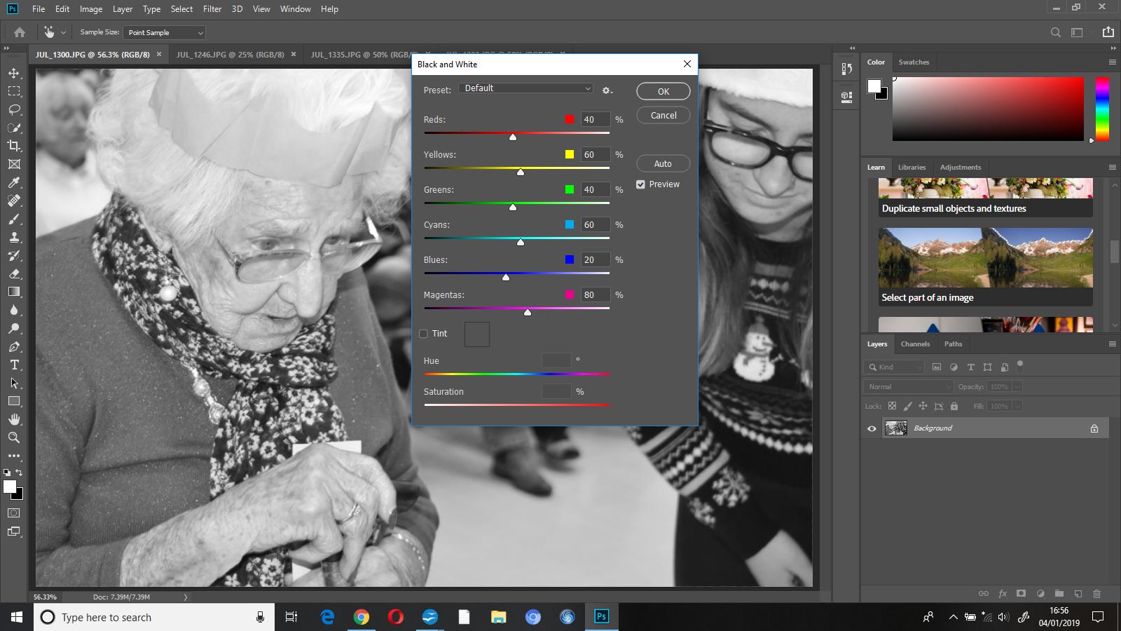
The first thing I did with this photograph was edit it into black and white, I did this as I wanted to make the subject the only focus of the image on while editing a little bit later on.

I then used the ‘history brush tool’ to ‘colour’ her back in, the history tool will reverse the part of the image you select to how it was originally, so in this instance, it brought the subject back to colour while keeping everything else totally black and white.
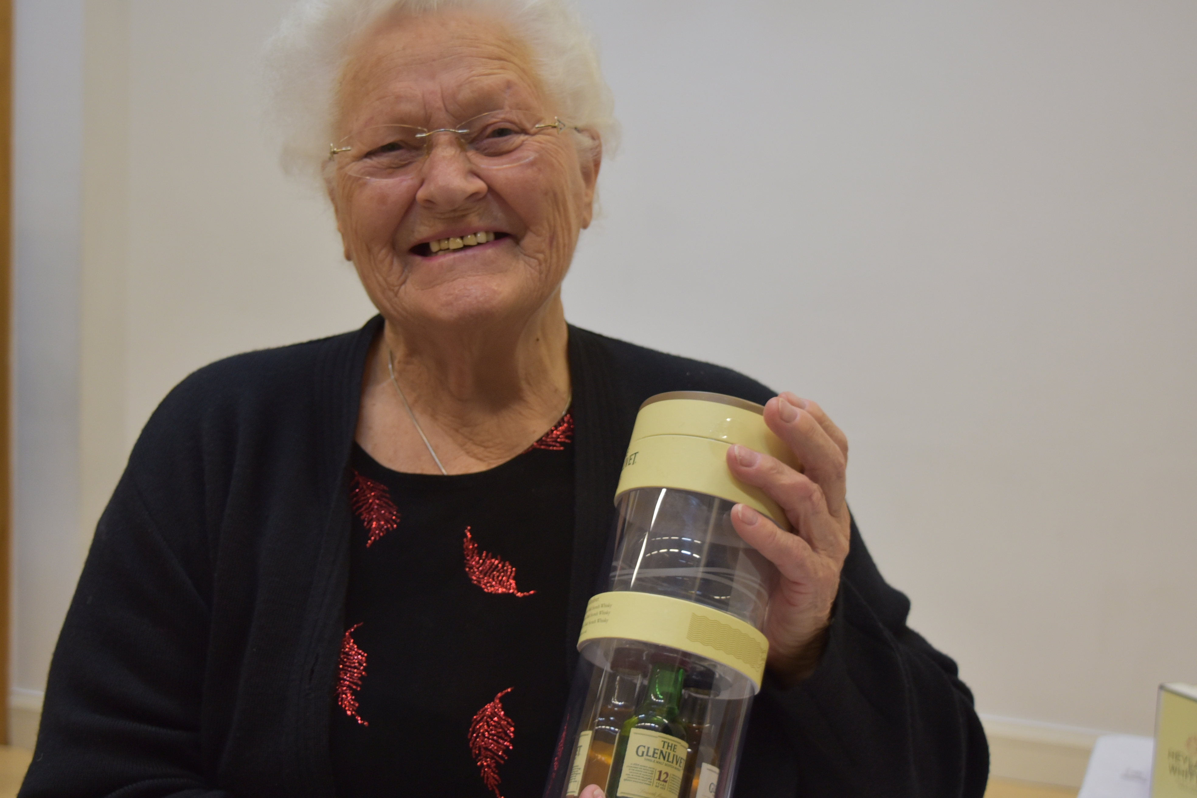
second image unedited

This is the second photograph I chose to edit, this woman had  just chosen her prize, and as you can see, was extremely happy with it. I chose to add another photo onto this one and merge them together.

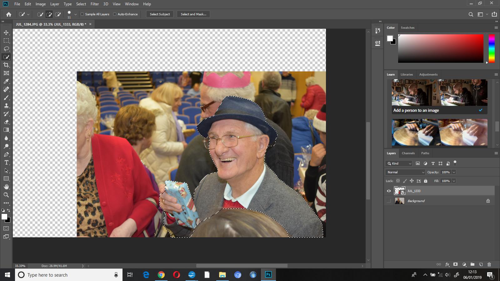
First I went to file – place embedded and added a second image, this adds an additional image onto the canvas that you’re already working on as an additional layer. I then used the ‘quick selection’ tool to select the part of the photo that I wanted to add onto the original image that I’d chosen to edit.
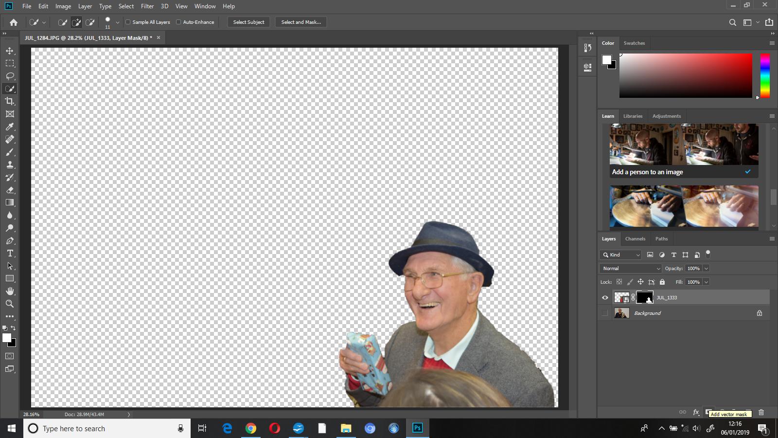
I then masked the layer which showed me which parts I’d selected and hid the rest. I pressed show layer on the original image and this added my masked layer on top so that I could see it all put together.
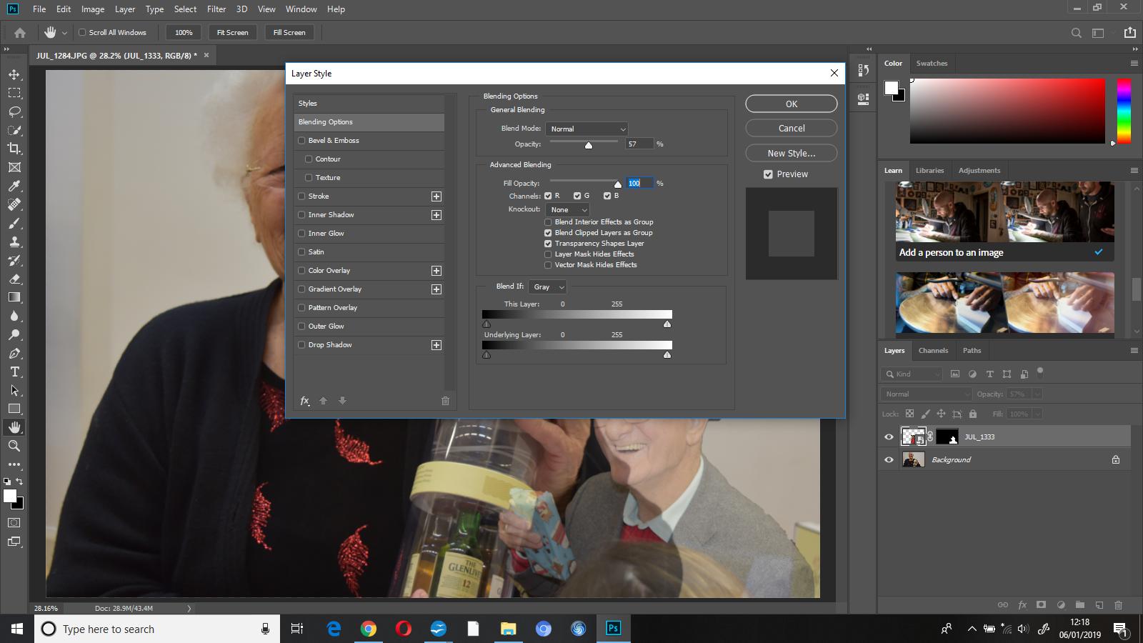
I reduced the opacity of my masked layer to 57%, I did this so that attention went to the primary image beforehand.
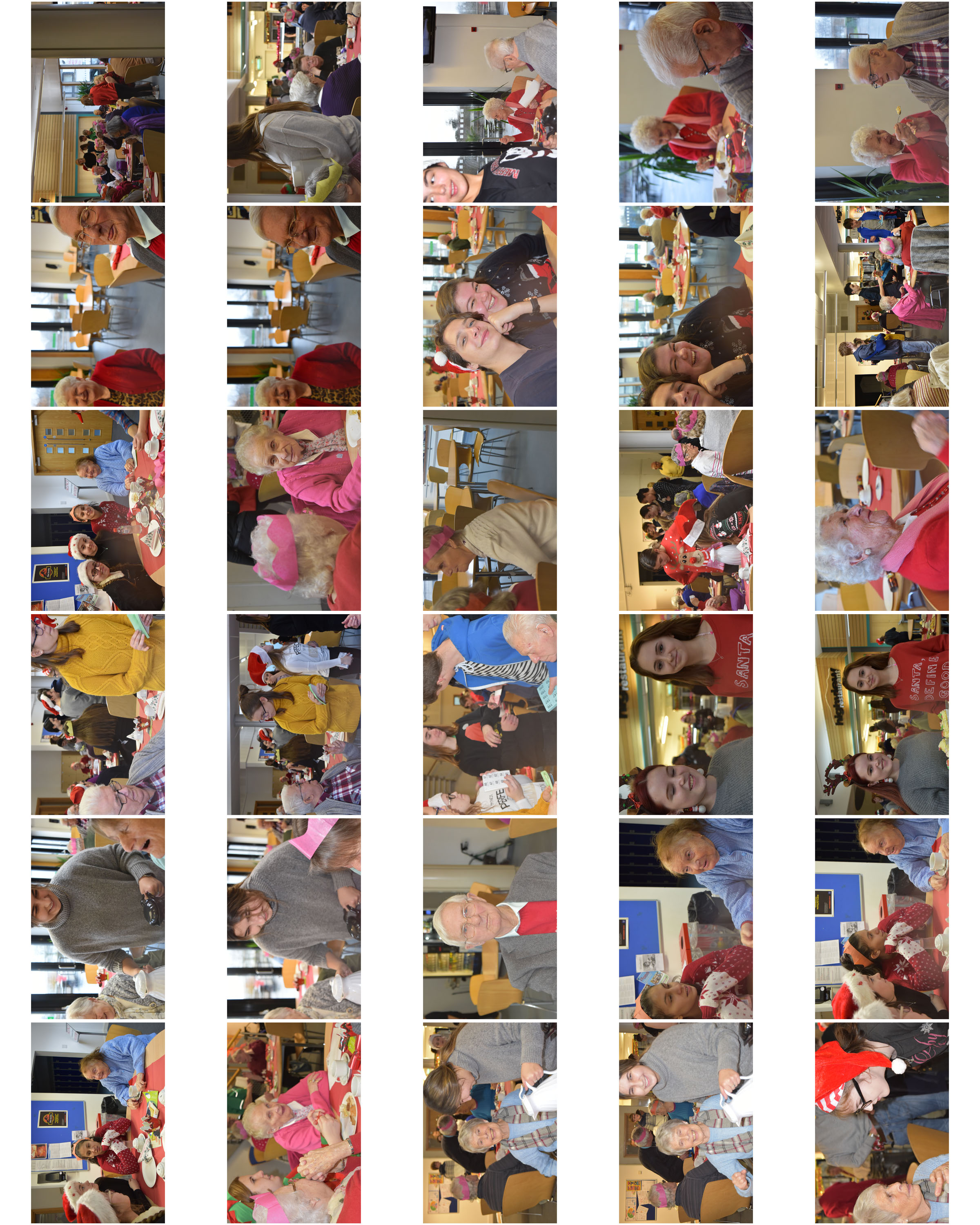
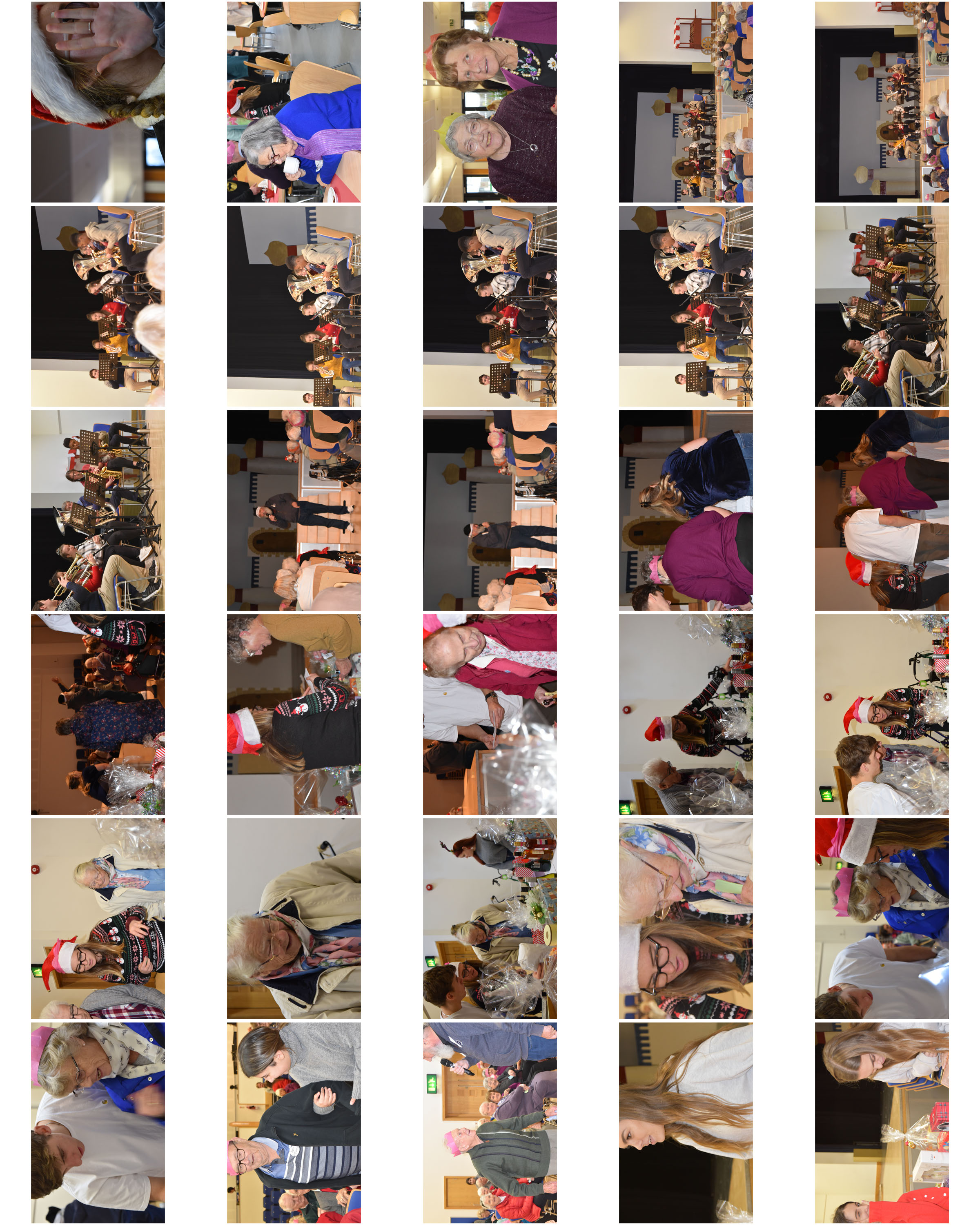
HAUTLIEU SENIOR MEAL – ENVIRONMENTAL

Sunday 16th December 2018

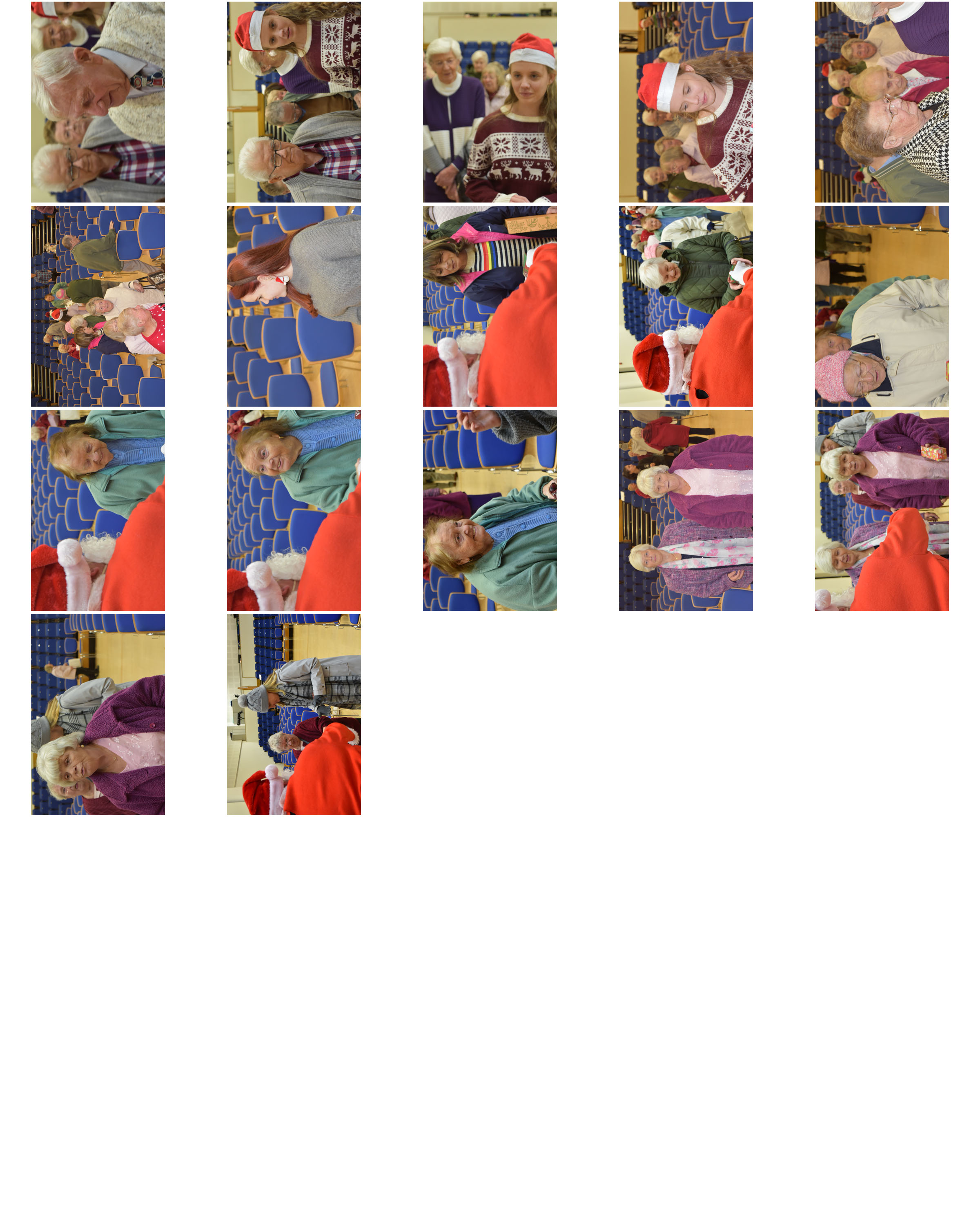
Each year Hautlieu School students and staff come together to host a Christmas party for the senior citizens that live in the school parish, St. Saviour. Hautlieu do this at Christmas time to ensure that seniors are included in our Christmas celebrations whilst also giving back and building a relationship with our wider community.

This year I had the opportunity of capturing the event in photographs.

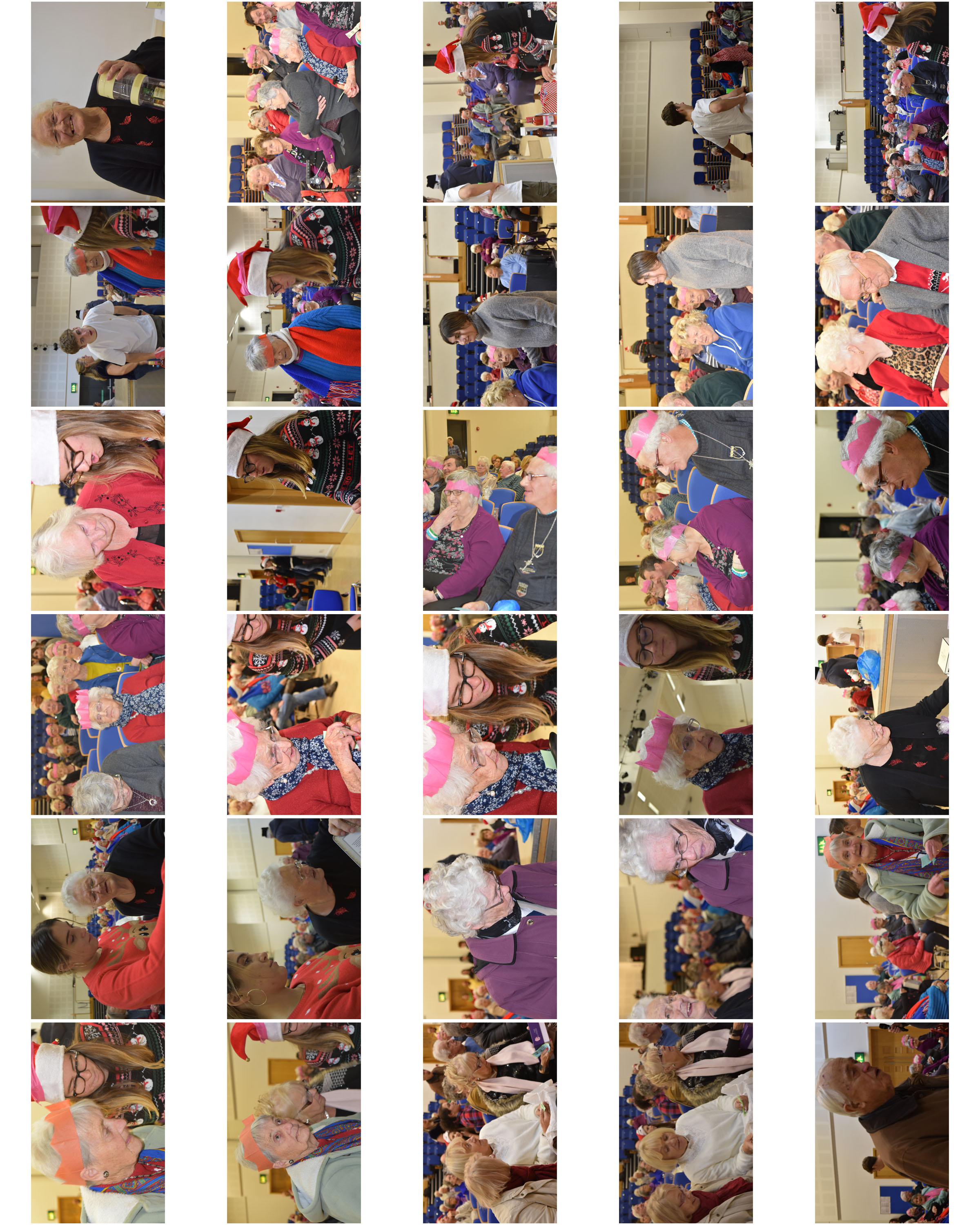
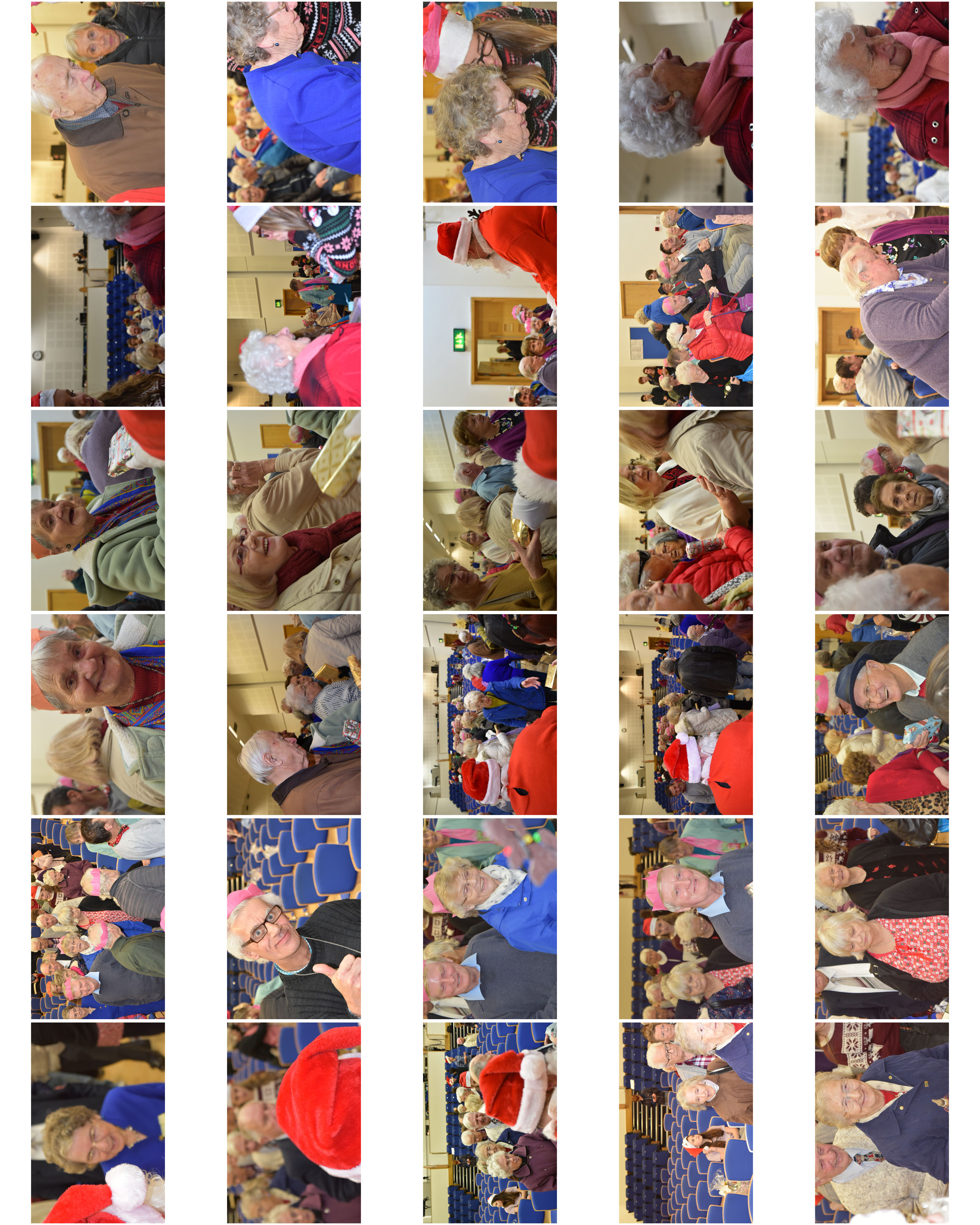
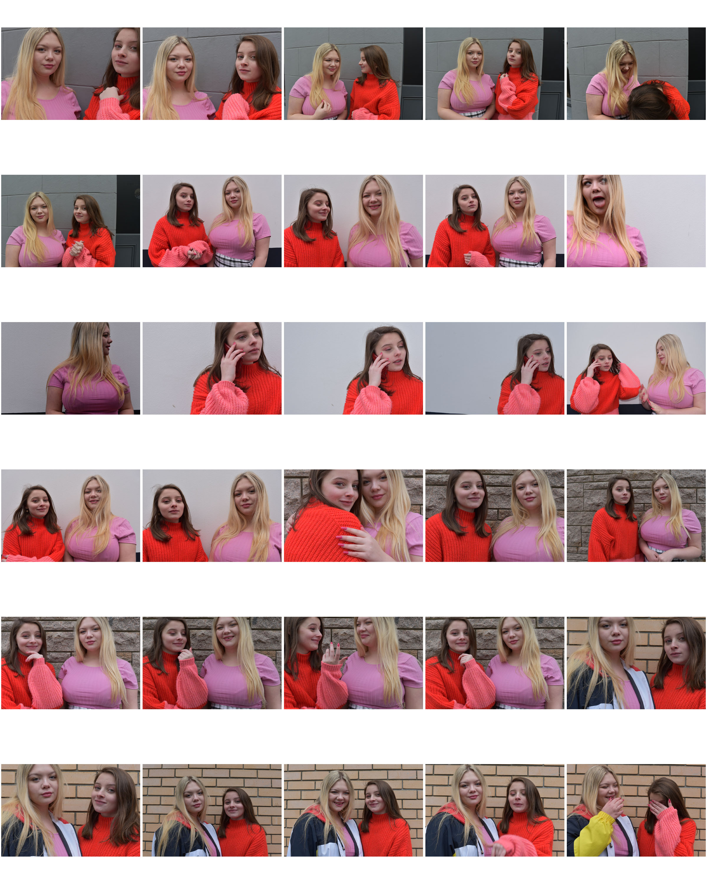
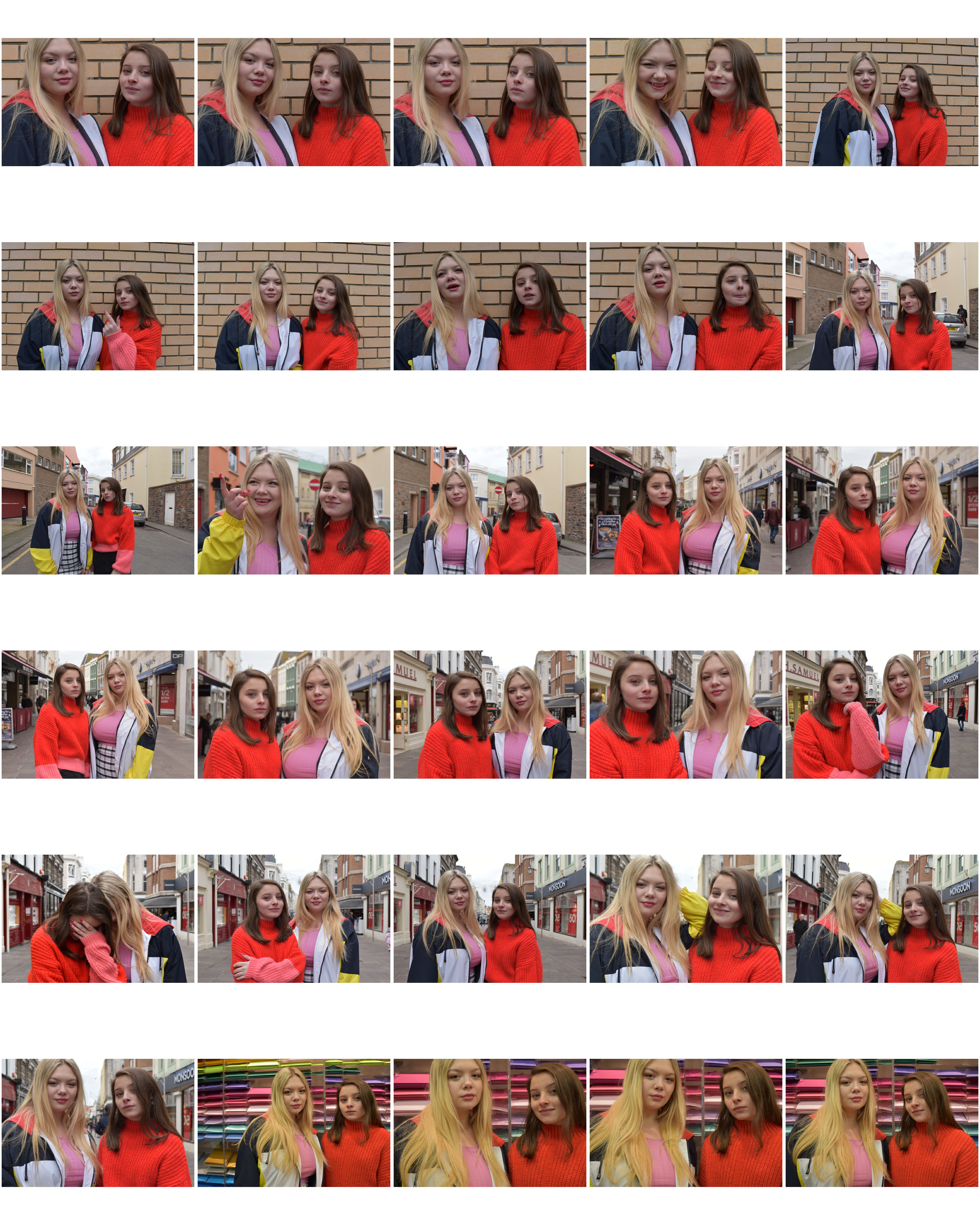
Contact Sheets

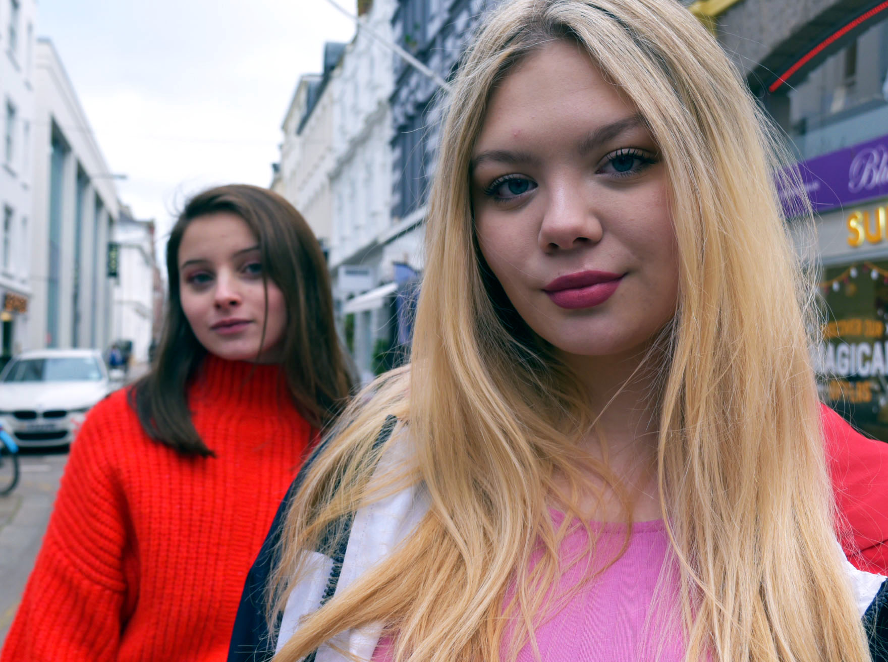
NATURAL LIGHTING PORTRAIT FINALS

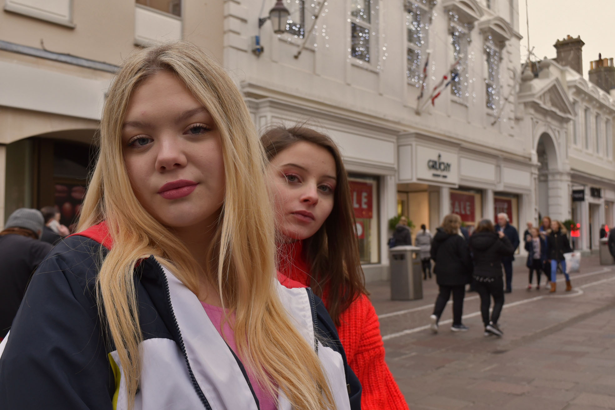
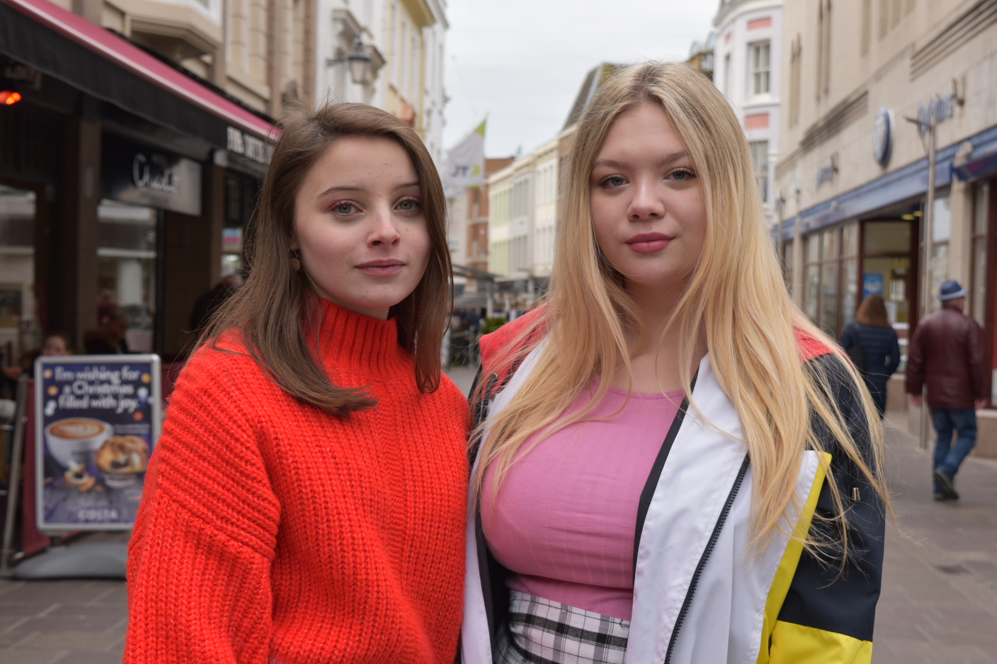
While editing this photograph I added a warning filter, after doing this I adjusted the shadows, highlights, and midtone which also made the blurry lights in the background stand out more while enhancing the filter subtlety
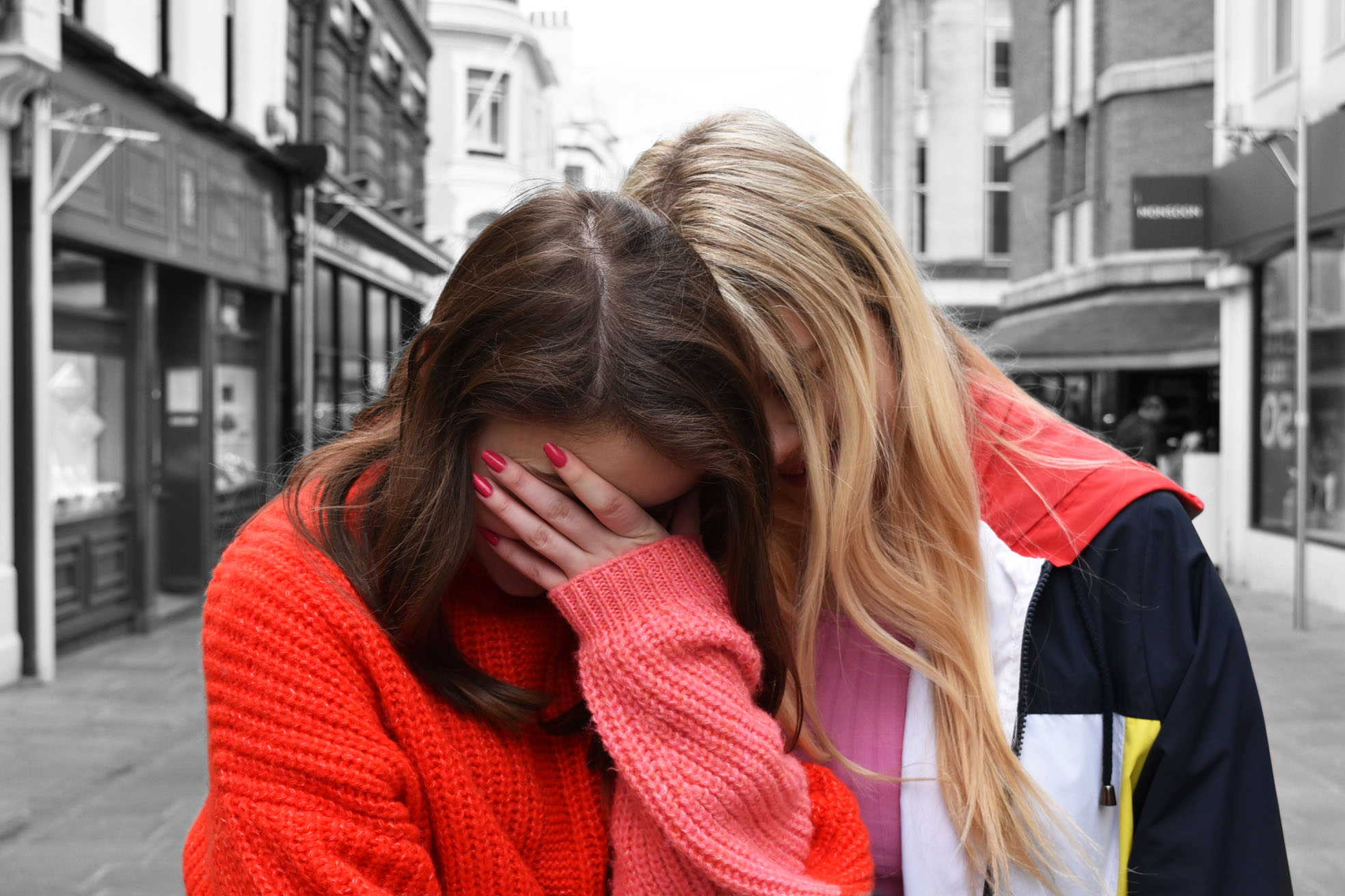
I duplicated this photo before editing, I then turned the photo into black and white before using the history tool to bring the subjects back into colour and upping the contrast and brightness to enhance the red that they were wearing.

EDITING NATURAL LIGHTING PORTRAITS

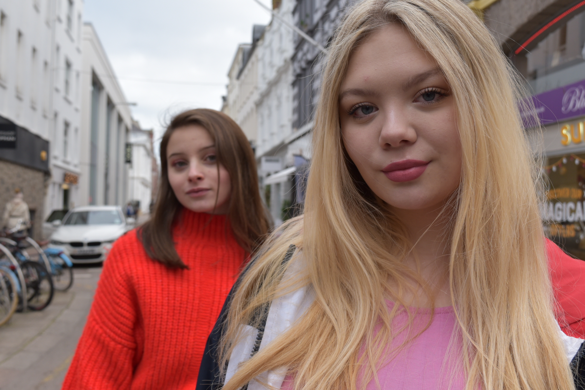
I chose to edit this photograph as I liked that because of the depth of field each model was in a different amount of focus and the model standing in front catches your attention straight away.

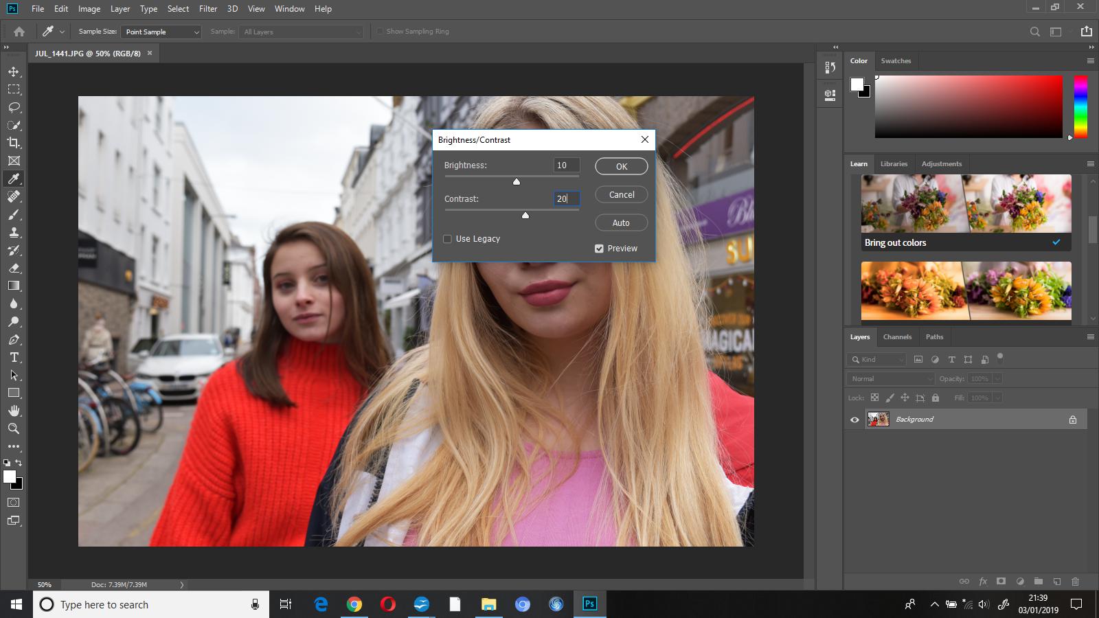
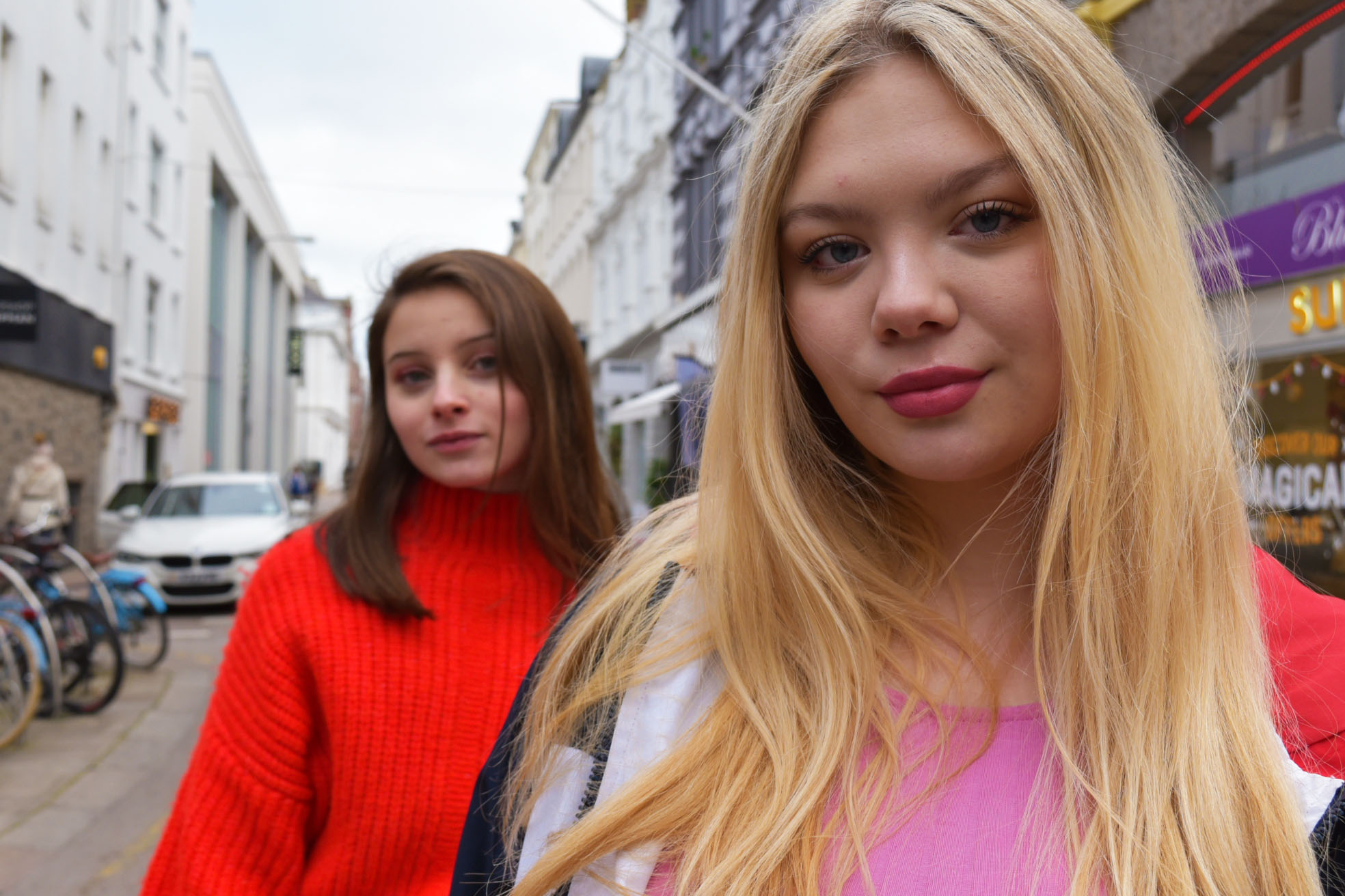
Once I’d opened this photo up in Photoshop the first thing I did was adjust the brightness to +10 and the contrast to +20, I did this to bring out some of the vibrant colours. Doing this helped to bring out the colours as the brightness affects the highlights, and increasing the contrast made the lighter colours in the photo lighter and the darker colours darker, ultimately making them stand out more.

I then went to image-adjustments-vibrance and increased the vibrance to +35 and the saturation to +2 to add to the pop of colour I was going for in this edit.

As you can see, after making these adjustments the model in the foregrounds hair appeared very warm toned. I went to image-adjustments-colour balance and changed shadows (-20,0,+15), midtones (+10,0,+5), and highlights (+8,5,+12) and this gave the image an overall cooler tone.

To finish off this edit I cropped out the bicycles from the left side of the photograph, to both make the photo less busy and cluttered, and keep the focus on the subjects.

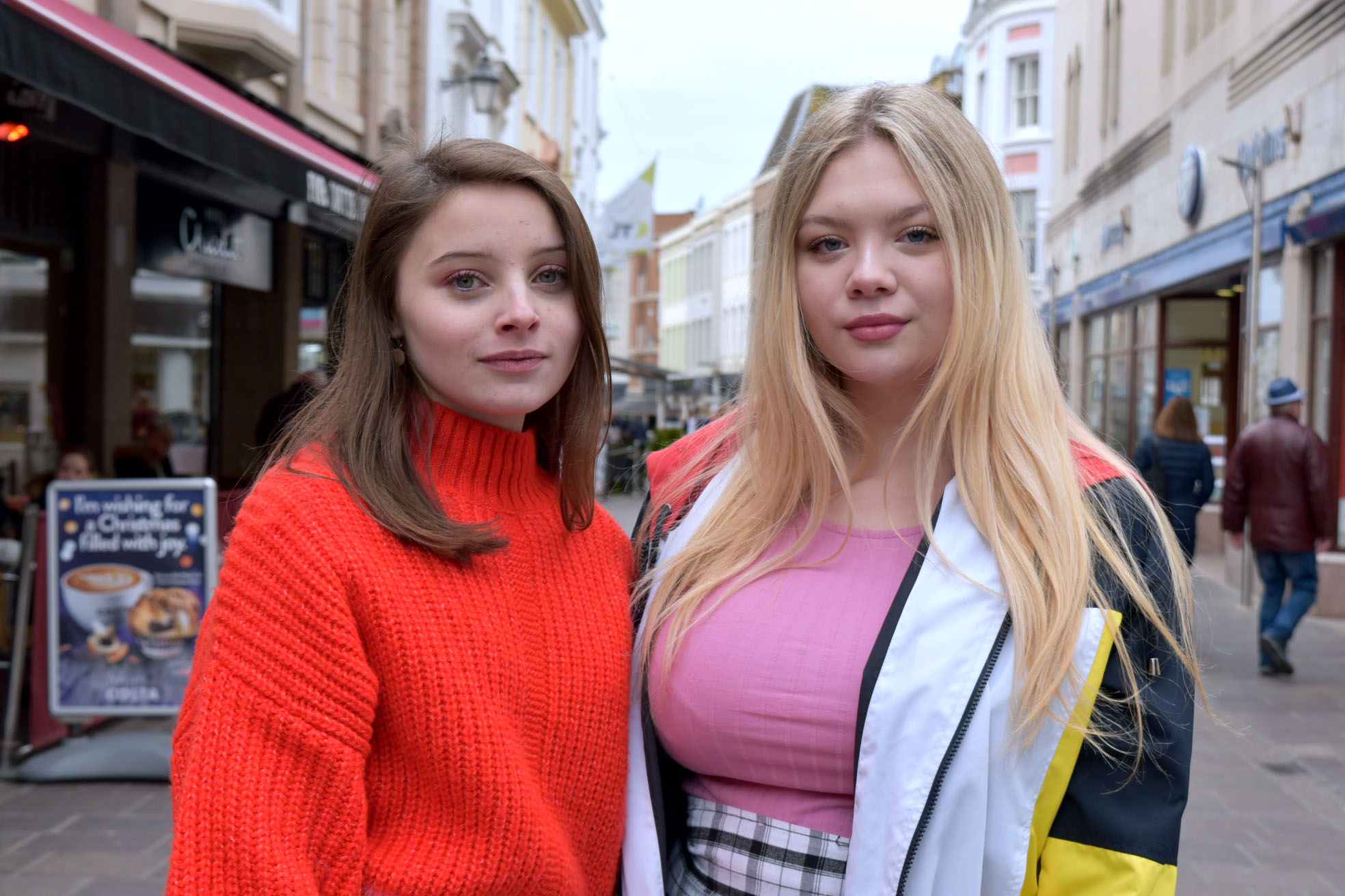
second image unedited


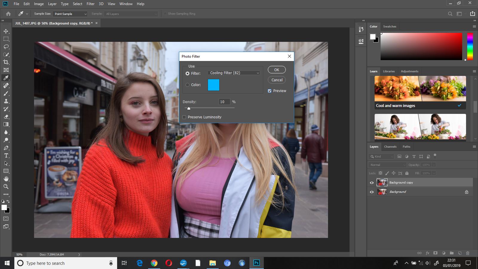
The first thing that I did when beginning to edit this photo was add on the ‘cooling filter (82)’ at a density of 10%, this made the photo cooler toned. I experimented with the density a little bit before deciding on 10% as I did not want the photograph to look as if it had a blue coloured overlay.

To finish this edit I increased the brightness to 5 and the contrast to 15, I did this to just enhance some colours while still enabling the edit to look somewhat natural.