All posts by Charles D

Filters

Author:
Category:

Threshold adjustment. Nature Vs Man made

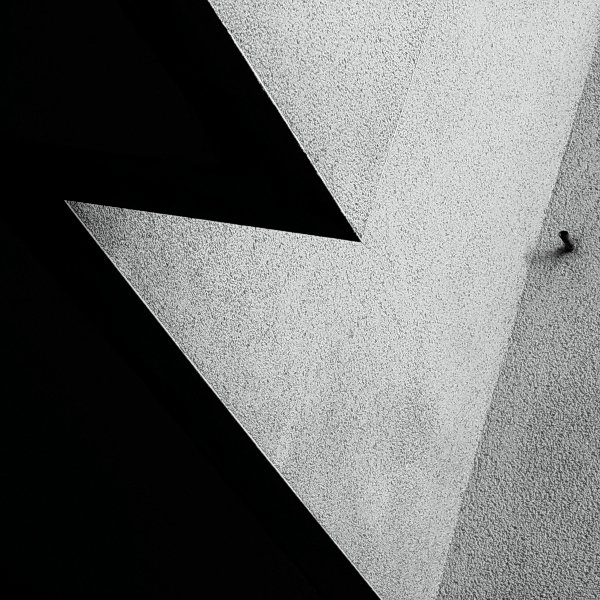
In this blog post I am trying to mimic the style of Keld Helmer-Petersen. Helmer-Petersen is most famous for his dramatic use of black and white features, where he explored dramatic contrast of tones.

Keld Helmer-Petersen was a Danish photographer who achieved widespread international recognition in the 1940s and 1950s for his abstract colour photographs. He was born in Denmark on 20th August  1920, and died 6th March 2013

Here is some of his work.
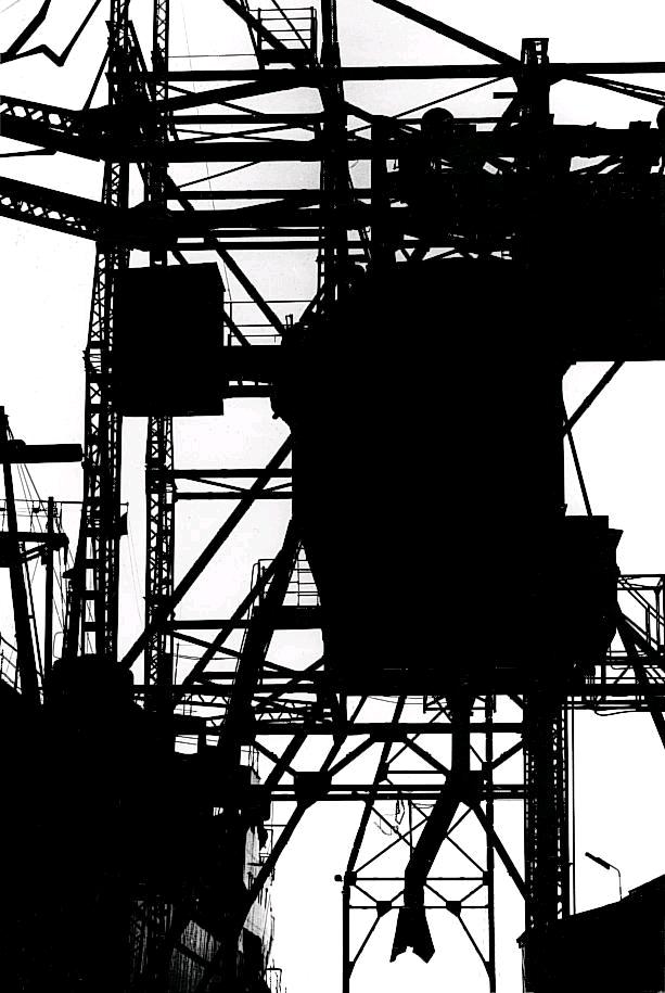
As you can see there is a massive contrast between the extreme white, and dark black within the colours.
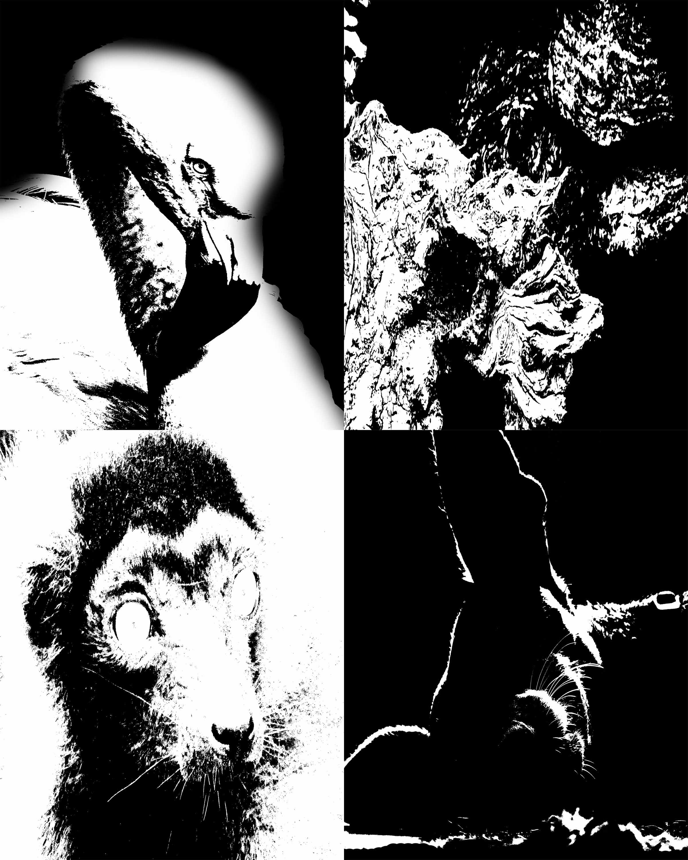
I have tried to recreate his take on photography by using the  change on threshold within Photoshop, I feel I did really well with this task, I did two different sheets for this, each with 4 photos. My first attempt was an all natural version, with a Flamingo, some wood, a Lemur and a Whippet. I feel this went really well


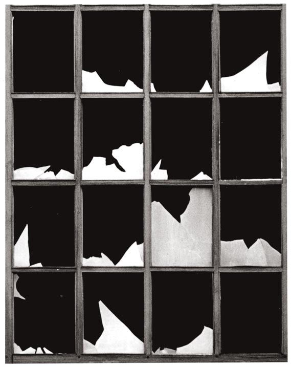
My second attempt was more of a man made version, with a Climbing frame for Orangutans, the side of a building, a glass bottle within a wall, and an old hook for a large gate.
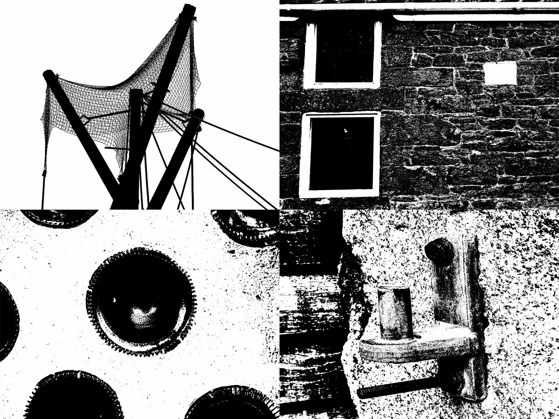
Personally I felt this was even better than my natural one as I found the perfect threshold for the contrasting tone, much like Helmer-Petersen.

 

Colour and Texture- Research

Colour photography is photography that uses media capable of reproducing colours. By contrast, black and white (monochrome) photography records only a single channel of luminance (brightness) and uses media capable only of showing shades of grey.

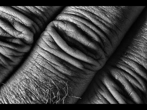
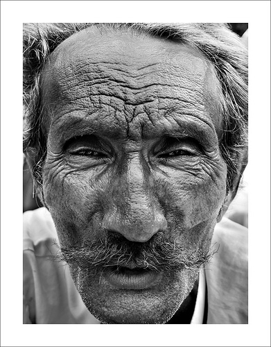
Texture is the perceived surface quality if a work of art. It is an element of two dimensional and three dimensional designs and is distinguished by its perceived visual and physical properties. Use of texture, along with other elemental design, can convey a variety of messages and emotions.


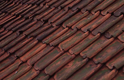
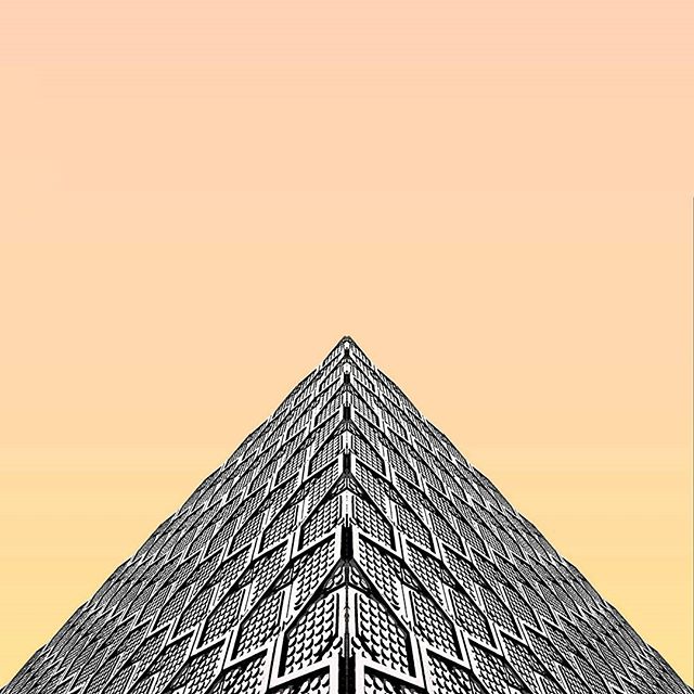
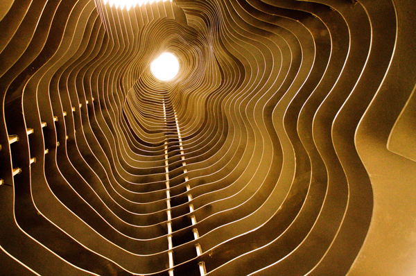
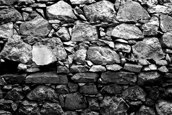
Texture in photography can be used to create strong images in an architectural and structural way like this

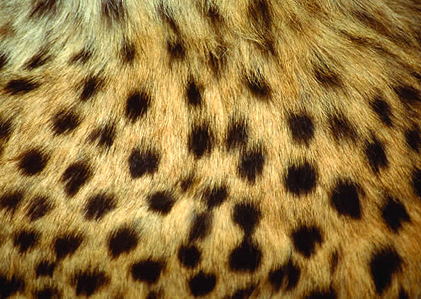
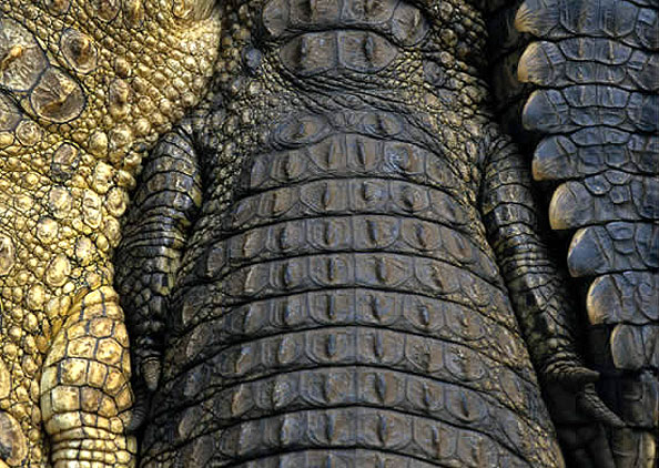
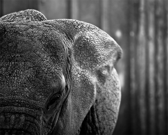
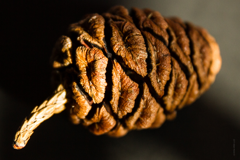
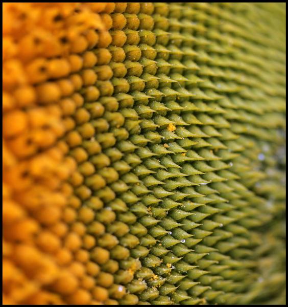
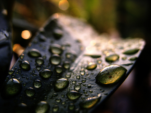
It can be used to show off the beauty and different surface feelings of nature, like this


It can even be used to show the certain characteristics and age of a person like this

I like this type of photography as it allows you to have more freedom over the camera as you can use both auto and manual focus, letting you get as close or as far away from the subject as you want or need to be. It also means that anything can be your subject as anything and everything has a different surface and texture.


I also like the use of Colour photography as it can be original or edited to have a great outcome. There are many different types of ways you can have an outcome of photography. You can have multiple or the same colours in your original photoshoot, you can add a layer of colour on top of the frame during editing or even make the whole frame black and white and only select specific parts of the photo to have colour.


Abstract minimalist- Research

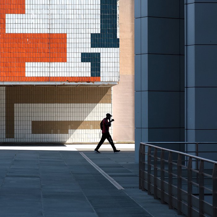
Abstract photography, sometimes called non-objective, experimental, conceptual or concrete photography, is a means of depicting a visual image that does not have an immediate association with the object world and that has been created through the use of photographic equipment, processes or materials. An abstract photograph may isolate a fragment of a natural scene in order to remove its inherent context from the viewer, it may be purposely staged to create a seemingly unreal appearance from real objects, or it may involve the use of color, light, shadow or texture.

I quite like the abstract minimalist photography as it involves the use of editing, warping, and making the photo seem unreal, or edited to an extent where it seems unnatural. In some examples of minimalist it makes the object in focus either seem larger than life or smaller than it should be.

I also like the use of changing the colors to make it seem neon, brighter or even electrified. This effect can be used on people for portraits and can be used on everyday objects.

Julian Schulze became a master of minimalism, his work is eye-catching and very impressive. He is focused on geometric abstraction and minimalistic compositions. His images can range from simple shots of everyday scenes made up of a small number of elements to mind-bending abstractions that will leave in confused as to which direction he took the shot. Each shot he takes is expertly composed using light, shadow and color to create 2D and 3D illusions and scenes.

I really like Schulze’s work as some of his work is simple by just taking of a photo with a wide range of colors in an everyday normal environment, whereas others involve black and white structures and taking them at obscure angles to change the interpretation and the way we look and understand the photographs.


Focal point and Depth of field photoshoot

The aim of this photo shoot was to use manual focus to try and use the different levels of focal views. In a few of these the back of the photo is focused on more than the front, but in most of them it is the front that is more focused.

You will notice I have added a new key, with half yellow and half green. I have done this because I really like the photos, but as a final step I will edit them. Have shown this with the photo below.

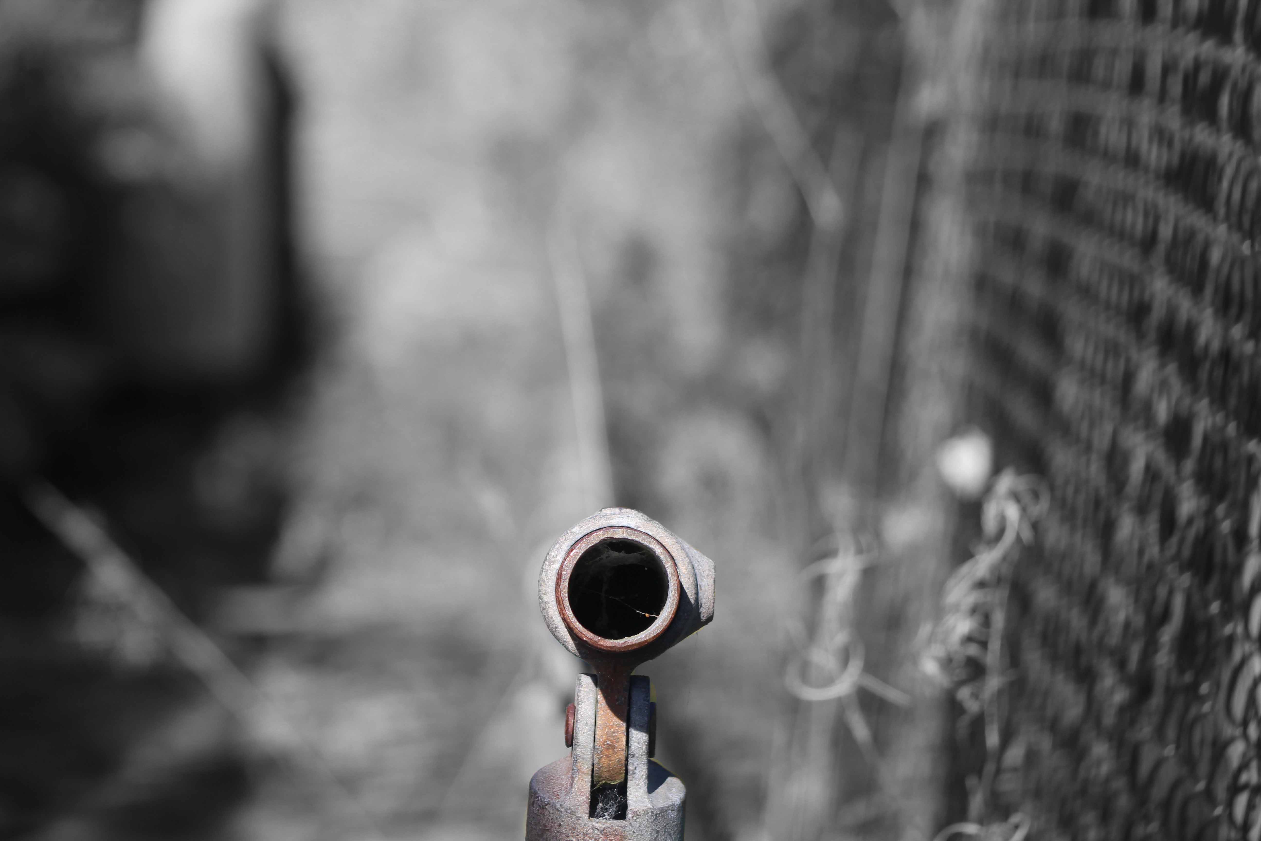
After shortening my list of photos using my colour scheme, I picked my final one to edit. In the photo I have changed the background to black and white and using Photoshop I removed the top layer to bring out the colour underneath.

Because I did use an old metal railing the final product has only a minor and subtle change, but I feel that it changes the photo just enough, and it stands out from the background.

The first photo shows the original photo, it is not edited and focuses down the hole within the railing, blurring everything else out.

The next shows the edited and final version, as you can see it is very subtle but you a drawn to the bland and near invisible colours at the bottom center of the photo.

Focus and depth of field- Explained

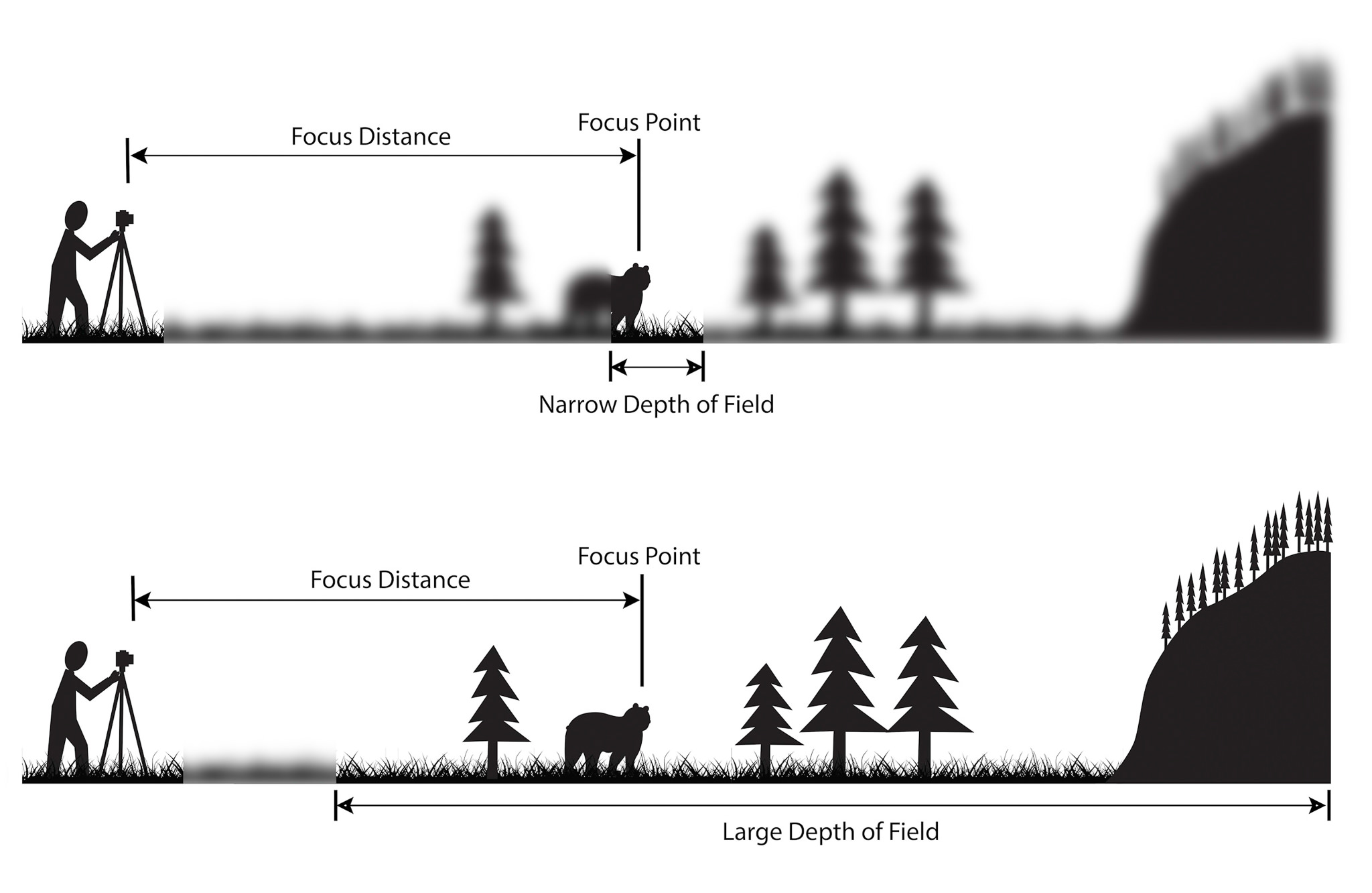
Depth of field is the distance about the plane of focus, where objects appear acceptably sharp in an image. Although an optical imaging system can precisely focus on only one plane at a time, the decrease in sharpness is gradual on each side on the plane of focus, so that within the depth of focus the unsharpness is imperceptible under normal viewing conditions.Many photographers have used Depth of field to create a certain type of mood or effect for the photo that they are taking.
Many of these photographers include:

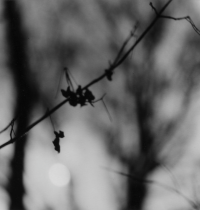
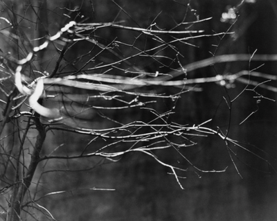
Ralph Eugene Meatyard-                                                                              Meatyard mainly experimented with various strategies including multiple exposures, motion blur and other methods of photographic abstraction. Two of Meatyards series were mainly focused on Depth of field, with both stretching the expressive potential of photography and film when looking within the ordinary world.

Here is some of his work, named ‘Zen Twigs’ I really like these 2 photos as the dramatic use of the black and white gives the photo a spooky and eerie tone and effect, but also due to the leafless branches and the way that they stand out and creep out of the frame makes it seem alive-like. The use of the black and white effect makes the photograph have a colder atmosphere making it seem like the photo was taken in the middle of winter, giving it a cold and shivery feeling.

Paper Photo shoot Contact sheet

This is my second time using a contact sheet to create ideas for final photographs. I have used the same colours as I did last time to show my final choices and my thought process.
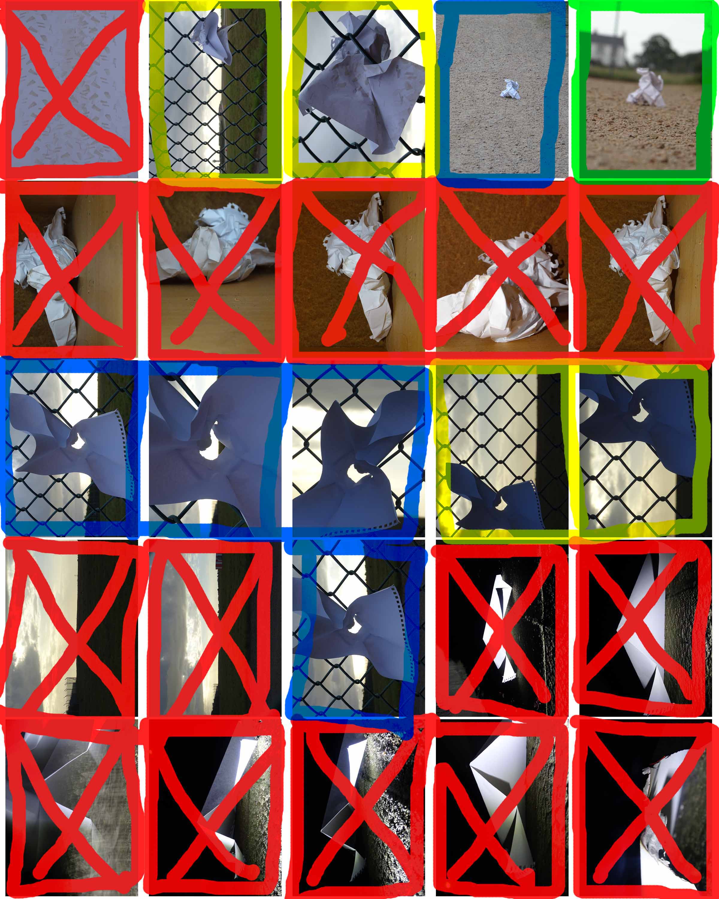
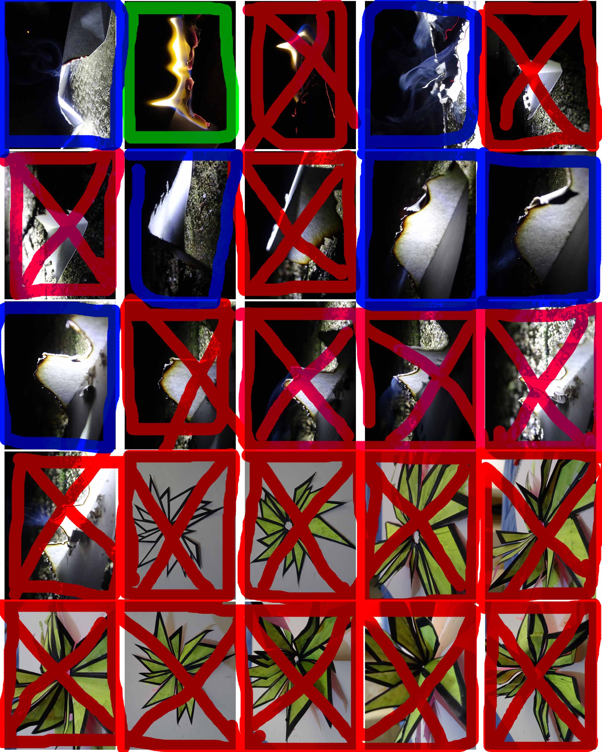
I was very unhappy with the turnout of this photoshoot, as when I had a closer look there are loads of problems which I don’t like. As you will see from this there are loads of red crosses due to the unhappiness of my photography.

New Objectivity – Research and moodboard

The new objectivity was a movement in German art that arose during the 1920’s as a reaction against expressionism. The term was invented by Gustav Friedrich Hartlaub, the director of the Kunsthalle in Mannheim, who used it as the title of an art exhibition staged in 1925 to showcase artists who were working in a post-expressionist spirit. These artists included; Max Beckmann, Otto Dix, George Grosz, Christian Schad and Jeanne Mammen.

Although principally describing a tendency in German painting, the term took a life of its own and came to characterize the attitude of public life in Weimar, Germany as well as the art, literature, music and architecture created to adapt to it.

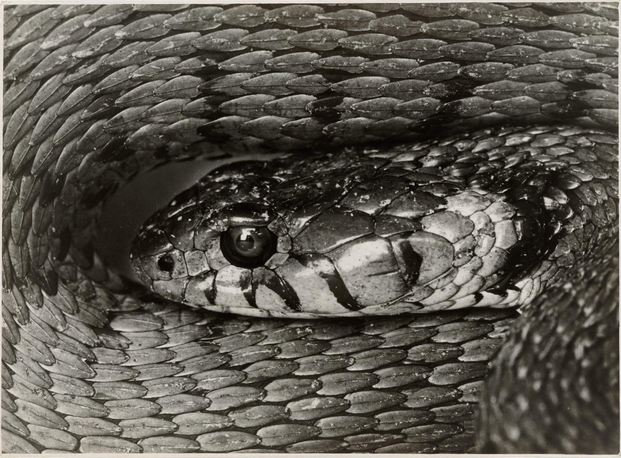
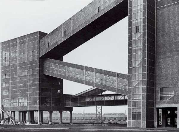
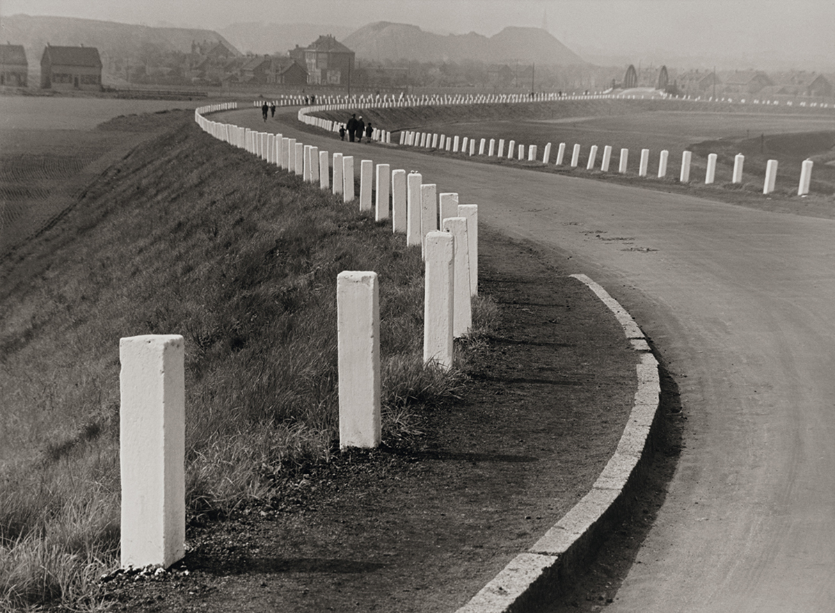
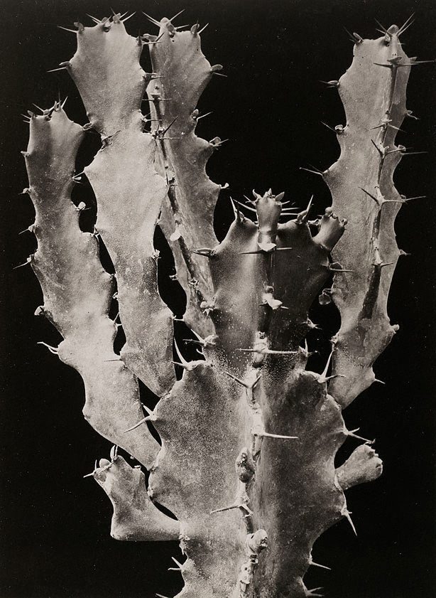
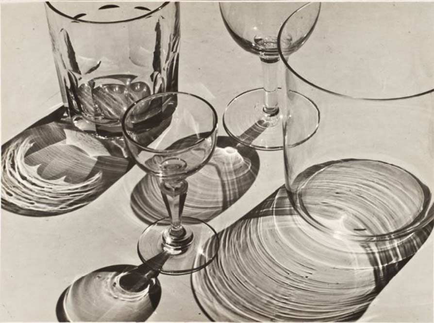
Albert Renger-Patzsch was a German photographer associated with the New Objectivity. Renger-Patzsch was born in Würzburg, Germany and began making photographs by the age of 12.                        In it’s sharply focused an matter of fact style of his work exemplifies the aesthetic of the New Objectivity movement that flourished in the arts of Germany.

In this topic of New objectivity I started focussing on Albert Renger-Patzsch, this is because of his take on New objectivity. He mainly takes photos of inanimate objects such as; Plants, Buildings, roads and glasses, but has also taken photos of snakes. He then uses the expulsion of colour from his work to give the atmosphere an eerie and spooky feeling, this creates a dramatic feeling within the person looking at the photo.

I also like his work as it rejects the sentimentality and idealism of a previous generation emerged as a tendency in German art. Renger-Patzsch’s work demonstrates a his sustained interest in the camera’s relationship to the beauty and complexity of the modern world.

Here are some of my favourite photos of examples of New Objectivity.

New Objectivity – Research

The new objectivity was a movement in German art that arose during the 1920’s as a reaction against expressionism. The term was invented by Gustav Friedrich Hartlaub, the director of the Kunsthalle in Mannheim, who used it as the title of an art exhibition staged in 1925 to showcase artists who were working in a post-expressionist spirit. These artists included; Max Beckmann, Otto Dix, George Grosz, Christian Schad and Jeanne Mammen.

Although prinicpally describing a tendency in German painting, the term took a life of its own and came to characterize the attitude of public life in Weimar, Germany as well as the art, literature, music and architecture created to adapt to it.

Albert Renger-Patzsch was a German photographer associated with the New Objectivity. Renger-Patzsch was born in Würzburg, Germany and began making photographs by the age of 12.                        In it’s sharply focused an matter of fact style of his work exemplifies the aesthetic of the New Objectivity movement that flourished in the arts of Germany.

I like this work of Albert Renger-Patzsch as it creates a feeling of loneliness or spookiness with the use of Black and White. I really like the building photo as it is a modern architectural structure but the black and white makes it seem a lot older, this is the amazing thing with photography.

I also like his work as it rejects the sentimentality and idealism of a previous generation emerged as a tendency in German art. Renger-Patzsch’s work demonstrates a his sustained interest in the camera’s relationship to the beauty and complexity of the modern world.

Using Photoshop to edit photos

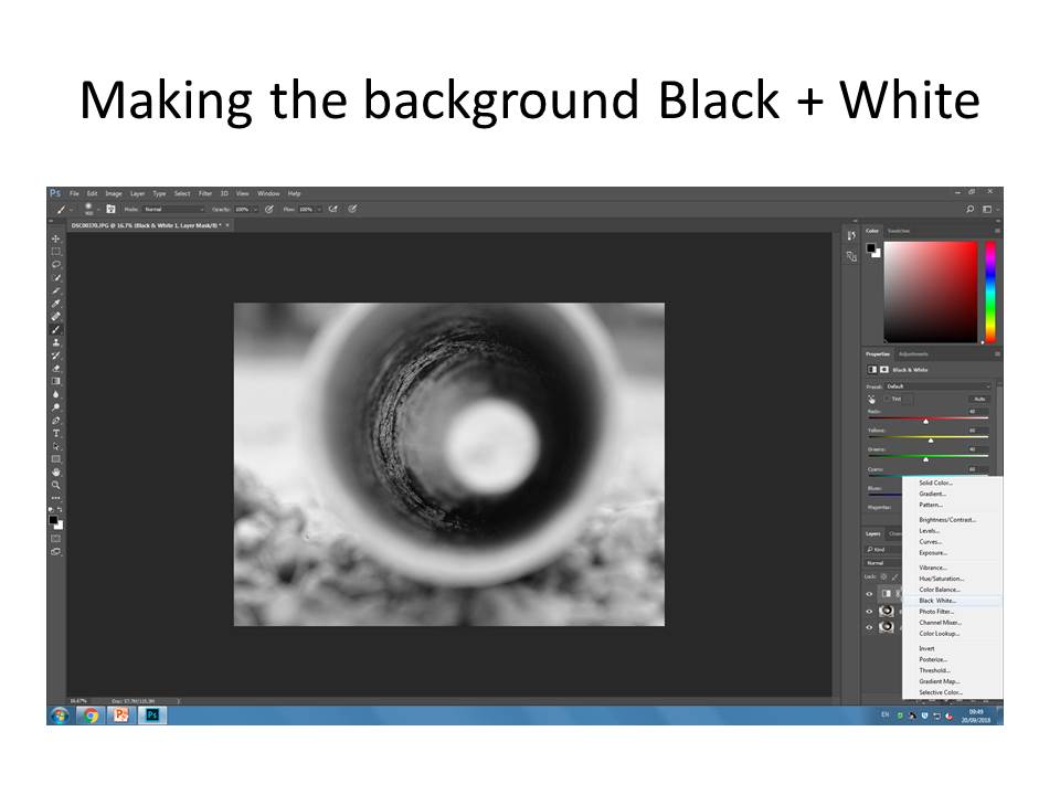
For my first edited photo on Photoshop, I carefully selected an image which I took as part of my abstract photography piece,  in this instance it was a thin pipe on a gravel like textured cycle track.

Then I made the background into Black and white, which didn’t , make too much of a difference as the colours weren’t extravagant in the first place, but I did this in order to bring out the colour in the center pipe.

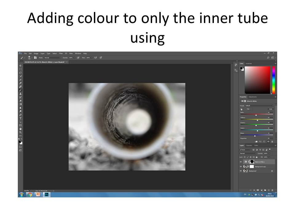
Then using a mask layer I then coloured inside the tube being very careful not to bring out colours from the background. I personally find this went well for my first attempt as the black and white, compared to the subtle and gentle colours contrasts really well.

And that is my final product !

My Hautlieu Abstract contact sheet

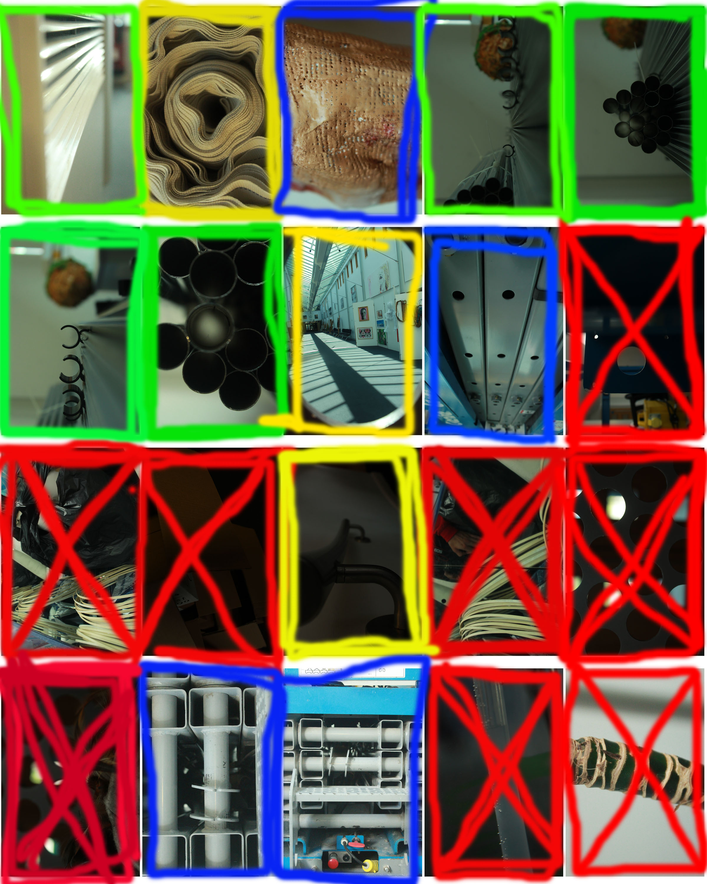
 I took a wide variety of pictures around the site of Hautlieu school and managed to select these 20 photos. From the 20 final photos I used the help of this contact sheet to go further in my simplifying.

The key for my contact sheet is this:

-The green box means I am happy with the final product and don’t want to edit it anymore

-The yellow box means that whilst I am happy with it I know that I could edit them and make them up to my own standards.

-The blue box means that I am unsure whether I should edit them to try make them better or I should discard of them.

-Finally the red box means I am unhappy with the photos and don’t want to take them further.