All posts by Charles D

Filters

Author:
Category:

My best studio portrait photography edited

After my first couple of times in the studio doing portraiture I have a small selection of photos that really stand out for me, but to make them better I put them through Photoshop and the editing software that comes through windows.

I will be showing the before and after photos, just to show a contrast between an original and an edited version of a photo, although the difference may be very subtle I think that they really change the photos looks.
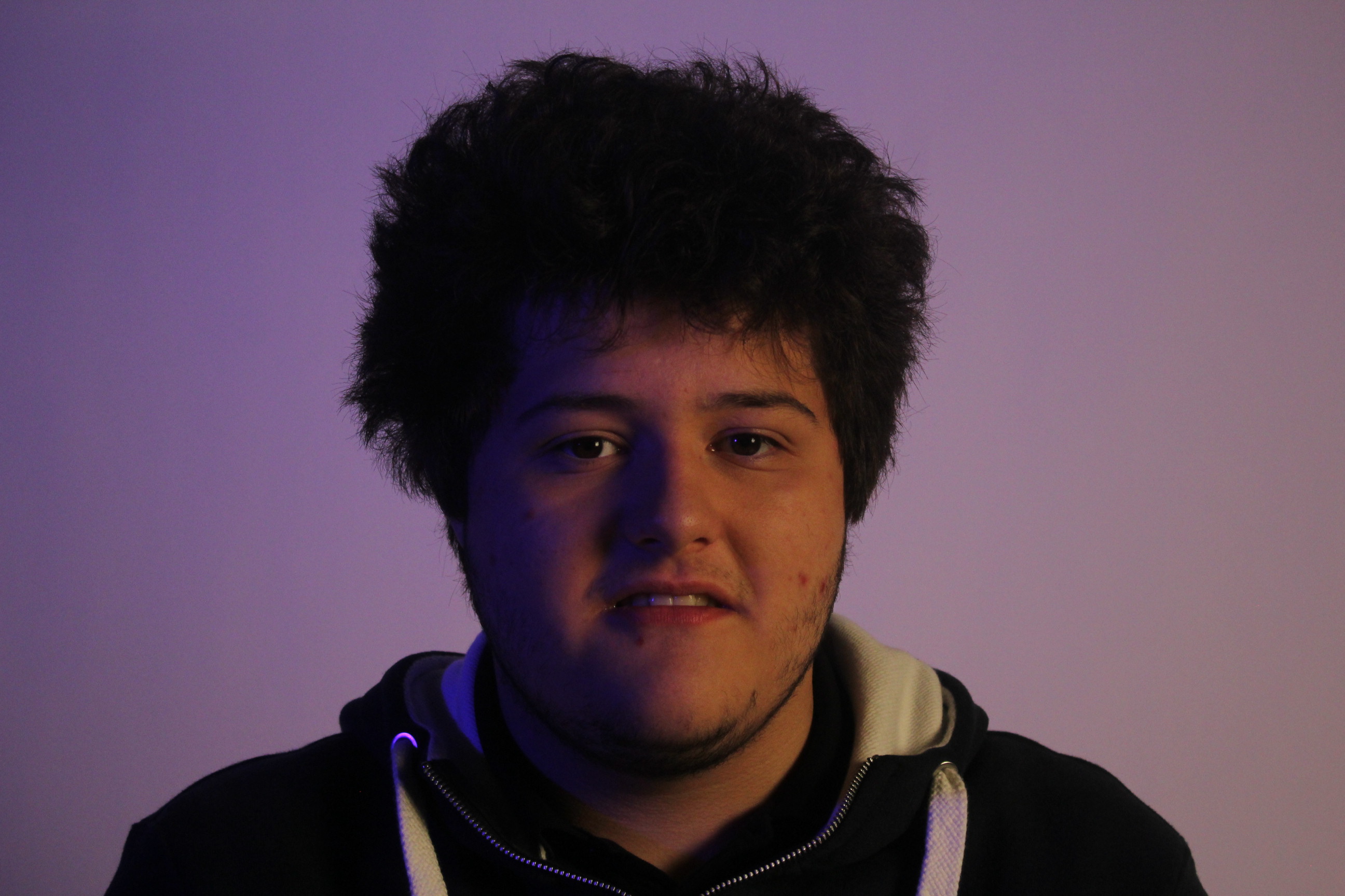
This is the first photo that I will be editing, it is one of the best photos I took from my second visit to the studio.
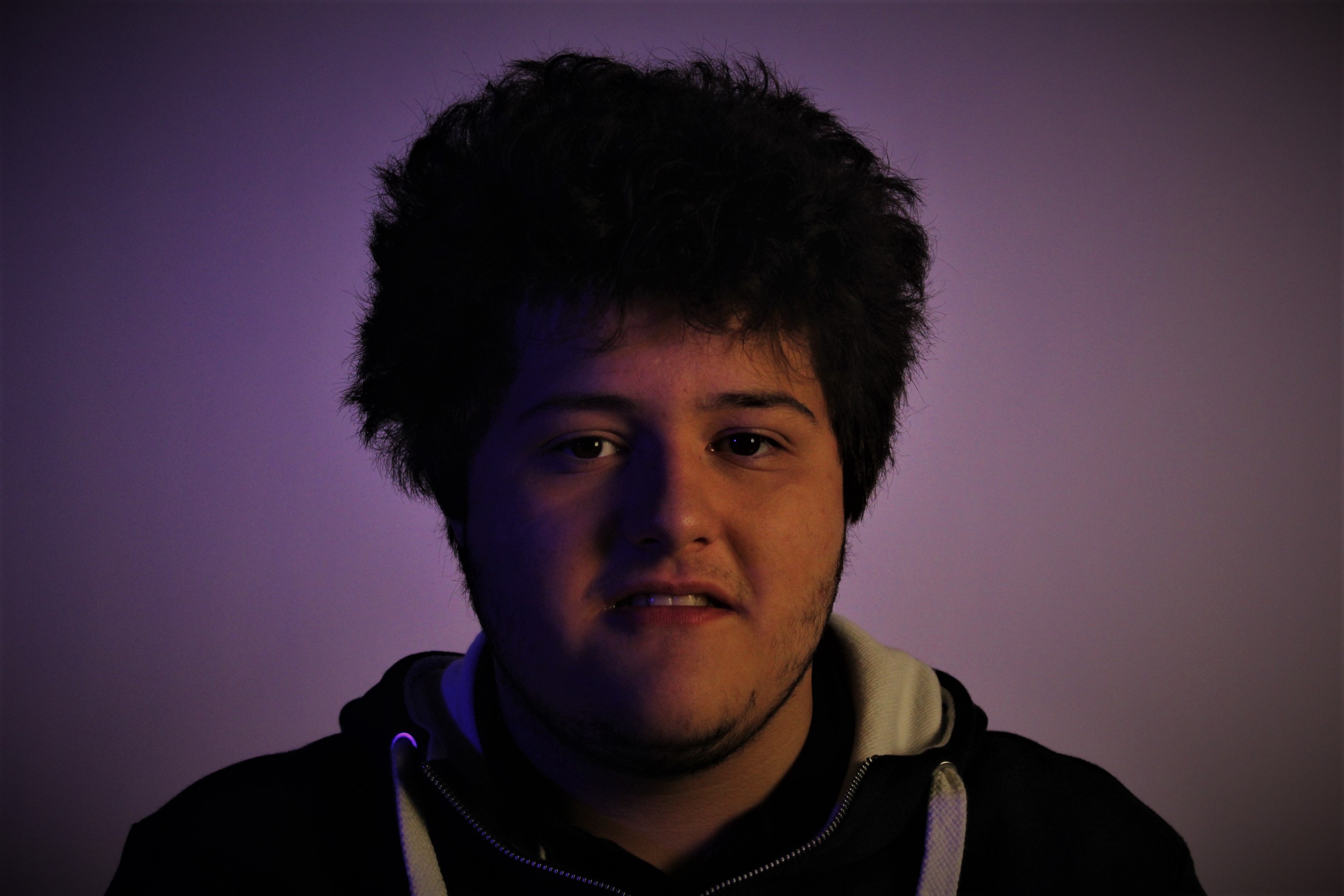
In this edited version of my photo all I have done is used spot fix to make the skin seem smoother and clearer I also turned up the color making the blue/purple look bolder. I also brought up the clarity on the photo to make it seem bolder and for some features to stand out. Again I increased the vignette to darken round the edges and corners but so that the model is the main piece of the photo.
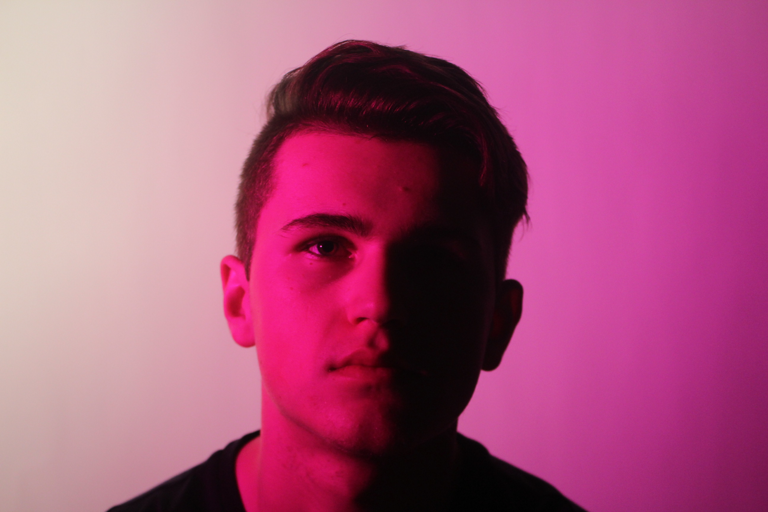
I really like this photo as it brings in the style of one point lighting to only show one side of the face but has the added feature of the color making it seem more vivid.
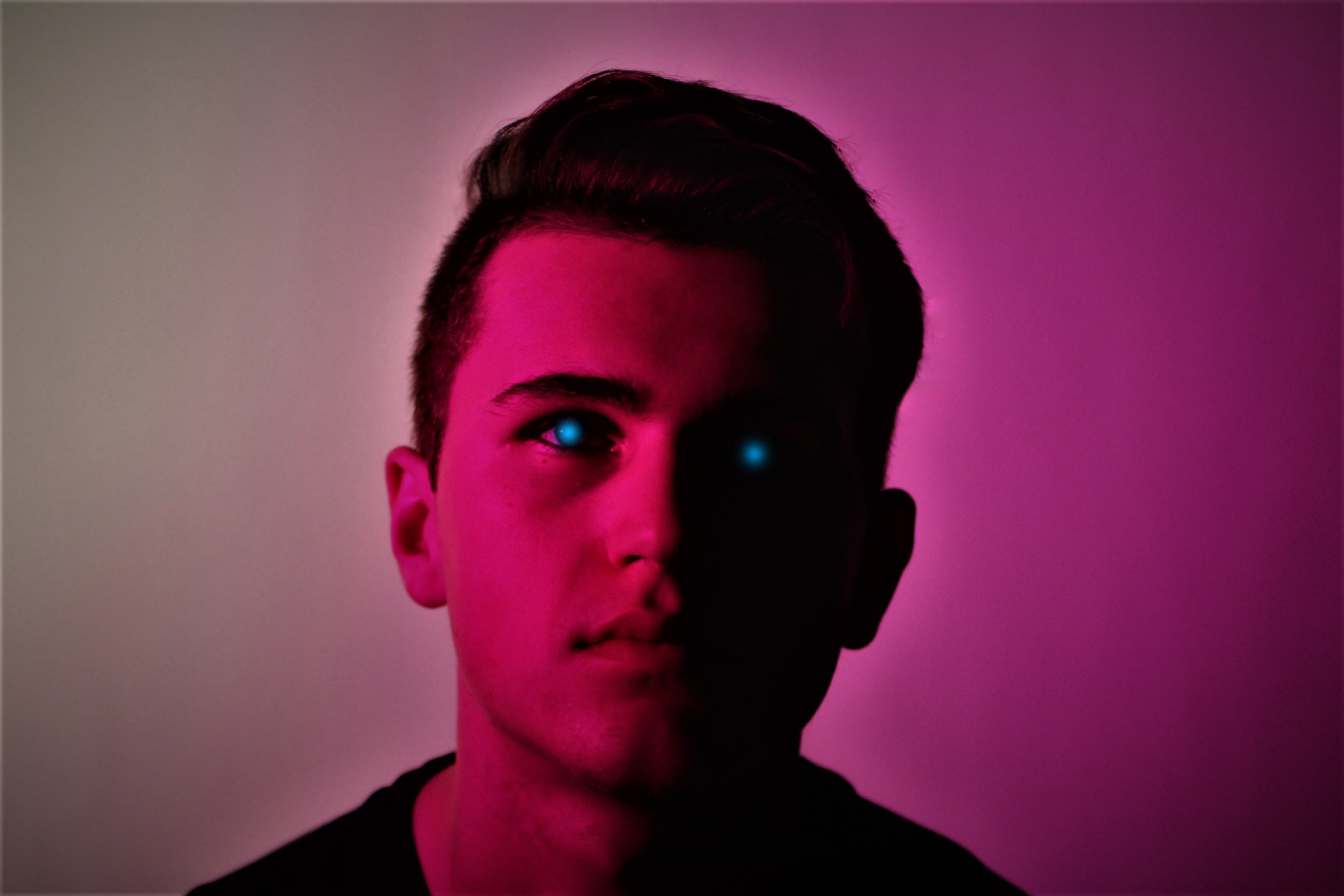
In this photo you can see an immediate change in the look of the photo. The first major change you can see is the blue specks of color where his eyes are. On the left side of his face (As you look at it) you can see where his eye is, but due to the one point light, you can’t see where the other eye is, I think that the blue dots of color help make the picture stand out. Also with this photo I put the clarity all the way to maximum just so that his key features stood out. I also raised the vignette just a bit to create the same effect as before. Again with this photo I used spot fix, but this time not to make his skin to appear smoother but to fix any hairs on the photo which looked out of place, this makes the outline of his head to shoulders seem more in place and smoother looking.
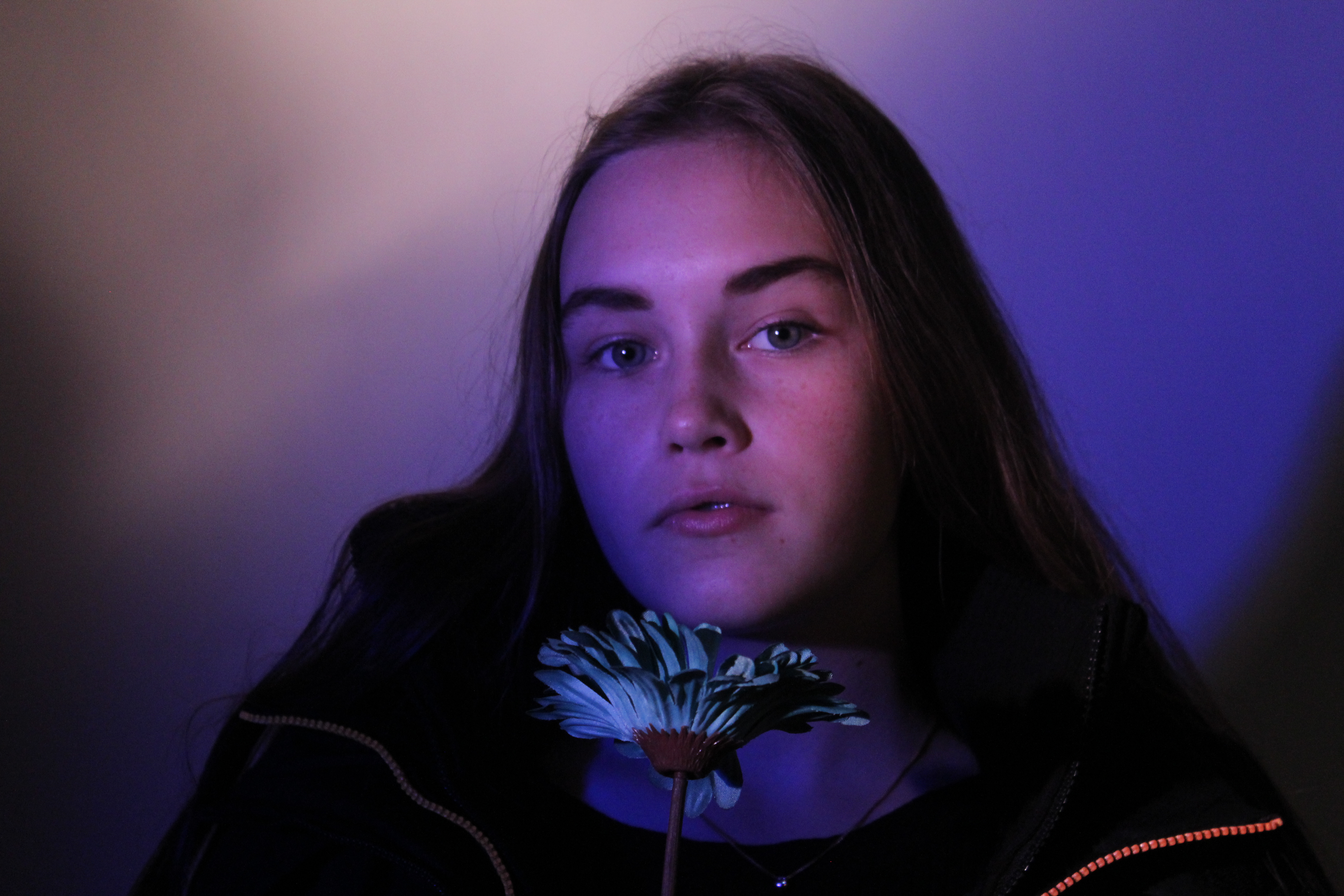
I have done nothing to edit this photo as I think that it is really good. What I really like about this photo is that the use of the color blue really makes the much paler blue stand out. I also like the use of propping with the coat as it does just make the color and atmosphere of the picture stand out.
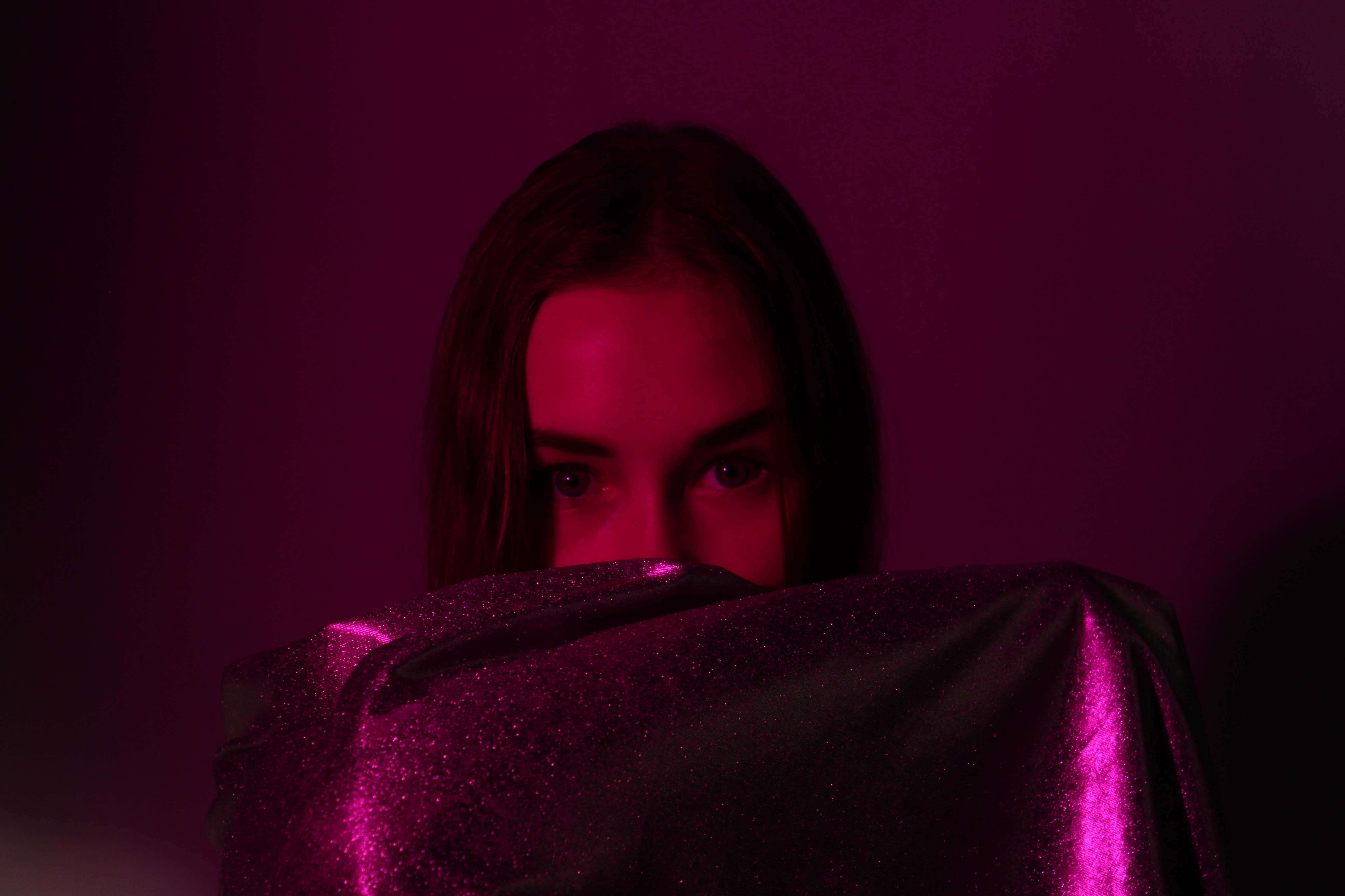
I also really like this photo, as the use of the red and purple mix of the film to create a mix of colors on the model really makes her eyes stand out among  the rest of the photo. I like the use of the silver and glittery sheet as it stops you from becoming too focused on the rest of her face. The use of the sheet also works well with the light as it has its dark and light tones which makes it sparkle and stand out.

Studio Photography II

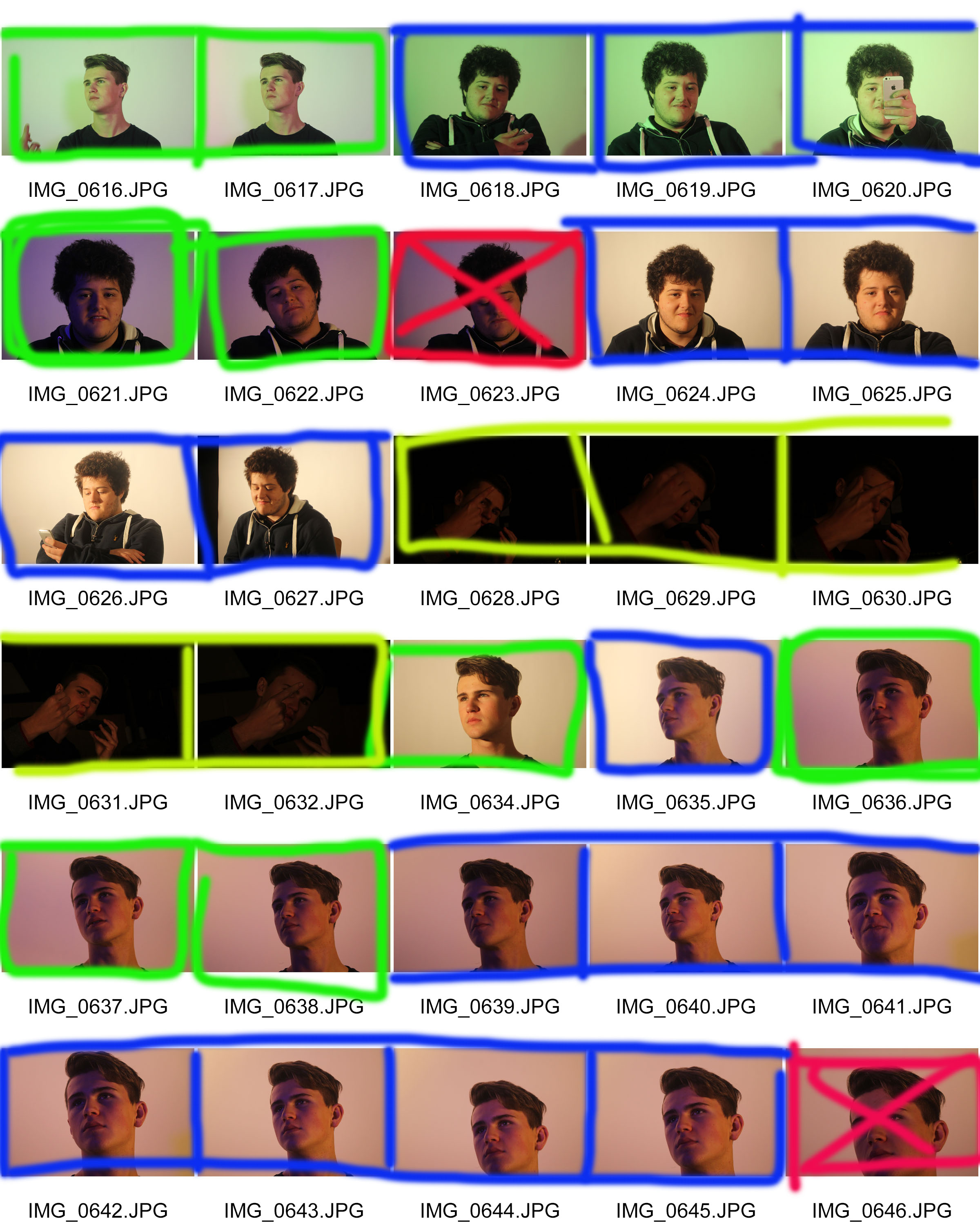
So this was my second time doing photography in the studio, so at first I had the same struggles of under and over exposing the photos, so I was adjusting the ISO after every photo just to get the perfect image which really paid off in IMG_0621.JPG.

During most of the photos I had the ISO set at around 400-800 but eventually changed it to auto, so it would instantly adjust to what ISO was needed on the spot.

I did however always use manual focus, just so I could change where I wanted the focal point to be or whether I wanted my models to be in or out of focus, which I like to differ depending on the lighting and my mood or where the models are standing.

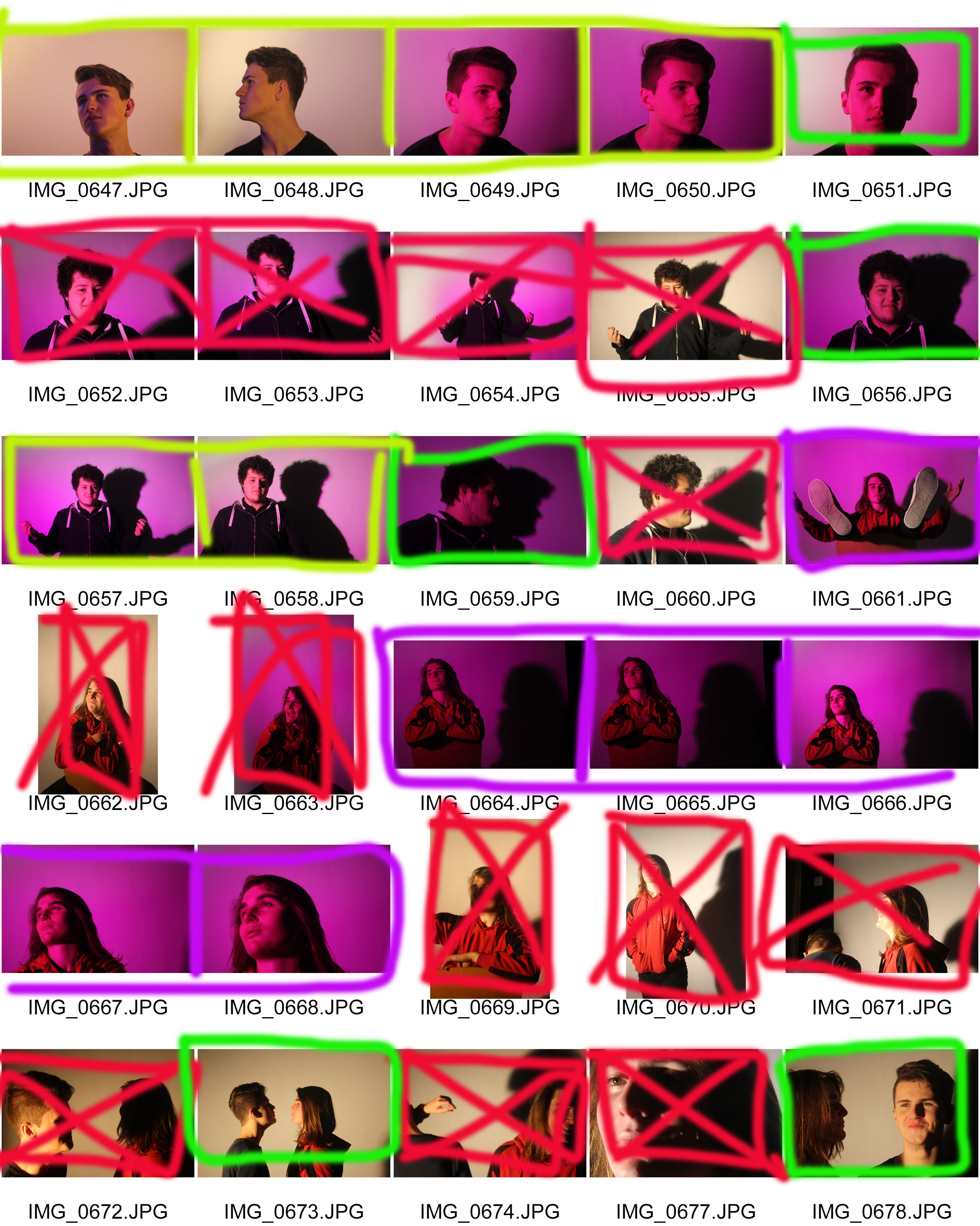
I was very lucky in this instance to be able to have 2 models which enabled me to change my style of photography for each, due to their differences in look and style I was able to use these to my advantage and let them express themselves for the camera.

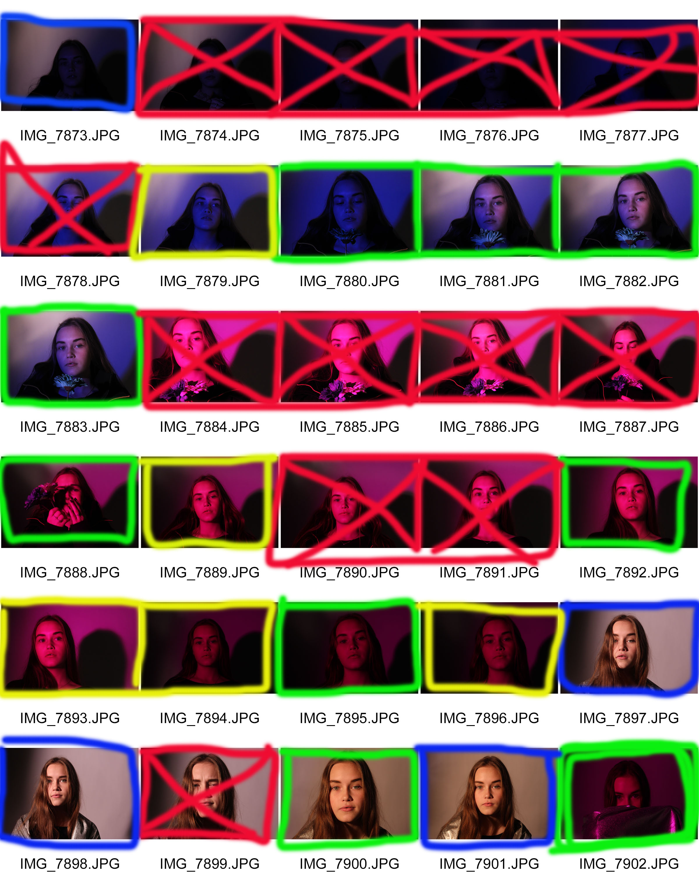
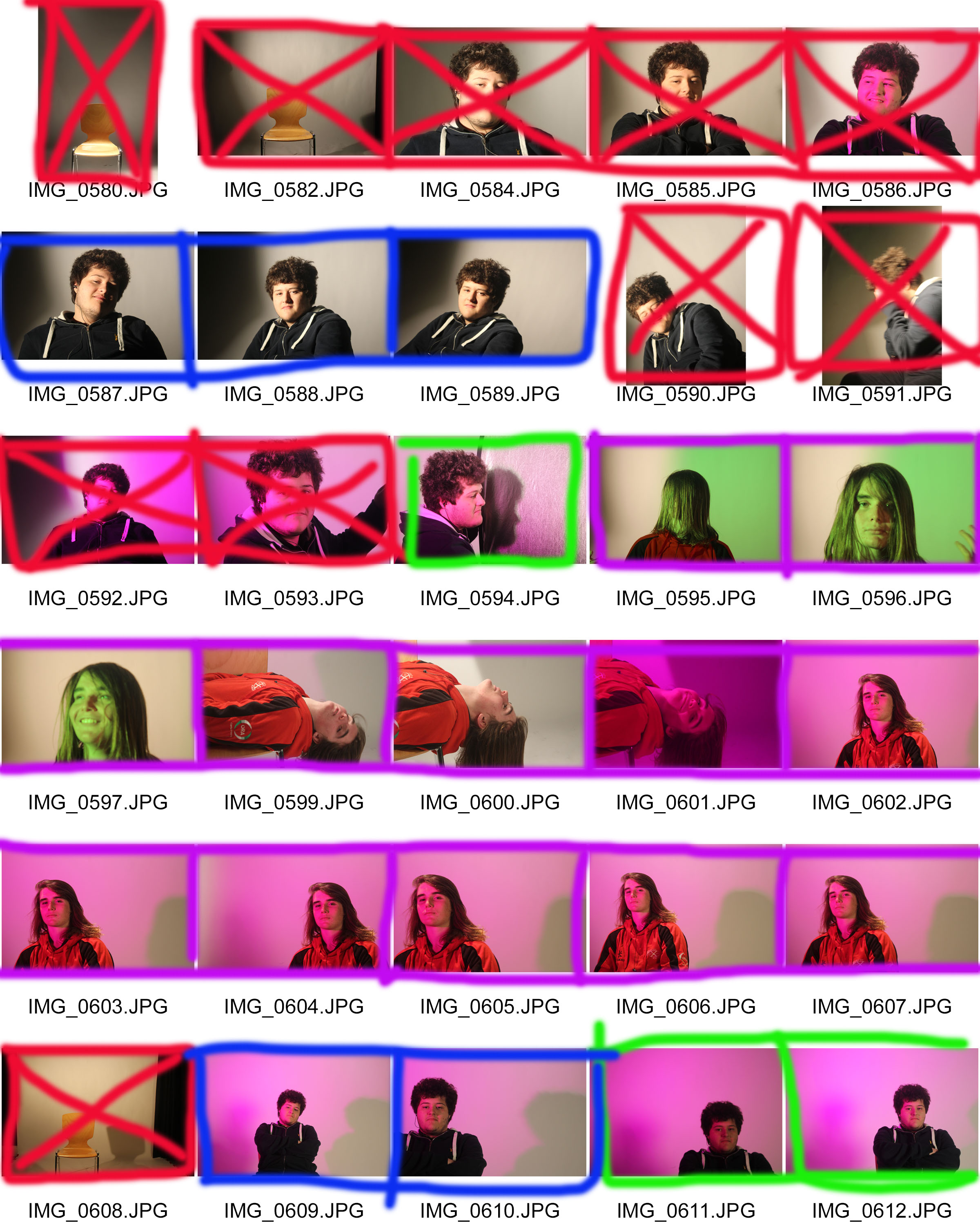
You will notice in this contact sheet that there is a new color which only surrounds myself. This is because of us working in one group we all used the same camera, I isolated my pictures from the rest so I could not be biased towards them. But due to the light, focal points and camera work they are nice photos.

My favorite photos are the green bordered photos, this is because in these ones I really feel like I helped express the models movement and personality into the photo, making it seem naturalistic and just great.


Studio Photography

Now we have moved into portraiture in photography we have started to use the studio, this is brilliant and fun in the moment on creating better portrait  photos, this is because we can take photos in an controlled environment with no factors of extraneous variables.

In the studio we are able to dim and brighten lights, have lights shining in specific areas to light up part of a face, or we can use a color filter to give the photo a different feeling, like a warm or cold feeling, by using a warm or cold color to affect the light.

In my very first studio photo shoot I asked the person visible to act in whatever manor she liked, this way the movements and facial features would seem more natural and relaxed. I like this way as it doesn’t make the photo seemed forced in anyway, but also this way I can capture the real facial features and emotions of a relaxed person.

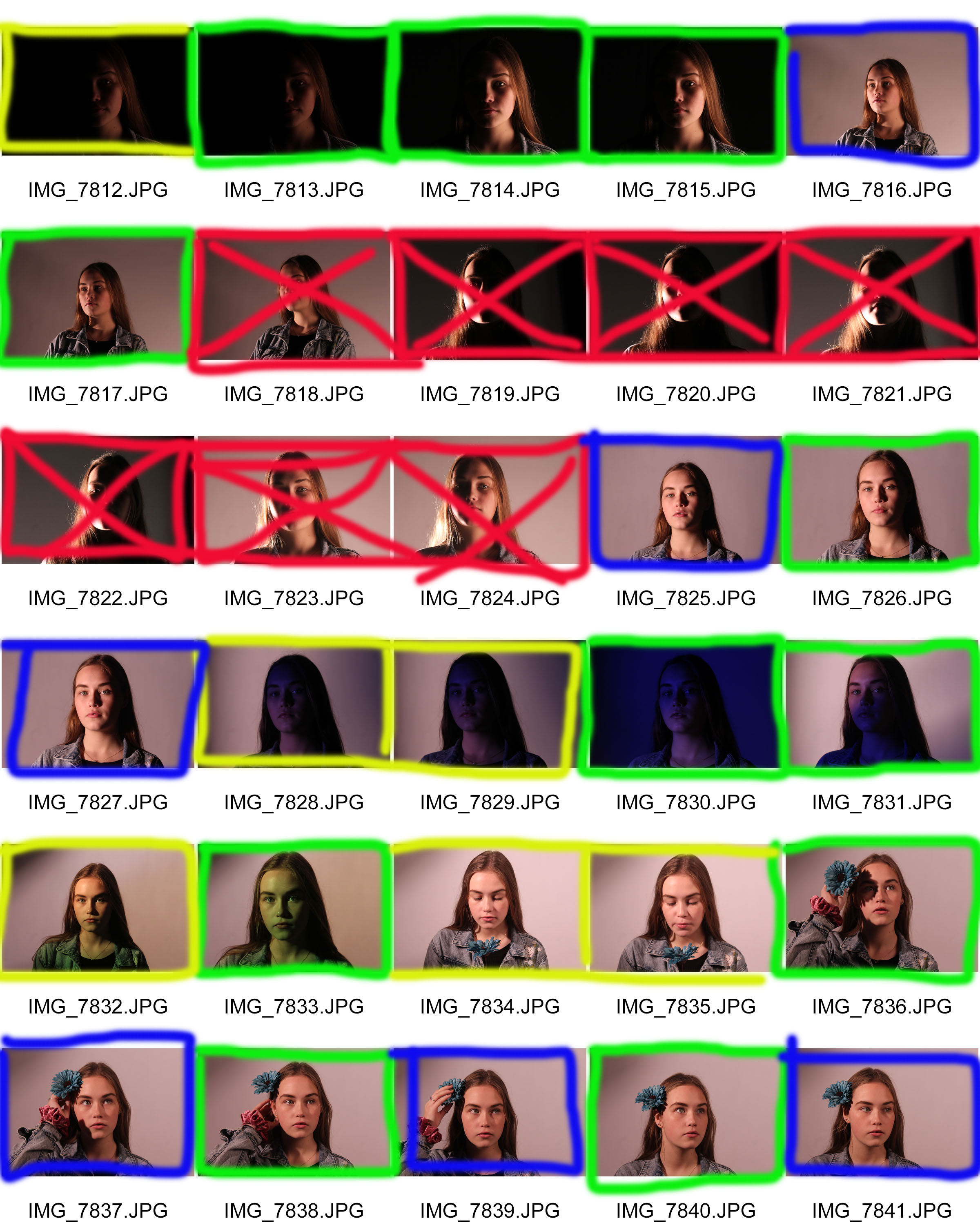
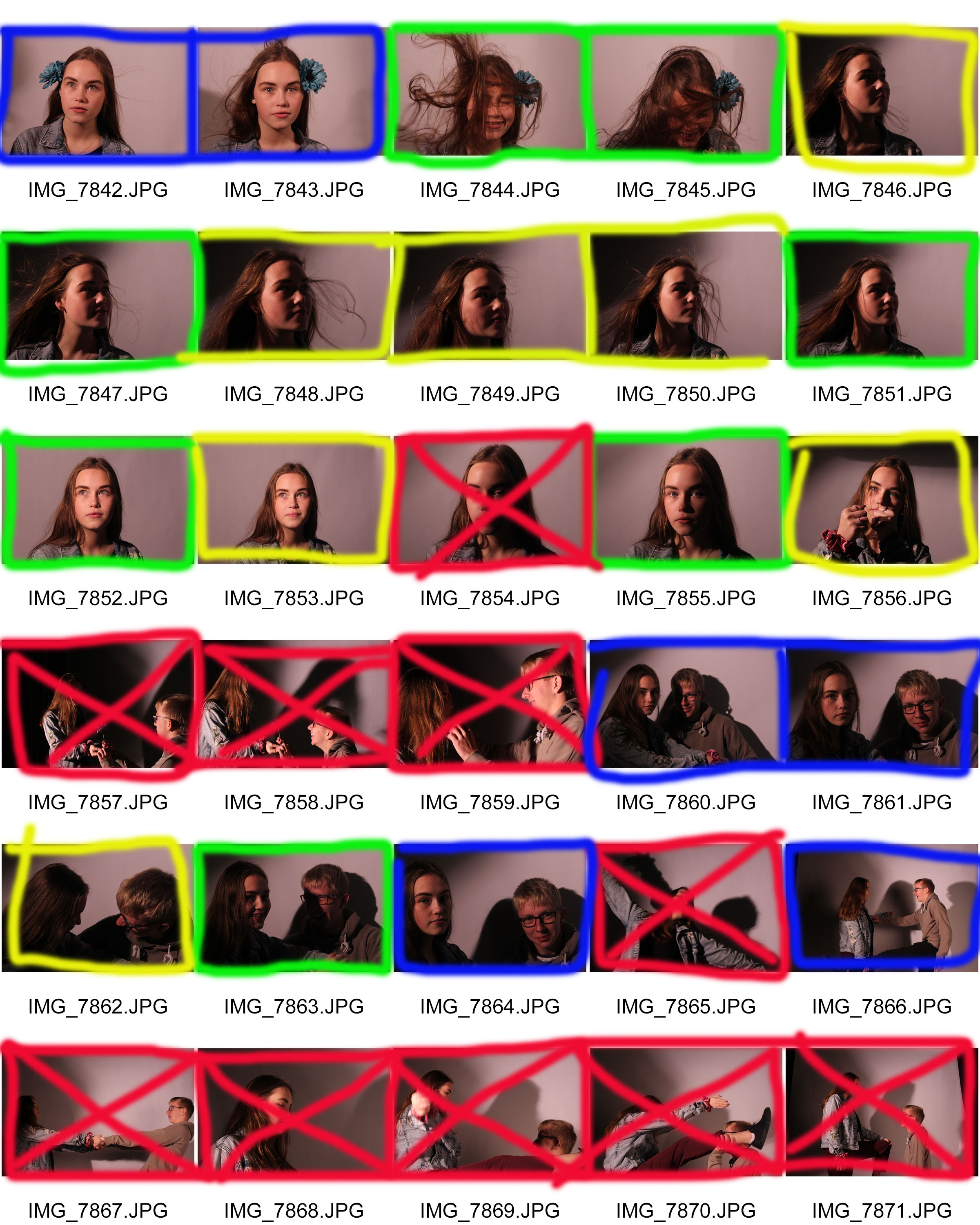
In the contact sheet you will notice I have used the same key as I always do.
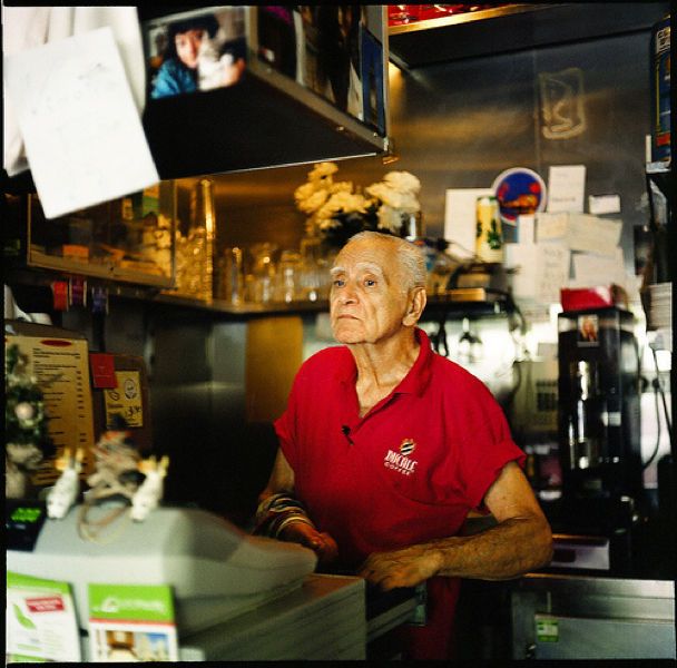
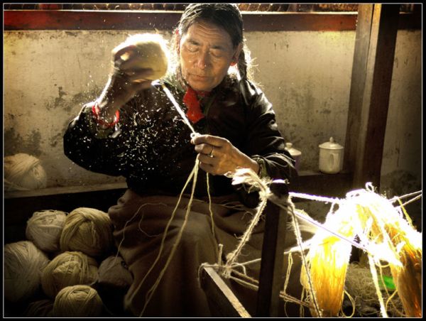
One thing which is visible is that I have loads of photos which I am unhappy with, this is due to the fact that it was my first time using the studio therefore I was getting used to the different settings with ISO and aperture to make it really work with my models face.

Most of the crossed out pictures are because I had made the photos either under or over exposed making it too light or too dark, others which may seemed great did work with the light, but I had realized that my models face looked bored or just uninterested, but there are others where my model is showing emotions such as laughing which really helps me capture the human persona and features.

Environmental portrait – Explained

An environmental portrait is a portrait executed in the subject’s usual environment, such as in their home or workplace, and typically illuminates the subject’s life and surroundings. The term is most frequently used of a genre of photography.

By photographing a person in their natural surroundings, it is thought that you will be able to better illuminate their character, and therefore portray the essence of their personality, rather than merely a likeness of their physical features. It is also thought that by photographing a person in their natural surroundings, the subject will be more at ease, and so be more conducive to expressing themselves, as opposed to in a studio, which can be a rather intimidating and artificial experience.

The surroundings or background is a key element in environmental portraiture, and is used to convey further information about the person being photographed.                                                                            Where it is common in studio portraiture and even in location candid photography to shoot using a shallow depth of field, thereby throwing the background out of focus, the background in environmental portraiture is an integral part of the image. Indeed, small apertures and great depth of field are commonly used in this type of photography.

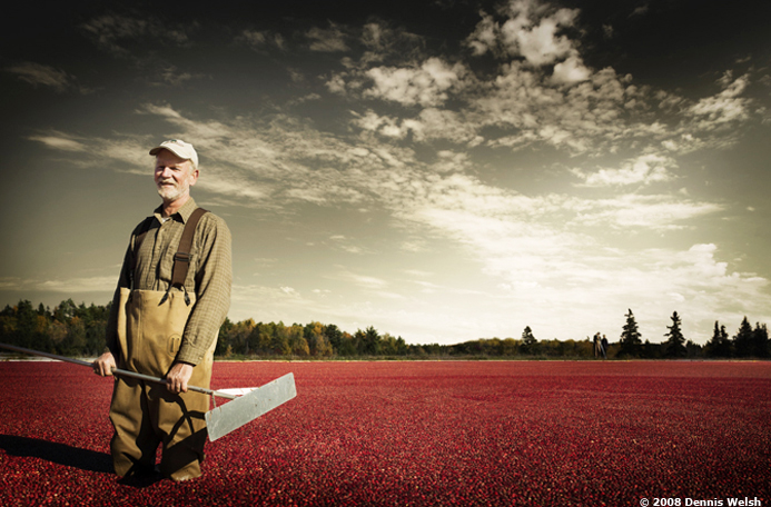
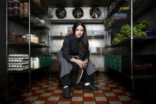
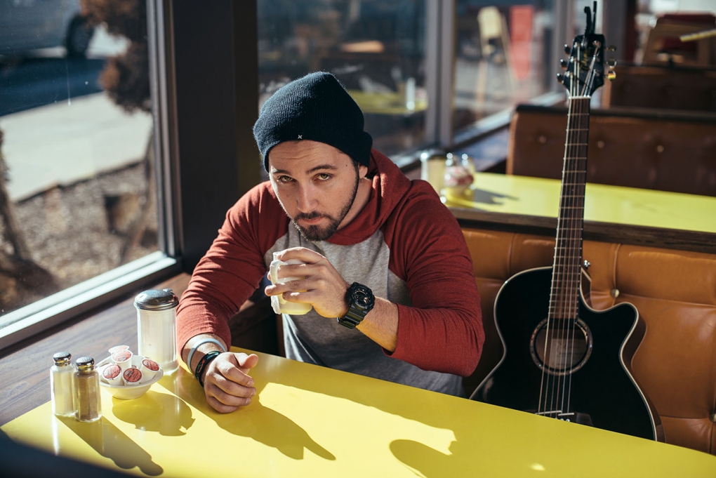
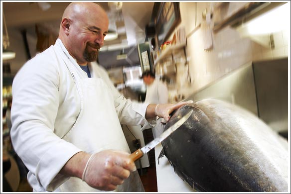
Here are some examples of environmental portraits.


Street Photography

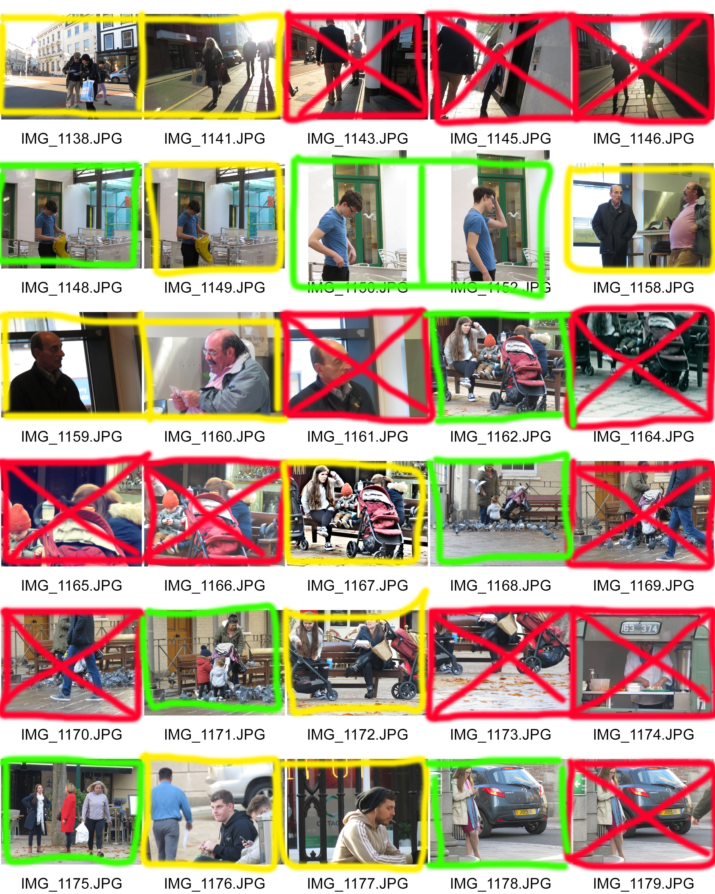
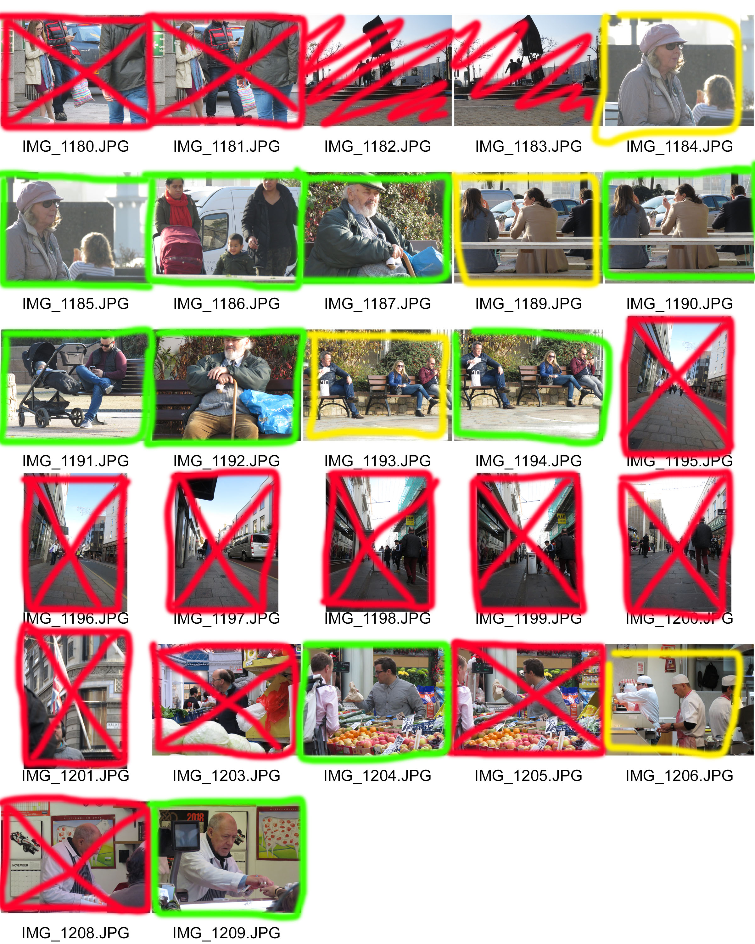
Street photography is a category of photography that is not pre-planned or prepared and relies on chance encounters with people in public places as they go about their days. For this Photo shoot I went to Kings street in town and also visited liberty wharf/square, the market and Royal square. I chose these visitor hot spots as they are very popular with the public but also is a place where people act very naturally and can interact with the public.

I really liked doing this photo shoot as it allowed me to experience the bustling streets of St .Helier at times where I wouldn’t usually be able to experience that atmosphere. But during this photo shoot I felt a little bit guilty due to me photographing people when they were unaware that I was doing so, it felt like I wasn’t respecting their privacy and exposing them.

I was really happy with the outcome of some of my photographs as I got to see and now show how everyday people, whether it be tourists, young mum’s, people on their lunch break or people who work in the market serving others. But like every photo shoot I had some photos in there that I didn’t like as I was either too far away or there wasn’t a person in focus or the actual camera shot.

What Is Street Photography ?

Street Photography (also referred to as Candid photography) is photography conducted for art or inquiry that features unmediated chance and random encounters.  Street photography does not necessitate the presence of a street or even the urban environment. Though people usually feature directly, street photography might be absent of people and can be of an object or environment where the image projects a decidedly human character in facsimile or aesthetic.

Many famous street photographers include:

Henri Cartier-Bresson (1908-2004) He was a french photographer who mainly focused on using street photography on capturing a decisive moment using a 35mm film.

Helen Levitt (1913-2009) she was an American photographer who was particularly noted on using Street photography round New York, and was called  “The most celebrated and least known photographer of her time” 

Vivian Maier ((1926-2009) She was again an American photographer who worked for about 40 years as a nanny who pursued doing photography within her spare time, eventually become a well known street photographer.


How to undertake street photography.

In order to successfully complete a street photography photo shoot, you will need to sit in a busy area but where you can still have a clear view on some people to photograph. It is better to have no relationship with the people that you are photographing so you can get their natural emotions as they would act without the use of a camera to capture the moment. You can either walk around and take photos or find a place to sit down and take photos from the same position.

Personally I would recommend sitting down and taking photos in an area with quite a few people that circulate around the area. This is because you can have time to set up the camera and focus on the model you are photographing, whereas if you are walking around it is hard to focus on a person/people and you may not have the perfect aperture or ISO set on the camera, as I found out during this shoot. I also realised that if you aren’t positioned in an area, and are walking around then people may realise that you’re taking a photo of them, therefore act differently to fit into the social desirability bias.

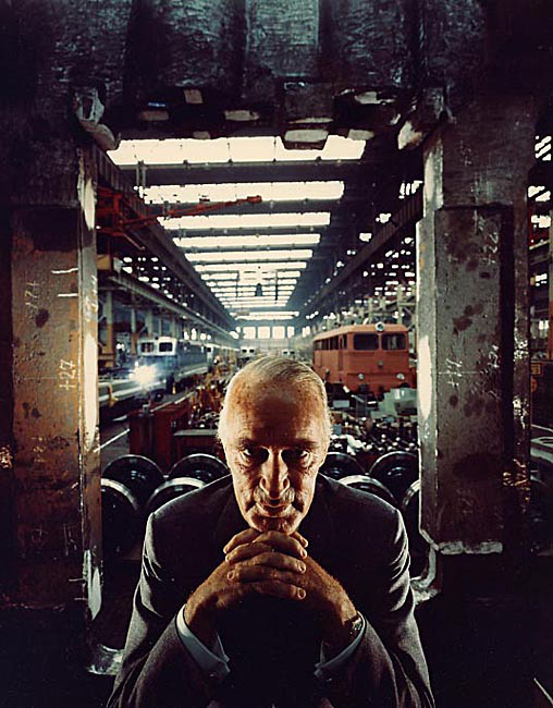
Arnold Newman – Alfred Krupp

Emotional Response When I first saw this I really liked the photo,                                                        this was because of the contrast between the                                                    light and the dark, in terms of the foreground                                                    and the background. I also like the the way                                                          that Newman has captured that depth of the                                                      photo. I also quite like the symmetry as Krupp                                                    is in the center of the shot, and how the                                                                  Pillars also create that nice line of symmetry                                                      down the sides.

Visual: Visually this photo is very appealing to the eye, as there are                     nice lines of symmetry vertically down. This gives the                                   portrait a spooky/eerie feel to it. Within the photo the way                       the facial expression has been presented and the way he is                       holding his hands makes him look very sinister, with this in                       topic, there doesn’t seem to be any parts of beauty, only a                         dark, depressing background.

Technical: I feel like the first thing that you are drawn to in this                                      portrait is Krupp’s eyes, this gives you an all round feel of                          the photo. The lighting has been very well balanced with                            the use of natural lighting in the background, and on                                      Krupp’s face with the aid of a smaller light, possibly a                                    lamp giving him that glow/lit up feature on his face and                               forehead.

Conceptual: This photo was taken in 1963 by Jewish photographer                                 Arnold Newman. At first Newman was hesitant with                                     taking this photo as Krupp was a well known helper                                       with Nazi’s in World War II, using his company in which                               he took over from his father as slave labor camp in                                         order top make weapons in aid to help the Nazis in                                         their seek for world domination in World War II. When                               taking this photo Newman tried to make Krupp as                                           sinister looking as possible to show the world and                                          expose him in what he did during the difficult times.

Portrait Photography

Portrait Photography or portraiture in photography is a photograph of a person or group of people that captures the personality of the subject by using effective lighting, backdrops and poses.                            A portrait picture maybe artistic or it maybe clinical, as part of a medical study.                                                                                                                   Portraits can serve many purposes, from usage on  a personal website to display in the lobby of a business.

There are many types of portrait photography genres- These can be:

  1.  Traditional Portrait.                                                                                        Traditional or Classical portraiture would refer to an image where face is the predominant element. The purpose of the photograph is to depict visual representation of that person. Subject is expected to be looking directly at the camera. With what is described as a head-shot, two thirds or full body framing can be used. 
  2. Environmental Portrait.The term Environmental Portrait refers to an image where the subject is photographed in person’s natural environment. For example, a worker photographed at the construction zone, teacher in the classroom, sculptor in a sculpture studio and so on. Surroundings are used to compliment the subject and to emphasize his character. Subject and setting are chosen by the photographer.
  3. Candid Portrait.A candid portrait is taken without a subject expecting or acknowledging the photographer. This style used in photo journalism, travel photography, street photography and event photography. As opposed to an environmental portrait, this image is captured rather than set up.
  4. Glamour Portrait.                                                                                                   The term Glamour Portrait refers to portraits where emphasis is given to highlight the sexy romantic appeal of the subject. 
  5. Lifestyle Portrait.The term Lifestyle Portrait refers to portraits where emphasis is given to suggest the “style of living” of the individuals depicted. Technically it is a combination of environmental portrait and candid portrait. More weight is given to communicate the feeling of life experience of the subject. Style has numerous implications in commercial and fine art photography. Editorial, fashion, pharmaceutical, and food industries often use lifestyle images to evoke emotions in viewers by depiction of desired life styles. It is common to see this style used in wedding and family portrait photography as well.

Final Abstract pictures

In this blog post I will be showing you my favorite and final abstract photos. I had to chose a few photos of my favorite abstract photography that I had taken and place them in a file to be sent off to print. We had to choose photos to be printed in A5, A4 and A3. I didn’t chose an A3 picture as none of my photos showed enough colour, boldness, enough abstract, or textures/shapes.

But I feel like the 2 photos for A4 and the single photo for A5 are good enough for their size.

These photos were chosen for my A4 printing.

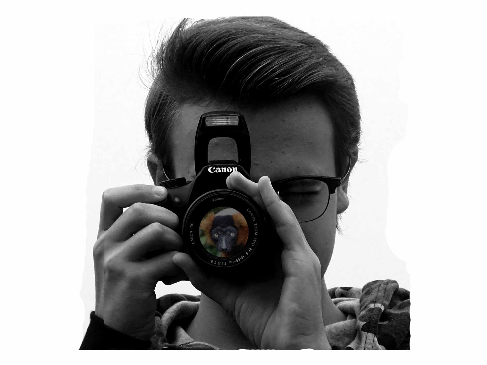
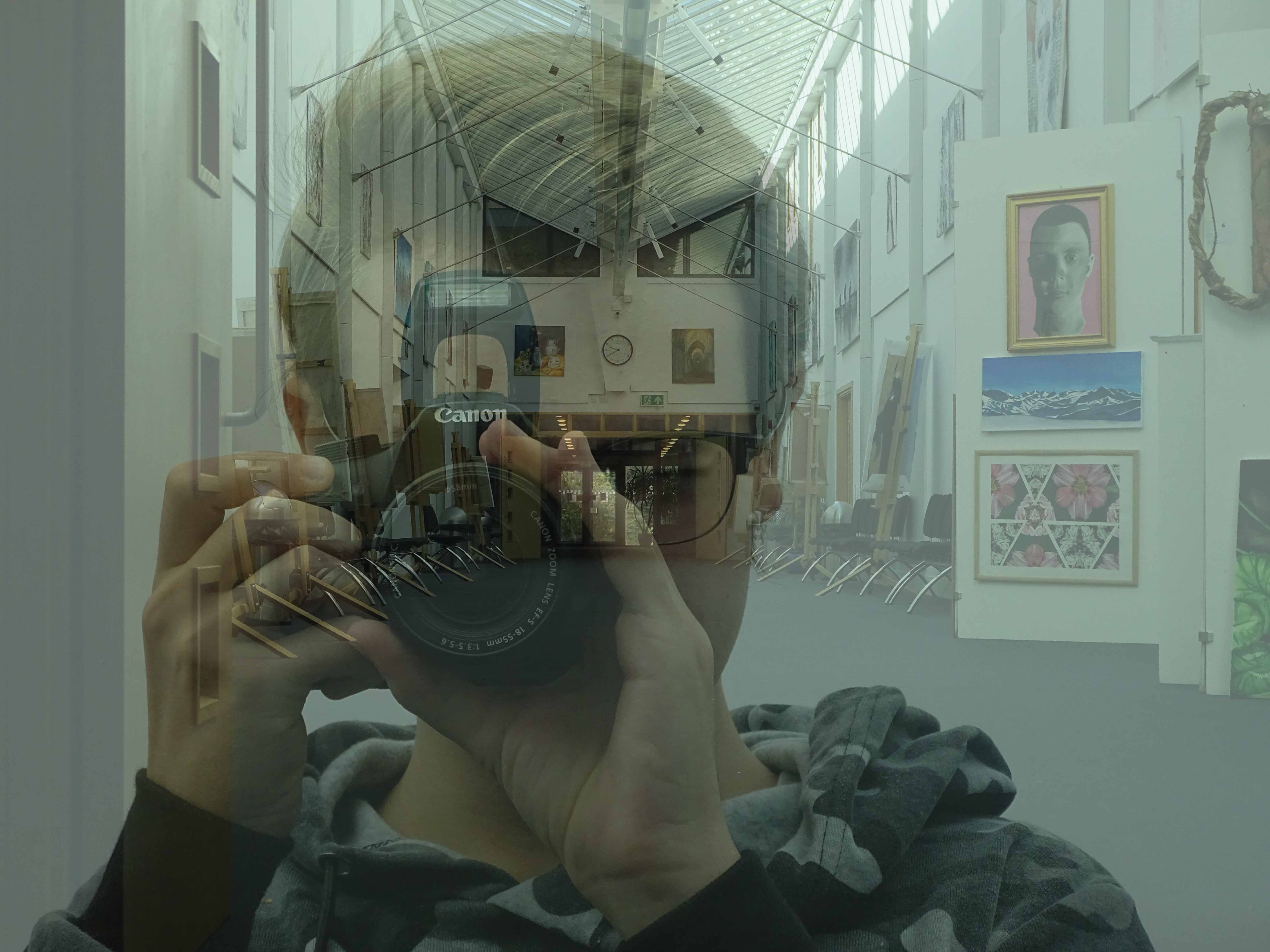
I really like these photos, because it shows good camera skills of portrait but also shows my ability of using Photoshop to create a double exposure effect. On the first photo I used a double layering effect to create the black and white but also to create a  more deeper black and to show off the white a bit more.

On the second photo I kept the photos original without changing them, but I created the double exposure in a way which made it look like the person taking a photo of a school hallway with a reflection of glass. I created this effect by changing the opacity levels so that the portrait photo was slightly higher than the background photo of the school hall.

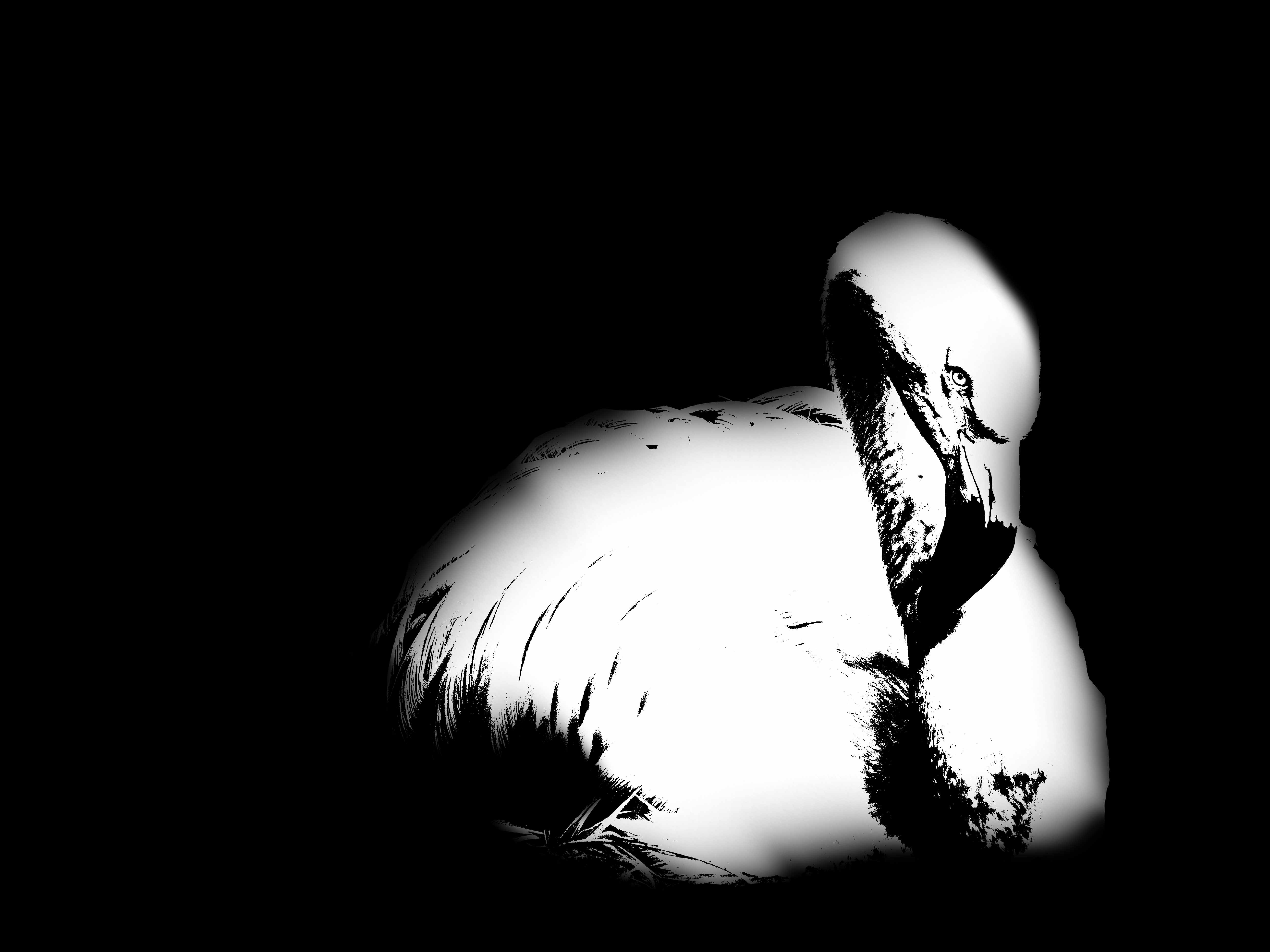
This next photo was one which I put forward to be printed in A5

I like this photo as it again shows my ability level on Photoshop. With this photo I have used the different thresholds, and adjusted them to what I thought looked good. I have also used the paint brush tool to create an effect of the photo blurring into the black background.

I thought this photo was suitable for an A5 as it isn’t a big photo worthy as it doesn’t show that much abstractness with colour, texture and shape. But due to the use of the threshold adjustment I thought it would still be suitable as a final printed abstract photo.


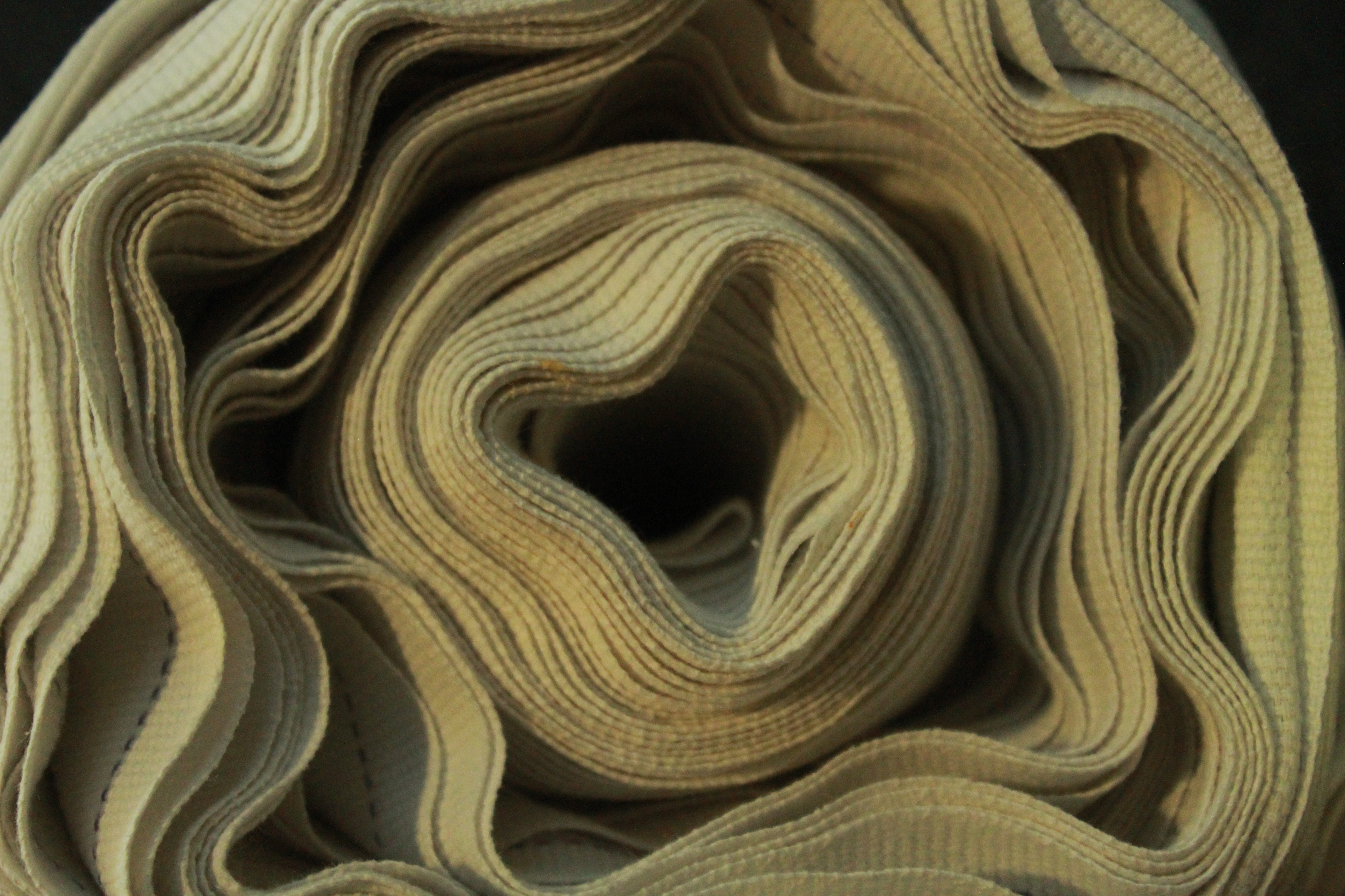
These next photos were photos which I never really took to, but after having a closer look at the photos I realized that without editing they looked like nice final abstract photos.

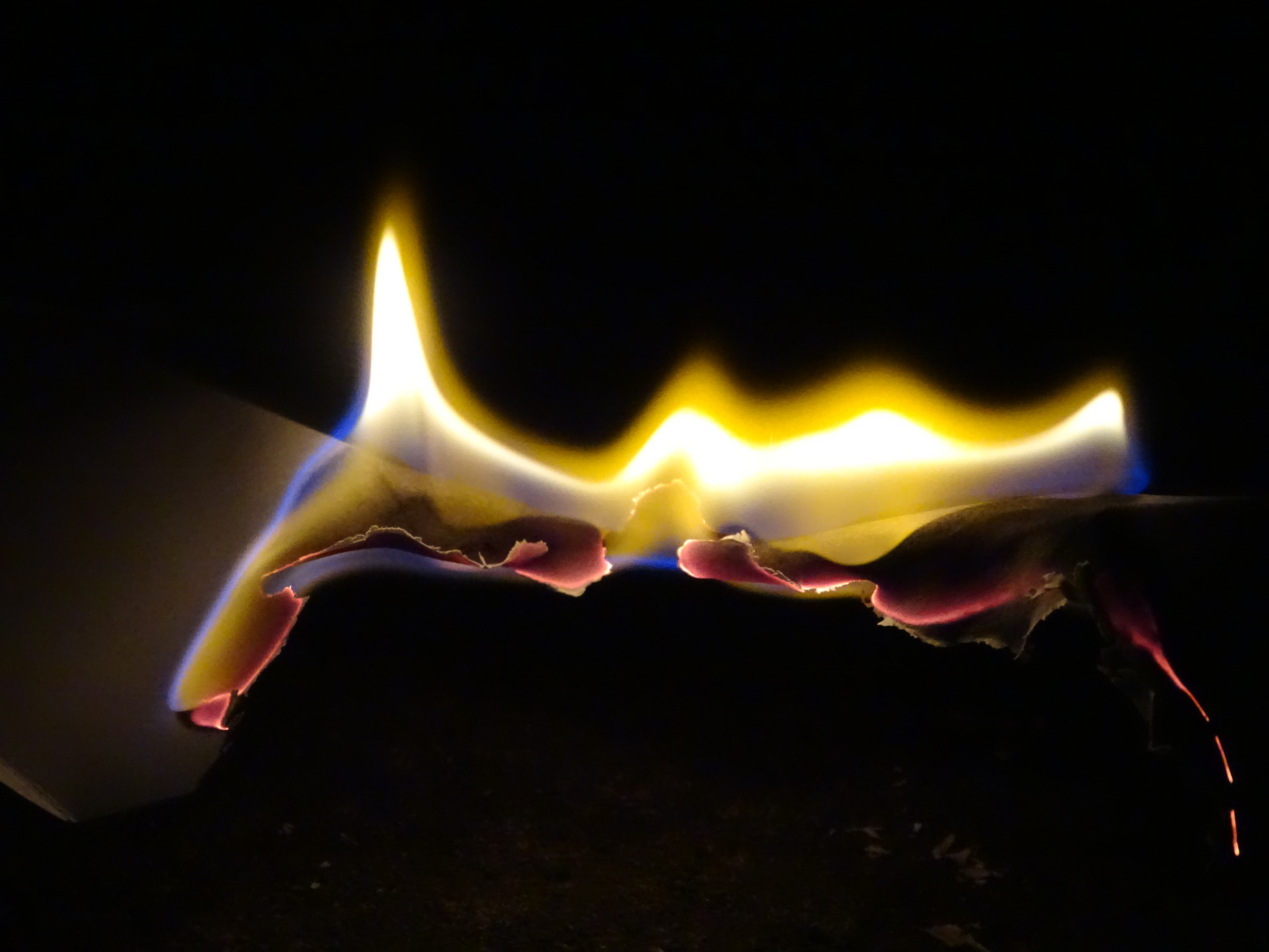
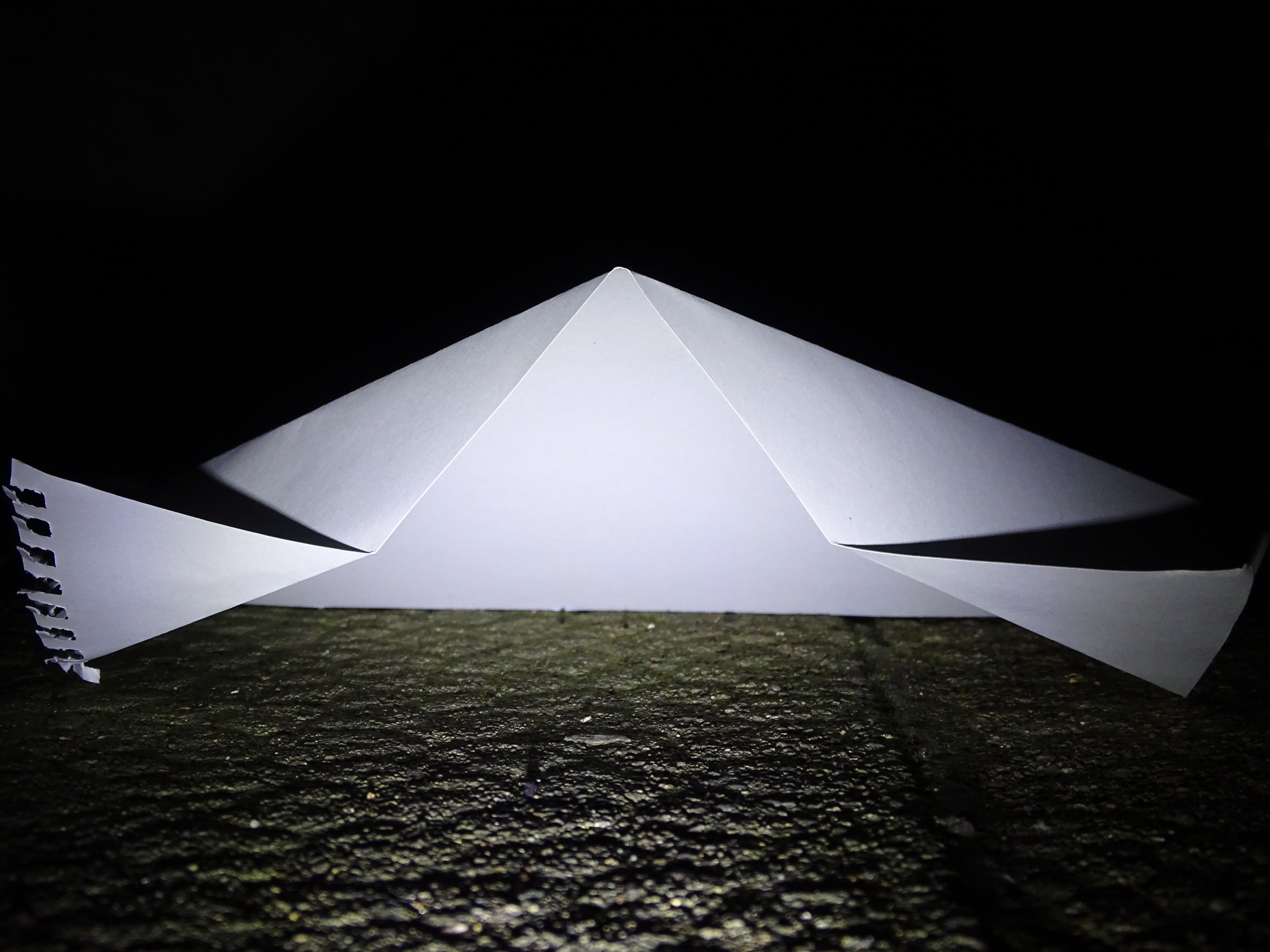
I really like these photos as they show different versions of abstract. With zooming in really close to pick out minute detail, using a variation of depth of field to focus in the fore-ground and blurring out the background, to experimenting with light and dark, by staying up till the early hours of the morning and using a bike light to shine against paper, causing the sharp dark lines of the paper.

Conceal / Reveal

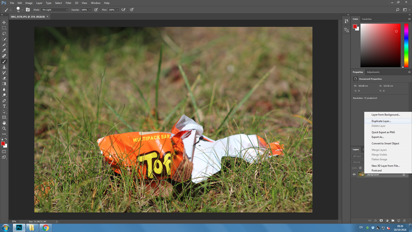
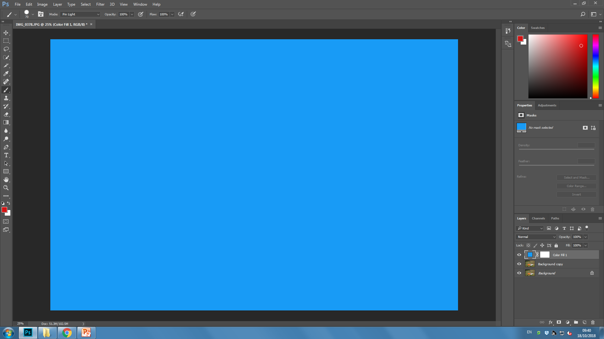
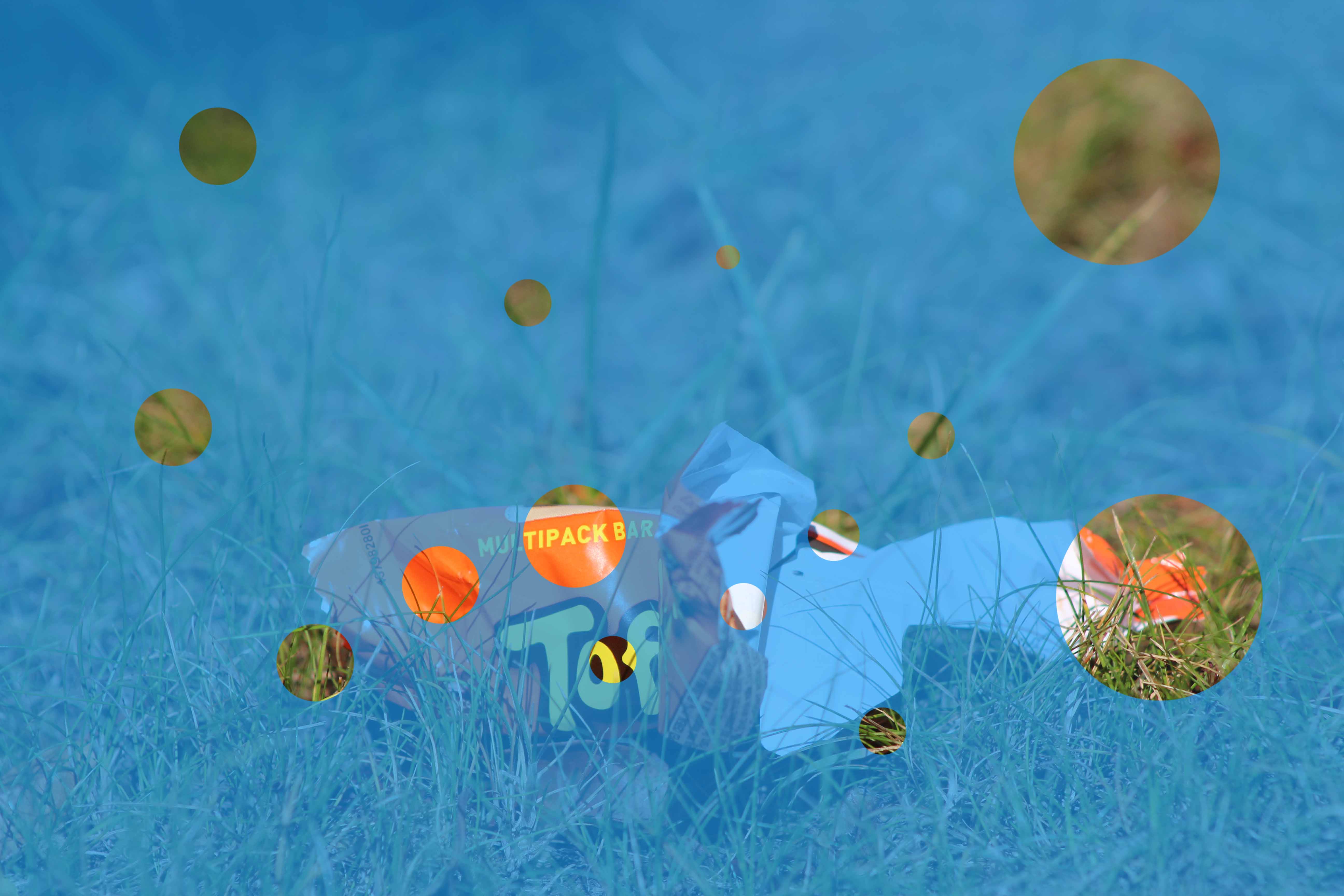
In this blog post I’m going to be showing the use of the solid colour effect to help do Conceal and Reveal on Photoshop.

First we need to choose a photo. I’ll use this one as an example.

First on Photoshop we need to duplicate the layer.

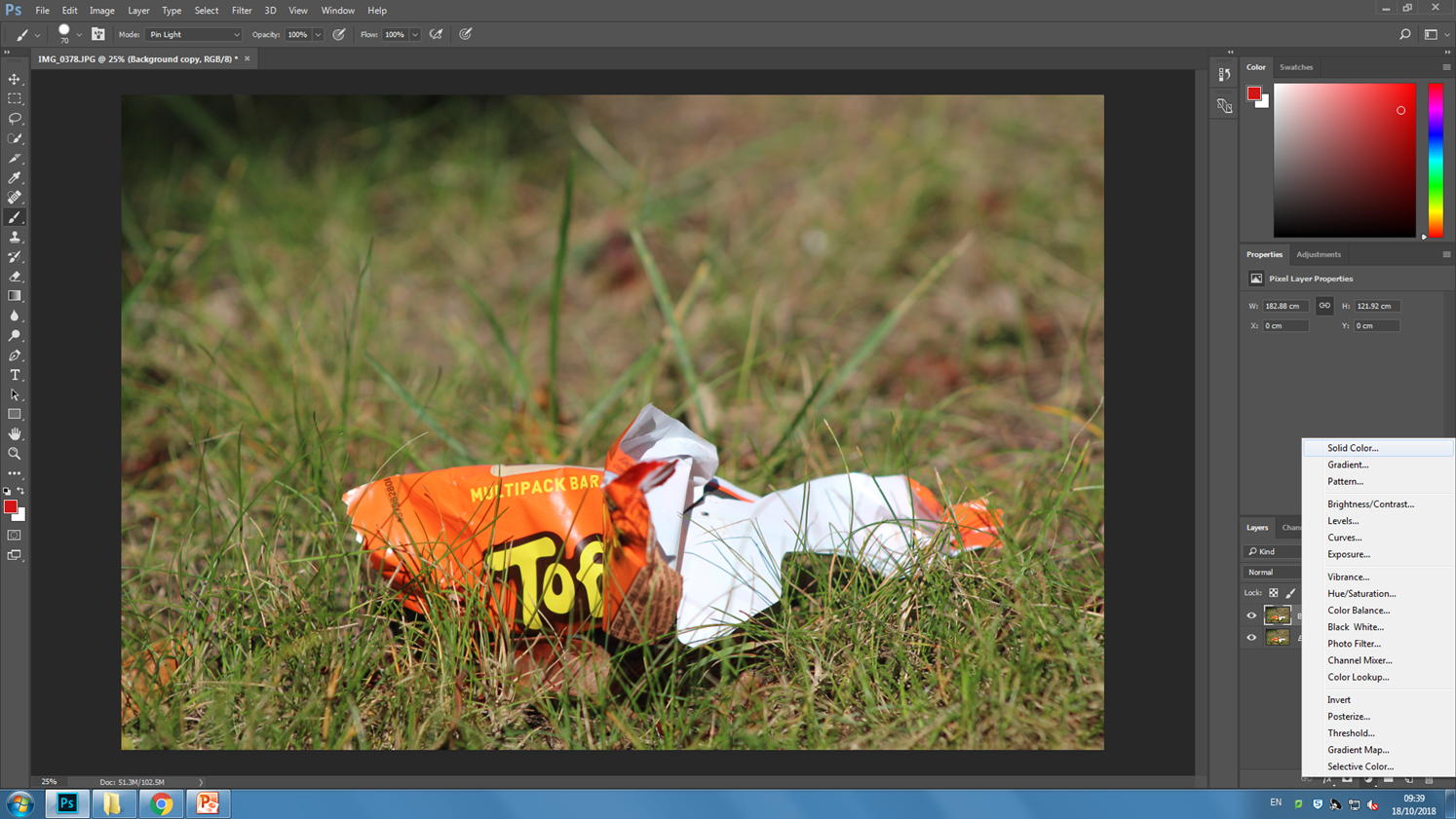
After doing that we need to change the new duplicated layer to a solid colour. Lets use blue.

Then using the paintbrush tool and the circle shape, In random places start to remove the top layer. If you want, lower the opacity so that you can see the photo below. Remember to have the colour of the paintbrush on BLACK!!

After you’re done, remember to flatten the image and Save it.

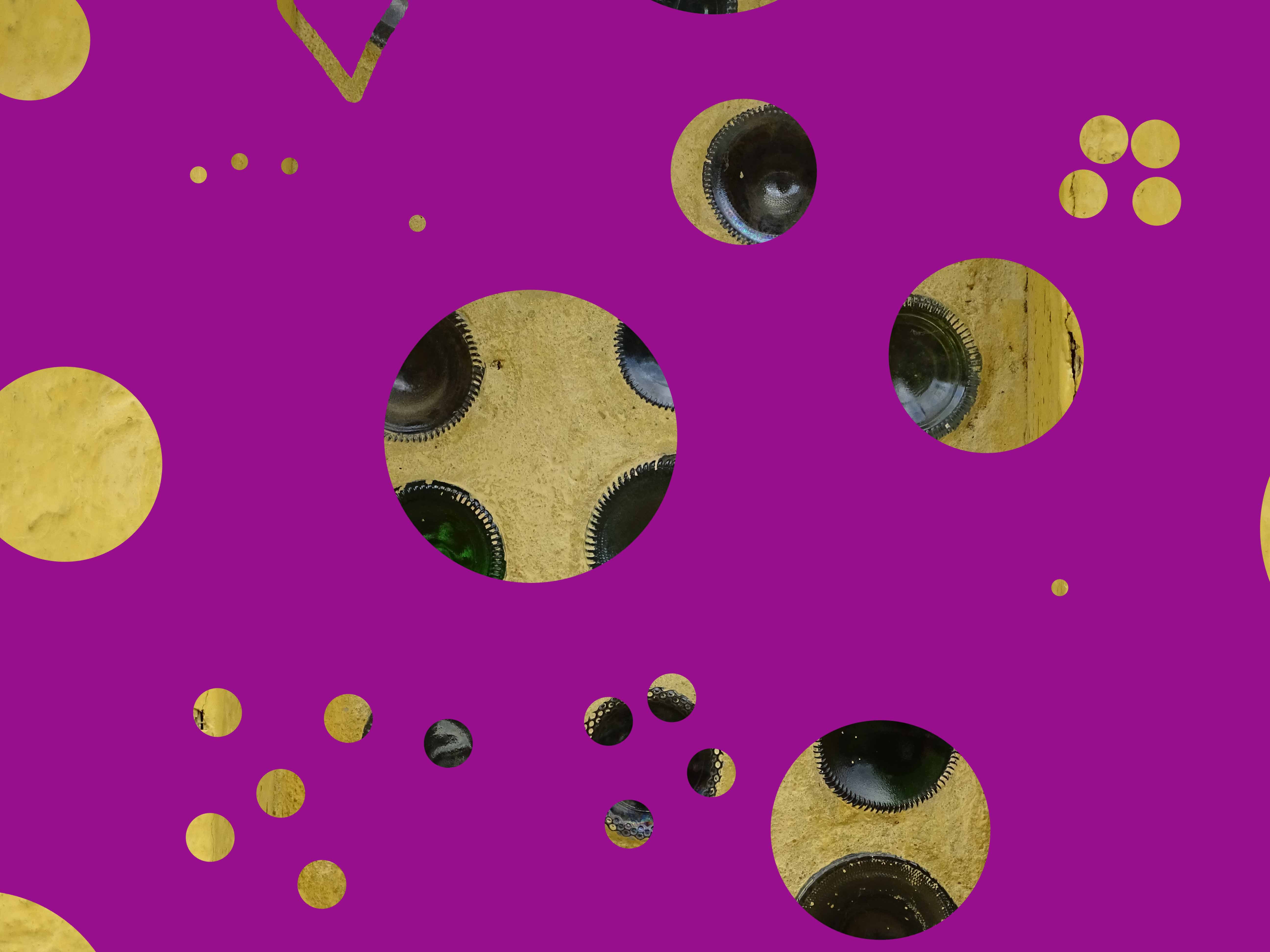
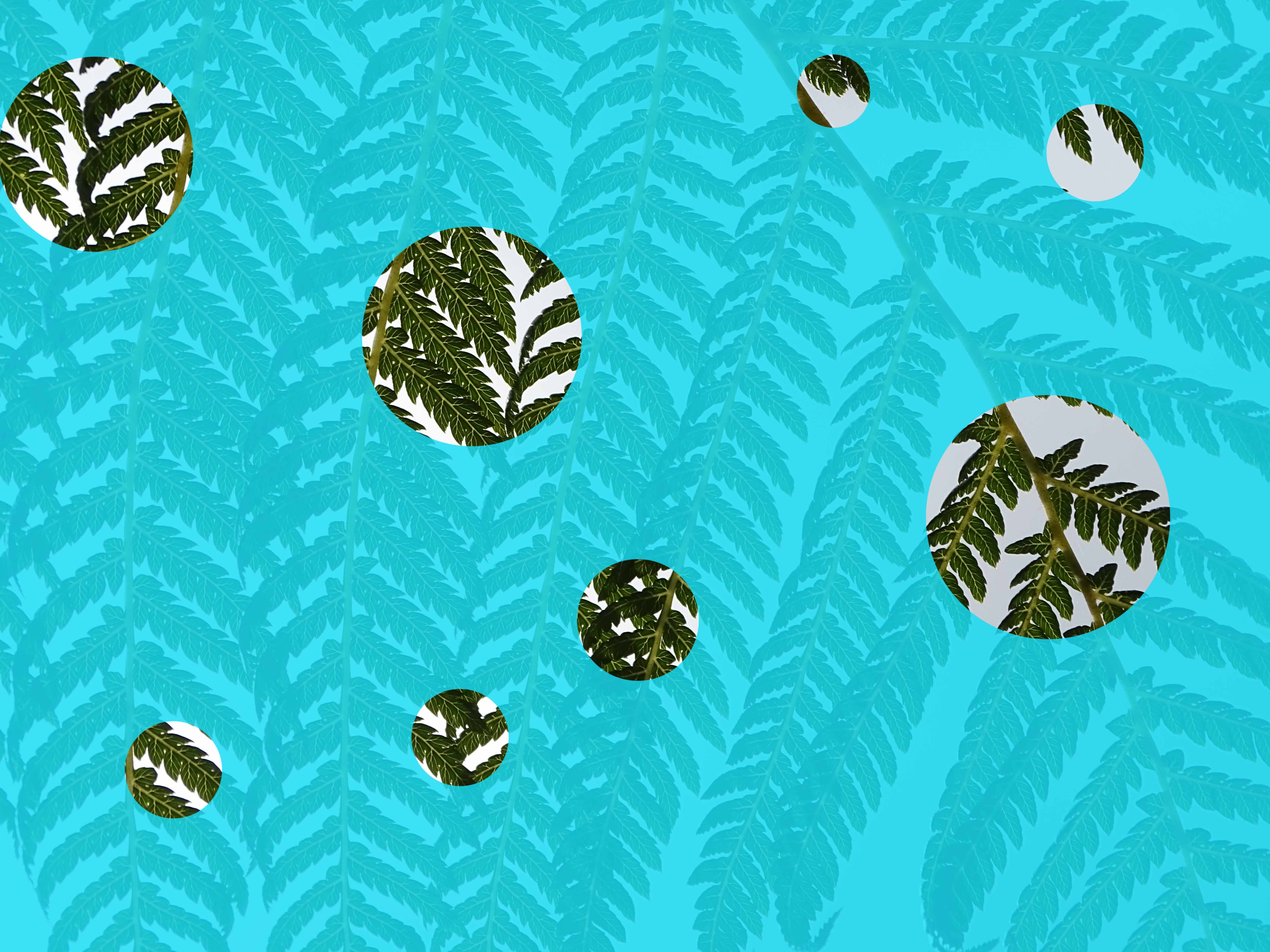
These next few are ones which I have already completed previously.