All posts by Alex Phillips

Filters

Author:
Category:

Jeff Wall essay

How does Jeff Walls tableaux approach depict a seemingly photo journalistic approach?

“Walls images have all the drama and spontaneity of street photography but the exacting precision of a film set” (Shelley Jones, July 2019)

Jeff Walls approach to photography may seem at first to some, as simple street photography, the subjects caught in the act of going about their everyday lives. However, this is not the case, as Wall is a world renowned tableaux photographer, who focuses on creating the perfect picture and adopting a meticulous and tedious process to obtain the perfect depiction of his ideas. Some shoots typically taking hours or even days just to process one image. Wall has been known to hire out masses of industry professionals such as prop makers, lighting technicians and stylists to really bring his images to life and portray his ideas as clear as he sees them in his own head. “Wall, 68, refers to his approach as cinematography or near documentary”(E. Lipsy Karaz, Wall Street Journal 2015). With Wall referring to his own approach as cinematography, it raises the question of How? How does wall achieve the approach of cinematography and produce a well-orchestrated and descriptive image?

The answer lies within the image itself. At first glance, Many of Wall’s images simply seem to be images of chance occurrences within the environment Wall is shooting in, However that is far from the case, as Wall conducts his shoots and arranges subjects on set based upon his own personal experience of situations he finds of interest. For example, in one of Wall’s most renowned pieces of work, Mimic 1982, we are presented with an image of a well-dressed, clean looking male subject of Asian heritage walking through a suburban area of Vancouver, Canada.  Alongside him is a more unkempt male subject grasping the hand of his seemingly disgusted female partner. The male subject has his finger dragged to the corner of his eye, making an obscene/ racist gesture aimed towards the Asian subject. This image may seem at first a chance occurrence that Wall happened to be in the right place and the right time for. However, if we are to look behind the scenes, we would soon come to the realization that in fact, we are unable to view the immense production team responsible for the creation of this image. The idea from the image comes from a personal experience of Wall’s, where he was walking along a suburban sidewalk in Vancouver and witnessed this exact event unfolding in front of his eyes. Wall was disgusted by this racist act, but at the same time intrigued, as the event he witnessed really depicted the social unease at the time between Asian immigrants and local Canadians due to the recent events of the Vietnam war creating a surge in Vietnamese refugees seeking asylum within the United States and Canada. In 1923, The Canadian Government passed the Chinese Immigration Act, which restricted Chinese nationals from immigrating to Canada, and this act later expanded to cover all Asian nationals. The Act was later repealed in 1947, however the majority of Asian Immigrants came to the US and Canada in the wake of the Korean and Vietnam Wars respectively. The vast Majority of Asian Immigrant families reside in Downtown Vancouver, where this particular image was shot, and Wall wished to use this image to highlight the silent war of abuse and unrest towards Asian members of the public. Wall’s ability to reconstruct this image aided the creation of a conversation on immigrant rights and protection from discrimination, and in 1982, The Canadian Parliament passed the Canadian Charter of Rights and Freedoms, stating all Canadian citizens be treated equally under the eyes of the law. This Charter was no doubt influenced by the cultural impact of Mimic 1982. The fact that Wall was able to reconstruct this exact image from memory is remarkable, and this must also be considered in the fine attention to detail in all of Walls works, with some shoots consisting of multiple of seemingly the same image, yet only one was deemed perfect due to something as small as a crease in a shirt, or the positioning of a cloud. This has assisted Wall in standing out in the world of photography, as a man of process and above all, meticulous selection, further proving he is one of the many greats of tableaux photography

‘Mimic, 1982’- Jeff Wall
Image result for jeff wall milk
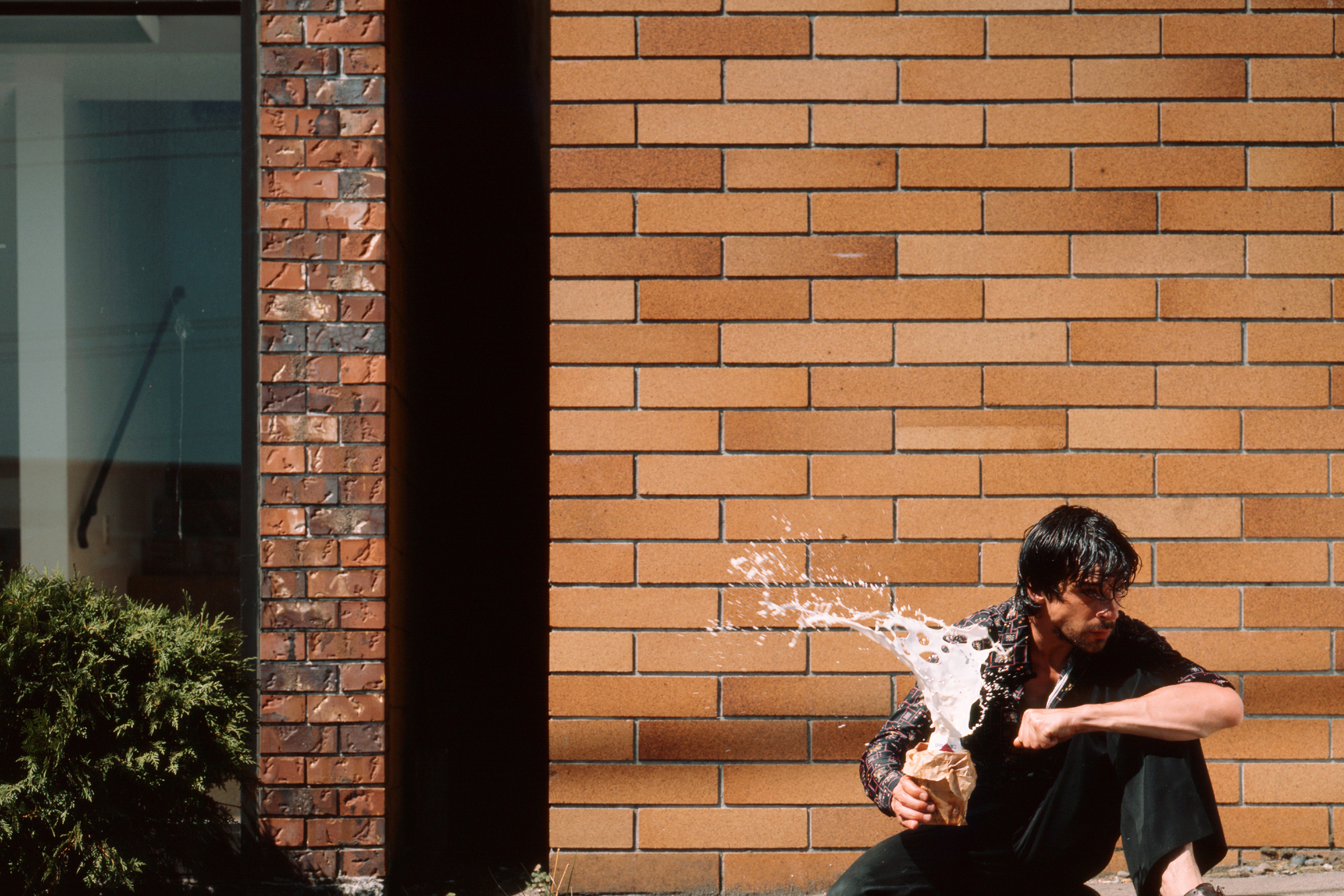
‘Milk’- Jeff Wall 1984

In this image titled simply “Milk”, Wall has depicted a male holding a milk drink and squeezing it, causing the milk to erupt in the subjects hands. The subject is in full focus and the background seems to be that of the exterior of a well kept and clean building, Whereas the subject appears dirty and scruffy, With greasy hair and dirty clothes. This creates a contrasting image, With a sense of cleanliness making up the background with the focus being on the messiness of the main subject of the image. The explosion of the milk carton makes us question why this is happening. Is the man angry? is he undergoing stress? or is he potentially in a crazed mental state?. This image essentially allows for the critic to create their own context to the image and create their own story due to the multiple scenarios that may be at play here in a contextual mannerism. Wall quotes from his interview with David Campany ” I think the pictorial problems emerge from the accidental encounter that reveals the subject”. I find that his quote means in a sense that the use of the medium of photography has opened up a conversation regarding the issues the subject themselves could potentially be dealing with, and that photography can be used to portray an individuals expression of their inner selves. The composition of the image in terms of contrast plays a role in telling the story as well, As the background is bright, contrasted by the small shadow of the wall of the windowed building. The usage of tinted blue for the glass and the green of the plant give the background an uplifting feel due to the bright colours. However this is contrasted by the ragged appearance of the male subject in the foreground, Depicted by his dark coloured clothing and dark hair. The white of the milk drink exploding instantly draws us to the image due to the absence of white in the background as well as the shape and texture of the liquid itself captured in the time frame it was captured in. The explosion of the milk carton creates a dramatic contrast when observed in comparison to the solid, tranquil background of the image. The eruption of the milk itself creates a talking point. Why is the milk exploding in this manner? What is the subject currently feeling in terms of emotion? Was there an event that caused this reaction?

Historical and Theoretical Context

Many street photographers also tend to interact with their subjects as a form of gaining context to a persons background and the situation being photographed. Street photography has been used throughout the years as a platform to address issues to the public, such as homelessness, poverty and racism

I have taken this quote from a previous blog post of mine, exploring photographic movements. The particular movement this extract is taken from concerns street photography, a movement Jeff Wall is no stranger to. Street Photography is a movement that is widely associated with photojournalism and photojournalism is a relation of documentary photography. The idea of reality concerning photojournalism constantly resounds, The idea that we may not be seeing the bigger picture, and the information fed to us is altered to suit the eye of the photographer and tell the story they wish to rather than them conveying us the truth at times. Then the question of propaganda arises. Is the sole purpose of some forms and elements of photojournalism simply to influence our attitudes and bend our minds to conform to the beliefs of those in control of the media? or is what we see through the mediums of photojournalism the real deal and an accurate representation of the topic covered? In a society where forms of media are readily available in the palm of our hands in the form of digital news outlets and social media platforms, The subject of reality is one that many of us question on a daily basis. Fake news stories are being slapped in front of us as a society on a regular occurrence and those in control of the media have become masters of creating a reality from a myth through the means available to them. Tableaux photography when done correctly, can influence a viewer to believe the events they are presented with before them are real events that have actually occurred. To the untrained eye, Tableaux works can be highly convincing, Thus creating a culture of dictation and false information, further tweaking the minds of society and conforming it to the views of those in positions of power. Even news and media outlets that are deemed legitimate and credible may even be giving us only half of the actual story, or the story they or a higher power wish to tell. The movement of photojournalism is one that carries with it the burden of deception at times. Some photojournalists working for large media outlets have proven that in some instances, they are employed to give a differing perspective of a story than the true perspective of the story.

Conclusion

Within images taken by photojournalists, we are often led to believe that what we see is what we get. For example, a disheveled elderly man sleeping rough will be seen by many as simply a homeless person, poor and dirty, struggling for survival. But many are quick to just claim this is nothing new and bat an eyelid and move on. Now what if this man were to actually be a military veteran, kicked out on the street after a long fought battle with mental health issues. The perspective would instantly change, further highlighting the representation of subjects of photojournalism and the photographers responsibility for the image of a subject. Jeff Wall however, is not a photo journalist, but rather an artist whom recreates an image solely from memory and events he has witnessed. The meticulous recreation of these memorised scenes is regarded as tableaux photography to the trained eye of a photographer, yet to the general public, this is seen as a reality occurring right before them, and they are left completely oblivious to the staged nature of the image and the industrial process behind the creation of the single image in front of them, and this can cause deception among most as they deem this image to be a real life event, captured at exactly the right second by a photographer who just so happened to be in the right place at the right time, whereas in the case of Jeff Wall, this is far from the case.

PHOTO BOOK Design process

For my photo book, I have decided to focus on a simple, minimalistic layout aimed at truly emphasizing the images. I will be laying my images in a square format in the centre of the page, leaving a large area of blank page between the image and the edges of the sheet as shown in the image below

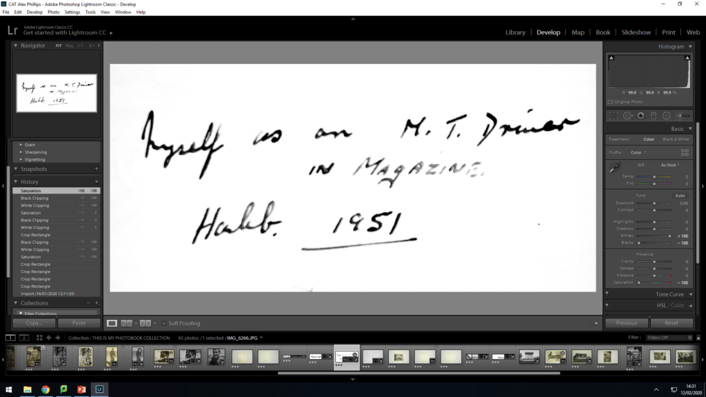
I am incorporating archival images alongside images I have recreated myself as well as original written text extracted from the back of my grandfathers photos. Originally, The archival images were yellowed due to age and I for one didn’t like this effect, and I also realised that it would be harder to replicate the yellowing on my reproduced images so I took the decision to convert all images to black and white for the project. With regards to the handwritten text, as the text was written on the rear of the images there were a lot of blemishes and marking on the paper due to the age of the images so I therefore had to go through a process to elinminate these markings and extract the whole text. I set the whites to positive 100 and the blacks to negative 100 after desaturating the image, this then made the blacks of the written text stand out from the image and gave the image a whole white background meaning that only the text was visible when incorporated into the photo book

The original image of the written text
The written text after the editing process, the blacks of the text stand out well and the background is fully white

I have decided to use a landscape shot of the RAF base my grandfather was stationed at as a front and back cover for my photo book as I find that using portrait images would straight away give away aspects of the book, as well as the fact that I feel using the landscape can act as a metaphor as in the images were taken within the landscape, so therefore the landscape image covers the book and it contains the images taken from within that landscape. I desaturated the image and adjusted the colour filters to create an aesthetically pleasing black and white image as the cover. I then used one of the original images of written text to add to the top right hand corner of the front cover to act as a title for the book, with the book being titled as ‘Myself’. I find this is quite a fitting title as using both images of me and my grandfather within the book helps create a sense of identity, as well as the fact that my grandfather was a huge role model to me, so in many ways, I see elements of him in myself and my personality.

Photobook specification

3 Words: Generations, Legacy, Family

Sentence: A book about the relationship between myself and my grandfather, inspired by the physical resemblance between myself and my Grandfather

Paragraph: Throughout my life, Whenever my family have looked at personal family photographs of my Grandfather as a young man, My family have constantly remarked upon the strong resemblance between myself and my grandfather and this is the inspiration behind this photo book, exploring my grandfathers young life and recreating original images myself whilst depicting this resemblance.

Book Design

I would like to produce a hardback saddle stitch bound book on semi gloss paper. Ideally I would like my book to be a square, roughly 30x30cm with a portrait orientation of images set as squares in the centre of the page with a white border. I would like to incorporate written text by my grandfather and myself and include these alongside the photographs and photographed objects throughout my project. I would have an image of my grandfather on the front cover and the same image replicated by myself on the rear cover of the book. I would like a simple title which I am still considering in terms of what to name the book. I would incorporate a full bleed image on the middle page of a landscape and I will either have one half of the book as photographs of my grandfather, and the other half will consist of images of myself recreating the photographs myself.

Movements and ISMS

Pictorialism: 1880s-1920s

The desire for a photo graphical image to reflect and resemble a painting spurred the onset of pictorialism. Early pictorialsim portrayed romantic and religious themes, Reflective of the art forms of interest at the time. Women were mostly photographed due to the idea at the time being that males were seen as higher earners than women due to the gender pay gap, so therefore, Men were rarely the subjects of images and woman were therefore the subjects as a result as the men would typically be out working, whereas the women would typically be at home taking care of the children and doing household chores.

Structural elements of typical pictorialism, such as the joining together and combination of different images to form a composite image as a result. The recreation of atmospheric effects in nature are also a predominant feature and there is a heavy focus on tonality and focus within images. Pictorialism inspired works are typically framed and displayed in an aesthetically pleasing manner

Image result for pictorialism
This image, By Sebastian Geithner, Depicts a man on horseback, flanked on both sides by very large trees. The size of the trees is being utilised here to present the idea of the sheer mass and power of nature, and the darker tones within the image almost convey an idea of pending doom when compared to the bright white of the horse and the minuscule size of it in comparison to the surrounding landscape

Street Photography 1930s- Present Day

Street photography is a photographical movement that arguably changed the course of portrait photography as we know it, by essentially capturing one off candid moments of people in urban environments. Street photography is said to have roots in Paris, With photographers such as Henri-Cartier Bresson being pioneers within the movement itself. Street photography aims to explore the human figure itself and Humanity’s interaction with everyday life and situations within an urban environment. Many street photographers also tend to interact with their subjects as a form of gaining context to a persons background and the situation being photographed. Street photography has been used throughout the years as a platform to adress issues to the public, such as homelessness, poverty and racism. Street photography aims to be spontaneous and capture a moment in time, with the prime purpose of telling a story and highlighting the subjects interaction with their environment. Street photography can also be classed as documentary photography dependent on the approach of the photographer. If a photographer is less spontaneous and more precise with capturing images with the sole intent of telling the story of the subject, then Street photography can fall into the bracket of documentary photography.

Martha cooper street photographer work
This image, taken by Martha Cooper, Depicts children in an extremely rundown area of New York City playing with old discarded car tires. The image presents to us an idea of freedom within a world of poverty and oppression, as well as the innocence of children in contrast to the harsh reality of poverty. This image in particular portrays poverty due to not only the rundown area in the background, but also the attire of the children themselves, wearing tattered shorts and generally looking dirty and grubby. The idea that they are entertaining themselves with items that are considered as not of use to the average person and discarded as rubbish further highlights the theme of poverty within the image

Independent Shoot: bunkers

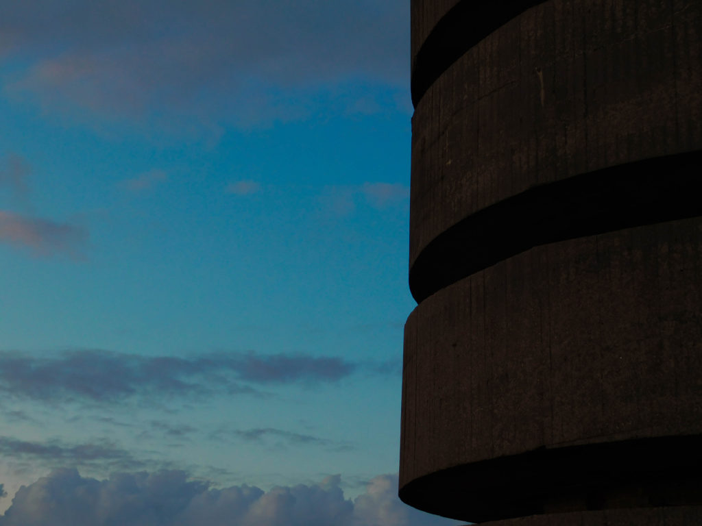
For my independent bunker shoot, I decided to drive to Corbiere and photograph the German radio tower. It is part of the old German radio complex situated around the west coast of Jersey to assist in detecting allied ships within the Atlantic ocean that meets the west coast of the Island. the radio towers were also used to assist in co-coordinating aerial attacks upon allied fleets in the English Channel.

Today, the tower can be rented out as a luxury getaway destination, with 360 degree panoramic views of St Ouens bay and Corbiere lighthouse. Back in the occupation, this tower was a key asset in channel surveillance, and a nearby bunker system hosted multiple anti shipping and anti aircraft batterys to bolster the west coast defense.

Here are my images taken from my shoot. I went and shot my images around sunset as I wished to capture the sunset and experiment with the colours of the sunset, to almost reflect the end of an era, and to use the sunset as a metaphor to represent a promise of a tommorow, a promise that was fulfilled with the liberation of the Channel Islands.

Editing approach

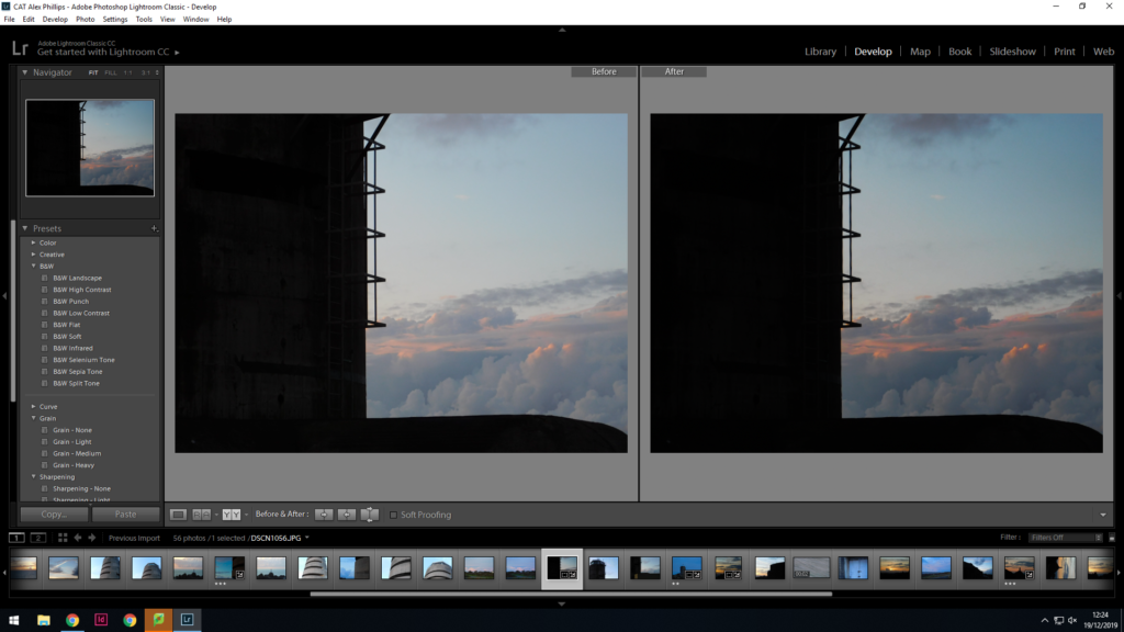
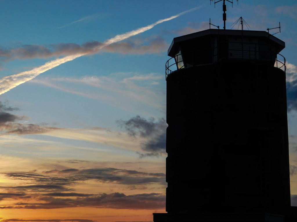
For this image, I wanted to highlight vapor trails in the sky as well as emphasise the clouds in the background. To do this, I increased the clarity to +40 to make finer details stand out and I also adjusted the colour filters to make the colours of the sky and sunset much more prominent to create a dramatic colour palette.


With this image, I decided to deploy the same principles as the last image, Yet I adjusted the hue of the yellows and orange as well as the saturation filters to adjust the sunset to make it much more dramatic. I used a wide angle shot to get the full tower into perspective and utilise as much cloud as possible to further increase the dramatic effect given off by the image. I chose to take a wide angled shot to incorporate the bench looking out into the sunset, Using it essentially as a metaphor for reflection upon a time of upheaval
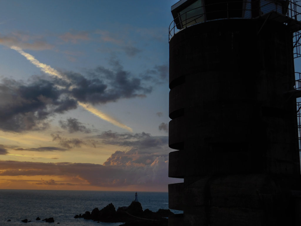
For this image I chose to photograph Corbiere lighthouse in the shadow of the radio tower, To highlight the sense of occupation. having the tower in close perspective and the lighthouse in the background helps to emphasize the idea of occupation and the domincance of the occupying forces upon the Channel Islands
in this image, I chose to have the lighthouse as the central feature of the image and incorporate the observation slits of the radio tower in the foreground to portray a sense of observation over the bay. i have altered the colour filters slightly in order to create a more vibrant image.
With this Particular image, i chose to use the silhouette of the radio tower combined with the calming colours of the clouds to create a contrast between the occupation associated with the fortification and the liberty and freedom of clouds

Final Edits

Here are my final edits for this shoot

Overall, I am deeply satisfied with this image due to the vibrance and warmth of the colours on display, as it has been manipulated yet seems still realistic. The depth of the colours create a dramatic effect whilst maintaining an aesthetically pleasing look
Within this image, I am pleased with how the tower is silhouetted against the dramatic colors of the sunset, Representing the idea that the scars of the occupation are still visible even to this day and that the fortifications are left as a constant reminder of the occupation of Jersey

With this image, I focused on capturing the texture of the clouds in the background as well as the iconic Corbiere lighthouse to create a dramatic effect and to also depict the idea of the fortifications still watching over the island landscape to this day. However, Now looking at the image, I find that I could crop the right hand side of the image slightly more in order to get rid of the sliver of blue backdrop present to create more of a framing effect, utilizing the radio tower to do just this
For this close up shot of the observation slits, I wanted to emphasize the texture of the concrete structure and compare it to the softness of the clouds within the background and I find that I have achieved just this to provide a string textural focused contrast within the image, representative of the harshness of occupation in comparison to the comforting image of freedom and open skys
With this image taken at the exact same location, I aimed to capture the drama of the sunset as well as the texture and formation of the clouds. In the mid left of the image, there is a seagull flying and I wanted to capture this particular image to use as a metaphor for liberation and freedom as the seagull flies free in an open sky

Jim Goldberg- Raised by wolves

First overview

Flicking briefly through the pages of Raised By Wolves, I am instantly drawn to the design and layout of the photobook, With the book consisting of images, with recorded dialogue and hand written, grungy letters accompanying the images. from a first look, the book appears to be about the 90’s punk/grunge culture of the USA, with many images relating to street culture, depicting scenes such as raves, skateboarding and working class life.

Jim Goldberg

Jim Goldberg is an American Photographer whom focuses on exploring populations of people whom are deemed to be out of the view of the mainstream media/press. Examples of these such groups include those in poverty, the homeless and those associated to punk/ grunge culture, the main focus in Raised By Wolves.

Gold Berg is associated with the social aims movement in photography, Taking a narrative approach to highlight issues within society and tell the stories of people from all different backgrounds. His ability to interact with his subjects is seen throughout his works, As his unique approach allows him to delve deep into the lives of his subjects and explore them and show them in a new light that may have been previously unseen by other members of society

Raised By Wolves

Raised by Wolves, Is an extremely moving photobook that details the lives of homeless young adults in Los Angeles. The book consists of multiple images, accompanied by handwritten messages from the subjects themselves, as well as dialogues of stories and encounters as told by the subjects themselves. The book itself aims to explore the issue of homelessness in Los Angeles, a city seen by the world as the home of Hollywood and infinite luxuries. Goldberg aimed to produce this piece of work to show the world that despite the luxurious draw of Los Angeles, many thousands of people were suffering from poverty and homelessness in underdeveloped and under looked communities, thus inspiring an atmosphere of rebellion and dissent towards law and order, An atmosphere that was felt across the vast majority of the western world at the time, Spawning the “Punk” movement. Often associated with loud, vicious rock and the iconic Mohawk haircut, The Punk movement coined its name from a term used to describe a person who was seen as worthless and of no importance in the world. Punk culture revolves around the ideas of rebellion, self freedom and anti establishment views.

Raised By Wolves consists of striking imagery depicting daily life for young adults left homeless within Los Angeles. Many of these youths managed to form communities of fellow homeless adolescents and inhabit abandoned buildings. AS typical with young people, Partying was common among these communities, and It is widely depicted within the book, with themes of addiction and trauma also incorporated to further tell the stories of those on the streets.

Book Design

The book is presented with a glossy cover, With the silhouetted outline of a female with the main title written in a graffiti style. The image of the young woman is laid over the top of an image of an adolescent male in an urban environment. The rear cover of the book includes a written letter from a subject Goldberg photographed, reminding him to publish the book to show the world who the people of the streets really are. The pages themselves are of a semi gloss finish and the book is bound by stitching, Which is visible when turning the pages of the book itself. Images usually take up a full page, however there are also a few full bleed images included. One of the unique characteristics of the book itself is the incorporation of handwritten notes from the subjects themselves, talking about aspirations, their lives and attitudes towards society. There are also recorded dialogues within the books, straight from conversations with subjects themselves which I find adds a real interactive element to the photobook as it allows us to not only explore the physical lives of those that Goldberg decided to photograph, but it also allows us an insight into the mentality and mind of those photographed.

Image Analysis

Image result for jim goldberg raised by wolvesphotography
This image depicts two males in an apparent fight on the right hand page, and on the left of the page, there is a film roll depicting the same fight, almost giving the impression of being a contact sheet due to the circled frame within the image. Below the roll we see the typical handwritten notes associated with goldbergs world famous project, allowing for us to gain context into the scenes we are presented with
Within this image, we see a staple piece of Raised By wolves in the form of the forefront subjects denim jacket. The jacket itself is covered in graffiti and motifs and has become an instantly recognizable symbol of grunge and youth culture. The subject in the jacket is sharing a moment with what seems to be a female love interest, however the female in the image seems to be focusing on something else in the distance, which can be seen as a metaphor for survival, as the woman is not focusing on her partner, but is rather on the lookout for something, potentially danger
Image result for Raised by wolves
This double page spread features an image of a young boy smoking a cigarette on the right, and a quote, seemingly taken from the boy pictured, on the right. This quote refers to sleezy old men, depicting the opinion of the homeless youth of Los Angeles towards the older, richer population. There is also a drug reference included , which further highlights the struggle and despair for these children

Statement of intent

After analyzing various artists, I have drawn a lot of inspiration from Jeff wall. I personally really like his approach to tableaux photography and his ability to capture a moment by reconstructing it in a live setting, as well as his attention to detail. I am particularly inspired by his image “Milk” due to the display of emotion that Wall has been able to capture. The idea of the erupting milk carton has inspired me to reproduce images in this style, utilizing various objects to use as a representation of a metaphor of inner emotion. The explosion of the milk carton can be seen as an explosion of inner anger and frustration. I want to portray inner emotion through the use of inanimate objects to show feelings of Occupation Vs Liberation within a person in terms of how they feel mentally.

Image result for milk jeff wall

I would like to photograph my subjects in environments where they may be experiencing these emotions, such as out partying, feeling a sense of freedom and liberty, or behind closed doors, feeling occupied by their own minds. I would plan out every element of my shoots, such as time of day, outfit of my subject and their exact body positioning and facial expression, reflective of Walls highly meticulous tableaux shoots. I therefore intend to create work inspired by Walls tableaux approach to portraiture and I would like to incorporate the themes seen in “Milk” as I find them very intriguing and a great way of portraying a story.

Overview of PErsonal investigation

Intro

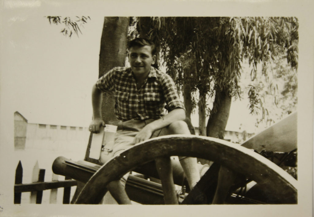
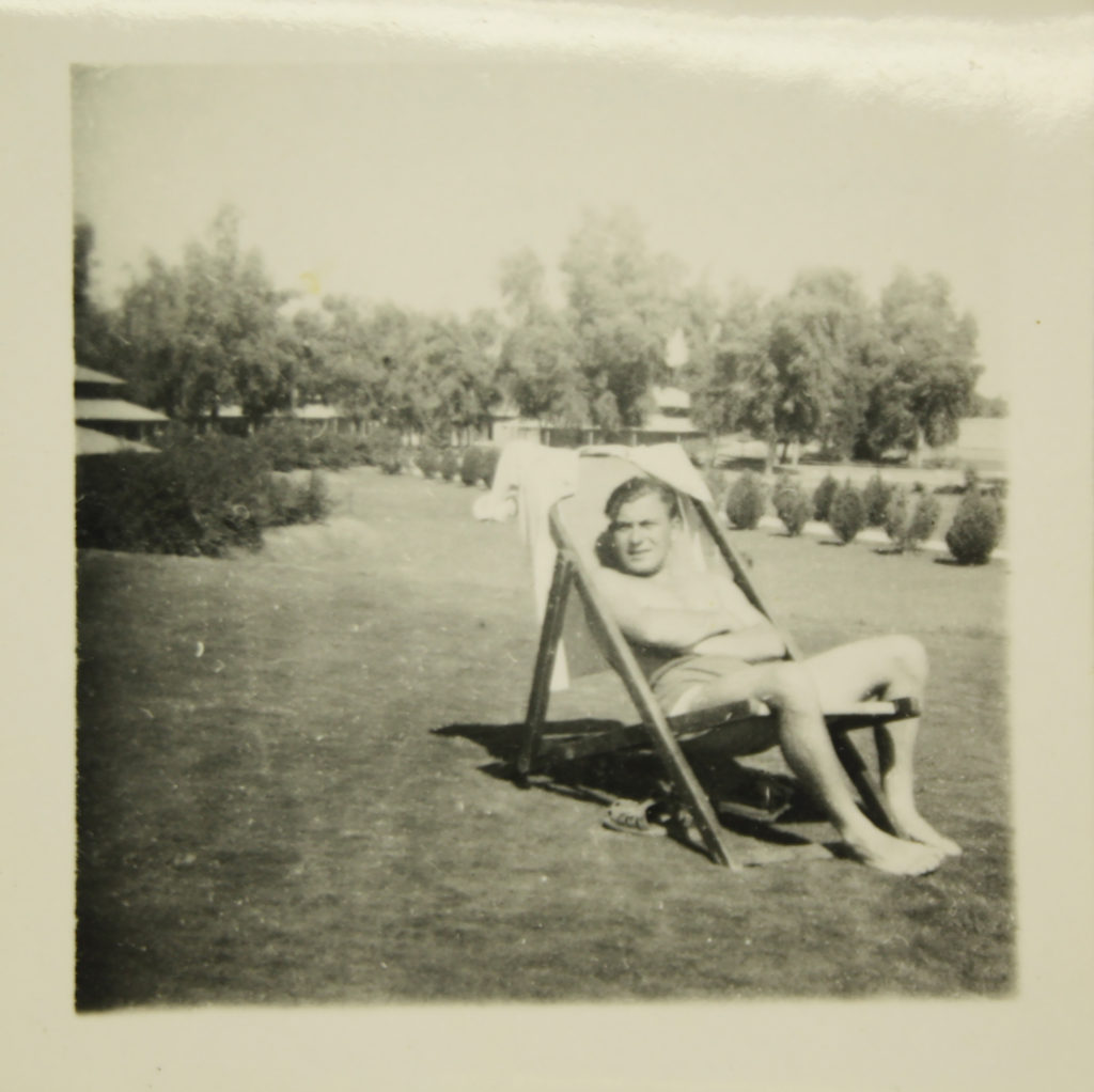
For my project, I have decided to focus upon the story of my grandfather and his time serving in the Royal Air Force. I have found a set of photographs from my grandfathers deployment to RAF Habbaniya Air base in Iraq in 1951 as a munitions officer. I have chosen to replicate the photographs taken of him and re-enact them myself as a form of self identity as my grandfather was one of my biggest influences in life. The original images range from images of him in scenes of leisure to him in uniform operating machinery such as munitions lorries etc.

Original Images

Below are the original pre-edit images of my grandfather taken in Iraq. The images are yellowed with age so I am looking to convert them to black and white for usage in my project to give them a rejuvenated look and feel.

This is an image of my Grandfather sat on a canon in Civilian attire
My grandfather in uniform next to a large danger sign. Due to the nature of my grandfathers job, there was a constant risk of danger handling live explosives and ammunition
My Grandfather relaxing next to the open air swimming pool at the RAF base. Coming from Jersey, the climate in Iraq was evidently very different in comparison to what my Grandfather was used to
Here is another image of my Grandfather in civilian attire, this time sat atop what appears to be some sort of water tank/ fountain

My responses

Despite not being in the Air Force myself or being based in Iraq, I have attempted to recreate these images as best as I can using locations and environments available to me in Jersey, focusing primarily on the poses and body positioning of my Grandfather as well as backdrop. For example in the below image, My grandfather is stood in front of a shack with a low roof. I decided to find a similar building and photograph myself in a similar pose to my Grandfather as shown below.

While my recreated version of the above image features the roof slanting the opposite way to the image with my grandfather, I find that rather than flip the image so that my image matches the one of my grandfather in terms of composition, I shall keep my recreated image as it is due to the fact that both images will be opposite each other, essentially creating a mirror image as such as detailed in the image below

Artist Study- JEff Wall

Jeff Wall is a Canadian born, Vancouver based photographer who specializes in back lit tableaux photographs of the city of Vancouver itself

Wall studied at the University of British Colombia and graduated with a masters degree in photography in 1970. In the same year he relocated to London to study for a post graduate degree at the courtyard institute, studying with Manet expert T.J Clark. He then went on to become the Assistant professor at Nova Scotia college of Art and Design from 1974-1975 and he then became the associate professor at Simon Fraser University, British Columbia from 1976-1987 whilst also teaching at The University of British Columbia.

Wall is renowned for his tableaux reconstructions of scenarios he had witnessed himself that were representative of the political environment at the time. His photos are always back lit and in a cinematographic style, Depicting more of a story through this means. Due to his tableaux style, His shoots often consisted of many people such as cast, crew as well as digital post production workers. Almost all of his shoots are centered around suburban Vancouver, world renowned for the relationship between the suburban environment and the rural environment. Many of the suburban areas have mountainous backdrops and are bordered by forests as well as having a substantial amount of urban architecture, which Wall finds to be a great way of providing contrast within an image.

Image Analysis

Image result for jeff wall
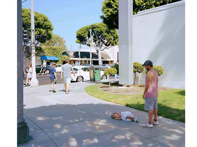
Parent Child- Jeff Wall 2018

In Walls image ‘Parent Child’ we see a striking usage of colour. The green of the foliage and grass compared with the white shades of the wall and sidewalk as well as the vehicles in the road create a sense of elegance and almost calm. The blue of the sky above also depicts a sense of calm. The child on the floor seemingly sleeping calmly acts as a further metaphor for this portrayal of calm. The father looks over the child dressed in a pink vest and gray shorts, and judging by his slightly slouched posture and his tilted head, He is tired of his child playing games and playing around as he potentially may be on his way somewhere with her and she is holding him up. The image is very bright in itself and consists of high contrast colour to reflect the atmosphere of a sunny midsummer day. Overall there is a sense of serenity and happiness in the image and the person in the background on the scooter can be seen as representative of time passing by. This point is furthermore illustrated by the presence of people walking past the parent and child, just in front of them, with the subject on the left looking over his right shoulder to examine the scene presented before him. This makes us ask the question ‘What is it he sees’? Does he see a Child having a tantrum? Does he see a fed up father? Does he feel sorry for the father?.

Personal Opinion

Personally, I am a big fan of Wall’s work and his representation of modern day life in a suburban community. His usage of back lighting makes his images consistently bright and vibrant and allows for him to experiment with contrast between brighter and darker colors. Walls Tableaux approach is a method that I would like to replicate in my personal study, essentially creating everyday life scenes that appear candid in nature but are actually fully staged and instructed. This would aid me in portraying senses and feelings of occupation and liberty however I please, rather than waiting for an opportunity, I am able to capture exactly what I would like to achieve when I want to capture it.

Contextual Studies: Conversations on Photography

Jeff Wall Image Analysis

Image result for Jeff Wall

In this image titled simply “Milk”, Wall has depicted a male holding a milk drink and squeezing it, causing the milk to erupt in the subjects hands. The subject is in full focus and the background seems to be that of the exterior of a well kept and clean building, Whereas the subject appears dirty and scruffy, With greasy hair and dirty clothes. This creates a contrasting image, With a sense of cleanliness making up the background with the focus being on the messiness of the main subject of the image. The explosion of the milk carton makes us question why this is happening. Is the man angry? is he undergoing stress? or is he potentially in a crazed mental state?. This image essentially allows for the critic to create their own context to the image and create their own story due to the multiple scenarios that may be at play here in a contextual mannerism. Wall quotes from his interview with David Campany ” I think the pictorial problems emerge from the accidental encounter that reveals the subject”. I find that his quote means in a sense that the use of the medium of photography has opened up a conversation regarding the issues the subject themselves could potentially be dealing with, and that photography can be used to portray an individuals expression of their inner selves. The composition of the image in terms of contrast plays a role in telling the story as well, As the background is bright, contrasted by the small shadow of the wall of the windowed building. The usage of tinted blue for the glass and the green of the plant give the background an uplifting feel due to the bright colours. However this is contrasted by the ragged appearance of the male subject in the foreground, Depicted by his dark coloured clothing and dark hair. The white of the milk drink exploding instantly draws us to the image due to the absence of white in the background as well as the shape and texture of the liquid itself captured in the time frame it was captured in. The explosion of the milk carton creates a dramatic contrast when observed in comparison to the solid, tranquil background of the image. The eruption of the milk itself creates a talking point. Why is the milk exploding in this manner? What is the subject currently feeling in terms of emotion? Was there an event that caused this reaction?