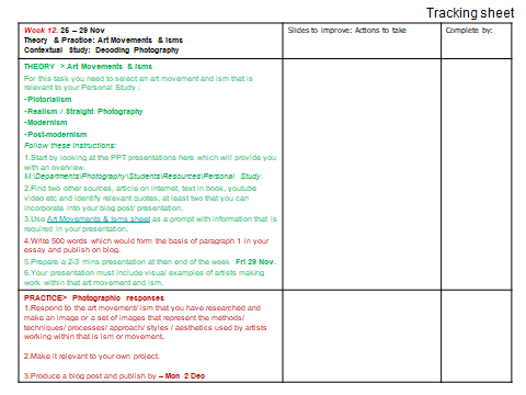


POST-MODERNISM
Time period:
Time period : Late 20th century
Key characteristics/ conventions :
Postmodernism is best understood by defining the modernist ethos it replaced – that of the ‘avant-garde’ who were active from 1860s to the 1950s. Postmodernism overturned the idea that there was one inherent meaning to a work of art or that this meaning was determined by the artist at the time of creation. Instead, the viewer became an important determiner of meaning, even allowed by some artists to participate in the work as in the case of some performance pieces.
Key characteristics/ conventions : Common targets of postmodernism and critical theory include universalist notions of objective reality, morality, truth, human nature, reason, language, and social progress. The ideas rejected by postmodernists include the idea of artistic development as goal-oriented, the notion that only men are artistic geniuses, and the outdated assumption that non-white races are inferior. Feminist art and minority art that challenged canonical ways of thinking are often included under the umbrella of postmodernism or seen as representations of it.
Artists associated: William Eggleston and Robert Rauschenberg.

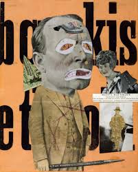
Dadaism: Dada or Dadaism was an art movement of the European avant-garde in the early 20th century. Dadasim had an influence on postmodernism in its questioning of authenticity and originality. ‘Combined with the notion of appropriation, postmodernism often took the undermining of originality to the point of copyright infringement, even in the use of photographs with little or no alteration to the original.’ -The Art Story.
STYLISTIC AND CONTEXTUAL IDEAS:
The snapshot type imagery which Eggleston created throughout his career, created anecdotal meaning about everyday aspects of life. The accessible and simplistic method of his photography, such as using the Kodak’s Brownie camera, meant that his work had a personal touch to subjects he had no direct personal link with. Color also represented a multitude of themes in his work such as the contrast between the new and the old, the ordinary and extraordinary, the man-made and the natural. In many senses he was a non-conformist, associating him as a prominent figure in the postmodernist art scene. He also explored a contemporary commercial printing process of dye transfer to see the ways in which this could contribute to the representation of color and how this could become the focal point instead of the selling of lifestyle, concepts or ideas. During his career there were a few occasions where Eggleston encountered the work of Andy Worhol, exposing him to other popular forms of mediums, contributing to his experimental photography style. Eggleston’s use of the anecdotal and everyday is set apart by his focus on details such as facial expression which can be seen in the image above. Throughout his career he pushed the boundaries of documentary photography associated with the works of Robert Frank and Walker Evans. His photography effectively captured the shift of life in the South from rural to cosmopolitan societies.
In the work above we can see an example of the extreme focus which Eggleston pays to the facial expressions and body language of the subjects. There is a clear contrast in character from the youthful appearance of the woman on the right and the sickly, pale and tired lady on the right hand side of the image. There is also an overall contrast of color from the left and right with the radiant blonde hair, African print dress and the dark, flat hair and blue toned dress. There is a distinct lack of facial expression with with the woman on the left as she lays on the sofa, in a lifeless and melancholy fashion, observed by the Goddess like presence of the light haired woman. The image provokes overall feelings of conflict and change. Opposed to the typical conventions of postmodernism, this image in particular follows close conventions of Tableau and Renaissance art with the stylized body language and dramatic lighting. This image very effectively showcases the postmodernist features which Eggleston focused on within his work.
Methods/ techniques/ processes:

PICTORIALISM
Time period : 1880s-1920s
Key characteristics/ conventions : make them look like artworks
Artists associated: Julia Margaret Cameron The Vienna Camera Club (Austria)
Key works:
Methods/ techniques/ processes: scratching etching to look like canvas, vaseline over lenses=unsharp lenses, adjustsments in lab with chemicals.
REALISM / STRAIGHT PHOTOGRAPHY
Time period:
Key characteristics/ conventions : wanted to make realism – straight photographs
Artists associated:Walker Evans (1903-75) Paul Strand
Key works:
Methods/ techniques/ processes:
To begin researching for my personal investigation I started looking at what was around me. For me, the easiest way to start creating your own ideas and plans it to first look at what other people have done before you. Therefore, I gathered some of the photo-books from previous year 13 students and went through them picking out bits I liked and inspirations I could take from them. In terms of composition, all 4 of the book have included a mix of full bleed, double page spreads, smaller images and sets in their books which is the first thing I want to recreate.
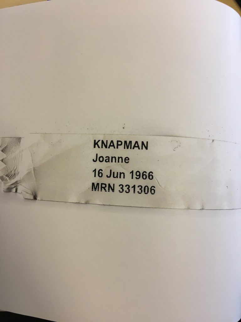
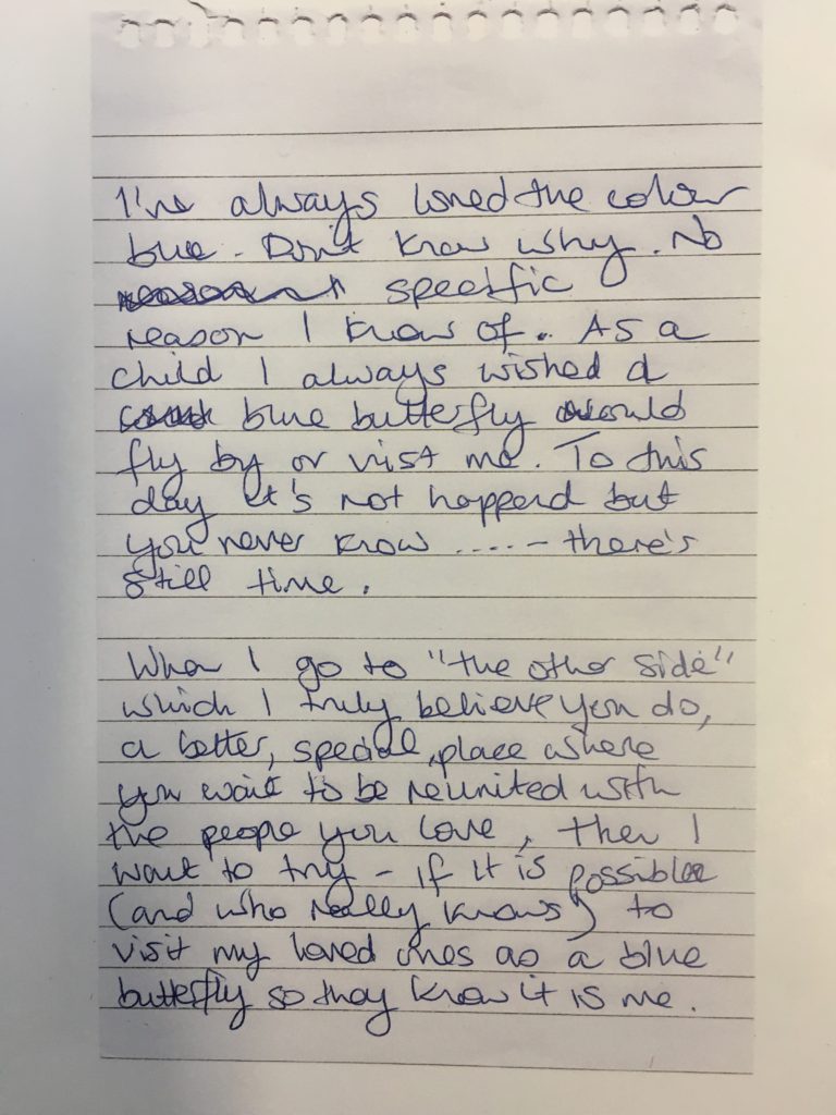
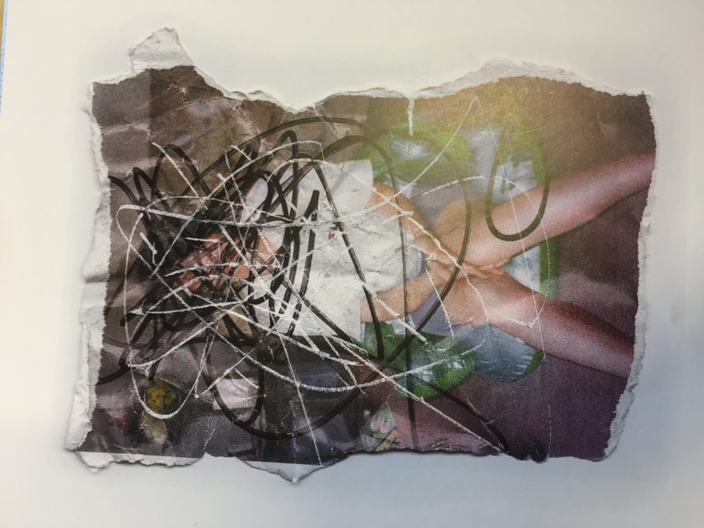
The first book that I looked at was named ‘Is that my blue butterfly?’ by Mattie Knapman. I really enjoyed looking at this despite it being very emotional containing sad and violent photos/collages. The theme of the book is centered around his mother, who at the time of making was passing away in hospital. The book contains a mix of archival and recent photos of him and his mother, as well as collaged photos and which was have been painted/drawn over. Another aspect of this book that I think adds another aspect of understanding is the inclusion of photos of objects. For example, Mattie chose to include a double page spread of a photo of his mother’s hospital band. He has also included a note at the beginning in which he explains the reasoning of the book which in turn gives a more personal touch, especially as it is in his own handwriting.
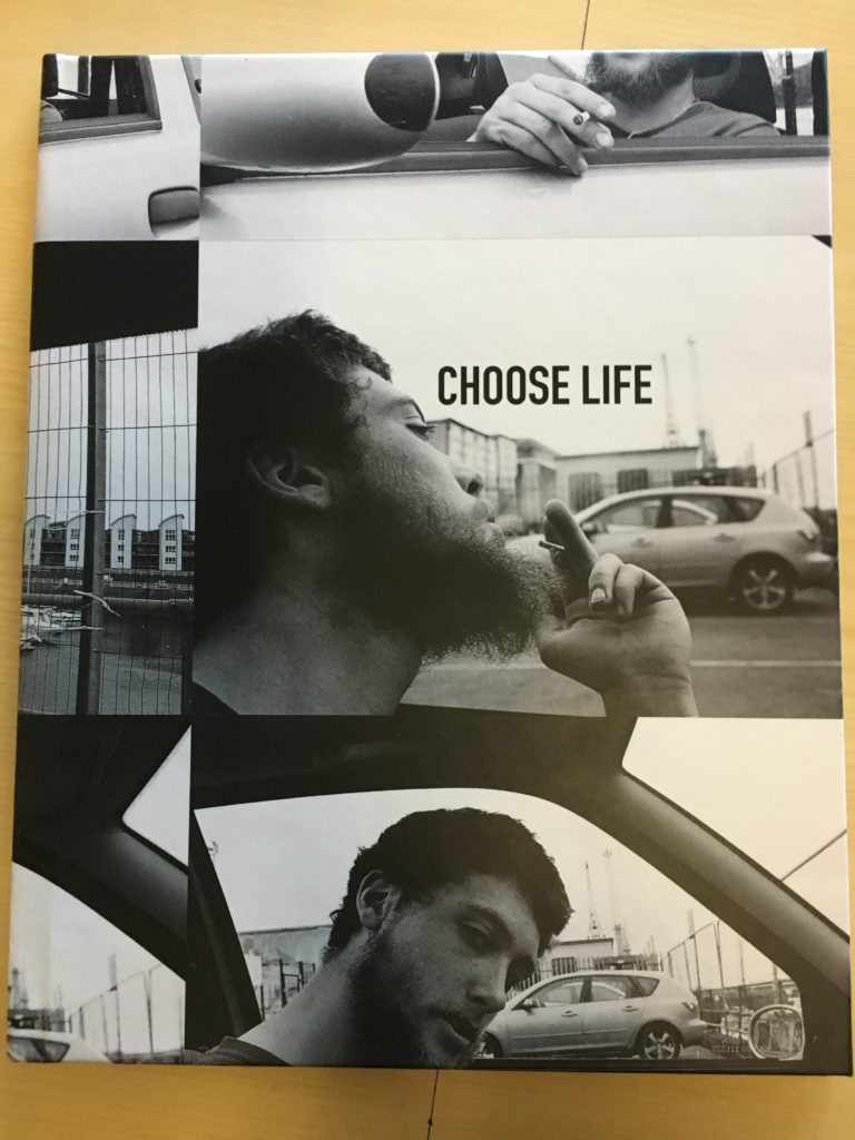
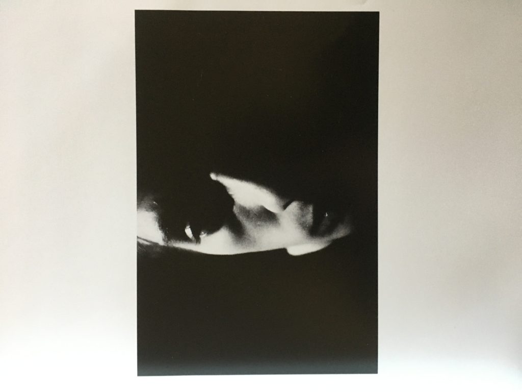
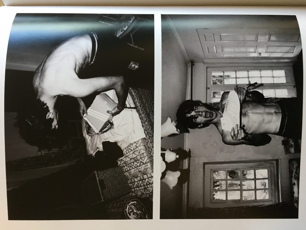
The second book I looked at was ‘Choose Life’ by Oscar Vibert. This photo-book has a much more relaxed atmosphere than the previous but still has it’s meaning. The theme of this book in my opinion is mostly about skating and living everyday life. Here are some aspects of the book which I would like to draw inspiration from:
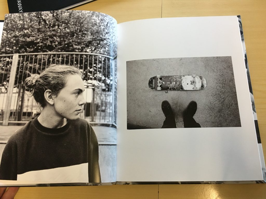
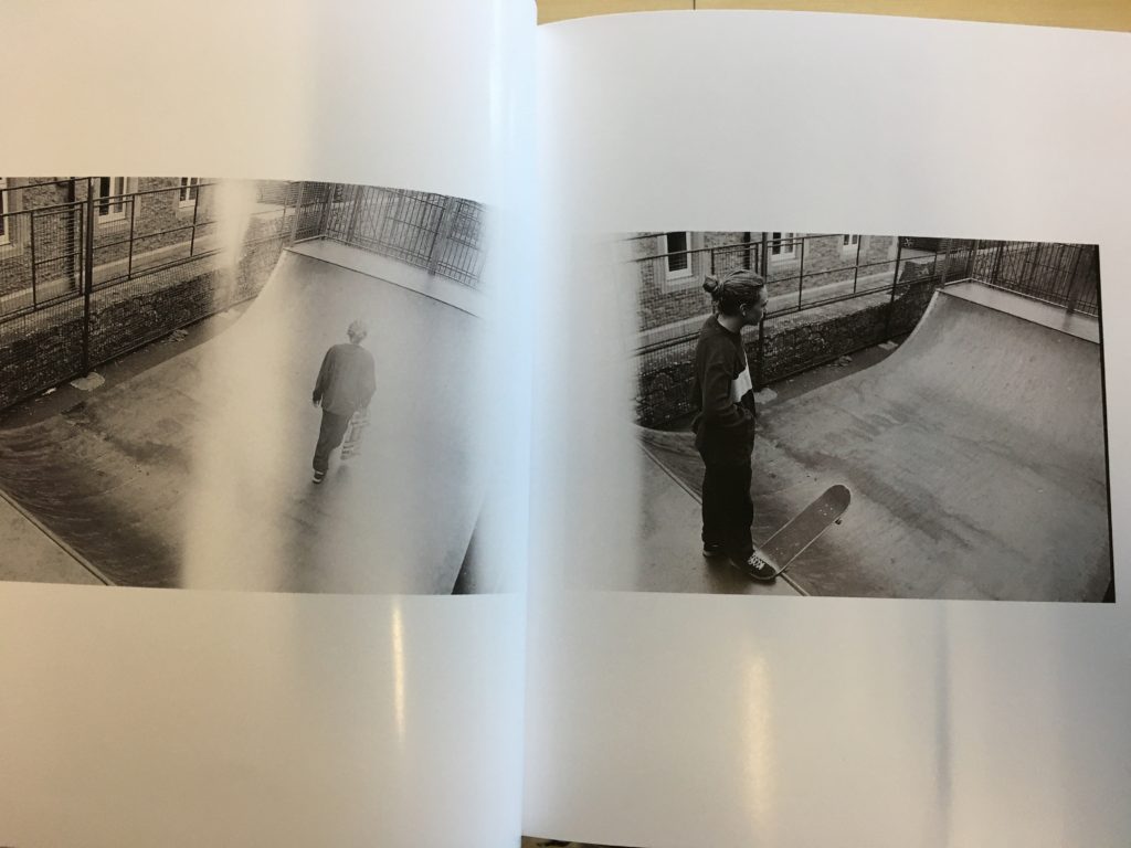
The above photos with the white striping also look like they may have been taken on film which is another aspect I want to use in my own personal investigation/photo-book.
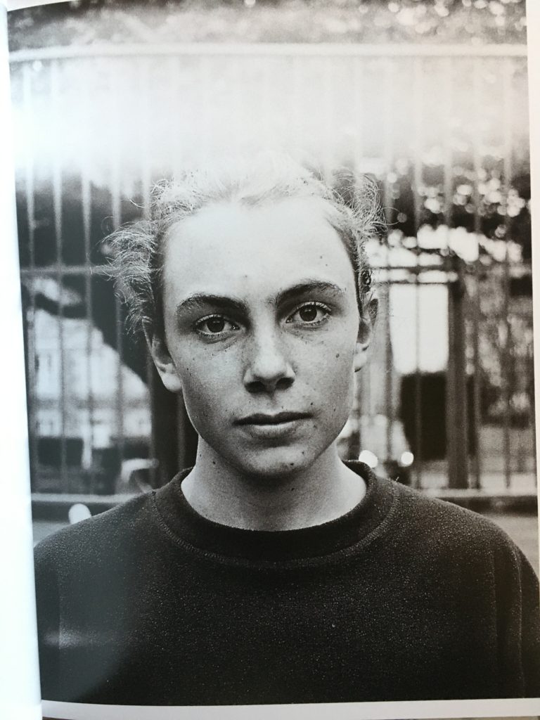
Above is the main type of portraiture I want to include; which shows a person’s full face, everyday habits and seems natural.
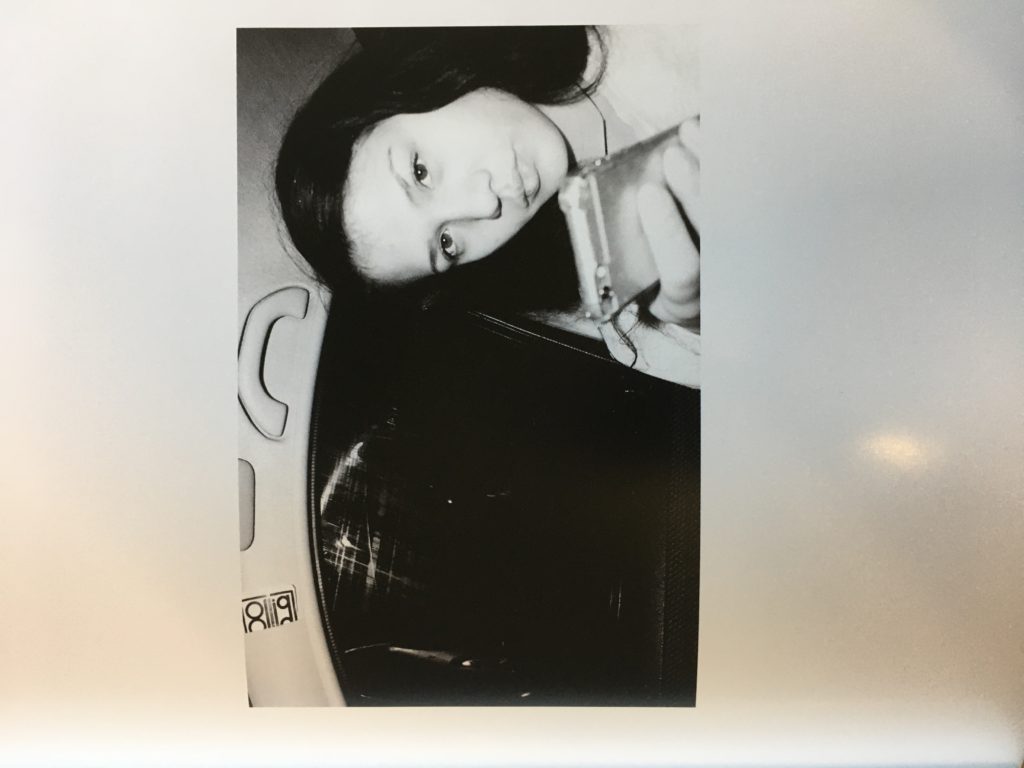
This photo-book is similar to Mattie Knapman’s as it focuses on the themes of family and relationships with parents etc. I don’t particularly like most of the book as it contains some images which I think don’t necessarily need to be in there or don’t relate to the theme or title. Some aspects I do like are:
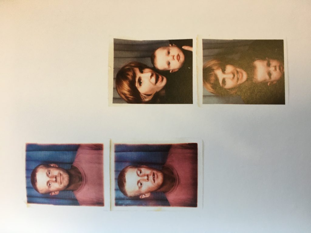
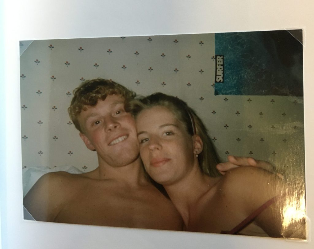
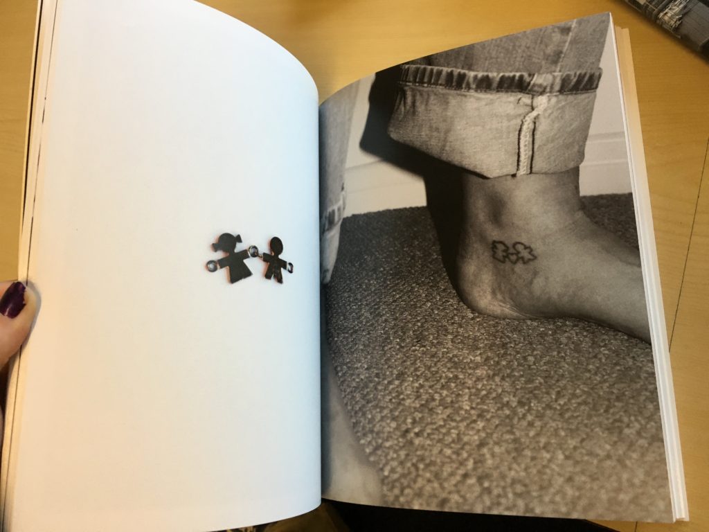
I’m not sure who the creator of this photo-book is as I couldn’t find a name anywhere on the book or blog. However, what attracted to me to this photo-book is that it just perfectly illustrates teenagers lives and the things they do. Most of the images seem like they haven’t been purposely taken for this reason even though they easily could have been. Most of the images don’t really make a lot of sense and are a bit weird which I really like as that is just the same as everyday life. They are all also all black and white images of people which I want to also do.
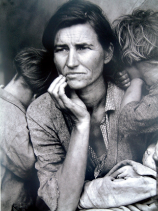
Straight photography emphasizes and engages with the camera’s own technical capability to produce images sharp in focus and rich in detail. The term generally refers to photographs that are not manipulated, either in the taking of the image or by darkroom or digital processes, but sharply depict the scene or subject as the camera sees it. Paul Strand and Alfred Stieglitz pioneered Straight photography in New York while the Hungarian-born László Moholy Nagy exploited pure photography to maximize the graphic structure of the camera-image. These straight or pure approaches to photography continue to define contemporary photographs, while being the foundation for many related movements, such as Documentary, Street photography, Photojournalism, and even later Abstract photography.
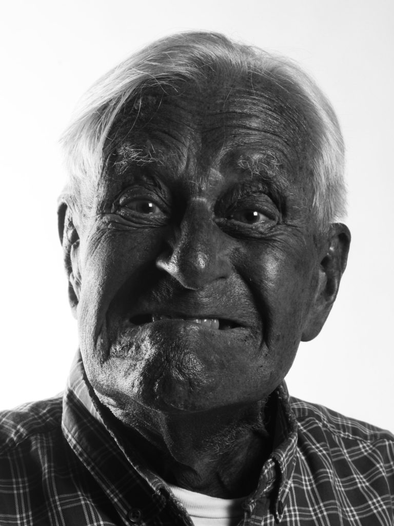
The theme I enjoyed most over the course of this unit was probably portraiture as it was always varied and we covered a lot of different ways of approaching portraits. For example I did some research on contemporary photographer OLGAÇ BOZALP along with historic photographer Ernest Badoux. Despite being from two very different time periods, Baudoux and Bozalp still photograph their subjects in a similar way. Both photographers incorporate the subject’s home/background in their photos, this can be seen more in the Bozalps however it is still evident in Badoux’s photos as you can decide what class the person/person is in through looking at the background and their gestures in the photos. I also enjoyed taking photos of Bob Le Sueur and hearing about his experiences. It was a good way to experiment with trigger flashes and photographic equipment in the studio.
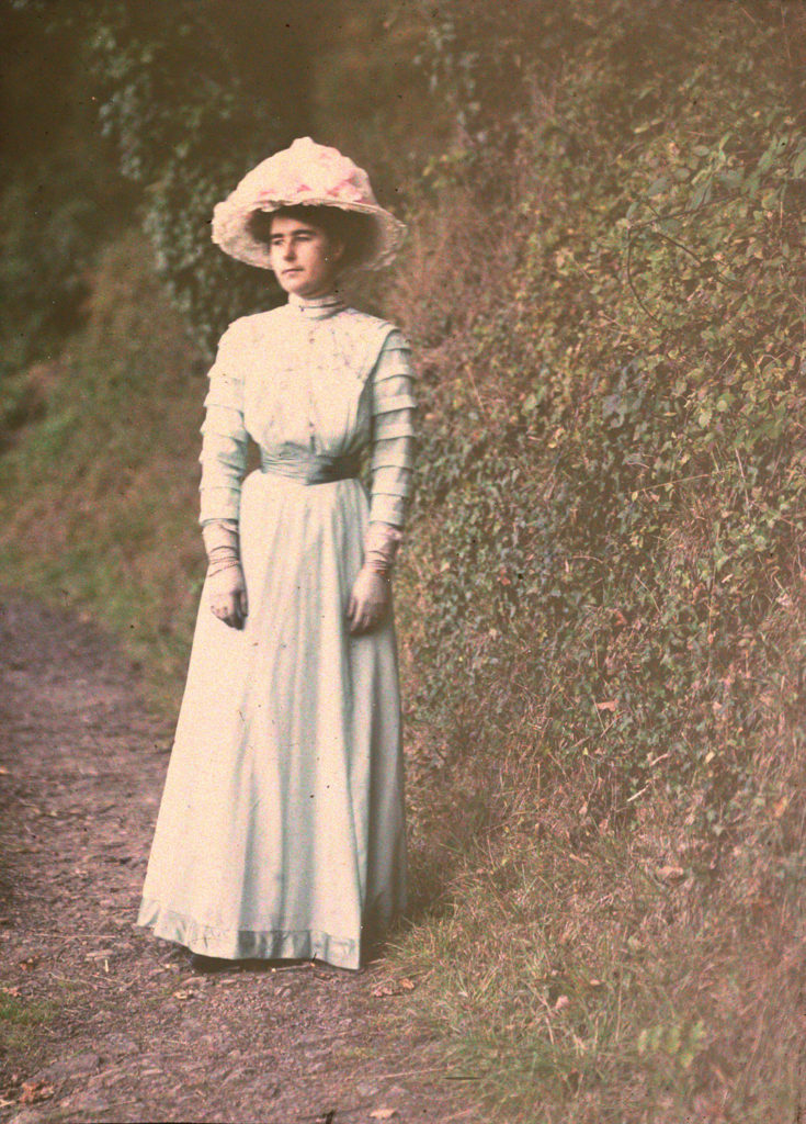
Another historic photographic technique that I found interesting what the use of Autochrome in the 20th century. The first practicable method of colour photography was the autochrome process, invented in France by Auguste and Louis Lumière. Best known for their invention of the Cinématographe in 1895, the Lumières began commercial manufacture of autochrome plates in the early 20th century. This was especially interesting as Jersey Photographer Emile Guiton began experimenting with it early on, and it is strange to recognise the landscapes in some of his photos. Such as the image below which was taken well over a hundred years ago in a forest near where I live.
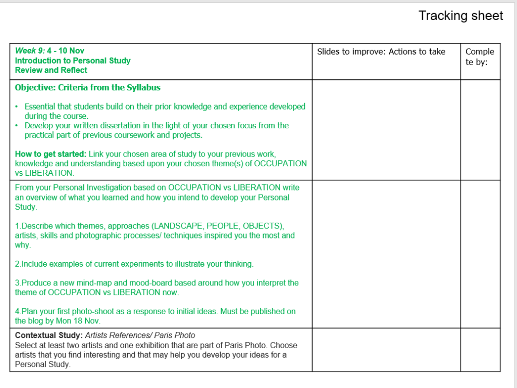
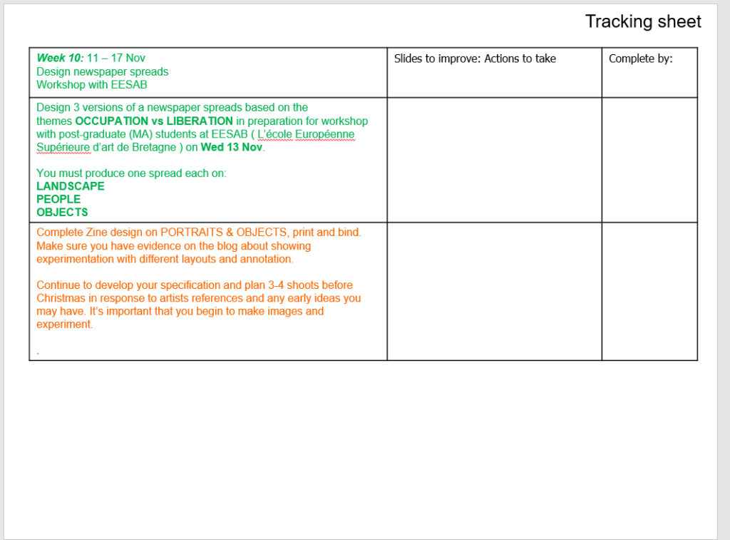
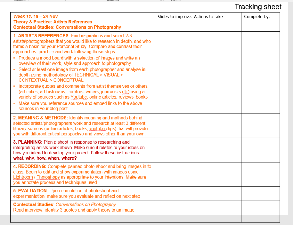
Occupation vs. Liberation. Overview of what we have been doing and working on in this unit:
LANDSCAPE | ||
| Research 1: SJ Photographic Archive | ||
| Research 2: Artists references | ||
| Essay 1: Whose Arcvive is it anyway? | ||
| HW 1: Family archives/ photo-albums | ||
| Photo-shoot 1: Bunkers – school trip | ||
| Photo-shoot 2 & 3: Bunkers – independent | ||
| Experiment 1: Crop / Colour / B&W | ||
| Experiment 2: Photo-montage / composite | ||
| Zine: Research and Planning | ||
| Zine: Design and Layout | ||
| Zine: Printing and Bound | ||
| Feedback: – | ||
| PORTRAITURE | ||
| Research 1: Artists References – Historical | ||
| Research 2: Artists References – Contemporary | ||
| Research 3: Jersey Archive | ||
| Research 4: Family History | ||
| Photo-shoot 1: Jersey War Tunnels | ||
| HW-Assignment 1: Environmental and Candid portraits | ||
| HW-Assignment 2: Establishing and Detail Shots | ||
| Research: Occupation babe | ||
| Studio-shoot 2: Occupation babes | ||
| Experimentation: 3 variations of 3 images | ||
| Feedback: – | ||
| Overall attainment for this set of assessments based on the sum of all assessments | ||
| OBJECTS | ||
| Research 1: Historical context: Still-life | ||
| Research 2: Analysis: Still-life painting | ||
| Research 3: Emile F. Guiton and Autochromes | ||
| Research 4: Contemporary practice: Still-life | ||
| Studio-shoots: Objects/ Still-life | ||
| Experimentation: Objects/ Still-life | ||
| Extension: Food Substitutes | ||
| HW-Assignment 3: Exterior and Interior | ||
| Zine: Research & Planning | ||
| Zine: Design & Layout | ||
| Zine: Printing and Bound |
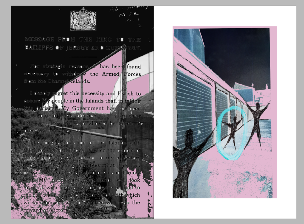
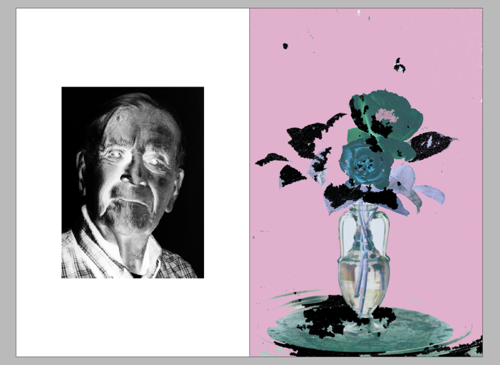
Below are the 3 different variations of a double spread for the newspaper. Most of the images I have used are Occupation related or have a relation to something we have worked on in this unit, such as the montage of the Emile Guiton auto-chrome rose. I’ve chosen a light pink, black and blue/green theme for all these images as I think they go well together but also work well on their own. I’ve also inverted 3 of my montages in Photoshop as I think it gives an interesting effect and matches the colour scheme well.

The first practicable method of colour photography was the autochrome process, invented in France by Auguste and Louis Lumière. Best known for their invention of the Cinématographe in 1895, the Lumières began commercial manufacture of autochrome plates in the early 20th century.
Emile Guiton was a keen amateur photographer and practised throughout his long life. He experimented with colour at the beginning of the twentieth century in “Autochromes”. His subjects include the recording of archaeological excavations and he was one of the few people in Jersey permitted to take photographs during the German Occupation of 1940 – 1945. Emile Guiton also recognised very early on the importance of collecting photographs, both as a valuable social historic resource and as interesting artefacts – examples of developments in science and technology. He donated many images to the Société Jersiaise. He died in 1972.


https://blog.scienceandmediamuseum.org.uk/autochromes-the-dawn-of-colour-photography/ https://www.independent.co.uk/life-style/autochrome-lumiere-colour-photos-oldest-potato-starch-dyes-a8190846.html https://edition.cnn.com/2015/06/03/world/gallery/autochrome-christina/index.html
Still lifes were a great opportunity to display skill in painting textures and surfaces in great detail and with realistic light effects. Food of all kinds laid out on a table, silver cutlery, intricate patterns and subtle folds in table cloths and flowers all challenged painters. Several types of subject were “banquet pieces” or simpler “breakfast pieces”.[Virtually all still lifes had a moralistic message, usually concerning the brevity of life – this is known as the Vanitas theme – implicit even in the absence of an obvious symbol like a skull, or less obvious one such as a half-peeled lemon (like life, sweet in appearance but bitter to taste). Flowers wilt and food decays, and silver is of no use to the soul. Nevertheless, the force of this message seems less powerful in the more elaborate pieces of the second half of the century.

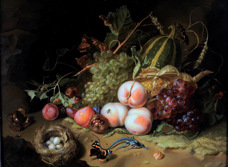
Vanitas Paintings – A Metaphor for Transience
“Society’s awareness of death did not disappear with the end of the Twelve Year Truce; in the 1620s the Republic suffered two outbreaks of Bubonic Plague and this may account for the proliferation in Leiden of Vanitas paintings, whose recurring motif, the skull, was a constant reminder of mortality. Symbolism was present in every form of Still Life but never more significant than in Vanitaswork where everything spoke of ephemerality and the inevitability of death: the watch or hourglass – the passage of time; the overturned glass – the emptiness of life; a violin – the vice of enjoyment, or music fading away; a book – pride in knowledge – an artificial virtue, or history being finished; a smoker’s empty pipe, a guttering candle or smoking oil lamp – life is eventually snuffed out; and airborne soap bubbles were evanescence epitomised. However, there remained as redeeming Christian reference, the chaplet of corn on a skull, a reminder of the Resurrection. Fuchs suggests that this density of morbid symbols would have appealed to the intelligentsia at Leiden University, centre for the study of Calvinism.”
https://dutch.arts.gla.ac.uk/still_life.htm
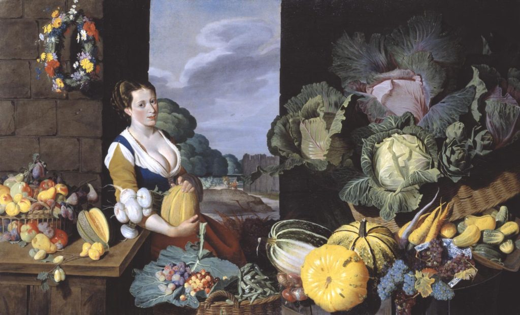
Above is Sir Nathanial Bacon’s ‘Cookmaid with Still Life of Vegetables and Fruit’. This was painted from 1620-5. The paintinf is a landscape of a cookmaid with an arrangement of exotic fruit and vegetables around her and on a table. The backdrop is comprised of outdoor walls and a gap in the walls where a landscape of sky and trees, along with other buildings can be seen.
Curator Tim Batchelor discusses Cookmaid with Still Life of Vegetables and Fruit: TIM BATCHELOR: This striking painting is quite unusual for British art of this period in that it shows quite a lavish still life. Still life painting really becomes established in Britain in the late seventeenth century. NARRATOR: Curator Tim Batchelor. TIM BATCHELOR: The painting also reveals the artist’s interest in gardening and horticulture, the cultivation of plants. This was becoming increasingly fashionable in this period and Nathaniel Bacon took a great interest in this. We have a variety of grape on display here which was a new introduction from America and the melons that we can see prominently displayed near the cook maid herself were grown on his own estates. NARRATOR: Bacon is unusual in being an artist who was of the gentry. His wealth enabling him painted for own pleasure. Not much is known about his training but this painting may hold a clue. TIM BATCHELOR: We know that Nathaniel Bacon travelled in the Southern Netherlands during this period, and that paintings of cookmaids and cookmaid scenes, banquet scenes of this nature, are prevalent in the southern Netherlands, around Antwerp in the late 16 Century and early 17th Century. So he may well travelled there, trained there and become accustomed to this compositional style while he was there.
https://www.artsy.net/article/artsy-editorial-dutch-lifes-dark-secrets-hide-exotic-delicacies
https://en.wikipedia.org/wiki/Dutch_Golden_Age_painting#Still_lifes
https://dutch.arts.gla.ac.uk/still_life.htm
https://www.tate.org.uk/about-us/projects/tudor-stuart-technical-research/entries/cookmaid-still-life-vegetables-and-fruit
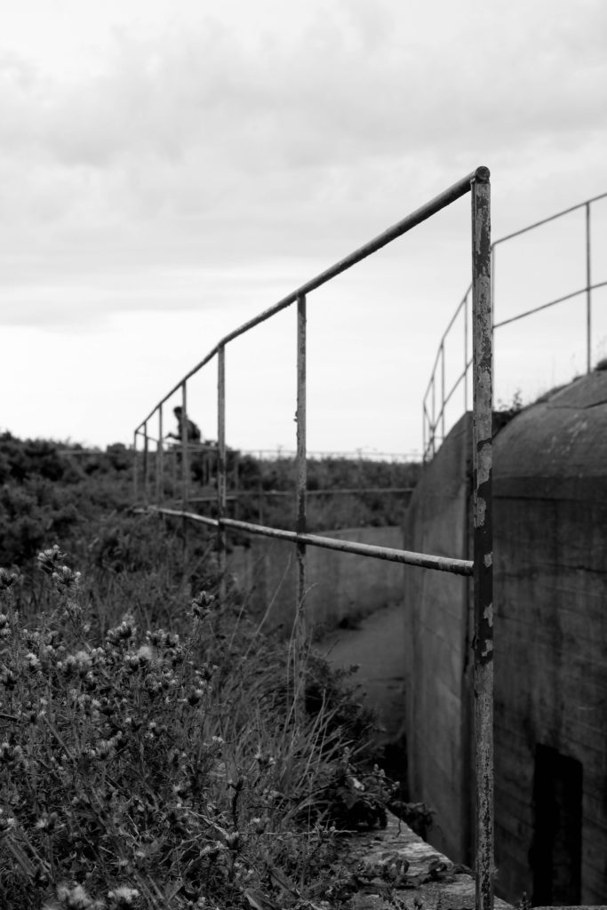
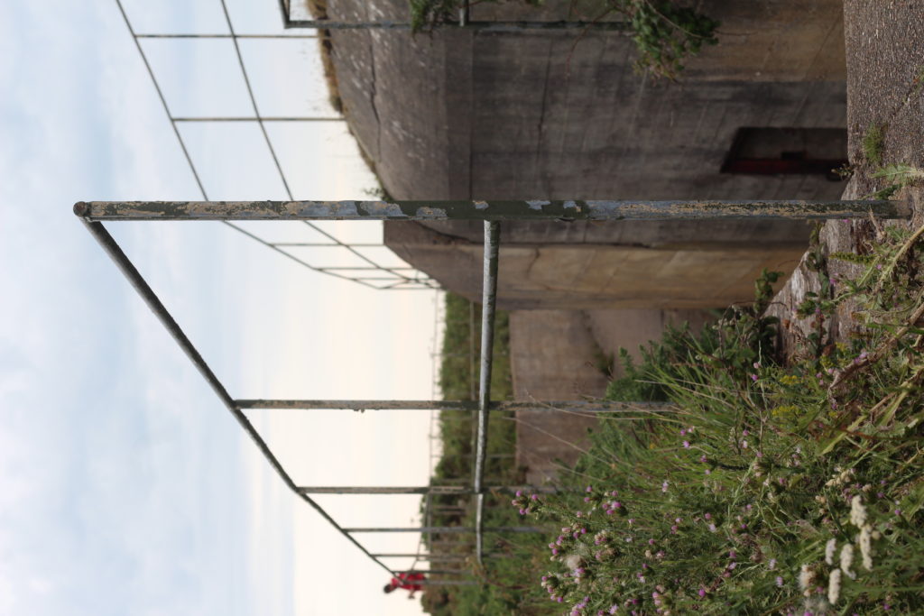
Batterie Lothringen was a World War II coastal artillery battery in Saint Brélade, Jersey, named after the SMS Lothringen, and constructed by Organisation Todt for the Wehrmacht[1] during the Occupation of the Channel Islands. The first installations were completed in 1941, around the same time as the completion[? of the nearby Battery Moltke, in St. Ouen.
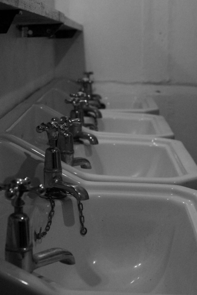
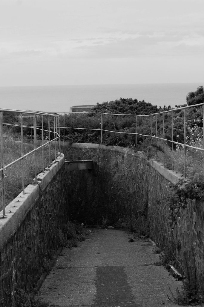
We visited Battery Lothringen as a class in July, where we spent a few hours there and took photos, we also took a tour of the bunker inside and explored into it.
The batterie site is located at the end of Noirmont Point, a rock headland which overlooks St. Aubin’s Bay, Elizabeth Castle, and the harbours of Saint Helier. It was a part of the Atlantic Wall system of coastal fortifications, and most of the concrete structures remain today. The 3rd Battery of Naval Artillery Battalion 604 were stationed here.[
