All posts by Andreia D S

Filters

Author:
Category:

Final Images A4

Final Prints – Abstract Photography

Set (1) of 3 Images
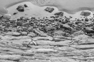
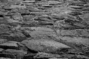
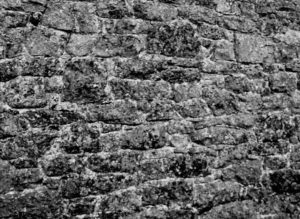
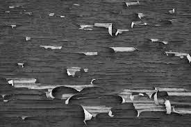
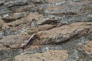
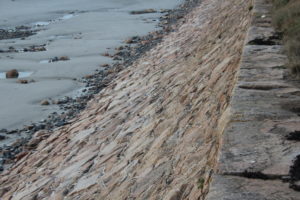
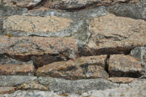
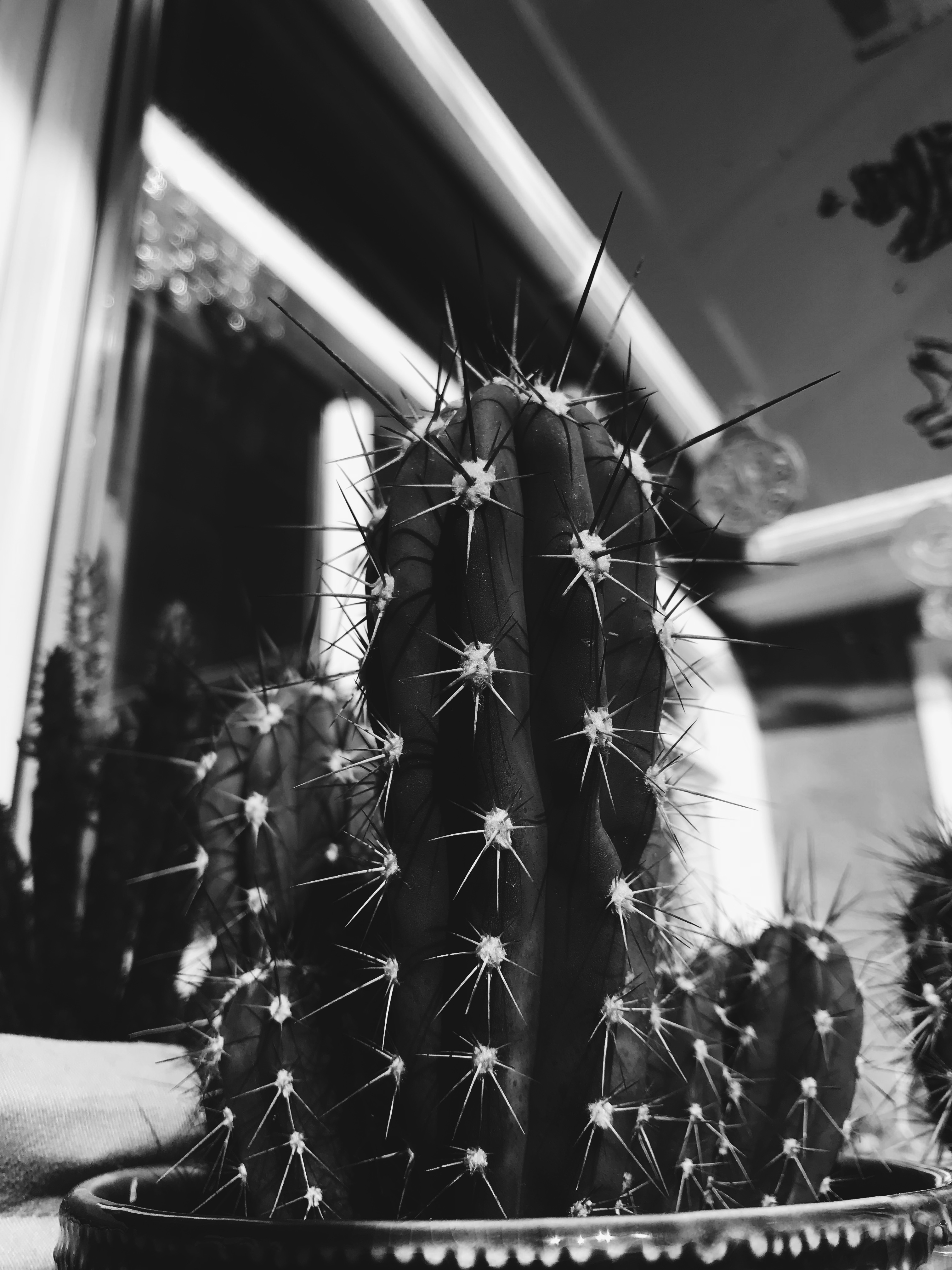
These images were inspired by the works of Aaron siskind’s work although I have kept some elements and ideas from his work I have tried to adapt and create a set of 3 images to all resemble the similar sort of idea to Aarons street photography.  For example I liked the fact that Siskind used black and white to enhance features that may not have been captured through colour photography.  for editing these images the first one to me contrasts the most as its an image with a bit of empty space which to me was quite necessary as it captures the depth of the image. Whilst I photographed this image I stood on the edge by the rocks to capture an element of fall which by changing my setting to black and white is focused on how the shade on the rocks and the water fall seem quite far away yet was taken quite closely. The second image I also changed the settings as it was originally photographed in colour. I did this through adobe photoshop and simply using an app on my phone called VSCO to change tones and the exposure and shadow settings. Additionally I repeated this process for image 3 although after having looked at it for long enough the image itself looks busy as theres so many lines and patterns and quite rough surfaces lots of different elements of texture but for me the image fits in perfectly with the theme of Abstract photography.

I am using these images as my set of A4 images as I can see they all fit into the element of abstract and all have the same theme throughout each image with extreme elements of sharpness yet some elements of blurriness.  For my final presentation I will add these images to a big sheet of black paper and have them present as a line of three almost like a story but with images that are just exploring different ideas within the same theme through different editing and cropping.

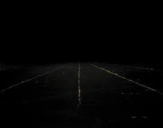
Compare&Contrast Edgar Martins

Edgar Martins 


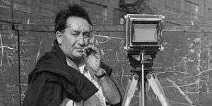
He was a Portuguese photographer who is currently living in the United Kingdom. He was born in 1977 in a small town area called Évora, although Martins grew up in China. However Edgar doesn’t just base all his creativity in the photographic area but he has also published a hand full of books in which he has won a variety of awards for. Martins has work exhibited in various places around the world from Portugal to places like Dubai. Not only that but Martins was considered by the UK and the US as one of the most influential artists for this generation. Not only has his work inspired our first project for photography but having looked at my new images and my now edited images there are some obvious changes in terms of contrast and the shadowing I have added to the photo to make it similar to Martin’s developments.

His images is part of a series of work inspired by the writing and sending of letters, the power and intimacy of a letter. Martins has recently won various awards for his minimal, direct and stylish approach.  it is pretty evident that Martins puts a lot of thought into his images as not many artists have had the same approach as he had. 

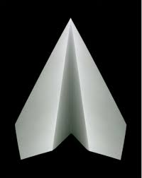
Edgar photographed paper. There is a stillness to his images that belies the fact they may have been written as suicide notes, used to communicate between prison inmates and loved ones. Martins spent time working with court, prison and parole officials and indeed, prisoners in Portugal.

Here are just some of my favourite examples of his work.

(not an image of paper but still one a famous image)
Paper 1
Paper 2


I like these images due to the contrast of lights and darks and how in the second image of the paper there is a  real sharpness and contrast on how the  black background sits below the white piece of paper.  For me this is really eye-catching as the focus is quite vastly spread amongst the image but immediately only draws attention to the white area.

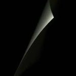
My paper photographs were not as professional as Edgar’s but there was a thought process. Here are some of my examples before I even edited them slightly. This image was not the first set a paper photographing I did but the second. I chose to edit this image as its one that looks quite similar in terms of Edgars images .
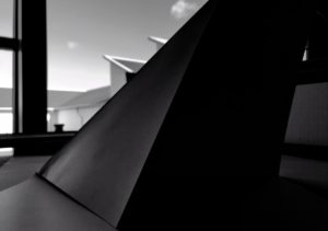
Here I’ve changed the image lighting and added a lot of heavy shading. I’ve edited this image by adjusting the tone, brightness,exposure,contrast and black point.

Aaron Siskind

Aaron Siskind

Aaron Siskind was born on December 4, 1903 in New York. Siskind and Callahan, famous for their synergy as teachers and photographers, reunited in 1971 when SIskind left the Institute of Design for the Rhode Island School of Design where Callahan then taught.

This is one of Aaron Siskind’s work

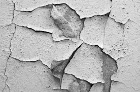
Siskind was interested in surfaces and texture from the natural environment surrounded by us in everyday life. therefore my response to his work is focused between those two areas.

Most of siskind’s work is based in images of black and white which immediately sets his work to a more detail and higher levels of contrast. His work caught my attention as when taking photographs I like working with black and white as for me it brings details that wouldn’t normally be as visible when I’m colour. However this works the same for some images that are colour that if you edited to black and white wouldn’t be as outstanding to some. However siskind’s work is different due to his focus on texture and levels in the images.


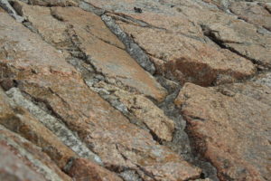
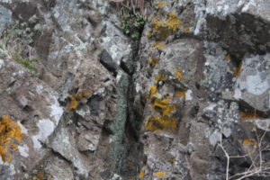
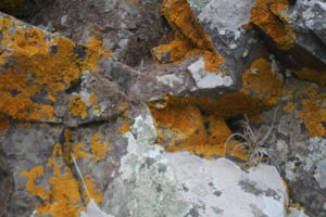
These are just some of the images I have taken based on Aaron Siskind’s work on texture and surface.

Mirroring Experiment

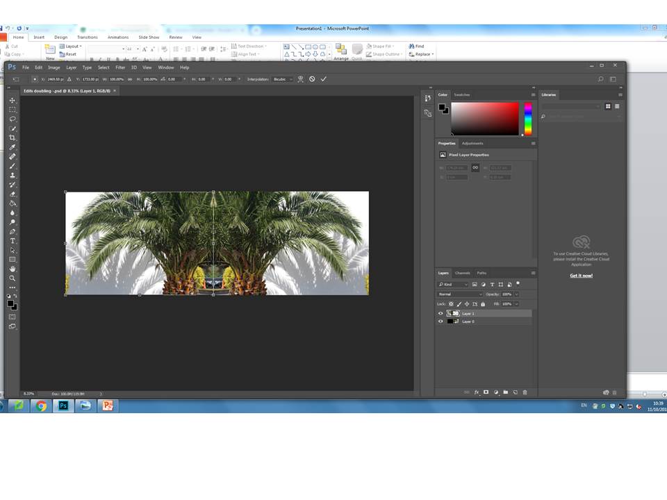
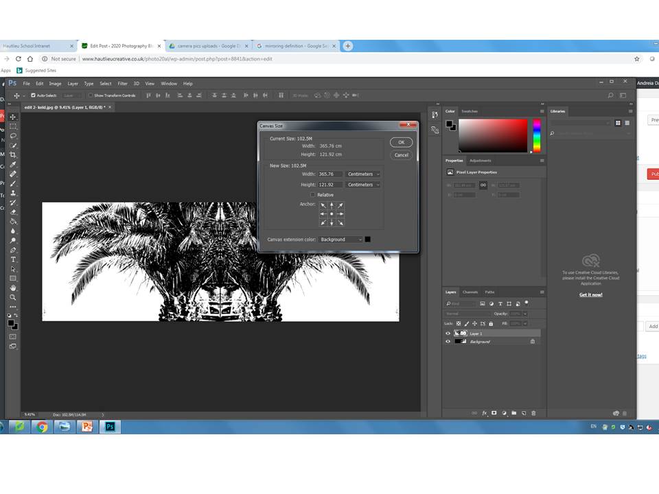
This box is used when you want to decide where about you want your image to be mirrored at.

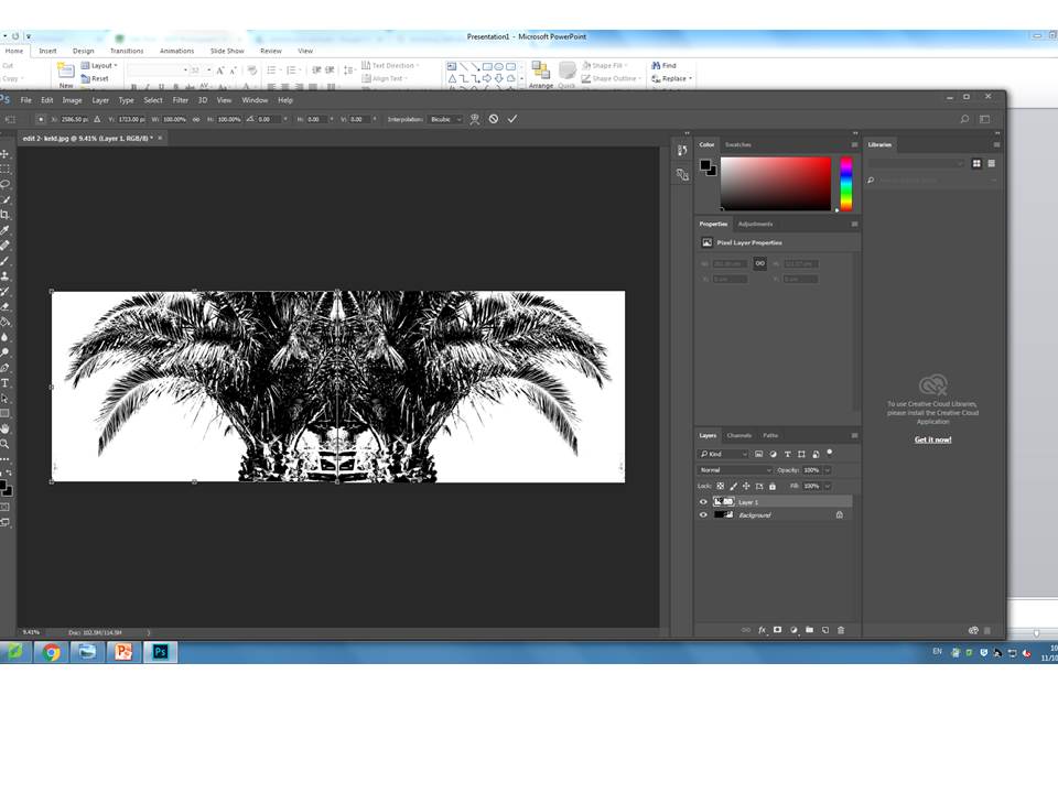
Here are a couple of examples of my final outcomes.

The steps i followed were pretty simple. I started by deciding which image i was going to edit first. Then by hovering over the image tab at the top and press canvas size i was able to drag the photo from one side to the other using the small arrow in the corner. After having selected it and by pressing control J.

Here is another example of the same image i edited but in black and white.


Hw – 4 Editing Photos

Task 4 – Camera Skills Editing


  • White Balance


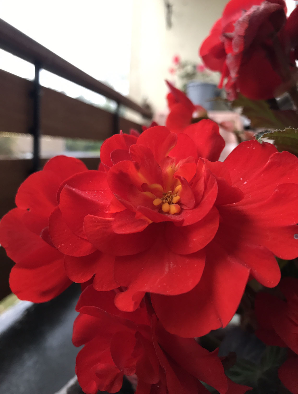
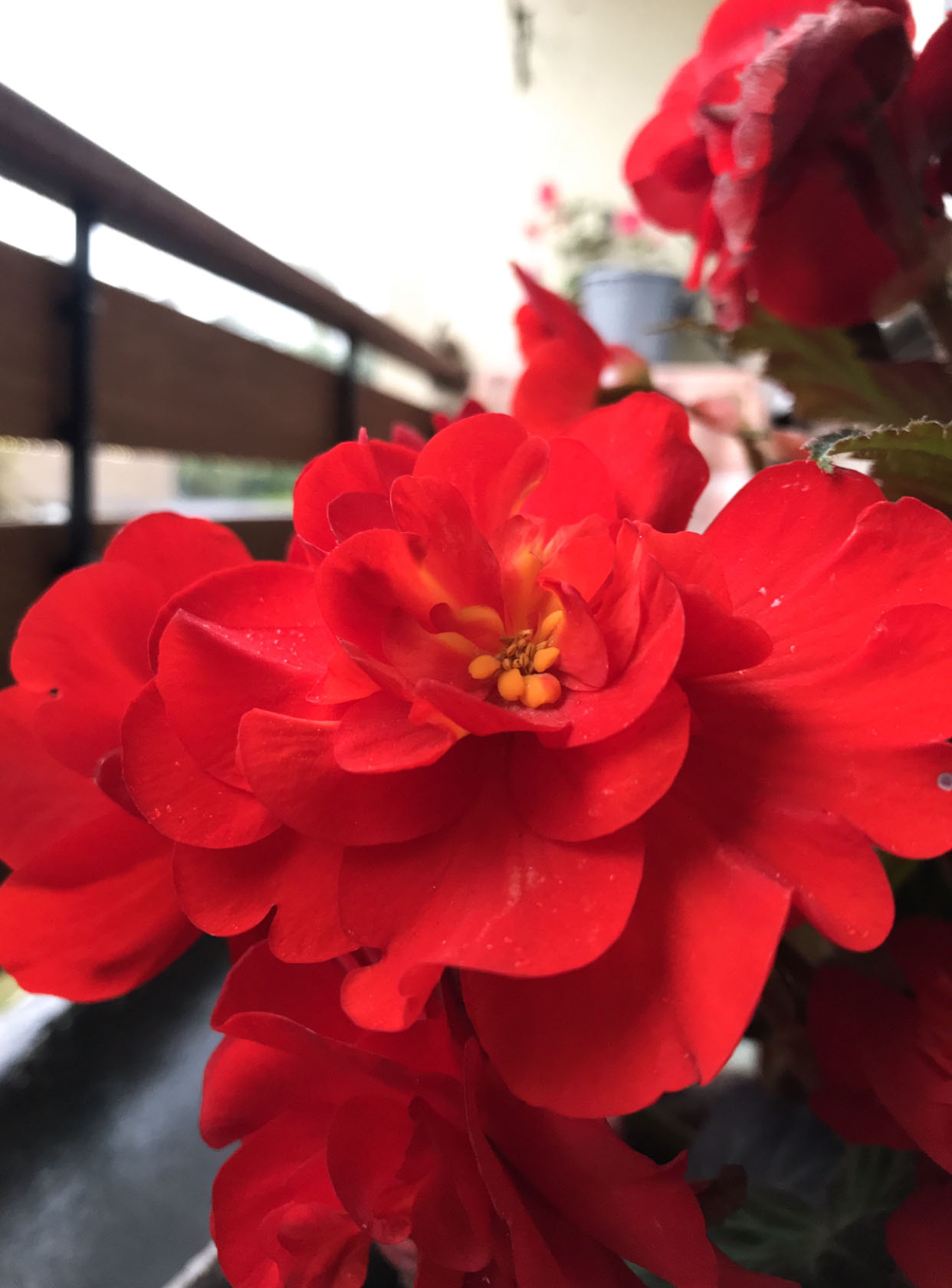
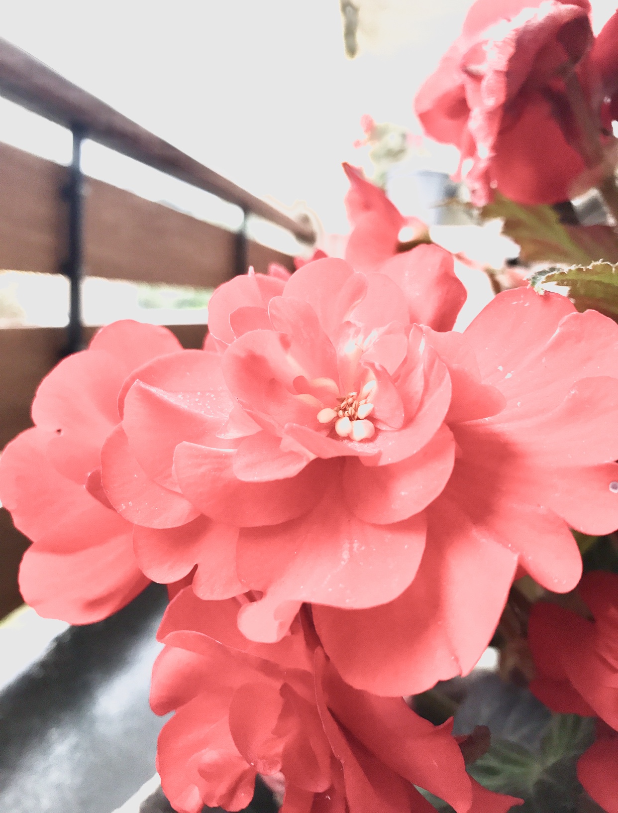
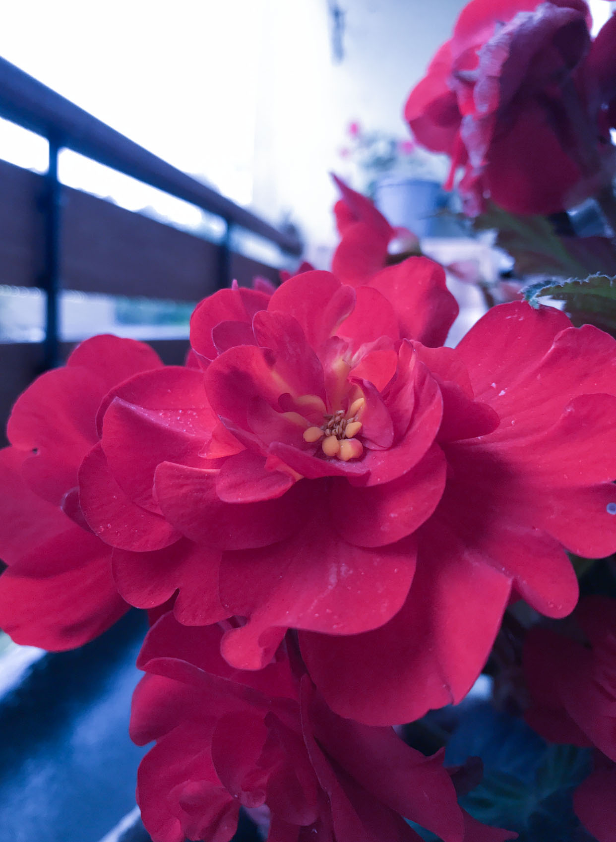
White balance is the process of removing unrealistic color casts, so that objects which appear white in person are rendered white in your photo. Proper camera white balance has to take into account the “color temperature” of a light source, which refers to the relative warmth or coolness of white light. For my experiments I simply edited the lighting so that neither of my images were too dark or too light. By doing this some of the colours have been enhanced due to the how bright the background colour is. However the temperature of the photo has also been changed therefore has caused the image to be more dim.

This is the original image:


  • Depth Of Field

The depth of field of the image is the zone where the sharpness and focus is based on one area of the image. Weather this means the background is blurred or simply toned down the focus will only be on a specific area. Again by simply adjusting the light and darks on the image i managed to focus it on one area.


Keld Helmer Peterson – Interpretation

Keld Helmer- Peterson 

Keld Helmer-Peterson is a Danish  photographer born in 1920 and died in 2013. He was famous for his photography due to the structure of his images and the different types of pattern he used. His photos tended to be based in more industrial areas, city spaces and nature. Keld started photograph in the late 1930s in his late teens and first made his name with his a book ‘122 colour photographs’ in 1948.


Whilst in the 1950s and 1960s he began to focus more on the idea of architecture and design photography, his work began to lean to be present in a more abstract way. This happened as he began to look at other artist and began to get inspiration. He looked at German and American photography as well as other international abstract art that he liked. As well as many other artist Keld Helmer-Peterson was very much inspired by Albert Reneger-Patzsch, a German artis 

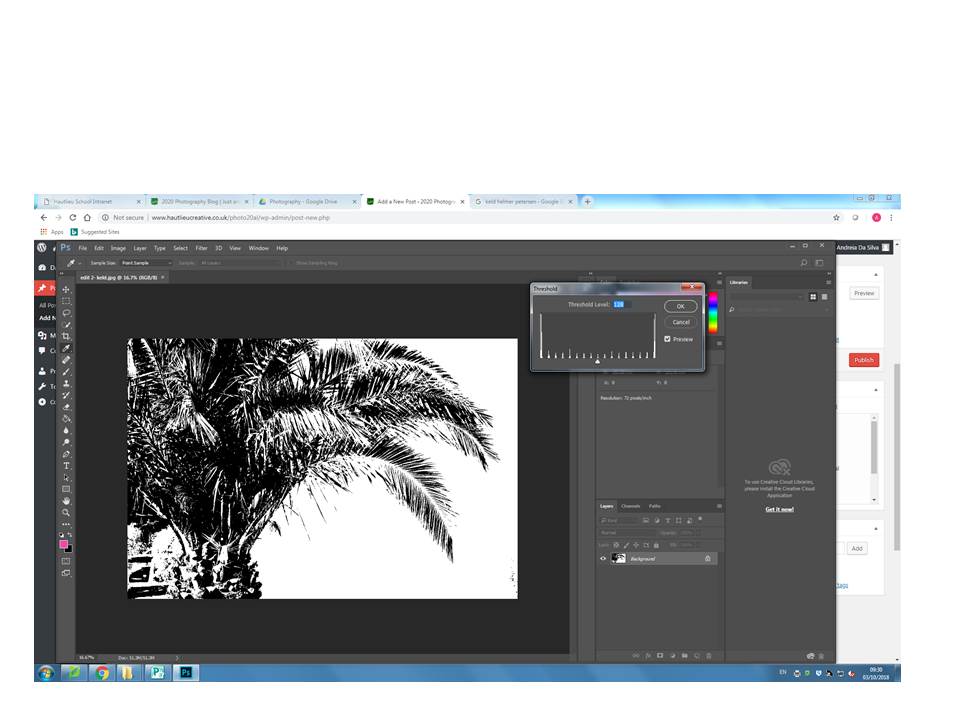
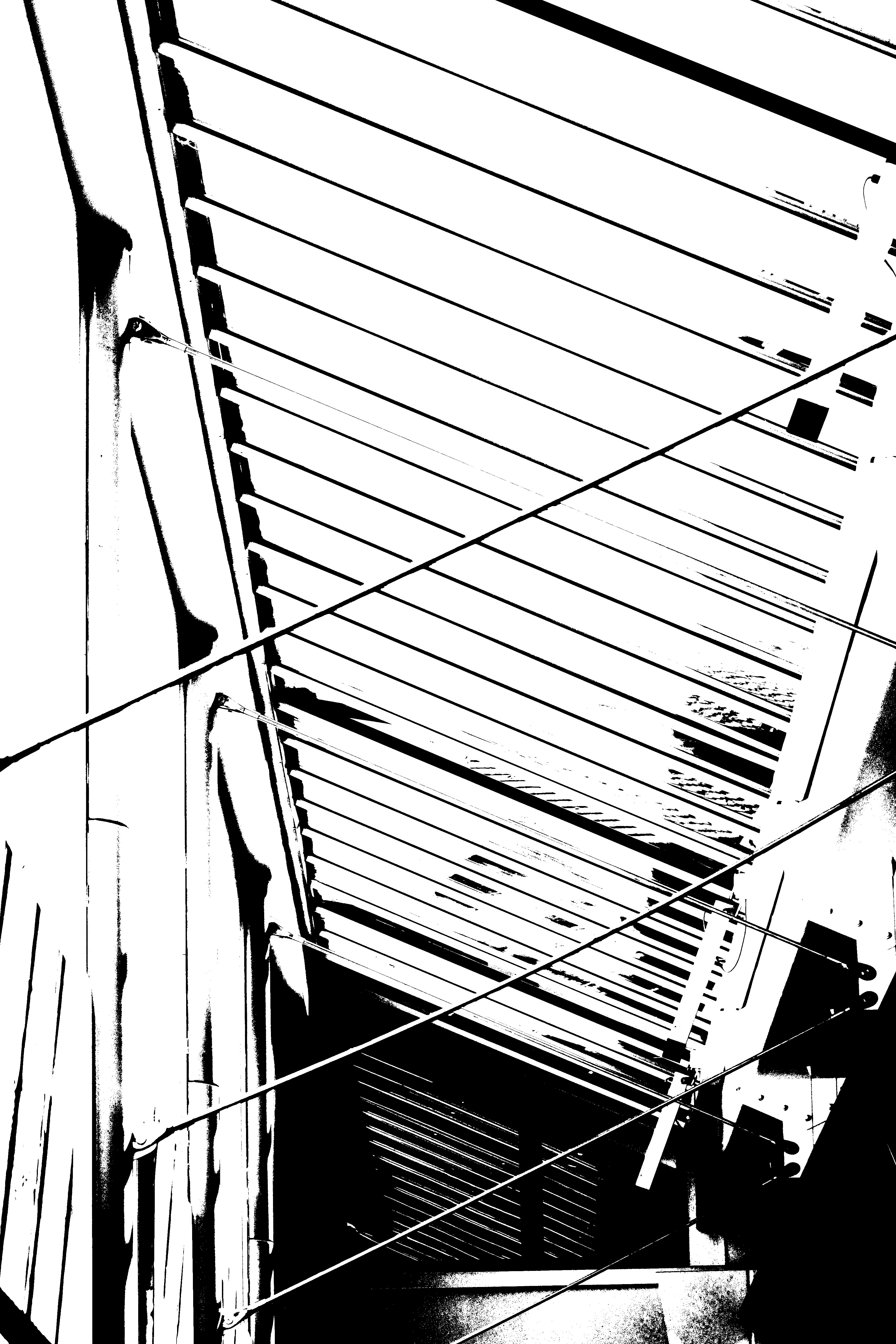
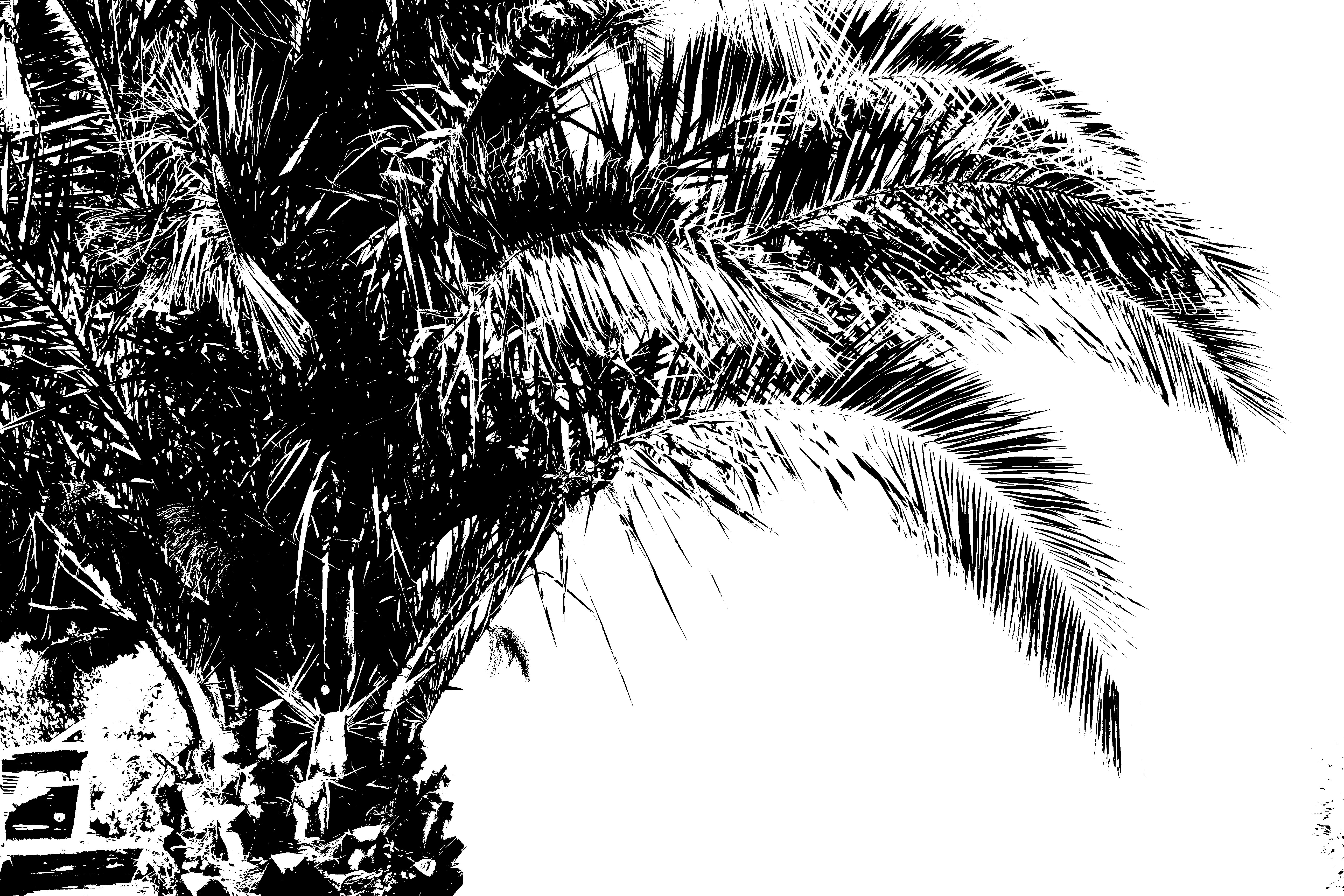
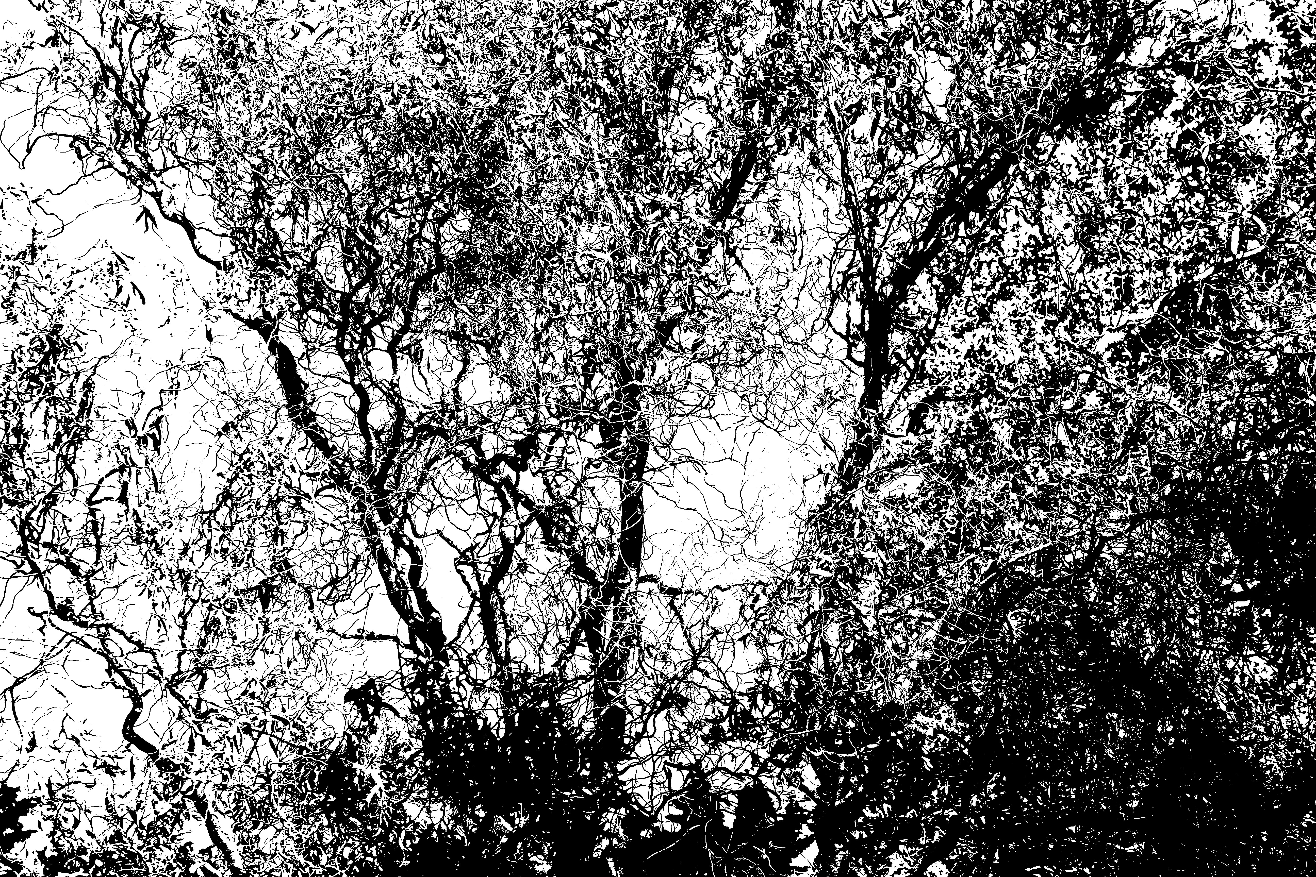
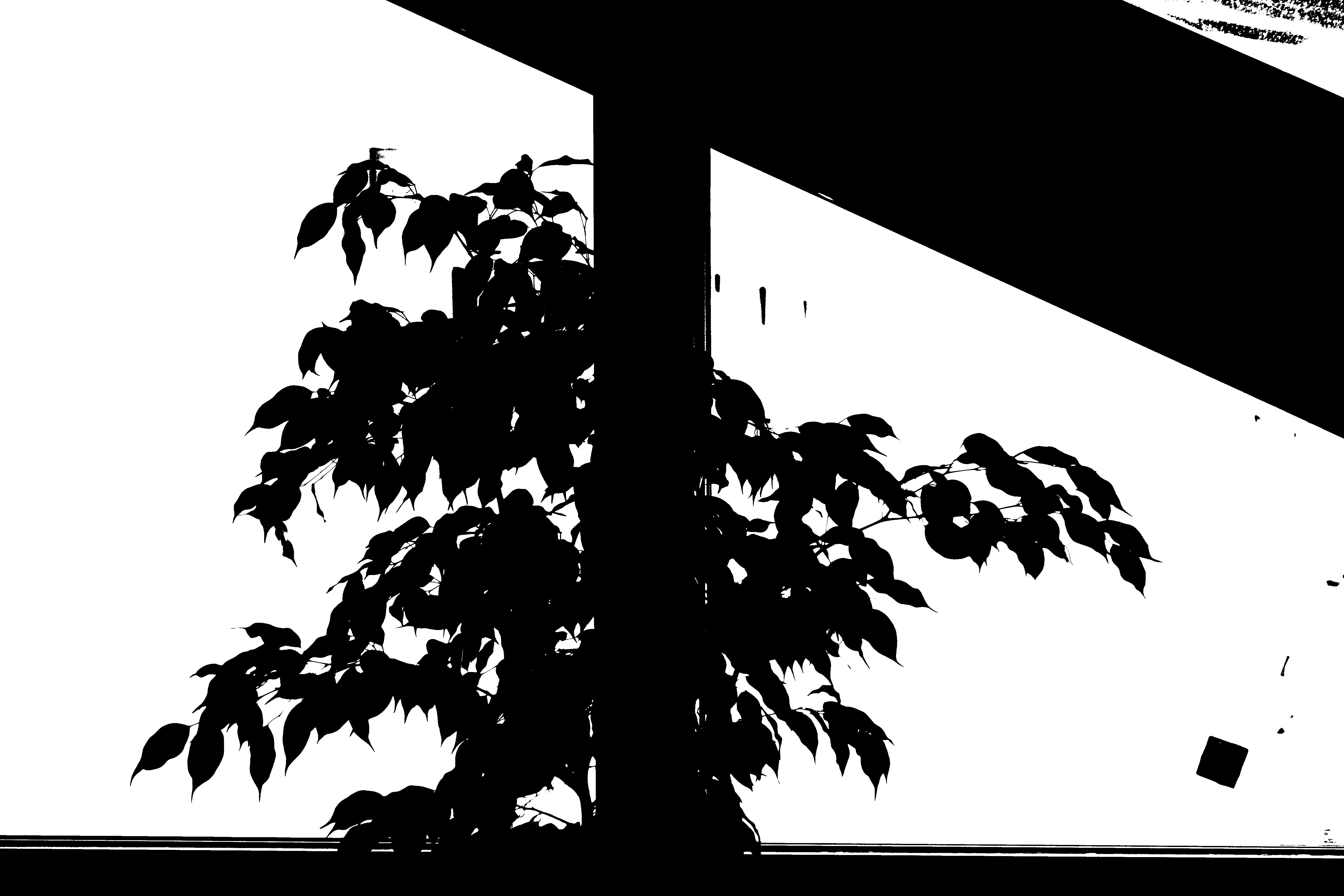
For these edits i have used Photoshop and the setting in images called Threshold.  Above is an example of how I interpreted Keld Helmer Petersons work.


Albert Renger -Patzsch


ALBERT RENGER- PATZCH WAS A GERMAN PHOTOGRAPHER OFTEN ASSOCIATED WITH THE TOPIC OF ABSTRACT PHOTOGRAPHY. HE WAS BORN ON JUNE 22ND 1897 IN WURZBURG. ALBERT BEGAN PHOTOGRAPHING BY THE AGE OF TWELVE. THE ERA HIS PHOTOS WAS BASED AROUND WAS WORLD WAR ONE TO WHICH HE SERVED IN THE MILITARY FOR THEN WENT ON TO STUDYING CHEMISTRY AT DRESDEN TECHNICAL COLLAGE.

Alberts interest in photography led him to creating his best well known book called ‘The world is beautiful’

Albert does not stick to one area of photography. His work consists of elements of wildlife,images of traditional craftsman,landscapes and architecture.

All of his work really captures his love for nature and how he sees the world as a beautiful place, Albert uses photography to show to the public his love for the camera.

In 1928 his book ‘the world is beautiful’ he collected over 100 images with patterns of beauty and order but he does this by photographing through nature but only man- made patterns. Meaning that he did not alter anything to form something that was not there before.


Renger-Patzsch work interested me because of the level of detail that he had included. Another reason i like his work is how lined up everything is. I can tell that Renger patzsch takes time to reflect on the setting before trying to capture the moment.

Clare Rae X Claude Cahun

Hw- task 2 -CCA Galleries International

Claude Cahun X Clare Rae Exhibition 

Clare Rae- Exhibition

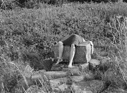
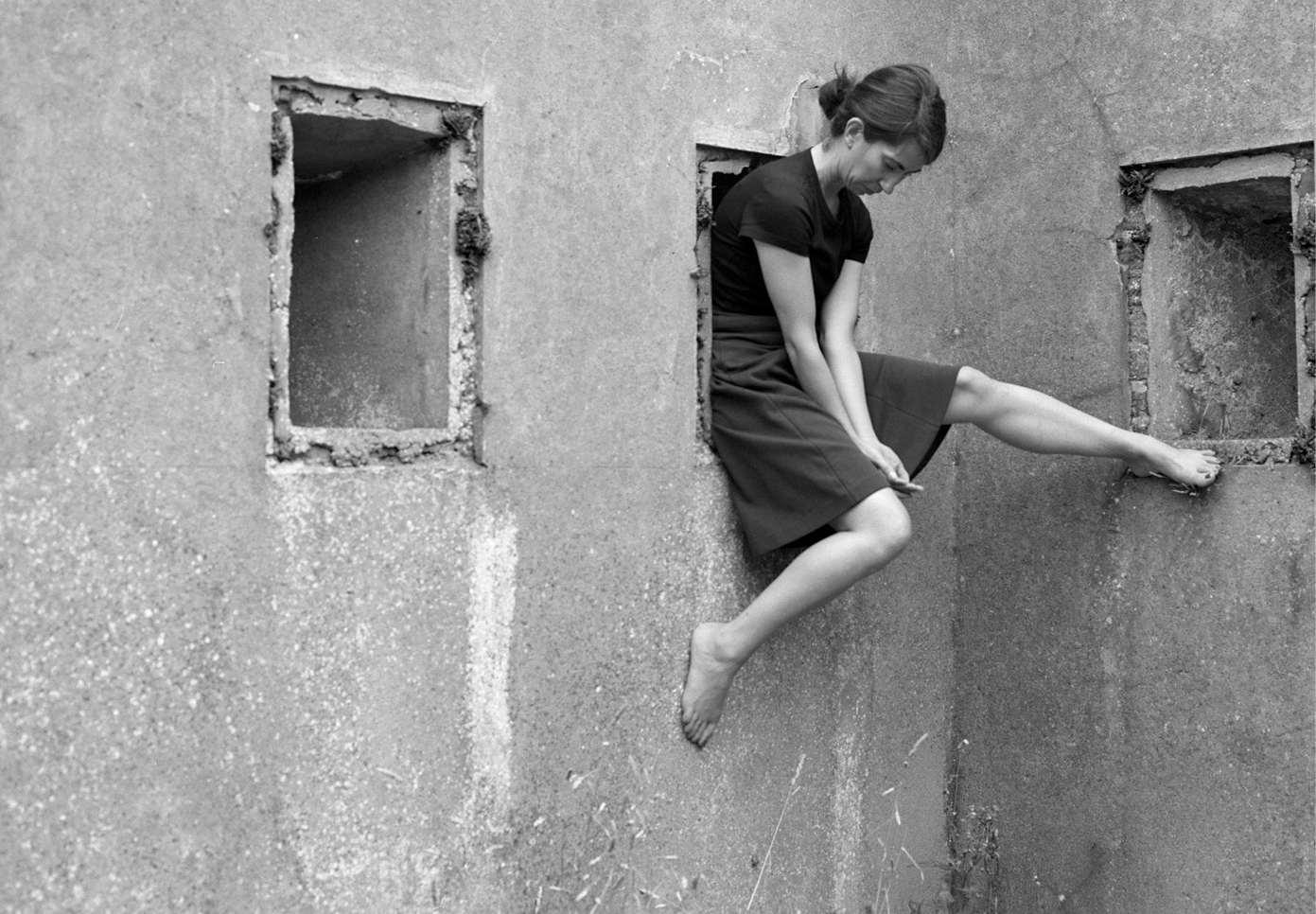
I chose this image by Clare rae due to how it stood out compared to the rest of her images, although her images all stick to a theme of portraits clare seems to try and adapt to the environment around her. She does this by positioning herself inside holes in buildings or by climbing onto rocks at the beaches or the sand dunes. This image she has physically lied across a rock this i found particularly weird as i had never seen an artist do that before. I particularly like her images because she works with black and white. For me i think the images that have quite a lot going on in the photo as in the surrounding that she has chosen, it creates more shading which also brings out certain detail that maybe if she hadn’t done it in black and white we would not have been able to spot due to sunlight or if the image was too bright.


Clare Rae Block


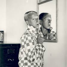
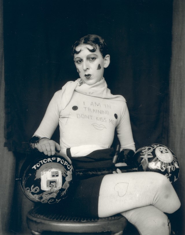
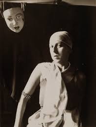
Claude Cahun

This is an example of Claude Cahun work. This was my favorite image due to the elements of weirdness in the picture.  I think this picture is unique due to the fact its not simply sticking to the idea of just normal portraiture photography. Cahun works with black and white so therefore she relies on the heavy shades and contrasts between colours to adapt to the type of image she wants as an outcome. Every photo that Claude takes has a story she tends to explore out of the box ideas which in her age would have been seen as a brave but challenging thing to do. Cahun works around the theme of identity. This is shown not only in this photo but many others. She was looked up on as she was known for her exploration of sexuality and she shows that in her photographs.

Overall both artists create ideas of expression of identity and allowing and not being ashamed of showing off the female body. Both artists are expressive and work well in what there trying to create when someone is looking at their images as all images have a story so once understanding the context I realised why their images might have been seen as strange.