A2: PHOTOGRAPHY
PERSONAL INVESTIGATION
BUNKER ARCHAEOLOGY
A2: PHOTOGRAPHY
PERSONAL INVESTIGATION
BUNKER ARCHAEOLOGY
Photoshop Example (1)
I have decided to use Photoshop to experiment whether I would keep my images the same or play around with color saturation. Here are some of my examples and the steps I took to achieve these first attempts.
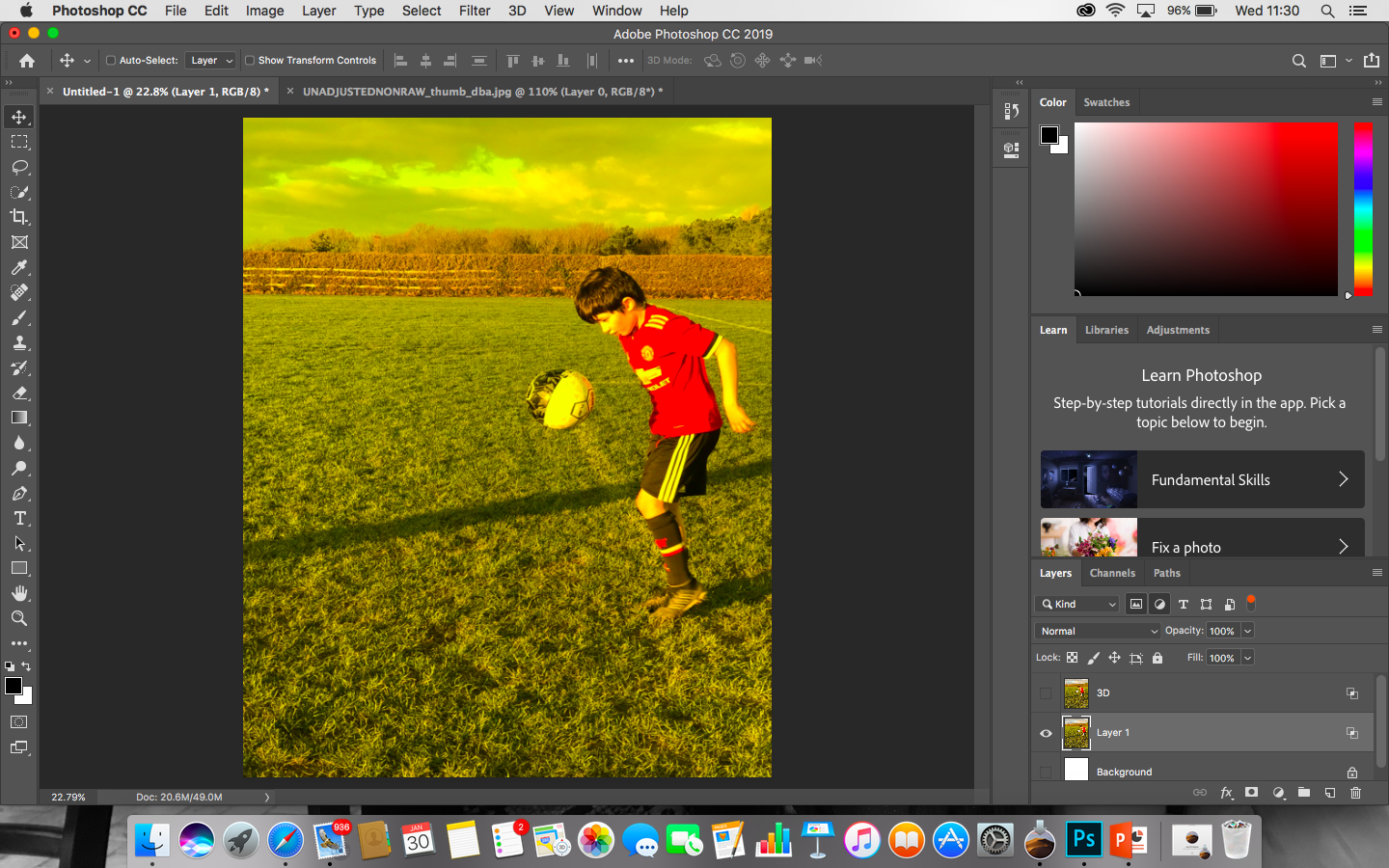
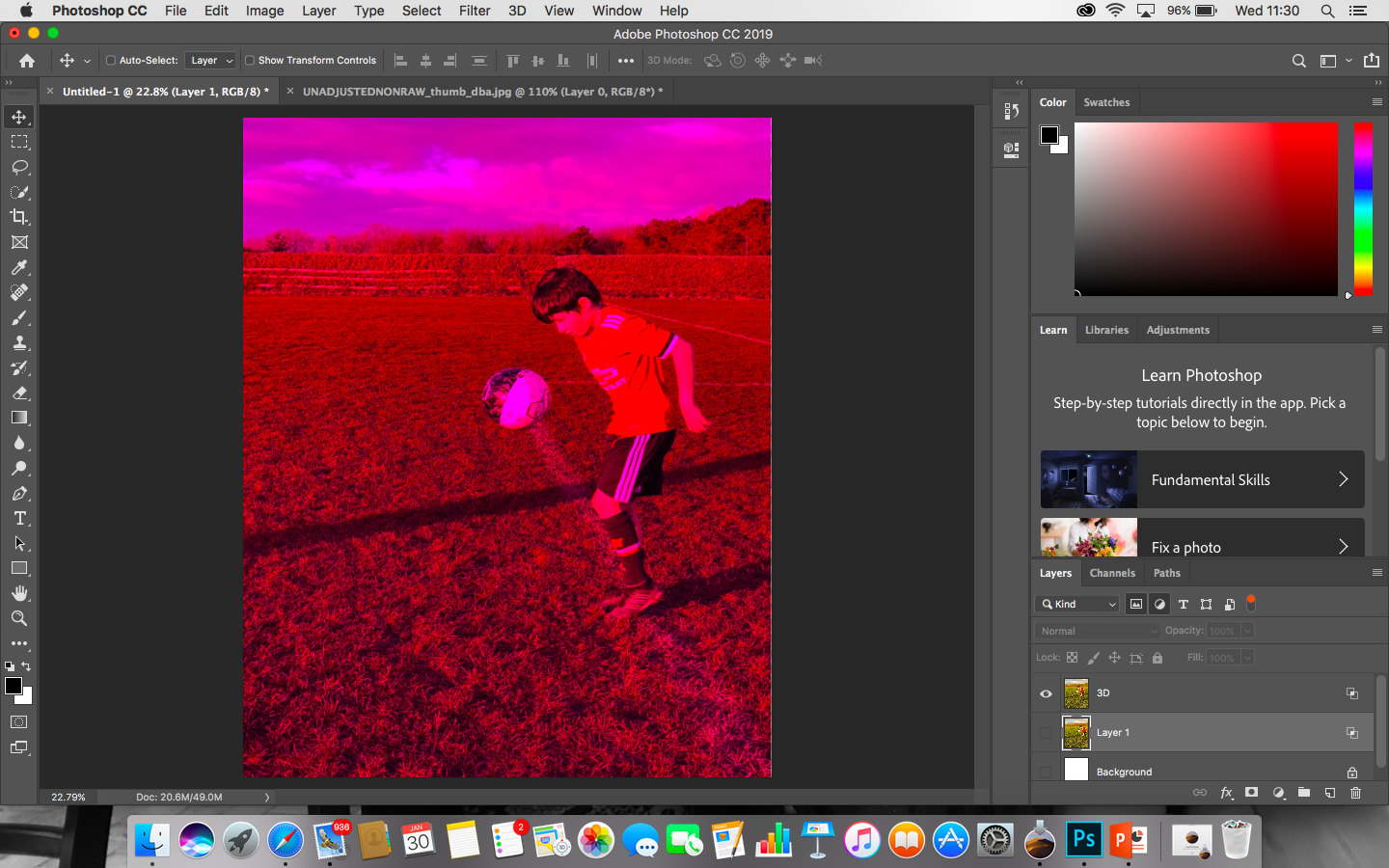
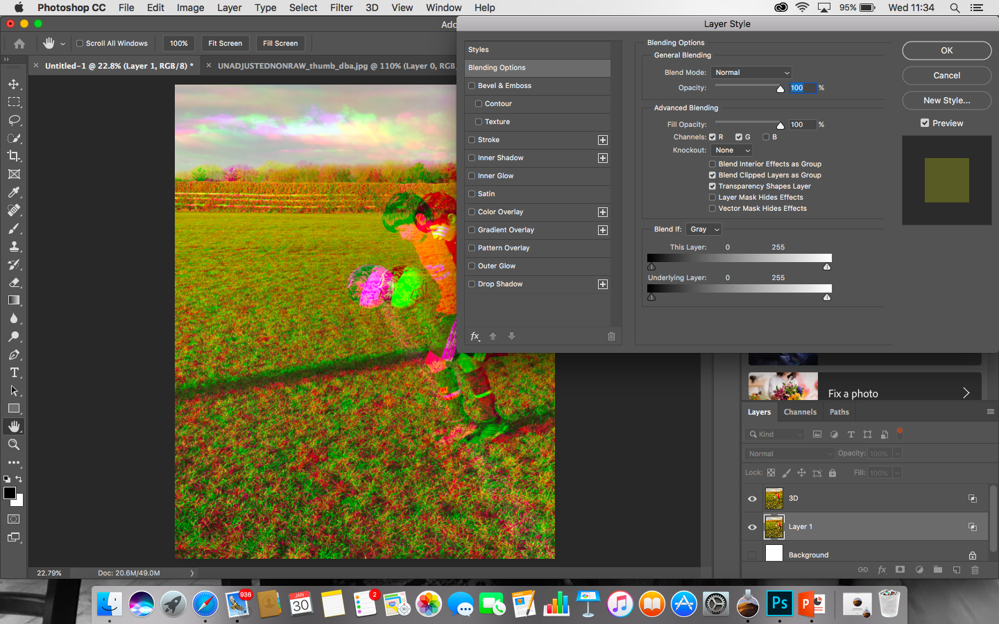
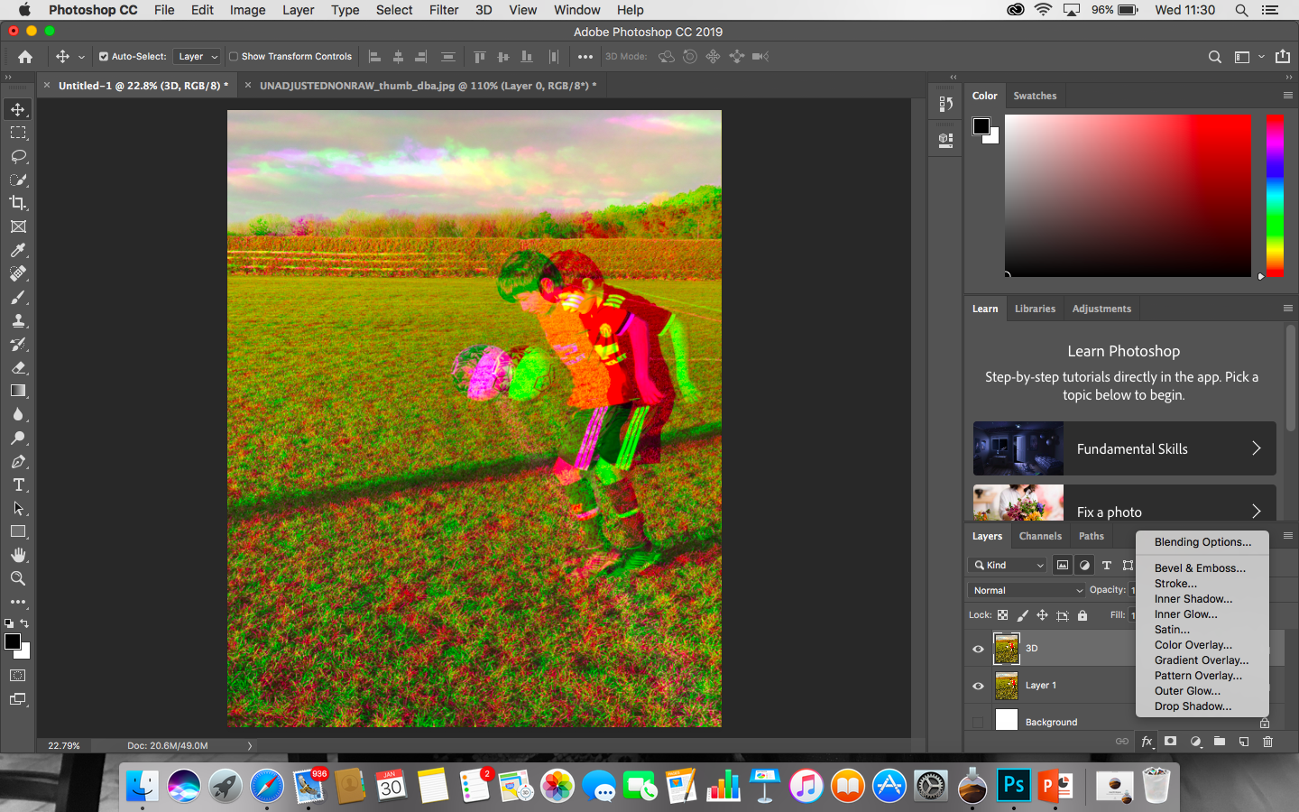
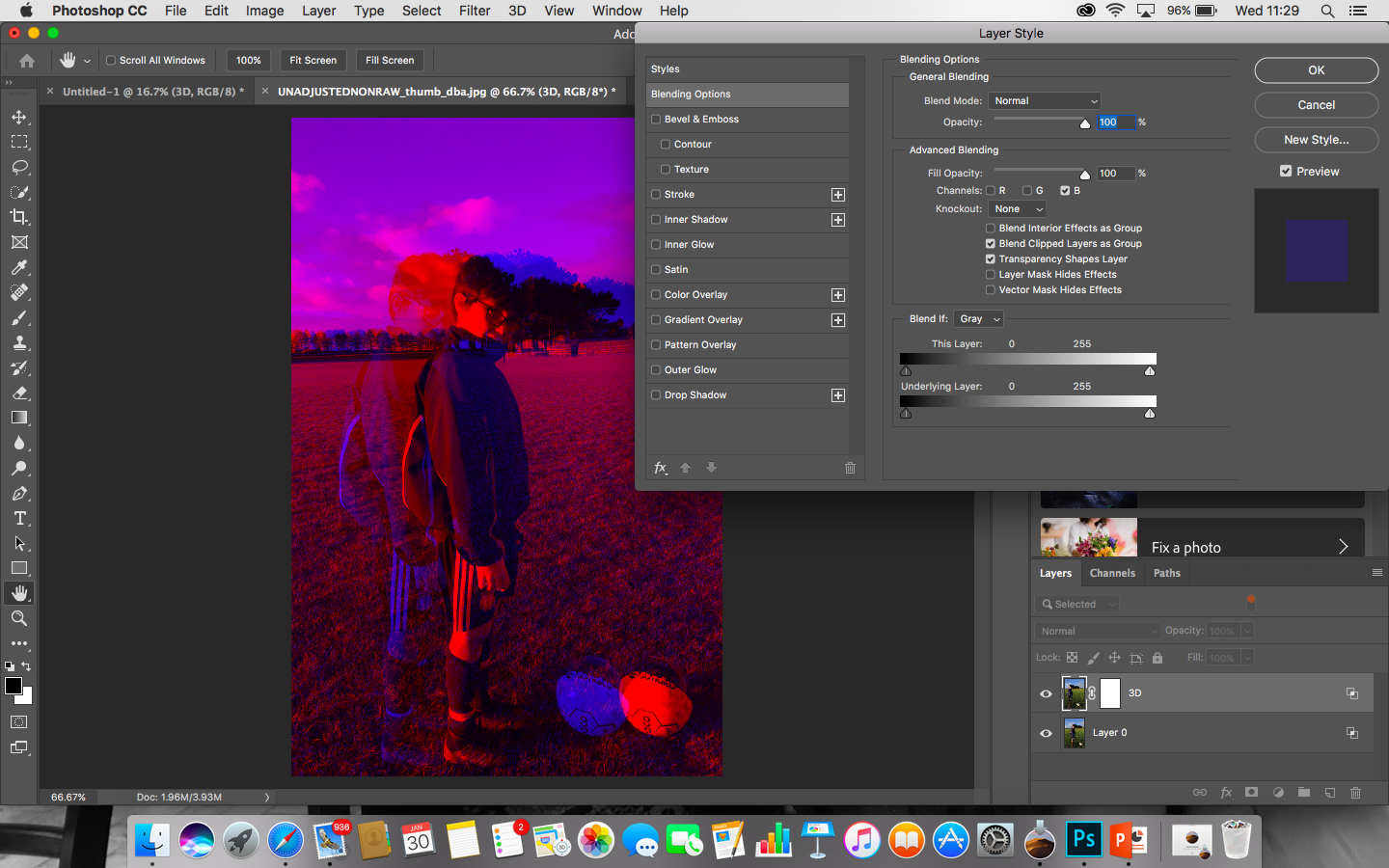
As i am not a photo shop genius, this took me at longer than anticipated but however i am proud of my end results.

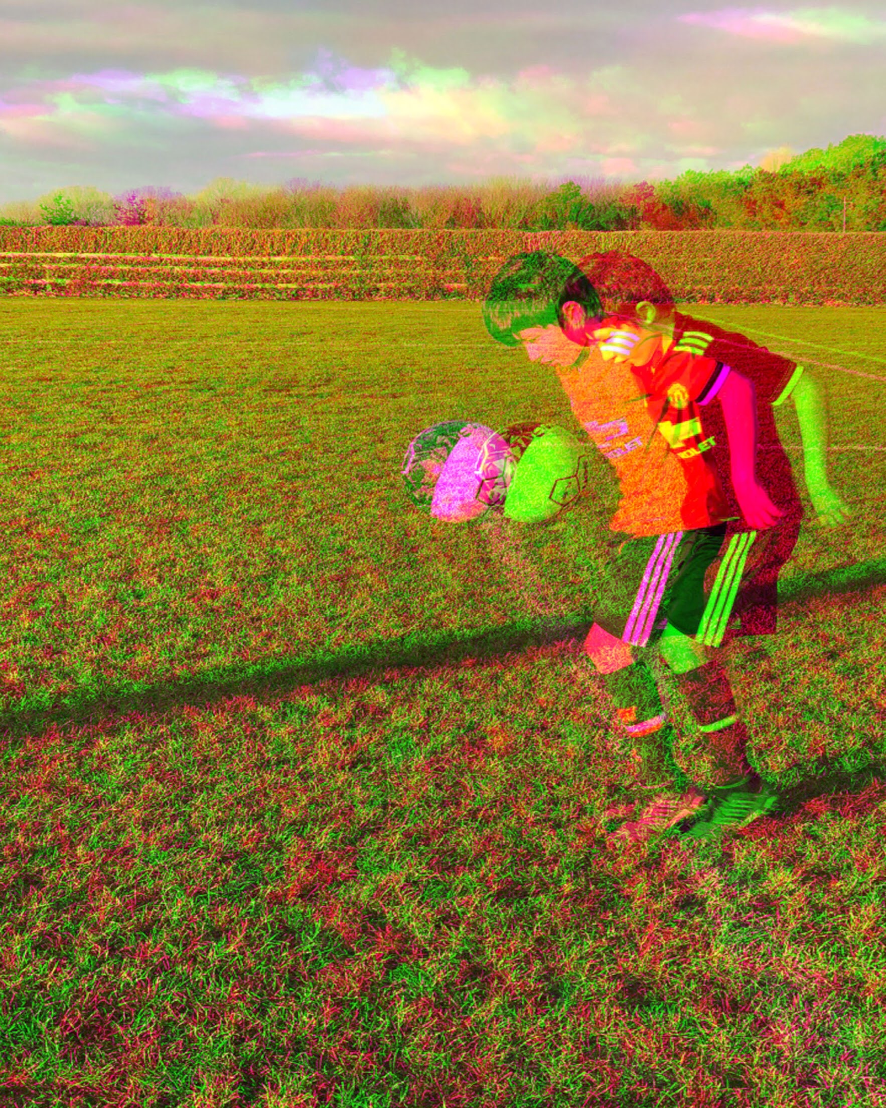
I decided to challenge myself and present 3 different images and blending them all together to create one simplistic image.
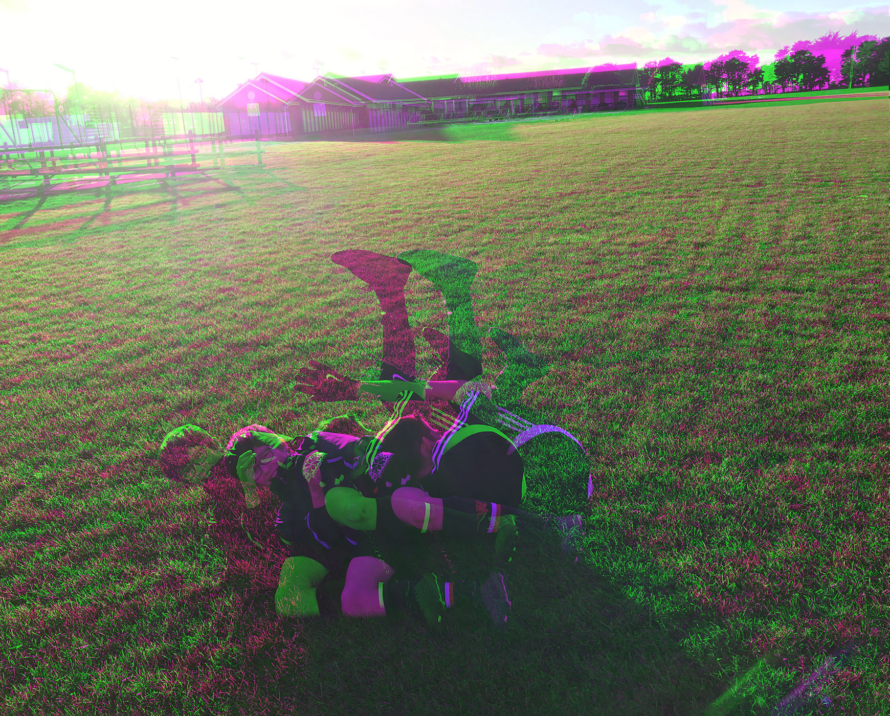
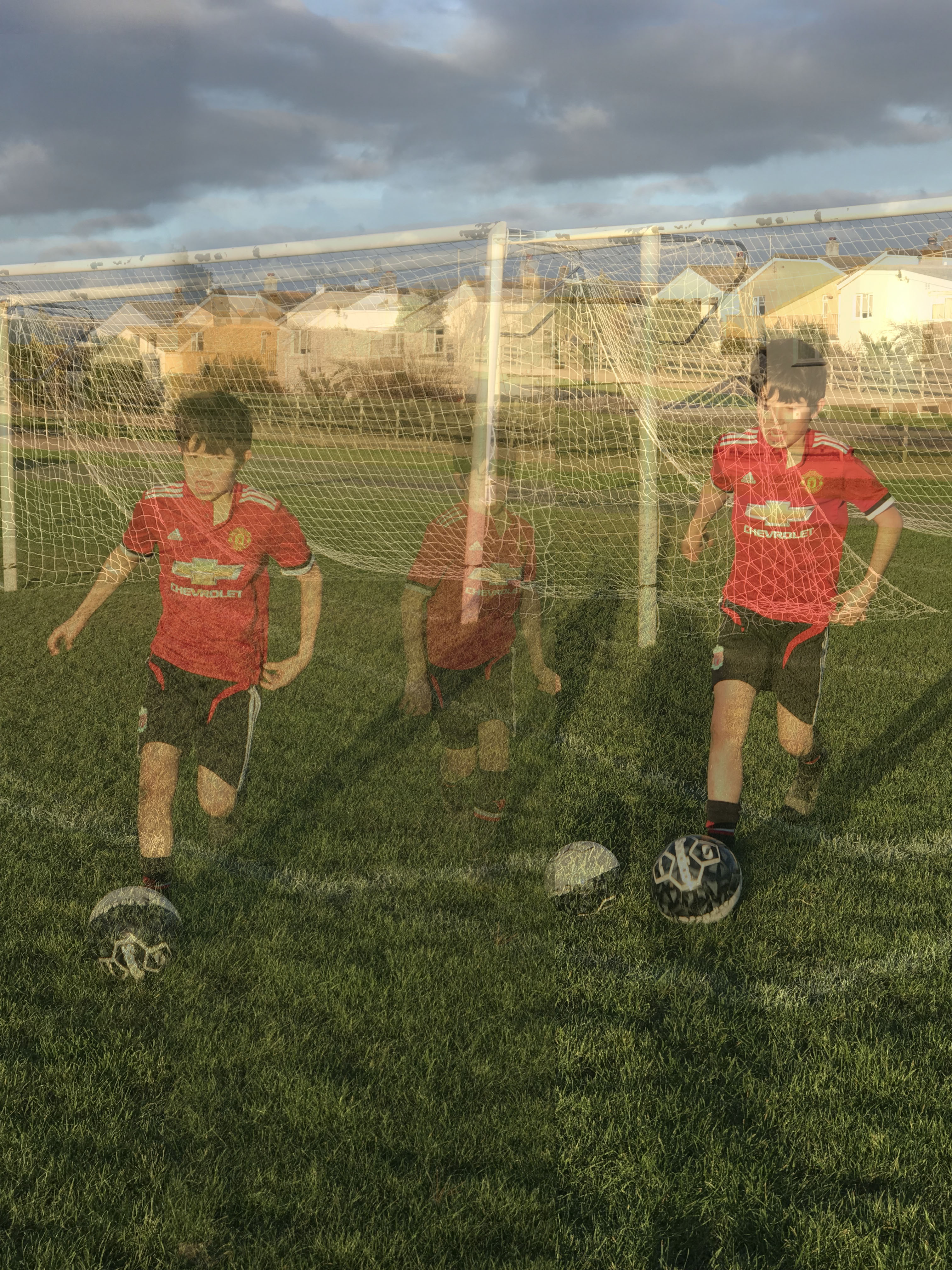
In the image above i have done nothing with the brightness, shadows, contrast. I chose to leave it because i found that due to the natural lighting of the sun the image really shows warm tones like yellows and golds to create this afternoon sort of shade. The other technical aspects like the positioning of myself and the model was well thought out as well, however in one of the images you can see my shadow and if i was to do this again i would have tried to stay out of it just because it also draws attention to it due to it being black. In this example i made my brother run towards me as he was kicking the ball, however i was positioned very close to him but i did that because i wanted to capture the sense of movement which wouldn’t have been achievable from far away.
I chose to insert 3 images into one because it adds movement to the image. By movement i mean that there is multiple things happening. Not only that but by trying to add a football vibe to it. What i mean by this is that when footballers are playing a game it is very rare you see anyone actually standing still. By combining these 3 images and lowering the opacity of each image its trying to capture that it can be tiring and it should be effort but if its something you are passionate about them it should seem more like a hobby rather than a chore.
https://www.digitalartsonline.co.uk/features/illustration/best-photoshop-tutorials/#75
The images below are my respone to both the theme ‘ Identity and place’ and the response to my artists one being Eamonn Mccabe and Brad Mangin. As my action plan consisted of my brother playing foot ball and the process which a young footballer has to take due to play as best as he can. Some of these images are what id like to call action shots. This is my interpretation of identity being the child and place being in his element which is football fields and some images are captured indoors to show the process of him getting ready for training.
Here are my images in a form of a contact sheet.
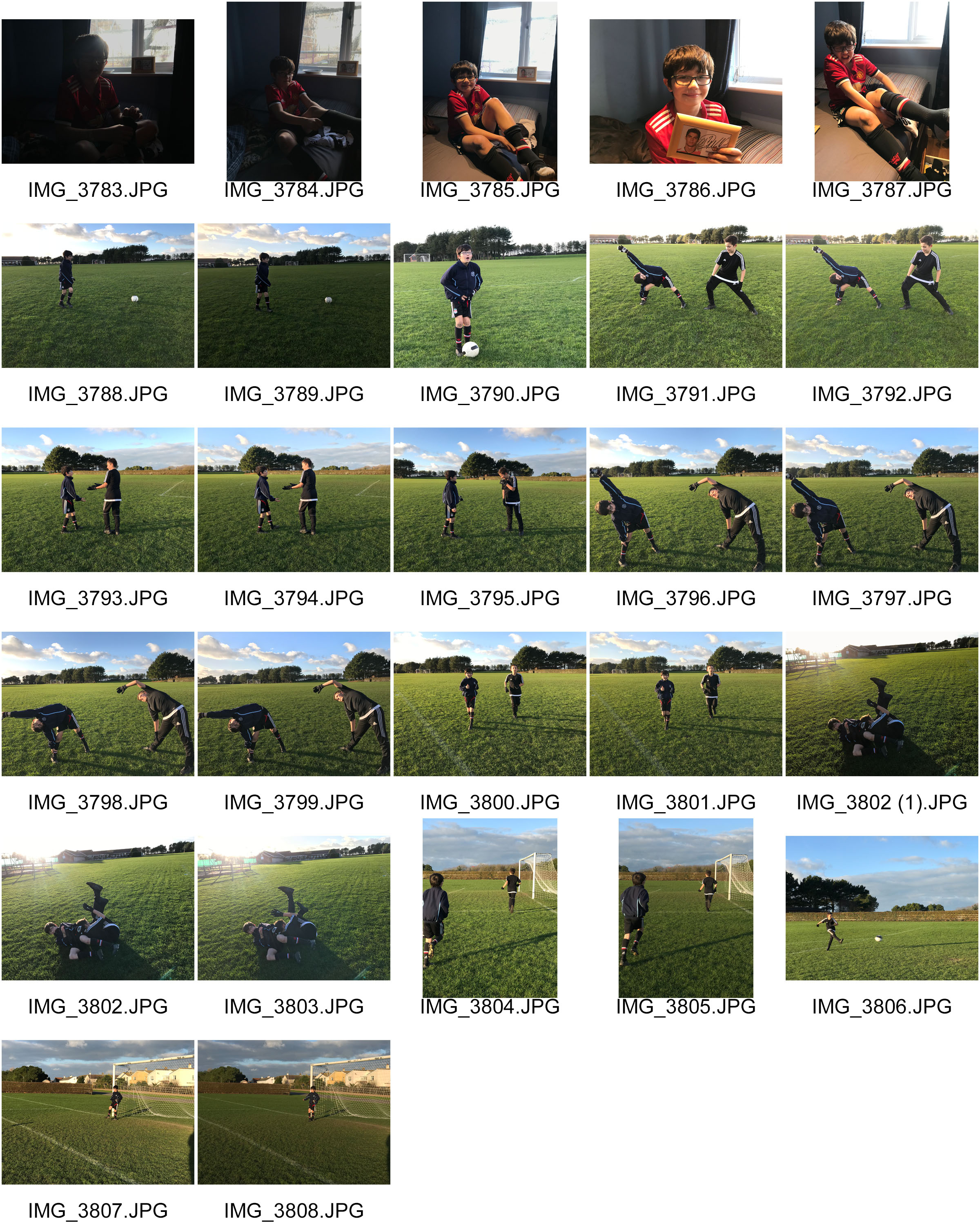
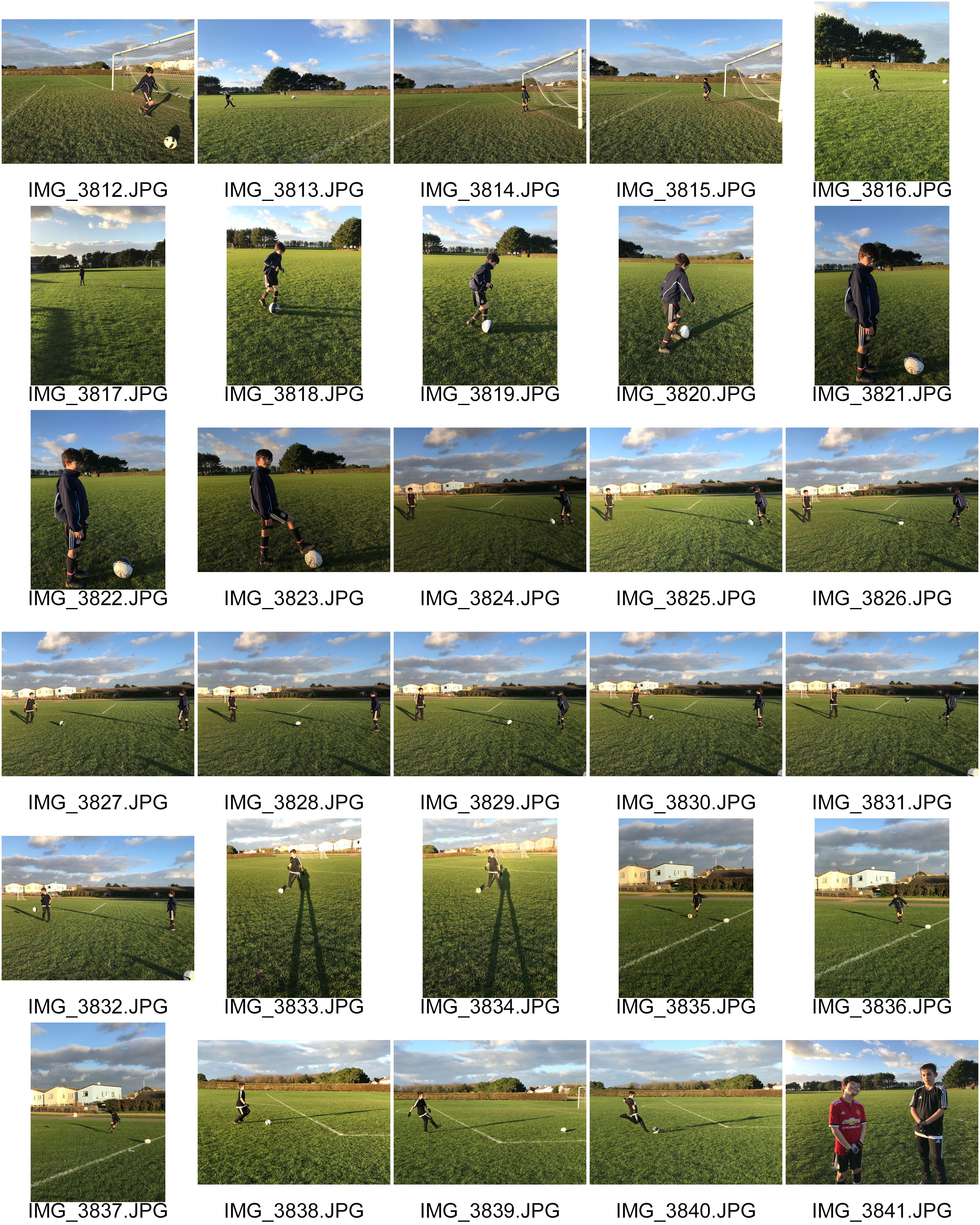
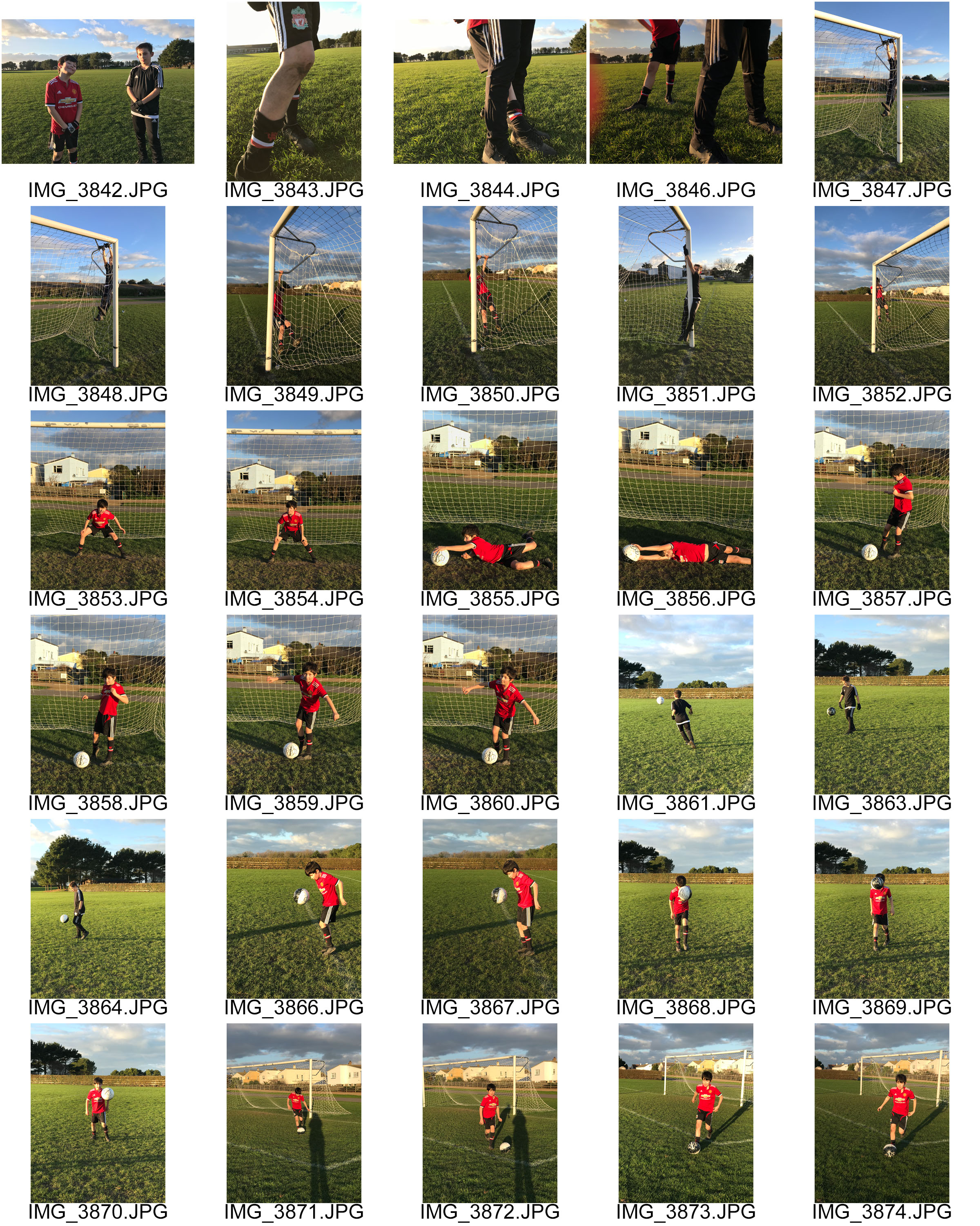
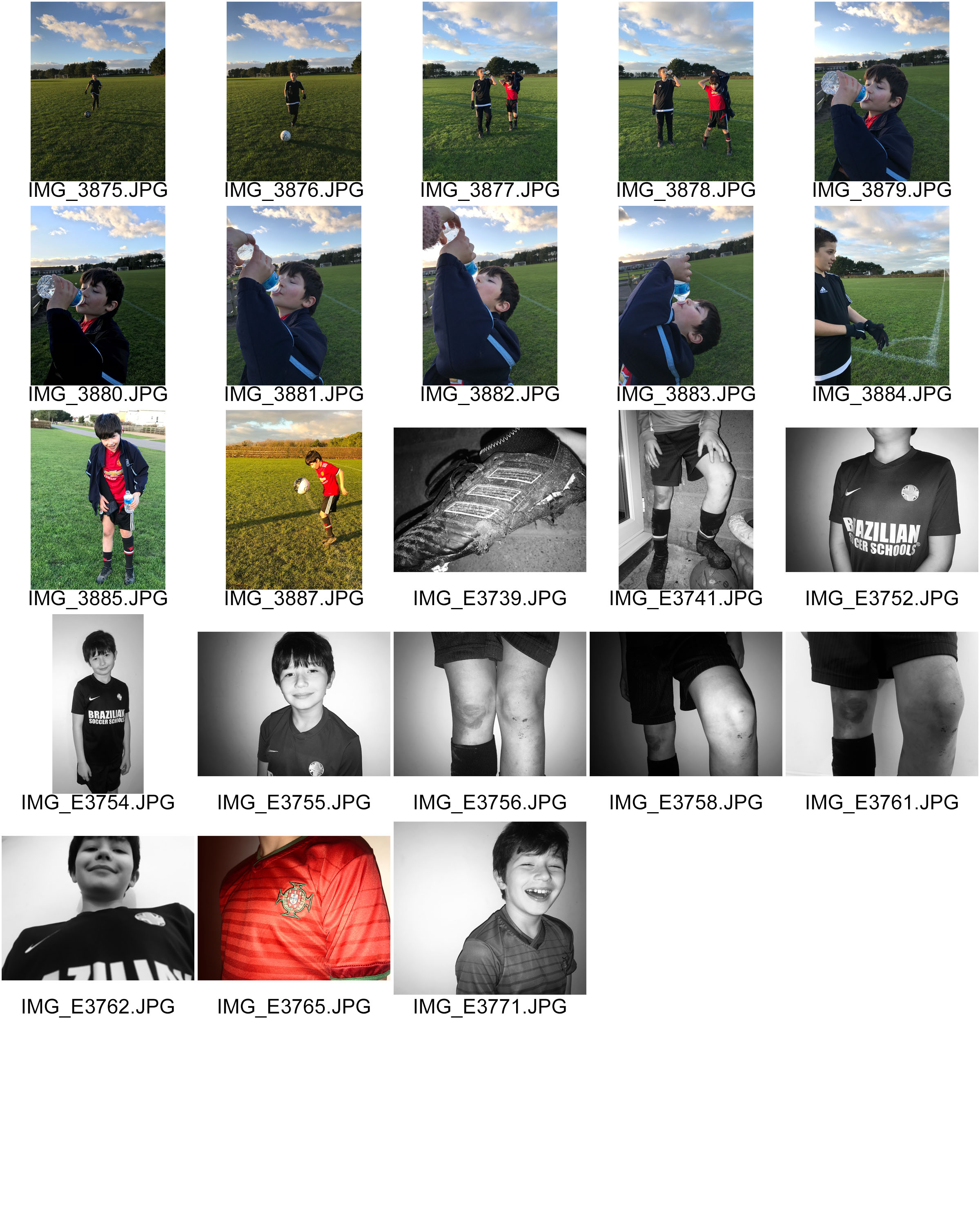
In the examples below you can see I have drawn over the images. have done this because some of them are under exposed therefore to dark so I am unable to edit it I have done that in (red) . Additionally if the image is too over exposed or under exposed i have decided to cross it off In (blue) .If the image is out of focus I have chosen to cross it out in (pink) Finally if the image I think has too much negative space behind it which makes the images look quite bland and boring I have crossed out the space in (white)
Now having looked closer to these images, its evident that some are better than others in terms of the lighting quality the picture just how its presented visually and the context behind it.
Visually, when i was planning this photo shoot i could not have picked a better day in terms natural lighting, the glow in some of the images really make the image more welcoming to look at giving it quite a warm temperature as well, unless i’ve chosen to add them images into black and white. However if it wasn’t for the light of the sun the 3D effect i was after would not have been achievable. I also like how some images have the shadows in the background because it fills the image more which is something i had a problem doing when i did the photo shoot. On the other hand some could say the space helps the image as it slightly draws attention to the small people in the image.
In terms of detail due to the drastic, golden effect of the sun i have been able to capture quite heavy amounts of detail like the individual lines and patterns from the grass and the goal even the close up details of the football and background. I captured these images on the quennevais football fields which actually adds a bit of value to the images as its where my brother began to play football. We would usually take him there in the afternoons and just have a kick about which now has lead him to having a passion for this area of sport,which now is involving as he’s just practiced for the island trials. Now he uses this time in the afternoons when he gets home from school to go out and practice with one or two friends which day by day is improving his skill and technique.
BIOGRAPHY: he was born in 1948 currently 71 years of age. He is a British professional photographer who began his carrier as a sports photographer and who has won four times sports photographer of the year between 1978-1984. He then changed his attention to The Guardian and The observer for more general editorial portraiture. Not only that but McCabe managed to cover 3 of the Olympics.


Visually, the images above all have a story behind them.The purpose of photography is to capture moments which make you reflect on the day, the event, the moment. Here, the first image i have interpreted it as a celebratory moment. By looking at this image its quite evident just by the body language of the man that he had clearly scored a goal and this was his celebration moment. The shutter speed in the image would have had to on a fast setting to be able to capture the moment he started running towards the camera and we can see that by the way his hair is being breezed backwards. The image itself is focused well and the contrast between the man and the people in the background that almost look gutted that they didn’t manage to black the goal. Additionally , the image is quite happy to look at and gives a sense of almost achievement as if we were there to cheer with them. The iconic 1970s English soccer player, Kevin Keegan was the first sports personality to actively enter into what was then known as a “face contract” for what were essentially his image rights.
The last image from the ones above i chose to insert into the blog as it caught my eye as its like an action shot. This drew to my attention due to the posture of the footballers.
Furthermore, Eamonn McCabe was the Bradford Fellow in Photography for 1998, and photographed City both on and off the pitch. Bradford-born Ian Beesley captured City’s first season in the Premiership. His photographs reflect the emotions of not just a professional photographer, but also of a Bradford City fan. Hence the story of the images below. Examples :
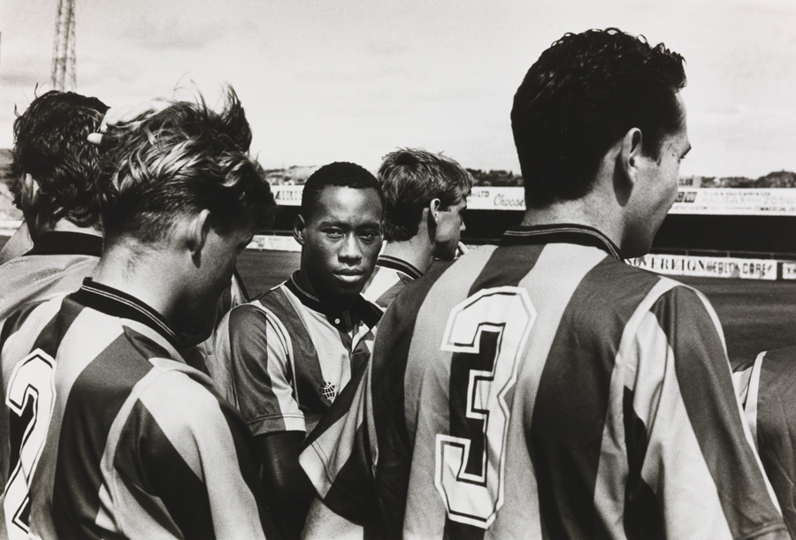
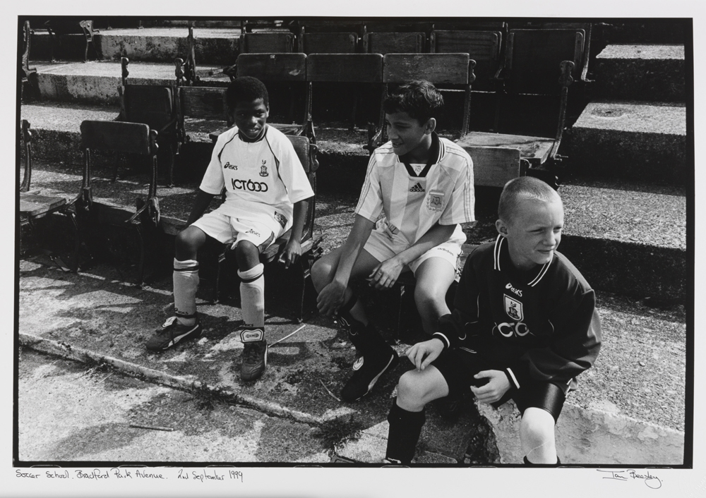
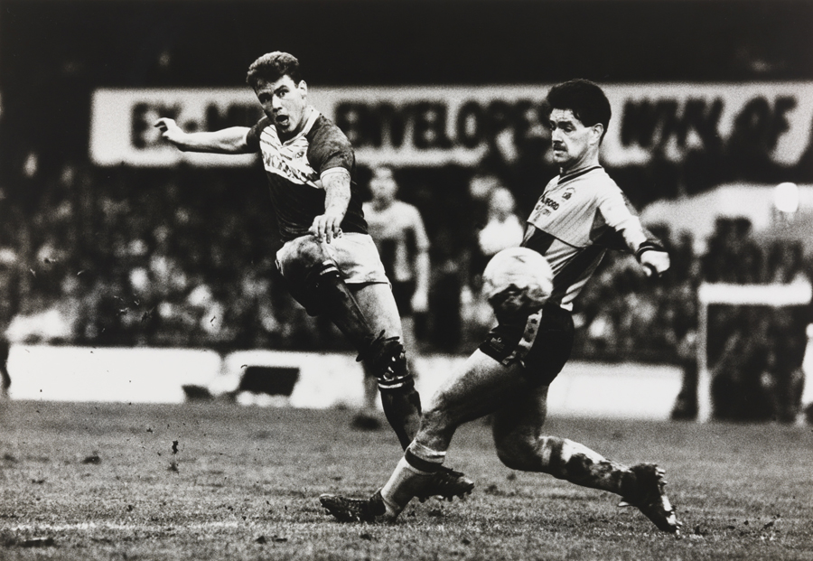
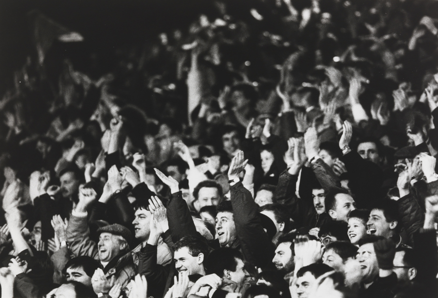
Brad is actually a sports photographer but as my theme is identity and place and that my model is my brother playing football to symbolise his idea of valued place to portray his hobby I thought that looking at a bit of sports photography would be great.
Brad Mangin is a Bay Area freelance sports photographer. Mangin has done eight cover shots for Sports Illustrated. Mangin graduated from San Jose State in a degree in photojournalism. He was born in 1965 and is now age 54. Mangin is known for his photographing of Major League Baseball for clients like Sports Illustrated and Major League Baseball Photos since 1987.
The reason i have chosen Brad Mangin to study is because it links well with the idea of identity and place. He chose to place himself in areas of the game to capture action shots like some of the examples before. This links well with my idea as im doing sports as part of the identity of my model. I’ve also decided to use the times before and after the games as almost like a before and after to capture the tiredness and the determined facial expressions of the individuals.


![]()


Having looked at Brad’s work, I have chosen to go down the lines of social identity and enviromental portraits. To be able to achieve sports photography,
However having reviewed over more photographers that base around the area of Sports photography i have decided that i do not just want to stick to the idea of just photographing my brother playing sports in a field but to capture his passion for football. I am going to portray a series of images that rather than just being seen as a simple images with no context there will be a story of a boy who aspires to be a famous footballer and play for teams like Manchester United and Portugal, not to mention his slight obsession with Ronaldo, whom he sees as a role model.
The fact of being who or what a person or thing is.
Identity can be based on multiple factors. The person someone is today might not be what that person is tomorrow, we adapt and portray ourselves as how we want to be seen and it usually demonstrates aspects of who we are. For examples Identity can reflect on your upbringing, being religious, non religious, being foreign to being born within Europe, culture, family, hobbies, friends and life style choices, even your own appearance can reflect or be used to make you stick out from a crowd weather this being someones features or not its still there. Regarding to the other theme of place. this can be seen as, what makes this place relatable to you as a person. The environment and colors also come into consideration, the questions asked when having a scenario places within the lines of identity means it has to voice what the model cannot speak in a photograph.
The model I have chosen is my brother, it links well with identity as its someone who I am close with and interact with on day to day basis. After having thought of quite a few different places to set my images out on I presumed that doing something related to sports would be quite a good idea. This to me struck like a good idea as part of his identity i.e. personality is the fact he is good at sports so I have based some of my experiments on places where you’d usually find an activity being performed .
Different types of Identity:
Mood Board –
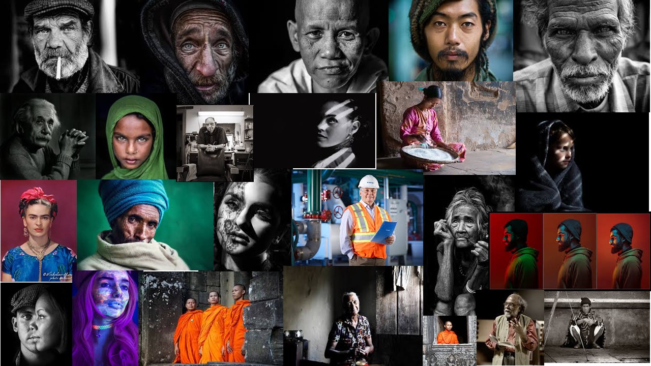
My idea is that ill capture my images, before, during and after the game and in general capture home life and how he dreams and thinks about football all the time .This being said i want the images to be presented as a story of the day in the life of someone who plays football. However my images aren’t just going to be portrait based, i will include images like the football, the equipment, water bottle. For this idea i have chosen to look at a sports photography which also links into environmental portraits.
Brno Del Zou is a French artist born in 1963. In his “photosculptures” series, Brno Del Zou uses the fragmentation of the body in order to better understand it. The body and the faces are revisited and their volumes are highlighted in order to create installations of multiple scales. In Brno’s work he is trying to explore the human body but by doing this his style, rather unusual but unique really goes with what he was trying to explore. By him being different it makes his work one of a kind and interesting to look at he’s expressing parts of his identity which is what should always be done when creating “your own work”. I like his work due to the layered fragments of the face creating a bizarre outcome, the use of black and white helps with distinguishing the mood that hes trying to share however some of his images have tiny elements of colour which makes the models features easier to spot and draws automatic attention. His work itself is leaning to the more unrealistic side of photography which gives him the ability to work with what he has an extend it for something meaningful which has been fulfilled in his case.
For every great image is a story or an idea. For Brno’s work its evident that the idea of identity and expression is clearly shown, ashore the story behind it could be that Brno is trying to explain that our mind can be our biggest challenge we face daily. Some images show various expressions, this can be used to symbolise the feelings we might feel In day to day life. This clearly highlighted the importance of what our minds can do which lead to a powerful message being shown through art and creativity instead of chunks of writing.
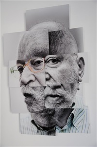


Photo montage is the process and the result of making a composite photograph by cutting, gluing, rearranging and overlapping two or more photographs into a new image. Sometimes the resulting composite image is photographed so that a final image may appear as a seamless photographic print

My first Attempt at Photo- Montage using Photoshop:
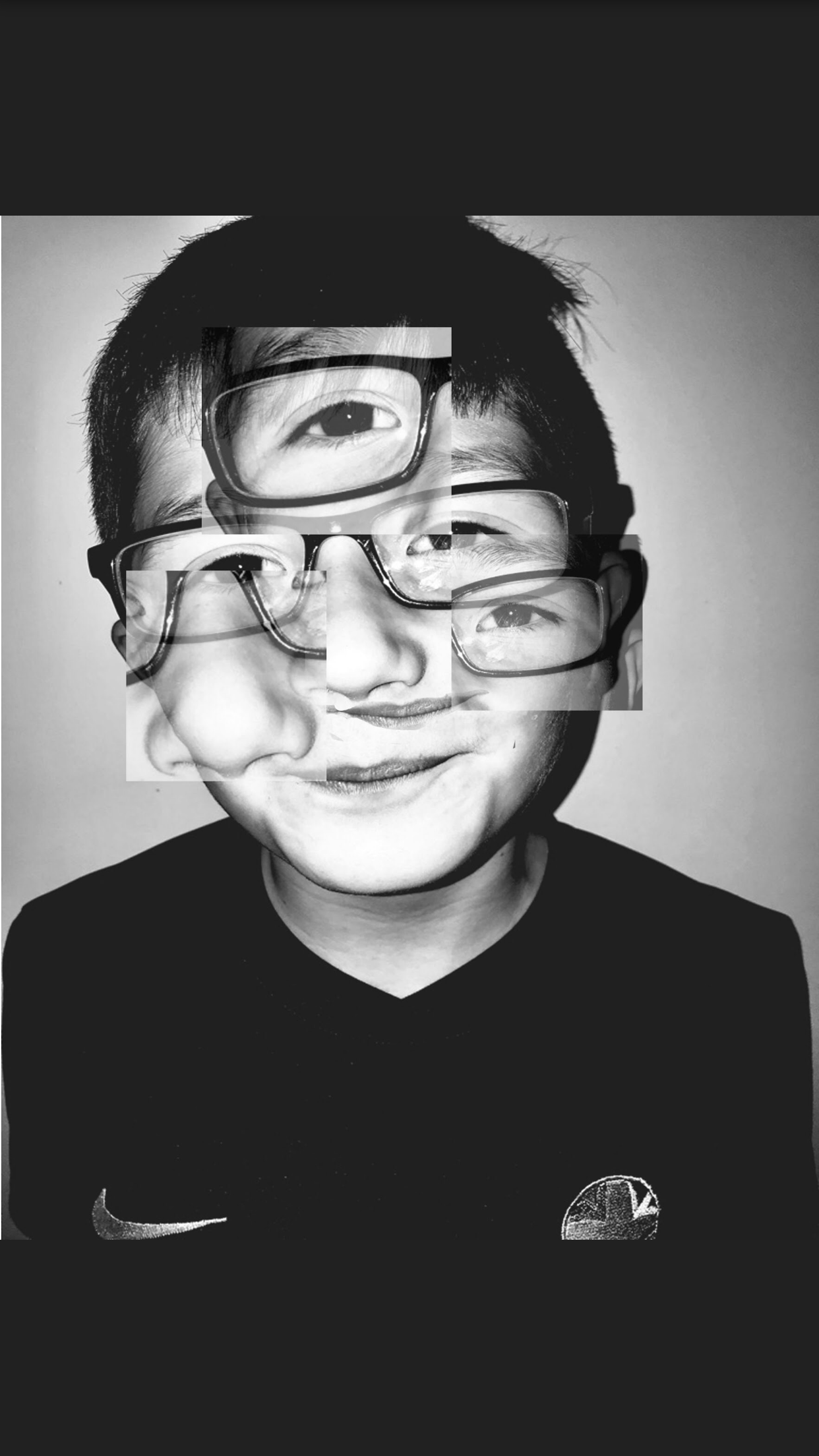
My Process:
As I mainly forgot to screenshot a long the way I decided to write out the process which I followed to achieve this image. Firstly although this took me over 45 minutes to figure out how to over lay layers and fade them out. Firstly i selected which image i wanted to use as the montage examples. Secondly i had to decide whether i would be using the same image or a different one when adding it over one another. I chose to stay with them same image as i was inspired by the artist Brno Del Zou and in most of his outcomes he sticks to the same image but just creates multiple layers. As this was my first attempt as a beginner i found it quite hard but In not too disappointed by the result. After having copied the image a couple times i decided to crop into certain areas of the face making another face but above another one. Therefore here i chose to crop parts of the eyes,mouth and nose to create a weird, distorted image. Then finally i edited the cropped areas by changing the opacity of each section by making it lighter giving it a transparent look.
The technical aspect of this image, when looking at lighting its quite dark, however there are some elements in this image that are put there to draw attention. For example the big eye in the middle of the forehead, giving it this aspect of abnormality and weirdness draws attention if you look closely you can see harsher tones of blacks and grey and then lighter mixes of white tones. This attracts the eye to look at areas that sometimes aren’t highlighted in normal room lighting. This image was also taken using flash hence why theirs a circle almost shape going around the face which just supports my point that the attention is drawn immediately to the face.
Visually, other than light, if i was to complete this image again, i would try to fade out the corners of the boxes or at least learn a way to blend them in a bit better as it makes a slight contrast with the additional background due to them being different tones of white and one slightly more faded.
The context behind the picture was that it was actually taken for the studio lighting section but as my chosen artist worked with portraits i decided to pinch one picture from here.
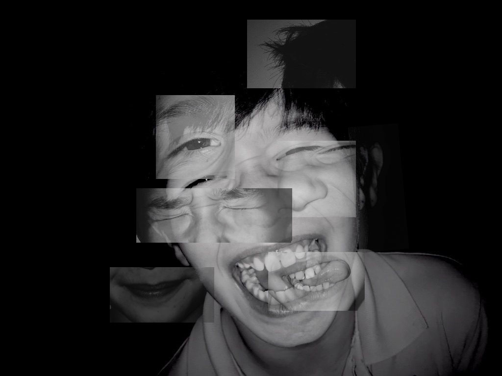
Here are some of my other attempts and experiments at Photo Montage using more than one image:
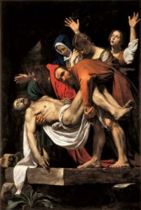
Caravaggio was born as Michelangelo Merisi in Italy around 1571. He was orphaned at age 11 and apprenticed with a painter in Milan. He moved to Rome, where his work became popular for the tenebrism technique he used, which used shadow to emphasize lighter areas. Using this technique is what led Caravaggio into success as it added realism to his images. Caravaggio the colorful, sometimes violent street fighter but ultimately brilliant painter, applied an extreme form of chiaroscuro (light and dark) to his work and was directly influenced by Rubens, Hals, Rembrandt, Vermeer, Velazquez and Bernini.
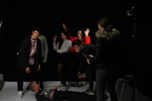
Our class process to imitate the image:
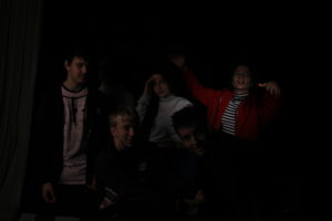
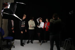
Here are some of the best outcomes:
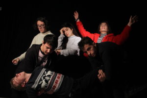

We had a second attempt at tableaux photography with this image
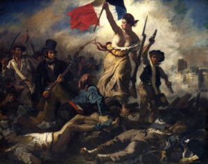

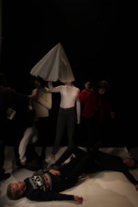
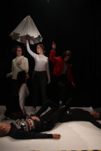

The second image in my opinion was harder to re- create and copy as firstly we needed more people but in terms of lighting it was hard to pin point where we trying to focus. However these image have been focused on the center of the image which therefore has made the images come out darker than excepted. This image also took longer as we were trying to angle the light in the same direction as the image but having looked at the image now the light seems to be coming from behind the woman in the middle. overall the process of figuring out where to put lights and where to stage people was a better outcome than the image itself but our first attempt was a best outcomes.
These are the contact sheets i made from our class attempts:
In the examples below you can see I have drawn over the images. have done this because some of them are under exposed therefore to dark so I am unable to edit it I have done that in (red) . Additionally if the image is too over exposed or under exposed i have decided to cross it off In (blue) .If the image is out of focus I have chosen to cross it out in (pink) Finally if the image I think has too much negative space behind it which makes the images look quite bland and boring I have crossed out the space in (white)
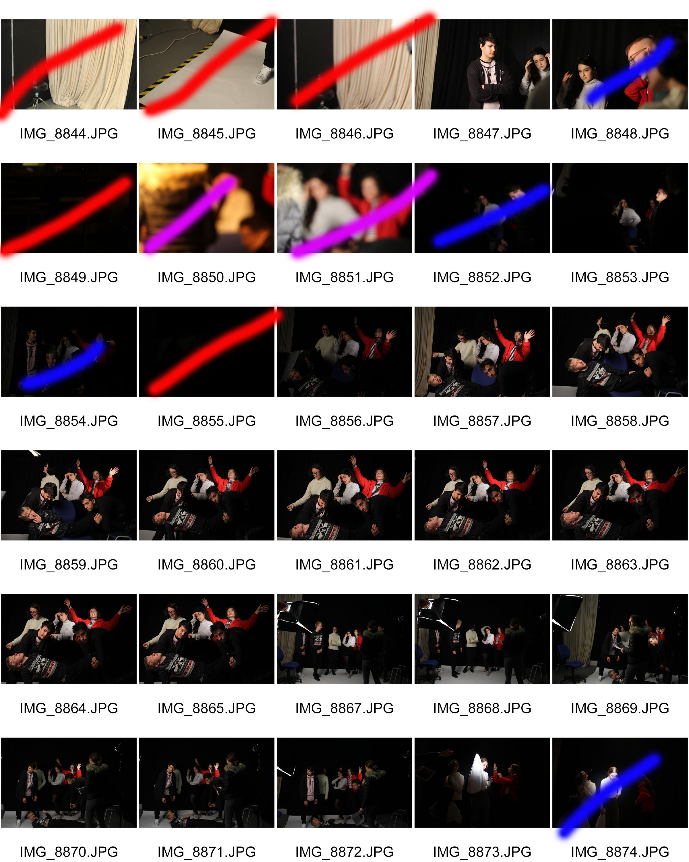

what is it?
A tableau vivant, French for ‘living picture’, is a static scene containing one or more actors or models. They are stationary and silent, usually in costume, carefully posed, with props and/or scenery, and may be theatrically lit. It thus combines aspects of theatre and the visual arts.
The idea of tableaux photography is so that we can re create famous images by finding similar props and outfits. The setting and lighting also have an imapct on the outcomes for tableaux. The whole point is to make the image as close to the original as possible. Therefore the setting and all the models expressions have to be near enough the same.
Above this post are all of our class attempts for tableaux photography. We found it quite challenging to keep the same facial expressions because we were stationed in all sorts of positions so at the end of the day most of the outcomes are either fairly blured or fairly dark, however re- creating the images from Caravaggio was quite fun.
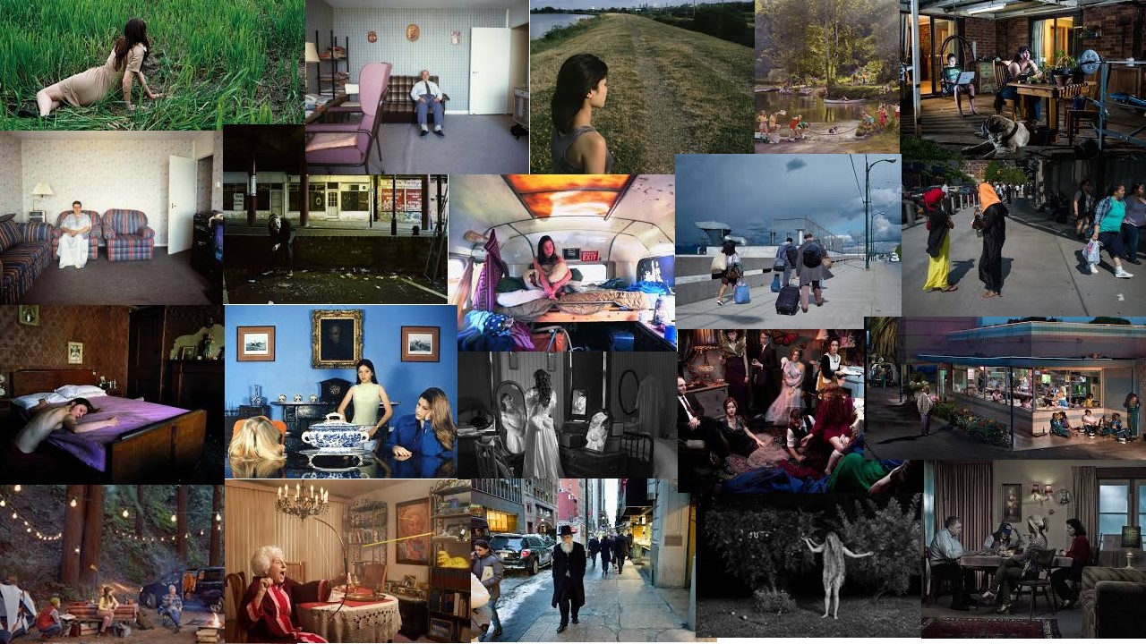
These are just examples taken off google images when searching in ‘ Tableaux Vivant’ some examples in the mood board above are actually examples from Tom Hunter, who’s worked is based on tableaux photography.